Transcripts
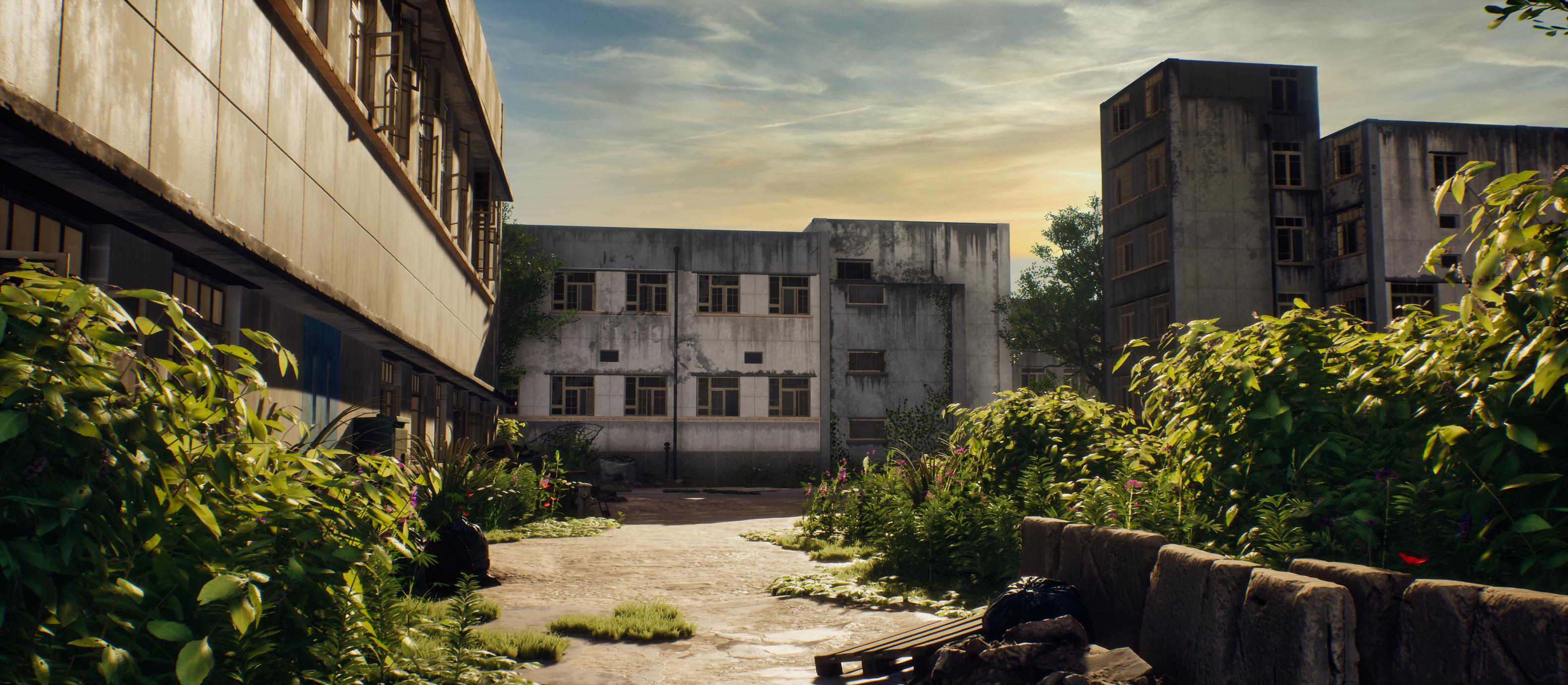
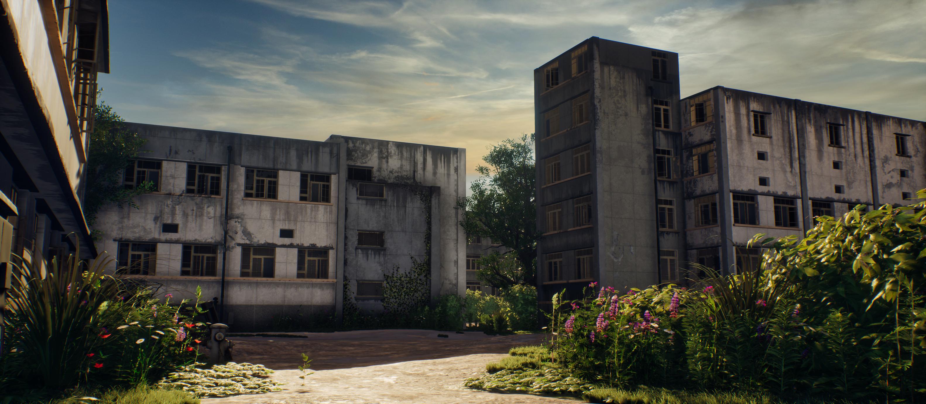
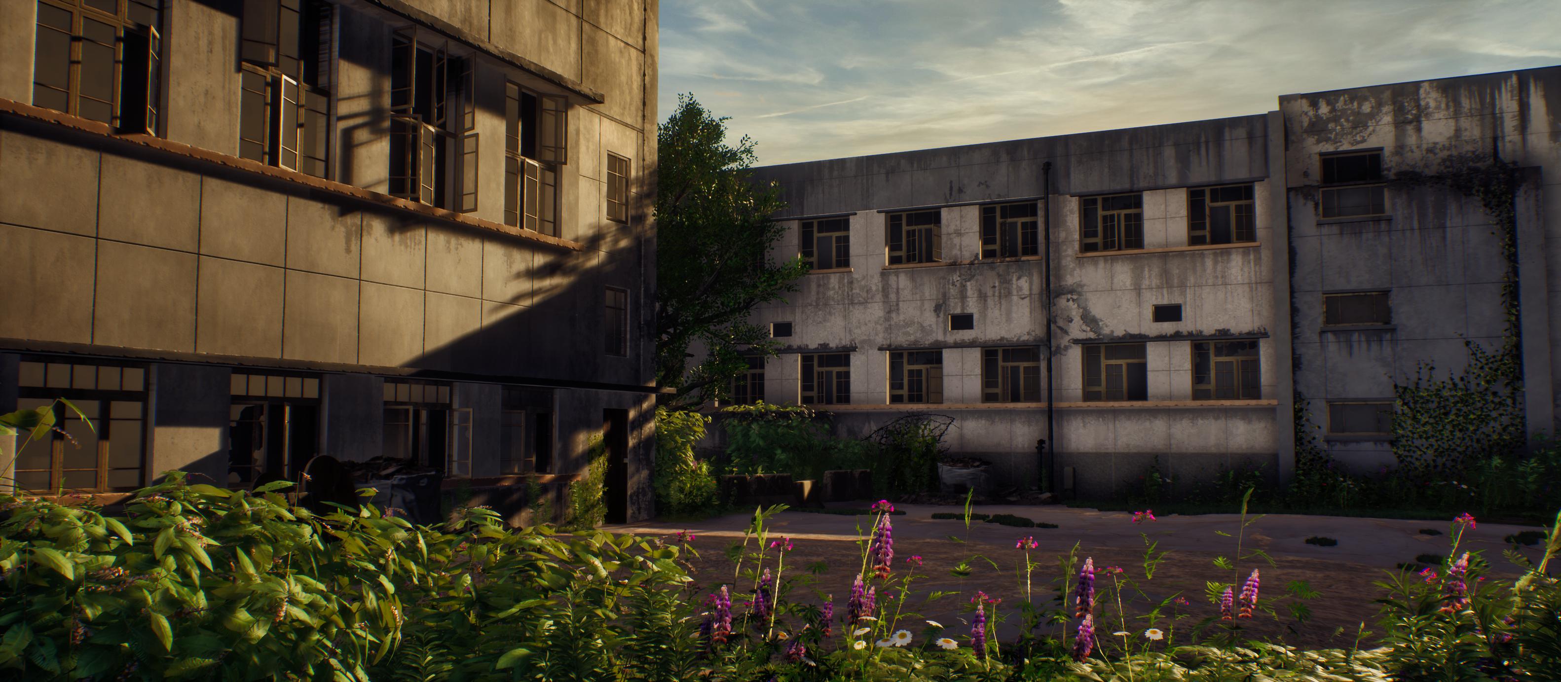
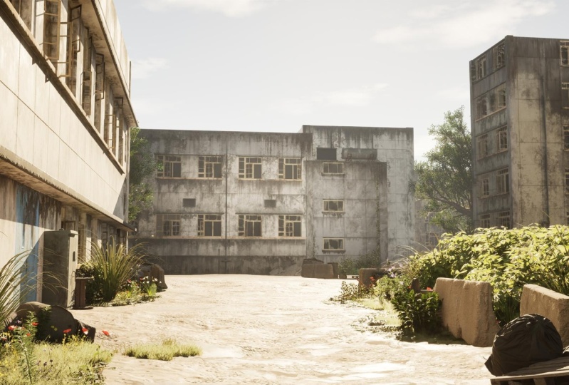
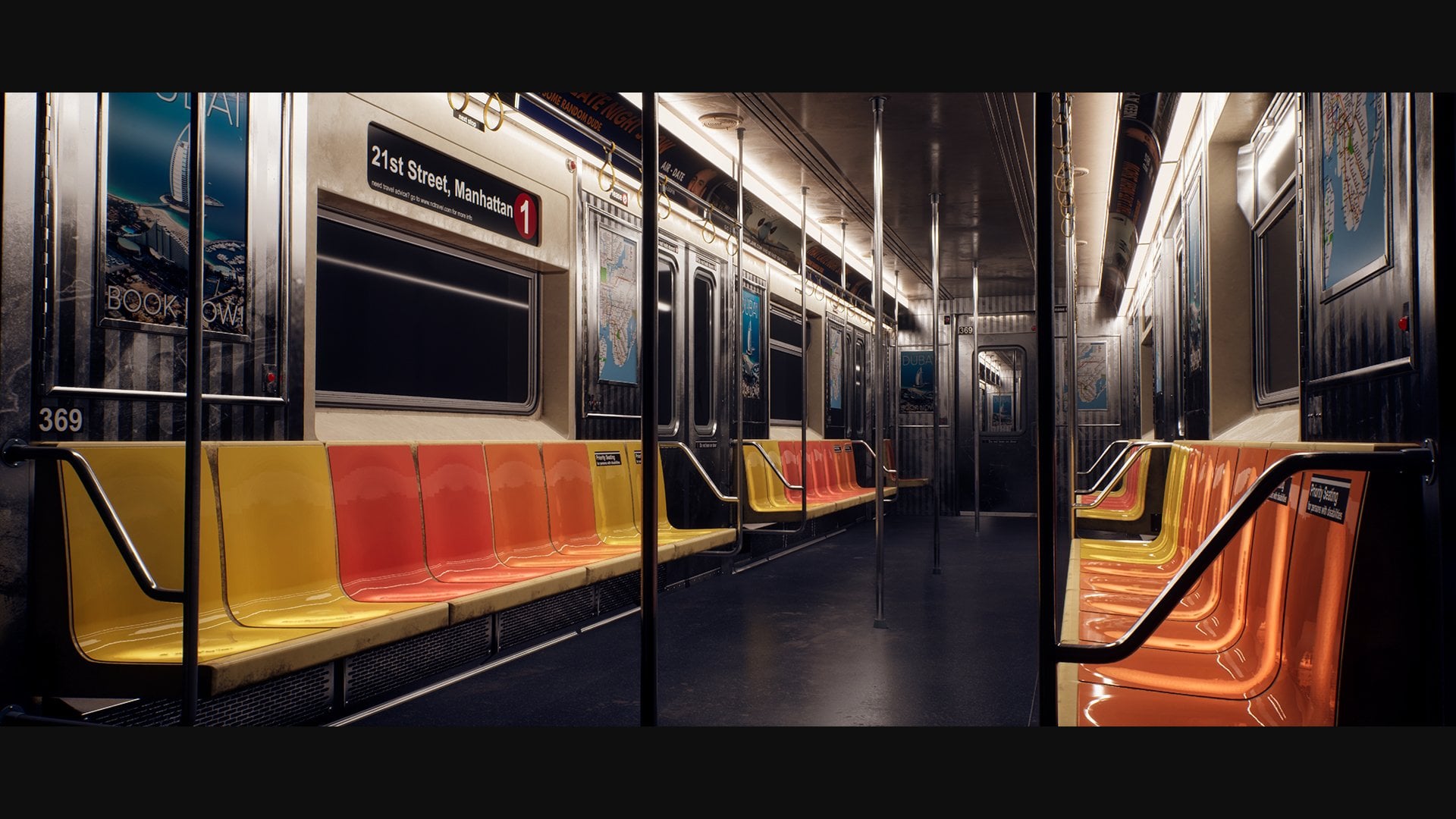
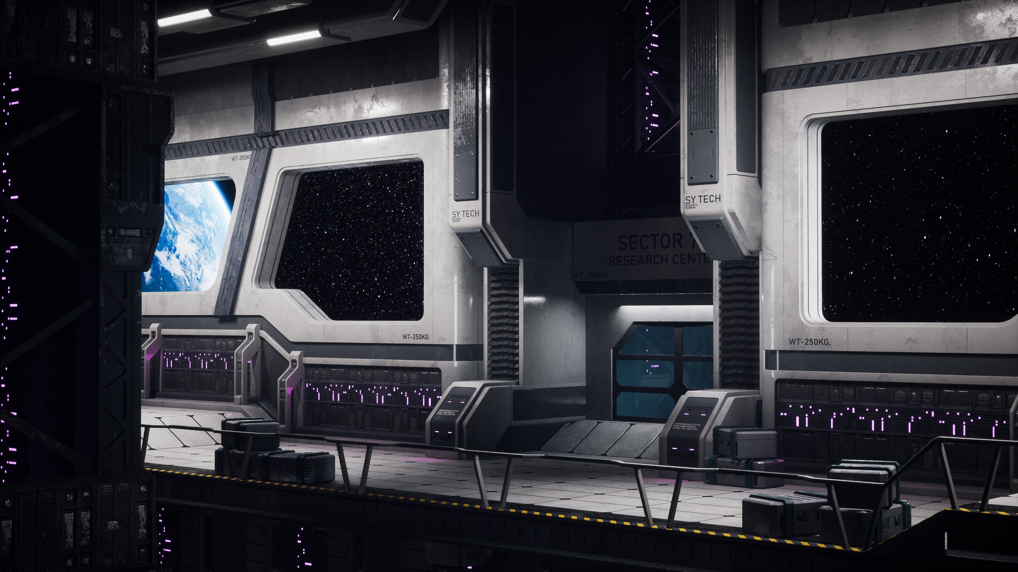
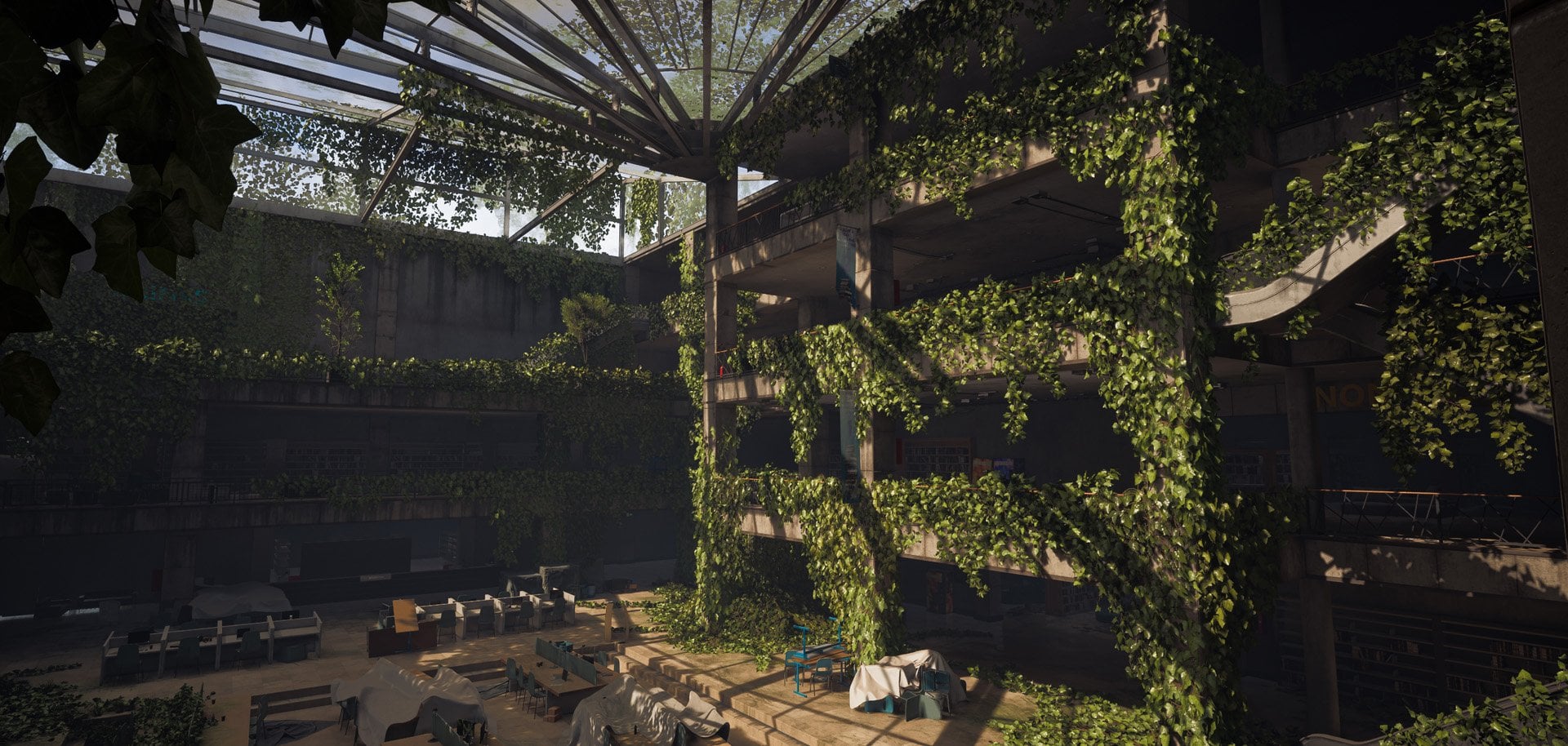
1. Introduction Trailer: In this tutorial course, we will go over on how to create a post ecalyptic game environment
from start to finish. This course will be almost
completely in real time. We will only use time lapses for very repetitive functions. Next to this, we
have also included a few bonus chapters at the
end of the course on how to push your environment
even further using mega scans by adding a few
smart props like barrels, road barriers, and some rubble. Some of the key points in this tutorial course
are the following. How to create modular assets in a smart way to create large environments
with little work. How to create procedural
materials and decals to cover a large
range of variation, how to create foliage for games, how to do environment level art, composition and lighting, and how to think like
an environment artist. For the Tweety modeling, we will be using Maya. However, I will be using
universal modeling techniques. This means that you are able to follow along with
the modeling in this tutorial using any
standard tweet application, like, for example,
Blender or three years Max as long as you know the
basics of that program. For the foliage,
we will be using a combination of
Maya and speech. Then for the textures
and materials, we will be using
substance designer and substance painter to
build our environment, we will be using
unreal engine four. Now we will also make use
of Photoshop and ZBrush, but these programs will be less important
within this course. We will start this course off by creating a blockout for
our environment to make sure that our
modular pieces work correctly and that we can
get the composition we want. We will then turn
this blockout into final assets and we will create procedural materials
and unique textures to go along with
these final assets. We are then ready to set it all up inside of Unreal engine four. Once it is set up, we will
do our first lighting pass and we will create our decals and place them on our buildings. And once this is done, we will draw focus
to our foliage, where we will be
using Spetre and Maya to create some
ground plants and grass, some bushes, and a tree. We will go over on how
to place this foliage in the correct way in unreal to
get the composition we want. Then we will go through
multiple improvements on our environment like
doing another lighting pass, adding small details,
polishing our scene, and painting our train, and many more things to get at the end result that you see
in the promotional images. Finally, we will anticipatory off with some bonus
videos on how to use mega scans to push your environment that extra
bit within a short time. This course will include
all the source files, including the Unreal
Engine project, except for the actual
mega scans assets. After following this course, you will have a very good
understanding on how to create large post apocalyptic
environments and many other types of
environments and props. This course will mostly focus on the bigger
picture, so to speak. If you're interested
in much more in depth prop modeling
and texturing, then I would recommend
to have Look on a store as we have courses that
cover this exact topic.
2. 01 Going Over Our Reference And Planning: Okay, welcome. So first, what we're going to
do as always is, we will go over reference because there's quite
a bit to talk about. So I got these reference
image over here. Now, unfortunately, because these reference
images are from a commercial pack that I bought, I'm not allowed to
actually include, and I'm allowed to show them, but I cannot literally give
them to you because that would be reselling almost,
something like that. So I will go over these
reference images slowly, all of them, and
then you can just, like, pause the video if you ever need to
go back to them. So basically, these are
the reference images. I'm using pure Rf, but honestly, you can also, of course, you cannot see
that. There you go. You can also, of
course, just use normal Windows view,
which I often use. I only recently started
using pure Rv because it's at least for Dorios I only recently started using
it, but it's quite nice. So if we go to this one, this will be our main reference. Now, as you can see, there's
actually quite a bit here. It might not feel like a lot, but there is quite a bit here, and that is the thing with
this tutorial course. We need to handle this very, very smartly because since
it's a tutorial course, I cannot spend 100 hours making a hyperrealistic
environment. That's just not feasible. So I need to play it
smart and to still get a really cool effect
while teaching you all the techniques needed to
even take it step further. Gus this, we are going
to use a few things. We are going to
for the buildings, use a modular workflow. This means that we are
going to make, for example, the windows, the walls, everything in a way that
we can reuse it a lot. Now, the second
thing is, of course, yes, we are going to
make some foliage. So that's no problem.
That's just something we do inside the speed tree. It shouldn't be the
most difficult thing. Although I will just do
some prototyping just before I start recording to make sure that I can get
it exactly right. Materials, not a big deal. We are going to just make, like, Well, of course, we are also going to make
the concrete materials, but the nice thing is that
we can reuse a lot of stuff. So modular pieces, of
course, we can reuse, but also materials
because what we can do is we can make
a ground material, and then we can make
a concrete material, and we can immediately use
that concrete and slightly adjust it make a
concrete tiles material, some color variations on that, and maybe also like a
more rougher material. And then, yes, the
wood, I'm sure I might try to save some time by doing the wood inside
of substance paint. Just because I don't
really feel like making an entire tilable material
just for the wood, but we'll have to
see about that. That comes way later. So first of all, I want to
focus just on the modeling. I like to do my vimins
in stage, basically. I do, of course, have
an idea of what to do, but I'm first going
to focus on this. So this is going to be
our main reference. Now, another few things is that we are going to
gamify it a little bit. Right now, reference, it has
a really nice silhouete. As you can see over
here, it goes down, up, down, up, down, up. So that's quite a nice
silhouette to have inside of games that there's
a lot of difference. However, the thing is that they all feel very flat,
which makes sense. So what we are going to do is, yes, over here you have
this broken piece, but this will feel a little bit out of place inside of
a game environment. I will feel very random, even though it is
here in real life. So instead, what I'm going to do is I want to go ahead and I want to make these
buildings a little bit more interesting
using foliage. So I will most
likely just use ivy, create a few generic
ivy pieces so that we can have some ivy
hanging from the roof. And also maybe something creeping up against
the building, just to kind of break up
those straightnesses. In the beginning, I
was like, Okay, let's make some destruction and like, have a building like destroyed. But unfortunately,
doing that thing alone would be an
entire tutorial. So I might cover that
in a future tutorial. So I got a few more images. Here's like a close
up, as you can see. So yeah, see, this feels wrong, and it's also another
entire material. But yeah, over here, it's nice. So you can see that we
do have a few props. We have some rain
pipes over here, so I will make, like all
these props in the same time. Like let's see what do we have? We have rain pipes.
We have a door. I do not count the windows because they are part
of the building. I go to this one. This is just a close
up of this shot, which can just show us the door. You can see here
there's a little ramp, which we can also do. So we will just have a train. So we got this stuff.
I'm just doing it slowly so that you can have a
look yourself, also. Over here, this is just
like the other side, but we are not going
to make this back. I'm only going to
focus on this view. And maybe if I have time, I will also create a corn
of you like over here, but I will then do that in
like a time laps later on, along with that, actually. So this will be our main view. I will later on like
bonus chapters. I might then make a time
labs for this area. And what I will do is I will make a time
labs where I will just dress up the environment a little bit more
with some mega scans. These are just some random
props that I will be using just to push
the quality to show you what an
environment can really be if you have the time to spend to create all the textures and
materials and all that stuff. So let's see, where were we? Yeah, so this like the corn
of you.This is quite nice. Like the leaking, it
almost feels like gamify. So the leaking almost feels like it's from games because you often see these type of
leaks everywhere in games, like the really strong
black leaks and everything. So it's one of the first times that I can actually use them
and they make sense. This one is just from, like,
a slightly different area. I just felt like let's
throw it in because of the ivy and
everything over here. It just looked cool.
It's just like some nice looking concrete that we can use and just
get some inspiration from. Also, some dead leaves would be nice if we include
something like that. This one, I'm pretty sure
you know why I included it. So this one I mean breaking up the boring
buildings with ivy. Of course, this
is insane amount, but you get what I mean. This one, just to get again, a sense for the building
and everything, I also did this for
some destruction, but we are, of course,
not going to do that. This one close ups
of some concrete and some walls and doors, windows, sorry, windows.
Same over here. It's just good to have some
close ups, just to make sure. And these are actually really
high resolution images, so we can really, like, zoom in and have a look at
everything. Same over here. I do quite want to go for
a lighting like this, like a nice sunny
looking lighting, a bit like the last of
our style lighting. Over here, you can see that
there are foliage on the top, which means that that would
make it logical for us, even though we're not
going to make the roof, it would make it logical for us that Ivy can also grow here. And this one is another one
just like a random image. The other side of
that random image. And here's just like
another extra view, and I believe that that
is it. So, okay, cool. So if I have a look at this, what we're first going to
do is we are first going to divide everything up
inside the Photoshop. So we're going to decide what module pieces
there are going to be. I decided to do the planning
completely from scratch. I've not done this
before, this planning, and I just want to do it
completely from scratch just to see what we're exactly going to do so that you
can see the process. Now, next to this, we
will be using Maya, which is quite a new
program for me for this. I chose it because it is fairly basic modeling
that we need to do. And although technically, I am more experienced
in three years. Max, the tools are
pretty much the same, and people left me
requesting Maya. So don't worry about it.
I know how to do it. So we are going to go ahead
and use Maya for this. It's going to be easy the
modeling because yeah, it's just some modular pieces. After we've done our reference, the first thing
that we're going to do is we are going to go over on how to
create the blockout. So I think that is
very important. We want to have an entire
blockout and we want to already have this
blockout inside of reel. We don't need the foliage yet, but we need to have a
blockout of the buildings all in place with all
the pieces so that we know that everything
works exactly perfectly because that's the
thing with modular pieces. They need to work
perfectly together. And then we can just
move on. So I'm moving this over to
my other screen. I just went to the Photoshop. Now, you don't really need
to do this because, again, you don't have this image because I will
need to remove it. But I'm just going to
decide, like, Okay, what is going to be
on module pieces? I'm going to go for
as little pieces as possible while still giving me all the variation
that I need. So what I tend to
do is I tend to, for example, go ahead
and create a selection. So, okay, let's start
with an easy one. So I'm just using over here
my polygon lasso tool. And let's say that this over here, and then
it would go back. It's just like as an indication. This would probably be like
one piece. So you select it. You go down here, solid color, make it a random color and
then tone down the opaste. See? Okay, so that
will be one piece. So that is a wall with
tiles and a railing. I'm going to go for, well, we probably need a basic wall, but I'm not sure how I want to do the windows because there needs to be holes in the
wall for the windows. So unless, no, I cannot do the windows on top, that
would not look good. So let's see. What if we do? Is that one being used more? Well, it's an easy one. So it is basically going
to be big wall with single window. Like this. So big wall with single window, which we can also, duplicate
over and over again. And what we will
do is we will make a big wall with double
window like this. So that will cover that
entire building because I'm going to make
it in a way that you cannot see any
doors or anything. So we don't need to
bother about that. So just give the random color. Here. So everything down here, because it's been
covered by foliage, I'm not going to
bother about that. We are literally just
going to do this. And then at the end, we'll
just have some plain walls, but we'll just include those. This one, so these
are different. I think on this side,
I can use this wall. So we will make it that I can
use this one on this side. And then what I will do is
I will make one extra wall that is basically just a slightly different
variants from this one. So that's the cool thing
is that we can just make a few different windows
and just quickly slap them on some walls and
just call it today. So this one will be wall
with a window to the side. So that will cover
this building. It will cover this building. It will see. Can we use this piece up here? No, I think it
would be good if we have this block because we
can use this block up here. So we're going to
use this block up here and we're going to
use this block up here. So let's just say just like a concrete rooftop block,
something like that. Okay, so let's make
this another color. Okay, so we will be able
to use that block there. This piece over
here is going to be like a single window
piece with a corner. And then up here, we will also duplicate just like
the pillar of this, and we will be able to use the pillar to close things off. So basically, how it will
look like is we will have, for example, like this
blue piece over here, and then we will have
a single pillar. And that one we can just once we've created a window,
we can just use that. We will have a single
pillar at this point, we get, like, running out of basic colors to use, but
that doesn't really matter. There we go. A single
pillar that we can then re use to do some
changes. So we have this one. Am I able to am I
able to use this? So if I move this down
here and if I then just throw in a single beam
that should be working, but then I want to
make the bottom flat, and that is, Oh, you know what? We can use this one.
We can use the top of this and we can just
have the window, and then we can move
the top and we can just move it in front over here. And that will hopefully create something in that direction. Now, this door is sitting
pretty much on top. However, I'm sure that we
have another door piece. So what I will do is I will
just make a very basic, just like a flat door piece. Like this, just so that we
can use it in some places. I'm going to go for,
like, color like this. Okay, so that can cover that this entire building
is covered this entire, this entire these windows. I feel like they are not
the same as anything else. So let's have a look. This bottom piece, do we
already have a bottom piece? Like, we can use this, but then we want to,
like, change the UVs. So we will use this one as
the bottom piece for this. But what I'm going to do is I'm just simply going to, like, change the UVs so that we have, like, a slightly
different bottom. And then the top
piece, the windows, shall we shall we
use these or Yeah, we could just as well use
those windows up here. Yeah, that should be doable. So we will use those windows. And then over here, if
we just go ahead and grab one extra
piece that is just like a long window
because I quite like having that difference
all of a sudden. We do one more over here, which is going to be like just make it like
a random color. Doesn't really matter too much, just for viewing purposes. And then the top will just
be like a flat thing. Roof. I don't think we
need to make the roof. We will just make it like
overlap so that you cannot see. But for the rest,
it should be fine. So, one, two, three, four, five, six, seven, eight,
nine, ten pieces. However, from the ten
pieces, if we make one, two, three different windows, and then just revit
this window in here. So that already takes
quite a bit of work away. These are just some very
simple basic squares. And this one also. So see, that shouldn't
be too much work. I think this will take me modeling wise,
creating it final, it will only take me
like an hour or two, maybe a bit longer because I'm recording it in a tutorial. But it shouldn't take
too long for the moding. So that's a pretty good plan. Let's go ahead and let's
go with this plan. So I'm just going to go ahead
and I'm going to save this. Modular underscore. Planning. Yeah, let's go
for something like this. I will save this. Good.
And what I will do is, I'm just going to go
ahead and throw it. I have two screens, by the way, so that's why you
sometimes see me, passing and waiting.
S there we go. As you can see, I don't think
I actually showed you this, so I just have some
random windows. They are very basic. What we are going to do is most of
it will be the texture, so the modeling will
be just quite easy. There we go. So that is
our reference planning. And now what we can do
is we can simply just jump straight into
Maya over here, and we can get started
with our actual scene. I am using the complete
default of Maya. The only thing that I have is that I have in my
environment Act, like a custom environment tap, but you can also go to custom. So let's say I go to custom, I have a few tools over here. I actually miss a few. So the tools that
I have is edit, delete by type and history. You can hold Control
Shift and click to add it to whatever
to you have selected, and then you can go down here
and save all the shells. However, I have a bug that it doesn't properly save for me, so I sometimes need
to re art them. I have a modify and I have a freeze transforms
and reset transforms. This is handy if you
ever have some proms with your bevels or
anything like that. Then I have a Bzire curve. You can find that one in mesh. No, sorry, not mesh create. Curve tools, Bezier curve tool. It's just a simple curve. I have combine separate
fill hole mirror options. You can find all of
these in here, combine, separate fill whole
mirror options. Then I have my connect vertices, merge two vertices, cut and slice split selected edge
ring and the smoothening. You can find those in connect over here, insert edge loop. I know they're called
slightly different for some reason.
Multi cut over here. Just look at the icons. You
have a target belt over here, and u over here, if you go to Mesh display,
you have to soft the edge. However, most of this stuff, I will just be right clicking
and using that, of course, you cannot see it right now,
but if I would have a cube, I will mostly just be right
clicking and using this tool. So shift right click, you
can find all your tools. Now, diitoal is for
intermediate artists. So it's not for
absolute beginners, just people who
have already done T art for a couple of months at the very least and
know how to do some basic modeling.
That is about it. What we're going
to do in the next chapter is we are
going to go ahead and we are going to
start by working all of the blockouts of
our modular pieces, which we can then nicely
combine together. I will most likely also
create like a pillar, but I can just probably
use, one of these pillars. But that's stuff that
I might do later on. So let's go ahead and
continue with this stuff.
3. 02 Creating Our Blockout Pieces Part1: Okay, so here we
are inside of Maya. Now, all the
techniques that I will be using are universal. This means that I
will only be using tools that are also
included in Blender, three SMAx and those are
the programs I know, but probably also in Modo and
any other three D programs. So do keep that in mind. You don't need to
use Maya for this. If you are efficient in the
other three D programs, you can just use those
and follow along. So the first thing I want to do because right now with
the modular pieces, I want to focus on the scaling, so we need to have
a proper scale. I'm just going to pick, like, a character that's
like 180 centimeters, which is often the
default scale. And based upon that, we just want to find the correct scale. And then in Maya, we
still have flexibility. So we can still change
it inside of Maya. Don't worry about
that, but we want to make everything relative
to that character model. So I will show you what I mean. So we want to keep basically
all the scaling even. I'm going to get started. Now, normally I would just
import the character model, but once again, fun
because of copyright, I cannot give you any character models because I'm
not a character, so as long as I didn't make
it myself, I can't give it. So we're going to go
for a simple cube. And with the cube, if you just
double check by going into Windows settings and then in preferences and
go to settings, just double check that you
are set to centimeters. So we are going to go for 180 and not 1.8 or
something like that. So we have a cube over here. Now, if you just go into
the channel box down here, if you cannot see any windows, I'm sure you know
that you can find pretty much every window
into the windows step. And that's the last
time I will say this. So we're going to go for the I always forget it's most
likely the Y axis. It's right now set to one. So that's 1 meter. Yes, because one grid
point is 1 meter. So we still do need set to 1.8. And then what I'm going to do is I'm going to set my C scale to 0.1 and the X scale to 0.1. So that's a little bit, okay, that's bit too thin. Let's 0.3 and 0.3. Yeah, If you press space, you can go to your
different views. And then if you just select
on a different view, you can just press space again. So right now, you can see. So this 1.8, every point
is going to be 1 meter. So it might feel very
small in context, but for now, this
should be fine. This is going to be our
little character for now. Okay, so we got this. Now, I think the first
thing that we want to do is because, yeah, this bottom one is
actually by coincidence, it's a bit tricky because this bottom one will have
two different pieces. So we again play on to that
inside of real engine. So I will probably
start with this piece. Now, if you imagine, this is a very large door. So if you imagine that a
character's standing here, now this door is very large. The character would
probably only get up until this point. So 18230. That's often 23240 is often a default height
in some buildings, especially industrial buildings, industrial buildings are
often quite a bit higher, while 210 is more for,
like, residential. So two meter ten is often
for, like, residential roofs. So let's for us because we
want to go for a bit of like a grand feeling let's
go for two meter 40. So if that is two meter 40, I would assume that every
floor is going to be two meter 42 40 and this one, 240 because then the roof
would already start here, so that would sit on top. So we're going to
go for two meter of 40 for those pieces. Height. The width, I'm going to go I
tend to go around 4 meters. Four or 5 meters. It just
depends whatever feels white. We just need to be
able to duplicate it often enough without
atently changing it. So this is pretty much a cube. So if we're just going
to go clear the cube, let's go ahead and let's
move this over here. So we are going to set and I always forget which one it is. I'm going to set the Z scale
to sorry, What was it? Yeah, why am I so confused? 2.4, two meter 40. Yeah, yeah, that should work. And I'm going to set
my Z scale to four. Maybe if you have
a look at that, if you know that the door
is already halfway here, might want to go with
five so that we do not spend too much
time placing assets because it means more assets
to count and more pieces. Now, we want to have this
going quite far back because it needs to
cover multiple cases. So we are just going to
push this quite far back. And, you know, a
cool thing that I just thought of is what we can do is we can have
can we do that? I was going to say we can
have this rich on one side, but not on the other side,
but that does mean that we would have a
transition in between. I'm not sure if that
would have any use cases. Probably not. Nah, never mind. Ignore me. I'm just going to create a
separate plane for that. So 3 meters back?
Oh, that's a lot. Two. I feel like 2
meters should be doable. Yeah, so that should
cover more than enough. The thing is, you
don't want to make it too much because if
you make it too much, you can get into trouble around corners because then all of
a sudden you have clipping. But that's the cool thing.
We will see this inside of unwel before we
actually make the finals. So let's go for this. Now, I'm just going to go
ahead and pivot point wise. So over here, right now, the
piv point is in the center, which makes it quite
annoying for me to just quickly snap this to the
center and just color today. So if you go to your
tool settings and you can find this also in
your Windows up here, you can go ahead and you
can press Add a pivot. Now if you just go up
here and I just want to snap this to points, yeah, it should
do vertices also. Snap this to points
and then just go ahead and snap it
down to this point. Is that correct? Yes.
Okay. I'm sometimes a bit confused because
it also does the curves. But yeah, points
basically means vertices. I don't know why they don't
call it vertices, but okay. So we basically want to snap this pivot to
our point and then we can turn off snapping and
it can turn off at a pivot. Now that this pivot is
here on the corner, all you need to do is now
set this to snap to grid, I mean, you can just click
on one of your move tools, and it will automatically snap
to the closest grid point. And this is basically also how snapping works inside of unreel. For example, if we would go
ahead and duplicate this, this is how it
would go in unreel. You would be able to duplicate
this and that's modular. So you are able
to just reuse it. And because we make
it even numbers, so we make it
exactly 2.4 meters, we are able to
perfectly snap it, and that is important thing with this that you want
to perfectly snap this. Now, I'm just going to
very quickly for this, just go up here
and press Select. So it's basically
just the edging. It's I should know these tools. So Insert Edge loop
is what it's called. So sorry for the confusion. I just look at the icons mostly because they are
called different. So I'm just going to press that, and I'm just going to add a quick little line
probably around here. I think that's a nice thickness. Then I'm just going to
go to my face mode, and I'm just going
to go ahead and hold shift and just extrude this. Oh, I still have
snapping turn on. Do not turn on snapping for
this kind of stuff because then it just snaps to
the close grid point. So this is just like
this little ridge. Because this is a blockout, you want to keep
this very low poly. You don't want to
add any detail. It's just here just to
get the basic shape. And I feel like that
is important shape. There we go. Already done. Okay, so the next one would be probably
like a window piece, and then I can just jump in and create a few different
windows for this. Oh, yeah, we have this point. This point is probably
going to be 1.5 meters, kind, 1.5 meters, probably. So let's actually do that one first because
it's just another cube, and then we'll do the window. So if we just go ahead and I will probably let's
create a new cube. So let's create a new cube. So we are going to go for 1.5
Yeah, that should be fine. And then Z x is of five, and we probably want this
one to go not too far back. Let's go for only right actually two is just
as far, isn't it? Yeah, okay, let's keep it
consistent. Let's go for two. So we got this one over
here. Same thing as before. I can just, like,
go ahead and then add a pivot quickly snap this to a point and then
go to grid and then oh, make sure that you turn off add a pivot
before doing that. And snap it to
grid. There we go. Okay, so that should already be it because it's just
a very basic piece. It doesn't have No, Yeah, it looks like
it has a ridge, but I'm not going
to do that myself. Okay, so for the
window, for the window, it's basically going to be
let's see if this is 2.4, we probably want
to make this the same or if this is 5 meters, we probably want to
go ahead and make that the same width, but it does mean
that we probably go ahead and end up with two windows because we cannot
fit that many in one piece. So basically the
way that this is going to work for the window, I'm going to start with a plane. And if you just quickly go
into your pool plane over here and set the subdivisions back to zero because
we don't need them. Now, I'm just going to
go ahead and rotate it. Hold J to snap rotate it so that you can snap
rotate it 90 degrees and 52.4 so this time it's
X because I rotated it. So that's going to be 2.4. There we go. Okay, so this is going to be
basically our window. I'm just going to
very quickly do, the whole added pivoting. We only need to do this
willy at the beginning. Once we have these
pieces, we are just going to convert them
to final later on. So for now, I keep forgetting
to turn off my added bowl. So I'm warming up.
It's morning here. So basically, if I go ahead
and snap this to the grid, I want to move this
further back a little bit. So this is basically where
our windows are going to be. Now, we're going to get
started with just the pillows, which are going
to be very basic. So if we just go ahead
and grid like a cube, I want to get started,
and I want to make my pillows a sensible scale. 0.8 is often like 0.6 is
often nice thickness. Six or eight. We'll see. Let's first of all,
just place them. So this is 2.4. This is
going to be 0.5 probably, 0.3, there we go,
that it's like, I just want to have it You know, that's still too much. 0.2. So I want to make it
slightly thicker than in here so that it catches the
light a little bit better. So I'm going to go for 0.25. 0.25, I said. So yeah, right now,
we're working precisely, but that doesn't need to
stay this way all the time. I personally, I'm not the
biggest fan of even doing it, but I know that it is needed. It's just something that
I find tedious to do, and I just want to
quickly create some Acht. So okay, I'm just going to
go ahead and snap this. Quickly, snap it to the grid. And then we can turn it off. Now, this needs to be modular, so we need to have it repeating. So what we want to
do is we want to have this one on the
center over here, which I will go ahead
and I will first of all, just do it out of hand just so that I
can see if this works. So if we go for
something like this, these windows I feel like I feel like they want
to be a little bit long. I feel like they want to
be a little bit like this, so a little bit thinner. But I do not want to
change my scaling. So actually, you know what? These pillars are a lot thicker. See, it's the angle. The angle is I don't know
if the angle is correct here or if it is just like an illusion and messes
it up over here. Oh, I know what I did. What I want to do I want to go ahead and I want
to scale this up to probably one after because this one is going to
be split in half. So this is the only actual
pillar that we will see. So if I do one, one, one, you can turn on your
wire frame over here. Yeah. See here, that looks
a little bit more logical. So once you've done that, what I'm going to do is
for one of these pillars. Let's just grab this pillar because it's like the main one. I'm going to start
by just moving this nicely into position. So the window is going to be let's move it a
little bit back. The window is going
to be around here. So we will later on just cut out this plane and just
get it to work. Because the window has
some thickness to this, I want to make this
0.3 after all, and this is just to cover
some of the window pieces. So that 0.35. That will cover enough space. Now what I'm going to do
is I'm just going to go ahead and I'm going to use
my connector over here, which is just this one. I will only do this
in the beginning that I show you the tools. But basically, I just
want to go ahead and oops select my cube, go to Edgemde, connect it. And just place a single connect over there and then press Enter. And the reason I do it using this way and not just
like a swiftly spelt, I need it exactly in the center because if I have
it exactly in the center, I can now just
delete these pieces. This is going to be pretty
much our final cube. So what I can do is,
it's still in the grid. I can go ahead and I
can duplicate this, and I can edit my pivot and
snap the verts to the center. At which point, I can now go to my Wife Rmote or Wife Rmote
to my grid snapping mode, and I can snap it
exactly like that, see? And I can just go
ahead and clone this, and it will also be exactly
on Centra over here. So this way, I don't need to worry about
that kind of stuff. Once you've done that,
turn off your snapping. You can go to Face Mode,
and you can simply delete half of the faces. And here also, I'm going to
go ahead and I'm going to go and select these
two edges and then just shift the right click and I'm just going
to bridge them. The reason I want to do that is because often I leave them open, but it can cause an
lighting errors. But what it can
also cause is some accidental if for some reason, something is slightly offset or we want to use it in a
slightly different way, it's just nice to have it close that we have more flexibility. So we're going to
do that same here. It might be a little
bit more annoying with the baffles later on, but for now, this should be
fine. So we got this piece. Now, for our windows, let's just go ahead
and make a few window design designs, sorry. And basically, what
I'm going to do. So let's have a look. I'm just going to,
like, create a few of them because they are all pretty much the same
height, probably. I might make them separately. Let's just focus
on one, actually. I don't want to overcomplicate
it for you guys. So for these designs, if we're just going
to go ahead and go to our let's first of all, like, create a very basic cube. And now we probably can
just go to our side view, turn on our wireframe over here. Okay, that's not
the nice side view that I was hoping
for, but I will. Okay, so I'm just going
to make this into cubes. So let's see if we have um So here we go for zero point. So this one is going to be
the slightly thicker ones. We have some thick ones and
we have some thin ones. So let's do 0.0 809
for the ticker ones. And if I just go ahead
and go to this view, what I can do is I
can just rotate. Snap rotated 90 degrees using
J. Let's move this back. And let's set this to like 2.4. There we go. Now, I'm not going to because I'm going to
remake these entire things. I'm not going to do
all the snapping because I will actually need
to replace these later on. So having this, you basically just want to
get it into the center. What I tend to do
is in this case, I tend to just eyeball
it because it's often close enough that I
don't need to worry about. I place one in the center, then I place a single one
in the center of these two. There we go. I will do this
properly later on, but if I spend too much time on the windows now, it
will take the line. And then just grab the center
one and just rotate it because it doesn't need to
be an actual center here. So if I just go ahead
and scale this in, this is too far too wide. So I might want to just go ahead and just move these
back in a bit. Yeah, they don't need
to be too precise. Let's go for something like
let's see, Tin. Tick tin? No, we want to go
for even scaling. Let's just move this in,
and then just let's select both of them and then move
them a bit more in the center. Bit more. There we go. Okay, so it's just
like super quick one. Now what I'm going to
do is, I'm just going to go ahead and clone this, and I'm just having this
halfway to the end, and this is just to
create the borders. Same for like this one, I'm going to clone
this and this one, I'm going to set my scaling
to 0.04, for example. It's just to end
the actual windows. So another one over here. Okay. Now what we
have is we just have the actual little window pieces. So if I just go ahead and
just duplicate this one, call this 0.03, probably. I just want to go ahead and
have two on both sides. So one, two, select them and just move them slightly
in the center. I know it will look
very silly right now, but that's the thing
with the blockout. A blockout only needs to be
the most basic stuffs that I know that it is a window for s and don't need
to do anything else. So now I can select everything. And if I just then deselect, everything except for my window. What I can do is I
can go up here and I can go to the combined tool, which will just make it
into one solid window, and now I can just go ahead and I can clone this over here. Oh, that is interesting. I'm not in the center.
That is interesting. So if I go over here, Huh. I don't know why
I'm slightly off. But that's Oh, yeah, wait, make sense that
I'm slightly off. I must have snapped at one
or I forgot something. I honestly don't know. But that doesn't matter because that's
nice that I see that now, else I would have seen
it inside of a real. I'm just going to then
scale up my windows just to recover from this
slight like incorrection. There we go. Okay.
Window piece done. So we're going to
keep everything at five metres, pretty much. I think that should
be a good scale. And if we need to make it less, then we can do that later on. Pillar is literally
going to be this. So we have that
pillar over there. And everything around
like the back, I will do that later maybe
if I decide to do that. This one is going to be so I sometimes forget
the shortcuts of Puref. So that one is going
to be, let's say, let's grab a cube and
2.4 this is an end. Because it's an end, I
might want to go with 2.5 meters because I can get
away with it, basically. So over here, you
see, like the end, actually, it also has a window, so we might want to do
something like that, something very basic where
we have one of these pieces, and these don't need
to be 2 meters. We want to make them
quite a bit less. 0.1 actually needs to
have a door in it. So zero point it's 20.3, so that we have
space for the door. So we're basically going to
have this piece in here. And then what I probably
end up doing is also just cloning it like this
for the top piece. So you can see, you
can imagine how we are just going to clone
this up and up and up. And then at the very end, it will be blocked off by this. I know that over here,
it is closed off here. So we'll see how that goes. But for this piece,
basically what I'm going to do is I'm just going to go
ahead and go to Face Select. I'm going to go
to my connection, and I'm going to set my
segments to two so that we have exactly two even
segments. That's okay. Now the next thing I want to
do is because it's a door, I'm just going to go ahead
and I'm just going to clone our character and make the door slightly
higher than that. So, you know, doors are
quite flexible, actually. It does depend on
which area you are, but for this kind of door, I'm not too worried about going exactly at two meter stan, which is technically
the actual measurement of often a door height, at least in Europe, it is. So you can 2 meters. This is about 2 meters then. So I know that's just how
I tend to look at it. I'm just going to go ahead
and delete the bottom faces. The reason I'm doing
that is because I want to grab my door. Yeah, there's thick enough, and then just extrude this in. And if you do that, you get this messiness down
here with the faces. So door easy, does it? Window, what I'm going to do is I'm just going
to select my face, and I'm just going
to go ahead and I'm going to, you know, just do a quick extrusion and just extrude
this in over here. So that will just create
It Mx is called an inset, and in blender, it's
called an insect. So basically, it will just create like an extra
phase in between here. And I'm just going to
go ahead and this one, once again, it doesn't really
need to follow the matrix, and that's what I call this
matrix because it's just like this random smaller window that is
just sitting here. So I can I can fix it later
on if needed, but for now, I can just grab this window, extrude this in. There we go. So just a quick thing
that we created. So we now have this building
done with our blockout. The smaller doors and
everything we will do later on, which will most likely
have like a flat wall. It will most likely
have a flat wall. We can use this. We can use this for
that. That's no problem. Okay, so we got that piece done. This piece is just
another five meter piece, but then it just has
a random window here. So what I tend to do is I
then tend to just, like, let's just start by cloning
this one because it's in handicubeFive meters,
2.4 high white. Yeah, 2.4. And this is
going to be a thin piece. So I'm going to go 0.2. Correct? 0.2. It should be correct. Okay. So for this piece, this piece is quite
a one off case. So what you can do is you
can just go ahead and well, what I tend to do is I tend
to just select the edges, do a quick double
connect and press Okay. And then I just move the
edges where I want and then scale them in to the thickness
I want my window to be. So if I have this, I just basically look at, okay, it's roughly around here. So if we would go for
very even numbers, you would guess that
they would have it on 1 meter if it is
put them here, see? So I'm just switching
back to my windows. I feel like that's a
little bit too far, so I'm just going to eyeball it and move it back a little bit. And then, basically
what we have over here is we can just go ahead and probably
just do another cube. Yeah, let's just do a
quick cube over here. And I forgot what
the English word for this is window, something. I forgot. Sorry. It's
this thing, basically. Just like the ridge that you
often have below windows. And why did I forget that? I literally renovated a house in the UK, so I
should know this. Anyway, so we got this one, and if we just clone this and this I'm going to just
a little bit thinner, and this one I'm
going to make like even to these edges over here. So let's say we have
one cube over here. Another cube, and
this is going to decide like our height. I feel like this edge needs
to be a little bit longer. I feel like we need to make
our window a bit longer. And that's why we
do the blockout, also so that we can get
a general sense for, like, the windows
and everything. So yeah, it can be
quite sloppy now. I'm already working too precise. Willie, a blockout actually doesn't need to even
be this precise. I think because I know I'm being watched that I'm more
precise than normal. So let's say
something like this. And if you cannot get it
even with normal scaling, just select the face and
just like, move it on top. Over here just to
make sure that it is a little bit more even. And then what we're going
to do is we're simply going to go ahead
and add a loop, and we're going to add one round like in the middle over
here. That's fine. And another one just above here. The only reason you want to do this is because you
want to be able to extrude this in and still
have it look correct. And then for these
cue piece over here, you might if you go up
here, you have to tool, this is the isolate select. You can only do this
in object mode because else it will isolate
just like your faces. But if you do that,
you can very quickly, select the face and then go
outside of Isolate Select, if you ever cannot see it
or anything like that. Or another way that you can
do it is you can just click drag and then hold
Control and then just deselect everything
that you do not want. So multiple ways to just quickly select something
you cannot see. Okay, window, check. And I don't care
about the insides. That's stuff for later. So we got that one done. This window is pretty
much just going to be probably maybe
we can reuse this. If I grab this piece, maybe I would be able to literally just
grab all of these. Actually, no, first of all, just to keep the
geometry bit cleaner. Let's first of all, just
grab the vertices and just move them like this.
So it's around here. It's a little bit
of a tinn window. I'm just looking at my
reference on my other screen. And then if we just move this, it looks like it comes
up until this point, and then it just moves
it up a little bit. You know, let's just see. So I need to make this window a little
bit thinner. Here, see? I'm just trying
to kind of, like, mimic whatever we have. We have a random verts. Oh, no, now it's gone. Okay. Fair enough. Let's see. Something like, you're there. Oh, it's those pieces.
Just ignore me. So Hmm. I probably want to have a
little bit thinner, don't I? Iike a little bit. I think
something like this. And if you really want to
keep your jom tree clean, because we might want to use
this shape already, like, we're not going to
probably create an entire new cube again
just to remake this. We need to keep the shape, so
I like to keep my jom tree quite clean. Like you
can see over here. Okay. And I'm just going
to steal one of these, and I'm just going
to throw them at, like, the bottom over here. So it's going to be
quite easy basic stuff. Oh, wait, sorry. This one is one of those
that's slightly extended. Okay, so another piece done. And now we only have
two pieces left to go. I will go ahead and
do those two pieces because they have quite a
bit of windows in them. I will go ahead and do
those in the next chapter. And after that, we
can just throw it into unreel and actually see if it is working
the way that we wanted to. So let's
continue with that.
4. 03 Creating Our Blockout Pieces Part2: Okay, so let's continue. So we left off with
this one over here. Now, this one actually
feels quite a bit bigger. I'm not sure if it's
double the size, but it could be. But then yeah, this side over here might be a
little bit annoying. So let's have a good
think about that. So we could do it in
two stages or we could make an extra strip that is
just something like this, and that would just
be for this building. And then we do have a
little bit more control over how big we want it to be. Or we can just say, No, let's just make one big size. And then we might
run into trouble. Let's go for just like a strip. Also, one thing that I
have forgotten to do I think it's only
in this one yeah, it's like I'm talking
about corners, but what we could
do is we could just simply run some pillars along this side in order to make
that fit a little bit better. That's something that we can
see when we do our blockout. So let's do this in two stages. So we have this one,
which is the first one. For that, what I will
do is I will probably just reuse this. Yeah,
let's just do that. Let's just reuse this. And basically, what
I want to do with this piece is I'm just
going to go to Vertex mode. I'm going, Oh, let's see let's
move this in the center. Uh, you know what? I'm going to do this a
little bit more careful. Yeah, we have this
backside backside, there's also still
some stuff there. So I'm going to make this
like a very small window, basically, and then I will
position it properly. So something like this, okay? And now this window
is going to be pretty much like in
the center over here. I can measure it out
if it is center after I've placed it. So let's see. So we're just going
to do the window. And actually, if we are
going to do the window, it actually needs to be
a little bit more down, so we probably want to keep
it at this level over here. Cool trick that you
can do if you just very quickly want to
test something out. If it is in center,
you just quickly grab a cube. You just scale it. Like this and just make it up until the
side of the window, and then you know that if
you move it over here, you know that it is not
in the center anymore. Another thing that you
can do is just very quickly move the cube
across this side, and then just do a very
quick connect over here and just make it
like a single connect. There you go. Now you know that this
is exactly the center. So we were actually
quite a bit off, so we can just grab this
and then just pretty much move this in the
center over here. I'm just going to move
this face down so that it feels a bit cleaner
on the other side also. Okay, so we got this piece. It has like Oh, it
has two of them. It's two of them. So one
of them is over here, which I don't know why it
selected both of those. Let's see, this
one is selected or this one is sticking out
up until this point. Grab the other side
and do the same. There we go. And I'm going
to just duplicate this. Make this one a little bit
thinner and it looks like this one is sticking
out up until here, and it's actually a
little bit longer, and it's actually sticking
out a bit further. So don't forget to d select those vertices over here so
that we can move this back. There we go. Okay, so that's sticking out a
little bit further. Might be a little bit too far. Maybe we'll push it
back a little bit. There we go. Okay,
we got that one. And this one is just
going to be a cube, but it's going to be
like half the size. So I most likely can just
duplicate this piece again. And this time, so let's keep
the numbers even 2.4, yes. Well, I have a really
bad memory. So 1.2. Don't know why my
memory is bad today. And with 0.2 in the
thickness, 0.2. There we go. Okay. Yeah, so we got that thing, and I'm just going to give it like a random I think it's sort of like another
window, I would say. We might turn it into like
an air vent or something like air conditioning kind
of something. But we'll see. So let's just go ahead and I'm
just going to go to scale, hold Shift and just
do an extrude scale. Make it a little bit wider. Let's make it a bit smaller. Center, center, center. Yeah, let's do it in center. Also makes it easier for us, and let's just push this as
far back as that we can. Okay. So we got that piece done. I think we have arrived
at our last piece. So this piece, yeah, it's going to be like
a double window. Let's see. So there are going
to be quite wide window. I'm just having
to think if I can reuse anything of this stuff. I might be able to. I might want to grab this stuff. I'm going to move it to
this side because I have a little bit more
space over here. So what if I grab this stuff? And then at the bottom, what I do is I basically if you have trouble
with the moving around, just press F to zoom in again. I will kind of like reset. So I will need to
remake this one mostly, but if I just go ahead
and do a random cube, probably up until this part and just push it all
the way through. So as I said before, we're
going to probably remake this. But if I do something like this, that we have these windows, and then if I steal some of just one of these
random cubes over here, I can push these down here and move these up a little bit. Vertex. Looks like that just goes straight through
to the other side. Oh, yeah, let's go ahead
and push this further back. I keep using Control too
Select because that's how Max and Blender works to select, but, of course, here in Maya, it's slightly flipped around. That's a fun thing to
need to keep in mind, because as the making
of this story, I'm also making story
in three years Max, so it's quite a bit
of switching back and forth between programs. But it's fun to do. So you learn from it. I'm going to just press reset over here
in our tool settings with our pivot just to
make sure that it is in center and then scale
it out a little bit. Maybe make it a little bit
bigger just so that it sticks. Actually, you know what? No, it doesn't need
to stick above it. Okay, so we got that stuff, and we still got like the
pillar and then of course, like this window
stuff over here, what you can do is
you can just kind of scale this down and just refit it for now and we will just make
some proper windows. But the windows, I'm
going to do almost as if they are separate props. So because of that,
I'm not going to spend any time in this because I
want to do those properly. Here, I do that. Then
I just duplicate this over here. There we go. So that's more than
enough to show, like, Oh, no, this is a window. So it will just nicely
sit on top of there, and that should do the twig. Okay. So, we still have
some small props over here. I'm not really too
worried about that. I will do those
after the blockout because they do not really
make that big of an impact. I think that we are
pretty much done. The door I can do inside of unreal just like a quick cube. So that's looking pretty good. Okay, what we are
going to do now is inside of nalizFour which is where we are going to
export this to now, nrulizer four always reads
the pivot point from 000 in our transform, and that's where it will
place its pivot point. Because everything needs to be perfectly snapped together, this means that for
many of these pieces, we need to have them exactly on 000 with our pivot point also. So we need to line them up. Annoying thing
with that is that, of course, right now they
are just all over the place. So first things first is we need to start dividing this
stuff into layers. We can do this over here in our channel box and
our layer editor. This is what I find
the easiest way. So I need to kind
of give it names. So let's start with the font. So this is going to be like so I'm just going to select
it, press a plus sign. Then select the layer,
right click and art selected Objects to
select this or to add this. And I'm going to call this um concrete block score, white, for example, select
this one plus sign, right, click select Objects. Concrete block score. Tin we can delete this. This one, another
one, right, click. I will do this quite
quickly by this point. This is going to be like A. I often do underscore
A just so that I can so in case I want
to make more pieces, I can just say A, B, CD. You can also do 01,
02, whatever you want. I should probably do 0102 if you think you are going to have more pieces than
the alphabet will have. I made that mistake before. This is going to be single
window underscore A. This one I will make double
window underscore B. I am doing B on purpose
because I know that this one we will use more times and this
one is more important. So I like to give that one the double window underscore A and right click
Select Objects. Yes, having a double one
should do the twick. So this one it can just
be like what am I doing? Oh, yeah double clicking.
Builder, underscore A. Right, click select objects. This is going to be single
window underscore B. This one, new layer
selected objects. Let's see. And it's
important to get these names white because we will
be using these names to associate them
with export files. So if we do not get
the names whte and we name our export files
different from Maas, we will get confused
in the long run, or at least I would,
and I don't like that. So single window D. So that's why I just
spent a bit of time to just make them
like proper names. And this is going to be Oh, yeah, I forgot
about this button. Sorry. I keep pressing
the plus sign, but you can just
press the button, create new layer and
assign selected objects. That's my fault. I'm
sorry about that. I'm so used to
using this button. So this will
automatically add them. Bit late now, butter well. So this is going to be like Tin concrete strip, A, something like that. Like we don't have
that many pieces, so it doesn't need to
be too descriptive. But I have worked
with assets where I had 60 or 70 pieces, and then you need to be very
descriptive about names. Anyway, what I want to do
now is I'm going to turn off my layers to make sure that they have been
properly assigned. Of course, if I would have used that button, I would
already know this, but, well, that is my mistake. There we go. Okay, that works. And this stuff, I'm
just going to go ahead and I'm just moving it over
here or something like that, just in case we still need it. So what are we going to do now? Now, hopefully most
of these pieces already have the pivot point
in the right location. So basically, all we need
to do is we need to go ahead and we need to have the pivot point where
we want to snap it. So we want to snap it here
because I showed you why. So yeah, you know why. When we duplicate
it, it will be also inside of the wheel
perfectly aligned. And then what you're
going to do is you're just going to click and drag over all of your translate notes and just press zero. Oh, I'm sorry. We cannot do that because these
translate notes, they do not register
based upon the pivot. They actually register
based upon the center. So we just need to
snap it like this. In three years, Max, they
register on the pivot. So that's just me again, having a think about
the wrong program. So basically, we can now
just keep doing that. So this one, just snap it on the pivot, and
that's totally fine. This piece. Is
this on the pivot? Yeah, that's correct. Single window. Same
thing as before. Just go ahead and
just drag it on here. Now, this one is
a double window. So what I tend to do
for this kind of stuff because we only need to
place it into position once, and then we can
technically separate it is I'm just going to
press combine up here. And then I'm just going
to edit my pivot, and I'm first of
all, just snapping this pivot to one of the sides. Turn off add a pivot, and then I can snap it into position. There we go, see? So we got that one. Oh,
when you combine it, it will kick it
out of the layer. So you just need
to right click and art selected objects again. Sometimes happens.
Same with this one. Combine. Point at the pivot, set the pivot to this
little corner and set this to its proper position
and re art the object. Pillar. Looks like that. That one is already correct.
So we can just move it. Single Window B. I think for all of
these, what we need to do is just need
to go ahead and press combine and
rtselectedbine, rtselected and
combine art selected. And then I'm just
going to turn on my snapping edit pivot. I'm going to start by
just editing this pivot. This one and this one. There we go. So yeah, we
only need to do this really once because then we have everything in
the right location, we cannot actually
move it after that. If we move it after that, then the prom that we will get is that it will change inside of heel so that it would break our entire blockout, and
we do not want that. That's why we need to have this position correct
at this stage already, because when we turn this
into an actual final models, we cannot just go
ahead and change that. So we got all of this stuff
ready to go over here. That's perfect. So now we are going to export
all of these things. Now, there is actually there are scripts out there where
you can export per layer, so you can export all
of this in one go, and it just picks
the layer name. But I want to keep it
to the default Maya because it's a tutorial. So what I will be doing is
I simply select my model, go to File, Export Selection. And then what we need to do is we just need to go
ahead and we need to, um, copy our folder over here and where we
are going to export it. You can choose two
things, or you can export it inside of your
unreel engine folder. If you do that, it
will automatically ask you to reimport
whenever you make a change. The next thing is that
you can export it outside of your Unreal
engine project folder, which is what we will be doing. And the reason I do that is mostly for the people
that do not want to follow the unreal part of this tutorial course but still want to access these files. So that's why I'm doing this. It just means that when we
are inside of unreal engine, every time we make a change, we need to select the file and we need to press
right click and reimport. So in our export folder, I'm just going to
make a folder in capital letters that
I will call unreal. For some reason, I always
do it in capital letters. And it's just going
to be FBX export. And we're basically
just going to call this the same as our layer. So concrete block
underscore white, and we can just go
ahead and export it. And we need to do that
for every single one. Now, I will go
ahead and I will do this off camera
because it's literally me concrete underscore
block under square tin. Do this. So because of that, I'm just going to go ahead
and do this off camera, and I will get back
to you until this is done. Or, actually,
you know what? We are almost at the
end of the chapter. So in the next
chapter, I will have a basic Uel engine
project created, and I will show you how to
input it and set it all up. So let's go ahead and
continue with that stuff.
5. 04 Setting Up Our Blockout Pieces In Unreal Engine 4 Part1: Okay. So here we are
inside of in wheel engine. Now, one thing I had
to think about is I need to decide if I'm going to make the floor as a terrain or if I'm going to make
it as just like a normal, just like a big mesh, basically, and then do
like some vertex painting. It's actually mu trickier for me to think about what I should do. So I think a twain
would be handy, yes. Does mean that we need to
create a bit more of like probably a bit more
complicated material just for, like, the vertex
painting and everything. But I guess that we
then at least can have, just some very small
elevation and just, like, some very small
details and stuff like that. Yeah, that's. Okay, so
let's do the win for that. So here we are
inside of Em engine. This is just a blank project. I have literally
nothing in here. You can see it over here. So what I tend to do
with this is I tend to, first of all, set things up. So if I press this
little button, I like to see my content
browser like this. I can right click and I
can create a new folder, and I will call this one. S, this course.
I'm going to call this course post
ecalypticE environment, something in that direction. So if I just call this
PAE underscore course, there we go, just
so that we have a folder where all
our stuff is in. And the reason I'm doing
this because I know that later on I will
most likely import some mega scans to enhance the scene at the very
end as bonus content. So I'm just going to
create a folder that I'll call saves for our scene files. Right click create another
folder that will call assets, for our models and everything. Another folder that will
call textures. You know why? Another folder that will
call materials because even though I often call outside
of unreel textis materials, inside of unreal materials
are a different thing, and maybe another folder
that I'll just call other just in case there's
other stuff in here. Okay, so we got that stuff. Now, I like to always start
completely from scratch. I like to have a
completely empty scene because what we have over here, I don't always trust the
lighting and the setup. So what I tend to do is
I tend to go to file new level and literally just pick an empty
level over here. We might steal the time of
day of the other levels, but that's something that comes way later when we
actually do lighting. So here we go. Pure blackness in this level, but that's okay. I'm going to get started by
just going to file and just save the current level and
just in our safe folder. Let's just call this main
level and press save. Now a cool thing that you can do if you go to
settings and go to your project files, give
that second the load. You can go down here to
maps and modes and you can set the default
maps to our main level. This means when we actually
open up unreal engine fresh, it will always just
load up this level instead of us then needing
to load in the level. So we got this stuff.
Now, I do need to get some very basic lighting in here just so that
I can see something. So if I go to my place
actors and go to lights, I'm just going to
drag in a skylight. I'm going to drag in
a directional light. I'm then going to go
to visual effects, and I'm just going to
drag in a exponential, no atmospheric fog over here. There you go, that
increases the color. And I'm going to have
one sphere reflection already and sphere reflection will just capture our
reflections properly. I just do it temporarily and
set the scale very high to like 10,000 or something
like that for now. So we just got some
basic stuff in here so that I can actually
see what I'm doing. Now, in this environment, we will be using
real time lighting, and if my computer
can handle it, I want to also introduce some rate racing at the very end just to really push the quality. Also, our lighting
is going to be a lot more interesting than
what we have over here. So what we're going to do now is I will first
just create a very, very basic train, and then we can start by
importing our models. So for our train, because
in this environment, we are just going to focus on everything that we can see to save some time instead of making an entire
walk through of, like, a game
environment, the train doesn't need to be very big. What you want to do is
you want to go up here to modes and then just
go to landscape. Now, once she's done, then
you can see this green plane. So this is going
to be your rain. And that is pretty much it. So, actually, that
is pretty much it. So you can also control the density of your
rain and everything, but we can also
do that later on. For now, it looks spot on. Understand. I wanted to say something smart
about, Oh, yeah, you can change the
settings, but honestly, we are pretty much
spot on with this. So the location is
at zero, zero Y 100. Let's set Y at zero also. And the reason I said why at zero is because I just
like to have everything at 000 for this kind of
stuff. So that's about it. So just set the location to 000. We do not yet need material because we don't have a
material for landscape yet. So overall resolution,
you can increase the compounds or resolution
if I set this to 16, and that will increase the scale of your
train if you want. Going to set it back
to eight because I just simply do
not need that much. And what was it quad size that you can
increase the quads? Oh, no, way that There was
like one to increase polygons, but I never use it.
It might be this one. Oh, yeah, there we go. So here. So with this, you can increase the amount of
geometry that you have in it. But we don't really need this because we can
increase it later on. So I'm going to set
this to 5,500 by 500. And when you do that, it
will automatically just set the overall resolution to
something that is even. So 442, in this case, it's just the system
does it in this way. So you basically just
want to press Create. There you go. You
have a basic twain. It's where they
ask you, like, Oh, do you may want to
paint and sculpt on it, which you can do if you
want, but we do not need it. For now, we just
need a flat train because all the sculpting that we are going to do in
the painting it will not be included
around the buildings. So it will just be like
this kind of stuff and maybe to make our foliage
feel a little bit, like, higher up
just by putting it on a hill and then covering
that hill with foliage. And that makes it feel
like there's actually a lot more than there really is. So once you're done with
that, at this point, we can just go for
modes back to select, and there we go, super
basic train Easy does it. Now, what we're
going to do is we are just going to
import our assets. I left the last chapter, as I said, by exporting all of our assets,
which I have over here. So I've exported all
of them to FVxs. So what I can do now
is I first of all, want to just import one of them, and this is to make sure
that the scaling is correct. By the way, as I said, lighting
is going to be real time, in order to get rid
of this message, just go to your
skylight and set it to movable and go to your directional light
and set it to movable. And now the system knows, Okay, this is going to be a
real time lighting scene because movable lights
will not be baked. So as I said, I'm going to import one to make sure that
the scaling is correct. The way that I do this
is I first of all, just go to basic and I
import an empty character. The reason I do this because
an empty character is often slightly smaller
than a player. So you would expect that
an empty character, the camera is about just
above this over here. So that's where we want to have a rough scaling
of our character. I'm going to go ahead and just
start with concrete block white because that
is the one that we used as the first mesh
and just drag it in here. Now, what you want
to do in here? If you have skeleton
mesh turned on, just turned off,
we don't need it. And if you just
press the drop down, we can turn off
generate light map UVs, and we need to turn
on combined meshes. If you do not turn this on, if you ever have more
than one mesh, it will actually import
it us multiple meshes. And we do not want
that because that's often a very big
mess. Uniform scale. This is what I
mean with scaling. I'm going to leave it at one. And if I find out that we actually set it to ten
in order to upscale it because sometimes there
is a slight difference between the metrics between a three program and the engine, then we can do that,
and then we can automatically apply that
to everything else. So what I do is I import this. I grab this. See?
This is what I mean. So because we made
it in centimeters, it did not convert properly
to the correct size. So it is one smaller. So if we would set this scale by just double
clicking on our model, over here, it opened
it up in Melsin. You can scroll all the way down, and then here you
have import settings. Transform uniform scale. Here, let's set this to ten
and then press reimport. Okay, it looks like that
we need to go to 100. So let's set this to 100. Reimport. There we go. 100 is the exact scaling. And now you can see that
we have the exact scaling as that we had inside of Maya. So now that we know that we
need to go from centimeters to Oh, no, wait. Yeah, we are centimeters. It just feels like
that inside of unreal. It's a it's calculated in
meters. I'm not sure feet. It could also be
because metrics. US metrics, UCM or
Europe metrics, it's all that weird stuff. In any case, because I'm
now just talking nonsense, grab everything, import it, and this time set the
uniform input scale to 100. Everything else will still be
remembered from last time, so you can just press
Import and there you go. Now everything, you
can just drag it in. Now everything has the correct
metrics. And there we go. So now we have our models
imported over here. Okay, so what will we do now? I will show you the systems
on how to do the snapping. I will show you how to create this one building over here, and then the other
buildings I will do using a time
laps because it is quite a time consuming process to just copy paste and
cells very repetitive. So this building over here, if we have a look at this, we want to start with,
like, the ground floor. And coincidentally,
in this case, the ground floor
is going to be a little bit different
than most buildings. The way that snapping
works is that over here, you can see you have
your grid snapping. You have also rotation
and scale snapping, but we are mostly
focused at the grid. You can see that if I move, that it will automatically snap. If I set the snapping
higher to 100, you can see that it will snap
nicely based upon the grid. The flickering is because
our terrain is set at zero, 00, but that is no problem because,
yeah, you can ignore it. If you really cannot ignore it, then what you can
do is you can go to your landscape and you
can set the location over here to 0.0, see, 0.01. Oh, expect it to be a bit more. One. Okay, so it's around one or around two maybe that that stops to flicker whenever
you are close to camera. For the rest, it's just
like a little camera bug. I guess that is
one of the reasons why they set it at like 100, but I guess if we just set it
at ten, yeah, that's fine. So because, of course, when you are actually
in game view by pressing G, there is no grid. That's why I'm not
worried about it. It's just like in this view. So let's go ahead and
just set this to ten. And the reason why I didn't really like it is because now, of course, this is sunken in. So what I then would need to do is I would need to go in,
turn off my snapping, set this like so that it is
actually on our terrain, and then I can turn on
snapping gan and then it will still follow the grid. So you don't need to
worry about that. It will still follow the grid, but it will follow it on the last location
that we set this on. So we have this stuff. Okay, if we say these
are mostly windows, and then this is
sitting in front of it. Now, the cool thing is if you have, for example, this piece, so let's say that our building starts like a little
bit back here, the nice thing about
unreal is that you can very easily replace models, which is very handy when
doing modular stuff. For example, I can say, Okay, I want to double Window A. I can just drag this on here
on our static mesh, and it will automatically
replace those models. Now, one thing that is maybe
a little bit annoying is that because there is back
facing because remember, a plane is just a single phase. It doesn't have anything at the back, light is
shining through. We do not want that,
but technically, we don't even have
materials yet. So what you can do is just
quickly click on Lambert one, which is the material that is imported that is
assigned to everything. And then just click on
the actual big over here, the big material box, and then simply click on two sided
and then press Save. And what that will do is
it will tell the system that we need to render
both sides of the plane, which automatically
means that you can no longer see through them. See, I still has some
small light bleeding, but honestly, that's
stuff that we will fix. That's the whole point of
it. So we got this stuff. Now the next thing, the
snapping is now set to 100. 100 should be correct
because we have 5 meters. Um yes, actually, we can
probably even set it to 500. If we set it to 500, just for the fun of it, plus
Contra C Contra V, see? And it instantly splits because 500 is exactly 5
meters what we have. And that's the power of it,
because now what I can do is I can just very
simply merge down. I do realize what I'm
thinking about now is that our windows will not exactly fit the same way
as they would over here. So that's the first
thing that I now note. So, okay, we might need to actually make a change to this, because that's what
I realize now. However, we had another window, this one, Window B. What I wonder is maybe
Window B is enough for us. To make this look good. So see, that's basically
now the goal of this. That's why we are already
doing the blockout inside of Win wheel engine
so that we can actually have a visual look and know how we are going
to manage this. So I can now duplicate this. I can say one extra bit, two, three, four, and one
back is five windows. So one, two, three, four, five, and then let's say to
end the environment, there's going to be another two. But of course, our camera will not see that because
we are over here. We can say something like this. Now, remember how we had
that single door over here. We might actually be
able to use this. So this single door,
if I Oh, no, wait, we cannot really use that
because if we use that, it would start to
mismatch here at the top. So that's something I
need to keep in mind. So instead, what I will do is wherever we
want to have a door, so one, two, one, two, so around here,
we have a door. What I can say is I'm
going to grab up pillar A, and this is S, this is why I find it
annoying with our train. So you know what? I'm going
to set my train back to zero. Sorry, you will have
this flickering effect. I was trying to
just get rid of it, but I do not simply trust if I do not work
exactly on the grid. And if you find it
really annoying, you can just temporarily,
set the terrain lower. Or what we can do is
we should be able to also turn off the grid
by going to show, and then literally
turn off the grid. That's something that
you can also do. Yeah, that's something I
can also do, of course. One, two, three, four, and I'm not sure. Let's look at this
from the side. So I want to make sure that
I do cover enough of this. So I'm also a bit worried
about these areas over here, but that's something
that we can see because we can just
do, overlapping. So let's actually go Oh, let's set our snapping
now to, like, around 100, although we most
likely just want to, like, turn this off. Yeah, let's set the
door around over here. And what I can do in this case, for a door is I can
simply have this piece because this is one
of the few times that the door can
actually sit on top, which is very handy, so we don't need to go inside
of it or anything. What I can do is I can
go ahead and I can set this door to start over here. And then if I just simply duplicate this
plane, I don't know. Oh, let's turn on snubbing. I'm not sure if this will work as well as I think it will. If it does not work as
well as I think it will, then of course, we are simply going to make an extra
piece that is just without. It's just like a
five meter piece that is just like
a simple plane. That is something that
we could actually do. Let's do that because I just remember that
we need it anyway. So we can simply grab this
concrete block white, and we can just go ahead
and we can press Contra C Control V. And what it
will do if you do it in Contra C contravene
instead of duplicating it, it will also duplicate your
actual layer over here, see. You have this one, but it
will duplicate your layer. Then what you can do is
you can just rename this, and I'm going to call this
plain underscore wall underscore A, press Save. And what I want to
do with this well is I'm just going to
go ahead and start by click Hold Shift and
then just do like a double click so that you
loop around your selection, and these the end
just delete it. Then select these two faces
and bridge them like this. And then you can also get rid of this edge because it no
longer has any support, so you can just press
controbgspace to get rid of it. And there we go. So now
we have this flat plane. Now, this one is
just a matter of me going into this scale
and set this to 0.2, which seems to be the
average that we go for. And I can then just go
ahead and quickly export this call this plane on the
scoe while on the score, A. And we will basically just
do this as we go along. When whenever I feel like I
do not think it will work, then I'm just going to quickly
throw in an extra piece. Here we have plane
while A. I'm just dragging this in
here. Press Import. And now I can simply
decide that for this one, I want to turn this
into a plane while A, and then what I will do later on is I will just
simply throw on a door over here and
you do the trick. It's a double door that
should have enough space. So very easy stuff. Now, over here at
the end, we have a little door, a different door. So what I can do
is I can just go ahead and duplicate this. Snapping is still set to
100, but that's fine. And then just grab door A. There we go. So we know this
is going to be the corner. Now I also know that I
will most likely to create a pillar that is on
every single corner. And what that pillar
will do is it will hide the transition pieces
because right now, we didn't make any
corner pieces. You can make entire
corner pieces, but that is quite a
bit of extra work, and I personally want to avoid that work just
because it's a tutorial. I might do it if it was,
like, for production, but not for something like this. So what I'm going to do now is we now need to
have the top piece. So what we can do is
we can duplicate this. We are at 2.4 meters. This means that
this is not even, but that's no problem
because all we need to do is turn off snapping, grab our concrete block white, which is the
one that we need. What I'm going to do because
here it's sticking out quite a bit is I'm going to set this without snapping over here. And have it just
below this piece that it will hide and then just
move it forward, see? That will instantly also
hide that extra trim, which doesn't look
very good on here, but will look good
on other locations. But what I can do is I can now just move it forward
as much as I want, start to turn on snapping again, set this to 500, for example, and start to press CtraZ Contra V in
order to duplicate it. And that should still now
all nice and even duplicate, and then over here,
what we can do is so here you have the
cut off, as you can see. And that is in this case,
it's a bit of, like, a tricky one because there
should be more images, right? How is this being cut off? So this is just
like a plain wall. I'm just Oh, I see
how they do it. This piece sticking
out, although you cannot see it
from this angle, it is actually just like a tin
trim that is sticking out, and the actual wall behind it is still on the same
level as this wall. What because it is that, that's why this transition
over here looks normal. Okay, so that is interesting. I didn't see that. The
way that we can fix that, I don't know if we
want to even fix it. You? Oh, yeah, they are. Okay, so the way that we
should be able to fix this, do I want to fix that? I quite like having it
sticking out like that. I think that looks
quite interesting. It just means that over here, we might need to do a
different type of transition. Because if I duplicate this and turn it into
a single window A, it would need a transition
like that or we need to move this back again. Doesn't give me the
most precise -40. So let's set this
to A -40 on the XX so that it is exactly straight. Okay, so that would just
give us an end like that. Hm, I do not really
like an end like that, so we might actually go around
the corner for this one, and that we have it as
more like a bulky building that it is just an entire
piece sticking out like that. But I don't know if
that would be logical. So in the light of
this, I think what I will be doing is I will
be making an extra piece. I had a quick thing
off camera about this because I didn't want to body too much with
this kind of stuff. So what I will do is this
stuff can still stay the same. So all this stuff we can
temporarily just delete it, and then just do like a
proper duplicate just so that I don't need to change
the position anymore. So we are going to
have this piece just sitting nicely
on top over here. I believe that we can
it set this to 24. Oh, no, sorry, here, 240. There we go. Exactly 240 so that it is even. So this piece we replace
with the concrete block. Sorry, concrete block
white over here. So that can just stay the same. That shouldn't be a pum.
It's just that we will place another piece in between here. So let's turn on snapping. And let's see. Let's first
of all, build this building, and then we will have that
piece sticking out there. I have a feeling that because
I still feel like we need to move this a
little bit further back because Elsa just
feels like wrong. Like here, you can
get this trim. But the trim it
doesn't look nice, but we cannot move further back. So it must be just like some kind of an optical
illusion kind of thing, not so much optical illusion, but that is just it's not as it seems. Let
me say it like that. So I'm just going to go try and follow the
reference as logical as I can, which means that after
we've done this stuff, we need to add
another window piece, and then we need to
add a roof piece. Now, we can actually
do that with probably one. So
what if we do this? What if we duplicate
this window piece, and this will be
480 there we go. This is going to be double
Window A over here. Yeah, yeah, okay, here
it does make sense. Fair enough. So we have this. Now, I know that over here, there is this
transition going on. See, where it goes around here. But you can never see this. So I don't really mind because our camera will literally not go there or in this direction. So I'm just going to
leave it like this. And what I will do is later on, I might just play some cubes
there in case there is some shadow difference.
Sorry, I wasn't thinking. So I'm going to have this one. I'm going to duplicate it again. A cool thing inside of
what you can do is you can simply select this number
and press plus 240. That's what do is,
it will work as a calculator and it
will just add to 40 to this rather than me
trying to do it out of my head. And then I'm just having
the concrete block tin, I believe, is the
one. There we go. So that should give
us a look like that. No, is that the same building? Yes. That is so freaky.
That is sticking out. That makes no sense to me, but it might be because this
is I think this is like an Asian country or something or something in that direction, and we do it a little
bit different here, it feels like inside of Europe. But I still need
to get that trim. So we will probably I guess we will just like
place another trim here. I hope that you can see, you can almost the transition
looks too clean. That's what I mean. It feels
too clean between the two. But okay, fair enough. In that case, I'm just going
to leave it like this, and I will trust on the fact that if I follow my
reference, it will work. So I'm now just duplicating both of these, save some time. And then what we
will do is we will finish this chapter off by
just creating extra trim. And after that, I
think you have had, like, a fairly good idea of
how this actually works. Oh, sorry, let's
set do plus to 40. Is this correct? Zero. You
need to be at 2:40, right? Yeah, zero, 24240 plus 480, I know, but it wasn't really. Okay, so we got that piece. And then over here,
we get, like, this corner piece, which
looked like it's ending there. But for that one, I cannot see. So I'm not sure how I'm
going to go around here. I have a feeling that maybe
we just want to go ahead and create a piece, and then we probably go
in and what I'm doing here is I'm just rotating
this to see if I can make it feel like it's going
around the corner here. If I would make this like 2.5
meters instead of 2 meters, then it goes around the corner. I might be able to do that
and just do it that way here. So 2 meters. Let's say
2.5 and export this. So export selection plane
while A. Oh, sorry, no, not plane while A. Concrete block Tin. Yes. And then we just need to be careful about our
actual textures. So here, concrete block in, right click, press reimport. And now looks like that's
what I need to do is because I am breaking our
metrics a little bit right now. But I should be able to just get away by just
doing this by hand, placing it like
this. There we go. Okay. So at least now, if we just keep an eye out
about our textures over here, that should just
give us the feeling like it's going
around the corner. Okay, so we were going
to work on, like, a trim, I guess, something
in that direction. Yeah, I'm just kind of trust
on the fact that it works. And else I will just
simply change it. It's no rocket science. So let's see. We got this piece over here. I was hoping that I can
simply just go ahead and Control Contra V so
duplicate the layer. Let's go ahead and
rename this as, Trim underscore A,
something like that. The select this, and now
this trim all I'm going to do is I'm just going
to art a loop, and I'm going to add the
loop around over here. Yeah, that should
be thick enough. And then just simply
delete everything else. Quickly select these two phases. Shift click, bridge
them. There we go. And I'm just going to go
ahead and export this trim underscore A. I know
that often in three D, there's also another
type of trim, but those have to
do with texture. So let's input
this. Okay. Trim A. Another nice thing if you just want to quickly get
this on the same location, you can select the
model that you want to get relocation from, right, click on location, press copy, and then select
your other model, right click and press paste. And now with
Snapping turned off, what I'm going to do is
I'm going to move this forward and move this down. There we go. And hopefully this will give us the effect
that I'm looking for. We will see. I'm
a bit skeptical, but it should work.
So 500 snapping. And let's start
duplicating this. And then, of course,
at the end, we most likely still need to
create one piece. That's why I want to keep
everything so even because now here we only have one piece
that is slightly different, and it's just being a bit of a pain because now we
have all this stuff. Now we can do, again,
the rotation stuff, but with this trim, might be handy because we might need to use
this more often, where we can just go
ahead and we can contra Contrave it and then
just rename this. Trim underscore B. And
the reason for this is because once we made
trim A to final, Trim B, we can literally
just cut in half. So it's like almost
no extra work. So we can simply select this. Do a quick connection
and press Enter, and then just delete half of
it and bridge the end. See? And once you've done that,
you can simply go ahead and export this as
trim underscore B. There we go. So here's trim B. Import that. And now we can
go ahead and grab Trim Bada, so we got this stuff over here. These windows, they have
the continued trim, and then over here, it ends, but I'm fine with that because it does
the same over here. We need one more on the top. What I can do is I
can simply select all of my trim as that
we have over here, and I can turn off my
snapping, duplicate this, and this needs to be above
the windows, just above it. Like that. And if I now have
a quick look like this view, if I have a look at this view, I feel like the trim, because it's sticking
out so much, it has trouble to even see the extra top so that might be something that
I want to play around with, but that's something
that I'm going to then do in the time laps. So you now have a
general idea of how we are going to create
these modular pieces. What I will do in
the next chapter is I will create a time maps. I will narrate over
it. Don't worry. And all I'm doing is I'm simply starting to build all
of these buildings. Once you get a sense
of it, I would say kickback, listen
to some music, and just go to town with it but do have a quick look
at Taps because I might be creating some very basic
extra pieces or I might be rotating my pieces
or using my pieces in a certain way to
get this to work. And yeah, for these windows, I believe that we could
reuse this stuff, but that's something that
I will have a look at, if it makes sense
for us to just push this out like over
here in order to have, continuous trim
going around here. But again, I'm just going
to go ahead and close this chatrov Don't
forget to press Save Aal to save
all of your stuff. And in next chapter,
we will start by continuing to
create our blockout.
6. 05 Setting Up Our Blockout Pieces In Unreal Engine 4 Part2 Timelapse: Okay, so here we are
in the time labs. So what I'm doing here is I'm just better
positioning my camera, and I'm just creating a new
camera in this location just by going to the drop down and press Create camera here. And I'm basically
just playing around the field of and espritio. Now, don't worry about
this because after T labs, we will revisit
this in real time. This was just for my
own preference so that I can kind of see
where I need to go. And now, what I'm going to
do I want to start by just trying to create this trim
around here that you can see, because I want to go for,
like, a continuous trim. But I had a little problem, and that was that the trim is not big enough
to cover the rest. So I'm just pushing it out. Now, on my screen, I see some graphical errors, but I'm sure that is just
in the editing software. So let's hope that you
guys don't have that. But yeah, basically, over here, I'm just re importing that where I made the trim a
little bit bigger, and I'm now just,
like, carefully moving that you can see here, see? So I just nicely, like, move that around so that it
looks a lot better. Now, over here with
the top pieces, what I decide to do is I decide to duplicate
them another time and just duplicate
them up another time so that I can actually
see the top bit over there. So that's just basically it. And for the rest, I'm just
trying to match the reference. So it's quite basic
stuff over here. What we're going
to do now is we're just going to start working on the other building that
you can see over there. Now, first of all, I am using two of these pieces
in order to, like, kind of get a feel for the width of the
building, basically. So here I'm just temporarily placing the so that I
get a feeling like, Okay, so roughly where would
our building need to be? And then I just place
it into position. I then simply place
my first piece and I just try to match it
up with my reference, roughly where it's going to be. And once I've done
that, I'm just duplicating a few up until the point where
you can no longer see it because it's
behind the camera. And at that point, I don't
care about it anymore because it won't be seen anyway. It would just be
a wasteful work. Over here, I'm just
adding these windows, and I could see that the windows feel like they are lower, as you can see over here. So that's basically
what I'm doing here, I'm moving my
windows a bit lower, so I'm clipping it
into our other object. But at least this way, it is simply matching our reference. And over here, what
I'm doing is I decided because I
need a bit more of a bigger flatter face to
just have one of those in between pieces like that because I just needed
to match it up. So I'm basically just
creating one side, and for everything in this, I'm just trying to
follow my reference. After which point you
just turn on snapping and you just once again
duplicate it all over. And there you go.
So the next one. So there is another building that is sitting here next to it. It's actually white
aligned to it, and then there's a building that is just sticking out in
the top, as you can see. It's a bit tricky to see, but that's why I'm
now looking through my reference to figure out
exactly where the building is. And I could see like, okay, so this one
needed to go upwards, and then we would have a
building sitting behind it, which would create that
silhouette that we have. And that's basically
what I'm doing here. So I'm just figuring out exactly where I
want to place this, and I will be playing
around with this a little bit more here and there just
to get it to look white. And over here, I'm just
using one of our top pieces. And this is just to, like, give it some kind of, like, a floor just because I
was a little bit worried. If I didn't do that, that
you might be able to see it. And for the rest,
it's just literally me playing around and
just trying to get a square looking building and just getting that
to work correctly. Now I will still be revisiting
this a few more times. Also, if your light
is too bright, just set the intensity of your directional light down like I'm doing here so that you can see things
a little bit better. But yeah, basically
what I'm doing over here is I'm just having
a good feel about, okay, how will this
all fit together? I just keep looking
at my reference, I wanted to just
like a flat wall in this area just because it
doesn't need any detail. You can barely see it
or anything like that. And over here, that was
just me playing around just clayton corner because you never know something
in that direction. Now I'm just using the plain
walls that we have created. And at this point, what I
did start to realize is that this top bit of the building comes out
a little bit more. So over here, I'm just
reusing this piece, but that's not important. Here, you can see
that I realized that it was coming out
a little bit more. So I had to make this
extrude a little bit more. However, I couldn't
do it because we didn't have a
short enough piece. So I went in and I simply went ahead and I
grabbed a plain wall, and I just cut it
in half, basically. So here I just created
like a plain wall B, and I just simply add one connection point
and I cut it in half and just delete the
rest. There you go, see? And once I've done that,
I'm just exporting this and re importing
this and importing this, I mean, there we go. So now we have a shorter piece, which will fit a little bit
better with our design. So just an extra plane
while I'm making it a bit ticker just to match
up with the other windows. So instead of 0.1, it went to 0.2, and I'm just
basically using that one. And that seemed to
do the trick to get it to look a lot more
like our reference. So to get it to look
quite nice and proper. And at this point, over here, I'm just quickly grabbing
this piece just to create some kind of like a
ceiling on the top. I just sometimes
like to do that. But over here, you can see
that in our reference, the window was a bit lower. So once again, I'm
just moving this down, creating this ceiling or this
block sitting on top of it, because I am like the metrics aren't that
precise anymore at this point. I needed to do a little bit of hand movement. So that's
what I'm doing here. You can see me just carefully
doing it just by hand, but that isn't really
a problem that much, especially from that distance. If I find the problem,
I simply fix it. It's literally just
some positions. Now, over here, what I'm doing
is I'm creating a pillar, and the pillar is literally
just going to be a cube. And I set the cube to 0.5 and 0.5 in the width and the
thickness and the height to 2.4, just so that it matches up. And then once again, set
it into corner and just call it pillar B
and import this. We want this pillar
for the corner. Having these on the corners, the transition will be a
lot better because we are not making these pieces to
have a corner transition. So the pillar is the thing that comes in to make that
transition feel more realistic. And on top of that, it's
also just like a nice change because we can give it a
slightly different material, which will make it
look interesting. Also, you can do a
little bit of scaling. It doesn't always need
to be 100% precise. You can just play around with
the scaling a little bit. Don't be too worried about that. Just don't go too much
because if you go too much, later on, what will
happen is that your texts will look stretched. So pick your battles,
I would say. I'm just basically
placing this pillar in certain locations where I
feel like it's logical, L over here, we have
another corner where it just feels logical to
have this pillar over here. So I'm just duplicating it and just giving it like a proper
scaling. There you go. And over here, I'm just creating a very quick corner
just in case, and maybe that later on I would want to create this building. Also, it's good to
sometimes do this for shadows to make sure that the
shadows do look realistic, depending on the sun angle. You will see me later on
at the end of this time laps also work with
that a lot more. But yeah, right now,
I'm just trying to get the general look
of the building, just the general
positioning and everything, and, of course, just getting
the correct pieces in here. That's what I'm
basically doing here. This one actually
took a little bit of twice to get it to look correct because I made the
spacing a little bit too big, but you will see
how I solve that. I just keep switching
to that camera that I created in order to roughly get a logical
location for this. And that's what you
will see me doing here. Over here, I'm just
once again doing the trick where I place
this window down inwards, and I believe that I was
actually not happy with this. I believe that this effect
didn't really look very good. I actually end up just
having the window on a normal location and just moving the bottom
pieces into the ground. So you will most likely see
me do that in just a second. Yeah, here, see, like
I'm experimenting. And the problem is these
windows are not aligned. So first of all, I'm just going to go ahead and move
this into the ground. But these two windows,
they are not aligned, but they are aligned
in the reference, so I need to fix that.
How do I fix that? I go into Maya, I go into my single window
C blockout and I simply select the window
and move it up so that now it should be aligned
with the other windows. So now it's nicely aligned, and that makes it feel
a little bit more logical because windows
are often aligned. It doesn't make
sense to all of a sudden just have different
heights of windows because imagine if
you're sitting inside of the building that just
doesn't look very logical. And over here, what
I'm doing is I'm just playing around
with scaling. I went for like two
pieces on the side, but then I changed
my mind later on, so I just removed
one side of it. You can also see
that in my camera, it's too far to the right. So that's what you
will see me working on right now where I'm just playing
around with the scaling, and I'm just trying to figure out exactly how
far I need to go. You can see in our
reference that there is a tree
there that's kind of like blocking off the
view it's stuff like that. And that's what you
can see me doing here. So I'm just playing
around with it, trying to get it as close
to our reference as possible because these are the biggest focal points of
our environment, of course. And now, just to cover myself, I'm just quickly creating a
backside just in case it's needed just for the shadows or just because for some reason, you can somehow see something. You never know.
So that's why I'm just trying to quickly do that. Like, that kind of stuff
doesn't take too long, so I'm not too worried about it. I'm also over here once again
playing with my camera, setting my field of view, most likely a little bit lower just to get everything
to work properly. And what I'm doing over
here is I'm just following, once again, my
reference and just creating that building that
you can see on the side. Now I'm just simply grabbing these pieces because
the building is only sticking
out a little bit, and I basically just do
it this way where I just cut the window in half
the out building, but you will not be
able to actually see that once the entire
building is done, see? So you will not
actually be able to see that there's
anything behind it. So to you, it will just look like that it was intentional
to be like that. And over here, I'm
just duplicating this. I still need to replace
some of the pieces, but I'm just getting
this like the basics. And now I just keep
looking at my reference. I just keep trying to match my camera actor a little bit more and playing with
my field of view, setting it to 55, just to see if I can get
that Zoomed in effect. But once again, we
will work on this much more clearly in real time. I didn't want to really
spend time on it, but it was kind of like
needed for the blockout. And here, I'm just
replacing these pieces. I end up actually going
for two of the tin pieces. So you will be able to see
me doing that here, see? Because s just didn't really match up, and I felt like, Okay, it's fine if we just have two of those that would
still look cool. So it wasn't really a problem. And if it becomes a problem, I can always fix it later on. It's just stuff like
that, basically. And over here, what
you can see me do is I'm just once again
double checking my work. And at this point,
I'm grabbing a cube from This is an actual cube
just inside of real engine, and you can just find
in your place actors. And I'm just grabbing
some random cubes, and these will mimic buildings. They should never be in view. You should never be
able to see them. However, you might be
able to see the shadows. You can already see it
happening over there, see? So you can see the shadows,
and that is the whole goal. So I'm creating these
cubes to mimic the effect using lighting and shadows as if there are more buildings
around us than we can see. Of course, because
those buildings do not need any detail because it's
literally just a silhouette, you can simply go ahead and
you can do it this way, by creating some big cubes. Later on, we'll just
make them just gray. They don't need anything. All we care about is some lighting. And for now, this is,
like, totally fine. There's more than
enough there we need. And it makes it
instantly feel like the environment is a
lot bigger like that. And yeah, I just place this in certain locations
just because you never know how it
would look here. Especially affects the
shadows on the side, but we are still going
to change our lighting. That's why I'm working on that. Over here, I'm just
placing, like, a flat wall or a wall with
some windows like this, but it's just like
one single wall. And this is just a block
of the view over there, because in real life, this has, like, a view to, like, a mountain and everything. But of course, do not really want to spend time to create
an entire mountain for now. So we're just going to block
off the view like that. And for the rest, I'm
just grabbing my pillars, placing them in a
few more locations just to make them look correct. Make sure that you do
not have any clipping. So that's what you
see me doing here. I'm scaling down my
pillar a little bit, just on the width and depth, just to get it a little bit smaller so that it
fits a little bit better. And then I'm just duplicating
this pillar over. To the top and then scaling
the last little piece so that it at least kind of matches the top.
And there we go. We can go ahead and we can
now duplicate this over here. And this pillar, once again, it will just look nice and cool. And if we give this
different material, it will give us
some nice breakup. But yeah, this is starting
to look really good. I think the modular pieces
worked really well. So I'm quite happy about that. So what we can do
in next chapter is we will just quickly
go into real and do some more balancing with
some basic lighting and just getting a general
sense of the environment. And after we've done that,
we will most likely start turning our pieces
into the final pieces. And that's probably what
we're going to do next. Here I'm just taking some
creative freedom and just placing some
pillars in the center just to once again
break up the surface. We are later on also going
to create modular pieces, but for now, this is about it. I'm deleting pillar A because it turns out
we never used it, so we can just as
well, get rid of it. And now let's go ahead and let's continue to
the next chapter, which of course will just be
a normal real time chapter.
7. 06 Turning Our Blockout Into Final Meshes Part1: Okay. So as you can see, we are now done with just some basic level design over here. Of course, still lots of stuff to do before we
get to this point, especially with the floor and
the foliage and everything. But what I want to focus on
next few chapters is I just want to go ahead
and actually start by making these windows. Now, one thing to remember. So these windows, some of them have different positions.
Now, that's no problem. That's easy to do because we can just make
the windows with the pivot points at the centre so that we can open
and close them. The only thing
that's a little bit tricky is what will
be behind them. So if we look at these windows, we can just have
black behind them, but I wonder if
that is going to be enough or if we're just going to have a very basic
room behind it. Hmm. I think because you can see all this stuff that we're going to go for
a very basic group. Now, there is a technique, but I'm not sure if we need it, and it's basically
a technique in which you can fake as if there's a room behind it when you rotate around it using
Parallax mapping. I've only used it once
before in my life. So I'm not sure if I want to show it in a tutorial
because it's been a while. But yeah, something
like that, we can do. So if we go for
some final models, these models are quite simple. Now you can see
that we have tiles. I do actually want to probably later on when
we have a texture, turn these tiles and have actual jom tree in here just
to push quality bit because this model is so low pool that we can push that
a little bit extra. But for now, what
I'm going to do is I'm just going to go
ahead and go to Maya. And if I have a
look, for example, let's say this model. So this one was
already pretty good. Now, we are going to use just a few very
basic techniques. We are going to use the
weighted normals technique. Which is basically a technique
that will make your model look hi poly without actually needing to do any type
of baking or anything. Most of this modeling
is going to be super, super easy because the
textures do a lot for this. The only thing that
will take a little bit longer is going
to be the windows. So for the weight
normals technique, I will show you that on this
one because it's very easy. Basically, what you need
to do is I'm first of all, just going to do the
actual modeling, so I can see down here at
the bottom in my reference. It also just has some nice
just some nice reference. So what I'm going to do is I'm just going to go ahead and place a loop let's say around here. The only tricky thing
is that I want to make sure that it is even. So you know what? I'm just
going to go ahead and quickly create a cube over here
and just scale this down. And the only reason
that I'm doing this is so that I can get like an even distance because
this cube is there we go. Oh, because this cube is,
of course, even number. So that looks good. So now what I can do
is I can simply go to my actual model, and I can say, Okay, I
want to place a loop here, and I want to place a loop. Oh, loop over here, pretty
much something like that. Then you can get
rid of the cube, and now all we need
is we just need to select this phase
and this phase, and we just need
to extrude this, and I'm just going to extrude
this like a tiny bit. Now, this is also a way to normals comes in,
but I will show you. So first of all, I'm going
to extrude this a tiny bit. I'm going to extrude
this over here, and it should be on the
local normal. Yes, it does. When I say local noming, I mean that it extrudes
per phase direction. So you can see
that this one goes outwards and this one goes down. So once you've done that, I'm just saying this
because in blender and max, it's a little bit different. You actually need to select it. Once you've done this, because
it's around the corner, there will always
be some warping. All you need to do is select the font face
and scale it flat, and then it just becomes
perfectly straight. And you can just do
the same over here. Tara. See? So that's actually
already it for the models. Now, for our weighted normals, what we want to do is weighted
normals need to bevel. The reason that they
need to bevel is because there needs to be
a little bit of a buffer. I have actually on
my YouTube channel, which is Fast Track
tutorials on YouTube, I have a free super
detailed tutorial on how the weighted normals work and why you would want to
use them and everything. So in this tutorial, so you can check
that if you want to have a more complicated
explanation. But here, basically, we
need to bevel because we are going to smooth this.
If we would smooth this. So for example, let's say
we select everything. See, I'm just going to
do that as an object, select everything and
then just go ahead and go to mesh display and
go to soften Edge. What you can see
over here that's happening is because these eggs are correctly are
immediately connected, they will have very strong
smoothing like this. So what happens that if
when we add a bevel, let's say we add the bevel
to these three points. What will happen is this bevel will create a buffer
for the smoothing. And as soon as I just go
ahead and I just do contra B. So I should use my menus, but I'm used to Shoga and set this to like
0.1, for example. So it's just like a small bevel. Now if I go ahead and just
smooth this again over here, and I just have this button, what you will see
happening if I turn off my interface is that there
is a buffer in between here. Now, unlike Tres
Max and blender, Tres Max and blender actually
require a tool to do this. However, Maya does
it automatically when you do this
kind of smoothing. It is pretty good at the bases, but there are pay tools for Maya if you want to
improve it even more. However, in the spirit
of this Tutoil, I will not do that because I don't want to make you pay for even more tools than
we really need. So yeah, here you can see that it just creates a simple buffer, and it will make this pace
fairly flat, this phase flat. And then in between, it will
just do 100% smoothening, like we said it, W, and it will just create this effect like we
have a nice round edge. Now, we also, of course, have now problems
over here because we still have all these
flat pieces down here. Do not worry about that. That's
something that we'll fix. But first, even this one, as I said before, we
simply need these bevels. So I'm just going to go ahead and I'm going to alter
add the bevels here. I feel like this edge because
this is such a large asset. Remember, it's a large asset. I feel like it's worth for
us to alter the bevel here, and then I'm going to
show you technique when you do not
want to add bevels. So let's do contre B, and
0.5 is actually fine. So if we would go
ahead and smooth this, you can see that now we have this really nice edge sitting around here. Okay, that is good. So these etches around here, what you basically
want to do in order to not have any smoothing
here, it's super simple. I like to go to tool settings, and No tool settings,
where are you? Modeling toolkit. Yes, Modeling toolkit over here. It is also in Windows, and it's like in modeling,
modeling toolkit, in case you cannot find
it because I think I moved it from the right
side to the left side. Basically, in here, you
have, where are you? Where are you
selection constraints? I think, here selection
constraints and then angle. And then if you set
the angle to five, for example, basically it will select all pass based
upon an angle of five. Now, because it is
flat, it will mean that it will automatically just
select all these faces, and that means that it will save us some time needing to
select those pieces. Now all we need to do then is we need to go to mesh display, and I'm actually going to
art this to my bridge. So harden Edge,
I'm just going to control shift right click here. So just like harden
edge, and there you go. So now it will still have
the smoothening around here. However, it will have
a harsh edge here. And the reason that we want this harsh edge is
because, of course, you can never see it
because in our scene, the has edge is pretty much
Oops, don't move my camera. Hasdge is pretty much
always hidden behind here. So we have that done. And now, basically,
all I want to do is I'm going to this
is very important, what I'm going to tell you now. Something that is
in real life is that nothing is ever
perfectly straight. Sure, things can look very
straight, but not always. Especially things like
buildings and concrete, you can see here this line, it's not a perfectly
straight line. You can see that there
are some warping in this. This is natural. It's just because it's organic. It will always
happen everywhere. Also over here see, there's always a tiny
bit of warping going on. And this is actually a
very key point that makes things look more
realistic without people really being able
to put their finger on it. It's something that
you also learn, and in the game industry, at least for A games, it's something that you
often really need to use. So of course, for us, it's a little bit
tricky because we are having pieces
that we are re using, but we can still add
very small warping to this to make it
look like this, make it not look
perfectly straight. And that's something that we
will do with many pieces. So for pieces like this, basically what I tend to
do is I tend to like art a couple of edges over here. And then I can start by
just doing some warping. I'm going to turn off my
selection constraints, and I'm going to start by, for example, let's say I
grab these pieces over here, and I simply move them
back a little bit. I need to be a bit
careful that I do not accidentally break
any modularity, never touch these
areas over here. But for now, let's
just move this back and maybe move it
down a little bit. And let's also just
se this one here. I'm just going to move
this back just a little bit and I'm just going to
move this one forward. It's very subtle, but
on the bigger scale, it will hopefully show
up. So we got this stuff. Now, so I'm just I have a bug that it doesn't
always save my shelves. So over here, if you want to
clean up all your inputs. So this is all the stuff
that we've just done, you can just reset
the history by going to edit the
lead by type history. This will keep your
mesh clean and often also prevent any
bugs from happening. But let's say that we have this. So let's say that this is considered a final
model for now. We might edit it after
we've got the textis, but let's say for now that
Okay, I'm happy with this. And while I'm saying that, I'm actually not happy with
this because I just want to move this down a little bit. And maybe this one
also. There we go. Just make it look a
bit more interesting. Okay, so we got
this final match. Now, all we really
need to do is we simply need to go to file
and Export selection. And as soon as you
would override it. So let's say an FBX, this is concrete block white. Yeah, we simply
want to overwrite it in our same export folder. And then if we go in here, we
have concrete block white, reimport, and there we go. So now, you can see that we have these
really nice soft edges. Now, it might not be as impressive right now,
but the soft edges, what they also do is
they also interact with lighting a
little bit better, so it will give
you a nice effect. Now, next to this, it's subtle, but you can see very
slight warping. It's a bit hard to see when
we have better lighting. It should be better,
and if it's not better, then we can, of
course, improve it. That's basically
the general idea. Like this, we are going to turn our models into final models, and then what we're going to do is we're simply going
to update that. The only thing is
that for our windows, we might want to make
some few more variations, or we just want to make a
few windows and then have the windows as separate
models that we can then just duplicate
over and over again. I think I think doing the windows separately
will probably be faster. It might be a bit
annoying to place them, but I feel like it
might be faster to do. So I think I'm going to
go for that technique. But for now, what we can do
is we will leave the windows until last and just start
with some easy stuff. So concrete wall white. Fine. Wall plain, those
are already fine. They are literally
just plain walls. All they need is a texture. Trim A. Trim A is most likely
going to be, let's see. Yeah, I just need
to double check. So Trim A is this one, right? Trim A. Yes, it is. So trim A, all I
will need to do is I just need to add
some deformation, so let's add a few extra
segments like this. And then because I know that trim A is
often sticking out, I can just go ahead and I can, let's say, let's move this
one down a bit and out a bit. This one out a bit. There we go. That should do the
trick. Should give us at least a little bit
of, like, variation. And all we really need to do
for this one is just like these two edges, do
a quick Contra B. Let's make this Contra
B a little bit bigger. Point No, that's too big 0.2. Yeah, let's go for
0.2, make it a little bit smoother because
I don't know, it just feels smoother, basically in some
of these areas. I do know that over here,
I am changing things, so because I keep forgetting that this
is another extra trim. So this is actually this trim. Now, if I have a look, I
don't mind having it added on this one because
you never know when we can use this bottom piece. But what I'm going to do for this is just to
make it a bit more interesting is I'm going to add, like, a line over here. Now, because we have this broken piece like this
geometry over here is broken. There's a few ways
that you can do this. I will show you two ways. Or you can go ahead and
you can connect this. Press Enter. And I'm just
using the Cato over here. So you can do the
same over here. Okay. And now that
we have fixed this because now there are
no longer end guns. Now they're all quads,
now you are able to add like an extra edge around
this, wherever you want. This I would probably
recommend doing it this way, but just in case you want
to go for different way, if you press space, and let's say you go
to your sideview, what you can do is you
can press the cuttol and the cuto also works
as a slice tool. What you can do so you can
literally click and drag, and that is more if
you want to have a perfectly straight
edge around. Here, see? So that's
the difference. So then you get a
perfectly straight edge, while now you get this one. Now, I'm not sure which
one I should go for. It doesn't matter
too much, I guess. Let's go for straight right
now that might actually look a little bit nicer
that it's just started to peel and warp
around these areas. And once you've done
that, all you really need to do is let's
go to our side view, select all of these pieces, then just select
these two faces. Over here, and this
should already be round enough that
all we need to do is we just need to
do a quick extrude, and I'm just going
to extrudes using the blue Aoki and just give it a little bit
of an extra bump like that. And don't forget. You just
need to go to Edge mode. On large models, sometimes it sometimes has a bit of trouble selecting the actual edges. In that case, you
zoom in. There we go. I'm just going to give this
like the tiniest bevel, which because the bevels react
based upon the edge size, it already does that for me. Okay, so now it's just a matter of setting everything to smooth, turning on selection
constraints on angles. And that's like this
piece because they don't have bevels so
smooth doesn't work, so let's make those
harsh and there we go. And here we can once
again export selection, trim A. I do always just like to check
just because N looks cool, but also just make sure that we have everything done before
we move on to the next one. Yeah, so that will
look nice once we actually have two
different textures. So we're going to have a texture for the tip and then
texture for the base. So here you can also
see the warping. The warping is maybe a
little bit too strong. So I'm just going to go
ahead and go in here. And I'm just going to go into
vertex mode and just move. Oh, selection contrag still on. Let's turn it off. Okay, let's move this a little
bit further back in. Let's hope that that works. Yeah, that looks a
little bit better. So, okay, so for now,
I'm fine with this. It's always a bit difficult
to see in context, or without textures, I mean. So over here, we also have, like, a short trim
it looks like. Now, the difference between the big trim and short
trim was literally just a how you say it, it was litting cutting
this in half, here, see? So what I'm going to do
is I'm just going to go ahead and I'm going to Oh, the shot trim I need to be
very precise, of course. In that case, what I'm going to do is I'm just going
to go ahead and I'm going to hello,
I was selecting you. I'm going to get rid of these
edges, control backspace. Sorry, I just mean backspace. I keep force habit. That's just a force fabit. And I'm going to go ahead. Oh, I'm doing this all
wrong because I need to, of course, duplicate this. So this is trim A. If I just go ahead and I
don't what to do that. Okay, fair enough. Basically,
what I'm thinking about is I I don't know why I did that. Sorry. I'm trying to
controls Contrave, but the thing with
Contrac Contrave it creates an entire new layer, but that's no problem for now. I can fix that later on. I was trying to duplicate it, which normally works
just by doing, like, a duplication to leave it. I guess I could
have just gone to edit and then do duplicate, but I didn't think about that. It's just one of those things
that I sometimes forget. It looks like that
what I did is I accidentally this is confusing. So I accidentally selected
the Wong trim for this, which means that what I'm
going to do is I'm just going to select this and throw this into Trim
B, rtselected objects. Right click and delete
the trim A layer, right click and rename. Where am I? There we
go, double click on it. Trims A. Yeah, I'm still warming up in May
after using Max for a while. So let's go ahead and
now turn off Trim A. And now what we should
have left is trim B. And for trim B, what
we can do is we can simply we can probably
just cut it in half. If we just do like
the connection, where are you over here? Select these edges. Connect.
There we go, Enter. Face select. And then
delete everything else. And then now what we can do is blockout, we
can just delete it. There we go. So
that was my goal. Took a bit of a
turn, but basically, I just want to go ahead
and just get this piece. And now at the
back, what I can do is I can just go ahead
and fill the hole. Now, because this is flat, same as on this side,
we do need to connect, some of these pieces
because else, they might break it side of
unhel. Does it always happen? Most time unreel does is good at fixing this kind of
stuff upon Import. But why cha the chance? I can just spell learn you the correct techniques,
which is cleaning this up. Or at least I can
show you like once. Another thing over here.
So this is quite annoying. So what you can also do is you can also go ahead and
just delete this. Double click so that you
select all of the edges, and then just deselect these
two sorry, vertical edges. Because now what you can
do is you can just go ahead and you can add a bridge. So Shift click and add a bridge. There you go. So now
that is connected. Okay. This piece, I'm just going to add like maybe
one extra segment. Just give it the tiniest bit of warping doesn't
need to be much. And this should all still
be correct for rest. Yes. So for the rest, what we can do is we
can just put this as trim B. Here we go. And re import, see? And now it just perfectly fits. That's why we had to just keep it here so that it
perfectly flows over like this. Okay, so that was a very extended overview
of how we're going to do the weight normals
and how we're going to apply it everywhere and
the general techniques. Now, in the next chapter, what we'll do is we'll just
go ahead and continue. It will be a real time chapter, but I will go a little bit faster with it so
that we don't spend too much time too
much time on it. So in the next one,
what I'm going to do is, let's see, trim. We're going to start
with concrete block tin, for example, and we'll
take it from there. So let's go ahead and
continue with that stuff.
8. 07 Turning Our Blockout Into Final Meshes Part2: Okay, so now we're
just going to go ahead and continue through
this a little bit faster. So this piece is often
used around here. If it is used around
here, let's see, Okay, so it looks like this, but we could do this trim over here probably
with, like, a texture. So I'm not too
worried about that, although I have a cool idea, but I'm not sure
if I can use it. Okay, I have a cool idea,
but for that, I need to see. I am I'm using a double. I basically wanted to
create a trim around here, but if I do that on
this one, I'm not sure. Can we get away with
that? You know what? We might be able to
get away with it. If this is the only place
where we use them double, I had this idea of
doing this, basically. So the top, oh, make sure that you don't
accidentally move it. So this piece is
going to be easy. This is simply going to be
a contra B and just set it like 0.05 too much, 0.02. 0.01. There we go,
just like a SIB one. And then I should have
done I should have. Sorry, I'm really dumb. If I do that now, I
cannot actually do what I'm doing here without
needing to clean up my mesh. So what I actually had
in mind here was to just place like an edge
here and another one around here and just cut this
piece out so that we have a little extra trim around
here and just use that. But of course, I first
need to do this because else I cannot the
bevel over there. For these pieces, very simple. All you need to do is just
double click on this edge, and then just de select
these two edges over here, and then just go ahead and
bridge this. There we go. So, for basic modeling, like this, I do expect
that you kind of, like, know already how it goes, so I'm not going to spend
too much time on it, explaining it's just
doing some bridges, bevels, and it's
really easy stuff. Um, yeah, okay, I
can live for that. Actually, one thing I might want to do is just quickly go to your target weld
and just weld it like this to make your
mesh a little bit cleaner. There we go. It's always
a bit tricky working with really large meshes for the
moving around and everything. But I might have
already noted that. I'm just going to
add some pieces, give it some small variation. I need to be very careful
because as I said before, we are duplicating
these pieces up. But hopefully, actually, maybe for sticking them
out, it should be better. If I stick them outwards, we should not get as
many arrows or anything. And when I say arrows, I just mean that it looks a bit off. So let's say
something like this. Let's smooth it on
strain selection. Okay, and I want to just get rid of this one, this
one, and this one, and sharpen. You can delete it. I personally don't
do that because you never know how I'm going
to use these pieces, and I might actually need to be able to show, like,
a tiny bit of it. But okay, let's see this
concrete blocked in. Yeah, this is what
I mean. So we do see a little trim around here, but I feel like that it might not see even from this point, you cannot even see it anymore. Probably when we
have text on it, you might be able to see it. But I just like to have this trim more for this area in case we have a
camera close to here, we just get something a little bit more interesting down here. One thing I yeah,
as you can see, I probably want to
move this forward so that it actually
fits a bit better. If I go here and just
go to my site view, select all of this stuff. What I want to do is, I'm just
going to simply move this forward until this point
over here is on our center. And because this
all duplicate it, we shouldn't need to worry about any mismatches in
snapping like that. So should should
already do the trick. Concrete blocked in.
See? There we go. And that will just give us a nice extra
trim around there. Yeah, that is fine. Am I
using them here, too? I am. See This kind of stuff here
becomes a little bit tricky, but what we can do is we
can just replace this with a simple window or
something like that. We do a simple plain wall. But for now, we can
fix that later on. I'm not too worried
about it because we got the same thing going
on over here anyway. Or maybe you want to
go all the way around. You know what? I'm
just going to cut this in half of those pieces. But that is something
that I will fix later on. I first want to just
get all my meshes done before I fix that kind of stuff. This one, we cannot touch these sides because they
need to I'll be tiable, and this is just a door. So it is a doorway, so it probably doesn't have
anything special in it, except for probably,
well, a door. So, it's too bad
I cannot see it. I'm basically
thinking of what I'm going to do with that door. So I think I'm just
going to, like, grab an extra or I'm just going to make an
extra door later on when I make my
first door anyway. So for now, just move
this back a little bit more. And let's see. So a doorway like this, if I place a door in here, then this should
only be concrete, which means that we can
just bevel these pieces because even the framework
around the door will all be handled by the extra door that I'm going to make later on. So for now that's who
had said to 0.03, a little bit more,
0.05. There we go. And just go ahead and select
our model, smooth it, and I want to deselect this
one, this one, this one, this one, and this one,
and just make it sharp. Yeah, it should be
fine. So the door will be hidden in front of that. So we can go ahead and we
can export this door A. Yeah, there we go. That's easy. Okay, no problems. Now, what else do we have? We have our single window A. So these are just
going to be windows, and now they're going
to be without frames. So because I'm going to make
those frames separately, as we have discussed, and knowing that,
all we really need to do for these pieces is pretty much the
same as the door. So most likely this will just become like
a black material. So I want to move this
quite far back for now, just to make sure that
I'm covering our bases, and I do not need to
add any bevels to that. I just simply need
our bevels here. So, luckily the blockout is just very similar to
our actual finals. So let's see. We
have all this stuff. Just do a quick contre B, 0.05. There we go and then
just smooth this. And I'm just going to once again select all of these
pieces that do not need any smoothening and
make them harsh. See? There we go. So that's single window A. Yeah, this stuff
is really easy. I chose this environment specifically because
I wanted to keep the modding quite
easy and just show the power of just the textures and the rendering
and everything. And that's what will
happen with most of this. Just the windows is pretty much only modeling that
we really need to do. And any other extra
special assets? Let's see, single Window
A. Where are you? No, it's not that one, right?
Did I not use this one? You can go up here in your
world Outliner and just type in single. Huh. I am missing something here. I must concrete block white. Why is everything called
concrete block white? It makes no sense. See?
Because it's not like that. Okay. Fair enough. It doesn't matter that
it's cut like that. It's just strange that
it is cut like that. But anyway, we have single window A just in
case that we use it. I will off camera just check
if we have actually used it, but it's not that
much extra effort. So let's now go to
our double windows. Okay, so our double windows are going to be a bit
different because this is where we actually do have a little bit more
geometry going on. It looks like that
this stuff, it's pretty much merged in here. So we don't need to worry
too much about that. It will mostly just be
different textures. But what we are going to do is we're going to
get started by just deleting these
temporarily window frames that we have over here. Because as I said before, we will just make the
windows separately, and I'm going to make them supermodular so that
we can just nicely, move them around and stuff. I can even make them
that we can rotate the windows inside of wel, if you want, so it
should be easy. Okay, so let's see
what do we have here. So as I said, this top piece, it is pretty much
already attached. All we really need to do is
maybe move this back and just delete the back
face because we do not need it. Same
for this stuff. In this case, what
I'm going to do is I'm just going to
go ahead and delete all these back faces because
we do not need them, and I'm just going
to go ahead and I'm going to make it in our shaded that
the shadows cannot go and shine through
our back faces. Same over here,
move this delete. There we go. So, let's see. I think I should probably
be looking at this. Yeah, it looks just like
all very basic stuff. So over here, we do have,
like, the problem that, of course, down here, we do
not want to have a bevel. We kind of, like, want to
just end the bevel here. Now, with a piece like this, you can pretty much just cheat. And first of all, what we need to do is we
just need to go ahead and let's make sure that there's less
clipping here just by moving this little
bit close online. It's okay to have a little
bit of clipping because you can never ever
see it most likely. And if you do, we'll fix it. Basically, when I
need to make stuff, fast, it's my mentality. Like, if it is a problem,
then I'll fix it, but I'm not going to
spend the time fixing something when
it's not a problem yet and when there's just a smart chance of
it becoming a problem. So over here for this bevel, the nice thing is because
we have this bar over here, we can actually hide
our bevels behind it. Now I'm going to get started by just going to the side view. And I'm going to
select this edge, and I'm going to select this
edge or these edges, sorry. I cannot speak English. And then I'm just going
to do a quick contra B for these 0.3, probably. I want to make them a little bit smoother than most pieces just for the sake of because they are far away
from the camera. And now for these pieces
to hide the barrel, we're literally going
to hide the transition of the barrel in between here. So we can simply add
a split edge and just add an extra edge and
just move it down there. And you can do this with all
of them because the top, it will just end, so we don't
need to worry about that. And then here these
sides, we just need to have one piece. There we go. For this one, I am
actually going to go ahead and I'm only going to get
rid of the vase over here. I'm not going to get
rid of It's Come on, I'm trying to select you. I can just press H to
hide it if I want. Oh, let me just quickly
add this shortcut, and then I can
just press a quick show just to show it back. So basically, get rid of those stop faces.
That's no problem. It is because we merge
everything together that sometimes it's a
little bit annoying, but basically what I'm now just doing is
I'm just grabbing these edges just to
make the jom tree on the back end a
little bit cleaner. Go. So I'm just doing that just to make it
a little bit clearer. And basically, now,
all we need to do is we just need to slack
these edges over here. And because we have
an edge over here, it will not continue down. So, I can speak. All that will happen
now is if we set this to 0.05, for example, maybe a little bit
lower 0.04, no 0.03. There we go. All
that will happen now is that this will now
have some nice bevels, and you can never see the transition
happening between them. Even though the transition
does, of course, plus H, here see, this is
how the transition looks. We don't care about that. All we care about is
getting some baffles there in the place
that we can see it. So that's about it. This will
be like a black material. This will just be a
simple concrete material because it looks like we don't
have tiles on those areas, which saves me a lot of time. And let's see, is
there anything else? So I think the
rest is just fine. So I think we don't need
to worry about the rest. Yeah, that looks like
it's just, like, very these buildings in
general, they're very simple. So that does make
it a challenge to make them look interesting
because they're so plain, but for now, it should be fine. So let's go ahead
and smooth this. And I want to, first of all, start by just
selecting the base, harden this. Oh,
hey, look at that. We have you know what? I'm going to delete my base because I don't
think we need it. And this one of the few cases
where it is in the way, I'm going to move this
up because this is our little pillar and just
delete that. There we go. So these pillars,
we need to keep. So I'm just going to
select this hard and edge. Sites I do want to keep. So let's also go ahead and just make that and
hard and edge. And the reason I want to keep the sites because once again, we are much more there's a much bigger chance of
us moving this forward or backwards the moving
this up and down that we are able to see
anything behind it. This stuff, I don't even
know what the stuff is. That's the thing
with a blockout that we just need to do
some cleanup in order to make it look
all correct a logical. But I think for the rest,
this is already good. See? So now it just turned
into quite a basic model. So if you just export
this double window, I said double
Window there we go, Let's go in here and double
Window B, re input this. So I think this one is
this one over here. Yeah, there we go.
That looks correct. Hmm. Ah, this is this
is not lining up. I'm just double checking
that the reason that's line up is not because
I accidentally moved my mesh. Oh, no, it's not. It's it's just me being sloppy. So then for these pieces, what we're going to do is we
need to just move this back. But all that stuff, I don't have to focus on that right now. I like to keep my tutorials
in different chapters. So right now, the
chapter is going to be making this in the final, and I will just have later on,
like a bug fixing chapter. So we got that one double
window A, double window A. If we just double
click on our pillars, and the back piece, and then just do Control shift
I to invert our selection, and then just delete
that, there we go. So for these ones, once again, very easy to get rid of the top let's get
rid of the bottom. You know what, we can even
get rid of the center line. So let's backspace it. See, this time I
remember to actually do a backspace instead
of contrabgspace, because blender is
contrabckspace. It's all very similar to the
shortcuts, but not 100%. Okay, one thing to remember, this one will often
transition into this one, which means that we do not
want to the bevel there. We just want the arte bevel
on the inside over here. So contra B, 0.05 Yes, open survive should be enough. And now if you just go
ahead and do a soft select and then select the sight over here and then
do a harsh select. There we go. Let utter
ready do the trick. So let's export this double
Window A. There we go. And now we just go
ahead and go in here, we have a double
Window A, reimport. See? Easy does it. So we will have many different
windows behind there. The only thing that I might
want to do is I might want to just select this face and just move it further
back since I can. There we go. And
then export that. Double window A, yes. Okay. Single Window B. So single Window B pretty much looks like
the same thing as before where we can probably
like, you know what? Let's leave the
top in this case, but we can remove the back. So it's bi angle, delete the back and
the back faces over here. Yeah, that's all fine. Now if we just go ahead
and go to our side view, we want to bevel
these pass, yes. Stop by doing
Contra B here, 0.2. Probably, 0.2 should be fine. And now we have these
two Contra B, 0.3. There we go should be fine. All I'm going to do is
I'm just going to go ahead and double
click on this mesh. And actually, you know what? I'm just going to
go ahead and I'm going to separate this. So over here, you have
your separate button. So you can separate
this, and that just makes it a bit easier
for me to select it and move it instead of
me trying to mess around with just trying to get it all done within what element because you can just merge
this, of course, together. It's just something
that I do try to avoid because I'm
lazy, basically. So now you can
select both of them, and as soon as you press
Control J or combine over here, combine because I
can remember that shortcut Control J is not
for everyone the same. So let's just do
combine over here just to cover everyone. That's now all combined, so
now we can smooth it again. And now what we can do is select by angle, and we can say, I want to Harsh angle dose. And if you forget something, you can also very
simply just have a look at it over here. This one is actually a problem. Let's just double click
press H to hide this stuff. Okay, so the problem
is over here. We should have just beveled
all of these bits over here. So let's just do quick tre B. Set this to one. And now I do want to just do some cleanup because now the geometry
is a little bit messy. So if we just do, like, a
target weld and just start by welding some of these
pieces together so that they look more like a normal bevel,
Yeah, there we go. It doesn't need to be perfect
because it's hidden anyway. But at the very
least, we just want to try and get something that at least for the
smoothening works properly. There we go. Let
you do the trick. And it looks like that
they're already smooth. So I just in case I can go
ahead and do it again by just smoothening this and
then just selecting the backside and setting
those so harsh edges. And, of course, now,
what you can do is just press unhidal huh? What the hell happened to you? Well, that makes no sense. I am unhiding everything, so but this mesh was
not attached to it. I'm just going to
go ahead and I'm just going to see
if I can undo this because this should
not be correct. I doubt that I can
undo this far back. Okay, there we go. I don't
know why it did that. That's very strange. No, it's here. It's
even broken still. There we go. Let's
just separate that. If it does that again, we will just go ahead and
automatically separate it. Do the same over here, and then I will just go
ahead and I will isolate this one mesh because
it shouldn't do that. So that's why I don't
really trust that. See, I'm just redoing this. Sorry about that. I
will twice go quickly. Here we go and lost
one. And you know what? I'm just going to
select everything, and I'm just going to
do a No, not normals. Sorry. Let's just
leave my history. Oh, God. What did I do? I didn't know What did I press? Average normals. Talk
on normal display. That's what I did Accidentally said to talk on normal display. What I meant to say is
I want to go ahead. I want to go to merge urtess and then merge and then set
this to the settings. And I'm just holding
Shift a right click. I'm sets quite
low, way too high. Let's try it again. Come
on, Undo, thank you. Try it again, merge vertices. And let's set this
to 0.05 presupply. And hopefully, what it does
is it will merge some of these really small
vertices that are super close together that
I couldn't see together. And now what I can do one last time is do the smoothening. Harsh angle to this, unhide. Oh, sorry, I mean I'm
in isolation mode, so I don't need to unhide. And now I can just select
all of this stuff. Make sure it's all still
in the right position. Combine finally. Okay. This is going to be what is
the name single window B. So that's pot selection, single window B. There we go. Re input this. I think it
is over here this one. Okay, so that now looks correct. What I will do is I
will actually end the chapter here because we
are a little bit overtime. So in next chapter, we
will just go ahead and we will finish off the
rest of the windows, and then we'll actually start
with the window meshes, which will take a
bit longer to make, but they should look very
nice once they are done. So let's go ahead and continue
with that next chapter.
9. 08 Turning Our Blockout Into Final Meshes Part3: Okay, so we are almost
done with our windows, and after we've done that, then we can just go
ahead and move on with the actual real modeling, I would call it, which is
going to be our window frames. So for this one, I
learned my lesson, so I'm just going to separate this so that I can
isolate this piece, and now I can just go
ahead and go to edges, and I can just, you know
what can I maybe just track this it probably still takes Oh, wait, sorry, select biangles. Turn on that turn it off. I feel like this still
will probably take more time for me to drag it like this and
then undrag yeah, see, I don't think
it will save me. It doesn't even save
me time. Fair enough. Doesn't really
matter. That's good. So we don't need
to back. We just need these front pieces. So let's do a quick
contre B 0.2 ish, I would say, outside of isolation mode,
and then this one. Actually, for this one,
I'm now going to go to tool settings and just reset our pivot so that
I can actually see it. Move it down a little bit. Yeah, what you want
to do with this one, select the backface
and just delete it. And then for all
of our font faces, we can just go ahead
and select them. I'm going to turn on my
geometry preview. There we go. 0.2, also, actually 0.2
is also fine for this. I think that is it. You can remove the
back, actually. I think maybe for this
one, it's actually good because it has quite messy
geometry in the back. Let's just delete
that. There we go. Let's go ahead and just combine these two pieces back together, and let's go ahead
and smooth them. Modeling Tolkat selection
constraints by angle, and then just quickly
select the pieces you do not want to have 100% smooth and give
them a harsh edge. Single window C. There you go. Alright, click Remport. Not sure where this
one end up with. Am I just making pieces
that we do not use? No, I must use this. Oh,
wait, here I use it. I was thinking like, that
would have been strange. By the way, where
you combine stuff, sometimes it kicks
it out of the layer, so you just need to re add
it back to your layer. But yeah, you will notice
soon enough when that happens. Same for this one. This stuff is pretty easy. It's already correct because we can just do basic
clipping like that. I'm not too worried about
that, so let's separate this. Let's isolate this one. And this time, I'm just
going to select it by hand. Because that end
up being faster. Contra B 0.1 this time, no less. 0.05 maybe. I think
that should work. Maybe also just go ahead
and delete the back. And I'm going to go ahead and go outside of isolation
modes like these pieces. Just go back into
isolation mode so that I can easily second. You can just ddt
multiple objects at the same you should be able to dit multiple objects
at the same time. Okay, that's weird
that it doesn't work. Now, I'm 100% sure that you can edit multiple
objects at the same time. I don't know why in this case, it decides that it doesn't
work. Come on, Edges. Okay. Ignore me. Ignore
what I'm saying. Apparently, I don't know Maya
as good as I thought I did. But luckily, in
this environment, pretty much everything that we'll be doing is base modeling. So because I'm
keeping it universal, so you can use it in
every single program. And yeah, this
modeling is simple. It's really basic.
Great for beginners. If you happen to be
more of a beginner, just because it's
easy stuff to work with, yeah for the rest. Let's go ahead and combine this. It's not going to
be too difficult. I'm going to smooth this. Select these pieces, hard edges. Oh, let's not forget the inside. Hard edge, there we
go. Sing on Window D. Okay, so that's that
one ready to go. It's fine. So let's see. What else do we have?
Concrete, thin concrete strip. There's going to be
like a vent in here. I once again, I am not sure. Or it can be like
a little window. A vent. Now, we are
going to go for, like, an air con vent. But what I'm going to
do because it's so high up is I probably will just
use a texture for that. I don't really think I need geometry for
something like that. So it's quite interesting
that there is literally black behind all
of these windows. But yeah, I guess it makes sense because there will just
be like the rooms, they will not have any light, so it will just be dark behind it. But anyway, so for this piece, I guess all I need to
do is remove the back. And this time, just in case
I'm going to go ahead and I'm going to Oh, I keep getting to turn
off select biangle. What I was going to
say is I'm also going to select the back
edges like this. Contra B. This one does not
look correct this bevel, but we'll see it might
be just a jom tree. That's two point yeah, you'll see, it's
just a geometry. You can try and reset the
history or the transforms, but honestly for this piece, I can just as well move these up a little bit. There we go. And now I can just go ahead
and do a smoothening. And when I say reset the
transforms or the history, what I mean with
that is going in here and go to edit
the by type history or to go to modify and then freeze transformations
and then reset them. And basically, that
sometimes fixes the bevels. But I think I already showed
you that I hope I did. So I showed that before. And I'm sure that we will come
across it again later on. So thin concrete strip A, yes. And while I'm here, I can
just go to the pilar because the pilar all we need to do
is select all of these edges, do a quick control B, and set it to 0.1. 0.07, probably, actually. Smooth it and then just harden edge the
top and the bottom. So yeah, we got also
just go ahead and export this. Builder B. Okay. So as you noticed, many of these pieces, I did not do any deformations on them. It's most of the time
just because this kind of stuff is too small and we
reuse it too many times. Like, if I'm adding like a little kink in
one of these areas, and we will be duplicating this window four or five times, then yes, it will become too visible and then it
won't look very good. I will most likely do
quality pass later on, way later on in the video, once we've already done,
textures and everything, just to make sure
that we can push the quality and just
make it look extra nice. And then I might just go in, do some extra changes and create more variations
or something like that. But for now, let's just
quickly go into reel. So we have thin concrete
slab A reimport. Yeah, it works per fine. And pillar B, reimport. Pillar B is a tricky one. If I add maybe see, one, two, three segments, let's just go ahead and
let's dd, not that strong. Let's add a little bit
of like a bump here, a little bit of a bump here and a little bit
of like a bump here. So that on different angles, we just have very
small variation. This is going to be pillar
B. So let's export that. Let's reimport this. So let's see. It is subtle, but it is there. So I think for now,
it should be fine. I might make it a little
bit more intense later on, just around these areas
like here or see. So you can see if we move up, you can see
that it is there. Okay, so we got that stuff done. Now, before I want to start
working on my Windows, I just want to improve some of these really large base
pieces that I have over here. First one all these one. So it looks like that
we keep rotating these. Okay, so over here,
we don't really do anything, but over here, we also turn these into normal pieces and then
we keep rotating them. What I want to do
is I'm going to go ahead and I'm going
to create a piece. So this is number
concrete block Tin, I believe, is what it is. So we have concrete block Tin. What I'm going to do is
I'm just going to go ahead and contrace
and Contrave it. And I'm just going to call
this one, where are you? Block thin underscore short. And this one, we're just
going to cut in half, so I'm just going to get rid
of these center segments. Make sure to turn off
concrete block in. Let's try it again. Backspace, there we go. And now select all of these. Oh, see? No, I need to
do Control Backspace. Yes, because else
at least the erzes. So I was white. I was white. Here, basically, it's doing
this, just to show you. Backspace seems to be
getting rid of the edge, which is the same inside
of Tres Max and blender. However, it keeps Divertzs. So in Maya, you need to
press Control Backspace. So sorry for the confusion, though I'm sure that
you've already noticed. So yeah, Maya Control
backspace to get rid of that. Um, this is just shortcuts. It's just something
that if you use multiple programs,
I've said it before. It's quite an annoying
thing because it's hard to get used to it when you switch
between programs. For example, yesterday I was using Max day before
I was using Blender, and now I'm using my argon. So just to give you
a sense of things. I'm just going to go ahead
and do a actually, no, well, let's just select
these edges and let's just do a quick
bridge. Oh, wait. You cannot do a bridge
if you do not have the same amount of
faces, unfortunately. So instead, what
I'm going to do is, I'm just going to do
a quick fill hole. And I'm actually just going
to leave it like this. I first want to
see if this works. So let's go ahead and
export selection, and I'm going to call
this concrete block thin underscore short. And let's export this as an FBX. Now we can go in here and we can just go ahead
and import this. All the settings should
still be the same, okay? And now for these pieces, what I will do is I will delete them. And then if I have these two, I can just go ahead and
turn on snap I can copy, paste them, place them in here, and then just replace them
with the short version. See? So now it goes around here. And then around this
area over here, I am honestly not too
worried about it, and that's because you
cannot really see it. So that's something that I
would go after on how to fix. I will most likely
just fix it by moving this forward and just
doing some clipping work. For example, if you want to
do it, you would grab this. Scale it a tiny bit back
and then grab this one. And because we have a pilar that is
breaking everything up, you can, for example, use this piece and
then duplicate it. So that's a way that you can fix those kind of
areas if you want to. I said that I was going
to spend time on it, so now I still did, but I will. These pieces, I think I can for now live with that because I will just throw some decals
on top of that, so I'm not going to worry
about that too much. And these areas over here, what I'm thinking about is maybe because they should work both
at the top and the bottom, we should be able
to maybe rotate this 180, place this in here, and then we do need to
adequately move this up up until let's say here. No, probably a
little bit higher. Let's see. No, no, no, up until here, it's fine. And I'm just going to quickly
cheat and do it this way where I can now
just go ahead and duplicate this, rotate this 180. The only thing that's
a little bit annoying is that over here, that is a little bit annoying. Trying to get it to line up properly and
everything like that. Yeah, here, it wouldn't work, but we can probably grab this
and we can replace it with the short version over
here. There we go. So we replaced with
the short version. And then what I will
do is, at this point, I will just simply
merge this in here. And because I clip it in there, it will be very hard to even
see that there is, like, a difference, and then I don't
really care about the back because we cannot see the
back. All we can see is this. So you can see I'm
really focusing just on the stuff
that I can see. Okay, so we got some
base models in here. What we're going to
do now is we are going to start working
on our windows. So I'm going to save my scene. And basically for
the window style, I think I want to go for
a profile like this, but then I do want
to have the windows being able to split up
and being able to open. If we have a look at this, it looks like that the
top windows are always the ones that
you cannot open, and then the bottom
windows you can open, but they do look the same. Basically, what I'm thinking
about is if we go to unreal, because I can remember. Let's go out there. I can remember that here. See, these windows,
they would probably only be three
because we made them lower than that we made
these windows just to compensate for the fact
that we have different pieces. So I'm just going to go
ahead and I'm going to make these windows basically
as like a square. So if I make this as a square with three different windows, I can duplicate that square up in order to make
these windows. I can use that square also on these probably because
I can make it into two, although we might want to create some variation, of
course, in the windows. Um, these ones are
also tree windows. So maybe we can reuse
that if we keep it close. So we'll see how it looks. What I'm going to do
is I'm going to go for a profile I think I will use this one
as my main reference. This one and then
the bigger profile will be like this. So
it's quite simple. It's just a thin slip, bigger slip, even bigger slip. So it's just like
a pyramid style. They often use that in Windows. So let's have a look. I'm going to use my where
are you double window, A or B. I'm going to use double Window A probably as
my test subject over here. What I'm going to do is I'm just going to go
ahead and I'm going to quickly select
an etche over here, and I'm just going to a
very quick single connect. I can get rid of this later on. It's just that I know
exactly the center point, so I know how to
divide up the windows. Now, all we need to do for
Windows is we first of all, just need to create the
actual trim profile. For the trim profile, many
ways that you can do it. Inside of Toys Max, I would
recommend using splines. Inside of May Blender, I would recommend using
probably just a plane, but you can use a
cube if you want. So I'm just going to go
ahead and create a plane. I can set my segments
up here in the plane. So in the settings, I can set those back to zero. And I can go ahead
and I can hold J and just rotate
this 90 degrees. So what do we need for this? It all depends on we just want
to have it even basically. Because we want to have it even, I don't even care about the
actual scale of it yet. I just want to create a profile and make that profile even. So I'm going to
select these edges. I'm going to add
a tool settings, double connect, press Enter, and I'm just going
to scale this out. If I scale this out, it will
become even double connect. Then what I can do is I can
just extrude this forward. And it's a if we look at
our reference over here, here, this is like a thin strip. Now, what I'm going
to do is I'm just going to go ahead and
select these edges again. Again, double connect. Hello, I said double connect. Oh, I think it broke. Invalid edge in next.
That's not good. In that case, let's just get
rid of these bottom faces. Maybe that's what's
causing the problems. So let's try it again.
Double connect. There we go. Now fix it. I don't know why, but oh, well, so we
now got this piece. And now I just simply do
one more extrude like this. And now we can just delete these pieces because this
is all we really need. Okay, at this point, we just want to go
ahead and we want to scale this down and
in a little bit. So we can very easily decide
how thick we want to have our profiles to be because everything we did was
in an even number. I do actually think
that I want to make these pieces a
little bit bigger. So just select them, scale
them out a little bit. And that means that if
I have these pieces, I actually need to extrude these back because this is
where the end is going to be. So let's give this a ty. We need to be able to
fit in three windows. Where are you? There you are. Okay, so we need to be able
to fit in three windows, but they need to
be able to open, which means that this
will be the back frame, and the windows will slot most likely in the
second piece over here. So this is just going to
be like surrounding frame. I'm going to scale this
down and scale this up. I should probably just set
my scale to 2.4 or 2.5. I have cut. Last time I worked
on this was last weekend, so that's why I'm just
warming up a little bit. This should be fine. I'm just going to go in with
my ertzes and just make sure that it hits the tips over here. See? Just like that. Okay, so the next
thing I would need to do is I would need
to divide this up. Right now, it feels
like it's to tick. So if we go ahead and I'm just going to
use this as my guinea pig, so I'm just going to
place a loop here. I'm going to place another loop over here so that I can cut this up because now I can
just select these edges, and I can just do even
cuts here, and I can say, Okay, two cuts.'s press Enter. So our window frames need
to be one over here. One over there and
one over there. But as I can already see is that it would make our
windows very thin. These ones can go
halfway over here. So actually, the
window thickness, I'm going to make it
like a tiny bit thinner, not too much, just
like a little bit. So I'm just going to
go ahead and grab this and scale this
in a little bit more. And also let's make
it also a little bit thinner on this axis. Move it inside, like that. And now if we just go ahead
and go to what are we? Top hue. DL. Okay. Fair enough. Let's do the front view if
it doesn't want to show me this on the top. And basically, very easy, what you can do is
you can just go ahead and set your pivot
point on the center. However, this is
the grid center. I want to actually see
the where are you? You'll turn off the grid, and let's just go ahead
and just do like a see through because I want to see the actual center
of my polygon. So, if I just set my pivot point because I know that my
pivot point is in center, if I set that on center, I know that I'm in
the right location. So at this point, I
can just go ahead and I can duplicate this. Sorry, my zooming in and out is very sensitive
for some reason. And now let's duplicate swans. And what I'm going
to do later on, I'm just going to
simply cut this in half for this window. There we go. So we now got
some base frames over here. And another thing
that I forgot to do, but I guess we can just
do them on all of them at the same time is
to simply select these pieces and add some
weight normals to these, or some bevels, I should say. So let's just do contre B. 0.5 is actually fine. Yeah, I did forget to add those. I should have done that
before duplicating, but I'm just going to very
quickly Add them like this. These pieces, what we can do is we can most likely
just start by selecting the top and the bottom edge over here and do
a single connect. Here's a one in the center
and just press Enter. And now we're just
going to go ahead and go to top view and zoom in. I want to just go ahead and
select, this side, delete it. Make sure that you
push this edge inside of your mesh that you do not accidentally have
it floating in front of it. And do like qui entre B. Okay, we got that one done. And we can do the same
over here where I can just go ahead and
select this stuff. Connect it, Enter. And delete. And contra B. Okay, so that
stuff is now all ready to go. So I can now just
go ahead and select all of this and just do
a quick shade smooth, and that should
already do the trick. Okay, so that's the base frames. Now all we need to
do is we need to go ahead and probably use one
of these because remember, I'm going to cut this in half. If you want, you can already do that, but I will do it later on. I'm going to duplicate
one of these, and I'm going to rotate this nicely 90 degrees and go to probably my
site view over here. Sorry about the rapid
zooming in and out. It's probably because it's
just very large meshes. Or maybe it's because
this messes delete that. Maybe that is it, that is throwing off my
zoom in and out. So we got this one, so it is like the bottom of the frame. And if we just duplicate it
and rot it is nine degrees. So, by the way,
for these pieces, it might be worth
just scaling them in a little bit. There we go. So as I was saying this piece, we can just simply
move it up here. And I'm okay with this
clipping over here. You will not really
be able to see it, especially because we have a window sitting in front of it. But let's say that these are
going to be our base frames. Now in here, what I need to
do is I just need to add, like a singular edge down here and then just delete
everything else below it. And then we have
exactly half a window, and then all we need to
do is we need to focus on the actual window frames. And I wonder, shall I give the window
frames like handles? Because this environment is
more like a grand picture. It's not so much like oh, look at how exact everything is no matter
how close you get. Oh, actually, you know
what, for these ones, make sure that you
scale them all the way until they're hitting
the concrete. There we go. So, I will actually explain to you after I've done
this what I mean. Just in case you don't
understand already because yeah, it's more about the
bigger picture. It's not so much about
the tiny details. The tiny details, you can alter yourself with the knowledge that I'm giving you. I'm just simply trying
to teach you as many things as I can in a short time while you're
still getting a good result. So yeah, I'm going more
like the bigger picture. My intention is that when I look at it like this,
it looks amazing. My intention is not that I'm going to set my
camera this close and that I will be able to see every
little perfect detail. Now seeing these windows, a few things that
I am going to do is I'm just going to add some very basic
hinges over here, just to indicate that
there's something there, but they're literally going
to be cylinders pretty much. How do they open out? This
one opens out like this. This one opens out like that. And the second window also
opens out from left to right. Okay, yeah, so you can open
up both windows. That's fine. I'm going to make
it so that I can open them up inside
of wel engine. So that's something that I
also need to keep in mind. Oh, we are quite
a bit over time. So we have our base frames. Let's go ahead and save scene. If you want, you can
already start adding these base frames to Window A. So I can just go ahead and add them or select them,
create a new layer, Arts like top jets, Window
underscore A. And it's safe. There we go. Okay, so
in the next chapter, we will just go ahead and create the actual window frames. We will test out inside
of unreal engine, and then hopefully it will
look all good and nice, and then we can continue with another variation
of the windows.
10. 09 Turning Our Blockout Into Final Meshes Part4: Okay, so we are now going to
continue with the window. So this window, it basically
looks a little bit simpler. So it looks like
just like cube with like a little bevel falling off. And we have that on our side. So let's go ahead and
do that. And I think I will just make
this as one piece. Although, of course,
technically, in Windows, these are separate pieces, but they are often
pinched together so tightly that you
cannot really see that. Who knows? If we are going
to end up doing, like, unique textures for windows, we can actually just make it
inside of substance painter. So I don't really want
to do that in geometry. I think it's not really
worth my time right now. I'm going to do is I'm going to get started by creating cube. So I think a cube, in this case is a little
bit easier to work with. Let me just grab
the centre window. So this window, let's
see if I move this back. So it needs to slot into
this piece over here. So I move it up
until this piece, and then same over here. Let's see. Select the back. There we go. So we're making it quite thin, but that should be totally fine. So now we basically
just want to fill up this entire piece over
here and also down here. And now, yeah, we
have two thicknesses. We have the side thickness, and we have the central thickness. So if we first of all,
work on the side, and I think what we
can do is we can just delete No, wait, sorry, we do not want to delete
our back because we are going to have the ability
to open these windows. So instead, what I want
to do is I want to slag both the front and the
back at the same time. And then I just want to
go ahead and I want to do a let's just do like
a simple extrude, but let's just then scale
this flat over here. See? Let's grab the blue slide, hopefully. That's too bad. I expected that
because it is long, you cannot scale it as
uniform as I would like. So instead, I just need
to do some manual work to scale this properly and just try and get an even scale. I feel like the top is still a little bit thicker or
a little bit too thin. There we go. So that looks
to me like it's pretty even. Okay, so we got those pieces. Now what I'm going to do is, I'm just going to go
ahead and I'm going to delete this, isolate this, and then bridge these
faces together, and then we can just add
the extra bits after that. Yeah, so we bridge
this stuff together. We want to go ahead
and you know what? I need to make this
a little bit ticker. I know that it means that we
will pass beyond the frame, but I don't think
it will look very nice if we don't make
it a little bit ticker. So yeah, basically,
create this frame. You can now go outside
of isolation mode here. So yeah, okay, maybe
move back a little bit. Just trying to find a good
balance between them. But anyway, at this point, we just want to create
a quick bevel here. We do also need to place
a bevel in the corner, but those bevels are more
for the weight to normals while this one is here for
an actual artistic look. Oh, 0.5 is actually
pretty spot on. Okay, fair enough.
So it's no problem. Edges. Let's select these edges. We want to have two. Yes, we
want to have two of them. So if we just go ahead
and place a connect, set the segments to two and then go ahead and
just press Enter. Now, first thing you want
to do is you want to select these segments and then
scale them flat like this. And the reason you want to do
that is because, of course, we want to work with
nice straight edges. After we've done that,
we can just select all of these vertss and
we can move them out because it looks like
the center is bigger than the top two pieces if
you look at your reference. So just basically
replicate that. And then what you can do is
you can select the edges, and you can press Contra B, and doing a fraction on a flat face will simply
split your edge in two. And now we can just
say 0.05 maybe. Yeah, 0.05 seems
to look correct. And at that point, if I
just go to isolation mode, do I also want to have
a bevel on this side? I don't know if that even
fits, or if you know what? I will have a bevel
on this side, but I will have it very small. I want to have like 0.3 or something so that it
is on purpose smaller. But basically, after
you've done that, all you need to do is select
these few pass. Come on. So movement is again sensitive and these
and then bridge it because faces over here because you can also just
bridge actual faces. Now, one last thing
that you need to do is you just need to scale
this in so that you actually get the bevel
also on this side and probably also scale
this in to get the bevel on this side. And now let's just go ahead and I'm just going to
press F to zoom in. Just because these
pieces often so small that it doesn't even
want me to zoom it in. There we go. But then also
what I sometimes do is I just drag like
that. There we go. Bridge edge, bridge faces, I mean, bridge face. Scale this down up until
this point, there we go. Okay. So now that we
have done this window, now what we can do is
we can actually make it work with all of
our weighted normals. So we need to get all
the corners beveled. This corner is tricky. We want to bevel this because we need to get the
weight normals on here. However, right now this is too small or right now this
will become too big, I mean, to bevel
compared to the rest. So what I'm going to do is
I'm first of all going to bevel these because these
can be a little bit bigger. We can go to like 0.2 for these. And then for these
pieces over here, I'm going to simply select them, but I'm going to give them such a small bevel that the bevel literally is only intended
to support the smoothening. It barely has any
actual geometry. It is just here to
support the smoothening. So we need to also do that in these corners over
here. Let's not forget. We don't need to do it on the back because
that bevel is small enough to be covered
by the weight normals. It's just because these
ones, they actually need to look like
a strong bevel. And if we just ignore that
and just smooth this, then this will just look like one big smooth piece,
and I don't want that. So double check. Got
everything selected. Think so. So let's just go ahead and start
by doing a bevel. And that set this to 0.2,
something like that, see? So that still stays very sharp. And now when you do a
soft selection on this, if we turn off our edges, see, we can still see
that we have a harsh bevel nicely around this. Okay, so we have a window
to get started with. Now, if I go outside
of isolation mode, this window still
needs two more things. It needs an extra frame,
like you can see over here. And what I have decided
is because yeah, I cannot really see door
handles here anyway. I'm just not going to
make door handles. I just imagine that they are on the inside and that
they are hard to see. So that's just me cheating my way out of extra
work, basically. Definitely, go ahead and make
door handles if you want. All you need to do is just
throw on a metal texture on those or even wood because they are often
also made for wood. So for our actual ring, the way that I'm
going to do that is we need two things
we both need the glass, which is just going
to be planes, and we need those rings which are going to
be like a cylinder. And let's set the cylinder
to, like, very low. Eight sides, probably
probably eight sides. Maybe we can even go down to six, but let's start with eight. And then you just basically
want to scale this down. And scale it up a little bit. And we are simply going
to push this in here. So scale it down up, and most of this what
you will be able, here, see, let's go for six. Most of this, what
you will be able to see is simply going to be the actual texture change rather than the actual geometry
because geometry, we are just going to do
something like this. So I do not expect my camera
to be very close to this. Because that's not the
goal of this environment, I expect that you will
just be able to see it and that you can make up
your own mind what it is. And of course, it
will look logical. Don't worry. I am going to
make this look logical. We are so close right now to our object because it's such a small object that
the camera starts to clip, but we're almost done. So what I'm going to do is I'm going to select
all of these edges. I'm going to add a double
connect, yes, double connect, scale that up a little bit, and then add a contra B at
like 0.2, something like that. And now what I'm going to
do is I'm just going to simply insert this.
You know what? Let's also add one extra edge just for the sake of it
over here and over here. And let's go to our modeling
toolkit, select by angle, and let's start by
selecting the Sorry. Start by selecting the face
and also scale that in. So over here. And we don't
need any smoothing on this. I think maybe that we just do a full shade smooth
on this here, see? So you just get a
general silhouette and then what I'm going to do is if I look at it
from a distance, I need to scale this
up a little bit more because I was looking
at it apparently too close, so that sometimes happens. If you look at it so up close, it's often hard to really
get a sent for scaling. So we do that and we then
duplicate this also over here. So we now just have
these two pieces, which means that we can
just rotate this open. And basically, the way that
we are going to rotate this open is we're going
to start by, for example, for now, collapsing
these two over here, so collapsing all these pieces. We still need to
have glass in here. So for the glass, there are some broken pieces. So we might create
some variations, but for now, let's first of all, focus on actually just getting
in just the base glass. So let's go ahead and
add a simple plane. And subdivisions can be zero. So we are going to just make a nice glass shader
inside of unreal, which is just going
to be very simple, but it's just like some
dirty glass that we can use. So this piece, what we can
do is we can push it in here and just place it nicely
in the center over here. And then I'm just
going to go ahead and turn off select Bangle
and just move this up. There we go. So yeah, we will make this two sided
inside of the engine. I'm just going to select all of this again and collapse it. And now I'm going to
show you how we would, like, rotate this
inside of wheel. So basically what we would
do is if we go to the top, can go ahead and go to tool
settings and edit the pivot. And we are basically
going to snap this later onto the center
and inside of wheel, we are just going to group it and make it
like a nice model. But this is how it
would look like. You change your pivot like this. If we go outside
of isolation mode now with this pivot
changed, see? You can simply rotate this
window open around its axis. And like this, you can
imagine how we can just create a bunch of
different variations. So for example, this
one is now done, and all we really
need to do is just duplicate this over here. Just make sure it
sort of fits Okay. And then on the other
side, we need to open it. Oh, no, sorry, we
need to open it. This needs to stay on this side. So this one will open. I'm just looking at the directions
at which they will open. So this one will open like this. And then if we just
duplicate this, all we will need to do here is we just need
to go to measure. I tend to just simply
go to mirror and mirror it on the Y Z xs, no. Y xs? No. I'm a Oh, wait. Of course. Let's turn
off cut geometry. See? There we go. And
then what I tend to do is I tend to just select the
old one, just burst delete. There we go. And then the reset. That's so far what I
found the best way. I have a feeling there must be a better way of
doing this to just quickly flip it
because often tools just have like a flip button, but the flip button,
there's like another one. So you have mirror, but you
also have symmetry on here, symmetiz and these two do
not seem to work for me. I know that they need to
work with face selections, but for me, they do
not seem to work. So if you happen to have used Maya and you happen
to know a better way, then please feel
free to let me know, and I will include it into
the next course, of course, because well, yeah, I get to
know everything, of course. So I'm doing my best to
know as much as possible. But an artist will always learn. It doesn't matter if
you've been doing this for one year or 50 years, you will always stay
learning. But there we go. So this one and now we can
very easily inside of a wheel, we can start by doing stuff like this and
we can open them, and then whatever is behind
it will just be black. So let's say that
we have this one. I'm quite happy with that. Now, I just need to
quickly double check if we grab these
pieces over here, I'm just going to
combine those also. And that's mostly just to make my life a little bit easier. So I'm going to go ahead
and press, combine, select these, and I just
want to see how this looks if we duplicate this over here. We might need to do some Oh, no, sorry, we don't
need to do scaling. There we go. Okay. Yeah,
I think that works. I think that works just fine. So we have our window. Let's turn off our double
Window A so that we can select everything
rearti to Window A. Now, another thing that I
want to do is I just want to now because this
is its own mesh, just make this
look like a little bit cleaner and just nicely, and it on those sides over here and over here just to make it look a
little bit nicer. There we go. But that's just a very basic
overview of how we can create some
simple windows. So we have done those pieces. Let's go ahead and
let's get started by how do I want to snap this? Do I want to have this
in a corner or do I want to just Hmm. I'm not sure how I'm No, I don't think I think
I'm just going to have this very simple in
the center, probably. Yeah, let's just do
it in the center. I don't think I need to have any special kinds of movements. Snapping, by the way, doesn't even work with
something like this because we're nowhere
near metrics for this. So let's just go ahead
and snap and set this one pretty much in the
center like this. So we will have
our window frame, and then we'll have two doors. So this door, we can
actually delete. This door, what we're going to do is we're just going to go ahead and set the
transforms to zero. Wi, you're going for that zero. Let's reset our history, and let's go ahead and instead of setting the
transforms to that zero, just turn on snapping and
snap it to actual zero. Fine, Maya, fine. There we go. So we have two
windows that are just both flipped and
we have a frame. So it's turn off snapping. Let's go ahead and export this. So this is going to be window, underscore A, underscore frame. And we will just see how much stuff we
can make with this. Of course, we still
need to make this kind of windows, but who knows? Maybe we can play around and actually manage to also make these or
something like that. So window frame Window sco
A un score frame export. Export selection window
underscore door underscore. Let's call this where
the hinges are. So let's say left. Window score, A, score door score left. And then this will be
right. So export selection where you window sce
A unscoe door score. Right. And it's going into reel. Let's go ahead and I'm just navigating to it on
my screen. There we go. Import. Import. Nice. And
now, what I'm going to do, I'm going to start by just
throwing in my window frame, and I'm going to reset my position so that
it is exactly in 000. And the reason I'm doing
this so that I can also reset the position of all
these doors over here, and that will just make
my life a bit easier. So we got this one
I forgot again, which side it opens this side. So this one needs to be This one needs to be on this side. These two need to
be on the center. I'm just going to use
my scroll wheel that I can move very slowly. It's t's even lower
camera speed too. There we go, so that
I move very slowly. And I'm just going
to start by moving this stuff down and
up a little bit. And it's duplicated, so we will have
another one over here, and you will see what I'm going
to do with this later on. We're just going to parent it, and then it will stick together, and that is the
general idea for this. So let's go ahead
and we just need to place this once in
the right location. Then we're done with
it. So we got this one. Let's move it up a
little bit more. Okay. So if we have a look in our hierarchy,
we have a window frame. So if we now just
go ahead and select these three pieces and just
drag them under window frame. Now when you move
your window frame, you will just get everything. So if we just go ahead and let's give this a go, shall we? Let's move this in here. There we go. We can decide now how far in or out that
we want to move it. That's all up to us. But let's get started by just
doing one over here. Now, most likely,
when you copy this, you most likely need
to select all of them. I can give the ty, but yeah, see, I knew that was
going to happen. So yeah, you need
to select all of them and then copy them. But then they will stay in
their own little parents. So it's not like they will break so that you can just simply
select the top piece, and then you can just move
it like normal. Yeah. Okay. Maybe if I did the
movements in the corner, that would have been
easier, but honestly, it's now already place, so it doesn't really
matter. There we go. So now it's literally just a matter of
sometimes at the end, that we go in and we
do this stuff where we just simply rotate this
stuff out wherever we want. Like this. And that will look very nice
that from a distance, we will just see all these
cool little window frames. They will have dirty glass
and everything in them. I will create some
extra windows that just have a difference in glass
with like some broken glass. Those variations,
I will probably just like doing like a timelaps. In the timelaps
I'm just going to make a bunch of variations. But for now, this
looks really cool. So what I'm going to do is I'm going to keep these closed. And in the next chapter, I will go ahead and
I will start by just placing them?
No, you know what? In next chapter, I will go at fit those wherever
I can fit them. Then I will create
new window frames, and once I've got all the
window frames that I need, then I will just do a
time labs and where I will place them and
add some variations. I think that is the
best way to go. In case you didn't
notice, I'm kind of winging this environment just because I'm just still making up my mind what would be the best way to
create everything. But this should be this is going to look like
an awesome environment. So let's go ahead and continue with that
in the next chapter.
11. 10 Turning Our Blockout Into Final Meshes Part5: Okay. So now that we
got these windows down, let's see if we can
go ahead and well, actually, let's just see where
we can actually use them. So I'm trying to just get as many use cases out
of them as I can. Then we go. Let's move this down. So yeah,
this is just very simple. It's just because modularity. If we don't have to
make extra stuff, especially in tutorial,
it's just better. So we got this one. Hmm. This one, it could maybe
use like a trim on top. What I'm thinking
about is we have the same over here where we have a trim on top, and
then we have this stuff. Of course, we need to scale
it down a little bit. But what is quite
interesting to me is what if I just make a
single window like that? Well, actually, it could
maybe even be one of these. Here, I'm just playing
around with this. So don't see this as final
work or anything like that. Just seeing if I would
scale this down, if I can get away with it or if scaling is going
to be too much. Yeah, you'll see. So the scaling
is going to be too much. But it's interesting
that if we would just place an extra
trim around this, then all we really need to do
is just go ahead and, like, scale this stuff
down a little bit, do this, for example, and
then move it back down. Over here. Yeah, I
think that will work. So let's go ahead
and go into Maya. So what I'm going to
do is I'm going to grab probably this version. Now, let's grab both of them. Let's grab two of
these versions, and let's copy them. And then I will get started
by going into this one and I feel like we need to
just cut this all in half, but it is because of
the way that we cut it, we can probably just better
use one of these sites. Let's just do this. Let's select this one. This one, and throw in a quick
connect and press Enter. And now I can get started
by just deleting this. And next, I just need
to add a quick edge. Say around here, maybe
move it a little bit. It will be in the wall anyway, so you don't need to go buy the centimeter
for something like this. There we go. Okay, so we
got a piece like this. I'm just going to reset my pivot point because
basically what I want to do is I want to measure
this out on the top here. So if we just go
ahead and hold J and then do like a quick
snap rotation, it doesn't need to
be perfectly placed. Because we need to
move it anyway. It's more to know the scale. So if we have this, now what I can do is I can just
select one side. And move it like
this. There we go. Now, at least we know like,
Okay, this one window. Maybe what I'm going to
do. I'm just going to make a little bit of
a thinner window, something in this direction. There we go, see.
So that will work for hopefully this one
and also this one. Yeah, we should be able to get quite a bit of use out
of something like this. Then if I describe, for
example, this window, all I need to do is maybe get rid of the hinges
because this will be a window that you cannot actually open. So let's do that. Let's rotate. Oops
snap rotate this. And let's do the
quick reset pivot. First things first, let's
place it a little bit more in position. There we go. Let's move this down over here. Um, there we go. So what we can do, yes, we can move it like this. But what I'm thinking
about is what if we just, like, try to do a mirror
and then just move it up. So let's see if I can do that. So what if I do a mirror
on the Y xs, no ZXs. Okay, so I have a feel. So yeah, first of all, set the threshold a
little bit lower. But basically what
I'm thinking about is, Jesus, this offset, it's really slow or
it's really soft. You can also use
your move tool here. What I was hoping
is to get this. But seeing this, I'm
not sure if we then we would need to push it back yeah, you know what?
Let's do that. Let's move it like this because at least we now have the shape, so we don't need to
do any bridging. So let's move this. And I'm just going to leave it like this and just going to press Enter. And then what I'm going to
do is basically the goal is to probably go to my site view and we
need like a guidance. So if I go to my site view, and I just go ahead and create a quick cube, where are you? There you are. So what I'm going to
do is basically use this cube as just a
quick measurement. To make sure that the windows are at least even enough that you cannot see a
difference between them. So let's say we have this, and then I just go ahead
and I clone this. And then I grab
sometimes it's quite annoying that it is so sensitive with
movement for this stuff. But anyway, I'm grabbing one
of these pieces over here. I'm going to do I still have
the right one selected? Yes. But for some reason, this edge is not properly, can I get rid of this
edge Contrabadspace? I don't know if
that worked or not? No, I cannot seem to
get rid of this edge. That's most likely that we just need to merge this closer. So let's merge the edges and
set the threshold very low. So 0.001, just so that basically if you set this low whatever is
on top of each other, whatever verts are on
top of each other, they will just get merged
together, Contrabadspace, see? And now they actually do work. So I will have another one here. I have a feeling that
we're not going to make it because I want
to split this up. So what I can do is I can move
this into place over here. And if I just go ahead and see. So we had our cubes over here. If you select this cube, and then just go ahead
and select everything, and then we just basically
move this in the center, and we want to go
ahead and press combine so that we can evenly move this like this. Now, of course, because of the scaling it will mean that we will have some
gaps over here. But generally, the idea is that I can now just quickly place these bits in the center and then we will have an
even divide later on. One, two, three. Fair enough. I my fault, I need to have another one. Next year. I'm just going to eyeball
it by this point. There we go.'s have another one next year.
Let's try it again. Combine. Yeah, one, two, three, four, five, one, two, three, or, sorry, one, two, three, four, one,
two, three, four, that should work might
even look better. So There we go. And let's give that a go. So we move this one here. This one here, here and here. And now we can delete
this, and there we go. We have a static window that is evenly divided
windows in there. Okay, so that's pretty good. What I'm going to
do with this one is I'm probably going to combine this just to make it easier for me to
move everything. And at that point, I believe that I can just
snap this to the center, because we're just going
to move it like this. So let's just snap
this to the center. I'm just going to go ahead
and I'm going to place a new layer and
I'm going to call this Window underscore B because Tech gate
is still Window, so Window B and right
click rtslect objects. Now we can turn off
the rest and we can go ahead and we can
export selection to this. And it looks like that I'm no longer in my
source files folder, so let's go there exports
ANal FBX window underscore B. Let's export this,
and now we can just do the whole thing
of importing it. See Window B. Let's input this. Yeah, it's all fine. Okay, let's give this a go. So I'm going to
have this window. Moved up until this point. And now to get it even with
let's say this window, all you will need
to do is red axis, which is the X axis. We can just go ahead
and go to this window, select the red axis, which is the X, XYZ, yes. And then we can go ahead and go here and we can just
paste it in here. And that hopefully gives
us a perfect alignment. And then all we
really need to do for these pieces
is we need to grab this window frame and scale
it down a little bit more. How does this fit?
Oh, there we go. So we still need to move
it a little bit back. Looks like that the axes
are not exactly the same, which is okay. I'm just going to play
around with this. Yeah, so that's fine.
So if I grab this one. Now, wait, it
should be the same. This This is just a window
frame on top of it. That's what threw me. We have
a little bit of clipping, but for now, I'm not
too worried about that. I'm just going to go ahead and move this in a
little bit like this. Maybe scale this
down a little bit more. There we go. Yeah, I think that could work. When it has some cool
open windows like this. Yeah, that should
work totally fine. Okay, great. So we got this one. Now we can probably go
ahead and let's see. Let's start by just trying to also duplicate it to that one. It's okay if we have, like, a few more of the same windows
compared to in real life. That's just us saving some time. So what I'm going
to do is I'm just going to go ahead and
select all of this stuff, and I just want to
make sure that it fits in this window,
for example. Oh, I probably messed it
up because I moved it or not. Yeah, see? It's because their parents, it does not like it when you move the child notes and the parents
at the same time. I don't even know
where it is now. There we go. There it is. So
once you have duplicated, just like the parent
and then select Window B, there you go, see. And then at least
it moves properly. So we can go ahead
and we can rotate this 90 degrees.
Move this over here. Okay, let's have a look. So if I this one fits, I just need to grab
the top piece and also fit down here and
let's move this up. Yeah, here, see? So it's
pretty much the same window if we I just move this
down a little bit more. Yeah. For now, I'm
just going to do this. I might go a little bit
more precise later on. But yeah, as you can see,
basically just the same window. Maybe also something smart that we might want
to do is, like, have the outside of the actual model extend a little bit more, but then I'm a
little bit worried if we ever have two windows next to each other that it
would give us any problems. But okay, let's say that
we have this piece, setting my camera
speed a bit higher. That's looking pretty good.
What else do we have? Up here, we have just like
a simple double door. So if I just go ahead
and duplicate this, let's see if we can make
it out of this one, also. Okay, so the height
is pretty close. Looks like that I need to
scale this in a little bit. And get it because I don't care about if it's hidden behind it because you
cannot see it anyway. The only thing that is
there is this window, you can, of course, delete it. But for the rest, it is so high up like little bits of stretching like this you
will never be able to see. And it's common practice
in the game industry to just do that when don't
you can ask when you see it, of course, do it
with moderation. You want to try and
avoid stretching, but if you really cannot see
it with stuff like this, then of course, just go
ahead and just do it. Okay. I don't know why I'd
keep switching. See? Whenever I try to do a
scaling, it for some reason, switches, which is a little bit annoying because I'm
trying to move here. But let's say
something like this. So from a distance, all you will see is you will
just see nice extra window. So we are able to
cover that one. We are able to cover this one. This one, I have a feeling, maybe I can see if that works. Let's go ahead and it's
going to duplicate this. And hopefully we can
do the same technique. Sorry, I just need to move
this properly. There we go. Hopefully, we can use
the same technique where we just make it a little
bit bigger, in this case. And then probably scale
it in a little bit. I'm first focusing on
the bottom windows, and then I can just do the
top a little bit later. Mm. Let's move
this a little bit. Like this. Okay. Then for the top
piece, basically, what I want to try and get
is just get these 2 bars. So instead of me using
the actual bars, what I can do in
order to compensate it is just scale this
up a little bit. Then use these two ends as if this is going to
be our trim that is sticking around it to make it feel like this is just going
to be a double window. And that's just
another reuse case. So now we again, we
have another done. This side over here and
this side over here, it's just going to
be these windows because they are the exact same. Maybe we change some stuff up or we have something missing. So we got that one, that
one, that one, that one. All we have left is
these two over here. Now, this one is a
little bit more unique. So I will probably just
create a unique window. This one is interesting. So it's an interesting design. I think I will also
make that one unique. And if I have a
look at this, so, yeah, we can just reuse everything because it looks like that we can just reuse it. I'm just having a
think of which ones we would want to open or if we are just going to have this. It's like a static thing because
I don't see any of them. Okay, so this frame can open
the rest of the frames, I never see them open. So I just wonder
if that is static. I have a feeling that
with this design, only these two frames
are meant to open, and then the rest is just kind
of sitting there for show. So let's do something like that. If we have a look, there we go. That's a good one. So, let's go ahead and let's go into Maya. And let's see. So Window B, I just want to grab what are you
called double Window B. Let's go for double
Window B over here. So we can use this
as a measurement. And if we then grab Window
A, do we need Window B? Yeah, I think we can
just use everything. If you just go ahead
and select all of this, deselect this piece. I'm just going to
duplicate this over. And for now, I'm just
going to move it here and I can start
with the placement. So if I just move
this out of the way, let's start with
just a window frame. I want to have one of
these here 1 second. Let me just move this at least already in the correct
area like this. Okay. So I'm going to have one
of these pieces down here, and then I'm going to have
another one up here. Yes. And this one is going to have
the window in front of it. So scaling wise, I just need to have a look and
see how the scale works. So before I'm going
to cut stuff up, I just need to see if I can
make the scaling correct. We need to be able to
have two pieces there. 1 second I'm looking
at my reference. Whenever I talk slow like that, I'm just looking
at my reference. Basically what I'm
looking at is, if we have one piece over
there and one piece like this, they kind of like need to fit. See? So right now
they don't fit, so right now we just need to scale them down a little bit. I'm just going to copy
the scale to keep it even, paste it over here. Okay, so I'm very close. I think we need to be at
like 0.9 for both of them. 0.9. So let's see. So if we would have
one piece here, the other piece here,
sure, we can do some extra playing
around with it. But then we should be
able to maybe, like, clone this Then this
piece needs well, actually, it looks wider also. So then this piece needs to
become a little bit wider. But yes, this
should do the twig. If I just go ahead
and delete this, now I can just quickly grab
my window frame over here. And I'm just going to
turn this into like a single window frame once
again. So same technique. You just basically select
the top and bottom and add a very quick connection and press Enter, then
delete half of this. And then over here we
are just going to add an extra edge in between here
and here, and the let this. There we go. Let's do a
quick reset on a pivot. So let's see. We have 0.9. So
that's over here, 0.9. There we go. So now we're just
going to make this basically fit For now, I'm just going to
delete these pieces. Okay, so there's going to be
one like this. Another one. I'll just move over here, and then I'm just going to
go into Vertex mode and just grab one of these
pieces and just move them back. There we go. And then we will have
another two over here. Let's turn on my edges because I cannot
really see what I'm doing anymore. So
let's grab vertex. Don't just do scaling
because scaling will squash these lines down. That's why I always use
vertex mode for this. So I grab this stuff. And what I'm going to do now is I just need to go
ahead and need to basically move this in
the center like this. And then just grab
one side and we're going to just make this
one a little bit wider. Here we go. And lastly,
we have one of those, and yeah, I believe that we can just once again reuse this,
just move it down. And this is going to
be a plain window, so it will just have a
single window in there. Okay, so that's the
frames ready to go. So now if I just grab
one of these pieces, I can have two versions. The first version, which I
will create does not have the hinges in order
to indicate that it will not be opened. Let's scale this down
to 0.9, like the rest. And with this one, I'm just
going to push it further back so that it's aligning
with the rest of the frame. Here we go. So we got that one. This one
will also be on the top, although we might need to do some scaling,
but that's okay. Here we go. So this one
belongs to the top. And then I'm just going to
go ahead and I'm going to move this over here. And actually, yeah,
that should be fine. So that should still
have three even pieces. So I'm not worried about that. And then this one
will have the hinges. So what I'm going to do is I'm
just going to go ahead and move this. Move this. Oh, sorry. I'm in
the one. Here, I need to be in this
one over here. So move this down, and I'm
just going to start by just scaling this down, and then I'm just
simply going to quickly move this
up a little bit. There we go. So it's just
going to be a wider window. We can probably just
throw like one of these pieces in between
and get away with it. So if I just go ahead and, like, select this piece and
then deselect the back, and I'm just going to I
feel like I'm just going to press extract faces so that
it will still be separated. And now, if I go
to reset my pivot, I can just hold J. Oh, sorry, shift J so that you clone
and then snap rotate it. And then I'm just
going to very sneakily move this down and up. And yeah, so it will not have that perfect
transition up there. But honestly, are you really going to see it
from this distance? I highly doubt you will. So unless you're planning to
have your camera like this, I'm not too worried about this. I would do it probably
if this was for, like, an actual game, but if
it is for tutorial, I would personally
not do it. This one. I think something
interesting that I could twice just to clone it and then rotate it 180 and then move it so that the hinges
are on the other side. I didn't really think
about that when I did it with the
mirror the last time. But I'm guessing that
that should just be fine. So we got those pieces, and all we need
to do is up here, we just need to have a window. So if I just go ahead and let's grab this piece over here, oh, sorry, not even this piece. Without the actual sorry, I didn't
mean to select that one. I sometimes miss
select inside of Maya. So without this frame, I just want to grab this window. And then basically the
general ideas that I will select these edges over
here and just press, actually, I don't
want to do a delete. I'm just going to do
a mirror. I wanted to let them and then
move them forward, but because we have a corner, I feel like that would
not be as easy as just adding a very quick
mirror on the right axis. So Y Z, I don't know why my Xs are this far away probably
has to do with the pivot. But if we do this, set the
merge threshold to 0.01, for example, and then just
press W. There we go. That's basically what on here. So make sure to reset
your pivot because else the axis will be in a
bit of a strange location. But basically, if we do this now we place this here because there's
still a nice window here, everything should
look consistent. So I should be able to just
put control backspace on this.'s move this up
because I can see it. There we go. Don't forget to do one last control backspace on that one. And now we can just go ahead and we can move this up here, and we got ourselves a window. Okay. Nice. So if we
go to double Window B, turn it off, delete this stuff. And this one, I'm
just going to go ahead and add a layer Window C. I'm just going to add this to that so that I can turn off Window
B and Window A. And for this one, Oh, yeah, we need to
open that stuff. What I'm going to do is
I'm going to go ahead and let's delete this one. Yes, let's delete this one. Let's select everything and then unselect this piece
and then combine it. This one is going to be in
snapping 000, and this one, we need to go ahead
and go to our top view, set the pivot, add a pivot and just set your
pivot Sorry, bit sensitive. Why are you so? Let's go ahead and Oh, wait, it's sensitive
because of the snapping. I was already
thinking. Add a pivot. Make sure to turn off snapping. Wait, I have a
short term memory, so not really, but that's what it feels like
often. So we got this stuff. I'm going to go ahead
and I'm going to now turn on snapping
and just throw this into the center over
here. So do the trick. Turn off snapping, and now
we can just go ahead and we have this one,
file, expot selection, window underscore C. And this one expot selection window underscore C, underscore door. There we go. And what I might end up doing is also for
the long windows, use one. So here we have the O,
we should add that. If we have the Window A, for this piece, what
I might let's see. This one. What I might end up doing is actually deleting it. So yeah, and then because I can just
rotate this stuff around. Yes, because that
should still be fine. So I'm just going to
go ahead and do this. And now if I just
go into unreal, I will get started by just importing Window C
and Window C Door. So yeah, Import. That
one should fit nicely. So all we need to do is to
have this window rotate it and just nicely like
move it into place. Go, and then we
have Window C door. I'm going to go ahead and
I'm going to rotate it, and I'm going to
move this up here. Duplicate rotate 180
and move it up here. Okay, so we got
that window done. This window I will
do uniquely after, but first before I forget, I'm going to go
in and win door A left No, You know
what I'm going to do? I'm just going to
make this a bit more easy. I'm going
to select this one. Export Selection,
call it Window A on the score door Export. And then if we just go ahead and go into reel and import it, what we can do is on
all these pieces, we can just very quickly replace
them with Window A door. See. Then for these pieces,
what you want to do basically is just
rotate them 180. There we go. And that saves us another mesh that we
need to worry about. I don't know where that other
one went. There you are. See? So now it will still open. So that will save us some nice time without any difference. And if we're going to do
unique texture for this, it will also save
us texture space. So it's just a win win
on many different areas. But, yeah, we definitely need to replace them because
else we cannot easily remove the other pieces. You guys should be closed. Long snap rotation so that it's very easy to just
close everything. There we go. Okay, so
those are the windows. It's good that we did it before placing and that we test
all of this out because now what we can do is we
can save it and we can say window A frame
window A door over here, just like these
two, delete them. And at this point, we should be able to do a force delete. It's still a memory because I haven't restarted the engine, but I know that I have
replaced every single window, so we should not have
any problems with that, and else you can easily see it. So we are way overtime
with our chapter. What I'm going to do is
in the next chapter. I'm just going to go
ahead and I'm going to kick in the time labs. I will quickly just create a window for this
in this time laps, which is just going to be me
placing my frames around. And then what I'm going
to do is I'm just going to place these
windows everywhere. So that will take quite a while. And that's why I'm
doing it in timelaps. But after that, we
have done our windows, and then what we can
do is we can move on to something else. Probably like doors
or something. I'll have a look about that. So let's continue
with that stuff.
12. 11 Placing All Our Windows Timelapse: [No Speech]
13. 12 Doing A Quick Lighting Pass: Okay, so we now got
a very solid base. So we got over here, we got our buildings,
we got our windows. Now, of course, the next few
things that we need to do asset wise would be the
foliage and the ground. But what I'm going to
do this is my plan, and I made this up off camera. So I first of all,
wanted to get in some basic lighting
into this scene just to make everything
look a little bit nicer. Then I feel like it's best if we first focus
on our buildings. This means that we are going
to create the textures for our buildings first and apply those and just
get that already. Now, coincidentally,
the concrete texture, we can most likely also use
part of it on our ground. So we are already almost making
part of a ground texture. But anyway, once we've
got our buildings done and we got the
textures on there, we got the decals, so I will make the decals
also on there. And we just got, like,
a good general base. Then what I first want
to do is I first want to go ahead and I want
to start on the foliage, because I think the foliage
adds so much to the scene. Also, the foliage guides
the terrain over here. So before I want to make my terrain textures and start applying them
and everything, I first of all, just want to get the
foliage that I get, like, a general sense of the scene
and how large everything is. Once I've done
that, there will be a quick pass where I will
probably do some small assets like doors and over here like these bits and
just other random bits. And after that, we will
work on that twain. Now, once those things are done, it's probably a little
bit of polishing, then a quick bonus chapter
where I will just throw in some mega scans to show
you how to do the assets. But we have many
asset tutorials in our on the FastTrack
Studios portfolio. So if you want to know
how to make the assets, please just feel
free to have a look and you can find a
bunch of stuff there, so there should be no problem. So yeah, that is
pretty much a plan. Probably do some stuff in the windows, small
stuff like that. So lighting. Let's have a look. We are going to go. Actually,
I'll drag it back on. We are going to go for a
sunny day, pretty much. I quite like to have a
sunny day like this. So it's just like
a nice sunny day. Shadow wise, we just
need to kind of, like, have a look and
see what looks best. Like, I quite like having, like, part of it in shadow, and then the rest,
you can just see some nice sun a little bit
like you can see over here. Just because here,
this looks a lot more interesting than
this, of course. So that's what we're going for. Okay, so let's have
a think about this. I'm just going to go
outside of my camera mode. So first of all, so we have our reflection
spheres over here. This is a massive sphere. What I'm going to
do is I'm going to go ahead and set this a little bit lower like this. Oh, move this up. What did I do? Oh, there it is. So it's a bit hard
to see sometimes. See, I'm going to move this down a little bit so that it is
pretty much at ground level. Basically, what I'm going
to do with this is I'm just going to go ahead
and I'm going to copy it. And this way, we
have a little bit more precise
reflections everywhere, especially if we're
going to work on, like, shiny windows or
anything like that. I would not want to accidentally have these really
strange reflections. So let's go for
something like that. That's just like an
easy first pass. Next, we are going to go
for real time lighting. That's why we already set
up our movable over here. I think the first thing that I want to do is I just want to go ahead and I want to start
working on my shadows. So if I go to my camera actor, I'm just going to go
ahead and I'm going to see which shadows, let's turn it off
my snap rotate. Which shadows might
look most interesting? If we go for, like, see, do we want to have
this in shadow? If I do this like halfway, then what I can hopefully
get is I can get like some of the foliage in light, and then the rest in
shadow over here, that might look good,
or we can go for, like, something like this, and then we do get some quite
interesting shadows here. Can we maybe push it?
Okay, so we can push it that Part of this
building is a shadow, and this is also a light. So that could also
be very interesting. Of course, we can still
change it later on, but I just want to get
something in here. So let's see this one
or this one, basically. Um Let's go for this one. I think this might be a bit more interesting
to work with. Let's see. Do we need to do something with our
rotation of our light? Yeah. Now, I think this might become a
little bit too intense, so let's move back a little bit. Let's go for
something like this. This is also what
I meant with like adding all those extra cubes. It's just for shadows. So I think this is
quite interesting. So we got, like, a
bitter shadow here. We still got, like,
part of this building in light and this part. And then for the
rest, we just have all these nice little shadows
here. So that is good. I'm just going to go
ahead and I'm going to make my scene a
little bit warmer. And the way that I'm
going to do that is by just going into
my light color and just making this a little
bit of more orange light. Now, because of all the white, everything feels always
a little bit green. Do not worry too
much about that. Once we actually apply our
textures, that will change, and then we probably
need to balance the lighting a little bit more. So we got this
stuff ready to go. The next thing that I'm going to do is I need to go
into settings and I need to go into
my project settings because I need to turn
on some render stuff. So if we go down here to
engine and rendering, and scroll down over
here, lighting. What I want to do is I want to generate mesh distant fields. Press restart later. So
mesh distance fields are basically for
larger environments that even in the distance, it can properly generate
ambient occlusion and shadows for both
foliage and building. So it will make everything
look a lot better. And also for real time lighting, in a big environment,
it's almost like a mass. Without it, it just
wouldn't look as nice. Next that, I'm also
going to go for now for a screen space
global animation, but I will most likely go
for rate racing later on. But for now we can
just have this one on. And you should already
see the effects for that. So the screenspace GI, it will just add some localized global animation like
you can see over here. Now, at this point, I
will save my scene, and I will just restart it because you need
to restart for the distant field shadows to be active, let me
just quickly do that. Here we go. And
when you restart, you can see that
it is generating the mesh distance fields, and you can already see
quite a bit has changed. So you all of a sudden now
see shadows over here. Now, here's here you can
see it most clearly. See how nice the
shadows are over here. Over here, you cannot
really see that clearly, but this is mostly because this is one massive
white environment, and we still need
to work with it. Once we actually have textures,
this will look better. But for now, the
way that you can control it is you can
go into your skylight. And then if you go over here, um I don't know. We probably do not want
real time capture. So real time capture
of the skylight, it will capture your
environment in real time. The problem is that we don't really have
an environment yet. So for now, let's
just leave it off. You basically want
to scroll down, and over here, you have your distant field
ambien occlusion. I like to set my OCM to multiply so that it just
adds everything on top, like you can see over here,
and then you can play at your occlusion exponent to
increase it or decrease it. Your max distance you
can play around with, how far away will go, I like to set this always
quite high to let's say 1,200. And if you want to get playout
like with your contrast. So you can make this
very strong if you want. For now, I'm just going
to leave it at the base. Also, wanting to keep in mind the stuff
that we have here, I'm what I'm going to
do in my final ndals is I will go down here and I will set my screen
percentage to 200. That will make my
scene a lot slower, but what it will do is it
will double the resolution. And you can see that with
double the resolution, it's able to generate those
shadows a whole lot better. So that's also something
to keep in mind. But of course, when I'm working, because you can
probably see it in my FPS 120 FPS. Oh, sorry. I I said it's 200, it's at around 45
FBS and in 100, which is our base,
it's at 1:10, 120. So just so you know, now, I am soon going to get
a computer upgrade, hopefully still before the
end of this tutorial course, and then I personally can just go for the high settings
whenever I want. So let's hope for that so that I can just really
show off everything. But, yeah, this is
what you got now. Everything might feel a
little bit blown out, but this is simply because
of everything being white. But you must imagine if we
have nice green in here, we have a text and everything,
this will look very nice. So one last thing I want to do. I want to go to my
volumes volumes, visual effects over here. And actually,
probably two things. I think I want to add
some fog in here, and I want to add a
post process volume. So let's start with the
post process volume. These are basically
post effects. They are camera
effects that are being added to your scene
after everything else. So if we go ahead
and drag it in, all we need to do is
scroll down here to the post process volume settings and turn on infinite extent. So what that will do is make sure that every
single camera in the entire world or in this entire scene,
will be affected. Now, there's a bunch
of stuff in here. Also some controls for
rate racing for later on. But what I want to do is
we have a few of this. For example, we have Bloom. I'm sure many of
you know what bloom is because you've seen in games. It's just like the blowout
that you get from, like, the sky and everything. What we can do is,
for example, we can, like, set that to like alten. Let's actually
keep it in one for now because it's a
bit hard to see. But yeah, I just want to
go over some settings. Exposure. Exposure is
actually important. So exposure is basically
the control for this. Right now, I can see my scene. What this will try to do is it will simulate that
if I, for example, look at something very up close and then all
of a sudden look into the sun, it's a
bit difficult to see, but all of a sudden see
the visuals change, and they make it simulate as if that your eyes need
to adjust to things. I do not want it. I want to have full control over
the lighting in my scene because I'm not making a game or a
game environment, well, I am, but I'm
making it from portfolio. So I always tend to start by
just setting this boat to zero, the maximum. Huh. Normally, this happens. Normally, if you set it to, like, zero to zero, you get too dark or you
get too bright. But it looks like
that this time. It's pretty spot on. Like,
it's a little bit dark, but we can balance that
out with our colors. So for now, that's fine.
Comatic aberration. I always like to set it
at a very low level. It's basically the lens
distortion that you often get in these SLR lenses
at the very end. So if you set it's
very, very low, it will just give you
like a nice effect at the very back edges. So let's do 0.3, which
often just looks cool. So just feels a bit
more realistic. Image effects. We
have our vignetting. It's just like same for
like a DSLR camera. It's just like the
darkening around the edges. We do have grain, if you want. And that's just like
if we want to make this look like a bit of an altivit that
could be cool later on, but for now, I
don't really trust that before I've had my
textures and everything. Color grading. We will
get back to this. There's a bunch of
color grading tools in here. It's very powerful. The only thing that
you might want to do is to go into shadows, click on Gamma and make your shadows a little bit
blue so that they catch up a little bit more of
like the skylight because shadows
always have a little bit of the skylight in them. And that's why you often see in cinematic movies that everything feels a little bit
bluish in the shadow. And this or in games, this because we just
balance that out. Now, I guess what
we can do for now to counteract the greenness
that we have over here. Although it's probably also
in our atmospheric fork. No. Well, to counteract it, basically, if you want, you can go to Misk
in color grading, throw in the scene
colour tint and just set it in like
the opposite of green. So if this is green, here, you see, we can just
set this to, like, round purplish, which
we just kind of like counteract that tiny bit of
green colour that we have. Here, we can go for a
little bit purple blue, and it just makes it a little
bit nicer to the eyes. But that's just for now. We're going to
change it later on. So it's just up to you. I'm going to focus
on textures anyway. So if I go down here, these are most of
the real settings, as I call them,
ambient occlusion. Ambient occlusion will simply
it won't show up a lot nowadays because we
have real time GI turned on if we
would turn that off. I can turn it off in, like, on my other screen so that
you can see the change. So with real time GI, without real time
GI. So you see? So it just asks that
extra bit of GI. However, that does counteract
against the ambienclusion, so we need to wait
until we turn on rate racing before we
can do that stuff. This is the amuclusion.
So the global lime, yes, this is the
global illumination. Sorry, bit mistaken. Here we can control how
much of that we want. So we can say,
like, Okay, I don't want to have it as much, I want to have it at
0.8, for example. You can also even control the color if you want
to go for, like, a very yellowish color, but I tend to not
do that for now. Trace, GI, stuff like that. Reflections, I set my reflections
always to screen space. Sometimes, if it's a very
heavy reflective scene, I go for rate racing. But often this is not the case, especially here, like there
aren't a lot of reflections. So race reflections,
they are very expensive. They make your PC quite a
bit slower and you're scene. But it would really be great if it's like raining or
something like that, then it would be really nice, in my personal opinion. But for the rest, I'm just
kind of like leaving this. And then in our screen
space reflections, which are reflections, I just tend to set the quality and the max roughness all the way up. And that's about it. Now, this was a quick overview
because it's just like a very
quick lighting pass to get something a bit nicer. But you can already see
how much we have improved. So we will go over this
a lot more later on. Then we'll also go
over it a little bit slower and really
in more detail. But for now, this is starting to look quite interesting,
quite nice. So what we'll do in the next chapter is in the next chapter, I will get started probably let's start with a base concrete that
we have over here. Then we will turn that
concrete into like a slightly smoother
concrete with tiles. I will give you variations
for like color later on, but now it's not yet needed. Maybe it would be
nice to also have, like a variation of the concrete that just has like
damages on it that we can paint those in and out using vertex painting that
could be interesting. Let's keep that in mind. That one. What do? This is more like it is
more like a marble look. We are just going to go for a concrete look that looks
slightly different because they are
so similar and I don't want to make an
entire new texture. This one, same for this one, I'm just going to
go ahead and I'm going to give it
like a color change, and that should pretty much
take care of that stuff. Pretty much for
almost all of them. Most of it's going to be decals, so that should be fine. What I will do is I will start
gathering some reference. So here you have
some good reference of how it actually looks
because this is all yellow, but it's probably not
yellow in real life. It's probably maybe
this kind of yellow, but most of it
comes from the sun. So in next chapter, I will have gathered
my reference and we can get started
with our concrete, which will be one of our
most important materials. And we will be using
substance designer for this.
14. 13 Creating Our Concrete Master Material Part1: Okay, so I got a few
reference in Jove. So basically, when I
Oh, hello. 1 second. There we go. My pure
Rv didn't work. So basically, when
I look at this, it pretty much looks
like this material. Like, it's pretty damn close. So I think that is what
most of it is made out of. However, I do want to get
a little bit of variation. And because of the power of substance, we can do
this quite easily. So what I'm planning
and I will just use my windows viewer for this, I will make this material, which will become the tiles
material that we have, and it will most likely also become this material over here, but then of course, without
the extra tiles in between. And then I also want to make something more in
direction of this. So it's more like a
flattened concrete. Let's see. Can I
see a better view? This is too flat. Yeah, so I would say
it's more like this. So it's like a
flattened concrete, and it just has, like, most of the details are
just in the base color. They are actual stones. But yeah, we'll see how
that we're going to do it. So we are basically almost going to just
pick a grunch and, like, shave off pieces from
material over here, throw in some extra
very flat stones, and then play around
to the base color a bit and, of course,
with the roughness. So just like that,
we can quickly create like two materials. So I have a few more
references over here, but they're not too important. So with that and don't
think about color because color we can change for part
inside of unreal engine. So with that, we have
covered this one. We've covered this
one over here. We have covered probably
the stop, this piece. Oh, yeah, some damages. We do need to add
those probably. So this building is already
like big part covered. We have covered these back
pieces, these top pieces. These ones. Yeah, look at that. With one material, we can pretty much cover
almost everything. Only what is that
one? Where are you? Okay, so it's one of those
really stony pieces. Those do not take long to make. They're basically I don't have a reference for it right now, but I recognize them because
where I used to live, you had a lot of those, and
they're just tiny stones, and there are like just
thousands of them, and they all just have
slightly different color. So it's actually very quick to make, so don't
worry about that. So I will go ahead
and I will have my Windows photo view.
On my other screen. And here we are inside
of substance designer. So this is what
we're going to use. I do expect that once again, you have a basic
understanding of substance designer,
substance designer. It's easy to follow along. It's a bit harder to sometimes understand what note why
we exactly use node. So I will do my best
to still explain it. But if you've never touched
substance designer before, I do recommend that
you first just quickly go to Google
and substance literally has their own
YouTube channel where they have great
introduction tutorials. So I will go and
call this concrete. Underscore noisy. I guess I'm bad with names, in case you didn't guess it yet. So, you saw me, sorry, I do that too quickly. I always close my treaty view. This is because I always
preview my stuff inside of Mum's tool bag just
because I feel like I have more control over there
with both the lighting, with both the shades
and everything, and it just makes everything
feel a little bit nicer because I also want to get some nice material
renders out of this. So basically, these
notes over here, what I tend to is I tend to just delete them because I don't
really need them right now. This is going to be concrete, so we do not need a
metallic map because concretes often do not have
anything metallic in them. So we have a base color normal
roughness, AO and height. That is totally fine. So the M inclusion and the height map, they are mostly only
for tile version. We are first going to now get started with just like the
plain concrete version. And the way that you
do that is you want to work from big to small. Now, the tiles would
normally be big, but for now, I'm just going to get started with just this one. So if I have a look
at this, I always start with a height
map, then a norm map, and then I will
go over to, like, the base color roughness
and any other maps. In this case, we can start with a norm map because we're not yet going to make the tiles, and this stuff over here, it's small enough for
like a norm map. So it looks like it has
some direction to it, even though my pictures
are a little bit bad. It does have some
direction to it. And then it looks like it
has some deeper holes, and then it just has some
noises in between that. Okay, so knowing that
the deep holes are easy. Those are just like dirt specks. I'm just going to try
and get this wavy betw. And the way that we could do
that is if we go up here, we need to get something that
is quite like a soft noise. So if we go into noises, clouds one, let's
give that a go. And let's also see let's
see what else do we have? I always like to just
drag in a few of them so that I can choose. Moisture noise. Let's
give that a go. Maybe clouds two. And
then for clouds two, if we just set the scale
a little bit higher, so that it becomes
quite a bit smaller. Okay, so the way that this basically is going to
work because we need to give it some direction
is First of all, what I want to do
is I want to add a multidirectional
warp gray scale. This is basically to just break up the texture
a little bit. So if I just drag this into both my input and my intensity input, you
get this effect, see? Yeah. So it just messes up our texture a little
bit, but in a good way. For the rest, we don't
really need to do anything. You can play around
with your modes in case you get a nice effect like minimum often is quite nice. Oh, chain. Now,
let's not do chain. That's too strong. But I quite like minimum
compared to average. Here see average. So
let's go for minimum. And then what we want
to do is we want to add a directional warp. I'm just pressing space. And basically, when
you press space, you can type in
whatever you want, and all the stuff that you can find in your library
will be in here. So if I just add a
directional warp to this, I also need to remember that, now I'm used to going a little bit quicker because we did ding, so now I need to remember
to slow down a bit more. So directional warp. Basically what you can
do is you can give it an input in intensity input, and then it will warp in a direction you want based
upon that intensity. I could literally, for example, grab like clouds to, throw this in here, set my
warp angle to the side. And if I set it's quite
strong, you can see that, if it said it's like 40, you can see that it will
start to warp that way. Now, this might look very silly. I don't know if it works yet. The way that I can see if it works is what I first of all, want to do is I probably want to or you can go into
your clouds and you can, lower down your scaling, but that often in the
multidirectional warp, it breaks it because
it doesn't have enough information
to properly warp it. The other thing
that you can do is after your directional warp, you can press space and add a transformation to D. And
basically what you can do with a transformation to
D is you can go down here into stretch and
press the minus two, and that will tie it exactly twice like this, so
it makes it smaller. It will still stay tilable,
which is very important. If you press space
in your two D view, you can see that it
is nicely tilable. So having that done, now what I want to do is I
want to add a normal map. I'm basically going
to dino mapping. I always work in OpenGL. Many people do direct X, but I find that direct
X is harder to read. So I like to go for OpenGL, and now I got this effect. Now, seeing this, it does
not yet look the same here. So it does have some of
this warping going on, but it has a little bit too
much of the directional warp. So I'm just trying
to tone that down. And maybe this noise
is not the best here. This noise is too much
of that direction. So what I can do
now is I can just plug in different
noises into the system. Mm, you know, many of
these are not very good. There was another noise that
I can remember in here. Here. It's like a grunge map. So it's like this one,
but I don't know. You can see if it works, because it already
has like some of those streaks yikes Let's
set the mode to average. Okay, so let's see if we
set a motor average and we just try and probably
break it up a little bit. Now, what I'm going to do
with this one because I want to have a specific direction, I can add another
transform node, and it's called a
safe transform node. The reason I pick
that one is because this one will always make sure that everything keeps tiling. So if I set my rotation, it will only rotate once
we arrive at 45 degrees. So here, if I said it's -45. See, it will rotate like this. Then it will give me just
like this directional warp, another direction
warp like this, tie it Okay, so we need to
so it is getting closer. You can kind of see that effect, but of course, it's
way too large. So I want to scale
this down. Let's see. But I don't want to
lose too many details. So I'm going to start by
scaling it down in here. Then I probably need to
tone down my intensity of my directional warp and the
intensity of my actual here, because this warp, I don't
think clouds two works. Maybe if we go for
like a parlis. So a purlis just really soft
blobs that we can often use, and it just arts
like a little bit. So if I now set my
intensity to 50, let's see. Yeah, it does start breaking
up a little bit quicker. But I guess that we don't need that much directionality
to this anymore. So we could actually get rid of a direction wall
because right now, because we already
have this direction, it probably doesn't matter. So if I now go ahead and go into this transform and just
go minus two a bunch of times so that it becomes like this really thin stripy bits. It's maybe the do ones. Okay, so it is now
thin and stripy. But now what we have is that almost everything is just
like perfect stripes. Like, I don't like
that. I want to get a little bit of
flatness in here, and I want to get a
bit of dots in here. It's a bit tricky to see
because at this point, we are working in
such small areas. Maybe if we scale this, I probably need to
preview it in context. I think what I'm going
to do is I'm going to make this texture a
little bit bigger in here, and then I will simply
tie it into the engine. If you do that, then what
you can do is you can get a little bit more detail
in your actual texture, and then once you
are in the engine, you can tone it down, and then you will probably
lose a little bit of detail, but hopefully not too much. So let's say we got
this piece over here. I'm just going to play
around with my balance and my contrast a bit in order to get more of those flat pieces that we get over there. Now, we got a safe transform. A cool thing that
we can also do in our safe transform is if we go ahead and add a make it tile
photo gray scull over here, make it tie photo gray scull. It's really nice. Oh,
sorry, make it tile. I mean, Patch, What is called
make a tile patch gris gel. That's the one. Make
tile patch gris gel. Because what it will do is, if you go to Octave and said
it's a little bit higher, it will basically grab our material and then based
upon our mask precision, which we can play around it,
we can change the sizes. So here we can give it
deformation in sizes. We can do rotation,
but of course, rotation right now
wouldn't really work since we need to go
in specific direction. But we can set out a rotation
a little bit so that we have very slight different
directions going on. You can play around a little
bit more with your mask warping to get a bit of,
like, a sharper mask. And see now all of a sudden this texture starts to
look a lot more interesting going from this
to something like this. Now, on multi directional warp, I'm going to leave it off now. I just want to see
what this looks like if we leave it off. So okay, so we're getting close. We're getting close to
something that I like. Could it be that
this is too long? Like, these strings might
be a little bit too long. I might actually
want to squash them. But if I want to squash them, I probably want to do
that in, let's see. Yeah, I probably want
to do that before here. So let's add the transform here. Now, when I squach them,
I will break my tiling. So if I press control shift,
I can move this down. But what happens is that
it will break your tiling because we no longer are
working with something even. But what I first want to try out is I first want
to see if this actually looks good
before I, I see here. So that does actually
look pretty good. I just want to invert this. Actually, I don't
even need to do this. I can just temporarily go into my normal and just press
direct X just to see. Okay, so that's too streaky. So this is correct. Okay, so
make it squatch does work, but because we broke the tiling, it will no longer it
will probably give me like cuts or not. It should do. Or are we breaking
this up so much? Here, see? Here's the cut. Ah, our make a tile
patch is breaking it up so much that you do not
even see the cuts anymore. That is a coincidence. I have never seen it
that strong before. So I guess in that case, we
don't need to do anything. If you did have to do anything, just throw in a
make a tile note. Make a tile photo grayscale. So that note can make your
textures tlable again. So we get now something like
this. That's pretty good. Now, what I'm going to do
is I just want to bump up like a bunch of these Willy small little holes that
we have over here. So having these
pieces over here, multi directional warp grayscale,
we can press backspace. Backspace deletes it, and
then just re links your mesh. For the rest, I think
everything else we need. So yeah, nice and small. Not too many notes
used, so that's good. Now with this note, I'm
going to add a blend. And I want to go ahead
and I want to add a dirt probably
dirt one or dirt. Let's see. So basically
dirt one and their two, they are very dirt
is not enough. They are just these very thin
little splotches over here. If you don't like where
they are, you can, of course, play
around your random seat in order to change it. And then once you're
happy with it, what I tend to do is
I tend, first of all, quickly go out of
levels because I just want to get a
few less dirt specs. And if I move my black
stide of my levels, it will just get rid of some of those ugly ones or
ugly ones, small ones. And with my white levels, I can boost up the intensity
a little bit more. So it's like a
balance to be found. Now, once you've
done that, right now they are probably too sharp. We can have a look so
we can art this into our blend and we can set
our blend to subtract. So subtract will mean that black means that
it goes inwards. White means that it
comes out. So here. So we do get, like, yeah, okay. Maybe it's not too sharp. It's
a little bit hard to see. If you feel like it's too sharp, so maybe it's like the
tiniest bit too sharp. What I tend to do is I
tend to just add a blur, high quality grayscale note. And this note, if I set my
intensity all the way down and zoom in, because
it's quite sensitive. There you go, you can see, if I go to 0.15, it will just add a little bit
of extra blur to my scene. And now we get, just some
of these little holes. So we got something like this. I would say that this is
like a pretty decent norm let's get rid of these noises. Now, what we can do is we can go ahead and we
can actually preview this and preview this
inside of Mom's at toolbg. So I'm just going
to go ahead and plug this into my norm map. So here we are in Mom Se Tolbag. Now, I got this Randall scene. Because this tio is
not so much about Moms a Tolbag but just about texture creation
and unreal engine, I'm not going to show you how to create this Randall scene. However, if you go to the Fast Track Tutorials
YouTube channel, you can actually find literally a video on how I
created this scene. So here you can
see literally how the scene is created and
how you end up with, like, a very nice result
as you can see over here. So we will be using this scene. And, of course, because
YouTube, this is free. It just came out, so
I figured like, Hey, I can save some time and not make this
tutorial as crowded. And, of course, if
I keep Tutorial short, the price goes down, which is also a benefit for
you guys as long as we cover everything that we want.
So we got this scene. Why now I have aced
racing turned off. We can later on turn
it on to make it look very nice because this
is Moms to Back four. But what I'm going to do is I'm just going to
create a new material, and of course, this
scene is included. I saved it as texture
underscore render in our Texas folder. So I create new material, and I will call this
concrete underscore plane. And then what I like to
do is in my text folder. I like to make a folder called concrete underscore plane
concrete underscore tiles. Gone goon Crete underscore
tiles under scoe B. And I'm just going to
call this underscore A because I can remember that we made that we are going to
make two variations score A. And, um, concrete underscore rough for those little stones
that we had like the back. So we have concrete plane. We can go ahead and we can,
for example, copy this. And then if we simply
go into subs and Ziner, we can start by just
doing like a save as. And I'm going to save this in my main texts folder and just call this
concrete underscore noisy and just save it. And then for this one, for now, we can simply export this, and we are going to export this in our concrete
underscore plane, taga so TGA format. Turn on automatic exports
when outputs change. This means that whenever
we make a change, it will just
automatically export. And that's why I'm
confident in using Momset because I never
have to visit this window. I can just make a change and immediately preview
it inside of Momset. So I want to press Export. And now if we go in here,
we have a concrete plane. For now, we only
have a norm map, so we can just drag in
that norm map that it has exported, throw it on here. And once you've done that, we can just drag this on here,
and this is what we get. So it looks like the no map
is a little bit strong. So let's actually go into this normal and let's just tone this down the intensity
of this so that it becomes this quite nice soft. And then you can see
that have outer updated because if I go here,
it is a lot lower. Now, for now, I'm
just going to set my roughness sliders lower because I don't want
to get all that shine. And this is what I meant with what we would do in the engine. Right now, this is tiling one. If we go down here to texture, we can set the text
tiling to for example two. And this is what I mean. So what we will do is
we will actually change the textiling inside of unreal to make it
look a bit better. Now, I'm going to make this
a little bit stronger. So let's say around
0.4. Here, see. And I would argue that
looks pretty good. So from this distance,
it looks quite rough. Of course, if I would
go for a far distance, so just like, Well, I don't have the came
wngle, but you can see, from a far distance,
it looks quite soft. It's a bit difficult to show you now because we have
nothing in here yet. Maybe if I make my base color
a little bit darker, I see. So it looks quite soft,
but then up close. I will look if I go
back to camera one, it will look very
nice and detailed. Okay, that is great.
So we got that stuff. For fun, I can turn
on rate racing. I probably won't
do much right now, but, it just gives us a very
slightly more crisp look. And down here, as
soon as you turn on rate racing, it will just load. And at the end of the loading, it will just give you like a
nice denised final render. So that's looking pretty good. We got some
directionality to this. I'm probably going to
just add a little bit of breakup to it in
the next chapter. And for the rest, what
I can do is I can show you how to just create
the tile variants of it. And then now let's first
do the base colors, and then I will add the tiles. And once we've done that stuff, we can just move on
to the next thing. So let's continue with that.
15. 14 Creating Our Concrete Master Material Part2: Okay, so let's continue
with our material. So yeah, we got this stuff. I wanted to add a little bit of breakup to this, basically, because right now it's all
perfectly going in one line, and I feel like here,
sometimes it just randomly, changes direction
and stuff like that. One way that we can already
do that is make a tile patch to change our rotation variation a little bit more. There we go. So that we already,
like a bit of breakup. And the next thing I'm going to do is I'm probably
just going to go ahead and add like a blend after our very final blend before
it goes into our normal. Yeah, like that. And then I just want to grab a noise and, like, very softly throw
this noise on there. So Let's actually
try grunge map. Let's try Grunge map 013 and play around with my
seat a little bit more. Yeah, I quite like
the seat number two. Now you can play around
with your contrast. So I do want to go
ahead and probably make that contrast a little bit
stronger. Let's play around. I'm basically trying to
get smaller there we go. So I try to get like a bunch of smaller islands that
are quite white. And then if I throw this on top, what will happen is if
I set my blending mode, I tend to just click once
on my blending mode and then use my scroll wheel because then I can, play around with it. So I want to make this
go probably flat. So let's set it to art and then simply play
around with your paste. So now you can see that wherever
this will become whiter, it will just have less effects. If I go to Momset, see?
So you get this effect. And this actually
also already, like, a preview of the effect that we're going to use
when we need to make our ties smoother like
this is that here, see, you can see the softness
that happens over here. But yeah, for now, let's
not make it this strong. Let's go in here and let's
set our pasty down to around 0.2 inch,
something like that. That probably works.
Let's do 0.3. There we go see. So now we got just a little bit
of break up going on. It's very subtle, but since this material is going to be
used so many times by us, I can just, like, spend the extra time just to
polish it up a little bit. So we got that now, base color. Okay. I guess base color is
going to be very simple. Most the base color
would actually be in the tiles because the ties can actually creates a
place to hold dirt. So if I look at this, yeah, honestly, it's just it's almost like a plain
colour, I would say. I'm going to give it a little bit more variation just to game a fight a little bit and to make it a little bit
more interesting. So in this case, the way that I'm
going to do this, there are many ways that you
can create the base color. In this case, because
it's so plain, I tend to use this technique. I tend to add a uniform color, which is literally
just a plain color. And I then go to,
like, my color picker. And you cannot see it, but I'm on my other screen. I am hovering over the picture, and I basically just grab
a color from the picture. Now, do not trust this color because when you take a picture, that picture will often
always have light in it from the sky or any
other external factors. I know that this is probably
going to be a very white looking a white looking
piece. There we go. So I was going to show you because as you
can see over here, see, so it is quite white. So for my main color, I'm probably going to go for something more in direction
of this actually. So if I have a look at that, I want to set this now to
a little bit more like a whitish color like this. And then what I'm
going to do is I'm going to start by
duplicating this. And this one will just
be a tiny bit whiter or a tiny bit darker,
doesn't matter too much. The goal is that we have two very slightly
different colors. Now, we then blend
those colors together. And what you can do
is in your blend, you have an obeste mask, and whatever you
throw in here, that's what it will blend
between these two. So if I grab let's go for
crunch map 001, for example, let's play around with
my random C because I never like see number zero and then throw down my
contrast all the way so that we have
very soft variations. As soon as I drop this in here, this is what
will happen, see? So this was like
before and now it just adds the tiniest bit
of a color different. I hope that you can even see it because it is very subtle. Now, on top of that,
what I'm going to do is I'm going
to add the blend. And I'm going to start by just grabbing some of probably the darker spots that
we have in here. So if we add a actually, you know what, we might be
able to use this as a mask. I was going to do
this in two parts, but let's see if I can
do it in one part. So if I grab a levels, it's just a simple levels
note and just plug my blend in here and throw
this into my opacity. Now, if I grab another
uniform color, and this time, I'm
going to go like, if we just click on here,
let's go for a bit more like a brownish color, maybe
a little bit lighter. Throw this into the top. Okay, so this is
what we got now. Now, if I go to my
levels and just flip around the black
and the white slider, it will invert this stuff. There we go. And now if
I just play around with probably only the center
slider probably or my levels, I can increase or decrease it. So this stuff, if I would now, let's say, go in my base color, make this a little bit lighter and then go into my blend and just tone down the
opacite I must admit, coincidentally,
that already looks quite a bit like what
I got over here, because it literally applies it to like all of
these little cavities. And that's great, because
that's exactly what I want. I'm just going to
make it very subtle, something like this
because remember, this needs to be
tiling a lot of times. If we make this
very clear to see, then what you will see is
you will see repeating. Even if I do this, you
can see repeating. Now imagine if I do this, you can see that it will just tile way too much,
and we don't want it. We want to make
it feel like it's this magical infinite texture that is completely
unique always. That's, of course,
the dream. We can never really get
it to that point, but it's just what
we want to try. So, we got this stuff. Let's throw this
into our base color. So we now got a base
color and normal. We don't yet need an
ambulation and height map. We do need a roughness map. Now, roughness map for this is also again going
to be very simple. It's just going to
be like a well, let's actually
just do like this. Let's add a grayscale
conversion node. Roughness maps are
always in gray scale. This is color. You can see by the button. This is grayscale. So that's why we
have been working grayscale and now we
are applying colors. You cannot have, for example, in the blend a grayscale and a color, then you get arrows. So I'm going to grab this one, Trots on my grayscale
conversion note. And just add like a levels. This is just that I
have a bit more stuff. Black means shiny,
white means dull. So we want to go ahead and we want to just
play around with my white slider over here and
just move it to the right to make it quite white because we're not going to go for
something that looks shiny. We can then add a blend and we can add this dirt
that we have over here. I'm just going to grab the mask because the mask is
already in gray scale. Throw this on top,
set this to art, and then play around
to the opacity. So this is going to be like our roughness variation
that we have over here. Then for now, we can just throw this into our roughness
and see how that looks, and we might need to
do some balancing. But basically,
let's save machine. I'm going to go into Momset. And now we have over here Abdo, so just throw in
your base color. Oh, let's turn off rate
raising at this point. And we have a roughness map, so let's throw in
your roughness. Okay, so this is
what we got right now. It looks pretty good. I think what I want
to do is I want to just boost all of the colors up a little bit to just make
them a little bit whiter, yeah, this is already
set to white. So let's go in here. And
what I'm going to do. So this color, I'm going to
make this color near white, and then this color, let's go into the view so that
I can see what I'm doing. Make this color. There we go. Like a little bit
darker. And then over here, we have our dirt. Let's also go ahead and just make this a little bit lighter, play around with the
dirt a little bit. There we go. Let's
see how that looks. Okay, so that's why
it's starting to look a little bit more like
what we got over here. Let's see. Let's see. What
else do I want to do? I probably want to
enhance my dirt with, like, something else
like a grunge map. So here we have our
levels of our dirt. Let's add like a blend, and let's just throw in let's throw in
moisture noise, maybe. If I grab a moisture
noise and just add like a levels to this because
the moist noise, unfortunately, you
cannot control the balance in contrast. So let's set the moisture noise to around two in our scale. Throw this in here and
set this to be art, and I'll just play around
with your levels that we only get this in some locations, we just get a bit more dirt. Here or see. So hopefully
I can then combine that. Okay, so now we got some
extra dirt in here. I think I'm going
to go ahead and set my motion noise back to actually one in scale because
else it's tiling too much, and I just want to
go into my blend and just want to tone
it down a bit more. So that's not as intense. There we go. Okay,
so that's looking actually pretty good.
I quite like that. Let's see how it looks when
we tile it even more 34. Okay, see, so it's very tilable and then we still keep some
of these details in here. So that's great. So let's go back to probably I
think I'm going to go for three or two.
Let's go for three. Let's go for tiling of three. So if I have a look
at this, Yeah, I think I'm quite
happy with that. So we got like a
salt base color. My roughness I might
want to just throw something into my
roughness just to make it a bit more interesting. So if I go in here, roughness, let's add a quick blend on top. And let's just grab,
can I steal something? Let's steal Grunge
map 013 over here. And then just go ahead and set this to be a subtract this time. So this is going to be
like some downness. So I'm using Grunge
map 013 for Okay, some light bits, so
I can just use this. If you want to not have
it in the same location, simply throw it transform in between and then just
move it around a bit. This saves you an entire
note, because, of course, the more notes you have, the more expensive
things become. So right now, this note is, for example, 57 milliseconds. This means if we change
something over here, this means that it it needs
this much time to calculate. Now, it might not
feel like a lot, but if you have
very large graph, it could actually end up being
like a few seconds even. So being able to save 57
milliseconds is quite important. Transform only cost us 1.4 milliseconds compared to literally an entire
new crunch map. So it's something that later on, I will go over an
optimization pa and I will go over a little bit more just how to keep your graphs clean. For now, however, what I tend to do is I tend to first
focus on the art, and then I will focus on the cleanup and the
more technical stuff. So we got this note over here.
Let's see how that looks. Let's make it a bit
stronger. There we go. Might be a bit hard. You can hold Shift and right
mouse button to, like, rotate your sky around. Then you can see, some glare. You can see
it a little bit. Let's make it a
little bit stronger. There we go, see. Here, so you can see, like a
little bit of glare. I'm going to tone it down
just like a tiny bit. I'm going to end up with
0.35. But there we go. So we now have a base color, normal and a roughness. That's great. Let's
save our scene. And now what I will do is I will just go ahead
and do some cleanup. So we got these
pieces over here. A few cool cleanup techniques. First one is if you
just select this, so this is going to be our
normal here, let's do this. This is going to be
our normal creation. So we just go ahead
and select it all, right click and press art frame. Now if you add the
frame, now this frame, it will just move all
your notes around. So if I call this, um
grainy underscore normal, just in case I'm going
to have more normals, which I probably will,
that should look great. This one, art frame, concrete underscore
base color score A, because we might also have
a different base color, and this one art frame is
just going to be roughness. Now, a last thing that I like to do is I like to keep
my outputs together. I like to just
grab all of these, move them a bit further out, and then add another frame, and I just call these outputs. Now, a few cool
twigs, I can speak. Sorry. If you want, stuff like what you can do
is you can select nodes, and then down here,
you can align them. So this is just like
if you want to keep things extra clean, for example, you can always just select
these bunch of notes and just nicely align them and just
move them all together. What you can also do,
you can select them and just align them in
the horizontal way. Of course, in this
case, it wouldn't work. But for example, over here, I can align them horizontally. If this was, for
example, offset. See? So that would
then work very nicely. But okay, anyway, we have
now a base concrete done. So that was nice and easy. I think it was a good
introduction to substance Ziner. What we'll do in the next
chapter is we will go ahead and we will start by
adding tiles to this. And then what we will
do is we will move on to our second variation, and that one is going to be
probably something like this. So let's go ahead and
continue with that.
16. 15 Creating Our Concrete Master Material Part3: Okay, so let's go ahead and
continue with our tiles. So our tiles are going
to be these kinds, even though this reference, this reference shows
the long ones. We're just going to go
for like the square ones. Should be pretty basic. So if I have a look at
this, can I go closer? Yeah, so it should
be pretty basic. There will be some breakup,
and it looks like that, then the centra has
this flat cement in it, so I do want to capture that. I think that would
look quite nice. So tiles. Very easy. We do need to create a height map for this
because I like to have some parallax on my
tiles inside of unreal. So if we go to pattern, yeah, honestly, these are so basic, we can just go for
like a tile generator, which is one of the
most easy nodes, but it's also very cheap because it's only 0.7 milliseconds, while the more complicated
nodes are already like 37. So tile generator, probably
going to go for like three, two. Let's do two by two. Yeah, I think two by
two should be fine. And then what you
basically want to do is you want to just set your patron specific
lower like this. Now, we do want to actually
create a little bevel. That is something that
I do want to get. So what I had in mind for that, there are two ways
that you can do or we can actually grab like a brick generator because a brick generator
generates bevels for us. So we could actually
probably save some time if I set
this to two by two and set my offset
yeah, yeah, see? So that's easier. If
you wouldn't do that, then you just use
like a bevel note. So there's an actual
bevel node here, which can turn if you like, lower this or higher this
specific. There you go. So you have a bevel
note and that can turn this into like bevel. But it would require
more tweaking. So we can just
swell for something this simple, use a
brick generator. And then simply in the bevel, set this to be 0.003 probably. Let's have a look. So it's flat. So if I go for 0.02 B 0.02. Yeah, I think she open CO
two, we'll do the trick. So we got this stuff done. Smoothness. So the smoothness, it does make our tiles a
little bit more smooth, so because we have quite a bit of layering going on over here, but I don't think
that in this case, it will actually work very well. Let's see. What else do we have? I actually So, yeah, you can see, like the slopes, but I actually expect
them to not be this bad, but maybe I'm just
zooming in too far. So we have, like the
centerpiece over here, that is the middle size. No, sorry, it's not
the middle size. The middle size is the offset of the middle size. It's
a gap over here. So the gap over
here, I'm not sure. We might want to just make
this like a little bit bigger. So let's go from to
0.00, zero, five. No, that's still too much. Two. Yeah, let's do
0.000, zero, two, sorry. You can read it on the screen.
I already messed that up. Okay, so we got this stuff done. Now cool thing that
you can also have with this is you can
already apply a slope. So if you just have
a variation slope, here, basically what it is
is it's some direction. So we can give it the
tiniest bit of a slope. So here we have a variation, and if we then play
around with the balance, and then set the slope
very low because these are not tiles that are
laying on the ground, so I just want to
have this super low. I'm going to set it
to like 0.1 by 0.1. So it's super subtle, you won't really be able
to see it in here, but you will be
able to see it in the actual height when
we start applying this. I believe for the rest that
this is pretty much fine. Yeah. I think this
is pretty much fine. So here, if you would
convert this to a norm map in OpenGL, this
is basically what you get. So I do feel like
the sample size is still a little bit too
small if I look at this. So I might want to
go in here and just set my gap a little bit bigger. 0.004. Probably do that. 0.004. There we go. And it looks like,
so the angles, the samples, basically,
they do not look too bad. I wish that we had control
over the sample size. So the sample size is basically how much of this
stuff you want to, um like, how many of these
layers you want to get? Yeah. Sorry, Brad freeze. So we got this stuff.
That's pretty good. Now, I want to get some
flatness in between. And I believe the way that
I can probably do that. If I have a look at this,
I'm just thinking about, like, the easiest
way to do this. So we're not going to have
this into normal map yet. We basically need to fill
it up from the height. Now, there is literally
a height blend node. And in the high blend note, what you could try to do is
to blend this stuff in here, but I'm just having to
think about because yeah, first of all, we do
want to break it up, but that's not really a problem. I'm just thinking
about this waviness, what kind of noise I would want. If I go for probably
a pearl noise and make the pearl noise quite small by
setting the scale up, probably around 50, and
then throw like a levels, and you basically want to
get this to be almost white. Let's do it with
the bottom sliders by moving the black
slider to the right. There we go. So it's like
this very solid variation. And throw that onto
the height top. And now I just go into
my height offset. Now, what should happen is if
I set my height offset up, it will bring this piece up, and when you throw this
into your norm map, here, this is basically
what you will get. And let's play around to the
levels a bit more to make them a little bit
strong because here, this is what I
want to get that I get some height variation. See? So that might be
a little bit too much. Let's make this a
little bit less. So yeah, we basically just get some height map
variation over here. And the cool thing is that the
high plant creates a mask. So this mask we can
use to do the breakup. And basically, the way that
I would do that is I would add something called a
slope blur grayscale. And basically,
what you can do is you can plug in the mask into your gray scale and then you can break it up
using a slope blur. In this case, if I
look at this noise, this is quite soft. So I'm going to go for a pearling noise or
for a moisture noise. The moisture noise has
more harsher edges. So if I plug this
into the slope, at my mode to minimum and throw up my samples and then play around
to your intensity, you get basically
this stuff, see? So that actually
looks quite good. And while the pearl and noise, if I said is like a very
small ratio, even smaller. Let's go for like
two, five, six. You get this stuff. So it's up to you
which one you want. I think I'm going to go for
the moisture noise myself. So basically, with this, we can very easily
play around with the intensity and break up
these edges a bit more. So let's say 0.12, something
in that direction. And once we've done that, all we really need to do
is we need to go ahead and probably convert
this to a normal map. Think that is the best way. And then if you
would combine this, now, like height maps, you can also combine norm maps. The way that you
do this is you add a normal combined node. And then you simply plug
both of these in here, and then it will properly
combine nor map. And I always like to set the
technique to high quality. Now, once normap is combined, you just want to go
into your original normal and just playout with the intensity because we
don't want to have this as strong, something like this. And we are keeping
this all procedural. So if we ever want to go, for example, to high blend
and play out with the offset, you can see over here,
we can simply just control how much height we
actually want to get in here. But this will be
very small detail. So this is all you
will really see. And there we go. That's
a very quick way to just create
something like this. Now, basically, we have
this normal map over here. What I'm going to do
now is I'm just going to do a normal blend. So it's funny because there's also something that's literally called a normal blend, but I mean just
like a blend note. And then you want to go ahead and you want to plug in your um we want to create
a normal color note. So this is just like
a plain normal color. And then we want to grab
a normal combined note. So we basically want to combine our tiles along with our normal combine
so that we get this. So basically, it's just
overlaying this on top. And we want to then plug into
the top our normal color because we do not want to have these noises on the very center. So what we can do now is we can grab our mask that
we have over here, plug it in here, and
now you get this. So you get a flat
normal in here, and then the rest has this
really strong normal. Now, one thing I do not really
like is if you going to my brick generator is I
want to just make this a little bit smoother because
these edges are too harsh. So if you go to your
brick generator and go to the smoothness, you can play around
to that C and then we can make them just
like a little bit softer. You can even make your edges a little bit round if you want. I don't know, instead. Yeah, they are a
little bit round. So I have no problem just
making them a little bit round. So set smoothness to round 0.6 and set the
roundness to round 0.7. Something in that
direction doesn't really have to be too precise. So we plug this normal into
our actual normal slot. And then what we will do is
we will plug this height map, which is this one. Lent height into our height. And finally, amble
clusion all we need to do is we need to create
an ambient oclusion node. And now a nice trick
if you hold control, you can duplicate a connection and plug it somewhere else. So we have this ambient
occlusion here. Set the height depth very low so that we do not just
get blackness, but we actually get some
nice difference over here, and then throw this into
our ambient oclusion. There we go. So let's have a look at this. Okay, so these are our tiles. Now, of course, this
is tiled quite a bit, so this is tiled three times. So do keep that in mind. The first thing
that I see is that the tiles are too small
compared to the noise, and I find that the
norm map is too strong. So let's start by fixing it, and we need to
break up the tiles because they feel very
straight right now. So if I go over here, tiles are too small
compared to noise, which means that I
probably want to just make my noise smaller
because the tiles cannot really go
smaller than this unless we make one large tile. The reason I do not want
to make one large tile is because then I can add
very little variation to it. So instead, I'm going to go to my blend. This is the output. Yes, this is the output,
so let's go ahead and add another transform on here
and just minus to this. So there we go. This
becomes a lot smaller. We can play out a little
bit more intensity of our norm map so that when we blend it together,
it's not as bad. And that's looking pretty good. Next thing, break up. So if we go to our actual brick
generator over here, what you want to
do is you want to add a directional warp. And direction warps are
great to lex and breakup. These tiles, they are organic because they're
made out of stone. And they are also quite large. This means that they will
never be perfectly straight. Right now, these lines are
100% perfectly straight, and this very rarely
happens in real life. This is quite an
important technique. So, oh, wait, I already
explained to you. Yes, I already explained
to you in the models. So, yeah, it's
important technique. It also applies to materials. I sometimes forget
everything that I explained. So I'm just going to
grab a pearling noise and make it quite large. And throw this into
the intensity input. So then we get
something like this. Now, if we play around with our warp angle and
then go back to our plan noise and just make
it a little bit smaller. Now all we really need to
do is just play around with our intensity and just give it like the tiniest bit of
warping maybe set Yeah, maybe start warping a bit. That might be a bit
too much. Be very subtle with this because
when it's tiling, if I press space, it might look silly if you
do it too much. But just having this little
bit of extra warping, if we go back to
our substance here, you can see that that's
already adds quite a bit, having that a little bit less. Now the next thing that
I'm going to do is I'm going to make my normal map, which is this one less strong. Okay, maybe a little bit
stronger would be good. Let's go for 1.5, probably. Okay, so that's fine. I'm going to make let's see. So, everywhere, the center
is going to be quite. Since we do want to create
like a texture change, but that's for later. What I'm going to do
is I'm going to make my tiles a little
bit closer together, and then hopefully
the height blends should still be able
to blend properly. So if I go to my brick
generator and I'm going to set my gap to 0.003, Uh, why is it not working? She opened 01. Oh, probably because
of the smoothness. The smoothness probably
pushed it back. So if I set my gap all
the way off, yeah. Okay, so the smoothness
pushed back the gap, and that's what made it look
a little bit like that. So if I go here, see, now it's a little bit thinner and
it looks a bit better. Of course, also remember, if
we would be tiling this at like two, this is what
this would look like. So we do actually get
a bunch of details. So we got that
stuff. I feel like my normal map is still a little bit too strong, so
let's go in here. Normal sorry, not
this one, this one. Let's start with one.
The insight normal, I feel it's not strong enough. So if we go in the
insight normal over, let's set this to around 0.5. And the cool thing is
that the inside normal often does also like
art a little bit. Now, the only thing is that what I find a bit
of a shame is that I'm actually getting rid of some of these cool details
that we have in here, and we are just basically
making it plain. Now, a way that we can fix this is by going into
our normal color. And instead of a normal color, we can plug in a
duplicate of this normal. The reason I say duplicate
is because I might want to play around with the
intensity when it arrives here. ERC, so now we have this, now I can play around
with this intensity. Sorry, not how pass
the intensity I said. And that should hopefully HeRC bring out those
pieces a bit more. So it's a little bit low. Now, technically, we do not
need this intensity anymore, but I'm just going
to leave it here because it doesn't
really do much harm. It's just because of the
blending, technically, we are getting rid of some of it as soon as it
goes into the blend. So let's say that we got this. So if I go ahead and just
create a frame for this and call this large
unscor tiles. Now, what I can do is if I go
to my base color over here, I do want to, of course,
accommodate with that. I'm going to do
this in two ways. I'm going to first of all, like a simple blend and then add
a simple uniform color. So this uniform
color is going to be probably like a bit
of a grayish color. And all we need to
do is then grab that mask that we've
used a few times before, after the blur greyscale, over here just to create it, and then we can play
around with, again, base color over here to
make it not as different. So this will most likely
just oh, does it not apply? It should apply. A, there we go. So we'll just add that. Let's make it a little bit
more intense, the color. We can do this by going down here and just make this
a little bit more gray. And now another thing
that I want to do is just add some very
quick dirt to this. Now, this is actually very easy. So this dirt is
actually going to be specific to around the edges. And yeah, the goal for
this is, of course, to make it feel more like
these are We tiles because dirt builds up wherever
they are uneven surfaces. So because there are tiles here, it has more of a chance
to get built up, especially when we work on an abandoned scene like
you can see over here. Even though most of our
dirt will be decals, all we really need to
do is add a blend. And this time, I'm
going to go for a uniform color that is
just completely black. And I'm going to add a node, and it's called a DRT node. I go down here. So the dirt
node is quite expensive. But if you plug in your Ambienoclusion into
the ambiencluson slot, and you plug in your curvature
by typing in curvature, and then it asks
you for norm map. I would go for this
norm map before we have all this noise
because the curvature basically picks up on edges, and if we have a lot of
noise, it cannot do that. So we grab this
curvature and set it to open yell and it
rolls into the curvature. And then we get this basically. So now, hopefully,
what I was hoping, though I don't see it
happening just yet, is that I can get dirt
around the edges. It might be that these edges
are a little bit too here, let's twine, get rid
of the curature. It might be that these
edges are a little bit too specific and too strong. If that is the case, which I
feel like it is, yes, it is. Then it means that
we need to make a little bit of a more
bigger structure. Now, the bigger structure,
it's not too difficult. It's just basically
this. It's a flood fill. And then basically what you want to do is
you want to have a flood fill to gray scale. Flat filled to grayscale. Flat filled to Gradient. There we go. Flat
fills a gradient. That's the one. So
flood filter gradient. Basically, whenever shape
you plug into a flood field, it will convert it
into a position map, and then you have, of
course, all of these notes. I'm not going to go over those.
The most important notes that I often use is
random grayscale, which will give
random gray scales, gradients which can give
us random gradients, just like we have
seen on our tiles. And there's, like,
a few more maps, but I don't often use them. It basically looks like
this because over here, you can already see that
we are also doing that. So we have our directional
warp over here. We basically throw it
into our flood fill, and that is able to
now convert this into a position map. Then
we have a gradients. Now, gradients, you can
make those randomized. This is exactly the
same system pretty much as that we have in
our brick layer. But what we are going to
do is we want to have gradients are gradients like this so that they are
in one direction, as you can see, and then
we want to duplicate this four times because we
need to get every axis. So we have left nine degrees up -90 degrees down
and 180 degrees right. Now, all we need to do is
we need to blend this, and then it forms a star shape. So if you go ahead
and blend this stuff, using A, I always
forget which one it is. I believe it is a multiply. Or Mint darken. I think
a mint darken will work. I tend to blend
this using a mint darken And then what you will see happening is
that it becomes a star shape. Now, if you have other ways
to create the star shape, for example, if you use
a more complicated node, you can duplicate the node, and then you can go to patterns
and you can go to shapes. And in here, you also
have a star shape. It's called Pyramid. So that's basically the same
basic concept. The reason that we are
doing it this way is because we are adding
directional warps to it, and those directional
warps deform my texture. So if I grab this,
this star shape, what I can do now
is now I can add a dirt directional,
where are you? Dirt. Sorry, ground dirt. That's what it's
called. Ground dirt. And basically, this is
treated as a position map. So if I plug this into my
position, I get this effect. Now if I play around
with, for example, my dirt height and my levels, you can see that now
this dirt is only around the edges, and
that's exactly what I want. So this dirt, I can
just plug in here. And I can just keep playing
around with the levels until I get something
that I like, for example. So here all the dots like
accumulating around the edges. And then all I need to do in
my blend is simply tone down the opacity until
it's to my liking. So if I just go
ahead and just call this tiles underscore dirt. And if I feel very adventurous, I can add a quick
blend to my roughness, plug in the same
mask and set this to be an art so that it
is extra dull over here. And then you can play around a little bit more
like your opacte. But basically, you want
to make it extra dull, and then if we go to our
moms set scene, see, you can now see this dirt, and then we can just
do some balancing. For example, I say, like, Okay, I want to have the bit stronger, and now it is a bit stronger. Next to this, what you can
also do is you can go into your ground dirt and play
around with your random seed if you don't like the
actual look of it until you find the
look that you like. It's a little bit less strong. But yeah, I'm guessing
that by this point, you do get the
general idea of it. So we got these tiles. We got the dirt. Great. So now that we've done that
part, in next chapter, what we'll do is we will
create a variation of this, and this variation will look
a little bit more like this. So yeah, we have these tiles. We have these pieces over here. Still need to add some damages. I just want to get
a quick variation and just have it
on this building, just to make a little
bit more of difference. I will also have it
on this building. So this one and this one, I will probably go ahead and
then using the variation, and then this one,
this back building and this one will be
like this variation. Because the modeling wise, the seed is very simple. I just want to add a
little bit extra to it in the texture department. So let's go ahead and
continue with that.
17. 16 Creating Our Concrete Master Material Part4: Okay, so we are going
in the right direction. So in this chapter, we are going to work on this variation. Now, we can make this variation just in our own little graph. So I will show you
how to do that. Most of it is just going to be changing sliders pretty much. And for the rest, yeah, we need to generate some stones and probably also just get
some more interesting colors. So if we go over here, let's have a look
at our reference. The first thing I'm
going to do is I'm going to go ahead
and I'm probably going to start by
adding some sliders. That will most likely
be the easiest thing. So what you can do is because the power of
substance is that you can also very flexible,
flexible flex. I don't know how to say
it. There is a lot of flexibility in how we can
quickly change our texture. So basically, if we, for example, have
a height bland. Now, one thing that you
can see is that in here, the concrete is actually very close to the edge of our stone. We can simply do that
using our height offset. However, I do not
want to go in every time go in here and
change my height offset. What I instead want to
do is I want to press this little button next
to it. Press expose. So what I can do is inexpose
I can give the name. I tend to give it always a
new name, and I call this, for example, Grout, because that's called Grout in between
there, underscore height. Then I press Okay, and Okay. Now, what you can
see is you can no longer edit it in
here, but don't worry. If, for example, click on here, let's click on my
blend over here. If I click once on my
concrete noisy down here, you can see that now
in the parameters, we have our height offset, which is called crowd height. I always go and copy the identifier and
also in the label. This way, I can immediately
read it like this. Now, the cool thing about
this is that what we can do is we can go and
create presets. So over here, if we
would have a preset, we can say, Okay, crowd
height at this level, I'm going to have a preset and I'm going to
call this preset, um grainy underscore tiles, for example,
something like that. Once I've typed in the label,
I'm going to press new. Now, it will save this
preset as grainy tiles. Now what I can do is I can go ahead and I can, for
example, now, say, Okay, I want my Grout height to
be higher so I can go up here and I can push this up until it's
almost at the very tip. And I can call this one, Smooth. Let's call this
one smooth tiles, and I can press new again. Now, in this drop down,
now we have grainy tiles, and as soon as I click that, it will go to those settings, and I have smooth tiles. So yeah, you can imagine if we just expose a bunch of stuff, we can actually very quickly create some interesting
effects with this. So here, I set it
to smooth tiles, and because this is a preset, it will automatically
export like this. So if we would go to Mm set, you can see that now we
have over here we have these quick grout lines. Now, I can, first of all,
do this with a few thing. So over here we have, for example, you can
see, we have the color. I can do the same over here. I can expose this,
and I can press new and call this crowd
on the score color. So that is for our color. So now we have full control over the color of those things. Now, we also have a
base color over here. With that one, I might want
to wait because I first need to change my
normal before I know exactly what I want to
do with this kind of stuff, just because it's yeah, it's very specific in coloring, but I don't want
to go as specific as I can see my
reference because I still want to stay within
this range a little bit. So what I'm going to do we need to make this
a lot smoother. So we're going to do
this in two phases. We are going to
make this smoother, which we already had
a base system for. So over here, let's see. If I would go ahead and I
believe it was this one, right? Where I Okay, yeah. So here, like this,
I'm blending that out, but I do not actually
want to use this. So I'm going to go ahead and show you
how to use a switch. So if we make this a
little bit bigger, what we can do is we can
add a switch gray scale. Yes, we only need
one. You all have a multi switch grayscale in case you want to
have more switches. But what I can do is
I can plug this into falls and into transform. And then I can, for example,
duplicate this bland, and I can say if I grab
a grunge for this, so something that will overall make everything a lot smoother. So not like this one, I want to have it almost
everywhere smoother. So let's say grunge map 001. Here, let's move
this. I just keep making my frames bigger? Yes, I actually forgot
what it was called. So let's say I have
something like this. I plug this here ops in the
top, and have this blend. And if I just move this
up, you can see that this one's way more focused on just making
everything smooth. I can plug that into true. And then what I can call
this is I can go and expose this switch and I can say
this switch if it is true, then it is smooth concrete. So now we just know that when smooth concrete is set to true, it will be smooth concrete and else it will
be rough concrete. So it will very simply
here if I go here. This is what we have now. I can very simply go into
my concrete noisy. And in my smooth tiles, oh, let's copy our identifier
into our label, Cout color also into
our label. There we go. So now if we go into our preset, you can see height, gout
color and smoothness, and I can just very simply
turn this on and off. I need to go into
my smooth tiles. So there we go, update. And now, sorry, I missed click. And now if I turn this
off, it should. Hello. Why are you not working?
Have this true false. Yeah. It should just work. I'm not sure why it
decides not to do it. This, this one still works. So smooth cream Oh, I'm turning it on and off here. I mean to press true or false. Wow, Amil, that's so bad that
I sorry about that, guys. I have no idea how I actually do something,
stuff like that. But yeah, basically, now it's
just this soft concrete. So yeah, you can see that this already works quite
a bit better. Now what we can do next
to this is we can say, I want to also control the intensity of this
normal over here, which are rough normal. So let's expose this all
this rough score concrete, underscore normal
unscore strength. I like to use underscores
for my stuff. There we go, so we can
control that intensity. And now, finally,
what we need to do is we can start by just
creating a base color, and then we can add
the stones later on. This base color,
I'm going to show you another technique
that I use. So let's say we have this is going to be like
our white base color. We can leave this
dirt on both of them. So what I can do is I
can add a switch color, and I can say, I white tile. So let's expose white
nscoed tiles. There we go. Then I can say, if white tiles is true, then we will do that. But if it is false, let's make this bit bigger
that I have more space. I'm going to show you
another technique. If we go ahead and
grab a gradient map. Now, the cool thing
about the gray map is you can map colors based upon the gradients
that is inputted here. If we grab, for example, well, actually, let's grab this
crunch map 01, for example. I don't know if it will look
good, but I will show you. Now what you can do is you can
go to the gradient editor, and then you can
pick a gradient. Now, you won't be
able to see it, but when I pick a gradient, I can go to my other screen and I can literally
click and drag. Like this, I can literally
click and drag on here, and then you can see
that it will type to map whatever I picked
to these gradients. So just like that, I can choose
whatever gradients want. The longer you drag, the
more noisy it will become. So sometimes it's good to only drag it a little bit
like this, for example. I'm just basically going
to see whatever I like. And I'm just in random
positions in my texture, I just drag this just see if it's to my liking or not
until I find something. It can be quite noisy
because it's stone, so I'm just playing around
It's a bit too noisy. Yeah, let's do
something like this. The goal is that I just get these interesting
different colors. Now, now that I
have these colors, now what I want to do is I do want to do a little
bit of balancing. I'm going to do this
using an HSL node. So the HL note, I can set the lightness,
which is quite good. And I can also just
play around with the U a little bit to make it
a little bit browner. And I can, of course, play around with the
saturation if I want. I want to keep this, let's
say, fairly brownish. Start with something
like this. There we go. So 0.54, 0.5, and 0.57. I want to keep it quite light. And then I already
plug this in here because now what we need to do is we need to create the stones. But before we do that, I already just have a look at this. So in the end, if I go
to my concrete noisy, go to my parameters
and just copy the identifier in
the label over here, I can say presets
white tiles is turned. Oh, smooth tiles, yes. Turn off white tiles. So now we get this effect. So here, this already
looks a lot better. And if we just go
also into our normal, I can also go in here and I can set my normal strength
a little bit less, and then I can press Update. Now if I go in mom's
set, there we go, see? So we very quickly start to get something that looks a
little bit more like this. It's not as reddish as that
you can see in a reference, but I do that on purpose. But we still get this effect. See how we got these details? So we still get those details. So we can very quickly
just swap things around. Color wise. Yeah, it's fine to have these a
little bit more shiny. So the automatically
also change the colors. But yeah, here you can see, like this is starting
to look really good. The things are gout color can
be a little bit brighter. There we go, see so
it's not as intense. Okay, so stones.
How do these look? Yeah, so they are
more like patches. They do have a normal,
but it's very subtle. We can also add a normal. I'm just having
to think about, I don't want to make an
entire stone generator. But that is such a
large thing that it will actually make
it very difficult. So instead, I'm going to make
a very basic version of it. Because it's all flat, I don't need to have
anything special in this. The way that I'm
going to do that is I'm going to go ahead
and go to patterns, and I'm going to grab a
shape splatter over here. Now, I need to create
a few stone shapes. The way that I tend to do
that if I want to very quickly do it is I
quickly grab a shape. I make it, for example,
into let's say, like a disc and just set
the scaling a bit lower. And then I just
break this up a bit. I break this up using a slope
blur, gray scale often. And in the slope, I just
grab like a purlin noise. So we've used all
these noise before. I set my purlin noise
quite low in scale, and then my samples quite high and just set
the mode to minimum. And what it will start doing is it will start cutting away. Actually, maybe blur
minimum blur, I don't know. Let's give that a go because the next note is
going to be levels, and these levels,
we are going to push the black slider
all the way down. And that's what basically
turn into a randomized shape. Now we can imagine that
what we now can do is we can just play around a little bit more
with our scaling, and we can give a
few variations. So we got, for
example, this one. What I can do is I can say, I want to duplicate this
stuff three times, probably. Maybe also in one of
them, change the shape. So let's change the
shape from this one to like Let's literally do like a square because we
break it up and then we get like if we just make our
scaling a little bit bigger, and I break up
intensity a bit higher. So that heads to like 32. And then play around
with your random seat. You basically just or actually, you can play around
with your disorder. I'm just trying to get
interesting looking shape because these shapes are very
interesting looking also. So we got something like this. Let's go to your levels and
really push this all the way down so that whoops
that you only get, like, a plain color pretty much. I normally have a note
to do that for me, but, um yeah, that note
it's exclusive to me. So I'm not because making that is going to
be, again, a lot of work. Like, I'm trying to keep
this fairly simple. So basically, I'm just playing around a little bit
more with, like, my scale and my disorder. Maybe I want to set
this also to 32, just to break it up a bit more. Make sure to set this
all the way down. And yeah, just basically
keep playing around with it until you
get a shape here, like a shape like
this, for example. So let's say that we got
a few of these pieces. Now, what I'm going to do is I'm also just going
to go ahead and I'm just going to drop one
of these shapes in here. And I'm just going
to add a very quick, like a directional warp and just grab one of
our pearl noises. This is just, I said
it's quite high to 40. This is simply just to create a very basic shape that we
can throw in between here. And once we've done
that, all we need to do is go into our
shapes splatter. Let's set our input
number over here, the pattern input number to
four and then plug in one, two, three, and four. And now this note
is very powerful. It's quite expensive,
but it's very powerful. So what I can do with this first things first is always go down and turn off the height scale out to adjust because it's
always trying to, like, automatically
adjust your height scale. Then let's start
by just going and setting the amount quite low. Okay, that might
be a bit too much. Let's set it to
around 40, 40 by 40. And now we're just going
to mess this stuff up. We're going to boost up our random scale in our size to just give it a random scale. Random position, throw that up, so that we get random position. Random rotation,
throw it all the way up so that we get
random rotations. Now what I like to do is because often this is very,
very uniform, while over here you can see that sometimes there
are areas with almost no stones and sometimes they are areas with
a lot of them. I like to just grab a grunch
map and maybe I can steal one that I've
already used before. Let's grab this
one over here and throw that into your
mask random slot. Then if you scroll all
the way down over here for mask random map multiplier, and that will basically
based upon your mask, it will just remove
some of the shapes. So we get a very easy and a bit more organic looking
distribution. Now another thing
that you can do is you can quickly go ahead and go to your
height scale random, and that will just randomize the actual intensity of
our norm map later on. So we will have two versions. We will have this
version, which if we add a norm map to
this on OpenGL, we want to make this
very, very soft. So this is just going to be like 0.05 or something like that. So very subtle. And basically, we can plug that on to
this one, this blend. So let's add a normal combine. Plug this in here and sets to be high
quality. There we go. So the sum now, we get I
think it's still too strong. I think we even want to go for 0.03 because most of
this is in the color. And then the next
one that we want to do is we want to add a do we have a mask in
here? No, we don't. Let's add a levels. And basically, you
want to just go ahead and move your white
slide all the way up. You can art in histogram scan. You probably have
seen those being used in many tutorials also. It's called histogram
select, I mean. And basically, with that,
you can set the position. Oh, sorry, you can set a range, what is it contrast
and a range all the way And then you can also
do some extra controls, if you want less or more pieces. You also have a Hiscom scan, which does the same as a levels, but I like to use levels. I feel like I have
more control that way. So I plug these levels here. So this is now our mask.
I can now go into my HSL, and I can add another plant, and I'm going to
use this mask in my opacity and now all I need to do is create an actual color. Now, the good thing about
the color is that if we add a gradient map and plug in before we add the
levels, plug in this one. T already basically
because it is a gradient, this gradient will
see everything on dots as a different color. So if we would plug
something into our grain data by going in here, picking a gradient and just
dragging it over here, see, it will start to just grab
a random colors based upon whatever we direct and I direct it in this
area over here. It will just grab
some random colors. Because it is a mask, it will just ignore whatever
is outside of this. So as soon as our blend this together, we get this effect. Now if we just go ahead and
add like an HSL note to this, boost up the saturation
to make them quite colorful because I think that looks quite nice and then
also boost up your lightness. I can just go in here
and just keep here. We need to go a little bit lower maybe with the saturation. So we don't want
to have it looking like confetti or
something like that. But let's say
something like this. Now, if it still
feels too strong, you can just go ahead
and you can, tone down the opacity a little bit. Just don't go too of bobbed. We still want to have
them showing up. And if you feel like the
edges are too sharp, add a very quick blur, high quality grayscale and just set the intensity like
very low. So 0.1. Let's, let's do 0.15. There's always like a
little clamp moment where it shoots up
from pixeled to soft. So let's say
something like this. Now if I go now here, what do we see here? We
see our actual shapes. We can even make
them a bit stronger. Going to our blend, move
this up a little bit. Okay, that's a little
bit too strong. But yeah, basically, now we just have these very
quick shapes over here. Like that. So that's great. So we very quickly have created
now a second variation. And all we need to do now
is we just need to well, let's save our scene first,
go into a concrete noisy. And for this one, we can just go ahead and we
can update our smooth tiles. If I go ahead and go
to my normal map, I can now click here and
go to my grainy tiles. And in this one, if
I just turn all of this stuff on white tiles, I want to be turned
on, smooth tiles, I want to be turned
off, and everything else should still be
in the default format. So if I just press Update and go back into Momset, now
they're white again. So now we can just very
quickly switch between the two and does it. See? And then what we can
also do is we can change the color later on
inside of unreal engine. So that means that we've done this one. We've done this one. We've done this
one and this one. Um yeah, I'm probably just going to
make a variation of the Grout, but I can do that inside
Unreal engine also. So having those
pieces done, yeah, we have the bottom one
that I still want to do, but I feel like I'm
forgetting something. So I will close the video
or close this chapter. We still need to
do this one, but I will also have a look if I did not forget accidentally
something in here. So let's go ahead
and continue with probably this material down
here in the next chapter.
18. 17 Creating Our Concrete Master Material Part5: Okay, so in last chapter, I said, I felt like
I forgot something, and the thing I forgot
was to simply make a preset without
the actual tiles and just like the
plain concrete. So if I go ahead and I
can actually just artist to both presets first,
we can drag down. Yeah, I think we can already
do it at this version. Basically, if we do
this, let's have a look, let's see. I think
we can do it here. So if we have a switch over
here, Switch Grayscale. If tiles is true, and now another cool
trick if you hold shift, you can over here
swap your outputs, and then if tiles is false,
it will just be white. So because it is white, it should hopefully not
show up anywhere else. So if I do this, expose the switch and call them
tiles and press Okay. Now I just need to test it out. So if I go to my concrete noisy, start with parameters and just copy the identifier
to the label, now if I go in my preset, I can just go ahead and I
can have another let's see. So if we go to grainy tiles because this is the one
that we often have, and then I'm going
to turn my tiles. Actually, I'm going to
label this and call this no tiles grainy. Turn off tiles and just
set this as a new. So no tiles granny, I just want to have
a double check, and I can just simply do
that by going in here, double checking my base color, so my base color
looks almost fine. We just need to get rid
of that outer line. Normal looks fine,
roughness looks fine, and the rest looks also fine. Okay, so we only need to
get rid of the outer line. So this pretty cool that I
can now also show you this, it is basically going
like this. Let's see. So here we have our tiles. What we can do is at this point, we can add another switch color. And this time we
can just say, like, if this tiles is false, we get this one,
and if it is true, we get all the dirt
from the tiles. And now you can
actually share output. So I can go to this switch,
and I can go down here. And this time, I can just
simply select tiles. So now it will share
the same switch, and now you can see that it
has immediately fixed it. And if I go in here, we have plain concrete,
just like that. And we can then
later on do the same if we need to with
the other version. So we got this
stuff ready to go. No tiles, grainy tiles, and smooth tiles are also here. So I just need to
go to smooth tiles, turn on tiles and press update. Grainy tiles. Turn them on. A press update. There we go. So now, at least it's
just applied everywhere. So that is great. Okay, we got our tiles done. That's perfect. Now that we've done that, I was going to go ahead and I was going to work on this version. Where are you over here. So these pieces, we can pretty
much still use our tiles. They are basically just
like a different surface. I do not know if it's word
making it in the same graph. I guess we can just make
it in the same graph. So let's just quickly
add the frame to this and call these um the flat underscored stones. Yeah, there we go, see. So the
calf is still not too big, so that's still looking good. I can just go ahead
and save this. And basically, if we go to ch reference.org to
find some reference. So it looks a little
bit like this, but I can remember that
I had another texture. It's like these kind of
grainy tiles. There we go. Let's grab these three. So yeah, it's basically this
kind of stuff. So they're almost like
little pebbles that are just stuck on top of it. You also have this one, which
is like the bigger version, but I don't think I
want to pick that one. And yeah, we have like
this one over here. So I'm just going to go
ahead and go for this. So let's just quickly
download that. Here we go. So here is the high resolution that
I've just downloaded. So if I have a look at this, it looks like it is mostly just like a height map and then
also, of course, non map. And FRs is just like
a color change, and, yeah, we can just keep
the rest in our graph. So if we go here, um, let's just have a look and see. So these pieces, because
they are really small, that is going to be
a little bit tricky. I'm going to start by creating some more dedicated
pebbles for this. So the way that I'm going to do these ones because they're a little bit different is
I want to go in here. So let's go over here. Because these are it's like
literally a blanket of stones that makes life a little bit easier. Let's go in here. And basically, the way that
I want to do this is I want to grab a let's see, cells two or cells four. So basically what
you can do with these cells is so we can
generate stones based upon this. I think cells, too,
should be fine. If we then play around
with our edgewid, so we want to give it a little
bit less of an edge wit. But now, at least I can just control the scaling very easily. So I'm going to set my scaling
to 80 to get started with. You don't want to make
it too small because else the notes that we're going to use after this will make
things go a little bit bad. So on this, I want to add a non uniform blur
grayscale over here. And basically, if I then
plug in my blur map, both in these one bits and my samples all the way up and
my blades all the way up, we should be able to get just like some softening
going on like this. So we got that one.
Now, I still need to get an effect that can
give me some smoothening. I don't think this one is going to be the one. We can see. So basically, if we grab
a histogram, what was it? I always mistake if
it's a scan or a range. Let me just have a quick
look. Yeah, it was scan. So in histogram
scan, there we go. And the reason Okay,
so that does work. So the reason I want
to grab a HiscRm scan is because I can
actually control, a little bit more
of the smoothness and I can make these
edges a little bit round to give them more of the pebble feel that
we got over here. So let's go for something
like this, for example. So we got these nice round
stones over here right now. Now, we do definitely want
to break these up and just add like a bunch of
extra variation to it. The first thing I want
to do is I want to add a flood feel and then I want to grab
before we smooth this, yes, because else, a
flood fill needs 01, which means it needs
to be fill white or it needs to be filled
black, else, it doesn't work. So this kind of stuff doesn't
work on a flood fill. But if we grab a
flood fill and then do a flood fill to gradient, we can throw on the
angle variation. So now we have these bunch of
different little gradients. Now, my hope is that I can
use those to actually slice away pieces from my stones to get these really
sharp edge over here. I am improvising quite a
bit here because normally I use a very
complicated generator that I have already created, but that generator is
a tutorial in itself. So that's not something that
I can just show you because it uses like pixel processes
and a bunch of other stuff. That is very
technical that even I would not feel confident
in teaching you. So I'm going to add
a blend to this. I'm going to throw on my
flat field the gradient. Now, the blending mode, let's just use my scroll wheel. I believe that it was
multiply that cuts it away or Oh, there we go. Minimum darkening is the
one that cuts it away. So it gives me
some sharper cuts. So if I just throw on a norm map just so that I can keep
track of what I'm doing, this is what it looks like now. So I have this gradient
that is cutting away. I believe if I add like
levels after the gradient, I should be able
to control here, I should be able to
control the amounts of cuts that I have over here. So now I'm cutting it away
like this. That is good. Okay. So what I want to do now is I don't want to have
these cuts everywhere. So I can use my flood
fill and I can add a flood fill to random
gray scale over here. And when I plug in my flood
fill, we get this effect. So we just get like a bunch
of random gray scales. The nice thing about
this is that if we now add a histogram, select, we set the
contrast all the way up. What we can do is
based upon the range, we can literally just
select randomized pieces. I can literally say like, Okay, I want to use
this as a mask, and then I want to
blend before I cut them and after I cut them and
blend it using this mask, which should mean that
some of them are now cut and some of them are
still smooth, as you can see. Now as for the smoothness, let's play around with my
blur a little bit to see. Okay, so we do want to probably get quite smooth like this. So now we're just
getting a bunch of different cuts
and stuff like that. Another cool thing
about this that we might want to use is, let's add an outo
levels to this. And out levels, basically, make sure that the levels
are completely 0-255. With that, what I mean is
that if I plug in the levels, right now, you can see
that stripe is over here. So it's not ranging
the entire way. This outer levels
simply make sure that everything is pushed 0-255, which often gives us
a brighter effect. Now if we add another blend
to this and then plug in this random gray
scale that we had on top and set this
to be a multiplier, we can now control how much of the stones
we want to show, like the actual depths
of them here, see? So I can just completely
control that kind of stuff. So that's starting
to look pretty good. It still feels very, very uniform. Now, that
is a tricky one. So I want to blend these
two together. Let's see. What if I set my OSC, by
the way all the way up. So then I am starting to mask
out some of these stones. It could be interesting. I could like a levels like this and then push some
more pieces towards black. And then what will happen is those pieces will be masked out, like we can see over here. Twice something like this. I do want to try and
clamp this together so that it always just
stays quite sharp. Okay, so we're masking
these pieces out. Now, what I was hoping is
that if I just throw on a transform and I blend
these two together, hopefully I can create
some clumps together. So if I blend these two together and basically grab
your transform and then just move
it a little bit. So now, all I need to know is, which blending mode would
hopefully work for this. So if I go to my normal and just start
using blending modes, I want to try and
find one Max Lighten, maybe that twice and
basically clumps things together without
breaking the original shapes. Max Lighten, what
else do we have? Switch, divide, overlay,
screen, and soft light. Yeah, I think Max
Lighten is the only way, only one that really
does it to create these really large clumps. Now, there is quite a
bit of clipping here, but what I'm thinking is
that when we actually tie this another time because
it's going to be so small, that should not actually make
that much of a difference. That's what I'm hoping.
So if I have this one, if I now add another transform
to D and press minus two, see, now it looks like this, and then it starts to look a
lot more like this effect. And I know that engine wise, if you look this up close
inside of unwel engine, you won't even be able to
get this kind of detail. It's simply not enough
resolution for stuff like that, then I would need to
make it dedicated to like a render like this,
but I'm not going to do that. I'm just going to go
for the general idea and still have it looking, of course, very interesting. So we got that stuff. Now, we want to go for more of
like a browno look. So let's see where do I
want to plug this in? Because I, of course,
also still want to have these empty places. I want to have them filled up. So if I grab this
stuff over here, and I add a normal
blend this time, so an actual normal blend. A normal blend just
blend your norm maps a little bit better compared
to an actual blend note. I plug this into the top, and then I do want to use
a Musk gas and I want to use let's see. I want to use this one, duplicate this levels,
but I want to invert it. Actually, I want to
grab it over here. So grab that and
invert it. Oh, wait. I do need to add like a
transform after that. Same transform because we are, of course, tiling it. Okay, so we got this one
First things first is, I need to clamp this closer together so that it
actually is full white. And I grab this and it looks like I do not want to
invert this actually. So I do want to keep
this like this. Alright, that's, that's not giving me what I was hoping for. In that case, what I'm going to do is I'm
simply going to grab this, transform, throw
it into my levels, and then have a look. So if we have this, then
basically just move your white slider all the way up and then we just
clap it out like this. That basically does the
same trick. There we go. So we now got a
background so we can just use the same background
from our large tiles. That's no problem. I do want to, of
course, now create a very quick switch color
that I will call if I expose this very rough
concrete, for example. And then I say, if that is
true, we pick this one. If it is false, we pick it
before we add this norm map, and then you swap around
your connections. So we now got this one, so we can just with
a flip of a switch, we can just easily change that. We still have our tiles that
we also need to work on, but I first of all, want to just get this working correctly. The tiles are quite interesting because
they are just like these really bright white lines. Over here, which makes
it quite interesting. So I just need to have a think about I'm
going to do that. I might have this one as just a single tile so
that I can map it a little bit easier and not
have pumps with the top instead of me going
around with double tiles. But I'm not yet
sure, so we'll see. Let's go ahead and just
add a frame to this. Very rough concrete. Now, if I go ahead and
just in my height, which is the tile
height over here, if I just add like a
blend, and just throw in. No, you know what? I
don't even need to blend. I just need a switch grayscale. If I do a switch grayscale
and plug in into the false, the height that we now
have and plug into the true this height map and just throw that
into our height. And you know the drill, just go into your switch and set this to be very rough concrete so that whenever we
turn it on or off, it will just immediately change. And this version, I also want to plug that into my
ambient clusion that it automatically generates
ambient occlusion whenever this one is turned on. So finally, the last one
that I want to work on, it's going to be our
actual color over here. So if we have these two colors, all I will need to do is I need to add another
switch color. I'm going to turn this
probably into a multi switch. What is it called right
now? White tiles. Okay. If I add a multi switch
because we now need this, a multi switch color,
and instead of calling it white tiles in the
input selection, expose it. Let's just call it texture
score color. Let's do that. It's called texture
n score color. And then we basically want
to say T is input one, false is input two. And then if we set the
input number to three, we can add another input
and just replace that. So basically, the reason
that we want to do this is so that we can just very easily swap that stuff around. I will clean up my
input later on. I first now want to focus
on actually making one. So I'm going to go for
probably a gradient map and throw in a
height map in here. And now, if I see
this, I'm not sure. Sh I will try to just
literally grab it from there. So if I go gradient at the top, pick gradient and just
grab on that texture, yeah, that's what I expected. So it just has this really
ugly look, which I don't like. In that case, I'm not
going to grab this one. I'm going to grab.
Where are you? So the flot filter random, yeah, let's do that. Duplicate
that transform. And then in our flood
filter random grayscale so that we have these bunch
of different grayscales. We can just go ahead and
we can throw that on here. There we go. Now we at least have a bunch of
different colors. Let's throw that into
input number three. Let's give that a go.
Let's save scene. Let's go into concrete noisy, we want to get started
by going into, let's see, no tiles grainy then the input can be
number one. That is fine. Oh, I need to change my switch. Switch, copy the
identifier into the label, and input selection, copy the identifier also
into the label. Okay, so preset. Very rough concrete. I want to set falls. And update this. Now, if
we go to grainy tiles, I want to once again,
very rough concrete is false and update it. Smooth tiles, very rough
concrete is false. And taxicl now want to set to number two because this is going to be number
two over here. So let's go ahead and
update that, yes. And now if I grab another one, which is just going
to be turn off. Actually, we can get rid
of white tiles, don't we? Do we still use white
tiles over here? Let's see. This switch,
what are you called? You are just called tiles. So we do not use
white tiles anymore. So we go and go
into our concrete noisy and into our perimeters. And then in white tiles,
just press the X button to get rid of it just to
avoid any confusion. So smootiles is fine. Grainy tiles is fine. And I want to now just
go into no tiles, and if I then go ahead
and just set this to be rough concrete tiles because this one will most
likely only be a tie. Turn on, no, wait. Let's turn off tiles for now. Let's turn on the very rough concrete and set
the color to three. And that should do
the trick. I hope. So let's press new on this that we have a new
preset, let's have a look. So we got this one. It arts the dirt. I don't think
that will look very good, but we'll see. We got
this one, that's great. That looks very much
like our reference, our roughness, and the rest. Let's give that a go. Okay,
let's have a look at this. So first of all, our
roughness is really won, and our turn on rate raising. So rate racing does help
in these kind of cases, just to make it stand
out a bit more. I do also want to probably add some displacement to
this at this point. So what I'm going
to do is I'm going to add a displacement. I'm going to add a height map, but this will make
things very slow. So let's just add a
height displacement. And for now, I'm just going to navigate to my
textures 1 second. I know that we're still just
exporting at the same one, but that doesn't
really matter because we are later on,
just go cleans up. So throw this into height. Set is very low, so 0.01. Probably. Okay, now let's
turn on rate raising. We only need to do that once. And let's hope that the
shadows aren't too intense. And, okay, so this is
what we got right now. Oh, the shadows are
really intense. I'm going to set my
height to 0.005. And I'm going to go ahead and go into my substance designer. And in this normal, I'm going to set this back to one just to get started with. Just make sure that
it's not too blown out. Now, here we have our
multi switch color. I want to go ahead
and also go probably in this one. Let's see. So that's tiles 30. So if I add a switch over here, switch color, I can
say if There we go. I rough concrete,
very rough concrete, I mean it is true,
then we will not have the dirt arded and
if it is false, we will have the dirt arded. So let's see how that looks. Okay, so we are getting there. The roughness needs to
be a little bit lower, and I need to make
the color lighter. So first of all, let's
go into our color. Let's add the levels to our
gradient or sorry levels. Let's add an HSL map
to our gradient map. Call this light
and just throw up lightness and also
probably a little bit of the exposure. There we go. Now we got, like, let's
throw down the exposure bit, because right now the colors,
they look a little bit more silly rather than cool. Okay, so we now
have that effect, so we get, like, this really
grainy look. That is great. We've got that
stuff. And actually, the roughness, you know what? I think the roughness might actually be fine at this point. I think, yeah,
because I can even control it inside
of unuel engine. So I'm not too worried
about this, to be honest. It looks quite
dull in this area. So this is actually pretty good. So we got this piece over here. Now, what I can see
is that some of these pieces are
very bright white. So I do want to see if I can just quickly implant
something like that by going into my color over here and
just adding a blend. And then like a
uniform color that is literally if you go unifocal, that's
literally just white. And then we have a
via transform to D, I'm just going to
go ahead and add the levels. You know what? No, let's not do
levels. Let's add a histogram, select to this. Set the contrast all the way up, play around with your
range and your position. Let's do this. And the
reason why I'm pushing this out is because you could see these little
lines over here, which I do not want
to actually include. So instead, what I'm doing is I'm pushing my
range all the way up, and then I'm just going
to go ahead and add an invert grayscale node and
plug this into my opacity. Now we get this stuff.
Okay, now I can see like, Okay, I want to
have less of them, so I can go into my
histogram select. I can go into my position, just get a few less
of them. A bit more. Yeah, let's add like a bit more. And then also just go into your blend and just
tone them down a little bit so that they are not as
white as they are right now. There we go, see? So we just get some of these
little white bits. Okay, so that's pretty good. I would say that the last
thing that we want to do at this point is just re
art our tiles bag. So we got all this stuff
ready to go. There we go. And to re art our tiles bag, all we will need to do is
we need to go down here. Yes, let's say at this point. Add a single blend
because I know that this is going to
be just the tiles. So what I can do is I
can add single blend. I can grab my directional warp, this one, throw it in here. And then add the levels, hold control, and also
throw your mask in here. And then for these levels, you basically just want
to go ahead and just mask out just like
the outer borders, and then just flip around
your bottom sliders to invert it and
throw that in here. So now we get this effect. So hopefully, what
I can do this is I can now go to my
levels and I can just try and blend
this as good as I can until we get
something like this, see? So the stones just get cut off and we simply have the tile
sitting in between there. Now, I said I was going
to do a singular tile Oh, yeah, we still need to
do this in base color. See, I said I was going to
do a single tile for this. But I'm not sure.
Would that be useful? Yeah, yeah, okay. We can just
well do like a single tile. If I just grab this one,
this actual brick generator and simply set the
bricks to be one by one, it will just become
one massive tile. Here, right throw it on here. Like that, and that should
give me one large tile. And now all I need to do, Willy is make sure that it's
also in the height map. So our height map is Okay, so our height map and
our AOMp are gay. In that case, I
want to go in here, and I want to add a blend. And I want to blend this using the same concrete color
that we have used before. This time simply grab
this piece over here, throw it into our paste
and add the levels. Now, if you add the levels and you do not feel like going all the way down
and dragging it back up, if you press D, you
can dog something. Dog something basically
means minimizing the layer. And then if, for example, now, I can still change the setting, so I can just swap this around. I can make this a little bit stronger so that what we get
is this effect. Over here. And then, of course,
it now takes a while to render because it's
just quite a bit of stuff. But basically, I just
now want to double check my pieces and I will press space for that so
that it's easier to check. So we have this one,
fine, this one, which is fine, this one, which is fine, this one,
which is fine, and this one. So that's actually
looking really good. So I'm quite happy with that. It only took us half an hour. Yeah, so I'm going to actually
keep it this white because that's also how it
looks inside of our reference. It
feels very white. And for the rest,
before I move on, I just want to try
and actually see it in context before I
start to improve things. The rendering of this, I
don't know, it's very slow. Probably because
there are just so many little dots and
everything to render. So it has a lot of
calculating to do. But now I think this
list is looking great. So we can keep it
as this for now. In the next chapter, it's
almost one rendering, so just have a quick look because then it does
like the denoising and then it often
looks a bit better. Okay, so it doesn't do too much. So anyway, let's have a look. Done done Done, done, done, done, and done. Perfect. Okay. What I'm going to do is in
the next chapter, I will start
organizing everything. I will start exporting
it too in real, and we will start by
creating our material. Material is I'm going to
keep it nice and basic, mostly just some colour changes, maybe some adding dust variants or something like that, but
it's going to look cool. So let's continue with that.
19. 18 Exporting Our Materials: Welcome back. So what I
want to do now is I want to go ahead and I
want to start by exporting all of my textures. I mean, like all of the presets. So for this, I do want to
keep this nice and organized. So we have a few folders here. So, yeah, we need to
make some changes. But yeah, we're going
to export them, and then inside of Maya, we can import them
and use them as UVs so that we can actually
see how everything looks, and we need to, of course,
create some UV maps for this. Now, what I'm going
to do? I called this concrete noisy because I didn't expect at the very
beginning that I was literally going to
do every single concrete in this graph, but I'm glad that we did
here. It looks nice. It's still quite
smart, so I'm quite impressed how much stuff we
were able to push into this. So what I'm going to do is I'm
just going to go ahead and right click and press
rename. Oh, sorry. Actually, before I do
that, go to export output settings and turn off automatic export
when outputs change. Now, in order to save this, we do need to export one last time. Doing this, at least it will
not automatically export. So let's see. These
are the ones. What I'm going to do
is I'm just going to go ahead and I'm
going to delete them so that I have a
fresh start for this. And now we have concrete, plain rough tiles A and tiles B. Basically, what I want to
do is I want to go ahead. And right now what
will happen is if I rename this to concrete, then it will go like this. File names will be
called concrete. And then if you
go to the output, for example, underscore
base coolor. That's how the naming works. So whatever is placed in here, that's what it will be called. So what I can do
is I can go ahead and I will keep this base color, but I can say, for example, for this one, base
Color underscore plane. And then I can, for example, copy the underscore plane and just throw that
behind everything. Now, if I go for yeah,
actually, you know what? Technically, we do not
need the aminoclusion and the height for
the plane versions, but I rather just
keep this looking nice and organized
instead of me trying to, like, mismatch and,
like, changed stuff. So we need four
different outputs. One, two, three, and four. So yeah there are many ways but what you can also do
is you can just export everything into your
folders and then rename it or you can save this entire file
as an SPSAR file and then a new scene, rename it. This just feels to me like often the quickest
way to do this. So this one will be called
base color underscore Rugh. And I can just go ahead and
I can replace the naming with underscore Rugh Oops. There we go. Then we
also are going to have base color underscore
tiles underscore A. Let's go ahead and base that. Because then what we
can do is every time that we export because
at this point, we don't need to do
automatic exports anymore because, yeah, we don't really need to go back and forth
that much anymore, maybe just for balancing later on inside of unreal engine, but for the rest, not so
much here on score B. So we can just go ahead and
turn stuff oops on and off. So I can do this over here. Now, something to make my
life a little bit easier. Right now, this is set
to the group material. If I just go ahead and just
set a one behind this group, then it makes it easier
for us in the exporter to turn things on and off. I will show you what
I mean. So here I'm going to call this
group material too. And this one would be like
group material three. Like that. Okay, so we
got that stuff done. Now, basically, if
you go into export, export outputs and spit map, you can see here, we now have material and then
material one, two, three. So the first one, which I already, so this is
going to be the plane one. Now for the plane one, if
we then click on concrete, go to our presets and
set up presets to be plane is going to be no
tiles grainy over here. This is going to be the plane
one. So I can now go ahead. And right click
Export this and then simply turn off your other
materials like this. Okay, so this one is already
in the right Export folder. All I need to do
is press Export, and that we'll have exported
these maps in here. Then, of course, the
height and the AO we don't actually import
inside of unreal engine. Now what I can do is I
can go for next one, which is rough, so I can go
down here in my presets. Concrete, plain concrete rough. I think oh, oh, yeah, of course, because
we have this one. It's just sorting. So yes, so this
is the rough one. Sorry about that. So let's
go ahead and export this, set this to material one. And then we can go
down here and we can go from concrete plain to concrete rough. There we go. It's because normally when
I say concrete rough, I mean something different, but that has nothing
to do with disti oil. So the next one was
going to be tiles A, and tiles A is just going to be like the sandy
tiles probably. So grainy tiles, I mean.
Let's go ahead and export. Material two, concrete
tiles A, export. And then finally, we will
have our smooth tiles. And we can just go
ahead and we can export and turn last material. Tiles be safe and
export. Okay, perfect. So what I will do
is I will just very quickly here inside of
Momset for you guys. I will just set up
these materials just by duplicating them.
Okay, here we go. So this scene will be supplied
for you with diatoil. So I've just set up
my other materials, and you can see this one. And when I redirect it in, this line got fixed because last time this line was
a little bit long. I think I just messed up like some dragging order
or something. So here, we got the rough
one, these concrete tiles. And these ones. So those
are all ready to go. I'm going to go ahead and I'm
going to save this scene.
20. 19 Creating Our Uv's: Okay. So what we're
going to do now is we are going to get started
by getting our UV Oh, getting our UV, getting our
materials into our Miocene. We just need the
base color just so that we can start by
creating our UVs. So for this, what I like to do is I often like to
just right click, go to assign favorite materials and just assign a
brand new Lambert. I then tend to call
this something like, for example, this one is going
to be like concrete tiles. And I don't need to
be too descriptive because even though we have different tiles
inside of muL engine, we can, of course, define, Okay, I want this one to
be the gray tiles, this one to be the correct one. The only thing that
we need to define is between plain wall, this wall, and this wall. And also, because the two
different tiles that we have. So remember how we
have the white ones and the more marbly ones, they are exactly
the same format. So we can use the
same UVs for that. So it just saves
us that tiny bit of extra time and
effort, basically. But anyway, so concrete
tiles. Let's go to color. And then button next it a file, and that's open up and
oh, it's already here. We want to go ahead and
open up our concrete tiles, a base color, like you
can see over here. Now, once you've done
that, if you go up here to texture view, you will see this. So this is now our box. Now, of course, we
still need to create the materials for this
or textures for this. Don't know why I keep confusing. For these textures, what
I'm going to do is I have my UV editor and my
UV toolkit over here. Now, these ones you can
also find up here in UV. And here you have UV editor, and that one should also open your UV toolkit
automatically. And else, I believe that
it is in here somewhere. I'm just so used to
having it over there. I'm sure that it is
in here somewhere. I just forgot where it
is because it normally automatically opens up
along with my UV editor. So anyway, we got
this stuff over here. Now, all that we
really need to do is we need to start texturing this. Now, these ones are a little bit trickier than you
would normally expect. And the reason for that
is because yes texture is tilable but also the actual
model needs to be tilable. So the texture on
this side needs to be perfectly tilable on this side so that it just transitions. So for that, what I'm going to do is I'm going to
go to Face select, and I'm going to
go ahead and oh, do I have some Oh, yeah,
angle constraints. Let's turn you off. Go ahead
and I want to probably select up until this phase because these pieces
are quite important. Now, what we want to focus
on is mostly like over here, this stub that we
have a little strips going down the middle
and just work with that. Now, if I have this, if
I go to UV and probably just go for let's go
for a planar angle, then what I can do is
right now it is planar. If I then press, for example, W to reset it, then what you want to do is
you want to go to unfold. Want to press unfold. So when you do that, we
get this shape over here. So you can see, Can
I do straighten UVs? Here? Straighten UVs
often just makes our UVs very nice and straight. Now, we have this
back side over here, which we never really use. So for this one, if I just
set my selection constraints to angle and just
select these three, I can just go ahead
and I can go to UV. Let's just do a best plane. Best plane, all you
need to do is you need to select on a plane
and press Enter, and then it will unwrap based upon the direction
of that plane. Then if you press unfold,
that's what fix it. The reason I'm doing
that is because yeah, we don't really need that. Now the other piece,
for some reason, is already unwrapped
here, so I might have done some tests that I
already forgot about. But just for the
sake of this Dil, I'm just going to go UV, planar, press W, do a quick unfold and do a quick straighten UVs to make sure that they
are perfectly straight. So we got these pieces. Now, this one is by far, of course, the most
important one. So what I want to do with
this one is we need to get it exactly into
this box over here. I would preferably have this
edge going on this side, and this edge going
exactly on this side, because then I know that it is tilable because I know that my texture is tilable now, actually quite easy
way to do that, when you have a singular tile
that is square is you can simply go to modify
and go to layout. This will automatically create a layout and just place everything in
this one by one ratio. But because we only have
one selected, it should, when I press this, not
leave any space, see? So it does not leave any space. So that is good. That's
exactly what I want. Now the next thing that I
need to do is over here, right now, our tiles
are way too big. Now, I don't want to
change that in here. I want to change that
in our actual material. So if I just quickly go
up here to hypershade, and then click on
our concrete tiles over here. Let's have a look. So we have our color. We need to just click and go
into the color. And then if we just go
ahead and go into Okay, so I'm just double
clicking on this. So when you double
click on this, you should be able to it
should open up over here. And if you don't go down to
where are you? Oh, wait. Color. There we go. Here we go. So I do need to press
into the color. And then if you go to UV Cornet, been a while since
I've done this and go down here,
finally. There we go. Okay, so if I just well, I don't really need it anymore. Basically, we want to get to this view because here
we have repeat UV. And what we can do is if we
just zoom in a little bit. We can set this to two by two, and that we just
basically repeat my UV. So if I go for two by two
and then move this down, that should I think
that should be enough. I don't want to make
them too big, of course. So basically, if I now select
this pace and move it so that this is in the
Center over here. Yeah, there we go. So I
basically want to get it nice center because I can move it up and
down because we have a cut here and we
have a cut here. Those pieces don't need to be tilable else it was
going to be wheel pain, but I do want to get, like,
a nice piece in the center. So I'm quite happy with this. Like that just moves nicely. Now what I can do is I
can select this piece. I can let's go
make this smaller. I'm used to working on
a four case screen. That's why I'm
having trouble here, just getting all of
these screens on here. Normally, I just have a
bunch of extra stuff. But anyway, if I go to modify and also do a layout
for this one, I don't know why my pivot
is staying. That's okay. If I do a layout
on that one also, all I need to do
is so we want to have this nice transition
going down here. And if you want to just
push this a little bit, in case we are going to need it, we can have a, we can have one of these
lines if I zoom in. On this very corner over here. Now, that's quite
cool because what we can then do is we can have this line on the
corner and this line will almost because
it has a non map, it will almost give us a
very nice transition cut. And then what we will do is we will just have the rest as like a plain material or basically, it will be the same material, but I will just change
the colors of it. Or maybe I will probably
use this one, actually. I probably use this one
and then change the color. I don't need to worry
about the tiles for the rest. This is all good. And then, yes, if you want
this piece over here, honestly, I don't
really care about it. So I can make it maybe a bit
smaller, that on the side, just in the off chance that
we have something here, I can make the sit like this so that it's just
like a plain piece. And then what I can
also do is I can also maybe like here just places
something like this. But honestly, I do not care because I know that we
are not going to see it. We have already
placed these pieces. So like that, we just
have a very basic UV. Now, all that we really need
to do now is we do need to split up the actual
materials of this into two. So what I'm going to do, and I do this in Max. I forgot if Maya Oh,
angle constraint, sorry. I forgot if Maya works the
same way, it should do that. But basically, I select the
pieces that we want to go ahead and we want to add
a different material, too, which are going to be
these pieces over here. And don't forget. Do not select that
extra bevel over there because then we will
lose that nice transition. And then if we just go and right click sine favor material, new Lambert, see here. So that works exactly
the same Maya. I kind of expected that. I just wasn't 100% sure, so it was a bit of a gamble. If I then go ahead and
go all the way down here to Lambert four, I'm going to call this
plain underscore. Concrete. Yes, because the other one is
called rough concrete. So I can just say
plain concrete. And for this one,
if you want, you can add your color to this. Over here. Concrete plane, base color. And if I want to canals
to go down here to the UV coordinates and
set this one to be like three by three or
something like that so that it's that might be two
by two. There we go. So that looks quite plain. Just imagine that we
will change the color of this later on. So
we have this one. I probably also
want to just apply the plain color to this piece. Let's actually go
to my side view. That's probably the easiest. Oh, wait, that's my top view
side view. There we go. This might be the easiest
way to quickly select this. There we go. And if now, just go ahead and just deselect the top pieces. How are you doing? So I got the bevels. I did not get the bevels here. Turn that stuff off. Okay,
and just on this side. Okay. And now we can just
right click and we can press assign existing material and just assign also the
plain concrete to this. There we go. That
piece is now done. Okay, so we got that done. What I'm going to do now is
for most of these pieces, it's exactly the same workflow. So what I will do is I
will go ahead and kick in the T labs where I will nicely start by just UV unwrapping all of these pieces
in exactly the same way. So let's go ahead
and start with that. Okay, so Ti naps
has been kicked in. Now, I was not actually
expecting to narrate this, but for some reason, these UVs, they were
incredibly annoying. Like, nothing went my way, and I have no idea why. Later on, all of a sudden
everything just got fixed, and they just went easy. But there was something about the snapping going on,
and I just don't know. So I just want to time laps
this because basically, I used two new techniques in
this during the time maps, which I did not
actually show you. So over here, what
I'm doing is I'm simply just doing like
an automatic unwrap. Later on, what you will see
me doing is that I literally just do an automatic unwrap on everything at the same time, and then only unwrap the
pieces that are very unique. But yeah, so for stuff like
this, this is still basic. For this, as you can see what happened was that my UV
stayed into a square. If this happens, then your transforms are a
little bit messed up, and all you need to do is you
just need to simply go to modify and just reset or
freeze your transforms. Now, down here, this
is what I mean. So I went into the transform
tab on my UV toolkit, and then you can select
where you want your pivot. So I set my pivot
sometimes at the bottom, and then I just turned
on snapping in my grid, and I then snapped my UV island to the corner so that it
is exactly in the corner. It's the same as what
the layout does, but the layout
doesn't always do, like, a perfect job with that. So that's just something
that I wanted to mention to you that I did that
specific thing. Over here like another
piece that was like quite strange going on. Same thing happened
before that you just need to reset
your transforms. I end up actually doing
some manual scaling, which was bad because I
wasn't thinking, right? Because at this
point, I was already frustrated because the last
piece was being such a pain. So when I get frustrated, I often, I just don't
think about it. So that's basically what
you will see me doing here. Like, I'm trying to
mess around with it. But yeah, basically, just
go ahead and go to modify and freeze your transforms.
That is one thing. Another thing is
that I had, like, a selection problem
over here, which, turns out it was just me
thinking wrong because I kept going to Vertex mode instead of UV mode
with my selection. And, of course, if
you do Vertex mode, it will just select
other vertices aligned to it
because vertex mode, two UV shells still
share the same vertices, sorry, as you can see
me doing over there. Like, now I figured it out. So now I'm just scaling
everything flat because the straight UV tool also didn't really work well. So that's just me
being dumb, basically. So can happen. I must say that I'm quite new still
to UVs I love them. I love the tools that we have. But yeah, sometimes I just
forget which buttons to press. So that's just yeah. Something that I will go ahead and I will practice more in. But that's also why this
environment just has some basic modeling
because many people requested a Maya tutorial, but I wouldn't yet feel comfortable teaching very complicated
modeling inside of Maya. So we are going to just
keep it nice and basic, and most of the focus
of this is how to build an actual environment
quickly and efficiently. So yeah, over here, what I'm
doing is we had our trim A, and our trim B is basically
like the trim A cut in half. Now, instead of me just
redoing my entire UVs, trying to get them
to look perfect, I just recut trim A in half. And then I do, of course, need to reapply some of my cut tools, as you
can see over here. So I'm just reapplying
those, and for the rest, I just like an automatic unwrap to the face that I just created. Once again, like I once again, some problems with the
snapping going on. So that was strange
also. But OL can happen. So sometimes you just have
one of those days, I guess. This does mean that in the
end, it took me almost, I think it took me
like 30 or 40 minutes just to do these unwraps. For compensement, normally
this would take me like ten. But basically,
overhear these pieces, all I will need to do here is I need to go ahead and
focus on the front. So I'm now just doing
a quick bass playing, and I'm just remapping this. Later on, I did realize
that it's often easier to just do an automatic unwrap on everything, as I said before. But at this point, I wasn't really thinking
about that yet. So what you will see me doing here is
that I need to go to modify and freeze my
transforms because once again, the transforms are a little
bit messed up. So yeah. And now the transforms
do actually work. So now I can just
do a proper unwrap on those and just don't
forget to unfold them. And then just nicely snap them into the corner using
that transform trick that I used that sorry about that,
that I didn't cover that. And yeah, so for the rest, I just make sure that
everything is, of course, nicely and tilable and
then I'm just matching up the UVs or the tiles
based upon my reference. So it looks like that
the bottom tiles are slightly bigger
than the top tiles. So I kind of want to
try and create that. Uh, same deal over here. The second piece,
so the tin short, it is literally just a long piece cut in half. So I'm
just doing that here. I'm just re cutting
this in half, just to save me sometimes that I don't
need to redo my UVs. Of course, I do need
to over here, like, just do some quick
extra cleanup Whoa, I don't know why I'm moving
around that fast, but okay. Oh, I probably just
wanted to do it very quickly and then just get done. But yeah, basically,
I'm just doing an automatic unwrap on this side. Now, that side, you can never really see
as far as I know, I might be wrong
with these ones, because I can't remember
that we use them on corners, but for now, that
should be fine. Like, we can always go back
in and just fix it again. So over here, the door. So at the door, I started opening unreal engine
because I had to have a look and see which materials would
actually be on there. Now, this door actually has
I'll find it out later on. This door can just
be plain concrete. We do not actually need
any tiles on this. It can just be very simple
plain concrete for this. So that was quite nice. Once again, I had to just
reset my trans or sorry, freeze my transforms because they weren't working very well. So that's what you
see me doing here. This door, what I did is
I did an automatic wrap, and then I just selected those two edges that
you saw over there, and I pressed cut so
that they get cut in half so that the UV
isn't as squashed down. After this one, I just
do orient shells, and I basically now here just have a look and I
just basically start applying my correct
materials to the rest. Now, one thing you will
notice me doing here is that I will go
back and forth, and with lots of
these materials, I'm just turning them
into plain concrete. Whenever we do not
really need tiles, I figure that this would
just make my life a little bit easier later on
inside of unwelEengine. So whenever I can use the plain
concrete, I will do that. Here, I just saw, like,
a small little UV prom, so I just had to re
unfold this and then re snap this in
there, and that's it. So that wasn't too difficult. I hope that I did
not mess up my UVs. I might have, but that's something for me to see when I'm actually inside
of unreal engine. Personally, I just
find often easier. If I just see it
in Unreal engine, then I know if I messed up and then I
can just quickly fix it. So it's kind of like a balance. So I'm choosing to do it very
quickly inside of Maya in the hope that I don't
make any real mistakes. And then Unreal, if I find
out that I did make mistakes, then they can just
quickly go back and only fix the
stuff that I need to fix instead of me thinking
I made mistakes in Maya, trying to fix them,
and then they turned out to be no mistakes, and I wasted half
an hour of my time. So I hope that kind
of makes sense. So here you can see me deciding, like, Okay, so for example, our windows, it looks like
that our windows need to transition with the tiles
from the other pieces. So that's what you see
me looking at here. I'm looking at what
materials need to be perfectly transitioned
to what other materials. And that's something that
I will work on later on. Like over here at the
door, I realized, Oh, hey, the door doesn't
need any tiles. Now, this window, this
window does need to be transitioned based upon our
big block that you could see. So Oh, yeah, I'm just re adding
some tiles here and there. I will go over not
in slow motion, but in real time, once I've exported everything inside of UnwelEngine, we can have, like, a closer look, and I will
just give you a bit more of a broader overview
because yeah, the UVonwrapping, it
didn't went exactly how I like it to normally go. But yeah, it also it's
not bad or anything. Don't worry about
that. It's just it's a bit of back and forth. And I didn't really like that. But, yeah, that's over here, what I'm doing is I'm basically just
grabbing this window, and I'm just temporarily
moving it out so that I can scale down my UVs so that they exactly
line up my actual with the actual block that we have so that they
will nicely transition. And then once we get
into a real engine, I'll see how good it looks. Now, stuff like this, I'm
just going to go ahead and do an automatic unwrap
on everything just to instantly get it right. Over here, I'm creating
a new material, which I will call
concrete color C so that I have two different
concrete color variations, just in case I wanted to. And I'm just giving
these colors like a very basic, just
like a plain color. And I'm creating new material
which I'll call black, which is just for the
back of the windows. It's just like a black
material that we were there. Same over here. Just do
automatic unwrap and black. So now you can see now I'm going fast because now
all of a sudden, all those problems that I had,
they magically disappear. Like, nothing went
wrong anymore. It was just me doing nice UV. So now you can see us going through this very
quickly because I don't need to troubleshoot
and figure out why a selection mode isn't working or why something
else isn't working. So over here, I'm just assigning the plain concrete to pretty much everything except
for, like, the front. And I'm just doing
an automatic unwrap most almost on everything
except for the front, and then I just realign the front so that
it looks proper. Now, I'm just going
to go into my UVs for the ertzes because I didn't
like the transition. So if we go ahead and just go to UV, just grab these verts, and I'm just kind of moving
them out in order to get the lines lined up exactly how I want them to, like
you can see over here. So this is just me carefully
moving some UVs around. For this one, same
thing as before. You basically just
want to go ahead and assign your
correct materials, and then we can just do
an automatic unwrap. And then at the font,
we just want to go ahead and we want to do a
unique unwrap for that one. Orient the shells and then
snap them into the corner. Over here using
just like a layout. And now it's just a
matter of me moving it around so that the lines
are nicely aligned and sitting in between the window because that
looks much nicer than all of a sudden just
having a random slab cutting off in the
center of the window. And you can also I'm also just looking where the lines are positioned on our
actual reference. Now for this window, I wasn't really sure which
window this was. So this is just me looking into Unreal engine to see
which window this actually is. And then I figured out it's literally that
window over there. And the reason I need to
know that is because I need to know if it needed
tiles on the front, and it does, because it
needs to transition with that we thin strip of
window that we also have. So that's basically
what I'm doing here. I'm adding my tiles. And I'm just once again just
nicely unwrapping them, adding them to layout, and then centering them just to make the centers look
a little bit nicer. And now we have the tin
strip, the tin strip. Also only need
tiles at the front and maybe just a
black at the base. And here I just
need to once again, like, freeze my transforms. And these tiles, they
need to align with that single Window D that
we have just created. Keep that in mind.
I'm doing a layout. Now I'm going to go ahead and move this piece a little bit forward so that
I can see them, and then I realign my pieces. Just by zooming in, you can
do very precise movements, and then just snap this
back into position. So now we know that
those nicely transition, and it's just a pillar
without met Unwrap.
21. 20 Creating And Applying Our Materials In Unreal Engine: Okay, so we are back. So I went ahead and I already exported all of the pieces
that we have just unwrapped. The windows we are
going to do later because those are more specific. Now, for this unwrap, just because in the time
laps, if you've seen it, I discussed that there were
some problems which caused me to needing to use some
tools that I've not um, explain to you in real time. So what I want to do now is I just very
quickly want to show you because I'm just
a bit worried that things might have gone
a little bit too fast, and I would hate for you
to be confused about it. So basically, the first tool
that I set was this tool. If you have, for example, peace, you can go to your
transforms and you can set your pivot to
wherever you want, see? So I always said it
to like the corner, and then it becomes the same as what we do in treat space. Where we turn on snapping, and then we can simply
snap it wherever we want. Now, I won't do this
now because this is not a correct this already made. But here, you can see
that you can snap it based upon the grid. So that's the first
tool that I used. For the rest, you also
have a rotate tool. If you want to
rotate stuff exactly 90 degrees, you
can do that here. Now the next tool, I believe
I did do in real time, but just in case,
whenever you feel like your UVs are incorrect,
they are stretched. They do not properly
generate when we use, for example, automatic or
Bs plane or even planar. You want to go to modify and you just want to freeze
your transformations, and that often fixes it. It's a little bit technical, so I'm not going to explain because I'm not confident that
they can properly explain. Inside three Max
it'salledRset X form, and inside My it's called
freeze transformations. I just make sure that all the
transformation are locked in place and do not
affect our UVs. So that's basically
it, I believe. The rest of the tools, they
were all just very basic. And the techniques
were also very basic. So it's just basic unwrapping. I honestly don't know why it gave me so much
trouble in the beginning. Quick tip that I
also explained to you inside of the
time laps is what I end up doing later on just
to make my life bit easier is I first just did automatic
unwrap on everything. And then I started by selecting
the pieces that needed a unique unwrap and I just
re unwrapped those pieces. And that seemed to save
quite a bit of time. Okay, enough about that.
I hope this is clear. If not, feel free to just
ask me some questions. You can contact me
on ArtStation or any other outlet depending on where you get this
tutorial from. So what I will do now is
I will go into Unreal, and I will go ahead and I
will start by reimporting, first of all, all
of these pieces. So I'm going to re input
these except for my Windows. There we go. Right
click, reimport. And now what it will
say is, yeah, okay, so you have different materials, which makes sense because we do have different
materials on it. So you just want to
press reset to FBX. And then we'll see
soon enough how much I messed up my vs. Just kidding. I'm sure it's not that bad. I saw some stretching that
I'm a bit worried about, so I might need to fix
that, but there we go. Okay, so now this
is what we got. So these pieces, I just
need to double check. Here, you can see now that
they have multiple materials. This is because that is
how we split things up. Okay, P two is we are going
to import our textures. I'm going to go ahead and
I'm just going to go in my texture folder and
I'm going to create a folder called concrete
underscore plane. Another folder that I'll call concrete nscorougcre ncued tiles, underscore A. Concrete uncutilesUn score B. Oh, that's it. Okay, so
we got these pieces. Now, remember, if you do not have a height
map or an AO map, or at least if you don't need
it, just do not input it. But for the rest, you
can just start by dragging in these
pieces in here. Let's go to concrete rough. Concrete rough has everything, so I'm just going to
drag in everything, including the height map. Although the hemp,
we might need to change later on because often the height map needs higher
bit rates than TJ can offer, but we'll see how that goes. For now, because we're not yet going to install a height
Map, I first of all, just want to check out
my actual textures before I start setting up
all the technical stuff. Oh, we got these pieces. Technically, this for
concrete tiles B, we do not even need the
height because it's exactly the same from
concrete tiles A. Same with the aminoclusion. So I'm actually going to go
ahead and just delete those, and we just need to remember to use that. Now, another thing. An wheel engine reads
norm maps as direct X. We have made our norm maps in open GL because that's
my preferred way. All I need to do is I need to double click on my norm maps. There we go, because
wheel engine knows that people
often use OpenGL. So all you need to do is
you need to go down here in texture and press
flip green channel, and then you can just save this. Flip green channel. There we go. And that will fix it. So now they are in
the proper direction. Now, I'm just going to
save my scene because we have imported quite a bit
of stuff at this point. Okay, so materials. We are going to
construct a material. We're going to keep
a basic for now so that I can actually
preview my textures. And later, I'm going to
things like parallax, dirt sliders and a bunch
of other fancy stuff. But for now, we want to
create a master material. The way that it works in
unreal engine is you have often the way it
works is you have a master material and
then you have instances. You can see this as
instances of an object. The master material will hold all the data and will be
the most expensive one. The instances will be cheaper, and we can just like in substance design expose values
that we can then control, including values like which
texture maps you use. I'll just show you.
It's always easier when I just show you
the trying to explain. We have a material, and
I'm going to call this a Base underscore master. Now, what I can do is I
can open it up over here, and let's just
drag this up here. So it will look very
similar to substance Zina, but I'm sure that you already know, a little bit
of the basics. At least I do
assume that you do. So what I'm going to
do is I'm going to start by just going
into concrete plane. And I'm just going to go
ahead and actually Noa, no. Let's do concrete tiles. The reason I want to
do concrete tiles because it has every single map. If I do concrete blane, I need to start adding maps from other texts just to
fill in the slots. So just click and
drag those in here. So what do we have?
We have a roughness. We have a normal map, a height, which I'm for now going
to just leave over there, a base color ambient oclusion. Now, the first thing that
you want to do very easy, simply have the base color
into base color slot, roughness into roughness,
normal normal AO into AO. There we go. The second
thing that I want to do is I want to go ahead
and I want to right click on these and I want to
press Convert to parameter. What that will do is
it will make sure that it shows up into our instance. It's the same thing
as when we go into substance Ziner
and we press expose. So convert to perimeter
and just call this base color and do
that with all of them. So this way, we can drag in different textures
whenever we want. So we don't need to go in here and every time
replace our textures. Normp Convert pemter AO. And then this one I'm going
to leave because this one needs to be different
because for parallax. Now, one more thing that I want to do is I want
to control the tiling. The way that I do
this is I right click and add the multiply node. A multiply node
you will often use because inside of el engine, I almost like to say it
as the multiply also combines stuff or
changes settings. So what you can do is you can have a texture coordinate node, texture, and I just
right click, by the way. Texture coordinate,
where are you? There you are. This note, you cannot convert
it to parameter. Because you cannot
convert to parameter, what we need to do is we
need to multiply it with a value that we can convert to parameter,
and it's this value. If we right click and
add a scalar parameter, a scalar parameter,
you can also press S, and then you have a shortcut. Basically, a scalar
parameter is just a number, but it is a number
that we can expose. So we can say scale parameter
and call it tiling. And then what will
happen is if we set a default value
over here to one, the tiling of these two pieces will become one because
we are multiplying that. So we are multiplying
this tiling by one. In this case, one means that there are zero multiplications. But if I said this
to two, these pieces will be multiplied by two, so it will become
a tiling of two. And then all you need
to do is just plug this into your UVs. So that's just
some basic tiling. And I think that we are
already ready to at least set up our base
materials at this point. So if you want to go
ahead and press Save. I always takes a second depending on how big your
material is to save it. But the goal is that I
now go into my materials. I have my base material
and I can right click on it and press Create
material instance. And then I'm going to start calling this by detection names. Concrete, underscore
plain, underscore white. The reason I do underscore
white is because I know that we are
going to have orange. We are going to have
dark, we are going to have just a bunch
of different ones. So once you've done that, you can just double click on it. And now in here, it looks like there's one
setting that I forgot to do. So one setting that
I already want to show you is
exactly what we're talking about that the
concrete plane doesn't have an embenoclusion
map or a height map. Now what I can do is I can
literally have a switch. So I can go in here and I can add a constant three vector. A constant three
vector is a color. It's the same as a uniform color inside of substance Ziner. Simply want to click on the constant and set
this to be white. Then if you add a
switch parameter or static switch parameter, you can call this has AO, and you can say I has AO is
true, it will use the map. If it is false, it will
use a white color. Amenocclusion is multiply, meaning that white arts nothing, only black arts actual detail. So I can go ahead and
press Save to this. I can now go ahead and I can
go back into my perimeter. And now here, if I could
just select this on, you can see that now I can turn this on and off whenever I want. So if I go ahead and just
turn on these pieces, if I can drag it down here so
that you can easily see it. All I'm going to do now
is just dragging in my concrete plane.
And saving it. Now, I can just go ahead and I can by this point
just duplicate this. Call this concrete, underscore
plain, underscore orange. Duplicate this again.
Concrete, underscore plain, underscore dark. Yellow. I'm just simply
looking at my reference. Now, I'm just going
to go ahead and I'm going to create
material instance from my base material again
and call these tiles oh, sorry, let's do this properly. Concrete underscore
tiles underscore A. Let's open up this one. So concrete tiles A. You guys need an embunclusi map. And it already has
the exact tiles that we need because we
use those as a base. The only thing that
we might want to change later is the tiling. Let's duplicate this
again, concrete tiles, B. And now for this one, I do want to go in and just re
drag in my base color, normal roughness,
and we can just use the ambienclusion from
the original tiles. So we got that one
done. Let's see. Concrete tiles dark is
another one that we need. So concrete tiles A,
let's duplicate it. Concrete tiles A
underscore dark. And I'm going to start
working on that one, too. So we have the dark version. This one we can close.
This one we can close, and this one we can close. So let's see. We have dark. We have orange and
we have dark yellow. Now, I want to go ahead and I want to
control colors for this. F now, I'm just going
to move this over here. This is, again, super simple. We just want to multiply, and in this case, multiply works almost like a
blend with an overlay. So you want to multiply
your base color with a constant three vector. And now this constant
three vector just right click on it and convert it to a perimeter and
call this color overlay. Now all we need to do is
just set the color to white. White means once again that
it starts with nothing, but then we can later
on just add colors. We always want to stay with default because else
I need to go into every single material and
change my values rather than just going into one
material and change the value. So I save this and I go ahead and now if I
just drag this back over, you can see that now we
have a color overlay. I will nicely sort
this later on. But for now, what I can say
is concrete tiles a dark. I can simply go in here and
see I can make them darker. And save. Orange, I will, of course, balance this,
but it's just for now, I can make this like
this quite orange color, like you can see over here,
save and dark yellow. I can just go ahead and
I can go for, like, a more I know, like, something like
this, for example, I'll see how it looks like when I'm actually
applying this stuff. So we got our base materials. Now what we're going
to do is we're going to just go ahead and
start by adding them. Now, what I tend to do is I
tend to now just go ahead and it normally does. It normally will just probably, like, add them to the
top. Yeah, it does. So I'm just going
to double click on these pieces. All
at the same time. Oh, yeah, black. We still
need like a black material. Let's start with these five. I'm just going to go
ahead and I'm just going to No, I want to move these. It's easier when I move them in a window like this because
then I can just drag in my materials rather
than needing to switch windows every time I
want to drag in the material. Now, remember how we had black. So we just had the
material black. So for that, we can
just go to materials. Right click, create a material,
and just call it black. Like, that's no problem because this material is literally just going to be a
constant tree vector. In the base color,
and then a constant, just a normal constant, which is just a number into the roughness to make
it completely dull. Oh, and set it to one
because else it's not dull. See? So it's
literally just black. So we can just go ahead
and we can save this, and then we don't need
to worry about that. Okay, let's have a look in this. One thing I do not
understand is why it doesn't give me Oh, wait. Of course, it doesn't
give me the names because we input
it as a blockout. In that case, because normally
I add these names earlier. No, wait, I don't do that. Normally, if you add
the names earlier, you will be able to
see the actual name. But in this case, all I need
to do is for these pieces, just press isolate,
and then I know, Okay, so this one is going to
be concrete plain white, and this one is going
to be concrete tiles A. I can then go ahead
and I can save this. I think it did it the
wrong way around? Yes, I did it. I did it
the wrong way around. I'm looking at the wrong deal. Let's just flip these around. There we go. Concrete tiles e. Now, we definitely need
to do tiling on this, but let's first just
apply this stuff. This one is that is supposed to be Huh.
Did you not reimport? Let's reimport this.
Double Window B I think I did not export
that for some reason. Double Window B, or
I might have Oh, whatever I exported
it in the wrong file. Well, we'll see it doesn't
it's not that bad, but let's just import that or export it
and then reimport. Reset ABX. There we go. That looks a little
bit more logic. So this one has plain white this piece is
going to be black. This piece is going
to be orange, yes. And then I want to
make the other one. Oh, no, I was going to go also
for, like, a darker metal. So if I just very
quickly go to the orange one and
duplicate it and just call this concrete plane dark
because I wanted to go for, like, something
that is just simply if here a little bit darker. Set this to be like this
just slightly darker color. And then what we
can do is we can balance it and make it
look nice later on. Drag this in here and save. Double window. Looks like that's just concrete white and black. Save. Yeah, you can see that
it starts to get applied. Door is going to be
concrete white again. This one is okay, so this is the block that I
thought I was working on. This is going to be concrete
tiles A and concrete yellow. Yes, yes, that's correct. Okay. It's a bit
strong, but okay. And this one is going to be I don't know which direction
I need to go like this. I hope Yeah, I think so. I don't know exactly
which one it is, but I'll figure it out later on. Okay, so we got
those piece done. We can now go ahead
and close them. Now we're going to assets,
we still have more to do. The reason that I do
them separately is because it slows
down my PC quite a bit if I all of a
sudden start opening 50 models or as an example, of course, we don't
even have that many, but now let's just go ahead and get
everything else down here. See, you can see that
it starts to slow down. So I'm just going to
redig this on here. So we did the tiling for the
ties inside of Mayo by two, which means that I overhear, I can also just
simply set them to two and let you do the trick. Okay, so we got these
pieces. Let's have a look. What do we have here?
We have our trim. Okay, trim short. So these pieces, if
we go into materials, the trims are going to
be plain with orange. I think that's save. Here, the trim long, we will
be able to see it more. Plain with orange? No, plain with dark. There we go. Plain with dark. So let's also add that here. We have a single window. Oh, the single window has
quite a bit of stuff. This one is going
to be dark yellow. This one is going
to be just dark. This is going to be white. Oh, yeah, this is
going to be the tiles. Oh, by the way, this one probably needs to have
the second tiles, like the tiles B, like this. And then the last one is
going to be just black. Okay. These ones, these
ones are all tiles B. So if we just go ahead and
go for concrete white, tiles B and black. We definitely need to do the
tiling on this. Don't worry. This one is going
to be a window, so this is going to
be concrete white and tiles A. I forgot to add
the black to the back, so that's something
I can add later on. This one is going
to be tiles B one. Here we have go tiles
B with concrete white, and let's do dark yellow. Ah, this is the small one. So this is also
going to be tiles. A, this is going to be
tiles A dark, actually. So we have concrete white. Tile is a dark black, and this is going to be
concrete, plain dark. Let's see, this is just a
plain wall. So plain walls. For now, I'm just going to
give it plain white plain white and plain white.
Okay, there we go. So let's have an actual
look what we have. So first of all,
our concrete tiles, we just need to go
ahead and we need to close this stuff. We
need to open them up. Come on. Here we go. And we need to change
the tiling to two. Symbolize setting tiling
to two over here. Here. And here. Okay. There we go. So what do we got here? So we got our texture. So definitely this plain
texture, concrete plane. No, that's the dark version. Concrete plane white. Let's set the tiling
I'll set to two. Yeah, see, and then it
becomes a little bit less. Yeah, so it looks
like that we do have some tiling
problems over here, which I'm quite surprised about. So on a way because
this is the windows. I'm not surprised
about that one, but that's something we'll see. These windows, they are
tiling very nicely, see? So that's what I mean that
you do not see any seams. These are tiling
also not correctly. So there are seams here, so that's something
that we need to fix. These pieces are a
little bit more tricky because we duplicate
them on top. Yeah, I'm not sure what I
might just go ahead and, like, change the tiling of that. But yeah, basically, at least
we got our bases in here. Now what we can start
doing is we can start by actually getting
this ready to go. So here, this is
concrete blocked in. And concrete blocked
in can, for example, be if we go to materials,
the dark tiles. There you go. So we are
already running over time. So what I will do is
in the next chapter, we will go ahead and we will really start
just making this actually look nice because
right now it just looks awful. And also, one thing is
that now we can start seeing Z fighting because
of our materials. So that's something
that we'll focus on in the next chapter,
going to be fun. And then slowly, our environment will
really start to come together. So let's
continue with that.
22. 21 Improving Our Scene Materials: Okay. So now what we can
do is we can actually get start by just making this look
the way that we wanted to. So if I have a look at this,
what's the first thing? I think we will first want to
work on our actual tiling. So over here, the
tiling is fine. The thing that I was not
sure about is what see. Oh, yeah, so it's a flat
wall. And then we tie this. But of course, the tiling over here is probably a bit messy. So if we just go ahead and go into Mamosete, go into Maya. Let's get started with this one. Basically just a front tiling. We want to make them the same
as all the other tilings, and then they should
transition just fine. I don't really care about
the centro over here. All I need to do is if I go into my UVeditor let's make
this bit smaller. I wish I had more
space, but okay. Let's go ahead and
just select see. Yeah, I just want to
do this as one piece. So let's do UV, and let's do a best plane and then
set it like this. Okay? And then what I'm just
going to do is I'm just going to grab everything
else and just move it up. We can go Because
these are table texts, we can just go
outside of this mesh. Let's go to transform and rotate this 90 degrees and then set
the pivot to the corner, and then with snapping turn
on, set this over here. Does that happen to be
transitioning perfect? Oh, hey, it does. That's nice. So it's exactly already the
scale that I wanted it to be. So double window B, export. Double Window B.
What's that this one? Yeah, yeah, that's this one. So double Window B, if we
just now re input this, this should hopefully see
transition perfectly. Okay. So that was a problem. Ah, Do Window A
also had a problem. Window A. Only these
pieces had a problem. So all I need to do is
select these two white. Actually, you know
what? No, because I don't want to create
a seam around there. So I'm going to go for this one, and I'm going to do a UV
and a best plane like this. Let's just move this out and do the same over here
where I select this one, UV, best plane over here. And I'll just go
ahead and Let's well, we first want to fold. So unfold this and
straighten it. Do the same for
this one. And let's go ahead and just
modify and orient. This one, I also
someone to go ahead, rotate and modify orient. And now I just need
to see that this site is on this end and
this site is on this end because then
what I'm going to do is I'm going to simply go to modify and layout this. Now, if I do the same over here, modify, and lay out. But then this one, this is why I basically tend to
move these pieces to the other side because now I start to run into problems. Okay, so I got
this. So if I go to transform and move Okay. In that case, you
set your pivot to the bottom and then
do like a snapping. I was hoping that it
would move evenly. But basically, I am now
moving this over here, and I move over here. So this should
transition perfectly. So if I now go and export
this, double Window A. This chapter is just going to be balancing and bug fixing. Rimport, Tada see? Okay, so that
transitions perfectly. Okay, this one, what to
do with this one? Hmm. What I could do is I could make another material
that's, like, way bigger and that hopefully just makes this feel not as bad. But I first wanted just
see, did I miss anything? Yeah, so we got like
this problem over here. This problem is just because I need to move this
a tiny bit forward. There you go, see? And
that fixes that problem. Yeah, we do want to probably
not go this orange. We want to change
this a little bit. But before we do that, I just need to see if I have any I can live for that to see
if I have any extra palms. Oh, hello. Oh, it's
because of these. I guess I guess you cannot
technically see them. But what I'm going to do is
I'm just going to simply grab my pillows and just
add these to the end. See? Another. The reason why pillows
are awesome to just close off because
you cannot really, you can see a little bit here, t's move it a
little bit forward. There we go, see? No one knows. Okay, so the next thing I was going to look at is stretching. I was going to just
double check to make sure there's no stretching
in my UVs or anything. Um I'm not sure. Is that considered stretching?
No, I don't think it is. At least not that
it's in a bad way. Ooh. Ah. You know what? I'm just going to place
a little pillar here because that transition is
going to be difficult anyway. Okay, so we got these pieces, but they do have a
double edge at the top, which I do not really like. So if I just quickly go up here and just try and go to what
is this window A a white? Single window A, yes. And now if I just go
ahead and let's see. Oh, yeah, because I have one at the top and one
at the bottom. That's a little bit overkill. So let's go to UV and let's
just select, for example, the bottom over here, and then simply move this,
turn off my snapping. Move this down like
this, so that there will always only be one line. And hopefully that still
transitions correctly. So this is going to be
window single window A. Yes. So have a look? Where are you single window? There you are. Reimport. There we go, see that
looks a lot better. We do now have a little
transition arrow over here where because
we move this down, it's not moving
correctly up here. What we can try and do
is we can try and set an extra edge over here and over here and use these
edges if we go to UV to select
them and then move this tiny bit up. Do
something like this. If you want, I will first
just try and eyeball it, and else I will
need to go in and, like, activate my other pieces and do all that stuff just to make sure
that it is aligned. But hopefully, this happens
to already be correct. See? So that was exactly
what I hoped for. Okay, so what I'm going
to do is let's focus, first of all, just
on this building. So if I have this building, let's go into my camera
actor, look at my reference, and then we can see that we want this to be much
more like a duller orange. So let's go in here. And maybe, yeah, I might
want to actually make my actual bricks
also more yellowish. But first of all,
let's go for this one. So I'm going to go for, like, a much duller orange look. I think this looks pretty close. Maybe make it a little
bit lighter. There we go. Now, the yellow look
partly comes from the sun, so we can literally go
into our sun and we can just make this a little bit
more like an orange sun. Here, you can see that,
that adds quite a bit. But it also comes from
the actual pieces. So if I go to my
concrete tiles A, I do want to give these
like the tiniest bit of like a yellow tint. Um, trying to look
at this, basically. I'm just carefully just
moving out. I think. This is correct. So
RGB one, 0.91, 0.74. But what I'm going to
do is I'm just going to copy the x as RGB. And then I'm just going to
go into my concrete plane. Where are you concrete
plane? White. I'm actually going to add
the tint to this one also. There we go. So that should hopefully add a little
bit more tinting to this, which will later on hopefully
will look a lot better, right now, it still looks
a little bit silly. Okay, so we got that one done. Now, the concrete's dark over here. Let's
have a look at that. First of all, let's
tile this two times. And now let's go
down here and let's just play out also
with this darkness. If we want to go for
something that's very dark, or if we want to
go for something that's just slightly darker. Well, let's go for
very dark like this. The only thing is that I might feel like making this thinner. So I might want to go in and
let's only for this one, probably, not for
the other pieces. If I go in here and
just flatten this, can I get away with that
without breaking it. There we go. Here, see,
that feels a bit better. It's just a little bit thinner. It looks also more
like our reference. Okay, so we got
those pieces done. What is the tiling like
on the white two Orange. Let's set this one
to two, dark yellow. Let's set this one to two, and dark, we already did. So that's also done. So
we got those pieces. So now here at the top, what I'm going to do is
I'm just going to duplicate my because I want
these to be white tiles. So concrete tiles, A, let's duplicate them.
Underscore big. With the underscore big,
all I'm going to do is I'm just going to set
my tiling back to one. And now, in this
case, we do not want to select the model
and then apply it. We simply want to
drag it on here, and these would just
create very large styles. This is often better because we do not want to replace
this material everywhere, only in this specific case. So if I go for these
very large styles, I might want to scale them a little bit later
on, but let's try this. Over here. Let's see how that
looks. Yeah, see? Yeah, that already feels
like quite a bit better. So I'm just going to
leave it like this. So there are just
going to be these really large slabs that
we have over here. Okay, so we got that stuff done. Yeah, I'm not sure. I'm not yet. I'm still a bit on the fence
about the yellow, but honestly, I just have
to see how it looks. Let's first of all, just get
started with this stuff. For this one over here, what I'm going to do is I'm
going to go to my concrete plain dark and
just drag those on here. Oh, you know what? I
need to duplicate this. Concrete plane sc
gray and then go into your concrete tiles
d and just copy this overlay because
we need to have it to be exactly the same. If I go to concrete plane, Gray? Where are you? Concrete,
plain gray over here and just paste the SRGB. See? This looks a
lot more logical. So we got this stuff. I'm going to go ahead and
I'm also going to just apply that over here. It feels like it would make sense to
also have the darkness. On a way, not on this
one, only on this one. This one down here
is actually going to become the white pieces. This one actually looks
a little bit whiter. That's why I'm on the
fence about this. This is probably the
actual color of this one. So this is supposed
to actually be white. I think I should just
do it with lighting. Sorry if I go back and forth, but I want to get this white. So let's make this a little bit more in
the color overlay. Here, we can still keep,
a little bit of, like, the orange in, but let's keep it white or more white for now. Here we go. So I will just go
ahead and I will work with the sun to make this
look a lot more orange. But anyway,
where were we? So we we going to go ahead
and add concrete plain white to I'm not sure that because
the tiles do not line up. It might be easier if we
simply just go for, like, plain colors in this
area like this. And then over here, we can
go for like the tiles, if you want, because
it's quite far along. Concrete plain gray
on this side and on this one, have a look. So these down here are going to become the concrete B tiles. So if we go concrete tiles B. So you guys are become
concrete tiles B. Down here, it will become
also concrete tiles B, but then we will also
have the rougher tiles. But I will show you
how we can fix that. And this stuff over here
will be the dark tiles, which technically
have an offset, but I'm just going
to fix this offset with like a simple pillar. So I'm simply going to
duplicate this stuff. It seems easier at this point
for something this one. I'm going to scale
this in a little bit. And move it in quite
a bit. You know what? I'm going to move this out here so that it's like encasing
that last little bit. And maybe if we just duplicate this can probably
go ahead and do, one more like this. You know what? Let's
duplicate this and rotate this Snap rotate
this 90 degrees. It might actually be nice to place it over here almost
as if that is a little trim. That from distance you can
see it looks like this. We got those pieces done. Now, the in between
pieces, most likely, we want to go for
the gray concrete. No, we want to go probably
for the white concrete. These tiles, they are
slightly different in colors, so that is something that
we do need to address, but we can do that
inside of substance. We got those tiles over
there. That is all fine. Of course, everything feels
very plain right now, but that's simply because
we still need to add some actual how you say it,
details and everything. So let's have a look over here. So these ones, here
we can already, so we have the concrete tiles
B, we can apply to this. And then we have the gray, which we want to apply
probably to these ones. I might just go for
an even lighter gray, but I will do that after I've just got a feel
for the environment. There we go. So it's
like a lighter gray. So we got that
stuff ready to go. And then down here, what
I want to do is I want to go for the where's
our really rough one. I don't think we've
made one yet. Let's go concrete tiles. A, let's duplicate this and call the concrete tiles rough. Let's open this
up. First of all, just set the color
back to white. And if we just go into
the concrete rough, we can just go ahead and
we can apply our AO, base color normal roughness. And now we can start
by applying this one. Oh. Oh, tiling. Oh, yeah, because we
made them very large, so we might need to go in
and set the tiling to, like, three, four. Let's see. Let's set it just lower so that it doesn't really show
up most of the time. Because we're only going
to apply to this model, I can be a little
bit more specific with here, so we can do this. And then this one is going
to be the same as this, but then, oh, slightly lighter. So what we might want to
do is you might actually want to go for the
concretiles B and just duplicate them and call them concretiles B underscore dark, and then make these in the color overlay a little bit darker. And maybe I'll go a little bit
more dull or orange color. We will match the
colors later on. So this one will be yikes we will definitely match
the colors later on. This one will then become
the dark versions, and then the
underpiece will become the nice light versions. Here's a dark, and
then here we have just the B tiles, like this. And then in betweens
are going to become the concrete gray, which I feel like that pillar
is a little bit stretched, so that's something I
will most likely fix. Like the textes they feel a
little bit stretched on them. And just for good measure, let's also over here, even though we cannot
see this side, just turn these also
into the same materials. Okay, so we got that stuff done. So it's starting to get closer. Now, what I'm going
to do is down here, this edge over here,
what I was hoping is that we can just
go ahead and go to Sets and grab like a plain wall. Now, let's do plain wall B. No, wait, A, A Wo creton
rotate this nine degrees, and let's hope that the I don't think I think we need
to change the tiling again. But basically, I was just hoping that we can move this up here. Yeah, here, so we
would need to change the tiling. Let's see. Can I maybe get
the tiling to work on both of them without me needing to change Mm. Well, now, you know what? If I place plants and
everything around that, now I can live with that, so I'm not too worried. Basically, what I'm
going to do is I'm just going to move
these up here, turn on my snap snapping, and just move these along
here to indicate that this is just a simple different
material change. Like that. So now you can see now we
just have this rough look, which I think I would
say looks pretty close. So we might want to make
it a little bit more brownish, so we can go in here. I will need to close all
these materials soon and just make this a little bit
more of a let's see. I want to go for
like a brown color. But all colors seem to be
a little bit too colorful. There we go. I think
something like this works. See, I'm just adding a
little bit of yellow. I'm just going to go ahead
and close all of these because it's too many windows. Okay, so for now, we got that stuff done,
we got those done. I need to go ahead and I need
to fix the color of these. So I don't know if I
can just do that in here or if I want to
do it somewhere else. So these do feel like very yellow if I go to
my camera actor. Well, actually, they do feel
more white, I would say, but let's see if I just
can counteract this color. Or would it just
let's cancel that. Cool Trink that you can try. If you go to concrete tiles B and just double click over here, what you can also do here is
you can, for example, say, I want to have my
saturation down by to 0.8, and then it will actually
set the saturation of your main image down. To 0.6. And then, for example, I
set my brightness to 1.5. And basically what I'm doing
is I'm trying to make this white so that now I can go quickly my
material and change it. So this is, if you want to very quickly change something
and you don't want to go all the way inside of substance designer in order to change it. So what I can do now is I can just go ahead
and I can go in here and I can just give this a little bit of a
yellow in color, like that. There we go. Oh, yeah, we were going to go to
the dark Tils over here. And we're going to go to the color overlay and
looking at my reference. I'm just trying to match
the same color over there. Oh, another thing that I
want to do is I want to go down here and just go ahead and, like, replace these with a more darker color so that
they do not stand out. Here you see. Okay, if you want to get
rid of this error mess, just go to build and build reflection captures, and then
you will get rid of that. So this is what
we got right now. So we are starting
to get some of the base textures in here,
which is pretty good. There's definitely, lots
of tiling going on, so I think the patchwork is
a little bit too strong. So that's something
that we want to go into substance Ziner and
we want to fix. We, of course, still
need to our windows. And yeah, just overall, we need to fix our lighting, but we also need to do digals. Lighting right now, I'm
not too worried about. It's something that you kind of just need to learn to look past because doing the
lighting right now, we still have so
much stuff to do at this environment that it wouldn't really make
too much sense. So what we'll do next
chapter is we will start by balancing some of our textures so that they look a
little bit better. And then what I will
do is I will start by unwrapping my windows, and we will start by creating textures for those also
just to get those in. And after that, we'll do decals. And then all of a sudden, hopefully there will be almost
like a flip of a switch where things start to look
a lot better very quickly. So let's go ahead and
continue with that.
23. 22 Uv Unwrapping Our Windows: Okay, so what are
we going to do now? So we have to cut
this stuff done. Now, we still need to
jump into subsets. I balance things
out a little bit. But I think I'm first just
going to go ahead and do the windows just because I
just want to get those done. I lost a tiny bit of recording, and all I did in that
recording was I separated my actual window over here. I separated from the
mesh so that they can hide it because the windows are going to be their own UVs. And I just did that
with all of them, as you can see here, so I'm
just pressing H to hide them. See? So that's
literally all I did. So basically, we are going to combine of the windows
in our own UVs. I chose this way because it
will save me a lot of time. So instead of me
needing to create an entire tilable wood texture, I can just jump
into subsisPainter, and I can just do the windows
and have some nice dirt build up and a bunch of other
stuff in here very quickly, so that will make my
life a lot easier. So that's why I chose
to do it that way. Now, I will also
get and the glass, I will also unwrap so that we can create like this
really dirty glass. But that kind of stuff we
will do in its own texture. So for all these pieces, in order to get them basically
all ready in our UV, we want to go out and open
up our UV editor over here. Now, these pieces are easy
because they are just planes, all we need to do is
select them, go to UV. Yeah, you can see that
I already did it, but as I said before,
I lost a little bit, so I'll just redo it and just do it like a
quick best plane. UV best plane. And I'm just going to go ahead. Or, actually, you know what? You can even just do a UV and
a planar for these pieces. They're even so simple that we can just
get away with that. Here, UV planar. I don't even need
to do a best plane. And then basically, all you
want to do is just want to select all of
them, unfold them. And then quickly, you go to
modify and just press layout. Oh, sorry, modify and
press orient shells, and then modify and
layout. And there we go. The only reason I'm doing
layout is because I just want to make sure that
I did it correctly. If you want, you can also if you go down here to
the checkerboard, you can apply a checkerboard
and you can actually see to make sure that there
isn't any stretching or anything strange like that. So that's it for the frames. Now, we also have these pieces. We have these really annoying
little hinges over here, which are a bit more
difficult to unwrap. Well, they're not difficult. They're just annoying.
So I'm going to select them and going
to separate them. Remember, when you
separate something, make sure to re add it back to the layer because else
it will not be added. So for these pieces, if I just quickly go
into isolation mode, and I'm just going
to go ahead and Uh, oh, it's my PIV point. I was thrown off
because my PIV point was still in, like,
a wrong position. Anyway, these pieces,
what I'm going to do is let's go over here. Um, Wow. It's so small that it's
actually tricky to unmap. You can already see that
I already did the seams. Basically, what I tend to
do is I tend to select it, go to UV and I do something
like a best plane, something in that
direction just to get everything in one UV. That's the goal to just
get everything in one UV. Then what I tend to do is
I tend to go in and just do a quick selection like
this to create a seam. If I press CAT and also play selection like
over here and over here, and then press cut also. Then what we can do
is what we have left is we have separated the
top pieces from this piece. Now, this piece, all
we need to do is now do relax because
it's a cylinder, we need to place a
cut somewhere because else it would be looping
around and around. But now we can easily
select the top, and we can just go UV and I am doing Best plane
and the reason I'm doing best play in
this case is because, Okay, so the reason I'm doing best plane is
because planar mapping actually breaks because we would then need to rotate
our plaanar mapping. While doing a best plane, it's still quicker because
we can just select it, press Enter, and it will
be in the right direction. So, yeah, that's basically just the goal for doing this one. If I go outside of
isolation mode, and this one I already
did over here, as you can see, so I'm not
going to redo that one. Now, these pieces over here. These pieces, I want to try and get as much of this in
one piece as possible. So what I'm going to do is
I'm going to select it all. Go to my modeling
tool kit and just set my selection string to angle and then just like
deselect this piece. Um Yeah, I think what you can also do is you can also select
this piece over here. And then we can
grow our selection. So if you press
Shift and period, here you can see what
will happen is that it is growing the selection,
and like that. Oh, it's growing it. Sorry, it's growing it more than I expected. Let's go up until this point so that we have these
bevels not grown. So now we are basically going to split
this into two pieces. We have this one where
we can do UV and a Bs playing over here, and we have the
remaining pieces. Oh, there we go. Sorry, I'm
way far away from the view. Let's go UV and also
do another bass plane. Go. So we got these
two pieces over here. All we need to do now is
we just need to unfold on them so that they
are not stretched. And then I'm just
going to select them, go to modify and just do, like a quick orient shells. There we go. And make sure that your bending
is not too much. If it is too much, I would
split up the UVs even more. Like this stuff I can live with, but Rembri wood, so there will most likely be
directionality to them. I'm just going to select
this one and just go to my rotate and just rotate
this 90 degrees over here. And there we go. So
that's now also done. Now, what I'm going to do is I'm basically now going to go ahead and here we go. So these pieces
are now all done. We want to have
everything in one UV. So I'm now first going to
go to all my other meshes, and I will just quickly
do this in the Taps where I will also turn
these into the UVs, and then we are going to
pack everything together. So I will kick in
the Taps right now. That should only
take like a minute, so I will still be talking after the Taps is
done in real time. So please do not just
click the video away and expect it to
continue at the end. So let's just kick
in the time labs. H Okay, so the UVs are now done, and I have also done
the UVs of our class. So if we now go
ahead and we want to basically go to all our windows and just hide the glass again, And I'm going to keep
this packing very basic. There we go. And now we just want to basically
turn everything on, select all of these
windows at the same time. Then basically we got
this stuff over here. And what I want to
do is I want to start by just
selecting everything, going to modify and just orient the shells to make sure
that they're straight. And then I want to
go to modify and then I just want
to go to layout. And let's try and look
at our layout settings. So let's see, pack
together, non overlapping. That's correct. I
think for the rest, actually, everything
should be fine. So if we just press Apply, the only thing that
we do have is that we currently do not
allow rotations, which is actually what
I want, but it does mean for some of these shells to make my life a bit easier, I want to just go ahead
and snap rotate these up because our woods
will have a direction. So I want to have the direction that we will have
for the majority. I want to have that
turned into here. So for all this stuff, I want to go ahead and I want
to just rotate this up, and then we can just repack it because it will not
change our rotation. I will just automatically
repack using this rotation, and it will do its best. See, by doing the
automatic packing, we are wasting a little
bit of UV space, but the time that
we save with it, I find worth it. You can do some
automatic packing, which literally means moving
all of these pieces by hand. Like in this box, but it
would take too long for me. So, modify, layout, see?
And now it'll just tick it. Here, this is what I mean,
we like the empty UV space. But honestly, there's not too much that we would
be able to save, like stuff like over
here, we can save. One thing that is important, try to keep everything even scale. You do not want to
all of a sudden have one of these pieces. Be a much bigger
scale because then what will happen is you
will be able to see the difference in
resolution because the bigger a shape
in this square, the bigger the resolution. If we have one
window that is this big and another window
that is very small, we will noticeably see that one window has blurry textures, and the other window has very high resolution
crisp textures. So the general rule is, even if it means that everything is a little bit more blurry, it is often better to
just get everything at roughly the same sizes
that they all feel even compared to having
different pieces. It's called textile density, so feel free to,
have a look at that. So if I have a look at this,
one thing that I can do, which if you go to modify
and you can go to layout, there are actually settings in here to calculate where are you? There was like a setting
in here to calculate how often you want to
calculate the layout. Um, am I going in the
wrong one Layout? Ah, yeah, it should be
layout. I'm not sure. Okay, so I'm super blind. Like it's literally
in here in layer. So I don't know why
I didn't see that. That is awkward. Anyway, set it higher. It means that it takes longer, but it will calculate
everything a little bit better. I think we can go even higher. And maybe I also go for,
like, a 512 resolution. Give that second. There we go. S. So basically what it will
do is with the iterations, it will keep calculating to try and get an
even better UV. But anyway, in our case, this is good enough, so we're
just going to go with this. And now that we have these
pieces done over here, let's go ahead and let's unhide while we have
our frame selected, press H to hide the frames so that now what
we can do is we can just go ahead and we can select all of our glass, and we
can do the same thing. So all of our glass, modify, layout there we go. For the glass, I do not care
which rotation that it has. All I care about is that it
is within this UV space. We don't even need a lot of
resolution for this stuff. So I'll go over that later on. Okay, finally. So we got these pieces
done over here. Now, what I want to do with this is I want to go ahead and I want to now press
AnhedL and let's see. So we have all of these layouts. I'm going to probably get
started by let's add material. Let's right click Assign
favorite material, and let's do a Lambert. One of the materials we
are going to use is, let me just hide
reset my history. This one is going to
be window frames. I'm just going to go ahead
and I'm going to add this material to all
of the pieces for now. And then what I will do is I will create a glass material. So assign existing
material window frames. Now I can go in and I can go to, for example, this material, and I can right click Assign
existing material or sorry, assign favorite
material, Lambert. This one is going to be glass. And let's make the
glass like a little bit blue so that I know
that this is glass. And now I can just go ahead and I can go into these pieces, assign existing material, glass. Assign existing material, glass. And also this one, there we go. So now we have all the glass sitting on here.
That's also good. And now that I've
done that stuff, yeah, that should be it. So what I'm going to do is I
do need to now go in here, and I just need to go ahead
and I need to recombine this stuff because we had it
combined at the beginning, and else we will probably I will probably forget
and make mistakes. Or don't forget after combining it to add it to
the correct layer. So combine and it will just keep the correct
materials on here. Combine and combine. And let's just select
all of this stuff and artist do Window C. And finally, combine this. Okay. So we are back at where
we were in the beginning. What I'm going to do now I just need to go
ahead and I need to export this so that I already
have inside in real engine. So this is going to
be Window A frame. Yes. This one, what
did we end up using? We end up using Window A door. So file Expot selection, we only have Window A door left. O no wait here Window A door. Window B. It's going to be Window C. And this one is going to
be Window C door. And finally, Window number. Oh, I knew something was wrong. Combine. There we go. File Expot selection, and
this is going to be Window D. Okay, so now that we
got these pieces done, now what I want to do is I'm
just going to go ahead and go to all my windows over here. I'm just going to hold Shift and I'm just going
to clone them. And I'm going to throw
these into a layer, which I will call Windows
underscore painter. And press safe and
apply my meshes. The reason I need to do this
is because I, of course, need to separate them so that I can see what I'm doing
inside of painter. But what I do not want to have is I do not want
to accidentally move my positions and that all
the positions inside of Unreal engine change when I export it. That's
just too risky. So instead, what I can
do is I can simply do this and just make a collection of these windows so that
I can see everything. And then I can just go ahead
and I can export this. And if we go outside of unreal, create a follo called painter. And in here, we can simply call these windows and export
them. There we go. So now those are ready.
Now those are exported. What we can do in
next chapter is we can jump inside of
substance painter, and we can go ahead and
we can preview that. All we need to do
over here inside of n real is just select all
of these windows quickly, right click and press
reimport and just reset it all to FBX
with our materials. There we go. So in next chapter, we'll go ahead and
we will actually start by texturing our windows.
24. 23 Creating Our Window Textures: Okay, so here we are inside
of substance painter. Now, we will not be
using substance painter a lot for this tutorial course, so I will keep it
nice and basic just in case people have
not used it a lot. So basically, for subs
painter, this is my layout. This is not a default layout. So if you might have
a different one, in any case, you can
just drag it all around. I'm sure it's very basic
based upon every program. And if you cannot find
any of these windows, every single window of these, you can just find in
windows and views. So I'm going to go ahead and go to file and
create a new file. It's very much like
substance Ziner, I should say, so
it's not too bad. Now if we just go ahead and let's go to our
file and let's go Exports Painter and just open
up the Windows file that we had For document resolution, I'm actually going
to go for four k. The reason I do this because I always like to make
my textures big, and then I can always
downscale them later on inside the
engine because it's better if you want to go for a higher resolution to just have a high
resolution and then downscale it for lower than the other way around
because upscaling is a whole lot harder and it
will rarely look very good. OpenGL for my non map
format, and for rest, that's pretty much anything
we need because we don't have any hypols or
bake maps renting. We can just go ahead and
press Okay, give that second. And no movement
is the same as in Mamoset, the way
that we move around. And also the same as in Maya. Yes, I think also pretty
much the same as in Maya. So we got this stuff. Now, what you will see
here is if we go to our texture Sorry,
L, where are you? Window view Texture set list, that's the one
that I was looking for. Let's have a look here. Texture set list.
You will see that we have glass and window frames. These are our two materials. So I want to click
on window frames, which means that we are now currently editing the
window frame material. Now for this, I do need
to bake a few maps, but I literally just need to
bake them from our low ply. So if we go to the
texture settings and scroll down to mesh maps, we want to go ahead and
press bake mesh maps. And basically all you
want to do is just set to four k and turn on use low poly measures hypo
only reason that we need to do this is because we might want to add
some generators, some masks, I mean, with that, and they
often need baked maps. But because we are baking
based upon loply all we really care about is an ambient occlusion and a curvature map, which can be baked
just from the lowly. So I can go ahead
and press Bake. And as you can see, we'll
just go through the process. It shouldn't take too long. Many of these maps
don't have any data. This is the only one
that has data in it. But basically, once
we've done that, what we can do is we
are going to just create some basic, here. So for this piece,
it's just going to be wood, basically, painted wood, I would say, and I'm
probably just going to have some paint peeling on the
edges to get away with it. It has a little bit of
metal unlike the hinges, but it's rusted and just has
some random dirt in there. So I'm going to keep
it nice and simple. So we got all of our
maps now ready to go. Now all we need to do is if
we go into layers over here, all you want to do is
you want to go ahead and let's delete
the first layer. We don't need it, and
we need to get a base. Now, if we go into
smart materials, give that a second to load. And then scroll all
the way down we have often like some wood
materials that we can use. So here we have let's see. Wood walnut, wood ship Hullld, Nordic wood chess stylized, and I can't even pronounce that. So I'm going to go probably for, like, Wood ship Hullld. Let's go for that one. And just drag that in. And what
it will do is here. I will update this. So now
that you have this wood, now it's already got
something in it. So if we just open it up because just a folder and it just has
a bunch of stuff in this, what I like to do is I always go ahead and turn everything
off like this. By the way, I'm
just going to go in my texture set settings and just set this to two K because my PCs running a
little bit slow, so we don't need a lot of
resolution for this just yet. So I like to turn everything
off like this that I can just tackle it all at
one thing at a time. We are going to get
started with the base. So for the base, right
now, my direction is one. Remember how I set all
the direction to go up. So I just want to
go ahead and rotate this 90 degrees in my
rotations up here. And that will simply rotate
everything up and it will give me a much
better result. Now, over here, we might
have some pieces that we do want to then later on
rotate the other way. Although I'm not sure
if that will look good. We'll see. First of all, let's go for a secondary color. And our secondary color, we want to go into our okay, our crunch map is
already correct. Wood fibers. Let's go into our wood fibers, directional scratches
and set this to be 90 degrees. So
we moved it up. And what I'm going to
do is in my base color, I'm going to go ahead and just go to this number over here, which is our opacity slider. Tone it down a bit. I don't
want this to look as strong. Now, we are going to have
paint on this, so don't worry. So this is just going
to be the bases. Veins. If we go into the mask, directional scratches and
set this to be 90 degrees. There we go. So these are
just some very thin veins. What I can do with this is I can probably go ahead
and once again, go down here into the 100 and
just tone that down and go into your height over here and tone this down so that
they are not as intense. We have some dust, which is
fine. We have some edges. The edges, they look quite interesting because they
do give us the old look, but I might want to go
into my mask and then into curvature and just tone down
the balance a little bit. Now, we have our dirt
over here, our dirt, let's see, playground with
your dirt levels a bit. So yeah, you basically
will see me just going into masks every single time. We have some white stains. These stains, I'm just
going to get rid of them. I don't like them, and we have some sharpening to
make it look sharp. Okay, that is pretty good. What I'm going to do is,
I'm just going to go ahead and match the
color a little bit more to this by making the
base a little bit darker. Down here, we have our base. So if we just go ahead and go into the gradient
note of our base, we can go ahead and we
can set these colors over here to be just a
little bit more of a whiter color like this, and that already starts to match quite a bit
more with this. So we got this piece over here. I'm just going to call
this bear underscore boot. Now what we want is we do want to give it a little bit of, like, a paint layer
on top of it. This paint layer is
going to be very faded. It's just going to be like it's almost nothing
there anymore. So the way that I like
to do that is I like to create a new folder
and call this paint. And now the paint layer
doesn't really need much. All it needs needs
a fill layer in here that I will call
base underscore paint. Now, what happens
with the base paint? First of all, our
roughness can be quite dull because this
is very old paint. Now the next thing that we
want to do is we want to go ahead and in the base
color over here, let's make this like a bit
more like a yellowish. Something probably in this
direction looks quite good. Now, you might have noticed that what you
can see over here is you can see that it is showing our bare wood through
it. I do not want that. I very simply fix this by going from base
color to height. And then in my height,
instead of setting this to be the LDGE, I'm not sure which one that is, but basically, all we want to do is just set
this to be normal. And I think we also need to
do this in the normal map. Set this do normal. That
was supposed to fix it. Let's go ahead and let's
go into our height. Let's see. So this is
definitely our height. So if we set this to Huh. Let's have a look. So
if I set this one too. Okay, that is quite curious
because normally, oh, wait. There we go. I set
the fill layer. You also need to set the folder to normal. So
that's the problem. So yeah, if you set
your height folder of the actual paint
folder to normal, for some reason, then
it does show up. I don't know exactly why this
is because you would think that this fill layer already
overwrites it, but okay. So we got this piece. Now what we want
to do is we want to start by just adding a mask. So arch is simply a
let's add a black mask. And then if we go to
smart masks over here, we can go ahead and we can grab something that
has edge damages. So maybe edges dusty
might look cool. Let's drag in Edges dusty, and then you just
want to go ahead and press global invert. Play around a little bit
more with your balance here see. So we get this effect. So we get these edges that are just starting to fade away at the very
end, as you can see. So you just want to play
around your balance, make sure to have global
invert turned on. But basically, once
you've done that, we can add another
mask and we can say, Okay, now I want let's say there's some gun
edges over here. Now I want some gun edges. Now, normally this
would overt the mask, but if I set this
to be a multiply, I should be able to go in here
and turn on global invert. And I should be able to
hear art some gun edges. Now, I don't like
the gun etches. They do not look as
good as I was hoping. So let's try Edge is
strong, for example, here. So Edge is strong.
Okay, Edge Strong does Art quite a
bit. So oh, wait. Actually, I feel like I think Edge is Strong is
actually overwriting it. Let's try it again. Oh, so it could be that not all
masks work like this. Um, so, yeah, that's too bad. There is another way
that we can do this. So we have this one. What we can also do is we
can go into our paint, the black mask, and on this one, we can add our edges strong. Oh, no, it's just a curvature. I'm just mistaking
myself with the name. Then there's no problem, then
we can just add it here. I don't know why I was thrown off with it being
called a curvature. So let's just do like a
global invert on this. And you want to let's
actually, first of all, uh Oh, delete your mask from the actual topies because
else you cannot see it. So let's do a global invert, and I'm just going
to set my global invert to start with off, and I'm just playing
around basically with my contrast a little bit. Oh, okay. And now I'm
just going to go ahead and I'm going to invert and
set this to be a multiply. There we go. So we're
really starting to, like, chip away from the paint. So we got this stuff. Let's just quickly
go into my paint. I'm going to make it
a little bit lighter. I'm going to go ahead
and I'm going to set my roughness a
little bit higher, just to give it a little
bit more like a shine. Let's set my roughness
a little bit higher. There we go. So we got a little
bit of a shine going on. Now, if I just add a fill layer to this and just call
this something like roughness on the score
there for variation. Now, what you can do is
you can simply turn off everything except for
your roughness map. And then if you go ahead
and black mask this, and we are going to
grab a grunge map. Now, a grunge map you cannot directly drag onto your mask. What you need to do is you
need to go down here to this little button
and add a fill layer. Now, once you added the fill
layer, you can now grab, for example, a random grunge
map, plug it in here. And then the cool
thing is that now we have full control
over roughness. Here, I can even show you with
the color, the grunge map. So here, if this is a color, I can now just go to my
grunge map, for example, set the scaling to two,
set the balance quite a bit lower so that we get
the grunge not everywhere, set scaling to like three. Here, see. So we now have
just like this color. But if we now turn off color,
we can just say, Okay, I want my roughness to look dull wherever we have the mask, and then
you get this effect. You get the effect that you
can see like here, see. So you can see just
like some nicer, dull looking paint
sitting in between there. Because remember, this paint, it's very old, it's
dirty, stuff like that. So we got this. Now what
I'm going to do is finally, I'm going to add one
extra fill layer that I will call dust. Add a black mask to this, and we're just going to
go into our smart masks, and I like to always grab
a dust occlusion for this. So if I play around a
little bit more with my dirt levels and set my roughness very low and my base color of
this fill layer to, like, a little bit more
like a brownish thing, here, we get
something like this. So we can just play around and
just start by just adding, like, a little bit more dirt. And most of this dirt because
it's in the occlusion, it will mostly be accumulated around
these areas over here. So yeah, we can basically
just play around with this until we get
something that we like. And I can also go back
into my fill layer, maybe make this a little bit lighter, something like that. Let's give something like
this a go, for example. Now, the next thing
that we need to do is we need to
work on our window. Oh, sorry, I forgot that
we need to do some metal. Let's go into our
smart materials and just grab like a rusted metal. Um let's see where do we have? Metal, painted worn. Let's go into our
normal materials. Normal materials
also have rust here, Rust Cars. Let's
go for that one. And let's just add
a quick black mask. And now if you go up here, you have the polygon fill tool. Basically, with
this tool, what you can do is you can set it to element and you can
simply select models. So this way, we can
simply click and select so that we know where that we want to
have our texture. So here's another there we go. And maybe what we want to do for this texture because it's
already quite small, is just set the scale
over here to, like, two, and maybe make
the rust color a little bit more like
a yellowh color so that it does not
stand out as much. There you go, see. So anyway, as I was saying, we
have this stuff done. What we can do is
we can save it. And I will go ahead
and go to textures. Windows Window
underscore texture. There we go. So
that is now saving. So we got some very just a
nice base texture over here, and now it's very easy to
just balance that out. So as I was saying, all we need to do now
is switch over to glass and our glass is going
to actually be very easy. So for our glass
with it selected, if you go to display settings or sorry,
shader settings, I mean, we can go down here and we can go ahead and
we can set this to be PBR metal rough with
Alpha blending most likely. As soon as you
switch that around, if you then go to your
texture settings and add a new channel up here in
channels and call it opacity, we can now have control over the opacity of this material. So all we need to do
now is, for example, we can add a fill
layer and we can call this base underscore glass. And in this fill layer, if we go ahead and let's make the color to be more like
if I look at my reference, it's more like a
yellow greenish color. Something like this. Then if you just go to your paste
and lower that, you will be able to
make see through glass. Now, you cannot actually see it because there's
nothing behind it, but if there would
be something behind it, you can see through it. But anyway, that's
not the goal of this. The goal of this is to now set my roughness of this
to be fairly shiny. We got a nice shine going
on, a bit like this, and then add another fill layer, which we'll call
roughness underscore. Oh no, actually, you know
what? Let's call it dirt. For this one, all we need
is a color and we need a here we only need a
color and a roughness. Now, if we go ahead
and for now set the color to be red that we
can see what we're doing. We want a black mask and we
basically want to just get dirt that is mostly around
all of these corners. So let's go ahead and try
out a few smart masks. So if we go into smart
masks, let's have a look. So we have dirt soft edges. Let's see that. Oh, that
doesn't do anything. Do we still need to
bake textures for this? Oh, no, here, we have baked the textures for
these ones also. So, let's see, dirt
dirt. It's Ty dirt? Okay, dirt is not the right one. I want to get really
something that's like dirt occlusion, maybe. Whatever I boost dirt
oclusion up way. If you turn on
triplanar blending, it often ignores the UV, and it will just do like
a projector blending, which can be nicer. I'm basically just having
a look and see if I can get Oh, there we go. So if you set your grunch
amount lower, not too low, but just lower and
then just go ahead and boost up your levels,
that should do the trick. Now, if I go ahead and just
set the roughness very dull and set the base
color to be like this slightly brownish yeah,
slightly brownish color. We now get this, so we get a see through window
with still dirt on it. So if you just go
ahead and let's say, let's tone down the
contrast a little bit more because I want these to
be very dirty. There we go. And I feel like it's a little
bit of, like, a sharp dirt. Now, what you can do is
you can go ahead and you can grab a custom
grunge if you want. So if we go to
grunge maps and grab something like,
something softer. Like down here, we
have grunge swipes. If you throw that into your
custom grunge and then turn on use custom grunge,
it will use this one. And now the cool thing
is that with this, we can play around
with it, and we can get often like some
more softer dirt. Let's tone this down a
little bit so that it's not too intense. Here, see? So that often looks like quite a bit better
because it's just like this nicer softer dirt look
which works better on glass. Now let's go ahead and try this out because we can
just spell try it out. And if we have any pumps, then we can or want to art improvements,
we can do that then. So we can go ahead and save sen, and all we need to do now
is go to export textures, set both glass and
window frames on, and we want to export this
as a PBR metallic roughness. Now, I'm not sure if that also exports our obesity channel. If it doesn't, we
will need to go ahead and just grab
a different output. But let's go ahead and
go in here and just set this to be a Targa
file, which is TGA. Same as that we've used before. I want to export this as four
k because as I said before, I like to use high resolution and then
tone it down if needed. So let's go to our source
files, textures, Windows, create a folder called final, select folder, and export. Give that second because
now it's just going to load everything and safe. Perfect. So let's go textures, Windows, final.
Okay, there we go. Now, all we need to do is
just jump into a wheel, create a new folder
that we call windows, and a new folder that will
call glass. And let's see. Did the glass have an opacity? Actually, our opacite
is just an even collar, so we don't even need it
when I think about it. So all I need to do is windows. I need to go ahead and
just import our windows. Base color, normal roughness. Now, this time we don't
need to invert our normal. The reason for this is because
substance painter does actually export as direct X. So here you can see that
everything is inverted, but that's actually logical. So if we just go to glass, all we need to input from the
glass is our roughness and our base color because we didn't really add anything for like a normal or
something like that. So let's go ahead
and input that. Okay. I just to go
outside of my camera. And I'm going to give this
a look. So for these, we can have way
easier materials. We can literally just have
a material that I will call windows because they
all share the same thing. So all I need to do is
input this material, input my textures to
it, and plug them in. And maybe I just add some
color control later on. But for now, all I need to do is throw these
three inputs in here, and that should
already do the twig. Now, the glass one is going
to be slightly different. So the glass one, if you're just going to
go ahead and create a new material that we'll call glass on the scall windows. Now, this one, let's import
our glass texts over here. Let's see. So we
have a base color. We have our roughness. And then if we go to glass windows, you want to go ahead and
set the material blend mode over here to translucent. And then the shading model, I think default should be fine. Yeah, default should
be fine for now. You just want to
turn on two sided for this so that we have
the window on both sides. Now our obese over here, we can actually go ahead and
we can just add a constant. And that is enough because a constant can also mean a color. So a constant can be
also a gray scale color. So if we set this to
zero, it means nothing. But if I set this to
0.8, for example, what that will do is it will give us a little bit of through, see? Like you can see over here. Now, having these for the rest, we are going to
make this probably a little bit nicer later on, but for now, it's just a
very basic window material. So we can go ahead
and save this, and now we can actually go
ahead and try this out. So if we go into assets and just load up all of our
window pieces over here, let's go ahead and
just drag them down here so that they become
their own little frame. Now, all I need to do for this is I need to go in materials. And in here, I
simply have windows, glass, and safe. There we go. You see? You can
look through it. But there should still be
some nice dirt going on. We might want to make the dirt a little
bit stronger to see, but for now, Oh, yeah, we might play around with
the roughness a bit. But for now, this is
totally acceptable. So windows, glass. And windows glass. And just keep doing that. This one is only
windows because it's just the frames.
And there we go. Okay, so all of a sudden, we now have lots of windows. So what I'm going
to do, I'm going to go ahead and just
quickly go into painter, and I'm going to first of all, yeah, let's start
with the glass. So in our class, I just
want to go ahead and make our base glass
shinier and then make our dirt a little bit less so that it shows a little bit more of that shine. So let's just play around
with your balance. I'm just trying to push
it a little bit out. Okay? Now if we just
go ahead and go to our text set list and go to
the window frames again, it will just load this in. For the window frames,
I'm going to go to my paint base paint and just tone down the
roughness quite a bit, so that's quite a bit duller. And I want to probably, I want to also tone down my
normal map strength in this. So if I just go ahead and go to my bear root and then go all
the way down probably base. Let's see, no,
it's not the base. Is it this one? No. Wood fibers. Okay, so wood fibers want
to tone down quite a bit by just setting the height
closer to the center point. The veins, I'm going to
tone down a little bit. And for the rest, I
don't think we Oh, etches, let's tone
those down a bit. Dirt's tonee that down a bit. White stains is fine. So yeah, this should be fine. Let's try and export
this once more. Here we go. And
say what settings. And now we can just go
ahead and go in here, right click and re import
our window textures. There we go, see, that's
a lot more subtle. And right click
reimport our glass. Okay, so that's
looking pretty good. I'm going to make my glass. Less ctru maybe? Yeah, maybe tiny
bit less citrus. Let's go a little. Let's do 0.85. And then just do a
quick save on this. But yeah, if we now go
to our camera actor, now all of our windows
are actually set up. Yeah, the lighting is
a little bit funky, but that's something
that we'll work on. So let's just for fun, set the screen percentage to 200 and then things start to
look already a lot better. So we got our windows. That is great. That
is good stuff. So we got those
pieces ready to go. We also have some
missing windows sometimes which is quite nice. In the next chapter, we will
balance out our textures, and after that, yeah, we'll do some balancing on just the entire scene,
just make it look nice, play around with the
materials a little bit more, and then I can start by
just creating our decals. And our decals will actually add such an incredible amount of
detail to this because yeah, when you look at the
scene, this is like decal heaven with all the
decals that we have over here. So we're going to just create some very nice
decals and we will go ahead and use that to break up all of these
really flat surfaces. So let's go ahead and
continue with that.
25. 24 Polishing Our Scene And Material: Okay, so what I want to do in this chapter is I
want to go ahead and I want to do some balancing. Most of the balancing is
going to be over here. You can see that our
dirt is way too strong, so we'll do that and we will go ahead and
improve our shader a little bit just to make it look a little bit
more interesting. So if we go in substance, what we want to do is we want to go ahead and
just go to, like, the dirts and just tone
down the opacity of those. So we have this one
and we have this one. Now, we do, of course,
now need to re export, I believe, I think
pretty much all of them. So let's right click
reexport. Oh, sorry. Let's first of all,
actually set up preset. So we are on grainy tiles. Grainy tiles is
going to be tiles A. So, oh, we already left off
with that, so export that. And that's number C. So export. And I know that our
smooth tiles if we export numbers material three, and we need to set a folder
to concrete tiles B. It's export that. Now we
have a no tiles greeny. This one, we export is material one and this one goes
into concrete plane, we do not need to
change concrete rough because that one doesn't
have any dirt problems. So if we go near,
concrete tiles A. Let's click and re import them. Okay, so that's already good. Concrete tiles B,
right click reimport. So that's over here. So that does, I think it removes our lines
a bit too much. Let's set up a
screen percentage to 200 just to make sure.
Yeah, here or see. So we do need to make our
lines darker in that case, because else we literally
cannot see them anymore. I'm just going to quickly reimport plain concrete?
Okay, that's great. So now you can see, like the tiling is kind of gone
and all the Wi patchy work. Okay, so concrete tiles B. If I go in here, sorry,
so smooth tiles. Let's go into our grout color.
I said it's a bit darker. It's probably because
we had the dirt. The dirt made the grout darker, but now, of course, we
don't have that anymore. So if we set the grout darker and press Update,
just to save it. And then if we export this as concrete tiles B and
material over here, export and hopefully
does the trick. So that's like that re inboard. Okay, there we go.
So now we can at least see all those lines again, and that should
look pretty good. Once again, if I just go to screen percentage
because they're here, then you can see
them a lot stronger. So let's go back to 100. Now, another thing
that I see here is, it's probably the roughness
is this this patchyw see? Here. So I feel like my roughness is a
little bit too strong. So if I go believe it's
over here, let's see. Let's tone this one
down a little bit. There we go. That
should do the trick. And that's X but that. And
it's fine to have that on the other pieces because they probably have
the same problem. If I just re input this? There we go. So yeah,
they're buildings. We want to keep
them fairly plain and almost even a little
bit boring, you could say. Another thing is that here the toppies it's not
matching our colors. So if we just go ahead
and go to where are you? This one is concrete tiles A. Oh, yeah, SRGB. Let's just copy that. And
concrete tiles A BIG simply past the SRGB to keep that the same because they would be the same material tiles
that they would use. This does not look like
an area where they spent a lot of time or a lot of money on
building materials. J and to make it
look interesting, it's just more like place
the actual building. So we got that stuff done. So that's now already starting to look
quite a bit better. Now that all the
patchy work has gone. Looks a little bit more
appealing to the eyes. So yeah, we do need to do something with
windows over here, which is that this
one? Yes, it is. So that is this one.
I could do that, but thinking about it, we most likely will
actually end up with a duplicate this. I will do, like, a
few, but we will most likely end up
with trees here, so you might not even see
it. So let's duplicate this. I remember how when
we duplicated it, we needed to go in here and then deselect these three pieces because else you
cannot properly move it because they are child nodes. So, if you just move
this over here, rotate this nine degrees. You can place in the
position like this, just so that we do
not literally just have these black
holes over here. And then I'm just going to go
ahead and select it again, duplicate it, and
move it over Oh. I made my own mistake and
deselected and moved over here. And if I just go
ahead and go here, I can grab that, select it. Scroll down, and then the
select the Well, look, if there's a better
way of doing this, after this tutorial course to duplicate stuff with
child notes and then move them because I feel
like this like it works, but I feel like it must be
an easier way to do this. I just never figured it out because it's such
a specific thing. It's hard to find online. So I will go ahead and I
will have a look at that. But first, I just
want to do this. And I'm just going to select all of these
at the same time, and there we go. This one. This one, and I basically just click once on the
frame so that I can Easily select it.
It looks like that. It's this one also. There we go. Copy. And now I do need to
just quickly go in here. Let's move this. There we go. And let's just have a
quick look from the side. Yeah. Okay, so we need to
probably move it one more time. So just go ahead and
re select this stuff. Duplicate it. And let's go
ahead and just deselect this. Here we go. Okay. I'm guessing if you want, you can just go ahead
and open a few of them just to keep it in line a little bit
more with our environment. Maybe have a few
of them missing, not too many, just like a few. But of course, the
whole reason that we placed is that I do
not get too much of those black holes
in my building. There we go. Okay,
so that's the trick. So we've done that
stuff. Next one. The next one, I want to just see how it looks like if
I have my rough concrete. Oh, it wasn't I didn't
mean on this one. Oh, are we not moving
this forward enough? Well, I guess we can
move forward enough. I just want to see how
it looks like if I have. I might end up undoing this. Let's see if that adds
an interesting look. Because over here, it does have tiles and right now, it's
just complete plain. Now, what I'm going to do
is let's just do like this. But what if I grab this piece and I'm just carefully moving forward up until this point. So hopefully there
will be no clipping. And then if I go for concrete
tiles A concrete tiles B, maybe, Yeah, let's do concrete tiles B because they seem to work a
little bit better. I'm just going to carefully move these Forward enough that
there is no clipping. And this stuff I
can live with this. Need to try and get it as close
as possible. There we go. And then just copy
your location. And then all of these pieces, we can just go ahead and
we can paste the location. We need to do that anyway
because they were not it looks like that
I didn't place them as nice as I should have. And now we can just
add this. There we go. That will just add
that extra bit of variation and not have
everything looking so plain. There we go. And, so this piece because
we will have a door, we can see what we do with that once we actually
have the door, but the door comes away later. I don't really want
to spend my time on, very small props like that, but I'm still focusing
on everything else. So let's have a look. What's the next thing
that we want to do? So, of course, yes, we do have lighting
and everything. So we are getting there, just like this kind of lighting. I don't know if I can get them to look a
little bit yellow. This will probably end up doing most of it in,
like, color balancing. But let's see if I
would go to so yeah, the first thing
that we can try to do is what we've tried before is just set over our
light a little bit of, like, a stronger orange. And I think that
actually quite works because it is a really warm day. So often with a warm day, it does come with a little bit more like a yellowish
orange light. It also, of course,
depends on the sky. If the sky is very blue, it does kick in a little
bit more blue into light because just the atmosphere
just bounces back. Okay, so what I want
to have a look now is some very distant
fog, basically. Also, we can, later on, also work on that rain
in the distance. But basically, if we go to
our visual effects and then go to exponential
height fog over yeah, you can see that that's
already changed quite a bit. So that's just mist, basically. So what I want to
do is I'm probably going to go for a
very whitish color. Shall we go for a warmer color? I'm not sure. Maybe
like a tiny bit warmer. Let's go for, be
careful with this. Don't overdo it because if you overdo it, it looks quite silly. So we have the
fogginess density, but we also have the
volumetric fog down here. Now, if we turn it
on, the fogginess will react to the lighting. So I want to see how that looks. If we turn this on. So that
will relax to the lighting. Now, if I go to my
view distance here, you can see like you just add
some volumetric fog here. Let's set it up until
what shall we say, 3,000. Okay, let's see. What
else do we have? Extinction scale. This works great for lighting because it just catches up
with the lighting. So extinction scale of
round two or albedo can be, once again, just a little
bit of this orange color. And now with some base settings
going on over here, here, you can even play
out with, like, scattering distribution to get it in some interesting
locations. I'm going to go for 0.1. You can mostly see it if I do
this, probably. Let's see. Where is our sun coming
from over here, I believe. Yeah, you can see it
like a little bit. It's a bit tricky to see,
because where is our son? It's probably now
hidden behind the fork. But basically what
this does is it will give us some got ways
and stuff like that, also. But right now I cannot
really figure I find it yet, but don't worry because that's something that comes
in next lighting pass. I shouldn't try to
attempt that now because there's so much
stuff that we need to do. So I like to go into my
camera actor and playo with my fork density over
here, Soe this before. And this just adds a
little bit of softness. So let's add it to 0.01 for now. Let's go into my direction light and just want to double
check that over here. I think here light shaft. That's why I thought
that was turned on. Light shaft oclusion and light shaft bloom as soon
as you turn that on, see, you get got ways
to turn the bloom off. It works better with stuff
like trees, of course. But yeah, I'm guessing
that you get the point. So yeah, like this with
the light shad occlusion, you can get some got ways. But of course, it doesn't
really matter for this specific scene because
the sky is behind us, so we won't be able
to actually see that. For the rest, yeah, that's all fine
distant field shadows. I don't need to
change any settings. Atmospheric sunlight. I could try like clouds. So if I go for, let's try
art volumetric clouds. And then I probably
need to go into my skylight and go down here, atmospheric sunlight,
cast shadows on clouds, cast shadows on
atmosphere, probably also. Okay, let's not do cast
cloud shadows because cart Cloud shadows will just pretty much get
rid of everything. So maybe let's turn on Cast Cloud shadows and then
go into volumetric clouds. And here I just want to
go ahead and I want to, like, Yeah. Okay,
let's not do that. Let's go into our directional light and
just turn it back off. So turn off cars, cloud shadows, and everything
else, should be fine. And now if I just
quickly go into my volumetric clouds,
what you can do here. So we get at least a little bit more of an interesting sky. So here I can set my
tracing distance. That is basically the distance
of the clouds says 250. Yeah, basically, if I go
higher, you can see this. So you just have all
these little clouds. We now have a sun
and everything, which is looking quite nice. The only thing is that I
want to play out, let's see. I want to make my clouds
probably quite high with my layer bottom altitude,
my layer height. So we have different
layers of clouds. So this way you can
get very thick clouds like this or very thin
clouds like this. I want to go for
very thin clouds because it's a sunny day. I'm not going to
go ahead and have some very thick clouds on
a sunny day like this. Planet radius, you can kind
of like leave cloud racing. Um I don't think I need to
change any of those settings. The only thing
that I always that I do want to change because
they are movable clouds, it's basically the
intensity of the clouds. Now, I believe that I
can play around over here with my volumetic
clouds instance. And if I like duplicate this, call it underscore
custom and just drag that because right now
it's in our engine content. So we want to dig this
into our materials. Let's do move here instead
of copy. Where are you? And then drag it on here. Now, this basically,
if you open it up, it just has a bunch of settings. Now, I personally don't even know what all
these settings do. They're not named
exactly the best. So what I'm going
to do is I'm just going to turn a
bunch of them on, and then off camera, I will just quickly play
around with them because I want to only get
a few less clouds. So just give me 1 second. Okay, so it turns out it was literally the very
first setting, the base noise
exponent and scale. If you play around with
that. Here, we can get, we sets a little bit high. We can just play
around with the scale. Yeah, I will try to
show you over here, so I'm just clicking
and dragging. Yeah, I want to go
for probably 0.01, two, probably to get like
some thinner clouds. I don't know. Do I can also play around maybe it like the
opacity of this multiscatter, no noise height, faceplnt, no I was hoping maybe in our bido if I set
my color a bit darker. Oh, there we go. So there I can play
around with your best. If I go to my Abdo set
the color a bit darker. See, I just get some
very thin soft clouds, and that's, like, a very
solid start for now. So I'm just gonna go
ahead and save machine. And in next chapter, what we will do is we will
start working on decals. I think it's time
because it will add so much and so we
will do the decals. After we've done the decals, probably another
polishing phase, and then we will finally
start on foliage. And after foliage is done, then we have all the
colors that we need to do proper lighting
because we are, of course, very far away from lighting that even
looks close to this. Here, right now it looks
very much like a game. And yeah, we just
want to make sure that it looks much
more interesting. So let's go ahead and save scene and let's
continue with that.
26. 25 Creating Our Decals Part1: Okay, so what we
are going to do in this chapter is we are
going to work on decals. Now, in this environment,
decals are very important. Actually, way more
important than in most outdoor environments
that I actually make. But this environment is just perfect because you can
literally see them. With decals, basically,
what I mean is they are going to be transparent planes that have details on
them that we place on top using a special
system inside of a So, yeah, we place those
on top of our meshes, and they will create leaks. They will create dirt patches. They will create damages. So yeah, all these leaks
that you can see over here, and you can do a lot with it. So we can go very powerful
with it if you want. We could even use them on the
train and stuff like that. But for now, we're
focusing on the buildings. So we are going to
make those, and then we are going to go ahead
and we are going to start balancing our materials again to look even
more like this. And maybe, now, actually, I first to do foliage and then we'll do some
lighting on it, just to make it look
more like this. So when I look at this, if I look at Digals decals, so we need quite a few leaks. We also need some stuff that comes creeping up from
the bottom over here. Yeah, some extra leaks
over here. It's good. Maybe some random patches of, like, damages that we can use. So I have a fairly good
sense of what we need. Now, Decas, you can go from very easy to very
difficult in making them. It can be anything from the way that we are
going to do it, which is we are going to use a free online resource
for the bases, all the way up to sculpting them yourself inside a C brush. But for leaks like this,
we don't need to do that. So we are going to go to a website that is
called textis.com. This is a very popular website
within the art community. And basically, it is a
free resource of well, actually, a lot of stuff here
if you go to the library. So they do everything from
trid objects and scans, PBR materials, decals, which
is the one that we need, but also just normal
photographs of materials, for example, like
concrete where you can just find
images of concrete. So we're going to
go ahead and we are going to go to decals. And these are decals
that we have. So we can already see leaking, some bottom and stuff like that. Now, when you make
a free account, you get 15 free
points over here, which you can use to
actually get the decal. We are going to
aim at decals that are of a resolution of
1024 by 1024 often. The reason that we do that is because decals don't need
to be that high resolution, and lower resolution means
that I use less points. So I do need to make this count in order to get all the
points that I want. I'm going to go to leaking because that's the
most important one, and then let's go to dark. If I go here and I just keep
looking at my reference, let's go for some
quite soft leaks. Let's see what we got here. This one, and I'm
just going to middle click on it so that it
will open in a new graph, this one, and then I
can just preview it. Okay, I also like some
strong ones, maybe this one. But I need some really
strong details also. Let's open up this one. Oh, actually, the soft
one is also quite good. So if we go for something
that's a little bit softer, I don't know. Do we want to have a sight? No, I don't think the
sight will really matter. This one I'm also
want to open because this one I can actually
turn into black leaks, and then I can just
match it all together. I'm not gonna use all of them. I'm just opening them up so that I can have a closer
look at them. Ba Forrest I don't
like this one. See here, all the color over here that looks
a bit strange. Let's not do that. You have some really nice and
strong leaks over here. Let's also open up this one. Okay, so within this folder, if we go and actually, let's go ahead and go to Mossy, no, I don't see
any mossy things. So I think we're
good. Let's go back because I first
want to just open up every deca that I want. And then what I can do is I can just see how many we have if we can make it with the credits or if we need to
strip out a few. Of course, I could
wait 24 hours, but I unfortunately don't
really have the time for that. This one is great. Over there. Yeah, a lot of this stuff, like this one is
also quite nice. It is green right now, but if we turned it
like a blackish, we can even use it also on the top and not
just on the bottom. This one could be nice
for some lighter areas. So for the dark areas, who would use the thick one and then maybe for lighter areas, we can just have
like one of these. This stuff is perfect
for up here, see? So we can use that. And
I'm just going to go ahead and I'm going to
leave it at that for the bottom because the
bottoms don't need that many. Wow, patched walls,
let's see that because we do have some
patchwork over here. The thing with patchwork is
that it's often very visible. So I need to be a
bit careful that it's not like, let's see. I just need something that
isn't too over the top. Because stuff like
this, it looks cool, but it's so incredibly visible that we can only use
it probably like once, and then, then it would look too obvious
if we use it again. So I feel like maybe this one. See, is there any other stains? Let's just open up
this one over here. Let's just now have a look.
Okay, so we got those. So we have stains
and we have damage. Let's go to stains
subtle because these can actually add
quite a bit of these. So this one is
quite interesting, but I just want to have a quick look because
I don't need too many stains. Let's see. Here, these kind of stains, you won't really be able to see
them anyway in our version, so I'm not really going to
waste my credits on it. So yeah, every 24 hours, you get a new 15 credits. So let's go for this one.
Okay, one, two, three, four, five, six, seven, eight, nine, ten, 11, 12, 13. Okay, so we got 13 pieces. Let's see if I can just go to damage and then go
for plaster exposed. Here. That stuff could
be more interesting. So we might want to go ahead and just do something over
here. Maybe this one. Oh, this one is
could also be nice. You know what I'm going to
go for this one over here. And let's stick to
that right now. So if I have a look
at this, luckily, I sometimes already
downloaded them, so that means that I can I
can already download it. So this one over here, what I'm basically going to do is I'm going to
download this stuff. And then what I want
to do is I want to go ahead and go into
Photoshop this time. So we do need Photoshop
for this, but well, you can do it inside
of substance designer, if you want, but it's
a bit of a pain. It's much easier
for me to go here. So for these decaals,
texture wise, they are a little
bit unoptimized, but we don't really
need to worry about UVs or anything like that. We want to basically drag in the texture that we
just downloaded, and this is simply a
1024 by 1024 Canvas. So I just went to file
new 1024 by 1024. And for this one, you basically just
want to drag in your decal and then scale
it up so that it is scale it up a little bit more so that it is nicely
on both ends. Now, once you've done that, whenever you import the decal, it will be a smart object. You can just right click
and press rasterize layer. This means that you can edit it. And then over here, for example, we have stuff like this one is almost completely fading out, but then over here, it still has quite a bit of pieces left. Now, what I tend to do
is I tend to simply go to over here my eraser tool, which is just like basic eraser, and let's go ahead and just set our size a
little bit lower. And then just kind of like, oh, sorry, my SC a bit high. I just want to kind
of, like, fate is out. But that doesn't look very nice. Try to fight like a brush here, like dry brushes, for example. I was trying to get a more
organic look transition. Yeah, let's do
something like that. So we basically have
this piece over here. Now, texture wise, this
is actually quite good. So I quite like this texture. What you want to do is now
that you have this piece, because we are using the system
Inside of Unreal engine, that system is basically
it grabs the texture, and it will project
it almost like, Oh, no, wait, I didn't
show you that in spain. That's a different
oil. So basically, it will project this texture. Now, because it
will project this, we cannot just stack
multiple on top of here. You might have heard of
decals of using an atlas, and you can use an atlas, but when you use an atlas, it means that you
would need to map it on an actual jom try
plane and then place it. However, we need to
place so many decos that flexibility wise, that's
just going to be a pain. So we're going to use
the building system inside of Unil engine. So we just want to
have one per sheet. Then want to go down and
click on the background, and then grab this little circle and press solid color and then grab a color from your Digal like this. The reason
you want to do this. Oh, sorry, the eraser
Let's ty again. It looks like that the
eraser did. Willie? It erases in colours, which is I know it's
sometimes annoying. In that case, what I'm going
to do is I'm literally going to go up here to
my polygon lesser tool, and I'm just going to
select around here. You can use any type of
lesser tool selection tool, and let's press delete. There we go. So yeah, that's a little bit annoying. It is strange, though, because
the other eraser does. Maybe it's the brush. I think it's the brush that does that. But anyway, the
goal is for you to get your texture in here and get a nice
background like this. Now, there's one more
thing that we need. We need an actual face to actually differentiate
between the two. The way that you can do that
is you can go ahead and you can duplicate your layer. Now click on the bottom layer
and then add a solid color. The reason I click on the
bottom layer is because it will always add the solid
color on top of that. Now if I set the solid color
to black, we have black. And if I now go into decal, I can right click
blending options, color overlay, and just
set the color to white. And there you go. Now you have a mask. Now all you need to do is you
need to select these two, right click and merge them, and then just press A, Contra C, turn them off. Go to channels, and channels
is the RG and B and A. And now we are going to RTMs and Alpha, so we are
going to press Plus. And contra V to copy it. So it will end up
in our Alpha map. Now, once you've done
that, all you need to do is go to file and saves. And I want to save it just as a PSE because Unreal Engine can input PSCs and I might want to balance out the colors,
so this is easier. Call this leaking underscore A, for example, and just save it. Okay, so that is basically it. Now, for all of
these other pieces, what I'm going to do is I'm going to go ahead and just
do the exact same thing. I'm going to download these and then I'm
going to go ahead and, yeah, I think we
have enough credits for all of them.
So that is great. So that saves me
quite a bit of worry. So we might not use all of them, but now we can at
least try it out. So let's kick in it QuickTaps. Just quickly do this
for all of them. A The Okay, so I have now set up all of my decals inside of
Photoshop, as you can see. So one thing that I
want to show you. So for the people, if you want to have a bit
more of an optimized decal, what you can do for
very thin decals like this is you can make
your canvas smarter. So if you go to Image
and then image size, right now, it's 1024 by 1024. And as long as you keep your
canvases, like a small, for example, height, let's say this is only one
to eight, for example. Now, this will completely
squash my pieces. But if I just go ahead and
press resample, press okay. Oh, press resample.
Sorry, I'm thinking. Basically, keep it even. You can use your
cop tool over here. I'm not thinking right in here. I need to go for,
so one, two, eight. 1024. Bye, one, two, eight. Thank you. That's what I meant. So if you do this, you can make your size a lot smaller
and then you can press Okay, and then
you can save it again. Now, the reason why
I'm not doing this, it's basically time save. So yes, this will save
you a little bit of texture resolution or
not texture resolution, per se, but the actual
size of your texture file. However, because of the
tool inside of wel, that tool works
always in squares. So if we do not
make it to square, what then we end
up is instead of us having the ability to just drag it in,
and it will be there. Every time we drag it
in, we need to scale it up so that it looks square
that this works again. And that's basically
my reasoning for not actually doing it for this
case. It's time save. If you have more time, you
want to do the scaling, you can go ahead and go for it. So that's no problem
at all. Now, having this stuff done, we
are going to input it. Once we have imported
it, what we're going to do is we are going
to make sure that they all fit together
because right now they have all slightly different
colors and everything, so that's something
we want to work on, and we're going to, of
course, make a cool material. So first of all, let's
go into textures, and let's create a folder
that we'll just call decals. As you might have noticed, we do not have any normal maps. We do not have any
roughness maps or anything else.
That's no problem. Roughness, we will go
ahead and we will do insight of unreal
engine in the shader. No map, we can later
on give the ability, but many of these decals, they do not actually need
a normal map on them. So we have decals. Now if we go ahead and just
grab all of our PSDs and just throw them in here.
Give that a second. There we go. There are decals. Now in materials,
I'm going to create a new folder that I'll
call decals because else, things get a little bit crowded. And in here, I'm just
going to go ahead and make a material and call it
decal underscore master. Let's open this up. Okay, so this material, let's first start by just
getting a base decal and I'm just going to go
for leaking A, for example. Just drag it in here. This one is easy. We want
to have a base color, and all we need to
do to turn this into a decal is go into
our main node, set the blending mode to translucent and set
the shading model, sorry, surface to
the third decal, blending mode to translucent, and then the decal blend
mode to debufferent color. Actually, that's only due color. Yes, because if
we only do color, basically what will
happen is it will grab the roughness from
our material behind it, so it can give us a bit more
variation. You'd like this. You can also do only
like normal map only degils, which is
a really cool thing. Remember that YouTube channel
that I shared a bit before. I have a video
called corner Dens that I am probably going
to also add to this one. That is really cool.
So we're going to go ahead and add those
pieces, also. But that videos like an extra, so I will literally
just share that video to instead of me redoing the exact same
thing in the video. It's just a bit
easier for all of us. So we have this. Now it
asks us for the paste. Remember how we have
an AFL channel, so we can just grab the Ava, throw it into our paste, and that should now have
also worked. There we go. It's a bit hard to see,
but there is our decal. So we got this stuff
already ready to go, Bridge Mich. That's
literally it. I'm just going to
go right click, convert this to Pemter and call this decal underscore
base color. Because we have many
deca, so let's save that. And we're going to
start with this. Now, we can also do some
color balancing on this. However, I want to try and do most of it inside the
Pothop because in this case, I want to try and drag
and drop it rather than, no, wait, sorry,
I'm making no sense here because I can just
drag and drop the instance. Never mind. I'm thinking wrong. But basically, for now, I want to try and
get it into Vothop. So we have a deca master. If you just right click and just create a material instance, call this leaking underscore A, now, using decals inside
of wheel, it's so easy. Literally all you have
to do is just drag it in here and it will
register as a decal. Now, it looks like that we
need to rotate our decal. You can see an arrow, so we need to rotate it
towards the wall, nine degrees, and it
looks like that we need to rotate it 90
degrees like this. There you go. If you move
this up a little bit, don't move it up too much
because it is projecting, so it will always project
as far as it can go. What you can do is
you can try and scale down your model flat, and then until the point that it is only
just in the wall, just make sure that
you don't accidentally go into the minus here and that will make the projection
go a little bit better. But there we go.
So we got a T Gal. Okay. The next
thing that we need, there are two ways
that we can control opacity, which we
sometimes want to do. One way is to move it further
away from the actual wall, and then it will
control the opacity. For that, if you
scale this bigger, you have softer control, see, so you can have this
really strong or really light. Another way that we're going to do is we are going to
go in our material, hold S and click one to create a shortcut scaler perimeter
and call this one city. Over here and set this to one. Now, I want to set my
slider minimum to zero and my slider max to 1.5. What this does is it
will basically clamp our slider so that we
cannot accidently set our slider to like 100
or something like that, and it just makes it look
a little bit cleaner. Now, if I go ahead
and add a multiply, I can simply multiply my
Alpha with the opacite, throw that in here
and press Save. Give that a second.Tu Okay. Now double click on this. I can go in here and
I can change it. So yeah, that's the
goal. So if you only want to have the
opacity for one decal, then I would recommend just moving it further
away from the ball. But if you want to have every
type of decal like this, control opacity or you can
set it a bit stronger. You can go ahead and you
can simply do that in here. So I'm going to stick
to one for now. Now, one last thing
that I just want to already give us
control over is color. It's just a color overlay. So if you just do a multiply and add a constant three vector, right click convert
this to peremter. We've already done this
stuff, so color overlay. Sets to white. At least, then we can always just have an overlay color in
case we need to. So, save this. And there we go. So we have
our first decal setup. Now, what we're going to
do next chapter is we are going to go ahead
and we are going to balance all of our decals. So place them, balance them. And then once that is done, what we will do is
we will go ahead and we will start placing them. And about that stuff that
they said about making decir smaller, that's
what I mean with that. It would look like
this, and we then need to scale it out in order
to make it look correct. But this is why easier because
look how easy this is. I can just quickly place
it wherever I want, and it will be done. So this wall over here is going to be like our little
prototype wall for this. So let's go ahead and continue with that in the next chapter.
27. 26 Creating Our Decals Part2: Okay, so let's start
by creating a detail. So one, two, three, four, five, six leaks. So I can just go to leaking A. Duplicate, call this leaking B. Duplicate C. Duplicate. The F, how far did it go? Oh, G. And number.
G, there we go. So let's go ahead and
just open them up. And then all we need
to do is just drag in the correct texture and then
place them in our level, and that will be
it for our leaks. So I want to balance
our leaks together. I want to balance our
bottom dirt together. And the patches,
they can be kind of like their own
standalone thing. So that's why I'm doing it
in patches. So here we go. Basically, just go in, turn
on the base color of all of them. There we go. And now we can just start
by dragging in number B, number C, because yeah, they all have a slightly
different dirt color. So I just need to make sure
that they do fit together, and not that we end up
with this silly look where every single decal that we
have looks slightly different. So yeah, we're going to go for
unlike the lighter pieces, we're going to go for light
dark, lightly brownish dirt. Over here, this
one, we might need to make a custom
decal to continue the top to make everything feel very dark,
like you can see over there. I will show you how
to do that because it's actually very easy. But anyway, so in this case, what I'm going to do is I am
just going to go ahead and duplicate this a bunch of times. Because we can also just do the same thing as
with models where we just Oh, hello, where we just replace. There we go. Where we just go ahead and
replace the material. So that's why I'm
doing that over here. See, we are covering
quite a bit of surface. So let's go ahead and
just do leaking B. Yeah, that's quite a nice transition. Like these kind of transitions
I can easily live with. It's just these ones. See?
Like that looks quite silly. But we're going to probably
move everything more in this direction in terms of color and not so
much in that one. That's why I also have
the color overlay. If I can get away with it
with the color overlay, I might just do that because many of these
are very similar. Like, this one, we need to go into Vote
shop, most likely. This one, definitely. So
and the last one over here. Okay, so if we are going to go ahead and
go more in this direction, I'm just going to remove
the brown from leaking A&B, and I will actually do
that inside the photoshop. So let's just go ahead and no, I don't need to save anything because everything
is already saved. I'm just going to go ahead and close these things over here. And I'm just going to
navigate to my degas f. So ANB Oh, that's bottom A&B. I need leaking A&B. There we go. Okay, so A and B. What I'm
going to do is I'm just going to get rid of the
brown and make it a little bit darker, most likely. I will do the darkening
inside of Unreal engine. But if I just go in here
and then go to my probably like it's a UN saturation on top of this and just set
the saturation bit down. Let's make it a little
bit darker in here. But let's see if I do this, then open up leaking A. Let's go to Digals leaking
A, and re input this. And then if we go
into our color, I just set this to be
see a little bit darker. I'm just going to
go ahead and just move this one over
here so that I can see if it transitions fairly. Well, okay, so that color I find is close enough, so that's fine. You can see it's subtle,
but it is there. So if I just go ahead
and go to Photoshop, what I can do is I can just press Control C on
the U and saturation, go to leaking B and just press Contra V, and then save it. So that we just override it. And then just re
import leaking B. And all I need to do now
is just go into leaking A and just copy my
color overlay as RGB. And open up leaking B
and place it here. Safe. There we go, see. So those now all match up.
Those ones match up. Okay, so this one this
one over here, this is. I think I'm just
going to bleed out the color a little bit.
I think that's about it. So this is number E. So
if you just go in here, open up leaking E here, I think it just has
too much color. So we can do that
pretty much the same way where we add
a UN saturation, and let's tone down the
saturation over here. So here I'm just bleeding out the color and maybe make
this a little bit darker. Let's save that. Maybe a little bit of
color is still nice, but just not too much. Re input this. Okay. And you know what? I think I actually want
to make this one a little bit lighter
now I look at it. So I actually need to make
my lightness a little bit more. Did that save? Yes, it saved. Yeah, see here. That now lines up quite nicely. Of course, they don't always look good
next to each other, but that's no problem
because we can just make sure that
they all match nicely. For this one, I think what I'm going to do is I'm just
going to make it gray scale. Number F. I literally
just gonna go in, you in saturation and
just tone it all down. My make it also
quite a bit darker. Here you see, so it just as
some of the stronger dirt. And then, this one, I believe, leaks quite well. The only thing that I would
do is probably just go in and maybe number G. Let's make the opacity to 0.95
to make it a little bit. Sets 0.9. He to make it a
little bit less strong. There we go. Then
it should line up. See? So now, when you look
at it at first glance, they all line up nicely. So we got these
pieces over here. Now what I'm going to do is I'm going to go ahead and
I'm going to start working on the bottom
decals which is one, two, three, four, up until D. So if I just go ahead
and just duplicate this bottom score A, B, C, and D. And we are going to go probably for fairly neutral colors,
maybe a little bit. Now, actually, let's not
do a little bit greenish. Let's try to get them in the
direction of black colors. So let's go ahead and just
open these pieces up. Here we go. Let's
go into decals, bottom A, B, C, and number D. Okay, so we got those. Yeah,
I can use that probably. Let's go ahead and I'm just
going to duplicate this. Rotate it 180.
Scaled a bit bigger. Here we go. And let's just go
ahead and get started with decal number A. Oh, you need to rotate it because
I was thinking about leaks. Okay, so decal number A? Oh, you know what? It might actually be nice to
keep one of them. If we just do this and just make them a little bit darker, it might actually be
nice to just keep them a little bit brownish, at
least like one of them. If I make this, like,
a little bit darker, so it still does work. Or is this one going to be? I'm not sure which
one was the one that I wanted to
use on the Windows, but this kind of stuff,
on the one hand, I would like it,
on the other hand, because it would be
great over here. But on the other
hand, I also want to have a dark version. So I don't know if I can just duplicate this and
if I just go ahead and temporarily change my color to see if I can get away
with making it dark in here. Okay, I can. So since I can ABCD, let's duplicate this and call this actual B underscore
dark. Let's do that. Drop this in here
so that we have one green version and
one dark version, see? There we go. I think that will
work then a little bit nicer if we do
stuff like that. Oh, yeah, by the way,
sometimes your decals, they go like, at
least the actual selection note goes
on the inside. So that's something
just to keep in mind. So we got those pieces. Let me just grab this. Duplicate this, and
then we have number C, and number C is very
subtle, but that's fine. So yeah, I'm a little bit more relaxed. Okay, this was the one. Oh, yeah, that's
already a good color. So this one will be the
one on top of there. Okay, so we got
those pieces done. That's great. Now, all
we have is patches A, B, and C. So if we go ahead and
just duplicate one of these, patch underscore A, B, and C. Okay. Let's go ahead
and open them up. And let's just drag in
patches A, C and B. And now we can go ahead
and save this. Oh. Okay. So if I just
go ahead and I'm just going to grab one of these and just
throw it up here. So patch A. Yeah,
patch A is fine. Patch B. Batch B is fine, but maybe make it a
little bit darker. Let's go into our color overlay. Let's go for like a bit
more like a darker color. And then we might want
to, like, later on, just make it a little
bit less intense. But for now, that
should be fine. And patch number C. Let's make patch
number C also a little bit like a darker color. And maybe go into Photoshop
and just quickly open up Patch number C and just add
a quick gray scale to this. Let's make it a little
bit more gray scale, maybe a little bit
darker. Save that. Let's go into decals, patch C, that's reimport. And let's set our
opacity for this. Oh, I'm I'm already
editing the opacity. Well, it shouldn't be too bad. Let's set it to 0.8. There we go. Let's go for 0.8. Okay, so we got now
all these decals, and you can even already see how much stuff
that they can art. So what I will do is so this building does not
use a lot of them. So what I will do is I
will use this building, and I will show you how I'm
going to dress this building, and then the rest I will
just go ahead and do as, like, a little time laps. Or shall I do this? You know what I'm
going to do this one. This one feels like it could be a little
bit more relaxing. So we got these patches now. We can just go ahead and
we can, drag them in. So what I'm going to do is
I'm just going to go in and, um, yeah, it's just a lit dose. So let's have a look over here. If we have a look at the
reference at the top, we have some leaking that is not too strong except at one area. So I think we want to go
for like a leaking A. We just really need
to places like one. Let's make it a
little bit thinner. Let's make it a
little bit thicker. Okay, so what do we have? Leaking A. I feel like it
might go from leaking B. If we just make this
a little bit thicker. So let's grab leaking B. Let's move it up
until this point, and let's then just push it out so that it's
not as strong. And then let's transition
that one to leaking A. Sometimes it's just fine to overlay like this.
That's no bomb. Then if we go for
like let's go Uh, leaking A again, or let's
go for leaking B again. So let's go for, like,
a leaking B again. And then this one you can kind of just hang out like this. And then if I just go in here
and just grab a leaking, what was it E, D, F? No. Oh, F also works quite nicely. I think it was like a
leaking D. If I just grab that and just slightly
throw that on here to add, like, a little bit of, like,
leaks around the window. So we get a leaking
effect like this. Now, if you go ahead
and just duplicate this and we are going to go
for, like, some patchwork. So let's see, patches B, for example, let's go ahead and just move this
probably here to the side. Let's not make it as intense. So here we have a
Patches B. Let's see. What else do we have?
Patches C. Patches C, I'm going to go
ahead and I'm going to rotate and probably
move over here. Scribe another patches
B over here and just like set it maybe like
the center like this. And over here and maybe
another one over here. So, this is going to
be definitely one of the more dirty buildings that we have. So we got that stuff. Let's go ahead and let's
duplicate this and go for, like, bottom D over here. I'm just going to scale
this in like this. Let's throw it on here. And maybe for this one, what I can do to change
things up a little bit, I can grab leaking
what was it leaking G? Oh, leaking G was the one that I wanted to use here.
Is it this one? Yeah. There we go. That was the one that
I wanted to use. But anyway, this one, I
wasn't going for leaking G. I was going for
bottom or leaking B, trying to find one or bottom D. So bottom D is the
one that we have over here. C, D A, let's go for number
A. Let's throw that in here. And let's switch this one out
to bottom D, for example. Let's make it look at it a
little bit more interesting. And this one is going
to be bottom A, again, for example. There we go. Now, let's already move
to the bottom over here. So I'm just going to go ahead and it's actually even hard
to see in our shadows. Let's call for bottom D dark. And I'm just going to
move it over here. Now, if I just go ahead and just duplicate this
and go for, like, a patches, B, C. Let's go for Patches
C and just make it. Let's push it in and then make it like a lower
opacity like this. So we got one of those.
Got a duplicate this, and I'm going to
have another one. Around here. And at this point, I'm sometimes find that it
is going over the window. If you don't want
it, you can just go ahead and you
can scale this in. I just very carefully
place something like this. Now let's duplicate one of these because I saw that we
had like a patches A that might be nice to
use steel somewhere here. If I just push this a bit
closer to make it a little bit stronger, I could
try and go for, like, something like over
here. And I don't know. Maybe I'll use it like Tony S, I'm Wi just slapping on
a lot of digals here. Maybe something like this.
Okay, so we got that stuff. Now what I'm going to do is I'm just going to go ahead
and I'm going to duplicate this Place one, let's say, over here and
another one over here. And then there we go.
So from distance, that's already here, I press
G to go into game mode. And let's go to my camera actor, set my screen space to 200. Here, see the difference between one with decals and
one without decals. So it definitely adds an insane
amount of detail to this. So that's basically the
general idea for this. Now, I can now go in, and if I want, I
can, for example, in some of these
locations where I feel like I want to maybe
have a little bit cleaner or a little bit less
intense, like this is fine. But here, I can say, like, Okay, I'm just going to move
this a little bit forward to not have it
too over the top dirty because it's a tricky balance
to get between looking very nice and looking
too much, basically. There we go. And like, stuff like
that. What I can say is, Okay, so up here, we are
going to go ahead for, like, really strong decals, 'cause that's just
how it looks like. Let's also move
another one over here. But then it does need to be
accompanied by another degal like this one that
is also strong because else the
transition is too fast. Like, we want to have this to
be quite a nice transition. Maybe if I go for some leaks C and I make them very
large over here. But I make them very soft
in terms of intensity. There we go. So we get something hopefully this direction. Uh, yeah, that's actually
go just for one of them. Sometimes I press G
to get rid of all of these notes that I can
see a little bit better. Okay, yeah, let's
go for something like this. So we
have some lighter. And because they're so
far up the resolution, you cannot really
see that this area like this at this
point, just looks nice. So yeah, that's basically the general idea for
this kind of stuff. And what I'm now going to do is I'm just going to go
ahead and match this up. The only thing that I
would say is up here, if we want to just have
all of this to look black, what I can do is I can go ahead and I can
go into Photoshop, create a quick, new layer. And this one basically if
I go ahead and let's say, I'm going to make my color
to be like a solid color that's like dark
brownish like this. And then in my mask,
if I just go ahead and merge this together so that I can pop a mask, merge layers. Now, let's go ahead
and alter alpha. And in your Alpha, just go
ahead and go to the brush. Make it a soft round brush over here. Set this to be white. An art something like, actually, let's make my hardness
a little bit stronger. If you click and hold Shift, you can actually just
make a shape like this. And if I just go ahead and
do a saves and just call this one square patch, for example, and save. And if I just quickly go
ahead and set this up here. Oh, sorry, that's not
the right folder. Decals, square patch. Go in here, just
duplicate like patch C, square under square patch. Let's open this up. All I need to do is just input
my square patch in here, set my intensity intensity
to 0.9, for example. And now, if you
just go ahead and drag in the square
patch, we get this. Now, this patch might
not look press G. Yeah, I'm not even in the
right direction. Now, this patch might not
look very impressive. However, what we can do is
we can have this patch here. We can make it a little
bit darker so that it fits more with our reference and maybe make the opacity
to one so that I can just do a full control over like this. So let's say
something like this. But now, if I just
duplicate one of my leaks that I have over here, and we had these
really big leaks. Let's see. Was it leaks D, E, might have been E. And else, let's just go for C, actually. Let's just go for C
because I know that that one does match better. So what you will notice is
that what we can do is we can just continue
this transition. And then I can just go in
this one and I can say, Okay, I want to have it exactly the right intensity where are you? For this one to nicely work. And if I then duplicate this
and just add, for example, a patch B on this to the side Oh, I was expecting patch. Maybe if I just do
patch B patch B, underscore dark, I mean,
throw that on here. Yeah, now I can just, play
around with my darkness. Let's not make it as intense. But yeah, you get the idea. So like this, what we can do is we can also go into
the square patch and we can just keep playing
around with this 0.95 until it matches
up very nicely. You know, 0.95 and then
move this one down and maybe make it a little
bit less intense. 0.99 or 98 maybe. Yeah, basically, we
will make it work. So that way, I just need to make this look
a lot more interesting. Maybe I'm going to make these
patches like a dort thing, so you will see me going
ahead in the time laps. I will just simply
play around with that. But, yeah, that's just the general
idea of how you can make, like, very large patches
and just fill things up. So let's go ahead and kick in the time laps and
we're just going to place all of these
decaals on our environment.
28. 27 Creating Our Decals Part3 Timelapse: I D. D. D. Don't I
29. 28 Balancing Our Scene: Okay, and we are done. So, wow. I hope that you can see just the power of decals over here. Like this is a
perfect example here. If I set my screen
percentage up. See? This is a perfect example. I placed on my decals in
the fall of organization, but also to show you that
this is with decals. And this was without.
Yeah, definitely looks a whole lot
more realistic. So this is great. Now, what I wanted to do is I wanted
to go ahead and just do, a little bit of balancing
before we move over to almost like an extra chapter, which is going to
be the foliage, and the foliage is going to
be a very large chapter. So that's why I just wanted
to, first of all, do this. If I have a look at
this, first of all, let me just have a look
at colors, basically. So if we have these colors, I still want to try and get these colors to
work a little bit better. Let's go ahead and let's make my directional light a little bit more orange to
get this color over here, like the yellowish color. And then what I will do is I will counteract the colors in my materials to make them
feel gray in other areas. And let's see if that works. So, this one, we're
basically going to go for let's go for suppress
cancel. I already ruined it. Let's try it again. So a
bit more yellow over here. Okay? Now, the first thing I want to do is I want to
make these really white, the ones that we have over here. Um, the way that I can do that. So I know that our concrete
tiles be over here. Oh, no, we made those white. So this is the dark
tiles, I assume. Yes, the dark tiles. Dark tiles. Are those gray?
A, they are gray. So if I just move
this over here, and then I basically see
so the opposite of yellow, so we need to go
probably a bit more like a bluish direction over here in order to counteract
some of that yellow color. Basically, when you look at
it from different angles, you can see that these
are all very white. So it's a bit tricky,
like the sun is here. But then in these areas, the sun doesn't hit
it, but in our case, the sun does hit it,
making it more white. So I'm just basically just trying to balance it
out a little bit, but I need to be careful because I don't want
to make it look fake. I don't want to have very blue looking um pieces, for example. So just give me a second
because I'm just trying out. Yeah, I just want to give it the tiniest bit of a blue tint. Let's make it a bit darker,
something like this. Yeah, I think
something like that should work a little bit better. And if we have a look, save sin or let's save
our material mean, S we got these ones, and
then we got this one. I think I want to
make this over here, the concrete tiles be dark. I think I want to make them
just a little bit darker. And then later on,
I don't want to do once again too much
because we are going to do, a little bit more
balancing later on. So I'm going to make this also a little bit more in
the direction of green and then a
little bit darker. Something like this should work. Now, making this darker will most of the time also affect your decaals
a little bit, because yeah, your degas
are dark themselves, but I think this is still
looking quite right. Okay, so we got that stuff done. Now, our windows over here, our windows I'm also
not too happy about. Let's go into Windows. Oh, okay, so we did all of this. Oh, wait. No, that's I need glass that we got's
going into class. Okay, so our glass we did
inside of substance painter. I'm just going to see
if I can quickly open up my glass base color like this and see if I can
just play around with the saturation to balance
out the darkness. So if I set the brightness
to 0.8, give that second. Here to make it a bit more dark. And then if I set the saturation
to around 0.8, probably. Give it that second.
Okay, let's do 0.5, actually. Yeah, there we go. Let's do that. So now
that it is a bit darker, it just feels like
it fits a little bit better in certain
areas over here. I am quite surprised that these over here are still so bright. Let me just set my screen
since back to 100. Like, I wouldn't expect
those to be this bright still because of the sky, which by the way,
interesting clouds. I definitely need to fix the pixelation that
I have on there. So, this brightness, I'm not 100% sure
where that comes from. But I'm not sure if I even care about fixing it right now. Right now, I just want to
go like the overall scene. An overall scene, we are
starting to get closer with our colors to what I wanted
to get in the beginning. Another thing that I see over
here is that in the end, it looks like that these patches over here are a little
bit too strong. So if I grab these ones, it's actually going to unlid mode that I can see it better. Here, I just want to go ahead
and I want to push these a bit further back in as to make them a little
bit less strong. There we go, because I just
want to be able to still see my stones very well. Okay, how does that look if we go back to
my camera angle? Yeah. Okay, so yeah, that
works quite a bit better. Of course, there's going to be foliage and everything
against it, so I'm not too
worried about that. So, are we ready
for the foliage? I think for now, we are.
I think what we're going to do is so this will
be a short chapter. In the next chapter, we will
start with our foliage. Now, we first of all, just
need to create a prototype, so we're just going to make
one piece of every foliage, and then let's say
that we just like I'll place it together to see
how everything looks. The trees we will do last because they are
not as important. So for the foliage, I
will go over that in the next chapter just to make sure that we got everything. I'm not sure if we like
we could make some ivy, but making ivy, this actually takes very
long, so I'm not sure. I might make, like, one or two variations just
to have it somewhere here, but we'll have a look at that. So let's continue with that
stuff in the next chapter.
30. 29 Creating Our Ground Plant Part1: Okay. So in the
next few chapters, we are going to work on foliage. Now, foliage by itself is a whole other
beast, so to speak. It is something that is Well, it's so specialized
that are literally jobs that are just about
being a foliage artist. So many very large games have a folage artist
like Battlefield, Foss and D division. They all have just, like,
a very dedicated person who knows a lot about foliage
and how to create it. So for this tutorial, because foliage can
be an entire 20, 30 hour course in itself, if we want to, I'm going to try and just show you like a few different techniques
to create foliage. We will not go over how to
create the actual textures because I personally just use Photogrmtree for the textures, which is if I want to make it myself, I
literally go outside. I can do that now because we are just getting out of winter. But basically, what we're going
to use is we are going to use some free and some other
resources for the textures. I'm going to show you a few ways on how to create
the action models. Now, for some of these
models, I will use Maya. For other models, I will use speed tree just to
speed up the workflow. I want to start with,
like, these ground plants. So these ground plants,
I want to do inside of Maya just because it's a
little bit easier in Maya. And you'll see, so
we'll just make like a generic looking ground
plants that we can use. These T one is better. So these bushes that
we have over here, we are going to use
spit tree for those. So that's going to look
nice and interesting. These ones we're going
to use speed tree. Although the technique
that I always use, I do often just quickly
go in Maya because well, you'll see, I won't go
over that right now. I'm not going to
make every type of foliage that you can see here because that would
simply take too long. What I had in mind was I was going to make
some grown plants. I want to make one of
these stalks over here, and there may be also like one variation that's just like cluttered, that has,
like, a few of them. So I want to make one of
these bushes over here that I will make in a specific way that I
can reuse them a lot. I want to make some
grass, which is just some very easy,
very basic stuff, and I quite like having
one of these plants, which is like the
sort of longer grass. So that's the Oh, and a tree.
I will also make a tree. So that is the broad
plan for this. With the tree, I might also make some custom texts for it. It will just be branch textures. We will still use the leaves
from online resource, but we'll make like branches. So that's generally the idea. I might later on
in the bonus chips enhance my foliage a little bit with some mega scan foliage because it's all photogram tree. It's hard to beat
something like that. So, okay, that is the plan. I hope that you now understand. So we will use a bit of
Maya, bit of speed tree. At least I will show you
the techniques that you can use to create a bunch of
different types of foliage. And I also need to create
some ivy later on. The IV, however, I will do in the time laps because
it's very similar. It's literally just mapping a texture on a plane and
then just placing it around. And yeah, going to be fun. So the base one that
we have over here, let's get started
with that stuff. So what the resources that
I want to use are if we go ahead and So we have textis.com, and we have substance source. Now, the reason I
have two of these is because substance source comes with your substance license. So if you have a
substance license, which if you are making
these materials, I do assume that you do, you will get three
points every month. I think it's around 30
points, but they stack up. Like, I'm at 400 because I
just don't use it enough. However, because I
am not sure that the student license also
gives you free points, Because of that, I'm
also going to use text.com because text.com
has a free version. So basically, if we would
go to Substansurce, we have a bunch of
atlases down here, and it is literally just
like foliage atlases. So this is great. Okay, it's a bit slow. There we go. Loading
was a little bit slow. Anyway, as you can see, we just have a lot of
different atlases, but we are more focused towards the leaves that
you can see over here. So, there are a bunch of
nice little leaves in here. And basically, this is where
we can just find stuff. Now, the stuff that we
download from this are dot SBSARFles or dot SBS files. This does mean that
we need to open up substance designer in order to export them as texture files just because
this is part of substance. The second one is in
our latest textures. If we go ahead and go to Ted scans Atlas and
then leaves over here, Okay, I don't know
what's going on. I think my Internet is
just extra slow today. So I'll just pass the video
until it's done loading. Oh, never mind. There we go. So here you can see, these
are all also scanned leaves, which also great because we can just use the bits of this. So there's, like, a
lots of stuff here. Also grass, as you can
see, which we'll also use. So we are going to
use some grass. But, yeah, it has ground plants. So if we want, we
can literally just, like, map these things
on a plane also. But these smaller
little flowers, I'm just going to grab
from subssgna just because subnerF mega scans, just because it's a little bit quicker and it's the
same basic concept. Yeah, there's a lot of nice, really nice stuff in
here that you can get. And inside of text.com, you can get the low
resolution for free. So what I will do
is I want to start by finding a leaf that looks
a little bit like this. Now, I'm personally
not as picky, so it doesn't need
to be too precise. I just want something that
looks a little bit like that. And now that one, um, I'm sure that it is in here, but there are so
many atlases that it might take me a while
to actually find it. So I can I narrow
this down flowers? No, I cannot but there are
576 types of leaves in here. So it might always take like a second in order to find it. Does mean that we have, lots
of choice, which is nice. But what I'm going to do is I'm going to go ahead and
basically already spent some time going through
and just trying to find this trying to
find this stuff. And I end up with this one. So it was called a horse
chestnut. There we go. This was the one that I end up. Now, normally these ones
are on actual trees. However, this was
the best one I could find that has the same pattern that I could find down here. So only people that
really know a lot about foliage will probably
know the difference, but I'm just going to use
these as crown plans. So I'm just going to go ahead and I'm going to
basically them just press on the SBSAR file. And once again, if
you don't have this, just go in text.com. I'm sure that there's,
like, a very similar one in here somewhere. Here we get, like So say, Oh, you can even go photoshop with single leaves and
just place them together. Here. Let's say, stuff
like this you could use or here stuff like this. For example, Oh, Ivy, Ivy is perfect because we
need those later on also. So technically, once you've had a look,
if you don't click on it, you can simply download with one credit only to
save your credits, only download the base color, the normal, and the Alpha. If you have enough credits, I would also say the roughness and if you have
even more credits, I would say translucency. But remember, we are going to make a few different
types of foliage, so you might want to just be a bit careful
about what you use. Now, in texts, let's make
folic cut foliage and I'm going to call this
one Gund plant underscore A in case
I want to make more. And so this texture in here, I can just drag in
my dots BSAR file. So I just open up
substance and I dragged in dot spsR file that we have
here, and this is it. So this is all that
we need from it. There are lots of modes in here that you can
use if you want, but all I care about if I just delete this stuff is I want to get my base color
in here, my normal. I want to get my roughness. I don't need metallic,
I don't need emclusion. I don't need a height. I'm
just going to right click. Oh, sorry, press
space, type in output, and I'm going to go
ahead from mask. And just copy your identifiers into the label and just press a little
plus sign down here. So we have our opacity in here. And I want to go for
a probably also, do we have a translucent? Oh, no, we don't
have a translucency. That's no problem. Then we're
going to go for this stuff. Okay, so that's basically it. So all that we need
to do in this. Now, one thing that you can
do if you want, for now, I'm not going to do it yet, is that you can combine your
Alpha mask in for example, the Alpha of your base color. This will save you
some texture spaces. So it's just optimization. Way that you can do this is by pressing space and typing in RGB A and then go for
Alpha merge over here. And then you can say, Okay, I
want my base color in here, my obaste here, and throw that into your base color. For example, I can do this. The reason that I also want
to export it separately is because inside of Maya, it is much easier for me to
just drag in this mask in order to read the Obaste so that I can actually
create my leaves. But anyway, so we
got this stuff done. We can go ahead and we can
save this and foliage, count plant A, there we go. And now we can also
just export this, and we can just
export this as a TJ. Oh, let me just quickly copy
the group into the mask. There we go. So that's
now nice and organized, so let's go ahead and but
Export, and there we go. So now we have our
leaves over here. Perfect. So that's already it
for preparing our texture. So that's why it is so easy if you just use
photogram tree for this. Now, let's go ahead and
go to May over here, and I'm just going
to do this in like a new scene because it's
just its own thing. I want to go ahead and I want to just create a very simple plane. Over here. So we're
first just going to go ahead and make our leaves. Now in this plane, I'm
going to probably set my seconds to four might
be a little bit too much. Let's go for 33 by three. And the reason I
want to do this is so that I can then
at least, like, bend my leaves a little bit
the way that I wanted to. There's one thing that I just remember that
we might want to do, and that is why
now the stalks are not very long, but
we, of course, want to end up
extruding our stalks that they look like they
are going into the ground. Now, once we get to this stage, there will be so much
going on that you cannot really see that anymore. So that's the thing that we are going to
actually take advantage of because we have so much different foliage
going into each other. It will basically
cover if we make any mistakes or if something
is not as accurate, we are able to cover that. But for now, what I want
to do, very simple. All I want to do is
I want to go ahead and add a quick
blend to my opacity. So just hold Shift and plug
in your blend in front of it. And then you just
want to go ahead and press space and add a shape. So the shape is just
a very simple shape. If I just go ahead and set my
Y size very thin like this. Now what I can do is I
can add to transform and I can then just hold Shift and just carefully move this up. You might have guessed it
because if we add this to our mask like this, this stuff over here
will not be masked out, which means that if we just map our UVs of a stalk in this area, it will show up and it
will just become like a green little stick, basically. And that's about it. So
let's just re export that. And now we are ready.
So we got this stuff. I'm just going to go ahead, se click Assign favorite material, and just assign a brand
new amber to this, and just call this leaf. For this one, I'm
just going to go for shall we do like
two variations? Yeah, I think we'll just do
both of these variations. So one of these and one of
these, that's no problem, and that should already be enough because we will
have so many of them that you cannot really
differentiate from them anyway. I'm going to go ahead
and go into color, file, open it up. And let's open up
our base color. There we go. And now we
just go ahead and then go in here and also
go to transparent Oh, it's already read transparency. So we can now go ahead
and go to textured mode, and this is what we get now. So yeah, I forgot that it automatically reads the
transparency in here. So basically, it will now have just
like a very simple leaf. Now, the only thing that we
need to do is we need to start by going into our
UV editor over here. Go to Face Mode, select it, and I just want to try and get my leave for the biggest
part into, like, one area. So something like this. So yeah, you get a look like this. Once you've done that, you want to go ahead
and duplicate this. And this one you want to have your leaf covering
this area like this. There we go. Easy does it. Now all that we need to
do is we just need to go ahead and we need to cut
out our actual leaf, so we can just use our knife to. You can just be quite
sloppy around the edges. She can see, oh, well,
not that sloppy. But let's go ahead and
just, let's do that. And I'm just going to go
ahead and have one here. One here, another one here. I basically just want to cut
out some of these pieces. If you ever do
something like this, just make sure to
connect this again like this. There we go. And basically, once
you've done that, you can go ahead
and you can select these pieces and just go
ahead and delete them. So that all that is
left is our single or leaf if you have this stuff, what you can do is
you can go into tool settings and
you can turn on preserve UVs because
then you can move your ertzes without
the UVs changing. Of course, it's not perfect, but at least then
we can move this, and we can also move this one
and just say, like, Okay, I want this one to be nicely in the center of my
stock like that. So we got that one.
Now, let's just go ahead and just quickly do
the same thing over here. So I'm just going to go
ahead and I'm going to place this. This
one is annoying. I'll leave that one. Then
here, just try and get this. There we go. Let's just go ahead and get rid of these
faxes that we have over here. Here we go. Okay, so we
got that stuff done. Now if I select this one, turn on my preserve UV.
Let's see if I can. Okay, so I probably
need to move this see. So you need to be very careful. But basically, I just want
to make sure that I get one edge over here that I can
later on extrude the stalk. So that's why I'm trying to just keep
this edge ready to go. In here, might be
useful to just do this just to push it back
in a little bit more. If you want, you can
do the same over here. See, that's nice
thing about preserve V that you can do
this kind of stuff. But, okay, so we got our
two leaves over here. Now, what I want to
do with these leaves? Basically, what I'm first going to do is I'm just
going to give them a little bit of a bend because
as you can see over here, like the way that they are in here is that they actually they bend up and out a little bit. But because we need
to make sure that our leaves are because
we just have planes. It's not like real
life. We cannot have this many leaves
because it would mean that we have 50,000 polygons. So we need to make our shape in a way that they kind
of like bend down, almost like almost like a
sort of like a mushroom, so that they cover more
area so that we need less leaves to fake the density of this,
if that makes sense. But if it doesn't
all, of course, just show you. So
we got this stuff. Let's go ahead and there we go. Let's go ahead and go into
probably vertex mode. And basically what I
mean is just select these pieces and just move
them up a little bit. So we move this so that
we get a bend like this. Now, of course, then
you can just go in, in some areas, you
can, for example, push this down a little bit. Oh. This time, turn off preserve your vs because if you do
not turn them off now, they will not actually
bend with it. It's fine for over here,
but just for that one. So we just get a leaf
sort of like this. There you go. S. So it might
not look very nice now, but don't worry that
we'll make it look nice, because what we're later going
to do is we can also add some bend modifiers to make it look a bit more interesting. But let's say that, okay, we got this piece. Let's move this piece up a bit. Preserve your ess turned off. Let's see here, see.
So I'm just trying to, like, make this look a
bit more interesting. Maybe move it down. There we go. So just imagine it like this. Then basically how
it will look like is if we move it up
and just rotate it, where's my stalk?
Oh, there it is. If we move it up and rotate it, it would just kind of like sit like this above the ground. There you go. So that's
basically how it will look. What I'm going to do now is I'm just going to go ahead and I'm going to set my pivot
from object to world, and I just want to
basically give it all the same rotation. So if that is the stalk, let's rotate it like
this. Same over. I'm going to rotate like this. I'm also going to give it a
little rotation like this. There we go. Maybe you rotate it a little
bit to the side. Now that we've done those
pieces onto the next one. The next one would
be that we select this piece and do
Control B on it. A very low one, 0.1. So this is just for the stalk. So if we do that, maybe I can collapse this
if I press preserve Vs and if I then
go ahead and go to shift merge vertices
merge to center, Okay, yeah, that
still looks correct. So that saves me just like
when you work at foliage, almost every polygon counts
because we are going to place probably like
two, 300 of these. So two, 300 times this, which you can see if
you go to Windows. Where are you workspaces? No. I always forget
where I can find this. Come on. Oh, display. It's in display, of course. Display heads up display, poly count. There we go. So yeah, here, you can
see that right now, we have around these
two around 35. So I want to twin
and keep this below, like ten K. It might feel a lot, but it's going to be very large. So the one that we are going
to make is going to cover a very large area.
We'll see how it goes. We'll get as many
polish as we need to get the quality
that I want basically. The power power of game engines in general is that we can
use a level of detail, which means that
based upon distance, we can lower the
resolution of a polish. So we can actually push quite
a bit in here, as 0.05. 0.03 probably. Let's go for
something like that. Okay, so we got
these pieces done. Select this, press collapse, and turn of our preserve UVs. Okay, so the only thing that we need to do
now is for this one. Let me just quickly
orientation world, scale this out a little bit. And all I want to do
for this is, let's see. Let's move these up
a little bit more and then just select that edge. And just hold Shift and just move this down in
only two segments. You will barely be
able to see this edge. I'm just doing it just
in case that we can see it because I don't want to just have everything feel like it's literally
just floating. So just move and extrude
this edge down like this. Now, once you've done that, all you're willing
to do is just go into your UV editor and just select these two faces
and just go to UV and do, for example, plan,
something like that. Just something so
that you can then go to your UV toolkit, unfold, unfold it,
and straighten it. I said straighten it.
Really? Okay, fine. Maya it doesn't always straighten if it doesn't like shell. I honestly
doesn't matter. All we need to do
is just make sure that it is in this area and then just go to
your UV vertexes and just push it like this. This is all you really
need. Maybe you want to go in And if you just go
to UV also in here, just push this into, like, the green so that when I
zoom in, it looks like this. Now, we can change
the green color for this if it is needed. But honestly, I've
made this one. I've made it like this before, and it looks very, you can barely be able
to even see the stalk. Might have been a white
since I've made it, so there's always like room for improvement, but we'll see. So let's go ahead and go to
UV for these ones, plainer. Let's do a quick unfold. And just push these in here, maybe skull them
down a little bit. There you go. So now
we got this stuff, which from a
distance, as you can see, looks totally fine. So we got to throw leaves. I'm just going to go ahead and save my scene at this point. And I will call this
one foliage for you guys. There we go. And in the next chap, what
we'll do is we will use a particle system
in order to well, it's not really a
particle system. It's called mesh inside of Maya. In order to place it in, like, a correct pattern, then we'll go ahead
and we'll make some variations that
they become smaller. The further they
are on the edge. We will make the shape look very organic
and then of course, get it all into real and see how it looks. So let's
continue with that.
31. 30 Creating Our Ground Plant Part2: Okay, so now that
we have our leaves, now what we're going
to do is we are basically going to
go ahead and we are going to scatter
them on a plane. This means placing
many different leaves on just like a surface, and then slightly
changing positions, rotations to make it feel more organic and also
changing the scaling. Now, for this surface, I don't just want to throw
it on like a basic plane because then we would
literally just get a square of leaves and
we don't want that. We want to make it look a
little bit more organic. So let's just create a plane,
and let's scale it up. And depending on, so if
the leaves are that big, let's go for probably
something like this. Doesn't need to be super precise because you can just
play around with scale. Yeah, there we go. And
let's set the subdivisions, we probably only
need five. Whoa. That's not normal.
Let's try it again. I think something just
went wrong and scaling. Let's first do subdivisions
and then scaling, although I've never
had that before. Let's try it again. There we go. Okay. Five is yeah,
five should be fine. So we basically have this plane. Now, if you're just
going to go ahead and just go to the top view, I'm just going to cut it up. So actually, you know what? I'm I'm going to scale this
plane out a little bit. So cutting it up, I just want to get, like,
a general shape. It doesn't it's by
no means final yet. It's just me playing
around with the shape. So we got, something like this, so it kind of flows off. And then over here at this side, I want to go for a
fairly even shape, like you can see over here, because that's
just the backside. Because we have a specific
direction because all of these leaves are always pointing fairly much in a
specific direction. That's why the backside
will not be used as much. Like, we won't go
around and, like, rotate it around too many times, but it will still
be used, of course. So let's go ahead and delete it. But it will most likely be used in conjunction with
the font site. So let's delete all of these
pieces that now what we have is we have this
random shape over here. I don't care about geometry. It's it's a throwaway shape. I just want to have it there so that we have something
to scatter it on. So we got those pieces. Cool. Now the next thing
that we're going to do is we need to go up here
from modeling to FX. Now, if we grab, let's
start with the first leaf. So we need to do two of these. If we grab the first leaf
and go up here to mash, so mesh is the tool that we're going to
use for scattering. What you want to do is
you just want to simply press Create Mesh Network. So when you create
the mesh network, you can see that it is
duplicated a few times. Now, what we need to do
with this mesh network. First of all, what we
need to do is we need to click it and we
need to go to mesh. Utilities and switch
mesh geometry type. The reason you want
to do this is because you want to turn these
leaves into instances. If you do not do that, your
scene will run quite a bit slower and scene will already, we are going to push quite
a bit of stuff polis here. So just remember that. It's not so much the polis. It's the object amounts. So the polis are not as much, but if we have 1,000 different
objects in our scene, then of course, it
can become slow. So we click back on
here on Mesh one, make sure that you have
your outliner open and then turn on your attribute
editor up here. So what do we want to do? First of all, let's go
into mesh one distribute. And what's the distribution
type to be a mesh. When you do that, I should
have named my mesh. So let's select this mesh, and let's just go
ahead and name this, Ground plane, for example, something like that so that I can actually differentiate it. Basically, in mesh, you
want to middle click and drag your ground plane
to your input mesh. And now what you can
see happening is that they will be scattered
around this input mesh. Okay, a few problems. Now, the first problem is
going to be that they are, um, sunken into the ground. So if we go ahead and go to
our mesh insensor up here, and just move this up. Let's not do too far. But remember, we are going
to change the scaling, so we will still have some of them higher,
some of them lower. So we will have transforms
and scaling and everything. The next thing is the rotation. Now, I believe I can just
go into the mesh incisor. No, wait, it was the mesh one. Where are you? Plane
one. Sorry, plane one. It's hidden right
now. But basically the plane one that is hidden, it is your original leaf. Now, if you just select it, you can actually
change the rotation. So if I do this, here, see, I can just rotate it, and I just need to look
at these pieces. So I'm just having the rotations that most of them will
be pointed forward. Okay, so we have our
base setup ready to go. Now that we have this, now we can start by playing
around with this. First of all, number of points. If you set this to like 200, what you will see
happening is we get a whole lot more leaves,
and that's what we want. But remember, we are also
going to have this one. So later on we run to duplicate
our mesh one network, and we are also going to
add this one to that. So have about half of
what you want in here. So if I go for, actually, yeah, I think 200 is fine. Let's go for 200 for now. And then we can
play with the rest. So we got this one.
Should we do that now? I might want to do that now. If I go ahead and
select this one, I can also go to Mash,
create Mesh Network. I can once again Mash two. So it's all named correctly, so I can go Mash, utilities, switch geometry type,
and then in Mash two, I can once again distribution. Mesh. Not mesh, but mesh. I can say it. Go to your ground plane and throw
it into your input over here. Now, what will happen is that if we set this to what was it 200, they will be in the
exact same location. This is because of because
it's not truly randomized. So what we want to
do basically is we want to go into mesh
one to get started. Click on the original
mesh node over here and grab a random node. If you click and then
press art random node, this will add
randomized everything. Now, one randomized
thing that it does, it will go upwards.
I do not want that. I think it is
position Y over here. I want to move this
only the tiniest bit. Like 0.05, for example, to still give it a little bit upward momentum because
we do have that. But for the rest, you
can just play around with your position X
and your position. Do not worry that it
goes off the plane because the way that
we are going to work with it is it
doesn't matter too much. And this is basically
randomization. So what we can do is we can
give a bit of rotation. Be careful with it. Don't
do it too overboard. Like the Y rotation is
probably the best one to randomize some Z rotation, and we can also do the
same with the scaling. Now, the scaling,
if I set this up, it will only go bigger. However, if I turn off absolute scale and
turn on uniform scale, what it will do is it
will keep it uniform, but it is able to create both
bigger and smaller pieces. We will play around with scaling in a different way
later on, don't worry. And the random seat
is the one that will give us the option
to not have them in the exact same location as the rest. So we got this stuff. You can also set the transfer
space to local if you want. I'm going to stick to world because I want to have it focused on the
world and not just on the localized leaves. So we got this very
basic stuff over here. Now, what we want to do is
we want to go ahead and we want to go into
Mesh two over here. Add a random note. And I'm just going to go
ahead and I'm going to set the position to 0.05 was it. And let's see how much we want
to play around with these. So these ones, they
are dead leaves. So what I'm actually going to do is in the mesh two dist root, set them to probably like let's say 150 just because
the leaves are a little bit different and they are a little
bit more obvious to see because you can see
the shape is more obvious. Oh, Mesh two. Hey, I switch utility switch. Oh, sorry, I need to press
mesh two. That's why. Utilities. It's funny because
you need to press Mesh two, but then it will change
the mesh instanter. Anyway, move it up. That was what I was missing. So we need to move this up. And direction wise,
I'm not sure if it is. Oh, yeah, so, wow. That's bad that I missed that. Anyway, that's now fixed. What I was saying is
going to the mesh random. Play around a little bit
with your rotation and scaling and turn off absolute scale and
turn on uniform scale. There we go. Now we can
just play around with this. Okay, so we got these
pieces over here. You can play around
your random seat. That is pretty good.
So first things first that I notice now is
that we need way more pieces. Let's go into mesh one in the distribute and
sets like 400. Let's go into mesh
two sets to 200. So the cool thing
is that with this, what we can do later on is
I can also paint in meshes, so I can paint in more and I can also change the scaling
based upon the painting. The power of that is that if
you look over here at As, they are often much smaller on the outside compared
to when we arrive in, like, the much denser areas. And that is something that
we can use to our advantage. So we got this stuff
over here now, which it's starting
to look pretty cool. What I want to do now is I
want to go into my mesh one, and I think the random,
the random is all fine. Let's go in here and you
want to press a placer note. Add the placer note. And basically, what we
also want to do is we also want to go into Mesh one and we want to add a merge note. I think I want to
move the merge. Yeah, wait. Let's delete that. I'm not sure. Let's
delete the placer. Okay. Merge. Okay, now, for some reason, I
thought that it might be that the position
of it might change, but it looks like that
it doesn't do that. Sorry. What I mean is
that the order matters. I thought that the
order matters, but it looks like that
it doesn't basically, in your Mesh one merge, you just want the middle click, Mesh two, and drag it
into your child load. Now, this is now
merged together, and it just makes it
easier for us having it all in one graph over here. And that's why it doesn't
matter because it's not literally merging it as
if we press combine. It's just placing it
all in the same graph. So mesh one placer. Let's go ahead and click on art and then what you can do
is when you start dragging, you can see that this happens. So we just add some leaves. Now, the random
rotation, unfortunately, the rotation for these are still not in the
right direction. But let's go into our
random rotation wine. Set like 90 There we go. So no rotation 90, so we give it some rotation. And basically, in
some of these areas, you can simply click
and you can just fill it in whenever you want. Now, this is not why I
actually used the placer. This is just like a little bonus because it's just handy if you missed some areas to just place it because we want to
go for quite a dense area. The reason that I want
to use the plaser is because if we
grab the placer, hold Control, yes, hold
control. Very careful. It's very sensitive,
but you can scale. So here you can see that I can scale these small piece down. You don't want to scale too much because then they will invert. There is a point where they
will invert into each other. Now, if your whole
shift, you can scale up. So I can carefully just
click and I can scale up. In these areas, I can
just scale them up. And then what we get is we get this transition
between very large, that might be a
little bit too large. But basically, we
get this transition between very large pieces. Very small pieces. So we
can do the same over here. And that will also make
the further we go inwards, the more denser it feels. It's not actually denser, but just because of the
scaling, it feels denser. Now, if I now go to
mesh two over here. Did my merge now just appear?
Oh, no, there you are. Mesh two over here.
I want to go and want to also press
a placer over here. So mesh two placer, we want to basically do the
same where we just go ahead and we can hold control
because some of these pieces. Unfortunately, the placer, you cannot do them
at the same time. There is a way that you
can do it, which means, but then you would need to draw all of this stuff in by hand, and then you can add
multiple models, but I do not like doing that. Set ran rotation to 90. I
do not like doing that. So also sometimes there's
trouble registering. Come on, you can do
it. There you go. Sometimes I had trouble
registering my shortcuts. So when I press shift, I sometimes need to
click on art again, even though it is
already turned on, just to add it a
little bit more. But basically, I hope that
you get the general idea. So basically, what
we can do with this is we can play
around with it. We can place a few pieces
where needed, stuff like that. And then we can just
see how it looks. Now, I believe that I can
grab my plane and hide it. I'm not 100% sure,
but let's press H. Okay, yes, so I can grab
my plane and hide it. And then, it sometimes just makes it a
little bit easier for me to see how this looks. So we got this stuff now. Now the next thing
that we want to do is we want to go ahead and we want to have some
vertical scaling. So right now everything
it's perfectly flat. I want to actually have
also some vertical scaling. And the way that I tend to do that is for these
pieces over here, because I feel
like that in here. In the place, it doesn't really work as well to do it there. What I like to do is I
like to basically do this. Mash, utilities,
bake insets object. Thank you. That's
the one that I want. And basically what I want
to do with this is I just want to go ahead and just
press bake this frame. And what this will do
is it will turn it all into its own unique objects. So it might take a second, but the goal is that we can
then do some selecting. So we got these pieces. Oh, actually, you know what? I don't even need this backup. Let's just delete this
because I can just do this. Mash, utilities, bakes objects. Bake this frame. So
we got this one. Now, something I do not something I need to do is I need to press
H because right now, what it is doing it is displaying two instances
on top of each other. So if we press H to just hide that for now. So that's
what I want to do. I want to add these
to my mesh backup. Didn't I just didn't
need to duplicate them. But basically, now we
have all of these pieces. Now, I guess if I
just go ahead and just display hide
show Show selection. I just want to add it here. There we go. So I'm
just going to add my ground plane so that I have a little bit
more reference. But basically, the idea is this. I have my instanter objects. I can go ahead and I can
now, for example, Cub. Let's say cub like
a bunch of them. Now, I do have the bonus tools. So we have these bonus
tools over here. And I can remember that
there is something in there. I'll show you where I
get these bonus tools. Modeling, but there
is something that is called selection or
transform randomizer. Here randomized transform.
So they are in here. Okay, I might use that. I will show you how I got these. So the bonus tools, they
are not included in Maya, but they are made by Oodsk. So if you go to Google and literally type
in Maya bonus tools, you can find on the very first link the
Odesk Maya bonus tools. They are on the Odesk app store. So these tools are part of Maya. You can just download
and install them. So all the information
is on here. Basically, what this tool will do is I will
show you two ways. So the first way that
you can just, like, add some randomized scaling
is the old school was select something and then just
go in and just like randomize clicking like
this to unselect pieces. Then once you've done
that for a few minutes, you just simply want to go ahead and you want to scale this up a little bit and
maybe move it up. That will give you some
randomized scaling. However, we can
literally automate this, or what I can do is
let's say go up here to your lesser tool and I'm
just going to only randomize, let's say, these
pieces over here. Oh, God, that is, of course, very I forgot that these
are a lot of models. With other words, it will
probably not like me selecting, it doesn't like me
selecting this many models. So let me just quickly
pass the video. Okay, so it saved it. So basically, because it's
trying to select like 500 objects at the
same time and then do a function on them,
it does not like that. So what I tend to do then, I can't wait until I get
my more powerful PC, it's on its way. I'm just going to select,
like parts of this, and hopefully that should
work a little bit better. So it will still be
quite slow for me. But what I will do with power of editing is I will
just every time pass whenever it's selecting. Oh, unlike this time, this time it
doesn't need to do that. So with this, what I can do is, Oh, we have quite a bit
of history in here. I might want to
just go ahead and just quickly go to edit, delete alba type and and history because that might actually make my scene a little bit faster. So anyway, the goal is for me to now go to my bonus tools, go to modify and go to
randomized transforms Advanced. Come on, Maya. You can do it. Thank you. So randomized
transforms advanced. And basically what
you want to do is you want to go to
your scaling only and multiply your xs over
here on the Y scale to 1.5. Let's do 1.5. And
maybe multiply X on 1.2 without translate. Let's go ahead and let's
see how is that? Oh, wait. We want to set the multiply axis over here to zero and zero, and then just play around
with your scaling. Okay, so getting there, these multiplies also zero
to zero because I only care about, that is sensitive. That's really sensitive. I only care about the up and down. 0.0. Okay, it's
not that sensive. 0.1. Okay, let's see. Can I play around with my
scale a little bit more? So I can play around to the
scale a little bit more. I just need to be
careful that it doesn't look too blocky. So we got this star over here. Let's go ahead and
select this area over here. Here we go. And reload selection. And then what you want to do is you just want to go
ahead and you want to once again 01.2. We can now just play around
to this scale also and 0.1 in this
transform. Here, see? So we can just get some
more variation here. Now, if I now go and just select like a
thin strip down here, we can hopefully, push
this thin strip even more up so that we get a little
bit more variation. And else I might push some
more pieces in the dense areas up because you won't
really be able to see that they are
floating anyway. So let's try this
reload selection, zero and zero and just 1.5. Okay. I'm just going to
push the transform up. So 0.3. Set this to two. There we go. So I want to
push this out maybe three. I want to push this out
quite a bit higher. Okay. Because it's also
pushing it down, of course. That's the thing with randomized with it being randomized, I will push it two ways. So if we set this back to one, what I might want to
do is, let's see. Yeah, I guess what I can do is I can go ahead and
I can literally just, like, push it up a bit more and push this down
a little bit more. I'm just going to height yeah, I'm just going to hide my frame. Okay, so we got this stuff if
I now go to my lesser tool, I just let's see. Let's select smaller
patches over here. So we're going to do this
in a few ways to get I just need to get some
height variation in there just to make it look a
little bit more interesting. So I deselect it. There we go. So this one, scale it maybe push it up a bit more because
in these areas, it will be very
difficult to even see that stuff is floating just because there are so
much stuff going on, and I'm going to use that to my advantage to sometimes have areas where I can
just go ahead and just push it up and
make it floating. And then after we've done this, what we can do is we can just polish our shape a
little bit where it is needed by literally
just cutting out some pieces, but it's actually
looking pretty spot on. So let's just, let's
do stuff like this. If you ever see floating, just like that's why I do this. But honestly, when we look at
it inside of unreal engine, then we probably get
like a better sense. So sometimes elsa may be
good if you just literally clone it a few times. And what I will also
do, I will also make like a gowd plane that has, like, vines on it because I need to make the
plane anyway for my IV, but I can also use that in here, but that's something
that I want to do after we've done this, so it will become a
little bit later. Okay, so we got this
stuff over here. Um, I'm not sure, maybe
we want to, like, thin out some of these
areas simply by selecting a couple pieces here and there and just pressing
the lead on them. Just make things a
little bit thinner and not so stacked on
top of each other. So it's mostly because
this outside ring is the one that we
can really see. So that's where I just want to put my focus
a little bit more. So let's say we got
something like this. Now, I'm not sure if this
is going to be too dense. It's something that
we will need to just check it out inside
of Unreal Engine. But if we just have a look
like this or look at this, this is looking pretty nice. This is looking pretty good. So what I'm going to do
is I'm just going to go ahead and these
pieces over here. I'm going to, um I let's make a backup as a file because
I know if I try to make a backup in my layer,
it will just break. So if I do a safe scenes, foliage underscore,
backup, there we go. That's what I tend
to do when I know that MPC is not strong enough. And then if we just
quickly go ahead and just open the original foliage file. And the reason that I want
to do this is because here, you can even see how long
it takes to just open it up. Here we go. Oh, of course. That's not very smart of me. I forgot to save before I
actually did a save as. So I can just go over here, and I just need to do a
saves on my backup file and just overwrite
the foliage file. So that is this latest. But anyway, the goal is that now that we
have these pieces, what we need to do is we need to go ahead and we need
to combine them. So I think what I'm going to do, I'm just going to do
a long selection. It might take me like a
minute before or not. Never mind. That's weird. Okay, it's select
this right away. In that case, just press
Combine. There you go. And now because you
have press combine, now it is one very easy to
work with shape because it's only 14,000 poles
or 15,000 twists. So it's very easy
to work with that. Remember, we are going
to use level of detail. It will be or it will be
15,000 twist at this distance. But when we move out,
it will probably go to, like, 7,000, 2000, 10000. That's how level
of detail works. The further distance away,
the better it works. So we got this stuff over here. Now what we can do is we can
go ahead and we can export it to preview it inside
of Unreal engine. So in our folder as an FBX file, I'm going to call this grounds
plant underscore A Export. There we go. And now if
we just go ahead and we go inside of Unreal
Engine over here. So here we are in our scene. All I need to do now is I need to go to assets
and I'm just going to create a new folder
called foliage. And in here, where are you? Ground plan A, I'm just looking
at it for there you are. Crowns plant A, import that. I don't need to scale the mesh, turn it off, generate
missing collision. I don't need collision,
it's foliage, turn that off and
everything else, it's still correct
from last time. So scaling 100, we don't need UVs and make sure that
combined message is on. Oh, no, wait, because we
combine the inside of Mo. Technically, it doesn't matter. But basically, we have
this stuff in here. That is great. So
let's input that. Maybe it's a little bit
big, but that's no problem. Let's for now delete it. I'm
going to work on the scale. First of all, I need
to actually get a material so that
I can display it. So if we go to textures, create a new folder
that we call foliage. In this folder, I will
create a new folder that I will ground, underscore plant. And in here, remember those
textures that we created. So we can now go ahead
and just go to foliage, ground plant A. And here we go. So actually, I only need my base
color on normal and roughness because we
have the Alpha in here. Throw this in here. Let's
open up the norm map. So normap is an open GL, so just quickly press flip green channel in order to have it in
the right direction. And now we're going to
work on our material. Now, our foliage material is actually going
to be fairly easy. So we just want to create a new material that
we'll call foliage. And actually, let's
make a new folder. That we call foliage and just in this material, just
drag it in there. Where are you? Foliage is dragging into the
foliage folder. Let's move here. There we go. So let's open this up,
and let's give this a go. What we want to do is we
need if we just import it, ground plants, we need
these three pieces over here. Let's input those. And we want to have our
base color in the RGB, our Alpha into the opacie. It's still grade
out because that's we need to set some settings, our normal into our normal and our roughness
into our roughness. Now, if we go into our foliage, we want to go ahead and
we want to go ahead and set the surface, sorry, the blend mode to
translucent and the shading model to
be two sided foliage. And also, I always tend
to just press two sided on also so that we don't
have any back facing. We can just preview both sides. Now, there's one last
thing that we need to do. We need a subsurface color. Subsurface color is basically when the sun is shining
on the foliage, it will be slightly transparent. So you'll be slightly able to see through it, and that's
basically what you want. Actually, now I look at this, I actually need to go for a
blend mode that is masked. And the reason I want mask is because else I can
literally see through. So let's just plug
this into mask. There we go, so that we cannot actually
see through the leaf. That's what the
subsurface color is for. So make sure that the blend mode is massed, not translucent. I was thinking of decals. So for the color, we are going
to make this quite easy. All we need to do is we
need a constant t vector. And you just want to go
ahead and convert to perimeter, sub underscore color. And make this like a very
light green color for now, bit more of like a
green, yellowish color. We can play around
with this later on. Now, once we've done that, we can go ahead and add a multiply, and we simply want to multiply this color using a
scalar parameter. You can also use your
shortcut ads and just call this sub underscore intensity. Throw this into the multiply
and just set this to one and throw this into
your subsurface color. So what will happen is
it will pick this color, and then we can
set the intensity, and based upon that, we
can create something. So if we look at this, yeah, I probably want to go
ahead and set this to zero. I might want to actually
multiply this with this piece, but let's just try it out. I might want to multiply
it with my base color that might look a lot
better, but we'll see. First of all, I just want
to get something in here. So we have this stuff now. If we go into our foliage, we can create a material
instance from our foliage and just call this ground plant. A, here we go. So it will have
this stuff in here. Now all we need to do is go
into assets and foliage. Let's open up a ground plant. And let's get started by
assigning our ground plant A. There we go. Now we
can see our plans. And now the next thing
that we need to do is, I think I need to
set my scaling, my import scale to around 50. So there we go, and then press reimport. B looks like that. It's because I didn't
use human character. That's my bad. But basically, if we now import this, and rotate it. This is what we get. So let's have a look at this. I think we need to scale this or move this
down a little bit. I will go ahead and I will
fix the scaling after this. But basically, now we have
these plants over here. So it is starting to
look pretty nice. We got some nice reflections. It's just that the
subsurface scattering isn't really working the
way that I wanted to. So I'm just going
to go ahead and let's open up ground plant A, and let's just play around
with that a little bit more. We are quite a bit over
time, so sorry about that. I will go ahead and just here, see if we just set this up. Okay. So yeah, right now,
the color is too plain. If we just go into our foliage
and if we do it this way, if we grab a multiply and grab our base
color over here, subsurface color in the top, and throw this
into our multiply, hopefully that will give us a bit of better
result because we then get some of the detail that we have in our original foliage. So let's see how that looks. Yeah, see here, that
looks quite a bit better. So we get some detail, but we can still play out
with the color bit. If we want to make it a little
bit greenish or yellowish, that will work a lot better. It will also work even
better if I show you, see? That's what I mean with
the subsurface color that shows that it shows
through your leaves. So here now you're like a little mouse or
something like that. Okay, so we got that. So
it is looking pretty good. One strange thing that
I noticed is that they are not pointing in the direction that
we originally had. So something must have gone a little bit wrong
with our transforms. So if we just quickly
switch back to, for some reason, my task bad
doesn't work, there we go. If we quickly switch back to
Maya, Oh, yeah, I see here. So yeah, they are definitely
in the wrong direction, so I must have just missed it. It's not very difficult. So if we just go ahead and go open scene and just
open up our backup scene, and this is why we did the
backup so that we have our original incisor objects before we merge them together. All we really need to do
is we need to select them. I can't remember. I've had
this like once before. Go to rotate, and then
in your tool settings, set your axis to object or make sure that it
is set to object, and then simply rotate this. Around here. There we go. So they are rotated, they should be
rotated correctly. There will be still some
pieces that are rotated won. However, these pieces I remember
how we like the placer, and the placer does
randomized rotation. So all I care about
is if they are very close, I would
say. Come on. Wow, we can't even
select this one. If they are very close,
the outside just quickly, rotate them back. It's
like, stuff like this. Like, there will be some random rotations
still happening. But, although these ones
are more than I thought, but shouldn't matter too much. Yeah, I only care about it on the outside
on the very outside, like, okay, maybe this one, but for the rest, oh, I care about this stuff because I'm just trying
to get some quick, nice foliage in here. And if you want
in your own time, you can make it, of
course, absolutely perfect. That's
no problem metal. The way that I'm doing it,
we already saved a lot of time compared to other ways, which there are
many more weights, which are quite a bit slower. I've seen people literally placing them by hand,
even and stuff like that, which it's more like
I'm giving up control, and in return, I get,
like, some more speed. That's basically how
you can see this. But anyway, let's do this. Now, let's go ahead and just
select it all and let's do, like, a quick combine. Over here, give that a
second. There we go. And don't forget I just
want to do a safe Cs, and I want to save this
as my original foliage again. So now that
should be fixed. Let's just do a quick reexport. So this is going to
be Crown plant A. So we're simply going
to reexport that. And then if we simply go
inside of Unreal engine, we can just we click reimport. There we go. That looks
a lot more logical. Okay, so that would be probably the first part of this course. What we'll do is, I
mean, for this part. So in the next part, what we'll do is we will create
more of our foliage, and I will also go ahead and I will create
like a plane that has that veins and everything
sitting below here. But that's going to be thing. And basically, what it will
do is it will take care of some of these more empty pieces that we have over here. Once we combine that with dirt
and grass and everything, all these empty piece stitch here will be nicely filled up with more extra foliage,
stuff like this. And for example, I can, like, um, yeah, I can show you from our camera
angle how it would look. So if I move this forward,
it's like an extra thing. Yeah, you can move forward. So, you can see that from
our original camera angle, once we have something like
this, and if we set our, for example, screen
resolution to 200, they can see that here. We can very nicely, we can
start duplicating this. We can start, like, rotating this and just
changing things out. And, of course, it feels
very empty right now, but just imagine there
being like a bunch of extra pieces of foliage
on top of that, which we will start
working on next. Okay, so that is a nice, quick way to create
ground plants like this. And yeah, in the next chapter, what we will do is we will most likely we might do a little
bit of extra polishing, but else we will continue
with these bushes over here, and after that, we'll
continue with the grass. So let's go ahead and
continue with that stuff.
32. 31 Creating Our Bush Plant Part1: Okay, so we now have a
pretty decent looking bland. Of course, there's still bunch of stuff that
we need to do, but like balancing and everything, and of
course, the veins. But what I want to do
before we move on to the next one is I simply
want to go into Maya, and let's see, so
we have this one. So let's just add a
new layer that I will call plant underscore A, for example, and just artist. And then what I want to do is I just want to go ahead
and I want to just, duplicate that and might take a second because it's
quite a bit. There we go. So now we can turn off
plant A and just call this one plant under scope B. And I basically just want to grab a few of the
smaller front ones, and then we are just going
to scale those down. So if we just go
ahead and oh, sorry, I'm thinking about
three years Max, there we go. Okay. There we go. Sorry, by that, I messed up all my shortcuts. So I'm going to go
ahead and grab, for example, like, let's
say, grab all of this. And then you just go to Select, and I just want to
go ahead and go to Where are you Select? I forgot that I can just
grow the selection. So yeah, you can find
it in here, so grow, but I just tend to press Shift and then with
the plus sign. And then basically it will just grow until we have everything
selected like this. Then we can just go ahead
and press Control Shift I to invert selection,
delete all that stuff. And now, basically what
I'm going to do with these pieces is I'm just
going to go ahead and I'm going to go in and just double click a bunch of
times to reduce this. There are probably many plug ins that you can find online, and that's probably what
I would normally do if I need to do this
for a lot of times. But in this case, because it's editorial and it
doesn't take too long, I'm just going to
basically double click and then just
press the lead. And this is just once again to reduce the amount of pieces that we have so that we
can scale them down. Let's do maybe a
few more over here. It's because we have quite a bit of pieces overlapping
in that area. Yeah, there we go let
you do the trick. So we got this stuff over here. I'm just going to go
ahead and I'm going to delete my history, go into tool settings and just reset your pivot so that
it is in the center, and you just want to
go ahead and scale this down quite a bit like this. Let's move this back
into the center over here and export this. Export selection, ground plan A. That's why we say underscore
A and Onscoe B because I only decided this a minute ago that I
wanted to do this. So ground plan B, if we just go ahead and import this The reason I want to do this is to just fill up some of these empty
areas over here with, like, much smaller pieces. So if I just go ahead
and open this up because nice thing is that
we can just reuse all of our materials
and everything. Later on, we will also set LOD. But first, I want to just
get all of my foliage. Here we go. And
now if we just go ahead and go into foliage,
they are floating now. I'm not sure if they're
floating because of the rain or if it's No, I think they might be
floating because of this. I might want to export them. Let's see if that
is most likely. So yeah, here, see, so that is the problem. Okay, I scaled this stuff down. So I scale this down to 0.8. If I just go ahead and just make the scaling correct wide away. So we got this one.
You know what? I'm just going to re
drag it in so that I can just adjust
this a little bit. I think because we were
over time last time, I think it was a little
bit too hasty with it, so I can just as well
fix it again now. So we got this one over here. I want to move this down
quite a bit and export this. Here we go. Let's re input this again. Okay, that should be fine. Now if I just go
ahead and I'm going to set my size probably to
around 30 and just reimport. You know what I'm going
to make. I'm going to set it a little bit higher. I feel like, if I just go
ahead and go for a side view, you see, I feel like it was
just a little bit too low. Yeah, at this point, you might
have guessed that I often change my mind just
after doing something. It's just a quirk that I have. So there we go. That should do the twick like we can make it lower if we need to. So basically, we have this one, and this would be
a place like this. Now we have this one over here, which I would then
also like rotate, but this one needs
to go way smaller. So from 100, this
one's going to be like 20 re import. It's 20 enough. I might want to go a little bit. I might want to go to 30. Let's do 25, Let's
do 25. There we go. And this is basically it's like a handy plan to place
like only a few times. If we want to fill up some
space over here, for example, or we want to just just increase the smaller bits that we have over here so you
can do stuff like this. But it's also great
if we want to have it next to an edge, for example. So, for example, because
this is going to be like my little prototype
that we're going to use when we are playing
around with everything. So let's say that we have,
something like this. There we go. Okay, so we
got these few pieces. I just want to go
to my camera actor. Whoa. That's How did
it get over there? Let's try it again.
Okay, that's just silly. Come on. Give me I feel like
the scaling is way off now. I feel like I want to make
everything quite a bit bigger. I think I've been looking
at it from too close up. So sorry about that. I think I want to actually
set this back to like 40. So let's go for 40 and let's
go for 35 for this one. He should still keep
the same position. And also, good twig, is if you go down
here and go from layouts and select two planes, what you can do is you
can set one of them to be your camera actor and just, sets to be like a
perspective. There we go. The other one you can use
for the actual movement. So what I can do is I can, can make this a
little bit bigger, and I can say, Okay,
I want turn off, turn on real time so that you can actually see the movement. And I want to just for example, move this over here and then
duplicate one of these. And I think I'm going to spill
it out into the road a bit more so I'm just going
to rotate it a little bit, do something like this. Then maybe like one of
these really small bits. Over here, which we need to
move out a bit more anyway. And then we go, like places a little bit here, for example. Or have it sticking
out more over here. There we go. For now,
let you do the twi. So let's work with this if I
set my layouts back to one. Yeah, there we go. So
we can work with this. So I think it's
best if we now just continue with the next
one. So let's save Racine. We are now going to
go ahead and we are going to start
working on a Bosch, like you can see over here. Now, once again, we just
need to go ahead and we need to find correct leaves for this. So I feel like going
with textis.com. So what I'm going to do
is I'm just going to go ahead and I'm going
to let's see. Quite soft leaves, they are. So big and soft.
So let's set this to leaves. And
let's have a look. This one we can probably use
for the tall grass later on, so let's keep that one in mind. But yeah. This one
could be close. Actually, this one. This one
might be better, actually, because it just see it has like little the
pointiness to it. So let's go for this one. Yeah. I think that's the one
that I want to do. So I'm just going
to go ahead and I'm going to download
the base color, normal roughness of and because I can also
the translucency. And I'm just dragging all
of these into our folder. Now, this time, we are
going to use Speed tree, which again, it's just
like a different program, but speed tree is very powerful. We will use Speed tree
for most of the foliage. So I will just go
ahead and load it up. Here we go. So Speed Tree is
a foliage creation program. It's very powerful. It's being used in many games
and many movies. Everything from D division, Forza Horizon, I
believe, in games, but also things like Jungle
Book and the lion king, I believe, also, for
example, as in movies. So Speedtr has a
lot of settings. I will say that upfront. So there might be like, quite
a bit of back and forth to get exactly what you want.
But let's just jump in. We are going to start with
just creating a Bush now, your first instinct or my
first instinct would be to just create a circular bush that I can use in
every single way. However, because this is
a very specific scene, what I actually like to
do is I actually like to create like a semi bosch. So I just create
like half a bush basically that is
slightly tilted forward, which can give me
all of these effects like it's tilting forward. And because it's slightly
bigger than half a circle, which means that I can create very sharp cuts when
I rotate it down. And I found that that
works quite nicely. So in order to create something like that,
let's get started. Basically, we just want to go
ahead and go file and new, and I'm just going to go for
a blank scene over here. So, a blank scene. Speed the movement is a
little bit different. So you can want to move around rotating with your
left mouse button, a middle mouse button pending, and then just using
your scroll wheel. That's basically all
the movement you need. It's not so much as
like a tweety program. So Speed tree uses a node setup, which I guess that
you can be a little bit more comfortable with
because of substance. Now, the first thing that
we need to do we need to go ahead and it's almost like a real tree, the way that
we are going to make it. We need to create branches. And once we have those branches, we can apply leaves to them. And once we have
done the leaves, we can also apply
some extra flowers to them, which I will also get. So that's a general idea. Main takeaways from this flow or the leaves become smaller
at the tops at the tips. I want to try and
also capture that. We need to make our
leaves quite a bit big to also like the density over here. The actual branches
will become smaller at the base on the outside so that you get the
smaller branches, and then the bigger
the plant grows, the longer the branches become, and also everything has a
little bit of a tilt to it, or at least that's what
I'm going to give it because it's very
specific to what I need. So if we go if we go to Speed
tree and click on the tree, you want the right click,
geometry to select it, and here you can find
all of your settings. There is a lot. It's
so much to cover. I can make a 20 hour
tutorial on Speed tree, and I would still not
cover everything. So I'm going to go ahead and I'm going to simply grab a trunk. So we are going to use a trunk. But instead of it being like
a tree trunk because we are going to create entire
trees into this later on, we are going to use
this just as branches. So, because these are
branches, I need to go ahead, and first of all, I want
to have all your settings. Now, if you do not
see these settings, make sure that you do not accidentally click
on one of these. If you click on one of these, you will get all of
these settings in, like, their own little view. I will try to use it,
but I personally, I am used to just scrolling down because then I know exactly
where everything is. So having these pieces, first things first
is, let's go down here to generation and shared. And here you have
the size scalar. This is basically just the
overall size of your branch. So I want to make this quite
a bit smaller because, of course, I just want to
have this like a thin branch. Now the next thing would be
that I need to scroll down, and here we have segments. Segment is geometry. I want to set my radio
segment all the way down. This needs to become a
very optimized here. Just set it all the
way down, both to zero because this branch
is not important. It's so thin once we are
done with it that you won't even be able to really see that it has any geometry. Now what we need to
do is we need to scroll down to spine. Oh, no, so a bit later. Skin. So we need to
scroll down to skin. And here we have the radius. So it's also up here in skin. Here we have the radius which
you can then tone down. So we want to make
this very thin, see? So that's number one. We now have a very thin branch. What we can do is
if we go back to, over here, we have the absolute. So the absolute is just
the overall number of pieces that you want and the
rotations that they have. If I start just clicking
and dragging the number up, you can see that I
can quickly create, for example, 70
different branches. Now, of course, these
branches right now, they look a little bit
silly because they're just sitting here all in one piece. What we want to do is I tend to always often you
will see me just playing ground with settings like
this where I just move them unless I say that
we really need it, technically, you can
do the same thing, but you don't have to
because it's literally me just seeing if I happen
to find something nice. This one is important. So we have these
shared boundaries. If we set a last up, what you can see is that we
can, like, increase this. So this way is if you want
to create more trees. We can use it to
our advantage by making our base a
little bit thicker. And now all that we need to do is we just have
all these bunches. We just need to try and
make them go outwards. So if I scroll down even more, we can go to the next part. So we've done the segments
length over here. So we have our length, which you can see is just a simple length. Now, one thing that is
very powerful inside of speedre is over here,
this little graph. Every little setting
has a graph next to it. Now, often we can
use these graphs to also create variation. So if we, for example, double click on it and move this down, what you will see is that it
will randomize the lengths. This is because it will look at the graph, and based upon that, here, if I set another one
just by double clicking, it can randomize the lengths. The cool thing about this is
also that I can later on, but I need to have a
better look for that because right now everything
is crammed together. I can also make it so that the branches on the outside are smaller than the
ones on the inside. I believe that is like
the plus radius one that you want to
play around with, but I'm not 100% sure, so I need to check
that later on. Basically, we now have
some different lengths. Great. Orientation.
Orientation is quite nice. So you have a start angle, and the start angle is actually pretty good if you
just want to give it already a little bit of a bend going on. You
have the alignment. Alignment, it doesn't often do much in this specific case. You have the role
in which you can rotate around your branches. Now, if we go down
shape, I don't gravity, we can give it already a
little bit of the bending, which you can see over here. So that is quite nice. Thanks, I believe that
this is just setting, at what point do you want
the gravity to start? And if you then Oh,
yeah, see here. So it's a bit of a
balance to find. So I'm going to go probably for something like this
to get started with. Straightness. Oh, that adds
that just adds some jumtry. As I said before, there
are so many settings. I often just play around with the settings
because there's just too much for me to remember
every single thing. Part often doesn't do much. Noise. Noise is pretty cool. Noise we'll add stuff like this. It will literally
just add noise to your jom tree which can break
things up a little bit. We are slowly getting
there. But of course, right now over here, it's very there's
almost nothing here, so we probably do
want to now play around with the scaling
now that we have this. You have some
turbulence in noise, which we just give
you some turbulence. Late. It's a bit
difficult to see. I think it just pushes
things out a little bit, but I can't see too much. Break is pretty cool. So break randomly breaks off
some of your pieces. That could be nice
for some variation. It's also very nice. In tees, it is used to just break off like a branch
here and there sometimes. Let's see, skin, radius. Maybe if I just
go ahead and just play around with
my radius and set a few different
radiuses by going into my graph. There we go. So we just get a few
different radiuses. For the rest, all this stuff, I don't I think we are now at a point where we don't
need much of this. Okay, so we got these pieces. Now what I want to do is I just want to see if I can get some of these to go lower. Now, there is one
that I do know, but I don't really like to use. It's a sink. So you have
the sink over here. But what you can do is you
can, like, set the sink. We are going to use
this technique later. All right, yeah. So we can
use this technique later on. And basically, we can
move it closer together, and then we would
just cut it off here. But it's a last resort for me. So I first want to see if
I can change the length. The reason why I'm a bit worried about the length on the outside is because sometimes it does squashes things
down a little bit. So if I go, sorry,
that's miss segments. So let's go in spine, spine. So I need to set
plus from radius. I believe if I set
my plus from radius, no, I don't want
to set that one. Let's see which
because I'm not sure. So the thing is that
these ones over here, they are more
random, so to speak. We can move them
down, as you can see, so we can move them down. But I'm not sure how
much I want to do that. I think we should
get some leaves in here before I
can really see what I want to get out of
this because the length, it does look fine. I just want to make sure that
they have enough leaves in this area and I have a
few different tricks, of course, on how
to get that effect. So for now, let's just try
and get some leaves in. So the way that you want
to do this on this one, we can already have the leaves right away on these trunks. So we can right click Add
geometry and add a leaf mesh. Now, this will just add a
bunch of leaves over here. If you want, you can even go into already your generation,
just set the number up. And then what you can do is you can scroll down and remember in generation scalar,
the size scalar. Yeah, if you set the big,
you can imagine what I mean with that we can make
this look quite dense, but yeah, it needs to
look much more dense. So basically having this piece. Now, these leaves,
we now need to go ahead and we need to
import our textures. Up here, we have these windows. We have materials,
and we have meshes. Those are the two
important ones. If we go to materials, we want to press the plus minus sign and create a new material, it's called leaf underscore A. Press okay. Now what you
can do is you can start by dragging your color will
receive the albedo, your opacity will
receive the Alpha, normal, will receive the normal, gloss will receive
the roughness, and subsurface will
receive the translucency. Of course, most of
these are not too important in this program,
but it's just nice to have. Now that we've
done that, we need to create a mesh for our leaf. If we go to meshes and
then go ahead and press Edit just when it sets
none, we get this view. So this view, the
very cool thing about this is that we
can literally just click on the red
buttons over here. And we can just create a
layout for our leaves. Now, if you want
to create another red point, for example, you just simply
click on the line, and then you will create
another one, just like this. Now the next thing
is that we need to set the angle of our leaf. Over here, we have the angle, and you can see that that
rotates the orange point, and then you can simply grab
the orange point and set it roughly to the angle of
your leaf like this. Then don't forget in
order to save this, you just want to
go ahead and press this arrow button to set this to your high, medium and low. These are your ODs. However, we will not use the
ODs for stuff like this in this
specific way because they are already
very low resolution. Then you can just click
outside of your mesh. And now, if you go to Materials, you can simply dig this here. See? And now it will showcase those leaves that
we have just created. Now, based upon
that, I can see that we still have a long way to go, but don't worry about that. The first thing
I'm going to do is I'm going to play around with my scalar with my size scalar. I don't like the way that
it's working right now. So you have different
generation modes. For example, you have classic proportional and absolute
are the biggest one. I tend to just first of all, try classic because classic often rotates your
leaves around a point. But I do like to always
also try proportional. Proportional also does
a pretty good job. And yeah, absolutely
we just had. So proportional does often have a little bit more settings. So let's say we set proportional and we set
the number to 100 for now. Now, this will look
very silly right now, but we still need
to work on that. There's one last thing
that I will do before I will close this chapter and we continue to the next one. And that is that the
leaves right now, they are all on
the wong rotation because I want to have my leaves sitting on like a flat rotation. Now if we just go ahead
and go to, let's see, skin that's why I use the Al
button because over here, I can just scroll down
and I can see it. So we need to go to final
adjustments over here. And then we want to go ahead and I believe it is the right. Yes, the right. We
just want to go ahead and just move those out. Once again, they're
perfectly straight. So we later on I going to, for example, work with,
like, the warping over here, the folding, you
know, deformation, curling we can play around with twisting we can play around with to make them look a
lot more organic. And yeah, so in general, there's a lot of stuff
that we need to work on because right now it
just looks plain silly. So let's go ahead and continue with that stuff
in the next chapter, and I'm just going to set it to two sided just so
that we can see it. So yeah, let's continue
with this in the ne
33. 32 Creating Our Bush Plant Part2: Okay, so let's
continue with this. So right now, yes,
it looks very silly. That's something
we will work on. The first thing I
want to do is I just want to go
back to my trunk, and I was going to make
this like a semicircle. The way that I can do this is I can set my sweep over here. But one thing I
notice is why it also looks quite silly because
they are too close together. So my sweep over here
in generation here, it will basically just set
like a general direction. That's what I mean with setting
it at a certain location. You can also play
with your role, and that will just change
the entire direction. But if you just go down to the last and just set this
out a little bit more, see, so this will just create
a bit of a bigger base. Now, it looks like that our
trunk is also too thick, so let's scroll all the way down to skin. Where are you here? Set the radius to be
quite a bit lower. Don't set it too
low because then it cannot generate the leaves. But let's start with
something like this. And I probably also want to go ahead and I want
to probably reduce my length because it looks like the length changes
are not as intense. So if we scroll up to spine
and here in our length, let's just go ahead
and here, reduce this. That is that is not
too over the top. As you can see over
here. There we go. So, oh, it's time to already get quite
big all of a sudden. Let's call up. Let's set our
sweep a little bit higher. And let's set actually our
number down to probably like 60, maybe 50. Because we simply
don't need this many. 40. Yeah, let's start with 40 and play around with
my sweep one more time. There we go. So I end
up with like 0.53, something like
that. Okay, leaves. So for our leaves, what we want to do with this
is we want to first of all, play with our first and last. So I want to go ahead
and I want to get, like, most of my
leaves in the tops. You can do this by setting your last a little bit
higher over here, as you can see over here, but
that does mean that I can also see that we probably have
too many leaves right now. Let's set the
number down 100-60. Okay, that's not Let's do 80. And yeah, this just looks silly. We do need to work on that. What I'm going to
do is I just need to play around to this
a little bit more. So let's set our last to 1.1, and let's leave our first. Yeah, let's leave our
first at around zero. Now, if we go ahead and
just go to the size scaler. Now, this size scaler, basically, we can
set the base leaves. So I want to set the base
leaves quite high over here. But then if I just
go into my graph, it should generate
based upon length, as far as I can remember, which means that if I
set this button down, it will become smaller
near the tops. And then I can also just do some playing around
with it if I want. So it will become
smaller near the tops, and remember how I wanted to
create something like that. So we have that done. So it's smaller near the tops. I need to go in my trunk and set the last a little bit closer. And I want to go in my
trunk and I want to set the noise a little bit
down because it's, everything just kind
of works together. So we basically just
need to play around with everything to get
it all working. Let's also go into length
and set the absolute length, a little bit lower to push
it down a little bit more. Okay, so we got that stuff. Now, I want to right now, it's all sticking
out to the side. I do want to try and, like, fill in some of this stuff in, like, the center over here. But I think I first need to just focus on
the leaves because I'm jumping back and
forth a little bit too much because there's so
much stuff I want to do. So in our leaves, let's just
go up and down and just see. So yeah, rotations is fine. What I'm going to do
is in my size scaler. I'm just going to place
one point over here, and then all of a
sudden move this one way down so that it's really just all of a sudden
rams down and it just gives us these
small little bits. So we got that stuff down. Let's scroll down.
What else do we have? The leaf size is also
technically the size scaler, but then it just looks
at our material. We don't need to do
too much for that. Local orientation. Let's see. So the folding, alignment, we can align this
up a little bit, and face Now, Face, I'm not going to
really touch also. Let's see. Final adjustments, we already did deformation. So we had the folds to fold
them down a little bit. We have the curling,
which we can curl. If I look at my reference, it looks like that it
curls down a little bit, which is just like, just
pointing down a little bit. Of course, we have
a vertex noise, which can add some extra
variation to this. And you can also
just play around with, for example, your scaling. For example, I can
set my length a bit longer and then go down here
and then just mess with the graph a little bit
to get all of these different in lengths,
as you can see. Okay, so we got that stuff done. Now, let's go ahead and what
we want to do is we want to try and get some of
these trunks in here. Now, a cool thing that
you can do if you want, is you can actually
edit your actual trunk. So you can click on
one, for example, then if you go ahead and
go to notes down here, it's a bit tricky
to click on them. You can actually
edit this one trunk. So if we want, we can do some manual editing. But what I will do
first is I will first try to see if I can get
it to go in the center. It's trickier than
you might think. So let's have a look. If we go in the center, Okay, so I'm on purpose
showing you this that I don't do it as if I know exactly which buttons, I can do it. Sure. I can go off camera. I can get this
absolutely perfect. And then, you would only learn how to press
those specific buttons, but I like to just go over
them just so that you can see. So it would normally
be if we go down into, I don't care about
segments, orientation. So we have the start angle. What if I set my start
angle and then play around with maybe I can Okay, so we definitely to
do this at the end. Um, Did you know that, by the way, you can also
go downwards in this. I can move this down. And then set some of these up. And then if I set
my start angle in, see, we get this effect. So that's actually
working quite well. The next thing is that
they don't feel bushy. They feel very, it just still feels just like thin strains that are just kind of
like sitting in here. Now, technically,
we can probably fix it by literally just
pushing up my number, and then it will slow because that's how it would
go in real life. Like it would just
push up that number. I would showcase a
bunch of those pieces. I think I'm going
to go for, like, 60 probably for this to
get started with, but it's the sticking
out that I don't like. So I don't know is it the length or I think it is more the
noise than the length. So if we go down here and
go back to all the way down to our noises, skin. Sorry, Oh, there we go. Spine. So noise amount. For example, where is
that one coming from? So it's play around
with the noise amount. So okay, so a little bit
of a noise amount is fine. I'm going to now also play
around with, um, Hmm. The late so the late
pushes it out quite a bit. So let's set that
quite a bit lower. Okay, so also cool thing. So, these things, if we go to notes, you
can literally just, for example, select this
and then press delete. And then if you don't like one, you can simply just delete it. Now, another thing that
I wanted to show you if we go back to
generator is forces. So you can go for forces. And let's see if I look at
my reference, um, basically, if I rotate it down and then maybe push it up so that
it goes towards the sun, I can go for forces, art force, and I can go
for, let's say, a magnet. Now, a magnet over here, if you just press W, you
can move to your move tool. The fun thing about
this is if I set this, for example, up here, I
can go into my trunk, and then it will
showcase forces, and then if we go to magnet, you can see that it will twine
grow towards the magnet. Here, see, so we
can really just, like, have some fun with that. Now, it's often very sensitive, so we need to go
for 0.04, probably. So it went so instead of, can I wait, I can showcase
this to you. 1 second. Forces, where are
you? Wow, I must be really blind. There we go. Wow. Of course, it's at top. So what I can show you is
that before, after, see? So we can have a little bit
more control over this, and it will just start
bending a little bit more. So we are getting there. Another thing is that
the leaves right now, they look a little bit silly. Let's go into our leaves and let's see if we
can improve that. So first of all, our yeah,
we have a first and last. If I set my first up a
little bit, there we go. I don't know 80. Maybe if we can go for like 60 or maybe we can even
go like 40 and then okay, let's do 50 and then
let's scale them all up. So if we do 50, they'll set the size scaler up a little bit, so that it becomes quite large. Over here, I feel like I might want to
go into my trunk and just set the sweep
a little bit less. There we go, that it just becomes and maybe
also play around a little bit more like my last because I just feel like it's not as round as I want it to be. Okay, so now if we go to our leaves and
let's have a look, I'm going to show you how
to add more later on. I just for now want
to just play around with maybe I can play around with just the
overall size of the leaves. Here, see, I can just go to leaves and then to
the size and I can just see if I can get something
a bit more interesting. I think we are getting there.
I think at this point, what I like to do
is I'd like to just quickly get it into
Unreal Engine, just to see how it looks. So let's save usne
and based upon that, we can make adjustments to it. So it's better to
see this in context. So the way to get
this to Unreal Engine through speedry now
the first thing that I see here is
that my branches are 7,000 polis and my leaf
meshes are 10,000. That's a bit much. So I just quickly want
to go into my grunge. And in my segments,
I just want to tone down not so much the accuracy. Let's start the length. Oh, wait, I guess
it is the accuracy. Mm, supposed to go. Let's tone up.
Okay, there we go. Optimization. That's
the one. So I want to tone up my
optimization quite a bit. So now it's only 800 twist,
and I can live with that. So that's like around well, yeah, it's 800 twist. So now if I go to
my leaf measures, I can also go down to leaves, and there should also be, hopefully, like an optimization, and else we can use I think that we need to
use our LODs for this one, because it doesn't
have the same type of optimization as you have with the rest. So yeah, so we are going to
use level of details for these pieces over here just because they do not work
as well as the trunk. So for now, let's leave
it like this because I like to set up my
level of detail inside of Unreal engine. So let's go ahead and
go to Export up here. And now you just want
to go ahead and you want to export this, let's say, to our Unreal folder. So if we go exports, Unreal, I'm just going to make another folder
called foliage and just call this Busch A
and press safe. Now for this one. I'm using the speed modeler to
Unwel Engine four. It's a specific version. It is cheaper because
it only exports to UnruLEngine four rather
than any other program. So I will only be exporting
to Unreal Engine four. Scale, I'm not sure yet. I like to set it to just like around 20 or 30 and
then see how it goes. You want to make sure
that Atlas is set to none because we
don't need an atlas and that LODs is set the highest only because we do
not yet need LODs. For the rest, you can just
go ahead and press Okay. And then if we go
into Unreal Engine, we can go foliage and we can say export Unreal and just
import dot s file, drag it in here, and
set the LOD setup as individual actors
and just press Import. Now that we have this,
we can go to materials. We can go ahead and let's
go ahead and duplicate our ground plant A and just call this Busch A, for example. Let's open this up.
Did I? I did not. I just need to go quickly
into my foliage shader. First of all, I need to expose
over here my parameters. Base color. Convert parameter normal and convert the perimeter roughness. Now, another good thing, because we now have translucency, which is the same as
subsurface color, pretty much, we can now go ahead
and we can go in and add like a slot
for transluency, and then we can say, like, Okay, do you want to use
the base color like this one or do you want
to use a unique map? Now for that, I first of all, I want to just go in
and go into textures, foliage creates a new fold that Alcaboh I hope that I
translate that white. I think it's called a
Bush, at least in English or it might be different in American
English or I don't know, honestly, I'm not even
going to try and guess. So basically what I'm going
to do is I'm just going to navigate on my other screen
to our textures over here, and let's go ahead
and input those. There we go. And what I want to do so we also
have an Alpha map. So let's drag in our translucent
and our Alpha in here. And now what I can do
is, yeah, you know what? I'm going to make this I'm
going to make my life easier. Go into your gown plant and
just also import the Alpha. Oops. There we go. Yeah, let's import this one. And just set this Alpha
into your OST mask. There you go. So just right
click Convert to pemter mask. Because then I can just
easily dragon on and I don't need to keep throwing
it into my Alpha map. It's a little bit
more an optimized, but it's just for this tutorial. Else, I would recommend just throwing it in the alpha map. But if it's just for folio project or
something like that, honestly, this kind
of optimization, no one really cares
about that, I would say, but don't take my word for it, of course, a disclaimer. So what I'm going
to do is over here, I can after my multiply, I can add a switch parameter, what is static switch
parameter, it's called, and just say has sub. And then I can say, actually, let's do has sub map. And then I can say, if it
is false, we use this one. If it is true, we will use a unique texture and
throw that in here. Sn I need to do is right click
and just convert this to perimeter, it's called submap. The only reason I'm
doing that because I always forget Oh, no, wait, the word is
not that difficult. It's subsurface. I know
how to white that. I was a little bit
worried because it sounds more difficult
in my head and I'm, whiting in English is
not my strong suits, so I can barely speak it. So let's go ahead and just save. So we got those maps there. I don't think I've got anything. We'll see. So let's have a look. Materials, foliage.
Let's just double check. Oh, I meant crown plant A. So that is still all correct. Yes, okay, it is. And
here we have Bush A. So if we just go ahead and
just drag it down here, we can turn on he submap. We can turn on all of
these pieces over here. And now we can simply go
in our textis foliage push and just start by
dragging in all of these. There you go. So,
the translucent does not look very good. Maybe because it's a bit too strong, so let's set it down, but we'll see soon enough if
this is not going as well. So anyway, let's go in here. Let's go into our foliage. Double click on Bush A. Bush
A does have the stalks, but we will work
on that one after. First of all, I want to go ahead and I'm going
to just drag in on my material. Like this? Oh, wow, yeah, the subsurface is definitely not going well, but we'll fix that as
always. So Bush A. Okay. Scaling wise, I think we can move it up to
30 just to get started with. So let's export over wide. Just set the scale to
like 30 and press okay. And then you can simply
just like any other model, just right click reimport. Okay, so this will
be like over here. So if we, for example, places over here, it is
not too bad. Looks cool. So that is actually, yeah, it's not too bad because
remember how we are going to use it if
we have this one. I don't know why
everything feels so way off in the distance. But, you know, let's
see if I scale this up, for example, because I'm
just focusing on this. Yeah, so if I scale this up, I do want to create a few extra leaves
and stuff like that. But you can imagine
that the reason I like the semicircle is because
I can do this stuff. I can now, if I
want, create, like, sharp cuts like this without everything feeling like
a perfect round bulge. And then I can also,
like, scale this down. Maybe stick it out here, and then you can see
that you can very quickly just create
these plants. Now, it looks like that we do probably
want to fill this up. I think just doing
stuff like this is totally fine in
this specific case. Of course, if you're
making foliage for an actual game and it needs to be used in many
different situations, then you probably do want to
go for, like, a round model, and you probably
want to polish up a little bit more
so that it can be used in any type of situation. Let's say we got this.
Now, if you feel like everything is very dark,
this is your skylight. So if you just go down here to skylight and just
set your intensity to, like, two, see, becomes
a little bit less, but you also use some
of that occlusion. Lose sorry, lose some
of that occlusion. Let's do 1.5. So we got
this kind of stuff. The evenness that
we have over here, I actually do not I actually
want because I'm just going to fix my evenness by simply
scaling things up and down, as you can see over
here and moving them. And that is the way
that we are going to control and just make sure that everything doesn't
feel too perfect. So that is actually
looking pretty good. So it looks nice and dense.
That is what I wanted. So just like a nice dense mesh, we need to fix our
textures a little bit, but for now, maybe some more pieces sticking
out at the bottom. That's probably it. Only some more piece
sticking out at the bottom. And then I can add
some more variations to some more variations
to my actual leaves. Now, doing the more
at the bottom. Hm, I feel like I could just as well do
that by going to trunk, right click and
pressing duplicate. And now this trunk over here, if I just simply drag this
onto my tree, it will add it. And what I had in mind
is that I go down to my length where are you length and settings
quite a bit lower. I'm talking like ten. And then if I just go
ahead and set also, the number to like
20 and then set the last a bit out,
she can see over here. Um let's set the first out. We want to set the last
and the first and just try and clamp it together so that it just comes out a
little bit like this. Now, once you've done that,
what you can do is you can just go ahead and you can
also duplicate your leaves, direct it on here, set it to 20, for example, also,
or maybe like 30. See? And that way,
we can it's like a very easy way to just
add some extra pieces. We can play around a little bit more with the
first and last, but because we already
have our settings, now all that we need
to do is just here, maybe play around a
bit more with the first and last and maybe a little bit more with the
gravity that we had over here. Just to push it out a bit more. And maybe a little bit
more with a length. Let's go into and make a length, maybe a bit more, a
bit more drastic. Let's make See? There we go. So we can just create
a few extra pieces. So that's often
what is being done in substance in Spettr. I'm really starting
to lose track of my programs is that you get, just like a bunch of
different pieces like this. Now, another thing that is
very cool. So we have leave A. We can actually randomize the leaves over here by
just setting like a plus. So if we go ahead,
press this button. Just go to leave
A and just press duplicate and call this leave B, and we want to go for
three variations, I think. Let's select, duplicate. Call this leave C, and
then we can press Okay. Now if we just go ahead and
go down here to leave B, we can go to meshes and we can set this back to none and
then just press Edit, and then we can go
ahead and we say, Okay, so for this one, I want to
go for this BV guy up here. And you can just
click in your line if you don't have
enough segments. Like that. Don't forget to just set your
angle and everything. So we can say, Okay,
this is leave number B. Let's that. Great. Now
if we go to leave C, set this back to none
and press Add it. I'm going to go for Oh, because yeah, these are the bottom sides, which
is a bit of a pain. Yeah, I'm going to go
for then this one. This might be a bit
of a smaller one. So we'll see how it looks else. I'm just going to not use it, so we don't have to
use it, of course. Let's go for something
like this. And if you want to remove one, so for example, if I
think, like, Okay, this one is a bit too much, I can go up here to
points and go to the X button and just click on it, and
that will remove it. But I just want to show you that I am actually
going to keep them. But yeah, just so
you know, basically. So let's go ahead
and ddops angle. Let's not forget the
angle. There we go. Let's add this one
also. Okay, great. So we got these pieces. Now, all we need to do is go in here in our leaves and in our type and just go ahead
and press Plus. And now we can set
this one leave B. And then set this to
leave B, cut out, and this one leave C and then
mesh to leave C, cut out. And now you can see that we have different types of leaves. Which will look quite nice. So as far as I know, yeah, because it doesn't
it just replaced leaves. For some reason, I had
the thought that it would add the leaves on top,
but that is not the case. So, it does have a
little bit of clipping, but honestly, with
so many leaves, the clipping is so hard to see. You can try and fight it by going simply back
to first and last. And setting the last
little bit down. That's basically the way to
fight any clipping like that. So we got those pieces. I can also quickly
go into leave mesh, the second one, and I can just add leave B. I'm not going
to do C for this one. Actually, you know what I
am going to do C. Why not? Let's do number.
Okay, there we go. And then you can set the
weight and the weights basically how much chance there is that this will be used. So if we just set
the weight lower for these pieces because
they are the broken leaves, they will not be
used as many times. And yeah, you can do
the same like leaves, see if you want,
stuff like that. So that's so look quite good. In the next chapter, we will just start adding some flowers, do some extra polishing and
when we're happy with it, we will just set it
all up properly, and then we will move on probably to these
pieces over here, and then I will do the grass.
34. 33 Creating Our Bush Plant Part3: Okay, so we are getting close
to finishing this one off. What I wanted to do now is I just want to give
it some color. So I'm just going to
give it some sort of like flowers, something
in that direction. So if we go ahead and just go in here, and let's
just have a look. So Can I get out of
this? Yes, I can. I want to go for plants and flowers down here.
Let's have a look. Just something like something
like in this direction, but then maybe this one. Let me just quickly check
if there's anything else. It's too yellow. Like, I'm not really
gonna go for flowers. Like this kind of stuff
would also be cool, but I don't think
it's colorful enough. Yeah, it looks like that there
isn't much else. No, okay. So I'm going to go ahead and go for where are you?
This one over here. So, this one, let's download
Albedo, normal roughness, Alpha and translucent.
I'm just tagging these. So same basic concept. Only thing is that these ones we will only have near
the tree tops. So I have dragged these in. So if I go to Speedre, I can go ahead and I can
go to the plus sign, duplicate and call
this flower flower under square A, and press a. And if we go down here,
we can just go ahead and we can start by
dragging in flower A. So color, pasty, normal
roughness and translucent. There we go. And just set this back to
none and press dit. And I'm probably only going
to go for one of them. So let's just use this one. There we go, and don't forget your angle and apply
it to all of the ODs. Okay, great. So we got that stuff done. It's basically just us
duplicating our leaves. And then this time, just throwing it on the
same trunk then maybe, like, move it up. There we go. So for this one,
first of all, yeah, we're going to go flow only 20, and all of these, we only want to have them at the very tip. So let's just first of
all, actually apply our, I just get rid of all of those extra leaves that
we added and this time, set the material to flower A. But and now what we
can do is we can go ahead and we can start just
toning down the amount. So here, we're going
to go for maybe one or maybe like two and
then just play around with your last over here so
so it's not only at the top, so it's like a few locations. Maybe I'm going to
go for like five. Let's go for five here. So it just shows a little bit of extra color in there,
which I quite like. They might be a little bit big, so let's go into a size scalar and just tone those
down a little bit. But yeah, there you
go. It just adds a little bit of extra color,
so I'm happy with that. Yeah, let's give that a go. Let's save seen I'm quite excited to see
how this looks. Export. Yes. Okay. Now if we go inside
of unreal engine, I'm going to go, first of all,
I need to go in textures, push, and just import
the flowers over here. Now all I need to do
is go into materials, foliage and duplicate Bush
A to push unscoFloer. Let's open this up. Let's see. Bush. Okay. So we
have base color, Alpha, normal roughness
and translucent. Yeah, that should do this work. And now we can just go
ahead. We can go in here. And if we just go to assets
foliage, let's re import. There we go. That's starting
to look a lot better. Let's open this up,
and let's have a look. Oh, yeah, we also need
to have some branches. So for that one,
I'm literally just going to go ahead
and go to material. And if we just open up
black and expose it, so convert this to perimeter
and just call this color. Oh. Because as I said,
the branches are so not important because you can barely
even see them that I'm literally just going
to throw on a plain color. So I'm going to set
this to color and then create a material instance
that I will call brown. And let's just move this into our foliage folder to
keep it organized. Yeah, open it up, set the
color to be like a Actually, we probably want
to go for, like, a more of like a green, like, brown green color and
quite dark, also. Let's go for
something like this. So more like a yellowish color. And we'll see how it looks.
So we got that done. Now if we go in here,
we have our Bush A. All we need to do now is, let's close plants, A and B. All we need to do now
is let's isolate. So o, this one is the colos. This one is A, B, and C, but ABC in our case, can literally all be Bush A, Bush A and Bush A. And then we have our flowers. Save this up. And there we go. Okay, that's actually
looking really nice. I like how we have increased the amounts here at the bottom. So also, yeah, that is
looking nice in general. So that is good. We do need to balance out
our textures a little bit. So if I have a look at this, they are very green, so it's actually
surprisingly green, but they are not so
much yellowish green. They're more like this kind of green that we have down here. So we like the more dull type. What I'm going to do is I'm just going to go ahead and
go to my textures, and let's go start with the
ground plant over here. Just want to make it
a little bit lighter, and I'm just going
to do that in here. I'm just going to set
my brightness to 1.5, and then maybe set my saturation
to balance out to 0.8. Let's do 0.9 over here. And now for these ones, which are bush,
let's have a look. I know that a lot of this stuff comes from the translucent, so do keep that in mind. So if we want to make this
one a little bit more green, I'm going to set my
saturation to 0.8, maybe 0.6. And then if I go into
my material, over here. I should be able to now. Oh, do I not have that? Do I not have color overlay? I do not have a color overlay. Arti quick multiply like this and just throw on a
constant three vector, which will be a color
overlay so that we can basically balance out
the colors a bit better. Color over lay, make
it white by default. Here we go. So that
should do the trick. So let's save that stuff up. There will be a
massive not a massive. There will be a big
cleanup scene later on, but for now, this
should be fine. So yeah, now color overlay, I can now hopefully
push these colours on purpose more in,
like, the green. You see, so I have control over how green I
want them to be. So if I look at this, I think
this looks pretty similar. So just play around
with your colors. Now, another thing
that I'm going to do is because, of course, all of them have a slightly
different roughness, I just want to simply go
in here, add a multiply, and then select our roughness into B and a scale parameter, which we'll call
roughness amount and set that to one
because one is default, which means that it will
not change the default. Throw this into your roughness. So this way, we
literally have a slide that we can just control
how much roughness we want, and that just makes
it easier for us when we go back here. To go to Bush A set ruffles and just play
around with your color, so you see here, so
we can make it a little bit duller so that it
fits a little bit better. So that's looking pretty good. Our flowers over
here. You know what? If I'm going to
ground or sorry to bush and grab like our flowers, can I maybe set the
saturation to like 1.5? Here, to push it up even more? Yeah, let's do that. Maybe I'll set the brightness to 1.2. Let's make it just like
a little bit lighter. But there we go, just so that
they stand out a bit more, see? So that's nice. Let's go into my camera actor. Okay, so that's pretty
good. I like that. Let's go in and I'm
just going to make my leaves a little bit less green just to make
them fit a bit better. So if we go in here, let's say this a little bit more whiter. There we go. So we
get that stuff done. That's looking good. Let's have a look at my camera angle. I might want to
just move it down. Let I'm just having a
look at my reference. Here, let's start with
something like this. There we go. Let's go
for something like this. So yeah, definitely, later on, when we have all the foliage, I will go in and I will properly place everything so that's
looking extra good. For now, what I'm going to do is let's just have a quick look at a resolution of 200 in
our screen percentage. Yeah, because that's
looking cool. Yeah, I like that. That's a nice piece of
foliage that I can use. Maybe I want to make my
brown a little bit lighter. There you go. And also from sights. So here, that's starting to look
quite nice and realistic. Okay, in the next chapter, what we will do is we
will go ahead and we will start by just quickly
making one of these plants, which is just going to
be the most easy thing because it's literally
a singular trunk with the leaves just
like a leaf cut out and just having more leaves at the top than at the bottom. But I will also probably make one that is almost
like a cluster. So we are going to make
two variations of that. Then we'll make the grass. Then we will make long
grass, and at that point, I'm going to call the foliage, the ground foliage,
at least done. We still need to
create like a tree. But yeah, that comes after. I first then want to
just quickly do some dressing just to make sure
that everything fits well. So we'll do some level art, create a tree, place that stuff. Then we can call
the folage done. And then we are very quickly
starting to get close to the end of the
tutorial because all we need to do then
is some materials, some lighting passes, polishing, and we got something cool. But yeah, it's starting
to look very good, so it's slowly getting together. So let's go ahead
and I'm going to set spect to 100, save my scene. And in the next chapter,
we will go ahead and continue with those plans.
35. 34 Creating Our Plant Part1: Okay, so the next plan that we're going to
work on is this one, which is just a very simple one. And I already went
ahead and I found, oh, I found over here
these leaves, there we go. These were the close
ones that I could find to something
that we can use. So it's just called
common Orlando leaves frontside on
substance source. And I already went
ahead and I went just, like, download it, send up in substance,
and then export it. So same stuff as that
we've done before. Um, so those are the leaves, so we are pretty much ready
to go because the stalk, we can just make,
like, a basic green, and we're just going to
make this variation, and then maybe like a
variation where it looks more like a plant and it's just,
like, scattered around. So if we go for blank over here, share this one, then the grass, then we'll do the other stuff. So let's go ahead and create probably like a trunk because we just need like a single one. So for this trunk, we basically want to
go ahead and scale this way down because it's
like a tiny little plant. Now, I don't really need
to worry too much about the scaling here
inside the speed tree because I can just set the
scaling inside of a wheel. Yeah, so we want to
set this way down. And then if we scroll down to length know width,
where are you? There you are radius in skin, and then you set the
absolute down a bit. Now, I also want to
go ahead and get rid of because right now it has a really trunky feel where
it just has like this noise. Now, I'm not sure if this
happens in our noise. I know it happens Wait, let me just make
this a little bit bigger so it's easier
for me to see. Let's go up to the top. So let's see where
does this one happen? Because there's like a
noise modifier for this. Um, Oh, by the way, I'm just gonna set my radio. Yeah, I'm gonna set
my radio way down. Mm. I hear turbulence. Is that the one threshold. There we go. Late. So late was the one that is
causing the noise. So actually, I do not mind late, but I need to smooth
it out like a lot. So it just becomes like
this very soft warping that we have,
something like that. And I think that should
work because yeah, of course, these are
also not perfect. They also have some
bending to them. So for the bending, what I'm going to do is I could
just use force if I want. I'm not sure if the noise
does anything interesting. Okay, so the noise does add just like a little
bit threshold. Let's set the threshold down so that the noise is
just all over the place. Okay, so we can do a little bit, and then you have turbulence. And with the turbulence,
you can make your noise, like, a little bit stronger. So let's say
something like this. Something like this
should be fine. I'm still going to go back
into my skin, and over here, I just want to go ahead and probably set the radius
a little bit down. Here we go. And then if
we go just in this one, I just want to make my radius a little bit more even
because right now it has, like, the typical here,
let's make it a bit even. Because right now it
had the typical piece where it goes from tick to tin. I do want to have it
go from tick to thin, but I want to have it
go in this direction. So it's not as much. Also I want to probably have this thickness if you
just double click. I want to have it happen a
little bit later like that. Okay, so I think
that should be good. So now if you just
go ahead and just add our leaves to this. Now, I believe that just a normal leaf mesh
should be fine for this. So we have our leaf
mesh. Absolute. I think I want to go
for portion of for this and just set
the number up here, so we already get this effect. Now, you know the
drill. Make a material. So art new, let's
call this one leaf. And while I'm here,
I'm also going to make another one
that I'll just call, like, stalk, for example. There we go. So for our leaf, let's go to our folder
and just drag in our base color opacity,
normal roughness. Those are the only
ones that we have. Go to meshes and press Edit. Okay, I'm going to go for
this one, most likely, and I will most likely just like a few different meshes because we have so many leaves that we can just
as well do that. But let's start with
the easy one rear and don't forget
your center point. So rotate the center
point down a bit. There we go. And add that.
Let you do the trick. So if you go to leaves and
just add this material, now what we need to
do is, first of all, we need to scale
them up quite a bit. So that's set the size,
and I need to rotate them. So if I just go down here
to final adjustments, I need to go for the right. Yes, I need to go for
the right over here. Now, the next thing I need
to do is I just need to go ahead and give it a
bit of deformation, so that's why folding. Like that. Curling. I'm
not sure. Not too much. It's like a little bit because
do they curl or do they go up? They curl. Okay. So we do want them
to curl and twist, you can always just give a little bit of
twist, if you want. And then, of course, if
you feel adventurous, just play around with
your vertex a little bit. So we got this stuff, and now it's mostly
just the basics. So basically what we
want to do is we want to go from big leaves and
then to small leaves, but also have some small
leaves at the bottom. So if I have a look at this, I'm not sure if I want to
go through the leaf amount. So let me just
check my settings. Here, so I'm not sure if I
want to go through this kind of leaves or if I want to
go to this size scale. I think maybe these ones would be more interesting
to start with. We definitely do need to play around with the
scaling a bit more. So let's say we have this one. I'm now going to go in
here and I'm going to say, Okay, I want you to start small. Then I want you to
quite quickly grow big. And then you at your biggest. And then I want you to start
or become small again. Okay. Now let's move this around a bit that it actually looks logical. So let's see. So it's starting small. Most
of them are quite large. And then they grow bigger again. Let's do something like this. Now the next thing is I want to go down here because I can play
around with my scaling, and I just want to make
them a little bit thicker. I don't know which scale this
is. Is this the X, no Y, no Z, Okay, so yeah, it is technically the
C, but it looks like the scaling is not working
as well as I wanted. It's not really palm.
Also one thing, go into your materials and just set it to two sided because that always reveals
quite a few more pieces. So having these pieces, it looks like they are always angled a little bit upwards. Right now, they're angled
like perfectly straight. So if we go up here to angle, I don't know if we can use
a line a line over here. We can also here,
see that actually adds quite a bit if
we do that stuff. So we align it. And then if
we maybe like fold it no, we cannot fold it down anymore. We don't oh, wait here, curl
it. Then we like curl it. It's not a lot of
geometry that we have. Let's go into our measures. Let's see if I can maybe an extra just like an
extra bit of geometry. So we got this
one. Basically, if you go up here and set
the tesselation higher, you can add a bit
of extra geometry. And then if you just press this apply and let's only do it, actually, let's do
it for all of them. We can just add an LD later on. And that should give
me a bit more White. Leave mesh, leaf cut out. I was hoping to get a
little bit more geometry. But, honestly, I don't know if I even want to add more geometry because when I look at this from a distance,
it's not as bad. I think what I just want
to do is I just want to go in my curl and just make
it a little bit less. Or what you can also
do is you can also set your curl very low and then
maybe try to add like a four. So let's add like a
magnet, for example. And let's see if I add
this magnitude here. Okay, so yeah,
that does not give the same curls that
I was hoping for. No problem. That
sometimes works. Please remember that I
mostly make trees in this. So, of course, this kind of stuff I haven't done too often, but it's the same
basic concepts. So that's why I felt
like I still wanted to show I would just say take it with a grain
of salt, probably. So yeah, let's just move
this down over here. Okay, so we got this one. Maybe I can do something with the density. So
we have a number. I'm not sure if it's this
one or the first one, but you can actually increase the number based
upon where this is. So if I do this, so I can have lots of
pieces at the top, and then I can once again
at the or at the top, I can have little piece,
and then in the center. I can have most of the pieces
and then at the bottom, I can reduce them, but I don't
know if that is working. I should I think it's
probably like the other one. I think it's probably
like this one. So let's try this. You
know, I I said this one. I think we're a bit out
of luck in this case. So let's just see
what do we have here? I don't want to go too high, Let's go for 200 leaves. And let's play around a little
bit more with the jumble to I just need some more
variation, basically. Sweep and probably the
first and last clip. Okay, so yeah, there is actually not much
to do about that one. But I need something
rotation, position. I need something to break
them up quite a bit more. I'm just trying to find
out which one would be the best setting for
this. So let's see. Um, up? No, because this one does like the final
adjustments to everything. Mm. Let's go up to let's see. Maybe if I play with my last in the craft that
should might work, it does it just
does not do what I. Sorry, it's the max. But it does not do exactly
what I wanted to do. And that's a little
bit unfortunate. So here, basically, it just
does it for all the leaves at the same time instead
of for a singular leaf, which makes sense
because it is in here, but maybe if I said from group to individual,
there we go. That's the setting I
needed. So group to individual, that's what I meant. So now it treats every
leaf as an individual, which means that I can now, play around with my
sweep and everything. And now that I have
this stuff, over here. So that's starting to look
quite good. Let's see. The next thing I want to do.
The next thing I want to do is maybe make them a little bit. I probably don't want to make
them a little bit bigger. I don't like the polycunt. I don't like how sharp it is, and I'm not sure why over here. Because technically,
if we said if we set this to more segments, it should easily work. Here, see? There we go. Okay, so but now we
are at 6,000 twist, so we cannot really use this. We need to optimize this.
Let's go into our trunk. Let's go down and just
start by over here doing the optimization
as much as you can without while still
keeping a little bit. So 16 twist. That's
more than enough. Now if I just once again
go into my leaf cutout, let's see if I can set the
tesselation. One lower. And actually, what I'm
going to do is this time, I am going to actually
make use of these LODs. I think that could be
handy. So let's do this. So now I add the tesselation, the highest one to the top,
then medium and then low. There we go. So
that's still doable. So now we have our LOD, so I can just export
with the LODs. That's no problem. Then I just won't do them
inside of front wheel. I'm going to go
ahead and just add my stock here and just
set the color just for our viewing purposes to like this green
color over here. So that's how later will be. And I'm going to probably make my bottom leaves a little bit
bigger and then we're done. So here we have our leaves. Let's just scribe the bottom. Make those a little bit
bigger. There we go. I think that should
do the trick. Maybe also make
my stock a little bit thinner at the bottom. Let's see, where are
you skin over here. Let's make the bit
dinner. There we go. Okay, great. So we have a
quick little plant over here. Let's go ahead and save sin. And I'm just going
to go in leaves, and I'm going to go for oh, sorry, I need to be in this one. Saves foliage. Bush, let's go plant. And let's go ahead and call
this plant underscore A. So let's first of all,
check this out inside of unreal before we make
the X variation, which just has more
of these plants. So let's go ahead
and export this. Unreal, foliage, plant
A. Okay, export. 30. Let's give it
a twice right now. It's probably way too big because the last
one wasn't Bush, but we can give it
a twice if we go to foliage and I'm
going to start with my texti foliage,
New folder plant. A. And I'm just grabbing
my textures over here. Double click on my normal
just to make sure that it's I think we need to
flip the green channel. Yeah. By the way,
did we do that here? Okay, so we did add that
and to this one did we add that No, to this one not so that might actually make
quite a big difference. Does that make a big
difference in normal? A little bit, not too much, but it's looking cool. Okay, so we've got
our plants over here. Just need to go into
materials, foliage, and let's grab Bush
A and just duplicate it and call this plant unscre A. Oh, I can type. There we go. Let's open this up. Oh, finally, it actually opened up as like a small window. So we have this one,
this one, this one, this one, and it does not have a sub D map, so
we can just turn it off. And the sub collog we want
to make probably greenish. So let's start with
something like this. And now, if we just go ahead
and go to our Export folder, which I'll navigate to
on my other screen, and in here, assets foliage. And this one is
going to be plant A. So let's import this
individual actors. And what should have happened is that now it also imported. Oh, no, wait, I turned
off LODs didn't I? Yes, I turned off
LODs. You know what? I'm just going to delete
this because importing it with LODs is easier than
updating it without LDs. So just go to Export,
plant A and turn on LODs over here and then
press exxpotPreso, I mean. And now it should have imported. Here you see, LLD zero, which is 3,000 triangles, LD one, which is 1,000
and LD two, which is 100. So like that, we just very quickly have the LODs
here. So that's good. So what I'm going
to do now is I am actually going to open
it up again because I want to add my these
ones over here. So stalk and plant A. Okay, definitely need to
grow from brown to green. So let's make a new material
that we call green. And for this material, just
balance it out so that it fits. See? There we go. That easy. So I'm not going to spend too much
time on stuff like that. Now, all I need to do
is just fit it and just balance out my
textures. So plant A. Oh. It's a pretty good size. It goes through LLD from LD zero to LD one very
quickly, which I do not like. So that's something I will fix. But FRS, let's see,
how is this size? If I have this one? Because you will have probably,
like, a lot of them. Maybe a little bit bigger. You know what? The
variation in scale I will do when we
start painting it. So this is quite
good. It's only that the LDs are not good.
And how is the color? I think the color is also
fine. So let's go in here. So those LDs, I do not like how quickly they go over here. So if you just go to LD
zero, screen size one, LD screen size sets to 0.95 although it will probably ask me to redo the Ds. Setting the actual distance, I find inside of unwel
the way that I do it, always a little bit tricky. So I believe that let's save it. There is a show where you lit level of detail
colorization, mesh LOD. And if I set this to LOD Auto, I should be able to see Oh, here, see how quickly it goes. Wait, it goes Okay, so it goes very quickly to
just like the first LLD, and then it all of
a sudden just like, so this one is fine. And then LLD one, it
goes very quickly. Let's see. No our
build settings. So it's not a screen size
reduction settings, maybe. Yeah, we import it. Let's just remove this LLD. Yes, I want to remove LLD one because I want to
go in my LOD settings. I'm just going to make
it inside of real. That's why I basically always do that in
here because I'm comfortable with using
it inside of unreal. Because in unreal, now I've just removed my
LDs, for example, all I need to do
now is I need to go into over here my LOD groups. And then I just need to
set this to be Well, I'm scared to set it to foliage, but we can set folage
and press yes. And then we set the number
of LDs to, for example, two, and then press
Apply changes. And what that will do
is it will generate for us. Two LODs. And now you can see here,
it has still reduced it, but magically, it
still looks good. So I set my LODs to three, I believe, and press apply. Here we have now an LD two, and then LLD two, what I can say is reduction settings is 25. So we now went from LD zero, 3,000 to 1,000 to 2000. Now, the moment of
truth is that if I move out, it is further. It's not as far as I would want, but maybe it's far
enough. Yes, here, see. So now you cannot
see the transition. So that's looking pretty good. Now, the way that we are later
on going to use these is by going into modes and
then going to foliage, and then we drag this in here. And then what it allows us
to do it allows us to paint. So we can say, foliage and
we would say something like, okay, the size or the
minimum size is 0.8. The max size is 1.3, for example, and then
we can say, Okay, just paint away, and then you
would just paint a bunch of these plants in here and
have stuff like that. And then it would generate.
And if I go back into select, give it a second to generate. But of course, I'm doing
this very quickly. We will make this very nice. But now you can see, you
can very quickly just place variations in the
stack and everything, and this is how it
looks like over here. So that is the general plan
for placing these pieces. We are going to also have different angles and everything. What I will do in
the next chapter is I will go ahead and just make a quick variation that is
just like the bush of it. So just like a bunch of
them scattered together. I think that would
be nice. And then what we can do is we can
continue on to the grass.
36. 35 Creating Our Plant Part2: Okay, so now that
we have this plant, this is going to be very easy. We can just go ahead and
do a saves and just call this plan B. Over here. Basically just go
into your trunk, go up, and we basically just
want to play around with, for example, the
number over here, and then we want to play around
with the first and last. Where are you? Over here and just set to quite
close together. And then we also just want
to play with everything from the rotations
and the scale. So, not these
rotations and scale. Let's try sweep. Let's lines ting as individual. Let's see. There's like angles, so we probably can do
something with that. Let's see, length,
alignment, starting angle. Giving it a little bit of, like, a starting angle might be cool. Roll, which gives us some
randomized rotations to this. I probably want to
get like a few more, but I don't want to make
this too many polis. So let's see how
many do I have now? I don't have that many yet. So if I place it's
quite close together. Now, I do want to play around
with the scaling also. Just have some randomized scale. Also, if you want,
you can do, like, randomize here, and that will just randomize a
bunch of stuff for you. So that often can give you
some interesting effects. So okay, we got
that stuff lnked. If we go for our Oh, wait, sorry, that segments. I want to go into spine
and then absolute. Now, doing this for
multiple pieces, I'm not sure if they randomize
or if they all just Okay, so they do randomize. Just, this kind of control is
always a little bit tricky. It's not always the absolute
best. But there we go. So they did randomize.
That's good. So we have some different
lengths going on. That is fine. Maybe we can do
some different start angle. There we go. So we have some different start angles going on. Shape, gravity. Oh, we can actually use
that in this case. The gravity we can
use because if we do that and then
push them a little bit closer together just
with our first and last over here, see how is our first. Let's move our first
a bit closer, also. Okay, now our gravity is
a little bit too strong, so let's just go ahead and
tone that back down to 0.01. Yeah, I think that could work. So maybe a little bit
too dense in the center. But what we can do is if we just go ahead and go to notes, I might be able to actually literally just grab
one and just press delete. Wherever it is too dense, I can simply grab on over
here, press the lead, and hopefully when it
is still good enough, and now I can also
move some manual ones, because at this
point, this doesn't take too long to do
some manual ones here. Often, I try to avoid it just because it's a
bit of a pain to do. But for these pieces, it's okay. The reason why it's a bit
of pain to do is because, of course, it's destructive. Like if we want to
change stuff after, we would probably need
to redo this often. Yeah. But if I do this, the goal is that it just
looks nice and dense. It doesn't need to
be this massive. It just needs to look like a nice and dense piece of
foliage like we have over here. Let's go back to generation. Let's save scene. And let's go ahead and export. And I'm not going
to export this so plan B. I'm not going
to export the loDs. I don't trust the LODs in here. I'm going to just
do them inside of real because that's
how I always do them. So that's export. There we go. We can just go in
here, and this one is a little bit easier to import because all we
need to do is, let's see. Dragon plans B. Yeah, that's fine. Let's go in here. Let's set this to be
LD group foliage. Yes, and I want to give it
two. So let's press apply. So sorry, three, I always forget because zero
is not counted. So I didn't mean
to press reimport. Why did I do that?
I'm going to quick three because reimport
breaks it again. So we have 30,000,
yes, a bit much, but then it goes to 18,000, and then it goes to 9,000. Let's do another one, four. So I'm going to go a little
bit higher than normal. I would optimize this a lot
more if it was there we are. I would optimize this a lot more if it was for an actual game, but just to push the
quality a little bit, I'm not too worried about
the optimization now. You can optimize it
literally by just removing those testllations
on your leaves more and stuff like that. So we got this one.
Let's go ahead and grab our materials. So we have green Oh, sorry, greens being
the bottom one, and then we have plant A. Save that. Let's go outside
of here. So let's see. Next time when we
want to have, like, a bunch of plants, what we can do is we can
simply grab this one. This one I do want to actually
make a little bit bigger to make it feel a little
bit more impressive. So let's actually export this. And the reason I'm doing it in here because speedr doesn't always scale up properly
when we set the scale inside of unreal by input. So 30. Let's go for 40, and then we can go from there. So let's go 40.
Let's re input this. That will most likely get rid
of my ODs. Yeah, it does. So I just need to go
in and quickly go in here and just set this to
three or four, was it, right? Four press apply. Save that. There we go. So we have this one, and
then what we can do is, later on, we can just go ahead and scale it
up if you want. So we got this stuff, which is looking quite nice. It's quite a bit of density. The shadows are very dark, so let's quickly go into my skylight over here
and just set this to 23. That's two. The thing
that makes it so dark, it is the distant
field generation. So if you set the occlusion
exponent, a little bit lower. And I was hoping that, let's say, here, there we go. So you can technically do
it also with the color, but it is very sensitive, so I don't want to go
too overboard with that. Basically, the goal is
that I can just see how it looks and also how
that LOD behaves. But this is looking great. Like I'm totally fine with this. It's it's nice and dense. That's exactly what I wanted. So if I go from,
like, a distance, I can see it, that
we need to play around a little bit
more with the shadows, but that's about it. So let's go ahead
and save our scene. And I would say that that means that the plants
over here are done. We might need to do some
balancing later on, but let's go ahead
and let's move on, and we are going to move
on to our grass bits. And those are let's start with just the easy ones, which
are the ones over here. We don't need too
many of them, so I'm just going to
make one variation, and then we're going
to start also a bit like these ones over here. And the reason I'm doing this is because I also
want to show you a different technique
where we use Maya and speed recombined, just so
that you have that two. And then three. So let's
continue with that.
37. 36 Creating Our Small Grass: Okay, so as you all know, we have done those plans. So now what we're
going to do is we are going to work on our grass. So our grass is, well, it's actually it's quite a
simple one, I would say. So let me just load
it up. Here we go. So grass. Now, grass is the
one that we need, it's not as important because it's only used very few times. So grass you can make
in multiple ways. The way that we are
going to make is a little bit quicker and
a little bit easier, and it is a way where we have already like a full
grass texture, and we're just
going to map it on planes and place it together. However, if, for example, grass is a very important
component of your scene, then what you want to
do is you would want to also make the
texture yourself. And it's better if I show you. So we're going to use
texture.com for this one. So if I type in grass, So over here, you can see
you have often two types. This is the type that
we are going to use, which is like plugs of grass. However, if you say, Okay, my grass is so important, what I would recommend is that you go in and you actually, for example, grab one
of these atlases, map them all onto
planes inside of Maya, and then map them all nicely out and then bake that
down as a texture. There are YouTube
utils about this. I personally haven't made a
YouTube til about it yet, so I will go ahead and
put it on my list. But yeah, since this method would take me probably
like an hour, this method would
take me 10 minutes. So, of course, then for something that is
not that important, I will go for this method. So knowing that, we are basically just
going to grab this, throw it inside of spere and then go ahead and
then just create a grass. So let's see. I want to
have this one, this one. So I do want to, of
course, on variation. Um Yeah, I think
that should be it, so we're just going to go
for something very simple. So let's go ahead and
go for these three. So I have already used
these ones before, so I can just go ahead
and I can grab them. So we need our base color, normal roughness and opacity. I don't really
need translucency. Translucency. Yeah,
I say that right, I hope for this
because this grass, I know that this
one doesn't work as well and we just want to have more control over our grass. Now, this one, Oh, hey, this one I
also already got. The nice thing about texas.com
is if you have an account, it will remember all the stuff you got and
you don't have to, like, reg it, so it will
save you some points. And I probably got this like years ago or
something like that, and it still works today. So basically, we got
those few pieces. I got them here in my folder. Let's jump inside of Spetre. Let's go ahead and create
a new blank scene. There is, like, a
base grass scene over here that you
can open if you want, but I personally
don't really like it. So I'm just going to go for
like a simple blank scene. And I'm just going
to start over. So let's have a look at this. Let's get started by just what
we want to do is actually, we want to go ahead and
we want to add a zone. So if you add a zone, it's just basically an area. So I like to add a zone because it gives
me a bit more control compared to just
throwing my leaves on the ground because we are actually not going to
have a trunk this time. So with this zone, you do
want to go in and you want to set your last also to zero, so that it is in the center. And now you can very easily
just use your scaling to scale it up and down
and stuff like that. Once you've done that, geometry, and now you want to
add and leaf mesh. So these leaf mesh is over here, they will just be
sitting on the ground. We can just go ahead and
we can set a number up. Let's go from absolute to
proportional or classic. I want to go for,
like, some let's see which one I think we just want to go
for proportional again. Right now, of course,
they don't look very impressive, but
we'll work on that. So we got some leaves and then we just add like a
bunch of variation to it. But first, our textures. Let's go in here, ddNw let's
go ahead and rename this to grass underscore A and add another one that will be
renamed grass underscore B. Just like that bit
of extra variation. So grass number A,
I'll be though. Alpha normal roughness. And let's go immediately
to grass number B, or be though of normal
roughness. Okay. So we got those pieces on. So grass A, go into your meshes and you
just want to press Edit. Now, this one is
often very simple. Um, that's a bug. Yeah, that was weird.
Isn't supposed to do that. I'm going to cut my
grass off over here at the center because this will
be in the ground anyway, so I'm not too
worried about that. So let's do something like this and just throw that in here. Oh, set my center point a
bit lower. There we go. Let's throw that in
here. That's one. And now we just go
back to our materials. Oh, don't forget the setting
to set it to two sided. Let's go grass B,
two sided, add it. And grass B, I'm
going to go for u Probably something
like this. I always like to just stay quite close to the shape because rendering an Alpha still costs you memory. So staying close to the shapes that you
do not have a lot of empty Alpha space is always good just in general
as like an optimization. So we got those pieces. Now, all we really need to
do is let's go to grass A, throw this on here, and
let's first of all set this upright so that we
know what we're doing. Same thing as
before. We just need to go down to the
final adjustments, and I believe it's
the right one. No, it's not out. So 0.5 for the out. And then if we
already go in here and just add a type under our leaves and you set this
to be grass B. O here, so now we have two
different grass Bs. That's good. Okay, let's get started with a bunch of
variation, basically. So we want to go for just
like a small patch basically, and we can rotate that patch around and just place it
around, stuff like that. So if I have a look
at this, number. So number is set to 50. That feels very high, even though we don't
have a lot of geometry, but it's probably
because it's all crammed down here, see? If I go ahead and
set this to last, I probably need to just
make my zone a little bit. Let's make my zone a
little bit larger. And let's go now to
the first and last. Where are you? Oh, up here. Let's see. Ah, that is interesting that
it behaves like this. I'm not used to it
behaving like this. That's Oh, there we go. Just okay, fair enough. Strange. Anyway, so
we got these pieces. I can go ahead and later
on just play around with these settings over here in order to get them a
bit more spaced out. What I first want to do is I
first just want to go ahead, set the align style to
individual and just like, play around a bit with
your sweep, your role, stuff like that, favor splits. I don't know what that
one does. But basically, I'm just playing
around to things. So this rotation I don't
care about because it's for the entire thing.
Wait, the size. No, wait. We can
do that down here. So we have this size. Now, I'm not sure what I want to do. This size, I can give it
some overall size like this. So some randomized size, I mean. But I also want to just
do only the length. So if I go down here, local orientation, a
line is fine, fold. And face. Yeah, so those don't really do
anything in this case. As I said before, I like to always just play around
with my settings. Over here, we have defamation. So we have some
folding. No curling. Curling could work, and twisting
twisting can also work. Vertex amount like
some variation, okay. Well, yeah, here we go. So the scale, that's
what I wanted. I want to just push
the scale down, and then I want to
just play around with my graft in order to randomize everything
a little bit. Okay, so we got that stuff. Let's just push my scale
up a little bit more. And see, I want to go ahead and do more randomized rotations, but I'm not sure maybe if
I go into the rotation in here and et's see, because I don't think
this rotation actually works per here, see? So it doesn't work per model. So maybe there's an alignment. U Oh, yeah, here,
up. That's the one. The naming is always
a bit strange. So let's go ahead and
just play around with up in order to give me some randomized rotations. Okay, so we got some of those rotations going
on. That's fine. Still doesn't feel too exciting. There is a technique where you can make a cross out of this that from multiple
angles, it looks fuller. However, I personally
do not really like the look of that technique. I can show you later on
if this doesn't work, but let's have a look
at this here if we just push up our
number to around 100. A 100 doesn't I don't
think 100 actually means 100 planes because there
definitely aren't 100 planes, and there are still
only 200 twists. So it's more for me that I can just look
at it from a distance. Right now, they feel too big, so I just want to
play out my size scalar because I want these
to be small grass patches, and I want to play
around more with my first over here and last. So sketing there. Let's play around a
little bit more with just like our Y height. So let's lower that down a
little bit, we have here. How's that rotation
going Over here. Let's I feel like that could go that would
be much stronger. Maybe if I just
push it all the way out that works a little bit
better. What else do we have? Okay, out don't we
want to keep, right. So up is one and
write is another one. Okay? Let's go ahead and
just set right so to some randomized
positions like this. Do we have something like
alignment? That would be nice. So here we have our alignment, but our alignment is
not going in the Oh, wait here, we can probably
do something with face. If we just go ahead and just randomize using the
graph, our face bits, and now just push these out or you need to make the stronger in order for this
to actually work better. So I'm just playing around
with this a little bit. Okay, so looking at
it from the side, it's starting to
look like something. Yeah, so, okay, we have that. You can also play
out your random eye to see if you can find, like a more interesting
position for all of them. Yeah, this one I quite like. Yeah, I quite like
this position. Okay, so this is
a very quick way to just create some grass. Now, if you want to get
these the cross pieces, which we can try out
because we need to use this technique anyway for
the next piece of grass. So the way that that
would work is that you would go, for
example, in Maya, and you would actually
make your leaf in here because then you have
more control over it. So for example, what
you do is you create a plane and I'm just
setting this to zero. Now, so this will be
more wasted Alpha, I can improve it, but I first want to see if it even works. I know that my
textures are square, so I know that if
I grab this plane, rotate it 90 degrees and
then just hold shift and rotate it another 90 degrees so that it looks like
a card like this. Now, if I move this up
and I go and say, Okay, I want to export this, I
can go ahead and I can export this exports foliage. Let's make this Grass
underscore Cross, for example, and you want expedition You can
do FBX or OBJ. I think I'm just
going to go for FBX, as far as I can remember,
that's one I always use. So export. But yeah,
they both work. And then, basically
what you want to do is you want to
go into meshes. And then you want to go
down here into, let's say, your A cut out, and in the, you want
to press this button. And then it says loading a file, delete Do you wish to continue? Yes. And now you
just need to go in here and you need to navigate. So the navigation is a
little bit annoying. But basically, here foliage, grass cross and open that up, and no, I don't care about LD. Okay, so this does not yet
look great, I believe. Let's have a look. No, no, ignore what I just
did. So let's see. It's probably because the
way that we turned this on. So if we go in, where are you? Um, just trying. Okay, so we are in
the right no up. I'm just trying to figure out in which way that we are rotating What you
can also try to do is also to go over here in
the orient and then flip it around to a point where
it looks correct, but I think I'm
mapping it wrong. I think that's the problem.
If I just quickly go in here and just assign a very quick Lambert
material and just super quickly throw
on your color map. Here we go. So that's probably the case if
I go here. Yeah, see? So the case in this case
is that I just need to rotate my planes in the actual right direction because right now the
UVs aren't working. So basically, we
grab it like this. And what I'm also going to do, actually, now that
I'm here anyway, I'm going to add a few segments to this because if
I don't do that, we cannot have any cool
bending or anything like that. And I don't even know if
I'm going to use this. I just want to show
you the technique so that in next part, we can just use this
exact same technique. But you never know. So let's just add, like, a few extra random
segments like this, and let's go ahead and export this and all you need to
do inside the speed trees, you just need to press reload. And once you've pressed reload, I can flip this in
the correct location. So let's see out, no, right, no up. Come on. Which one is it? Um maybe
if I flip one of these. It's always a bit tricky
like it is saying that it's in right axis because you can see
your pivot point here. Why up. See up. There we go. Finally. Okay, so basically we have this one. It's floating a little bit, but we have a sinc function, so we can just go in here
and just press like sinc. So then you get this effect. Basically, what you get is
that it will from more angles, it will look more denser. The only thing is what you get, you get this effect that
it can be very sharp. Now, of course, this
is a basic grass. This kind of stuff, if you
make your own textures, you have much more control
over because you can have, very small little bits
here and there sticking out in order to make
it look much better. So we are kind of
like sacrificing this because we only have, very small bits of grass. So if I have this, because I am speaking about
small bits of grass, I'm going to just first of all, go to my, it's twilight playground with my noise and maybe like my fold and
the curl and everything. Because we now do
have the geometry, and the hope is that
when we do that, we just get a bit
of a nicer result. And now next thing that
I'm going to do is, I'm just going to
go ahead and I'm going to make the
scale a little bit smaller because I feel like we're still going way too big. So make the scale smaller, play around with your
first and last to make it closer together. Like this. There we go. Now if we just
also go in grass B cut out and also just go ahead and
open the same grass cross. No, I don't care
about my extra LDs. Why up, there we go. So now we just have this really
nice dense bit of grass. It's a little bit hypoly
but that's why we have LDs later on. So
we got this stuff. I would say that if I just make it a little
bit thinner on the Y axis or a little bit
smaller on the Y axis, maybe also a little
bit on the X and Z. There we go. So that's just
like a small grass patch. I feel like that
we're getting there. I feel like we're
getting very close. Maybe play around to your first and last a little bit more. I don't know if there's anything that we can do with
our graph to make it look more interesting. No, I don't think there is much. I think the only thing I'm
going to do is I'm going to go to notes and then just Oh, I'm not sure if we can
do it with this one. Yeah, because these are
leaves, unfortunately, we cannot really, see, here, we cannot do, like,
actual little bit. You can do a little bit
with like the position, but it's very
annoying, but that's the only one that I
wanted to change anyway. So we got this stuff. Let's go ahead and save scene. And let's just go
ahead and foliage. Grass. Cars under
score A and save this. And now what we can do is we can just check this out
inside of Unreal. So let's also export
this foliage, cars A, save scale 20. I'm guessing. I'm just
making guess over here. But let's go ahead and do that. Let's go into Unreal. Now, I'm
just going to go ahead and just pass the video
because this is the exact same setup as that
we've done 100 times by now. Okay, here we go. So the
scaling was pretty spot on. I think what we need to do
is we just need to reduce our transmission or transmissive or subsurface, so many names. If we just tone down
that intensity to probably like 0.1
on both of them. Let's see. How is
our sub D color? Yeah, actually,
the color is fine. Maybe our color overlay, we need to go a little bit of a darker
color overlay in this case. Yeah, this is just
some little balancing. But there is going to be a
balancing pass later on. That's for now,
keep it like this. Yeah, there will be a nice
balancing pass later on. But for that, I want to first dress my scene a
little bit and play around with the lighting
a bit more so that I actually know how
this will look. So this is basically just
a small bit of grass. Now, same technique. What you can do is you can
go into foliage. Oh, just very
quickly, open it up. And if we just go ahead and
just in our level of detail, set the group to be foliage, yes, and just add
like three LODs. So k zero, one, two, see, almost no change. So that's also done. Okay, foliage.
Throw this in here. Just go ahead and
right click and press or just make sure that it
is not turned on this one, so that we only paint
with this version. Let's say 0.8 to 1.4 in
our scale variation. Okay, if I paint around to it, I probably want to set my
density to 200, 300 maybe. We'll just add some more
pieces per drawing over here. And now, basically, how
that would work is like, Well, it will probably
not look like this because there isn't actually
much grass in this area. But, yeah, you can just, like, carefully, like, do
some nice grass painting. I'm going to set my density
to like 1,000. There we go. So that I actually
paint some solid grass. But it's also nice to
just fill up, like, extra spaces or just
to blend stuff out. But yeah, it can hide all
of our other details, so we don't want to go
too overboard with that. You can just hold
shift in order to, like, reduce the effect. So here I can do, like, shift at the very outreches and then only have them like a
little bit sitting in here. But yeah, I will go over some
nice painting techniques, and I'm not even looking
at my reference right now. It's just like a little showcase that we have over here just
to test out our foliage. But yeah, once that's done, that's looking pretty good. So we got, like, some nice
grass sitting in there. So easy does it. So grass. Yeah, that works. See, you get some nice grass. I will work on this later on. Also, a trick, and remember this one because I might
revisit it later on. If you go into grass
because these are planes, sometimes if you go down
here into bold settings, so sometimes the distant fields do not generate correctly. So I tend to always just turn on two sided distant
field generation, and that seems to work
better because it just keeps in mind over
here, if I just save this. I basically just keeps in
mind that there are two sides to this mesh for distant
field generation. So you basically can just
go and just press apply, and it will just improve
the generation. So plan B. Oh, Plan B already has it, Plan A. Here we go. So you might not see much now, but just in the long run, it will make things
a lot better. And also, don't forget sometimes just look at screen percenta 200 to get a feel
for the final view. Things are starting
to slow down now, but that's probably because I have a lot of programs running. But it's starting to
look really nice. Like, we've got some nice
foliage going on here. Yeah, we got our grass. So that is a quick way to
just create some grass. Now, in the next chapter,
what we'll do is we will go ahead and we will
create some long grass, which is the one
that you see here. And once that is done, our ground foliage
over here is done. And then I'm just
going to create one tree because there
are very little trees, so I'm just going to create
one variation of it. And yeah, that's going
to be quite easy. I think we can even just,
like, steal a template from Speed tree to
make most of it, and I'll just go over how it is made. So let's
continue with that.
38. 37 Creating Our Tall Grass: Okay, so because all the techniques in this one
we have already covered, I'm just going to
speed things along a little bit more just to
save a little bit of time. So for this one, basically
what you want to do is I have found this
texture over here. Oh, 1 second. I'm in the wrong folder.
Come on. There we go. So I'm just calling this graspi. So I have found this
texture over here. It's from texture.com,
it's called bamboo. It's just a simple bamboo leaf. It's just like basically
go for, like, a long leaf. So this is easy stuff, like we have already covered it. Then what I did is I went
into Maya and I just grabbed a plane and I just bend
the plane at the top. Now, the way that you can do
this is you can very simply, if you clone this, if you go
to sorry, yeah, surfaces. And then, sorry, deform, go to deform, non linear and
then use a band modifier. And this bend modifier
over here, it's very easy. All you need to do is go
into your channel modifier. And here you have your bend
and you can set your Whoa. Jesus. You can set
your curvature. So if you set your
curvature to like 40, what you can see is this. You can see that
starts to rotate. Now you are able to
simply rotate this, and all I did was I
rotated like this, and then I just set my low bound to zero so that it only
rotates at the top. Now, of course, this
works better when you already when you
have a flat plane. Basically, with this, you can just play around
with your rotation. So all you need to do is
just get the top rotators. Honestly, getting the top rotated isn't even
that important. It's just something that
I happen to have done, but you can still get away
with like a flat plane. All I did with this one is
I just did in my UV editor, I simply just grabbed
my actual shape and just mapped it and
just mapped it on one of the leaves. So that's it. Once you've done that, you can go ahead and at this point, I will start picking
up the real time part. I'm just going to go ahead
and I'm going to export this, and I'm going to do
an export selection. Export foliage and just call
this grass nscore long. There we go. So yeah, I just want to speed it
along a little bit. Okay. So now what
we will do is we will go ahead and go
inside of Speedway. So this is the mesh
that I already created. I did this as like a prototype. As you can see, it
has a little bit of junk here at the bottom
because of our sink. But I will show you in real
time how to get rid of that. But yeah, basically for this, because it is
literally just placing leaves inside of a circle
and just bending them, I just want to go over
the settings just to not make things
too boring for you. So same thing as always. I just imported my material. And I just input it
also my mesh over here. And this mesh, yeah, I just directly imported it. Orient is Y up, and then the flip is
X minus Y minus Z. So I do think these have
an importance of it. So you can, if you
turn on alignment, you just want to basically align it with this little
leaf that you see. Now, once you've done that leaf, I set my number. So I basically have just a zone, and it's just a zone set
into the center with a that's literally it. It's just a zone set
into the center. That's everything. And
then in our leaves, it's just adding a leaf
mesh, proportional. Let's add like a number of 200. That's basically what
I went for around 200. All of these settings are left. I didn't care about
it. Even here, the first and last,
we can also just set to zero and zero.
I don't care about it. If you want rotation, I can
set to zero position to zero. Oh, no, sorry. What was
it? Okay, so rotation. Now, rotation doesn't matter. Position does
matter. So position, you want to set to around 0.05. Is just a rotation that
it's not important. It's just leftover for me playing around
with my settings. Size scale, I went for around 1.7 just to make
it a bit bigger. And sync this is the sync. I just set it to 0.33. And the reason I did this is because when we go to
the other settings, I found that it just gave
us a nicer bend, basically. So if I go to the
other settings, if you go down, forces. Oh, no, wait, I did
nothing with the forces. It is still here, but let's delete that because
it does nothing. So no forces, leaves, I set this scale to 1.08. But honestly, if you want,
you can also go for one. It doesn't really
matter. So, almost none of the settings
I'm touching. The only setting I touched here in local orientation is
the aligned setting, which literally just
pushes this out. So I set this to -0.24, and it's just basically
just to give it an angle. That's it. For the rest,
I didn't care about this. Final adjustment. The only
one I really care about is the out because the
out sets it upright. If we set this to around zero, it was in the wrong direction. So 0.5 to just make it upright, just like the grass that we did. And honestly, right and
left, it's up to you. Like just have fun with it. I don't really care about those settings. That's
honestly about it. Like, we have some
curl, and the curl basically just gives us a little bit more of
like a bending. But the bending, it's
not as straight, so it's not perfect. And we have a vertex deformation to just make them look a
little bit less perfect. And I believe the
last thing, yes. The last thing that
I did was I went for, I believe over here, I went for the scale here, and I literally just in my graph, I just set it low and then high to create a few of these
small plants over here. So that's it. That's honestly it.
And then it's done. Now, at this point, I will just go ahead and I will properly export this
and I will show you how to cut off the top because there is a technique for this
because we need to kind of like because this is speed
reef for wheel engine four, we cannot do everything in here because we cannot just
do modeling in here. So having this piece, I'm going to go ahead and I'm
going to do a quick saves, and I'm going to save
this in saves foliage, grass and just call this
like grass sco B, save. And now let's go ahead
and export this, and I'm just going
to export this to unreal foliage, grass B, save. Set the scale to 40, I'm guessing. Let's try 40. And now if we just simply go inside of Unreal
engine over here, I just want to go ahead
and in my foliage, grass, let's go in here, and I do need to set it up still
in Unreal engine, but that will only
take a second. So let's just go
ahead and import all of our bamboo leaves. Don't forget to just go into your nom map and just
flip the green channel. And now if we just go
into our materials, let's do grass A and
just duplicate this. Grass, let's call this
tall unscoreGrass. Here we go. And I'm just going to quickly trying to do this
as quick as I can. I could just pass the video, but it doesn't take too long, so let's art your subdmp. There we go. Okay, so importing. This one, we need to import, but then we are going
to use a technique to also export it again so
that we can edit it. So if I go ahead and I'm
going to export unreal, I'm doing this on
my other screen. I'm just grabbing my
grass B over here. Press import. Oh,
that is very small. I I do want to set the
scaling correct right away. So let's just go
export this grass B. Let's set the scaling to 80 maybe because quite
if you look at this, it's quite a large
plant, actually. So let's try 80, reimport. Yeah, that should work. Let's just add my textures
and then have a look. So materials, tall grass, just throw that on here. I want to go I
want to go bigger. Let's export this grass B. That's y 100. Rimport? There we go.
100 should be fine. Like we can then also just scale it up and down if we want to. So, Okay, so we got this
mesh over here, the grass B. So the problem with
this one is that, of course, now we
need to cut this out. So we want to export
this to Maya. The way that you can
do that is you can actually just go
into your foliage, right click Asset Actions
and press Export. So like this, we can go ahead
and we can export this, and we can export this to let's see, source
files, export. From Unreal actually,
you know what? I'm not going to do
that because it's just another fold that
we probably won't use. Let's just call this
tall grass underscore from Unreal and
just pass Export. And I always tend to go
for FBX 2018 ore 19. I tried to match up
with my Maya version. Now, my Maya version is 2020, oh, well, so you can just turn off all
this stuff over here. You don't need it. You
just want to press Export. Because now the nice thing
is that we can now simply go inside of Maya and over here, I just quickly save this scene. By going saves, foliage, grass, tall unscore
leaf. Save, okay. And now if I just go ahead and just create, like, a new scene, and I basically
just want to import or grass that we
have just exported. So if you go exports foliage, tall grass from unreal and
import that, it's very large. But okay, now that we get this, don't worry about
the triangulation. It isn't actually
extra expense because everything is always triangulated
inside of an engine. So when we export this back,
it will still be the same. The only thing that I want
to do in here is if I go to my probably
like my site view, just wherever the
center line is, I just want to select this,
and you can do it nicely. Like I can just do
this and just press delete or if you really
want, you can just go ahead. You can use what was it like a cut tool and just
click and ag like this. And then technically, you can, you can cut it super precisely
just to get a nice tool. But anyway, the goal is that
we have this piece now. We can now go ahead
and we can just export the selection and we can say exports unreal foliage. Tall underscore grass,
and then I will probably just remove grass B later on. Let's say tall grass for now, then grass B, I can
just nuke out later on. So let's import our tall
grass. All of this. Actually, uniform scaling needs to be one because remember, this one we have from wheel, so the scaling is
actually already correct. Now if I go here, same
scale and material, it should be exactly the same. See? Exactly the same grass, only we have saved quite
a bit of polygon count. And now all we will
need to do with this one is we can just go into the tile grass and we can just go into our
let's first of all, do two sided distant fields. Let's press apply. And
now let's go in here, set this to be foliage and set our LODs to like three
and just press apply. So now we'll go
down to 4,000 2000. We can probably go even lower, but we have quite a few
leaves. Okay, perfect. There we go. So I hope
it wasn't too confusing. If you don't like
me doing stuff like this and really only want to have everything
in real time, just please send me, like, a personal message on our
station or something, and if I get enough of those, then I get the hint. But I just wanted
to try this out. Like, just like you, I'm also learning with
every tutorial that I make. And I just like to
try out new things. And this time, I because I happen to
have already made it. Like, most of this tutorial, I make from scratch. I don't make it like
upfront before. I just make it at the
same time as you guys, just because it's
often very basic. And well, it saves me if this environment takes
me 40 hours to make it literally saves me 40
hours compared to when I would need to make
it first completely. So it's like a balance to have. You guys get a cheaper tutorial. And I don't have to I don't get a burnout from making 80 or
100 hours on an environment. I can do live streams, so
talk more about that stuff. I will do that in the
future. I'm going to do like YouTube live streams, and then you can
ask questions about my decisions behind
some of these things. But okay, we got our leaves. Enough rambling for me.
This is looking cool. Especially with tin
leaves like this, it's perfect when you go with, like, a higher
screen percentage. There we go, because you
can just see the leaves. So we got those pieces. We are starting to get a
very nice and dense mesh. In the next chapter, we
will create our tree. And once we've done that,
we are finally done with the foliage
and we can start by actually placing it around. So let's go ahead and
continue with that.
39. 38 Creating Our Tree Part1: Okay. So what we're
going to work on now is we are going
to work on a tree. Now, we're just going to
make one tree because we don't need that
many more variations. And for the tree, we also
do need a branch texture. So we cannot just get away
with like a leaf texture. We want something more
in direction of this. You can see these
branches that you often see or like these ones. And I'm going to first of all, try and see if I can
use one of those or maybe like a smaller
one, like you can see here. I want to try this one over
here, the maple branch. And if that doesn't work, I will show you a different technique. If it does work, I will
very quickly go over the different technique just so that I have all bases covered. But let's go ahead and
let's just download this. And let's go ahead and go
into our foliage tree branch. I'm just doing this
on my on screen. So here I just drag this
in here. There we go. And I already went ahead
and set up inside of substance designer so that we can export our
maps over here. Now, for tree branches, I would say that mega scans, if you haven't heard
of it, megacans is photogram tree based, and they are really
great with this stuff, but because mega scans is paid, although it is free for
Unreal engine, actually, because it's owned
by Unreal Engine, I do not want to
use it because I cannot use it outside
of Unreal Engine. So for this kind of stuff, I prefer to just use
a resource that I'm 100% sure is pretty much free. I know that doesn't
make any sense since pretty much free, but anyway, basically, we're just going
to go for a blank. Now, if you want
to save some time, you can go in here, and you
already have some templates. For example, the
broad leaf template. If I open that one
you can see so here. There are some trampldes, but we are just going
to go ahead and we are just going to make
a brand new one. So tree. Most of this stuff, even if our branch doesn't work, we can still do all this. So let's get started with
this time an actual trunk, and this time it's going
to be like a big one. So basically, I'm going to
split it up in a few ways. So we have our very
large trunk over here. It's going to be
just simple one. Let's go ahead and
just go down to our length and just set it
to be a little bit higher. Let's go around here.
I don't know 33. I don't know if there's
meters or feet. I'm from a country
where we use meters, so I don't even know what
30 feet is, basically. It could be way too much, but anyway, we can just
do the scaling later. Noise. So the noise is just like if you want to add some bending
or something like that. I don't know. Do I
want to do that? Maybe like a little bit,
if I set the threshold down and maybe give it a
little bit of noise like this. This one is just like
for the waviness. So let's not make it too much. This piece, we can
just keep very simple. And the radius, let's set the radius to be quite a
thick tree at the bottom, and then just like
overhe you can see it slowly goes to the top
where it becomes less. Yeah, let's just
leave it like this. So just a very
simple basic tree. This tree will also be
mostly in the distance, so I don't need to worry
too much about it. We are going to take care
of these caps later on. For now, what you want
to do is you want to right click art geometry, and to this, you want
to add branches. So if you go for big branches first and then we can
go for little ones. So the big ones are just
these ones over here. And basically for
these branches, you can have a look if
you look over here, so there will be smaller
ones in between this. But if we have this one
to get started with, see, frequency, I'm going to go for so they often going
in like intervals. Let's say, I don't know. Yeah, actually, let's
just go for around 1.4, and then you can also
do the count over here. You can add more or less. I'm just going to
have not too many. So yeah, let's actually
keep it at four. So I'm going to go
for, like, four in our count because we are going to have a lot of small branches, and those will actually
add quite a bit. Now over here, the geometry
of this is really high often. So I'm just going
to go through some of these things like
most of this stuff, I don't really care about
because just rotation. Most time, you can just
play randomized in order to get some
interesting branches. I would say that the length
of them is too even. So if I go in my length, and then in the absolute length, just add some randomization. Oh, it would be nice because
they call segments length, but they also call spine length. So this is the one
that I of course mean. Why not? Oh, it
must be this one. So it looks like
that by default, instead of using the absolute, they basically
calculate a length based upon the length
of our actual trunk. So that one over here,
you can see that they already played
around with the settings, although they made their graph be like a smooth
graph over here. So you can just,
like, play around with this to get a few
different lengths. Something like
that, for example. For the rest, I would say
orientation, start angle, maybe set my start angle to be a bit lower down the bottom, and then it just kind of goes
up, something like this. So here at the bottom, it's just like quite straight, and then slowly
it will be pushed upwards so that they are going towards the
sun, basically. And for the rest, I don't I'm not sure if there's anything really special here. Maybe I want to make my
noise a little bit less, but I quite like it. I think all I'm going to
do is I'm just going to go ahead and go into my segments. And when I optimize this, the noise will automatically
also become a bit less. So let's go ahead
and go optimization. And let's set this down
to around let's say 0.8. So now we went from
27,000 to around 9,000. Now, in order to fix, for example, this cap over here, what you can do is you get very simple simply go to the trunk, right click, R
geometry and add cap. And then it will split this up, and it will just add like a
quick cap that has a bit of a broken off look on the
top, and just fit that. And we can do the same
with big branches, right click, R geometry, cap. And that will just add some
nice little caps to make the branches not feel like
they're just stopping, but they actually just like they just end in that direction. Now, once we've done
our big branches, we can ar geometry, and we can go on to
little branches, like you can see over here. So these little branches
that we have over here, let's have a look at these. So how is the frequency?
Sorry, I mean, the count. I think I'm going to
set my count to four. So we got these branches.
That's all fine. I probably just want to
go in and first of all, because look at that
67,000 triangles. Let's go ahead and just reduce
Okay, we do need to keep. We definitely just
need to use our LLD. Let's set the optimization to 1.5 to keep it
like that for now. But yeah, we definitely
need to later on just work on our LLD. I will show you a technique
in order to optimize more, but that's for our branches that are going to be
on top of this one. So I'll show you how to do that. First of all, let's go ahead
and go into our length. And then here we can
once again just play around a little bit more with the length just to give it a
little bit more variation. See, some of these punches, I'm not a big fan of. So I might want to actually set my optimization
a little bit lower. Here we go, just to get a bit
more of those branches out. Okay, so normally, when
you have these branches, there wouldn't be
leaves on here. There would be even
thinner branches. But if we would make those
even thinner branches in actual geometry, that would simply
be way too much. So instead, what we're
going to do is we are actually going
to have a texture, and I'm not sure if I can
find the texture in here. So it will be basically like
an empty branch texture. So it will look like these ones. But then, of course,
in the form of a branch. And I'm not sure. So I know that substance that Spetree actually
comes with one for free, that we can most likely use. So if we just go ahead and go
to File and just press New, is it in here somewhere? So here, the broad
leaf sampling, that one comes with Speedree. So what I want to do is I
want to just quickly see if this one comes with
its own empty branch. So fresh don't think. So he can see like the
power of this speed tree. You can make something
really nice. But this graph is also quite a bit bigger and
more complicated. Okay, so if this doesn't work, I will show you
technique and this technique you can also use for your actual leaves. So basically, if you
go to file and New, you have this cluster over here. And if you click on this,
this is what you get. So a cluster is basically that it's basically like a texture creation.
You can almost see it. So what I can do with
this is I can go in and I can say I
don't need any leaves. I just want to have
some empty branches. Now in here, I can
just go ahead and I can say, let's see. So what do we have here? So these bunches, you cannot
actually add more to them that easily just by the
way that this is made. So you can handwrite. You can go ahead and hold space. And then you can hear, you can hand draw some branches. So you do that just simply
by holding space, basically. I don't think I think
space this punch. Oh, there we go. Yeah. Like this stuff, that
would be way too small. Like, I'm not going to do that. But basically this way, I can add, like, a few more. That's how I tend to do this. Because I only care about
the side view, basically. Mm. Yeah, we have
like this one length. Let's say the length
for this one lower, needs a little bit more
custom work to get white, but I just need
something very simple. Well, let's see, I'm not sure. Let's delete this one. Let's just make it
a little bit lower. It sometimes has a bit of pumps registering where I want to
actually have the branch. Let's do something like
this, for example. So we just have a
super basic branch. Now, all we will need to do
for this is we have a sample, so we can just
drag this on here. And if we just set this color
to be like a brown color, that should already be enough. So if I just try and go
in here and just set this to be let's see, like a dark brown
color because this will be very obscured. So you will not be
able to really see it. The glossiness to zero. Um, actually, yeah, we
actually don't need those. Let's just say
something like this. Like, I can just ignore
the There we go. I can just go ahead and I can ignore the glossiness of this. I don't really care about
that. I just care about the base color. So
I got this stuff. I can just go ahead and
quickly save it if I want to. So here you can see speed
tree like the samples. So they do actually
have a few samples. There's probably one in
here that has this branch, but if I just go ahead
and save this file as textius foliage tree branch,
empty underscore branch. Let's save this. Now, I am aware that my texture
is also a branch, so I kind of need to see
how many of these we need, but I do want to
have empty branches. I don't want to have
everything with leaves. So basically, if we
go what am I doing? I still need to
render up my texture. Basically, if we go to file with this and go to export material, what you can do now
is you can go for an aspect ratio of 1024 by 1024. And for the rest, like, all you will need is
you need your opacity, um you can have a
normal and gloss. You can have all these maps. Like, I don't need an em
inclusion or subsurface, so I can just get rid of those. I don't need gloss. I just want a material opacity and normal.
That's pretty much it. And for the rest,
don't have shadows tone on all of these settings
are pretty much fine. You just want to go ahead press Okay and just call this empty
branch and just press save. And what that will
do if you give the second is it should huh? Where did I save this? Oh, wow. I saved it in the Wong folder. Let's try that. So,
save. There we go. So now it should have Well, this one you cannot see because you need obste in
order to see it. But yeah, basically,
it will also baked like no map based upon
what we have over here. So it's just a very quick way to just create an empty branch. But yeah, this is
not too important, so I don't want to spend
too much time on this. Basically what you want
to do at this point is you want to go ahead and
create a new material, and I'm just going to call
this empty unscor branch. And I will also create one
that I will call leaves. Paso. So for the empty branch, just throw in your color
and your opaciteOon opaste. I need this one. And
then for our leaves, we just want to drag in
just every map that we have basically. Like this. So we can now just go ahead
and start working with this. So for these leaves,
turn on two sided, go into meshes and press it. And it looks like that your
mesh starts over here. Now, I'm just going
to go ahead and I'm just going to cut
it off over there because I don't need those
last two extra leaves. They're a bit in the way. So I'm just going to do this, and then don't
forget to also set your angle and add this
to your leaves like that. Now if we just go
back to materials, empty branch, press add it. You over, you can go to show opacity in case
you cannot see it. And empty branch is just
going to have some very, very basic geometry. Like this. Okay. I think I
already showed you, but you can press
over the X point to get rid of any points
that you do not want. So let's go for
something like this. Add those. And now we basically have
these two variations. So with these two variations, if we go ahead and go
to our little branches, we can start by
adding some geometry. So let's start by
adding a leaf mesh, and this leaf mesh
is going to be our full branches that have like the
leaves just to make sure that that looks correct. So if we go ahead an artist,
this is what we'll get. So it looks very silly
right now, but don't worry. We can go in here,
set our mode to be portional and just boost
up your number first, and then boost up your
size scaler quite a bit. So let's see what yikes, that that still looks quite bad, but maybe we can
make it look good. So we got these
pieces over here. So at least we do
have the branches. But yeah, we definitely
need to work on this quite a bit
more because over here, they feel much more organic
and much nicer placed. So having these pieces, I'm just going to go
ahead and let's see. First and last,
how is that going? I feel like it's pretty much on, it's pretty much
placed everywhere, so I'm not too
worried about that. See, we have a size scaler. I think what we need is
we definitely need to go in and go into our xt, we can also go into
our leaves over here and just randomize
the scaling a little bit. Like this so that we just
get some randomized scaling. But, we mostly
just need to go in here and just play around
with the orientation. So final adjustments. If I go, let's see, up, we don't need right. I'm not too worried
about an out. Out, I do want to push this out a little bit so that
it's sticking outwards. Now on top of this, let's have a look at our local orientation. So we have some fold, a line and face, which I'll do not do
anything that I want, so I don't care about that. Let's go into our deformation, so hopefully this one
can give us something. So we got some folding,
so that's looking good. We got some curling and
we got some twisting. I feel like we need a
little bit more geometry. So if we go into
our leaves cut out, just boost up the
tesselation a little bit on just a hip there we go. We should be able to just give it a little bit more pieces. The only thing that I'm worried about is that our leaves
are too close together, because right now it
just feels like a tree where we just randomly
place these leaves on. And yeah, I'm not sure that
doesn't look too good. So but first of all, let's
just play out with, like, our vertex and our twisting. Yeah, it's definitely something
that we need to work on. Okay, so let's say that
we have these leaves. Now, I'm not sure
if I'm liking this, so I might want to end
up not using this one. However, what I also want
to do before we move on is go to my big
branches over here, and I want to right
click, and I want to add a leaf mesh to this one. So when you do that, we get
these leaves over here, and you might have guessed
what we're going to do. We are going to add our
empty branches to this. And then we do, of course,
need to go in here and probably make
those a lot bigger. But they will basically
be some empty branches if we go from absolute to
probably proportional. And you set the number to
be quite a bit higher. Here we go. Oh, settings
make this two sided. So we just got some
empty branches in here. Let's play around a
bit more with our size scaler to not make them. Too much, you probably also just want to go in and just
import that normal map, just make them look a bit nicer. And if we then go in here
and let's have a look, so we have the fold, the curl, most of these pieces
on the empty branches. I don't mind too much. I would say play around
with it a little bit. I think what I first want to
do is I first want to focus on our actual leaves over here. Now, if I just quickly open up because maybe I'm
able to use some of the speed models that we
already have here we go. So if you go into
your installation folder or for speed tree, you actually get
quite a few samples. So what I want to do is
I just want to open one up like this and have a look over here if we can maybe reuse one
of these textures. Because yeah, texture wise, the way that these
textures are made are literally by going in here, adding leaves to them, and
then rendering them out. And you create those leaves
simply by going here. Downloading leaves
and mapping them. So it's literally what
we've done before. But because we literally have only one tree in the distance, I'm personally not
really first of all, the main bark over here,
we can already use that. So I can literally just go
to my main bark, go up here, to copy, and then just go to my new speed tree,
go to my trunk, and if we just go ahead and create a new one that
we'll call bark, And with this bark,
you can go down here and you can press paste. And then you can just
track this on here. See? So that already creates
a bark. Oh, am I crashing? I don't I don't
think I'm crashing, but just in case,
let's save my scene. So, this tree might require
a little bit of back and forth to just to get
everything looking nice. So I hope that you're in
for that kind of stuff. Let's go ahead and make
a fold called tree. T A. There we go. Okay, so we got like the
ti tree. That's fine. It's just our leaves that
are currently the problem. So let's see here you can
also see how they do it. So they basically
have the branch. Okay, something is definitely my viewpot is no
longer. There we go. My viewpod was not responding. So basically, they
have the leaves. Then they are the branches. And then basically
they add extra, broken off pieces, which is quite a nice idea. I
could also do that. And then they are over
here of thinner branches, and then they add the
leaf meshes here. But these leaf meshes are often quite a bit larger,
it looks like. So let's have a look. We have this one that's open up because I can't
remember there was like, Wally, do I really need
to navigate to this again? Here we go. So we have this one, which
is like a bigger tree, and this one comes a little bit more closer to what
we're looking for. Now, this tree is very
interesting because it has like a double bark
or something like that, which is quite cool, but
we're not going to go for insane details like this. I just want to go
ahead. Oh, here we go. So here, these were
the bear branches, and it looks like the way. Oh, yeah, they do have a
better way of using it. Let's copy this way. So basically what they do I showed you how to
make the bear branches. I guess we can just use our
own. That's no problem. Basically, they just add
it all in one leaf mesh. So instead of me adding
it to the main branches, which doesn't look as
good, as you can see here. So I'm just going
to delete that. They added to the leaf mesh. But let's go ahead
and let's go in here. Let's go for see spring. And let's go ahead
and copy this. And now if I go to my A, I can go to my leaves, and I can just go
ahead and paste this. Now, if I go into my meshes, I just need to go
ahead and press Edit, because for this one, if we just go ahead
and we need to probably completely do
like a reset for this, I'm just going to go ahead
and I'm going to make a Can I probably copy
this? I assume I can. Yeah, here, I can
just press Copy. Ah, wait on which 1:00 A.M. I? Spring, let's
go ahead and here. Copy my leaf mesh. And I'm going to cheat and just quickly paste it in
here. There we go. So now, at least it's like, this is already
looking a lot better. So textis matter a lot. So basically, the
way that they did it is they have their leaf mesh. And then if we just go
ahead and go down in our leaves over here, just press the plus sign and add some empty branches in here. And then these empty branches, I want to set my
weight quite a bit lower that they do not
overtake too much. I want to only have 0.3. So 30% of them to
be empty bunches. Yeah, and here
they fit in night. Here they fit in
quite a lot better. These empty branches over here, I'm going to improve my
texture a little bit, and the way that I'm going
to do that is I'm going to go to my bark over
here and copy it, and then simply go to my empty
branch, paste it in here. And then I'm just
going to go ahead and file and just do another
export material, and that will just
overwit the material. There we go. And then in here, if it doesn't
automatically update, you can just go ahead and
you can just redrag it in. So we only need our Normal. There we go, see. Okay,
we're starting to get there, so that already starts
to fit a lot better. Now, let's go ahead because I'm just kind of in the
mood for making this look a lot better
than I initially expected. Let's work on that. First of all, bark,
throw the bark on your end knobs over
here like that. And now what I want to do is I want to go ahead and we have our trunk over here,
or big branches. Let's add another big
branches on this one. Or little branches. I think I want to go for big branch because they're bigger. Now, in the big
branches over here. Yeah, too high for the parent. That's literally what
I'm going to work on. I want to go in and set
my first to zero and my last down so that most of these big branch
are, like, near the bottom. Yeah, you can kind of
see that happening here. So most of them are
now at the bottom. Let's get rid of these messages. Oh, God. What did I do? Window layout properties. There we go. Okay.
Sorry. Now, basically, I'm just going to
break them out, and there is literally
a setting for breaking. I know that this is a
different way than they did it in the actual demo, but I have my own
ways of doing this. This is being made by a
professional foliage artist, I'm going to go the
easy route, basically. So if we go in here
and let's go ahead and there's a chance of
breaking, where is it? Late no break here, break. Chance is one. And now you can see that all
of these bunch are broken, and then the spot, I
can lower that down. So here I can have
these branches broken, and then all I need
to do is add a cap to this and throw on our bark to
this cap. And there you go. Now we have some broken
branches that are just, like, broken off sitting there. Some of them are broken, some are longer,
some are shorter. And I quite like that variation. So we got that stuff. Now, let's go into our leaves
because these leaves, we actually did
not yet edit them. Like we didn't do
anything with them. They're now just placed here. So they are actually placed in a really nice location
for something that we only change the texture of. So let's go ahead
and go into, like, our set our last Yeah,
our last is fine. And first, let's set our first a little bit lower in the minus, so -0.1, just to push those
branches down a little bit. I think what I want
to do is I want to go ahead and maybe because I
need to make this more dense, basically, we can
do it or by adding more branches or maybe
pushing our large branches, a little bit back by
setting our length lower. Twilight first. Let's go into our spine and set our
length a little bit lower. Okay, so that just
removes the branches. So that's not what I want to do. Our little branches over here, we can go to our first
and last and set our first or our last a
little bit lower. That works a little
bit by pushing closer, but I think I will need to add a few more extra branches in here. So let's set the count. There we go. Let's set
count to around six. Yeah, okay, it's not too bad. Let's set our optimization
a little bit. Oh, wow, we're way over
time. Sorry about that. I try to keep my chapters 20-30 minutes to keep
it more digestible. But let's set our optimization actually quite a bit higher. To the point where you
can start seeing it. So I can go quite far before
really start seeing it. So let's go for 1.5
in the optimization. And now, because we
have so many leaves, what we can do is we can go to, like, our smaller branches, and we can also push
the optimization, and it will be
quite difficult to even see it because there
are so much stuff going on. Okay, so we got this stuff. That's looking pretty
nice. Let's see. So these branches yeah, yeah, this is all
looking quite nice. It just looks like a round tree. I don't know if we maybe want to do something with it, like, have like one side of the tree a little bit deformed
compared to the other side. The way that you can do
that is go to forces, and we can add actually, season light is
quite interesting. So season light,
basically what it does is it attracts thinks
it's like a sunflower. Yeah, sunflower, that's
what you call it. So I don't know, let's not do a season light. Maybe if we go ahead for
maybe like a magnet. Let's go for like
a magnet and just have a little bit of the tree
growing in one direction to almost make it look alike that one
direction of the tree doesn't get a lot
of light because it is between buildings. So it's specific to arsen. But if we now go
ahead and I want to probably go for the
small branches, have those start to
go towards light. So small branches, magnet. Here, just set this quite low. And then if we go also to our leaves and turn
on our magnet, Over here. Let's see. Here, we can have the growing have them growing in specific
direction a little bit. Maybe even our big branches. Throw on the magnet,
but set it very low. Here, 0.4. That just
adds a little bit extra. And honestly, I
think at this point, I think we got our tree. I feel like maybe at the top, I would just want
to make my branches a little bit smaller. So if we go to the size scaler, let's go over here
and just set tops to be it's a little bit smaller. And maybe also in like
a little branches, let's go to a size scaler
and double click and just set this top s to be a little
bit smaller. There we go. I think at this point, this
should be fine for now. Let's just first of all, try it out before we do anything else. So I'm going to save my scene. And in the next chapter,
what I will do is I will start by exporting
this to reel engine, setting it up, and adding
any polishing if needed.
40. 39 Creating Our Tree Part2: Okay, so for the export, now, the export for this one is going to be a little bit different. And this is because
we used textures over here that are part of Sper. So because we use
those textures, and although same
basic concept goes for if we would make
our own textures, we want to go ahead
and want to export this with textures because ls I would need to go in and navigate to my textures and
all that stuff. So if I go to Export, I can go in here and
call this three A, and I can go ahead
and press Save. But then this time,
what I want to do is I want to go ahead and let's call the
atlas name Tree A. And I want to go in
and in the Atlas, I want to atlas everything. Now, basically what that will do is it will go ahead and it will pack textures into like
a nice little atlas. So we want to add
last everything. Yes, non I think
it's everything. I always forget which
one of the two. For the rest,
separate materials. Nah, I don't think I need to do that because we have all
of our textures in here. And I'm going to go
ahead and max size. You know what? Let's
set this to four K because we will most
likely add last. Literally, we will add this
our leaves, our branches, and our bark, so I just want
to rather have it high. And I believe that
that's about it. LODs we will do inside
of Spetree scale, I'm going to start with
50 and just press Okay. And then what will happen
is if we go in here, exports, sorry,
unreal and foliage. You can see over here that it has created an atlas for us. That's not a very good atlas. Did I mess up the scaling? Make size okay. Okay.
For some oh, wait. Of course, I decides
to make this a 248 by four K texture because of
our tree bark over here. So we can technically do separate materials in
order to save that. But first, I'm just going
to check it out inside Unreel to see how bad it
is. And that is quite nice. Now the shadows are generating, then you get a
better sense of how it looks because with shadows, it, of course, gives
us a lot more volume. So let's go into
Unreel Assets foliage, three A, let's import. And what I'm going to do with this tree is give it a second. So this one takes quite a bit
longer to import because, of course, a lot bigger. Let's just go ahead and place it here so that I can wide away. Yeah, okay, that might be a
little bit of a big tree. Gigantica is what it could be. That's the name of a
very, very large tree. So let's go ahead
three A and 50. I think I'm going to
go for half the size. Half the size, yeah. So let's go for 25. Export.
While that's exporting, let's go into our materials, foliage, and let's
just go ahead. Oh, yeah, we do need
to separate it because our bark does not
have a translucency. Although, actually, maybe
we can use our map. We might be able to
just use our map. So let's go for the tall grass, and let's just go
ahead and, like, duplicate it and
just call this T A. If we go into our foliage, T A. Now, I am missing my roughness. I don't know why, so it's not the worst thing,
but oh, yeah. Um, it should be that the thumbnail will show
us as if it is a square, but it should not
read as a square. So we should be able to just go into our
materials and foliage, go to A. I normally do not include
the bark in my foliage. That's why I'm a
little bit hesitant, but I can just give it a go. So we have our base color.
We have our normal. We have our subsurface,
and we literally miss two of the most
important maps, but okay, one of the
most important ones. So it doesn't have an obeste
no, but these ones do. I think it adds to the
color. That's probably it. If we go in here, one a bit. Yeah, see, it adds the
opacity in our color, but even so it is not
generating a correct one. Or see, it's not generating
a fill white one. Now, we can technically
just go and set our maximum Alpha high, and it should push it
into the white like that. That is one way of doing it, but I feel like the
bark is also here. The bark is also not lining up. So I officially do
not trust this, so I'm going to go
ahead and export this. Oh, by the way. Yeah,
actually, let's do that first. Let's export this three A. So the scale Pablo
is already right. I'm going to go ahead and
press separate materials, and I will see how
this looks and else, I'm just going to navigate
and find the textures myself. So let's go ahead
and go in here. A. Just wait for a second.
Okay, how does that? Yeah, you know what? It
is not doing what I want, so I'm just going I'm going to actually find the
actual materials. So instead of me trying to mess around with
this kind of stuff. But first of all,
let's just re input this so that I can
check out the scale. So it just means a
little bit more setup with our textures, but that is no problem. Okay, so this is pretty good. We do have a little
bit of, like, a problem that it's
way too white the tree for this specific area, but I might be able to I might be able to,
like, clip it in there, and I'm not sure how
bad this will be, because, of course,
here what happens is trees they grow
against like building. So I could literally make it that it's like one side is flat, but I still want to use this
tree in certain other areas. So we'll have to have a look and see what exactly we're
going to do with this. Having foliage clipping
in a game environment, it's like a classic,
but I could do, something like this, and then it technically would still work. So, okay, for a tree, what I'm going to do
then, in this case, is I'm going to export
this but this time, I'm not going to have
an atlas in here, so I'm just going to
export this without an atlas and just plat okay. And now, first of all, go into real because we already
have one of the textures. If we go foliage, tree. So let's first go ahead
and navigate and find our tree branch over here because we already
have this one ready to go. So we can just go
ahead and import this. So we need our normal, just the empty tree branch,
the one that we want. Now the next one is going to be. We need our tree trunk and
everything or the tree bark, sorry the tree bark
and everything. So these ones, they're all in the installation
folder for Speed tree. Here we go. So if you literally go to the installation folder, then samples, then broad
leaf and then bark, here you can find your bags. And basically, I'm
just going to go ahead and I'm going
to let's see. Is this the only
bark that we have? Because I believe that there was another more stronger one, that's like a pine bark. Okay, so this bark, let's grab the bark
to Closs and normal. Yes, and let's just
copy and paste this into our texture
folder over here. And now we also go
to broad and leaves, coastal oak let's see
where this one is. So these are definitely not the one leaf clusters.
There we go. Leave clusters.
And we need to go for oak cluster
spring, I believe. Wow, so many textures. So oak cluster
spring, spring gloss, spring normal, spring
opacity, spring subsurface. I think that's the one, so
let's copy and paste those. And I believe that that is it. Yes. Okay, so we can go ahead and just
import all of these. So as I said, it takes a little
bit longer, but oh, well. So we got these bunch over here. Let's go in our materials, and let's just go ahead and go tree. Doing an atlas does often work, so don't worry too
much about it. It does often work, so I would
recommend just trying it out on some of your textures
just to see how it works. It's just that in this
specific instance, it happens to not work. But anyway, I'm just going
to call these the leaves, so I'm just going to throw in only our gloss and subsurface. I know that gloss and
roughness is not the same, but we can always change
it because it doesn't matter too much for these ones because it's such
a small addition. Where's your subsurface?
There you go. So, we can change that later on. If I just quickly go in here, it looks like that I need
to flip the green channel. Same with my bark, I need
to flip the green channel. There we go. Okay,
so that's that one. We also need one for
the dead leaves. So if we just go ahead and
go to foliage, three A, duplicate and just call this three A underscore dead
leaves and open this up. We can now go ahead
and go to three A. And for this one, we have
our base color, our mask. We don't have a
sub map, so let's just turn it off a normal, and we don't have
a roughness map, but I'm going to give us just like the bark
gloss, for example. We just need something
for the roughness. It's too small for me to
even care about this stuff. Subsurface color, I'm
going to make it black. I don't want to have anything
tr or something like that. And the overlay color, I'm
just going to turn that off. There we go see. So we
just have a basic branch. Let's go ahead and save this.
So we got those two done. The last one would be a foliage, right click, create material
that I'll just call bark. All I'm going to do for this one is I'm just going to
go ahead and bark, gloss, normal, import
these, plug them in. Here we have assume
this is a base color, base color, roughness
and normal. So let's plug those
in. Let's add a very quick multiply along with a constant tree vector that we will convert to Beemter
and call color overlay. And this is going
to be a bit of like a brownish color in order to make the bark
look more brown. Yeah, so we're just adding like a quick color
overlay. Let's save that. Sorry if I'm doing this
a little bit quickly, but I can't spend too much time like one
single thing here. For our gloss, right
now, it's really shiny. So I'm going to add
a one minus note, and that basically
inverts my gloss. And because if one is
shiny, now it's dull. So I'm just inverting my gloss. Now, it's not
completely acurate, but for now, it is fine. Like I can work with this. So we got that stuff
done, finally. I'm going to go ahead and
I'm going to actually grab my tree and just
throw it in the light here so that I can
see it a little bit better. Let's open this up. So this tree, it does not have every
single material on here. That is strange
because the leaves do have two materials, right? Eaves and empty branch. Yeah, they do have
the same material. So let's go to Export. Is there anything
that I maybe have? Oh, wait, turn off
separate materials. None. Include variations. Yes, packing and
real engine four. It should be fine.
I hope that works, and the s we'll
see at this point, I'm not too attached to
those empty branches, but I still want to get
those in, if possible. So let's just re input this. Else I might need to re drag in my actual tree. Oh, there we go. Luckily. Okay, so we
got these pieces. I'm going to go ahead and
let's scale this out. So if we go isolate, these are, these are definitely
like our actual leaves. So if we just go in here in our materials, so
those are three A. No, wait, those are dead leaves. The other one is A, most likely. Yeah, see, the majority
needs to be A, and then we have bark. Save scene. Okay,
here are our leaves. So first of all, our bark too dark. We need to go in and
actually let's right click, create a material
instance that I will just call bark instance, and I will now quickly just
throw it on here so that I can have a look play
around with this. Yeah, okay, that's
fine if I just open up my model and then add the bark
instance instead of bark. Okay. And now these ones
are going to be easy, so the A, all we need to do for that is we need to work
with our subsurface. So right now our
subsurface is quite bad. I'm quite surprised by that, so I'm just going
to not use my map, and I want to first of all, try and see if
this No, also not. Okay, fair enough. In
that case, use my map. That is really dark.
Let's go ahead and just open up our actual
texture over here. I didn't expect
this to be so dark, so let's then set the brightness
to probably like two. And let's also open
up our subsurface and let's set this
brightness also to, like, two, three, to two. Hm, that is still darker than I thought. You
know what it might be? It might actually simply be the, if we go to skylight,
it might literally just be the occlusion over here. Like if I set it
higher, yeah, here. So that will most likely
affect the brightness. So that's a lighting thing. That's something I'm not
going to work on right now because it will
just come later. But yeah, here we go. Just a
very basic tree, basically. But still, it looks
quite interesting. So I think it will definitely do the job
for us to place it over here where it will just be
sitting in the sidelines. And what we will also
do is we will most likely also place it
for like, shadows. That we will place it
on here, for example. So, we got a tree, we can just do something
interesting with shadows, as you can see, like this, later on, so that we
get some shadows. Now, one last thing, open up your tree go to your LODs set this to be
large prop this time. Yes, large prop.
Give that second. And I'm going to go
probably for like four LLDs because this is a
very high pool prop. It's almost 100,000 ply. So oh, four, it even
does it for me. So 100,000, 55,000, 27,000, 13,000. You know what? I'm going to go for
even five and apply. So that we to one
extra LOD to this. And also cool thing
is that if you, for example, go, for
example, like LLD four, you want to lower it even more, when you select LD
four down here, simply go to your
reduction settings and set this even
lower if you want. But okay, this is
looking pretty good. I'm going to save my
scene so that now this tree will most
likely hear it. Like you can even go to show or It level of detail,
mesh colorization. And here you can see that
if I go closer here, zero, one, two, then it will most
likely three and then four. So it will definitely
work in that respect. Same for these ones
like over here, only when we get fairly close, will they become full poles. But anyway, that's
looking pretty good. We got a tree over here, so that seems to work just fine. Now, this t we still
need to work on it, but that's going to
be for placement. So in the next chapter, what we will do is we will go ahead and we will already do a little bit of
variation painting on a rain just like
with the height, and then we are already
going to place our foliage. Once that is done, then I will start working on these
textures over here, and we also need to, like,
play around with our lighting. So we'll just make sure that
our foliage looks correct. And that it all works
the way that we want. And if something is
wrong, then we'll fix it. But yeah, this was
quite a chapter, but I think we got some
really nice foliage already. Of course, right now, it feels
a little bit out of place, but that's what
polishing is for. So it's going to look very nice once everything is ready to go. So let's go ahead
and let's continue. In next chapter,
where we will do some level art with
the foliage placement.
41. 40 Placing Our Foliage Part1: Okay. So in this chapter, what I want to do is
I want to go ahead and I want to get started
with some level art. So I will do this in real time because this is quite
important for composition, how we are placing the foliage, so I want to make sure
that it happens correctly. But yeah, Fresta should
be not too difficult. I would say that I do know that I still
need to make, like, the veins on here, like the branches
and everything. Don't worry. I will do that one later because it's
not that difficult. And, of course, yes, I also know that I still need to make Ivy. Stuff like that will
most likes be done later or I might just end up
using mega scans for that, but I'll have a
think about that. What I'm going to start by doing is I'm going
to start by just getting rid of this foliage because we placed
it very hastily, and it was just like an extra. So let's just go ahead and
just delete all of it. Plain so plants we
want to get rid of. I don't know why plain ball is. Let's go ahead and just dig
this into buildings because, you know, we don't need
to one, and there we go. Okay. Now, this stuff over
here, it's just the foliage. So if we just go to foliage, select these two,
right click, remove. Yeah. Goodbye. There we go. Okay, fresh start. Now, the first thing
that I want to do is I just want to go
ahead and I want to give my train a little
bit of movement in here. Now, I don't want to do too much movement
around this area. The reason for
that is because we have a ground plants here, which the way that we made them, they they do not actually
deform to the tain. But, of course, this train
it still needs a little bit. So what I'm going to
do is I'm going to go from modes to
landscape over here. And let's make my scene
a little bit bigger. Let's go ahead and
can I just turn off my something feels like
it's slowing down my scene. I don't know if it's the
decals or something, but I'm running more
too many programs. But anyway, let's go
ahead and go to sculpt. And the first thing
that you want to do is set your radius. Let's set this to, like, 500. I still much. Let's do 300. There we go. So yeah,
we got a few things. We do have actually
a ramp over here, which might be
interesting later on. I've never actually used it, but it might be interesting to later on created for, like, I don't know if
that does anything. Um, probably like this, art ramp? Oh, yeah,
yeah, there we go. Okay, that's pretty cool. We
can use that later on for our door because you
can see it over here. Can I just reset? Thank you. Okay, so sorry, I
got distracted. Anyway, let's go ahead and
let's just go to sculpt, and we're just going to stay
with a very easy sculpt. And we just want to have
this at a very low strength. So 0.1 probably C. Okay, 0.1 might be doable. And if I have a look
at my reference here, you can see that it's
a little bit zigzaggy. So if I go over here, it's going to be very subtle. Here, I see. It's just some natural
changes in the actual ground. You can see over here. I on purpose want to keep
this very subtle. I don't want to do
anything too drastic. Because this is just
like flat ground. We're not in the
mountains or anything. And yeah, if we would want to make a way like a fill
on hill or something, then of course, we would
have needed to make our buildings a
little bit different or at least place
them different. But for now, let's just go ahead and let's go
to the camera actor. Like a little bit here, here. See? This already
looking quite nice. So it just has this
little bit of extra. I'm just sometimes just
going to go in here and just like play around with it. But yeah, as you can
see, it just has like this extra little bit of
height difference over here. Let's do a little bit more
down this direction and a little bit more over here
in case I can see it. There we go. Okay, so let's have a look again
to my camera actor. I'm just going to hold shift, and I'm just going to reduce
some of these a little bit. I think maybe reduce
these a little bit. But I think for the rest,
that works quite well. So yeah, the next one
that we can also do is if we want we can go
ahead and we can, like, in some areas actually
push it down a little bit. To enhance some of
these pieces or just when we have
a long flat area, just push it down a bit
to just give the idea that the rain does not just
go up, it also goes down. But in most of these areas, we cannot really see it, so I
don't really mind too much. Let's go ahead and let's
get started with something like this. There we go. Yeah, I'm quite happy with that. Okay, that's already it
for our landscape for now. So we just wanted to keep
that very nice and simple. The next thing I'm
going to do is I probably want to go
quickly into my materials. And just go ahead and
create a material that I will call landscape. And I'm just going to
make this material like white or gray for now. Let's add a constant t
vector and just to make my landscape white so that I can see the placement of my
foliage a little bit better. So let's not make it fill white. Let's make it a
little bit grayish, and tone this into a base color. And if I just go ahead
and save my scene, now I can simply click
on my landscape, scroll down and where it
says landscape material, I can just input this, and
that should there we go. It should give me this. Let's go to show and just turn off
the grid at this point. Okay, so that will just give us, oh, it's really shiny. Let's also add the constant. And let's make this
constant to one. A set is to be our
roughness so that we do not have any
shine coming from this because I don't want shiny
landscape. There we go, see. So now it's just dull
white, as you can see. Okay, so that's pretty
good. Let's get started. So the way that I
work with foliage is I work from large to small. So we're going to get
started with the tree. Then we'll actually get
started probably with, like, the ground plants because
they are very large and we kind of need them in order
to see everything else. First of all, I just want
to go into my camera actor over here and just have one final look to
see if I need to, like, change my angle. So the angle right now, it
feels very, how you say it? It feels too up close, like it's the millimeter. I forgot diameter, diameter,
I believe it's called. I feel like it's a
little bit too much. So let's go from 60. If you go to 70,
70 feels better. Let's do 65. Yeah,
let's go for 65. So 65 looking at the
distance from the building. I probably want to go for
something like this over here. Yeah, so if it turn on Medigals. Okay, let's go for, like, a camera like this that
should do the trick. So let's go ahead and
save Acne. That is good. So now that I know that, I'm going to get
started by going into my assets and foliage. Okay, so big ones. Let's start with the tree.
So the tree over here. Let's go ahead and
just grab this. Oh, it looks it doesn't
look nice right now. It looks very contrasty, and that's not a
nice looking tree. Okay, so we have this tree. Now, what I can do is I can
actually go and probably make a variation inside a sub spater to make the tree less round. But first of all, because you
can just do that with like, or a magnet or like a direction. But I want to first of all, see if I can get away
with just if we go to our camera actor by doing
this, because we probably can. The tree is quite far
back, so here, see. I might be able to just get away with
something like this. Just be gusty tree so far back. And if we then just try
not show the clipping too much like this, I think that you do the trick. So yeah, we got this
one. We probably later on can also just
add like some hills, but they need to be very
big in order to even see. So I don't know if it's
even worth us doing that. But anyway, let's
start with this tree. Now, there will be other
trees around here, but because I do not yet know where all of our
foliage is going to be, because those trees
will mostly be used for shadows, like I
showed you before. I'm now going to already
move on to ground plants. So let's start with the large ground plants that
we have over here. So these ones over here. Don't worry too much if they're sometimes clipping
into their train. That's not really
that big of a deal. I'm going to go ahead and
let's go into my perspective. Okay, so these are really
like I think at this point, what I want to do is I
want to split my view. So let's create a camera
actor here and sorry. Let's go to layouts
and let's go for, like, a double view. Let's make our
scene a bit bigger. Now, this also means
double the rendering, so it does slow down
your scene a little bit. But let's go ahead
and go for this. And now if I just go in here, I could even just set
this to unlit if I want. I want to go ahead and start matching this up as good as I can with my reference. There we go. So this might take a second because
I'm just trying to, like, see how my
reference looks. So it looks like there's
another piece like over here, sticking out like this. And I'm not worried
about this kind of stuff because I can always just go in, rotate this and, like, just push this out like this and just make it
very dense looking. So I got one of these, and now I just have
a look at my Okay, so basically, this
is where it is. So it has those leaves
and then over here, so it does have a path. So most this stuff
it will just be grass and it will just be
plants that are filled up. We will not spend time on
things that we cannot see, of course, but that's just
simply because of time saving. However, we do want to place like some things
because I never know if the global ilmation so the GI will catch up on all that green
and actually showcase it. But anyway, so we
got this stuff, and then we got a
little part over here. So yeah, we got
that little ramp, but for now we will
just ignore the ramp. So knowing that, I'm going to go in here and I'm going to
probably set this part. So this part is quite straight. Let's set this around here. And then it just starts to
also go into the train. So this is like a good cut
off point fast to start with. Now another one is that
if we duplicate this one, it looks like that we
have another piece. On this side, so if we
rotate this around, move this let's have a look. I want to move this forward. I want to scale this down
a little bit, probably. I want to scale this one
down a little bit that it is not as overwhelming. So we got this one. It's okay if it clips into the building a
little bit like that. I don't worry. I'm
not worried about it. I mean, I do feel like that
when you look at this, we are too close to the
door with our camera. So our camera is here and
our doors around here. I don't know if going further
back like this could work. And then if I just
go ahead and just grab all of these count
plants and simply move them a bit closer. And if you hear me talking
slow because I'm looking at my reference to
make sure that this is correct. So we got this. It doesn't need to be one
on one, but I want to get the general idea to be there right away and
to actually work. So here, let's say
we have this one, push this a bit
further into the mesh. And then what we would
do is we would go for ground plans too over here and use this to kind of fade things
out a little bit more. So if I grab this one, like duplicate and place
it over here, there we go. So we would use that
to kind of fade it out, like you
can see over there. Okay, so that seems
to work just fine. Let's also grab one of those grown plants over here
just in case you can see it. And if I have a look at
this site over here, there are some pieces
where I want to, so I do want to keep this shape, so I do not want to just
throw them in here. I might want to throw one down here and I might want
to throw one over here. Oh, yeah, here, this
is why you want to sometimes drag them in
because if the train changes, at least this time,
at least like this, it will snap to the twain. But anyway, so we want to probably also to give this
a smoother transition. Have this one over
here and over here. Like that. And then yeah, then it will just move
over to the other pieces. So having that, I'm going to go ahead and
probably go for, like, another gown plants over here that will probably
be a little bit smaller. Yeah, probably sunken
in a little bit more. Duplicate that, sink it
in a bit more over here. Yeah, these count plants, we do much just because we don't want to try and get the
exact same shape non stop. So that's pushing out shape. We don't want to
have that non stop. So that's why we have this second piece so that
we can kind of, like, fill it up and fade
out, make this, for example, a little bit
more like a more plain piece. And then over here,
it is on a hill. So we need to be a little
bit more careful about that. Um, we can get away with
it in this case, but yeah, you don't want to have the
plants floating too much because that would
look a little bit silly if that happens. Let's delete this. Also, for
some of the hill pieces, because we are going to use
the paint foliage function, they will actually
align to our terrain. So there we can get away
with that a little bit more. Okay, so let's say that we got the basis
for those pieces. Over here. Over here, it looks like we
just have some ground plants. And then down here, we
have like concrete tiles. But I wonder, yeah, I think we are going to make
these into concrete tiles, but just a hole and a broken
version so that we can just paint it in because we
can just literally paint on our rain textures,
then later on. So for the rest,
I would say that the rest is all smaller
plants in that area. So unless I want to probably maybe do some
ground plant over here. Like this, just to see if and then maybe like duplicate it and then rotate it around. Just to add a little bit of extra interest around this area, and then we're just going to
add like some grass bits. So we got those pieces. Let's go ahead and
let's get started with our actual Boches. So if we go down here, let's start with the big one. So we have this one, I believe. On the way, that's plan B. I
need Busch A. There we go. This one. And for this one, this one is perfect for against the wall because it
has the flat bit. And what I can do is
I can move this in here and I can sort
of match this one, which is going to be
one of the key ones. I'm going to match this to
my reference like this. And then it looks like it has another one that might be
a little bit sticking out, that is a little bit
lower over here. And maybe then like
another one down here which you probably
cannot even see anymore. Yeah, basically, it's
just that we get this cut off here because
it has do with framing, and it often looks nice if you have something
on the foreground and the rest on the background
because it draws in focus. So we got that
stuff if you want. For this one, you can also add another one over here just
to fill in that empty space, but it's not too needed
in this specific case. So we got this one. Now, let's go ahead and let's have a look. Let's go to the other side. Is going to drag in
a new one over here. And this one is up here. Okay, so these ones, we're going to scale
quite a bit bigger, and we're just going
to have one over here. And then if I have a look at it, all this stuff is quite low. So I need to be a bit careful
that I don't overdo it. It's just like a few
of these plants on the side that are very large. So I'm going to have
one over there. And at this point, I'm
just going to scale this down and have, another one probably over here. Another one, which I'm going to like folks and do
some rotations on. Let's make this one like
a little bit bigger. Um, sure, do I maybe want
to give it some space. Yeah, here, I want to
give it some space. And then I'll just throw in some extra plants
in here for that. And then I want to
have another one. And these ones, instead
of making them smaller, I probably just
make them further back or sing them
into the ground. Like this. So we're just almost creating a barrier
and that barrier slowly becomes
smaller and smaller. And then at this
point, it will just become like plants and
grass and stuff like that. So we got those pieces. Okay. Let's grab one of these, and let's just push it, way back in like this. And I want to see if I
can just fill in some of this empty space and also add some density to our
count bits over here. Like this. You can see different levels and you can see it going off. I don't know if I
want to sometimes crap do something like this. So that we have a little gap because I'm looking at the tops. I'm looking at
silhouete at the top, and it's often nicer if it
just has a little bit of variation compared to just being like a straight line down. So that's why all of
these silhouettes, you keep seeing me doing that. Now, these ones, coincidentally also are like this in real life. But over here, you also
want to do this with foliage to get some
more interesting looks. Now, if we go down here, this one, it says that
it only has a plant. I don't know if we want
to maybe add a bit more. Um, maybe not. I'm not sure. Let's just have a
play around with. So if we have this stuff over here, I will
probably, like, throw in trees behind this. So I will probably go for, like, like, a tree over
here, for example, and maybe we can even
give it a little bit of some plants or some
of the branches and then create another tree over here,
probably in the distance. Okay, I don't want
to do that one because let's go ahead and
then place this tree behind here like this so that we get some interesting shadows
on these plants over here. Okay, so this is in the shade. Now this tree Um, Okay, so this tree already puts
most of it in the shade, probably because
of this building over here. You have hide this? No, this one? Oh, no. Which where is the
shade coming from? Is it the tree plus
H to hide this? Oh, no, wait. It's just because
the sun is in our back. So it's natural. It's natural that we will
have some shade there. So this is looking quite nice.
Yeah, I quite like that. I'm going to go ahead and
I'm probably going to, like, place one more bush that
is quite large over here. Although at this
point, I realized that we cannot really
see this anymore, but you never know if we might be able to
see it later on. And maybe have another one. Because I saw quite a small one. So maybe another one that is just about to be
cut off like this. And then just for good measure, grab another one next to that. It's going to be a little bit
bigger. There we go, see. So we see a little
bit of a cut off. And then at this point, we
can also have maybe like a ground plant A
sitting in here. So rotate this a little
bit so that it's not clipping into the train, something like this, just to get still another extra
piece in here. Okay, so we got that stuff. Now, for this one over here, it looks like most of it's
going to be like a tall grass. That I will just scale up like this, looking
at my reference. And then it will be some extra
ground plants over here. Now, the Sargrass, I do want to use this
a few more times, even though you
cannot really see it often inside of our reference, but we made this thing, so we better we
better just use it. I'm going to have
this maybe like one here. Another one here. So some tall grass there. Maybe another tall grass sitting quite high in here and just
push it down a little bit. I don't know how that
works for a silhouette. I just keep looking on my
camera just to make sure that it all looks nice. I don't like it in those areas. I'm just going to probably
place like one here. There we go, see that well, maybe push it a
bit further back, that we get some of these
little strains here and there. And I'm probably going to
place another one over here because here we
don't really need to care too much
about the silhouette, so I can just fill it up
with foliage like this. Okay, so now that we have
this basic composition done, and I can just go ahead and I can set my layout back to one just so
that I can show you. There we go. So we got some really nice composition going on right now. If I also throw on my
decals again, see? There we go. So what I
will do is I will now go ahead and kick in the time laps because now that the main
composition is done, I'm just going to place like
some grass and everything, and we're just going to use the same technique with
the foliage for this. So if you want, I can already set it up here for
the next chapter. So let me just set
this back to 100. And if I just go ahead and
grab my grass A over here, and I want to also
grab my plant A, and then plant B,
I will probably do some hand placement for. So if we have these
ones, basically what you want to do is density, that one I cannot set yet, because I don't know
how dense I want this, I can start with like 500. The size, this will
randomize the scaling. So if we set this to 0.8 by 1.3, it will be within this scale. Align to normal
means that it will align to the direction of our train. We do
want to have that on. Random angle, what
you can do over here or the random pitch angle is
you can randomize the angle. That would not be good for the grass because our
grass is very specific, but it would be
good for this one. If we go in here, we
don't need static shadow. We want the mobility to be movable because we want
this to be a real time. Actually, no, this
can just stay static. But yeah, we do want to have
this to be a real time mesh. So do on effect distant effect
distant field lighting. Just go ahead and
turn that one on, and that is about it. So if we now go ahead
and go to this one, effect distant field lighting, we don't need a static shadow. For this one, we can set
our random pitch angle. Let's start with 20
and set our scaling to 0.8 and 1.4 again. This one I need to, let's
just turn this one off. This one I do need
to have a look. Okay, so our angle is
a little bit much. Let's set this to like ten. If I hold shift, I
can get rid of it. Here see. So that we just
add some nice angles. And for the rest, you can
just play around with your density here and you can start drawing
out quite a few. Going to set my
scaling to 0.6 and 1.3 so that most of them are a little bit more on the
smaller side, and there we go. Okay, that's about it. In the next chapter, what we'll do is I will go ahead and I will kick in the painting. I'll start with the plant
and then with the grass, and I'll just take
my time and just nicely dress the rest of
the foliage in the scene. And I will do this
in the time laps. So let's go ahead
and start with that.
42. 41 Placing Our Foliage Part2 Timelapse: [No Speech]
43. 42 Doing Another Lighting Pass: Okay, so now that you've done a big part of our
foliage placement, now what I like to do is, I like to call this a little buffer, like a little buffer episode. So basically, because
the next thing that we're going to is create
the ground materials. Now, that will be, once again, like, a big chapter, not as big as the foliage, but it's still quite a
lot of intensive work. So I like to just
use this chapter. I don't know how
long it will be just to balance out the foliage, do some more lighting and just
make it look interesting. So this is what we got. Yeah, the lighting definitely. Right now, because of the global imation on the white floor, the lighting is a little bit
lighter than it should be. So we do need to kind
of keep that in mind. But if we just go
ahead and here I have, I made a few extra camerangles just to make it a bit
more interesting. That's what you can see here. And definitely one
thing that I want to work on is the distant fields and just a general light tone. So if I have a look at this, what I can do is I
can actually just make my terrain material, a little bit more in
the direction of how the color will look on
our actual final render. So if we go for a bit more of
like a darker brown color, then I can be assured that the lighting
will just stay the same. Of course, sure I can
make the materials first and then do the lighting, but what can I say? I'm just in the mood
for doing the lighting and everything right now.
So this is what we got. I threw all my foliage in just like a simple
foliage folder. So if I have a look at this, I think I'm first going to go ahead and work a little
bit on the lighting, and then we can
properly balance out our materials for over
here, like our foliage. So let's have a look. So I just like to always fiddle
around with the settings. So this is like the
first one, which is our atmospheric fog. And, yeah, it just creates a little bit of,
like, a blue sky. I don't care about that.
Eponsial height fork. Let's see. So your
volume metric lighting. Okay. And let's see, the intensity Okay, yeah, it just adds a very soft haze. Honestly, I'm fine with that. I think most of our
effects will be in the post process volume
and in our skylight. So the skylight is going to be a bit of an interesting one. If I just press G
and let's go to my skylight and move it up so that I can see it over here. Now you have this cool thing, but it doesn't
often work as well, and that is the
real time capture. So when I do that, it will just capture the actual
environment in real time. But as you can see, it makes
everything feel very dark. Now you can try balance it out by trying to play around
with the intensity. But it's a difficult balance to get with the
fogginess that we have, and that's why I tend
to not use it and just I tend to go for, like, the source, and right now it will
capture the scene, just not the real time scene. Now, I'm not sure. I do
like it on the burnings. What I can try to do is I can try to turn on the
real time capture. And let's see if I then go ahead and probably go into
my distance field, maybe here is the problem. If I set that lower I could
play around with that. I'm not sure. Let's see. Because the distance field, it's just a tricky
balance to get. Now, another thing that
I can do that I can show you is that instead of
just capturing the scene, we can actually
capture a cube map. Now, this is another thing
that I want to show you, even though I don't
know if it will work, but because it's very useful
also for other scenes. And if I just make
my text follow, I'll follow called HDR. So cube map is basically a
high definition range map. We call it HRI. And if you go to crhaven.com, this is basically website
where you can get free HCRs. They're completely
free. You don't even need to sign up.
It's really cool. And basically,
with this website, you can just use it, I believe, also just for commercial
use and everything. So we can literally say, Okay, our scene is going to be probably like urban
because it is quite urban. And then I just want to
have an outdoor urban scene that has quite an interesting but quite similar
sky to what we want. We have lots of concrete.
So let's just middle click this one to open
it up for later on. This kind of stuff could
also actually work. Let's try this one. And
let's try this one. Basically, the way that it
works is if you just go ahead, you can just preview it, and we only really
need a two K map. So I'm literally just going
to press two K and it will download for these three. And then all I'm going to
do is I'm just going to in my HDR, drag it in here. Now, not all of
them work directly inside of wheel engine. You can see it from
the thumbnail, which ones work and which do
not this one seems to work. This one seems to work. If the Tmnil does
not have black bars, but it's completely squared,
then it often does not work. But okay, these
three seem to work. So basically, the way that this works is you go
into your skylight, and you go from your
source type and go for a specified cube map. Now, once you have
this cube map, all you need to do is you
just need to go ahead and just drag in your cube
map, and this is what you see. So it's often quite strong, so you kind of want
to tone this down. But herever I go,
you can see that the lighting gets affected
and it changes quite a bit. So here, this one has, like, colder tones because it
has more of a blue sky, while this one has
quite warmer tones, just because, of those guys. So if I go for probably
the more warmer tones, also in the distance, it works very well with reflections
and everything. And once I've done that,
what I can do is I can say, Okay, let's set the
intensity to one. And now let's go down into my
distance fields and try and see if I can make it
a little bit darker. So I'm just trying to
find this balance, which is sometimes a
bit tricky to find. So let's set this
to 0.5 probably, and then, play
around with my tint, it is a bit tricky here. So I'm trying to get
these nice little shadows in between my leaves.
That's basically my goal. Like, I having them here, that looks nice for these ones, but it definitely does not look good for,
like, the ground. So that's a little bit lower. I'm going to go for it's
really like the value. It's almost completely black. It's even hard for me to select. That's how close
it. Let's try this. What is it? 272727
FF in the SRGB. And then if we just go
ahead and play around with our minimum occlusion, see, let's set our minimum
occlusion all the way down, and then our exponent, we can do some very
soft balancing. So if we set our exponent
a little bit down to round 0.8, occlusion maximum distance. The maximum distance
can just be at 1,500. I don't know if we're
going to go even higher. 3,000. Let's see,
1,500 versus 3,000. I feel like 1,500 just gives
me more accurate results within those smaller
little leaves over here. So we got this. Now, we definitely
need to work over here because what we
have right now is that it's like a mess
in this area over here. It's mostly just because
our taxis are too dark and our lighting
isn't very good yet. But as you can see, C now already starts to
look quite a bit better, especially compared to,
like, the real time capture. So having this
with our skylight, the next thing that
I'm going to do, let's first of all, just quickly build our reflection captures. Remember all those
reflection probes that we played those are the only
ones that we need to build. Like we don't need to
build any lighting because we're going for
real time lighting. It's just that one thing. Volumetric clouds I just
want to before I go on. Let's see. Was there something
in here that I wanted to? Oh, wait, yeah. I believe it
was in this pass over here. Oh, God. I already forgot
everything that I did in here. I was going to make them. I was going to make the noise
a little bit less. There we go. 0.01. So that
the noise 0.015. There we go. So that the noise was not as intense because it felt
like a little bit grainy. It still does a little bit, but let's leave it
until this right now. So directional light
that we have over here. That's the next one that
we're going to work on. Let's see. So what
do we have here? So we have a sky that
is quite bright. So if we set this to two,
let's set this to one. Mm. Now, I want to
set this to two. I think at this point, I just need to push my
colors a little bit more. To make it a little
bit more yellowish. I'm surprised how white this surface now is while all
of these are very yellow. I'm not sure if
let's go in here. Let's press G to go
into my game mode. I'm going to play around a little bit more
with the rotation. I'm basically going
to go into my scene, and I'm just going to go ahead and play with the
rotation up here. So if I do it this way, now in the Y axis, here, see, you can Oh,
that's very sensitive. Okay, you know what?
I'm going to do it by hand because it seems
a bit too sensitive. So in that case, just move it closer and let's just rotate
your sky around just to see if we get anything that is more interesting than
we already got right now. Maybe we want to go
for quite a low sun, maybe like quite a high sun. D know, maybe we want
to literally just, like, rotate the sun around. Oh, I do like the lighting that we get
on our foliage like this. I just do not like the lighting that we get on anything else. That is unfortunate. Like
here, look at that lighting. I like that lighting,
but I'm not sure. Shall we fake it? We
can actually fake this. Let's see if I turn
off cast shadows. Well, actually, that
doesn't work too well. Mm, that I can
actually fake this, but it will look very logical. So what I can do is if
I go and just do this, was this, I think this
was the position. Maybe play around
with it a little bit. Basically, the way
that you can fake this is you can go ahead and
you can just set this one. And basically, I first of all, try to duplicate my
directional light. For this directional light,
turn off my light shafts, turn off my atmosphere. Yeah, just turn off a
bunch of these things. And there is a way that you can literally
just tag the light. So if I go and set this like this and
turn off my cart shadows. Okay, so cast shadows does
I think this lighting, it looks very cool, but I'm worried that it
will also look very logical because here you can now see
double shadows over here. So it technically would
not work as well. Okay, that is very unfortunate. Now, I can have another
think about, okay, is there maybe a different is there maybe a different way that we can get
lighting in this area, but I'm not sure there is. Yeah, I'm not sure that sucks. It's like a trade off
that you need to do, but I don't I'm quite stubborn and I don't
want to make trade off. I'm just duplicating
my light and just turning off the effect
wheels for one of them. And I'm just going
to see because maybe I can also do
something like here, I got my casting. If I just lower this. Maybe I can just make this
quite interesting after all. Here, like these
lights over here. But maybe if I can boost up my global animation to still cast those I'm
just thinking out loud. I always like to think out loud that you guys know
my thought process. What if I only do
like one of them, I kind of like
want to just have. Like, this is way too
strong, but Let's see. Like this, I at least
get some lighting in here. I'm not sure. Let's just temporarily turn off our light shaft, I
think is causing it. No, you would think that that
is causing it atmosphere. There we go. So let's turn off our atmosphere. Okay,
let's have a look. So we can still bring this into our light while still getting this quite interesting
lighting on our foliage. So that's quite good having
something like that. Yeah, if I go for
something like this, for example, let's say we
go for something like this. Now, let's turn on my
atmosphere and let's see if there's anything that I can do in here just to tone down that strength,
atmosphere, Sundisclor. No, that's not the
one. Scattered color. No, I'm sure that there's an you would think that there is just like
setting to tone down the sun, but I'm not sure where it is because I've
never actually used this. I'm literally just playing
around with it as we speak. So often you have
advanced settings where you can, like, look, Okay, I'm just going to go ahead and I'm going to turn it off now, and I will off camera, just have a quick look and see if there's anything
interesting that we can do. Okay, so let's say
that we got this. Now, what if I now go in, for example, not my skylight,
my skylight is fine. What if I go into
my post effects? And if I then go down here, let's go into where are you? Global imaging. There you go. So we can boost this
up quite a bit. So we can set this
like here, see. Now I'm not sure how far
I want to boost this up. Let's go for 2.6. Color wise, we can
give a little bit of coloring if you want to and just go for a little
bit more like an orange color in
our GI. We got this. Now, I want to make sure that these pieces just really feel
like they are in shadow. So I believe that we already did some color balancing here. Yeah, we already did some
color balancing in our Gamma, where we push this out
a bit more into, like, the blue tones, which
that already, helps. Now, what I don't
like right now is I don't like the contrast
to start with. Let's go into not
in the shadows. Let's go into global and
contrast and see what here. Let's actually keep this to one. I'm going to try a lute. So basically, a lute is
a color lookup table. We were going to do that anyway. So I will go ahead
and try that out. But before I do that, basically what is happening now is I still do not like how these buildings look
when they are in light. So I'm kind of trying to see if I make the decision to only have this building
in light and have our foliage like this or
to not have it at all. If we just set our screen
percentage to like 200. Okay, so that does help setting our screen
percentge like that. I'm just not sure maybe I
can fake it a little bit. What if I do this? What if I So I'm just now
playing around with it. I know this is a tutorial, but it doesn't mean you cannot just play around with
things and everything. So it's way more fun than me already knowing exactly
100% what I was going to do. Let's drag in another light. For this light, let's set
the intensity to, like, one. Let's set the color to be
a little bit more orange. And let's turn off cast shadows
and just tone this into, like, the distance over here. And what set is very low. So 0.1, for example, and just set is to be movable. And now if I just go ahead
and go to my camera actor, I was hoping that I can like 0.2 0.3 here that I can push some of these buildings
out of the shadow. So if I do 0.4 and
then maybe make this color I don't
know, lighter color. You know, I don't
think I want to have these ones
to be done orange because orange indicates that
there is like a sun on it. So if I just push this
a little bit more to a different site, so more into the
direction of blue, for example, and then
push my original sun, which is temporarily this one. If I push you much
more into the orange, I'm basically faking
the effect that you get in shadow where everything
feels a bit colder in shadow. And if I combine this
along with a color lookup, that should do the twig. So if I go and set the intensity to like
0.2 probably 0.3. Let's go 40.25. So 0.25. For now,
we got this one, and then we have this
light which yeah, I do not really care
about it right now. Okay, so we are slowly
getting somewhere. So now that we got this stuff, let's go into our post effects. And so let's see, do we need to do
anything like the bloom? It would be nice to maybe give it a little bit more bloom. So let's set this to 1.5, just because it then shines off nicely all of our
foliage over here. Now, let's see. So all of this stuff
I already went over, depth of fields. I'm not sure if that yeah, I don't think we really
need that right now because we need to just be able to
see all of our environment. Here you can also
not see blurriness in the background or
anything like that. So there's not really
the scene for that. So I believe that
if I amoclusion, yeah, let's just set
it nice and high. Maybe go into, like,
advanced and I don't know, just push up the
power a little bit, just to give it a little
bit more aminoclusion. AO. So ambclusion is
different from just doing the um distant field maps. So globally Mason, we already
have it set quite high. I'm not sure we can
actually set it lower now because we are now
using a light to fake this. So I'm doing this light
only very specifically. If this would be a game, you would just have one light
and you would just take peace with the fact that these
buildings wouldn't be in, like, that type of color. Reflections, screen space, and they are all correct. Okay. Okay, let's go
ahead and let's get started with our
color lookup table. So the way that the color lookup table works is basically this. We want to go ahead and
want to, first of all, take a screenshot of
our scenes that we can go into Vote
shop and edit it. Now, if I go ahead and just set my screen percentage to 200, I'm going to save
my scene, actually. And I'm just going
to go down here to High Resolution screenshot, and we can just leave
it at one because we do not care about resolution
too much right now. I just need something so that I can change the
colors in Vote Shop. So I can click on here, and what it will do is it will have created a
screenshot for me. Here you go, see? So
quite a basic sweet shot. I think I'm going
to go, at least I wasn't I didn't realize it was this low resolution,
so let's set this two. The higher you take it, the more it takes for your
computer to actually make it, because, of course, it's literally doubling
the resolution, but for now, that
should be fine. Okay, so now that
we have this image, let's open up Photoshop. And I've imported my image. Now, basically, if
you go to Google, if you want to have more
information on this, simply go to Google
and type in Un engine for Color Lookup table or LUT. And then basically you get
very detailed information. As like a quick, easy recap, Color lookup tables
are basically giving us the ability
to change colors and contrast and small tweaks
like that inside a Photoshop and then translate that into tweet space on all
of these pieces. And that's basically
what you can see over here and you can
see it happening. Now, I already saved this. So here you have you
always need a clean out. So over here, you
can find a clean out that is not that does
not have anything on it. So I already saved this for us. If we go ahead and just
in our source files and textures, I
just have this one. It's just a PNG file.
So just open it up. Throw it in photoshop
and just move it somewhere so that
it's not in the way. And basically, now
you have done this. Now what you want to do?
You cannot paint on this. Painting will do nothing. However, you can
change the colors. And if you go down here, everything you stack
on top of this, that's the way I do it, will change the
color of your scene. So you can use brightness
and contrast levels, curves, exposure,
vibrance, in saturation, color balance, black and white. I'm not sure about these two. Color look up, selective, not color look up, polarize
and selective color. Those are the main
ones that you can use. Let's just get started
with an easy one. For example, we have our levels. So if we go in our levels, we can just carefully
play around a little bit more like the conquest,
with our black slider. Maybe also get
some highlights in here with our white
slider, stuff like that. So that's quite basic stuff. Now, next to this, we
also have color balance, and color balance is very nice. If you just want to do some
quick balancing, for example, making things a little bit
bluer or a little bit whiter. What I can say is also
here in the tone, I can go to shadows
and I can say, Okay, I want my shadows to be a
little bit more bluish. And that's basically what I'm doing a little bit
with the lighting only with my lighting, I also boost up those
colors a little bit, and that's something
that's a bit more trickier to do in here. And I can say, okay,
my mid tones, I, for example, want
to get a little bit more yellow or orange. So here I just push
those a little bit more in the direction
of five with red. And let's say like minus five or something like
that with our yellow. Now that we've done that,
you can see that I want to go into my shadows
and just make those a little bit more that's a little bit too much
plus five, maybe plus six. Here, make those a
little bit more bluish. Now, I also notice now that my contrast is
a little bit high. So let's just see if
I can just carefully, like, tone that down something
like this, for example. And another cool thing
that you can do is you can also use a
selective color. A nice thing about
this that you can literally pick the colors
that you want to change. So I can go to, for example, my greens and yellows. And here. Okay, so I think this is more in the direction
of yellow here, see? You can see me that I can
actually make my foliage, for example, a little bit more vibrant if I want to do
something like that. And I can just basically do
that with other ones also. Now, white is a tricky one. So, of course, this is
technically all white. But what you will get is that
it will also do the sky. So it can make if I set my yellow to like
around plus ten, it will make my buildings
a little bit more yellow, but, of course, also
my sky a little bit. But basically, the general takeaway is
that this was before. And this is after.
So you can see that it actually packs quite a punch. It's quite a big impact. I do want to probably
later on change my sky. I think I want to
make it a bit darker. Yeah, let's make
it a bit darker. But basically, we got
these pieces here. I'm not sure if
there's anything else. Yeah, I don't think
there's anything else that I want to
change at this point. So what I like to do is, I like to just go
ahead and do like a saves and I first of all, save it as a PSD and just call this color balancing so that we can always
come back to this. And now the trick here is that you do need to only
export your lute, but you want to keep
all these pieces. What I do is I
hold Control and I click on my Lute
that I selected. Then I go to image Cop, and now this will still
contain all of these pieces. So all I need to do now is do a quick saves and save it as a PNG and just call it Lute underscore A. Just press Save. And then what I do
is I just press Control Z and then
save my scene again so that I have just my base so that I do not stick with
that cropped version. Now, all I need to
do here is I just need to go ahead
and go into Unreal. Let's go into
textures, and then I will just go ahead and do
this in the main folder. So if I just go in here, import out A, open it up. And what you want
to do with Lute A is you want to go
ahead and you want to scroll down and set the MPG no, not the MP, set the texture
group to color lookup table. Where are you?
Color lookup table over here to tell it that
it's a color lookup table. And now all we need to
do is we need to go into our post effects, go into Misc, turn our color grading
lute and simply drag it in and just
see the power 321 Bam. See? That instantly just changes our scene
and makes it a lot more vibrant and a
lot more interesting. Now, what you can do is
you can play around with a slider if you want to
have it less or more. For example, I want
to set it to like 0.9 to just tone
it down a tiny bit because sometimes it's
a little bit stronger inside unreal than that
it looks in other places. And I was going to change
my sky color, I believe. That has nothing to
do with my clouds. It looks like that I need
to go for the let's see, exponential height fog.
Actually, you know what? The exponential height
fog at this point, I want to make it a
little bit less orange, probably, and probably set
the intensity to 0.005. Let's do 0.007, eight. Nine? I feel like there's a little bit of a
clamp between 0.01. So just 0.009. I know I'm picky, but
that's what I end up with. And atmospheric fog over here, I believe that with this one, we should be able to I don't
think it's the sky coolor. Oh, okay, so this is sky coolor. So with the sky coolor here,
we can set this down a bit. But what is, we
just like our sky. But what I feel like is that
it will affect also our sun. Maybe not. I just want to see. So this? Okay, no, so it does not affect
our environment. Good. So in that case, I'm
going to make this like a baby blue kind of
color over here, maybe a little bit darker
so that it's more like a nice sunny day sky,
something like that. And then I just want to go
ahead and I simply want to go in my volumetric clouds. And in here, I want to
just set the count albedo. I want to set my material over
here and see if I can just reduce the intensity of the clouds a little bit.
Let's go to albedo. No, that's not the
one extinction. No, that's also not the one. Come on, where are you? I just need, like, some
kind of Um Be a power, no. Nah, that doesn't do
base noise exponent. It does make it less, but it doesn't do it
the way that I want. I just want to, like, almost
just change like the obese. That's kind of like what
I'm trying to get here. So I guess I just need to go in, play around with my
settings a little bit. There we go. So this one
is the extinction scale. Yeah, so the extinction scale
and the erosion strength. So the erosion strength
is quite nice because it can make our clouds feel
a little bit more spotty. But the extinction scale seems to be the
one that we want. You just have only, like, a few very soft clouds,
something like this. And there we go. I think
that adds quite a bit. If our sky is like a
little bit more blue, it at least makes everything else stand out a
little bit better. So we got this stuff done. I believe that we
still need this light? Yes, this is the light
without shadows. It's not very expensive when
you don't have shadows. I think I'm going to set
this light to 0.2, probably. There we go. So this
is just a fake light. Then we have a real light, and then we have our
directional light, the old one, which I'm going
to delete at this point. And just in this light, yeah, I think the sun disc
is probably too strong. If we go Down here,
atmosphere sunlight. Oh, yeah, definitely
let's not do that. Let's just leave that stuff off. And I think for the rest, that's looking
actually pretty good. So I think what I'm going
to do at this point is I'm going to go ahead and
start with my materials. So we have now
quite a nice scene. And once we are done
with our materials, I will simply go in. Well, we'll paint them, and then we will just continue with, like, the polishing and just
keep working on the scene. But we're getting very close
to finishing the scene. It's got to be materials, Ivy. Improvements to
lighting and polishing, and then just some
bonus chapters. So we're getting close. So let's continue
with the materials.
44. 43 Creating Our Ground Material Part1: Okay. So what we're
going to work on now is we are going to
work on my ground texture. Now, I want to make
my ground texture pretty much in three versions. I want to have the bare ground, which is basically soil
with stones on them, like you can see over here. I want to have a clean ground, which is going to
be the concrete, but it will have
very little cracks, and maybe even might even
have some tiles in there. I'm not sure about that one yet. I don't think,
actually, I want to do that because then
I would need to, like, pay attention to the direction in which
everything is going. And the last one is
going to be a blend, where it will basically be
like a broken up version, like you can see over here so that we can blend
between the two. Now, the reason that we need to create these three versions, in this case is because
what we are going to do is we are literally going to paint this dicture on our terrain. When we paint this
on our terrain, we are actually able
to very specifically paint in every single
texture so that we can transition from
broken pieces. To our soil to whole pieces. So here in the back, we
can just make it just like a normal ground and then sometimes break it up
and stuff like that. And also for the ramp, it's really nice to just
have this version. So that's basically
what we're going to do. Now, I want to go ahead
and I want to get started probably just
like a plain soil. I think that's the easier one so I have a few reference images that you
can see over here. This is like, quite
a good one now, not the very large stones, but just like some of
the more smaller stones. This is also quite a good
one to showcase how it looks in these areas where we have broken up pieces and
then the stones in between. One thing that you often see in stones that some people often go wong with is that they
always seem to cluster. So they're not very generic, that they are just
all over the place. You can see that they often are always like,
Well, of course, over here they are
in areas where they would get stuck also
in plain areas, you can see that most of the stones are always
in little clusters, and then sometimes we have stones here and there
that are in between. So that's something that
we're going to work on also. S, I got a few
close ups of this. This was just for me to preview how the concrete
would kind of look, but we do need to improvise a little bit with our concrete. But we can still
create something in this direction in terms of color and just like
destruction of it. We just make ours a
little bit more plain. And here we have
another perfect example of just like how the
stones will behave. So yeah, you can see, like
you have some areas that are just very dense and
some that are a lot less. Now, for us stones, this is just like
some plain concrete. And yeah, there we go. Okay, so I'm going to go
for this one to start with. Now, here we are in substance. For our stones,
what I'm going to do is because these stones are a lot more complicated than the last ones that we
did in our concrete. So the one that we
did in our concrete, those were like, just
like a very basic thing. Now, what I have for these stones is I actually
have a custom note, and this notes basically
a stone generator note. Now, I will include this
note in ground and others. However, I also want to
create a quick disclaimer. This note, it's a very advanced. It's a very complicated
note to make. Even I personally
made it using Atutoil so because it uses pixel
processes and ax maps, which I do not know a lot about. So because I did
create this note, but because I followed
Atutoial to create it, it only feels fair to me to tell you where you
can find this tutorial. So this tutorial is made by an amazing artist
named Ben Wilson. He's an amazing
substance artist, and basically he will go over this toil on how to create
the stone generator. Should say this is a little bit more advanced in substance. So if you just
start in substance, I would recommend that
you first take a while to just know the basics
because this stuff, I've been using substance
for eight years and I barely understood what was going on in some baths of thisil not because
it's a bad oil, just because it's just
quite a bit more difficult. And if you've never used pixel processors or
FX maps like I have, it is just a tricky
thing to use. But basically, what
we're going to do is we are going to use this note to our aid in order to create these
stones a little bit. It will make our lives a whole lot easier
using this node. So that's why I just
wanted to give it to you. And if you do not feel like, no, I don't want to
use custom modes, then you can still use
the old technique, but then you would need to have multiple different
tile generators in order to sort of
get this effect. So basically, hving this note, what we can do is so we have large and we
have small rocks. We are basically our focus is going to be to
do like clusters. There are a lot
of settings here. Most of these settings
we don't really need. The only thing that we
want to go for is we want to go for
quite smooth rocks that sometimes that are sometimes have
sharp cuts in them. If I go here, I will
just go over the note. So we have the
amount. This is very easily just like the amount
of stones that we have. The dynamic scaling
is really cool. So dynamic scaling,
if you have a map, like a grunge map, for example, it will scale based upon the
gradients of the grunge map. So let's say I grab let's
say grunge map 001, for example, and just tone down my balance a little
bit, plug this in here. What will happen is that
they will scale or they will be placed based
upon where they are. To be honest, I thought No, they are also being
scaled. I think. Yeah, because if I turn
this off, Oh, no, sorry. So they are just
being masked out. And then maybe I named this one or I should have call
for like a better name. So they will basically
mask this out. We have the ambiclusion calling. That one is pretty much the
same where what it will do is if you have an ambien
uclusion which is perfect, for example, if you
have stones like this. So what we can then do is if we have, for
example, these stones, we can art an ambien
eclusion and we can tell the ambien inclusion to
generate the stones in between these cracks over here. So that's very nice.
So you basically use the AO as a map as a mask. So for now, we don't
need that size. I'm pretty sure that
you get this one. So you have the size. Now, in the tutorial, this size does not
go as low as I did. I just pushed it
way down just in case but then it
does start to break, but I still want to
have that option. So I just exposed that value. Size variation map, that's
the one that I meant. So size variation map. Here if I delete this let's turn off dynamic
scaling for now. The size variation map
is the one where if you plug this in and then
turn on size variation, it will set the size
based upon this mask. So maybe here if I
play around to this. See? It's a bit difficult to
see with this kind of map, but you can see that it
will just play around with the size variation based upon the area sware that
we are located in. Yeah, it might be a
little bit tricky to see. But yeah, basically,
size variation. So that's just for scaling. Position disorder is
just like position. Else, you will get lots of square areas, and
we don't want that. Now, here are the
areas that will actually control the stones. So we have inflate.
This will basically push out your stones that
they are touching each other. So you can go from, like, very thin sharp stones to, like, just like these
more pebble stones, and that's actually
what we want. We want to go for, like,
more of the pebble stones. Inflate volume. That one just like controls how round
you want pieces to be. You have the actual
roundness themselves. This roundness controls the
roundness in tweed space, not so much the
roundness on the edges, but rather like how
soft everything is. If I set this low,
you can see that your rocks are quite a bit sharper compared to
when I reduce that. So once we've done
that, we have softened. This will just do
an overall soften and multiply by
bounding box size. I'm not sure actually what
that one does anymore. I forgot, but it is there. Like I do know, it
probably multiplies the gradient based upon
the bounding box size, but we need some
more maps for that. Cutting. Cutting is really cool. So if we turn off cutting, you can see that everything
becomes very plain. So the cutting basically just has the same cutting
as that we did, remember, how we cut off
certain parts, like angles. That's basically
what this does here. You can just set your
angle variation. You can set how often it cuts. So we only did like one cut, but you can actually
set it up to four, and it just asks like
some nice interest. Flatten flatten basically allows you to with some variation, sometimes flatten certain notes. So if you want to flatten
a few of them, here, see, you can see that it starts to just flatten
all of your stones. Now, we personally for
now don't need that. Surfacing is
basically just noise. See? It's just like some
noise maps that are added on top in order
to play around with it. And then we just have
some normal intensity, and this stuff over here. This stuff over here,
I added myself, and it is basically
giving me the ability to control the angles of
my cutting separately. So that's like an extratch that I added myself
because I needed it, at one point for ray material. So now that I went
over the note, now what I want to do
is I just want to go ahead and I want to actually
get started with it. So first of all, what I'm going to do is I'm just
going to delete this, turn off my size variation
map so that I get, like, a fresh start. So I want to go ahead and first of all, let's
set the amount. So the amount, we don't
want too many stones. So I think I'm going
to go to like 0.5. Now, the dynamic scaling is
already actually pretty good. So we can use the
dynamic scaling to already break up our
surface a bit more. So this time, let's try and pick like an actual Popper crunch, probably like crunch map 013. Let's play around
with the a random sat over here and throw that into your
dynamic scaling map. And let's just play
around a little bit more. So the contrast is
always zero or one, because stones cannot fade out. Stones are there
or they are not. So that's why you kind of
want to play around with it and see what you want. Because one thing that I do want to try and get is I want to try and get some stones
like randomly in here. And for that one,
let's have a look. So Okay, so it pushes
out the amount. I'm not sure if I probably
cannot use the contrast, but if I can implant some small stones in here by blending this with
something stronger. So if we blend this
map, wait, for example, try like B&W spots one and just thrown
like a levels because the B&W spots one
does not actually have control over your sizes. So art that I just said
this the art Okay. That is interesting. I wasn't
expecting that to happen. Maybe if we set
this to subtract. Let's see. So before, after. Okay, so it does
like a few stones. It's just not as many
as I was hoping for. And this is basically
how it looks now. So if I go ahead and let's see. Let's clamp down my black slider and my white slider
a little bit. Okay. And now if I just play around with the
B&W spots random seat, I can maybe get like, let's try something like this. So we just get a few extra
stones here and there. Now, I will improve upon this. Don't worry. This is just
for the very large tones. So seeing this,
yes, large stones, so I actually probably will set the amount a little bit lower. And let's go ahead and that's Ao culling I
don't need right now. Let's go out. Let's go
and play with the size. So over here, we
have like a size. So if I have a look at that and maybe scale this one
up a little bit more, so, okay, that might be
a little bit too much. I don't know how often I'm
going to tie this on a twain, probably quite often, so I don't want to make
my stones too small. Let's do 0.33. Maybe 34. 0.34. Okay. So it already
starts to cluster a little bit. So we have a size variation map. Personally, I don't
think we actually need a map for this specifically because we can just turn
on the size variation, and that will already
start giving us smaller stones and bigger
stones in certain locations. Position disorder.
I'm fine with that. So for the stones
themselves, let's see. So we have inflate,
which is fine. Inflate volume,
just push it out. I'm not going to
make this too soft. So probably, let's see. For my roundness, I'm going to reduce my roundness a
little bit to around 0.2. So yeah, I basically don't
want to make these too soft, so that I still have
some sharpness. And then we have the cutting, and the cutting is
something that I do want to art like an intensity of 0.4. And then the angle
variation and the facets, I can pronounce it up
to, like, round four. So okay, maybe make my roundness a little bit bigger over here because that felt
a little bit sharp. Flattening. If I go to flattening and set the
intensity quite low, I don't know if
that could be nice because there are sometimes, like some pieces that are
quite flat over here. So I just want to see if I can maybe play around with that, but only certain locations. Um, I'm not 100% sure. Let's have a look at our height map or let's have a look at the map in actual
displacement map later on. But for now, let's start
with something like this. Surfacing, you can just play
around with it depending on how broken up you
want your pieces to be. So setting the surface distort one and two, quite high is fine. And then the surface noise, that one actually
breaks up your stone, so that one I don't
want to set too high. So I'm going to go for
like round 0.2 for those. And for the rest, this is all stuff that I don't
really care about for now. Basically, just say like some
random angles over here. And now that we have
got a bit of a base, let's have a look at
what I want to do next. So we got the stones here. I'm not sure do I want
to allow overlap. Allowing the overlap
basically will mean that some of these
stones are stacked together. So you can actually reduce
this to have the overlap less. So I'm going to go
and set my overlap to around 0.8 that we
can have some overlap, but I don't want too much of it. And that's starting to actually give us quite a nice result. So having these maps over here, what I'm going to do now is I'm going to kind of,
like, combine this. So we got this one. Let's
duplicate this note. And this time, I'm just
going to go ahead and I'm going to go down to size, and I'm going to make
these quite a bit softer. Like this. And maybe set the
amount quite a bit lower. Why do I always say softer
when I mean smaller. Sorry about that. Quite a
bit smaller, I meant to say. Set the amount lower? Let's
set the size even lower. Here. So we want to go like, quite low. Let's do 0.02. And now what we can do with this is we can go ahead and
we can add like a blend. And the cool thing
is that this note outputs our actual mask, the one that we have over here. Or it also outputs
like a smooth mask. So I think we want to
go for the smooth mask and just throw this on the top. And if we then set this to, I believe it is art, it should make sure that
it does not here. If you see difference, it
should make sure that it does not generate the stones
in specific locations. Now, the nice thing
about this is that we can blend these two
nodes together, so we can blend the height
and this height together, and I tend to blend
it using a max ten. And then what you can see is
that we can start adding, much smaller stones in
between these pieces. Now, these stones
still feel a little bit they feel too many, so let's reduce the amount, and they feel a
little bit too big. So let's set the size
a little bit lower. Let's do -0.05. Yeah, I think something
like that should work fine. And then we have
the size variation. So there we go.
So that just adds a few extra stones
in between here, and we can basically
just fill up, and that will
hopefully create like this effect that you
can see over here where we get a bunch of these stones really
clustered together. Like, that was my goal for this. Okay, so we got this stuff. Now what I'm going to
do is I'm just going to have one last note of this. And this one is going
to be very simple. It's just going to
be an inverted, so just press an invert
gray skull in here so that the rocks are
specifically in other areas. I don't think this
invert gray scull actually works as
well as I want to. Let's do an invert. Let's do, actually,
no, let's do a levels, and let's grab our
original piece over here because
with the levels, you can just flip these around. And then I still have more
control over my levels. So what I can say is I can dd this plant these stone
layers over here, I can go ahead and I can, like, add this to my height and
set this to Max lighten. Oh, hey, look at that. So now you can see that
I just sometimes and I can still play around
with probably the invert. So I can sometimes
still generate a few stones here and I can just play around
with the amount. And this basically just add those few extra
stones here and there so that not
too many spaces are completely empty,
as you can see. And for as, yeah, you can play around with
your mask a little bit. If you move your white slider, you can have a few more
extra stones in some areas. And then maybe,
like, set the amount a little bit lower
so that we still have some stones at least
a little bit everywhere. So as you can see, now we have these quite interesting
looking stones. Let's just actually try
them out, shall we? So to see if they
actually look good. So if we plug this into
our normal over here, set this to open GL, and I'm going to go
for quite a strong, like, tree or
something like that. I'm going to also well, actually, we can pretty much
delete everything else. Let's go ahead and drag
this into our height. And let's add an ambient
occlusion modifier. Hold control and
drag it in here. And for this one,
just like set your. Well, I'm going to turn on
GPU optimization and then turn on 16 samples to get
the best possible quality. GPU optimization
here, you can see the difference without width. So it basically optimizes
your note a lot. And then just reduce your
height depth around 0.02. So, this is basically
how it looks now. Now, of course, remember,
we still need to make a very rough ground below it, but it's like a nice base. So let's save sine and I'm
just going to go ahead and I'm going to save it in
our ground folder and just call it ground. And then I'm going
to export this. And in our ground folder, I'm going to make a
folder called final. I can type final. There we go. And in here, I'm going to make a
folder called gravel. So this is pretty
much like the gravel, let's select this folder.
Let's export this. And now if we just go
ahead and go into Mum set, what we can do in
here is we can create a brand new material.
Strike that on here. I'm going to temporarily
turn off my rate racing because else
changing this is very slow. Call this gravel in here, let's add a height. And now all that we
need to do is just go to final gravel and
start dragging in our height map tone that down. Strike in our no map. There we go. That
arts quite a bit. And let's drag in our
occlusion map over here. There we go. So of course,
without the ground, they feel like they
very rapidly stop. The ground will take
care of them because it will of course be
sitting into the ground. So I'm going to go ahead and set this height to round 0.012, and then I'm going
to probably make my normal map a little bit. Let's actually start
with one around one. I forgot to turn on
automatic exports, so let's turn it
on. There we go. So one is often a
little bit better. I'm going to go
ahead and I'm just temporarily turn off the
flattening on the big ones. Yeah, turn it off. Oh, that's sorry, face cutting. I meant flattening.
There you go. So that just makes some of
these a little bit sharper. Okay, so we got
something like this. I think that's
looking pretty solid. So now what we're going to
work on in next chapter is we are going to go ahead and work on the actual ground. Also, one thing that you
might want to do is just tile this from once to twice. Yeah, see, that looks a
little bit more logical. So it's just going to be like these very small
stones, basically. And I like to go
for something that small because at
least then we get a feel of how it would look on our terrain
because our train is, of course, going to
be a lot smaller. It's turn on rate racing, just to give that a and we might need a
second to turn on. There we go. See, rate
racing always just adds so much to your materials for
a quick extra preview. I know that in our final scene, we most likely actually
will not go for rate racing because the
way that we set up now, it will most likely the way that we build it look better without rate racing than with. So it would require a lot of
extra work. But who knows? Maybe I do like an
extra bonus chapter to show you how to set
up for rate racing. Because just turning
on rate racing inside of a wheel is very easy. It's literally just in a
random setting. There we go. So here we can see, it's
starting to look quite good. Now, what I'm going
to do in the next chapter is, let's see. So we got these pieces.
That's all fine. I don't know if we want to maybe add like a quick
sharpening to this, like a very low level, just to give it a
little bit more of like an punch let's set it
a little bit lower. Let's set this to around 0.15, and that is basically
going to be the start of our height map.
So let's save our scene. And the next chapter, we
are going to start working on the actual ground in between it and have it very nicely creeping up between our stones, like you can see over here, and maybe add even some
more smaller pebbles. So let's start with that.
45. 44 Creating Our Ground Material Part2: Okay, so we now got
some solid base stones. Now, let's start
working on the ground. So one takeaway with
the ground that I always tend to do when
I have them with, like, the stones is I want to have
the ground, kind of, like, piling up against
the stones because I feel like that looks
often more realistic. You can kind of
see it over here. But yeah, there's so much
stuff going on in the scene. But here, yeah, you can
see, like all the sand is kind of like piling
up against the stones. And then there's variation
within that sand, also, which we will also make. So the technique that I
tend to use for this is I tend to use an or yeah, non uniform blur gray
scale over here. And this note is
very cool because what you can do is you can
input your gray scale. And then for your blur map, you basically need to get
a mask from your stones, and then I'll show you
what it actually does. So I tend to just use the levels because I see many people
using his grim scans. I personally, I just prefer
levels. I don't know why. I always seem to know exactly what to do with levels
while with his rim scans, I keep messing around with them. Basically just move
my white slider to the right and throw it in here. And now all I need
to do is I need to flip my levels over here, and then we get this effect. Now with this effect, right
now it looks quite bad. This is because we first
of all need to set our samples all the way up and let's set our blades
all the way up so that we get quite
a soft effect. The black line concerns
me a little bit. But that's probably in
my levels if I move my white slider further back until the black line
is pretty much gone. There we go. See, you
can almost control how much sand there
is like this. So let's start with
something like this. I might need to blur my mask, but I like to always just
have a quick look inside of speech inside of Mama sets. Now, the intensity is basically your fall off for your send. So if you set your
intensity quite low, you can get like, quite
a strong fall off. I personally want to set
my fall off quite high. Let's see. Shall I go
fill on? I don't know. I think the strength within
here doesn't actually change, so we should be
able to just push our intensity up quite a bit so that almost everything has,
like, quite a softness. And then what we can do is
we can just go ahead and we can change the centers over
here if they are too strong. The reason I'm saying
this is because with our height map we need to find the right balance
between our stones and our actual ground height.
So let's start with this. I'm going to go ahead and just throw this first of
all, in my norm map, then I can get a
better look here, see. Okay, so right now, so this
blur I'm not a big fan of, and it's removing my stones
a little bit too much. Let's first of all, just
go into my levels and just move my white slide
of or sorry, more. Okay, so that does
not seem to go. Let's see, intensity. Okay, so my intensity, I probably set lower after all. So I'm going to set my intensity quite low so that you can see, like the send piling
up in between. And now so these
cuts are really bad, and I can just
quickly show you why. You throw this in here
and just go tune reel or to Mamoset Is this automatic
export? Oh, yeah, it is. Then it might be a
little bit hard to see, actually, in this case. And let's see if I tone down my displacement a little bit, and I already regret doing
that because for some reason, changing your displacement while you have your rate
raising going on, it's extra slow
compared to s. So yeah, you can see like a little bit, but what I will do is I will zoom so I reduce
my displacement. It's reduced a
little bit too much. But basically, when I zoom
in, this is what you get. See, and that's the problem
over here, these pieces. So what I will do
is I will just set my displacement to
0.008 probably. And while that is regenerating, I just want to go in here
and we just basically need to get rid
of this softness. Now, first thing that we can
try to simply add a blur, high quality gray scale
after our levels. And if we then go to norms
that I can see and then go back to your blur and
just softly there we go. Boost up our intensity. And that seems to work great. Actually. Yeah, that
seems to work great. So that will fix that bit. Now, another thing that's
quite obvious is that, of course, our sand,
we need to, of course, make this look a lot
more interesting because right now it's just plain steel, and this send overga see
it's like lots of variation. I want to do this
variation in a few parts. The first part will be
still in our height map, and then the second
part will be just in our normal map because
then it becomes micronise and I tend to not want to have miconise
in my height map. It kind of depends
on the material. In some materials, I just make everything
in my height map, including all the micro noise. And then if I need to have a height map that does
not have the micro noise, I just add it in
front of my notes. However, in this case,
I'm just in the mood to use my normal because I feel
like it will work better. So let's get started
with the first one. For the first one,
what I want to do is I'm going to
create a noise, and I basically just
need to create something that has some height. So let's grab in a
cloud sto let's see, something like crystals, maybe. So boost up the crystals so
that they become quite big. No we just blend
these two together, so let's blend the crystals
with our clouds, too, and just play around with the
blending mode until I get something that I like. Maybe it's better if I
just quickly throw on a normal so that I can
see what I'm doing. So I'm just slowly going to go for just some general
large chunks. So first of all, I just
need something that works very well with our Wow, that's not a lot
that actually works well with our clouds
too, to be honest. Let's see, multiply, no. Divide, overlay. What if I do overlay. Now let's go into crystals and
just add the quick levels. Just play with the cents
slide off your levels. Okay, we definitely do
not want to do that. Basically, what I'm on
about is I want to have, first of all, then my crystals, and I'm just going
to blur the hell out of them using a blur, high quality grey scal,
something like this, that it becomes very noisy. Then what I want to
do is I want to add a multidirectional
warp greyscal. That's the first
one I want to try. If this doesn't work, I want to just use a directional warp. And I don't know, maybe
we can reuse our clouds. So basically what this
does is it will warp our noise from multiple angles. So let's actually get
rid of this blend. We might already be able
to get away with this. You already set this
to like ten. See? So you basically get like we are basically using our warp. We are breaking up our noise
that we have over here. So that is working quite well. What I'm going to do is I'm probably going to
go ahead and try one more multidirectional warp grayscale and probably go for, like, something's twe like a pearly noise to
get start with. So if I do pearly noise and set my pearly noise
scale quite low, it's basically just to,
like, add some warping. Mm. No, I don't like
the pearly noise. Moisture noise, maybe. No, that's too sharp. Plasma. It sometimes takes a
few tries to find. So the thing with
the blurry noises, those are not too
good because they are more like a water effect rather than an actual sharp effect. Now, I'm not sure what if I literally like another crystals. Play around with the scale. Maybe a random seed. What if I blur these crystals? Okay. And now if I set my
intensity over here to 50. Okay, that's way too
much. Let's turn it down. There we go. Let's
see. Before, after. It's subtle, but it is there. So basically, let's
just say, okay, we have this very
base looking sand that we can now break up. Now, all we really need
to do is we need to go ahead and add a
blend over here. And I want to go in and
throw on this noise at the top and probably set
this to be a let's see, art or Max Lighten. Let's try a Max Lighten. And now we do need to
mask out our stones because else our stones
get affected by this. So this is where a
tricky thing comes in. Because we are using our scent, I'm not sure if our mask for our stones is perfect.
So we'll try. So we try to add this Okay. That seems to still work fine. Basically, what I mean is
because we are, of course, overlaying sand on
top of our stones, sometimes what happens
is that there's like a small mismatch
between the two. But let's try this out. If I go ahead and let's
go to my camera one. Let's set my albedo
map quite a bit lower. Here we go. I'm also going to set my roughness
quite a bit lower. Okay, so let's see
what we have here. I don't feel like the intensity is strong enough right now. Like, I can barely even see it, which is quite
surprising when you look at how intense this is. Let's go into our first crystals and just set the scaling a little bit higher so that we hopefully can
see it a bit more. And let's go into our
levels over here. Let's see if you can just
push our white slider. Actually, know what? I'm going to show
you different trick. So right now, if you
look at your levels, you can see that our levels
are not going 0-255, like they are a little
bit off to the side. There is this cool node, which is called
the outer levels, and this will automatically
basically push your levels so that they
are if I show you here, so that they are back 0-255. This can often help with your height maps
in order to keep your values accurate.
So we got this stuff. Now, this should actually give me some quite strong warping. Like, I can start to
see it a little bit. Let's go to my normal. Is it? So I can start
to see it a little bit. It's just not as strong
yet as I want it to be. Hmm. I'm now making a choice. So it is getting there. I want to make the
base stronger, but I do need to make sure that my stones are not as strong. What I can first of all,
try is I can, first of all, balance my displacement based upon how strong I want
everything else to be. This time, I remember, so turn off my rate racing here because if I set it
stronger, you get dis effect. So I want to go ahead and set this probably to
around this point. So 0.010 0.015 Come
on. One, five. There we go. Yeah, sorry, my PC is a little bit slow
with this kind of stuff. And now for my stones, I want to set my stones a
little bit less strong. So if I go in here, let's see. Shall I just darken them? I mean, I could do
that. I'm just a bit worried that it will mess
around with my mask. Basically, what I
can do is after I've done actually let's do
before I've done our stones. Let's just add a
blend and just like a simple uniform color that
is a gray scale over here. So I add this uniform
color in here. I throw in my stones
at the bottom, and I just want to quickly do like an invert
gray scale on this. And then I press D to dock it. I believe that I've already
shown you the docking, but basically, it just
minimizes everything. Now, if I now go in and it
just makes it a bit darker, I just need to be careful that we do not get
those black lines back. See, I think it's best if we do it before we add this stuff. So we got these pieces, and basically what will happen
is that in some heights, our base noise takes over, but in other areas, we still have our
send over here. Now, that is the plan right now, but I already saw,
like, a few pum. So if I go here. Okay, so
this is definitely not good. Let's reduce the opacity
of our black pieces. Yeah, so the scent is piling
up a little bit too strong. So now that we have
this darker, let's see. If I go from maxton
to like Art, no. Yeah, I think we do kind of
just need to max lighting. Yeah, let's go for just Mxighten and just tone it
down a little bit. I think we need to just find a balance, and
then for the rest, what I will do is I will work on my normal map in
order to improve it. Yeah, it's a bit of
a balancing trick. Oh, seeing this, I
can actually see that my stones here, if
I turn this off. Okay, so the Max Lighten is actually messing
up some of my stones. If in that case, because
it is doing that, I'm going to create a new mask because
I do not want that. What I'm going to do
is I'm going to add a mask just by grabbing
my non uniform blur, adding a levels boosting
up the white slider. And you do want to keep
some softness in here. Now, if you flip
this mask around, it just means that we
basically will only get in the very
large empty areas, we will get our extra noise. So if I now play around
with Max Lighten, you can see that we
get this effect. Now, all I need to do now is
I do need to probably like a blur high quality
gray scale in order to make sure that it's not
as visible. You'll see. So if I blur this, hopefully this transition will not
become as clear, see? So now it will stay here,
the scent will stay here, but the transition
is not as clear, which means that this should
hopefully look better. If I now turn on, for
example, rate racing, and while the rate
racing is going, we can just as well create
now our extra noise. So let's say that this is
going to be our height map. Now what I want to do is
I want to go ahead and we can just add a quick
right click frame to this. White map. So what
I want to do now is I want to just
go ahead and start working on my norm
map a bit more. And our norm map will
basically just have all these micro grains that
you can see over here. And the way that I tend to
do this, if I look at this, I would say it probably needs a fractial sum base
or fractial sum one. Let's do fractual sum
one for the very base. Let's add a dirt one for the extra extra specs
that you can see in here. And could it be enough? Let's see if that is enough. So basically, if we
just go ahead and blend the fractual sum with the dirt, now I want to go ahead
and I want to start adding a levels to
the fracture sum, and I want to add both a blur, high quality grey scale at a very low level and another
levels at a dirt one. The reason I do that is that
I can use my black slider in order to reduce the amount
of dirt that we have. And the reason I
want this levels is because it's
probably too strong. So if I set is the
art, for example, I want to go into the
levels and just clamp down the bottom slider to get a
softer noise, basically. So if you would add
like a normal to this, this is what you will get, see? So you get soft base noise, which you can now
play around with to make it stronger
or less strong. Yeah, let's set my
white side like this. And then you have
your stronger noise, which if you go into your blend, you can just use your opacte to make that stronger or not. So we basically get
something like this. Now all that we really need to do is we need to grab a normal, and you can just
use a normal blend, although although just a
blend node also works. But let's say we plug in
our normal blend in here, and then all we need is we need this mask with our stones, throat in the top so that
we get this effect so that the stones are not receiving the dirt, but
everything else is. Now, what I do not like
is right now this dirt, it's basically just taking away all of the hard work that
we did on this dirt. The way that we can fix
this is simply by adding a normal combine set
this to high quality. So I like high quality and then just throw the normals
on top of each other. So I'm throwing this normal, and then I'm throwing
this on top of here. I reduce basically
my dirt normal. Here, you can see that,
I'm just reducing it. And because it will
mask out my stones, it will just basically
take away the stones, and now it will have these two normals sitting
on top of each other. So having that done,
let's go in here. Let's give that a go. So
this is what we have now. It's to be honest, I expect more of it, to see. Let's see if I need to just make let's see do I need to
make my norm maps stronger? I'm just making it extra
strong just to see. Yeah, okay, so I need to
make my norm map stronger. And I want to make my stones
a little bit less strong. So if I go into here, this is basically going
to be our balance. If we set the opacity of our
uniform black color down, I was hoping that it would
reduce the stone's amount. But I have a feeling, Is this
even working? Let's see. Yeah. Okay, so it is working. So it's interesting how
strong the stones stay. In that case, what I'm going to do is I'm just going
to go ahead and I'm going to actually push
this back up a little bit because I feel like we're
removing too much detail. And I will just go
ahead and I will change the displacement
inside of Mam set. So let's set it from 0.01, and I'll just reduce this, and then in the normal, I will push back some of the dirt. So if I set it to 0.01, Okay, so I end up
going for 0.011. Now, one thing I noticed, and that is that sometimes
because this is rate racing, it doesn't always update when
we update our height map. So if you have that,
I would just turn on and off rate racing and
that seems to update it. So that is why we had
that little mismatch about between the darkness and that it didn't feel
like anything changed. But this is good. So
we have this now. I'm happy with that. So
what I'm going to do now is I'm going to go
ahead and first of all, I want to go into
my noise over here, the fractual sum and the dirt. So I'm going to first of
all, go to my fractual sum, add a quick transformation to D and set this to minus two, because I want to
tie it more so that it so that the greens are
a little bit smaller. So let's see how that looks. Okay, so that's starting
to look better. I am a little bit
worried now every time that I'm not sure
if updated or not. But okay, so this is already
starting to look better. Now that we have this base, what I'm going to
do is, let's see, how does it look when
there's almost no stones? Okay, so they have some
larger stones that are barely visible that
are just sitting there. I think we can do
something like that. I think that would look nice. So let's do that lastly at last. So let's first of all, add
the frame to this and just call this normal map. And now for the larger
stones, if I just go in here, I basically grab
this stone layering, and this stone layering is
already using the right mask. So all I need to do for this is I need to set my
amount very little. Maybe change your random seat just to give it like
a random position. And then I want to set my
size actually very large. And when you set
your size larger, you might want to
just need to go into the amount
and just push this up again in order to get
it still in a few places. Now, if I also go down
here and just go to my flatten and just
set the intensity a little bit stronger
to make these a bit more flat,
let's have a look. So if we go to this blend, let's add another blend to this, throw in our stones, and I'm going to set them
to max Lighten here. So these are like some
very large stones. They are not yet in all. Maybe if I just set the
amount a bit higher. And just turn off the allow overlap because these ones I do not want
to overlap as many. Let's see. Dynamic scaling. Whoa. Okay, so dynamic scaling
actually does add a lot. If I set dynamic scaling off, I then play around
with my size a little bit and then play around with my amount
to set it a lot less. Because I just want to have
these in a few locations. I think something
like this is working. Now, I feel like it is still
overlaying on some pieces. So you can do that by just
switching back and forth. Yeah, yeah, it's
definitely doing that. What I'm going to do is
I'm going to add a levels. And in this levels,
I'm basically going to grab these pieces over here. I'm going to add
these to my levels. I'm pushing this all the
way up to make them white. And then what I want
to do is I want to add a blur because
I want to also make sure that this does not
apply around these areas, so that it really only
applies, the very large areas. Throw this into your
dynamic scaling map. Da, because dynamic scaling
masks out. Don't worry. What I did is still find it. I'm just getting
confused by the naming. So here and see what I'm
doing is still correct. So it is starting to add
more of those pieces. I just now need to
go into my amount. So some of you are probably now screaming at the screen saying, Emil, you're doing it wrong. But, add a few of
those, there we go. So we got now these
larger stones in here. That's basically
the goal of this. Now, just tone down the pacte to make sure that they
are not as strong. Let's just go back
into, like, our base. So now here we can
see we have some of these smaller slabs of
stones sitting in here that are just fading into the ground. So let's
have a look at that. Let's see how that
looks. Now, here, see. I can see them, but I
don't trust it just yet, so I just want to go to render, and I just want to turn
off my rate raising. Okay, so they are
in a few locations, so that's quite nice.
Turn it on again. Yeah, you know what
I'm going to do? I'm just going to
make the opacity a little bit stronger
and then for the rest, I will have the color
take care of it. So let's set this to 0.5. Turn off rate raising, turn
it back on. Okay, see? So we now got these
larger stones sitting here in some locations. So I'm quite happy
with that. I think this is starting to
look quite good. So at this point, what I
can do is I can go ahead and let's just set our
color all the way up, turn rate racing back on. I'm surprised that
now all of a sudden takes long to turn
rate racing back on. Now, we cannot see much,
but that's because we are going to work on
the base color now anyway. So let's go at the saver scene. And in the next
chapter, what we'll do is we will start working
on our base color, and after that, NR roughness, we don't need a metallic map. And then after that, what
we'll do is we will start by creating the floor variation. So let's continue with that.
46. 45 Creating Our Ground Material Part3: Okay, so let's go ahead and get started with
our base color. Now, our base color should be fairly easy for this because it's just like some stones
with some random colors, and for the rest,
the ground, yeah. Yeah, you can see the
ground it's just like some blending between
different colors, also. Oh, let's get started
probably with the stones. So the cool thing about
stones is that we have a mask that we have a bunch
of mask outputs over here, and we can actually use those. So if I go ahead and let's see, which output shall I use, you can pretty much use
all of them if you want. So I'm going to go ahead
and I'm going to do this. I'm going to grab a gradient. Map over here. And yeah, I already told you
about the graded map. So it's been so long
since we've done the other materials,
I sometimes forget. So yeah, Grady map, it
looks at gray scales, and then based upon that,
we can give it colors. Now, the cool thing is
that we have some maps over here where we can literally here random grayscale values, where we can literally just grab random grayscale values
based upon our notes. So what we can do with
this is we can go ahead and we can throw this in here, and it will still read
these as different colors. So if we have this, and now I do need to find a good place where I can pick my colors from. So let's see. Maybe this one. Maybe if
I drag it along here, I can get enough color. So let me just do
that by going into the green big gradient and I'll just Okay, it's one of those. Sometimes subsets bug that I cannot do it on
my other screen, so I just need to split
my screen in half. Here we go. It's just
even less space. Let's go to my gradient editor, and let's go ahead and
just pick the gradient and I just need a
bunch of colors, so I'm just going to
pick it like this. Then what you will see
has happened is that it has randomly changed my colors a little bit based
upon what I picked. Now, I'm not sure if
I'm too happy with this because it's very yellowish, which I guess makes sense. Let's see if I can maybe get away with doing it also in here. If we go and pick a gradient
and grab, for example, this here, these colors seem
a little bit more even. Now, we do need to darken them because right now the
sun is shining on it, and that's causing all
these light spots. So I would almost likely to
pick them over here if I want to. But that's too dark. Let's see. I'm going to
go for maybe over here. Now, let's just pick it from the top and then we
can just darken it. I think that's better.
So we got this one. Now we have one,
two, three, four. So if we just go ahead
and just duplicate this four times. Over here. I think we can reuse
the same thing, so I think we can
just reuse these. And then all we
need to do is just grab these random
grayscale values, keep throwing them together. Like this. Okay, so we
got a bunch of stones. Now, of course, we're going to change the
colors later on. The goal is that
we just have some small variation between colors. Just write this over here. Now the next thing that
I'm going to do is I'm going to work on my ground material and
my ground material. If I just have a
look, it's basically just a fairly plain color, and then it just has some
darkness in between. That's pretty much what
it looks like to me. So if I just go ahead and go
for a see, you know what? We might be able to also use
a gradient map for this one. I wish I didn't take my
image off, but okay. So we need something that is
not too noisy that works. Let's try grunge map
CO 13 grunge map CO 13, it's not well, it does have a lot of noise, but if we are careful, it can be not too noisy. So let's pick greened editor. Oh, yeah, here, so it
still doesn't work. So let me just do this again. So if we just go ahead
and go for example, like in this area,
greened editor. Big gradient. And let's
just go ahead and just drag too much?
Yeah, too much. Um here. You know, that could work. So we got something like this, so it just has a little
bit of color difference. And then maybe
what would be nice is if we just add a bit
more like a stronger, softer brown color on top. So if we add a blend to
this and just add like a simple uniform
color that is like a little bit of like a
brownish color down here. Let's go for something
like this. Now, if I grab m I feel like
grabbing grunge map 001. I wonder, have you
already used it? No, okay. Else could have
just picked that one. But then in that case, grab grunge map Zozo one,
play around with your seat, tone down the
balance quite a bit, and throw it in here so that we just have these splotches, which I will now tone
down a bit more. And then I can just play
with my balance if I, for example, want more or less. See? So we just get like this, look for our ground material. So it's parked noisy, parked, still having
larger details in there. That's pretty much the goal.
So we got these pieces. Now, basically, we
have four of them. So if we just go ahead
and d four blends, one, two, three, and four. Now what do we need to do
is we just need to go ahead and start by dragging these on. And then you guessed
it that all we need to do is just quickly
grab the mask for each stone, drop
that in the bottom. So we want to go probably
for a smooth mask. No, not a smooth mask. Our normal mask. We want
to go for a normal mask. One, although I do feel like
we need to blur the mask, but we can always do that
after two, three, and four. Okay, so let's see. So here you can see that we are
starting to just add all of these stones on top of each other,
which is good. The sto zones have a lot
of detail right now. So what I'm going to do is I would probably make
them a little bit more sandy and I have a feeling that I can just
use a dirt modifier. So if I grab my blend
and if I then grab, for example, like
a uniform color here, throws in the top. And now there's a modifier that's called the dust modifier. It's a bit expensive, but
it's very good in just adding dust and like
little cracks and everything without kind
of breaking the rules, as I would say it, because
you do not want to add your ambienclusion into
your actual base color. This one is kind of like a, it's kind of like a cheat bear. It still gives you effect as if there's an
ambien inclusion, but it adds more to it. So if I grab an
ambient occlusion, the reason I need to
pick a new one is because I do not want
to include my scent, and I need to type in
curvature so AO and curvature. Now I think it, we probably
already used the D node. So having this AO, I need to grab before our sharpening for our aminoclusion, and I need to go ahead
and just grab a quick, simple normal and
throw in, let's say, after our sharpening, normap, open GL, set it to three and throw this
into our curvature. So we have a curvature,
make sure that it's the same norm map format, and we have our amin occlusion which I will just tone down. And if I now plug this in here, we get this effect. So what do we need to do here? First of all, we need to
tone this quite down. So I'm going to go in
two stages for this. The first stage is going to
be just our stones over here. The stacond stage is going to be our actual ground that is
surrounding the stones, because I think it
would be cool if we just make that a little
bit darker also. So if we have this stuff, I do not like it's great, but I do not feel also duplicating this node again
for the ground below it. So I am going to
probably cheat in a way to make it look
a little bit cheaper. First of all, go to our
aminocclusion and turn on GPU optimization so that the milliseconds are
a little bit lower. So for this one,
if we go to mask, what I can do is
I can simply add a blend on top of
blend on top of blend. And if I just go
ahead and hold Ctell, I basically want to mask
together all of our stones. Like this. And then
all you need to do is just press
art so that we'll just art them on
top. There we go. Now, at least we have a mask with all of our stones combined, and we can plug this
into our mask over here, which will make
sure that we only use this dirt on
the actual stones. So that's number
one, as you can see. So we just add some
dirt over here. Now, we probably need to
go ahead and just add like a quick blur, high quality grayscale after this at quite a low intensity. And then the levels, and you
probably know why because the dirt is crossing like
it is really strong edge. So if we blur it out
the levels and use our black slider and
move it to the right, we can hopefully get
rid of that edge. So let's just see how far we
need to push this like this. Okay, second one would be to get some dirt
around these areas. And the way that I tend
to do this, first of all, let's go into your uniform
color and make it a little bit lighter over here. And second of all, add
another blend to this. Throw on your same uniform
color, and this time, I want to add a blend where I'm blending
my ambien occlusion, but I am inverting my ambient
clusion the reason I do this is that we basically just get almost
like a fall off map, like you can see over
here, and it's very similar to our non
uniform gray scale. And now, if we go ahead
and grab like a Cloud one, for example, throw it
in the top and just try and subtract that or maybe do a multiply on it to basically
reduce the amounts. So if I throw this
in here, yeah, I probably need to go
in and just add like a levels to our clouds one. Okay, so that's for the
breakup and then let's also add in the levels
after our invert. And this is basically
so that I can push the whiteness of this. I'm pushing the whiteness, as you can see, so it just
adds a little bit more. And then I'm playing around
with my Clouds one in order to break up the dirt again. There we go. And now, lastly, just go into our blend and just tone it down a little bit. Maybe also go into
our stone blend, tone it down a little bit
because we don't want to have this two over the
top. But there we go. So now we just get like a double layer of dirt
sitting on top of this. So we got these
pieces. Let's go ahead and actually see how this
looks before we move on. So you know what I'm going
to keep my outputs together. And we do need a
quick roughness for my roughness because this
is all very dusty and here, even here, you can see there's
almost no shine to this. I'm just going to
go ahead and go for a very simple gray
scale conversion. And throw in my
gradient map in here. Add the level so that
we can control this, and we want to set
this quite white so that there isn't much
roughness going on. White means that it looks dull. And then if we add
a simple blend, and now what I'm going to do is, I'm just going to go ahead
and I'm going to blend see, I think I only really
need to blend like one of these gray
scales over here. And then blur them a lot. So let's, you know what? No,
I don't want to do that. Sorry. I don't want to do
that because I would need to mask them out again and
stuff like that. I'm not sure. I mean, yeah, okay,
let's just do it. I know I sound a
little bit reluctant. It's because it's
quite a bit of masks. So although I could
use this one. Let's first of all,
try this. Let's try my random gradients because they don't need to be as acud. That's what I'm
talking about. But if I grab my grains and
then use this mask, I wonder if I use this one. Okay, you know what? This
could actually work. Because as I said before, I
don't need to be very akard. I don't even care too much
if 2 stones are cut in half, because we are going to have
this at such a low opacity, as you can see, that you will barely be able to even
make out what it is. So let's add this. And
now maybe let's add a last blend where I just
quickly grab like this dirt. And then set this to art, and then I'm just
adding a little bit of dirt on top. And there we go. Okay, I hope I'm
not going too fast. I will twin slow
down a little bit. So we got this piece. Let's go into our Mm set scene, and let's go ahead and
actually preview this. And hopefully it will
look good, by the way. Probably not. I always
tend to balance it out a bunch of
times. So let's see. We have our Albedo
map over here. And we have our roughness map. Okay. You know what? It is actually pretty close. Definitely these larger stones, we need to
make a lot darker, but our actual stones, they are looking pretty nice. I'm I'm not Yeah,
it's looking good. Okay, so our larger stones,
those ones are easy. All we need to do is I
believe it's these ones, tone them down quite a bit, that they will probably
if we do it this way, they hopefully just look dusty. See, they will just look dusty, so we can actually tone
them down even more. So we're kind of
faking that effect. So that's already
getting rid of that. I do not like this noise. Can I maybe make it sharper? I should be able to because
we used a fractural noise, didn't we? Fractual sum. Ah, that's too bad.
The fractual base has a roughness setting so
that you can make sharper. But for the fractural sum, what I want to do is
let's see the levels. Let's just add a very
simple sharpen after that. Not too sharp. Okay, so we are like a very simple sharpen that is
starting to work. I don't know, do I want to maybe do like a minus two again? I'm not sure if that
is tiling it too much and then play around with
my sharpen a bit more. Mm. Yeah, I think we kind of, like, pushed it as
far as we can go. So since we pushed it
as far as we can go, I just want to go in here, go into my levels and just, like, tone down the intensity
of them a little bit. There he goes, that
is not as strong. And also, we have a
stronger dirt over here. So let's boost up our
intense a little bit more. And then in our blend, just
tone down your paste to. You also have this stronger
dirt not as over the top. It's looking too flat. I don't send it's very easy to
make sand look too flat. So that's why I just
trying to balance it out. Let's make this a
little bit sharper. And maybe if we just go to our levels here and
just add the sharpen, I just need to get the
sharpness from somewhere. Okay. So that is starting to make it look a
little bit sharper. That's good. So we
got those pieces. Let's go ahead and try and see if we can make
it look a little bit more interesting over here, in our base colors
and everything. So in this base color, let's add a very old school technique where we simply add
the levels and just push the center
slider down a little bit to make it simply everything a little bit
stronger and more contrasty. And then let's also
over here with that dirt, let's
just push this up. Okay, so levels work. The dirt, we want to tone down. It's too strong. Still a little bit too strong.
And, you know what? I know. I'm really going crazy with the sharpening
notes this time. But for this kind of stuff, because it is noisy, it actually often
works to just add a quick sharpen to it to
make blend in better. So we got that stuff.
That is pretty good. We got our stones. I don't know. Let's make our send a little bit lighter just to make
the stones blend in. Just moving our white slider
up a little bit this time. Yeah I see here, so that
blends in a little bit better. So we got that stuff done. I feel like that we
are getting ready. Let's make our see if I can make my send a
little bit lighter, even. Okay, I probably don't want
to make it that light. Let's make it lighter
with my cantal slider, in this case, because I don't
want to blow out my colors. So it's kind of like
a balance to capture. And what I can also
do is I can also make my actual stones, like, a little bit darker. Now, yeah, let's make my stones a tiny bit darker.
Quick trick for this. What we hopefully
can do is simply add a blend and then grab our mask that we have created
with all of our stones. And, this uniform
color is black. So if we input it, it
will give us an error. But if we select it, press space and add a
gradient map to it, press D. We can dock it, and now hopefully we
can just tone down your press D like this. See? And we can make them
all at the same time, a little bit darker
instead of me needing to go in and changing all of these colors to
make them darker. Okay. I think this is
looking pretty good. Yeah. So I think this is a very solid base to
get started with. Of course, I would recommend
that you, of course, polish it, make it look
absolutely perfect. But let's say that for now, this is a very nice
base for gravel. So let's right click Ara
frame, and who knows? I might improve it later on. Let's call this base color. Alta frame here. Let's
call this roughness. And I'm just going to select
all of these and just set this out sorting over here. And let's call these outputs. So we got this stuff over here. Now, what we are
going to do next one is we are going to create Oh, I don't have the
other piece open. Just give me 1 second. Okay, here we go. So we
got this ground over here. Now what we're going
to do is we're going to work on the
concrete ground. So if I have a look at this, Okay, so this is how it looks. So I think what would be
nice if I go for, like, a plain concrete that
I will add cracks to. And once I've added
those cracks, I will also add like
a generator so that I can select chunks out of them. And then what I can do is I can add these two
textures together. To then also create
this texture where it will basically be broken up. So I think that would be a
good way to go about this. So knowing that, let's continue
into our next chapter. And I am actually then
going to split this up, and I'm going to show you
how to create two materials, use a dot SPSCR file in order to merge
them then together, and then to incorporate it all into one big material. So
let's continue with that.
47. 46 Creating Our Ground Material Part4: Okay. So let's start
with our concrete. So I'm probably just going
to use this reference. I do know we have that
other reference over here, but it is not, it's like a bit.
Where are you here. So yeah, this reference,
it's not the same. This is we like poured
concrete walls. So what I can do because this
is quite smooth concrete, I can kind of, like,
combine some stuff. So here we are in
our concrete noisy. Now, what I want to do
is I just want to do a saves, but before I do that, I first need to go into my
export outputs as bitmap Okay. Nobody does that.
Just make sure that automatic export is not turned on because if you do save
as with that turned on, it will start overwriting things if you forget
to turn it off. So having this, let's
just do a quick saves. And we're just going to go ahead and go into textisGround. And I'm just going to
call this um base. Concrete, probably, something
like that. Press okay. So with this one,
what I want to do is, first of all, I can just throw away a bunch of this
stuff that we do not need. So if I go in here, let's go into my presets and I want to just set this to be
that smooth tiles that we have over
here. There we go. This like just going to be our base that
we have over here. Now, what we're going to do
is so our stone is fine. Here we have our tiles,
which let's see. Where do they start? I
think they start over here. So these tiles, I'm just going to go
ahead and move them over here so that I know
because I'm going to basically replace these
tiles with cracks, that's going to be
a big time save. All of this stuff, it's just
like basic concrete stuff. Of course, we just need
to make our base color a lot more interesting
because this concrete is rougher, it's dirtier. So but most of that stuff we like the
rougher and dirtier. It's literally me going in
here and like just increasing, for example, these normal
amounts and stuff like that. So for the cracks,
what I'm going to do? Yeah, I'm going to create a very basic crack
generator that I want to have just to get
some basic cracks in here. So what we're going to do is basically for the crack generator,
it's not too difficult. What you want to do
is you want to grab, if we go to patrons let's
go for a tile generator. That should be fine. So we basically have
a tile generator. Now, what we need
to do is we need to generate pixels basically, and generating those
pixels will give us the ability to then
add a distance node, and a disc node extends out. I'll show you. It's
easier if I show you. So let's set the pat one
to be a simple square. And if you don't go
ahead and just set your scale way down. So that's only just visible. So 0.02, for example. What you can do is you can
play around with your amount. But the goal for this mostly. So here, let's set actually let's set
my scaling a little bit up. So let's set this to 11 by 11. Drop the scaling a little
bit so that I can see it. Basically, the goal is to add
a lot of variation to this. So if we go for scale
random, for example, here, let's push this up a little
bit more offset random. I was expecting position random, I mean, that was the
one I was expecting. Now doing position random, the reason why I don't
want to do this one is because I want
to create clusters. Now, creating these clusters, I'm not sure if I think I actually want to switch
to a tile sampler because I feel like that I can create better
clusters with this one. So sorry about the change. I'm going to just grab this
one, do the exact same thing. So just scale random it like this and we can just
scale it down later on. Position random it
completely like this. And the reason why
the tile sampler is nice is because it can
give us a scale map, but it can also give
us a mask map input. What we can do with
that is we can basically control
where we want to have big cracks and
smaller cracks. So for example,
let's say I grab one of our favorites or my
favorites crunch Map 013. I throw on a bunch of
just random seeds, and I set my balance a bit lower and my contrast
all the way up so that we just get this really strong white pieces over here. Now, when I direct this
into my mask map input, I can go in here
and first of all, let's first of all set our
X and Y amount a little bit higher and then tone
down our scale a little bit that they do
become pixels this time. But now the cool thing is that I can scroll all the way down. And here we have our mask
random and if I boost it up, uh, sorry, mask map threshold. And if I boost it up,
he can see that it will only place these pieces
wherever there is a mask. Now, because these pixels
are close together, that means that the cracks
will be more divided up in this area compared to when
there are almost no cracks. So with this, I can simply
play around, for example, my balance like this to
create some clusters. And having this done, the next thing that
you need to do is you do need to go in and just set your color
random all the way up so that you need gradients. Having the gradients
is quite important because we need the gradients
in order to generate masks. So let's say we have
something like this. Now, the way that this works
is you have a distance node. And the cool thing about
the distance nodes, let's put in this one into our source input is that you can basically push shapes out. But if we push them out
at an insane level, let's say 5,000, for example, just go really insane
with the amount. There will become a
point where they start pushing against each other
and then the pushing stops. Now, for this, you need a
binary map for the mask input. With binary, I simply mean a map that is completely
every pixel is 100% white or every box is 100% white compared to this one. Now, as soon as I drag this
in here, you will get this. I'm sure that if you've
been using substance Ziner, you've probably seen
maps like this. There are even some
noises over here like a these ones that also do it. The only difference
is these ones, they just have a very basic. All the patrons are
about the same scale. This one has smaller patterns
here, larger patterns here. I can also go in and
I can say, Okay, I want to play around
with my balance to get very large cracks
because remember, this is quite large concrete. So I can say, Okay, I want very large
cracks in these areas. Then I can even go into my
tile sampler and I can say, I want to set my amounts up. What will happen then
is that there will be some small cracks in other areas because I'm pushing
up my amounts, it will just create
more small cracks. Between these two, we
can basically just get some really nice details.
So we have this one. Now, there is a
note that we have, and the note is called a
fine edge detect note. If I just go ahead and I
will give it to you guys. So textures, ground O. There we go. I'll just add this. Now, this note you can
find on substance Share. I'm not going to go
to substance Share. You can just Google it.
It's basically from substance Zig and it's
basically free note. It's free notes, free
materials, everything. So I'm just going
to drag this in. And basically, the reason is because an edge detect is often not precise enough because if I do an edge detect,
here, it's like, it's okay, but it's
not as nice while the fine edge detect
can often give me some more broken
up pieces here, see? So I can break up my
shapes a bit more, and I can just play
around with, like, the overall strength
and stuff like that. So I tend to use the fine
edge tag for cracks. Sometimes just normal
edge tag does work. So I would say, like, feel free to use
it, but over here, then you cannot get these
sometimes soft pieces or soft edges over here, and you cannot get it as precise as that we have over
here like the corners. Anyway, so we got this piece. Now, all that we need to
do is we need to make this we probably need to end up making this
a lot bigger later on, but we also need to
start breaking this up because right now
it looks very plain. So what I'm going to do is I'm going to start adding
directional warps. So adding these few
directional warps over here, it will give us the ability
to make our cracks look more like the really wavy
cracks that you're used to. So the first one, let's
add like a crystals. Crystals in directional
warps often give you, quite a sharp edge, as
you can see over here. You can just play around
with your direction. It doesn't matter too much for cracks because they
go in all directions. But if we just tone this down, we can already get some of that just like winklingef fact. Okay, I don't know why I
placed that in this one. Anyway, pearl noise
is also quite nice. If we set this on
quite a large level. Strike that in the first one. The pearl noise will basically
give us the more softer, you can play around jangle. It will give us these more softer deformations
that we can use. And the smaller pearl noise is, the more waviness we can get. Want to set this on quite
a large level because setting it on a low level
will often look bad. So here, what you can
see is you can see me going adding from
perfectly straight, adding some waviness, adding some crystals
to some cracks. And now, if I grab
another crystals at an even lower level. And then go ahead and
push this up even more. We get this effect
where we just get some of these cracks
are very soft, and then other ones have
more stronger here, more stronger cuts,
as you can see. So that will just add some nice variation very
quickly like this. So now that I have these cracks, I want to start working a
little bit more on the breakup. And the way that I'm going to
do this is I'm going to add a slope blur gray
scale over here, throw in a directional warp in the gray scale and
then for a slope, we just want to crack like
a simple purlin noise. And the reason I
do this is because if we then set our
samples all the way up, our mode to minimum and then
lower down our intensity. We can often oxy, no, sorry, not set it to max. Yeah, let's set it to Max. We can create random
thicknesses within our cracks, which we can then push
out using levels, and that will give
us a nice effect. So if I add like levels to this and push this out that it
becomes quite a bit stronger, you can see that we now get some more uneven but
very strong cracks. Now, all we really
need to do with this is we need to add a blend between the original
cracks and these ones. Because I, of course,
don't want to have these strong
cracks everywhere. So I'm creating an
original blend, and then I'm just going
to go ahead and go for, like, probably like a cloud sto, for example, throw one at quick levels and set it a
little bit lower like this, maybe this one a bit higher. Throw this down here, and
the goal is that we now see, we get some thin cracks, we get some ticker cracks. Now we can play around
with the scaling of our cracks and everything
later on for now. I just want to
continue with this. So that will take care of
just some nice unevenness. So we got that stuff done. Now, the next thing
that I'm going to do is probably the removal
of some of these pieces. I think that could be the
next thing that I want to do. I just want to have a look
if I go to my reference. Yeah, so the removal
of these pieces. Some of these pieces, they
are actually quite far apart, so yeah, here we can see us. Let's go ahead, and
what we might want to do is we might want to
go ahead and just add, like, Yeah, let's
add some more break. I'm just going to try some
stuff out just to see if I can make this break up a
little bit more interesting. A few things that
I am improvising. A few things that I'm thinking
about is to maybe get some more breakups in certain areas around the
corners where we have, like, very small pieces
and get some areas where it's almost like some
of these pieces are almost, like, detached from them. Let's get started with,
like, an easy one. An easy one is a
levels like this. Push these levels all the
way up so that you just get, like, a very solid white. Add a flood fill to this. Oh, invert your levels.
Invert your levels. So add a flood fill to this.
Actually, you know what? We probably want to invert everything. Yeah, you know what? Let's add an invert here. Let's add an invert to this
point because at this point, we could probably
just use this one because we need to go for black anyway because black
is down, white is up. And then I can just,
like, get rid of this. I don't know why it took me
this long to even invert it. But okay, so we got this piece. I need to also the flip
this back and forth. So flat fill, it will create
different pieces for us. And then if we do a flood
fill to random gray scale, it will create a mask for us. Now with this mask, all
that we really need to do is we need to go in and add, for example, a histogram
select over here. And with the histogram select, I can very simply
go in, for example, my range, sorry, not my range, my contrast, and then my range. And I can basically
just start by selecting certain pieces out and have some pieces, for
example, missing. So doing like this and you
can also play around with your range to get some
pieces missing or not. So we can go for, like, some smaller pieces or we can go for, like,
some bigger pieces. It's just I do want to have
them like linked together. So that's why I want
something like this. Now the reason I want this is because later on when
we start painting, I want to be able to have, like, a transition piece, basically, where we are painting this. Now there's another one,
which is what is it? RiskM scan? No, I always forget which
one this is. Shift. Range? Oh, it must
not be in here. Okay, so then I'm going to sold. There is a way that I can
actually use a mask on this, and using that mask, I can actually just I can have certain areas
with the same color. And what it will do
in here is it will actually get rid of
those specific areas. It's almost like using one of these masks to only have
the cracks in certain areas. But for now that's not needed. I just need to have
a quick think about how I did that
again because it's been a while since
I've done that. But that's the fun
of it. So let's say that over here
we have our cracks. Now, these are large these are quite large pieces that
we are going to get. First of all, let's go
into our tile sampler, it's probably just reduce the amount that we get
much larger cracks. Like this. Now, if I go ahead
and I do want to let's see. Let's set set my
scale to like 0.1. I need to find the balance
basically because I do want to have some
smaller pieces in here. Let's set my amount actually up, but then set my grunge map down. Come on, give me
something I want. Close, close. Still, like I'm starting to get
them over here, but I need to get many more. Mmm. Okay, what if I literally go for my amount,
like a crazy amount? Okay, so if I push
my amount way up, so that's a little bit too much, but let's say 34 by 34. Maybe 27 by 27 or something. And then play around
with my grunge map. You know, let's push this
up a little bit more. Okay, let's see if something
like that looks interesting. Okay, so we got quite a bit of fractures going on over here, and then for the rest,
they are quite large. So that is pretty
good. So that's something that we can,
start with for now. If you want, you can play around with your random seat over here, see if you can find something
that looks even better. So this kind of stuff is
also quite interesting, actually. Oh, this one. I think I'm going to go
for this one because I still have some
quicks over here, but I just have these really
large pieces over here. And if you press
space, they are all still perfectly tilable,
which is really nice. Okay, so we got these pieces. Now, the cool thing that we
can do with this flood fill. We can reuse it because
we can also add a flood fill to gradient,
throw this in here. And if we set the
angle variation up, we can have this here, if we just add like a blend, we can have these pieces
angling at different rotations. So I just add this piece
and I artist multiply, and then I simply tone down
my plant a little bit. So that will now give us some really nice
angling over here. So that is some of the
angling that we have done. At this point, let's go
ahead and save my scene. So we have done the angling.
We've done our cracks. We have, okay, I wanted
to make some pieces, like, break away from the
cracks at this point. I probably want to
do that in here. If I go in and I could
use this one for this, I could add like levels. Oh, no, I'm adding this gradient after or not. No,
wait, no, wait. I can use this gradient. Basically, what I'm
thinking about is this, if you use the levels, you can actually map out some of the black and then push
everything else into the white. And then you can see
that all of a sudden, okay, that's a bit too much. You can see that we
all of a sudden start missing larger chunks. And you can kind of
say, Okay, yeah, these chunks, by the
wind and everything, they were just taken away. And then what we can
do later on is we could even just throw
in some stones or some pebbles in
between these cracks to make everything feel a
little bit more interesting. But that is when we start doing the actual
merging and everything. So we got like these cracks. Now, let's see. So I'm adding this After, which means that if I go
here and add a blend, I throw in the levels
and I set this to be in a multiply or do
I even need a multiply? No, sorry, I do not want to have a multiply because a
multiply gets rid of my thinner cracks
that I have over here. That is interesting. How am I going to's
see subtract No. What if I add like a Hmm. What if I push it out? So if I add a blur, high quality gray
scale like this, and I set it like a bit lower because we know that these
pieces are quite large, so what we could do
is we could blur it. And then if we add the levels, we can basically use our
white slider to push back on those edges and only leave the very
strong edges like this. So if we grab this one, throw it on here and
let's set this to be in multiply over here. There we go. Now, we keep
some of those edges, but we still keep some of
the stronger cuts in here, which will have stuff removed. So that's pretty good. This
one I'm not a big fan of. Is that something I can
fix? It's over here. I think I could simply
fix it by going 41-42. I don't know if that
made look ugly. No. So, that's good. So sometimes you
just like me to, like, kind of find your way. So we got these pieces,
and now what you can do is you can keep
playing with these levels. If you want to have more
stronger cuts here. If you want, like,
more pieces missing, you can simply play around
with these levels over here. Okay, so we got some edges and corners
and everything missing. That is good. We got the rest of these pieces
all looking nice. If you go ahead and just like, add the normals, you will
see how this will look. Yeah, so if I set this to
like ten, for example. Okay, so we have a little
problem with the normals. This is most likely because
our bit rate is too low. So we go from 16 bits to eight bits in our
fine edge detect. I don't know if my edge
detect can actually Okay, so the edge detect only
goes to eight bits. So after the edge detect, Okay, so then it's 16 again. That's interesting.
Oh, wait, is it 16? Because I just know. So why are you going Where are you going from 16 back to eight? Huh? Okay, apparently, just
simply in the output format, exposing this, I must have, I must have just, like,
pressed something. Sorry. It's most like you
has to do with the exposing. But basically, you want to make sure that this is set to L 16. And when you said to L 16, you will not have those errors that you get with the bit rate. So we have this broken concrete over here. That's looking good. So if we go over here, so what was the thing that
we needed here, we had a mask, and
we had axle stones. So if we go ahead
and just let's say, let's hold Shift and replace the actual stones for the mask, if we have this one, I have a feeling like I
need to invert this. So, oh, way, this is going
to be for the Grout, but our grout is going to be our Grout is actually
going to be ground. So if I just go ahead and just let's just
have a quick look. We basically need to just
reconstruct some of this stuff. This one, let's at
this to zero for now. So we got our stones, so we don't need that other one, so we can literally plug this directly in, get rid of these. Then we add our concrete noise. Then we add this thing which
I once again do not need, so I can just press
backspace to get rid of it. Let's see. I don't know what
this this arts. Okay, so this art some of the
Tindal stones. That's fine. Then we have these
pieces. These pieces are probably like random pebbles, which I do not need also. They most likely
use like a mask. Oh, this is the very
rough concrete. Let's get rid of that. Let's get rid of
that entire thing. I don't need the rough concrete. I just want to go
get rid of this. So we have a normal map that
goes in there. That's good. Then what we have here,
we have our base color. We add to multi switch, but this multi switch we
also do not need any longer. So just hold shift and
just plug this in here. Let's get rid of all
of these things. Because I want to
just clean this up before I export
this to my ground. Another multi switch color, let's just hold shift
and just swap that out. Then we over here
like our tiles dirt, but we do not need any of that. So if we just plug in
this color up here, we can literally grab this entire thing
and just delete it. So we have a base color. We have our normal, we
have our roughness, we have our ambien occlusion, and we have our height. So here we have this switch. Let's go ahead and swap
this switch out. Like this. Oh, we are way over time.
So we have our height. We have our aminoclusion. We have our roughness,
normal, and our base color. Now, all we need to do now
is for our base color. We just need to go ahead
and I think at this point, we just want to move over to our ground, and in our ground, we can actually start
applying on top of this base color and
work with the rest. So if I just go ahead and
delete and clean up my graph a little bit. So
this is what we get. I'm just going to get
rid of, like my tiles. So we still want to
keep the flat stones. We still want to go for the
surface and the surface, we probably want to increase. So if we go in here, we can go to our base concrete
and in our concrete. With our smooth tiles,
we can simply say, Okay, I want to have my rough concrete to be quite a bit
stronger like this. And what I'm going to do then in the next chapter is we will go ahead and we will get
this to our other scene, and then we will start
building on top of this. So I just wanted to
do this as because I'm copying the entire
graph as like a nice scene. I will clean all of
this up later on, for now I don't really mind, so I'm just going to save it. And what I want to
do now is I want to publish dot SPSR file. And I'm just going to
save this as based on Sco Concrete dot SPSCR just
in our folder over here. So let's save that.
Just press Okay. There we go. So in next chapter, we will go ahead
and we will apply this to our ground texture.
48. 47 Creating Our Ground Material Part5: Okay. So what we're
going to do now is we have a base of
base concrete over here, and I just simply want
to drag this in here. So we're now just
basically going to kind of like merge the
materials together. Oh, God, did I forget to set
the preset? Probably not. I I said it to smooth tiles. It won't really change anything because we removed everything. If I just go to
normal. The only thing I've got to over here,
the rough present. But now you can
also see the power of exposing your parameters
because as you can see, just like this we now have controls over here for
all of these things. So we got this. I
forgot to do one thing. If we just go to our concrete, I forgot to expose
some masks over here. So if I just create
a quick output, I just call this mask. Because it would be a bit silly if I do not just
expose it in here, I need to recreate it. So let's plug in this
blend. So let's see. We got this mask. And let's
also plug in this one. So let's say mask two, should plug in this
one over here. So, yeah, we got
these two masks, and yeah, I definitely need
to clean this up later on. But for now, let's
just once again, save. And then just press publish
SPSARs file as previous. And then when we go over
here into a ground, it should automatically update. I was hoping it
would automatically update Let's see
if the exposing, I guess we just need
to redrag it in. It does automatically update, but I think what we need
to do is we need to restart the entire
substance signer for this. But anyway, so we have
now our masks over here. You can click on the
outputs to see them. So we got the solid
base sitting here. Now, I'm going to go ahead and I'm going to
place this here. So let's have a look. First things first is we
have a ground over here. And I want to I want to start blending
this with my normal. So if we go for a normal blend, I basically want to only show the ground in
between the cracks. So if we go for normal blends, we can say, Okay,
grab this normal. Actually, no, yes, sort of. Yeah, okay, let's
grab this normal. That should be fine. And then if I grab
this mask over here, the thing that I'm
worried about is in between these cracks
that it will show sand, but we'll see how it looks. Grab this mask in here. So now, Okay, so it
doesn't look too bad. It has some stones now
sitting in the bigger areas. Yeah. Okay, so it
doesn't look too bad. I need to have a check and
see how the height map will work in between
these areas over here. Most likely, what we can do
is we can go into our height, and later on, what
we need to do is we need to blend
everything together. But for now, let's say
that we are like a blend, grab our height and also
grab this mask. Here we go. So I'm hoping what will happen is that the
stones will not clip, and else we need to
balance out our height. So let's say, right now, what I'm going to do
is I'm simply going to have plain concrete. Then later on, we will add some switches and we
can say something like, okay, I want plain sand and then we just
turn this stuff off. I want to have I would have
only concrete with cracks, and then we have this one,
and then I want to have, okay, I want to have a
balance between the two. For that balance,
I also actually need to expose some parameters, but let's first of all,
just focus on this. So if we go for our
base color over here, and I'm just going to have this outside of this base color, I just want to go ahead
and I'll get a blend. Blend our dart in the bottom, our base color into the top, and our mask into the opacite over here,
so we get this one. Now, we still need to do quite a bunch of
stuff to this one. For now, what I will do is I will go ahead and I will
just add another blend. I'm just going to go ahead and I just want to add some dirt, mostly dirt that is based upon the tiles and stuff like that. So let's go ahead
and add just like a normal dirt modifier. Okay, Amoclusion and curvature. We already have an AO. I
just need a curvature. And it's plug in our
ambenoclusion in here and our normal
into this curvature, set this to open gel. There we go. Now, what this
will most likely end up doing is it will give me the
dirt in between these areas. It's kind of like what I
expected it to happen. B, that's not what I want.
So I think what we need to do is we just need to make
a small change to this. So right now, is this I feel
like our AO is again wrong, but that's something
that we can fix later. I need a flood fill. I don't know, I want to expose my flood fill,
but let's see if I can, first of all, just
make it in here. Okay, should be doable. So sometimes when your edges
are too close together, the flood fills
don't work because they just become one chunk. Here you can see it happening. But it's not too bad
if it's once or twice, but if it is all over
the place, it is bad. So basically, instead
of an emclusion, what we'll do is we will
simply have a flood fill, and then we'll have a
flood fill to gradient. So basically just going to do
that technique again where we just set like four angles. So we have 90 degrees -90
degrees and 180 degrees. And we then just simply
blend these together using, what was the multiply?
We've done this before. So multiply Yeah, I
think it was multiply. Then plug in. These ones at the top, multiply and multiply. Okay. I'm just going to add
the quick outer levels, which will just push this
back into these areas. Now we have basically just many dark edges
around the corners. And if we plug this
into the embcluson, we can basically just tell the emclusion map that I
want my dirt over there. Now we get this effect, so we get all the dirt
sitting around this area. Now, having this, you can
play around a little bit more with your grunge or with
your levels and contrast. What I'm going to do is
I'm going to only use a custom grunge because I don't really like the one that
we have right there. And when you use
a custom grunge, you can literally just
grab anything you want. So let's grab, for example,
like a grunge map 01, tone down the contrast, for example, and
the balance a bit. My play around with your seat. And then when you
plug this in Yeah, I showed you this in sub
spainer pretty much. It's almost the same
as a sub spaner. You plug this in.
And there you go. See, now you got a much
more interesting grunge map sitting in here
that still works, and you can still
play around with like a grunge amount and
stuff like that. So let's see. I think this is pretty good. So we got this stuff over here. Now, what I'm going to do is I'm just going to go ahead
and I need to add a mask and that mask is
going to be this mask again. So that it just
masks out the actual inside because we do not want to have any dirt in there
because that's sand. So we plug this in here, that became a lot
bigger than I expected, but okay, we plug
this one in here. And then in the
top, I want to add a gradient map with
just something that is quite basic like B&W
spots three, for example. Just plug this in here, and
then in our gradient map, if we just pick the gradient, I need to split my screen again. Okay, let's try it
again big gradient, and I just want to
grab, not that. I want to grab some random like brownness Yeah,
there's not enough. If you don't have if
it doesn't see enough, then you need to redo it. Actually, you know
what this should work. Let's do something like this
and just like an HSL note. And the HL note is basically
for me to balance out my colors and make it a bit
more of like a brown color. Next to the HL note, there is also a note
which is called replace color if you want to go for more
drastic measures. But let's plug
this into the top. And now we get this dirt. So now if we just play around a bit more with
like a dirt level, grunge amount to make
this quite like dirty. And if we go to our blend, just tone down the
opacity a little bit to balance it
out a bit more. Something like this.
Okay, so we got those. Now if I just go
ahead and let's see. Let's also add one more blend. And this blend is
just going to have a very simple crunch map. Maybe we can even
reuse the one that we used for our dirt. Throw it on the top, and then just towed it
down a little bit. So it's just going
to be like just some general dirt
sitting here and there. So we got that. Plug
this into our output. For our roughness,
all we really need to do is we need to add a blend, and we need to grab our
roughness here at the top. I'm just going to steal my
mask from here, hold control. There you go, steal your mask, an art and very quick blend. And for this one, I'm just
going to use this dirt over here to throw it on top. Set is the art, and then simply play around
a little bit to make the dirt quite
a bit more dull. And there we go. So now we have pretty
much mercies together. I'm not yet happy
about base color, but I first want to actually
preview it before I move on. So I got this stuff.
Let's save my scene. Now, what I'm going to do is let's go ahead and
go to Mom Set. And yeah, you can see so it needs to update our height map. If we just go ahead and go, turn off rate
raise. There we go. So let's just turn on and off my maps that it actually
properly generates this time. Okay, so we got this stuff. Actually, the dirt is
looking pretty good. This noise is a little
bit too strong, so that's something
I will reduce. The problem I see here
is that my cracks. Actually, I don't know.
Are they too deep? Ah. Yeah, they are too deep. They are too deep. And they're also a little bit too boring. So I do want to break those
up a little bit more. We need to do it
anyway. So let's start with going
to our height map. And let's see if I
grab so if I use my main height to be
this one and just grab like levels between
my stone over here, I should be able
to now simply use my black slider down here to push this
all up a little bit. So hopefully that
will work. Now, I kind of want to try and get some of that
angling going on. So what I want to
do is let's see. I want to see if I can
push this out here. So now I can start
to see the angling. So I'm pushing this out,
and hopefully I can now is this one already working? Okay, so now we have the
sand closer together, see? So now the sands closer together, but we are
pushing this out. Let's push this back
in like a little bit. Let's not make it too intense. But now at least
we can see like we have some pieces that
are fairly straight and some pieces that are
starting to angle up. That's quite nice. So for the rest of the
ground and everything, that seems to work just fine. So I'm not too
worried about that. The noise, I'm going
to make stronger. So if we go in here, this down here, it
is way too soft. So I don't know if I can
just use, like my Hmm. I think what I want
to do is I think I'm just going to
break it up in here. So we have over here, we
have our outer levels. So it's because this is a very soft valve the
system thinks like, Okay, so I need to
have this very soft. If I just add like a
blend and I just add something like clouds
one, for example, throw in the top and just set
to be probably just an art, but then when we
said student art, we do need to add the
levels after our clouds. And these levels is
just here so that I can make sure that it's only in certain locations like this. Now if I just go in
and tone down my art, hopefully, that does work. The only thing that I
now don't like is that my clouds it's not sharp enough. I want to get something sharper. Let's try Grinch MepzO 13 because that one
is often very sharp. Oh, we don't need the levels for the crunch map, by the way. Okay, so that adds some
sharpening in there. There we go. That's
more like it. Here, you can now
see that over here. If I push this up a little bit, it's a lot more broken up. So we just get like this
dirt in certain locations, and then we throw
on some extra dirt. Now, there's extra
dirt over here. I'm using this here.
I'm just going to go ahead and I'm
going to duplicate. Actually, no, no, I'm
going to make this cheap. Duplicating cost me
56 milliseconds. Adding a levels in
between cost me 0.2. I think that's a nice trade off. Then because this is
basically the same as using your balance,
using these levels, it's the same as me just
playing around with my balance, making some pieces stronger, playing around a little bit more the intensity, stuff like that. Let's say something like this. Starting to get
there. We definitely get some of this dirt. Let's play around to the
middle slide of my balance. The only thing that I
might not like too much is the very strong difference in colors of these
two over here. I don't think I like
those too much. So let's at this point, let's
go ahead and go back into a base color or base
concrete. Over here. So first of all, let's go into our gray map and
in this Grady map. What you can also do is
you can also custom dit. So you can click on a note, and I can say, Okay, I want
this note to be a bit darker. Click on this one
and say, Okay, we want this one to
be a bit darker. Now this concrete is a lot
more plain, which is good. That's what I wanted.
I just wanted to go for more plain concrete. Now, next this, I also
wanted to go ahead and I wanted to expose
this one over here. So let's just have an output and call this mask. On
the score three. Then if we also just grab
this hist cam select, and if we just go
ahead and just expose the position break up
the score position. Okay. And I don't know. Yeah, let's also
expose the range. Expose new breakup score range. Now if I just go
into my concrete, I can go ahead and let's
update my smooth tiles. But let's now go
into parameters. So parameters, let's get rid of the grout height, grout color, smooth concrete, rough concrete, tiles, very rough
concrete and texture. Yeah, and do we
need texture color? Yeah, we can keep texture color. So now if we just
copy our label, into these two. There we go. S. And the same here
with the presets, we can go ahead and
we can say, Okay, I want to go to grainy
tiles, delete my preset. I want to go to no grainy
tiles, delete my preset. So this is just a
bit of cleanup, rough tiles, delete preset. And then smooth tiles for now, we can keep just
because why not? We already have it.
And there we go. So that's just like
some quick cleanup. So we got this stuff over here. Oh, yeah, this switch, I do not care about this switch. I want to S, do I care about
this entire thing? I do not care about this
entire thing, do I? Uh, Let's see. Okay, so it
is exposing this version. So if I do this, should be fine. In here, if I just said, I
got rid of my intensity. Let's just press reset the default value,
expose it again. And this one is going
to be normal damage. Intensity. So it got
rid of one of them. But anyway, this switch over
here, we can now get rid of, we can get rid of this
thing. There we go. So we still have this stuff. Let me just double check
that I did not mess up anything else. Okay? So I just need to go
in my concrete again. I will do this a bit quick because we've been
over it by now. Copy paste this and then tone down the default
intensity quite a bit. There we go. Okay, so
we got that stuff done. Let's save scene. Oh, yeah, I wanted to make my
quacks a little bit more interesting because right
now they are very plain. That's when it's quite
easy. It's literally just playing around with
our directional warps. So we got this direction warp. Let's make this a
little bit stronger. This direction warp, let's
make it quite a bit stronger. We got the smaller one also. Let's go ahead and also like another directional
warp in between here. To create some very large cuts. Maybe if we grab
another crystals, but this time, this crystals
is going to be quite large. Throw that in here. Play
around with your angle and then set the density
like quite strong. Let's see. Before, after, okay? That looks quite interesting. Then we add some smaller Okay, so that's starting to
look quite interesting. The only thing I have now is that I feel like
it's a bit too much. So we can do that in a few ways. Or we can add a mass to this
in order to blend it out, or I can just say set this
direction also all these three into the same direction because then what
it will do is it will ignore some of these lines that are
going in that direction. So now we just get like a few warped angles,
but not everywhere. Let me just quickly double
check how this looks. In here. Okay, this is starting to look
a little bit silly. Let's go ahead and let's
get to this direction warp. Let's see. Let's tone
it down a little bit. Yeah, here, let's tone
down this direction warp and Maybe we'll increase
this one a little bit. There we go.
Something like this. Direction warps will, of course, also change everything
else because we are deforming our actual shapes. But let's say something like
this still seems to work. So let's save a scene and then publish SPSAR as same file. Just go in here, and I just
want to go ahead and so, yeah, you can restart
substance if you want. Or what you can do
is you can simply redirg this in over here, and then just hold Shift
and then replace this. It just depends on how much
time you want to have. But this is faster
than restarting, so I can just as well do this. Okay, so base color normal, and we now also have
this mask tree. So if I now go in here, our base color is a lot softer. Our normal is fine. So if we now go Yeah, we just need to turn this
on and off because it's not for some reason, the updating is not
doing very well today. So I'll just turn
this on and off. Okay, so we got these
quacks sitting over here. That is looking pretty
good. Let's see. Do I want to Yeah, that's my displacement
to around 0.13. Dirt, dirt, dirt. I'm going to go in here. And now that we have a
softer look, maybe I can, like, play around with my levels to add a little bit more
overall dirt like this. Okay, so that's getting there. Let's make this
dirt a little bit. Here, let's duplicate our HL. Let's make this dirt. A little
bit lighter. Like this. Okay, now let's tone it
down just a little bit. Okay. That's a bit too much.
Let's tone it back up a bit. Let's just try
something like this. Let's try and turn on
rate racing just so that I can see it in full
glory, basically. There we go. Okay, so
that's looking pretty good. Some of the displacement
is a little bit much, but that's just in
our rate racing because now we can
see the shadow. So we just want to set this two, for example, here, I think it's
actually faster if I turned off. Don't worry. I will get a stronger PC. I know that I've been saying
that for two courses now, but I'm working on it. So let's set this to 0.01. Turn on rate racing again. Here we go. I think for
now, that's pretty good. So we got our plain
looking concrete. We might want to just play around with this a little
bit more later on, but let's say that
we have this one, that's looking pretty good. And now what I should be able
to do is I should be able to then use this mask that we have over here along with whatever setting
we have in here. To change things around.
So having this mask, I'm going to go
ahead and let's see. So to map out this mask, it's basically, I believe it's
just going to be a switch. No, it's not going to
be a switch because this mask has more
densities to them. Yeah, see what it's going
to be is it's going to be a blend and it will
have hold shift. It will have this
mask in foreground, this mask sorry, this mask, mask one in the background, mask three in the foreground and sets to be like a subtract. Now, I have done this, but still it looks like I actually need to
expand it a little bit. Now, that is not too big of a deal as long as
it's accurate enough. So let's go ahead and add a bluh I call the
gray scale over here. My intensity quite low. And then if I just add a levels, plug this into a
foreground. Let's see. If I now go into my levels
and push the white slider to the right Okay. I I set my intensity to
0.34 maybe 0.35 then? Let's see if that even matters, though, it's in line. Just because I need
to be very careful because if I don't do that, we get faded pieces,
and we don't want that. Also, some of these pieces,
they could actually use some chips being cut out. I can't believe that
I forgot to do that. I can easily do that,
so that no problem. Let's go ahead and actually
save our scene first. And let's have a look at this. Of course, turn on and
off your displacement. Here we go. Okay, so we are encountering a
few small problems. One is that the stones are sometimes being cut
off by these pieces. The second one is that now the sand with these
pieces over here, well, actually, that's not
that big of a problem. I can only see it happening over here where the sand
is slightly higher, so I don't mind that as much. So the stone cutting off, that's just masting.
We can just fix that. Oh, yeah, and we were going
to add chips to them. Before I forget, I
first want to do that. So technically, you can do it in here because we have
a height map in here, but it's probably
easier if we simply go into our base
concrete and update it. So let's go into
our base concrete. And over here, we
will see this one. Yeah. So wherever it turns
it into actual normals, you just want to art in
slope blur gray scale node that I should have
already shown you. The slope blur gray scale if
you add in a moisture noise. So moisture noise
is great for like chips. So art is in here. Yeah, I've definitely shown you this samples all the way up, mode minimum, intensity
all the way down, and now just simply tick. And seeing this,
I'm just going to go ahead and add
the transform to my moisture noise
and send it to X two so that it becomes a little bit of these bigger
chips, like you can see. Now, press space because I
need to be careful to make sure her or C because
I scale this up, it is now not properly
tiling anymore. So once I've done this, let's go ahead and let's add, first of all, a quick plant. And in this blend, I just want
to plug these two in here, and then I want to add a grunge map in order
to break them up. So if I can, can I
just use this one? I don't know. Maybe it
would be nice. Let's see. Now, I think I need
something stronger. I will use for now a
Let's see over here, Grange Map ZO 13. And what I'm also going to,
I think what I'm going to do is I'm going to
make a bonus chapter, which is going to
be the time laps, and it's just going
to be me cleaning up all my scenes because I don't feel like many people
would want to watch it, but I think it can
still be useful. Grange Map CO 13 has
too many holes in them. Let's go for Grange Map CO 01. Contrast there we go, see? So now we have some
breakup here and there and some areas where there is no breakup at all.
So we got this. For this note, simply add
to make a tile photo. See? Now if you press
space, it's tilable again. And that's more than enough
like we don't care too much about artifacts in this one because it will
still be in here. And for sloper let's
expose this and just call this tile breakup intensity. Sorry, tile Edge
damage. Let's do that. And that's also now quickly
going into our parameters, tile edge damage and copy
this into the label, else we don't know
what we're looking at. So let's do this.
Let's save our scene. Let's publish the SBSAR file, quickly go into
our grounds again. You would think that there is like a reload button
in here or not. Ah I mean, yeah,
you would think so. Anyway. Oh, wait, now it does reload.
You know what it is? It does not out or
reload outputs. It does out reload our
actual edge damages. So if I go here, here, see. So I was already confused. Like, why do I need to do this? But I was just trying
to make it work. Sets to 0.05,
probably. There we go. So now we just get
some edge damages, and that should
translate in here. Yeah, see? So now we have
some edge damages in here. That's also good.
Okay, the stones. The stones is also not
going to be too difficult. It's basically because this node is separate from ulterior graph, which is quite
important in this case, if we would make this after we've already made all of this, this would not work
because substance reads from beginning to end. You cannot go
midway, grab a note, and throw it back
at the beginning. That doesn't work like that. But what I can do is I
can simply move this, for example, up here. And then what I can do is I can go into my blend over here, leave it's this one,
and I can say, Okay, wherever I have these stones, I just add this to my mask. I do not want to have
any merging together. So like this with a switch, I can literally just turn off this mask and then everything
will be turned off. So we need to do this for this one over here because everything is being
derived from this note. So just press blend. Add
this mask to the top. You can see that works. And I believe I need to
set this to subtract. No, sorry, I need
to set this to art. There we go. And now that should if we go back
into our normal blend. Huh. You would think
that it works. I think it does work. I
think it's just very close. I think it's just very
close to the end. Also, K. Yeah, two k. So m maybe it's easier if
I look at my height map. It's not easier if
I look at my temp. Now, see here, it still cuts
it off. That is interesting. So it is this mask, right. Yes, it is this mask. We add this mask here, which means that it should
not generate anything, but it seems to still ignore it. Let's use one
that's a prototype. Let's press backspace and
let's use only this one because I'm sure
you know that this is quite logical because
it's literally mask. Like, if I do this, here, see? If I do this, it just
does not map around it. But then all of a
sudden if I press art, it might be maybe it's
not strong enough. Wait, now it does
work. Okay, substance. Fine. For some reason
now it does work. I don't know what I did, but in that case, I can just
add the blends like this. I don't trust that. I don't trust that it now
all of a sudden works. Like, I'm used to that happening from some other programs like three years Max or
sorry, three years Max, Maya or like unreal, but I don't trust it
happening from blend from designer because designer is often much more reliable
with this kind of stuff. Okay, so the rocks it looks
like they are around it. And I'm not sure these ones, I don't think they do much. Like we can add another
blend to this if we want to. Just make sure it's to art. And, the big stones
I don't care about. So this stuff I think it just has a little
bit of trouble here. It's trying to, but it's just not getting
there like the very end. So if we just add like a
quick blend to this, sorry, not a blend add a quick blur high quality
gray scale to this one. And I do need to. So this time, I cannot
just swap around my pieces because they're
all over the place. I will make these lines
also a bit nicer later on. But for now, arte blur and
then add like a quick levels. So we are basically
just going to blur this mask because
these are stones. We can simply blur them, but I still want to have them close. So I don't want to
blur this too much. Just make it like a white mask. Like this and start
plugging this in. So yeah, I want to have
them close to my edges, because I like to
have that breakup, but not too close. So let's see. Okay, so now if I
go in here into my blur and let's say blur is a little bit more Here, see? It's starting to get
rid of. There we go. It's starting to get rid
of some of those stones. Let's do this. There we go. Okay. That should work. Yeah. So now the stones
are just around the edges. Maybe can I push them
like a little bit closer? Let's try that. Here, see? So I'm
just pushing them a little bit closer. Okay, great. So we got this
breakup now going on. So we now basically have
three materials ready to go. So with these three materials, what I'm going to do
is set up my switches. Now, by the way, for later on, if you want to make
this look cleaner, for example, by not having
this go Chris Cross. Now, I'm used to seeing this as Chris Cross, but you can write, click Ara dot Note,
and then you can, like, control where
you want these pieces. I will go ahead and
I will do this, or off camera or in like a
time laps as I said before. But like this, I can
just, yeah, I can just, like, play around with
this kind of stuff, and I can even still use
these pieces on here. So that's just
like a very quick. You can also find
it up here. Oh. You need to select
something. But yeah, that's just a quick
way to optimize this. So I will later on
just make all of these notes look nice. I personally, I'm just used
to seeing it like this. So the way that I find it
is I simply select it, and then I can just follow the highlighted angles.
That's pretty much it. But anyway, we are going
to start working on our actual just these switches. Yes, I can speak. Sorry. Okay, switches. So what I'm going to do
is I'm going to have a multi switch grayscale, because I believe if we are lucky that we can literally have one single switch
for all of them. So if I add a multi
switch grayscale and set the input
number to three, I can say, basically, I want to have here, if I just add like
a uniform color. It's grayscal, I can say
solid crown Oh, no, wait. I do need to expose this
one thing over here, but that's about it. So we have solid ground, and then I can say, Okay, so
we have broken up ground, and then we want to have one that is not broken up ground, but it looks like that
I do then need to go in what is it? This mask and this
mask. No, wait. I don't need here, so I
can just grab this one. There we go. Non
broken up ground. So now I should be
able to literally go from input selection
one to three. If I hold Shift and
just swap this round, now let's test this out. So we have now no ground. So if I now go in my
outputs, look at that. It looks like for all
of them, it's working. Yes. So because it's
ignoring the mask, it will just simply get rid of literally all
of those pieces. Now over here, it
will also simply ignore it here because we
are adding black to nothing. So it doesn't do anything. And now if I just go ahead and go from input one and input two, I'm pretty sure that that works. Input two, we know it works. And input three there we go. And it just update. Of course, I need to reapply my displacement, but
that is looking good. So, perfect, okay? I can just grab the switch. I can say input selection. Let's leave it at one as a default and simply
go ahead and expose this new selection
and just call this one ground unscore type. Press ok. And there we go. Okay, so we have these three pieces here. Finally. Now what
we're going to do is I will go ahead and
I'll do this very quickly. I'm just going to like
a frame and just call this. There we go. We'll call this
tiles, base color. This one can just
be to the roughness because it's just
two extra nodes. So you can just
plug this in here, and this one is just the height. So yeah, I can just do
something like this. And over here, I can
just right click art frame Tile on score
base. There we go. Okay, so save machine
one last time. Let's go ahead and
start by exporting. So I will show you a
different way of exporting this time just
because last time I showed you how to do it
with multiple outputs. This time, what
I'm going to show you is simply to go
into our ground, turn off automatic export, and we can just say,
Okay, export this one. Then I can go ahead
and I can say, Okay, I want to, let's set the
ground type A in my label. Like that. Okay.
So now I can say, Okay, I want to go 0-1. So this is broken up tiles. So if I just export this, I can simply go in here
and I can say final, make a new folder,
broken up tiles. The only thing with this one is that your file
names are the same, which doesn't matter for real, but it can matter if you are
working on a big project, and you need to keep track
of value of your files. So if we just go ahead
and press Select folder, and then we just go
ahead and export this. There we go. And now I can
set this to number three. Export. And I can say, these are going to be
clean underscore tiles. Grab this one, select folder, export. There we go. Okay, so in the next chapter, what we'll do is we
will go ahead and we will import this
inside of a wheel engine. We will go ahead and set
up a landscape material, and then we can just go
ahead and we can start by actually painting these
materials on our train. So let's continue with that.
49. 48 Setting Up Our Terrain Material And Painting Textures: Okay, so we are back inside
of null engine four. Now, what we're
going to do in this chapter is we are going to start applying our
materials to our landscape. Now, an actual landscape, as you can see over
here that we used, the materials are different
from normal materials. They're actually
quite complicated. At least I find them quite complicated because I don't
know a lot about them. So because I do not
know a lot about them, I also do not feel comfortable teaching you how to create one, for example, you can
make basic ones, but they often get
complicated very quickly. So what I'm doing
instead is I went ahead, and there are many free
landscape materials out there. So I literally just typed into Google Unreal engine for
free landscape material. And I got this one from OC. I think that is his name. Basically, I would
give it a read. If you just go ahead
and well, if you want, you can copy URL or just
simply go Google and type in Unreal engine for
free landscape material. And then you can find this.
So I went ahead and I went to download this because
it's completely free, so I should be able to use it. And basically, I've
inputed this in here. Now, this landscape material, I already had a quick look at it to make sure
that it works. It's quite a big one. We only need a very
small part of it. I just need something
so that I can paint my materials on
here and do that. But I can show you what I mean, like, because this is actually a really good
landscape material, but I can show you it's now in the art folder materials here, and I can show you why it is quite complicated because it's simply it uses
different techniques. So here, the way that these
layers work and everything, I personally, I've never
really done that because I rarely need to make landscapes inside of emu engine four. So yeah, that's my
reasoning for it. But what I'm instead
going to show you is I'm going to show
you a little bit of let's say, hacking. So I'm going to basically
hack this material together to make it
fit for our use, which I think is
a skill in itself that you can often
use quite well. So this material, over here, we have the MI
underscore landscape. That is basically our instance. If we go ahead and input this, you can see that there are many, many parameters in here. However, many of those I do
not actually care about. What I did off camera is
I went into textures and I just imported a simple black
texture, just pure black. You can do this with Photoshop
or substance design. It doesn't matter. Another
thing that I had to do is I had to go inside
of Mamset basically, we have a normal output,
which is totally fine. But you want to add an
RGBA merge node over here, an RGBA merge node. And then in the red channel, you want to plug in
your aminoclusion. In the green channel, you want to plug
in your roughness, and in the blue channel, you want to plug in your height map. And then in the Alpha, just have a simple white color and throw
this also into an output, and I called the output set. Now, the reason I
did this is because this landscape material,
it uses optimizations, and those optimizations
include combining different maps into one in order to pay only for one
map instead of three. So, of course, we avoided
those optimizations in terms of speed and just make everything
a bit more easy. But in this case,
we will need to do this because else
it wouldn't work. So once you've done
this, you can very simply go and export this. Now, I already
exported the gravel, but I still need to go in here, and I need to, for example, set my ground type to
one and export this, and this is going to be
our broken up tiles. So we can just set it,
press export again, and then set this to two export, and this is going to
be our clean tiles. There we go. So Easy does it. That's all that we need to do. Now inside of
Unreal engine four, I already went ahead
and I just imported my normal maps on my
normal textures I mean. So here we have a gravel, and I already imported the set. I just need to go into my
clean and the other one, and I need to go in and give me a second
to navigate to it. So this is clean. So I
just want to import set my clean set and broken up
import the broken up set. There we go. So those
now all imported. So now what we're going to do is we are going to do the
little bit of hacking. So if you see over here, this material is very
specific to its textures, meaning that it has,
like, a cliff texture. It has a grass texture, it has a gravel texture. But these are only names. I can make them whatever I want. So I'm not going to bother
trying to change the names because these textures are
linked to layer infos. And basically, layer infos
are files that hold data. And that's tell the Twain what kind of texture
to paint, basically. So that's why I do not
feel comfortable changing the actual naming because I do not know where these
names are being referenced, and if I change it,
I could break it. So instead, what I'm going
to do, it is very easy. We just need three materials. So what we can do is I can say, Okay, I want a cliff material. Also, over here, displacement,
we can minimize, distant roughness, we can
minimize, distant overlay. This is basically in games. What this would do
is when you are looking at the train
very far away, it would not use
tlable textures, but it would use
a unique texture because from that distance it doesn't look low resolution. So that unique texture
will just look nice. I've done that stuff before, but it was in cry
engine a long time ago. Because I'm hacking
this, I'm simply adding my ground base color
because I know that we can never
look that far anyway. Grass, we can do.
So we have what? Cliff, grass and gravel. Ironically, one of our
pieces are actually gravel. Now, here you have
landscape grass. Basically, landscape
grass, what it is, is it automatically places grass meshes, but I
do not have those. I do not want those.
So what I can do, I can just go ahead and
just add my black to this. So that's what I was
saying about that, it's just even turn it off. This basically oh, sorry, it looks like that we
need to keep it on. But this is what
I was saying with this texture, this
material is very big. It will even automatically
add grass and everything, so it's very automated. Macroormal turn it off. I don't know what it does, but I don't need it, so
I can just turn it off. Um, over here we have a slope using slope mask, turn it off. Once again, that's strange. Why would you give me
an option if it errors? If you cannot turn
it off, simply add a black mask because black just means that
there's nothing there. And then what we have
is like we have snow. I don't care about
snow and we have soil, but I also don't yet need that. So you can even add
more taxis if you want. So we got this stuff. So these I can just
minimize because I'm not using them and to
make it easier for us. Same with these ones,
just minimize them. Displacement. I try to play
out with displacement, but I couldn't get it
to work, unfortunately. So I think it's only
for it's not for as small scale as that we
need it for, but that's okay. So cliff, grass gravel. Simply go into your
gravel, for example, plug in your base color, your normal, and your set. Go into the grass
and for the grass, what I'm going to
do is I'm going to go ahead and I'm going
to go for broken up. So I'm just going to have my broken up textures
normal and set. And then for the cliff,
I can just go to clean. So I hope this is not too
confusing with the names, but this is something that
even in the industry, you often just do,
just to make it work, simply set these on here. And there we go. So now
with this stuff done, we can go ahead and press Save. I will move this over
to my on screen, and it should
technically work a bit. Now, it should work very well. We'll see. So click on
your landscape material. Now what you need
to do is I just need to go in here
and in this material, the MI landscape, I just want to dig this into my
landscape material now. Now that will generate so
let's give that second. It will say stuff like grass
maps need to be rebuilt, but since we do not use grass, I do not worry about
that kind of stuff. So it's just compiling the
shader, and there we go. Okay, so this is what we
have right now. It's black. Now, what we need to do
is we need to go down here from mode to landscape
and then go to paint. So in here, what you want to
do is we have this paint. We basically want to go ahead and we want to we now need to apply those landscape layers
that we already had before. So basically just want to
drag these all in here. You see that now the arrows
and this have disappeared. So I know even though
the ones that I do not need, they will be dragged in. But there we go.
Now we get this. I I just press G. So you can already see one
of our materials in here, which is the broken up material. For the rest, we
also have gravel, which is probably the
one that we want. So what you want to do
is you for example, click on gravel, and then you can simply
start by painting it in. Now, the first time
that you paint it in, it will need to regenerate. But that's basically all
I really need from this. I just need to be able to
paint in my materials. So now, see? I can have gravel. Now what you can also
see is you can also see that now the
painting works well. And with these kind of pieces, if we set our far off to be
very sharp and for example, our radius to be quite small, we can do very precise painting. So we can literally
say, Okay, I just want to paint this up
until the crack. Okay, I was expecting my
flo off to be linear. Okay, there does need to be, of course, enough
jum trene here. Oh, wait, no, sorry,
it's strength. The strength is messing
me up. There see. So we can do quite
precise painting. And for example, like
this, we can very nice get rid of those pieces. Now, as I see over here, I do need probably a little
do I need more geometry? You can see it basically
looks at your tesselation, if I go to brush Y frame. Here, basically,
based upon this, it will try to get rid of that. Now, I doubt that if I
set this to brushy frame, I doubt that if I
play around with my displacement over here and set the max
testilation higher, that it would do anything. Yeah, you see, it doesn't
really do anything. So I'm not sure what the
displacement exactly does. That's the thing
with when you do not make a material yourself. So we can go ahead and we can try if we need more
precise placement to paint in or to recreate our train and just get a
higher density landscape. Wow, that took me way
too much to way chesus. That was way too
difficult for me to say. Sorry, I don't
know what's going on. So basically, so if
you go to manage, you will see a very big
selection cube over here. What I can do is I
can go ahead and I can turn this one off, select these two
cubes over here, which are the only ones
that we really need. And selection cube. Sorry, I meant resize. Click on Resize. I'm
thinking of something else. So click on Resize. And now if we go, let's go here and just
go to BushwFrame. We can have a look.
So resize mode. Make sure that it is set to
resample instead of expand. Resample means that it will just pick our original
train expand, means that it will just
make our train bigger. Now, once I've done this, I basically want to go ahead and look at the overall resolution. Let's set this first
of all to two by two. So that's double the resolution. I think that should be fine. We have a press apply here now it has increased
double the resolution, but it keeps our
painting in here. Now, I'm not sure if I go 66. Let's see how high I can go. I don't know what's
going on with my speaking right now.
Sorry about that. Ooh. So with this, we might be able to do something
with like displacement. But now we can paint
very accurately. Now, with this being a terrain, it should still from a distance, it should not be as
expensive compared to close up because
it is using LODs. Even though I cannot
really see them now, that should be the case. But let's say that we
have this right now. What this also did is it
also made my texture. I don't know why is
my camera so fast. Sets to two. There we go. So it also made my
texture smaller. Now, I'm sure that there is a tiling mode inside
of our landscape. But first of all, let's set this to 127
by 127 because yeah, we are not going to use
displacement anyway, so I don't want to make
it two over the top. And doing this hopefully happens to already set the
texture resolution to exactly the size that I want. Yeah, it might just
have done that. So let's just say that
this is fine for now. Now, what I'm going to do is I'm just going to go into
paint this time, and I want to have my base
to be gravel over here. So what I can do is I can
simply grab my gravel, and in the old version, there used to be
like a fill layer to just fill everything, but I can't see it anymore here. They updated since
the last unreel. So I'm just going to go
ahead and set my radius very large and just click
ones like this. And then it automatically
just because it's so large, it just all becomes gravel. And then I can set
my radius smaller. There we go. So we
now have gravel. And our gravel actually
looks quite nice. So there is quite a bit
of tiling over here, but that's something
that we can work on. So let's say that
we have our gravel. If we have, for example, look in our camera rector here,
now we can see that. We have some gravel, though it's not as visible as
I want it to be. But that's something that
we can work on later on. First of all, let's start
with just the painting. So let's say that this area, we want to have just plain
just like plain stone. So if we go for
what was it grass, now I'm getting confused, but that's I just need
to ground let's see. So the grass was going to
be the broken up pieces. So I just need to go ahead
and go for the cliff. So if I go for cliff, luckily, I only need to
use like a little bit. I can go ahead and set my
radius quite a bit larger, and I can say, Okay, I
want this stuff over here. Just have it regenerate.
Give the second. Uh, makes a smooth follow. Have it just like
these large pieces. Now, these feel very large. Let's go into our
near cliff tiling. So I believe that
this is the one. So if I go for the cliff, let's set to like
1,000. There we go. So we can actually control tiling of this just
fine. That's fine. 800. I do need to get, like, a good tiling for this, so I want to make sure that up close, the resolution
looks fine. Now I can also, of course, increase the
resolution later on. Whoa. That's concerning. That's something
that I will work on. So I can, of course, increase
the resolution later on. But let's say that we
got this kind of stuff. Now, having this stuff, if we now go ahead and just
set our radius quite a bit lower and start by
setting our fall off on so that we have
a little bit of f off. What we can do here is we can
start by actually painting in now our grass,
I believe it is. Cliff, our grass, so
let's paint in our grass. And our grass needs to
be the same tiling. So I'm also going
to set over here. Our cliff was 800, so I also want to set
my grass to be 800. There we go, make sure
that that is correct. And now, there we go, see. Now I can start by
painting this in, and I can almost just
create a quick transition. Now, I feel like that we
might need to just add like an extra variation
map in between here. But we can also do this by
just simply painting in, for example, our gravel. So if we go to our gravel, set our file off a little
bit lower and just set our radius a bit smaller,
we can go in here, and I think I will just make
a variation for the gravel, and we can start by just
painting away some of these pieces in
order to make this feel more generic,
as you can see. So like this, we can make it
feel like that there isn't all this tiling because
this is bad on trains. So when the tiling
looks like this strong, but it doesn't have to be everywhere. We can
just go in here. And I feel like
that maybe we end up needing to go for more
resolution after all. So let's just quickly go to manage and just set this back to 255 and press
supply. There we go. Then I can just makes me
feel better that I can do, much more precise painting
over here. So we got this. I need to increase
my gravel amount. So gravel, near tiling, let us set this to 800
because we pretty much made everything based
upon one tiling, so we can just as
well reuse that. Oh, yeah. Hm.
That's interesting. So this one is now
still smaller. So this one is 800. But then our grass is 800
and feel smaller. If we go 400. Yeah, 400. 400 maybe. Let's try that 400 here. We kind of need to have the
gravel more visible anyway. So if we make it a
little bit larger, that does not really matter. So that's looking, okay,
that's looking pretty good. I think what we can do is we can do something like a
darker dirt in here, but just break it up, but that's all going
to be polishing. First of all, I know this tutorial has been
going on for quite a while, but I first want
to just show you the actual proper basics, and then it's just
going to be ardens. It's just going to be
polishing things and just making them look better and improving things
and stuff like that. But here, I can now
very precisely. With this, I can very
precisely start by painting it in like this. There we go. I might
not definitely I am not the best teacher for landscapes, but there are so many
techniques that you need to know that it's sometimes hard to know
all of them perfectly. And this is one of my kryptonits
that I just do not know. I have no idea why
this is so dark. I will check it out. It's
looking really, really ugly. Yeah, it makes no sense. But, okay, so as you
can see now over here, we got this stuff. Now, if you go into
our camera angles, so we can just play
around with it, that is starting to
look pretty good. I'm going to now go in here. And I will start off with just some simple cliff over here and let's make
my radius a bit larger. Yeah, I'm going to
start off by just painting in some
cliffs down here, then make my radius smaller, and then I'm going to just
simply grab some grass, which of course is this version and start painting
in some of that. And it will just
transition nicely because it goes because it
is the same texture. Now, let's have a
look. I think I need to be a little
bit more forward. So I think around this area is where we want to start getting some of those
breakups that we have. Yeah, see here. So
some of that area, let's paint this in, and then let's go back to cliff. And let's just transition
some of these into, like, much larger pieces. Like you can see over here. Okay. Yeah, definitely need
to work on lighting more. So Bell. Oh, let's, let's
go back to grass. So this one, I was expecting it to kind
of stop at that point. But okay, let's try
something like this. So we got, so we got
some of those pieces. And now what we can
do is these pieces we can also later on, I will work on the
door and everything. But that's going to be like
a bonus chapter because it's very small insignificant props. So I'm going to go for grass. And maybe like some
of these areas just painting, like, a
little bit of, like, this damage. Let's
get rid of that one. Just to break up
our surface a bit more and to showcase,
like, Oh, now, there used to be like an actual
road here, but over time, it just has gotten worse and
worse and stuff like that. Like this. And I will show you how to do a
little bit of this, and then the variations
that I will be making. So we can do I
believe I don't think snow is really included because snow has
its own specific, it has its own specific values. But I'm not 100% sure we'll see. But anyway, I can still have one extra texture
that I can use. So that's what I will be doing. But I will do that off
camera, most likely. Let's curve all over here. So let's see because we also had a camera that is
like that, okay? Okay, so we're starting to get some of these texts over here. They're looking really
nice. I quite like them. They have some nice
roughness response and everything. So
that's pretty good. Yeah, so definitely I need the gravel to break
up the actual gravel. Now, I guess that one
I can do on camera. Now I think of it because it's literally just
reducing the stones. So if we go to our ground, we can go ahead and we can, where is our ground type. I want you to be gravel. There we go. And it's basically just going to
be reducing my stone. So what I can do is I can
in my stone layering, I can set my amounts
and expose them. Stone unscoe A unscore amount. And that should be fine, yes. And then what I can
do is I can just create a preset
where I reduce them, expose Stone uncoe
B unscoe amount. Expose stone on score C on
score amount like this. Now the last one, I don't think I need to really
do anything with that. Now, one last thing
that I want to do is, if we have some very specific
darkening like this, just go into your grunge map
and just go ahead and yeah, basically in here, I
just need to change it. Unfortunately, I cannot
expose my actual random seat, which is a bit unfortunate. But what I can probably do is like a different
seat like this. I could do this every
time on Export, but I just want to keep
this very non destructive. So let's just add like
a switch grayscale. Over here and just
expose this and just set this third variation. And just press okay. Okay,
so that was very quick. I know, but it's just
that I can go in here. I now need to copy over my
identifiers into my labels. And if I go to presets, I want to go ahead
and let's call this gravel variation B
and just pass new on it. And now in the
amounts over here, oh, don't forget to copy
your label from your switch. So dirt variation on set off, so it has a different
dirt variation. And if I go in here, I can now very simply
go into my preset, gravel variation B,
and in the amounts, I'm just going to tone down
all of my stones a bunch. There we go, see. So
there's almost no stones. And maybe in the end,
I changed my mind, and I'm still going to
go in here and expose stonec D score amount. So, I will do this
quite quickly. Here we go. Stone D
amount, also reduce that. And now we can
just press update. And now we can export
this and just call this ground gravel
score B export. And now we can simply
go into an wheel. And in here, we can say
ground gravel score B. And I only will
need my base color, my normal and my set texture
for these ones, I guess. So don't forget your normal to just flip the green
channel. Always do that. And now we should be able to
just go into that material. Scroll all the way down to soil. Replace it with gravel B. Safe. Okay, that was quick. Okay, so gravel B was
going to be soil. So if I go in here,
give the second. For this one, let's say my smooth f of a
little bit higher. My radius is a
little bit higher. So the goal for
this. There we go, is that I can Oh, tiling. Let's not forget tiling. So 400, I believe. Yeah, 400. There we go, see. And now I can just go
ahead and I can also set my strength
like a little bit lower and maybe my radius
is a little bit lower. And I can start by just
randomly painting like this. To basically break up
some of this soil, and then I can just go back
in my gravel and for example, sometimes get random patches. And between these two, we can basically break up
all the tiling that we had so that it does not
look as tilable anymore. And it's not as tilable
I mean, of course, that it just feels like it's not just the same texture
over and over again. And then when we look
at it from a distance, it should hopefully heres. So it should look
like a clean terrain. So once we're in here, for
example, scale this up. Set the 200 to
have a quick look. And there we go. We
got our else train, and we got our textures in here. Okay, so in the next chapter, I think what I want to do
is I want to go ahead and just jump back and forth
between a bunch of stuff. I will go in and
do fix the grass, maybe improve my
twain a little bit more like the painting
and everything. Yeah, definitely
like that stuff. These windows and doors and
everything, stuff like that, will all be done
in a bonus chapter because it's very minor stuff, but it's very time
consuming stuff. And I will just improve
my lighting a bit, and I will show you, like, a
bunch of other techniques. And yeah, so we're
getting close. So let's go ahead and continue with that in the next chapter.
50. 49 Polishing Our Scene: Okay, so what we're going to do now is we are
going to get started with, again, sort of like a polishing phase that I will go over. So it's mostly just
going to be bug fixing, small improvements,
stuff like that. First thing is our grass. I have no idea why it
is this dark because I'm pretty sure that it wasn't like this before,
so let's have a look. It could be because this
is paint now on our rain and the rain material is doing
something with our grass. I feel like that could
be it, so but then our plants would also
need to be, see here. So our plants are still oh. Let's go outside of folage So
our plants are still fine, which makes me think that here, this has to do with something with, like, our shadow, see? So there's definitely something
wrong in that respect. Let's go ahead and first of all, just check out our
grass material. Maybe we can solve
it simply by doing some over here, where are you? Oh, sorry, I'm in Texas. Foliage. Okay, let's see if I can get away with it with a
subsurface color, probably. So subsurface color. Let's twy our intensity. So if we set this to 0.8, and we do need to
do this on both of them. Does that fix it? Yeah, that seems to fix it
from pretty much all angles. Let's have a look. Yeah. Okay. Okay.
That was an easy fix. So we got those pieces done. There will be later on. So yeah, as you
might have noticed, I'm now slowly just the chapters are starting to become longer because I need to try and get, like, all of these small
extra things in here, which is why we will soon
start going into time lapses. Now, there was
another thing that I just wanted to try out. So let's see. This was
our main light white. Yeah, and this was
our extra light. Basically, what I wanted
to try out is this. I wanted to just very quickly press duplicate it and then
turn off the original one. I just if I press G, I wanted to see, but to me, it still felt a bit unlogical
if it comes from this side, it couldn't reduce this, that it couldn't just show
me still my lighting, see? So here, it still
shows me my lighting, and I don't know why last time
I wasn't sure about this, but this might now turn
off both of these lights. So let's see. This versus, I can actually do it like this. So we got this stuff. And this one will put
probably Oh, not that one. Sorry. This one will probably be a little
bit less yellowish. So we got this one.
Oh, we got this one. Yeah. Okay, so I guess that the lighting is still
better in that one, because it captures all of our reflections a
little bit better. I'm just a little bit on
the fence about that. I still kind of want to have
these buildings in light, but I don't want to
fake it too much. Like, that would be a little bit too much if I literally
just go in here and like, for example, just cast shadows like this and just do
something crazy like that. So but okay, I will
get back to that. What I first want
to do is I want to make my ground a
little bit darker. That's basically one of the
things that I wanted to do. So let's go into our ground. And let's go ahead and
let's go to parameters. And I want to set
my ground type. Let's start with
number two. And now, if we just go ahead and go
in here in the base color, let's just add an HSL node. Which is all the way over
here, but let's do this. I'm just going to make my
likeness a little bit darker. I just want to get some
overall darkness in here. And because this is
a train material, normally, I would
simply do this. Well, actually, I can
do this inside of. In real now I look at
now I think of it. If you want, you can go in here, you can go to ground because the base color is not
included in that collection. If it would be included in
the set, we cannot do this, but maybe I can actually
give this a try. If I go to my ground here
and I set this to like 0.8, Let's also do this with the broken up version so
that I can see it a bit. Basically, I want to
make it stand out more. Oh, no, wait, I cannot do this. The reason I can
now I think of it because then the transition will look strange most
likely between the two. It's not that strange, but when we also make
our dirt darker, the transition will not be good. So so I'm just going
to do it inside of substance because I
also don't trust it. So anyway, in here, HCL note, let's just reduce this to 0.45, and this one is going to
be the broken up version, so just export this to broken up tiles we also quickly just set our ground type
to the clean tiles. We can also go ahead and
export that. Here we go. Okay, so that's now
a little bit dark. Let's see how that looks. Okay, so now it is a
little bit more visible, which I quite like. So
that's what I wanted. Okay, so we got that stuff done. Let's continue
with the next one. So yeah, I'm just
basically just trying to make this easy. I feel like that we later on also probably want to grab
some kind of, like, a grass. Is my Why is my grass dark
again in these areas? Do I need to No, I don't need to update my twin because else
it wouldn't work over here. I'll keep an eye out and it's most likely just has to
do with the shadows. Anyway, what I wanted to do over here is I wanted to paint in broken pieces wherever we
have this kind of gas. And if we have a lot,
just paint in like soil. So for this stuff, just go in here and start
painting in the soil. Actually, I'm just going to
go for this actual soil, which is without as many stones. But yeah, I definitely
need to fix this. Like there's something
going on here, but I will check it off camera because I'm not familiar
with this problem. So it might take a
bit longer to fix. We have over here our
Cliff looks like, Oh, sorry, I need to
have grass, I mean. There we go. And let's
go ahead and the paint, let's set our strength
a little bit lower, sorry, not the strength, our radius is a
little bit lower. And also in here, just start by painting this in so that we have more broken up pieces where that the
grass can actually grow in between rather than just have the grass
sit on concrete. Now, of course, we
do not really get that close to these pieces. So once we get to this area, I'm just going to
quickly do this. Go to soil, maybe my
radius a bit lower. Just play around with
that because I don't need as much detail
in these areas. But of course, if you're
making game environment, you would probably want to spend a lot more time just making this very nice and
just perfectly, like, matching up
and everything. But in my case, I'm
just doing stuff like this to kind of fill up this space and just make it look a
bit more interesting. Like over here? Yeah, so yeah, at this point, I'm not as picky anymore. I'm just adding the
soil everywhere where I can just to indicate that
this stuff over here, it's just mostly places where ground where plants can
actually grow properly. Like that. Okay, so we
got some of those pieces. Now that we've done
that, so basically what I want to do is I want
to make my textures feel a little bit more ground, that's what right
now. If we go here. So yeah, you can see the gravel, but we have so much foliage in here that it will be hard
to actually see the gravel. However, in games
because we cannot just push more and more foliage
in this direction, we would probably want to go for something like a grass texture, actually, that is sitting below here to fill up the space. Now, as you might have known, with our grass texture, it's not as easy
because we would need to create an entire
grass texture. So instead, what I'm going to do is I'm just
going to grab like a grass texture and use that
just to save some time. Now, I first will
need to check with my landscape material
to see if Yeah, I'm just going to toy
out my snow to see if I can actually use
the snow because else I would need to
use a different method. So let's go over here and I'm
going to basically for now, use gravel in my snow. Actually, I just need
something in here. So let's say gravel bee, for example, throw
this into your snow. And I basically want
to see if I can turn off the snow and maybe
I can turn it off by changing my actual texture. So let's set this to like black, for example, tiling to 400. And now if I go into landscape, I can simply go to snow and I just want to see
if this actually works. Let me just compile the shaders. Okay, so it seems
like that works without actually showing
anything else in the snow. So that's great, so that
we know how to do that. So what I'm going to do is I'm just going to go
ahead and go to subs and source again. And let's see. I want to basically
just get like some grass that still shows
some soil in between. So moss and grass,
low grass soil. Like this one could
probably work quite well. Or we can go for like
I want to get like something more grass than
soil basically in here. So let's see. I think I'm going to go for that
first one that I saw. You know, I think this
or moss and grass patch might actually
work quite nicely. So let's go ahead and
just download this. Let's just go in New file grass. And what I will do is for you in this folder, I will
just implant it. Here we go. This is a very
large dot SPSAR file. I'm not used to it
being this large. So let's see, no height
needed, no AO needed. Actually, maybe a inclusion,
no metallic needed. So we can go in, base color, and actually, I can go in here. So over here, I don't know. I wasn't expecting it to show anything like
that at the top. Basically, we need base
color, normal roughness. And I am in occlusion. Set my normal to be open gel. But what I don't know
what this thing is. It's like they made it preset
dried out moss fresh moss. Okay, that definitely
doesn't work. Let's U know that. Okay, how
do I get rid of this one? I basically just need to
play around with things, so that doesn't work. That is very strange that it just adds something like this in there while it shows in our preset to not have
anything like that. I mean, I can still
make this work. Like, I can just go ahead and make this tileable
just by adding, for example, like a transform. And let's see if we just hold Alt Shift and
just scale this up like this and then add
a make a tile photo color. Here like this. That's already good enough for
something like this. It's just a bit of a pain
that I even had to do this. I can do the same with normal. Now my normal map, normally
make a tile photo, it's a bit tricky with
a normal map because it can give you an
inaccurate normal. But I think for something
dismall this should be fine. Like I'm not too
worried about it. Transform and make a
tile photo greys scroll because we did not
change any settings, it should be exactly the same. Yes, it is. And we also now need to do that with the
aminoclusion. There we go. Okay, so we got
these maps normal, and now all I need to do
is create an RGB, a merge. So we had what did we have
amin occlusion, roughness, and then a uniform color for my height and a white
uniform color for my Alpha. Throw it into an
output that I'll call the set There we go. And let's just go ahead
and quickly save this. So, this, of course,
I'm doing very quickly because I've
already covered this, but I still want to
show you just for the people that want
to see it again. Okay, ground. So a folder called grass. Let's import this. Double click on your
normal and flip the green channel or not. I already flipped? No, yeah, we need to flip
the green channel. And let's go ahead and let's go into our landscape material. Scroll down all the way to snow. Here we go. Plug in our grass. See, I hope you don't mind
me doing it this way, but else if I need to
make a grass texture, then it will this story will
simply become too long, and I need to think
about more things than just one singular texture. Let's go ahead and set
the f off quite high. So the grass, I just want,
maybe not that high, I just want to have a bit of
f off radius, maybe like 60. And then what we
can do is we can start by these dense areas. I will, first of all, paint
in the grass like this, and then I will balance
it out basically. So I'm just painting
out this cart, but right now we can see
like it's way too dark, but don't worry about that. That's something that
I will match it more with the colors later on. I think for now, it is good
if we just have somebody starting to work a little bit
to have some green in here. Yeah, let's set my strength
a little bit lower and in this area, just like start painting in a little bit
more of that grass. Not completely. Like, it's fine to still have some
concrete here and there, but just from some of
these more larger patches. Like here, I can get
away with concrete. I probably just want to go in. And if I go to my landscape
and go from snow to soil, for example, yeah,
I can just, like, make this a little
bit more soil, and now let's go back into snow. Like over here, it
can use some grass definitely. There we go. And actually, when we do this, we probably don't need to make the veins anymore
because those branches, that's literally
just an alpha with just some just like some painted
into Photoshop branches. So it's not too difficult to
do if you want to add it. I might add it for the ivy, but basically for this, we probably don't even need it. But I'm tempted to scrap the ivy because ivy is
literally a ground plant, but then on its side
and then just change, the positioning a little bit. So I think what I'm going to do is I'm going to have a look and see if mega scans maybe has some ivy that I can borrow. Okay, so over here. Now, I have a feeling that the
grass might be affected by the distant field in a way
that is actually breaking it. I know that we have set it
to affect by distance field, so that's something
that I do want to. And I'm talking about, like
this really dark grass. Like, I think
that's the problem. I think for some reason,
the distant field decided to make this not like
our grass, basically. But okay, let's say we
got something like this. Now, what I'm going to do is I'm basically going
to go ahead and go to my camera view over here. Okay, that's not
a good enough he. Let's go in here. There we go. So we just need to
balance this out. And honestly, we can
probably do this as simple as just going in
here because with this one, we can just change
the brightness. Let's do 1.8. See? There we go. Just to make
it a little bit brighter, and when it is a little bit
brighter, it does fit in. Maybe also make it a
little bit more greenish. So I think we can do
that in saturation, else, we need to do
it in substance. Yeah, let's do
this in substance. Let's go into
Substance Designer. Let's add a replace color
range node over here. What you can do
with this node is you can basically grab
your source color, which is just going to be
like a greenish color. I can then set range up. And then in my target color, what I want to do
is I first want to click on my source color. This will basically make
sure that it stays the same. And at this point,
I can just start by see carefully just
moving my slide to, for example, make it more green. Or make it any color I want. I can make it red
if I would want to. Then I can just re import this. There we go. And now it
will match even better with our plants over here.
So we got that stuff. Now, with the distance field, what I suspect is that if we go into foliage and
we click on here, if I turn off this one gets affected by
the distance field, that will fix it as
I kind of expected. It's mostly just the grass if I go back outside, there we go. So it still gets affected by the screen space
ember inclusion. It's just that in
the distance fields, it will not get affected. Now, I'm not sure if that makes it look bad or not,
because, of course, it does mean that
from a distance, we do not get the really
typical distance field effect that we get on these pieces. But to be honest, I'm not sure. Yeah, because if I do
a fact distance field, like I have no control
over how much I want in it with this in this case. I could try and
see if there's if we go to assets and foliage, there's always like
this so grass A. So we have turned on
these two side dis field and distant field
resolution scale. I'm not exactly sure if I need to set this
higher or lower, but sometimes it
does make a change. Let's do 50. Let's go crazy, just Okay, so that does
make a change 30, maybe. So I just need to see if
I can find the Oh, wait. I'm changing the scale while I'm calculating my
mesh distance fields. That's not very good,
and I think I crashed. So let me just pass a video. Okay. Luckily, I did not crash, but I need to wait
for this to generate. And after we've done that,
what I will do is I will actually start by making a list of stuff that I want to do, and I will do this in real time just to show you the planning of everything that will still be done up until the
end of the tutorial. Okay, so unfortunately, the resolution doesn't
make a change, so I am afraid that
what we need to do is we need to go into our
main level because yeah, this one probably
also doesn't work. No, so that I think
makes it even worse. So yeah, let's just go ahead and just turn off
a fact distance field, in this case, just for
the painted versions, just to make our
lives a lot easier. So let's say that
we got this stuff. Now, let's go into
our camera actor. Let's make our
screen a little bit bigger so that I can really
take in the environment, press G to go into game mode. And then I will just
go ahead and his No, sorry, screen
percentage set to 200. Okay. So what I'm going to do now is I will have my
reference on my other screen. I always do this. I will
have my notepad over here. And what I'm basically
going to do is I'm just going to have a
look at my environment. I'm going to have a
look at my reference and see what things I want to improve in this
environment, basically. So, the first thing
I want to do I want to make my terrain more uneven, so that it just as a
bit more bumps and maybe also like a ramp
where we have the door. So that's something
that I want to do. Second of all, I want to add corner dents to my buildings. Now, doing this, I will
do this, off camera. However, I actually have a
tutorial of this on YouTube, so I will literally
just include a tutorial because it does include Cebush which we did not
include in this, but it's like an extra bonus. I want to add parallax to my textures. That's
something I wanted to do. I want to let's have a look. Probably do another
lighting pass to make the back buildings
a little bit brighter. So this is basically also what you would do in the industry. Before you go, for example, to your lead, you basically
just have a look. Now, of course,
this is a tutorial, so everything works a
little bit different. But, same general idea. Improve the glass. On my windows because right now it just looks
all very plain, and it's just like
all yellowish, and I don't really like that. This darkness over here,
I'm going to keep that in. We also have it
even in real life, so I'm not too worried
about that stuff. So, okay, so we have, like, our lighting, our foliage. We will do another
lighting pass. We'll get some parallax in here. So far, if I look at
my reference. Yeah. Okay, so mega scans pass and the mega scans
pass is basically me showing you what the
environment could be if you spend even more time on all of your
extra pops and everything, those will be things
in Mexican spas, will be things like the
doors, like fire hydrants, like these extra bits
that you can see, like the um rain rain. I forgot the English word.
Wow, I really forget that. Sorry. So that I want to do
broken window variation, just to get some broken windows. I will once again do
this in a time laps. Let's see. What else
do I want to do? These decals over here
I don't really like, so improve font decals. They are a little
bit too stronger. They don't really show off my
actual texture over there. So I'm going to do that. And I believe after
I've done that, our foliage is
working very nice. I just need some extra
lighting our foliage. Artiv. I will add that too, but I will most likely just
use mega scans to just add some ivy because it's just a
little patch here and there. And I will later on
just make probably, like, a YouTube
tutorial about it. But yeah, in this course, I will not be covering that. Let's see. Is there anything
else that I want to do? Um, I'm just looking at
my reference right now. Yeah, just make train textures. More dramatic. I'm just calling it dramatic. It's basically over here
when I look at this, I can very clearly
see the train, I can see what is going on. While if I look at this, it's partly because of the lighting and partly because of the angle. Like if I set my angle down,
it works a bit better. But most of this just feels
like a little bit like noise. And I do not really like that. It's just like in
these areas. Oh, wow. My thing starts to go very slow. It just starts to feel
like a little bit. M I want to improve this. And lastly, I will do
an optimization pass. Of our scene and a cleanup pass. So this is going to be what we will be doing in
the rest of the toil, and once that is
done, hopefully, everything will look great. Make the train more uneven.
I'll do that in real time. Art corner dance. I
will go ahead and I will show you how
to do one of those. And for the rest,
I will just add the video the actual
YouTube video. That does mean that the
video will feel a little bit out of context compared
to the rest of the toil, but it would cover exactly the same thing that I would cover if I make
it in real time. Parallax to my textures,
I will do in real time. Adding another lighting pass, I will first off
camera play around with it and then show you
what I want to change. Improving glass on Windows,
I will do in real time. The mega scans pass, the broken window variation, improving the front
details, adding the IV. I will do all of
those in a time laps. So those will come
at the very last. The optimization and cleanup
passes come after that and making the train
textures more dramatic, I will go ahead and I will
also do that in real time. That is the plan. We're
getting close to the end. It's normal to go
back and forth and jump between things
at this stage. So feel free to go your own way if you want to make more
improvement yourself. I'm going to go ahead
and I'm going to get started with those things
in the next chapter.
51. 50 Polishing Our Scene Part2: Okay, so let's continue
with our list. So first one, making our train
a little bit more uneven. I'm going to start but
I want to see if I can create that ramp
because it does here, we do have a ramp function, but it's often a bit
tricky to actually see how white your ramp is
so let's set it to like 500. Let's let's see, click here up until probably
like this point, so I want it Okay, here.
So you can see it. Then my fall off, I
want to be like 0.1. Okay, so my fall off is low and then set this to like 300. I actually never noticed this visual representation
of how it looks. It's actually the
first time that I'm noticing this. Let's see. If I go to my camera actor. I think what I want to do is I probably want to go
ahead and I want to set this one a little
bit closer like this. And then this one up until
probably this point, it's just going to be
like a smile ramp, and let's press art ramp. Let's know that. Let's
set our fall off to 0.2. And maybe let's set this
a little bit lower. Let's ramp. Let's see. Does that make a nice
impact? Yeah, it does. Okay, so let's do something like this. That's looking
pretty good. And then what we do around this area is I
will press smooth, and I will just carefully, start smoothing this out. That might be a little
bit too much, actually. My contre Y means that
you will redo it. I'm sure many of
you already know, but just figured I
should mention it. So let's do something like this. Now if we're going to paint, let's go into my soil over here and let's actually set the strength to
be all the way up. So my soil around this area, I'm just going to because yeah, this is areas where you
would probably walk or stuff like that.
So here we go. So let's just give
this a little bit of, like, a cleaning,
and then it kind of spills out over here, the soil. And then at this point, the strength goes
a little bit down. And it just creates like a little p here and
there, a little bit. There we go, where people have walked and because
they've walked, the stones got pushed into the ground or got pushed
away and stuff like that. And I believe I believe that I'm literally editing
my camera actor still, which is always a pain
because that means that now I need to go back in and see if I can fight like that
camera angle that I had. Well, actually, might not be too bad because I need
to play around with this camera angle
anyway, toggle a few. There we go. Uh, let's see. I was something
around this area. So make sure to turn off your
camera angle while editing. Okay, so we got that stuff done. Let's go into our
landscape, sculpt. Let's go into noise. So the noise works great
on actual mountains. However, I do not think it will actually work
on flat ground, so we can give, like, a
go, but maybe it does. Yeah, here. Now, I see. So noise often just
goes downwards. I don't think, see here, I cannot make it go upwards. So in that case,
we'll just go for sculpt and set the
strength very, very low. Radius maybe a bit lower. And I basically
just want to go in. Let's go into my camctor. It's a bit tricky to
actually preview this. But because this cameraactor
is so important, I want to, first of
all, go in here. Okay, for this one, I
need to be very careful. Let's set my radius to 50. So let's go to smooth. Here, this stuff, I need to
be very careful that I do not accidentally make all of
my foliage disappear. Let's go quickly to select. Let's grab this foliage
and just move it up a little bit. Over here? Actually, I can probably do
the same over here, like, move it up a little
bit so that it catches a little bit more shadows. I
think that should be doable. Yeah, I'll just catch, like, a little bit more shadows here
and there. Doing it, this? It's my This grass. I turned it off. Why are
you still on? Foliage. Effect distance feels. Do I need to press apply
or something? No, I shouldn't. Opra safe. Make sure that it is
staying this time. I don't know why it
didn't stay, but okay. So yeah, we now got this
unevenness going on over here. Let's go ahead and
make sure that it still works well for the
other camera angles. So for this camerangle, we just get some nice unevenness.
That looks nice. This camera angle, I feel like this unevenness over here is a
little bit too much. So let's go into our
landscape, sculpt, smooth. So the radius is a
bit stronger and our strength is quite soft. So let's smooth this
out a little bit. So have a look Camector two. Yeah, I can probably live
with that and carat a tree. I can also live
with that. Okay, so une Make Train
more uneven, done. Next one, adding corner
dens to our buildings. So for this, what I will
do is after this chapter, there will be a video that I will call
creating corner dens, and it will just be
the YouTube video, or you can go to my
YouTube channel, Fast Track Tutorials, and
you can view it there. So for the corn ants, if
you've seen the video, I now have just like these corner idents that I made in that video in my textures. And basically, you will see in the video
how I'm using them, but I'm just going
to show you again. Basically, what it is is it is just a very simple
texture that has, like, some sculpted
damages from Z brush, and I will show you
how to apply them. I will show you the
texture later on. First of all, I just
need to make sure where to place them because I don't want to
spend too much time. So I'm going to place
them on these tops, and I'm going to place them
on my trims over here. And I'm also going to place
them on my corners over here. That's probably about it.
Like the other pieces, I don't think we can
get close enough for me to bother
spending time on that. So if I go in here in Maya, I'm just going to create
a very simple plane. This plane can just
be zero like this. And all I need to do
let's just turn on edges. All I need to do is place
this plane around here. So I do need to remap it
while in the tutorial, I use the piece that
we already created, but same basic concept. I basically grab this plane,
move this back in here. I like to give mine always
like a little bevel, so I like to just hold shift and just give a little bevel
and then move it down. Twice, make it fairly even. So basically, we get
something like this. Now, I simply move this from one side to the
other side, pretty much. Like you can see over here, I'm going to go
ahead and just shade smooth so that it's
just nice and smooth. Now all I need to do, well, let's go in tool settings
and reset my pivot points, but let's just Jesus,
so little space. Basically, what I want
to do is I want to right click art a favorite
material Ara Lambert. And this Lambert is going to be called corner
underscore dent. And then if I go into my color, I basically just want
to go into color. And I want to grab a file, and I'm actually going to
grab my normal map for this. So the norm map corner, then, that's the one
that I'm going to get. So this is how it
looks over here. And so, yeah, it's just
basically as a takeaway, if you don't want
to see the video, you basically just have a
corner inside of C brush. One of the corners you break up. You then bake that corner down onto a plane, and
then you get this, and now you can
translate this corner by moving it up here into
another new piece. Because this is a
plane and because this texture is not
a square texture, but rather a very thin texture, all we need to do here is
select it and scale it up until we get to a point where
Oh, actually, no, sorry, we do need to go to
UV and do best plane, probably, and then just
do a very quick unfold, just to make it softer and do a very quick straighten UVs. So basically, for this one, we just need to go Scale this up so that it is mapping this and then just
scale this down. Whoa, way too much. Scale this down until it's not so stretchy
anymore. So that here. We basically get if I
turn off my edges and faces and zoom in,
this is outlook. So you want to have
this on the corner, and now you can, of
course, just play around, see how many of them you want. So let's say that you
have this on the corner like this, that's
looking pretty good. I don't know why
I selected that. I'm often not too worried about tiling because you cannot
really see the tiling. However, if you want to make it very precise, you
can, of course, go in here and just
set this to the top. And this to the bottom and
you can even snap it to make 100% sure that
it's tiling perfectly. But then, yeah, just go in,
like, sections with squares. Basically, once you've
done this piece, so now I can just
reuse this piece for all of my other pieces, I can go ahead and I can clone this and I'm just
going to go ahead and move this down so I didn't mean to open
up my UV editor. So I delete this, clone this, and then rotate this using
J 90 degrees, for example. I do know that we
have some variation going on inside of our
actual mesh in here. If you have that variation,
and you cannot get around it, what you can do is you can
simply add some extra edges. It's a bit sensive and just
move it out like that. So if I just move
these quite close, they don't need to be super, super close, just quite close. And then over here, I
can see like, Okay, so if I just add a
quick edge over here, select that edge and move it
down, we get this effect. And there we go. Now
all I need to do is because this is a modular piece, I need to select all of it. I need to go file and
export my selection. And I want to export
this in exports. Unreal, as in FBX. And this is going to be, I need to be 100% sure of this. Let's artist to slate concrete, block wite. Let's
write it again. Export selection. Forgot my
location exports, unreal. FBX, concrete block
white. Press okay. And now when you go
inside of Unreal Engine, let's first of all
start by just setting up a corner dent. So if we go in textures, new folder, corner,
underscore dent. And in here, what we
can do is we can simply import the mask and the texture. And if we just go
into materials, actually, let's do
this in decals. Right click material
called corner dent. And this material, it's
just like a decal. All you will need to do is I've actually talked about
this. So corner dent. All you need to do is just
import your decals in here. Plug in your normal into
your normal slot and then go into your digal and set this
from opaque to transparent. And the shade Sorry, surface to deferred decal, blending mode, transparent, yes. And then the decal is
going to be translucent normal so that it will only have a norm map and only
have an obacite map, which you can probably
not even see it. But basically, this
will make sure that you only project a normal
map on your decal. So it's a decal, basically. You can even use it as
a decal if you want. You can literally
just drag it on, and it would showcase for you. It's only because it's not square, so you cannot
really see it. But it would showcase here. I would showcase the actual
corner dent for you. So knowing that, I just need
to go in my corner dent, and I just need to
flip my green channel, remember? So we do
need to do that. And now simply grab
your shape over here, our concrete block white, reimport it, and
press reset to FBX. And now if we open
this up, all we need to do is just
go into materials, decals and just drag
in our corner dent. Into the last material and save. And now, this is what you get. See? So you now get these cornidns that
are applied on here, which is very nice because now you can look at it from side, and it's subtle, but
it will be there. It will be probably
more visible down here. But yeah, you can see
that it is very visible. So it will just break up
your edges quite a lot more. Now you can have more
variation in this. Maybe if I set my screen sends to 200, it
becomes more visible. C. So you can just see these tiny details where
they are just broken up. And because it's
very easy to do, we only do this for like a few. I will go ahead and off camera, I will apply these exactly
the same to this version, which is our trim A
and to our pillar. And that's about
all I need to do. Okay, so that is now done. And as you can see,
now you can definitely see the details in
here, which will nice. So we just got some
nice corner dents here, so that's nice and old and here. And also on the pillows, we have some nice corner dents to just make them
look interesting. And this is a very
powerful technique that is also often used in the game industry for large modular pieces
where you cannot just do sculpting and
a unique texture. They will use something like
this. So we got that done. The next one we'll be adding
parallax to our textures. Okay? Yes, I promise to do that. It's mostly for, like,
pieces like over here, where if we go to we need our master
base master over here. Oh, wow, yeah. It's a really easy base
master that we had. I expect that it would
have become much bigger, but okay, so parallax mapping. Parlex mapping might
seem intimidating, but it's actually
quite easy to set up. So for the parallax
occlusion mapping, basically what we need to do is we just need a base setup. We over here have a
height map texture. All we want to do for
this is right click, and we want to then convert
this to a texture object, and then right click
again and convert this to parameter and call
this height map. So now it is a texture object is the only one that
this node accepts. And that node, it's
a very large one, but don't be intimidated. It's called the parallax. Occlusion mapping
node over here. Now, this note, you basically want to plug in your
high texture in here. Oh, it's using my Df texture. I wanted to use
concrete tiles A, so let's grab the height. Plug this in here. There we go. Okay, so the inputs of these, they are pretty much
always the same. So let's go ahead
and let's do a few. So we need a press S click, so scale up parameter. So we will have our height. And that when I
often said to 0.05. And this will just be simply
the amount of our height. We will have the minimum, so the min and the max steps. These are basically
parle seclusion mapping. The way that it works is
it will place a lot of small planes very close together
with our height texture, which which will give the effect as if
there's actual depth. And basically the minimum steps is how little planes you want, and the maximum step
is how many you want. So for the minimum, I go
often for like eight, and for the maximum, I
often go for like 32. So 32 is often on the high end. Some people do 16, but I like 32. Now, the tiling. The tiling, we need to
now slightly change. So we simply want to have
this multiply in the UVs. And then the parallax UVs become the new UVs
for these pieces. So you can see that now, I just want to plug these in here. As you can see, like that. So the parallax UVs have
become the new UVs. We need a height map channel. The height map channel is I don't know exactly
what it is for, but it's always a
T constant vector. So here, just pure red. And basically, if you
just append that. Sorry, not append many. Come on. What was it? It was an append vector, not an append melanie. Then simply, oh, sorry, I do want to convert
to parameter. High channel.
Basically for this, just plug in your top and
your Alpha in the same. I'm just doing this by memory. This is one of the few that I never know what it
is exactly about. I just know that without
it, it won't work. So we got that one and then add a simple constant that it
will be the reference plane, which we set to one
stroniOce again, these two, I'm not 100%
sure what they do. I just know that I need to do them in order
to make this work. Now for Parallax, we just need
to set up one last thing, which is a bit more specific
for our normal map, and that is a DD X and a DD Y. So once again, I just know
that I need to do it. I don't know exactly why. It's a beauty of artist.
I'm not a technical artist, I'm just a normal artist. Now, if you don't go into
your norm map over here, you want to go ahead and set
the MIP value to derivative. Yes, that's it. The MIP
value to derivative. And then you can see that it
asks us for DDX and a DDY. And the last thing I
would say is over here, we have a pixel dept offset. I tend to always dig this into our pixel debt
offset into the final. That's it. It always
looks like this. At least, as far
as I'm using it, it always looks the exact same. So this is like probably the 20th time that
I've set it up. So let's save scene. See how that looks. Often. There might be some trickiness going on with the temp
that we need to fix, but we'll see. So
we got this stuff. And it should already start
giving us a little bit, No. Let's go into our materials. And actually, this is the
concrete tiles, A over here. So for this one, oh,
actually, you know what? I'm going to make this black. I'm going to go to
textures and select my black and then go into my mask material because I only want these on
very specific ones. So let's make this
just pure black, which means that
there's nothing, and we can just save this. And then whenever we want a
map, we can just input it. So let's do that. Okay, so
that is a safer option, basically. Concrete tiles A. Now, here we have already
implanted R let's turn this on. Here we have already
planted the height tight. So what will most
likely be the case is that we need to add
our height to our Alpha. I think I've said this way back, but we can just check
if I set this to 0.2. If it stays pretty much flat, which looks like it does, here, it only breaks
in these areas. So 0.05, then it
often means that we need to add our
height to our Alpha. So if we go to the concrete
tiles A over here, let's see, the height is, the
height is fine, but it's not included
in the Alpha. No, it's not. Okay, so we just need to quickly
jump into designer. So as I was starting
up substance designer, I realized because we need to export this as a
different file anyway, because TGA on 16 bits
does not support Alphas, we can just as well
do it in Photoshop. So here in Photoshop,
I literally have my tmp, and at this point, all I need to do
I would set this up better by expoting it as a TIF file inside of substance designer as
like a unique file, but at this point, because I would need to rename everything
and stuff like that, I can just go ahead and go
and Photoshop Ctraci on my. And in channels, you need to set your image from gray scale to RGB color and from mode over here from
eight bits to 16 bits. And then if you go in channels, just go and press plus
sign and just press Contra V so that it
is in the Alpha. At this point, all you
need to do is do a saves, and you want to go ahead and
you want to save this as a TIF file and name
it differently because if you input this
as a TIF while there is already a file with the
same name as a TGA, unreal will get confused. So concrete tiles height, underscore fix, for example,
something like that. So I'm just going to take
the easy route for this. And now if I go in here, concrete tiles height
fix, input that. Now, open up your
concrete tiles material. Concrete tiles height fix and throw this into your
height map. There you go. So now you will get height. Now, this height
is way too strong, so let's set this
from 0.05 to 0.01. See? It's very hard to even see that it is
completely fake, the height. So what I'm going to do is let's go ahead and
go to my camera actor. That sets to 0.02, probably. Now, it will be a subtle detail. I wasn't sure if it would
work on all locations, but we'll basically see. So we want to have
it for this one we want to have it for this one. So this is concrete tiles A big. So, let's see. Concrete tiles A big,
we want to have it, concrete tiles dark.
We want to have it. So let's plug that
one in 0.020 0.02, concrete tiles B, we
want to have it 0.02, concrete tiles B dark, I want to have it 0.02. And I believe that's about
it. So concrete tiles A. Now we just go to our concrete
tiles and just start by importing everywhere
this height map texture. Here we go. And now we can
see that now we will have this parallax sitting on
all of these fancy pieces. So that's how you do
parlex into the engine, and I hope that that will just a little bit here and there. So Parallax done, what I will
do in the next chapter is I will go ahead and I will continue by probably
improving my glass, and then I will do
my train texts, and then we'll do
another lighting pass. So let's go ahead and continue
with that in next chapter.
52. 51 Polishing Our Scene Part3: Okay, so what I'm
going to do now is I want to start by just
improving my window glass. Now, this will look a
lot better later on where we have some variations
with broken glass. But for these ones, I
basically just want to go in my material and just fiddle
around with it a little bit. So here we have our window glass over here. Okay, let's see. So I'm going to let's give
this some more control. Let's add a multiply. And let's give it, first of all, some control with some color. So let's do a constant
tree vector, right click, convert the perimeter and call this color overlay because
this is just a glass, so I can just mess
around with this stuff. It's not like the windows
where it would change also the wood and
not just the glass. This one is a scalar
perimeter white. Else, I can just right
click and convert this to a parameter and just
call this vest. Now if I also go ahead and
do a multiply for roughness, along with another scalar
premter that I'll call roughness amount set this to
one in our default value. Oh, wait, don't we are not using our roughness because
we are translucent. You would think that
with translucent, there should be a way to
have also roughness in here. Oh, yeah, that's probably
causing those pieces. So I don't know if I even remember that
this was the case, but where is it? There is like a setting here, lighting mode, I believe. I don't know if it's surface
translucency volume. Is that the one? Because that is one
of these activates, but I can't remember
if it's surface forward shading or if
it is the other one. So we need to have a look. I'm going to start with
translucency volume. I believe that it was this one, and that would just
apply our roughness. So that can actually
probably make quite a big difference. So let's save this.
Let's have a look. Okay, so if we go ahead and have a look in here
to see how it works, so the translucency still works. My roughness, I feel like it's working, but
it's not too strong. So let's right click, create a material instance
and just call this Windows instance,
for example. And then if I go ahead
and go into my assets, I do need to probably go into, let's see, Window B, C, all of them that have
glass in them over here. And then I can just
quickly drag in my instance instead
of the base window. And then we can
fiddle around with the settings until we get
something that we like. There we go. Save my scene. So instance, let's have a
look. What do we have here? So we have the OPST which yeah,
okay, so that works fine. I'm going to set it
a little bit lower. Let's set it to
0.3, for example. And then I mostly
just interested in my roughness, here, see. So my roughness now
starts to slowly art. If I set this, I will need
to push this, it looks like, but the goal is that
when I push it, that it does start to show up, like you can see over
there, here, see. So let's set it to around 0.2, and let's set by C 0.5 maybe. Let's go into my
camera actor so that I can also have a
look at the distance. So the distance is starting
to look a lot better. If I just go ahead and set
the color overlay, of course, it looks a little bit
dark, but that makes sense because everything behind
it is actually dark. So it would make sense that those windows do
not have a lot going on. They are a little bit brighter
in our actual reference, so I will play around with that. I probably want to also make them a little bit
more yellowish. Just set your colors
to a little bit more yellow set the pro
see like 0.7 inch. 0.8 0.7, play around with my roughness a little
bit more. Let's see. Okay, so I'm going to leave
my roughness at around 15. And my opacity, I want to go
ahead and it's a tricky one. I think I'm going to mostly, I'm trying to find
a balance between these windows and these windows. So 0.5, I guess, is 0.4. Let's 2.4 so that these
windows are not as clear. So I think that's a trick
for just some easy windows. Here, so we get some windows that are still looking
quite a bit dirty. And in the light, they get like, very cloudy just because of all the dust that
is sitting on them. So but with our roughness on it, you can see that sometimes they do nicely show the roughness. So, yeah, I think that is
actually working quite well. And here, there's
not much you can do because it's pitch black
behind it, of course. So we got those pieces done. Let's see. What's
next on the list. Improving windows, making
terrain textures more dramatic. So if I have a look at this, basically, when I say
making them more dramatic, I mean that I probably
just want to make my stones a little
bit more clear and maybe my normal map
a little bit more stronger in order to
really push this out. So if I just go
ahead and go for, what was it, Base Concrete ground over here. Let's
go to our ground. So, okay, so like
this stuff is fine, stuff that we have over here. I don't know if I want to maybe make my
camera a little bit straighter like this because right now the camera is
kind of like pointing up, so I don't know if it would look nicer if I just
make it a bit more straight so that it looks a little bit closer
to this effect. I quite like having it
near the ground actually. I'm just using my skull wheel to do very precise movements. Let's see. So ground versus up. Let's go up a little bit. Something around this
area, seems fine. Then I'm just playing
around a little bit more with my position, maybe a little bit
more to the side. A little bit back to that we
can see a bit of that tree. Let's go for position like this. I think that's fine.
We have this position. Yeah, we definitely need
to fix some decals over there and just add some
extra windows in this stuff. But I'll just do that in time
laps and we have this one. Yeah, definitely lighting
is too plain in that area. So that's something
that I need to work on. But okay, so if we go in here, we can get started by
going into our stones, and I believe that we actually have a control to set
all of our stones. Oh, we need to go
into our ground. Set up preset or our
ground type to be one. There we go. Okay, so we had control over
all of our stones, I believe, at one point. Like the darkening of it. Oh, I swear we had that.
Yeah, here, we do. But it is using, it's using this black
color, so that's fine. This is the one
that I need. I just want to make this a bit darker. And then if I have a look
at my final output so that I can still see how it looks. So if we make this a
little bit darker, hopefully that will
already be enough. And then if I set my
normal map a bit stronger, so here's a normal, but I just want to set my
stones stronger, not the rest. Let's set the stones to 2.5. There we go. So we are going
to make those quite strong. And let's go ahead
and export this one, and this is going to
be gravel and turn, actually, we can turn on set. We can turn off ambenoclusion, height, and roughness
and export. Okay, let's go ahead
and let's have a look in ground gravel. So base color normal and set. Let's right click reimport this. Okay. It's working a little bit, so it's making it a little bit more clear. If I go up here. So yeah, I'm going to make
them a little bit darker, and I'm going to
make the norm map. Let's make it a little
bit more intense, and let's make this
a little bit darker, just so that it's
a little bit more visible. Export this again. Reimport. There we go. So it's a little bit darker. It's a little bit more visible. We still need to do it also for the other gravel variants. So if we going into ground, we just need to have
a preset and set this to gravel
variant B, like this. Let's export this one to
gravel B. There we go. So that should make
that. If we go gravel B, should make these a
lot stronger, also. So then at least I can see some of the pebbles
also from a distance. And then what we can also
do is like later on, I will just make you can make some nice screenshots
going closer up. But now I think
that's looking fine. So also from like a ground view, we can get some
really nice angles and also from other
camera angles, we can just get some
interesting looks with this. So we got that stuff done. If I have a look at it, I believe that that's pretty
much fine at this point. So what I will do now
is I will off camera, play around a little bit with my lighting to see if
I can get it better. The reason I'm doing
this off camera is because lighting,
at least for me, it's often just a bunch of back and forth until I
get exactly what I want and just me playing around with the settings I've
already played around with. So that's something that I
will be doing off camera, and then we can just have a look and see
how everything looks. Okay, so by the
magic of editing, I went ahead and
I played around, put my scene a little
bit just to see if I can get better lighting, and I did. So I wanted to go ahead and
go over roughly what I did. It will not be exactly the same, because, of course,
I'm redoing it. But, yeah, I think
it will look good. So what I want to
do, first of all, I'm going to play around with
my son position over here, and I want to get
it a little bit more it is like it is
just behind the building. So just play around with it quite carefully so that you get a little bit of a sun here. I'm just basically twying
to copy what I did so as to not make any
mistakes because yeah, this just happens a
lot of back and forth. I played around with HCR maps. Honestly, I played around
with a bunch of stuff, just every setting, pretty much. So let's do something
like this so that I get a little bit
of sun over here, and for the rest, everything
seems to be quite well. Now, what I'm going to
do at this point is I'm going to go ahead and
I do want to show you that inside of um
Sorry, that's Photoshop. That what I did with the
inside of the skylight, is that I went for a completely
different technique. So for this skylight, basically what I did
is, I was looking for, like, lighting, and then
I found this image. We have this image
in our reference, and I quite like the image. It has dark shadows in here. It is from a DSLR. It just has some
nice sunlighting, but the shadows are quite dark, and it really fit. So I really like that. So instead of me
using an HDR map, I end up using real
time capture over here. Now, at the beginning,
I was like, Yikes, that does not look good,
real time capture like this. We definitely need
to change that. Intensity I set my
intensity to one. So I just went ahead and I started playing
around with things just to get them exactly
the way that I wanted. So the real time capture for my skylight,
is already fine. Now, one thing we probably do want to do
is we want to go into a distant field and just
set it a little bit, like a tiny bit lighter.
That's already too much. Most of the things that I
did were in my post effect. So I don't want to I might
need to come back to this. So I'm just trying to find here, 313131 FF in the SRGB. So now that we've done that, let's have a look
at my skylight. So two is fine. I'm just going to make my color a little bit less
orange over here. Let's start with
something like this. Now, once you've
done this, so we have our skylight color a
little bit less orange. That's fine. This skylight,
I still want to keep it. I think it's still very useful. So for now, let's
just leave that. I think what we want to do now is we probably want
to go ahead and start going into our post effects where most of the
changes will happen. So if we go down, here
we have our contrast. I want to set my contrast
to zero, sorry, 1.05. So it is going to give me a
little bit more contrast, but I'm going to balance
it out basically, because the next thing
that I'm going to do is I'm going to go ahead
and go into my shadows. And in this gamma here where you play around
with your shadows gamma, I can set it like
a little bit up, so I can set this to like 1.05 also, probably
something like that. Now, our scene over here, let's turn off our
scene color tint. Now if we have a look
at our color lute, as you can see, so I
changed a tiny bit. I went into Photoshop. And I went ahead and I
basically turned off. So here you can see my
lighting test that I did. We still need to do a
few things for this. But I basically just
turned off levels. That's all I did.
I just turned off the levels and then reexpoted. So that will just take
care of that contrast. Now, in our Post fax, one thing that I found that actually makes a massive difference is that our ambien
occlusion over here, we scroll down, our ambiclusion, the radius is way too
big because when I set this to 60, see that? So you can already
see press G. It actually adds a
lot. To our scene. So here, you can see
how much that it arts. So I set this to 60, and I set my power to 6.5 to make it a little
bit more stronger. The GI over here, I set
to probably around 1.5, just to push that a little
bit, but it's very subtle. So it's a bit tricky to see. And at this point,
what I want to do is I basically now just
need to start playing around with a few more
settings over here just to get exactly what I want within this. Now, I'm going to
go ahead and set my directional light three
to an intensity of 0.3, just to give it a little bit
more light in this area. And now we're starting
to get already, like, a little bit closer to this
image that we had over here. So if I have a look
at this image, what I can see is
probably the contrast, like I want to probably set my contrast a little bit darker. So let's go into our skylight. By the way, if you want to just reset the cube map
to get rid of it, I will also delete all of my HGR files from this
because I no longer need it. So let's set this a
little bit darker. There we go see, so we get
these quite dark lightings. At this point, maybe
let's go ahead and set our screen
percentage to 200. Here, because that actually
adds a lot to our scene. So we got something like this, and it's starting to kind of look a bit more like
what we have over here. If I have a look
at this reference, what I want to do is I
want to go around to my directional light and just see if I can play
around with the light shaft. Oh, yes, don't think the
bloom. Would the bloom work? So if I set the scaling to
like 0.1, at this point, I'm just playing around with
it and set the bloom tint to be like a more orange tint. Or not, maybe not so maybe
more of like a lighter tint. Let's see. Before,
after, before, after. That does not. Let's
say the max brightness. Can I set this lower? I can, but it's very
sensitive. It's 20.25. Let's see, is this worth
it? Before, after. It's 20.2. Before after before, after. Okay? That is actually starting to look quite
nice because it actually gives me a little bit
of that blue effect that you can see in the
distance over here. So that is quite
good. Let's do that. Our contrast is, contrast
our contrast is pretty good. Let's see. What else
do I want to do? Do I maybe want to, like, go into my light over
here and I don't know, maybe play around with the
color a little bit more. But if I said it's like a
little bit lighter or maybe even a little bit more orange. Now let's set a
little bit light. Maybe a little bit more reddish. I'll let you know when
I found the color. So I'm very close to
the color that I want. I'm mostly looking
at this building over here because that's
where the sun is on. Let's do this. SRGB
FFE zero B four FF. Which is like a
beige orange kind of lighting. I quite like that. Let's do that one.
Now, there was one thing that I did try out, and that was the shadow amount. But if I set it to 0.95, for example, here, I don't you can reduce
the shadows like this. It's basically
controlling the amount of shadow that you are willing to let your
skylight give. But I personally, I don't like I can only go very
low to like 0.99, and then I already
don't like it anymore. So I'm going to
leave it like this. Okay, so we got this stuff. That's looking pretty good.
Exponential height fork is uh, pretty much fine. Like maybe maybe if I sit my albedo, like,
a little bit darker. There going to make it a
little bit less intense, make my albedo a
little bit darker, but we're super close
to what I want. You can already see the
difference between this and this. This is, of course,
a while back, but you can just see how far our scene has progressed
within this time. So this is starting
to look quite nice. Let's see. What else
do I want to do? So yeah, when I do the testing, I always do, a bit
of the testing, and then I just go
in and in real time, I just play around with things a little bit more. I
just like to do this. So we have our gamma over here. Okay, so this one is already set to like a little bit blue. Maybe if we make it a
little bit more bluish, may be tick too much. The positions are so
small that my mouse has trouble making so precise. Let's do this. I honestly, you can copy the
RGB if you want. But yeah, I'm very working very specifically now with how I want to have
all the colors to be. So those colors are good. Now, I'm just going to
go ahead and go back to my main reference over here. So this is what
we got over here. Now, of course, this
is a very plain like we are really gamifying
our lighting over here. But the goal for this is
that I want to have a look, and one of the
things that I see is that if I set this back to 100, is that my roughness on these walls are a
little bit too strong. And I'm not sure if it's I think it is the actual wall roughness that is making it so strong. So if I go to my materials
and we have our what are these concrete tiles A because
it's simply the lighting. The lighting makes
it very strong. But what I can do is I can just very quickly go into
my base master, and I can do the
same thing where I like a quick multiply. And with this multiply, using a scalar parameter that
I'll call roughness amount. Set to one. One means that
we do not make any changes, and it just uses the map. But yeah, doing this, what we
can do is we can just play around with the
slider and just set our roughness a little
bit less intense because, of course, we have a
very intense light now that is shining
directly on the camera. Well, it just needs to
regenerate everything. So let's here we go. Okay, roughness amount. I don't know if I want
to go for, like, duller, or maybe like lighter.
I quite like light. It's just like the
here because dull makes it look a little
bit too well, dull. So let's see if I set my roughness probably I
probably want to go for, like, something a bit
lighter Let's do 0.65. There we go. So before, after. So that actually adds quite
a bit, so I quite like that. So we got that stuff done. Now, this is starting
to look very nice. So we got that. Let's play around a little bit more
with our ambien oclusion. If we just go up here. Post effects, score
all the way down. Okay, so our aminoclusion. Let's play out with
my radius a bit more. Yeah, okay, setting
this to let's set this to 50 instead of 60. Let's play around with
my power a bit more. Let's set my power to
five instead of six. And the quality
just boost it up. So it's a very important
piece of our scene, so we can just as
well boost this up to make it look extra nice. Okay, so I think that is
starting to look very good. So what I will do is, at this point, yeah, because some of these pieces, I do want to, like,
make them look a little bit more interesting. For example, I'm not
100% sure about, like, the windows over here when we look
at certain angles. But if we just have a look at this camerangle is very good. This camerangle is a
little bit dark, actually. But we can work with that. And this one is also
a little bit dark. Now, I don't know if
I go to my light. The second one, if
I set this to 0.5, for example, when
I go over here. Okay, let's set this
to actually 0.4, and then it should balance out. So if we set our
light 3.4 like that, and let's set our
actual light to 2.5. I kind expected it to be. What if I set it to like five? Okay, that's too much. 2.5. So here it's fine. Here, yeah, yeah.
I can work with that throw on a little bit of photoshop to do a
little bit of balancing. But for the rest, that
should be totally fine. And the last thing
I'm going to do is I'm just going to
go in my post effects, and I'm just going
to set my bloom intensity a little bit higher. Set this to 1.8, probably. So let's see, before, after, before, after.
Actually, know what? Maybe I even want to set it lower, actually,
now I look at it. Now, I'm going to stay with 1.5. I figured like I want to get a little bit more bloom
on my foliage over here, but I do not want to sacrifice the rest of the
environment for that. Okay, so I got this done now. What I will do in the
next chapter is I will explain to you what
I will be doing in time lapses and how I
will be doing it so that you can still follow along
if you are interested. But basically, these are done. So we have finally arrived at the final polishing
of our scene. So yeah, please stay tuned
for the next chapter. If you just want some
extra info on how I'm going to really take
the scene to final. If not, then thank you for watching, but I
will do the outro
53. 52 Tutorial Closure And Info: Okay, so this is super exciting. So we're getting super close
to finishing our scene. So this is what we
have right now. Now, what I'm going to do
is I'm going to the scene. So we have our pieces here. Now, the broken
window variation, I will just make a
time labs where I simply just create a
variation of our windows where I just break simply using the knife tool
or the cut tool, I simply break some
of the windows. That's it. These front decals, it's just me moving them
back and forth a little bit, so that will also
be in time laps. Then the mega scan
pass and the IV pass. Now, for people
throughout Toyo might have not understood what I'm
talking about with this, Mega scans is a
photo grantr library owned by Unreal Engine. The company is called Quicksaw
but Unreal Engine owns it, which is why I feel
comfortable with using it now. I cannot include these
pieces in this scene. That's because they still
are owned by Unreal. I'm not allowed to just
give them away while I'm getting paid for this
tutorial course, of course. So they will not actually
be included in this scene. So for you, this will be the final scene
that you will receive. However, I will go and I will use mega
scans, for example, for the Ivy and for
these extra pops, if I just grab my over here. So these extra pops. Now, of course, you
now know the skills to also do those because they are pretty much the same
as the windows, and else I also have some
pop tutorials if you want to go much more in depth in
really advanced pops. But for me, I was focusing in this story
on the bigger picture. Small things like cables, like these kind of
pops over here, like the doors and everything
and all that kind of stuff. Those things, they
are not really that important for me because they just feature same techniques. Because of this, because
they do actually make the final scene
more realistic, I will use mega scans for those, along with some other
stuff that I can find. Now mega scans you can get in two ways or you can simply go to marketplace of unreal and you can literally go to
free and mega scans, and pretty much
all the mega scans are in here, almost all of them. Now the reason I
say almost all of them is because
sometimes the thing with mega scans on
the store is that when you want to download
a mega scan pack, you are all of sun downloading 20 gigabytes of
textures and materials. If you say, no, I just
want something specific, you can also go
ahead and you can use the actual
mega scan website. So quicksa.com slash Mega Scans. You can sign in using
your unreal account. And for example, they just
are like more trash bags. This stuff is perfect
for me to art. This stuff is, of
course, very difficult to actually make TD. It would be almost a tutorial on its own, because
it takes like, well, it's just
basically a bunch of simulations and
marvelous designer. I would make it, and it
wouldn't even look this good. So that's why it is so great to have a photogramry library
to enhance your scene. Not be scared to use it. As
long as if you're a student, as long as on your portfolio, you can showcase that
you can also make fairly complicated
props and environments. It is totally fine
for you to use mega scans to enhance your
environment a little bit, and you just need to mention
it just to showcase saying, like, Okay, my focus for this environment was
foliage was materials. It was the bigger picture. I just use some mega scans
for the final stretch, and that's basically what
I'm doing over here. So that's what I will be doing. I will be time lapsing all of my work that I will
be doing for this. And that's about it. Because these are bonus scenes, I just want to already
close off titoil here. So actually, we went over a lot. I have no idea how long
the ditoil ended up being. I think it ended up
being quite long, but I feel confident
that I have showed you all of the core skills needed to create post apocalyptic
environments. So I've showed you how
to create unique props. I've showed you how to
create modular props. I showed you the
power of decals in these kind of environments with all of the leaks and everything. And you can still see just like the massive
difference before. And after. So it's very, very important these
kind of things. I might also use
some extra decals for mega scans for
this, by the way. Yeah, I've showed you foliage. Now, of course, the
foliage foliage can be an entire tutorial
course in itself. So if you want to really
dive into foliage, I would recommend
downloading or buying some very dedicated tutorial
courses on foliage. There are a feud out there
with really amazing artists. I just scratched the
surface with this, and we used both Maya, and we use Beree for this. Of course, I showed you
how the great materials, the Tilable materials,
which were really fun. So we got some really
nice tiles over here. We got like these rougher
tiles which will show up better once I fix
my decals in here. I've showed you how
to create variation. I showed you the importance of not having
straight edges and of having like a silhouette with the buildings over
here and the trees. And, of course, level dressing, lighting, and just everything that comes with an environment. Now creating an entire
environment is a very big task. It is something
that most people, you don't need to know
every single aspect of an environment when you work
inside the game industry. For example, when I
worked at Ubisoft, for part of it, I was
simply a pop artist. I would only make sometimes a
building, but for the rest, I would just make
assets that like the assets that I'm going
to grab from mega scans. The other part, I was
a texture artist. I would make the
textures, and I would not actually make the actual assets. So you can imagine it's
very useful to know all the skills that you need to that you know
how to do lighting, that you know how to do level
art textures, modeling. But try to also mostly
focus on some core skills. Within environment
art, those core skills are often going to be modeling, texturing and level art. Lighting is its own job. That's why they are
lighting artists. Foliage is technically
also its own job often. There are foliage artists
dedicated for foliage. And, of course,
they are dedicated level artists and
everything like that. No, I will stop
talking at this point, and I just really hope that you enjoyed
this tutorial course. I had a lot of fun making it, and there will be many
more tutorial courses coming out for Fast
Track Tutorials. So I hope to see you next time. My name is Emil Sligos and thanks for watching
Fast Track Tutorials.
54. 53 Bonus Adding Broken Windows And Balancing Decals: I I I I
55. 54 Bonus Adding Megascans To Our Scene: M I
56. 55 Bonus Creating Corner Damages For 3D Assets: I've one, thanks watching the Fast Track tutorials
YouTube channel. If you end up liking this tutoil then make sure to check
out our fill courses. The links to these are
posted in description. So in this quick
tutorial course, I will show you how to create corner damages that are generic and can be
placed everywhere. Now, basically what this
means is that we are going to create corn damages in
the form of a decal. A decal is basically a plane often that is overlaying
on top of your mesh, which will show it
can be anything from base colors to norm
maps to just damages, whatever it is used
for so many things. Everything from cracks to just
literally having litter on the ground to having
foliage, so everything. Now the way that we are
going to use it is we are going to create some sculpt of, like, a corner that is damaged. We are then going to translate that sculpt into a surface, and we will do that by baking it down from high ply to low poly. And then we will use
that to the texture, which is going to only be
a norm map and a mask, and we will use that to
then map it on planes, and those planes will
be placed over corners. Then using that along with some specific
smoothing will result in a very nice damaged corner while still showing
the textures below it. I will show you how
this will look like. We will probably show you I will probably show you inside
of Emble engine four, maybe inside of Momset
although it is easier to show him in a game engine because you have more
control over the shaders. So I'm going to get started. We don't need to do a lot
inside of a three program. Create a cube and set the Y a little bit
longer to like three, so that we just have a long
cube the longer you make it, the more variation you can
make in your sculpting, but of course, also the longer it takes to actually
do your sculpting. Let's say something
like this. Very easy. It's just a basic cube. I'm going to go ahead
and export this. There we go. And now, what I want to do is I want
to go into Zebras over here, go to Import, select
the file that you've just import or just
export it and open it up. And there you go. So you just want to go
ahead and input this. Now, this file is very low poly, so we are not able
to sculpt on this. What I'm going to do
is I'm just going to use my dynamte down here, which will just do a re topo because subdividing
doesn't matter for something like this. Even if you would add
creases, oh, sorry. I messed up in part. I know it a little bit too much. So yeah, even if you
would add creases, which you can do over here. So creases, basically,
if you select crease, you can subdivide it and it
will keep the corners intact, but it will still not
give us even topology. So knowing that, what
I'm going to do is I'm simply going to go into my dynamesh set is
quite a bit higher. I think I want to
go to around 1,500. That might be way to height. It always depends on the model. Like some models, you
think like 1,500 is a lot, but it ends up being
almost nothing. In this model, it ends up
being three, 4 million polis. I am using my custom layout. However, these are just
brushes that I'm using. So you can use whatever
layout you want. I'm just going to
use some brushes that you can also find in here. So I'm quickly going to just press trim dynamic and just have a look and see if I can
actually Okay, good. So I still need to connect
my drawing tablet. But basically, now
what we're going to do is we're just going to
do some quick sculpting. We will be using
the trim dynamic, and you need to go to light box. You need to go to brush, trim and grab the trim smooth border, which is basically just
like a harsher version of the trim dynamic. Now, what I'm going to do
is I'm now going to go ahead and change my
material to gray, and I will swap over
to my drawing tablet, which means that my
audio will change a little bit because of the
position of my microphone. Here we go. So I hope that
my audio is not too bad. Now, basically, we only want to really focus on one corner. If you feel adventurous and you want to have
more variation, like you're making this
for a large environment and you just need
more variation, you can actually
just go ahead and sculpt multiple corners.
That doesn't really matter. Technique goes exactly
the same for that. I'm just going to do one
because it's a tutorial. So this is I'll throw away work for me so
I can just, well, not do too much on it and
just show you the techniques. So I'm going to go ahead
and go to my trim dynamic. And then I want to go to my Alpha and said
this to a square. This will give us
a little bit more like well, a squarish look. Now, I'm just using I'm controlling my brush size
using my drawing tablet, but you can do it up here also. What you basically
want to do is you just want to break up these
edges over here. Now, the top edge
and the bottom edge, this is generic, so it needs
to be a little bit tilable. It doesn't need to
be 100% perfect, but we still want to
keep it quite tilable. So what I'm going to do is
I'm first going to go ahead, just going to give
it a little bit of, like, just like some
tiny damages like that. And I'm going to do that same
over here at the bottom. And the reason I'm doing this
is because these damages are so small that they
still feel like they fit, but you will never be able to actually see the transition. So what we're going to do
now is we are basically just going to break up these etches to make them feel a little bit. I'm going to go for concrete. You can go metal,
concrete, wood, whatever. Doesn't really matter,
whatever surface you have. I'm just going to
go for a simple one which is some basic
concrete style. Now, with these etches,
something to remember. They will be repeating
because we are making it a tilable texture
like a generic texture. So do not make your details
too specific because then you will see them
over and over and over again and that
might not look so good. Next thing is that
I have down here in my UY the orientation. Now, this stuff over
here, it's very handy. However, if you do not
have that in your UY, you can also find it in Picker, and in here, you
have orientation, and that's where you can
set the exact same things. Basically, what orientation
can do is for example, now I have a trim dynamic, I have my square brush or
square Alpha set into it. Now if I just go add,
let's say, Yeah, yeah. Let's say I like a bit
of them just like this. And now I would go
over to count Auri. You can see that count Auri
is a little bit sharper, and often that one is quite a bit nicer,
actually, to use. Now, I'm going to set my focus
shift up here a little bit lower so that it's very thin
between the two circles. This will also once again, give you a sharp effect here. If I do this, see? I will give you quite a
nice sharp effect. So as I said before,
keep this generic. Keep it not too specific. If you feel adventurous, you can also use your
actual direction over here, which is basically
a pencil direction. That is handy if
you want to create some specific let's see, let's try some specific cuts. It often works better with
the trim smooth border. So if you grab a smooth
border with square Alpha, let's see, should normally. Here, there we go and think I just need to go
for like a bit more. See? There we go.
That's what I meant. So you said it's a
little bit lower, you can go for some
quite interesting cuts, as you can see over here. And if you do this,
then I would say, just like place
like a few of them, maybe change your
angle a little bit. There we go. And I'm just going
to go to my trim dynamic. Count Oi so count orientation. What do you count? I guess it stands for count
or clockwise. But I'll actually never even tell about what it
actually stands for. But basically, I'm just
going to do this quickly. I would recommend that
you take your time, look at some references of actual concrete damages
and everything. One of the websites
that you own, which is called
chreference.org has, like, a lot of very
nice reference images about it all free. So you can have a look on that. I will go ahead and post a link into the description
for that also. But yeah, basically,
I'm just going to go maybe break up the
hatches because it's just a quick
tutorial and an example. I'm not actually going to
use this for anything. I'm just going to
quickly show you. So basically, general takeaway is make it feel like a little bit concrete. Don't
go too unique. Like over here, this stuff
might be a bit unique, so I'm just going to
fade it out a bit more, like you can see
over here, maybe switch to ony just to
make this kind of stuff. I don't know why it's so sharp
in this area. There we go. Just try and make it a
bit more interesting. Yeah, I don't know why
it's being so sharp. Maybe my focus shift
is set too low for that stuff. That could be it. You can try to suggest
focus shift a bit lower. There we go. So, let's say
we have something like this. So we just have some
concrete damages. There we go. Just
something basic. Now, what you want to do now is so you have this shape
that's looking good. So I'm too picky. I shouldn't do that in
a quick YouTube putiil. So yeah, let's say we
have these damages. Looking good. Sorry,
I can't help myself. I just need to fix it
a little bit more. Okay. Now I'm done.
Now I'm done. So these concrete damages, this means that we just
have, like, a basic hypol. So we can go ahead and
we can export this. Call this corner underscore HB and just press S and
just give that second. Now, while that's doing that, I will switch my Oh, I will go ahead and change
my drawing board position. There we go. So now the audio is hopefully a little
bit better again, and we're just
going to go ahead, not to Mm set to Maya. And what I want to
do with this one is I'm just going to go
ahead and I'm going to select this phase
and this phase and press Control Shift I to
invert your phase selection. So invert your selection and
just delete everything else, because all we are focusing
on is this one corner. Now, I'm just going to
quickly go to edge, and because we have
broken up this edge, it has created a
little bit of a bevel. So often it works better
if we also in here, give it a little
bit of a bevel or a chamfer depending on
which program you use. So I'm just going to
go ahead and I'm going to give it like a quick bevel and I'm
going to set it very low. So 0.0 0.1 is even way too high. 0.05, too high, 0.03. 20.02. There we go. So let's
do 0.02. Okay, great. Now the next thing
that we need to do is we simply need to go ahead and we need
to go in our UV. I already have my
UV editors up here, but you can, of course, also
just go in UV and go here. And all I will need
to do for this is I need to create a very
quick and simple UV. Do this by going into actually, we can stay in object
mode by going into UV, and let's go for Best plane. When you do best
plane, you can select a phase and you can
just press Enter, and it will just quickly create a UV based upon the
direction of that phase. Now, the reason I do this is because all I need
to do is select it. Go down here to unfold
and just press Unfold. Huh. Let's quickly
freeze our transforms because sometimes
the UVs are a bit messed up when we
change our transforms. So if you quickly go to modify and press freeze transforms, and just for good measure, also go to edit the lead
Albi type in history. Let's give that another go. So UV, Best plane. Select it, unfold. There we go. See? That looks a little
bit more logical. So we got this piece. Now, with this piece, what
I want to do is often I tend to just go to modify and press layout because
it will already, push it to the very corners. So we need to basically
have this repeating. We are now going to have
this very simply like this, but we are going to change this inside of probably
Photoshop, I will do it. You can leave it, but I'll explain to you later why
we want to change it. Just going to go ahead
and select the top, and I want to move
my top just like the tiniest bit
bit over the edge. So normally UVs,
you want to keep UVs that you're baking
within one by one. However, in this case, because we are
making them tilable just by simply pushing them
a little bit over the top, what that will do is it
will make them repeating. And because we took the precautions of
it inside of sebush, you should not be
able to see the transition or it will be so small that we can literally fix it
inside of Photoshop. So, what do we have now? We have a low pool cube. We have some UVs. We want
to go ahead and want to just shift right
what am I doing? Sorry, mesh display, soft edge. So you just want to
give the soft edge. And the reason you
want to do this is because baking on a
harsh edge like that, then you will be able to
actually see those corners. So we just want to make
everything nice and smooth. And I'm just going to
re export this once again as the corner lopol. There we go. So we have a lowply mesh that is smooth that has a basic
UV that is correct. And we have a hipole mesh
which is just a sebush scalp. Now, I'm going to use Mama set. You can use any TD program
you want that handles baking. It's all pretty much
works the same. The reason I use Mom set is
because I just prefer it. I find it the quickest and
the easiest one to use. So I'm going to keep
this very basic. Just simply go to your
new bake project up here, just a little bread icon. And then what you
want to do is if you just quickly go ahead and import your low poly OBJ
and your high poly obij. So I'm just dragging
that in. There we go. Drag your low poly under low
your high poly under high. Now, first of all, go to
low and just turn off out the bake because else
while we are changing it, it will try to
change some stuff, just deleting this
metallic material. Now, I'm going to turn on my high because I want to
make sure that my cage, which is this green bar is not
sticking through the high. So you don't want
something like this where you can see that
it's sticking through. You want to set the max offset until nothing is sticking
through anymore. Once that is done, you're
pretty much ready to go. So you simply want to go
to your Bake project, set outputs over here. And I will just call this
corner underscore bake save. And we only need the norm map. So all you want to do is
just press the normals. Let's go for 16 samples, and I'm just going
to keep it four K. That's totally fine. So I'm going to press bake. And what that should do, here, if we now turn off our high ply, we can press the little P button to preview, and there you go. This is now our low poly,
but it has our bake on here. So as you can see, it looks
almost like it is low poly, but it just looks
almost like it's a nice looking sculpted corner. And that's the
whole goal of this. Also, the goal of this is that we can make it if I
press contro D repeating. So you can imagine
that if we place it on a plane and we
just repeat the UVs, well, of course, I'm
doing this quickly. So when I would do this nicely, you wouldn't be
able to really see the transition
because it's so small and then you will just have this very nice and
repeating texture. Now, I will now go ahead and
I will just clean this up. So let's just open this
up inside the Photoshop. Here we go. And I'll
show you what I mean. So we have baked this, but you might know that
about texturing and UVs, is that you do not want
to waste a lot of space. Right now, we have a 2048 by 2048 texture for something that we are only
utilizing like what? A few percentage
of, and that feels a bit overkill because we
have all this empty space. Now, normally, what you would
do is for this empty space, you would just have a bunch of these details because
you can use this for everything from cracks to morcdns and
everything like that. So normally, if I would
make this for a game, I would be going in and just having a few different
variations on the same sheet. I would have some cracks on
this sheet so that I can just reuse and just cram as much
as possible in this texture. That's not what this
tutorial is about, so I just want to clean this up. If I ever look at this, I can
just use my selection here, and then you can see that
it is 2048 by around 120. So if I set this, if I go new, so if I'm going to go for a height of 2048 and a width,
you want to keep it even. So 64, one to eight. Let's do one to eight. So that we keep even numbers. Now, all we need to
do here is actually, I can just close this normal. I can just re drag in
my normal in here. I can go up here and just make sure that the height
is set to 100 and the width is also set to 100 so that it's just
correct scaling. And then just hold Shift and just move this
into the position. There we go. Okay,
I don't know why it is giving me that tiny
little bit here, see. So little bit of norm, but let's go ahead
and just move this. Maybe something in the
baking winter a little bit. It's probably because
it's the very corner. It's probably picked up on
that and try to give us a roundness because our hypol the corner is not
perfectly square. So just do something like this, and then it should
be totally fine. Now, if you really
want to make one, mpcent sure that it's tlable another thing
that you can do. There's many ways to do
this. But, for example, you can select this tip. You can go to your
move tool, hold Alt. Sorry, hold. What am
I doing wrong here? They Photoshop changed.
It keeps changing. I'm just going to duplicate the layer. It doesn't
really matter. What I want to show you is if I press Contra Shift I and
just delete everything else. Rest rise. There we go. Oh, that's it. It's
because it was rest rice. You cannot see it,
but you need to rest ize your layer because right
now it is a smart object, but this is so thin that I
was not able to see that. But basically, let's
say that we end up with this little
strip over here. All we will need to
do is go to dit, transform and flip it vertical. Sorry, I meant do
select the white one. Flip it vertical over here. 1 second. I'm messing
up over here. I'm just going to go
ahead and press cut. Just ignore what I'm
doing over here. This is just me edit based. There we go, because it
still had some leftovers. Okay, as I was saying, we have this little
strip over here, which should fit
properly. There we go. Now if we go edit, transform, vertical, it is now
flipped and now if I just simply move this Photoshop, why do you ever since I'm used to
the older Photoshop, and in the newer one, they made it that as soon
as you select a layer, it will just move that entire layer, but I
don't like doing that. So basically, over here, now you can see that now
we have replaced this. So this is now here
at the bottom, which means that it
perfectly transitions. Now, if I would right click
and merge these layers, I can then simply go over
here to my clone stamp tool, and I can just fix this transition over here
a little bit better. There we go, just to make
it look a little bit nicer. But as I said before, I'm
personally not as picky. I would make this perfect
if it is for production, but for tutorial, I'm just going to go over
this very quickly. So we have this norm map. We can go file and
we can go saves. And I'm just very
quickly going to save this as like a TGA and just call this corner underscore
damage, underscore normal. And now what you can
also do some programs, not all of them need
this, but some of them do like to
have a little mask. And for that mask, all they require is for you
to make a new layer. Go to your brush and
just grab a soft brush, set your mask to, like, white, and just basically do, like, a very rough, something that's very rough
that looks like this. You want to keep fairly
close to the edges, but I'm not going to worry
about that because once again, I just want to show
you the techniques. It's not so much about
making it perfect. Because at least if
you're anything like me, then when I am watching util, I just want to
know how to do it, and then I can spend
my own time on it, rather than needing to see
someone going back and forth, like I did with the sculpting
for a very long time. So you want to do
something like this, select a layer below it and
just go down here and add a solid color and make that
blackti you have a mask. So you can also just do
it like a saves TGA, corner, damage, underscore,
mask. And there we go. Okay, so that was a
very quick overview of how to actually
make the thing. So we have created a high pool, we have created a low poly, and we have baked it all down, and then into Photoshop, we have minimized it so that we are not wasting
as much space. So we now have a very
nice norm map and a mask. Now I will show you how
to actually use it. So I will just very
quickly set up a cube. I will just do this with a cube. So if we go over here, the cool thing
about this that we can actually reuse this shape. So if we go to the shape and we go ahead and
just right click, Let's assign a favorite material and assign a new
Lambert material. So that if we go in here, we can call this corner damage. Now if you just quickly go into color and just apply a file, you can go ahead and
you can actually grab your normal map. Over here, sorry, corner
damage normal, open that up. And all we need to do is we need to go up here and detextviw. We need to quickly go into our
UV map because, of course, what we have now is that it stretched out
because it's way thinner. So what I tend to do is I tend to just very
quickly go up here, and I'm using my shelf. However, this is the
split selected edge ring, which you can also
find in Mash tools, and here you can find Insert
Edge Loop. That's the one. And you basically just
want to create a loop from a little bit closer. Remember how we don't want to go too close, but
just something like this. Now when you do
that, you can delete these outterfaces
because all you need is you need the corner. You
don't need anything else. So at this point, I simply go to Vertex mode and
select all of this, and then I'm just
scaling this up and I'm just placing this so that
these bevels over here, I use them actually as a guidance to place
them into the center. And then what you get is you get just a very easy corner dent. See? So you end up now with a plane that has the
texture on it that is long, that is not stretched
or anything like that. Now, all you will need to do now is I'm just going to quickly go to tool settings and just reset my pivot so that
it's in the center. And I'm just going to show
how to do it on a cube. So we are just going
to simply have a cube. Here, let's just make
it a bit bigger. So I'm just moving my corn
the n out of the way. So we have this cube. Although it's not
needed, I do like to always give my cube a
little bit of a bevel. Wherever I have a corn nt, I do like to give
the edges a bit of a bevel for two reasons. One, we need to place this as close as possible
to our mesh. And because we have
a little bevel here, which I chose to do, you can do it with
a sharp corner, but I find that
the sharp corner, the quality is just
a little bit less. So you kind of want to also create a bevel in
here just to get it. And also because it just to me, the smoothness, it feels like it accommodates everything
a little bit. So I'm just going
to very quickly, like, select all of my edges. I'm just going to add a quick bevel and
make this very low. So 0.02, too much, 0.0. One, there we go. And now all you need to do is this is a decal,
so it's a plane. You want to move this plane, and you want to move
it very close to your mesh so that
it's almost clipping. Like, you can be quite
flexible still with this because it's
just like a norm map. But you basically want to
do something like this. So that it's not clipping
when you look at it close. Now, a cool little twig
that you can do is if you select these futzis
because it's not long enough, instead of us duplicating
this match and cutting it up, you can go to your tool
settings over here, which you can find like Window and it's somewhere near
here tool settings, general editors tool settings. You can preserve UVs. And now, if you do not make
any drastic movements, but just up and down, you can see that it will
just preserve your UVs and it will just keep it tiling. Make sure to turn it off
after that. There you go. So what I'm going to do off
camera is I'm just going to go ahead and I'm going
to place all of these. So you just basically
want to clone it, and you can, I'm just
going to rotate it. So I'm just going to
place these all around just for presentation purposes. And I'm going to select my cube, and I'm just going to go
to my where mesh display and smooth because now
that we have bevels, we can just smooth them and they will just become
weighted normals. I have a tutorial on the
weight normals for this, and I also have a more
in depth tutorial on how to do baking inside
of Mum's head for this. So you can have a look
for both of these. So, I will see you
inside of Unreal, where I will have placed
these corn dents all around. I have imported my cube
with its own material, and the corn dents have
their own material, and then I will
show you how to set up and show you the
actual power of it. Okay. So as you can see, I've just placed my planes
all the way around, and here we are in reel, and I have just imported our
cube along with the planes, so they are just two
different materials. I have also imported
my mask and my normal. Don't forget you're
normal to just quickly press the
flip green channel because Unhel engine reads it as DirectX while Mum
set bags as OpenGL. Once you've done that, I'm
going to do this super sloppy. So all you want to do is make sure that in
project settings, you have deferred or D
buffer decas turned on, which is over here, debuffer decas, make sure
that that is turned on. I'm just going to super
quickly, create the material. I just call this corner and
I'm just going to open it up. Going to drag in my
corn that's normal and mask because this is very
easy to set up this material. And all you will need
to do is go into your corner I'm missing
something. There we go. Go to material and
set the material to be a deferred decal
blending mode, masked or trans I think masked. I always forget which one this. Oh, no, no, sorry. Oh, yeah, and then DGA blend mode. That's when you want to set
to debuffer translucent normal so that you only have a norm map and an
opacity channel. You plug in your normal, you plug in your
VST. See, I knew it. I had to be translucent. Set your blend mode
to translucent, else you will get error. I always forget. But yeah,
basically, you save this. And now, what it is doing is it will only show up in the normal, which means that if we have this nice little cube over here, as soon as we drag this on, oh, we cannot drag it on. You need to actually select
it because it's a decal. Go down here and I will
just drag it in here. Boom. There you go. Go and dens. And you need to go very,
very close in order to even see that they are
not part of the mesh. But just like this,
you can see how powerful this is because I'm not doing any special baking. So that means that if I would actually spend the time on this, I can have massive buildings, massive buildings
or whatever I want, even buildings like
that and everything, I can just break up the edges simply by moving
a plane along it, and that's how we also do it in the game industry on
big budget games. We often use these kind of techniques also for
cracks and everything, just to have some extra cracks. It will just add a lot more
detail to your models, especially large
models to break them up because for a large building, you cannot bake in a unique normal and actually do
all the sculpting it. That would take
too long. It would be too much texture memory. So what they often
do is they simply do a decal technique like this and they just slap
that on the edges, and it is less time, less texture memory,
and it is quicker. So there we go. Now,
this was very quick. So I hope that you get
a general idea of it. Feel free to experiment
with it a lot more, but this was just a
quick overview of it, and I hope you
enjoyed this tutor. Of course, make sure to
like and share it if you did enjoy it so that
more people can see it. And I will be making many more
of these kind of tutoils. So if you have any suggestions, then please let me
know in the comments. So until next time.
 FastTrackTutorials, Premium 3D Art Education