Transcripts
1. Introduction Trailer: My name is Emil Llegas. I'm a senior Tri
environment artist and I will be your
instructor for this course. In this massive course, I will teach you everything
you need to know on how to create both small and large interior
environments for games. And these workflows
can also be applied to exterior environments and
general asset creation. Now, this course will cover a very large number of topics, but the biggest topics
are as followed. One, creating
interior environments using both modular and
unique structural assets, two, creating assets in a
very fast and efficient way. Three, doing clot simulations
using Marvelous designer. Four, creating procedural
textures, five, creating advanced
materials in Unreal engine five that art everything from
procedural dust and dirt, vertex painting control,
and general dirt control. Six, creating various types
of Ivy foliage, seven, doing advanced lighting and post effects in
Unreal engine, eight, doing gravity simulations in Maya and nine doing level
art in Unreal Engine. Now next to this, there will be so much more content in this. A lot of small workflows,
smart techniques, but also some extra bigger
techniques that are just not worth mentioning
in this short trailer. The general takeaway of this
course is that at the end, you will have the
knowledge on how to create exactly
what you see here, and you can apply this knowledge to almost
any type of environment. Because I want to make
sure that you can follow along with
every single step, I made sure that almost
the entire environment is recorded in real time
and fully narrated. There will only be a
few small time lapses, but these are simply for
very repetitive functions. With a total of almost 45
hours of video content, I feel confident that at
the end of this course, you will have to know
on how to create almost any type of
interior environment. Next to this, these workflows
are also often used for everything from
exterior environments to acid creation and more. This course will come with outer generated subtitles in English, Chinese, Russian, and Spanish. I hope that you will
enjoy this course, and I hope that it will have a positive impact on your life.
2. 01 Going Over Our Reference And Planning: Okay, welcome everyone to the very first chapter
of this course. This chapter will just be
a quick talking chapter. It will be about what we're
actually going to make, how we are going to make it,
and all that kind of stuff. So normally what I like to do is I always like to go ahead and do the planning
in real time. However, an environment
like this is simply so large that I
can't really do that because the planning
alone already took me a few hours just to get
everything into place. So instead, I already have
all of my reference or well, all of the reference so far. So I got some
environment reference, some material reference,
and some prop reference. And I already made
a detailed list over here of all of the assets
that we are going to make. So what are we going to make? I can't exactly show you
because what we are going to make is going to be
made up a little bit. What I want to do is I
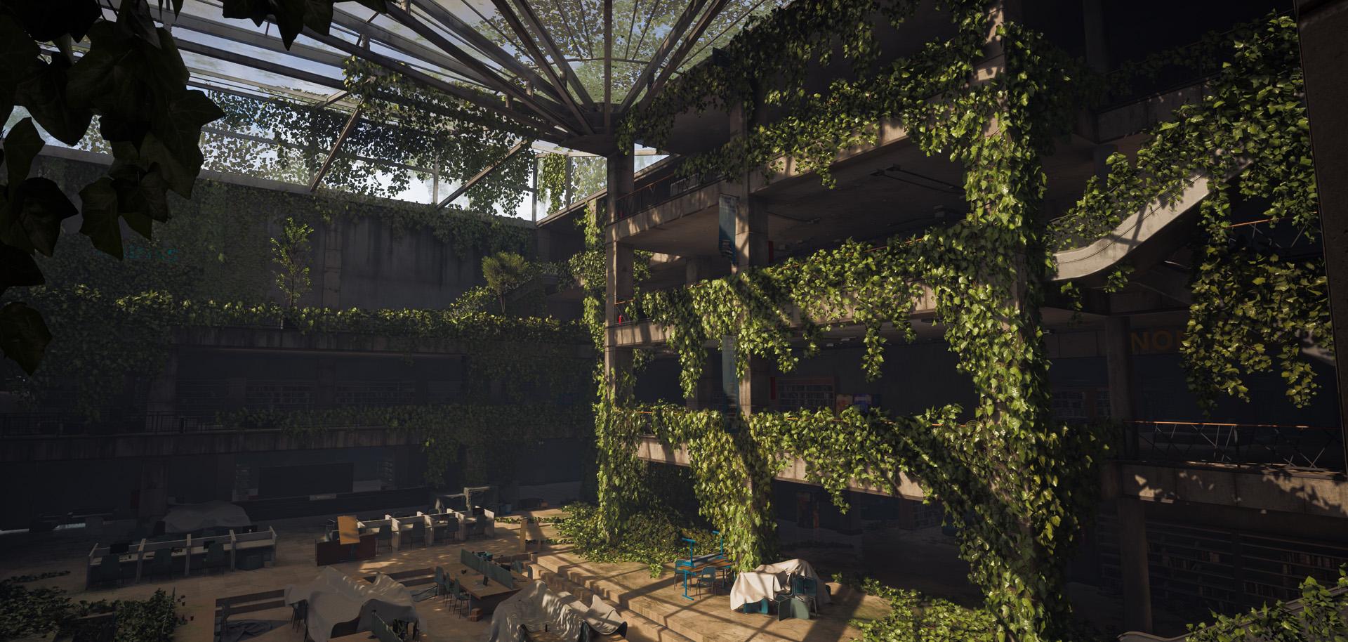
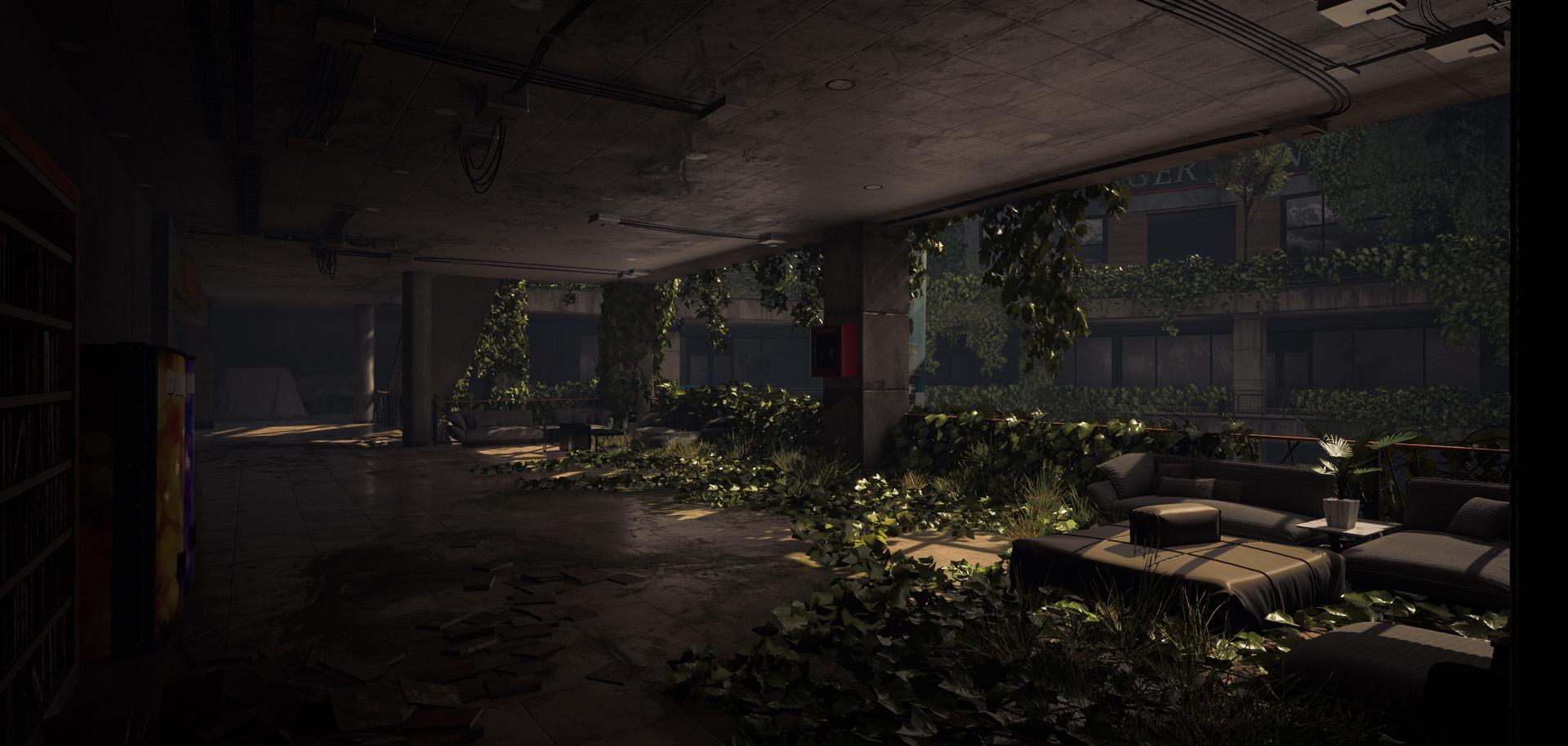
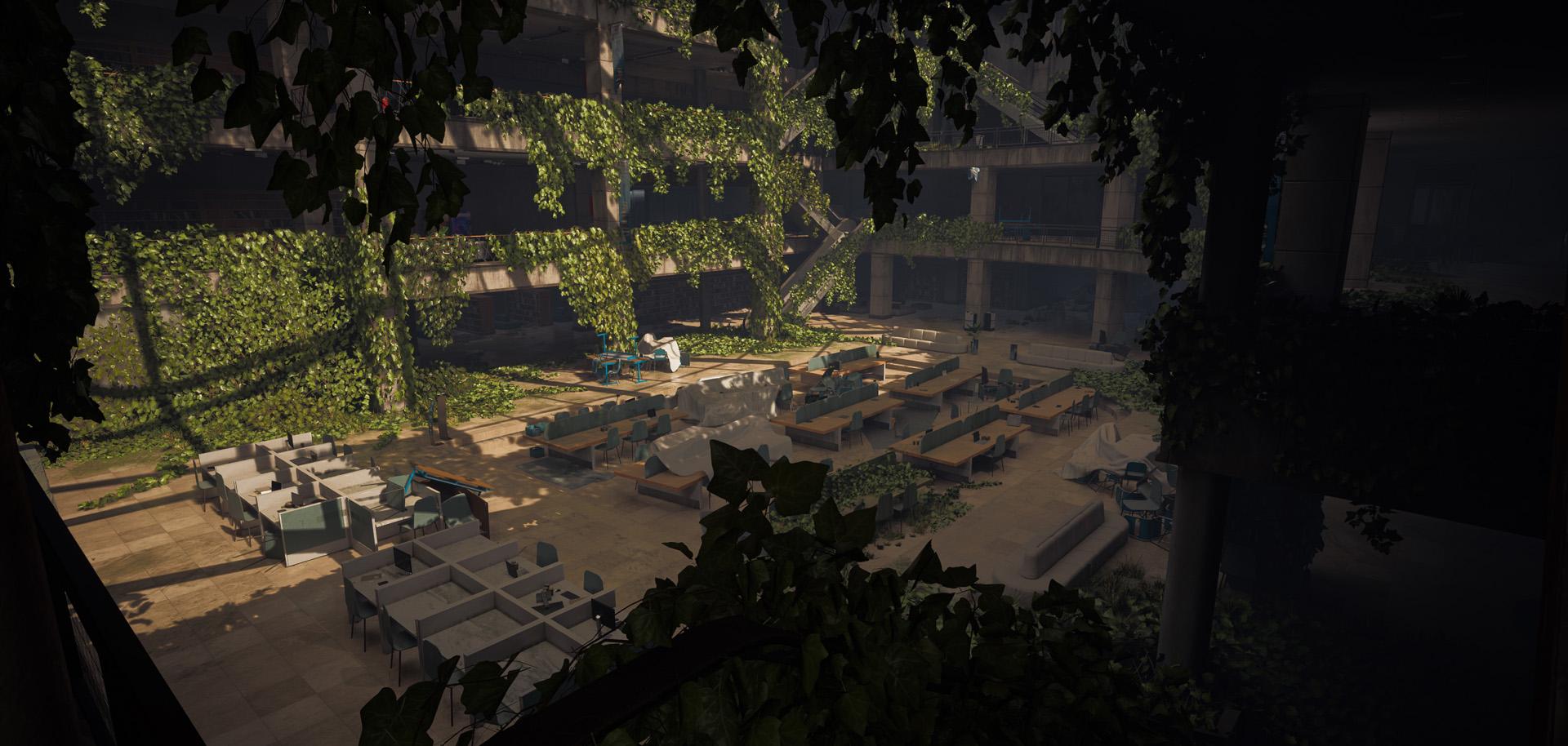
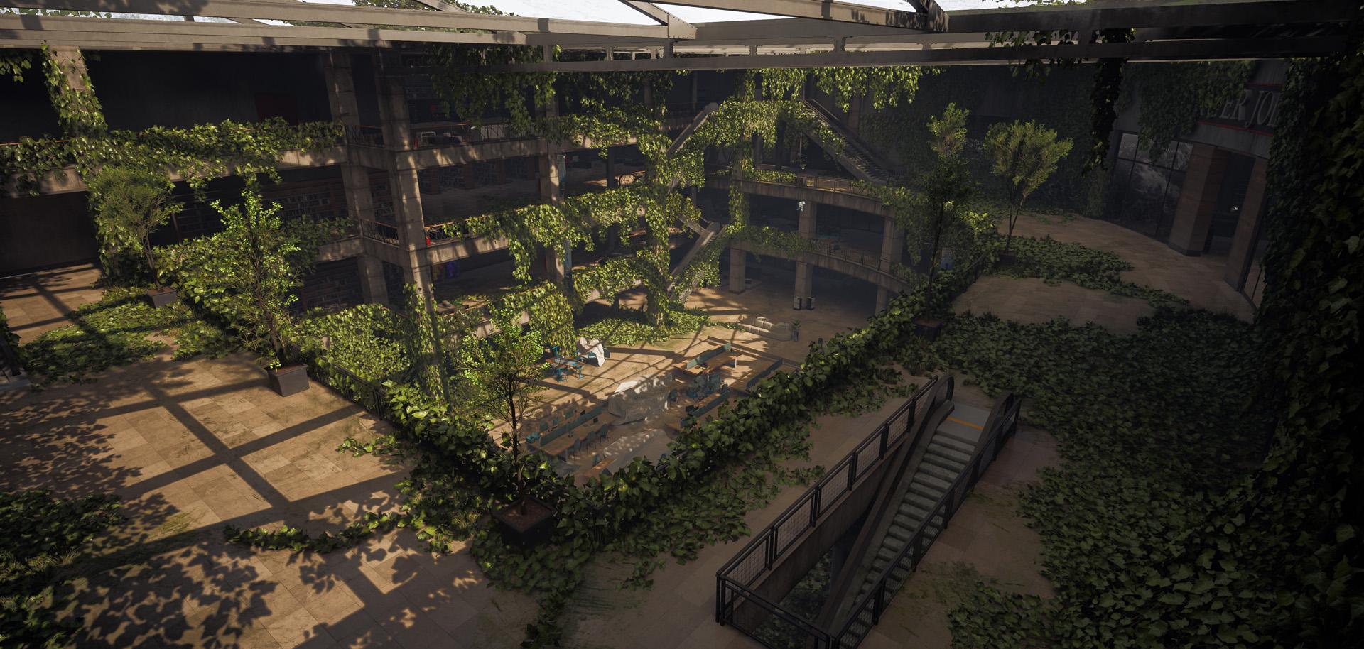
want to basically create an abandoned mall that has
been converted into a library. So what I mean with that is
that it used to be a mall, then it got converted
into a library, and then it got abandoned. So the cool thing about
this is that we can do, of course, like, a little bit
of, like, the last of us. Style, like what you
can see over here. I got a bunch of images
from Last of us, and we can combine
this with, like, a lot of clutter and
everything from, like, books and bookcase
and everything. But also because a
library has, like, fewer pops that we need to actually create compared
to, for example, a mall, a mall can have
hundreds and hundreds of props. While for a library, all of these tables and all of
these books and everything, they are really good
to fill in the space. But next this is also
because I just wanted to get more simpler interior
environments and then still have a few environments
that are like stores. So I already have a very good idea of the blockout.
Don't worry about that. Now, if we first of all have
look at the last of us, I quite like looking this or quite like using
this as a base, especially because we have this semi round
circle over here. And I think that this
can give us a lot of very interesting
looking shapes. Now, working with round areas in a environment
is quite annoying, but I like to see it as a challenge because you will
also learn a lot from it. So yeah, for the rest, we are not going to just
copy this, of course, but we are going
to kind of, like, try and get roughly the same
design in certain areas. And for the rest over
here, I also got some extra shots that
I quite like with, like, the lighting
and the library. Over here, it was just like, looking at the stores
and everything. So we are going to create
a few storefronts. Yeah, just in general, here, I quite like this kind of stuff. I just got a bunch of
random images here. Now, these images are filled up with spakes over
here, as you can see, and as you can see
in the library, it looks very full, but there aren't a lot of props. So for example, if we
have a look at here, you can see, like, a few
tables, you can see, of course, some structural pieces like
pillars and everything. Over here, I just got these
because of the entrances of, like, stores, just so
I know how to do that. Same with this one,
like some entrances, we are going to basically
use something like this for most of our entrances to keep it nice and simple. But again, this is
something that's in the blockout we will go over. So I'm just going to very
quickly flick through this. Here, as you can see, most of these are just to look at, like, the bookcases and I quite like these tables
and that kind of stuff. So that's pretty much it. We will go over this much
more in detail later on. Now, as I said before, before we go over to the
rest of the reference, I have a list over here. That is our asset list. So this is something
that I would normally do in real
time, but in this case, I had to do so much planning
that it was easier for me to just do it or
do it beforehand. So this is split up
into a few pieces. We have the structural assets, we have the props,
we have the foliage, we have the materials, and then we have additional assets. As you can see, this might
look quite overwhelming, and don't get me wrong. It is a lot of work. So this is going to be quite
a large couse, but I still try to
keep it to a minimum. So the structured pieces
is nothing special. Pieces that we would at the bare minimum need to create an environment like
you can see over here. There are stuff
like modular walls. There are stuff like
pillars, floor pieces, railings, the actual ceiling and everything, and of course, generic storefronts, which basically means
store fronts that we can just quickly use multiple times without really noticing
that they are different. And we have unique storefronts, which are going to be
very specific, like, for example, over here
we have a steakhouse. So we are also going to
have a few store fronts that are very unique
and very specific. And for us, we just
have the ground floor. In our props, we
have escalators, we have book store signs, advertisement panels,
ceiling lights, chairs and different
types of clusters, desks. We are also going
to work with tap, so we are going to have chairs
and desks that are covered with tap as if they have been stored away and
that kind of stuff. And, of course, we have our bookcases and
our actual books. So you can see a
lot of clusters. But for the clusters, of course, we do not need to
actually create our props because we already
have those props created. We just need to place them
in specific orientations. So it is not as much
as you might think. And in terms of props, I got a few images,
but of course, I might need to get
more images later on of just a simple escalator, like some bookcases, some different types of chairs to see which one we
are going to use. I think I'm going to go for two different types of chairs. Over here, some more bookcases, of these railings that we can use in front
of our store to sometimes close it
off if we don't want the player to go inside it. More escalators, more like
desks and stuff like that. Over here, even more.
So this is quite straightforward
the kind of stuff that I have and
also some banners. I think those will also be nice. I don't actually
think I added those, so I might no way there should
have advertisement BnLC. So yeah, we just got a
bunch of stuff over here. Now, next up, we
have our foliage. Our foliage is going
to be very simple, and we will mostly be using the last of us
as our reference. And luckily, for
this environment, it's almost only iv. So our foliage will just be creating a bunch of
different types of ivy that we can use to basically
dress our environment. So yeah, nothing too special. And then we have our materials, for which I basically
just looked at all of these images
and just decided how many different types of materials that
we need to create. So it is quite a
bit, but most of the materials are
quite simplistic, so they will not take that long to actually create inside
of substance designer. And finally, we have
our additional assets. This one is a
little bit special, so the additional assets are basically assets that I will be creating during a time lapse or that I got from the
unreal marketplace. The reason for this is
because I simply cannot create every single
asset that would be needed into a proper
interior environment. In real time for a
tutorial because then the tutorial would simply
be 100 or 200 hours long. It is just not possible because often interior environments,
they have so many assets. They can have hundreds
and hundreds of assets. So that's why especially for
these type of environments, you have an entire
team of probably yeah, quite a few people, maybe like five to ten people that are actually working on one single environment
while I'm trying to do it as an individual while
teaching you how to do it. So these additional items, these you can consider
almost like bonus stuff. So the time naps are
going to be bonus. And everything I got
from the marketplace, it's just going to be
desk items, receptions, office, restaurant items,
all of this kind of stuff. It will just be
bonus material of me doing like a time enabs
of placing these type of assets to basically finish off our environment and make
it look extra nice. So that's an overview over here, as you can see of
our asset list. And as you can see over here, I also got those materials. So we got some nice
polished wood. We got some tiles, some ceiling, some carpet, some plaster, all that kind of stuff
we have over here, and also some like, of
the moss that we can support for behind our ivy
and behind our foliage. And that is pretty much it for our reference
and our asset list. Now, the way that
this is going to look is we are first in the
next few chapters, going to start by
creating our blockout. Once we have created
our blockout, we are going to create
our materials after that. And then we are going
to first focus on just finalizing all of
our structural elements. Structural elements
are things like walls, pillars, ceilings, all
that kind of stuff. So the most important
thing that we need to really create this environment
and give it a look. And after that, what
we'll do is so, yeah, we will finalize it I'm going to go ahead and I'm going
to use special techniques and special shaders
inside of unwelEngine to minimize the amount of assets
that we need to UV unwrap. So I want to tie in all of our wall assets and all
of our pillar assets to go ahead and actually have those not UV unwrapped, or well, they will have a basic unwrap, but they will use triplanar mapping or
world space mapping, which basically
means that it will use not your UV coordinates, but it will use automatically
calculated coordinates. We will go over that
a little bit later. So that's something that
I wanted to write to do. And once that is done, what we will do is we
will go ahead and we will start focusing on our props. Our escalator is going to probably be the
most difficult one. The bootcases are going to be easy and our chair is
going to probably be quite annoying to
create because of the shape, but that's
pretty much it. Now, one thing you
should keep in mind is that almost
all of these assets, they are known as fill
assets and not hero assets. This means that these assets, I will show you the techniques on how to very quickly create multiple different
types of assets and just to really make your
general environment look good. However, because they
are not her assets, they will not look absolutely
perfect going up close. So they will have a bunch of nice stuff in here, but
we will, for example, not be going ahead and doing, high poly to low poly baking for everything and all
that kind of stuff. We will mostly be using
weighted normals. This is very normal to do. This This something that
is being done in pretty much every game
like last of us and everything that many
of these assets, like, Okay, so these are
baked down or actually, no, these are probably
not baked down. They just use weighted
normals and that kind of stuff to basically just
save a bunch of time. You can also see it over here. So you can see that the quality is not the
most amazing quality, but because you are looking
at an entire environment, it's basically all links together and it turns into something that
looks really nice. So, yeah, that's
something that I will also teach you that is very important to know when you work in the game industry. And I think that's about it. So I will stop talking
now for this chapter. Let's just go ahead and dive
right into the next chapter, and then we will get started
by creating our blockout. And once we've done
that, you will have a much better idea of how to create everything
because as I said before, I'm going to pretty much make up half of the stuff that
we are going to create. I have a good idea in my head of what we are going to create, but it is basically just
going to be trial and error. So that's why I cannot just
explain to you like, Oh, yeah, this is exactly how we are going to create
this environment. Let's go ahead and continue to next chapter where
we will be creating our blockout so that you can get a much better idea of how everything will be put together.
3. 02 Creating Our Blockout Part1: Okay, so, the first
thing we are going to do is we are going to create
a new Unreel project, and I will be using
UnreelEgen five for this because I've been doing that pretty
much every tutorial. Since hopefully soon
Unreellegend five will come out. At the time of recording this, it's still in Beta. Beta Beta. Yes. But hopefully soon it will become the norm
to use UnreelEgen five. And also the lighting is so much nicer in
Unreelgent five to do. So, give it a name. I'm going to just call this
um interior environment. I never like to go for too long names because
there is a limit in the amount of characters you can have in your project
location combined with the name. So always just try to keep it
short and also twice here, as you can see, I already
have a very long location. So try to maybe, like, keep
the location also short. I think it would be
quite cool if we go for a third person
character over here just so that we can
really walk around in our environment
and make sure that all of the scaling is correct. And for the rest, all of
this can stay to default, just maximum quality, and then we can go
ahead and we can press. On no way, Dex, that's
who we start the content. The only reason I want to do starter content is because
it has a glass material. So I'm just going to go ahead and I'm going to press Create. That will create the
environment for. So what we are going to do first is we are going to
define the scaling. That one is very important
for this environment. Now, this environment
is quite large. So it's not like a
interior of a house where your ceiling would probably
be a maximum of 2.5 meters, if you have a high ceiling
and maybe 2 meters, if you have a low ceiling,
that's not the case. Like you probably know here. If you look at the moles, how large these ceilings are and how large of the
doorways are and everything. So we want to kind of give
that same feeling over here. So you can see if an average
person is like 1 meter 80, this is easily like three to 4 meters high
or something like that. So we are just going
to play around with what feels best, pretty much. So here we go, as you can
see, here's our player. If you want you can press play, and then you can see
that we can just, like, walk around over here. I do expect that you know
the basics of unreal. You definitely need
it if you want to follow along
with this tutorial. If you don't, of course, just watch like a quick
introduction to Toyo. But let's set up our project. I'm going to get started by just going in my
content browser. By the way, IFMan
Content browser, you might start up with
content browser like this. Just press Dog to layout
or Dog in layout, and then you will get your content browser
in this layout. So let's go ahead and create
a new folder in our content, and let's call this
interior environment. And this folder will
basically contain all of our personal assets and textures and
everything like that. So we get right click folder. Assets right click folder. Texts. Right click folder, saves. What else do we need? Materials. Let's leave
it to this right now. So we got a few base
folders over here. Now the next thing I'm going
to do is I'm just going to go ahead and create
a brand new level, and I'm just going to make
it a simple default level. I quite like because the
default level already has some basic lighting that
I can see what I'm doing. Now, in here, I can pretty much leave everything here except for the floor.
Let's delete that. The players start.
Yeah, let's keep it also because we do want to go ahead and
use that later on. And the first thing I'm going to do is I'm just going to go to file and save my current
level and then save it. And this will already become
later on our final level. So interior environment. That's what I'm going
to call it over here. So now we have done that. One last thing that I like
to do is I like to go to settings and
project settings. And if you go to
your maps and modes, you can set your
default project. So whenever you start
up your engine, you can set this to be
your interior environment. So this becomes your main level. So whenever we start
up the engine, we will just go ahead
and we will load in this level over
here. Okay, perfect. So we got this done. Now, first of all, what I like to do is I like
to go into my materials, and I like to create
a new material. So right click new material, and just call it plain
underscore master. This will basically be
plain colors that we can control so that when we
are designing our level, we can easily give it like a more or a nicer
color to look at. So I'm just going to go
ahead and in my material, right click and add a
constant tree vector, and then convert
this to peremter, which means that we can control the color later on
and call this color. And let's make it
not perfect white, but make it like a grayish
color by default over here. And then right click or you
can do an S click to add a scalar perameter and call it roughness
and set this to 0.8, and just plug this into
our roughness map. There we go. So
that's all we need. We can just go ahead
and we can save this. And then if we are in our plain color or
our plain master, we can right click, create the material instance
and just call this gray. And then as you can
see, because this is a material instance
when you open it, you can control the color and
the roughness, of course. So that's pretty much all
that we need for this one. I think the last
thing that I want to do is I want to go
ahead and show you. Oh, wait, I actually
need to do myself also. We want to activate a plug in that is brand new
to Unrealigen five. And if you go to Edit
and plug ins in here, if you type in modeling and then find the modeling
tools editor mode, and as you can see,
it is still in beta. So it's Wi only comes
with UnleEengine five. You want to enable it,
and basically what this allows us to do is it allows us to do some
very basic modeling. These are things like
Boolean functions, things like
extruding, and moving edge and everything
on specific models. So I will show you this is Wi easy when you're
creating a blockout and you need to create
some more unique looking, I don't know, like shapes. So you do need to
restart your engines. Let me just do that
now. Here we go. So I just restarted my engine, as you can see it
loaded up my level. And now you should have Oh, where are you? Did
I not activate it. Modeling. Yeah,
yeah, I know that. Huh? Okay. Let me try again. Okay, so this time it did work. I don't know why. I don't
know why it didn't show up. But anyway, when
it does show up, you have this extra
button over here, which is the activate
modeling editing mode, which allows you
to create shapes, do stuff like adding loops, doing in general ply
editing, doing Bollians. Now, it doesn't
all work perfect. Just keep that in
mind. So I only like to use it for blockouts
and very basic stuff. But the Boolean function actually works
surprisingly well. So I do sometimes use
those on final models. Anyway, we are now completely set up to get
started with our environment. So to give me some free
range, what I like to do is, I like to just
very quickly go up here to activate
landscape and immediately just press create
so that I just have like a very large
floor over here. We will most likely
replace this later on, and I'm just going
to click on it, scroll down and just throw your gray material into the landscape material,
something like this, see. So just a massive plain floor. Okay. For scaling. Now, as I said before, I already did some planning, so I already know about
which scaling would be best. So let's just go ahead
and get started. So basically the kind of
scaling that I want to have, if I go ahead and go to create shapes and create
a cube over here, let's set my location
over here, this to zero. And this one down
here. There we go. So I'm setting my What is it? I'm setting my terrain all
the way to zero over here. Okay, so, I like the look of a clean
cube. Let's have a look. So I want the base height of my floors to be 4.5
meters long over here. And as you can see,
because it's 0.5, my snapping needs to be set to five grid points because else I cannot do,
like, proper snapping. So this is basically going to be the basic floor height that
you can see over here. So that means that I want my pillars to be
one by one by five. As I said before, I
already planned this out. You would need to experiment
with this if you want to create your own environment and see whatever works best for you. And do not be afraid to actually look up
online actual measurements of, like, default floors and
walls and everything. So I want to have
my default wall to be 5 meters over here. Yeah, I can just rotate
it. Doesn't matter. So 5 meters and then 0.2 meters. So it is just like a tin
wall, and then still 4.5. So this I want to
be my basic wall. So it's just going to be like a nice plain wall over here. Now, next to this, I also
want to go ahead and have a cylinder over here. So we are going to have
two types of pillars. We are going to have
a square pillar, but I also like to have
a cylinder pillar, and that one is going
to be 4.5 meters long. However, I'm going to
make and the thickness, so I'm looking at
my notes over here, 0.6 by 0.6 over here. So just going to be a nice
thin cylinder that we can use over here like this. So this one will also be
nice to break stuff up. And this one is going to be like the constructural cylinders
that you can see over here. This one is going to be
like the internal cylinders or constructial pillars. This one is going to be
the internal pillars that you cannot actually see, but I have a good idea
of where to place them. It is mostly like around here, because right now this
is all Cumbot but we have our floors
will not be collapsed. So our floors will
actually I want to have some supports here and there to make sure
that everything does not just collapse
into each other. So we have this kind of stuff. Now, of course, you can have railings and
everything like that. I would say that the
last one that I want to show you is going to be a floor panel or
a ceiling panel, you can choose yourself, which
is going to be 5 meters by 5 meters by 0.5, I decided. The reason I'm
making it a little bit thicker is because
also over here, you can see that there is a
floor panel in between here. I personally decide that I'm not going to make
mine as thick probably. Maybe I can make
it I don't know. Should I make it a little bit. The reason that I'm not sure if I want to make it
a bit thicker is because we are also going to
have railings on top of it. But then again, this actually seems really
thin now I look at it. So I might actually
change my mind and go for 1 meter
thickness over here. And then I will
probably also create a variation that's like a
lot thinner for our ceiling. But basically, this one is
just going to be five by five. And as you can see, this is something that you will
see me keep doing. I always try to go
for square shapes. Now, this is a force of
habit because normally, if I create UVs that
are completely unique, but they need to be modular, so they need to be repetitive. I like to go for square shapes. Of course, this one is
not completely square. However, of course,
for this environment, we will not actually be using specifically these
UVs over here. But basically, as you
can see over here, we now have this. So what I can, for example, do is I can, for
example, very quickly, just to show you, let's say that we have
a wall over here. Let's say that I'm placing
my wall like this. I'm actually going
to also replicate these dimensions inside of Maya so that I can
immediately turn them into finer models later on
so that when we place it, we don't need to replace it. If I go ahead and use these
as my blockout, later on, what I would need to
do is I would need to start by just keep replacing all of my models
and I do not want to do that. Sorry, if I sometimes
have a brain freeze, it's because I'm trying to
think because there's a lot of thinking going on in the background while creating this. So over here, we have this one, and this one is basically
going to be like sent away. But what we will do with our interior
is we will often just have pieces sticking out like this so that because you
cannot see it anyway. Of course, if you want
to go ahead and you want to make a transition
from outside to inside, you just want to make this
a little bit cleaner. So you might want to make,
like, a floor piece that is just a lot thinner
and stuff like that. But for now, let's say that
we have this one over here. We will basically
just go ahead and, like, duplicate it over here, and then I would go ahead and so I need to have a think about this because
everything changes. When I change one dimension,
everything changes. So I need to have a look, and normally I would
push this up here, but then my second floor would become a
little bit shorter. So that's why I'm thinking about this that I might want to make these pillars 5 meters, specifically, only these ones, so that they basically have a little bit of a
buffer zone over here. And if I do this now, and then this one is on
the bottom, that's fine. I just need to double
check if this works fine. So we now have
this one, and yes, so this is a little
bit sunken in. But now for this last one, what we can do is we can
move this one up over here, which should give us pretty
much the same level. So the base floor will be
slightly different most likely. Well, not, no, because I would
probably use this anyway. So, this is a tricky one. This is a tricky one because
how am I using this? I'm using this midway
at the midway point. So this is part of the testing. So right now, what I'm
thinking about is if I use this at the midway
point over here, it would become quite thick. Also, these ones can
probably go a little bit in But it might just be fine. So I might be able to
keep using it like this, but then we will have
to have look and see if the ceilings are
high enough or not. So let's say that we have
another one like this. And push it up over here. Okay, so let's say
that this is going to be like our structure,
pretty much. And then maybe at
the very top ceiling because that one
will be closed off, you would kind of do
something like this. So if this is going
to be our structure, one thing that I quickly
need to do is I just need to quickly grab one of these pieces and
just scale them. And this is just because
what we are going to do now is we are going
to go into player mode, and I'm going to see if this is actually good enough
for what I want. So I can just go ahead and
I can move this over here. And I basically now
just want to go ahead and make sure
that your players start is above your floor because as you fall else
you will fall through. So yeah, this looks nice and
grant. So I quite like that. So I think this scale is pretty good because
we want to go for, like, these really large openings that you saw over here here, see? So you can see compared
to, like, the people. These are really large stores. We also have some
smaller stores. So what I have in mind is
that let's see if we go play. So this one is fine. It's nice and large, just
like a nice open space. And then I should be able to
kind of, like, walk up here. And this one is going to be
because it's a second floor, a slightly more confined
space, but honestly, it's probably just like a 30 centimeter difference
or something like that. So that should still be fine. So yeah, I'm happy with that. And then also from a distance, you can see that it looks
quite nice and large. Okay, so perfect. So knowing all of that
with these shapes, what we're going to do now is we are going to just go ahead and dive into Maya and set up a bunch of different models like this
using these base dimensions. So that's pretty much it. These are all the
dimensions I need, because based upon
this, I also know how large my
escalators need to be. I know how large basically
everything needs to be. So let's get started
with the MllingP in Maya in the next chapter.
4. 03 Creating Our Blockout Part2: Okay, so now that we have this, it should go quite smoothly. So what we're going to
do now is we are just going to go ahead and
go into Maya over here. And once again, I do
expect that you kind of know the basics of
Maya and everything. So I'm just going to
very quickly go through my list and just pretty
much make most of these. These ones we cannot make yet. This one, we need to
wait until we have the entire environment
placed. Same with this one. Okay, so yeah, basically, we need to go back and
forth a little bit, because it looks like there's
more stuff that is unique. So first one is a cube
that is going to be one, one, five and while I'm here, five, 0.2, 4.5, okay? So one, one, and
the ZX is sorry, YXs I mean, the YXs
is five over here. Okay? So we got that one. I will place it correctly later on. Then we have this one and
this one was going to be zero point I mean, here, 0.2. And this one was
going to be five. This one, 4.5, I believe. Five, zero, so although, of course, the xs are a little bit flipped, that
does not matter. Then we have this
one, which is 551. So we can go ahead and
we can go in here and do like a C. So this one
is going to be five. This one is going to be one, and that one is also
going to be five. So we got that one
also out of the way. And I believe that that is pretty much Oh yeah,
wait, the round bill. 0.6, 0.6, 4.5 Let's go
ahead and do that one. Cylinder. It's just a blockout, so I don't need to worry
about the segments yet. So it's going to be
0.6 by five by 0.6. Was it five? You
would think, 4.5. But then again, 4.5 no longer. Oh, no way, actually,
yeah it does fit because it should not be used anywhere outside
of those pieces. So I should be able
to go 4.5 over here. Okay? So we got those also done. That looks really massive.
That's not logical. The way that these are, no way that that is so
large. Let's go sin. Let's go in here and
set the radius to 0.6 and 4.5. There we go. Now it does work, although
it still looks really thick, but we can always
change this later on. So we got these pieces over
here. Let's have a look. So what I like to do
all modular plane, I like to do like a B. So the next one is
with the bottom trim. And basically the
bottom trim ones are just the ones that I sometimes want to use just
like an extra bit of detail. It's basically just going
to be like an extra val. And then if I go down here, it's my split edge rings, so I just have a custom shelf that has, the basic
molding tools. So I'm just going to
add an extra edge somewhere along this line. I'm then just going to go ahead and I'm going
to extrude this out. That's enough for my blockout
to indicate that this one is a modular wall with
a trim over here. Modular all bend, we
will wait with it, but we are going to later on bend will specifically
at 15 degrees. Pyl square, per
square, bottom trim. So for this one, you basically just want
to go ahead and you want to duplicate the spill square, assuming that it will be
around this location, although yeah, I hope
that that is correct. Yeah, let me just
turn on my Y rim. And then you basically just want to go ahead and
you want to just set your loop pretty much on
the same level like this. And then you can just go ahead
and you can just do a loop select around here and
then do like a control E, and for some reason, it freezes a little
bit. There we go. I'm just going to
push this out to also give it a trim around here so that whenever we
have these pills, they will just nicely
flow over like that. So we got that one done, so B for blockout
there's B for blockout, there's B, Bill around. Also done railings.
Oh, yeah, okay, so our railings are
a bit interesting. What for railings are we going? So those are basically
these pieces over here. Now, the reason
that these ones are solid inside of the *** is, of course, because of
gameplay because you need to be able to take
cover against them. However, we don't
specifically need to do that. So because the solid also makes everything
feel very blocky, so I just want to, like,
have a quick look and see. I'm not going to do
glass because glass, it would not be
completely whole. It would be broken. However, that would mean that we need to make too
many variations. So for now, I can probably just use a cube and
just decide later on, but I kind of just
want Oh, yeah, here, this kind of stuff
might work, just like some kind of basic metal
or anything like that. Let's use that as like a base. So for that one, let's see. At this point, I
probably want to, first of all, place these
into the correct location. Okay, so placing these in the correct location
is very easy. So over here we have a pillar. Now, what I want to do is I just want to go
ahead and I want to, um, Sorry, I'm having braves. Go down here and translate
and set this to 000. Let me just move all of
this out of the way. We will clean this up later on. And I'm just going to organize
everything into layers because right now
they are easy models, but later on, they might become, of course, more
difficult models. So we got this one now. It's probably easier
if we just do like snapping because we
are snapping by five. Oh, let's set the
snapping to around well, actually, we do not need to
set our snapping difference. We can just set this to 2.5 over here because it is, of
course, always even. So this one would also
be 2.5 like this. And basically, so whenever
you have a pillar, so we have this one, I just go ahead and press
this little button over here, which will add a new layer and immediately assign your object. And I'm just going to call this pillar square trim. Let's do it like that. So let's keep the
name very simple. And this is also
going to be the name that we are going to
have inside of Unreal. So then we can just
go ahead and press the V button to turn it off. Over here, I can go ahead and
set this one in the center, and I can go ahead and call this pillar underscore square. And then I can
again turn it off. We have this one over here, let's set this to zero, and this one is not
going to be 2.5. Yeah, yeah, this one's
going to be a bit dent. The thing with this is that I kind of want to keep
them in the center. So for Clness that's
easy because all I need to do is I need to
go to my tool settings, and press Add a pivot
and then snap to points. Then I can snap my pivot
to this point over here. But for a square, it's always
a little bit more annoying. So we got this one. And now, oh, sorry, then
turn on snap to grid, and then you can medtly snap
it to the grid over here. So 2.0, 2.25. I could
have figured that out. But let's go ahead and just call this a circular pillow
or something like that. And walls our walls, because they are
going to be modular, we want to have the pivot point in a more specific location. Specifically, what
we want to do is we want to press at a pivot, and we want to set this on
this very corner because this will make it easier for us later on to just snap it all around. So we set it to the corner. We then go ahead
and we snap this to 000 over here, as you can see. So that later on if I just do, for example, a Shiv
D to clone it, you can see that now it does in very even snapping based
upon our pivot point. So we have this one,
so we can just call this wall on the score plane. For this one, even though we have the corner
point over here, what you want to do? Oh, hello. Where is my My entire
shelf is gone. I'll figure that out later on. I don't know. I'll restart Maya. So basically, what I want to
do is I want to add a pivot and I want to snap it
to this Verz over here, which would be the
original all that they perfectly snap
together if needed. So we got this one,
turn off add a pivot, and now you can
simply snap this one also to your grid
point over here, and you can simply
call this while on the score plane scored
trim like that. And for this one,
it's probably easiest if we also set up pivot
to this corner over here. So we are just trying to keep everything quite nice and even. So we have this one over here,
and we can call this one. Let's make this floor,
block, underscore thick. And just in case I also
want to do a shift D, do not do contras Contrave
whenever you have something in a layer
because when you do that, it will also duplicate
the entire layer. He sees, something is
going wrong with my UI, so I will restart Maya. But basically, for
this one, we can add this to a new layer and just call this floor block. Oh, no, actually, let's
make this ceiling block, underscore thin over here. And for this one, I'm
just going to set my translate to 0.5, like that. So that we also have a
slightly thinner one. So we got those ones done over
here, floors, floor piece, modular, plane, B,
the round piece, I'm going to do a
little bit later. So that's pretty
much all I need for now to already get started with just
setting everything up. So let's go ahead and save
sin and I'm going to save. And this is also going to be
our final structural pieces. So in the safe
folder, let's call this structural pieces over
here, and then we can save. Perfect. So now
all you need to do is you basically just
need to select them, go to File, Export Selection. And I'm going to go ahead
and in our source files, I will make a new export
folder that I will call to underscore Unreal. In here, you just want to basically give it
the same name as your layer because se things
will just get too confusing. So pillar square,
underscore trim. So it is very
important to just keep your naming the same all the way across so that you can easily find everything if you need to make
changes later on. So we are going to
go ahead and call this pillar underscore square. This one is way too
thick, definitely. I don't know why, but we'll see. Circular, pillar. Wow, plain. Wow. Plain. Trim. Floor block. Tick. No 1 meter still feels
really thick to me. But yeah, I'm not
going to change it. I could change it to, like, 0.8. I'm tempted to do that, but then I would need to
change everything. I would need to
change every pillar, and then the values will no longer be even if
I go into the 0.8. That's why I like to
go by steps of 0.5 at the very minimum. But rather I just
stick with meters because meters are
easier to work with. So we got all of
this stuff done. We then go ahead
and go into reel. And in our assets,
all we need to do now is we need to import
all of these pieces. Oh, God. I did something wrong. Wow, that's a rookie mistake. I actually forgot to
sell this to FBX. So when you export selection, right now it is all set to Maya, but I forgot to sell
it to FBX over here. I've never done that before. I'm just going to
pass the video. I'm just going to re export them like this with FBX turned on. Really sorry about that. Okay,
so let's try that again. So we got all of
our FBXs over here, and all I need to do now is
I just need to import them, and a few very important things. First of all, go down here
and turn on combined meshes. If you do not do
that, when we later on have multiple
different meshes, it will try and import
every single mesh as an individual mesh,
and we do not want that. Next you can pretty much
leave everything on. We can generate light maps, even though we are not
going to use them. The only thing I'm going
to do is I'm going to set my scale to 100 to compensate between
the different metrics from Maya to unreal. And then if I press Import, it should all be the same
scale as we have over here. So let's say that we
have our unreal pillar. I should be able to how to
save, go in here and see. We now have all of these pillars that are all the same size. And if these are the same size, everything is the same size. Okay, perfect. So this
stuff is pretty much done. What I can even do
is I can go ahead and delete all of this, yes. Okay. Here we go. And now what I want to do is, I think having so we are going to create
a corner like this. So I think having this corner is like a center
point would be best. So we are going to
start with this corner, and then we are going
to work from that. So let's go ahead and
in our next chapter, we will mostly be
placing around all of our different objects
and just making sure that we are creating
a proper blockout.
5. 04 Creating Our Blockout Part3: Okay, so let's go ahead and get started with some level art. So I'm going to probably
have this one open here, and I'm pretty
much just going to make it up as I go along. So as I said before we are going to start
with our pillars, I'm going to start with a pill square with a trim over here. Oh, sorry I didn't
mean to press that. I meant to press
this one so that it is exactly in the center. And by the way, can I
just quickly you guys, you can just go somewhere over there. I don't really care. Perfect. Now, having this, I'm going to get started and I am going to make an
opening like this. What I want to do is let's
go ahead and let's grab a first floor block over here
and let's rotate it 180, and I'm pretty much
going to move this. I have snapping over here
turned on and set to five just that I can do a little bit more
accurate snapping. Basically for this one, what I want to do is I want to have it end at the top like this. And then I still want to and sometimes it can be a
little bit difficult to see. I want to give it
a little bit of space in between my pillar and the rest like this so that
it probably transitions. Now, I'm just going to
go ahead and I'm going to duplicate this,
so we have this one. And then what I would do
is I think at this point, I would probably
grab another pillar. And now, for this one, I kind of need to decide how I want to do it if I want
to just have it on the end or if I want to have it into the
center over here. I think the best way to do it is because I do
want to make this double as long because it's
not really thick length, but I quite like having
multiple pillars in between. So I'm going to have another two so let's say that
we have this over here. And once we've done that, we have arrived at
the escalators, which means that this one
I need to have at the very least like this so that it ends over here because this is going to be
like an opening, which means that over here, yeah, it honestly
doesn't matter too much. I'm probably just going to
have it nicely in the center. See? Here. So it's nicely in the center, so
that should be fine. Okay, so we got this one now. I do want to go ahead
and I want to move this probably one back before
we start creating a wall. So let's do it one back, and then there is something
that you cannot see. But what I actually
want to do is I want to go ahead and
create an entrance over there because
we do not yet have an actual entrance
for our environment. So that entrance would be somewhere along this
line over here. So let's say, if we have this, I would place two here, and this is just to measure out the entrance later on so that I can basically just place a wall over here
and work with that. Yeah, that's pretty much fine, which means that I probably
want to go ahead and create one extra pillar. Probably something like
this. There we go. So it is quite thin next to it. Okay, so we have
that stuff done. And because we have
this one back, I actually need to do
the same over here. Like this. Okay. Let's see. We have over here now our base. There's going to be
an escalator here. I'm going to go ahead and I'm probably going to
get started with grabbing a plain
wall trim over here. Rotated so that we can
actually see the trim. And then this one will
later be replaced into an actual normal wall. Okay, so our plain walls, they are quite a bit higher. I can remember that they did
not have to be this high, but that shouldn't be fine. So we got this one,
and I'm just going to, like, nicely place it over here. And have two like this. So this will later on
become an entrance. For now I will just
make it a wall. And I do want to probably have some pieces like
slightly sticking over. So whenever we have
a while, I want to probably give it
a little bit of, like, a trim around
here like this. And now, down here
in this space, what I'm going to
do is I'm going to go ahead and I'm going
to crab a plain wall trim. And I'm basically going to
go ahead and I'm going to decide roughly yeah,
that should be fine. I'm going to decide roughly
how long this is going to be. So what we are first
going to do is we are first going to
create the bare bones, which everything we can
see, and then we're going to start adding
rooms and everything. But adding the rooms
and everything, that stuff comes later. So I can go ahead and I can probably for now,
just close this off. And here you can
see that we have that thing where we just need to probably, like, duplicate. So let's say that I
close things off from here up until the very end, most likely, for now. Okay, so I close this
stuff over here. I can go ahead and I can
already place another one. So here you can see
that now we have this little gap over
here to get started. So this is basically the point where I will stop with this one. I might just quickly like
one extra pillar over here. Like that, but that's
basically the extent of this. So now what I want to do is
I probably, first of all, I want to go ahead and start
building into the height, and then we can
continue from there. So we have these
pieces over here. I'm going to go ahead and pretty much for every pillar
that you have, you can simply duplicate it. And whenever you duplicate it, the piv point sometime move. And then don't forget
to set this to be a square a pillar
square over here. And we are going to
go for let's see. So if you have a look over here, you can see that this
is flooded with butter, so it does have a
few extra stories. So let's go for, like, four. Yeah, like one, two, three, four. Let's do
something like that. So this one is ground
floor, one, two, three, and four, I'm going to actually
quickly hide this one. And the only reason that
I'm hiding it is so that I can actually see what I'm
doing. So we got this one. Now, let's go ahead and let's grab probably all of
these pieces also. So this is going to be almost
like a hallway at first, and then we'll take
it from there. So this one should be
pretty much like no, sorry, it should be further
down at the base over here. Control H to unhide, and now I'm going
to just hide this. Then I'm going to
grab this once more. It feels like I'm doing
stuff randomly right now, but this because I have exactly in my head what I want to do, but it's really difficult to
convey that without simply showing you control H.
Okay, so we got that one, and then I will do
one last duplicate that will be at the top. And then once we
arrive at this point, you will simply get the
ceiling and stuff like that. So that should be fine. Okay. So we got these. Now what I'm going to do
is I'm probably going to get started which
is placing walls. So around here, what we are going to do is I
want basically have a walkway that transitions
into this area of the environment because
I simply want to be able to just easily navigate around the
entire environment. So there would be like
a walkway over here. So if I just quickly capture
one extra over here. So knowing that
there is a walkway, I'm basically going to grab, for example, a plain
wall with a trim. I'm going to place it over here. And then later on we will have stores in some of these places. But for now, let's just go
ahead and start building this. And this is why it is good
to keep all of these numbers even because now
you can see that the snapping just
works totally fine. Around here is interesting. So around here, I do not
have a proper transition, but honestly, what we can do is we can probably just place
a pillar to save time. You could make like
a corner piece over here that will
probably transition, or you can simply
just place like a very small pillar that will also look quite
nice and decorative. So we got this one. We then go over here and let me just push
this back and push this in. So this, of course,
will look fine because they simply are sinking in
or clipping into each other. Like this. Yeah, and then I probably want
to go ahead and now, wait, I'm doing something wrong. I want this to be storefront. So what I'm going to do is I'm actually going
to first get started with simply moving this
forward like this. And then later on, we will have, for example, like a store
entrance over here. But for now, we can just leave
it like it is right here, which means that
I can pretty much just duplicate all
of these pieces and I can move them up, duplicate again, move
them up like this. So now you can see
that now we already starting to get something. Right now, it still looks a lot like a parking lot or
something like that, but that's something that we
are going to fix later on. So the next thing
that we need to do is we want to have
some escalators. Just like over here, you can see that there are some escalators. So for those, and now to pretty much just
continue on with the same thing that
we've been doing before, what I'm going to
do is actually, you know what these pieces, I probably want to move them
is we are going to make the gap for the escalators
as wide as these two. So it's pretty much
just going to be here. So this is where the
escalators are going to be, and we need to have two
escalators over here. So at this point, we probably just want
to go ahead and want to create some kind of escalator.
I'm going to move this. Let's see. I'm going to
probably move this further back first to create some space. And then, of course, I
probably also need to go ahead and another
transition over here. This is already where
the bend starts. So you can see that over here, we have this bend, and I want to already
start it over here. So I don't want to have too much of this
square stuff going on, but I still need to create
something for my escalator. So if I have a look at this, I'm going to see grab this and I do not need to
have a pillar there. Let's just go ahead
and get started with creating our escalator. For this, what I tend to do is I often simply go to,
for example, Google, and I just type
in something like escalator dimensions just so that I can roughly see the
actual sizing of an escalator. Now, I know from
experience that the slope is often 30 degrees
on an escalator, but of course, in our case, we just need to make it
fit within two floors. Basically, what I want is I want to go ahead and just give me a they give me the numbers, but they do not actually give me the actual sizes, which
is a bit annoying. Around 1 meter, it
looks like, right? Yes, around 1 meter
per thickness, and then it gives probably
another 20 centimeter. So it doesn't need to
be perfect right now. I just need to get
something close. So what I'm pretty much
going to do is I'm going to use my modding
toolkits for the first time. I go up here to activate
our modeling toolkit, and if we then go to the shapes, you simply want to select a box and place
that box over here. So this box, our escalator
is going to be just beyond our pole over
here most likely. So what I'm going to do is
I'm just going to go in here and it says 1 meter, but 1 meter feels way too thin. So I'm probably going to
fake it a little bit, and I'm going to go
for 1.2 meters or 1.4. Just give more space that
people can also walk by. The nice thing about
escalators is that there are so many different
sizes and everything. And then for the height,
right now it is at 1 meter, which should be fine, I believe, for, like, the actual Ah, Willie, this one I can't read
even though it says it. Just give me something I can
read, please. That's inches. Sorry, but I'm from a
country where we use centimeters a meter
so I'm not able to actually read inches. I wouldn't know what it means. Let's just go over here
to escalator dimensions. And just go in some
of these things. Of course, that does not work. Then I'm just going to wring it. If I can't quickly find it, then I'm just going to
pretty much wing this stuff. What I'm going to do is because we can change it later on.
That's why I'm not the word. Let's say that our
escalator already starts beyond this
bend, most likely. I need to see because
I need to reuse it. And what I'm going to do is
I'm going to get started by just pressing the poly
Addit tool over here, which allows us
with this cube to basically select our
faces and edit them. What I can do is
I can go up here. I can go to Extrude, and then when I move my mouse, it will extrude this phase. And then what I can do
is I can push this up, and let's do one
more extrude roughly around say this point. And then you want to drag, and you can see that
sometimes depending on how you drag, it does
not always work. But what I want to
do is I want to go ahead and I want to
have this escalator end at the very top
like this over here. And then as you probably have
a pillar next to it, yes. So if I do this, I will
have the pillar next to it. Now the next thing I'm
going to do is I'm probably going to go ahead and
I'm going to actually, let's place two loops. If you go to loop
insert over here, it allows you to
basically place a loop. It's not perfect often, but this time it seems
to be working just fine. You then press except down here. And then if you go back
to your poly dit again, you can hold Shift and you can
basically drag these three down and you can give this
a very quick extrude. And let's just delete
these faces over here. Sometimes I also
just want to quickly grab my edge like this. So what I'm going to do is
I'm going to move this one. Much all the way down. So this is basically where the end is. And over here, I pretty
much want to do the same. So let's push this
one all the way down and just make sure
that we move it back. It doesn't need to be perfect. It's just a blockout. So we
got something like this. Now, I feel like that
these railings over here, they are way too large. But we kind of just need to have a look with our
character later on. So what I'm going to
do now is I'm first going to just push this
back in a little bit. So like this, that we
have a basic escalator, and then I feel like it's still way too
thin, but we can play. So then we can see if we
can place it along it. So let me just go ahead
and just walk over here, and it should have automatically
detected here, see. It's weighted in because people are never able to
actually walk past it. So what I'm going to do is
I'm just going to go ahead and go back to my
modeling tools, dit poly, grab all
of these pieces, and I'm just going
to move this out a little bit to give
it a bit more space. Over here. And the general idea for this is that later on, we would duplicate this. Oh,
actually, you know what? I don't like the angle.
Let's go to add the pool. Let's push this forward a
little bit more. There we go. So that seems a little bit
better. So we got this one. If you want, you
can go to materials and just apply your gray color. That's why we have the stuff. And later on, what we would do is you would have another one and you would rotate it
and you would have it like somewhere over here and it sort of
needs to match up. So if we actually
have this space, it might even be
easier for us to simply push this further back. Here, let me just grab my
player start over here. Play. So let's see. So first of all,
yes, I want to make the railings quite
a bit bigger again. So right now, yeah, we can go a little bit bigger. So this actually can
work into our advantage. So if we go in here,
these are instances. So if we change this one, the other one will also change
unless I tell it not to. And the way that you can tell
it not to is by pressing, there's like a duplicate
button here, dup over here. You can press that if you want to change it to a unique mesh. But now you will see
that if I do this. And press Apply, you can see
that that's what changes. So this is quite nice because
now all I need to do is I need to grab one of these areas, push them out a little bit, and then you can see that
these are pretty much going to align quite nicely. So if I feel like I don't want
to go any more than this. So what I'm going to do is I'm going to probably
just simply move this a little bit further in. And then what I'm going
to do is I'm going to lastly select these
bits and match them up with the other
height. Like that. Okay, perfect. So now you can see that you get these
escalators over here, and the general
idea is that if we duplicate this Over here. Actually, we only need to
have three of them like this. So then we would
have the escalators. I do want to make them look
a lot more beefy later on, but for now, this should be
fine as like a beginning. So what I'm going to do now
is I'm going to go ahead and I'm going to place an
entire pillar row. Probably somewhere along here. And yeah, I think I
want to once again have these just before here. So let's let's move this back in a little
bit so that it is basically sitting
against the escalator so that people cannot fall in between or
anything like that. I'm going to have
this Yeah, before it. Like that. Okay, good. So that kind of fits. So we got that stuff done. Now, if we have this one, we probably just
want to go ahead and still create the same floors. But that's interesting.
So this floor over here, it will not have an escalator. At least it will have the
escalator on this end. And then this floor over here, we'll have another escalator. And then once we've done that, it will basically just
transition into our ceiling for which do I want to make
my ceiling like thinner? I feel like that would
probably fit a little bit better if we select
all of these pieces. Go to assets and grab our
ceiling block tin over here. If for some reason, I feel like that would look a
little bit nicer. It does mean that over here that we have a little bit more space, but that might look
more interesting. Then simply duplicate
this over here. So I hope you can
slightly start see where I'm going at
with this stuff. Here we go. See now we
have an escalator thing. At which point we can just go ahead and we can select, Oh, these ones are slightly
different in placement. That's okay. Then I'll
do this one separately. And I probably just want to
go ahead and turn the corner over here. Like that. So yeah, this one would
just turn the corner. And these ones, we are just going to go ahead and do all of
them at the same time. And after this, I will
probably call this chapter done. Here we go. Gift also in corner, but later
on what I need to do is I need to start planning
for, like, the circle. So I don't want to go too far
with this. But there we go. Okay, so now that we have something like
that, there you go. You can see that that already starts to look
quite interesting. So in the next chapter,
what we will do is we will go ahead and we will just
continue with this blockout. I don't know exactly where,
but we'll figure that out.
6. 05 Creating Our Blockout Part4: Okay, so let's go
ahead and continue. So before we go
ahead and we start moving on with
planning over here, the half cylinder or circle or whatever
you want to call it. What I want to do is I just
want to use this one as like a little prototype to show you how we are going to
do everything else. So first of all, I just want to quickly change
the escalators, and then I will show you how we are basically going to divide up like the actual stores and how we are
going to kind of, like, manage those things. The reason with the escalator is because it just doesn't
look very beefy, and I think it is
because over here, it just doesn't really touch. So instead, if we go
to our modeling tools, it might just be as simple to make it look a
little bit better. Oh, I added segments. In that case, I need to
select a little bit more over here and also over here
to select these pieces. And hopefully we
can just carefully, move those down a
little bit like this. So now they definitely look a lot thicker than if I
press supply here, see? You can see how something that small actually makes
quite a big difference. So we got something like that. Now, let's go ahead and let's
have a look at our stores. So I think let's see
yeah, we got that stuff. The railings, we
still need to do. Did I ever finish those? I did not finish the railings. Oh, Oops. That's awkward. Let me just quickly go
ahead and fix that. Here we go. So
railings are often I'm going to make them the same size as over here
like our panel. And they are often at desk size, which is around, shall we say, like 65 centimeters, I believe. So we can just
takes like a base. So what I'm going
to do is I'm just going to go ahead
and create a cube, and I'm going to keep
this quite simple. So let's just grab
this cube over here. And yeah, I'm going to do this, like super dirty
right now and just very quickly without even
any snapping or renting. I just want to quickly
create a railing, and what I'm going to
do is I'm just going to pretty much
move it like this. So basically just
have a cube and then I will just duplicate it to
the correct height later on. So let's go ahead and do
the same thing over here. So if it would be on the floor, let's say
that we have this one. What I can do is I can just quickly create
another cube and set the Y axis to 0.65. No, is that correct? It might actually be
correct because I'm looking at this in a really
strange perspective. So yeah, that might
actually be correct. I might just be making
this way to tick, so I might just
want to, you know, let's say, tone this
one down over here. And then pretty much
just go ahead and maybe, like, have another one like this and then have
a ticker one down here, just to kind of, like,
give the most basic looking railing ever over here. Maybe move this up a little bit. There we go. That's honestly all I need for like a blockout. So I can artist you a new layer, call this railing on score 01 in case I need
to make more variations. And all I need to do now is
I just need to kind of move this down here and more in the center because your pivot point will always stay at 000 when you export to unreel. So we can just go ahead and we can Export is railing
underscore 01 and export. And now if we go into unreal, all we need to do is just
do a super quick import over here. Should all be fine. Perfect. Now we can
go ahead and we can use those over here,
just like that. Yeah, see that looks
fairly logical. We got these ones over here. The snapping still works,
so that should be fine. I should be able
to just use this. Maybe I want to snap it like
a tiny bit higher for now, and then I can
just go over here. Now, as you can see over here, this always becomes
a little bit tricky. But what I tend to do is
in these type of cases, I tend to just have
them going inside of our pillars and later on, I want to do a bit more
precise placement, but for now, I'm just
going to do this. And honestly, it's just
because it's easier to just very quickly
place something like this compared to me doing
perfect scaling already because I don't yet know what my railing is going to
specifically look like. So it's not always good. Am I Okay, I'm good. It's not always good to go super precise right
away because you might just end up
wasting a lot of time but you will need to
recorrect later on anyway. So over here, you can see me just doing this,
quite quickly. I'm not too worried if stuff is clipping into each other
or anything like that. We have this one. And I don't want
to do those yet. So what I can do is I can
already quickly grab these, and I might change my lighting after I've done
this so that it becomes a little bit easier to just view this because
I can see that I sometimes have a bit
of trouble correctly, reading out if I'm
already here, see. Like this, it's
really difficult to see where exactly
the flooring is. So for that, it is as
simple as going down here. And what we can do is we can, first of all, I will
clean this up later on. So we can first of all
go here in our light this one and simply go ahead
and play around with it. And often if you set it in
a little bit more shadow, it will look a little bit nicer. And another thing
that I'm going to do is I'm going to go to create visual effects and add a post process volume. We
will need this later on. But for now, all you want
to do is you want to scroll all the way down and
turn on infinite extent, which means that it will just always wherever you
are in the level, it will use this post effect. And then if you go to exposure, you want to take on
exposure compensation. Minimum and maximum, and this is the stuff that when
you look at it this and then you look
away that you can see that the lighting tries to adjust based upon
where you're looking. However, I want to
have full control, so I like to set this
to zero and zero and then push my exposure
compensation down. So now it doesn't
matter where I am. I will always stick with
this kind of exposure. Yeah, you can see when I
look at it from the inside, it's already starting to look a little bit
more interesting. So we got these railings over here, that's
all totally fine. And then when you have
these pieces over here, this is mostly the reason why I was making these railings. Because, of course, you do
not want to have people falling down from the escalator. So that's why the railings
would be very vital here. So we can make railing here, and then another one over here. And yeah, let's just
leave it like this. I honestly, I don't really care. And if we then make another one, I just need to
have a quick look. So this one, oh, nice. So it actually ends quite
naturally at those ends. And then I can pretty
much just grab these three Keep duplicating them over here and just keep switching
this one around to the other side and do it again. And then for those ones, this is a special case,
this one over here. What I need to do is I just need to go ahead
and give it like one tiny end down here, for which for now, what I'm going to do is I'm
just going to scale this. Later on, I'm going to use a wihacky technique where I will probably just
boolean it out. So I will literally
boolean a final model. So let's turn off
scaling so that I'm just going to cut it off
because it will save me literally creating
an entire new model. And I like to save time,
especially when it comes to this kind of stuff because
I don't have a lot of time. But yeah, okay, so the railings are done. That's
all pretty cool. Now, let's get started
and just decide where Whoa. Brain freeze. Where that we want to
have are actual stores. That was way too
difficult to say. So what I like to
do I already have, like, something in my mind. We cannot just push
stores everywhere. If I literally go like,
Oh, yeah, store here, a store here, a store here,
it doesn't make sense. Few reasons. One,
it's a library. And although it is a mall
converted to a library, and the second one is that it
would be way too much work. So instead, what I want
to do is in these areas, I want to almost
have like sections. So what we're going
to have is we are going to have things
like for example, fiction section, non fiction. Then over here, you
can go, for example, like documentaries life advice, blah, blah, all
that kind of stuff. And for example, kids. So something in that direction. So we will have basically one floor for every
type of thing. It's almost like
a clothing store where you have the
men's section, the woman's section, the kids
section, stuff like that. So what I'm going to do is
I'm basically going to create the holes of where I want to have the entrance
to those sections. So the way that you can imagine it is and you need
to keep doing this. You need to keep
imagining, like, how would this
work in real life. So the people come in here later on they will see like a really nice environment and everything, and they see like over here, they see like restaurants, so you can, like, sit
and eat and everything. And then they're like, Okay,
I'm going to read a book, and then you have,
like public places. So you have some seatings here, and then you come in here and you basically walk
in here and here, for example, have completely filled with like fiction books. And it's just like a lot of stuff that you
can browse around. And then you're like,
Okay, I'm going to go up the escalator, and then over here, we can, for example, have, let's say, around this area maybe over here or I don't know is two enough, or
do we want to go three? Yeah, over here, we
can go for like, Okay, so here we
have another one. And once you've done that, so you can walk up here, and then you can go up here
and go to the restaurants. Or what you can do is you
can go another floor, and you say, Okay, so there's
another topic over here. And for this topic,
what I want to do is I probably
want to go ahead and maybe make it like I'm looking at I'm looking at my
reference, by the way. Sometimes, that's why I pass. I'm going to make this
like a very large area, and let's make this
one, a small one. So these are just
going to be like small stores or they will have, like, a gap that
you can go inside, and then it will become
a little bit bigger. And then over here,
I just wanted to have a very large area. I'm going to make this
like a lounge area. So stuff where people can sit where people can use
computers, that kind of stuff. I think that would
be quite cool. And then over here
at the very top, we will have just like
a simple little store two. Yeah, that should be fine. So a lot, two. You know what? Let's do three
after all. So there we go. So we basically have
something like this. Now, what I'm going to
do is for the entrances, we might want to make those
entrances sort of unique. However, for now, what I
will do is I will just make them as like
a quick blockout, which means that I'm going to go in my modeling tools and I'm going to create
a very quick box, and we are going to be able to reuse this over and
over and over again. So let's set the
scale to 0.8 by 0.8. And this pillar over here, it's just basically to block out the transition so that we can make a nice
looking transition. I'm going to go to ply did
and I'm going to move this up until around this
point over here. And then what I
had in mind is to, like, give it almost
like an insert. I go let's go into my loop in and give it an even insert and then maybe also give it like something down
here, pre accept. Then if we go back to apol
did, we can extrude this out. See? So you get kind of like something like this over here. Yeah, that will work quite well. Yeah, I think that will work quite well. So we got this one. Now what I'm going to do is I'm just going to go ahead and maybe quickly give
the gray material, duplicate it and rotate it 180, and then simply place
it on the other side. So yeah, you can see that we
can make bigger entrances, and the bigger they are, the more pillows we
will have in between. And right now, doing
the whole stuff like merging and everything
is not very handy to do inside
of this program. So what I tend to do
is I tend to just go ahead and kind of clip them in, select both of them,
and then press append, which will basically turn
them into one object. So if I press apply, you can see that now
it is one object. So having this piece, if we would go ahead
and duplicate, Oh, my walls are slightly off. Not that that really matters, you won't be able
to notice that, but I don't know, it's something if you
want, you can fix. But basically, let's go ahead and push this all
the way up like this. And then here it just
becomes another entrance. And then for this one, this is very important with
your modeling tools. As I said, it's instant. So what you want to
do is you want to press duplicate up here, and then simply press accept, and now it has become
its own model. So now if I go up here and
I select all of this stuff, I can simply push this
further in like this. And then what I
can do is I can go ahead and if I
want, for example, place another box over here, 0.8 by 0.8 by what was it 4.5? Oh, no, four. Over here
and then just kind of, like, make sure that
it is on one line. And then it is as simple as just kind of moving
in the center. Sometimes a bit
difficult to see. But this is something
that I will properly measure out later on. But having this one,
what we can do is we can just go ahead and we can
also do an append on this. So now we have two types. This is a really large room. I want to have full
access to that room, so I'm going to use this
one so that we do not have any interruptions when you
walk through this doorway. So here you can see
that I'm just kind of like moving this over here. And now what I can do is I can go ahead and I can
push this back, press duplicate to turn
it into its own model, Polly add it, and then it's
as simple as grabbing this. So these new modeling
tools, they are super easy. They still need a
lot of work, but they are actually
really powerful. I'm only showing you
a fraction of it, but you can do a lot of stuff. It's just a little bit
slower than, of course, doing it inside of, for example, Maya or something like that. And then I'm going to basically duplicate it one
last time over here. And that's pretty much it. So my idea is that we
have these pieces, and this one is, like,
a little bit higher. So you know what? That might actually will
that cause problems? Um, no, it will not cause problems because I'm only
using it on this store. So the only problem
would be that this one would need to be
slightly altered. But it will look
nicer for our ceiling compared to having a really
thick piece over here. So it will look
nicer for sealing, so I'm just going to
leave it like this. It might not make sense what I'm saying right now, but trust me, it will later on because I've made stuff
like this before. Not this exact thing, but
I've done for the division, I've done, like, a lot of
sealings and stuff like that. So there we go. So we basically now got all
of this stuff over here. And now pretty much
what you want to do is you simply want to go in and decide how large
you want these stores to be. So for example, as you
can see over here, you don't have to
place this while here. You can just go ahead and you can place it, for example, like, let's say that I place it
over here and I say, Okay, I want this area to be quite thin and you can just map out
whatever area you want. Now, in our case,
most of these stores, I think I will only
have one or two stores that I will actually
properly decorate. So these stores they will just
have a bunch of bookcases, but I will on purpose
not have any lights on, meaning that it
will just look very dark when you look inside. I'm doing that for this one because it
is the ground floor. It's not really a floor
that you will notice. You would often just
want to make shots from, like, higher angles and
everything like that. So with this one,
what I can do is I can just keep it like a nice, small room over here. Like that. And then it's
also just a matter of just grabbing your sealing pieces, and we need to have these
anyway because of this store, so we can pretty much
just continue on. Here we go to the
point that you prefer. And then you simply want
to go ahead and you want to place them here. Which will give us
a lot of depth. So you can definitely see if you also want to
make the outside, the transition works
exactly the same as this, only you want to
make it, of course, a nice doorway transition. And then on the outside, you
would just build your walls around this area to not merely show that
it looks like this. So that's pretty
much how you make a transition from
inside to outside. You can also look on my
YouTube if you want to have a better look at how to
make those transitions. But here you can see that it
just looks very dark inside, and that's exactly what
I W. So just like that, we can basically
create the store, and we just need to
go ahead and we need to continue on doing that. But this chapter is almost done, so let me just
quickly do this one. And I'm going to make
this one. Let's see. So let's do this to be
like the kids section. Then over here, we can do, like, probably like fiction
or something like that. It doesn't really
matter too much. Like, you want to have
logical locations in it. But one thing you
need to keep in mind is that I'm doing
this for a tutorial. If you are doing
this for a game, you can really go super
detailed in the planning with, like, entire blueprints on like, Okay, so where is the fiction? Why is it in that
location? Is it? Because often fiction
will be close together with non fiction and
all that kind of stuff. The only thing that I will
be doing is later on, I will just have a simple text
over here that just says, like, non fiction books, for example,
something like that. And it will just be like
a cool treaty text as if they just quickly place a text on to indicate
where to find what. But this is something that
you will see later on. This comes way later when we are almost done because
those things are not very important to art. They are just very
small details. But as you can see over here,
I'm just making this one, a little bit bigger like this, double check that this does not happen where it
accidentally clips in, and if it does, it is
always better to clip towards the outside than
towards the inside. And now it is just
a matter of once again grabbing this one. I can have maybe some lights on. I will most likely need
to have some lights on. Or what I can do is I can maybe, create a ceiling light
or anything like that, but that would not really
make too much sense for a multi story building because they expect there to
be another building up here. So if I want to have
a ceiling light, it would need to be
on the top floor. I cannot just give the bottom floor a
random ceiling light. The reason I say that is
because of this stuff, see? Where you can see, like
a nice ceiling light. It looks really cool. But we need to figure out where
to actually use it because we will most likely be getting most of our lighting from
this roof over here. But as you can see, these two
are now pretty much done, and what we will be doing
is in the next chapter, we will just map out
this one and this one, and yeah, then we will just go ahead and
continue on with that.
7. 06 Creating Our Blockout Part5: Okay, so we're almost done. Let's go ahead and just
quickly finish this one off. And yeah, actually,
for this one, we can once again just kind
of leave it over here. It also sometimes makes sense when you have the walls on like, roughly the same location because then it will feel
like it's a support wall, like it's also going to be like the outdoor wall over here. In English, you often call it load bearing walls, I believe. Yeah, load bearing walls, which basically means
so you often have two type of walls in a building. You have the normal walls, which basically they do
not hold a lot of weight, and you could knock them down, knock them down without actually
destroying the building. And you have load bearing walls where if you knock those down, then of course, the building
has a chance to collapse. So it is nice to know that there are these two
different ones. And often, what you see with multi story buildings is that if it is a
load bearing wall, the wall will be on the same location on
every single floor. So there you go.
That's a little bit of advice that I did
not even learn. During the D. I learned that because I was renovating
a house one day. So that's how I learned that trick. But it
is good to know. So you just know that if you want to have a
load bearing wall, that you would need to continue that wall on multiple
different stories. The only thing that I
cannot tell you is how to identify which ones are load bearing by
looking at an image. I think that would
be very difficult. But anyway, for us, we don't need to
go that complex. We can just go
ahead and go here. And then this one I will
make like super small. I will make it like
go here and maybe, like, just move it
down a little bit. But for now, go
ahead and do this. Want to double check?
Yeah, that's correct. See how many use cases all of these things
have like this one, for example, over here. So what we can do with
this one is for the top, we can just make it
like a concrete, and then from the bottom, what we can do is because this one will always
be at the bottom, if we can just make it like office tiles or just
something like that. So that will be quite nice. Now, last one, what I'm
going to do is I'm going to, let's have this one over here. I think that would be
nice to at least have one of them sitting like this let's just only
do it like two. As I said before, I just want to make this one quite small. Let's only have two of
them, push them back. And then this one is just
kind of like going in here, and that's pretty much it. Doesn't need to be anything too special because most
of these stores, I will just do some
supergeneric lavarte. I'm just going to cheat a little bit and
just move this down. So most of these stores, I'm just going to the
super generic Levart which means I'm just going to
place like a few seatings, a few bookcases, and
just leave it like that. Because right now I'm not
so much focused on having a full on environment.
1 second, sorry. On having a fill on environment that's perfectly welcable
and you can go in every single room and
everything will look perfect because I simply do
not have the time for that. This is where I'm saving
a little bit of time myself just by making
it a bit easier. Whenever I have
something like that, it feels a little
bit overkill for me to duplicate the entire ceiling when I can just quickly move
it forward a little bit. See? And there we go. So as you can see, it
looks really nice and clean as a blockout.
That's great. Now what we're going to do is we are going to probably get started with the difficult part, which is going to be this part. So we want to go ahead and
we want to get started, creating almost like
a bend like this. And the first thing
that I notice is that I do not
have enough space. Like, one of them is not enough. I want to probably
have at least two. So what I will do is
I will just go ahead and make these walls
a little bit larger, especially because I want
to have escalators here. So with one of them,
I would not even have proper space for like an escalator and
then still space for people to walk. So
let's just do this. Um, the bottom one. Yeah, you know what the
bottom one we can leave. That might actually
look a bit interesting, having like a
shorter area or not. No, wait, no, wait, sorry. Because I want to
also have openings later on on the bottom area, so I probably just want
to keep it like this. There we go. And same over here. There we go. Season
now, at least we have quite a bit of space to just walk around so you can go here. And now this area is
going to be restaurants. So we will have the semicircle, and we are going to
have restaurants. This area is going
to be like all of the books the bookstores
and everything. This area over here, it's just going to be
like some general stores, and for the rest, it's just going to
close off the building, so it will not have
anything special, many flat walls and just like
some lights and everything. And then, of course,
in the center area, I don't know yet what
I'm going to do. I think what I will do
is I will just do like a communal seating style
thing, something like that. So this where people can sit and study and like what you
often see over here. It's just going to be like this. So just like one
of these things, maybe like an information
desk or something like that, but that will be in a
time laps if I do that. So yeah, this is pretty good. Now, let's get started
with this one. What we're going to do is we
are basically going to go ahead and we are going to
start with the semicircle. Now, the first thing
I want to decide is if I want to probably
make this go straight, once more to give myself
a little bit more space. So if I make it go like
this over here, see? Because if I go already
as a bend over here, everything becomes a
little bit more crammed. If this one would already
be like this, for example. Yeah, I can't really
show you right now because I don't
have the proper model. But if this would
already be like this, you can see that when
you walk in here, it just feels wrong, like it is really crammed and
I don't like that. So instead, we have this. And now, what we're going
to do is we are going to go inside of Maya over here. We are going to grab
our floor block tick. And actually, that makes me
now think about something. So that means that we would also need to create a
floor block tin. Yeah, that should not be too much work to create two of them. So we got this one.
It's duplicated artist to its own layer
and just call this floor. Oh, Block. Come on. Sorry, my keyboard
is being strange. Tick underscore bend. Over here. And now what I want
to do is five. I want to set this
to No, not this one. I always get confused by which
axis I need ten over here, so that they are too long
because we made them too long. And now what we want to do is we basically just want
to simply bend this. Now, you can decide on how large you want the
angle of the bend to be. I already know because
I did some testing, and I want to have
it be 15 degrees, a bend of 15 degrees. And basically, the
larger degrees, if you go, for example, 25, the smaller
your bend will be. So 15 degrees will get it like
somewhere along over here. And then, for example,
if it would be 25, it would be a lot more curved. If you would only do five, you would get a
much larger curve. So I found that 15
is the best one. Basically, for this,
you simply go to Edgemde and you need to add a
bunch of seconds over here. You can do this simply by
going Tata to here connect, or you can find it in your mesh tools and
then here connect. And I'm going to go
for, like, yeah. Actually, this one will most likely be turned into
final right away. Probably, I don't know. Maybe not. Maybe we
will just duplicate it. So let's leave it at ten.
I think for the final, I want to have more
segments, but we'll see. So this one is going to
basically bend like this, so we only need segments
on these areas over here. And now it is as simple
as grabbing a band. So I have it in my custom shelf, but you can also go to deform non linear and
grab a band over here. Let's start by setting
the curvature to 15. Then you want to set
your I believe it is the high bound to zero,
almost low bound. Set the low bound
to zero over here because we don't need
anything like that. And now we can see
that you can freely move around this
band transformer. What I'm going to
do is I'm going to snap rotate by holding J so that it is exactly
90 degrees like this. And then what I'm
going to do is I'm going to snap the points. Or, actually, no, let's
do snap the grid, and I'm going to snap it
to the grid over here. And then just to be sure, let's set your high bound to two to always make sure that it
bends on the entire line. And here you can also see
that if I set my high bound, for example, to ten, you
can see what happens. So you can see that we are
slowly going to bend this, and then we hit another point where it is simply
straight like this. So with this bend, that's pretty good already. We have the bend, that's fine. Now, pretty much at this point, I personally like to just
keep it exactly as it is, and then I do a little trick down here to turn it
into a normal floor. However, that trick
will come way later. For now, this is already fine. We can just go ahead and we can grab this and I do want to not remove my history because I want to keep my
bend on here for now. I'm going to export this, call this floor block tick bend. And I will basically show you how this is going to
look. So we got this one. So now if we go back
into real over here, we can go ahead and
grab our folder assets floor block thick pen, and just input it like normal. So this is basically how it's
going to look. Let's see. I'm going to actually first
of all, make a change, and that is that I want to
have this one end over here. And the reason I want
to have it end over here is because I'm going to
actually have an escalator. Going down here to this level because what
I like to do is a little bit of the
same as what you can see over here that we
have higher levels. So you can see that this
is like a normal level, and then the last level, it will not have a third story. It will just be
like really large. And this will give us
a really nice breakup because if we make
everything like this, it will just look like
a parking garage. However, if we break
it up like this, it will hopefully
look a lot better. I'm going to go ahead and
I'm just going to push these out or in to make them
look a little bit nicer. And I will, of course,
later on, also have a pillar sitting over here. There we go. And pretty much at this point, what you want to do is, let's say that we duplicate
this piece. I can then go in and I can go four block tick bend
and looks like it, I just need to rotate
this 90 degrees. Move it back, and as
you can see that will be a perfect fit like that. Once we've done this fit, now it becomes a little bit
trickier to place it. Basically, all you need to do. So let's set this
rotation to 270. Is you need to go ahead
and duplicate this. Then you want to rotate
it by 15 degrees. You can see that I have
snapping turned on. My snapping angle is
set to ten degrees. So what I'm going to do is I'm going to go down
era set this to five, and we want to just
basically rotate it by 15 degrees every single time
so that it properly aligns. And then what you want to do is you basically want to go ahead. Oh, it doesn't matter if I height my floor.
It's still dark. 1 second. Let me dark gray. Yeah, let me do
something like this because the floor is a
little bit too bright. So See? Here, now I can properly
see what I'm doing. Okay, anyway, so what I'm going to do is I'm going to
basically move this close by, and then I'm going to hold V, and what you can do with V
is you can snap to vertices. And then often if you click
once, it will already snap. So here you can see
that I can snap to the vertices of
my other model. This is once again,
one of those times where it is great
to make a blockout because imagine if we have ten times more vertices here because we already
turned this to final, then we would not be able to properly do snapping like this. So we can now go ahead
and we can duplicate this, move this close. Rotate it by 15 degrees
and press V to snap. And we can just keep doing this until we basically
have a semicircle. 15 degrees, V, snap 15 degrees, V and snap I think
we need one more. 15 degrees. V and Snap. Yeah, see, and now we have arrived at the end
point over here. And if you want, you
can even test it out by quickly grabbing
these pieces over here, and they should still all snap because we've done
this really evenly. So we should be able to
just simply rotate this. There you go. S and still properly snap it all
the way along here. Oh, no, wait. There's
the tiniest change. Well, if there's a tiny change, all we really need
to do is just for this one. I am rotating this. It's kind of dangerous
to rotate it because you never know how
your UVs are going to behave. But because we are going to
probably use WorldSpace UVs, it doesn't matter, and else I will just rotate
it back later on. But basically, as you
can see over here, this now works correctly. And then at this point,
we would go ahead and do this probably in
the next chapter where we will create
this area over here. But for now, all I need
to do is I need to grab my floor over here. Duplicated. Sometimes a bit annoying
where the pivot point ends up, but it doesn't
matter too much. And because we have snapping
turned on, it should snap. Come on, see, it's really sensitive because
of the Pivooint. There we go. See, I should snap correctly. And there we go. Now we have a semicircle
in our floors. And what you can do then is you can just do like a
quick play and just see. Yeah, see, that
looks really large, so I'm totally happy with that. You know, I can go up here
and you can see that. It is, like, a nice semi floor. And then over here, there
will be closed stores. So there will be
stores over here or like book sections
and everything, but you will not actually
be able to go inside. They will just have
reflective glass on them, and that's basically
like a time saver. And you can see over
here here, see, it starts to look
quite interesting. And then if you go down here, there will be really large
restaurants, one of them, or two of them, I
will probably open up or maybe more.
I don't know yet. And yeah, you can walk
here, and then of course, you will see the side of the building here and
that kind of stuff. So that is starting
to look pretty good. I'm going to go ahead
and I'm going to duplicate my escalators because this is quite an important part. I'm going to have my escalators
basically also over here so that people can go down
from this floor to this area. Now it's always a little bit
tricky over here because we are already sitting in the
bend with our escalators, but it should not be too bad. If you just place this quite
close to the wall over here, and I duplicate this,
I'm going to have a double escalator
like this. See? That's looking pretty
good. Don't know if it would be nicer if
I like the darker. Color? No, I think I'm just going to change
my gray a little bit. So I like to always play
around to this a little bit. I shouldn't do that during Adil. But it's like peace of mind, just to play around with some small stuff like that sometimes. And then, of course, over here, just to make sure that people
don't actually fall down, you would go ahead and
you would like This one, you can probably even place in the very front over
here if you want. But that's something
that we can look at. So just like that,
as you can see, we have done that piece. Now what I'm going to do is I'm just going to go ahead
and I'm going to see duplicate these three. Oh, and then this transition.
That's interesting. At this point, we are
finally going to go ahead and actually, no, we
can leave this one. I'm going to
transition this to be a wall plane over here. And then what I'm going to do is I'm going to probably move this down like this. And I will have probably like I will probably embed this
into the ceiling, the way that this
looks over here. So now, with this one, I might just carefully
like scale this, let's see, to snap
scaling and like 0.125. Like that, something
like that. And there will probably be like a
trim going all the way around here when we
create our ceiling because our ceiling is
going to be unique mesh. So that's looking
good. We got that also done. Now,
let's have a look. We need to create
some back walls over here to also
go along with this. But yeah, this is
looking pretty decent. I'm going to probably go ahead and let's make a
circular pillar. Yes, this one is way too thick. So I was correct with that. The dimensions do not
properly pot over from unreal to Maya, in this case. But basically, what I'm going
to do is I'm going to have two support pillars over here. I think that will look nice. And then if we
quickly go to Maya, we can go in here, and I'm just going to kind of scale this in. It doesn't need to be like a super even number or
anything like that. So here we have our
circular pillar. Export. Right, click
Rimport. There you go, see. That's looking a lot better.
And then another thing that I want to do is I need to have a pillar. Let's see, because
there needs to be actual support over here because right now everything
is just floating, and that would not
be very structural. So I'm going to have one pillar. Probably like over here, maybe. Yeah, let's do one
pillar over here, and let's have another pillar. Kind of sitting down here, like midway point over here. And for these pillars, what you can do is you can pretty much just keep duplicating them. Oh, that is very close. I should still be fine. See,
as you can see over here, I'm just duplicating them
and that we'll instantly add some nice
looking spot beams. See? So that once again just makes everything look like a
little bit more interesting. So that's quite nice.
So we got those done. And then finally
what I will do is I will create one extra builder
that I place down here, but I will just place it
halfway into the ground. And this will also make sure that people do
not accidentally fall down the shaft over
here and stuff like that, because there's also always, a lot of safety going on
and all that kind of stuff. So let's just leave
it on one line, and that should
look pretty good. I don't know why I'm missing a floor piece
over here, okay. There we go. Again, I don't understand exactly where
this is not going evenly, so one, two, three, one, two, three, it's probably because I moved this
wall further back. It doesn't matter, of course. Like, what we can do is we can pretty much
just try and, like, line this up a little better. Yeah, maybe you can even use the pillow to kind of just
change the difference. But that's something
I will probably fix a little bit later. Okay, so in next chapter, what we will do is
we'll just go ahead and continue with
our semicircle.
8. 07 Creating Our Blockout Part6: Okay, so let's go ahead and
continue with our blockout. So what I'm first
going to do is I will first fix the
bottom floor over here, and I have a pretty
good idea for that. So if we first of all,
place a wall here, and basically the only reason I'm doing this is that I can see where the straight
wall ends again. So we go like this, for example, over here. There we go. So see
because this is straight. So now I know that this
is where it will end. And then my idea is to actually make this like a square space. That's the same name
as the website stuff. So what I can do is
I can go ahead and I can simply start
duplicating this, and then we will create
a ceiling later on. But this is my idea. So we basically duplicate this,
and then over here, we also push this one further, and it will basically be a
really large square space. And I think that will also make things a
little bit more logical for when we have our
restaurants because up here, I want to have restaurants and everything that you
can walk inside. So it just seems like it makes sense if we do it this way. So let's go ahead and do 90 degrees and move this
one roughly over here. And what would also be cool is if I just
grab, for example, one of these builders
and use these to basically cover up that
ugly transition like this, and then it will
look still quite natural if we do
something like that. So for the depth, we
just need to see. This is once again one of
those places where I will not spend a lot of time ding
like props and everything, so I'm not going to make it too overkill in terms of
size and everything. So let's push this back. Now we can simply continue
on like this. And we are basically
going to use our modeling tools to create a very quick ceiling
for this kind of stuff. So we got these ones. There we go. See? So we got this big open, empty space down here, pretty much, and this
works for all of them. If you want to create a ceiling, the way that I do
this is I go ahead and what are the
dimensions again, 1 meter by five by five
or something like that. Yeah, 5 meters per one. Okay. So knowing the dimensions, I simply go up here to
my modeling toolkit. I go to add a box and
then just press complete, and the box is going to be one by one doesn't
really matter. I just need to figure
out and set this one to 0.95 to make the
tiniest bit smaller, and I want to make it so small that you cannot really
see the transition. So if I turn off my snapping, I basically want to
move it up here, 99. See? So I'm moving it up
here so that you cannot see. Well, you can see the
tiniest bit of a transition, but it's not visible enough that it will be
annoying to look at. And then what I can do is
I can pretty much just move this to, like,
a place I want, go to my dit toolkit, and then it's just a matter
of moving this one out. Moving this one out,
and then we can just create a very
quick ceiling. And then over here, if we just carefully click on
this edge like that, I can also move this one out. And then pretty much
you just need to go in, let's press accept. Add like loops in and add a few extra loops
in here just to make it look a little bit nicer. So here, we add like
a few extra loops, and then we go back
to our pool it, and then we simply
select these corners. Push them further back in. You can see that
sometimes it's a bit tricky to select
the vertices. So if you get us selected
or not correctly, just try to select it
the other way around. But basically, we now
have something like this. Very quick and easy.
And then when you would add like your gray material, of course, right now, it's
not the exact gray material. It's this one, but
you can see that then the transition becomes fine. And you can see that this will be the same when we start adding our wpace materials because those are the exact
same materials. The transition will simply work out totally fine like that. So we got that stuff
done. That's great. Now, for this piece, as I said before,
this one is going to be closed off stores. So I'm first going to go ahead and start to create a
bent wall over here. So if we have our where
are you will play trim, I want to go ahead
and I want to do a shift to duplicate
that artist to a layer. Call this wall underscore bend. Yeah, well, we only need one, so I don't need to
really say 01 or 02. So we got this wall, and then
we go ahead and have a look at our floor block over here. Now, this bending, we do not want to bend
it on this side. We want to bend it over here. See? So I think
what I'm going to do is I'm just gonna here,
let's have a quick look. Okay, so it sits just on top of that, that
should be fine. So if I go ahead and just
quickly move this a little bit forward so that I have a little bit more
of a buffer space, I then go in, add a bunch of
connection edges over here. Then shoot, once again, be fine. Oh, it looks like
that is broken. That sometimes
happens. Don't worry. So you can reset your history
of freeze your transforms. Freezing transforms you can find in modify
freeze transforms. This sometimes it just gets
a little bit buggy and if it doesn't work again,
Okay, see here. So unfortunately it
doesn't work again. This just sometimes happens. For some reason, Maya is really bad with,
like, the connection. And if that is the case, what I'm going to do is
I'm just going to go ahead and I'm pretty
much just doing some manual placements over here because they don't need
to be perfectly precise. Like, at least not
for the blockout. So just doing, like, some manual placement like this,
there were going. That should already
be enough segments. So I'm fine with that. So having this piece done, what we're going to do now
is we are going to add our bend, same thing as before. We are going to
set the curvature once again to like 15 degrees, although we will need to play around with
it a little bit, set our low bound to zero. Turn off our floor temporarily. Let's rotate our bend 90 degrees and set our high bound to three
to basically push it out. And I'm going to snap this to points and snap it to this point where
our pivot will be. So once we've done
that, we turn off snap the points and turn
on our floor again. Now pretty much all that we need to do is we need
to push this out, as you can see over here until
it sort of hits the side, and then we just want to play
around with our curvature. You see, so we can
pretty much scale it. Let's set this to five maybe. No, that's too little, seven. It's probably going
to be if that was 15, 7.5 is probably going to be like you'll see the even value. So you just want to basically
set it at half the value. And then if you are
placing it very carefully, it should kind
snap in place just because of the movements always
like a little bit jacket, but in this case, it actually
works to our advantage. And just basically
get it like this. So you just have a nice
bend in the back corner. Once you are done with
that, with this one, pretty much just go
ahead and remove your history so that you
can properly move it. And then it's just a matter of snapping it back onto our grid over here so that it is back in place just like always.
And that's pretty much it. We now have this well done, so we can just go
export selection, and we can go ahead and
call this while plain, yeah, plain, underscore
trim, underscore bend. And we can export that. There
we go. One extra piece. It's going in here. Import. And then it is just a matter of doing the same thing
as we've done before. We duplicate this, and we like
the plain trim over here, as you can see, and then it would just kind of
like transition out. For this one, yeah, I'm afraid that it once again, the really annoying
way of placing it, especially with this trim. It might be even more annoying, where I kind of like need
to placed over here. I like to just remove
the bottoms like this. And I'm going to get started
by just setting this to a rotation of 15 degrees,
holding V, Woops. And carefully snapping
this together. It might sometimes take
you a few tries to get it to snap exactly correct. But once you've placed this, you never have to touch it again because we are just
going to update this. That's the nice thing about
these type of blockout. All the work that
we do right now, later on when we create
our final models, it's just a matter of overwriting
them with our blockout, and then instantly
everything will be final. So that's why we are
doing it this way. And that's also why we already spent so much time on this. If this would not turn
into final right away, I would not spend this much time on just creating
the best blockout. But this is pretty much just
already designing our level. That's why I just take my time to make sure
it's exactly perfect. Here we go and Okay, one more. One more. And then we got it. 15 degrees. Move it back, hold V, and snap. Okay, and then if
you do Control H, you can unhide pieces,
and there you go. That works. Oh, it
looks like that. I do need Uh, wait, I need to snap
this last one over here. There we go. And down here,
I don't need to do that. So that's now snapped
and now this one will just snap on and on
completely normal. So we got these pieces
done over here. That's looking
pretty good already. What I'm going to do now is I'm just going
to go ahead and I'm going to
duplicate this stuff. Move it over here.
Oh, interesting. We don't have a trim anymore. So I wonder how we would
properly navigate that way. Um, maybe we can get
away with a trim, because there will be only like store fronts all the way
around here, as far as I know. So beyond this point,
we would have, so beyond this point, we would
have, like, a store front, storefront, storefront,
and another one. So I'm actually not too
worried about the trim. This wall will most likely
just be removed later on. We are just placing
it now so that we properly have something
to measure by. Let me see if I can actually I'm not snapping it
exactly correctly, am I? Oh, no, wait. I
am. Okay, perfect. Okay, so we got these
pieces over here done. These was, as I know we have
them a little bit scaled, so I can just go in here and I can apply the same scaling here. Like a little bit of
scaling like this should normally not
matter unless you have bricks renting and you are having or you are using
unique UVs on those bricks. Yes, then it will look bad. But when that is not the case, we can do
something like this. And then you
probably guessed it. We can simply grab a pillar like this and just kind of like move it over here. Push it back to kind of cover up those areas. I don't know. If you want, you can also
continue this pillar down here. Don't forget to dn quickly, just flip it around
to be a pillar with a trim like that so that it
just nicely transitions. It go should be good enough. Okay, so we got that
stuff also done. Over here, there will be a
roof and stuff like that, so I'm not too
worried about that. Yeah, that's looking
all pretty good. So now that we have
this stuff done, the next thing that
I'm going to do, I'm just having a t over here. I'm going to let's add
some pillars first. Let's go in here and pretty
much add some pillars, and I want to have them
just in front of it. Well, let me just quickly go to my gray and make this
like a little bit darker. So that it matches everything
else a little bit better. There we go. Okay, so I'm just going to have these
pills just in front of it. Turn off my snap rotation
and basically just kind of rotate them, and that
should do the trick. And I'm not going to really do like super
precise placement. I'm kind of just going to wing it and see if it looks good, because if it looks
good to my eye, then often people will
not really notice that it is off unless they really
look super closely. But like how many people will actually look
that closely and start measuring out the distance
between pillars, for example. Yeah, here it
becomes a little bit difficult to
sometimes see again. Wow, that's really
difficult to even see. Let me just go back
into the shadow. There we go. Now I can at
least see what I'm doing. Okay, so I was quite close. Okay, so we got this
one, this one, this one, and probably the last one
that's on a round area. Let's move it a little
bit further back. Okay. I'll start turning off my
snapping for these pieces. So we have this one that's
bull be just in front of here. And then finally, we have
the last one over here for which I will go
ahead and I will set the rotation to
exactly 90 degrees because this is on
the flat area again. And then nicely
push it down here. Okay, perfect. So we got
this piece done over here. So as you can see, that's
already starting to look quite nice, what
we have over here. It still needs a lot of work,
but it's getting there. I'm going to wait with
the stores until last. So let me just first of all, just finish off this
area over here. So for this area, I now also
want to have escalators in these places so that
people do not have to walk all the way
to this escalator just to get to this area. They can just also walk. And then what I need
to do is I need to go ahead and have the
walkway also over here. Now, this should not
be too difficult because I just need to
replicate this one, one, two, one, two. So if I go in here, I can even duplicate literally
everything over here. Yeah, my snapping is turned
on again, so that's fine. So I can duplicate one, two, one, two, so that
will give me the space. And then I need to go
ahead and then need to delete this one and this one, this one, and this one, yes. And then I need to grab
only these two over here. And move them in here. And what I'm going to do is I'm probably just going to rotate them 180. Let's see. So these will nicely
move into this location, and they will just slot in here like that so that people
can walk past the pillow. Once again, they can go up. Yeah, that is fine. So
we got that one done. Now, over here we have
a lot of empty space. For this empty space, what I'm going to do is I'm
probably just going to have just like a simple
walkway over here. So this should be fine
to have it on this side. So I'm just double checking. Whenever you hear me talking slower and everything,
it's just me thinking. So just keep that in
mind because, of course, this takes a lot of
mental work also behind the scenes to just make
sure that everything works correctly because you need to think with environment, you often need to think
like 100 steps ahead. Like, I'm thinking now about stuff that
we will only cover in like 20 hours time or something like
that, for example. But this is looking pretty good. Now, over here, this one
will just transition. So we should not need to do
anything because this will basically just transition out
to the very end over here. If it is transitioning
out to the very end, it means that I need to
change my placement a little bit because I want to have this walkway hit
this area over here. So if I go ahead and let me just quickly
finish this off to see how far away I am from everything because
then we would just need to place an
extra bit between it. Okay, so if this is the
walkway that I want, I will need to go ahead and I will move this up. Oh, yeah, it's the pillar. The pillar is making things
a little bit confusing. So I'm going to move
this further like this. And I'm just going
to probably move this entire thing
to this very end. So first of all, let me just use this one as like
a measurement tool. Okay, so that is quite a gap, but that gap would start
overlapping with this area, and I do not want to
have it overlap like that. Let's have a look. So I'm just having a think about how we can do this
transition because I kind of just want
to end the pillars or I want to end
these bits over here. To be honest, what I want to
do is I want to even end it a little bit further. So that we get that tiny
little bit of like a trim. So if I go in here, and move it like once here, see, so that we get a tiny
bit of a trim over there. So this kind of like how
I want to end things. I can see over here that
it's also clipping in, but that's something
that's easy to fix. I can just push that back. That is no problem. So it takes a lot of selecting
in these areas. Oh, that's annoying. There
we go. Now it works. Okay, so this one would
basically end over here, and this will be just the
end of the actual building. So that leaves this piece. I don't understand
where did we go wrong to end up with
a piece like that. It's probably like somewhere
along along the line, we went wrong with one
transition between a pillar to like this piece. Now, it does not
matter too much. What I'm going to do is I'm
going to cheat a little bit, and I'm just going to scale this set my scaling even lower. There we go. Let's just do this. Let's just scale it like this, and that should
be honestly fine. If we do it that way,
I'm going to go ahead and deleto and just quickly duplicate this up so that it is already
in the right location. These pieces over here
are going to be moved forward like this, which
means that over here, I can just duplicate
one extra piece, and I need to probably
do the same over here where I need to just, see? Yeah, I need to scale
this out a tiny bit. I normally don't like doing
manual work like this, but for now, it is probably
the easiest solution. And then over here, Yeah, it might be nicer if we
just go ahead and also give it like Oops. The same scaling, so
let me just go here. Okay, so we give it
the same scaling over here, and I have an idea. So what I'm going
to do at the very end is I'm going to grab a round pillar And basically
use that as the sport. Almost as if to say, this is a decorative transition because else it will look very strange because as you can
see right now, just in general, it
already looks like quite strange that we just have this
floating corner over here. But once we have our actual
railings here and everything, it should I hope
it should be fine. But, it will be fine. I
know it will be fine. So we can now just
go ahead and we can grab this entire thing up here. We can duplicate it. And nicely moved into position. There we go. So there will
be a railing over here. There will be railing over here. So I'm going to probably have
another pillar around like this point and
another pillar around this point and another
pillar 1 second. Let's do, let's do this
point, yeah. No, wait. No, I don't like that. I'm really picky with
this kind of stuff. Let's do another pillar here. And then another pillar
around this point. And the reason for
that is because we are going to grab a box. We are going to make the
size here, one that's fine. Let's just snap this down and you probably can
guess what we are going to do. We can snap it over here. And then if we go
into our poly added, I'm going to nicely
move this very close. So this will pretty much be our only unique piece that
we have for our floor. So we are going to
like nicely and closely places over here. And then when you add the gray, it's just like there's
an extra floor, see? And then this support over
here, it becomes logical. So we now got
something like this. That's looking pretty
good. Nice and simplified. You can go up here,
can go up here, and then you will
reach the restaurants. You can go up here. You
will reach the bookstores. You can go down here to
reach the restaurants, and then I also want to go down here to reach the restaurants. So that will be the next one. Just quickly rotate my
lighting around a little bit. So I'm going too, that did not work,
rotating lighting around. There we go. So yeah, I want to go ahead and duplicate it up
until this point. And okay, of course,
also this one. And this is basically going
to be the end over here. So this will be the
corner of our building, so we will pretty much
just transition down, and I will do that
in just a second. And down here, I'm going
to do something special. So let me just do that
a little bit later. For now, let's just go ahead
and duplicate these three. Rotate them 90 degrees. Move them back a little bit. Put them nicely into place. And then we can simply start by duplicating this all over
the place like this. Until we reach the end. And that should all fit
fairly well, which it does. It's not the most perfect fit, but that does not matter
as long as it works, see? Because, of course,
we did some scaling, so we just need to
compensate. So there we go. So now we have a bottom
place over here, and then for the top,
all we need to do. Ooh. How am I going to
I'll have a look at that. Like the best way to fix
it. Probably just by simply doing some scaling like we would have
done over here. A yeah, that's probably
going to be the case. Just going to be
selecting these. Oh, wait. What's the scaling? 1.125. So let's select all of these pieces over
here. This one also. Move it down, turn it into a simple plain
wall without the snapping. And we are setting this to
1.125 like this. There we go. So that's now the end. See, so it's just
going to be a corner, and then there will
simply be like a few stores or
something else in here. Now I'll make it like
nice and decorative. So let's see. So that
transitions those pieces. That's fine. This is the least interesting
area of a building. It's just kind of like
that to close it off. So most of our camera angles will be focused
towards this area, towards this area, and
towards this area, I think, just because if you look at this,
this looks a lot cooler. So I'm going to first of all, quickly duplicate these pieces, and I'm going to set them
near the very end, probably. Like that. There we go. See. So now there is more than enough space for people to
go everywhere they want. They can just walk around
and stuff like that. Over here, what I was going to do is I was going to roughly do the same thing that we are
doing here where first of all, we are pushing back this
wall a little bit more. And then we are
basically transitioning. And Oh, wait. If
this one is wong, then it must also be wong here. I just cannot see
it. And unlit mode, I can also not Oh, no, wait. It's just a single
one. Oh, that's why. Because it is a different wall. So that's annoying
thing with unlit mode when we don't have any
colors yet or anything, you just cannot look through it. But anyway, I can just,
like, make a rough guess. I guess I could also try and set my sunlight to like one here
to set a little bit lower, then it might be a little
bit easier to see stuff. So we got this one, and now I'm just going to duplicate
this down here, and then we are
just going to make it go straight all
the way along. So let's push this back up until roughly this point.
Duplicate it once. Let's push it back a little
bit more. Okay, perfect. So now if we just go ahead and duplicates all
the way along, that should pretty much be it. Doesn't need anything special. And I think I'm
not even going to have any stores in this wall. It's just going to be
like this random wall, and I will just fill
it up with, like, seatings and stuff like that, just for people to read and
sit and anything like that. So let's do one last
duplication over here. Oh, wow, 30 minutes. Time really flies by. Sorry that this is such a long chapter. In that case, I will go ahead
and finish this one off, and it will be very
dark, as you can see. But it will work.
So let's finalize this by quickly duplicating
this floor over here. There we go. So that just becomes
a dark area. I can see that over
here, it's not perfect. So let me just Ooh. There we go. So yeah, that already now gives us
quite a nice transition. Let me just quickly
save my scene. That would be nice
to do. And let's just have a quick play around. So if you just look around at it and just imagine that
you are a person, you come in here like big doors, and you just see this
really big open place, it's like a massive library.
You can walk up here. It's totally fine. Like we just have the escalator. So, I think the metrics
are looking pretty good. I think it will give us a really nice and impressive feel, but it will not look
like silly big. So it will look like
a very large place, but it will not look unnatural,
as you can see over here. And then you can also go ahead and you can
walk down here. And here you just
see the restaurants. Okay, perfect. So
I quite like that. So in the next chapter, what we will do is we will pretty much just go
ahead and continue. And I think I'm going to yeah, I think I will spend a little
bit more time polishing, adding some railings, and then we will start
with our stores. Most of our stores are going to be completely unique measures, so they do take quite a bit longer than the stuff that
we've been doing so far. So let's go ahead and continue with this
in our next chapter.
9. 08 Creating Our Blockout Part7: Okay, so let's go ahead and
continue with our blockout. Now, what I'm going to do
is let's just first of all, get started with an easy one, and that is that I will just
make a few stores in here. And at this point, it becomes really annoying
with the lighting. I don't know why it is
so bad. Normally, it's not this bad, actually. One thing I can try to
do temporarily is to go, Oh, let me also clean
this up, by the way. I think that's the
easiest if I do that. Just plus contre A,
and then just deselect everything that is not a model. So I'm choosing my
scroll wheel over here. And then I can just
quickly, throw it into its own folder, and it makes it easier
for me to manage. So over here, and this stuff,
I think that's about it. Okay. And then just add it to folder called
assets, for example. For now, that should
be fine. Basically, I was going to go to
my post effects, and I was going
to scroll down to Shadows, click on Gamma. And then set the Gamma, a little bit low or a little
bit higher, actually, so that I can look
easier inside of, like, the really dark areas. So for this one, I'm probably
going to have just like a very basic store
or something here, and I want to get a
larger one over here. So this one can maybe be like some random books
or anything like that. I don't really care
too much about it. So let me just duplicate this. Ah, yeah, you know what? Let's
just leave it like this. Duplicate it again. Let
me just move this up. And that should already be fine. I'm going to keep these
like really slim. I don't want to have my
building extend out too much. Oh, that's a long rotation. There we go. And let me just go ahead and
let's do one more. Just push it out to
the back over here. And then do one more
simple placement. Like that. Okay. It's a bit harder now to select my sealing pieces, but
that should be fine. Here we go. And duplicate. This one I will probably
just leave empty. It's just going to be
just in case you can look near this area, for example, over here,
just so that you can see basically like a gap.
That's pretty much it. Like, what we can do with this one is we can probably just reuse this opening that
we have over here, we can just throw this in here. So it doesn't need to
be anything special, just like super
basic, super quick. Just push it down a little bit. Move it out. There you go. Okay, so this one is a little bit larger, and for this one, I wanted to go for some kind of a convenience store or
something like that. However, we can just
go ahead and reuse the same layout over here that
we have been using before. It looks like that I do need
to edit it a little bit. Yeah, I do need to do that. I like the length is fine. I just need to fix the height. Here we go. So let's go
into our modeling tools. Don't forget to press
duplicate so that we do not accidentally
edit the other one. And now we can simply move this and move it up. There we go. I can just do, food
and drink and maybe like snacks or something
like that, as in text. So it's just going to be like some treti text or
something like that. So that should also be fine. And for this one, what I will do is I will keep it quite small, even though the
entrance is large. It's just like a small
convenience store where you can buy some drinks
and everything for when you're reading or
something like that. Like, I'm also making
this up as I go al so we'll see what
it will look like. Let me just go ahead
and duplicate this. Tree. Yeah, you know what? Let's just do that. Let's
leave it like this. And then later on, with the additional assets
that I spoke about, I will probably make a counter, like a checkout counter
or something like that. And that should be enough. So let's do something like this. Let's quickly grab these pieces. Oh, I'm just going to move
this forward a little bit. Here we go. And now I just need to go ahead
and do the top pieces. But for this one, I
think I will just grab my ceiling block thin because we don't actually have the top
pieces already in place. So it's easier if I just
grab a very thin slab over here and just throw
this onto the top. Just move it like a tiny bit like this, it covers everything. Here we go. So that's just like a small little
entrance like that. And to be honest, I
think that's about it. Like, I do want to, like, add some pillars later on, but I will not be focusing
on that right now. So we will have a bunch of, like, construction
pillars here and there. The only ones that I probably
do want to art right now is just like a
simple one over here. And let me just set my size
like 50 so that I can do, like, a bit bigger in
terms of snapping. I'm going to have
only two, probably. Let's see what looks best? Two or three. Now, I
think two looks best. Yeah, Okay, there we
go. Let's go for two. Let's quickly
selected, and let's set my snapping
smile again so that I can move this a little
bit back. There we go. So those are the only pillars, then they are just supporting pillars just like
these ones over here. Perfect. So let's save my scene. And now what we're
going to do is we are basically going to start
focusing on the stores. So for this, let's get
started with the top stores. And what I want to
do with this is I want to export part of
this environment to Maya, and then I'm just
going to basically create the stores
completely uniquely. So let's export let's see. Let's do these walls. Let's also do the
escalator over here. These walls over here. And these stores, it's
best if we just do them, make sure that all
the dimensions are exactly correct right
away so that we can just convert it
into a proper store later on because
it is going to be a bit of a pain to actually work with semi round
environments like this. So I'm not going
to lie about that. It will be quite annoying to do stuff like that, but
it should be fine. So this page much covers
all of the top parts. So what we can do is we can go up here to
our world Outliner, right click and press
Convert Acts to static Mesh and then go ahead and
just call this for example, large store template,
and press save. And that we just have
created a very simple mesh, as you can see over here, which we can then export to Mayo. So we can right click Asset
Actions and press Export. And then if we go ahead
and we can go to Exports, let's create new folder
from underscore Unreal. And in this folder, we can just go ahead and save the FBX. I do not need vertex colors or level of detail or collision. We can turn all of that stuff off and we can
just press Export. Now it is as easy as
going over here into our scene going to
file and import. And I just need to navigate to the from
inhalFolder over here. Click on it, Import. It will come in massive. But all you want to do
is you want to select your model and
then set the scale back to 0.01 so that it is a more
manageable scale like this. Okay, perfect. So
from this point, you can pretty much just go AD and you can start
with the stores. So if I have a look at this, Oh, God, did they merge it
down? That is really annoying. That is really annoying
that they merged it down because that means
that I cannot properly select it because I was going to actually
select these pieces. Oh, hey, there's
also a mismatch. That is not good that
there is a mismatch. It should not matter too much as long as
these ones are fine. So this is going to be
like a small store, and this one is basically going
to be like a large store. But the annoying thing is that I cannot do, proper selecting. So this is one store, this is another
store, and this is going to be like two
stores over here. Um, how am I going to
properly match that. So let's get started. That's really strange
that I mess this up. Let's go ahead and just do like a snapping over here
because it means that the snapping will most likely be wong everywhere here, see. So then it is wong on
all of these pieces. But I'm not sure if
it really matters. Yeah, I'm not sure if it's
actually matters that it is won because we are going to replace pretty
much everything. So let's do something
like this over here. So I'm just going
to go ahead and do a re selection
again. Here we go. And this time, what I want to do is let's do instead
of the merging because that is what gave us problems or convert
actors to static mesh. We might go to merge
actors and then merge them into a single static
mesh actor over here. And if we then go into meshes, we can go ahead and
just save it over this one. Here we go. Let's see if that maybe maintains the shape
a little bit better. So if I delete this one and let's re import the same thing, set the scale to 0.01, see, did that make a difference? No, here. I didn't make a difference, which
is a bit too bad. Also, what I don't understand is that I
have this removed. But here it is not correct. So something is definitely
going wrong over here. Let's just try another convert
actors to static mesh. Let's just call this. I'm
just going to call it 01. Let's do some debugging.
So we have 01. Oh, wait, I know why. Because I need to re export
it. That's why. So I forgot to
export it outside of unreal so that when we go
in here and we import it, it actually has the FBX over. You can see
how large it is. 0.01. Let's see. Okay, so that still does like this really
strange merging. I guess that Unreal
automatically does that. I'm sure that there are probably some
settings that you can use whenever you
press this in here, but I'm not completely sure. But honestly, does
not really matter. So this is already good enough. So now we know that this is where our first store
is going to be. And for first store, it's just going to be the
most generic store ever. So I got like a bunch
of stores in here. And I pretty much want there was one that was like an
Amazon store here. I just want to get
something super generic, like you can see over here
in this specific case. So we are going to keep
this one very simple. I'm going to go ahead and
grab let's grab a pillar, so we can just use
our pillow square. Yeah, let's just do the normal
square pillars over here. Grab one of those, and let's create a new layer and just call this Unique store underscore 01, because the reasons
why these are not very good to be generic is
because of the band. At the bottom, we are going
to make them generic, but this one I want
to kind of like, have it enterable pretty much. So I'm going to grab
My pillar over here, I'm going to set my
scale probably to 0.8 by 0.8 to make it a
little bit smaller. So this pillar will just be used as like a transition
piece, basically. So we just have this so that
we can nicely transition without too much trouble
between the two pieces. And then all I need to
do is I only need to focus on whatever
is inside of here. So having this one, I do
want to go ahead and I want to Oops, go to Vertex mode. And just push this
to the very top. As I said, this is
going to be unique, so you don't have to worry too much about
modular workflows. You can just go ahead
and push those here. And then white on this pillar comes another
transition later on where we will have the second
restaurant. So we got this one. And now it is up to you to choose if you want to
have everything in one mesh or if you want to have multiple meshes per restaurant. I personally like to
do multiple meshes just because it makes it more manageable than
one massive chunk of mesh. So we got this one. Now, what I'm going to
do is I'm going to go ahead and let's see. Let's grab probably one of these pillars over here,
them down a little bit. I probably want to get started
with just a simple bend and then we can
take it from there. So we have another pillar. Let's set our axis
orientation to object because if we
need to do it in world, it just becomes more difficult. Basically, what I'm
going to do is, I'm going to push
this on my pillar and maybe see if I can give
it a small rotation. Oh there we go. I'm going to probably, like, scale it in a little bit, and this is just going
to be a top trim that we have used before, and it's going to be like this large trim that you
can see over here. So knowing that, let's push this probably
further out like this. And maybe also actually
further back like this so that it really becomes like this
large trim piece over here. And then we will
later on just slap a ceiling on inside
of unwhelEngine. So that's looking pretty decent. I'm now going to
go ahead and scale this out quite a bit further so that we have
enough room to bend. To connect and just do,
like, I don't know, like 20 connections or
something like that because it's quite
a large pillar. And now it's just a
matter of adding a bend. Start with 15 degrees. Let's go ahead and rotate it 90. Set the low bound? No, the high bound. Oh,
yeah, yeah, the low bound. Let's set the low bound to zero. And same thing as always. We just want to, if you quickly press isolate select
it over here. You want to snap your
bend. At a pivot, two. Oh, sorry, I didn't
mean at a pivot. I meant to say snap the point. Snap it over here and don't
forget to set your high bound as high as
possible so that it covers the entire
range over here. And now you can see that we pretty much get
something like this. So we know that over here, it is just in front of our pillar. So all we need to do is we
need to go in here and set our curvature maybe to
like okay, not 101,414.5. No, I think 14 was the trick. Setting this to 14 over here. 0.1. Let's do 14.1 because
it feels very thin. And once you've
done that, what you can do is you can grab this piece and just remove the history to remove your bend. Select those final bits. This is still, of
course, a blockout. So don't forget that do not
spend too much time on it, just like a decent amount. I'm going to actually push my pillar out a little bit more. Over here. And I was going to select these fuses
and push them back in. And then, lastly, what I'm
going to do is I'm going to go ahead and let's do a reset pivot to have a pivot in the center, and I'm going to use
the lattice note. Yeah, I can say it.
I can pronounce it. I don't know how to pronounce
it. This one over here. And if we click on that one, what you can basically do, so it's just called
an FFD basically. And what you can do in here is you can set the subdivisions, which is currently set
to five, which is fine. You'll see if you add more,
you can add more points. And the cool thing about
this is that if we right click and go to Lettuce
point over here, we can select these points. Let's say that we
select this one, and we can softly
push this back. To give it a more even look because it's
really difficult to get the bend exactly
the same everywhere like this or using just
the bend technique. So this is basically to compensate for that small
arrows that we might make so that we can still create a nice bend
all the way around. And then if you once again just remove history, there you go. You now have this
bend over here. Now, we are basically just going to create
a bunch of frames. So I'm going to get started
by duplicating this one, and I will be repurposing
this as a frame. If I repurpose it as a frame, the first thing I want
to do is I want to probably push it back a little bit. Push this in. Click, hold Shift, double
click on the other side. Make this like a lot
thinner over here. And then it is easier
for me to just add a new loop around this point. And to just remove
this stuff than it is to edit this stuff. So let me just
quickly remove it. And if you want, we can
quickly isolate it and we can just do a very quick double
click all the way around, Deselect the end
pieces over here. Oh, you don't need to
deselect this one, only this and do
a simple bridge. There we go. If you want, you can also do a fill
hole for the end, if you want to have
something there. It doesn't really matter, but
I might be re using this. So now I can pretty much just generate everything
from this point. And if you can see
this over here, so I will not be doing the
gap in here because I will be doing that most likely around this area
because it's easier. So for now, I'm just going to go for some very simple
frames with like a door. And for that, I'm pretty much going to
go ahead and let's say, let's say that here is
going to be the door. I will do proper
dimensions later on. Don't worry about that.
So I'm just going to do a fill hole over
here and over here. Then I'm going to place a loop around here and around here. Let's see. Actually, what I also need to do is I actually also need to duplicate this up. Like this. Let's see. So select these two, hold shift, and just
extrude those up. Now this is going to be
way too large for door. So what I will
most likely end up doing is I will
most likely end up. Oh, I kind of wish that I
did not remove this now. Extrude this up to this
point and just place like an extra loop over here,
push it back a little bit. Just quickly, we just need to have a basic bend over here. So we push this back,
and then it might be nice if I select
these three points. Shows down a little bit to make the door a
little bit smaller. So this is going to
be like the doorway, so just something super basic. And then over here, pretty
much all I need to do is, let's say that I grab well, first of all, let's place a loop here that we have a close
off point like this. And then I'm going
to grab every one to click, one to know. Let's do this one instead. Here, one, one, there we go. And then just do
a quick contra B, which is like a bevel, set your fraction to
something quite low. So let's do 0.05, 0.07 or something like that. So then it will simply split
these two edges into two, which means that we can now
push those out. There we go. So that's just to
indicate that, Hey, look, there's going to be
windows over here, and we can pretty much do
the same on this side. Now I will finish
off this store, and then this chapter is done, and then we will continue
on with the other stores. So this one, this
one, Control B, 0.07 Move this up over here. What I'm going to do is, I'm just going to
go ahead and select this pillar over here. Or should I? No, you know what? Maybe I can do this better. Let's go ahead and
grab a new cube. I might be easier
to do it this way. So I'm just going to
indicate the door once more. Here we go. So basically for this door in order to because it will
of course be a double door, else it would be the
biggest single door ever. So the doors we do
want to keep straight, they wouldn't make
bent doors like that. So the doors will probably
be straight like this. And what we can then do
is if I push this out. And honestly, when
I look at this, I think you also want
to just remove these. Here we are just going to keep this straight over
here. That's easier. Basically, for the door, place a single loop in the
center like that. And if you then
go ahead and see, let's, am I thinking about this? No, I'm not thinking correctly. I want to do a Control
B, so 0.070 0.03. There we go. So that
will be like a beam. And then I want to
select these few edges, press Control E and then turn off keep faces
together and set the offset to like 0.0 0.05 maybe so that if I delete
this, there we go. And now it just
becomes like a door. So basically, if
you do an extrude with only an offset and
not the actual extrusion, it will simply
give you an inset. And if you turn off
keep phases together, it will inset every single
phase individually, which means that we get
something like this. See? So once you have done
that and you're happy with it, we can basically go ahead
and we can hide this. Select this one and just
right click and add all of your objects
to your unique store, and then the first
store is done. Now, I'm not yet going to
go ahead and export it. What I first want to do is I just want to go ahead
and continue on. So our next store is going to be from let's see if we
just use this again, add a new layer and call this
one unique store score 02. So the next store for next
chapter is going to be from that point to pretty
much this point over here. So it's going to be like
a large restaurant. And the restaurant will
actually like a key focus because the restaurant
will also have like spilling outdoor with, like, seatings and everything and just tables and people can, like, relax and all
that kind of stuff. I just tend to call it like a burger joint or
something like that. But, okay, so let's go ahead and continue with
this in our next chapter.
10. 09 Creating Our Blockout Part8: Okay, so let's go
ahead and continue. So we got this one
done pretty much, so now we are going to go
ahead and get started with, like, something
like quite a large. So I quite like, where
are you? Over here. Like, it's really hard to see, but you have a large
steak house and, like, a large sign, large entrances.
And I quite like that. So I can remember I saw, like an image somewhere here that is close
to what I want. Yeah, here, it's just going
to be like not this one. I can't seem to
find it. So maybe it's just like
something general. But, we are going to
just make something up, pretty much, so there
should be no problem. I'm going to go ahead and I'm going to get started by probably selecting in my blockout
this one and this one, and then I will deselect
everything outside here. We will not actually
be using the blockout, but it's nice if we
have even selections. So here, I can just delete this, and now I know that
this is where I need to have my restaurant. So I'm going to go
ahead and go for a really large
entrance, probably. So for that, let's do
something like this. Let's go ahead and grab a
simple cube to get started. I'm going to move
this cube over here, and it's going to be a little
bit thinner than the rest. So let's move it like this. And this will basically
be like the top part. So first of all, just going
to place it like this. I'm going to then push this out, select it and give it
a bunch of segments. So let's do 30 or something like that, just to
get started with. Is 30 enough? Yeah,
30 should be enough. And then what I'm going
to do is I'm going to art a bend as always. Get started with
a default of 15, set the low bound to zero. Let's go ahead and do a few snap rotations.
Is that correct? No. One back. Yes, that's correct. Let's set the high bound
to something like five. And let's isolate these two
so that I can properly snap the points as snap
my point over here. Is five, not enough. Six?
Oh, that's interesting. I don't know. Why, that is a little bit broken.
That's strange. But honestly, we will need to
probably cut it out anyway. So I'm pretty much
just going to go in here and I'm going
to try and figure out like a correct angle
for this that will nicely flow across our curb and
then end over there. So if we go over
here, we can see, Okay, so there's like a
tiny bit of space there. So I'm going to go
probably like 10.9 10.95 Here, something like this. And even though the bend is not exactly the same,
oh, wait, here, there's something what is
let's see, rotate -90, 045. There we go. So now the
rotation is correct. So basically like this, although the bend is not exactly the
same as it used to be before, it should not really
matter because it should still give us
quite a nice bend. You can see over here
that we are super close to the actual design, and doing it this
way, it will give us a little bit more
flexibility if we just divert from the
bend a tiny bit. So at this point, what I can
do is I can probably remove my history and just delete this. I have no idea why
it's doing that. That's new. But let's
delete my history. And yeah, so over here, I'm pretty much fine with that. Maybe turn off snap
the points and push it back a little bit like this. Okay, so now that
we have our base, the base always takes longest, but now what we can
do is we can set this to a correct size. So I'm going to set
this to the very top. Then I'm going to go ahead and just remove that one phase that
you can see down there. Shift click and we
can push this down. Roughly to like a
point, we like it. So I want to give it a little bit of a
flat area over here. And this flat area is great for if you want to do something
like a really large sign, this one says, like steakhouse, but I'll just make up a name
or something like that. So there should be no problem. I'll see, all of these
really large stores, and you can see that
they have quite a bit of space at the top. And then what I can do is
I can immediately sort of, like, flow this over into
like a massive entrance. And the way that
I like to do that is by figuring out roughly where I want
the entrance to be. So let's say To white like this. Sorry about that. So if it's too white like this,
one, two, three, four, five, six, seven,
Click and click. One, two, three,
four, five, six, seven, click and click. Push down for the blockout. That's already fine. See,
it's super simple stuff. And then over here,
what you can do is you can kind of just
fill this in with, for example, simple frame. So if I look at this, I can probably just steal one of these frames
that should be fine. So is there anything else
I need to do for this? No, I do not think so. So we can probably
just leave this alone. And then if we just
go over here and steal some of these
frames like this, and this one will
have an open door. So it does not
actually have a door. It will just have a gate or something later on that
you would use to close it. Anyway, if I have this, what
I can do is I can start by removing this side over here. Same over here, get
rid of all of this. Then I can simply push this down to fit it a
little bit better. And because this one is
already bend, hopefully, when I combine these two pieces together so that it
becomes one model, it will already fit fairly
well into the bend. Doesn't have to be perfect, but let's do this. And let's actually scale
this up a little bit because these windows
are quite a bit bigger. So we can do a simple
scaling just to give it the impression that the frames are a little bit larger. And once we've done that,
what we can do is we can probably just use a
lattice over here. I'm going to remove my history
and freeze my transform. And now the one. Okay, that still didn't really work
too much, better well. So let's go to the points. And let's see. I'm going to go for
two points like this. Three points here. Let's do three on the and
for the rest two. And then if I go to my
points, I can, first of all, get started by moving this
one carefully over here. And I basically want to select all of
this and push it up. Oh, no, never mind. I don't want to do
that because it would not look correct. I want to push this one in a little bit and
maybe also over here. Push this one in. Yeah, let's
do something like this. Remove your history instead
of moving it up like that, you just simply move
up your tzs over here, and that's good enough for
what I need right now. So it's just going to be like some general frames over
here and over here. Oh, you can see that
there's actually a really big difference
in the size. That's weird because I counted. So if I counted and it's
still is it noticeable? It's not too noticeable, but if I go, for example, up here to my X ray mode, here, that is still missing almost
like an entire piece. No, I don't think
it will be too bad. What we can do is in our final, we can kind of fix it up. For now, what I'm going to do is I'm just going
to go ahead and add a lettuce again and set this to two by two
by two and then just manipulate the points and
you basically just want to push this all back a little bit. There we go. That
should be fine. If you want to compensate
it even more, because, of course, you pushed things, so you squash them a little bit. You can always select this and move it forward
a little bit more. There you go. Okay,
so we got this stuff. Now, I think the last
thing that I will do for this one is
I'm just going to very quickly shift right
mouse button and go to type. Where are you? There
you are. And that we just give you some text. And if you in your attribute
editor, go to type, you can go in here
and just call it like burger joined with like exclaration mark or
something like that. Over here, you can use
your skull wheel to basically swap between here, something
like this looks fine. Just swap between different
fonts to one that you like. And for the rest, what I like to do is when I have this stuff, I tend to go ahead
and already go to my faces because it's always very unoptimized and it's not exactly the way I want. But what I can do
is I can simply select these faces over here. Press control shift I to invert my selection and
delete everything else. Let's go ahead and set this
one a little bit like this. Yeah, I'm just making
something random. It doesn't really
matter because we are going to redo this anyway. But basically, having this text, if we now just go
ahead and scale it down roughly so that it
can kind of fit up here. So let's move this close by. Let's make it a
little bit bigger. Just try and make it like the size that you want and like the position that you want. And when you are happy
with this, what you can do is you can temporarily
isolate your model, select all of the
edges like this and just extrude this
back over here to make it t. And then it is just as
simple as adding a bend. So you basically push
this further back in. You add a bend over here, and we can go to our channel box and set the bend,
starting with like ten. And this time, we can keep
the bend on both sides. So we just want to basically
rotate this around. You just want to give it a
little bit of like a band. So let's say five is not
enough. So you had ten. Maybe still give it a little
bit of like a rotation. Doesn't need to be
perfect right now, but you just want
to kind of, like, have something like that, see? So now we immediately
have some text, and then you can just
remove the history to kind of keep it into place. And maybe what I will do is I move it a little bit further. Let's see, a little bit
further in like this. Yeah, and just play
around with it a little bit more. There you go. So that's pretty
much the second one. So we have our first
store unique over here. We can hide this and
we can hide this. Am I not missing anything?
I'm just double checking? No, so I can just
grab this stuff and add this all to my
second store unique. And now what we can do
is we can go ahead and continue with the rest of them, and the rest of them are
going to be fairly generic. Where is my C. So we now got this one we
got over here like this one. And now we just have
two straight ones. So the straight ones are
going to be very generic, but they're going
to be very easy to create because they
are not on a bend. So for this, let's have a look. I'm going to make
it probably 50, 50. So one, two, three,
four, five, six. Yeah, so let's do three of them for one store and three
of them for the next. So I'm going to go ahead and see these ones do
not get collapsed. There we go. Let's
grab one of these. Now, over here, I do kind of
feel like making a change. So I might want to go in and
grab a cylinder this time. To give like a cylindrical
pillar instead of a square one because I don't really like the look when literally
everything is square, it just feels, I don't
know, like cheap. It just feels like basic. So that's why I
sometimes just like to switch things
up a little bit, almost as if every store
has its own identity. Like the store owners
and everything, they all want to
make an impression, even if it is something as small as changing the look
of a pillar like this. So we got like this one. I'm going to like a little bit less let's turns off our edges. Now let's go a little bit less. It's going to be a small detail. Okay, that's too much. Something like this
will look fine. And let's go ahead and
just push it down in here. I know that there is
already a pillar here, but I feel like it
just makes sense that if the store owner has one here, they just want to have,
another one on this side, and then later on
they would also have another one over here. So this is basically where
we will be switching our two walls out. And for this one, let's
make another I don't know, like I sort like a
McDonald's here, here. Let's make like a basic McDonald's rip off
or something like that. So if we are going to make
this one floor again, I'm going to set my
cube external edges. I just need to quickly
set this cube at the same level of
the floor so that inside of here we go.
Yes, there we go. So that it is all even still. I can then just scale this down to roughly the
size that I want, which 0.2 actually makes
sense if we make it that size because that's how much our actual walls are
also going to be. And then you want to push kind just want to keep
it on this level. So just push this
all the way along. Move it up until it
hits the top over here. And now let's have a look. So the McDonald's, it
has a little trim, and then I quite like
this pattern over here. But for the rest,
it's pretty much an open design with maybe a few extra
windows here and there. So that should not be
too difficult to create. I'm going to go ahead and
I'm going to get started by grabbing another plane like
this and it's scaled in. For this plane, let's this phase and push it out
a little bit more. So there will be McDonald's. Of course, we are
not going to call it McDonald's because
then copyright, but we are just going to
give it a random name. Somewhere I think around
this height will be fine. And if we do that, we cannot reuse the frames
that we've used before. So what I'm going to do
is I'm just going to go ahead and I'm going to again reuse this one and just make a very quick thin base frame. Let's move it on the floor
and push it back out. And later on, what
I will, of course, do is I will just
double check all of the sizes to make sure that the door sizes are not too big. They will, of course, be a lot bigger than a person
in this case, because that's the goal for these stores to have these
really big openings. But the actual door
frames and everything, they should still be reasonable. Let me say it like that. So
if I have a look at this, so I want to have this shape. So what I'm going to do is I'm going to have
one frame here, one frame here, one frame here, and then we will have decorative
stuff from here to here. And then we will
have an opening, which is going to be
our door opening. I'm going to probably
have like, you know what? No, I want to have
it kind to the side. I think it will look nice
if it is bit to the side. And then we will have two
big windows over here. So this one will not exactly
become a door opening. It would have one
centre bit here, one here, and one over here. And then if I just
reuse this one, what I want to do is
I want to rotate it, and this is going
to be like a plank. I'm basically going to just very quickly create a
design like this. It's going to be super
basic for a design, but should be doable. Have it stick out
a little bit like this and also on this side
a little bit. There we go. And now it is just as simple as moving this down,
holding Shift, and then doing a Shift D, which will basically repeat
the last duplication we just did over here. And I'm just going
to very quickly select all of these pieces,
move them up a little bit. And if you want, you
can also combine them to make the selections
easier later on. So yeah, this one is going to
be a frame and everything. This means that I can
hold Shift J to do like a quick clone and have another
frame here at the bottom. So this is going to be
like a single window and then another
frame over here, and I will also make like a glass material in
just a little bit. First of all, let's go ahead
and just combine these two. And move them over here. So as you can see,
I'm keeping it super simple for,
like, our beginning. And just in general,
often these store fronts, they are very simplistic. Also like over here,
what do you have? You have just like a panel. And then for the rest, you have a little bit of
glass with, like, a trim. You have over here, this
is like an original wall. So in this case,
it would be like a pillar, but we
will not have that. And then you have like this
random decorative thing, and then in our case, we will just have another bit of glass. So it's wi is not
anything special. So this storefront is also done. Let's treat these two as
like one big storefront. So what I'm going to do is
I'm going to turn off Unique one and Unique two and
hight my blockout. And add these two layer and Cali unique underscore
03 over here. And now we can unhide
our block out again. And if you want, you can
turn on the other stores. Here, see, so it's already starting to look a
little bit more lively. So this one is pretty much done. Now for the next one, I saw like this one over
here, I quite like. So let's go ahead and use
something similar to this, and I also quite like having this gap going
inwards for this one, and we will be doing that
in the next chapter. So let's go ahead and continue with this in our next chapter.
11. 10 Creating Our Blockout Part9: Okay, so let's go ahead and
continue with our last store, which is going to be a little bit like this
design over here. I quite like that. So what I'm going to do
for that is, well, of course, just get rid of all
of these pieces over here. There we go. Yeah,
we're very close. Oh, I did that interesting. Okay. Anyway, it doesn't matter
that it looks like that. What I'm going to do is
I want to have, like, a bar and then like a
thinner bar in here, so I can probably
just reuse this. So if we just shift
the it and let's see. Am I going to make this ticker? No, I probably do not want to make this ticker
than the pillar, only on the other side,
so not on the front side, but maybe on the back side. If I go ahead and I'm going to set this one to be quite a bit lower, something like this. And let's just make a ticker on this side. So just push it back. I don't know, roughly around
here, that should be fine. And then what I'm going to do is I'm going to duplicate this, and I'm going to give it
a little bit of space. I would say somewhere
along here should be fine. Select the bottom face and
push this back up so that we get a thin slap over here and you can sometimes see me
just resetting my pivot. That's really smart
stuff that I tend to forget to tell you just because it's a very quick
button press. Let's see. We got this and then we
arrive at the glass, which will just be roughly at the same
height, I would assume. Yeah, that should be fine.
Okay, so for our glass, I do want to go ahead
and create like this design that you
can see over here. So for that, what I'm
going to do is it might be easier if I simply grab oh, sorry, delete the top one. Grab only the bottom
frame over here. Looking at my reference, I'm
going to make it a little bit bigger like this. Push it back. Maybe a little bit more in
the center over here. Don't worry about the ground
or anything like that. And I'm going to then
get started by just fully pushing this towards
this area so that I can, set it split exactly
in the center. So now what I can do is I can go up here and I can do like a connect and do like a dual connect or
something like that. For your opening, this is
basically where it's going to go around the corner. So you can kind of like decide yourself how big or small
you want this to be. Later on, I will do some proper measurements
for the opening, but right now it's just
not really needed yet. I'm going to delete
these few pieces. Double click and let's do, like, a fill hole to close
of these pieces. Like this all very
basic modeling. Later on, we are,
of course, going to go for more
complicated modeling. But for now, it's basic. It is imprecise. It is just here to give us an impression where roughly all of our
pieces are going to be. So I'm going to do something
like this over here, and then this is where
our door will also be. So maybe what I will
do is I will extrude. And this time I'm doing contra E. And the reason
I'm doing that is because I'm selecting two faces that are opposite of each other. If I don't do Contra E, I cannot extrude it like this. So let's have one
last one over here, and then this is where the
door will actually be. So if you want you can
do one more CtraE, push it out and you can say, like, Yeah, you
can push these up, for example, but I am going
to do a mirror on this. So I can actually do
that for all of these. I can just grab all
of them, push them. Oh, I don't know why this
one is not inside of here. I'm going to place an edge here, push this up, and I'm
going to place an edge here and push this up over
here, something like that. Doesn't need to be too
precise because what we are going to do is we are
going to reset a pivot, and then we are going
to do a simple mirror, which you can, of course,
also find up here, and then there's a mirror somewhere in here, here, mirror. And I'm going to mirror it on the is position on
object so that it will actually be in this area
on the y axis and set the direction in the plus
so that we can flip it around and simply move
this up, and there you go. Instant frames. So we got
these pieces over here done. I'm going to actually
keep this nice and long, so I want to give this one
big glass plate over here. You can see that over
here, they technically do not have any bars
for this glass. We can later on also
decide to do that. For now, I'm just leaving
it like this because it's not too important for
what I'm trying to do. So we got these ones, and pretty much all you need to do is you just need to duplicate this also to And just push
this all down so that it fits. And then of course, this one would not
really have an entrance. So if we go to face mode, what we can do is we can delete this side delete this side and just grab one of
the sides and just push them quickly
back like that. So there will be
like glass around here. And if I have a look. Yeah, it looks like the
glass is on one level, so we don't actually need to change those pieces over there. There we go. So just
something very simple. And if you want, you can also go ahead
and you can do, like, a very quick text. I'm, of course, not
going to call it lush, because that's
copyright, so soap. I'm going to call it soap. And I'm just going to go
ahead and scroll through my here, there we go. I'm just going to go
ahead and scroll through my font over here until I
find something that I like. And then all I need
to do is just select the faces and the font. Control shift I them
and delete everything else and just place
this into position. It's just going to be
something very quick. And there we go. That is
our last unique store. And after this, we
can just create two more generic stores, and then we are pretty much
done for all of the modeling, and then it's just a
matter of going inside of unreal and, like, properly finishing the blockout. So let's do something like this. I'm just going to push
this back over here. There we go. That's
all I need. Just soap. So we got those things done
that is all looking good. Yeah, I'm happy with that. The last thing that I'm going
to do is I probably want to go ahead and I know why do
I want to add some glass? I don't really
need to add glass. I can just do that later on
because it's just a blockout. So this should already be fine. Let's go ahead and go in here. Unique 01, Unique
02. Oh, wait, sorry. And unique 03. Yeah,
let's select it. Now, once we have
these pieces placed over here, and you
are happy with them, what I tend to do is
I tend to go ahead and set my axis
orientation to world. And I'm just basically
moving them over here, and I'm going to
probably move them roughly in the center here, it kind of depends
what you want to do. Let's do this one in the center. Because it's not too
difficult to place. I only need to place them one. Let's do this one in the center. And let's do this
one in the center. This will make it easier
later on to work on it, and also it will make it easier to move it inside of unreal. So having these
three pieces done, let's go ahead and just export them and place them
into position. So file export selection. Unique store on the score 01. And then later on we
can literally just turn the entire
store into final, so that should not
be too difficult. Unique store on the score 02. And unique store
on the score 03. Here we go. And then if we go ahead and go
into wheel over here, I can go up here and get
started with importing them. So assets and just
on my other screen, I'm just dragging
in my unique stores and just import all of them. And because we did
the scaling at 0.01, when we input this, it
should be exactly the same. And now pretty much because
we have the pillars, we can set this quite accurately simply by
moving these pieces down. Oh, that's strange. My stores are floating. Well, actually, that
might not be so strange. I just might be that
I didn't notice. So let me just quickly
move this down so that it is not
floating as much. This was number 03, because else it will be a little bit more
annoying to place it, so it's better to just
fix it right now. File Export number 02. And number 01. Here we go. And then what you can
do is you can just go in here and just
select all of them, right click and press reimport. And that should fix
it. There we go. Okay, so as I was saying, let's move this properly down. You can twice snapping, but I tend not to do it because it might not
always be very acud. So basically, we now just want to roughly
place this into place, and it should in the end, it should all pretty
much fit because we are using the pillows
as like a buffer zone, so we should have
the flexibility that we can now go in here, for example, and
also grab this one. So this one is now
pretty much done. We can then go for
Unique store 02, because I kind of kept
the bend the same. It's mostly just a
matter of going in here. And carefully
slotting this into, like, a nice position. And then it should
already do the twig. So yeah, you'll see. So that's also fine. Good. And then for
the third one, which is the easiest one, we just need to go out and
get rid of these walls. And we can grab Unique
store 03 over here. And we did like a halfway right. Yeah, so halfway
point over here, halfway point over here.
And we did the same. Yeah, see? And then, of course, don't forget that you want to probably set like a
floor and everything. This one is, it's because
of that stuff, of course. Can I not push it back? It might actually be easier
for me or not. No, wait. Now, you know what? It does not really
matter because then I would have the same
problem over there. In that case, what
I'm going to do is I'm going to turn
on my snapping. I'm going to grab these pieces, and these will have interiors. They will have
glass, like, nice, broken glass and
everything and interiors. However, they will
not be as extensive. So I'm just going to give this, like a general area, and then I'm going to just give it like a very
basic interior. But let's wait up
until this point because these ones
are on a round curve, so they need the little ceiling twig that
I showed you before. There we go. Okay, so
we got that stuff done. So we can now go
ahead and go in here. And for this one, we can pretty
much Oops, I click away. We can pretty much just
continue this one on. And let's just make
these simple stores. What we can always do is
we can always place like a fake door somewhere
as if to say, like, no, this is going to like the back of the store
and stuff like that. So that's never
really a problem. I'm going to go ahead
and I'm going to rotate this 90 degrees, move it maybe a
little bit in front. And I'm just going to
move this all the way, course. It's no problem. Because even though the
stores will have an interior, it's going to be more
one of those interiors where you do not expect the
player to actually go in. It's just like something
to fill the space. Now over here, I do need
to make sure that I kind of hit the ends. So let me just
select all of these, push them back and
I need to have them hitting roughly around
this side over here, which means that for this one, it might be easier if I select them push them
back a little bit. And the reason I'm doing it this way is because it is easier to scale these because the piv
point is on one corner. So there we go. So now we have this one
over here, also done, and now it's just a
matter of grabbing your ceiling pieces over here. And pretty much
duplicating these. You can choose yourself,
so you don't have to go for a fully high ceiling. I'm probably just going to
go ahead and go for, like, something like this over here. And it looks like that all I
need to do is now de select these pieces and push this stuff over here
back a little bit. But I want to make sure
that I, of course, do not have a gap, so
something like that. And there we go. See?
Quick, easy stores. And then if you want, you can go ahead
and you can place one extra wall and maybe replace these walls to
be a simple plain wall. And this is going to be the
division for the store. So we have these few
walls over here. And, of course, what you
can also later on do, or well, you can even do it now is you can make
longer wall pieces. This is something
that you do often do in the industry
where, for example, you have a five by
five meter wall, and then you have a
15 by 15 meter wall. The reason I'm not doing
it right now is because, yes, it is a little bit more
optimized if you do that. However, in my case, it also takes a little bit
longer to take it to final. So that's why I'm choosing to just have a single
wall over here. But there we go. As you can see, that's already looking a lot better and a lot
more professional. So for the burger joints, they are basically going to become square rooms
on a round corner. So it's a little bit
like this one over here. So knowing that, we pretty
much just want to grab, say, two of these
walls over here. And we kind of,
like, can choose how much or how little of the
walls we want to have. So yeah, you can
see that over here. I need to continue
this a little bit, but I will do that in the final. So I'm going to go ahead
and grab. Let's see. This is like a smaller store
or something like that. So I'm not going
to go too large. Let's have these duplicate this. And as I said before, so
this is going to be square. So I'm going to have another
one here, and then this one, I'm pretty much just going
to have a corner over here, that, like a rectangle. So I'm going to rotate this 180. And places roughly where I want. See, this is the kind of stuff that I would
need to fix later on. And then duplicate it, and this should be enough. Just make it nice and
simple because it's again, one of those where we are not really going to go in
it. It's just a filler one. So we just kind of,
like, fill in space. So we got that one done,
and then over here, we can pretty much grab, let's see, it's a
big restaurant. So let's go ahead and let's push this a little
bit further back over here. And these walls over here, this kind of stuff, if you
want, you can also, of course, fix, or you can push it back and scale it in or anything like that.
So that's up to you. But basically, for now, that's really small
stuff that I will fix way later when we are almost done with
the environment. I always do like a bug fixing pass where I just basically look around to see if I missed anything or if I can
make small improvements, and then I will tos. I'm going to actually
already start continuing this one so that I
know where to actually stop duplicating. No, should be long enough, yeah. See? And it's just going to be like a really large restaurant. But what we can
do is we can have some internal walls or
something in here later on. And those walls will be like
the separation between, for example, the dining room and the kitchen and
stuff like that. But that's something that we
can, of course, do later on. So we can just have a
wall here or maybe, have an actual structure in this. It doesn't
really matter. So having this one done, now what I'm going to do
is I'm probably going to go ahead and create my floor and also my ceiling in one go because it's just
going to be duplicate. So we are going to go 40.99, I believe, or 98. Oh, because this one? Oh, yeah, yeah, so that is correct. I kind of want to pushes
down a little bit more. This one also because
I had intended for those frames to hit the floor. Yeah, and these are fine,
okay? Anyway, where was I? I was going to go up
here. Cafe, there we go. I just wouldn't need, like, a very precise
placement for that. And now that should be fine, like these walls
and everything, I can fix it a little bit later. Oh, no, I didn't
mean to do that. I'm going to place this roughly
into location over here. And then it is just
a simple polyddt and I like to do it this way. You can also draw polygons, but we are drawing
them in empty space. So then it becomes easier
for me to do this. So there is a function
here that you can actually draw your polygons.
So we have this one. I'm going to go
ahead and I'm going to probably move it here, and then I'm going
to press Extrude and immediately continue
this on over here. And maybe I'd grab this face and immediately already push
it all the way along. And because I
personally don't really like having like a square area
like this that is hidden, I'm just going to go ahead
and I'm going to add a few extra etches, and I'm just going
to push this back. And these floors, they will most likely already
be like the final. Like we are going to make shaders that will give us
the ability to properly turn these floors into
the final because they should not be too
complicated to create. I'm going to go ahead
and I'm going to push this all the way over here. Except let's go loop in. I'm going to place a loop
that will hit that area, a loop here and a loop
here, that should be fine. If we go back to our poly edge, we can push this one nicely
into this area over here. This one carefully here. And this one. Come
on, you can do it. There we go. Push
this back over here. Yeah, that should
pretty much be fine. Now what I'm going to do is I'm just going to go
ahead and give it a simple gray material, see? And then if we duplicate this, I just hope that it's sort of, it's not perfect,
so we definitely need to fix some stuff. And for that, what I'm going
to do is I'm just going to press doop doop, doop over here, Dup and then go to pliedge and we just want to push this
back in front of our walls. And if needed, you can
always add more segments. For example, over here, if I cannot push it
far enough back, I can always add
like an extra loop in grab it and then
push it further back. There we go. That one is
also quite far pushed back, but over here you can see that we probably need another loop in push this one back. Over here, it is just managing to be or to stay in front of it. And let's do another loop in
here. Another loop in here. Probably just in case
another one there, saves me some time if
I do it all in one go. So one here, one here, here, here. There we go. Okay. So that is now sitting
all the way in front. So when you deselect
it, you'll see, you don't actually notice that
there is a ceiling there, but it definitely is here. And of course, once again, you can choose how high you
want to have this ceiling. If you want to go
for, like, a lower ceiling over here,
that is totally fine. So maybe it would be
cool to just make it a little bit lower so that it's
not like too over the top, high. So there we go. And now, as you can see, that's already starting to
look pretty good, if I say so myself, especially
when we have the ceiling. The ceiling will tie
everything together. But now that we have done these, what we're going to do
is we are just going to create two variations of super generic stores that we can guide all the
way along here. So we can just have
something simple like that. And once we've done
that, we are going to work on some smaller
details which could be like the railings along here
and along here and just like very small details before we finish off
with our ceiling. So let's go ahead and continue with this in our next chapter.
12. 11 Creating Our Blockout Part10: Okay, so now our unique
stores are done, which are by far the most
muddling work that we will do. And now, what we're
going to do is we're going to work on
some generic stores. And I pretty much am going
to make them like long, like two of these
pieces long, so one, two, one, two, one, two. So we can have three
stores in general. And then, of course,
down here, we have like this empty space, which I will just throw in some lights in
just a little bit. So let's go to Maya, and what I can do is I can turn
off Unique store 01, and I can simply grab my where are you
well bent over here? Yeah, that should
be fine. So we can just use this one to make
our snapping easier. So if we have this
one, we can just do a Shift D to duplicate. Artists do a new
layer and just call this generic store underscore
01 and press save, and then turn off the original. And now it is just as simple
as duplicating this again, rotating this by 15
degrees over here. And doing just like an unreal, a snap to points and snap it. There we go. And
now we know that this is how it looks in unreal. And honestly, for the
very first generic store, we can pretty much just grab most of the stuff that we have from our unique store over here. And these generic stores, you cannot actually walk inside. So I can I can just grab all of this stuff. And let's see. Do I want to have,
like, pillars here? I don't, I don't think I
actually need pillars, so I can just go
ahead and I can Oh, turn off snap to points. Hey, where's my
pivot? There it is. I can just grab this, right click an artist to my
other layer over here. And honestly, I just set the access orientation to world over here because
else it doesn't work. Oh, no, wait, that
still does not work. So, it's a little bit buggy. What you can try to do or you can just do like
a quick combine, or you can try to go to Manip
and Minip will basically rotate everything as
one solid object, as you can see over here. So pretty much the only
thing that I need to do for this is I need to keep a small sliver of wall left on this side
and on this side, and basically just make everything fall in
line with that. So if I go ahead and
now, for example, delete all of this stuff because I know that
this one is also bent and delete all of
this stuff over here. It should just be a matter of
grabbing this and let's get started by just Oh,
of course, I need to. Let's just do a very
quick close role. I don't need to do
anything special for now. I just want to get this
over with quite quickly. So fill hole, grab
all of this stuff. Ty and place it quite
closely into place, and we do need to do some
manipulating later on. But here, I think that's
a pretty good rotation. Let's go ahead and
push this back. Move this forward over here. So this is basically going
to be the end of the wall, and then we will have
this continuing on. This piece over here, what we can do is we can select the top and just move
it down a little bit. There we go. So we
move that down, so we keep all of
this stuff in here. And you probably guess what
we're going to do now. We are just going to select
all of this and do a lettuce. And sets want to
be on the U. Yeah, on the division, let's
sets to I don't know. Do I want to do five? Maybe
I just want to do two? Maybe I just want
to only have it on this side so that I can
carefully grab this. And push this back
like here, see? So that should still go along
the curvature quite nicely. So we got this one
done over here, and then we can
later on just make a variation of this for
the second generic one. I don't know yet. I will
probably just do like, big windows or something like
that. So let's grab this. Let's remove my history. I need to close the
hole on this side. So fill hole. There we go. So that stuff is pushing out. And that should
already be fine for our first generic
well if you want, you can do something a little bit more special on this side, but I will do that in the final. I will not do that right now. And then what I can do
is I can just double check that everything is
in my generic store 01, and I can already
export it right away. So generic store underscore 01. And now what I can do is for the second generic store,
let's select everything, Shift D, and add
it to a new layer, generic store on the score 02. For this one, I'm
going to go for big windows over here. So let's do it like a quick
fill hole and fill hole. There we go. So it's like two big windows. So the
same thing over here. Delete, delete. Let's not
forget to delete the top faces. Same over here, just
delete those top faces. Fill these holes up.
Then for this one, it might be cool if we do the same thing as that
we've done before where we basically grab these
two pieces and do a control E and push
them out a little bit, and then another control E to push them out a
little bit more, and then grab these
pieces and Control E again and pushes out
up until the top. You don't really need to worry about the top over
here as far as I can remember because you will not be able to look
through the glass. Yes. So because we are
not going to have it that you can see through this glass because
they are generic. I don't want to make interiors for them. They should be fine. So I should be able to
just grab this door, push this back here and maybe do some very small adjustments simply by kind of moving this
out or something like that. For now, you should
not really be able to notice anything
special with that. And then maybe for this one, what I want to do is I
want to extrude this. All right, actually, let's
do Control E extrude. Oh, hey, that's interesting.
Just twyt again. Control E extrude. There we go. I just messed up my
selection. There we go. So we got something like this.
I think I also need to at the top. Here we go. See? So we got something
quite basic like that. And I guess the
only thing if you want to make it
look nicer is you can place a beam, let's say, from here to here. I push it out like that that
here so that you can see it. And then the same
thing on this side. And as you can see,
like all of this stuff, I'm not doing it very
precisely, but later on, we will have standardized
metrics for all of our window frames and everything
so that we can literally just reuse the same window frame over and over and over again. And then everything becomes really nice and
then it will have, very small little details that will hold the glass in place and all of
that kind of stuff. So speaking about
glass, with this one, what we do want to do is
we do most likely want to actually give it
some glass in here. So let's double check an artist
to our generic store 02. And to get started
with number 01, what I like to do
if I just want to create some very quick
glass is I like to go you can go to create and Curve tools and grab
a Basier Curve tool. I just have it in
my shelf over here. And then I can click
once on this side. Click again on this side, and all I need to do is click
and drag and kind of like match this up with
my frames like this. Oh, eye extend knee. A that something extra. So now you just have
this very simple curve. And pretty much the only thing you need to do
with this curve is if you go to create
and sweep mesh, please note that
you will need Maya 2021 or higher for this. So sweep mesh. Set the
sweet mesh to be a line. So this will basically apply geometry to your spine,
specific geometry. It can be clness, it
can be rectangles, whatever you want, and set the rote profile to 90 degrees. So now you can see
that I can go up here, and I basically have this very quick and easy way
to add some extra glass. And now I can just go in
by hand and maybe, like, push some of these
pieces further in, as you can see over
here and over here, try to make it a
little bit nicer, but it doesn't need to
be perfect for now. There we go. So it's just so
that we block off the glass. And then the last
thing that I would do is I would select the glass, right click Assign
favorite material, and just assign a new
lambert material. And if you want, you can
call this fake nscoreGlass. And then we just
know that, okay, so there will be fake
glass in here and we can actually make it
look like fake glass. So we can save our scene. I think I need to re export this one here, generic store 01. And now if we go to
Generic store 02, Oh, by the way, just
assign that glass. Here we go. And for
Generic store 02, once again, you
can use a Basier. And if you want, you
can even do this. You can click and
use the Basier like this and then simply
click down here. Down here, down here and down here and then
click a drag again. And then you can see
that over here because a Basier is like a smooth
curve if I go to isolate mode, you can see that it does
not properly align, but what you can
do is you can do a shift click and go
to Basier corner, and that will
basically allow you to edit the Basier per point. So per one point, and then it will stay in a sharp corner. So I can then go in here and I can just make
this whatever I want. And once I'm roughly
happy with what I have, I can go create sweep
mesh line 90 scale. So it goes very quickly. And also, don't forget
that with this stuff, if I passier two over here
with our curve selected, I can still control my curve, so I can still go in here. And when I move it,
it will still be linked to my sweep mesh. So I can move this around and get it exactly in
the locations I want. So it is going to
be very simple to just properly get this here. You can see that over
here, there should be like, Oh, yeah, here it is, like a little point that I can use to kind of
move this. So there you go. So it's very simple stuff. Also, if you want
to, for example, add more geometry to these
glass panels over here, you can go into your
attribute editor and go to your sweep mesh creator too and simply turn on optimize and
set the precision to 100. And that will give you a higher
precision in your curve. And of course, at
this point, it's just a matter of
probably moving this up. But I have a duplicate
for some reason. Let me just remove history because that
will break the curve. I don't know why I have
that duplicate, but okay. See, I basically move
this up over here, right click Assign
existing material, fake glass over here. And that's it. That
should do the trick, so we can just go ahead
and we can export this, call this generic store 02. And the nice thing is
because of our position, we should be able to
just snap it right away. So we should be able
to go into reel. Import our generic
store 01 and 02. Then one thing you want to do is you want to go to
your materials. Let's quickly open up our
plain master and also add a scale perimeter that
we will call metallic, but just leave the
default to zero. This will give me
the ability to very quickly create some
fake glass effect. Even though glass not metallic, I can still just fake it. So if I go ahead and save this I don't know why it
takes so long to save. Here we go. And now if I go
in here, I can, for example, duplicate my gray and just
call this fake unscore glass. And all I really need
to do for this one is set my color to be
a little bit darker, set my roughness to be at
0.1. So that's super shiny. And if you want, you
can set your metallic to like 0.5 to
make it even more. And for the rest, it's just
like playing around with it. But to show you the magic,
if we, for example, delete this one, we can
simply select this well. We can go to Generic store 01 and we can click and drag
this onto aesthetic mesh, and it will instantly
replace the mesh. And then I can just do
this with the fake glass. And now we can see
that we have this shiny glass over here. Same over here. Delete this one, select this one,
generic store 02. And if you want some
fake glass again. Or you can, of course, apply the fake glass into
your actual stores. But since I only need to place three, I'm a little bit lazy, so I'm just going to Go in here. Let's use generic store 01
again, and there we go. And that's it. We now have an entire row already selected. Let's set my metal
to baby like 0.2 and my collar a little
bit higher over here. But that's pretty much it. So as you can see over here, we now have a bunch of
generic stores over here. We have a bunch of
normal stores over here. If you want, you can add even more stores down
here, but for now, I will leave it at this, and that is looking pretty
good if I say so myself. Let's save sin playground. So from a ground floor, you can still see,
some of the stores. And then let's say
that you would go into the top floors, you
can see that over here. It will just be a bunch of
generic looking stores, nothing that you can
actually go inside. But then if you go around here, we will have all
of these stores, and they will be looking very nice and lively
and everything. Yeah, the collision is
always a bit funky in these areas because I just
have generated collision. But yeah, so they
will look quite nice. Of course, the doorways,
I need to improve because well, actually,
you know what? This might look
really, really large, but it is always really
large in these moles. So I might just make it a little bit smaller,
but for the rest, I will not make a doorway the same way as that
you would have in your house because those doorways, they just
do not match up. Over here, what you can do
is you can go at and, like, grab these pieces over here and pretty much just place them into already a position. Over here, I can just scale them up a little bit. There we go. And this is basically
also what we will be doing a little bit later on is we are going
to just create a curved version over here. Oh, you see, I can see that I should not have scaled this. We are going to create
a curved version of our railings. You know what? We actually have time
for that right now. So we should be able to just do that still in this chapter. So let's grab Oh, here, see, I need to add
this to my layer. Let's grab our railing 01, and let's grab our floor
bend. Where are you? Floor block tick, floor
block, bend over here. Let's duplicate our railing 01. I'm just going to
have this nicely on the corner as you
can see over here. All I need to do is just
add this to a new layer. Ailing underscore bend, save and we can turn
off the original one and you guessed it. Just give it a bunch of segments like ten. That's interesting. Whaley, have I never tried to do this at multiple
objects at the same time? Actually, I think
this is actually, I think, the first time in Maya, for some reason, it's the
first time that I tried to, like, do it on multiple
objects at the same time. I never knew that
that wouldn't work. Or is it Oh, no, wait.
They are separate models. That's why I was
already thinking like, that was really strange.
Just combine them. Sorry. I thought I
discovered something new, but oh, well, so
let's add the bend. 15 degrees this time is fine. Low bound can be set to zero. And all we need to
do is we just need to rotate this 90 degrees, set the high bound to
something like two or three, and snap the points and snap it to your very
corner over here. Oh, really? That is interesting. So I guess that 15
degrees counts for, like, the outside, but you would
expect it to be closer. 107.5. Okay? Yeah, so I guess we just needed to 7.5,
so we needed to halve it. But anyway, this
one is now working, so we can just remove history. We can turn off our
floor block tick. We can edit our pivot and snap it to one of these
little corners, and then we can snap this to
our grid and export this. So it's a super easy one. This just going to be
railing on score 02, score Oxi 01 score bend. The reason I do 02
is in case I want to have multiple different
types of railings. So let's go ahead and art this. And I guess the easiest
way to art this is for you to grab Oh, wait. Let me first import this
before I start doing this. Ailing zero, one band. Okay? So the easiest way is probably to just grab
all of this stuff, all of your band pieces. Over here, then do a
contro c Contrave, so we are duplicating them. We are moving them up, and
then we are simply dragging in our railing bend
on all of them so that it instantly changes. And then we kind of like here, let's actually do our snapping and kind of snap it
to the top over here. This is curious. How did this happen? This stuff should not happen. That there is a bend over here. I have no idea. Like,
did I mess something up? Let me just quickly
indo this because I can Alicia only now saw
it for the first time. No, I did not mess anything up. You can just to
contra y to redo it. Okay, that's awkward. I don't know where
this happened, but let's just press a V, and let's snap it
on these corners, and then I guess I will
do some kind of scaling. I have no idea why
this happened. But okay, it is fixable. We can just do for now, do some careful scaling,
and then later on, if it is giving me problems, for example, like a
flickering effect or anything like that,
I can fix it later on. So, okay, anyway, we
got those things done. Now, over here, so over
here, the bending is fine. All we need to do
for this one is we need to go ahead
and we need to kind of push this and
maybe move this out. Oh, yeah, here. It
is really close by the edge. That is true. It is very close by the edge. But the annoying thing is that
if I just move this back, it most likely will not
like me doing that. You know, if I move
it back and then maybe I'll also snap
it twice to the side, one, two, I guess
that is close enough. I can scale this up a little
bit, turn off my snapping. And then for this one, it's like unique one
to maybe give it, maybe if I give it
like a rotation, 180, it will make it
easier for me to do a closer positioning over here. And for now, I'll
just, like, leave it like this. That
should be fine. And then for these pieces, yes, it is a little bit
more annoying, but I guess that
we can just have them also moving backwards, and then they will
clip inside of my pillars, which, in turn, hopefully means that
it will look natural. So we are going to go one, two, and then also on
this axis, one, two. So that should give
it an even look. And then over here, this is
the only one where it is a little bit like an
awkward position again. So if we just rotate this 180, turn off our snapping to grid. Kind of like carefully snap
this together like that. So we got those
pieces over here. And then at this
point, here, see? Am I am really messing
up a lot or not. I guess that I just don't look
close enough when I snap. So if I snap this one
back, should it work? No, that snaps too much. I need to snap by, like I need to snap like
lower, even. One, two? Technically, that still
does not snap properly. I don't know why I am
snapping this so badly. Okay, let's just keep
it like this for now and I'll just
see how it goes. Like, those are
really small problems that I will just fix later on. I don't really want to spend all my time fixing
them right now. So over here, I'm just going to set my snapping back to five, push this up once, and
I will first of all, just place this into
its position over here. And now I can just continue on with normal snapping,
pretty much. Go over here, and probably this one is one of the few
ones that I can scale. And of course, we can also go ahead and we can
move it over here. Over here, we don't
need a scaling, so we can just set
this back to one. And then it is just as
simple as pushing it out. Oh, looks like I need to
push this one further. Here we go. And then maybe over here, you
do want to do, like, a small bit of scaling, just so that you can properly
go around the corner. But anyway, we are going
way over time right now, so this is something that
we will do next chapter. So in next chapter, it will
be mostly small details, and after that, we will probably just focus
on the ceiling, and then we are done
with our blockout. So let's go ahead and continue
this in our next chapter.
13. 12 Creating Our Blockout Part11: Okay, so let's go ahead and
continue with our blockout. It is starting to
look pretty cool, so we are going to first of all, focus just on some
smaller details. I think that's best to do. And after that, what we
will do is we will go ahead and focus on
the actual sealing. And once we've done our sealing, trust me, then everything
really comes together because, of course, making an interior
that is completely open, it just doesn't feel
like an interior yet. Anyway, I'm just going to spend my time placing some
of these railings. Once again, it does not have
to be absolutely perfectly placed because you can
just fix this later on. You just duplicate
this one. There we go. And for this one, this one is a little
bit more special. Let's see. So because we do, of course, need to have railings
all the way around here. So I guess what I can do is
I can just go ahead and push this back in here. I'm just double
checking my work, and then maybe I also
have one on this side. And then we will have, later on, like a smaller one
that I will just cut up using a Boolean. But for now, because I
don't want to use that yet, I'm just going to let's push it here and make it
a little bit smaller. So I'll fix that one
later on, that's fine. And then over here
we have this one, which should just be as
easy as doing a placement. I'm going to set my scale
back to one over here. And for now, that
should be fine. And then over here, what I want to do is I
probably want to go ahead and also have it at this point. Oh, no, wait, see, I cannot
really do that because I will need to do some
better placements. Also, I need to double check. Yeah, see, this is what I
was afraid of that it is sitting white inside
of one of our pills. So I'm just going to
push this back a little bit for this one. Then I'm going to push
this forward a little bit. And then I'm just going to push these pieces over here,
also back a little bit. And I don't know. Is that fine? Yeah, I'm
sure that that's fine. So I'm just going to do this one by one instead of trying to do two levels at the same time.
This should be an easy one. And don't forget, later on, we will have planters
here and, like, plants in it and everything, and we will have
seating next to it. So there's so much more going to be added to this that
right now everything, of course, feels very empty. But yeah, this is something that
you will get used to that your environment will
feel very empty or it will look quite ugly until, like, the last 10% is done. But that's just something
that you'll get used to it. And at one point, you will see the
environment starting to transform and it's
starting to look, cool. And that's kind of what's
going to be the goal. For this environment
also. So there we go. So we got some railings here.
We got some railings here. We got the railings
here so that you cannot actually fall off
or anything like that, and we got these
ones over here also. So let's also have a railing up here that would be nice
that you don't fall down. Pretty much displays
railings everywhere where people can actually fall down if they don't
watch their step. So we got that stuff done. Now, if I look on this side, I would say that, so there will be a
special entrance here. But for the rest, I think
it is pretty much done. We got our floors, we got
all of that kind of stuff. We got over here our escalators, which are also
working quite well. We got all of our
beams over here. So this site is completely
done now for our blockout. Now if we have a look
at this site over here, let's see. What do I see here? This one can be turned
into, like, a plain wall. This one cannot be turned
into a plain wall. I didn't realize
that it was round. And that is a tricky one. Yeah, but that's one that I'll fix later on.
There's no problem. Like, if this is literally
the only one, yeah, see? So this is literally the only
piece where I have this. So I'm just going to do something cheeky where
I will just, like, have ivy or something or I will I will just have
some kind of prop in front of it so that
you do not notice it instead of me needing to create an entire new
piece over here. But anyway, Fez so, yeah, we got our store.
We got this store. If you want what you
can do is you can, for example, grab,
actually, you know what? Let's not grab that
one. Let's go in here. Grab a circular pillar. And basically, you
just have already like a few pieces over here, kind just to indicate
that there are actual spots going on up here. If you want, you can also push this a bit forward like that. So that's quite simple. We got this one that's
fine, this one that's fine. On this side, I'm going to
add some more support beams. Yes, that's probably the first
thing that I'm going to do. So I'm going to go
ahead and I'm going to duplicate these pieces
to get started with. Oh, wait, I already
have them, don't I? Oh, no, wait. I
do not have them. Those are the extra stores. So these are going to
be spot beams that are just halfway in here. So if I have this one, I can go ahead and I
can duplicate this. And the only thing, of course, that you might
notice over here is that this is clipping
inside of our escalator. However, I do not really feel like needing to move
my escalator forward. So instead, what I
will do is I will grab this entire beam. Oh, there's a store
here. That's annoying. So there is a store
here. So if I have a look, so yeah, okay, then I guess actually, I guess I don't have a
lot of options, do I? Yeah, I don't think
I have a lot of options because there
is a store here, so I can't really do much. I do need to have also
a beam over here. So actually, this one
is supposed to actually be if I go up here, roughly around this point. To have it properly closed off. Then I would say that I would want to have another
beam over here. So what I will do is I will
just place it over here, but this one over here, we are going to remove. And for the rest, this one we are going to remove. Then this one over here, I can have another support beam sitting roughly down here. Yeah, that should be fine, so that should show enough. Maybe also just move it down. And turn this into our pillar
with a trim over here. And then I think it will look nicest if we just continue
these three pillars up. But of course, as you can
see, they are smaller. I think they are 0.8 by 0.8. Oh, and the snapping
does not work. So I just need to
go in here and, like, try and get
this quite precisely. But for now, that
should be fine. Okay, so we got this one, and
that one will also then be placed roughly around
here and around here. So does that look logical
to have like, Yeah, I guess it looks
logical to just have these support beams
going all the way up, even though all three of them in such a short area
that would most likely not actually do anything. But what I can do is, do I need to move this forward? Oh, no, I don't need to
move this forward anyway. Yeah. If I do not have to
move this pillar forward, it might be overkill for me to place an entire
pillar here and needing to move my
escalator forward just so that we can get this pattern. So instead, I'm just
going to delete that. And for this pillar over here, I'm going to No, I don't actually have it
too close to the escalator. Let's just leave it
like this. I think that should be fine
if we do that. Let's move it down a little bit. There we go. Okay, so spot pills on this
side are also done. So we got that
stuff done in here. If you want, you can go to
create lights and create a quick rectangular light and
just set it to be movable. And then if you go ahead and
just give it a rotation. There you go. I just so that you can get a little bit
of light in here. Like that. And by the way, since we are placing
these lights anyway, we can just also
place them over here because this area over
here is just way too dark. So I'm just going to go ahead
and do one here, one here. And later on, I will, of
course, do proper lighting. Like, this is not
where we are going to place ceiling lights
or anything like that, especially because
there's going to be an abandoned environment, so there will be
very little lights except for natural
light in here. But anyway, so this
one is now done. We have all of our
supporting beams. All in, like, the
right location. So that's something to remember that often if you have
an actual sporting beam, unless it is decorative
like these ones over here, they will always kind of be guiding through
all of the floors. So they will be on top of
each other through all of the floors because else there
isn't really any sport. That means that over here,
what I'm doing here, that would probably never
be done in real life. However, in my case, I'm still an artist,
so I can still, like, mess around with things
and kind of, like, go a little bit logical just to make sure that everything
looks extra cool. So we got these pieces done. This one over here is fine. So it's just like
a simple walkway. I think we are ready for
our ceiling, people? Yeah. I think we
are ready for that. So let's go ahead
and save scene. And now for our ceiling, I have something very
specific in mind. As you can see, the ceiling
can be broken up into a semicircle and into a square. So what I want to try and
do is I want to basically combine the look that
you have over here, see, with the semicircle, with the double support. I think that looks really cool. And I want to combine
that along with this look over here
into the square area. And I think that will look quite interesting if we
do something like that. So for this kind of stuff, pretty much all we
need to do is we need to export our entire
environment to Maya, and then we can just
create a ceiling. Oh, well, when I say
entire environment, yeah, actually, you know what
I mean, entire environment. I'm just going to do that
because it's easier. So let's throw everything
into assets that is an asset. Just ignore any lights
or anything like that. Perfect. Okay. Now, if
you click on folder, right click and then select Immediate children so that we select all of the assets
inside of the folder, save my scene before
I do anything, and then right click convert
actors to static Mesh, call this full blockout
and press save, and then right click
Export this one. Fill, blockout. And now, basically we are just going to make the entire ceiling unique. That's often just
the easiest thing. However, we are still
going to make it somewhat modular inside of Maya. So we are going to make
it entirely unique, yes, but when we create
our final model, it will basically
consist of, like, a bunch of models
being just duplicated. So I'm just wanting a double check to make sure
all of the holes are closed. So here you can see, like
this is our building. So you can imagine
that you can make your building and
just have, like, a shape around it if you
want to close this off and you want to make it look
really nice. I can do that. It's like an extra bonus. Later on, I can do, just some very simple walls
all the way across here to show you that inside and outside can always look
a little bit different. But it is starting
to look quite nice. I think we have something
good on our hands. So let's go ahead
and go in here. Let's add a railing
bend like that. Save scene, import,
fill blockout. Scroll out, select your
blockout and set this to 0.01. There we go, see. So here's our fill blockout, and it is quite close to the
center point. That's nice. Okay, so what I'm
going to do is we are pretty much going to
use simple cubes for now. So I want to grab a cube oh, I still have snapping turn on. And I want to basically
get started with, like, the very first beam, and the very first beam is
going to be like the one that everything will
be made out of. So you kind of want
to just try and get a decent size out of it. And yeah, do not
make it too thin, even though in real life,
it might be very thin. If you make it too
thin, the problem will be that basically, it will be difficult to see
because it is so high up. So over here, you
can see that we have these beams over here, which are quite a bit thicker, and then we have
the center beams over here, which are thinner. Now, I'm going to make my shape a little bit more
simplistic for the blockout. And then for the final,
I can always do that. So if I have this one,
this is going to be like there we go.
That should be fine. So this is going to
be on this corner. And basically, this is
the beam that will be all the way across here, and it will kind of end here. And then we will also have an entire beam running
all the way along here or like a strip or
something that we can use then. So for now, let's
just actually push it out a little bit
more like that. Okay, so as I said before, this is going to
be a double shape. And what I want to do with the shape is I'm basically going to duplicate it and rotate
it all the way along. First of all, let's go
ahead and first of all, maybe create this
shape over here. So if I duplicate this, oh, that's a lot of space. No, actually, it might just
look like a lot of space. Let's duplicate this over here. And then let's go ahead and
duplicate this again up. So for this one,
what I want to do? Yeah, this one needs to
stay on the same level. I'm going to select
both of these, and I'm going to push them down a bit so that
they are actually hitting over here, these pieces. I'm then going to move
this forward like this. And for this level, I'm just going to
push this down, and this one will
basically become part of the strip that is going to
be all the way along here. So I need to decide
do I want to have it? Yeah, it might be nice if I
just make it like Witick. So this strip is basically going to be all the
way along this area. Oh, then over here, that
becomes tricky again. So over here, it
might if we do that, the strip will kind of
hang over the edge. So I kind of need to see
if that looks good or not. Most of this is just winging it. It's just like checking out, making sure if it looks good, or if it doesn't look good,
all that kind of stuff. But anyway, what I'm doing here is I'm basically moving this up, and I'm going to
create this shape, see? So I'm moving one up. I have one beam down here, and then I can create
these cross beams that are sitting on every other piece. So you kind of just
need to decide how high you want this to be. And once you've
done that, you can, for example, grab one
of these pieces again. You can do a shift J
to do a quick rotate. And what I'm going to
do is I'm going to move this one over here
to get started. And actually, I'm going to move a little bit further
away from the edge that I have space for
my trim later on, this one is going to have,
for example, one over here, and then it would have another
one above it or below it. Let's see. So we can make
multiple different choices. That's basically why I
am thinking right now. So I can either do that
and can have one above it, so then we would need to make our strip a
little bit higher. Yeah, that might look better. Now I'm kind of starting
to regret that my ceiling, I use a thin one, but
we'll see how it goes. So if we then push this
one up, of course, what I can see now
is that I need to, like, move this piece
closer over here. Okay, let's see. So
we are pushing this up up until this point, and it will kind of,
like, hit over here. And this is basically
where this piece will end. So Oh, no, wait, we
cannot end it like that. We need to end it
at the very end. So we probably want to go ahead and just push this back in here, and I will figure this
out later on when we actually create our final
how to properly do that. For now, I basically just
want to end it over here. And now that I've
done that, I can go in here and I can
just hold shift. Sorry, do both of them
at the same time. Saves time. Hold shift. And the shift the
and then over here, what I can do is I can
pretty much let's see. So this one needs to end
up until this point. And then just for now, I will make this more even
later on, but for now, I'm just going to
carefully, kind of, like, push this over here. Like, there are other
tools that I can use to do very
precise placements, but those tools, it takes a while to then set all of
the settings correctly. Okay, so we now got these
really large windows over here. That is fine. And if I then go in and
use these beams over here, let's duplicate all of them. Snap otate them 90
degrees and place those into place over here. Go to vertex and
move this all down. I will have some instant
beams like that. Now this still feels, of course, way too large in terms
of the window size. So I'm just going
to kind of, like, split up these windows into two just by doing
something like this. And I probably also
want to split up these windows into two or three. So let's rotate this a bit. Let's see. I think I want
to go for like three. So if I place two
beams over here, and I'm just going
to kind of, like, guess it for now, because
it is just a blockout. Let's see. Two. Yeah,
three should be fine. So we got, now this
structure over here, so that should I'll
work pretty decently. And then up here,
what we want to do is yeah, you know what? I'm going to change these
beams a tiny bit more. I'm going to go to vertex
mode with all of them, and I'm simply going to
merge them down into here. So I will just make a proper joint later on so that they do look like they have
a logical combining. And now I want to go ahead and create this structure over here. So we have a tick one, and then we have a slightly
thinner one that is sitting below it that kind of
tape us off to the end. So we can already do that. We can grab this one,
which is like tick one. And then move like one down.
Scale it in a little bit. So this is the thinner one, and you can kind of like decide yourself how much space you want to have in
between these pieces. And then at this point, just kind of like
taper it off back into the end, like that. And I guess we will need
to have some support here. So if we grab no, wait. If we grab the bottom one and like a bunch of
segments over here, let's do ten, no five, maybe. Yeah, let's do five. And then while we have them selected. Yeah, that's correct. Do a control B at
like 0.10 0.04. No, 0.02. I think I assume
that you can hear in my voice. Thinking that goes
behind the scenes. So this is something
that I need to do this while talking
while showing you. But I recommend
that you just take a moment and just really just don't do
any modeling, look. Just take a few minutes
to just really look and think in your head about
how to create a structure. I've already done
that a little bit beforehand, but it
is good for you, or it is just like
general good practice if you always do this
and make sure, like, how are these
things constructed? How they are held together without collapsing, all
of that kind of stuff? How would they be
affected when there is, like, weathering and everything? And we will, for example, have some broken glass and
everything like that. There are so many factors
that come into play for this. Now the reason I'm
doing this one, I will show you in just a second because we are basically
just going to rotate it. So if we have this, I'm
going to press combine, and I'm going to edit my
pivot and place my pivot against this pillar like this. And now hopefully my
goal is that I can hold Shivj and then
I can basically do one and I can just choose
if this is enough or if I want to have a big angle,
maybe I want to do two. So I can, for example,
choose like, Okay, if one is not enough, one, two, is that enough? And then if you just do
Shift D, you can decide, and I can see over
here, for example, that no one was better. So I can do Shift J,
one, shifty, shifty, shifty, shifty shift D, and it should end because
we are using even metrics. It should end
properly over here. And with this one,
you can just like a lattice, two by two by two. Go to the points and just
neatly push this one forward. And pretty much for all of them, that's kind of like
what I tend to do. And the reason I tend to
use this technique is because we have all of these cental bits that
are evenly spaced. And if I go ahead and
try to do this by hand, it will no longer
be evenly spaced. Let's be a bit
careful over here. I'm just going to push this just beyond the wild point that I
can create a trim later on. Now, I know that we are
a little bit over time, but let's just make this a long chapter so that we can
finish off our blockout. And then in next chapter,
what we will do is we will focus on our materials, and I will show you or I will tell you at the
end of this chapter, specifically how we are going to approach those
kind of things. Because I want to do a
specific way of doing it, although I only do that
because it is a tutorial, and I just want to
explain to you why I take a strange route for things. But we'll go over that. Let's first of all, just
finish this over here. So see. So we now got
all of these windows. That's fine. Now what we can do is we can
go ahead and we can grab this large beam over here and pretty
much use this one. So if I go ahead and have this
extending out quite a bit, I can go in here and I can
do a fill on extrusion. And I know that I'm pushing some of my beams on the inside, but that should be fine for now. I just want to basically have
this, and then over here, what I'm going to do
is I'm going to just, you know what? I'm
just going to wing it. I'm just going to do
two by two and just carefully try to keep
a fairly even spacing. And the entire goal is
to basically have later on a place where we can have
everything connected to. And if we have that, it
will just make our lives easier instead of needing
to justify, like, joints for every single piece and have the joints
connected to, like, the wall and all of
that kind of stuff like that would just be
simply too much work. Doing that technique might
look a tiny bit nicer, or yeah, tiny bit. It might look a
little bit nicer. However, it will probably
take like four times as long, three or four times as long. So for a tutorial,
I wouldn't do that. And basically, what
I'm talking about is instead of doing something
like this joint, you basically just make like
a special structure for every single beam over here that is connected to
the wall and it's like, just like a metal hinge
or something like that. Yeah, so you can also do that. If this would be a
production environment, so like for an actual game, yeah, I might do that unless
I have a tight deadline. But you can consider this as having a tight deadline,
what I'm doing over here, the tutorials,
because I cannot have you guys watching me
for 100 plus hours. No one would like that. So we got this kind of
stuff that's great. I'm just going to go
ahead and I'm just going to select whoops. All of these beams over here. I'm going to go to Vertex mode. Oh, wait, I can do that. I wanted to move them
down a little bit, but it's not worth the effort if I need
to do it that way. So here you can see
that we already get quite an
interesting ceiling. So let's save scene. And let's first of all,
select everything except for our blockout artist to a new layer that we
will call sealing. Now the last thing I pretty much need is
I just need to have a structure going along
these points over here. And for this structure, that's height, let's
go to our top view. Maybe if we go wireframe, here. If we go wireframe, we
can kind of see it. I think it might be
easier if we just do like a Bazzie corner
because a Baze corner allows me to do
very straight lines very quickly like this
because I think for now, I'm not sure yet if this is the technique that
I'm going to use. But I think for now, it
might be most logical. To have these beams
always straight, you can also see that they
did this in the last of us, and I know why they
did this because one, from an artist's perspective,
it's easier to do, but also from a real
life perspective, if they would need
to use bent metal, it would increase the
cost by a huge amount to have perfectly bent metal
exactly measured to size, while if they would just
use simple straight metal, it might not look as nice, but in real life, it would be a lot easier to do
something like that. So here you can see
me basically on every joint that we
created, if you remember, I can just go ahead
and I can just do a simple click with the
Basier and then I'm going to later on edit all of them at the same time using
a Sweep modifier, which will give
me a single beam. I think this is
like the last one. And then later on
we can give this a lot more fidelity and make it look a lot more interesting. So I'm going to grab
all of these pieces. They should No, they
are not on one line. I only want to have
them on the top line. So let's go ahead
and grab these, move them roughly in the center, and then go to
create sweep mesh, set them to be a rectangle, turn off your corner
radius to make them sharp, and now it's just a matter of playing around with your
width and height over here to give it like
an interesting look. Oh here, I'm really
nicely in the center. Oh, I see. Yeah, so they
are on one straight line. Of course, yeah, this one is
not on one straight line. But now you can see
that from the bottom, we get almost like
a spider web style. Look, the only thing
is that over here, I messed up a little
bit, but that's okay. I'm just going to select these edges and just manually
by hand, extrude this. There we go. G to select
everything and do a quick remove history
and freeze my transforms. This will just make sure that everything is all in
the correct position. If we, for example,
press nhid now, you can see that this is now
going to be our structure. And I think for now, that should be fine if we have
something like this. So I'm just going to hide this. I'm going to delete
this blockout because we no longer need it. And pretty much for this one, I'm going to actually, know what. Let's unhide this. Let's select everything. And I want to set my
pivot point basically at, like, the very
corner. Over here. This mill make it very easy for me to place my
sealing inside of my level. So I'm going to do
this, but I, of course, want to keep my block out in the same position because later on, I need to change this. So having this done,
I can save my scene. I can export this one and call this sealing, call it sealing. We only have one that
is this specific. And then if we go ahead
and go into reel, we can import our sealing.
So let's press Import. There we go. And now
if we go up here, here it comes, we
have our ceiling. And we can just
kind of push this out I think up until this point, move this in here and
just double check. Yeah, you can see
that I probably want to push this out a little bit
further, but not too far. So I'm basically
looking at this line, and I'm looking at this line. And for the rest over here, it's pretty much on the corner, which means that these
are also connected. So now, look at that. That already starts to look a lot more interesting having
something like this. I can see over here that what
I want to do is I do want to quickly grab one
of these beams. And have them on these
sides over here because else we have such
a massive window and it looks a bit strange. So grab these and
move them down here. I'm just going to go
ahead and I'm going to duplicate them over here. And now I'm just going to
first go back into reel. So that is fixed. For the rest, we have a structure like that. Also, the shadows are a lot more interesting
now, as you can see. So over here, we have
this large structure. That's fine. We are going
to improve this later on. Yeah, you know what? I think
that's pretty much it. I think that's all
we need for now. So we can go ahead and we
can export this sealing, save my scene, and right
click reimport this. And give that a second. There we go, so that's now also done. Awesome. So having this
pretty much done, you can, of course, just go ahead and set a lighting to something
that you like. So maybe give it some kind
of interesting lighting that we can see a little bit of the
ceiling, but not too much. Like, this will be too
overwhelming because you can see all of
these little bits. But if we go, for
example, a bit closer like this, over here. And then if you go into
your light source, you can go down here
to the source angle, and the higher you set that the softer your shadows will be. So I can, for example, set
this like a little bit softer over here that will give us, again,
a better effect. And finally, if
you go down here, you can set your screen
percentage to 200, which will give you
much sharper shadows and just in general,
everything a lot sharper. Awesome. So I think blockout
is pretty much done. So we got all of our stores,
we got all of these pieces, and we already
went over and made sure that every side
is completely fine. And we now also have this. So if I go for a
few cool angles, you can see that once
we actually have the glass and the ivy and everything in here
and hanging on it, I think it will look very cool. Right now, it might
look a little bit thin, especially around these areas, so we might want
to work on that. But just in general, here,
this is an awesome shot. This is like a
really nice shot of the environment because
you can see semi round, you can see this, you
can see the ceiling. I would assume that over here, there might also be a nice shot. Yeah, you'll see this is
also a really nice shot. So I would say this is great. Now, in the next shuttle, we are going to do
things slightly different than what I would do if I do a personal project. So we are going to
focus on materials. And what I want to do is I want to first
create one material, let's say, the pillar material. And then I first of all, want to create a completely
customized shader inside of unwelEngine. So we create one material. And what we will do
is we will create a customized shader
that will give us all of the flexibility
that we need to add dirt to have no
UVs on our models. So we are going to
try and get most of these structural pieces to
not have any unique UVs. I will tell you later
on how to do that. And once we've done that, then we will go ahead and we will create all of
our other materials. So when I say materials,
I mean textures. So that's pretty much a plan. For now, this is looking great. We got like a nice
big environment to walk around in, so awesome. Was it for the
blockout chapters. I know that you might
think, like, Oh, God, this took so long, and we still only have a
few white boxes, but don't forget the
blockout chapter was also our level
design chapter. So we also designed
our actual level. So let's go ahead and
continue to next chapter where we will get
started with materials.
14. 13 Creating Our Wall Tiles Material Part1: Okay. So in this chapter, we are going to get started by creating our materials
and our shaders. So yeah, the next few chapters will be all about
texturing, basically. So we are going to get started by first just creating
one material, and it will be our
tiles material. And I got, like, a few extra reference images,
as you can see over here. And we are basically going to make a combination
between this. But these are floor tiles. I want to have,
like, wall tiles. So we will do that and
we will do then like a combination of what
you can see over here, just a little bit of
everything, basically. And also, I ordered
some reference for, like, some really nice concrete,
which we can also use. So the way that you
should imagine this is the tiles are going
to be like on these type of pieces
and over here on like, our on the side of our
walls and everything, so they're all just
going to be tiled. And then we also have a plaster that you can see over
here, for example. And that's one I
just want to have on the walls and
everything like that. And the shaders will take
care of most of the damage. So let's just go ahead
and dive right in. We are going to get started
by creating one type of tile, and then we will also make
a few variations of it, like a dirty variation, damage variation,
stuff like that so that we can
blend between them. This will break up the
tiling and it will just increase the quality
level of our environment. So knowing that, let's
go ahead and we will be using substance designer for this, especially for tiles. It is the easiest
way. Now, one thing that I have is in
your textures folder, you can find a
MomsetTolbag scene that is called material
Render over here. And it is basically a
very easy default render inside of Mamo Set Tolbag
for your materials. If you want to know
how to actually set up this entire scene, which does take like 20 minutes
or something like that, you can go to my
YouTube channel over here on FastTrack Dtyos. And if you just
go ahead and find the video creating a high quality material
render using MomsetTWgF, then you can learn how to, like, set up a render like this and get really nice
material renders just like you can see over here. So that's just something,
but we will just be using it for a quick previewing
because I do not like to preview
inside of designer myself because I don't have enough control
over the lighting. Anyway, let's go ahead
and create a new scene. So new substance graph. I'm going to just go
for metallic roughness, and I'm going to call
these while score tiles because we will also have a follow tiles later
on most likely. So let's go ahead
and press Okay. And I'm just going
to go ahead and get rid of my tree
view over here. As I said before,
I don't need it. I do not need the metallic. Height. I'm not sure how well, for example, parallax,
will work with our shader, but we can make it for now. So these are basically
going to be our inputs. Now, for tiles, we
are going to go ahead and first of all,
start with the height map. Then we will go over
to the norm map, then we'll go over to
the base color roughness and all of the other maps. As you can see for our tiles, I want to go for a design that is and this design is
working quite well. That's nice thing. Of course, Naughty Dog already did
a lot of testing for me. So I quite like going for, like, some squarish tiles. So that will probably be
something like this over here. I think that will
work quite well. So knowing that we are
first going to create our tile shape and also
the grout in between, and then we are going to
add damages to our tiles. So for that, you go
to your patterns, we can probably get
started with like a very simple tile
generator over here. You can use a tile sampler, but that one is
more expensive and it probably does not really
make a big difference. So let's use the tile generator. And then you want
to first of all, get started and decide how many tiles you
want per square feet. Now, I personally, I
often like to go for one, two, three, four, five. Okay, so they are quite large. Yeah, like four by
four seems quite fine. So if I tile this, yeah,
it should work fine. Let's just go four
by four over here. Next, what we want to do is we want to go ahead
and we want to set the patron back to
a simple square. And then what you
need to do in order to see it is you
need to go down to your size and just tone the
size down a little bit. See? And now you can decide how much grout you want to
have in between your tiles. You can see the tiles often do not have a lot of
grout in between them. Okay, here they do. But just in general,
they do not have a lot. And also, if you look
at the things up here, you can see also like
it's just quite thin. I don't know if I have more. You can also see, like, some
tiles and stuff like that. So we are going to
go ahead and set this probably to 0.99. Yeah, let's get started with 0.99 over here so that we
have a little bit of crowd. Now we are going to just add some general variation to this. If you go ahead and let's
not do a scale random, I do not assume
that these styles would have different scales. All we want to do is we
want to damage that has been created like when the
building got abandoned. It's like weathering damage, it's like slight edge
damage, stuff like that. This also means that
we do not really need to do anything
with positioning. You could, for your rotation, maybe set your
rotation random super, super low like 0.001. And it will just give you the tiniest bit of like a rotation, which from a distance, it will just make
everything feel a little bit more incorrect. So that's one that you can do. Now, over here you have
your luminance random. You can normally use this, but I actually like to use
a different technique. So let's say that
I now have this. So these tiles, they do
not need a lot of damages. I'm going to probably do like two or three different
damage passes. The first one is by doing a multi directional
warp gray scale, and you can just see me pressing space and I just type it in. This is how I always
work in designer. I always just press
space because I know the names out of my head, and I just type them in here. So multi directional wb
gray scale over here. And what I like to do is
I like to go ahead and have my tile generator
in the input. And if we then go ahead and
just double click on it, I'm going to set my
mode to minimum. This will mean that this will ignore anything
that is black, and I'm going to set my
directions to one or maybe two. Then if we go into
our noises and just grab a quick purlin
noise over here, when we plug this in,
you will see that we give it some general variation. Let me just see how
two directions work. Here, see two
directions is not good because then it will
try to look overlap. So we basically
just have this one. You can change the angle to
give it a general angle. And then what you
want to do is you just want to start by setting the scale down quite a bit. Over here. Yeah, yeah, down. So to, like, round five. And then if we go
into the intensity, I'm going to go ahead and just set this like I don't
know, seven, maybe. And this will just give us
some very slight variations and unevenness in our tiles, which I think will
work quite nicely. Now, the next one that I want to try is actually a new one. So I'm not sure if
it will work great before we add all of
our slope variation, but it's a new technique
that I've recently learned because I always used to use a little bit more of an
outdated technique. And basically, the way
that this works is you kind of want
to mask the edges. So you want to get
started by, for example, doing an edge detect and if you didn't set the
edge roundness down, I basically want to mask out my edges roughly where
I want to have my damage. So you'll see what I mean. So what I can do
is I have my edge detect and I set my
edge with lower. And then if I blend
this along with my original and set my
blending mode to let's see. Because on a weight,
I probably need to invert this. Do I
need to invert? Yeah, I need to
invert grayscale, my original over here, because basically, I
want to just mask out those black areas like this. So now you can see that now
we have a little bit of control over where we
want to have our edges. Now, what I can do with
this is I can grab a noise. Let's say we do like a
B&W spots two or three. Let's do two because two
always looks nice and sharp. Then let's add something
called a histogram scan node, and this allows me
to basically have control over the position
and give it more contrast. And you can also play
around over here with your contrast to make it
sharper or less sharp. And then the general
idea is this. So you have your edges. You basically use
them as a mask. So if we go ahead and we
use them using a blend, I don't know if I
need to invert it. Let me just quickly see. Let's see, blending mode. Yeah, here, see, I
need to invert this. Let me just quickly do an invert gray scroll
in between here. As I said, it's a new technique. I'm also still remembering it. So that now I get
something like this. So, okay, so I got
my edges over here, and I set my blending mode
basically to multiply. That should do the
trick. Yeah, multiply. So you just want to leave with like a few edges over here. So now, this is the areas where we will have
damages and everything. So I can go into my hcreen
scan and I can play around in position to basically add
more or less edge damage. So that's quite nice.
Now, once I've done this, what I can do is I
want to do a blur, high quality gray
scale over here. And if I just go ahead and
set the intensity down, I just want to give this
quite a bit of a blur, as you can see over here so that the edges do
not look as sharp. And let me just find a
nice area to look at. Now if you add a non uniform
blur grayscale to this, and actually plug this
one into your blur map. And if you go down here and set your multidirectional warb
grayscale into your gray map, you get this effect that
you can see over here. I believe that if I set
my blades down to one, I believe, get this really
interesting edge there effect. You can also set the
blades to more to get a softer effect as you
can see over here. But as you can see, so maybe set the samples
also not too high. You can see if you
sent your samples up, I will give you more direction because you can
change the angle. So you just want to
set your samples down. To maybe like five
should be fine. And yeah, you can kind of choose what you want
to do with your angle. I'm just going to
set my angle to, like, let's put it to the side. And then for the rest, we
can choose our intensity, and this should give
us some edge damages. Now, as I said before,
let's just have a look because we might want to add our slopes in front of it. If you add in normal note, and said this to OpenGL. Here we can see
the edge damages. See? So this is a technique
that I recently learned. I forgot where I learned it, so sorry for that I cannot give credit to the
person that taught me this, but I saw it random in like a random note. But here, this is quite cool. So normally, what I
would do is I would normally use which I can
also add on top of this, if you want, is a
slope blur gray scale. If you then grab a moisture
noise on top of this, you can then set your
samples all the way up, your mode to minimum, and then your intensity down, and then you get a slightly different style of
blur over here, see, or style of damage. So if you set your intensity
to 0.01, for example, zero, one, you can
see that you get, again, a slightly
different damage. And then I would blend this with multiple different masks to kind of get roughly
the same effect. But this effect goes
a little bit quicker. So we got some damage over here. We can kind of play
around with it later on. Let's see if I do my samples. Yeah, I think I do want to stick with, like, five samples. Sometimes it might
be nice if you actually use your blades more, because it does give me, like, a few extra directions. And then yeah, the only
thing that's a little bit annoying is that
your ankle is always like a slightly different
angle. But okay, that's fine. So now that we've done this, what I want to do is I want
to add some slope variation. As I said before, I did not like doing that into my
tile generator. Instead, what I like to do is I like to add a flood fill note, which is one of my
favorite notes. And I basically grab
should I grab this one? No, the flood fill basically
can only see black or white. Well, yes, yes, the flood field can only
see black or white. So these kind of
damages, it cannot see. So I probably want
to grab the one before we add our damages. And this is what I
mean. I don't know exactly where I'm
going to place this. But flat fill, it will convert your nodes into positional data. So what I can do then
is I can use nodes like flat filled to gradient or flat filled to
random grayscale. If we add those flat filled
to random grayscale also. Is super cool. So the
random gray scale is the same as adding
random luminosity. And if something is white in your height
map, it will stand out. If something is black,
it will go inwards. So doing this, we can have our tiles and give them a very
slight height difference. Our flood fill to grayscale, if we go ahead and turn
on angle variation, it will give every single
tile a random angle. So if we do this at
very low levels, we can give very slight sloping. This is great for floor tiles, but even for wall tiles, I'm going to give the
tiniest bit of like a slope because I think
that will look nice. So having these two notes, I believe that I can just
add them after this. And the reason why I'm
thinking about this is because I might lose some
details if I'm not careful. So I'm going to deblnd. I'm going to start by
plugging in my flood fill to random grayscale over here. And I want to
basically set this one probably to multiply here, you can see that it
keeps my damages and tone the opacity way down. This is just going to be
a very slight variation, and we can look
inside of marmoset after this to make sure that
it looks correct or not. Then we can add another
blend and plug in our flood fill to
gradients, multiply, and then once again, play around a little
bit more with your opacity and you can then see that
you get some slopes. It might be very difficult
to see, but it is there. Here, if I turn on my opste you can see that the
slopes work a bit better. Okay, perfect. So we got
this stuff right now. Now what I'm going to do is I probably want to give this
a tiny bit of smoothening. Let's add a blur high quality
gray scale in front of it. And just set the
intensity super, super low, like 0.05, just to give it, okay,
maybe a little bit more, 0.07, to give it like the
tiniest bit of like a slope. Then we add our damages.
And then in the end, here you can see that everything will look a little bit softer. So our tiles will have more of like look that you
can see over here. By the way, one thing that
you can also do is you can also play around
with the roundness, as you can see over here. This is pretty cool,
and a general twig that I use for this is I used this
at like the very beginning. Remember how we did
this edge detect note? Now with this edge
detector, as you can see is we can basically
control the roundness. So if we just play
around with our edge width and set this to zero, I can set my roundness
and based upon that, I can give some of my
tiles like a round corner. Now, you can imagine if
you would simply have, for example, these
round corners, you don't want to
have them everywhere. But what you can do is you
can add a very simple blend. You can blend
basically your edge detect along with
your original one. And then all you need is
you need a flood fill. Oh, I'm not let's see. So if I'm using this one, I think I will have to just
duplicate the flood fill. The flood fill is a
little bit expensive, but it's not that
incredibly bad. I just want to plug in my original in my
flood fill over here. And when I say expensive, I mean the milliseconds over here. But it doesn't really
matter because we are not going to use this as
a real time material. You then set this
to a flood fill to random grayscale to give
some randomization. And then if you add a histogram, select, you can basically
select based upon gradients. You do this by setting your
contrast all the way up. Your range will control how many you want
to have selected, and then you can do your
position as a randomization. So I can just basically mess
around with this until I get a selection that I like and simply plug this into my mask. And now you can see some
of these are around, other ones are
square, and you can basically just mess around with this and get
whatever you want. So that's also quite
a nice technique. If I guess I will show you. I will not be showing you all of these little small details later on because then the
soil will be too big. But I guess another
thing that you could do is you could use
your tile generator, and then you could
go down here and set the luminance random all the way up or almost all the way up. And then add like
a histogram scan on top of it and push the
position all the way up. And then what you can do is you can use this into your
histogram select. So as you can see,
that saves you. If you want to make
your material cheaper, you can see that now I
am only using around, 1.3 milliseconds instead
of 31 or 32 milliseconds. So this is another way
that you can do it. But it's substance.
Like in substance, there are so many ways to do small stuff like this that
it is very difficult for me to literally show you every single technique
because there are ten ways for the same thing. Anyway, if we now
get to the end, we got these basic tiles. We can already just
have a look at this. Let's save scene. Plug in our normal slot
into our normal over here and plug in the actual height map
slot into your height. And while we are here, let's add an ambient occlusion
and grab the RT AO, which is ray trace
ambient occlusion. It is a bit slower, but it
gives you a much nicer effect. And when I say a
bit, I mean a lot. But it doesn't matter because
it's the very last note, so it doesn't actually
need to do a lot of work. But I can go in here and I
can give it like, S here, some really nice looking
AO just like that. So I'm quite happy
with that. Okay, done. Now what we are
going to do is we are going to make a folder called final in our wll tiles. And let's call these
ones tiles underscore clean because we are
also going to make tiles underscore dirty
version later on. And then to export them, just right click on your Wal tiles, Export outputs as Bitmap
final clean select folder. I always export as a
TGA file or taga file, and I always turn on automatic exports when outputs change. And what this will do
is it will make sure that whenever you make a change to your
graph, it will export. So we can press export outputs, and it will just export
into the background. I am already working in four K. If your PC is not very strong, you can always go down here in the properties and set this
to be two K, for example. If we for example now
go quickly in here, what I'm going to do is
I'm just going to here, let's add some safety
frames 1 second. You will learn how to do
this inside of the tutor, but it's basically
setting your output to be a square size and then turning on your safe frames
in your camera. There we are, that
gives me a nicer look. I can now create a new material, fresh start and Gali
while tile on the score clean, plug this in here. And what we want is we want
to have a displacement. We want to have a normal,
and we want to have a down here ambience oclusion. We then plug in our nor map. We can plug in our height
map into the displacement, and we can plug in our
AO map into Imeclusion. And even without the base color, it just makes it a
bit easier to see. As you can see, right
now, our height is really strong,
and by the way, the reason I can show
my height is because I have my subdivisions
up really high. So right now my height
is quite strong, and you can see that it has
different height variants. If I would go ahead and I
would go in here, I can, for example, increase my
tilting a little bit more. Because I know that my height
is going to be very soft, but then it will automatically update, and then
you should be able. If I just, for example, tick this on and off to reload it. You'll see, you can see that
the tilting has changed. I get a playground
with my scale. Now, right now, I
have a huge amount. I have 24 million pulleys. I could go one
subdivision lower, and then my sliders will
respond a little bit quicker, or you can turn off
rate racing in render, and then they also
respond quicker. So you can see that now they
already work quite well. If I turn off rate
racing temporarily, you can see that then
they work instant. I like to sometimes do that
where I turn off rate racing. I figure out my height, and then I turn it on again. And now you can see that
here are our base tiles. I can go to texture
and tile my texture twice just to give me a
slightly better look. And this is already
a very solid start. So having this in
our next chapter, we are just going to continue at a few more non
map variations, and once that is done, we are going to get started with our base color and
our roughness, which will also carry a lot of the dirtiness
and everything. So let's save this scene also, and let's continue
to our next chapter.
15. 14 Creating Our Wall Tiles Material Part2: Okay, so let's go
ahead and continue. So I'm going to mostly work a little bit more
on damage right now. Oh, that's weird. Let me just move this
down. There we go. Okay, so we got, some pretty good damage
already going on. I just want to kind
of, like, play around with it a
little bit more. So let's see, we have
this type of damage. Non uniform blur here, okay? So it kind of,
like, fades out. That should be
fine. Angles should also not really matter too much. I just want to kind of play around with my
noise a little bit, and you see if I can get
maybe an even better result. So it's often easier
to just look at your norm map when you are
deciding about the stuff. So let's do in B&W spots. Let's do clouds two, and
let's do a moiston noise. And it's very easy. You basically go to your normal. Let's make this a bit bigger, and we simply swap out
different noises and just see which one looks
best. You see? Because they all look
slightly different. And I want to go for something that's a little bit more smooth. Wow, Clouds two does have an interesting effect,
but not what I'm looking for. Moisture noise also not. So
Cloud three is pretty good. I think I like it more
than Cloud two, probably. Yeah, Cloud two
is like Wi Sharp. But then there's also one
there is a um let's see. Let's do B&W spots one. Just double check. Okay, so that one
is not very good. Okay, so I'm going to
go with B&W spots three in the end because it has
a slightly softer look, and I just like that a
little bit more in general. And for the rest, yeah, you
can also, as I said before, play around with your angle to get to a point that you like. And I'm going to set
my intensity probably a little bit lower,
maybe one ish. That's still here, it's
still quite a bit. So let's do 0.5
maybe. There we go. So I just want some
random small damages, maybe 0.7 on here. Okay, so we got this stuff done. Now what I'm going to do is I'm going to go ahead
and I'm going to give it like a tiny bit more edge chips. And the way that I want to do that is I already showed you, adding a slope grayscale. We plug this in here,
and for our slope, we grab a moisture noise. Have I already used it? If
you already use the noise, you can always just reuse it, but looks like I haven't. So I'm going to plug this
in samples all the way up, mode to minimum, and set
the intensity really low. So 0.05 maybe. We just want to give it like
a few small edge chips. Let's do 0.03. And then what I'm
going to do is I'm actually going to grab
my moisture noise. I'm going to add a transform, and I'm going to press
the X two down here, which will scale up our noise. And what that we'll
do in here is, if I said it's a little bit
higher so it's open se five, you can see that
it will basically, the more you scale
it up, the bigger the details are going to be. So scale it up once, and that's looking pretty good. But now we do have the problem that it is no longer tilable. See? So whenever you
scale something up, you can scale it
down easily with it keeping table, but not up. So then you just want
to arter very quick, make it tile photo gray scale. And honestly, all you can
do is you can just press Enter and then just
press D to dock it. So so that it is not in the way. And that's the simplest
way to just make something tilable very quickly and
works great for noises. Okay, having this one done, all we need to do now is
we are going to blend, and I'm just going
to hold control Oh, sorry, not control shift, move my inputs over here and then move
this one down here. So what I'm going to do
is I'm going to have my original down
here at the bottom. I'm going to have my damaged
one at the top over here, because if I now blend
this using a opacity, I can basically add the damages to general areas in my texture. Because right now the
damages are everywhere. So I want to go ahead
and go for, like, a cloud to and probably plug that in
or something like that. And now you can see the difference that it's
not everywhere. And if you want,
you can even add a histogram scan on top of this, which will allow you to
basically control roughly where, and if you want, you can
also use your contrast. You know, it will
just in general, roughly control
where you want to actually have your damages, and if you want to have
more or less of them. So if we go into our here see, now we get these
type of edge chips. So that's looking pretty good. You can also play around
with your pass to basically reduce the
intensity of them. So I don't need them
to be very strong, so maybe like 0.25 at the most. And that will just give me
an extra layer of damages. So now we are pretty much
done with our edges. The only thing I'm going
to do is I'm going to just give some
very small random. Can I see they are
basically basic chips. I cannot really see anything properly in here
for the reference, but I know what I want. So basically, all I want is I want to have a simple blend. And then I want to grab, for example, a dirt
two over here. And the dirt two, we can use these basically as little chips. So let's see. Let's first of all, make them a little bit smaller, probably. So let's set the scale to two. Then what I'm going to do is I'm going to go
ahead and I'm going to add a histogram scan, and that will give me a
bit more control over how many spots I
want like this so I can just increase
or decrease them. I do not want to have too many, so I'm just going to
decrease them to around 0.3. Then I want to have a very quick blur high quality Griskal. And this is just because right now they are way too sharp. So I'm going to set this super
low like 0.05 ish, maybe. You can check it out. If
you look at your norm map, you can kind of check
out here 0.07 C, so you can see which
one would work best. If we set this to zero,
it looks way too sharp. So 0.05, I think, works best. And now all we need to
do is we just need to plug this into our blend. Set our overlay to subsect because we
want to have these as black so that they are
actually pushing in and then simply tone down your paste a little bit so that
in your norm map, tone it down even more,
it will just become like these really really
thin looking specs. 0.02, maybe even. They're going to just be very, very subtle little imperfections like this. And that's
pretty much all you need. Now, from this point on,
we can just focus on our base color and our roughness
for any extra details. So if we go in here, let's
reload this or turn it on off. Let's see. Okay, I'm going
to make those specs a little bit stronger
because apparently, they do not show up as
much as I expected to. So let's set this to like 0.05 and give that the second to like export,
and then let's try that. Sometimes I like to
go to my free cam, for example, which allows
me to just move around. Okay, here, see? They
are definitely there. It's just from a distance, they become less, but I do
not want to increase them. These are really small details for when you are very close up. So here I can see
them like a tiny bit. If you would change
your tiling, see? You can see them a
lot better. Perfect. So we got this stuff done. Now what we're going
to do is we are mostly going to focus
on our base color. Our base color is a
little bit tricky. So even if you
look at over here, so they have a lot
of damage in here. We will not actually be doing something like that for now. We might make a
variation with damage. But the general base color
should be quite basic. So I'm probably going
to go somewhere a blend between this type of base color with a
little bit of dirt on it, but then I'm going to grab a more grayish color or maybe like a more concrete
style color for the rest. The reason I kind of
want to figure that out right now is because I can actually use a color
picker to kind of like decide which color
I'm going to go for. Let's just start maybe like a sort of like a concrete
color like this. You just double check. Yeah, like a whitish concrete
color should be fine. The way that we're going
to do that is we are going to go up to
substance Ziner. First of all, let's
just go ahead and let's grab all
of these pieces. Right, click Ater frame, and I can just call
this frame height map. This will keep it
nice and organized, and the height map
is automatically just converted to a norm map, so that's also nice. Now that we have done
that, what I'm going to do is we are going to get started by creating a
general base color base. I know that's weed worth. For this one, my
absolute favorite is always to B&W spots too, because it is a
really sharp noise. Basically, for
this to work best, I recommend quite a sharp noise and not something too soft. And what I then like
to do is I like to add a gradient map. And with the gradient map,
what you can do is you can map colors two different
gradient values. So you can see here that
we have a lot of values. Now, the cool thing is that I
can actually pick gradient. So I can actually pick
colors from here. And I can use those in here. So let's say that I go up here and I want to pick
colors from this area, and then I'm going to add
the dirt later on top. I press pick gradients, and then I just click and drag, and then you can see that
it picked a few colors. You can just keep trying to
do this. You can even here. If I go over the
green, for example, you can see that it will
pick a lot of green colors. This also great if you
want to create some moss. But I'm basically going
to just keep doing this until I get
something that I like, and I can see down
here in the bottom. So this is just like
the general base here, this one I like. Subtle, but it still has, like, a bunch of
information in here. So instantly, it feels like you have
something that is like a little bit concrete style,
something in that direction. So that's quite cool.
Now having this one, what I'm going to do now is I'm going to probably
go ahead and add a few more scratches and maybe some general
damages in here. What I actually like to do for this is something
that I don't think many people tend to do
or they forget about it. So there are a lot of noises, yes, inside of
substance designer. However, there are
way more noises inside of substance painter, and you can actually just grab those noises and you can
import them in here. So because of all the file types within substance,
they are universal. Whatever you use in
substance painter, you can use also in designer. So I like to just open up substance painter and go
down here to the noises, because these kind
of scratch and everything, yes, of course, I can make them inside
of substance designer, but it is way quicker for me to just simply
find them in here. So what I like to do is
I like to go down here, and here you can see,
like, a lot of noises. So you basically just
choose whatever you want. I like to just hover over it, and then it will give
me a larger preview. And then I can choose
whatever I want. Now, there is one
I have in mind, this one over here, and one of the reasons I like it
is because I made it. So these are
actually made by me, but they are included in
the default substance. So I'm going to go right
click Show Explorer. So we have grunge,
charcoal and cop reps. And what you can do is
you can go back to designer. Here you can see that
when you have it open, you have the
charcoal and coprebs and they are just
dt SPSCR files, meaning that I can
simply drag them in, and I will have my
grinches in here. So first of all, I'm
going to take out a few or I'm going to add
a few extra details that we actually use in here, which is, honestly, it's only
like these spots over here. So we d the blend.
In the bottom, we plug in our spots colors. And then in the top, we want to just go ahead
and go for, like, a brownish color, most
likely, Yeah, brown. And what I can do with
that is or you can go ahead and you can just add a
uniform color that is brown. But sometimes I like
to just go ahead and grab or duplicate
my gradi map. And then I like to simply if I have any image that
has some brown spots, I like to pick gradient and
I just like to kind of do this because it sometimes gives me a slightly
better result, as you can see over there, or maybe we can do something
like over here, and you just want
to give it like a lot of different noise. This looks quite good. So
I'm going to, for example, pick this one and
once that is done, I'm going to simply
plug it into the top, and then you can see
that it will just add these extra little
spots down here. And the spots, they
also blend over a little bit better because
it uses the same noise. Now having these spots done, these spots done, sorry, I can add a blend, and now I can choose
for my main dirt. Please note, do not make
the dirt too strong. If you make it too strong, it will be too noticeable when you start tiling your texture, and I will show you in
just a second what I mean. So I got these two over here. Let's get started
with the charcoal one and see how that looks. I want to go in
here and invert it. That looks pretty cool. And this is what I
mean with too strong. If I press space, you can see that the tiling
is very repetitive. Now, we are going to blend between different textures,
so don't worry about it. This one is still going to be the base one,
like the clean one. We also have like our
cop reps over here, which also actually
looks quite nice. And it has, like, a
general random sat. Over here, cobwebs or charcoal. Maybe if I kind of
like combine them. Let's do a very light cobwebs
on top of my charcoal. So if we go for,
like, a max Lighten, let's tone this one
down a little bit, and let's see if
that looks better because no one says that we
can only use one if we want. Here, see, we can just
add a little bit extra. Okay, so that's looking
pretty cool, see? So it kind of goes hand in hand, and this will give you much
more specific details. See all these
scratches over here. If I had to go
ahead and do all of those things within
substance Zina, it would just take
me a lot longer. But we are working on getting results fast and
really nice results. So now you can just tone down your paste because
as I said before, I don't want to have
it too strong until I get something like this
direction, something like that. Okay, awesome. Now, there's one thing
you might think like, Emil, aren't you
forgetting something? I am, yes, and
that is the grout. That is something that we
are going to work on now. And the grout is just going
to be like this dark, slightly darker gout, basically. So I'm just going to use, let's use like this area. So what we can do
is we can go ahead and probably just redo
our gradients again. Big gradient. Sorry, I'm working here in ten ATP
because I'm recording. Normally, I do this
on a fork screen, and then it's not
that difficult. Or I use multiple
forkay screens. So we got something like this. Now, it is still a little bit too light. Okay, I
don't like that. Whenever it is too light, don't worry about it,
so you can, like, plug this in here and
use these colors. I don't like that one. I actually like the
one previously. Can I Undo there we go. This is the one that I like.
What I tend to do is I tend to just add a very
simple HL node behind it. And with this, if I
set my lightness down, and I can even play around with my saturation to make
it a little bit duller, it's just going to give
me a general color, and I immediately have
control over the darkness. Next, we just add a simple
blend to our other blend. And then all we need to do
is we need to grab a mask that is specifically
from the outside. So we can probably just
grab this one over here or probably this
one, the blur one. So let's grab oops,
not that one. Grab an invert grayscale. Plug in our mask
before we art all of our edge damages and
simply throw it in here. Because the edge damages, they do not actually hit the mask. They are just on the surface. But now, as you can
see, we just have some very quick crowd
just like that. And because we art
this after the blur, it will also have a little
bit of like a softness to it. One last thing that I sometimes
do is I add like a blend, and then I add a curvature, along with a gradient map. The reason I need
to add a gradient map is because I'm trying to go from a grayscale
image to a color image. You can see it here
in the inputs. If I do not do that, it
will give us an error, see? Because it only allows color. Next, just simply
grab your norm map, plug it into your curvature. Don't forget to set the
normal form to open GL because that's the
format that we use. And then play around
with your intensity. And basically, with
this, what we can do is if we set our blending
mode to art subtract. Yeah, we can give it some
very small edge highlights, which will also immediately give it a little bit more depth. The only thing is
that it does add our noise over here, and
I don't really want that. So instead, I'm just going
to duplicate my normal, and I'm going to plug it in
before we add our noise. See? And then it will
instantly just remove our noise because our noise
can just say nice and soft. I just want to
highlight the edges of our actual tiles over here. The damage on the tiles
is not very strong, is it? Let's have a look. Non uniform blur. I cannot
use that one, actually. I'll see how it looks.
I might want to just play around with
this a little bit more. But what we can do for now is we can plug this into
our base color, which means we now
have a base color, a normal AO and height. The last one would need
to be our roughness, which we can just create now. And then in the next chapter, we will do some balancing
and creating variations. For roughness, super simple. Add a grayscale conversion, and we are going
to first of all, grab the base, and
we are going to convert this to a gray scale because roughness is grayscale. Next, I'd like to add
a histogram range, which will give me the option to basically play around first
of all, with my range. I can set that one quite high. And how light something is, how duller it looks, how
darker something is, how more shiny it looks. That's the easiest way
that I tend to explain it. So let's start with 0.4. Next add another
blend and plug in the mask of your actual grunges because this mask is
already a gray scale, and you want to basically set
this to be multiply or art. No, I want set this to art
and then tone it down. So the dirt will now become
slightly duller looking, so it stands out a
little bit more. Once you've done that, you can also go ahead
and you can add another blend and plug
in your Grout mask. And if you set this
one also to art, you can make your grout a lot more duller than the
rest so that once again, it doesn't really
show up as much. And I think for now,
that should be fine. So let's start with this. We can also do some edge highlights
and everything later on. Okay, shall we do that now? We can do a blend and we
can grab our curvature, because a curve jure, you can, as I said before, use
as edge highlights. And then if I play
around with my noise, I alot forget which one
or I can use a high pass. Yeah, let's leave that for now. I'm going to probably add some edge highlights
in a little bit. But for now, I can just go
ahead and I can save my scene. It should have all of
these texts now exported, so we can actually preview them. And then in the next chapter, we will just go ahead and
we will fix any problems. So I'm going to grab my base color and drag
it into the albedo. You can see that it's
a little bit darker. Let's grab my
roughness and throw it into the roughness
map over here. So all of our maps are now here. You can see that these
are our base colors. It's starting to look good, but we still need a lot of work. First of all, I
like to quickly go into my sky and I like to just have a look at my presets because we
are going to go for, like, yeah, I don't know, like outdoor style preset. So maybe like early
construction. I just like to double click and just look at, like,
a bunch of them. Don't go for something
too yellowish because then it will
look not as good. So I'm trying to find something
that is fairly neutral, and that is also it has, maybe a little bit
of green in it, and it is in the open air. But I also, of
course, want to get some general
reflections in here. So just give me a second.
This is important. So we just want
to kind of, like, go through here
and see if we can find courtyard brick building. Let's keep that one in mind. And I definitely need to work on my roughness
and everything. Sunset, no, that
would be too much. Just try to get something
that has, like, roughly the same colors as that your
environment would have. Our environment has buildings
and it has greenery. So we can know based upon that what we kind
of like need to get. Oh, they are a lot more
maps. All of these are new. I don't I must have had
them when I updated. That's cool. But I'm
not going to check them out yet because
I would need to, like, download them and
everything, and that's slow. Okay, so it looks
like the best one was definitely the courtyard
brick buildings. Where are you?
Courtyard. This one. I think this one,
it's quite neutral. I'm then going to also play
around with my brightness a little bit more and set
it to maybe like 1.5. And I can play around
with my lights over here and give some brightness
to basically, you see, just increase some of my
lighting and just give like a nice looking material
or something like this. Okay, so this is
looking pretty cool. So now you can see that we
get a better neutral look. Based upon this, I
can, for example, sent my ambient decclusion
a little bit down, and I can not things like I think actually,
the color is pretty good. But for example, what we will do in the next chapter
is we will do stuff like playing around with
our over here with, like, a texture and
stuff like that, make it a little bit darker. So that is something
that we can do. We can also play
around and increase our dirt on top of this. That would be another thing,
and maybe also in here, reduce the amount
of, like, the grout. And then when you
would switch back, you would very quickly get
a slightly different look. And if you shift
and right click, you can also rotate your sky around until we get
something that we like. But the roughness, we will mostly look at
these areas, see, so you can see that the
roughness is starting to look quite a bit better. Anyway, just don't forget to save all of your
scenes and let's continue to the next chapter.
16. 15 Creating Our Wall Tiles Material Part3: Okay, so in this chapter,
we are just going to add some extra small details to our texture and finalize it and probably also create
like a few variations. So when I look at this, the first thing I
note that my dirt, it feels a little bit
like low resolution. And it could be, yeah, I think that's just like
a little limitation. So there's many ways that we can fix this or we can tie it, or we can try to art a very
quick sharpen over here, just to increase that sharpness of our dirt a little bit more artificially like this
because because yeah, we are using it on a very
large texture over here, while it will work
better if we tie it. But if we tile it,
then of course, it will look more repetitive. So we got those ones done. Now, another thing
that I like to do is I probably like to have
some localized dirt, which is dirt around
the corners over here. The way that you can do
that is the technique that I at least tend to use is I use a ground
dirt over here. With the ground dirt, it will
ask you for position data. But the cool thing is
that you can pretty much just use let's see. I could use this one. So there's many ways that you
can do it or you can go all the way
back over here. And change it or what you can do is you can grab your flat feel and add a flood fill
to gradient here. So if we grab our original
flat fiel like this, this one requires
a bit more nodes, but it keeps your
textures more intact, and it keeps everything
more procedural. Because basically what
you do is you basically create four flood fills, so I'm just duplicating them like this, one for each angle. So if we go here, we will have an angle of zero. Then this one we would do like 90 this one we
would do like 180, and this one we would
do like -90 over here. So basically, we have a gradient coming from every single site. And then what you would
do is you would go in and blend them together using a, I believe it is multiply.
Yeah, multiply. So you basically are
like a few blends. So as you can see, Here we
go. So we multiply this. So it will basically give us a gradient
all the way around. And then at this point, you can already just use your
position if you want. But sometimes you need to add the outer levels to kind of push it into the
correct ranges. And I tend to then
just like dock this. So well, most of
these I cannot dock, so I can only dock
the outer levels. You can see it's a
little bit more of a bigger setup and you want to give it a
little bit more space. But now, if you go
to your ground dirt, you can see that you
can very easily, with your levels
increase or decrease the amount of dirt you want
to have around your tiles. Like this, you can also play around with your dirt
height and everything, so you can make
this more or less. So I'm going to have
a little bit of dirt over here and not too
much around the corners. I then add a simple blend, plug in the dirt and plug in
my brown color over here. Now, you can see that over here, we can get like if we play around to the
levels a bit more, see, we can get a little
bit more dirt around those extra corners, and
then we can, of course, also translate this into
our roughness by adding a blend to our
roughness and giving it the same ground dirt slider over here, let's
say this the art. Here we go, just to make it
look a little bit duller. So we got that one also
done. That's looking fine. Let's look back. Okay, see, so we get like some
of that ground dirt sitting around these
corners. That's pretty good. And yeah, you can kind of,
like, play around with it and see until you get
something you really like. I do want to just as a ty add a transform between my cobwebs and setting these to minus two. Yeah, here, that's
quite a bit of tiling. So it will probably look yeah, that might not look
as good on here. So instead, I'm just going
to leave that because we are looking at it like
super, super up close. So this should actually be fine. If I do this, if I scroll in. Yeah, so the resolution
should be fine. Some of this resolution can also come from our actual base. So here I like the damages, so the damage are working well. I'm going to quickly check. So it might just come
from this base over here because the base also has a
little bit of a softness. So sometimes it is as easy
as just trying to sharpen the base because then it will also just
sharpen everything else. And that's basically like a
balance that we need to find. Also, what I want to do
is I probably want to go ahead and I want to add
some edge highlights to this that we are
using for our tiles. And if I have a look
because I probably can just reuse this stuff that
I have over here, I can pretty much
do like a blur, high quality gray
scale from this one. No, from let's see. Yeah, yeah, actually, you know what this one
might actually be good and throw this
all the way over here. And then if we add
a quick blend, we can first of all, probably blend this along with, like, a purlin noise. Can I maybe reuse
the purlin noise? No, that's too big. Then I will just add a new
pearling noise. So blending it with the purlin
noise using, for example, an art and playing
around with the scale, it will just reduce the amount of actual really strong
reflections that we have. And if I now invert
gray scale this, and you can just press D to dock the invert grayscale and
set this to be subtracted. I can basically give it
some edge highlights, and now it's just a
matter of baby like blurring it even
more so that it just gives me some small
edge highlights. Also playing around with
my pearlis over here so that I just get it
in like a few here, see, into like a few
different areas. I just get these highlights so that whenever the
light catches it, it will just shine
a little bit more, and I think that will
look quite nice. So if we have a
look at that, yeah. So you can see over here you get some extra edge highlights. So the general roughness
is pretty good. I think I just want to
maybe like playgrounds with my levels a little
bit more on this one. See, this one, yeah. So let's add a histogram scan. Yeah, let's do a Hcrum scan. And I'm just docking
it, but then I can still select it can
still change things and just try and play out a little bit more
with our contrast and everything to make
sure that we have a little bit more variation between the white areas
and the dark areas. And maybe in a Hcum range, it's at the range
all the way up, but maybe it's at the position a little bit more
down so that it is even stronger because we are adding so much
extra dirt on top. I hopefully balances
out a little bit. Here sees now you can see a small shine coming
on the entire model. So that's already starting
to look quite nice. So, yeah, we pretty much
got those pieces done. Over here, we got
this. Like, yes, it might look a little
bit dark in here, but that can also be partly from my ambient oclusion
and everything. So I'm not too
worried about that. I can also go to my free
camera so that you can get, like, a better look, see? So you can see how the
reflections work and everything. So I am quite happy with that. I think the last thing that I
will do is just to be sure. Oh, no, wait, I am adding a
sharpness over here already. Yeah, so resolution wise, we could have gotten a
little bit sharper in here. I can give it a twy. Let's just give it
a try. Let's add a transform and
says the minus two, so we are tiling it twice. But as you can see, that might
be way too overwhelming. Let's go back to our Camera one. And I'm basically
looking for, like, all of these repetitive looks. So you can see that now it
looks a little bit sharper. It's not that bad, I can see with repetitive looks. Let's see if I would tie
this like four times. Yeah, okay, see, so
it's not too bad. So what I can do is I can
keep it like this and because we are going to blend this with other variations,
that should be fine. So we got this stuff done. I'm going to do a
little bit of cleanup, and then I will
create one variation, and after that, we will get started by creating
our actual shader. The reason I only do one
variation is because I don't yet know exactly what our
shader is going to include. So let's add the frame here. Call this roughness. Let's collect all of
these outputs over here. And also, if you just want to
very quickly organize them, you can select the outputs
and press this button, which will align them on the
Y axis on the vertical line. And then we can add a
frame called this outputs. And then we can go ahead
and we can grab this one, frame and just call
this base color. So if you want to go
ahead and you want to, for example, add a lot more dirt and
everything like that, what we can do is we
can expose values, mostly, that's mostly what we will be doing for
the first variation. We are going to
expose values and then increase some stuff. So to do that, very easy. Right now, if you click on your atiles and you go
down, not to attributes, but the over here
to our parameters, you can see that we only
have our output parameters, but we can expose them
just like you would use intereses inside
of unreal engine. So let's say that
if we go in here, let's say that first of all, if I go all the
way to the bottom, I don't need willing de expose. Those I'm going to start by exposing probably this
non uniform blur. No, wait. I want
to probably expose this one over here so that I can increase
and decrease it. So that's the position white. Yeah, so that's expose. So you can go to the position
to this little button, and then we are going to expose new graph input and just call this edge damage amount. Copy the identifier
also into the label. The label is basically the name. You can give the description if you want, but I
don't need that. And FRs should be fine,
so I can press Okay. And now you can no
longer edit it in here, but you can edit it down here. So what I can do is
I can also go in here and I can say expose
this, and this is going to be, for example, tile
height, variation. Copy it also into the label. I don't need to description,
and we're going to preso. For this one, oh, sorry, this one, we can
go ahead and expose this. Tile slope variation, copy
in label, press Okay. So we can now control very
quickly slope and the height. And in here, we can go
ahead and expose this. And we can do like small
Edge, damage strength. Copy that into label. Press Okay, so we
got that one done. The dots and everything I
don't need really right now. I'm going to go near and
I'm going to expose and call this Dt amount. Over here. I can go
in here and I can expose probably let's
do this one. Let's see. Do I need to do dirt
height or dirt level? Dirt height. Yeah, dirt
height. Expose this. Call this corner dirt mount. Okay. And then we can
go into this plant. Wait, actually, we
don't need to do that because this blend
is already 100%. So let's say the levels, corner, dirt, strength, and
places in here. Now, I did forget to group
it, but I can do this after. So we pretty much
have these pieces now over here. Let's save sine. Now if you click
on your volatiles, what you will get is
you will get all of these exposed pieces here. Now, as I said, I
forgot to group them. So I just need to make a group
that I will call height. And then everything that has
to do with height variation, I can set in the height group. This will make things
more organized. I'll show you in a second.
And then over here, I can do color and everything in the color group. Can go in here. Perfect. So that's now done. And now, if you go
into your preview, you can see that you now have a nice height group
and a color group, and you can very simply just change these sliders around
to get something you want. So what I like to do is,
I like to go to presets and call this one clean
underscore tiles, and these are all
default presets. This is literally
what we just already set when we started
converting this. So you basically say clean
tiles and you press new, and now you have a
clean tile preset. Then what I can do is
I can say dirty tiles. And these ones are
the dirty ones, and then I can later on also
do damage, for example. And if I press new again, you now have dirty
and clean tiles. You probably guess what's going
on if I now, for example, go to my normal I can go to my preset on the clean or on the
dirty tile preset. I can go in here
and I can actually set the amount of damage, the amount of height
and slope variation, and also the small amount
of damage strength. I can increase all
of those things. I can then click
on my base color. And then if I scroll down to color, I can
say, like, Okay, I want to have more dirt amount, so I want to have
them a lot dirtier. I want to have corner
dirt amount more and I want to have the
corner dirt strength to be maybe a little
bit stronger. And if I then press Update, it will now have this preset. If I go back to the clean tiles, I will immediately
have my original. So you can imagine that
later on we are just going to set a preset and then
we are going to export it. For example, if I
now set this to dirty tiles and I wait for this loading bar here
and go to Mom set, you can see that now we have our dirty tiles because
they are all exported, so that's looking actually
really good. I like that. Maybe like now, wait, actually, the D amount is fine. I'm not too worried about that,
about the strength of it. And now I can just
go ahead and go, for example, back to clean ties. And once I've done that,
it's really hard for me to say the word
tiles for some reason. But now you can see that now
we have a clean variation. Perfect. So that stuff is done. Now what I tend to do
just to prepare this for unreal engine is I'm going to quickly go to Export
Outputs as Bitmap, and I'm going to turn
off this setting over here, automatic exxpot. And then you do need
to press Export once more to save the setting. And the reason I do this
is because now I can go to my dirty tiles preset. I can again go to Export outputs as Bitmap, but this time, I can export them tiles
underscore dirty to a new folder. Now, they will have
the same file name, but I never really have
any trouble with that. If I want, I could
go in here and I could set the file different. So instead of underscore graph, I could do underscore
dirty tiles, for example. But I'm not going to do that. That's not really
that important. I can export over here. And then you should
see that we now have clean tiles and
dirty tiles ready to go. And because we have a
little bit of time left, what I will do is I will go ahead and already
import them into unreal. Oh, it's on May Wong
screen over here. And once that is done, we will go over to the next chapter
where we will start with the planning of our shader
and just make sure that everything is going
the way that we want. So we can go over here,
textures, wall tiles. And then in here, we can go clean and we can do dirty and later on we can probably also do like
damage, for example. So in our clean, we can just import all
of our clean tiles. Oh, no, wait. Um,
the height map. If you want to import
your height map, there's one extra step
that you need to do. You need to go ahead, you
need to go down here, and you need to t a
note that is called an RGB or an Alpha
merge note over here. So if you type in RGB, and then if you just convert
this to a gradient map, you basically are going to merge your gradient map,
which are Alpha. And the reason you need
to do this is because unweelEngine reads the only the Alpha for your height map. So once that is done, you can go ahead and now this one
is the dirty version, so I can go export, and it should be
dirty, so that's fine. But it does mean that I
now quickly need to export and then quickly need to go back and change my preset to clean. And then I need to
set like this folder. So you kind of want to do all of this exporting when
you are pretty sure that you don't
need to make many more changes to your texture. So we now got all of this stuff done, and it will override it. And now, here you can see that
now it has like an Alpha. So now I can
properly go in here, clean version, clean tiles. Dirty version. We'll have
the dirty tiles over here. For the dirty tiles, we can
sometimes also just like, for example, reuse
the height map or the ambient occlusion map. It kind of depends how
much difference there is. You just want to go ahead
and open up your norm maps, and the reason for this is
because we work in OpenGL. However, unreal
engine is direct X. So the only thing you need
to do is you need to scroll down to where are you? Texture over here,
and then click Flip Green channel
because that's pretty much the only
difference between the two. Else your normal
map will be flipped and that will be
quite noticeable. So all of our textures are
now imported. That's good. So let's go ahead and
go ahead and let's continue to next chapter
where we will be going on on how to create our master material or master shader inside
of Unreal engine.
17. 16 Creating Our Shader Part1: Okay, so we now have
our texts imported. So what we're going to do
now is we are going to start working on our
shader, pretty much. It's sometimes a bit annoying
because it is a shader, but in real, we
call it materials, but we also call
texts materials. So yeah. Anyway, this one is going to be our
master shader. It's going to be
quite a big one, probably the biggest
one I've ever made in an actual tutorial. So let's just go ahead and let's just see
how far that we get. Now, the first thing that we're going to do is
we are going to go ahead and create
a list over here. Let's do a new text
document and just call this Shader
Underscore features. And the reason I
often do stuff like this is because I need to put on paper exactly
what features I need to have so that
I don't forget it. And then I can
also, for example, use the images to kind of like decide exactly
everything that I need. So let me show you like this. If you do not have experience in creating materials
inside of unreal engine, then it might sound like I'm
talking Gibberish over here, like it might sound very weird all the stuff that I mentioned, but
it should be fine. So first of all, we have, like, I'll just, like, go
through the motions myself because I can't really
talk while doing this. So first of all,
we have Oh, sorry. Go away, up Gena.
General map inputs. Okay, that's an
easy one. Let's do Color and intensity control, which is just
having control over your roughness and your
color map and everything. Okay, so we have those are
like super basic stuff. Parallax is another one that might work or
might not work. We'll see how it goes. And
now comes the tricky ones. Okay, so I can remember
having this one over here, which give me quite a good indication of
the stuff that I want. These actual BoiyStrong leaks, those are most likely
going to be decals. So I want to have
the ability to do a generic breakup via grunge. So the generic breakup
re grunge, Oh, and also by the
way, WorldSpace UV. So the generic breakup a grunge, what I have in mind
for that is that we can basically use
a WorldSpace UV map to randomly slightly change our texture around so that we can slightly
switch between, for example, a dirty texture
and a clean texture. On top of this, I
also want to have vertex paint texture control. And the vertex paint
texture control allows me to manually by hand, also paint in extra things. For example, this will allow
me to paint in damages, which I can, for example, use here at the top,
that kind of stuff. So this allows me to
paint in damages on the corners and everything
just by doing it by hand. Of course, I don't
want to do too much by hand because I have
so many pieces that it would take a long time. So we have those. Now comes
the most difficult ones, and that is going to be that
I want to have world or actually position
based dirt generation from top and bottom. This one I do not have a lot of experience
in doing this one, so this one will even be
difficult also for me. And basically, it will
give me the ability to generate within unreal
without any masks, dirt that comes from the
bottom and that creeps up, but also dirt that comes from the top and
that falls down. So I don't know if I can
show you a good example. It's basically just like some general dirt that I can have, for example, so
that the dirt kind of creeps up over here
and also at the top. Normally, I would
use masks for this because it gives me a little bit more control,
but in this case, because we need to save so
much time in order to be able to even get this done
in a reasonable time, that this is basically
what I'm going to do. So that should give us
all of those effects. And then I will have on top of this decals for the leaking.
So we have that stuff. Now the generic
breakup via grunge, we can choose how
much breakup we want if we want to have extra damage or if we want to have
extra dirt. But let's see. So we have this kind of stuff. Is there anything
else that we need? I think for now,
this should be fine. I think this one is the
most difficult one, but let's just do a
general focus on this. So knowing that, you can
go ahead and you can save your texture or
your shader feature. Sorry, I need to warm
up for today with dking again because
it's morning for me. So I'm going to go ahead and I'm going to go
to my materials. I'm just going to call this one simply the master material. So main underscore
master, for example. Okay, so let's open
it up. Here we go. And now if we go ahead and just already import our
clean volatiles over here, and we cannot for this shader,
we cannot use our height. So the reason we cannot use our height is
because we are using world space UVs and the way that the height system works
inside of unreal, it needs actual UVs. So if you want to do
that, you would need to actually UV unwrap every single model completely by hand, which we are not going to do because the height it's not really worth it for
these kind of tiles. So let's go ahead and let's
move these over here. There we go. Okay, so
we have a base color, we have a roughness,
we have our normal and our ambient
occlusion. That's fine. Now, I will first of all, go ahead and create
the U V system. I think that's the best. So what you want to do is
you want to first of all, definitely follow this order, right click on your maps and then convert them to
a texture object. And only then you
want to convert them to peremter If you do it the other way around,
it doesn't work. So call this pase color. Now, there is a bug where if you convert it to a peremeter it
will input the Wong texture. That's something that
we will fix later on. So convert to a texture object, convert to peremter roughness. Oh, by the way,
let's say underscore clean because we will also
have dirty versions later on. Underscore clean. And then here we have convert
the texture object, convert to perimeter and call
this normal nscore clean. And over here, we can
convert the texture object, convert to perimeter,
AO unscoe clean. This is also the reason why we are not combining any maps, why we are not
throwing, for example, your ambient occlusion into the Alpha of your roughness
or anything like that. It is because texture
object cannot read individual RGBA channels. Now that you have this, you just need to quickly click on a node, go back and then over
here, click on one. See? And then if you
press the arrow, so here I click on roughness, I click on roughness here. I go back and I press the arrow, and that will basically
input the correct texture. It's just like a little bug. I don't know if it
is specific to Oh, this one already Embertolgen. I don't know if it is
specific to unrealizing five. I can't remember it
happening in four, but, it can happen. Okay, so we are going to use the most simple technique
for world space UVs. We are simply going to add a world aligned
texture over here. And what you can do with this is it looks like a very large note, but honestly, you only need
to plug in your base color, and then you need to
have a scalar peeter so don't forget as click and call this base on the score tiling because we will have multiple
different types of tiling. Default needs to be
actually quite high because we are tiling based
upon the entire world. So let's get started
with something like 300. You plug this into your
texture size, and that's it. Now, whatever you
output in here is a tilable texture
that looks like this. So just to show you,
we can use this, and I will already
show you how it works. You need to have this
node. Every single one, except for the normal. For the normal, you need to have a world aligned normal node, which looks pretty
much the same, but this is still
slightly different. You just want to plug in the
same dialing file of them. That's no problem like this. And then you simply want to plug in your texture maps in here. And the XYZ texture is the
one that you want to plug in. And this one you want to
do also the XYZ into the normal over here
and into the AO. So there we go. So that
looks still very simple. And now what we can do is
we can dd map manipulations like control over
your roughness, strength and everything
later on. I got this one. If I would, for
example, save my scene, we can already test this out. So let's give that a second. Of course, I don't
have final models yet, but that does not really matter. I should be able to
just test out on, for example, this
model as a basis. And then later on I can quickly turn this model into final because it honestly only needs
some bevels and that's it. So we have this one,
materials, main master. Let's right click and create a material instance
and call this. Let's do wall tiles. Arch. Let's do that one, and just drag it on here. So now you can see that it
instantly already has UVs. Remember, I did not UVNwrap. If I would drag it
on something else, let's say that I
drag it on here, you can see that it will work
whatever stuff you have on, it will just properly
UVNwrap on it. So that's pretty good.
So that is working. And as you can see, it kind of like decides how to do things. Now, over here, you can
see that this edge, it does not look very nice. However, don't worry here. See, you can really see
that it's worldspace. Do not worry about this because this is
something that we are actually going to fix
inside of the model. So we are going to have an
artificial line along here. And also, if I end
up not being happy, then I can just UV
unwrap a specific model. Like, it's okay for me to sometimes turn off this feature. However, then we would need
to have another material. So anyway, this is now working. Now what I'm going to do is
I'm going to, for example, quickly go in here and decide on the size
of my base tiling, you can do that in
here in your instance. So if I set this to 400, it should become bigger, see? So like this, you
can just decide how big that you want
to have things to be. And for example, over here, if I would place this in, like, a perfect position, you would even get
something like this. And this is basically
how we are going to later on, have the end. We are just going to
have it on the corner. And that's why sometimes doing
unique UVs is quite handy. But for the walls
and everything, this would not be handy. Anyway, so the timing
and everything is fine. I will move this
over to my screen. Now let's do some
very simple stuff. Let's add a multiply, and we are going to multiply our base color with
a constant t vector, which is just like
a plain color. Don't forget,
convert the premter and call this color overlay. And set the default to white. So this is just the basic
color overlay which will allow us to control the
color a little bit, make it darker, lighter or even make it like red
or something like that. Same over here. We
have our roughness. We can just do a simple multiply and add a scale perimeter
that we'll call roughness. Amount, and we can set
the default to one. And this will give us control over how much of our roughness
we actually want to use. So if we set this above one, we will add more roughness. If we set it below one, we
will add less roughness. So that will be for roughness. Now, the norm map strength, I'm going to stay away
from because in the past, you can change it, but it
can be a little bit buggy, so I don't really want
to do that right now. And our ambient clusion I also don't really care about
too much right now. So that is the general
map inputs and the color and intensity
inputs for now. Oh, and our world
space UVs also. The parallax I'm actually
going to remove because that one I realize
that we cannot do. So now we have generic
breakup via grunges. That one is going to be a
little bit more interesting. First of all, we
need some grunges. So what we can do is
we can go to designer and just very quickly export like a bunch
of grunges to unreel. And the way that you
want to do that is just do a simple new graph. Grunge exporter set this to be an empty
project over here, and then we can just press okay. Give that a second to load. There we go. And now, if we just go ahead
and we first of all, add a out puts note. And just call this grunge. Also in the label
grunge, should be fine. And I can just go ahead and I
can clone this a few times. So I'm just pressing
Contrave a bunch of times. And yeah, I think, actually, that should be more than
enough six of them. That gives me more
than enough choice. So I'm going to do a
variation between, oh, I don't have
paint open anymore. Here we go. So a variation between these maps over
here, let them load in. And in here, let's see,
is there anything. I always quite like
grunge map 013. So what I'm going to do is
I'm going to grab this one, and you can control
the balance in here, but remember that we can also do this inside of unwel later on. So grunge map 013
looks quite good. Maybe we want to have a bit more of like a
generic breakup. Let's do a clouds. And let's add a levels to
my clouds and just kind of, like, play around with my middle slider.
So that's a cloud. And now if we go to painter, we want to go ahead
and see if we can find some more
unique stuff in here. So one that is my
favorite over here, the cop reps. Show and explorer. So let's do the cop reps also. Here we go. Next, let's
have a look and see. Oh, that looks interesting, but it's probably
not very handy. Dirt splats that could also be interesting, smudges, this one. Let's do humidity. Over here. So grunge humidity. Let's plug that one in. It's just an easy way
to quickly get some of those grunges inside
of an real engine. No, that one is too strong. Et's do this one, which is
grunge. What is it called? Grunge paper ripped. And let's see. Maybe
some more wipes or smudges or
anything like that. But yeah, we want to go for
some general overall detail. So maybe this one over here. Show in Explorer. There we go. That should give us more
than enough options to swap out different grinches
to get different effects. So once you have
this kind of stuff, I just want to go
ahead and in here six, five, four, three, two, Okay. Yeah, that should be fine
with our label because it will export using
these names over here. So if you want, you can
save this, actually. And you can save
this in textures and just call this grunge exporter. And then if we just go at an
export outputs as bitmap, I'm going to make a new
folder called Granges. And this way, I can later on always swap it out if
I'm not happy with one. And yeah, pretty much just
go at the press export. So nothing too special. We
are just exporting maps. We are just using designer
as like an intermediate. So in here, we go to our
textures, Grungs new folder. And now if you go ahead and
let me just navigate to it. TextisGrunges. And just drag all
of them in here. There we go. Now
we have them in. Okay, so let's use this ones
like a base to get started. If I have a look.
So we are going to have generic breakup
fire grunges. Generic breakup fire grunges
means that I need to go into my dirty wall tiles,
and I need to grab them. I don't need to grab the
ambient clusion because it is no different
from the original. So I think for the
dirty version, we only really need to have these three maps
that will save us an entire map because
also these maps are always a little bit limited
to how many you can use. So I'm going to go ahead and
also duplicate this stuff, and we do want to keep the
same texture resolution because often we will be
using tiles over here. So let's do this. Convert
the texture object, convert the parameter,
and just call this base color
underscore dirty. Convert the texture object,
convert the perimeter, normal underscore
dirty texture object, parameter, roughness,
underscore dirty. There we go. And then we just
need to quickly go in here and so just make double sure
that it is the correct one. Normal. I'm just swapping out these textures
and roughness. Here we go. Okay, so that
will give us control over these maps like this. And basically, to
do the blending, you can kind of decide
if you want to do the blending before or
after the color overlay. I think for now, I will
probably do it before. So if I move this
out of the way, we can very simply blend, probably just using a larp. So let's just add a larp, which is a linear interpolate. And I'm just having
an extra thing. So I'm going to blend between, let's say, the base
color over here. Let me make some more
space so that we are dividing these up into
their own little bits. So over here, what
we can do is we can have base color one, base color two, and
we are lurping them. Let's move our roughness over here and try to
keep the same order. Like the clean one
is at the bottom, so then keep all of the
clean ones at the bottom, and all the dirty ones at
the top and stuff like that. It will keep it more organized. So we got those pieces done, and now we are going to
lurk it using a Gang map, and the Gang map we also want to go ahead and convert
to texture Object, perimeter and just
call this drd. Break, grunge or
something like that. And then once again, we do
need a world align texture. However, for ****'s texture, we are going to go ahead and add a scale perimeter
that is separate. Dirt, break grunge tiling
and set this to 500. So we are going to set
this a little bit bigger. Don't forget that we need to re art our grunge map in here. Okay, so we have a grunch map. We control the tiling, and basically this one
becomes the Alpha. So we are now basically
blending these two together using a grunge map
that has WorldSpace tiling. And then what you can
do is you can plug this into your color overlay. The nice thing about
this is that later on if I decide that I
want to, for example, have unique UVs, I can just
copy and paste a shade. All I need to do
is change the UVs, but these ones can all
stay because I need Bilspac UVs for this kind
of stuff. So we got these. We can go ahead and
if you want, you can also already lurk be an A. Oh, wait. I need to change these round because this
is a world aligned normal. There we go. It's
the same over here. So this one is a B and A and we control it using our grunge and this gets
thrown into the normal. And then here we
have also a B and an A and we control
it using our grunge, and this one goes
into our roughness. Let's have our grinch
a little bit further back so that all of our grunches will
basically live over here. So we have this stuff
over here right now, and now it starts to also
become a little bit more complicated to keep track of everything. But it
should be fine. I just need an extra second sometimes to think about stuff. But if we save this, we
should now have over here, as you can see, so
it did art control. Let's also grab a Can I just grab like a
default wall over here? S grab a default well
that I can use for testing. There we go. Okay. So if I go
into my instance, which I have still
open over here, I should be able
to first of all, control, our roughness breakup. So if I set this to 200, here we go. So 500. So I can control roughly 1,000 where there is going
to be dirt and no dirt. So it will still be randomized, but it's good that
I have control. Now, if I go ahead and add a I have so much stuff on
my second screen right now. If I go ahead and I add to a multiply with a
scalar parameter, dt, break up, grunge
strength and set us to one. And I can go ahead and I can
hold Control and plug it in like that so that I do not need to recreate all of
those connections. So we just plug in a
multiply in front of it. When you hold Control, you
can swap out your nodes, and that should give
me control over the grunge strength over here. So if I go in here, I should be able to make it more or less, but there is supposed
to be a clamp, yeah. So you can see there is
supposed to be a clamp where it just becomes too much. I look like the
clamp is already. So it's really only 0-1, isn't it, that I can
really control it. Or, I need to do, like,
some extra contrast tricks. But zero and one,
that should be fine. Now, you can actually you
should be able to go in here and and set the minimum slider to zero and the
maximum slider to one. And this will basically give us a clamp that it will not go below those areas unless we
really force it to. You see? So now, it just has
like this clamp, and I can basically
go ahead and I can control if I want to
have more or less of it. So hopefully, having
that control along with, for example, if I set
this already do like 100. You kind of just need
to play around with it. I don't know, 500. What you can also do is you
can also do like a debug. Oh, that's my plain master. Din meana. We can also add
some kind of like a debug. So if I add a let's
do over here, let's add a constant t vector. And let's go ahead and
simply make this red Oh, wait, I need to convert
it to parameter and call this debug musk color
and now make it red. Are you okay? Oh, I had the second slide still turn to black. Sorry about that. And then what I can
do is I can add a static switch parameter, and I can call this
Dirt underscore debug. And by default, it
will always be false. So if it is false, it will
use this, but if it is true, it will swap out our base
color for an actual red color, which means that we can
very easily see it. Now, this is a great
thing to have like a debug color that we
can use multiple times. So if we do this and we save, I can go in here, and if it
is ever hard for me to see, I can just click on the debug. And then it will just load. And then here I can
see that, for example, my dirt break up here,
see, it is too strong. So knowing that, I can then, first of all, in this
case, I can, for example, go in here and I can grab
my cobwebs and I can, for example, accept my
balance a little bit lower and re export this. So that's when I go
inside of unreal again, I, first of all, try
to fix it this way. That's often the easiest way. Reimport. And then next to this, I can also play around
with my breakup. So let's say that I
set this to like 2000. Yeah, you can see,
like, the maps. Ah If I set this a two. Yeah, that's annoying.
I'm going to create a new system to basically
control the amount of maps. But these maps, there is a limit to it.
That's the problem. As you can see over here,
like, there is simply a point where we
cannot really go down. So that's why I'm not
really confident with that. The only thing that I
don't understand is that I would have expected less, set the tiding to like 700. Here, B, almost everything
right now is set to dirt. And what I'm a little bit
confused about is I would have expected this
to be less strong. You can also open up your
texture in here and you can ty and mess around with,
like, a few things. So if we go, for example, I believe our brightness curve, if I set this to two, five. Oh, let's say zero. Minus five. Okay, so minus one. I don't think we
can go below zero. Although zero does seem to
fix it a little bit better. Maybe it's just not
the right grunge. As I said before, sometimes
you just want to play around. Let's say that we grab this one. Here, see, this one shows
me a lot more stuff. This one shows me less. Oh, this one shows me a lot because that's like these
really strong areas. This one shows me almost
nothing, this one and this one. Let's go for this one as
a default, which is 013. Now if I plug Work
with this, okay. So zero, one, which means
that I need to go in here, 013 and push my balance
down, I believe, or up. I always forget. Let's right
click and let's reembot. Okay, I need to push it up. So we are currently going
in the wrong direction. There we go, and maybe also play around with your
contrast a little. So, we just need to get
these bases done here, see? Perfect. That's exactly
what I was looking for. So now if I turn off my debug, you can see that it
very clearly goes between dirty and between clean. And that's exactly
what I wanted. So that's basically
why the debug is very handy because it gives me an
easier overview of things. So we have control now
over our generic dirt. That is also pretty good. Now, next, the vertex
painting one I kind of like need to wait
with because I need to actually add more
geometry to that. So let's go ahead and
in the next chapter, let's get started with
the most difficult one, which is position based dirt. For now with these kind
of things, if you want, you can clean them up by
you're selecting the stuff. And you can go in
here and you can do a C. If you press C, you can alter comment and
just call this base color, C and call this granges then later we can just
make this bigger. C roughness, C, normal and AO. There you go. Now you can also easily just move it around
and stuff like that. So let's go ahead and continue to next chapter where we will be working on our wordspace dirt.
18. 17 Creating Our Shader Part2: Okay, so what we're going to
do in this chapter is we are mostly going to focus
on arling on dirt, and it will be like dirt that we can have from the
bottom over here, and it will be dirt that we can have from
the top over here, which will be great
just to, like, art that little bit extra whenever you have
walls that you have, like, dirt creeping up from the bottom and the
top and everything. Now, I am going to make another material
that is going to be object specific
that will have dust. So dust is another one. But honestly, if I look at this, the floor, I don't really
want to make dusty, I can just do that
with a texture. Was, all of these other
pieces are standing up right. I do not think. Yeah, I don't
think that I need dust for this specific material
because it would just adds more and more
and more on top of it. So doing this, it's
not too difficult. It's more that it's
hard for me to explain because I'm not
a technical artist. So it's a bit tricky for me to explain what the
notes actually do. Basically, what we're going to do is we are, first of all, going to grab something that's pretty much
a world space mask. You do this by, let's see. Let's go over here. Right
clicking and add a absolute Oh, type in world position,
and then you get it. So world position over here, it is an absolute
world position. And basically, this maps the actual position
of your objects in here or actually
of the world. Then we also have one that
is the object position. I think it is object position
was, yeah, that's the one. And this one will map
the object position. And now what we need to do
is we basically need to transform the will
position into local space. And what that pretty
much does is, and please note that as I said, I'm really out of my way here that I know how to do
it. I know the setup. I just don't know exactly how everything works from a
technical standpoint. But basically what this
does is it converts the absolute will
position to local space, which is your local object. So that one is called a
transform position over here. You need to set it from absolute world space to local space. So we are basically now
working on creating a mask. That's pretty much what
we're going to do. We want to subtract these two. And when you subtract
these two together, basically what will
happen is it will make sure that no matter
where your object is, it will always have the
mask in the same place. So if I have the
object over here, it will have a nice
little mask here. However, if I, for example, have an object that is different that has a
different pivot point. For example, these objects, these have a pivot
point in the center, it will still do
that kind of stuff. Because if you
only use this one, it will only read based upon the pivot point
position of your object, and that's where the
mask will start. However, if we use
both of these, and we do a subtract
on them like this, what will basically do is
it will always start to pivot point at the bottom of the top or the top
of your object. So once we've done that,
there is another one that is called object local bounds, and don't really ask
me what it does. If I have to guess
something about calculating the actual size or the actual scale of the object
or something like that. But basically, we
want to divide this. I know it's not the
best as a tutor, but you can know everything.
So just keep that in mind. Like, making
environments, normally, you have a technical artist, you have a material artist, you have a prop artist, you have environment artist, level artist, level designer. You have so many positions. Anyway, we throw our
local bound size into the B and then the
subtract into the A. Once we've done that,
what we can do is we can convert this to an
extra mask and you can just do that by typing in
mask and then you want to get the component mask over here. This one, what you can
do is you can convert. Your axis to masks. So right now the RGB and A, you want to actually select the B axis because B
means up and down. Green means left and
right, and R means like, so green means
like I don't know, like horizontal this axis or vertical here, you
can see it down here. So the Y axis, the X
axis, and the Z axis. So we are converting
this to a B mask, and now if you right click and press start previewing a note, you should be able to see C. So now you can see that it has this actual mask that
comes from the top. So we are going to
start with the top, and all we need to do is invert it whenever we want
to have the bottom. So having this, I would
say that at this point, we probably want to give it
a little bit more control. So this is a note that I could have also used over
here, actually. So right now I'm
using a multiply, but there is another node. Yeah, let's use that.
It is called cheap. I didn't actually think of
it of using it on this mask. So it is called cheap contrast. And if you plug in your in and then plug in just
a contrast like this, the only thing is
that you need to set your default contrast to zero because that means
that it stays at default. Here, doing this, it's
just a different note, but it will give me a little bit easier control over
the intensity, and it will not push things into those will strange
colored values. Anyway, we are also going
to do that over here. We are going to add
a cheap contrast over here, plug
this into the end. And for the contrast, we want
to have a scalar perimeter. And let's call this one
top dirt, mask, strength. Yeah, yeah, that should be fine. Top their mask strength. I'm sure that then
most people kind of, like, can figure
out what it does. So we have this stuff over here. Now what we need to
do is we need to lurk this using another grunge map. And the reason we
want to do that is because right now
it just looks flat, so it will not look very nice. So what I'm going
to do is I'm going to Arredy like a lub. We have a linear interpolate, and then we want
to plug this into the A and then into the B, we want to plug in probably just like a constant
that is zero. If you do a constant that
is zero just means black. So we are basically
keeping the mask black wherever we do not
want to have any white, and all we are doing
is we are just masking out this
shape over here. So for our Alpha, I'm going to just go ahead
and grab a different grunge. I think, let's see, for this kind of stuff, these
wipes might be really nice. So let's just use
that one as default. So we have this grunge map. We can convert this to
a perimeter and call this top slash bottom crunch. Break up. Let's do that. Top and bottom,
crunch, break up. I'm stupid. Sorry, I'm stupid. I need to convert it to
a object peremter first. Convert to texture object, and now I need to call it. Top, slash bottom,
crunch, break up. There we go. That's
what I meant to do. And after that's done,
we can pretty much just rip off all of this stuff. I don't know. Let's
only rip off these two for now over here. We can control the
rest later on. I just first of all, want to, of course, make
sure that it works. I'm going to call this top
slash bottom grunge tiling. And yeah, 500 should be fine. So with this one,
all we need to do now is we probably
need to just do a one minus and a one
minus inverse our mask. The reason we want
to invert it is because we have this
one into the A. So if I invert it and do a right click and
start previewing mode, it hopefully cuts out. Come on, don't hold
me in suspense. Oh, wait, arrow. Where is
the arrow coming from? I'm not sure where the arrow actually is coming from,
to be very honest. So we got that one done. We got a texture object. Maybe we need to add a
cheap contrast in between, because I normally do that. But in this case, I figured
like it is not needed yet. Oh, yeah. If this happens, it probably has to do something with the output over here. So it probably
output to something specifically that is not
compatible with an Alpha. So the cheap contrast just
happens to cover the back. Oh, yeah, here you
can see it working. Normally, I always
add a cheap contrast, but I normally do that later. But of course, this time in tutorial, I don't work as fast. So let's do a scaler
peremter as click. Let's call this one top slash
bottom grunge contrast. Plug this in here. Okay. And now you should be able to
see that let's see, I need to, this one. If I set this to, for
example, 0.5, see? Well, like 0.2, you can
see that we can control. The actual breakup.
So, that's good. So now, as you can see here, we already have quite
a bit of stuff, but this is working really well. So what we are doing now
is we are first of all, getting a mask that comes from, like, the top and the bottom. Then what we are doing
is we are breaking up this mask using a grunge map. Now what I want to do so
I can already show you. Let me just, like,
multiply for now, and this will
become like a dirt, but we might change this
to a texture later on. So let's call this dirt color. And for now, let's just make it pink just so that we can see it. Um, Yes. No, yes. No. Depends. Sorry. What
I'm thinking about, if you do a multiply, you will multiply it on
top of this texture. However, if you want to have
the dirt laying on top, you want to not use a multiply. You just want to go
straight into a larp. So let's actually go straight
into a larp like this. Do I need to do a one minus? Yeah, I guess I need to
do another one minus, where I invert this mask
over here. There we go. And now, if I plug this
into my base color and I can turn off the stop reviewing, it should give us
a there we go see. It's a bit difficult to see, but you can see the pinkish stuff. So let's see if this
actually works. If I go ahead and I'll go
into my interior environment. Okay, so I started to look like it's working, you
can see it from the top. And now if I go to my materials
and in our large was, let's play around with
the values a bit to see if we can get something that looks
a little bit better. So let's see. What do we have? Top and
bottom grunge contrast. That's one, see, controls the amount of amount of contrast on our grunge.
That's really nice to have. By the way, also here the
breakup. Where are you? Third breakup grunge
strength. Yeah, you see? So that one now also
works quite well, where. I can control that a little bit. But that's good. Okay.
Anyway, what else do we have? We have the top and
bottom grind styling. So if I set this to like 1,000, it just controls that. So let's keep it at 500. And then we have the
top dirt mask strength. And if I set it is higher, it will make the
mask become smaller. And if I set it's lower, should it should just
completely start to cover. The lower I go, the more
it just completely covers my model up until there's like a threshold
where, of course, it stops. But that's good. So that
means that at zero, it hits just below it, and I basically have
control over all of this. Over here. That's great. Now, there's another thing
that I do not really like, and that is that white now. And also with this crunch map. You might right now, what I want to do is I
basically want to have really thick layer of dirt or at least the option of
a thick layer of dirt. And then when it fades out, it becomes a grunge map. I kind of like that idea. Also, by the way, we can also try out
different grunge maps, and you can see how
different they are. See? So we can actually,
this one works for leaking. If I would go ahead
and set my see set my mask strength a little bit higher and
maybe my contrast. It's really soft, but it does
actually work for leaking. So you can see that
you can actually do a lot of stuff with this. So anyway, let's use
these ones over here. Let's set my mask strength
to around 0.2 or 0.3, and set my top grunge, let's leave that at zero. Now the way that we can do
this should be quite simple. I'm just going to move
this out of the way. If we go over here, let's see. So we have our
contrast down here, and this is where we
break up our texture. But if we then add our mask on top of it and then simply make our mask
a little bit smaller, we have control over
both of the things. So this one is the B. So if I go to my cheap contrast, then I would
duplicate this again. So right now for this mask, here, you will see what I mean. Let's call this one like solid underscore top
dirt mask strength. Plug this into the art. And whenever you set
that a little bit lower. So if we set this
one, for example, 2.2, you can already
see it happening, my idea is that it's almost
like in substance Zina where we are blending two masks on top of each other
using the art. So now we see
something like this, and I should be
able to go in here and if I set this
lower, here or see. So I can set this lower, but then it will still
have my mask break up because my mask breakup
is going below it. So hopefully I can get something that is an
interesting here, it does like some mass breakup. I can play around
with my scaling. If I make it smaller here
see it works better, maybe if I make it a
little bit smaller. And then I just want to play around with my top and bottom. Yeah, here. Once we have this set up, it should
be pretty good. So let's keep this at zero. Let's make this a little
bit bigger, actually. I don't know if I
like this crunch. Maybe I want to go
for a different. Actually the leaking
looks quite cool. But yeah, let's do a
gang map this one again. I know that we already use it, but it's good to still
keep them separate. Yeah. So this is like
the bottom mask, and then this one is
like the top mask. And there we go. So
now we basically get, like, a bunch of breakup. Cool. So we have this done. Now we can set our dirt
probably to, like, a default color or, for
example, something like brown. So let's say we go for, like, a like a dark brownish
color, something like this. It's like a nice default. And lets you see how it looks. There we go. You see? So
now we get some dirt. It's a bit of this
brownish dirt color, and we can always
go in here, and we can make it like maybe
like a black color. So that's great. So
we got this one done. Now, pretty much all that
we need to do is we need to do for some of the structure, we just need to
invert it so that we also have it at
like the bottom. So you can see that actually, it's quite a bit of notes. That's why I said
that it is a lot more difficult than the stuff
that we have over here. But I hope that it was
still quite understandable. I'm going to press C
and call this dirt. Generation. So this one
will do the top view. And now I'm just
wondering if let's see. So this we can reuse. And then after we've
done our mask, we probably just want to
go ahead and invert it. Yes, but we also want to
keep the same breakup. So I want to copy
these notes over here. I don't need to copy this one. This is confusing to know
exactly what I need to copy. These ones just go one
of these needs to go into the minus, but I forgot. Is it this one minus? Maybe.
Let's just figure it out. Let's just try it out.
I'm going to move this up here and we will see. So we have this mask over here. If I do like a one minus,
I can do this easier. Let's make this a preview note. This mask, if I do a one
minus. No, that's not the one. At which point? Yeah, it's because it's still
showing me colours. So it's a little bit confusing. It's not exactly what
I was looking for. Let's go ahead and duplicate these ones
to get start with. So we need to have
control over our mask. But we don't need to
actually regenerate this mask unless I need
to flip it around, but we are already
on the blue ax. So as far as I can remember, we should just be able
to simply invert it. So we have this one over here. Just by the way,
so you guys know. So right now I'm
also moving into new territory because I know
how to do the top dirt, but I've never actually
done this technique for bottom dirt because I never really needed
it up until now. So we have this contrast, and then we want to
probably go ahead and also convert
this kind of stuff. Over here. Actually, you can
just re use this constant. And then the one minus
goes into our grunge, but we want to have
to break up the same so we can just
keep using this. I want to use as little
input nodes as possible. So for this one, we are adding
our contrast over here. Now, I wonder if we
just do a simple Oh, yeah, we do have like
an art over here also. Let's go ahead and
do that, actually. So this one, we want to
also plug into our mask. And this one we will call
bottom dirt mask strength, and this one we call solid bottom dirt mask
strength over here. And then we just want to
go ahead and have an art. So we are adding
these two on top. And then we are lurping these using a one
minus over here. So if I add another larp
linear interpolate, plug this into the B,
plug this into the A, and now I just need to see where exactly I want to
invert my mask. If I want to invert it at this point, that's
the only thing. I need to figure out exactly
where I'm inverting it. So right now I'm inverting it, I believe at the bottom,
but we'll have to see. So what I'm going to do is I'm
going to save and actually let's for now plug in a debug color into this one so that I can actually see because I know
that the top works. I just don't know if
the bottom works. And if I don't need
to invert it here, I need to invert
it somewhere else. So let's see. Okay, so we do have a little bit
less on the top. So hopefully, it's
just a matter of settings that if I go in here, bottom dirt mask strength. If I go minus one minus five. Okay, so that one, no, so that is not the one
that I want to use. Solid bottom mask
strength. Or maybe it is. Maybe I just need to
set everything, like, a little bit low. No, I do not. Okay, so I'm just
going to figure out where exactly I need
to have the invert. So just give me 1 second. Okay, so I figured it out. It looks like that we do need to duplicate a little bit more. So we pretty much need to
go ahead and we need to add a one minus after this point after we've
done our subtract. And then we need to
duplicate these two, and then we can have the rest. So we duplicate these
two, of course, your mask, and that should
give us an inversion. So if I go in here and preview, it should give ERC, so now
it gives me an inversion. So I thought that I
could invert it a little bit later on to avoid
needing to copy more pieces, but it looks like
that for some reason, this was the only way
to get it to work. So sorry about that. A
little bit of a workground. But anyway, so we now
have this working. We have all of our contrast. So if I can stop
reviewing this note, I should be able to now just play around with my settings to get somewhat the
effect that I desire. So if we go in here, let's see. We have our bottom break mask. Let's tone that one down, and then we have our
solid Solid bottom mask. Okay, that's
confusing. Zero, zero. Am I still doing one
minus somewhere? There. I think now I
just need to do again, one minus over here, just like I've done last time. I think that's the
problem like this. And hopefully that
works. Okay, it doesn't look too
good, but we'll see. So what do we have? We have our bottom strength,
which does work, but then we have our
solid bottom strength, which is still at, like,
the wong location. So let me just check. I think it's good if I just keep a
little bit of this debugging. So as I said before, this one, I've never really done it
for the bottom before. So okay, so the bottom
strength works fine. As you can see, we can have control over that. Yeah,
I'm happy with that. And then we should
still have control over our top and bottom grunge
strength over here, as you can see,
which is also quite nice. What are we doing here? So if I start previewing mode, we have a larp over here, and then we start preving mode. Okay, so this one it is using
still that mask. That's it. See, I just need to
plug it in here. There we go. That
was the problem. And now that we
fix that problem, we can just plug it in here, turn off the previewing mode, save our scene,
that should give us a pretty good looking,
y, that works. Okay. Awesome. So that means that now we have our
bottom dirt over here, which we can have
like creeping up, and then we have
our solid bottom in case that you
want to make it a little bit more dense over here. Awesome. So now we
can just go at them. We can probably reuse
the same dirt color or you can use a separate color. Doesn't really matter. But hopefully we can
now start to see. There we go, so that we have
a default wall over here, that's already starting
to look pretty good. What I can also do what
I will very quickly do, I will just do a temp
material over here. And in this temp material, I'm just going to go
ahead and only add these four maps over here and
just plug them directly in. So the reason I'm doing this is that I can see the difference. Just so that I can show you the power of creating
good shaders here. So I can, for
example, save this. And now we can kind of
see the difference that if I duplicate this ball, you can see that my worldspace
textures were perfect. Oh, yeah, that's probably the only thing that
I do need to do. So I just need to quickly. Let me just quickly add my world space textures to that material. Okay,
so that's done. So now if I go to Temp, you can see the difference basically between the two walls. And, of course, of
course, don't forget it, we have full control over everything between
these two pieces, and this will work everywhere. So I think this is
looking really great. We can now go ahead
and we can just art this wherever we want. And what we're going
to do in next chapter, let's have a look at our list is we need to have
vertex paint control. Maybe also some
extra control for, like, adding damages and
everything like that. But this is a
really solid start. And, of course, we use dirt, but you can also use
textures for this. Oh, yeah, I will also actually add roughness for
our dirt control. So let's go ahead and continue with this
in our next chapter.
19. 18 Creating Our Shader Part3: Okay. So now that
we have this done, which spritalt now what
I'm going to do is I will most likely now work
on the vertex colors. However, for vertex
colors, you need vertices. And right now we
have almost none. We only have some corners. So I'm just going to
very quickly here, let's grab a pillar. Let's use that one
as like a default. Here, let me just
duplicate it over here. And this one is
basically the one that I'm going to use
as like a tryout. So let's go into Maya. And for now, let's just add
some very simple vertices. 1 second, let me just see pillar square with
trim over here. So you can choose yourself
how many vertices you want. The more you have, the more accurate you can paint stuff in. And I want to try and
go for the ability to paint in really rough damage around the corners and
everything like that. So what I would probably do
is I will probably just use my manual looping and
I'm going to set, for example, a few
extra loops down here and then it becomes
a little bit larger. And then maybe a
little bit smaller again, maybe over here also. Nowadays, geometry, yes,
of course, geometry, it still bears an expense, but for A games, it is
a lot more flexible. So I can go probably
something like this, and I would still
be fine, especially because remember
about the structures. So you can see about,
small and big props. These are very,
very large props, so we can dedicate more geometry to it because it makes sense. Like if you would push a I
don't know if you would push, like a like 20,000
polies into, like, a tiny prop like
this that is just on the side, I would
not be logical. But these props, they
are super visible. So it's no palm to just add
an extra bit of geometry. And some people tend
to forget that. But over here, so let's say that we have
something like this. And with this one, honestly, if you want, you can already turn to final. And the only thing that we would need to do for this to turn into final is we would
probably add some bevels. Oh, wait, then I would need to show you like a
script. Never mind. Let's not turn into final
yet because it will actually take me like 10 minutes to
prepare you guys for it. So anyway, this one is now
done. We can go ahead. We can export selection, and I'm just going to
export it again. Exports to real as an FBX. Pillar pillar. Come on,
pillar square trim. There we go. We can just go ahead and
export it like this. That should be totally fine. And then in here, we
can just remput it, and nothing will change, but we have now added some
extra geometry. You can see it by going
into your YFrame over here. Now that that is done, we
can go into our master. Okay, so what do we need? Right now, we have
our dirt generation. Let's do it like this. Dirt generation top, and
then this one is going to be C dirt generation
bottom over here. We got those pieces done. The last one would need
to be for vertex colors. Now, with my vertex
colors, I think for now, I probably just want
to go ahead and I want to paint in Um, do I want to have
control over this one? I can do that. Like, I can
paint in the damaged version, and I can also paint
in the dirty version, both of them at once. And I also still need to go ahead and add some
roughness here. So let me just quickly
write it down. Add roughness to
dirt. There we go. I add it on my other screen. So for that, we first of all
need to create some damage. So let's go in designer, and let's open up our la tiles. Now for the damage, I will just do it very quickly right now, but we can make this, of course, a little bit more
interesting later on. So if I go into my
wall tiles and I set my dirty tiles as a default because you would think
like the damage has, like, a lot of extra dirt
and everything, I can just go ahead and I can
go in here and let's see. Yeah, I'm going to make
this super simple right now just because it is just
a placeholder, mostly. So here we have our dirt. I'm going to add
a blend to this. And I'm going to probably do, like a h let's see, let's grab a grunge map
or something like that. Maybe like a clouds too. And if we then add a
non directional warp, non uniform directional
war grayscale over here. What we can do with this is
if we also plug this into our intensity input and set our multidirectional
warp grayscale. Sorry I need to warm
up again because all of a sudden I'm
jumping into designer, why I focus so
much on materials. And in here with our four
directions in our mode, here, we can mess up
the shape a little bit. And I think I want
to have a normal by hand just so that I can
see what I'm doing here. So right now here we get
more like a rougher damage. And if we now combine
this with a mask, and I'm just having a think about what kind of
mask that I could use for this grunge
map 013, maybe. Let's play around with
our random seat for it, and I don't know. Maybe let's do
something like this. Let's say that we plug in this mask and plug
this into the top. And then in this mask, what we can do is we can
add another blend. As I said, I will do
this properly later on. It's just a bit
difficult if I need to focus on doing it
properly right now. And I'm going to plug
this into the top. I'm going to set this
to multiply so that we are cutting those pieces out. So now we have some
damage. And if I just quickly look
on my norm map. Okay, so that's way
too strong damage. So we need to go into our
grunge map and either blur it or use a
different grunge. If we go into our now you can see that we get like damage, and then we mess around with that, actually, you know what? I think I want to blur
this quite a bit. There we go. So we got some
random damage, that's fine. Now, if I go ahead
and let's see, having this one,
Yeah, you know what? For now, this might actually be fine for now. So let's
just use this one. Then over here, I'm going
to add another blend, and I'm just going
to re use again my gradient map or maybe maybe add an HSL notes behind it and just now make it a little bit darker and a little
bit more gray scale. Plug this in here. And then I kind just want to go ahead
and create another blend. And that blend has
damage at the bottom, and then there's, like,
blurriness at the top. And we can set this probably
to multiply, I think. And let's just see
what we're doing here. I am widely unprepared
for this, by the way, just so you know, like,
I'm just willy winging it. Normally, I always make
a plan beforehand, but now I just want to quickly
get something in here. So, we now got something
basic in here. What I can do is I can go
ahead and I can export this, and let's just temporarily
call this like damaged. So tiles underscore damaged. And later on I will find paper reference
and do all that stuff, and we will just really sit
down and make this perfect. However, for now, I just need something so I can
test out my shader. So that is now exported. If we go into unreal, we can go ahead and we can
environment walls damaged. And the other one
for the plaster, we can do peeling plaster or something like that later on. So for these ones, I don't
even know if I'm actually going to use the damage in the first place,
but we'll see. I'm just going to input my
base color normal roughness, as we are not using a
height map for this, don't forget to go
to your normal and just kind of like flip
the green channel. Okay, perfect. So having that
done for our vertex colors, let's go ahead and import
these extra textures. Let's create some space. Base color Roughness. Our normal map. And this is
very easy to do actually. So all we need to do is over here we have
like a base color. We can convert this to
a texture object and then to a peremter and
call this base color, underscore damaged and we can just do that
with all of them. So here we have our
roughness and our normal. So convert the texture object, convert the peremter
Roughness damaged. And I just need to
fix the inputs, texture object, and normal
underscore damaged. Quickly go in here and properly
apply the correct maps to this. There we go. Okay, so we now have a damage. We just want to pretty much go through the same motion where we have our texture and our tiling. And then all we need to
do is we just need to control to only show them up
where we have vertex colors. So once again, tiling, texture and also
over here, tiling. We can do that using
a very simple node, and pretty much all you need to do is you need to larp it. So if we have these pieces, we just want to go ahead
and we want to add a larp, or you can also do an Click.
I keep forgetting that. You can also do an Click and
let's larp the B channel. And then in our A channel,
we have a texture. And plug this in here. And we simply want to
lurk it using a texture, not a texture coordinate,
a vertex color node. And now we can pretty much
choose what do we want. So right now for these ones, we can also lup those
in a different way. So if we add another lub
Sorry, add another lurp. We can have this one in the B, and we can once again
have our dirt in the A. So we are, first of all,
lurping it using a grunge map, so that one we can
just turn off. And then over here,
we can lurp it using, for example, the red channel. So everything that is red will become dirty and everything that is not, it will
not become dirty. Then in the green channel,
we can use our damage. And then we still
have a blue channel left for something else, for example, a
roughness variation. So for now, I'm going to
leave the blue channel open until I actually know
what I want to do with that. So having these two lbs,
we can duplicate them. We can go up here and
do the same thing. So we are lurping these
two and these two, and it needs to go red, first, and green second. Again, over here, we
are lurping These two, and these two red and green. And then this loop can
go into the norm map. This loop we already
have assigned, and this loop we
also have assigned. So technically, that
should already be it, but we'll see if this actually works the way that I wanted to. So let's save sin Now, I just wonder if by default, if it is dirty or not, if you go up here, Oh, God. We can go to paint, and you want to set
your color to be RGB channels. Okay, perfect. So by default, it is just fully, fully green and fully blue. So if we go to the let's
do the red channel first, click on the red channel, and then you just want to go ahead and you want
to press fill. And the reason I want
to do that is if I then go to black and fill again. Okay, so black which
if I go red channel. Okay, so if the red channel
is off, it becomes dirty. And if it is on,
it becomes clean. That is good. That's
exactly what I want because I want my
defaults to be clean, which means that now with
our red channel turned on, if we erase stuff
from our red channel, we can literally paint in
the dirt wherever we want. Now we have our green channel. In our green channel, if I
fill, it becomes damaged. It looks like. Yeah, here, see. So I feel if I turn it
off, it becomes damaged. If I turn it on,
it becomes clean. So once again, I can just
set the color off, so black, and I can literally
paint in my damages, as you can see over here,
exactly where I want them to. Now I can also go ahead and
increase this later on. So let's say that
over here. For now, I will just do some super quick painting around
these corners, and you can also see that the
dirt is, like, a lot worse. So just like this, we can also control a bit of painting
over here and over there. So let's say that we have
something like this. If I go to designer, I could, for example, do something
like this where, let's see, right
now I'm adding it. I'm adding it over here.
If I do a normal blend, duplicate my normal and plug in my actual dirt texture in top and plug in this
one at the bottom, I can blend between
the two normals. So over here you can see
that I can blend it, and then I can set my
normal way stronger. So I can set it to like ten, for example, just to really make sure that everything
works exactly the way I want. So here I make a really, really strong normal just
on purpose right now. And then if I go ahead
and export this, it should all look correct. So let's see. So let's go
normal reimport. There we go. Okay. So we also got that done. So we now have that
functionality, although it is a little
bit difficult to see, but you can use your colors to basically see this
kind of stuff. If you would go into
your vertex paint, you can see over here
in your red channel. Or in your red
channel over here, you can see where
we are painting away the red so that
it becomes dirty. And in our green
channel, you can see where we are
painting where we are painting away the
green channel so that it also becomes neutral. So so trust me. That is fine. It will work better
later on when we actually have our
text properly set up. Now what I'm going to do lastly, is I'm going to
give control over the actual dirt roughness
that we have over here. So right now we
are lurping this, and I simply want to also
add some larps in here, although we are
just going to have a scale peremter that we'll call dirt ardon actually, we don't need addon
dirt roughness. And we can set the
default value to 0.8, which means that it
will look very dull. And all we need to do
is we just need to copy over these
two lbs over here. And it's a little bit annoying. So at the top, we
can plug in these. At the bottom, we can
plug in our roughness. And for the mask, I can
go ahead and plug in, see this one, and I need to
plug in this one over here. So that should give us exactly the same control
over our roughness, so that our dirt
roughness will look dull. So that we basically just have control over
how our dirt looks. Which seems to be
fine, see. So now you can see if I look
at it into the sun. Our roughness is very dull and I should be able to control it. So let's double check. The roughness if I
set this to zero, here it becomes super shiny. And if I set this to one, it becomes super
dull. Okay, perfect. So that is pretty much our
shade, as you can see, this is quite a large shader, but this should
work totally fine. So what we can do in
the next chapter is we are going to start by
focusing on our materials. I will create a proper damaged
material for these pieces, and then we will just
continue on and we will basically create all
of our materials first, and then we will create all of our final structural models and then set everything up
inside of unreal engine. And then we have an
organic cut where we can start by creating our actual models,
starting, for example, with our escalator, and dents will become quite a bit more complicated in terms of
modeling and texturing. But for now, this
should be fine. So we have this stuff over here. I can add this to a base color, so let's just clean this
up a little bit more. But at this point, if you want, you can
already click away. It's just me. Oh, wait. We actually have everything
quite clean. There we go. Okay. Let's save a scene, and let's continue by creating our actual textures
in our next chapter.
20. 19 Creating Our Damaged Tiles Material Part1: Okay, so in the
next few chapters, we are going to focus fully
on materials, finally. So as you know, we have
everything set up. We have our shader over here. What I'm going to
do is I'm going to fix something
that's bothering me, and that is that
I'm going to create a proper damaged version
for my tiles over here, and that will be
the first focus. So over here, they are
looking really good. They might not look as
good yet inside of unreal, but that's because we don't
have any proper lighting or anything set up. So
don't worry about that. It will all come together later. I'm going to go to designer, and let's see, over here, I added some of this damage. I'm going to just
press backspace, and that will basically
cleanly remove my notes, but it will not accidentally
like how you say it? It will not break the rest of the graph. Let me
say it like that. So I'm just going to get rid
of pretty much what we did in the beginning
because that one was a little bit
of throwaway work. Okay, perfect. So
what I have in mind, I got a few more
images is I just want to combine partly cracks, and I want to combine
those along with, like, having a proper grout in the background and have some
pieces of the tile missing. I think that would
be quite cool. So it will be small pieces of the tiles in the corners
and everything are missing. Then we will also
have our cracks that are running
across the tiles. And where the tiles are missing, we will have some more
rough or concrete. So let's go over here. Now, for this, we first of all, just need to create a very
basic rack generator. And what I'm going to do for this is I'm just
going to go ahead and let's add a shape over here, it can just be like a
white block that is okay. And I'm going to add a
shape splatter over here, which allows me to
basically plug in my shape into BetrinO
and then if I scroll all the way down to height and turn off
height scale out adjust. Now, you cannot
really see anything, but as soon as I would
scale this down, you see, you can see that we basically get like a
bunch of little cubes. So we want to have that
one and for these ones, we are basically going to
create a lot of pixels. So if we set our X and Y
amount all the way up, something like this, set our scale quite low so that they become
very small pixels. And you can see that
because of the height, you might want to go into, like, your height offset, I believe. Oh no, we can also
do this after. So sometimes Oh, no, wait, actually,
this is good. Yes. Height scale random.
That's the one, because I want to give
them random luminosity, like you can see over here. So we got that stuff done, and now it is just a
matter of going in here, throwing the position
random completely up. Rotation random, I tend to
not touch, but you can do it. It will give you very
slight differences in look, but this
should be fine. So just give it like a
bunch of little pixels. Also cool thing. So these
pixels later on they will be converted into actual cracks. I will show you how to do this. However, you can also go in, and if you just
throw in a noise, for example, here,
013, this noise, you can actually control where the cracks are going
to become big or large because they will basically only wherever
there is black, there will be larger cracks and then wherever
there is white, there will be smaller ones. So if I plug this
into my mask random, and this is basically
how it works because we are basically just removing, if you scroll all the way
down to masking and turn on your mask random
map multiplier. See, you can see that
it basically just remove pixels in the areas
where we have black, and by doing so, we will later on not generate
as many cracks. So let's set this to
0.85, for example. Now comes the magic,
the stuff that we use to actually
generate the cracks. First of all, what we're
going to do is we are going to add a simple
distance node, and we want to plug in the height or the shape
splatter into our source input. Into our mask input, the only thing that we
need to do is throw in a very simple histogram scan in which we throw the position and the contrast all the way up. This is basically to remove
any of those gradients. When you plug these in,
you get this effect. And then if you set
your maximum distance, super high to
something like 5,000, you can see that now we are generating basically
a bunch of cracks, and we can go into our shapes plattera based
upon this, we can, for example, set our amounts lower to generate
more or less cracks, and we can set our
all the way down, masking over here to
generate bigger ones, you can then also use your
mask random on top of that to generate even bigger
ones. So we got this. Now if we just add the
outer levels behind it, it will kind push
the values into like a better area. Now, cool. So all we need to
do now to generate our cracks is we need
to detect our edges. And for that, we can just
use a simple edge detects. You can see edge detect
and if I would turn my roundness off and my
edge width a lot lower, you can see that over here, we now have a bunch of cracks. And this is perfect
because we can use these to basically cut out different chunks from our
meshes. So we got this stuff. Let's say that we
do I don't know, like a multi directional
warp gray scale over here. And then we plug in like
a cloud two, for example. And when you throw that
in here and set the mode to minimum and the
directions to like one, it will just give us
some general warping around all of our lines. You can play around
to the angle, but it shouldn't
matter too much. The only thing is with the
angle is that sometimes the warping is a little
bit less in these areas. But this will just give
us some general warping to make things feel a
little bit more organic. And after this, you
can pretty much play around and do
some more techniques. So we have already, like, a system here, right? Oh, yeah, we break the edges
like that. You know what? I'm going to do a
simpler technique just because I know that it
will not be as important. Let's do a simple
slope blur gray scale, and we can probably steal
something here. Here, this one. Come on. I'm trying to
make my windows smll. Let's press D on this to
undock it so we can use this one into our slope
grayscale over here. Samples all the way
up, mode to minimum, intensity all the way
down. There we go. Give it a few
general variations. I don't know if it's
too big. We'll see. Then if you just
go ahead and you blend this together using a grinch map for which I guess that we can just
probably reuse something. I am using this one, really. I expected there to be more. But I can just use the
HiscRm scan and just duplicate that one
and maybe like play around with my position a
bit more so that I basically get the damages in
just a few areas. Here and there. Okay.
So let's say that we have this as a very
solid base. Okay, perfect. I just realized that
the damages probably might not even matter because we are going
to cut them out, so we might need to do
the damages after this. It's not throwaway
work, we are just going to move things
around a little bit. So what we now want
to do is we want to basically overlay the
cracks on this area, and then we want to basically
cut out some pieces. Now, it might actually be easier if we do this earlier on. So let's see. So over here, we still have a
mask, and then we are starting to generate
all of our pieces. So it might actually
be easier to do it in this area because
what we can do is we can do a blend and we can blend our blur high
quality crescal over here, using our tiles, setting the mode to multiply
so that now we have, all of these little
detections over here. And then what we
can do is we can basically map all of these out, and then we can control
how many we want of them. The way that you
would do that is you would add a flat fill. Then a flood field to
gray scale over here. Grayscale flood
filled to gray scale. Yeah, yeah, this can work
because we need a mask. I also want to do
a flot filled to random grayscale. I
need both of them. So we have Oops. Here we go. So we have these two. This
one is basically going to be used for randomized picking
out different pieces. This one is going to be used to basically detect
around our edges. However, we need
a mask for this, and that mask is pretty
much going to be almost like an
etche detect mask, so I can probably just
duplicate this etche detect. And let's see. So this
is just to detect that we only get our
shapes around the corners. If I go ahead and set
my edge roundness up and my edge width, and then press invert that should give me only around
the corners some edges. So if I throw oops, if I throw this into
my griscal input, here you can see that
it will only kind of, like, break up the edges. And based upon our edge detect, we can set our width
higher or lower to get more or less little
chips away from our shape. So that's really nice and it's
working surprisingly well. So what I can do is I can say, like, Okay, I quite like this. Now what I want to
do is I want to blend this together
using this flood fill. However, in this flood fill, I'm going to use a
her randomize or histogram, select or shift. I guess a select should do it. If we do a select, set a contrast all the way up, and then play around
with our range, we can basically control randomized selections
of our shapes. And if we subtract them from our original shapes up here in the blending mode,
it should reduce. See, I will reduce
randomly even more. So even though we have
a very simple mask, using this and using our range, we can basically
control how many or how little damage
we want to have. So, wow, that actually ended up being
bigger than I expected. But anyway, I can just go ahead and let's say that
I add a frame here and just call this like damage. You probably guess
at this point, all we need to do is
we need to do a blend, and I most likely
need to invert this to cut it out. No, wait. I might be able to just
do a simple subtract. Let's go in here and
subtract this. There we go. So we can now subtract
this and you can see that this is what I
was going for that we, for example, in still
have clean tiles and then all of a sudden
it gets subtracted. I most likely need
to do a quick blur, high quality gray
scale after this, just to give a little
bit of softness to it. And that also helps with that extra little line
that you sometimes have. So that's pretty
good. Yeah, let's do something like this. And we can also add some
extra damages on top of this, but let's first of all,
see if the system works. Now, for our grout, we are going to go for
something like this, but of course, not as strong. So this is pretty
much going to be, I can see, like,
large and soft noise. So I think we can use the techniques that
we've used before, which is a multidirectional multi directional warp
gray scale over here, and I want to use a Clouds two. I also want to try, sorry, I knocked
against my desk. I also want to try
a B&W spots two. And then, yeah, actually, that should be fine
if we try those out. Let's just mess around
with this first. So plug this in both
your intensity inputs. This one, we already
know what it does. It just gives us some
general variation and we can play around with, I like to offset this to
minimum because it gives me these little you see, it gives me these
little gaps in between, which I think looks quite cool. And don't go too far
because if you go too far, it will just look like liquid,
and we don't want that. This one over here,
let's see, minimum. It can give us a
much rougher look, but once again, it can
also look like liquid. Also, play around
with your direction. Sometimes only two or
one direction is fine. So let's say two looks
a little bit better. And I don't know. I don't know. I think this is looking a little
bit too strongly. So what I can do is I
can also, for example, try a few different masks because I don't often blend
two of these together, but I still want to try. Even though this is a tutorial, I'm also here to learn, just
like you guys a little bit. But of course, to a much
lesser extent, don't worry. I'm not trying to figure
out stuff as I go along. I quite like B&W spots three. But I don't know. I've had it quite
often, actually, that I'm working on oil and
I just come up with an idea, and I quickly try it out, and actually turned out great. So let's have a
quick look how this looks in our normal Okay, so that's really sharp noise. And that's like
the liquid noise. Okay, that's actually
pretty good. So what I'm going to
do is I'm going to probably add a transform
to this one and set this to minus two
so that it becomes like these really sharp but
really small noise pieces. And then if I kind
of combine those, if I go for a blend and I plug
in my main in the bottom, which is just like some
general height variation, and then the rest in the
foreground, Max Lighten, maybe? No. Let's try I always like
to use my scroll wheel. Multiply at like a low level, that might be good. Let's try that. Let's to
quick normal. Here, see. So multiply at a low level does give me an
interesting effect, although I'm not
sure yet if it is exactly what I was looking for. But we'll see. We will just see inside of Momoset
once we are done with it. So we got these pieces now. All I need to do now is I just need to go ahead and I need to add a blend over here. Plug this into the top. And add a Hestogram
scan and an invert. So we need an invert also. No, wait. Actually,
invert comes later. First of all, it's doing
'sgramscan to basically map out without all of those gradients exactly our
black shapes over here. And then we need an invert. Oh, wait. Actually, there
is an invert in here. I forgot about that.
Oh, never mind. Let's add an invert
behind it like this. And now I'm running
out of space. Now if we add a quick
blur behind this, we should be able, if I
set my intensity lower, to get something
that looks nice, but that does not look too much out of place. So let's see. So we got this one. Tintin, I'm going to add a
histogram range behind this, set my range all the way up, but I'm going to set
my position down. To make this darker, that's probably the best
way of going about this. And I need to kind of,
like, play around with it. So if we go, for example, to a normal, yeah, here that looks
really, really soft. I don't really like
that. Let's see if we go into our blur. Okay, so that blur in
this specific case, does not work really well. Where is that
softness coming from? Is it being increased
these pieces? Well, let me just see.
Let's have a normal. Oh, I said, Let's have a
contro Contra v normal. Okay, so at this point, it is sharp and then it
becomes way too soft. Huh. Interesting. I did
not expect that to happen. Like, I can sell
it like this, yes, but the annoying thing is that we have this
little line around here. So I can sell it here, and I can also play around with this blur, maybe set it to like
0.2 or maybe like 0.1, to give it like this
really sharp cut off. But then we are
running into, like, a few small problems over here. Like, I'm not too worried, I guess, about those lines. Because we are going to
have more cracks later on, although I'm not sure. Actually, I, I might be
worried about those lines. Now I look at it. So let's
first of all, fix those lines. And the way that we can fix them is by axes that are intensity, a little bit higher to 0.4, but then adding a histogram
scan and playing around with full contrast and then our position to kind of
push out those lines. And let's see. So that kind
of cuts out those lines, so we get some even
chips over here. For this little
edge around here. That one is actually
really annoying. What I might end up
doing is I might end up changing this up
a little bit more. So if I do this one, it is fine. Let's set our Hcum scan
a little bit lower. Yeah, so that line
is definitely here. Okay, so if that is the case, what I'm going to
do is I'm going to have this one over here, and then I'm going to
basically go in here and grab a let's see. Let's hold Shift and
move this over here. Let's move this all down. I'm going to art this into
my norm map only, basically, but I just need to have a
think about exactly here. So if I go for a uniform color, set it to grayscal
and make it white. And set this to be
like our background. And then I can set actually
this position. Oh, wait. Actually, maybe make it black. I kind of like I
need to kind of see. So what I'm going
to do is I'm going to turn this into a norm map. The only thing is that this
edge is still being annoying, of course, so I'm not completely sure the best
way for me to cut that out. It would probably
be just by setting my base color at a default grace that it blends
in a little bit better. So here we go. So now
we have our norm map. And then if I would go
all the way down here, we can basically do the same
techniques that we've done before where we add
a normal combine, and we plug these
two together and set the technique to be detailed
oriented, high quality. So that will give us a
little bit like this. Now I can still see
some lines over here. Where are those
lines coming from? They are coming
from this point on, which means that I probably want to just go ahead and just blur a little bit
more until yeah, but then again, if
I do this blur, it will get rid of all these
really nice sharp edges. Yeah, it's always annoying this one. So let's have a look. So over here, I'm
cutting those out, but I need to have those. Seems. I cannot avoid those. The only thing I can do is I can go in my etched attack down here and set this
to maybe like 0.5. And hopefully that
tones it down enough. Now, here's, it breaks. So the reason why
it breaks is that the flood fill it needs to
have a little bit more space. I need to indo that so
that the flood fill can actually read the
different objects. So we can see how
low that we can go. So if 0.5 doesn't
work, 0.8, here see. 0.8 already doesn't work, 0.9. No. One Wow, I think we were literally just on the threshold.
Sorry, what was it? 1.07 just happens to be exactly the threshold
that we needed. So that was just a lucky case. But anyway, so we now have
these damages broken up, and then the only thing that
we would need is we need to try and cut out
these areas over here. Now, that is a little bit
more annoying. We can do it. But before we do this,
I just want to quickly actually see if this all
works the way that I want to. Over here, we have some grout. And I'm using this mask. However, maybe best if I use
this mask instead over here. Um we just do this? Yeah, yeah, it leaves the cuts, but the cuts I'm going
to then remove later on. So let's just see if this works. And then for our grout, I do want to probably go ahead and make something that
looks like a little bit better because right now it just looks like we
have some darkening, but it is exactly flowing over the same, and I
don't really like that. So what I'm going to
do is I'm going to add my gray map over here, and maybe I can just grab the actual noise that we
created from our sharpness. Let's see. So we have
then something like this. That is not the best. Let's go into our
gradient editor. Let's see if we
can maybe capture something better.
So pick gradient. Let's do like over here. There we go. So we
get a lot stronger. Let's pick gradients
and see if we can, like, find something that
does not look as liquid. So just give me a
second. I'm just playing around with
something like this. I think will work fine. So if we have this one, what I'm going to
do is I'm going to blend these pieces together. Along with the B&W spot. But important thing
that I'm going to do is I'm going
to add a transform to D to my B&W spots and
I move it around a bit. This will make sure
that the colors are not in the same
place as the rest. Then if I pretty much
just go in here and I can click on my grading
map, go to my blend, and then just basically play around with my blending mode, maybe mid range speed or
mid range speed opacity. I'm just basically trying to find here, something like this. Just like some interesting
values so that we get some rougher and less rough areas. Like that. So that already starts to
look a little bit better, I think. And let's see. So let's use this one as a base. We still need art dirt. We still need to remove the
racks, all of that stuff. But of course, I will do
that in the next chapter. So what I'm going to do now is I'm going to go ahead
and tiles damaged. Let's turn on automatic export again because we are
working on these so much. So we can do an
automatic export. And now, if we go into
the sign or Mm set, we can go ahead and we can
call this Wild tiles damaged. Plug these on here.
And we're going to give it a little preview of
what we did this chapter. And then you
mediately know how to also damaged tiles and
everything like that. So we mostly need to
work on our grout and just on the
definition of our cuts. So I'm going to have
my height replaced, base collar replaced,
normal roughness and AO. Okay, so this is
what we got right now, yeah, it looks really ugly, but we are going to work on improving this in
the next chapter.
21. 20 Creating Our Damaged Tiles Material Part2: Okay, so let's go ahead and
continue with our damage. So if I have a look at this, there's a few things
that I want to do. I want to balance out the color. I want to improve my edges. I want to increase
the larger variations of noise within
the broken tiles. I, of course, need to fix, like, these little bits
over here and there. So that's a pretty solid list of
stuff to get started with. Let's get start, first of
all, like the obvious one, which is like this
stuff over here. And yes, we can fix that. Let me just have a quick look. So the way that we
are going to fix this is by grabbing a few
different masks. So let's start with the
first one. Let's see. I want to probably add
this at this point, maybe? Or this point. No, at this point,
over here. Okay, so the first one that
I'm going to is, yes, I am going to
try and blur this a little bit, just to the point. Here, let's go into
our hisogrm scan, just to make my life
a little bit easier. So I'm trying to blur
it to the point where it still shows some
sharpness over here. Now, I just need
to double check. So as you can see over here, it gives us a really thin line. And what we can do with that
is we can simply blend this together using another
blur and a histogram scan. But this time, we use
this one over here. Oh, we might not even
need to blur it. But yeah, let's go ahead and
just add this and let's set this to be's to add subtract, I believe or multiply. Let's see. No, no, not multiply. I think I'm just
going to invert it. Makes it easier. I like
to work with white, so I need to just play
around with my position. And now with my position, I
should be able if I go to subtract It's easier if
I look at it in here. Okay, so I need to go to art. So I need to artist, and then I can basically
play around with my position to push this in and out to basically get
rid of any of these lines. Then we have these really
small spots over here, but I'm not sure
if those are bad enough for me to
needing to fix them. Yeah. So those lines
are done, and oh, wait. It's not exporting
for some reason. I do have automatic
exports turned on, so I don't know exactly. Maybe I was just too fast.
Oh, no, wait, sorry. It's because inside of marmoset, the height map doesn't
always properly update, so you sometimes need
to turn it on and off. And now you can see that
that fixes those things. Okay. So we also need to
add some extra quicks, but let's first of all, focus a little bit more on edge damage. So if we go back over here, I am adding my edge
damages at these areas. But then over here,
I probably also want to add some extra
edge damage on top. Yeah. I'm going to go ahead and I'm going
to get started by adding the tiniest bit of blur high quality gray
scale like the very end, just because right now everything is a
little bit too sharp. So give me second. So let's do like something
really small, like 0.1. Just give it a little
bit of softness, and that will blend in
a little bit better. Now we can use this technique, but honestly for these cracks, we can just use the
more basic technique. So right now, we are adding the technique over here
with our slope grayscale, but that actually
does not do much, so we can just basically
flip this around. We can grab these
three nodes and we can instead use them
somewhere over here. So if we plug this in
here, Let's see what am I? I also need to plug
in these bits. Oh, God. Now I'm
getting confused again. Let me just do it this
way. Slope gray scale. Okay. I want to go ahead and I want to
add my noises here, so I have my gray scale,
and for my slope, I want to have a moisture noise. So I can just use this one. No, that's all I need. I don't know why I was
trying so difficult. Let's go ahead and
set this to minimum. There we go give like a
little bit of damage. And then we basically
blend this together. Using a general noise and
for the general noise, I was going to grab simply a his scram scan over here
with our clouds to noise, and I was going to
mess around with it a little bit to get some
extra damage wherever I want. So I can use
basically my position to increase or decrease
the amount of damage. Just do something like
this. There we go. So we got a bunch of extra
damage, everything like that. So if we now go ahead and
we can go to Mamoset yeah, you can see that now our ties, they are a little bit smoother, so that also works a
little bit better. Now, next thing
I'm going to do is just some large surface
detail over here. I am tempted to add it
into the height map, but one thing that we cannot
forget is that it will look flatter inside
of our actual scene. However, if you want, you
can do it a little bit in the height map in here just
to give you a nicer look. So if we do that, it would just be as simple as just plugging in
the noise that we created over here and also plugging it into
our actual height. So if I go see, probably like beyond this
point. Let's add another blend. Oh, no, sorry, not
beyond this point. Oh, yeah, yes, yes,
beyond this point. So let's go ahead. Select
this blend. There we go. We can pretty much just
grab this noise over here. This one is not doing
anything, is it? Oh, that's why. Wow, I really need to warm
up for some reason. So I'm going to grab
this at, like, the top, and then we have a mask
somewhere along here, probably. My histogram scan is not really breaking things up very well. What am I doing here? I'm adding this, but it's
completely broken, see? Is it Oh, it's just
broken because of that. So I just need to
generate my mask, but I believe that I
already had a mask. But I'm moving it from over
here, so I cannot do that. So I will need to regenerate another mask and
basically just go ahead and do a histogram
scan on top of this. I know the graph is getting a
little bit messy right now, but we are almost done, and then invert
grayscale over here. So we just give it a little
bit of noise here and we can basically just play around with our opacity to control the
noise a little bit more. Yeah, here, so that
still looks quite good. Now, what I'm going to do
is we have our clouds. Over here, I'm going to probably increase the intensity
a little bit more. So let's set the intensity to, like, six over
here in my normal. I also need to
probably fix it in here because right now it does not look very good. I think because I
probably want to, like, plug in before we
add the noise over here. There we go. So I was generating
a mask over here, too. That's what I forgot that
I was actually doing that. Anyway, I'm going to
go in here and I'm going to tone down the really small noise so
that it does not look as strong over here
inside of my scene. You can also see these
little specs over here. These are happening because
somewhere along the line, I am breaking I see over here, I am breaking the
16 bit channel, and I'm accidentally
going to eight bits, and looks like it comes from this noise or from this color. So all we need to
do is we need to go into our output format, absolute and set
back to 16 bits, and now you can see
that that properly fixes those jagged
looking etches. So now this already
looks a lot better. If I look at it like this, we can also go ahead
and we can have a look inside of marmoset. Stern is of play around
to the height a bit. Yeah, so in general, that is looking
quite a bit better. So let's work a little
bit on the color, which is most likely
just going to be some general balancing. So if I go in my HSL note over here, I can probably just, like, fix it by just improving my
lighting a little bit and maybe setting my saturation
back to 0.5 or 0.49. Here see, so that
already improves that a lot more. S can see. I do see a few areas where
it looks very close. Here see, it looks
like there's like the grout is really close by. So let me just have a quick look and see where that
is coming from. And then we will add our cracks, which will hopefully kind of, like, tie everything together. So if we go in here,
I just want to have a look Gastinetches just come from this area. I guess what is
happening is because we are tilting our tiles, the etches, they
become less or more. So probably the best
way to fix this is if we go ahead and go into
our wall tiles over here. And then if we go
into our presets, we have our dirty tiles preset. Let's go ahead and call this
damaged tiles and press new. So now we have a damaged
tiles preset also. And then if we go down here, I want to probably go
in my height except my tile height variation and my tile slope variation
a little bit lower, which should result
in a better looking normal now doing that, we can also go ahead and
here we see our dirt. We also want to add
dirt within our tiles. So for that one, I'm
going to let's see. So over here, I'm adding
this kind of dirt. I'm going to probably reduce the amount of dirt that we
have actually on the top. So let's go into
our color and set the general dirt
amount down a bit and the corner dirt
amount down a little bit also so that it is
just not as strong. And now what I'm going
to do is I'm going to add another blend over here. I set over here. And this can be as easy, most likely as just adding
an ambient occlusion and using that along
with a mask breakup. So if we add a normal HBAO so this ambient
clusion over here, we can grab probably
this one or this one. I think I want to grab
this one over here. Throw it in the Miami seclusion. Tone down my height details
that we basically get a little bit of
shadow around here. And what we're going to do
is we are going to then invert this AO, play
a little bit, like, a histogram scan so that we can control roughly
where we want to have our AO sitting like this. And then it is just a
matter of breaking this up a little bit with like
a noise, for example. So if we just do a blend, break this up using
maybe like B&W spots too and change the
seat so that it does not look the same as our color and set the
blending mode to probably, multiply or something like that. So that's number one.
And then maybe blend it again using a uniform
color that is black. And this time blended using
some kind of a grunge map. Maybe I'm able to
actually re use one. Hey, You know what?
Let's just use this one. Let's, 1 second, because I
don't have space anymore. Let's throw this in here. Change our random
seat a little bit, push our balance out and place it at the
bottom over here. So now you can see that we are breaking this up even more, and then we can use this
as a mask and we can use our normal dirt over here
to like artmex or dirt. And then I guess if you want, you can do one more histogram scan to basically control
the dirt intensity. You see? So if we
basically push this up, you can see that we can get
a little bit of dirt build up in between all of our
little broken pieces. Okay. So having that done,
what I'm going to do now is I'm just going
to work on my cracks. The ones that are
sitting on top, so those are like
the surface cracks. For those, what I tend to do is I tend to actually
use a custom note, and this note, I
did not create it. It has been created by someone on the substance Share website, but because right now, the substance Share
website is still undergoing maintenance
because they are improving it, you
cannot download it. I will just go ahead
and I will add a folder to our
textures called notes. And in here, I will just place it so that you guys
can also use it. Here we go. The Bruno
crags generator. This one, if you drag it in, it is just a very quick
and simple crack generator that we can use and that
will save us some time. So over here, let's ar
a frame and let's call this grout underscore noise. And I will clean up
this graph in just like a little bit because right
now it is quite messy, but we are trying to do a
lot with one single texture. But this is probably one of our more complicated versions. So over here we have
our crack generator. What I can do is I can set the
edge fade all the way off, and now you can see that
you get this effect. And now if you
just first of all, let's turn off our ware. There we go. And then we can now play around
with things a little bit. So we have a distance, which is like general size. The spreading will basically control if the edges
are going to touch, so I want to just tone that down set my distance
down a little bit. The edge fade will
basically just fade it again along the edges, but we don't really need that because it is a tilable texture. So if we have
something like this, all I want to do
is I want to blend this using something
that is quite soft, maybe a cloud too. And change the seat
of your clouds too and like a histogram scan. So if we blend
this using an art, what we can do is we
can basically control how many cracks that
we want so that they do not actually
happen everywhere. Now, another thing
that I want to do is I want to make sure that these cracks do not flow over
from one tie to another. So it would not be logical
to have a crack here, go up here, and then just
continue on to more tiles. The way that we can fix
this very simple is we add a directional warp, and then we plug in a
gray scalimage in here and we happen to already have one, as you can see over here. So this random grayscal
image, when you plug it in, it will basically shift
around our quacks per tile. So if we set this to a random warp angle and
set the intensity to 500, you can see that right now,
well, it's really difficult, but it will have shifted around our quacks so that they
will never be repetitive. Once that is done, let's
move this down over here. We can go ahead and we can add another blend to our height, throw these cracks
on top and set them to be at a
multiply over here. So now you can see
that our cracks are basically they are
happening somewhere, but they are not continuing. Now, I also need to just
mask out this stuff. So if I go ahead and after
our directional warp, art another blend and basically
just quickly mask out this mask over here
by plugging it into the top and setting
it to be an art. So now there will be no
quacks in those areas. And now you can see
that that already works a little bit better, also. Now we can go back to the Bruno cracks generator
and we can go in here and play around with our ware maybe
like a little bit. So if we set our ware
samples all the way up and use a custom noise, and I'm actually, know what? No, I don't like this.
Let's turn this off. Let's do it a little
bit different. Let's add a
multidirectional warp riskl let's throw in a clouds too. Oh, which I happen
to have over here. One direction in the minimum. There we go. That's number one to break up the
noise a little bit. I'm going to tone down
my softness over here. I'm going to make these cracks a lot sharper, as you can see. And I just kind of want to see. Yeah, that's a pretty
decent sharpness. So we got the sharpness
down over here. And now if you
want, you can also add some edge
damage, once again, just by doing a
slope grayscale mode to minimum samples all the
way up and intensity down, and then just throw
in a moisture noise? Where are you? Yeah, this one. Let's just throw
this one in here. And I will clean up this graph
in just like a little bit. So we can set our
intensity to maybe like 0.02 or
something like that. And honestly, that
should be fine. Like, I don't think I need to
blend it again with a mask. Over here, you can
see our quacks. We can go into our quacks, and we can basically, well, mostly just look at your normal, then go back to your quacks and just tone down your
opacity until they become like these quite soft little details
as you can see over here. And then it is up to you to
decide if you, for example, want to make these a little bit bigger by
setting the distance down. I just want to get
a few extra quacks just to make everything
look a little bit nicer. Here, this kind of
stuff is great, where we can have
a quack all the way along. Okay, perfect. And then lastly, lastly, what we're going to do
is we are going to add one extra blend here along with, let's do some dirt or
something like that. And basically, if we
just invert sorry, invert greyscale, our quacks, we have a mask, and we can
place this mask down here, which will at least give us also a little bit of the quacks
inside of our base color. Okay, wow. So we got
that stuff done. Over here, that's
all looking good. If we go ahead and have a
look inside of marmoset, oh, it's not done
loading yet, I believe. Yeah, here it's
not done loading. But let me just double check. The roughness is a
little bit strong, but let's see
again. There we go. Okay, so as you
can see over now, we have a damage, we
have a cracks over here. I might actually add
a few more cracks. It would be great
if you can also get some cracks in these
areas over here. But that would be a bit tricky. So I can do that, but
that would be like a bit extra because in order to
also add cracks over here, we just basically need to, like, do some playing around with
our mask all the way at, like, this point
over here where we are chipping out our pieces. Because as you can see,
if we go up over here, we do have these
cracks continuing. So we are able to mess around with this, but for
now, I will not do that. What I want to do in
this last chapter is I'm just going to do
a little bit of cleanup, and then I'm going
to probably call this one done for now
because I honestly do not expect to use the damage
too much for me to spend more than half an hour or
like 40 minutes on this. So let's add the frame over
here and call this cracks. Now, for this cleanup, there are a few things that
you can do to clean this up. Of course, we have
the basic cleanup, which is just making
everything look a little bit nicer.
And you can do this. B, for example, if you, for example, want to have
everything in one row, you can select the
entire row and then go up here and just snap
these to be horizontal. That is just nice if you want to do some actual visual cleanup. Now, personally, I will
probably do that in my own time because it does
not really add any value. What I am also going to do is there's a few ways that we
can optimize our graph. One of them is by
reusing noises, and you've already seen me
doing that a little bit, and the other one is by
reducing the amount of resolution on specific nodes that do not need that
amount of resolution. The way that I like to do that
is I like to basically go ahead and start
from the very base. Then I like to just
see here, let's see. Over here, I like to see which notes I can probably
reduce the resolution. For example, for this
one, it is using a purlin noise as a noise
at four K resolution, but the pearl noise
is very blurry. What we can do is we can set
the output size probably to 256 by 256, and it would still give
me the same result. Or maybe to be safe, we can do 512 by 512.
Now we can continue on. So the moisture noise we need, we have a Cloud two over here, but we all know that I've used Clouds two a couple of times. I can, for example, over here, simply plug in the Clouds
two and if you hold Control, you can copy your note
and that will save an entire node because
we do not need it. We have a B&W spots
tree over here, and I don't know if I use that
one here, B&W spots three. I can once again just plug it
in here and reuse that one. So that saves another node. And just like that, you can
just keep going with this. This one I want to leave
at four K because we use it as a background node
and the background means that this will actually also read the same resolution
as this note. If I would make
this, for example, one K or two K, this note also
becomes 2048 by 2048. So let's have a look. Let's continue looking at this. So we got this stuff
here. There isn't too much that we need
to do in this case. These dirt specs we
do need to keep. Cloud two, we do need to keep, but I'm also using
Cloud two over here. So here, seeds the same one. So let me just
quickly grab this and throw this into this
Clouds two. There we go. Now, this Cloud two actually
uses a different seed, so that's why I do
not want to use it or I do not want
to replace it. And it looks like that
we also need to keep the resolution because we are using it for, like, damages. This note does not do
anything, so we can remove it. Here we use another
B&W spots to. Oh, wait, that's two,
and this is three. So I'm guessing that we do not have another one. No,
so we cannot use. This Burling noise has
a different scale, so we are not going to touch it. See, that's pretty much it. Like, I'm not going to spend
too much time on this. I will do this in my
free time. I will do some extra cleanup
and everything. Here, B&W spots two. B&W spots two, although it
is a different position. But for these ones,
what you can do is you can fix it by simply
adding a transform. And if you move a
transform around, you can see that it
looks different, but we have saved from
35 milliseconds to 1.3. So that's another little
save that we can do. Over here, we have a
plain black color, and the plain black
colors can also be super small because it does not make any difference since
it is a plain color. So you can just a it
to like two by two, and it will be almost
no milliseconds. Ambient occlusion over here, we can turn on GPU optimization, which will make things
run double as fast. And for the rest, I think
I'm going to leave this. I think this should
be fine for now. We have everything
in our shelves. So I will clean this up a
little bit more later on. But oh, yeah, one last
thing that I wanted to do is I wanted to get a
few more cracks in here. So let's play around
with my histogram scan. There we go. Just get
a few more in here. And once that is done, if we let it export and go to Momset
over here, there we go. We just get a few extra racks, and I think that will
just look extra nice. So we have our damaged version and we have our clean
version now ready to go. And what we're going
to do next chapter is we are just going
to go ahead and continue on with
the next texture. I don't know yet which one
that is, so I will check, and I will let you know in the
next chapter. Okay. Hello. Sorry. There's one
last thing that I quickly wanted to show you that I'm doing after effect
because I kind of forgot about it. And
it's super quick. It's just go ahead
and go in here and it will add a
few extra cracks. So if we have our blend
before we start cutting out our shapes,
simply add the blend. Oops. Over here. Then if you go ahead and
grab your cracks before you start adding them on
your tiles like this, what we can do is
we can very simply, we can blend these cracks
using some kind of a noise. Let's do a gring map 013 and play around with your random seat and your balance and
stuff like that. Just get something interesting. Throw this into your blend
and set this mode to art. Basically this is
just to map or to basically make sure that some of the cracks
are going away. Like this. And then
if you simply blend this as a multiply, and set it at a very low value so that they become very
thin little cracks. It should give us what I was talking about
that transition. I thought it was
going to here, see? I thought it was
going to take longer, but actually it doesn't
take too long to do. So it's just better
if I show you now. And then you can
basically just play around with the random sat of your noise and with
your balance to get the most favorable position. And, of course, next dis you can also do a bunch of exposing, which is just some switches, but we will do that later
on when we start exporting. So I just want to
quickly show you that, and let's continue
to next chapter.
22. 21 Creating Our Plaster Material Part1: Okay. Hello, fan. So we have finished over here
our tiles material. Although one thing that you might want to do is you
might want to, like, a very quick switch somewhere along the damaged part.
So let's have a look. And the reason basically that we want to do that
is so that we can turn on and off the
damage. So let's see. So we have this one. This
one, this one is fine. So over here, we start
to have the damage. So this is quite a
cool one. You can just go ahead and you can add a switch gray scale over here. And then if it is true,
or if it is false, it will use this one,
and if it is true, it will use all of this stuff. And then you can go
ahead and you can hold Shift and you
can move it like this so that if we go down
here and we expose this value, we can just say damaged, for example, in our switch, and then whenever it is
true, it will be damaged. And the nice thing
is that we can actually reuse that damage slot. So if we now have a look and let's say that we go
to our wild tiles, and I want to update my
damage title, so that's fine. Let's go to the clean
ones, for example, then go down here and just
turn off the damaged version. And then I just want
to have a quick look. So my height is now correct, my ambient occlusion still
has some cracks in it. Okay, so my roughness also. So it looks like that
somewhere along the line, we are actually
using these bits, and that's probably
just like a mask. Here, it's probably this mask. So if we add another switch,
grayscale over here. I damaged is true,
if it is false, I can remember that I had a black color somewhere
along this line. Yeah, all the way over here. Let's just reuse
this uniform color. And then hold
shift. There we go. So we can click on this
and then we can go expose. And now you can just click on damage because
we already have an exposing or exposure
that has been activated. So now you can see that now we don't have the damage for those anymore and it looks like the last one that we have
left is some cracks, which you can find over here, for which we can just also
do like a switch grayscale. We can set this to damaged
and then if it is true, it will use this,
swap this round. And if it is false, it will use a very
simple uniform color, that is a gray scale that
is completely white. There we go. And that
should do the trick. So now you can see that now
because we don't have a mask, it does not overlay
anything like that. Oh, that's strange. Where are you coming from? Because I'm setting
this to white. So I must somewhere
along this line, use this again, which does
not make too much sense. Here, see, I'm not using
it in here. In here, not. But somehow my no maps can
still register the cracks. That is actually really
strange, did you know that? That is really strange
because I don't know exactly where these come from. So we have our
switch. So the switch does actually show
some quacks over here. Oh, it's because I'm here, I need to do one less. I falls, there we go. So I accidentally had still
the quacks included. So now that you do the trick. Yeah, see that works. Over here, it also works. Now, as you can see, we do have some grout
problems over here, but these grout problems are once again something that we can just here just because of
that one of this grout. So what I can do is I can just do one last switch,
and this time, I can do a switch color,
expose it as damaged. And then if it is true,
it will use this one. If it is false, it will use without the grout. There we go. Okay, anyway, sorry about that. I just wanted to quickly
show you this so that now you can very
quickly go in here. And we have our clean
tiles, dirty tiles. We can go ahead and
we can also turn off the damaged, like that. And then we have
our damaged tiles for which we can turn it on, and then instantly will have
all of these damaged tiles. So that's all looking great. Now the next one
that we are going to create is we are going
to create our plaster. Our plaster is going
to actually be super important because we will
use it on all of our walls. So this is actually
going to be quite, it's going to be
an important one, but it will actually
not be that difficult to create because
it's fairly flat. So we now got the tiles done, and we can also use those
tiles all the way over here. Next, for the plaster, we are going to use it in these areas. So we are just going to go for, like, a white plaster first. And I have over here,
some reference images. So we are going to use
this one as a base, and then we are going to slap on some colors in
the direction of these bits over here just to see if we can
get a good balance. Now, let's go ahead and go to designer and not
waste any more time. New substance graph, metallic and roughness and just call this plaster and just press okay. Here we go, and we can
close off our tree view. This one, it does
not need a metallic. It does not need an
ambient occlusion, it doesn't need a height
and also not these notes. And the reason for that is
because it is a flat texture. We are basically only going to create our normal map for this, and I'm going to get started
with a normal map like this. So we want to go ahead and
start by creating some noise, and we can take it from there. Maybe some of this streaking
effect that you can see over here might also
look quite interesting. So let's go ahead
and grab this one, and I'm going to have a look, so since it is only no map, we are just going
to basically create a bunch of different noise bits. I'm going to get started
with some base noise, which is just going to
be some write noise. Add a quick norm map to it, open Gel but set the
intensity really low, like 0.01, something like
that, maybe lower, 0.005. It's just going to be like
some tiny bit of base noise. Now on top of this, we need to have some of these
rougher noise, and then we need to
have these little spots that we have in here. The rougher noise
looks like it has a little bit of direction to it. So maybe we can use, let's see, B&W
spots three or two. We might be able to
use one of these. And if we do like a multi
multidirectional warp grayscal over here. Uh, let's see. So
we got this one. And now for the warping, we can either use the
base or what you can try to do is you can try
to add a directional blur. And if you do a directional blur at a specific angle like this, it sometimes helps
by pushing out. Oh, that's s is the minimum. It does not look very good
at the first instance. Normally, it helps with pushing
things out a little bit. It might not be working
very well for this one. We can also play out
with our angle just to make extra sure.
Yeah, you know what? I don't think this is going
to work for this one. So let's go ahead and instead, have a multi directional warp. And we basically
just set the angle and maybe set the
angle to, like, one and then just tone
down the intensity to give it a little bit more space. So that could give us
some good direction. Let's have a look
in our norm map. There we go. That could give us some good direction already. Now, let's go in here
and first of all, let's also test out
B&W spots number two. Okay, so I kind of like
B&W spots number one, probably because it
has these little dots. I'm going to give it the tiniest bit of like a
blur high quality grayscale. Be careful for this
because it could make things look like they
are very low resolution. So 0.02 no five there are sometimes a
clamping point, seven. Let's do six. So it kind
of softens things out. And then if we blend this
together using a B&W spots two, which is like this
really sharp noise, hopefully, probably as
like a multiply I think. Let's set the obese
down and then play out with here we go. We can get some more
variation in between here, which in general just gives
us a nice field of noise. The thing that's always tricky
with this one is that you need to be careful
about the liquid look. Now, I guess one
way that you can try to avoid the liquid
look even more is to add a slope gray scale with like a moisture
noise, for example. And often, if you do this, set your samples all the
way up and your intensity very low and maybe set
it to like minimum, like 0.01 or two or maybe five. No, that's too much. Three,
you can see that very softly. It will make things a little
bit sharper. So zero. But this is all like
super subtle stuff. If I set this to 0.0 0.1, you might see it a little bit. But this is all super soft stuff because we are mostly just using this noise to
already break it up. Let's set this to 0.03. There we go. So that will give us some general
noise over here. That's good. So we
got some base noise. We got some of the main noise. And what you can do is
you can add a quick, normal combine to combine
these two using high quality, to make sure that there's always something going on
in our texture. So we get now our base noise. Now, if you want to have
the streaking effect, oh, by the way, first
of all, save sin. We can also create
something like that. I'll show you
how to do that. So first of all, textures new folder that
we'll call plaster. And in here, we will just go ahead and we will
save this and we will most likely again have
a clean and a dirty version. So for the little streak effect that you can see over here, sometimes it is as simple as grabbing a anastrophic
noise over here, and I tend to set the Y
amount by resolution, which will really scale it down. Then on the X amount, you
can set the length of them. Let's set the length
to around ten or maybe a little bit more,
maybe like 15. And having this one,
so there's a few ways. We can, first of all, try a multi directional
wb gray scale, and this can often work, but sometimes you just want
to add some more variations. Let's try this with a
Berlin noise over here. Set the Berlin
noise quite large. And let's see, directions. If I go one direction. Yeah, here, that does not make the streaks exactly
the way that I want. Instead, what you can also
do is you can have this one, and if you go ahead
and we need to have something around it to break it up a
little bit more. So let's have a I don't know. I tend to only is
very expensive. I tend to often just grab like
a grunge map and throw on the brush pattern like this and then push the
balance out a little bit. And if we then blend
this together, we can make all of the
outsides black like this. And then I often use
a shapes platter. But I'm not sure if this
will work as well this time, that I want to probably make my shapes a little bit stronger. So I would often use
which one would be best, like a tile sampler or oh, yeah, let's maybe
try shape splatter. Do a shape splatter and then go into Pattern one
and grab this one. Scroll down and turn off
height scale out or just. Scroll up and just
set the amounts to be quite large like this. And then it's just a
matter of throwing up your scale and your
scale random also. And normally let's go down
because there should be a Oh, does it not have this mode? Then we might need
to actually use a tile sampler over here. I was hoping that it would have a specific mode and you can see it in just a
second, which one I mean. So if I go up here and
do a patron input, there is this mode
that if you blend, it will not blend using an art, which the shape sampler
is doing right now. So when it increases
over, but instead, it will use a here, it will go art subtract
or it will do Max. And right now, this one, it seems like it's doing
an art subtract, but let's try the shape or
the tile sampler, sorry. And first of all, scale randomd a bunch it's okay if it
is heavily overlapping, that's no problem at all. We just want the
scale random it, then we want to give it some
random position, maybe. Maybe not. Let's try first
of all random rotation. And I think I need to
blur my mask over here. Let's do a blur high
quality gray scale. And let's see if we
soften that out, maybe we need to set
our anastrophic noise. No, wait. We do not need
to set the smaller. Maybe only set the
Y am a little bit more and then go in
here and then you can go ahead and you
can play around with the scaling a little
bit more so that we get these random
streaks over here. And now what we can do is we can do some general purlin
noise directional warp. You can also try it in here, but it does not really work
when we have large shapes. So instead, let's do
a directional warp or like a multidirectional
warp. You can choose yourself. And then throw in that
burl in noise that I was talking about before, just to give it like a bunch
of, like, random waving. So let's set this to minimum probably and set the
directions to two or yeah, I guess we only can do this
with the directions of one. And that will just give
it some general waving. And now you might think like, Oh, God, this looks really bad, but we are, of course, going to only use a fraction of this. So having this, what we can do now is we can add a few things. We can, first of all,
add a histogram scan. Let's do that. Which can basically give us control
over how many we want. Then what we can
do is we can add a quick blur high
quality gray scale, which can give us control over the sharpness because we do not want to have
these very sharp. So maybe like 0.15 ish. And then we basically
want to blend this, and I guess that we can blend this using the
purlin noise, maybe. Maybe if we just create a
new purlin noise that will look better. Let's
create a new one. Let's change the random
seat and let's make the scaling a little
bit bigger and then add a hist crumb
scan so that you can control a little bit better where the
blending will happen. And we set this to subtract
or something like that, mess around with the scaling
a little bit more so that we get these random
lines here and there. And then it's just a matter of messing around
with, for example, your histogram scan, all of that kind of stuff to
get exactly what you want. And then at the end,
we just do normal. There are many ways,
of course, to do this. I could try and pinpoint exactly
the best way to do this. But right now I'm also doing
this for the first time. So I want to show you
the organic way of how to figure out how
to get the best effect. If you have time, I would recommend playing around
with it and trying to get exactly what you want and everything because there are some ways like this is
one way of doing it. Another way is that
you could probably use your scratch generator over here to create some extra stuff, another way is that you can use your tile generator along with like a Wile tin
strip of cylinder. As I said, there are so many
ways to do the same thing. But anyway, so we
got this stuff. We can do a normal combine,
plug this into the top, and then you will see
that the details, because they are so small, they do not actually
matter that much. So they are just more like
in the background at like a 0.08 value or something like that. And that's
pretty much it. You pretty much plug
this into your norm map, the frame and just call this normal map and once
we've done that, we can quickly preview it
inside of Mamset because the next chapter
will be a little bit bigger because we
are going to go for, like, the general
dirty looking plaster. Maybe I will get some
more reference for that. I will do that. I will get some
more reference for you guys in the next chapter, but for now, save for scene. Export output sets Bitmap, turn on automatic export, create a folder called final And let's do another folder called
clean and select. So this is going to just
be the clean version. But you can see that you
can very quickly generate this really interesting
looking noises and everything. So now if we go ahead
and go in here, we can go ahead and 1 second, I'm just navigating to things. Final clean. Let's create a new material, call this plaster score clean. Throw this on here, and it only needs a norm
map in here for now. And then if we tone down our colors that it becomes
a little bit easier to see and tone down our roughness and set
our texture tiling to, like, two, there you go, see? So you can see that we get this cool rough looking plaster look. You can see a little bit of the stripes in between here
and you can just in general, see the rougher details. And at this point,
you can always go in here and you can either
change all of these values, or what you can
do is you can add a normal intensity node. And this note you
should be able to kind of tone down the intensity
as much as you want. So let's say that we set this to -0.3 to make it less intense
because it is plaster. I don't want to have this
super intense looking normal, but now you can see that it
is a little bit less intense and just in general,
it is looking cool. So we can save our scene. And in the next
chapter, what we will do is we will focus
on our base color. So let's go ahead and
continue with that.
23. 22 Creating Our Plaster Material Part2: Okay, so let's go ahead and get started with our base color. So I got a few more
reference images. Since this is going to
be the clean version, it will be more in the
direction of, like this. And, this one is not very good, actually, because it has,
like, all the wipes, maybe like something
like this, and maybe like a tiny bit of, like, general dirt
in between it. So we'll we'll figure
out how it goes. First of all, what
we need to do is we need to create
our actual base. And for this, let's
add a gradient map, and I was wondering
if I can reuse this stuff over here
that might be possible. So let's grab this one, gradient editor, and let's
move this over here. That is a nice thing
about Pure rev that I can just have them both
on one screen like this. I think this one would
probably be the best one, yes. Okay, let's go ahead and pick
gradient and let's just do this. Oh, I can see. Well, that's actually
not too bad. That's actually not too bad. So let's see if I have this. The only thing that I don't like is over here, these areas. And it seems like that they
are coming from this place, so I can just click and drag and I can select and I
can actually just delete. And then I can slowly
find here, see? So I can slowly start finding the places where our
colors are too strong. For example, I think this
color is too strong. So I can always go in and
manually edit it so that it fits a little bit
better. Let's see. I think there's another color I don't know which one it is. Is this one? Yeah, that
one is one of them, and this one is also a
little bit of light. There we go. Perfect. So
now I got it all toned down so that it is not as strong, but it still looks good. So we have, like, a pretty solid base already. That's nice. Also, one thing that I forgot
to do is that I kind of, like, wanted to add some
extra specs to this. And I can just do this by adding a very quick dirt over here. We've done this before.
Just grab a D two. If you want to go ahead
and add even more specs, you can blend Der two along with dirt with a transform and just move the transform
around a little bit, and set this to max
lighten and that we basically just add another
layer on top of it. And you can keep
doing this until you have as many as you want. Now I'm going to go ahead
and I'm going to add a very quick blur, high
quality grayscale. To give this like a
tiny bit of, like, a blur, maybe 0.05. And I'm actually going to add a histogram scan in between, which can give me
the option to reduce or increase the amount of dots. Now if I look over here,
I can see like, Okay, I want to reduce these
amounts and I want to just go ahead and add another
normal combine over here. The reason I'm doing
this now, well, one is I forgot it, but also because I can use it later on. We got this one and now it's
just a matter of going into your normal and making sure
that they are not too strong. We just want to have a few of these extra specs
sitting in here. Perfect. If I have
a look at this, while I can see is
you have a base, then it has some
general discoloration. You can also see the
general discoloration here. It is not too strong, but it does have
a pattern in it. Now, once again, what
I can do is, yes, I could spend a lot of effort getting
exactly what I want, or I can have a
quick look inside of substance painter if I
have a grunge that I like. We have a base color over here. Let's add a blend and
let's add a uniform color. And this uniform color,
I'm going to probably pick something a little bit darker like what
you can see over here, and hopefully that
will blend well. And now inside of
substance painter, we can go at, and we
can go to our textures. And let's see.
Let's try to see if we can find something
similar to this. But to be honest, it looks
kind of like the charcoal that we've used before. Let's see. So if we go down here, you see, it kind of does
look like that one. So we have the charcoal, maybe some leaky stuff. Nah, probably not. So
let's not do that one. Dirt. Yeah, we have dirt and dust over here
if we want to use it. But that can be better maybe for our dirty version and not for
our fairly clean version. Same with like
some of the leaks. Oh, the humility one actually
would also be quite nice, but let's wait with it.
And just take your time. Just have a look around,
see what you like. Peel. Oh, this kind of stuff. Like the grunge paper
ripped actually is perfect. I think I'm going
to use that one. Yeah, let's use that because
this one plaster faded. Let's try to use one of these. So show an explorer. So grunge paper ripped
and plaster faded, which literally has the
word plaster in it, so that is actually kind
of perfect over here. So we got these two. Now,
let's plug this in here, and then we can basically just see if we plug in this one. Okay, maybe like set the
color a little bit darker. Here we go. Okay,
so that's that one, and this is the faded one. I think the faded one actually
works a little bit better. So we can do the faded one, and then we can do the plaster one a little bit
later on and give it, like, a slightly stronger
effect. So I quite like this. And here we have the faded one. Let's go ahead and go
into our colors and just, like, kind of play
around with it. It does not need to be
something super special. And I'm going to make
it pretty much gray. Okay. The reason I don't
want to make it too strong is because this needs
to tie a lot of time. So if we push space, you can see that I don't want to
make it too repetitive. I know that I'm going to
blend it with more textures, but still be careful. So I'm going to blend this
along with the color again. But this time for this color, I'm going to grab my specs
over here. There we go. So we get like some of the
specs in between here and see, this is the N I don't think
we need to do anything more. As I said, it's
sometimes tricky, but you really just need to keep this, like
really simple. And as you can see over here, even with just a
plain base color, it does kind of look
like plaster already. So I'm going to blend
this once more, and maybe I'm going to add, like a little bit of, like, a dirt effect and
just make it really, really soft for now. So let's grab like
a I don't know, like a base dirt color
or something like that. Grab a plaster ripped over here. Yeah, so we can see
like this dirt color. Now, one thing I
don't really like is that right now, the shape, it is very similar. Let's see if I play around
with my seeds. Yeah, see. So what we can do for that is we can do the
same technique where we add one and then blend it along with the
transform of itself. Using max lighten or soft
lighten. No max lighten. And then if you
push this around, you get a slightly
different look, and it should still be tilable. But now we got this
and now we can just tone down our
paste quite a bit. Just give it like
slight dirt levels. Perfect. Okay, awesome.
Our roughness, it's going to be pretty dull. So plaster is
pretty dull looking once it gets a little bit dirty. If it is quite new, it can still have a
little bit of a shine, but else it is going to be a grayscale conversion
note of our base. Along with maybe
like two blends, and I'm going to blend
this crunch on top, and I'm going to blend
this crunch on top. For our base color, let's do
a histogram range over here. Set the range all the way up, but just set the position
to be down a little bit. And then if we add
this color on top, but set the obese quite low, this one will basically
control most of our dullness. But that's why I make
this a little bit more shiny so that we can still
get some shine through it. And then this one
is also going to be a art or maybe like a max
lighten on top of that. Over here to make it
look even duller. So we got it looks very similar to
actually the base color, as you can see, but
this one is like a base roughness that
we can maybe use. So let's save saw, let's actually see
how this looks. I have a pretty good
feeling about it, but I often have that, and then it turns
out to be not good. So over here, already
our normal map, you can see the little
specs, so that's good. Now let's go ahead
and let's import our base color into the albino map and our roughness into the roughness
map over here. Well, that's not
too bad if I say so myself. Let's have a look. So here, I'm going to make my nor map a little
bit less strong, and maybe I can make
it a bit sharper. So most likely the sharpness. So the normp intensity, I can go to like 0.6, and then the sharpness, I always do like a little bit
of blurring here and there. Here. So let's get rid of that blur to maybe increase
the sharpness over here. And then I have
another blur over here that I'm going
to set to 0.1 maybe to also increase the sharpness a little
bit over there. And this blur is actually fine. So let's try
something like that. And if you want, you can also do the While cheeky
method where you just throw on a sharpen note with like a tiny bit of, like, a sharpen, like 0.05, just to give it like
that extra bit of push, but don't overdo it because
then it will look bad. It's just like something
to get your point across. So over here, that's
looking pretty good. Like, we got some
sharpness going on. You got a pretty decent
roughness over here. Let's rotate my sky around. Yeah, here, see that
actually gives me a pretty nice color,
not too strong. So I'm actually
quite happy for that because remember that
also inside of unreal, it will probably not
look as strong as it is in here. So I'm quite happy. I think I'm going to go ahead
and I'm just going to make my intensity a tiny bit less. Let's do zero -0.7. And that should be all of
it. That should be fine. So let's save this. Yeah, there we go, see. So
that's our clean plaster. You can see that it's
old that's worn out. And actually, now I look at it, it does kind of feel it feels
not as bad as this one. But over here, you
can see like it has a little bit of, like, the same vibe to it, although this one is
a lot more stronger. So now that we've
done this, what we can do is we can go ahead and clean up our graph and then create the actual dirt version. So over here, let's go
ahead and add a frame, and we can call
this paste color. So yeah, this one is a lot easier than our tiles, actually. The frame and call this
roughness over here. Okay, so pretty much this
is good for our base. We can go into our plaster. Oh, yeah, we don't have
anything exposed yet. I'm going to do I need to
expose anything of this? Let's expose the normal
intensity and just call this normal intensity and call this into the group normal. So this time I'm not
forgetting to do that. I can also probably
expose these ones, expose and just call
this normal lines. That should be enough
into the group normal. Okay. So that one and
the rest of the details, they are fine because the rest gets controlled
by the intensity. Now if we go in here, I can go ahead and this one is
already pretty good. This one, I'm not
doing much also. So over here, I can,
here, I can do this. I can expose this
one and just call this dirt underscore zero, one, and then cit let's do this and just
call this base color. And then I can also go
down here and expose this and call this dirt
once 01 on the score. Roughness, that
should be more than enough and call this into the
group roughness and okay. So we got now some exposing going on with the default
being the clean one. So now if we go to our preset, we can go ahead and create
a new preset that we'll call clean and press new. And then I will also
make one that I'll call dirty and press new again. So for our dirty version, I'm going to probably go
ahead and first of all, just have a quick
look at my normal and probably make my normal
lines a little bit stronger. And maybe make my normal
intensity a little bit stronger, just to make everything
feel a little bit rougher. Then in our base color, I'm going to make my dirt that I already placed
a little bit stronger. And I'm going to also
make my roughness. It's annoying that you sometimes need to,
like, click away. But let's also
make my roughness, a little bit stronger to
make it stand out more. Now that we've done that, I
wanted to get some kind of, like, a leaking effect also. 1 second. Let me just quickly. Outputs. There we go. So the leaking effect,
I really like the one, which is this one over here, the grunge height
or grunge humility. So show in Explorer because I think that
one will actually look really good because
over here you can see, a lot of leaking and everything. And also, actually, by the way, some of those leakings,
I can also find. So first of all, let's import this one. So grunge humidity. And maybe if you want to
then add some greenish, I can remember
seeing another one. I think it is this one like
grunge leaks over here. Let's also show this
one in Explorer. Because this one also
actually gives me off the general same vibe. So if I have a look at my dirt
over here, what do I see? I see some stronger
color variation. Okay, but that's
because this color is yellowish or
it is like beige. This is because
they painted it and it's basically showing
the color behind it, which was the original,
which was white, most likely, or it is
the other way around. Anyway, we don't really have that because we
have a white color. So our dirt or anything comes mostly from simply the dirt sitting on top. I can add some white
residue and everything, but it's mostly going to be
this kind of dirt over here. So getting started
with the first one, I'm going to add a blend. And actually, this
uniform color, I think we have too
much dirt for this. So we are going to instead
grab a gradient map. And can I just steal B&W
spots two over here? Because that's my go to
for dirt and everything. And then in our gradient, we can just go ahead
and we can kind of like Let's see. Gradient editor. Just
big like a lot of stuff. Like that C? Yeah, actually,
that's already fine. You know the drill, HCL editor, because I want to get it still
quite close to that color, so I'm going to set my
lightness down a little bit. Maybe set my saturation to 0.49, and let's see how that looks. Hm, I don't know
if that might be a little bit too noisy.
No, no, actually, no. That should actually be fine. So we got these ones over here, and now we can also
plug this in here at the top one and
use the humidity. And let's play around with
my balance of the humidity. Yeah, actually, you
know what? It does feel very noisy
when I look at it. Let's set my random
seed back to one. So if it is very noisy, I might just be able to simply
throw in something else. Let's have a look. Let's
try a B&W spots tree. Let's try a clouds tree. Let's try a moisture noise, and let's try a grunge map 013 and just see
which one works best. To liquid. Does look kind of sandy. Way too liquid. This
one has potential. Let's use grunge Map 013, and let's play
around a little bit more with our balance over here to basically try and get a general feel for things and maybe give it like a very slight blur, high
quality gray scale. You can see the more
that you do it, the more that it
just becomes a mess. But if we give it a little
bit of softness over here, it does look a little
bit more like liquid, but it should not
be as noticeable. I'm going to also by the
way, duplicate my HL, and I'm going to make
this one a little bit darker and maybe set my saturation to be a little bit duller to give it a
slight color variation, just so that we have
a little bit of variation between
these colors, see? Now I can just go ahead
and well, first of all, what I want to do is I
probably want to go in and do another blend with a
transform over here. And set this to max
lighten so that we give it some general overall stuff. So let's do something
like this over here. There we go. So this
like some general dirt, and it looks really dirty,
as you can see right now. And we can just
then tone it down. But of course, what
we can also do is once we have a nice value, simply expose it
and call it dirt underscore 02
underscore intensity. You go in the base
scholar group, and I'm going to also copy
the name because I will most likely also need to
go in here, add a blend, plug in the same thing,
and set this to be art set your paste down and then expose this and call
this underscore Roughness. There we go. And
because I want to have separate control of it, I do not want to just
reuse my base color. So we now also got our roughness in there, so that's also good. And let's see. So now maybe
like a little bit of green. So let's do, another blend. And sometimes you
can use your HSL, and you can play around
with the hue to basically get like a greenish color, but it kind of depends. So you can try it out and you can just use a uniform color. Anyway, for this one,
for this crunch, I'm going to set my
balance down quite low, and it's just going to
give it a little bit of, like, a greenish tone. So let's set my saturation. Actually, let's set my
lightness up a little bit. My saturation maybe down
a little bit over here. Let's do 0.47. And let's move this down, and let's do another. Let's see. Let's play out
balance a little bit more and maybe do another
one of those blends. I need to do those a lot all
of a sudden. That's curious. But anyway, so let's do a
max light and over here. Throw this down here somewhere. And now you can see that we
have a lot of greenish goo. And I just want to basically, once again, play out
with my opacity, and I can expose this
and call this dirt underscore 03
underscore intensity. Oh in ten city. There we go. Sorry,
I'm bad with spelling. So let's go ahead and set
this the base color over here. And let's blend this. Oops. Also in here. Let's call this one art. And you know what? Maybe this
one we want to actually do subtract so that it becomes
a little bit more shiny. That might actually look nice. So expose and just call
this dirt 03 underscore Roughness, Over here, safe. Okay, so we have a roughness. We have a no map,
and we now have a base color that
looks very dirty. So let's go ahead and go in
here and actually check. Okay, so that's
looking pretty good. What I'm going to do is
I'm just going to very quickly also look at this on my four cet screen on the other side because it often makes quite
a big difference. And when I look
at it over there, what I can see is I want to make my normal intensity
a little bit lower, and I want to set
my base over here. A little bit higher. And
let's maybe also expose this base roughness. Okay. And yeah, I was going to make
my norm map intensity on my dirty version a
little bit lower. So we have our norm
map intensity. I think I'm going to set
that back to zero -0.7, and don't forget to just
press update because else, it doesn't actually
save your preset. So let's have a look at that. Yeah, yeah, that's already
looking a lot better. And also, what you can
do is you can always create a quick screenshot to make sure that
everything looks good. The reason I need to
do this is because, as I said, I am currently
recording in ten ATP. However, in ten ATP, everything looks always
a little bit blurry. So I need to go ahead
and go in here and call this one I'll just called image. And at two K by
two K resolution, I can, for example, just
press render image. And that's for me
the easiest way to very quickly
check things out. Now, I think I accidentally have multiple cameras
selected or not. I might be the case,
but we'll see. So I'll just pass
the video until it's done rendering. Here we go. Okay, so it was not
more than one camera. So now if you zoom
in, I can kind of see the true
resolution over here. So that's all looking pretty
good. I quite like that. Maybe what would be cool is
wherever you have the dirt, you can maybe reduce the
normal a little bit, just to make it blend
in a little bit better. And I think after that,
we are pretty much done. But for rest, yeah, it's a pretty solid looking
plaster material. So let's go in here,
and it is pretty much going to be let's see. Let's blend. This one along with this one
at a max lighting and maybe, like, tone down the
back a little bit. I think this should
already be enough. So if we have these two, what we can do is we can
do a normal blend. And I mean just a blend and
not the actual normal blend, sorry, and a normal
color over here. And then if you throw in
your mask at the bottom, you should be able to
control the norm map, exactly where all
of our dirt is. So the stronger the dirt, the more control
of the norm map. I don't want to have
it completely out. But let's say that I set
this to like 0.7 over here, and then it will basically become a little bit less strong. Wherever we have our dirt and then the dirt stands
out a little bit better. For us, if you just
move around with your camera over here,
that should be fine. So that's all looking
great. I can save my scene. I can go into my plaster, and I can quickly go
to the clean version and just make sure that
everything is still correct. So in our clean version, we want to go ahead and
want to turn off dirt 02, dirt 03 over here. We want to set our base
roughness pretty much the same, and our normal intensity is also staying the same, so that
should already be it. So you can just
have a quick look. Okay? And you can, of course, look inside of Mum set, and then you can see that now
we have a clean version and we have our dirt
version ready to go. So you press update and
you save your scene. Awesome. So in our next chapter, what we're going to
do is we are going to continue on and creating
our polished wood material.
24. 23 Creating Our Wood Material Part1: Okay, so in this chapter, what we will do is we will get started by creating our wood. Now, this wood actually looks a little bit
different than normal. So normally you would have the classic wood grains
and everything. But when I look at this,
we don't really have that. All of the wood is
kind of directional. Although I've never
made wood like this, it should actually be
easier to create wood like this because it is just some
directional information. So yeah, we are basically
going to just make, like, a balance between
this one and I guess, this one, and we'll just
figure out what we get. The goal is to use this
wood on like railings, like you can see over here
and that kind of stuff. So that should be fine. Oh, and also probably
maybe later on on like these kind of bookcases
and stuff like that. Anyway, so let's go ahead
and just dive right in. And we are going to get started with I think we don't
need to height again, so let's get started
with just a normal map. So in designer, let's create a new substance graph
and just call this Wood. Yeah, I think, Oh, no, wait, let's do polished wood
over here.'s ploy. And when I look at my
reference, first of all, I can get rid of all
of these over here. When I look at my reference, it looks like that
there are grains. They have differences in length, especially in the center, but don't forget that we are
not going to have planks. We are going to have simple, just like a plain wood sheet. So yeah, the grains, they have longer and they have
shorter grains. So in what to make a
balance between that. They do give a little bit
of warping here and there. And for the rest, most
of it is in the color, and they have some
angling going on. So let's try and replicate
something like that. So if I go in here, it
honestly looks like an anastrophic noise would
probably be easiest for this. So let's grab the
anastropic noise over here. Let's set the wire
mount by resolutions that we have a lot of
really small wood grains. And let's see if we can
create two versions of this, a long version and
a short version. Let's go ahead and grab a
histogram scan over here. So that for the long version, I can have it You're a
little bit like this, and maybe let's make
my anostrophic noise. X amount to, like, two. Okay, maybe three. Just
make it even longer. I guess actually two
might actually be better. Yeah, two flows a
little bit nicer. There we go. So we got some really
long streaks over here. And then what I want to do is I want to go
ahead and I want to also duplicate this again. And this time, we
are going to go, if we go in my Hcrum scan. For the wire mount,
we are going to make this a lot
smaller and maybe also change your seat up so
that the sad doesn't look the same as the one
above it. There we go. So we are just making
this a lot smaller. And we have full control
over the histogrum scans. Now what I'm going to do is
I'm probably going to combine them over here and combine
them using Max Lighten. So we now have a lot of
really grainy stuff going on. Now, what I want to do is
I probably want to go at it and I want to give it
some random directions, as you can see over here,
there's some warping going on. And there are a few ways
that we can do this. Now, one thing that I
want to do is I want to go to my transforms
and I want to add a screw now this will
most likely break our mesh, but we can see. So
throw in the screw. And basically, we are
just going to give a slight angle so that we can
later on angle it around. Now, if I go ahead and set my align to center and
then set the amount, oh, sorry, I need to set my axis to vertical, here,
this is what I mean. You can see that due to this, the resolution just becomes
a little bit crushed. And I think the easiest
ways that's why. First of all, just just
set our anastrophic noise. Why amount resolution lower in the hope that that will Wow, actually, it's way worse than normal. That is interesting. Because if I go at and do a safe transform note over here, and set this one in the
rotation to 45 degrees. Okay, I guess it is not that much worse.
Okay, fair enough. The reason I don't
want to use my safe transform is because I just want to give it like
a slight angle variation. So let's say that we have
something like this, and let's see if we
can just make it work later on along the line. So we give this a little
bit of like a screw over here. Like this. And then what we can
do is we can also duplicate this and
set this to -0.1. So basically, we have
a flat one and we have two scows over here that
we can blend between. So let's see if we first of all, blend between let's do between the flat one
and the first screw. And now all we need is we need to have some kind
of a noise that can properly in different
gaps blend between this. And I feel like that it would actually be easier if
I grab, for example, a tile generator over here, which is still a very
cheap looking node or a very cheap node. And I'm going to go ahead
and set my let's see, my X amount all the way down, my Y amount, a little bit lower. I'm going to set this to be a square and then
what I can do is I can scroll down and probably do like a
see a checker mask. Yeah, I think we can do like a checker mask,
something like this. And now if we blur
the hell out of this, it should kind of
divide everything up. So if I blur this
out, and maybe I just need to give a few
more Y amounts over here, let's just see. If I blur this. Okay, so it is giving me the transitions
between these pieces. And then if I blend this again using the other
screw, and then over here, if I go ahead and
probably duplicate this, let's first of all, just change, changing your seed will
not really do much. Let's just set the Y
amount maybe a little bit lower over here. And I don't actually know what would be the
best thing to do for this. So you see check and mask, horizontal mask and check and mask are pretty much the same. I can do like a random
mask to kind of, like, break things up. Yeah, that could be good. Instead of a checker mask, let's go ahead and let's
set the wire mount a lot higher and then give it
some random mask over here, which will basically just
cut out some random pieces. And then hopefully we can
still use our seat to randomize the mask
until we get something that's not too big of a gap. And if I do something like this, Okay, so I'm going to
actually invert this. There we go, see. So now we just have a bunch of randomization. That's good. That's good. And now if we go
ahead and we can add a safe transform gray scale, which has this handy
slider for me to just automatically
tile everything. Okay, I'm losing my tiling. Normally, scows should
not lose your tiling. Way, they do. I've never. Okay. Sorry about that. As far as I can remember, Scoot did not lose your tiling, but I might be thinking
about something else. In that case, you add a make it tile photo gray scale over here. And yes, it will give
us this blurriness, but you can kind of go in here, and I think we need to have
the horizontal, no way, the vertical mask
precision over here, which can give us a
little bit more control. So just mess around with your vertical mask position
and your size and everything. And your mask warping also can reduce things a little
bit more until you get, something that looks correct. And that way, we can just
quickly make this tylbll. The reason I'm not too worried
about how it looks now is because we are using a safe transform to
make it so small. And by the time we have
altered our damage and we have altered our
blurs and everything, there will not be
much left for us to really see any arrows in. So, for example, we now have this random effect over here. I feel like it is still way too thick, because
as you can see, it's weight in a
for these pieces, you can go in here and
you can try to set like this the Y amount over here a lot thinner on these pieces
to make this a lot smaller. And then I will do, let's see. First of all, do
another Histogram scan, which can give us if we set
this to 0.5 by default. It can just give us a little bit more control over
how many we want. Then what I'm going to do
is I'm going to give it a quick multidirectional
warp gray scale. This will give us a
little bit of variation. So let's go for a clouds two because I always
like to use that one. But let's set the
scale a lot lower over clouds two so that
the noise is not as strong and set the mode to
minimum directions to one and maybe give it like a tiny bit of an angle warping and just set the intensity really low. Something like, let's
just do one over here. So that gives us some
very slight warping. And then if you want, you can
also add a slope gray scale just to break up the
lines a little bit. You can choose for
moisture noise. However, for this one, often what also works good
was the clouds one, I believe, that
one tends to also, if you set your samples
up, intensity down, mod the minimum and set the
intensity to 0.01 here, see. That one also works quite well. Actually, 0.01 is
still too strong. 0.005, and it just gives us the tiniest
bit of little breakup. And hopefully, at this point, if I would turn this
into a norm map as a Opa GL and set my
intensity like super low, you can see that now over here, we basically get these
really soft wood streaks. But remember that even on here, the norm map will
not be very strong, and it will actually probably
be indented like this. So we might actually want to
do an invert grayscale here, that looks a little bit better. And you can see that
it will just be like the tiniest little bit of wood grains that we
can see over here. And based upon this,
you can kind of just play around with it and
get whatever you want. I'm quite happy with
this as, like, a base, specifically because I know
that once we get to in reel, you will not be able to
see much of this anymore. That's just nature
of materials often. So I'm going to go ahead
and I'm going to call this, grains over here. Of course, we will
still see some of it, but often the effects are
a little bit reduced. So we got those ones. Wow, it's really
storming outside. I don't know if you can
hear that, but it's raining so hard that I can
hear it from where I am. So let's see. Is that the only
normal detail we need? I feel like it is because
the rest is mostly just like actual
base color detail. If you want, you
can give it like a few extra specs,
maybe here and there. Yeah, I guess we can do that. So we have like this
normal over here. S, let's leave it like this. Come on, there we go. Maybe a few extra specs. Let's do a simple dirt one. At a levels, sorry. At a histogram scan to only bring out a few of
those and maybe change the random
seat a little bit. Next, blur them because I don't want to have
them very sharp. And then add a normal node, and we need to invert
gray scale this node, and I just press D to dock it. And now I can play around
with my blur to like 0.1, 0.05. Yeah, okay? And let's play around with our Hcum scan a
little bit more to only leave these
really strong specs. To be honest, this might
still be too much. I don't know. We'll see. That's blurred, maybe, like, a tiny bit more,
like 0.07 maybe. Okay, that's again,
too much, six. There we go. Okay, so
we got this one also. So if we just do a simple normal combine between these two, at, of course, high quality. Don't forget about
that and just set your specs to also
be a lot lower. So they are just
going to be like some little damaged bits and
gaps inside of our wood. And I think that's pretty solid. If we go ahead and just throw
this into a normal map, that's save sin that would be
very nice to do. Textures. Polished wood. And
then later on, I will most likely
also try to give it some color options
inside of unreal. So we might actually make
this a gray scale texture inside of designer so that we can control the
color in unreal, or we will have an
extra variation of it. But I will go over that later. Let's save sin and let's
go ahead and export. It's article called
final over here, TGA, automatic exports when outputs change, that's all fine. I'm going to do that, and I'm going to give it a
quick preview in here. So actually, you know what? Let's just duplicate the
plaster clean and just call this polished wood. And this one we will not
have a dirty variation. We will just have one
variation for now. And if we need to make
a dirty variation, then we can always
do that later. Let's get rid of our albedo map, our roughness map, and tone
down the color of our bedo. Maybe give it a little bit of, like, a shine from
our roughness. So now all I need to do is
I just need to navigate to my polished wood textures
and throw in our norm. There we go. It looks
actually pretty solid. You can still see there's
some greens over here, but that's just a
limitation to the renderer. You can try to
turn off use maps, but that actually oh,
that creates more noise. But just in general,
I'm fine with that. It's very subtle, but
that's exactly what I want. If I look at this, I
think what I'm going to do is I'm just going to make my dents over here, 0.07 maybe. Not 70, 0.07. There we go. I'm going to
probably make them a little bit stronger here, see? So you can just see some of
those dents. Okay, awesome. So in the next chapter, what we will do is we will
go ahead and we will focus on our base color
and our roughness, and then I think we can
already call this one done. So this one is
actually super simple. Normally, wood is super
complicated when you well, not super complicated, but it is complicated when you need to do all of the grains
and everything. But in this case, yeah, we have a nice and simple one. So let's go ahead and
continue on to next chapter.
25. 24 Creating Our Wood Material Part2: Okay, so we are now
going to get start with our base color over here, which is pretty interesting. So we are going to give it a few layers as far
as I can see here. We have the very base layer
that you can see over here. We have the lines that
you can see over here. We have white residue, residue, and then we also have
some darker residue and I try to kind of, like, get everything in there, but do not forget we are not
going to create planks, so we cannot have like that
directional information that you can really see on
the edge of the planks. So we kind just need to have
it at random locations. And then for our roughness, I do want to see if I can do something interesting
with my roughness. I think I will more go
towards this direction for our actual base color just because it feels a
little bit more fitting in, like, an old environment like
you would see over here. So that's the plan. Let's
go ahead and get started. First of all, with
the very base. So let's grab a gradient map. This is probably
the easiest way. Yeah, we need to get
something that's very, very small and very grainy, just to give it a little
bit of variation. Yeah, so let's go ahead and
let's see I think this time, the grunge Or grunge
the B&W spots too, it might be a little
bit too much. Let's try directional
noise one. Let's see. What else? Fractual s
base we can try out. I like to just always drag
in a bunch of stuff just to see moist noise
is really liquid. Well, liquid is
also very liquid. Maybe a grunge map 13 that has a very low contrast
that might also work. Okay, let's just give this a go. So first of all,
directional noise, we are first going to
set up our gradient map. So let's twice to do that
if I have the space, and I'm going to strike it here. I'm going to try and avoid the Wi dark spots as
much as possible. So pick gradient,
and let's see here, because you can still see that there's a little bit
of stuff going on, and that's kind of the stuff
that I'm trying to grab. Here, see, here, that's still a pretty decent amount
of information. It is just a base. It
doesn't need to be amazing, but as you can see,
the directional noise one works pretty well. I'm just going to
randomly move some stuff around over here
because as you can see, we have the centi bit, or
maybe I should just remove it. I don't know. I don't
want to remove it, but I don't want to
have it as dark. So maybe just like here, make it a little bit lighter and maybe a little bit more orange. And then later on
what I will show you, I will show you a
replace column node, which is really cool. Let's
do something like this. Yeah, that's pretty good. So we got a direction noise one. Let's still try out the
other ones just in case. Also, we have a
direction Excuse me. Sorry, I had to cough
out of nowhere. Anyway, let's try ulcer
direction noise two. I like one more. Oops, I
didn't need to do that. Let's see. Let's try
a fractual sum base. Okay, so that gives me
a really grainy look. But I guess having already like a tiny bit of
directionality, and this one gives
me a stronger look. I guess having a tiny
bit of directionality will already support our
wood a little bit better. So I'm going to leave my
fractial sabase in here just because I did quite like it, but we'll
see how it goes. At this point, I'm going
to make my tiview a little bit bigger so that I can properly see what I'm doing. And there is this cool note, and it is simply called a
replace color range node. And nice thing is
that we can just click on the source
color and just make it like roughly yellowish and set the source range
all the way up. Then if you go to your
target color and click on your source color again,
nothing will change. So this is your base texture. But now I can add
small variations, almost like a color
overlay to this texture, so I can quickly
change it around. And if I have a look at this, I'm going to go ahead and
make it probably like a slightly darker color, maybe I don't know if we
should go to yellowish. Let's try to go a little bit
more brownish in our color. Okay, that's way
too much. So I'm just it's really,
really sensitive. So I'm just trying
to guide and I get, like, and then maybe, like, a little bit
more grain, maybe a tiny bit more yellow. Wow, it's really sensitive. I can try to go in
here. Oh, no, right. Actually, I quite like this
one. Let's do this over here. So just like a very
subtle difference, but it's just a little bit
tone down because don't forget we are making a post
apocalyptic environment, so the wood will not
have been maintained. It will become a
little bit dirty. So now that we've done that, we can just start
with the layering, starting with, of course,
our darker lines. Because the lines are so thin, we can just use a
simple uniform color, and I will keep it black
for now, and let's see. Can we use this one?
What are we doing here? So we are breaking it up,
so we do need to use this. However, I'm going to add
the Hcrum scan because I don't think I want to have
them literally everywhere. So using my Hiscum scan, I can set the default to 0.5. Okay, let's have a
look. So if I go ahead and tone this
down a little bit, just to reduce the amount
of stripes because here, you can see that
it becomes really strong and then just tone it down in our opacity
also quite a bit. So it's just going to be like
these extra bits of detail, play around me with your
position like a little bit. Yeah, I see something like
0.4 seems about fine. Yeah, I really don't want
to make it too strong. Let's get started with
something like this. Now what we have is we want
to go ahead and give it some white residue and
some darker residue also. Oh, it might be quite
cool if we just like in some areas make the stripes a little
bit stronger, but they might also be dangerous because then you can see the
tiling if we do that stuff. Okay, so white residue
and dark residue. I'm going to go more for something that you
can see over here. So just give it
some random color, and the one that I'm
probably going to go for is a where are you grunge map 013. However, this one, it's
not so good by default. Let's go ahead and play around a little bit more with
our random seat, and then add a transform note and set to 90 degree so that
we can basically rotate it. And then if we use this along with a uniform color
that is white. Oh, by the way, I
made this one black, but I actually meant to
make this dark brown. Not that it makes much
of a difference at such a low value, but
it's still nice to have. Okay, so let's play around
with our balance. Maybe I can. Yeah, I think if I
play around with my balance and my
contrast a little bit, I can get some pretty
good results in here. We do want to make sure that we do not make them too strong. So what I'm going to do
is I'm probably going to go ahead and duplicate my transform and add a
blend, blend over here. So let's blend these two
together using, like, a Max Lighten or something and then just move it
around so that I basically cover a bit more
real estate like that. And hopefully, should
look pretty decent. I hope that tiling
is not too bad, but we will see
because, of course, I'm going to set my
opacity like way down. So it just going
to be like these really soft white
spots over here. And then I'm going to blend this again using again brown color. And now I'm going to
go maybe for, like, a grunge map, see,
zero, two or 03. 03 is always a bit softer. Let's do 02. So here we have 02, play around a bit
more with our bands. So this one is really like a
little bit more wood style. So it's not so much spots, but it's more like grains. And I'm going to
once again rotate this 90 degrees
because we want to have everything going with
a wood grain like this. And then if I go ahead
and pushes down. It will just give me
a bit more color. And if I go ahead and go into my grind werap and I don't know, set the balance a
little bit higher, but also my contrast a
little bit higher so that I just get a little bit
more variation in here. And now you can see that even though we are just working
with plain colors, it is starting to look a
little bit more like wood. So having this, I'm going
to make my white a little bit less over here. And I think that's pretty
solid for, like, our base. So let's go ahead and let's
go in here and here we have output frame outputs. Let's add this here. Normal combine. There we go. So just a quick bit of cleanup. Base color. Plug this one into
our base color. And now for our roughness, so our roughness, I can
remember having heres, you can see that it actually
has quite a bit of glare, and we kind of
need to figure out how much glare do we really
want to have Because, again, it is a post
epileptic environment. It wouldn't have
that shine that much anymore because of all
the dirt and weathering, especially when the roof is open and it's out in the
open and everything. It should still be quite a bit. So I can see I'm going to
make the grains quite dull. In between grains, I'm going
to make it quite shiny. And then let's make the dark spots dull and the white spots maybe a
little bit shiny again. Let's twice something like that. So let's start with a
gray scale conversion. And let's go ahead and grab
our color range over here, a histogram range, sorry, range and set the position
to be quite dark. So we are going to make
this one quite shiny. This might be too
shiny, but we will see. Let's start with 0.3, and then we are going
to blend the grains, the white, and then
again, the dark. I'm just adding all
my blends here. So here we have our grains. Here we have our white spots, and here we have our dark
spots. So the grains. Let's set these ones to be art so that they
are added on top. Like that. The white
spots we can set to subtract so that they
are being subtracted. Yeah, maybe that's
actually a bit too much. And then over here, we can set this to art again, which is like our
dark spots like this. So that will give
us a little bit of variation between
those pieces. And now you can also decide
if you, for example, want to have some
more variation. Let's say that we
add one extra blend, and just grab a simple grunge
map 03 and transform it. And the reason I
sometimes want to do this is just to give it some
overall roughness variation. So if I set this one to art, it will just give
me a little bit of extra roughness
variation in here. So that is our roughness. And now let's go ahead and well, it will have already exported, but let's go ahead
and start with, like, the polishing of this material, so we can go inside of Mamset. So polish wood. Set a color to white. And then we have a base color, and we have a
roughness over here. Whoa. Wow. The roughness is
pretty spot on, actually. This is actually really
cool. Yeah, I like that. Very nice. And the color? Wow, this is almost
suspicious, how good this. I'm just going to
very quickly check on my other screen
because I want to quickly review it in four K. Oh, damn, that actually
looks really cool. I like that. For basically, it's not the most advanced
texture, but for what we have, the only thing I'm going
to do is I'm going to make the dark spots a
little bit less, and I'm going to make my grain
a little bit less strong. But if you see for, like,
the tiny graph that we have, that is a really good
quality texture. So let's go in here
and let's just tone this one down a little bit. So maybe like 0.12. And I was going to tone
down my grains over here. Didn't I have a normal strength? I can't remember having like
a normal intensity on this, but maybe it's the other one. 0.03 maybe. So let's tone that stuff down, and let's have a
look Yeah, here see. Let's o pinch of four. I like the darkness now. Let's go see opens four because I'm really picky when it comes to
this kind of stuff. Okay, cool. Yeah,
I will like that. It's kind of nic. It's probably one
of the best woods I ever made while being, like, one of the
most simple graphs. Of course, I made way
more advanced wood, but then you also have the risk of running into more problems. But okay, this is
looking really solid. So having this one done yeah, we have the wood grain,
so that's quite nice. So yeah, that's pretty
much it for our wood. Sorry, I expected to needing another 10
minutes for polishing, but I guess I do not need that. So in next one, what we're going to do is we are going to get started with check. So polished wood,
the floor tiles, floor carpet, plastic
generic and metal generic. I'm going to do these ones first because they
are more important. Let's go ahead and first of all, work on the generic
plastic and metal. They are going to
be super quick, like 10 minutes per material. And then we have
our floor tiles, for which I guess what
we will do is we will probably use like
something like this. But I'm not 100%
sure yet because we need to be able to reuse
it on a lot of areas. We have our floor carpet for which we can just do
like a basic carpet. It shouldn't take too long. And then we also have, well,
yes, we have some moss, but the moss it does not need to be
super special right now, and our office ceiling lights, this one, and that one will not take very long,
but it is one that we need. So yeah, okay, we
now know what to do, so let's go ahead and continue
on to the next chapter.
26. 25 Creating Our Metal And Plastic Material: Okay, so in this chapter, what I want to do is work on
our plastic and our metal. Actually, what I'm
going to do is we are only going to
create a metal, but we are going to create it in a way that we can very easily inside of unreal engine,
turn it into plastic. So we basically just have
control over the metallic map, and we will have control over
the colors and everything, so that should all
be totally fine. I'll show you what
I mean, and it will save us creating
an entire texture, but it will also be
cheaper for us to render because we do not need to
render an entire texture. So we can go ahead
and we can go metal. Generic, that should be
fine, and that's press okay. Honestly, this stuff is
going to be really easy, so easy that I don't really
need a reference for it. I can just do it out of my head. Like, you can look
up some reference for metal or plastic or
something like that. But often as you can
see, it's almost plain. So I am going to
give a little bit of imperfections,
that's about it. So we only need a here, we don't even need a metallic, even though it is metal because metallics are zero or one, unless you have a
unique texture, which means that we can
just set it inside of our shader inside both marmoset, but also inside of
real to zero or one. So what are we going
to do? A norm map. It's going to be just
some very base variation. Let's say that we grab a
parlise that is very large, which will just give
us some waviness and add a norm map
node over here. Something that you will
barely be able to see. But as soon as you press
space and you zoom out, you can see the very
small variations in here. So that's another
one. Another one that you can do is you can give it some general tiny bit like specs or
something like that, so we can grab like a dort. And we can do the
whole stuff with the histogram scan and then a blur, high
quality grayscale. And if we start with
the Hogam scan, we can kind of control
how many specs we want. I don't want to have as many blur, high quality gray scale. We can go ahead and begin
give this like 0.1, no 0.07 maybe or six. Just give it a little
bit of some specs, and then add a normal map to it, and it looks like that
I need to quickly add an invert grayscale. I said, I'm going to do
this quite quickly because it is such a basic material. Also, if you want
to have more in depth materials and now it's
great metal and everything, you can go to our
YouTube channel, which is a fast traced oils, and we will have free
videos on it also. But it felt a bit cheaper if I just included that video in here because ours is going to be a little
bit more specific. Way, make this really low
intensity and then add a normal combine
over here like this. And that's pretty much
it for our norm map. Most of our variation comes
into our roughness map. So we have this one. We can
plug it into our normal. Now, for our base color, what you can do is you
can grab a gradient map. And I'm going to just go ahead
and grab a fractual sum. I quite like that one over here. We just need to
find some place to get some general noisy colors. And the funny thing is
it doesn't even have to come from metal because
if we try to do it on metal, we will probably not
capture anything. So let's literally capture, for example, I saw
one here. Here. Let's literally
capture the carpet. Just something like
some general noise. So what I'm going to do is I'm going to go in my gradient map, pick gradient and just
do something like this. I just want to make
it very, very noisy. Oh. Double click on it. Wow, that's still
not noisy enough. Let's see. I kind of expect
it to be a lot worse. Let's do something like this because I kind of just want to have
it all over the place. There we go. That looks
a little bit better. So let's say that we have
something like this, then what we're going to
do is we are going to add an HSL node because we
need to first of all, set the saturation
pretty much down. I'm going to set
this to probably 0.25 and maybe set the
lightness up a little bit. The reason that we are going
to do this is because we are going to later on control the
color inside of our shader. I will show you how
to do it in Mm set. Anyway, you want to blend this. Using a uniform color, and this uniform color will be your actual color
for your texture. So let's go for
quite a white color, plug this into the bottom, and then basically we set
our opacte over here. You maybe set this a
little bit lighter. We basically want to
set our opacity here, which will give us a little
bit of those grains, but it will be super subtle. So once we have done something
like that or like this, that's pretty much already it. So that one is also fine. Now, for our roughness, what we're going to do
is we are going to add a gray scale conversion node along with a
histogram range node. Set the range all the way up, set the position quite low. And I'm going to
set my position, as I say, let's make it
like very low over here. And then this is
the only one where inside of Mamset we cannot
really control this, but we can control
this inside of unual engine where we can control the roughness
to turn it from, for example, metal to plastic. But basically having this one, what we can do is we
can just throw on a few random grunges that
we have from painter. So let's do one that is like overall and one that
is like scratches, and it's open a painter to find some good grunges. Here we go. So let's have a look.
I was going to go for some overall dirt and some
scratches. Ah, let's see. So let's first of all, start with scratches,
which I'd like down here. And this is why I like these
ones because as you can see, they are very different. They also by the way, have some really cool
spots if you want. So, yeah, I think, although I do want to have them subtle. So subtle or Nah, you know what? Let's grab this one.
Show and Explorer. So I'm going to use that one. So for some reason, my BCs acting syringe,
so we have this one, so we got some scratches, and then I want to have
some overall dirt for which I'm going to go for something
like these smudges. I do hope that later
on they will add these type of things
also to designer. But because these in smudges, they are perfect for
stuff like metal to just make it look well smudgy. So oh, I actually
also like that one. I'm going to go
probably for this one, and maybe I will also
go for these leaks, although I can't remember
there's another one. Oh, yeah, this one.
Um, let's go for oh, wait, the Smuts also. Sorry, I like looking
at this stuff. So let's also try that one, and let's try these leaks. And let's go to designer and
just give me a second to. So we were gonna try some leaks, but they always they
are really sharp. And then I'm going
to go probably for the fingerprints. I think
that's one I like more. Okay. So, as you can see, a lot of this stuff goes
into the roughness. That's the thing with metal and anything that's really shiny. So we have our general
smudges over here. I'm going to set
that one probably to smudges will be lighter, most likely, so
that's set us to art. And then I'm going to have some scratches and the scratches, they will be, they probably
will also be lighter. So let's set those also art. And then let's do
one more blend. Lu this one in, and let's set this one to also art, I guess. But I want this one
to be very low. Let's try something
like this for now. Also, I know from experience
that I need to blur this map a little bit because
it is always a little bit too grainy
and stuff like that. So let's do 0.1. 0.13 maybe, just to give it
a little bit of softness. Okay, so we got something
like this. Let's see. I have a feeling
like the scratches will not work very
well right now, so let's toe those down
a little bit more, and I feel like maybe
making them shiny because they are cutting
inside of the metal. So it kind of depends
how you can see it. If the scratches are new,
they would be shiny, but since they are
old, the scratch would probably have been filled in with dust
and everything, so they are no longer like that. But anyway, what we
can do is we can save. That is the wong folder. And second, I'm
just trying to find the correct folder over
here. So textures. I'm just going to
call this metal, underscore generic, but
it will also be plastic. It is for us to know that
it will also be plastic. So let's go ahead and save
that and then let's export this create a folder
called final, and then I will show
you what I mean with all the manipulating stuff. So we can go ahead and we
can export all of this. Maybe I turn on out tomatic
exports when outputs change. Now if we go in here, we can go ahead and
create a new material. We can call this metal. And
I can start with this one. Then I will also set up
a plastic just to make sure that everything
is roughly working. So in here, we can go ahead
and go metal, generic, final and grab our base color, normal and our
roughness over here. And then the magic happens
when you turn on metallicness. And then you can see now when we turn on metallic,
we get this effect. You can see that we get quite
nice roughness response. You can also later on here, you cannot do it really well, but you can later on real
control the actual roughness. So if I look at this, I'm going to reduce my norm map details. Because they are
simply too strong. So let's set this to 0.03
or something like that. There we go. So they are
just like some specs. I'm going to I quite like the base shine.
That is quite cool. Although I do think because
it is post apocalyptic, I'm going to make it
a little bit duller, even though I like the look, it might not be the
most logical look. Then for these smudges, I'm going to make those
a little bit stronger. I'm going to make my
scratches a little bit stronger and probably
also my leaks. So I'm just going to go
ahead and chase that here. So now we can really
see our scratches. We can, by the way, go into our textures
that it to like two. So you can see like
our scratches. We can see like all of the smudges and
everything like that. So if I see this, I'm going to make my scratches a
little bit less strong. A little bit less. So now we are just basically
balancing it out a little bit. Okay, so that is also
done, and for the rest. Yeah, maybe I don't know if those are the
leaks or if those are the it looks like these
are the base muches. So maybe let's tone
those down a tiny bit. Okay, maybe then let's see what happens when we
increase our leaks. Okay, so those are
the leaks over there. Yeah, so I do not want
to really increase them. I'm just going to leave them. Yeah, let's tone that down. And I think this should be fine. Like this is like a
pretty solid base metal. And now to show you what I mean, if we duplicate this and call
this, for example, plastic. I can drag this on
here, if I turn the metallic off and I can
set this, for example, so let's say that
these are going to be like window frames, I can set the color
to be darker, and then you can see that we can quickly turn
this into plastic. And then later on, you would
also go into your roughness, which I cannot
really do right now. But we would
basically make wait, maybe I can. 1.5 here. So I can actually make my
roughness look duller, or maybe I can set even the two. And then you can see
that we get like this dull plastic looking map and you can control the
color a little bit. See? So it is very easy to
quickly change this round, and it still looks a
little bit like plastic. Because we do not
have them tic turned on and we mess around
with the colors. I just in general, it
looks a lot better. So like that, we can quickly
switch between the two maps. Okay, awesome. So
literally 13 minutes. Super quick to do this. Very easy. Let's go ahead and just
do a quick frame normal map frame base color,
and another one. M. Our roughness, it's just to keep things
nice and organized. It is good practice to keep
things nice and organized, even though I personally also don't always do that.
But there we go. Super easy. So we
got that one done, which means that we saved an entire texture creation because else there was almost no difference
between the two. So metal generic is done. So the next one is going to be our floor tiles for which
we will pretty much rip off almost
everything that we've done with our
original floor tiles. So so the ones that we
like our wall tiles, we pretty much will just use those and create like a pattern
like this, for example. And then the carpet. So I can tell you how long this
one is going to take, but we are going to
get started with just a simple clean
version because we can probably add like some kind of a dust layer on top of it using a
special shader. So that will be interesting. So let's go ahead and continue with this in the next chapter.
27. 26 Creating Our Floor Tiles Part1: Okay, so we are now going to get started with
our floor tiles, and I kind of want to get something like you
can see over here. So, of course, it
will not be as shiny, but I think this is pretty cool where we just have
some floor tiles. They have a slight
color difference. I'm probably not going to make the color difference
this strong. And the reason I won't do
that is simply because else you will be able to see
the tiling very clearly. Maybe give it some marble
grains and stuff like that, and just in general, make something like that and maybe combine it a little
bit with this style, but we will see how it goes. So knowing that, let's go ahead and I'm actually
going to do two things. One of all, create a new
graph over here and just call this one floor
tiles, for example. There we go. And next thing, so let's get rid of metallic. I don't need that, but the rest I will probably want to keep. So next thing that
I'm going to do is, I'm just going to open up a normal wall tiles, the old one. Yes. So here we go. And I'm going to
basically just, like, steal a bunch of
stuff from here. Now, the floor tiles they will not be broken or
anything like that. I just want to get them to work properly. You know
what? Might be easier. It might be easier if I
literally just copy everything, and then just start stripping away a bunch of
stuff that I do not need. So let's actually do that.
Let's go in here and then press Contra V. So I
just press Control C, and now I'm pressing Controv. And if I just go
ahead and go in here, then I can pretty much start
it like the very base, and I can continue on from this. Be it would be nice if we
just have some damage, although we will not make
the damage super strong. So what I would do
is, for example, I would go ahead and go in
here and actually here, let's create our very base, turn off the luminans random, and let's get rid
of the round edges. So that's one I
don't want. So here, and then I just start
deleting the notes. All of this stuff I can keep. And I just keep clicking on my notes and just
keep continuing on to the point where I find something
that I do not want. So here, this kind
of stuff is fine, although it would need to, of course, be a lot less strong. I don't know why it is so
strong right now. Oh, wait. The reason it is so strong
right now is because we lose all of our exposed
values for this. So you kind of want to or
you just need to reset those by going in here
and just pressing reset. The only thing about the CS, you can reset or what you can
do is you can literally do a save as on your wa tiles.
So that's another way. I'm going to, I'm just going
to leave it like this, and I'm just going to have
a fresh start for this. So I'm just going
to press down here because we only need
one variation of this. So that is fine. A little bit of damage
should be fine, but I might want to just
reset this one also and just give it a slightly
less strong effect. Then we go on to the next
one, which is this one. Okay, so yeah, that's like
a few specs. That's fine. Because these are
of course going to become a little bit more shiny. So these ones are really soft
scratches, it looks like. Oh, wait cracks. So we
do not need to cracks, so we can just press backspace. Then these ones, they
are grout effects, I believe or not. Yeah, here, these
come from our dirt, so these we can also get rid of. These ones are just extra
damages we can also get rid of. This is the Grout, I believe.
If we just have a look. Yeah, so this is mapping
the grout and it is using this grout noise, we
can probably keep that. This one is using our cracks, so we can also get rid of that one by pressing back space. We can get rid of the
switch grayscale over here. And let's see. So
over here we have our tiles and then these
ones we can all get rid of. So we just need to
have this normal. So let's delete these bits. Our ambient occlusion and
our height is looking good. So now at this point,
we can go ahead and probably start
by getting rid of, like, a bunch of these
things over here. So if I go ahead
and have a look, we basically want to focus on
the ones that go out words. So for example, this one goes up here and you can see that this one does
not have any connection. So we can just go ahead
and we can start by deleting all of this
stuff over here. Then we have that's
pretty much it. Here we can just delete
all of this stuff. Same for the cracks. I just need to
quickly have a check, and I can see over
here that we want to get rid of the cracks
in these locations, and then we can get
rid of all of those. Here we have the grout noise, which should be fine, but I don't think I
actually need this one. You'll see this one
actually doesn't do anything, so I can
just get rid of that. I'm using this one as a
mask. I can get rid of this. So yeah, you can see that we do need to do a little
bit of cleanup, but in the end, we have a
pretty decent base already, so we can save a lot
of time with that. Over here, we have our base
color and our base color, we are going to make a
bunch of changes to it, but I guess that we can leave
this a little bit in here. So if I have a look, the grouchy, we can
leave that one in. This one is like
the localized dirt. And the localized dirt comes
via the mask, I believe. So I need to go in
here and I need to reset my level and
my dirt height. And yeah, I guess it
will be fine if we just have a little bit
of like this dirt, but let's make it very soft. Same over here with this one. I'm going to reset my opaste and I'm going to make this
like a very subtle dirt because this one is being
used so many times on our on our floors that we just want to make sure that everything is correct. Over here, I'm actually going to get rid of this
one because this is still part of the our dirt
and everything. So we can just go ahead
and get rid of these. And yeah, so now we pretty
much end up with this. So now only need to
do is we need to make our base color look
a little bit like what you can see over here, and we can take it from there. Now, I'm pretty much
just going to have a very soft base color that
I'm going to use, like, some vein masks from
substance painter to very quickly create some
marble veins over here. So if I have a this dirt
generation is fine. We can keep it. This
is our actual grout, so we also want to keep that. This one is just like
some base overlay dirt, which, again, we can keep. And then after this
point, oh, yeah, yeah. These are just some specs. See, after this
point, this is where we want to go ahead and
create our new colors. The first thing that we
need to do is we need to start with like a base. Right now, we have this
gradient map which might work, but I'm just going to see if I grab something even softer, like a fractual sum
base, for example. And if we grab that in our Okay, so that is not actually softer. Let's see. What if I get rid of my sharpen? That
might work better. Let's get rid of the
sharpen, in this case. And then let's go into
our gradient map. And I just need to have
more gradients for this. But that's a little
bit of a tricky one. I'm going to go ahead and let's probably grab
it from over here. So let's do big gradients
and let's see if we can do something like this. And I want to use
the same technique. Okay, that's still not enough. Let's see. I don't know. I basically want to use
same technique with the replace colors so that we can give some color variations. I want to do this, but then
I'm worried that we get some really strong colors
in here, which we do. So I now just want to
kind figure out where all the where strong
colors come from. So if I just move
this out, let's see. If I delete this one, no, that's not where
it is. This one. No, I just basically need to see where
the gradient start. There we go. That's the one.
Probably this one also? Yeah. See? So now
I can kind of just get rid of some of those
really strong colors just by clicking
and deleting them. To make everything a
little bit more even. I think something like this
might work pretty decently. Oh, wow, that's actually Oh, no way, that's not
a big difference. Never mind. I thought it
was a big difference. But okay, so yeah, this
is looking pretty good. So let's scale this back, and let's use this as like a base should be fine if
we use this as a base. Let's add a replace
color range over here. Select our source color, throw on our source range, and then in our target color, select our source color again. And now we can kind of decide which color scheme
we want to go for. If we want to go for a
little bit more beige, which I think will be
fine if we do that, maybe a little bit more grayish or if we want to
go for something a bit more extreme like
you can see over here. Anyway, I'm going
to probably go for something in this direction
that you can see here. So I can go in my
target color and I can click on that location. And now you can see that
we have these colors. I'm going to make it
a little bit darker, probably, but I think
that looks pretty good. Once I've done that,
all I need to do is I need to go ahead and
for the randomization, I can choose how many
different colors I want. Let's say that we want to have
one that is like a little bit lighter and also a
little bit whiter over here. And let's say that
we want to go for another one that
is just slightly darker and maybe a little bit
more in stronger in color. So once you've decided how
many different colors you want and you can keep doing this as many times as you want, what you want to do is
you want to go ahead and add a flood filter
random gray scale, which we already have over here. And as long as our
tiles do not change, yeah, they do not really change, we can add a histogram select, which basically allows us, as I showed you before,
I've shown you before, it allows us to push up our contrast and then based
upon the range and position, select randomized pieces
from our Histogram. So I can go in and I
can play also around with just in general with my range and everything
to get something I like. And then it is as simple
as blending two colors together using our Ham select and now you can see that we add those extra colors. And then if I just add another
blend for the third color, I can simply duplicate
my histogram select, mess around with my
position a little bit, which is basically the same as your seat until you get
something that you like, let's say, something like
this, and plug it in here, and then you can see that now
I kind of want to see if I can go something a bit
more in the center here. Let's say something
like this. So now we have all of these
different colors. Then we would, of course, add our extra dirt specs and everything like that.
That's all totally fine. It still looks way too grainy
most likely for marble, but that's something that we
can fix in our roughness, so hopefully it
balances things out. Having this stuff done, I'm
now going to go ahead and go probably right after
this point over here, I'm going to add my veins, and I want my veins
to basically be like it's going to
be a simple blend, but I want it to be
a uniform color, and I want the uniform
color to basically be a stronger contrast
color for my base color. So if we select our base color, go down here and basically
make this like a lot darker but also make it
stronger in color. Next, what you can
do is if you go to painter and go down
to our textures, we have over here like a
bunch of marble veins, and I'm going to go for you can kind of choose
which one you want. I think I'm going to go for
this one, for the white ones. Show the next wer
just as always. Go back to designer and open
this one up. Here we go. Okay, so now having these ones, what I'm going to
do is I need to switch them up based
upon our tiles. So the first thing
I want to do is I probably want to go
ahead and I want to add a transformation to the and sets the minus two so that we have a
bunch more of them. By the way, you can also go
ahead and play around with your disorder and the
marbling over here, so that can give you a
stronger effect if you want. But this should be fine. So having this one, now, all we need to do is add a
directional warp throw in, if you hold control
the gradient map, this one over here,
throw it in here, set it to a random warp angle and set the intensity to 500, and that will basically
just switch things around as you can see, so
that should look good. And then if we
plug this in here, you can see that
now we have all of these marble grains at which
point, we can, by the way, go in a blending mode
and try an overlay mode that sometimes looks
nice, not this case, but I can also try like a
soft light mode or let's see. Is there anything
else? Art subtract might actually look
interesting if we tone this way down because I just want
to get a general look Okay, let's just start with copy. Let's do copy, but let's
make my uniform color a little bit more colorful, maybe something like that, and then play around with
your opacite a little bit. And next what I'm going to
do is I'm actually going to remove my transform
to D because I think it was still a
little bit too small, or now it kind of feels too big. Uh, let's see. Art
subtract maybe after all. Because you subtract arts like this interesting color to it, like this really
contrasting color, and then we can probably play
around with our opacity. But I need to see what works. I need to preview this inside
of Mm set because I'm, of course, converting an
existing map to something new. So if we go ahead and go into
our roughness over here, we can get started by
setting our Hcam range to, like, quite darks to
make it more shiny. And then, yeah, you
can pretty much play around a little bit more like
your dirt pieces over here. Same with these ones, but let's
not make them too strong. This one I can get rid
of because that is just some leftover stuff. And another one that I want to do is I want to go in here. Add a blend and add
those veins that we have on top and make
them look duller. So let's set them
to art like this. And let's just see
how this works. So let's say that we
have this as a base. Now, this is a really quick
way of making marble. Normally, creating original marble, it
takes a lot longer, but it's not worth it, or it's not worth our
time for the floor tiles. So let's go ahead and create
a folder called floor on scored tiles. Save it. Export this, create a folder called final within our
floor tiles folder, turn on automatic exports again, and now we can just go ahead
and we can export this. Gamma, there we go. And now if we go ahead and
go inside of over here, I can probably duplicate my floor tiles
clean and just call my volatiles clean and call them floor tiles. Throw
those in here. And now it is just a matter of going ahead and navigating to our floor tiles folder,
which I am currently doing. And I'm just going to
try again my new AO, my new base color,
my new heights. Normal and roughness over here. Okay, so as you can see,
it is quite a bit shinier. I'm going to make these etches probably a little
bit thinner and our veins. Yeah, they do not give
off the right effect. There's also a lot of
extra dirt in between, and right now this
looks too grainy. So if I look at it from this, I'm going to make
this less grainy. I'm going to add a lot more dirt in between that is
like colorful dirt. And then those veins
should kind of blend in a little bit
better once I've done that. And I'm going to make
this less white. Damage wise, we can
kind of choose. Reflection wise, yeah,
it should be fine. Maybe also reduce our
normals a little bit. So I will just do a
few of them right now. So if we go ahead and
have a look over here, I'm going to add those specs
that we have over here, I'm going to make
those a lot less. If we go so that they
are a lot less strong. I'm going to go all the way to the beginning and
I'm going to set my scale over here to 0.995
to make them a lot thinner. Now, most likely, what I also actually multidirectional
warp, I'm not sure. Let's just see if it still
can register my flood fill. Yeah, I can register
that. So that's fine. So that's now a lot less strong. I'm also going to go
into my let's see, slope gray scale
most likely and set the intensity to 0.03 maybe,
so that it is a lot less. And now over here, Oh, to make this less grainy. That is actually a
bit of a tricky one. And that one will actually
take quite a bit longer. So what I'm going to do is I'm just going to save
my scene and we will continue on the next
chapter where we will properly finish
off this material.
28. 27 Creating Our Floor Tiles Part2: Okay, so we are going to
go ahead and continue. So as I said, like
this technique, I want to do it quickly like
that, but it doesn't work. So instead, we are going to use just a layering technique, and it basically
something like this. Instead of having a B&W spots, although we can still
use them over here, we are going to actually get started
with a uniform color. And this uniform color, yeah, let's just keep the
color replace in there. That should not matter. No, at weight that would probably look weird
if we do that. Anyway, let's go
ahead uniform color. Click on a base color over here. I don't know why I
did that because I just literally said that I
was going to replace them. I mean, let's duplicate
three uniform colors. I don't have enough
space. There we go. And now, uniform color, click. Uniform color, click. Uniform color, click. They should be slightly
different here. And then it's just a matter of replacing these
pieces over here, and then these
ones, we can well, maybe not remove them just yet, go ahead and move
them over here. Now this is a lot more plain, but that's actually what I
wanted because instead of trying to add our dirt
already in our base color, we are going to basically
layer it on top of each other. So over here, what we have is I'm going to set my
blending mode to copy. I'm just going to temporarily
set all the way up. And now if I go in here, I'm going to add also these marble veins
because they have a lot. I'm going to basically
start layering on top veins and dirt and all that kind of stuff until we get
something like this. So these are like all the veins, and then you can see that
we have a general dirt. So let me see if I
can also find that. So over here we have
some more veins. Now, the general dirt, um, I'm not sure if I see if we have something
compatible in here. I don't think
number 13 is white. I've been using substance
painter grunges a lot. Maybe 001 could actually work. 001 does have that general look, where if I tone down
my balance here, see? It has, like, a
general spotty look that you can also see over here. But anyway, so what I was
going to do is, first of all, just duplicate your
directional warp and just plug it in here so that
we can also switch these up. And as you can see, now we
have a lot of stuff going on. So my hope is that I
can do another blend. And this blend will also
basically have this color, but a lot softer. Yeah. So we have
like this color, and this color will basically
be a little bit more matched with the base color. So if I click on my
output color and just click on like a
lighter one, here, see. And then if I have a look, I think I want to have it
darker, something like that. Then what I want to
do is I want to go ahead and I have
these ones over here, for which I probably actually
tone down the color. And for this one, I can go ahead and I can once
again tone down the pasty, but maybe a little bit stronger. Yeah, maybe let's tone this
one down a little bit more. So this one is quite subtle. Then we have a stronger one that kind of stands out
a little bit more. And once we've done that, what I'm going to do is
I'm going to add my dirt, probably in front of it. I think in front of it might actually work a
little bit better. So let's art this in front
of it instead of behind it. And we can just do this dirt, and we can once again just
add like a uniform color. So this is like, another way to basically art a bunch of stuff. You basically just keep
layering on uniform colors. And then this dirt is
a little bit strong. So what I'm going to do is
I'm going to set my color. You know what? Actually,
we can leave the color. Let's just set the opacity down. Something like this.
And then don't forget. Wow, I really don't have
a lot of space here. Move this down, move this down, move this down, and once again, just steal the directional
warp over here. See, here you can see perfectly out switches
everything up. So we are individually
switching of that stuff up, layer one, layer two, and then comes the rest. So this should look
quite a bit softer. I think maybe my base dirt might need to go a little
bit lower, but we will see. And now in our roughness, what we can do is we can have another two
blends over here. So one of them is going to be our general dirt in the top, and the other one is going
to be the second veins. And what I will do
is the general dirt, yeah, that needs to be an art. Like, I just want to give
it a little bit of extra. Then the smaller veins, I'm tempted to just do subtract. I know it doesn't
really make sense, but it might actually give
us a really cool contrast. If it doesn't could always
turn it the other way around. And then we just have like
our normal veins somewhere. Oh, wow, that's all
the way up here. But that should be fine. So let's say
something like this. Let's have a look.
Excuse me, Epot. Okay. So this is what
we have right now. So the general colors
are a little bit too or the darkness, I mean, is a little
bit too strong. I like the dirt. Let's see. Yeah, the shine is also good. This is not really the
greatest sky for this. So the shine is good. Yeah, I just need to work
a little bit more on the actual colors of
these ones over here. So if dark isn't working, because over here, it's also quite difficult
to even see them. If dark isn't working, we can just try and play
around with something else. Let's say we set the base
ones maybe a little bit lighter and that we set them a little bit lighter on
purpose so that they are difficult to
see in some areas, but better to see
in other areas. And then we have this
one and this one, yeah, I just don't think
it is going to work. I'm just going to Let's see. Well, we can twilight. I don't think it will look good, but yeah, you'll see. So the bases, I can't
see them even anymore. So this one definitely
needs to be darker. Let's do that. Sorry, this takes a little bit
of back and forth. You'll see now we are getting
closer. Color, color. Like on the lighter ones, I don't really like them. Maybe if I set
color a little bit more or a little bit less
strong, less orange. I can always go a
little bit more red. And then in here, what I'm
going to do is I'm going to set my oveste maybe
up a little bit. Let's have a look? Oh,
sorry, that's painter. Okay, so now we
are getting close. So I like the bases. I just don't like the
bigger ones over here. So they are red right now. I think I just need
to go. I think I'm trying too much
to use colors. So I might just
want to go in and just will like tone
down the colors. Yeah, here, see, something
like that works better. So we have that one. It is a little bit stronger
the lighter areas. So what I want to do, I know that it's a little
bit of a work around, but it's just something that
makes things easy for me is I'm going to make
them a little bit darker until they look good
on the darker areas. So over here, I want them
to here, see, to show up. And then on the lighter areas, what I'm going to do is
I'm simply going to go in my veins that sounds
weird, but okay. Then go into the blend and then grab which one is light?
This one is light. Grab this mask on top, set this to be a subtract and then just tone down your
paste so that basically we are lowering the
strength of them in these areas so that
now when I go back here, see you can see that they
are a lot more subtle. That's actually working quite well. I am quite
happy with that. What I can do at the
very end is, let's see, because we are overlaying
this probably at this point, I can maybe try a
color replace range, and that might sometimes be faster whenever
we want to change that color than needing to go in here and change
all of these colors. So if I go for a
source color like a default and because I have
my source range turned up, my idea is that if I go here, let's say that I want to have
white tiles, I can do this. And then I should be able to see instantly
generate white tiles. And then it's just a
matter of playing around a little bit more like our veins to get exactly what we want. But, yeah, I think
for now for default, what I'm going to do
is I'm going to go ahead and use my sauce color, and I will just
keep this one here. So that's pretty much it. You can, of course, do a little
bit of exposing for this, and that's why I was
talking about this. So, for example, I can
expose my target color and call this overall color. And then later on,
the nice thing about this, let's
call this color. The nice thing
about this is that we can go ahead and we can basically whenever we set up our environment and we
have our correct lighting, we can quickly do some
balancing if we do this now. So I can expose
this one and call this dirt score 01 and this one also just goes into the color node over here. This one I can go ahead
and set the expose this veins score 01
score intensity. You go in color. It never allows me to properly
select that. There we go. This one I can go expose veins
is zero, two, intensity. You can also go and
color there we go. And then from this point,
that should be fine. Like the rest we can
expose if you want, but I just want to have a
bit of control over that so that when I change my
colours, I can work on it. But now, as you can see
here, this looks quite nice. It looks like a little bit
dusty, looks a little bit old, but still it has that nice shine factor
that we have in here, which we most likely will
need to later on set to like 1.5 in real or maybe like two even to kind of,
like, tone down. But the reason I'm
going to keep them a little bit shiny right now is because we are going to have actual dust layering
on top of this. And whenever we have the dust, it should balance out
a little bit more. But okay. So that's pretty cool. Let's go ahead and
call this one done. And the next one
that we are going to do is going to be
our floor carpet, which will be quite a simple one because
I just need to have a very generic carpet for which I can basically
quickly control the color. The moss, we are going to wait
because it has to do with, like, vertex painting,
and I don't know yet when I need it. And the office
ceilings with light, yeah, that one is
quite important. So let's go ahead and
add that one also. So let's go ahead and continue with this in our next chapter.
29. 28 Creating Our Carpet: Okay, so let's go
ahead and get started with our floor carpet over here. And yeah, I got a few
reference images, although this one is actually way too blurry, let me
just delete that one. But yeah, as you can see, so I'm not going to create
the extra patterns. I want to get something
a little bit more even, and also in terms of scale, I want to probably
go a bit more even. There are a few ways
that we can do this. I will go ahead
and first of all, show you the coolest way
to see if that one works, and else I will show
you the boring way. So let's create a
new substance graph. Floor carpet. And honestly, the color is also
going to be super easy for this. Though I wonder. Yeah, I think the dust
comes from a shader, so we are going to use
a shader for dust. You can keep a height
and an AO if you want. I think it will look kind of cool for your marmoset renders, if you want to create renders to show off on your portfolio. But of course, you wouldn't
really use it inside of design or inside of unreal. S, so many programs. Okay, so the cool way is basically to do
something like this. You go to the patrons
and you can grab a tile sampler over here. I believe, vector map. You need to have one that has a vector map input over here. And then we need to basically create one of these little dots. And for that, it's
pretty much just like if I have a look at this. I want to kind of,
like, have them from like a side angle
view, most likely. So if we go ahead and let's
grab a shape over here, one thing that might
be cooled try out. I've not really done it for
something as specific as this is to grab something soft, something like I don't know,
a bell or let's see a cone. I think a cone might
actually be best, and a playground
with your scale. And basically, grabbing a Oh, we can do a shape extrude or
we can do a height extrude. Let's quickly try
the shape extrude, although it will most likely
just let's have a look. Oh, it's actually already
set to to cylinder. If we do custom input over here. Okay, that does not
look very good, but let's go ahead and try
to add a levels in between. And this is quite slow, but now if we just
mess around with our levels. Wow,
it's really slow. Here, I want to just see and you can actually click and you can move
this little dot around. It's probably so
slow. There we go. I think the reason it is
so slow is because we are already working in
four K. But here, so you can see how slow this is. But basically, that
should be profile type. Yeah, this should be
pretty much fine. I don't know if the bevel height we can try and
play around with that. Let's see. Let's set the
bevel height a little bit higher than the play
around with our bevel curve. You basically just want
to go ahead. There we go. See? And it basically looks a tiny bit like what
you can see over here. So let's just try out
something like this. We basically go ahead and just grab this one and throw
it into our patron input. And then over here, we set
this to be a patron input, and let's start with
like a tiny scale. Let's do two, five, six by 25, six, like really, really small. Then push up your
scale over here. And once we've done that,
we basically want to crab, or we are going to create
like a vector mask. And what you can do with the
vector mask is you can give your tile sampler directions in which directions all of
these shapes need to go. And it's also great if you want to create grass or
anything like that. So what I tend to do is I tend to create like a pearl noise, and it kind of
depends on our scale. I think we want to
go probably like 20, but that might even be too big. And then you want to
add a normal map. You set to open gel and
you set this really strong and just throw this
into your vector map input. Next, if you go in here, then you can see the magic happen. If we go down to rotation
and a vector map multiplier. Okay, and vector
map displacement. Okay, that one does not
seem to work as well. Here, it does also do
some displacement. I'm basically trying to
get like a decent look, but maybe I need to set my vector map
like a lot less here. See if I set this a lot less, and I think I need to I think they are too
long right now. So I'm going to say
it's a lot less. I'm going to go ahead and yeah, blending mode of Max is fine. Let's throw up a scale random over here and also
just like a general scale, go into our shape extrude
and then pushes down a little bit over here because I think it
is too long right now. But you can kind of
see the goal of this. So we basically like a very
quick, trey looking shape, and then we map that
shape on here and see, now we get something
a little bit closer. It's not yet perfect. So let's go down here and let's say let's try really high, like 512 by 512. I just need to be a bit
careful because, of course, if we go too high, it
just looks like noise. So if we now set up the
scale a little bit, And then maybe go
into our position. Yeah. Okay, so our
position random does not really matter
at this point anymore, but you can see that
we get something here. So we can also do like a
rotation random over here, and then we have our vector map. And now we start to get a little bit more like
that here, see? You start to get a little
bit more like this. And what I can do is
all of the black spots, I can later on just
kind of work with that. But the only thing that I wonder is if it is
too large, see? So I think I actually
want to go maybe 350. It does not need to be
like super even numbers. Let's see. That's 300 because s it just
feels like it's so small. So let's say something like
this looks quite cool. Okay, so we have this one. Maybe have one last play with our scale to make
sure that it is correct. Let's give it a little
bit more space. So let's set this to around
3.4, something like that. And then what we can do
is we can blend this together and blend this one into the top and then
in the background, create a transform to D and
move it around a little bit, throw this into the background, and then all we need
to do is we need to have a histogram scan. And then if we set up position,
we should be able to, if we just flip around
our or invert a position. I should be able
to capture, like, a mask in here. Something along this point. Okay. And then that will reduce the amount of black
spots that we have. So these ones will kind
of be in the background. What you can also
do, you can also, Oh, wait, let's flip these ones. No, wait. I do not want
to flip them around. I want to add a
histogram range to this. Set the range all the way up, but then we can
control the position. So this one is sitting a
little bit more in the back. I don't know. No, actually, you know what?
Let's not do that. Sorry, I'm just playing
around with this, basically. Let's set our mode to
maybe like Max Lighten. Does that improve things? I kind of improves
things, I think. I'm not 100% sure. No, it does not.
Anyway, basically, we just need to
find the balance. Let's go into our norm map. Set this the open GL, and then we can maybe find
a better balance. So if I go in here, it
does not look too bad. But yeah, as you
can see in carpet, you really just want
to fill everything up. So right now, what I'm
basically worried about is that the blending is
not going correctly. That's why I was trying
to do a Max lighten. If I do this, it looks
like it is correctly. It looks quite
overwhelming, even. You have to go for
like a lower version. But maybe it's better
if we just see this inside of marmoset. Let's
set this one to one. Oh, let's get rid of
all of these bits. Let's plug this into our normal. Let's plug this one
into our height because this would pretty
much already be it. Like, we can add some
extra variation to this, just like some warping
and stuff like that. So maybe do like a
multidirectional warp gray scale with like a cloud two over here, just like the basic stuff
that we've been doing before, minimum mode with one direction. And maybe set the clouds to
be a lot smaller in scale. Actually, set the mode,
maybe the average. I know, average does not work. Yeah, even here, it is so small. The shapes are so small that we just need to be super
careful about it. Let's also add a rate
raise ambient occlusion in here and set this to be a height scale of 0.0
even that's too much. 0.005 maybe. There we go. So some ambilent occlusion. And let's try this out. Let's go ahead and save us to
get started with. Go go textures, carpet And we can go ahead and
we can export this. Don't forget, I always
make a folder called final within my texts folder. Oh, let's also turn automatic exports when outputs change. So we've got that stuff done. Now let's go into
Momset and now let's go ahead and create a new
material, call it carpet. And let's see, we want to have an amputclusion slot in here. Let's throw it in, but set
this at quite a low value. We want to have a
normal map slot, and we want to have a display or a height map or
displacement map. Wow, that is really noisy. It's really difficult to
even see what we are doing. Let's set this a
little bit down. Okay, so yeah, we
definitely need to work on this because right now it, okay, actually, no,
it does kind of work. It's just like it's
quite overwhelming, especially if you would set
the tiling to, like, two. Over here, it just looks like
one massive chunk of noise. So let's go ahead and let's
go back into designer. Let's first of all, just try and only use without
the extra layering, only use this one
to get start with. I also want to go in here,
and I want to maybe see if I can push my vector map multiplier a little bit
more so that we get a bit more of an interesting rotation. I can also play around a little bit more with my scale over here in my parlise to
see whatever works best. Yeah, that should
actually be fine. So let's have a look at this. Make sure that it's
all not too strong. Okay, so that definitely does not look like
carpet right now, but that's something
that we will work on. So yeah, we definitely
need to have all of these in between
spots over here. Now, we can try to do
another technique. I'm just going to
duplicate this so that I do not
accidental ruin it. But what we can try to do is
we can try to, for example, push up our scale so much
until it fills all of those extra spots and then maybe play around a
little bit more like our size, X and Y to see if we
can kind of, like, get more individual pieces, although, actually, now
I'm doing it too much. And maybe size
random a little bit. Yeah, I don't know why I
was changing this one. I should have done size
random on the X and Y. But I feel like this
would just here. I'm just not sure
if this will work. Maybe I expect too much from it. That could also be the
case. Actually, it does kind of work better. Don't forget it's carpet, so it is just going to be noisy. I need to set like, too, and now I need to wait for my rendering to even
get something close. If I go into my height map, I can twin play around
with my embleteclusion in my render and maybe also Oops, set this ambulate elusion. Maybe it's better if
we just turn it off. It is definitely a tricky one. I think this is going to be one of those materials
where we just kind of need to see it inside
of a real engine to get something decent. So what I'm going to do is
I'm going to set this back to one because at least now I can read it a
little bit better. I'm going to push up my
height a little bit. So right now, this
looks pretty decent. So what we're going
to do is we are going to forget this technique. I'm also even going to not
use my multidirectional warp. Oh, by the way, I should
have done because, else, I do not get an accurate
look Oh, I see here. So now I did not get
L and now it looks. Not the way that I
want it anymore. What if I sequent it
just use this one for ambient clusion?
Let's have a look. Ironically, that works. If we only use our
height map for this one, but then for a norm map, we basically have this carpet. Okay, I'm fine with that. I'm going to get
rid of this one, this one, this one,
this one, this one. I will just have two of them. One of them that will have
a little bit of space, and one of them that
is quite filled up. Basically, the reason
I'm doing this is this one is more
for presentation. Having that little
bit of space will give us the look of
individual strains, and then this one is more for our engine so that we can
actually have the carpet feel. What I'm going to do now is I'm just going to go
ahead and I'm going to play around and start by
working on my base color. Now, normally with my
base color for this, what I would do is, as you can see, there's
like a gradient. So I would actually just
give the color a gradient, but on this one, I'm not
sure if it will work. So I would go, for example,
like a gradient map. I would then click
in here and I would basically delete the center one. And then we have, for
example, from black to white, and then if you throw in, for example, something in here, you can then go in
here and you can, for example, you see, tone this down and
that's where you can get Let's actually make this a tiny bit, like
a yellowish color. So you basically tone this one down and then tone
this one down even more to get a slight
gradient effect over here. But if I do that with this one, it will not look very nice. So what I might want to do
is I might want to duplicate this Use this one as the base, but then add like a
blend on top of this. Add the blend on top of No, that actually that
would not work. Sorry, this one
requires quite a bit of thinking because it might
seem like a easy material, but it's about further along the line how
it will look good. I think instead of a blend, what I'm going to do is I'm
going to make it as in DRT. So what I'm going to do then is I'm going
to go my grade map, and I'm going to actually turn
my grade map into a mask. So set this one to white. I don't know why I
have two over here. So that one to white, and this one you want to
basically set to black. And then what you
can do is you can basically control the point
where the black starts. So let's say
something like this. And if I turn this one into a gray
skull conversion and throw this into my opacite, I should be able to now
add like a uniform color. That is just like a brownish
dirt color over here. And then I can kind of, like, play around with my
opacte and just make this like very subtle,
something like that. The honestly, there isn't
much that we need to do for our base cool or roughness or anything in
general, to be honest. It's just that it's just
such a basic color. So we will control this color
inside of unreal engine. So what I'm going to
do is I'm going to just go ahead and pretty much convert this to a
gray scale over here, maybe like a blend for like a mask and set this to be like an art like a histogram range in between and actually
make it quite white. This is such a boring
texture, to be honest. Now I look at it like there's almost nothing going on here, but we'll see how it looks. So if I now go ahead and go into Mamaset I set my
base color back. Throw on our base color and
throw on our roughness. And then for now just
for the fun of it, let's make this like a
blue carpet, for example. Okay, so if I see this, I want to make my height map
version a little bit denser, which is just a matter of going in here, going
down to our scale, pushing up our scale a
little bit. There we go. And honestly, this is
something that you should expect to see
from a distance. So it will look a
little bit noisy because it will be shown
from this distance. But I think for
now, this is fine. I think most of the rest, what I will do is I will simply control it inside
of unreal engine. What we can also
do in unreelengine is we can probably create a special shader that
has some funnel in it, which will basically
give us along with some fuzzy techniques, it will give us a fuzzy look. So that might also
be good to do, but I still need
to think about it. It depends how much
I'm going to use this if I want to
dedicate time on it. Way, that is our carpet. I know it's not the
most amazing one, but it's good enough for now, and we might improve it
a little bit later on. So we are going to
continue on with our office ceiling with lights. And once we've done
that, we can finally leave the material
chapter behind for now and we can go ahead and
actually do some modeling and actually start seeing the
environment come to life. So let's go ahead and continue with this
in our next chapter.
30. 29 Creating Our Office Ceiling Material: Okay, so what we're going to do now is we are just
going to go ahead and get started
with a very simple looking office ceiling style, like you can see a
little bit over here. And it will basically be like the office ceiling with
just some general lights, maybe, like, one or two
lights, and that's about it. So what I'm going to do is
I'm going to get started, and we probably want
to use metallic for lights on, probably. So let's just go ahead
and use that too. And yeah, I think we can pretty much leave
everything in here. Okay, so far off a ceiling, it's going to be quite simple. We are going to get
started with the pattern. And let's use a simple tile
generator, for example. It should already be enough. And we are just going to
create this pattern over here. So let's get started with
a square in our pattern. Oops, square. And then if we go down, we can set our scale down, and then we kind
of want to decide how many tiles that
you want to have. So maybe like four by four. Yeah, that feels about
right, four by four, which is probably I guess
it is exactly the same as with the wall tiles. Yeah, because three by
three is just like a little bit too big. So let's do four by four, and then let's go down and set
our scale a little bit up. But as you can see
in our reference, we do want to keep it, or we do want to give it
like quite a thick line in between here,
something like this. Now what I'm going to
do is I'm just going to add a very quick blur, high quality gray scale. Just give it the slightest
bit of like a blur over here. We'll just work better with
our height map because a perfectly sharp shape just does not work as well
with the height map often. It will show a lot of
stretching. So we got this one. Honestly, that's already
pretty much it for this. Like, if we would convert to a norm map, it's already fine. Now what I'm going to
do is for our light, our light will basically
sit on top of it, and then it will dent
in a little bit. So we can make
this quite simple. Sitting on top, that is
a mask because we don't actually need to change the height for it,
and then we go in. So if we go for
something like this, let's go for a shape and because we know
that that one is white, we can go ahead and again
set this to be a disc, scale down over here. And then if I blend this shape
along with another shape, which is also a Here we go. This one is also a disc. Now what we can do is we
can probably do set is to subtract and then go into our shape and just set the
scaling down like this, for example, and then simply set our blending mode over here a little bit less
so that this one is basically just denting in. And once we have done that, all we need to do is just do a quick blur high
quality gray scale. There we go, just give
it a little bit of a softening, maybe 0.1. Oh, no, sorry, I mean just
normal one. There we go. No, let's do 0.7. Okay.
So we got that one done. And now we need to decide how often do we want to have
these lights in here? So one, two, three,
four, one, two, three, four, we have one,
two, three, four, so we can just as well have
only one in the corner, and that's probably already
enough because here you can also see that they just
don't happen too often. If you have too many
lights, it also won't look very good. But that taxi makes things a lot simpler because that means that all we need to
do is a simple blend. And then if we just
go ahead and add a histogram scan down here, set the position
to be completely up so that we have a mask. And if we then go ahead and simply add a
transform in between, and now this is quite important. What you want to do is
in your tiling mode, set this to be absolute down here and then turn on no tiling. Because when you do this, if we go ahead and go
into our blend, we can now control here, see, and we can oh, sorry, make sure to hold shift. So now we have full control
that we can just scale this down without actually
changing the tiling. So I can just have this
in the center over here, choose my scale for which
this is pretty much fine. And then what I'm
going to do is I can just go into my HCM scan and just mess around with my
position until it nicely blends. So if I have a look at
my position over here, I want to probably give
it like a little blur, high quality gray
scale after it. And the reason I
want to do this blur is that if we go into our blend, I can give it a
little blur and then in our hercrm if I
set my conquest up, I should be able based upon the blur to cut out,
and there we go. Be quite careful about it
because it is quite sensitive. But now basically we
can cut this out, but it will still exist in here. So what I can do later
on is I can simply make this a different material
and then we can see it. So if you want, you can give it the
slightest height, and the way that
you can do that is simply adding a levels. In front of it, and then setting a white slider of our levels down a
little bit. Here we go. So then you can see
that we give it a slight height difference. And then if we turn
this into a norm map, for example, at OpenGL, here you can see that it has a very slight height difference, and then for the rest, it
just works like normal. So we can use this one also already in our height
map over here. I'm just going to use a normal ambient occlusion because I don't need rate racing
for something this basic. We can just use normal ambient
occlusion, set our height, depth to 0.005 or
something like that, very low. Throw
that one in here. Now pretty much what we can
do is we can pretty much reuse a bunch of stuff that we have already
used in the beginning. If we go ahead and
we open up let's open up our metal
generic over here. And then what you can
do is if you just simply go on your
metal generic dot sps, right click and publish
a dot SpCR file, which is basically a file
that allows us to share our material along with all of its outputs between substance programs like
Substance Painter, but also substance Ziner. For example, these ones
are dot SBAR files, these noise over here. So I want to do that,
and I want to do the same thing for our
plaster over here. So let's open that one up. Okay, so it is a plaster. So same over here, publish dot SBSARFle and press publish. And I hope that I've exposed all of these values
for my plaster, did I? Oh, yeah, here. See, I did. And then the cool thing
is I can literally go to my office ceiling. Give that second
to load in again. A frame and just call
this one height. And now pretty much
all that we need to do is we need to go into
our textures and import those like metal genexi. You now have the dot SBSR file. You basically just want to
go ahead and input this one, and I'm also going to import
my plaster over here. And then for my plaster, I'm going to make it a
little bit more clean. So we can go in our preset
and we can set this to clean to there. So
that's quite easy. And then we can even go
in our base color and set the dirt intensity even lower to make this like
a very clean version. And then it should be
as simple as adding blends between this one and HSL. HSL over here. And this HSL is just going to be
a little bit darker, which is going to be for,
like, the in between bits. So we are blending this
using our actually, before levels using our blur Oh, and we want to quickly invert gray scale and then
press D. There we go. That's that one. Then
what we can do is we can blend this again
using our metal. And for our metal, I'm
going to go ahead and I'm going to duplicate this blend over here and simply set your
bass all the way up. There we go. Oh, of course, transform. I forgot about that. In that case, what
we're going to do is we are going to go ahead and add a select sorry, color. To mask over here. And what we can do is we
can plug in this mesh. We just need to
add a green map in between because we are
converting to a color. And then if we click on the color and just
click on white, it should be able to mask out exactly the white
and we can play around with our mask range to set it to the correct amount. There we go. So now we have
our metal also in here. And once we've done that, all
we need to do is probably one more blend and this
blend can use yeah, I guess another color
to mask over here. And this color to
mask is going to use the inner center pit. Play around a little bit
with your mask range to make sure that you do not
extenv like all of these. Like a few pixels
should be fine, although we can play around
with our mask softness a bit. Yeah, but that should be fine. And I'm just going to call
this a uniform color. I'm going to add a uniform
color that is almost white. Just make it like a slightly
yellow whitish color over here. Okay, here we go. Looks like that I want
to do a quick blur, high quality gray scale to
this at quite a low level, and then maybe a
histogram scan behind it. Start with 0.5
because I'm trying to it pushes out a
little bit more. And yeah, you can see some very slight artifacts over here. I can do a better job,
of course, in masking. But honestly, for this,
you will never notice. So I'm just being a little
bit lazy here, basically. But what we can do is we have our base color roughness
and we have a metallic. I can plug this in here, and then it is just a
matter of going in here and copying these ones over here. For our roughness, so you
are going to be roughness. And I'm going to add a levels. Or in his scrum scan
doesn't really matter. The reason I was doing that is because I wanted to make one of them a little bit whiter. Although here, let's just
like very quick levels, just to show you that you can also just use
levels if you want, and then push this one
up a little bit more. There we go. And then we plug
in our roughness in here. So then we have this
stuff going on. And then if we do another blend, we can plug in our mask because, of course, you can also just
plug in masks if you want. And I'm going to set
this one to subtract, make that one a
little bit darker. Yeah, let's throw this
into my actually. No, I want to do this
slightly different. I want to use this
mask down here, and I want to add
a uniform color. And the reason I want to
do that is because else it will show our
plaster through it. So if I add a uniform
color in here and set my blending mode to copy
and opacity all the way up, see, now it is a plain color, and that will simply
look a bit better. So I'm going to
also make this one quite shiny. So that
is our roughness. Now, for our metallic, all we need to do is we
just need to plug in this mask over here to show which one is metallic
and which one is not. So let's have a look.
Base cool or check. Norm map check. Oh, wait,
norm map not check. That's why I do the checks. So for our norm map, we want
to go ahead and want to do a let's do a normal combine that we just have all
of our plaster over it. At high quality, there we go. So that's already
our base plaster. Perfect. We can also
go into our base, and then in our norm map, set our nor map
intensity a little bit lower to make
this a bit softer. And then, yeah, we do have
the metal normap if you want, you can just do a
normal blend over here. I don't know why it ed it there. Normal blend. You can blend
this using this norm map. And then once again
using your mask, and it should blend out
that one specifically. Oh, actually, no, that
does not look good. The reason it does not
look good is because we need to do a normal combine and combine our first norm
map because else we lose this extra edge over here
and now it should look good. There we go. So that
is our norm map, and then one extra
note that I want to add is I want to
add an output node. And I will call
this note emissive. Copy the identifier and the label, and that's
all you need to do. Actually, the group, we want
to call the group material. And the reason we want to do this is so that we can plug in. Often, you can just use a
mask that you can plug in. Let's say that we plug in, you're like, Okay, yeah. So at this point, it's
to a levels I know, I just feel like using
levels all of a sudden. I know that's not
really logical reason, but I'm going to push this back, and I'm going to use this
as an emissive so that I can control to have the
lights turned on or off. So this is basically a
light on or off mask. Now, this one, as you
can see it definitely is not the cleanest material
that we've created. I will clean it up a little
bit, normal details. But I'm sure that just like you, I'm also starting to
get a little bit, impatient and I just want to go ahead and get started
with the modeling. So base color. And that's why whenever
I have that feeling, I personally prefer to
just go ahead and, like, not make my materials completely perfect right away because I can always polish
them up later on. If needed. So here we go. We have, like, a notes.
We can save a scene. And if we export this, Creta fool called final automatic exports
when outputs change, and we can just go
ahead and we can throw this or we can
export this stuff, and then if we throw it
inside of Mm set over here. So let's go ahead and actually, let's just duplicate
our wall tiles over here and call this
office ceiling. Throw it in here, and then if we go and import I'm just
navigating to it. Office ceiling, we have our height map we
have a norm map, with a base color
map, roughness map. And the seclusion
map and if you want, you can also have an
emissive map over here by clicking on emissive
and importing that one. And then you can see
over here that we can control the lighting. So having this one. Yeah, the general office
looks quite good. I do want to make it a
little bit more whitish. This ring does not look
very good, however. So knowing what I want to do, I'm going to go in my plaster. And maybe just add
an HSL node between our plaster and the rest and set the lightness
a little bit up and the saturation
a little bit down. There we go. We are going to
make this like super white. Then in here, we
have the darkening. I can just play
round with my Bassi to maybe make that
a little bit less. And then in here,
we have a metal. Oh, wait. That's why
metallic. It's not turned on. I need to add my metallic
map. There we go. So that's my metallic map. Still not doing. So the color is fine now. I'm just going to go
to my main camera and just double check. Oh, yeah, I guess
there is metal. I guess it is the angle. So of course, if we would go ahead and go in, for example, a texture and change the offset, the angle might
improve the you see. It will improve the
actual reflections. So that's basically the problem why it was looking like that. So what I can do is I
can just set it like a nice value, for example,
something like this. But for now, this
should be fine. Like we have some office tiles. I should not need to be anything
more specific than this. They are working totally fine. Maybe make our dirt a little bit less and
that's about it. So let's go into
our base plaster and set our DT one intensity, even less over here, and then we can pretty
much save a scene, and we can call
this one also done. Here we go, see? So we got
some basic office styles. Awesome. So now that we have most of our
base materials done, what we are going to do in
the next few chapters is we are going to turn our
structural models into final. And then what we are also going to do is
we are, of course, going to apply our
materials and balance out all of our shaders
and all of our textures. So these will be some
quite exciting chapters because you will really see your environment
coming together. And once we've done that,
what we can do is we can start focusing
completely on props, which, of course, will matter
a lot in this environment. So let's go ahead and continue with these things in
the next chapter.
31. 30 Creating Our Final Pillars: Okay. So what we're going to
do in the next few chapters, as I said, is we are
going to actually turn all of these models
that we have here to final. And yeah, we will just
take this step by step. Now, one thing I
want to do before we get started is I want to make a slight variation for my main master material that will basically
have unique UVs, because I feel like on
this one, specifically, I could use unique UVs to get like these really
nice edges over here. But then, of course, on these ones, I do
not want to do that. So it is super simple. I just need to duplicate
my main master and call it main
master underscore. Unique underscore UV, for
example, and then later on, you can literally just
swat them out without actually needing to reset all of the settings or
anything like that. So the only thing
I want to do with this one is I'm going to go in at a texture coordinate node. And then on top of this
one, I'm going to also add a multiply and a
scalar parameter. And the reason I
want to do that, call it tiling is because
the taxicora node, you cannot convert
to a parameter. So if you want to go
ahead and you want to control the
tiling of this node, you will need to
multiply it using a scalar parameter to basically increase these
numbers over here. Once we've done that,
all we will need to do is we need to
have a quick look. So the dust and everything, I can just leave it that
world align texture. The only ones that
I want to turn into proper ones are
these ones over here, which means that I
need to go ahead and I need to let's see. Do I need to re import this? I think I will need
to re import this. Yeah, I cannot convert it back, so that's a little bit annoying. So I will need to
go in here, quickly go into my wall tiles, and let's just go
ahead and import. These ones, that's about it. So we have a clean
Oh, sorry, actually, we have a clean dirty
Oh, this one is dirty. Clean, damaged and
dirty over here. And I'm just going to
also have them over here. So This one is the
clean version. This one is damaged version. It would be nice if they
make that so that you can turn it back into just
like a normal parameter. And dirty and then the last one is probably
just our norm maps. So we have clean over here. Dirty over here. And then we have our damaged
ones over here. That's it, white. Oh, yeah, ambient occlusion. I guess we can also do that. Here we go. Okay, then all we need to do is we
need to click on here, copy the parameter name and
then convert to parameter, this one and just
paste the name. And then what you can
do is you can simply hold Control and then
plug this in here, and then we can delete these. The only thing what we need
to do with this one is later on we just need
to plug in EV in here. So we can printy
much do the same. We can go ahead and just
very quickly click, convert to parameter, paste, copy, convert to
parameter, paste. And another time. Here we
go. Our roughness clean. Roughness dirty. And roughness damaged, convert the pemter. There we go. And the last one. Because we keep naming the same, the reason I'm doing
this is that we do not need to later on switch
them out or anything. So now you can
just hold control, and it is just a matter of
replacing these inputs. And once you've done
that, you can pretty much just delete all
of these extra nodes. And you can nicely move
these in same over here, just replace this stuff and
then get rid of the old ones. Yeah, then what we will
do is we will first go ahead and start with
our pillar, probably. Then I will show you how to do weight normals because I have
a little script for that. That should be fine. So we got this one and that one also done. Okay. We don't need to
base tiling anymore. All we need to do
is we need to go in here and just plug in this note into every single UV over here so that
it will control or it will be controlled
by our unique UVs, and that way we can
still tie it if needed. Okay, here we go. A lot of connections, but
that should do the twig. And these ones can still be water line textures
that sell totally fine. So we can go ahead and
we can save our scene. And now, if we go back
into our interior, that should be pretty much it. So let's go to May and let's get started by
turning our pillar into, like, the very first version. What I'm going to do is I did
add these edges over here. I actually want to remove
them because I want to have a fresh start because it
was just for an example, and it is not as optimized
as I want it to be. So let's remove these. Okay,
so I do want to keep this at the same level or the same height and
the same thickness. And the reason for
this is because we have the same on our
walls and everything. But pretty much
all that we really need to do for Pillar is I want to give it a small
bevel on each corner, and I'm going to now
art weighted normals. You can look on our
YouTube channel if you want to have
a much more in depth instruction on what weighted normals are
and how to use them. Basically what this is we manipulate our smoothing to make the model feel high pool while it is not
actually high pool. And the way that we need to
do that is first of all, we need to place
bevels on our corners. These bevels act
basically as a buffer, and it can just be
like a small bevel. So this is actually
quite a big bell, so I'm going to go
probably for 0.1. And then over here, I'm
going to go for like a smaller bevel of 0.05. Oh, whoa, 0.2, actually. Here we go. And then
I will show you. So first of all, let's get
rid of the bottom side. As the bottom side doesn't
actually do anything, we can also get rid of the top side because it
doesn't do anything. See, now we have
these bevels here, and now what we want to do
is we want to go ahead and go to our mesh display
and do a soften edge. Now, what that will do is
if I turn off my edges, you can already see it
happening a little bit, it has this nice soft and
smooth edge over here. However, it is not perfect yet. If you look at it from
the side, you can see that the faces, they are not they feel
like a little bit warped. Now, I Maya, the default softening is
actually really good. I would say 80% of the
time it's already fine. You don't really need to
run a script over it. However, when you have
really large flat surfaces, you will need to run a script, and I will show you
which one. Here we go. If you go to Gumroad and you
go ahead and you look up Valletin noduluO you can just look up VN normal Wow, Jesus. Normally, C or
something like that. Basically, this one
it's completely free. It's a free mail script
that you can use. You can just download it,
whatever you want to do. And it will also tell you how you can execute the
script and everything. And basically, once you have
placed it in your documents, you can call a
function over here, and I believe we need this one. So we can call this function. We'll set the pemter
of the norms snap. Yeah, this one over here. And if I just copy
this, if you want, you can also go in
here and you can also go down and create a new if we go for our or you can add it in
your mail script down here, or you can go up
here and you can go to your shelf editor. And then in your
own custom shelf, you can press the
little plus sign to add a user script that you'll call I'm calling it WN
for weight and normals. And then when you
have the script selected, if you go to Command, you can go ahead and
you can paste it in here. And that's pretty much it. Now, if you just go
at the press save, it should be over here. I believe this is the one. Yeah. So I need to kind of hold my middle mouse button and then I
can move over here. And basically, the way that this works is you want to select your faces that are
pointing towards a specific angle and then
if you press the script, it will add weight
normal studios faces. Here you can see it. If you remember the look, see at this. Now I select the
faces and now I press this and now you can see that the look is a
little bit sharper. You basically just want to do
that for every single axis. I don't know if I
don't think you can do it with multiple
axis at the same time. There are scripts out there that can do that, but those are paid. So let's say that we have
this, and if you want, technically, this
is also an axis. So if needed, you can
also do it on this one. And now if we go ahead and
we turn off our Etch face, you can see, Oh, wait, this one actually does not
give me a very good effect. 1 second, my eye is being a little bit strange.
Let's just do that. Actually, yeah, now it's fine. So as you can see, now we have these flat faces over here, which should work a lot better. Awesome. So as you can see, now we have a model that
is still very low poly, however, it feels
very high Poly. At this point, I should
have probably actually done this before I
press that button, but I can go ahead
and I can now add a few extra segments over here. The reason that
this is happening is probably because
I accidentally, I must have miss clicked on this one word C so let's press Control
Backspace on it. See no other wordss? No. Okay, that's it. Weird.
Anyway, as I was saying, I'm going to give it a few
extra segments over here, not too many, maybe like four. And that will allow me to
basically paint in the corners. And yeah, you can
kind of choose. I think I will do like
one on each side, and that should already
be enough because I don't need that many vertices here
from my vertex painting. So let's say that
this is already good. You can see that now our faces are not really correct anymore. So what we need to do is we need to go into
our modeling toolkit, and I like to go ahead and set my selection constraint to
angle and set this to like an angle of 15 because
then I can simply click on these and I can press my little script over here. And it is a lot
faster to select, compared to, of course, selecting
it manually one by one. Like this and that
should now look good. Awesome. Now the next thing that we're going to do is we are going to give this texture. This is one of the
few ones that I actually want to give
a unique texture just because I want to have
proper edge around here, and I do not want to
have any weird tiles sitting in here that I want
to basically create this. But then I also want to
have an edge around here, and I do not want to
have random lines sitting on the edges over here. So for that, let's create a new favorite material
that is a Lambert. And we can go ahead and we can then let's remove my history. We can go into our
lambert material, and we can call these
wall underscore tiles, and we can just
reuse this over and over again for
other models also. Then if we click on
the little button next to the color
and go to file, we can assign our
wall tiles texture, and I'm just navigating to it. 1 second. Here we go. We can open image,
pasting your location, and you can grab, for example, probably just the base
color is already fine. We can open it up,
and there we go. Now, if we go up here and
go to the little textview, you should be able to see your
wild tiles just like this. So the next thing that we
would want to do is we probably just want to go
ahead and do a UVNrap. Now for these kind
of things, I'm not too picky with the UV unwrap. So what you try to do is
you can, first of all, try an automatic unwrap and
see how far it gets you by often going just to UV over here and just
pressing automatic. If it gives you
wrong proportions, for example, this is long. However, this is a square. All you need to do
is you need to go to modify and freeze
your transforms, or you can press the
shelf button if you have one, and that
should do the trick. So it is just a little bit
confused about our transforms. Now if I do this, here, see, now you can see that
this is looking correct. And basically, the reason
for this that I can just do an automatic unwrap is because
often it's already fine. And 1 second because I don't
have a lot of room here. Now what I basically
want to do is I want to grab these shelves. And let's go to UV shell, and I basically want
to move these up here and you can give them
a little bit more space, but I'll have a look so
that now you can see that we basically just
continue this one on. You can ty this is a square. So we could try to literally have the edge already built in, and ls I will show you
another technique. But actually, that does
work surprisingly well. So if we do this and do the
same for this one over here, and we can probably
just for now overlay it so that we have
the right size. And then maybe move this along. I just want to see if I can
also get a line over here. It's not completely perfect. Let's see. We have a line
over here over here. I was just wondering
when we do that, if we can just go ahead
and we can just scale these up to be roughly
the same size, but then without the line. So if I would grab
this one, for example, and let's say that I moved here that I just carefully
scale this in a little bit so that there
is a transition going on. But it is not as strong. Now I kind of regret what
I did over here with my tiles that I
made my tiles bend. Yeah, I am making them bend. In that case, because this is not looking so good because
of the bend pieces, I do want to make sure that this is just like a really
well done piece. So in that case,
what I can do is I can do a manual UVNwp which
takes a little bit longer. But basically, let's
select by angle, and let's select this angle and then just do a UV
and a bass plane. I'm just going to actually
go up here to where is it? Range and layout. So, I
lost it for a second here. Create, here we go. Create.
So I'm just going to go ahead and I'm going to often press
the best plane over here. Click on the plane
again and press Enter. And this will basically
just generate planes. Oops. Let's say this to five degrees because I
want to avoid the bevel. Like this. I want to basically not
select the bevels themselves. So let's go ahead and also do another best plane over here. Best plane over here, and
best plane over here. So those are all
of these pieces. Now what I can do is I
can select my bevels. Best plane over here. Here. Here and here, and they will all be stacked
on top of each other. And you probably guessed it. So what we can do
with these is we can carefully move them on here. And then with these pieces, what we can do is we can go
ahead and go to transform and rotate this 90 degrees. If you want, you can set the
pivot point to the corner over here by pressing this
button and then snap to grid, and then you can snap it exactly to the grid, just like that one. And then if we
move this in here, it should give us a
pretty decent transition. A yeah, see, so that's not
as noticeable anymore. And then what you can do is
you can go ahead and you can select the UV shells. And for example, have
one shell over here, another shell here and another
one here just to break up the look. There we go. Then we have one line. Up closed, we do have
a tiny bit of, like, a problem over here,
but that problem, it's not too bad for
what I'm looking for. There are much more complicated ways that
we can fix this, but honestly, it's
just not worth it. Like, one of the ways
is that we would duplicate these corner
faces and we would basically only cut out only our edge and place it
on top of it just above it, and then have these back
faces all completely around. And I know that I'm not
explaining that very well, but that's why it's not a
technique that I tend to do. I'm just going to
go ahead and turn off my selection constraint, and I'm just going to select
like the top bit over here. And this one can
probably just be like a very simple Oops. Best plane like this. If it is a little bit tilted, you can always go
to modify and press orient shells to
straighten out the shell. And I'm just going
to go in here. And we can just overlap this
that there's no problem. I'm just going to
throw that in there. And then for these
pieces over here, what I'm going to do is, let's probably just do
it manually by hand. So let's do a best
plane on this side, and I will just temporarily
move it out of the way. Another best plane on this side. Another best plane on this side. And another best plane on
this side. So there we go. So we have all of
these four sides done, and then we can just
scale these down and just make sure that
we do not have any lines. So try to scale it
as big as you can, because the bigger it
is, the more resolution. Just don't have any lines in it. And honestly, that
should be fine. Like that should all look good. So there we go. Our first
final UV unwrapped model. And if we then go ahead
and just overwrite this, we can go up here, we can overwrite this
with our original. So let's do two unreal. Set this to be FPx and let's go on pillar square
trim to get started. And then later on I can
also turn this into like normal pillar, but
I just want to show you. So if we go ahead and that's delete these because
these ones were tests, here you can see Pillar
square trim right click and reimport that will
already just reset the FBX. Here you can see that now
with the updated jom tree, it is already looking a
lot nicer and softer. I'm even going to, like, add
some more variation to it, but before I do that, here
we have a pale squared trim, and all I'm going
to do is I'm going to go volatiles large, duplicated and call
it large underscore, unique underscore UV. Plug this one in here,
and then all we need to do is we just need to
click on this one. Let's move it over here,
scroll all the way down and replace the main master with the main master unique UV. Then you can see that it
will use our proper UVs. Now on every single corner, we have a nice little edge, and from here, we can
just balance things out. Another thing that I
wanted to show you, right now, this bill is
absolutely perfectly straight. That never happens in real life. Of course, it can
be very straight, but especially on really
large structures, there's always a little bit
of slight variation in it. And luckily, because we already have these
etches, we can do that. We can simply go in here and just give it the tiniest notch here and there or on like corners not too much,
just like very subtle. And that will just add
the tiniest bit of extra realism to your mesh by just having it feel a
little bit more imperfect. You can sometimes
also go in here and push these back.
Stuff like that. And once you're happy with that, you can go ahead and you can export this again and
just override it. And then you should be
able to just see it. If we go, for
example, like this, right click and reimport. You'll see. You can see the
tiniest bit of imperfection. It might not look like a lot, but it will be a lot once you have it in your
entire environment. Now, once you've done this, it is pretty much just a matter of balancing out your
wiltils over here. So you can play around
with a bunch of settings. So bottom dirt mask, I don't know why that one
does not seem to do a lot. Let's first of all, just dirt,
crunch, breakup strength. Okay, so that's that
one. Solid bottom dirt. That's that one. That's fine. Solid top dirt. It sounds fun. I just want to reduce the
amount of top dirt mask. I just want to reduce the amount of dirt breakup that we have. I believe it was this
one, like the bottom, the dirt breakup, ranch
if I set it like 50? No, I wonder which ones. Maybe it's do I not have it because of my vertex colours
or something like that. Let's figure that
out first. Let's go to our mesh painting. And if we go into our paint, Yeah, let's try our red channel because our red
channel controls. So if I fill this
is this one now or if I filled again,
Oh, there we go. So now it is clean, and now I can paint
in extra dirt. Correct? Clean. Dirty.
Yeah, so that's correct. So we can just go ahead
and we can fill this. And we also, of
course, need to re export our damaged version. But that's looking pretty good. So I know that we are a
little bit over time. I am just going to go
to my damaged version, and I believe that I can just reimport them because we
have just overwitten it, right? Yeah, there we go. So having that one done, I'm just going to play around
with this a little bit more just to see and make
sure that everything works. Let's say we go into our paint, and I believe this is
our green version now. So if we go in here and
paint this, there we go. Now we can see that
we are painting in some damaged
versions over here. And that's awesome. That's exactly what
I was looking for. So you can clearly
just paint in, like, a damaged version and maybe
also here at the bottom. You can just paint in
those extra cracks and everything to showcase that there would be
like extra damage. Now, if you want to have this damage on all of
your models because, of course, right now, I'm not painting them
on any of these, you can always go ahead
and you can press apply, I believe, propagate in instance vertex
colors sauce beat. Yeah. So if I press apply
and press continue, you can see that now
every single one has this extra damage and
these exact vertex colors, which is for now
is honestly fine. So that's pretty good. We can go ahead and we can save
our scene like this. And then we also have a version if we go ahead and
quickly duplicate this, so let's do Shift D and assign this duplication
to our pill of square. Over here, the only
thing that we need to do is we need to
delete this one, delete these bottom faces. Grab these faces over here. And then if you go ahead and you can turn on snap to grid, and then in your tool settings, try to turn on preserve
UVs and snap it down. And then we get
something like this. So we will keep the
exact same UVs, then yes, over
here, there's like a small tile, but
that should be fine. And that's basically we preserve your Vs. W preserve your Vs, it will try to keep
your UVs intact. So now that this one is
exactly on the corner, which is the one that we wanted, we can just go ahead and
we can export this also to be a pillar square over here. So if we go in here, we can simply go to our
assets, pull a square. Let's reimport
this, reset to FBX, and then simply assign our material to it,
we can save this. And now we can see
that we have all of our pillows over here also. And these pillows,
it might not be as good to have bottom
and top dirt. But once again, you can
just go at it and you can go in here, paint, and let's start with
our red channel and just press fill and also
start with our green channel. Okay, our green channel
needs to be white. There we go so that
we do not have Dems. Now these are just
normal clean tiles, and we can, of course, create
variations of our material. I'm just going to apply
this to my original mesh. Here we go. Oh, hey. Did it not work? It
should have worked. Mm. Okay. Oh, yeah,
yes. Now it works. Sorry, for some reason, I
thought it didn't work. But basically, yeah,
we now have a base. We just need to work
a little bit more on the dirt and only
have the bottom dirt, of course, at the bottom here. But yeah, that's pretty
much it for this chapter. In the next chapter,
what we will do is we will go out
and do some balancing, and then we can just continue on with all of our other models. So let's go ahead
and continue with that in our next chapter. A
32. 31 Creating Our Final Walls: Okay, so what we're going to do now is I'm just going to make a quick add it to my pill over here and create
another material, and also actually
make an added to my master material over here. So basically, all I want to do is I want to go
ahead and here we have our dirt generation
top and bottom, and I want to basically
create like a switch. So it looks like I'm only No, wait, I'm adding this to the base color and to the roughness. So then it might be easier if I make the switch over here. So that's a static
switch parameter. And let's call this has
bottom DRT, for example. And then what we can
do is we can go ahead and hold Control and
flip this around. If it is true, it will use this. If it is false, it will use a constantry vector that is
simply black. There we go. And then I should be
able to also copy this, hold Control, if it is true. And then if it is false, and this one is a top
dirt, yeah, top dirt. So all I need to do
here is just call this has top dirt over here. Okay. And let's set
the default on true so that we do not
need to edit all of those pieces later
on. Squad and safe. There we go. And now, if we go into our main master, no, not our main master, Walt's large unique UV, let's duplicate that
one, and let's call this pillar on the score
no dirt, for example. Trow this onto the
second and third story and maybe like four story
over here of our pillars, so that we can basically remove the dirt in those locations. So what I can do is
I can go up here. And I can turn these bits over here off. Okay, so that works. And then I probably want to
go ahead there for this one, which I know is still
the default wala tiles. But I pretty much I
don't think it's really useful if I have the top
dirt on on this one anyway. So I can probably go
in here and just turn off the top dirt so that it's at least here from distance
generates a bit better. And then I would also need to go ahead and later on balance out my textures because
right now they are way too tilable, so I
need to balance them out. And thing that you can do. Let's see. This
is in the centre. So another thing that
you should be able to do is to simply rotate this, for example, 90 degrees. And like that, you can
later on, of course, we need to go in here
and do like play this. Like this, you can basically
add even more variation. So we would need
to go in here and, like, I think we only
need to do these one, so I'm just going to
quickly assign this, and then over here, it's
fine because as you can see, it starts at the base. It's more like if we can see them being stacked on
top of each other, like over here, I can see that. This one is fine. These ones are fine. Yeah, I turned off all the top dirt over there, so that's also fine. Here's another one
where I just want to change this around. And I think it's pretty much it right. Yeah, that's
pretty much it. Okay, cool. So we got
those pieces done. Now the next one that we
want to create is our walls, and our walls should
be even easier. So let's actually go in and start by importing our textures. So here we have our wall tiles. Let's go into our textures. And by the way, the
vertex painting and everything that
will come later. Like, it's not
important right now. Plaster. And let's make a folder called clean and another
folder called dirty. And when I think about this, we might also need to
create a switch for, like, the damaged version, or we can simply plug in, like, a clean version in the damaged one or like
a dirty version. Anyway, I'm going
to import my stuff. So plaster, final
Clean? Oh, do I not? Sorry, I don't have
the dirty one export. Let me just quickly open
up designer. Here we go. So it looks like I never
actually changed this. So let's go to our presets. Set is to be the clean preset and is the exporter still, okay? So we'll have exported. Turn off automatic exports,
and then export again. And now what I'm
going to do is I'm going to set it to
the dirty preset. And then I can
export this again, but this time just
change the folder to a folder called
dirty. There we go. Export that one that
you do the trick. So let's go into reel, and we have a clean one for which I can just go
ahead and import these. Nice and easy and don't forget that we need to go
into the plaster and flip around our green
channel over here. Way, did I do that
for the damaged one? Just Let me just Oh,
yeah, yeah, I did. Okay. So then we also have
our dirty version for which I can just import
those over here. Open it up. Honestly,
just ask me once we do the lighting and once the foliage and
everything comes here, right now the textures
still feel plain, but then they will look awesome. Especially when I throw on
a decas and everything. That's the thing with vimins. You need a lot of stuff
together to make it work. But this should be totally fine. We can probably just go
for a default plaster. If I go for a main actually, let's do the volatiles large because that one
already has some settings. Let's duplicate this and call this plaster
underscore main yeah, let's do plaster n
Sco main, open it up, and you pretty much just want to swap out all
of our textures, and then we can play
around with our settings. We don't have an AO map. So basically, this material, we will just keep working on it while we are working
on all of our assets. So for example, what I realize now is that I want
to create an option, and I know that it is
a little bit annoying that we would need to copy this over like the settings because we now have
two materials, but it should be fine. So I'm going to go
ahead and go in my materials may
master, and in here. I'm just going to create a static switch parameter
over here has AO, hold control in here, and if it is true, it will do this one, and if it is false, it will do a constant
three vector that is white this time, like this. And we can pretty much
just copy this over, save our master material and then also
quickly add this to our main master with the
unique UVs over here. Like this, so that should
not really be that special. Oh, by the way, I'm
going to set the default through because most of my
pieces will have an AO. No, actually, technically, no. Technically, they won't,
but oh, well, it's fine. So what we can do now
is we can go in here. Turn off the SAO, can go into our
plaster and start with our clean version.
So here's our clean. And I'm going to just only add my dirty version to
the dirty over here. So here we have another clean, and here we have another clean. So now, basically, for
our damaged version, I'm just going to
add the dirty one because we don't have
a damaged version, and that should
pretty much be fine. And then we have our
roughness over here. Okay, so that's
like a solid base. Now, if I go ahead and I need to turn this
into a final model, which is the most
basic thing ever, most likely, let's go into May. Turn off our wall and
just go for, like, a plain wall over here. We don't Honestly,
we don't need to do anything for the plain wall because it's literally
a plain wall. You don't want to give a bevels because it is a tile or it is a procedural tilable procedural. It is a modular model.
That's what I met say. And over here, all I need to do is I probably need to go ahead and delete this
version over here. You can delete the
sites if you want. I like to keep them in because sometimes they help
with my lighting. So the only thing
that I'm going to do is I'm going to add a very simple bevel on
these two over here. 0.5 is already fine. And then I'm just going to add a quick smoothening just on
these few faces over here. So just shade smooth and
just leave the rest. Oh, that's strange.
Try again. So shade. And if you just select it
again and now Control shift I and then shade, like
strongly like this. So then now we only
have the smooth shading in here, for which if you want, I don't know if it will work correctly because
of these areas, but we can try to apply
our script over here. Looks like that it
works pretty decently. Yeah, here, see that
works pretty decently. So that's just our
weighted normal script. So that is already fine. So we can just go
ahead and make an X, but this because
as I said before, we don't have any UVs or
we don't need any UVs. If it would be needed, we can just do automatic UVs if we need it for light maps
or something like that. But if you don't use that,
then we can just go in here. Plain will trim. Yes, I want to. Save that. And the bend version, I will do like inj a sack. So here we have our plain WL trim and it's just a matter
of reimporting this, opening it going
into our materials, and let's grab our plaster man, throw this in here, and then we basically just look how
it looks here, see? So you can see that we have
our mask working well. So that will instantly
add a lot of pieces here. I'm just going to
go ahead and now my lights let's have a look
light source. Here you are. Let's do something
like this, and let's set the intensity
to maybe like two, that I can see everything
a little bit better. So here, you can
see now our als and that's nice thing about
using a worldspaceUV. They will just be
correct everywhere. There will be no seams or no tiling or
anything like that. For this one, I'm probably
going to add Wood. Shall I do wood or plastic?
No, you know what? Let's do like black
plastic for that. But first of all, what I
want to do is I just want to mess around with my
settings a little bit, because this is a
little bit too intense. So we might actually want to go for just plain walls and then just use a vertex painting, which means that I
actually need to add a bit more geometry
to these pieces. I did forget about that. So we have over here we
have a bottom dirt and our top dirt
that should be fine. Yeah, you can kind of, like,
see it happening over here. See dirt, break up, grunge strength. There we go. That's one, no wait. Yeah, it's sort of the one that I want, but not completely. Top, dirt, top dirt, solid dirt. Dirt roughness, set this from 700 if I do like 200,
that's too much. 1,000. Here we go. See that looks already
a little bit better, maybe a bit more, maybe like 2000, just to give
it like some overall dirt. But for the rest,
everything is fairly clean. And then we just have some
dirt at the bottom over here. We can always go in our dirt
color and you see kind of, like, play around with it, make sure that we don't get
something too strong. And just in general, now
you can see that if we make our ground map very
large, just overall, you don't really
notice the tiling, but there's just this
general extra dirtiness just going on everywhere.
And I quite like that. And later on we can also
apply it to these pieces, which are completely
unique still right now. But anyway, having that
done, that's pretty good. Let's see if we can go up here and maybe we want to do
something like a top dirt. Oh, no, wait, the reason
we don't see that is because it is, of
course, hidden. And here we do see
Oh, no, do we? No, we don't see it.
Oh, that's tricky. Top Top slash bottom
top dirt mask strength. If I set this higher, does that increase
it or decrease it? Zero, five, doesn't do anything. Let's see where are you? It's a bit difficult to
find solid top dirt, mass strength five,
one, zero minus five. Ah, that's interesting, that it does not
seem to really work. In any case, it doesn't
matter too much. What I'm basically going to
do something that I forgot is I'm just going to go in here and I'm going to give
the few segments. And this is mostly so
that we can basically paint some additional
dirt in here. So let's do something like this. It doesn't need to be a lot. Looks like my weight
enormals are still intact, so we got that one
done. Anything else? No, I think that's it. So I can just go ahead and
export this again. Wall plane with a trim. Okay. So that should be fine. So we have our wall
plane trim reimport. Then we have our wall plane
over here for which I can apply again, my plaster. Like that, save that one. So that will work for just like these few pieces over
here. That is good. Next, what we want to do is we want to use our bend walls. So if we go in here, we can go, well, I'm having a difficult time finding
pieces. Don't know why. Because it's not like I made the naming will
strange or anything. Oh, yeah, I was going
to make that plastic. But let's first of
all, do this one. This one, yeah, okay, I guess, just like art maybe
like two segments here. And for the rest, we can
select these pieces, Control B and 0.5 should
be exactly the same value. But we probably also have
a pillar in between. So even if it isn't
the same value, it will still flow
over correctly. And now what I'm going to
do is I'm just going to go ahead and press Shift A and set everything to sharp
and then select these pieces, which is not as easy this time. Let's see if we can go to our top view just
by pressing space. And then hold Control
Shift and then select everything like this and
then maybe hold Control. Okay, so that kind of works. I forgot about this one.
That's really stupid. That means that I
need to quickly do this. It's still quite quick. There we go. Apply our
material or our script. Requires at least one argument. For some reason, my
script isn't working. Oh, wait. That's why.
Sorry, Indo this? I'm willy being bad
today. I don't know why. I forgot to soften it out. And now I lost my selection
again. Of course. So I think it's late. I
will take a break after this chapter because I feel like I'm making a
bit too many mistakes. Let's do control shift I set this one to
sharpen. There we go. And now all we need to do
is we need to go in here, we can actually do this
click or shift. There we go. And I'm just going to
actually select it like this because that's why I was selecting it
differently the first time because I wanted to
smooth everything at one go. And I can do the same over here. Okay, perfect. So
that one is done. Yeah, it should be fine. We can just go ahead
and make an export this because it's just a
single material for now. So here's our wall
plain trim bend. We can go in here while
playing trim Bend, reimport. And then I can
assign my material. And after I've done that, what
I can do is I can go ahead and work on importing my base. Oh, yeah, I forgot
about this stuff. Oh, yeah, wait. It's
because I was going to cover it up and stuff like
that. That's no problem. But yeah, basically, these
pieces now work quite well. So let's go ahead
and go in textures. Let's create a new
folder called metal. And in here, I can
import my generic metal. Over here, don't forget to flip around the green
channel in your normal, and then I just want
to have a quick look in our main master, what I do with the
metallic, nothing. In that case, create
a scale peremter. Call it metallic and just
leave the default to zero. And this way, we can very
quickly just turn it on or off, which, once again, easy does it. So let's save that. If you want, you can also apply it
over here on this one. You just copy this. I know it's a little
bit of double work, but at least then I do
not forget about it. So we got those now also done. And now if I go ahead and go, yeah, our metal is fine, so let's go materials. Maybe use our plaster
main and just duplicate this and
call this metal. Oh, no, wait, let's call this one plastic underscore black because that's the one
that we need right now. The metal I can create
when I need it. For this one, once again, because we have
all of these maps, but we don't need
most of this stuff, what we can do is we
can simply go into our metal and just replace everything with the
same texture because then it will just stay the same. It will not try to blend well, it will try to blend between
the exact same texture, meaning that nothing
will really happen. I can see over here that
I did something wrong. Let me just fix that. So plaster Mine, where are you? Oh, here you are. Sorry, I couldn't find it. It
was on my sang screen. Here, this is what I did
w. I messed up my Mm. Let's see. I messed
up my texture. I'm just trying to find it. Pillar, no dirt. Roughness. Where's my top and bottom
dirt breakup? Where are you? There you are. Plug this in here and also in your plastic black because I accidentally
messed that one up. So now we can save, and all we really
need to do for our plastic black is
we need to go into our color overlay and just set it to be like
a dark color for now. So that's now also done.
And now if we go into Maya, we can pretty much
just go ahead and grab if we just
select these pieces, hold control, and quickly
deselect this stuff. Yeah, okay, it
looks like I cannot do loop select like that. Here we go. And then
simply right click Assign favorite material and
just assign a new Lambert. I don't really care
about name renting like that because I'm going to replace it anyway
inside of heel. So I can just call this
one Wall plane trim bend. And then if I simply open
up also our Wall play trim Same thing over here, just like select these pieces, hold control, deselect the rest and give it another lambert
material and export. And that's it. So while
plain trim, here we go. All we need to do now is
we need to go in here. While plain I close, this material In close, this normal In
close, here we go. Let's reimport this
and press done. And then if you quickly go to your materials and click
on our plastic black, we can always just
go in here and now we can just assign it. So now you can see that now it is using the black plastic, and from this point on, we can just play around with things. So reimport, press done. If you press reset the FB exit, we'll also remove
our first material. That's why I'm not
pressing that. I can press save, and now
you can see that now we have this nice black trim going
all the way around here. Like that, and we probably
also want to do the same with our pillar,
but just to show you. So, lastly, let's do it
also with our pillar. And that's the last thing I
will do for this chapter. S grab our pillar square trim. And assign favorite
material, Lambert, File, Export selection. Pillar square trim. Yes, I want to override it, and I want to save my Miocene. Pillar square. That
one is already done. While plain trim, that one
is done, this one is done. This one is done. Looks like I don't have it open anymore. Pillar, square trim, re import, press done, and then I need to quickly go to my materials
and assign my material. I hope that you don't
mind that I do this very quickly because it's
just assigning stuff. But basically, now we
have this one also. Even with this concrete color, you won't notice too much of it, but it is a subtle thing. So you can see that now slowly, we are starting to get
all of our text in here, and once we have some
proper lighting, it will look quite cool. So in our next chapter, I will probably start focusing on our floors
and everything like this. Yeah, that's probably the next
one that I will focus on. So don't forget to
save everything, and let's continue
to our next chapter.
33. 32 Creating Our Floor Part1: Okay, so let's go
ahead and continue. Now, we're going to go ahead and get started with
over here flooring. So basically for this one, yes, we need to have a floor. Then it will transition
over into wall tiles, and then it will transition
over into ceiling tiles. So that's pretty much the
general idea for this. Is there anything
else I'm forgetting. Now, later on, we
can, of course, change it to carpet
and stuff like that. But for now, let's go into Maya. And let's have a look. So,
yeah, our circular pilar. Our circular pilar
will just be plaster, and it will have a
top and the bottom. So we might I don't know. I don't think we actually
want to give it a trim. Sorry, let me just
quickly check. Am I using it? Okay, so we could actually give it
probably like a top and the bottom trim because I'm
not using it anywhere in succession except for over here, but that is so hidden, it should not be a problem. Yeah, let's do
that. Let's give it something in here,
let's have a look. So I'm just going to do this one first just because
it's a very quick one. Here, this stuff is quite cool. Like a tiny trim at the top and a large
one at the bottom. Let's just quickly do that, and then we can go and
continue on with the rest. So over here it
doesn't really need to have much measuring. I'm just going to have
one at the bottom, and then like a very
short one at the top. And then all you will
need to do, you just need to select this top
and do a Control E. And no, that's interesting. That is doing it like this. Let's do a selection like this and do Control E. It does mean that I need
to remove the top, but else it did not seem to properly transition here, see? So then I do need to go
ahead and I need to, like, delete this top. Let's go to my top view.
That might be easier. And just delete all of that. There we go. Now, it's a little bit easier for me to manage. And then I was also
going to go in here and maybe make this one
a little bit deeper, also. Yeah, like that, and there we
go, that you do the trick. And you guessed it. We can just do some
weight to normals. And because this is a cylinder, we probably don't need
to use our script. We can just give it there we go. 0.5, that should already be
fine. Do I need to give it? Maybe give it a few loops
like this, just like three. It doesn't really
need to be a lot. That should be fine. And then we can go ahead and
we can smooth this. See? And that will already
look totally fine. Awesome. I'm just going to
quickly export this one, and then we can go on with
what I was actually doing. But it all needs to happen, so it doesn't really
matter in which way. I will set it up a
little bit later. Let's first of all, work on our floor block tick over here. So knowing this, if we have
a look inside of unreal, our Pivot point will
always be at the front. I do want to give it a
little trim around it. But then, Oh, hey, that's one that I overlooked. Actually, we can just do this. There you go. But anyway, yeah, I will
make this properly later on. So yes, the font, that's fine, but then over here, we will have side pieces where we
cannot really have a trim. And that one is a
little bit more tricky. The reason we cannot have a
trim is because else it would not flow over correctly. Now, of course, I can shy and, like, create another piece later on if it really bothers me. But if I look at this, the only places where we get
it is over here. And over here. So it might not really
bother me too much. Anyway, what we're
going to do is, let's go ahead and go into Maya. And in our reference,
if we go over here. So I kind of like having, like, a little trim around here,
something like that. I think will look nice.
So here we have a block. I'm going to go ahead and we can only have it at the front. I don't know why my pivot is on this location because it should
always be in the corner. Not that it really matters now, but it's just better. So I'm going to go
ahead and I'm going to select all of these
edges over here. Then I'm going to
go ahead and do a double connect like
that, push this out. And pretty much at this point, what you can do is, I
just like to go inward. So let me just quickly place
another loop over here, and then I can delete
these few faces, double click to select
the entire ring, and then just hold
Control and deselect the font so that we can do proper bridge
from here to here. So you can see that I only
have those edges selected. Maybe move this oh,
sorry, turn off snapping. Maybe move this a
little bit forward. Like this. And let me just quickly check to make sure
that this is correct. So we will have our floor
block tick over here. Let's going near, by the
way, circular pillow. Let's also re input that one and our floor block tick.
Let's remput this one. Okay, so trim goes along
there, goes along there, ends over here, and then we have a pillar to block that off. And then the important thing
is that when we look in, for example, these
kind of pieces, you can see that even
though the trim is there, it should still work correctly.
We have a trim here. And then this is
one of the points where the trim is not
working correctly, but it should be just
a matter later on of rotating this and
moving it like this. And then I should be able to, for example, here, if I
would delete this stuff. I can just duplicate this over here. There we go. See, and that will work.
And then down here, we just need to do the same. I can just as well do it now. It's not like it
doesn't need to happen. Anyway, but I just want to focus more on
modeling right now. So we got this one for which
I just need to make sure that I'm snapping it
in the correct level. No, that's not the
correct level. We need to go one higher.
Whoop. There we go. Okay, so, something like that. One more over here, and that should do the trick
pretty much everywhere else. Awesome. So now that
we know that's what we can do is we can go ahead and I just want to have a bevel on these
places over here. I do not want to
have a bevel here because we need to have this
all perfectly transition. So we cannot have any
bevels on the corners. We cannot have any
bevels on the top. These are pretty much the
only places where we can have a bevel. So let's add one. But now, of course,
comes the tricky thing that in order to properly convert
this to a softening, we would, for example, grab these faces and then
make them soft. And then control shift I and
these faces and make them, so it's always annoying
that when we do this, it just gets rid of
your face selection. Let's try this again. So select these Control
shift I and make these hard like this. And it should already be fine. Like, you can use your script, but I don't know
how the script will react to these points over here. Let's see if I click on it. It reacts fine, but honestly, it's not really
needed that much. Anyway, so we have these
pieces. That's good. Awesome. Now, what
I'm going to do is I'm going to go ahead and
I'm going to basically, we are going to have on the top, we are going to have our if
we go existing material, we are going to have our
floor tiles over here. I already created the material because I crashed a
little while ago. But it's just assigning favorite material
and then Lambert. This one will be
our ceiling tiles. This, actually, everything else probably
will be our normal ties. So if I do control shift I, you are going to become just our la tiles that
we've used before. The only thing is that I
might want to do automatic, like an automatic unwrap for this because these tiles might
need to be very specific. Oh, by the way, actually, these pieces are going
to become plastic. I don't want them to be
included in the tiles. They are going to be
like a little trim. So if we just go
ahead and create a new lambert for
ourselves over here. And yeah, so for the rest, I think it is best if we just do some automatic UVs
just for these pieces. Let's go to UV and
just already press automatic to already do
something quite quickly. I probably need
to actually reset my forms and
everything. Yeah, here. God, look how little space I
have when I work in ten ATP. Let's try that again.
So UV, automatic. I still does not work. Let's try this.
Let's try the top. Best plane, Enter. So that's fine. Let's
try the bottom. Best plane, Enter. And then for these pieces, so
this is the only one. So I want to do a best plane, Enter. That one is fine. And then for these ones,
I can probably go ahead and just do you know
modeling toolkits, selection constraint,
angle five. And these are all flat, so I can also just do a best plane. I don't need to do any
type of relaxing ornting. I can just do a best
plane on all of these. Best playing on here. There we go. And then if I just
select say these two, I can go modify orient shells. Of course, let's rotate this 190 degrees. That's
what I meant to do. And if we then in place
these on top of each other, is there somewhere I can make
some more space like this. I'm going to have these
on top of each other, and I'm basically going to make sure that this one is
the most important one. This one just scale
it up and just place it over here nicely. These ones, they are a
little bit secondary, so all we need to do is
just place them on top and then also have
them kind flow over. So we can place this on top, and then for this one,
maybe, like, move it. I know somewhere like
over here like that. That should also be good.
And now you can see now we have these nice
little tiles over here. Maybe actually now I look at it. I might want to move this a little bit
better so that we get a nicer transition. Let's do something
like this. Here we go. So we get an even
transition on both sides. Honestly, once we've done that, that should already be it. So I should be able to save my scene and export
this floor block tick. Let's export. And then in real, we have our floor block tick,
so let's re import. Press Reset to FBX. I want to have a fresh start on this. Yeah, that should be fine. If we open this Move it to the side where
you can have a look. So if you just press isolate, you can check which
model this is. So this is or you can press highlight. So
this is the top. This is the bottom. I do not have these
texts imported yet. This one is the plastic, so I do have that one imported. Let's go in here, plastic black, and this one is the surrounding, so I can go volatiles
large, unique UV probably. Yeah, and then I do need
to fix my vertex colos, but that should be fine. Oh, no, I don't like that. I want to fix that 1 second, especially because
it's also not tlable. So I need to properly make the tylable the way that I
can do that is if I go to Maya's go at here redo
this one specifically, and to make a til ball, it just needs to fit exactly
between these two pieces. So then I rather just have a lower resolution
than not making tilb. I wasn't really thinking
about that. So just do this, and then you can still move it up and down, but just
do not touch it. Because there is a plane
it will automatically snap to the very ends over here. So the only way
that we can improve our resolution is to tie it
by two by a factor of two, but then we would hit these
extra edges over here. So this should be actually fine. Like if I do this and export this floor bloc tick over here. I can just reimport it. There we go. And then we will
have a much better look. So we got those pieces done. Just go in here and just
quickly in our paint, I'm just going to
see fill this color, and then I'm going
to press Apply and continue to apply
to every single model. There we go. So
that was just like the vertex painting that we've done many times before already. Now that we've done this,
that's pretty good. I'm going to go ahead and I'm going to start by importing. So if we go textis we
will have floor tiles. Oh, Caps la. Floor tiles. And I'm going to go ahead
and I'm going to create one that is sealing tiles over here. And let's go in and import our so I'm just
navigating to it. So for floor tiles, I want to do embclusion base color,
normal roughness. Let's go in here. And let's double click and flip the green channel
for our floor. And then we have a ceiling or off a ceiling for which I'm also going to ambient
Crucian base color, a missive, metallic
normal and roughness. So this one is a little bit more extensive. But that
should be fine. We can later on if
you want to also create like a parallax map, but I don't think it's really needed for this environment. We already start to get
nice concrete look. Okay, materials. Let's start with the floor tiles for which I can go
ahead and I can just use my I need to have
directional data, so I need to have the ones
with a unique U V. Yes, because that's why
I unwrapped it. The reason I need to do that
is because I want to make sure that they are always
in the same direction. Now, in this environment,
it might be fine, but as soon as we transition
over from here to here, then of course, because it is wordspace it will simply go straight, but we
don't want that. We want to have it
go with the curve. That's why this one
it's not as easy. So we can go ahead
and just duplicate. And call the floor
tiles unique UV, because we are
going to use like a tilable one on the bottom. And with this one,
if we go ahead and turn all of this stuff on, and we are just going to replace everything with the
one that we have. So we have our floor tiles
here here and with occlusion. And then in these base colors, we are now going to throw the same base
color into all of them. And then later on we
can always just add like an extra bit of dirt
or anything like that, and don't forget our
roughness over here. There we go. Once
we've done that, what we can do is we can go
in here and we can apply it. So floor tiles Okay. Ooh. Nice reflections. Finally, I want to also balance out the reflexions
of my concrete a bit. But this is already
looking quite cool. I do think I need to go in here, and I need to set
my tiling to two. If you keep the tilings
at factors of one, the tiling will
work totally fine. But as you can see,
this works quite well. Like, I know that it is tiling, but it is like a pattern
that we have over here, and we start to get a little
bit of shine in here, which is also quite nice. So that's the power
of marble, I guess. Yeah, that looks good. Now the next one was going
to be our sealing tiles. So let's just duplicate our
floor tiles, sealing tiles. And then for this one,
we do need to make a few extra adjustments
in our main material. But for now, let's
quickly just replace. So AO base, base, base, Normal, normal, normal and roughness
roughness, roughness. And then what I need
to do is we have an emissive and we
have a metallic. So if we go ahead and open
up our main material, I'm going to basically create a switch because
the emissive and the metallic will always be in the same location most of
the time unless you have a very different
dirty version and a very different light version. But of course, we
don't have that right now. So this one is emissive. So I can right click, convert to peremteremissive map and
this one is metallic, so right click convert to
parameter. Metallic map. And all we really need to
do with these two is create a static switch parameter
has a missive and duplicate, has Metallic metallic,
I mean, there we go. If it is true. Oh, wait, sorry, I should say
has emissive map. That's more clear and has
metallic map. There we go. So these are what happened. If these are true, we
will have the map. For the metallic,
if it is false, it will simply use this one. And by default, I
said it's to false. And for this one, I'm just
going to steal a black color, which I can remember
using. Oh, really? Did I use that on the Oh,
I use it on the other one. Doesn't matter. In that case, just copy over here, we have one by one by one. If you want to save a
little bit of memory, you can add a one minus. It's the same as doing
it inside of designer, doing a one minus, now
it will become black. And because this is pure white, the one minus or the invert is cheaper than me adding
an entire new color. So I can move this up,
plug this in here, and set this to be
a missive color. And then for our missive map, we want to go ahead and
add one extra multiply. Along with a scale
parameter that we'll call emissive strength. Let's set this to one
because if it is false, one does not matter anyway. On no way, taxi, let's set the D four to zero just in case. Yeah, throw this into
your emissive map so that we have
control over that. I will clean up the material
a little bit later. Let's first see if this works. So let's save us. And
then if we go in here, we just want to go to our materials and
then sealing tiles, click on it and apply per save. And that's like
the dirt overlay. Let's turn off as bottom dirt. First of all, there we go. That's looking a
little bit better. And then for this one, we
can go ahead and we can have we Unique UV. Don't tell me I was
editing the wrong one. I was editing the wrong one. That doesn't matter because
I can simply use this CtraZ. So it's because I accidently switched back.
Let's do Contra V. Et's throw this one in here. This one in here. And
this one in here. There we go. Like,
nothing ever happened. Let's save again. Let's try this again, shall? So anyway, as I was saying, something is going on, I
cannot select. There we go. Sorry. There are still sometimes a few small
bugs here and there, which just like
selection errors. Has metallic map and has
amissive map can be turned on. Huissive map, that one, I don't know yet how
much I will use it, but I just want to show you that if we go into our
missive strength and sets to one, we
can have control. And then, of course, me
being super forgetful, I forget to actually add
our tiling to these maps. So let's do that. But
the cool thing is in nal engine five with
a new lumen system, the missive will immediately
light up the scene also, or it should do
that a little bit. See? Yeah, like some
general lighting. But now you can see that very quickly you can quickly
create some office lights. So because this is abandoned, for now, I'm going
to set to zero. I'm going to set my
roughness amount. Set is a little bit higher. So zero point or a
little bit lower, 0.7, maybe like 0.5 C or 0.6. Give it a little
bit of roughness. But just in general, here
we have our metallic, which is also working fine. We have a norm map. So that already marks the
end of our ceiling. So for now, that's a
pretty spot on thing. So yeah, that's fine. In our next chapter,
what we will do is we will start working
on these pieces over here. Yeah, that's probably
it, and then we will start working
on our railings. So let's go ahead and continue with this in the next chapter.
34. 33 Creating Our Floor Part2: Okay, so we are now
going to first of all, get started over here with these floor pieces,
which by the way, I noticed that they are
not perfectly aligned, but I will go ahead
and I will actually, it is easier if I fix this now than try to fix it later on. So let's have a look. So this
one is aligned correctly. This one is aligned correctly. Also make sure to look at
it from the different side. So it looks like this one over here is not aligned correctly, so what we can do
is we can press V. The reason it is easier to do it now is because we will have more complicated
geometry later on, so the snapping might
not work as well. We need to align
this one. This one we go align over here. This one over here,
I don't know. Let's see. So does
that art like, here. So that does add a
problem on this side, where I need to try and hold V and snap this one together. Okay, so that one works. I just need to find
a point where it no longer Los incorrect. I guess for now I can leave
it until something like this. Basically, let's go ahead and
get started with our floor. If we go into Maya, what we want to do
is we first of all, want to grab our floor
over here and let's do quick Chief D and then right click an artist
to our floor block, tick bend like this. Now that we have
this one, we are going to break the
geometry a little bit. Let's first of all,
isolate our mesh. Select all of these
edges, and let's add a connect over here. Oh, it's already on 15. And yeah, let's
add around like 15 segments so that
we have more than enough segments to nicely go
around. That's looking fine. Now let's select the
back, turn off isolate. And for the pack, I'm just going to go ahead and move this manually up until
it's very close, something like that,
that should be fine. So now all that we
need to do is we should just be
able to bend this. So having this piece, if
we go ahead and we can grab a bend and what
was it 15 degrees, zero on the low
bound, I believe. And then I need to rotate
this first of all, like this. Then over here, and then I need to snap
this to my corner. Oh, no, sorry, I need to rotate this the
other way around. Like this, -90 degrees
snap it to the corner. Okay. I think that's it already. Yeah, that looks pretty
much spot on, right? Yeah, that looks spot on. Okay. Awesome. So this one we can remove at this point. Cool. Okay, having this one done,
all we need to do now is we just need to fix
our UVs a little bit. And this is the first time
that this one does become a little bit more tricky
this side over here, because we kind of want
to see if we can align it up with these tiles over here. Now, a nice thing with these tiles is that we
over here, as you can see, we already have a little
edge that divides things up, so we can make use of that. But the first thing
that I need to do is I need to go
ahead and go here. Let's remove my history. Let's go attribute editor, and let's grab our floor tiles, color, file, and let's actually import one of our
floor tile colors. So if we just go
ahead and I'm just navigating to our floor tiles, And let's just use
our base color. That should be fine.
Here we go. Okay. So actually, you know what
our base color might not be too bad if we just
extrude this out by two. That might actually
already be it. There might be everything
that I need to do. So if I go ahead and
I grab let's see. I want to grab a
This one, if I can. Let's go ahead and go
to UV shell, actually. Okay, so let's say
that we have this one. What I'm thinking about is this is pretty much
twice as long, right? So what we can do is if
we go ahead and we can go to our transform,
set our pivot down, and then scale this up, and maybe it's easier
if we scale it using grid snapping or not. No, it doesn't actually make
a difference in this case. Let's just carefully. So I'm just trying to scale this
up as much as I can. 0.9. So if I set this to
one, no, that does not work. I was hoping that
that would work because it is moving
the scaling tool. In that case, we
can go to scale, set the two on the vertical
axis and press scale. There we go. And now we
have a perfect scaling. For basically, the reason
that this took a bit longer is I want to simply scale it and then snap these two
points together here. But if I do that, there
is a chance with tiles, it will work fine
for everything else. But with tiles, there is
a chance that there is a slight mismatch in the transitions between our
straight pieces and the rest. Now that I have done this, it should it is flipped.
That is Aqward. So it looks like the
piece is flipped, which means that we need
to just quickly do this. And instead, we need to
scale this on the Uxis. Uxis I said. Okay,
now it is working. Sorry about that. It's
always confusing. So that one is now working. Yes, there is a little bit
of stretching going on. I guess what we can do is
we can scale it by one. So if we go ahead
and we can grab this I can very carefully. Oh, it looks like I
need to look at it. Geez, so it's really
sensitive with my movement. Over here, I can very
carefully move this one up. Try to get as close as possible
and then go into your UV. Oh, let's turn off snapping. And I'm just here, see, carefully moving this
here so that I have one line running
all the way across. And that should give us a
slightly better look over here. Awesome. Okay, so we
got that one done. Now, we also have the
bottom one over here, but honestly, at this point, it might be easier
for me if I simply go to my modeling toolkit angle, select this one and
simply delete it. Select this one, shift a
right click and do a extract pass over here so that I
can manually select it. I can go ahead and I can
go to tool settings, add a pivot and snap my pivot
to this verts over here. And then if I just go ahead
and hold shift to clone it, snap to grid and snap
this down to my grid. Now I know that this is
exactly on the right location, and then all you will need
to do is you just need to go to mesh display
and press reverse. And of course, don't forget
that we need to right click, assign existing material, and this one is going to be our
sealing tiles over here. So that should basically
take care of that. We do have the side
panels over here. However, I'm not going
to bother with those because I know that
for the round bits, you will never ever see them. So I can go ahead and I can
pretty much export this, and I should already
do the trick. So, it's mostly the UVs that are a little bit
awkward for this one. So floor block, tick, bend. Let's go at the next boot. And now if I go in here, I can go floor block, tick, bend, reset it to AVX. Over here, it seems
like I need to rotate this one because
that's not correct, so it would need to
be like rotated by 90 degrees and then moved back. And then this one rotated
by 90 degrees and also move back over here so
that now as a proper flow, let's open up our model. And let's see isolate. Okay, so this one is the
roof or the floor tiles. This one is the ceiling tiles. This one is our wall
tiles, large unique UV. And this one Oh, no, wait, this one is our huh? This one is our sealing tights. That means that this
one is our plastic. They flipped it
around. Save scene. Now, we can see that sometimes
this happens over here where it is not actually
applying my correct material. This is because I accidentally
added this material. So I just need to go ahead and I need to press this
button over here, or I can just Oh, no,
wait, I cannot do that. Yeah, so just go ahead and go in here and just press
this little button to reset I can actually do
multi select and do this. There we go. That's
we'll just reset them. And over here, the transition
should be pretty decent. Here see? Like, you can see the transition
happening over here. So it's actually, it's not as
perfect as I was hoping to, although over here
it is perfect. So I guess that it
kind of depends. I don't think we can get
it as perfect as possible, but it should not
matter too much. Like a smart transition like
this, I can cover that up. It's just important that
the overall look is fine. And often in video games,
you can also cover this up. Like, I can spend
another half hour or something just
making everything transition absolutely perfect, but it simply would not be worth it for one extra transition. That's only worth it to spend a lot of extra time
if you, for example, have a pack that will
be used thousands of times in multiple different
levels and stuff like that. But anyway, so we have
this one over here. This one is just
like a random box, so that's something that we
will need to fix later on. I saw that the transition
over here is not correct. See if I can still
properly snap this back. I don't know where I went
wrong with this kind of stuff. Okay, so then this is a box. So this one we will need to
work on a little bit later, but that comes after we've already created
our final pieces. So this transition is correct, let's go into our
vertex paint and just go ahead and press a fill over here and
then press apply. So I'm filling the red with
black so that we turn it off, so now it's only like
the clean version. And I think the rest
of the transitions are looking pretty
good. Over here. I just need to 90
Move it like that. And over here, 90, no
matter what rotation, they should work totally
fine because they are tilable like that.
So we got this one. And then over here, yes, there is a little piece. I guess what you can do is you
can scale this in and then carefully just scale this out again just to make it fit a
little bit better over here. So, yeah, that's pretty
much it. Looks pretty good. So what we are going to do is we are now going to
in the next chapter, work on our railings. So just to finish
off this chapter, I'm just going to finalize my circular pillar over here because I want
to first of all, apply a correct
material to them. So here we have circular pillar. We can have one material
for the plaster, but I just want to have one
material down here and up here that is going to be plastic or if we want,
we can make them tiles. So let's go ahead and right click Assign existing material, assign something here because I don't
think I have plastic, so I'm just going to
do a Lambert one. And the other one, I'm
just going to go for like a Lambert two or something
like that. It doesn't matter. Just make sure that you have
two different materials, and we can export
this circular pillar. Now if we go in here, we can re import reset your bag, open it. And then if we're going
into our materials, we can start with
our plaster man, and our plastic dark over here. There we go. And
that should give me a correct UV like this. And what you can
do is we can later on also just make this
like a lot whiter. I think just in general,
we need to make the plaster a little bit whiter
and everything like that, but that will come in
our balancing phases. So for now, let's go ahead
and close this chapter off, and in the next chapter, we
will work on our railings.
35. 34 Creating Our Railings Part1: Okay, so what we're
going to work on now is we are going to start
working on our railings. Now, off camera, I had a
little think about it, and I think what
I want to do is I actually want to create two
different types of railing, because it just feels cool like that if this
site has, like, one specific type and
then, for example, over here, it has just
like another type. Just to kind of, like,
break things up because else everything will
feel very even. Yeah, we also need
to do a lot of texture balancing and everything.
But let's have a look. So I found this reference image. I think I want to use
this one at one place, and then I also had
another one over here. This is quite cool to also use. So I think this one we will use on this side, and then this one, which is a little bit more
generic and everything, we will use along
these areas over here. Once we've created them,
like most of it is just the texture work is
pretty much atlable texture, so we don't really need
to worry about it. So once we have created
them, that should be it. So it shouldn't take too long. Where is it? There it is. So let's get started
with this one over here. Let's have a look
inside of Maya. Let's turn of our cylinder. Let's go for railing zero, one. Here we go. Let me just
quickly check the height. Give me 1 second. Here we go. Now we can play. So let's see, because normally the railings, yeah, see, they are too short. Normally, they come up
until around your waist, so they should be probably, like, quite a bit
longer, actually. Let's have a look if I do this. If I would literally
move this up. This is probably
too long, but it's just about playing
around with it. Oh, I over jumped it. Yeah, so if we go
probably one lower, so if we would do something
like this over here, let's do one last play
just to make extra sure. Because if I do this now, if I make a mistake, it
will be quite annoying. Yeah, let's do
something like this. So like, kids cannot
accidentally just jump over it and just
fall down two stories. Like, stuff like that is the stuff that you want to avoid. So knowing that, it means that our railing turn off snapping. Our railing will become
around this high over here. And now we can pretty
much just create it. So as you can see, there's
a lot of welding going on. We can mimic the same effect.
Don't worry about that. That should be fine
with weight normals. So the only thing that we
do need to think about is that we are going to create
or make this modular. Which means that I probably
want to create two versions. One of them is just going to be a version that looks
exactly like this, and one of them has one of the pols missing so
that we can repeat it. But don't worry about that. It should be quite easy. So let's go ahead
and get started with a simple cube over here, and this is going to
basically be pole number one. And I think we want
to have two railings per piece or one. Two. Yeah, let's do two. So let's have two
railings per piece, which means that if I go
ahead and move over here, for some reason, is there
something in my scene that is causing my Because you can
find, like, the snapping. The snapping is really strong, but I cannot see anything. You can always select it Contrav age and
then press height. And then you are
basically hiding everything that is in the scene. So now you can see that everything is just
kind of like gun. But anyway, I keep digressing. Let's go ahead and go over here and start with deciding
our thickness. This railing will come up
until around let's see, there's going to be a railing on top, so around this point. Knowing that, we
can now decide from a distance what our
thickness is going to be. I want to probably go
a little bit thinner. Maybe something like
that should look fine. Let's go ahead and move this. Yeah, let's move
this nicely into the center and also
move it up here. There we go. One, two,
three, four, five. Honestly, it's easier if I simply place one single
connect in here. Instead of trying to
manipulate my grid point. So now I know that if I
turn on my grid snapping, I can go up here and I
can know that this is going to be where
our center point is. And then we will also
have another center point that ends up until this
point. There we go. Now we can hide this.
Okay, we have this one. Let's go ahead and
start working on this. It looks like if I look over here that it is sitting
exactly attached to it, and then it has like
a bevel around it, which, of course,
would be the welding. These pieces over here, they
are actually also welded. But that might actually
be a little bit trickier, but we can do that.
We can do that. It's just a little
bit more work. First of all, let's
grab this one. Let's go down here and looks like there's a little bit of space above the ground. If we select this edge contra B, 0.5, I want to have this
a little bit flat or 0.3. Let's so 0.35. There we go. Then what I can do is I can just grab this one and just hold
Shift and extrude this out. I can pretty much
just leave it here, but guess what I'm
going to do is I'm going to mirror it in order to properly have this working. Now, at this point, what we basically want to do
is we want to go ahead and select everything over here. See, let's delete this one, and let's delete this one. Yeah, so just select everything over here and give the bevel. And that will immediately also transition into like a
proper bevel over here. So if you do 0.2,
for example, here, you can see that it gives us that welding style bevel look. What you can also do is you
can also make this one, a little bit thinner so that it is not touching this area, and then the welding
will look even stronger. I guess that you can even do
that right now over here. Sorry about right
camera. We'll try to fix it. There we go. But I don't exactly
know because I don't see anything
in here that could cause my camera to
work like this, where it is super sensitive
when I rotate around, and it's not like my models are super small that
I'm working on. But it's not really that
big of a problem right now. Anyway, we have this one. Now if we would go ahead
and this is all unique, so we need to mirror it, and then we need to start
placing all of these beams. And then what we can
do is we can cut them out using booleans in these
areas and then weld them. So I'll show you what
I mean with that. So first of all,
having this piece, let's go ahead and press Add a pivot and maybe set
your pivot in the center. And then let's add a mirror. Set the mirror to be object, and let's go on
the ZXs over here. Where is my here, see, something is really wrong because this
is set to object. Whenever it is set to object, it should actually be like
all the way over here. So there is something going on with my mouse
because of that. 0.01 in my merge threshold, let's press okay right now. Ah, that's sorry,
that annoys me. Stuff like that
annoys me because it logically should not happen. But anyway, let's go ahead
and let's move this one out until it hits this point. And then later on
we will just go ahead and duplicate the rest. So we got this piece over here. Let's do control backspace and get rid of that little line up there. Over here. And that's pretty much it. So let's go ahead and just kind of like mimic these lines. First of all, I
just need to create a very quick wood
bar at the top. So this wood bar, it's going to basically be quite thin like this. It's moved up. Oh, and then we can finally use our polished wood, also on this. That's nice. So
it's quite thin and then it is sticking
out a little bit. Maybe scaled in a little
bit more over here. Now what I'm going to do is I'm pretty much going to have this one hit this point and then later on with
our second variation, it should nicely flow over. But for now, let's just go ahead and just hit it over here. And what we're going
to do is we are actually going to
give it a little end. So I'm going to say,
let's first of all, select all of these bits and do a contra B and add an extra segment and make
this extra round like this. And then what we're
going to do is we are going to select
everything again, but just only then
select the outer ends, do contra B and
give this a small. So 0.2 here, just give this like a little small bevel so that this bevel will basically be transition piece
because in real life, you can also see it
over here a little bit. In real life, it would not be one massive long piece of wood. It would simply be wood planks that are sitting on top of this. So now that we've got
this one for our lines, we can pretty much per save, go into this view over here. Let's press height. And then we can pretty much use
splines to draw it out. So if we use a Bezier Corner, remember, you can
also find it up here, turn on our edges over here, and I'm just going to
mimic the same look. So I'm going to click
Once, click another time, and then just press W. Go to Bezier Corner
again, click once, and I'm just trying
to basically get it roughly at the same
location as in real life, because this is something that I just I do not need
to bother trying to, like, make up something myself. Over here. Over here. And I'm just
mimicking real life. So let's see, we got this
one, we got this one. I'm going to do another
one that is like this. And there's another one, so I'm just checking over here, up until this point over here. Then there's another
one that goes from here down to here, and then another one
that is really close by. Like that. But still,
like a slight angle. And then there's
another one crossing this point and hitting
around this point. I think, yeah, it's
not exactly perfect, but it doesn't have to be.
I think that's pretty good. Another thing that the
guy need to figure out is that these ones are merged in, but these ones, it's like
they are sitting on top. So it is like this one is
sitting around the back. Sorry, I'm starting to
stutter for some reason. Okay, I took a little drink, and now that should be fine because I don't know
why I couldn't speak. So yeah, these slightly
horizontal bars, what I will do is I will go ahead and have them
sitting at the font, and then the vertical
bars I will have actually embedded into my metal. So knowing that, we can
pretty much just go ahead and select all of
this stuff over here. Let's go in and go to
create sweep mesh. And finally, we can
use our rectangle. This is actually a perfect mesh. So if we set height and our
width down quite a bit. Oh, that's giving me an interesting I think that
it is a little bit broken. Let's Undo this. There we go. And let's try to
do it one by one, which might be a little
bit more annoying, but I just need to make
sure that it works. Also, what you can do is you
can reset your BIV point, remove your history, and
freeze your transforms, and sometimes that helps. So let's go sweep mesh, rectangle. Ah, come on. That's really mean
if for some reason, it doesn't work right now. Let's have a look and
see why it doesn't work. Let's go to Control vertex. Okay, so these points they
are just not wanting to work. I want to keep this
in because this is just like some debugging,
because, of course, I also couldn't know that this would not work
specifically for this one, which it is a
little bit strange, but you can see over here that basically everything is broken. And I honestly do not
really understand why. Yeah, even our
cylinders are broken. So if this does not work, I don't exactly know why because I've never had this
specific problem. I know that the sweep mesh can sometimes be a little bit iffy, but this is no loss. Like, we can still use this. The only thing that
we are going to do is we are now going
to use a cube, and we are going to more use
those splines as guidelines. So yeah, awkward, but that's just how it
goes with tutorials, especially even when
something worked, like I don't know, always, the one time that you want to
show it, it will not work. It's just something
that happens. But basically, it's the
same basic concept. What you do is you
create a cube over here. We set the general
thickness of the cube, and the only thing that we need to do now is
we need to make sure that this is a correct
thickness over here. And then if we just go ahead and grab our bevels, we
can do a contre B. Now, actually, you know
what? I know a better way. Let's do that after we've
merged everything together. If we do this after we've
merged everything together, it will simply be a
little bit easier. So if I go ahead
and look at this, I can see that I first of all, want to make it a
little bit thicker. Because we need to baffle
the corners anyway. And then pretty
much what we can do is we can move it like this. And then if we go to
our side over here, it's just a matter of
rotating this a little bit, and then deleting the bottom
face, and then over here. I'm also going to rotate
this a little bit, move it over here and
just clip it in here. That's no problem for
now, and that's it. So now it is just a matter
of grabbing this one, and I'm going to, for
example, copy it over here. Move this. Move this. Copy over here. Move
these. Copy again. Move this and then rotate it a bit because the angle is
a little bit too strong. See? So Easy does it. It's just pretty much
doing this stuff, and we can still use
these guidelines. So it's not like we
wasted a lot of time. Okay, so we got these ones then. Now for the other ones,
what I'm going to do is I'm going to go ahead and I am going to copy one of these. Let's reset my pivot
in the center, rotate it. Like this. But for this one, if
we go into this view, it is basically going to
be on the front over here. Because it's going to
be on front over here, these ones we will most likely
just go ahead and, like, kind of push up
around this point. And then down here, what we
can do is we can kind of, like, end it beyond this point. The only thing that I
want to see is I want to see if I can make a
nice transition here. I feel like the best way to make this transition without spending a huge amount of time
on something the small, especially when kretu is that
we add a bridge over here. Let's move this a
little bit forward. And actually, let's also
add a bridge or a cap. Doesn't really matter
because they both do the same thing over
here and have it just sticking out and then create
a little section over here, and I'm just going
to press Control E, and I'm going to
push this out like this and maybe just make
it a little bit nicer. Let's select these ends and
do, like, a nice Contra B. See? Just something like that. Maybe make it a
little bit thinner, just to give it an impression that there is something
going on over here and maybe also make
a nice bevel over here, just to kind of aid
with the design. Oh, and make sure that it has, like, the correct
direction because right now it's kind of
like tilted. There we go. And then we can pretty much
do the same on this side. So we are going to control
E, extrude this one out. Select these two bits, Contra B, select this one, Contra B, then
select this again. Just make sure that the fits over here. We got this one done. Now, this one, specifically, I am going to already add
my weighted normals to it because else it will
just take a long time. However, for this one it's
actually a little bit tricky. There is a point
where your models become too small for
your weighted normals. You need to decide
when that point is. I think I am going to
outweight the normals this, but I would say that it is white on the edge where if you need to optimize
your project, you probably wouldn't want to
weight the normals on here. I'm going to art them,
but I'm going to make them very small because else
they will break my mesh, and they are going
to be quite basic. Oh, by the way, let's do in quick isolate so
that I can actually. So I'm going to select these I'm going to select this side. I know that I'm
doing it by hand, but this one is a
little bit annoying to do loop selections on
because these bevels, they break the actual looping. So I'm going to do one
here, here, Let's see. So we go around
here. That's fine. I think Als might actually add a little bit
there because else we might run into
smoothing problems. Yeah, that should be fine. So if we now do a Contra B, 0.5, let's do 0.7 maybe. And just add like a smoothing. I'm not even using
my script right now. I'm just adding a smoothing because it is such a small mesh, and maybe if you want
to use your script, I would say use it only
on this side over here. See, to make it a little bit
sharper and on this side. And maybe only on the front. If we do this one and
then one on the front, that should be enough
just to show off that sharpness. Okay, awesome. Now, if we go back
to our side view, now that we have this
one done, this one, you want to try and keep as
well intact as possible by rotating it instead
of moving around your ertzes and then
making it smaller. So here you can see
that I'm rotating this until it's roughly
the correct size, and I'm just going to already
also duplicate over here. So you're doing these railings, it might take a little bit
longer than our bigger pieces. Our bigger pieces I wanted
to get out of the way quite quickly because they
are very basic shapes. The railings, however,
they will actually have a little bit more detail, so I do want to go ahead
and improve those. This is interesting. How am I going to do that one? Now, I think of it because
these ones are connected here. Hmm. Yeah, you
cannot really see. This one is logical.
You can kind of see it. This one somewhat. So let's have a look. Let's
see how it can properly fit this one because pretty much I'm now just
making up a design. There are people
that are spending like days or weeks coming
up with a perfect design. Of course, I'm ripping off
their design a little bit, but I still need to kind of, like, make this work. On my own, if I give this a little angle
and cut this in here, I can see that over here, I'm not hitting any
of those extra poles. So that should probably be fine. I know that I'm kind of
just hiding it in here, but these ones specifically, they will be quite difficult to see because they
are at the bottom. So what I'm going to do with this one is
I'm going to hide it, and then I'm just going
to delete the top. And then I'm going to copy
this one once more over here. And let's have a
look. So this one, we are going to hide it
into the top, like that. Nice and cheap. Moved over here. And when I say
cheap, I just mean, because I'm doing
it very quickly. And then now all that we have is we have these pieces over here, which we kind of
want to connect. And then we do not want to probably connect
them at the top, probably same basic concept where at the top, you
cannot really see it. One thing that you can
do at the top is you can give it a
little trim around. So I'll show you how to do that. Let's first of all, go up here. And the easiest way probably to do this
because they are all at the same diameter is to place a loop here instead
of doing a boolean, a place loop here,
and then simply go placing loops around here. This is why I wanted
to wait with my bevel, because else I had to merge
way more pieces together. Now what I can do is I
can place these loops, and then I can simply go in later on and
just add my bevels. Because here, these are
quite a bit of pieces. So yeah, you can
see that this is definitely a little bit
more complicated model, but see it as a warm up
because just trust me, when we get to our
escalator and when we get to our chairs
and everything, things will become
more complicated. I started this tutorial off really easy like just
really basic stuff, but we are definitely
going to go into more advanced territory
at this point. I'm going to go ahead and
I'm going to select all of these pieces and combine them so that I can properly
merge them together. So let's press combine. Yeah, these are all in my shelf. These are all basic tools that if you know
the basics of Maya, you should be able to
know where they are. Why is my target belt working? 1 second, let's just
remove my history. Target Belt, sometimes
it doesn't work. Perfectly. Come on. Target belt. I'm going to do something a little bit different because
this one isn't working. Sometimes it doesn't
work because it is sitting inside
of another mesh. Although it does not happen often in case that it happens, now I'm moving my mesh out, and now I seem to be able
to merge this together. Over here. I don't know exactly. It normally
doesn't do that. By the way, over here,
I'm just pressing X ray to get this view. But it shouldn't
matter too much. All I need to do
is I just need to move this above my mesh, and then I just need
to weld it together. It will still end up
in the same location. It's just a little
bit more annoying because it means that I need to do one extra step to
get this to work. Over here, and now I'm
going to do a Target Weld, here, here, here, and then seems like
this one, I cannot do. Willy, you cannot target
well through a mesh. I swear we could do that. So am I thinking of
three years Max? I could be thinking of
three years Max where you can just target well
through everything. It doesn't really have
any restrictions. Okay, well, I learned
something new today. So we will see There we go. Okay. So those are now all done. So if we go and turn
over Xray, basically, what I had in mind is to go in here and select select
these ones over here. And this ring up here like that. So we can pretty
much go in here, hold shift, select all of these. This one, unfortunately,
we cannot do like a loop. Also, it's really sensitive with the selecting because we now have a lot of stuff selected. See? Here, it has
trouble selecting these really small edges unless
I go very close to them. See? So that's a
little bit annoying, but you can just
move your camera closer and that
should do the trick. I'm sure there's
somewhere in Maya a setting hidden on
the snapping of edges. But if I need to go
ahead and find that, it takes me longer to find it and to look it up than to
actually do the selection. So that's why
sometimes that kind of very small stuff I leave out. But basically, we have this one. We can now do Contra
B, and now you can see that we
have a nice weld. If we set this to 0.3, for example, and then
here at the top, if you want to give more detail, you can see how am I having it? Yeah, then I would need to
rotate it a little bit. You can go ahead and you
can place an extra loop. Select this and do like
an extrude out like that. Personally, Okay, yeah, fine. Let's just do that. But I'm not going to
give it the bevel. I'm willy stubborn.
I technically do not feel like spending
the time on this, but I know that if I would do this for a production
environment, I would be spending
the time on it. I think it is just
because of a tutorial because you always have that looming idea that
there are a lot of people here watching
my tutorial, and they don't want
to spare me an extra. I don't know how much. This will be like another 3 minutes extra just to place a
quick ring around it. But that is just
my own struggle. So that's something that
I should learn that sometimes I cannot rush things, and I just want to
kind of, like, have them work extra well. So this one, also,
let's move it down. You just need to rotate
it a little bit. Sometimes if it is
rotated too much, you can select one side
and kind of, like, push it out like this, just to compensate for the squashing that you get when you rotate. Yeah, over here, you can
also see that it's again, not perfectly extruding, so you might want to
rotate this around. But I will do double
check after this. I think this is the last
underweight, two more. So this one can go up here. Yeah, that doesn't have a lot of squashing, so I can
just push this out. Like this. And then, as I said, you can do a little bit of
rotations if you want. And finally, this one, I'm going to move over here. Next threw this one out, rotate it a little
bit, there we go. So it does not need the
weighted normals because it's simply not important enough for that, and it is so hidden. But just having this little bit extra just in case you
are standing on, like, a ground floor and you
are looking up at this, it is nice to have this
little bit of extra detail. All these small
details together, they will make the environment. There we go. So we
got that one done. And then for this one,
yeah, you can try it also, but that is a little bit
too much overkill for me. So there we go. This
one is now done. We can go ahead and
we can save scene. And pretty much all
that we need to do now is we need to Oh, God, don't delete it. Just duplicate this stuff, move it over here in pretty
much the exact same location. I'm going to actually, I'm
going to combine these pieces, it by pivot and move my pivot or probably just snap my pivot
to the corner over here so that I can properly go close up and move this a bit
further back over here. And now we can delete this one. We now got these pieces. I can actually get rid
of all the splines. Here, let's hide this. Hide this, this Let's do a little bit of scene
cleanup before we move on. There we go. Let's delete these. So, as you can see,
this is one railing, and we spent about
half an hour on it. And that is basically
why I'm saying that I often do need to watch my time for
very small details because it can be pushed into, like, way too much time. But anyway, what I'm going
to do is for this one, I'm going to go ahead
and select this, and I'm going to delete. Not this one. I want
to kind of keep that. I'm going to fake this
effect a little bit. Just double click over here. Double click over
here and delete this. Select the top. Move this
back. This one is fine. And then over here, I am going
to go ahead and I'm going to Do like a target
welding, pretty much. So these pieces I'm
just going to delete. Move this quite a bit
closer over here. And now we can once again, we can just go ahead and combine these pieces and do a
very simple target weld, it looks like we are running
into problems again. So, this one is being
annoying again. So let me just select
both of these. Shift, merge vertices,
merge to center. And then for these, oh,
actually, this one also. Whoops. I have one extra
selected, merged to center. For these ones, what
I'm going to do is I'm just going to target
Weldon to the side. There we go, so that they
will be properly merged. There we go. So this is
now all properly merged. And what we can do with this
one is we can just do like a soften select or a
softened smoothening. And then if you want, you can go in here,
go to your face mode, set the selection
constraint angle. And just for the
big one, you can run your weight
in normal script. You can see that the
more faces you have, the longer it takes to
actually run the script. So that's why I'm not
doing it too much. I'm just going to do this one, and that should
honestly be fine. So we got this one
done, perfect. I'm going to save my scene. We are way over time right now. So what I will do is
in the next chapter, I will go ahead and export
this to preview it, and I will also create an extra variation
that's basically just only this site without
this one extra pillar. So let's go ahead and continue with this in our next chapter.
36. 35 Creating Our Railings Part2: Okay, so let's get our first
railing over here exported. So we have this one railing 01. Let me just quickly add it. And what I'm going
to do is I'm just going to do a quick Shift D, but I first actually
want to make sure that I do not accidentally, I just want to make
sure that I don't have it inside of a group. That's quite annoying in Maya. That sometimes without noticing it throws it into a group. So shift D, an artist to another one and call this
railing on the score 01, the score shot or
something like that. We go, and then we can
turn this one off. So for this one, this one needs to be repetitive, which means that we need
to remove. Oh, of course. Yeah, let's do it by going in our face mode and just
doing a double click. So we need to remove this one, and then we need to remove
up until this No wait, sorry, up until this point. Here we go. So we need to remove this I'll make it fit later on. Don't worry. So also,
all of this stuff over here can be removed.
There we go. So the goal is that
whenever we have this one, if we, for example,
combine this now, whenever we duplicate
it over here, it needs to fit, and we can see over here that
this does not fit. So if I go ahead and go
in here and for this one, move this back, I believe. Yeah, let's move
this one back and maybe this one a
little bit forward. So this one is
slightly different. I think I want to move it
back a little bit more. There we go. So that we
get that little seam over here. So let's have a look. I have my mesh, and
whenever I duplicate it, I want to have it hit
the ending up here. And then this is fine
that we don't have the actual welding effect
that we normally have. All I care about is that
over here, it looks fine. So having this one, actually, know what
I might want to do. I think it will look better if we select, for
example, this one, and I'm just going to
press Shift and then the plus plus on
my numpad, sorry. Shift and then the
dot or yeah, dot. It's just I assume that's
what it is called in English. And then I'm going to kind
of push this one back so that our seam is sitting
in the center over here. Now, we might run into
some trouble later on the other version,
but we will see. So if we have this version
and we push this back, then over here, we can have
another there we go, see. So that will look a little
bit better if we do something like that. So
that should be fine. And then over here, what
I'm going to do is just in case select the top, Shift click and do
a quick fill hole over here so that we cap it off. It does not need to be beveled or anything like that.
This should be fine. So this is number. So this is the short version,
that's totally fine. Selected an artist to layer. And I think what
I'm going to do is, first of all, just
going to use it. One thing that I would
most likely need is I would need to have
the actual beam over here. But what we might be able to do is simply double click on it, and then deselect Up
until these pieces. Yeah. Yeah, let's, let's do
these pieces over here. That should be fine. So having
only this one selected, and I'm just double checking to make sure that that
is the only one. Okay. What I can do is shift click and extract
the faces over here. I don't know why it's taking
so long. There we go. So now it is basically
its own separate model. It looks like it
does mean that it broke our weighted
normals over here. Yeah, I see here it broke them. So what I'm going to do
is I'm just going to go ahead and I need to redo those simply by selecting it and
running our script again. Oh, Wong button.
Where's my script? Oh, did I not save it.
Oh, sorry, 1 second. Here we go. I must
have forgotten to save it when Maya closed down. So I'm just going to grab
these pieces over here also, run the script. And on the backside, I assume Wow, that one
is really broken. But anyway, so let me just quickly fix this. It's
a little bit annoying. And honestly, I did not
expect it to be this bad, but hot take too long to fix. And let's see, so then
this one is done, and then we can
pretty much just do the placement, and we
can take it from there. But yeah, this one,
we need to have like one single beam
over here because heals we can never
properly 1 second. I'm going to extract those. Else, we can never properly
end or close off the end. So I think I only need
to do it on this side. What you can also do is you can also often go ahead and go to your mesh display and
press average over here. And if you don't mesh
display, see, conform. No, I meant to say unlock
normals over here. Although, do we even need to
average it? Oh, no, wait. We don't even need
to average it. Sorry. So that's just me, again, thinking too difficult. But basically, let
me just quickly run my script on this one and
on this one just in case. There we go. Okay, anyway, I'm spending way too much time on small
details like this. Having this one done, what
we can now do is we can basically export this one and then also export
everything else. For that, I do need
to select this one, and I need to just
quickly over here. Do just like a fill hole. If you want, you can
connect your vertices, but I don't think it will be that big of a prom for this one. And basically, the reason I can leave this one is
because we pretty much always or we can rotate
it around or we can always, place it into place, so
that should not be a prom. So let's go ahead and export. Over here, FBX, ailing underscore 01
underscore beam export. And then we just
select both of them. Export again, ailing
underscore 01, nscore short. Export. And then finally, what we can do is we
can go ahead and open up our layer railing 01, file export, and then we
can just overwite this one. Yeah, I want to export
it. There we go. So let's actually see how
it looks inside of unreal. Go ahead and go into
ailing 01 to get started, reimport Yeah, that looks
actually pretty cool. I was a little bit
worried that it would be too noisy having all
of these beams here, but I think that is
looking pretty good. So the next thing
that I would do is I would need to figure out over here in which pieces we can use railing 01 and in which pieces
we would need to replace it because it seems to me right now and I know
that I did that, that I was a little
bit too relaxed with things where over here, the railing does
not properly work. But if we go ahead and import our railing 01 beam
and short versions over here. Just press Import. For this one, we
will most likely be able to just replace
the railing short 01. And now we can see
that if we duplicate it and it looks like that I cannot use the
snapping or I need to go for, like, a really small snapping, but it should not
matter too much. I basically want to see if
this fits reasonably well. And this was exactly what I was worried about. This
is not what I want. The reason I don't want
this is because it will just cut inside of here. That is quite annoying,
to be honest. It means that I
might need to just shorten everything
out a little bit. So if we have these four pieces, what I'm going to do is I'm going to go ahead
and go in here. And I think I will just
need to go ahead and shorten things out a little bit. For that, I'm probably going
to make it exactly 2 meters. I think that should be best. So if we go over here
to our lettuce note and then we can set
this two by two by two, lettuce point, and maybe go to your top view so that it's
a little bit easier to see. Push this back, and
then we will see if it does this look bad? Oh, that is quite
a bit of pushback. Yeah, that is quite
a bit of pushback. Let's instead see if let's see how little
I can get away with, how little of a pushback I
need to have to get away with. So if I export this,
railing zero, one, short. So yeah, we just basically
need to figure out the best place for this
railing, zero, one, short. So if I do this one, because don't forget once
you have multiple, what could very well be is
that the size compensates. Ah, so close. It is very close. What you could do
is at this point, you could switch over to the
beam and have it like this. I guess that is another way. That's like a cheap
way for us to avoid our problems, basically. Or what we can do is we can push them in together like that. That's another one. But then for this one, Wow, I really overlooked this. Sorry, that's my bad. Like
I really overlooked this, but yeah, so this one can work. So it does not look too bad yet if I squash it a
little bit like this. Of course, with our
double one over here, it will most likely not work. Now, for this one here,
you can see that it does pretty much
fit the double one. So I did do something white. I just didn't do it
white everywhere. And another thing with our
double one is that over here, we would need to transition
from a double into a short version to extend this. But then we get this
problem over here, which I kind of like expected. Or what we can do is we can just keep it as like a
double over here, which I guess should
not matter too much, and then we can just scale
this down a little bit. Yeah, because you don't
really notice that, and it might even feel
natural because that's what they sometimes
do also in real life. So those are the main
versions over here. And whenever we have a
double one like this, we are just lucky that it fits. So knowing that, yeah, let's do it this way.
So we got this one. Now, before I go ahead and do all the placement,
I first of all, want to go in and also
make the other one. But I first of all, want to save my scene and turn this into
final with our colors. Let me just quickly check
oh that looks natural. Yeah, I can work with
that. Awesome, especially when we have ivy and everything. So colors, colors.
Let's have a look. So it looks like that we
only have one material, and we need to have wood, and we need to have metal. So if I go in here,
remove my history, all I need to do is
select everything, and let's go ahead assign
existing material, and let's just do a Lambert one. I should have done this a
little bit more organized, but honestly, when
you do not use Vs, it does not matter too much. And then existing material, let's like a Lambert
two over here. Now if we go in
railing 01 like this, once again, select everything
existing material, Lambert one, and then
select these stop bits. Existing material, amber two, and this one, existing material, amber two. That should be it. Should be able to export
this and it will work. Railing 01, save scene. Then over here we have
railing 01 short. And finally, we have our
railing 01 beam. Here we go. Okay. Awesome.
Having these pieces, we will need to go ahead
and import our woot. So we already have a metal. So now all we need
to do is import our wood and set up
a material for it. So polished wood final. Perfect. Let's use this one. Don't forget to quickly go to your norm map and just
flip the green channel. Even when the norm
map is so soft, you probably won't even notice the difference. It
is still good to do. And go into our materials, and I'm going to grab
something very basic. Let's do like our
Were our metal. Dark gray there plastic. Let's duplicate
this one and call this one wood underscore
polished. Let's open it up. And what I'm going
to do is metallic is set to zero, that's fine. Roughness amount is set
to one, that's fine. So I think that will be
good if we go to our wood. Let's plug this in. And normal and our roughness and then our color overlay will
just become white again. Save seen let's grab this one to get started with railing 01. And 01 beam railing. Okay, let's reimport these and just press reset
FBX for this one. Reimport reimport. Nice. Okay. We have plastic right now. I might want to
turn it into metal. Yeah, I might want to
turn this into metal. So what I'm going to do is
I'm going to plastic black. Let's call this metal
underscore black. And in our metal, black, I'm going to make
this one even darker. And Yeah, I'm not going to make
this one metallic because it would
still be painted. When metal is painted,
it's no longer metallic. 20.5, yeah. Okay, let's leave the
roughness to one. Let's leave it to this for now. So if we go in here, we will have our metal black. I'll polish it out later on. In our beam, we will have a metal black in our railing 01, we will have our metal black and our polished wood.
So that's fine. Now if we open up our metal
black and our polished wood, we can have a proper look at it. Seriously, how did
I mess that up? Let's go in here. And let's
just flip these two around. There we go. That's
more what I meant. It's looking pretty
good, actually. We have some weird
dirt going on. The top dirt over here
actually works quite well. So you can see that
we have a top dirt. Maybe we can even make this
like some kind of like a white dish residue. Yeah, top and bottom dirt. That's quite cool that it
actually works like that. I'm going to give it like a slightly lighter
color because it kind of works like dust almost. So let's do that. And then
let's have a look over here. So why does this never
work? There we go. We have our bottom
dirt mask strength. Yeah, that's fine, actually, if we leave it at zero. Later on what we can also do, we can also set slide in
specific order if you want to. I'll show you how to do that, but that's become a little bit later because I don't want
to focus on that right now. Alright, this is a
solid dirt over here. Yeah, you know
what? I'm going to play around to this
a little bit later. I am going to go to my wood, and I'm going to
actually probably remove most of this dirt. I know that we could use some dust or
something like that. Also, directionality
might become a little bit of a problem
later on, but we will see. But for now, what I'm going to do is I'm going to go in here. It's my bottom dirt
mass strength and my solid top dirt mass
strength to zero. I'm just setting this
to a strong color so that I can see
what I'm doing. I might want to just I can't remember that
I turned this off, but it might be just
like the different one. Yeah, I think that's
what I'm going to do. Right now, we are using
the Worldspace UVs, but also because our
wood is directional, it does not really work on here. So instead, I'm going
to replace this with my main master unique UV. Like this, which should
not make any difference. And now we have a htop
dirt which we can turn off and a bottom dt dirt
which we can turn off. Then the next thing
that I'm going to do is I'm going to
fix my actual UVs, which should be quite simple. I should be able to just
go in here and actually, let's just do automatic UV. There might be already enough. I just need something
very basic. So let's just do a UV automatic. And seeing this, most likely, what I want to do
is I want to go ahead and go to
transform and rotate this 90 degrees because my wood is going on a
horizontal direction, and I can see by the shape that that one is not horizontal. And now I go in
here, UV automatic. Double check that that worked. Okay, so yeah, for this
one, definitely rotate it. Don't worry. It's
tile wall material. We don't need to
worry about, like, keeping it inside of the center. Although over here, it does look like I need to smooth
this. There we go. And then for this one, yeah, maybe remove history
and freeze transforms. Let's try another UVN automatic
because for some reason, it feels like it is
a little bit square. But let's just rotate this
and see how that looks. So I'm just doing something
super, super quickly. And then I will do one
more export ailing 01, and export this one,
ailing 01, short. Right, click and reimport
them. And that should. There we go, see. So now the UVs are all in the same direction, which works a lot better. And we now also have a lot more control over the
dirt and everything. So that's also
looking pretty good. I think we can call
this one done for now. As I said before, the placement will come
a little bit later. I first of all,
want to also create another variation of this. But this basic out is going to work a bit like
this one over here. So you can clip
it in, and that's where this one comes in
where we can just kind of, like, hide it like that. And that actually gets
done quite often in games. So don't feel too bad about it. But, yeah, we need to make
sure that it is not floating, which it is for some reason. The only thing that I'm going
to do? Oh, no, wait here. See, I can see that my PIV
point is exactly on center. So I must have these
floating because I moved them up a little
bit in the blockout. See, there's only one where
the blockout where I did a really bad job on the
blockout. I will admit that. Like I should have done
this a lot more accurately. Anyway, next chapter,
what we will do is we will work on
our second railing. So let's go ahead and
continue with that.
37. 36 Creating Our Railings Part3: Okay, so we are now going to get started by working on our
second one over here. And for a second one, I'm
probably only going to make a repetitive version because
if we look over here, it will only be used in, like, these really long areas. And then over here,
we also need to, like, a round version of it. But it would not
technically be round. It would just be like
slightly angled. So knowing that, what we're going to do is we are going to go ahead and go into
Maya over here. And I can decide,
actually, 1 second. I want to decide if I
want to go by 5 meters. Yeah, that might be
best if we do that. Let's do that. Let's go ahead
in Maya. Turn off this one. Although we might be
able to reuse this beam. Yeah, let's just
go ahead and just duplicate this and
artists do a new layer, and we will call this one
ailing underscore 02. So this one might become a
little bit less refined. Oh, see, here, it's in a group,
which is always annoying. There we go. Now it's
out of the group, and I'm going to
go into my floor. Where are you? Floor
block tick over here. Basically, the reason I want to use this railing mostly is because of the height because I now know that the
height is correct, and I'm going to
place this over here and we are going to pretty
much do the same technique. Only this time, I'm going to
make it a little bit more simplistic in these areas over here so that they
transition a little bit better. What we have right here,
let's go in and actually just delete this
center bit over here. What we can also do
is we can also double click on these edges and press control backspace
to get rid of those. Now if you just double click on the top and the
bottom over here, we can go at and we
can add the bridge, and that should just transition. Then you can then if you want, you can also do Control
backspace right away. Okay, so we have this
piece basically, and it's a little bit
difficult to see, but it looks like that
it is extending out. So it looks like what it is doing is it has a
small edge over here, and I'm basically just making stuff up as I go
along right now. And then it has these two ends, which if you extrude
them and then just press W and then scale them out, you can push these
out a little bit. And then I'm going to
just go in individually, and I'm basically going to
scale this back in to make the bevel look a little
bit nicer like that. Okay, so that now works. Yeah, I guess that
I want to also add some extra bevels around here and around here.
So let's do Contra B. Yeah, that's actually fine. It doesn't need to be too much. And then, yeah, the top, I don't probably need
bevels because I'm going to have an extra beam sitting
next to this. Okay, cool. So we got this one done. Next, it looks like that we have two beams that are going across. So first of all,
what I want to do? We will not have a beam here. So if we have two, we want
to probably do, again, 2.5. Oh, yeah, so I did do that. So I did measure it out
last time. Now I remember. Sorry, I took two
days of a break from recording to focus on work. So I just need a reminder. So last time I did place
like another one here, but I guess because of
the pillars in here, the offset end up being
a little bit different. Yeah, that makes sense. By the well. So I'm going
to basically have one here, but I'm not going to
have one near the end. This is quite long, actually. Yeah, this is quite long. You
know what I'm going to do? Let's temporarily place
one here at the end, because we know that the
final one will be here. And maybe we want to
go like a square. Something that you
can do very easy to measure it out is
simply grab a cube, place the cube
near the end here, something like this, and then
simply select this side, move this over
here, and then you can place your segments so that you know exactly where you want to place
all of your beams. So if we now go ahead
and use a connect, two settings, we can
say, for example, two here, two feels quite white because then it is not
too long but not too short. So knowing that we
have these two, and then we can go in
here and we can grab this one and clone
it again, this one. And then this one over here
we will not actually have. But for now we can
just place it so that we know where
to place some stuff. And we only will need to
create one of them again, and then it will be fine. Is this wood? Don't know that must be metal. I think it is metal.
So we are going to go ahead and get started
with a simple cube. If it is metal, it would
still have a seam. So let's first of
all, do the top. But of course, it will be
more of like a square shape. It will not be the nice rounded shape that we
had with our wood. So I'm going to go in and I'm just trying to
look at my reference. It looks quite thick, but
maybe not this thick. So let's do roughly thickness like this looks quite
nice over here. And then for now on this
side, I will go to the top. I will place this over here, and later on I will figure out how to properly
transition it. I'm also, by the way, going to make this a little
bit wider like this. And then this
version, what we can do is we can pretty
much just have it near the near the end of this seam. I think that it will
come out correctly. Nels, we can always change it. There we go. And yeah,
that's pretty much it. I think all we need
to do is we just need to create an overall bevel. So let's do contra B that is
not too wide, so maybe 0.2. Yeah, I think 0.2 will work. So we got this one, and
now what we can do is we can duplicate it
over and over again. But first, let's
duplicate this one. So it looks like that
we have a little space in between here
in our reference. Sorry, my zooming in
is again it's again, quite sensitive, so I need
to kind of work around that. What you can see
me doing here is I specifically do not
just use my scaling. I use my moving
tools because else, the bevels get scaled, and I do not want to have that happening. Control shift I. Actually, yeah, I can just
invert it and look over here. And then if I go ahead and go to my I don't know what it
is, font view, Black view. It's a bit annoying
that it doesn't show the actual name of
which view you have, but the well, I'm going to make this a little bit
thinner over here. So this will just be
like a simple beam here. Yeah, let's roughly that size, and then we will have
another one that is roughly around here. And then this one is a square but it's hard for me to see if
it is sitting on top. No, I don't think it
is sitting on top. I think, does it. It's really tricky to see. It looks like this is very thin, and then it has, like, a
thicker area sitting on top. But because I cannot
really see it, what I'm going to do is I'm just going to
make something up. I'm just going to go ahead and duplicate one of these
pieces and rotate them. I'm going to move
this one up here. Let's see. What am I
going to do with this? So, of course, this one
is going to be down here. Maybe I can give it like a
really thin strip next to it. So for these ones, I'm going to make them
a little bit thinner, and we're going to move this
one quite far out like this. Another one quite far
out, roughly like this. And then for this one, what
I will do is I will snap rotate it down here
at the bottom again. Move it on top of here.
But with these pieces, I'm going to make these a
lot thinner as if it is just an extra little
piece of metal, like a metal strip
sitting on top, that is holding
everything in place. I move this back and I
move it back over here. And now I can also
just duplicate this. Move this over here. Now, next thing that we have is we have this metal over here. Of course, with this metal, it would not just be
floating in here. I would actually have a grip. And I think what I'm going
to do so you can make a Oh, I should have done that earlier. N, you know what? I
can add this on top. So there's two ways.
Or you can add little hinges that will
hold onto the metal. Or what you can do is
you can simply go ahead and create a little strip
almost like a window. And I think I will
just create a strip. Now, I could have
added them on here. That's silly for me that
I did not think of that. But at this point, you can just as well if you want to have a
bit more flexibility, place a cube in the
center over here, scale it in, like that. It's just going to be
like we thin strip. Move it along this
side and just move it or make it fill the space. Because then what
we're going to do is we are going to inset it, give it a little bit
more detail here and there, that should do the trick. If I now go ahead and I can
grab these pieces over here, I can do a contra E and set
the offset to 0.0 0.01. Yeah, 0.01 seems fine. W. Then I'm going to brass CtraE carefully pushes
back a little bit. Like this. It should be
fine now if I delete this. See, do I have
enough space left? Yeah, I have just
enough space left. Select all of these etches
and do a quick bridge. And I'm going to grab my
scaling tool and I'm going to just maybe scale this
out a little bit more. And the goal is that I'm placing one tiny eedge and we don't need weighted normals or anything on this because it's way too small. I'm going to place one
small etche in center. And for these pieces, it will it's so small
that it's just, like, a little bit
tricky to move around. I'm going to turn off
my floor block because that one is probably
also causing my zooming not to work properly because it's
trying to keep track of it. See, I'm just going to push
this in, and then later on, what we will do is
we will also create a quick metal texture inside of designer or a quick metal alpha, I should say, that will
be like a cut out. So this should do the
trick, you can see. Now if we go ahead
and just grab it's very simple plane and we can just make the
subdivisions set to zero. You kind want to place this
one on the inside like that, almost like it is glass. And then you simply
push this in over here. And now most of these can be, this is all metal, pretty much. So it can just be
wordspac metal. All I need to do
is for this one, you need to Von web it, and it's probably easier if
I do that right now. So if I go ahead and save
my scene and just make sure that all of
this gets added to our railing 02 and
probably also move it down until it is once again
sitting in the correct spot. Like this, we will
need to adjust it a little bit later on
inside of unreel. So what I'm going to do is let's open up substance designer. Here we go. And I have my
metal texture lolled up. What I'm going to do is I'm
going to go ahead and create an output. Like this. And just call this one grid underscore Alpha or
something like that. Also places in the label and places into the group material. And all we really
need to do is we just need to go
ahead and go into our patterns and then create a grid Alpha like this, which
should be quite easy. I should pretty
much be, oh, wait, actually grid Alpha and then
also gridpaUnerscore normal. It would be nice if I
also have a norm map so that I can give a
little bit of depth. There we go. So one is the
Alpha map, one is norm map. Let's go into our
tile generator. Over here and I'm going to
set my patron to be square. I'm going to set my scale down. And these are also square, so this might already be fine if I do
something like this. Maybe 15 by 15 might be nice. Now, let's do ten
by ten, and see. So if I do ten by ten, when I tie it, it
will look this small. Yes. So ten by ten is fine. So ten by ten, and pretty much all
we need to do is do a invert grayscale then also add something called a non uniform blur
grayscale over here. And what you can do
with a non uniform blur gray scale if you plug in both of them and
set the samples all the way and then play
around with your intensity, you can get this round
effect over here. So this one works a
little bit better than your normal blur because your normal blur does not keep sharp edges around
it. This blur will. So if I turn this
into a norm map, you can see that it has, like, this classic round edged look, while if I do a high
quality blur high quality, for example, it
simply would not do the same trick because it would just become
a blurry mess, see? So that's quite a
big difference. So having this one,
this can be the normal. This one can be the
Alpha, that's it. That's pretty much
all that we need. Of course, you can
embed your Alpha, for example, in your base
color, et cetera, et cetera. But because this is
a tlable texture, I don't really want
to do that right now. I'm going to save my scene, and I'm going to
export this stuff. Over here. And whenever
you add new outputs, you do need to press
the export button, even though this
setting is turned on. So having that done, all I'm going to do now is I'm going
to go into real first, textis metal, mites art, these two here. There we go. And then if we go into Maya, we can basically, first of all, create everything, Lambert one. And then over here, I'm going to create
a new material that I will call grid. And then in our color, I'm
going to go to my file, open it up, navigate
to the Alpha version. Here we go. And now if
I turn on text view, this is our Alpha
version over here. So all I need to do now is I just need to go
into my UV editor, and I need to straighten
this out a little bit. So it looks like I just need to carefully and I'm just going to nicely place this
so that it kind of makes sense into position here. Sometimes it's fine
to go to your UV, and then, so it looks like
these are already correct. So we have a nice
little metal edge sitting all the way around here. I'm just going to push
this one a little bit further back because
else we cannot see it. There we go, that
should do the twig. And then when I tie this, hopefully it will stay the same. So we now got this
one also done so if I can or if I go ahead
and finalize this. So we have our
railing over here. That means that I technically should be able to delete this Grab all of this
and duplicate it. Oh yeah, so here you
can see that I am going into the wong
probably because over here, this edge down here, but I do want to properly
transition this. So what I will do is I
will go ahead and I will, I believe, move this to
this edge over here. So it just takes a second to. Oh, no, wait, Axi. I
need to extend this out. I need to extend
this out over here. Oh, now I make another mistake. No, I need to extend this in. Ah, why is it so confusing? 1 second. Let's make
it a lot easier. Simply move your mesh
up until this point, and then you know over here how far this one we need to
extend out or in like this. So it looks like that we
pretty much just want to be on the center
of both of them. And I will figure this out. So one here, This is kind of awkward. Come on, Emil. How
does this work? If we place one, if we
place one, 1 second. We only have this one. This one needs to be able to repeat. If it needs to be
able to repeat, it means that it
needs to be extended. But if it is extended out, it will not work this way. So technically, this should be you would think that
this is extend out. Why am I being so
confused about this? Let's have a look.
Okay, 1 second. Yeah, so for some reason,
I'm just I don't know. Maybe I'm tired.
I'm thinking won. So, it needs to extend in
because if it extends in, it will compensate for
that space over here. And it looks like
it needs to extend in, like, a little bit more. But, I guess that needs to
extend in up until this point. The bevels are making it
a little bit confusing because then I don't know
exactly at what level. Yeah, here it looks like I need to extend this in even more. But I swear that I
had this before. So I don't know
where I went wrong. Anyway, now it
should work, right? Pretty much. Yeah. Like it extends in like a tiny bit more. And that's the thing
with the bevel. Yeah, a tiny bit more, and that should do
the twig. Okay. Sorry about that, people. Let's shy and
continue with this. So we got this one over here. And now what we can do is
we can basically extend another one out that does not need the final beam. If we have this one, it looks
like that we are missing. If this is exactly the 5 meters, we are extending this out
a little bit too short. But I guess what we can do at this point that will
hopefully compensate with it is we add a lattice modifier and then we push this
back in because it's like a tiny bit over here. Then all I need to do is try
to find the old version. There we go. Just delete it. Okay. Let's go ahead
and remove our history. And then this one we should
be able to also delete. There we go. Now,
this should work. We have our railing 02,
so we can export this. Export selection. This
will be a longer chapter, but I want to get this done. Ailing nscore 02. And then also export selection, railing 02, underscore beam. And export this. And
now if we go in here, we can simply import
these few new pieces. Here we go. Okay, let's actually figure this
out. Where are you? Ailing 02. Yeah, it
looks pretty cool. So if I would duplicate this, it should be able
to properly tile. Finally. Okay, it does. Okay. Good. So for this one, pretty much for like a metal, all we need to do is
if we open up railing 02 and probably also
railing 02 beam, these can probably just
use the same black metal. Or maybe what we can do is we
can duplicate this and call this gray metal just to make it a little
bit more interesting. Here we go. So let's
do gray metal, and then in our gray metal, I'm just going to go in here. And yes, I know I
need to probably redo my weighted norms, but
I will do that later on. Although they do
not seem too bad, here, let's make this
a little bit lighter. And then for the rest,
all we need to do is we need to have a special material, and just call this Alpha
undersco master for now. But we can reuse. And I basically want to
go into my metal, and I think I want
to use all of them. Yeah, think about to literally import all of them in here. And let's have L. So we have our base
color, which is fine. We have our roughness,
which is fine. And then we have two normals
and we have an Alpha. So if we go in our Alpha master, you want to go ahead and set the blending mode to be masked. So we don't want to
have translucent. We just want to have it masked. And this is why you could, if you want if you want to, like, save an extra texture,
you can place in, for example, the Alpha
of your base color. That's what people often
do. So we got this one. I'm going to go ahead and do a quick multiply and a
constant three vector, right click, convert
parameter, color overlay. So just like some quick
color overlays over here. A quick scalar parameter that we'll call
metallic over here. A quick multiply along with the scalar parameter that
will call roughness amount. Set the default to
one, I believe, yes, I believe set the
default to one over here. Now, you can already
kind of see it working. And then in here, what
we want to do is we want to go ahead and add a node that is called blend
angle corrected normals. And what you can do this is
you can enter a base normal, and then you can
enter an additional normal that will be
overlaid on top of it, and we can throw this
one into our normal. And lastly, we need to have a texture coordinate
node that we will multiply with a scalar perameter that we'll call tiling
and set that to one. So this is all just like stuff that we have
already covered, and you throw this all into your UVs to give us
control over the tiling. And I guess after that, what you want to do is convert
all of your maps to perameters base color. This is what I get when I try to talk while typing roughness. Of Normal underscore 02. Normal score 01. There we go. Let
you do the trick. And here you can
see it all working. Now, I most likely need to flip the green channel. You
know, I've got to do that. So flip the green channel. For this one, it's actually
really important to do that. And now, if we go
into our materials, we will have Alpha Master. Let's create a material
instance and call this grid underscore 01. What you can do is you can go in let's open up our railing 02. But click on Grid 01
and add this here. And there you go. So that's a very quick way to just add this kind of geometry without needing to spend a
lot of expense on, like, actual mesh geometry. So this one is a lot quicker. And now what I can
do in here is I can set my metallic
to one, for example. You can see that the norm
map is working perfectly. I can set my tiling to two to make it like a
little bit smaller. And if you want, you can also play
around with your color, but I will probably
just set that. We'll probably just leave
that roughness amount. Yeah, let's leave that
to one also. Perfect. So here we go. Now, the only thing
with the Alphas is that from a distance, they
will start to fade out. So based upon that, you
might want to actually keep the tiling to one because
if you have them bigger, here, it will be more
difficult to fade out. Also, we are currently looking
at a resolution of 100. However, later on, we will set
the 200 for our rendering, and then it will be a
little bit better to see. You can see that on 200, everything looks a lot more
crisp, compared to 100. So that's the one
that I always use if I make my screenshots
and everything. Awesome. So this now also done. It is our working stylable, all that kind of fancy stuff. You can always go in here and
you can still replace them, even though it's different mesh. The only thing that
we need to do is we need to do proper placement. And that's what we will
be doing in next chapter. We will go ahead and we
will place our railings. And what we will
do is we will also create a railing over here
for our band version. So let's go ahead and continue with this in our next chapter.
38. 37 Creating Our Railings Part4: Okay, so let's start
by fixing up all of the placement and everything and then just doing some
general polish. So with these ones, what we can do is pretty easy. We can pretty much just
duplicate this and then just duplicate it
over and over again. So that's not too difficult.
Let's go over here. And let's just carefully
place this one. So that's also the nice
thing about the pillars is that we can just go
ahead and we can kind of cheat a little
bit here and there. So, yeah, we have these
pieces over here. Now, all I need to
do is I'm just going to delete these ones. Well, things are slowly
starting to get together. You might not see it, but it
is something that you will learn when creating
environments that for, I don't know, 80% of the time, the environment will
look pretty bad. But as soon as you learn to
look past that you can start seeing the little gems that are coming out. So what
I'm going to do. I'm also going to
because I want to save as much time as possible. I'm going to go ahead
and also remove these because I can duplicate all of that
at the same time. And also, yeah, this one
I can also duplicate. So let's go ahead and just
use this one over here. Yeah, this is one of the few times where
it is a little bit annoying having modular pieces. So here I would
recommend or maybe creating your own
personal modular piece. Or what you can do is cover
it up with different models, and that's what I
will most likely do. So I got this one over here. I'm going to duplicate
it like this. And then I'm going to
duplicate it again. But this time railing 01 beam, I'm just going to use this and just place
it against here. There we go. Oh, yeah, and this one I was going to do. But this one was
pretty much fine. If I move this one, and then this one and maybe a
tiny bit of like a scaling. There we go, and then
select both of these and make sure to move
them onto the ground. And then in here, what
I can do is I can go ahead and I can
delete this stuff. But, you can see
when the light cats, it does actually have
some really nice detail, so I quite like that. So yes, I'm going to
also delete this one. And now it should just be
a matter of mostly copying all of this stuff and
then just duplicating it. So this might not be a
super interesting chapter. But if you want to skip the
stuff, because, of course, you don't really need me saying
you what to do with this, then later in this chapter, what we will do is we will
work on, like, the bend. So that's one that might
be good to follow. Although I need
to figure out how we will do the bends with, like, our pillows and everything,
but that's something that will come later.
So here you go. I'm just duplicating it. And pretty much all
I need to do is just make sure that
it kind of hits the floor and
duplicate it again. And hits the floor like that. Then over here,
what we can do is we can just go ahead
and duplicate one of these pieces and nicely
place them over here, and that pretty much
sorts out that area also. And then, of course, over here, you can get rid of this
because this one will become the second variation. So for now, I will just
go ahead and delete it, but oops, see, it's really
difficult to select. But I will get back to
that in just a second. I first of all, want to
fix the first variation. Here we go. So let's see.
So those are now all fixed. This entire row is fixed. So now we have arrived
at this point. Over here, what I can
do is I can pretty much just duplicate this one. Yeah, I would recommend
taking your time. I'm not really taking
too much of my time because if I would be a level artist on an
actual project like this, it would take me one
or two months just working on this I'm getting
it absolutely perfect. Of course, you would
also be working together with other
artists and everything. But just to give you a sense of how much time actually goes
into something like this, if you would need to make
it absolutely perfect, completely from scratch and
all that kind of stuff. So I'm just giving you
a general overview and, of course, make
something that looks cool that's still
important to do. This one I'm going to
probably move a little bit forward over here. Delete this one for now
and then move this stuff back like that. And let's see. So this one was scaled, but we no longer
need to do that. I'm going to probably go
in and grab a railing 01 and rotate it 180. I just nicely placed
this over here. Duplicate it again and this
time place it like that, and maybe that means
that I want to actually place this one
bit closer over here. There we go. So we got this one. And then at this point,
all I need to do is just grab the railing 01 short, rotate it 90 degrees. Yeah, I'm not too happy
about this stuff over here, but it's also not too bad, so I'll have a think about what I'm going to do with it. Okay,
so we got this one. Maybe if I can just move
this a little bit more then this one will fit a little bit better
because then we are going to duplicate
it raining 01 beam. You know, let's push it back
a little bit like that. So, this kind of stuff, it just depends how
you want to use your modularity and that way you can probably
fix it later on. So we got that one.
Now over here, I should be able to
basically delete this stuff, reuse this one over here, and then reuse the other one,
I will show you which one. Let's see. So this works. Yeah, that works and then reuse this one for
the other side. And then over here we are
starting to transition over to the new version or
the second version, I mean, not the new version. And for this, I'm
going to push it back like that so that it is sitting
inside of the pillar. Looks like it's a
little bit lower. Or not. Oh, no, no, it's not. I'm carefully just going
to push this out a little bit. Let's see. Maybe move this back a little
bit more And at this point, let's duplicate this and grab a beam 01 and place this
roughly around here. There we go. Yeah, once
we've done all the railings, we will finally start
working on our shops, which are actually
not that difficult. They are actually surprisingly simple to create
because they are still just like really
large chunks of models. This one is yeah, I'm fine with that, I think. Or should I do it this way? I guess if I do it this way, it will fit our style
a little bit better. Yeah, let's do it this way
and then go ahead and use our beam at the
very end like that. Yeah, that fits our style
a little bit better. So these ones are done,
these ones are done. These ones are also done, white? Yeah, that one is fine. I kind of feel like if possible, I want to move this a
little bit further back because you can just imagine. Well, actually, I would say you can imagine children
going through, but to be honest, they can also climb through
these pieces over here. So it's not like the best
railing for that kind of stuff. And over here, I feel
like I might want to just push this back a
little bit further also. Okay. Awesome. So those
are now all done. So now what we can
do is we can get started with our second railing. So over here, what I can do is these ones we can pretty much delete because we need to first know where these round bits end. Over here, it's going to
be a little bit trickier, so I will need to make good use of my extra
pieces for that. I can also delete that one, and let's just get
started with this. So we move this
down. That's fine. We give it the
position that we want. It's probably going
to be over here, and now it's just going
to be a matter of duplicating this many times. And unfortunately,
I don't think we can actually use
snapping for this one. Like, I could have probably
made it work with snapping, but then it would have taken quite a bit extra time.
Oh, no, wait here. Uh, sort of. I guess the snapping does work, but you kind of, like,
just want to push it back. So it just depends
what you want. But yeah, so if you want to make pieces work with snapping, it does sometimes take
a little bit longer. It just depends how often
you want to use it. I think for this environment,
I don't mind too much. Okay, so these ones are a little bit more
annoying to end over here, but it should still be doable. I don't think you will notice
too much, but definitely, as you can see, like here, it will feel off a little bit. Another thing that
you can do is you can twice to do some
scaling over here. But then you would kind of
need to scale everything. So basically, what
you would then do, she would, for example,
scale this one once. Then you would move
this one back. And because I already
did some scaling, I would need to go in here
and then scale this one back. Oops. And because we are doing the scaling on a very long area, you will not really notice
the scaling too much. So if I now look back, see, you won't really notice
as much that there is, like, a slight scaling going on. So that's definitely something
that you can do over here. And then if we go ahead
and select these pieces, we can duplicate
them to the bottom. Don't forget the end.
So let's duplicate. Move it down here, and I will see how this
works with our pillar. So we are moving it down here and we are cutting
into the pillar. In that case, for these, I'm just going to push my
pillar a little bit forward. That's easier than me trying
to break this up because, of course, this one
is just a little bit less flexible with
that kind of stuff. And later on I will also want
to have a railing two that is probably shorter for these
kind of bits over here. Now, we have the round
piece over here, but I can already do
these one so here. Let's see, railing two. Move
this down a little bit. And you know what,
for these kind of pieces, you can
kind of, like, just already push them back
into the pillar, if you want. Duplicate rotate
90 degrees and we can hopefully reuse
the same beam over here simply by pushing
it into a specific location. And over here, you can once
again see you probably want to just do a little
bit of scaling over here. If I just go into unlit mode because I can no longer
see what I'm doing, I can delete this stuff. And let's see. So
we have this one. So hopefully, if I now
go ahead and rotate it, I can once again properly
reuse the same beam. It might be a little
bit difficult only to see in unlit mode, but in lit mode, it's
way too dark here. So I'm not able
to see it anyway. That's something that
I will fix later on. Like I will balance out my
colors a little bit better. But for now, I'm not yet going to do that because that's part of the lighting pass. So let's do this one over here. And yeah, you know what? It is going inside of the pillar, but we might be able to just Oh, hey, I forgot to set
this the two sided. If you go to Alpha Master, simply click on Alpha
Master and turn on two sided in your material. There we go. And then
if you save that, see, now you can see
it from both sides. That's pretty much
it. So let's just go ahead and that's
places over here. I can always, if
needed, do this. But I think in general,
it does not look as nice, mostly because there's
still a little gap here. And I will probably, if I
move my pillar like this, the gap will be a lot
harder to actually get in. So that one is also done. Here, I can now go
unlit mode again. Over here, you can pretty
much if you want to do the same thing where
you get started with, like, a railing 02. And we nicely move
this over here. These kind of pieces, yes. I'm going to find a
solution to that later. No now. I don't really
have time for it now. I just want to get the bulk. Oh, it's really
annoying to select. I just want to kind of
get like the bulk done. And for me it's
also a little bit tricky sometimes to
select because I'm using a special mouse for recording that minimizes the click sound because else you
guys keep hearing, like, click, click,
click, click, click. But the annoying thing with it is that it is
not the best mouse. Like my main mouse, if I'm not recording is
like a razor mouse. This one is just like a very small Logitech mouse
that happens to be made for office work to, like, minimize the clicking. Just to give you some insight on why sometimes you see me miss
click and stuff like that, just because this mouse is
not the most accurate one. And sensitive one, which
is what I'm used to more. Okay, so here we also need
to create a small version. I think at this point because we will not have any more time, I'm going to go ahead and
start working on this one. So if we have a
look, I think what might be best is if we
simply push the pillows back a little bit to basically
transition it in front of this because else
it will be very difficult to properly
get this working. But as you can see, it needs
to be very, very accurate. So if we go in here and save us we basically want to go ahead and we want to
grab this stuff over here. 1 second. I just need
to quickly check. Okay, my Pivot points
are on the very center. That's something that we
will also need to work on. So we got this one. I'm going to press
Shift D artists new New railing and call this one ailing underscore
02 underscore bend. And now I hope that I do not have any of these in a group. No, I do not. Good. There we go. So railing zero to bend. And now if we go into our
ailing 01 bent. Where are you? Hello. Ailing bend. Of course, I did not call it 01. Here we go ailing bend. What I can do is I
can first of all, just make sure that over here, it is sitting pretty much on the exact same level like that. The way that we
are going to bend these is a little bit
different because of course, in real life, you would not
just bend this metal around. I don't know if we have
any examples over here, but here you can see a little
bit of the bands going on, but they try to keep
in strong corners, even with simpler shapes. Yeah, I don't think I have any examples of proper
bending going on. Oh, yeah, here. See? You can see that
they basically stay straight and then
they bend around it. Maybe like the top, they
bend like a little bit. But I think in
general for this one, this one is too
heavy duty for that. So what I'm going to do is
I'm going to go ahead and I'm going to probably
split this up into three pieces and
bend it like that. So if we go ahead and just
quickly isolate this one, I'm going to select this stuff, and you are going to be
combine piece number one. I'm going to select this stuff, combine piece number two. This stuff, combine
piece number three, and then over here
the transition that should still work the same. And now for these pieces, if we go ahead and go
into tool settings, edit a pivot and
snap it to points, I'm going to snap
this one over here. I'm going to, I can see
it. Let's hide that. I'm going to add a pivot, snap this one in the
corner over here. Oh, I forgot to turn off, add a pivot because when
I do not turn it off, it will try to snap, of
course, to this surface. And then this one, add a pivot
to the corner over here, and we will see how this looks. If it does not look good, I will give it a little bit of a bend, even though it might be not the most logical
thing, but we'll see. Let's hide this stuff, which I accidentally unhid. So now, for this one,
carefully rotate it. For this one, turn
off snap points, move it into position, and then again,
rotate it over here. And yes, there will
be a little gap over here, but that's normal. So we are probably going to
adjust this a little bit. But first of all, I want
to see how this looks before I spend my time
adjusting things. And then this one carefully
move it. Rotate it. And then what would happen
is in the next version, we would basically
push this out, but that will most likely
not work correctly, but we will see how it looks. So let's get started
with this one. Let's select these three pieces, and let's go ahead
and export them. So this is going to be
railing underscore bend. Over here. And this bite is important to keep
the naming here. You can see I call
it railing band, but I export it as
railing 01 band, and now I'm getting confused. So that's exactly me not doing what I'm
telling you guys to do. So sorry about that. But basically, we can
just reimport this. And let's see how
does this transition? Yeah, as expected. So we would kind of like need to push the first one over
our pivot a little bit. I think that will do the trick. If I grab this one and
actually place it on the other side of the
pivot like this carefully, and then we will need to
go ahead and maybe give it a very small
scaling over here, I think that if I do this, it will work correctly. So railing 01 bend
And just so you know, I have the tendency to say, I think, but I'm
pretty sure often. Like over here, now what
we need to do is we do need to fit this a
little bit better. But in general, you can see that because it is on
such a large area, it will properly bend like that, and of course, we
need to move it down. So knowing that what we can do now is we can just go ahead and create some small adjustments. So we got this one over here. And the kind of
adjustments that you want to make is simply by going over here to these
pieces, rotating them, and just making
sure that they are connected with the correct angle to the end because that would
still happen in real life. They would still most likely
connect them a little bit. I'm going to go ahead
and I'm going to I don't like to hide it
because then I need to keep unhiding all
of my other pieces, so I'm just going to
isolate these pieces. Going here, same thing, nicely rotate it, move
forward, and don't forget, even if it's not perfect, once we have all of our foliage and dirt and digas
and everything, very small details like this, they will be very
difficult to see. In a video game, you still want to get it perfect
because, of course, you will have millions
of people if you're working on a large game
that will actually see it, so then there will always
be people that notice it. But for me, unlike a small tutorial or
something like that, I have maybe thousands
of people that will see the final images and even less people that will
probably buy the course. So then, of course, it is
a little bit more relaxed. Now, what I'm going to do is I am going to duplicate this. And I'm going to give this
a rotation of 15 degrees. And the reason I'm doing
that at least know, it cannot be 15. What is it? -12 degrees. Actually, minus -12, so
it needs to be doubled. So that would be around -24 ish. I know it's like 24.4 blah, blah, blah,
something like that. It doesn't matter too much. All I need to do is I
need to go ahead and I need to roughly
get the position so that I can fit
this one a little bit better. Over here. But yeah, I do need
to be careful because else might not transition
properly again. But for now, let's go
ahead and have this one. And also this one. I
hope I do that right. There we go. Okay, so
we got these pieces. They are transitioning
correctly. So if we go at expose,
let's see how it looks now. Ailing 01 bend. I know that technically
it is not a 01, but I'm not going to replace it. Okay, so that is
looking pretty good. It looks like it just has a
decent transition over here. And then at this point,
what would happen is it would transition over, not this one into the
normal version like this. So first of all, what I need to do is I need to
select all of these, and these are a lot easier to select because of the plane. And I need to carefully
move these down. There we go. And let's just finish this one off
so that I can see how it looks in general.
So I move these down. It looks like that
I need to move this one down a little bit also. And yes, then this
one because we are transitioning to a
straight piece, of course, we will have a little
arrow over here, but that's once
again, it's one of those error margins
that I'm okay with. In a video game, do
not be okay with it. Try to get it looking better, even if it means
creating extra piece or playing around with
your final pillars. But for a tutorial and an
environment that's pretty much a throwaway environment
because I'm not going to use this environment for anything else except for this tutorial. Yeah, maybe to throw
in my portfolio, so then it is simply
not worth the time. And the reason why I keep
saying stuff like this is because it is all
about time management, and it's important
for you to also know that that often
almost in every game, you need to dedicate your
time to specific things. Also in personal projects, I assume that no one here has a huge amount of time to just work months and months
on a personal project. So then you kind of
need to say, Okay, where is it worth for
me actually adding details and where
is it just kind of like useless if I spent a huge amount of time adding
all of these details? And then based upon that,
you can work with things. So this one, what
I'm going to do so I'm going to move
this. Oh, I cannot. I cannot move it. In that case, I'm going to move this back. And give it a little
bit of, like, a scaling, like that. Let's go into railing bend 01, and let's select our materials. So you can go in here. We have our grid 01, and we have our gray metal. Save it. There you go. Now, insulate it fits
together. It goes over here. Here, we want to
have a short piece, but we are running a
little bit out of time. So what I will be doing
is for these pieces, I'm going to push them back
because in the beginning, I had them like that, but
now plans have changed. So I'm going to push them
back so that we can have the railing running
in front of it. And most likely than over here. Yeah, we probably want to
keep it, but we'll see. I don't know why these
breeches. Let's go. It's probably because
I turned them to gray, so I just need to
quickly select them. And reset the material. I don't know why I
didn't do a multi select because I need to
now select them again. That's just me
forgetting about it. By the way, as soon as
the Alpha is on there, it becomes hard to
select again because it will actually check your selection based
upon the Alpha. But anyway, move
this down over here. Let's grab this one
and also move it down. Yeah, let's just do
something like that. So this one transitions
all the way over here. And then at this point, it
would basically just have another transition
piece over here, and this one becomes
difficult again. I think this is one
of those where I will later on replace it when
we have a single version. So we now got this
stuff over here done. I still have a little
bit of time left. So maybe I can do that. Maybe
I can turn off railing. This one, yes, this one
can stay in railing bend. Ailing 02 bend is
actually not needed, so I can just go ahead and
I can delete this layer. Turn off isolate mode over
here and I'm going to go into my railing 01 or sorry, railing 02 over here and pretty much only
select this one. Correct? Yes. And then just
export it and just call this one ailing underscore 02 underscore short and export. So that should be an easy one. Now if we go ahead and
import it, Import. Open it up right away. Why not? And that's materials. So we have our gray
metal and our grid 01. And then in those small cases, for example, what was
it here? This one? I can just go ahead
and I can replace this with railing 02 short. Don't forget to set your
scaling back to one. And then here, I
can duplicate this, and hopefully I can finish
this off a little bit better. So we got this one over here, and I don't think I can
get away with scaling. Maybe if I place
it like this far. Yeah, I cannot get
away with scaling. This is a really annoying
one because I cannot scale these pieces
because they are around. So then I will just kind
of need to be okay with having this a little bit of a strange version where we have the beam
sitting over here. And it is just going
to be like a cut off. But you probably won't
really notice that much. So yeah, we can basically
do that kind of stuff. Over here, we can
most likely not. I don't think it will here. Yeah, it is actually
extending out. At which point, it means
that it might be easier for me to yes move this like this, but then liti select every single version and then push it back
into the pillar. And once you've pushed
it back into the pillar, what we can do is we can
just add like an extra beam. Oh, wait, we already
have the beam even. So go in here and just try
to do as little as possible. There we go. And then over here, it will have already
like a beam. There we go. So it might not be the nicest
way of doing things, but at least it will work. And then for this one,
you can go up here, and this one should be fine. Like if we just go ahead and do a little bit of a scaling, and it looks like that, in this case, I'm probably
just going to grab a normal beam over here. And often if you want
to finish it off, you can finish it
off a little bit like this where we just kind of nicely place this on here so that we do not have this
transition over here. But that's something
that if you want, we can even have a tiny
block that we add to this. So we got that one, and finally, we have another one over here, which we want to
rotate 90 degrees. Yeah, this is, again,
like one of those where there isn't much I can do. I'm just going to
kind of match this up to the same level, give it a little bit
of like a scaling. And then duplicate it grab b02, and move it over here. And for now, that
should be fine. Like there will be
polishing phases later on where we will work
on all of that stuff. But I think in general, we now pretty much just cut
all of our railings done. So there you see
how long it takes to create even simple
measures like a railing. So now you know why we are going to also save so
much time on the meshes. But if we just have a nice walk around to finish
off this chapter, I think that is
looking really cool. Like, it just feels natural. It feels real having
these pieces over here, having these
interesting railings. So let's go ahead and continue
on with the next chapter. And in our next chapter, we are going to I think that we are just going to get started with
our actual stores. And once we've done those,
what we will do is we will get started with
those additional pieces, and then we will do one
quick polishing phase. And then, yes, then the roof, the roof is going to be
a very large one to do. So quick polishing phase, roof, and then we can go
on with our prop chapters. And our prop chapters
is going to be like 10 hours of just creating
props, probably. So just be prepared for that. But let's go ahead and continue with this
in our next chapter.
39. 38 Creating Our Final Enterable Stores Part1: Okay. So what I want to focus
on now is I want to get started with working on our
actual stores over here. So let's just get start
with the main ones, and then we can continue
on with the simpler ones. So for stores, it's actually not as much
work as you might think. Oh, I see some arrows here. And it is because these are
pretty much just pillars. And then, yes, okay, so
for our window frames, we basically need to
create some generic frames that we can reuse
over and over again. So if we go ahead and we
can go to Maya over here, we will have our unique store
01, correct, like this. Oh, yeah, 02 and 03. Okay, yeah. So it's unique store 01. Now, these are just pillows. All we need to do
is we just need to add some weighted
normals to them. I do want to just have a quick extra double check
on everything. So our pillows, they are
in the right locations. So I just want to make absolutely sure before
I do something. Ah, see, and this is why. For example, over here, I can see that I want to go
ahead and I want to add, like an extra trim here. But if I look at this, it looks like that my pillars are sitting a little
bit at the bottom. So I just want to see if
that makes if that matters. No, it does not. And
knowing that kind of stuff, we can, for example, use
this as a reference. For the rest, our window
frames are too thick, so I'm going to make
those a little bit less. And this one over here, it's probably going to
be wood or something, but I need to have a
good idea for that. So I believe that this one we based based upon
this kind of stuff. Okay, so they
something like this. Yeah, we can probably
also do that. Okay, cool. So now I have a plan.
What I'm going to do is I'm going to get started
by grabbing, for example, a wall bend, and I'm
just going to quickly duplicate it and throw it
into my unique store 01. The only reason I'm
doing this is so that I can grab over
here my pillar. Because you can see that we
have a slight difference, but I do not really
want to move this up or down because
then it will also mess up these extra pieces. So what I'm going to
do is I'm just going to go ahead and I'm going to add a edge over here like this. I'm going to select this stuff, Console E. Nice to just push it out
a little bit like this. There we going now. We can just go ahead
and we can overhe. I can add some weighted
normals. 1 second. Let me just delete the
bottom So over here, weighted normals, that's 0.5 is the default, so that's fine. So we now know that
this one works, and then all I need to
do is I need to add also some weighted normals
on the corners over here. And if I just go a little bit up close that I can see
what I'm doing 0.1, 0.05 maybe. Let's do
something like that. Deletes the top. Add
smoothening to this. And while we are here,
we can just as well run a script on every
corner like this. So this is just going
to be one large pillar. And then what I'm
going to do is I'm pretty much just
going to copy paste. This pillar, is it going
to use unique UVs or not? I know that we have these ones. I guess I just want to see if the color
scheme continues on, basically, or if we are
going to use something else. So maybe it might be
nice because over here, you can also see like you have
a lot of different colors. So some are using plaster, some are using tiles
and that kind of stuff. And I think that
might also be nice for us if we just
change things up. So let's go ahead and make
these like plaster color, which means that
we do not need to add unique UVs to this. Now we might want to create
something interesting at the top that might still be nice if I have a look over here. Yeah, it would be nice
if maybe we do something like wood or something.
So let's go in here. Let's place like an edge
roughly around this point, and then I'm going
to do a contra E, and I'm going to push
this in a little bit. Then at the top, I just want
to go ahead and delete this. And basically, I'm just
playing around to things. I don't have a concrete
plan for this. I am just moving also my bevels out a little bit so that I
have a little bit more space. See, as I said, I don't have
the real plan for this, but my idea is to
have plaster at the bottom and then
have wood at the top. And also in our polishing phase, which we will do after we've done our stores
and everything, I'm going to make my plaster a little bit whiter
and less dirty. So we got this stuff. I can go in here
and do a contro B, like 0.2 or something like that. So we got that stuff also done. Let's do another smoothing. Just in case, I'm just going to do these
ones because the rest you cannot see anyway. Going to run my
weight normal script. Okay, so we got
something like that. So if I go ahead and
assign existing material, yeah, might be nice if I
actually fix my materials. If you go to this
little button up here, you can see that you get a
bunch of different materials. Now, we might break
our materials, but that should not be that bad. So Lambert one and two,
we have mostly used. So what I can do is
I can select all of these and pretty much
just press delete. Same over here, gray, gray,
gray, just delete it. Lambert ten, 11, 14. If we delete it,
it just means that we might need to later on Agan. Tye blind standard surface
or no stand surface, I need to keep fake glass, fake glass one, ceiling tiles. Let's just do something
like this. This is fine. So what I'm going to
do is I'm going to go ahead and I'm going to
create a favorite material, Lambert and call
this one plaster. I should have done this earlier
with like the managing, but I only find now that
it's a good time for it. And also, what I'm going to do is I'm going
to select these faces. Assign favorite material because I don't think we
have wood on this. No. Lambot and just call this
one like wood. There we go. The wood should not have directional
problems, but we'll see. I'm going to now, oh, wait. Sorry, 1 second. The
bottom over here. Let's go ahead and assign favorite material
Lambert and just call this black plastic. There we go. Yeah, I should really do better management
when creating soil. Let's move this pretty
much in the same position. And then we can
remove the old one. Okay, so we got that stuff done. Now for this piece over here, that one is still a
little bit tricky. So it looks like it's
just like a sharp block. But if we go inside, I would need to be
quite a bit higher, but we cannot make
it higher because then it will go against my wall. I'm going to make it
a little bit higher. I don't think we need to have extra segments or
anything on here. I think I'm going to make
it a little bit higher. And then what I'm going
to do is at this point, I'm going to place an extra loop and this is just so in case
that we walk into the store, we can probably close this off. Here we go. So basically, I expect that the wall itself will kind of
be in front of this. Having this one, I'm
going to go ahead and I think just a
simple weighted normals. And yeah, I guess
that I will also do one here just in
case and one here. Yeah, I think a simple weight to normal should already be enough. I sometimes have
trouble creating really simple shapes because
I have the urge to, like, add a lot more detail, but
for something like this, it's just not always needed. I'm going to do a smooth select, and then I'm just
going to go ahead and select this entire ring. Up until this point over here. Oh, those ones I
don't even need. Let's do a hard select,
and then over here, I'm going to just delete
actually, you know what? Just delete it. I
don't know why I even bother doing the smoothing when I can just delete
this kind of stuff. Okay, which means that
we can also get rid of this segment because it
no longer adds any value. So there we go. So that's
also fine if we have that. Now it is time to get
started work on this. So this one will come in
a few different areas. I'm going to make an
actual window frame. You can see that
these are quite easy, but I still want to create
a standardized window frame that I can reuse over
and over and over again. And next to this, we have some basic beams
sitting at the bottom, and we have some larger
ones sitting at the corner. Then we also have a
door and the door, I'm just going to make like a basic door that I can probably also reuse in most areas. So I can reuse it here. This
one doesn't have a door. This one doesn't have a door
and I can reuse it here. So we will make the same style and then over here,
I can also reuse it. So I'm going to make a lot
of reuse more than I would do when working on a
high budget project, for example, but it
should still be fine. Now, for our window frames, we basically want
to have something that can also hold the glass, but it needs to be band. So what might be easier for our specific purpose
is to make it like a single beam that we can then just bend around and
use however we want. For this, I'm going to get started by just
creating a simple cube. Let's do, actually,
you know what? Let's do a bottom beam. Let's do a center beam, and the center beam
can also be used on the top and in the
center over here. And then the bottom beam, we can also use on the
corners over here. So I will make that
one extra tick. So we only need to
create two versions, I believe. So we have this one. I'm going to go ahead and
I'm going to Oh, God. Scale. Let's do
like I don't know. 2 meters, 4 meters maybe? Let's do two. T 2
meters is fine. And we are just going to dictate which size our window
is going to be also. So let's do 2 meters by zero point I don't know.
Let's start with 0.1. Okay, it needs to be
a bit bigger 0.2. I need to mostly just guess
and see whatever looks best. Yeah, 0.2 by two, so we are going to
make this one square. So this like the bottom,
and then it will have the extra beam
sitting on top of it. So if we have this 12 by two, we would then go ahead
and we would probably delete these pieces
duplicate it, and this one would become way
thin like open 05 probably. Now, open 07 maybe. Six. Yeah, let's Zero
pen 06.5 as thin. So let's do something
like this. And this one we'll basically be
sitting on top of it. If I have a look at
this, is this still, let's push it down a little bit. Oh, that is quite thick. Now, you know what? That should be. I think it will be fine. Let's do 0.18. 0.18, just to make it
like a tiny bit smaller. We push this one back down. Over here. And then, basically what we want to do
is we want to go ahead and create something for
it to hold the glass. As I said, this one is
going to be very simple. So I'm going to delete. No, I am not going to
delete the back most likely because I feel like
I want to use it later on. I'm going to select these
two edges over here, and let's just do
a double connect, push it in, and
extrude this down. Over here. Okay, select everything and give
it a quick barrel. Like a small bevel like that
should be fine. And smooth. Maybe on this side, run my
script, and on this side, run my script, or not my script, but the script I use. And then for these
pieces, I'm going to, let's just also add the bevel
because we are going to reuse it at 0.1. Yeah, it should be fine.
Smooth it's probably no use, actually, to run
my script because I will need to edit
this later on. Actually, I need to
add it literally right now because I
forgot to add segments. So that's just me
being forgetful again. Let's do like five. I want to give it more
than enough segments. Let's do eight segments per
beam. So this one also eight. Make sure that everything
is still intact. Okay, so this beam,
it is the bottom one. It can now just go
ahead and we can bend it all the way around
here and make it fit. Then what we can
also do is later on, we can just grab this beam and we can rotate it like this. But this one would
probably need to have a mirror on both sides. So let's do a
mirror over here in the object position at the
Y axis. Oh, that's it. Double click and just get
rid of the center line. Okay, so that is the
center beam over here, which I think we can probably
make a little bit thinner. If we go to our top
view, let's grab this. Oh, hey. Sorry, let's Undo quickly because it looks like the mirror ring did
not work correctly. Reset mirror. Let's set our threshold to 0.01. Object on the Y axis or C axis. And now I lost it. Now
it doesn't work anymore. I lost. Why is my oh, that's why it doesn't work
anymore. Sorry about that. Reset my pivot. Okay.
Now it is in the center. So now, mirror, object YXs 0.1. So now it will still merge together in these points,
but not over here. And what we can also do
is we can immediately just move this closer to
make it thinner, actually. That I know that I want
to make it thinner, and then we can get
rid of this stuff. Okay, so this beam is done, and don't forget these
beams are important because we are going to use
them literally everywhere. So this beam is done, this beam is done,
this beam is done. This beam is done,
this beam is done. That is fine. And then, yeah, we can just
work with the rest. So let's just go ahead
and set up a skeleton. Let's go in here,
and first of all, these ones, I'm going to move them over here so that I
can later on reuse them. So we are basically just going to keep adding
more pieces to this. For now, this should be fine. We can also leave it
in the same layer. I'm going to get started
with this and what I want to do is I want to pretty much do the same thing
that I normally do. I combine it. I dit my pivot and snap it
to points and snap it to, like, a point over here,
turn off added pivot. And then just go at it and I want to clone this and carefully turn on snap the
points again and just carefully snap
it to this point. And I want to do that three
times should be enough here. And then we are just going to
basically cut off a piece. So it's almost the
same as in unreal. So we have these ones. We can go at them,
we can grab them, and we can probably
also just combine them. It's easier in this kind
of cases to combine it. And I'm just going to
give it the same angle, starting angle as over
here my pillar all right, that's quite nice that
it moves on like that. So I push this over here, and then all I need to do is I just need to go ahead and I need to bend this out. I know that I could
have extended this out, but it doesn't matter. Once I have this
one done, I will just copy over the
entire window. So I'm going to bend it.
Start with like ten degrees. I know that's
probably not white. Zero on the low level. Why doesn't it allow me
to rotate? There we go. And I'm going to move
this one over here. Set my high bound to
like three or something, just to extend it
out completely. And it set my curvature, maybe to like five for now. Let's see. So I am starting
at the correct angle. Yes, I am, but I feel like it is still missing something like it's going a little bit short. I think this band, the
reason is just because we manually made
some changes to it. So I guess you can kind of choose for yourself if
this band is enough. I think it is fine.
Like I don't need to have the bend as prominent
as what I have right now. I think it will still
work just fine. Maybe we might need to
move it back a little bit. So I'm going to
remove my history, and pretty much this
bend it ends like over here and then
it transitions into pretty much the same block. Only that block is a
little bit sharper. So if we have this one, what I mean is that it would grab one of these and
let's combine it, and let's just go ahead and
move it and basically Yeah, this is then a little bit
tricky getting the angle right. Honestly, trust me, it's a pain to work with semi
round objects and everything in this way because nothing properly works the way
that you want it to work. So we got this one.
What I'm going to do is I am going to
move it a bit further, but I'm going to basically
extend this one out a little bit to compensate for that slight error over here, because else we
would need to have a perfect on the millimeter, and it just still probably
wouldn't look as good. So I'm going to
push this one out. Then if I go ahead
and go vertex mode. I can carefully
move this one out. And also, this one, remember, we can go inside of the store, so we do need to make it work
pretty much for both sides. So that one now has a pretty
actually no, it does not. Let's move my biiver down
so that I can properly see. It looks like that
I need to give like a tiny bit more of a
rotation like that. Okay, that's pretty good. And then over here, maybe I can move it back a little bit. By the way, you can also
go to your X orientation at this point and go to object, which means that we can move it back based upon
the object rotation. So I'm going to do that, and
I'm going to push this one a little bit back
over here carefully. Okay. And that now is this
transition over here, which means at this point,
with this specific one, I can just go ahead
and I can scale it up because we don't need any
UVs for this kind of stuff. So that one is also working. Now what I would need to do is, and I can probably reuse this. That's why it is nice that
we use the same style. I can go ahead and
I can duplicate this and probably just
delete the bottom side. And I'm just going to
do a quick mirror on this in the object position
on the Y axis over here. And let's just delete
this one. There we go. It's not exactly the way
that you would use a mirror, but I find that other
functions inside of Maya, they don't work as easy. So now, this one is
exactly on the same level, so I can just nicely
push this down, which means that at this point, if I just delete this
one, there you go. Okay, so that
window frame works. Then what I can do is I
can also grab this window, once again, delete the backside. For this one, I think we
can just do a rotate. Like that should
not matter too much because we need to do a
proper rotate anyway. I do want to reset my pivot, edit it again, and move it down. Yeah, the only reason
I tend to move my pivot down is that
I can zoom up really close and do some proper
rotations over here. You see, until it kind
matches correctly. Okay, so that one is also done. Perfect. I'm going to get rid of this trim
because I get confused. Awesome. Okay. And now pretty much all that we need
to do is we need to have the center pillars and
then our center joints. And after that, what
we can do is we can create our glass
and everything. I'm just going to place
this one over here, and then I will figure out
the distance between them. So we can start with this one. And it's good to keep the
segments because we can also use them for maybe later on vertex painting or
anything like that. For this one, if
you want, instead of just doing a scaling, you can also go up here to your tool settings
and do a soft select. And that way, if you select one, you can carefully,
move it up like this, and it will just evenly, but make sure that you don't set your soft select too high. It will basically just
stretch it out a little bit. It's another way of doing things, depending
on what you want. So we are probably going
to go for even scaling. Oh, and I also
probably want to get another trim like this in
here, but that should be fine. If we do even scaling, what I'm going to do is I'm
pretty much going to go ahead and grab a let's do, like, a cube over here. Make it not too large,
something like this. Okay, that's really small. And place it over here at this
point and place this one, and it doesn't even need
to be bent at this point. The only thing is when it
doesn't need to be bend, I do need to actually scale it out a little bit so that it becomes a
little bit wider. Okay. And now you guessed it. We are just going to
measure this and split it into like three or however
many windows you want. So if we add two segments, now all I need to
do is for this one, make sure that this
one is in the center. Make sure this one is in center, and then I can pretty
much delete this. And now I can just edit my
pivot go up close over here. This one was already
pretty much correct and just make sure that it fits. For this one also
edit your pivot, and then we can go
up close to here, and I can carefully move
this back and make sure that it fits like this. And that is our
first window frame. In our next chapter,
what we will do is we will just go ahead
and continue with this.
40. 39 Creating Our Final Enterable Stores Part2: Okay, so let's go
ahead and continue. Now, one thing I almost forgot was over here, we
have this line, and I kind of want to keep
it at the same height as our door because we can
actually just reuse that. I think I actually want to have this one going
inside a little bit. So let's go ahead and
just move this down. And now, for our door over here, as you can see, if this
is roughly like a person, although they are standing
a bit further away, you would think that
if this is like 180, it would probably be like 210 in terms of the
height of the door. So I don't know if I can
properly measure that here. Probably not, but we'll see 2.1, two meter ten because that is quite Yeah, that is quite low. Let's have a look.
Let's play our level. Keep doing that. I
keep jumping over. Oh, Oops. One more. I don't even know the
own level I'm building. Oh, that's a nice shot. I like that. The
lighting and everything. So if I have a look over here, yeah, honestly, I cannot get closer because
of the collision. I need to fix that later on. But I feel like that the doors that should be fine if we keep
it the same size, like this will not look very unlogical because they
are already large doors. So knowing that I'm
just going to go ahead and I'm going
to keep this one. And I will move it
a little bit lower that door starts at the base. But let's say that
this is fine for now, honestly, I'm fine with that. One thing I do need to do is
I need to reset my pivot, and I need to go ahead
and then need to add a mirror that's
not a mirror. Mirror over here. On the object in the axis
position on the Y axis, and then set the direction to
the plus so that we flip it around and maybe make it a
little bit thinner like this. Now we can select this piece
and control backspace. Double checking because it
didn't properly transition. There we go. Okay, awesome. So that one is now also done. We can save our scene, and that marks the finished
window over here. At this point, I can pretty much just go ahead and grab
all of this stuff. Up until this point, and I'm going to set my
access orientation to world, and I'm going to move this, and then I'm going to
combine it reset my pivot. If I ever think about this, all of this is going to
be the same material. Yes, so I don't really need to worry about materials
in any way. So I can go ahead and I can go to my mirror
tool over here. And I want to set my mirror
on the object. Push it back. Yeah, actually, that
is already fine. So let's just do this,
and I'm just going to delete this end over
here. There we go. I can remember that there
is like a flip or something around here where you
can flip around here. There's like a flip, but it doesn't work the way
that you would expect. So that's why I prefer
to use a mirror. Now, over here, we can
see some problems. These problems, we can fix those by just
unlocking our normals. And yeah, for now we
can just keep it, like, nice smooth normals and
pretty much just kind of, like, fit this to be
in proper location. It might be a little
bit annoying at first, but we only need to
really do it once. So I'm going to probably move it based
upon the end over here. I don't think object here.
Object won't work right now because we have merged
everything together, so we cannot do an object. But that is looking pretty
close to what I want. Let me just quickly
check. A little bit out. I know it's a little
bit annoying, but we only do it once. This one, I can delete entirely. Yeah, at this point,
I can just delete this one I can also delete
entirely, I believe, yes. So at this point,
I know what to do. I don't need to have
my blockout anymore. For the most part, I'm going
to push this carefully back. There we go. Okay, so that one is hitting
the back like that. That's good, which means that this is the space
that we have left. And we are going to go ahead and just push this
back in a little bit, but it should be just like
a simple straight piece, which ironically
is actually more annoying because all of these
pieces are not straight. So I'm going to start
by using this one. Yes, I'm going to start
by using this one. Make sure that the
size is correct. Let's go ahead and
just combine these. And I'm going to, let's actually get rid
of the door also. I'm going to try and
get this one to be aligned properly with our mesh. It's the lead part of it. Push this back in. I think I will most likely want to
carefully select one side, push it back, carefully
select the other side. Do the same thing
over here. Okay. So we got that one ready. I feel like I actually want to move it out a
little bit more. But we need to be
careful because when we move out this one also, there will become a bigger space here because we are rotating it. So that's basically what I
need to be careful about, not that my door becomes too wide when we actually
end up with the pieces. So we got this one, and I
don't want to push it out, or I don't want to have
this extending out too far. So I think something like
this should be fine. Think if we have this
one, and then over here, here comes the tricky part. So this is what I
was talking about. I want to actually
keep this straight. So what I might want to do
is I might want to actually select both of these,
temporarily combine them, and rotate them like this
and try and compensate for the space that when
you look at it like this, it will still go straight. This will just make a life easier for something very small. And then if I go
ahead and go in here, I can carefully just
push this back in. Carefully make it
straight over here, and then select these pieces. I'm just going to carefully
There we go. Push them back. And then over here, this
one should be fine. It might feel bend, but that's more like
an optical illusion that it looks like
it is bending. Okay. Yes, that is correct. Now we will have pretty much this one over here and rotate it and then
place it near the end. And then the door frame will sit between here which we will, of course, create a unique
door and everything. So we have this one. Let's set the X
orientation to object and see if I can carefully
push it further back. Okay, so if I go object, that means that for
this one, I need to extend this out
a little bit more. That should be fine if
I go in here and just carefully extend this out and make sure that I make it straight based upon this model. Do not make it
straight based upon this model because then
it will not look correct. The only thing this model
needs to do is go left or right like that. So there we go. That should fix the
window over there, at which point I can
go up here and I can pretty much delete
these two pieces. And let's just do a quick
mirror on the Yaxs object. Set the direction into the plus and then delete the old ones. Reset my pivot and carefully
just move this up. There we go. That
will fix that one. Then lastly, we will have one more that is
sitting down here, for which I will go ahead and I will once again reset my pivot, do another mirror on the
Yaxs object in the plus, and this time set my
merge threshold like 0.01 and just presso. And if you want,
you can go at it, you can get rid of these extra edges which are not needed. It's all extra geometry
that is just not needed. And then try to get it
pretty much like at the same level. Over here. I know that this one
is a little bit wider, so you might want to
quickly go to, like, one of your side views and
push it down a little bit. Like that. Okay. So
that's those windows. Those now also done. Now we have one last window
that I want to do, and that's the window that
will be sitting here at the front for which I am going to use that's tricky. So I need to decide
how I'm going to add this joint over here. I have an idea, and
that is that what if we reset a pivot on this
one, just to try it out. I need to push this further back this piece and do a mirror. But try to keep the mirror
here if we set this to object on the YX. Yeah, YX is in the
plus, I think. No, YX is in the minus. I'm basically trying to
see if I can do some kind of a merging over here, but it's not maybe it
does work actually. Let's see. Let's set a mergethreshold to 0.01 that we do not have
problems down there. My idea is that I have this
dual joint piece over here, and then the door will
basically be sitting or the hinges of the door will be sitting in here,
and then over here, it will transition into like a normal window
that might actually work well enough to look good. So let's move this
out a little bit. Yeah, I think that will work. So let's go ahead and let's match display,
unlock my normals. I probably will have
double edges here. If I don't, then we are lucky. But let's grab this one, this one, this
one, and this one. Looks like I don't
have double edge. Oh, no, wait, sorry, that
one is not a double edge. I only need this
one. Yeah, here, I only need this one because I forgot that I just
add those on top. 0.1, 0.05, should do the trick. 0.05. Let's smoothen our meshes and just turn off
our wire frame. Yeah, here. See that does not feel out of place.
I quite like that. So we grab this and
all of this stuff, again, we can reuse later on. So I'm going to actually, I don't even need to grab this. I just need to mirror this. On the object space
in the Y Z axis over here and just nicely
push this back. And then if needed, we can
also go ahead and we can grab these pieces and we can carefully make
sure that we push them in the correct
location by moving them. Pretty much over here. Okay.
That works also. Awesome. So now if I duplicate this one and get rid
of one of the pieces, and reset my pivot. And for this one, I am going
to actually get rid of the center lines because
right now they are in the way of me trying
to get correct placement. I can go in here and I can start with setting a
correct placement on this side. And this is one of the few times that I
can actually just use my vertices to get them
to look correctly. And then what I will do is
I will go ahead and move this to this side. And maybe actually go
to my edges and maybe, like, push this one
in a little bit so that it is not clipping out. There we go. Okay, so we got this one, and then pretty much
if I just go ahead and duplicate this and, yeah, you can just grab the
bottom fd seas and basically move them
down a little bit to make it a bit longer. Push this in over here. And if you want to save a
little bit of geometry, you want to select
the top faces. These select the side
faces and just press the lead so that it does
not have an actual top. And once we've done that,
we have our window. Okay, awesome. Let's
save our scene. Let's go ahead, and I'm just going to go in
here and I'm going to grab all of this and carefully push
it out a bit further. Oops, Mr. Barrel. Here we go. That should do the
trick, I hope, and else we will, of
course, fix it later on. So having those done, now what we are
going to do is we are going to create our door. Our door is going to be open, so we will need
to create a side. So pretty much looks like a
cube, that's just like glass. So if we grab a cube, we're like a higher bottom, we cut out the trim
and then the glass, and then out here, we
do an extra extrusion. The very small details that
you would have on this, I'm not actually going to do specifically on this one just because it would be a
little bit overkill. Another thing is that over here, what I could do is for this one, it might be a bit tricky. But if you select, say, these faces over here, I want to basically invert this so that it is like a
trim that can hold the door. I basically invert this. I then deselect the side faces. I push them out and then
push the last one out. So it's almost like
inverting the piece. And what this will do is
it's like a doorstop. So we can make it
so that the door basically hits that point, which means that we
have a little bit of space in between here. Or what we can do is we can have the door go against the side, but I don't think that
will be so logical. So let's just see what
we're going to do. I'm going to get
started by grabbing a cube and with this cube, I'm going to get the sit on the thickness and also
the general height. So if I have my door, yeah, I do need to add, like, a little bit of
thickness to my door. So I might actually end up placing it here like this and have the door
stop basically end. You probably won't really
notice if there are any strange incorrections
or anything like that. I'm going to move this up just so that I can kind of
see what I'm doing. Yeah, that does not
look good, does it? Let's see where I want
to ideally have it. I'm going to make
it a lot thinner. Let's have a look because I am going to have
this door open, but I need to decide from
where the hinges will go. I think if I just
place it like this, then when the door opens, if I just do a
quick add a pivot, snap the points, and snap it to, like, this corner
over here, later on, when the door opens, I did not snap it correctly, but it will basically
be open like this. Yeah, that should be fine. If we do something like
that, should be fine. So let's go in here and let's grab these pass so
it's a bit tricky. Here we go. And let's go in here and just move this like just below our bevel and then grab this side and move this all the way
to the other side. This is where it becomes
really annoying to even see the placement that you're
doing because we only have the top to
basically look at. There we go. Okay, so this would be the size
of a double door. So if I select the center
and add a single connect, this would be the size
of one single door, which looks about
or white, okay? Now we are, of course, only going to create one
door and then duplicate it. Let's delete one side, and let's do a simple
bridge over here. Then what I'm going to
do is I'm going to grab the front and the back and I'm going to start
by creating the frames, and I need to have a
close look at this. Let's do contrae, set
our offset to 0.10 0.12. Yeah, let's do 0.12, then grab these two
edges over here. These need to be a little bit higher I know that my doors
look a little bit white. I'm going to also as these edges and move these beds further in. And the reason I'm doing that
is that we actually have space for our handle over here, which is actually a
really easy handle to create, so that's nice. So yeah, okay, I'm
happy with this. And then basically we
can just go ahead and we can delete this stuff. Copy it and do Control E, and then just press W and
basically scale this in. Oh, hello. Why do you not work? Object. It is
standing on object. Let's freeze our
transforms and remove our history, see if
that works better. And else, there are many other
techniques that we can do. Oh, yeah, here. So because of
the rotation, I mess it up. Doesn't matter all we
need to do now then is I need to go ahead
and do a simple bridge, and then I do it this
way. I select my bridge. I need to have a double connect. So let's just select
these four pieces, yes. And then let's go ahead
and do a double connect. So not 21, two segments, and I need to extrude them out. So I'm going to no wait, I need to extrudem here they look like there's
a piece going out. Let's add an extra trim.
I think that's it. Let's go ahead and
now go to our pinch. Set this to 0.1.
Okay, one maybe. Yeah, let's do that.
Let's do that. And then grab this and now
extrude this out again. So contra E, and we are
pushing it out a tiny bit. So we give it like
a little trim. And then if we just go ahead and so it's difficult
to do a ring select. That's why I'm selecting
them one by one because my selection mode is being a little bit
annoying. There we go. So we push this out to
give an extra detail. Then we add another
two segments, but this time we set up
pings to minus one, okay? No, -0.5 maybe,
-0.3 or just zero. Yeah, okay. You know
what? Let's do zero. And then let's extrude this in. There we go. I think
that will give us enough detail to make
this look convincing. So we have those
pieces over here, so they are extruded
in, so that's a door. All we need to do now is we
need to create a handle, and we need to create a
little strip over here. Here, let's just do contra E. Here we go. Just like
a little strip just to indicate that this is
where the door goes in, and then the other
door will kind of fall into place in this point. Now, bevels. I'm going to go
ahead and I'm going to we pretty much only
need Wi small bevels. So let's go ahead and grab
all of these corners, and it might be a little
bit annoying to select. I know it might seem like we are adding a lot of geometry. And technically we are. So if you want, you
can avoid adding bevels on this center bit over here that
might be worth it. I will just show you how to
do that just to avoid it. So let's say that over here, I'm not going to add any bevels at those points just
to save some geometry. I am going to add bevels
to all of these corners. And these corners over
here and let's see, so all of that stuff is done. Okay. Let's do control B. Let's do 0.3. So 0.3. Actually, 0.3 might
be even too small. Let's do 0.5. 0.5
seems about fine. So now you probably guess it go ahead and just press
Control Shift A, smooth everything and then
just go in here. Select this. And if we just do
a shift and a dot, then we grow our selection. Let's do a hard edge on here, and that should pretty
much do the trick. So we got these
pieces if you want. Do I need to do anymore? No,
I think I'm done with it. So when I'm done with
this, I can go in my selection constraint
in my modeling toolkit, S is to five, and let's just quickly run my script pretty much only on the
front and the back. I think that's the
only place where I really need to run it. There we go. So that
works well for our door. We are going to then
play some glass in here. It is a little bit thick. Like, preferably,
I would have had it a little bit more like this, but I don't think it will look that bad
inside of our game engine. So what I'm going
to now I'm just going to go ahead and
create the door handle, which should be very easy. It should pretty much just be and I think it's easier if
we actually, first of all, create this in our
normal axis because we are pretty much working
in a rotation right now. 20 segments is a bit much. Let's go for, like, 16. And I'm basically just going to not set it into the
correct rotation yet. I'm just going to
create it. So first of all, decide on
your thickness. And the only way that you can do that is also by
deciding on your length. And if I have a look, so it
looks like this one is, like, a little bit down and
a little bit thinner. No, make sure that you do make the thickness correct because
games for some reason, love to make the handles
like while tick, and it just looks stupid
when that happens. So let's grab something like this over here. Yeah,
that should be fine. And then what I'm going to do is I'm just going to go
ahead and I'm going to basically duplicate this. It's a reset my pivot. Rotate at 90 degrees, and this is basically
going to be the extra piece that
is sticking out on it. So we will have actually, we only to do one because the other one we
are just going to go ahead and we are
going to mirror. So place a single
segment over here. You can also use Booleans if you want, but I
just tend to do it. Like this, I place a
single segment here. I go to this I go to
this point over here, and yeah, I do tend to actually place a segment here in the
center over here like that. And then I just go
to Vertex mode, turn on my cut tool, and basically just
cut along this shape because sometimes booleans
don't always work because it is so close to the
outside of the mesh. And that's why I feel
like often it is safer to just do a quick cut if it actually allows
me to do a cut. Come, I don't know why this is acting probably because
it's such a small mesh. It is acting up a little bit. Yeah, here, it is
not going well. 1 second. I even almost removed my work.
Stride from this side. Wow, I just cannot
get it. Okay, fine. If I cannot get it to work we, I will simply place
another edge over here. I go to my vertex
mode and then move this stuff up, basically. I don't know, I know it
is a very small model, but it should not be that bad
and then just simply merge it down here. Same over here. So there are a few ways
that you can do this. If for some reason here,
you can see that I had problems with my
cut for some reason. Which I now need
to fix, and that's the annoying thing.
Let's do this. Let's quickly isolate
this so that I can actually see what happened.
I need to get rid of this. I'm going to get rid of
this entire loop over here and I'm going to just go ahead and delete all of these
extra pieces over here. There we go. And now
if we go isolate, we can grab these two
and isolate them again. We can go ahead and
we can combine them. And then if we go to Vertzs, we can do a shift click, merge ertzis and just go into the merge Vertzs tab or the
settings over here. Apply. No, that's way too strong. 0.001. Apply, 0.003 maybe. I'm just trying to see
how far I can push it so that further I can push it, the less work I
need to do eight, Yeah, I think. Oh, no, eight. There we go. Okay, so everything
that is basically left. Oh, which happens to be actually a lot because it does not actually properly
merge together. You just need to
do a target welt like this. Sorry about that. I did not realize how
far out my mesh was. 1 second. So I'm just going to push
my mesh in front of it. Normally, the mistake that I made here is that I did not
realize that it was inside, and then I started merging
to make your life easier, move it in front of it, and then target belt it
down to the center. That's actually a
lot easier than trying to do a manual merge. For some reason, that
did not cross my mind. So now I need to suffer
the consequences of that, and that's basically by needing
to move these in front. Last one. That's my consequence. I need to now move these in front
and now I need to do a proper target
belt like this. I do apologize for that. But it's pretty much
the same concept as what we did on our railing, only this time it's
with a clinker, which means that we need
to do a few more pieces. And that's also why I
want to just go ahead and mirror this. So I got this one. Just to make it extra nice, I can select these edges, do quick contra B. Oh, let's all select this one
because else it breaks. 0.1, no 0.05, no
0.03. That's fine. Over here, I'm going to give it maybe like a nice round top. Let's add segments. There we go. Let's do a nice round top. And then pretty
much at this point, I will just place a simple loop and just
cut everything else off. Awesome. So we can reset this. We can add our mirror. I know that we are way over time. I do apologize for that. So here we go. We
can add our mirror, flip it around. Smooth shading. And now what we can do
is we can basically just rotate this until it is like the correct
rotation for our door. Over here and basically
place this on here. It is not giving me
the best rotation, so let me just
carefully. There we go. And if you want, you
can, once again, add an extra loop around here
and then extend this out. But because I already rotated it, I'm not
going to do that. So we have these two pieces. I'm going to go ahead and
I'm going to actually only this one because else I need to redo my weight normals. I'm going to duplicate
it because, again, I will need to redo my weight normals most
likely. Object space. Yeah, on the Xaxis
is fine. Let's see. Let's No, that is not correct. I think I'm just
going to rotate it. Object space, rotate it 180. There we go. I think
that should be better. And then for this
one, I'm going to basically make the thickness. A lot bigger. So I'm going to, let's see, I'm moving
this one up there. So I'm moving this
one down here. And it looks like
that I do need to compensate a tiny bit over here. But I messed up a little bit. But let's do that. And
let's go into our top view, and then for this one,
I'm going to make this one like a ticker version. Over here. And now, basically, you can decide if you want
to go inside of this or not. And the only thing
that you need to do for that is you just
need to go ahead. You need to wit, let me do it from,
like, a top view. So, you can basically decide if you want to go
inside of this or not by opening or
closing the doors. There we go. So in
our next chapter, what I will do is I will go ahead and I will do some
general polish on this. I will start adding my glass, I will start adding
my materials and actually get it
into Unreal engine. So let's go ahead and continue with this
in our next chapter.
41. 40 Creating Our Final Enterable Stores Part3: Okay, so we are now mostly just going to install our
glass over here. And honestly, for this one, I think we can just
use a simple plane. We don't really
need to use a curve because we don't have
such a large curve. So let's go ahead and
go into our glass. Yeah, that should be fine.
And let's rotate it. The only thing is that,
of course, it's at, like, a slightly annoying angle. So let's set it into place
and you basically just want to set it in between here. Let's move it up. And then what I'm going to do is I'm
going to place this one. Probably every tree should
be fine because glass, well, actually, no, they
do make curved glass. I don't know if they
would do it for stores because it's
really expensive, I assume, to do it. But let's just go ahead and kind of space these
out over here, because by the time that we
have our smoothening on it, you should not be able
to really see anything, and we can just
move it along like this. That should be fine. I can now go ahead
and if I want, I can even go in here and space this one out
all the way across. Okay, let's do this. And
the last one over here. And then if I would
smooth this out and turn off my edges. Yeah, that looks that
looks fine. Okay, cool. So that's all works. Now all I need to do is
I need to go ahead and need to mirror this. 0.1 in the emerging I doubt that I will be able
to get it actually close. So what I will do is I will just go at the Brass
W and then extract the mirror or the
mirrord version and reset my pivot on it. And let's see with
a bit of effort, I should be able to still
get it lined up nicely. But of course, the rotation
is very sensitive when we work with a large
asset like this, see? So maybe it is easier
at this point if we just carefully move it forward so that it actually fits properly instead
of trying to do, an exact correct rotation. These ones are fine.
And then over here, it goes a little
bit in the wong. So let's just go ahead
and move this back. Okay, let you do
it for that glass. Do not forget to just smooth it. And then for this one over here, it's pretty much all
just square glass. So what I'm going to do is let's just go ahead and
create a new plane. Set the segments
to zero and zero. Rotate. So yeah, that's the
only thing about these. It's quite annoying that
we are work on rotation. You could avoid it by actually at the very
beginning when you create your blockout to
set this exactly straighten and rotate
it inside of unreal. Personally, there is not a clear reason why
I didn't do that. I think it's just because
it is easier for me to place inside of unreal
when it is in this angle. But of course, then we
have the disadvantage of it not being easier
to our final models. So yeah, it's kind of like up
to you what you want to do. I'm going to go ahead
and rotate this. 180. Let's make sure that this is nicely in place. We? Oh, yeah, we
don't have actually a trim around here.
I forgot about that. I'll add that one
in just a sack. First of all, I just want to go ahead and finish this one. So let's actually first
do the doors over here. So the doors will have their
own glass in case I want to later on open them because
I might want to do that. Pens because I don't yet have a planning of how I'm
going to actually use this specific
here, 1 second. I don't know how
I'm going to use this specific store because
it's such a generic store. So that's why I'm not
going to decide just yet. I'm going to have this one here. And then also roughly
around this area over here. I moved a little bit
forward. There we go. Then lastly, the top window. M Here we go and Okay. Oh, make sure that it is
in the correct location. Cool. So that is now all done. We can save scene. And I believe that oh, yeah, I was going
to make a trim. That's it. I was
gonna go in here, and I want to kind of,
like, use this one. So let me just quickly duplicate this and see if I can get rid
of these pieces over here. Reset. My pivot. Oh, looks like I'm doing this
for two at the same time. Doesn't matter. All I need
to do is just select this one and just go ahead
and extract phases. Or what you can
actually do, I tend to do extract phases
because I've used it, but you can also go
up here and separate. And then it will separate
as long as the models are not touch not touching. So I sometimes forget
that, of course, that is often the
easier way of doing this. And then just rotate it. Place it over here and
just kind of like place it in the right location. There we go. It doesn't
need to be something super special, just
needs to kind of, like, fit because the chance
that you will even see it, it's quite small
unless you are going inside of the store and
then going outside again. But for our images that we are going to
create our final images, you will most likely not
see this specific angle, of course. But there we go. So we got that stuff done. What we can do now is we
can go ahead and we can, first of all, select
the glass over here. Right click Assign oh, sorry, assign existing material. Well, I call it fake glass,
but it doesn't matter. Just use fake glass. We can also use
this normal glass. And once we've done that, we
can just press H to height. And I forgot to do
these ones over here. Assign existing material,
fake glass, height. This one is going to
be completely no way. This one is going
to be a special. I wanted to do a
woot or something. I quite like this effect
that we have over here. So let's go ahead and
let's change this around. Let's set the base, assign existing
material plaster. But then let's go to select. And select this loop around, and I'm going to make it like a plastic with a wood
pattern. I quite like that. So we can just go
ahead and create a norm map inside of
designer for this. But I think that will
look quite cool. So let's grab this
one. Right click Assign existing
material Lambert. And let's just call this
plastic underscore pattern. And that way when we call
plastic pattern, hopefully, we can also reuse that
one whenever we have it anywhere else.
We can hide this. Now, this one, I'm
going to set my Oh, wait, did I already do that? I must have already
done it, yeah. Or not. Plastic wood. Yeah, see? So these ones, I already did,
so I can just hide them. And all of these are
just going to be plastic except for,
like, the door handles. So let's go ahead and
assign existing plastic. Do I have plastic? No,
I just use Lambert one. On no way here, black plastic. And then these two, I'm going to just
make normal metal, which I also don't have. So let's just create a new
lambert material and just call it metal. There we go. So just to give a little
bit of variation, that should do the trick. If I now go ahead and I
will unhide everything, which does mean that I need
to hide that piece again. Let's actually see how this looks inside of unreal finally. First of all, also right
click and just assign everything to our
unique store layer just to make sure Unique
store 01, export. Unique store 01. Okay. Let's go in here. Right click and reimport. Quite excited to
see how this looks. Reset everything to FVX. Okay, it does look more visual. I definitely need to fix
this stuff over here, which I don't know if Okay, so it's coming from these walls. Because these walls are
sitting in between two pills, what I can do is I can just go ahead and
select both of them. Carefully move
them back a little bit over here so that
it is not clipping. Now, what do we have
here? Let's open it up. And let's see because
we do need to create a few new materials now, so that is just part of
finishing this thing off. Here I go here, we
have our frames, which are going to be just
like normal black plastic. Yeah, that's fine. We
have a plaster over here, for which I'm going
to do plaster. Where are you? Um,
Maine I can find it. Plaster main. There we go. So that
is the plaster. I will definitely make that
a lot cleaner because I don't right now everything feels a bit too dirty
for what we have. We are going to
have our polished wood at the top for now, looks like I will need to
do proper UVs for that one. Oh, and I need to keep this into account
that there's, like, a little bit over there,
but that's no problem. We have our black panels for which I will also need to do unique UVs, but I can
do that right now. We have just normal metal.
Am I using this one? Oh, wait, I'm only using
grid one for that, so I do need to create
a normal metal. So let's go ahead and we
have our metal black. Oh, yeah, metal black, metal un score plane.
Let's go in here. I want to set my
metallic to one, and I'm going to set my color over here to white so that now we have our metal
and we can even see the small roughness
details. Is nice. So that is this one. Over here, so that's
just like normal metal, so that again, feels a
little bit different. And then we have our
glass over here. And for our glass, we
do want to go ahead and create probably use like
a nice glass shader. I can't remember that we have starter content in here
that has some glass, but it's not dirty,
so we might want to use it for now and
then later on edit it. So here we have M glass. Let's use that one for now. You can even go ahead
and go into, Oh, wow, does not use an
instance. That's interesting. Let's set our pasity
to like 0.5 for now. But as you can see, it's like a really basic
looking glass. It's just like a base color. And for the rest, it has,
like, a specular roughness and some refraction. So the only thing that
we will probably get from our personal version is that we would copy
paste this stuff, which is the refraction, which gives you
like, I don't know. I don't think I can
show you here, see? You can see that, like,
the refraction is starting to bend the
glass like that. And for the rest, I just need to make sure that it is set to two sided so that we can
see it from both sides. So let's go ahead and save that. Now, I will open up
designer in the meantime. Here we go. Let's go recent
packages, metal generic. Yeah, we can use this one. And I'm basically
just going to create, like a norm map
detail like this. It's gonna be super easy. I'm just going to
go in here and I'm going to add a let's
see, where are you? Let's do just like
a tile generator. Oh, no, wait, actually, probably even stripes should be fine. If we set our shift of
our stripes to zero. No, sorry. That's not fine because I want to
have only black lines. So let's use a tile generator. Set the pat one to be a square. Careful when you use
your scroll reel. Let's scale this
down a little bit, and then I'm going to
set my X amount to zero. M Y amount a little bit
bigger to maybe 12. And then if we go down here, what we can do is when we set our interstine over
here on minus one. I will basically push
it beyond this line, which means that it
is still tilable, but it is just one long line. Then if I give a very small
blur, high quality grayscale, and then a normal map in OpenGL, maybe make it extra strong just so that you
can really see it. There we go. That's
pretty much all I need. If you want, you
can give it like a directional warp with some pearling noise or
something like that. But if we go ahead and just
create an output and call these metal score stripse normal based in label
group material. And then if we go ahead and
just do a normal combine and combine this stuff with our actual metal
normal over here. Oh, come on. Here we go. That we have that extra detail. We can go metal stripes normal, save scene and
export this stuff. And while that's exporting, I can go ahead and
go back in here. I can close off my glass.
Now my glass is fine. I just need to work on that
quite a bit more later on. We need to have, of
course, some unique UVs, but let's first of all, just
import this kind of stuff. So here we have a metal. Going to go to texture
folder in my other screen. And let's see, metal
generic stripes. Don't forget to open it
up and just quickly flip your green channel
around. There we go. Okay, so if we go for
our plastic black. Yeah, I want to have the
same color as the base. Though, can our base
be a bit darker? Maybe maybe once we've
done our lighting, I might make it a little bit
darker. Right now it's fine. It's looking very dirty, but I'm actually not I
don't think it's too bad. It's actually looks quite nice, although we want to
probably push this back. So let's do a duplicate and call this plastic black
store 01 over here, and assign this one so that I have a little bit
more control if I open it up. On my colors. There will be
a balancing pass over here, especially because
right now it's still a little bit unorganized, how I have these pieces. So I'm fine with the
top and bottom dialing. It was more like the
grunge contrast. No, I'm also fine with that, I believe. Oh, no. Yeah, actually, I
am fine with that. Don't want to make it too
strong, so maybe -0.5. 0.8. 0.9. Okay, -0.9. And then we have our bottom
dirt. Where are you? Bottom dirt mask strength. Which if we hire that,
we can lower this, and then we have our
bottom dirt solid. Where are you? Solid
bottom dirt mass strength. And that one I'm just going
to lower down even more. So it's basically just like
a balance between these two. Doesn't always work perfect, but there we go. I think just having everything
a little bit lower, I think for now that
should be fine. And what I'm going to do is I'm going to go ahead
and duplicate this again and call this plastic stripes. Open this one up and our plastic stripes it's
going to have in our no map, our generic metal over
here with the stripes. And then in our material, we are going to
go ahead and main master unique UV over here. And that's one we can
then apply there. But first of all,
what I'm going to do is I'm going to go ahead and go in here and I'm going to probably
open up my materials, actually, first, open up
your hypershade up here, and oh, God, I did not mean
to do that. There we go. And let's see. So we are going
to use our wood over here. I want to dd a color
that is a file, and I want to art actual wood is just that I can see which
way my UVs are pointing. So over here, if I go at polished wood final base color. So that one should be fine. And I'm going to add
another one that is going to be Oh
yeah wait here, plastic pattern, that one. Let's open that
one up file image. And the one that I'm going
to use for this one is I'm going to actually
use my norm map. So here we have our stripes just so that I know
the direction. And having those done,
that should be fine. Now I can see over here
that, for example, if I do a UV and an automatic, and do I want to go
upwards or sideways? I think up UV automatic. I think up actually looks
the best. Probably. Yeah, let's do up. And
then for this one, what I'm going to
do is UV automatic. Kind of expected that this
one would not work like that. So let's go ahead and just
do a better manual UV. Wow, that's really let's remove our transforms and freezer transforms and
remove our history. Let's go ahead and, I am going to do a UV
and an automatic yes. You can see here that
these are now improved. But then for these pieces, see, this one, this one, and there's another
one, this one. I'm going to actually
select all of them. I feel like I'm
missing something, but it looks like the
bevels are fine, okay? And then I'm just
going to go ahead and do a normal UV and, like, a best plane
from the font. And then if we go to
unfold, let's unfold this. Rotate this so that it
is pretty straight. And that's the annoying thing about the bevels is that if I want to straighten this out, I would squash the bevels. So let's just see if this
is good enough if I just scale this down over here
or if it looks too bend. Yeah, it does look like it
looks a little bit bend, and that's not what I want. Now, there is here, like an unfold along
the vertebra axis, but it rarely works
or you can twice straighten Vs but once again, like all of these
straighten shell, okay, straightened shell did work, in this case, it does work. Like this is maybe,
I don't know, one in ten times that
it actually works, that it straightens
out the shell. The reason why it normally does not work is because
with the bevels, it will squash the bevels. So don't know which one it was. It was all straighten
UV on the U axis, or it was straightened
shell that I pressed. I'm not going to twin
and change it right now because then I
will mess it up again. But yeah, basically,
so that will be a correct UV
for those pieces. So we can go a and we
can re export this. Unique store zero, one, safe. Just go in here. Yeah, the first store
always takes the longest because we
had to remake all of our frames and everything and just get into the zone with it. But there we go. Now
this wood is correct. I might change it
later on, of course, to make it a different color
for that one specifically. And if we go in here,
I can go material. Plastic black stripes
is going to be in here. There we go. See how easy it is to just
create a quick norm map. And yeah, it is
pretty bare bones. Remember that we are going to create all of
the text later on. There's going to be a
special chapter about text. We can probably also do
stuff like stickers on our glass and we
are going to make our glass very dirty
and all that stuff. However, there will be
special chapters on it because if I want
to do that now, it's just going to be
a waste of time when I still need to create
all of the other pieces. So then it would be too
much back and forth. I'm just having a
quick look around, make sure everything
looks correct. See? This is why I check. This one, I am probably just going to go ahead and go into my modeling tools. Polly added. And just
carefully push this one. Oh, it does not allow
me to push it. Come on. So it tends to do
that sometimes. Sometimes it just does
not want you to move it. There we go and press accept. So I'm basically just
hiding that kind of stuff. And in here, yes, this
will be like plain, but what we can
do is we can add, for example, our office
tiles that are world space. So these ones that
we have right now, they are not world space, but later on we
can just do that. Let's save sin first of all, and let's go ahead
and press play. Have one extra
look, and then what we will do is we will
continue on to the next one. So these ones, we
definitely need to also do later on. But here we go. See that already starts to
look quite interesting. It might look a little bit dark, but that's something
that we'll also work on. And, of course, I will work on the collision also in Justice. No, but I like that.
I like the stripes. They catch the lighting.
That's quite nice. Awesome. Okay, in
our next chapter, what we'll do is we will simply
move on to the next one, which is going to be our
burger joint over here, which should be actually
quite a bit easier. So let's go ahead
and continue with this one in our next chapter.
42. 41 Creating Our Final Enterable Stores Part4: Okay, so now let's go ahead and move on to
our second store. Now, I already know that our
second store has a pillar. So what I'm going to
do is duplicate one, right click and add them
to Unique store 02. And then if we go in here, here, so I can already, replace this. That's an easy one.
Oh, the pillar is really close to the edge.
Actually, you know what? This pillar, it is
supposed to be, I believe -90 because this one
is exactly straight again, which is nice that we have that. So let's go ahead
and go in here. Yeah, let's just line this
up pretty closely like that. And then the original
one we can just delete. Now, let's have a
think about this. If we go over here, so most of this stuff
is quite basic. We are just going to have
really large window frames. This is just going to be a very simple plaster, most likely. And then, of course, our
text we will not yet do. But for our text, what I'm
going to do is I'm going to create like a plate and then
have the text on there. So that's something
that will come later. The only thing that I
want to kind of, like, think about is these
beams over here. If I'm just going to make
them very basic plaster, which looks a little bit boring, or if we can find
something interesting, because I kind of like
doing this stuff. Like over here, you can see, like you have some wood
and stuff like that, or what is it stone? No, this definitely wood. So something like
that would be quite interesting if we can kind of, like, create
something like that. I don't know if I can see a better example because
s would look like this. It would just look quite basic. Definitely, we can have
something at the bottom, also. Yeah, and it is going to be
like a pistro style thing. So he can also already see
like a bit of these things, although the interior, I'm
not going to do too much. Most of the interior,
I will just go ahead and I will do that
in the time laps. So in the interior, I might like add some extra details
here and there, but it will be pretty dark. So, okay. Yeah, and here, you can also not really
see many examples. Most of these things are just clothing stores
and everything. And they also actually
look quite basic. Yeah, and this is like
what I mean with, like, just getting something
interesting. So I'm just looking around. I'm just thinking
for myself here. I think what I'm going to do is, let's do
something like this. We are going to
basically give it a little strip
around the bottom, and then we will
give it a tiny strip around the top just
to break things off. Then what I will do
is I will probably use some mega scans
just to show you how that works and I'm going to play around with things
to see whatever works best. For us, we will just
use our own textures. If we go ahead and
go not a designer, you can go away. If we go in Maya, so our burger joint for now
we are going to delete. Then we have this
stop bit over here. I know that we had to
move this a little bit out because else it was
not fitting correctly. For the rest the roundness
or the amount of segments is fine. Yeah,
I'm fine with that. So I'm going to, first
of all, cut out, shift, extract faces
these two pieces. Then what we have
left is we have this chunk left over here. I'm going to add a bridge
over here because I know that I will need to have
these covered later on. Okay, so add a bridge over here. And because these ones
are going to be inserted, we can just add a
bevel here and Yeah, and also on the other side, we also need to add a bevel
on this side over here. And that's about it. That's the only two bevels
that we need to add. So that's 0.1, maybe. Yeah, 0.1 seems fine. It doesn't need to
be like Wi sharp. So that's already this one. If I just go ahead and I'm
just going to basically select the bottom side and make this
smooth shaded over here. And if you want, you can run your script on the very
bottom one over here. But for the rest,
it should be fine. I don't really need
to run it on here. Oh, I don't know why this one you need to be hard
shaded, like that. Okay. That's an easy
one. That one is done. Now we have our
windows for which we can pretty much steal
a bunch of stuff. But before we do our
windows, I first of all, just want to go ahead
and fix this piece. So what I had in mind was to
go ahead and give it like a thin strip over here and give it like a
bigger strip down here. We can get rid of the bottom and the top piece
doesn't have it. If we then go at it,
select the center, control shift I and
then do Control E. We can extrude
this back over here, and that's why we needed
faces on those areas. Then we can go at and
we can get rid of these extra pass
up here like that. Next thing I'm going to do is I'm probably going
to compensate for the mness a little bit and make this a
little bit more straight. Same over here because else, it's a little bit too intense. Same over here. Okay, so
that one is also done. Next, I'm going to give it
a nice bevel on all sides. Let's make it quite a larger
bevel. Oh, wait, here. Does it? Oh, no, sorry, for a moment there, I
thought my bevel was wrong. If it was wrong,
you just need to remove your history and
freeze your transforms. I can do it just
in case like that. But then you do need to re
select.chraB let's do 0.1. So it's going to be
quite a large bevel. And then for the smaller bevels around You can select
those Contra B, and set these 20.2 or
something like that. At which point I can just go ahead and smooth all of this. Is there anything
else I need to do? No, I can start by using
my script on this side, and let's just in case
also use it over here. So these are just our
weighted normal script. There we go. So something like
that should be quite good. Now, I do need to add
a basic UV to this. What I'm going to do is I'm
going to temporarily add just my where are my pattern, my plastic pattern over
here, and UV automatic. Now, you can see that over here, this does not line up at all, and this is something that
we would need to fix. Then again, on worldspace, this might actually
look totally fine if we do it using worldspace texture. Yeah, because it would
just go in that direction. Over here, technically, it
would also have been fine, but I wanted to get the
edges here and here. On this one, I think it is totally fine if we
just do a world space. So let's do that. Let's not care about our U Vs that will save us a
little bit of time. I'm going to turn this
one into Wood over here. So it will basically
just be like some kind of like
a wordspace Wood. And all I need to do is I
need to Oh, no, not yet. Select. Let's go to a side
view. It's easier to do. Select the top bit
and the bottom bit. And let's go ahead and grab
a material that's going to be Let's do just like
a normal metal for now. I think that might look
nice if we just do a basic plain metal like aluminium style or
something like that. And now we can copy
this over over here. So as you can see the
actual exterior of this piece is going
to be very easy. Now, I can see over
here that, yes, it does not line up perfectly,
but that should be fine. So we got these ones over here. Um, I can pretty much
just line it up like this and then delete this one and just make
sure that it will work. That's actually a lot of I need to line it
up a little bit better because the
top is there we go. I just need to make sure that
my top is actually Oh, wow. Is it thinner or something? Or is it just
because of my edges? Um let's do this a
little different way. Let's go into our font view, and let's move this until it
is very close to our edge, move this one till it is
very close to edge and this one because I have a feeling like it's a
little bit thinner, see? And this is probably
because what we end up doing is we end up using that technique with our lattice to kind
of push it out. So I think now this one end up being slightly
thinner because of that, which should not
really be a prom because you will never really
notice that kind of stuff. And I'm fine with
having it like this. So that's good. Yeah,
I don't mind that. Now for our frames, it's pretty much going
to be copy paste. I'm going to go
ahead and grab my and see. I'm just checking. I think I want to have a
slightly different frame because else everything will
look too much the same. So I'm going to go ahead
and go in here and I'm going to grab pretty much
all of these. That's fine. And shift the throw this
into Unique store 02. Okay, make sure to set the actual orientation to world that we can move it as one bit. For rotation, we want to set this to world that
we can rotate it. If it does this, you just
need to turn all minip in your rotate center
so that it will treat it as one big object. And what I'm going to do is
I'm going to leave this bar. But I think for this
one, I just want to kind of remove
the bottom bar. And I want to move this
probably down a little bit. And then if let's isolate this because
else I cannot see it, grab the bottom over here and then move
it down like this, it's just like a
long thin strip. I think that will look
a little bit nicer, then we can go in
here, push this down here, push this down. Okay, so we got that
stuff also done. Next, we need to get
them to fit in here. And the easiest way
probably to do this is to start with just like a
combine to combine everything. And then I'm going
to place this. Over here, I'm going to get
rid of the center joint. I'm going to select all of this, and I'm going to move
this pretty much up. And if you want for
these segments, if you want to space
them out evenly, you can also do that
just in case you want to have vertex
colors or anything. Now, I don't have vertex coll. So technically, I can just
remove this geometry, and that would be totally fine because these ones do not
actually need the bending. The reason I'm not going
to do it this time, just because it is so little geometry and I do
not have the time for it, but I recommend removing it if you are making this
for a video game. So we got this stuff over here. Now let's go ahead and
de lattice modifier. And I'm going to set this to two by two by two to
get started with. It's going to my lattice point. It's a little bit of
annoying position, actually. Yeah, that is stretching
it out a lot. I'm not happy about how
it is stretching it out. So instead, what I need to do is I probably need
to do this manually. I'm going to go ahead
and grab this one, and I'm basically going to
push this one up until here. And get it to a point
that is to my liking. Oh, actually, I'm going
to push it. No, wait. Yes, I'm going to push it up
until this one. Let's see. Get it to a point. So over here. So if I am fine with this, I'm going to go ahead and
for these pieces, let's see. Let's delete this stuff. You know what I kind of
want to have this one. I'm going to extract or we don't even need
to extract technically. What we can do now is we
can just do a separate. I'm going to actually
use this one. So reset my pivot. Let's quickly combine this
one and rotate it 180. 180 is too much, but I'm going to carefully
move this into position. There we go. Let's remove
the old one. Okay. So we got this one.
Now over here, we pretty much just need
to do like an extension. If I'm going to grab these
two and combine them, I might do it is quite an evil or dirty
trick of doing it. But if we just go ahead and
add a pivot snap the point, we can try to carefully
just simply scale it up. So if we now going here and my excess orientation
wouldn't work, I cannot yeah, I don't think there's
anything in here that will probably get this to work. There are some tricks I can do, you can add like a fake point, but I don't think
it's really need it. You can add a fake
rotation point. But if I go ahead and go in here and scale this
up like a tiny bit, I only need to do
it for this one, and then I can just duplicate
this over to the top also. So if I have this one, let's
go ahead and go for lattice. Set this to Let's see. Four by two by two. And then just fiddle around with your points
a little bit to get them to line up like over here. And then I just select
these pieces over here to carefully give it a
bit of its bend back. And this time, I need
to be a lot more accurate than what I
did in my blockout because I just want
to make sure that everything properly fits and that it does not look strange. You see, right now, this
does not feel even. It doesn't feel like
an even rotation, so I need to push this one
back a little bit more. And try and look at it
from different angles until you get a pretty
even rotation like this. Okay, so honestly I'm happy
with something like this. Let's remove my history. Let's reset my pivot
and probably just do a quick mirror already on the Y axis using object in
the direction of the plus. Push this back up until this point over
here. There we go. Now, these ones, we would once again need to
place them in the center. And let's have a look and see what kind of windows
you often have here. So you have, these
really large windows, but they are always straight. So when we have band windows, they would probably
just add like extra frames so that they
can properly bend it around. Here you can see,
like an extra frame. See? You can see that
there's like a slight bend, so they add a frame. They also tend to just
do like glass panels, but that would not translate
as well in three D. So I'm probably not
going to do that. Yeah, so I think I'm
just going to follow the same design as that we've done before with these ones. The only thing I'm going to
do with these is if I can, I'm going to make them
a little bit wider because these windows
are a lot bigger. So making this one
a little bit wider, and let's delete this one, it would just look a bit nicer. Now, the way that I'm going to do a classic
way of measuring, I'm going to place this one
pretty much in the center, and then I'm going to place
this one in the center again. And then we can
choose if we want to have three frames like this or if we want
to have this design. I think I'm going to
go for this design I think that looks a bit better. Then edit my pivot and move it down here so
that I can properly position this one and
rotate it so that it actually fits like that. Same over here. Add a
pivot, move it down. Like this. Okay, so we
got that stuff done. I'm fine with
having a little bit of space in between here. Yeah, I'm not too
worried about that. And I think that's pretty
much it for our frame. I think that's looking good. Yeah, yeah, I'm happy with that. I'm going to probably just go ahead and duplicate
this also in here before we add our glass because I never know if
I need to make changes, and then I would need to
also change the glass again. So just make sure
that it is combined. Double check that you did
combine it correctly. Duplicate this over here,
and here we can kind of see. So here, I think at this point, because I want to make it more accurate than in my blockout, I am going to actually
keep the windows exactly the same scale and push this one forward because there's too big of a difference
between them. And that will also make my
door a little bit smaller, which it might
actually look nicer. So I'm going to basically
now delete this. These ones are now
properly pushed forward. I can see here that it's
not perfectly round. Preferably, I would grab this one and maybe I can do it and solve it
like a soft selection. You know, if I set it
to like one, I might. No, I don't think a
soft selection would properly fix this stuff.
Nah, you know what? I'm not going to
do that. I think it is too small a problem, and I will just ruin it if
I try to change it now, and I don't think you
will really see it. If you will see it,
then I will spend a lot more time on
properly fixing it. But for now, this
should be fine. I also want to
quickly double check near that this one is still
correct, which it is. Although you can see over here that we do have
quite a bit more space. Yeah, it kind of
looks like this, but if I do that,
it gets pushed out. So that's the annoying
thing about this. So I need to really
have it just on the edge and just call it like a margin of
error, pretty much, and push this one further
back. Let's move this up. Oh, hey, look at
that. It's tilting. That's interesting. That's one that I did not expect.
Why is it tilting? It's not tilting in here, so maybe there's like a
slight tilt going on. Oh, well, I'm spending too
much time already on this. So we got these two pieces done. We got our entrance
over here done. So now all we need to do is
we need to grab, for example, one of these glass panels
and add them to my layer. And I'm just going to reset my pivot, rotate this in here. And I'm probably just
going to go ahead and get rid of all of these segments and get started by pushing this into
correct position here. And this in the position here, and then you start by
adding segments one by one, pushing them back into place. Let's do one here. No one here. Should probably be enough if I smooth shade this,
let's have a look. Yeah, you don't really
notice the gap. Over here, the reason that I
notice it here is probably because of our weighted
normals. Yeah, see? So we need to go to mesh
display and unlock them, and then we can just go ahead
and we can smooth this, and that should
also look fine now. Yeah, I think that looks fine. So I'm going to move
this one over here. And then yes, okay,
in this case, it ended up that I did not
have to change these frames, which means that I could
have done the glass first. But honestly, it doesn't
matter too much. I can just go in here.
And maybe I can even Oh, no, wait, no, I
would not be able to actually copy transforms. It's not unreal. So I should
of course, know that. Let's see. This is pretty
close, let's just go in. Over here, and I'm sorry
if I'm a bit quiet. I'm just trying to fit this properly the first
time. There we go. Okay, so our glass is also done. Our glass already has
the glass material. These ones already have the, so all the materials are
already assigned. This one, I probably need
to go ahead and make it a plaster material just in
case. But there we go. That should already do the twig. So if I go ahead and export
this unique store 02, that one went really fast. Unique store 02? Yes. Let's have a look. And then I will also show
you what we can try out with these materials because I'm not going to make
every single material. Like there are too
many materials. I'm going to make
almost all of them, but not every single one. So I can always use
mega scans to kind of, like, fill in the empty spaces. Unique store 02. Let's reset it to the FVX. Okay. Is it fitting here? Yes, it is. Is it fitting here? Yes, it is. Okay. That's fine. I got this one to be wood, which means that this one will automatically also be wood, but I can fix that
later on for now, let's just go ahead and
let's assign my materials. So we have wood polished. No, that one is the
plaster. Plaster main. There we go. This one
is the wood polished. This one is the normal metal. This one is the fake glass, which we are going to
turn into normal glass. Start the content
material, normal glass, and this one is going to be
the plastic black store 01, and we can probably also
just reuse that one for store 02 over here. Okay. So right now, it still looks quite boring. This is mostly because we
don't have a sign yet. But what we can do now is just
very quickly to show you, if you want to just try
out some materials, you can always go ahead
and you can, for example, go to content and to
the Quicksaw bridge. And mega scans is
owned by Quicksaw. So you can get a bunch of free photogrammetry materials
and whatever you want. So I can go in here and
I can, for example, go to my surfaces and then wood, and then in here, I can, for example, play
around with things. Let's say that I go for, like, planks, and I want to get, almost like a
rustic plank style, like you could see
somewhere along here, which I cannot find it. There we go. So like
a rustic plankstyle we can always go
ahead and go in here. See if we can find
something interesting, or maybe we also want to have something more polished
or anything like that. Hell, you can even just make your tire environment
using this if you want. But here, let's say that we have some interesting
wooden planks here. Although these ones, they
are in the wrong direction, which right now is actually
quite a bit of pain. I can probably rotate
the direction, but I'm just going to play around with this a
little bit more. So let's also go to this
one over here and see, these are all specific patters. But, yeah, you basically just want to go ahead
and you want to play around with this and see if you can find
something that you like. Maybe we want to go for, like, some really shiny
varnished style wood. We can also do that. But okay, let's go ahead and try
like the planks out. I should be able to
rotate the planks. I'm not 100% sure about it, but I believe that I
am able to do that, and then I can fix it later on if I want to end up using it. So it was this one over here. You basically just want to
sign in with your account, and it can just be your
unreal account. Here we go. And then you can
choose your quality. I'm just going to go
for medium quality. And then you can
simply press Download. It will quickly download it for you, and after
you've done that, you can go ahead and
you can press art, and there we go. It's done. So now
I can press art. And then in a mega scans
folder, it will art this. Any materials that I will
end up using for mega scans, I'm not actually
allowed to give you guys in the project files because I don't have
the copy right to it. So that is something to keep in mind that I will
not be doing that. So then you would basically have an empty text here and you
would need to add it yourself. Or what I would do
is I would quickly replace it with one of my
own textures later on. Anyway, I can now go
ahead and I can go, for example, boot polish. Let's duplicate
this and just call this boot underscore
Rustin score planks, for example, and quickly just
throw it on here for now. This is just going to be a test. I will need to rotate
my texts around. But if I go ahead
and go in here, I just want to show
you what I mean. You can see that if I use
this one and my planks, and well, the roughness actually also doesn't work, so I wouldn't need to edit it. But then you can kind of see the difference if I would go to my tiling and set my
tiling to maybe like five. We can go for, like,
a more rustic look. And the cool thing about
the rustic look is if it is like a burger
joint or something, we can actually work with this. And of course, you want
to play around with your general textures
a little bit more, but we are way overtime because we're already
at 30 minutes. So for now, all I'm going to do, and I will fix this
in my plishing phase, which is in a few chapters, I will go ahead and fix
this kind of stuff. But for now, just
go ahead and set the brightness
maybe to like two, just to indicate like, Okay, this is where we're
going to have a texture. And then what we also need
to do is we just need to flip around our material. That's the only thing
I'm going to do. I'm just going to quickly
grab this one because it's easier for me to do
this one than this one, and I'm going to assign
existing material and just give it
like a Lambert one. It doesn't really matter because I'm going to replace it anyway. It's only this kind of stuff, 1 second. Let me just export it. This kind of stuff, like the messiness that
I'm doing now, it's good for personal project. But of course, if you would
be working on a game, you will have guidelines
on how to do everything. And there would also
be a big chance that you're not even
using Unreal engine. So depending on
which game company. So just press done,
open it up again. And I'm just going
to go ahead and just apply my wood polished
to that version and my wood rustic to
this version and save. There we go. Okay. So
that is now also done. Still looks pretty basic, but it is a start. Let's go ahead and
let's press play. And then maybe in our
next chapter, yeah, so we are going to do the
escalators first and well, not in next chapter, but once we are doing our props
escalators first. And then I will just
do all the signs to give this more life. But just in general,
it's like a big opening, big windows over here, maybe a little bit too big,
actually, now I look at it. But honestly, I'm fine with it. Like, yes, it is big, but I feel like it is intended
to be like this large. Like, they want
to impress you or something like that.
So that's pretty good. Now, let's go ahead and go
into our next chapter where we will continue on with these
two stores over here. And yeah, that will probably
take up the entire chapter. So let's go ahead and continue with that
in our next chapter.
43. 42 Creating Our Final Enterable Stores Part5: Okay, so now that
this one is done, yes, of course, it
looks quite bad. Still, this one also with
the wood and everything, but that's something that
we're going to fix later on. We are now going to get started with these
stores over here, which should be quite
a bit easier to do. By the way, I think
this wood will actually also work
really great on here. So I might just go ahead
and work with that also. Anyway, this is going to be
like the McDonald's ripoff, which we have Where are you? Come on. There you
are. Over here. Okay. So knowing that, let's go
ahead and go into Maya. Unique store 02. Don't forget to re
art our frames. And now we have Unique store
03. Okay, let's have a look. So the soap and
everything can go away. For the frames, what we can do is we can just reuse those. These pieces are just
going to be simple blocks, although I quite like
that they have like a little trims and
everything in between there. We can probably do
that as geometry. That should not be
that difficult. These ones are just going to be simple plaster,
plaster, and plaster. So I'm just double
checking all my work. They are sitting
just on the ground, so I'm going to probably
give it like an extra trim. These ones are going to be
plastic for the first time. So both of them are
going to be plastic. This one is going to be
plastic, and this one is going to be plaster,
most likely. And then here we will
have special boot. And then these ones will be just like plain metal. Okay, awesome. So knowing I love that and having my information,
what I'm going to do is, let's get started by just
deleting the top, oh, and the bottom, actually,
of our round pillar. Then what I'm going to do
is I'm just going to add an extra loop around
here and I'm going to give this a very simple
trim CtraE There we go. Just like a simple trim
around. State that. And then all we need
to do is just give like a quick bevel so that we can add some weight
normals. Smooth this out. There we go. This
one is going to use worldspace UVs
or triplanar UVs, which means that I can just
go ahead and not UVN my bit. And this is basically
why I like the hater. So the triplanar UVs, yes, it is limiting specifically if you need specific directions. But as soon as you do not
need specific directions like plaster or plastic or very, very plain wood or
anything like that, it's great or metal. Because yeah, we just don't
really need to do anything. So we got that stuff done. Let's start with just
like the big spaces. I'm going to, let's select all of this and let's give
it maybe like two segments. Oh, no, wait. Let's do three. Let's do three segments. And what I'm going to
do is, I'm just going to add some construction lines. What the construction
lines will do is they will make it seem like these
are panels, basically. And yes, you can do this
with a norm map detail, but it is a little bit quicker
for me, 0.01, no 0.005. It is a bit quicker
for me to just do it simply like this in
actual geometry. And because it is
such a large piece, it doesn't really
matter too much for the extra bit of
geometry that we add. I'm going to delete. I'm basically going
to delete these, and then if I go ahead and
Bridge them by selecting them. I can then move on
to the next one. Once again, bridge them
because I already deleted it. And then the last
one. Here we go. Bridge these. Like that. Okay. So very easy, but that should do the trick. In terms of my bevels, that is actually a
little bit annoying. I should have probably
done that beforehand, although it probably wouldn't
have mattered too much. I'm going to keep
these bevels very, very sharp, most
likely, have a look. Okay, so I do need to
have a correct backside. In that case, if I need to
have a correct backside, let's oh, not that one. This one, let's go
ahead and isolate it. First of all, get rid of these side panels over
here. I don't need those. I do need the back,
but I do not need Oh, yeah, wait, I do need the top. So let's go ahead and I think I will need
to do manual selections. I was thinking about,
how can I speed this up? And I can have a look. So if I isolate this, Okay, how can I speed this up? Probably by selecting this, this and then holding control
to deselect the back. So that will speed
up the selection of all those really
small etches. And then over here, what I'm
going to do is I do need to get rid of these
in between lines. Double click on the back side. Oh, and also get rid of them
on the bottom over here. And do a contra B. And for the contra B, we mostly just need to look
at it in this area. So if I scale this up, yeah, then it becomes too much. So let's do 0.7, and let's
just smooth all of this out. And that should
already do the trick, so I can just run my script. And I think I only need to
run it on the front and the bottom and maybe for good
measure also on the top. There we go. Okay. So if we
turn off our action face, you can see that
now that just looks like some separate panels, and we can give this
like a colorful color. We can make it green or
something like that. That is no problem. This one, we don't
need to actually do anything because it's
just like a plaster wall. So that's very easy. So we got those ones done. I just want to go
ahead and I want to immediately move
on to this one as long as it is going to be
yeah, let's move this back. As long as it is going to be very simple shapes, I can
just go ahead and do that. Let's delete the backsides. And for this, all we will
need to do is we just need to select it, and let's see. So this one, it basically ends. Yeah, okay, so it rests on here, which means that we need to
make sure that the back side over here is aligned almost precisely with
our frames like that. Does mean that when we
place a new frames, we might need to change
this up a little bit. Let's give it a
bevel, 0.06 maybe. And then we can go ahead
and we can smooth this one. This one, I'm just going to keep playing because I
can remember it being like a very flat
color. Oh, no, wait here. See, I also has
construction lines. It also has construction lines. I'm going to only have
construction lines on the top. I think for this one, I want
to go ahead and make it plane just because it's not
like a super large shape. So quickly run my script for
my weight normals on here. And then for the top, what I'm going to do is
I'm just going to go ahead and probably
duplicate this. Think that is easier because the body has the construction
lines and everything. So if I go ahead
and duplicate this, move it in position.
Scale it up. Go to, like, a side view, select the back and move
that back over here. And then we can delete that one. Add the lettuce modifier. Grab this site and just
push it back so that we nicely there we go. So that it nicely fits, and that saves us a
little bit of time, and then we can just
remove our history. And for this one, yeah, just in case I will
soften it again. But there we go. We have some construction lines
here, we have them here. We do not have them
here basically to give it a little
bit of a breakup. And now it is pretty much just going to be creating
all of our window frames. So for our window frames, nah, I'm a little bit
on the fence about it. It might seem cool to
have glass like this, but glass is a pain
to do inside of T D, and we run the risk, especially if we
go around corners, that it will just look
like one massive plane, or it will have weird overlapping because
if you have glass, going through glass,
going through glass, which you have over here, you
can already see it in here. Like the distortion just
becomes very intense, and that is especially
the case when we work in T D. So that's why I just
want to make the frames. What I can do is I can make
these frames very thin, so that it is a design choice. So let's make those
frames very thin. And over here, we
actually are going to make them pretty
much a normal size, but maybe we will
make them normal metal instead of black metal. Now, if I go to my
Unique store 01, I think I can pretty
much only use these. I think that's best.
So let's use these. Assign them to Unique store 03. And let's see, for that frame, might be a little
bit thick, actually. Yeah, maybe if I just push it
down, that will look fine. Let's go ahead and
just push it down. Let's get started with this one. Oh, this one has a back, it means that I need pretty
much place this one here, and then I need to actually for these ones just to
save some geometry. You can just get rid of these because I know for
sure that we will not have any bending here and if I just get rid of it now, it might be easier. I know that I didn't do
it with the other ones, but because we are going to pretty much redo all of these, it's also easier for us modeling wise if we just go ahead and make all of
these pieces straight. See, just see that's making the stores in
different stages. We start with the
blockout stage. Now we do the generic and
the large work stage. And then after this, what
we're going to do is the detailing stage in which we will actually nicely art signs, art stickers, art,
all that kind of stuff that makes a store final. So basically, I'm going
to push this one over here and just have it in here, and that should be totally
fine for a corner. And then I'm going to go into my vertex mode, move
this one up here. I'm going to grab
this one over here, push this back up until probably like this point over here that it goes inside
of the pillar. And then we have this one,
let's reset our pivot. Hold J and then do a
quick snap rotation. Move it over here.
The clone again, hold J, another
quick snap rotation. Move this one over here. And now what we can do is
we can pretty much Oh, God, all of these
are still separate, which means that I
need to actually go in and what I will do is I will keep this as
like a large window. 1 second. Let me just quickly hide. There we go. There is it? I'm just going to hide these
pieces because else I cannot see where my blockout has left. Okay? Let's unhide and just
hide this random piece. Okay, so this is going
to be like a nice, large window and then
this one would also be. No, I'm not going to
make it a large window. I'm going to make
it a dual window, but I'm going to make the
center very, very thin. Let's do that because
I basically want to try and give the
stores a different look. If I have everything out
of some large windows, it will look lazy, even though
I am a little bit lazy. I'm not going to deny that. I think when artists is lazy, they do also find the
fastest way to things. But of course, there is a point where you become too
lazy and at that point, I need to add a
bit of variation. So I'm going to push
this one back in, make sure to look
at the tops that we keep it very thin over here. And then these thin bars
we will probably also end up using over
here and over here, and then have tick bars
along the bottom that will actually support the
weight of the class. So I have this one.
I can go in here, or what I can do is I can grab a very quick cube. Like that. Move it and place a single connect edge so that I know exactly
where the center is. Oh, wow. I must say, I have a pretty good eye,
if you look at that. That is pretty spot on
to being in the center. But anyway, so yeah, that one is exactly
in the center. And then for this one,
what we're going to do is, I think it is easier
if we just literally duplicate this because it
is also against the pillar. The only thing is that
it needs to have a end also on this side because it doesn't have
the original end. So what I'm going to do is I'm going to already
delete this. I'm going to reset, pivot, grab this one
to a quick rotation. And then move this
probably over here and then select the
old one like that. Select everything,
and let's just do a simple combine
so that I can do an easy pushing in,
going to vertex mode. I want to probably
go to my top view and quickly grab this
and make this thinner because else it will not fit correctly in terms of the look. So I'm making this one thinner. And now I'm going to nicely
fit this in probably in here. Yeah, that looks pretty decent. I'm fine with that. These ones I'm going to delete for now. These ones, I'm going to see, let's move them out
a little bit more. Do I need to do anything
special for that? Maybe give it an ending. Let's make it a little
bit thier over here. I am fine with the thickness. I'm going to give it a
little detail at the top. Let's just do a insert
detail at the top. So let's remove the top phase. So control E. There you go. Like quite a strong one because L will never
even be able to see it. And while we are here, I can
just bevel this right away. So let's do Control B.
And then at the bottom, I'm going to give it
an extrude detail. So I'm going to move this out, and I'm going to make my
extrude detail sit up until the same line over
here, roughly. Delete the bottom
face, select this and do a controle E and
then extrude this one out. And once again, give
it a quick bevel. And finally, you guessed it, bevel the corners, and
I can just do 0.5. I'm fine with having quite
a strong bevel on them. And now I'm going to go
ahead and move one here. Move on here,
delete my blockout. There we go. That's fine. And now for our wood, because I probably want to
use the same wood as that I am using data over here, what I'm going to
do is I'm going to go ahead and go
to my mega scans. Or, actually, you know
what? I know a better way. Let's go to texts.com because text.com also
has a lot of materials, and the nice thing is
that these materials, I am allowed to actually
keep in the project. So I'm allowed to go in
here and find, let's see. Let's just go for, like, wood. And maybe if we can find a nice looking wood in
here, we can use that, and that is better
than using mega scans, because else for mega scans, you guys would need to, like,
re import it all again. So this one wood plank
Wall is quite interesting, but let's have another look so we have these kind of wood bits, but you also have
because these are scans. You also have PBR materials. And if we go PBR
materials and then wood, here we have very
different types of wood, so I can also go in here. And this is quite
nice. So we can also actually use any of these. So maybe if we want
to have, like, an extra floor material
in a specific store, this is like a cool floor
material that we can maybe use in one of the
stores, we can do that. That is no problem. This one looks This one looks
quite interesting, but it's maybe a
little bit too yellow. Here, you know what?
Let's do this one. It's like all
planks, but I think it will actually work just fine. What you can do with
this is you can download it up to 512 by 512. The rest you will
need to pay for. That is the only tricky thing
is that it is so small. And if I have a look over here, oh, that's
kind of awkward. To be honest, I think 5512 is too small for such
a large surface. I think we will need
at least 1024 by 1024, and the tiling would
also be really intense. But it's still good
that I showed you. So you can go ahead, or if you want to pay, you
can pay for it, but if not, you can go ahead and you
can download these type of scans and you can download these type of materials
and everything over here. I believe that this wood is
exactly the same. Five tf. Oh, no way, this
one does do well, this is maybe not
a good example. Let's go because I quite like rough wood planks
or rough wood base. Let's try the planks.
Does this one do 1024? Okay, so this one
does do 1024 or 1024. Yeah, I guess we can try to get a little
bit more color in here. Let's just have a quick look. So here we have a willy
rustic one, but it has, like so I need to make sure that I make
the right decision. OBS board is surprisingly
interesting, but it's yeah, too much construction style. Indoor sliding. I think I'm going
to go for this one. Although it has the nails. I don't like the nails. Oh, this is difficult. I don't know which
one I should pick. Okay. I passed the video. I had a little think
about it and I decided that I am going
to use mega scans, but if you do not want to use mega scans, you can usetext.com. Now, the thing with mega scans, and I will still do this
quickly in this chapter, is that these wood
planks and everything, right now, we have
very little added. First of all, it
sorts the roughness, so it sorts the AO roughness and another map inside
of one RGB channel. We cannot have that, and we
also have no control over the rotation or anything like that, which is quite annoying. So what I'm going to do
instead is I'm going to go over here and I'm going to go to the actual
mega scans website. Over here, and here you can
download the maps separately. So it actually has a lot
more maps than then you will find in Unreil
Agent five because not everything has
been ported over to Unreil Agent five yet. So I can go in here. I can
go ahead and go to Wood. Then I can go to planks. And then in here, I can find, like, that rustic plank, and you even have like here more planks that you
can play around with, maybe like varnished
wood planks. Those are also actually
quite interesting to use. So if I happen to find
something that's even nicer in here because we have
just a lot more options. We can do that. But let's say that now we
have this one over here. What I can do is I can go
ahead and set the resolution. So let's do nice and
big four k resolution, although we can probably
get away with two K, and then it will
download for us. But then when you open
it, you will see over here that we have our albedo. We have our normal and our roughness. Those
are the ones that I need. And I can simply drag
this into a folder. I'm just going to
drag it in here. I made a mega scans folder, and then rustic wood blanks. And in here, what I
will do is I will go ahead and I will artists here. And then later on
what I will do is for the project that I
delivered to you guys, I will just swap
it out for, like, one of my personal
wood textures. But I'm not going to
work on that right now. Make a folder in textures
called mega scans. In here, make a folder called
rustic underscore wood. And then there's one
thing I need to do and that is I need to make an edit, so I need to actually rotate
these textures around. Now, I'm actually
going to open up a brand new scene in
designer for this. I'm not going to use Photoshop. And the reason for
that is because when you rotate a normal map, it will actually give
you incorrect data. But there's a node
inside of designer that we can use that will
give us correct data. So we can go in here. Input it and give the second
to input because they are quite large files like this. And now if we go ahead
and add a few space, normal, and then find a normal
vector rotation over here. And in this one,
this is direct X, I believe, Well, actually, it looks a lot like OpenGL. It looks like an open GL map. So what I'm going to do is I'm going to set
this to open GL, and let's hope that
that is correct. And now I'm going to set
my rotation to 90 degrees. Oh, yeah. Because I
need to add sorry, I need to add a
transform before it. Set this one to 90 degrees. Which is annoying.
Counter clockwise 90 degrees clockwise. And then if we
plug this in here, it will also have a rotation at 90 degrees wise,
and now it works. That was a bit confusing because I thought it would
also rotate this one. I don't use this map too often. But anyway, we can now duplicate
our transform over here, and then we have our normal
and we have our roughness. Now we have a properly
rotated map, if you want, you can even go in here and you can do an HSL notes that we can immediately make
this one a little bit brighter so let's
set the lightness. Let's play around with
our saturation a little bit like that so that we get, like, a slightly
brighter texture. And once you're
happy with it, you can save and you can export. And I'm just going to go
ahead and export it into the same folder so that
I have it right here. And now let's go ahead
and go into reel. Let's import our mega
scans, rustic wood. Quickly go to our normal and
just flip the green channel. And now we can, first of all,
just try it out over here. Yeah, yeah, yeah. Let's
wood rustic planks. Let's open it up. So first of all, let's try it out over here and see
how that one looks. I was going to do this
at the polishing, but now I realize that
I need to because I need to UVR map them
correctly on the other one, I cannot ignore it anymore. So we have our no map over here, and we have our
roughness over here. That is not very strong. Oh, and are not using
main master Unique UV? No, I want you to use the
main master. There we go. So that it just flows over
perfectly right away. So I'm going to make this
a little bit smaller. So let's go into our tiling, base tiling, let's say, 600. Oh, you need to go lower. 200. Yeah, let's
just do 200 for now. That should be fine.
Okay, awesome. And then what we can do in here, but we will do this
in next chapter is we can now go
ahead and properly UVUnwp inside of Maya our planks and then duplicate them over and over
and over again. So pretty sold start. Let's go ahead and continue
to our next chapter where we will most likely finish
off both of these stores.
44. 43 Creating Our Final Enterable Stores Part6: Okay, so let's go ahead and
continue where we left off. And I was going to
create our wood for which we can just create
a simple plank over here, and we can just basically make it the same
thickness that we want. So there's quite a bit of
space left between these two, so I'm not going to make it too thick. Let's do
something like this. Nice to place it against
our frames over here. And I'm going to push
it out a little bit, and then I'm also going to push it out a little bit beyond the other side like this. So pretty much the same thing
as that we've done before. And if I move it, yeah, somewhere along here,
let's have a quick look. Yeah, I think that will work.
Now you know the drill. Just go ahead and
control shift A. Do a quick contra B at 0.3
maybe, something like that. And then we can quickly add some weighted
normals to this. So soften it. Oh,
for a moment there, I thought it was looking Oh, no, no, okay. Never mind. I thought there was
something strange going on. Once we've done this,
what I'm going to do is I'm going to go
ahead and I'm going to create I think we can chooe our existing wood material
because as far as I know, this is the only thing that
has actual wood in it. Yeah, so that should be fine. And now I just need to do, like, an automatic unwrap or
something like that. And what I'm going to
do is I'm going to swap out my wood texture. So I don't think actually an automatic
on map will be best. I think what I'm going to do is I'm going to go ahead and select the backface over
here. Press Control. Oh, sorry, shift Dot to
increase our selection, and we are going to go ahead and do a best plane over here, and then Control Shift I. And then we are going to do
another best plane over here. And then I'm just going
to unfold both of these. Okay, never mind. I'm going to, first of
all, remove my history and freeze my transforms
because it looks like, Oh, God, it's one of
those problems again. Remember how we had
this problem before, where for some reason, it just cannot do the UVs properly. One thing that we can do is we can go ahead and
select two of them. Combine them, and then
remove the old one. It's like a workground
and hopefully that works. You'll see now it
works. Don't ask me, why does this happen?
I honestly don't know. It's a really strange thing, but that's a
workaround to just go ahead and combine it
with another model. I guess that when we combine it, it somehow resets the settings, and then
we can just do this. Now I'm going to go into
my attribute editor, and let's remove my history. Let's go into Wood, and let's open this one up
and let's quickly grab our mega scans
rustic wood blanks that we can properly oh, sorry,
that's not the right one. I need this one over here, which is the flip one so that we can properly just
map it all together. And now it is pretty
much just a case of grabbing this one and
maybe overlaying it. Maybe like scale this one
in a little bit more over here and placing this
in between a plank. So try to get it as big as possible without
actually overlaying the plank until we have
something like that. Okay. And now what
we're going to do is we are going to go ahead and we are
going to duplicate this. Something like this seems
fine, and then shift D it. So we are going to just
duplicate this a bunch of times. But then what you will
most likely notice is that the UVs are exactly
the same everywhere, which, of course,
looks very bad. So instead, what we're going to do is we are going to go
ahead and we are going to, let's turn off my UVTogt. Sorry, I just don't have
a lot of space doing UVs. I'm going to randomly
select a bunch of pieces. Then I'm going to
go to, for example, my UV shell or just
UV or whatever, and I'm going to
move these around. Then I'm going to go ahead
and I'm going to randomize, again a bunch of pieces. Yeah, this is actually
a little bit annoying. So it might randomly
grab some used pieces, but I guess that should be fine. And then what we can
do is we can once again move this around and keep doing this until you have
switched things up enough. I think I only need
to do this one. So I'm going to go in here and just move this one
around. There we go. And here. Now, you will see that it does not look
very repetitive anymore. Sometimes you can still
see some repetition here. But what you can also do
with these is you can simply move it around a
little bit like that. So let's see, is there
any more repetition. This one over here, let's go ahead and just move
this one way up. Yeah, that should be
fine. So there we go. So we got a nice variation
between our wood, which should be fine. Now what I'm going
to do is, let's see, for this piece over here, I'm going to make the default, probably just normal metal. So the default is
going to be metal. But then if we go to face mode, I'm going to select
these faces over here, and I'm going to make
these black metal or black plastic, like the frames. So all of these frames
and everything. Let's go ahead and
just select them. These select this.
These select these. Oh, wait, all of these frames already are the correct color. Sorry. So they already
are the correct color. I'm going to go in here and create a new favorite material
for this one and call this plastic underscore
color Colored Oh. Cold underscore zero, one. This one is going to be plaster. This one, T one and this
one, did I already? No, I did not Uv on wrap it. These ones are also
going to be plaster, but then I'm just going to
go ahead and go down here. Actually, let's
just do this one, and I'm going to turn this one into probably just
like black plastic. That should be fine. Over here also, assign existing
material, black plastic. And now all that we
need to do is we need to copy over frames. Assign material, black plastic. There we go. So yeah,
now we just need to pretty much
finalize this one, which should not
be too difficult. So here we have our frames. I'm going to keep those, and I'm going to quickly grab I think I only need to grab
these pieces over here. I could. Yeah, you know
what? Let's use this one. This one might be a little
bit easier to add it. Reset, let's
duplicate this here. This one is going to be
the big window frame. I'm going to push this one back. Let's push this one in also. Then this one is going to have the very thin transitions
on these areas. Which actually will
become very difficult. The reason that it will be
difficult because we need to have a transition over
here. Yeah, that is true. That will become very difficult. Unless it will not be difficult unless if I add a
mirror to this. So if I do a little
trick with my mirror, let's go at and add a mirror, set the merge threshold very
low, 0.01, for example, and set the X
orientation to object, and you basically
want to hold J, and you want to rotate it
around 45 degrees like this, which will basically give us a proper transition down here. Make sure that the
merging is correct. In that we do not
accidentally merge it into a strange area. By the way, let's also go
and unlock our normals. So now that we have this piece, what we can do is we can move this over here on the corner, and then we can
basically replace it later on with another corner. So if we have this one,
let's go ahead and, yeah, it's probably fine to just have a tick piece down here because this is where our
door is going to start. Yeah, so that's actually
looking quite nice. So we got that one over here, and there was a tick
piece over here, which means that I just need to probably just
again grab this one. This time, I'm going to get
rid of this side over here, and I can leave that
side to be quite thin. Oh, yeah, and then
this side, of course. A, okay, that's fine. So I'm just thinking
out loud here. Then I'm going to basically
push this inside of here. Let's hide my block
out temporarily. So I'm going to nicely
push this inside of here. Set it on like a decent
position like that. Okay, so that will nicely close off and make everything
ready for our door. And, this one
doesn't have a door. Lucky. Now I'm just
going to go ahead and I'm going to unhide
and I'm just going to again, like, hide that stuff. So if we have a look
at our blockout, this side of our
blockout can pretty much be deleted. That's fine. And this side will pretty
much be a copy paste. So what I'm going to
do is, first of all, I'm going to grab
this really thin piece that I have over here, and this is basically going
to be our transition piece. In this transition piece, we do need to decide how are we going to
place this around? Because we do, of
course, want to have our window to kind of
follow both of them. But I'm not sure if
we can simply do something like rotating
it at an angle. No, I don't think
that will work. No, that's not going to
work. So let's Uo that. Let's instead, probably just use two pieces in here and see, or what we can do is we can once again do like the mirror thing. If we go to our
top view, it does mean that it becomes
a little bit thicker. But I think in this case, it will be probably
the best technique. So let's reset up if and I'm going to probably
edit my pivot and just only move
it down carefully. So it's long pieces are
always annoying to work with. Now let's do a mirror
in the object position. In the Y axis. Oh, you are not
doesn't look like it's an object position,
but let's just see. So if I rotate this, no, I need to rotate
this in which direction. Maybe it's not the Y axis,
maybe it's a C axis. Oh, God. This looks really bad. 1 second. I'm just
trying to figure out which axis position I need to actually use.
I think it is a wide. Maybe it's a merge
threshold, 0.01. Okay? That kind of looks
like it's doing something. This is not going well. I have no idea how
this is rotating. So if it rotates here, it just pretty much ignores
it. Let's undo this. Oh, I don't know how many
times I need to undo this, Patoka. So let's see. If that does not work correctly the way that I want it to work, I probably need to first of all, do it on a bigger scale
and then push it back. So I'm going to grab this one, and I'm going to move this
out way more like this. Wi, the mirror actually end up going through
because I didn't see it. So okay, way bigger than this, and then we are going to try
and still create a corner. So reset our pivot point. Go for the mirror in the object direction,
threshold 0.01. On the I'm guessing Y axis. I don't know why I tell
it to be an object, but still maybe bounding
box will be better. For some reason, the object does not seem to
work for this one. And let's see if I
go ahead and Undo, let's hold J and carefully snap this
together, there we go. That's more what
I was hoping for. And now all I need to
do is I need to move this as close as I can together. So first of all, this one,
we can move very close. And then this one, we can do the same So it's basically just going to be like
corner joint over here. Let's dit a pivot now. Move it down. Turn off at
a pivot, and let's see. I I now move this into place, Yeah, that looks a
lot more decent. Once I quickly add like
a small bevel over here, 0.1 maybe, smooth
everything out. Maybe move it forward
a little bit so that we do not have any
strange clipping going on. Also, by the way, this one also needs a very small barrel. So maybe like 0.01. Now, 0.005. 0.003 then, there we go. So this one small bevel smooth. Oh, never mind with the smooth. I will need to do
that later. 0.003. There we go. Can I
smooth this out now? See unlock normals. And yeah, I think at this point,
I can smooth it. Okay, so that has a
proper corner that is supporting all of our glass on every single side.
So that's great. So now this is completely
done, and at this point, it's pretty much just copy
pasting it everywhere. So having this stuff, I'm going to go ahead and
select all of it. I'm going to combine
it, reset my pivot. Let's get started with doing a very basic mirror this time. Object on the ZXs I think
ZX 0.001 in our merging, and I'm going to just
nicely merge this in here. And because I want to
keep everything even, I will actually leave
it like this and I will fit the door
in here later on. So now this one I
can also delete. So now all I need to
do is I need to go ahead and probably
just duplicate this. Yeah, pretty much. So duplicate this over here. We want to move it
down a little bit. So only give it like
a very thin strip, and then start with just
using our vertex colors to basically create the top. I'm going to get
rid of my blockout because it's in the way. Let's try again, vertex colors. Push it nicely on the top. I also noticed that over here, I do need to actually add
a small bevel around here. So 0.003 or something. 0.003. There we go, which means that I also need to add to the small bevel here. So I forgot that one. 0.003. Okay, so we
got that one done. Let me guess. Then, of course, here it will also be warm. 0.003. Here we go. 0.003. And let's go ahead
and just mesh display, unlock normals, and
smooth them again. Okay. Here, what we can do is so this one
needs to be pushed out. That's definitely one of
things we need to do. So let's grab this and nicely push this
out until it hits. Let's move this one
forward a little bit. So this one goes forward
a little bit like this. And then this one is going
back until it hits like that. Nice. Okay, so we
got that one done. Now, over here before we are going to do
our weight normals, we are going to delete this one, this one, this
one, and this one. And you probably guessed it
we are just going to nicely move this over here and you can use snapping or
anything like that. Most of the time, what you
can do is you can simply move this super close
and then do a shift, click, merge Virtss
and then merge them at a very low value. This is too high.
So 0.0 005 maybe. It seems to be like it works, and then we can do
the same over here, so we can grab this stuff, move it very, very close. Select everything and
then press Apply. And then hopefully if
you just double click and are able to press
Control Backspace, you know that the merging
went correctly, like that. So now it is just one big
window. So Easy does it. Those are our so done, you can go ahead and quickly unlock the normals
and then soften them out again so that this
has a correct transition, which means that over here,
we can pretty much start by dding our glass
and oh, no, wait. First of all, we will do our door. And then
we will do the rest. So for our door, we are probably going to
go for like a double door, same as before the rhymes. So let's go ahead
and grab this one. Actually, let's also do this
one over here. Duplicate it. Assign it to Unique 03. Let's go ahead and
temporarily combine this, and then we are going
to just rotate this, and then we can see how far
off we are with our sizes. So I'm just trying to give it a very like an even rotation, but this is sometimes a little
bit tricky. There we go. No. Never mind. Yeah, it should be good enough. So having this door, this is a very small
door compared to, like, the opening, which means that I probably want to do
something with the opening. Now, if I remember correctly, the door over here, do I have a scale
reference in here? I don't have a Scale
reference in here. Let me just quickly import one. Okay. I imported a
scale reference, which is basically
just like a character. I think because I had the
pills, I didn't use it before. But basically, with
this character, what we can do is
we can kind of see how big everything is compared to, like,
a real life scale. So with these, you can see how absolutely massive
these entrances are, but this specific one I'm
not too worried about. Over here, this one, I might be a little bit
worried about the gap of it. Although that is a really
large gap, actually. And you can see, like these
people are already sitting, so they would probably only
come up until this height. So it would probably
be the height of the window frames pretty much look like double this one, which means that right, we probably want to
lower it a little bit. But I will do, like, an
extra polishing thing for this. And then over here. Yeah. So if that is my door, I probably do not want to go ahead and make it any bigger. So what I'm going to do is
I have this door over here. I'm going to let's
see where does this. My frames are sitting
on the very end, but that does not work
with my new frame, so I probably need to move
this up a little bit. Let's go to my side view. There we go. Let's move it
exactly on the grid over here. So this is basically
where our door is going to be the rest is
going to be sunken in. So knowing that,
let's go in here. Let's first of all, start
by going into vertex mode, and I'm going to push these
back until the door fits. And then what I will
do is I will just do like an extra window at the so we are pushing these
back to where the door is, and then we will just
create an extra window for which I'm going to
go ahead and I'm going to extract
this one and this. Actually, no, let's
do these two. Let's go ahead and just extract pass so that I can use them properly because I do not want to just detach
every single piece. And over here, I'm fine with
having the end like that. So this should be fine.
Let's grab this one. This is also going to be one of those things where we are
not going to enter in, but we will have it
sitting here because I don't want to
spend as much time also making it enterable. Select the entire
top, move this back. Reset our pivot and
move this over here. Clone rotate 180,
move it over here. Clone rotate 180 and
move it over here. Should that be fine,
or do we want to have an extra strip in between? Or maybe like, Yeah, let's
do something like this. Let's go quickly
to my side view, and I'm going to quickly grab. Oh, wait, it does
not have a frame. In that case, what I'm
going to do is I'm going to just do a mirror in which I can do pretty much the same
thing. So let's go object. Mirror, and let's set the
merging to like 0.001, 0.001, I said, and let's push this back in until it becomes quite a thin
strip like this. If you want you can
delete that center edge, but that should be fine.
Yeah, there we go. I think that will
look fine for now, and we can always change the design later on if
it doesn't look good. So knowing this, what I can do is I can start by
adding my windows. So let's go ahead and grab a
simple plane sets to zero. And these ones are much easier than the round ones because
all we need to do is we just need to place one in
position and then we can just copy paste it and slightly
change the scale. Yeah, so just this
one. There we go. And then, yeah, I will
do another chapter after this in which I will just do a little bit of polishing
with my scaling, just to make sure
that it does not look too silly because it's always a bit tricky
where vinments that are incredibly large, but that still need
to have the logic. So they will feel very
large also in real life. But the tricky thing
is that even though they are very large in
real life in games, it might feel too large or it actually might still
feel a little bit small. So it's always really annoying, basically to work with that. I'm just going to do
a extrude over here. To push this one in
the right location and do another
extrude over here. Same over here, push it
in the right location. Now if I just go ahead
and do a quick mirror, object on the Xaxis, 0.01 in the merging and just
move this all back here. Like that. Then what we can do is we can go ahead and yeah, let's just
duplicate this. Select select this face, I mean, and then just reset my pivot, and I'm just going to move
this into location over here. I know that we are
once again over time. I always try to keep my
chapters below 20 minutes, but lately for this environment, I'm really struggling
because there's so much that we need
to do that it is hard to just have it in 20 minutes without just keep cutting it up
and everything. So anyway, for these ones, what we can do now is we
can go ahead and we can clone select the top
side and move that down. And I'm going to actually
delete that side. I'm going to just double check. Okay? That's correct.
That's correct. No wait, or is it
correct? Let's see. No, it is not correct, so
let's move this one back. And for this one, let's
just move this along. There we go. So that is also
our windows ready to go. So all we need to
do is we just need to select our windows. Right click Assign
existing material. So this one is going to
be fake glass and height. This one already
has the fake glass and has all of the
material set up. This one is going
to be black. Ah. Let's just use a lamp
but once that we can replace it because I might want to change
the color a little bit. This one I already did, I believe, colored
plastic white. Yeah, plastic colored
here one, yes, which means that this
is fine, this is fine. All of this is all done all of these frames
are copies, so yes. Okay, everything is
now ready to go. We have done our UV reps. We have done our unique
UVs where needed, which means that we
can save our scene. We can export all of this. So unique 03 over here, and let's just quickly
set up into reel, and then in the next chapter, we will do all of this balancing over here based upon
our scale reference. So unique 03, let's go
ahead and reimport this. Reset to FBX. And now that we've done that, I'm going to open this up. And let's have a look. So we have plaster. It's
the first one. Here we go. Then we
have our plain metal. Then we have our colored
metal for which I'm going to duplicate plastic black
and call this plastic, underscore color underscore 01. Throw that one in
collared metal. Then we have wait, this was the metal
that I just added. That means that I must have done something Wong for huh Okay, so this is going to be plastic
Black Serra one store. Yeah. This one is going
to be plain metal. This one is going to be plastic black ira
one store again. So I must have dragged
it into the wong one. This is going to be our
wood rustic planks. And then this one is going
to be our fake glass, which for now is
going to be well, it's called fake glass, but it will be just
normal glass over here. Okay, let's save our scene. And this is now the base. And what we are going to do in our next chapter is we are just going to polish off all of these windows because right now at least we have a pretty solid base to
get started with. You can, for example, go in here and let's
say that we make this like a light green color
or something like that. So yeah, we can
basically work on that. So that will be the case. For the next chapter,
we are going to go ahead and start
working on making these dimensions a little bit better and just polishing
whatever we have right now. So let's go ahead and continue
with this in next chapter.
45. 44 Creating Our Final Enterable Stores Part7: Okay, so what I want to focus on now is just
some balancing. So right now over here, as you can see,
like the portions, they are a little bit big. Oh, and I also need to, like,
fix small stuff like that. But I'm just going to
have, like, a check. Where are you? There you are. Yeah, so it's like twice
the height of a person. So I'm going to try and kind of, like, fit everything in here. Yeah, so I was hoping to
make it a little bit higher, but I feel like that it might be a little bit too risky to
do something like that. Over here, it's pretty much also twice the height, I assume. If we go here, actually, 1.5. 1.5 the height, but
it does kind need to work well because of course, yes, these are 1.5, but this ceiling is a lot lower. So I do want to kind of
play around to things and see if it would look logical. So if I go over here, I think what I'm going
to is I'm going to make it the same
height as this one, because, else, it just
doesn't feel very logical. And then maybe what I will do is I will make everything a little bit thinner because if I go over here, yeah, that is quite large. I just want to quickly play. So this is now just going to
be like a balancing chapter. It is an important
chapter to do, but it is also not the most exciting
chapter, unfortunately. But yeah, it should be fine. So let's go ahead
and go up here. So if we have this,
yeah, it feels, let's make this one a
little bit thinner, and I am going to just make all the windows a
little bit thinner, so I'm going to
make them less big. This window is probably
fine to keep at this size. And then what I will do is I will also work on the plaster. So let's first of all, just finish off these two
shops completely. Also, I can almost not
see my edges over here, so I might want to do
something with that too. Okay. If we go ahead
and go in here, what I'm going to
do is I'm going to go ahead and maybe just input my scale reference that might actually be easier in this case. Let's go exports scale
reference and let's input it. It will probably be massive
here, 0.01, I believe. No way, it's 0.1, 0.1. Oh, God. The scaling of this
is actually the scaling works inside of unwel
engine, but it's 0.01? Oh, yeah, 0.01. So
I had it white. It was just in a won scale. Okay, knowing that, we
can roughly go over here. And basically, whenever we need to shy away or
stay away from, like, the basic cube that is
one 80 centimeters, I tend to use this little
guy because I know that this one is like average
height of a person, and based upon that,
I can kind of, like, figure everything out. The only thing is with
this specific environment is that it is not as
clear cut in terms of, like, the scaling
and everything. So that's the only thing that is like a little bit annoying. So I'm going to go in
here and I'm going to just select pretty
much everything. Also this one. Here we go. See, that's just the
annoying thing about this. It is not as straightforward
because of all the sizes. So I'm going to push this one down probably up until
this point should be fine, which means that this
one over here will actually here we go three pivot. This one will look better if we have it in the
center over here. Then for this one, what I'm going to do is I'm going to go ahead and I'm going to make
it a little bit thicker, first of all, to compensate
for the scaling. Then I'm going to move this
one nicely down so that it properly cuts
everything off over here. Okay, then for these ones, I'm going to, first
of all, move it down, and then maybe make it a
little bit wider. Oh, wait. I'll select your glass, reset your bivot here we go. Et's make it a
little bit higher. So the changes are quite easy. They are just these
kind of changes, but they are also important. So and then move this down. There we go. Okay. Awesome.
So we got that one. Now, what I probably also
want to do is in here, I have, like, these Extra edges. I'm going to actually select this one or maybe do like
a contra or a shift dot. Yeah, let's do that.
So let's first of all, select the center
edge everywhere. And then I'm going to give
the different materials so that I can make it stand out with a dark
material. Shift dot. And now let's right
click assigning system material and
do a lamb or two. Doesn't really
matter what? I just want to give it like
something extra there. And while I'm here, let's do the same over here because else I might forget because it
is the exact same model, so click click click Shift Dot. These models are
in the same area, which means that I probably
want to go ahead and give this one let's do
like gray for now. I probably want to give a slightly different
table again because this one is green and
this one is black. But anyway, so this size now should be pretty
much correct. And what I'm going to do is, oh, let's keep that one. I'm going to pretty much
match the size over here. But then, first of all, because I underestimated the
sheer size of things, what I will do is
I will go ahead and divide this window up. Oh, sorry, I need
to warm up with my English because it's
morning again here. Because, of course,
I'm not recording this entire 30 hour
or 40 hour course in two days or something. Let's do two over here. I would be surprised. Like,
you guys can see these toils, but it can take me like a month of recording just to
finish this stuff. But, okay, so we
got that one done. Then I was going to go
in here and I was going to go probably to
my vertex mode, select one side of the vertices
and turn on preserve UVs. And hopefully I can
carefully. There we go. Make it like Oh, disable preserve vs. That's
probably because I need to combine this because I had
multiple pieces selected. So let's try it
again. Really? Oh, so you are unable to
preserve vs. Okay. Didn't expect that.
In that case, turn off preserve
UVs. Push them back. And if you feel like
the scaling is too bad, we can then go into our UV and just click on
UVs and in here, we can basically just select
all of this and push it back a little bit like that so that now
it is compensated. And it means that I
pretty much just can get away with having only
two of these beams. So let's have two. Let's
get rid of this one. I'm also going to select
them because I don't like having this beam on a random
construction line over here. So what I will do is I will kind of probably push
this in the center, so people can walk a little
bit here if they want to be difficult and people
can walk over here. Now, next, what I
would do is I will probably change the
scaling of things. So if I move this over here, we can go ahead and we
can select this stuff. And also, this one,
I will do this one separately because it
involves some deleting. So we are going to
move this down. Probably up until
this point, yeah, I think it will make more sense if it is just on the same level. And then this one, of course,
needs to also move down. So let's go ahead and move
this down a little bit. And then for the rest, just move it down like this because I don't want to make it to tick, and looks like the tawal is
still in the right location. So that should be better, yes. I feel like over
here that I want to probably make this
a little bit thinner. I also want to have a
quick check Yeah, okay, the frames are not like this frame feels
a little bit big, but now that I've
made it smaller, it probably doesn't, see, it's not that big anymore, so I'm not too
worried about that. I am going to probably make
this frame a little bit thinner just because I don't
really like the look of it. So we have this one over here. Just go ahead the select one side and carefully
make it a bit thinner over here so that it
fits a little bit better instead of just
having like a massive block. So we got that one done. Now over here, I can
start by selecting these two and just select them
and move them down. Oh, hey, look at that.
While I'm here, fix that. The top faces,
let's delete those. There we go. Okay, so
that's what is done. And now over here for this one, I'm going to go ahead and select this and delete and then maybe do like a quick go
back into object mode, isolate and also
delete these two. There we go. That
one is also done. So that should pretty much
be it for these two stores. Let's go ahead and have a look. Is there anything else I
need to do in material wise? So we have this
material. That one is fine, and we have the rest. Um, Yeah, so I'm not using
this kind of technique, so that should be fine for now, and we will, of course, make it look more
interesting later on. So for now, let's go
ahead and export this. Unique store 03. Done. Rimport. And just
go ahead and press. Done? Yeah, okay. So this is now fitting
a little bit better. We now also have these
extra etches over here, which will hopefully make
everything stand out a little bit better later on once we have done our materials. So now let's go ahead and define our materials a
little bit better. So let's open this up,
and let's get started. So we are going to or I'm
probably going to get started with my plastic color because this is a
really ugly color. Let's go ahead and in
the color overlay. I do not think that we
are able to actually grab the color from here
last time I remember. So because you have a
color picker, on the way, the color picker is able
to pick from our image. So I just clicked on
this image over here. And then if I hopefully
play around with this, yeah, see, here, I can get
quite a decent looking color. More like an olive
green style color. So that's quite nice, okay. Now we have these center
ones, and for this, I'm just going to use my
plain master and just call this duplicates and just call this plane on the score dark. And let's see if I use that
one for here for gray. So here we have plain dark. Oh, Wi. Sorry about that. I meant to do create
instance. Oh, no, God. Now I'm doing it again, delete that one, plain
master, create instance, plain nscore dark nscore 01 because I already
have that name, plug it in here and now
remove the original one, which is a actual material. There we go a bit limp. Okay, so end up with a plain
dark instance over here, which we can then go
ahead and we can, for example, go in
here and make it like a nice dark color like this. Yeah, that is pretty good. Maybe later on, what
I will do is make the construction lines
a little bit bigger, and I'm going to go ahead
and duplicate this and call this plain underscore Light. Throw this in here and set this color to be like a bit
of a lighter color like this. Okay, so that's pretty good. That's also done. Yeah, so
we got our glass over here. I'm not too worried about
that kind of stuff. It now all kind of fits. Yeah, that's pretty good. So what will also
make a difference is, of course, over here, everything's
really dark right now. So if you want you
can temporarily just place like a
light or anything. So if I just quickly grab this
light, move it over here. Just for now, I don't know if I will make this store dark or
light or anything like that. It's just nice to have
something in here. You know, let's set my scaling. A little bit bigger, my radius maybe and then set my
intensity just down. Even if it's like a fake light, even if it is just to give it some general lighting in
these kind of stores. You'll see from a distance, let's make it even less.
Let's make it like just one. But from a distance,
it will actually make a big difference when we can see inside
of it a little bit, especially when
we have our props and everything is
sitting in here. So that's all pretty good.
We got that one done. We can go ahead and delete
these two and this one. And let's save our scene and
let's do one quick play. Just make sure
Let's have a look. Yeah, see here, this
feels quite natural. It is still really large, but it is intentional large. So that looks quite a bit
better. Okay, awesome. So we got these ones done. I still need to do that stuff. Now the next one is this one for which I do
want to get large windows, but I think I need to break
them up a little bit. I think maybe make them a little bit smaller
than what we have now. And then I want
to break them up. I quite like these pillows. That is no problem, although I think we want to
have maybe like a small little strip of
wood around the top just to give it a little bit more
like an interesting detail. And then, yeah, here, so
these windows, it's fine. I just need to make them a
little bit more logical. And then these ones over here, they are already fine. Like I don't need to make them
any larger or any smaller. And then what I will also do is I will work on the plaster, and I'm going to work on
the wood here at the top, for which I might
actually end up using this wood,
but I don't know. Maybe I will just duplicate this wood and make it
a different color. So let's go ahead and
continue with this one. So let's have a look
and see what they do. Well, they just make the
stores massive. Yeah, here. See? They literally just make
all of these stores really, really large. Those
are not stores. These ones look a
little bit smaller, but just in general, if you see that this is like a person height,
this is what I mean, it's really annoying to guess
the scaling because it's an unnaturally large scaling,
especially in America. You can often see this. So yeah, it might be
good if we go for, like, a few more segments, see? You can see over here that they do have the stores really large, but they just add segments
around like the doors. The only thing is, we now don't have a door to align it to. But that might be best Yeah, because here we have
already done that. So yeah, let's do
something like that. Let's go ahead and Honestly, I don't think I need
my scaling for this because it would not be
super logical anyway. Let's go ahead and
go to generic store. Oh, sorry, Unique store 02. Okay, let's have a look. So we got this one.
I liked this stuff. I was going to make a wood
strip. I will do that later. I'm going to make my
windows, probably, let's make everything a
little bit smaller maybe. Oh, God. I have all
of these segments. So you can see that my
decision comes back to bite me later on. So what I can do is I
can just go at of course and select these segments and then move them down
a little bit like this. The select a row. Yeah,
that's a bit awkward. I should have probably
removed them. I will probably just for
the sake of optimization, remove them off camera in
some chapter or something. It's not really needed for me, but it should it will probably be a proper thing to do.
Let me say it like that. I'm going to go ahead
and select this stuff, push this one down a little bit. And I'm going to
select these two. Push these down also a
little bit. Over here. And, okay, so for
our wood strip, so there will be a
big sign over here. I don't need to
worry about that. Maybe I can do already
a blockout for it, but that would
probably be overkill. It would only look nice for like an hour or
something or a few hours. This strip, I'm going
to go ahead and probably use it from here.
Yeah, let's do that. Let's go ahead and add a segment somewhere along this line and then simply
extrude this out. Oh, wait, sorry, I'll add
a segment around here. So we want to give it a
little bit of space here, a little bit of space there. And maybe up until this point, so that we curve the
wood around here. Let's see. If I do
control E like this, let's see what this looks like. So I kind of curve
the wood around here. So it's one of those really
flexible wood plates that are just decorative. Then I just need to carefully move this one back a
little bit over here, and this one is this one
actually a little bit closer. And then I'm going
to select probably this bottom side along
with only the bevel. And if I go ahead and
look at it from distance, you push this down a little bit. Okay. And then what we will do later on is we
probably will have a gate or something on here also that is kind
of like hanging down, but I will decide that when
we actually make the gates, which will take a very long time before we get
to that point. Those are one of the last extra details that
I want to add. And I just mean like
the gates that the restaurants used to close
up when they are closed. So we got this stuff. I'm
going to give this a bevel. Just do like a soften.
Yeah, it should be fine. If you want, you can
go ahead and you can select this and maybe move it up a little bit just to make it look
a little bit nicer. Maybe push it out a little bit. Okay, so we got that one done. Now what I'm going to
do is I'm just going to select these bits. If I would need to
select this many times, I will probably just detach it, but since I only need
to do this once, it should be fine for
me to just do this. Right click Assign
existing material, and this is just going to
be like wood over here. And I don't know if this one, no, because what
am I using here. Now, wait, I want to
use the same wood, which means that I
do need to create a proper unwrap for this. Because these ones, do
they have? 1 second. I need to double check. Wood, rustic planks. Main master. Okay, so
they do not have UVs, so I do not need to create UVs. I had to quickly refresh
my memory for that. Now, in here, what I will do is I will go ahead
and detach this one, so extract the pass from it, and let's combine this
back and duplicate this. So for this one, pretty
much just go ahead and do a mirror on the object space
on the YXS most likely. In the plus direction
with a merge of 0.01, lot of little steps needed, and then just push
it down up until you get a thickness you like. Something like this looks fine. Then what I will do is I
will align this one with the same height of the two
people roughly over here, just to give it some
sense of scale. Okay, so that one is done. If you want, you can
also go ahead and just remove the center lines,
control backspace them. So we got that one done,
and then over here, I kind of want to do
the same and it's most likely easier if I simply do the same thing than trying to again
match this one up. So let's go ahead
and extract phases. Combine cloner mirror object
in the Y axis in the plus, 0.01, push it down. Trying to go for like
roughly the same scale. There we go. So, you can see
for these kind of buildings, I am quite relaxed with,
like, the type of scaling, which is often fine unless you need to make
something very specific. But often if it is just a
few centimeters difference, because it is such
a large asset, you can kind of get away with
that because people will simply not notice those
kind of small differences. So you can use that
to your advantage to, for example, save time. And that's what is being done very often,
also in production. So I can go in here
and I can see, here, I was pretty close.
Actually, you know what? Let's move this up,
and let's place this back so that I can set it
exactly to the same height. Yeah, you can always
just use random assets to basically measure out
your scaling and everything. What I'm going to do
is I'm going to go to my side view and probably select the bottom and just make it like a tiny
bit smaller like that. Okay, that should
pretty much the trick, and that will then also be
the end of this chapter. So let's go ahead
and export this. Unique store 02. Here we go. It's a re import.
There we go, see. And small changes like that do make everything feel a
little bit more fitting. I'm going to duplicate
my wood polished and call it Wood polished
underscore dark. And for this one, Yeah, let's just quickly add it in here just so that we can see. I'm going to make
the color overlay. Oh, wait, this is, of course, a different pillar. That's why it is not showing. Here we go. And yeah, so just make the color overlay. Now you can see that we
can very easily make a very convincing dark
looking wood color over here. Yeah, so that actually
looks really nice. Okay, so we can save that. Yeah, that looks fine to me. So for now, that should
be pretty solid. I will also go
ahead and later on, work on my plaster,
but that's going to be like for the overall polish. So in our next chapter, because this one
is already fine, we will get started with
our generic stores, which should not be
too difficult to do. And they already have
the Greg scaling. And after that, after that, let's quickly fix
some small stuff like over here and
just some bug fixing, and then we will get
started with the big one, which is going to be
our actual sealing and also our extra
sealing piece. Don't worry too much about it because even though it
is a very large one, because it's so high up, we don't need to go too
much into detail. We don't need to
create the same type of detail as that you have here. We like the actual dents
going inwards and everything. So let's go ahead and continue with this in our next chapter.
46. 45 Creating Our Final Enterable Stores Part8: Okay, so let's go
ahead and continue. Now, these windows,
what I'm going to do is because they are not like you
cannot walk through them. They have, solid glass
in front of them. I don't think that
we actually need to have this specific
system over here. We can make it much easier, especially because it
is also very dark. They are more like an add on. They are almost like a wall. They need to stay
simple because, yeah, we can just basically
save time on them. So what I'm going to do is I'm going to go
ahead and I'm just going to use our blockout and basically convert it into
something that we can use. So we have our unique store 02. Let's not forget to add
these back over here. And then we have
Generic store 01. So let's have a look.
This is fake glass. That's fine. I can
just hide that. This one over here, all I need to do is I just
need to let's see, get rid of these pieces. And actually, we can also get
rid of the back over here, and I do think that we
need to have the front. Actually, we don't
or sorry, the top. I do think we needed the top, but we don't because
it is hidden. So we can also get rid of that. I'm making this as
simple as possible. And then I'm going
to just go ahead and select the base contrabt. Oh, something is wrong
with my geometry. It's Undo. Let's do
a remove history and freeze transforms
because that looked like it was going wrong. Let's try again. Double click. There we go. Now, it works. 0.02. 0.03, maybe a little bit bigger. And now we can just smooth this. See, that's all we will
need for this one. And right click Assign
existing material and just throw on like
a plaster over here. Okay, next we have our actual
window frames over here. So I'm just going to make a
few small addits to these. Why are these so large? Probably to extend out, but do they need to extend out? No, once again, they don't. Yeah, I think. Let's I should not
have hidden that. Let's just unhide
that over here. Okay, that's why I
did it. Never mind. I'm fine with that.
So let's hide this. For these pieces, I'm
just going to make the sizes a little
bit more sensible. So for example, over here, I'm just going to,
like, carefully. You can twice set the
axis position to object, but it seems like it
doesn't really work. So I'm just going to carefully
push this all back into, like, a reasonable size. I should have paid
closer attention to my blockout, but okay. And I am fine with the spacing, having small, big, small. Yeah, I'm fine with
that kind of stuff. So that's good. Then
we have this one. What I'm going to do here is I'm going to do
a quick control E, and let's just do it
like a quick offset, like 0.0, 0.2 is too much, 0.1. And then if you do
another control E with another offset of 0.05, we can actually push this in. Again, this is like a
really annoying place to work with these kind of fess. So we are going to push
this in like this. We have a door. I am going to replace my door with
the door that I already have created
before with limes. And for the rest, as I said, we do not need to have an
actual edge in between here because you will never be able to see that
because of our glass. And I am probably
fine with, like, the thickness of my top and my bottom that it is a
little bit more visible. Maybe shall I make the bottom
like a little bit thinner? Let's go to my side view. Maybe let's make or the top. I mean, wow, I really cannot
make up my mind today. Let's make the top a little
bit thinner like this. Don't forget to
quickly go in here and also make these a bit thinner. Pretty much once we've done
that, these ones also. Over here, that's
all looking good. Yes. Pretty much once
we've done that, we can start adding
our weight normals. Over here, what do I have? This is my actual
wow. That's good. That's totally fine if it is my wall because that means
that it will do a transition, although we have a pillar here, but it might not work
like that in here. So knowing that, what I'm going to do is I'm going to probably
just leave this one. Let's go ahead and select
this piece and this piece and add a let's
plaster material. Then if we go ahead
and select this front, shift dot to increase
our selection. Over here, we can go
ahead and oh, wait. 1 second because I do want
to have a connection here. Let's use our Catto
and just place a connect like
this. There we go. That's more what I
wanted. Select it, and you are going to become
black plastic, I believe. Yeah. So we can hide that one. Next one is over here, assign an existing
material plaster. And I just need to
add a cut here. And I want you to also
become black plastic. I'm not worried
about the weighted normals on this specific piece because it is so small
and this so hidden. So as you can see, I'm really dedicating my time very specifically
to specific cases. And this is one of
the cases where I'm not going to spend
too much time on. So I can go ahead and in here, remove this back, remove
this back, remove this. Oh, I did not do that.
Let's try again. Let's remove this, this, this, this, all of these back
faces we can remove. And for the top, we
can select the top. It looks like that the loop
is not going correctly. Let me try it again. I think the loop is going wong
around this area, so I just need to
do it manually. Yeah, here see.
Probably has to do with this transition over here, which looks a
little bit strange. I can actually get rid of
that entire transition. Yeah, let's get rid of that. Let's get rid of this small one. I'm basically just removing
all of the edges that I do not need to optimize
my geometry, of course, but also to
make my life a little bit easier when I start adding
my weight a normals. There we go, see. So from the font, there
is nothing special. If I just quickly
isolate this at the top, I can go in here and
I can see that I only really need to add a
bevel on these two sides. And let's do these first,
and then I'm going to add one in between here.
So let's do contre B. 0.0, no weight, 0.1, here, and then here in between,
I'm going to go ahead and add another one and
don't forget the corners. Over here, Contra B. Yeah, this one can stay
quite low to like 0.5, so that when I smooth it,
see, looks very basic. Now we have this one over here. I'm going to go
ahead and get rid of probably the bottom
sides, the lead, and all of the back sides also, the lead Yeah, all of
these can all go away. I do not care about them. These ones I want to keep because that's where our
door is going to be. So these in between
pillows, we can remove. But yeah, you can
see we are basically doing this that
one optimization, two so that we do not need
to place as many bevels. And that should be fine
because we only have very specific use
cases for all of these. There we go. Let's go ahead and go into isolate mode, and
let's have a look. I'm going to I don't think
I can do a loop selection. I can do it around here,
but that's about it. For the rest I need to do
some manual selecting. And then over here,
we can do, oops. Another nice loop here also. And then all I
need to do is copy over my door that
I've created before. Throw that in here, and then
this one is already done, and we can pretty much do the same thing with
the other version. Though for the other version,
we can probably use our Oh, no, wait, probably not. Sorry, let's do that. I forgot that I also need
to add bevels over here, and I feel like that
something is going wrong. Maybe I have, like, a duplicate adverts or something like that. But if I lose my selection now, I would need to redo
my entire selection. So let's just quickly do
contra B Ah, yeah, here. Wow, that really sucks. That means that I need
to do two things. One of them, remove my
history, reach my transforms. Second one, Control
Shift A on everything, and then merge word Cs and then just merge them at
a very small value. And next I would need to go, Oh, yes, nice. I get my selection. It doesn't always do that. Sometimes when you
remove your history, it forgets your selection. But looks like this
time we are in luck, which means that I do not
need to redo anything. So I can just add
my selection here. And now it should work,
I hope, Contra B. Yeah, C. So let's do 0.2 ish,
maybe a bit bigger. No, wait, actually,
0.2 should be fine. Let's just go ahead and press W. Add some smoothing to this. And if we go outside of isolation mode, that
one will also work. Okay, let's go ahead and unhide everything and then of course, hide the really large piece. Over here, we have our window. I'm going to delete my window in between here and
move this back. See, that's nice thing
about generic stores, we can make them super
quickly like this. Save my scene and grab Unique
store 01 and just quickly steal the doors over here. Shift the part them
to generic store 01. And then these stores, I will make the doors.
Let's combine them. I am going to make the doors
flat as they are right now, so I'm just going to kind
of fit this in here. Size wise, I'm okay with just making the size
a tiny bit bigger. That shouldn't
really be a problem. Yeah, something like this
and place it nicely here. And then all I need to do is
I need to grab this pillar, carefully move it
against the door. Like that. Same on this side. And I'm looking mostly at the bottom to make
sure that it does not have too much of an
extreme angle over here. Now, if we go to the
top bit over here, we can do the same thing just
carefully move it against. Same over here. And then
finally, the windows. And if you want in your window, you can also add
an extra segment. If it allows me to
place it. There we go. In here, just to maybe, like, rotate your
window a little bit. Uh oh. Am I crashing? Wow. That happened that did
not happen for a long time. I'm going to restart
Maya because this is an official crash. So
let me just restart. Okay, we are back.
Sorry about that crash. Luckily, it just has
a safe recovered. So basically, this one is
going to be fake glass. This one should already
be fake glass and should have all of
the other materials. So what we can do at this point is we can hide this,
we can hide this. And all of this is going to become our No, whoops, almost. Let's hide this one, this one. All of this is going to become our black plastic over here. And for us it should be fine. Like, you can run your way
to normal script on it. I think I would only
need it Wi in this area. Over here? Yeah. Here we go. And I think for the
rest, if you want, you can run your script on here, but I don't think
it's really worth it. If we go ahead and do a quick hight and have a look at this, I think that's
looking pretty solid. Let's go ahead and export this. Our very first generic store. And of course,
because of the crash, I lost all of my export
parts and everything. That's the only thing that's
quite annoying to this. I'm going to navigate
to it again to unreal, sent this back to FBX Export, and then we have a
generic store 01. Here we go and export. That should do the trick.
It will probably become even darker when we add
our black metal to this, but that should be
fine because we are going to do proper
lighting later on. So for now, let's go
ahead and re input this, and let's just reset
this doing FBX. And I can see a tiny bit
of like a hole in here, so I will also fix that one. But first, this one is
going to be our plaster, so let's go ahead and just
apply this kind of stuff. Plaster main. This one is going to
be plastic black. This one is going
to be glass fake, and this time, it's going
to be real fake glass. So do I here? Let's just use this
one for now still. And then this one is going
to be plain metal like this. We can save that,
and all we need to do now is we just need to fix that one little problem
that I can see over here. Oh, this is actually a
little bit annoying to fix. Let's fix it by Oh, my bevels are really
messy over here. Let's go ahead and just
do a quick target belt. I'm just going to target welt these pieces together
to make a clean bevel. And also over here, I'm
just going to target weld these pieces together
to make a clean bevel. And that I can do is I can probably just go ahead
and quickly export this. And because it is such
a small bit of mesh, I do not think I will need
to do an actual bevel. I can just 1 second tools. I don't know why they're
extruding did that. Oh, wait, it's because I
have my scale set to object. Let's set my scale to wild. Huh? That is new. I've never read that before. I think my transforms are
a little bit confused. So you can just reset history and freeze your
transforms again for that. But we can basically just
keep it like this with a hard edge that should
not be a problem. And the only thing that
I do want to do is I'm going to try and kind of, like, place it in, like, a nice location like that. Same over here. Let's go ahead and place
it in a nice location over here so that
at the very least, when we look at
it like this, you will never be able to see that. Like, you would need
to look so up close, which for this model, it is
simply not going to happen. So I'm going to go
ahead and I'm going to throw this into
Generic store 01 again. If we go in here, we can just re input that and it should
fix that little problem. There we go. Generic
store 01 is done. Might be a bit difficult to see, but let's hope that
that will be fixed later on when we do our Windows. Generic store 02 is
slightly different, yes, but it does
have the same top. So maybe we can just go ahead
and duplicate most of this. We go back into Maya, save acne. Let's go ahead and because this one is pretty much
on the same level. Only thing that's
different is that it has the gap going inwards. So yeah, what I'm going
to do is I'm pretty much going to go ahead and
grab the entire store 01, do a shift D, throw it all in store 02. And while it is still selected, I'm going to hide it,
and I'm going to delete. I need to just remember everything that is already
included in store 01. So for example,
for these pieces, I'm going to yeah, I can delete all of it,
but then for these ones, I just want to only
delete the sites over here and also the
sites over here. It's that I still
have this left. So now if I go ahead and unhide, of course, hide this
massive thing over here, I am at least able to select this and
push it back and know, this one can be deleted. This one I basically
want to then later on pushback and now I can just create a frame
based upon this system, which means that these
can now also be deleted. Yes. So creating a
frame on this system, That's a little bit awkward
because I now, of course, do not have a backside anymore, so I will need to now
redo some modeling. So what I'm going to
do is I'm just going to grab this stuff over here. 1 second. Let me
just isolate this. That's a little bit easier. You know what? Let's go
ahead and bridge this one. Yeah, that should do the trick. And then over here, I'm
just going to extrude it, and I'm just going
to place it up here so that what I
can do is I can go ahead and do a target weld and just weld my vertices
together like that. Let's do a bridge like here. Same deal as before. Extrude this and push this out. And then, before
we do our bevel, let's go ahead and
just extrude this out. So first of all, I
want to make sure that this one is properly aligned. Yeah. And then I'm
going to select this. Let's go outside
of isolation mode, and I should be able
to just kind of like push this forward over
here, align it correctly. And I'm just going to rotate
this because it's not the most accurate
piece I'm doing here, but it should not matter
too much because it is, of course, behind our field of view or behind
what we can see. So if I then go ahead
and grab these two, let's extrude those up.
Scale them flat also. Then at this point, this
one would be extruding out, so we can actually just grab this piece and we can just go ahead and
do a simple extrude. There we go. This one
is being extruded out. And then all I need to do
is I just need to grab these ones and do
one last extrusion. If I do one here and
one around here, console E. There we
go, extrude this back. And just kind of move this
in here and just delete that extra phase that is left
over, this phase over here. So just kind of move back
and do something like this. I know it is maybe not the
nicest way of doing things, but it is the fastest way for something that you
will pretty much not see. So we got one of these, and now all I need to do is
just add a few quick bevels. I should pretty much be it. So I just want to
go ahead and add the bevel on this side. This side and this corner, in this corner also
and this corner. There we go. The
chotti already bit. If we just do a
bevel here and then get rid of all of these bits, we do not even need them,
as far as I can see. Yeah, as far as I can
see, we just need to delete that stuff. And let's also do
the same over here. Let's just go ahead
and delete it. There we go. Some
quick extra bevels. So I'm doing this
really quickly because I just want to get
these over with. I don't want to spend
too much time on it. And then we can smooth this out. Oh, looks like that over here. Or we can place a bevel or
we can just break the edge. I think for now, it's
probably easier if we just place a very quick
bevel like that. And smooth again.
Turn off isolation. Here we go. And I'm just going to create a very quick plane
or something like that, for which I can set my
divisions to zero and zero, rotate this a little bit. There we go. Glass panel. Don't forget to assign our
fake glass material to it. And then we can just go ahead
and place it over here. And a nice trick
if you don't feel like rotating your glass panel, what you can always
do is you can always go to Mesh
display and just press reverse because it is one
single site like that. And that's pretty
much it, I think. Yeah, I don't see any holes. So what we can do is we
can go ahead and we can export this Export selection, and this one is going
to be generic store 02. Save acne. Let's just assign
everything to our layer. And yeah, so that's
all looking good. So let's go ahead and
finish this thing off. Generic store 02, reimport. Let's do a reset the FBX. It is already looking good. So this one is going
to be our fake glass. This one is going to
be our black plastic. This one is going to
be our metal plane, and this one is going
to be our plaster main. There we go. Yeah,
that should work. You cannot really see it,
but if I would place, for example, a light
here, then we can see it. Oh, wait, sorry, we need to reset all of the materials over here because I must have assigned accidentally
the incorrect materials. And like that. There we go. Reset those. Yeah, that's like a solid base to
get started with. With your fake
glass, if you want, you can set your metallic to
0.5 and roughness like 0.05. Maybe set metallic to one
and maybe the roughness x to 0.2 or something
like that. There we go. Just to get a random look,
but we are going to, of course, make this look
really nice later on, but we need to do some
unique texturing for that. So that's why I'm not going
to cover it right now. But anyway, that is working, especially when it is dark. So in our next chapter, what we will focus on is it's probably going to be a messy chapter
where we'll first, focus on some random pieces
like you have over here, do some general balancing and do maybe some
plaster balancing. And after that, what we will do is we will do our sealing. So let's go ahead and continue with this in our next chapter.
47. 46 Adding Some General Polish: Okay. So in this chapter, what we're going to
do is we are just going to quickly add some
store fronts over here, which when I look
at it like this, I'm actually going to make
it a lot more simple, so you will see what I will do. And after that, we will
just do some polish, like adding these
kind of pieces, fixing that kind of
stuff, things like that. So for our store fronts, what I'm actually going to do
with these is I'm going to go ahead and still
make them modular. So right now, we pretty much already have a pillar
that is good enough. So what I can do is if I
go in Maya and I simply grab my pillar square
without the trim, I should be able
to pretty much do check that it is not
extantly in a group, Chief D, and then
add a new layer. And let's call this layer
pillar underscore horizontal. And turn off the old one. And then for the
horizontal pillar, you probably guess it. All we need to do
is, first of all, make it a little
bit more thinner because we are
basically going to replace this with
the top pillar. So it is going to be
replaced with this one, which as you can see,
is a bit thinner. And then we are just going to pretty much place
it the horizontal. So seeing this, yeah, if I just go at and
go tool settings, at a pivot, I don't know, snap it to dis center or
something doesn't really matter. And then, Oh, actually,
yeah, it does matter. So snap it to that center. Oh. Make sure that we are in object mode before we actually
do that kind of stuff. Because else it is useless
at a pivot and rotate. Yeah, that should do the trick
that will perfectly snap. So let's go ahead
and export this already. The easiest one ever. Let's go ahead and
two unreal FVXPllarun the score horizontal. And that will save us a lot of time in needing
to unique pieces. I didn't really think
about it at first, but when I really think about
it, it's all just pillars. So if we are just
going to create some interesting signs and everything, this should be fine. So what we can do is for
that one, we can delete. We can grab these three
pieces and turn on snapping and carefully
snap these down. Is that correct?
Yeah, that's correct, but I do need to remove or make this material
a little bit better. I need to do which
material is this? Pilar no dirt. That is
the material I need. Let's drag on pilar
no dirt on the top. And then for the bottom
for these pieces, what I'm going to do is replace
these from pillow square. Ah, we can do that
because it is smaller. I guess, well, actually,
yeah, we can do that. If we grab the pillow square and then carefully move this all up. It shouldn't make a
difference because it is clipping inside of
our ceiling over here. So having that done, now
if we go into our assets, we can go ahead and import
our pillar horizontal, which I'm just navigating
to. Here we go. Yeah, that should all be fine. Like we don't need
anything new from this. We might need to quickly replace our vertex colors,
but that's about it. Let's do pillow no
dirt on here also. And let's just see
pillar square. Oh, no, not pillow square. Pillar horizontal over here. Yeah, see this is why
we need to do that. Yeah, later on we are
also going to paint it. But what I'm going to do is
I'm also going to balance out my plaster in this chapter
a little bit more. So having this one,
let's go ahead and let's go to vertex paint, paint, set our color to
black and press fill. Oh, this one is very clean. Why am I not able
let's press Apply. I just want to go to select
and select these ones. Is it because if I press fill. No, this one is slightly
different again. That makes no sense because
it is the same material. Yeah, it is the same material. So why are you acting
like that? Let's see. If we go our green channel to
white and press fill, Okay, I will need to figure that out because maybe somewhere
along the lines, our norm map is
going incorrectly, but then I don't understand. Oh, wait, yeah, because
this one also No, wait, this one is
not damaged, is it? Ah. Our norm map is messed up. Somewhere along the line,
our norm map messed up. And also, technically,
over here, it is a little bit stretched, but that's something
that we will also fix this chapter, probably. So let's for now push this
back and nicely just make a tile Looks like that I also need to fix that kind of stuff, but that's all okay. For now, let's just place it, and then we can
always go ahead and fix it in just a sack. So we got these
pieces over here. I'm going to delete them, and they are going to be
replaced with a pillow trim, but I want to make the pillow
trim a little bit thinner. So let's do 0.8 by 0.8. There we go, I think
that just fits a little bit better when
it is a bit thinner. So we will have one here, one over here, and then we will have our
pillow horizontal. Because this is
basically how clean I want to have the base to be. But then, of course, I do
not want to have dirt. This is why I was a little bit confused why it still
showed some dirt. But it's just a
matter of balancing. We have this one, duplicate
it, and then here, we just need to carefully
move it back so that it does not clip out. There we go. That's like a very,
very basic base. We might later on, like
replace this with, for example, plastic
or anything like that. All of that stuff is just
ready to go if we want to. Let's go ahead and just
duplicate this pillar over here. Push it down here. Yeah, that should already be fine and just duplicate
it all the way over here. Like that. Then if we go for the
horizontal pillar, 188 place it in, like,
a nice location. Now, after this, I'm
going to probably fix the tiling first
of my builder. Yeah, let's do that.
Let's fix tiling first. And after that,
what I'm going to do is I'm going to go ahead and fix the actual material. Um, wait, let's
duplicate both of these. Might be easier. I just want to make sure that
I do properly snap it. Just delete this one. And I want to make sure that
there's nothing here. It's super close to the
top side, but that's fine. Worst case, we would just have scaled it down a little bit. Might be a bit difficult to see, but it looks like
that it is working, and now it becomes even
more difficult to see. So maybe at this point, I will transition over into
our unlit view over here. And for this one here, let's
place it back a little bit. It should be fine.
Oh, by the way, we did not make a trim
on the back side, which means that sometimes we might end up not
having a trim there. You can make a trim
on the back side. I will only probably make
it if I end up finding out that I have a picture
in which you can see it. But else I will probably
not bother with it because these rooms I will
probably not use myself. So but that's
something it's just as simple as just adding like a mirror on your wall to flip around also the
backside, basically. So we got this one over here. That's all looking fine.
Is there any else? No, I think those are
the ones that I needed. By the way, for these
ones, I feel like, because they are so high
up yeah, over here, I'm just going to have ivy
on it, and for the rest, you cannot really see the ends close enough that you would need weighted normals over
here also enough. So we might just want
to go in and add like a simple sealing style material. But let's first of all, before I forget, do this stuff first. So first of all, over here, all I really need to do is I need to go ahead and
go into my UV editor, and I need to pretty much
just grab all of my UVs. I think that's easiest
and move it so that line over here is
sitting just at the end. And then this line over
here, wait, let's go. Yeah, actually, we
can do this with UV. I'm going to scale
this down a little bit. Move it back again. I want to have that
line just over here, and then here I want
to have basically no line. Something like this. Now, tiling wise, it
might not be the best, but we can basically check because since we
have a line over here, it should break, although it would be nice if I actually
place the line properly. And I'm just quickly also
selecting these sites and just scaling them in to
compensate with our shape. So let me just try and get this. The font is the
most important one. Let's just try and
get this nice. There we go. And the top let's see where is
the top over here? Oh, yeah, that's
awkward because, of course, our actual shape. So if you would want to do that, you would need to
literally by hand, move these vertices to get
them to perfectly align. But this, of course, it's
nice to do if needed, but the top will pretty
much always be hidden. The bottom, however, that
one is a little bit worse. The bottom, what I want to do is I want to push this back. Over here. It looks
like I need to grab. This piece. There we
go. So the bottom is the one that we can
mostly see and the back. Yeah, the back, we
might be able to see, so let's also just
push that one down. Wow, I did a pretty bad unwrap in the first place on
this. Now look at it. Because it's already
been a few days since I've done this unwrap. But again, let's just
nicely push this out. There we go. So basically, have a line on this side,
have nothing on this side. So that should pretty
much do the twig. Let's go ahead and
re export this. Export selection, pillar,
horizontal. Here we go. S, that's a nice way. Always, if you have these type of textures, if you need to make
something table, but you cannot just go 0-1 in your U V, then
this is a perfect way. Because up here, you
won't really notice, but if we go super close, see? If you go super close, you can see that it is a harsh line. But honestly, you won't notice. So that's how most of
environment art goes. If you don't notice,
just leave it bridgeg. And then over here we have
like a well, actually, this transition is
also not super nice, so I might want to improve
that a little bit later on. Okay, so this damage, let's have a look in
our actual material. So pillar, no dirt, but you guys are from
the unique UV, right? Yeah, main master, unique UV. Let's have a quick
look and see exactly, maybe I just messed up like
a let's see, base color. So base color is using
the grunge as an Alpha, and then it uses
the green no way, the red channel and
then green channel. So over here, it should
use Grungs as Alpha. Then it should you so it's a bit annoying to highlight it. Yeah, red channel,
green channel. So that is correct. Damaged dirty, clean. Damage dirty, clean. Damaged? Well, technically, the damage Oh, wait, here, see? Something is going
wrong here. No. Volatiles, something
is going wrong here. So in these orders, it looks like that the cleaned version shows the
damaged version. But what I don't know is if
it is in here by default. So if we go to our textures, we are going to have so I probably just mess something up. I probably just, if
I go to the clean, that's probably the
thing with when you have the exact same naming that it's a little bit
more difficult. So that one is the
clean version. Dirty version is fine. It is in the center, so you
cannot really go. And then over here we
have damaged version. So if I go in here, damage looks correct, clean
looks correct. Damage looks correct,
clean looks correct. Okay. So let's go ahead and save that maybe. But
that is the base color. So yeah, see? So it looks
like that we were going to actually add our
damaged versions in here. So that
was the problem. Now, if I go ahead
and go in here, let's go in our green channel, let's make it white. Okay, so that turns this and now if I go in my red
channel and then fill that, there we go. Okay, perfect. So we need to fill both channels with white in order to
get our clean version. So if I press Apply to this and then continue,
that will replace it. Now, if I go ahead
and go in here, I'm just going to
also do it here. I want to have
control over my dirt. I don't really care about
control over the cleanliness. So fill, apply, continue. Click this one and
fill, apply, continue. Okay. That looks pretty good. This one was a unique case, so I just need to
fill it because I used it as like a tryout. It is still dirtier than
I expected to be honest. I just want to quickly
have, like, an extra check. Okay, so that's fine. So if I go ahead and go to black, yeah, so it does Yeah. Okay, so we are definitely
at our cleanest version. So what I will do is I will most likely just add my
texture to make it even more clean for those
versions. But there we go. That is already
looking a lot better. Yeah, you can also
see like the tiling. It's a little bit easier to
look at with the tiling. So I'm going to make
this version cleaner, and I'm also going to make my
clean plaster version even cleaner because we
are going to have like all of these overlays
sitting on top anyway. So let's save us and let's
open up designer first. Okay, so first of all, export and turn off automatic exports
when outputs change. And when we've done that,
we can go in here and we can start with
going into a preset. And let's click
on the clean tile see how nice it is to
just have this preset. Because now I can just go in my color and say, like, Okay, I want to have less
of a dirt amount. And let's also less corner
dirt amount over here. So these ones are
really going to be super clean like that. And let's go ahead
and export this and you can go into
the clean folder. Tiles, clean, select export. That is fine. And then
we were also going to Oh, yeah, do the plaster. So only this one and
now very quickly just open up plaster plaster. There we go, plaster. And simply change the clean
version for that. Quickly, double check.
Okay, so automatic exports has been turned
off. That's good. Let's open this up.
Go on our plaster. Presets, clean base color. Well, it looks really
clean, in my defense. Let's set it even cleaner. Maybe it is just too strong
in our actual overlay dirt. Maybe that is causing
the problems. So let's go ahead
and export this one. You need to go into
the clean folder. Save export. There we go. And now if we go
ahead and go in here, we can get started
by just grabbing our well cleans and
re importing them. Uh, that must be the
overlaying dirt, in that case, because
this is very clean. So it must be that
the overlaying dirt is too strong, but that's okay. I will work on that also. I'm, first of all, going to reimport my clean
plaster over here. So, yeah, I think it's just
like our don dirt, see? That is causing a few
of these problems. So all we need to do is we need to play around
with it a bit, make it maybe a little bit
less strong because we are also going to add vertex
painting on it after this. So this is quite cool, but I feel like it's
maybe like over here, it is quite nice, but maybe just tone down the
color a little bit. So let's go over
here. And let's see. We have our dirt breaker
crunch strength, which is this one -0.5. Oh, and maybe what can also be the case is that I need to
do my vertex colors on here, but we'll see -0.2
maybe. There we go. So yeah, I'm fine with that. I just want to double
check my vertex colors. If I go in here, paint and set these both
to white or black. Okay, yeah. So they
were already correct. Yeah, that's totally fine. If they are already
correct, I don't mind. And then over here,
we have a wall tiled large unique UV let's mess around with that
one also a little bit. That one is great actually
for these kind of tiles, where we just have it
all over the place. But I'm going to probably
make my dirt a lot bigger. So do we have a dirt
Break grunge tiling. Let's make it like 1,000. So make it bit bigger,
and we are going to make the dirt break strength
probably to zero. Now for the rest, this one, pillar no dirt. For something that has no dirt, it does seem to
have a lot of dirt. Let's turn off hos
bottom dirt, maybe. Oh, no, wait. It's because I'm not editing the
correct material. That's it. I need
to go to this one also, pull on no dirt. So that's why I try to avoid having too many
duplicate materials. So 1,000. Yeah, that's fine. And then dirt breakup. There we go. Okay, so
that's totally fine. We still have some dirt breakup, but it's not too intense. And just in general, here, see, that looks a little
bit easier to look at when the dirt
is not as strong, but we can still see the
dirt coming back here. Sure, we have this
kind of stuff, also, which we will need to fix, but I'm not going to
fix it yet until I have my actual decals and everything on here because
it might not need fixing. And based upon this,
what I can now do is I can slowly later on, have like vertex paint
chapter in which I can set my red color
on here and I can, like, start painting
in actual dirt. Over here in these areas
and that kind of stuff. And I can also go in
here and maybe, like, paint in some green like that
to get some nice damage. By the way, for the damage,
we probably want to make our damaged versions
a little bit dirtier, but that's something
we will also go over. Now, another thing that
I wanted to fix in this chapter is I
wanted to go in here. And fix the snapping
of these two plates, and that will most likely mean that we need to also fix
it on these two over here. There we go. This one is actually going to
be a bit different. All we need to do is we need to duplicate our original
floor over here. Oh, hello. Why don't you have the correct snapping?
Set the snapping to one. Is that correct or
not? Yeah, it's not really visible anymore. Okay, let's duplicate
this again over here. What we are going
to do is we are going to basically use
Booleans for this. So we are going to go in here and I'm going to
probably first of all, grab these two pieces, and
I'm going to combine them. So if we go append over here, and then press accept
so that it becomes one big piece that makes it
easier for me to handle. And then if I click on a box, we can grab our first cube. This cube will basically decide where our
Boolean gets cut out. So if I go in here, I probably want to have
my Boolean sitting at this point and just make it extra long
so that you click on this piece, click
on this piece. Boolean. Apply. There we go, see. So that we cut it out. It will give us an empty
space here, but we can, of course, add a
wordspace UV on that. And our second one
stronger over here. Our second one needs to be exactly on this line so
that it properly flows over. Let's turn off our snap. Yeah, let's do
something like this. Select this one,
select this one, and boolean it plus accept. Okay. There we go. Like nothing ever happened. So grabbing this piece now
over here on the side, you can kind of choose. So we have a floor
tiles unique UV. I'm just going to quickly
duplicate this and call this one floor tiles
because I don't think we have a floor tiles yet that
does not have a unique UV. Oh, sorry. We probably don't
want to have floor tiles. We want to probably
have wa tiles on this. Right? Yeah, wa tiles. So that's one we should have
Main master volatiles Large. That allow me to. There we go. Yeah, I took a second to appear. Okay, so that is all correct. So we now have that done also. Anything else? No, these are all
flowing over correctly, and we are already
at 25 minutes. So maybe this is a good
moment to end this chapter. Let me just quickly look at my notes so that I did
not forget anything. See, I wanted to
fix the floor gaps. I wanted to at the store front, and I wanted to improve my tiles material and
also fix that piece, which means that this
is pretty much done. Okay, this means that
our next chapter, we are going to get
started with our ceiling. That's going to be
quite a big one. The ceiling is not so difficult, but we are also going to
create our class shaders, which we will then
also apply over here, and that one is going to
be a bit more interesting. So let's go ahead and continue with this in our next chapter.
48. 47 Creating Our Ceiling Part1: Okay, so let's go ahead and get started with
our roof over here. Now, when I have a look at this, it is quite close, I guess, to the top, but we can still keep the
details quite minimal. You can also see it over here. You can see that they did add
like some details in here, but for the rest, they
just kind of, like, pushed the bars in between
these areas over here. And I think something like
that is also fine for us. Now, we are not going
to have a broken roof because that would take a
little bit too long to do. So I'm mostly going to just use something like this
as my reference here, see? You can see like the frame. So basically, we will create a frame and then we will create
everything based on that. Maybe I will also add some of these horizontal
details over here. You can see how kind of
like the joints are made. So we are just going
to make something up. Now if I have another look, so I pretty much only have the lasts for proper reference for this, but that
should be fine. It is also quite cool, having these really heavy duty beams over here so something
like that, we can do. And I think for the
rest, I don't have any. Yeah, I don't hear like
a tiny bit of reference, but not exactly what
I was looking for. So yeah, we'll just figure
it out as we go along. One thing I quickly
want to do is I quickly just want to play. Here we go. And I'm just going
to run to the top floor. So let's see. This is like
the closest we can get to it. Do we need weighted normals? I do not think we need weighted normals for
something this up close. Yeah. Like, I'm not going to do weight to
normals for my version. You can, of course, do weight
to normals if you want. It's well, it just takes time. It's not difficult. It just
takes a bunch of extra time. And for sal, over
here in this gap, I need to kind of figure
out a correct way to do it. One thing that we need
to keep in mind is that we will constantly
have glass everywhere, so keep that in mind when
we are creating stuff. Also, this one, I will probably do weight norms
because it's like a w thick strip of metal
going all the way around. Next thing that I was going to think about is
construction lines. So the construction lines are a little bit what we
have done over here. However, doing it on
these kind of pieces, it would make sense to have it because these are
really long pieces, and if you need to
actually in real life, have this all to be
completely metal, it would not be as logical. So I think for the
construction lines, what I'm going to do is
I'm going to go ahead and probably probably do probably, sorry, I can't pronounce it, probably do, like a texture. So that's the, that is the plan. Of course, I already had this plan a little
bit in my head, but I still want to, like, show you how I come to
these conclusions. So let's go into Maya. We are basically, first of
all, going to go ahead and get started by creating
our base pieces. Let's get started by just
creating this area over here. And let's see this
stuff I can delete. So for this area, I'm
going to go ahead and create these type
of models over here. Should be quite easy to
do. So these models, they will be joined
here and here. Then over here, I
will create like a special metal panel that will basically
join them together, and we will use those
metal panels more often. It is kind of like the stuff
that you can see over here. I just saw one. It's kind of like the stuff like
you can see over here, like these panels over here. We will kind of use
those like joins. And we can probably also do maybe an interesting
shape like this. All of this stuff would be way easier to do inside
of three years Max, but O we will just go
ahead and do it here. I'm going to get started with This one can probably
just be like a square. Yeah, let's get started with I'm just going to
redo this stuff. I'm going to grab a cube because I want to have a
fresh start in all of this. Okay, so we are going to
have this cube over here. And you will see me often
switching back and forth. Just make sure if I can
make it any thinner or I probably should not risk making it
thinner than this. It would be cool if we get a
little gap in between here. That would be nice if we do something like that.
Let's also do that. But not now once we've done the other piece, I
will show you what I mean. So this one requires
a lot of thinking. So where's my pivot
point? There it is. So, this one requires
a lot of thinking, so there might be
some slow moments in this chapter where you'll just see me basically
thinking about stuff. And what we are going to do is we are going to
create like a piece. For example, over here, I'm
going to create this piece. And then I will go back into my blockout and
I will basically delete the piece again like this so that
we are going to replace the models
with the original one. This kind of stuff over here, I, of course, also want to go
a little bit more precise. So what I will do
is I will duplicate this rotated 90 degrees. And then move it over here. And basically, this is
so that I can place a proper edge here ready
for our extrusion. Oh, actually, I don't need
to even place an edge. I can just move this over here. See? Because the thickness
was, like, slightly different, but in this case, I want to
go for, like, even thickness. So we got this base
joint over here. I'm going to probably very easily add two weight
normals on the front. I don't need to create
anything on the side snow. So let's do it just like
a simple contrab 0.05. No 0.1. Yeah, 0.1 should be fine. Then I'm going to go ahead
and select these back faces. We can just go ahead and get
rid of those. There we go. For now, I'm going to leave that because I still need to I don't want to do weight
normals yet because I'm now going to create
these bars over here. So these bars, it's
pretty much creating one, and then we can reuse
them over and over again. So if we go with our cube, we can pretty much just grab roughly the same dimensions that we made before Mm. Yeah, here, they
are not very thick. I'm probably going to make them like a little bit thicker. Then I'm going to
push these down. Move these forward. And for now, I'm just going to push
it back like this so that I can quickly
isolate this, and I can turn this into, like, one of those really
large metal bars. I used no name, but I
temporarily forgot. So two edges over here. And that's nice
thing about this. So if we don't need to
do weighted normals, which we are not
going to on these, it is a lot quicker to do
the modeling because it is just like bare
modeling, pretty much. So I can also do two pieces here and just push those
back as far as I want. And out, it's just a
matter of selecting the stuff, deleting it. Double clicking on both
of the ends and then removing these etches over here, and then we can do
a simple bridge. Ah, so it got confused. In that case, do one by one. So bridge here, and then double click Bridge here. Here we go. And now that we've
done this piece, we can leave the end
in case we need it later on because we are probably going to reuse this
piece quite often. But what we can
do is we can just simply push this
piece down here, and I'm probably going to make this here, let's
go add a pivot. Probably going to move
this down in a tiny bit. Let's move it down nicely,
a little bit like this. And then this one we can delete. And now now comes the
important things. Now we are going to try and
work on our joints over here. I'm going to go
ahead and I'm going to do an added pivot and
snap this pivot to this, like one of these
corners over here. Then I'm going to do Shift D, hold J, and snap this and looks like the
snapping worked quite well. And then we have this
piece over here left. And what I'm going to do is, Oh, turn off your
snapping to points. I'm probably going to move it roughly up until this point, and then let's go
ahead and just do, like, a simple
extrude like this. Oh, and let's set my
scale back to world, and scales nicely
flat. There we go. So we have, like,
a nice extrusion like that that
should do the trick. And then we are going
to basically have our beam or we are going to have another beam probably sitting over here, and then we will end this off. So if I, I do probably want to move this to the same
height or does that matter? No weight, it doesn't
really matter. So in that said, in that case, I'm going to just
leave it like this. So we got this one, which
means it over here. I basically want to create
a joint that kind of hides these pieces over here because they do not
look really nice. If I would stand here, here.
See, you can see them. So I'm going to create like
a joint that is basically sitting above this
that maybe has, like, some bolts or
anything like that. So this one is fine.
These ones over here, I'm going to delete for now. I'm going to get back to
that later on. Let's see. This one, I'm going
to move this back end all the way across
Yeah, like that. And then over here, we
just need to create one extra joint later on. I just want to see how we can do those horizontal
joints without them looking really basic because I don't really like
them looking like cubes. I was hoping that there's some kind of like
an interesting. So they just do these bars, but these bars, they do
not really fit our style. So I guess that
we are just going to add some more
panels to kind of, like, fit everything together. So having this one, let's go ahead and let's first of all, finish off the joint over here, for which if we just
duplicate this, rotate it. Let's make it a lot smaller. Here, see, because we
have now these gaps, we can later on nicely place the other joints
in between here. So what I'm going to do is I'm going to move this
one a little bit forward up until
roughly this end. Yeah, down here, you can kind of just have it sticking below it. And then up here,
we want to kind of, like, attach it to this point. And then what I'm going to do
is I'm going to just create a few small models
that are basically joint models that
are connected over here and they are connected
in a few different areas just to make it seem like everything has been
actually bolted correctly, even though that's
not really the case. So let's delete that
blockout model. So we got that one also done. As I said, beginning
is thinking. After that, it is going
to be a lot easier. Let's grab a cube over here and let's just create that little bit in between here. Here we have a cube. I'm
going to carefully move this back so that it is aligned like that. And then my cube can kind of go over here. Almost
like a glove. And I will see nicely
place this here. We are going to push this
back and this forward. So it's just going to be
something like this. See? You can see more often. If
you ever look at factories, they do often do this to
kind of join together. Of course, the reason
why we do it is to hide that we are clipping
these pieces into each other. Now that we have
done this, what we can do is we can go
ahead and we can create a let's do
like a cylinder. Oh, sorry, cylinder. A sphere. I mean, let's create a sphere. And let's make the size
the sides like six. Okay, let's do eight.
Let's do eight. So they are going
to be very smart. These are just going
to be like these really large bolts
that you often see. So I can delete half of it
and then simply push it down. And then when we
smooth this, there we go see, it will
look a lot better. So we are just going to
place these bolts over here. Just in case that
you can see them because I think you
are able to see them. If we make them a little bit bigger than they would
be in real life. Then from a distance, see? If we make it a nice looking texture, we can still see them. Oh, and that's nice
thing about this, that we don't need to texture
it and that we can just use our tiplne or UVs, because just imagine if
we had to texture all of this stuff, that
would have been a pain. At least in May, it would have
been a lot more annoying. In TriSMX, Tris Max has a
feature which is called your UVW map and your UVW map. Sorry, let me just move
this a little bit more. Your UVW map basically
is almost like a really good automatic UVNap much better than the ones
that you have in Maya. So I do miss that one for
these kind of things. So for large environment art, I do prefer probably Max
just because it is a little bit faster to do
these kind of things. But yeah, I'm now just going to these and I only need to place them
once because after that, what I'm going to do is
I'm just going to ELC, just like some
really large bolts. I don't know, maybe make
them a little bit smaller, actually, now I see
them all lined up. Let's select all of them at
the same time, go to scale, set this to be a object in our axis orientation so
that when we scale this down and let's scale it on only the green axis,
no, let's not do that. Let's just scale
it down like this. Normally. Here we go. Now all of them just kind
of scale at the same time. And now if I select the back and just go ahead and
do a quick combine. That ones no also done. And then what we can do is
we can do a quick mirror in the object like that. There we go. So that is
that joint that looks good. Now, over here, we're
going to do another joint. So let's see. I'm just checking where
I need to have them. What I'm going to do later
on over here is I'm just going to have a very simple
loop running around here, and then two over here that are sitting
just in front of it, and then also like a loop here. So that's what we can do is
we can push this one back in. Oh, and then I don't
really like the bevel, so I might want to edit that. This one we can push back in over here just in
case you can see it. And I'm leaving space
here basically to catch the shadows. That's
mostly the reason. I'm going to let's see. Let's move this down
a little bit more. Like yeah, like that. And then I'm just
going to move this one back up again.
And this one also. Okay. As I was saying, what I want to do is I
want to grab this edge. Let's just do
control back space. It's easier for me to just
place a new edge over here. And let's also place an
edge probably around this point so that
we can push it back. There you go. Just to give
it like something to go inside so that it's
actually holding somewhere. If you want to do
this even better, what you can do is
you can probably select the bottom face and just push this only one
against our metal, just to really make it seem
like it's holding the metal. Okay, so we got this one done. As you can see, I'm spending quite a bit
of time on this because I know that I'm going to
duplicate it a bunch of time, so then it doesn't
metal too much. I'm going to grab another cube, and this one is going
to be for these joints, and this cube we will also
probably be reusing a lot, so make sure to make it
correct the first time. So I'm going to kind of
make this slightly smaller. Let's move this back
in a little bit. Let's move this up. Let's see. I am going to make it a little bit bigger than
it would be in real life, because I want to, of
course, show it off. So I'm going to now also go in here and basically just do something very
simple like that. Then if I just select
the faces that I can see and then
invert my selection, so contra shift I or
sorry, contra I Huh? I What the hell? What am I? My shortcuts
are not working. For some reason, I cannot
invert it. That's new. Okay, selected and deleted. I don't know why
it didn't do that. And also for these,
what you can do is you can quickly merge these
vertices together. As I said, I will probably
use this 150 times, so then it's good to just
already do that stuff. Now if I go over here, that was really
strange, by the way. If I go over here and just
duplicate this thing, I can just quickly grab my bolt, control shift and
delete everything else, reset my pivot point. Do a quick 90 degree rotation over here, carefully
move this back. And we are going to
have one bolt here, one here, two here. And the nice thing is
if we combine these, hold Shift J to copy
and immily rotate them, I can also place the bolts here and then I can immediately see if my cube was
long enough or not. So now I can just
nicely move this out. And now if I combine
all of this, we will have a simple joint, which we can also
later on use over here once we have added more pieces. So now this is basically
what you can see. If you want, you can also
place this joint down here just because it looks cool, even though it is going inside, so we can just do
something like this. There we go. So that's
from a distance, it just looks interesting. So we got that one done. Now, it would mostly just be a matter of duplicating
this, I believe. Yeah, I don't think
I missed anything. So we are going to first of all, get started with
duplicating these pieces, and then we can create
the network in between. So if we move this,
let's just do a manual duplication over
here just to make it. Because I don't really
trust doing Shift D with this many objects that
are all loose from each other that need to be
evenly spaced because I already did the evenly
spacing in my blockout. You can see if we now
spend 20 minutes on this. So yeah, this is going to take a little while
to finish completely. I'm going to have a
look in the back. Okay, so this one is
basically ending over here, which means that I have a
little bit more flexibility, so I can just end it in,
like, the center over here. I think that will look
a little bit better. And once you've done
that, it is just a matter of going into your blockout
over here and deleting it. What might I don't know if it
might be easier if I here, if I, I don't know, throw the block out in like a special layer because this is a little bit
annoying to select, and I want to, of course,
be careful that I do not accidentally remove
models that are final. But I will do that
later because now it's already too late for that.
So let's remove this one. Et's remove this one.
And then, of course, we do not have a
bottom site over here. But we did join this. So what I can do is I can
temporarily hide this and I can just get rid of
these two pieces, and then if I go
ahead and unhide it, you know, we can just hide
that model again. Here we go. Okay, so I think this is
pretty good test like a base. What we're going to
do later on is all of these horizontal
beams over here, and then we are going
to edit this one to properly have this
connection over here, and, of course, just
arts and exxra details. So let's go ahead and continue with this in our next chapter.
49. 48 Creating Our Ceiling Part2: Okay, so let's go
ahead and continue. So we left off with, of course,
these pieces over here. That's totally
fine. And now what I'm going to do is I'm probably going to get started with, like, these horizontal
pieces over here, which should not
be very difficult. It's just pretty much a
duplicate, as far as I can see. Yeah, it's just a
duplicate of this one. So if we go ahead and
just rotate this and I'm just going to sorry, duplicate this and then
rotate it. Let's see. This way or this way. I think they would do it this way so that it can
actually fit properly in here. And then they would probably
make it a little bit thinner by grabbing the
top and pushing it down. Yeah, that seems like
it makes sense. Okay. So that one works. And now, there is one thing, and
that is that, of course, over here, when
we have a window, it would not just kind
of transition like this. Also, by the way, with a window, it would actually have a little strip sitting in between here, which I did not create,
but I'm not sure. Um, I think what I might do is I might just place the windows on top
instead of on the center. So they will kind
of sit here on top. And that's way from the inside, we will not have the
problems with needing to make every window
perfectly logical. We can just kind of place
the glass on top of that. So what I'm going to do is
I'm going to grab this one, probably push it over here, and then later on I will
make a very thin strip somewhere along this point, but that will come
when we do our glass. And I think for this
one, I can kind of just push it all the way along because I'm going to have these little panels
sitting here at the top. So if we go over
here, let's see. Let's do, like, a panel like this and kind of,
like, push it back. Okay, so that does
not fit perfectly. Just having a think about how we can make it fit perfectly. I guess what we can do is we can make this piece over here solid, but it would take quite
long if we need to. Oh, no, wait, because we
can just duplicate it. Let's go ahead and
just duplicate these pieces and then I will
make them actually solid. First of all, just
place them over here. This is just one of those things it is really time
consuming to do, but on the other hand, it's not very difficult
to and I don't see yeah, I don't really think I can do, like a really proper time
laps or something like this without you guys missing out on some important
decision making. So I will just do
it in real time, even if it means
needing to spend 2 hours just creating the stuff. But we will see. I don't think it
will take 2 hours, especially not because
we are doing our UVs. So yeah, let's move
this over here. So you got that one done. Now, do I need to do I'm
not going to do that one. Going to leave that, which
means that for this one, all I will need to do is grab
a quick loop around here. And then we can delete
this one and then select these two faces and then do a bridge should be
in here somewhere. It's like a face
bridge bridge faces. There we go. It was
a bit difficulty. Now, it will most likely
Oh, no, wait. It does not. In Max, it always like arts
and extra face on the back, but it doesn't do that in Maya. So it's just force of habit for me to check
on the inside to make sure and now I'm basically
just going to go ahead and I'm going to move this exactly on
the same location, and then I can
just press height, for example, and
delete this one. Move this again on
the same location, press H to height, delete the old one, and
just keep doing that. Height, delete old one. Height, delete old one, and last one over here. Height and delete the old one. Okay, and then just, of course, do a normal unhide. And honestly, like this
piece, I can get rid of it. I'm just going to delete
it because if I need to keep unhiding it and
hiding it again, it is just a bit annoying. So that is this beam over here. Now, I was going to also have
this beam in the center. So what I'm going
to do is I'm just going to go ahead and duplicate these pieces because we
probably do want to keep them. And then we can just
go ahead and hold shift and copy this and this
one will be in the center. See how that looked. Yeah, that looks logical. So let's just have this nicely
in the center over here. And there was going to be
glass around this point. But maybe what
would be nice if we now go ahead and just duplicate. I just unselected only my beam and then duplicate
this entire part, and if we then just rotate this, hold J and rotate
this exactly 180, it should still rotate it on
the correct axis everywhere. Then we can push this
now for this one, honestly, I'm almost tempted to actually push it on the inside. Like, I cannot do that here
because of this joint, but I should be able to do
that here when I look at it. So if I go ahead and
select all of this stuff, it might look a lot better, and it will avoid us needing
to do any extra work. So yeah, select all of
this stuff and then carefully move it in
the center over here, and then it's pretty much grabbing these pieces
and pushing them back. There we go. Yeah, see? That fits nicely. So in the end, it all
kind of fit together. And this is basically
the same construction that we are going
to do everywhere, this kind of style. So it's like this heavy duty
construction type thing. So yeah, we got
this one over here. So those beams are now all done. We have these beams over here, for which you can have a
flat joint if you want. But honestly, what you can
also do is just only duplicate this one and then just place it into place for which I'm just going to add my pivot
and I'm going to place my pivot roughly here so that I can try and zoom in because
as you might have noticed, it's really difficult to work
with really long objects. So rotate it. And kind
of push it like this. And then what we
can do is we can go to our orientation in object. And then I can hopefully
duplicate this again. And I just need to
push this back down. Yeah, see, so that's
what kind of like fit. Like, you can add
extra joints here. Maybe I will do that in like a time laps if it is
really noticeable, but for now, this
should be fine. So we got those ones done. We got the back done.
I still need to add my extra spacing in here. So let me just zoom in. Place these edges to
get started with, and then we can extrude all
of them at the same time. Here and here. And this
one we can just leave. See, we are going to
select this stuff, this stuff, and then we are just going to extrude all of
them at the same time. And that should do
the trick. I don't know where my piv
point is contre E. There it is. And nice
to push it down. There we go. Just as like
an extra arded thing. And yeah, if you want, you can push up the bottom over here, but I don't really care
about it that's white now. So that's all very small stuff. If I feel like it is
needed, I will add that. So we got those beams done. Now the last one is that we want to go ahead
and do these beams. And what I'm going to do is
I'm going to just go ahead and already do like an
extrusion over here. I'm going to move my extrusion for now
up until this point. So this is the only thing
that is a little bit, I do need to like art. Make this perfect, basically. I need to make that perfect, but we will get to that later on. For now, let's go ahead and
grab this beam over here. Let's do a extrude using
these pieces over here. Let's first of all, do an extrude, and I
like to often do this. I like to first do an
extrude and then not move it so far because it's such a long object and
then just nicely, kind of, like, work this stuff off, 0.3 maybe, like, a
nice long bevel. And then at that point, I can
just nicely extrude this. And actually, for this one, we can actually delete
the backside. Scale this flat. And for now, we will just move it up
until this point over here, and we will continue
this later on. But now we do have
a proper extrusion. We can get rid of
these back faces because they are not needed and they will just be in the way. And you can also
already smooth this. So just to double check and make sure that
everything works a bit. And it looks like
that for this one, you would want it later
on oh eight, yeah, because the smoothing
else, of course, will look really bad around
these areas over here. So what we are going
to do is I'm going to give it a heart
shading for now, and I will later on
when I do, like, a pass of, like, polishing,
then I will smooth it. I think that's a better plan. Now, for this one,
we pretty much can just go ahead and
we can duplicate Oh, make sure set your
extras back to world. We can pretty much go
ahead and duplicate this. Delete that one. So let's see. I'm going to duplicate this roughly on the same
point over here. I'm going to move
this over here. So these are like the joints
to keep them together. And then down here, what we can do is we can just
have another few joints. So let's start with just
placing this and then carefully Actually,
Yeah, let's do this. Let's only do like
the top. There we go. So that we are
keeping the bottom over here straight as if it
is meant to be like that. There we go. And then
maybe move the bottom up a little bit, like that. I think that looks nice.
So we got that one, and then over here, we do, of course, have an angle
that we need to work with. So I'm going to probably get
rid of these ones for now, push this in and then
see if I can make the angle work fairly decently. Let's rotate this a
little bit and maybe push the entire thing down
a little bit like this that we compensate
for the scaling. Then if we go ahead and
just select these bolts, I can extract pass on them. Quickly combine them, or you could have just done separate. And then I'm going to kind of carefully move these over here. Maybe move these a little
bit forward. There we go. So we got that stuff done. So reset by pivot.
Yeah, that should work. On thing is that No, wait, the angle does not
get stronger, I believe. I think this is the
most our angle will be. So let's just go ahead
and duplicate this. Rotate it using
world and probably using minip turned on because else it will
not rotate correctly. So this one, you
can push up here. Oh, I don't know what's
going on over there. Let's remove history
and free transforms. Okay, weird. It
disappeared for a moment. But anyway, we can move this. And then same thing over here. We just need to kind of,
like, place this into, like, a good location. Push these a bit further
out. There we go. So we got this one which we can combine and we got this
one which we can combine, just to minimize the amount of objects we need to work with. And then from a distance,
yeah, that looks fine. So now it is just a matter of duplicating this again and this time pushing it over here. And I hope that
the angle does not change, but we will see. So if I go select all of this
and just move it all down, yeah, you'll see the angle doesn't change, so that's nice. Awesome. So that
one is also done. Let's go ahead and just
select both of them. And this one should be as
simple as just doing a duplicate and nicely
moving it on here. Okay, so those are also done. Great. I believe that
that is pretty much it for these sites over here. Yeah, I don't see anything else. Of course, the glass, but the
glass will come way later. And now over here, I
do I'll of course, also see if I can make a
really nice looking joint. So for now, let's
go ahead and just extrude it or
extrude this export this to be our ceiling
just so that we can kind of see
what we have made. Squaba sealing. Reimport this. And hopefully that
looks a lot better. It is a lot of
objects. That's why it takes so long to import. There we go. Yeah, that looks a lot better compared to, like, a blockout. So now we can actually
see some shape and some intention here. And as you can see
the weighted normals, they were not needed. But the bolts are still
quite nice to have. So I'm quite happy with that. That's looking pretty
good. Technically, also like that you go inside of here. You cannot really see but well. But Fres I think
that's looking nice. You know, let's throw in
like a plain metal or maybe like a black plastic or something like that
just to see how it looks. Yeah, I do think we need to
really define our material, but just in general, this
is looking pretty good. I'm going to go
ahead and I'm going to close off this chapter here. Over here, I want
to do something special so that we can
properly support these pieces. And over here, we are
going to basically create another joint that looks
like this to kind of, like, cover those spaces, and we
are going to create something like something to hold it up against our pillar over here. So we will see how that looks. But for now, this is going
to basically be our style, and we are going to
take it from here. So let's go ahead and continue
on to the next chapter.
50. 49 Creating Our Ceiling Part3: Okay, so let's go out
and continue with this. Now, the first and most
important beam is, of course, going to be this one. But I think I first of
all, want to probably, work on this area over here. Now, for this, I just want
to see if it is still intact pretty much the
same way as it was before. Yeah, so it is
pretty much intact. I'm just going to make a little bit rounder and
hope that it will properly line up and that we
will not make any mistakes. So for this one, actually, that is a little bit
annoying to just go ahead and make it rounder.
So we'll see how it goes. I'm going to get started by probably pushing
this out up until the point where it
starts with roundness. And then I'm probably
just going to do, like, a simple bend that
is really large. And then very carefully
using a lattice, maybe, move it around a little bit, because it is not
a perfect bend. So yeah, we kind of have to see we kind of have
to see how it goes. I'm going to start over here, and I'm just going to extrude
this out a long, long time. Then I'm going to grab the
stuff and I'm going to extract my faces let's have a look. I'm going to give it
a bunch of segments. This time, I want to add way
more segments than before. So let's go for 100. Wow, really? Yeah.
No, wait, that's ten. I said 100. Oh, God. Yeah, it sometimes does.
Sometimes the connect does not actually
want to go above ten. Instead, a quick
workaround is to just place like a single
connect over here. So one and then do a contra B. And then in here, if
you set your fraction to one, yeah, yeah, one. And then your
segments to like 100. It basically adds
also the segments. I know it's annoying. I don't know why they don't just give us the functionality inside of the connect tool
to go higher than ten. But anyway, so now 100 should be more than
enough over here. Having this done,
I'm going to reset my pivot just in case because
when I set this to one, it might have merged some
vertices together over here. I'm just going to select
everything and then merge my vertices together
at a very low level, like 0.001, just in
case, the security. Now it my pivot,
snap the points, and we are going to
snap it from the back, I believe. I think that's best. If we do the back, yeah, because
that if we do the front, it might flare up a little bit. Yeah, yeah, that should be fine. We'll see. If it is not fine, I'll just change it to the font. So let's go ahead
and remove history, freeze or transforms,
all that fancy stuff, and let's add a bend. I'm going to set
this to ten already, and I need to my low bound. Yeah, my low bound to zero. I'm going to go ahead
and join or rotate this. And I kind of forgot
that, of course, I also need to snap
this bend over here. So I'm going to snap it, I
believe to this point, yeah. Okay. Now, Curvature 90, nope, 80. Oh, wait. Let's set our high bounds a lot higher to five so that actually properly goes all
the way around 80, no 70, 71 72. 72 looks decent. Like, it goes
nicely around here. Over here, it is
struggling a little bit, but that should just be
a matter of extruding. Let's have a look.
So at this point, yeah, over here, it
just go straight. So let's just say that
this should be fine. I'm going to remove history, freeze my transforms
again just in case. And up until this point, yeah, let's do up
until this point. It's delete this. We are
going to extrude this. Now, I probably want to
go in and carefully Oh, turn off my snap to points, carefully move this out, and then I might need to compensate a little bit for
the bend also over here because this object is so big if we make even a small
adjustment to our bend, you will most likely notice it. So this one is extruded out. And now what we can
do is if we just grab our original blockout over here and reset my pivot
so that I can see it. I'm just going to move this
up a little bit so that I can kind of have a look around. So over here, you
can see that, yes, we are not sitting
exactly on the edge, but we are sitting
really close to it. And this is a
perfectly round band. So I can be assured of that. And I think that that
should be enough. So it might be really
thick around these areas. So I do need to be a
little bit careful. I think over here, it stops. So it might be a little bit
thick around these areas, but then I think it
will look still good. It will look still good. Wow, my English, it will
still look good, of course. So this one we can delete. And because I need to be absolutely sure that
this is correct before I start making
everything attached to that, I'm going to export this
again, sealing, and save. Let's go in here and let's
just quickly re import this. And might take a second, so
let me just pass the video. Okay, so that's now imported
or not. Yeah, it is. It's a bit difficult to see,
but there is a babble here. Okay, so let's have a look.
Honestly, it's not too bad. Yeah, it sticks out a little
bit further away from there, and then it goes a
little bit more uneven. But that is more about
our walls because I'm pushing my walls back a little
bit around these areas. So I think in general, oh, and I need to push it out
a little bit further. And maybe this one, I want to extrude out
a little bit more. But yeah, so in general, that is looking actually pretty good. It's a nice clean cylinder
like that. Awesome. So yeah, only thing I
wanted to do is go in here. And select this stuff and just push it out a little
bit more like that. So that is now also done. Now what I'm going
to do is we have this one and this one will
be, of course, a big one. And I think I'm going to also
have these horizontal bars. Although I can
remember that that I made a decision on
that, but I'm not sure. Oh, wait, I think I did
not do that because ours is a lot thinner.
That makes sense. Because over here,
this is way wider, so it would need to spot. Mine are not that white, so they might be overkill
and might become noise. And with noise, what I mean is, for example, you can already
start seeing it here. If I go like an angle like this, you can no longer
make out all of the shapes because there are so many on top of each other. So that's something
I try to avoid. It's the same with, like, over here that if you
would do too many of these pieces and you would have them running along each other, then it just becomes one
massive piece of noise. So yeah, okay,
let's not do that. Let's do this same
style over here. We have that style,
one at the top, one at the bottom, and that
will be connected there. I will angle there, and then over here we
are just going to create a special joint a little bit like we have over
here, but then thinner. That's the plan.
That is the plan. Let's go ahead and
go in here and grab this one as a base. I think we can
probably just keep the same maybe make it a
little bit thinner, actually. Now I look at it. Maybe make it a little bit
thinner and then over here, I also need to have
a proper joint. So if I temporarily hide this, preferably, I want to
attach this in here. So I might make it a little
bit thinner and a little bit higher for this one, and then maybe for
the rest of them, I might make it a bit lower, but if I make it lower, it will give me an
incorrection in these areas. So construction is difficult. That's basically
what I'm going at. Let's unhide. Or
actually know what? No. Let's not unhide.
Let's hide this, yes. I'm going to move
this one down here. Then I'm going to go to my
side view or something or A view where I can.
That's not the one. I just want to have a view like this so that I can
easily select the top. This one will be
pushed out over here. Now, when I do this and I move it up
here, I just need to see. We are a few centimeters
from the original, which means that we will be
a few centimeters lower, but we have enough space in our beams to
compensate for that. That should be no
problem over here. Over here, it gets
a little bit close, so we need to be careful because if our pieces are already wider, so maybe the bottom piece, I will make thinner
because else it will just, then we end up with problems. So let's push this
back. These ones are now properly
connected like this. So that's the whole
goal of this. Over here, yeah, I can kind of, like, just clip them in
here that should be fine. And I will just add some
of these joints later on. But yeah, that is going to be a pain to place,
but that's fine. So we got this one over here, I'm going to probably
make it thinner or not. It's really important
that we decide this correctly because
we are going to duplicate it so many times. Looking at this, I don't
need to make it thinner. I quite like the more
heavy duty look. I think that fits with this one. It's like a style.
So having this, I'm going to duplicate this then I'm going to go
to one of my side views, and then the bottom one,
I'm going to make it a little bit lower. It's going to be a
thinner version of it. Then I'm going to quickly
press anhid that I know roughly which height I need
to make the bottom like this. And then I can hide it again
and carefully move this up, and this is where
the problems start. This is where the
problem start, yes. Because that one is
now a lot thicker. If I make this one even thinner, it might look bad. If I push this down,
it will look bad. We are going to have
maybe like a panel over here to transition to it. So if we would
push it down here, it would still look
bad because this panel would need to be way too large. If I place an edge here, I'm basically going through my thinking process
right now for you. If I place an edge here and
do this, it will look wong. So that's annoying.
That's pretty much it. This is an annoying one. And I don't exactly know how
I was going to fix this. At least how I'm going to
make this look extra nice. I can end this one
a bit earlier. Let's export this. Let's have a look because I'm not going to twine guess when I can
just see how it looks. And else we just need to
change up our design. So let's go here and
let's reimport this. Oh, Wong button. Here we go. Give it a second. Say, basically, I'm worried that this one becomes too thick. And then over here
we have a bad joint. So if I look at the
thickness, okay, the thickness or the height, whatever you want to call
it, it's not too bad. But then over here, yeah, this joint is quite bad. What if I place the joint below it and do some kind of, like, a special but then I would
not be able to prop, I would I would not be
able to properly hide it. Basically, this is my idea. And I think it can work. It just means that
we need to, like, re export our
current environment. So my idea is basically do this. We place it down here,
and then maybe, like, add some joints around here. Yeah, actually,
you know what? That can work. Yeah,
that can work. Let's try that. One
more time export. So if we place a
joint on either side, it's like it is being
attached to this piece, so then it doesn't matter if it is clipping
inside of the val. Here we go. Yeah.
So let's do that. So it will basically be attached
to this piece over here, and I will just make the
joints very flexible that even on other areas where it is clipping into
side of the wall, you will not really notice. This will also give me a nice transition
between the space. Okay, cool. So we
have that one done. Now, all that we need is we need to have those centre beams. And for the center beams, I'm going to probably grab. They are pretty much straight, but we can grab these three because the other
two will not fit. And for the center
beams, we want to officially decide the
size of our windows. Now, the size that I have right now is actually,
it is pretty good. I think what I'm going
to do is I am going to make the windows a
little bit smaller, but these are the big joints, and then I will have
the smaller bits in between here just to
split up the windows, but they will be
in between here. So we don't need to worry
about that right now. Okay, so that's also sorted out. Which means for this
one, all I need to do is I can rotate this. Don't forget I have
minip turned on. So I'm going to rotate this
place roughly over here. I need to move this
exactly on the top. So we are going to have those
in between these windows, which means that this
size is correct. So we can just follow our
blockout in terms of size. So the first one would
be roughly around here. And for this piece, let's
grab the top, scale it flat. Yeah, it's probably nice.
Actually, know what? It is quite nice having like
a solid piece at the top, almost like it is intentional for our bolts or
anything like that. I can then go ahead
and I can grab these. Let's reset my pivot, rotate these 180 and
nicely move them over here because these pieces
are technically straight. Almost, they are almost
straight, actually. But straight enough for me
to just push this down. Push this in over here.
This one is straight. The bottom one has like a slight angling, but
that should be fine. So having this piece, I'm going to actually make
it a lot thinner, sorry. I need to think
before I move on. So I'm going to make
it a lot thinner. Maybe move back a little bit. Okay. See, it's like
a thin extra strip. I feel like it might
still be too thick, but we can fix that later on
if it is really the case. So I am not adding my
joints around these pieces. I'm adding them around
these ones over here. So what I can do
is I can already just duplicate this
over and over. So we have one here.
One over here. Yeah, I guess this one we
will run into trouble. So we will probably
just not have these. Here, we will only
have, the top panels, and then for this
one, just kind of, like, move it down like this. I should be fine for now. I don't think people
will really notice. This one, we can move up. And then for these, we
can also move them up, but let's go ahead
and make a version where we delete the top bolts and basically move this down. So it is going to be
a smaller version, and maybe also move this
one in a little bit over here just to give it a
more interesting look. So rotate this. Okay, so
we got that one done. This one over here, I don't know big
or small versions. Let's see if it fits. Yeah, we can just use
the big versions. And then the final
one over here, push it back and move these up. Okay, so that's done. I'm going to again export. Actually, I'm going to
save my scene first, and now I'm going to Export. Here we go. Let's re import, and I will pass the
video until that is done. Okay, here we go. How do they look? A bit too thick or too thin
or, you know what? I think I'm fine with that. Although over here, they
do look. Okay, let's make them a little bit thinner. I need to make sure
that this is correct because if I need to
redo this later on, it becomes really annoying. So let's just go ahead and
select all of these and just carefully push it
in a little bit. And that should be everything
that we need to do. All of these, push
it in a little bit. Push these in, and over here, I'm just going to move this
up a little bit so that a bit more space, And this one. See, now it is still easy. But what we are going to do next is we are now going to start by exporting all of this stuff
or exporting duplicating. Come on. Why do you
stay in addit mode? Sorry, my models are
being a bit annoying. Okay, weird. So anyway,
we got this one done. So now what we're going
to do is we are basically going to start with
the duplicating. For this one to duplicate. I think it is best
if we actually start by combining
everything together. Which should be no problem, since we are not using any weighted normals
on this stuff. So just combine this all
together, and then of course, deselect your blockout that is accidentally
selected with it. I don't like combining
this many objects, but everyone works different. I know many artists who actually always want to combine
so many objects together, but I personally just
don't really like it. Feels like less flexibility. Anyway, I'm going to move this to this little point over here. And now I guess it's just
a matter of shift J, because I believe it
will just do like a general and then
shift D, right? Yeah, pretty much. It
has a slight offset, but that could be because
of our thickness. Oh, no, wait, that is
actually because of our point from which
we snap together. That is the case, which means we kind of want to have
a point in the very center. Or what we can do is we can, here, let's Indo that.
Sorry about that. I'm going to Ido this
because it might be better if I have a point sitting
in the center to snap from. If I quickly go in here, what I can do is I
can go ahead and actually select this and then do Shift double
click to select our entire ring and then
do a single connect. But then what I'm going
to do is I'm just going to quickly
place one loop here. I know this seems strange, but it's just to save some geometry while still giving myself a proper
point for snapping. Yeah, let's move it
like this and then just simply do a double click on that edge and press
control backspace. So now I still have the point. And if you want, you can later
on also remove this point, of course, just by
doing a double click. But for now, it is
important that I can do an added pivot and set it
exactly in the center. And let's see if
that works better. Shift J, duplicate, shift, shifty, shifty, shift D, shift D. So it works
a little bit better, I guess, at the very beginning, I put it all the
way to the center. Let's just hide this because I cannot really see what
I'm doing anymore. Hide. But this should
actually be fine. Moving it like this. I'm just
having a quick look yeah, this seems about fine. The only thing that
is, of course, annoying is that over here, it will have pushed this out. And this time, we
cannot really well, we can move these
pieces forward. That's no problem.
But of course, we cannot do these pieces. So we probably cannot
use a lattice for this, which means that we
probably need to do, like, a detaching at this point. But before we do a detaching, I just want to make sure that
the final side over here. Okay, so you place it
exactly over there, which means that I want
to also probably move this one carefully to the side, and then there is going
to be a point here that will cover up all
of these mistakes. Now, I'm going to export
this before I will turn this into final because this is the trickiest
part to get white. And then we will turn this
into final in next chapter. So let me just pass
the video. Here we go. Yeah, this one would need
to be pushed forward if we want to have
this done correctly. But over here, it
does not seem like it has too bad games. I'm surprised how it
has no C fighting. That's probably because of UV. So just looking at
it from a distance. Yeah, that looks very sturdy. It looks nice. I like it. So in our next
chat, what we will do is we will extrude
these out and we will also fix this point over here
so that it is not clipping inside of our actual mesh
because we cannot do that here. But it's quite nice
that if we go up here, that we can later
on see the bolts and have the light hit it
and all that kind of stuff. So let's go ahead and continue with this in our next chapter.
51. 50 Creating Our Ceiling Part4: Okay, so let's go ahead and
continue where we left off. And one of the important
things was that this one, I was going to push it
back a little bit more. So that over here, it will not clip too much
inside of our ceiling. Yeah, it should be fine because we are going
to cover this up, and I don't, here, see, you cannot even see that it is really
clipping into each other. So that will be totally fine. Now comes the anointing
of this part, and that is that we are
going to push these out. But we cannot just use
our lattice because then we will have problems with these pieces that they
get stretched out. So instead, I recommend just extracting the
faces on these two. And I do not press this
button because if I do that, literally every
single bolt that you have will come loose, and
you don't really want that. So just do a simple
extract phases, and that should be enough. Then these ones, we
should be able to just carefully move forward. Yeah, then we do need
to do some manual, we go ext phases. Then we do need to do some
manual placement again, which is not the most fun
thing to do, but I will. So let's go in here, grab these two pieces, and you should be able to
just carefully move these. And I think it is easiest
if we just move them until they start clipping
into the back. There we go. And then
later on we will, of course, place
these correctly. So let's do the same over here, carefully Straightly move them down like that. Next one. Because we also lost all
of our transfer data, so we cannot just do move based upon object or
anything like that. But that should not
really be a problem. Even if we are a few
centimeters off, it should not really matter. See if we had a bunch of
segments in between here, yes, then it was going
to become very annoying. If you want to do vertex
painting on this, I recommend doing the segments after there we go, and this one. Yeah, I recommend doing the
vertex painting after you've done the rest after you've
done this kind of stuff. But I'm not going to
do vertex painting, so I'm going to move
this one over here. And then to make
extra sure that it is actually properly set in
the correct location, I'm going to export this
because if it is not correct, then it would be no use for me needing to already move all
of these pieces over here. So I'm just going to re input
this and pass the video. Here we go. Yeah, that
seems like it all works. Looks like we do need to start angling later on our shape. But yeah, okay. Perfect.
So that all works. Now comes the part where
we just need to go in here and basically
grab every single one. And it should not make
too much difference, but you want to just move. And then of course, place
in the correct location. And then, yeah, this
becomes a little bit more annoying over here that it can overshoot a little bit because it
was the exact same size. For that, I would recommend
to probably just for now, try to get as close as possible. And if you see it unreal that
it is actually looking bad, you can just select
the faces and carefully push them
back a little bit. But for now, I'm not going to do that because I have
a feeling that really small edges like
that you will never ever see unless you go super
close with your camera. So you can see me just trying
to move this very close. Yeah, this takes a second. So what I will actually do is, I think this is one
of the few times, I am going to just throw in a time lapse because I need
to do this for many pieces. So let me just quickly
throw in the time laps and then we can finish
this thing off. Okay, so that's now pretty
much done, as you can see. So we have our main
structure done now. Now comes these thinner
pieces over here, and I also wanted to
split this one up, but probably not at this point. Probably at this
point, I wanted to start splitting it up
into more pieces that we basically do not have massive windows and also weird bent looking windows
or anything like that. I think with all
of that in mind, it might actually
be easier if we add these bars just on top of it and that the glass will kind of bewitched in between there. Now, normally then on the top, there would be extra
bars sitting up here. So it would almost look like
this one would be extruded. That's kind of how
how it would go. So it would be extruded and this is where the
glass is going to be in between. Actually,
you know what? Yeah, we can do that.
Now I think of it. It was just an example, but
if I really think about it, it's an example that
we can actually use. So if we go ahead
and go up here, we should be able
to just use these almost like something that
has been welded on top. And if we grab these and
do like a control E, and whereas my
pivot, there it is. I just need to decide how tick. This is going to be
the same thickness as the basket we sit on top. So let's not make it to
tick, something like this. And now I will make just
one of them just as, like, a proof of concept. For this one, what
I'm going to do. So if we go ahead
and look over here, oh, that is not very
straight, actually. See? So I did not place it
perfectly straight. I don't know if that is needed. If I want to make this round because they are going to
become straight pieces. You would not have
band pieces like this. But then I'm a
little bit worried that we are not
sitting just below it. So let's just see
how bad that it is. So over here, I
think in general, this should be fine in
terms of the radius. If we, for example,
grab a cylinder, we can use a cylinder
to measure it out. And if I grab the cylinder
and do maybe only grab a corner of it like
this, control shift I. Here we go. Just to
see how this looks. Okay, so that's actually Huh. Interesting. So we
would need to push this out further if we want to
have this done properly. But then beyond this point, you will never ever see
that. That's the thing. Beyond that point, the fact that it is not perfectly round, you just won't notice because
it is such a massive piece, so you would only
notice over here. So I think what I'm
going to do is, I'm just going to
move these pieces a little bit forward later on, and that for now
I will just reuse this spline over here and
let's just see if this works. Am I able to use
my sweep modifier because it didn't
work last time? So let's do a rectangle. Okay, so I'm able to use it. And these ones are
going to be quite thin, something like this.
And I don't know. Maybe we can give
it a little bit of a corner radius that no. I guess it doesn't allow me to do it for
such a thin model. Yeah, it doesn't
allow me to do it. But I might be able
to like a bevel, just like a really
harsh bevel in here. Let's now see
something like this. For example, let's say
that we have this, just to see how it works. Let's push this
down, and then we might I'll later on,
push these down. But let's export this because I have no idea if this
is going to look good or if it will just look absolutely awful or
anything like that. So I'm going to export this. And now what I'm going
to do is I'm gonna save. Go in here, re import,
and I'll pass the video. Okay, let's see. Oh,
that's really thin. That mesh is so thin
that from a distance, it starts to even fade
out a little bit. So I am going to make it
a little bit thicker. And probably make the stop
bits a little bit thinner. But in general, it does work. Yeah. If we place glass here, that should work totally
fine then moved around. I think this thickness,
let's make it a little bit thinner than
our original blockout, then I think it will be correct. So if we have this one, let's go ahead and go in our
sweet mesh creator. Let's make it a
little bit thicker, and maybe let's set our
height a little bit higher. So if we set this a bit higher, then we don't need to
change the scaling from the previous one and will instantly make everything
feel a little bit bigger. It really does not like me. 0.09. There we go. And maybe make it a
little bit thinner now, something like that, because it's still going to be
quite a thick beam. Okay, so I'm just going to make a quick screenshot of this
so that I can remember it. And then later on what we would do is we would go
ahead and maybe, like, add a single bevel on these four sides that is going to be quite
large like this, just to kind of make
it fit a bit better. Yeah, I think this can work. I think we can work with this. So for these ones, we pretty much just want
to go ahead and just reuse the splines that
we have over here. And maybe do do a double check. For example, for this
kind of stuff that the joints are sitting
in the corner over here, because those are kind of like where things start to
look a little bit bad. So if we place them in
between our other meshes, then you won't really
notice it. Let's see. So if I now go ahead
and go in here and add a sweep mesh rectangle, and if I look at my screenshot, 0.067 by 0.09 like that. Okay. And once that is done, you want to select
all four etches, give them a fairly
large bevel over here, delete the old block out.
Yeah, that should work. I think this will look
fine. Let's go ahead and delete this one.
Same thing over here. We just want to go
ahead and first of all, double check our work. I did not expect that I could use so much of the
blockout, but it's nice. It will save us a
little bit of time. And try to keep these
fairly straight over here. Let's move them up a little bit. Create sweep mesh
rectangle, 0.067, 0.09. Yeah, that's fine. Contra B. And it keeps creating
an extra mesh. I think it is like
a leftover from the sweet mesh or something like that. But this should be fine. Yeah. So two more to go and then I will quickly
check it in side of unreal just to make
extra sure that it is indeed looking the
way I want it to look. This stuff, sorry, this stuff is always
a little bit annoying because you have the urge to basically make it
round and rotate it. But in real life, they often just wouldn't do
that unless it is a very expensive building or project where they
just want to have everything looking
absolutely perfect. But this is definitely
not one of those. This is just going
to be almost like a refurbished library or a refurbished mall,
I should say. Rectangle, 0.067,
0.09, selected. And this time,
let's first of all, remove our history
before we are the bevel. And hopefully that we'll avoid that extra model that gets
created. I don't know. I don't know why it
creates an extra model, honestly. I have no idea. But okay, because I am
deleting the original one, for which by the way, it
is missing something. Oh, wait, remember I can
remember that missing, yes. Um, it's actually, it's more
annoying for me to just continue that spine by this point than to
just extrude this out. That's probably
what I decided last time. So for now, that's fine. Just move this over
here. Et's move this up. Create sweep mesh
rectangle, 0.067, 0.09. Let's reset my pivot so
that it is a little bit closer. Here we go. And then before we do,
the whole bevel stuff, just go ahead and select the outreches and just do like a simple
extrude like this. Rob it. And for some reason, this time it does not add
an extra model, but okay. So we got these
pieces over here, and then what we're going to
do is later on we will have another piece that
comes probably out of this point over here and it will just
kind of hit the end. I can already do the basis. So if we go for a
badge corner and go in here, but I, of course, need to do better measurements
because I do want to probably get that
to be square ish. Yeah, I feel like we would need to try and
make it square somehow, but we will work on that. Yeah. So let's for now, just
do a normal export, and then in our next chapter, what we will do is we will
try and get that to work. So export but I am going to stop this
chapter now because I am getting a sore throat
from the all the talking. And we don't want that. So
let me just pass the video. Okay, here we go. Mmm. I still looks a bit thin, but hopefully once we have
all of those extra bars, it will start to look
a little bit thicker. And else I will
fix that later on. Let me just quickly
play my game. Yeah, yeah, so we can
easily see it still. So the network is there. That's good. Yeah, it looks
quite nice and large. Yeah, I feel confident
that when we start adding those horizontal bars or vertical bars depending
on how you look at it, that will kind of
balance everything out. And we still need to, of course, add some finishing touches also. So let's go ahead and continue with that
in our next chapter.
52. 51 Creating Our Ceiling Part5: Okay, so let's go ahead and
continue where we left off. And that was that we
are going to start by splitting these
windows up over here, which is going to be
fairly tricky to do, but it should still
not be that bad. So, yeah, we got these ones. They are looking good. This is my last
chance to change it, but I think it's fine. So let's just go ahead
and try some stuff out. And, of course, it's
not my last chance because I can always
just try again. I'm going to go ahead and have a look at my reference to see
how this is divided up. Okay, see here. So
they kind of, like, just cut them along
the windows like that. And if I go to my top view, let's see if we can I often also like to use
splines to just kind of, like, try some stuff out. So for example, over
here, I can see that, okay, so here's my window. I don't want to add
any splines over here, but let's say that I want to
try and get this to be as straight as possible and
have one spline over here, and then maybe have
another spline over here. Wood that work. So it kind of
goes into joints over here. We have three windows,
and then it just kind of goes further out and further. And then what we would do
is we would probably have, simple lines that go like this. So now just doing my
planning over here. To break up the window
scale even more. It might look a bit strange, but maybe when we have
it in scale here, see, when we do it
in a large scale, it might not look that strange. So let's try something
like this, yes. Now, we should be able to
still use these splines. If we just quickly
go to Control vertex and try to fairly
evenly place these, but these will be very
difficult to actually place in super even fashion, unless we would literally
change around our angles, but I think that
will look worse. So let's just try to do something like
this over here, okay? And then we have
this one. And let's see if I just straighten
this one out, yeah, that looks
fairly straight. Of course, they are not squares. Over here, they are squares. Hm. That is tricky. So the center ones over
here, they are squares. So what we can do is we can
try two different things. First of all, let's
finish off this one, and then we will basically
just see whatever looks best. I think
that is the best thing. So see this as like a mini
blockout because right now I'm a little bit on the fence
on what will look the best. The mils just going in here and kind of, like,
cut this one up. So we got these ones over here. This is then number one. And what I can do
is I can already see go in here and probably
am I able to do a sweet mesh? Yeah, I'm able to do sweet mesh on all of them
at the same time. So if I have a look
at my screenshot, 0.067 by 0.09 over here. And actually, you
know what? I'm gonna probably go a
little bit smaller. 0.00 0.06, probably. And it's also here 0.06,
something like that. Okay, so that's like
the first style. And now what I can do is I can go over here
to this one and, for example, do like
the second style. So the second style would be something like a
square over here. But then our lines, I'm just going to create, let's say, like three lines. I need to basically create a cube so that I can
kind of measure it out. So we would basically
have these lines. And then if I quickly
create a cube, just so that I can
properly measure it, my idea is that we have this cube and make it
like a fairly even style. Of course, on this one, we cannot do that
this specific one. But hopefully, if I
go or s orientation, yeah, the world that
does not seem to. A, there we go to object. So let's say that we
have a cube over here. Let's see how that looks. Cube number one,
and then it will basically just be cut
out cube number two, cube number three,
cube number four. Actually, you know
what I'm going to get rid of my lines temporarily. So having these cubes, then the idea is that we basically create a
single line here. And then have a line going
evenly across on these sides. I just need to quickly go in and move these so
that they are even. So we got something
like this, and then these windows over here maybe have an extra
line going across here. And let's see how
does if I get rid of my cubes or at least move them out of the
way, how does that look? Okay, so then you can
see that it is square, but it is in a very
different way. Now, because this way
takes a lot longer, what I will do is
I will only do, like, now I can do I will only do like two windows or
something like that. So also over here,
I feel like that this is not exactly straight. So what I might do
is I might move this one a little bit
further so that I have, like, more even spacing. So here, this is basically
where it changes, that this one, it is not aligned with
this line over here. So we need those extra
lines like breakpoints, and I'm basically a little bit worried that it might look bad. But we can see, of course, we will see if it looks bad, then I'll use the first method. If it looks good, I will
use the second method. And if it looks the same, then I will use the
first method because the second method takes
a lot longer to do. So we now got all
of these lines. Let's go in here. Reset my pivot and then move this
up a little bit. Let's just go ahead and add
the sweep mesh rectangle, and I was going to make
the 0.6 by 0.6 this time. No w 0.06, like that. Select it again. I could see some geometry problems here and there, but
that's no problem. For now, I'm just going
to push this out, and let's export this just
to see which one looks best. So don't worry about
doing this kind of stuff. It's often best to do it. It's almost like just
an extra blockout. Because I also don't know exactly how everything is
going to look right away. And sometimes the
idea that I have in my head might look
really bad on paper. So that's why I like
to try different things because I might not it might not seem
very bad at first, but then when I compare
it to, for example, different technique,
that's where it will start to look bad. But, okay, so let it import. It's frozen for a little bit. There we go. Okay. If I look at this, yeah, definitely, this
one is way better. See? This one just feels a lot more natural
compared to this one, this one just looks
like it is broken. So we are going to go
for the first method. And now we can also
see just in general, if this is what we want,
or maybe want to go for, like, bigger windows
or anything like that. I quite like that. I think if we throw glass on this, they might. They could be a
little bit bigger. I don't know if I like,
hide these pieces. If that is already big enough. Yeah, let's just delete these. That's the last thing
that I will do. So let's delete these. And let's do one more pot,
and don't worry. I will pass the video
until this export is done. Here we go. Okay, so these
are the bigger windows. I'm going to go for
smaller windows. But I think that I
will, after all, make the actual lines
a little bit bigger. I think that's going
to be the plan. So we can just do
like an on height to give our smaller
windows back. Oh, wow, we still
have the blockouts in here. Did not mean to have that. Let's try and get rid of those. Must have hidden them instead
of just removing them. Okay Okay, like that. So having that done, I was going to go in here and I was going to make these
a little bit bigger because they do seem smaller now that we compare it
to these ones over here. So do we still
have a sweet mesh? Yes, we do. Okay, I'm going
to set my height, 0.09, but I'm going to set my width, probably also 0.09 to make
it a little bit bigger. And you can see that
the befels kind of just go along with it, or maybe 0.1. I think 0.1 should be enough, and then these
bits are going to, of course, become a
little bit thinner. So that's why that
again with this one. Oh, does this one no longer
have the sweep mesh? That's a pain that these no longer have
the sweep mesh on them. Do I happen to have? Yeah, so I still got the line. So what I'm going to do
is I'm going to go ahead and 0.1, 0.1. Okay. Let's go in here. Re
art a new sweep mesh. Rectangle, 0.1, 0.09. Here, delete, create sweep mesh. 0.1, 0.09. De let sweep 0.1, 0.09. And then the other
ones are going to be a little bit thinner,
so I'll do this one. And I will just add
the bevels later on in off camera or in a times
or something like that. So 0.10 0.09. There we go. Okay. Now we are
going to basically create this type of structure
that we have over here, which should not
be too difficult. Most of it is just going
to be simple lines. I do want to go in here, and I can already see that we do have some problems,
unfortunately. As you can see with
our actual splines, now, it seems like it's
not too difficult to fix. But what I want to
do is I just want to make sure that the
first one is correct. This one, okay, so it just kind of goes beyond that point and then you won't
be able to see it, especially when we have
really dirty glass and everything
around these areas. How is the clipping? Yeah, I don't think that will
really be a problem also. It's a cheap way of doing it, but it is effective. So with these ones, I'm just going to select
the end ss over here, and I'm just going to rotate them like that because
for some reason, it's deciding not to do that. There we go, see, so simple
rotation should do the trick. And for the rest, I think
this one is already fine because I did quite
accurate placement on it. So all I need to do
now is go in here and pretty much do the
same thing because I don't think we can
just copy it, can we? And Shift J. I mean, I guess we can
copy the center ones. I guess these ones we
can do Shift J and then copy them a few times like that and then
go in here. Actually not. We should have only
done it with the lines. I'm going to get
rid of my geometry. I'm only going to
do this with spines because much easier
to scale the splines than the segmented
edges over here. Like that. And now at least we know that
it is fairly even. So I can go in here. In here. And these points, they
become very straight, and then they go back
into curving down. Yeah, I can imagine
that this is not the most interesting
thing to watch for you. I assume many people
are probably not even watching this because
they are going their own way. And that's totally fine. Like, you don't have
to watch this part. You can just make up your own mind because
mulling and technique wise, it's not anything special. It's just something
that we need to do. So I can go in here,
select all of them. Uh, yeah, I guess that we
will need to have the angle. Let's quickly go into Control
vertex, which, of course, you cannot do on splines with multi select,
unfortunately. But I'm going to go in here
and I'm just going to kind of end these pieces in here. And this is mostly
why I wanted to copy it so that this spacing is fairly even along
all of the pieces. Like, I'm fine with a few
centimeters difference because on such a large scale, you will not be able
to notice that. And this is not an environment where we have to be super
acud with stuff like that, especially not for tutorial. But of course, if you're making very specific architecture
model or something like that, then yeah, then
you probably don't want to do it this
relaxed like I'm doing. But okay, so we got
these ones over here, and then these ones are going
to be a little bit thinner. So create sweep mesh, rectangle, 0.09 by 0.09, I believe, we did. No, 0.06. Rectangle,
0.06 by 0.06. That's it. Okay. And it looks
like it is sitting in the correct location over
here, which is also good. By the way, these pieces. Oh, they are fine. Okay. So now all I need to do is, Oh, I need to do this
actually first, go in here and just quickly
do the rotation thing. The sweet meses far
from being perfect, especially when we have
complicated models. Whenever you try to do sweet
mech it always in the end. And I do know that some
people don't have this, but I always have this, that the ends basically just mess up. So maybe I'm just
unlucky. I don't know. But it does happen for me. And these ones are fine. Great. The ends
are also correct. Yes. So let's save our scene. And now let's go ahead
and do this stuff. So these lines, I guess, if you want, you can just
extrude this stuff over here. Then it will also be
at the same side. So if I just go ahead and
select the end and let's see if I extrude this and
rotate it a bit, if it will look just
as good as when I place entire lines here
because it will be a nice time save
Yeah, that looks. Of course, this one is always looking a little bit strange. If you want for these pieces, if you want to make them
straight, you can place like a line around here. I don't know over here,
they just kind of like cover it up and we
can probably do the same. So it kind of just depends. If it looks really
bad, I will fix it, but if not, it's one of those things that would probably then be added to, like, a small polish chapter
where we just like, add one extra beam over here, and it will not make any
difference even after we've placed our glass because the glass will just clip through it. So it's not something that you should really
be worried about. For now for now, our focus is to get the bulk in. Or at least that's my focus, and then to start teaching
you how to actually create the props and actually finalize the environment a lot more. After we've done our sealing, we are going to finally do
our first lighting pass. So that one will also be
quite important just to give us a nicer look and then we will basically
just wait we're doing our environment for a while and start focusing
fully on props. But the way that we are going to create our props is going to be in a special way
that is being used a lot in video game production when you are in a fill on production and you don't
have a lot of time. And it is basically the quality of the
props will be slightly less often than if you
would do fill on high poly, low poly baking, everything, but they will be cheaper in
terms of the rendering cost, and they will be much
faster to create. I'm talking we can push out like five to ten props in one single day with these
kind of techniques, and that is something
that is simply needed for this kind
of environment. Just have a look
at, for example, the division or just have
a look at the last of us. You will see the same thing.
You will see as soon as the prop is not
like a hero asset. By the way, for
these ones, I might want to do two of them. Because then it
looks more square. But yeah, basically, you can
see in lazos and everything, those kind of props, they
are not hero assets. They are pretty basic looking, even if you look at it, even for a quality like
lazos. Like stuff like this. See, you can see that this is not high poly to
low poly baking. It's just made This
one is a lot better, but it is just made
as like a hero asset. Same over here, like the
chairs and everything. If you look at it up close, the quality is not that
absolutely amazing. These ones are really good. But if you look at it as like a hole, it looks a lot better. Oh, this kind of
stuff is also nice, but I'm not going to do
that for our environment. I was going to have
a look and see if this one might be better if we do like one over here
and another one over here. But then again, maybe it
does not really matter. So first of all,
let's go ahead and just export this stuff
to see how it looks. And then we get inside.
So let's go in here, reimport and I'll
pass the video. Here we go. Yeah, you know what? That's
looking pretty good. And these ones don't
really need bevels. I can already see that
like they are quite small. But now I think this
looks really nice. So we have really large
windows over here, and then we have a smaller
division of windows over here, and they all kind of
connect down here. So I would say that
the next chapter, we are just going to
add like a bunch of smaller details like
you can see over here. I can very quickly also, actually, you know what? I
will do that off camera. Adding those type of bevels
that you can see over here. I will just go ahead
and do that off camera. So that will be
the next chapter. The next chapter is
pretty much going to be finalizing our ceiling. I don't know how long
our glass shader will take, but based on that, we might already
be done with this entire ceiling for next chapter, and we are just going
to add a lot more like these panel details
and everything in some of these
areas over here. So let's go ahead and continue with this in our next chapter.
53. 52 Creating Our Ceiling Part6: Okay, so let's go
ahead and continue. I did art the bevels off camera, as you can see over here,
so very basic stuff. And now for the rest,
let's have a quick look. So over here, this one
is all completely fine. Like, we got all of
the joints over here. I'm going to place joints
around these areas. And I think for the rest, that's pretty much
all I'm going to do. Like, these ones, I'm
just going to clip in. If I need to place joints on
every single one over here, it would be so much work
for so little reward. Oh, and I'm going to place
a big joint around here. Yeah, and that is
it. Okay, that's it. So let's go ahead
and go in here, and let's just grab one. So we want to have just
a square one, I believe. A here, can I just, like, steal this one? Thank you. And we are going to place two
of them at the bottom here. So let's do two that are
rotated probably like this. And for these two, what
we can do is we can make our joint a little bit bigger. So I'm going to actually
have this one probably. Oh, that's tricky. I don't know where exactly I'm going
to place it unless I need to unless I import my blockout,
so I might do that. But let's move this one down. And maybe also move this one
down over here just to kind of give it a little bit more
sensible, you know what? That might not look let's
move it up a little bit. There we go. It might not
look the best, but it's fine. So for now, I'm just
going to push one here and reset my
pivot and rotate it. So I'll first show you how
we are going to make it, and then we are going to just
properly place everything. So two of them are
going to be here. That's totally fine. And then what we're going to do is we are going to have another one that is basically
sitting in here. And then this one, I can make this end a little
bit shorter again. There we go, see? It's just
nicely sitting in this part. And then, again,
if we just reset a pivot, also in this end. Yeah, that should pretty
much do the trick. Let's go ahead and
quickly export this. And while doing that,
we can go into reel, and we need to export
our blockout or at least a small part
of it again. So export. Let's go ahead and
re import over here. Here we go. Yeah, that's
looking pretty good. So now what we're going to do is we are just
going to quickly select these few pieces over here so that I know exactly where
to place my joints. So that's pretty much on
the weight than this one. Here we go. Those are all
of them that we need. So let's go ahead
and convert actors to a static mesh
and just call this, like I don't know, joint underscore balls,
something like that. And let's right click Asset
Actions and export this. And we can export
this to exports from unreal joint walls, safe export. And then hopefully they
should still stay in the same place because
we made our oh, no weight because we
did move our ceiling. So they might not be
in the same place, but we will see the thing is, we know where our joints need to be because of the first
one that we created. So hopefully we can just go at an import joint walls,
and it will be very, very big's go in here and
go for 0.01, I believe. Yeah. And then all
I need to do is I need to move this, see. It does somewhat need to fit. So if I move this
down, Basically, where I want to point
my pivot is up here. Excuse me, I need
to cough up here. Because then what
we can do is we can have a quick
look and make sure that over here. There we go. Because I believe
that in unreal, they are also not
cutting in anywhere. Yeah, see here. So they
are exactly on the line. So now that we know that one, all I need to do is I just need to make sure
that over here, it is also roughly aligned, which I guess is the only one
that's a little bit tricky, but it should give
us a general idea. Let me just quickly
do one more check. I know it's boring, but I just need to do one
more extra check. Okay, so you are like
halfway in the metal shape. So if we go in here, probably
somewhere along this line. So that should be it. Now I should be able to
just go ahead and select these pieces over here and pretty much just
keep copying them. Oh, make sure that you set your access orientation to word. Let's try it again.
Keep copying them. No, why don't you
select what I wanted? Let's try it again.
Yeah, keep copying them. So we got these pieces, and what I'm going to do is I'm
just going to quickly copy them all over here so that later on I can just go ahead and I can quickly edit it. There you go. Now if we just go ahead and
go back in here, we can start with this one
because as you can see, they have quite
the angle to them. So I'm going to probably
match up the angle with my beam over here, and then I will most likely twine change the angle
around just by going into vertex mode and pushing this out and then rotating
it a little bit, like that. T that's probably what will look best for
these kind of things. Again, angle over here, move it, and then
for this one, Hmm. I have a feeling
like my shape is not exactly on the right
location or is it? Yeah, we probably need to go
a little bit forward with these shapes because I feel like I'm not sitting
exactly on the right position. I'm just going to move
this a little bit forward right now just in case. And then if we go
to vertex mode, we can try and, like, rotate
this a little bit around. I don't know. I don't know how that will look. We will see. These ones should be
fairly straightforward, because it is mostly just
placing them over here. Let's get started by just
pushing all of this back. Giving it a rotation so that my bolts are still sitting in the top and then selecting these pieces over
here and moving them back. And as I am doing this, I am starting to realize that this is going to take very long. So what I will most likely do is I will most likely do
this in the time laps. Push these back because this is not at all interesting work, but yeah, it will take
really long for me to properly get all of these
and a lot of back and forth. So it's just not worth for
me doing it in real time. Because I think this alone
can take me like 15, maybe even 20 minutes
just to do this stuff. So basically, once we have
these pieces over here, I can also go in and I can move this a
little bit forward. Like this. Although,
technically, no, it should probably not be forward because it is
sitting on the right angle. Anyway, what I'm going to do is I'm just going to kick
in the time laps right now and we will go ahead and we will finish off all of
those joints over there. And in the time
laps, I will also just quickly create
the joint over here, which is basically just
copying this one and scaling it up and then moving
things around a little bit. Let's go ahead and
kick in the time labs. M.
54. 53 Creating Our Ceiling Part7: Okay, so now that our
time lapse is done, and we have most of these
joints over here all set up. And also, of course, we have the big joint
over here set up, for which I just add like an
extra panel and everything. This one over here, yes, this one becomes a
little bit tricky. You kind of maybe
just want to, like, move it forward one of
your pieces a little bit. But that's like little
polishing work that we will do a little
bit later on. Same over here with,
like, this entire pillar. We might just want
to kind of, like, move it forward a little bit. But I don't know if
that is too far. If it is too far, it might
mean that for this one, I actually want to go ahead
and make it like this. Yeah, it's something
that we kind of just need to figure out because
then we would, of course, need to go in here and, like, select these beams and
then move those around. So for now, I'm just going to probably leave it like this and we will see how things go. So what we're going to do now is we are going to
work on our glass. So for our glass, what I first want to do is I
will first create the glass over here in this
piece as like a tryout, and then we are going to
create a glass shader. The glass shader is not
going to be too difficult. It's basically going to be like a really smudgy,
dirty looking glass. Well, sorry, I knocked
against my mouse. Dirty looking glass.
It has, like, the green algae and
everything in there. And then later on what we're going to do is we
are just going to break it up in specific
places and stuff like that. Knowing that, let's go
ahead and go in here. And for our glass, if we want to do the
breakup correctly, we do want to make the
glasses like separate panels. This one I did not actually, I think we will just have
the glass sitting on top. They are just going to be
simple planes, most likely. So let's go for a plane, zero. Or subdivisions on one, and I'm just going to
kind of move it over here and it's just going
to sit on top, basically. That's all that we
need right now. Maybe one thing that
would be nice is if we just rotate this so that we can see the bottom side from
the bottom because that will often work better with our lighting Oops, way too far. So I'm going to place my
panels roughly around here. It might look very unlogical, but remember that we are
seeing it from this side, and then it does not
look unlogical anymore. So once you basically
have a panel like this, what you can do is you can go ahead and you can duplicate it. Place another one
over here up until it hits the second beam like
that. And you guessed it. Let's duplicate it again. And after this is done, I'm going to just go
ahead and give it the correct material and then duplicate it a bunch more times. And then we should have enough. So at this point, I was
going to place like an extra piece over here, and Oh, yeah, because
these are all spines. Let's just go ahead and
do it also as a spine. Probably up until this point, let's create a spine up here. Click, all the way
until here, click. Then we can just press
enter, reset my pivot. So this one is just
so that the glass basically properly separated. If we go ahead and go and create sweep mesh rectangle 0.060
0.06, I believe we did. And reset my pivot again because it keeps resetting my
pivot and at this point, I can just move it
around a little bit. So let's say that
we have this one. Let's do Control B on every single piece and move it up until probably
like here at the end. So this is just an
extra little joint. And for that one, once
I'm happy with it, which I'm not until
I rotate this stuff around because it once again just squashed it for no reason. Same over. Here we go. Double checking. Okay. Maybe I'm going to just push this out
a little bit more. Remember, there will be
glass, there will be ivy. All of that kind of stuff will kind of cover up any palms. So later on when we
have our decals, our glass, our ivy
and everything, it's really easy
to just basically hide any palms we might have. But for now, let's
move this one in here, and that will at least give
it a little bit more of a sensical placement when
we do something like this. Once you've done that,
you can go ahead and you can duplicate
your glass, and now it's pretty much
just a matter of going in here and Oh, hey, they are not matching up. 1 second. I do need to
make sure about that. Let me just quickly grab all of this glass and
let's just combine it. I'm going to select
one side over here. Maybe push this
back a little bit because we need to have
a transition piece. Select this. Push it
out a little bit. And again, and this one
needs to be pushed back in. So, the glass is not
exactly the same size, but as you might have noticed in three D, you
cannot really notice. If you might have noticed,
you cannot really notice. Wow. But anyway, this should
be more than good enough. We now have our glass over here. We can select it. We can give it a new lamb built material, and let's just call this sealing underscore glass, and
that should be fine. Because the glass will
have Worldspace normals, we don't need to do any UVs, so we can go ahead and
we can export this. Sealing. Here we go. And re input it and I will just pass the video. Here we go. You cannot see it from here,
but as soon as I go here, you can see that now
we have the top glass. So this is a pretty good
piece to try things out with. Now, what I'm going to do
is I'm going to go into my starter content materials, and I want to have
over here our glass. I'm going to actually copy that. So click and drag it into our materials folder and
just press copy here. So I'm not going to actually move it here. I'm just
going to copy it. And then we have our glass. So let's just rename
this sealing, or let's just call it
glass underscore Master. Because I like to keep my
own naming conventions and then create a material
instance once again, sealing under Sco glass. Now, you can place this material
in your actual sealing, but I'm just going to drag it on because I know
that this is going to be the only place where
we will have this glass. So right now, if we go ahead and have a look,
we have our color, opacity, roughness, and
final and everything. Let's see. You can kind of see when we
play around with the colors. Well, okay, so these colors
actually do not do a lot. It just becomes a
little bit white. But here, you can see the glass. So if I go ahead and
set my ops quite a bit lower to like 0.5, my roughness to like 0.6
or something like that, I want to start with like a pretty basic dull
looking glass. Let's make our
glass more whitish. Yeah, here, let's make our
glass a little bit white. The final f is a little bit
difficult to see right now, most likely, if I said it's to five, you can see it over here. Ten. 20, it basically just decides when the
final starts happening. So let's just keep
that one to ten, and the refraction is the
amount that you can see here. If I set this to ten,
you can see that the reflection becomes
really strong. I'm actually going
to set this to 0.5. I want to have this
super low because it is not so much about
that type of glass. Now what I'm going to do
is we have a speckler. Let's have a look if I set zero. Okay, the specular
doesn't do much. So now that I know
all of my settings, we can go in here
and we can start by adding some extra settings. So the reason I copy
this is just that I don't have to redo
this kind of stuff. Our glass over here. Yeah, let's set the default
to be like a white. The first thing I'm going to do is I'm probably going to give it a gradient that is going to be our moss
that we can add on top. And we also want to
add the gradient into our roughness that is just
like some overall dullness. Our speckler I'm not sure. So I never really use speckler, but, let's just delete it. It probably if I
notice a difference, then I will fix it, but I probably don't
need it right now. Let's go into our textures and our grunges and I'm
going to go for, like, say, some dirty grunches and I'm going to go for this one over
here for our green. So let's just drag
these two in here. So first of all, we have
our smudges over here. Those are going to be
our overall roughness. So if I multiply this
and what was it? Cheap contrast was the one here, cheap contrast over here. This was the one that I
wanted to start using. And just call this one roughness Underscore Smudge
underscore amount. And this is going
to be like one, so we are going to
make the super dull, throw this into I
multiply for roughness. Then another thing that
I want to do is I, of course, want to
fix my UVs in this. So I'm going to go
ahead and add a world, aligned texture, and another scale
peremter that I'll call smudge underscore tiling. And let's set this to
probably quite high, like 700 or something. Throw this in here, right click, convert to texture object, convert to peremter
and call this smudge underscore Grunge and just do exactly the same stuff as that we've done
many times before. And what I can do is I can
copy this stuff over here. Call this Ms underscore tiling. Once again, convert
to texture object, convert to Pemter,
Ms underscore Gang. Throw this in here and
don't forget that you want to reassign your texture. So that is the moss
tyling over here. So this one will become a mask, which means that I
need to just duplicate my color glass and just
call this one moss color. And let's make this a little
bit like a greenish color. And then we want to
larp linear interpolate our color with our moss
color using our Grange map. And then on top of that, we
also want to go ahead and do a let's do a cheap contrast in between here with another
scale parameter that we'll call moss
underscore contrast. Oh, what was it zero or one? I believe it was just zero. Over here. Yeah, I believe that these are
actually supposed to be zero. We can plug it in
here, but then we can also do another multiply. And we can, No, wait,
let's not do a multipl. Let's do a lp. It's
better if we do a lp. Let's larp our normal
roughness along with a scale perimeter that will call moss roughness and set
this one to maybe 0.7, throw that in here using our cheap contrast and plug
this into our roughness. Okay. Now, let's set our
default opacity also to like 0.8 so that it is quite dull, and now we start to see already, like, a little bit
of the effects. I have no idea if this is
going to look good yet, but we will see that I think glass is often quite
a pain to work with. But hopefully it will
not be too difficult. We definitely don't want to
have it, like super shiny. Oh, wow, we made something
quite big already. So if we have a look over here, Okay, that is interesting. Let's Well, it is two sided, so that is interesting. Why is it so strong? Because I believe that I
flipped it around, right? I guess I can flip
it around again. Let's first of all, just
have a look at the top and see if this does
what I wanted to do. And then I will figure out
why it is not showcasing on the bottom in here because
I need to flip it around. Or what I need to do
is I need to just turn it into solid geometry, one of the two.
Let's go in here. Let's turn everything on and play around
with the setting. So first of all, we
have our opacity. If I set it 0.5, zero
point, let's 0.6. We have our roughness, 0.9. It looks really
dull, although we have still our refraction, which is actually really
strong at this point, which is strange, zero, one, Okay, let's set the
refraction back to one. Weird. And let's go in our
most contrast C. Okay, so our Musk contrast
is pretty good. So let's set this
let's keep it to zero, but let's set our
most tiling really, really high to like 2000. Maybe even higher,
maybe like 3,000. And I kind of want to
invert it, to be honest. Can I do like a one
minus already here? You know, Let's do like
old control and just swap around these two inputs. And save. Come on. Okay, so that's looking
a little bit better. So now we can just
play around with our musk contrast to
make this more or less. And that means that
I can also actually set my moss tiling to probably 2000 now so that it
is not as large. We have our glass, and
our glass will basically control the darkness of our glass basically controls
how much of it we see. So we can make it look like
a little bit whitish or maybe let's give it like
a slight greenish tint. And then we have our
roughness smudge amount. Which I cannot really see a lot of maybe because my roughness
is not very strong, set the base roughness to 0.7 or 0.5 or four, I don't know. And then if we set our roughness much amount one, Minus? Okay, wow. I really cannot
see anything of it, which makes me a
little bit suspicious. But, first of all, see if we can actually
invert this somehow. Let's save a scene. And I do find it strange that it looks like this, but I
can just invert this. Maybe it's most likely just
that the light responds differently based upon the
direction of our plane. Maybe even if we
turn off two sided, it will show again like different or a difference,
but let's see. No. Oh, yeah, here, see? If we do two sided,
it's turned off, so it definitely shows a
difference. But that's okay. Like if it is two sided, because glass is quite
a paint to work with. If all I need to
do is flip this to look the way that I want to and still have
it see through, then I'm not going to complain
for something like this. I can just go ahead
and expert this. But I will off camera, have a better look at things to make sure that
everything is correct. If we go ceiling because
if this isn't working, it means that in our store, you probably would
also not see it, but it would probably
be so difficult to even Oh, here, see? In our store, you can see
the glass from both sides. That is interesting.
Anyway, let's go in here and let's re
import our ceiling. Okay, so it looks like that the direction actually
does not matter. So that means that it is most
likely because the light is hitting it specifically
on these areas over here. At this point, that means that what I would
most likely do is I would just stop
the chapter here, and I'm just going
to have a quick look on my own to see how we can properly make this
because I do not actually make a lot
of glass often, since it's not really
needed or I use like a pack that you can buy online. So what I'm going to do is I'm just going to
have a look at that. Also, especially because
over here, right now, what is happening is that it is blocking our actual light. So what we want to do is
we do want to go ahead and flip this around because if we do not do that, it
will block our light. So mesh display and reverse. And I will just go
ahead and re export it, and then in our next chapter, I will have a solution
for our glass material.
55. 54 Creating Our Ceiling Part8: Okay, so I had a quick look off camera as promised on our
glass why it was not working. And it turns out
it is not actually our material that
makes it not work. So the problem is that in unrealizer five,
for some reason, the distant field
shadows on this class, they are a little bit iffy. So if I would, for example, click on my ceiling
and go down here to lighting and then turn
off effect distant fields, then you can see that this,
along with, of course, some setting changes will
give us a much better effect. However, it will, of course, also make the rest
of our model, see, look quite a bit worse
because it just does not have any nice little shadows
like those anymore. So the easiest solution for this is to simply
go into Maya and to throw your glass into like a special layer and then
export it separately, and then simply set it down
the exact same position as sealing. So if I just go at an artist, I can call this
one sealing glass. So it is a little
bit of a workaround. Oh, wait because the material
already exists sealing glass underscore L for
layer. There we go. So now I can turn that off
and I can quickly export our original sealing
over here. Okay. Like that. And then what I can do is I can, oh, I need to re hart
this to the ceiling, and I need to go
ahead and export this one and just call this
sealing underscore glass. There we go. So then we
can just turn it off, and then we can play
around a little bit more with our settings
that should do the trick. So in here, I'm just
going to, first of all, reimport my ceiling and let me just pass the video
until that is done. Here we go. And now all we
need to do is we can Okay, so a fact distance field
is turned on, that's fine. And then if we import our glass to meal
and sealing glass, let's import this one. Yeah, all the settings
need to be exactly the same as when we
imported our ceiling. And then pretty much all that
we need to do is we need to drag in our glass and then quickly go to our ceiling and just go up here
and just copy. So right click in empty
space in your location, press copy, and
then where are you? Glass over here. We can right click and
we can press paste, and that should place it in
the exact same position. So one important thing
as you notice for the glass is that it
doesn't have a backface, and I also turned this off
into our glass master, so it no longer has two
sided glass over here. And then pretty much if
we go ahead and maybe, open it up, grab our sealing glass and
apply it over here. And yeah, we are going
to later on also, of course, improve this
glass a little bit. But for now, I just
want to get a base in so that I know
what I'm doing. Okay, so now with our
searing glass selected, let's go down here until
off effect mashed it distant fields so that we have a little bit more
control over that. And now it is mostly going to be a bit of playing
around with our settings. And one thing that I wanted
to do is I also wanted to make my moss actually solid, so that it is setting on top. So let me just first do that, and it should be quite simple. It should be just going in here and let's see here
we have our paste. So if we multiply, or no wait. Let's larp it. Let's lup your interpolate, our opacity, along with
a scalar perimeter that will call MS, not even needed. Just a constant. A constant is basically cheaper version and set the value to one that it is basically not transparent. And then for our Alpha, we are going to grab this
one minus note over here, plug this in here, throw
this into our paste. Okay, so that should
take control over that. Now, our roughness is still not really working well,
to be very honest. So lighting mode
is right now set to surface translucency volume. What was it? Like volumetric
nondirectional, I believe, or surface forward shading. One of the two did sometimes
give me a better effect. So this one is non directional and the other
one is forward shading, which is I might need to actually play around
to this a little bit more. But because right now the
surface transitionc volume, I do not think it will give
us a correct look over here because our lighting is affecting our glass a
little bit too much. So yes, we now can see our moss a lot better,
but as you can see, just the actual glass itself, I seem to have no control, even if I go a little
bit lower like 0.7. I just seem to have no control over my roughness values
or anything like that. See? So what I'm going
to do is I'm going to quickly check which mode
I need for this to work. Okay. So yeah, I was white. It was the volumetric
non directional. The other ones, they
still give too much of reflection and
everything off. So if I now go in here, this is what you get
when you do that. So this is the more white washed look that
I was going for. And then if we go ahead and just mess around a little bit
more with our colors, so let's set our paste
probably to like 0.6 maybe and then
set my color glass. Maybe, like, a
tiny bit in, like, the greenish direction and then set it like a
little bit darker. So if you set a bit darker, it is still see through,
but it is not as bad. If I want, I can also go ahead
and quickly create, like, a cube so that I
can kind of, like, compare the seed thruss. Yeah, see, so, yeah,
it is very see true. So we got that one, and
then if we mess around with our moss color
over here and make that one a little bit darker like this and maybe play around
with my moss. Let's see. My roughness of my moss
doesn't really Oh, wait because it's
literally the roughness. We can set that to
0.3 or something. Just in general, the roughness
still doesn't do much. But honestly, at this point, I don't really mind. It's just because
this ct root doesn't really show that shine anymore, compared to, for example,
these pieces over here. But that's okay. Like, we don't really need
it for this one, and I'm going to
improve this later on. My moss tiling, 300
or 3,000 maybe. See. Just kind of, like, want to play around
with it a bit more. Yeah, I think something
like 1970 looks quite good. So we got that one. We have a contrast of our moss
if we want to have it like stronger or less strong or even if we
want to invert it. Oh, to be honest, invert it
does look quite interesting, but let's get started with
just doing a contrast of like, let's just keep it at zero. Yeah, I think
something like this should be pretty solid
for like a base. Going to myopathy, a
little bit higher, so maybe 0.7 or 0.8, so that it is a little
bit harder to see through. And that
should do the trick. And our lighting,
as you can see, because we don't
have a backface, the glass, it will just go straight or the lighting
will go straight. The lighting will go
straight through the glass, sorry, and that should
pretty much do the trick. So I think that for now, our glass shader is good enough. I know that it
didn't go too well, but, yeah, it should
be good for now. So what I'm going to do
next is I'm going to just add my glass everywhere else. And once we've done
that, I will show you how to create
some broken glass. Now, for these ones, I'm just going to make it very simple, and I'm only going to
have the glass panels. It's like one massive
panel over here. It's just on these ones, I wanted to go a little
bit more precise. So having this done, we
can turn on a ceiling. And pretty much most of the
glass can just be planes. Over here, I probably also
want to have separate panels. So let me just quickly grab
a glass, set this to zero. And this is going to be just
a base panel, basically. And for these kind of panels, what I'm going to do is I'm
just going to have this sitting nicely on the outside like that. I'm fine with that. Then push this out. Move this one here. Let's not forget to assign
existing material, sealing glass like that, and now it should just be
a matter of duplicating this pushing out a
little bit further. Duplicate pushing out a bit
further and push it in again. There we go. Let's
those pieces done. Now, over here, we can go
ahead and do the same thing. And basically, we are just
going to start enclosing this. Then I will show
you how to break it up for which I will
use a plug in. So that should be
very easy to do. And after that, here, let's just quickly out
like a segment over here. It should pretty much be done. So I'm just going to
move my glass like this. Going here, maybe now we can get rid of this
center segment. Okay, so that's those. If you want, you can pretty much for these ones,
just combine them. Duplicate them. Over here, and then simply go
to mesh display and just reverse them. Okay. And let's just grab this one. And now for these pieces,
as I said before, I am going to just go ahead
and make it one large panel. So the broken pieces might
not look as accurate. You can spend much more
time on it if you want, but I'm not going
to have too many broken pieces in here anyway. So for our panel, our glass will basically
sit inside of here. So this one can go up
or this one go in here. And these ones, I'm pretty
much just going to go ahead and move all the way down. And hopefully, if I did my
job a little bit decently, it should just be an even slope. So if I go here, Maybe push
it down a little bit more. Yeah, that seems correct. Okay. I'm going to go ahead and probably just set my pivot at one of these
corners over here. And then shift Clone
it a bit. Okay. So yeah, that does not really work exactly the way
I was hoping to. But that's okay. We
just need to kind of like clone it and get
it roughly into place. And then all we need to
do is just go in here. And honestly, at
this point, you can just push your glass completely out because you won't be able to see that it is being
pushed out like this. It's just that there's
glass everywhere. And then just shift clone. Again, move it here. Give it a bit of a rotation. Move this one out here and
move this one over here. So yeah, now you can see
why I want to do it this way because it is vastly
faster than trying to have, like, a glass panel
on every single one. I would only do that if
it needs to be, super, super high quality Because
there's no skill to it. It just takes a lot more time. And to be honest, that's
something that you would often have junior artists
do this kind of stuff just because it is
a little bit simpler, but it is still good
practice to get everything working right and working on such a large model. So this is the kind
of stuff I always had to do when I
was a junior often. Of course, I also get to
do much more cooler stuff, but it was also more repetitive
tasks, which makes sense. You can't expect that
you are going to make hero assets or a ton of
hero assets as a junior. So this one I'm
going to just push in a bit. Okay. So from the bottom side,
that should look correct. So if I turn off my sealing, add all of these pieces to my sealing glass and give it a quick pot just so
that we can see how it looks. Hopefully, that will
look pretty decent. If not, then yeah, that sucks. Then we need to figure
out a different way. So assets sealing
glass and reimport. Give the second. Yeah, that does
not look too bad. If we now break everything
up and everything like that, I think that will
look totally fine, especially once we
have proper lighting. Let's not forget that we do not even have correct
lighting right now. And yeah, we need a
lot more moss details, a lot more ivy and everything because right now this would
look a little bit strange. But I think this
looks pretty solid. So in the next chapter, what I will show you is I
will show you how that we are going to break our
glass and stuff like that. And once that is done, I think our ceiling is
pretty much done, and then we can finally get started with our lighting pass. So let's go ahead and continue with this in the next chapter.
56. 55 Creating Our Ceiling Part9: Okay. So what we're going to do now is we are going
to go over on how to actually break our glass so that it looks a little
bit more like this. For this, what we're going
to do is we are going to use a very nice plug in. Now, this plug in, it
is called Pull Down It. If you go to Google
or, for example, you can go ahead and you can
type in Pull Down I Maya, and then you will
be able to get, for example, this
Odesk app page. You can download it
here, but you can also download it from their
official website. The difference is that this one is for free for students
and everything, so you can use it
however you want. However, if you want to use
it for commercial projects, then you will need to buy it. So in here, you have this
website pulldown its.com. They did change the
website lately, and I actually find it a
little bit more confusing. But in here, you should
be able to just go to By now and then you
can buy it in here. However, I believe that you
can also go to Download. And if you enter your
information here, you should be able to
get a free download, or you should be
able to get yeah, you should be able to
get a free download if you enter this information. And there was also something
about education lights, if you're a student,
you get it much cheaper, something
in that direction. But basically, you are
able to download it for free over here by going, Well, you can try to do that, but just go to the
OTIDsk app store and find Bull Down I five. Anyway, once you've done that, it will show you how
to install it and everything else that
information is in there. I do expect that you know how to read that and follow along. And then you will get
this extra tab over here, which is called Bull Down I. So quite simple. Now,
how will this work? Let's say that we want to
have some broken glass and you basically just
want to look and see, I want to probably
have these two panels over here broken, for example. I can go in here and I
have these two panels. Let's just deselect this one because I still want to
have most of it intact, and I might do a polishing scene where I will go ahead and I
will do a bunch of breaking. But for now, I will show you how to break one of these panels and how to break
one of these ones. You basically go in here, you
isolate this one, save sin. Then if you go up here, you want to use the shatter it fracture, which is this one. Once you click on it, you
can have a few settings in here and to
keep it very easy, basically, the number of shatters is how many times
we want to break this. Let's say that we do 30 to
make it not break too much. Then we have the
shatter type for which we can go ahead and
we can do uniform, radio, local, other
kind of stuff. What I like to do is, I
like to start with uniform, and then I like to press
draft mode over here. If you give it a second,
it should start, or it should crash,
one of the two. Let me just go ahead
and re try that. Okay, we are back. The reason that it crashed is because
I forgot to do one thing. The pull down mode, it really does not like
one sided geometry. So just quickly
grab your geometry, extrude it up a little bit, and then shift click
and then just fill the tops by filling the holes.
And that's pretty much it. We are going to delete
it all later on, but for some reason,
it doesn't like that. So now if you do draft mode, you can see these
points over here. You can set the number, and that will basically increase
the amount of points. And these points
roughly show you where all of our
damage will occur. So we can do like
extending or reducing it. If we reduce it, there
will be shots over here, but they will be like
will, will small. So I just want to extend
this all the way out. And once you're
roughly happy with it, I think that's about it.
Let's just have quick look. Yeah, that is about it. So let's go ahead and then
press shatter it. And now you can see that it will basically create all
of these shatters. It will still have
the original mesh. If you unhide it, you would
get the original mesh. But you can imagine
that at this point, if we go ahead and go
up here and delete, let's say, Yeah,
what we can do is, for example, we can
delete some of these. Yeah, let's turn on our ceilings
that we can kind of see. You can see that I can go
ahead and I can, for example, delete the pieces
that I do not like. So let's say that over here, most of this stuff is all, like, broken. Like that, see? And then you have
a broken window. And over here, I'm
going to go ahead and do the same thing. Yeah, you want to
play around with it. It's not perfect, but there
are a lot more settings like in the dynamic
proportions and everything, there are a lot more settings that you can play around with, but it's simply not
needed for what we have. If you want to know a
lot more about this, I created a tutorial that is called creating
destruction for games, and that tutorial
will literally show you like hours how
to use this tool. So but basically in here, this is also why I wanted to try and make this like
a separate object. Right now, even with this one, I would need to go in and do
a manual delete like this, but you can see that it will end on the break line
of every single object. And that's why I wanted
to make these separate. But anyway, this is
mostly just examples. After this, I'm just
going to kick in the time laps, and I'm
going to do all of it. If you go ahead and first of all, what you
can do is unhide, and then you will
see that you still have your original
object over here. Now, we don't need it, so
we can just get rid of it. And then if you just
select the pieces that you have
shattered over here, all we really need to
do for these to keep things really simple is isolate, go ahead and go to
our face select and select the font faces over here. You cannot really use an angle select for this because
all of these faces are cut so I'm just going
to do it manually. So here, this stuff is sometimes a little
bit time consuming. Control Shift I, invert it and just delete
everything else, so that all that we have
left are these pieces. And if you want, you can do even a Control
Shift A to select everything and merge verticies and merge them at
quite a low level. If you press apply, that
will sometimes just go ahead and merge some
vertices like down here, not always, but oh, wait. For that, you first need to
collapse everything together. And now if you do it. Yeah, it should merge at some low
level C nicely together. Now, as you can see, some of these vertes they do not have a proper connection
because they are only connected by two points
and not by three or four. That does not really
matter because we have triangulated turn on. So for now, all we need to do
is assign our sealing glass this Turn over our sealing and re art this
model to our layer, and this stuff can also go away. And then I will show
you how it looks, and then we can start
by doing the big one, and after that, I will go ahead and kick in the time labs. So because I crashed, I of course, lost my folder. So to unreel FBX, make sure that triangulate
is turned on this time, and we have our sealing glass. There we go. And if
we re import this, you will get these nice
broken glass pieces over here, just like that. And now, please remember
that we will have, like, full on, like, foliage hanging out of it, Ivy will just be spilling out of this glass and everywhere,
all that kind of stuff. So just keep that in mind
because that will actually make a really big difference
because right now, what you're looking
at is you're just looking at like an
empty building. This is not how it
would be in real life. It would just be dressed. But that's basically
it for that one. And then for this
one, over here, can shatter it many, many more times. That's
one way of doing it. Or what you can do is
if you only want to shatter it in
specific locations, you can turn on your ceiling and you can basically
just start adding edge loops wherever you
want to shatter it, and then you can separate the models and then
do it like that. I'm going to do
it the quick way. So let's say that
we have this one. I'm going to go ahead
and isolate it, select all of my edges and
push them up and then do a quick fill hole so that
it becomes one big model. Let's save my CNX because this is sometimes a
little bit crashy. And then if we go
into our draft mode, I'm just going to set my
number a lot higher over here. So that we just have
a lot more of them. I'm going to probably extend
them out a little bit more. Also, by the way, feel free to play around with this here. You have a radio
local wood splinters, which is also pretty cool. Pat base we don't
have right now, and all of these other
ones we also don't have. Basically, we can just go ahead and you can play around with this kind of stuff over here. And then when we
are happy with it, just go ahead and
press shatter it. Like that. And then I'm just going to go outside
of isolation mode. And basically from
the bottom side, I can go in here and I
can say, like, Okay, I want to have a bit of
a broken piece here. And this is why it
might not look as nice because we have
this extra cluster, but we can also basically
change this round later on. So if I go ahead and
say, like, Okay, I want to get rid of most
of this stuff over here, I can later on move
around my vertices to still fill up these kind of holes to kind of
compensate with it. Over here, over here, I can do like a little bit. And let's say over here and. Actually, I don't actually
like the look of that one. Gonna move that one
like that. That's fine. And you will see
what I'm doing in a sack because this might
look really bad right now, but I'm working on it. Yeah, okay, let's try
something like that. Then I basically
turn off my ceiling. I can temporarily hide
my other glass panels, and get rid of this really
small one over here. Now, for this one,
as you can see, it might be a
little bit trickier to do all of the selections. So what you can do in
this case is you can go ahead and combine
everything together, and then go to like a side
view and then do like a face select the bottom and then hold Control and deselect the top. And then we'll
instantly select all of Oh, let's try it again. Maybe from this
view, it's easier. Face select the bottom. Hold Control, deselect the top. There we go, so that we have everything
selected in one go. Control shift I, delete
everything else. And now at this point,
just go to Vertex mode, Control Shift A and merge them all together
quite a low level. It does mean that we have
some extra geometry. This is why it is
sometimes nice to just break up your windows
into smaller pieces. So you can kind of
like decide for yourself if you want to pay
for the extra geometry here, the old one we can get rid of, or if you want to spend the time doing all
of those extra windows. Basically, what I was
saying is over here, as soon as we start moving
some pieces around like this, this one is fine, actually, although I think I actually just want to go
ahead and get rid of it. There we go. As soon as we start moving
some pieces around, we can make everything fit
better to our windows. So I can, for example, do stuff like this so
that it does not feel as cliche as if it is
just continuing on. See? Like, small things like that actually make
quite a big difference. So just moving that
kind of stuff around. Will look much better. So that over here it
does not just continue. So over here, I can
do the same thing. I can, for example, do
something like this, and now it instantly
just feels better. And also, feel free
to, for example, move things back
if you don't like the shape of it,
stuff like that. The more in the more
pieces you shatter it, the better it will most likely look, but we are
going to go for, like, some quite large pieces just to keep things nice
and organized or optimized. Yeah, let's do something like that. Let's
move this one back. Let's move these
forward over here. Okay. I think that's the twig. I don't know what
that switching was. I was all of a sudden
switching many, many times. But, let's go ahead
and let's re art this. And let's expo this
one more time. And then I will call
this chapter done. And what I will do is we
will finalize things with a quick Taps chapter on doing just some general
damage in our glass. Let's save scene.
Let's go in here. Let's reimport this.
And after that is done. Oh, yeah, just press done. We need to actually
make sure that we do assign the correct
material to all of this, which is our ceiling glass. Yeah, after this, lighting pass, which is going to
be quite exciting, the lighting pass always makes everything just feel
a little bit nicer. And then it's time for
pops, most likely. Yeah, yeah. After that,
it's time for pops. Which is quite a large chapter. It's like half the tutorial. But yeah, as you
can see over here, some more broken
pieces and everything, so we can just go ahead
and keep playing around with that until you get
exactly what you want. So next chapter, time laps. After that, light
pass, and after that, I will get started by
just doing our props, probably getting started
with some signs first, and then I will do
the escalators. So let's go ahead and continue with this in our next chapter.
57. 56 Creating Our Ceiling Part10 Timelapse: [No Speech]
58. 57 Doing Our First Lighting Pass: Okay. So the glass is now
done, as you can see, just has a bunch of
broken pieces in it, pieces in it, quite simple. And what I want to do now
is I want to finally go ahead and start with our first
lighting pass over here. So for this, we
are first going to do some very simple cleanup, which is just basically selecting everything
up until here, deselecting all of the pieces that are not actual assets and just dragging all
of that into assets. There we go. Simple. Now what we're going to do
is I'm going to get rid of my rectangle lights first because I like to
do this as a fresh start. Our first lighting pass, it's going to have a little
balance between, of course, getting our final source
light direction in here, getting some extra forge
and everything in here, and then also doing
some post effects. Now, I know that we have
a post effects over here. I'm just double
checking my exposure. Perfect. So that one
is already done. Let's get started with our actual light source
that we have over here. Now, the first thing I
want to do is I'm going to set this to move ball so that it takes full use of lubin
and then for the rest, what I'm going to do is I'm going to probably go ahead and get started with
like a main angle. It's best if we
have a main angle and based upon that angle, we are going to
create everything. And then, of course, we will
have extra angles later on. So I think like an angle
like this looks quite nice. So if we go down here, let's create camera here
and create a camera actor. Now, if you go from perspective
to your camera actor, you can now control
this camera actor, and you can choose
what you want. If you want, you can
make the 1920 by 1080, which is the default
16 by nine format. Personally, what I often like to do with these kind
of environments, I like to give them not
a higher field of view, a higher aspect ratio to
basically only give them a few black bars at the top and the bottom like this just
because it looks quite cool. Then you can choose
your field of view, and of course, you can
choose your location. So let's say that we have just going to fly around
a little bit and see. Well, of course, I probably
wouldn't want to do that. I'm just going to fly around
to see what looks best. We will also have
angles like this, but I just need to have a main
angle to get started from. I think over here, Maybe I can still showcase
a bit of the rest. Just give me 1 second.
This is quite important to get right. Mm. Yeah, okay. I think
I'm going to go for an angle in this direction, and I probably want to go on, the second floor to also
showcase some of that. And then another nice
thing to do with your angles is try
to get, for example, like a pillar sitting on
the foreground because that will read a
little bit better. So let's say, this
is a difficult one. I'm not completely
sure, actually. Because right now, of course, it doesn't look very nice yet, since we don't have any assets
or foliage or anything, let's get started with
something like this. Oh, by the way, for
our ceiling over here, we just need to go ahead
and throw in, like, a world space tile material, but I will do that later. So let's say that
we have an angle like this to get started with, and I will probably create a
few extra angles later on. I now I have my light
source over here. And easiest thing first, let's go ahead and play
around with our intensity. So for the higher we
set our intensity, of course, the stronger
the light will be, but it depends if you
want to go for this type, which is like a
gloomy, we like, dark. It's basically it's rainy, it's overcast, that
kind of stuff. Or if you want to go for
more of like a sunny color. I think having a little bit of sun shining in here
will be quite nice. So what I'm going to do
is I'm probably going to set this to 2.5. Then I can choose
my light color. You can choose your light color here or you can choose
your temperature. And with your
temperature, you can very easily make things if you want, like, super yellow
or super white. So I'm going to
go for Let's see. A one thing to keep in mind is give it a second to
adjust lighting. So whenever you have a lighting, you wait for a little bit. So 5,400. Yeah, so a little bit of yellow in there.
That is quite nice. Now we are going to play
around with our rotation. You can do your rotation
via your pivot here. Or what you can do
is you can simply drag around these values. Now, this rotation
doesn't matter, but this one does over here, and then we also
have this rotation. Oh, by the way,
let's go ahead and set our screen percentage to 200 to give me an
extra high resolution. And now I can basically just play around
with these type of rotations or I can do here, let's turn off our snap rotate. And I don't want to have
these lines here too much. But I do, of course, I kind
of want to capture the light. So maybe if we go from the
top side to the bottom side, so that we have a little bit of overcast going on so that we don't have these really
strong shadow lines, but that we still showcase
a little bit of light. You see, you can see
the light adjusting. That's why I wait a
little bit before I continue on. Let's see. Let's do something like this so that we have the light
coming a little bit from the top side angling to here. So it kind of comes
from that side, pretty much where
the sun is right now and just kind of
angles like that. That is looking pretty nice. It has some
interesting lighting. Now, a cool thing
is if you go down, you have your volumetric
scattering intensity. This is basically how
much your light is penetrating down into
your environment. So if I set this, for
example, to five, Okay, five does not seem to Oh, for youmetric Indirect lighting. I mean, if I said this
one to five, here you go. Here you can see that
it kind of just tries to gather into these
areas over here. Now, we don't need to have
this actually too high. I'm going to probably
set this to two. There we go, just because
it is quite sunny, so I want to have
some light in here. And then what we can later do is we can go in here. Let's see. Is there anything else
I need to change? No, I don't think I need to
change anything in here. I will need to change something
in my skylight later. But basically, what we can do to basically make the light
continue on into this area. It's quite an old trick, but it works is grabbing
a rectangle light like this and making it pretty
much the size of your door. Sometimes you will
need to because it is quite a large door. Let's set your barn door angle down like this and just kind of like have the
light sitting in here. And this is going to be
quite a subtle light. So let's set the radius
quite a bit stronger. I'm going to set my length
quite a bit longer like this. Oh, sorry, that's my radius
again. Here we go my length. I'm going to set my light, and this one use
temperature 5,400, I believe, something
like that. What was it? Yeah, 5,400. And then you basically set your
intensity quite low maybe like one or two, but then set your indirect
lighting to like ten, which will kind of
start pushing out. And then you can
see that we get a little bit more light over here. And just in general, you kind of want to
balance it because, of course, you can
see a little bit of like glow coming off here. Sometimes it is maybe nicer
if you just push it further out so that it kind of gets
caught up with this lighting. But just in general,
as you can see, when you do that, everything
will be a lot more brighter. And based upon this,
we can, of course, mess around with things
and change them even more. You can also go
ahead, for example, in here, let's
push this back in. We can make this all
a little bit smaller. Maybe for this one because this one is quite a bit smaller. Let's set to like
0.5. Over here. Then again, have a nice
light that you can use, and you can pretty much do
this wherever you want. If you want to also
have one here. The same thing, make it
a little bit bigger, maybe set our radius a little bit higher and maybe
set it back to one, just to push out that
lighting even more. And we will, of course, also balance this out a little
bit better so that it is not as strongly in terms
of the transition. But I wanted to show you this, this is basically a good
technique if you want to quickly grab some lighting in here while you do not
actually have any lights. Here you can see it
really strongly. So this is one where
you definitely want to play around with it and maybe
even push it further out, maybe even push it
out like this so that it so that everything basically becomes a
little bit lighter. And then over here,
duplicate it again. Move this one in here, maybe, actually, you know what?
For now, that's fine. Once we actually have a material on our terrain, that
should be good. But as you can see over here, now it is a lot
easier to look at. Another thing that
I'm going to do is I'm actually going to go into my main light and
I'm going to set my indirectional light
probably to one, just to push it
down a little bit more because it does feel
quite light right now. And another thing that you
can see over here happening. What you want to
do is you want to set your rectangle lights to movable so that they work properly with lumen and
everything. So there you go. If we go into our camera actor, you can now see that we already start to have the ability to kind of look inside of everything.
We can save our scene. Now that we have that
done, of course, you later want to place
those everywhere, but right now it's just
about playing around. Let's go into our
skylight over here, and I'm also going to set
this one to be movable. Now, the real time capture, it is quite interesting. It does often give
a nice effect, but sometimes I do prefer
using an HRI map for this. I think for this environment, so the real time capture if you turned on, you
will get an error. But basically, once
you have added a sky atmosphere
component and in a volumetric cloud component, you will lose your sky, but it will give you better effect. I don't really want
to do that right now. I'm going to go for a cube map. Now, if you go ahead
and you can go to a website called polyhaven.com, you can go to browse HRIS, and HRI are basically
environment reflections. They are the same thing that
you would use in Mamoset. And in here, we can basically find something that is quite similar to what we want or at least something
that looks cool, and we can use it to enhance
our lighting a little bit. So in my texture folder,
I'm just going to create a new folder called HDR or HRI. And in here, we can go in and let's say that
let's try indoor first, but of course, our
indoor scene is very specific because
you can actually see plants and everything. So I'm just doing a
middle mouse button on some random pieces that
I think look quite cool. And else what I
will do is I will go more into an outdoor scene. Maybe try this one also. I don't know. The fall, I don't really like this
one is a good one. So we can try out a few things, and I recommend just
trying out a bunch. I'm just going to get
started with five of them. And then you simply want to
make sure that it is set to GR two K resolution
is more than enough, and then you can just do a
free download like this. So it's really nice that they give all of this away for free. I do recommend supporting their patron to keep them going. And now what you can do is what I'm going to do is I'm going to
drag this in here. Which you, of course, cannot see, but I direct it in here. And now, if I go you will
see in the beginning, it will be quite a
large difference. But the more lighting we are
and the more assets we are, the less impact these
HDRs will have. But yeah, for now,
it is pretty good. So if we go to our camera angle over here or camera actor, we can go up here
to source type and set this to be an SLS
specified cube map. When you do that, what
you can do is you can simply go to your cube
map, and if you drag in, for example, sky, you
can see that it will capture that sky and it will adjust everything
based upon that. Now next to this,
you can also control the angle of it to see if you folks have
brought a different angle. You can definitely see
it in your roughness and in your window, your glass response. I
can just go in here. Let's start with
an angle of zero. And basically, we
do need to wait a little while
before it is done. This one, Pepamin power
plant is quite cool. Let's do glass passage. This one is quite blue because
of the sky as you can see, floral tint, because I do want to get a little bit
more warmer tones in here. This one is very even, like the lighting is very flat. So let's try the last one. Let's see. The last one
is quite interesting. I think I'm going
to go actually for the peppermint power plant. I think that one looks probably nicest when we have a
good rotation for it. So at a rotation of zero. Let's set cube map resolution to 512 to make it a bit higher. Let's see, rotation zero, and I just like to kind of rotate around a
little bit carefully. Don't do it too much. Just
see whatever looks best. So now we have, for example,
280, which is really strong. Here we have round 60. 30. I think I'm going to set this to
around 40 in our rotation. That looks quite nice. It's quite nice and
natural lighting. I think for now that
is pretty good. And what you can also see
is you can also see all of these reflections coming
back into your glass, and I am still able to
see the glass over here. So yeah, I'm quite
happy with that. By the way, I just want to
quickly check something, okay? So having that one done,
that is our skylight. Now, if we go back into
our sky light over here, I want to scroll up to distant field em
clusion that's at the max distance to 1,500. And let's say the
mode to multiply. This will often just
give us a better effect. And I want to probably
go ahead and get started by having a look at
my shadow distance. 1 second. I think I need to
be my light source here, cascade that shadow maps. Oh, 20,000. That is actually quite Let's set the number
of dynamic shadows to four, which will give us just a
little bit more fidelity. Maya, basically, if
this one is too low, you can always set it higher, but it is more for, like,
city scenes and everything. But right now that is
looking pretty good. So we got some nice
lighting in here. A source light, rectangle
lights, that's fine. I'm going to, first of
all, add some fog to this. And then what I will do is I will work on my post effects. So for the Fog, we can just
go ahead and go to create visual effects and grab a exponential height
for, which is this one. Now I'm going to give this like quite a toned down feeling. First of all, we need to decide, do we want to use
volumetric fog, which is actually quite nice, so it will just make
everything well volumetric. You can also see some
of your light beams. It's a bit difficult to see, but you can kind of see those also. You can play around with
your volumetric fork to get whatever you want. But it does affect your
normal fork quite a bit. So I'm going to get started
by setting my normal fork probably to bits of
yellowish color. And in here, you can
set your density also. So that will control
quite a bit. Your volumetric fork
is like an overlay. I'm going to set
my density until I can just see a little bit of fogginess in those
areas over here. So let's do 0.005 probably. With these, you can
also, as I said before, you can play around with
your color and make it a tiny bit, like a
yellowish color. And once we've done that, yeah, you can control your past. But now we are going
to focus more on our volumetric four
which once again, I'm going to give
this the tiniest bit of a yellowish color. Scattering distribution, I'm
going to set quite high. If you do your emissive, you can get it to
be very strong, but I'm not going to
add emissive to this. Extinction scale, the
higher you set it, the faster your original for
kind of starts coming up. View distance, we can often just leave that
the way that it is. And static light
scattering over here, you can often leave
it to default. Let's say that something like
this is actually, no, wait, it's not I'm going to set my view distance a little
bit lower so that I do have you know, let's set this back to 6,000. There we go. And let's go up here and set the volumetric or the fog density to maybe
0.007. There we go. Okay, what was I
going to show you? Oh, yeah, I was going
to show you that if you want to increase
your volumetric fog, you can go to your light source and set the volumetric
scattering, for example, if I set it to like ten, you can see that
here now you get these Gdrays see,
which are volumetric. Although it is also shadow. It's like gotas and
shadow combined, which works perfect for
this kind of environment. I'm going to probably
set this to maybe, like, let's do four for now. So there we go. That's looking pretty good, just
like a solid base. Now, in our post
effects for now, we don't need to
do a lot because I'm not going to do
color grading yet. I would say you can go into your bloom if you
want to give it like a stronger, bloomy effect. I don't know how
else to call it. Sorry, I think I
accidentally deleted it. I'm not going to do that.
I'm going to just give it a very soft effect, 0.5 maybe. For the rest, all of these we can pretty much ignore for now. I'm probably going to
go in my shadows and in my gamma of my shadows. This was the original
one where we set our shadows stronger or lighter. I think 1.3 is still fine, but I'm just going
to set my color over here to be a little
bit of a bluish color. You can see the
stronger I make it, the more the shadows will
show the color blue. So giving it a little bit of a blue it will often give you a slight cinematic style
effect, something like this. Next, what I'm going to do
is I'm just going to go into my lumen global elimation
and set this to two. Same for my lumen reflection,
set the quality to two. So this is just for our quality of the lumen. Not much
to say about that. Most of these things, I don't really need to explain
because it literally says it, and these we can
also ignore for now. So lastly, the thing
that we're going to do later on is we are going to
work on our color grading, but for now, this
should be totally fine. It's like a first
lighting pass just so that everything looks
a little bit nicer. Now what you can do at
this point, if you want. Of course, you can start by adding all of your extra lights, but all I'm going to
do is I'm going to duplicate my camera
actor here Camactor two. I'm just going to
start by creating a few nice camera angles. And here as you can
see I'm placing one of my pillars on the foreground over here because it will give
me a nicer look of depth. Now, number three, I'm
copying my cameractor again. I can go maybe, like,
no here or here. Of course, this is very
difficult to guess how things will look because we don't have any
asset or anything yet. Especially the foliage will add a massive difference to this environment.
Let's do number four. So camera number four, I probably want to go for,
like, some higher up. But I do want to show
off my restaurants because I spent a
lot of time on that. Et's do this for
now. So there we go. Now we have a few
camera angles from which we can just see
the entire environment. So that is now also done. And lastly, all I would say is, if you want to go
ahead and over here our ceiling because we
cannot see the top, all we really need to do is we need to go into
our materials, grab our let's do a plaster one. Plaster main over
here. 1 second. I just want to Come on. Why don't you load. There we go. I hope that you cannot hear my computer
in the background. It's going quite
loudly right now. So let's duplicate the
plaster main and just call this ceiling tiles nscoreWs
for world space and open that one And now all we
need to do is we need to go ahead and go to our ceiling tiles
and simply replace those in our texture. And that should be enough
for this model. Like this. Find our asset, open it
up, go to materials, ceiling tiles, world space, and apply it. And there we go. That should be enough
now. You can then go in here and play around a little
bit more with our dirt. So bottom dirt mask strings,
we can set to zero. Where are you? There should
be somewhere in here. Oh, yeah, this one over here. Set it to zero. Set our top dirt mask
string tell us to zero, maybe like play around
with our dirt color. Or what you can do is you
can replace the material. But for now, I don't
really mind that. I'm just going to leave
it like this for now. I honestly, I just don't care. Like this is something
that comes way later. We first of all, need to focus
on many more other things. This all little bits of polish. But anyway, that's pretty good. So we got now a pretty
solid base already. What we're going to do
in the next chapter is we are going to
focus on our models. We are going to start
easy by just going over some signs that we
have over here for, like, our restaurants and
stores and everything. And once that is
done, we will go ahead and get start
with a big one, which is going to
be our escalator. So let's go ahead and continue with this
in our next chapter.
59. 58 Creating Our Department Names Part1: Okay, so what I want to do now is I want to get
started, first of all, but just creating a bunch of signs that we can use
on various locations. Now, these signs are not
going to be difficult. They're just going to
be tree text mostly, and sometimes they will
have a little trim or anything like that around it. But Frese, just going to
be quite basic stuff, like what you can see over here, just random teeti text
pieces and stuff like that. So what I'm going to do
first is I'm going to go ahead and decide which
pieces do I want to have? So every opening I want
to get a kind of text. So if we go up here, I can
just write this down here, and let's get started
with this one. So over here, what I can do is I'm going
to make this one. Let's go ahead and do, like lifestyle and religion. Let's go ahead and up here, we can do because it's
quite a large one. So here we can do like fiction. This one is even larger, so we can do like, Oh, actually, let's make the bottom
one non fiction and this one fiction because
there would probably be a lot more fiction
than non fiction. And then up here, we can
go ahead and do something like children or
children's books. Yeah, we can call
children's books or something like that. So
that's it for those. This one over here. Uh, let's not have
anything on that one. Oh, by the way, I still need
to replace these pieces. But yeah, this one is so dark. That's why I'm not
going to have anything. This one, I'm going to create
let's do snacks and drinks. So we can have snacks
on this side and then drinks on this side. Over here. This one is going to
be calm off course, I cannot use the actual names, so I cannot just call it
lush or anything like that. But what I can do is I can
do fresh homemade cosmetics. So let's go ahead and go
for soap because why not? And then fresh fresh
handmade cosmetics. Okay, so that is
it for that one. Over here, I'm going to go for maybe like an acronym for
McDonald's. I don't know. But we already have
a burger joint. So let's just do like a bistro. Let's call it bistro over here. This one is going to
become burger joint. This one is going
to become, you. What shall I do with that one? I want to do a convenience
store, something like that, or maybe like a clothing
store. I don't know. So this called Express Factory. Let me just have a quick
tink of it off camera. Okay, let's call
it dress culture. Let's have a clothing
store in here, just as a little extra. And the reason I call
it dress culture is because I literally
just went into Google, and I just used a name generator with the
topic clothing store. So that's basically
what I got out of it. So it is quite simple. Oh, these shadow problems
over here are quite annoying. That's something that I
also need to fix later on. But okay, so that should
be enough for this. I know that we still need to
make an entrance over here, all that stuff, but don't worry. All that stuff comes later. Now, one thing I should really mention is that what we
are going to do now is, yes, we are going to spend a long time creating
various props. Those props we are not yet going to place in
our environment. I want to do all of that
in one single chapter to make it whole. But this stuff, the tricky thing is that if you are quite new to
environment art, it's really difficult to see the bigger picture to the
point where you kind of can get discouraged
by needing to make so many props without
actually seeing something. Now, I want to
mention this to you. One way that you can combat that mentally is to just
make a prop and then immediately place it into your environment
and just see how it looks and do some
just playing around. Maybe what you can also
do is you can even create a blockout of every single
prop that you have over here. Place it into your
environment so that you get a good feeling of how
everything is going to look. For me, mentally, that
often works a little bit better because then I just
know what to expect roughly. We are not going to
do that, so we are going to probably
just place the signs, but beyond that, all
and the escalators. But beyond that, all
of this other stuff, we are, first of all, going to create everything, also create all of the foliage, and only then we will get back to this
environment to place it. This can take 10 hours, just so you know, this is
going to take a long time. But often after you've
seen a few props, you will know the techniques
that we need to use. So let's go ahead
and dive right in, and I'm going to go into Maya. And for these kind of props, I'm not going to use this scene. This scene is mostly just
for, like, structural pieces. So I'm going to go ahead and
create a brand new scene. Over here. And now, if we look at our text, let's go for the first one
lifestyle and religion. For this, as you know, we can just shift
click and we can use our tree text that
we have over here, although I might
want to make it, of course, a lot smaller. But the cool thing about this is that we have a bunch of fonts, so we can basically just find a font that kind of
fits this topic. So if I go in here and
just call this lifestyle and religion,
religion over here. I can go in here. I can first of all, set my font size to be
quite a bit smaller. Probably up until
something like this. Space, no leaning. It's kind of
annoying. Like, there should be in here geometry. You would think
that there is like a way to make this
a lot thinner, but extrusion
distance, there we go. Extrusion distance.
That's the one. And then the extrude divisions,
we can also turn off. There we go. So we got
lifestyle and religion. And for these type of pieces, because this is going to
be just normal books, I actually quite like
having just like a very simple font and
not anything special. You can use your
scroll wheel over here to basically play
around with these fonts, and I'm going to go for
something that is going to be quite a thick lifestyle that's maybe a little
bit too thick. Or maybe let's see,
lifestyle and religion. That seems quite, let's say Microsoft Yahi or
whatever it is called. This one seems pretty good. So once you got this, you can also over here
with these segments, you can remove them or you can go up here and set
the curve resolution, a little bit lower to,
for example, three. But this is a pretty
good start already. If you would set this one into the center and
then go down here, maybe set the extrusion
distance, a little bit bigger. So this one is going
to be sitting Up here. So that's pretty good. I'm going to go
ahead and I'm going to already call this
one almost done. I will most likely
outweigh the normals. So for now artists
do a new layer, call this life sign
Lifestyle and religion. Oh, yeah, because
the N is probably lifestyle underscore
religion. Oh, really? Okay. For some reason, I Lifestyle or religion. It should be correct, but. Let you underscore. Okay, weird because I
did do like a dash. Okay, so badly, we can
only do lns scores. I actually never really
noticed that in Maya. But anyway, so we got this one over here.
We got this one done. Now, one annoying thing
about this, however, is that if we would
duplicate this, it will lose all
of its function, so we are no longer
able to type. So basically, what
we're going to do first before we assign all of the other layers
is we are going to duplicate one when we
are happy with it. Then we go back to the original
and we change the text. So the next one would
be fiction, I believe. Let's go fiction and we are basically going to just
give it the text first. I'm just going to do all caps, fiction and then shift clone then we can go again
the next one over here. Let's do non dash fiction. Move this.Go over here, and then we will have I don't know how they would
normally type this. I think children's books. Yeah, yeah, I think that is it. Let me just double check because I'm notoriously
bad with spelling. Yeah. Okay, that seems correct. So at least Google
tells me it's correct. So let's go ahead and
duplicate that one. Then we can again go in here, and this time we will have snacks and Actually, let's do snacks only. And then another
one that we will do drinks because it depends
on how we are going to place them on
our mesh, drinks. So these are all
just like the basis and then we can
take it from here. Now we go ahead and we are going to work on
slightly different fonts. So these are like the
very basic ones which are just going to be for our
bookstores and everything. These ones are going to be
for our actual restaurants. So if we go in here, we can
go ahead and start with soap And for now, I can already, like, make my font size a
little bit larger, maybe go into my geometry
and some my extra distance. Like this. And if
we go ahead and go for something that looks
quite, I don't know, like, a little bit cliche, but soap, n just want something that looks very ornate or very special. I don't know how to say it. Yeah, something in these
directions over here. Se soap, but let me just
have a quick look around. Oh, yeah, so they do, like,
really large text for those. Actually, you know what that is that might actually be fun to do like this
really bold text. Let's see if I can
find something even worse than the ones
that we've used before. Yeah, like soap,
maybe one of those. And then this sign, I will
change a little bit more. So I will add some
extra details to that. Yeah, actually, you know
what the segments are fine. Those are enough segments.
Then we have this one, and this is going to be Bistro. And I'm on purpose, not doing
fllly capitalized letters. I just want to see
if I can go for, you know, something
that's too cursive, but just something that looks a little bit like cursive or something like that or thin. Bistro that na
that's not Bistro, yeah, that should be fine. It's the Bistro over here. And then we have probably one
of our most important ones Burger Joint with the
capital or exclamation mark, not the capital letter,
exclamation mark. And for this one, oh, hey, that's actually
really nice. Burger joint. Slightly cursive. I'm going
to make it quite a bit larger later on. Yeah,
I quite like that. Let's do Burger joint. We can always change it
later on if needed. And then we have
finally dress culture. Let's move this one
down a little bit more, and let's make this one a little bit thinner in our geometry. And let's go ahead and just
play around once again with our font. Dress culture. I don't know. That font looks a little bit cliche.
Yeah, let's do this. This looks really nice and
ornate. I quite like that. What I'm going to do
with this one is I'm just going to go in
my generate or sorry, my geometry and set
my curve resolution one down because that's a
little bit too much geometry. So as you can see, we have
quite a bit of text over here. However, because we
don't really have time to work on every
single piece of text, we are mostly just going
to work on the soap, the burger and the burger joint, and the rest is pretty
much already fine. Having this now done, you can pretty much just
go ahead and you can start by assigning this
to their own layers. So here we can go ahead, we can call this
the rest underscore culture.'s turn this off. You can go to this one,
place in the center. New layer, soap, hide it. This one, placed in center. New layer. Bistro and hide it. This one, this one is going to be a little
bit more special, especially because
this one is curved. So we will see how that looks. This is called burger joint. These two, I'm just going
to use both of them. Snacks and drinks. Sorry, snacks score. Drinks. Here we go. This one, I'm just
going to call child. This one I will call nonfiction. NonnscFiction. Then we have this one, which
is called normal fiction. And then this one
we already have, but we just want to place in the correct center.
Okay, awesome. Now that we have this done, what we're going to do is, as I said before, for these ones, we
don't need to do a lot. Probably the only thing that
you want to do is go to a side view and remove
the back faces, and those are the front faces. Remove the back faces because
we don't really need those. So here we can squad and delete, and that will save us a
little bit of geometry. For the rest, you can
leave this stuff. I'm even not going to start connecting all
of these furtzs. I'm going to rely on the
triangulate function inside of the FBX to properly
connect all of that together. I also don't really need weight and normals for
something this small. I'm only going to do that
for the much larger pieces, especially with this one. If we had to do weight and normals and
everything on this, it would be such a pain. So it is easy that the
text is quite small, so we can just
delete the backside. For the soap, I am going to do something a little
bit more special. So let's keep the
backside for this. And basically, I
just want to give it a little trim around it, and then the inside would just be a
different material that is supposed to be like
plastic that can light up, but because it is turned off, so it looks a little
bit like this, but because it is turned off, you will not be
able to see that. But what we can do is we can
go ahead and do Contra E and set only our offset to maybe like zero point,
okay, way lower. 0.01. 0.02. 0.04, maybe. A so 0.04, and then hold shift
and just extrude this in. See? Easy does it.
Just some soap. And then for the backside,
we can just leave that flat. I'm not too worried about that. So that is the soap already. The Bistro, once
again, actually, I just want to quickly check, when reels on the wong screen. So bistro is going to be
here. Oh, yeah, definitely. It can just be very simple, no back faces.'s delete those. And I guess if you
want, you can do some small optimizations
in these kind of areas. As you can see, you
might also want to maybe even add some more geometry
if you feel like it. I don't really think it
is worth it in my case, but if you feel like your camera is going to
be why up close to it, you can definitely add some
more geometry on here, or, of course, at the
setting for more geometry. Burger joint I'm going to
wait with snacks and drinks. We can go ahead and
we can do the same, delete the backside And the reason I'm going to wait
with the burger joint is because that one is
definitely the most work. So I just want to, first of all, get this stuff ready to go. And material wise, it
will basically just become like a
plastic material for which we will give
a different colors to make everything
kind of fit together. There we go. And lastly, we have fiction over
here. Okay, cool. Now, in our next chapter, what we will do is I will have all of this
stuff exported except for the burger joint
so that we can already kind of place it into place
and make sure that it works. And once that is done, we will go ahead and go
finish off the burger joint, which is like a text that is
going to be slightly bent, and it is also going to have a panel around it and
everything like that. And then we can also finalize just everything
based upon a text. For now, I would say,
save your scene, interior cores that's fine, and just call this one Assets. That should be fine. If
we just call it assets. Here we go. Okay, let's go ahead and continue on
to our next chapter.
60. 59 Creating Our Department Names Part 2: Okay, so off camera, I went ahead and I
already imported all of my signs over here just so that we can
kind of tie things out. So this is pretty much how
I'm going to see it work. Let's say that we have, for
example, this one over here, we grab our children's books, which is a little bit big,
but that should be okay. Let me just turn on my
snapping. Here we go. So basically, you rotate 90 degrees and you just skate it down to
something you like. I like quite large text like this. Yeah, something like this. And then what I will
later on also do is I will most likely
for these ones, sometimes just change the color. Let's say that I make this one, for example, black plastic, because small changes like that, they actually make a
really large difference. Here, for example, well, okay, it's now really dark. But you can already
see if I give this, for example, different
colors like green, for example, and
stuff like that, or just some kind of nice color, it will make quite
a large difference. In any case, we
basically have this one, and what I'm going to do is with these type of text pieces. I'm not yet going to
texture them or well, apply materials to them. Basically, the biggest reason why I'm not going to do that is because based upon how our environment is going
to look at the end, that's how I want to
do the color scheme. Because right now I don't have a direction yet for
the color scheme. So what you want to
try and do is you want to try and just have all the colors work
together properly. It's a bit tricky to explain. It's just something that yeah, basically depends if
it looks cool or not. I know that's a really
bad explanation, but it's my explanation. So it just really depends on
if things look cool or not, and based upon that, I
will change my colors. So that is something that will come later on in the
polishing phase. As I said before, we are first going to focus on our models. So for now, you can also
by the way over here, because it's such
a large entrance, maybe do two of them. So what we're going to do is, as I said before, we are first going to focus on
all of our models, and then we are
going to basically throw everything into
our level and then do all the balancing
and then all of a sudden with 2 hours
or something. This level will go from looking like this to looking
nearly final. So it's like a lot of stuff is happening in those
final 2 hours. However, for now, yeah, it will just not look as
interesting temporarily. So let's just make
this one non fiction. Over here, skirt this down. And of course, these
kind of assets, if I only need to use them once, I am a lot more relaxed
when it comes to, for example, the
scale and everything. If I would need to use this
like many, many times, then of course, I would
just make sure that the scale is cracked right away. By the way, I have,
like, a gap here, so let's move this back. There we go. I'm trying to kind of like
places in the center. But yeah, these are
pretty much don models. They are not the most
important models. So we have that one, nonfiction, let's go ahead and
just do lifestyle and religion over here. And then we can just
nicely scale this down and places over here. This one I still
need to work on, but I'm just going
to do that later on. It's not always needed to
fix things right away. Here we have snacks. I I just go ahead and
duplicate that one, I can replace it with drinks. There we go. So very easy stuff
for those kind of pieces. Here we are going
to have a soap. Scale this down. Places
quite closely to the front. There we go. Soap
fits perfectly. This one is going to be
a Bistro, yeah, Bistro. And just put it to the side. It just feels better
because, I don't know. It just looks better,
having it to the side probably because of the
tilting of the letters, because of the cursive
so here you go. You have nice pistro. This one we still need to do. And then, oh, over here, I completely forgot that I need to actually
rotate this stuff. So that's something
that we also need to work on. We need
to go ahead them. We need to rotate this,
and this one will basically be sitting
roughly around here. So let's go ahead and now
start working on these two and just pretty much finalizing those, and then it
should be fine. I'm going to go ahead and
let's go in here and let's go to our burger joint
to get started with. And for my burger joint, I think what I want to
do is I want to give it like a little
frame around it. I'm going to get started by
just grabbing a simple cube. And this basically going to
make up our frame later on. First of all, decide on
the width of your frame. I think something like
that honestly looks fine. Then scale this out. I'm just going to go
into my face mode. Push this one out up until here, this one out up until here. Let's make the frame
not too thick. Let's make it a bit ticker
just so in case that we have some messiness going
on with our rotation. Then on the center of the frame, just make
this very easy. Just do contra It's a bit
frozen for a second there. And then set our offset to 0.05. No 0.1. Yeah, let's do like 0.1. And Actually, know what, sorry. Let's do it a little
bit more contra E 0.2. Let's make this
quite a tick frame. Then just select the outside and just shift and extrude this out. Something like
this, for example. So quite basic, we
got these ones done. Now what I'm going to do is
I'm probably first of all, going to give them a rotation. And after that is done, then I will probably add
some weighted normals, though it might be a bit tricky to add
weighted normals here, but we will first see
if this works properly. For rotation, we want to go ahead and give it a
bunch of segments. So let's say 15. Ah, it doesn't work. Can I at least do one that I
can use my bevel technique? Whoa, that's really broken. Let's try it again. One?
No. Okay, so that's broken. Can happen. No problem. Then what I'm going to do is I'm just going
to go ahead and place one in the
center over here. Unfortunately, my snapping
tools never work with this. So in the old version, you were able to, I don't know, press control, something
to do the snapping, but it does not work for me anymore. Anyway,
I have this one. I'm just going to do Control B. Gonna give the bunch
of segments and set my fraction to
that's 215 to one. There we go. And that pretty
much does the same thing. Although I might want
to quickly go into my vertex mode and just
merge my vertices at a low level to make
sure that I don't have any overlapping stuff
going on. There we go. Now, for our rotation, I should be able to import see exports from unreal joint walls. I think that was the
one that I wanted. Yeah, that's the one. Set
this to 0.01 over here. And this is just basically to figure out the
rotation of it. I can see that of course, these walls, they
are a lot smaller. So what we might want to do is, oh, wait. Sorry,
this is the one. I might want to change the scaling for my
Burger Joint sign for this one specifically. She's going to have this roughly
in the center like this. I'm going to grab my
burger joint sign over here and set my access
orientation to world. And minip There we go so that
we can properly scale it. And then I can just
place it here and then it's a little
bit easier for me to figure out the correct
rotation to things. Let's see. That looks Yeah, yeah,
that looks good. So we have it around this point. We then push it
back a little bit. And now it is just a matter
of probably combining it. Yeah, yeah, okay, let's
combine it for now. I will need to detach it
later on and then add a bend. And the bend, I'm going
to get started with ten. It can be on both sides. So let's rotate this 90. And then again, 90
degrees over here. 15. Okay, so this time
15 did work properly. I can see that now it
is nice to rotate it around and knowing
that for this one, temporarily just hide it. I'm going to remove my
history on my bend. Going to nicely place this
back onto my pivot over here. Now, if we go ahead
and we want to just separate all of
these measures out again, and then now what we need to do is we need to choose if we want to add a bevel here.
You can add the bevel here. I think I do want to do it. However, it is very
time consuming. The reason for that
is because with these measures, if
I, for example, click on the font face and
then do a Control click and then two edge parameters so that I only
select my edge parameters, what you can see is that doing bevels on these
kind of measures, as soon as I press Contra B, it will basically
break the face. This is because the geometry
is just not very nice yet. Now, you can try
to do a cut tool. So, by the way, I
remove the backside. But I think I accident
needed that off camera. Anyway, so what you can try to do is you can
use the cut tool, but that one does not work
nine out of ten times. If I press Enter, here, see? It does not work. I don't
ask me why. I don't know. So another way is to
just delete your mesh, and then you would basically get started a little bit
more from scratch that you create a bridge
between specific areas. So over here, you
can see me adding a bridge between these areas, and then if I also
add another one here, then hopefully I can
add a bridge like this. Now, the annoying
thing about this is that all of these measures, as you can see over here,
I was afraid of that, you would need to have the
same amount of polygons. That's something that I do not understand why Maya still has this because Max does not have it and it's
also out to desk. But basically, it means that
we need to go one by one, fix our bridge over here. And then maybe at this point, I would, for example,
transition over to this side. And then we can basically
connect the pieces like that. So as you can see,
and then over here, you would, for example,
do a fill hole. Over here, you would
do a fill hole, and then you should be able
to now place a cut like that. So as you can see, this is
the clean way of doing it. It is very time consuming. There are other ways of
doing it, for example, doing a triangulate and then getting things done that way. So let me just
quickly, I will just quickly finish this
technique for this one, and then I will
show you the second technique on the second letter. So let me just
quickly finish this. Here we go. So as you can see, I just quickly added
all of those lines. And now, if I would go into my face mode and maybe do
a selection constraint on angle and then contra
clic two edges to edge parameter over here. And then I can also go ahead and also on all
of these corners, you want to select the edges
here because of course, the bevils do need to
be in the corners. Then it should give
me a correct bevel. So let me just see like this, save my scene, and
then let's go at a new Contra B. There we go. S. So now we do have a pretty good looking
bevel and 0.5, maybe 0.7. Don't know if that is too much. N 0.7 should be fine.
So there we go. That's one way that
you can add the bevel. But of course, it will take a while before
all of them are done. Let's go over here, and I will show you another way that is a
little bit messier, but sometimes it does
work a bit better. Let's say that we select
the front over here. If we go to mesh
and triangulate, what it will do is it will try and connect
all of our vertzs. Now, over here, the connections
are not always as nice. For example, this one does
not really need a connection, so you can press
Control backspace. This one already has a
connection over here, so you can do the same
thing and over here also. So you can see that here this one also does
not need a connection, that it is a little bit messy. Over here, it tends to, for example, do double connects. Which we again do
not need because your virtues only need
to be connected once. It just depends on whatever
is faster for you. Just make sure that you
do not accidentally remove too many edges. Over here, let's say that
I would do something this. And the reason I want
to try and keep it this clean is basically because
when we do our bevels, if we have a triangulation, it does not always work as well. But we can also give that a try. So let's say that I go to my angle constraints because sometimes it
does actually work. It just kind of like the bends. You need to be lucky with it. Oh, sorry. Yeah, angle constraints control to
edges to edge parameter, and then turn it off and
then select these bits. So the next one that I will
do and that's the last one, and then I will just
quickly do all of this off camera because it is taking too long to do
a single sign over here. So contra B. Yeah, this one works also quite well, although I'm probably
going to keep it at 0.5. I think 0.7 for this one
is a bit too strong. So let's do 0.5. There we go. So that's another one
that's working quite well. Although I would actually
say that over here, I am tempted to basically add a cut tool and to add
an extra cut down here. So that you can move this down and give it a
slightly nicer curve, and you can also try
the same over here. By the way, placing
the edge loops like this would not work by the next technique
that I'm going to do, which is this technique. This one is the messiest one is basically
selecting your font. Actually, let's first of all, select the back and delete it, selecting the front
and doing a mesh and a triangulate and
then immediately going to edges and
two edge parameter and just completely ignoring
the messy geometry. Annex starting like this. This is the way
that you would do it if you are really in a rush, but there is a chance
that it just does not work because the edges
might be too messy, but it depends on your model. So over here, I have
everything selected, so let's do Control B. So
in this case, it does work. You can see over here that this stuff over here
looks a little bit messy. But in general, this
technique can work. I now showed you three
techniques going from, if I do our Y frame, the cleanest technique to a quicker technique that
is still fairly clean, although it will still
show us some these type of verts over here
that you would then preferably just merge
together and over here, you might want to
move this up because it isn't as clean in
terms of the geometry. And then the quickest
technique, which is this one. Now that you know that and I've shown you the three
techniques, of course, what I'm going to do
is I'm going to use the Quakes technique
just because for me, this sign is not as important as that it would be for you, since I have a lot of
other stuff to do. So I'm just going
to pass the video, and I'm basically
just going to finish off the rest of all
of these signs. And yeah, that's pretty much it. So let me just quickly do that. And then in our next chapter, actually, let's
empty a chap here. In our next chapter,
this will be done. We will finish this stuff off, and then what we will
do is we will also go ahead and bend our
dress culture, sign, get it into real
and get placed correctly. Pay of forrest it
is a good start. So let's go ahead and continue with this in our next chapter.
61. 60 Creating Our Department Names Part3: Okay, so here we
go. As you can see, what I did is I just added all
of my bevels to my models, and now I can just do
like a smooth shading. Oops, I forgot to delete the back for this
one. But there we go. Simple smooth shading and
that should look if we turn off our frames
a lot better. So this is pretty much a technique that I
would normally use, for example, on D division when I was creating signs there, I had to create,
like, a lot of signs. If you want, you can also
run your script on this. I do not think it is we needed, but for now, I'm just going
to leave it like it is. The only thing that I'm
going to do is I'm going to make my text over here. A new lambert material, which I will just
go ahead and oh, I need to remove my history. I will call this text, and then I'm going to hide it. And then for this
one, I'm going to make another Lambert material, which I will call plastic
plastic underscore 01. And then what I want to do
is for the inside over here, I'm going to add another
lambert material that I will call plastic underscore 02. So what I can do
now is I can just split this up into three
different materials, basically. So that should be quite simple. We can go ahead and
add all of this into our burger joint layer over
here and let's export it. Let's see how it actually looks. So if we go ahead and
export and I once again lost my export folder, let me just navigate to it. FBX and I want to go ahead
and I sign burger joint. Do I have that one yet? No, I don't think I
actually import it, so I want to go
sign burger joint. Shouldn't be extra
sure because I can remember that I export
it, but probably not. And just make sure that
triangulate is turned on. So over here, we can go ahead
and we can import this. So I'm just trying to find it. There we go. And yeah, it should just be all fine. And there we go.
We have our sign. So let's go in here. Oh, our sine is still large. Oh, yeah, because I crashed, so I messed up the
scaling. Sorry about that. I crashed in between
of these chapters, and that's why you
see it like this. That's why it looks
slightly different. But it should not be a problem. I just need to place it once,
and then it should be fine. So let's make it a scale
that you like, basically. And then I'm going to go up here and I'm going to turn this into a object space position. And then basically
in the center, I want to go ahead and
place it so that it is just touching the back
of the wall like this, and then simply use a rotate
and just make sure that you do not have snapping
turned on so that we get, like, a nice trim all
the way around it. Like that. There we go. There's our burger joint. Yeah, it's looking pretty cool. If we end up with a material, for example, like black
for the burger joint, and then maybe like metal and then a red or
something like that, I think we can give it
quite a nice balance. So having this one
over here done, I believe that
this one is pretty much also just going
to be 15 degrees. So we might not even need to report or to re
import our shape. We might just be able to go into our dress culture like this, reset my pivot and add
a bend at 15 degrees. Rotate this around over here, and let's see if this
is already enough. So if I export this,
sign dress culture. I can go in here and I can
just go ahead and reimport it. Aha. Look at that. Let's go ahead and maybe
scale it down a little bit. Okay, yeah, so the text, it needs to be probably
ten degrees, I think. But for the rest, we can
already just place this. We probably don't
have to do much more. So if I just go ahead and go
in here and set the bend, maybe to like ten like that, and that should already be it. Rs culture. And
then I will choose how I'm actually going to do my materials on this later on. Yeah, over here. So we can probably push it back
a little bit more. Maybe it's to eight. So it's because, of course, we changed this around
a little bit. It's to seven, actually, seven. We changed around the bending for this specific
piece a little bit. So I just need to have a little bit of playing
around with it. There we go. See? That
looks a lot better. Okay, awesome. So that
one is now also done. I'm just going to
leave it like this, and I will just go and later on, find a nice material for
all of this kind of stuff. For now, it's pretty good.
So we got the bases in here. As I said before, the reason I'm not doing the colors
right now is because I want to go ahead and
focus on that later on when I actually have more
of my environment in here. For example, I have my foliage and all of my props in here. So we will revisit those probably not for
quite some time. I know it might seem strange
that we are doing that, but I have my reasons. So now that this is done, what we are now going
to do is now we are really going to
dive into props. This means that we
are going to create props like the escalators
and other props, and we are going to turn
them completely to vinyl. However, what I want to do for that is I
just want to create a quick presentation scene that we can use to basically
preview our props often. So for this, I like to always create a new scene
because this scene right now, it is not correctly set up yet because we
don't have our light. Yes, we have a basic
lighting pass, but it is not as perfect yet. So in order to properly
preview everything, let's go ahead and create
a brand new level. And I'm going to go for probably just like
a default level. That should be fine. So
here we go, default level. Easy, does it? I'm going
to delete my floor. I'm going to delete
my player start because we don't need
that. Actually not. Maybe we need that. Let's go ahead and we have
our light source, which I'm going to
set to moveable. Oh, you know what? Yeah,
yeah, let's do move ball. And then let's go ahead and
create a shape and a cube. Reset the cube location using your little arrow button and set the scaling
to maybe like 50 by 50 by 0.1 or 0.2
or something like that. Just so that we have a
simple floor over here. Now what I can do is I can go ahead and I can, first of all, go into my sphere
reflection capture, make sure that it pretty much surrounds our cube,
which it does. Then we can go
into our skylight, which I'm going to make movable. SLS capture is going to be specified cube map for which we are going to use our HRI and it was the
Peppermint power plant, is the one that I wanted to
use at a angle of round 30, I believe we did, and maybe like a slightly
higher resolution. Now for the rest over here, I'm going to set my max occlusion distance
all the way up. Occlusion combined to multiply. That's pretty much it.
That's all I need. My source light, I was going
to go use temperature 4,500. I think you know what? Let's do 5,000 for this scene, just to tone it down
a little bit more. For the rest, if we
scroll down, actually, we don't need
cascaded shadow maps because we are only going
to preview this up close. Intensity maybe start with like four and just to
preview everything, if we go into my assets, and you can see that I
cleaned this up a little bit. So over here I have my pops. What I can do is I can go ahead, for example, grab ailing 02. That's nicely
duplicate it a beam, and then polish everything
based upon this. So here I have my beam, and I can also do a
railing 01 like this. So I can nicely
preview my models. I'm going to go into my
light source over here. And let's see. Let's give it a little bit of a nice lighting
angle. Like this. And then based upon my lighting, I can also choose, for example, set my intensity to like five. And this is also great because
we are going to figure out our material response and the general darkness of our
materials based upon this. So we do want to get it kind of close to our original scene. But doing all of
our props this way, we know that when we go
into our original scene, everything will look
correct based upon this. So this is going to be like a library of all of our props. So having this one done, let's see, our light is done. I'm going to go ahead and add a create visual effects
post process volume, scroll all the way
down and turn on infinite extent that
it is always active. Go to exposure and turn
on min brightness, max brightness, and
exposure control. Set the min and max to zero, and then push exposure
control down. Let's do something
like -14 -14.5 maybe. Yeah, -14.5 looks
nice. Let's see. I don't think I need
much more in here, maybe in my shadows,
in my Gamma, go ahead and just make
these a little bit more bluish over here
in our shadow color. And if you want, you can also go to your lumen,
global animation, set it all the way to two, in your quality and also
your reflections all the way to two. So yeah, as you can see, this
is a pretty decent preview. I can go in here and I can just basically mess around and just make sure that everything
looks correct. And also, you see the
material response and the light response on, for example, our Wood, which
is looking quite nice. So this scene, let's save it. File save current levels, and let's go into
interior environment, saves and just call
this asset setup, for example, like this. Now, our signs and everything, I don't need to
really push in here. Also, the other extra pieces I also don't need
to push in here, but it might be nice to just go ahead and for our
structural pieces, place those here so that I can also do quick
previews of those. But not our stores, of course, just like some smaller
structural pieces. Ceiling block I
don't care about, the ceiling block tick, I do care about maybe let's
duplicate it and then also snap rotate it which is basically just here so
that we can see the backside. And then we have our
wall play over here. Here, there's also quite
cool when you move it, you can see how it just arts
the dirt and everything. While playing with the trim. Oh, way. They're one way around. Not that it really
matters. There we go. But then I can just quickly also preview these extra
pieces over here, which will also just look nice. So yeah, that's
actually pretty good. I'm just going to
play around a little bit more with my shadows, but I think this is
a pretty solid star. So using this scene, we can basically just preview everything and just make sure
that everything looks good. For example, in
here, I can decide that this metal that
I have over here, the metal black, I probably want to go ahead and just make
it a little bit lessblack. So I can just go in here, and
then everything that uses this material will be a little bit more
correct. There we go. And also don't forget
that you can go up here, and if you set your
screen percentage to 200, you get really nice
Cris resolution. Awesome. In our next chapter, what we will do is we will get started with our escalator. That's probably going to be the, that is going to be the most
complicated prop so far, but this will give
you a good preview already of just all of our
assets, and I like that. I like the shine. So let's go ahead and continue with
this in our next chapter.
62. 61 Creating Our Escalator Part1: Okay, so we are now going to get started by creating our
escalator over here. So for escalator, I
have a few images here. It is going to be a little
bit more complicated, but we are not going to
make it too complicated. The reason for this
is because if I would want to make this 100%
like it is in real life, I would basically be
spending hours on it, and I'm not really in
the mood for that, especially like really
small details like this. But we can definitely make something interesting
out of this. So pretty much what
I want to do is I'm going to use the escalator
that I already used here, and let me just do
one final check. Yeah, this is a good size. I'm talking about the hand
raise and stuff like that. Yeah, okay, perfect. So the size is pretty much good enough. And also the width is also, so enough for, like, two people
to walk past each other. It's even a little
bit too white, maybe, but that's something
that they're fine with. I'm going to do is
I'm actually going to select both of them
and then export them. The reason I do both
of them is because they have a scaling
change over here. And if I only
export one of them, it will not take into
account the scaling. It's the same stuff as when I export something along with the cube to make sure that
everything is correct. So I can convert this all
to static mesh over here. I can export this. So asset actions and export. And I already had, like, a
test export done over here. There we go. Okay.
Now inside of Maya, all I will need to do is this is our asset scene over here. I'm going to import
the escalator. It will be very, very
large as always. So let's set the scale
back to 0.01. Here we go. And then I'm just
going to get rid of the top one because they
will all be the same. So it should be quite easy. Most of this is spline
work, pretty much. So we're just going to the
bottom piece as a spine. Then we're going to create the stuff along here as a spine. Yes, we have the glass which
we will just do uniquely. For our What do for stairs. Wow, I shouldn't know that word. For our stairs, most of this
is going to be texture work. So we are just going to have
a flat stair piece which we will then texture and place
over and over and over again. This stuff over
here, if you want, you can do texture work
with the little hairs. What I'm going to is I'm most likely just going to make
it black because you will not be able to see all of those
really tiny details here. Like these we tiny details you simply
won't be able to see. But we will run that along, and then we will also create a metal panel that
is sitting with it. Yeah, we will figure it out. Okay. Let's go ahead
and go in here. This is where our metal
panel is going to be. I'm going to see, I'm going to extend this
out, up until this point. Let's start by going into
our side view over here. Then I'm probably going to
start with the bottom railing. I think that one is
the most important. I'm going to use
splints for this. I'm going to go up here
to my Bezier Curve tool. Did I click it?
Yeah, I clicked it. I'm going to click over here. And now, as you can see, I
cannot really switch back now, but as you will be able to see is that everything
is a little bit round. So I'm going to go probably up until
this point over here, just before we hit this curve. And then I'm going to
click and I'm going to drag to make it a little
bit round, as you can see. And after that is done, this
is absolutely not precise, but we will make this precise. I'm going to go up until
probably this point. Click and drag over here, and then up until this point. So as you can see, it
will look quite ugly, but don't worry
about that because we are going to work
on that right now. The first thing that
I'm going to probably do is I'm going to
create a quick cube over here because this makes it easier for me to
figure out my scaling. So if I grab a cube, select the back side over here, and then extrude this down, it's basically just to
make sure that we have a fairly decent size difference. Can I do X ray mode? Yes, I can. So I can go up here
and I can say, Okay, if this is where my point is going to be, then
the top one, see? The top one is way off, so I need to push this back. And then it will be
pushed forward like that. So let's see. If I
go all the way along here, that is pretty wide. So I later might want to
actually push this Oh, no, wait. Actually, no, I don't
need to do that because we are making it wider. Let me just quickly check. Which line I need to follow.
Oh, that's annoying. So I cannot really
follow this line because then I would
be clipping in here. Sorry about that. I
knocked against something. So that means that we
probably need to do, a little bit of
balancing around. For now, I will leave
it up until this point. But yeah, to
basically push down, we will need to work on that. Let's first of all, go
over here to our spline. And we have this one over here. I'm going to move it roughly at this point, and
then we have this one, which I'm just going to try
and get a fairly round piece, and this one is going
to be straight again. So here I'm just
trying to if you want, you can Control Shift click and do a Basier
corner over here, which allows us to then
click, for example, these Basier points and then carefully move this
around until it becomes a correct roundness. And what you want to do is you want to basically have it start off straight over
here and end off straight over here,
something like this. Now I can also go in
here and you can see that it's pretty much
the same thing where I need to probably move
this one like that. Push this one forward
a little bit and maybe also do a shift Bezier, ooh, let's not do that a because then it
breaks a little bit. So let's say that we have
our base spline over here. I'm just going to
delete the old one, and I'm going to move
this base spline a little bit forward so that I
can actually see it. Okay, great. So this
is our base contour. What we can do now is we can start by creating
this shape over here. I'm not going to
create a fun bit. I just want to
create this shape. So up side, in side
down and down again. And I will just add
extra details to this. The reason I'm saying
it like this is because we are also going to
do this using a spine. So we are going to go in here. And then if we grab another
spine and size wise, don't worry about
it too much yet. I'm going to, although I could set my grid
a little bit lower, that might be easier. Yeah, let's do that.
Let's go display. And then in our grid settings
over here, right now, we have units that are 12 and I want to go
on the way taxi, maybe I can just set my
subdivisions higher sp supply, a little bit higher, 20. There we go. The reason I want
to do this is just to make it easier for me to click
on my Bazzie corner, and I'm going to go straight up. Then I'm going to go probably up until this point
and then move it back. I'm just trying to
make this fairly even. It might not look
good right now, but I can now go in and I can, for example, push this
kind of stuff down, maybe push these ones
in a little bit. I can do this very precise by measuring it out
using other objects. But I think for now, this
should actually be fine. Yeah, let's actually close it
off. This is a good trick. If you want to close
off your spine, the only thing that you
need to do is you need to go over here and turn on Snap to turn off over here, snap to curves, and
then you want to go to your BasierTol and then
you simply want to click here once and click here once. Excuse me. Trials, snap the points. I am not able to click
anywhere, all of a sudden. Okay. Normally, I'm able to extend the curve.
I don't know. I probably press something
wrong, but basically, you can also just go to
curves and do open and close, and that will close it also off. So it doesn't really matter
which technique you use. This is basically
going to be our base. I like to keep it quite simple because I personally
find that curves are not as powerful inside of Maya compared to, for
example, T is Max. But now that we have this one, all that we need to
do is we need to go to create and do a sweep mesh. And then if you go
ahead and go to custom, you can select the
profile and you can click on this curve over here. And then what you can
see is it will basically map the shape of this
curve on this curve. Now, at this point, you
can go to your Sweet mesh, and you can set
your rotate profile till 180 to move it back. And as you can see, we can very quickly create a
pretty decent shape. Whoa, I don't know if
you could see that, but my screen just turned black. Okay, weird, I will double check after this if my
recording is still fine. Anyway, so as you can see,
we now have this curve, and that's basically how we
can create everything based upon this so we can do the same with these type of
curves over here. Now, having this one done, we should be able
to also go back into this curve if
I just turn off my snapping and still make
some small adjustments. So if I move this down, you can see that it will
also move down here. What I'm going to
do is I'm going to just push this back
in a little bit, push this one down a little bit. Yeah, I think that
looks pretty decent. And another thing
to keep in mind, if we go to our Edge mode, you can see that
over here, it is not really bending very nicely. Click on this one, go to the position and just
set your position up, but then turn on optimize. This will basically improve
the bending a little bit, but it will still optimize our mesh so that we do
not have this everywhere. At this point, you can make
whatever changes you want. For example, what I can do is
often what I like to do is, I like to just go ahead and
duplicate this so that I have a backup in
case it is needed. And for this one,
let's first of all, do some jumtre cleanup by getting rid of this
line and this line. Let's go here at
the top, get rid of this line because
I don't need that. I'm actually going to
go into isolate mode, go up here and just trying to do a loop around.
There we go. Select this loop and let's
do a double connect. So we are now going to create a connection where
we have our glass. So double connect, maybe push it in a little
bit like this. And once that is
done, what we can do is we can go ahead
and once again, select it and do like a contra. And then for some reason,
it freezes a little bit. There we go. So CtraE let's
push this back down and maybe also use your red scaling tool over here to scale this
back in a little bit. Don't forget that we do need to outweight the normal later on. This is not going to
be an asset that we are going to bake down from high poly to low poly simply because that would
take too much time. I'm going to now at the ends, they look like
fairly simple ends. I pretty much looks
like there is a spine It's easier if
I do this as a connect. Oh, no, you know what? It's even easier if I just go ahead
and select these edges, bridge them, select these edges, bridge them, and
then I can just do a simple loop because now
we have a full connection. So up until this point, we want to go ahead
and just move this and then move this
a little bit forward. And then also don't forget
to move this one forward, which might be easier
in your side view. There we go. So you
can see that we create a shape sort of like
this, and then we will, of course, just work on this area over here
in just a little bit. But now we can do this. And if you want, you can
just do a quick fill hole, and we are going
to fix this later on to make it look
absolutely perfect. I'm going to go to my top view. Let's move this one forward
a little bit. Then this one. Then if I go to my
side view and just carefully Moving forward
and feel whole there we go. That one is also done. Okay, that's a
pretty solid base. I like to keep things
quite simple at first, almost like it is an
advanced blockout, and then I'm going
to refine them. So that's why you
do not see me yet adding all of these small
details at the site over here, because right now, while the models still
quite simplistic, I can still make simple changes. And mostly for this one,
the one that I'm most worried about is these
areas over here. I have a feeling that I would just need to go ahead and
if we look over here, I would need to
probably move this down because it is
cutting in here. And then it is ending in here. But if I look at that, you can see that the ending, logically, this ending
should hit the top. So that's where I'm a
little bit on the fence. I need to just play around. Maybe what I can do
is I can add like a special something
at the bottom, which makes everything
feel a little bit beefier, but still has all of
that logic in it. Anyway, I'm talking
too much again. This one over here, I'm
just going to create a backup folder, and yeah, it might have been easier if we created this in a new scene, but it doesn't matter too much. Let's select these pieces. Add a new layer and
just call this backups. And then whenever
we have something, we can just throw
it in this layer and we can turn this layer off. So this one is pretty much done. I'm going to move it up here. Later on, I will, of course, move it correctly
to another site, and I know that this
side pretty much needs to hit this
top end over here. So that is the next
curve that I can create. I can go to my site
view over here. And this curve is a
little bit more annoying. It's probably easier for
this curve if we create a cylinder. Here you are. You just need to
quickly rotate it on this axis over
here. There we go. So it's probably easier if we create a cylinder
because these are pretty much perfect
cylinders and they are also at the top, which ironically,
I do not actually have a preview of the top, but
it's pretty much the same. Oh, are we going to do glass or are we going
to make it solid? Let's have a think about that. Also, one thing that you
can sometimes see is over here you see the
flaring out like this. This is also a specific
design choice. Over here, you will not have
it because of the glass. I will most likely do glass just because then I can break
it and it will look cool. But anyway, in here, pretty
much what I want to do. I I want to go and
have you know, I can even select this
stuff and delete it. I want to go ahead and have
these pieces over here. No, sorry, I'm not
doing that right. I do not need to delete it. I need to actually scale it
down because this pieces to This piece needs to hit
the straight part over here. This piece needs to kind of go down and then move in here. This is probably
the correct length, although I would like
to have it a little bit further down here.
Let's do this one. This is probably
the correct length. And then if I go up here,
I can move this up, and then I know that this
is also the length where I need to hit the rest. So let's see, one, two, it's again like a long model. We have so many long
models. One, two. Let's do this, and then
we can always adjust it. Okay, so one thing that I did forget is that with most
of these escalators, there's actually a little round a little flat part
before we continue on. Actually, over here, it's
also even in our blockout. So I'm just going to go into my sllnes over here and slack, like half of it or something
and basically just extrude this out so that we
know that around this point, we want to get started by curving up and just
going nicely around it. Let's do the same over here. Let's extrude this out, and
then we know like, Okay, so that can be straight,
and we can continue on from there. And
that's pretty much it. Over here, this will also
probably be a sharp turn, but we will see how
well that it goes. So let's grab our
Basier curve over here, and I'm probably just
going to push it down up until like this
one point over here. Then let's go probably
up until here, be careful with it, and then up here and then
nicely rotate it. It doesn't have to
be perfect yet. We will go ahead and
we will work on that. Now, over here, I'm
probably going to click in front of
it because we do want to give this
like a smooth fall and then give it like a
slide fall off like that, and we will fix that
once again later on. Now if we go ahead and
go up until this point, no wait up until around here, click once. Smooth fall off. Oh, that fall off is really bad, but we will work on that. And then click over here once, and now we can once
again here, see, nicely create these fall offs, up until this point, and
then I'm just going to press W. Now, this might
look very bad. I know, but don't
worry about it. We will work on that. Let's
go ahead and let's hide. Yeah, actually, let's just
hide everything. No, wait. Let's unhide our
slness over here. I'm going to start by basically going into every Control vertex. Shift click and go
to a Basier corner. Now annoying thing is
that the Bezier Corner does reset our curves over here. But after that, we are able
to properly place this. So what I will do is I will first try and get a
fairly decent placement. These ones over here
are the trickiest ones because if we do not
make these straight, you can actually see like
a little nick in it, although we can fix it once
we have our jump reversion. This one over here is actually quite a
strong bend normally. But it should be fine. I just need to kind of
move this out of the way, straighten this out,
stuff like that, just to get somewhat
like a good curve. And we are a little
bit over time, so I will work on this a
little bit more later on. Let's go ahead and just
move this one out, and then over here, this one, we can move it here, and then we can do
a Basie corner. So this stuff is straight. You can move it up a little bit. That's fine. This one, we just carefully want
to move it up here. Same for these ones, you
basically just want to straighten them out until
they look quite nice. And now, if you would
probably select your curve and do a
isolate over here, we can have a better
look without showing our points how round
our curves are. So over here, you can see
that this looks pretty good. This point over
here, for example, might want to move this
back a little bit more so that she nicely goes around. And yeah, so that's not too bad, especially since we can, of course, adjust this
later on a little bit more. And also the nice thing
now with these ones, if I can select it, is that with these points, we can move them back
and forth to create, like, longer or
shorter versions. Because what you can see over
here is that this version is a little bit shorter
than this version. Not that I really
mind as long as it follows my blockout,
which if I unhide. Here, it follows my
blockout really well, so I don't really mind that. Anyway, we now have this curve. If you want these
objects over here, I can just temporarily
move them out of the way. I can also actually hide my blockout and
having this curve, we can carefully move
it up until this point. And I will go ahead and
continue with this in our next chapter to
finalize this curve.
63. 62 Creating Our Escalator Part2: Okay, so let's go
ahead and continue. So we left off with this
spine, which is pretty good. Now, what I'm going to
do is I'm actually going to steal this one
because I can reuse it. As you can see what
we're now going to do, are going to create another
spine with this shape over here that we can just run all the way along
just like that. However, for that,
I first of all, need to create the spline
and then it is easy if I use this because this will avoid me needing
to change my grid, which I never really like to
change my grid in a lot of different ways because I can never get enough
points for that. So instead, what I
will do is to guess the correct scaling,
I will go in here. Let's push this out a little
bit more and just decide, let's say that this is a good. Is this a good scale? Yeah,
this looks pretty good. And we can always push it back, and then we can
take it from here. If you want, you
can even literally go up here and do,
like, a double connect. And something like this,
and then pushes out. And then we can kind of even guess where we want
to start this. I know at this point, if
you use the old technique, if you have been using
Maya for quite a while, you will know that there is also an old technique where you can extrude this mesh
along this shape, but I personally don't
like the technique because I feel like it's less flexible than me simply
now going to my side view. Where are you? This
one? Good enough. It's hight camera and then just tracing
around it, basically. So let's go on X ray mode. I'm going to go ahead and do it just like a simple
basset corner. Click here. Oh, wait. Let me first turn on my
lines over here. Let's see. Let's click here, click here, click here, and I will
probably just do it halfway. So one here, one here, one here. So just trace around the shape. That's pretty much it.
And then, of course, we will just clean
things up a little bit more. There we go. Okay, so we got that one done. Now, I just need
to go in here and make sure that this one
is exactly straight so that will not have a weird
looking bend going in it. It's fine. If it's
slightly off the shape, it will still look fine. And then what I'm going to do
is I'm just going to go to my curves and open clothes just to, like,
close off that part. I wish that you could just
snap to the end, but oh well. Now my camera is acting
up really badly, but this should still work. Let's go ahead and try this
out. We have this shape. We can go to create sweep mesh custom
and select this one, and now you can really see what happens when we do not
have enough geometry. Let's go into our sweep mesh
creator over here and set the position all the way up
and then turn on optimize. And then over here, what you
can see is that it still does not really art
those segments. And for those pieces,
all we need to do. Oh, I forgotten which one it is. Is it in this one
or in this one? I believe it is in this line, which I can literally
not see. There we go. Now I have it. And, uh, oh, God, where was this?
Honestly, I forgot. Let me just quickly
pass the video. I completely forgot where
this setting is. I found it. If you go to your
original shape, it is in the sweep
profile converter, and then here we have
the curve position and you just want
to set that one up. There we go. Sorry about that. I know Awkward. But
that is pretty good. Now, I feel like it's a
little bit too beefy, what I'm going to do is I'm
going to actually, let's see. I'm going to make these a
little bit thinner over here and maybe push it out a
little bit more like this. M yeah, I guess that the bend, I wanted to avoid that, but this one is a
little bit thinner. Maybe we can get away
with just scaling it like this and then carefully maybe
moving it up a little bit. Oh, yeah, hey, we can
get away with that. Okay, cool. We now got this shape around here and
it just blocks in here. At this point, what you can do is you can probably just use a boolean if you want in these areas. I think
that's what I will do. But before we do that, I
just want to double check. Okay, so this shape is now done so we can do a boolean here. We probably Oh, yeah, we already have a line here,
so all that we need to do. Is add some extra details
like an extra line in here, for our glass, place one
last spine around here, and then it is just a
matter of having our stare. So as I said, I'm going
to keep it quite simple, these escalators, but I will, of course, make them
look extra nice. And for this, we will need to create a trim sheet later on. And that will basically
be most of the work, just creating the trim sheet. Anyway, this is pretty good. I'm going to go ahead
and I'm probably going to get started
with creating a boolean. And for our boolean, could
we maybe use this one? I wonder? It would be really perfect if
we can. Let's see. The goal is that if we would
cut this completely out, it would kind of just
shell our shape into it. So this needs to become bigger. Let me just quickly twice. If you select this shape
and then select this one, you can go to mesh
Booleans and difference. Let's see if I would then
it's a little bit too sharp. So I would then need
to bevel it out, but I think that we can make
this work from a distance, yeah, I just need to
also, you know this. Let's nicely place
this in the center. I think we can make this
work. Because of course, with our shadows, this will look very dark in these areas. So you will not really notice that it might look
a little bit messy, and that's often something
that you will notice with these kind of props is that because we are
making them so quickly, yes, there can be
messiness at times, but it's often not that bad. So let's go in here. I can't remember I had a boolean
in my tool shed bague. So we make it like that. That's fine. And then I
go again. Click, click. So first of all,
click the main one, then click your shape
that you want to cut out. Booleans difference.
There we go. Okay, so we got those done. That's also good. I'm going to probably now take
this one to final, and then I will take this one
to final. So let's isolate. And the first thing I need
to do is for my booleans, I need to make this
quite a bit softer. This shape down
here, we can just keep hard shaded,
that is no problem. I'm going to oops,
go to vertex mode. And then I notice that
over here, I have, Jesus, my camera is
sensitive on this. I don't know why
it is doing this, but okay, let's just
be very careful. Let's do Control Shift A, merge vertices and start
by merging them at quite a low level for edges
like you can see over here. Next what we want
to do is over here, we have some quite messy edges. I'm probably going to actually move this up a little
bit because s, it just becomes too sharp. And I'm going to grab these
two points over here, and I'm just going to
do a quick contra B just to give it a bit
of a nicer shape. Now, we first of all
need to start by connecting some
vertices over here. So we can connect these
ones and these ones over here because else, the bevels will most likely not work out exactly
how I want it to. I can go up here.
I can go up here, and this kind of stuff, I will all just kind
of merge together. It's mostly just this stuff
that I want to connect. Now the connection
will not work great because we don't have a lot
of points to connect to, but we will just see how
well the bevel comes out. Because often when
you connect a lot of furtss to one point and
then try to bevel it, it does not always look as good. So you might want to then
do some manual adjustments. And also, I need to be super careful because for some reason, my camera has really been
acting up this entire tutorial. I already tried
checking it off camera, but I cannot seem to figure
out why it is doing this. So if any of you know, please feel free to let me know. We have a discord, by the way in which you can get
help with tutorials, but you can also just talk
to me and ask for things. So that would probably be the best way if you
want to contact me. Discord you can find pretty
much on the product page, you can find on YouTube. You can find it pretty
much everywhere. So feel free to join. It's a pretty awesome place. I'm going to go up here
and I'm going to Come on. Careful bevel D pieces. I'm really trying to be
careful with my camera. Contra B. Yeah, that looks good. So now you would see
that if we do this, it's just basically a
hole where it goes into. And then imagine that this
will be completely dark. Maybe I can even mimic it with my shadows over here,
screenspace exclusion. Okay, it's not as
strong, but trust me, it will be like that
in unreal, I hope. Anyway, so that one is done. So now I just want to
go ahead and do the same on this side over here. Let's do a quick zoom in. Oh, this one is
already quite far out. Can see it's not
perfectly in the center. I guess that I don't know if we want to do something
about that, but let's try. Let's start off
isolate and just see. Here we go like, move it a little bit
closer to the center. Select the object, go
back into isolate. And then we can get started. So first of all, we will have
these two. Control B them. Easy does it. I'm just going
to go ahead and I'm going to select all of
these vertzs and I'm just going to do merge
vertzs merge to center. And then let's go
ahead and just do a nice target weld over here. Oh, actually, let's
also merge these ones. There we go. So we
get that one done, and now it's just the
usual go in here, start connecting
this kind of stuff. And the bevels I
was talking about, they are the bevels
on the outside, which we have not yet done. Those are the ones that
I'm a bit worried about. But who knows? Maya is actually spicly
good with beveling. So maybe it is not as bad. In Max, Max is a little bit
less good with beveling. Although there we
would just call it Chamfer to make it
extra confusing, having slightly different names while the program is
being developed by the same people by the Okay, there we go. Let's do a quick double click. Well, it looks like
that. This time, it doesn't loop
entirely around it. And I can see over here that
we have a little problem. Let's just do a target belt. There we go. That's
a lot better. Let's not forget a
bevel over here also, and contra B Wow. We can fix that. Just press
W, we can fix this by hand. I don't know what happened, but I think we just need to kind of merge these together and then
kind of move them back in, something like
that. There we go. Okay. Awesome. So we got those done now for the rest
of these bevels over here, what I'm going to do is
I'm going to get started by selecting the side over here, which might be easier if I just go select by angle in
my modeling tools, and that's select this angle
and this angle over here. Next, what I'm going
to do is I'm going to do a contra E and set my offset to point
oh, not 0.1, 0.02. Yeah, and then do
another contra E. And this time set my
thickness maybe to like 0.01, yeah, there we go. I just want to give it quite
a harsh angle like this. I think that looks quite nice. And now, if you want, you can give this
quite a soft bevel. In our reference, it is
technically soft over here. So if I would do ContlB with a few segments and
a higher fraction, this is how it looks
like in our reference. So if you want to follow along, I guess that will not take
me too long to do, I hope. So this one and this one, Control B, all the way to one, give a bunch of
segments like that. Okay, so those are also done. And now all we need to
do is we need to start with our beveling process for which we can I think all of
our bevels are quite small. The only ones that are big
are the ones around here. So maybe, first of all, just manually bevel
only this side over here and make
it slightly bigger. And then all of the other ones, we can just make the same size. So this is the one that I'm worried about.
Let's see how it goes. Ah. Okay, surprisingly well.
That looks pretty good. Let's do Yeah, let's do
a bevel of 0.5. Nice. Awesome. I'm happy about that. Let's go in here,
do the same thing. We just select this outside. 0.5. Nice. Okay. Now we are going to get started by
selecting everything else. And we're going to
go to my face mode. It's going to angle,
and I'm just going to get started by
selecting these pieces. A lucky thing is that we can
reuse all of this stuff. So select it and then control, right click two edges
to edge parameter, and then double click over here, double click on this
one, double click on this one, this one. This one, this one, This one. This one, this one, this one, this one, this one. Okay, now I'm starting to
say that word too much. Over here, what I'm
going to do is, I'm just going to
probably cancel it out up until this point. So let's just hold Control. Okay, so we got those, so
we don't need to edge here. We do need to select this
corner over here. Yes. And then it will
go all the way up, and now selection is
starting to become annoying. Let's deselect it over here. Yeah, that is fine. Maybe, let's select this corner. That might actually
be better if we also just continue
it on like that. Let's not forget to
continue it on here. And then also around that
corner and around here. I definitely need to do some
cleanup later on over there. That should be fine for now. I'm not going to deselect
based upon that. And if we then go ahead and do a Control B at
quite a low level, actually, you know what
0.5 is also fine for this. And now all we need to do is we just need to do a
little bit of cleanup. So let's start by, for example, selecting these bits, and I'm just going to
merge those to center. So I'm getting a little bit annoyed by my camera
at this point. Especially because I never
ever have this problem, as far as I can remember. Yeah, you know what
I'm going to just connect these
together over here. Again, do, like, a manual
connection like that. It just needs to kind
of, like, flow over. It doesn't need to be perfect,
but it does need to sort of merge these together. Yeah, it does need to have
kind of a decent flow so that when we do
our weighted normals, it will look totally fine. So that's the thing
with weighted normals. We are saving a lot of
memory because we are not actually creating any textures
or any norm maps for it, but in turn, we do art a
little bit more geometry. So it all depends
on what you want. And right now, for most games, textures are way more
expensive than Jome tree. So it's always better to go for jomtre first than to go for
a bunch of extra textures. But of course, you
also need to weight this weigh it out with, for example, the use case of it. This is not a very
important prop, so we can go ahead and
we can do it this way. But I would imagine if you
have a hero prop, yeah, then you probably do not want to go in and only have
weighted normals on it unless it is
looking good enough. Come on, let me merge
those these together. You can do much more
optimization than I'm doing. But of course, that stuff
also takes a lot more time. I'm going to place a
connect here so that we still can bevel
this a little bit. Yeah, and here, if you want, you can remove that kind of stuff. But okay, let's give this a go. Let's go ahead and
smooth this out. Let's go into our angle
constraint and then select these and then
Harden these out. I am not yet going to run my script in case that I
need to edit this later on. But let's turn off our edges, and we should be able to already see in general if
it is working fine. Yeah, it is working pretty good. Don't think that, as
I said, we do need to later on run our script here. I will just like an
example to make sure that it will work correctly. Select these faces over here. Sorry, I had to do control
shift and run my script, and then you can see
that it will take quite a bit longer this time because we have so
much jum tree sitting here. Though this is
taking really long, did not expect that. Here we go. So now you can see
that that definitely will fix those kind of things. Okay. Why not. I will also just
quickly do the script over here. But that's it. For the rest, I don't
even think I will need to have the script
on anything else. So let's just also run it here. Awesome. Okay. So that
one is now also done. Now, all I need to do is
for this one over here, I will also turn this to
final and after that, throw some glass in
and then we can, first of all, start with
the stair before we do this little piece down here. And the stair is going
to be pretty easy. The only thing is that because we are going
to use a trim sheet, I can probably only make
three pieces of the stair. And then, yeah, I guess
I can instance them. But I will probably just later on just make a mockup of it. I'll show you what I mean. It basically just has
to do with the texture. So in our trim
sheet, we will have a few different
textures in here. It will be like some stickers and everything that we can use. It will be like a texture
that you can see over here. It will be texture over here. It will be some
yellow lines and, like, watch your step
text and stuff like that. This stuff over here, we can use our plastic for. If you want, you
can do literally the entire thing
in one trim sheet, but I'm not trying to
do something like that. So this one we can
go ahead and we can use our plastic for. This one, what we can do
is we can use our metal. But we are going to
create a special shader. This is going to be our object
shader that has a mask in it that basically allows us to add extra dirt and
everything in between here. But we will go over that
a little bit later. For now, let's go ahead
and first of all, get the final model in here. So for this one, all
I really need to do is I'm going to well, turn off angle constraints. This side and this side and just give it like a small bevel. 0.3, it doesn't need to be big. This side, I can get
rid of, I assume. It's actually going into
isolate mode that I can see it. Yeah, that one I can get rid of. It's not even on the other side. Here I have, like, a double
edge that I can get rid of you may move this
up a little bit. Over here, we got some leftovers from our spine,
which I'm used to. Let me just quickly go into my lesser select tool because
that makes it a little bit easier for me to select
this and then hold Control and then deselect
this and delete. Ah, didn't select everything. Let me just try and
delete that by hand. There we go, that we
have no leftovers there. In here, I'm probably going
to get rid of this one. Maybe push this one out
a little bit further. So right now, it's just
a little bit of bug fixing the spines do not always do exactly
what I want them to do. Add additional geometry
that is simply not needed. And as you can see, I'm
doing this quite quickly, but you can go super
in detail with this in how you want your splines to look and behave
and everything. I'm going to go ahead and
add a double connect here, and then just do a quick
controle E 0.1, -0.01, I mean. Yeah, let's do that.
J delete the end. Let's delete this end. Let's place a bevel around here and then what I'm going to do is I'm going to make everything
smooth at this point, and then just select these
in the centctes and then do a shift with a dot to grow our selection and
make this one hard. Like that. There we go. So that will give us
that shape over here. These pieces, actually,
let's remove history on both of these that I do not accidentally have
any interference. These pieces over here,
what I can do is I can just throw all of them
into our backups. And let's start by already
adding our glass, probably. For which I can probably
just use a simple plane. It's the easiest thing, I think. So plane, get rid of
our subdivisions. I am realizing that
we are way over time already. Don't worry. I will finish after this
one and then continue on to the next chapter in
which we will Well, we will not finalize the model. I don't think I
can be that fast, but we will just get it into the engine and seeing
how everything looks, and then we will need to
focus on our texturing work. Yeah. Let's do the
minimal amount of segments and then
just push it in here. I think I need one more. There we go so that
it is not clipping. Then over here, I can just
do a target welt if I want and just temporarily weld
all of these pieces down, so target welt cannot go through different objects like this. Let's go back to my side view. Start with a simple
duplication over here. And scalp this in
a little bit just to make it a bit nicer. Then continue on over here. Here we go. Connect this. And
then what you can also do. Another trick is instead
of adding segments, you can just duplicate
this a bunch of times, and then you can use
the extra segments that were created during the duplication to basically
fit your glass like that. So that's another
way. And there we go. So we got our glass also done
over here. At save scene. Let's go in and unhide and then pretty much at this
point. Yeah, we have this one. I just want to go
in tool settings and make sure that
it is correct. We can place this
nicely into place. And I know that's because
we have some extending out. Technically, we probably
would need to place it like this because else over here, we will run into problems. Yeah. But I'll see how
well that this goes. And then let's go ahead and
also clone this over here. And then if I hide
this, you can see that now it's starting to look like an escalator if I
do something like this. So let's go ahead
and continue to our next chapter where we
will start with our stairs, add some extra little details
here and there and just get it into the engine and make sure that all of
the scaling is correct.
64. 63 Creating Our Escalator Part3: Okay, so let's go
ahead and continue. So what I first want
to do is I want to go ahead and export this to unreel because before
I can make the stairs, I need to make sure that my angles and everything
are actually correct. So I want to go ahead and just select this and
it's fine to just have empty space here.
That does not matter. And let's go ahead and navigate
to unreel FBX. Oh, wait. Of course, we don't have
an escalator yet because I made those with the
in house tools. So escalator underscore 01, just in case that we want
to have another one. So let's go ahead and
just export this. And if we go in here,
all we need to do is assets, go the props. And in here, I'm just going
to find it. 1 second. There we go escalator 01, and all of the default
setting should be correct. So let's actually
see how this looks. Escalator 01 over here. Okay. I'm going to
probably just delete this one and make sure that I can make it fit,
and then I'm happy. That's pretty good that
over here it fits. It is sinking into the
ground quite a bit, actually. But over
here it's also. I guess what I can do is I can simply move it up like this. Yeah, actually, that
works really well. Nice. Yeah. Let's go ahead
and do a quick play. Yeah, so it is a
little bit thin. Of course, I cannot welcome it, but just to preview it, it is quite a thin escalator. But yeah, to make it thicker, that is a little bit annoying. So maybe we will just go ahead and keep it a thin escalator, especially because if it
is in a format like this, don't forget the escalators, it all depends on where it is. Escalators can be
thinner or bigger. That's why often in airports, you see much bigger
escalators or in mega Miles, you see much larger
escalators for the people that are in a
rush that need to go up, and then they have
another people that want to just stand still. That's why you often
have those sizes. However, in this size, I think it is fine if we
just keep it this thin. It will give us way more trouble if we
want to go ahead and, like, avoid that size. So I'm quite happy with this. Now, the thickness I'm
not yet happy with, but what I'm going to do is
I'm going to give it like a stylish extra bulk at the bottom that
will hold our stare. It's a bit difficult to explain to you exactly what I mean, but that's something that we will just go ahead and work on. So having this, I'm going
to get started by grabbing, let's see, a plane. And this plane, it will
basically just sit on ground level or slightly above ground level,
that sets to zero. So this planes going to be
slightly above ground level. And it's going to be from
this point over around here. Let's do this point up
until this point over here, just turn on my edges. Then it's going to
stick out, not too far. Let's do something like this. And then over here where we will actually get the transition, I'm going to Hmm. If I push this in, it will clip. I know that over
here, you can see that it pushes in a little bit. However, for us to do that will be very tricky because we, of course, have a floor
still sitting here. Instead, I'm going to just go ahead and fake this
a little bit more. What I'm going to do is
I'm going to move this up a little bit higher, but I can again not
move it up too high. Oh, wait. I'm setting
this at the bottom. Yeah. Since I'm now setting this at the
bottom, that has changed. So instead, I need to
actually go ahead. And if this is our floor, I probably want to go
up until this point. And then for this one, extrude or extrude this like this and then push it down over here. And then select this one and
give the quick contra B with a few segments so that we kind of flow over
it or flow down it. Then what I will do is
around these points, I'm just going to go ahead and I'm just going to push this down and make it nicely flat. So it will just kind of sit
into the ground like this. I'm fine with that. If you want, what you can do is you
can go ahead and you can give it a quick bevel, mostly around these corners and maybe even these ones also. See, let's do it even nicer. Let's add a quick bevel here, a small one, so like 0.2. And then select these two and make a big one over here
with a few segments, and just give it like a
round far off like that. I think that will work
a little bit better. Also what I think I will
do is at this point, I am actually going to
change my pivot because we changed the way
that we make this. What I'm going to do is I'm
going to push it down here. It means that I do
need to replace it later on inside of unreal. But this makes it a
little bit easier for me. So then we will have
our stair pieces. I'm going to
probably just create one model and duplicate
it three times. The reason that I'm
basically going to do that is because
what I want to do is I want to use three
different stairs and just randomly use them
over and over again. This way, we will not have the exact same texture
on all of them, and we can just, like, give it a little bit more variation. So you will see what I mean with that if you don't exactly know. But for that, I
first of all need to figure out the exact
scaling of things. So I'm going to go in here.
I'm going to grab a cube. And then, first of
all, what I want to do is I'm probably going to temporarily move this cube out up until where my
first stairpiece starts. So if I have a look
at my reference, my first stairpiece starts as soon as it goes
to, like, a bend. So that one will be straight. And now what we can
do is this one would, for example, be going
up a little bit. Okay. Often the size of
the stair over here, it is like I don't know, 10 centimeters, ten to 15
centimeters, I believe. So let's go ahead
and figure this out. This one needs to
be 0.15 probably. Oh, that's very
small. Let's do 0.2. Does mean that it would
be 20 centimeters, but that does feel a bit better, actually, if it is a bit bigger. And then these sizes,
what I'm going to do is, I'm just going to
carefully here, kind of, like, push
them into our shape. So we are going to kind of
Oh, no, wait. You know what? Let's push them just in front of it in front of our shape. And what we will do is
we will later on have this little black trim around here and that will also cover
things up a little bit. Now in terms of scaling
for a full stairpiece, what I'm going to
do is move this up. Oh, and then I can see
that I'm messed up, so let's fix my mistake. Here we go. That's correct. So for a full stairpie, that one is always a little bit tricky because, of course, it needs to fit beyond
the entire area. I'm going to have
this one over here. So make a duplicate,
move this down, and this will give me
the correct height. So if I make a duplicate and move this down and knowing
that this is the width, I can push this one against it, and all I need to do is
make sure that over here I am staying within
a certain space. So if this would be the space, whenever we create another one, we would do this and
then shift D. Okay, so not a shift D because
it will not fit correctly. That is a very thin spacing.
I do not like that. Let's push it down. Hmm, tricky. That is a very thin spacing. So I want to have the black
bar along this point. However, as you
can see over here, these are often
quite large steps, and that is what I'm now worried about that even though
this one is down, even though this one would
be roughly down here, this is kind of how large
I want every step to be, what you can see over here. So if I pushes back
But if I move this, I would be sitting
far beyond this point unless I make my steps longer. If I make my steps longer, then at one point, I should
be able to hit this size. So let's go ahead
and grab this one. I'm going to make this step a little bit longer over here. And another thing that I want to do is what you can see is that these steps they kind
of have a bend in them. So these ones are straight, but then they have a
slight bend in them. So for this bend, at this
point, let's do an isolate. Let's get rid of all of these segments over here.
We don't need them. And then what I'm going
to do is I'm going to move this forward
a little bit. And then let's go
ahead and Yeah, let's probably just do like a normal loop, and then
if you hold Shift, it will push the loop forward and it will give
us a new edge flow. Hopefully, I can do
this accurately enough. It will also do some snapping, but it looks like that it is not as precise as
I want it to be. So let's just go
to my side view. Oops, side view over here. And let's just kind of move
this by hand. It's okay. It doesn't need to be too
amazing. There we go. This what a stairpiece
would look like, and then it will probably have a nice little bevel around here, 0.1, just a small bevel, and then we will have a
textures sitting up here also. We got this piece over here. Now, if this piece would go, let's delete this, we got over
here our stairpiece, yes. And now, basically
what I'm trying to figure out, this piece, if we start somewhere over here and we will probably
start lower, it will need to end over here. I cannot end here. It
will need to end here. But we can probably not have a stair at this point
because if we do that, we will not reach the same look that you
can see over here, see? So that is a tricky thing with these escalators because they are, of course, moving stairs. It's not as easy as just placing our stairs and
being done with it. I'm going to go ahead
and probably in my side view over here,
stern off isolate. Let's create a
cube. Here you are. And this cube is
almost like a guide. So if I select this cube, I want to see let's
first of all, just go in this view over here. Let's move this out of
the way temporarily. So if this is my guide, it needs to start over here. And then it needs to
end at this point. So at this point, we will
probably go ahead and we will start pushing things in. So if you want, what
you can do is you can have this on
one side like this, and then we can get
started with this. So I kind of want to try and get my stairpieces to sit close
to this line over here. But then at one point, I do
need to again, lower it. So I don't think I can
actually go for the fill size. Let's get started by
just pushing this in roughly around
this point here. Let's say that we
push this in here, and then we clone it, and
then we push it in here. But now, if we would
clone it again, you can see that
that would not work. So instead, what I want to
do is after cloning these two, push them down. And I'm probably going to go with a mark of
around three like this. This one actually let's
make it a little bit lower. So let's do only three lines, one, two, three, one, two, three, and then hopefully
we can get it to the end. The only thing that
I'm, of course, worried about is that even though this one we can do
123 and we can push it back, there will come a
point where we need to hit this angle over here. So what I'm going to
do is I'm going to probably grab these
two over here. Clone them and now combine them. It's a reset up pivot, and then we can go, Okay, one, two, three, and I'm counting
my faces, push back. One, two, three, counting
my faces push back. And I might need to do a
little bit of cheating when we get to the top, one, two, three, push back. So well, actually, it's not really cheating because an escalator, of
course, at one point, it just goes back
into the ground, and at that point, there's like a
mechanism that will basically keep it
going on the back end. Please don't ask me to
explain how that works. I should probably know that, but it's just like
a rotating bar. And as far as I can
remember, the stair pieces, they actually become flat
or something like that, depending on the model.
When they go down. So right now they are stairs, but they just look
like a flat sheet of metal on the back end or something in that
direction, I believe. But don't quote me on that. I'm not an expert in escalators
or anything like that. It just means that over here, we can carefully move this. And, of course, all
of these pieces, it's pretty much throwaway
work, this stuff. I'm just going to
remove it later on. But for now, I want to place
this that I can see in unreal if it does not look silly small compared to
my character in terms of, like, how big the
stairpiece are because these are a lot of
stairpieces to have. Now, anyway, this might
take a second to get done, but we are getting very
close to the tricky point where we carefully need to
start moving things back in, and I just need to figure
out exactly where. Probably one more, and
then I want to start moving it back in. Let's see. Because there's often a buffer of around three pieces like one, two, three, and then it
starts doing its thing. I assume that at
the top, it will probably be the same.
So we have this one. And then over here,
I'm going to At, yeah. Let's do this one,
and now that's crap, this piece, and Oxy, I don't even need to sorry,
I almost extrude it. I don't even need to do that, do a separate selection.
And let's see. So now we are going to go
for probably like one, two. And for that one, two, we
actually want to make sure that it is roughly
the same distance. And then this one be at
the very end over here. Again, make sure that it's
roughly the same distance. Now I can remove this.
Let's also remove this one. And then at this
point, it would just be our stairpieces for which I can just move them
like this and then it will have another one of
these panels, I assume. So let's go ahead and
hold CtraJRset our pivot before we do that
because else it's not in the center over here, and we are going to nicely
push this down until it is just above it. And I'm going to probably
move this one around two back so that it is
not sticking out too far. Okay. That looks sort of fine. Yeah. I don't know what this is. This is a cube which
I can actually use. I can actually use this
cube because this is what I can do if we want to
have the bulkiness, remember that I
was talking about. I can go in here and then
basically pushes out. Carefully, start
by first of all, just moving it over here. And then I will add
some more segments to that one later on. So I can now also
move it over here. Then another one for
which I can probably just scale this flat over here. And then at this point,
it will probably go inside of our ceiling. So if I have a look at this, I might want to reset to the
center and actually scale this in a little bit to give it a little edge around
it like that. Okay. It's going well. Let's go
ahead and add our loops. Basically just add one,
move it into position, add another one, move it
into position, another one. And often in these cases, you can even do like
every other two. It doesn't need to
be every other one. I just want to see if I can
give this a smooth file off. So over here, I do
want to then go in and see if I can actually make this
look a little bit decent, which it's not doing too well, but we'll see do some
careful moving around. It's not perfect yet, but we
will hopefully improve that. Let's go over here.
Let's move it out. Yeah, this one is
working a lot better. Let's for now get
started with this, and I'm going to
delete this backside. I'm going to delete this side. I'm actually going to also
delete the entire top side so that all that we have
left is this shell for which I can go ahead and do
a Control B on both sides. Give it a few segments
and just make it like a nice round loop around
like that. There we go. Save our scene, and let's
actually check this out. Let's see how this
looks. So export. I'm quite excited
to see escalator, and then in the next chapter, what we'll do is we will
finalize our model. And then we can get started with our actual
texturing and everything. So re import. I will
probably move a little bit, as expected. Oh, wait. I forgot to add a
few seconds there. Let's get started by just
carefully moving this. Think like that. Let
me just double check. Yeah, that looks good. Let's
turn over our snap, rotate. See, we now got the
bulkiness in here, so that's also looking good. Quite happy with
that. And over here, it just kind of cuts
in, but that's fine. I'm not too worried
about that stuff. Maybe move it forward
a little bit. So we have our stair,
and then down here, all that we need to do
is we just need to grab this stairpiece and then move
it down a little bit more. And just have two of them
like this or something. There we go. Just
doing one last export and checking it out
escalator. Okay. I will probably not
have correct collision, so I don't think we
can walk on it yet. Although I can try to
generate collision nails, I will make it a custom collision
for this kind of stuff. Oh, it looks like I
need to be slightly higher like that because else it does not
properly fit here. Let's press play. Okay, that looks cool. Looks
like an escalator. The stairpieces are
actually really small, yes, if I look at it like that. So it just very quickly
create some collision. If you just open
up your escalator, you can go up here to collision and press remove collision. And then if we go to
show simple collision, which is the collision
on which we walk. And then if we go to
collision and do Autocvex and set the hulk
count to ten and set the hb position
quite a bit higher. And press apply and give
it a second to calculate. And then hopefully it, it does not yet do a
good collision that set the hulk count
quite a bit higher, and maybe the p position
also quite a bit higher. I'm just trying to get
some temporary collision in that is very messy, but just so that we can walk. So let's press apply
again. Okay, let's see. Yeah, I hope that it
is just good enough, so then we can save and now
if we press play Hopefully, it's just that I can see walk. See. So I do I guess,
yes, the stairs, they are technically
good enough because they are about the
size of the feet, but they do not feel
absolutely perfect. So what I will do is off camera, I will just mess
around with this and maybe change the
scaling of my stairs a little bit more to get them correct because we need
to redo this anyway. Once we have done our texture, we need to replace them anyway. So all of these, as I
said, we throwaway work. So that's something I
will just experiment with off camera because it's
a lot of playing around. In our next chapter, I
will have that done. Then we will place a
little strip around here, which is going to be this strip. And I believe after that, all that we need to do is we need to go ahead and get started with creating our trim sheet, probably to get started with. Yeah, that's pretty
much it. So that will be then the focus the trim
sheet, and then the texturing. So let's go ahead and continue with this in our next chapter.
65. 64 Creating Our Escalator Part4: Okay, so let's go
ahead and continue. So as you can see, I made the stairpieces
a little bit bigger. So this was super simple. It's just playing around. And basically, I did
not make them wider. I just moved them
up and I just made this face over here longer so that basically when
you push it further back, it still stays at
the same point. So just playing around with it. It's nothing too special. Here you go. This is
my size over here. You can see that I just
made it really long, and then the front
side is the same, just so that I can
move it like this. And then I simply push it
all the way back up until I hit the points where
I want this to be. Anyway, so we got that one done over here. That's
pretty much fine. Now, it is sitting quite close
over here to these points. So I'm going to have my trim sitting just along
this side over here. Now you can choose what you want to do if you
want to go ahead and extrude this out because you can probably just do that
if I look at it. So we probably don't even need to do something very difficult, and then we just want
to probably mirror it. Yeah. Yeah, let's do that
because it seems easy enough. I'm going to place one extra
loop probably around here, select the loop and
just straighten it or flatten it or whatever
you want to call it. And then over here, I'm
going to do another loop, say up until here, flatten that. Yeah, that's about far enough. And then if you go ahead and just place a loop
here and a loop here, we can select this phase, go all the way to the top. Shift, double click over here, and now we can start
by extruding this. So let's hold Shift, Extrude. And once we've done
that, what I'm going to do is I'm
going to press Shift dot to grow my
selection. And you know what? I'm going to actually
extract this. So let me just go
ahead and extract the faces over here
so that we have, there we go, a separate
mesh like that. It will give me a little
bit of flexibility. Now you can see over here that
there are a lot of hairs. You can, if you want
to an Alpha thing. What I'm going to do
is, I'm just going to make it like a solid mesh, and in my trim sheet, I will just have a hair mesh over here that we can use
because as you can see, it's so close together
that you probably won't really notice the
difference too much. So we have this one over here. I'm going to I just want to check that my
weighted normals are fine. Yeah, they're fine. Okay, so
I'm going to grab this one. Now it's going to be a
little bit trickier. These pieces, by the way, they do not need weighted normals. I'm going to add an extra loop here and an extra loop here to make it a bit
thinner because they are so thin. You can
see how thin they are. And then I'm just
going to again, do like a quick extrude. Let's turn off isolate mode. And let's hold shift and extrude this out a little
bit more like that. Let's pretty much do the
trick. So we got this one. If around here, you want to make sure that everything
is nicely bend, you can always go to match display and do a soft
and hardened edge, and what that will do is
automatic smoothing, basically. Now I'm going to just
go ahead and probably do like a simple
mirror on the object. Oh set the merging to like
0.01 and carefully move this further in up
until there we go. Awesome. And that's pretty
much it for our model. Yeah, our model is now done. So what we're going
to do is we are going to go ahead and just create
a very basic trim sheet. For that, I just want to have
a quick look and I can see that I do not have too
many difficult pieces, so I'm most likely going to
create this trim sheet using Photoshop and using
substance painter. So for this, let's first
of all, open up Photoshop. Here we go, and just
go ahead and make a normal file that
is 2048 by 2048. That should be more
than enough and create. So what are we going to do
in Photoshop? Two things. One is we are going
to make a division, so we are going to divide up
all of our pieces over here. And what I will also do is I will actually
leave some space left because we
don't need to fill up a lot to get our
escalator done. So what I will do is
I will leave space left in case I later
on, for example, want to have more trim
sheets on different signs or stuff like that. So
this is quite nice. So this is going to be almost
like a global trim sheet. It's going to be a
texture that we will be using for a lot of
different models. Okay, first of all, we are going to have a stair as a trim sheet. We are going to have these
hairs as a trim sheet. We are going to have a few signs and stickers as a trim sheet. I'm going to, this one, this floor is also going to
be part of our trim sheet. This piece over here, I will most likely,
you know what? I can make that yellow. I can just add that to the trim sheet. I'm basically now just
doing my planning, and I think that is about
it. Yeah, that's about it. So if we go here at the top, for our black little hairs, let's go ahead and
just go up here to our selection, our
rectangular selection. And just make a simple
rectangle like this. Then what I like to do is
I like to go down here to the little circle and add a solid color and then
just make it a color. Basically, what we're doing here is we are almost creating a selection mask. We
got those pieces. Next, what we have is we will have our stairpiece over here. Our stairpiece, if I
have a look over here, it pretty much looks like
it is the same shape, the same shape that goes through the front
and to the back. Knowing that, what I want to do is I want to go ahead and add a selection and add a little bit of a bigger
selection like this. The nice thing if I do this
and give it a different color is I can basically move my stairpieces around
within this space. By moving it around, the
texture will always look slightly different for
every single stairpie. So you will not get
a repetitive pattern in case we want to add dirt
or anything like that. Now that we've
done that, we will have an area for stickers. But first of all, I always like to first work
on the long area. So let's first of all, work on another one, which
is that floor piece. So I like to always
just have it long, and then I like to divide
it up into squares. So we got over here and it doesn't really
matter what color you make it as long as it is a
different color. There you go. Okay, so our area that
has our stickers, what I will do is
I will go ahead and you have over here your measurement
bars that you can see. If you don't have those,
you can find them in view and rulers over here. The cool thing is
that you can click and then if you click and drag, you will get a actual
measurement and you can see that it will snap to
the center over here. I can do the same over here, click and drag, and it
will snap to the center. Now, what I'm going to do
is I'm going to designate this entire area over here for just random different
signs and everything. So now, give it a solid color. But what we will later on
do is we will later on also just add a Photoshop file
that is a base color file. This means that we
have all of this area over here left in
case that we want to later on also add small things like maybe some bolts
here and there, or if we want to go
ahead and we want to add some extra stickers that
are on our bookcases, all of that kind of small
stuff, we can add to this. This is quite important
because as you can see, many of these models, they
have tilable materials, like this one can
be, for example, our solid or our polished
wood, for example. But then it sometimes has
those extra little details that I do want to include, but it is really annoying
if I would need to include those in my
tilable material or anything like that, or need to make an entire new texture just
for those things. So just know that that is pretty much how we are going to work. Yeah, just follow my lead. Having this one, let's go ahead
and go into our textures. Let's do trim sheets. And let's do trim Sheet
underscore 01 over here, and then in here, make
another folder called final. But then do not place this texture in our final
folder, but the one below it. So we can go file and do a saves and I will
call this Trim, underscore 01,
underscore color mask, and just leave it as
a PSD file. Perfect. Now what we can do is we can go ahead and probably first of
all, create our stickers. You can see that there are
a bunch of stickers here. Some of these you
might even be able to rip off from our
actual texture, but we are pretty
much going to go totxot com and maybe
some other places to find some good
stickers that we can use for these
kind of things. Here we go. So we're going to get started by
going to texts.com, which is a website
where you can get a lot of free content. I don't know. Yeah, I think I've been using this before in our tutorial. And I want to go all the
way down here to signs. And then in here, you also have, like, instructions and stickers. So let's just do a middle
click on instructions. Let's do a middle click
on posters and stickers. And warning signs also. And then we can just go
ahead and have a look. So what do we want to use? We want to get
something that kind of like indicates instructions for escalator and maybe also just like some generic
stickers on top of this. So if I go ahead and just
have a look through here, most of this stuff, it
is not too interesting. We can use a sticker
like this somewhere. I don't know. Yeah, there
just isn't a lot of space. Like we can maybe, use it somewhere along
here if you want. So we can use a sticker there. So let's open this one. And there are a bunch of
warning stickers in here, so that's always nice that we
can try and find something, but I'm looking for
something very specific. And what you can also do
is you can also Google it. I will do that if I cannot find it here,
because with Google, it's always a little bit
tricky because there's often copyright on your stickers
and stuff like that. That's the tricky
thing about it. But, of course,
copyright you don't often need to worry
about if you, for example, are just
making a personal project. It's more that when you start selling it or something or
make a tutorial out of it. So we got this one. Once
you are happy with it, just go ahead and go down here and you need to
create an account. But when you do you
get 15 free textures every single day, every single 24 hours. So you can just go
ahead and download. And if you want to go higher
resolution, then yes, you do need to get some premium
credits which cost money. But I'm just dragging this
into my folder over here. And then I just continue on. So these are some really ripped off stickers
and everything. I don't think for this specific
mesh, it will be useful, but this is always really
cool if you just want to add some messiness
to your props. And then over here, warnings. These are a little bit better. So drowning and electricity, we want to get protection, various and physical injury. Those seem to be
quite important. Let's see, over here, I don't see anything too interesting. No. Let's go this one, various. Yeah, of course, tries to
keep the language or use only something that is drawn, so no text or use
the same language. Else, it will look a little bit strange if you have a bunch of different languages
on the same model. Just having a look Ah,
see surprisingly little. Let's go to last one,
physical injury. This one we can
maybe use over here. I think we can get
some use out of it. And it is even already or it even already has
the background removed. So that's also quite nice. Mm. Well, it's a lot of German text while I'm
making an English tutorial, so let's not do that. You can if you want, of course, but I will not do
something that specific. So pretty much, okay so
that's pretty much it. Now what I want to do is I just want to go ahead
and go to Google. And then if we, for example, go to images and then
escalator warning stickers, type in something like that, I already had a quick look around. You can often find some
pretty good stickers in here. If you go to tools
and then go to size, you can also filter on only
large images like this, and then we can
take it from here. So we can just find a bunch of warning stickers
that will work well. You want to get something that's really from
the front view. That's why these ones over
here are not the best. So I'm just trying to
kind of find something. And most likely I personally
will need to buy the image. It will most likely be
on a stock website. If you cannot find it, you can always in the large,
you can always go here. For example, this one over here, this is like a great one. It's just like some
escalator stickers. And what I will then do
is I will go ahead and I will find something similar to this or this
one specifically, if I can, and I will go
ahead and just buy it. But for you, if you just
use for a personal project, honestly, it's fine to just
use this kind of stuff. So don't worry
about it too much. Okay. So over here, I found some easy
stickers, so that's great. Now what we are going
to do is we are going to use our Trim 01 color mask. Do a quick saves and just go ahead and call this Trim
01 underscore base. Yeah, just do unscore
base, not base color, but just base to differentiate it, and then we can save it. Now in here, you want to import all of the things that
you have just downloaded. Those are your stickers
and signs and everything, so I can just go ahead
and import those. Of course, you can get way more also for the rest of
your environment. I will most likely be adding more and more to this later on. The nice thing is then we can just go ahead and
update it inside of, inside S painter. So I'm just going to
now go to my tool, right click Free Transform
and in place them all in here and you can decide how much resolution
you want to dedicate. For this kind of stuff,
that's all up to you. So depending on how
big the sign is, you want to, of course,
make it also bigger. So I'm probably going to
go for something like that, not like this. And then what I will do with this one is I'm going
to make quick edit. So let's rest ize, and I'm going to probably Click over here to
create a selection. Then you want to go ahead and right click and transform
your selection. And first of all, move your selection back
so that it hits, hold shift so that it
hits exactly against the side of your sign or at least of the
bigger sign like this. And then what you want to do is you want to go ahead and do an l shift and then
carefully move this out a little bit so that you
evenly go around the sign. Press okay. Now
once set is done, I want to go ahead and I
want to go to my select, modify, and I want to
add a border to this. And five pixels. No, five pixels is too much. Select, modify, border. Let's do three pixels. And once we've
done that, what we can do is we can
go down here and add a solid color and just
make it like a black color. Now, these borders, they do
not often look very good. So what you want to do is you
want to go ahead and then go down to image and levels while you
have your mask selected. Then often in here,
you can push it back down so that it as like a
nicer border like that. This is just because
I want to nicely differentiate the
text and everything. I'm going to probably go ahead and now duplicate this border. Over here, so I'll shift, and then also place
it down here. And once that is done,
let's go to six. Oh, yeah, six, eight. Well, go to the sign. I'm thinking too
difficult about this. Click and swag. So
quick Control Shift I and then just go ahead
and press delete. So I'm going to delete that. Then before I do anything else, I just want to select
half of it, it, cut, create a new
layer down here, add, paste, paste into place. And then if you select
both your layer that you just created
and your border, you can carefully move
it out of the way. So basically, you just end
up with something like this. At this point, you can just
go ahead and you can zoom in and delete those extra
little white pieces that are not intended. Like that so that we have two nice little stickers
that we can use. And what I'm going to do is I'm probably just going
to go ahead and go to image adjustment and go
to my color balance. Actually, no. Let's
do image adjustment and go to U and saturation. And let's make this a little bit duller and a little
bit darker to make the stickers look a little bit older and do the same over here. So a little bit duller, saturation and also
a little bit darker. There we go. Okay,
cool. That one is done. This one is already fine, although maybe let's go
ahead an image adjustment, in saturation and also set the saturation down a
little bit over here. And then finally, we have
this one, and for this one, what I'm going to do is
I'm just going to cut off the rust because I don't
want this to be so rusted. So just go ahead and
select the outsides. Go up here to your layer, right click and do a rest
rice, and then delete. Is that all that we have left? Let's do one more
line of pixels. There we go. All that we
have left is this one, which can be very simple. So this is the general idea
for something like this. You would go ahead
and you would place a solid color that's just
like quite a natural color. Let's do like a like a gray color or
something like that for now as a background. You want to save this, and then another thing
that you want to do is you want to go ahead and you want to
select all of your layers, right click and
duplicate the layers, and then merge them down. And the reason we want to do
this is because now if we go to our blending options by right clicking on that layer, you can go to your color overlay and set this to be white. And then if you go ahead and add a solid color behind
it that is black, we instantly now have a mask. So we can go ahead and
we can do a file and we can save a copy this time because I
don't need to do a PSD. And then I will just go ahead
and save this as a TGA, for example,
something like that, Trim 01 underscore mask. Press save and done. Awesome. So now that this is
done in our next chapter, what we will do is we will go ahead and
we will get started by creating the actual final
textures that we have. So let's go ahead and continue with this in our next chapter.
66. 65 Creating Our Escalator Part5: Okay, so let's go ahead
and let's start by creating our textures now that
we have all of our files. The first thing that we
need to do is we just need to create a very
quick plane over here that we can use as a template
for our texture because we, of course, need
something to texture on. So I'm just going to
have this plane here. Don't really care too
much about the scale. Let's go ahead and export this. And I'm going to
export it just in my trim sheet folder over
here and just call it plane. There we go. Easy, does it? And then we can
just remove this. Now, let's go ahead
and go into paint. I don't know why it's so small. And in painter, we are just
going to create a new scene. Once again, yeah, this is the first time we
are using painter, so I do expect you to know
the basics of painter, else, this will be going a little bit too
fast most likely. But let's go ahead and
import our plane over here. Document resolution, we only need two K. Tk is
more than enough. We can even get away
with like, five, 12. But the nice thing
is with textures, it is easier to
downscale them inside of real engine than to upscale
them because upscaling will, of course, stretch
out your pixels. So let's go ahead and pass Okay. Give it a second to load. There you go. There's my plane. You can hold Shift
right mouse button to rotate your sky round. And now, what we're going to do is we are just going to go into file and import resources, and you want to select your Cam trim base color mask and
normal mask over here. Then if you click click and hold and just select
all of your meshes, you want to set them
to be a texture and import them into
the project over here. So we are not going to
import it into library or custom or current
session, just the project. Now what we want
to do is we want to set up a actual shader. So if we go to our
text set list, let's call this one Trim
sheet underscore 01. This will be the name that
your file has when you export. Then go into your
taxi set settings. If you do not have
any of these windows, you can find all of them
going into Windows, views, and in here, you can
find all of these windows. So we have our
text set settings. Base color height roughness
metallic normal is good. Let's add another one
that is going to be our mask or Alpha translucency. I can't remember if
there was another Mask. Okay, I guess I will just
use translucency for now. It doesn't really
matter. I can, of course, just use
whatever I want. Here we go. So having that done, the reason I want to do
that is because, of course, we have a little mask over
here that we want to use. I think, yeah, that's
pretty much it. Over here, you do
have some mesh maps, although these mesh
maps, of course, they don't really do anything because we
have a simple plane. Now, what I'm going to do is I'm going to go back to my layers, add a fill layer over here. And let's go ahead and call
this one, call it base. No way, let's do stickers. Underscore base. There we go. And in our stickers
underscore base, we are going to just drag in
our trim 01 base over here. Then I can see that my plane is not rotate it correctly.
That's a shame. It's a whole Jane. Let's rotate this over here and
re export this. And you can just go
ahead and update it. In the way that you update
it inside of painter, it doesn't always work, but for something this
simple, it does work. Go to edit project settings, and then over here, you just
want to go ahead and again, select your plane
and then press Okay. And there you can
see, now it has updated into the
correct location. So those are our sticker base. Now, our mask we
also want to use. What I'm going to do is I'm going to get
started by adding a group call these stickers. And in this group, I'm going
to drag in my sticker base. And on top of that, I'm
going to add a fill layer, and I will call this control. What I have in my control
is if we go ahead and set our control or add a black mask to
our control over here, so add black mask. Then what you want to
do is you want to go down here and add a fill layer, and adding a fill layer to your mask allows you
to input a texture, in this case, this
texture over here. Then in here, I can
turn off my color. I can turn off my metallic
normal and translucent. Yeah, translucent, that is fine. And then once that is
done, in our height, we can give our text a little bit of height as
you can see over here. And then our roughness,
we can control the roughness of our stickers to make it a little bit duller. So that's fine. Now, lastly, I'm going to go into my sticker in my stickers folder over here, and I'm going to go ahead
and add another black mask. Actually, what you can also do is you can add a
bitmap mask over here, and then you can try
and find your trim 01, which pretty much just skips the step of adding
an extra fill layer. As you can see over here,
this folder will now simply have our signs
in here and we can use the mask later on inside in real engine to properly
mask everything out. Next, we're going to get
started from the top. The top one is going to be
these little pieces over here. That one is going
to be quite easy. Let's call this black
underscore hairs. In your black hairs, you want to just go ahead and go down here and add mask
with color selection. This is the one that
you want to use. However, when we use it, we need to enter an ID mask. You can also go in here
and actually enter the ID mask in here by
clicking and dragging it, and then you can
see that it will automatically use
that mask by default. Then go to colors, pick color and simply
click on the blue. So now we know everything
that happens in this folder will
become this color. These hairs, they
are very simple. All we need to do is we need
to have a simple fill layer. So make sure that
it is inside of this folder. Call this base. Make the color to be quite dark, as you
can see over here. The roughness to be quite dull, almost almost no roughness. And next what we need
to do is we just need to give it some
non map information. For this, I'm going to go ahead and maybe I can combine
it into my base. That could be possible. Let's click over here
to get rid of it. And I'm going to go for, like, a stripy looking oh, oh, God. Painters crashing, maybe.
If it doesn't crash, I will go ahead and
I will save my scene else. I need to
redo all of this. So I really hope
it doesn't crash. Okay, luckily, it's recovered. I don't know what
happened, but I will. So I'm gonna go
to my texts here. And you know what? I'm just going to add
a new fill layer. It gives me a little bit more control by doing
this separately. Call this one hairs
underscore height. Next, what I'm going
to do is I'm only going to pretty much
have my height in here and just already set
your height up like this. Then if you add a black
master dis along with a fill layer in this fill layer, I'm going to grab a
anastopic noise most likely. This one, as you can see,
it will add some stripes. If I make my height really
strong so that we can see it. I will add some stripes and
what we can do in here is we can go into our
noise perimeters and we can control the amounts. First of all, I'm going
to turn on rotate. This will simply well rotate. Yeah, rotate my texture. Then what I'm going to
do is I'm going to set my Y amount a lot higher to make the hairs a lot smaller and my X amount all the
way down to one, which means that the hairs will just be completely straight. I'm going to set my
Y amount maybe even to 1024, if possible. And finally, what I'm going to do is I'm going to
go up here and add a filter on top of this
and then add a blur. And if we give this
a really small blur, it will give the
same effect as what we often use inside of designer, if I set it to 0.1, where it will just bring out the details a little bit better. Like this. If you want, you can also maybe turn on roughness in here and just a little bit of roughness
variation like that. Those are just the hairs.
As you can see from a distance that works quite
well, it is quite basic. Now what we're going
to do is the next one over here, our
actual stairs. As you can see our stairs, they are pretty much just lines, and there's quite a big
difference between up and down, between things being
flat and not being flat. Next death, it also
has like a base metal. For our base metal, what we're going to do
is first of all, set up our folder. So this one is
going to be stairs. Let's go ahead and add a
mask with color selection, click over here, all
that kind of stuff. Now let's go into
our smart materials, and we are just going to grab a base metal to
get started with. This is aluminum, at least, it looks like a typical
aluminum, same over here. Although over here it is
dark, over here, it is light. So I guess it is up to you. I'm going to go gray.
Let's just go in between. So if we go up here, we
have a aluminum. Over here. Or if you do not like it, I don't know why
painters are slow. Oh, it's because I'm rendering out a video
while I'm recording. Let me just pass that.
Okay. Sorry about that. So you see now it
is a lot faster. It was because it was saving a video that I was rendering
out in the background. This always is slow when you
go all the way down with your materials because
it simply needs to load in all of
those materials. So that one doesn't
really matter how fast you PCs. It just
needs to load it in. So as you can see, you
can choose between steel over here or you can
choose between the aluminium. I think I will go ahead
and go for the aluminum. So I'm going to drag
this into my stairs, and now you can see that we have our base aluminum
sitting in here. I'm going to open it
up, and let's see. We have our scratches,
which is fine, and then we have
our aluminium base. The finish is going
to be brushed linear. That is the default
finish on here, and we want to change this. So it will give you
these little stripes. I'm going to go down here
and I'm actually going to go for what is it called
rough over here, see? It will give you a
nice rough finish. You can play around
with the scale if you want to make it
bigger or smaller, but this will be most of
our general variation. And what I want to do is I don't want to make it too intense. So let's set my brushing
intensity a little bit down. Let's also go into
my aluminum base, and I'm going to set over here my collar to be a little bit darker and probably my
roughness to be also a little bit duller, like that. I can see too many tiling, so I need to go back into
my met finish rough. Maybe my grunge scale
and my overall scale. Uh, Okay, so that one is not really adding most of it. Oh,
it's my scratches. My scratches are here, see? That's actually looking
better. So my sketches were the ones that
are cast the tiling. So let's go into eye sketches, and I'm going to
actually delete it. Let's create a custom
scratches for myself. So what I like to do is
then add the fill layer. Because I do not mind
having some scratches. Fill layer called scratches, turn everything off except
for your roughness. Make your roughness
a little bit duller. Add a black mask,
and then add a fill. And then if you go
down here, we have a bunch of different
grunches including a bunch of scratch
grunches. Let's see. Where are they? They are
in here. Oh, yeah, here. So we have some scratches rough, shavings, spots, all
that kind of stuff. Let's do some scratches
rough over here. Next, what I'm going to do
is I'm going to go ahead and set my scratch tiling
probably up a little bit. Like this. And then what I
will do is I will go back into my roughness and
make my roughness a little bit closer
to the original. So they are just like some
really subtle scratches, as you can see over here. Now, what we're going
to do is we are basically going to work
on the actual pattern. And as you can see,
I showed you before, this is pretty much
how the pattern looks, so not too special. Because this pattern
is way more even, we cannot use the
anostrophic noise. Instead, what we're going to
do is create a fill layer. Carl it Baton, turn everything off except
for our height and set our height up again,
create a black mask. And then to this black mask, we want to go ahead
and we want to, we do want to add a fill, but I want to do a shape
generation. Let's see. It's probably in
Alphas over here, but I need to give the
second to actually load in. And you just want to grab
like a brick generator. If I can find it. Oh, wait. We have some line stripes. I'm not sure if this one gives me control
over the stripes. Oh, yeah, it does
give me control. But it is in the center,
so it does not actually, if I actually, here, see, set my height all the way up. This one should be
fine, actually. Set my bend down and then
set my stripe number up. And let's set this up to 64, no, even more 128. Yeah, there we go. That's
we'll do the trick. Then let's go ahead and add
a filter on top with again a blur give the slight blurring 0.05 or something like that. See, let's set our lines. Let's suit 256. We don't want to go too much because then it becomes noisy. But actually, this effect
that you can see over here, it literally happens
in real life. I don't know if we
can see it on here, but it's something that
even with your own eyes, you will notice in
real life happening. I don't see it a lot over here, and maybe this is a
little bit too much, so let's set this to like
200, but you get the point. Like, we can balance this out. We can play around
with it a little bit. Just in general, this is just going to be our base.
So we got this one. Do we want to add
some dirt on top? Maybe not some dirt, but maybe
we can add if we duplicate our scratches,
Roughness variation. Let's add some
roughness variation. Let's make this one quite a bit duller and then simply swap out your scratches for just like an interesting
roughness map. And I like to often
go to these ones like the wipes or
something like that. So playing around with those. And then with the balance,
and maybe let's also go into our pattern
and just tone down our height to not
make it too intense. Let's see. This pattern is
not actually doing much. Let's try a different one. Let's turn off my pattern temporarily just so that
I can see what I'm doing. Here, see, now I can
see what I'm doing. But yeah, basically,
our pattern does negate a bunch of
those little pieces, but just in general,
this works quite well. So that's those ones.
Now, the next one that we were going to do
is this one over here, which is pretty much the
same as these stripes, but then it is a little bit more neutral and then it is
the opposite direction. So what I can do is I
can grab my stairs, duplicate it and
call this panel. Go in my color selection, gets rid of the original color and then pick our green color. And now we just want
to go ahead and just play around
with our settings. First of all, let's set my roughness to be a
little bit duller. Let's go ahead and get rid
of my scratches for now. Let's go into my pattern and set my height to
be a lot softer. And then if you go
into the line stripes, we need to go down here and
set the rotation to 90. See? So it will
just be a duller, maybe okay, maybe not this dull, maybe make it a
little bit shinier in our roughness and
also in our grunge. But just in general,
it will just be a very simple line
like that. See? So it is very easy to create
these kind of pieces. We got that one done. I was, Oh, I going to do a yellow one? Yeah, I guess I was
going to do that. So this is maybe a
good way to show you. So if we go in here, we can go to our color mask. And say that I want
to have a yellow one, I can create another line. I can give it another color, say, I know you
like yellow, save. So just press Contras. And then if we go in here and
we can go to our texture, so we just need to find
it over here, trim 01. You can right click and
you can press reload, and that will
reload the texture. Now, when you
reload the texture, it will not update always, so you might want to just redrag it in and then it
will properly update. I can now go ahead
and I have my panel. I can duplicate this, call
this panel, underscore yellow. Color selection, remove the
original and pick the yellow, then all we need to do here
is in our aluminum base, go for a nice yellow color,
something like this. There we go. And then we
can map this one over here. Yeah, that's pretty
much it, I believe. Yeah, I think that should
be more than enough. So it is a really
good starting point. We still want to balance
it out. We are later on also going to create a dirt
mask, all that kind of stuff. But for now, if you go
ahead and save your scene, and then you do want
to export this. We do not need to
export our mask. So in the end, we actually
don't need our translucency. So let's go ahead and get rid
of it because that was just going to be like a mask
because for some reason, I had in mind that I
also wanted to art and alpha to my hairs over here, but I'm not going to do that. I'm going to go file and export tu Remember how we created
that final folder. So set your folder to
be in the final folder. PBR metallic roughness is fine. I always go for Targa
files, and the size, you can just say based
on the deck set size, or you can just click on 2048. Export, save Ta da,
our final textures. So in our next chapter, what
we will do is we will go ahead and we will map these
textures on an actual model, along with all of
the other textures. And then what we're going
to do is we are also going to generate a special
UV map for mask. Now the thing with
that UV map is that we are going to
use a specific UV, which means that we
are not able to use worlds textures on
these specific props because else we
cannot use the UV. So do I say, No, wait, I don't
say that white. No, we can use worldspace. We just need to adjust
our shader a little bit. So it should actually be fine. But we need to create
the UV anyway. But anyway, let's go ahead and continue with this
in our next chapter.
67. 66 Creating Our Escalator Part6: Okay, so let's go
ahead and actually apply all of our
textures to our model. The first one is easy. We
have these ones over here. Right click Assign existing material and just go to glass. If you don't have
this material yet, you can, of course,
just create it. That's when I already
created, and then I crashed. But anyway, so I'm just going to hide that after
I applied my material. All of these pieces, however, they are going to
have a specific mask that we are going to use. Now, first of all, the
stair piece over here, I'm just going to
delete because these are pieces that I was just
using for previewing purposes. I'm going to re art those later on after I've done my UV unwrap. Over here, same, this one, also, this one, this
one, and this one. So all that we have left is this one panel over here.
Actually, you know what? Let's do three of
them so that we have slightly different
textures. There you go. Okay. So basically,
as I was saying, we are going to use WorldSpace UVs for most of our textures, except for our trim sheet. Our trim sheet is going
to have a special shader, and our WorldSpace UVs is going
to have a special shader. I can combine the shaders and then have a switch so that
we can turn it on and off. Let's just go ahead and
see how well that goes. Anyway, for now,
all that we need to care about is that
for this model, we don't need to make a UV one, but we do need to
make a UV three, which is a different UV channel. Which are UV three, we are going to later on generate a mask. So first of all, let's just
go ahead and unwrap these. I'm going to select them, right click Assign favorite material, Lambert and just
call it Trimset. Then go into your color, file open, and open your
trim sheet, base color. Maybe your no map is probably better
because it is easier to actually see what
you're doing for this one. Yeah, that's easier. So let's go ahead and use
our no map over here. Now go up here and just
turn on text view. These ones are quite easy,
so we are going to now do some actual UVNwpping for
the first time or something. I'm going to go ahead and
I'm just trying to make my window as big as
I can over here. And for these ones, very easy. Just go to UV or you
can go down here to create and then just do a simple best plane and
press Enter on the back. Then you can select everything, go to unfold and just unfold it. Now first thing I notice here is the same thing is
that we often have. Let's go ahead and actually
select our entire model, remove history, freeze
our transforms. And let's see if that works
actually better this time. So unfold. There you
go. Now it works. First of all, just
going to go ahead and let's grab this piece. Let's do modify orient
my shells to make it straight and then move it into location
somewhere over here. Just make it nice and
big, something like that. Yeah, that looks pretty good. So I don't want to
make it too small. Next, let's temporarily
delete these pieces, and let's just shift
and duplicate this one. And the reason I'm
doing that is because all I'm going to do is I'm
going to go in this one and move going to go
in this one and again move my UV shell
so that later on I can alternate between
these three pieces, and that's why I can add
variation to our texture. For now, this is fine, though. So we got this stuff
also already done. Our UV two, we are going
to generate later. So for now, you can just
go ahead and hide them. This one is a little
bit different. What we're going to
do is we are going to assign our trim sheet.
So there you go. It's temporarily isolated. Now, the front over here, what I'm going to do is I'm
going to select it Hey, I never continued on my bevel. That's fine. I'm not
too worried about it. I'm going to select probably my front up until,
say, this point. And then let's simply do
another bass plane Enter and temporarily move
it out of the way. Then I'm going to
select these three. Best plane, Enter. Move
this out of the way. Now what I need to
do is I need to go ahead and I need to actually
add some edges here because if you remember our
texture, it's really thin. So we need to have more
splits so that we can fit it within our UV.
First one is easy. We go up here, we click
and simply move on here. If you want to make
this extra clean, you can also go
ahead and already do the other ones like this. Or what you can do is
you can just rely on the triangulate
function when you export your model.
One of the two. If you are baking, you
will need to do this. But since we are not baking, I'm not too worried about that. But okay, let's just
make it a little bit nicer. Good enough. So I'm going to go ahead and I'm going to select
these pieces. Again, best plane, Enter. Move. Next, for this one, go ahead and select it
and just add a connect. And if we go into
our tool settings, let's do like three
connects. Press Enter again. So now you know this re.
Best plane on this one. Best plane on this one, and a best plane on this
one. There we go. The rest of the stuff that
we can have down here, honestly, I just don't
really care about. Oh, by the way, actually,
for our best play, what I'm going to do is
I am going to continue on with my bevels and just
add like this extra piece. So let me just very quickly
redo that and just do a quick unfold and just press fix if you get
in non manufold UVs. Often it should not be too bad. So same over here, best plane. And also over here, let's do
another best plane unfold. There we go. Okay. So
if I go down here, this is all the stuff
that I have left. Because I don't
really care about it, what I'm going to do is
I'm just going to hold Control and deselect that site, and I'm just doing a very
quick best plane over here. Uh, I just selected this,
and now it's gone again. Let's try again. Best
plane. Thank you. By the way, we have
this one over here. Just do a shift dot to grow our selection
and then deselect this extra stuff and also do a best plane
because I do want to have my bevels included in this and then do another unfold. As I was saying, so we have
this stuff left over here. I'm just going to hold Control. Over here, I can do another
bass plane like that, and then just select
whatever is left and do another best plane over here and then unfold them because
they're just two phases. Anyway, now I'm just going
to select everything, modify and orient the shells, and I will be doing
this quicker and quicker the longer we go on. And then over here, let's select this one first, and this one was going
to be the yellow. Which is a little
bit tricky to see, but I can see it
because I can see the split like a
tiny bit over here. So you kind of want to try
and get your norm map or your lines to end in one
of these points over here. Next one is going to be this one for which I'm going
to go to my transform, and I'm going to rotate
this 90 degrees. Next, I'm going to grab
this one, move it on top. This one, which we also need to rotate 90 degrees,
move it on top again. This one This one and this one and maybe,
like, scale this one up. And then what we can do is we can select all of this stuff. Yeah, we do need to scale
it down a little bit more. But try to get roughly
the same scale. Now, you might see that there's some cut off going
on on our no map. Most likely because
of the lines, you will never ever notice that. If you do notice
it, then of course, you do want to just fix it
up a little bit better. Then we have these
extra lines over here. And for those, I'm just
going to push them in here, and I don't really care about
the resolution too much. Same with these ones,
select them, rotate them, and just move them in this space because all I care about is that they
have a texture, see? So this one is
again, quite easy. We can now turn off isolate
mode, save our scene. Duplicate this to the
top. Rotate it, 18. Oh, I do the same
thing as that I did. Last time, rotated
180.'s move it up. Over here and delete the old one because we now have
replaced it with a new one. Done, hide. These ones over here, because they are all going
to use ty bod materials, we do need syna materials, but for our UVNwrapping, we can keep this quite basic. Now, this is a
really long piece, and I'm going to most likely just end up duplicating
this piece also. Let's go ahead and let's
use this technique. Let's use the technique
where we do, for example, a bass plane on the
entire thing like this, and now it is just
one massive UV. Then if you go ahead and
you select some edges, you can break the edges
and what that will do. Oh, God, it's really difficult
to even select this. I'm trying to select an edge
that is not as noticeable, so I'm trying to select one in the center. There we
go. Double click. And when I break
this eedge and then also break it along a
few lines over here. So if we go ahead of old
control shift or just shift, Same over here and go down to our cut and
sew and press cut. As soon as we now unfold this, it will be unfolded into three different pieces
as you can see. I'm a little bit
worried that this centerpiece over
here is too long. So what I'm going to do is I'm going to place
one single edge roughly in between and do one extra cut so that
now as you can see, we have these four
pieces over here. And yeah, the unfolding is also working fine,
so that's great. Now we can turn off isolate
mode, reset our pivot. I guess that we can also just do this one and just
duplicate it in here. I'm not too worried
about this line. So first of all, let's go ahead and do an
unwrap on this one. Should be quite easy.
Let's go back into our UV. I'm going to go into my faces. And the first thing
I'm going to do so the inside over
here, honestly, I do not care about because I'm not going to do
anything inside it anyway, because we are going to
use table materials, blah, blah, all that stuff. What I will do is go into
my selection constraints, angle five, select this, hold Shift Dot, and then just do a best plane on this
piece over here. When you unfold it, you will see that it
is super stretched, but as I said, I do not care. I'm choosing where
to spend my time, especially when it
comes to UviN wrapping, and this one is just
not worth my time. So let's also do an
unfold over here. Next, what we can do is we can turn off our
select by angle. And let's go ahead
and let's see. I'm going to probably
select a site. Yeah, let's do sides first. Now, the nice thing about
this mask is that we do have quite a bit of control
over the size. Like the mask, it can be a
lot smaller, I should say. Or the shapes in the mask can be a lot smaller in
terms of resolution. Just follow my lead. I'm going to go ahead
and I'm going to select one side, hold control, and then deselect
everything that I only have the ending
selected over here, as you can see, and
also over here. Then let's go ahead
and do a best plane on here and a quick unfold. Next, what I'm going to do
is I'm just going to go ahead and go to the other side, click Hold Control, click again, and that should nicely
select this site over here. Once again, best plane, and the more of these sites
we chip away, the easier becomes later
on to disconnect it. I'm going to go ahead and do the same probably on the top. And for a top view, if we just go ahead and
select all of this, up until the front
piece over here, and then hold control and
then deselect the sides. We now have only the top
and the bottom left. You can go ahead and do
a bass plane plus Enter. And then if you
double click on it, you can see that
it is two pieces because they are not connected. So we can unfold this one. We can unfold this
one. At this point, you can double click on
this edge and cut it, which means that
all of these pieces now have been cut
into different areas. Nice. That's easy. Finally, if we just
go ahead and select everything that's left and
hold control on one side, you can see that this one is
just a handy font over here, not perfect, but more than good enough and a handy
back over here, which we can also unfold. Like that. We can now go ahead and we can
leave UV like this. So we are not going to do
anything else to it yet. Having this done,
select both of them. Go ahead and reset a pivot, hold Shift, and clone them. Then I'm going to
simply press hide and then delete the originals. And by the way, we can
also delete the lines. This one we can also hide, delete this one
we can also hide. Next up is we have
these ones over here, and these ones, once
again, oh, wait. I forgot to add the materials. I will add those later on. This one I can add the material. So let me just
quickly do this one, which is just going to be
like one loop around here. And it's just going to
be a bass plane that we then unfold and then
cut it down the middle. And then right click
Assign favorite material, Lambert and just
call this Lambert, plain underscore
metal over here. And then we can also later on use those for the other ones. So we can hide this. And now all that we have
left is this one. And for this one,
get started by doing a right click assign existing
material plain metal. But then if you go to your do we have a
proper front view? Not really, but something
good enough, I think. We can go to our face mode. Click and swag and
select the outsides over here. Contra Shift. There you go. Yeah. Shift click. Oh, not shift click. Sorry, the right click. Assign existing
material, trimset. And then what I'm going
to do is I'm going to already add a best play to this. And the reason I'm doing it now is just so that I
can split it up. And after we've done that, what I will do is I will select, for example, one side,
deselect the front piece. And this tiny back
piece over here. So it's really difficult to probably select this back piece. And now what we can do is we can go ahead and do another
bass playing on this one. Unfold it. Here we go. And let's just
leave it like that for now. Next, yeah, okay, so we have
these two pieces over here. These are tiny, tiny pieces, but just throw them somewhere. I do not really care here. If you want, you can even
throw them down there, because you will not really be able to see it most likely. Anyway, let's go ahead
and now do this one. Remove the front. Whoa.
Did you see that zoom out? That's how sensitive it is when we work with
really long models. And the back one,
best plane over here, and again, do an unfold. Now, because these are
really long pieces, we can most likely get away with not needing to split them up because they are also dark, so we don't need to have these. But these are not essential for our mask. Let me
say it like that. So what I can do is
I can go in here, rotate this 90 degrees and just nicely place
them in here and just make sure that they
do kind of fit in. You can try and straighten
this out if you go to your straight no, not
straightened shell. Straighten UV over here. It will give us a straight UV, which means that if we place them exactly on
top of each other, we have a lot more real
estate to work with. So if I go ahead and
just select all of this stuff and then start by scaling it up, you
can see that over here. I can scale it up
much bigger so that the hairs become a
little bit smaller. Anyway, so this one
is now also done, which marks all of
our models UV and Mt. We can now go ahead
and press nhide and I can delete by
this point my blockout. All I need to do is so
this one I did this one, right click Assign existing
material, plain metal. This one, right click, assign existing material, plain metal. These two, I'm also
going to actually do the, let's do the plain metal. And then what you want to do
is you just want to isolate one Go ahead and if we
select the center line, hold Shift, double click Shift and then press dot to grow your selection
up until this point. And then if you just
do a control shift I, you get right click assign existing terial Lambert and
call it Rubber over here. And that one is
pretty much going to be a plain color most likely. Can do the same over here. Click Shift dot. Right, click Assign existing
material this time Rubber. Oh, I'm going too fast, Contra shift I assign
existing material rubber and this one just to make sure assigning existing
material plain metal. Okay. These two
are now also done. So all of these textures
are pretty much done as far as I can remember. So what I'm going to do now is I'm just going to finish off by placing my actual stair
pieces, which we can do now. And after that is done, in the next chapter, what
we will do is we will create our second UV because we, of course,
still need to do that. So let me just move this over here. It's looking pretty good. These ones just move them until they are just below
the edge over here. And now the nice thing is
that now, for example, oh, I can see over here that I'm
not doing this the best way. Let me just push this up. Yeah, because you can
see that this one, it is mismatching in
terms of the scaling. So this one I want to move up. No, this one is the one that
I do not want to move up. It's a bit annoying
because it's like the beginning this one I do
want to move all the way up. If this one is going to be where the final piece is extended, I can push this down
and push this in. So I just push it
in. Try this again. Push this one in also,
move it up a little bit, push this one in also,
move it up a little bit. There we go. Now we're
getting somewhere. And this one also move
it up and then maybe do one extra duplicate that is sitting over here.
Okay, finally. So basically, let's go ahead
and create a few pieces. First of all, what you want to do is because
we have these three. I want to grab, for example, the second one, copy it. Again, move it up
and then just move it far enough back so
that it hits the back. Then I want to create select,
for example, the first one. Copy it. And then the third one. So what you can see is happening is that we are
switching around UVs. We can also switch around UVs a little bit
more after this. So once I'm happy with this, I'm going to just simply
select these three. Or what we can even do is we can probably, let's just do three. Select these three,
combine them, and then simply keep copying
them pushing them back. Copying them, pushing them back. And just go ahead and keep doing that until we hit the
top and at the top, we are just going to balance things out a little
bit more again. And then we should have a
pretty decent there. Okay, see. So over here now we are
arriving at this point, so I'm just going to separate them out again and immediately press reset on by pivot to make sure that it
is in the center. And then over here,
what you can see is that I'm going to move these down, move these also down. Because at this
point, I want to hit, we can move these up a little
bit, but at this point, I want to hit this final
end line over here. Let's just quickly,
just move this down a little bit so that because Techi our stairs are not made for that, but
that should be fine. Here we go. So our stair
pieces are now done. So in our next chapter,
what we will do is we will generate
our third UV. I'll explain to you
why we do that. And then we can also
get this into a reel, start creating our shaders. And those shaders, we will use those shaders also later on
for all of our other models. So they are just going
to be mostly copy paste, but there is going to be a
little bit of a difference. So let's go ahead and continue with this in our next chapter.
68. 67 Creating Our Escalator Part7: Okay, so what we're
going to do now is we are going to
create our UV two, and our UV, it's basically
a different UV map. If you go up here to
UVSets and UV set Editor, you can see that right
now we have one UV map. You can actually create multiple different UVs within
the same model, and then depending
on the software, you can use those UVs
in different ways. For example, I'm sure that
you often know or often hear that Unity and Unreal engine use UV Map two for
the light maps. They call them lightmaps UV. Now, what we are going
to do is UV Map one. We are not going to touch beyond this point except
for I need to fix one quick thing because I forgot to UVnwrap this
backside over here. But next to that, we don't
really need to touch it. And then what we are going
to do is UV Map two. I also am not going to touch it because Unreal Engine
doesn't really like that, but we are going to
go to UV Map three, and then we are going to
have a perfect or a unique UV that is not overlapping
or anything like that, that is nicely packed together, and we are going to use
that to generate a mask. This mask, we will generate
the substance painter, and it will basically be a
mask that allows us to add extra dirt and extra other
pieces to our environment. So knowing that,
what I'm going to do is I'm going to go
ahead and first of all, I was going to go in here. Let's isolate this.
And there's one. I forgot to like
UVnwapTtuf over here. You see, you can see that
does not look very good. Honestly, with these pieces, because we are going to
use a Worldspace UV, what I'm going to do is I'm
just going to go to create and just do like an automatic
unwrap and just press okay. And then these kind
of pieces over here, let's see, let's
select it again. Let's do modify and do an orient shells. There
we go, just to make it. For rest, I do not
really care about it. I just don't want
to have it super long because then it will
cause me problems later on. The rest seems to be totally
fine, as far as I can see. Yeah, all of these
pieces seem all. A, okay. So, I'm fine with that. Cool. Now that you
have these pieces, what I'm going to do is
I'm going to go ahead and I'm going to first of all, save my scene, which takes surprisingly
long for some reason. And now if we go
down here, sorry, I really have just not enough space in
these kind of things. Go to UV sets, and then we want to go ahead
and press UV set Editor. Oh, select your model.
Now we have map one. What I'm going to do is I'm
going to do another one, so new, which is UV set two. Let's just call this Map two. Sorry, I like to keep
my name inconsistent. Then another new one,
which is Mp three. Map two would normally be light Map U Vs. That's why
I'm going to ignore it. I just don't like using it. It's a force of habit. And then Mp three
is the one that we want to copy, Map 12. So what we can do is
we can go ahead and go to Map one and I
believe you can even do it in this
channel if you just press Control to go to
Map three and press Copy. Oh, Sorry, you know that
I'm thinking wrong. Let's delete them. I need
to do the copy in here. UV, copy UV to set. And it looks like that we have
a lot of different models. Now, this is an easy fix, although I personally
don't really like the fix. But if you go ahead
and just quickly combine your entire
model together. Now if you go to UV sets
and press Copy UVs, you can see that it only
has the three maps. So we can do copy UV
to UVSet Map three. So now if we go to
our UV Set Editor, you can see number one
is this one still. Number two is nothing, and then number three
is this one again. So that's the goal. So now
we are in UV Map three. So let's go ahead and we'll leave this
or you can close this. I like to leave
this open so that I remember that I am
working in UV Map three. You can also see there's
also a place over here, but I kind of forgot that you can see that this
is UV Map three. But oh, God, I forgot.
Sorry about that. I forgot where it is located. There is somewhere setting that you can see
which map you have. But honestly, if you just go ahead and make
sure that this one is selected to your UVSet
editor, it should be fine. Now what I'm going to do is
I'm going to go ahead and I'm just going to probably
do an orient shell. Let's do Contrashift A
to select everything. Modify and do a
quick orient shells just to make everything
nice and straight. Remember, this is UV Map sue, so we can edit the UVs. We don't need to abide by
our trim sheet anymore. All we want to do with
this is we want to pack it together into one single UV. Now, I'm also going to go up here because I found this one and I don't
know what it is. It's like one really large face. If you cannot see it,
it should often be fine. I'm not too
worried about it. I'm going to go into my object mode and select this object. Now just to double check, you've map one,
you've met three. Now we can easily
see the difference. I'm going to go to modify
and then in my layout, go to layout settings. Now for the packing resolution, I'm going to do 24 days. So we are just going to
do a automatic packing. This doesn't need to be special because it's going to be a mask. We don't need to do
insane optimizations. Packing iterations,
you can go higher. It will take longer to pack, but then you can often get
a better packing result. Make sure that preserved
three ratios is turned on. What it will do is it
will automatically scale your models based upon
the scale in real life. So these ones become
smaller than, for example, the
really long pieces. And for the rest,
translate shells and rotate shells turn on. Now, over here, you can
do padding. In pixels. I tend to set it to UV and
I always tend to go for 0.005 or was it 0.05? I think 0.005, and then just
go ahead and press apply. Now down here, you will
see a loading bar, and now what it will do
is it will start packing. Once the packing is
done, we will have a UVMp suite that
is non overlapping. Then what we can do is
we can go ahead and we can export this to
substance painter. We do need to do a few functions before we actually do
the exporting here, see? Great. That's all I need. That's all I care
about. Just having this fairly decently
packed together. So now you can see
the difference. One, which I do not care about and three, which
I do care about. Okay, so as I was saying, what we're going to do now is we are going to export
this in two ways. First of all, I want to
go ahead and I want to do a quick hide here,
let's just unhide. And we did already apply all of our
materials to this one. So we should be able
to simply go in here and export this. Let me just quickly
navigate to our exports to unreal FBX, Hello. I will check my hard drive. It's getting a little bit slow. And then escalator 01. Do
you want to replace it? Yes, I want to
replace it. And then it will export our escalator 01. Next what we need
to do. This one is a little bit more tricky. Now, in substance painter, it can only read Map one. What we need to do is
we need to temporarily copy Map three to Map one. The way that we can do that
is we can simply go in here UVSet and then copy UV set and you can see that
we have Map three selected. Then just click
temporarily on Map one. Then go ahead and quickly export this without
a glass, remember, because the glass is not
Um quickly export this to a new folder that will
call two nscoePainter. Call this escalator,
for example, an export. And once you've done that,
quickly, Undo, like this. Then just double check that you did properly Undo
what you just did. Now you can see
that we have just reset it back to the original, which is what we want because we do not want to have
UV Map three in one since we did all that work to actually
apply our trimset. Now that we have done this,
we are pretty much done with our model inside of Maya and
we have everything exported. So what are we going to do? We are, first of
all, probably going to go inside of Unreal Engine, and let's go to our second
scene that we have. We have our asset
setup scene over here. And let's go ahead and just grab our escalator over here so that we can use it for
some proper previewing. Now our material, our material is going
to be quite similar. What I'm going to try and do is I'm going to try and combine my WorldSpace UVs
with my unique UV. I'm going to twy and
create a switch, but I've never
actually done that, so we'll see how to
do that in here. If we go to our main master, let's do that one, duplicate it. Hello. In real froze? Okay, weird. There we go. And let's call this
prop underscore master. And then let's go ahead
and open this up. So what do we have here? We already have a
pretty default base. Now we have dirt generation from the top and dirt generation
from the bottom. All of this stuff
we can get rid of. I want to simplify this one. The one that we do want
to do is we do want to have a dust generation, which I am going to
probably create. Yeah, I will create
that one separately. I could use simple elements
in here, but for now, have a look over here where
the lines are guiding to so you can select the line
and then you can see that, Okay, so this one, we
want to go ahead and we want to just press
backspace and delete. And this one also. So let's go up until this
point over here, and let's get rid of
our dirt. Delete that. Next, we probably have the same over here in our roughness, so I'm just going
to apply this to my roughness in all
of these maps that we have in front of it, let's just go ahead and
get rid of those also, which means that now all of
this dirt we can get rid of. So we are going to do a dust layer just a little
bit later on, but let's first get in
basic functionality. So we are using vertex
paint over here. I do not need vertex
paint for this. I'm going to use a
single texture because I'm going to use dirt for this, which means that over here, I pretty much can
just plug this one. This shader is actually going
to be a little bit easier. So let's plug in our paste dirt. In here. Let's just do something like here, something like this. We have a base color
and just get rid of the clean. We can
do the same over here. Basically just do
this one. I don't actually care about
the other ones. I'm going to delete
all of this stuff. So we have a roughness clean, which I'm going to
just call roughness. We have a delete delete we
have a base color, roughness. And finally, we will also have a norm map that can go directly into the
normal, I believe. Yeah, because these
are all just lubs and whatever is a lub,
we can get rid of. So we have a normal
clean over here, and then we have an
ambient occlusion, which we are not going to use in the way that you would think we
are going to use it. So for now, what I will do is I will just get rid
of my ambiclusion. We are going to include our ambient occlusion
into the actual Oh, and turn off the emissive map. So we are going to include
our ambient eclusion into an actual mask map. That's
what I'm trying to say. So this is pretty much
what we have right now, even the crunches, there's
almost nothing left, as you can see, a
roughness and base color. We could pretty much just
have made a new material. Now I look at it because it's
even less than I expected. But anyway, having this stuff, what I want to do is I want
to see if I can go ahead and actually combine this with
our normal UVs in some way. So for our normal UVs, our unique UVs, for example, our trim sheet, we do not
actually need tiling. So hopefully we can
just swap it out, and then what we
can do is if we do a static switch parameter over here and just
call this he world UV. And then if it is true,
I want to do this one. And then if it is false,
I hope the reason I'm worried about this is because
it is a texture object. So if it is false, I will go ahead and I will use
this one over here. This is what I was
talking about. So right now, what
you can see is that it's trying to combine a float
tree with a texture two D, and we do not
actually want that. Now, a way that we can fix
this error, most likely, is by simply adding a
texture sample Yeah, texture sample in between. Then if you go to
your base color, you can plug this
into your text, and then over here,
it will basically convert our texture object
to a texture sample. It's a bit weird because
when we would input this, it would become a
texture sample. But if we throw this
into our false, now what we have is we can
also even control our UV. So basically, now you can
see that error is gone, and it should in the end
result with this switch allow us to switch between
worldspace UVs and Unique UVs. Now if I go ahead and
just copy this switch, and paste it over here. Then we can also
go ahead and copy this taxi sample over here. And this one we do not need
to expose our parameters. We can just go ahead and
we can do worldspace UVs through false and throw this one into our normal and over here, we can again go
through to texture, falls and plug this in here. So that should give us the
ability to switch between world space textures
and normal textures. Now the next thing that we
want to do is we want to go ahead and decide on our mask and how we are going to use it. So for this, what we will
do is in the next chapter, we will go ahead
and we will jump inside our substance painter, generate our mask, and then create our shader
based upon that. So let's go ahead and continue with this in our next chapter.
69. 68 Creating Our Escalator Part8: Okay, so we are now going to get started by creating
our actual mask. So let's go into painter, and let's create a brand
new scene over here. And for now, we can use
a metallic roughness but we will actually be creating our own template for this mask. Now, in our file over here, we can go ahead and we can
navigate to source files, export to painter and grab
our escalator over here. I'm going to go for
two K resolution, even though that is already
quite high for just a mask. Honestly, the format
doesn't matter because we are not going to
create a normal map, and then we are
just going to press Okay and give the second. Now, one thing that I do
quickly want to check is I want to check if we do not
have any flipped faces, which we do not. And with that, I mean,
if it is invert, like you would see
over here, but it looks like that everything
is looking correct. And then the next thing
that I'm going to check is I'm going to go
down over here to my two the only view
and just double check that my unwrap over here
is actually correct. I seem to be missing
something in my unwrap. Now you can test this out
by just simply painting on here. Oh, see? Yeah, I am missing definitely something in my
unwrap because if we go ahead and have a
look in Maya over here and go to UV sets,
click on number three. You can see that this unwrap it has quite a bit
more stuff in it. So what I want to do is I
just want to make extra sure. Let's go ahead and let's apply, for example, just like a random material. Doesn't
matter what material. The reason I want
to apply is because I want to see A see? I am missing a bunch of stuff.
That is quite interesting. I don't know why
it would do that. Let's go at it first of
all, go into unreal. Open up our escalator. So we are just going to do a little bit of debugging here. So we are opening
up our escalator, going down here to UV, and then we can see UV Oh, press reimport, sorry, and
then just reset the FBX. And now we can see,
okay, UVhannel zero and UV Channel one. We do not seem to have
a proper UV channel two being imported, which is quite surprising. Yeah, here, see. So let's go ahead and let's
try this again. Let's first of all,
try and get it correctly into Unreal engine. So Map two and Mp three. Maybe what could be the
problem is that Map two is completely empty.
That might be the case. So what I'm going to do is
I'm going to grab Mp three, go to my UVSets and
copy it to Map two. So most likely because
it is completely empty, is just ignoring it. That's what I suspect
is happening. So let's go to Export Selection, and then this one is
going to be exported to Unreal and escalator. Totally fine. Et's go it. Oh, make sure because
now I, of course, do not have my glass selected, so I just want to quickly make sure that I export everything. And try that out. Let's
do reimport there we go, see? So that was
the problem here. Now you can see that
UV channel two, and the reason that
it is called two and not three is because in unreal, it starts from zero, one, two, while Maya, it starts
from one, two, three. But perfect. So this
one is now working. I'm not worried
about that anymore. Now, the next one is if I select this one, it
should just work. So let's go UV sets, and let's copy temporarily
my UV set to map one, export to painter escalator. Yes, I want to export it, and then I'm going to go ahead
and I'm going to do this. And if I go to my UV set editor, just make sure that
everything is still correct. It seems to be correct. So hopefully, that works, although it doesn't
seem like I've done anything different than last
time. So let's try again. Let's do a new oh,
I know the problem. Taxi set. I forgot that I
have multiple materials. That is totally my fault. I'm going to you need
to have one material because else in Unwel it will read as
different materials, and that's why it
is not showing up. Honestly, that's a
rookie mistake of me. Let's go ahead and
let's go to our UV set. Click on Map three,
copy to map one. Right click Assign
existing material and just assign one
single material. It doesn't matter which one
it is and then export it. And now quickly export it, and then before you
forget Undo, there we go. Now we have one and three, and
then just save your scene. So that is the
problem. So now we can just go ahead
and we can try new. We can go ahead and select
our escalator again, 2048 and just press Okay, and then disregard the old one. And now you should have,
see, the correct UVs. Perfect. Okay, so
our UVs are setup. Now what we're going
to do is we are going to set up a painter scene, and we can actually save
this scene as a template. Because this is
going to be a mask, let's go ahead and
in our text set, I'm just going to
call this escalator. And then in my
text set settings, this is what we
basically want to save. Now, we don't need a height, roughness, metallic, or normal. All we need is a base color, and the base color
will basically help us preview our mask. And then we need an R, a G, a B, and an A channel for
our mask because we can utilize every single channel for a different type of mask. For example, the R
channel can be for dirt. The B channel can be
for edge highlights. The G channel can be
for, for example, roughness variation,
and the A channel can, for example, be for
ambient occlusion. So the way that we
are going to do that is we are going
to use user channels, which are custom channels, and let's grab
User channel zero. User channel one, use Channel
two, and use channel three. The first one, we are
going to go ahead and we are going to
double click on the name and just call this R DRT. G edges. B, roughness. And then finally, we will
have A ambient occlusion. So now that I have these four, I know that in my red channel, I need to add dirt in
my G channel, edges, B channel roughness, A
channel, ambient occlusion. Having this one done, I want to go ahead and
I now want to go to File and Save as
template over here. And if we click on
that, we can save this, and we are going to call this one interior underscore prop, underscore mask and press Save. And then next time
when we press new, we can go in here and
we will be able to find our interior Prop
mask so that this is automatically already set up in our next time that
we are doing this. Now what we're going to
do is we are going to get started by going into
our bake mesh maps, set the output to two k, and turn on low
use low poly mesh, high poly mesh, so that we
do not need a low polymesh. And we are just going to
bake some default maps. Honestly, the only one
that I'm interested in is the ambient occlusion,
which you can see there. And for the rest, the
rest of the maps, the reason we want to have them is because we are going to generate masks because I want to try and keep
this very procedural. Now that those maps are done, the last thing that
we're going to do is we are going to create a default material that we can later on pretty much
use everywhere we want. So the default material, I'm going to start
with the folder called this interior underscore
tutorial, underscore mask. I'm going to get started
with a few fill layers, one, two, three, and four. This one we will call R dirt, G etches, B roughness, and finally, A
ambient occlusion. Now, if we go down here,
this should be quite simple. So first of all, for
the ambient occlusion, we can turn everything off, and then in our AO, we can
click on it and we can select our actual
ambient Oclusion map that we have baked over here. It will always be at the top. Next, we are going to
go ahead and turn off our roughness and turn over edges and get started
with our dirt. For your dirt, you want
to turn everything off except for your color
and your R dirt. Now, also, what I'm going
to do is I'm actually also going to create one extra
material down here, and I will call this
material the base. The base material will basically
make everything black, and this is quite important, including the base
color so that we can actually preview
whatever we are doing. So this is now all black. I don't know why this one
is not turning black. Oh, wait, because
of that one. See? So, this one is now
completely black. Now, if we go into
our roughness, the nice thing is that
we are going to use our base color over here
to preview our mask, and you need to
make sure that your R dirt is set to white. You can then art a black
mask, and for our dirt, I want to just get
something that's just like some
occlusion dirt in here. So I'm going to go
to my smart masks and grab most
likely my favorite, which is dust occlusion.
Throw this in here, see? So you get like this
really handy dirt that is collecting up against
all of the little edges. Now, what we're going
to do is I'm going to go into my dirt and set my dirt level
a little bit down, and this will be our default. So later on, we can, of course, also just add more to this. Having this as default
is pretty good. The next thing I would
do is I would just add a simple paint layer on top, but not touch it yet. This is because we
are also going to save this one as a template. So this one for now, it is fine. Then we can turn it off. We can go to the G. Set our color to white and
only turn on the edges. Then we can set this to black. And if we go in
here, we can find, for example, an edge generator. So let's go for let's see, just like some edges dusty. I don't know. Let's
try edges dusty. And I just want to give it some general edge
highlights using this. Edge is actually quite nice now I look at it. Yeah,
I quite like that. The rubber bands, by the way, they will have just
like a plain color. So, oh, no, wait. Yeah, I might make something
out of it, but we'll see. So yeah, that is actually
looking pretty good. You can go ahead and
go into your mask and maybe set the
contrast a little bit higher and the balance a
bit lower to make Okay, a little bit higher to not
make the edges as prominent. There we go. So those are
just our default edges. We can turn it off. We can go
to our roughness over here. I'm going to set my color for
this one, probably to red. Only turn on
roughness over here. And then if we go
ahead and go add a black mask, for this one, what I want to do is I
want to add a fill layer, and I want to just add like a nice grunge map as a default. So if we go down here, let's grab grunge grunge
cop web over here. And then what you want to
do is you want to go in your UV projection
and set this to be a triplanar projection
so that we never really have to worry about the scale
or something like that. I'm going to set
the scale to around three and then simply play around a little bit
more with my balance. So wherever there will be red, we can control the roughness in our material. So know that. So we can literally
just with the slider, make it duller or brighter, just like we do in
substance painter. So that one is now soon. Now, at this point, you can
turn off the colors for most of these over here. But we do want to activate them. If you want this one,
you can just turn the color or you can keep the color on it
doesn't really matter. Having this now done and
we have embitclusion, we can right click
on our folder and we can convert or we can
create a smart material. When you create a
smart material, it will always stay
in your project here, and all we need to do is
whenever we have a new pop, we just want to drag this in and we start with a
really nice base. Now that we've created
our smart material, we can always go, for example, into
our paint layer or we can edit this in general. Let's say that we grab, for example, an artistic head, we can go in here and we can add more or
less dirt in here. Say that I'm going
to go for dirt one, set my scale a little bit lower. I can go in here, and oh, by the way, let's set
our spacing, also. No our spacing. Let's set our position jet are
also a little bit lower. But basically, I can just go in here and I can, for example, paint a little bit
more dirt around these areas if I want
to and stuff like that. And I can just make
it however I want. So you can just
paint in for now, I'm just going to leave
it to default because this is already
looking pretty good and enough for me to
test out my shader. One last template
we need to create. First of all, save scene. Let's create a fold
that will call masks. And let's call this one
Escalator underscore mask. Or if you want, you
can do underscore the 01 underscore mask and save. Cool. Now to export this, we are going to go ahead and we are going
to, first of all, navigate to our masks
folder over here. Then go to File Export textures, set your mask folder in here, and here comes the difference. We want to create a
custom output template. If we go into output templates, what you want to do
is you want to press the plus sign to create
a brand new one and call this one
interior underscore mask underscore
Export, for example. Now, what we can do
is we can basically map whatever we want in
whatever channels we want. So I can go to R plus
G plus B plus A, which gives me the option to add a different map in
every single channel. I can go in here in the name and I can go to the
little dollar sign, and I can call this texture set, which if you remember, we called our text set list
escalator, underscore mask, which means that
this map will be called escalator
underscore mask. Whenever we have a new model, it will always use
a text set name so we can set the name
of our model in here. And now we know how
it goes. User zero was our red channel and
just pick gray channel. User one was over here
was our Green channel, user two, which is down here because the
order is a little bit messed up is our
roughness channel. And if we go ahead
and go User three, this one was our Ambit
occlusion channel. So now every single channel will use the maps
that we have painted. We can now go back
into our settings, go into our output
template and find our interior mask export. And then in our file type, we can go ahead
and we can go for a taga file and
export safe setting. I meant to say exports,
not safe settings. Export. And now we have
our TGA file over here. So let's go ahead
and go into Unreal. Let's go to textures, new
folder and call it masks. Drag it in here, and now you will be able
to see the magic. If I turn off these channels, you can see we
have our DRT mask, we have our edge mask, we have our roughness
variation mask, and we have our
ambient occlusion. There we go. Now, this setup
we only need to do once. Now that we have done the setup, we can use it for every single prop that we ever
want to create. So if we go ahead and go
into our prop master, we are going to drag
in our mask over here. Just quickly go ahead and convert this to
peremter and call this mask or let's call
this variation mask. And then what you want to
do is if you add a texture coordinate, node,
texture coordinate. There we go. Now, we don't need to worry
about the tiling. The reason we don't really
need to worry about this is because this one will
always be a unique mask. However, we need to set our
coordinate index to two. Remember, zero, one, two,
that's the number that we need. You plug this into your UV to
basically tell this map to use UV channel two or three depending on
how you look at it. And now we can basically grab whatever mask we want from this. So this can be very easy. We can go ahead and we
have our color overlay, and we can say we
want to add a yeah, let's do a larp
over here in the B, and we can call this
one dirt color. Make it, for example, the
typical brownish color, plug this into A,
and then we can grab our dirt over here. Then what we can do is
we can larp this again, almost like it's pretty much the same as our vertex colors. We can larp this again, copy a color overlay and
just call this one, Edge highlights, and
let's keep it white. We plug this one on top of here. And we can grab
our green channel like this and plug this in here. Now, what we can also do
is we can also create a static switch parameter that web call has underscore AO. And if it is true, we
will use the Alpha map. And if it is false, we will use a constant three vector
that is completely white. Grab these two, move them over here into our
ambient occlusion map. Now finally, what we have
is we have a roughness, so we can go over
here and we can do a lp what we can get
started with is we can start with a scale
uprenter that we'll call dirt roughness and set
the default to one. Then we can do another p Copy a dirt roughness
and call this one. Edge, highlight roughness. And then we can do another erb. And this one, arts in here. We can duplicate this once more. And we can call this one
Roughness underscore overlay, for example, plug this into the Alpha, and now
you know the drill. Red channel in the first one, green channel in the second one, and this time, blue
channel in the third one. And you can even utilize the blue channel for
something else if you want. So you throw this into
your roughness over here, and that's pretty much it. Now if we go ahead and
we would save our scene, what we can do is in
the next chapter, we can test this out,
we can polish it. We need to import our trim sheet and just set
everything up. So let's go ahead and continue with this in our next chapter.
70. 69 Creating Our Escalator Part9: Okay, so let's go ahead
and first of all, get started by importing our
trim sheets. Here we go. So trim sheet zero, one. And I'm just going to go
ahead and find that one. And we need to import the base column metallic
normal roughness, I believe. Here we go. And don't forget to go into
your normal and quickly just turn off or flip
around your green channel, I mean, like that. Oh, no, wait, sorry, this
one comes from painter, so I believe that because
painter exports as direct X. Yeah, so this
is already correct. Because pain exports as direct X, we don't
actually need to do that. But anyway, so we have
this one now done. Now, what we can do is we can go ahead and get started by
creating our materials. Let's go into materials, and we will have our prop master, and I will add dust
later on to this. I first of all want to just make sure that this is working. So pop master. Here, let's
actually go materials, and let's create another
folder called props and throw the prop
master in here because else we will get a
lot of materials. So it's probably easier
to do it this way. Right click Zoom material
instances and just call this Escalate Oh, no, let's do a trim
sheet underscore 01. That should already be
fine. Actually, no, that's not fine because
we are using our mask, so I do need to
call it escalator, because if I ever want to use this strimset for something
else, it would not work. So escalator, underscore,
trim sheet underscore zero, one. That's one of them. Then we have another
one that is going to become escalator underscore. Plain underscore metal. Another duplicate,
which is going to become escalator
underscore rubber. You know what, no,
let's not do rubber. The rubber, what I'm going to do is I'm going to create like a generic rubber
material because we don't really need
anything for that. So I think these
two are now fine. Let's go ahead and import
or open them up and swap out the textures. Here we go. So with this one, this is going to be our
escalator trim sheet. We can just go ahead and open
up our texture base color, normal roughness and looks
like the first thing I need to do is my metallic map
is already turned on, so I need to go up
here and need to turn on has AOMp and
has metallic map. And then we can also swap
out our metallic map. Those are leftover
from last time. It's already activate these
extra pieces over here, and we do not want to
use a WorldSpace UV. That's this one. Then we have
our escalator plane metal. And for that one, if we go
ahead and go to our metal, I'm going to grab my
metal base color. Normal and roughness. I do not need a
metallic map in here, and we can just control
the settings in here. And this one, I do want to
use a Worldspace UV with a base tiling of round 300
should be fine for now. And also, let's also
turn on has AO map because we are using
the AO Map for my mask. Okay. Now let's open up escalator and have a look
at all of our materials. Let's turn off my UV. So if I go at isolate, so
that one is glass. Let me just make this
smaller so that I can do an easier dragon drop. So if we go materials, we have our sealing glass. Let's now use that
one over here, and we can use something
else later on. But for now, let's just
use sealing glass. Then we have over
here our base metal, escalator plane metal, then we have our escalator
trim sheet, and finally, we have our escalator rubber, which I will not yet do
anything with for now. So first of all, if we go in
our escalator plane metal, let's set our
metallicnes to one. And then it looks
like that I want to set it looks like the
dirt is not working, and I want to set some of my let's see my
roughness amounts. So if I set my dirt roughness to zero, no, that's not doing. This roughness
amount, zero, one, roughness overlay Okay, roughness overlay,
something is going wrong. Let's have a look at
our roughness overlay. Our roughness overlay
is using our B channel. Which should not be
too special, actually. That's interesting
that it is using a B channel and still
gives me this effect. Maybe I need to set my roughness overlay a little
bit closer to the end. So if we go for around
zero and then here, see. So I can see that the
roughness overlay is working somewhat. What I'm going to
do is I'm going to go inside of painter. Let's go into our roughness
over here. Here we go. I'm going to set my
contrast up a little bit, and I'm going to
set my balance up a little bit so
that I'm basically flipping it around where there is black, we
will have our overlay. Let's do another
export over here. We can just export it
to the same thing, and then all we need to do
is inside of unwel engine, quickly go to our
masks and re import. Then another thing that I'm
going to do is I'm going to have a little bit more
control over my roughness by going up here and having my
roughness overlay multiplied. With my base roughness. I have my base roughness. I use my roughness overlay
to basically control how much roughness there is
within the base roughness, and that is the one that
I am blending with. So if I now set this to
save by default on one, it should not change
anything to my roughness, I think, but we still just need to do
a bunch of balancing. Here. See that already
starts to work a bit better. So let's have a look over here. Metallicness is set
to one that is fine. And then I want to set
my roughness amount. See if I set this to zero, one. Okay, so the roughness
amount does not really work. That is interesting.
01. I'm just curious. So let's see. We have
our color overlay. Our edge highlights is also
causing some problems. Our dirt color is
not doing anything. Wow, we have a lot
of problems here. Let's see. Color overlay. So we are multiplying,
then we are lurping together using a green channel. Okay, let's do a one minus
on our edge highlights, and most likely
we will also need a one minus on our dirt. So let's first of all,
actually focus on our color to make sure that that one is somewhat
working. So let's save this. Okay, let's have a
look. So if I go dirt color and make it like pink. It doesn't do anything. And if I do my etche
color, make that one pink. It also doesn't do anything. So my mattel back to zero just
to see if This is strange. I must be missing
something here. It has WorldSpace
UVs, so that is fine. So maybe there's something
going on in those areas. I don't think so because we
use our UV coordinate too. So that one is working fine. And if I would turn
off my WorldSpace UVs over here, there we go. Then it would use a normal UVs, and it still does
not seem to work. I'm going to have a quick look
off camera to see exactly where the problem is because
technically speaking, there should not really
be a problem except for this entire map is blue. Why is it blue, all of a sudden? Well, that is the problem. I accidentally turned off
these maps over here. So that is why nothing is
working all of a sudden. So let's try this again. Turn on the map. That's quite important. I was already thinking
like, that's so strange. But that's just my forgetfulness that you are probably
used to by this point. So this is now working okay, which means that
there we go, finally. Let's have a look.
So first of all, I'm just going to
set my edges off, and my dirt collar
seems to be working. So you can see that we have
our dirt collar over here, and we are mostly
just going to control the dirt inside of
substance painter. This is also quite nice that
you can see that the dirt is really collecting in these
areas. So that's fine. I can set this to be like a pretty decent
looking dirt color, something like this or
something to get started with. A edge highlight color. If I said this one
to, for example, blue, it does not seem
to work too much at all. So what I'm going to do
is I'm most likely going to go into my etches, quickly turn on the
color for those. And I have a feeling
that all I need to do is add a quick
levels on top and just push the white values because the white values
always needs to be a little bit stronger inside of painter in order to
show up properly. In here or C. So now that
I made the bit stronger, so we have our edge highlights over here that's also good. Those can just be
white like this, and now we are going to
work with our roughness. So I do want to make this metallic because it is
going to be like aluminium. However, what I have right
now it is way too strong. If I set my roughness
amount to zero, it doesn't seem to work if I set my roughness overlay to zero. It also does not seem to
work. What if I do two. So right now there are
somewhere along the line, something going on
with my roughness, and I just want to
figure that out. So over here, H world
space UV, that's fine. And now I am multiplying
the roughness like that. Let's plug in this multiply into our roughness
overlay over here. I think that might
actually be better because else it could give
me some here or see. There we go. Else it was giving
me a few extra problems. So now if I set my
roughness amount to one and my roughness overlay, I need to play them
against each other. Let's 1.5 and two, and 1.5 also. Also, I feel like
my resolution is not as high as I was
hoping it to be, which I'm quite surprised
about. Roughness overlay. If I do two, three, 2.5, you can see the roughness overlay
a little bit better. But it is just not what I want. Right now, it seems like my
metallic is causing a lot of problems because if I
set that one to zero, I do have a lot more
control over things. So let's set my
metallic to zero for now and let's see if
we can work with that. First of all, let's set
my roughness amount to around 0.5. My roughness overlay to maybe one to give a
little bit of variation. And this does kind
of look better, especially if we then go
into our color overlay and maybe make it a
little bit darker. So my metallic is currently
causing most of the problems. Now, what am I doing
in my metallic? I'm turning off
the metallic map, and I'm just having a plain
color all the way across. However, dirt and everything does not actually show
up in your metallic. So you would probably
also then want to lurp your dirt in between here. So let's do a quick lub and
also what I want to do. Oh, that's the wrong
one. Also, what I want to do, by the way, is we have our dirt roughness
over here and just plug in the one minuses in here because Ls, they do not properly work. Over here, I also want to go
ahead and do A one minus. And to be honest, I have
the urge to do also a one minus for our overlay
for our roughness overlay. And then I might need to adjust it a little bit more inside of painter, but that
should be fine. So let's also try and lup
these ones over here. So I'm going to lp this with a constant that is
always zero for my dirt. There we go. So we
are just cutting out the extra dirt on top of it. And then I just need to have a quick look what
I'm going to do with my metallic because
the thing with metallic, you can also see it over here is that it really
depends on your scene, how it is going to turn out. So what I might want
to do is for this one, I might actually go
for a dull aluminum, which means that we will not use metallic because I don't
want to just do like 0.5. 0.5 does give us insane, like a better look, but then the metallic
is not accurate. If I set this to
one, you can see over here that we are
currently almost black. The reason that we
are almost black is because most likely
it is our lighting, and it is a combination
of our roughness. So if you now make
your roughness duller, so here you can see that if one. So if I set this
two, for example, 1.5, here, see, start actually, now we start to get
something way better. And then my roughness overlay, I'm going to set to one
point see, one, 0.5. No. I think I'm
going to go for one. To give it like that little
bit of dullness over here, but I still need to play around with it a
little bit more. So that is starting
to get somewhere. Now we have our edge highlights, which you can see over here, just like the whitish
stuff like that. And then we also have
some of our dirt, which you can now see
is not being attracted into our metallic map. So this is actually
looking pretty good. I'm going to make my my
color is already good. I'm going to set my
roughness mount maybe to like 1.3 or sorry, 1.7 to make it a
little bit dull. And see if I can kind of
get away with this for now. Now the next one is going to
be our escalator trim sheet. What I'm going to do is actually from my escalator trim sheet, I'm just going to delete it. Use the one that I've done
now because I did not realize how many settings
I had to change around. So for this, you do need to quickly open up your escalator. And then if, for
example, click on escalator Metal plane and then replace that temporarily into our trim sheet
version, then we can, without problem, save sine first and then delete
the trim sheet one, and then duplicate the
escalator plane metal and just call it scored trim. Then if you go back
into your escalator, you can now apply
your trim sheet back. Here you can see it a lot better with neutral
lighting, how that it looks. And then if we open
it and plug in our trim sheet. It should work. Now, the funny thing with props where people seem to forget is that most of your work
is simply balancing. That's like almost
all of your work. Of course, you have
modeling and everything, but the balancing is
all very important. I'm going to turn
off WorldSpace UV over here, and now
I got this one. Now I can see that my colors
are very dark over here. This is most likely
also our metallic. So most likely what
I did is I made the actual texture colors
a little bit too dark. But what I want to do is I just want to have a quick look to see and show you also the difference that if we have
something like this, and let's temporarily
already go to props, escalate a metal plane
that's duplicated, and just call this rubber. And for our rubber,
what we're going to do is we are going to
have a switch or we are going to build a switch
in our mask Over here, let's do static switch parameter has variation mask with the
default always to be true. And then I'm going to
duplicate this four times. Oh, one, two, three, four. Come on. There we go. Then if it is true, it is going to it's going to
do these outputs, hold control, and just
swap them around. And then if it is false, it will be a constant tree
vector that is black. Oh, no, sorry, it is black, but for our ambu oclusion, we want to go ahead
and make it white. Although we can, of
course, also just turn over embuoclusion, but this is like a safeguard. So here we make it white. And then we can go
ahead and we can save. Because these all
have the same name, it is just a single button. So I can go up
here and my rubber has variation mask and
I can turn it off. Then for the rest, all I need to do is I have my metal generic. I can just set my
metallic to zero. I can set my color
overlay to be quite a bit darker and then I immediately
have a rubber look. The reason I'm doing this like
this is because later on, I am going to add some
extra dust functionality. I can go over here
and I can just place this as my
rubber like that. See? So now we have our rubber. Later on, you will have actual dust and everything
on here also. Having this map over here, yes, it is way too dark, we would want to
then, for example, go into Painter. Let's
save this scene. And let's go ahead and let's
open up Trim sheet 01. And then in here, based
upon your metallic, you just want to mess
around with things. I am going to also preview
this into a different scene. So stickers, black hairs. Yeah, how are those looking,
actually? As expected. Okay, so we have the black airs. Then we are going
to have our stair over here in our stair, I'm going to go into
my aluminum base, and I'm going to make
this way brighter. And then if I go in my
panel, also, same deal. Just make it a lot
brighter over here, maybe even brighter
than the stairs. And then for your yellow
panel, yeah, probably also. Just go in here. Well, actually, yellow pelo cannot be brighter. But if we do this and then play around with our
roughness a little bit, we should get a
much better result. So I can just go ahead
on where the export is. I can then go in
here, trim sheet 01, right click, re input
all of this stuff. There we go, see that
already looks a lot better. And then if I go into my
escalator trim material over here, roughness amount. One, two, one. Mm. Actually, probably like 1.7, 1.8 was already fine. So let's just go ahead and
go for something like this. Anyway, there we go. It looks pretty good.
What we can do with the painted yellow is technically
because it is painted, it would not be metallic, so I can turn off
the metallicness in that and then export it again, and then it should
show up in our mask. So if I go in our trim and just reimport
our metallic map. There we go. So now we have a little bit more
control over that. The only thing that I'm a
little bit worried about right now is the resolution, but it does not look too bad. Also, our maps over
here, you can see, we still have some roughness
problems going on, but it feels like those I don't know where they come from. I don't think they
come from this point, so they must come from our map. So yeah, there will be
a lot of balancing. I need to find, like, a good way to break this up because if I just do the balancing
in real time, it will take so long for,
like, small stuff like this. Like with this one,
I can, for example, go to my edge highlights,
double check. Okay, it's not my
edge highlights. I can go to my dirt
color over here. Looks like that is also not it, although I can here, let's just play out
a little bit more with the color and
not make it as brown. So it is most likely
in my roughness, which means that I need
to go into painter, and then we have our stairs. And then if we go
into our aluminum, we have our roughness variation, and I'm just going
to set my map to be roughness and then
tone down my opacity. And then you will most likely see that as soon as I do that, the roughness tones down
a little bit in here. Here I re input this, see, which makes the overlay
less obvious like that. Okay. Save sin, and I do still need to create
a collision of it. But this is like our base
escalator over here. Now, it might seem
a little bit dark. Most likely it is dark, but that is something
that we can, of course, balance out. And here, if you go over here, yeah, see it is pretty dark. So that is something that I will go ahead and I
will balance out. Yeah, I guess I still have a little bit of
time left for that. Most of it is just going to be about playing around
with our colors. So if we go in our
escalator plain metal, in the next chapter, we
will do our dust also. So escalator plane metal. At this point, you probably don't need to
follow along with this. It might be a bit
boring. But I'm just going to go
in, for example, my roughness amount and set this to two or even three to 2.5. Roughness overlay, I'm going
to set to one, 1.1, 1.2. Now let's do 1.1 over here so that now looks
already a lot brighter. I'm going to go into my
escalator trim you see, it's just playing
rounded values. Like, honestly, I just don't
have anything to tell. Yeah, that set us to 2.5. And then the roughness
overlay to maybe 1.0, one, 0.91 0.1. Let's do 1.1 over here. So that now also looks
a little bit brighter. I can go into my rubber and maybe make my rubber
just a little bit lighter already like this. I can go ahead and I can
go into my materials and just grab the sealing glass and drag it into props
and press copy here. And then go ahead and
right click rename this escalator underscore glass. I can then just grab
my escalator model, throw in the escalator
glass instead of the ceiling glass. And
then you guessed it. I can go in here, for
example, with this one, I want to set my moss a lot less and go let's use our moss and actually
turn it into dirt. Contrast, we can keep at zero. Most tiling, roughness
amount, smudge tiling. I'm going to set by
contrast even lower. I'm going to set this
two -0.3, probably. There we go. So it's just
like some dirty glass, and then maybe set my
opacity to like 0.6 or 0.3 to make it a
little bit more ctr. And just like that, but like a bunch of balancing,
it's still not perfect, but it is good enough for us to place it into our
environment and when we have proper lighting because
material response matters a lot when it
comes to lighting. Yeah, you have already,
some nice areas where you can really
see everything. But based upon that, we can, of course, just play around with things
a little bit more. So for now, our escalator, I can move somewhere over here or maybe
somewhere around the back. And then in the next chapter, what we will do is we will
just create our dust system. So that's going to
be a small chapter, just a simple dust overlay. And after we have done that, then we are going
to get started, which is rapidly pushing
out different models. And that stuff for those things, we will actually just be making multiple different models at the same time and then do all of the texturing at the same time and
stuff like that. So let's go ahead and continue with this
in the next chapter.
71. 70 Creating Our Escalator Part10: Okay. What we're
going to do now is we are going to add
our dust system, which you can add on all
of your props later on. For this, I do need
to go ahead and quickly open up in my materials, my main material here, main master, like that. What we can do is
we can actually use our top
generation over here. Let's go ahead and just press Contra Z and we can
use parts of it. So that will save
us a lot of time. If we do a quick contra
V and you can press a C to comment it and just
call this dust like this. Now, I'm going to
get rid of all of this stuff because this
stuff is controlling how we are generating the
position mask of our dirt. But of course, we
want to do dust, and the dust is just
going to be a layer that is always sitting
everywhere on top. That one is also
way easier because all you really need is you need a pixel normal worldspace node along with the
constant three vector. And then in the
constant three vector, we once again need to
define our channel, so we want to go to the B and set this to one so
that the blue channel, which is from the top axis, and then simply multiply it. That's pretty much all
we need to do for this. Because if you multiply it and plug this into our mask node, here, if I start previewing this mask,
you should get, see? This one, I do not actually need the solid top
dirt this time. So you can see here the longer
I go, start previewing. And then over here, if I
start previewing here, you can see that it will once
again blend in our noise. Speaking of noise, I do want to create a more of a
dusty noise for this. So here we go
inside of designer. We have a grange exporter. I'm just going to
duplicate one of these outputs and call this one, two, three, four, five, six. Okay, Yeah, seven.
And for our dust, yeah, we want to go for
something very dusty. So let's go for a see or
dirt one or a dirt three. I think dut one will look nicer, but what I'm going to
do is on my DRT one, let's add a blend and then add a transform and you
already know this technique. So we are adding a transform, plugging it into the
blend and setting the blending mode
to max lighten, and then in our transform, we are just going to
move this out to make even more dust particles. And let's use one like
that. That should be fine. So if I go ahead
and export this, that should add a
nice little dust, which I can now go in real grunges it is not exporting
in the correct location. For some reason.
Let's try again. Export. Oh, I must have
messed up the location. Let's do this. And let's
actually only export. The last one. Let's try
that again. There we go. Now I can just input it. This
one over here, click on it. Let's go into our prop
master and plug it in. The main master we
can get rid of. See, here you can see
that this is really a dusty looking grunge, and then we can,
of course, control the top bottom grunge tiling. Let's call this one dust tiling just to make
everything a bit more logic. Let's call this one dust, breakup contrast, and this one
I will call Let's do dust. I don't know, dust fall off. Strength. There we go.
Let you do the trick. So now you can see that we have these pieces and we
can just go ahead and control all of these
values based upon this. So having that done, let's go ahead and stop
reviewing this note. And then we can go in
here and we can add another lub in here. Maybe what I want to do
is one more multiply. And this multiply, I will
just go ahead and add the scale premter data
we'll call overall dust. And with this one, let's
set the default to one. This is just that
I can hopefully change the opacity of
my dust a little bit. So we plug this one into
not the top into our Alpha, and then we grab
again a dt color, and this time we will call this one dust underscore color. And make it a little
bit more like a duller brownish color over here and simply plug
this into the top. Now, same thing over here
we have our roughness. So what we can do is we can add another lure Number A and then scale perimeter
dust underscore roughness, that we will set to two, I believe, to make it extra
dull in the beginning. And then we can go ahead
and we can grab our mask. By the way, I most
likely want to do a one minus on this mask, but we will know soon enough
if that is the case or not. So plug this into our
roughness so that we now control our dust roughness
and our dust color. And that's pretty much
all that we need. Oh, no, wait. I guess metallic. I guess we will need to
have also a dust metallic. So let's do another urp
on our metallic because dust is never metallic and set just a constant
to zero again, plug this into metallic
and then set our Alpha to also be a dust over here. Now, seeing this, it doesn't look too good, as you can see. So what I'm going to do is, yeah, I feel like in one
minus is what I need. Let's do one minus, hold control to swap
around these values. Maybe not. I think, maybe it is like
our overall dust. If I set it to zero, maybe let's not doing one minus. Where are you? What
if I plug it in here? I just want to see where
the problems start. Dust fall off strength to one. Oh. Looks like
something messed up. Yeah, so no one minus. Let's try dust file of
strength to one. Is that it? Dust breakup contrast to one? No let's do a quick previewing. Okay, so here it is still
previewing correctly. If I set this to zero, it will just have a bigger fall off. That's fine. Start
previewing over here. I will still looking correctly. Start previewing and
over here, it breaks. So if I set my fill
dust to one, it's fine. And then if I do 0.5, I think at this
point because I'm making it black, no,
that should be fine. So if I set this to
one, it should be fine. If I now go in here,
start previewing. Well, actually, we
can just stop that. Hmm. Let's save acne. Let's see where the
problem is actually happening because we are
adding our dust in our Alpha, and you can see that
Alpha is totally fine. So let's go in here.
Okay, right now, so the dust is everywhere. If I just play around
a little bit more with my values, let's use my rubber. My rubber is probably a good one to play around with to
see which values we need. So a dust tiling over here. If we set that one, two,
for example, 300, 100. Here, see, we can create
like some very fine dust. It must be the overall
dust over here. The overall dust, and then
it needs a one minus. So it does need a
one minus, I think. So plug that around. Save acne. And then I guess I
just need to push the overall dust.
There we go, see? Okay, perfect. But we
need to be careful that we do not go below
zero with the overall dust. So zero means that it
will just have nothing. So if you want to limit that, that you do not
make any mistakes, you can go into
your overall dust, and oh, the minimum slider is that I guess that we
can always force it. It's not like
designer, and I keep forgetting about. Okay,
I can go in here. I can set my dust tiling
maybe to like 30. So it's very okay,
that's a bit much. 50. So very soft dust tiling. We can set the
overall dust in here. So if we set this to 0.8, for example, it will just
be like a nice dusty look. I feel like I don't really
like that dotty effect. Our dust roughness
is set to two. If I do one, zero, then a zero becomes shiny. So yeah, I think two is fine. Dust foul of strength. This one should be
controlling here see. Here, this one is controlling the amount of file that we have, so that's quite nice, but let's just keep it
to around one for now. Dust breakup contrast.
That's also a nice one. In here, we can basically control just the amount of dust. The only thing that
I don't really like is the file over here. Let's see, the file of strength. Let's set that one
a bit like that. So it's very sensitive. Let's do -0.1. Yeah, that looks pretty good. So what I'm going to do
is I'm just going to go ahead and leave these
values open and set them as default
so that I do not need to change it for
every single one. So dust fall off strength
is going to be -0.1. Dust breakup contrast
is going to be -0.184. Our dust tiling is going
to be 50 by default, and our overall dust
is going to be 0.8. Did I miss anything?
I do not think so. So let's go ahead
and save Razin. So now this will mean that
everywhere, as you can see, it has a slight layer
of dust sitting on top, and that will also kind of even out all of our reflections. But this is great. So this dust, it's really cool because
no matter here or see, as soon as we start rotating it, you can see that
the dust will just basically happen everywhere. So it's really
nice. If you want, you can also use it
on these shaders. The reason I don't do that
is because I want to have a bit more control
over my floor. And if we add dust to our floor, it will just be dust everywhere. Yes, we can turn it off, but it's just a pain to do. Like, I'm just going
to go for this method. Great. So as you can see, that's looking pretty solid. Tiny thing that you could fix is over here, we
have a white line, so you could throw this
into your black lines, but I'm not really going
to bother with that. So we have this one done. Now, there is one last thing
that I am going to do, and that is that
I'm going to create a custom collision that goes
along with our escalator. You will rarely see me creating
custom collisions because often the default collisions are totally fine for
this kind of stuff. But this is one of them where because we
need to welcome it, we do need a custom collision. So let's go ahead and
go into Maya over here. And now we are going to
create some collision meshes. These measures need to
stay very, very simple, and they cannot again have the complicated shapes that we make it all out of one mesh. The reason we cannot
do that is because, se way that yeah, unreal just doesn't read it well. Let me
say it like that. So just to avoid problems,
just follow my lead. And why if you have a complicated model
that has, for example, a door opening or
anything like that, to split it up into
different pieces. So over here, what you can
see is I'm going to go ahead and I'm going to split up the
bottom from the railings. Yeah, so I go up
here, I push it out, and I'm making
this, very simple. Move this down, and it's also like move this
edge over here, and then also move this
edge roughly over here. So we are covering
the base like this, and then I'm going
to do one more cube. And this cube is simply going
to this base over here. And yeah, you can make it just fit very accurately if you want, but often collisions
can be very sloppy. You don't even need to have
the roundness renting in it. I can just make it like
this because all it is doing is stopping the player from actually going through it. There is also a
complex collision that you can use, for example, for having bullets and
everything like that, but that's not what
this tutorial is about. So we have this one and then just do a quick
copy over here. Now, one important thing, go ahead and select your mesh, and then you want to
go in your outliner and you want to give the prefix. This prefix is called UCX and then escalator underscore
zero, one, for example. And the reason we
want to do UCX is because then well reads
it as a collision. If you do not do UCX, it will read it as normal model. So I can go over here and do UCXUnerscore escalator
one, two, and three. Once that is done, I can
go ahead and save machine. So save machine and
export my mesh over here. So we are going to export. And then in Unreal,
before we import, we need to go in
here and we need to turn off, generate
missing collision. And yeah, I think
this is the one. In Unreal Engine four, I believe they called it something like automatically
generate collision. So it kind of throws me off when they changed a slight
name like that, but I think one convex help UCX that has to
do with the collision. So I think this should be fine. If we go ahead and re import this because this is actually the first time I'm
doing collision inside of n realigentFV. But if you then go ahead and
go to show simple collision. Okay, so that definitely
did not work. No, let me just
check my settings. Okay, I find the problem.
I had a quick look. Turn off one convex hl per UCX. And then another thing that
you want to do in Maya, you want to make sure that
your model or my collisions, I end up just combining them and calling them UCX escalator 01. And one thing I've got
to do in Maya is that your original mesh
also needs to have the same name as your UCX. Escalator 01 for
our original mesh, and then the UCX escalator
01 for our collision. Now, it doesn't really matter if you have multiple meshes, like we also have
the glass in here. You just need to have one mesh that is the same name
as your collision. There is still a small problem that the convex is not
always working perfectly, but we can see how
well that it goes now. So you basically want
to export it like this. So one collision, one thing. But because I made
it one collision, it doesn't always work as well. This works a little
bit different, I believe, even inside
of InwalEngine four. But over here, you can see
that it works pretty decently. But yeah, actually,
yeah, you know what? It works pretty decently. So I think this will
actually be fine. So now you can see if you go to Show and simple collision, we now have our
collision in here. So just make sure to turn off the generate missing
collision and one collision hul per UCX. If you turn on generate
missing collision, it will also try to generate
for like the glass. So now if we just gohe and
press play, moment of truth. Yeah, it works. And we have
also a nice size over here. My legs are a little
bit floating, so this is where you
would want to make your collision maybe a
little bit more accurate, but that doesn't
really matter for me. I just want to be able
to walk up and down. And this is working great. So our escalator
is finally done. I know it might seem like
it was a lot of work, but remember that I had to explain a lot of new workflows. I had to create new shaders. I had to explain how to do
the masking and everything, which means that now that
you know all of that, all of our other assets, they
will go much, much faster. So that's what we will be doing
in the next few chapters. We are going to go ahead. And we are going to get started with this one we
are going to leave. So let's get started
with just our tables, our chair clusters,
all of those things. Once we've done that,
we will put our focus to all of our bookcases
and our books. And once we've
done those things, then it is time for the foliage, and then we are
actually getting a little bit closer to
finalizing our environment. So then at least the bulk
of the work is done. So this one, as I said before, was by far the most
difficult one. Let's go ahead and continue
on to the next chapter where we will be starting
by creating our tables.
72. 71 Creating Our Additional Assets Part1: Okay. So before we move on to creating all
the other assets, what I want to do is I
just want to quickly actually place my
escalator over here in these areas just to
make sure that everything fits nicely and it all
just works correctly. And over here, I think I already see a
problem right away, and this is why I do
like the placement, of course. Let's see. Am I able to push this
one further back? I think I am without
actually breaking anything. So hopefully, yeah, okay, so it looks like
that we are able to just use this without
needing to make any changes. There we go, see. So I just want to basically double check, and stuff like this
we will fix later on. I don't really care about that. I just need to make
sure that this kind of stuff by default, works. So let's rotate this 1180. Nicely move it up. Pretty
much the same height. Move it forward. It would
be nice if we can nicely align these to pieces over
here, and then it goes up. Okay. And then, yeah. So over here, I am not able
to align it exactly the same. Oh, by the way, yeah,
okay, so that works. Cool. See, I'm not able to
align it exactly the same in the way that I made it because then we will have a
problem over here. You can adjust your model a
little bit. I might do that. I'm not completely
sure if I will. It just kind of depends if
it is worth the effort. But anyway, in general, this seems to work totally fine. So this is the last
thing that I wanted to do is I wanted to
go ahead and just add my escalators because I
spent so much time on them. Over here. And then over here, I can also see that this
one is a little bit longer. I believe what I end
up doing is I most likely did some kind of a
scaling or anything like that. But in general,
we should be able to still make this look good. If I just throw in a little bit of foliage here
and there just to kind of minimize this bend over here because this
bend around here, it feels a little bit strange. But for the rest,
we will fix that. So let's first of all, go ahead and delete these
two and apply these. So these ones are definitely
a little bit bigger. As far as I can see here. So let's nicely push this in a little bit and just push
this to the side over here. There we go. Lastly,
we have this one, for which I'm going
to rotate this 180. Move this nicely into location. Here we go, push it in. Maybe go to my unlit mode that I can see. Okay, so it is
exactly on the line. And then finally, I
hope that this one fits because I'm a bit worried about that it does
not fit properly, but it should fit if we have done our blockouts correctly. Okay. And over here over here, it does not completely fit, but it's still manageable. We can still fix it. Yeah, let's push this one a
little bit forward. Yeah, that's interesting that
it is a little bit back. I must have extent knee
somewhere along the line, place things a little bit wong. Okay, so it does mean that we need to do some
small adjustments later on. But just in general,
if you look at this, this is already
looking a lot better. We now got our
escalators over here. We are able to press play and walk along them just like this. Over here. There we go. Perfect. Okay, let's go ahead and get started with
the rest of our models. So we will probably not see Unreal for a little
while because what I first want to do now is I just want to create a bunch
of different models. If we have a look
at our asset list, I'm going to create all of our chairs or all of our tables, all of our chairs,
and all of our desks. Let's do these bits
over here first, then get everything into
Unreal and finalize it. Then we will do
everything that has to do with bookcases,
books and everything. Then get it into unreel,
then we will do this one, get it into unreel, although this one I might not even need. And then we will do our foliage
and get it into un reel. That's the goal. And
after that is done, we are done with muddling. Now, let's have a
look over here. We are going to get
started with if I have a look, cumunal tables large, and those are I
know the one from my head I think this design
is quite interesting. This design might be
a little bit basic. Maybe we can kind
of, like, combine the two designs.
That could be cool. And I just want to go ahead and also have a look over here to make sure that you, those are just like a desks and everything. We
can also place those. On the way, these are
desks that I wanted to do, like the Wi classical
kind of thing. So I'm going to I'm
going to create probably this one and combine
it with this one over here. As you can see, it
is super simple. Most of these things,
these are public places. They just want to
use simple elements. And then also for the chairs, we will also do
something simple. Let's go in Maya and turn
off our escalator over here. The first thing that I am going to do is I'm
going to just go ahead and import my scale reference in here because
this is, of course, a new scene, and I do want to roughly get
my scale correct for all of them so that
I can just set it properly inside of unreal
when we import it. Here we go. It's nice and
big, 0.01, as always. There we go. Okay,
scale reference done. Let's reset my grid over here. Subdivisions, I'm going to set
back to one or was it two? I think two over here. See, let's go a bit higher. Okay. And let's get
started with cube. So these ones are
pretty much cubes. I probably will not. Yeah,
actually, you know what? Yeah, we can create these
little bits over here. Maybe that will look
interesting if we do that. But we will make them
a lot more simplistic. So this table, this is
going to be interesting. I'm going to make the table. If you can see this
is three pieces long. You would think that it is
about 1 meter per person, so 1 meter, no, 60 centimeters or
something like that. 60 centimeters per
person, I guess. And then we will
have another like, I don't know, 30
at the Avi ends. So let's just go to meter 40. I have a nice feeling
about 2.4 meters. Then we will have the thickness. At zero point oh, sorry, that's not the thickness. Thickness at 0.0 0.05. So that is like 5
centimeters thick over here. Oh, that's really small
compared to a person. Yeah, I guess it is slightly
longer as a person, but that feels way too small. Like, these are way bigger, so I must have
underestimated it. Let's go 4.8. Yeah, that feels a lot better. And then for the
thickness, let's say 1 meter per person
plus a little buffer. So 2.3, a little bit too much. 2.2 yeah, so 1 meter per person, a little buffer,
where we will have our actual signs in
here, and then the rest. That looks good, but
now at this point, I feel like that I
want to probably make this 10 centimeters wide. And in terms of,
like, the height, you would think if a person
is sitting down, let's see. So if they are sitting
down, which means that they sit up until around
their ankles over here, so you probably go a little
bit lower like this. Of course, we can
adjust it later on if it doesn't look logical, but for now, this should be
fine. Set it back to zero. Okay, so that is the base
scale, that is great. Now what I'm going to do
is it looks like this is just an extra bit of boot
sitting on top of it. Now, normally what you
would do with this is, yes, you would just
extrude this down. However, it might be
nicer if you go ahead and you use a sepal
piece of boot. This is just like that extra
little bit of quality. If I go ahead and
duplicate this and set this on this axis over here, I can go ahead and
can go in here. And then what I first
want to do is I'm going to go to my
original shape. Add a double connect. Oh, I'm, I'm going to
do double connect, but I'm going to push
it out a bit more. And this is just so that
I can have even scaling. So push it out a
little bit more, and then this one is going
to become our second wood, and then what we
will do is we will bevel the top, a tiny bit. When we bevel the
top, a tiny bit, you will see the difference
between the two wood panels, and hopefully that
will look cool. So we got this one over here. Let's go ahead and
grab the base, and I'm going to have
the base hovering just above the ground so that we can give it
like the little legs. Something like
this, if you want, you can go ahead and do a
quick plain scale it up, set segments to zero
so that you can kind of try and look below it to make sure that
everything looks correct. Okay, so let's say that
it is pretty good. Now, for our wheels, I'm going to make
this or wheels. For our legs, I'm going to
make this super simple. Let's go ahead and create
a cylinder over here. I'm going to make
this cylinder very loco maybe like six or
something like that. I really for something dismal, it does not need a
lot of geometry. And what I want to do is
I want to go ahead and just push this in here. Go to face mode, select
the top and delete it, then select the bottom. And let's go ahead and if
I look at my reference, it looks like it's pretty much up until this point straight. And then if you extrude
this and then push it out, it becomes like a
tiny little leg. Oh, and if you want,
you can also delete the bottom faces over there. So we got this one,
and then I'm going to have one pretty much
in the center and two let's do two actually further to the
side over here like that. And now I'm just going
to go ahead and hide or delete my plane because it makes it annoying for
me to select stuff. So we got this one over here. Now, for this beam, I do feel like maybe having something a little
bit more interesting here because this looks very, very basic, but I guess all
of them look very basic. Ah. I feel like maybe
giving it a trim, but a trim wouldn't
really make sense. We are now just making
stuff up, by the way. What we could do is we
could maybe do something like the metal that you can
see over here and just have, like, a metal strip
sitting around it. I think something like
that might be quite nice. So for this one, what we can do is we can
get started by just doing a contra shift A
and then a contra B. And let's set the
fraction to 0.0 or 0.1. Yeah, you don't want
to make the bevel too big because else it will
look a little bit silly. So let's do 0.1 like this. And now, normally, I would
just extrude this out, but because it is easier
for me to do this way, for the metal strip that
I want to guide along it, you can see this as to keep
out dirt and everything. I'm just going to
have a thin cube running along this area. Yeah, let's just do this. Uh, yeah, let's
give it a bottom. So I do not want to
give it like the end. I'm actually going
to go and, like, stick away from the
end a little bit. And it's just going to be
like extra piece. Over here. Yeah, I think something like
this will add some interest. Now, in terms of beveling this, that's a tricky one. Do
I want to bevel this? Maybe I just want
to give the bottom a 0.1, like a tiny bevel. But for the rest, honestly,
I don't really care. So for this one, I guess,
you can smooth it, select these bottom pieces and
then press Contra shift I, and then just do
the hard edge on those so that you just
have this round bit. This one can be
completely smoothed. Then if you want, you
can run your script on the side because these are
very large sides over here. And why not? Let's
also do the bottom. Okay, so we got side, and then this one is
pretty much ready to go. So if we go ahead
and duplicate this, so you can see that
now I'm still talking. But if I would be doing
this in real time, these techniques, they can get you stuff done
really, really quickly. For the center, I'm going to
make this a separate bar, but I don't really like
this one because this one needs a support to
hold everything up, especially with the
power sockets in it. I saw another one here, this stuff is probably a little bit better if we go for
something like that. So first of all, in this one, go ahead and yeah, actually, no, we can now get rid
of our center lines, select everything,
do a Console B, and make this like 0.1. At this point, I will go a lot faster with
this kind of stuff. So it's not so much
like time lapse, but I will just rush
through things a little bit more and just
tell you what I'm doing. But I will not go too far into
the explanation of things. So we got this one over here. I add some weighted
normals to it. I save my scene, and then I'm going to go ahead and
create one extra cube, and I kind of wish that because now I
don't know the center. So I guess I will need to do one extra loop which does
break my weighted normals. But if I don't do that, I have no idea where
the exact center is. So let's make it a
little bit thinner. Push it down. And by the way, I'm also going to do
another loop over here. And the reason I'm doing
that is because I want to split this piece up into two. So I'm going to go down here. The sit on your thickness, this will be quite thin and
flimsy wood, most likely. The sit on your
height, something you can see that the
people are sitting here. I'm not going to go too high, so people can still look over it if they would
stand up in the chair. But if they are sitting down,
they can just concentrate on their work because that's
why these pieces are here. Now, I'm going to make the edges around just like
in our reference. So select this stuff, contre B, give the bunch of segments. 0.4 infraction should be fine. Select the bottom
stuff. Delete it. I delete it? No, wait. You know what? Let's
not delete it. It might actually look nice
if we give it a little bevel, so just place it just above it or just on the
edge over here. And now what I'm going
to do is I'm just going to go ahead and
select these edges. Let's do a control
two edges to edge perimeter and do a
quick Control B at 0.3. So the bevel cannot be too big, but it should still be nice. And then just for good measure, I'm just going to
connect this one over here and this one, and the rest, I will let the triangulation
upon export handle. So we got this stuff. We can go at it, we can smooth it down. Of course, I forgot to
give this a tiny barrel. Here we go. 0.01,
something like that. Let's try again. Smooth this. Let's go message play and just do an unlocked normals because it seems like Oh, no, wait, sorry, the normals
are it's just my angle. My angle made it seem
like the normals were not going correctly. Let's run our
script on the font, and let's run our weight
normal script on the back. Reset a pivot, clone this stuff, and now you can see
that everything should just fit together nicely. Over here. There we go. So if I turn off my wire frame, you can see, we very
quickly created the table. Now, normally I would go
ahead and I would like, texture it, export it,
all of that stuff. But as I said before,
I like to do this. I like to just do, like,
a bunch of models, then a bunch of
unwraps and textures, then setting it
up in the engine, and then doing the
whole process again. I guess the best way to say
it is that it's like a mood. It just keeps me
in the same flow and it just works a
little bit better for me. And also, it shows me a
little bit more art quicker. So I'm going to artist
do a layer and call this one communal table. Large. And then we also have now our chairs,
our communal chairs. And for those, we
need to decide. So let's see, communal chair. Oh, I can see it, of course, because
of a reference. Is this the only
chair that we have? Yeah, so those are
the top chairs, those are the cluster chairs. So this is the only type of
chair that we will have. I will later on, of course, also just download
a bunch of chairs. I got a few more that
I have downloaded, but I will only make one mostly because creating chairs
is a pain to do. Chairs they're such a weird, annoying shape often, like
the easy ones are fine, but let's have a look. I think I want to go for
something like this, but this looks a
little bit too round. Yeah, this one I don't like. Like, I will just do an arch visting if I want to do that. I saw one near the
communal chairs that is, like, a little bit more square. You have these ones which
actually have the arms, but they are made out of fabric, and that would just be a
little bit too much work. However, we have
these ones over here. So I'm going to combine this look along with
this look most likely. Yeah, let's do that. Oh, we are pretty much at the
end of our chapter. So in the next chapter,
we will go ahead and we will continue
on with our chairs.
73. 72 Creating Our Additional Assets Part2: Okay, so we are now going to get started by
creating our chair, and I basically want
to create this design, but with a square top. I feel like that
would look quite nice and not too difficult. It's mostly like over
here, this is, like, a weird design, but
we'll figure it out. So for our chair, it is most likely easiest
if we first of all, create the top part over here. So if we go ahead and start with a simple cube, and
then the top part, I will keep it flexible so I can still scale the height
of it depending on how long we need to have it because the
chairs often come up until just above here and
halfway midpoint over here. And halfway midpoint is often
if you go into a person, it's roughly around like
this point over here. This kind of like where
things get started. So we are going to create
this slab over here. So I'm just navigating
in my reference. And then what I'm going to do is I do need to kind of figure out the width and
everything and thickness. And then we are, first of all, making the shape
very, very basic. So this is always annoying. I guess, something
like this seems fine. Now, the first thing that I want to do is
I'm first of all, going to focus on
making this round. Then I'm going to focus on making then I'm going to
focus on making it dented in. After that, I'm going to
focus on this little lip over here and just make the
rest of it also around. So that is the plan for
this, but we'll see. This is very thin in real life. I'm going to keep it a little
bit thicker in three D because else it might
not look very good. And yeah, in terms of, like,
the size, I have no idea. We'll see how far
out we need to go. So if I go over
here, go up here, I can already kind of, like, use This is
like a reference. So if we would have
three chairs per piece, then I guess my
thickness is about fine. Yes. So the thickness is
fine, the height is fine. And have a look at my
reference over here. Yeah, so the thickness
is pretty much good, maybe, like, a
little bit thinner. And then the height
should also be good. I do want to make
this one really well because since we are going to use it many, many times over. So I think for now,
this should be fine. Okay. What I'm going
to do in order to properly or give this like a round bevel, I
want to, first of all, go to my target
weld and I want to target weld these corners together so that we
have one single edge that we can bevel
simply by selecting it. Then if we have a look
at our reference, it is quite a large bevel. So let's do Contra B. Give
it a bunch of segments. Probably something like
this would be best. Yes. Now that I have done that, what I'm going to do is I'm going to scale the
top a little bit in, not too much, but just
like a little bit. Then I'm going to go add
a few segments here. Let's not do too much.
Let's start with three. The reason I don't
want to do too much is because I still need
to bevel these ends. I can already bevel them now, but I'm first going
to get started by creating this roundness and then the lip that is kind
of like falling over it. So for the roundness, it
is easier when we have less segments because
then I can just carefully move this
out over here. Then what I can do is
I can go ahead and I can give it a lip probably
around this point. And then start by first of all, grabbing these pieces.
Actually, you know what? I think we only want to grab
these font pieces over here, push them down and give them a slight rotation. There we go. So that will kind of fall over our edges and
then over here. Yeah, it's kind of maybe we want to give this like
a tiny bit of, like, a slope or maybe just a tiny
bit of like a rotation, but I don't want to go too far away from the
straight point over here. And what I'm going
to do is I'm most likely going to move this edge and this edge forward so that I have space to
bevel this around. Now, first of all, let's go
ahead and do an edge here, and if you hold shift,
A, that's too bad. Normally, if you hold
shift, it can try to fix the topology and make it look a little bit
more interesting, but it's a little
bit unreliable. So instead, let's go
ahead and let's add one extra topology
over here, maybe. No, then I would not
have enough space. Let's first of all, just
bevel my corners over here. Control B them, are the segment. Zero point, actually, you
know what 0.5 is quite nice. Here, see, so I am
beveling my corners. I later on I'm also going to just place a bevel
all the way around. And then now just to compensate
things, for example, if you press three, you can see, when it looks smooth, and I just want to get
that smooth effect. But without, of course,
the extra geometry. So I'm going to
place one single cut manually roughly
around this point. And then if I just grab these
two segments over here, I'm going to push them
out a little bit. And this one is actually quite
it's flowing quite nicely, so I'm not too
worried about that. So that is probably enough.
So we got these ones. Then over here, we
have this part. I'm going to now also add a contra B in here and maybe make
that one a little bit bigger and give it a few
more segments over here. And see, let's go for
Hmm Let's undo dad. I'm just trying to figure
out, like the best. I think I'm going to
make this a little bit higher and a little bit further in because it just
didn't feel right to me. It's are the femur segments now. And just imagine how it looks like when it is
sitting behind it. I think that is
looking quite nice. Now what I want to
do is I just want to create this dent in over here. And hopefully, it
can be as easy as selecting these pieces Oh wait. I need to have a few
more segments over here. So let's add a few more
extra segments over here. And maybe also like
shall we do a few? Yeah, let's also do a
few on the top side. For that, we first need to add a cut because we broke
our topology flow. So if we don't add this cut, then it will not Work. There we go. So let's go ahead and do a few
more segments over here. And now I hope that this works. Select this. Go down here to a soft select because the soft select is super unreliable. Sometimes it works perfect, sometimes it just
looks really bad. And I'm going to go for
a nice soft select, maybe zero point, something that does not really
touch the edges. 0.3, maybe 0.3, and pushes
down and in a little bit. Stern of our frame.
Yeah, see here. So that does work quite well. The only thing I'm going to do is I'm just going to go in here. I'm going to actually now set
this even lower 0.15 Okay, that's a little bit
too lousy up with two, and now maybe pushes
in a little bit more just to give it a
slightly better flow. And then hopefully
when we actually soften this, it will look fine. So let's see. We have the lip, we have the dent, we
have the roundness. We have a very slight tapering, but not as much because
I didn't like that. And over here, we have also
the roundness like that. So if we would have this
chair sitting around here, it is pretty decent. I think, we have some geometry problems
that we will need to fix. But if we just turn
off our soft select, I feel like that over here, just do like a select
of these etches. We just want to push
them down a little bit because they feel a little bit too sharp
at the back end. Here we go. So moving down, it will look a little bit nicer. And then what I'm
also going to do is I'm also going to
go ahead and go, over here and grab this, grab this. And this one. There we go. Are there
any etches that I do not need for my shape? No, I think that's fine. Also, over here, just because
we are going to bevel this, it might be nice to clean up our etches over
here a little bit better. Up until this point and
then up until this point, what I'm going to do is I'm
going to connect them like this because I do not
have enough space. If you place an edge, horizontal edge too
close to another edge. So if I would, for example,
do something like over here, then I do not have enough
space for my bevel. You already saw me focusing
on that when I was working with beveling
the corners at the font. But anyway, so we have
this one now over here. Over here, I'm going
to connect this Ah. Connect this. I'm going
to leave that one open for now because
I feel like, else, my bevel
would be too sharp. Here we go. And then over here, you kind of just
want do the same. So let's connect
these ones, these, and then all we need to
do is we need to add a quick bevel on
the outer edges. And then hopefully
that will already be the annoying part
of our model done. So if I go ahead
and double click, it's looping around
quite nicely. And then also over
here, a double click. This one is not looping
around as nicely. The reason it's not
doing that is because I messed up one of
my connections, you can see, but that's it. So let's try again. Let's first of all, start with the bottom. Loop around. Okay.
Select the font. Loop around. Let's do contre B. Make it a little bit bigger. That is holding up quite nicely. Yeah, that's holding up nicely. Awesome. Okay, we got
that one also done. And then if we smooth this, hopefully, also these edges, if we turn over edges, you
will see that it does not look as obvious that there are only three
segments in here. And else you can
always place bevel in the center like this to maybe, flush things out a
little bit more. I'm probably not going
to do that myself, however, because I
think this is fine. Over here, I have a problem. So, what is the problem?
Oh, it's just some edges. Most likely, I can
fix that by using my script if I go angle,
Zoom angle of ten. No, zoo angle of five. Let's see if I can just select. Okay, that's a
little bit annoying. I was hoping that I could do a slightly better
selection, but okay. Just going here, here, s do an of angle, hold control and just deselect
these bevels over here. And then I will run
my script on it. So that is correct here. Let's try and run the script. Might take a second
because there's a little bit or quite
a bit of geomry. You can see it is still running. You can see it by
the little icon over here, so I'm not
going to touch it. There we go. Oh, that
is not going well. No, let's mesh display. Let's unlock my normals because you can see
that it kind of, like, evened out the normals
a little bit too much. So instead, what I'm
going to do is I'm going to just run my
script on the top part. Hopefully that will improve
things a little bit better. There we go. Fair enough. Then that's why you do need to be a little bit
careful with the script. Okay, so we got our
chair over here done. Now all that we need is we
need to have some legs on it. And legs, there are pretty much just going to be
something like this, and it's mostly
just like mirroring work once we have one of them, we can just mirror it
over and over again. I'm going to get started by creating a cylinder over here. We don't need 20 segments. We need like 16,
probably even too much. Probably we want to go for 12 segments that should be fine. And then tone this down.
And I'm just going to add a quick oh. Oops. Come on. Add a quick plain over here. Get rid of my segments. That I can see where the
floor is scale this up. In and the sight on your
thicknus over here. So it is quite thin. I'm going to go for,
like, a slightly bigger thickness
over here because I do want to just give
it a nice look, and then I'm going to move
my bottom piece down here. And let's see. My top piece,
I'm going to kind of like, have I don't know. Where am I going to have it? Probably somewhere along here. I'm going to make this
a little bit thinner. And then on my bottom, I'm going to make it stand out a little bit on two angles. So I'm going to make it stand out forward and also sideways. Now, next, what I'm going
to do is I'm going to probably just scale
only the front over here so that
we are making it a little bit thinner because
that's how it looks here. And I do not see I can see that the scale just
goes all the way to the top with the thinness.
So we got that one. Now what I'm going
to do is, let's see. So let's make the bottom over here around just with a
single bevel like that. And now comes the tricky part, which is that we
need to have these bars that are kind of, like, merging together into it. But the bars, kind of like
they feel square to me. So we might be able to
actually do this a little bit easier than expected by adding a single
segment over here and then grabbing This side, let's see if we move this
side down here for the bars, and then if we move let's place an extra
segment over here. Then if we move this side here, Okay, sort of getting there. I'm going to move this
a little bit forward. This segment over here, I'm going to let's see, I'm going to actually
move the center over here down a little bit. No, I'm not going to do that. I'm going to move
this center down, and I'm going to move
this center down a little bit over here. Then I'm going to place
one extra segment in here, select it. Let's move this one also down and maybe then do a Control B. Oh, that's weird that it
does not allow me to do a contra B around
the entire corner. Maybe remove history and
freeze my transforms. Willie, why are you
not allowing me? Do I have like I guess I have a weird
segment sitting over here. Let me just quickly do some
cleanup before we continue. No, wait, before
I do the cleanup, let's also, first of all,
place one segment here. I'm going to so I want to basically give
it like a bend like that, and then I'm going to mirror it. But I first of all need
to do some cleanup because the geometry is just too messy to work with right now. So if I go ahead and
go to my vertex mode, I can go ahead and
do a target weld and I'm going to weld
this one, this one, this one, this one, this one over here, same thing. Just go ahead and weld all
of these pieces together. And over here, I'm going to just weld them into like
a singular point. Same over here, weld them
into like a singular point. And over here, I cannot weld
them into a single point, but I can do it over here. Remember, these will be
very difficult to see, so I don't I simply do not need a lot of
geometry on here. There we go. So hopefully that
will make everything, see that will make everything
a little bit more flexible. There we go. Okay, we got those.
I don't think we even need bevels for this, although maybe it might
be nice to do a bevel. Let's go ahead and just do
a bevel around the side. I don't even think we will
need weight normals for them. We just want to get an
interesting bevel here. Oh, wait. Let's do that. At this ring around here. So I'm just going to do
like an interesting bevel here just to give it something, maybe increases to 1.5, and then it will most
likely overlap somewhere. I'm just checking where
exactly it is breaking. Probably over here, and then I can see if I need to fix that. Oh, no. Yeah, actually, that looks fine. I don't see oh here's
the breaking point. It's because I did not add
the bevel on this side. If I do this one to 1.5, and now if I go down here, you will be able to see
if I do X ray mode, see? So let's merge these
vertices to the center. Same over here. There we go. Let's go into our tool
settings and reset. Now what I'm going to do
is I'm just going to do a simple mirror object space on the Z axis and set the threshold to 0.001
or something like that. And yes, just push it back. Until it sort of hits this
back point over here. I can see that I am not
completely going inside of it, but that should be fine. I'm going to first of
all, move this one. I don't even need to move
it. I can just bevel it. Let's go ahead and just
delete these faces, and then just go ahead
and select these ones and these ones and bridge them. I didn't mean bevel.
I meant bridge. Now what I'm going to do is I'm going to go ahead
and I'm going to do one more mirror first, reset my pivot again,
do another mirror, Object on the X axis in the plus at 0.001 and get it to roughly the
same location over here. Cool. So we got
that one also done. Now, the font is
already bend enough, but then on the back,
as you can see. I want to go ahead and
I want to let's see. Let's try Move this down, hold Control, the select these, move this one down,
hold Control. Oops, the select
these, and this one. There we go. And I will just do a simple mesh display and soft and hardened edge that
I'm doing automatically. Ooh, that actually let's
call mesh display, soft and hardened edge. Let's go into our settings.
Let's set the angle to probably like 20
and press supply. Or we need to go higher, actually, 45 and press supply. Yeah, I think 45 looks
a little bit better. Awesome. Okay, so we got
this stuff over here. Now, what is the first
thing that I notice? The first thing that I
notice is that I have the urge to push
these a little bit back because right now they
seem like, very white. So I might want to go
ahead and then make a small adjustment where I push this one back a little bit, push this one back a little bit, and maybe even also over here, push this one back a little bit. And this one. Okay, that looks a bit better. Then in here, I'm
going to do the same. But I'm just going to probably
use my scaling tools to carefully give it a slight
difference in scaling, mess around a little bit
with your general positions. And let's see. If this
is now sitting on here, does that look natural? If I go ahead and, for example, duplicate this because I feel like the legs are also
a little bit too thin still. So let's say that
we have another one sitting like this
and then another one that is just kind
of like pushed out. I'm going to make my legs
a little bit thicker. I'm going to fix the
backside over here a bit. And I'm going to probably make the bend in here a little bit more extreme.
That's what I'm going to do. So let's go ahead
and just quickly do that still in this chapter. So first of all, let's fix. Actually, before we fix that, we can just do this stuff first. Let's go ahead and make the bending a little bit more extreme for these pieces by turning on our
soft selection. Set to like 0.15 maybe. Push those out. Same over here. There we go. So I'm going
to make the bending a little bit more
extreme like that. For these ones, this one is a little bit trickier
because as I said, I want to increase the scaling, but only on my legs. Let's turn off the scale. Let's see here because I cannot really push
it out like that. Now there is another
way that I can do this, which is often just like a general push out
or simple extrude, but I'm not sure that
will be the best way. Let's instead go ahead and select it and
in our vertex tool, select the ends, and only on the green
axis, scale them out. Like this and then only select these ends and do
the same thing. I think that will
look good enough, which is a quick adjustment. This is why I was struggling so much or
why I was looking so much to making sure
that the size was good because it's annoying
to do it after the fact. But of course, unfortunately, it still is needed. And if needed, you can also go ahead and you can select it and maybe push it back
in a little bit more. It you just don't want it to clip below the other
side and over here, make sure that it kind
all touches the ends. Like this. And then
finally, last one, we are going to select the
backside over here and also do a quick script on it. And there we go. I
am happy with this. So what I will do is I
will select both of these, and I'm going to
call these ones. Hair on the score 01. Awesome. So the next thing is we have some chair clusters
that we are going to make. I'm first of all, going
to make my desk small, and then I will
make the clusters. The clusters are
just like a pile of chairs and everything that
we can randomly throw into, like, a corner and
stuff like that. But let's go ahead and continue with that
in our next chapter.
74. 73 Creating Our Additional Assets Part3: Okay, so now that
we have the large communal desk and
our chair done, the next one that I wanted
to do is I first of all, wanted to create our
small desks over here, and then we'll start with the clusters and
everything like that. And then we can also add tarp
on top of those clusters. So for our smaller desks, you kind of can choose, of
course, whatever you want. So I had something like
this in mind over here. It actually looks a little
bit similar to what we have only it is more like
a plastic style. And I just want to quickly, because these are too big, and I think for the rest, I do not really see anything
that is super interesting. You can do here. We have,
again, like these really long. Over here, those are
pretty much long tables and everything like that. Yeah. So let's just go ahead
and go for that, and then we will
take it from there. So where are you? There you are. So for this one, it is pretty much going to be if I turn off these.
No, you know what? No, I'm not going
to turn off these pieces because I can use this measurement over
here for the same height. So what I can do is I can
go ahead and go up here. And set my scale. So this one is going to
be a little bit thinner, zero point, not that one, 0.05. Yeah, that's most likely the thickness that I
want to go with. And then what I will do is this one will only be one tick, so I'm just going to go
for, like, a 1.2 maybe. Now, let's do 1.1. So let's just push this a little bit back, something like this. And then for the scale,
we can go ahead and turn off our comunle table. And then I can pretty much just use my chair to kind of get a good sense of how
wide things need to be. So 1.5. Oh, no,
sorry, not that one. This one, 1.5 maybe. And you can kind
of, like, choose based upon this chair over here, roughly how big that you want
things to be. 1.3 maybe? Yeah, let's do 1.3. Okay, so this is like the
inner center size, and all we need to do is we need to add some
walls to this. Now, for the walls,
you can kind of chose. So over here, you can see that
the walls are repetitive. So then you would need
to also make this modular if you want to
go with that direction. However, what you can
also do is you can also just make them
singular and just have these beams
over here a little bit thinner so that they
nicely fit together. And I think that I will go
mostly with that technique. So we have this one over here. We have the height
all correct and can now turn off my chair. And first of all, let's go ahead and just do
a Shiv Ja to clone this up. I clone this and just
placed over here. I'm actually already
happy with the thickness. Now, the reason I'm going to
clone this is if you want, it's like a cool extra detail. You can go ahead
and at the bottom even add an offset of maybe like 0.01 and then push this back in so that it feels like an
empty desk over here. So we like the cheap stuff. Then I can go ahead and I
can start with first of all cornering or beveling
the corners. Zo 0.01. Actually, if I
look at my reference, it's a little bit
bigger, 0.03 maybe, and it has two extra segments. So it is a little
bit round like that. And then it is up to you to,
for example, select the top. Control click two edges
to edge parameter. And I'm going to just
go ahead and add a few edge over here and not in the bottom because that
would be overkill. So a few edges over here, smooth this out and then
just select the bottom and then make this hard
face over here. And let's just run our
script on the top. Oh, yeah, we cannot run our script because our geometry
is not yet clean enough. It's okay. So we
got one like this. Now what we can do is we can
go ahead and for this one, I'm going to quickly
grab a plane. Push this down over here, and then we can pretty much decide how large we
want this to be. So probably up until
around this point, I'm not going to make these too high, something like this. And this will look quite cool
because then what we can later on do is we can
add, for example, when we like some sheets on it, we can have the sheets
like dip in here as if there's no screen neting
like they are left behind. And if you want, you can also do something
with the screen, but we will go over
that in just a second. Adding those extra top pieces, it is super easy to do. So I will tell you. That in a little bit later. I will tell you that's
a little bit later. So as you can see over here,
it's a little bit bigger. I'm just going to give it a
few extra trims around here. And for these trims, I don't know if I will need
weighted normals for that. Let's just see what we will do. I'm going to get started by just placing a loop around here at the I'm going to start by placing a slightly bigger loop
around here at the bottom, and then one that is just
raised from the top over here. Also, by the way, I'm
going to move this up a little bit so that I
have a little bit of space left over here for our
legs and everything. So we got these ones. Now what I will do is I will
also go ahead and place Alder loop around here that is even bigger so that I
can push this back in, and it will give
an extra detail. Now, you can also
see that there is a few supporting
lines over here. And also there's
another one over here. What I'm going to
do for that is I'm going to see for this one, I'm going to just push
this out a little bit like this because remember, we need to make it
so that later on we can literally just duplicate
it however we want. So just keep that in mind. But it is fine if we have
a little bit of clipping. Actually, you know
what I'm going to know that because I want
to extrude this out, but I also want to extrude
out this joint over here. The only thing that's
going to be a little bit annoying with this
is weight to normals. You can also split this
up into different pieces, then it will make it
a little bit easier. But just in general, this is going to be a little
bit more tricky to do. I'm going to do a contra
esa that I can do like an even scaling out like this. There we go. Now it
will just be one of these extra pieces that
is sitting beyond it. And then what you
can do is here, you can select the
side and you can scale it flat over here like that. Same on this side. You can
just select the sides. Oh, these ones are, of
course, not completely. You want to select
only the top side. There we go. And then
flatten that one out. Now, there is another
construction line up here. If you want, you
can also add this. I would recommend just
placing a quick loop here. That's probably the easiest way. And then if you delete
this stuff, you can grab. If you manage to select it, I cannot manage to select it because my pivot is in
the way. There we go. You can grab these three lines and just push them
down over here. Oh, God, for some reason, my camera is again
breaking up a little bit. And then over here, you can
either press a loop segment, but that might be
a bit overkill, or you can just do
a simple connect like that, press Enter. And only reason why we
really do this connect is so that we can delete
this phase over here, and then we can simply merge these pieces together over here. And then, of course, if you
want, just kind of make it look a little bit
nicer. Whatever you want. Also, if you want to place another edge over
here and you can make it also like
a thinner version, but I'm not really going
to bother with that. So I got the bases
done like this. I'm going to make the
front quite round, maybe. I think that will look nice, even though we have two
next to each other. So let's set the fraction
a little bit higher and just give it like a few
round segments like that. And then over here on the top, I'm going to select that also Control click
two edge parameter, give it a quick top frame. And now, for the weight normals, that one is a bit tricky
for this one, specifically, because we either
need to add, very, very small edges or we just don't want to have
weighted normals at all. I do feel like pushing
quality a little bit, so I am going to delete the
bottom Hello. What is this? I don't know what this
kind of geometry here is, but let's just fix it. Weird. So I'm going to basically delete the bottom to make my
life a little bit easier. I'm going to go ahead and we
have another edge over here, which is just sitting here
randomly that I do not trust. So let's do Control Shift A, and let's first of
all, just merge all of our vertices at a
very low level, turn over angle select, and let's use a target weld
to kind of, first of all, clean up our mesh, and
then once we've done that, we will go ahead
and do the rest. Let's do this because I think my target welt Control Shift A, let's try that again,
needs to go even lower. 0.001. There we go. Now our target weld is not
doing anything strange. So as I was saying,
oh, that's why. That is why I cannot
merge that one together. In that case, I'm going to
move this. That's annoying. There's no proper place that
you can move this stuff too. In that case, I will need
to fix my barrel later on because right now it
is just being a pain. Anyway, as I was saying, so over here, I do want to add some
weighted normals to this. But honestly, this is really an. I think I'm going
to do like a 50 50. Let's go ahead and let's do a
1 second because over here, it's again messing things up. Let's do a weighted
normals around here and another
one around here. This will look very
bad right now, but we are going
to fix it by hand, so let's do contra B Oh, no, look, it actually
surprised me well. Here. See, you can see it just it kind of breaks
in our perspective. So maybe connect another loop. And I think, like, It's really difficult to select
something this small. Loop it around here. I'm going to smooth this out and
then this loop over here, I'm going to make an hard
edge out of it so that I'm not going to do an actual weighted
normals over there. Which means, this one
needs to have a hard edge. Then over here, I
probably do want to go ahead and add a bevel
around this side, maybe while we are at it, also play bevels in
these areas over here, if it allows me to select Yeah, so let's do a
bevel around here, also, just like a very slim one. This one is going to be fine because it already
has an edge next to it. So that edge kind of
counts as a bevel. Then over here, I will
not have a bevel. These ones have bevels.
Yeah, I think this is fine. So now let's do a smooth again. So I will need to redo this
smoothening over here. But Harden edge. And what I'm hoping
is that over here, it will actually look
like a softened edge because it has an edge
sitting right next to it. So even though it
is not a bevel, when you have an edge
sitting right next to it, it does kind of
count as a bevel, although it does,
of course, not give you exactly the same effect. But in general, when I look
at this, it seems fine to me. It's quite messy geometry. I should have
probably done it in two separate pieces that would have been a little bit easier, but for now, this
should be fine. So having this one, I
want to go ahead and grab my communal chair large and
I'm just going to duplicate. My leg over here and create a
new layer and call this one desk score small and also add the rest already
to our desk score small. So with this one, I'm going to make it a little
bit thinner over here, push it back in and then maybe place two
of them like this. So what we can do is we can now go ahead and we can
duplicate this stuff. Maybe it would be nice if we
actually do a mirror on it. So let's reset up iv it, do a quick mirror, 0.01
in the merge threshold. Yeah, that's press W, and
I'm going to separate them. And this is the correct
one, right? Yes, it is. So let's place this here, hide it and delete
the original one and then just unhide everything. So this is the original one over here that's all looking good. So we got a flatb against the side and then we have
this bag against here. And now on this side, I think that you can
pretty much reuse this one and just do
something special with it. So if I grab this one, I might want to here, let's first bow my rotate. Let's remove history
freeze transform. Am I sitting in a group? Oh, I got it in a group. That's why it is
acting like that. If you ever have weird
scaling or something, it can often be just that you
accidentally placed it in a group somehow, and
that's how it happens. Now, basically what
I'm doing is I'm pushing this back against here. I'm just seeing
which end is nicer, if you want to go
for nice round end or if you want to go
for a sharper end. What I can see is definitely
the round end is nicer. So I will then just go
and add a mirror, 0.01. And push it back. Let's double click and get rid of that
center line over here. Okay, we got this
one. Let's see. Our smoothing groups
are still intact. But now you can see
that we just have a very easy cubicle that is still surprisingly
high quality when you look at it up close. Probably way higher quality
than it is ever needed. I'm going to grab
these two legs, and I'm going to turn on
minip with my selection, and then I'm going to
rotate it 90 degrees. This way, I just rotate
them if they are one object so that we can properly move them to this side and
then just move them, let's say, one here
and one over here. You know maybe one
in the center also. Here we go. Cubic.
Anything else? No, I think for
the rest, the rest will be taken care
of using materials. So we can probably do
like a fabric material in here if we want to. But yeah, that looks in
general, pretty good. So now that we have our cubicle, what we're going to do
in the next chapter is we are going to get
started with clusters. These are going to
be chair clusters, and these are also
going to be already some um clusters
with tap over here. So I will also have
chairs and desk with Tap. Those will also become clusters. So I will create a few
more variations than I have given in here, but
that should be fine. So let's save Arsene and
go on to the next chapter.
75. 74 Creating Our Additional Assets Part4: Okay, so let's go
ahead and continue. Now, what I'm going to
do is I'm actually first going to do my
materials because I realized if I do not do
the UV unwrapping now and I'm going to start duplicating these models to use in clusters, and we will have a
bad time because then we would need to redo all of our UVNwps or replace
all of our models later on. So let's just go ahead and take these three to final over here. I'm going to start
with the communal table large over here. Because I am going to use
wood on it most likely, I think I want to actually
use unique UVs for this. Yeah, then we can just well do it for everything over here. Although maybe the metal,
we don't need unique UVs, but we need to have
the unique UVs anyway because we are most likely just going to use a mask for this. I want to combine this one, and I want to combine
this one into a mask. Our chair, along with the dust, it doesn't really need a mask. Like, it will not make
much of a difference. So anyway, knowing
that, let's go ahead and go in
here, to hide this. And I will do my UV unwrapping quite quickly
for this kind of stuff. So let's open up my UV unwrapping tool and
then get it done. So first of all, we
are going to start with our normal UVs over here. If you can go in here, actually, I can also show you a twig after this. Let me
just isolate this. I will show you a tick on how
to later on copy your UVs. So I'm selecting this Control. Oh sorry, shift and then my
dot. Oh, that's strange. Do I have select by
Angleton or not? No. Select this. Oh, wait, it's
because of this one. Shift dot. There we go. And I'm just going to
go create Bs plane. And I think what would be
better is if we actually do an unwrap or do a reset X form. So let's go at the freeze transforms reset X form,
isolate this again. And now you can
instantly see that now it is working a lot better. And then we have this
one left for which I can also just do a
bass playing over here, unfold just like that. Okay. So if you want to
go ahead and you want to copy this kind of stuff
over to another one, what you can do is you can click on the
one that you want, then hold Shift and click on the one where you want
to copy your UVstu. And then if you go to mesh, transfer attributes over here
and click on the settings, you want to go in ta I
believe sample space. Yeah, component in
the sample space. And that should be it. I don't see anything else. And then just go ahead
and press Apply. And now if you click on this
one, you can see my UV. And if I click on this one,
I can once again see my UV. So it has copied
it. The nice thing is that we can do
this with everything. So this one is done. Now, okay, so this one does not
need a specific UV. However, because of the
way that the Wood works, what I do want to do is I want to go ahead
and select this and maybe do one shift dot to grow
my selection a little bit. This is going to be one side, and then I basically want to
just only have these sides separately. So I'm going
to select this one. Best plane, unfold. This one. Best plane, unfold. And just like that, we
will basically finish this thing off so that
I can nicely have all of the wood grains going in the correct direction once
we have done our actual UVs. I don't know why this one
has manifold UVs, but okay. So this one if you want, you can also remove
center lines. You can even do that after
you've done your UVs. So here we do best plane over
here, unfold. There we go. Let's say that I want to remove my center lines because
I no longer need them, I can select them
control backspace and it will not really make
a difference in our UVs. So that one is done. We
don't really need to do any copying over or
anything like that. Now, this one we do want to go ahead and
do some copying over. I'm going to go ahead
and probably select this shift dot and do another best plane
over here and unfold. It's like this one,
shift dot best plane. And then let's just go ahead and select the top bit over here. Select the bottom bit over here, and then all that
we have left is the sides for which
we can just do a simple best plane and unfold, and then the sites
are also done. And then for this
one, once again, just go ahead and select
your second mesh. And this time, because we have our settings
already set up, we can just go to our transfer attributes and click on it, and we'll keep the settings
that we did last time. For this one, what I'm going
to do is I'm pretty much just going to select the bottom side over here all
the way around, do a best plane and unfold, and then just select the
rest and do a best plane. And then also an
unfold over here. Same thing, we get selected. At this point,
maybe do a transfer attributes and keep it
in your shelf over here. Then you can hide this.
Honestly, for this one, all we need to do is we
need to go ahead and do a normal based or whatever norm based
camera based UV anyone or AUV that will not
contain any edges. 1 second. It's really
small or any seams, and then just select one seam. Go ahead and go to cut
and see and press cut. And now just select everything and do quick unfold over here. And now you can do, once
again, the same thing. You can just go ahead select
it, transfer select it, transfer Transfer, transfer. And transfer. Cool. So now if I do a height, then we have all of
this stuff back. All you really need
to do at this point is you can go to Modify, and we are going to make a
mask later on, but for now, I will already do a default
layout for this one. So modify orient shells, modify layout, and I'm going
to set my layout to 2048. Let's give it two
packing iterations. Allow the rotation
of shells first, and now I'm going
to press Apply. Yeah, okay, I should
have set my padding, but I can set my padding later. The reason I'm only going to do the rotation shells
now and later on I'm going to turn it off is
because I want to have my wood grains going into
the right direction. Okay, that's weird. Why does it let's try and select this again because
it shouldn't do that. And let's do one
iteration first, just to check this out because I just want
to do all the scaling automatically and
just get it correct. Wow, something is really wrong. Let's once again, orange shells. And let's just try and
do my padding to 0.005. Maybe that has something to
do with it. I'm not sure. Let's ty again. That
is really weird. If this happens, it
doesn't happen often, but something that
I often try to do. Yes, free transforms and remove our history and try to
combine your mesh over here. And then it feels
like here, see? It's almost like there's a wong selection going
on or something. Just try this one more time. Orient shells, Layout. Come on, Maya. I shouldn't
be a difficult thing. Thank you. Now it works.
Okay, that is strange. Anyway, our wood
grains are going from left to right, so
they go horizontally. So I just basically
want to go in here and double check
that all of these pieces, for example, this piece
is not horizontal, and then just do a quick
rotation like this. Same over here, I
can select this one. Just make sure to double
click horizontal. This one, no, this
one horizontal. This one needs to be horizontal,
which it already is. This one is also
already horizontal. These pieces are also
horizontal, so that's about it. The rest of the pieces, they should be totally fine. I don't need to worry
about it too much. Although maybe this
one even these ones are already in the
correct direction. No way, these are not in
the correct direction. Sorry. These two or these four, we also want to have
horizontal like that. So pretty much have
everything horizontal. And once you've done
that, what you can do is UV shells, select
everything, modify, layout, set packing
iterations to two, and this time turn off rotate shells and
do another apply. So now this time it will
not rotate our shells, so it will keep the
same orientation that we have used before. So that's great for our
base UV for this one. Now, if we go ahead
and we will need to reapply our model to our layer, but now we can go ahead and
continue on to the next one. This one is a little bit see, the front is quite
easy, I would say. What I'm going to do is
I'm probably just going to grow my selection
and do it that way. So first of all, select it, freeze transforms
and remove history. Isolate this one. Let's go ahead and do a selection
constraint by angle. Set the angle to like ten. And I basically just want
to select the bottom, a little bit like
we've done before. Let's do an over angle select. Just make sure you do have a nice selection going on
over here, which I do. And let's do a best
plane on this one. Quick unfold. There we go. And then grab these
pieces and do another best plane over
here and another unfold. There we go. See that
one is super easy. Next, if we just
temporarily hide this one, we have this one, which is
a little bit less easy. First of all, one
thing that we can do to make our life a little bit easier is to select the
top pieces over here. And remove those because you
cannot seen them anyway. Here we go. Let's just go
ahead and remove those. Next, what you can do is
you can go ahead and select the bottom ends and already do a best plane for these
and then unfold them. There we go. Those
are already the ends. I'm going to then go in here
and select each side like this and do a quick best
plane and then unfold. Select this side, best plane, unfold. Same over here. Best plane, unfold. And also over here,
another best plane. And an unfold. Okay. So all that we have left now is
we have these spills left, for which I'm going to do a Let's do a best
plane on it like this. And then what I want to
do is I basically want to select every single one and
just only select one line. I don't know if I
can do that in here. Let's just double
click and have a look. Oh, yeah, over here it is. Yeah, I'm not too worried
about where the seams are. So let's just double
click on one line and then place a cut over here, and let's hope that
that is already enough. So UV shells and unfold them. Yeah, perfect. So there we go. That's another way
that we can do these. And then if we just go
in and unhide our mesh, this one, yeah, this one was actually going to
be WorldSpace UVs, but I think I'll still
do it like this. Doesn't matter too
much orient my shells. But yeah, we could have easily done WorldSpace UVs for this. I'm not going to lie. I kind
of didn't think about that. But anyway, let's just
pack it together. And hopefully it will this
time not give any poems. There we go. And now we can
go on with our next one, which is our desk
smile over here. And for our desk smile, what I'm going to do is I'm
going to maybe go to, like, my top view and isolate
the select one side, hold control, and
deselect everything else. So we have this side. Let's
do a best plane over here. Unfold, and I will check in just a second how
bad the unfold is. Let's also do a best
plane over here, unfold. Okay, so this one, it has some messiness over here. I'm, first of all,
just in case going to remove my history and freeze my transforms. And
now let's see. So this messiness is happening
in these areas over here. First of all, let's
do one more unfold, see, so the unfold actually
fixed that problem. Let's go in here and let's
do also like another unfold. This one, however, it's a
little bit too strongly. I'm going to select
the inner side, and I'm going to do a
best play on this one. And then all we have left
is we have this shell left for which if I
probably go in here and do a cut down here and another cut over here. Another cut over here. And another cut over here, and let's try to do one
more unfold. There we go. So now they are
just four pieces. Should be fine for
something like this. Stern of isolation mode. We can go ahead and we can transfer UVs and
that looks correct. So hide that one, hide this one. Over here, what I will do
is I will select the top. Shift dot's do a
quick bass plane. Yeah, I'm definitely going
a lot faster this time. I'm sure many of you noticed, although even now I'm still
going quite a bit slower. Like if I would
not need to talk, yeah, I think if I
would not need to talk, I would probably be
quite a bit faster, maybe not twice as
fast, but close to it. But that's something
that you will learn. I just a thing that
happens with toils, that you simply cannot
do that kind of stuff because then no one
will be able to follow along. I'm going to place a cut here and I'm going to go ahead
and also place a cut here. This one pretty much is just
going to use WorldspaceUV, so that's why I'm not
too worried about it. I'm going to hold Control
and the select these pieces, cut, unfold, and then we have these two extra edges over
here, we can hide this one. One, it is slightly different because we
did a mirror on it, so it is most likely easier if I go ahead and
just select the side, do a best plane, unfold it, and then later on, do the
whole same thing again. So here also best plane, unfold. This one is already fine
over here in my inner side. Yeah. Yeah, okay. Let's just go ahead and
get rid of that one also. Let's do the same
techniques that we've done before. G here. Going here. Here and here and do a simple
cut. And unfold. There we go. That
one is also done. And now we have these
pieces for which you just want to pretty much do
the same thing as before. You do like a nom base or
camera base. Doesn't matter. Place a single line down here, cut it, unfold it. And then what you
can do is you can go ahead and select this piece. And quickly Copy over using
the transforms in your shelf, all of your UVs, like this. Then we can go ahead
and we can unhide it, select all of this, save it. Let's just do a
quick combine on it. And what I'm going to do
now is I'm going to go modify, orient my shells, modify and layout my shells, and I'm just going to
fix my manifold UVs, and that should pretty much
do the twig for this one. So I'll pass the video until
this one is done packing. Here we go. So that is
now done generating. So this one is also done. If you want, you can
go ahead and just, Oh, wait, I already combined it. Now that we've done this,
let's have a thing. So our UVs are all done. The only thing that we need
to do is we need to go ahead and this one I'm
actually going to combine. UVs are done, and
we are going to only have a mask for our desks. And you know what? I'm going
to have both of these tasks. I'm going to actually
combine them so that I can create a mask for both
of them at the same time. This will save me doing once the entire workflow because we have enough
resolution for two. So at this point, what you
pretty much want to do, you want to go ahead and
go to our UV editor, and in here, I'm going
to go to my UV sets. I'm going to go to
my UV set editor and create two new UV sets. So we have map Map two, or, actually, this is
going to be Mp three. And this one is
going to me Map two. Okay. Now, important
is I need to go ahead and go to this one
and do the same thing. So UV map two and give them the exact same
name because else we will go into won Mp three. Okay, so that is also done, which means now Map one
and Map one is fine. I'm going to go ahead
and now UV sets and copy my UVs to UV map two
and three because remember, we cannot have an empty one, copy them all to map
two and Mp three. And then what I will do is, if I select both of these, do they work? Yes, they do work. If I select both of them
and I am in Mp three, I should be able to now
go to modify and do a simple layout for Mp three, which is going to
be our mask layout. The selecting is
sometimes a little bit iffy sometime because we are working with multiple
different models. And I personally I am used
to doing this kind of stuff in three as Max myself, to be very honest, because it goes a little bit
quicker and easier. But let's have a
look. So if we go Map one, we still have UVs. That's correct. If we
go Mp three, over here. It looks like they are, yes, combining and they are
probably placing together. Awesome. So that kind of
stuff is now also done. What I can do now is
I can, first of all, just move them out
of the way and just keep them quite
a distance from each other because suembientclusion
might start interacting. I'm going to at this point, save my scene because these ones we have not actually placed them in the correct
location anyway. I'm going to get
started by adding a simple Lambert material
to both of them. Save my scene once more. And now having this,
I should be able, so lambert material is done, so if I now go UVSets
we are in UV set three. I'm going to copy UV set three to one over here, UV set three, copy UV set three to one,
file export selection. And I'm going to export this. Sorry, there was a little
whistle in my voice, export this to FBX desks Export. And now carefully Undo like this and just double
check your work. There we go. So I did the Undo, and
that is looking correct, which means that at this point, we have exported the masks. So with these ones, what we can do is we can start
by setting them properly into the correct
position over here, and let's do the
same with our chair, which is going to be at 000. There we go. Okay. So let's
see I got the UVs done. I always like to do a little
checklist in my head. So I got the UVs done,
and I got the desk done. All I need to do
now is export them. Oh, no, wait. See? That's
why I do the checklist. Materials. I'm still going to do that in this chapter because we are close to
finishing things off. I'm going to go ahead
and if I have a look at my chair or my desk over here, I'm not going to use
the exact same colors. Because that will look
a little bit strange. What I'm going to
do is I'm going to go select the stop side, right, click Assign
favorite material Lambert. I'm going to select this side. Right, click Assign
existing material. Do I already have a wood? No, so assign favorite
material Lambert, and I'm going to call this Wood. The reason I don't do
anything with these ones, like I guess you can assign
plastic 01 if you want. It doesn't really matter
too much. That's why. Assign favorite
material Lambert, and this one is going to
be Wood under score 02. And then I'm just going to finish off selecting
these little legs, which are just
going to be black. So what I will do is I will oh wait and we have the metal. So I will just call this rubber, and then we have the
metal over here. Assign existing material,
plain metal over here. So once again, like for
these kind of assets, it doesn't really
matter the naming of your material
because we are going to replace anything anyway,
but it's just good to have. This one, we can assign
existing material, plain metal, and then we can go ahead
and just select the top, assign existing material,
plastic 01 over here. That one is now also done, and then we have a desk
small for which I'm going to select my little
legs over here. These are going to just
become the rubber. Then I'm going to select all
of these pieces in one go, and I'm going to start by just making all
of these plastic, and then I'm going to grab
the outside over here. Or maybe also the inside. Let's have a look
what looks best. No, let's not do that.
Let's do only the outside. So let's Uo that. Only
the outside over here, and I'm just going to
give it a material. So, for example, plastic number
two, something like that. Having that done,
that should be fine. Also, if you want, you can
have something below here that will actually show that it is holding up the desk and
everything like that. I'm not sure if I'm going to do that unless I, for example, have this one tilted and moved, but then I would need to
make a bottom side anyway. So our materials are now done. I will go ahead and export this, and then in next chapter, it will be imported into Unreal, and then we can start by just
doing our mask painting. So to unreel we can call
this desk underscore large, actually, let's just call
it the same as our layer. Communal table, large export. This one, we can go ahead and go Chair underscore 01, Export, and this one I can
go Export Selection, desk underscore, small
and export again. Okay, let's go on to the next chapter
where we will most likely be finalizing
these assets.
76. 75 Creating Our Additional Assets Part5: Okay, so everything has been imported over here inside of UnwelEngine, so
that's looking good. Now, what we're going to
do is let's first of all, create a mask and then we will go ahead
and actually set up our materials because else we will need to go back and
forth a bit too much. Here we go. And now
comes the ol part. All of that prework that we
did now comes into play. So if we go to our template, we can go up here and find
our interior prop mask. We can then go ahead and go to our folder and we
will grab our desks. Then we can go document
resolution, to is fine. I don't really care about my norm map and just press Okay, because we don't
have a norm map. Now that we have
this one, all we need to do is text chat list. Remember this is
going to be the name. And so desks
underscore zero, one, just in case I'm going to
make more desks later on. And then if you go to
your text set settings, you can see that now all of
these settings are correct. The only thing that
I like to do is I like to go to my baked mesh or like I need to go
to my baked mesh, and then do the
whole baking with low polis high poli and just
quickly bake these textures. And give that a second. There we go. Now if
we go to our layers, we can remove layer one. And if you go to your
smart materials, oh, God, what did I call it? I called it something
like interior here, interior tutorial
mask. Is this it? Yeah, I think this is
the one. Here we go. And it's our dirt,
and now you can see it will have our
default dirt on here, and of course, you can
add more or less dirt. Let's say that I have
my default dirt, I can go into my paint, and maybe I want to go in and paint in a little bit
more dirt from the bottom. I don't know. Probably
not, actually, because it is literally
sitting above the ground, so it would not be too
logical to have dirt there. So, honestly, I'm kind
of fine with that. Oh, this kind of stuff, it looks like that I
must have messed up one of my textures, but it's not that big of a deal because those are going to
be metallic, right, or not. If I did a mix up like this, what I tend to do
is I just press X to flip around my
color. Oh, sorry. I shouldn't need to flip around. Basically, you can press X
to flip around your color. And I'm just kind of like
going to hide my mistakes. I don't know exactly
what went wrong there. If it is also wrong in
my UVs, I will fix it. But just like this, yeah, I don't really
care too much. If you want, you can
also go in here. And if you set, for example,
your flow very low, you can try to capture a bit
more dirt in some locations. Actually, I don't like that. I'm going to leave it like that. I am going to just
reduce the amount of dirt down below over here, but it should just be something quite basic, not too difficult. And then what you can do is
you can go ahead and turn off dirt R. Let's go in our etches, that is nice, but
one thing that I can remember is that we
had to add a levels and push out the color
of the edges a bit because else we would not
be able to see anything. That's also good.
So let's go ahead and turn off this color and then go to our
roughness variation. And our roughness
variation for this one, I'm just going to go in my
scale and set this to like two or maybe like one just
to make it a lot larger. Yeah. Wow, I really
messed up my UVs. I must have just literally forgotten the UV
andwb part of it or forgotten to, like,
smooth things out. So I will have a look at that. I'm not too worried
about it for our mask, but we can always update it. If it is really bad,
we can update it. So this one is also done. And then, of course, we have
our embitclusion over here, which should also work fine. Great. We can already save this. So there's almost nothing
we need to do now. That's why I create it this
way. That's sound scauseu. So I try to take away as much work as possible
because I didn't know how many, well, I knew how many
ss I was going to make, but I didn't know how
many I was going to mask. So we can then go at and
we can texture our work. So if we go and set this
to the correct folder, textures and masks over here. Then over here, we
have once again our preset and I call it
interior mask, I believe. Ah. Your interior mask export. I am a taga fan, so I'm
going to go for Targa files, and then I can just
press Export. That's it. We can go in here. We can go to our textures
and to our masks. And then let's go
ahead and import it. Give me 1 second. I'm just
navigating to it. There we go. Yeah. That looks good. Gool. Okay. Awesome. So let's
get started with this one. I wanted to make
two types of wood. Let's do the top panel one wood, side panel, second wood. We have some basic
metal that I'm also going to use
for my little legs. And then I want to do,
like, some kind of just a plastic
panel around here. Let's go to materials and props. Let's go ahead and first of all, so we have a prop master. It's probably easier if we use our escalator that we
already used before. So I'm going to do escalator
metal. Let's duplicate this. And let's call this
desk underscore 01. Or, actually, let's do how can we use the
wood for multiple? Yeah, so we can just do desks, underscore 01, underscore wood because we are using the same
mask. I just don't know. This one doesn't have wood, so it just would not
be used anyway. But okay, open it up. First of all, swap out
our mask over here. And then what we're
going to do is we are going to go ahead and replace this with
our wood over here. By color, normal and roughness. Let's get started with
that. Let's go in here. And if I go to my materials and props
again, so we have wood. I'm going to duplicate
this and call this one desks score
01, nscorePlastic. I will make the
bottom sides plastic. Duplicate desks on score 01, underscore plastic on score 02. So maybe rename this one
to plastic underscore 01, and I need to have a metal. So let's duplicate this again. Desks underscore 01,
underscore metal. Yes, I think that
is all that I need. So in here, I will use the two plastics that I'm
also going to use here, so we are going to kind
of get the same colors. The reason I want to
do it already here so that I can just open these pieces up and I can
already apply my materials. So then all I need to focus on is just getting the
materials to look correct. So they will look
really bad at first. But if I go here, I can go
isolate wood, desk 01 Wood. I thought I swapped out my mask. But okay, we'll fix it later on. This one is metal, so
it's going to be metal. This one actually is also going to be metal. Oh, no, wait. I was going to make those
rubber because they were dark, so let's make those rubber. Then we have Wood 02, which is going to
become plastic 01. And then we have plastic CO two, which will become plastic 02. Then for this one,
if I have a look, we have this, which is
going to be plastic CO two. No, sorry. Plastic 01. This one's going
to be plastic 02. And these are little legs
which are going to be rubber. Okay. And then I can
just close this for now. Should not have
done that because I need to open it up anyway. And now for my mask, let's have a look because it
seems like where's my UV? So you are U using
UV channel three, but we have four of them. That is interesting. Why
do we have Oh, I know why. Let me guess. We have
four because I Oh, no, wait, that was
the collision stuff. Generate Light Map UVs. Let's turn it off.
It's reimport. But now it will most
likely keep these maps. So I need to quickly check which map it was that we actually use. So the way that you can
do this because you can remove UV maps,
but of course, I need to know what
our original map looks like on map number three. Okay, big, big. So just try to remember
what it looks like. And then if I go here, that is number Oh, it is number 2012. So that should be fine. Is it I just forgot to
swap out the mask. What? I swear that I did that. I swear that I, that's weird.
Okay. Sorry about that. I really, really thought that I actually swap out the mask. Anyway, so we got this one done. That does mean that I now
need to go into my props. So that was strange. But
at least I showed you now also a way that you can do some debugging in case
anything happens. So I just need to go in here. And now I am a little bit worried that I
accidentally, for example, swapped it out on my original, but it doesn't look like it is. Okay. And desk one plastic mask. This one just basically replaced
the mask for everything. Sorry, my viewpoard
messed up a little bit. Let me just fix this.
Okay, desk one metal. Let's get started with the
metal one. Let's go to metal. Plug in our base color normal
and roughness over here. And once again, for some reason, I mess up the masks. There we go. Wow. I'm
really bad at that. Okay, this is the metal one, which is this one below here. Do I have control over my
metallic? Oh, yeah, I do. But if this one is set to one, does that mean that my wood is said to my wood is
said to be metallic. That's not good. Do not do that. So here, that makes actually
a really big difference. I wasn't really thinking
like, my wood is a bit dark. There we go. Okay. So we got our metal over here. I'm going to set my roughness amount because I
want to have this a little bit shinier
metal, 1.5 maybe. There we go, see. So it's just
like a shiny metal strip. Then we have plastic 01. Plastic 01 is going to use
the same metal textures, but then it is going to have a super dull roughness and we are going to
control the color. I actually want to have
this a white color, so the color is pretty
much already fine. Only thing that I'm
going to do is, yes. My roughness is going
to be like four, so metalica zero, two, one. No. 1.5. I do need to keep in mind. Like, I always like to art
a little bit of shine, but then you always have
this little struggle between that, yes, you want to give it shine,
but it is, of course, in a very old environment, so everything would be
very dull and dusty. By the way, my wood over here, I need to swap around
because surprisingly, these ones are in
the right direction, but I managed to
still mess these up. So we have a plastic 01. So 1.5, if we now go this one, which plastics one,
02, that's a bad name. Let's rename that and
get rid of the one. There we go. That's better. And I'm going to set my
roughness mount lower. I'm going to go swap out
these textures for my metal. And then this one is going to become like a gray
collar, I think. Or maybe we want to
actually go for, some kind of an
interesting color palette. Let's just play around
with our colors. Oh, maybe like a
green, like a dull, greenish color, like a dull, dark I don't know. Let's here something like that, but that might collide
a little bit too much with our foliage.
Now I think of it. So maybe actually go, let's
go a little bit bluish, like that, like a slight bluish. I think that fits quite
well with the bottom desk. That's like a base, and then we can always
play around with it. Like, I'm not completely
happy with it yet, of course, but we'll
play around with it. And as you can see for the rest, we have a lot of scale parameters
here in our pop master. I cannot remember having
this one, this many. So we have our dust fall off.
That should all be fine. I just want to have a quick
look at my mask over here. I'm going to probably make it a bit stronger because
I don't really see much. So let's go into our dirt. Yeah, that's probably why.
Yeah, go into our dirt. I'm going to actually,
let's go into our actual dirt mask and let's see if we can maybe swap out the grunge with
a custom grunge. Maybe we can find a more
interesting colo here. So if you just swap out the custom grunge and then go up here and use custom
grunge that is the true. And now you can see that
you have these grunge maps, and you can basically just keep swapping them out until you get something that looks more interesting than more
to what you want. Oh, I like this one.
This is grunge dirt tin, and then maybe let's play
around with my balance a bit. And then finally on the top, I'm going to add a levels, and I'm just going to make
this a little bit stronger. And let's see if I
export this out, hopefully that will
increase the dirt amount. And I probably also
need to play around with my colors a
little bit, of course. So let's go into our
masks and reimport this. Yeah, we get it
like a little bit. So plastic two. That's
still surprisingly little. Desk 01 wood. Let's set the
roughness amount back to one for these because I just want to give my
wood my normal roughness. I don't want to do anything
special. Roughness overlay. 01. Yeah, that does
not really matter. We are going to do a dirt color. Yeah, I need to make
that a lot stronger. But I also want to quickly
just have a look at my overall dust color here, see? So we can really if we set
this to one and then maybe set our dust break up contrast,
a little bit lower. See this perfect, that
you can really get like this dusty looking road. So I'm going to do the same
for a plastic 01 over here, overall dust to one, and
then set my dust break up a little bit lower so that we have a layer of
dust on everything. And when we do this
with liva props, we just have a nice
layer of dust. So in here, you can definitely see this
dirt a lot stronger. So I'm going to go and set my dirt color for this one to be a little bit more of
like a Dalcal over here. Also, you need to
be careful that you do not get these artifacts, which you can see over here, and these are always a
little bit tricky to fix. And by the way, I also wanted
to have a look and see. Okay, so it looks like
those arrows that I had, they are not too bad. But there is going to
be a polishing phase. Don't worry about that. We
got this stuff now done. All I'm going to do now is I'm going to quickly go into painter and push up my
levels quite a bit more and export this once more. We also get, like, some nice highlights, as
you can see over here, although you might want to play around with the colors a little bit, but I'm fine with this. And I'm going to
go inside of Maya, turn off my desk small,
and then for this one. Yeah, it isn't that direction. I swear that I made my wood
in the same direction. I did. So, why are you?
Let's have a look. What are you using?
Desk 01 wood. You are using the
pop mask material, which I make sense.
Open that one up. And the pop master material. Is using world space textures. I need to swap it
around. That's it. I need to go in here and
probably turn off Haswell UV. And a, there we go. That is looking good.
It's only way too big. So what we're going
to do is we are going to add one more feature, and that is going to be a
scalar parameter that we'll call unique UV tiling. And then in here, I'm
going to set this to one, and I'm going to multiply this
using a constant constant, using a texture
coordinate over here. There we go. And then we are
going to plug these in here. Now, later on, what
I might decide, although we are a little bit too far along for that probably, is that I can do the
same technique for my structural elements to also combine them into
one big shader for those. At first, I just did
with two of them. There isn't really the
biggest reason for that. It's just that's what I felt
like because I didn't really think about doing it
this way because I was feeling like it was going
to become too complicated. But now that we've covered this, you can, of course,
also combine those. Anyway, I can now go in here and I have my unique UV tiling, and like I said it's
the two or even three to basically tone
down the wood UVs. And I'm fine with that. And for the rest those
can be worldspace UVs, so that's still very handy. Whoa, where's my
frame rate going? There we go. It's back. So those two are done. And just for good measure, we have our chairs over here, and let's just make
them the same color probably as this just
to match up the colors. So for that, I will go to
my props desk plastic 02, and just duplicate this
and call this chair, underscore plastic,
underscore 01. And the nice thing about these
things is that later on, we can simply just, like,
duplicate these materials, give them different colors. And that way we can just
play around with all of the colors in our
environment in one go. That's really
awesome because if I feel like the
discolor is not good, I can literally just
in a few materials, change the colors, and in the entire environment,
everything will be changed. That's also why it is nice to
combine this kind of stuff. So anyway, I'm going to
go to my hair plastic 01 and turn off the has
variation mask for this one, and also turn off the has AO because it doesn't
have that one also. And that should be it. So
if I go to my desk metal, duplicate, chairs
metal, nscore 01. This one, I'm going to also
turn off variation mask, turn off a AO, and I'm probably going to
make the color a little bit darker to make it
like a darker metal. Save that. Open up our chair. Throw in these materials. So this one is our plastic,
this one is our metal. And automatically, as you
can see, we have some dust. And no matter how we
later on rotate this, the dust will always just nicely be placed
together like that. Cool. So we got this
stuff if you want, how we are going to use it is we are basically
going to have these chairs sitting
against here, and I'm just using Contra
Z Contrave to give it like a bunch of, like, movement and
everything like that. And then you can later on,
like, duplicate chess. This will most likely,
for a big part, be done in the time naps
when we actually get to it, because if I would need to do this kind of stuff in real time, it would simply take,
such a long time. Like I would be spending probably a few hours
just placement, which makes sense because in bigger games,
people spend weeks. So for me to even
total it down to a few hours is quite a lot. And I'm going to then go ahead, and, for example, over here, we are going to do something
like this where we have communal desks like this. And now just also testing
it. It's just good to test. And then I can, for example,
duplicate these again, turn on my snap rotation
and rotate them 180, nicely move them against
the back and then simply move them to align. See? And then what you would want to do is
also have these desks. Of course, I am going to
have a few more chairs, but I'm not going to I
already made them, mostly. So I don't actually
need to add those. Those are from a
pack that I made for the unreal engine
marketplace myself, but it would be overkill if I'm also
going to do that in here. But as you can see, that's
working quite well. Maybe we want to tone down the dirt in these ones,
and that's about it. So I'm going to go
in here and set my overall dirt for this. So that's overall dust. Let's go down here and set
probably my dirt color. Yeah, a little bit
down. There we go. That should fix it. Awesome. Now what we're going to do
in the next chapter is we are going to get started
with our clusters. So our clusters, they will
be clusters of desks, clusters of chairs,
all that kind of stuff that we can then use. I might also already use a few models that I
have already created. Remember about our
little list over here. So I have, later on, I'm going to import
some pre moodels. I will already use
a few of them. The reason I'm
going to do that is because we are also going
to use these clusters along with these pops
and we are going to use them to add tap on top of it. Going to be a cool chapter because we are going to
use Marvelous Designer, which is a software that I
have not actually shown. Yeah, I don't think I've ever shown you in a material or in an environment
tutorial how to use Marvelous. So that's
going to be fun. So we are going to use
that. And after that, it is all the focus
on our books and bookcases and then
all focus on foliage. So, honestly, it might seem like we have a
really long way to go, but I think that we can knock
this out within 10 hours, probably. So yeah, definitely. And also have the
environment designed. Cool. You now know how to efficiently and very quickly
create props like this. So this is how props are most of the time created
for larger environments. So, if they are not hero props, but just side props, you will see that they
will look like this. It doesn't matter
if it is nati dog. As I showed you before,
if you look up close, you will see that this quality
that you see over here, it is probably yeah, even our chairs are probably
slightly higher quality. But for the rest, the quality is slightly higher
than what we have. And the only difference with
that is because, of course, this is Nati Dog, they have more than enough time
to create all these assets, and I'm making them
in a tutorial. So, of course, I'm very
limited in what I can do. But definitely it's still
great quality, and just wait. Once you see the environment,
Oh, it will look awesome. So let's go ahead and continue with our clusters in
the next chapter.
77. 76 Creating Our Chair And Desk Clusters Part1: Okay, so what we're going
to do now is we are going to get start by creating our clusters, and then later on, we will also go ahead and export those so that we can use them to add tap on top of them
to add even more variation. So as you can see over here, I have imported a
few extra models. These models you guys
will also be able to keep because I made them, so I have to copy right to them, unlike some other models
that later on I will use, which I bought from the
unreal marketplace, just to fill in the environment. So as you can see, some
basic desks over here. These are actually from
a school environment. So this is like a teacher desk, student desk, teacher chair, or in this case,
an office chair, and just like a student chair, as you can see, and
a simple table. So these will go nice in
conjunction with the rest. I do need to balance them out a little bit
because you can see that they come from a slightly
different environment, and because of that, the general vibe is a
little bit different, but that should be no problem because that's just
material work. For our classes, we can actually use some new
features that we have inside of a real engine for our classes, which
would be quite cool. One of them, let's say that
we have this model over here. Let's create a formation of something that we
very quickly want to just be able to drag
into our environment. For example, something
like this. This is going to be the main example, but you will see after
this what I mean. So we got these pieces, and
then later on if you want, you can also have even some extra I got some extra pops in here, like computer screens. But right now, if
I drag them in, I do not have the
material set up yet, and the scaling is not correct. But I will set these
up for you later on. That's something that
will go in the polish. But anyway, let's say that
we have these pieces, we can go ahead and we can
select all of them over here. And by the way,
before we select it, if we go to our interior
environment, assets, create a new fool
called clusters. Clusters over here. So we have these
assets over here. We are going to right click. And then down here
in merge actors, we want to merge the
actors to a static mesh. You can also have
some other options, but this is the
one that we need. So if you press that
I'm going to go interior assets and
clusters over here, and I'm going to give
this a correct name. So Communal table with
chairs underscore 01, for example, and then
you can press Save. I think I misspelled
communal, but okay. Now, it should be in the center. Let me just double check. It should be in the
center of our Model, yes. We can also drag it
in over here, see? So, so it doesn't exactly placed in the center,
but it is quite close. So it will use the pivot
point of one of these models. And now you can see
that we can just very quickly drag this in. And like that, we just
have this base model, so we can very quickly create different
variations like this. So that's one way
to do the cluster. Now, let's say we want another cluster
that is going to be something like this.
So we have a chair. I'm going to reset my rotation and I'm going to go ahead and I don't actually think
this one will work well. Yeah, this one doesn't
actually work well. But we can still use this. Let's say that we
do snap rotation, and we do this stuff that you can often see in
restaurants and everything, where they just kind of,
like, stack them on top. It's not the greatest thing for Pivot points. That's
the only thing. You can also do this in Maya, but doing it in Maya will be a little bit slower because she didn't need to re import
everything again. But if we just go ahead and kind of move this down here
and as you can see, I give a small rotation so that it does nicely
fit on the ground. We can instantly
have this one over here, select these two. And now you can see that's
quite a nice pivot point, right click merge Actors again, and we can go back into our
clusters and call these ones, for example, chair on the
score 01 on the score. Stacked underscore 01 again in case that you
want to have more, and now we can instantly,
that's too bad. So the Pivot point in this case, it is not going correctly. Now, if you go ahead and click on this one first and
then click on this one, that might swap around
our Pivot point. Let's just double check because I've not used this
feature too often. It was this or it was needing
to go into our settings. Yes, I want to override it. Here see. That swaps around the pivot point
to wherever you want. Just select the model
that you want to have the pivot point on select
that one first, yes. And then we will have, as
you can see over here, another nice looking cluster
that is working great. Okay, so we got those also. If we want, we can place
the clusters over here. So we got this one, this one. And just like that,
we can also do a bunch of chairs and
all that kind of stuff. Let's say that we, for example, do a simple desk like a chair, and this one will be
mostly for our tap. So it's just going
to be something to have a tap on over here. Like this, we can go ahead and click on the desk probably
first and then the chair, right click Merge actors it's annoying that it doesn't remember my folder, but okay, and this one is going to
be single desk width chair 01, and we can save it. Now, I'm mostly doing these because I'm going to have tap on top of them. These
ones are great. But the ones that we have
over here, of course, I would not really
want to do this because then I can no
longer edit the chairs. So these ones are mostly
here so that they are going to be exported so that we can have cloths and
everything on top of it. I, of course, want to
try get in this one. That. Now, just like this, we can also go ahead and we
can also have a bunch of chairs that are kind of like
just sitting in a pile. For this, you can kind of choose which chairs you want to use. I'm going to go ahead and I will Let's first of all,
start with an easy one. Let's say that we have
something like this. Let's have a desk here, another desk that is kind
of like sitting here, and then maybe another
desk that is rotated 180. So we are now just going
to make a mess, basically. So here we have
another one like this. And push that down here, and then we can
have, for example, I should really just
keep one of them always there so that I
can just copy it here. So we have a bunch
of, like, clusters, so people just quickly push them against the side and
all that kind of stuff. And then you can
have, for example, another chair that's kind
of like sitting in here, maybe another one for which I'm going to reset my rotation, and I'm going to rotate
it like 90 degrees. And I'm going to kind of move this up here and
just have this one, kind of, like, just fallen
or just thrown under this. And just like that,
you can do, like, a bunch of stuff with this.
So you can go in here. And then the reason why I
want to keep these two chairs separate is because I just want to give,
like, that separation. Like, these chairs,
they are purchased specifically for
these kind of pieces, although we might actually use the office chairs
for these desks. So these chairs are really just like meant for this table. And then these chairs are really just meant
for these desks. So I kind of want to get
that balance between them. And in larger environments, having these different sections, it will feel more realistic
because it is more logical for institutions and everything to buy it like that. Or sometimes they have,
like, all chairs, and then they recently
purchased new chairs, and just like that,
you can also get a bunch of that stuff. So I can do this one, and
then I can, for example, reset my rotation and do
like a 180 degree over here. And, for example, let's go ahead and rotate this and just kind of place it down
here, something like that. So we have another chair that's
kind of sitting on here. And the cool thing is that
we can later on also use this to just throw a bunch
of tarp on top of it, and it will look really nicely. So once you've created this
cluster, you know what to do. You basically go, Let's select this one as
our main pivot point. And then we can nicely select the rest and then right click merge Actors and merge
them into a single mesh. Clusters, I'm going to call this stacked desks on
the score of zero, one. For these, we will
have a bunch of them. So there we go. So
that's another cluster. We can just go
ahead and input it. Now, in this case, it
looks like that it messed up my material a
little bit or not. Let's see. For some reason, it uses a white material. I know why it is using
a white material. It is using a white
material because this specific shader
that is on this, this material, it's not the
material that we created. The material that
it is currently using actually uses
vertex colors. However, these vertex colors, I believe that we lose them as soon as we
stack things together. Now I can have a quick look, but I am doubtful
that in our settings, we can keep the vertex colors. So we can grab it, right click Merge Actors and go into
our merge actor settings. And if we go down here, yeah, here in the material settings,
everything is pretty much just closed off bake
vertex data to mesh. Ooh. So they did artist. I was not sure if they
added disc kind of stuff. So let's merge them.
And let's see. That would be amazing if
they did that because I cannot remember them adding
that. So let's replace it. Awesome. So they did
do that. Oh, no, wait. Yes, yes, they did.
Okay, that's perfect. So it looks like they did
add the vertex colors. So just so you know
the shader that I am using for these assets,
because, of course, these assets I made
in my own time, then you can see the difference between something
I need to make in its toil and I need to
make when I have time. You can see that this shader
is much more advanced. It has a bunch of extra stuff in here. It also has a dust. The general stuff is here.
It has the dust stuff, but it also has the
masking stuff in here. It has highlights. It
has breakups on it. It has vertex colors on it. It has just a bunch of stuff. But you should be able to create roughly the same shader with the knowledge that
I have given you. This is great. So here we
can see like cluster one. And this is also
how they do it in very large games and
in large environments. They often have prefabs
or they have just models like this that you can quickly
place. So we got that one. Now, over here we have
just some basic chairs. So I don't know, maybe
we can do, like, a small cluster of, like, a bunch of
different chairs. What if we do that just for fun, and then we can maybe just
throw some tarp on top of it. So let's say that we
have a chair like this and they just kind of, like, threw everything together. So this one, I'm going to. And you kind just want to
find out whatever you want. I will most likely
kick in a time lapse in probably not too
long. Let's do this one. And I think after that, I can already kick
in the timelaps because there isn't much
more that I need to do. And in the timelaps you will
just basically see me making a lot of variations of
this that we can use. So here I can just go in here, and this one is a little bit
different as you can see. You need to turn sometimes off your snapping
for your rotation. Because you can see that if this chair would
actually fall down, it would, of course, need to
be fallen down logically. So I can go in here. I can do, for example, one here. I can do one here. Maybe another one that is
then fallen on its side. And just like that,
you can create also like a bunch of chair clusters. And you know the real by now. Like it's just placing. There is nothing
special to this, but it is quite fun
to do because you can quickly it's almost like already doing a little
bit of level art. So if we go ahead
and go in here, like this, like that? Yeah, that looks fine. I'm
going to have this one as my base and then I'm going to select everything
else around it. Right click Merge actors, and I'm going to
merge these with the name hare cluster underscore 01 and save And now so we
have a bunch of chairs. Okay, I'm going to go ahead
and kick in the time labs, and I will just
create a bunch of variations until
I'm happy with it. It will not be ansane amount, but don't forget that the
variations that I will make will instantly also be made so that we can have clot fall over it or simulate clot
that is covered with it. Almost as if they just
place it and they just threw clot on top
of it to kind of, like, protect it because they
knew that they were in a hurry and they just had
to kind of, like, get away. So let's go ahead
and kick in the time laps right now. Oh
78. 77 Creating Cloth Covered Assets Part1: Okay, so as you have seen in
the time laps, hopefully, I have created a bunch
of clusters over here, and they are looking
really cool. So we got some really
cool stuff going on here, and this just makes it so easier to quickly dress
our environment. And also, as you can see, only a few models get a
large variety of models. So over here, like
what did we use? Just these few models we used, and we got chair clusters, different types,
chairs with desks, other desks and
everything, teacher desk. So there's a lot of stuff here. So imagine just adding more and more assets
to this and you can create bigger
and bigger clusters. The reason I wanted
to keep it to this one is because this
just felt perfect for, like, just throwing because, like, Oh, they're
in a rush or, like, there is a panic and people are basically just I don't know, like a zombie apocalypse, like they're trying to barricade the doors with chairs
and everything, and they just throw the
chairs against it and push desks and everything against it, all
that kind of stuff. So that's quite cool. Now, what we're going to do is we're
actually going to use these to add another little
piece of variation to it. And that will be
that we will have some of these variations that have cloth or
fabric or plastic, whatever you want to
call it on top of it. What I'm going to do is
in my clusters over here, in my content browser, where we saved Alva clusters, simply go ahead and
select everything. And if you right
click Asset Actions, you can also do a bulk export. And then we are just
going to do it in the From and real folder. Now, when you do this
and you press Export, do keep in mind that it will
throw this into a folder. It will throw this into an
actual structure over here. But as you can see, we have
our FBX files in here. So what are we going to do? We are now going to go ahead
and create cloth or fabric. For that, these should
already be fine. They should be roughly at 000 in terms of the pivot point, so we do not actually need to import these inside of Maya. So we are going to use Marvelous Designer to basically create the clot
covering everything. And I like to do this because Marvel designer is awesome
with this kind of stuff. Like, yes, you can, of course, use T Max or Maya or
Blender, whatever. And if you want to
learn how to do that, you can simply type into YouTube how to do clot
simulation in those programs. It is super easy in
those programs, also, but it is even easier marvelous and Marvelous has a
lot more flexibility. So we will be using
Marvelous Designer, which I'm going to
have over here. Many people consider it
only for character artists. And yes, it is mainly used
in the clothing industry, movie industry, and on
the character art side, also with, of course,
game industry, but we are going to use it
in an environment art sense, which is actually
a lot simplicities a lot more simplicities, especially because Marvel
Designer is a large program. Like, I only know
the basics of it. What I like to do is I'm just going to get
rid of my library. I do not need it for
this specific thing. But what you can do is you can actually import the models that we've just exported
as a collision. So here we are in Marvelous. Just as a super quick overview, just in case you don't know, right mouse button will rotate, middle mouse button will pen, and just use your scroll wheel to basically zoom in and out. Now for the rest,
you have two views. You have your Tweedy
view and you have a two D canvas in
which you can draw out shapes which will then become tweed planes which
you can simulate. So I will show you how to
do it. It's much easier. The first thing that we need to do is we need to input one of our models so that
we have a collision. Now, I'm not going to cover
all of these in models, but let's say that we grab. Let's do this one. This one
is quite a good example. Stacked desks 04. I can go in here and I
can simply go to File, Import. Let's do Import art. And then just import an FBX file because we are exporting
from real in FBX. Then once we've done that,
copying your folder, and this is going to
be stacked desks zero, four and simply press open. Now, in terms of the
scaling over here, I'm going to press
Okay because I forgot the scaling
is a little bit different between
Marvelous designer and all of the other programs.
So let's just press Okay. Oh, yeah, yeah, here, see. So that's a pretty decent scale. So you don't need to worry
too much about the scale. The reason you don't
need to worry is because inside of unreal engine, we can simply set the scale to, for example, ten or 100 depending on how it
comes out over here. But we have this one. Now, if we want to simulate on this, it's actually quite easy. So here in your two D Canvas, you can use your middle mouse
button to rotate around, and you can even see,
like a little outline over here of your shape. Now, we don't need
to do something, do a lot in this canvas. I'm going to keep this
stuff super simple. What you want to do
is you want to go up here and you want to
grab a rectangle. Yeah. So a polygon, you can actually draw out
a plane in the shape, whatever shape you want, and then it will go ahead and turn it into three D. But we are just going to go for like a
simple rectangular sheet. I'm going to click on that, and then I'm simply
going to click and drag and make it quite
big but not too big. So I'm just going to make it a little bit bigger than my shape. And then as soon as I release, you can see over
here if I write use my mouse button, I
have this plane. What I'm going to do is in
my two D Patron window, I'm going to go back
to transform Patron. And then in here,
make sure that you have the move a
select tool turn on. If you click once on your
model, you will get a pivot. What I can do is because I'm
simulating using gravity, I want to basically
move this pivot out and I want to move
this on top over here. Then the first
thing that I notice is that when I simulate this, it will not properly
cover everything. Now, the cool thing is because I press the transform
button over here, you can see that I have
all of these transforms which I can make bigger,
and then in here, I can go ahead and have my
plane a lot bigger and I can then simply move
this across over here. That looks a little bit
bigger, but not big enough. So I'm going to just move
it a little bit more. And you can also use
the center ones if, for example, want to go
for, like, a longer sheet. Like, often, you would
think like plastic, they would often be not square sheets, but
slightly longer. Now, let's say that
you're happy with it. There are a few settings
that you need to focus on. One of the settings is
the particle distance. The lower you go, the more
accurate your simulation, but also the slower that
the simulation will be. This is why you want to start at quite a high value 15-20, and if you have not a very
powerful PC, even higher. And then finally, when
you want to export, you will go down to, for example, five or ten. The reason why it will
be slower is because it adds more geometry to make
more accurate simulation. The next thing is down here, you can see it says fabric, and then it says fabric one. If you go here at
the top, you can see your fabric one over here. And if you click on it, you need to click away from your
shape and then click on it. You can see over here
a bunch of settings. Now, to keep it easy,
ignore most of this. The only thing that
you really want to look at is you want to go up here to physical property
and then in the preset, you can either set
your own settings, or what I like to do is I like
to go down here to custom. And here you can basically see different presets that correspond
to the type of fabric. For example, something
that is silk will simulate differently than something
that is cotton, for example. And this is quite
a big difference because this is also
something that you cannot really do in Tres
Max or sorry in Maya. You do have the settings, but
you don't have the presets. I can go in here and you can
even have a little preview, and let's say this one,
the Cotton 40s hambre. We don't need to do
something super specific, but let's click on it, and
then it will use this preset. This will affect
how it simulates. I'm going to show you for you
examples, so don't worry. Now, at this point, what I like to do is I'm
going to set my particle distance to 15. I'm doing this
because I have an RTX 30 90 thanks to Nvidia. So with this card, of course, I can go a little bit higher
or a little bit lower, in this case, with more
polygons with a simulation. Now, if you go down here,
you can see that you have a fast GPU normal and default. The fast GPU is amazing. It is a tool that has been added in the latest versions
of Marvelous. So if you are still on
quite an old version, you will not have it. It is a little bit
less accurate with your simulation, but
it is really great. So what I like to
do is I like to click on fast GPU over here, and then I simply press simulate by pressing
this little button. And then as you can see,
it will have simulated. Now, as you can see
with the fast GPU, it has a few problems over here with it clipping to a mesh. Now, you could
already see me do it. That's a force of habit, but you can see this little picker tool. You can simply click
and drag and you can literally move your fabric
out of here to get it to, like, a pretty decent point. Here, you can see that
simulation is not super acrid, but the cool thing is
that I am able to move out my fabric however I want
to get it to look nice. Now, what I want
to show you, okay, this is actually
quite a bad example because it is not very acrid. What you can always
do is you can always turn off the simulation. And then if you press Undo, just contro Z, it will
go ahead and go back. Now, if I go, for example, do normal default and
then press simulate, you can see that it does
a slightly better job in the ecod simulation. But it seems like over here, it still gives me quite a
bit of trouble like this. Now, this kind of trouble there are a few
ways that we can fix it, or we can try by hand to get
this to work exactly right, like you can see
over here and just get it sort of looking in the right direction and also playing around
with your settings. Or what we can do is we can
edit this mole slightly inside of Maya to give it a
more favorable collision. Now, what I'm going
to do is before I will edit it in Maya because that's the way that
I prefer to do it because it gives
the best result, I want to show you the preset. So while simulation
is still turned on, I can go to fabric one. And if I go over here,
and for example, press let's pick one that
is very, very different. Let's do there should be like
a silk in here most likely. They recently changed this from just text to actually icons. Okay, here, silk chifon. If I click that,
you can see that it instantly changes
the simulation type. I can also go and set my
particle distance to, for example, ten, and then
if I press Simulate again, you can see that over here with the particle
distance of ten, it does also catch. Oh, yeah. You know what? Yeah, I think we can actually
get away with that. When we have a higher
particle distance, it will add more polygons, but it looks like that it is able to kind of,
like, reach out. Oh, God, don't do that. Be careful where you press because L makes the
same mistakes I do. But yeah, it's able
to kind of like, reach out and get
the correct shape. So, I Marvelous, it is a
lot of playing around. A lot of dragging and pushing
and pulling and everything. Over here, you can also
see me doing that. For example, let's
say I want to have a dent in here, I can do that. Now, also a cool thing. If you go ahead and you can
set your shrinkage over here, what you can do with that
kind of stuff, if I set this, for example, to 120, I can almost give
it like elasticity. Yeah, wow, that's
a difficult word. Elasticity to my mesh. So we have shrinking weft
and warp or shrinkage warp. I'm going to try and set I
believe it was the second one. Let's say that we set this
to 120. Or was it this one? I think it was the first one. Set this one to 100. I set it to one, and now you can see that when I said one, it just basically becomes
like a swing web. So that's just my mistake. I'm going to turn
off my simulation, and I'm just going to
do Undo very quickly. And let me just quickly actually Undo this all the way back. So you can probably see it. If I go ahead and set
this one to, for example, 110 and then play Oh, I'm still at normal,
but let's go to GPU mode because GPO mode
is still a lot faster. Let's go ahead. Let's click
on that shape again, 110. Let's do 120. Here you see, you can see that it becomes
a little bit bigger. And over here, I
can also go 110, or I can even do like 150, and then you can see that
it just almost like adds more clot to this kind of
stuff. That's pretty cool. And, of course, if I go lower in my particle
distance, let's say, I go to like five,
which is very, very low and then
press Play again. Yeah, you can see
that it's, like, a lot more accurate and it's also quite a large
sheet like this. But the shrinkage
is also a little bit tricky to use because yeah, as you can see, it's
not the best method. What I'm going to
do is once more, I'm going to undo
these pieces so that I get rid of my shrinkage, 100. I'm going to set my particle
distance probably to ten. And if you ever don't or if you are
ever not able to Undo, what you can do is you
can click on your model, and you can go up here
and you can reset the to the garment arrangement. And what it will do is it
will reset the arrangement. Now, it does remove
the position. So I do need to go in here now and just reset
this position, but it's another way that you
can use this kind of stuff. So what I'm going to do is I'm going to make
it a little bit wider over here and I'm going to give it a nice centralized
position like that. Now if I go ahead
and press simulate and I'm going to do a
fast GPU simulation, I'm going to just see
which fabric I like most because I'm not so much
going to go for accuracy. I'm just going to go for just
something I like, Niu cool. So I can go in here and
I can, for example, just play around with
a bunch of these, different types of cotton or different types of
fabric, I should say. Until I get something that
I really like. So let's go. Oh, this one, Nylon
is quite nice. Nylon featherweight. Let's keep that one in mind. Nylon featherweight. This one is also pretty good. Doesn't have a good name though. Rip underscore one X one. But silk satin. That one's also pretty close. Wool, let's not do wool. Silk knit jersey. Ah,
let's do this one. Silk knit jersey
looks really cool. The reason it looks cool
is because it really shows these yeah, you
know what I mean? It just shows all of the winkles and
everything like that. So I quite like that.
I'm going to use something like this
as like a solid base. Now, once we are going to
export this kind of stuff, you can, if you want, go into ZBrush and
add a bunch of more winklesO maybe if you have some winkle Alphas or
something like that. That is something that
is often being done. I'm personally not
going to do that because I'm going to go for,
like, a simpler method. But what you can
do is you can add those winkles and you can
even bake them down into, like, a norm map and
then use that norm map, of course, inside
of Unreal engine. I will later on create a YouTube tutorial
on how to do this. So keep an eye out
from a YouTube. Maybe it is not yet done
by the time that you are watching this,
but you can do it. I'm going to go ahead and
I'm just going to now try and push and pull and just
be a little bit careful. I'm going to try and push
and pull these shapes. Also, by the way, if you do not like the color
of the shapes, although it is often
a little bit tricky because when you have
something selected, the color will stay the same, then you can go to your fabric over here
if you click on this, and then you can go
down here to the color. And he gets this folks to like a dark color just to make it sometimes a bit
easier to look at. However, when you select it, it will still show
like this darkness. Now, I'm just going to see. I want to give it
like some denting in I just want to maybe
push this out a bit more. And just in general, you can go in here and you can just give it an interesting look and just see whatever
works best for you. So we can go in here. Of course, because it does do
a equid simulation, whenever the clot is not
in the correct location, it will kind of just
shoot back, see? Because that's just how the
equid simulation works. Now, you can change
a bunch of settings. Also, by the way,
the pressure you can change the pressure one.
Be careful about that. The reason you need to be
careful is because it's super sensitive and it's almost
like a gravity multiplier. If you set it into the minus, your sheet will fly up. If you set it into the plus, your sheet will really be
pressed down into the ground. But anyway, my goal is
to get this fabric here, but sometimes still have a few holes where we can look through, like you
can see over here. I think this will
look really cool. Now, once I am quite
happy with this, I'm going to turn
off my fast GPU. I'm going to go ahead and
first of all, save this. So let's go into
source files, saves, create a new folder
called Marvelous because Marvelous signer always likes to create a few extra
files most of the time, and then go to
file, and then you just want to do a save project. And then go in here, and we
are going to save this one as probably best to do the same name stacked
desks, 04 covered. That's what we will name it. Stacked desks Unsce 04
underscore covered. Awesome. We are going to save our scene over here
and give it a second. And now what I'm going
to do is I'm going to set my particle
distance quite low. I'm probably going to set it
to something like 5-3 range. So let's start with five,
and then down here, I'm going to go to
normal default. Now, this will slow down
your PC a lot more, but what you can
see is over here. Even though it slows
down, it will give us a much better result. But yeah, of course, the
polygon count is also quite a bit higher. But
I quite like this. Now, once you are happy with it, you can turn off your
simulation again. Also, by the way, you can
also use the fitting. That one is even slower. But for what we are going to do, we don't really need
something that specific. That's really if you are making fashion
and stuff like that, like Wi clothing for characters. Anyway, once we have
this stuff done, what we can do is we
can go to File export, and then we can do an
OBA Export on selected. So make sure that you have
your fabric selected. Then if you go ahead
and we can go into our Export folder from Underscore Marvelous over here. And we are going to call
this one stacked desks, underscore zero, four,
underscore covered, and go ahead and press save. Oh, and then you will
get the setting, and all you need to
do is just turn off the unified UV coordinates. And for scaling, we
imported it correctly. So it's probably good if we also export it with the
same millimeters, which is the one that we use. So let's just go
ahead and press Okay. We can always change
it. The reason why you want to turn this off is because else it will try to export like 50 textures
for some reason. So just turn it off and press Okay. And then it will export. Now, in our next
chapter, what we will do is we will bring
this into Z brush, and then you can
go ahead and you can Oh, we are going
to optimize it. I will show you just as an example to how you can add a few winkles
here and there. Um, Oh, I might do that. But okay, I will do
that for my versions, but you will need to buy
a specific pack that's only $5 if you want
to also do that. But I'll figure that
out in next chapter. I was not planning it to,
but now I look at it. I have some really nice ideas for it, so I might just do that. So let's go ahead and continue
on to the next chapter, and then we will go ahead and go over all of these things.
79. 78 Creating Cloth Covered Assets Part2: Okay, now that we are
done with our simulation, what I'm going to do
is I'm going to give you some unexpected
bonus material. So we are going to now
bring it into Zbrush. That was all normal, and normally what I
would have done is I would have optimized it and then already bring it into reel. So that we basically keep this. What I want to show you
as a quick bonus is how to quickly place
some folds Alphas on this and then also on how to bake it down into a norm map
using Marvelous designer. I'm going to do
that for this one, so we do need to balance. That does mean that I'm going to time lapse the creation of the other pieces just because everything will
take a little bit longer, but it will be very
interesting and everything in terms of work flows
will be exactly the same. So we end up with exporting, as far as I know,
for Marvelous, yeah, we end up with exporting
our OBJ file over here. So if you open up Cebush now, one thing I always like to do, which I looks like
I already did, is I like to set my
range over here down, and then I like to use my
Zoom to basically fill in my screen a little bit so that I have more real
estate to work with. Now, this is super easy. We are just going to go
ahead and go to import. And we are going to navigate
to our Marvelous file. Click on it and import. Now, the Marvelous files, as you can already see
it inside of ebush, they always come
in to triangles. If I go to my ply face,
you can see it over here. However, that does not
really look very good. And when we start, for example, going to Jomtre if we
would, for example, subdivide this, you
can see that it leaves like this strange
effect over here. Unfortunately, this is something that we cannot get
around for Marvelous. So there is a way to
get around it inside of Zbrush about
so many programs. So what I'm going to do is while having this
and I'm basically going to go to my material here and grab a basic
material that's nicer. I am going to probably
divide this once more. Then I'm going to delete lower, so I just want to have
a few extra segments. And then if you go ahead
and you want to go down to ZRemasure and for now you set your target
polygons all the way to 100 and press Z remeasure. And what this will
do is it will re mesh our shape into quad or our model into quad and hopefully it will also
still look good enough. So we will see soon enough, and then we can do some
proper subdivisions. See? So now if I
go to my geometry, you can see that this
looks a lot nicer. So for simple shapes like
this, it works great. And once you've done this, you can go ahead and
press subdivide, and then you can see that
we get a much nicer effect over here for our clot. So we are now at around
1.5 million polis. If I look at my geometry, yeah, that should
be around fine. Now, from this point on, normally what you
would do is you would do some optimization and you would get it already into Maya and then into real. However, we are going to
do a few extra steps, and those steps are that we are going to add a
little bit of sculpting, just super basic stuff, and after that, we are going to bake it down inside of Mamoset. If you do not want to do that, just skip forward a little
bit to the point where we get where I'm
optimizing this model. Now, for the sculpting, I am going to use a pack. So if we go ahead
and go to actually my store on RStationFast
Tract tutorials on R Station, I have this folds pack
which I created together with Jonas Renegade, JROTols. Make sure to also check him out. And with this pack, it just has a bunch of different
folds that we created. Also by the way, with the
help of Marvelous Designer. What I'm going to do is I'm
going to import this pack, and they are just Alphas. Then what I will do is for
the ones that we will use, I will go ahead and I will make a I will include those
for free in here, only the ones that I use
because I cannot just give you an entire pack
worth $10 because then, of course, the price would
increase of the util. So let's go into textures, and I'm going to make new
folder called Zbah Alphas, and I will place them in here. So let me just quickly
import these alphas. Okay, here we go. So you can see that I now have a
bunch more alphas. And all I did is I just
went here to Alpha, Import and then just
select whatever you want, which if you are using mine, you can go ahead
and you can go to, to the brush Alpha folders,
and you can use it in there. Now, once we've done that, what I like to do
is, I like to pick my clay buldup tool over here. This UY might look a little bit different because
it is custom, but there isn't too
much difference. You can go up here. I'm not going to do it because
then I lose my UI. But over here, you can find interfaces that
are very similar, or you can just find all
of your brush in here. Again, if you know the
basics of C brush, I expect that you easily
know how to do all of this. But we are basically
going to grab our clay builder brush. We are going to
set the stroke to be drag rectangle over here. And then down here, what we want to do is we just want
to grab an Alpha. Now, I want to add some winkles mostly over here on these flat areas and make
them look more interesting. You can see that we have
a bunch of stuff in here. So let's say we grab number 58. Then all you need to
do is you need to set the intensity higher and
one thing I do like to do, and this is done a little
bit more advanced. I don't want to go to
it fenced inside of sebush because we will
not be using it a lot. But if you go down here to layers and press
this little button, you can add a new
layer, and now, whatever you sculpt, you
can place in that layer. The nice thing about this
is, if I now click and drag, you can see that I'm sculpting. See, I'm sculpting over here. And then, for example, I can see that this one is
a little bit harsh, so I can hold Shift to go into
smooth and I can kind of, like, smooth this out a bit. Here you can see that
now we have very quickly added a
few extra winkles. Now, why did I do the layers? If I turn off the recording, I can now using the slider, literally just control the
intensity of my layers. So I'm going to turn
on recording again. And that's basically why because I like to have
control over that. Now, we can go ahead
and we can go in here and you can see that, over here, you cannot look on the backside of our
shape, but that's fine. I'm going to go in
here and I'm going to find something else. Like, we have some
really strong winkle. So let's do 56, for example. And it's okay to just kind
of, like, cut it down. And if you cut it
down, then over here, I like to just go ahead and
smooth this out a little bit, because I feel like versions
are going to be a little bit smoother than my
Alphas. So there we go. So you can see, and
that also gives the effects if that the clot
was a little bit longer, but then it just kind of got
pushed into this direction. Sometimes it's also
nice to try and combine your alphas along with
your extra jom tree. So over here, you can see that I try to combine it a little bit as if it did kind
of, like, phase out. So just like that,
I can go ahead. And for example, for this
one, this is a long one. Maybe I can find something here. These ones are like
long streaks like this. And then I probably
want to make these a lot softer over here. See? And just like that,
you can very quickly add some very interesting
looking details. So let me just do one more. Maybe I will do and
sometimes it just needs a ty out for
the selecting. Yeah, let's make
that extra soft here just so that it blends in
correctly with our model. And I'm just holding shift. So all I'm doing is dragging and holding shift. So
that's for those. That's really cool. If you want, you can also go, for
example, a bit to the side. Let's say we grab this side. And if you go for these ones, you can see that
they look slightly different because they
are a little bit softer. These work a lot
better on the side. So if I click on
which one is it? 48 and click and drag, you can see that I
can, for example, carefully I can create, and then I do need
to smooth this out because this one
is quite strong. I can create some extra
winkles like that. It does add a little
bit extra volume to your mesh in this case, but that's mostly just this one. Let's see if I can
find maybe a different one like this one, for
example, over here. See, I can just quickly
add a few extra pieces. I'm just going to t. I
also really like this one. And 41, I quite like 45. And then 48. 48
works quite well, but it seems like that it's a little bit stronger
than expected. So maybe I just need to set
the intensity bit lower. But yeah, just like
that, you can also do, like, a bit of
sculpting in here. So, let's see. Is
there anything else? Yeah. If we go, for example, for, let's say, 41, just so that you can see, you can see that you can
get, like, these effects. Now, I can see that I must
because you can see, like, these little bumps, I think I accidentally imported the
wong version of my Alpha. So I think I imported
my bear version. Um you will need to
import the PSD version. I will give you the
correct versions. Don't worry about that. So
for now, I'm not too worried. I'm going to maybe
at this point, turn off my layer one and click on New again to
have another layer. And I'm going to give this
another layer a little bit of sculpting at the top
over here. Like this. And you will see that
I, first of all, make them quite intense, and
then I just soften them out. And then I'm just going to
add, like a bunch of stuff, and maybe I'm going
to add like okay, maybe not something like that. I just want to see,
Oh, this is the one. This is the This is
the correct one. So I was wrong in in the
ones that I wanted to use. But anyway, it doesn't
really matter. I'm going to go and the 07 can probably also
work a little bit. Maybe you can use 07 over
here and soften it out. And the goal is that if we have something like this and
maybe also one over here, no, that does not look good. Let's do 07, let's place it a little bit
bigger like this. So the goal over here
for these type of pieces is that once
we have placed them, we are going to
turn off the layer, and we are going to
make this layer a lot. Less intense. So like 0.3. And then you can see that
when it is less intense, it will look quite interesting. Now, as you can see, I already now spend
around 11 minutes just doing this kind of stuff, and we still need to
do a bunch more stuff. So every single model
will probably take you 20 to 30 minutes once
you get the hang of it. And that's why I was initially
avoiding it because, yes, the kind of quality
that you get it is like it's not the
biggest quality bump. It's really nice up here, but I think it is a useful
quality bump to have. So you need to choose if
you have the time for it. So now that we have
these layers over here, we can go ahead
and press Bake Al, and then it will bake everything down into one layer,
turn off record. And go into geometry and
press the lower and now do Baikal Layers bagal because else turns black
for some reason. So we now have these
meshes over here. You can use your
soften if you want, but this one is now ready to go. So what I would do is
I would now export it. And I'm going to export it
to source files exports from seabush And then I'm going to call I'm going
to do this in folders. So stacked desks underscore 04. And then we will do stack
desk 04 underscore CVD unscore HP for hipoly and we are now
going to basically export our hipoly version. And now, what we're going
to do is we are going to optimize it into low poly. So we have this
version over here, optimization Because
this is a static mesh, it's a mesh that is
not going to move, it's not going to
animate in our case. Although some clots you do
sometimes want to animate. We can basically just throw a
bunch of triangles to this. This is very handy because
this means that we can do an automatic
optimization because if I would need to re topo this, it would take far
too long to do. And then I would also use
different techniques. So we are going to go ahead
and go up here to plug in. And if you grab this
little button over here, you can drag it to the site. Now if we go to
decimation Master, you want to go
ahead and you want to press preprocess current. Decimation Master is a plug in that will optimize our mesh. It's like Po optimizer
in three Max, optimize inside of Maya and
decimate inside of Blender, I believe, something like that. Or even the LOD generator inside of Inhal
whatever you want to call it, it's similar to that stuff. So what we are doing now
is we are preprocessing, meaning that it is
calculating our model. This often takes the longest, looks like it 25 seconds. And then over here, you can choose the percentage you want to decimate with or you can
choose the amount of polis. Now, I like to do percentages, and seeing that we
are at 1.4 million, first of all, I'm
going to go to 1%. Now, you cannot go
lower than one, but it doesn't
matter because what you want to do is
you want to set this to one or whatever percent you want, press decimate current. And then over here, you
can see that now it is 14,000 polish roughly. Points is not exactly the same as polis, so it
might change a bit. And you can see that here,
our geometry is a lot lower. But this is fine.
Like we can go way, way lower than this
because we are going to bake our normal maps. So all of those hypoldtails, they will actually
be included in here. So you will see if
you follow along, you will see what I mean if you don't have experience with this. I'm going to press
P process current again because now we
have a new jom tree, and now you can see it
takes only a second. And seeing as we are at 14,000, I probably want to get
this down to around 4,000. So let's do 30%
first and decimate. The reason I only do 30%
first is because I want to make sure that my shape
still stays intact. What I can see right now
is that it stays intact, but I can go even lower. So I'm going to pre
process current again, and now I'm just going to
do it increments of 50%. So if I do 50, yeah, see, now we are starting to get to a point where if
I do my jom tree, it starts to break up
around these edges, and that's where we need to
be a little bit careful. But it is looking pretty good. I think what I will do
is I will undo once, and I'm going to set mine to 70% because I
always like to keep a little bit more jom
try in here since I will use LODs anyway to
lower it down again. So keeping a little bit more jump tree will just give
me a nicer quality. Now, once I'm done
with this, pretty much, I can export this. So I can go up here
and export it. However, if you want, right now, you lost all of your UVs. If you want, you can
use the UV master, and you can simply
press Unwrap on here, and it will quickly
unwrap our model. And it does not
always look good, but sometimes it looks good. I'm just going to go ahead
and I'm just going to leave it like this and
I'm going to export it. I don't even need to preview it. So I'm going to go to Export. And then here we have our
stack desk covered high Poly. We are going to call
this LP for low poly. Save scene. Now last thing that we need to do is we need
to go into Maya over here and I'm just going to
turn off my communal table large and I'm going to
import you guessed it. A low polly version for this. Now, one thing that is quite
important that I do not want to do is I do not want to change the scaling
of my low ply. So over here you can see that
my lopoli is stupid big. Right now, I know that because
it comes from Marvelous. Normally, I would just
set the scaling to 0.01, and it would be fine. The reason I don't want to do
this now is because then I would also need to change
the scaling of my high pol, and I'm not going to import 1.5 million polis
inside of Maya. I don't really like
doing that. Only thing I want to do here
is I want to go to my UV editor and just double check to make
sure that it is correct. And you can also turn on if
you turn on your selection, you can double
check to make sure that your UVs are correct. These are the UVs that
come from Zebras, by the way, but I'm sure
that you guessed that. So that's looking pretty good. You can go super
simple for this, maybe like rotate
it a little bit. And the reason why we can
go so simple for this is because we only care about baking a normal map on this. Once you are happy
with the UVs, smooth. That's important. Make
everything smooth shaded, and then you can
see that everything feels already a lot
more high poly, and then simply
select your mesh, and then you want to
just export it again and then overwt the
existing OBJ file. So from Z brush, stack desk 04, set this to be OBJ
export and over wide the low poly now with our
correct UVs and smoothening. Awesome. So now what
we're going to do next chapter is we are going
to go into Marvelous signer, do a bake, get
everything into in reel. I will show you a quicker method of setting up your
models with the clot. And after that is done, also, I will need
to change material. I'm going to throw on a
quick fabric material, which I think I will not
bother to make because there are so many free tutorials out there on how to make it. And for us, it would just
be another 20 minutes of doing the exact same
techniques I've shown you before. So I will just use an existing
one that I already have. I will throw it on here, and then I don't think
we need a mask. I don't think we need
a mask for this, so then we will just go
ahead and use our dust to basically create
the nice effects. So let's go ahead and continue with that in our next chapter.
80. 79 Creating Cloth Covered Assets Part3: Okay. So what we're now going to do is we are going
to get started by baking our low pool and
high pol which I'm going to drag inside of
MamastTolbg over here, as you can see over here. Yeah, we use MomseTolbeg again already for the rendering
of our materials, so you should know how to
kind of like navigate. So we are going to
bake these down. The reason I like
to use MomsterTolbg is because it is so fast and it has a built in cage system, which
works really well. So as you can see over here, we have our low poly
and we have a high pol. Now it might not seem
like a lot of difference, but there is still
quite a difference. And the nice thing
is, of course, that the low poly only, like, what, 3,000 polis, probably
a little bit less. So what do you want to do
to do this very quickly, I like to always remove
all of my materials. I like to press
this little I like. We need to press this little
bread icon over here. Track the low poly in the hi
ply into the high folder. And then what you want to do is you want to
quickly turn on the low poly and the hi ple
over here using the eyes. And then this is important
in the low poly, turn off auto bake
because else it will try to bake while we have
not yet set any settings. Now you can already
see your cage at work. Here, if I do max
and minimum offset, I want to just set my
cage to a point where it will cover my entire hypol, which it looks like it
is doing right now. Great. Once you've done that, you can, if you want to turn
off your high over here. Just turning it off,
it makes it invisible. It does not remove it. So don't worry about
that. And then if we go to our
Bake Project one, I'm going to go ahead and textures clot
underscore normals. Just going to go ahead and in
this folder. I will paste. So I'm going to call this one stacked
desks underscore 04. And once you've got the name, it will automatically
say underscore normal when we have our normals. We only will need to have
our normal over here. If you want, you can even just
remove the rest like this, so you can bake
any map you want. I'm going to set
my samples to 16, resolution two k by
two more than enough, we can probably get
away with even 512 and having only normals,
I'm going to press bake. Now this will be very quick. It's already done.
As you can see, now it will spit out a PSD
file that is our normal file. And if you want to test it out, you can press this little
P button over here, and then you can see
that it has applied the normals to our low ply. So here you can see the low ply. Um see? So it is just like the low poly. But now it has our
normals on it, and then I can turn on and off to show you the difference. So that's looking quite nice. And also over here, we get these extra little
details in here. That's pretty much already it. All I need to do
now is I need to go ahead and while you
can save this scene, I think it would be beneficial
for us to save this scene, mostly because then I can reuse it multiple times
for the other clot pieces. So let's go into our Sage
folder and I'm going to call this clot
underscore baking. And let's just press.
So normal is done. Now, there's one more thing that we do need to figure out, and for some reason, my
Windows bar isn't working. There we go. Now it's working. The thing that we
need to figure out is that for a Shader, I want to art an extra normal
map that is going to be this I'm calling it
a detail normal. That's the easiest
way to call it. So this extra normal
map, I do want the art, and for that, I need
to go in my materials, but I don't know
in which UV map. I think I will just use
UV Map three for this. And the reason I will use UV
Map three for this because UVMPte will never really
be an overlapping map. So that's probably the safest. So I just need to
quickly go into Maya, my UVEditor over here, UV sets, UVditorNUNU Map two, AMP, Map two, and Mp three. And then if I go to Map one, I can go UVSets copy to Map
two, and copy to Map three. That's all I really need
to do. And finally, this one is Pat Matan. Yes, you can scale it down, but I think it's probably
easier if we just scale it down inside of unreal engine or not. You can scale down here.
Just set it through 0.1. Sorry, 0.01. There we go. See, now it is probably
in the right scale, but we will know soon enough. So export selection. And this time, I'm going
to export this into the unreal folder
as an FBX file. And this is going to be stacked. Actually, maybe make like
a folder called clot. It might be easier. There we go. Stacked unscore desks, score 04, unsce covered just because we will have a lot of
different types of clots, and you will see that
in the time naps. Covered yeah, that
should be fine. No way. No wait, underscore clot because if I do only
underscore covert, we already have that
name. So export, close. And now what I'm going
to do is I know that I hope that my trangulation
is not causing me problems, but I want to show you the
technique on how we can very quickly get the clot on here. This will save us time. So let
me just quickly import it, and then I will tell you because this becomes
too confusing. So first of all, need to
just import my stuff. So to unreal clot. Covert. It's import, and ironically, we are scaling it up to 100, so we could have probably just
kept the same scale and it would have done the same. I'm
just going to drag it in. Yeah, see, so it
is correct scale. So, ironically,
what we could have also done is just
keep the scale, and then you set
the import scale to one, which, of course, makes sense because
I never changed the scale when I
exported it from Unreal. But that's just
something. It's quite easy to switch around
these numbers, so you don't really
have to give it a second thought.
So we got this one. I'm going to go textures. Folder clot underscore normals. And then I'm also going
to import that one. Give me 1 second. Here we go. And don't forget to just
double click on it and flip the green channel because
this one is in OpenGL. Okay. So what I'm going
to show you is I'm going to show you
how to assemble them inside the Unreal engine, the same way as we have
assembled all of these props. The reason I want to do it
that way is because if I export all of these
props out of Unreal, import it into Maya, and place my clot on it, and then export it
all back into Unreal, it means that I would need to reapply all of my materials, and also I risk losing my vertex scholars on
these kind of models. Now, doing it this way, just applying the clot
on top of this one and then merging it together
like a new model, it basically saves me like what? A few minutes. It will save me just a few minutes, at least. So, first of all, we are going to go into our
materials and into our props, and we need to edit
our master material. So where is our pop
master. Here you are. All I need to do is I
need to go to my normal, and I need to add
a World aligned. No, not a world aligned. Flatten normal Blend angle corrected norms. That's the one. Sorry, I was, Blend
angle corrected normals. And what you can do
with this is you can basically apply an
additional model. So having this one,
I'm also going to add a static switch parameter. So now I need to, of course, get warmed up in real again. And I'm going to call
this has UV three normal. And then if this is true,
we will use this one. If this is false, we will use the switch before we are
starting to apply this, and we throw this
into our normal slot. Super easy, right? So now all we need to
do is we just need to plug in our normal, and I'm just going
to use this one as the default over here, convert the
superimeter, UV three underscore normal or call it ditalnmal or whatever
you want to call it, and add a texture coordinate. Note with a UV index of
two because remember, it starts to count
at zero and then just throw this into our
additional normal over here. Then what it will do
is it will basically apply this normal on top. So if we save zen and
the default is false, which is fine, that
should do the trick. Now, in terms of your fabric, I'm going to go ahead and
I'm going to input just like a fabric that I want to use.
There are so many places. You can get your fabrics from megascans.com or from Quicksawbidge
over here if you want. Maybe I will just use that for now and then I will
replace it later on. You can also use your fabrics from the
official substance store. You can get it from
share for free. Maybe TexSCo would
actually be nice. Let me just quickly
navigate to text.com, because if I do tex.com, I can actually include
this into the project. Of course, I have plenty of
fabrics laying around myself. But why make it difficult when I can go
here and I can just find, like Do we have
fabrics, leather paper. Perfect. So I can
just go in here and you can go for a
blanket if you want, or here you have
some carpet, denim, I will probably just
go for some cotton because it is just like here, it's something super basic. And what you can do here
is you can download up to 1024. So
that's no problem. So I will just use this one. It's probably easier than me trying to find
one in my library. I'm just going to call
this fabric nscore 01. Open it up in our text folder and just go ahead and download. Oh, you didn't need to
download the height, download the albedo
normal roughness, and Aldon Ansle, the embed clusion doesn't
really do anything. So albedo. And yeah, these are the files, but that's fine. Normal and roughness. Even though I'm a TJ file, it should also accept
their files in unreal. So fabric underscore 01, and just throw these files
in here. There we go. Now for the norm map, I think if I flip
the green channel, I think we do need to
flip the green channel. Yes. It's very difficult to see. You probably won't even
notice the difference. But anyway, there we
go. Basic fabric. I will go into the
albedo and I'm going to set my
brightness to two. The reason I'm doing that
is that it is brighter so that I have more control
over my color later on. So props, let's grab
a rubber as a base, duplicate this and call
this fabric underscore. A, we can do that because it is not going to
be a generic one. Stacked. Desks score
04 underscore fabric. Let's call it like that. Let's open it up over here. Throw in our fabric 01 material. And let's turn on has UV
three normal. Like that. We can turn off a
variation mask. Yeah, we can actually
keep World UV. That's no problem at all. And we can turn off a AO
mask over here. Great. And then we
have a color for which I'm going to set
it to white right now. So material done now all we need to do is we need
to go ahead and go into our assets props. I will clean up this
folder later on. But then over here we
have our covered assets. So making sure that the rotation for both of them is at 000. All I need to do is I
need to grab this one, right click in empty space on our location and press copy. Go to this one, right
click and press paste, because it should perfectly
apply on top of it like this. Now once we've done that, what we can do is we can go ahead and open up this model,
apply our fabric. And then what you see is that
it will become two sided. So here we go. We are
applying our fabric. Wie I didn't make
this two sided. Click on our prop master
and make it two sided. That's weird that I
didn't do that. But okay. There we go. Now this two sided, so that looks a lot better. It's a bit slow because it
is compiling our shaders. But here we go. Now we can also add some
subsurface scattering to this, which will make the light
penetrate a little bit more. First of all, what I'm going to do is I'm going to go in here. And I will show
you the subsurface scattering in just a second. I'm going to set my
base styling to 100. There we go. I just want it
to be very soft like that. My color overlay here, but you can see that
can change the colors. I still it's surprisingly
dark, I would say. Now, my no map, as you can see, my no map seems to be
working correctly on here. You can even test it
out if, for example, would grab a metal noomal
which is very plain here see. So you can see
that it definitely makes a big impact over here. But that is pretty solid
as like the beginning, and then we can still see
our props sitting below it. Now at this point, you
would, for example, grab your prop and you
would grab this one because now we don't need to make
any changes to our position, and then you simply right click and then you can
merge them again. And this time, interior
assets clusters and just call this stacked desk 04 underscore
covered, and save it. And that's it. If you now
delete this one, for example, we can plug this in here, and it should now have a desk
and everything in here, and that's already
looking a lot better. Now with this one, if
you want to give it some subsurface scattering,
you can go up here. Oh, but then we need
to change this. So if we do subsurface
scattering, we will need to go from
default lid to subsurface, but I'm not sure if I want to do that for
this one specifically. I might let's not do it for now. Let's do that as like
a polishing phase, because if I do that now, I run a risk to messing with
all of the other materials, and I don't really
want to do that. One thing I am going to do is I'm going to go
ahead and click on my stacked fabric over
here and just have a look at my overall dust. Yeah, my shadows are
a little bit harsh. That's interesting that
they are so harsh. But I'll have a look at
that. So let's look. So we have our dust
fall of strength. It's a bit difficult
to see the dust. Let's go in my dust collar. Over here. Let's make
it. There we go. Maybe I can now get it
a little bit stronger. Let's set it to
1.1, and let's at the dust breakup contrast. Oh, Okay, yeah. So that
looks pretty fine. I want to my dust
ful of strength. A little bit softer like that. So that looks quite nice. Now I'm just going
to go ahead and I'm going to go
in my dust color. And don't worry
about the shadows. Those are mostly just me not having really nice
lighting on here. But now what we can do is
we can just give this, like, a dust color. Let's go for, like,
quite a brownish color because else it will
be difficult to see. And I will probably go in my albedo and make
this even brighter. So brightness, let's at this to even like tree in the
brightness and let's set saturation down to zero over here so that it
is just like willy white. Like that. Probably the shadows will also improve
if I said to 200. I know. Yeah, so they
are surprisingly strong. Interesting. I will have a look at that if it
becomes a problem or not, it kind of depends
because over here, of course, it's not a problem. So it just depends on how
our lighting will be. But anyway, this is our first covered asset
as you can see over here. If you want to add additional
improvements to it, you can always add a U V three
mask to it, for example. The subsurf scattering
we will do later on. I will just make
it shine through, but I'm not yet sure
if I want to do that because it is also a little bit unreliable when it comes to Unreal engine five. And the reason it is unreliable
and probably actually, the reason it probably
would not even work is because in Unrealized five at
the time of recording this, you have your virtual
shadows over here, and your virtual shadows, unfortunately, they do not
support subsurface scattering. Now, there is an update
about to come out that has the support for
subsurface scattering, but I will not be able to wait for this
project up until then. If I go, for example, to
shadow maps over here, you can see that then, it's a lot softer. So it's
kind of just depends. So the shadow maps does work
a little bit better for now, but if you look at it
from the distance, yeah. So see? So it kind of works a
little bit better in a distance to show our shadows. So we just need to figure
out which one works best. But we are starying to get quite a nice library of assets. So in our next chapter,
that will be a big chapter. I am basically just going to have a bunch of covered assets. I'm going to probably
cover this one. I'm probably going
to cover this one, and I'm probably going to cover this one and maybe also
this one over here. And then I will go
ahead and go through the entire process of every
single one that I have. Maybe it might be faster to
combine a few norm maps, but we will see, and you will just see me do that because it's the
exact same workflow. Let's go ahead and
continue with that in our time lapses in
the next chapter.
81. 80 Creating Cloth Covered Assets Part4 Timelapse: Bang Bang Do H. H I I
82. 81 Creating Our Bookcases Part1: Okay, so now that we are done with most of our
desks and chairs, and we got some really cool
looking stuff already, if you know that we are doing this in a
tutorial and like, just getting it
together very quickly, I think we have something
really nice here, and we still need to, of
course, polish it a lot. I want to do a lot more dust and everything on here,
but that will come later. So this is pretty good.
Now, what we're going to do is we are going to get started with our bookcases over here. Now, we have three bookcases, and then we also have
the books themselves, but the books
themselves, those are a whole different
thing because of the textures because
you need covers. But let's first of all,
focus on the bookcases. We have a large
against the wall, small against the wall,
and a standalone one. The nice thing about it is that we can pretty
much combine it. So if we go over here, I got this reference
image of this one. I'm actually just basically going to create this bookcase, and then for the one
against the wall, I will simply close off half
of it in the back and make it a solid back so that we can
place it against the wall. And then on top of
that, what I can also do is for the smaller version, I can just cut off
a part of the top. So it is very easy to move this around so that
we can very quickly get three bookcases for almost
no extra work except for, of course, creating
the first one. And, of course, try
different bookcases, I got some more
reference images here, but this is the one that
I decided to go with. And I will also keep the colors flexible in case I want to, for example, make it white
or something like that. Now, I will later on,
and when I say later on, I mean way later when we already arrived at
time lapse areas. I will most likely also
create some unique bookcases, and I decide that
because of this image. So the way that you should
imagine it is that I'm first creating all of the
assets that we planned. And then later on
when we actually start just implementing
everything, I will also have a lot more
assets that I, for example, got from the marketplace just to dress up our environment. But there might come a
point where I say, like, I look at the environment and I feel like there's too
much empty space, or I want to do a special
design to make it feel more unique and not make
everything feel too generic. Then at that point,
I can decide to create some more
unique bookcases, which are going to be bookcases like what you can see over here or just like it can also just be like some glass or
anything interesting. I'm just basically then going to throw in a bunch
of interesting stuff. It's the same with
like, Oh, maybe I will do some carpet and that kind of stuff like
these kind of bookcases. So that's something
to keep in mind that I cannot do that now. I don't want to also do
that now because I might else be making models that I will never
actually need to use. Anyway, we are going to get
started with our bookcases. Now, for this, I'm
going to probably get started with
figuring out, like, a correct scaling of it because bookcases
do not exactly have a standard scaling when it comes to the ones in public areas. I'm going to drag in my
character over here. And I'm going to do my books. I know that the width of
a bookcase is around 6 ", which is around
15-16 centimeters for pretty much everywhere else in the world,
except for America. But that doesn't really
work in this case, because if I would do that,
and I would say, like, Okay, so this is like one book, and then it's like another one. So let's say that's
like 35 centimeters, then you will get this. Well, here, the
bookcase is like this. So instead, what I'm going to
do is I'm going to kind of, like, guess, and
based upon that, we can create everything. Well, I say guess, but
I don't mean guess. I mean I'm gonna let's see. Let's set this one to probably
0.8 feels like a 0.7. 0.7 no I think 0.8. So like 80 centimeters
feels pretty much good. Then we know that our
ceiling height over here, this ceiling height is
around, what was it four? So I just need to
double check because it's been a while now at this point since I've
checked that five 4-5, which means that if this is 4-5, I probably want to go for,
like, 3.5 at the most. Yeah, I think 3.5.
Let's try 3.5. And then later on
I will, of course, play the game to
see if that fits. Here, 3.5 is way
too big, actually, because then no one will ever
be able to reach the top. You will need to be
able to reach the top. So if I want to be
able to reach the top, it will probably
be arm's length, so something around this. So let's do 2.5. No, yeah, 2.5. Let's site 2.5
first. No, let's do three. 2.7. 2.7 seems about fine. That seems like at the limit of how high you want this to be. Sorry, I didn't mean to
remove that little guy. And then for our length, well, you can kind of guess. Like, you can kind of just make it whatever
length you want, because I can see over here
that they are often modular, even in real life,
which means that you can probably go quite
long in length. Maybe we will go for, like,
I don't know, 4 meters. Let's twit. Yeah, 4
meters seems fine. And once you're happy with it, you can always play the game. Because our character
is slightly smaller, but it's also standing
with its knees bend. So that's kind of
like it gets it. But yeah, this feels
like I don't know, it feels a little bit high. But if we make the top, if the top actually has
some wood on top of this, I think that it will not be too bad. So this
looks quite good. So yeah, this feels
like a nice size for our longer
standalone version. So I just I like to
have a look at this. This one, I like this one most probably. It's
looking really nice. And I'm glad that I did the normal because it
does in the end, even though it's a
bit of extra work, it does add something
to our scene. You see? So that's quite
nice that we did that. Anyway, so we got this version, which means that
the wall versions will pretty much be the same. And then we will have
the short version, which is going to be like, two, yeah, I guess
two should be fine. So we have this one, and
then we have this one, which an adult can
just go ahead and grab from the top. So I'm
quite happy with that. Cool. Okay, let's go ahead and now that we know
these dimensions, 40.8, 2.7, we can
go inside of Maya, and now we are actually
going to create this shape. So first of all, just
create a quick blockout and just replicate it.
So it was about four. Is the Y scale is
the top 2.70 0.8. Correct. Four, 2.70 bright, and this one is 40.8 and that's the annoying thing when the axes are in a
different order. Oh. Why are you not allowing me to
duplicate it? Thank you. So for this one, we are
going to go with just two over here and also
just move it down. Okay, so these are blockouts. This one we can move out of the way because once
we have done this one, we can do basically everything. Now, for these shapes,
I'm first of all, going to create the outer shell, then I will create
the inner shell. The outer shell will
only have wood as far as I can see on the
top and on the sides. I kind like having
this gap in here. So what I can do is I can just
make multiple variations, one with the gap, and
one where I simply throw like an extra piece of wood in there to fill the gap. So let's by default, make one with the gap, which means that I
need to go ahead and I need to create a cube, and let's turn on my modeling. And at this point, it's pretty much is going
to be basic modeling. So I'm going to go
set this to 0.2. I'm going to set
the Y axis to 2.7, and I'm going to set
the X axis to 0.15. Is that too thick? Might
be a little bit too thick. So let's do 0.15 also, but I don't want to
make it to square, so then I'm going to
set this one to 0.1. Let's go over here, and you basically just want to
place this one at the end. And the reason that I'm
doing separate pieces like this is so that we have some logical transitions
going on here and here, because in real life,
they don't just have a panel and they
just extrude this down. It would not be as
logical as simply having multiple different
beams that make everything up. So what I can do is
I can clone this, and then for this one,
we can already give it some weight to normals,
and that's pretty much it. What we need to do.
It's very simple. These models are very simple. So let's do contra B Hello. Thank you. 0.05, maybe. I want to make this very thin. 0.07. Let's do 0.07 over here. If you want, you can
already smooth it down, and then we are going
to have one here, one on this side, one
that we are going to rotate and move near the top. Over here, we will
have another one that we are going to
move down over here. And once we've done that, so
this panel in between here, we are going to just make that from this piece
from the back. But I also want to
just make it like a tiny panel that is
sitting over here. Yeah, let's crab
this, move it in. It's going to be
like a plank almost. Go to reset my pivot. And this will
basically have room for the name tags if
I want to make them. So now at this point, I'm going to probably hide this
version for now, and then I'm going to have another panel
sitting at the back, and this one would be
like a normal panel that would bring
everything together. Or shall I just make
the panel I don't know. Um, I guess it would make sense if we just
have this panel very thin, but sitting it up
until this side. I know that in real
life, it probably doesn't look exactly like that, but for our version, it seems a bit more logical. If I now go ahead and
I move this in here, see, so it is going to be
like this very thin panel. Same over here, Control Shift A. Let's do actually,
let's first of all, remove our history and
freeze our transforms, and then do Control B, 0.3. 0.4. Yeah, I think 0.4
is around the same size. And then you would also
soften this one over here. And once you've done that, I
will run my script later on. But then I would, for
example, duplicate this. Move this down. Move this up. And you can see
that I on purpose, keep all of those bevels
so that you can see them. That's a small
difference between a very cheap looking prop or a prop that has a little
bit more tart behind it, these really small bevels. Now, another thing that
you can do is if you want, you can add some very slight incorrections
to this by adding, for example, a few segments and doing the same thing is that we've done with our pillar. Now, on a model like this, these need to be
very small because these are quite small pillars, but you can do stuff like that. And also just be careful
way I do it here. So I can move these
pieces down a little bit, and I can give some very
slight imperfection. I'm not going to do
too much because then it will be too noticeable, and you don't want to make this super notable since we are going to reuse this one like 100
times or something like that. The only difference
that we will have is the order of the books in it. That's what will mostly make
the pops feel different, just the way that the
books are all ordered. There you go, see? So just
some slight imperfections, a little bit more than it
would be in real life, but at least now we
have our base panel. Now we will have the top, and pretty much then
the same base panel will also be around the back. So what I can do is
I can grab this, duplicate it for now,
and I'm just going to combine it and reset my pivot. The reason I do this
is because later on when I unwrap this, I will just replace it again because these pieces will
need to have a unique unwrap. This is simply because, else, the wood will not flow
into the correct grains. I'm now going to go
in here and I just realize that I actually need
to push this, of course, B then I'm going to move
this one over here, and then I can be confident
that my length is correct. So at this point, I can
hide this center version. And now we can pretty
much just go ahead and grab these three. Yeah, pretty much, I think we only need to
grab these three. Let's go ahead and do Contoj. Let's move them up over here. Push them back. All
right, one is good. That one is good. I just need
to move this one back also. Over here. And it
seems to me, actually, now I look at it, this
one seems like it is a full panel. Yeah, it does. So what I'm actually going to do is I'm probably
just going to get rid of these two
pieces. Grab this one. I'm going to keep
it even simpler and just grab one side of it and move the side further along. Like that. And we can even keep in the extra segments to give
it that extra imperfection. And I'm just going
to move this one down here. Here we go. Okay, so that we have now
we have created our shell. Now, the bottom one is a little bit different because
that one is metal, and you can see that there's an extra trim in between here. So that one I want
to do separately. I'm going to go ahead
and I can use this one. Like right now, it doesn't
matter if it is boot or metal. I'm going to get rid of
my segments because I do want metal to be
completely straight. G to move it Down here, I'm going to, let's
see, the metal. Yeah, the metal
pretty much borders the same height as this panel. So I just need to go to the side view or
something like that. Oh, no, wait, actually, it might be better
if I go to, like, a front view over here
and move this one up. There we go. And then for that extra little bump
that you can see in there, I'm just going to simply
place a etche over here. Double click it,
do a contre B with one extra segment in between and set the fraction
quite low like this. And then all we need
to do is we need to go to once again,
like a front view, grab the center over here
and just push it back, and it should Jesus, that's a sensive zoom. It should just give us enough of a look that if we
go ahead and well, you can smooth all of this. And then if you just
go ahead and grab these pieces and give
these harden edge, over here, then you should be able to see that and you still have smooth edges. Maybe over here you
want to smooth these two that might.
No, you know what? No, I'm just going to
do that because then we will not have a
correct transition. If you want to make that smooth, you just need to place
an extra edge loop around this point over here, and then you can smooth it out. But I don't find it
worth that extra loop. So we got this stuff
done over here. Now we have the inside. And for our insight, it should not be too difficult. So what I can see is that it is just like one structure that we can duplicate over
and over again. Now, I'm going to
make one change, and I'm going to make
that center panel. You can see that it
is C tru everywhere. I'm going to make this solid. I will do this on
purpose because it will make our prop look a lot fuller because we cannot always have as many books
sitting in here, and I don't want everything
to be too empty. I think yeah, to be honest, I kind of want to have a solid version and a citru version. What I can do is I can
make the wall versions. So if I ever want to
have a solid version that is as a standalone, I can just grab
two wall versions and just place
them back to back. I think that's probably
the best way of doing this because else I would need to create two
different variations, then that would again
be another model. So, I like to just show
you guys his plan. So yeah, in a way,
I am winging it, but this is also the
way that it would work, of course, in the game industry. So I make up my
mind as I go along. I have, like, a basic idea of what I want to do beforehand. But you probably notice that
I'm not really the kind of guy that likes to just
stick to my ideas, and I just want to
do other stuff also. I am making the center
panel right now. Over here. And also, I would
probably need to have the basic boot book
width over here. So the basic book width
is around 17 centimeters, which means that,
this one is 0.17. No, doesn't 1.7. No, because that is annoying because the scaling does not exactly
correspond to what I want. So I kind of need to just make the scaling based upon
this person over here. H. She's a bit strange. It did not used to be like that, but okay, let's just see
what scaling we get. And then I can know that if I maybe messed up my scaling inside of May or
something like that. But we can basically just
have a book over here, and I can see that
I, for example, want to make this book quite a bit smaller
because the person, of course, needs to be able
to hold it in his hand. If you want, you can
also just rotate it like this and kind of, like it hold it make it
or place it in his hand like this so that we
can kind of like get a good guess of the default
book size over here. It's not the best way of
guessing this kind of stuff. But Yeah, right now, it seems to work best. So zero point so it is
almost 30 centimeters. Am I just mistake
I must have just been mistaken in the book sizes. Maybe because, of course,
there are so many book sizes. The reason I know about
the book size is because I once wrote a book that
has not been released yet, and those sizes are different, but maybe I'm confused between
inches and centimeters. That might be it. Although almost 30
centimeters feels really big. So somewhere along the line, something does feel
a little bit wong, but at least as long as it is the correct size based
upon our character, we should not need
to worry about that. It should be very precise. So knowing that this is roughly the correct size based
upon the character, I can place this book in
here and I can then say, Okay, I want to, of course, leave a little bit of space,
so I'm going to place the height of my
first panel here. Now what I can do is I can grab this side and move it from
one side to the other. Then I have a
feeling that we want to go at and go
like at the bottom, have empty space that we can place our metal
panels there. So I'm going to go in here to a controle E and set the offset to like
0.02, a bit too much. 0.01 maybe over here, and then another
controle E and then set the thickness to -0.1, -0.05. 0.02. Fine. Like that. Maybe a little bit higher. Okay, so we got that one.
And then at the top, I'm just going to do
a simple Control B. Do I also want to do
that on the sides? Yeah, I probably
want to do the top, so that's the control right
click two edge parameter. And let's also do the sides, but we are not going
to do the bottom because that edge is too thin. So we are just going to
keep those edges hard. So if we go 0.2 inch
that looks about fine. Okay, make sure that
your bevels over here are actually shown because else it would be a
shame if we spend extra geometry on that without
actually showing them. There we go. That's
one is also done. I'm going to save my
scene, and we are pretty much at the
end of this chapter. So in the next chapter,
we will create the divisions here, the center bits, and also
the book dividers over here. So let's go ahead and continue with that in our next chapter.
83. 82 Creating Our Bookcases Part2: Okay, so let's go
ahead and continue. So we got this panel done. I'm going to create
some center panels. This is interesting. Ah. I think I will need to split this
panel into two pieces. Yes, I think I will need to split this panel
into two pieces. And then it's like a circular. I have an idea in my head. I don't know if it is exactly
what we have over here, but I'm just going
to take a guess. First of all, let me just
quickly grab these edges. Oh, oh, God, not those. Grab these center
edges over here, and I'm just going to place like a single connect like that. And pretty much the only
reason I'm doing that is that I can duplicate,
for example, this book. Hold J. There we go. And yeah, I just want to basically create a
space in between here. Honestly, a space like
this would be fine. So that's the only reason
I place this loop over here so that now I can remove it and now I can move
this back because, of course, I do not want
to cut it because then I lose whatever I
made at the bottom. It might not make a lot of difference what I made
at the bottom here, but it will when it is up here, then you will be able to
see this bottom like that. I'm going to go
ahead and also then simply move this over here. And that should
pretty much be fine. That should give us
more than enough space. So yeah, so panel panel, circle a piece that
goes to the top. The panels, they look like
they are slightly shorter, which means that for this one, I'm just going to make all
of them slightly shorter. Let's go ahead and grab
this one over here. All J, and I will just use this because I have the
cube already sitting here. Just as well use the stuff
that you already have, and I'm going to go
ahead and I'm going to probably first of all, I
need to split this up. So I'm going to make
this a bit bigger. I'm going to grab one of
these panels, and once again, I'm going to use them
to my advantage to basically get exact spacing. One, two, three. Yeah, I think
three is fine like this. So now I know exactly
where to place all of my panels over here, and then I only
need to make one, and that will do the trick. So if I go down here, these ones, they are so thin, I probably do not need to actually have weighted
normals on them. I feel like that would be
a little bit of overkill. So what I'm going
to do is I'm just going to move this over here. Then I will go ahead and actually delete the bottom
because I don't need it. And now it looks like it is like a cylinder that is
sitting behind it. So let's create a
quick cylinder, and the cylinder does not
need to be this many polis. Let's go six. Okay, maybe do like eight. I think eight should be fine. And then we're going
to kind of move this all the way back here, make it thinner,
and then make it also longer so that
I can properly. Oh, I was really close. There we go. So we are going
to ppi places in the center. And then basically one
cylinder will account for A pieces or two pieces. I think I will do for pieces. Yeah, it looks like for pieces, which means that I
would need to go ahead and I would need
to actually duplicate this one up once more so that I can differentiate
between the two. For this, I'm going to quickly
grab probably this cube. I'm going to make
it a little bit bigger and push
it out over here. And now I can just go ahead
and I can duplicate this. And then I know that
these pieces over here, I will later on, of course, UV unwrap them before
I do anything else, although it is metal, so I probably don't need
to UV unwrap it, but we need to do it anyway for our mask because we are
going to create a mask. Anyway, knowing that
this is the height, I will for now just make
the height sit in between here so that later
on I can very easily duplicate everything
over and over again. So I can now grab this piece over here and push it back in. Honestly, that should
probably be fine. Maybe what would be nice
is to grab the end, give the Control B
with a few segments. I know that this is
not in our reference, but I don't know. It feels cool. And I'm going to probably
grab my cylinder over here and make it a
little bit thicker. There we go. Okay, so we'll see. So we have, one of those pieces that is
sitting down there, and I just need to go
ahead and I need to place a quick cut over here just to keep my jom tree somewhat clean. I'm going to make this piece. It's moved a little bit
more in the center. Make it a little bit
thinner probably. And then we can
duplicate it over here. So this will make up one piece, and then we can just go
ahead and we can keep duplicating those
over and over again. So that is good. Let's
grab my cylinder, select the sides and
press control shift I to invert my selection and just
delete everything else. So that's all looking good. I think we got a solid
base for those pieces. Now, over here, we have like this and it's
like a book holder. I am probably not going to
create it now I look at it. The reason I don't really
want to create it because then I would need
to do a lot of work to keep rotating every
single book holder whenever I want to
just place like a specific amount of books, and it's not very common. So I'm just going
to do something like you can see
everywhere else, where it is just basically
like a panel like this. It will make it a little
bit easier for us, and we can just kind of like, have the books sitting against it and have these extra
panels over here, which are these panels, holding the books together. So I think that will be
a little bit easier. Now, having the pieces,
these pieces, sorry, I need to have a
quick look yeah, so then the books
will go up there. I think I do want to get a
metallic piece at the top. Yeah, that would make sense. So let's grab this one over
here. Let's grab this piece. Let's get rid of
this line around it, and then double
click and get rid of the entire bottom
because I don't need such a tick
piece. Reset my pivot. And then rotate
this and move it. Up up until here. And I guess it would
make sense if we make it a little bit thinner here, so that it is not sitting white on top of the wood and actually has a
little bit of space. There we go. So that's
like a top panel, and now it's pretty
much going to be like a duplication party. So having this stuff, I'm going to go ahead and I'm
going to Let's UV unwrap. Let's delete this one for now. I'm going to UV unwrap these few pieces. Let's
delete these also. And then what we can do is we can start by actually
merging them or, sorry, duplicating them. I cannot speak.
Sorry about that. I should really learn how to speak when my job
is creating Titoos. Hopefully one day, I will be able to properly speak English. But I do hope that you, of course, understand,
I don't know what? 95, 98% of what I'm saying? That would be a nice number. Anyway, I'm going to
go ahead and I'm going to UV this length over here. So let's go create
and do a bass plane, and then we can just do unfold, and then I can see that I
need to reset my forms. So let me just quickly
turn off isolation, which is over here, select everything, and remove history and just
freeze my transforms. Easier to just do all of them at one go than trying
to do it separately. Unfold that one.
And don't worry. We will, of course, later on, do the whole straighten
stuff or align stuff. I already forgot
what it was called. Why do I forget that?
Orient stuff, Orient. That's it. So we
got this one done. Now, for our cylinder over here, there needs to be one seam. I'm just going to
do a normal base, and I'm just going to place
my seam where I think it will be the least visible,
which is going to be here. And then I can just go ahead
and I can do a quick unfold, and that should also be fine. So we got those pieces, so we can already start
duplicating these. Then we have these
ones over here. And what I'm going to do
is I'm probably going to grab the bottom Oh, sorry, I had a feeling like
I selected something more. And then I'm going
to do a shift dot, so I'm going to
grow this up until let's say one more
up until this point. Best plain unfold. Actually, I'm not too worried
about those kind of things, because this one is going
to be just for a mask, so it doesn't need
to be too perfect. And then let's grow this selection also
using a shift dot. Best plane this unfold. Yeah, that's not too bad. It looks like we
have some leftovers. Don't know where those
are coming from. That's strange. Can
I just delete them? I don't see anything different
after deleting them, so I guess, those were just
some random leftovers. I'm just checking the
corners to see. Yeah, okay. So, honestly, I'm fine with
this. So we have this one. We can turn off isolate. What I can do is I
can just go ahead and I can duplicate
this already. Over here, and then
temporarily hide it, delete the old one, and
then unhide everything. And honestly, at this point, we can get rid of our blockout. And for this one, I'm going to go ahead and I'm going to get rid of my edges because
we don't need those. The only reason they are here is because we need to do
some measurements. And I believe at this
point, this should be fine. If you want, we can already
unwrap these kind of pieces. Yeah, why not?
Let's just do that. So we have this one over here, which just in case I want to have a bookcase
knocked over or something, I will keep the bottom in here. So let's go ahead and
just select this. Shift dot. There we go. Yeah,
it should be fine. Vsplane, unfolded. And then I want to probably do the same over
here at the top. So we have this one.
Shift dot at the top. There we go, unfold it also. And now for these side pieces, I think what I will do is I
will select them and then just hold Control to deselect, first of all, these angles
and do a bass plane on these. Don't forget to unfold them, and then just
select the rest and another bass plane on here
and unfold them again. And as you can
see, I don't worry about the rotation because
I will do that later. Let me just hide
this. The reason I like to hide this stuff is that I do not get confused about what I still need to do. This one, I think what I can do is I can just basically
do an entire bass plane. Feels like if I would unfold
this. Yeah, here, see. That gives me a
pretty decent result. For something that is
just going to be a mask, that's more than fine.
I'm going to go in here. And for these ones, you can also do a different
type of unfold, which I will show you,
and it is this one. You basically select this
piece or this one over here. You then go all the
way to the other side. Control Shift, double click. Ah, it is going the wrong side. Actually meant to go this side. Let's do a Control
click like this. So sometimes you want
to do it in steps because it doesn't
know which direction, of course, around
you want to go. It will just find
the shortest path, but that's not the
one that I want. And then if you do a bass
plane over here, and unfold. Yeah, that's quite easy because then you can just select
everything else and do another bass plane
and also unfold. And then see you only have very little seams at the top, and that's
pretty much it. So I can go ahead
and I can hide this. And now for these pieces, we are pretty much because we're going to duplicate
them later on. This one, what I can
do is I can trans, I should be able to
transfer UVs even with the different edges. I'm not 100% sure,
but we'll see. I can go in here.
Let's set this. And you can tweet this one
almost like a cylinder. So you can start with the
top and the bottom to get rid of those or
not get rid of those, but to UV and wrap those
that they're done. And then, basically you
select everything else. You do a best plane, and then you grab
one edge that is going to become your seam. And unfortunately,
it looks like that because it is a proper bevel, it will loop all the way around. So I just need to do
a manual selection. Do a quick cut, unfold.
And there you go. So now that you have
these ones over here, you can also double check with your I never have
enough space for this. Yeah, just a quick double
check. There we go. So we got that one done. Now, I hope that the transfer
works correctly. So if I click and go here, and I believe that we have, oh, I restarted Maya,
so I do need to do a transfer attribute sets to be component and press Apply. And I just hope that it will
transfer properly. Nice. Looks like that it
did that. So that will just save us a
little bit of time. Now we can pretty much
do the same over here. I don't even need to be
able to see those pieces. I just want to go ahead and
do an unfold. Also over here. And then I'm just going
to grab this stuff, do a best plane,
and I will simply, at this point, I do
need to do an isolate. At this point, I'm going to grab almost invisible seam and
then do another unfold. There we go. And
hopefully, once again, I can select the bottom,
mesh transfer attributes. Seems like it works.
This one over here, I'm pretty much going
to select this. I'm going to do a shift dot, and then I'm going to do
Control Shift I to invert my selection and delete that because you
cannot see the back. So once I've done that, all I need to do
is I just need to do an unfold from the front because there is
no longer a back. There we go. And now
that is also done. So height, oh, I
accidentally grouped it. I meant to hide it.
This one I can hide, this one, I can hide,
this one, this one. This one, I'm going to just get rid of the back
side over here, and then I'm going to basically select these few angles
and unfold them, and then select the rest. Best plane and also
unfold those over here, and that one is also done. And finally, we have this
one over here for which I can pretty much just
select the back, shift dot. Let's say up until this point, one best plane, unfold and
select everything else. Another best plane, unfold. There we go. That's pretty
much all of our UVs. I can turn off my UV editor. I can go ahead and I
can unhide everything. And then what I will do
is I will go ahead and grab this side over here, duplicated, and I can still combine it.
That's no problem. Reset my pivot, rotate it, 180, place it on top
of the original. Like this, hide, delete and do another unhide to keep
our correct version back. Cool. So that is done, and now it is just a matter of grabbing this kind of stuff. And I want to also combine these duplicate them and place them on this side over here
so they are on both sides. And once we've done
that, you can probably also just go ahead and
combine this stuff. And then I'm first
of all going to move this on the correct
edges over here. And then just to save a
little bit of polygon count, you can get rid of these edges
without changing your UVs. So let's just do a control
backspace to get rid of them. And then I pretty much just
want to go ahead and grab this stuff along with this one. Yes. Yes, along with this one. Duplicate, place it in
the correct position. And that's probably
where we are going to end this because
if I go one more, that does not look very good. What I can do is I can just like the bottom one.
No, you know what? No. It's better if we just
remove it at the top. And then you can get
rid of these cubes, which are no longer
needed because they were just
again measurements. And now I can go in here, and I can also go
ahead and move this. Here we go. Maybe move down
a little bit more over here. Make sure that this one is
not floating. There we go. Okay, cool. So we got those ones done.
Yeah, I don't know. I will place one extra
joint over here, but this joint is
almost like a closure. So it's not really intended to have anything here at the top, although we can have some restocking or
something like that. It's just there so that this one actually has a proper
end over here. And there we go. We pretty much just have our
first bookcase. And then later on what we
can do is we can, of course, convert this one into another
bookcase simply by removing half of it and making it look a little
bit more interesting. Anyway, with this done, before we are going
to convert it into multiple different
types of bookcases, what I will do for
this chapter is I will just prepare my UVs for these. And the reason for
this because what would be extra cool is if we can actually reuse the same mask for all
of our bookcases. So what I will do is
I will first of all, grab let's grab
this one over here. And I will have one
special beam or plank, I should call it
that I can use to fill this gap in case I
do not want to use it. So here I can get rid of this. I can move this one over here against the side
and then just move this piece over here
down. Move this piece. Up. Move these pieces back. And let's go to,
like, a top view, and I'm going to just
push this back a little bit more. O not. No, no, no. I'm not
going to push it back. I'm just going to leave it
like this. There we go. So we got this plank,
and I'm just going to move this plank to
the side right now. And then you can
see that over here, you can just go ahead
and you can also later on add some more
planks via this one. Only thing I need to do for
this plank is I need to quickly select it all
and do an unfold. Like this to make
them a bit bigger. Sometimes it's easier if we actually freeze our
transforms first. Let's try again. There we go. So having that one done, this is basically just a piece that we are going to leave to the site that we can later on just easily
move in and out, but it will be
included in our UVs. So is there anything
else that I forgot? I need to make all
of these pieces now because if I forget
to do them later on, then yeah, it won't work. I think that's it. Yeah. Yeah, I think I'm
happy with that. So having all of these pieces, we are going to go ahead
and just select it all. Go into our UV editor. Oh, we need to select again. And now, first of all, let's go ahead and just go to Modify and let's do orient shells to
orient everything properly. And then we can already
and we can just use this UV channel, Modify layout. By the way, it would be
smart if I save my scene. 2048. Let's start with
one packing iteration. Let's allow our shells to
rotate by 90 degrees and give it a shell padding of 0.005,
and let's press apply. Now, these are
quite a few models, so quite a bit of models. So it might take a
second, but let's see. Oh, no, not too long. Oh, that's a very nice UV. That's a nice thing when
working with square models. They often have quite nice UVs. So that's actually
looking pretty good. Think if I go ahead
and just show my Yeah, here. Nice. Okay. Awesome. So having that done, now all I need to do is I
need to go in my UV sets, and at this point, I do
probably want to combine this. I can always separate
it later on. So I'm going to
combine this UV sets, UV set Editor. Map two. Mp three over here, and then I can go to
Map one and I can copy them to Map two
and to Mp three. So that is also now done, and I believe that
at this point, we are ready to start
making our changes. First of all, I'm going to
grab this piece and I'm going to extract it already. You sometimes do need
to re smooth it. But having that piece extracted, we can now create
our variations, which means that
the next chapter, I will start with just a
lower variation and then with a wall variation, and we
will take it from there. So let's go ahead and continue with this in our next chapter.
84. 83 Creating Our Bookcases Part3: Okay. So what I'm first going to do is I'm first going
to take this one, except for this little
piece over here. Let's get rid of
that. I'm going to take this bookcase to final. Now, for that, there are a
few things I need to do. So first of all,
for this one, let's go ahead and assign
existing material, and this is just going to be a I don't know,
simple Lambert one. And the reason I
need to do that is because I'm going
to export this one. Our UVs are exactly the
same in one and three. Yeah, so I can just already
go ahead and export this. So let's file export selection. Where's my folder. Here it is. Exports, and this one is
going to be to painter because this one is going
to be a mask export. Let's go ahead an FBX, and this one I will
call bookcase under score 01. Let's go ahead Export. And now what we can
do is we can add or apply some problem materials and also set the
direction correctly. So if I go in here, I'm going to go ahead and
assign existing zero and most of this is going to be
plain metal, for example. Then I'm going to
select the wood pieces. And, of course, make
this wood. So let's see. So this one is all going
to be plain painted metal, so it's just going to
be like a white metal. That's fine. These pieces
are all going to be wood. Yeah. So right click
Assign existing gil wood. This one, assign
existing cheryl wood. And then what I'm going
to do is I'm going to go into my UVs over here, and my wood is going
from left to right, which means that this one is
in the correct direction. And I just want to make sure that for these kind of pieces, remember this U V one. Yeah, this map one, so we can do whatever
we want to this. So I'm pretty much just
going to go my transforms, and I'm just going
to rotate this. I do not even care about them overlapping
or anything like that because it does not
matter in this case. This one is fine.
This one is fine. This one is fine.
This one I want to rotate. This one is fine. This one is almost fine, only this one I need
to rotate over here. Yeah. It's not too difficult. It might look messy, but you
just need to kind of, like, look past that, because
it simply doesn't matter. If you want, you can
do packing after this, that's totally fine. But it's not something that
I'm going to do. Hot at this. There we go. That's pretty
much all the boots. So those are now done, which means that this one, I could the Export, and
that should be fine. So let's save my scene, and I'm not going to
export this one, of course, because that's going to be a
different variation. This case, I will go ahead
and file export selection. Let's do two unreal and just call this bookcase underscore, stand alone underscore empty. Because we will also, of course, have variations that
have books in it. And those times we are going to actually place the
variations inside of Maya because it is a lot easier than doing
it inside of unreal. But anyway, I now got
that stuff exported. So if I go to paint first, I can very quickly
create a new scene, template interior pop mask. For our file, we are
going to do book a 01. Here, two k resolution is fine. Just press okay. Here we go. Now we can go in
our text set list. Be case and score one. By this point, you should know how to do this
because of the clot. So we can go in here and just quickly bake
all of our meshes, use low polis hi poli. I will just fly through
this just because it is the same thing many,
many times over. Go. We go layers, we can go in our
smart materials. I'll just type in interiors that I can find
my material in here. And let's see. So
this is the dirt. The dirt is way too strong. So let's go ahead and grab
our dirt and first of all, just tone down the amount. And I probably also
want to give it a custom grunge because I just don't really like
this grunge look. So let's go in here
and let's see. There was one that I really
liked. Which was it? It was like this one, I think. And then press use
custom grunge. Not that one. Maybe
some smudges, no. That one works pretty well, but let's just try out
a few more things. Grange dirt. That
one is too strong. That one is too flaky. I'm just trying to find
something that still has some detail, but
it's not too flaky. This might actually work
quite well. Grunge cobweb. If I tone this down a little bit and then play around my
contrast and my levels. Yeah, that might show a little bit of dirt
here and there, although I can barely see
any dirt in these areas. So I might want to
actually increase this a little bit like this that I get some dirt in those areas. And then if I go ahead and say, duplicate this, right click and duplicator R dirt over here. Now, in this one, let's see. So actually, this
one, I'm going to go ahead and I'm going
to tone it down. So let's turn off our copy dirt. Tone it down for the center. And then this one,
what you want to do is throw it into a folder. Dirtncdon I will
call the folder. Here, throw this one in here, and then add Oops, add a black mask to your folder. At which point you can go
up here to polygons fill. You can select this by element, and you can just go
ahead and you can select the wood pieces where you want to have this extra
dirt show up like this. There we go. And maybe if
that's one, ah you know what? I'm not going to make
that one extra strong. But let's say that as
a base, there we go. So for dirt, that
is totally fine. Here at the back, I do feel like that's a little
bit too strong. So maybe grab, like, a brush and go for I don't know, like, I never really
like dirt one. It's toy dirt spots. Well, I like dirt one, but for this kind of stuff, it always just looks
so yeah, so even. So I'm just going to go in
here and I'm just going to basically paint
out the backside. Or if you really want to, you can also do polygon
fill, go to faces, set the color to black, and
then simply click on it, that kind of does
the same, I guess. Over here. Yeah,
let's just do that. There we go. So that
is our dirt done. Now we can go ahead and we can select these pieces
and turn them off. And we can go to our edges. For our edges, I'm
going to increase the amount a little
bit over here, actually, a little
bit more next, I'm going to add
a levels on top. Let's make this a
bit more intense. Yeah, it doesn't
need to be a lot. And now that that is done, I'm going to go ahead
and turn off this color. Then we have some roughness
variation for which I will go in my grunge cobweb and set my scale probably to, like, only two and
playout with my balance. Over here, so that's just like some general
roughness variation. And our embit clusion
should already be included in here,
which is also fine. Okay, cool. So that's
now pretty much done. We can go ahead and we
can save our scene first. And I will call this one
bookcase nscore 01 nscore mask. And now we can also go
ahead and we can copy this. So source files copy
this export this. Sorry, I mean, export, of
course, masks, select folder. Interior interior,
where are you? Interior mask exports
a Tager file, and I'm just going
to press Export. There we go. So
that's already done. And now in real, which for some reason
is on my wong screen. So here we go. We can import our bookcase, and we can actually
get this working. So let's go into props.
Grab our folder over here. And in the FBX that
we have exported, I'm just going to
navigate to it 1 second. To unreal bookcase,
stand alone empty. It's import, and it
should all be fine, so we can just press
import like this. There you go. Already
looking a lot better than the cube,
as you can see. So it works quite nicely with our lighting
and everything. Let's go ahead and well, we can already open
it up, but we do need to just create some
materials for this. So first of all, going
to go into my masks, and I'm going to import the
mask that we just created. Which is going to be bookcase
01 mask. Here we go. Next, I'm going to go into
my materials and my props, and I will grab my desk
01 Wood as a base. Duplicate this bookcase
underscore 01, underscore Wood. Open it up and just plug in
your bookcase 01 over here. And then I will
also have a metal. So let's go in here, and then we will grab our Let's do our plastic because it is going
to be painted metal, but painted metal
is not metallic. So let's just
duplicate this one. BouaseUnderscore, 01,
underscore metal. Open that one up.
And then this one, it is basically just
going to be white metal. So I just need to play around with the
roughness a little bit. But first of all, let's
just throw in our bookcase. Also, with our roughness, of course, we will
have dust on it. So yeah, you just need
to balance it out. Anyway, bookcase 01 wood. The first one is metal.
The second one is wood. Here we go. It's
looking not too bad. I'm going to go in my bouquet zero on wood and
I'm going to set my tiling too maybe like
five or maybe even eight. Now, let's do five make it
a little bit less strong. And then we have
over here a metal, for which I'm going
to, my overall dust is fine because here,
this looks really cool. So it's that really like that dusty look that
you got over here. Maybe play around a little bit more with the f of
strength of my dust. Like that, just to make it
a little bit more even. And then we have our
roughness amount. If I set this to 0.5, to try and push out ERC, or maybe do like one to still push out my shine
wherever I can. And then the dust because
the dust is quite dull, that will kind of just
be its own little thing. And I'm going to
set my dust also just a roughness to one.
That should be fine. So there we go. We got a
base bookcase over here. And just imagine it
filled with books. But that's looking pretty cool. Um, my mask over on my
wood is not too strong, so maybe I can go in here
and just set my dirt collar, first of all, a
bit look lighter. And I need to go in painter. Yeah, of course, I can do a cheap contrast if I
want to in my shader, but it's often easier to just
go in painter and actually, not that one on
this one over here, throw in extra levels and just crank up the
intensity a little bit. Don't go too much because
then we can see too many of those that pixly look.This
is a bit strange. So it's got masks, bouquet seron
reimport even here, I don't really like having it sitting against the
side over there, so I'm just going
to go in my paint levels, tone this down. And let's do like an
artistic head brush. Oh, there's actually some
stretching going on. But anyway, it shouldn't
matter. There we go. I'm just going to paint out those really strong
ends over here. Like that. Let you do the trick. And then just a
bit of balancing. So let's go ahead and
export this reimport again. Yeah, there we go. So we
got a little bit of dirt. And of course, you can
now just go ahead and you can play around with the
dirt colors and everything. I always like to do
this at one point, like way later, I like
to just go ahead and, like, work on everything
like this and just make sure that everything works and
balance everything out. But it is nicer if I have everything in my environment
to see stuff like that. Also, like the name signs
and stuff like that. Those are going to
be small bonuses. I'm going to add
those way later. They are simply not important because it's just
adding an atlas with, like, text and then just
throwing those on a name. Here you can see
that the dust shader is actually working quite well. Also, if something
would, for example, be flipped over like one of the bookcases
would have fallen down, it is really nice that
we just always have this nice layer of dust sitting on everything,
you can see. So that's great. Now,
for our small version, I will do in this chapter, still our small version. In the next chapter, I will go ahead and work on
our wall versions, and then this is also done. Our small version should be quite easy. So we have this one. Now, if we also go
ahead and reset, move this panel here. And also move one. Over here. Let's do
this quite precisely. We can go ahead and already
select all of this, do another export selection, and this one is going
to Bocase standalone underscore flat front
underscore empty. See? So I can just go
ahead and export this one. That's another
version already done. And now I will go
ahead and I will hide this stuff or
maybe not hide it. Maybe just throw all
of this into a layer. Bookcase, underscore stand
alone, underscore empty. Here we go. And now this is going to be
our small version. So knowing that,
I'm going to select only the top without
the front panels, and let's do a shift D, and let's throw this
into its own layer. BootcaseUnscore, stand alone, underscore,
small underscore empty. Here we go. And then we
can turn off the original. And now for this one,
you probably guessed it. All we really need to
do is we just need to go in here and get
rid of some of these panels up until
probably this point, and then this will
all be moved down. So I'm going to do that. I'm now going to go ahead
and grab this stuff over here and just push it down. Probably. Well, if I do that, then, move it up a
little bit more. Do something like that. We can go ahead and we can go in
here and do the same thing. Just kind of push everything
down to the correct scaling. Be careful because, of course, we have now UVs and
a mask in this, so we don't want to go too much overboard with that
kind of stuff. This one over here, these are always a little bit
tricky for those cases. What I'm going to do is I'm going to go
ahead and I'm just going to very carefully
move it down step by step. So, let's actually let's go ahead and do a extract
phases on these ones. And then having these, I'm just going to go ahead
and select everything. And basically, if you have
multiple segments like this, go ahead and select everything, move it down a little bit, hold control these, select a bit, move it down a little
bit, so we are evenly spacing out our UVs
while moving it down. And then if needed, we
can always go ahead and we can always
flatten this out. But the reason why I
want to do it this way is because of our UV tree. That's mostly the reason
why I'm being so careful. And then I can go ahead and
push this one down over here, and that's now done. I can go in here and just make extra sure that this
one is also correct, and later on we can also
just start duplicating this. I think I want to duplicate
this anyway later on. But having this one done, I can delete my shot version. And over here because this
one does have a unique UV, I still want to go
ahead and I still want to move this stuff down. Go ahead and extract pass for
these, select all of them. Move it down, hold
control, move it down. Hold control, move it down, and now carefully line it up. Like that. Select this stuff. Move it up a little
bit. There we go, see. So very quick way to just create a short
variation of this. And our UV should
still be quite intact. If you want, you can
go ahead and you can, just do a quick unfold
for some of these. Let's see, this one, this one, and this one mostly
are the ones that I moved or I actually
stretch them. And for those, it is nice if you sometimes just
select them and do, like, a quick unfold. Like that, just
to make sure that there's no stretching
going on in our base UV. So we can go ahead
and we can save this, right click and reassign
all of these objects, and I can export this. Export selection,
bouquete stand alone underscore, small
underscore empty. Let's go ahead and export that. And then if I just quickly go into my stand alone over here, I'm going to hide
these two pieces, and I want to go in here and just select these
planks over here. Do a quick extract pass. Now, I am a little bit worried that
because we did our mask, that the mask will show up, but I quite like having a few blanks like that. I
think that will look nice. So I can go ahead and
export this bookcase, standalone empty,
and there we go. Instantly, we have
three variations. So you can see how quickly we can create
multiple variations. At this point, it might be
easier if I go ahead and yeah, just move it over here.
So we got this one. I can go into my
assets props and I'm importing the other
two over here, import. Here we go. I'm going
to right click and re import this one that
we have our planks. Yeah, the dust kind
of, like, covers it, but we can always go into
our shape and like playout. I think it's the
ambient occlusion currently that is
causing some problems. So I will go ahead and
fix that in a sack. I am first of all going
to open up these two. And the nice thing now, this
is why we did all of this. We can now go ahead
and we can simply reuse the same materials because we kept all
of the same UVs, and I'm planning to do
the same thing also with our WOW or with our
wild bookcases. So at this point, I
can, for example, duplicate these over here, select this one, drag
in our new mesh, select this one, and
drag in your small mesh. And there we go. Our
three bookcases are ready to go. Like that. And what we're going to
do next chapter is we are going to just create
a few more variations that are going to be specifically
for against the wall. I will go ahead and fix this small little problem
that we have over here, which is probably just like
an embriooclusion problem. And I think after that, we can get started with
creating our books. So let's go ahead and continue with this in our next chapter.
85. 84 Creating Our Bookcases Part4: Okay. So what we're
going to do now is we are going to get started
with the wall variations, which will basically just
have like a back over here. So I have my bouquet
standalone empty. Yeah, this is the small one. So we want to have a big
one and a small one. So let's just go ahead
and grab this one. I don't actually need
these pandles over here. I can just grab
this one over here. Let's do a shift D, create
a new layer and call this one bookcase
underscore Walle. Large. Yeah, large Underscore empty. I know that I didn't
call this one large, but it should be
fine. So Excuse me. Is it Oh, here it is in a group. That's why. Ah, that's so
annoying. It sometimes happens. I still not sure why
Maya randomly does it, because I don't know exactly
what I'm actually pressing, I must be pressing something accidentally to throw
it into a group. But of course, I do
not want to have this into a group. Let's see. Ungroup, there we go.
Okay, now that works. So this one looks like
I already duplicate it, so let's add this one here. But then this one. So let's hide this one needs
to go in here. These also Oh, God and then
unhide. Let's have a look. Okay, so yes, that's correct. And this one is correct. I
just want to make sure that I do not accidentally
lose any type of work. Okay, that seems fine.
Now, for this one, we are going to have a
half panel over here. What I'm going to do is I'm going to go
ahead and probably grab this one over
here. Or you know what? I'm going to
separate everything. So separate selection. And let's just in case
I'll reset up pivots. This can go, this
can go, this can go. So all of this can
just go, except for this panel over here. I do need to fix that. All of these can go
also. These sildas can go because we will replace
those with actual wall. So yeah, most of this is
just removing things. The trick is to keep everything roughly
intact so that it can still work with the
same textures and with the same masks and everything. That's the general twig
for this kind of stuff. So what I can do is
I can, for example, grab this one, and let's say that we make the
background wood. I can grab this piece, and
then what I want to do is, first of all, yes,
place it into location, which is roughly around here. I'm going to also
move this down. And down here. Now you
might guess, Okay, but this needs to become
very, very large. How are we going to solve that? Very easy. We can already
scale it over here. So just scale it
from side to side, and then we are basically
going to place it in an area where there simply is
no data in our mask. So we got this one over here. We can go into our UV editor, and the first one is quite easy, but just want to do
an unfold like this. That should be
fine. If you want, you can even do
an orient shells. Now we want to go to our UV
sets, click on number three. And in number three,
what we want to do is we want to basically
grab this stuff, and I know that this area over
here is completely black. So I'm going to go ahead and
I'm going to, first of all, set my scaling over here in minus ten or
something like that, and just press the scale button to make it really
oh, that's plus ten. That's weird. Anyway, then we can just use our
pivot over here, and I'm just going to have
it in the corner because I know that there's nothing
in this corner here. And then we know that if we go over here, it
is correct again. And that's pretty
much it. So we now have this backside like this. I can quickly duplicate the
backside just so that I can go in here and I can here, let's say, delete this. Ah. I'm just going to scale this because now I know that this is going
to be the end site. And then over here, I think I should be able
to scale this down. So if I go ahead and
just move this back in, I do not think it will
give me too much trouble. The only thing I do want
to do is in UV one. I want to go ahead and quickly unfold this because
it is a little bit too small for our base UV. And then I can go ahead
and I can duplicate this over here, delete this one. Let's see, let's move this down. And now, if I
quickly go in here, I'm going to grab our panel
that we have over here, duplicated artist
to our other layer. And now what I can
do is I can use this panel like this and also here to
basically cap the end. And I need to once
again go in here, select it, quickly, do an
unfold. There we go. Okay. So that one is now done, which means that we can
remove this angle over here. We can push also back here,
let's push this back. And I do need to once
again go in here. So the mask might
show a little bit of stretching on this one. I don't know how bad it will be. So this is one where we have
used our mask quite heavily, and that's where you
need to be careful. The more you paint
it on your mask, the more careful you
need to be about the models that you
actually change. So I might just want to reset that or
something like that. But anyway, we got this one done now
over here at the top. I don't think we, we did a
little bit at the bottom, but it should not be too much. So I can go ahead
and I can go in here and just push
all of this back. And let's do an
unfold unfold here. There we go. That should
hopefully do the trick. So we got those ones also done. Then lastly, we have
this one over here, and then the other side,
we can do a copy paste. So first of all, grab this side. Let's push this one back, and this one is once
again one of those where I'm a little bit scared about how we are going to
actually have our mask work. I believe that this one
actually uses WorldSpace UV, so I don't need to
worry about the base. But as you can see over here, this is pretty much going
to be just a simple site. This one I can go ahead
and I can delete, and I can then grab
this stuff over here, and I'm going to probably just combine it and then
throw on a mirror. I think we need to go
in the plus direction. Set this two objects that I can do a slightly better job
in terms of placement. There we go. Let's press
W. Is this correct? Yeah, this looks correct. Okay. So that one is also done. Over here, it looks like that I lost my weight normals
for those pieces, most of those or not. Oh, no, wait, sorry, it
is mostly these ones, I kind of like lost the weight normals because
I believe that I did do some weighted normals just
like these sites over here. I believe that I did place weight normals here,
just double checking. Oh, no, I did not. Or did I? I feel like I did, but let's make that hard edge.
Yeah, here, I did. So I will just go ahead
and fix it off camera. It's literally just me doing
some smoothing groups. I don't really care
about that too much. So we got this stuff
over here done now. What we can do is make sure that everything
is assigned to our layer. I'm just going to have a
quick look also over here. Okay. I'm just very quickly going to fix
these weighted normals. Just give me 1
second. Here we go. So all my weighted normals on all of my models
have been fixed. Oh, I just need to re
add this to my layer. So we got this one done, and now we also want
to probably have, like, a short version of this. So let's go ahead and
just select all of this. And I just want to make
sure that you know, this is what I wanted to make
sure that I'm not in like, let me just quickly
remove history, freeze transforms. There we go. Okay, I just wanted to make sure that I do not have
anything in my groups. And now I can do a simple Chef
D. Artist to a new layer. BookcaseUnerscore, Wow underscore, small
underscore, empty. And then we have sorted out our bookcases once we've
finished this one. So if we go for the
empty, there we go. This version, I'm
just going to create a very quick cube and let's just move this over here
so that I actually know how large I need this
to become. There we go. And now we can turn
off the old version. So, we are going to
get rid of this stuff. Oh, it's one big model. Let's get rid of this stuff. And I guess we can
keep this one. Go to make it a
little bit lower. Let's get rid of these
panels over here. Let's grab this stuff
and move it down. Oh, here, I can just
as well get rid of it because it looks like this
is lower than I expected. It's done on my edges. There we go. So that one
we can go down this one. We don't need to worry about that small difference in scale on such a large model
in terms of our masks. And then over here, what we
can do is delete this one. We can pretty much just
grab all of this, I think. Yeah, we should be able
to just grab all of this, move it down a little bit because these are
all solid pieces, so we don't need to
worry as much as that we had to do last time. Here we go. And if
you want, you can, of course, quickly go in here. I think I forgot one. Yeah, see? I forgot one panel.
I will fix that. But first of all, let me just quickly
do it like an unfold. Oh, we do need to be careful about that kind
of stuff. Wear it. No, I mispressed. Bundo I meant to
press orient shells. This stuff we need
to be careful about. So make sure that you do
not accidentally have anything rotated into
the wrong direction. And now what I'm going to
do is I'm going to grab this panel because I managed
to forget to do that. Don't forget I do want to rotate it or actually,
I want to mirror it. The reason I want
to mirror it is because I'm going
to use the mask, and when I mirror
it, the mask will basically just be at
the same direction. So if I set it to the plus, and I'm just going to move
it up until this point, and then I'm going
to move it by hand, over here, and then I'm
going to select all of this stuff and move
this one back. There we go. So
because we mirror, it should have the
same masking only flipped in here. I
think that's about it. We can go ahead
and we can assign, and that should do the trick. Let's just see if
it actually works. Save sin and let's export this. This one is going to be
bookcase underscore wall unsce large underscore
empty export. This one Bokas underscore
wall underscore. Small underscore empty. Over here, I just want to re x but these because I fix
my weighted normals. So this one is stand
alone, small empty. For this one, if I just
temporarily hide this stuff, this one is going to
be stand alone empty. And I'm just going to
do an unhide over here. And then I do want
to quickly hide these few planks over here because else they
will show through. So hide those. Of
course, if you want, you can do a duplicate
and just place it in again in a separate layer. But then if you would want
to make a change later on, we need to again
make that change. So I'm going to export
this, and that's about it. Now, in and reel, we
can, first of all, just right click and
reimport these three pieces. And while those are reimporting, I can navigate to my bookcase as well and also import
those over here. And what I will do is I will
go ahead and for these ones, maybe just like place them here, duplicate this one and just drag in a static measure
of the shot one. I do want to give
it enough space. I can I will make this scene look a little
bit nicer later on, but for now it is just
about quick previewing. So let's open up my bookcase as well and see how well
everything held up. So we have our wood metal, and this one wood and metal. That seems to held up. So it messed up over
here a few pieces, but that is mostly because
of our ambient occlusion, which is sitting behind it. So that is something
that I can easily fix. Although, no. I did
not export correctly. Wight? Oh, wait, I only applied the
panel on the small one. We still need to fix the amtoclusion because
you can see over here, it is adding some dirt in places I do not
want to have dirt. For the rest, everything seems
to be fine, around here, because we place it
into a black area, you cannot actually
see anything. The backside, of course,
yes, that looks warm. If you want, you can fix it. But assuming that
this is going to be a piece that
you will never see the backside from anyway, I don't know how much effort you want to spent
into fixing it. All I need to do is I
just need to go into the wall large
version over here. And I'm going to
grab this panel, and I will just quickly
do another mirror on this in the plus.
Double click on it. Move it over here. Select
all of this stuff, and move that back. There we go. And then we can export this
one as the large version. Save sin. I think this is it. Let's go ahead and
wall large empty. Let's re import. Over here. There we go. Okay,
we fix this stuff. Now, a few things that I want
to fix are very easy is I just want to go into
painter over here, and it's mostly just like some ambient occlusion
I want to fix. Actually, you know what,
this might not be as easy. So let me just quickly Oops, won one, check over here. This is the dirt. Yes. So if I go
in down here into my toot and sweetie view, Oh, that's interesting. Oh, yeah, it's doing that because of these
panels over here. So I need to go First of
all, turn off this one, and then we have this
one left over here, and this one is basically
causing the dirt, and I need to just
find the panels that have really solid dirt on it. And then in my paint layer, I should be able to
just paint them out. If I go for a basic art, I should be able to simply paint out the dirt
in these panels. And the reason there is
dirt here is because we are using a generator that
uses ambient occlusion. However, if an ambient
occlusion is black, of course, it will be just completely dirt, which is not very useful
for these kind of panels. So let me just go
in here and start by getting rid of this
stuff, and you know what? Let's also get rid of
this one just in case. And actually, this one also over here and this one over here. Okay, I think that
is about correct. It's Twine export to see
if this actually works. It's always a bit
tricky to see exactly where we need to
grab this one from. So bouquets. Okay, almost. So it looks like that I removed a part of it, but
not everything. In here, it is working fine. So that's quite interesting. That over there,
it's working fine. Then over here, it decides to
still have a little piece, even though it is
the exact same mesh. Um, see, so this should be
on like a big panel here. See? I'm sure that
it is this one. So let me just quickly
paint this away. I have a feeling like
it is in these areas. You can also hold Shift, and when you hold Shift, it
will do a straight line. I'm doing this quite messy, but of course, if you want, you can make this much nicer. I can also later on just make the transitions nicer for now. I just need to figure out
exactly where the panel is. You can also go in
Maya, if you want to open up the UV Editor
and find it in there. But I already I think I'm already quite
close to finishing this off. So let's see. Let's try one my export. I keep going to Maya. Ripot. There we go. Okay, so that fixes that stuff. Now, I did lose a little bit of dirt in these
areas over here. But what I can do is instead of just having
a selection mask, if I go back to my treaty view, so we have this one over here. Instead of having
a selection mask, what I'm going to
do is in my dt don, I'm going to make this black, and I'm simply going to grab like an artistic
head, for example, and only paint in where I want
the dirt to be. Like that. So that way, I avoid
accidentally selecting dirt in areas where there
is amulet clusion which means that we
would then again see it. Actually, I think, so it does sometimes shine
through a little bit, which is not great. Oh, wow, it's shining
through really strongly. Ah, that's actually that's actually really annoying
that it does that. Let's just get rid of
these angles over here. It just because our mesh is
basically too thin for it. I'm going to instead,
this is annoying. I will try to go
and do only, like, an Edge select or face select and only
select these two phases. These two. Hopefully, I'm
not selecting anything, but I have a feeling
that I will do that. So let's just export this
and just have a look. Let's see if this works. This is just like
Willy small fixes. Now I can see that over here,
I got a little bit of dirt. Yeah, that's what I
was worried about. And over here, I
probably just want to go ahead and get rid of the dirt because even though over
here, it works fine. As soon as we make this smaller, it will push the dirt down
and it will not work. So it is probably
safer if you simply go to these phases and then cancel out the dirt
over here by clicking on it. So one more export. Okay. There we go, see. It's just
safer to do it that way. Then we will not
have any annoyance. I like the dust on this.
Dust looks really good. This looks really realistic to what would happen in
real life with the dust. So that's all looking good. Now, now that this is
done in our next chapter, what we will do is we will
get started with our books. The models of the
books are easy. The placement of
the books are easy. The thing that is a real pain is to find covers of
books that do not have copyright on them that we
can use and still have more than enough covers to
not give the feeling as if that it is just like the same book
over and over again. So that's something
that we're going to work on the next chapter. We will also do then some
simulations for our books, and after that is done, I think then we
are, first of all, going to work on some
advertisement banners and the store barriers
we will do way later once we actually
have our props done. So then we will start
focusing on our foliage. And I'm just looking
at my list over here. So let's go ahead and continue with this
in our next chapter.
86. 85 Creating Our Books Part1: Okay, so now that our
bookcase over here are done, it is time for us to start by creating our books and
then adding them to this, and then also creating some
simulations of books that are fallen out of the
bookcase and that are scattered around the
ground and stuff like that. Now, for this, the first
and most important thing that we need is
we need textures. What I'm going to do is I'm
going to go to Photoshop, and over here, I have a
very simple blank canvas, and I made it four K because
I like to start high and then just go lower
inside of real engine. But yeah, I just wanted
to get a big canvas. Now, for your book covers, of course, if you want, you
can create them yourself, but that would take far too long because I simply need
to have a lot of them. However, texts.com, which
we all know and like, they offer a bunch of
book fonts over here. Now, the nice thing about
this is that book covers, those are things
that have copyright. So you cannot just
go to Google and type in book cover and
grab whatever you want, if you are working on a project. If it is like a personal
project, it is fine, but if it is a project you are planning to make money
on, for example, by selling it on
the unreal store or making a editorial,
you cannot do that. Now, in text that come, there are a bunch of
book covers here, but they are quite old, which might actually be nice for post ecalyptic style things. However, I'm going to go and scroll down because
there's also, do I want to do some open books? I might also want to
do some open books. But anyway, if I go
ahead and scroll down, we should get some
more modern versions. Wow, those are a
lot of. Come on. There we go. So
here we have, like, a bunch of modern
versions of book designs, which we can use. Now, if you want to make it
yourself, it's super easy. All you need is disc
kind of design. If I go ahead and can I open it? Zoom in. Here we go. So as you can see, you
will have the left side, then you will have
the center side, and then you will
have the right side. So in your U V, the left
side would be the back, then we will have the center, and then we will have the font. So that's all quite easy. You can even download
the OBJ file if you have premium over here. But of course, we
are just going to go ahead and go for
something very simple. So I want to go and one, two, let's see, 15 credits. How many credits? Oh, I
already got that one. One credit per so one, two, three, four, five, six, seven, eight, nine, ten, 11, 12, 13, because I currently
do not have a bait plan. 13. This one, I think I
already got. Yeah, that's 214. To be honest, because I
want to get way more, what I will do is I will most likely just go
ahead and just buy, like, a few credits
so that I can get all of them like this. And then what I can do
later on is I can go ahead and or what you guys can do later on is you
guys can, if you want. Or you can buy
credits, of course. Like, you can support xt come. That would be great. Or what you can do is you can wait 24 hours, and then you will have
enough credits again. So we got those. And
then I also want to have some open books because
one thing that would be nice is that if the
books have been fallen out of the closet, out of the bookcase,
that we actually have, like, some of them
just laying open. And that's something that
does not often happen, but it would be nice. So for those, we
are just going to go for some white sheets, and I can take it from there. So let's grab I think something
like this is quite good. So let's grab this one. And then also, we want to have a side. And for the side,
it would be nice if we can have it
in here and else I can make it in Photoshop. It's like a bunch of papers. I saw some at the bottom, so maybe I should go all the
way to the bottom over here. There we go. And
let's grab one that is still looking fairly modern. Yes, but this is quite thin. Maybe have a thicker one, then if we make it white
again, that would be better. Having a look over here, see
which ones would work best. Yeah, let's do one of these. Oh, that's pretty
cool. Yeah, let's go ahead and grab like
this one over here. And then what I will
do is if voteshop, I will edit it a bit so that
it is a little bit whiter. So we now got all
of these pieces. What I'm going to do is I'm
going to go to my folder. T over here, source files,
textures, book covers. Go in here and let's go
ahead and call these base. And in here, I can just go ahead and I
can throw these in. So nice thing is that I
already for previous projects, got a few of them, so those
will not cost me any credit. And I'm basically just
going to go ahead and download this
stuff over here, and I will see how far
I get before I need to. And 1024 by six oh seven,
that is more than enough. Like, I don't need
to go higher than 1024 because I'm
going to go ahead and scatter them around in
atlas, just like we've done. What do we have?
Yeah, we've done it for, like, the escalator. So this is same basic
concept over here. But I am already running out of credits. She can see nine. This one, luckily,
I already got. But the reason I want
to have so many of them is because normally, I'm fine with having
like a few because most people will understand that if you look
at in game books, you will often see a
lot of duplicates. But in this case, I just
want to see if I can get as many as possible to
get a lot of variation. Now, don't forget
that these books, right now they are looking new, but we are going to, like,
mess them up a little bit, make them look a little
bit more dirty and old. And of course, we will have a dust shader sitting
on top of it. So that's also nice. Over here. Over here, and we are close
to the end, two credits. One credit. And then now you will see what happens
where you finally run out. Oh, nicer this one
I already got. But we got now a lot
of book Covas already. Here's. Not enough credits. So I'm just going to go
ahead and I'm going to see if I can get
some extra credits. And once that is
done, we will go at the fine of
downloading everything, placing it into texture, and that is the most
difficult part. After that, it's just like some very basic models that
we want to create. Okay. Here we go. So now
I got 1,000 credits. And honestly, these credits
they cost like 13 bucks, like 13 euros, so like $15
or something like that. And that's more
than enough. I can go over here for premium, but
I'm not going to do that. And the reason I'm not going
to do that is because I will assume that most of
you will be using free, even though you have
to wait 24 hours, so I'm just going to
stick with free versions. Over here. And those are
already enough resolution. I just don't need
more than that. So I can go ahead and I can
just finish downloading all of this stuff over here. Yeah, Nice. And once that is done, it's just a matter of throwing it all into Oh, yeah, this one. Throwing it all into Photoshop. Should be pretty
much it. Okay, so I'm going to go for probably
this one over here. Let's get like this version. And now let's go into Photoshop, and that should
pretty much be it. Of course, I could
get even more book covers like older ones. If I want to, I can have
multiple variations, but right now we have
around 29 minus those two. So 27 different bookovers. I'm literally going
to select all of it and just drag it in here. And oh, that's actually
already a really nice size. Nice. That's perfect
that it's already that size because for 29, I think even that is
probably already too big. So let's just go ahead and
press Okay on all of them. And then it becomes
a little bit of a tedious job of
going up here to our MVT I will go ahead and
just make it easier for us, scroll all the way
down, and down here, add a solid color that is
black so that we can easily see or maybe make
it not completely black in case we have
any darker book covers. But now it is just a matter
of clicking on the first one, moving it over here, clicking on the second one,
moving it over here. It doesn't need to
be place perfect. Don't worry about
that kind of stuff. We just want to get around
four per row over here. And that should do the twit. And then it's all about our UVs. Like in our UVs, we
just need to nicely place it all together and
all that kind of stuff. But for now, it's just a matter of throwing all of this
in here. There we go. And that will, of
course, save a lot of textures because you
don't really want to start by importing
this many textures. And also because they
are all different, it also mean that
every single book would have a slightly
different material, and this will save
us in total, well, it will save us
like 28 textures, and it will save us a lot of materials and a
lot of extra work. This one, I'm going to leave at the bottom because it is
like the empty paper. This one I will also leave
at the bottom for now. And I will first of
all, focus on just getting this stuff
over here all done. It's nice that they
fit so perfectly. I'm quite happy about
that in a two K version. Now, it looks like that
we do not actually have we cannot actually
get all of them in here. I feel like Mm. Now, let's go ahead and
right click Free Transform, maybe make this one bit small. You can always get
like an extra texture, but honestly, we have
so many right now. Oh, these are actually last two that I'm not too
worried about that. My I'm just gonna see if I
can make them a bit smaller. Of course, smaller
does mean that the resolution might also look a bit smaller,
but hopefully, it is not bad enough that you won't be
able that it looks strange, I mean, so we will just make these books
in general, smaller. If we make the model smaller, then textures will hopefully
compensate a little bit. So we got this stuff. Now,
I'm going to go up here. And if you press out to
select or your Move tool, you are able to select
one of your models, which is going to be
like the white paper, which also does not need
a lot of resolution. Going to make that a bit bigger. And now this one,
what I'm going to do is I'm going to go
ahead and I'm going to right click on it. First of all, then
we need to rest to layer because else we
cannot really edit it, and then I'm going to delete
the top and the bottom so that it is just and also
the sides over here. I just want to get a
long strip like this. And then if I go
ahead and just do a simple free transform, and then I will most likely just shift and just
duplicate this one. And then if you go to edit, transform and flip
on the horizontal, we can just make this
cheeky quick mirror that will improve
things a little bit. Over here. Right click, and let's do merge layers. And now what I'm going to do
is, I'm just going to go to image adjustments and
hue and saturation, and I'm going to make
this one whitish. Like this. It can have
a little bit of yellow still in there because
you never know how the weathering
and everything happened because there will be a lot of ivy and
plants and everything. But just go ahead and do this
and then duplicate it over. And if you want, you can
grab the center one and do an added transform and go
for a vertical transform, and then it will flow over. You just need to be
careful about this butterfly effect over here, but honestly, you won't
really be able to see it. So as you can see,
just like that. By the way, I can
move this one up and then move this one up
a little bit, actually. It's right click free transform. Here, we got some
really nice spacing. Grab this one,
move it over here. And then this one, what
we can do is we can right click on free transform, make it a little bit bigger. There we go. Okay, wow. Those are a lot of book
covers, as you can see. So having all of these done, we do want to oops go
ahead and make them a little bit more like older
and dirty and everything. I'm just going to do some
very basic stuff for this, and I can always
improve it later on. Let's get started by selecting all of our book
covers over here in our layers and throw them into a folder and call
those base covers. Now on top of that,
what I'm going to do is I'm going
to go ahead and I'm going to throw in down
here a hue and saturation. And because we are throwing
it on top of this, it will be affected
by everything. And let's do a simple default, which is going to be toning down the saturation to
make everything feel a little bit
duller, as you can see. So, the colors have all been
washed out a little bit. And in terms of the lightness,
I'm fine with that. You know, I still want to
give it some color like this. And now we happen to
have a bunch of crunches over here and we can always
use that kind of stuff. I don't know, let's use
this one, this one, this one, and this one, let's have look, throw
them all in here. I think that one
actually will be quite well. Which one is it? This one over here because it is literally like ribbed paper. And what you can do is or
we can use it as a mask, or we can use it as an overlay. I like to Aw scroll through
here to see if I do, for example, something at a low opacity with like
a multiply here, see. You can get some
interesting stuff in here. But it's not super interesting. Another thing that we can do
is we can add a fill layer, or I mean, sorry, solid color. And this way, we can also
control some of the color. So we can do roughly
the same as in unreal. We make it like a brownish
color to get started with. And then what you want
to do is you want to go ahead and grab your mask, press control A,
and then press Oh, wait, restize it,
press control C. And now if we go down
here in my color fill, I can go down to channels, and in this color
fill, I can press Contra V. And this way, it will use the color
fill as a mask. By the way, turn off this
little button. There we go. So it uses this mask, and
now you can see that it actually applies
brownish dirt on top. So I can now go
in here and I can basically control how
strong I want it to be. And once that is done, I can choose maybe
like another one. Let's say like this
one over here. And maybe what I'm going
to do is I'm going to right click and
retransform it, and I'm going to set my
width and height to 50%. And then I'm going to tie
it a little bit more. Just to make this or make these details
a little bit smaller. Oh, wait, because
I have 1 second, it's because I have
out select on. I'm not able to
properly copy them, which I am able to do now. I'm missing a little
bit. It doesn't matter if I miss a little bit. This does not need
to be tilable. So I can just right click and merge all of these
layers over here, make them a little bit bigger, and then we can duplicate
our color fill. We can grab Control C, Contra A and Control C, and then we can go into our
fill layer and use this one. Over here. And now what I
can do with this is I can, for example go for
a lighter color. And then maybe if you
click on your mask, you can always go to image and levels or image and curves, whatever you want, see,
play around with it a bit. So I'm just basically dirtying
them up because remember, this is a postoplyptic
environment. So something like that,
that looks totally fine. Now we got a pretty
solid base over here. And once you are happy
with all of that, you can now go ahead and textures and we can save it
into our book covers in here. So let's go ahead and
save and let's just call this book covers
underscore 01. And don't forget to
also save it as DJ. So then do a saves copy because in the latest
versions of Photoshop, you can no longer do Save as. For DJ, you need to do Save
as copy for some reason. But okay, so we have
book covers 01, save There we go. Okay, texts are now done. In our next chapter,
what we will do is we will create a few
base book models, and based upon
that, we are going to apply all of
these book covers, and then it's just a matter of first of all, doing
some basic placement. So let's go ahead and continue with this in our next chapter.
87. 86 Creating Our Books Part2: Okay. So we left
off with having all of our book coffers
over here created. So now if we go into Maya. Oh, I do not have my scene
open for some reason. Let me just quickly
open it. Here we go. And what we're going
to do is we are going to start by creating
a few base books. So I can temporarily turn off
these book cases over here. And what I can do is when
I start placing my books, I do not actually have to
export it with the bookcase. I can just go ahead
and I can only export the books and then place
them inside of a reel and then do the same stuff as
what we did with the clot. But for now, what matters
is, I removed that. I remove the base book
size. Let's grab a cube. And I can still roughly remember the size
because it was like, the thickness does not really
matter because it's a book. It can have many
different thicknesses. It was the width over here
and the height that was I think et's see. Something like this?
I can also go ahead. So I just need to
now double check because I, of course,
removed that one, but I didn't think about the fact that I'm going
to need it anyway. So let me just quickly do this little twick where
I just move it in here. Yeah, okay, so that one
is on the smile end. So let's make Rs a
little bit bigger. Also, just in general, I'm going to make it a
little bit bigger to gamefy it a little bit and to make it
fit a bit better. You often seen games that the
books are technically just, they're a little bit bigger
than they should be, but it works better because visually in like a
bookcase over here, it just looks a
little bit nicer. So let's say that
we have this one over here as like a default. Now I'm going to turn
off my bookcase, and I'm going to get started. Let's use these ones
over here. Here we go. You can choose yourself how much detail you
want to place in this. For a bookcase, most likely, I'm just going to keep it as simple cubes, because if I want, I can go in and I can
place like an edge here, an edge here, and an edge here, and already grab these
pieces and push them in. But now you can see that we do have quite a bit of
extra geometry here. So if I do like a contra E, and it is yes, it looks a little bit nicer, but you probably won't really notice too much when it is
actually in a bookcase. And all this extra
geometry over here. It will make it more
annoying faster U V unrep. But also, if we are going to have hundreds and hundreds
of books on our screen, that geometry will
add up quickly. So right now here we are at like 60 twist for
something like this. And if I just Indo
this kind of stuff, now we are at 12, so that is too much of a
difference for me. So instead, what I
will do is I will just simply use these and
I will unwrap them. The thing what I am going to do is I'm going to
have a look over here, and we basically
want to get, like, a few different sizes and a
few different thicknesses. So I will have this one, I don't know, on my other
screen temporarily. And then I can say, like, Okay, this is a default. Now
what I'm going to do is. I'm also going to have one that, actually, before we do that, let's apply one book
texture to this because it will save us a little
bit of time using our UVs. So I'm going to add
this new material, call it book covers, open up our colors over here. So textis book covers 01. Okay, cool. And if you want,
you can apply text here. So what I'm going
to do is in here, I'm just going to do
one basic wrap already. And I always get annoyed how little a scale I have or
how little space I have. So let's go ahead and do
a create for this one. And then let's do an unfold. And I can see that I need to
remove my history and freeze my transforms Wi for something that's
simple. That's weird. But okay, as you can see
here, typical book cover. And then we have these
ones, and I'm going to also do a best plane, but that will probably
be too small. So let's do a best
plane on the top, a best plane on the bottom. And the nice thing is
that these best planes, we can always keep at
the same location. We don't need to change them
because we are going to go ahead and rotate
them 90 degrees, and we are simply going
to throw these down here. I'm sure that the
transition will not be perfect because of the dirt, so I can go ahead and
I can work with that. But just in general, you can see that now you have your books, and then for the
other side over here, we can go modify and
do an orient shells, and I can place this
one into a default. So these are really
thin. This seems to be a pretty decent default. You can go ahead and
you can scale your UVs and don't worry too much about stretching it
out a little bit. I'm just going to
move it like this, and then I'm just going to scale this out a
little bit more, and it looks like that I need to rotate this 180,
and there we go. There is our first book, as you can see, very low
poli but it is working. So basically, having
this stuff done, I'm going to go ahead
and first of all, make a few variations. So we will have another one, which is pretty much the same, but it's going to be a little
bit thicker over here. I will have another
one that is going to a bit wider and a little bit
bigger and maybe also like a little bit
thinner over here. I'm going to have another
one that is to another one. It is a little bit
smaller again. I just want to basically
create a bunch of different sizes to art variation because books do come in a lot of
different sizes. Of course, you can
look on Google exactly the standardized
sizes of books, but personally, I don't really. Yeah. It's like those
are super small details. I can do that if it
is really needed, but in my case, it is
not really needed. Maybe we have another one,
which I'm going to yeah, it's just like some very
Honestly, these kind of sizes, I'm going to probably leave
it here because I can always just scale them up and
down a little bit. That is no problem. So
let's go for these sizes. I feel like I could be getting a few more
these ones over here. They are thin because you can see from the cover
that they are thin. So they are mostly
just, like, long, and then they are very thin. Something like this is what
it looks like over here. Okay. Cool. So,
having these sizes, I'm now going to fix
the UVs on them. So first oh, that's sensitive. First of all, go ahead and
just select all of these, go in here and then
do a quick unfold. And then do a quick
Orien shells again. You can also go on here,
unfold, modify Orien shells, and then I basically
just need to grab the ones that are sticking out to the side and scale
those back in. Here we go. And now I can basically
just go one by one. And for example, for this one, I can see that there's like
a While tick book over here for which I can use this, and I'm just going to scale
this in a little bit. Over here, see? And like that, we can go ahead and we can
just continue with this on. So this one can go for the
top because at one point, I will go ahead and
just start at the top and then texture everything. Here we go. Then we will have this one,
which I'm going to have. This book is pretty much a
base, but it is thinner, so I feel like this would be quite a good
one or this one. Let's just do this one.
Over here, There we go. This one is pretty
much the same. It's just a different thickness. So we can just use
whatever we want. In this case, I'm going to go
for probably this one here. Just makes a little
bit thinner again. See? So even with scaling, it often holds up really well, this kind of stuff.
So that's great. And then we have this white book for which I can go down here. Scale in a little bit more. Over here. Okay. So those
are our base books. Now, pretty much all that
we're going to do is we are going to look
at the next version. So let's say that this is
like the next version. Now, if I look at
this, it is pretty much just a tin
book like this one. And then I can
duplicate this book, grab this, move it to
the next one over here. And then apply it. Now, this kind of stuff, it's
all time consuming. Also the placement later on is going to be very
time consuming. So what I will do is I will most likely just kick in the
timelaps right now, and then we can go ethical to. We've done the first row.
You now know how it goes. You can always just select
all of your books to make sure which ones you
have already gotten, so we can see like
next one is this one. This one looks a
little bit wider, so maybe I just
grab a bigger one, and then that's basically
what I will be doing nonstop. So let me just
finish this one off. And then what I'm
going to do is I'm going to kick in the Tabs. So here, nicely place this. Okay. Let's get going.
88. 87 Placing Our Books Part1: Okay, so this is
looking really good. We now have a really
nice range of books, actually, way more
than I expected. So one thing that
I am going to do, which I was not going
to do in time lapse, is that one of these books, let's say probably this one, I just want to create
like an open version. So let's go ahead and
just duplicate this. And the reason I want
to duplicate this is because it's
probably easier if I just see rotate this to
create the open version. So we got like this
version over here, and then we are going to have another one sitting
right next to it. Both of these do
need to then be, of course, a little bit lower
because they are opened up. And then there will
be a joint over here, but we are basically just going to make it a
little bit round. Mm. Actually, no what? One of them is going
to probably be like, let's make a few variations.
Let's make one variation. So first of all, I'm
going to go in here and I will I don't care yet
about the texture. I'm just going to add
three segments here, and I'm also going to add
three segments over here. And let's do a few variations. One of them is where we go ahead and have only one of
these sides over here if we just select these edges to basically be around like this. So yeah, this one
does look very cheap. If you want, this one, you can kind of art the segments
or something like that. But I don't know. I still think that this book
will be too small because it will be shown from this distance
or something like that, so you won't really notice
those edges anyway. But anyway, once we've
done this one over here, what we can do is we can go
ahead and for these versions, I'm just going to
probably combine them. And let's go into our UV Editor. And then for this, if this
is going to be the font, for example, then this
one will be the front, but then this one
will be the back. So let's just like
these pieces over here. And I'm just going to
do a very simple cut. Actually, no, let's
not do a cut. I think I can actually already
just move this over here. No, I cannot. Where is this? I need to select like
these outer edges over here, and I
need to cut those. There we go. And now I
should be able to move it correctly to like the back. Just in case you
can ever see it. I don't even think that we will be able to see the back ever. But then here on the
front, what we can do is we can select all
of these pieces. Let's go ahead and do a
new create bass plane. And let's do, like,
a quick unfold. Let's rotate this. Doesn't
matter which direction, just as long as it is
90 degrees because these ones are going to
become our paper over here. For which we do probably want to just go
ahead and get rid of most of our dirt because since this one will
always be laying open, which means that it will
be laying on the top, it will automatically already have dust on it,
thanks to our shader. So I can go in here, and
I'm just going to go grab a black brush over here.
Yeah, something like this. Bit smaller that I can actually
control where it's going. There we go and just paint out the dirt and
then go to the next one and do the same because this was
already really all paper, so honestly does not need
all of this extra stuff. You'll see that dirt
is already in there. Let's save. And let's also do a quick saver copy as
a taga file or TGA. Here we go. So that
one is now also done, as you can see, it just updated. So we got this one, and then all I'm going to
do is having one of these, duplicate them,
and then also have another one for which I
will Oh, wait, sorry. I almost forgot that the sights, I guess, I don't know, are they we pads or not. Let's do an unfold. Let's do orient shells. I don't know why I decided
to go that direction. Let's redo that. Over here, scale this down. Yeah, there we go. That
should do the trick. So anyway, as I was saying, we got this book. I'm going to now duplicate this, and I'm going to go ahead and probably make this
one a little bit lower. And then this version over here, let's make this
quite a bit higher. So I'm just basically creating a few different height variations
in here as you can see. Also, what would be
nice if you want to add even more variation is
to just grab the bottom over here and move it down to make the book
a little bit thicker. And then, of course,
you do need to move it up a little bit.
But there we go. So now you can see that we
have a few extra variations in here. It's totally fine. Sometimes, if you want to Wi give it like that dented look, you can twine, like push. Both of these down, and then move this one over
here up a little bit, and then this one kind of
like that to fade it out. But yeah, this one I
already really has it, so that one I don't
need to do it for. Anyway, we now also got two
open books which we can use, and we can just scatter
around and stuff like that. So that's all great. Now that our books are done, now all we need to
do is we need to go through the process
of placing them. Now, this can be very,
very time consuming, but there are a few ways that we can make it a bit quicker. So first of all, throw
this all into a layer, call it books,
underscore stand alone. Over here. And what we're going to do is this
will go in two parts. One of them will be placing
them inside of the bookcases. That one is quite easy, and then the second part
will be actual simulations. I'm going to split this
up into those two parts. However, for placing them
inside of the bookcases, this is simply a very
time consuming thing, so I will need time lapse it. If I go ahead and
duplicate all of this and throw this
in here and just call this Books nscore
book case score. Large, large nscore 01. The reason I can do
large is because it doesn't matter if we have a standalone or we have
one against the wall. If we only make one side, we can then simply
rotate it around to the other side and
you won't really notice small stuff like that. I can now turn off
the original one, and I can go for a bookcase
standalone empty over here, and I can basically use
this one as like a preset. The way that you
pretty much want to do this is, first of all, we need to figure out how
many books we want per piece. Let's say that I grab a bunch of these books and I just place them against each
other over here. And I'm not too worried
about the categories. I'm not going to go that
intense with like, Oh, no, this is a children's book and it's sitting
against something else. That would be a
little bit overkill. Sometimes I do like to give it like a little
rotation over here. And then like a smaller
rotation over here, and then we will go
back into like normal. So these are small variations
that I will art later on. I'm also not worried
about having multiple books that are exactly the same against each other. The reason I'm not worried about that is because in a library, you would think that you would have multiple of the same books. But for now, what I'm going
to do is I'm going to mostly just place
them quite close together so that I can have I really like a base of
where to get started with. And then also have a think about how gravity would work
for this kind of stuff. If the book is thick enough
to kind of stand on its own, which it is right here,
then that's totally fine. But these thinner
books, they don't often have the thickness for it. So we kind of just
want to minimize it. And also, don't worry, like we are going to switch
this up a little bit later. For now, I just need to get the base in and then we can generate our variations
based upon this. So I'll show you what
I mean with that. Here we go. So we got
a bunch of these. Now what I'm going to do
is I'm just going to go ahead and select
a few at random, push those back,
select another few. And I don't even look
at my selection. I just select another
few, push those forward a little bit over here
so that we have also that. So you can see how even
with this many books, it's pretty much only one
single row that we would have, but it is a row
that is completely different that every
single book is different. And we can, of course,
play around with this. Basically, what we're going
to do now is we are going to duplicate this a bunch
of times and we are going to create
like I don't know, like six or seven variations. Once we've done
those variations, we can go ahead and just sort everything out and
place them here, and then we can keep
switching around these variations to
get different looks. Now, this is something that
I am going to do in timelap. So basically what
we've been doing now, later on, I can, for example, go in and I can say that I
want to get started with like a few of the same books over here. I will
do two of them. I will do this one. It doesn't need to reach the
end, by the way. So you can kind of choose, actually, I'm going to
have this one over here. So you can kind of choose
so I'm going to have different or like
the same books, multiple different times. And then at one point, I
can decide, You know what? I want to now go ahead and just give a bunch of
different books over here. So I just duplicate parts of it. And the more variations
we make like this, the more parts that we
can, of course, create. So if I go ahead and's have
like this one over here, sitting against it,
duplicate it again. It's totally fine to have a bunch of different books
so I can go in here. And sometimes I also
want to just do a Shift D to get
like a few of them. And these books are more the books that have been left alone. Like, these are the
ones that have not been knocked out or
anything like that. I can go in here and I
can say, like, Okay, I want it to end using
these books over here. See? And like that, you can very quickly create
multiple variations, and I'm basically now going to do this like ten
different times. So let me save my scene and let's go ahead and
kick in the times for this stuff. Oh.
89. 88 Placing Our Books Part2: Okay. As you might have
seen in our time naps, I went ahead and I
created a bunch of different variations of books over here. It took
quite a while. I think it took me
around 40 to 60 minutes just to create this view. And of course, these are still
not a lot of variations, but they are more than
enough for what we need. I also went ahead and I
already imported them. So the first thing
that I'm going to do is I'm going to go ahead and actually set up
my materials first. Let me just quickly grab one of our bookcases over here that we can use as like
a preview example. And then what we can
do is we can just drag it over here a
bouquet here one. The reason that
it has a material on is because it
imported the texture, since that comes with the FBX, but we are, of course, going
to have a proper material. Go to copy my location and paste it in here,
and there you go. So that will work the
same as with our cloth that it will just place it
into the right location. It's already looking
pretty cool, even with only, like, a
simple base color texture. So what we're going to do is
let's go into our materials, and let's go into our pops
and let's just duplicate, I don't know, um Book a
01 mood, for example. Let's duplicate that one, and let's call this one
Books underscore Atlas underscore 01,
something like that. Open it up, and
let's have a look. So the first thing that
I want to do is we do not have a normal and a
roughness for our books, but that should not
really be a problem. The reason it's not
really a problem is because we have control
over those pieces. So what I can do is I can just use something that
is very plain, let's say, metal over here and throw this into my normal
and into my roughness. Now, of course, I can
also create a switch. I can create a switch
to turn off the normal and to turn off
the roughness if I want. But yeah, that's just overkill, if I can just do this
for one material. I'm going to turn off the SAO, and I'm going to turn off the has variation mask over here. Also turn off the has World UV. Set the unique UV tiling
to one and create a new folder in our textas
called book covers. And I'm just going to import
my TJ file that we all know, we create it over here and throw this one into
our base color. Now, for my roughness amount, I'm going to set it to
like two or three even, so it is going to be quite dull. Let's do around let's do 2.5. There we go. So
it is quite dull. And then automatically, we will also have our dust on here, and the overall dust is already set to one, so I'm
fine with that. And most of these other
settings will be ignored because we no longer
have an extra mask. So let's go ahead
and save this, and let's open up our
bookcases over here. Oh, it opened up in here. And if we go to our pops and
book Atlas, there we go. It's a small change, but it's quite important because
as you can see over here, we have some really
nice dust going on. I'm going to set my dust tiling. 50. Let's do this like 20. There we go to make
it a lot more subtle. And maybe my dust
fle of strength. Let's set that one
to be a little bit. Actually, no, not my
dust file of strength. My dust breakup
contrast, I mean. That's a bit higher.
Let's do -1.1. Yeah, there we go.
So we got these really nice, dusty
looking books. As soon as they are, slightly angled and
everything like that, they look very dusty. And also, this will
be great when we start doing our scattered books that are, like,
falling on the ground. Also, if you look over here,
as you can see in the back, we have all of our
texture over here, the only thing that I'm going to do is I'm going to get rid of my dirt also over here because
it is way too specific. So let me just do the same
as that I did with my paper. Just go ahead and go in here
and just paint this out. We do not need it for this.
It would just be too strong. And because we are
re using this one over and over again
on every single book, it is simply better to
just keep it clean, even though we will most
likely not be able to see a lot of this except for the ones that are
laying on the ground. So let me just quickly re export this. Let's go into unreal. Let's quickly re import
this again. There we go. See? So now also from the back, this looks very natural. And the nice thing
about this is now I think about it is
that from the back, we can, of course, see this
stuff. So that's great. Anyway, we now have
this one done. What we are going to
do is we are once again going to create a
bunch of different clusters. So I can grab this one and I
can then also duplicate it, and I only need to do this once where I rotate this around 180. And hopefully, this does roughly fit in the
exact same way. It should be because it
is correct yeah, yeah. That should be
fitting in correctly. Nice. Okay. So we
now have these, and what I can do is I can
go in here and first of all, pretty much just select every
single bookcase and open it up so that we can apply
our material on it. So let's go to materials, sect Book Atlas and just use
the arrow button over here on all of them. Easy, does it? There we go. So we no longer
need to worry about that. You can close this, and
if you just do a save, you will automatically
save all of them. And then it is pretty much just a matter of
going, for example, to this one, replacing
it with a book large 02. And now I can grab this stuff over here,
all three of them. Let's start with my bookcase, and then my books over here, and I can right
click merge actors, and I'm going to place
these in assets clusters, and I'm going to call this one, bookcase score, stand alone on the score
large underscore zero, one, and because it is
in the classes folder, I am aware that this will
mean that it has books in it. So the empty versions
we of course, don't need to
create classes for, but we can now go ahead and
we can save this over here. And like that, we
can now go in here and pretty much just
create a few variations. Let's say that we do three, and then we do, for example, four, and I can once
again select these, right click, merge them again. Now this will take
a while to do. But I'll just go ahead and
I'll do it in real time. So you might just want to skip ahead because this
is quite boring. So here I can now go,
for example, four. And now over here, what if I can also use the small
versions. That's no problem. So I can go, for example,
zero, one, small, like this. And that's why we can create
many different variations. I'm going to get
started with probably, like, four variations. Yeah, I think four
should be fine. So clusters, zero, one, 03. Let's do one more
variation over here. Let's do number do
number two on this side. And let's do this
version over here. Select this again. Right click Merge Actors Merge Static Mesh. Clusters. So I will
like this technique. So this tool is new in
nualEengine five pretty much. However, you can also do the convert actors
to static mesh, and that is pretty much similar. The only thing is
that it tends to sometimes mess up your
materials a bit much, and compared to
the merge actors, the merge axels have a lot more settings that you can use. But anyway, now we
have these four done. What I'm going to do now is I'm going to go ahead
and I'm going to, I'm not going to
replace with this one. I'm first of all, going to
get start with the small one. So let's go into our props, and let's grab our bouquet standalone small
empty over here. And then these ones, we can have not as
many variations because these are all small, so we can do pretty much
just this one over here. Oh, wait. We can only
really do one variation, but we can rotate it around, and then we have automatically
like two sides of it. So let's just merge these
because we only have two variations in
terms of our Well, so bouquets, large,
small, under scare 01. So if you just would
go ahead and make, for example, more
books, you can do that. Also, I guess this is a really cheety way
of doing things. But what you can do is if this one is setting
on the ground floor, you can just like a
large version and then secretly move
it down over here. So that is clipping in
the bottom like this. But this does not really
work if we have Well, actually, yeah, it
should actually work because we have
a thick enough floor. But if you have a tin
floor, it will not work. But I can do this, just
like once I will go ahead and do this one where I just kind of push
this all down. To the floor. It
feels wrong to do, I know, especially because you're wasting some
geometry, but trust me, this is being done so many times in large
games and AA games, you just stick everything
under the floor pretty much. If you want, you
can also use a body in function to even cut it out. So there's many ways
to do this stuff. So let's do two variations of
these. That's totally fine. Now what I'm going
to do is I'm going to delete this stuff. For this one, I'm going
to replace it with a large empty to get started. And then we have
our bookcase 01, and then I just need to copy my over here and paste it. Okay. So we can have quite
a few variations of these ones because we don't
need to have two of them. So I can go ahead and
I can right click, and I will do this
quite quickly. So merge actors, I just wish it remembered my last folder. So this one's going to be
bookcase underscore wall, underscore large underscore 01. Save it up and then pretty
much just go ahead and set this do number
two. Merge actors. Yeah, this go look cool. So I love doing this
kind of stuff where for, like, little work, 1 second. I just need to find the wall, where for pretty much
very little work, you can create many variations because it's great to just fill in your environment
very quickly. So merge actors again, the only thing is that the
thumbnail is incorrect because I did not place it
in the correct direction, but it should not matter. Well, it does not
matter. It's just that means that I cannot really see it unless I drag it in here, but I cannot really see
these anyway, also. But anyway, so we
have number three. Number four. Merge actors, merge interior alvinments
assets, clusters. Here 04, save 05. Oh, wait, 05 we can also use for our smaller versions, actually. Didn't think of that,
because I believe that I removed all of
the top pieces anyway. But anyway, so here's 05, save. And then I will also just use my smaller
versions over here. Let's do book 02 over
here as like last one. 06. Okay. Now we can go ahead and we can swap this out
for a smaller version, and I'm going to already swap
this one out for here, see? So I can do 05. Let's get started with just
swapping it out for 05. Oop. Button. And this one will be de small underscore 01. Merge small Osco 02. And where are you
small score 03. Yeah, that should be
pretty much enough for now because we can always do
custom books in here also. So at this point,
I can delete this, and I will clean up
this scene a little bit more later on because I want to get rid of all of this stuff. But just to quickly
double check, you can see how quickly
we can now just drag in different
bookcases that all have different book orders and also like wall
versions over here. Just like that. So this
is looking really good. So we got a lot of
variation in here. And the reason I wanted so
much variation is because we will most likely
it's a library. We will most likely
have a lot of books. So in the later on, what
we can also do is we can also just start swapping
out the materials. For example, you never
know that I decide that I want to instead of
having like this one here, let's go material, that
I say, You know what? I want to go for maybe maybe
I want to go for, like, a polished wood like this for, like, a different variation. Or I can say, maybe I
want to go for, like, a nice black canvas for, like, a modern store. And just like that, we can
very quickly go in here, and we can just change
this up however we want. Like this, whatever we want, just to make it
look interesting. Maybe we want to go for,
like, a white bookcase. So that's really great. All of this stuff is still
very flexible. Now, at this point,
now that this is done, the last thing that I will do is I will go ahead and
in the next chapter, work on some simulations
where we will simply have some books that have been fallen onto the ground and
stuff like that. And after that is
pretty much done, or after that is done, we only will need
to do our banners. Yeah, our store banners because these barriers come later. So we will do our store banners, and then we will go
on with our foliage. So let's go ahead and continue with this
in the next chapter.
90. 89 Scattering Our Books: Okay. So what we're going
to do in this chapter is we are going to go
over object simulations, in this case, for
books inside of Maya. Now, I am aware that online, there seems to be like
everything seems to be way too difficult the way that
people try to explain it. And that's because I
feel like with Maya, because Maya is used
often for animation. Everyone wants to show you
how to actually, like, do animations along
with simulations and all that kind of stuff,
but we simply don't need it. We just want some simple
gravity simulations. That's what I'm going
to show you now. I'm going to keep this
very simple because it is ways simpler than what
you would think online. So what we're going to
do is I'm first of all, going to just go ahead
and grab let's see. This one is all of
our books, right? Yeah, so I can actually,
you know what? I can just do this. Basically just grab
a bunch of books over here and I'm just
going to clone them, and I'm going to
have a new layer for them that I will call, uh scattered books
underscore 01, for example, and then I can
turn off the other ones. So we need two tools for this. The first one, you
need to download in Install, but it is for free. It is the Outerdsk Maya Bonus
tools that go 2018-2022. So you can just go ahead
and download this. You can just type into
Google Maya bonus tools, and you will get this
page right away, or you can go to the
Outdesk app store and you can find
it in here also. It's a normal X installation. It will just add a
few extra tools. And one of the tools that
it adds is randomization. Yeah, so transform
randomization. And that's a really nice tool. So having these books over
here, what I'm going to do is, let's say that these
are going to be, these are probably enough books
for our first simulation. So I'm just going to go ahead
and I'm going to already, let's do a minip and kind of give them a slight
rotation like this. And then what I will do
is I will separate them all out because I do not think that they
are all separated, select them again and reset my pivot so that it is
in the center like this. Now, when you have your
bonus tools installed, you will get a bonus tools over here at the very top
in your modeling tab. And if you go down to modify and then
randomize transforms, there's a lot of stuff
in here, by the way. Also scattering tools. A bunch of stuff is in here. But in the randomized
transforms, the reason why I want to use this one is because I want to give it random rotations so that when they fall
on the ground, they look really nice. And you will notice
very quickly difference if you want to try, you can also simulate
it without it. But just follow my lead. So I'm going to keep my
scaling the same. So I'm going to set this to. Well, actually, I don't
even need to do this. I'm just going to press
randomize rotation, and I'm going to rotate it
with -90 to 90 degrees, which means every
single rotation. Next to that, I might
also work with my move. So first of all,
just press randomize rotate, and then you get this. It looks like a jumbled mess, but trust me, it will
work a lot better. Randomize move. Oh, yeah,
that looks quite nice. And the more you
press it, the more it will randomize your
movement tools also. So we need this. We need a jumbled mess like
you can see over here, and then we can go ahead and don't worry
about the clipping. Over here, you can see
that I'm trying to rotate it like this with Min IP, and it just gives me, like, a really strange rotation,
but that's totally fine. You want to get this.
You want to get, just a mess out of this. Now we need two things. By the
way, this guy we can hide. We have our books.
That's thing number one. The second one is that
we want to have a plane, and this plane will
act as our ground. So just go ahead and make
it extra big over here. And if you want, you can get
rid of your subdivisions. Now, the second tool that we need is already
built into Maya, but you will need
to activate it. If you go ahead and go to Windows settings and preferences
and plug in manager, there is a tool that is
called bullet over here, and you just want
to go ahead and you want to press outer load, and you want to press loaded. And then you can press
refresh and close. Now, the bullet tool you
can find by switching from modeling to our
FX tab over here. And now you will see
over here a bullet tool. And next to our bullet
tool over here, we also have a bullet shelf over here that has
the same tools. Also, by the way, something
I remember is we do not actually need a ground
plane over here so we can get rid of it
because we can just set in the settings that
this is going to be our ground plane.
So that's no problem. Now, if we select
our measures, Oh, and I see over here that
they are actually in a group, I do not want that. I'm going easiest way for me to do this is to
quickly just go ahead and combine everything
again and then remove the history so that
we get rid of this group. And then we just
want to go ahead and also probably
freezer transforms, and then separate them again, and then quickly reset in
our tool settings a Pivot. There we go. Still,
can I just modify dit? Ungroup? Thank you. Okay, there we go. It's so annoying that it just
keeps grouping stuff. But anyway, you
want to make sure that your meshes
are not in a group. It doesn't always matter, but most of the time it will
just cause proms later on. Now what we are going to
do is we are going to get started with our
gravity simulation. This is actually going
to be very easy, so all we need to do is we
need to go to bullet over here and go to our active rigid body and click on the settings. Now what you want
to do is because we no longer have correct
transforms and rotations, we cannot actually use the
collider, which is a box. The reason we cannot do it
is because it will just have a box in world
transformations. And because we have
these rotated, it will not actually properly
create a box collision. So instead, we are going to
go for a hull over here, which will more closely
match our actual shape. Now, if you press the
height rigid body shape, this is quite nice. The rigid bodies,
they always show a really annoying looking
green ball on it. And if we just turn this on, it will basically get
rid of that ball, which is like a preview thing. So once that is done, all of these other settings, you can pretty much
just keep the same yes. So you want to go
ahead and press Apply and now give the second, and now you can see
that over here, it has added some extra
rigid body stuff in here. Something that is
quite important. You want to go
ahead in what said the collider shape
margin to zero. If you do not do that, the collision will be
bigger than the books, which will mean that
they will float. I also actually
set my length and my radius often also
to zero over here, which all have to do with almost like a safeguard for collisions, but we don't need
that safeguard. We want to have
our meshes sitting literally just on top of each other, like touching each other. Now, there's one extra
thing that I want to do is if I scroll
all the way down, we have now a new node which is called the bullet solver one. I just want to click on here, and then in our ground
plane over here, type in on, which will mean that it will
use our collision. And that's pretty
much it. So you don't even need to
press simulate. It should. As soon
as you direct here, the first frame will
on the way, of course, the first frame, normally, the first frame pushes your
meshes out of each other. Oh, yeah, I see. It will push
the mesh out of each other, and then it will
start simulating. So if I just press Play, you can see that over here
and if I press pass, it will now have
done a simulation. And now, as you can
see, these books, they are sitting right
on top of each other. So that's perfect. This is exactly the type of
simulation that I want. Just to show you for the
people that are interested, if I select my books, if I would have set
my collision shape back to 0.04, this will happen. VPs play, see? So not only will it push away
from each other a lot more, and it does this
because it doesn't like having objects colliding
with each other. But next to that, here
you can see that just has random floaty
bits here, see. So everything is like floating's all the way out of each other. You can play around
with this a little bit, maybe setting it to 0.01 to
get a slightly closer fit, but then you would still
need to go in by hand, most of the time to
fix some floating. So that's why I like
to set this to zero, just for people who are
interested in knowing. Oh, how are we going to do this? Very easy. You basically just move your slider to the end, and now you know
that this is like a pretty good simulation. These are actually quite a bit of books, but that
should be fine. Once you are happy with it, I believe that we
cannot clone it. I can see. Can we clone? Okay, so we can clone
and then we can combine it and then remove the history
and freeze the transforms. So this one will no longer be included in your simulation. This one, however,
it will stay, see? So I can just use this one to simulate
over and over again. But as soon as I'm done
with the simulation, I can just simply move
it out of the way. So let's say now for
this simulation, I want to go ahead and I
believe my bones stools also has a randomizer for our
selection, which would be nice. Ah. I'm not 100%
sure if it had that. Now, I might not have a
randomized selection over here, which is a little bit too bad. But it's not really prom. Basically, what
I'm going to do is I'm then going to just go ahead and delete half of it
and kind of there we go, delete it so that we
have another pile of books that is a lot less. So this pile of books,
it should still be fine. What I probably want
to do is I want to set my collide margin to 0.02 maybe. Then I'm going to
move my simulation, and I'm going to set
this back to zero. And then, hopefully,
here or see, you can see that because our simulation moved out of the way, if we leave it
like this, it will basically simulate our
books further away. Oh, no, wait, because,
of course, it doesn't. Sorry, I'm thinking wrong. It does not reset
our simulation. Whenever we have
it halfway there. So we can actually not do
that, but this should be fine. I think we just need to move
our books further away. So the stuff that I just
said, that was incorrect. That was because I was thinking of something else where you can change your settings after you went beyond
the first frame. That's not the case,
just so you all know. But anyway, this one is actually fine for,
like, another one. So I'm going to copy
this, combine it, remove history and
freeze transforms, and now I can go back to zero. And then for this
one, what I want to do is I'm probably going to have another one so let's do another delete over
here of, like, a few more. But then for these, I do need to now start
by moving them a bit further away from
each other because else it doesn't work. Now, there are mal
scripts which allow us to also do selection
randomizations. And, of course, we
have our bonus tools, but those are not
always as easy to use. So we have these ones over here. R Stazeros now I've
a similateOops, if I undo that. 1 second because it's
not properly doing. I think we are at a point where we have broken it so much, we just need to
reapply our bullet. So let's go ahead
and just remove our history, freeze
our transforms. And then if we go to AVX bullet and then remove the bullet from
selection over here. Wow, I really broke
it, didn't I? Yeah, it's completely broken. Interesting. I normally
doesn't break that much. I think there's nothing left but to just go ahead and delete it. Also, it seems over
here, there's a lot of leftover pieces when
we duplicated it. These ones that do not
actually do anything. I guess what you can
do is first of all, go to billet and just delete the entire bullet
system over here, and then remove history
freeze transforms, and then it seems
like we have a bunch of random empty
groups over here. That I can also delete. So I'm just trying to do
a little bit of cleanup here because this is a mess. Anyway, you now know how
to do the simulations. It might be a little bit of back and forth to
get this white. So I'm going to show you a few
more types of simulations. So we got these two over here, and I will probably simulate one more that
is a little bit less. So if I go ahead and probably, I can duplicate this, and then if I go separate tool
settings, reset my pivot. As I said, so I just
want to delete a few of them so that I only
have a few left over here. That's fine. I'm going to
go ahead and probably, like, rotate this 90 degrees. I can go into my bonus tools
and modify and just, like, a basic randomization in
our rotation. There we go. Now if we go to bullet, active rigid bodies press apply, click on our bullet solver and make sure to turn on
our ground plane, so set the two on and select all of these pieces
and just once again, make sure to get rid of the radius length and
friction and play. There we go. Oh, hello. That is not going correctly. Looks like it's confused about something bullet.
Active rigibdy. You are sitting in a
hull, which is fine. Let's turn off our
hight rigiboy shape so that I can see
what it's doing. Here, this is the shapes
that I was talking about. It seems to be Oh,
wait here, see? It's in a group. That's
what I was talking about. So I just need to ungroup it. So let's go ahead and
ungroup this stuff. Maybe it's easier
if I ungroup it. So remove your bullet and then ungroup it because else
it will just go crazy. Here we go. So now
that she's working. So bullet, active rigid body. And then if we press
or if we go in here and set this
to zero length, zero radius, zero margin, come on. Thank you. Now it works. That's
what I wanted. But here, now you can
also see why I find those rigid bodies annoying
because as you can see, it's just hard to
see. But that's good. So we got, like,
another little row. I can go ahead and I
can clone this stuff. Combine it, remove my history, and freeze my transformations. And now you can see
that you have a bunch of random junk
sitting around it, and those are these
extra pieces. So now you can really
see all of them. I'm just going to delete those. For these ones over here, I'm just going to go
back to my simulation. And actually, at this point,
I can delete these also because I'm going to do a
fresh clean simulation. So let's go to our billet and just delete our
entire bullet system. So these three are
now ready to go. We have one that is very dense, one that is less dense, and
one that's just a little bit. Now, I just want to show
you some cool stuff. So more two more types of
simulations, I'm going to do. The first one is very easy. It's basically if you grab
well, it's just a funny one. Let's go ahead and
duplicate these two pieces. It's important that we
have a long row over here and just add these to
our scattered books layer. So the fun thing about this
is that what we can do is we can actually have stuff fallen over when
we simulate them. So it works a little
bit like this. You have these pieces over here. You place them quite
close to the ground, and then you go into your
bullet tool and you do, like, oh, make sure to first of
all, separate them out. I'm getting a little
bit forgetful here. Let's remove history,
freeze transforms. We need to go in and ungroup this stuff like this and make sure that we reset
also our pivot. There we go. So we now have clean
meshes over here, bullet system,
active rigor body, it will have the same
setting, so that's fine. Go to our bullet solver
and don't forget to set the ground plane to on. Personally, I don't
really like simulating inside Maya, by the way. So if you know threes Max, doing simulations in three y max is a lot nicer, personally. Anyway, because
they are so close together and they are places
like this when we simulate, they will nicely fall down, and then they kind of just
fall into like a group. And if you place the closer
you place them to the ground, the less disturbed they will be. So if I go in here and I
should be able to still place this here, see? And then you can see
that it will just kind of do some falling
over over here. And you can also play
around with your friction. If you set your friction,
I believe, lower. So that set is still like 0.2. I will not do as much.
Oh, there we go. So on the way, this will actually do
more if I do that. So friction of zero
produce a bit too much. But you can see that
we can get a row that is basically broken. So if I do 0.7 with my friction. Now, 0.7 s 0.5. So I just basically want to
create a fun little row of, like, falling over books. See? Here, we have an
entire simulation like this that we can create over here. So this is fun. I feel like I can somewhere
still use this. So I can now
duplicate this over. Combine, remove history,
free transforms, get rid of all of
the junk that is sitting around it. There we go. And now these ones over
here we still have left. So that's one thing
that I want to show you that you can
also, for example, place these inside of your
bookcases, that kind of stuff. You can even simulate this
kind of stuff with your books. So you can even I'll do that one lastly because else you guys will need to see
something that I will most likely not use. The thing that I wanted to do is I wanted to
get rid of this, and let's just remove
our build system. The last thing I wanted to
do is I was going to grab my standalone bookcase and then create a cube that is
sitting in front of it. And the nice thing about this is that we can basically
have the books laying against our bookcase and use this as a
collider over here. So we got the collider. We can add it to our
scattered books. Then if we go and
temporarily hide it, and then in our
bookcases, over here, let's just, like,
use a few of them, here let's clone them, assign them to our scattered books. And now if we unhide over here, you can see that we
have our collision. We can grab these
pieces and place them quite close as if they have fallen out of our bookcase. Then it is a matter
of doing the whole, actually, I'm probably
going to hide this again. Then is a matter of doing
the whole separate on these, remove history,
freeze transforms, unwrap or ungroup them. Over here, reset
our pivot points so now we have a clean ungroup. And now if we go to bullets, we can do an active rigid
body on these ones, and don't forget to go in
here and just set your length and your radius down and
also your collider shape. Dan, what I'm going
to do is I'm going to probably go to my bonus tools. I should have actually
done this beforehand, but I don't think it
will metal too much. I'm just going to do a quick
rotation for -20 to 20. Here we go. So that the rotation is not too intense. Okay. Next, I'm going to go height, and I'm going to grab this one, go to bullet and do
a passive rigid body and click on the
settings and just make it a box and also hide our rigid body
shape and press apply. So this is now a collision. Lastly, if we go into
our bullet solver, we just want to
set the ground to. And now, if I simulate this, it should not bounce against. Okay, that's a little
bit unfortunate that our books are so close
together that they actually do not
properly simulate. Let's try going into bonus tools and there is also a gravity thing that I want to show you in just
like a second, but that one is very unreliable
when it comes to Maya. Let's do a quick movement and
also a few more rotations, maybe set the rotation to
-90 with 90 over here. And hopefully, let's
see if I now simulate, it just breaks the movement. That's unfortunate. That
means that I quickly need to go to bullet and remove my
bullets from selection. And now we just need to go
quickly to bullet and again, make sure to set
this back to Hull, apply my selection. That's it. So there's a lot of
resetting when it comes to simulations with the
same object multiple times. So we have this kind
of stuff over here, maybe stocaa margin to 0.01 that might be nice if
we do something like that. And then, so basically, you have your initial velocity, and that's when you
can use to kind of like push stuff
against the book. So if we first of all,
simulate over here, here, this is
already pretty good. So as you can see, the
books they kind of just sit against are bookcase. So if we want, we should
be able to already duplicate this one
and combine it, remove history, and get rid of all the junk that is
left over over here. And then if we just go
back into simulation. Now if we select
our books again, initial velocity on the Z axis. We need the initial
velocity on Z axis, and I don't know
if I need to go in the minus or in the plus. You can kind of see it
by moving this down. Okay, we need to go in the plus. So if I set this to 0.1,
and let's see what it does. Yeah, I pushed it a
little bit. Let's do one. See? Yeah, you can
see the tiny bit. Let's set this maybe like five so that you
can see it better. It will basically
push against a wall. And it's almost to
say they have been thrown against the wall
and then they fell down. Yeah, that's pretty much it. And you can also play around
with your angular position. So if I set this
one, for example, to 20, see, they rotate
around a lot more. And just like this,
we can basically have a few different
variations on top of this. What I'm going to do is
I'm going to go ahead and probably remove
a bunch of them. Simulate again. There we go. And just make it
like a small group, maybe maybe like the
center over here. Delete a few over there also. Do another simulation.
There we go, see. And you know this real. Pretty much, you can just
keep doing this over and over again and get as many
variations as you want. I'm going to have
this one, combine it, remove history, get rid of
the extra junk over here. And let's see. So we got
these. We got these ones. I think for now, this is fine. Like, you can do a lot more if you want, but
for now, it's fine. And then just for the fun of it, going to save my
scene at this point. And just to show you that
you can even add variations. Let's say that we have
our bookcase standalone empty and we have our
books large over here. What I can do is
read these ones. I can go ahead and I can
select all of this stuff, do a quick shift D and add a new layer that I
will just quickly call fun. There we go and just turn
off everything else in here. By the way, this
stuff needs to be in our scattered books layer. There we go. So I'm
just calling this fun. And then what I can do in
this one is for this one, I need to go bullet, passive rigid body, and I
believe a hull is fine. No way to mesh. We want to go ahead and set this
to mesh, probably. Mesh is slower,
but because we are sitting inside of mesh,
it's probably safer. So just press apply
and then select all of your books over here,
and you know this real. You want to go ahead
and you want to just separate them all out. Go ahead and just ungroup
all of this stuff over here. It's really annoying that
it keeps ungrouping, but you probably
have heard me say that already too many times
in this soil, there we go. And then I'm just going
to hide this temporarily. I'm going to remove
history, freeze transform, reset my pivot, bullet, active, Hull, press apply. It's going into our
bullet shape and then set our length zero radius
zero and collider zero. Now if I press anhid
over here, Oh, it has leftover This, it has leftover from our cube, so I can delete that, I believe. Well, I cannot select
it. Let's hope that it does not interact,
but we will see. And now, if I play my animation, here, it's not perfect, but it does allow Oh, wow. No, that's really not perfect. Actually, now I look
at it. Maybe that our collision is not enough. Let's set our friction to
zero and wait, our margin. It's not a friction.
It's our margin that's the paw here see. When I set a margin, although some pieces
do clip around, but you can see that over
here, we can once again, do a bunch of simulations that
look quite fun and give us quite an interesting
effect that you can use to do some
realistic simulations. So if you want, you can do
even more variation like this, it's great for this kind of
stuff that you see over here. But honestly, you need to
kind of play around with it. For now, as you can see, I
just want to show you that. But that's about it. I'm
going to not use this. I'm going to delete all of this. I'm going to delete my layer
and to make a fresh start, go to billet and remove
the entire bullet system. We now have our books over here. So what we can do is we
can scatter them around. One last thing that
I want to show you that is quite cool is, this is a trick for unreal if you have many
different books. What you can do is you can
go up here and just call these all in a separate name, scattered uncored Books
underscore zero, one, for example, and then place them all in the
center so I can go in here. And this works great if you
have a bunch of models with the exact same
material that are not too difficult to
select, two, three, four, Books underscore
Wall underscore 01. Yeah, these are great if you just want to quickly
get this done, and I can just press Contrave automatically change my number. So all of these books, yes, I can export them as six
different FBXs if I want. But what I can also do is I can also export them
all into one FBX. So let me just quickly
navigate to my export folder. I'll show you what I mean
exports to unreal books. Scattered books under score
01 and export them as an FBX like this and make sure that these are
all separate measures. And then if we export this
and input this into reel, there is a very nice
setting that we can use. So we have our props, and then we can go ahead and we can unreel I'm just navigating
to it on my other screen. We can have a scattered book 01, and all you want to
do is you want to turn off combined meshes, and now it will import those six separate meshes
into sepal pieces. So if I now press
Import, you can see that now we have these six
meshes over here. So if I go ahead and open them up and apply our material
to add the dust, and then we are already
done with our books. So materials, we can have
our book atlas and just go ahead and just
apply it over here. So I know that we are over time, but we are almost
done with this. So now, moment of truth. Books one, Books two, books three, and
you can see that it input it as separate measures. And just like that, we have a bunch of different variations, and I can add more
and more if I want. And the extra cool thing is
that we have dust on this. So you can see that it has nicely see this
without the dust. So you can see that
it just nicely throws all of this dust on it. And now you can imagine that if, for example, I will after this off camera, I
will clean up the scene. But let's say that we now
we're creating our scene. We can say, like, Okay,
so I'm creating my scene. I want to have a
standalone bookcase that is probably
number four or yeah, number four, that has,
I want to have one that has very little over here. So you can see that it has, like, a bunch of books missing. Then I can say, Okay, I
want to now go to my props, and I want to have
some scattered books that are sitting here
against the wall. And move them against
it over here like this. Then I maybe want to
combine them along with some more scattered
books that are kind of like just flowing away
or something like that. And then if you want, you
can also, for example, here, another scattered
books over here. Yeah, let's have these
ones kind of just as if they are thrown away
or something like that. And I can now go to my props. I can grab a very
simple empty version, so let's set another one against it that is completely empty. And now you can see
that over here, we can simply have a bunch of props that are completely empty that are sitting against the walls and
everything like that. And just like that, we very quickly have all
of these pieces, and we can also export all of these singular book pieces over here into separate meshes. But that's something that
we will go over later on. But just like that, you can see here. That
looks really cool. If you want, you can go to
clusters and you can have, like, additional stuff just
sitting here next to it. And just like that, you would go ahead
and you would, like, nicely dress your scene around, which is a bunch of
different assets like that to cover it up. And that's pretty much the general idea for
this kind of stuff. Also have extra
bookcases so that you can look through it.
And there you go. You very quickly have a very
nice looking scene with extra books and everything
working together perfectly. So, wow, I have talked a lot in this chapter 30 minutes
of non stop talking. That's even exhausting for me. What I'm going to do is
I'm going to go ahead and I'm going to nice clean
up this scene off camera. I'm just going to nicely place everything correctly together,
all that kind of stuff. And then in our next chapter, what we will do is
we will work on some advertisement banners that we can hang against
pillars and walls. So let's go ahead and continue with this in our next chapter.
91. 90 Creating Our Banners Part1: Okay. So as I said
in my last chapter, I went ahead and just cleaned up the scene a little bit
and just organized all of my assets nicely on a row so that we can see everything.
That's pretty much it. Nothing special. It's still the same asset, so I
didn't change anything. What we are going
to do now is we are going to work on our
banner assets over here, for which I want to
make two variations, one that is just like perfectly whole and one that is
ripped at the bottom. Now, this will come in
pretty much like two stages. The actual model, but
also the textures are going to be a little bit
more unique because we, of course, need to create
a unique texture for this. Yeah, shooting belt. I
should not be too difficult. As you can see over
here, the banners, they often just have 2 bars
at the top and the bottom, which we can go
ahead and create. Or what we can do is we can have the bars at the bottom
weighted so that there's, like, actual heaviness to it. And then only at the top,
it is basically connected. Seeing that I do not really see, oh, it's here, I can see, like, Oh, yeah, they do
like little strings. So yeah, I guess there are
many ways we can do this. But I think what I will
do just to keep things easy is I will only have
something at the top, and I will have it sticking outside of the wall
because I want to create something
like, where are you? Something like this,
but then much longer. So knowing that, let's go
ahead and go into Maya. I already placed this
little cube over here. This is just like a simple
cube that is 4 meters high that can give me
some sort of direction. And the first thing
I need to do is I need to create the
actual top pole. For this, I can go
to my cylinder, or I can go and
create a cylinder, and I'm going to
make this only like I don't know, 12 sides probably, and then rotate it, and let's
nicely move this over here. So I'm going to move
this one at the top, pretty much like this. And then this cylinder
is going to become the beginning of our pole. So first of all, let's
remove the back. Let's select the front. And
move it somewhere over here. And what I will do is I
will actually, let's see, I'm going to move
it up until here, then I'm going to extrude
this down, move it here. Then I will go ahead and use my scale tool and
then extrude this in. And is this too thick. Yeah, I feel like that's
a little bit too thick, so maybe make it go a
little bit thinner. Here we go. So this one is pretty much sticking
out over here, and then the bar will come from this point up
until this point, which means that, for some
reason, I cannot zoom in. There we go. Which means
that here at the end, I do want to give it
like a little end. So I'm just going
to hold shift and extrude this out over here. Make another extrusion.
I'm pretty much now just making stuff
up as I go along. And let's give it a
little end like this you often see ends like
that. There we go. Now, this one, it is so far away that we do not really need any bevels for
something like this. Maybe one thing that would
be nice is if you place one extra loop
over here and then extrude this part in like this
to give it like an insert. Then you can get rid of this
leftover etche over here. But that's pretty much it.
I don't need any bevels. All I want to do is going into my mesh display and my
soften and hardened edges. 30, no, I want to go for like 20 or wait, I need to go higher. 45. Yeah, there we go. 45 seems about fine. If I turn off my edges, see? So now what I'm going
to do is I'm just going to create a plane already. So we will do our banners
in Marvelous designer, just because I want to create
a few variations in which the banner is like wrapped
around these areas over here, and it's just easier to do
that kind of stuff in Marvel. What I do want to do
first is I want to actually make sure and measure out roughly the size of the banner. Here,
this is already why. See? You can already see
why I wanted to do that. So if I because I want
to make the banner, yeah, it doesn't need
to be too thick, but I also do not want to have
it too close to the wall, and it will need to be
a little bit longer, as we can see over
here somewhere. Yeah, that seems about
fine. There we go. Okay, so it looks like that, I need to go ahead and
I need to get started by pushing this further out. A little bit further
also like this so that it is not
at the very end. And then if I look at
it from a distance, maybe make it like a little
bit thicker. Like this. And then maybe the end feels
a little bit flat right now. So maybe just grab the end and pushes out
also a little bit, so to compensate
for the thickness. Yeah, there we go.
Like, something like that looks pretty good. Now, if we have a look at this, so this is actually a
little bit of a tricky one. Yes, I want to go ahead
and I want to go into Marvelous and I want to
do some simulations. But I know that because
this is simple gravity, there will not be any winkle. So it would only be simulations
to web stuff around it. However, there are also extra details down
here at the bottom, which would be a pain to do inside of Marvelous
compared to, for example, inside of Maya,
because just like some very simple basic
stuff that I want to do. So I have a few choices. Choice number one
is that I go ahead and make it as like
a simple texture. I think that's the one
that I want to do. And choice number two would be that I would go
ahead and I would, um, creates one version inside of Maya and one
version inside of Marvelous. So I will most likely just do a texture because it is flat, it's easier to do
it as a texture. So we will add some
extra details. We need to create unique
textures for these anyway, and then also all the winkles
and everything like that, I will go ahead and also just implants once
again inside of a texture instead of doing like sculpting or
something like that. Knowing all of that stuff, we are going to create
three variations. One of them is just a perfectly
fine banner like this. One of them is a banner
with a ribbed bottom, and we will have the fabric
fibers and everything using an Alpha mask so that you
can actually see that it looks ripped and it's not
like a straight polygon. And then another one, which is it's ripped, but
it's also like, by the wind, it has just
been kind of, like, blown all over the place.
That is a general idea. Now that we know exactly
like over here, the size, what I can do is I can
select this pole over here, and I just need to export this export selection
to Marvelous. We do not actually have a
folder that goes too marvelous, but what I can do is I
will just throw this in our export folder and I'm
going to call this banner, underscore pole, underscore two, underscore Marvelous over here. And an FBX is fine. So we can just go ahead
and we can export this. Now what we want to do
is we want to go ahead and we want to open
up Marvelous Design. So here we go inside
of Marvelous designer. So first of all, we need to
import the XL pole so that we know roughly how large
everything needs to be. So let's import
FBX. Oh, perfect. We already in the
correct folder. So let's go ahead
and open it up. Now, this one comes from Maya. So normally the default
is millimeters. We need to set these
2 centimeters, and then we need to set the
percentages to around 1,000. So just like when
we go into in real, we upscale it by 100. In Mum's set, we also
need to do that. Very important. Inside of
sorry, I mean, marvelous. Inside of Marvelous designer,
scale works differently. What I mean by this is
that the actual clot and the assimilation of the clot
depends on the scale of it. Clot that is very, very large, for example, a massive banner, simulates differently in real
life than a small banner, even though it might
look the same in TD. This makes sense
because it would be way more heavy
and stuff like that. And that's why you
want to be careful with your scaling percentages
and everything like that. But this one is fine.
Like, if we have this, this is going in accordance with everything else
that we have created, so it should be totally fine. Now, what I'm going to
do here is, oh, yeah, we are at, like, technically
the wrong angle, but that should
not really matter. I'm going to go in here and
create a rectangle to get started with and just go
ahead and go like this, there we go draw
out a rectangle, and then we can go ahead
and we can edit this. So in here, I can go and get started with just
doing a simple rotation. And, of course, just kind of
like placing it into place. Oh, hey, I was quite
close with the scale. Let's do something like that. Okay, let's see for the scaling, I'm going to push
this out a little bit more from the right side, and then from the left side.
And this is quite cool. If you click on your
mesh, you can see the little dot over here,
which is a blue dot. And in your Tody view, you can also see the blue dot, so you can then push
it back because now you know which angle
you are looking at. So I'm going to push it roughly around let's say this size. And then I can also
always go to, like, the bottom over here, and I can make this, for
example, a little bit. Let's say that I make it
a little bit shorter. I think that looks pretty
good, something like this. So while we have done this
or once we've done this, sorry, I can pretty much already export
this one if I want, but just for the
sake of argument, I'm going to show you
how to actually make it fit or attached to the top, because right now, if I would
go ahead and edit this, it would just fall to the
ground, which makes sense. So two steps that we want to do. First of all, quickly
go into your fabric, and just go ahead and in your
preset grab like a simple, I don't know, like
a cotton canvas, something like cotton,
that should be fine. Next, there is this
really nice tool that if you go down here, you want to go to this second
button and press a Pin box. Oh, sorry, we need to set up particle distance
a lot lower. So let's set it to like
three, for example, here, see, you can see that everything becomes hiapol if
I set it lower. Now, what we can do with the pin boox it is still selected, that we can click
and drag around the top vertices like this.
Let's do a little bit more. Oh, that's interesting.
For some reason, it is not applying. It should not matter that it
is not applying everything, but I kind of expected
it to for some reason, it's not applying everything.
It doesn't matter too much. It's just a little bit strange because normally it would
have applied those areas. But anyway, what this does is it will basically
pin our mesh, and it will make sure
that if we simulate, so if we now go to our
move tool over here and press similate that
it will be attached. Oh, yeah. That is strange. Maybe it is because
the selecting is not sticking in here. So if I go ahead and let's say
that you can do a pin box, and then if you hold
a Alt or Control, if you hold Control, here,
then you can remove it. So what I think is happening is if we select our
mesh and go to top, it is probably
intersecting too much. With there we go, with our pole. So if I just place it just
below it and now go to our pin boox and try it
again, there we go. Now it does actually
properly work, except for, like, this last little bit
over here. There we go. Perfect. So you just want
to basically create, like, a line all the way
around, and that's it. So now if you would
simulate this, you can see that it stays
hanging on the top, and it also gives us a
little bit of, like, a bump. So at least there's a
little bit of a shape. But the cool thing is that here, see, it's completely simulated. Oh, except it does not do
not move it as fast as I do. I sometimes forget that. So
just move it slowly, see? And then we can just
go ahead and we can do whatever we want with it. So, perfect. We have
that stuff done. I'm going to go ahead and I'm
going to quickly Undo this. I'm going to do one
simulation like this, and then I'm going to select my shape and export this
already as the base. So Export OBJ is selected. For Marvelous, we are
also in the right folder and call this banner
underscore 01. So we will go ahead and
then just quickly optimize this inside of brush probably
or something like that, although I'm a
little bit worried about the corners,
but we will see. And now we just want to
create two more variations, one of them that is ribbed, and one of them that is ribbed, and then we kind of fold it over on top of the actual bar. So for the ribbed version, that one is not too difficult because we are going to keep the shape very simple inside of Marvelous and later on
make the shape better. If you go into your
two D pattern and then go art some
points over here, you can basically
click on your edges, and that's where you
can add some points. Then if you go down
to the dit pattern, you can basically just click on the points and you
can move them around. So what I'm going to do so
I'm going to just go ahead and move these around
something like this, anything that you
want, go ahead and create a cut or
something like that. So that is all totally fine. Now that we have done this, I want to share
the UVs later on, but I'm not sure if
I'm able to do that. I don't think I'm
able to do that because we are going
to optimize it. So anyway, it's just a
little bit of extra work. Having this done, it
will still totally fine. So if we go to our
transform pattern and press simulate again, you can see that nothing has
changed, but it still has, like, our simulation
properties in here. Although it feels like,
let's go into my fabric. Let's go for cotton 40
shamble. Here we go. So that's like it's a
little bit flatter. Oh, sorry, forget to
press simulate. You see? So that one feels a
little bit flatter. So I'm just going to go ahead and wait for it
to kind of, like, balance out a little bit. And, come on. There we go. Something
like that should be fine. And this is already it. This is just the first
one that we need. So we can go ahead and we
can export this selected, Banner underscore 02, and save and turn off
Unified UV coordinates. There we go. And then we
can do one more simulation, and now what I had in mind
is to very carefully, click on the ends and
then kind of just move it on top of each
other and drop. No, it missed the target. And so it's Come on. I want to do this very
slowly because else it will clip into each
other. There we go. And then maybe if I can
throw it back over. I need to be careful because
I don't want to have it, thrown back over at the end. So I'm just trying
to kind of, like, manipulate my gravity
too carefully. Come on, you can do it. Yes, and now move it to the
sides a little bit. Come on. Something like that is
what I had in mind. Yeah, so the wind kind of just, I can even push it
down a little bit. So this is pretty much
what I had in mind, so that the wind kind of
blew it over and everything. Now, the UV should still be fine because it is still
just like a plane. So I should be able
to just now turn off my simulation and export this
again as the third version. So OBJ, banner
underscore 03 and save. Turn off and press Okay. So all that stuff is
pretty much done now. Now, there's two
things that we can do. Or we can do our optimization
inside of C brush, but we can try it in Maya. Normally, I don't
really do it in Maya, but we can give the go. If we go ahead and go in
Maya, just to try it out, go file input because these
are not super hipoly, so it should not really
matter too much. And let's go to exports from
Marvelous banner, 01 OBJ. Let's go ahead and
input that one. And then we want to go ahead
and go to our scale 0.01. There we go. Okay, so
the banner is working. Now, in order to optimize this, it should be quite simple. We can go to our mesh. And then if we go to our
reduce settings over here, we can set it by percentage, and it works sort of like
the decimation master, but it is honestly,
it's not as good. But we can set this to I don't know what
are we 5,000 polis. We really don't need
a lot. Let's start with 10% and press Apply. You are not doing anything.
That's interesting. Huh? It's still 1%, maybe. Apply. Now, wait, it
is doing something, but turn on my wife, am
I setting the wrong? Let's just do a vertex limit. Let's set the vertex limit
to, like, 200 pulleys. There we go. Okay. Weird. I
don't know what's going on. 200 actually is you can go lower probably,
if you want to. Maybe over here, it's nice
because we will not have any norm maps for this
kind of stuff to keep it. So, yeah, it's up to you. Like, you can go
lower if you want, or you can just
keep it like this. 200, I'm fine with. Like, I can live with
that kind of stuff. So we got that one done. Now, if we go ahead and throw this into
probably its own layer. So let's do like, Banner
underscore 01 over here. And this stuff, I'm just going to keep outside
of my layer for now, it's just that I
can turn this off, and then I can do
a quick import. Banner 02. Oh, let me guess. It's all the way over
there. Zero pen 01. And let's go ahead
and find it again. Okay. So oh, it's probably called banner 02 automatically because we already have
something called banner 01. Banner underscore zero, one, underscore L for layer. And then this one, I'm going to go ahead and add a new layer. Banner underscore 02
underscore L. Save, mesh, and it should
keep the same setting. So I should be
able to just press reduce, and there we go. Okay, and then just do like a
smooth shade. Easy does it. So that one is also done, and now we can just
import the last one, which might need a
bit more geometry, but we will It's a bit hidden. And wait, let me just go
in my outliner over here. Am I able to find it? Set this to 0.01. There we go. It
was really hidden. But anyway, this
one is also done. I'm gonna go ahead and yes, we will try A reduce. Yeah, actually, yeah,
that's enough jom tree. Once we smooth it. Yeah,
that's not too bad. So that one is also
working totally fine. And this one I'm going to
add to another layer Banner, banner underscore 03, and save. Cool. So we got these
three banners now. If we go ahead and
go to the first one, we are going to
create a unique UV of all three of them combined. So we have this banner. I can just go ahead
and I can do like a UV and like a best
plane from the front. And if we go in here, that's pretty much already it. You can try to do an
unfold if you want. But for the rest, this is
already like a solid base. I then go to the second
banner over here. UV best plane. And also just like it unfold. But we are going to have
unique textures on these, so just keep that in mind. Most of these textures
will be created in Photoshop and then a little bit of substance pain will work, but that's about it. The third one, we'll see how
it goes, UV and Bs plane. And if we unfold it, it
should fold out to a plane. I did not do proper unfold. Let's try again, UV, best plane, Enter. There we go. So it should unfold
to a proper plane. Nice. Okay, that also works. Now that we have
done these three, we can turn all
three of them on. We can go to modify and
do a quick orient shells. That's also good that it is
all at the same direction. Only thing I want to do is I
want to go ahead and rotate this 190 degrees and
also this 190 degrees, so that it is all in
the same direction. And then for this one, I'm going to go ahead
and select the top. And now I can see that the
top is actually the bottom. So this one I also want
to rotate 90 degrees. Oh, or I could have just
looked at the polygon count. But anyway, we now have
these three pieces. I'm going to go modify, layout. Just do like 2048. That's fine. We
don't really need packing iterations for this. I'm going to turn
off rotate shells, and I'm going to
set my pixels to UV 0.005 and press Apply. There we go. That
should do the twig. And having these three, because we have a
little bit of space, I'm just going to
go ahead and move them a little bit
more out of the way. A little bit closer to the top. And, of course, you can always add more banners if you want. But this is a very solid base. So over here, we are going to create our mask and
everything like that. Now that this is done, I
will close this chapter off, and in the next chapter, what we will do is we will get started by actually
creating a base texture, just like an actual
advertisement texture. Yeah, that's probably the
first thing that we will do. And once that is done, we
will go ahead and we will jump inside the painter and
just finish everything off. So let's go ahead and continue with this in the next chapter.
92. 91 Creating Our Banners Part2: Okay. So now that
our UVs are done, the first thing that I want
to do is I want to get started by creating our
branding over here. Now, for this, I first of
all need to have, like, a proper preview of my UV that I can use
inside a Photoshop. So I'm just going to go to Image and just press UV Snapshot. And then over here, you can just throw this,
like, somewhere. I'm just going to kind of
throw it in here and call this Then I'll underscore UV or something like that, save. Then I'm going to go
for an image forwat just to like JBC. That's fine. And I'm going to go 40 96 by 496, and that's
pretty much it. So press Apply and close. And now we should
have oh, sorry, that's shaded
feature. There we go. See? Now we have UV over here, so we can roughly know the size, and then we can place
everything together. Now, inside of Photoshop, I have already created a 1496 by 14 96 document in which I can go ahead and I can import over here, this kind of stuff. And I pretty much only
need to create one banner, and I'm just going to
duplicate and use that banner. Now I, of course, want
to create something that has to do with books, most likely,
something like that. You can go very difficult
or you can go very simple. Here it is very simple stuff. But then you can
also go, of course, difficult, which has this
kind of stuff over here. I'm probably just
going to go ahead and do a little bit
of an in between. So having this stuff, let's see. Let's first of all,
I want to have probably like some
books down here and then maybe like
some text up here. So maybe what would be nice if we start
with like a simple cut. So we start with a
simple cut like this, and we are going to give
it like a plain colour. I'm going to make this color, I don't know, maybe
like a bluish color. I don't know I don't know if
blue will look very good. So we will basically have
something like this. I'm just making this
up, by the way. And once we've done that, we will also go ahead
on here at the top. What I can do is I can go
and select this stuff. Yeah. And let's do another fill. So down here,
another solid color, I mean, let's make it white. But then if we go onto
our layer and do, like, a blending options, we can go in here
and we can go to our gradient overlay and
set the angle to like up, which is going to be like
90 degrees over here. Oh, no, wait, I want
to do the opposite. So let's set this
to -90 degrees. So it's going from
black to white, and maybe I can now go
into my gradient by clicking on here and then
start with the black, double click on it,
and then we can maybe grab the blue here, see. And then we are going
to go to our white so that it nicely
transitions over. And now for the scaling,
you can kind of just play around with your scaling
the way that you want. But I think something like
this will look quite nice. Yeah, it looks quite
neutral like this, and we can work with it. Now that this is done, I'm going to go ahead and
so for the top I'll do, like, a text, so let's go
over here to our text. And I don't know. Let's
make it black for now. Then if we go down here, you can kind of just choose
whatever text you want. It's the same as when we did our Ted text, we just
want to go ahead and, like, find a pretty
decent looking font. So I'm going to go, I'll just, like, start with one of them, and then I can use
my scroll wheel. So let's start with Bon shift
or something like that. And now, um, maybe
like an advertisement. Well, actually, I
have cool idea. So let's do a book. Oh, that's really small. Let's quickly select it
and let's set up points to like 150 or something
like that. There we go. Oh, hey, this is actually
quite a nice font. It's a really clean
font, which I like. Now you can also choose if
you want to do, just Capsloc. So a book. Oh. Come on. A book. Yeah,
that looks better. A book a day I want
to do some wordplay. A book a day keeps the Kledge at bay. That sounds like fun for
something I quickly made up. Yeah, yeah, I feel
like that sounds fun. So I think something
like that will work. So a book a day keeps
the knowledge at Bay or maybe it doesn't matter, or it's not super logical, but I think this will work. Now the next thing
is I'm going to have this a little bit at
the top over here, yes. It is quite close
to the corners, but I think I'm fine
with it with this. And then maybe down here, I can do Like a website or
I don't know. Maybe not. Maybe let's not do website
because what I want to do is I almost want to create like
a tower of books in here. I think that will
look quite fun. And for our text over here, yes, you can select
the text up here. Or what you can do is you
can just go ahead and add a blending options and then
turn on color overlay. And then we can
choose some text. So let's say, I don't know. I feel like some kind of
like a dark purple, maybe. It's always a bit
tricky to think of. Like text that actually looks nice for this
kind of stuff. I feel like maybe
like a purple fits a little bit better with
this kind of color. So let's do this. Like a book a day keeps the knowledge at bay. I don't know. Do we maybe
also want to do like a drop shadow that is maybe like a distance
that's very low, like two? Let's double click on it again. Let's do one pixel. Okay, so let's try
this to get started. Of course, we are also
going to make this like a lot more dirty
and everything. So a book a day keeps
the knowledge at bay. And basically, my main graphic, I just want to go ahead
and create some books. Now, I can do that in here. So if we have let's
hide this one. Let's turn off our banners. Let's artists do a new layer and just call it like banner, underscore pole or Oh, soy caps still on Banner
nscoePole, something like that. And now my idea is to
grab a bunch of books. So let's do our let's grab
our book sorting for this. And I want to grab the one that has all of the unique books. So that's not this one. Books
Large Zero on this one. This one has basically
all of the unique books. So what I can do is
I can duplicate it, and I can just go ahead an
artist to a new layer and call this book
underscore AdVorT. And what I have
in mind is to oh, yeah, I need to reset my
rotations for this, actually. Let me just quickly separate selection tool settings this
might take a little while. So first of all, what I
had in mind is to place them literally against
each other over here. There are annoying things
that I can no longer reset my rotation because I
combined these pieces. I don't know if I
have maybe, like, a book Showcase? Oh, wait here. I have book showcase,
so I can use this one. That might be a
little bit easier. So let's use these and then
assign them to our layer. Okay. So hopefully now, I can place all of this
stuff against each other. And you also want to kind of just move them on
the same level, and then I'm going to
have them sideways, and then I'm going to kind
of give them a rotation. And I think something like
that will be quite cool. The only thing that I need
to pay attention to is how high I'm going to
make the books here. So for this one, on the way, this one does not have a
rotation. This one has. I can just go ahead and
set a zero rotate to zero and then move
it again on top. The reason I'm moving
it against it is again because this
one is sideways, so it will just have gravity
sitting on top of it. So I'm pretty much I'll
just pass the video. I'm just going to place
these against each other. And once I've done
that, what I'm going to do is I'm
also going to go to the front view and place them roughly at the same
angle over here. So let me just pass
the video and do that. Okay. Here we go. We
got these books done. Basically what I have in mind
is if I said this to minip, I wanted to rotate it sideways, and then I wanted
to give it almost like a spiral rotation. Only I'm afraid I might
need to do that by hand. I'm just going to
move this over here, and it's just going to be from the side and then it's
going to be spiral. I can try to look
at my bonus tools. Maybe there is something
in here if I go randomized transforms over here. But I think because I want
to have every single book, slightly more rotated, it most likely does
not multiply axis. Let's see, which axis are we on? We are on the X axis. So if I do 1.1, uh set
this to I don't know, one this is zero and zero. Yeah, see, I really
just randomizes it, so I cannot have a
more precise. No. Nah, I don't think
I'm able to do that. So let me just quickly do this. So instead, I know it's
a little bit annoying, but you basically
just want to go ahead and grab the stuff, rotate it a bit assign one on assign one
and just do this. And I think we do
need to make this a little bit longer than
we have right now, and that is mostly because
our banner is really long. So this was like what
I sort of had in mind, I just need to quickly
check because I, of course, do not want to show a lot of those font sites over there because they do
not look very good. Yeah, I don't think
that's going to work. I don't think that
will look very nice unless I make my
rotation, like, a little bit. Yeah, I can maybe go from
this side over here. So if I grab this stuff and
then maybe, I don't know, like duplicate it
again, and this time, set the rotation a little bit further over here. Let's see. Is there an angle
I can work with? If I just take a very
quick screenshot like this and just to see
if this will work, let's see. If I go up here. So this is like the
screenshot and I will make a nice render later on. Okay, so it would be
up until this point. I think I want to go maybe
a little bit higher, but I don't want to
have a lot of books. So I will probably just like, add some extra graphics in here. So let's leave it to this, and I'm just going to use this one. So this looks, as
you can see here. It's just like an easy spiral. I'm going to now go ahead and
I'm going to export this, and then we will make a very quick render inside
of MamsetTolbg, most likely. So let's do this,
and then let's have a export just like in
the main Export folder that I will call books
underscore spiral here we go. We can export that like this. So here in Mamoset I'm just
going to import my model, and I'm going to make a
very basic render setup. We got a model. Now, in our texture, I'm just going to
throw in my book covers texture in our albido and set our roughness a
little bit lower over here. Strike our material on here. I don't know why. There we
go. Now it is applying. Then it will be
roughly round here. First of all, let's go
with our sky and that's set our sky to be
a simple color. I'm probably going to make
this like a black color. Yeah, like this. I will most likely just render it
without the actual color. So we got that stuff
done over here. We don't really need
to have a base. I can do that at the
Vote shop if I want to. We can go into our preset
and if you want, you can ty. Of course, we don't have
any proper reflections, but we can ty to get an interesting sky that will at least give us some
interesting type of color. Maybe I want to go for, like, something that's quite
strong or in terms of lighting or maybe, like, a little bit bluish. I think or this one, actually, courtyard Cobblestone
or the one that I quite liked was also
over here somewhere. Oh, no, I already lost it. This one over here. Let's just do this one because
this is quite neutral. Now, let's go ahead
and let's right click Add Light and do a directional light
over here and just throw this down to
give it some shadows. So I'm going to set
my color to be maybe, like, a little bit of
like I don't know. Let's keep our color white. It's just here for the shadows mostly. There we go. So let's give it
some quick shadows. Maybe soften them out a little
bit using our diameter. Okay, so we got that stuff done. Now I'm going to go to my
camera. Let's add a new camera. Let's set our strength up. Let's set our bloom up. We
don't need any vignetting. And I'm just going to
have this one at, like, a nice angle, like you
can see over here. Okay, so that one is also done. And now we can go into random. We can turn on rate
raising if we want. There we go, give it a little
bit of that extra flare. Let's turn on some ambient
occlusion in here also. There we go. So
we got our books. Our roughness, I'm going to, I'm not going to make my
roughness very strong. So it is pretty good. Like, now I can
go into Photoshop and I can start editing this. So if I go to my render, I want to scroll all
the way down and art my camera one,
which I just created. Next, I can go up here
and I can, first of all, for the image output,
I can go to textures, and we need to make
a folder anyway. So let's make a folder
called banners. Over here. And then I
can go in here banners, and I'm going to call this
one banner underscore books. Press Save as a PNG file. I'm going to set this
to 383840 by 2160 PNG, and let's also do transparency
so that we basically have mask so that we can mask
out already the background, and else we can also
just do a color select. I think that's about it. So
if we now go ahead and press render Image over here, it should give us an
interesting image. And if you want, I will also save the scene
after the rendering is done.'s give the
second. There we go. Let's also go ahead and
quickly save our scene. And just call this one
book underscore spiral. Save. So we now have a PNG file. If I go ahead and
go into the PNG, so let's open it up
into a new file. As you can see over
here, it has removed our background. So that's good. So now we can go
in here and we can already drag this in and I can go ahead and I can scale this up a little bit over here. I'm just trying to create a random graphic,
something like this. I'm going to make this
a little bit bigger, and the reason I'm going to do that is because we
are going to have a little flap sitting at the
bottom using our norm map. So we got something like this. Now I just need to figure
out about some text or something. Having this one done. Let's right click
and oh, no, wait. Let's first of all, go
to our image adjustments and maybe do a curves. And make it like a little
bit like contrasty, but also like a little
bit more brighter, sukimage adjustments. Let's also do, like,
a color balance, and let's see if we need to
do something with our color. I don't know. It's because
the backgund is blue, so there isn't a lot that I actually need to do.
Let's just cancel that. Let's not do anything
with our colors. So we got these pieces. Let's now right click
blending options, and maybe we can do I
don't know if needed, like a drop shadow or
something like that, or maybe like an outer glow. An outer glow might be better. And then play around
with your paste, play around with your spread
and your size over here. To give it a little
bit of, like, a glow, something like that. Next, what I can
do is I can maybe add like a random
type of shadow. So if I go down here into
my polygon lesser tool, I can maybe do like
something like over here. I've no idea what I'm
doing, by the way. I'm just playing around
with things right now. I don't have a super
concrete plan. So let's add a solid
color that's like black, and then you can basically
just play around with Bassi to give it, I know, some kind of like a shadow, and maybe I actually make my
shadow Also, add it here. If you click on your mask
and then press delete, it will fill your selection. And then if you go
ahead and press X to flip around your
color and press delete, it will remove your selection. So here we go. We got some
books that has a glow. A book a day keeps
knowledge at bay, and then maybe we can do
something with floor. Over here, we can do floor one. Yeah, because we also
have a big one here. So maybe I do like one
and then over here, I can do two and then over
here, I can do three. I don't know,
something like that. And then I'm just going
to make this super dirty. I'm going to add some
fabric patterns. I'm going to just make
it look really dirty, and then that should be fine to fix all of that
really perfect look. Let's go ahead and
select our text. I'll shift. Let's set this
to one and press Okay. Right click free transform. Let's do. Let's make
it a bit smaller. Something like this. So we got a random one. I don't know. And now I will go
ahead and probably quickly go to text.com and also add some
grunges on top of this. The reason I want to go
to text doom is because I just had this idea
of maybe, like, overlaying some
fabric on top of it, but I'm not sure because it
is quite smooth plastic, so maybe that is
not the best idea. But I can just pretty much
like figure or check it out. So let's go plain Oh,
yeah, here it is, like, really strong fabric while I personally want to rather go
for some more plastic style. I don't know if
there is a plastic, rubber tape,
styrofoam, fiberglass. Ah, maybe try like packaging. Maybe like twice,
something like this, so I can go ahead and
again, like, download this. And I don't know. I just
want to see if I can maybe overlay it and maybe that
looks a little bit nicer. So let's apply it and
just throw it on top of throw this all
the way at the top. Let's also go ahead and go
to our Stem tool over here. First of all, rest.
So right click Rest Re, your plastic layer. Let's go ahead and make our
size a little bit bigger. And let's do, like
a soft round brush, and then I'm just
gonna paint out the bottom and maybe the top. So we got something like this. And I just basically
want to play around with my mode over here to see if I can maybe
get a little bit of, like, a plastic
look out of this. So I'm just using my scroll
wheel to play around. And if I look at this, I think there was only one that I found a
little bit decent. Yeah, I don't know. Multiply is a little
bit too dark. There was also a soft
lighting, most likely. Lighten Oh, I can't remember there
was, like, another one. This one. No way. That is not color burn
is also too strong. Yeah, so you can play
multiply and maybe then play around
with the levels of this math a little bit more, just to get a few of these extra winkles
and everything here. But we will, of course, also
have an map on top of this. So I don't want to spend
too much time on this, so I'm just going to
finish it off now. I'm going to go into my grunges and I'm going to have some
leaking in this one, some of these also, and maybe
some of these over here. So the leaking will
be quite good. So if I go ahead and get
started with, like, my leaks, I can move them
roughly over here, and I can add a solid color that's going
to be like a bit brownish. Control A, Control C.
And let's go ahead and then go into our fill and
just press Control V. Now, if I turn this one
off, oh, sorry. Let's try it again.
Click on our layer. Contra V, there we go. And then if you just turn off this little Link
button, by the way, if you see the red,
you just want to turn off this preview. If you turn off this
little Link button, you can go ahead and you
can kind of move this around to get our leaks. And whenever we have
this white left, we can just press
the lead to make it black. So we got that one. I can now go ahead and I can
probably duplicate this, and I will press
Contra A, Contra C, select our fill layer,
ControV over here. So now we have this one also, for which I can also, again, click on my mask
and kind of just move it around to a point
where I want it to be, and then I can delete
everything else. Don't worry because
I'm, of course, going to, like,
mask this all out. But now that we have this dirt, I can first of all, just play around a
little bit more with my colos and my
opacity of my dirt. And I can also do this a little bit more later on
inside of pain. But for now, I just want to
already get like a base. Same with my leaks. And
once you've done that, let's delete all of
our leftover grunches. Let's make a selection like this and then create a folder and apply
the selection to it, and then just apply all
of our banner stuff, except for our banner UVs into this folder so that now only this folder will
have our banner. And that's put. Now what we can do is we can
copy this over, but I will go ahead and do
that in the next chapter, and then we can
also work inside of painter to make this look
even more interesting. So for now, just go ahead
and save your scene. So if we go textures
banners, I can go File, Save As, banner, underscore
base, and press save. Let's go ahead and continue with this in our next chapter.
93. 92 Creating Our Banners Part3: Okay. So we have our
bender over here. I'm still not completely
happy with it. So what I'm going to do is I just wanted to make
a few small changes. One of them is, let's go ahead and create like
a little box around here. So if I do something
like this and then go to my select modify and do a
border, doesn't need to be big. Like five pixels. Now,
okay, a little bit bigger. Modify, border like ten
pixels. Yeah, that might work. I say, come on, go down here and
to a solid color. I can make it like a
purple, solid color. And then if I go to
image adjustments, make sure to click on your mask. Image adjustments
and our levels, I can basically push this
in using my levels to get exactly the thickness
and the strength I want. Now I'm going to go ahead and I'm going to move
this down below my dirt so that it will be
overlaying on top of my dirt. And then I'm going to go back to my text and I just
want to free transform it and throw this and make
this a little bit smaller. Over here. There we go. So that already looks
like a little bit better. So yeah, that's fine. I don't know. I still feel like there's just
something missing here. I don't know if maybe
it's just like some here, if I maybe do, I don't know, like a weird shadow or
something like that. Probably wouldn't
look good, but we can always try this
kind of stuff out. Just go in here in my shadow. Yeah, you see, that does
not look very good. It is a tricky one, definitely. So it is a tricky one because I just don't know what
to do with this one. The one feels a
little bit strange. Like, Yes, okay, this text
I can kind of live with, but this one I just don't know. Well, the nice thing is we can always change
this later on. So keep that in mind,
even though we are now going to go into painter,
we can change later on. So for now, what I can do is
I can keep it like this and just continue on and later
on if I have a new idea, I can add some
extra improvements. So we have this one done. I'm going to go
ahead and I'm going to duplicate my entire
group over here. That's okay. You know what? We can then just pretty
much just merge the group down because this will
make it a bit easier. Oh, I was also
going to convert to Smart Object and then right click and
free transform here. This makes it a bit
easier for me to just move it down here. Let's go to my move tool
and let's move it up a little bit so that it is
covering the entire EVs. Because it is ripped,
we don't really actually need to
do anything else. We can just hold Shift. There we go, and we can
just leave it like this. Now if I duplicate this again, I just want to go ahead and
move this down like this. So when this one will be ripped, it will basically just cut
this kind of stuff off. So that's pretty good.
Let's keep it like this. For now, I'm going to
save my scene again, and we are able to just
import dot PSD file, so we also don't need
to worry about that. I'm now going to go ahead
and go into not painter, go into Maya over here, turn off my book adverts, and then we have our banners over here, which we can texture. I'm going to temporarily
duplicate my banners. And move them next to
each other over here, and we can use this one
as a two painter file. So let's go ahead
and export this to painter, file export selection, to painter, banners under
score 01. There we go. Yeah, that's totally
fine. Now what we can do is we can continue
on with our texturing. Let's go into painter. Let's create a brand
new scene over here, and I'm going to make a normal PBR metallic roughness scene. And then in my file, I
can have our banners 01, set this to four k, open
GL, and just press Okay. Give that a second to load in. There we go. Looks like that
this is the front over here. That's totally
fine. Now what I'm going to do is let's
get rid of our layer. Let's go in here and Oh, damn, we have three textures. We need to right click, assign existing material
and just do like a Lambert one material. There we go, because
we do, of course, need to have the same texture or the same material on this. So let's go ahead
and try this again. File new select bend
or Serra one, four k, open GL, and press K, and then we can
disregard. There we go. That works better.
So I'm going to call this one banners underscore 01. And then if we go to
File Import resources, we can import our banner base, which is a PSD file
and just input it as a texture into your
project over here. Next, you can also go
ahead and already do a saves and save our scene. Banners on the
score 01 over here. So that one is now also done. And then finally, we have
some masks over here. So if we have a look, come
on. Let me. There we go. Base color height, roughness, metallic normal, I'm
going to add one more. That is going to be
a specific mask, I think translucency. And then if we want to go down here to our shader setting, so let's have a look over here, the second one, we can grab the PBR metallic rough
with Alpha test. Picking that one
will allow us to actually see the Alpha
in our scene over here. And then, of course,
just go down here to your bake mesh maps, set them at four K, use low polis hypol and
just press bake. That's just the basic one, just getting all of those
maps out of the. Oh, yeah, because it is four K. It takes a little bit longer. So let me just pass
the video until it's done. Here we go. Okay. So that is pretty much our setup,
as far as I can see. Yeah, that's pretty
much our setup. So let's go ahead and get start. I'm going to get started
by adding a fill layer. And I'm going to call this base. By the way, if you want, you
can quickly set your size back to two K temporarily to make your senior
run faster if needed. Now, in our base, I'm going
to have for my color, I'm going to drag in my
base banners over here, throw this into base color. And now you can see
over here the banners. Now I can already
see that there's a few problems over here. Most of it is just
like slight rotation and also like this
text over here. It's not working really well. But for the rest, that is
looking pretty decent. So we got this one
as like a base. Let's set our roughness a
little bit lower and Yeah, it's too, like, a
little bit lower over here, something like this. Now, first of all, I want to go ahead and
I want to fix this. I think I'm actually
now going to then just remove this bar around it because it
definitely does not look the way that
I want it to look. So let's try something like that, and I'm going to then go, and I'm going to
duplicate my group, merge the group,
and then also do like a convert to smart objects. Now I'm going to turn
off my original group, and I'm going to actually set my opacity down a little bit. And the reason I'm
doing this is so that I can go and do
a free transform. And I just want to kind of
move this out of the way. There we go. So that looks like it is pretty much straight. And we can also delete
the old versions. I can then go in
and I can kind of, like, move it over here. Right click free transform. There we go. So I just need to be a bit careful
about the rotations, but that looks pretty decent. Duplicate this again. Use
my arrow keys to kind of move them out of
the way over here. There we go. And
now we can just go ahead and select all
of these meshes and set our opacity back to 100
and we can do another save. Because we should be
able to go into painter, right click and pass reload, and then the only
thing you need to do to update it is to re drag it onto our layer,
and now it is updated. There we go. So that
is actually looking pretty decent for like
some base banners. I will first probably
add some random dirt. Our dirt is mostly
like a roughness, and I also would add
that extra non map diet. Let's get started with just non map dital which is going to be a simple fill layer,
normal strip. Let's go ahead and only set the height over here
and set the height to, like, I don't know, 0.15, something like that. And then add the black mask. So this non maditil we only will need to create
it on this side. We can go ahead and go to our brushes and grab like a basic hard
brush, for example, and simply click here and then we'll shift and
then click over here. There we go. And now if we go, let's see our normal detail. Here, let's set our
height a bit stronger and then go into your normal
strip. Add a filter. And in this filter, we
want to add a blur. There we go. So just
give it a little blur. It might not seem like a lot, but it's just like an extra
small detail that we can use, and we will need it here. Now, for our dirt, squat in art, another one that's called dirt. For this one, I'm going
to go for my color, and this dirt will mostly be just like a roughness change. So let's add like a dirt and
make it look quite dull. We can turn off our
height, metallic, normal, and we can also turn off our translucent.
Add a black mask. To this black mask,
we want to add a fill layer, and
to this fill layer, we are going to grab
a random grunge map, maybe some smudges or
something like that. That might work nice.
Let's try this one. And set my scale actually
to something like five to get started,
or maybe like three. So the smudge itself,
I don't really like. Let's go ahead and
try a different one. Maybe like some leaks,
let's set this to two and maybe make the color like a black
color over here, but then set our paste down
so that it's not as strong. Just something like
this, just to get an interesting variation
in our roughness. Now we can also go
under our base, and what we can do is we can set our roughness to be quite shiny, add another fill layer
and call this roughness. Underscore variation, and
then turn everything off except for your roughness
and make this roughness a little bit duller and
then do the same thing. Just add like a black mask, add a fill layer to this
black mask and just grab some kind of
just a random here, like grudge map 013, for example, playout
with the balance. And that way, if
we, for example, go from material down
here to roughness, you see, you can see that I can mess around with it
and if I go to my dirt, I can make my dirt a bit duller. So I can just play around with my roughness to get some
interesting effects. Again, I can also go down here in my base and just set
it to a stronger color. And now, if I rotate it around, you can see that we get some interesting
roughness effects. I think my base is a
little bit too strong, so let's tone it down
a little bit more. Okay. That one is also done. So we got a bunch
of dirt in here. Yeah, pretty basic stuff. Now, I'm sure many of
you have been waiting about creating these
cuts over here. And for that, what I most
likely want to do is I want to create or I want to use
a grunge map for this. So to our folder, I have added these two
grunge maps over here, which are basically like
this torn clot effect, and my hope is that I
can use it in my Alpha. Now, it does have this extra
wavy effect over here, so that might be a little bit tricky, but let's
just try it out. So in our base, we already
have a translucent and this translucency
is set to white. If I now go at the top and
call this one torn fabric, for example, and turn everything off and set the translucent
to black over here. I should be able to then add a black color and let me just quickly try this out because I feel like that maybe it's
not translucent that I need. Yeah. So if I paint this in you can click Hold Alt and click on your
mask to paint it in. Okay, so now that I know that there should
be a hole there, I can go in here
and what was it? Not translucent, but
probably Obaste over here. That's the one I
need. It's because I did not change my shader yet. So I can turn off
translucency and turn on opaste and if we
just turn it on here, make it white, and then if
we go into our torn fabric, and make it black. There we go. See? So now we are able to
actually cut stuff out. So turn this into black mask. Go to file import resources, and we are going to import
those two grunges that I have and you can do this with anything
that looks like torn fabric. So just input it as a
texture into our project. And now, if you go ahead and go down here
to your projection, you are able if you click on it, it's this button up here. You are able to scroll down
and drag in the grayscale, in which case, we will
use this one over here. Now, if you hold S, you can
control S, right click, does the zooming, a left
click, does the rotating. So my hope is that
I can go up here, for example, and I
can swap this out. It looks like I need to go I need to invert these grunges. Yeah. And while I'm doing that, I can just as well
also work a little bit more on my shape. So let's go ahead and
invert the grunges over here and let's go to
image adjustments and levels and see if I
can maybe, push this down. And then if I can also
go ahead and maybe, click on like a black color and just grab like
a random brush. I'm just going to grab one
of my personal brushes. Make it a little bit
bigger. There we go. I just want to kind
of, like, paint this stuff in over here. Like this in the hope that
we only get those kind of like torn etches. Let's
do the same over here. I will most likely only use
these top two over here, so I'm just going
to go ahead and quickly fix this and also
up here. There we go. Okay, let's go ahead
and save our scene. Let's go in here and's
try again, right, click, reload, Redrag it
in, and there we go. Okay, so now my idea is that if I go in here
and I paint this in, I now can paint in
some torn etches and I do need to be careful about
where to paint them in. But it should look good enough
from a distance over here. Although I'm surprised by how I'm probably going to
also do some manual painting, most likely, because it's not as perfect as I
would want it to be. So you can also go ahead and
you can keep rotating this and I can also go down here, maybe set my size a little
bit smaller here, see. I'm just carefully. Let's see. Painting this out. And then what you can do once
you're done with that is you can go
back to your brushes, grab, for example, like
an artistic head brush, and then go in here and just
do some manual cutting also. And of course, this
will look even better in four K. But remember, this is going to be
from a distance, see? So from a distance, it
will not look as bad. If I go ahead and set
this to, for example, like four K resolution, see? So from a distance,
it is not as bad. Now, this one is, of course, a little bit trickier
because we cannot actually. Well, we can try to do a proper projection,
but what you can do, she can go to your
two the only view and then go in here and then
looks like this is this one. I can paint this out. And just like that.
So you probably get the general
concept for this. I'm doing this
quite quickly, but you can, of course,
do this, like, much more advanced if
you want to to get, like, an interesting
torn edge effect. There you go and
see. And now you can see that I even just completely remove some areas. So let's try
something like this. Let's go back into our brushes. We can just gonna remove these areas over here,
maybe also, like, paint out a bit more
here and also over here, like breaking up these
really sharp cuts. Like that. And now
if we go back into our Tweet only
view, there we go. So we now also have
some torn banners. Now the next one's going to probably be some
norm map details. So let's go ahead
and add another. I know that this looks
a little bit messy, but we honestly don't
need a lot for this. And just call this like
clot underscore waves. Now, you can use the alphas
that I have supplied that we also used inside of brush. But what I will most likely
do is I'm most I'm just going to set this to a
height, set my height up, add a black mask
with a fill layer, and then there is this
procedural texture in here, which is just um here, it's called Croesus soft. You can kind of
drag that one in. And if we set a projection
to triplanar projection, and maybe I need to
go, first of all, to my height over here and here, if I rotate this and
scale this down, you can see that I
can basically add like a bunch of, like,
wavineess to this. And that's why I had to set
this to triplanar projection. And if I go into my
normal sets to my height. Might be a little bit
difficult to see without some really strong lighting,
but it should be in there. Maybe if you also do
something like a color. I think my color will
not work very well. I could like an amu clusion, but let's just see how this
looks inside of unreal before we really try
to art a bunch stuff. You can also play around to
your roughness if you want. But yeah, just in general, that we just add some waves here, see you can see a little bit, and I'm just going to
make them quite strong, but they will most
likely inside of unreal, look extra strong. So now that we have this
text, as I was saying, we can change the numbers to, for example, number
two for that one. So I can always just
go back in here, close that one,
and then in here, I can go ahead and
duplicate my number one. Let's go ahead, right
click and duplicate it. Move it to the top. Just type in two and then just move it
all the way to the top. I think we need to have this one because the
other one you don't even or you are not even
able to see the number. And then right click
Rests this layer, and then you can
pretty much into like a clone stem tool
or something like that to get rid of the number. Or what you can do is you
can just select everything, Shift F five and do a
content aware fill. There you go.
That's another way. So we can once again,
save our scene, go in here, right click reload, and then go into our base
and simply re drag it in. There we go. Just like that. Okay, so that's
looking pretty goal. I'm going to go ahead and
I'm going to save my scene, and I'm going to
export this stuff. And then what we will
do in the next chapter, which will hopefully
be last chapter, we are going to set everything
up inside of unreal. So export textures. Navigate to our Banos folder and make another folder called final and we want to set this to be a
PBR metallic roughness at a Taga file. The PBR metallic roughness,
if you click on it, it will have an Alpha
in our base color, so we can go ahead and
we can make use of that. And I'm just going to go
for four K resolution and press Export and press Save. Honestly, I only
like 1024, maybe. 512 can even also be the case. But this looks pretty good. And it's also nice that we
have our own books in here. So let's go ahead
and continue on to next chapter where we will
finalize our banners.
94. 93 Creating Our Banners Part4: Oh, okay, so now with
our base banners done, we can go into Maya, and we got these ones
over here, but of course, at this point, we
can delete them, grab these banners and just
assign an existing material, for example, plastic 01. That's totally fine. And then if we go ahead and go
for a banner pole, we can by this point delete
our cube and I just want to select the actual pole
and just give this a metal plain metal material. And we don't need to do any UVs. We are just going to have
automatic QVs on this. Once that's done, you can pretty much start
with the first one, select it, and we can start
exporting this to Unreal. So to unreal and this one
is going to be banner under score zero, one, export. Select Next banner.
Banner underscore 02, and select the last one. Banner under score 03. Easy, does it? Then if we go ahead and go into
unreal over here, we can go assets, props. All right, Rex,
I'm first of all, going to input my textures. Let's make folic out banners. And I'm just going to input my banner textures that
will be the base color. Normal roughness. Those are the only ones that we will need. Also, double click on
your norm map and just quickly flip the green
channel around over here. And that you pretty much bid. And if you just double
click on your base color, you want to double check
that your Alpha over here, as you can see, is also
included, which it is. Now that this one is done,
this one is actually a little bit more unique
because we probably don't need the entire
shader for this, and we have also a mask. So I'm probably going to
create a new shader that I will just call opacity master
or something like that. So right click new material, call it opacity Onco master, and this one is going to
be very, very simple. So we are literally just going to use our textures.
That's pretty much it. We can go into our
banner. We can select this stuff over here. And then just drag in your
base color, your roughness, your normal, and then click on your actual master node and
then set it to be two sided. Set the surface. Oh,
sorry, not the surface, the blend mode to mask, and then plug in your Alpha into your opacity
mask over here. And that's pretty much
all I need, I think. If you want, you can do
a very quick multiply. And you can just
multiply this with a constant three vector, which I will right click, convert pemter color overlay just in case, set
it to be white. And what I will do is I
will also go ahead and add a cheap contrast node in here. Plug this into roughness with a scalar peremeter that I will call roughness amount with
a default probably to around one and just
plug that one also in. There we go. I'm now going to
go ahead and save my scene. And then what we can
do is we can start by importing our actual models. So let's go props.
Then exports in real. I'm just navigating
to it Banner. 0102, 03. Let's go ahead and press Import. And then if I go, for example, down here, I should Oh, wait, sorry, delete it. Delete these imports
that I just created. Import them again because
I forgot to turn on combined measures
because remember how last time we
turned that off. That's why it is a little
bit tricky to use. Now, let's go ahead and
open this stuff up. I'm just going to open up
all of them. Over here. Next up, we need to go
into our materials, props, opacity master,
create a material instance, and just call this
banners underscore 01, and we can already plug
this one into our plastic. And then if we go
to our materials, our base, we can
grab, for example, just like a plain
metal and use these in the top like this. And now, props, banner 01. One thing I need to do is I
need to fix my positioning, but just in general, that's
looking pretty good. Although I want to probably set saturation also a
little bit lower. So I'm going to do two things. I'm going to go up
here. In my base, I'm going to add a filter, and this filter will
have a HSL node, and I'm just going to set my saturation down a little bit, almost as if it is washed out. So that's number one.
We can export this. And then number two, which
I completely forgot is to go in here, and I'm just going to
select everything. Oh, awesome, my Banner pole and set my banopole to
be basically at, like, the pivot point over here. And now I just want to
do a very quick report. So this one is Banner 01. Banner 02. Banner 03. Let's re input all
of this stuff. Also our banners. Here we go. Let's re input this one. Okay, let's have a look again. So banner 01, see
that now works, and now you can just go ahead
and do a simple rotation whenever you want
to move it around. So that's working pretty well. And then if I would,
for example, duplicate this and grab Banner 02, you can see over
here that we have the ribbed banner.
And here, see? That looks quite nice to have, all of these torn fabric pieces. Let's move them
probably over here. That's probably easier
if I place them here. So number one number
two and number three. Two t. There we go. So those are
banners, and we can, of course, just create more variations, more marketing on this,
whatever we want to do. But now you know the
basics on how to do this. And you can also
see that over here, our no map is also
working quite well. For this one, if you
want, you can do a little bit of
subsurface scattering. This one is not as bad. So if you click on
your Opacity master, let's go into our shading mode, and let's go for subsurface. And then if we go in and add
a constant three vector, right click convert to parameter and call this subundscore color. And make this color by default, I'm going to make it a little
bit of a bluish color. And then if you
multiply this color, along with a scale pemter
that you will call sub underscore amount
with an intensity of one, you can plug this into
your subsurface color, and that should give
you a little bit of a see through effect. Although, yeah, yeah, that
should work here, see. So now you can see that the sun is shining through it, see? And then based upon
this, you can go in your bans 01 and
you can lower down, for example, your sub amount,
if I said this to zero. You can see that it
will not shine through. And you can do the same thing with your fabric, for example. So if I said this to 0.5, well, let's to 0.2, so
that it is shining through a little bit so that you can just
see through the sun. You can also go ahead
and, for example, here, what did I use for my Cloth stacked desks fabric
01 over here. Okay, so like this
my pop master. I should be able to
probably still use this. If I go to my opacitemster and copy
this and paste it in here, I should be able to
go in my pop master, set the shading
mode to subsurface, but set the sub amount to zero. I'm not 100% sure
if this will work or if this will
cause any problems anywhere else, but we
can just try it out. So we can give
this a quick save. And then, first of
all, just check all of our models
to make sure that there's no shine
going through it, but this looks like
everything is correct. My scene does feel a lot
slower, all of a sudden. If I go down here to my FPS. Yeah, I like 20 FPS and if I
go ahead and set this back, because this is, of course, quite a heavy shader function. So if I set this back, you might notice give the second to load. Here, 20. It's strange
that it's still. I feel like I have a little
memory leak somewhere. Probably if I restart,
it should be fine. For now, I'm just
going to leave it off, and I will just create
a variation later on, which I already said
that I was going to do. But our banners are
now finally done. The reason that that is special is because it means that for now we can stop with creating
our props because we pretty much created every
vital prop that we need. So in our next chapter, what we're going to do is we are going to get started
with our foliage. For foliage, we are going to transition back into
our old scene already, but it should not be too difficult because we are
only going to create ivy, so it's mostly just
creating variations. And once that is finally done, we can finally start by building our actual environment and making sure that
everything looks correct. So let's go ahead and continue with this in our next chapter.
95. 94 Creating Our Foliage Part1: Okay. So what we're going to next few chapters is we are going to get started by
working on our foliage. And for that, I do want to, I want to look quite a bit
towards these images over here from the last
of us to really get good inspiration of how we
can do, like the foliage. Most of it will be ivy. So here you can just see like a general idea of what
we're going to do. But it's going to
look pretty cool. So we are going to create
a bunch of variations. I know that I've written
down like a few of them, but I might end up
simply making more. Anyway, before we get started, I just wanted to
show you that I have started to also
import more models. These models will
unfortunately not be included because I bought them from the
Unreal marketplace. These ones will be included. So these ones they
are for you to keep. However, all of
these models over here like restaurant models, like these kind of things
and also all of these sofas, you can buy on the
Unreal marketplace. So I personally will
not be including those. They are more here
to just fill in my environment to make
it look a bit better. Because I cannot spend 100 hours making all of those models. But anyway, we are going to create the Ivy using speed tree. It should not be too difficult the way that
we are going to do it. And I'm going to get
started probably just like a generic one to show you
how it roughly works. For this kind of stuff,
we will most likely, once we've done our balancing, also test them
already out inside of our interior environment over here to make sure that
everything is working, even though we don't
really have nice lighting yet in here. But we are going to go ahead and work on that in just a sec. Now, first, what do we need? We need to have some textures. So we're going to create
ivy because that's pretty much the only one that we
need and maybe some grass. So I'm going to go to textures. Make a folder cut ivy. And now the nice
thing about this is that we can go to text.com because creating
foliage nowadays foliage is mostly done
using photogram try. So most of all the leaves and everything are done
using photogram tree. I personally would
also be able to do it using photogram try, but that would be overkill
for something like this. So texture wise, I'm going to just go ahead and
I'm going to use, I'm going to use ax.com. I do have a foliage toil. You can check out if you
want to have way more in depth knowledge on how to
create foliage for games. I'm going to go ahead
and I'm going to go to my Let's just type in IV. That should already
be enough over here. And then you can see
that we get these really nice ivy leaves. So we want to have these separate leaves that
you can see over here. I'm probably going to
use the first one here. That should be fine. And then you can go ahead and
you can download it. So I will go ahead
and I will download. You can do the 512 by 512. I'm just going to go
ahead and do, yes, I'm just going to
download this one and then also a norm map and a roughness map of
map and translucent. There we go. And I'm just dragging these
all into my folder. That's pretty much
all I need to do for my textures. Over here. Although for branches, we
would most likely go for, like, a wood texture. So you could also go in
here and also dah dah dah. Let's do like bark over here, and we can drag in
some bark textures. And for the bark,
I'm just going to go ahead and type in bark. Just use something very
basic like this one, like the willow tree bark,
something like that. It doesn't need to
be anything special. So I'm just going to go ahead
and also download this one, and I only really
need the base color, normal and roughness for those. And they are just for
like the little branches that actually hold
our leaves together. We are also going to do
special automization for those type of branches, but that will come
a little bit later. So first of all, I'm
going to show you the general principle
about creating Ivy. And once we've set
up that system, we can pretty much
just grow it bigger or smaller and just add
more and more variations. Now, the first thing that
we need is we probably need something to actually
support the ivy. So I'm just going to have a wall to get started with just a cube, and I'm going to grow
my ivy from that one. And I'm going to
probably try and create something like
you can see over here. So that's going to be our
first target, one of these. I'll start with a small one, and then I will later on also
create like a bigger one. So knowing that, let's go
ahead and go into Maya. Here we go. And this is
just a brand new scene because all I need to do is I need to create a
very quick wall. So I'm just going to create
like a cube over here. Let's just make it a
little bit bigger just in case we want to work on it more. There we go, and
just push this up. You can see this as a collision, just like we use inside
of Marvelous designer, This going to be
a collision where we can grow our ivy from. I'm going to go at it and
I'm just going to export. Exports, and just
export it as an FBX, and let's just call this
Speed tree underscore while. Actually, let's do a folder
that I'll call Speed tree. Let's do two
underscore speed tree, another folder because I
need to create a few more of them from underscore Speed tree. There we go. To speed three, this one is going to be Come on. Speed tree underscore
while underscore basic, for example, you can just
go ahead and export that. Now, inside Speed Tree, nicing and Speedrs really cheap, so you can already get
a monthly license for only $12 or something
like that, 12 or $19. I not exactly sure which one. But basically, Speed Tree, it's really powerful
to create foliage. I always create all of my
foliage in Speed Tree, also because it is
actually quite easy to do. Now, here we are in
a brand new scene. And just to show you, is when you open up Speed Tree, this is what you will get,
and I just press blank. The reason I had already press that is because it was
on my wong screen. Now, to import our collision, what we're going to
do is we're going to go to File Import mesh asset, and then we just
want to go ahead and grab our Speed tree while basic. Now, it's already for
me in this folder. Personally, I don't like
navigating towards this view. What I like to is, I like
to use the native dialog, and in here, you can
just do the same way. You can always,
paste in the part, and then you can
go to Speed tree, and then you can
select your wile basic and then just press open. So it has now imported. Now, all we need to do is
we need to activate it. So this is where we
will grow our IV from. So it's nice to have
something like that. I'm going to go to
my forces over here. Then I'm going to
click Art Geometry and Art Spetre while basic. And then as you
can see over here, we have our basic
while ready to go. If you want to give
it to quick material, you can always go to materials. Press a little plus button, not Whoops, plus minus
button over here. Add the new material,
and just rename it to be called gray, for example. And if you do that, once
you drag this on here, you can see that now we have a nice solid interior
that we can use. Just like in, for example, Maya, we can use W E, and R to do the scaling, rotating and all that stuff. But honestly, this
is actually fine. I think this scale is totally fine that
we have right now. So it's a good base. Now, what we're going to
do is we first of all, need to generate the
branches from our ivs. This is like a system
that we need to set up, and once we've set it
up, we can just use it over and over and over
again. So that's quite nice. And once we've done that, then we are going to get started by creating our leaves. To generate our branches, we first of all need something to spawn the branches from. We can do that by
going in here and you can use your middle
mouse kernel button to rotate around and
then simply right click Add Jump
tree to select it, and we are going to add a
simple trunk over here. I know that we are
not creating a tree, but this is just
something so that we can spawn our branches. Now that we have this
trunk, what we're going to do is there are a lot
of settings in here. Personally, I like to use the Al view because then I can just scroll down
to whatever I want. But I will try to use these
views because they are a little bit easier to look at. So what I'm going to do is
I'm going to go to my spine over here, and let's see. Then we have our length,
and I'm going to set my length to I'm going
to make it small first, so let's start with
something like six or something, maybe seven. So I'm not going to make it
too big for the first one, just because I want to have it quite easy to manage first. Next, what we want
to do is we want to go to our skin over here, and then we have a radius. Right now, our radius is really large so that we can
do this in two parts. The first part is by
clicking and dragging, and then you can set your
absolute scale down. I still want to keep
it decently large. The reason I want to do
that is because then I have more space to spound
my branches from. Another thing that
you want to do is you want to go down here to this little graph over here, and here you can see
that the scaling, this is the length, basically. So you can see that the
scaling is telling the scaling or the radius to become
thinner, the higher we go. If I move this up, you can
see that now our radius is even again across the field.
And that's what I also want. So I can now rotate this down, and now I have
basically just like a beam from which I can
spawn whatever I want. I then click on the
beam and I press W, and then I press E, and I'm going to rotate this
sideways, press W again, and I'm going to move
this where I want to have my branches to spa,
which in this case, is going to be roughly
over here, as you can see. Okay, perfect. So we
got that one also done. Now what we're going to do is I'm going to actually,
first of all, make my color a little bit darker so that I can
easily see what I'm doing. And now I want to generate two layers of
branches from this. The first layer and
I'm going to try to keep this as procedural as
possible because it's easy, but I might need to
do some manual work. So two layers. First one are big branches and then
the smaller ones. And when we do that
kind of stuff, I actually don't have
a lot of reference because I kind of know how
to do it out of my head. But basically, the big ones are like the ones that
you see over here, and then all the smaller
ones will be the ones that will hold the actual leaves. So I'm going to go in
here. Trunk, right click art Jump
tree to select it, and we are going
to go with branch. You can also try already
going in here with branches, and that often if
you pick this one, it often already
has some settings applied, which might be nice. But what you can do is
you can always delete it, and you can always also go in
here and grab branch, see? So the settings are
slightly different. Let me just go ahead and
actually use this one. These are quite new in
the latest versions. So let's go for big. Then the next thing that I'm
going to do is I'm going to first of all set my
radius, which is this one, the plus percentage of parent, which basically means
that the radius based upon the radius
of our parents, I'm going to set
quite a bit lower. These are not going
to be super thick. We just need a lot of them. Then what I'm going to do
is I'm going to go into generate, and then over here, you can control where you want
your branches to start if I set is lower and where you
want your branches to end. See? So what I'm going to do
is I'm going to set my very first one at zero and my
very last one at one. This way, they will basically
generate everywhere. If you want, I can
also go in my cube and encompass H to hide it
to kind of show you. Now what we need is
we need frequency. We need a lot of them.
Now, for the mode, you have different
modes over here. For example, I personally
like proportional modes, which allows me to then just
change my number and add more and more branches
just the way I like it. You also have other modes that
you can play around with. Next to this, we also have some rotation modes and
position modes. Personally, for this
specific thing, I don't really care about it, and the reason I don't
really care about it is because I'm going to go ahead and have these branches really like sticking
to our cube surface. I don't want to kind
of play around with my last and push out a
little bit further, and also maybe my first
over here to kind of, like, space out all
of these branches. Next, let's go into our spine. Our radius, I'm
going to wait with. Let's do that a
little bit later. Let's go actually in our skin, set our radius over a bit
sorry, I meant our length. Set our radius a
little bit lower, and now we are going
to make use of forces. If I go click on my forces and click on
the speedree while basic, it will unhight our WOW and we want to have two kind
of forces for this one. We want to have a force
that makes all of our branches stick to our wall, and then probably we also want
to have a force that shows some direction that
makes sure that all of the branches are
pointing downwards, which will give us the actual
gravity and hanging effect. Now, for our walls there are two ways
that we can do this. One of them is that
we can actually make this wall of collision and we can stick our branches to it. Another way which I actually like to do is I like
to go to forces, art force and art a
planar force over here. Now with my planar force, I can just press
E and then rotate it around and you
can already see it being affected a little bit, and I can basically stick this over here
inside of our all. You don't need to
worry about the scale. This force will basically
just go all the way across. Next, if you go to big, what you will be able to
find is if we go to forces, we have our basic val
and we have a planter. Now if we select both of them, you over here your basic well
and if you push it down, you can see that it will
try to stick to the wall. Then we also have a
planer which will try to make everything plain. Let's see. I think for this one, yeah, for this one, I
do need both of them. So I'm going to set
my speed tree wall basic probably to like five, and I'm going to set my planar, probably to five over here. Now, as you can see this
does not work very well, and the reason it
doesn't work very well is because my
branches are all over the place while I want to have them kind of just
sitting around here. If I click on my Wall Basic, I'm not even I actually expect my planer
to have a stronger effect. Maybe if I set this to like 200. Mm. Yeah, it does work, but I did expect it to have a stronger effect, to be honest. Maybe what I can do now is
I need to have a direction. Let's add a force and let's
add the direction force, which automatically points down. And if I turn that one on, there we go. That's a
little bit better. So because I do want to kind of point everything
down like this. Now what I'm going to do is I'm going to do a little
bit of manual work. If you click on your
branches and then click on it or then haul W
to click on it, you can actually control
your branches separately. See? Now, the nice thing about this is that I can
also go in here and I can just simply move this little dot to move my branches down
and do something like that. The only annoying thing is
that as soon as I press this, I no longer have that
procedural element left, but you can see that the
branches do work quite well. So before we actually
continue with that, I'm going to go into
my big branches, going to generate and I'm
going to set the number down a little bit because we have a bit too many right now. These are really just
like the main branches. So let's set this to 15. Okay, let's do 18 over here. Next, I'm going to go in here. I'm going to press W, and I'm basically just going to
go ahead and get started by moving these branches around until they are roughly
sitting in front of my wall. And you can sometimes have them, move further away or closer. That's no problem. These
kind of branch over here, I'm just going to delete if
they are very, very thin. So you can just press
delete. That's also nice. I see you're saying
for this one. And this is pretty much only manual
work I really need to do. It's just like
setting these down. It's a bit annoying, but so far, I've not found a better
way of doing it yet. The reason it's annoying is
because when I, of course, want to make changes for
these specific ones, I cannot just do
that procedural. Over here, and then you
can see moving down. It's still interesting
that it goes towards the side. It's not display now. I don't know what is
making it go to the site. But there's also another node which is called magnet,
if you want to use it. But honestly, for
this one, I can also just rotate my angles around over here and get
roughly something that I like. Let's say I have this one over
here and then another one here and like this. Now, I'm just going
to go ahead and I'm going to delete the
ones that I do not really care about this one
and this one over here. And now you can see
that we basically just have all of these branches. If you want to change the
general shape of your mesh, you want to do it
via these branches. For example, the outer ones, I can go down here to my length, and I can make them smaller
to create a far off. I can, for example, over here, set the length far bigger and also over here
to basically create a bunch of longer sections of Ivy and then maybe
make a few smaller again. And then maybe make
another one bigger again. And this is also
the way that you can control the general shape. So over here, you can see the
shape going into a point. Those kind of shapes we can
control using this method. So we do have quite a bit of control over it in that sense. I'm going to, let's see, I'm going to make
this one quite a bit smaller and this one also. Over here. See, so we get
quite an interesting look. Now, as you can see, our
branches are very wavy. Personally, I don't really mind that as long
as they are not sticking too far inside
of my actual wall. So the only one that I would
mind it with is this one. But I can try and go over here and just play around with it a bit more so that it's not
sticking in so much. So I don't really
mind that waviness, but you can always click on big, which are your big branches. And then if you go to
skin and not skin, spine spine or shape
actually, spine. If you click on spine
and then go down here, you have your noise late
and your noise early. Your noise late basically adds a little bit of noise to
your meshes, as you can see. But noise the reason it's called late is because it will
ignore all of your forces. The noise early over here, that one will not
ignore your forces. So as you can see, it
will abide by our forces, but still try to add noise. So you can kind of play around with it and get
something that you like. But I'm quite happy with this. Now that we have these,
now we are going to get started with like
they will small, lots of small branches. These ones that we
have over here, we most likely
will not even use. So these branches,
they are here, but they will not be
visible in our final mesh. The smaller ones that we're
going to do now, they will. If we go to big, but we
will need to optimize them. Art geometry, and
I'm going to simply art probably like
another branch. I can try little branches
over here if we want. So let's try little branches. Now, Ivy has a lot of them. The more branches we have, also, the more leaves we will have. But as you can see over here, I quite like how dense
everything looks. Everything looks very dense, as you can see, it's
really hard to look at. The method that we are using is slightly different
from the last of us because Lazarus uses a method that's a little bit
more personalized, where they do a lot more hand
placement and a lot more very specific or creating
very specific looking models. Their method is a little
bit more optimized, that's most likely why we do it, why they do it, and also
they have more control. But my method is just
a little bit simpler. I'm going to go ahead
and I'm going to set my boundaries
over here to zero. And now that we have
these branches, interval, yeah, you can do
that, but honestly, I'm just going to probably go to proportional because
I'm used to that one. And now you can see
that I'm adding a lot of them like 18 here, huge amount of branches. I do not worry about the plcunt. We are actually going to
convert these into planes, so you don't have to
worry about that. Next, what I'm going to
do, I'm going to set my last at one, most likely over here. You can see that it's sticking a little bit towards the ground. And then if we go
into our forces, we want to grab
our planar force. We do not want to do a directional force
for this one because these branches actually need
to go towards other areas. So I'm going to set
my planar force, and I'm going to
set it to like ten. And what you can
also do, actually, I'm fine with having this kind of messiness that
it is sticking out, but you can try to
use your speed while basic to really if you will, you need to have something
pushing against the wall. You can see over here,
you can use that, but for this one, I'm
going to use planer. The speed trial basic, I will later use
if I, for example, have a pillar and I want to have my ivy growing
against the pillar. But for this one, it is just important
that we make something that looks fairly flat as
you can see over here. So that's looking pretty cool. Cool, good, cool, whatever
you want to call it. I'm now going to
go into my spine. And then we have a few things. First of all, we have
gravity, which is quite nice, so that can make everything
fall down a little bit. It can make a point down. That's actually
exactly what I want. And then you also have your
start angle over here. You start angle can control from which angle you
want to start things. So these are your
two main controls that you can use to
basically affect the general direction of your IV. That's
looking pretty good. I'm now going to
save my scene before I start losing stuff like this. So let's go ahead and
interior objects, saves, make a folder
called speed tree. And I'm going to call
this IV underscore zero, one, and save. Okay, great. So right now, this has just been setting
up the structure, but now that we have
this structure, we can just use it over and over and over again,
whatever we want. Based upon this,
you can also see roughly how your IV is growing. For example, one thing that
would be nice if we go into our branches is by going into our spine
and then in our length, we are going to set our length lower the closer
we get to the end. You can do that by
clicking on this graph, and you can see that it
already has a base setup, but I'm going to here, see, I'm going to basically
push this down over here to make the length
a little bit smaller, the further we get down because when we go down to
these bottom areas, the ivy is still growing, so it's growing out
while over here, the ivy is quite old already. So that's looking pretty good. Now what I'm going to do is I'm going to start by
adding my leaves.
96. 95 Creating Our Foliage Part2: Okay, so now that we have
our branches over here done, we are going to get
started with our leaves. Our leaves actually require, of course, a little
bit of mesh setup. What we're going to do is we are going to go in our materials and press the plus
slash minus sign. Then press art New
and just go ahead and rename this
to be called Ivy. Enter and press Okay. Next, if we go down
here to our ivy, we want to go ahead and
drag in our texture. So I'm just going to
over here in my color, I'm going to drag in
my albedo opacity. And these are the two
most important ones. For the rest, all of the other ones, they
are kind of bonus. In my roughness, I'm just going to drag it into the gloss, and then my subsurface, I'm going to drag in my translucency,
something like this. But I only really care
about these, to be honest. So having that done, one
thing that's important, just said this to be two sided, and now we are going to actually
create our leaf meshes. This is because right
now we don't have an actual mesh for leaves yet. The good thing is that
inside of Speedry, we can do this completely
all the way inside Speedr. We don't need to go into
May or anything like that. We can simply go
to cutouts meshes. And then on the first one,
we want to press Edit. And then when you do
that, you get this view. Now in this view, you
can basically create the cutout for your meshes.
It comes in two parts. You can click over
here and you have this little yellow
arrow and this arrow, you need to set at the base because this is
your pivot point. This arrow also comes with an angle which you
can change over here, set it to be the angle or
the direction of your leave. This is quite important. Next, what you have
is you have all of these red dots over here
and if you click them, this is your actual geometry. You want to click over
here and you want to make it follow your actual leaf mesh. Doesn't need to be
perfect because the more points that you add, the more geometry
there will what you can see me doing here is I'm just going to click once, and I'm going to
then Add New point. So every time you click on it, here, click again, you
will add a new point. But now as you can see, is we have basically a nice
mesh surrounding our leaf. You can go in here and
add some tesselation. However, be a little bit careful about this because
the more tesselation, of course, the more geometry. I am going to do a little bit
of tesselation, just one, and the reason I like to do that is because I want to
be able to bend my IV. However, I do when doing this, I do really need to rely on LODs in order to make
my scene run smoothly. Now once that's done,
I can go up here and I can just use my arrow key. You can even create
different LOD maps in here. However, I find that those
do not always work as well inside of UnreLEngine. So because of that, I like to use the same one
for all of them, and then generate my LOD
inside of UnreLEngine. This is now done. Now
what you want to do is you can go up here and
you can go iv cut out. Oh, no, no, no, Ivy. I don't know
why it's switched. Here we have our ivy cutout. Then if I want to have more
leaves, I can add them. So I can go up here and I
can see one, two, three. We still need three more because these ones
are the backsides. So three more, we can
press d one, two, three, can go here and add it,
select the next one, and then rotate my ankle. I'm not going to have it
all the way at the end. The reason I don't need it
all the way at the end is because I want to kind
of cut it off over here. But then you can
see that over here, I just set my positions like this and then give it one single tessellation
and then add this. Don't forget to do these
arrows because else it does not get dded and
else you lose your work. I do not know why it keeps switching my
materials, but okay. So those two, number three, you set your angle in the
direction of your leaf roughly, and then you can go
ahead and you can click on here and sometimes just click in the center if you
need to add more geometry. Like that, and then once
again, we can just, oh, actually add one testlation and now we can add it over here. And of course, if you're making this, for example, for a movie, you can adweih more teslation
which will make things look a lot more or a lot
better and more interesting. So let's set the angle here. But yeah, we are games, so we always have this
optimization problem. Let's go up here. G here. Here. Another one, another
one, and there we go. And then we can just
go ahead and we keep forgetting my
testlationO tesselation, and then we got to
apply this one. So that's it. No, our ivy
leaves are ready to go, so we are able to now use them actually the way
that we want to use them. What I'm going to do is I'm going to go ahead
and save my scene, and this will become a little bit heavy on your
computer at first. So go into little, which are little branches, and we are going to add
our leaves on top of this. If you go ahead and just add
a simple leaf over here, you can see that it will
add all of these planes. Now we can replace these
planes into actual leaves. First things first
is go into Ivy and simply click and drag them
on here as like a base. Now, you can see that
this looks really bad, but don't worry. We are
going to work with this. Next, what we're going to
do is we are going to set our position and you can do this in two ways
or set a scale, or you can set your
size scaler here, or you can go to skin and set your actual leaf size in here. See, you can set
it a lot smaller. So here you can choose how big you want your leaves to be. I'm probably going to
go a little bit in the direction of the last of us, where they make your leaves
always a little big, a little bit too big, almost. Like they make it a little bit bigger than it would
be in real life. Over here, you can see
that here is Allie, and you can see that the leaf is bigger than her
hand most likely. But the reason that they
often do it is probably to fill up more space
with less geometry, and that's also going to
be the reason for me, too, so that I can really create these kind of looks
that we have over here, where everything
just feels really, really full without me pushing in 1 million polies
or anything like that. So that's what I'm going to do. So I'm going to go in my size and I'm going to
make it probably around 0.35 to get started with. Actually, maybe like 0.4 even. Once I've done that,
the next thing that I'm going to do is I'm
going to go into my type, and I'm going to add
a few more types. This because we want to have
the material IV. Over here. And then we want to set
this mesh to cut out, cut out two, cut out
three, and cut out four. What you can see
now is that it will randomly use different
leaf textures. These leaf textures you can
also control if you want to make a leaf show more
or less using the weight. If you keep the weights to one, they will all be
like an even color. Now, when we start
adding more leaves by going into generate and setting the number up,
you will get this. You can see that all
of these leaves, they are basically just
cutting through each other. This is not something
that we want. So what we're going to do is we are going to go down here to collision and set the
collision to high quality. What this will do is
it will basically make sure that whenever a leaf is cutting
through another leaf, it will remove that leaf. Leaves are still here,
so you can see that we still have 100,000 triangles, but that's just because it will make those
leaves invisible. When we export it,
however, we can, of course, tell the system
to not have those included. Using this technique, you can now also just
like set number. You can see that when I
change my absolute number, it will pop back
and then it will recalculate our collision. Now we are now going to set the direction, and
for our direction, if we go into our
skin and scroll down, we have some folding over here, and ivy leaves they are often actually folded
upwards a little bit. So this is why I wanted to
add that extra geometry. So here we are going to fold
them upwards a little bit. Like this, we have some
curling, which is quite nice. So let's have some
curling maybe down, and then we even also have
some twisting to just give it some general
twisting variation. You can also use your vertex, but be a bit careful
about this to add some general
variation to your leaves. And what you can do is you
can use the scaling over here so you can also
control the scale. What I like to do with
my scale is I do like to randomize my scale
by going up here, and next to our size, you also have this
plus minus button. What I can do with
this is I can go to my variance over here
and I can set this up, and what it will do
is it will randomize my scale a little bit
more, as you can see. So now we have some smaller ones and we have some bigger ones. On top of this, if
we go to generate and then go to our si
scaler, we can go up here, and then if I click
double click on this line and then
push my end line down, you can see that I
can make my leaves smaller when they
reach the ends. And then the reason I did the double click
is that I can now control also when I want
the scaling to start. So there are many
ways that you can add some more variation
to this kind of stuff. At this point, we
just basically need to focus on our orientation over here for which we are going to we have some
adjustments in here. Let's see, not a folding,
aligning over here. We can use that to
push things down. And we can also by the
way, go to our forces and set our direct force up. So to kind of move our
leaves a little bit down, but you don't want to
move it down too much. Let's use 0.5,
because these leaves, they are quite erratic, like they are have a better one. You see, so they are still in different directions
and stuff like that. Anyway, we now got this stuff. We can go to orientation. You can play around also with
your general adjustment, so you have your up,
right and left and out. And your out
adjustment also allows you to kind push things
down a little bit, but it, of course, depends on which direction
you're facing. And yeah, we have also some
general scales if you want. We can do some per
axis scaling also. But as you can see, so
that's looking pretty good. We can go in here
and we can go to generate and set the
number a little bit higher to add more leaves. And if you want to
add even more leaves, you can always go into your
actual branches over here. And if you go to generate, you can set this number up, and that will also automatically
generate more leaves. Now, at this point, let's say
that we hide our collision. Hiding does not mean
that it will no longer be active in our forces. We are going to hide
our big branch, and we are going to also
hide the thinner ones. And this is basically
what we will end up with. Now, the bigger ones, if I unhide that, you can,
if you want, leave it. It's kind of like up
to you. I personally don't often feel
the need for it, but this is like right
now what we have. I'm going to go ahead and
I'm going to go to my leaf, and I'm now just doing some
balancing, by the way. I'm going to make my size
a little bit bigger. So let's go for, like, 0.55. Next, what I'm going to
do is I'm going to go to generate and I'm going
to set this to 150. Here we go to will
push the size amount. Let me just move this force
out of the way because it's a little bit annoying. There we go. Okay, so
that's looking pretty good. So we got that one done. Now I'm going to go ahead and I'm going to play around with some things. I'm going to temporarily
hide my leaves, and I'm going to unhide
my big branches, and I want to go in here and
just press W and let's see. Let's scale this one down. This one also down this one I probably want to
scale up or scale. I mean, like length
change length. So I'm just going to basically
give it like a bunch of different lengths so that
when we unhide our leaves, you can see that it will have
adjusted based upon that. Let's see. I'm going
to hide it again. The reason I want to
hide it is because it takes way too long to Oh. Damn, undo. It takes way
too long to calculate, basically. So I can go up here. I can also quickly go to my little branches because
they are quite long. And in my parents, I'm just
going to push this all down. If you want to reset
this, by the way, we can also go in here, and we can also do like
a linear growth. Oh, actually, we need to go like a linear downward
spiral over here. That will give us a
little bit more control. Maybe pushes down a
bit more over here. And if I unhide my leaves, you can see that just like
this, we can basically control how that we want
everything to look. And you can also
see the power most likely in this that we can now make this longer or smaller and we can
just do whatever we want. But anyway, the base
system is almost done. I'm just going to go to
my leaves over here, and I'm going to let's see. Let's go to our forces and
maybe set my direction a little bit bigger over here, because that will
also make everything feel a little bit
flatter like this. Okay, so that's pretty good. We got that stuff done. We got some variation in our size done. Yeah, the thing with
our actual size itself is that because
of our collision, we cannot push in
too many leaves, but we can still go
into generate and see. So we have 150 here.
What if we set up portional splines like 50
give the second to compute. Okay, so it's not able to
actually add more to those. Let's set that a
little bit back. Give the second to reload. There we go. Okay, so, yeah, we just need to
do some balancing here. You can also set your collision to low quality, for example. But then, oh, I was actually expecting it to
have less leaves. Let's see. Cluster
plane overlap, prevention. Oh, that one is new. Okay, let's not do
that. Let's do none. I think I just need
to go in my leaves, and I just need to
keep increasing this. I think I need to go for
like 400 or something, which means we
have like 122,000. Okay. I think we have reached
our limit, to be honest. The 250, and let's see if
there's actually a difference. Give the second. You see? So I think beyond around 100, there isn't a lot of
difference anymore. So then we just need
to kind of, like, playro things and
see if we can make them the way we want to. And else we can always just add, like, extra leaves
on top of this. Anyway, for now for this one, I'm just going to leave
it the way that it is. I'm going to quickly hide
my leaves temporarily, go down here and just select
this one and push this one back a little bit
more and then unhide. And let's leave it
like this for now. In our generate, we do
ourselves like a first and last so we can kind of, like, mess around with
that if we want to have our leaves being
pushed up or down. And also, we can do
like a size scaler, but that one will most
likely intervene with my general scale again. Now, probably the last
thing I want to do for this system is I'm going to hide my big branches over here. And the small branches right now they are actual geometry, which means that
they are over 64,000 triangles, which is
not what we want. So we are actually going
to turn these into planes. Now, the way that we
can do that is we can go into our branches and we can set our um where
is it? Let's see. Let's set our skin from the
ti polygons to spine only. So now these are just
invisible spins. And now what we can
do is we can actually add a mesh to this, which will make the
branches sharp as a plane. This mesh we do need to
create inside of Maya. So here I am inside of Maya. I need to go in, create a
very quick plane over here. Let's set our segments
down to zero, and just make it like it's
just going to be like a long plane that needs to
be on zero, zero, zero. That will also decide
roughly the thickness, although we can control the thickness a
little bit later on. So this plane will be
repeated over and over again. So don't worry
about it too much. You just want to
have a single plane, go to our edges and give it
like a bunch of segments. So, the more
segments, of course, the higher plate is going to be. I didn't mean to
press that, but set this one to around
eight over here. Here we go. Now what we can do is we can go ahead and
we can export this again. File export selection. This one is going to
be IV underscore, branch underscore plane,
and export. Okay. Now if we go ahead and
go inside of Spettr, we can go into our
little branches. Right click, and we want
to grab a mesh over here and apply this
mesh to this one. Now, for our mesh, we need to probably go ahead and import, first of all, our ivy branch. Then once you've done
that, you can see over here that we need to
properly set our direction. We want to make sure that the branch aligns with the leaf. You can do this by going
into your orient over here and so Y minus up. So I need to be
like there we go. So why up left handed, although now it is I do
want to flip it around. So yeah, let's flip around the
normals. There we go, see? So you basically want to get
it aligned with your mesh, and then you can simply drag
it. Let's go in on mesh. Oh, wait, I need to have
material, of course. You can go ahead and you
can create a new material. Which I will rename and
call bark, press okay. And in this material,
you just want to go ahead and grab your
IV branch plain. And remember how we also downloaded our bark
textures over here. We can go ahead and just
drag these in here. Now, most likely UVs will
be a little bit messed up, but we don't need to
worry about that for now. So we have our IV bar I'm going to set my gloss
to around zero over here. And if I said the two sided
and drag this on our mesh, it should, as you can see, give a bark over here. Now, here you can
see that the UVs, they are not very
good, so that's something we also
will need to fix. But I can go in here and
I can also start with my general thickness of these. Now, in my mesh, I can play around
with the radio scale, which will kind of just
push them down over here. But as you can see
now, we are only at 5,000 triangles
instead of 64,000. We can now also go in
and we can also try to reduce this even
more if we want to. But just for like a base,
I think this one is fine. I'm going to just push it down, and I will most likely fix the UVs inside of Unreal engine. So that should not really be a problem because these are
going to be very small. The only thing that now
I'm a little bit worried about is that I
probably over here, it's fine if we don't
have a lot of ivy, but there are areas
where I probably want to make it a lot more denser and that is a tricky one
because the thing with collision is that the collision
will happen everywhere. So it's not like
again, just turn on and off the collision
at specific areas. So we got our leaves over here, and I'm also not too happy that we have some general space here. By the way, you can also go to your big branches like this. And if you go to
your skin for those, we are able to also set
those to spline only, right click art geometry
and then add another mesh. And then once again,
drag on your bark, replace material Oh, wait. No, we cannot do that.
Sorry, you know that. The reason we cannot do that is because then it
is no longer able to use the thickness of our branches to actually
generate our splines. So, in that case, I'm
just not going to use it. I'm just going to
leave it like this. I am going to go ahead and
go into my little branches. Go down here to sink. And I'm going to
kind of, like, maybe if I hide my leaves, I'm going to see if
I can kind of, like, sink these into each
other a little bit. Oh, sorry, that's my leaves. You see? So just at
this to like 0.1. So we are just going to
sink it in a little bit more to bring them a
little bit closer. And now that we've done that,
you can also go in here. And if you want, you can even use W and you can
push this kind of stuff but I think for now, I just want to kind of
play around with things. Another thing that I want
to show you is if we save our scene because we
are a little bit over time, so we will get this into
real in the next chapter. If you go to, for example, your little branches over here, you can go to L. And
then if you scroll down, you can actually do
randomize randomization. So over here we have
our random sats, and I can actually go
near and I can just randomize the generation or the splines or
anything like that. And then when I press randomize, you can see that over here, it will randomize our branches. Here. So this is like the
general randomization. And then we can also just play around and get
something we like. We can also randomize the
splines. There we go. See. So now you can already see
something quite different. Now it's mostly just going to
be finding a good balance. Right now, our mode
is set to absolute. Whatever I try proportional and then just push the number
up to an insane amount. Let's do like 200. Because I'm just
not happy yet about the actual scaling. Let's see. So this size gets here. So this size does affect it. If I set it to one, Oh, wow, one is at you. Oh, yeah, of course,
one is way too large. So let's see if I set the
smaller, that's too small. Yeah. Okay, so I probably don't want to
go smaller than this. What I'm going to do is because the chapter is done
anyway, off camera, I'm just going to mess around
with this because I kind of just need to play
around with it and get something that I like. By the way, I can
also go into my mesh, and I should be able to set a radial scale
if we double click over here and make the ends very small and pointy over
here, as you can see. So that it does not look
square near the end. But for now, this is like a
solid base to get started. So you now kind of
know the system. Off camera, I'm going to just play around
with my settings, and I'm going to show you
which settings I end up using. And then what we can do is we
can get this into in real, set up our shaders, and set up our very first foliage piece. And finally, when
all of that is done, then we can go ahead and we can start by creating
all of our variations. So let's go ahead and continue with this
in our next chapter.
97. 96 Creating Our Foliage Part3: Okay, so we are back. Now, as I said in
the last chapter, I was just going to have a
quick look off camera to see how it can make everything a lot more denser and I
came up with a plan. I made two very small changes. I just went into my leaf, and then in my generator, I said it to 350, and that is really the limit. Beyond this point, it will just not spawn anymore leaves
because of the collision. And what I did is
I went into Maya, and for my branches, I just made the ends a little bit thinner
simply by scaling them. And also over here, made
a little bit thinner. And then I just re exported
it to the same FX, and then if you go
inside of your meshes, you can just press simply
the reload button, and then it will
reload the mesh. Here you can see how many
leaves we actually have. We have 188,000
leaves currently, but, of course, not all
of them are active. But now this will just
give me a nicer effect, as you can see over here, where it will kind of
push everything in. So those are the two things
that I currently have. Now, on top of this, we also have our branches over
here, and for those ones, the big branches, I feel
like on the one hand, it's quite nice having them, but on the other
hand, it's probably not needed here if
you look at this. So I am going to hide them. Whenever you hide something,
it will not export. So in terms of my plan, at this point, honestly, I'm fine with the amount
of leaves that we have. I don't think we need much more. If we end up wanting more, what I can do is I can
use decals, basically. So if you can see
in these areas, we have more than enough,
if you compare it to these. We ever have an area
where I need to have everything super dense, what I can do is I can
use decals or I can even use custom measures to
increase that effect. The reason I'm not
just going to go ahead and do that is because I first need to know roughly how everything
is going to look. So at this point, I would
call this one done. So we have a pretty solid base. You can still play
around with things. Key focuses to play
around with is the scale. It is the amount of leaves
and the amount of branches. Those are two things that
you may want to work with. And for the rest
in your branches, maybe also work with your vertex deformation and
that kind of stuff. For the rest, honestly, we
are pretty much good to go. So I'm going to save my
scene one last time, and now I'm going to
export my measures. So let's go source files. Exports. I'm going to go
from SpeedR over here. This is the folder
I'm going to use. Now, in SpeedR, if you just
go ahead and go to file, you can go ahead and can do
a export to game over here. And then we can
export it as an FBX. So we just want to use
our correct folder. IV 01 is fine. FVX is fine. You can even export it
directly into in wheel engine, but I prefer to do FBX so
that I can go inside of Maya, and then I can still
work a little bit with the scaling and then because I need to reset my pivot
point inside of Maya. So I can go ahead and I
can save this over here. And now with these settings, there are a bunch
of settings here, but most of the settings
you can ignore. So we have our highest
only in our LOD. That is fine. I want to make sure that my
atlas is set to none. If you set this to
anything else than none, it will try to remap
your UVs and I will try to re export using custom Atlas. But we do
not want to do that. We just want to use our
original ivy leaves. And for the rest,
that's pretty much it. Like I don't really
need anything else as far as I can see. I might need to flip one
of these UV coordinates. I believe I need to
flip the V coordinates, but we can check. So first of all,
just press Okay, and now it will export
whatever it can see. So it will not export
all of those leaves, except for the ones
that we can see. And now, if we go ahead
and go inside of Maya, I'm just going to go and
open up my asset scene. I think I do want to
place these over there. So here we go assets. Yeah, we don't need to save
that because if we want to ever change those models,
we can just import them. Here we go. And we can
turn over our banners. So let's go file Import and let's actually see
what it looks like when we input it so that I can properly set
up all of my settings. So from SpeedR because I kind of forgot which
settings I needed. IV 01 FBX, that is the only one you want to focus
on, so you can input this. Okay, so seeing this, I need to scale it down, so we want to then
go back in here, file and do another export game, and just replace the same file. So I think we need to set our scale probably to route one. Scaling is always a bit
annoying inside of speed tree. And I need to flip the Jome tree on the Oh,
this is always annoying. So let's see if I hold J, I need to flip it on
the X axis, maybe. Let's try flip on the x axis. And then also, if we have
a look at our actual UVs, we can go into our
UV editor over here. Select our UVs. One, two, three, Okay, so
those look correct. So the UVs do look correct, so we don't need to
worry about that. So I can now delete this one. I can go into Speed tree, and I can just do
another okay export. And then I can input it again, hopefully this time, I
will work correctly. So we have our IV, 01 import. Okay, so the rotation is fine. The scaling is about fine. Now, in terms of our rotation, it looks like that it does not actually flip around
the way that I want it, although maybe it has
flipped around like this. But in terms of our rotation, we can just spell just because we need
to move this anyway. Just do a quick
manual rotation like this from now on. So
that is no problem. All I'm going to do is actually, I'm going to then reexport
this one last time, sorry, export the game. So that I can turn
off this because now I'm not sure if I
actually need the flip. One was about fine,
right? Maybe 0.8. I feel like 0.8 would have
been a little bit better, but we can always also change
the scale inside of unreal. So that's our final export. These settings will be saved
every single time we export, so we just need to go in here, and we need to import
our IV one more time. Here we go. And I'm going
to rotate 90 degrees. And then the important thing is that you want
to push this down over here so that our pivot point is sitting in the center. Like that. I almost feel
like I'm going to rotate it a little bit. Why not. It's really difficult
to actually see what we're
doing in this view, and that's just because
everything is flipped around. But you don't really have
to worry about that. Let's say that this is
a pretty good default. Let's just try this out. Go ahead and assign
this to a new layer, and we're going to call
this IV underscore 01, and we are going to save it. Oh, underscore L
for layer, save. Now we can already export
this and I'm going to export this in the two unreal folder, make a new folder
called foliage. And in here, I'm just
going to export this as IV underscore 01. And export. Okay, now inside of wheel
engine, in our assets, we are going to make
a new folder called foliage because I like to
keep this stuff separate. And in this folder, I'm
going to import my IV 01, and I'm going to keep
my uniform scale to 100 and just press Import because we now have the scaling roughly set
up like we do in Maya. I'm going to grab probably quickly one of my walls
over here for testing. And then the first thing
I want to do is when I drag it in, yeah, theoretically, it is on the won angle, but
it kind of depends. Angles are kind of relative because we need to rotate it
anyway in our environment. So I'm not too
worried about that. Now, as you can see over here, because everything is
still single sided, it will not look very good. And I also don't
know font from back. But that's why we are going to create our shader now first. So for our shader or our material, let's
go into textures. Let's make a folder called bark and let's make
another folder called Ivy. Now if I navigate to my
textures and import them, I'm going to go, let's
see, bark first. So here we have a bark. I'm just going to import
my three textures. Double click on your
normal and just go ahead and flip the green
channel around. Next, we have a IV import
all of that stuff also. Once again, click on the normal. And do I need to flip
the green channel? Yes, I do need to flip the
green channel, so save that. Okay. So those are
I'll imported. Now, we do need to create a
special shader for our IV. So what I'm going to do is
I'm going to go in my essays. This shader should
be quite easy. Sorry, let's go
into my materials. Let's do props, and let's
just create it in here. So if we do new material, and just go ahead and
call this one foliage underscore master over
here and open this up. Let's move it over
here. Then I also want to go ahead and quickly
open up my prop master because I can steal
some stuff from there sometimes. Where are you? There you are. Okay.
So foliage master. This material is not going
to be very difficult, but it is going to be our
main material for foliage. So if we go into our IV, I'm
just going to select all of these measures and I'm going
to throw them in here. Let's have a look. So
we have our base color. We have our Alpha, normal roughness and solucen. Let's go ahead and right
click and convert them to parameters in case we ever
want to replace this with, for example, grass or
something like that. Also, if you want, you can go through the effort of placing your Alpha inside
of your base color to save an entire texture. I'm personally not
really going to do that because I don't really
have the time for it. Since it will be of no use
for me, it is optimization, but it's optimization
you would only do if you are making it
for a specific game. So this one is going to be
translucency over here. And next, I always like to give a bunch of controls
to my base color. These controls are
very different compared to controls
in our pop master. So one of them is the same, by the way, and that's
the color overlay. I don't know if I can quickly steal the color overlay in here. But the first one is
going to be a multiply. And this multiply,
we are multiplying our base color using a scale parameter that
we will call lightness. And its lightness, the
default will be one. This will basically
give us control over how bright we want
our base color to be. Then we have a color overlays in case we want to
change our color. And then what we will
do, there is a node that's literally
called desaturation. And in here, we can
basically desaturate using a node called DSED
that is set to zero. This will allow us
to basically control the greenness of our texture
because often in real, you want to add a little bit of desaturation to make everything feel a bit more realistic. So we throw this
into our base color. Now, our mask is just
going to be a mask. Oh, by the way, for that, I need to go in my foliage master. Let's set my blending
mode to translucent and my shading model to be two sided foliage and
turn on two sided. And no, sorry, I need to set my mode to mask,
not translucent. And now we can go
and use our mask into our opacity mask over here. Our normal can just go into
the normal if you want. You can play around later on
with the normal intensity using a flatten
normal node in here, and then play around
to the flattens. But that one is often
a little bit buggy. That's why I don't
really want to use it. My roughness, we can just
plug in a simple roughness. And then pretty much the only
one that is a little bit different is we have over
here our translucent, which by the way, I will
call sub color instead. So in a subcolor, I want
to go ahead and I want to multiply this using a constant t vector that is a parameter and call this
color unscoe overlay. This will allow us
to still control the color a little bit
based upon this color. I'm therefore also going
to make the default like a little bit of a yellowish
white color over here. Throw this into multiply. Next, I'm going to
multiply this again. I was actually wanted
to have this in B using a scale perimeter that I will call sub underscore strength, which I'm going to set
to one by default, and this one will
basically control how strong that our subsurface
colors are going to be. And remember, subsurface is
the same as what we did on our fabric to make it
kind of shine through. And then what we can do
is we can go ahead and just throw this into
our subsurface color. And that's pretty much it.
If we now go ahead and save us so it is very simple, just like some very
default settings and go into our materials. We can go into sorry, into props, foliage master, duplicate or create an
incident called Ivy. And then if we go into
actually, let's first of all, also create a bark
texture for a layer. Let's duplicate a
rubber and just call this one bark. Open it. I know that this is a really
heavy shader for something that does almost nothing,
but that's okay. So, as WorldSpace
UVs is turned on, I'm just going to I just want
to get this done quickly. Yeah, just throw in my normal and my roughness and
stuff like that. Of that it has an AO map
or anything like that, and probably do we want
to turn off the dust? Overall dust. Let's
set it to zero. And let's set our
color overlay to just be like a simple, actually, maybe like a more of
like a brownish color over here to get started
with. There we go. So go to our IV, open it up, and plug
in our materials. So this one looks
like to be the IV, which means the bark one is
the second one over here. Now you can instantly see
that this is what we have. Remember, we have subsurface
turned on right now, so you need to go into
settings project settings, and you need to go into
rendering and then turn off the virtual shadow maps and set them to be shadow maps. However, there is or there
is about to come out a update for Unal engine five that does allow subsurface
maps in our virtual shadows. So just keep that in mind. Now, next to this, sometimes right now, the
shadows are not too bad, but we do sometimes get some really strong
shadows coming from our uh, distant field shadows. Right now, it's not
too bad. Right now this is looking
pretty good here. We got some nice
roughness going on. They are quite a bit bigger, but I think this is actually
looking quite cool. So we got something
really interesting. The only thing that I
want to do is I want to figure out the
scaling quickly. But yeah, so this is pretty
much what I was hoping for. Also, when we have a
background over here, you can see that
it's not as intense. If you ever want to get rid of your, your subsurface, wow, off your distant field shadows, you can always
click on your mesh, go down here and turn off
effect distant field shadows. Then you get
something like this, which of course
is a lot lighter, but it is also not
really as nice. There are some settings in here, but I don't think
those settings are really useful right now. Yeah, no, they are
not useful right now. But anyway, this is
pretty much our default. So we now got our shader also ready to go.
We got our ivy. So if we would go ahead and just to figure out
the final scaling, we can go into our
interior environment. And let's say that just like
what you can see over here, it would kind of be hanging from the ceiling from this one. And that's basically how we
are going to try this out. So I'm just dragging it in here. I'm rotating this one. And placing it here. Again,
you can change your rotation. The reason why I wanted to do it here is just that when I
look at it from a distance, I can see if this is
too big or too small, and later on we would
have, of course, really complicated
structures with different IV models
and everything. Seeing this, it is a
little bit too big. I think I'm going
to go in my IV, and right now it is set to 100. So if I go and set
the default scale, over here, the scale is one. So if I go in here
and I first of all, just reset no, edit my pivot and snap my pivot
to the center point. Now if I set this one
to 0.7 and export, I know that inside for the
next one inside of speed, I just also need to set it to 0.7 because the scaling
is pretty much the same. So I can now go in here
and I can just save all and right click
reimport to double check. There we go, see. So
that is looking better. So 0.7 is going to
be our final scale. We already got our, our bars our bark can actually
be a little bit. Let's go back and it's set like our base
styling to maybe like 1,000? Or do we need to go lower 50? Oh, yeah, yeah, 3010 to 20. Okay, 30. So we can just set our base bark to
something like 30. And yes, this is a
little bit sharp. If you want, you can go through the
entire process of, like, adding alphas to the
end to make them softer and doing unique UVs along with alphas
to cut them out. But honestly, I'm working
currently on distant looks. So from these distances, you cannot even
see the branches. The only reason I have
the branches is in case I go over here and I can kind
of see them hanging around. Also, by the way,
this works great, as you can see, with
the subsurface. So that's also
looking pretty good. Anyway, that's it.
Those are ready to go. If we want, we can
go into IV also and we can just mess around with things
like the desaturation, but that's something that we
will do some balancing for. I said, for example, 0.5. Yeah, it gets desaturated. So if you do like
0.1, it's subtle. And then, for example, make your color a little bit darker, you can do a lot with this. It's going to undo this for now. Here we go. And that's about it. So let's save our scene, and we are now done with
the base setup for our IV. So the next few
chapters is going to be all about generating
different variations. It's going to be
about generating variations with IV
climbing upwards, IV hanging down,
longer IV variations, shorter ones, specific ones on unique objects, it's a lot. So let's go ahead and continue with this in our next chapter.
98. 97 Creating Our Foliage Part4: Okay, so now that our first
variation is done of our IV, it is going to be a lot more simple to create all of
the other variations. So let's say that we now
have this variation. Now, we can go ahead
and first of all, create probably like three other variations that
are similar to this. And then we can create
like a very long variation and 1 second. Yes, like three variations, then also maybe like a
very, very large variation. And yeah, we'll
take it from there. Like we are going to just
create a bunch of stuff. Having this one, when you have your file saved and you
want to create a variation, I recommend to simply go
ahead and then do already a saves and just
save this as 02, for example, IV 02, and give that a second. Now I'm going to hide this one, and I'm also going
to go ahead and go unhide the big version. And also let's go
into our actually, no, I can just pick the
big version, I think. Wait. Let's just quickly
click on our basic while. What I'm thinking
about is that if I hide my meshes over here
and then go into my big, I want to randomize this, but because we place it by hand, the randomization will
most likely break, but that should not be too
big of a deal at first. So here we have our generation
if we just randomize this that is scary slow, how slow that the
randomization is. So I don't know.
Let me just pass the video until it's
done generating. Okay, so yeah, let's
just undo that. Let's not actually do
that. Let's instead just do it by hand that
should also be fine. Actually, I'm going to unhide
also my splines over here. Okay, so doing it by hand. So we now like a long variation. So if I go ahead and
press W in here, that is really slow, even
though I've hidden it. If it is really slow, even
though you've hidden it, you can go ahead and
you can go in here and click on this little
button and just delete it. And that should separate
it out temporarily, and then we can drag it on later on because for some
reason, it's really slow, even though I did not
actually expect it to be that slow because often hidden, when something is
hidden, it means that it will not be affected. But so we have a long version. Let's now go ahead and
create a version that is mostly targeted
towards the center. So let's make the
center over here. Let's make everything like
quite long in the center. And then we are very
quickly going to taper everything off like this, and this one, we can maybe, move it a bit closer over here. I think that might look nice. If we do something like that. Let's see. So here we have
something in the center. So now if I go in and just
drag on again my branches and then unhide unhide the mesh, and unhide our leaves. And let's have a look. I think it's probably the leaves
that are causing pumps. Yeah, there we go.
See? Quite easy. So we got this one.
I'm just going to go ahead and I'm going
to save my scene. And now I will also I will
actually open up 01 again. Come on. It's very slow. I'm pretty sure it's slow
because of the leaves. Like, if you want, you
can also try and reduce the amount of leaves
again in here, just to see if I set it
back to like 150 and just keep an eye out to see if you get a lot less
leaves in here, but there we go. So it does not make a
massive difference, so this will make my
life a bit easier. Anyway, having number one, I'm going to go ahead
and now I'm going to do a save as again, and this is going to
be version number 03. And that's going to
be the last version that is, like, super generic. After this, I will create
a very long version. And for the long version, I want to probably have the long version hanging
over I don't know. Maybe have one long
version that is normal and one that is actually
hanging on the railing. So the normal one we can
use in certain areas. And then we also have
the railing one, which will actually
be a little bit more generic that will just
hang over the railing. So that's the plan because I'm pretty much actually making the plan up as I go along still. But I got a pretty good idea, of
course, of what I want to do. Let's go ahead and
go in this one. And for this version,
I'm just going to make it. Let's see a little bit. Let's move these a
little bit closer. Over here. And now, this one is going
to be quite even. So we are going to
make the length. We are going to taper
off the length at the end a little bit,
but for the rest, we are going to make
all of this stuff quite even, all of
these branches. And let's do
something like this. Let's see how that
looks, and now drag in all the other stuff. Yeah, that looks nice. So
it's just nice and small. So this is number three, so we can go ahead and save again. Now comes the long variation. Let's do that one, and
then let's go ahead and then get started with the variation that is on top of this piece for which we need to import a new collision. I'm basically just creating
a bunch of variations, and then I'm going to
get them into real. So I first want to just
focus on this part. I'm going to close 03, and I can also close 01. I'm going to open up IV or 02. I'm going to open up IV 01. I'm going to do a save as
again and just call this 104. However, this one will be
a little bit different. So let's show our
basic wild forces. Now, I'm going to get started by deleting this link so that this stuff
is all turned off. I can also hide it. Here we go. Now I want to unhide
the big branch, but I also want to
unhide the trunk, and then I'm going to click on my collision and make this
also even a little bit bigger. And then I'm going to click
on my trunk over here, move this to the side, and then we click
on it again because whenever you move you are going outside of the generation mode, I can now go into Absolute and I'm going to make
this quite a bit longer. Now, if we go to our
branches over here, you are able to press space. Oh, that's whoops. Oh, God. What did I do? Space does do a free hand,
but I just realized that, of course, it would
not work here exactly the way that I want to. It's going to note. Yeah, I'm just going to redo
these branches. So I'm going to go
to my big branches, go into generation and I'm
going to set the number a little bit bigger so that
we have a bunch more of them, maybe something
like 30 over here. Okay. Now what I will
do is I will go in, press W and just
on these versions. I'm going to move them down. And yes, this might actually be a little
bit time consuming. Don't worry if they are
overlapping like that. That stuff can actually
look quite nice. I'm having a little
bit of trouble sometimes actually selecting I. This one is really
not in the mood. Let me just push my
collision back a little bit over here that might make
things a little bit easier. Yeah, you can also, of course,
play around to the angles. Now the length, because we are scaling our length
based upon our parent, we do need to probably push
those scales back a little bit because right now
they are far too large. But let me just first
focus on actually getting all of this stuff done. So it's quite annoying
to actually do some decent moving of these
kind of spins in here. Because unfortunately,
you cannot actually move them
in this direction. So you can only
move them sideways, but beyond that point, it just does not
really work as well. Describe this one.
Let's move to there. I probably don't need this one. I probably do not need that one. Let's move this one
also down over here. And this one we can maybe have just kind of hang
diagonally in these areas, and then maybe have
another one over here. This one, actually, I don't like the look of this one, so
let's just delete that. Let's do one more that
is quite diagonal. Yeah, let's have sideways over here. I think that's about it. I think if we now
delete the rest, that should look pretty decent. So let's now go to
our big branches, and then in our spine, if we go to our length
based upon parent, we can just tone
this down over here, and then we can go in by hand, still one more time
to, of course, adjust the length a
little bit more in certain areas that will hopefully
give us more variation. But this is really going
to be like the one that is just quite large and it is basically just
crossing across an entire area, a bit like what you
can see over here. So I'm mostly just, this one is really small. Come on, I can barely
even select it. So let's make this one
a little bit bigger. Let's push this one
probably a little bit towards the side, if it allows me to or just
delete it. I don't care. I'm just going to delete it, and then I'm just going
to move this one, give it a little
bit more length. Okay, how does that look? I mean, it looks pretty decent. I just want to adjust these. These are probably our
original branches, which right now
are way too small because they still use
the original scale. Yeah, I think something
like this might work. So we got these pieces. Now we already saved this, yes, so I can just
save it again. We already save us. Let's throw on our branches
over here and unhide, and let's throw on our mesh. Okay, that does
not look too bad. And now, if we throw
on our leaves, which will make everything
very slow for a second. Yeah, that looks pretty good. So it is just like a really
long version of our ivy. Yeah, I quite like that. It adds a lot of variation. Maybe. What I'm going
to do is I'm going to go in here and scrap, like this one, if I can and maybe scale
it up a little bit. Rotate it down. There we go. Just to give us a little
bit more IV in these areas. But there we go. So this
is the very large one. We can go ahead and
save a scene again. Now we will do one that
has a special collision. And you can do the same stuff that we will cover now with, for example, like our
escalator and stuff like that. And it's going to be one
that will be hanging over. So it will grow over here, but it will be hanging down
here and go on the ground. And then it will
also hang over here. I'm not completely sure how far I can push it that it
will grow over on both sides. But if we combine it in junction with our
already generic pieces, I think it will
look really nice. So what I will do is I
will grab these pieces, and I will grab these
pieces over here. And I just need to make
sure that I do stay away a little bit from the end. I guess I can grab my no wait. I'm not going to do that.
If I grab my pillows, I risk that it will grow on top of our pillows,
and I don't really want that. So having these pieces, let's convert them to a
static actor and just call these Ivy underscore collision underscore 02, for example. And then the right click,
Asset Actions Export. And I'm going to export
this to Spetre IV, 02 collation and let's
press Save and export. I'm going to just
quickly check it out inside of Maya over here. So this was our original IV. Let's go ahead and import
our IV collision 02. I just want to make sure
that the scaling here, this is Y 0.01. So I'm going to fix the scaling, and I'm going to also set this more in the center over here. That should do the trick. So let's go ahead and export
this again and just over white two sp three. Just overwrite this one. Yes. Done. We can use this version for this
probably as a deval. So let's save our scene. And then what we're
going to do is we are going to do a Saves. And I'm going to call
this IV underscore 05. And if you want it on your pot, you can, of course,
give it a better name. So let's do IV 05 as a saves. And now I'm going to delete this temporarily because else it
will be very slow. And I'm going to
hide this version. Next, I'm going to import theta Import mesh
asset collision 02. And then in our forces, I'm going to actually, I'm going to delete
the WAL and then forces art geometry
IV collision 02. It looks like what I need to do is I need to scale
it up a little bit to make it work for my uses. So I'm going to go see, in my settings,
when you have this selected, you can go
to your settings. And over here, you
have a uniform scale. So I'm going to scale this. In my rotation, I'm
going to rotate this on the uh here 90
degrees on this axis. There we go. I'm
going to rotate it, and I'm going to have it
hovering down here as if it was roughly the same as
when we had our wall. Let's just give it a nice
gray material over here also. There we go. I am a little bit worried about
this stuff, actually. What I will most likely do
because ls it will become too messy is I'm going to add a cube and the cube will
actually act as our railing because
else it will simply become too complicated
of a collision. Here we go. And then just
select this version, select our bottom layers, Control Shift I
invert selection, and just delete the rest. And let's do another export. So we can just re export this. And then we can simply go inside of not unreal inside of painter, meshes, reload. There you go. Okay. So now what
we can do is we can unhide the big versions. And now comes the
interesting part. So now we need to do is we need to play around
with our forces. I'm going to go to
my IV collision 01. Okay. So if I set
this to like 500, it will clamp to my ivy. But I guess I just want
to have it hanging. I just need like having
more areas over here. So let's turn off. Now, I
need to turn on the clamping. This is actually a bit tricky. I also need to create
more versions or I need to have more areas where
let's just do a test. Let's quickly grab a few of these and then move
them over to this side. I think we will have to redo it. I know that I
wanted to reuse it, but the general idea is that when we have
it to this side, we would then have
our collision, and our collision would
kind of just have the ivy sitting in these areas. But this is maybe too strong. 200, 100, I don't know, 20 another thing is actually our planar is no
longer relevant in this case. So let's turn off
our planar version so that this one is
actually able to grow. Maybe turn off our
directional version. No, we want to turn on
our directional version. It is a tricky one, definitely. So we will need to later on then have these
versions just grow. You can do hand
painting if you want. But yeah, that would not work. Sorry, I'm just
thinking out loud here. I need to reset this. I'm going to go in my big one, and I'm basically going
to go into my press and then go down here and just
do a randomize on our spine. That's not the one.
On generation. Yeah, there were going to
randomize on not generation so that it is in
specific locations. I'm then also going to go in my generate and set the
number to probably 45. Perfect. So these are
now still hanging off. That's sort of what I wanted. Oh, I don't know
what happened there. So we are going to
have a few of these, and then what I will do
is I will already push up my skin. No, not my skin. I think it is in,
like, shape or spline. A, here we go. My noise. That's not doing
anything. That's weird. It is supposed to do
something when we, so we have our early noise. That's fine. Our late noise is supposed to normally
do something, but I guess for some reason,
now it doesn't work. But okay, so we do
have our early noise. That's something. Yeah, I need to do
the slow process of selecting
individual branches. This is pretty good what I
have here. So I do like that. But the thing is, I might sound a little bit unsure right now.
That's not the case. It's just that using collisions that are going
in two ways like this, it's always unreliable and it is different
every single time. Even though I've done this like 30 times or something already, which I guess is not that much, but it's still enough for
me to know the workflows. It is always unreliable, how well that the collisions actually hold up and how well
everything actually works. Sometimes you just want to kind of move it around and
then even move around your rotation until you get here see until you
get something that is favorable for you. You see? I'm just carefully
trying to move it up until the generation is done
at a point that I like. So that's looking pretty good. We will, of course, fill this up with also our generic pieces. So don't worry about that. I'm going to move them a little bit further away from
the ends over here. And then now we have
arrived at the front. The front is less important
because we can always just add more foliage to
the front on top of this. So what I will do is I will
kind of just push here. The only reason
that we really use our front is because we need to have over the dome going
over it a little bit. That's going to be
something when I'm trying to generate those pieces. That's going to be
interesting. But anyway, so I'm now just trying to
push this stuff down over here. Here we go. And then over here, I'm going to push them further
away from the end. And hopefully this will
give me a decent result. But yeah, you need
to be very careful about how you are going to use your forces because it is
not always as reliable. But, let's say that we
have something like this. Now let's go ahead and add our
little branches over here. And you can see that it's
really struggling because now it needs to generate
all of those shapes. I'm going to unhigO I'm going to hide leaf I'm also
going to hide my trunk. And then in my little branches,
if we go to our forces, I'm going to turn off planar, and I'm going to
just push these. Yeah, that's also
annoying that I cannot. There is a way that
I can go to show, and in show, I can do overly. No, where are you
selection outline. Uh, digita Oh, God. Like I still I do
want to show those, but I'm just trying to
find a way to turn off, but I don't think I
can actually do that. Render. Yeah, maybe I am just not able to properly
turn off the branches. But if I go in here, so this
is currently the problem, it is the wavy stuff. So that's tricky. If we go into our forces and we are setting our collision to 500 to just clamp them
completely down onto our mesh, my hope is that that will
give me a better result. What I can also do
is I can also go in my generate and temporarily
set the generate lower. Just until we got
the right settings, and then we can
increase it again. Because now you can
see that I'm just loading and loading.
There we go. So yeah, what I'm going to do is I'm
going to go and hide my mesh. I'm going to actually
delete my leaf just to make sure that
it is not interacting. And right now, we have
set that generator 40. I'm temporarily going
to set it to 20, and now I can go into my
forces, and oh, wait. I'm also going to
hide my big branches. Yeah, so let's go ahead
and go into my forces, and that set us to like
200, maybe like 50. It's a little bit annoying. Maybe if we do something
with direction, we can set that
direction to like 20. You know what? I need my mesh, else I cannot see
what I'm doing. This is really bad. If
I set it to like one. No, right now, the direction
is causing problems again. Yeah, here. So the direction, everything is currently
causing problems. Because you can see if we go crazy, this is what will happen. So I do need to push it down, but I cannot use a
planar to push it down. I cannot use a magnet. There are a few source here. Right now I'm just debugging about the best way
that we can use it. So we cannot really use any kind of plaanars or magnets for this. We can try to use the
direction but preferably, I would just use our
IV collision and maybe try and set this to
like a lower level over here. And then maybe what we can
do is if we, I don't know, mess around with our angle. So if we go spine, and we have our start angle, And maybe I can also play
around with my gravity. I'm just trying to find
ways to kind of push things down without
them looking awful, which they are still
looking like right now. Set us back to one. So just bear with me. This takes time. If it takes too long,
I will, of course, just go ahead and
do this off camera, but I just want to show you
like all of the messiness. So we can also go
in here and we can also set our noise in our spine lower to give this a bit more of a
messiness and also in our late, although our late currently just seems like it is decided
to no longer work. Okay, so we're getting closer. So the noise is helping a lot. If I for fun would now
already apply my leaves. Although my leaves,
what are they using? They are using a planar,
which I need to turn off. And yeah, we have a collision. Let's unhide it.
Oh, that's fine. So it is fine over here. Over here, everything is
kind of like pushed down. So let's turn off
also my direction. So we got some leaves. They are looking very large. All of a sudden. Have they
always been this large? For some reason, they
feel larger here. Set the size maybe 0.45 bill. We do need to be a bit careful because if we are
all of a sudden making our size a lot
smaller, you will notice it. Now, I am what I see over here
is that I just I need to, like, fill in the
spaces a lot more. But currently, I don't really I have a good way of doing that except for
adding more branches, but that means that we would
need to redo everything. I can go in here and just try and play around more
with my gravity, which will and my start
angle also, by the way. Push everything up a
little bit more here, see? So yes, this is looking
a little bit better. I think if I do this, I would just need to get rid
of some of these bad apples, which are like these splines over here that are too strong. But then in general, this
should work pretty decently. So let's go into our little. I doubt I will even
be able to properly, select this kind of stuff. Delete. This is really
tricky to select. Delete. I don't mind if they
stick out a little bit, but I just don't want them to go too far.
Okay, so delete. So that stuff is good. I can see another one or two over
here, delete this one. And then I'm going
to combine this in conjunction with my other pieces to basically make it final. So this is almost like a base. You need to see this
as like a base. Because if I want to make this absolutely perfect to work
on this specific piece, I would probably
need like an hour or something worth of testing
and playing around with. However, I currently just
don't have the time for that. So we got this one, and I think I'm actually
quite happy with this. Yeah. I think this is
looking quite cool. I'm just going to move
my force down over here. So this is a Pritzl base. If I now go ahead
and combine this with a few extra
pieces here and there, we already got something
quite interesting. Now, over here, we do
have our ivy leaves, and our ivy leaves are currently
a little bit too random, but I cannot push them
down too far because else they will be
pushed into the ground. I can try to go in my forces and use my collision
to actually have them pushed down
onto my collision. So if I set maybe to, like, one, it's probably way
too much, but we'll see. And now if I use my direction
to kind of push them down, and set my direction
maybe into three. What I'm hoping it will do is it will push
down my leaves, but then that's too bad. I was hoping that because
of this collision mode, it would try and
keep them on top. Yeah, it's twining to do it, but it's not strong
enough. Yeah, you see. So it's tying to do it, but
it's not strong enough. In that case, I'm going
to set this one to 0.5, and I'm just going to set
my direction a lot lower. Maybe start with
one. Yeah, let's probably do one. I
think that's fine. I'm happy with this end result. Okay, so this one
is now Also done. Let's go ahead and
save our scene. And, whoa, 31 minutes. I'm way over time. Maybe that's why I feel tired because of the talking nonstop. In our next chapter,
what we will do is we will go ahead and just already import these
versions that we have now just to make sure that everything's
working correctly. And then we will go ahead and continue on with the next batch, which will most likely
be climbing ivy and maybe also some
specific IV on here. Although now I look at it, we can probably use this one, also in some of these areas. So let's go ahead and continue with this in our next chapter.
99. 98 Creating Our Foliage Part5: Okay, so now that we got the first batch of
our ivy over here, done, I'm just going to go
ahead and export it first, and then we will
get it into unreal. And once everything is set up, then we will just go
ahead and continue and create even more variations. So let me just quickly go to open and let's so number
one, we already did. So let's open number two. It is, of course, very slow because of all my leaves because
when I open it here, see, it still needs
to calculate that. The nice thing is when
you open up multiple, so here if I open
up number three, we just get tabs over here. So we actually get all of them in number four.
So that's quite nice. So we can just kind of
switch between all of them. Now, let's get started
with number four first. What I need to do is I
need to hide everything. I do not want to export, which is going to
be hide this one, the trunk and the large
branches over here, give it a second to
calculate our collision. Amen. Sometimes if
it does calculate, you can set it back to none, and then back to high quality, and that tends to do
the trick over here. And then we can
simply export this, so export the game. IV 04, save. And as you can see, it will save all of our
original settings, so that should all be correct. So let's pass okay. Okay,
that's that one done. Now, this one, I need to hide my collision because
else it will also export the collision,
and we don't want that. Here we go. Export
the game, 03, save. Okay. Come on, hide
and hide this one. I think this one is
going to be quite good. Yeah. Export the game. 02. And finally we have the big one over
here. Let's hide this. And that's about it. So let's go file. Export to
game 05. And let's pass Okay. Okay, so that stuff is
pretty easy, pretty basic. Now we can go ahead
and go back into Maya. This one, I'm just
going to delete because we have an export file. I am going to quickly
just turn on my IV 01 so that I can actually see which direction you need
to rotate things in. So from Speedte we are
going to go for IV 02. You can ignore all of the
extra junk that is in here. We are going to
remove that later on. Oh, oh, this is actually a bit of a problem
that you can see over here. Because it has the
exact same naming, it is trying to
overwrite our file. So I just need to quickly reopen my scene over here. There we go. And then make sure that
when you have your IV, just go into your
outliner. Here we go. And just call this IV score and then give just like a bunch of numbers. It doesn't
really matter what. I just need to give a different
name so that now when I import second one over
here, That's still? Oh, it's the final
name in between. 1 second. I keep
forgetting to do that. The IV is by default group. So instead of calling the IV 01, you need to call the
LOD zero under it. IV underscore and then give like a bunch of numbers.
Sorry about that. So now the LOD zero is the
one that you actually need to change so that now if we now import third time's a
charm, there we go. And now with IV
too, just already. Go ahead and just, like,
change the numbers. And for this one,
pretty much all I need to do is I
just want to go ahead and rotate
it nine degrees. Move it down over here
and throw this into a new layer called
IV underscore 02, underscore L for layer, and now we can turn off 01. There we go. That
should do the trick. Actually, maybe move it a
bit more in the center so that this sitting in the center with our pivot
and now we can go at and we can import IV 03. Once again, just
quickly already go into LD zero, IV underscore, just give the bunch of numbers. Rotated 90 degrees. Maybe a little bit of
a rotation like this. Move it down and into
location like that, and throw it into another layer. IV underscore 03 underscore L. That one's code. And then the Oh, no, wait. Only two more to go. A big one. Let's go ahead and do the
same thing, so rotate. Move this one also in,
like, the pivot position. Although this one
will be a little bit trickier to properly
move in those positions. Let's go ahead and
artists do new layer. IV underscore 04 underscore
L. And now for this one, I'm just going to go
ahead and I'm just going to go in my face
mode and actually delete this branch over here because it's
a little bit too big and I feel like it's
standing out too much. This one I can
probably live with. So you can also just quickly
make changes inside of Maya. But then later on
if you want to re export it from Speed
tree for some reason, then yeah, of course,
you will need to redo those changes again. So let's import our
last one over here. This is going to be
an interesting one. Let's go IV on the score and just give
it again, a few numbers. Rotate this one. Let's
see, move it back. Then in terms of
the pivot point, I guess, having it so just
at the top should be fine. Let's throw this one
into another layer. Ivy underscore 05
underscore L for layer. There we go. Okay, cool. So that's all done. So now it's just a matter of exporting
this kind of stuff. So exporting our selections, and I will just pass the video. So I'm just going to
go to unreal foliage, and I'm just going to
export it here like normal just by setting
it to 02 and everything. Okay. Here we go.
So I imported them, and I also already just
applied my materials to it. So same thing as before.
So we got this one, and then what you can
do is if you want, you can just go ahead
and do a duplicate. And then you would, for
example, throw in IV, too. And this also roughly it feels
it still feels a bit big. Is it because No, because I changed the
scaling in spedry, right? As far as I know, I
changed the scaling in speed r. So this one
was going to 0.7. Huh. Maybe I didn't. I swear I thought I changed this in speed
try, although I said 0.8. That is weird. Let
me just double check because else I need
to re do the scaling. Yeah, let's grab, for example, I v03, which quite closer. Yeah. Okay. Sorry,
that's my bet. I must have accidentally
messed it up. So I just need to quickly
select my models. Set them to 0.7, although
I thought I did that in side of speed, but speed reset 0.8. And if speed reset 0.8,
why this one, 0.7, I would need to do
a lot of playing around with until I
get the right scale, so I can just as well
do this inside of Maya. It's a little bit
faster. Over here. I do hope that this I, this one is going to be
tricky because, of course, it needs to fit perfectly
on our railing. So we will know soon enough if it is actually
fitting like that or if I need to change the
scaling again for that one. But anyway, I'm just
going to very quickly. Thishould not take long,
so I'll just do it in real time because it's
just double click. This one is number 03. 04. And 05. Anyway, so those
are now exported. If we go ahead and go into reel, we can just quickly
right click and reimport all of them, and
that should do the trick. So then we can see how they are all kind of
working together. So this is the nice thing
about this kind of stuff. We are going to later on, like, nicely move these
together over here. One thing I do also want to
make sure is my pivot points. Right now, what you
can see is that these pivot points
are moved forward. And the reason for
that is because I decided to place
them on the center, as you can see over here. So I pretty much
placed them on center. However, number 01 seems
to be on the Wong center. So I just need to push that back and then also reexor this one. It's better to do
all of this stuff now than later on
when we already did placement because
else we would need to go in and fix all of
our placement again. And basically the reason
that I want to do it this way is that when I
place it into place, here, let's do a new one. The way that we are
going to do our level Act, for example, when we create a structure, like you can see
over here, where we just have a lot of ivy, I would like to just
keep duplicating, dragging in a different ivy duplicating again and then dragging in, for
example, another one. And then you can see that
if we just keep doing that, we will slowly get an entire row of ivy that we can nicely use together
and stuff like that. So we got this, and then I can, for example, grab this one. And sometimes if you just
move it a little bit closer, you can also get here more interesting
formations over here. See? And then you very quickly are able to create
an entire row of ivy. Now, of course, we now
also have Ivy number 04. Let me just actually
duplicate this one. Ivy number 04, which is
this really large row, which seems to work quite well. Yeah, that seems to work well. So this one is also great
to have, for example, large rows of ivy and
then to break them up occasionally with like
a smaller ivy piece, like you can see over
here to make it feel like they are not just
too repetitive. Another thing that you can
do, she can also go in here to break the repetition and duplicate this one and
just move it slightly in front of it as if it is
growing on top of each other. And if you do that, over here, from a distance, you can see that this will look different. And this is also how we can
get the really dense look. Or what we can do is
we can literally just have a plane behind
it that has IV on it. But this will look quite cool
also from these distances. Now the next one, IV 05. This one I'm worried
about because I made it specifically or using
a specific scale. So that scale, of course, needs to match in here
or at least it needs to match roughly in
here. I don't know. I feel like right now,
it might be too small because it is clipping y, so if I would set this to 1.3, for example, which will roughly compensate
for that scale. No, that's not it. It's to 1.2 maybe. 1.1. And I just need to kind of, like, let's see,
move this forward. I think we can get away with it. I think if I do this, it will look like it is
just sitting on top. And then you would, of
course, for example, combine this with, let's say, maybe we grab, for
example, one of these. It's always a bit
annoying to see which direction or which
direction is like the font, that's a little bit tricky. Yeah, this is definitely
the front, I think. But anyway, so it kind of
just works on both sides. But of course, we want to
focus mostly on the font, and then you would
nicely just Oh, still messed up my rotation. Yeah, you would
just kind of, like, nicely place this together
along with these pieces. And then from a distance, you
won't really notice that. So just like that, we can
basically create a bunch of different stuff together to get some really interesting ivy. So what I want to
do is the reason I'm placing this
ivy mostly is just because I want to figure out exactly what kind of
ivy pieces I need. So it is good to just
try out your placement, and then based upon that,
you can make your decision. So we have enough IV now to kind of cover
these areas over here. I think the next
one that I'm going to work on is I'm going to work on my let's see. Do I want maybe have a
willy willy large one? No, I think I don't I
also look over here, like, yes, there's some insane large
walls in here and in here. But those are a little bit
different than what we have, so we don't really
need to do that. I think I'm going to
start with, like, a collection, let's
say, maybe, like, two variations of ivy that
are growing on a pillar. I think that is great.
Yeah, let's do that. So let's start with those two. And once we've done that, I
think what else do I need? I got some ivy that is hanging. I feel like I could use some more of those
hanging type ivs. You know, quickly
try this one out. I feel like I could use
hanging type ivy that is only, this kind of stuff
does not work. And if I do IV 04, maybe scale it
down a little bit. I think I want to have one
that is a little bit more unique towards our escalators. But that was already kind
of like a plan that we had. You can, of course, also
rotate your Ivy around. But the thing with
this ivy is that it is now growing sideways, so that does not look realistic. So we are going to have one that is unique to the escalators. We are going to have
two that are growing. I want to probably also have one that is just like only
like the ground part, a little bit like this that
is going around the ground. So I'm just going to
change my asset list. I'm doing some
planning So this one, we will have IV underscore
generic underscore, ground, Ivy climbing 01, IV underscore,
climbing underscore 02, so we will have those. We will have some generic
grass also on here. And see, there's a lot of ivy, so I need to just make sure. Do I need some ivy that
is resting on the side? Maybe I will just have some
generic shapes of ivy, just like a square ivy
plane and maybe like a triangular ivy plane so that
I can basically do stuff. And this plane will
work everywhere. It's basically so that I
can do stuff like this. So it's a bit tricky
to show you here, but it's like creating an area. It is not directional
and everything is kind of like floating and like, there's so much ivy behind here that it will just kind
of like work like this. Now, you can try
to make these kind of things using
these ivy pieces, but it just does not
work the same way. So I hope that you kind,
understand what I mean. It's like something like
that so that we can, like, create areas like you
can see over here, where all of the ivy kind
just like stacked up. I think once we've
done that, we probably have enough ivy
to do everything. Maybe also have one,
let's also have one that is hanging
specifically from a pillar. So IV underscore From
underscore Biller, and also an IV
underscore escalator. There we go. Okay, so there
are quite a few variations, but honestly, we
only need to create them inside of speedr
and that's it. So in our next chapter, what
we're going to do is we are going to get
started by creating our other variations.
100. 99 Creating Our Foliage Part6: Okay, so let's go
ahead and continue. Now, one thing I
actually also wanted to do that I did not realize in the last chapter is I want to
add one extra variation to this IV over here
because we have a lot of these ledges
where we can use them. So let's go into Speed tree. And here we have IV 05, and I can temporarily
close the rest. And I'm just going to go
ahead and I'm going to file and do a saves and
just call this IV 06. And it will just be
a simple variation. Most of it is just
going to be generated, and I'm just going to move
some branches around. Okay? IV 06 is now done. So I'm going to go ahead
and let's hide my leaves. Let's unhide my large
branches over here. And let's get started by just
passing W and Ooh, wait. I'm just going to get
rid of my There we go. Delete the connection point between our little
branches and the rest. There we go. So that's
a little bit faster. And I'm just going to
basically make this one, for example, less long
or something like that. So do some random rotations, some random scaling, just
to change up the shape. And then what we will do
is in our other branches, we will just do some
random generations. It is okay to
sometimes just, like, have a few that we if
I can select them, have a few that we can
make a little bit bigger. Over here. Um, I know you can kind of, like,
choose what you want to do. I'm probably going to, like, wiggle them around
a little bit to get them a little bit more spread
out, but that's about it. So let's say we have
something like this, let's go ahead and throw on our larger or smaller
branches, I should say. And then if we go into a
little branch and go to, we can go down to generate, and we can pretty much just do a randomized generation
a little bit over here. And I'll pass the
video until it's done because these are
a lot of branches. Oh, never mind. I
didn't have to do that. So yeah, we got these
ones. That's fine. Now if I unhide my leaves,
how does this look? And then I can hide the
larger branches over here. Yeah, that looks quite different to what I have
here, so that's good. So we can go ahead
and we can save this. And once again,
we will do all of the exporting a
little bit later. So that one is also done. Now, I'm just having
a look on my list. I think what I will
do now is I'm going to work on the climbing Ivy because this one has
slightly different settings. So it's good if we
do that one first. Let's go ahead and let's go
into our assets over here, and I'm going to go to
file and let's open up our structural assets
or structural pieces. Turn of a ceiling. Oh, all of this needs to also be added to
our ceiling glass. I am looking for a pillar square trim
over here, this one. What I'm going to
do is I'm going to temporarily duplicate this. So I should actually be grabbing this one
and duplicating that, which is the one
without the trim. And I'm just going to
export this one as a collision piece. Do
I want to do that? I will always,
yeah, on the sides, but then over here,
it will cut it out. But this is the annoying thing. Like, I will probably
just not have it go bigger than this pillar. Yeah, that's probably the case, because I cannot
pay attention to every single way that
this pillar is placed. So what I'm going to do is
I'm going to actually just get rid of this one
and just only have the base. Let's
just export this. I'm going to export
it too speed tree, and just go ahead and call this one pillar score
call for collision. There we go. That
should do the trick. Now, inside of speed tree, what I'm going to do is
I'm going to probably grab one of our more
simpler versions. So that's grab IV 01 because this one is way
too large to work with. Because, of course, now we are going in the opposite direction. So we do need to make a few changes to this
kind of stuff. I'm going to get started by deleting this connection
point over here. Then I will go ahead and I
will unhide my branches. I will go to my forces and
grab my speed will basic, and I'm going to
delete that one. I'm also going to delete my planar force because my planear force I need
for a specific thing, and my directional force I
will later on also change. Now, let's go ahead and file input mesh asset and Import our pillow collision
and then go to forces, art, geometry, pillow
collision over here. It is a little bit smaller, but it should still be fine, although it might actually be easier if we scale
it up a little bit. So maybe go down here
and just in our scale, make it a little bit bigger, and it's also move
it back a bit. Okay, so we got our
pillow collision. Of course, you can go into
your materials and just quickly drag on a gray material. Now, if we go to our trunk, we want to go ahead and actually let's hide our big
branches first. I'm going to basically
place my trunk here, but we almost need to have
them in like a point. Yeah, we do. We need to
have them in like point. You know what might be easier? It might be easier to
actually get rid of the trunk and actually use
normal branches for this. So what we can do
is just temporarily delete this connection
point over here. Move your pillar roughly
around like this corner. So this is roughly the originate where it will
originate, our ivy. And then in our tree, let's go ahead and let's
add new trunks or branches. Yeah, we'll probably
just add new trunks, but we need to scale
them down quite a bit, because you can actually
add multiple trunks. So if I go and set my length
to, for example, like, five, six, Yeah, let's do six. Let's not make it
too big. And then I'm going to go in and set my see shape skin,
my radius down. Also in here. Just make sure that the radius does
not change too much. Let's go ahead and
just make this a lot thinner over here.
Actually, you know what? I want to do a
double click here. And then in the last
point, I'm going to just, like, make it a
little bit thinner, not that it will actually
matter in a way. Now I think of it, it will
not actually matter because, of course, I'm going to
simply hide this later on. But anyway, so we have these
thin branches over here. And these ones are almost
already like the big branches. What I'm going to do is I'm
going to go to my generator. I'm going to increase
the number of them. Maybe let's say
around I don't know, like ten or something like that. Then if we go ahead
and we can go to our four pillar
collision, set to like five. And then I want to
go my generate, and I want to play around
with my last and first. To kind of have them
growing around it. Then I'm going to work on my first of all, go to segments. And in our segments, we can
set some length segments, and this will basically increase the polygon count to make
them go around a bit better. I'm going to set my
accuracy probably to like 100 so that now it can kind
of move around a bit better. Set my length here, let's give it a
bunch more segments over here in my length. Okay, so we got that stuff done. Now if we go to, I
don't know, our spine, let's go into our length and then set our
variation over here, quite high so that we have quite a bit of
variation between those. Then I am going to
get started with, let's see, start Now let's
not do a start angle. Maybe just do Oops, some noise. What is this? 0.5, that's the default. Maybe try some noise over here. Let's try like some early noise. There we go. Now we
are getting somewhere. So here we can see
that we are now just basically growing these
branches around here. And it's looking
pretty interesting. So let's go into our forces. And maybe at this point, let's just go ahead and now, I'm actually going to
keep this direction. Yeah, I'm going to
keep that direction. I think this is looking quite cool. Let's go into our trunk. And let's go in and play
around a little bit more with, like, the pillar
strength over here. Let's set this to
around two so that it is growing around these pieces. I don't know why my
rotation all of on is. There we go. Now it is reset. So it is growing
around these pieces, but what I want to do is I
want to just go ahead and mess around with them a little
bit more. Let's go. We can, of course, also play
around with the number, but I don't really need to do
that right now. Let's see. Is there anything else in here? You can set the
gravity in the minus, which will kind of make
them grow up a little bit. So that can be handy.
And for the rest, I'm just gonna, we have, like, some late noise, but
that one, again, does not work. I don't know. Let's just trying to
get a nice position. Something like this
looks quite nice. See? So it's kind
of like growing around it in certain ways. Having that one
done, if I now grab my little branches and
just throw them in here. Then we get something like
this. So first of all, let's go into our
little branches. Let's go into our
forces and also set these branches to be on
our pillow collision. Maybe hide our
leaves temporarily. See, I'm actually going
to disconnect my leaves. So, oh, yeah, so
this problem again. Let's try, first of all, by setting our pillow
collision to like 50. Okay, that's way too strong. Ten. And let's just try and
mess around with my settings. I had this problem
before? What did I do? I went to my noise, I believe. So I pushed my noise around. I feel like they are
also very small. So let's go into
our where are you? Spline. And then in our length, I'm going to set my general
length a little bit bigger. There might also be
quite a lot of them. I'm going to go at and well, segments we probably
don't need to. Do much from because we are using our custom
models for this. Ah, it looks messy, but let's hide our
bigger pillars. And it's already
just like our leaves just to see if it actually
makes a difference. So for our leaves, what I
need to do is I need to go ahead and need to turn
off my direction. And hopefully, do I have, like, a gravity modifier? The modifiers are
different between leaves and between our trunks. I do not think I have
a gravity modifier, but we should be able, let's
actually use our direction. Our direction is actually
correct now I think of it. I'm going to go ahead and I'm going to go into my skin and set my size a little
bit smaller over here. Like this. Now we have
very little leaves. If we go into my collision, I'm going to probably, let's see, because you can
have a few collision modes. I am ignoring the
parent right now, which is our collision. That is annoying. I need to basically find the
correct settings again. I think what I will
do is off camera, I will just go ahead and
mess out with the settings because this is once
again something that just takes a bit of work to get the settings exactly
the way that you want. So give me one moment and I
will go ahead and do that. Okay, so what I
decided to do for this piece is a little bit of
more old school technique. So, unfortunately,
our collision, we are simply not able
because of all of the collisions to really create the dense
effect that I want. So what I'm going to
do instead is I went ahead and I turned off
my collision over here, and then I went into Generate
and I set my number to around seven because
previously it was like 150. I think you can also get away with five, but let's do seven. Now, what you see
over here is, yes, you will see a lot of
clipping, if you look closely. But what we are going to do is basically we are going to rely
on the fact that there are a lot of leaves by making sure that it will not be too visible that
we have so much clipping. Instead, we are going
to go inside of Maya, and for the worst case of endo. So if I have a look over here, those are pieces like
this one over here, where we can really very clearly see them clipping
through each other. For those kind of cases, we are simply going to
manually remove them inside of Maya here,
like this one over here. And then hopefully once we arrive inside of Unreal
engine, it will look nice. So this one, I would
say is also fine now, so I'm just going to do a saves. Should have really done that. IV underscore yeah, let's just keep the naming
07, and that's safe. So that's what we're
going to do for this one. So we have the pillar one that is like climbing like this. Now, I don't know if we want to have another type of climbing. So right now we have the pillar, but I think that one is
actually quite generic. We can, of course,
create variations of it. Yeah, I don't think there's
anything very specific. Maybe we want to have one that is climbing against the wall. That could be quite nice.
So we have this one. Now, for our WL, we can probably just go in
and let's start by actually, let's start by deleting
this old stuff over here. Then I'm just going to
go ahead and I'm going to delete my little branches. Then I'm going to import. Do I need to import? No, I
probably don't need to import. I can probably just
go to my forces art Jome tree here,
Speed tree will basic. And I'm going to
delete that one. I'm going to apply I place my wall over here just in front of
the rest, like that. Let's just supply
in new material. Then I'm going to
unhide my branches. And then from my
branches, you are able. There is a generate mode. Which one was it
that allows you to literally place
them like in a row. Let's see portional,
no classic now, it's not classic. I
completely absolute. There was one, but to be honest, I think interval, maybe. No, I think I forgot which one it was. But
that's no problem. Like, I can just
go ahead and I can quickly undo this
stuff until I get back to the one that I used
before over here. And then what we can
do is for this one, let's go into forces,
turn on our speed well and set this to be like
ten or something like that. And then I'm just
going to go in here. I'm going to set my
generate probably to around five And then just
press W on these nodes, and then we can also
move them around over here to give them a
little bit of spacing. You can also rotate them
around if you want. But yeah, something like this
should be fine as a base. Maybe move it back a
little bit more over here. And let's see if we
go to our spine, let's go ahead and I don't know, maybe, like, move around with the noise a
little bit more. It's just to get
something in here. And then if we just apply our little okay, our
little branches, let's go into our forces and
turn on our speed reveal basic and set this to like
five again or maybe even ten. Over here, let's hide our trunk. I'm going to go ahead and some of these are a
little bit too far out. So let's maybe set our last to 0.8 to push this back
in a little bit. Another thing is that I probably want to have these
branches here. Let's hide my leaves. I want to have these ones really like going upwards
or growing up, but we should have a
gravity over here. Here, set that gravity up so that they are all just
kind of like growing up. And then if I have my leaves, Okay, so that's getting there. And then over here,
I don't know. We can try our collision and see if it may work better for this one if I set
this one back to 200. It is I'm really
surprised how bad it works for these
pieces over here. Let's see, collision? Yeah, the weight does
not really matter. Let's press Ignore parent. Yeah, I think most of these
maybe a pivot threshold. Wait, let me just
quickly swap it out. Oh, hey, look at that. Our pivot threshold
is allow is giving me the ability to add
a few more leaves. I wonder how Are they clipping? Yeah, so the pivot threshold
does make them clip, but maybe just maybe
it does not make it clip as badly. We
can check it out. So if I do something like this, will it still try to kind
of avoid the clipping? It could save us a
little bit of work. I never actually
played around with the pivot threshold too much. So that might
actually work. Also, let's go into generate
and maybe set my fur ooopsG into splines and then maybe set my first, a
little bit higher. Yeah, so that's a pretty
basic wall version that we have over here. Let's go into my leaves forces. And I think for this
one, I could use. So we have our
direction over here, but I kind of want
to have the leaves pointing towards something. So maybe go to forces, art force and grab
like I don't know, like a magnet and then push or place this
magnet in front of her. In the hope that it will
kind, it's already doing it. It will move my
leaves a little bit more towards the magnet, which, in turn, if I set to maybe
like 0.5, will make them face. Let's move this down a
little bit. There we go. See, so they are now facing
us a little bit better. I think something
like this is fine. So let's go ahead
and just do another saves this is going to be IV 08. There we go. So we now have one that can grow
against our wall, and we have one that can
grow against the pillar, which means that
we can pretty much generate endless
variations of those also. Then next one. So this
one, this one we have, this one we have, the ground
one we still need to do. Although the ground one, we can probably actually just use the one from the
wall on the ground. But so we will make a
variation of the wall because it just depends how you look at it. If I look
at it like this. Oh, by the way, this one
I will remove later on. Then I can make that work. So that's no problem.
Let's do the ground. Oh, we are over time. In the next chapter, let's go ahead and do the ground version, and then we will also go ahead and do the escalator version. And I think after that,
we are ready for another, then we are ready for
another export phase. So let's go ahead and continue with this
in our next chapter.
101. 100 Creating Our Foliage Part7: Okay, so let's go
ahead and continue. I'm going to continue with creating the one that will
later on be on the floor, which means that I
can pretty much just go to file and do a saves. Call this 109 over
here. Yeah. Okay. And then I'm just
going to delete the center bits and
unhide this one. Let me just move this. Oh, wait. I cannot move my magnet. Can I hide it? There we
go. Just hide my magnet. And my plan is to basically
move these pieces further away to give them a larger
surface area for a floor. And then I will make
the smaller branches a little bit bigger also, or yeah, a little bit longer. I'm going to go in
here and let's see. I want to have everything
go up a little bit more. So I guess I can use
gravity for this. Something like, actually, yeah, something like
that just fine. And then we have our
little branches. So now if we apply those
and temporarily height, I'm going to tone down the gravity for these ones
because they are on the floor, so they will kind of
just go everywhere. And then I want to probably set my length to my parents
a little bit bigger. Yeah, that seems like
it would look logical. If we now have our leaves, Okay. And then on our leaves,
what we can do. Finally, for the
first time is we can turn off our magnet. Maybe we want to keep it on. I basically just
want to go ahead and not have them
pointing downwards. I just want to give them some random rotations and everything. So let's see. Over here, we do like folding and aligning. Yeah, okay, so those probably
don't do much O vertex. Yeah, I don't know. So they are pointing
downwards. Where is it? Is it the direction? Oh, it's the direction that's
causing the pointing. So yeah, something like
this to get started with, I don't think the collision
will once again work. So if I go ahead and set
my pivot threshold lower, I know, maybe it
works a little bit. Yeah, I guess that
works a little bit, because I didn't want to
have too much ivy on this. So that might actually
work just fine. I'm also going to go in my mesh over here and then scroll down, and I'm going to
set my radio size a little bit smaller for these. That's a bit too small. Yeah, I think something
like that can work. Although they are pointing, they are pointing really
strongly towards the magnet. If I turn off the magnet, can I, let's see, turn off
the magnet and I'm just trying, let's see, folding. Or a line. There's always
this one setting that I can never find that will
make a big difference, but it's difficult
to see because, of course, this one, I think. No, it's just tricky to see, basically, because
of our collision. So you guys just need to
mess around with things. Maybe if we go to our forces, we can push this one
towards the wall. That's pushing it
out of the wall, of course, that is
not very logical. We can maybe turn on
our direction but set our direction here. Now, that gets
pushed out too far. Yes, it is. I guess the if we just
undo our direction, I guess we will need to go
ahead and go for a downwards. At this point, I pretty much broke it to my chum
just going to undo my settings because I didn't really like how
much I have broken it. We can also try and mess around with the magnets
a little bit more if we go forces and click on
our magnets that anhides. Maybe if I push it
back down here. It will work a little bit.
They are quite annoying. I will admit that. So but there are so many settings
that we can use for this, and now Auden my collision
no longer generates. Come on. Okay, so that
works like a little bit. But yeah, it is it's really tricky to find the
exact setting that we need for this cause there
probably just isn't really an exact exact
setting, I should say. This parents section
over here does sometimes work a little bit, but I guess. Oh, yeah, yeah, a little bit. I don't want them
sticking out so much. That's the annoying
thing. I just want them to be a little bit flatter. But it seems like even if I
probably will add a plainer setting over here and
set this one to be flat. I have a feeling that will not really make
a big difference. I let's try and go
into our forces, so we have now our
planar. Oh, actually. Yeah. Okay. Fair enough. So it turns out that the
planar is our savior. That one is able to give
us roughly what I want. So this was basically
the effect I wanted because else the gravity would have been a
bit strange because then the gravity would
have been pointing out, but now it is pointing flat. So yeah, I'm actually
happy with that. Cool. So yeah, we can save this because
this was already a saves. So that is the ground version. Now the next one, I'm
just looking at my list. We have done our ledge versions. We have done our climbing
versions. From pillar. So I guess we only need to do an escalator version,
and after that, we just need to create a few
of those very generic ones, I said, which I gave an
example from over here, which is just going to
be like some just like a square and like a triangle and like a circle or
something like that, just to kind of give it give us the option to build
with our ivy. But this is already starting
to look quite good. It's way too green, but yeah, we'll focus on that. So our escalator over here, we should be able to just
go ahead and grab it in our it's open scene assets. I don't need to save this scene because I didn't
do anything in it. Here we go. And then
if we grab escalator, where are you? Here you are. Oh, perfect. That's exactly
the one that I wanted. The collision one.
Well, not completely. I'm going to do a shift D. And then I'm going to hide the original because I need to make
this a little bit thinner. So I'm going to go in
here and I'm going to use this collision
because it is much easier to calculate
our branches on something that's like
a little bit more square and push this back. Over here. Do like a
contra B in this area. Give it like a bunch of segments over here to make that around. I'm fine with having
like a corner here. Same over here, just in
case, make it around. This one I can get rid of. This one, I'm fine
with keeping it. Yeah, I'm fine with
keeping it at this level. If I have a look,
Yeah, that's good. So I'm just going to go ahead and grab this one temporarily. I'm going to extract the faces or you can
just separate it. And then I'm going to reset my pivot and move
this over here. Now, for our stair, for our stairs, that's
a little bit trickier. I think what we will do is
we'll try to not have too many falling over on this side and onto
our stair because, yeah, I just don't think
here, if I hide this, I can use this stair, but I don't think I want
to use too much of it. So let me just here, let me just duplicate this one. Let's soon unhide and then
again, hide this version. And now for the
duplicate version, I'm just going to go
ahead and I'm going to select my stair
pieces over here. About this contal shift I
to invert our selection. So these are all of
our stairpieces. And now, if I go in here
and just place a loop here, place a loop here,
select this face, and just extrude this
down a little bit. And then I'm going
to move my stair. At this point, it's
probably easier if I select these few pieces
and isolate them. I'm going to move my
stairs back in here so that we can roughly
get the stair look. And then with all of this
selected, I can combine it. I can just assign,
basic material, while we have so
many materials here, but okay, like a
am one material. And then this version, I can export two speed tree
just called escalator. Underscore collision. So call and save. And now inside of speed
I'm going to use if I go ahead and press open and wait for the
thumbnails to load, I'm going to use, I guess
IV 06 would be the best, but we can kind of
get away with IV 05. Let's just try IV
06 and press open. Give that a second
to open. Over here. Now let's go ahead
and do immediately here save us and
just call this IV underscore ten,
and let's save it. There we go. And now I'm going to deselect to get started all
of these smaller branches, so we are going
to cut those out. I'm going to go ahead
and unhide this stuff. And then if we have our forces, we have our IV collision 01. Over here, I'm going to
delete that already. Oh, let's get rid of
all our small bunches. And let's import our escalator
collision over here. Forces, art, geometry,
escalator collision. I'm going to get started by
setting our angle over here to 90, 90 degrees. I'm going to set my
scaling a little bit bigger over here to
make it fit better. And then if I grab my o weight, let's also apply a material,
makes it easier to see. Yeah, I don't care that it
is black or thing like that. I'm going to grab my Bark. Angle it over here, but I'm
going to make it smaller. So I will click on
my trunk again. I don't know why I called
it bark, but okay. And you set the absolute
scale quite a bit smaller because I don't want
to have this one just covering the entire escalator, which is going to
be one that is kind of like sitting against it. And let me move this correctly,
something like this. And then we have our big
pieces for which I'm going to use my escalator
collision and set this to, like, five, and let's unhide it. Okay, so we got,
like a few there. We got a few there that's
actually surprisingly good. Yeah. It's way better than
I expected to be honest. Yeah, let's move it down a bit. I think I just want
to do like a few, maybe like a downwards
position over here. The only thing that's a
little bit annoying is that our length is getting cut up at this really small angle. But probably we can
probably resolve that by going into
our forces and setting our escalator collision, a little bit lower to,
like, two, for example, here, now, it looks like that we are able
to go in here and do some additional
lengths, like this. Don't go too low when we are
too close to the ground. So most like over
here, we want to kind of grow these pieces out. I also want to try and
grow this one out. And I'm just trying to mess my rotation and my
position until I get it hanging from the ground a little
bit more like that. Yeah, I think something
like that can work. So let's see if we now
grab our little branches, and I assume that for those, we also need to go into
our forces and set our escalator collision on like five or
something like that. How is this collision
is turned on, but it is not calculating, so let me hide my trunk. Let me hide my big branches, and just turn the collision to none and then back to high. And, come on. Thank you. Okay, this once again
feels like really large, but I guess it just feels large compared to our escalator. But it is working
quite decently. I am going to just because yeah, this feel a little
bit unnatural. I am going to set my scale a little bit lower to around 0.3. And seeing this,
this is quite nice. So I quite like this, having
a little bit of ivy here. I'm going to go ahead and let's hide these temporarily and then
unhide the big branches. And I'm going to make
these a little bit longer. On this side. Let's see if
I now unhide this stuff. Yeah, so that looks like
a little bit better. I'm going to unhide my leaf and just go into my bigger bunch and then go into my
forces and just play around with force strength. So if I set it to ten,
ten is way too strong. I guess we will need
to go with four. And then if I probably
also want to go to my direction and set my
direction maybe also five Or a little bit
less, maybe three. Oh, maybe even more. Maybe ten. Let's see. If I now showcase my leaves, how do they behave? Yeah, so now it does feel like they are sinking down more, maybe a little bit too much. Let's say this, Let's do
four in our direction. And how is our gravity going? I'm gonna say my gravity. Oh, yeah, yeah, my gravity
is also down a little bit. I don't know why
over here, it is deciding to only kind of, like, go towards one side
that is a little bit strange. I guess we can always just grab our direction and kind of like rotate it out a little bit. Make it fit better with
our escalator over here. But I think something like
this looks pretty good. Like, yeah, we can
work with this. So that's also good. So we
can save this. And let's see. We have the latch done, escalator down, the
pillar is done. We have some climbing pieces. Okay, we are ready for
another export round. What I will do is this time, I will just go ahead and I
will export it off camera so that we can continue next chapter with
actually showcasing them. So I'm just going to go
through the entire process again of hiding the
stuff that I do not want and then exporting this
via here Export the game. You know it's real
IV and just keep it the same name and then just
press Save and press Okay. Let's go ahead and continue
to our next chapter when everything will be in unreal and then we can test it all out.
102. 101 Creating Our Foliage Part8: Okay. So I have imported
our IV versions over here, and I also already applied
my materials to it. Now, I did not yet test them out because I want to keep that in real time in case I want to make any changes. So
let's get started. So we left off with number five, yes, which is this one. By the way, one thing
that I did notice is that I feel like this one is, um, Oh, no, no, wait, sorry. It's fine. It was at 1.1, but I set it back
to one in my scale. That's what I did. So
I did that off camera. Sorry, I didn't really
think about it. But anyway, I'm going
to duplicate this one, and then number six should pretty much just fall
into the same place, which it pretty much does. Let's see. No, it needs to go. We need to move it
up a little bit. But for the rest, yeah,
that looks really good. So we now got like
two variations. So then we can basically
just alternate between them. For example, here, this
one is still set to 1.1, so I'm just going to
set this back to one. And then you can, for example, use number six in here. Like this and kind of
just place it nicely. And then from a distance, yeah, you won't really notice
that they are the same, even though they are quite
close to each other. But this one was a
little bit too specific, which means that I needed
another variation. Number seven is a pillar
version over here, and this one we need to do some special changes to
inside of Maya also. But I first want to
figure out the scale. And the special changes, I mean that over here we have some leaves that are
cutting into each other. So that's the kind of stuff
that I wanted to work on. Now, I think I think this one needs to actually
go back to the normal size. So if we go in here, this one is number six, number seven. I set this one to 0.7. I think I'm going to set
this back to one because se, it will not work
because this one we measured exactly based
upon one of our pillars. So this is number 07. And if we do not do
this, it will simply not look correct. So
let's re import this. Yeah, and then I can do some
scaling myself if I want to. So let's see my goal
is to make sure that when we place
it on our pillar, it is not like clipping
through it in weird locations. And I can always go
in and I can always, scale this down if I
want to a little bit. But that's looking pretty good. Like, yes, okay, I got, like, a small piece over here, but that will not always be the case. So that's pretty good. So we got that 10808 is a wow IV and it needs to be
in this direction over here. Yeah, will ivy. Pretty
basic. It works. If you want you can even
kind of cut it into the ground and do stuff like
this to kind of break it up. Then we have 09, which
is our floor ivy. Which also just works fine. Like, there isn't much that
we need to do for this. So that's also looking pretty good that we got one like this, and then you can
also, for example, if you like, give
it some rotations. Later on, this will
work better when we create our
generic variations. But it is sometimes
nice to give it some thickness like
this that you can see. But, so that one is
also looking good, so I don't really need
to worry about that. This one, let's just
quickly check if it will also work quat on
this kind of stuff, because this is
what I had in mind for in the beginning to have, for example, here to do stuff like this where we have W like IV just kind
of like growing off. Nice. That looks quite
nice. I like that. And then we have number ten, which is going to
be our escalator, for which I need to see, looks like that the
rotation is slightly off, but that should be fine, just
like a small adjustment. And it's a little bit floaty. I think I need to set
my scaling for this one to one well, actually,
probably 1.3. So if this was 0.7, then 1.3 would have been
the correct scaling or not. But we need to
choose if it is too big or not, compared
to the rest, because we can
probably go to 1.2 and still get the same
results without any clipping or
anything like that. It is just something that we kind need to play around
with and stuff like that. Also, we can replace
this dust to be like green so that it also
fits a little bit better. I think, if we do
so this one is 1.2, so let's set this back to one, and let's go into Maya
and let's set this one to this one, yeah, 0.9. Because we scale it up inside
of unreal by two points. So here we are just
adding two points. So we can go ahead
and also do that. Right click reimport so
that will make it a little bigger. Okay. Here we go. Now, I'm going to show
you the technique that we need for our let's see, we need it for our
pillar and we also need it for a floor. Our floor was fine. We
need it for this one also. And that is basically
that right now, we have a lot of these leaves that are
clipping into each other. This is an old workflow. I used to use this, but then I discovered the
collision workflow. The reason why I don't
really like using this is because it is
very time consuming. So if we, for example, have a pillow rear, basically, you cannot really be a
perfectionist with this, but you basically need to go in and whenever you see something like this where they are clearly cutting through another leaf, you kind of just
want to remove it. Now, you can do this quite
quickly, but as you can see, it's not always as
easy to see them. And basically, what I normally do is if it is
cutting through for, like, a really large
amount, then I remove it. If it is only cutting
through, like, slightly, then I just leave it. But as you can see,
this is time consuming. So I'm mostly just
going to rotate around. It is also the closer you think that you will get to the mesh, the more you need to do this. So if you know that the
character will literally just be against the mesh
and everything like that, then sometimes you will
need to go in and, like, spend a lot of time here. But right now, I'm mostly
just double clicking. And whenever I see one that
is, like, very obvious, because if I can see
that it is very obvious, then of course, the
player can also see that. I'm not going to spend too much time on
this because this is more like making something
look extra neat, and that's not always needed for my versions because I
know when I start making screenshots and fly through
videos of this environment for the thumbnails and everything like that and for
the marketing materials, then most likely I will
not be able to see this. So you now know the workflow. It is just removing this
and then re exporting it. So let me just only focus on
these two sites over here, and then I will export
it back so that you can see roughly
what it looks like. And see. So yeah, it's a little bit tricky,
as you can see, too. See very clearly the ones that are cutting through other ones. These ones are quite
clear that we can see it, but it's not always the case. Let's do this one. You might
hear my arm moving a lot because I keep needing to go to the delete button and then
back to art to move around. So it's also not
the easiest thing. But yeah, just in general, let's say that we
are getting pretty close that when I look at it, I don't see too
much overlapping. I see, like, a little
bit here and there, but it's not too insane. It takes a little
bit of concentration to make sure that I do not miss any. Let's
go to this side. And I was almost done
already with this side. So yeah, it's not difficult. It's just boring,
time consuming. It's pretty much just the
case for this kind of stuff. But, yeah, that's the
thing with collision. So the collision, unfortunately, I wish that they had a
feature where you can always have an option that if
leaves are colliding, you can give it the option
that they will basically bend. They will use their jum tree
to bend out of the way. Now, there is already a system like this for our
branches and everything. But for our leaves itself, I do not think or substance. I do not think Speed tree
has a system like this. I try to look for it.
I cannot find it. So if they have a
system like this, then I really wish they
made it more clear. As you can see, now
I've done these two, and you can also go ahead and
do these two if you want. I personally will most
likely just leave it. And I'm going to export
this number 07 over here. Number 07, then we can
just re import it. And you can see that
it looks a little bit nicer from like the
sites that you do not see too many leaves like blatantly clipping
into each other. Okay. And then when you go over here, you can see them again. So you can see that it
is quite a difference. So what I'm going to do is, I guess I will just throw
this into, like, a time laps. Like, I can do it off camera, but just in case I will
throw it into a time labs, it will not be an
interesting one. So let's kick in the time labs, and then this chapter will end. So in the next chapter,
you can just go ahead and continue on
with the real time work where we will be working on C before I start the time laps. Ta ta, I think. Oh, yeah, the generic IV and then also
probably some grass. But the grass I probably want to wait with until I've actually designed my environment because I don't know where to
actually place the grass yet. So yeah, let's go ahead and then continue on with the generic IV, and then we can finally
start, I think, by actually doing level
art on our environment. So yeah, let's continue on
into the time laps right now. Mm. Gang
103. 102 Creating Our Foliage Part9: Okay, so we are very close to finishing our ivy over here. As you can see, what
I did is I end up. Well, this one
actually can probably move a little bit further out. But yeah, just so I end up fixing all of
my leaves over here, over here and also
like over here. On the way, this one I didn't do because it had the collision. Anyway, now what I want to do is I want to make a few
super generic pieces. But the nice thing is
that we can actually use this piece for it because
this piece is quite even. So if we go into Maya
and here, there we go. This is the one. So I'm just going to make
a square piece. I will also make like
a circular piece and like a triangular
piece, something like that. Now, the way that is pretty much going to work is we are
going to do a Shift D, and we are going to throw this
into a new layer and just call this like Ivy
on the score 11. Let's go L. There we go. And then pretty much you just want to go into
your face mode, and for the square piece, we are going to or you can just
select it like this, actually. Here, let's just do
a square like this. Then press Control Shift I
to invert your selection. Now, you will be cutting leaves in half and
you don't want that. So instead, what you
can do is you can go ahead and you can
hopefully press Shift dot. Now, what I hope is
that it will stop yeah, see, here, that's what I meant. So Sexo, that's a
few more times. Sorry. So Shift dot will
grow your selection, but it will stop the selection
when our leaves are done. Often two or three
presses is enough. The reason I do not want
to keep pressing is because I also have
roots over here. So I now, for example, I want to just go in
and carefully still keep some of these roots in here just by unselecting them. Because I think that will
look a little bit better. But once you are done with this, you can
just press delete. And then it is
mostly just a matter of cleaning this stuff up by removing some of the roots that are sticking
out in weird ways, and that's pretty much it. And then we have a square
one that we can use, and then we can also
use a triangular one. So this is like a very
quick way of doing it. Of course, you can do this even more interesting and more
precise inside of speed tree. It just depends if you want to, I don't know, spend
half an hour on it. I personally, I am not
going to spend that long, so I'm just going
to go ahead and I'm going to delete this stuff. Let's also delete this
one, and there we go. A very simple square one. Now I can do the same if I go, actually, let's just
already export this. Ivy underscore 11. Here we go. And if we go back
to what was it? This one over here, I v09. I'm also going to go for, like, probably just like
a circular version. Because we already have
a triangular version. Remember, it's the one that
is hanging from the area. So for now, let's just
do a circular one. Because when tutils
when I create tutoils, I always need to make
sure that I do not accidentally make models that
I end up not using a lot. Like, if I only use
a model literally once and it is not a hero prop, it is not worth it for me. Because, well, we
are already at. I don't know how long this
soil is already going. I think we are in like 35 to 40 hours probably,
something like that. So that's why I
cannot just waste time on any little things. So for our circular version, let's go ahead and
let's go to our face. And then if we go ahead
and where's the button? Let's actually, let's
do a lesser tool. A lesser tool might
actually be nicer because it will give me more
organic circle. I was going to do just
like a basic circle, but if I do this, here, you can see that I on purpose, make it look a
little bit strange, contra shift I, but I think that will actually
look a little bit better. Then Shift dot I
know like three. And now I'm going to go back
to my normal selection over here and then deselect
some of the branches. And delete. Now just do some
cleanup over here, and that will be pretty much it. These ones are a
little bit ugly. Let's just go ahead
and get rid of, let's get rid of this
entire area over here. There we go. Let's get rid of these few
because they are just floating too
much into mid air. It is a very easy
way of doing things. And sometimes I like
taking easy route. Actually, often you probably notice that often I like
to take the easy route. So we got this one also. I'm
going to move it over here. And by the way, I also need
to do that for the other one. So export this.
IV underscore 12. Let's quickly grab this one, and I'm going to go
ahead and also do an export like this to IV 11, and that should
pretty much be it. So I think we are now
pretty much done with IV. I'm just going to import
these and set them up. Here we go. I pot. Let's go over here and have a quick look. IV 11, IV 12, select both of them and
just move them up a little bit and apply our materials. So we have our bark in here and we have
our iv at the top. Nice. So that is now ASA done. And these ones we can use
almost as building pieces. They are pieces that we can
use to just as I showed you in the corners in two chapters ago or
something like that, we can kind of just use it to
cover a bunch of stuff up. But anyway, that's
looking great. Let's play a game and just have a quick look around
also over here. Yeah, the leaves feel big, but they do not feel too big. Over here, I would need
to fix my collision because right now our ivy
is blocking the collision, but ivy often does not need any collision unless you are
able to we walk through it. So what you can do, and for now, I will just do it for like
this one over here, IV ten. By the way, we can get rid
of these empty materials. You can always go down to collision and just press
remove collision and save. And then when you play the
game, it will ignore it, so now we can just kind
of walk past it here see, because it's difficult anyway to even clip against IV pieces. But that's all
looking really good. Now, having that done, finally, what we are going to
do in the next chapter is we are going to
go ahead and focus on actually placing all of
our assets in our level. So if I quickly go to my
assets setup over here, I will go ahead and I will
off camera art my IV also to this level if
it wants to load. Here we go. It's just
loading. There we go. So yeah, I will audit
here. But as you can see, we have a massive
amount of assets. Now, what we're going to
do next few chapters, I will explain it
a little bit more, but we are basically just
going to focus on placing all of our assets here.
So what I like to do? Already No, wait. I will do that in
the next chapter. In the next chapter, I
will create a list of everything we still need to do before we can finalize
this environment. And then I will also
just discuss this a bit. This will make it a little bit better in my chapter sorting. So let's go ahead and continue with our environment
in the next chapter.
104. 103 Placing Props In Our Environment Part1: Okay, so now that we have a sizeable chunk
done of Alva props, we can finally start by
placing them into our level. So we have a bookcases, which are probably one of the biggest versions
that we're going to do. We have all of these assets
over here. We have a foliage. Now, these assets will
also be included. So that's because I made them. However, these assets over here, they will not be included. I just got them from
the unreal marketplace. This one is just
called I just type in restaurant, same for these ones. And these ones if you just
type in sofa or waiting area, you get a bunch of these sofas, which by the way, are
really nice quality here. If you look at the seams.
Those are really nice. But anyway, so these ones, they are filler assets. They are just here to basically fill my environment
a little bit. I might add more later on. It just depends on
if I need it or not. But yeah, of course,
all of these assets, you now have the skills to
also create these assets. So I will just not do it
because I don't have the time, but if, for example, look over here, this is
just like a simple table. You can even see the
weighted normals on it with just some clot. So you now know how to
make that kind of stuff. But anyway, what I'm
going to do is I'm going to open up our
interior environment. Next, what I'm going
to do is I will here, let's temporarily just
get rid of the IV because I want to have a fresh start on this kind of stuff. Delete out of the IV.
I'm going to open up my text document over here and we are going to basically write down everything that
we still need to do. This is always very
important that you do this stuff so that you can
keep track of everything. So if I have a look
at my environment and then go ahead and this one open. We are now going to do
a first level art pass. After that, we are going
to do a foliage pass. After that, what we're going
to do is we are going to do a decal pass and the decal pass is
quite important because it will add dirt, but it will also add
moss and everything and just like green sludge and everything that we can use
to spot even more foliage. Then what I'm going
to do is I'm going to have a lighting pass. After that, we will go ahead and have another polishing pass. And in the polishing pass, we will probably cover
things like also finalizing these type
of text and everything, all that kind of
stuff and just making sure everything looks correct. And after I've done that, is there anything else
that we need to do? So we need to place our foliage. I know that over here,
I was not able to find all of the items that I wanted, but I will try to find
a few more later on. Yeah, I think for now, I'm just going to
leave it to this. So first of all, we have
our level art pass. For our level art,
we have our assets, and we are basically
going to place our assets from large to small. So first of all, like, the most prominent ones and
most important ones, and then we will continue
on to the smaller ones. So as you can see over here, I have a bunch of assets here. I don't know if I'm able to delete some of these materials, by the way, not that
one, not that one. I'm just not in the mood
to replace it right now, so I'm just going to get
rid of the ones that I can get rid of over
here. There we go. Okay. Now, if we have a
look at our reference, at this point, our reference will not be of too much help. Most of what we're
going to do now is going to be just improvising, but I'm just going to
have, for example, like this one up here and
I'm going to get started. I want to probably get started by placing our banners over here because those are quite
large and quite visible. So I'm going to place these over here at 90 degrees angle. Yeah, let's do,
something like this. There's some interesting
lighting going on, which I don't really like
probably because it here. Oh, yeah. That's something
I also need to fix. So I will do that in the
polishing pass where I will basically just duplicate this texture and just
flip it around because, of course, we cannot
have our text flipped around. But
we have this one. We can now go ahead and
we can duplicate it, and you just want to also decide where you
want to hang these. I think I'm going to
hang them just like the beginning of
the first piece, and then this one is
going to be banner 02, so I can just simply
replace it over here. And then what I can do
here is I can go up here and do banner 03. Now, maybe it's also nice
to have a banner 01 here. So let's do 90 degrees
and just move one over here. And let's see. So we got one here. I'm going to go ahead and
have another one over here. I need to make good use
of my models because I spent a lot of time
creating them or well, not a lot, but I spent
time creating them. So I want to make
sure that I just have plenty of use for it. There we go. That was a
bit annoying to place. You can also go up here
and then you can switch to your object space location. What I'm going to do
for this one is I'm just going to have
this one on here. I think that is
fine to have also round one because you cannot see the number three anymore. Actually, no, it is
still number one even. So we got that one done. Uh, yeah, let's leave that. So we got now just like some
basic banners. That's one. Gool. Now what I'm going to
do is I'm probably going to, first of all, get started
with our ground over here. In our ground, we currently
have a landscape material, but I want to create something
a little bit more um, personalized in it most likely. So what I will do is I will
delete my landscape material. I no longer need that. Okay. I'm going to create a, let's just create like a normal
cube to get started with. And you set the cube to
like zero, 00 over here. Let's make the thickness
quite a bit thinner. So maybe Oh, no,
no, you know what? Let's not make the
thickness thinner. What I had in mind is
to have a step down in the center where we will have desks and everything. So
I'll show you what I mean. I don't know if it
will look good, of course, but that's why
we are going to try it out. So first of all, we
are just going to make a large cube that will cover pretty much
everything. Over here. It's really bright out here. So I'm just double checking to make sure that it
covers everything. Yes, it does. That's good. It is also at, like, a pretty
decent height right now. So what I had in mind is we
have this area over here, and I just wanted to grab, for example, if we go to
our active modeling tools, grab a box and place it down. And this is going to
be like a boolean. So we are going to give it a step down in which we will have some communal
seating and everything. So I'm going to go in here. The only thing that
I'm a little bit worried is that it will look strange because of our
around areas over here. But I guess what
we could do is we could make like one
of the corners round. So I want to scale is out there, I want to roughly align
this with this pillar, just to get a little bit
of symmetry in here. Yeah, for the rest,
so that leaves enough space for people to
walk all the way around. Then over here, what
I'm going to do is I'm going to make this corn around. Now, I'm not sure if there is a do we have a bevel or
something like that. So I am able to select this one, but I don't know if we have
a bevel inside of real. No, I can't really see it. So we will have to do
this inside of Maya. So we are going to
export this to Maya and then we will edit it. So for now, this
means that I can just press cancel and I can basically just push this
down roughly over here. And then what I'm
going to do is I'm also going to
duplicate this model. So first of all, create
select our base cube, then select this one and do a quick Boolean over
here and press Accept. So that's one step, and then
I'm going to move this down. And for this one, I'm
going to just scale this in and then I need to just make sure
that it is not too high, so we are going to
do two steps down. Select this one, Boolean, cut. There we go. Yeah. For now, it is fine
because I'm going to go into the reel and I'm
going to edit this more. But I think that looks
quite interesting. If we then make this
side Wi round over here, I think we can create
something quite interesting. And what I can also
do is later on I can place some railings
and everything around here. These level arches, they will take very long at one point. So what I will do is I will need to time laps, certain areas. So I will show how to do it, and then I will
basically just time laps repeating my
methods everywhere. I'm now going to go ahead
and I'm going to see, actually, I should
already have this boolean in here. Here we go. I'm going to right click and
I'm going to export this. Source files exports
from Unreal, and this one is going to be called Center Underscore floor. And let's just do a
nice save export. And now we can go in Maya. And I think we will need to open up our structural
assets for this. It's probably better. So give
that a second to open up. We can hide our ceiling. Oh, I thought I
already did that. Save my scene so that I
do not lose it again. And I can import from
Unreal center floor. Now, our center floor
is very, very large, so let's set this to 0.01, and then when we input it
again, it will be fine. And I assume that I
need to look at it, that this is the corner that we need to convert over here. So what I'm going to do is I just want to press
this button, quatrangulate. And what that will do
is it will hopefully, although it doesn't
seem to work this time, turn my triangles into quads, angle threshold to 90
spresupply Oh, okay. This time, it doesn't
seem to work. No problem, then we are
just going to select them by hand and just
press control backspace. The reason I want to
get rid of my triangles here is because else I
cannot do a proper bevel, and we just don't
need the triangles. But because engines always
read everything in triangles, we do need to go ahead and get
rid of this kind of stuff. For this one, I'm
just going to get rid of a few of these
areas, I guess. This is just like
a random piece. Let's get rid of this one,
this one, and this one. Yeah, for now, that
should be fine. So I should be able
to go in here. And first of all, let's just grab the stairs and make
them quite a bit wider. Actually, that's make them
very wide so that people do not accidentally
mistaken them and, like, fall off it, because
there would need to be like some kind of safety
when this was built. But this is so large,
it also doesn't need to be like super precise,
to be honest. Like, look at it from like
a side and get it roughly like the correct position. And then let's grab this stuff. We are, of course, just
doing an automatic UV. I think I will just use tiles, but we will see how that looks. Let's do Contra B
and looks like that I got one thing that is a
little bit wong over here. Let's go to Vertex mode, Control Shift A and then merge Vertices and just merge
them at a low level, and then let's go ahead and grab the base and just
delete it for now. Let's go ahead and grab all of this stuff and delete it also because
we don't need it. Let's try again. Grab
this side. Contra B. There we go, see. And then if I add a bunch of segments, really? You are still is Oh, wait. No. Yeah, that's strange. Let's go ahead and
remove our history, freeze our transforms.
Let's see. You do not have anything no, you do not have anything
special going on, so come on, third time
is charm. Now it works. So I guess freezing the transforms or
removing the history. One of those end up working. So we got this stuff over
here that's pretty good. Yeah. I'm fine with that. What I'm going to do now is, first of all, over here, I can see one problem that
I will need to fix. Interesting problem.
I don't know. Let's collapse them. Let's go to our top few that I can properly place them
on top of each other. Okay, so that stuff is done. Let's get rid of this
one vertice over here, which is just hanging out. Looks like we also need to
get rid of the edge that is linked to it. There we go. Okay. Anyway, as I was saying, I'm going to go ahead
and I'm going to double click and fill hole
the center again. Now, once that is done, I will turn everything into
a simple Lambert one. But then I want to probably
have my stairs and everything into a different one. If we just go ahead and hold control shift and select
everything around, over here, and then
control shift I. And then this one just in case I'm going to make it
a different material, and then I can always go in
and replace it if needed. So let's do a lamp
or two material. And that's pretty much it. If I now go ahead and save
my scene and export this, we should have a
pretty decent base. So to unreel center
underscore, floor, export let's go into Unreel
and where is my folder. Here it is to Unreel. Let's go into structural pieces. Sent a floor. Let's input it and set it to 100
and press Import. And then we should be able to simply replace it with this one. There we go. Yeah, that looks a lot better, if we
have something like that. I think that can
look quite nice. If we just add a little bit of, like, railings and
stuff like that. So having this one, you can also go ahead
and go into props, and you can, like, try to oh, sorry, go into materials. And you can, like, try
to get I don't know, like a main master
floor tiles unique. Oh, wait. Do we also have
floor tiles that is not unique? I guess not. Then we can just duplicate
this one and just call this floor tiles underscore
WS for wordspace. Strike that one on, open it up, and just go ahead and go down over here to our main and replace it
with our main master. Let's see floor tiles are fine. I just need to go in my dirt. So let's go in here, top dirt mask strength, 0.1. Top dirty grinch tiling. I'm going to set you
to like 1,000. Who, honestly, can I just turn
this off? No, I cannot. I did not have functionality
to turn it off, but I should be able
to go in here and play around with my strength. So let's see. Bottom
dirt, no, that's fine. I'm not sure which
one over here. Top and bottom tining. I think I need to go in and
I need to add a switch to this one because I cannot seem to find
exactly what I want. What I can do is I can quickly
open up my master with a unique UV and just copy
over the same switch. Main master unique UV. Yeah. Okay, so it is
using a black color. So I can just go ahead and I can copy the htop dirt a
bottom dirt over here. I feel like there should
be another one in here, but I cannot see it. So let's copy this. Go in
here, paste this in here. And just hold Control
and then flip it around. Same over here. Just hold
Control, flip it around. And let's just save our
scene or save our material. Come on. Here we go. And let's have a look because this is not the type
of dirt that I want. So I'm going to turn off the
has bottom dirt and also has top dirt to hopefully
give me there we go. To give me a clean result
to get started with. And then, yes, of course, over here, we have like a tiles. You can see if you can use
your tiles on it for now, but we will most likely just replace this
with something that is like a clean like a marble
or something like that. I don't know yet, to be honest. Just going to use my normal
tiles for now or maybe. Yeah, let's just
use white so that I can even see the difference. And we are going to have
a lot of details on here. Anyway, so that is
basically the center. We can also outweight
normals to this later on, but I first of
all, want to focus on actually placing my assets. As I said before, I want to
get a communal area in here. So I can first of all,
get started by going into our clusters and I can grab I should have some
larger clusters over here. I can grab, for
example, these ones. And if I don't go ahead
and duplicate that, let's do I don't know. Let's do two or three. I think if we just go ahead and let's do three of
them like this. So this is like a
communal seating area, and it's going to have two over here and maybe
another three here. I'm not sure at this side if
we want to get rid of one. But this is like a base.
So I have this one. What I can do is I can
now go to this one and I can replace it with one
that has tap on it. I can go ahead and I can grab this one and I can replace
it with the empty version, for example, and then add
some chairs later on. Oh, that's unfortunate that
direction is different. But I just go in here and I can, for example, here
swap this round. I can grab this one and
also use the tap version. But this time maybe go ahead
and just rotate it 180. Say, at these points,
it would have been nice if my PIP point is in the
center, but oh, well. And I'm going to leave
this one and this one, and it means that
for these three, I'm going to go ahead
and I'm going to just duplicate these
versions, and later on, I will add my chairs
to it over here. So we have these ones.
What shall we do? I want to try and get
some storytelling that there was, like,
some chaos going on. So I don't know if
we kind of, like, just want to push
some chairs in here. And I don't know, maybe like some chair clusters
here and there. And if we have some
chair clusters here, this means that we can argue
that there are not a lot of chairs sitting
around these tables. So we just want to
kind of, like, have a few chairs here and there
that are still standing. Now, I'm not going to
make this like that it is completely runo or
something like that. I do want to kind
of, like, give it a feeling like they
try to kind of, like, leave it behind correctly, but I don't want
it to be perfect. So we have this stuff. Now I can also go in and I
can also sometimes as if they were working on
getting pops together, I can sometimes just have pops kind of sitting to the side. And then maybe have
another one that is, for example, sitting
against here, for which I can fight
like a nice rotation. So we can have some
stories like, Oh, no, were they had pops
sitting to the side, but they could not finish
getting everything sorted out. And that's why everything
is kind of like in here. Let's see. What can we do
something with these pieces? Yeah, I think it
would be nice to just have like one here, and then just maybe
rotate it around 180. I will later on. Right now, I'm really working on the bulk. Later on, I will do a little
bit more precise placement. So what you will see
is that later on, I might go in and remove a cluster object and
then just replace it with a correct object and
vice versa, stuff like that. So we got these pieces. Actually, we have
some cover desks also over here,
which we could use. But yeah, maybe do that
somewhere else more specific. So we got these ones. I'm going to I don't know. Here we have another
one where we have a desk that's kind
of like sitting here. I'm going to turn off
my automatic rotate or my snap rotate and kind of like place this one in here as if it is kind
of blocking the door. Then what I can do is I can
go ahead and I can have another few that are
sitting against here. Like this. And we will later on also have
foliage and everything. But you can already
see that even just having a bunch of these. And if I go in here and make like foliage and make it look really dirty
and everything, we can get some interesting
stuff out of this. Maybe, I say, like,
place one here. Maybe you have just a
little cluster over there. Maybe have some larger clusters. So this is still going
to be the entrains, but I'm going to just cover it up with foliage
and everything, so you won't really be
able to notice much. Let's leave that cluster out. So what are we going
to have in here? I think this will also be a super basic study hall
with maybe some bookcases. And the reason I'm not going
to go very large with it is because I will most likely
not even be able to see it. Let's go into our pops and
have a quick look over here. So, we can also do, later on, just have some book clusters,
just laying around here. And sometimes you can even have the book clusters like
sitting on top of here. Okay, this one is maybe
not the nicest one. But you can make
it like, Oh, no, they threw all of the books
on here for some reason, although I don't really
like that one personally. But, yeah, you get the
idea. I can just go into my props and I can
just play around with it. I also have a bunch
of other pops, which I'm not yet
going to use too much, but I can, for
example, go in here. And if I believe that it was
in the school environment, the meshes and props, and in here, you will find
a few more extra props. I can, for example, like a vending machine
and stuff like that. So we can have also like
smaller areas like this. But anyway, this is the general concept for
most of this kind of stuff. Yeah, let me just replace this with another one. There you go. This is a general concept
for for these things. What we're going to do the next chapter is
we are just going to play out with this
a little bit more. I will also design one store, and I will probably
design one restaurant. And after that, what I will
do is I will just go in and do a quick time reps where I'm just placing
these kind of assets, and then we will continue
with our fooliage pass. So let's go ahead and continue with this in our next chapter.
105. 104 Placing Props In Our Environment Part2: Okay, so let's go
ahead and continue. So we already did some basic placement as you
can see over here. There will need to be a lot of switching back and
forth between folders. So that's why I kind of
want to show you how to do, like, a smaller area first. So I'm going to leave
this area for my Tenabs. You now know how to do
this kind of stuff, and then what we would then
also do is, for example, here I have like
computer screens, and I have, like, for
example, desktops and everything that I
can also place here. But this kind of stuff,
there's no skill to it. It's just very, very
time consuming. So I don't really feel the need to actually show
you this kind of stuff. But you can go ahead
and of course, if you want her C, I have a little mouse, also. I can place this kind
of stuff in here, and it will just take a little while to get
all of that done. Now, let's say that we go to
our non fiction over here. A non fiction is a pretty
good one where I can start by just doing some lighting
or doing some lighting, doing some placement over here. Now, in terms of the lighting, that's why I was
thinking of lighting. If I go ahead and see, I have my Bselight here, I'm just going to go ahead and I'm going to basically fake my lighting a little bit because else it will be far too dark, even if it is just temporarily, I'm going to grab
one of my lights. And I'm going to play
around to the radius. So right now it will
look very well, but that's because it's just
like a temporary light. I am going to improve this
a little bit more later on. So in these kind of pieces, let's go ahead and go a
little bit more combined. If we go into our
interior environment, let's say that over here,
it's just going to be a simple library area. I can go to my
clusters and I can get started with just like my
bookcases that are large, that are sitting against the
wall. So I can go in here. And with these kind of pieces, it is easier if you go towards the corner and sometimes it's easier to even
go to unlit mode. Oh, I still need to flip
around my mesh over here, but that's something that I will do a little bit later on. And then just go ahead and
duplicate them towards the end because then you don't have to mess with
too many models. So over here, I know that I cannot duplicate this anymore. So I can swap this
around for number 02, this one around for number 03, and I can kind of,
like, leave it there. And then over here, I can just, like, place something,
for example, like a little chair or
something like that, or maybe a fire extinguisher. I also have those. I can place those kind
of pieces there. Now what I can do is I can duplicate these pieces over
here so that to unlit. And I'm going to push this
back and then over here, you can see that we
will need to give it a little bit of space because else there would not actually be any space to grab
those extra books. And then I can start by
duplicating this kind of stuff. And often what I'd like
to do is if I don't have proper spacing
is I like to grab all three of them and then just nicely place them into
the center over here so that it will still feel a
little bit more even like this. So I just nicely place
these into the center. I can then go, for
example, number 04, number 05, number
06, for example. And then what I can do is
I can go into my props. I can go to my books,
which are over here. And then, for example, this one has a lot of books missing, so I can grab. Not that one. This version over
here, which has, like, a lot of books going
from the side, I can nicely places here. And then I can,
for example, place this along with other books. Now there are so
many books here, and it is such an obscure area that I'm not too worried
about books clipping. Of course, be a
little bit careful about it that you
don't overdo it. But yeah, it doesn't need
to be like too perfect. I can now go ahead and just do 180 and also place like
a few books over here. Like this. And then
maybe, for example, have some of these
books which are scattered out and
just have them kind of scattering out towards
the outside over here. Just like that. So something went came here and it just knocked over
all of these books. And we can do the
same over here. Maybe have like
this one over here, and then maybe have also
just a few books that are just nicely scattering
around like this. So we got some of those
books, that's fine. Let's go back into maybe
like a cluster and see if I can maybe place something a bit more
interesting here in the corner. Over here. And then over here, we can, of
course, do the same. But what I also like
to do is I also like to go down here, and let's say that for this one, I'm going to place my
bookcases like this, and then I can just go ahead
and give it a bit of space. Now, these bookcases are
often if you look at your reference quite
close together. So I can go ahead and I can
grab these pieces over here. And place them quite
close together until we have reached probably
like this area. And then in this area, what I will do is I will go ahead and, for example, grab, let's
say, one of these. And then we can go ahead
and from this point, we can just grab one of these, and then we can just
kind of duplicate it. And I'm also going to switch
this around, for example, for a simple empty desk.
You can see over here. So that's the only
thing I miscalculated, and that is the direction in
which that I save my desks. But it's not too bad. So I got these extra pieces
over here, push them. I don't know, but maybe
do not push them to the side because we are going to now also have,
for example, a few here. But it's just like a
place where people can, for example, study on the computer. So we
can place these. We can grab our chairs and
do the same like over here. And maybe what you
can also do is like, rotate a chair 90 degrees. You kind of already
went over all of this because we
made our clusters. So you already know roughly how to place these pieces and how to switch between our world and our local space
to kind of, like, rotate stuff around
like this and maybe have another one that
is just sitting here, another one here,
another one here. And then here we
have, for example, like one missing, stuff
like that is also fine. And then what we can
do is we can go into our clusters. We can grab. Now, let's do, like let's grab like an area
like this over here, along with maybe
some extra desks and everything that are
just kind of like crammed down in this corner, along with maybe some more
chairs and everything. So here's, just an area where they kind of just threw
everything into the corner. And now something that will
also be cool is I have some extra assets which are
in the lobby sofa folder. These assets you will
not have, by the way. So unfortunately, these are specific assets that I bought. But what I can do
with these assets is I can use them to pretty much just get some kind of, like, a seating so that
people can relax and just sit on, like, nice areas. So maybe do like I don't know. Yeah, let's place them
roughly like over here. Maybe then I'll have another
one that is going to be a rotate that's around here. And then sometimes it is nice to turn off your
rotate and just give it some slight rotations to
make it feel less perfect. So we got these kind
of pieces here. If we go to lit mode over
here. So those are quite cool. And I don't know, um I'm just checking if
there's something that I can do next this because this feels a
little bit too empty. Yeah, I don't really
like that look. Let's see. Let's, I don't
know why this one needs load. Okay. I don't know. Let's get some kind
of a seating area. We got these seats over here, so we could probably use those. But if I maybe duplicate this and
rotate this around. Because basically what I'm trying to do is I'm
still trying to make it look and feel like a public library or
something like that. By the way, let's just
switch this around. So I do not want to
make it feel like a home because that's
not what this is. Now, over here, I
can see that it's not the most perfect thing
in terms of, like, rotating. But honestly, I'm not
too picky at this point. Let me just rotate this
90 degrees over here. Yeah, let's see. If we
just grab this one, I don't know if we maybe
want to rotate this. And I'm just trying to kind
of mess around with things. Maybe have a few
pillows here and there. I know that it would probably
not make too much sense to have actual pillows in something that is made
for, like, the public. Oh, yeah, here, this kind of
stuff is also quite nice. So if I, for example, have another seating over here, and maybe another
one over here that I will just rotate 180. Something like that. So I'm
just trying to figure out some nice ways for people
to read and relax. Now, I have a bunch more props, but let's first of all, just focus on these clusters. So we have large Serra one. I can go large Serra two, large share three, 04, and that's why I wanted to
get quite a few variations. Let's do 03 again and
then 01 again over here. Maybe I can do like a small bookcase here
just to kind of, like, cover up this
empty place over here. Here, small 02, and then this one is
going to be small 01. Hopefully, that can
kind of just cover up. Oh, hey, the biv point
is slightly different. Y. So basically, I'm just trying
to fill in my environment. And this is actually an
environment that we will not spend a lot of time
in looking at. It's more like that when we
have a camera like this, for example, I want
to be able to, of course, look inside
here so that it feels like that there's stuff
going on in these areas. That's why I'm also
not too worried about, for example, the lighting
and stuff like that. So I can just go
in here and I can keep working on this and keep chipping away,
like, the details. So let's say that I now go and, for example, have a bunch
of books laying around. Like in these areas over here, for example, and then maybe have some books that are
scattered around here. And I don't know, maybe have a row of
books that is sitting here along with a bunch of other books that
are against it. So just like that, we can create a
lot of variation. Maybe we have some books
in the corners that nicely go along with some books over here
in these corners. So yeah, there isn't much to it. It's just like finding good
ways to add more assets. The only thing that I do know is that currently because we
don't have too many assets, I am struggling a
little bit with, like, getting super high
fidelity enviamins. This, of course,
because I'm used to, for example, working
on the division, which has like 16,000
different assets that you can use for
all kinds of stuff. So it feels like there's
almost never like, not enough. Let's see. This one, maybe I
can just, like, throw this in here or
something like that, and then combine it with
a bunch of extra chairs that are just,
let's not do that. Let's just have one chair
that's sitting over here. And if we go into our assets, or maybe we can now also have a quick look at our school
assets at our props. So let's see, we got
some toilet stuff over here, we got some cameras. So if you want, you can do like you can even like some
very small cameras, although you will
probably not be able to see much of them once we
are at, like, a distance. Let's see. So those are toilets. We got some industrial lights, which would be quite
nice maybe to have. So we got these ones over here
also, the ceiling lights. But I'm not sure if yeah, that would not really
make any sense because our lights over here
are already turned on. I can also by the way,
go in here and start by just like placing some random assets and maybe rotating them
and just kind of like throwing them in here,
all that kind of stuff. Yeah, these are once again, these really small and
annoying little details that just takes so
long to actually art. I can also do stuff
like, for example, here, I can have a
fire extinguisher. I don't really have an exit or I don't really need
an exit sign here, but I do have exit signs
in case I want them. So we got this kind of stuff. And you can also, of course, if you want, this is a
very basic environment, but we can introduce more walls or what we can
also do is we can now, for example, work on our colors. So let's say that we
have these areas. Well, maybe not this one,
but for a different one, I will change the colors
and that kind of stuff. I even have little
light switches that I can place
here if I want to. But these are such
small details that most of the time you will not be able to
actually see them. At least not for our screenshots and
everything like that. Here, we also get a
little fire alarm, so you can place
those kind of things. They are super small.
You can maybe, scale them up a little bit. But yeah, so we have
just a bunch of small little stuff
that we can work with. And now, also what is
nice is that later on, we can add some
foliage over here, and we can have the foliage
kind of like growing in here. However, we cannot
go too far with our foliage because
then once again, we get to the point
where there's no light, so the foliage would not grow. Also, for this one, I
would, for example, delete that light that it
looks quite dark in here. So and then maybe later on I like places a
small light in here, but most of our focus is going to be towards
this area, see? So you just got like
this kind of stuff, and maybe you want to then go in and I'm really happy that we created these clusters
because they work quite well to just quickly throw
in some extra props. But, yeah, that's just a general idea of
how to place this. Now, you can see how long
it will take because we have already spent 16 minutes on pretty much just that one. But if we now go, for example,
to our camera actors, you can see that it does
make a big difference. Maybe not for this
one, of course, but we can also later on just
design like a really nice, a room and everything like that. So that's how roughly this kind of designing is going to be. We start with the bigger assets and then go to the smaller ones. Over here, also, right now, we still only have all the big, big assets, but we will continue on to the smaller assets. W you can also do
is, for example, let's say that I make
some extra clusters here or something like that. Also, mega scans has a
lot of nice assets, also. It has, like decals that have paper and everything and just
like random pieces in it. So those would also be
quite nice to use here. I will off camera I would just have a look at all of
the mega scan stuff. But, yeah, so in general, so we got those kind
of things now done. Let's go ahead and let's, let's do the Bistro over here, and let's continue on by just showcasing you how to
quickly design something here. This kind of stuff kind
of we need to fix. But okay, so for Abistro, we do have a bunch of assets
if I just save my scene. And if I quickly go to my saves and go to my asset setup over
here, turn on it mode. So for the Bistro, I have these assets over here that I think will
work quite well. They are like a bar,
and that kind of stuff, it's like some tables. I'm just going to select them. It's also like some random
silverware and light fixtures. The light fixtures and all
that kind of stuff is also great stuff that we can add. But I will just slowly, work on adding more and more. I know I keep saying that,
but that's the thing. It's a little bit annoying to Ty and show you everything now because it's just
super time consuming. Like, I'm trying
to do something. Like, these environments, you
can expect if you really, really want to make everything perfect and place
everything perfect, you can probably expect
to spend at least, like, a full time week on just like
an environment like this. And I'm going to try and push it down into,
like, 3 hours, three or 4 hours and just get it all in here quite quickly. Anyway, as you can
see over here, I'm just duplicating
these assets. Now I'm going to get
started with these ones. So let's say that this is like a bistro and I cannot
actually see anything here, so I will need to go
and use unlit mode. But what I can do is I can push this one against the side. Yeah, I need to have a create. Sometimes it's fine
to just quickly have a point light or something like that in here and set the radius and
everything quite high just so that I
can go in here and temporarily because this will be quite a dark environment
in certain areas. Also, let's turn on my snapping because it should snap
together over here. So I can make this like
a nice little bar. And then we have, for example, this corner piece over here, which I can then also use like a rotation of
180, like this. I can grab another
corner piece and again, do a quick rotation
and just kind of like place it
properly into place. I'm just going to turn
off my snapping so that I can do a
manual placement. Here we go. And yeah, this doesn't fit perfect, but also in here,
it does seem fine. Again, as I said,
like, I'm going to be very relaxed with
it in terms of, like, the placement
for these kind of things because we will
not look inside of it. These pieces are mostly here just so that we have
something that we can, that we can see
from the outside. And then later on I will grab one designated store from which I will go ahead and place a few. Yeah, I will just like one
store, and in that store, I will go ahead and
showcase our bookcases. So it could be this store, but we will have that looking a little bit nicer
and focus on it. Right now, we are just
getting the bulk in. So for example, if you
have situations like this, you can always go ahead
and you can always grab, for example, even just
like a simple cube, you can already get very
far width to create, for example, like a
nice ceiling block. So I can grab this
cube over here. And I can have, for example,
yeah, I can have it, placed around this
area over here. And then we know that
we now have a light that kind of just is able to hang out down here and maybe we want
to duplicate this light. 90 degrees and
move it over here. Also, then this ceiling block, we can go into our materials, and that's nice thing about
having materials that do not need anything any UVs, we can do or we can use, for example, this one, or
I can even go for, like, a gray metal just to give it some kind of like a specific vibe
or anything like that. And then what we can
do is we can grab, for example, let's
say, these pieces, so we can have a seating
area in this area over here, just by simply placing
this kind of stuff. And then grabbing, for example, this one also. Placing this one here. Probably up until this point. Go ahead and duplicate
this nine degrees, and let's move it
back over here. And also have it kind of like in corners over here,
as you can see. And yes, you can
say, like, Okay, so this is like a
seating, maybe we want to have I don't know if we
have some good tables. I don't think we actually
have proper tables for this, but we can then combine this once again
with, for example, lobby sofas, and I can go into the jom tree here
and I can choose to, for example, have
here like this one. For example, it's kind of
like it seems like it fits, or maybe just have like
something like this, just for people to sit and hang out and just
have their drinks. And then in this area,
you can, for example, grab just do like a salt and
pepper, move it over here. And if I then, for example, also have some
silverware that I place, you know, it's turn
over snapping. Yeah, you can have some silverware that
I place over here, and then rotate 180 over here. What you can also
always do is you can always just throw this
into folders if you want. By the way, I just need
to move this up a little bit because it has a
little there we go. But yeah, we can always just
also place it into folders, for example, but I
can just go in here, duplicate this rotate it around. Sometimes the pivot changes, then you just want to
select and deselect, for example, your
table, and then the pivot will be fine again. I can duplicate this again. Here, deselect and
select the table to snap your pivot back,
and then once again, give it a little
rotation over here. And then we can
always just go in and grab our chairs
and place those. So it's not the most
interesting thing, but it is quite an important here so I can,
for example, place these. I just need to kind of line up my silverware again over here. So yeah, you kind of get
what I mean by this point. It's just a bunch of placement. Over here, we can
have a bar chairs, but it will be time consuming. Probably one of the most time consuming things in this
entire environment. So here we have a bar chairs, maybe push them out of the
way for social distancing. And then we can also go
in here, and we can also, for example, play
around in this area. And maybe have some more
seating here for people to sit. Up until this point, sometimes it's nice to align
it with our floor. Here we go. Yeah, pushes back. So we can do a lot
of stuff with this. It will take a while. But it's going to look quite interesting. Yeah, I'm also quite
glad that these kind of match up. So that's nice. Yeah. So you can just
create a little restaurant, and then these ones over here, I'm just going to delete
because I don't need those. And then that's like one
point you would, example, delete this, and
then you would just see the outlines of everything. And I will, of
course, play around to the lighting in our
lighting paths also. And once you've done that, you can, of course, later on, also play some
foliage, for example. If the glass is
broken over here, you can have the
foliage just kind of growing from this
point on over here. Okay and then it maybe is also just starting to grow in these areas over here, and then you can
just grow them also in the opposite direction to
have, for example, foliage. And that will also
be a key tactic to basically increase the amount of foliage that we want
to place in these areas. So here, I can make this
like a round one here to basically expand
the growth and just get something that looks
quite interesting. Yeah, you can do this
with a triangle, 90 and maybe scale it
down a little bit. And then you can kind of
just play style together. So there is a lot of stuff
that we can do with this. I will do a otage pass later on, so for now, I'm just
going to leave this. But yeah, now you know
my thoughts on it. I will go ahead and
in the next chapter, I will just do one more
chapter where I will just do in real time, some placement. Now, this placement will be much the same as
what we have now, but it's just that you can see one more real time chapter, and then I will kick in a very, very long time labs that
will just have me placing everywhere all of the assets and just basically doing
all the level art, but it will not cover
any new techniques. So let's go ahead and continue with this in our next chapter.
106. 105 Placing Props In Our Environment Part3: Okay, so let's go
ahead and continue. So this is going to be the
last real time chapter for just placing our
props, and after that, it is better if I just go ahead and do a time laps because, yeah, I already explain to
you why it's just far easier. What I'm going to do
because they're so time consuming is I'm going
to select the pieces, and I'm going to move
them a little bit closer. Here, let me just actually do this a little bit differently. Oh, I didn't mean to do that. It is sometimes a bit
annoying when you have really small assets to
select them, of course. But I'm just going to do a
fresh start with these B save. And I will later
on, like refine it. Like, I'm on purpose right now, not placing my not
placing, like, the smallest props because I know that if I'm
going to place those, I will be spending 20 minutes
literally just doing that. So I'm gonna have let's see. Let's have like three over here. Another tree over here. Like that, and then
just go in and change. And you can see that I sometimes literally just
delete some pieces, and I'm just changing around the way that my chairs are here. Let's do like maybe
like a 90 degree angle, and let's turn off
our snapping and then kind of have fall down Make sure that it is not
clipping with other assets. A, that's another thing that I kind of want to get later on. I want to get some planters with some small trees renting that
we can place around here. But that's something that I'll focus on a
little bit later. So, okay, so we got
this kind of stuff. It's mostly just that when we look at it from the outside, we can kind of, like,
see stuff happening. What I will do is I
will just go ahead and let's go, for
example, in here. And we will use, once again, our original assets
and our clusters, but we are going to
change some materials. That's something that I
also just want to show off. So having this stuff,
what I will do is, let's say that we have a nice little seating corner over here, so I can go to my lobby sofas, for example, and hopefully I can actually find
something with a corner. Now, this one is not a corner. This one is also
quite interesting. It's just like something
that you can sit in. So that's something I want
to do later I want to, for example, in these areas, you have some random seatings that are sitting here
so that people can just relax a little bit
and stuff like that. That would also be quite cool. But anyway, so corners. This one seems to work. I'm just double checking
which other ones, okay. So we also have this one. So if I move this one into
the corner over here, it's just going to
be like a place where people can sit and relax. It's pretty much going to be it. So we got something. Oh, that's an interesting
way of going. I wonder in which direction
it actually goes. Over here, do we
not have anything? Well, that feels a bit like an oversight
that we don't have anything that can go
towards this direction, except for maybe
this one, I guess. It doesn't have to be perfect. For now, if you
are making a game, you, of course, want
to just make sure that all of your assets are
really, really good. But what you can also do then
is you can, for example, use pillows to kind of cover up some areas that are not
completely correct. So I can use, like a pillow here and maybe place like another pillow inside of
here and stuff like that. So you can, of course, cover
all of this kind of stuff. I can also play
some extra pillows here and things like that. I'm going to go ahead
and go for here, let's do, like, a little
seating over here. And then if we go
to our clusters, we can use our bookcases, and let's start with the
one against the wall. But what I'm going to do is
I'm going to change the wood to plastic to give it
some more variation. So let's say we have
one against the wall, and then I will
have a standalone. I'm really happy that I made these stand
alones over here. So while and then
the stand alone. And then if I go ahead
and just duplicate this a few times to create the same structure like this, maybe also have one at the end. I can then, of course,
go in and just change around the type of books. I can go in here
and use number 02 and maybe like number 04 to make it a little
bit more empty. Over here, I can, for example, just throw in a bunch of clusters that we're
going to place in here. So this is just, like, I know that story telling wise, we can do too much stuff. So the cluster theory is kind of like the things
that we cover most, and this is just because we
don't have as many assets. But it's fine. Like, it's not too bad
to have stuff like that. I'm gonna go ahead and
overhear what you can also do. Yeah, I still need
to fix my wall, but I'll still do that later. I I can grab, for example, these kind of pieces over
here and just Contra Z, Contra V, and I can just
kind of move them up. So the more assets we place, the more we can copy
them just like clusters. And then we can, of course,
use them for our own uses. So let's just do something like this where
people can also just sit against a desk, for example. And then later on
what I can also do is I can also do some kind of an office area that
would also be interesting. So right now I'm
just doing desk, and then the office area
would just have more of these nicer desks that I use that are like
the teacher desks, the ones that I have provided. But for now, what
I can do is I can just go ahead and use this one, and I will keep the desks empty. Actually, let's just leave that. Let's also leave
this one. The desk, I will keep empty,
but I will later on just throw a bunch
of stuff on here. I feel like I do need to
add more packs, actually. Like, I need to go
on real marketplace. And unfortunately, it
does mean that I need to spend probably
quite a bit of money, but I just need to
have some extra stuff that I can use to
fill in this space. This is stuff that you
will most likely also just see pop up inside
of the time labs that you will see me all of a sudden just having more assets. But that's something I
simply need to look at. For now, I'm going
to go to my props. And let's move this
one over here. This one is like a
well, not that version. This like a great version where we can have this
kind of stuff just laying around and then
maybe have it kind of, like, scatter
around to the side. Sometimes I like to
also turn off my rotate and it's places like
some stuff over here, and maybe, then again,
like a few of them. You can, of course, scrape
more variations if you want. With this kind of stuff, it's all the same books, so
it doesn't really matter. But just having,
like, some books that are sitting here
that have kind of, like, fallen down
is nice. Let's see. Then what I want to do is so
we have our sofas over here. We have some of
those structures. Let's have a look at the school assets if there's anything in here that I want
to use specifically. Yeah, so we can do
I can just already quickly give you an overview
of this kind of stuff. So it's just going to be
quite basic stuff like this. Over here, what we will later
on place will be placing. Even this kind of stuff like
you can never ever see it, but in case you want
to walk around, I'm not yet sure if
I'm going to make a video where we
are walking around. So that's why it is just nice to have those extra
assets just in case. I can do cameras in the
corners, for example. I can even do if I
want, once again, if I turn on my snap
rotation, like really small. Oh, hey, it does
not have a texture? I'll fix that later on if
it doesn't have a texture. But I can do, like,
some light switches. We also have, like,
a teacher desk. These are the ones
that I mean for, like, an office area that I can use, like the kind of one,
these kind of pieces. I'm gonna probably do,
like a um let's see. Let's do like a bin over here. And let's do a cluster of some assets here for which
I'm going to go for maybe, like, I don't know if this
looks This is too much or not. Yeah, I can just do some
cluster. There we go. And now for our colors, what we can do is we can
go into our materials, and here we go. We have our pop materials,
so we have our bookcase, 01. Yeah. So I can do
bouquet 01 wood. I can duplicate this
bouquet 01 and call this, for example, black plastic. Like this. And then
if I open it up, we can just replace this with, for example, black plastic. And that will once again give us a little bit of variation. Also, this one is actually
like a children's book area. So maybe we want to go even
for a different color also. So maybe we can
do, I don't know, black and green or
something like that. That could be interesting,
just a random color. But let's get started
with the first one. So we have our base color. We have our normal, and we
have our roughness over here. And then if we go in
our edge highlights, this one is going to be, dark, and I'm going to set
my roughness amount to 0.5 to make it a
little bit more shiny. And for these ones, you
don't want to actually apply them to your asset in here
by opening up your asset. I'm sure that the most of
you already know that. You want to just write these in. So we have our
bouquet ser on Black. I can go in here. I
can drag this in. And then if I go
back to lid mode, I can expect this
one to be very dark. But now I can go ahead and I
can duplicate this and call this underscore green plastic. Open this one up and
then go back into our color overlay and then go for quite a
cheerful green color, for example, you can
plug this one in here. I will add some lighting
to this later on. So here, let's plug this
one in here and maybe make it more of a lime
green color, actually. A here we go, just because it's like children's books and
everything like that. So you can play road to that. That's also nice with the children's books that we
have like these desks, which are often used for
kids and stuff like that. So we can nicely just build
our environment in here. If you want, you can
also, of course, play some extra walls
and everything. And in these kind of areas, what you can also
do is maybe have some checkout desks
and everything, but I need to still get some assets for those
kind of things. If we go ahead and
go into it mode, I do have my lighting over here. See. Yeah, my indirect lighting
is already at the Max, so I would need to go in. And kind of just,
like, maybe turn off my shadows and then
push this over here with a bigger radius so that we can at least
look towards the back. Now, these kind
of lighting areas over here, we do need
to work with that. Often, the way that you
would blend them out is by simply making
one of the lights a little bit stronger here, so that it so that
it doesn't overlay. But then, of course, what you need to do is
you would need to place another light over
here that has, like, a bigger
radius, and that way, it will kind of just
all blend out together. But it's a very
subtle thing that you need to kind of
play around with. But in any case, so this
is more what I want. So now what you can see is that we can look like
towards the back, so we can see some assets. But for the rest, we would not really spend
a lot of time here. As you can see from a distance,
it would not be a lot. I also do want to go ahead and probably work a
little bit more on adding more stuff to our
ceilings and that kind of stuff. I think that would be
quite nice because, yes, I have some really small signs, but those will not really work. Well, they will not do much, I mean, even if I scale
them up a little bit. We got, like, a exit sign. There you go. Oh, and it probably has a
missive turned on. So I will probably also
turn that off later on. But yeah, so it's like
that kind of stuff. It just from distance,
it doesn't do much. I also need to open it up, and I need to quickly go into my signs and turn
off my emissive. There we go. Because, of course, this is in post
ecallptic environment, so all of those pieces
would be turned off. Now, we also have some extra pieces which are
like a defective props. And if we go into Jomtre, so let's see, these are just
like some boxes and crates. I mostly download this
because it was free. And because the boxes, you can again use
these boxes in here. And maybe you can create
a few clusters also by stacking up your boxes and
then saving them as clusters. So that's something that
we can also work on. Let's see, we have
some crates, I guess. We can maybe create a story that the military came in here
and we have some crates. But then I will probably want to go for some better crates. Same we like the barrels,
like the quality of these, they are not super high. So for those kind of things, what I recommend is to have a quick look down
here on quick or Bridge, for which we can
also find some as and you will probably
also see me doing this in Time naps quite a bit. Here, like the warehouse, It's like a bunch
of great stuff. It's like some tarp that
is laying on the ground. It has, like, some metal shelving and
everything like that. Fuse boxes, like
these kind of things, these kind of things
are like, great. So, oh, I need to
sign. Here we go. So I just sign in. And
yeah, just like this, we are going to just grab
assets from everywhere, and based upon that, we are going to develop our
story. So we can art these. So what I will do is I
will go at an artist too, and then because we are
almost done at this chapter, I will finally tell
you, the general story I have in mind that I will
be doing in the Taps, and we will kind of
take it from there. So over here you can see, like that we can have these pieces, and what we can do is we
can actually scale them up. Like, these are very
flexible to scale up because you don't
know what's below it. So we can just go
ahead and work with this kind of stuff
to also add those. So what I have in mind, and this is not going
to cover the foliage, it's just going to
cover our assets. What I want to do
for the story of this environment is
that it is a library. Well, of course, it
used to be a mall, but then it is converted to a library that just
has a few restaurants. I want the restaurants
and the store to be in relatively good condition. So most of them are that it just hasn't been
touched for a very, very long time, and it has maybe some books
over here. Who knows? Maybe like an earthquake
or something like that. But just in general, it has just been abandoned. However, I also want to show signs that they knew that the abandonment
was going to come, so they tried to cover it up. Maybe because some type
of thing happened, they got support
from the military. So I also want to go in, and I want to just place like some big crates and everything, maybe packing stuff
to pack stuff up, palettes and all
that kind of stuff. Like they just got
it all in here, and then they went ahead
and placed all that stuff. This is still going to
be a door later on, but that's going to
be a polishing phase. For now, it is not
very important because what we're
going to do is we are simply going to rip off one of these pieces over here
and place them there. So that should be no pm. So that's what you will see me do using the time lapses.
They will not be narrated. They will just have
music on them because even the time napster
themselves will most likely be a few hours long, but it will just be me
placing our general props, and also off camera, I will find more props on the unreal marketplace and
all that kind of stuff. Of course, if you're
interested to also get assets from
the marketplace. Now, some of most
things will cost money, of course, but you can
also go to the free. And then, for example, the
free for a month over here, you can see that I got, for
example, the restaurant. But most likely by the time that I released this tutorial, this might not be free anymore. But, else, it would
have cost me 100 euros, which would have been
too much for me. Like, it would not
have been worth it. But you can also use these
images as inspirations. Over here, you can
see that this is way nicer than what I got, but that's because I just did
like something very quick. And I'm going to work
with that a lot more. So that's what you
will see me doing. And next to that, you might also sometimes
see me changing materials around and maybe placing some simple
cubes as well, just like what we did over here, like this kind of stuff, just to break things up a little bit. I will most likely not be doing any modeling
during the time naps, but if I do, you will notice it will probably
just be very simple stuff. So let's go ahead and
kick in the time labs. And the next time that you
will hear my voice will most likely be when we have
most of our assets placed, and that's we can start doing our foliage pass
because, of course, foliage and ivy and everything, it grows in specific ways. So I want to go ahead
and show you that a little bit more specifically how to place those
kind of things. So, let's go ahead and
kick in the time labs.
107. 106 Placing Props In Our Environment Part4 Timelapse: Mm. I I No. A so D. D. D.
108. 107 Placing Props In Our Environment Part5 Timelapse: A Do Do Do The Mm. I I I
109. 108 Placing Our Foliage Part1: Okay, so here we go. As you have seen in
the T naps, hopefully, you now know how to place all of these
assets and everything, and this is just something
random I came up with. Of course, as I said
before, it's a tutorial. I'm not going to go too in
detail with the storytelling of it just because I don't have enough assets
and would take too long. But yeah, this already
took quite a while. I think a few hours at least. And now, what we're
going to do is we're going to work
on our foliage. I did already place like a
little bit of foliage here, but that was more
because I did not have enough assets to actually make something
interesting in this room. The same thing over here, I'm going to cover it up
with foliage and with dirt because simply here also. Basically, I looked on
the unreal marketplace, and if I wanted to get
the assets that were high enough quality to
also dress these areas, it would cost me like 300 euros for it to get
everything I wanted. And I simply don't
I cannot spend that much money on something that as you can see, just
kind of in the corner. I most likely will not even
make screenshots of it. Over here, I did,
like something very, very basic with
like some assets. Even these assets over here, these tables and everything
still cost me like 25 euros, and that was with a discount. But yeah. So they're not amazing, but it's good enough for now. These ones, of course,
these are quite good. But yeah, so in general, I went ahead and for the base, it is just like a communal area where you can normally
sit and everything. I like as you can
see in the Tenabs I made some clusters to
easily place around with, like, our laptops
and everything. Over here, it's like a
reception area that has, like, just some shelving, but at that point, you
cannot really see it. I like to sometimes do
this kind of stuff, which would like blockades if I need to just
block the lighting. Also, I need to, like,
fix this kind of stuff over here and maybe, like, you know, make
this a bit big. Yeah. So that's mostly
it in this than a normal bookstore with some
seating and stuff like that. Then the second
floor, over here, I was struggling a little
bit because there wasn't a lot of stuff that I
could place in this area. So I just placed a
few additional assets and just another
store, as you can see. Also, I like to have seating
in these areas over here. I am later on also
going to place planters and trees in this area, but I first want to
do my foliage to make sure where exactly they
will look best to place. So it's almost like in the last last version
you have over here like these lights. And I'm basically going to
replace those with trees. So that's my version. Also, I do like that they
have like some random decals, sometimes on the walls. So it would be nice
if I can also just place like some random
decals here and there, almost like just decoration for my walls and
stuff like that. But first, we are going to
focus on our foliage now, and then we will go ahead
and work on decals. Decals will actually add a lot. It will add, it will just add
a lot to our environment. So the plan is foliage now, I will then time laps
placing the foliage. After that, I will do
one extra chapter where I will finish off these
kind of assets over here, like the text I will finish off, and I'll see if
there's anything else that I need to
specifically finish off also that has to do with models. And then once that is done, we are going to
work on our degils. Now, the reason that I wanted to quickly do the foliage in real time is just because
I wanted to show you, like, a little bit
of the placement. We are going to focus
with our foliage on that it is growing
from our ceiling. And then over time because it is growing through the
holes of our ceiling, it has fallen to the ground. And then, for example,
on the ground, it has been able to also grow just because the plants have
been fallen to the ground. Now we do need to
later on also combine these assets with dirt decals. So there is a little bit of dirt or like green smudge
around the assets. And the reason we want to do that is to
give the indication that it was able to actually
grow on the ground. So over here with these kind of things, it
would, for example, be something like
sometimes it's fine to also have them kind
of floating in the air. That's not really that big of a deal if I
grab, for example, something like this,
and then I grab one of my square pieces over here. To kind of cover this up, again, it is fine to sometimes
clip them together because from a distance,
you won't really notice. I do need to work on my shadows right now because it is
not looking too good. I do believe that
the virtual shadows, they do not accept subsurface, but they do give a better
result in our foliage. So you can go to rendering
and have a quick check. Virtual shadows? Oh, no, no, in this case, it does not. In that case, we're just
going to use normal shadows. So the general idea is that we have the foliage
sitting over here, that is, for example,
growing down. Looks like that I
already placed this one. I can't even remember
doing that, but okay. So we have growing down, and then over here
in these areas, it will simply have
fallen to the ground. And what you can also do is
you can also, for example, place even more ivy, and then you see me often switching between
my snapping points. Because I sometimes
like to snap. So you can even place more ivy
that is behind this stuff. And that's also nice to over
up the text, for example, and here you can
see me duplicating it for another one,
just like this. So we can just have
some ivy over here. And if you want, you can even, although it might
actually be nice to make a variation that's even smaller, but you can also this direction, grab this one, but this is
not the variation I want. I want to have I can't
remember that I had two variations of this because this is the
exact same one or not. Yeah, this is the exact
same one as that one. So over here, you can often also get
away with just kind of like placing them in here like this as if they
are growing on the latch. I know that it is
a very thin latch, but it is something
that you can, of course, play around with. The only thing is that I can
remember I can use this one, but this one is clipping through the ground or to the floor. We have number six,
which also clipping, but I swear I had two
variations of this. Or am I so blind? Swear that I have two, I had Oh, no, wait, it wasn't here. So I might want to
later on also just make an extra variation
and just replace it. I forgot that it was, of course, the variations were
for these areas. So it is good to have
some extra variations. What I just did is,
I duplicate it, and I'm going to
go for number 12, which I kind of
wish that I placed sideways because it
is probably going to be used more sideways. I think I need to
rotate it like this. I know that I didn't
do my snapping on, but this kind of stuff is
great if you, for example, just want to fill up some of these ivy pieces over
here. Like this. One thing that I'm also
not completely happy about is the thickness
of my branches, but that is something that I can fix a little bit later on. So that should not really
be too much of a problem. Although what I will
do is I will most likely just fix it in
the time naps already, just because it is
really time consuming. Same over here, because
I will need to re expedite it and I
will need to place it exactly in the
same direction. Now, over here, as you can see, that is the one thing that I am missing is that from a distance, my shadows are not
working as well, but this is something
that I can play around with the
settings later on. I also like to have my ivy
grow on the inside over here. But then what I want to do is I want to just have
it kind of, like, stop because then the lighting, because there is not
enough light in here, it will just kind
of stop growing. But we can do the
same over here. We can grab one of these and also grow a little bit
under the tables over here. And just like that,
you can see that we can quickly start building the same type of ivy as you can see in these areas, for
example, over here. So you got this stuff. You can then keep
combining this stuff with, for example, let's say that we grab one of these over here. So I can keep kind of
combining this and growing it. And what I can even
do if I want to, for example, cover up
some of these areas, I can use one of my ground pieces and do the thing that I
showed you also in the corner because actually we might actually
want to do that to also cover up this shop. So I basically start
with the ground piece, and I make this ground
piece angled like this. And just give it a
pretty decent angle. Then if you want, you can grab another ground piece
that is kind of like sitting below it so that
it basically blends over. And then we have a bunch
of these ground pieces like these circular
ones over here. And those you kind of just
want to place in here, and it's fine if it's like clipping a little
bit because there's so much stuff going on that you often will notice any clipping. And when I say clipping, I mean different objects
intersecting with each other. So we can have the
gown pieces over here, and you can also go
in and blend this one out just by rotating it
down over here like this. But I might want to actually
make this a lot bigger. So we got these kind
of gown pieces, and now what we can
do is we can start by covering those
up with even more. Let's say that over here
we have a little latch. So that means that I
can go in here and I can grab this version, for example, and I can throw it in here so that it kind of
starts to connect already. I can then also
grab, for example, IV 04 over here, and I can push this
version on here also. Now, I will most
likely later on also break some of my windows specifically to accommodate
with this kind of stuff. Having these pieces, I
can now go in and I can, for example, keep using IV nine, which is the really
large piece over here to and sometimes I like to switch my rotation around
and just the snapping. So this piece is
basically here just to grow almost like a wall
of ivy in these areas. So I can grab this because as I said before, I want to kind of, like, blockade this store so that you cannot really
look inside of it. So we have like these walls
of IV that we are growing, and then we can duplicate
them and use, for example, IV 11, which is just like
a simple square version. And we can use this to kind of build everything up to
create entire networks, and you can make this look
really, really awesome. Like, I'm still doing
it quite quickly. But if you just take your time, you can make this look
really interesting. So you can have,
stuff like this, push this one forward a
little bit over here. And then, for example,
what we can do is we can have another IV, and then later on I
will, for example, break these windows. So for now, I will just
have another IV over here. And maybe I'm going to
then duplicate it and then cheat a little bit by adding an IV four and adding it blow here. And the reason I call it
cheating is because, of course, it would not technically have a place to grow in these areas. So I'm basically just having
it floating into mid air. But it does work. So, we can do stuff like this
and we can make this all, IV 01, for example, we can make this all
grow quite interesting. You can grab this
one and also do like IV 01 over here, for example. And let's say that I grow
it here and grab another, and then I'm just
going to rotate my IV 01 because
nice thing about these ivs is that they
pretty much work on both sides, the way
that we made it. So now you can see
that from a distance, it's starting to pile up, and I just need to make
sure that, of course, on the inside over here, we are going to block things off. But then, like at these areas, um yeah, here we can, for example, do like IV tree. But then at those areas, we are just going to
nicely fade it off. So at this point, it would
be okay to fade it off, and then I will just have
some random cubes in here that will kind of make it feel like there's
something going on. And for the fade off, we can
do this in multiple ways. So we don't forget that we still have our floor
IV over here also, which I can kind of just
like place in these areas, and I can also actually
place over here. Although over here, it might
not make as much sense because it is growing up while all of the other ivy
is growing down. But I guess if you want, you
can also try to do 180 and kind of just scale
it up a little bit and just have
it as filler iv. You can definitely see from the direction that
it is not completely logical because right now the direction is
going up like this, but it it needs to fall down. So I guess that we do need to go like this rotation, right? Or not. Yeah, yeah, so this rotation does
make more sense. But this one is a little bit strange in terms of the angles because it looks different
depending on the angle. So I will also work on that. But over here, you can
do that kind of stuff. And for these pieces, you can often just go ahead and duplicate one of these
and grab, for example, like an IV 12 or
something like that, and just fill these spaces by rotating them
slightly to give them, again, a little bit
more thickness to it. And then simply duplicating
this kind of stuff over here, and then you can still leave a little bit of the wall left. So as you can see, it will take a while to place
all of this ivy. But once we have placed it, it will look quite interesting. We can also go in here
and make this area over here a little bit
thicker if we go for a yeah, let's grab like an Ivy nine
and just kind of push it down over here and just place
it in, like, the corner. See, I just wanted
to show you roughly how I will go about placing
my ivy and stuff like that. So that it is starting to grow. And, of course, this
is way over the top. We will kind of,
like, balance it out. We will have some
areas that are really, really strong and some
areas that are way smaller. So I think this one
is a good one to leave for now because
I do want to, of course, play around
with it a little bit more, but I just want to show you
a little bit over here. These ones, yes,
it can be a little bit tricky with our assets. Also, our assets
look very clean. Don't worry. We will go ahead
and, like, fix it later on. But like, here we are
again, growing it down. And here we have a
lot of reference. So you can kind of see
that it is growing down, but there are areas where it is easy to look at on your eyes, and then there are areas
where it is grown like a lot. So what I can do is, let's say that I just do
these two areas over here. So I'm going to go
with, like, an IV 05.'s try to drag it on
exactly there we go. So IV 05 is quite a simple one. It's just one that we're going
to place on top of here. And I'm going to mostly
focus on this area over here just to show you how we are going to
place these pieces. So here we have IV 05, and then I am going to
duplicate it and switch it to IV 06 to give it some
variation over here. And then over here, we do
have this kind of stuff, but it's not too
bad, as you can see. The Ivy is kind of
like growing below it. If you want, you can
always just add like extraiV on top like this. To kind of, like, make
it feel like it is growing in those areas
and stuff like that. So we have these
areas over here. We are, of course, going
to make them grow out a little bit more by
placing our flow pops. I think in the timelapse, you might see me also making more ivy variations
just because, yeah, we need a lot of them
in order to probably do this. So you can see me
growing them like this. And then what you can also
sometimes see me do is, for example, place an
extra prop over here, and that prop is kind of like just a slope in these areas that will
give me some thickness. And then I like to at the end, use IV 12, which is round. And it's because
just a round one is a little bit more
flexible to use. So we can go over here. And same like over here, go ahead and here, see. So it just adds a lot of thickness for something
that is so easy to use and just makes it feel like this is like we
it has volume to it. It's not just like a tin plant. No, it has actual volume
to it and stuff like that. Then, of course, we
can, for example, grab our IV over
here for pillars. And let's say that this
one would then of course, need to go all the way down. So it would grow down. But then because
it is going to be combined with if we
duplicate this one, for example, IV 02 is one that we can combine
it with on this side. Just move it forward so that
it is not clipping too much. Here, that's looking
quite interesting. And then over here, if
we say, like, Okay, I want to have the IV stop
growing at this point, I can, for example,
just use an IV 03, which like a small
one over here to kind of rotate around maybe, like, rotate sideways a little bit and just to kind of, like, cap off the growth and
stop it in these areas. So to almost have a
natural stop like that. And then over here, we just
need to add some extraiV. For example, these ones
over here to kind of fill up that extra
space that we have. So we can, for
example, use this one, and if I now rotate
this by 90 degrees, I can go here and
I can also just, like, let's say, grab these ones over here and do
like I don't know, yeah, maybe like an
IV 02 over here, just to kind of, like,
grow that together. And then you would, of course, grab one of these
areas or these pieces, swap them around
for, for example, a different variation
like number 06. To grow together. And later on we will also balance out the colors
and everything. But now you can see that if we do this and we are going
to combine this with, for example, a
number 04 over here, and then I do need to
break my windows in these areas because
else there wouldn't be any logic for the ivy
to grow here if there armed any broken windows
to kind of farm it. But we can have ivy sitting like that,
which is quite nice. And then over here, I think all that we will do is we
will just have the ivy kind of like grow
towards the site, but then it kind
of just fades out. So you can grab one of those, and then you can grab
a smaller one like 03, and just kind of place it
here almost to fade it out. So the ivy is fading
out towards the side. And that's what you
can also see here. You can see that it
goes from larger to smaller, and then
it kind of stops. So we got these kind of areas. If you want, you can even
cover up this entire area just by making all of
the stuff here thicker. I'm going to, for
example, use an IV 09. I'm not going to do that. I want to be able
to see through it, but I am going to use an
IV 09 in these locations to kind of here, it's kind of like just have
the plants nicely grow, and then over here, what
I can do is I can grab. One and I can kind
of just, like, have this as a nice fall off. And the cool thing is because
these pieces are white, white and green works
really well together. So you get this nice
flow of things, and sometimes don't worry
about scaling them. It's ivy, they're plants, so they can have
different scales. So sometimes I'm
just scaling them, and I'm just going to
clip them in here. If the clipping is really bad, I can always use a decal to smooth it out
and everything like that. I'm also going to, for example, I have decals, for example, that maybe are roots
or stuff like that, that are coming out here to have some dead ivy or
some growing ivy. And there's just
a bunch of stuff. But as you can see over see?
That looks really cool. It just gives a really
nice vibe off with having, like, the green and, like, the urban areas and
everything like that. So that's another one
how we are going to place our ivy and
grow it all together. Over here, this one is
always a tricky one. So I guess that you would
just kind of like have a smaller version of ivy
tree to kind of grow that. And then over here,
you would also have an ivy tree to just fade it out, and at this point,
it kind of stops. And then maybe over here, here, there is another area
where it is broken, so you would go
IV for like this. And let's not forget
that we also have this special one that is
specifically made for our escalators And although it is made for a specific
location on our escalators, it pretty much works
well enough for us to place pretty much anywhere
we want on our escalator, at least, like this to kind
of cover it up over here. And so you can get some
really nice stuff in here. If you kind of now use, for example, I v04, maybe scale it
down a little bit. Over here. So you can have
this one growing here. And if you duplicate it
and use, for example, let's use an IV 02 and have IV 02 just like growing here as if that it made a
little pocket for itself, and then you can duplicate this again and use like an IV 12. See? And then just to kind
of complete the pocket, we can have some actual IV that is not completely sideways, but just give it a little
bit of an angle over here. And then it just
feels a little bit more natural like this. These IV 12 are also great. If you rotate them, let's do 90 degrees and then rotate them again
around 90 degrees, scale them down a bit, and just place them wherever
they're stuff floating. See? So it's almost
like a buffer. So yeah, it's almost like
a buffer, like this. So that will look also
a little bit better. And once again over here, I'm just going to fade it
out with, for example, an IV tree like this, and I can have even
more variations. The more variations I have,
the more unique it will look. So I've now shown you how to do these kind of areas and how to do the hanging kind of areas. So that's all
looking quite nice. I might later on also make some extra variations
for my tables, but because you now
know all the techniques that will be done
in the time labs. So in the next time laps, I will first of all, focus on just fixing a few of these root problems
that we have over here and that we have on these
pieces over here because they are a little bit too thick, I feel like, although
I'm not sure. Like, from a distance, they're fine. It's just like up close. I don't really like
them. So that's something I will
fix a little bit. I'm also going to create
a few more variations, specifically on IV 04, I'm going to create
another variation, and after that is done, it will pretty much
just be placement, which will once again take me probably one or 2 hours to do. So let's go ahead
and continue with this in our next few chapters.
110. 109 Placing Our Foliage Part2 Timelapse: Bang Bang Bang Bang Bang Bang Bang and I h. H Mm.
111. 110 Placing Our Foliage Part3 Timelapse: And and and and and and do I. Uh No. Mm.
112. 111 Doing Our Lighting Pass Part1: Okay, so that was quite
another time lapse. But as you can see, I have now placed the biggest bulk
of all of our foliage. Right now, the foliage
is still looks quite flat if you look
at some of these areas. So that's something
that we are going to fix in our polishing phase. So what we're going to
do right now is I want to go ahead and probably
do a lighting pass first. It will be very close to
our final lighting pass, but not completely there. But I just need some
better lighting. I quite like the lighting. I I look in this direction, what we can see over here. So I'm going to try
and kind of, like, combine that and mimic that and just get something that
looks quite interesting. I hope that you watch the Tapso so as you can see,
I just had, like, some specific areas
where I really started focusing on my foliage and on like, layering
the foliage. And also over here, I
just wanted to, like, increase some
foliage that we have some extra foliage sitting
on these tables over here, excuse me, in these tables. So I did like unique
some new unique ivy. But for the rest,
it is pretty basic. It was just a lot of placement. And most time you can see me placing the logic
of having, like, a lot of foliage that
then grows and then grows down here and not just
have some random foliage. Like, over here, as soon as there's no foliage
linking to it, I did not go ahead and, like, have some really large plants. And I also added this one, which also quite nice, which will just allow us to grow things out a
little bit more. But yeah, so in general,
there is some logic to it, and also over here
on our ceiling, we still need to do a little bit of balancing of our glass. But for the most case, there is a lot of
logic to the foliage. Now, for our lighting, let's go ahead and
jump right in. First of all, so this wall
over here, I do want to fix. And actually, I still
also need to do a vertex painting pass
and completely forgot. So I'm just going to do a I'm just whiting it down
so that I do not forget a vertex painting pass
that we can actually also include some of those broken pillar
pieces and everything. I'm going to go ahead
and I'm going to use my camera actor one over
here as like my base. And I do want to at this point, probably move it
around a little bit. I don't know. This or this. Let's go for
something like this. And what I'm going to do
is I want to first of all, clean up my scene a little bit. Now, later on, for all
of the assets that I've used that I'm not allowed to include in the DSS from
the marketplace packages, I will go ahead and then
later on remove those assets, so they will simply not be
in the environment anymore. But for now, what I'm going to do is I'm
just going to go ahead and scroll down up until this point because
these are camera actors, and then just go ahead and throw all of these in assets for now. So for now, I'm just
doing it quite messy. I'm just having one
massive bulk of assets thrown into here. Also in the polishing phase, I will probably place
like a few more assets, but let's go ahead and
scroll quite far down until we reach this point
because this is a light source, so I do not want to include it. And then I'm just
chipping away from the assets slowly over here. By the way, these rectangular
lights that replaced, I'm going to delete them because I want to have a fresh
start with my lighting. And see at this point, up until here, I can
also go ahead and get rid of or I mean, throw those assets in there. So I'm still warming
up a little bit with speaking because it
is a new day for me. And now I can just go ahead and I can scroll
all the way down. Here we go. This will simply
make things a lot easier. Now, there is one thing that
I can see. Where are you? It is my reflection sphere. I saw that I accidentally
placed it into my assets, but I don't know
if I can find it. I do want to start
by just placing my reflection spheres
a little bit better, so a little bit more accurately. It looks like that right now. Oh, there it is. Here we go. This one. I'm going
to go ahead and here you can see
that it's not even included in most of the errors. I'm going to delete it because I'm just going to
have a fresh start. So first of all, we need to do some pop pop reflection spheres. I'm going to start with
one in the center, and I also want to
place a few down here. These spheres will
just make sure that we have correct reflections
and stuff like that. So let's go create
visual effects, and then we want to go for
sphere reflection capture, which is over here. Now, the first one is
going to be quite large. You can see over here that
it is already pretty large, but let's just go in and
set the influence radius a little bit larger like this. Do not worry about overlapping. It's fine to have overlapping. So what I can do is
I can grab this one, and then I can duplicate it. And in some areas where
I know that there will be glass or
reflections a lot. In those areas,
I'm just going to place like a smaller one over here just to make sure that
everything works correctly. Here see, you can see
the difference already. In the glass. The reason why we want to place more of these is because if we use this one, it will capture our reflections
only from this point. However, that means that
even from a different area, if you look at your reflections, they would not look correct. However, if we place
more of them here, you can see that
these reflections, they look a little bit off. But if I capture more of them, the reflections will be more
located around these areas, which will basically
give us a better result. So I'm going to go
ahead and I'm going to place a few probes over here. I don't want to place
too many because then it becomes a little
bit overkill. And I'm just going
to go ahead and I'm going to place another one probably down here just in case we're going to have some
really strong lighting. And this one I'm going to
actually scale up a little bit. Yeah, let's do that. Let's just scale this one up a
little bit over here. So it is fine to have
them overlapping. Just make sure that they
are being done correctly. And I'm going to also
place another one probably around this
area over here so that it can capture both the base
and the rest. There we go. That should give us already, like, a better result. Reflection captures
are still baked down, so you sometimes
want to go ahead and go to build and then just simply go to build
reflection captures to make sure that here, see. Did you see that? It started to kind of, like, adjust itself. So that's what it is. As you can see here, now my
lighting has already actually made quite a big difference,
and that's good. So we are going to get
started with that. What is not good is that
I've accidentally been working in my actual camera, which I did not
actually intended. So let's go in here and let's get started with our
base lighting over here. The reason everything else
feels darker is because we removed our
rectangular lights. So having this view, I'm going to get started by going into my
exponential height fork, and let's turn that
one off for now. Next, we have our skylight
over here. And let's see. So we have our skylight
with our sky dome. Yeah, to be honest, I'm
still fine with that. You can see like there's
quite a large difference. You can try, if you want, you can try to see how
real time capture looks. If you turn on
real time capture, what it will tell
you is it wants to have a sky atmosphere, and it wants to have
a volumetric clouds. Now, we can do that.
Before we do that, we need to get rid of
our atmospheric fog because that one kind of
goes against the other two. This was still
leftover from a scene. So we can go create
visual effects, sky atmosphere, create visual
effects, volumetric clouds. It doesn't matter too much for us because, as you can see, like, here it will only
matter for our sky, but we don't really
show a lot of our sky. So now you can see that we
have our real time lighting, so you can just make a decision. This is your real time capture. Or what you can do is you
can try and turn it off and then use your SLS
specified capture map. Let's see. I think we had 40,
which was pretty good also. Um, I don't know. Real. I think I'm going to go
for real time capture. I'm going to set my intensity of my skylight a
little bit higher just to make it
penetrate everything a little bit more. Maybe two. And let's see our color. Yeah, for now, let's leave
our color quite plain. We can always play around with
that in just a little bit. Now, you can also use your indirect light
intensity on your skylight. And if you increase
it, it will kind of go more into the cavities, but it is quite quite
it's not powerful. Let me say it like that. So I'm probably going to
keep it at two. And for the rest, the reason
all these settings are here is because I accidentally press
this little arrow button. But I think for now,
these settings are fine. Yeah, like our distant fields, set your max distance to like
1,500, which I already did. You can press
recapture if you want, but this is pretty much it. So for our skylight, let's
keep it at this point. Now let's go into
our light source. So as you can see
in your reference, the lighting here
we are not going to copy because this is like this dull not dull, W overcast lighting that is like really rainy and
everything like that. And I just don't have my environment setup to
really support that. So I'm going to go
more for, like, a slightly sunny lighting. A little bit what you
can see over here. You get a little bit
of that lighting left. Actually, you can also see
it over here a little bit. But I think it
would be nice if I just increase or if I
like a little bit of sun. So first of all, let's
go ahead and go to rotations and turn
off our snap rotate. Yeah, see if I go to an angle, you can see that also the
lighting works quite well. So I don't want to
have my lighting to be too overpowering in
this environment. I don't want to go for super, super strong yellow lighting. So mostly just, like, something like this
would be way too much. I just want to have it kind of like sitting
towards the side, and I'm just kind
of like rotating around to see at what point. And then later, we
also going to create light portals that
will basically push the lighting
even further in. But for now, let's
say, I don't know. Um, Like, I quite like
something in this direction. Yeah, because if we don't
have any light there, then it will just look
a little bit strange. So let's do something like this. And then let's go for
like a slight angle. I don't really have a proper rotation
that I can tell you. Your environment
will most likely be slightly different anyway, so it wouldn't really
matter for me. I just want to see if
I also want to get a little bit of light
just bouncing down here. So if I do that, so no, actually, no, I don't like that. I think I want to go
a little bit higher. Let's go up until this. So let's leave the bottom side over here, just completely into the dark, at least that it will not
be hit by direct sunlight. I go outside of my camera mode. So this side, it
will just be light. So when we look at
it from this side, we just get some nice lighting. Save over here, but when we
look at it from this side, we are going to get like, quite a dull or not dull
looking environment. I shouldn't say dull
because dull is a bad word, but we will get more
plain environment, but in a good way. I know, doesn't make
too much sense, Beca. Now, I'm going to my intensity actually a little bit lower.
Let's start with one. 1.5. Let's do 1.5. It might seem strange, but I'm going to later on just push all of the other levels up so that this will just
be quite a subtle sunlight. Now our source angle it
doesn't always do much, but it just adds a little bit of softening
to our shadows, although in this
case, it doesn't, in this case, it
doesn't do much. And our temperature.
Our temperature will actually
matter quite a bit. So I know that in
asfos it's really like a very strong white temperature, as you can see over here, but I think I'm going
to go ahead and go and give the second to update whenever you use your slider because it always
takes a second. But, if I look at this
white temperature, I think I want to
just go ahead and go for a little
bit more of, like, a warmer color for
my environment. And just ignore the really, really strong shadows right now. So let's do 4,500
to get started. No, yeah, okay. So 4,700. Yes. I think for now,
4,700 looks okay. Now, our indirect
lighting intensity, if we set it's like a bit
higher to, for example, five, you can see that it pushes our lights a lot further in. I'm gonna go for
probably around two h It's also going to my other camera angles
so that I can kind of see. Yeah, so two kind of
pushes the light around, and then I can
increase it even more using my area lights. And over here, we also get
like some darkening over here. So that's looking pretty
good to get started with. And see if I just scroll down, I don't need all
these extra settings. You can try light shafts, but I never tend to really use them for these
kind of areas. So let's see. If we scroll down our
cascade light shadows, we already push everything out. These are quite important
because if you do not have these values at
a high enough distance, although with an
interior environment, you often don't have a big enough interior
for that distance, what will happen is that
it will actually not show shadows after a certain point, and
we don't want that. But in general, these
settings that I have over here, they are fine. Like, you can play around a little bit more just by
dragging them on and off. Here, seeing there you can see
that there's some changes. And mostly, I want to focus, and that's why tree is fine
in our distribution exponent. I want to focus on still
seeing a little bit of my shadows from
my ivy leaves, even from a distance
because that is what is going to create that
depth a little bit better. And FRS, our distance
field shadows, I can overwrite the distance to which they will be active, but once again, it's an
interior environment, so we won't really need
to do much with that. I think I'm pretty
much done also with my light source over here. Now the next one is going to
be our exponiture height fog which will even out some of those really
dark areas already. So if I just push
it on, here see, you can see that that actually makes quite a big difference. And I do want to go in and maybe make it
a little bit whiter. I know also, one thing that
I want to do right now, we are using volumetric fog, but I think for
this environment, if I turn this off, it will actually give
me a better result. It might not seem
like it right now, but I'm just going
to push it back. So because I think like the
volumetric fork right now, it doesn't do much
for this environment. Volumetric fog is amazing
if you have, really, really strong lighting, like
a sunrise and it's like, and you need to have
a lot of fog in here. But for us, it will
just be more expensive because I think you can
even see it in the FBS. Maybe not on MPC, but on
other ones, you can see. So 50 Okay, so you can see you don't
mind because mine is already kept at the
highest I set it to. I will say 50, but my FPS, it is
able to run higher. It's just that because
it is in the engine, it just hovers
around those areas. But anyway, so I'm
going to turn it off. And then if we go
back to the top, I want to play around with
my density over here, that's what basically
just push back. The amount is quite sensitive. So literally like 0.0 015 ish. Now we have our over
here, our color. And I'm going to go
actually, a little bit more like the bluish
area like this. So a little bit
more bluish area. And also, you can also play
around with your paste. Oh, wait. It looks like
it's too sensitive. Sometimes your opste clamps,
you can play around with it, but sometimes
there's just a point of no return where it
immediately turns off, see? So we cannot really use it
this time. But that's fine. Our height fall off over here, actually, let's not touch
that. Let's just leave that. I'm fine with 0.2. I think we can even go
higher to like 0.5, because it just needs to
hit up until the ceiling. So most of it will
be in our density. 0.0 015. Let's do 17. Here, I'm just looking
at these other areas. And then if I also go around and play around
with, for example, as you can see, my
other camerangles, I just want to get that
slide distance fogginess. It will also create a
little bit of depth. Now, this is something
I would normally not do in an interior
environment. The only reason I'm
doing it now is because you can also see
the fogginess as humidity, because we have a have a very, very large ceiling of glass, so the sun will shine through. And then on top of all of this, we also have a lot of foliage. So that's why I'm fine with
using this kind of stuff. And then the closer you get, the more it will kind of blend out. So you can see that now
our environment is already starting to be a lot
easier to look at. I believe that Oh, no, wait, our ceiling glass light, it will not actually affect our lighting because if
we look at it like this, it does not have a back face, but it would be nice, maybe just to play around a
little bit more with my obese to bring out some of
those green colors that we have from our foliage. So I'm just going
to do like 0.1. Oh, it looks like we were
already at, like, the limit. Yeah, so then we are
already at the limit. So then let's leave it at 0.5, and I think my roughness
still doesn't do anything. We just don't have the
right conditions to really see our roughness.
It can happen. But anyway, so I just like to mess around
with things a little bit, just see if it
improves my lighting. So my fork is done, my main light source is done, my skylight is done. Now let's probably go ahead and get started with
our post effects, and then we will add
some additional lights to this just to improve
everything a little bit more. So post effects we
don't need to do a lot. You can play around a little bit more with your bloom
if you want to make it like wy hazy, but I'm actually myself
going to lower that. I'm going to set this to 00.25 probably because I don't like to have it too intense
for this environment. This is mostly
because well, sorry, post apocalyptic environments often
overdo it a little bit. I'm going to go 0.3, probably. Now, my exposure
is already fine. I don't need to mess
around with that. Chromatic aberration, it
will give you dis effect, which you often see at the
outside of your lenses. I'm going to give it. Now I'm going to leave that
off, actually. Let's see, our dirt mask, we don't need camera, lens
flares, image effects. You can play around with your vignetting a little bit if you want. Make it less or more. I think 0.5 is about fine. Also, your graneter. So that's what actually
just ask some grain. It could be nice.
It will, of course, make your scene look less sharp. But for these kind
of areas, here, see, it could be like an
interesting look. I'm sure that over here, it also has it like a little bit. Here see. All of
these little grains, that's probably
that's probably not a resolution thing or a resolution artifact,
but more like the grant. So I can give this, like, a very, very low
level low value, 0.05 Ah, yeah, she'll when
she'll hold tree maybe. Let's 0.04. That looks quite nice. We do have adapt of field. I'm not going to use it
because in an environment, deptal field is great for specific assets or if I
want to make a focal point. So maybe there are
cameras where I can. This one would not
have dept of field, although maybe it would
have a little bit of data field in these areas. But yeah, honestly, most
of these they will not. Most of these they
don't really need it. Over here, you can maybe have a deptal field in the outsides, but I will see, that's something that will
be in the polishing phase when we create our final
randos and everything. We have our shadows over here. Our shadows is
currently set to 1.3, which is good
because it will just make the shadows not as dark. And let's see. For the color, here
you can see that the shadow color actually makes
quite a large difference. So we can very
quickly go for, like, a more warmer color if we
want or go for a more color. I think I want to go more in
the direction of neutral. So a little bit more
in direction of white, maybe tiny bit blue. I'm just moving my mouse around. Oh, there we go. This is pretty good.
Little bit purplish. It's careful I like
this color over here. It's really difficult to get exactly the
color that I want, but I then need to push all of my other
values a little bit up. If I set this to 1.4. Okay, let's set this to 1.3
and maybe then go into our global and try to
play around with our Gamma because
the color is cool, but because of the
color, everything looks a little bit too dark. So I'm set the Gamma to
maybe one point here. So 1.05 ish in our Gamma, maybe I always like to try and do as much as
possible inside of the engine, and then we will
go ahead and add some color grading later on. I think something
like this is fine, 0.15 that looks pretty nice. So our contrast is
not too strong. I do not want to have a really,
really strong contrast. Oh, I I clicked away. Let's go back to
our post effect. Now we are already over time. So what I will do is we'll leave our color
grading to the next chapter. Let's just make sure that
our lumen effects are all sitting at a
high enough quality. Now, there was one more thing there was a setting that
I needed to over white. I believe it was actually my I think it was actually in here. Let's go into skylight. There is a setting I always over white, but I
kind of forgot. On a weight, it was
in my normal light, and it had to do
with my shadows. Oh, no, wait. I already
did overide it. Over here, my number of
dynamic shadow cascades, right now it is set to four.
I want to set it to ten. So I'm overwriting it so
that you can see over here the difference in your
shadows on your IV. So it looks like that
I already Oh, ten. Looks like I already
said that correctly. So I just wanted
to make sure that I did not forget
something like that. But okay, so this is already, like, a pretty decent start. Like over here, we still need to add some additional lights. But in general, it is
starting to look critical. So let's go ahead and continue to the next
chapter where we will finish off our post effects
with some color grading. Then we'll add some
additional lights, and then we will
probably also just do some general polishing
and stuff like that. So let's go ahead and continue with this
in our next chapter.
113. 112 Doing Our Lighting Pass Part2: Okay, so let's go ahead and continue with our lighting path, and we are now first going to
finish of our post effects, and then we will just play some additional lights here and there to improve our specific lighting
in our environment. So for our post effects, the first thing
that we need is we actually are going
to go ahead and go into Photoshop because we are going to do
some color grading. Now this environment does not need a lot of color grading, so this is going
to be very simple. But the first thing I need to
do is create a screenshot. I do like to always set
my screen percentage to 200 when I create screenshot, even though it's just
for this because you can see everything
looks a lot more crisp. The 200 trick works not
as good when you are on a four k screen
because then there is not a lot of resolution
to play with, but I'm recording in ten ATP, so there's actually
a lot of difference. So right now, it should have
my screen in around four K, even though I am
working on TenHP. Then go down here to my
high resolution screenshot, and this is the exact
same way as you would take screenshots
for your portfolio. I'm going to set my screenshot
multiplier to two for now. The higher you go, the
stronger your PC needs to be, and if your PC is not strong enough, it
will basically crash. So just know that. So make sure to also save your
scene beforehand, which I did not do. But at two, it's often fine. I then click on here and these ones are old
ones over here. You can see that now we have this PNG screenshot.
Wow, that looks still. I will need to probably boost
up my resolution even more. One thing I notice
also is that actually, I don't think I really like
the Willy white angles. So what I might want
to do is I might want to go into my camera over here and set my aspect
ratio to 1920 by 1080. Which is this one, and then I
just kind of like one, too. I don't know. This also
does not feel very nice. If I maybe now go play with
my aspect ratio a little bit. Yeah, I kind of like
something like this. I know it is unconventional, so like around 2.1, but it just feels a little
bit nicer to me to look at. So let's do something like this. And it's save scene, and that's twice set my high
resolution screenshot to around three over here
and press T screenshot. There we go. That
also worked fine. So now if I open that one
up, there we go, see? So you can now see that the resolution is a
little bit better. I don't need perfect resolution. If I would want
perfect resolution, I would set my screen to four K, and then I would take screenshot because then if I set
double resolution, I get an AK image. But anyway, now we can go
ahead and open up Photoshop. Here we go, and in Photoshop, just go ahead and import
your image over here. Now what I need to
do is I need to go to Google and I need to type unreal engine color grading
and you want to get this one, using lookup tables. The reason you want
to get this one is basically because it
gives us a download of a lute and a lute is just this little bar over here that holds our
color information. What we can do with
this is if we throw this lute into our
image in Photoshop, and then change the
colors of our image. It will be able to see the
changes in those colors, and then it can translate those changes also
into real engine. So this works great for overall colors like
contrast levels. There's a lot of
information in here anyway, but we basically want
to scroll down to this one a natural color lute and you want to
basically click on it, and then you can go at the right click and do a save image as and I will also save
this for you guys. Folder in our Texas folder, there's a folder called Lute and this is where
I will save it. So first thing I like to
do is I like to go to image mode and set my image
to 16 bits over here. Then I'm going to dragon
that Lute that we had before it's going to be W small like this,
but that's fine. Now next in what you
want to do is you want old control and you
want to select your lute and then quickly go down
here and add a solid color. The only reason I
do this is so that I can easily click
on the mask to select my lute because I am going to use a
simpler technique. For very complex environments, I would use DaVinci Resolve, which is a specific program that is used in
the film industry, also for color grading and also for adding effects and
extra editing, I believe. But that one has a
lot of settings, but it is way more complicated and simply not what
we need right now. So what I'm going to do
right now is I'm going to select my lute and my image, right click and merge
the layers together. And then I like to
go to filter and use a simple camera raw filter. And this will already give us enough control that
I want to use. So here we go. Here's
our camera raw filter, and we are going to get
started with basic. And now you can see that we can just control whatever we want. So let's say I want to make my shadows
stronger or less strong, although they are
pretty good right now. I can do the same with over
here my overall temperature. I can play around with that, so I'm going to set
it to maybe like minus two. My exposure. Let's set my exposure
to like plus 0.2. Maybe a tiny bit of contrast, let's say plus six, tiny bit of highlights,
maybe like plus seven. Vibrant I tend to
stay away with, but it can give you some
really strong colors. Texture and clarity and dehaze, they do not matter because those things cannot
be translated into your lute since they
are specific to this image. Now, if we go to our
curve over here, when you click on it, you
can move around your curve. So you can actually make or you can actually set everything to be a little bit bright. So I'm going to move the
top up and the bottom one Move it up like a tiny bit, so I'm just going to
make my entire vin, a little bit lighter, not
to have too much contrast. It is easier to
add contrast later on than to take it away
later on, most of the time. Of course, you just
have a contrast slider, but it's not the same
because we are now controlling our contrast in
a bunch of different ways. Detail, we don't
really need to do. The color mixer is quite nice. I can basically
control my color. So if I set this to green
and I play around with my, I can make my leaves very green, or I can make them
like yellowish. This kind of stuff still
translates inside of unreal. So what I can do is I can see, let's set our saturation of
our leaves down a little bit, and then maybe make it
a little bit greener. So around plus 17 and
saturation of around let's do 0.35 let's do plus ten
-0.35 in a saturation. The same over here,
we have a lot of yellow going on because
of our flooring. We can go into our yellow, and we can I think, actually, it is more
in direction of red. But you can play around with us your saturation over here. But yeah, I think it's more like orange colos. Yeah, see, here. So in orange colours, I
can make my yellow tones, maybe a little bit
warmer as you can see or a little bit less warm. Now, I'm going to actually
stone them down in saturation. So let's set my saturation
to around minus ten. Also, you can control all of these the bulk of all
of these settings, you can later on
also control with one slider inside
of unreel so we can choose how much of the effects that we are now
we actually want to art. Now, you also have
some color grading in which you can control
your shadows, your mid tones, and highlight colors. I do not
really like them. Like, they are
quite messy to use, and I can do the same thing
inside of unreal engine, so I'm just going to leave it. So as I said, we don't
need a lot of stuff. For now, I'm already
happy with this, so I can go ahead and
I can press Okay, and now it will have added
those settings to my image. You can see that there is
a small difference here. I don't really have
my old image open, so I'm not going to kind
of switch between the two. But anyway, now I can
hold control on my mask, select my lute and then
simply go to image and crop. And now all that we have left is this simple lute that has all of the information
also in it. Then if I go file and
do a save a copy, I can go ahead and in my
Lute folder over here. I need to save it as a PNG and just call it ut underscore 01, for example, and then
just go ahead and press Save and press
okay. There we go. Now I can Undo this
and if you want, you can also save this
image by doing a saves. And just calling this
Lute underscore edit, for example, and just
save as BSD if you want. Another way that you
can add a lot of extra colors and everything
is to go down here. And if you add these like the brightness and
contrast levels, curves, urine saturation, you can
also add these and do the same thing which your
lute in the same conce. But as you can see here,
this is looking quite nice. It has some quite
interesting lighting. We still need to do a lot of
polishing here and there, but just the general vibe of it is pretty good
compared to this. So what I can do at
this point is I'm going to temporarily set my
screen percentage spect 200 to get the
absolute best quality. I then go down here. 200 always makes my PC
also a little bit slower, although it's probably
because of the recording. And then if we go to textures, I'm going to create
a new folder, which I will call ut. And in here, I'm going to
drag in my Lute 01 PNG. Now, one thing that's
very important is you need to open it up and you need to go down here
to your MIP map settings. Sorry, not your texture
group over here, and you want to set this one
to be a color lookup table. If you don't do that, it
will not properly read. And next, you go into
your post effects, and now you can see
the magic happening. If you go ahead and
go down to MSc, turn on your color grading lute and your color grading
lute intensity. This is that slide I
was talking about. And then when you drag this in, boom, you get your
color grading. And now you can see that
it is not always perfect. Like, it's around 80
to 90% there often, but you can see here
the difference. Between before? Uh oh. Did I crash? No, yeah. Yeah, so it doesn't like me
turning this on off before. But you can see the difference
between before and after. And then I can control
my color grading tensity over here to tone it down
or increase it more. So if I set to,
for example, 0.9, if I want to just reduce
this a little bit more, I think I have a memory leak. This often happens when I work with when I take screenshots. The memory leak basically
means I think it's just like mostly unreal
engine fighting. It just makes my PC very slow and I need
to restart my engine. For now, I'm actually
quite happy with this. So I'm going to
actually leave this to probably around one, and maybe I will even go in
and just go into my global. No, not my global. Let's see. At said is 0.8. No, yeah, zer 0.9.
Let's use 0.9. Let's go into my light
and then maybe play round a little bit more
with my intensity by setting it to one or 1.2. I think 1.2, 1.4 something in those
directions. So let's do 1.3. Then we have the center.
I'm going to save my scene, and I'm going to quickly restart my engine because
then everything will be fast again. Here we go. So we are back. I did reset my screen percentage,
but that is fine. So now that we have
done our post effects. Now what I'm going to do is
I'm just going to go ahead and just increase a little bit of the lighting
here and there. So we can do this in two ways. So let's start with
this one over here. Here, C see it's fine, but sometimes you
just want to have an wit of lighting
shining through. And what we can do
is we can simply use our area lights or sorry a rectangle light,
that's what it's called here. But just like a low level. First of all, what
you want to do is go ahead and turn
off your shadows. You do not need
shadows for this work. You want to place these just in front of your foliage like this, and we are going
to then extend out my width and my height
a little bit like this. So you can see that also it works quite nice on
our reflections. We are going to set our radius, so our radius over here,
a little bit stronger. It's like 1,200. And then you want
to set your light to be like the tiniest bit of like yellow orange
light just to go with. Or what you can do is, I believe that we can
use a temperature. What did we do 4,500? Oh, that's really strong,
but let's just have look light source 4,700. So let's go rectangle light, temperature 4,700 to make
it the same as our sun. And then we are just
going to go ahead and turn this way down. So let's try one over here, and it's something subtle. If I turn it on
and off here, see. So there's something
subtle, but it will improve our reflections
quite a bit, even though they might
not be super logical, they will just look extra nice. I think I'm actually
going to go for like 0.7 even over here. And I think that just
looks quite good. Now, these lights are mostly
meant for these areas. See how dark it is here. So these are perfect to just
have our light sitting here, S's just like in front of it. You can even, have it going
downwards a little bit. And this one can actually go benefit from like
a one, probably. And then if we duplicate it, don't forget that because
we are duplicating lights close together,
they will become stronger. This one doesn't need it
because then over here now, the lighting just feels a little bit more even in these areas. So compared to, for example, when I turn them
off, here or see, it's actually quite
a big difference. I think I am actually
going to set them back to 0.7 because when
I have two lights, they actually become
a lot stronger again. Now, another light
that I want to do is I'm going to duplicate this light I'm going to set
my rotation to -90 degrees. And for these light in here, I decided to just fake it using almost like
a ceiling light. So it's going to be a large
light on the ceiling. And oops, that was the radius. And this light will just give me an overall look because if I
do the light in my doorway, it will simply be too
strong because then you can see a line of light
while over here, if I do it in a ceiling light and maybe set this light color, the temperature a
little bit lower. So let's set this to around
or higher to around 5,000. And then you set the
intensity to 0.3 or 0.5. Is is going to be that
when we look at it, we can just see the inside. So maybe like 0.3
and from a distance, our fog will take over
and then from up close, our light will take over so that we can still
see a little bit, but it is still
quite dark, mostly. You don't really, if you want, you can have a lot stronger, almost as if the sunlight is so strong that
it hits that area. I'm going to go
probably around 0.5 ish and mostly keep my light
near the entrance over here. And I can also set my
barn door angle down, which will basically point
my light down a little bit. So something like that will
work quite well if I then duplicate this light and
also use it over here. In these areas here, that's just enough to kind of maybe have another
one over here. That's enough to Wi just
so I can have the lights penetrate and just go down here. And then I'm going to duplicate
this once more over here, in this area and just like
nicely have it around or near the entrance over here so we can also look
inside of there. So this way, at least, all of the hard work we
did with our models, especially in these areas, we are still able
to see them because else it would just be a shame if we will cannot see anything. Here, let's just do one
over here like that. See? So now we can kind of look through it and
you can do the same. Let's first of all,
just do these lights, and then we can finish the rest. Oh, no, wait, sorry,
these are, over here. This is the only place where
I kind of want to do that. Turn on my snap rotate. Let's rotate this 90 degrees
and just move it below our Lights are there,
so there we go. So this one is a little
bit less effective, but it still works. We got those areas now in here. I'm on purpose going to
keep this very dark. I might have like one light
sitting at the front, but because I don't really have amazing assets to
use in those areas, over here, you can
see that I just even threw in, like,
some random assets. I don't want to kind of, like, advertise these pieces too much. So let me just make this
like a square light. And let's kind of just
like move it over here. Uh, maybe, like, move
it down a little bit. Yeah, see? So it's just
like a small light. And I don't know
if I want to also, maybe just a little bit
so that we can just look into the environment
a little bit better. But for the rest, I'm
going to leave that. And I think over here, we don't even need
to have anything. If I have a look
around this area. Oh. Yeah, you know what? Here. I'm fine with having
something like this. Also, select your
rectangular lights and set them to be movable so that they work the most optimal
with our environment. Now, I'm going to go
ahead and I'm going to duplicate this down over here. And this one already has
quite a bit of light, so I don't know before,
after before, after. I'm going to set this
one probably to like 0.3 or something like that. So this one is just going
to be here mostly to create some nice reflections
and not so much to really increase
the amount of light. This one, however, because of all of the ivy
and the escalator, it doesn't get a lot of light. So for this one, I am going
to increase this a bit. And then I like to often turn it on and off just
so that we can see. And then I can see like, okay, maybe 0.5, because it
might be a bit too strong. This one is really nice,
but I believe that we also have a camera
here, don't we? Oh, no, wait. We
have a camera here. Oh, I might want to see
which camera is this. I might to change around
the camera to over here. I know that I still
need to fix the signs. I'm going to do that.
Yeah, let's do a camera. An, let's keep the camera. I'm going to fix those signs in, like, my polishing phase. Just right now, I'm not
really focused on it because it's just like a small
thing that we need to do. I'm going to duplicate this one. So if my camera is going
to be here, later on, what we're going to do is
we are going to go into every single camera and
we are going to make sure that everything
looks perfect from those camera angles and extra interesting like adding extra
pops and stuff like that. I said this one to
probably like 0.5. So that just all looks extra
nice. We've done this one. I guess if you want, you can also add a light over here in these areas because it is almost like a portal
that is shining through. But these are a little
bit less important. Yeah, honestly, here, there's enough light
already coming there. So I'm now going to
duplicate this one. I'm going to rotate
this 90 degrees. And I'm going to start
pushing this here because these areas are very, very dark. And maybe it is nice, actually, keep that area
quite dark because there's a lot of
ivy blocking it. But these areas over
here, definitely. You can even make your
light a little bit longer and maybe make your
radius a little bit longer. Here, we just want to add like an additional
light in here. To make this, I don't
know, one, 0.5. Yeah, okay, 0.5
is probably fine. Yeah, I just want to add like an additional light here just to make sure that we can
see it a little bit. And I think then over here,
I'm going to make this light. Oh, yeah, let's set
the radius quite down, but also let's make the
source quite a bit lower. Asset is to like 0.2 or
something like that. So this one is going to
be very, very subtle, and then maybe also
duplicate it and then after all
place it over here. But I want to be
careful because we have assets sitting
quite close to it, so I don't want to have
it show up as strongly. And then we have these
areas over here, which are going
to be quite dark. But I don't know. I guess maybe having one light here and
there will look nice. So let's try, first of all, around this area, and that's
set our width quite low. Here we go and maybe set our Bandor angle also
down a little bit. So 0.3 maybe even. I don't know this
one. With this one, I might even just have sitting
in front of ivy over here. Just because we have
a lot of space, so that might actually
work a little bit better because
then we don't see that really harsh
lighting strip. So we got this one,
then maybe over here, I do like another one like this. Yeah, I think we are
pretty close to, like, having something
quite decent. And then down here,
I'm just going to keep this dark on purpose
because I don't need it. I just need to have slightly the silhouettes of my objects. I don't need to be able
to see anything else. Now, another thing is that
sometimes it might be nice to just fake some of the shadows because right
now because of the overcast, we have almost no
shadows over here. And yeah, 50 50. Like, it is logical, but I do sometimes like to just try out by simply
placing, for example, a large rectangle light at, like, a very low
value in these areas. The Bandor angle lower. Let's set our and let's set our indirect
light bouncing to like 0.5, so it doesn't do much. Let's set our radius a little bit higher and then
set our intensity to two and then set our temperature
to 4,700 over here and just kind of
rotate this down over here. And the goal is that it will hopefully give us some
very slight shadows. So if I turn this on off, yeah, I think I need to actually
go maybe for like an intensity of five because
it is here in the open. And you can even place like
a few of them if I set my Pivot points to
a different type, I can even try and say, place one over here,
one over here, and one over here,
and then maybe set the intensity down to
like two or three. And then I just want to go
into my camera angle just to see what this looks like. So if we have these ones, if I set effect world off, you can kind of
see if the shadows make a big difference or not. They do make a
difference. I just want to set this a
little bit lower, so let's set this to around two. And then I can just keep
pressing affect world. Here see. It just adds a little bit of extra shadows here and there, which I think works quite well. Okay, perfect. So we now pretty much
cut our lights done. It is quite dark in these
areas, which is fine. And now if I switch
to my other camera, here, this one is
looking really nice. I just need to add a
bunch more stuff to this one in terms of assets and everything
for our polishing. This one is looking quite dark. So but I quite like having
the escalator like this. So what I might want to
do is I might want to oh, I'm not even changing my camera. Yeah, let's have an
angle like this. I'm going to probably add
like one extra light. Let's use this one
over here and just point it towards
these areas down here purely to kind of
fake my lighting and give it like a pretty
nice light if I do like 0.5. That's a 0.3 or
something like that. And let's make my color. Here, let's make it
quite a actually, let's make it a
little bit of like a greenish color almost to
kind of like fake the effect of global elmation
for light bouncing. Let's set this to around 0.25 like that so that we can
just slightly see our IV. I still need to work
also on my ivy material. Once again, that's going to
be in our polishing phase. If I go and jump back and forth between all
of these pieces now, it will just become
very confusing. And this lighting angle
over here a fine. So in general, if
I now go ahead and save my scene first and
then set my potential 200, you can see that we got some pretty nice
lighting going on. So now we can properly just
work on all of our decals and everything like that
to finish this stuff off. So let's go ahead
and continue in our next chapter in which we will do a quick
vertex painting pass. That will be a
very short chapter just to add some
damage here and there. And then what we will
do is we will go into our decal pass in which I will show you how to
create a few decals, and then we will just
place them around, and it's going to be, it will actually make
quite a big difference. So let's go ahead
and continue with those things in our
next few chapters.
114. 113 Doing Our Vertex Painting Pass: Okay. So what I'm going
to do now is I'm just going to do some very
quick vertex painting. This kind of stuff is
going to be very easy. It's just that if
you want to paint in some dirt or some damages
or anything like that, you can simply go in and select the assets on
which you want to paint. And I will just do,
like, a few assets because I do not
think it will make a huge difference because of all the ivy that we have
covering these type of pillars. But let's say I
select a few pillars, we can then and I showed
you how to do this, go up here to our mesh
painting, go into paint. And the only thing that
I need to remember is if it was the red no. If we paint black and red, then it becomes dirty. That's that one, but I
was going to go more for, like, damage. So, okay. So if we paint black in the green channel and just set our strength
all the way up, we can go in here and we can add some extra damages in some of these areas
wherever you want. So I'm not going to have
damages everywhere. I'm just going to have, some of these pillars over
here, quite damaged. And then for the
rest, I will most likely just paint in some extra how you say it? Dirt
or anything like that. Over here, so I can just go
in and paint some damages. And now if I go to
my red channel, I can also go in and just, like, make it extra dirty in some of these specific corners and
stuff like that over here, just to make it feel a
little bit more interesting. And it's mostly just to cover
up these visible pillows. That's why I did it. And of course, I did because I wanted to show you
the techniques. But often in an environment
like this, you don't need. Once you have all of
these acids here, you simply don't need a
lot to really cover it up. Also, the dirtiness
is also quite logical because often the plants
and everything, they, of course, also give
off additional dirt and just decomposition of the
plants and stuff like that. So it's just small
stuff like that. You can also go to
select and if you want, you can select another one, and I think this one also allows me to paint in some dirt, although I think it
is actually I know. Maybe I just don't have
enough segments for that one. But yeah, so you kind of get it. I'm going to go somewhere. Sometimes I will just go to, like, some random places. So my size bit bigger. And I just basically go
in and just paint in some extra damages
or some extra dirt. So I select this one. Sexy else like this one, and then maybe this
time just paint black in our red channel to add
some extra dirt in here. This one is like a good
one where we can do that kind of stuff where
we can select these two. Go to paint and start with maybe some dirt in these areas
and these areas over here, and then maybe switch
over to a little bit of damage in some of these areas. Like that. Let's see. So this wall, did I have
anything specific for this wall? I can't remember
if I did anything. Now, I think we just did some
overlaying dirt, probably. We can go to our plaster
main, just have a quick look. Yeah, so I am using
my main master, but I don't see here, see? But yeah, you get, of course, if you want, you can
add an additional one. But I looks like it I
just relied on having the normal additional
dirt on top of it. My metal is looking pretty cool. So we got that one done here. As I said, I'm it's not going
to be super interesting. This one actually does not have any dirt because we
use plaster on it. And then this one over here,
we can probably, again, just select these three, paint and let's just make
these like mostly dirty. I don't know, maybe like one little bit of damage in here. And then this one is
also just going to be a little bit
dirtier, like that. So yeah, of course, you can push this way
further if you want. You can play around with
it, all that kind of stuff. But for now, that's fine. Like, it shows what I
wanted to show you, so I'm going to
leave it at that. I'm going to save my scene. And now the next thing
that we're going to do is we are going to go ahead
and start working on decals. So let me just have
a new chapter for this just to keep everything
nice and organized, and we will have a
chapter on how to create decals and
how to place them.
115. 114 Creating Our Decals Part1: Okay, so what we're
going to do now is we're going to get started by
creating our degals. Now, this is going
to be super easy. Let's get started with
like a simple leak decal because that's a classic to show you how everything works. Now, for this, if we
go into Vote shop, you simply want to
create a canvas. For example, it
needs to be square, but I have this one
set to 1024 by 1024. You do not really need that high of a resolution for decals. Then what we want to do is we want to go ahead
to, for example, text.com, and it's really nice because they have an actual
section called decals. In here, we can simply
go to leaking and then, for example, dark and we can just find whatever
leaks we want to use. This is really good. Of course, we can also later on change the color if you want
to go ahead for some more green sludge or
leaks or something like that. If I have a look over
here, I do want to get some quite large leaks, but not too pointy, more like this, but then larger. Let me just have looked like this one is
pretty good over here. Oh, this one is
actually pretty good. Let's go ahead and try
this one, for example. You can then go ahead
and you can download it. So just click on here. And then if we go
and dig this into our field, we can
place it in here. Now, it might feel like we have a lot of empty
space. That is true. You can create decals
in two ways or you can use the built
in decal system in unreel which we
are going to use. It is a lot more flexible, but it means that we can only
have one decal per texture, and the decal also often
needs to be square unless we want to keep needing to
scale the actual decal out. Another way to do it
is that you can have multiple decals in
this one texture, almost like an atlas
or like a trim sheet, and then you simply create
planes inside of Maya, and you then export
those planes to unreel and you use
those planes on here. The reason why
it's less flexible is because with
the unreal decals, what you will see is that
we can literally just plaster deco on top
of multiple models, while in the plane, if I would
have a plane sitting here, it will just go straight
through this pillar. So anyway, let me just
show you my technique. I have this decal over here. The next thing I want
to do is I want to go ahead and click
on my background, go down here and create a solid
color and simply click on my decal to get a
color that is quite similar to my decal color. Now all that we need to do
is we need to create a mask. For this, what we can
do is we can simply duplicate our layer over here. Right click, go to
blending options, color overlay and make
this color white. Then click on the
layer below it, go down here and make a
solid color that is black, and then select these two and
right click and merge them. So now we have a mask
and we have a decal. I can simply press A and then Control C to select
the mask and copy it. Turn it off and then
go into my channels, create a new Alpha
channel over here using the plus sign and
press Contrave, which means that
now, as you can see, we have a decal with all of the opacity in it
and everything, including the low opacity in
these areas, ready to go. And once that is done, what we can do is we can go at the file and do,
for example, SVS. Yeah, saves should be fine. And I'm going to
go in my textures, decals, and in here, I'm just going to call
this Leaks underscore 01 and then save it as BSD. And then I also want to just
do a quick save a copy. That is going to be a
classic Targa file, leaks 01 and save. Okay, that's it. So very easy
to actually create a decal. And then also to set
it up and input it, it will also be very easy. We go to textures,
New folder, decals. And I'm just going
to navigate to my decals and just import
your Targa file over here. Next, you simply
want to go ahead and go down to your materials. And for example, in here,
you can right click, create a new material
that you will call decal underscore master. Actually, let's make a
new folder called decals, actually, because I don't know how many I'm going to make. So new folder decals and just have the decal
master in here, here, so drag and
press move here. And then if we open it up, all we really need for
this is very simple. We need to import
our decal over here. And we are going to have just
an RGB into our base color. If you want, you can do
a quick multiply with a constant three vector that
we convert to parameter. So this color overlay, there we go for like a
simple color overlay. Set it to white by default. Over here. Next, what we
want to do is you want to have a multiply to have our Alpha map into this multiply using a
scale parameter that we'll call opacity and set
this to one by default, throw this into our multiplier, so this will control the
opacity of our actual decal. And then we can go
into our DCA master, and all we need to do is
set the material domain to deferred decal. The blending mode
can be translucent, and then the decal blend mode, we want to go for
translucent color roughness. You can also use the
color normal roughness if your dec also has a norm map, but I do not need a
norm map right now. I'm just going to do a
color and a roughness. So that I can throw my
opacity in here and I can add a scale pumter that I will call roughness that by default
is set to around 0.8, and this is just in case I want to make my decals ever shiny. And that's pretty
much already it. Now if you just go
ahead and save this, the cool thing
about these type of decal materials is if
I go to my decals, right click create
material instance and call this leaks
underscore 01, when you drag it on, it
will literally apply a box, and then if you
rotate the box to the right direction and the right direction is
using the arrow, can see that we instantly
have our decal over here, and we can scale
this up or down, and then we can very
easily create some decals. Let's say that I have
some leaks that I want to have quite large and
sitting around here. One thing to keep in mind is
that there's also a depth. I like to keep this as little or as thin
as possible often. So I'm going to push this back
and then move it in here. And then you can also
avoid your IV if you want, but I will show you another way. So let's say we now have
this decal like this. We can go at it. We
can click on Leaks 01. And I can play with my
roughness over here, or my opate I mean. So if I said it to like 0.5, you can see that it
is a lot subtler. And I'm going to do like 0.8. My roughness is
fine, but you can also control the color
if you want to go for, like, a more greenish tone. And I think I actually
want to give it like a slight just like a very
slight greenish tone like this. The bigger your decal is,
the lower the resolution. So you can see that now the resolution is
getting quite low. So you might want to consider maybe making this a little bit smaller just by
scaling it down, and the scaling is a little
bit weird for these. So you often to also you need to make sure
that you are never in the minus. There we go. There we go. So make
sure that you are never scaling in the minus because then you are flipping
around your decal. But let's say that I have
something like this, I can place it in here, and then I can also go ahead
and I can duplicate this. Now, in order to make these
decals, avoid your ivy. You simply want to
select your IV. So let's go ahead and
select all of it, actually, over here. Like this. So these are the
ones that are mostly being mostly have a decal on it. Feel like I'm missing one. No. Okay, and then you
want to scroll down all the way to lighting? No, not lighting. Where are you? Rendering, all the way
down to rendering and then go to your received
decals and turn it off, and then it will simply ignore any decals that I place on here. So that's one of them
that we can use. I'm going to go ahead
and I'm going to now create a few decals. First of all, let me just
do one of them that is like a green smudge that
we can use on here, and I will do that
one in real time. And after that, I
will simply create a few decals and I
will place them using a Taps because the technique is the same thing over
and over and over again. So it's not very
interesting to look at. So I'm going to, for example,
now go back in here. And I can, for example, or
I can go to the bottom, or I can use, for
example, subtle stains. And in here, we have
some stains that are often quite good to use, for example, as
some green smudge. But if you cannot find
anything, which I cannot, I don't really can go
like this kind of stuff, we can also use if we want to, but Oh, yeah, yeah, we can see another few smudges
and some greenish stuff. That's pretty good, but that's not exactly what
I'm looking for. This one is getting close to it. Here, this one is pretty good. Let's try this one. So I'm
just middle clicking it. I will probably use,
like, a few of these. What I can do is I can go
ahead and I can download this. It's really nice that they already removed the background. And then if I go in
here, I can well, if you want, you can
just go ahead and, like, delete these pieces. Import your decal,
which is this one. And I'm just going
to scale this up. Now, one thing that
I want to do with this decal is I want to go ahead and I want to
make it a little bit bigger. And I also want to get rid of this edge over here,
this hard edge. So first of all,
just right click and just go to rest rice layer. And then if you go
ahead and go to your um you can do it two ways. So you can use your eraser tool over here or you can use a mask. If we go to our eraser tools, I just want to make
sure that my brushes. So you want to often use
like a custom brush Oh, no, here, S. Sorry, because these brushes only
work using this brush, I'm going to do it a
little bit different. I'm going to simply
add a mask to this. And then using this brush, I can go in and I can paint in, as you can see, just
like differences. These brushes, you can find hundreds of brushes like online. Depending on when this
tutorial is released, you can also find them on
my store for very cheap. So you can also find some div brushes
inside of Photoshop. You basically just want to have something that has
quite a rough edge. So if I go in here
and, for example, here, see, stuff like
this is quite good. So it is still quite
soft, but it still has, like, this rough edge over here, and it just makes it
feel a little bit more natural when I start
painting away some areas. And then if I want, I can
also click on my layer. Hold Al shift using move and then, for
example, move this one, and let's say that I go edit, transform and then flip it horizontally just to change
it around a little bit. And if I then go ahead
and for this one, go back into my brushes and
just go ahead and paint out a few specific areas to make this brush or to make this
feel a little bit more unique, and then maybe move it
around a little bit closer like something
like this, for example. And then what you can do is
you can merge both of them. So we can do, for example, merge layers, add another filter. And now I'm just going to use my brush to basically get rid of the outside so that I
do not have any hard cuts, and I just have this random, pretty neat looking green splutge over here
that I can use. Another way that you
can do this is you can also go into
Substance Designer, grab a grunge map, paint out the outer ends of
this grunge map and use that. So there are many
ways that you can, for example, do
this kind of stuff. I might also use the
grunge method inside of my time maps, but we will see. I'm now going to create
a solid color for the back over here to
properly blend it together. And then I'm just
going to duplicate this one layer over here. I'm going to quickly convert it to a smart object so
that I don't have the mask anymore and then simply go to my
blending options. Color overlay, make it white, and then just add a
black solid color behind it again over here, merge layers, Contra A, contra C, turn it off. Add an Alpha, Contra V. And
now I can simply do a file, save us and call this one, green underscore, Moss underscore 01, for
example, like that. And then I can also
do a quick save copy. As a target file,
green moss 01, save. Okay. And then if we go in here, we can just quickly
go to our decals, import our green moss, then go to our decal
material and just duplicate our leaks and just call
this Ms underscore 01, open it up, select your
moss and then quickly just, oh, I forgot to convert
that to parameter. So go in here, right click, convert to perimeter,
call it decal and save. Let's try it again.
So now we can actually input our
moss decal in here. We can save it and then simply go into decals
and drag in your moss. And now you can see that we
have this little moss bit. I can now play around
with my colors, and actually white works a
lot better for this one. Myopate I can set
to whatever I want. So let's do 0.7 or 0.9. Actually, yeah, 0.8
is pretty much fine. And also, if you want to control the color a little
bit more in here, you can always go to your moss material
and then simply add a UN saturation on
top of everything and just set the saturation
down a little bit over here. Or what you can do is you can do this inside of the shader. I guess you can also do that, but I can also go in here, grab, sorry, Targa
file again, moss 01. And then go back into reel. So multiple ways to do this. Musso wants now it is
like a little bit duller, and now I can play
around, for example, with my green color to make
it more in the direction of the green that I want to just by playing
around with it a bit. And at this point,
let's say for this one, what I can do is I
can scroll this down. And these will be used mostly. You know, I just scale
these up a little bit to support my ivy. Because when I place this around here and around here and
maybe make this one, like, a little bit brighter green, the goal is that we have some
extra dirt and everything, sitting below the ivy. That will give it a little
bit more sense that it is growing on some actual smudge
and everything like that. Now, of course, I want to have
multiple decals for this. For now, I'm just
using one. And then what you want to
do is if you want. So Ivy never really
needs to receive decals. So if you want, you can simply select every single ivy
piece in your entire level. So I'm just calling all the
way down over here like this. Yeah, that's pretty
much everything. And then I can go down to my rendering and simply
turn off the received gals. So now I never need to
worry about that again. But now you can see
that we have this mos sitting in here. It's
not yet perfect. I need to have multiple
different versions of mos in order
for this to work. But now you know the
general idea behind this kind of stuff and how you can place these extra pieces. So in the next
chapter, what I will do is I will make
a time naps where I will create mostly
some moss variations, maybe like one extra
leaking variation, and maybe one overall just
like smudge or dirt variation. And then I will go over on placing them inside of my level, which once again
will be quite basic. It's just going to be
placing stuff around. So let's go ahead and continue with this in the next chapter.
116. 115 Creating Our Decals Part2 Timelapse: Oh
117. 116 Polishing Our Environment Part1: Okay. So as you might have
seen in my time labs, I went ahead and just
added the decals. Most of them are just some
very simple leak decals. Also, sometimes if you want
to increase the strength, but you do not want to create
an entire new material, you can just duplicate and have two decals on top of each other. It's not the most
optimized way of doing it, but it is a very quick way of, for example, here, let's say that I want to
have more strength here, I just do a Contrac contra
V, and there we go. Now I have more strength
and stuff like that. So you can also blend
them out like that. Yeah. So most of my time just went by placing
decals on the ground. I end up with, like, three
different moss decals only, and that is looking pretty good. So we got, like,
a bunch of stuff here and also over here. And for the rest, I just added
some extra leak details. Now, what we're going to
do now is going to be quite an interesting
few chapters because we are going to get started
into the polishing phases. As you can see over here, that's the last
thing that we have. Now, our polishing phases, they will be all over the place. It will basically be finalizing our environment for
our final screenshots. Normally, I would just go
ahead and I would just fly around and just fix
things as I go along. However, because
this is a tutorial, it might be better if I just go ahead and white it all down. So an obvious one is going to be I will just wide it
down on my other screen. You don't need to
watch me white. So obvious one is going to be
finalize the three D text. That's what I'm
going to call it. So it's just going to be
finalizing these texts, but they can be very simple
because as you can see, most of them are covered up.
So that's going to be one. Now, another one that I'm
going to do is I'm going to add add more dust. Also to external packages. And when I say
external packages, I just mean that I'm going to also add some very
quick dust to, for example, the assets
that I did not create. That's going to be another one
that I'm going to work on. Now, if I just go ahead and
go look at my screenshot, I'm going to do art
light to ceiling base. So I want to make this a
little bit brighter over here, so I'm going to
add a light here. And I'm just basically now here, maybe it's better if I go to
a screen percentage of 200. I'm just basically
looking around and seeing everything that I want
to fix. Let's see. If I have a look
at this. Yeah, so add more dust also to those
assets, that is fine. Maybe add some more
ground decals. Or other breakup. So I want to add a little bit more breakup
so that over here, I get a little bit more
roughness variation in these kind of breakup pieces. I'm going to add
leaks to back side. So I'm just going to add
a little bit more leaks over here to these areas. Let's see what else do we have. I think I want to let's see. Yeah, I don't know with my son. Let me just quickly copy my rotation before I
start moving it around. I don't know if that
maybe would be nice. Let's just go ahead
and make another one. Play with sun position because the sun that makes
such a massive difference. So even like the
tiniest rotation. And if I look at
it like this now that we have done the
rest of our lighting, I feel like that it could use a little bit more
lighting in these areas. But when we do that, it will, of course, change these
areas also over here. So compared to,
for example, this. So we kind of just need
to play around with that. So for this view boot, if
I have a look at that, I'm going to also add dirt
and assets to sealing. That's another one
that I'm going to do. So I'm going to add some assets and some dirt over
here to the ceiling. Now for that one,
I have this pack. Over here that I actually
created a very long time ago. But so maybe not the pipes, but I might be able to
use the cables for this. I think the cables can actually
give me something very quick just to basically break up the flatness that
we can see over here, because that's what
I'm working on now, and we just want
to break that up. I also probably want to, like, add more wall assets. And that just means
that I want to, like, in some areas just
add a few more assets to the walls or some
dirt or decals, anything to kind of,
like, break it up. Oh, that's this camera angle. Now, let's go ahead and
go to the next one. So this camera angle
is just going to be art detail based
on camera angle. That just means that
I'm going to add some extra extra small
assets and everything that normally I would
not really spend my time on because
it's a tutorial, so I cannot really spend that
much time on everything. But it's just going to be
to make this entire area a little bit more
interesting for the rest. So we will then also have a ceiling assets and
stuff like that. Make glass and fake glass
dirty because over here, if I look at this glass, it's
just like one perfect haze, and I don't really like that. So, yeah, that's
the same over here. The top glass I don't really
need to do much on and see. So if I look at this one, play around with
foliage material. And subsurface to see
if I can maybe, like, improve my subsurface a
little bit and maybe get, like, some improved
foliage in here. Let's go ahead and art
dirt to escalators. And I want to also add
small bits of grass. So I'm going to add small bits of grass in some locations, and this grass I'm just going to get from
the Quixaw Bridge. However, if you want to go ahead and you want
to actually learn how to create very detailed assets like very detailed
foliage assets like, for example, grass
and everything, I actually have a
tutorial on that. So over here, the Is foliage for games tutorial will
show you how to literally create also ivy, but also grass and
water plants and trees and bushes and
all that kind of stuff. So this one would be
quite good for you if you want to go much more
in depth with the foliage. So a little bit of grass. So we got that one done,
finalize center stair. So I almost forgot
that I need to finalize this
stairpiece over here. Let's also do a play with camera angles in
case you want to add some more camera angles
and stuff like that. So we're going to
work on that stuff. And I think for the rest,
there might be like, afterwards some polish
that I will do off camera, but that's, like, so minimal, it will probably
not be included. Oh, yeah, and let's add
Ivy to back escalator. Tor, because right now, this escalator over here like
the glass, it's very plain. Now, I can, of course, break the glass and
stuff like that, but it's easier for me to just
place a little bit of ivy. So that is pretty much
it for polishing. I think once we've
done that, we got some very solid thing going on, and most of this
polishing it will take very little time
to actually finalize. So let's go ahead and because this chapter
is still quite short, let's go and start by finalizing our three
D text over here. Finalizing our three text, I'm not going to do
anything super special. For these kind of pieces,
I just want to get a default material that
I can basically place. So I'm going to do
this very simple. I'm simply going to for
these kind of pieces, just use a material. Like, at this point,
because they are so covered up here, this
one you can barely see, we can get away with
stuff like that where we just even the plain
color would be fine. Like, I can literally
just go plain master, create material
instance and just call this text underscore zero, one, for example, and
just throw this in here. And try to select this one
and also throw it in here. So right now, polishing
phases, I do quite quickly. So I just quickly go over things because I know my uses
for this environment. If this was an actual game environment in which
you need to play, it would take me three times
as long to create this. But for tutoal we can just go ahead and
do stuff like this. And we can maybe, like, Yeah, let's do, like an
orange color for kind of these kind of pieces. And then maybe I can do a duplicate text 02,
and then text 02. I can go ahead and go for, like, a blue color. And then maybe I can
for the drinks here, I can do like food drinks. Soap, I assume, oh,
it only has one. I want soap to be two materials. So I'm going to skip
that one for now. This one. Oh, this one already
has, like, pretty decent. So what I'm going to
do is I'm going to do a duplicate, Tex three. And yes, even this one, I'm going to just
use play materials, and I'm going to mostly rely on my decals to make it
look extra dirty. So tex 03, what I want to do is I just want
to make it dark. So that I can why are you? You know, just go away. I don't want that
material. 03. I can go in here and I can literally just make
it like quite a dark color. And then if we have a look, I want to have the base dark. I want to have this white, so I actually need
to go duplicate text 04, I want to be red. For the trim? Light red. Yeah, because red, black and white often
works together quite well. And then we have a
plain light over here, which may I don't know. I think I can just use the
plain light. There we go, see. So very basic stuff. I'm going to probablys add
some more ivy to cover it up. This one over here, we
can do a dress culture, maybe duplicate our text, and this one is
going to be text 05. And I'm just going
to make this one purple because for some reason, I get a purple vibe like a gothic kind of vibe
from this kind of stuff. And just make it a
little bit darker. There we go. So dress culture, very, very easy stuff. And now I can go in here
and I can pretty much just use whatever colors I want. I can do children's books. I'm going to go yellow. Then over here, I
can do, for example, fiction, which I
will make bluish. Honestly, it doesn't
really matter at this point, whatever you choose. I'm going to go for non fiction, which I'm also going
to make yellow, and then religion over here. Okay, maybe not make
it a color of blood. Let's make it like a blue
color or something like that. It's more that from a distance, I can read this, and I think I want to actually
make this one. No way. You know
what? Fiction can stay like a lighter
color over here. And then religion,
because it is so dark, I'm gonna probably also
make it just light. Your lives and religion
because it's no pump to also just use white
colors. So there we go. As you can see, I'm just very, very quickly adding
this kind of stuff. The only thing that I want
to do is for my soap. I'm going to go ahead and
open up Maya. Here we go. And I'm just going to go to
my soap. Wow, that's big. But it doesn't matter. I
only had to place it once. I'm going to select
the centers over here, and I'm simply going to make
those a different material. So just use any material you
want doesn't really matter, and then go ahead
and export this. See, I'm now just
really trying to do this all fast just
to get it all in there. To unreal as an FBX file. Sign underscore
SOP. There we go. Just go in here, select it, do a quick reimport. And what we also need to
do is we also need to do an optimization
pass on our assets, so that's something that will
also happen in just a bit. But after the polish,
I will do that. That's just a finalizing
and stuff like that. For now, for OP, I'm guessing the
outside can be blue, and then the inside
can be white. Um, I'm gonna just duplicate
the text too over here, and I'm just going
to play around with my blue collar a little bit because it's a
little bit too intense for my liking for this stuff. So I want to go like something a bit
more like baby blue style, something like
that, for example. So we just got soap,
and then over here, we have Bistro for which we can probably just use,
like, a yellow color. There you go. Bistro,
burger joint. Okay. So that's the first
one from our list done. The next one is going
to be add more dust, I'll set to our external
packages. That is totally fine. Now, one of them in which
I wanted to see if I can add a bit more dust is
also my fabric over here. For which I can just
have a quick play around by going down over here. So we have a dust color.
I'm going to make my dust color a little bit darker, and just go to which one is it? Dust fall of strength. Overall dust. My
dust seems inverted, which is a little bit strange. There we go. That's better. So my dust was inverted. So let's at this two around one. And then we have my dust
fall of strength over here, which I can set a bit higher. I have my dust breakup contrast, which I want to sit
a little bit lower. Let's see, fall of strength that's Tone this down
a little bit more. There we go. So that we see a bit more of like a
contrast between the two. I'm going to try and maybe set my overall dust
a little bit stronger, 1.2 or something like
that. There we go. 1.1. Let's not overdo
it. 1.1. There we go. So that already gives
us a little bit of dust fall off in those areas. And if you want, you
can also go ahead and do that on these tables, but I think these tables
are pretty much fine. It's just over here that I
wanted to add some extra dust. And if I go dust, break up contrast, 0.51. I'm also going to
go to this one. That's the annoying thing.
Now I need to go in here. 0.51, save. There we go, see. So some of this clot is
not going correctly. So we have our chair clot. We have our T one over
here, chair to cluster. That's fine. Let's do
the same for this one. I just need 0.517. I just need to fix my dust in these areas because
they are not correct. It's impressive that I
did not notice that. 0.517 but it doesn't
take too long. Okay, so we have added
our dust over there. Now there are often like a few assets where I still
want to add some extra dust. What I can do is I can
very easily just, like, do this in bulk by placing this into the master materials. So if you have a look over
here, we have our fabric. Now I can go in here. I
can scroll down and I can find my fabric 21.
Don't tell me it. Oh, God. Okay. I'm a little bit worried that it is using many different
materials, but we will see. Basically, let me just quickly close this kind of
stuff over here. We have our main material, and now we should be
able to just open up our master material
that has the dust in it, so that is a prop master. Where are you? Here we go. Prop master. And then over
here we have all of our dust. So I'm going to also use
this one over here and I'm going to use yeah the
lub I can remember. So this one, I'm going
to paste it in here. Now, one thing that I wanted to do is I'm just going to set my values to be correct
already inside of my material. So if we use this one as
like a solid base over here, I can just look at the values, and now if I go
in my pop master, I can see that I want my
dust tiling to be 50. That's fine. I'm going to set my dust breakup
contrast to -0.568. I'm going to set my dust
fall off strength to 0.517 and my overall dust to around 1.1. Okay. And now, oh, my God. I'm doing it in the
wrong material. Sorry, I even almost switched
to Dutch when I said that. Let's try again. Dust,
breakup, contrast, -0.568, dust far off strength. 0.517, overall dust,
1.1. There we go. I don't know why I save
my material because I have not even hooked it up yet, so that's also not
the smartest thing for me to do because
now I need to wait. Okay, waiting is over.
Anyway, as I was saying, I'm going to simply place
this in my base collar, and then I'm also going
to do another erb. And hopefully this
will work just fine. Another lp that has just like
a constant in my roughness. And now I don't know how many
materials this one uses, what I hope this is the way
that we are going to do it. So what I hope will happen
is that the dust will just automatically apply to
most of the materials. So if we go in here, we can see that the
dust has applied, so that's good. That's great. You can see that it
also has tone down. And now I just need
to kind of fly around and also over here, it has also done the dust, but then this one, it looks
like it does not here. And the reason it probably
doesn't do this is because it is probably like a
slightly different shader, at least I would assume so. So I don't need to go in here. Here, let me just close my pop mask because I'm
getting too confused by it. I need to go in here, copy,
do another paste in this. I don't need to do
this for everything, just for the ones that
are very visible, and this one happens to
also be quite visible. So we can just lurp this one, and then we can also do
a larp for our roughness using a constant over here
and just use my mask. There we go. We can
do that one also, which should give us
another layer of dust. There we go on some
of these areas, and these ones also
have it. That's one. Now, I'm basically just
going to fly around whenever I find something that
I feel really needs dust, this kind of stuff, the counter, what we can do is
hopefully they use a master material, opaque. That looks like they use a mask material, that
would be really nice. Oh, wow. That's a
really basic material. Didn't expect it. I
can do a Contrave. Plug this in here, and
then also another lub with a constant in here, and we can do another save. So that will hopefully update again, like a bunch
of materials. Yeah, adding it into
the sauce is often the quickest way to do
this kind of stuff. If you have external assets, depends on how the
package is set up. So this one is fine. Yes,
we have the red hair Oh, this one is clipping through. And also, by the way, the lamps, what I want to do is
I want to, of course, have the emission or yeah, the emission emissive turn off. This one, the office chair. I'm just curious which
material it uses. Mm opaque color mask. Is that one important
enough for me to bother? I don't think, Nah. You
can do it if you want. It's not important
enough for me. I can just look at my camera
angles and I can kind of see which ones
really need to have, like, the dust on it
and which ones do not. Over here, it looks like, also, if I find stuff like this, I will just fix it right away. It looks like that my decals. I don't know where it is.
Oh, decal, I can't find the. There it is. Found you. Decals so because they are, of course, placed on top of our model, sometimes
they can stretch. And if you have that
and it is really bad, you want to often just, like, try and minimize it by
scaling it down a little bit, especially in these
areas over here. So this one is just
far too strong. So I'm just going to try
and scale this down quite a bit. There we go. Push it back. Okay, so
we got that stuff done. Over here, we have dust also, so I'm not too
worried about that. Dust is always a little bit harder to see on
these kind of assets. I'm fine with that stuff. I think I'm going
to add more dust. I can check that off my list. Add light to ceiling base. That will be the last one
I will do in this chapter, and it is simply me
duplicating one of my lights, rotating it over here, and maybe setting the
intensity a little bit stronger so that when we look
at it from a camera actor, we can actually see the
ceiling a little bit, and maybe now that I look at it, we might also want to just play around with our
sealing metal over here. So we have metal plane. Let's duplicate this
call this metal plane underscore sealing and just
drag that one in here. And then I can move
it out and just see maybe if I want to make it a little bit lighter.
So I can go in here. Okay, so the color is already
set to its brightest, which means that it's often like the metallic that's
causing problems, but I do want to actually
add some metallic. But I know roughness amount. This is actually a tricky one. You can, of course, go
into your metal over here and generally make
that brighter, but I'm going to probably
cheat a little bit and set my roughness like 0.5
or my metallic to 0.5. So it's a little bit of cheating because normally you
don't want to do that, but in this case, I am going to. There we go. Just to make
it a little bit brighter. And then we have this
light, which I'm going to set to maybe like 1.5. Actually, you know
what two is fine. Okay, let's go ahead
and save this. So we got already, like, a
few things done from my list. The next one is going to be adding some extra leaks
and everything like that. So let's go ahead
and continue to our next chapter where we will continue with
our polishing.
118. 117 Polishing Our Environment Part2: Okay, so let's go ahead and
continue with our polishing. The next one that we're
going to do is going to add some more details
in this area over here. And I'm going to
use not my moss 01, but probably my moss 02
because it's a bit softer. And it was mostly just like this area where I
wanted to break up the flooring a little bit more because for the rest, I already kind
of, like, did that. Maybe over here, I
can add another one. In this area, just to kind of break up the very flat floors, there aren't a lot
of flat floors in this area because there are a lot of assets and
everything like that. Over here, we've also done. Over there, we've also done it. And maybe let's say that
we duplicate one more. This one is a very easy one. This is pretty much
it. I just wanted to look at my camera and
be able to have that floor a little bit broken
up and maybe have one extra in this
location over here. There we go. So that
one is also done. Now I am looking at it. I'm
also going to probably just throw a random material on
here and call that done. So I'm quite lazy when it
comes to this kind of stuff. And basically, what I can do
is I can select my floor. And then if I go to
my camera angle, I can use this to figure
out which one I like most. So we have some floor tiles. Metal, plain ceiling. No, I don't need a metal plane, but I do want maybe,
like, a plaster. No. Plain light, no. Maybe, like, a darker color. To be honest, I think our base floor is probably the best. Yeah, I think our base floor, so our floor tiles world space will actually be the
best for this one. In the beginning, I didn't
want to do it because I was worried that you cannot
really see the difference, but I can see the
difference here. And if you want, you
can also twin and like art some extra
decals over here. And another nice trick that you can use is that
for these decals, if you move them further away from the surface,
so for example, if I scale this down a little bit and then
move this further away, you can see that the
intensity becomes less. So I can use this to my
advantage to then just duplicate this and basically add
some leaks to my flooring, and then I can look at my
camera to see and maybe, like, say, make it a little
bit stronger, actually. So to make it a
little bit stronger, I can just this
down a little bit. And then I can see that
these leaks do work. So let me just quickly fix this. Then, of course,
we have that bend, but in the bend, I will
just kind of ignore it. I don't have any camera angles really focused on that anyway, so it does not matter if I here, if I can just, like,
leave it over there. Then I can duplicate this one. And move it over here. L. I like that. And then
a last one. Over here. So this is also like Willy small stuff that
I might later on. If I notice it even after
I finish this citoil, I might just quickly add
very small stuff like this. But this is something
that you can go on with endlessly if
you really wanted to. So I'm just going
to now move it in the opposite direction
so that I'm not clipping it through the back and then just try and get a few
leaks here and there. Okay, so we got
that one also done, which means that finalize center stair yeah,
that is the one. Okay, Add leaks to the backside, and adding leaks to the
backside was this one, which means that I just
want to steal one of these pieces, rotate them 180. Move them over here. And let's just go
ahead and start with our duplication process.
Also over here. So this one was just
like a simple one. I just wanted to
get some extra dirt and grime because this looked quite flat like this and maybe also have
one on our pillar. But of course, it's
already dark here. So having dark leaks
on top of dark areas, it can become a little bit overkill, but we'll
see how it looks. And sometimes I just also
like to move it piler down, but of course, move it
around a little bit. So look at it from my camera. Yeah, that looks pretty good. So we got that one done. The next one is play
play with sub position. Hmm. Did I meant to say sub? I think I made a typo and
now I forgot what I meant, so I'm just going to
skip that one for now. It will probably get back to me. Add dirt and assets
to our ceilings. Okay, that's a pretty good one. So here we have our ceilings. What I'm going to do
is I'm going to add a decal to get started with
and use moss Actually, yeah, moss CO two is fine. And I'm just gonna
rotate this decal 180. And just kind of place this one again in some
specific locations. It's a little bit more
annoying to place details on ceilings because of
the position of it. Over here. Like this. So that's already, just
add a little bit of dirt. And honestly, for these pieces, what I can do is I can just duplicate and also
place them one lower. Yeah. So let's just
duplicate these. Move them down to and place them on the
ceiling below here. And now for my
adding extra assets, that one, I will need to
go ahead and I will need to import them, but that
takes a little while. So I will do that in
the next chapter. So add assets to the ceiling is what I
will have left here. Add more wall assets. That one was mostly referring to having
something against this wall. And I guess the easiest
way to do that is to just have some extra bookcases and maybe have them
quite a bit more empty. Then we can also add some
extra assets on our ground. Here we go, just to have
maybe these are like some return books or any
type of bookcases like that, so I can go in here,
number six, number four. And then the nice thing
is that I can also go to my props and, for example, grab some extra
bookcase clutter over here. That I can then use. So we got this one, maybe a little bit more over
here. And I don't know. Is this the one with my camera? No, but I can also do
the same over here. So I can duplicate these. Of course, I do want to change
them around a little bit. I can duplicate these I can maybe move them
a little bit closer, and then I will do, like, a bouquet 01, and then here a bouquet 05, and then here a bouquet 02
or something like that. Let's go into my props. Let's grab like some large patch of scattered books over here. Maybe like a smaller
one over here, maybe even a few books that are just kind
of sitting there, and then have, one that is
kind of just scattering out. Like this. And I believe that
this one here, Cesar I have some bookcases and maybe the scattering out
just that it shows up. I can push even further. And maybe just in this
case, I'm going to also, place a bunch of books around these areas over here just
so that on my camera, I can just see like some of the books being scattered out, which I think will
look quite nice. So we got that stuff
done. Yeah, that is fine. I don't know if it will
make sense to have sometimes some random books
sitting here or there. That's something I can also work with because we are going to put special focus on this area over here
a little bit later. But okay, so we got that
one done so that fills up those pieces over there. Over here, I cannot
really do a lot, so it's mostly just
going to sit here. One of them, so let me just
add assets to sealing. One of them that I was going
to do is I was going to grab one of you and
this is IV ten flip, so I need to have IV
ten normal over here. And I was just going to place you roughly in here. Yeah, something like that, just to kind of,
like, break it up. And then maybe if I add like
an IV 09 at the base here, I can then add an IV 03. By this point, I kind of, like, know the names
out of my head. I just need to be
able to find it. IV 03 over here. Let's make it like a bit
smaller. Move it out. Like this. I think I want to actually push
this a little bit forward. Or not. I know it feels
a little bit strange. I don't know what
it is, but, it's like it's clipping through, but it is on the right side. Is that all over here also? No, over here, it's like flat, so I don't know why
this one decides to. Clip through so much. But there we go. So something
like that should work. Maybe have an IV 01. It's a little bit
smaller and a little bit rotated and just have kind of
sitting in here like that. And then what you
can also do is you can also probably duplicate this one over here and maybe
move it a little bit lower. Just to kind of cover that stuff up so that from
our camera angle, we have a bunch of IV here, and I can see that the
last one that I want to do is I want to have IV 03, nicely sitting here that
is connecting everything. Together, that
should do the trick. Yeah, see? Yeah. So
now that doesn't feel like a really
weird flat area. So addiv to our assets. Add mobile assets. I've done that one also. Art detail based
on camera angle. I'm going to wait with that
one because that's a big one. I first of all to just
get some easier ones. Make glass and fake glass dirty. The fake glass is going
to be quite simple. So if we go over
here, fake glass, you are using my plain master. And the plain master is using just like a color
roughness and metallic. So what I'm going
to do is I'm going to let me just quickly close
all of these materials. Here we go. And now
I'm going to open up probably just like
my normal master. So that's what it
is going to be. So this is the plain master, but I want to get like Where are you? Main master,
there you are. So in here, what I want to do
is I basically just want to generate so we got our dirt
generation top and bottom. I need to have a dirt
generation that is to the side, but that should be fine. So if we have the top, we
should be able to use that. So if I go ahead and I'm
just double checking. I need to have a one
minus and I need to have my dirt in here. So let's grab this
one, paste it in here. So I need a one
minus node in here. And then what I can
do is I can add a lub between this one and another color that will be dirt color over
here in base color, and then also I will do
another larp also for my roughness that will just make my roughness
look a little bit duller. So let's scale a perimeter,
dirt underscore roughness. In here. And then finally, what I
need to do is I need to have a static switch
parameter has dirt. And if it is true, it
will use this one, and if it is false, it will use my normal version over here. And by default, I want
to have it to be false. Now I can go in here,
if it is false, and then if it is true, I can do the same over
here. There we go. So it's just like
a very quick one. And I hope that my top dirt is now correct and
that I can just, like, mess around
with my settings a bit together to
look good enough. So if we have my fake
glass over here, I can probably actually go
to my unlit mode for this. I can fake glass turn on a dirt. So it already shows it
shows up the top dirt. So I go ahead and just
make my dirt color. Yeah, let's make it white
for now. Let's see. So dirt roughness, I'm going
to set to zero, no one. Dirt roughness, I'm going
to set to one so that it will show up
roughness variation. Then I'm going to go in here and I will have my
tiling, that's fine. Top bottom dirt contrast. And then set my mask strength lower and now if I
go to my unlit mode, there we go. That's
looking good. Now I'm going to set my dirt roughness to probably like 0.5, so that when I look at
it from a distance, one, 0.8 maybe, 0.7 over here. And then I can also
go in my dirt color, and I can also make
it like a more brownish color like this. And if I want, I
can also just play around with my grunge map to see which one will work best. I think grunge map this one, which is the first one. I think that one will work
best, as you can see. And I'm going to my roughness
probably like 0.6 and then maybe make my color a little
bit darker and browner. I don't know. I'm just looking at it
from distance over here. So that from distance, it
looks quite interesting. See, we just got
some rougher dirt. Now, over here for your
dirt in your glass, that one is probably a
little bit more tricky, but we can try it out. So we can try opening
it and most of this dirt will actually be in our opacity and our roughness. That's where probably
most of it will be. So I can go in here. I can quickly copy let's
see this stuff over here. So contro C going to my glass, CtraV Just because
I already have it, I can just go ahead and
add a has dirt in here, and then also in my roughness, I can do a opacity. Static B is missing, which means I need Oh, sorry. Yeah, this is my
roughness in here. Over here, static B is missing. There we go. And
then in my opacity, that one is going to be a
little bit more interesting. I'm going to also
do the same thing, so I will have a over here
along with a has dirt. I has dirt is true, and if it is false,
it does this. However, if it is
true, it will add a scale pemter dirt opacity. Go in here and set this one to 0.5 by default or maybe
one actually by default. And then again, so it's
just me setting up the exact same thing as
I've done many times before now over here. So let's save that, and let's
just see how that looks. I don't know about
this one because I never really do this this way. I often pick like a much
more complicated way, but I don't really
have time for that. I'm going to create a material
instance and and move. Actually, let's
move both of these. I need to move both of them
to my materials over here, so let's move here. Okay. And then if I grab this one, I should be able to just drag on my material instance and open
it up, and let's just see. So as dirt is turned on. Then I have my
glass, that's fine. It does not seem to do
much, to be honest. I can set my color
to red to maybe, see if I can, I was a little
bit worried about that, that it just does
not really apply. So my instance is fine. Maybe's go to my fake class and I just want to go ahead
in dirt roughness one, solid top dirt mask
strength, 0.2, that's fine. 0.00 0.312, 0.312. Maybe if I go to my unlit mode, but it looks like that
the transparency, the transparency does not seem will allow anything
specific to happen? Like here, I got a little
bit, but it does not. The problem is that it is
not showing the actual mask. Oh, yeah, wait, there
we go. Got it. I think. Let's go to unlit mode. Okay. So now if I set my color to be like
a whitish color, and now my dirt
opacity is going to be like probably like two and then my dirt roughness is also
going to be like two. So it's just going to really sit here as like a grunge on top. And then I can play around
with my grunge maps again. No, in this case, this
one works better, but maybe I want to
set my tiling to 300 or maybe like 700, actually. Or not. Maybe 500 was the best. I think for
now, that's fine. I did not expect that I
would get a lot out of it, so it's already good that
I got something out of it. So having this one, I
can also go in here. Use this one. I can go in here. And fine. Oh, yeah, that one
is also done. There we go. So that's pretty much it. I
just wanted to get, like, a little bit of dirt
also in that glass. So make glass and fake
glass dirty is also done. Add dirt to my escalators. That one was again in, like, a very specific location. And I believe it was
act of four no 03. I'm guessing that
it was in Actor 03 over here that I wanted to
just add some details here. That's pretty much all I needed. So I was going to maybe later on some grass or something like that, but I don't know yet. So let's just go ahead and
use this one over here. Make it like a
little bit smaller. And then maybe just
grab it, move it up. I know, I feel like a moss one might actually be
nice for this stuff. And I'm basically just
going to. No, not that. I'm going to, first of all,
rotate it a bit better. And then move it up
a little bit more. There we go. So something
very simple like this. I don't know, maybe
one more extra moss over here that I
will scale down. Just something like
this, just so that this looks very dirty over
here in these areas. And now I look at this, I probably also want to
quickly throw a ivy tree. In this location, but
this would probably have come up anyway when I started working on the
specific camerangles. So now just trying to get away with most of
the easy stuff, and then I will do
the difficult ones. So add small bits of grass
and play with camera angles. Okay, so now we are pretty
much play with sub position. I still have no idea what
that one is, to be honest. Play with sub position. I could go back
to, like, my, um, to my recording for this, but right now I don't really
I can't really remember it, so it probably was not too important if I don't see it now. But anyway, what I'm going to
do is in the next chapter, what we will do is we add some ceiling cables
and stuff like that. So I will have those
imported and ready to go. And for the rest,
we are just going to fix or work on some of the more bigger ones
which are going to be adding detail based
on the camera angles, playing around with
our foliage and adding extra grass
and stuff like that. And then we can go on with
our optimization pass. So let's go ahead and continue with this
in our next chapter, which will hopefully be our
final polishing chapter.
119. 118 Polishing Our Environment Part3: Okay, so let's go ahead and
continue with our polish. Now, I was quite silly, so I realized what
sub meant angle. I just meant sun angle. So it was literally a typo,
and then I forgot about it. But no problem
because I know now. So what I'm going
to do is I'm going to go into my camera angle. Let's set my screen
percentage to 200, click on my sun, and then
I'm just going to go ahead and I'm going to press
G to go into game mode. I was hoping that I
could still Well, I can still do that. You can pass G over here, and then if you click
on the sun in here, you should be able to get
your pivot point while still having anything else
removed. There we go. S. So what I wanted to do is
I just wanted to see if I rotated a little bit turn off my snap rotation because I
got it like this right now, but I just feel like having
a little bit of sun on this flat area over here would just be a
little bit nicer. But I don't want to
have too much of it. So it's like a tricky one. I just I need to decide how
much I actually want for it. I think something like this
works actually quite nice. Before, after over here. Let's try something
like this for now and just have a look around. Here, it feels nice
having that stuff. Now, I was going to also go into my camera
actor number two. And in here, I just want to set my intensity a
little bit stronger. Let's set my intensity to one. And maybe if I push this further back and I throw on
my cast shadows, I wonder if it can maybe give
me some interesting shadows in Let's try same for this one. So cast shadows. Oh, yeah. Okay, so the cast
shadows does not really work as
well, in this case. That's okay. No wrong. I'm just going to
play around with this and maybe make
this one also like a little bit stronger 0.5
or something like that. Let's do maybe
even, let's do 0.7. You know what? One is
fine. Let's go for one. So, okay, let's get started. So that is the sun angle.
Am I happy with it? Let me just check. So over
here, I can see, like, a little bit of sun,
and then for the rest, it is quite flat,
but that's fine. Yeah, I think I'm happy
with the sun angle. I think that is
looking quite nice. So we got that one. Now,
another one is that I was going to art detail based on the camera angle and also
then work on my ceiling. And for that, I
imported a few pieces. Now, these pieces were a
little bit more annoying than expected to import.
Let me just set this back. But they are basically just
like a bunch of cables that I can kind of use here,
I save machine. I got a few pipes and a few cables over
here that I will also include which for you guys,
so you guys can use it. And basically if I
just drag it on here. Sets just these kind of
random cables and these ones. Now, they do not
transition perfectly, but hopefully I can kind of
just get away with it by just placing these in quite
strategic places over here. So we will see. Having
this kind of stuff, I think it can give us an
interesting look here. So if I'd like to place
another one over here, and I know, maybe it's mostly
just for like a distance. It can look a little
bit more interesting. And I just want to
play around with it. So right now, I have, some
cables here. I don't know. Maybe these cables, I
actually want to, like, push them further back. And I got a few more
types of cables here. There are ways that
they fit together, but I did not import all of
the models because as I said, I had some import
proms and I did not want to spend a
massive amount of time, just like a few cables. But if I go ahead and
have this one over here, that looks I will need to fix this kind of stuff, but that looks pretty decent. Now, I also have, as
I said, some pipes. If I, for example,
place them over here. Ooh, these are. They are really large. Let's
scale them down. So you can just also mess around with the
pipes a little bit. But I kind of need like probably some better variations
for this kind of stuff. I just scale this
one down A. Yeah, here, so I do need some
better variations. That's unfortunate that I do not think I can really
make a lot of use of it. So it's probably
just going to be the cables that I'm
going to make use of because cables I can
just place around here, maybe that's not rotated. It like some cables that are
running around here and then maybe just duplicate them to make them go all
the way across. Let's go to camera two. Yeah, see, so we got a few
cables, so that's quite nice. But then I do want to
change this one up to, like, a different
one most likely. Yeah, for example, like
this one over here, so that when I look at my angle, at least it looks a
little bit different. Unfortunately, this
one happens to have exactly the same
style in these areas, so that's too bad, but okay. Now, what I can do
is I can also go ahead and I have these
cable close offs, which I will just quickly
import over here. And these ones I should have still like material
for it, cable boxes. There we go. So I have the
FBXs open on my other screen, but they are not like, perfect. So they're still
quite basic pieces that are not completely set up, but hopefully it will be set up enough that
I can, for example, just place a box
here and a box here, and then maybe another
one over here to just maybe rotate this
one a little bit. And for this one, I
might want to, like, scale this out a
little bit so that I can fit the cables in here. Maybe for this one, I pick the second cable box
over here, so 180, 90 And just kind of like
push those in here. A bit like this. So just to get something on my ceilings to make mostly this view a little
bit more interesting, see? Yeah. I have a few cables, so that already looks a
lot more interesting. And then from this
distance, I can also see like a few
of these cables. And honestly, I'm
fine with this. If I go ahead and now
just duplicate this one, close of these cables,
then I'm happy with it. I don't need to really
do anything else. So I'm just going to have
this one sitting over here. And you duplicate this
over and over again. Oh, way, this one has actually you swap it around
for this version. 90 degrees. Scale this out. I never like working
with ceilings because they are quite annoying to just properly place some stuff even
when you make your models perfectly aligned for
the ceiling. But I will. Oh, well, we're almost
done with this, so one cable box over here, and that's pretty
much it for this one, because there are cable boxes here that can kind
of close it off. So that's already,
improving the ceiling. So now next one is adding detail based upon
a camera angle. Now, this camerangle
I'm quite happy with, maybe the only thing
that I will do is I will go ahead and
here in this corner. We have these vending machines, and I'm just going to probably
place one of them over here so that it feels less flat. You'll see so that I can
see the vending machine. And then over here, this
wall is also quite flat. So I'm going to probably add a cluster of chairs or
something like that, or maybe I know maybe we can do some bookcases.
Yeah, let's twilight. Let's place like
a few bookcases, maybe three of them over here along with some
extra book clusters. You know, just like three
throw in a few book clusters, and then it's going
to our props. The smaller one can go here, and then I have a
larger one over here, which I can throw in this location and maybe
also throw it over here. You know that we'll just
get one cluster here and maybe another one here. So
that's from a distance. See? We got now some bookcases that's
looking pretty good. I feel like I could use a
different color on these. So let's use the plastic color. It makes them a little
bit more hidden, but not enough, so
you can still see it. So that's looking pretty good. We got pretty much assets
all over the place. So we are getting we
are getting there. Like we are getting some
really good stuff out of this. I'm probably going
to maybe, like, extend this one out a little bit more over here and then
also extend it out towards this area in the hope that I can if I do like one here and
then grab not IV 015, but let's grab IV 09 over here and kind of just
rotate this sideways, and then we can create
some connections going on. So from a distance, it still shows a little
bit of IV sitting here, and then I can
hopefully also push this IV to go in this
direction over here. Here you see? So we can, I
don't really like that one. Let's delete this one, and let's move this
one a bit back. But yeah, it's just
to get a little bit more from this area. And for now, I'm going
to leave this like there's plenty of other
stuff I can probably do, but let's leave this
camerangle, go to this one. This one, it has
some nice books. It has these pieces over here. So it's mostly just going
to be let's have a think. What kind of stuff
can I add here? So we are already adding some of this ivy that is creeping
out, which is good. We got some basic seating,
so that's also fine. I don't know if I maybe want to, let's go to our sofas. Yeah, I don't think
there's another sofa for which I would say, Oh, no, let's add another sofa in
here because I don't know, that just feels won if
it is not this one. I could, of course, go
in and try and add one of these sofas and
then maybe move this out of the way. I don't know. Ah. Yeah, that could work. We just throw this one
on top of our ivy, that should not
really be a problem. Now I also need to go in
and I still want to add some trees over here in
some of those locations. So that's something
that I need to improve. Let me just quickly write
it down art, trees, and planters because this is once again one of those
things that I need to input. It's just like some
trees along this line, as I said before. So anyway, having
a look at this, yeah, that looks pretty good. Maybe I will add some more
small stuff later on. We got this one and
we got this angle. Okay. So detail based on camera angle. That
one is also done. Play around with the
foliage material and the subsurface scattering. That is mostly just me. Saving my scene first. Selecting our ivy. And then if I just go
into my foliage master. Okay, so over here, I got my sub color and I
got my iv and everything. I'm just going to basically play around with
the strength of it. And for this one, it probably won't make a big difference. Here of ae is the one, it
makes a small difference. But it's mostly on these areas over here that it
makes here see, that it makes quite a
big difference. So 0.1. And my ivy it's not
really perfect. So maybe what could
be the case is that the norm maps are
not the norm maps, that the smoothing group are not perfectly set up,
so we can try that out. So if I go, for example, over here, this one is
causing me problems. This one is IV 09, so I can go into May and
just try it out just to see. Here we go. Let's
turn of our soap, and Ivy 09 is the
one that we need. Now, I highly doubt that this
is actually going to work. I think the pm mostly in here is as you can see
that many of these, they are flipped around, and they are
also on the other side. This is just quite an
unfortunate thing. And I guess the only way
that you would really be able to properly switch it around is by selecting
these pieces and then going to
surfaces or sorry, to mesh display
and press reverse. I think before I
need to do that, I need to unlock my normals first. Oh, yeah, there we go. So
that already improves it. So you're basically
going to unlock your normals, throw
in smoothening. And then you basically
want to reverse the ones. And I guess for this one,
it's fine because we do not use this one in
many different ways. But of course, if we reverse
it here or inverse it here, it will also inverse over there. So this is the only way that you can really fix the
subsurface for these pieces. I think because we
use this one so much, it is worth it for
me to do this, even though it is very slow. Yeah, in speed tree, you can try and play around with your angles to
see if you can get less of these leaves in this direction. That
is more up to you. So what I will do is I will
go ahead and pass the video, and I will just reverse, like the biggest
clusters over here that you can clearly see
that need to be reversed. And then I will get back
to you. Here we go. I didn't do all of them,
but now you can see that that does give a
much better effect. So if I would export this,
it will most likely improve things quite a bit for
this specific IV piece. So let's do exports
to unreal foliage, FBX IV 09. There we go. Yeah, so that's pretty much
the way to tackle this. And after this, what
I will do is I will just play around again
with my subsurface. So if I re input
this, here you see, it also catches the
light a lot better, so that looks a lot nicer. Now, subsurface, going
I have it to 0.1. I'm just going to
go in my color, and I'm just going to
push this color down a little bit so that it
is just not too strong. And I think that is
that's pretty much fine. Like, if we have
a look over here, these ones now look a lot
better, as you can see. Over here, they also
read like a lot better. So what I'm going to do
is I'm just going to go ahead and let's see if
any other ones need it. I assume that number 15
also needs it. IV 015. Yeah, I guess what
you can also do is you can try here,
let's try this. Let's do unlock normals, because it looks like that
the majority are flipped. And then if we do
a mesh display, and press reverse on
everything here, see? That looks like
that we can then, if we now smooth this out, that we can basically
get away with just having like a few less that we need to select and then
reverse because this is, of course, quite a large piece. And over here, I'm not going
to reverse every single one. Even though it is
set on the ground, I know that I probably flip
this around a few times. So it's mostly just
me flying around in, like, the most
obvious ones that I feel like could
really benefit this. I can just go ahead
and I can reverse. Now, I have a feeling that
the last one that I need to do is number I
forgot which one, but the one that is
sitting against the wall because that one
just kept giving me like this strange problem and the strange looks,
which I didn't really like. So for now, I'm just going to finish this one off over here. I think I'm almost already done. As I said, I really don't need to spend too
much time on this. Because it will look nice, but it will be quite
minimal effort. It's more a majority thing. But yeah, basically,
once we have done our IV and everything, we are getting really close to the end of this tutoil here. Let's mess this play and do a reverse. Oh, a
little bit here. It's more here,
see. I can see like a cluster with like a bunch of them sitting really
close together. And then those ones I kind
of just want to reverse, and I can do like an export. So number 15 is
this. Here we go. We still also need to add
some grass, of course. But now, number 15,
right click reimport. There we go. It's subtle, but it does make good difference. The last one that I
was thinking about is IV 09 over here. No way, that's not the one. These ones are fine. I know that they look
fine. Where is it? Did I Oh, yeah, here, IV 08. That's the one. So let me just quickly check IV 08 over here. Uh, 50, 50. I don't think this one will actually benefit too much from it because I most likely have used it in many
different ways already. It's probably just like
in this area where I want to start by flipping
these around. But I think this one I'm
also not using it too much. I'm just going to select
a few of them over here and that
should do the twig. You'll see some
really obvious ones. You can spend a lot of time
doing cleanup if you want. Let me just reverse it.
EpotSelection IV 08. There we go. And
then we can go in here and grab I v08 and
just do a quick reimport. But yeah, as I said before, like this one, I'm not too worried about. So
that is A done. Let's go ahead and
save our scene. So we have done our foliage. Now, we want to add our trees
and our planters over here. So I don't have a planter yet and I don't have a tree model. However, Mega scans actually
offers a lot of trees. They are not in
the Quicklebidge, but you can download them
from the unreal marketplace. So yeah, I don't
think they are in here yet because they do
not always update this. Yeah, we have our plants,
but we don't have trees. And also, what we're
also going to do is the little bits of grass.
We are going to get those. So I can already import that, and seeing as we are at the
end of our chapter anyway, we will do the rest
a little bit later. So let's go into our grass, and then we can just
scroll down and we can find I just want to have
some small grass clumps. Tall grass? No. I think, like this one would probably
be fine these grass clumps. White crass. Oh, let's do wild crass. Oh,
I need to sign in. So there we go. You can just go ahead and
just do medium quality and you can just download
it and you can add it. What I will do in the next chapter is in the next chapter, I will have some planters and I will have some
tees ready to go. The planter you can
actually get from here. I forgot about that. So planter. I assume that's
what asset assets. And then street. So we can just grab like
this one, for example. This one looks quite
Oh, that's a bug. That's weird. This
one looks quite good. Let me just download it. I assume that this
does not matter, that it and maybe let's also do, like, a concrete one,
and then we can add it. This shaking also
happens for me. I don't know why
it is doing that. I think it is just
like a little bug. So I'm just adding these
planters over here. And yeah, let's just
already place them, and then we can go on to
the next chapter where I will have my trees ready to go. So let's go in here. Where's my planter.
Concrete plant pot. Let's see, which
one do I like most? The concrete one or the yeah, I think I
like this one most. So I can just have
this planter and don't have too many of them. Maybe we want to
do I don't know, one over here, one, and I'm not too worried about just
having them in the ivy, one here and one in, like, roughly the center like this, because I don't want
to have these trees to be too overpowering. Now, it wouldn't
make much sense to have one here because
that would mean that there's even less space
for people to simply walk. So I'm going to have
like one over here. One, I'm going to do like over here that is also
slightly rotated. So I do try to keep
roughly even spacing, but it does not
have to be perfect. And then I'm just
going to place, smallish trees in
here. There we go. So the planters are
done. Let me just go ahead and save my scene,
and in next chapter, I will have my
trees ready to go, and then we can also
place our grass, add some more camera angles, and then our polishing is done. So let's go ahead and
continue on to next chapter.
120. 119 Polishing Our Environment Part4: Okay. So I went
ahead and I imported some free tees from mega scans. And also, one thing I
almost forgot is that I wanted to add some
color variation to my IV, so that's something
we will also work on. But basically, over
here, I got these trees. They will once again,
unfortunately not be included. This is simply because they are not mine. They are from Spettr. They're also not the
best trees for, like, interior interiors, but
they should be fine. So we got, like, some smaller
ones and some bigger ones. So what I can do is I
can, for example, here, if I just tray like a
smaller one in here, we can have something
that's just very small. But we can also go, for example, to these planters and grab
some bigger ones like these ones over here and maybe scale them
down a little bit. And maybe you can
even try this one, which is like a like three
of them. I don't know. I'm also going to mess around with the
colors a little bit, but for now, let's try this
one and just scale it down. It's like a slightly bigger one. Then over here, I can
just use the same one, but then rotate it
around a little bit. And see, you can see, like
the color difference, so I definitely need to
give it a little bit of scaling or a little bit of color balancing,
should I mean. Um, I don't like that. So let's just go in and
these ones are really, really big, so maybe just
like, try this one again. Just make it a little bit smaller to give it
some more variation. Try this one again. Maybe
make it a little bit bigger. And then we can maybe go in
here and, like, once again, have a smaller one that has
not had time to grow yet. And more so that if I
go to my camera angle, so it looks like that I only
have actually one angle. I will add more angles. So over here, I can
see a few angles. But seeing that this is
the most important angle, I might want to just see
swap these two around. So this one I want to swap
around for I don't know. That might actually be
able, this might work. So we got this one over here, and then over here just because it's such an important angle, I think what I will
do is I will actually use let's see this one, for example, over here, and then go to my
camera actor and just play around to the
scaling a little bit. There we go. I will use those. And just so that we have
little just a few trees. Now, if we go in here, we can go to our
material. Two sided. And then if we grab our
actual color over here, which is this one and
open that one up, I can press G, and I should be able to just
go into my color, and also in my
material, I probably have a lightness option. Let's see. Advanced
controls, Albio controls. Brightness. Let's do two. Oh, ten. Then because I want to set my brightness
quite a bit stronger. And saturation maybe like 1.5 to them 1.2 to make them
a little bit greener, especially when they
catch the lighting, and then we have this
one also over here. So 1.2 ten, so we can
go in here, 1.2, ten. And then this one oh, that's nice that mega scans
added these controls 1.2 ten. This one actually
made go for, like, a seven. So we got that stuff. So if I now go to
my camera angle, I can now go in here
and I can say, Okay, let's say we want
to for example, go back to one with
our saturation. And with our brightness,
maybe we want to go to, like, a five? No, four. Let's go for a four in
terms of brightness. And then I do want to add a
little bit of extra color. So let's say this the one or a little bit more of
like a green color. So we got my Albedo controls. Do I have like an
overlay control? Would make sense if I had that. Of course, because I
didn't make these pieces, I don't know exactly
Oh, no, wait. You don't want to
change those values. Um, tint. Oh, here, Tin base color. Albo tint. So hopefully now if I just push this
more towards the green, I can get it a little bit closer to the rest of our environment. Am I Which 1:00 A.M. I editing? I assume I'm
editing this one, right? No, I don't know. You know, if I said this to
pink, you would think something would happen. But it should be this one. So I guess the albedo tint is not working. Basic controls. Just turn that on. And now it needs to compile
shaders, of course. That is a shame
that those do not seem to work the way
that I wanted to. Let's have a look because I'm not really in the
mood that I need to change the actual shader
in here, to be honest. You would think
that it would just be that this would work. So I guess if I really
cannot find it, then I will have to go into, like, the actual shader. Over here, which here we go. This is the actual shader. Oh, it's I can do that also, because this is one
of those shaders. It's really annoying to use. It's a really
complicated shader. I'm afraid that we are a little
bit out of options here. Like, there are
options, of course, that I can use, but they are
not very useful for this. So what I'm going to do is I'm going to have
a think about that. I guess I can try it out. Let's go into the main shader, and then you want
to cycle back Okay, let's go down to leaves, and then we have another cycle, and maybe it is good enough
if we can just do it here. So let's add a multiply. I know it's a little bit
hacky, but maybe it will work. So plug this one in here, and then we are
multiplying this with a constant t vector, which we will turn into a
Bemter and color overlay. And let's make this like white. I'm just a bit
worried that it will not show up even if I save this, so I can save all this stuff. And for some reason, my computer is also really slowing
down at this point. I think these trees
are very heavy to use because they are of
really high quality. But so we can save this stuff, and let's say that I now
have this tree over here, and if I open it up, I'm just hoping that there
happens to be a color overlay. Okay, so it did show
up. Will it work? Let's press G to go outside
of our selection mode. Okay, nice. So that does work. So I should be able to now
go into my camera actor. It's not the best method.
It's really hacky, but there we go. Et's copy the SRGB
and press Okay. Yeah, as I said, it's quite
hacky, but it does work. So here, now our tree. But of course, it will
make the branches also a little bit greenish,
but I don't really mind. Right now, I'm more focusing on the general look of things.
So I can go in here. To make my trees a
little bit cheaper, I will probably just turn off the animated wind and the
animated foliage over here, and then I can just continue
to scroll down, set my SRGB. Now, it will need
to update again because I don't really
need wind inside of here. Not even for my videos because all of my foliage also
doesn't have wind, so it would feel out
of place anyway. I can now go to this one. Over here, let's open it up. Once again, let's
turn off the foliage. Let's turn off the wind. Oops, let's go ahead and save my do my color
overlay like this, and that should do the trick. Yeah, we have this
tiny bit over here. But okay, so that also works. Great. Now that we
have done that one, before we are going to
do our grass painting, well, first of all,
just save your scene. I'm going to add some very
slight variation to my ivy. This is going to
be super simple. It's just something that I
like to do because right now, all of the ivy is
exactly the same color. So if we just go
ahead and go into our ivy material,
data, Iu materials. And I assume it is
in props over here. We can just duplicate
ivy and call this one ivy one underscore dark. And then we can, for example, duplicate it again and call this Ivy one underscore yellow. And if you just open up
these materials over here, the reason it is slow is because it's still compiling shaders. But then for the dark version, we basically go into
our color overlay and set this to be just
a little bit darker. It's just going to be
a subtle variation. And then for our ivy yellow, we can go into our color overlay and we can just make this a little bit of like
yellow color over here. So the easy thing
about this is if I move these out
of the way, I can, for example, here, let's say that I have
like this one over here, I can then go in
and just replace it with like a dark version. And then, sorry, still it takes so long
to compile Shados. You can see over
here that now if I also go in my dark version, which I'm doing on
my other screen, I can just slightly
change the color. And that will give me
some more variation. Here you see, now
it is super fast again because it is done
in combined shades. I can do the same
like the yellow. Over here, you can see that
now I have a yellow one, and it is a subtle change, but it is a change
that you can see, which makes it quite important. So I can go in here and I
can just whenever I want, swap around some of the colors, and then the biggest one, I will just keep a default color. But sometimes I just like
to go for like a yellow as if it has or it is starting to die or something like
that or just like a general darkness just to make everything feel a
little bit better. You can see like I'm using
some darkening over here. I can, for example, also, okay, this one is really not
good to darkening on. Let's do a yellow
version over here. Maybe for my yellow version, I'm going to make it a
little bit less yellow. And I'm doing that on my
other screen because I don't have it open on
this screen right now. But it's just in general to add a little bit of variation because it's all the
same material anyway, so that makes it
handier for us to just add that extra variation. Yeah, maybe I just
go for some yellow. Okay, it can be a little bit
more yellow. There we go. And especially for these areas
where we use a lot of iv, it would be nice to
just change some of the ivy around to, for example, darker versions,
maybe not this one because this one is
already in a dark area. But you get the general idea. We can do some yellow versions, some darker versions,
stuff like that. If I would really
want to make this nati dog quality level, I would have ivy. Under that ivy, I
would have roots. I would have some of
the ivy that is also then dying out the
further it goes along, but it would simply be far
too much work then I would be spending 10 hours just on, creating a few ivy pieces, which unfortunately,
I cannot do. But what I can do is I can add some very quick variations
here and there, which will hopefully make a difference in the overall
feel of our environment. So that's what you
see me doing here. I'm mostly just like
grabbing random pieces. And you can see
that I'm avoiding the really large pieces. So it's mostly just like the
random pieces that I want to swap around the colors from. There you go. See? It is subtle, but there is no difference. So yeah, that it's mostly for
this angle over here where I wanted to get a little
bit of darkening and sometimes just get some
yellowing in here. I can do the same over here. I have this one, which Oh, yeah, yeah, it's because
it's on an escalator. Let's make that one, for
example, a little bit yellow. I look at it from a distance
and judge based upon that, if you want to make
something darker or if you want to make it like yellow or something like that. So now you can see me
just looking at it from distance and just
trying to kind of play around with different
ivy pieces over here. And then you can
see, it's small, but it's a nice
variation amount. Here we have this one.
This one I'm fine with, I will most likely change my camera angle for this anyway. There we go. Okay, so that
is some extra ivy variation. So that one is now done. The next one is
going to be adding some little bits of
grass here and there. For this, we are going
to use foliage painting. Now, the foliage painting
will be on static meshes, but our ivy does not
have any collision, so it should not paint on it, but don't hold me
accountable for that because I'm not 100% sure
if that was the case. I kind of forgot. So
in our mega scans, we have our tree plants and
we have our wild grass. Once again, remember this stuff, I am going to not have this included in the final files
because I didn't create it. But what I can do is I can go to activate foliage painting. And whenever you import
something from mega scans, it often already has it in here. So it already has this
placed in your files. So you can often
just select them, and I'm not going to
select the biggest ones. I just want to
select smaller ones. Right click and press Activate. If you go down
here, you can play around with the general scale. So I can, for example set
my scale from 0.8 to 1.1, which will give me some
slight scale variation. Also set my brush
size a lot lower. For the rest, you can
align to normal and you can do like random rotation. So random pitch will be if I set this to,
for example, five, if I now place around my grass and give the
second because of course, it now needs to apply or
needs to there we go. Do my foiage. I will give
me some random pitch. If I see this, I
do need to go in. Let's set my scale
from 1.5 to two. Let's set my pain density
a little bit higher, but let's set my brush
to 60. So there we go. That looks a little
bit better already. So here you can see
that it will just give me some slight angle variations. I don't want to do
too many because these pieces are quite white. So if I do too many, they will look like
they are floating. And generally, this is going
to be in here and see Nice. So it's not painting
in my foliage. So you can kind of paint
it in the foliage, but it will just be like
in some general areas. I want to have little
bits of grass growing, especially like around
the trees over here. And this will also just
improve our ivy a little bit more as long as we don't overdo it because it will make the
ivy feel more grounded. And that's also why we place
some of those decals in here so I can go in here and
can do some painting. Now, once you've done
your painting over here, it actually blends
in really nicely, but we can later on, of course, also play around with our
textures to make this even better or it's more variation. So here you can
see me just mostly just doing some simple painting. Also, by the way,
I want to go in here and want to turn on
effect distant field shadows. This will just add,
Ooh, never mind. Let's not do that because
it is way too strong. It will normally just generate some extra shadows using
our distant fields, but it looks like
that, in this case, it will not work very well. I can also go in here, and you
will just see me basically in some random
locations where there is some openings
between our ivy, you will see me
painting this stuff in. And I will mostly later on
if I have my camera angle, number two, here I can also, for example, here this one. I need to be careful
where I place it, but it would be nice to just make it show
up a little bit, also in here, and be careful that you do not
accidentally paint it on top of your furniture. Oops. There we go. So I'm going to reduce the amount of
grass a little bit more. I just want to have it a
little bit here and there. It's going to be quite
subtle for most areas. Only in the very
heavy foliage areas. Do I want to actually also add, quite a heavy grass presence,
you can see over here. But for the rest, it
should not be in, like, too overwhelming because I want to have most of
the focus on the ivy, mostly because that's
the one that we will be creating
in our tutorial. It would not be very
fair if I like, make a tutorial and I have, like an insane amount of grass while not actually
creating the grass myself. So this is just like
an ardon thing. Yeah, you can see
that I'm pretty much ignoring these dense
areas in here. This is also really dark areas, so I will also not have too
much grass in these areas. It's just like some extra
grass that started to grow. Nothing too special.
This one we did. This one over here, I'm going to probably reduce it
a little bit more. And it's going here and
maybe let's place, like, a little bit of foliage
or a little bit of grass here and a little bit here in the corners,
stuff like that. Just some basic stuff. And then over here,
there's almost no ivy, so there would
also not really be a place for the grass to grow. But, yeah, you get the
general idea of this. Just to cover and
fill things in. There are also a lot more plants that you can use
from mega scans, if you want to.
They are all free. There's even ivy
plants, ironically, but they are not as advanced
as the ones that we have. So then you would only have
something quite basic. But anyway, I think this
is pretty much good. Like, I'm fine with
something like that. I'm going to save
my scene over here. Have a quick look at all my camera angles that
I have so far. Yeah, see, it's very subtle. You can almost not see the
grass from these angles, but it's more like if
we go for these angles, we can see, like, a little
bit of grass here and there. Over here, I want to probably
place like a little bit of grass in here, so I can just go back to paint, and it should
remember my settings. Here we go, Let's
just place like a bit extra grass in those areas so that when I look
at this camerngle, I can see a little bit of
grass, maybe also a bit here. And then we have this camerngle. Okay. Nice. So what I'm going
to do now is I'm going to once again clean up
my scene a little bit because we have added some
cables and bookcases. Decals, I will go
ahead and place those into a new folder
that I will call decals. Just some cleanup so
that now after this, what we're going to do is we are going to what
are we going to do? Camerangles? We are
going to do camerangles. Sorry, I forgot. And
I think after that, we are ready for
optimization pass. So I will still do the
camerangles in this chapter, even though this
is a long chapter, and I'm getting pretty
tired from all the talking. But I think it is still
good if we do this now. I'm going to have
this stuff in assets. I'm going to have all of
this stuff over here. Sky atmosphere, skylight, except for maybe my players start let's artists in the foll
call lighting. In here. Here's just
some foliage again. And our reflections,
they can also go into the lighting,
same with the clouds. There we go. Okay, so now that already
looks a lot cleaner. So let's go ahead and have
a look at our camerangles. First of all, the
first camerangle, I changed the aspect
ratio to 2.1. I want to go in here
and set all of them to the same aspect ratio because it's good to keep
everything consistent. 2.1. Now I'm going to set my screen percente to 200 for the
highest resolution, make my screen quite a bit
bigger, also save my scene. And now I'm going to start working on the final
camera angles. So we will have an
angle like this. Like I'm fine with that already. I am going to press Okay. I don't know what I did there. I messed up 1 second. I think I have a selection
bug. Yeah, that was it. So the selection bug, I think we already discussed, ContoCKtoV now it works. But for some reason,
it just adds like this extra IV piece. I don't know where it
is, but oh, here, see? It accidentally
duplicates because that is part of
the selection bug. There we go. So you just need to re select it
again, and then it will work. But I was going to go to
my duplicated camera, which is this one because I wanted to go ahead and go for, like, a more lower
shot also, like this. Okay, so we got that one. Let's go ahead and
go for Camera actor two and maybe make it
a little bit lower. Yeah, something like
this looks fine. Then we have camera actor
number three, which is here. I do like having the escalators, but I'm not sure if I if it would look
great in this case. So I'm just trying to find
an interesting angle. Yeah, I guess this is
a pretty good angle. This one is really good
because it is like a low view, and it has some light to catch
your eyes in the corners. Now I'm just going to go
ahead and I'm going to duplicate my camera actor again. So we got this one, and I'm
going to make a duplication, and this one I want to have
probably going over here. So this one is just
going to be like an overall view like this that we can still see
the restaurants a little bit. Let's do another
Contras Contrave, go to Camera Actor
seven for which I'm going to go in this view
over here and let's see. Now, I don't like
that, so maybe, something like this
will look quite good. And then maybe also
have another one that goes a little bit
closer to stores. So if I have a look over here, what's the best store to use? Mm. I'm just trying to get, like, a combination of both like some escalators
and some stores. But it needs to, of
course, look interesting. Ooh, let's try something like
this where we have both, some ivy, and we can
see like a store. I do need to fix the
clipping IV over here, just by moving it forward
a little bit, like that. Okay, let's try
something like this. We already have eight, but
this is a big environment, so I just want to get
enough screenshots and now maybe get another
one that is like, Okay, let's avoid these angles. I don't know if we may want
to go for like a top down or maybe Is there some
interesting lighting here? There isn't a lot of
interesting lighting here. That's why it's a bit tricky to go for something like that. Maybe something like this
would actually be nice. So we now already
showed off the stores. I'm now just going to have,
something that I can still have the pillar in
front of my camera to, like, create a breakpoint. But just to kind of show off these extra
stores over here, maybe have a few ivy bits
hanging at the top. Oh, wait. The only problem is that these transitions do not
look very nice, so I would need to place a
bit of extra ivy over there. So let's say
something like this. We now have more than enough
camera angles to work with. And of course, the main focus is going to stay on this angle. What I'm going to do now is
I'm going to the last thing, I'm going to switch cycle to my camera angles
and just change anything that I want to change
if it is very important. It's mostly with the new angles. So this one is actually,
I think this one is fine. The only thing that
I need to be careful about is that there's
one decal over here, which I want to
move down a little bit because we have some
stretching going on. But for the rest, should that
should be fine. Number six. Yeah, nothing too
special, number seven. And Again, nothing too special. Maybe I'd like a few extra
decals or maybe some extra one of these over here and have them
maybe go across here. I know. What was this? Number seven? There we go see just like an extra bit
of ivy here and there. That should be fine. Then
we have number eight, which shows off the
stores and everything. And I can always later on, make even more screenshots. And then we have over here
number nine for which might be nice but yeah, it would not be logical if I add ivy to that
one, to be honest. I think something like this
should actually be fine. You won't really notice that the transition
looks a little bit strange in these areas
because you are so focused on these
areas over here. I'm quite happy with
my camera angles. What I will do in the
next chapter is I will go ahead and show you a few more
optimization techniques, pretty much just adding LOD. That's pretty much
going to be it. And if I find anything else, I will just go ahead and do
some final polishing on that. Let's go ahead and continue
to the next chapter, which will hopefully be
our very final chapter.
121. 120 Optimizing Our Assets: Okay, so what we are going to go over now is just
on how to generate some LODs specifically for our foliage because I promised
to show you how to do it. Now, I personally, of course, don't really need to
do it because all I'm going to get out of this
environment is screenshots. So then it doesn't
really matter. But anyway, as we can see
now, if I go, for example, to my wireframe, we have a massive amount of
geometry in here. So we want to go ahead and
reduce that using LODs, which means level of detail. It basically means the closer
you get to your geometry, the higher polar it is, and the further away you
get, the lower polyar it is. UnwelEngine Unreal engine
five also has Nanite, which is the next level thing. However, we are not going
to use that because we didn't create our models
for something like that. It is basically going
to be super easy. So let's say we grab, for example, number 01. Where are you? Over here? I'm just going to show
you how to do it. I'm not going to do
it for all of them. But over here, you
can see that right now we have 15,000 triangles, and we have no LODs. You can see if you
go to LD Auto. We only have an LD zero, which means that's
just like the base. But in unreal, you
can very easily generate LODs by going
into your LLD settings. And I always like to start with my LLD group and set
this to be foliage. And then if you press yes,
what it will do is it will it will start
generating our LLD. So we have our foliage now. Now in the number of LLDs, we can choose how many steps
we want to do to reduce. Every step is around
50% reduction, but of course, you can control how many percentages it is. Let's say we do four
and then press Apply. Now it will generate four LLD. You can see if I now go here, we have LD zero,
one, two, and three. So LD zero is at 15,000
triangles, which is our original. But LD one is at 7,000
and as you can see, there is almost no difference. It just removes a few
more of our branches. Then if we go to LD two, you can start to see that there are some slight differences, but now we are only at 3,000. And LD three, now it starts to break up
a little bit more, and now we are only at 2000. Now, these LODs you
can control based upon or you can control
the screen size. Now, right now it is set to
out and compute LD distances. This means that it will
just take a guess and over here you can see based upon that guess when it will render out. That's
looking pretty good. However, if you
want, you can also turn this off over here. And then if you click
on, for example, LD one, you can see that the
screen size needs to be 0.5. So if it takes up less
than half the screen size, it will get reduced. If I set this to 0.7, you can see that now it
needs to take up Oh, wait. Now we need to go to Auto. Now you can see that it
will optimize even faster. So like this, you
can control it. If I would go back to LD
one and set this to 0.2, it only needs to take up
a screen size of 0.2. And if it then goes out,
you can see that it takes way longer
before it actually renders out into now it
only goes to the next one. So that's basically how you
can play around with this. But of course, you need
to satisfy every LOD. So this one would be 0.5, and then LD two is set to 0.12, and then LD three
is set to 0.125. But anyway, I'm just
going to press out the compute and I'm just
going to save my scene. Now, you won't really see
much difference in here, but the way that you can
test if the LLDs are rendering in or out fast
enough is to first of all, find one of your models. Which is LLD, here
we go, this one. And then if you go to IT, you can go to
optimization view modes. No, sorry, level of
detail coloration and turn on mesh LOD coloration. Now, in here, you can see which assets have LODs by the colors. So you can see that the assets from the Unreal marketplace, they all already have
LODs because that is required when you upload
something to Unreal. But most of the gray means
that there are no LDs, but now you can see
that red means LD one. So I can go LD one, and then if I go further away, LD two. And then if I go
even further away, it would also show
yellow, I believe. I kind of forgot. So green. Oh, no way, it shows green. No, red, green, and what was it? Blue. Blue is the last one. So blue, red and green. So you can see that now the
way that I move around, it will go from LD zero
when I'm quite close, and then quickly
go to LD one and then even LD two.
So that's great. So now you can see that
also from a distance, you won't really notice this
kind of stuff. You see? So you almost do not
notice the bopping. And that's basically what
you can do for all of your IV if you want
to optimize it. Even now, this environment
is already running at around 40 FPS, but it can be way faster if I would actually add
LDs that it would be a solid 60 FPS no matter what we do if I would
properly optimize this. So LDs is one way that
we can optimize this. That will work quite well. And I'm pretty much
done at this point. Like, also remember that you can also optimize
these kind of pieces. They also have a lot of
polish because of the clot. So with these pieces, all I would do is I would simply scroll down
and I would set this LOD group to a large
prop and then press okay. And then it will automatically
generate four numbers. So now you can see zero, one, two, you can see that
there's almost no difference. I think one last thing
that I want to show you, let's say that we have
number zero and number one, and it makes almost
no difference, you can actually set the
minimum LOD to be on one, which means that it will
never use LLD zero. It will always start at one, and then you can
see that that also adds some extra
optimization to it. So that's also another
way that you can very quickly optimize
this from 15,000 triangles all the way to 7,000 without actually
doing much work, but it will still keep
a very good quality, although keep an eye
out for your bevels, that your bevels
still stay here. Here you can see the difference. See? So this is where it
then starts struggling. So you can kind of choose
whatever you want. I'm going to set
it back to zero. And there you go.
Okay. Now, that is pretty much it
for this chapter. You now know how to also
do your automizations. In the next chapter, what
we will do is we will do a quick outrow where I will show you how to
create some screenshots, how to create a
quick video that you can nicely render out. And for the rest, it will just be like discussing
everything we went over. But I think that we got a
really solid environment, especially in the short time
that we had to create it. So yeah, I think
it's looking great. Let's go ahead and finalize this stuff in our next chapter.
122. 121 Presentation And Outro: Okay. Welcome to the
very final chapter of this massive tutorial course. So what I want to go over in
this chapter is very easy. I just want to show you how to take some for your screenshots, how to create a quick
video that you can render out that
has a fly through, and, of course, a
quick out throw. So for our screenshots, you want to go ahead and
go into camera reactor. You already know how
to do this basically because we already so
I already showed you, and just go ahead and click in your scene and
press G to go into game mode to get rid of
all of those little icons. Then go down here into our
screen percent set it to 200 and then screen
resolution. Pretty much it. The higher you go, the more
difficult it will be for your PC to capture
it because it will be artificially increasing
the resolution, but, of course, the
higher resolution it is. Now, it will take the
resolution of this window, not of your screen
as a multiplier. So this one will be around four k. So if I set this
two for example three and press a because I'm recording
in ten ATP right now, and then you can see
that if we go into our screenshot folder,
here is our scene. If I zoom in, you can see that it might look a
little bit blurry, but remember that this is actually this is
a ten GP screen. So if I zoom in,
you can see that the sharpness does
improve a little bit. Of course, I would
always be capturing my screenshot on a four K
screen. So just so you know. But yeah, basically, this is how we are taking
our screenshots. They are in PNG format. I recommend that you
convert them using Voteshop in JPEG format
for your portfolio. And if you want, you can
then also play around with your levels and contrast a
little bit, stuff like that. Now, next to this, if you want to go ahead and
render out a video, let's say that we want to grab, if we press G, again. Over here, then we
have our camera. And what we can do is if we go into our interior
environment, you can right click, go to animation and add
a level sequence, and this will allow us
to animate our camera. So just call it Camndce
01 underscore fly, for example, for fly through. Then I want to
double click on it, and I want to go ahead and I
want to drag in my camera, which is over here,
camera actor. So click on it and just
drag it into your scene. So this stuff is really easy. I then hold Control and I use
my skull wheel to zoom out, and I'm going to
select this red line and I'm going to push it
further along to around 300. This will increase the time
that our animation runs, which will mean that
our flight rule will go a little bit slower. Then it's just animating
like anything else. You want to go up here and just choose your piv point
to go directly forward, and then you want to start by going to your transforms and pressing this little button over here, which is a key frame. You click on it, and then
you move your slider, and then wherever you want
to have your camera next, you are going to move it once
you've placed that slider. I'm going to move this forward, for example, like this, it's going to be
a Zoom in effect, and then I'm going to
press transform again. Now you can see that
this will have animated. You can do this also with even flying your camera
around and everything. But there are its limits, keep it simple in
terms of movement. Next, if I go to my camera
and I would press Play, a da, then you can get a
really nice flight tran. Just imagine some nice music on the background or
something like that, and then you can just
animate it however you want. Of course, as I said, you
can also if I delete this, I can also do, for example, here, if I set my keyframe
here, I can also go here. Keyframe, then I can go next. Then I can, for example, go up here and do another keyframe. That does work, but
as you can see, it's not perfect because it
will try to do a smooth part. So it will do a part like this, and then it will basically
rotate around over here. So it's not perfect,
but you can, of course, play around with it. Now, I'm just going to
do this and get it back. If you want to render this out, what you want to do
is you want to go up here to render video, and the best
settings that I find are by going up here
to custom frame rate, setting our frame
rate to 60 FPS, setting our resolution
to 3840 by 2160. And then you just want to go ahead and do an
output directory, and I'm going to call
this fly on score 01. And I will just in
my output directory, I will go up here and just select folder and Act'm just going to do
this test on the score 01. Now, once that is done, you want to go ahead and
press capture movie. This might take a while. It might take a few minutes.
It might take half an hour. The reason that I'm
not yet going to cancel this chapter here is because the output that Unreal gives for some
reason is always corrupt, but I know a way to
make it uncorrupt. So I'm going to
capture the movie, and then what you want to
do in the meantime is go ahead and download a
program called handbrake, which is a program for
compressing videos. So let's go ahead
and pass the video, and I'll get back to you when the capturing movie
is done. Here we go. So it will say capture finished, and now we have this
test.01 AVI file. Now, what you will notice now
is that if you click on it, it will most of
the time not work or it will be very slow, even with VLC media player. So if I just go ahead
and double click on it, you can see that
it's already trying to compute and now here see. So it's just completely broken. This, for some reason, always
happens. It's really weird. I don't know why it
happens in unhel. It even happens in
UnwelEngine four. But what I like
to do is if we go and download a free
program called handbrake, which compresses videos, this
one can actually fix it. So if we go ahead and drag in our AVI file in here
and give that a second. Now, you can set
your dimensions. I like to set mine
back to 1920 by 1080, but you can keep it at four K. The reason I like to set it
back is because it will make everything it's one of the
few times where just like a slightly softer effect on top of our pixels
actually looks quite good. But for the rest, you
don't need to do a lot. You can go up here and go
for high quality ten E TP, something like that,
and then over here, you can go ahead and
you can just set your folder and just press save over here and it
will export as an pfour. Then if you just go ahead
the press start encode, it will just start by
compressing your file. Now, this will not
take very long, but I will still pass
the video until it is done. Here we go. So that's now done now if
you open up your pfour file, you should get a proper video. And now you have your
flight through ready to go. So that's pretty much it. And that was also the end
of this tutorial course. Now, I want to thank
you for watching. This has literally been so far the biggest course I've
ever created in my life. And trust me, I've created a lot of different
tutorial courses, but I'm really happy
with the end result. To get something like this, I think we are at
around 45 hours, which compared to other courses I see online of 100 hours, I think we still managed to
do quite a lot in that time. So I think we really got
something really nice out of it, especially with the size
of our environment. Now, I won't give
you the entire recap because if you got this far, you will most likely have
watched big parts of the toil. But just in general,
the biggest parts were on how to create the pop interior
environments with modular pieces and how to, like, nicely set something up, even though it doesn't exist. So we made this up
for the most part. Next to this, it was
also about how to create assets very
efficiently and quickly. These kind of assets
using weighted normals and just how to really push out many different assets in
a very short time and also how to use the
textures very efficiently. You can see I have some small
deca problems over here. That's why I'm
stuttering because I'm I'm getting
distracted by it. But anyway, that's
all small problems. That's easy to fix. We also went over
on how to create foliage and how to
keep the amount of foliage assets very mineral while still having a very
large impact in our scene. So you would not think
that everything you see here is only 15
different assets, a few of which we only use a few times like
on the escalators. Yeah, rest, we went
over lighting. We went over general use
in real Engine five. We did some other extra
stuff like how to break glass and just how
to work with very large, unique models, along
with modular models, how to do level art,
all that kind of stuff, how to place decals, vertex
painting, material creation. Let's not forget that.
But I think in general, we have created something
really nice over here. I'm really proud of it myself, and I hope that you
also really enjoyed this tutorial course and that
you learned a lot from it. Theoretically, this course alone should teach you
enough, for example, almost like a junior or
position in a game studio, if you would be able to
make it a dis quality, except for maybe high poly
to low poly modeling. That's the only thing
it really misses. Sure, it will miss also a few extra things like
unique texturing, it will also miss, but
you get the point. So yeah, I hope that
you enjoyed it, and I hope to see you
in my future Tutorials. My name is Mels *******, and thanks for watching
Fast Track Tutorials.
 FastTrackTutorials, Premium 3D Art Education