Transcripts
1. Skillshare Trailer: My name is Emil Ligas. I am a senior Trill
environment artist and I will be your
tutor in this course. In this absolutely
massive course, we will go over how to create a large scale game environment
from start to finish. Now, one of the key points
of this course is that this environment
has been created in the brand new
Unreal five engine, and also using the
new versions of substance tree designer
and substance painter. Next to this, we will be
doing our modeling in Maya 2022 and our
sculpting in ZBrush. But we will also have
a very quick bit of material rendering in
MamosetTolbg four, although this is
just a little bonus. This course will touch on so many topics that I feel
like it is better to simply give you a list of some of the most important topics and workflows that
we will cover. So here it goes. We
will go over on how to do proper planning for a
large environment like this. We will then go over
on how to create a blockout scene that uses
modular modeling workflows. We will also go over everything
from basic modeling in Maya to UVNwrapping to
optimizations and much more. And we will go over
on how to utilize weighted normals to get a
hipolyfeel without baking. We will also go over on
how to sculpt measures like pillars in
Zbrush and how to use the high ply to
low poly workflow to bake them down
into game resolution, and we will go
over how to create flexible procedural
materials using substance Ziner and how to create advanced shaders
in Unreal engine V. We will then
go over on how to paint masks in substance
painter that will go along with the Unreal engine five shaders that
we have created. Next to this, we will also cover general level art
in Unreal five, including object placement,
landscape creation, foliage painting, composition,
and so much more. I will show you how to use the new Unreal engine
five lumen system for our lighting
and post effects. Next this, we will also
cover how to set up optimizations like level of details and texture streaming. Finally, I will
show you how to use the integrated
Quicksaw bridge to add some quick extra props like statues to really push our
scene to the next level. In general, we will cover
every single thing that you need to know to create an environment like you
see in the images here. This tutorial is almost
entirely in real time, except for some very
repetitive functions. We time laps those. However,
due to popular request, I have also included
those Taps chapters as an untime laps version
as like a little bonus. With a grand total of 32
plus hours of content, I am sure that
there is something useful in here for everyone. At the end, you will
have an understanding of a vast range of workflows that you need to
become an environment artist. Due to the scale and difficulty
of this environment, I do recommend that
you already have a basic understanding of
the programs mentioned. Now, I will leave it off here. I really hope that
you are excited for this tutorial course and
I hope to see you soon.
2. 01 Going Over Our Reference And Planning Part1: Okay, welcome to the
very first chapter. Now, this chapter is
actually going to be very important because this
environment it's massive. So what we are going to do in this chapter is
we are, of course, going to go over reference, and then we're going to
go over our planning, and we need to have
perfect planning for this if we want to be
able to get this done as efficiently as possible. Now, before we get started, I, of course, want
to give credit. So here we go. Louis Medina, who is the person who created
this concept art, he was kind enough to allow me to use it for this
tutorial course. So make sure to
give him a follow. He also added a very
nice little painto or just like the quick sketch, and that's also quite handy. So yeah, of course,
I just want to give him the credit
for this piece. And now what I'm going to
show you is, here we go. Source files. So there isn't much in our
source files yet, but we have a reference. Now, I had also gathered
texture reference, however, it got corrupted, but it
doesn't matter because it will be many hours before we get to that
point, most likely. What we have over here is we
have our original reference. I will, of course, include this, and we have the sketch
at full resolution. Now, I will go over this
reference later on. But before we do that, I also went into here, we have assets. I created a pure v file, and purep if you don't know it, it's basically an
image previewing tool that many artists use over here. And this has a bunch of
different reference in it. Because if you have
a look over here, now, what's the
thing that we see? I focus mostly on the
most important pieces. We have these plints,
we have pillars, we have stairpieces, we have the actual stairs,
and we have arches. And then we, of course, have
some windows and like a top. So those are the
main focus points. So if we have a look
at our reference, now, these images over
here, I actually took them. I took them when I was in Italy. But these are very old
because this is from Pompeii, but it still gives me
some nice inspiration. Then I have a few images, and basically what I did for
this is I literally just went into Google,
and I just typed in, like, Roman ruins, Greek ruins, Roman pillar, Greek pillar, broken pillars,
that kind of stuff. Roman arches, classical
arches, stuff like that. And then we had just like
a but of this stuff. Of course, this stuff
it super detailed, and we simply cannot do that. First of all, I do not have the skill to
create this stuff. The actual characters. I'm
not a character artist. I wouldn't even pretend that
I have the skill to do that. So I would just use photogrumtry for that if I need
to create that. But we're going to go for, like, Willie old worn down, so we're more going to go
for, like, in this direction, which is just a little bit more manageable, especially
with the time. Yeah, I just got a few
different reference images. This one I quite like
because you can really see the stacking going
on with the stones. This one is more to just see the profile that we
want to use for stairs. This one I actually
also took myself. So this is just like
some really old stairs and frase, another one. So they're quite handy images. I would say go through
it, but, of course, I will reference
through them later on, especially like this kind of stuff where it's really broken. I do want to try and
capture that broken feel. And not go for a rest rate. I don't really want
to go rest rated. I would just here, this kind of stuff is also really cool
where they're split up. So there's a bunch of stuff here that's really interesting
that we can hopefully use. And else we can
always just go to Google and just find
a little bit more. So yeah, I just got
some more stairs and just some more old pillars just to see how the noise
and everything looks. Here, you can see, like,
the broken pieces. And also the top, this top
is going to be probably the most challenging in terms of modeling that we
are going to do, but it will be fine. So, yeah, we got a bunch of different reference
images over here that are looking really good.
So that's great. Now, with these
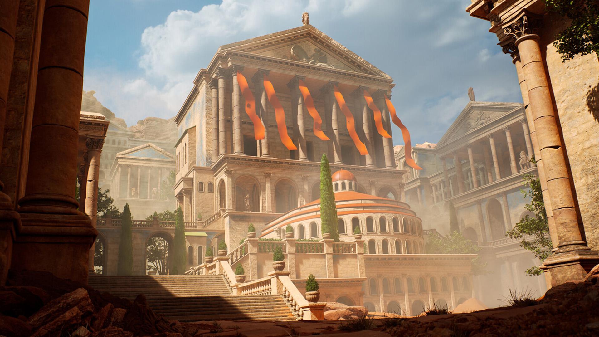
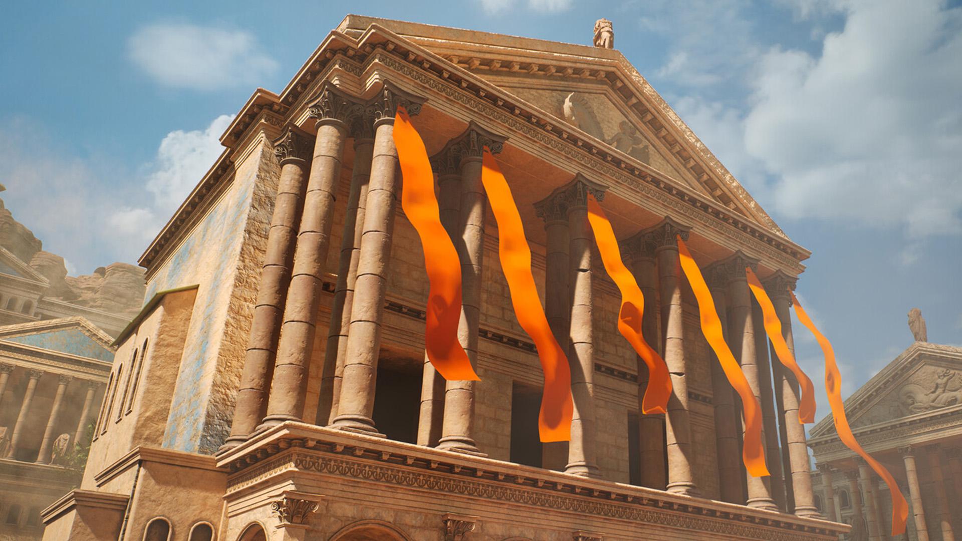
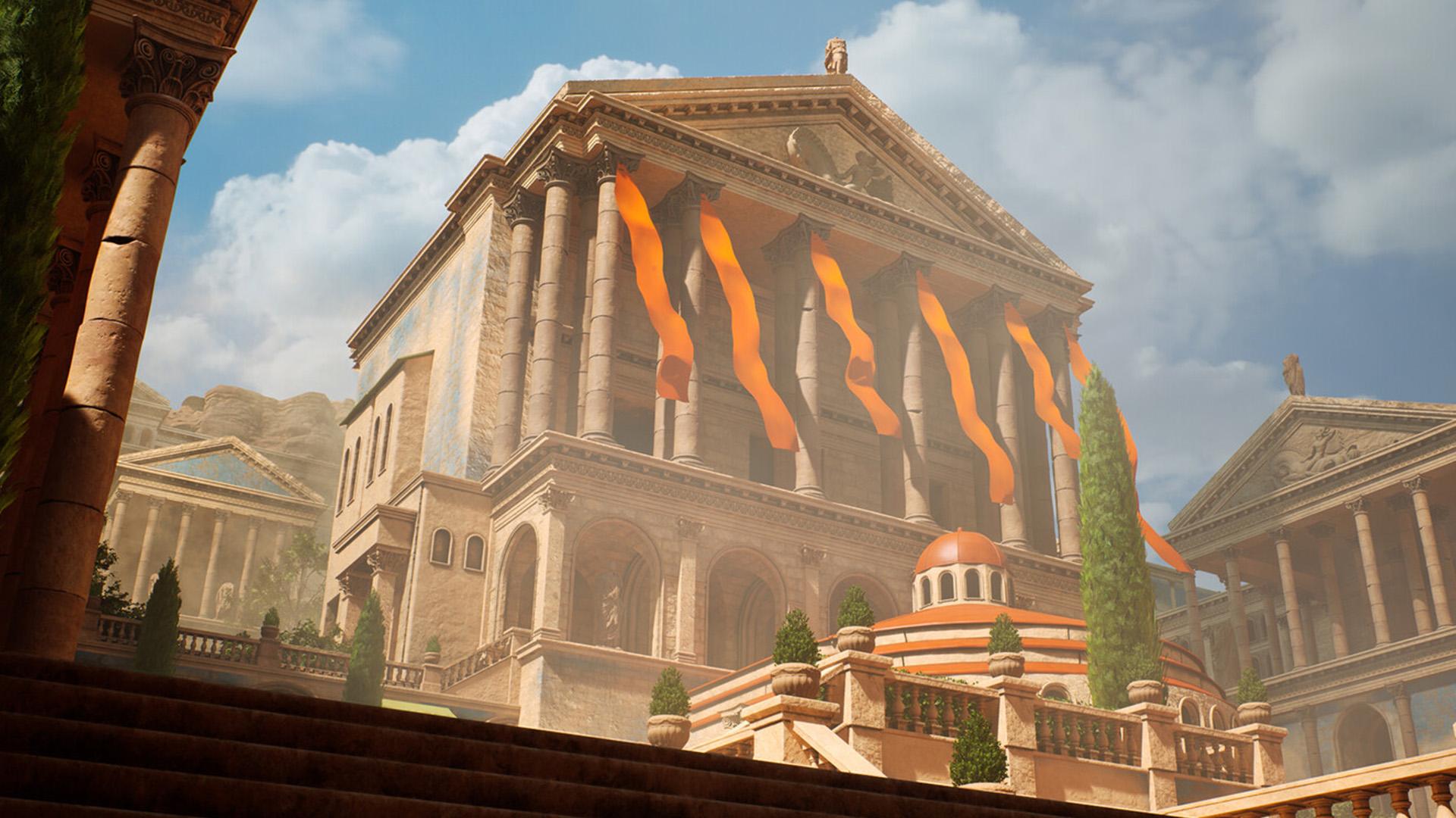
reference images, what we have next is we have, of course, our main image. So as I said before, this environment is
absolutely massive. If you just imagine
if this would be a full gameplay environment, it would probably
take a team of, like, I don't know, ten, maybe 15 different artists, all environment
artists, prop artists, material, lighting,
all those guys, and it would take
them a couple weeks to actually complete this. So you can, of course, imagine that for a tutorial course, we are going to get
the same impression, but we cannot go so absolutely
massive and detailed. And so we're kind of going
to play around with it, and we're going to use
some cool twigs to basically minimize the amount of time that we need
to spend on it. I have a feeling that I'm
going to spend around, well, let's say that the
tutorial will be around 20-30 hours long, but I feel like I
personally will probably spend like 40 to 50 hours on it, just like some time lapses and sculpting and
all that stuff. So how are we going to get this massive environment
within such a short time? That's where this
planning comes in. Now, I'm sure many of you have already heard what
modular workflows mean. And if you look at
this environment, modular workflows basically
means that we are going to create pieces that we can reuse over and over and over again. Now, that's basically what
this planning will be about. If you look at this
environment, what do we see? We see this one plint but this one plint has
four different sites, which means that we can
pretty much that we pretty much only need to
create one and we can reuse that one
all over the place. Pillars. We can just have one pillar and we can just reuse it over and over and over. Maybe even two if you feel adventurous and you want to
add some more variation, sure, we can do that. We can even have ways to minimize within creating
those two that, for example, only have a variation
for the center and not for the tops.
What else do we have? We have a stair piece. We have
the actual railing piece. So we have an end piece, and
we have a railing piece. And then this railing piece goes both straight and tilted up. And just like that, there's like a
bunch of different pieces that we can reuse. So what I like to do is I always like to go
into Photoshop, and then I just like to go
ahead and I like to actually give them colors so that I know how many pieces
I'm looking at. And the way that I
do that is this way. I go up here, and normally,
if you have your lesser tool, if you click on it, you can go to your
polygon ser tool, and I basically just paint out. Now, distori is for
intermediate artists, so the longer distorial goes on, the less I will start explaining the very,
very small tools. But for now, I will just let you know everything
that I'm doing. So for example, okay, we have one plint that
we need to create, at least, like this the minimum. So what I like to
do is select it, go down here and
create a solid color. And for example set is to red. Just tone down the opstes that I can still see whatever
is behind it. That's basically it. So
what else do we have? We have a pillar. It doesn't need to be precise. It's just for me to actually
know what I need to do. We need to create a pillar. Sure. Okay, what
else do we have? We have a wall piece
that we have over here, which is like a plain wallpiece. However, I'm going to use
this version for that because because this wall
piece is a bit easier to see. So we have a plain wall piece. Now, what I'm thinking
about is that I'm thinking that I'm going to
use a special technique. What I will do is after
we've done this planning, I will actually go
over the techniques that I currently think
I'm going to use. So what else do we have
if we look at this? So we have, like an end piece
over here for our stairs. So we can go ahead, once again, just like a different
color and lower it down. Now I'm going to use one of these straight pieces because
they are easier to select. Oh, actually, why would I could just use this
as a wildpiece. Didn't really think about that. Here we go. So we have
a straight piece. Let's see. Blue
was a wild piece. So if I just go ahead and select this and what you can do in hot shop when you have
something selected and you just want to
fill in your mask, what your mask selected, press delete and just make sure that you are
on the right color. If you are not on
the right color, then you can just go ahead. Like for example,
here, if I press X, I switch my color and I press delete again to get rid of it. But okay, anyway, so
we have that piece. Now, what I see
over here is that these corner pieces,
they are quite long. So let's keep that in mind
when we create is that we create it long because here we can just sink it
into the ground. But then over here,
we just want to have it still working. Okay, another quite
important piece. We will have a straight
piece like this. So that's quite an important
piece because this piece, if we go ahead and
give the color, and we have a oh, sorry, that was my
hand against my desk. And we are going to have
a corner piece over here, which basically just ends
the corner. Here we go. Great. Okay, so because
these two pieces, we can also use them here
at the top, as you can see. So we can basically just reuse this over and over
and over again. Now we have an archway piece
over here as you can see. This piece is going to
be very simplistic, especially because it
will be difficult to see. So what we can do is
we can just select it, but this will be almost
like a unique piece. It will just be a
one off pretty much. Here we go. Okay,
what else do we have? We have oh, actually, know what? I might be able to
reuse this over here. Yes. Yes, I think I'm going to do that.
I'm going to reuse it. See? So I'm literally
while doing this, I am also just working
on the planning. So I'm just deleting this one, and I'm just going to only
include this in here. Because what I can do is I can simply make this
entire piece at full quality and then just cut out this piece and
use that over here. So I need to try and cut
every corner I can right now. That's just how it needs to be if I want to
be able to create this. Statues and everything,
I will tos, but I will artose using mega scans because I know
that MgScans has them, and I'm not a character artist. Sirpies. We have, like, a simple stairpie over here, and we only need to
make one, and then we can just use that over
and over and over again. Here we go. Okay, see? So you can already see that with these few pieces, we
can cover all of this. We can cover all of the pillars. We can cover all of the plints. We can cover all of the stairs. We can reuse these pieces
here and down here. So there's a lot of stuff
that we can do with this. So this piece, what
I'm going to do is I'm just going to
reuse it over here. Now, we have over here, we have some unique pieces. These unique pieces
are quite nice because they do add
something to our scene. Let's first of all,
get started with this. So this is going to be like
a semi round window piece. And I'm starting to
run out of colors, but it doesn't matter too much. So a semi round window piece. Okay. Let's see. So down here, of course,
that's what I mean. Like, I cannot make
everything one on one. Sometimes I need to
cheat a little bit. Like this piece, we can
make this out of it. I don't know what
looks most like this. So these are just some pillars. Pieces it looks like that we can just grab
one of these pieces, make it straight, and have it go around the
corner over here. And then maybe here at the top, we can maybe use one
of these pieces. So that shouldn't be
really a problem. Now, this is going to be one of our first unique
pieces that we have, which is going to be this roof because right now it would just be a little bit of a
pain to make that modular. You can technically
make it as if it is a pizza slice so that you
only make one small bit. But in my case, I'm
just going to go ahead and I'm going to make
this as one unique piece. Okay, dark red might
not be the best color. There we go. Okay, let's see. So what else do we have?
So we can cover this. Another unique piece is
going to be this guy. It's going to be
quite a big one. In terms of scale, it's not
going to be a difficult one, because we pretty
much already need to make all the profiles anyway. I'll just keep that dark. Actually, no, I'm not
going. There you go. Okay, what else do we have? So I'm just basically now
scanning my textures. So here we have some don pieces. Whatever I say that
this is going to be like they're just going to
be like some extra dons. I will most likely just
time laps these because they are very basic modeling. So let's say that I'm
just going to call this don number one. I'm going to call,
and this is just going to be a square don
for me, dm number two. And the cool thing
is what we will also do is that these dons
we will make last. And the reason why we
are going to do that is because by the time that
we get to these pieces, we can literally just
grab details from all of these other
pieces and add them. Now, another one is that we have our flat pillar over here. It's a bit difficult to see, but I know the architecture, so it would be logical to
have a flat pillar there. So if you go ahead and
just do a flat pillar. See, you can see these are going to be quite
a bit of pieces, but don't be discouraged. The only pieces that are very
high detail are going to be these pieces over
here. And the archway. All the other pieces, they
are not that high detail, these pieces are
often quite basic. Okay, let's see. We can cover the
entire foreground. We are done with the
entire foreground. We are done with all
the stairs and have all those pieces. We can
just work with that. And what I'm going to do is I am going to have
I'm basically going to build this environment
on a few different angles. I cannot have an environment
that is completely walkable. Like, you can walk around it, you can do all that stuff.
I simply cannot do that. Well, I can, but
it would take me hundreds of hours to do that. So instead, I'm going to
have a few main angles, for example, like
an angle like this. Maybe like a close
up angle over here, maybe like an angle a little bit more from the side,
from the sky. So I'm going to make sure
that from every angle, we can build our environment, and then I will let you loose if you want to make an
even bigger environment. Although if you are a student, I don't recommend
this is already really massive for a
student to create. Then you can just go
loose and you can keep building on your environment with all the skills
that I've taught you. So we got these pieces. Now, back here, this is
going to be interesting art. So these are walls
that have a doorway. I do not think that I can
use it, but I will need it. So because I can also use
that doorway wall over here. And here, then we
have the archways. So the archways,
we can probably, like, mess around
over here and, like, scale it down and then have like a wall
sitting on top of it. But this piece, what I'm
going to do is almost like one of these wall pieces that's
just like wall with door, something like that,
you would call. So let's go for I'm really
running out of colors here. There we go. So wall with door. Okay, so here we
have a wall piece. I know that there's
a window here, but as I said before,
I need to cut corners. I'm not going to create
an entire unique piece for one window so
far in the distance. All of these pieces over here, although the pillars
we can just use. Now you might think, yes,
but these pillars will be really high pol for
such a long distance, but do not worry. I'm going to show you how
to use level of detail, which is LOD for short, in order to basically lower down the resolutions that seen
will still run very quickly. These backpieces over here, we can just use these windows. The only thing I want to do
is I probably want to create a more simplistic roof piece, because this roof piece
will be very detailed. It has all these trims. But in a distance, all
that detail becomes noise. And you don't really
like noise because then you cannot really make
out what the shape will be. So let's do that.
Let's create one of these pieces over here. Wow, we are already
at 20 minutes. I know that it might be
tempting to skip this, but this is actually
really important. So after this, I will go
over all the techniques. So let's say we start with this. We have some unique pieces
here, but all of these pieces, we can get the same effect using the pieces
that we have now. So, of course, we have
the scent and the twain, but that will
literally be a twain inside of unreal engine. What I'm going to do now
is in the next chapter, I will go over all the techniques
that I'm going to use, finalize the planning,
and then after that, what we can do is
we can start with the actual blockout and actually see if we can make
this beast completely. But if you are watching
this, we are able to do it. So let's go ahead
and continue to next chapter where I
will show you all of the techniques that we're
going to use and all of the corners that we are
going to cut, basically.
3. 02 Going Over Our Reference And Planning Part2: Okay, so welcome to this quick final
chapter before we dive in next you start
doing some modeling. So what I want to discuss
in this chapter is simply the techniques
that we are going to use. So the reason that I
want to discuss this is because I always do
this, in my head, and I felt like it is such an important thing that's better that I will also do
this while telling you. Now, of course, some
of these techniques, if you are pretty new to them, like you have never heard
of them and everything, don't worry because that's
what the tutorial cost for. So we're just going
to go through our models and just have a look. Now, our font models, which will be our plint over
here, I'll call it plint. It probably has many
different names and our pillar over here. They are very important. The reason that they are
very important is because they're super close
to the camera. They are very, very
large if you see the reference compared
to a person over here. They are very large. They are
very close to the camera. Now because of this, what I
want to do is I actually want to use a unique
sculpting technique. It's a few techniques.
Basically, the technique will be that we are going to create a
normal low poly version, and then we'll also create a
high poly version in Zbrush, and we will sculpt that version. However, because these pieces
are so incredibly large, we cannot just go
on and throw on a unique texture
because if we do that, it will just be a blurry,
ugly looking texture. So we don't want that.
Instead, what we are going to do is after we've
done that, I want to, of course, by that point, I will already continue
with my other models, but at one point, we will
create our tlable textures. Our tilable textures would
be like a sandstone texture, basically, and the texture
will have variations in it. The texture will
have variation to have both clean version, like you can see
here, but also like a damaged version like
you can see on the edges. So my idea is that we are
going to sculpt it down, and then inside
of Unreal engine, we are going to create
a special shader, and the shader goes like this. On one UV map, let's say that we are
probably going to use UV map one or two or
something for this, we will have our
sculpted norm map. So our UVs will be unique, but we will just have just
like the norm map in it. Then what we'll do
is in the shader, we will also add our textures. However, we are able
to tie our texture. So even though we will
have a unique UV map that is not like
overlapping or anything, we can just set the tiling
of our textures higher. And when we do that, we will
get much more resolution. Then we will give functionality
to vertex painting. So basically so that I
can paint in where I want to have the damaged sandstone
and where I want to have, for example, the
clean sandstone. Now, once I've done
that, I feel like that I might also want
to go ahead and add a special mask and that
mask will just be here for sand and dirt and
maybe some highlights, just to add a little bit
of extra detail because if we have just like
tilable textures, yes, that will look good, but it will not look
as good as we want it to be because
that would mean that we have an entire
sandstorm and everything. And then all of a sudden,
we have a perfectly clean even with the
damage version, we would have a
perfectly clean piece over here, and I don't
really want that. So I'm just going to
go ahead and just have a very simple dirt mask. Now that technique,
once that is done, that will look very nice. So then we will go ahead and also do the same thing for our pillar over here. Now, for our pillar, I want to get at least
a few variations. Not so much on the top. So what I'm going to do is the top is almost going to be
its own separate model. So we'll have the top, and then we'll have
the centerpieces. So what I'm going to
do is I'm going to use the same technique as that
we've done with the plant, and I will do that on the top and the bottom at the same time. And then this centerpiece, I will almost make it like
its own unique piece. However, I will create
a few variations. I will create a perfectly
clean variation. I will create a slightly
broken variation. Let's say, I'll make
three variations of it. This way, all the pillows
will not look 100% the same. So that's basically
the idea for that. We will go on just how to
create those variations, and then all those
variations we will bake together into one piece. Now comes the more
interesting stuff. Well, this was interesting, but now comes the
more tricky stuff. Over here, if I would need
to go in and I would need to sculpt every single piece
that I have over here, that would simply
take way too long. Like, then it would go from 2 hours to 15 hours or
something like that. Instead, what I'm going
to use is I'm going to use a technique that's
called corner dens. That's what I call,
basically, or corner details. Basically means that
for these assets, which are a little
bit less important, they are things like the stair. This, yeah, also
probably these assets. What I want to do is I'm basically going
to place a decal, and I'm going to
place this decal on our corners and maybe
also on the side. These decals will have
sculpted details in them. So basically, you can
imagine it like this. We have, for example,
sculpted Oh, what are you doing?
Sorry about that. So for example, we have
sculpted details inside of our instead of just
a texture map. And then we map those
sculptor details on a plane, and we hover that plane
just above our mesh. Then what we are doing in real is in Unreal, we will say, Okay, I only want to use a
normal map for this decal, so nothing else, and Unreal will then be able to project that
normal map on top of this. It's very similar to
using a normal map like you would do over here where you have a unique baked norm map. Only this time it says a decals, which means a little
bit more setup and playing around with it. However, what you can do
is so sculpt the details, I can reuse them everywhere. So all of these pieces, we
will use that technique. So in the end, all we need
is we need a low poly model, and then we'll need
a sculpted atlas that just has a bunch of
different details in it, and we can take it from there. And we can do that for all of
these pieces, all of them. So all of these pieces,
we can use it like that. The pills and everything
we just re use here at the top, Hmm. We can do that,
but it will take, like, a lot of time. So I still want to,
like, add some damage. So like this stuff I
can get away with. The top pieces, I need to have a think about how
damaged we want them to be because if we are
going to go like this, where are Yeah, if we're
going to go for this damage, then I might want to actually
go for the sculpting. But now I think of
it at that distance, you probably won't even be
able to see the damage, but we are having it over here. Yes, we do. We do
have it over here. Okay, let's also do the
sculpting technique on these bits just because they are very
close to the camera. However, all of the other bits
I'm not too worried about, we can just use the
same technique. And for the rest, it is
just basic modeling. So we will have that done. All of our materials, we will create one big
mass material that has functionality over vertex
painting and all that stuff. So plain walls, we need
to add a little bit of extra geometry to
those just so that we can paint in some colors. And then we will
most likely like textures like a plain
sand tone texture, a damaged santone texture, a sand sone texture
that has, like, a big or large bricks
in it and everything, and we will take it from there. So for the arches, the way that we will do it is I will
just keep that in mind, and then once we
have our texture, I will map it in a
way that you can literally see the stones
nicely going around it, or we can just give
it a little trim, like you can probably
see over here. Now, I think that is about it. So Feres, those are the main techniques that
we want to go over. So what we are going
to do next chapter is we are going to create all of these pieces as a blockout, which will be just like very
simple cubes and everything. And once we've done that, we are actually going to
already go into Unreal and we are going to
build our entire level. This is very important because if I do not do this
in the beginning, I will be having a trouble later on that the pieces
might not fit correctly, or I end up needing to make
more pieces than I expected, or I actually end up making more or actually end up making more pieces
than I will need to. So we are, first of all, just going to go ahead
and create blockout. Then we're going to turn those blockouts
into final pieces. We are going to do the
sculpting over here, and then we're going to
focus on our textures. So let's go ahead and continue with that in the next chapters.
4. 03 Creating Our Blockout Pieces Part1: Okay, so let's jump right in. Now, we will be using Maya 2022. This version is very important
because this version has something that has a new tool that we'll
be using a lot. Without this, I
wouldn't be able. Well, I would be able
to do this in Maya, but not efficiently, and then I would probably
have used three Max. This tool is called
the Sweep Mesh tool, which is basically a helper
to your spline tools. Now, so yeah, if you want
to follow along exactly, I would recommend
getting Maya 2022. Next thing is that I do
expect that you have a basic understanding of all the programs that
we will be using. Now, some programs are
easier than other, but definitely
programs like Maya, substance signer and substance, no, yeah, substinyb use a lot. So Maya substance designer, and probably unreal, those are the three programs where you simply need to know the basics. You cannot jump in and
create an environment this large with zero
experience, basically. So the next thing
that I have for you guys is I have
a scalar reference. A scalar reference
is basically just like a person or
like the scale of a person that we
can use so that we can make sure that all of the
scaling is fairly correct. Now, you don't need
to worry about it too much because inside
of Unreal engine, if our scaling is slightly off, we can simply during
Import set the scale. So that's why I'm not too
worried about this stuff often. So if I go ahead and here we go. So in our export folder, there's a scale v folder. So if we just go file Import, we can go ahead and just copy this and import our scale rap. It might come in at ten times
the size. See, it does. But don't worry about
that. This is because Unreal engine has different
metrics from Maya. You can see it like
Unreal reads in meters, Maya reads in centimeters. Now you can change your defaults
in Maya, but personally, what I like to do is I like to just set my scale
ten times lower. So this right now it's
a weird scale, 2.54. What I can do is I can go
probably to modify and freeze. Okay. Never mind about that. Anyway, 2.54 means that we will go ahead and we
will go to 0.254. Yes. Yes. Okay. That's great. For a moment there, I thought
that I was doing something wrong or that I was giving
in the wrong value. But basically, this is
a lot more manageable. Now, if we go ahead and
just, like, shift a, create a cube, mm You know
what I think I want to go. 0.0 254. Here we go. I think we want to do this.
This is even more manageable. There we go. That makes sense. Now, our main goal is to create our blockout relative to
the scale of the person. Of course, because we have
such a large environment. And in this case, I don't mean
large as in how big it is. I mean, in how large the
actual components are because they are already like twice
the size of a normal person. And that's just Yeah, you probably won't see
it in real life very often, this type of scale. But we do kind like
want to capture that. So, blockoutsbloouts
are very basic. They are literally just going
to be like base shapes, and all we care about is that
the metrics are correct. And with the metrics, I mean
the scaling, basically, that the scaling is correct, and it doesn't need any detail. This can just be like
a cube, for example. So what I can do is I can
go in here and I can, for example, start
with this one. Now, I try to always
keep my metrics fairly even as in the scaling. So if I go ahead and go here, I'm going to set this
probably to, like, two. So here, if I go, here. What I can do is, let's
just move this up. The first thing I need
to do is let's go ahead and start
with the top scale, which is going to be this axis. I always forget which
one it is C axis. No. Then it's probably the YAxis. Yeah, YAxis. That's the one. Now, another thing
that might be a little bit annoying sometimes is that when you are scaling, if you have it set on the grid, it is always scaling
in the center point. If you want to change this, simply go to your tool setting. By the way, I have my
modeling toolkit over here, my tool settings next to it, and my outliner next to that. If you don't have any
of these windows, I'm sure that you know that
you can just go to Windows, and in here, you
can, for example, go to here's your
outliner, for example, General editors in here, you will have your tool
settings, modeling. You have your modeling
tool kit, stuff like that. So this is basically my layout. It's very similar to the
same layout as Maya. I do also have a custom
shelf over here. However, once we
start using this, then I will just go over that. So for now, I'll just leave it. Anyway, in my tool settings, what I want to do is I just
want to edit my pivot, and then I want to go
ahead and I want to just set my pivot at the bottom. Plenty of ways you can do this. I believe that you can
just snap it here. I set to zero. Oh no, sorry, that's my piece. What I tend to do is I tend to just go over here at the top, snap to grid, and just
snap it to grid like this. In three years Max,
you can do it in here. And you might get it
in the beginning of the Toyo because I'm
literally like half day ago, I was using Trees Max, sometimes I get a little
bit of confusion. But anyway, now, if I
would scale this stuff, I can say scale on the Y. This is twice as
long as a person, so we're probably going
to be like 5 meters, see? And then just scale there.
Okay, so of course, this person is
standing on distance. I think I'm going
to go for eight. That's too much. Seven. It's very important
to get this y. Don't worry about just
spending the time on this. I think I'm going to go for six. I want to go grand and large, but not like silly large, I think, that would
be a bit overtop 6.5. Yeah, let's do 6.5. And now we also need to
accommodate for this scaling. So if we go for
probably four by four. Yeah, I think that will work. So we got something like this. I is very large.
Should do the trick. If you want, we can already, like a tiny bit of detail, just like some very
base measures. And that is where often my
custom thing comes in handy. So I just have like if you basically click on your
custom toolbar over here, you can add a bunch of stuff. Now, I only have a
few of them dt here. This is because I have
a bug inside of Maya that I'm not able to actually save my settings
for some reason, and believe me, I tried
looking at it online, finding it even
contacting out desk, but no one can seem
to figure out why. Basically, the way
that you just add these is you just go to
Mash, and let's say, here we have combine
and separate, you just press Control Shift
and then it would be Added. So I have combined separate
fill whole and here I will do I will add mirror
to this also for rest, all the stuff I barely use. The stuff like bevels
and everything, don't we tend to use
shortcuts for that. Most of the stuff is in our
EO mesh tool. So connect. I like to use Insert Edge loop, I like to use, multi
cut I like to use, target belt I like to use, and I feel like I'm
forgetting one. Tick, Tick, Tick, I know. Well, it looks like we got them. It looks like I
already had mirror. But anyway, oh, yeah, this one, delete history. If you go edit, delete albatype in history,
just add that one. And I would also go to modify and freeze transformations.
Also add that one. See if those are those two over here. And that's about it. So FRS I have some curve tools, but for Rs I will just use my menus or I will add
it if I needed to. That was enough. Let's actually now go ahead and dive right in. So first of all, I want
to make this very basic. I just want to
create this profile so that I know roughly how high I want this to be because
it is part of the matrix, and I want to create
this profile. At which point, we are more going to go in
the direction of this. So, we're basically going to place an edge here and we are going to just extrude
this in and then we'll just quickly push it out and just
leave it like that. First things first,
if I press space, I can go to my side view, and this is where I want
to use my split edgering. This one is called
different in your menu. In your menu, it's
called Insert Edge loop. Now, if I have a look
at my reference, I feel like that it
would be logical if we have this piece over here. So if we have one
edge over here, which is going to be
this edge, let's see. So I don't have a lot
of space at the top. So if I do one over here, oh yeah, that might
actually fit really nicely. Let's go back over here. Okay, so we got those edges. Now, all I really need to do is I just need
to go ahead and just click Shift Double click. And in here, we can
just go ahead and do Control E. So yeah, that is a default shortcut,
as far as I know. So control E just means extrude. And then I'm just going
to go ahead and just move my arrow here to
extrude this inwards. You kind of like why you
want to extrude this in as far as you think
it's going to be in. And then I'm just going to grab my edge and just
for good measure, grab this edge. I'll
nobody move it up. Like this and grab this edge
and move it down there. Actually, maybe I want
to have this even. In the beginning, I want to work very precisely, as I said. If I select both of them, go to my skeletol
and then do it, they will be perfectly even. See, in the beginning, I'm
simply working very precise. After that, we can
do the sculpting, everything then we don't
need to do as precise. But for now, So I'm just deciding how
far in I want it to be. But for now, I'm just
going to go ahead and do this correctly. Now, I'm just going to go
ahead and place, like, a very quick edge, I think, over here and
another one over here. And I just want to go ahead
and just seg these pieces and then scale them in a little bit. There we go. Yeah, see? That should do the trick just
to indicate what this is, that we know what the model is. And then we can, of course, just improve it a lot more later
on. So we got this one. Now, what I will do later
on is I will nicely organize it into a
layer over here. Actually, you know what?
Let's do that right now. Let's place it in your center and the reason you
want to place it in your center is
because Unreal engine reads every important model, the pivot point, it will read it from the center, zero, 00. So if you want, you can even go here, set everything to zero. Okay, except for that one, I don't know why
that was doing it. Let's only settle
the X axis to zero. That's strange because
the Pivotins here, so it shouldn't do that. We probably like me to remove
our history or something. But anyway, and then you just want to go into
your layer editor, Ater layer, and this
is going to plint. Now, don't worry. Right now
I'm being very detailed. However, once we've done
a function very often, like this kind of stuff, I will, of course, do things
a little bit quicker. So the next thing will be that we want to create our pillar. Our pillar is going
to be a cylinder over and we just need to
kind of decide how large. I want to start with the base. Now, I'm just going to
go up here and just turn on my edge mode. So let's see if I
have a look Okay, it looks like square
and then so here we first of all need to
now go in, create a cube. It's scaled up, make it thinner. So it looks like it
has like this cube. And all of these things
are important because they are all adding
to our scale. So if I have a look at this, I want to make sure
that this cube and everything is big enough. Like this kind of scale,
I can get away with. If this is not
perfect, actually, no, this needs to be perfect
because else the cylinder will not be perfect.
So let's do this. So have a cylinder here. I want to make my cylinder. If I have a look at it, it looks like your cylinder
goes like this. Now, a cool thing,
instead of you going in and trying to
select all of these faces, you can just go into
your modeling toolkit, go to selection constraint
and set this to angle, and it set the angle to five, and then you can just like,
select everything at one go. So if I have a look at this, it looks like that what it will most likely do is it will have a piece like this. Then if you hold shift,
you can extrude this. And if you scale this
in, it has like here. So this is kind of like
taking care of the diameter. So depending on how
large that we make this, we know roughly
what we want to do. At this point, what it will have it will have a
little thin piece, bigger piece, thin piece. Bigger piece. And the reason that I'm already doing this now is just for the sake of
looking nice, basically. At this point, just set our
selection constraint off. I'm going to have a single angle or a single line here and here. I don't need it to
be precise yet. I just want to very quickly so that I know the
diameter at the top, scale these out like this,
and then press contre B. Because what that will
do is it will just add like a little extra segment. So when I see this, I need to undo this because I've scaled them out too much. You said segments to
like three or something. Yeah, that's good enough. So seeing that, I'm going to go ahead to my ankle
constraint back on. Going to scale this
in a little bit more. I will make this
look nice later on. Now, all I care about is this. So we have this piece over here. Now, the next thing is that
these are perfectly straight. However, I want to make my pillars in this
style. Where are you? Here, see, this kind of style, that they are in
different sections, and that they also
have different cons. The reason for that is
because then I have more flexibility
making them look interesting and also to
move around my pieces. I don't need them
to be bold or like bumped out like this. We
can just go for straight. But knowing that, I think it is better
if we just go ahead and if we add another
cylinder over here. And now we can just go
ahead and use this one. So we just scale it up up until the outer line like
that, move it out. And now the thing is that I need to decide how
large is going to be. So if I go this, it's
like, one, two, 3.5. This one is 6.5, so Yeah, so like 6.5 times three. 6.5. That feels really large. Whoa, that feels
really, really large. Let's go a little bit
smaller with our pieces. So let's go for 3.75,
something like that. Still feels large.
I think I want to go I think I'm just
going to go for one, no. Let's go for two meter inter. We do 2 meters, 2
meters, two, four, five, six, seven, eight, nine, ten, I think 12
meters is enough. Oops, move this down. 12 meters. If I look at my scale
and my reference, yeah, I feel like 12. And then the little tip. So if we do 12 meters
plus a little tip, which I will add later on,
I think that does a trick. Now, what I'm going to
do for these is oh, sorry, it's better
if I do that now. If I just quickly delete these, What I wanted to do is
I just want to select this edge and this bottom match, give the small bevel at 0.0 0.05 maybe,
something like that. Because now if I select them you can see it's a bit better
to differentiate between the two and do it this way. Now, I'm just doing this by
hand because it's quick. You can use duplicate special, which, but it's like a lot of settings for something to small,
where you can, like, duplicate it you can set
like the number of copies, and you can set the
translate like how much you want it to
be like I don't know, like five and then you can, presld then it will
do all that stuff. However, that would be a bit overkill for like nine pieces or
something like that. So we will probably use
that later on also. But for now, let's go
ahead and do this. There we go. And then
what I'm going to do just for some variation to make
sure that that looks cool, because I want to know
if it looks cool when I have my pillows, like, not as perfect,
something like this. I will just, like, that might be a bit too intense,
move them out a bit. And then if I just have
a quick look at the top, do you have a better
top over here. So what I will end up
doing is move this up here. Create a quick cube. And this cube, we can
just go ahead and pass F to zoom in. Let's see. So this cube is sitting
just outside of our mesh. Yeah, so it's just
outside of this. Maybe a bit larger. This one is also very important
because this one will dictate how close we are going to make
our edges over here. So that's why this one is
quite important to get white. I'm going to make it like tin. So it's just going to
be a cube for now. And I'm going to
decide, like how here. If I go probably something
like this, should do the twig. Now, if I just select
all these fut seas and move this down, and you can now also probably scale this out
till the very tip. If I just go ahead and
set an extra edge over here, you can scale this in. And based upon that, I might
want to scale this out a little bit more because else I would not have enough
space to with this one, what you can do for
now you can just press Control B and add a
few more segments. Yeah, that looks pretty good. We got this one, make
it a little bit larger, and let's just
scull the end out a little bit more because that's
probably what will happen. Something like this. That should be totally fine for a blockout. I'm going to just extrude this out a bit
more. There we go. Okay, so that is our
pillar now also done. What I can do is I can
just select this stuff, and I can go ahead and add
a new layer, selected. And I'll layer pillar. And then later on
we will just place this to zero, zero, zero. Okay, so that's this blockout. Now, what we'll do in the
next chapter is we will just keep focusing mostly
on the foreground. So we'll start by just creating
these profiles over here. This one is also quite
important because I want to get the profile
already correct, as close as I can just
to make it look nice. Let's continue with that
in the next chapter.
5. 04 Creating Our Blockout Pieces Part2: Okay, so now I want to
focus on these roof pieces. Now for this, we need to make
a choice because we want to reuse the same pieces that we have over here, also over here. But as you can see the profile
is a little bit different. Now when I look at this,
I think this profile would actually be a better
profile to use also over here. So that's what I
want to go with. I wasn't happy with the images, so I just went off camera
and I found two more images. It's surprisingly
difficult to actually find something
with this profile. But I think this one is
quite decent to use. So this itself would
be like its profile, and then these
extra I don't know, I'll just call them cubes. They are ordered on top of it. See, that should
work. So then this will look a little
bit flat, however, but maybe we can make it
look a bit more interesting using a norm map or something
that we can probably use. Okay, so knowing that,
for our profile, now what we're
going to do is I'm going to go over spline moding which is inside of Maya. The spin moding is
getting a lot better. Now, if you're
used to Trees Max, it's not up to par to Trees Max, but I personally feel
like Trees Max is the best sply modeling of
all tree modeling programs, but it should
definitely be doable. So what I'm going to do
is I want to go ahead and I want to go probably to, like, a site view,
something like this. And then if you go up here to create and they
have your curve tools, now you have a few of
them CVCurve EP Curve, Bezier curve or Bezier, whatever you want
to pronounce it, I myself go for Bezier because that's the one that I'm personally used
to, basically. There is a difference, so here. You have like Sorry,
now, I don't know. Oh, yeah, so this is the Basier. Basically what you do with
the Basier is you click, and if you click once,
it will be straight. But if you click and drag, it will become round, which is, as you can see, very handy. These other curves, basically what those do day
four smoothing. So if you click
once, it's straight. But as soon as you go around
the corner a few times, it will start to try and, like, smooth everything exactly on
the way that you want it. But I feel like I have
less control this way. And this one create I don't even know that was probably
Oh, yeah, the EP Curve. Yeah, the EPI curve is a little
bit more like the Bezier, but in this case, you don't really have much
control over it. So yeah, that's my choice
for the Bzier curve. Okay, the way that
this is going to work, we are going to
draw this profile. We are going to start
from the very back, and we're going to
just push it out and we're just going to
follow this profile. Don't worry, if you mess up, you can change this later on. But I do already
want to have this completely final, at
least this profile, that the profile is
already good because it is easier enough for us to
just move it around after. So what I'm going to do
is I'm going to go ahead and let's go for Bezier curve, and I'm going to
probably have it, let's say that I'm
going to have it like just beyond here, say just beyond, and
then I might want to set my grid a bit smaller because I might want to use
grid snapping for this. So if we go to display and
then go to our grid over here, Lengthen width. Let's go four. Let's first of
all, set it to 24, so that I Okay, that's strange. Oh, there we go. That's the
one. Let's not do this. Yeah, sorry. I got mistaken. So we need the grid lines
every and then go for one. And now that we've
done, have that done, what I'm going to do is I'm temporarily going to just move my piece down over here so that I have it
exactly on the grid line. Okay, so if we go to Basier
curve and then up here, I want to just go
to snap the grid. Now with this, although
you cannot see the indication of it,
like in three years Max, what I'm going to do is I'm
probably going to go ahead and move it slightly
beyond down, up, and then we will start
by moving this profile. So if I go, let's say, up here, you can
see that snapping. You can see, also, if I do this, it will twine snap exactly to the grid. So we got this one. Now I want to go let's see. If I look at this, it is
slightly in front of it, but I'm not sure if I like that. Oh, yeah, yeah, it is.
Okay, fair enough. So in that case, oops, let me just move
back to my reference. In that case, I'm going to go up until say like this point, up until here, I'm
going to snap it. And I'm going to snap it up. And then at this point,
I just temporarily need to turn off my grid, and I just need to go on
the line over here because I need to grid like
a thin line up here. What I've decided to do
is that I'm actually going to have my grid. It's like I wanted to do it
a little bit less precise, but I feel like I want
to go a bit better. I'm actually going to
keep this window open. I will have it open
on my other screen, and I will basically keep changing my grid
lines that we are snapping exactly to the
grid in even numbers. So if I turn on my
snapping again, instead of me just
placing it here, I can now just turn on my
snapping and if I look at this, do I want to go even less? Um well, we might
not be able to see. If I go smaller, we might not be able to see it. So
I'm going to go up here. And now I'm just starting
to follow this profile. So we go up, out, up, up, and then I need to decide
how many grid points. If I set my grid back
to maybe like one, oh, that, of course,
doesn't work anymore because we are in
uneven grounds. One, two, three, four.
Now it feels too much. Let's go for three. I know that I'm picky, but
it's better to be picky now than needing to go in later on mess
round with things. Up again, now we get to
an interesting point. Now we have arrived here. Now what you want to do
is we want to create a little curve
that is going out. Basically, what we want, we want to have the curve and I'm going to go a
little bit further. I'm going to go here,
then this time, I want to click and
I want to drag. And just go ahead and let's
go outside of snapping mode. And then we can still
drag this out a little bit more without
breaking the link. If you break the link of
your edge, don't worry. What you can do is
you can just turn on your curve snapping and then
you can just continue again. I will showcase it a
little bit later on, but at this point, it's just annoying if
you break your link. So now that we have this one, what I'm going to do
is I'm going to go ahead and I'm going to Oh, wait, here, I did break
it. Yes, I did break it. So basically, when
this is broken, what you can do is if you
just go ahead and click on your Pasier again and this time go up here
and snap the curve. And then what you can
do is you can click, and then it will
register as like, Okay, so you want to continue. Now if I just
continue like this, you can see that it would work. Now, what I'm basically
now thinking about is that it looks like it goes
around and it goes back in. So I do want to try
and cover that. So if I go up here, I'm going to go and
set my grid point to 0.25 plus apply so that
it snaps it even more. And then I want to
go up here, click. Okay, so because of
this point over here, it is snapping it too long. Sorry I'm just thinking about
how far out I want to go. So if I go here, here, this completely messed up. Let's go ahead and go
into our Control vertex. If you right, click
Control vertex, let's go in here, and
let's start with this one. If you go to this one, you
can click on your Edge point, and then we have a problem. So the problem that
we have over here is that it will edit the
edges at the same time, even if we turn off snapping, I'll edit the edges
at the same time. However, if you hold
Shift right click, you can go to break
anchor tangents. And when you do that,
you can see that it will start editing it on its own. So this is more what
I was looking for. And then I wanted to move this. But yeah, we kind of need to, like, play around with
this and move this around. See, I would say, the
curve tools in my displacing them is a little
bit more of a hassle to do, but once they are
placed, it's fine. So it just takes me
a little bit longer. But that's why I will
only do this one. And luckily, this is not
too difficult of curve. So we have arrived here.
Now, if I have a look, It looks like it
just goes down and we can maybe give it
something interesting. I just need to see how far
back it will go again. So if we have done
this piece around, do we wide away want
to move it back, or do So what we might want to do
is if we just go to Bezier and turn on our
snapping to grid again, click and then turn off snapping snapping to turn off snapping to curve and then
snapping to grid. And I want to go click
and then two back. No, I think one back over here. I think that will look nice. If we just go to Control vertex, Shift click and yeah, just Oh, Shift click
brake anchor tangents. And you can just go ahead
and snap this to the top, and then it will automatically
become straight. So that's why I
like the snapping. So also, I need to keep an
eye out that from a distance, it still looks logical. Now, if I set my grid
lines now back to 0.5, so that they can have a
little bit of Oops, 0.5. So they can have a little bit
of a better look at this. Yeah, you know what?
I'm going to move this one up here. There we go. So we move it out. Let's go ahead and just snap
over here again. And I'm going to snap this out or I'm going to
create this quite large. This large? No, even larger. Let's go. Here see
this piece over here. And we can still move it around later on. So
don't worry about that. But I do try and keep
as precise as I can, because else the round
pieces are going to be pain if we need to move
those around later on. That's why. So we got this piece,
and now if I just have a look at my profile,
it looks like it goes. Let's see. So where are we? So we've done this,
so it goes out in, out in round up in up, all the way out, down. Okay, so atleast, that's what
I think that I'm seeing. So if I have a look at
this, I can go ahead and I can Let's see, go up here, set my grid
lines to 0.25 again. Because in M, I just
don't like working off grid. So go up here. But I love that they
added the sweep tools. Oh, once you see it, if you're used to the Motols
before and you will love it. It's really cool. So out
up only one, probably. And now for the bend, how big did we make that? Two. Sorry, the zooming
is very sensitive. So click track, click, and I will fix this later
on because now I'm in the mood to just continue. So it's very difficult
because by this point, the resolution on my image on my reference
image is quite low. So it looks like it goes, see, what did we do over here? Up in. So L say up. Then this one I probably
don't want to go too far in. I'm going to go up. Then I would probably go up four times. Then I want to go.
Click and Drag? Yeah, I think I
quite By this point, I'm improvising, by the way. So by this point, I'm kind of like improvising a little bit. Click and Drag because
I don't have to here. I don't have the resolution to actually see what's
going on over here. So I'm just kind of like
making stuff up as I go along. Or maybe we can do this. Up. T if we now go very far out, I don't know how far yet,
but it doesn't matter. Then it looks like we want to
go down to out a couple up. The way that we would
measure this is we are keeping it very non
destructive and then later on, we simply need to also
preview it inside of unreal engine to make sure that the
profile is correct. Let's see we go out,
then we go up again. Then if we go for, like, a very large one, so let's do three by three, one, two, three, over here. One last one and
end. Okay. Damn. So that's still quite a profile. Let's go ahead and
start by going up here, and let's start by turning
off all of our snapping. So carefully just
move this back until it becomes a proper circle. That's also the nice thing with snapping that you
can very easily get pretty decent
looking circles, which in three years
Max it's often a little bit more
tricky to get those. Like you need to do a
bit more manual work. But here, you can
also use a scale tool to evenly scale everything. You know, let's go for
something like this. Bevels and all of the small bevels and stuff like that. We can add later on. Now, one thing I do
probably want to do is I'm going to go in, and I'm actually going to
reduce these amounts over here. And then to compensate, I do
need to grab all of this, probably move it back a
little bit more again. And we have this point. So yeah, as you
can see over here, it does look like
this feels very thin. Now, the first thing I'm
going to do is I just need to snap to this grid line, which is up here, I believe. I'm just going to
very quickly just add one extra edge and just
have it from here to here. Hello. If you allow me to it's probably complaining because it's trying to close it. I'm going to leave it
actually, like this for now. You can close it by just merging
this together like this. So let's have a look at this. How does this look if
we go for a top view? Okay, so that feels very
small, which is normal. It tends to sometimes do that. So if we now have a look
over here at our reference, first of all, we can do
some generic scaling. So if we go ahead and go to our tool settings and
just reset our pivot, we can go ahead
and in this case, we will need to eyeball
it a little bit. If I look at this
and I look at this, now I know that this is a
slightly different profile, but I still need to get
that grand feeling. So if I go up, oh,
turn off my snapping. See, let's set the
scaling to, like, two. Let's see if we just
double in size. Let's see. From a distance. Yeah, that feels
like it would give me a really large scale. So if we just double it in
size and then move this back, and then if we just go to, like, a side view, can go to Control vertex, move
this round here. At this point, I don't care
too much about snapping. That was more for the
how do you say it? Just for ease of placement. So we got this it's really tricky right now to see how we are actually going to how
this would actually look. So what I'm going to show you is how to use the
Sweep modifier. So if you go to create and
go to sweep mesh over here, you can see that this happens. Now, this because it will always start with just say cylinder. We want to go for
a line over here. And then what you
can see is it will basically just
create like a line wherever we have our grid. Now, one thing that it does
do is that in the beginning, it does not give us
enough segments. If we go to interpolation, we just want to set this
up and turn on optimize. So basically with
up and optimize, it just art these segments, but it will not art all of
the segments over here. So there we go. That looks
already a little bit better. Now for the rest, we
have the scale profile. Doesn't matter too
much. It's just like for the initial piece
that we would need this. But for now, it is
good for us to, like, have an extra look
and just see how everything would look like. She can see over here. So
let's see if I go for short, long, here, that's sticking out, you know, this might be fine. Can I set my profile to, like, 15? There we go. Here we go. Even though it says like, Oh, I can't go any further, it can, so don't worry about that. So let's see. So we go down, and I'm now just looking at
my reference and trying to, like, kind of follow
along with it, see what we exactly did. These bands might be a
little bit too small, but I think that those we can actually improve
later on if needed. I think what I want to
do, the safest thing is probably to just
preview it inside of unreal engine because
right now it's a little bit tricky to judge
how it will look. So what I'm going to do is
I'm just going to go ahead and here we have our grid line. I'm just going to clone this, and I'm just going
to add a new layer, and I will just add
this grid line, and I will call this backup. So here we will do, vital pieces that we
might not need anymore. We can just back them up. Now we have this grid line
or this point. And what I want to
do with this one is, first of all, if we go
into our attribute editor, we want to go ahead and
want to go to oh, sorry, I think we actually need
to select our Bezier. There we go. So Bezier. So if you select that
to your outliner, you will have your
sweet mesh creator, and I want to set
this to a metric. Now the metric basically means
how is that we can often, like, evenly place it. I think if we go for, let's see, 5 meters might be a bit short. Maybe ten. Alright,
you know what? Let's go for 5 meters. Let's ten. Sorry, I know I'm very picky. Let's go for 10 meters. We can always change
later on if needed. So we have this piece over here. Now what I can do with this
piece is I can now for now, I can just say, like, new layer, and I call this large underscore trim
underscore straight. And then what I'm
going to do is if I go to my tool settings
and press Reset, I can also just go
ahead and clone this. And with this piece, what I
can do is I can go to Mirror, which I have over here, but you can also find
it in mesh and Mirror. And now in Mirror, you
get these settings. Definitely, do not
click away from them. If you go to your xs
and set this to be the X axis over here, definitely don't
click away from it. What do I do? I
click away from it. Let me just quickly
reset my history. Don't tell me I broke it now. There we go. I have no, weird. It is probably because
of the position. So if we set the position to
bounding box, there we go. There you are.
That's what I meant. So position bounding
box basically means that pivot is over here. Now, if I pass J
to hold snapping, I can rotate this, and I want to snap this 90
degrees like this. See? So it's like an instant
corner kind of thing. Now, if I go to my
top view, Grid. One? Oh, five? Yeah, I think five should work. Now, from atop view, right
now, you can just move this, and that's way you can
set it larger or smaller. We want to go for a
wily thin corner. So definitely go in your merge threshold and
set this way down to like 0.1 or something so that it is not accidentally
trying to merge. And then we are just
going to go for, like, a nice little
corner like this. Like you can see over
here, we might want to play out with it
a little bit more, but we need to make
sure that this angle and this angle stays the same. Set now, and let me just double check before
I click away from it. You want to just double
check that's over here. There is nothing merged
together in a strange way. Okay? Then you can press W. Now if you reset, you can
imagine how this will look. So in game, this would happen. We would nicely
place it over here. And then what would happen is that you would grab
another one of these pieces and you would
place those nicely on here. And in the end of
the day, when it is, of course, I don't snap
it properly right now, but you can see that it will
very quickly just, like, create a corner profile and
just have everything done. A nice. You can see. So that's another piece
already done very quickly. So I'm just going
to go ahead and add a new layer and add
this one and call this large trim
corner. Okay, perfect. Now, what we'll do in the next chapter is we will
just keep going, and in the next chapter, I should actually really draw or really add my
planning to this. Here we go. Okay, so let's see. This one is done,
this one is done, this one is done, and
this one is done. This one I will do later
on once we actually know the actual scale of these
pieces inside of unreal. So I will go ahead and I
will start by just doing some stair pieces and like some wall pieces in the next chapter.
6. 05 Creating Our Blockout Pieces Part3: Okay, so let's go
ahead and continue. So let's start with an easy one, which is literally
just a plain wall. So I'm going to go
for, like, a cube. And I think I want to make these cubes,
probably like the same. So let's say 6.5 Actually, before I do this, let
me just go ahead and actually move this,
I can just do 6.5. Let's move this to the top. I can always place it
precisely later on. So 6.5. Yeah. The reason
that I want to do that is because I
do want to try and, like, keep all of these
metrics the same. So I do actually now need to decide because this
one is very big. So if I make this 16.5, I would also want
to make this 16.5. I would probably want to
make this one double that. So I actually need to make
sure that I have this correct. I think I'm actually going
to go for 10 meters. I think I want to
have an even number. So let's go ahead and
go for 10 meters by Oh, 11x, ten by ten. So I do want to keep
this like a square, and I'm only going to
go for 0.2, I believe, for the side because I I still
want to have a backface, but I want it to be very thin. And what we can do is
we can just, like, reuse this over and
over and over again. And I think that
I can, of course, also scale it down if
it is needed because it is quite big by
now, right now. But the reason that I came
to this conclusion is because I wanted to make
sure that fits like that. So let's say that it's just going to be like a plain wall. Now, with this plain wall, there probably isn't anything that we really need
to do after the UV. So what we can do is we can already just go ahead and use
the Connect tool this time. So if you go to Edge Mode, select these edges and
go to Connect over here, which you can also find
in mesh tools, Connect. And I want to just add like ten segments or something like that. And do the same over here. And the reason I
want to do this is for later on for the
vertex painting, because if we have
these segments here, I'm able to just
properly vertex paint. And ten by ten, that's
not a lot of geometry. So that's not really that's
not that much to have. It's artists do a new layer. Let's call this plain
wall. Over here. And now we can go ahead and we can get
started with, like, our stairs, our stair end, and this piece over here. So if I have a look over here, these are a little
bit more moderate. So here's our Oh, hey, I'm looking at it
from the wrong side. Oops. Let's do this. Doesn't matter, so
here we go ahead. Let's turn off our plint, our pillar, and our large trims. Let's create a cube. Let's go ahead and just move this
over here to the top. Let's press Add a pivot, and I'm just going to snap
this back down over here. And now I just want
to have a look. Oh, turn off my snapping. So if I have a look at this, he comes up until
around shoulder height. So it is still quite large. So if we go, what was it? The YXsTe. Yeah, I think
let's do three by two by two. So 1.5. 1.53, 1.5. Yes, one thing that we
did have to keep in mind is that we have an
extrusion down here also. So now that we have this piece, which is going to be the
top as far as I can see, yeah, it looks about fine. What I can do is I will
probably remove this, but I can already add a very quick segment
here and just do like a Control E and
just extrude this out like this using
your mode or your node. And once we've done that, over here, what I'm going to do. Also cool thing that you can do. If you are extruding, if you do Contra E, if you
just want to insert it. Now, you can just
leave it like this, go to scale and then scale it
in. That's often what I do. But just in case
you ever need it, you can also do Contra E and
can also set your offset to 0.1, and you can do it that way. So offset will
just insert it in. But yeah, the scaling method is often a little bit faster. If I now have this, I can just go and extrude this
three down probably. Let's see, three up. Let's do four down, something like this. Let's leave it here for now and then I can just
adjust it later on. We got this piece. Now
what we want to do is I'm just going to go ahead
and like this wall over here, which if I look at it, pretty much becomes like a cube. Let's move this cube over here. Add a pivot. Just go to
snap it down quickly. Turn on my edge face over here. So I'm going to make
this the length. So if we have a
length of 10 meters, we probably also want to
do the same over here. And that kind of makes me
doubt if ten is too much. Maybe I want to go
for five after all. Five is that's annoying. Five is too little,
ten is too much. Eight let's do eight. Let's go eight by eight. We have the police
splits over here. You can twine go down here
and Oh, set the scale here. Let's do this. Eight.
There we go. Good enough. I don't care about it right now. I shouldn't be so
picky because it's just like a blockout.
Surn off a plain wall. Okay, so we got this piece. We can now go ahead and
we can just scale it in. And scale it out a
little bit like this. Let's see. So this is going
to be the bottom trim. Then if we duplicate this, then we're going to
have a ticker top trim that is coming up up
until around this point, which leaves me not
a lot of space, so I want to probably
play around with the thickness a little bit
and move it up a little bit. Let's see. If I see this. I probably want to have
this much space in here. So what I'm going to do
is I'm actually going to just move this up
a little bit more. So I'm going to go off the grid, but I think this should be fine. So now that we've done this,
I can go ahead and actually, I'm going to just
create a new cube because then I don't
have to do the scaling. I can just scale this in
and just make it like a pillar. Here we go. Let's do the top like that. Let's move it here to the side. And now another little
trick for you if you go ahead and just hold Shift
and duplicate it like this. And decide how much distance
you want to have there. And then if you do Shift D, it will basically
duplicate and it will also remember the transform
that we just did. So this is like a
quicker way than using your duplicate special. The only thing is
that, of course, here, it's not always good. So what I tend to do
often is I tend to, like, try some stuff out. So I tend to move a
little bit closer. See, you know what
I want to actually move further away probably. Shift D. Oh, that
was shift F. Sorry. Shift D. Here we go. Then this is a little bit even. For now, I will make
this more even later on. But for blockout, I'm just going to move all of these pieces a little bit like this.
There we go. Good enough. For blockout, this
is more than good enough. We have one
of those pieces. Now what we are going to do
is we first need to create our stair before we can actually know the angle for these pieces. For our stair, I
would go ahead and I would probably go to my
site view over here. And I'm going to go
to display grid, set my grid to like one, I think. Yeah, let's do one. Let's move I'm just moving
this over to my on screen. And now I'm going to use my
Bezier corner or Bezier, my bezier, turn
on grid snapping. And I think what I'm going to do is I'm going to
make them two by two. Of course, this is often
like what I tend to do. To grid points, it
depends on the metrics. We can check it out later on if they feel too
big or something. But this is often the
metrics that I use. Now if you are working
on a professional game, you will have exact
precise metrics on how deep the stairs
need to be and everything. If I look at this,
I feel like that this is going to be too steep. So instead, what I'm doing is I'm just going to
make them tree long, too high, tree long because
they are all stairs. So this does often
happen where they are longer but less high so that
they do not go up as fast. And then I'm just going to go, if I set my grid
lines back to five. Let's go one more Um, because that's, like, I would consider that
to be like 3 meters. I'm going to probably
stop over here. I think this should
be fine. And I just need to kind
of, like, check with Go. I need to kind of check with UnuLEngine before I know exactly how big I
want these to be. So this is one of those pieces where I
just need to set in Unreal engine in order
to know what to do. But for now, what
I can do is I can just snap rotate this over here, and I can just
already go to Edit. Oh, sorry, create sweep mesh, line and profile now, don't worry if it is black. So you just reset up if
turn over a snubbing. So this is just because
of the normals, see? So all you will need to do is you just need to
go into face mode. And then if you just
go ahead and you can I tend to always just
go to match this plane, press reverse. I should
actually have that. Here we go. I should
have that in here. And that's what just
flip the normals, because often with a plane, a plane only has one side, and the other side
will often be black. But basically what I'm more focused about is
that if I look here, I would like quantkin know the amount of stairs
that go into this. So for now, what I'm going
to do is I have this piece. I'm going to make
the scale profile. Oh, then what did I what
am I going to make this? Because this is going
to be a longer one. So five. Yeah,
let's do 5 meters. That should be fine.
So I'm going to make this 5 meters because it's going to be a really long stair. And I'm just going
to leave this, and I'm just going to
call this stairpiece. So for now this piece is
done, this piece is done, this piece is done,
and this piece is done, all in one go. So I'm just going to go ahead and go into my layers
and organize it. So, create a new layer
and add this one. Stir underscore. Ailing
nscore straight. New layer art selected objects. Sir un scoe end cap. Layer rtselected objects. S A, for example. And now all I need to do is I need to go ahead
and grab this one, and I need to duplicate it. And then what I want to do is I just want to go ahead
and combine it. So I have my combined note
over here that I showed you before. I'm going
to rotate this. And basically, what I
want to do is I want to place this into position and we definitely need to make the bottom a
little bit bigger, I would say, but that's
something that I can work on. So for now, let's place it
in the position over here. I'm going to temporarily
duplicate my stair and just duplicate it over here because this is how
it would roughly look inside of unreal. So let's see if I have this,
is this not too steep? Maybe it's a little bit steep, but we can have a look at it. Basically, there is
this the form note. If you go to the form
and you go to lattice, lettuce. I don't
know how to say it. What you can do is
you can then right click and you can
go to Lettie point. Now, the cool thing
about this is basically, it will edit our entire model almost as if it is a
low poly vertex model. So if I move this, you can see what it will do
is it will do its best to just place a model exactly how we
want it to be placed. So if we say that we
make this two stairs long like over here,
we can do this. We can also go in and if we say, like, Okay, I want to
make this a little bit. Larger, I can already just,
like, play around with it. But that's something
more like a final mesh. For now, all I care
about is that I have roughly a stair mesh. That fits. So here you can see, like, you'll see, I need to
kind of make this all fit. And I will leave it like this. And in the next chapter,
we will, of course, once again, or sorry,
not the next chapter. In Unreal, we will once
again check this out. So for now, I'm just
going to select this, reset my history, which will basically get
rid of that modifier, now it has just become
its own little model, create a new layer selected
objects and call this stair, underscore railing, underscore
tilted, for example. Here we go. Okay, so those
pieces are now also done. What we'll be doing
in next chapter is we will go ahead
and we will start by creating our archway and creating these
windows over here. Once we've done that, I think
what we will do is we will already go and go into a
wait and a straight pillar. Then we will go inside of Unreal engine because some of these pieces like these unique pieces that we have over here, here, the top piece,
and this back piece, we first of all
need to kind know the scaling before we can
do those kind of things. So I think after
we've done that, we can already go
into Unreal engine, and we can just start by
testing out the pieces that we have so far and
playing around with them. Creating the blockout will
be a lot of back and forth. After that, we know
exactly what to do, and then things will
become a lot easier. For now, your stairpiece right click and add it
to the backup folder. Save your scene. Oh, wow, I didn't save it all
this time. There we go. I saved it, and
let's continue to the next chapter where we will just continue with our blockout.
7. 06 Creating Our Blockout Pieces Part4: Okay, so we are getting close to having something
that we can throw into reel. Let's get start
with our archway. So I do want to now have a quick look at what I did with my metrics
because I felt like, you know, we worked it's tricky with these metrics because they are not
just like real life. If it was real life,
it's a lot easier, but this is almost, like, a little bit faked
in the way how big it is. So these pieces are fine. Yeah, so if I would
make my arch, double the size of the all, most likely, and
the val is eight. So if I would make that 16, I think that should do the twig. So if I go ahead and
create a cube for this, once again, I'll just move
the cube here to the top. Add a pivot. There we go
and snap to the pivot. Okay, so we are
going to go for 18. By six. Oh, I won't have 18
by 18, probably. I need to do 18 by 18, else, I just don't have the actual
space to do anything. And the thickness of
it is going to be ten? Feel like ten should
work. Let's do ten. Okay, so we got this
piece. Very large, I know. But if we just turn off our all and just move
this to the side, Yeah, those are some
really large archways. We need to see. I simply need
to preview this inside of unwel before I know exactly
how it will all fit together. So that's a little bit
of the annoying thing with this specific environment. But it isn't such big it
isn't a big of a deal. Sorry, that's what I meant say. So I'm just going to create a cylinder because
I'm going to use Booleans in order to just
cut out like a piece. And Boolean just means cutting out one
piece from another. So if we go ahead and what I tend to do just
for measurements, I grab my cube over here. I place a singular, we said to one, a singular
connect exactly in the center. And this way, I can
just move over here, my cylinder on center, and I can just have a look and see how large I want this to be. So first of all, let's go ahead and
just get rid of all of these bottom faces.
I do not need them. And then if we just go ahead and just double click
on the bottom edge, hold Shift and extrude
this down over here. And at this point,
what you can do is you just deselect Oops, if you just deselect
these edges, you can just shift click and
you can just bridge them. See? There we go. It is completely closed.
Now it's just a matter of scaling it so that it goes
through both of the sides. And now I just need to
see how much of this I want to actually
This like the end. So I'm going to go a
little bit larger probably because what you
need to remember is that when we
duplicate this here, we have a lot more
space in between. So I think this is
actually quite a nice size if we go for
something like this. And now basically
what you want to do, you just want to
select this shape, hold Shift, select this one, so it goes in order. And then if you go to mesh
Booleans and go to difference. There we go. Si easy does it. And now you probably want
to just do some cleanup. And this cleanup basically means if there's edges over here, which are very close together, but they are not connected, shift click, merge vertis
and merge them at center So, yeah, this is just
a merger center. And for the rest, I'm just going to use my multi cut tool, which you can also
find in mesh tools, and I tend to just
very quickly, do this. And this is mostly
just to prevent unwel from breaking or
something like that. For the blockout, you don't
need to make this clean. Because most of the
blockout meshes that we are making, it's throwaway work. Like, we will just completely remake the
actual final model. It's just here that we know the actual scaling
and everything. That's why you see me
working quite sloppy also, while when we are going to
start making our finals, you will see me working
a lot more precise. But right now, yeah, you can be fairly
relaxed with this. So just don't worry
about it too much about the scaling and everything because that's the
point of a blockout. It's so simplistic that
we can easily change it. So I just add this
selected and call this arch like over here. Now, what I will do is
these cubes over here, they are literally
going to be like a single cube over here. So you know what
I'm going to do? I'm going to duplicate this. And it was 16 mite. 16. No. No. That's strange.
It doesn't matter. I can just go ahead
and just select this, move these ft sees down. So you can also do it by
hand, like it doesn't matter too much. Here we go. And then I will just
make it even later on. And for now, I'm just
going to scale this flat and scale this out roughly the thickness that
I want things to. Maybe scaled out a
little bit more. Maybe just to indicate
that this is a pillar, place an extra edge here
and just move this out. And I don't know, places like
an extra edge here and just like control E and just
like, extrude this out. I may move this up. There we go. It's just to
indicate what it is. So we got this piece.
We can add a new layer, add selected objects,
pillar on the score flat. Here we go. So we got that one done. I don't need
that one anymore. We got the arch
done. Okay, we're making some good time.
So we got this one. Oh, yeah, the windows,
so we need to have a straight and
like a bend curve. The bend curve, yeah,
that should be doable. So let's go ahead and start
with the straight one. So if we go for a cube, and we want to make this Hmm. And once again, we will need to stray away from
matrix, probably. No, wait, we can make this six. White? Oh, no, eight,
eight. That was it. We will make this eight.
As a starting point. Ten, 15 maybe. I think I need 15
because I need space to actually bend this because we need to have a
straight version, but we also need to
have a bend version, and I'm going to just make
the thickness like 0.3. No, wait, actually, I need to
make it tick because else, the windows will look silly if we don't make it very thick. So we got something like
this that should be fine. Let's start with going in and let's just do
a boolean, actually. Let's start with like
a simple cylinder. And then if we just
select these pieces, we do the same technique
where we are to connect. But this time we are three of them because we want
to have three windows. Yes. Okay. The windows are quite close to
the site over here, but we can do the scaling to actually make sure
how that fits. So if I set my
scaling like this, remove the bottom,
extrude this out. I will make my scaling as big as I will not make my
scaling as big as the hole, but as big as the
piece around it. I think that will be better. So if I have a look at this, I feel like things are
a little bit too long. Oh, no wait, actually,
no, because we have some space here at the bottom and we have some space
here at the top. So if I go for something
like this, scaled up. Then we have another problem
that in here, it is fine. But if we would duplicate this, we would all of a sudden have this really large space sitting in between, and I
don't want that. So instead, what I'm going to do is I just want to go ahead, grab these edges and
scale them out a little bit more
to basically give a little bit more space
in between these areas. So now if I move this here, this one can stay and this one
here, it's too much space. Let's go back to edges. Scale this in a little bit more. I just want to see if I can just very quickly get
an even spacing. Once again, it's
something that I will make even better later on. I'll do one more. I'll scaled
down a little bit more. There we go. I'll
leave it like this. Okay. So we can just go ahead and we can combine
all of these three, select that shape,
and just go to mesh. Oh, sorry, select our shape, sect that second one, Mash, Boolean difference.
Sometimes that happens. If that happens, start with resetting your history and
resetting your transforms, so freezing your
transforms over here. And then you can
just try it again. So mesh, Boolean difference. And if it still doesn't work, do I have? Oh, that's why. That's why I close
these holes over here. Only this time, I forgot. So let's go ahead and
just hold Control. Here, select these edges
and then bridge them. Wii, you cannot do it
all at the same time. There we go. Normally, it can. It just sometimes
it doesn't like to. There we go. Let's try it again. Mesh, boolean,
different. Now it works. It's always the same,
just with that stuff. Now, with this one, we have all of these
segments over here. We need to be able to
actually bend this, so we have a straight one and we want to have one
that we can bend. Because of this, what I like
to do is I like to actually do my connects like this
where I place my connects, first of all, like this. And this might take a second. I'll only do one window, and then I will just
apply it to the rest. Yeah, so you can
basically do this. And then the other side,
we can just, like, mirror. So if you want, we can also just very
quickly connect this. And it can be quite sloppy. Doesn't matter right now because we're not going to actually
use this mesh in the final. So now that we have this piece, we want to also just go ahead
and add these ones over here. And these ones over here. Now, what I will do is I will pass the video and do
the exact same thing for these. Okay, here we go. One last thing you want to do is just for the stop pieces, go ahead and just very
quickly merge them to center like this. And now all I need to do is I just need to reset my pivot. I need to go into my
mirror. Where are you? Mirror over here on the
ZXs. There we go, see. And when you do it
on Z xs and you set the merge
threshold to like 0.1, I never like having my
merge threshold high because then it might
merge things that I don't like or that I
don't want to merge. And if you want, you
can double check that it merged correctly
by double clicking this edge and press
Control backspace to just get rid of it. So there we go. So that's
now I'll clean up. Now what you can
do is you can just place like a few
extra segments over, normally, let me just reset my history because normally
it should just go around. Oh, that's too bad
that it doesn't do that. Let's try it like this. There are multiple
ways that sometimes what it can do is it gets confused by these
edges over here. Now, you can just
try and press like a Connect C and then
connect does work. So it's just a
little bit confused, but we'll help it remember in a different way just
by doing connects. And really doesn't
need to look nice. It just needs to have
some segments here. And the reason for this is
because then if we have this piece, here we go. What we can later do
is we can bend this. So if we have this one,
let's add a new layer, small window piece straight. Okay. And now, what I want
to do is if I have this, three windows, one, two, three, four, five, six. Yeah, I would say so six,
even though I cannot see it. So let's say that we have a
circle that is six pieces. Now, this circle is 90 degrees. Which means 90/6 is 15. 15 degrees per piece
needs to be bend. So if we have this piece, we can go to the form, non linear, and then
we can go to our bend. And now what we can do is we can tell this
to be 15 degrees. Then all we need to
do is we need to grab our bend, hold J, and just first of all, make sure that it's, I
didn't snap it correctly. There we go. Snap it
like this and then hold J and then
snap it like this. Okay, so that is 15 degrees. It feels very little,
but we'll see. I'm really bad at mat, so I'm not sure if I
said that correctly. But technically, if we
would place it over here, we would be able to
just, like, place it all the way around
and do it like that. And then the of, we will
do the roof on its own. The only thing is actually
these pieces over here, we could make those
as one piece, or we can make it as
part of the roof. I think I will make it part of the roof
because over here, I might want to have a different trim and
stuff like that. Okay, so our windows are done. As I said before, these pieces, I do
not yet want to make. This backpiece I guess I
can make the backpiece. So let's do that as last. And then in the
next chapter, yes, in the next chapter,
we will already dive into nul engine. And yeah, then the wheel
work slowly gets started. So, of course, this
work, it's not I personally don't I find it a bit boring because
it's, of course, very basic modeling,
but it is so incredibly important that that makes it fun, just the
importance of it. Small window piece bend. Okay, so we got this
one, we got this one. And for this
backpiece, basically, all I need to know
is I need to know my plint and pillar size because I assume it will
be roughly the same. And that's where already
the ceiling comes in. So maybe make it a little
bit larger than this. But if we just go ahead
and go for a cube, and I'm just going
to isolate this so that I can move the cube up, add my pivot, snap it down. And now if I just go
outside of isolation mode, so I'm going to
actually, know what? I'm going to do this
by hand because it doesn't I don't know
exactly how long. We want to make it a
little bit larger, so we don't need
to go too precise. So if we do this, looks
like it's going to be 36. So 36 by Oh, God. I don't know. 16 36 by 16 by 0.9,
let's keep it at one. 36 by 16 by one. So that's going to be a
very, very large wall. And then this wall has, like, just a basic door in it. And for this door,
if this is a person, what I will do is I will move I will make this
like a very large door, something like this and
select these etges, do a double connect on them and scale these out a little bit and
delete these phases. Now what you can do
is you can select these edges and you can just
go ahead and bridge them. Bridge them and bridge them. And then one last thing
that I will actually do is I will go ahead and I can do this
probably in unreel, but it's up to you is that
you place another cube, and this cube is just going
to be like the background. So this cube is just
going to be here to have so that you cannot look through the door
because at that distance, I do not want to be able
to actually look and make an interior or
anything like that. So I'm just going to throw
a quick cube behind it. And I can just add a new layer. Add selected objects. Large doorway underscore
A. Okay, perfect. Now, what we will do
in the next chapter is we will go ahead
and we will start by preparing all of our models for export
to Unreal Engine. Then we will go
ahead and we will start by actually
using Unreal Engine. Now, exciting is we will be
using Unreal Engine five. Unreal Engine five has
not yet been released, but it is an early release. It is in the Alpha stages. I forgot what they called it. A I think they just
call it early access. So I will go ahead and
walk you through that. So we will be using
that. And the reason that I want to use that is not so much for the new features because there are
two new features. One of them we are going to
use. One is called Nanite. Nanits basically
feature that you can push in a lot more polygons, but we will not be using that because it wouldn't
really be logical for me teaching you those techniques
when Unreal engine is the only engine pretty much in the world that
currently uses it. So that's why I will not
be using those techniques because if you want to get a job in the game
industry or the film industry, you probably wouldn't use
those specific techniques. One that we are going
to use is called Luminu luminin is really cool. It's basically improved real time lighting for global imation and
everything like that. But I will go over all
of that stuff way later. So let's go ahead and continue next chapter where
we'll set up our models and start by importing everything to unreal
engine and testing it out.
8. 07 Setting Up Unreal Engine 5 And Importing Our Blockout Pieces: Okay. Welcome to this
exciting chapter. So we have just finished
most of our blockout pieces, at least enough that we
just need to have look inside the front wheel
before I can really move on. Now, the first thing
that I need to do now is I need to actually
place these into place. This means, like I said before, that unreal reads the
pivot point from 000. So our plant over here is fine. However, our pillar,
and that is also why we split everything up into
layers to make this easy. And by the way, this
piece can by this point. I'll just leave it there. I know that we've made a backup, so I don't need to
do anything on it. But for these pieces, what I'm going to do is I just
need to place them at 000. And what I want to do in this
case is I want to have it just below 000 so that it
is kind of like sunk it in. And this will just
make sure that the pillars match
everything correctly. So let's see what
else do we have? We have a large trim straight. Now at this point, things are going to be a little
bit more interesting. These pieces are really modular, as in they need to be perfectly
fitted together using snapping if you
want to be able to just be able to correctly
get this white. So what I'm going
to do with this is I'm going to edit my pivot, and then I want to
just go ahead and I want to snap my pivot to let's see which
12 points, yes. And then what I want to do
is, I just want to grab this, and I want to snap it over here to this vertex
point down here. So it's the third
one of the snapping, not the first one this time. Now, once you've done that,
you can go ahead and you can turn off at the pivot
and at this point, you can go ahead and you
can turn on Snap to Grid. And then snap it over here. Normally, if you did not
freeze your transforms, you are able to actually just set your
transforms to zero, zero, zero, but
because we froze them, we need to just do
it using snapping. So just like this.
So now we will be able to properly snap
everything together, especially because we
used even numbers. So we didn't go for, like,
a scale of, let's say, 6.98, which means that
it wouldn't be even. We went for a scale of exactly six or eight or I already
forgot what it was. But in any case,
so this should be fine. Now onto next one. This one, we also want again, once again, go to Ade pivot, turn on snapping to points and snap the point all
the way down here, and then turn on
your grid snapping and turn off at the pivot. And this one, I just want
to go ahead and I want to snap it once again to zero, 00. So that one is done. Now we
have a plain wall over here. For plain will, it's
the same basic deal. Add a pivot, set the point
over here to the corner, and then snap the grid
and then turn this off. And maybe at this point, I
can actually show you if you just press zero.
No, that's too bad. In Maya, the piv points, they get messed
up quite quickly. Now, I'm sure that there
probably is a way to reset them. I personally don't know
it because I just use this method like there are plenty of methods to
do this kind of stuff. Now for this one over here, what you can do is, yes, you can combine
everything if you want, or you can go ahead and press Control G. And when
you press Control G, it will group all of
these measures together. Now, what you can then do is
when you've done Control G, you can then edit your pivot, snap the points, set
these points over here, snap the grid, and just move your group
all the way over here. This way, within the group, they are still all
separate models. This might make it
easier for us later on. Of course it's hard to know now, but better to just do
it than to mess up later on. Stair piece. I'm just going to
snap it like that because the pivot
point was already in the correct center over here. So we just want to set this
in center. Sir number A. I want to move everything in
Oh, I don't need that one. I want to move everything
in the same direction. So the first thing I'm
going to do is set my pivot point down here, turn
off at the pivot. Then I want to just go
ahead and I want to hold J and rotate
this 180 degrees. No. No, wait, it is in
the right location. Which one is not in
the right location? This one is no way,
this one is not. There we go. Let's go ahead and click on your group and then hold J and
just rotate it. There we go. I want everything
to be in the front view. So this one is probably then.
So we just need to do this. Um, oops. I think I just want
to also do this one. This one, it might be a
little bit less important because these pieces are
we won't use them as much. But I like consistency. I think it's better to
just have consistency. So having this piece, we
can now just snap the grid, throw this stair over here. So, yeah, I just need to
keep in mind that this is my a little person
that I need to use. So let's go ad tool settings, add a bivot, snap the points, snap this point down here, turn this off, snap
the grid. Here see. So at one point, you can
do this very quickly. I'm also still doing this
quite slow right now. But yeah, often it's
literally just me doing this. And also, even for
really large assets like the archway. Damn it. I accidentally pressed Undo
too many times. Here we go. That's the archway.
Pillar flat. Pillar flat. For you, I'm just going
to reset my pivot, and maybe I'm just going to move my pivot a bit down over here. So I still have my grid
snapping turned on, and then I'm just
going to move it like this because the pillar
flats we can do, we don't need to
match it as perfect, so I just want to have some
more freedom in the movement. Windows. Okay, so these ones, we do want to do the
exact same thing. So let's go ahead and
edit the pivot down here. Snap it, okay. Now, this one, this one is a bit
more interesting. First of all, remove
the history on it. Next thing is that we
want to edit the pivot, and I just need to
have a think if I want to rotate this well, so if I move this over here, I think I want to
rotate this, yes. I think I want to
rotate this, and if I assume 15,
right? Yes, here. If I rotate this to 15 degrees, which is how much you bend it, I think that makes it
easier for us to place it because inunal you can
also snap to vertices. Wow. Wow, my English. You can also snap to vertices. You do not just have to snap
to grid. Sorry about that. That sometimes happens.
Those are the stargles of having a second language or having English as your
second language, I should say. So I'm just going to
go ahead and this one, I just combine it, and I'm just doing the same thing
because it is a while. And just like,
move it over here. Okay, let you do the twig. Oh, science Le objects. Lastly, I will just
move my human in here, and I will just, let's just throw this into backup
for now, that should be fine. Okay, perfect. So we got all
of these pieces ready to go. Now in Unreal Engine, the way that you can
get the early access, if you just go to the
Epic Games lounger, you can't miss it. It's literally UnreelEngine five as soon as you click on it, you can see here,
download Early Access. Now, depending on
when you see this, this is the reason why I'm using Unreal Engine five because
Unreal engine five, like the full version,
production version gets released in about six months
from the time of recording. By the time that I'm done with
creating these tutorials, we are one or two
months further away. So by that point, I do not want to teach
you something in unrelengin four when
in Unreulengin five, all of the UI and everything
is different because I can understand that for students
that can be very confusing. So that's why we are going
to use Unreelngin five. Hopefully, most of it
still says the same. I do count on that because
looking in their history, they don't tend to change things up too much after early access. They will change the systems, but not the actual look of it. So once you just download
this, and if you want, you can even have a play down here with your sample project, which is looking really awesome, then you can go at it
and you can launch it. Okay, so here we
are in the lounger. So you just want to
go ahead and go to games because we are
going to go for games. And well, you can
pick what you want. I'm just going to go
for blank because I'm just making an arch project. I'm not making game. I don't need to go in first
person and everything. I can always add that
later on if I want. Now what I will do is I
will create an folder called Unreal in
capital letters over here and use this
folder in here and call this Grant Roman
as an environment. Okay, so we got that blueprint. All of this stuff
is fine. We are not going to use rate racing, I think, for this project. I'll see later on. Luckily, NVD was kind enough to send me a 30 90 for this project
and for future projects, which means that I would
be able to now much easier easily
support rate racing. So we will have a C if we turn
it on and if it is better, but I will most likely just use a new luminant system which will make everything
run a lot faster. So I just want to go
ahead and create, and I will pass the video
until that is done. Okay, here we go. So
this is nil Engine five with a fancy new UI, which
is looking really nice. Most of this stuff is
still very similar. So yeah, if you have
known UnwelEngine four, our content browser
is still down here, which we have over here,
which is just sitting here. And we can also dock
it to the layout, which means that like this, this is more like how UnuEngine
four would look like. You have your details
which are like your properties,
your world settings. If you don't have these windows, they are still down here. You can still go in here world settings and all this stuff. Here at the top, we just
have our World Outliner, which is what we will
be working with. Data layers is a new one, and also our world
petition is a new one. However, we don't actually need these two for this project, so I'm just going to close them. And then down here,
they have been moved instead of here at the
top, I believe they were. The settings are now down
here in which you can go to your project settings and all of those other fancy settings. So throughout this project, we were just going to go
and go over everything. For now, this is pretty basic. So in our content browser, what we want to do is
just create a new folder. So right click,
create a new folder, and I'm just going
to call this Roman and I don't know why it
sometimes jumps over there. So Roman environment. Now, what I'm going
to do is in here, I'm going to create
another folder, and I will call this assets. While we're here, I will also just go ahead
and create a folder, but I have a feeling like
it will just remove it. Saves Oh no wait because we
can just save this scene. So let's go ahead and we probably just want
to use this scene. I am curious. Normally,
if you go to new level. Okay, so that's all
still the same. I'm also literally Unreal engine five released
two days ago. So if I sometimes
myself also just have double check on something,
I hope you don't mind. It's literally just me making sure that I explain
everything to you correctly. Anyway, if this is our scene, what we can do is we can
just go ahead and get rid of all of this stuff.
I don't need it. Player start I don't need
because we don't have a player. These reflection
spheres I don't need. Let's keep my sky in here. Let's get rid of
the static meshes. Let's keep my post
effects in here. Let's get rid of the
gameplay actors. Let's get rid of the sound
and audio. There we go. So we have a very,
very basic scene. Now, what I'm going
to do is just file and save the
current levels. And in my Roman environment, saves I can just go in here. And call this
scene, for example, Impress safe. There we go. Okay, I'll say our scene
is nice and saved. We are ready to go with this. So the first thing that
we're going to do is we are going to actually
import our assets. If we just go ahead
and go into assets, we can show Right click
and show in Explorer. Because what I want to do is I want to just export my assets directly into the asset folder of our Unreal engine project. This way, whenever we
re export something, it will just automatically
update without me needing to right click
and press reimport. Now I'm going to get started
with actually my person. Da da, da, where are you? Backup. Person. There we go. This little guy, let's go file export selection and
just paste in your location. I'm going to call this scale Rv, and I want to export
this as an FBX file. Now, in my settings, all of
this is pretty much fine. Yeah, I don't really
care about it. You can turn on triangulate
just to be safe. Triangulate to be safe, I mean, it's basically because we will most likely do some baking, and when we bake, we
need to use triangulate, so we can just turn
it on for everything. It doesn't really
matter too much in the engine because the engine
does it itself, anyway. So I can just go ahead
and export this. And then in here, what
it will say is like, Oh, change has been detected,
would you like to import it, and then you can just go
ahead and press Import. Okay, here comes
the first thing. Our settings, we don't need skeleton mesh because this
is just a static mesh. Yeah, you can generate missing
collision, if you want. What I care about more is
like the uniform scale. That is something that
I want to work with. However, that's the reason
why I'm only importing this one for now because
I want to go ahead and press Import. Over here. Now, what I'm going
to do just to make it my life easier is I'm going to go to create
and I want to go to shapes, and I want to just
create a quick cube. The only reason that I'm doing this is because I need to have just a basic underground.
There we go. Okay, so my scene feels
a little bit dark. I don't know if that
is also for you guys. If it is, I can always
probably just go to sky on the way to lights. Maybe set my skylight
a little bit higher. Good enough. It
doesn't matter right now because we will
work on lighting. First thing I'm
going to do input my scale Rf and this
is what I mean. See? This is because I can remember that we scaled
everything down twice. I I double click on this, I most likely need to
set the scale to 100. If we double click on our asset, scroll all the way down to our
input settings, transform. I want to set my scale to 100 and then I just want
to go ahead and press R input Base mesh. And now that we've
done that, oh, this window is a bit large. I need to get used
to it. There we go. Okay, we have a person. Now, an important thing
to make sure that this is the actual scale inside
of Unreal engine. What I tend to do is I
tend to go to create, and then I tend to go to
empty character over here. And when you see over here, so this empty character is often the standard
size of a character. Now the character
head will probably be slightly above it, as
you can see over here. But the main takeaway is that
our character right now, it is too large compared to if you would drag in the first
person controllers or the third person models that we have or any other models inside of the unreal
engine marketplace. That is the important
thing, especially because I probably
want to flare up my scene a little
bit at the very end with some mega scans
to add some statues. Now, if I do not have
the scaling correct now of the universal scaling, then what will happen
is that I would need to go in and scale it up. So it's better for me
so now just go in here. And make this window like a
little bit smaller over here. And now if I just go
ahead and scroll down, I'm going to go
and set this to be 50 reimport. 45, probably. See? And once I figured
out my crag scale, because we created everything
based upon this scale, probably 40, what will happen is everything will
have the crag scale. Yeah, you know what?
I'm going to go for 45. So to make everything a little
bit bigger, there we go. Okay, so, 45, that is going
to be our import scale. Now, there's one more
thing that we want to do, and that is that we now
want to go, for example, to our plint and if this
would be our first model, we can go export or file export selection and call
this plintUnderscore A. And all the settings stay
the same and export this. The reason why I'm
only exporting this version is because
then now if I press Import, I need to set this
uniform scale to 45. If I already start exporting everything and then
turn to unwell engine, on every single input, I would need to
set this setting, and I'm not in the
mood for that. So I first do this and
press Import. Okay, done. Now what we can do
is we can start with just going in here and it's literally going to be
us export selection Builder, underscore A, and I always
tend to do underscore A and B, and C in case I ever want to create more variations later on. Export selection, large
trim, straight, scare A. And I also make sure that they are the same names as that
we use in our layers. Because if we do not do that, we might get confused later on when we have a lot of
assets and a lot of stuff going on with over
whiting the correct asset. Oh, I made the spelling
mistake in my layer. Whoops. Corner AEport. It's going to be a plain wall. I will say default in
case I want to create a small or like a tin version
or something like that. So that's only for wells that
I call a default because if I do ABC for my wells, it can still get a little
bit confusing. What I mean. Oh, this one, that is a setting that we
need to keep in mind. I forgot to turn this
setting on on the other one, and that is combined measures upon import. I will show you. First, stair
railing, straight A. So I will show you
this later on. So it turns out that
we might need to after all set a specific setting on every single one or we
can use the input function. The reason why I'm hesitant to use that one
is because in the past, but that was Unle engine
four, it didn't always work. However, this is
Unle engine five. It's a new day. So who knows? Stare score a What
are you doing there? Let's just move you down. Thank you. Expot Sir nscore
railing, underscore. Tilted, Unsce A, and
I want to Expot. Let's see. What else
do we have Arch? Here we go. File expo selection, pillar, underscore
flat, underscore A. Window Bs tad score A. So if this takes a second. The reason I keep
this in is because I sometimes change
the name slightly, and I don't want to have
any confusion with that. And this last one large
doorway underscore A. Okay, perfect. So those
are all my pieces. If we now switch to unreal, what it will say is okay,
we have 13 pieces detected. I will go ahead and press Don't ask again because at this point, it will just
automatically update. So if I press Import,
I just want to go down here and I want to
turn on combined meshes. That was the one
that I forgot about. Now, it will also
generate lightmap, but we don't really
care about that because we're going to go
for real time lighting. If we now press Input I'll Here, you see, this is what I
mean. It wasn't fixed. That if you press Import Al, it will still pop this
up and you just need to keep pressing it
every single time. So that's too bad. I
always find that strange. It says Import.
Why don't you just import everything
with my settings. But it doesn't matter. It's just me clicking a bunch of times. There we go. So now
all of this should be at the exact same scaling,
you can see over here. Perfect. And I'm simply dragging and dropping
in all of these models. Okay, so in the next chapter, what we'll do is we will start by setting
up a quick train. Then we will do some actual testing of our assets before we can start putting
them all together to make sure that everything
is working correctly. And then we can very slowly start by building
our environment up, starting with the foreground, and then moving to
the background. So let's go ahead and continue with that in the next chapter.
9. 08 Testing Out Our Blockout Pieces: Okay, so let's start by making the preparations to create our environment or to build it. So the first thing I want
to focus on is our terrain. Now, as you can see over here, this landscape would
be perfect for rain because it has all the sand just piling up here
and everything. I think that will
just be great if we can do this using a train. So we can keep it
very basic for now. Let's go ahead and delete this cube. We don't
need it anymore. Now if you go into Unreal
this time you want to go up here to activate
landscape editing mode. And that will bring up the
landscape creation tool, which is pretty much still the same way as
that it always was. Now the quad size, we can choose how big we
want our train to be. I think 63 by 63 because it is a larger vimejs
but not that large. So I think that should be fine. Also, most of this is obscured by building so you cannot
actually look through them. So we got this. Okay, let's see. The sections, this one tends
to just increase here, see? It just tends to increase
things a little bit. But things like polygon count and everything, we can
add those later on. For now, I just
want to have Oops. Sorry, for now, I just want
to have a very flat plane. Number of components XY. So yeah, this will also change
your size of your twain. But once again, I don't
care about it too much. For now, I can just go
ahead and press Create. And give that a second
to actually create the entire train.
And here we go. So here's our train,
nice and large. Now the next thing that
I'm going to do is, let's see, our landscape? Yeah, that's all
fine. You already immediately go into
your sculpting tools, like if you want to
sculpt something, but we don't need anything. I want to keep my
train flat for now. So what I'm going to do
is I'm just going to go back to activate
editing mode. Yeah, we have this little guy. It is sunken into the rain, but if you would redrag it in, it would be right
on top of again. Okay, perfect. So we
have a Twain check. Now what we can
do is we can just start by playing around
with some stuff. The first thing that
I want to do is, I just want to do some
measurement with all of this kind of stuff just to make sure that
everything works. So the first thing I'm going to do is I'm
just going to go ahead and it's almost like just building
very tiny pieces. We will throw them most likely away again, but
it's just for now. Now, we can start with
Astair over here. Our stair currently
has grid snapping on. You can see it up here, and it snaps by dimensions of ten, which should be fine. For now, I don't mind that. Now what I like to do is, I
like to duplicate my stair, and then I just want to make sure that the snapping works. See? Here, the snapping
works really nicely. So it is a perfect
one on one snap. And that's why I try to
keep all of my numbers very even so that I can
do stuff like this. Now, for now, I'm just going
to keep it this large. And what I'm going to do is I'm just going to duplicate it once. And here it looks
like that we have a little bit of like an
issue where the snapping, it is not able to
snap correctly. But that's good that
we see that now. That's why we do this stuff. So doing this, it looks
like that it's just, like, the snapping
is a little bit off. So let's basically go through, and we are just going to
slowly fix things one by one. So if I go to my stair and can I go to,
like, a side view? Here we go. This feels larger still than what the snapping difference
is between this. If I just go to my display
and my grid, let's see, 2.5. Oh, I see here, I set it to one. Now, what I'm going to do for this one is I'm just going to carefully scale it up here, and I'm just going to
go to vertex mode. It's just to get a general idea. Like, I will make this
properly later on, but for now, I just need
to have things fixed. And I know I've been saying that very often that I
will fix it later on, but that's just how I
work in this stage. And I just want to make
sure that you also noted that you don't have
to worry about it so much. Here it has re imported. And now if I go over here, oh, now it looks like that it is a little bit too far down. Now, I don't mind if it's
like a tiny bit too far, but this is a little
bit too much. So I have a feeling that if
I set my grid point to 0.5, I know it's a little bit
messy to do it this way, but it is efficient. Like it works. Let
me say it like that. There we go. And I just
reset my grid point. So that should do the trick. Export selection, Sir A, close, and it will
automatically import. Okay. That looks correct. The only thing that
I'm going to do now is I'm just going to very
easily go in here, turn off my grid snapping
and just move this out a little bit like
that. There we go. So that should take
care of the stair. So now I know that the stair
metrics will work this way. See? So, where are
you? There you are. Next thing is that it is
always good to just use this as scale reference also.
So we got these pieces. Now what I'm going to
do is, I'm just going to duplicate this stair, and then I'm just
going to grab my stair railing tilted A and just drag
this into my static mesh, which will automatically
drag it on here. I just want to do
like some fitting. So I'm going to duplicate this, and I'm going to drag
in my stair end cap, and I just want to see
if I can actually make it look nice, basically. So let's see if I move
this one up most likely, and I am still
snapping on my grid, and it looks like that
also gives us a very nice and even look because we
kept every axis even. And the first thing
that I see now, which is why we are doing this, is that we do not
have a flat area, so we would need
to have a floor. Now, what I'm going to do is, I think what I want
to do for this is actually use a inside
of unhelEengine. In your shader, you can
actually use WorldSpace UVs. So I have this cool idea
that we will simply use a plane that is just a default,
UnreelEengine five plane. I will need to keep
saying or really need to keep myself from
saying Unreal engine four. And this plane will just
basically create a ground. I think that will be quite nice. So for now, the way
that this would work is I would make my stair. I would then
duplicate this piece, and I just want to see, like, No, would we go just down. Yeah, that doesn't
matter too much. And once you've done this
there, you would then go for, like, the straight railing
and the straight railing. Hm, it has an interesting
rotation. I'm not sure. I don't think I'm not
too worried about it, but Okay, so that is fine. It's just like here on the side. Now, at these kind of points, it doesn't really
matter too much. I can just turn off my snapping, move it forward a little bit, because what I more
care about is that if I now duplicate
this over here, that it is snapping
correctly and that it is not accidentally like
merging together. So if I turn off snapping, I can see. You'll see. So the snapping is
perfect. So that's great. And then, of course, yeah, we need to fix the pillow stuff because I accidentally placed the
pillow on both sides. So if we just very quickly do that, actually,
you know what? No, I don't care
about that. I'm going to do that in our final version. So, okay, let's see what
do we have over here? So here we would
always have a wall, but then we always have
a problem over here that it might not be extending
out far enough. So we need to like an end piece. Now, before I start
focusing on that, I just want to quickly go shapes and create a
very simple plane, so that we can, like,
know how it works. So let's do, like,
a snapping to this. Here we go. Let's
scale this out. And let's see. So in this plane, because this plane
is, of course, not made using R matrix, all we really need to do is we would scale it out
when we start placing it and we would place it just
below the stair, basically. I basically want to see how I'm going to construct
these balls down here. So having this, I would
then turn off my snapping, and I would just
place it very close to the stair like this, then you cannot really see the transition
difference too much, especially not if we have sand decals and everything
to cover it. And if you want, you
can even just drag on your gray material on
here just to make it fit. Okay, so how would we
fix something like this? So we have plain walls, yes. But then I wonder.
So if we just grab, I wonder in this piece, like the square piece over here. So let's say that we
have a plain wall. Now, for these pieces, it's easy because what we would
do is we probably just like place like a simple
plain wall very close, and then we would just
sink it into the ground. Something like this. And then we duplicate
it and just make sure that it's
perfectly fitting. It is perfectly fitting, but it would be nice
if I also once again, just move this out so that it, so it fits really nicely. There we go. Okay. So
we got that stuff done. That is fine. However, now we
have arrived at this point. So this will be our first
problem that we need to fix, is that we have this plain wall, but this plain wall,
it will not fit. We cannot just go
ahead and rotate it because then UVs
would get messed up. What I'm going to
do is I'm going to probably go into Maya, go into my stair railing tilted. And I'm going to probably, like, create, if we do like this, and then if I crab like an edge, I'm just going to have
this point over here, extrude it, scale
it completely flat, and then move it down
up until this point. So what I'm thinking of is that we will move it down
up until this point, and then we will make sure that these pillars are always
coming to the ground, or at the very least that we have some kind
of like a pillar. I don't know if I think this will look silly
if we do this. What we could do is we
could try and rotate this around and use this
to cover it up. Then we would we probably cannot use
proper snapping for that, so we need to do
something like this. This might work because the stones on here
will be sandstone, so they will not
need directionality. They just need to
have something there. So if I go ahead and grow
for that, grab my tilted. And the reason why I'm not worried about those other walls is here if I do this, because we have now our
pillar to break that up. See? So we have this, we have a pillar,
and then this one, even if there's a difference between the placement
between these two, if we make it by eye that
you can barely see it, we should be able to just nicely create a version like this. So that's all looking
good. Now, over here like our stair would go up, and then at that point, we would have some sort of
like an archway. But that would literally just
be us like duplicating this up and then we can just
duplicate all of this. And I would then,
for example, here, just move it so that it
is aligned like this. And then over here,
we would have, again, Oh, yeah, I already
forgot how we did that. So yeah, we would do this.
And I just want to see how the archway would work here.
That is the only thing. Like most of this when
I'm building this, I can, of course,
just like, keep it. It's not so much throwaway work. Like we will need to adjust it, but we can already have,
just a very rough version. So now, when this goes up, we get this problem. However, we were I
was planning to have, like, some kind of, like, an
archway going around here. So I think this one I would probably still
like I don't know, maybe I think that I would just very precisely place it
just for the sake of ease. So I would very precisely
place this on here, and I would just scale it Oops, turn off your snap scaling. I would like scale
it up a little bit, and then I would use
a decal to basically cover the seam if I
can even see the seam. So that would do that trick. And I think at this point, I just need to, like,
duplicate this. And now if I oh,
turn on my snapping. Okay, so we have this straight. And then here we
get this problem. But I think at this point, yeah, we might just want
to, like, scale this up. And if it becomes a problem, I can always just, like,
create an extra piece. For now, I'm just doing
this quite sloppy. But basically, so we would
duplicate these wells, and now we would duplicate
this piece over here. Okay, arches. Let's have a
look. What am I doing here? Okay, I'm going one
up and then I have my archway also around it. So for now, I'm not even
going to place the stairs. All I care about is to
rotate this 90 degrees, place this over here and
try and place it nicely. Let's move this up until
it looks correct. Hmm. So yeah, that's another thing that this looks not very nice, this transition over here. So these pieces would
almost need to be placed up a little bit more. But if we place those
up a little bit more, we would also need
to place these up a little bit more for it
to look more logical. Now, that doesn't
matter too much because this wall can just
stick in there. So how does it
look on this side? So here, it is able to quite
nicely go around there. It's just that these pieces
look a little bit silly. So we would need
to move these up. But then here we have
the problem that yeah, I think I know what's going on. So if we place it like this, I think we just need
to hire it because else it will not
nicely fit together. So say with these pieces, I think what would happen is
that we go inside of Maya. Grab stair railing straight. High it a little bit. Or what you can do is you can
select everything, and then you can
go to Vertex mode. Sorry, select
everything combine. Go to Vertex mode.
High it a little bit. And put this as
railing straight. You see? So that does
a pretty decent job, but it needs to go a little
bit low about the rest. I think we can play
around with this enough to get something nice. Actually, I can now
just like delete this. Select these pieces. So I'm just doing this very messy, but just to get this look a little bit nicer, even though it's blockout, I can still make it look
a little bit nicer. So let's go ahead and export
this, so railing straight. Nice. Okay. So yeah, that difference I'm fine with if we do
something like that, and we can always, like,
go in here or we can, like, move this
down a little bit. So, okay, we have that stuff. So we would have this piece, and then over here, the arches would probably start. That's what I'm thinking. So I'm thinking
that I would like duplicate I would not duplicate
those pieces or this one. I would probably just duplicate this and we would
then rotate it. I'm also now just
playing out it. Like this is the first time
I'm building this also. So you can literally
see exactly how I would approach all of this
in the means testing. It might take a little longer, but it's t. L it's very hard to get
something good looking, at least for environment art
within seconds, I would say. So we would like to have this, maybe a little bit lower. Of course, normally, I have
a stair to measure that. Okay, so here comes
the first prom. I think I just
generally need to lower this pillar so that it is at
least up until this point. Now, if I go to my SeriataEnd
cap, and we have a stair. No, I want to have
the end cap and I want to have the railing tilted. And if I now just
move this over here, just for measurements sake, let's say that I
moved over here. She's going to move
this down like this. And now I'm just going to go ahead and I'm going
to set this back to zero and export this as
our railing stair end cap. She'll called it railing
end cap, but okay. Yeah, so I should be able to just play around with this
and get it to look correct. So I'm not too
worried about that. So with this one, I
can also do that. So here, it would have a wall and if we just replace
it with the plain defaud, then the first thing that I want to do is I probably want to go ahead and I want
to as you can see, I want to make my
all a little bit smaller or at least a variation
that's a bit smaller. So let's make a variation that's just has a little bit of
cut off the top cut off. So plain will Shifty. Add a new layer. Plain while underscore. Short. And press okay. Now we can turn off plain will. And for this one, I'm
just going to cut off, let's say, two
segments, and three. Let's say probably
three segments. Double click on
this. Hold control and just get rid of the edges,
and then just bridge this. File Expot selection,
and this will be plain wall and then rename
it underscore shot. And this is why I give naming. So now I can just go in here. I will automatically
detect, import it. And then I can just go to plain Wall short and just drag it in. Because these are plain walls, they are so easy to unwrap
and to text and everything to them so that I do not care making like three
or four variations. So this is what it
would look like. It would just go
like this, pop pop. Do d dt, something like that, of course, I do it very quickly. And now we would
have arches here. Okay, so what do we have? We have a very large
arch that has no detail, and we have a large trim
that does have detail. If I would go ahead, let's move this over, grace
if I would first of all, place a trim here
and scale it down, probably like to 0.5, like that. So it's going to be a lot
smaller in this case. But yeah, that should
be manageable. Now, in here, we will just
need to clip it in here. But honestly, you will never really realize that that
it really looks like that. Especially from our angles,
you will not really see that. And if you want, you can, like, make a nice endpiece for
this to fit it better. Or you can just do what I do. And that is that I
move it probably, like, okay, that's too far. Let's see. I want to move it up until say this point over here. So, it's almost like see, it almost as like a little
edge that we can work with. Perfect. Okay, so
we got this piece, and we would then go ahead
and we would place it. Now, textual
density, which means our texture resolution
on this might look very different because
it is so smaller compared to the resolution that
we'll have on these pieces. If that is the case, we can just go ahead and
we can just create an extra material
incidence that has the textures tiled slightly less because we are
using tilable texture, so we can just play
around with that. So it would have
something like this. And right move these. There we go. Now what I'm going to do is I
want to have an archway. And for these archways, yeah, probably,
like, places here. I just hope that this detail will be because these ones will of course be quite
detailed most likely. But I think that should be fine. So I think if we place
this archway like over here, like this? Oh, hello. My archway is
not No, it's not even. Now, of course, I can go
lower. I can go to five. But I think, if I do that, I think that
still doesn't work. If I turn it off. Yeah, see? Yeah, so it's not even. So that means that
I need to fix that. I need to see why it's not
even because I thought that we used even
numbers. So our arch. Hello, big guy. What's going on? Ah, come on, you are even. You are so even. Because what's my grid? Five. 510? Yeah, here,
you must be even. So I don't know why Wheel
is complaining about this. Oh, it's probably
Oh, that's why. Because I need to scale this to like an even number,
0.5 0.5 0.5. There we go. So if I scale this to an even number and just sink it into the ground a little bit, I'll just justify that
there's sent piling up. Now it hopefully does work. I think we do because we are going from one to
0.5 here or see, I need to go smaller steps. Exactly like half the steps,
but that's no problem. So we would have
arches over here. I'm pretty much already building this entire piece,
where you look at it. But yeah, it's better to just make sure that
this works correctly. So we have this piece,
one, two, three, corner. So we do need to make sure that we can go around the corner. So if I just replace
this with a corner. Okay, so in our version, to make this fit, I'm just going to carefully place my corner
a little bit over here. And then for these versions, the way that I would do that
is I would just turn on my snap scale Okay,
that's really sensitive. Let's go 0.0 625, one, two, move it, one, one, move it. And finally. And then over here, we can, like, set the
scaling even less. So basically what I'm doing
is I'm scaling not just one very long and scaling
all of them a little bit, which means that the
texture stretching will be very minimized. So you will most likely
not really notice that. Now at this point, what
they have is they have this fancy looking
corner thing over here. However, we're not going to do that because that
would take too much time. We're just going to
have a basic corner, and we're just going
to clip it in, see? We're just going to clip
this in a little bit. And then at this point, it would just go around and
do all that stuff. So doing this, we definitely
need to kind of, like, have an interesting
look for this piece, and I don't think we
can reuse our arch. So what I will do is I probably just going
to go ahead and make an ornate maybe
we can use this. Maybe we can use
this ornate pillar that would have,
very small pillars. Here. Yeah, you know
what that might work? If we place like just to break up the corner because right now the corner will look very ugly. Because we cannot add
any details to corners when we need to snap
them perfectly. So let's say that I
have an arch like this. Wow, you really set the scaling to see if I lock the scaling
and now set this to 0.75. Oh, nice. That's
new. The locking. This is new that I can do this. So I'm just trying it
out for the first time. And then if we just rotate this, and we will probably
also, place one here. And yeah, we can make that
work. We can make that work. That's totally fine. Okay, so our stairs are now working and they have to
correct metrics. Our arches are working and
they have to correct metrics. Now what I'm quite curious about is this piece. How
this will work. So if I do my snapping
and I set it back to ten, so we need to go for, like, a massive, 90 degrees. Now, if I go ahead
and duplicate this, wait 1 second. So
what am I doing here? Ten? If I set my snapping to
five degrees, 15 degrees. No, that's definitely
not correct. So I would definitely
and I also need to snap it more to
the vertex points. And if it still works the same way as in
unhelEngine four, if you press V and move, it should be able to snap. Maybe if we turn off snapping, it should be able
to snap to like your vertex. I sort of works. Okay, so this was 15 degrees. M so we need to go 30 degrees. Yeah. Okay, I guess
that makes sense. So if we do that, I'm
just going to try this out and just press V. I feel like my terrain might be interfering with
the V. So let me guess 30. Okay, 30. Okay, this's
starting to look good. So press V again, snap it
to this tiny little point. 30. It's actually working. So I hate working with, like, band stuff because I tend
to always miscalculate. Oh, P. There we go. So yeah, luckily, it might be a bit more
annoying to place, but we only need to place
like a very few of these, so Come on. There we go. 30. Perfect. Nice and large. It has all the windows in there. Okay, so that stuff
is also working. There will be like
a ground here. Oh, wow. We are already way
over time. Sorry about that. In the next chapter,
I will just go ahead and I will just do, like, some final finishing, and then we will just already
in that same chapter, jump in and actually
do some building, which we technical you've done. So let's save your
scene. And let's go ahead and continue with everything in the next chapter.
10. 09 Doing Our Structural Level Art Part1: Okay, so we are back. So all of these pieces
seem to work just fine. This one also seems to
work fine. Don't know. Yeah, I think it is big enough. Yeah, that's big enough.
So that should be fine. Okay, let's see.
Is there anything else that I still want to test? So astray pieces, those, I have no worries about. And our pillows also not. Now, I think that
we're ready to go. So what I will do this kind of pieces because we've
placed them anyway, no point in removing them. I'm just going to move this out here and I'm going to
probably get started here. And what I want to do
is I want to just go ahead and get started
on the foreground. And then slowly, what we
will most likely find is that we have pieces that
are basically missing. So, for example, we
might want to have a much thinner straight wall
and that kind of stuff. And also here, in the corners, we might need to,
like, improve those. Do out save, there we go. Okay, let's start
with an easy one. I'm going to turn on
my grid snapping. And yeah, getting the
starting point is always funny to do. So I'm going to grid snap and
I'm going to set this say, here, nicely like on the grid. Then I'm going to have my pillar A sitting nicely on top of that. Yeah, I think that has automatically snapped on top.
Okay, let's have a look. What do we have here?
Pillar, pillar. Okay. So if we get started
with these ones, it looks like that
we have two pillars who are basically sitting in the corner probably like this
that will end up doing it. Then we have another
two pillars, which if we duplicate it, rotate it 90 degrees and
just align it properly. That's why I'm using my
grid snapping still. And now I just want to decide how far apart I want this to be. I probably want this
to be around like one plin size apart. So if I just remember
on my grid here, how far apart it is, let's see. Yeah, I think something
like that will work. And now it's just a matter of
doing it on the other side, exactly the same. So
let's duplicate this. And you can also over here, you can switch between
object and world settings. And in this case, because we
do have different objects, it doesn't set up IV
point to the center, which is what you
would be used to inside of a tree application
that it would do that. That's no problem.
We can just, like, fit this and once again, we can say, like, Okay,
so one plint size plus. So we have one plint
size. There we go. So this would be like
our pillar, I think. Now, seeing this, it
feels quite small. So I think what I'm
going to do is hm, shall I make it longer or play around with this
scale a little bit more. I think I want to probably go ahead and just grab these
pieces to get started with, and maybe, like, set
this a little bit closer, just like a little bit. These pieces are so
important to get white, so I just want to make sure
that I place them correctly. Because after we have
done the placement, it's a pain if we need to go in and completely
change it again. Now, what I will do
is this center wall, I will go ahead and I will use the same technique
as that we have over here on these balls where we can just use the default cubes. I will go ahead and just
quickly duplicate my plint, move it back, and just have it nicely sitting
here in the center. And at this point, you can
probably just scale it up a little bit just to fit it. So if we do this on both sides, at least that's way the trim
will just keep going on, you can see, which I
think will look nice if we just have a consistent trim going all the way around. Here we go. It's almost like
a little square. Now if we just go to create
shapes and create a cube. Now, this one, it looks like that it is
cutting it off over here. Scaling this might be a little
bit of pain because we, of course, do not have any
vertices to work with. So we cannot scale
it in that way. But that is no problem. So if we go, first of all, make sure that the scaling is I'm just going to turn off
my snapping at this point. There we go. So we have
a scale like this. Now I just need to make sure
that this fits together. And I'm going to have my scale. Let's see. Probably that it is just intersecting or just nut. I think I'm going
to do that it is just like in front of
our pillows like this. I think that will look best. I just need to move this,
scale it a little bit, move it, scale it a little bit. And just keep doing that. We only need to do this
once, so it doesn't matter if it takes a
second to get white. Now, over here, we can
just scale this in Mm. Let's move it a
little bit like this. Okay. And now we can just go
ahead and we can scale this up over here and I'm
going to scale it up up until probably
at this point. Oh, this wall. So
I'm actually going to move this wall
completely down, I think, and scale
it up like this. And I'm just going to
adjust these pieces, and at this point, I will
turn off my snapping still, and I'm just going to select
both of these like Yeah, I just want to see if I can get them exactly on the corner. Sort of like that.
Same over here, set it on the corner so that it is not showing up the wall. Yeah, actual, you know what
I need to do that here, too. I need to move this bit further. There we go. So
that's on the corner. Here we go. Then these plints
that we have over here, just move them a little bit forward so that
they are fitting together. Sometimes I just
need to go inside in order to be able to select it. So here we go forward, scaled it a little
bit so that we now all fit together nicely. And based upon that, we
can also see the height of our pillars and if we need to
go any higher. There we go. Okay, so let's just
quickly throw on the gray material here
just for consistency. Now what I'm going to
do is I'm just going to create the tops, basically. So for the tops, I
feel like we can just use this piece over here. Wait, let's reset that.
Let's go exactly 90. Okay, so we go 90, and it looks like that
they are ending just before the end over here. So if I do this, this one does look slightly different the way
that this one works. So this one looks like
it's going up here, and then it almost feels like
it's moving it like this, which I guess we can also do. But if you want to
flip this around, I'm not sure how
that's going to work. So let's just see
how far we get. So if we duplicate this,
rotated 90 degrees. Hmm. I was hoping that
it would fit exactly. I was hoping that
it would do this. I think I guess that we
can move up pillar closer. So if I do this a little
bit more properly. So if I duplicate this piece, rotate is 90, and it looks
like this one I cannot snap. However, I should be able
to just press V and snap it instead of on the grid snap
it on my vertex points. No, that's not correct. Let's
go super close, V Come on. You can do it. Thank you. Okay, so that's snapped
on the V. And if I now go in and move
these pieces back, Yeah, I think that is
doable if we do that. If we would just make
everything like a little bit thinner because we would then need to do the
same over here. But I think that should be fine. So let's just also do it
over here before we really start twying things out. Oh, this one is a little bit
trickier to actually place. Now I look at it because, of course, we do not have
a grid point anymore. And I do not think, here, I cannot snap
the V on this. So for this one, it's
a little bit trickier. Now, if I do this, that looks correct. Okay. That might be like
here. That might be like a very thin line. But let's first of
all, actually see if this will work the way
that I want it to work. So if I just quickly
rotate this 180, move these in I don't know. Maybe what if I move
them like halfway to, like, give it a bit more space? No, we cannot do
that because then they would start to
interfere over here. Okay. So I'm just playing
around with this. The foreground, I will just do in real time,
but at one point, I will have to kick in the time labs where I will just start by doing
all of the other placement. Yeah, the front is such
an important piece, we could just as well do
this. Okay, so let's see. So if we would go for,
like, something like this. That's not I don't like that it is not a lot of space here. Now, I want to go
for more space. Yeah, I want to go
for more space. So what I'm going to do is I'm actually going to do this stuff. I know it's quite a bit
of Idoing. Here we go. So I've do it. And instead, what I'm going to do is I'm
just going to go into Maya, and I'm going to you do want to try and
avoid this as much as possible, but
this is the font. It's too important for me, and I need to get it
white because else, it just doesn't look as nice. So if we go, where are you? Large strip corner over here. What I will do is
I will do contra D. Art selected objects. Large strip corner, long, and then turn off the other one. And what I'm going to do with this one is I'm just
going to go ahead, go to my top view, select
one side, turn on snapping, and let's make this
just like a one, two, three, four, one, two, three, four, let's
start with four, and then we can just adjust. One, two, three,
four. Here we go. So we have this
corner right now. Now, I just want to go ahead
and I want to set my here, add a pivot, set it to the
corner and artist to my grid. An export selection
and just call this large trim
corner under score B. An export. Let's go ahead
and go into Unreal. It's all fine, so
let's import this. And now what I can
do is I can just go ahead and I can
start by deleting that large trim corner
B, you can see a rear. And now I can just
go ahead and I can go Do some more
precise movements, turn on grid snapping, snap
this back and snap it in. If this still doesn't work, then we will just make it unique. So if we have this, I think one of the
corners we actually need to make less
large, basically. Like one of the
corners needs to be short and the other
one needs to be large. For now, is this exactly I want to make sure that my
grid snapping is correct? No, it is not. So if it is not, then I can just as well
press V and try and, like, snap this. There we go. On the grid. Okay, so the problem right now is that
there's, like, overlapping, so we would need to, like, have one corner short and
the other one sharp. So we have if we go up here, so this is that corner. So if I go for this
corner and make this short, let's try that. Export this as our
large trim corner B. No, not much will seem
that has happened. Okay, so now this is short. It is not yet short
enough technically, but let's just
actually see before I start spending too
much time if I can make something out of this. Because if there is clipping, I have ways to fix that up with, like, decals and everything. Okay, so this version, I don't need to do I need
to do this over here. Let's move this one up Hm. I feel like this pillar needs
to go back a little bit. Let's turn off snapping.
Let's go back. Okay? That's fine. So
we got this corner. Let's go ahead and
rotate this again. And I hope that you
can now see why that we do blockouts because
this kind of stuff, if I would have
already made this to final and then just figure like, Okay, I'm going to
work with it now. It would not work very well. So let's go ahead and do this. If this is the only
place where it is clipping, I know a way. So we can just use decals to avoid the clipping along with some fancy scaling and maybe changing our model a little bit more just to get it working. Like, inside clipping, I don't care because
you cannot see it. But I do care about
the flat clipping here because you will
be able to see that. And I will show
you an example for that after this to make
sure how we can fix this. For now, it's coat ands aov. There we go. So
that's another snap. This one needs to be
moved forward a bit. Okay, last one. And the most annoying
one probably also. 90? Because this one doesn't
really Oh, it wasn't rotated. This one doesn't
really fit anywhere. Like it needs to clip in here, but it is the opposite way. So So what I tend to do in this case is
it might be a bit annoying, but I just go in my
values and I just lower this until it starts
having an impact. See? Eight. There we go. So I
end up with 2518, basically, and then it tends
to just snap it correctly. Okay, so this works, and then this has
the clipping in it. That means that if I
would, first of all, twy and go in here, and the most I can push
this back is one more. Here. This is the absolute most I can push it
back, of course. So I can start by doing that, Export selection, trim corner B. You go here. And now the problem that I have
is if I go, for example, for a Lambert one and open
it up just as an example. And I said the color over here, a little bit smaller. Then what will happen
is this will happen. Here, see? That's what I'm
worried about sea fighting. So now, over here,
it also happens, but over here we will
have really dark shadows and you won't really
be able to see it. But these ones over here, they will be a lot more visible. So that is a tricky thing. Like, I need to kind of,
like, see the best way. What we can do technically,
is we can move this, and I don't think it will be too bad if we move
this and then give the tiniest bit
of like a scaling like this because this one is just clipping
into that corner. So over here, You can move this till there's
very little Z fighting. And if you want, you can
also do it by vertex. So we can snap this to
vertices over here. See? Now it's nicely snapped. There we go. That has
very little Z fighting. And I think over here,
if I do the same, I should do the trick
without looking strange. Yeah, there we go. Oh, wait. Sorry, one more. One more. So let's say
something like this. Now we can, of
course, just re art our Lambert one material to
this. I don't mind that. Don't worry about clipping at
the top. You cannot see it. And now I just also need to make sure that this
cube over here, if I add Lambert
one to this also, I need to make sure that that's
still all completely fit. And then up here, I
did see a problem, but I think it is just a cube not needing to be scaled
up a little bit more. I want to make sure that
there are no holes in here. No, there's not. Nice. It just nicely fits together
now. That's great. Okay, so we have our
main pillar done, as you can see, and all with
three pieces, pretty much. Now, the next thing that I'm
going to do is I do need to already create some
arches over here, and those arches,
what I want to do, and it will be lasting for this chapter, and
then we'll move on. I know that we spend a lot
of time on the pillar, but after I've showed
you this all this stuff, I will just timelaps so we
can just, like, kick it in. So I'm going to go
ahead and arch. Let's press contra D add a new layer and
art selected and call this layer arch underscore
semi cut, something like that. And basically, all that I'm
after is with this arch, if we just go to Vertex mode, is to very quickly create like
a cut that goes from here. Around to here. Oh, I
didn't catch that one. There we go. I
said, there we go. I want to place also
a cut from over here. And then I'm just
going to go to Face select and just
delete all of this. Now, at this point, you can just select
like these verses, flatten them to make sure that this is
completely straight. And now it's just a matter
of quickly bridging this. And we will use these
as the front arches. We will barely be
able to see them, so we don't need a lot for this. So we can just go ahead and set a pivot probably
to be on this corner. Arch underscore semi cut.
Actually, you know what? I will, yeah, I'm just
going to leave like this. You can call it arch A
and arch B if you want, but I forgot to do
that. Import that. And I will show you later on
how this is going to work. But basically, what we'll end up doing is just throwing
this here at the top, scaling it massively so
that it fits correctly. And then based upon that, we, we can figure out when our
next pill needs to be. And then we can also
do our camera angles. So let's save our scene for now, and let's continue with
that in the next chapter.
11. 10 Doing Our Structural Level Art Part2: Okay, so we can go
ahead and continue. Okay, so we have this arch. I have a feeling that our arch would need to technically
be a lot bigger if we want to be able to get the space that
I'm looking for. But what we can do in the meantime is if we
meantime meantime. Sorry if I sometimes
pronounce things incorrectly, I need to talk so much in
totils that I sometimes forget. So what I want to do is
I want to go ahead and select these pieces
and not those ones. Let's see, let's
get rid of those. Okay, so we have these pieces. I want to select
my pillows also. And I want to select
my plint over here. The reason I want to do that is I think it's easier if we just quickly throw this one into a folder in terms of selecting. I'll select this little cube, move it around to make sure that you have
everything selected. Then if you just go up
here into a folder, as soon as you press the folder, it will automatically put your
selection in this folder. Let's call this large
pillars over here. Okay, so how are we going to
do this? Let's have a look. So first of all, let's go
ahead and just select this. And let's just duplicate it. And let's have a look
and see how that looks, if we just move this over here. Yeah, see how little space. Now, what I'm hoping is that it might feel like a
little bit of space, but here you can see the
transition over here. So it will probably
if this would be it. Yeah, that's nowhere
near enough. I'm going to create a camera. I think it's easier
if I do that. The reason why I want to create a camera is because this will be our main camera that will have the same point of view
as this piece over here. So what I can do is I can go ahead and I can go down here. I can go ahead and they change this. Oh,
yeah, here it is. Create camera here
and let's go for a I want to have depth of field, but I don't need a
cinema camera for it. Let's just go for
normal cameracor. The difference is
that you have more controls with the cinema camera, but those controls
can also make things a little bit more
difficult to use. Once you've done
that, you can go down here into perspective
to your camera actor. Oh, whoops. And let's go ahead
and just have a look. So in the camera with
the camera selected, let's go into our settings. Now, the first thing
that I want to do is I want to go
for aspect ratio. So this is quite a
large aspect ratio, as you can see over here. If you go ahead and play around with this and boost this up, what will happen is
at one point, here, your aspect ratio will just
become very white like this, and that's what I wanted to get. Now, if I have a look at this, the field of view,
which you can see it a little bit like a lens
on a DSLR camera. Like if your lens is
like 50 millimeters, it's a little bit
more zoomed in, but it will give you a specific
effect compared to 17. You can kind of see it.
So we are now at 90, 90, 90 can be pretty good, but let's try like
80. Let's see. So I'm just trying to have
a look and see if I can match up this pillar
along with the rest. So let's see. It looks like that it's
quite close to the ground. And it has, like,
a pillar that is sitting like over here. Okay, this is 80, and
now if we go 90, 70. See, the thing with 70 is here, you can see that it gives
you that Zoomed in effect, which I feel like that is here. We probably will end up playing around to this a lot more. But for now, it's just like
something we try and get. So if I go, let's see,
an angle like this, probably to get started with, because now I can see past this pillar just like
in my reference. And then I do need to
change this pillar. Let's go for
something like this. Okay. So now that we
have those pieces done, we can go ahead and go
in here and, you know, if we just go in yeah, that's annoying thing with the duplicating that I
should have probably just places into
my other folder. So let me just quickly select this because I think
it's quicker if I just select this than trying
to figure out exactly where the models are located that I need
because now the naming, of course, gets a
little bit broken up. And then from now on,
we will just place all of these into their
own folders because they are such large
structures. Here we go. Let's move this to make sure that we didn't
forget anything. And let's go ahead and
pillars on score A. Then what I can do just for
organization is I'll select these folder,
pillars on score B. And now what I can do is
I can select these again, duplicate them, add them to another filler
to another folder. Pillars underscore
C. Go ahead and drag this folder into your
main pillars that it's not accidentally
in the large ones. Now, if I move this, what I can do is I can
actually split my view. So if I go down here, I can go to layouts and I can actually have
a two plane layout. There are other ways that
you can, of course, do this. Well, actually,
you can split them in many different ways. So what I want to do for this
is actually, you know what? I'm going to go for
my layout like this. Here's a side layout. And basically in this one, I'm going to go ahead
and set this to lit. I'm going to set this
to my camera, see? And having that, now
I can just simply go turn on real
time, by the way. So if you don't
turn on real time, you won't be able to see the moving until we've
already done it. And now in here, I
can just move this. So I can actually move this, and then I want to just
try and match this up. So if we have this one, now the first thing I notice is that it almost feels
like and this could very well be that the concept
artist simply placed it for composition closer by than
these pieces would be. Now, that would make it
a little bit tricky for us because then if we would want to have that same effect, we would technically
need to do this in order to get the
exact same effect. However, I will, of
course, first of all, just try and play
around my camera to see if I can get it in this way. But I like this composition so much that if we
cannot do that, I will actually cheat and
just move this forward. And then yeah, it just wouldn't be as logical
as it would normally be, technically. So let's see. So we have this I think
it's up until this point. And now just go into
our camera angle. So basically what I'm trying
to do is if I can go close by and still here, yeah, see that doesn't work. So we won't be able to do that. So we need to kind of
cheat a little bit. So in that case, just move your camera and see I'm just trying to match
it with my concept art. So it looks like
something like this. Also, by the way, over here, it feels, Oh, no, never mind. Ignore me. For one moment, I thought that this was
going to be a flat wall, but it's not. It's
just a pillar. So let's see. So we have this camerngle. This is quite important
to get white right now, so do take your time to just
make sure to get white. I just keep looking
at my reference. I think et's go up a little bit. I think this is good for now. And then for this
pillar, because I want to get that composition, I'm simply going to
move it up here. I'm going to do this
composition like this, see a little bit, move
back a little bit more. Move this down a little bit. Let's move this to the side. I think I need to just
rotate this a little bit more so that I can actually see more of my environment. So let's see. We have this. Yeah, I should be able to see, more of my environment
like this. Let's make this a little bit
bigger. I think we got it. Yes, I think we got
it. Okay, perfect. So at this point, we
can just go ahead and set our layout back
to one plane layout. And now what we need to do
is we just need to figure out how far this is
actually going to be. Now, when I look at this, I would say that
this is actually, this distance is actually okay. Like, we don't have as
much of a gap here, yes. But then again, our camera
angle is correct now. So unless we go into our field
of view and maybe set it to like 75, see here. So 75 probably works even better so that we have a little
bit more space here. And now that we have this space, we can just go ahead and sorry, I know that I just
changed my layouts, but let's change them back again because what I
didn't think about this that I was going
to do this next. So now that we have this, now let's just set up pillar
where I want it to be, and then we can adjust
our dome based upon that. So this is going
to be pillars A. Let's give this a
little bit more space, and then we have
this dome over here, and this dome would
be like place back. Now, it is up to you
to actually decide, do you really want like are you going to see
this top or not? Now, we are not going
to see this top. You can, of course, sit. Sorry, I accidentally
moved my camera. I shouldn't say that in
titoils. Sorry about that. There we go. Sea,
as I was saying, the problem is that do we really want to go through
the effort to change this? Because we have
already changed it this way, the way
that it is now? Or shall we just say, like, Okay, for this environment, I'm not going to make
it as logical because I more care about
this composition, and it's not so much going to be like a gameplay environment. I'm quite tempted to
go for that direction. Now, here at the top,
almost you see nothing, same as over here, wherever, I do want to get, like, a little piece of,
like, the dome. So what I'm going to do
is we have this dome. I'm going to
duplicate it. And I'm just going to see if I Okay, so that's why I
don't see anything. I will leave this dome
just because you can see the tiniest bit
here at the tip. See? And just in case I like, change it like that, I can still play
around with things. So for now, I think that this is actually quite a
good composition. See. Let's do some
final adjustment. But now we know exactly where our environment needs
to be and everything. So let's stick
with this for now. I think that should be fine. So we have a dome over here. Yeah, what you can do is like. This is how it would
technically then work. It would have unique pieces, and it will just be
completely split up, or it would probably just
be like a longer dome, basically, or like a higher one. So it would be something
like that, for example. However, I don't care about that because
as I said before, we can just go ahead and
use this screen over here. O. Great. I think we got it. Nice. Let's save acne. So that was the important part. Now what we can do is now we can actually start by just
creating our environment. So we will be referring back
to this camera quite often. What I personally
tend to do, however, you do kind of need two
screens for that if you want to make
this nice or easy is to go to Windows and go to your viewport and just
add like a second viewport. And I tend to just like set this viewport to be
my camera actor. And just to save some memory, I tend to go down here
and turn off real time. Now, what real time does is if I go ahead and, like, move this. Nothing happens
until I release it. So it will update only after
I've released my moving. But as you can see,
that's quite handy. So most like I will
just have this on my other screen while working with this because
we are going to probably do most of this as
a time laps anyway. So yeah, I'm just going to go ahead and I'm going to start with the very base
time laps for this. However, I will narrate
over this time laps. And what I will do on
top of that is I will make sure that the timelapse
doesn't go too fast, and it will just be me placing around all of these models. Now, this can take you a
couple hours to actually do. Like I'll do it very quickly, but it will still probably
take me like an hour or two. However, let's go ahead
and just focus on this. And once this is done and we
have the vari bases done, then we can start by going
over some unique pieces. So let's continue with
that in next chapters.
12. 11 Doing Our Structural Level Art Part3 Timelapse: And I Uh huh.
13. 12 Doing Our Structural Level Art Part4 Timelapse: H Mm a Okay. No D. D D D. D D
14. 13 Doing Our Structural Level Art Part5 Timelapse: I. I I B B
15. 14 Doing Our Structural Level Art Part6 Timelapse: Mm. I
16. 15 Doing Our Structural Level Art Part7 Timelapse: I, I Mm A Banana. Se Thank
17. 16 Creating Our Unique Blockout Pieces Part1: Okay, so we are
back to real time. And I would say that we have a really nice looking
blockout over here. So yeah, sorry for the timeless, but as you could have
seen in time labs, doing something like this,
it just takes so long to do. It's not too difficult to do. It's very time consuming. And on top of that,
it's a lot of thinking. If I would need to do
this while talking, while also needing to think about how to create a blockout, it just adds a lot
of difficulty to it. I think that we got
something really nice. As I've said in the narration, for basically most of it, I just focused on one angle, but I did focus on a way that
we can have zoom angles. We can just nicely zoom in
like this and stuff like that. We might need to do a little bit more stuff in
this area later on, but I might just do that off
camera because it would just be me placing stuff around
for my own presentation. But for the rest, I also create like something nice that we
can have angles like this. In any case, as you know, there are a few pieces that
we still need to create. So those are pieces that are going to be very unique
to this environment, so they cannot really be
re used anywhere else. You can try, of course, but that's not really
their intention. So we have the roof over
here that you want to do. I'm also going to just create some very small bits
like over here. And for the rest, I also want to turn this
one into like a proper, how you say it, into just
like a proper piece. So I don't know what
I have right now, so yeah, yeah,
because right now, it's just a cube. That's just how I created. So, one, two, three, Is there anything
else that I forgot? No, I don't think so. I
think that's about it. Everything else we
can ignore for now. So let's just get started
with the big one. So over here, I had to change my design a little
bit, as you know, because else just
everything wouldn't properly fit together
because over here, it's round, but I feel like, where is the space
to actually have the stairs and everything
and stuff like that. And also with just
the composition. What I want to do is, in order to make a blockout
for this inside unreel, I need to know the measurements. So what I'm going to do
is I'm actually going to go ahead and I'm going to select mostly like the
outer circle over here. Here we go. I know that
the ground is flat, so I don't need to really
select the ground. I want to select this and this. And yeah, we need to see how we're going to exactly
create a roof. So we do need to do a little
bit of improvisation. I'm going to select the Bwall and I'm just going to select these two pieces
over here just to make sure that they
are not included. So now that we have
this stuff selected, now what we want to
do is we want to go into our world Outliner, right click on it, and
then you want to go ahead and convert
actors to static mesh. And when you click that,
it will ask you folder, so it will automatically create a folder and just press save. Now, what is basically
did is it will turn all of our separate
models into one big actor. This is also handy for later on if you, for example, want, although the materials
are sometimes a little bit messy
how they work. But for example, if you have a piece like this that you need to
place around a lot, then what you can always is you can convert it to static mesh, and then here, you can just
drag it in and it would just become its
own little thing. But in our case,
we are not going to use it specifically
in that way. What we want to do is we
want to right click on it, Asset actions and press Export. Now I'm going to export
this if we go Export and then from unreal in our folder. And I'm going to call
this one So I don't know. Circle. It doesn't really
matter. I just need it once. FBX, 2013 is fine. I don't need vertex scrollers. I don't need level of detail. I don't need collision, I
don't need morph targets. All I care about is just
the base model like this. Now, if we go ahead and it will export and if
we go into Maya, so here's a temporary
roof over here. Which we are going
to turn into final, but since we already
have the temporary roof, we can just well turn it
into final when we turn all of our pieces
completely into final. So if we go file, we want to go ahead and
want to go input. And let me just quickly
here copy paste this value from unreal
circle A and plus input. Now it will most likely
be very, very large. So what I tend to do is
I tend to go for 0.01, and if you don't
zoom in, here we go. Now it's more
manageable. And then we just know that once again, when we input it, we just
need to scale it up by 100. So having this, let's create a quick new layer
selected objects. And let's call this circle of A. And now we just need to see how we are going to create this. So this will still be just like a simple block out. That's
the first thing I want to do. So we have a trim around here that is, like,
slightly tilted, goes up, tilted, goes up, and then it will be tilted all the way to,
like, the center. Now, this kind of stuff
isn't too difficult. However, I do want to have a quick look inside
of over here. How is our cube? Is our cube stopped? Okay, so that's nice. So I think our cube is stopping exactly at this trim over here, which is good because
we want to make sure that we do not go
super high with this and that we still
have some space left between the trim and
the actual cube. So if we go here, I'm
going to get started, and let's get started
with like a cylinder and see how it will
happen in this area. So if we go ahead and create a cylinder, and
now at this point, you do want to probably
make your cylinder like I don't know, 60 sides or something like that, because by the time that we are scaling it up, it
becomes a lot less. So I want to go ahead and
grab the cylinder and I'm just going to scale
it up up until Let's for now just say
up until it is like this bend Yeah, nice. It's an exact cinder. That's exactly what I wanted. Okay, now I'm just going
to scale it up a little bit more, so it sticks out. And now I'm just going to go
ahead and I'm going to well, we can scale it down
already a little bit. Let's see here. So that is a cilna
that sticks out. Okay, so this is how
it works over here. I can work with that. Yes.
How does it do it over here? Okay, so it is exactly
on the center wide. Yes, it is. So if we now go to Phase select, it's probably easier if
we do this at the top. I'm going to go ahead and
here we go. Let's scrap this. Delete. And let's just for now just extrude
this out. Here we go. Okay, let's go to our
modeling toolkit, and I want to get started
by just selecting this top. Let's go selection
constraint angle. Set to something
like five so that we can just select everything. And I'm going to get started by just like making this very thin. Okay, so thin, insert out, up, insert out up. That should. I'm a bit worried how it
will go around this edge, but that's what we are
going to just try out. So if you control,
Hello. Thank you. And if we then go for
zero point, oh, wait. We need to go quite a
bit. Five. Okay, that's way too much. One, maybe. Yeah, let's go for one. Okay, I have an idea how we
are going to do this. So let's go for one. Push
this out a little bit. And just keep in
mind this distance. I will make this very even
in the final version. However, actually, yeah, I could have
already make it even now. I'll make it even now
because we might want to be able to reuse this in
our final version. I'm not sure yet, but
if we then go ahead and just extrude this out, I have a feeling like I'm going to have a bit too
much, but okay. So extrude this out. Then I'm going to CtraE. Now, if I set this to -0.1, does that push
out? Yes, it does. -0.2. I sometimes forget which program Iga does that because three Max
does not do that. And I believe Blender No, I think Blender also does that. So just three years
max is the one that doesn't go in the minus. Let's go zero point what
was it two? Oh, God. I already forgot
two. Let's go one. We'll see. We'll
see how it goes. So we push this out
again. Number two. And now the last one controle E, 0.2, -0.2, I mean, -0.2. Tick, Tick. No, wait. What am I doing here? I don't need to do this. I
just need to go up. And now I need to do that.
So now I need to Oops, go Control E -0.2. Up. Now it would basically
go into a circle. But of course, we
don't have a circle. We only have half a piece. So what I'm going
to do now is I'm just going to get started
by selecting this, hold Control and
deselect the rest. I might want to
actually go outside of angle mode for this. There we go, and delete it. Because I just want to
select all of these vertss, scale them completely flat
and just push them in here. See? This was my idea. And then in here in the top,
what I will do is I will, um turn this into
like a cylinder, and then we will
extrude this out. However, before we do that, just for some good measurements, what I'm going to do
is I'm just going to use a cube for measuring. I think for such a large shape, that is the easiest
way for us to just quickly get it white. And two things that I want to measure is I want to measure that basically, see
how far are we? We are very close to the top. I think what I'm
going to do is I'm going to make this a
little bit thinner, and I'm just going
to measure that this over here that the flat
areas are exactly the same. And if you want, you can
also go ahead and you can measure the straight areas. But, if we would just do this, then we can make it
almost the same level. So as long as these over here are all at the same
level, it should look good. So if we go like this and then if we go to
like a site view, for example, select this entire
upper half Move it down. Then we can go ahead and make sure that you skip like
little trim over here. We can go ahead and move this. Yeah, as I said before, you don't have to go
absolutely perfect yet. We will go ahead and
work with that later on. So move this up a little bit. And finally, another
one like this. This is the way
that I often work. I just use cubes to measure. If I can do values, I
will at the beginning. But often for this
kind of stuff, I just quickly grab a cube, and it feels like
it's just as fast as keeping an eye out on
the values and everything. Now it's just fine.
Like, of course, these might differ a little
bit, but it won't be a lot. So, okay, now what
we want to do is we want to go for,
like, a round roof. However, we want to have it
around all the way around. I do not just want to insert it and that will just
look silly, basically. But we do miss quite a
few segments over here. Now, one thing that we can
do is we can very simply go in and let's go for a
cylinder over here. And 20 axis. Let's just set it also to 60. And for this cylinder, we are going to just use a
quick boolean for it. If I just go to my top view, and if I go let's go
for if remote probably. I just want to go in and just set this pretty
much on the center. Like that. Okay, so let's see. If we push this out
up until this point, it doesn't need to be completely pushed out. It's just for now. And now if we grab this,
grab the cylinder, mesh booleans and difference it. Oh, wait, I have an
open face, don't I? Oh, even worse the open faces
here if I isolate this. This is even worse where we have an open face and it's not
even completely included. So let's just push this
further back a little bit. Double click this, and just
quickly do like, fill hole. I don't even care
about geometry. It's just to make the
Boolean system happy. So if we select them, Boolean and difference,
Okay, there we go. Now, if I just double
click and looks like that Looks like the
loop is broken. Yeah, it is. There
is no problem. I just want to get rid of it. So just try and double click, but this sometimes happens with booleans that
the loop gets broken, C and that you cannot just do,
like a double click on it. You can, of course,
select by angle, but yeah, it just takes
a minute to select this. Not even a minute few seconds. Okay. So we got this stuff. Good. So now that
we have that stuff, the bottom one, I think
we can just merge that. I think we can just go ahead and merge first seas and
merge them at center. There we go, because
I don't need it. All I need is the top, and as you can see,
this was now my idea. So we have this piece. It is already sticking out. So these faces are
already ready to go. So all I would need to do is the only thing I'm worried
about is this area over here. So the first thing
that I can do is I can just scale this
in and push it out. Ah, I see. This is like the area that I
was worried about. Now, another thing
that I can do is that I actually keep that
flat by first of all, scaling this and Oh, God, can I go into my Where am I? Sorry, 1 second. Let's
delete history. There we go. So for more precise scaling, if you press the plus button, it's where your numbers are next to zero to the plus button, you make your gizmo bigger. However, in turn, it will also become more sensitive
in the scaling. So I want to scale this
very, very close like this. And then what I want to do is I want to go ahead
and do Control E And I think we don't
even need to do here. We don't need to do an offset. We just need to insert this. Yeah, that's the
thing. So over here, what will happen is that it will merge all these edges together. Now, this is because
of a few reasons. One of them is that
it is just over here, it's probably just like messy
geometry here that's set up pivot or Gizmo back here. So this one is probably like C. This is just messy geometry. What I tend to do then is, if you just press Control
Shift A to select everything, go to merge vertices
and then just go to the little setting
in the merge vertices. Set it quite low.
0.05, for example, sorry, 0.005 and press apply. Then it will at the very least, whenever we have
overlapping vertices, it will just merge
those all down. Now, let's try this again. If I just go ahead and
this is a perfect sillne. So at this point, I can
actually hold shift and I can just do this because
if I scale it like this, it will not site squash
down all of my edges. Now I can scale it
as far as I want. Go outside of isolation mode, and this should
except for this area, I don't know that will
probably not you know what? That's doable. That is doable. So I'm going to see how high
do I want to scale this? Not too high. Is it just going
to be like an angled roof? Of course, this height
and everything, we just need to play around with it inside of unreal engine. But basically, now we just get
this effect where we still have a straight piece over here, and then turns over here. If you really want,
you can even go ahead and so I was going
to go in here, if you go this X ray mode. But what I was saying is if
you really want, you can ty. I'm just not sure
how good that would look to select say
these edges over here. Let's go outside of X ray mode and then scale them flat
and move them back. See? Like, you can do
that. I'm just not sure. Mm. Yeah, I think if these are separate metal plates because it would not
be one big chunk, they would just place
metal plates like this. I guess that they
can deform them to make it work in this way. So at this point,
you have this piece. Now, if I go here, this one is actually a little bit more of like a square because
there's the window. So, one, two, three, four, five, like eight to
ten windows, I assume. So for this point,
I'm just going to go ahead and I'm just going
to actually even better. I'm just going to scale
it like this. Oops. Excuse me. Let's try it again. Because it Come on, Maya. Thank you. It's my extrusion? No, my scale is correct. Do I have something turn
on or something? I have no idea why
it's doing that. I think I probably just
need to reset my history. However, it doesn't
really matter because I can just
merge at center. No, it does matter. That is interesting. My
snapping is turned off. Let's go ahead and just reset my history and freeze
my transforms. Let's try that again. Okay. To be very honest, that is new. But if I do this
scaling, that works. I'm not sure why that happened. Let's keep an eye out on that because that's very strange. I've never seen that
behavior before, although I have not used Maya for as long as I've used Max, but I've still used it quite
a bit, so interesting. Anyway, we have over
here our cylinder. Let's go eight sides or ten. I think I'm going to go for like ten because by the time
that we scale it up, Yeah, I will just
push it like this. Let's see, Window one, two, I think window wise, this will look a little
bit more interesting. So I'm just going
to go ahead and I want to start by
just placing this. And then inside of unreal, we can, play around with it. So first of all, just places roughly how you think
it would look like. And then it looks
like that the top roof is actually separate. But for the top roof, what we
can do is we can just very quickly grab a sphere over here because pretty much
looks like a semisphere. And I'm just going to
go to my top view. Throw it into the center. At this point, I'm not picky. This one is not so much
going to be final. So let's just delete
like half of it. Push this back down, push
it out a little bit. And then, basically
what we're going to do is we're going
to select this. We're going to do
Contra E, push it out. Contra E. And move it down
and control E and push it in. Here we go. And it has, like, a little thing at the top. So if I just go ahead
and There we go. Select that. I'm just
going to do it like this. There we go, just so that it has the same thing at the top. And this one is more for height. I just need to see
because I have feeling like everything
is way too thick, like I want to probably scale this down a little bit more like this,
and then maybe, like, move it down over
here and maybe, like, oops.'s go in
here, scale edit this. Here, see, we have a
double verts here. If I just press Control Shift A, I need to set my merged
threshold a little bit bigger. Oh, it's even bigger. 0.1. There we go. 0.1. Yeah. Okay, that worked. As I was
saying, double click on this. Scale. Here see now the
scaling works again. Strange. Okay, so we have this piece over here.
That's looking pretty good. Now, what I'm going
to do with this piece is I'm actually going to select everything and just
move it down a little bit that this piece
at least, is at 000. And then for now I can
just select this piece. I can go file Expot selection, and I do want to actually go
in here, show an explorer. And let's go ahead and so circle roof under score A and export
it as an FBX file. Remember, we need
to go by 100 extra. So if we export
this, the scaling needs to be 100 times larger. 45, we want to go ahead for
100 because this time we scaled exactly based upon a unreal scale. So
this should be fine. Now, give the secret input. It takes surprisingly long
for such a low plu match, but the guy. Here we go. Okay, so let's have
a look. Circle roof. There you are. Start by just placing you on
the correct height. And now let's just
start by here, we just need to place to position once, and
then we're good. You need to move it a
little bit to the side. Yeah, pretty much like that. Okay. So if I now have
a look at my cameracor, I can compare here see. So yeah, okay, so
the roof is a little bit higher. I do
understand that. But yeah, I can maybe, push these down a little bit to make this a little
bit more angled. And for us, I am
going to this one. I just need to make
a lot smaller. So if I first of
all, just go down here and I will start by just
doing it not as precise. Because then I can always
measure this out later on. So I'm going to start by
just pushing all of this down to give me a little bit
more like an angled roof. And now for this piece, I'm just going to actually
scale it down in general, and I just want to push
it down here and for now, it's just about getting
it to look right. So for now, I'm just going to
quickly export it. Come on. Import. It is loading
because when we will froze. Here we go. Okay, so the
angling is good now. Only this piece, I personally, I would prefer almost
like if the roof was, even if it is like this. Okay, so if my roof
would be here, it would need to
be a bit thicker. Do I have space to
sink in my Ooh, I have almost no space for that. Like, I can give, like, a little bit of sinking in, but it's not going to be a lot. Unless I would adjust
on my windows, but I'm not going to
because at this point, we've used them so many times. So I can sink it in
up until this point. But up until that
point should be fine. So if we go for this, so here, it's
already a bit lower. And now we just go
ahead and this piece, let's see the height is fine. I just want to make
it now a little bit fatter or thicker. Export that once more. Okay, so yeah, that's
looking a lot better. So I quite like that. I think I'm just going
to have it like a tiny bit less thick like this. And then the next
thing that we would need to have a look at, but we are running quite a
bit overtime in this chapter, so most likely I will
finish that later on. But that is going to be
Oh, what am I doing? That's going to be the entrance. So right now we have,
this large entrance, yes, we probably
can just do that. Also, here, like the
circles in here, we will just make
this all hidden. Like you cannot actually
see inside of it. So I wonder. I think I'm just going
to have a little bit of a wall over here, and I am just probably going
to make the door inside of this hypol so I'm
just going to add a quick door in here and
just do something like that. However, we will
continue with that in next chapter. For now,
this is looking good. And yeah, so we are getting very close to
finishing our blockout. Let's save a scene, and let's continue with the
rest in next chapter.
18. 17 Creating Our Unique Blockout Pieces Part2: Okay, so we are getting finally close to finishing
of our blockout. So what I'm going to do is, I'm just going to quickly focus on just creating some
kind of a door here. So if you just quickly jump to Maya, this
can be very easy. We have this pillar over here. If I just temporarily, go ahead and I'm just going
to extract these vases. So that it becomes
basically their own thing. And if I just clone it
probably up until here, Yeah, here, that should be fine. Okay, so a door. Hmm. What you'll go
like an archway door. That might also be cool. Now, let's just
do a simple door. Let's go ahead and just
create a cube. Where are you? Cube. There we go. Oh, it's a bit high. Oh, yeah, of course, because
I changed the location. So if I just grab a very simple cube and I'm just going to turn this
basically into a wall, because at this point, it
will be very difficult to even see any detail. So maybe if we get closer, we will be able to see it. So that's why I still want to
make it look fairly decent. But let's go ahead
and grab a cube. Go to Edge Mode, and
let's select these edges. And I'm just going to connect, and let's add two connects. Here we go. And I'm just
going to go in and let's see. So this is quite large. I'm tempted to, like, make this like a large
door with two small doors, but I'm not sure how that
will look in terms of, like, sizing, because I Where's
my character reference. I should have that in
here, right? Backup. Oh, it's little guys hidden. There you are. I'm just
going to go ahead and duplicate this. And let's see. Okay. Oh, wait, that's
not very large at all. So, in that case, I'm not
going to go that route. I'm just going to
select both of these. I'm going to scale them out, and I'm just going to go for, like, a nice large door. Add a quick edge loop. And let's go quite
large. Let's go add an edge loop over here. And then we can just delete
this and we can just go in, bridge this phase,
bridge this one, and bridge this one over here. Yeah, that should be fine. And if I just have a quick look, okay, so that would just
be a simple entrance. And if I just You know what I'm going to make this
entrance a little bit longer. That might be a bit
more interesting. If I just make it
like a long entrance, and I don't know, maybe I'd like an extra
segment over here. Then get rid of
your bottom faces because they will get in the
way for what we're going to do now because then we're just going to exceed the
els, get rid of these. Because basically,
if we just select these edges over here
and press contra E, we can just push
those back like this. But yeah, as you can
see, that would also, mess things up a little bit. Let's just scale this
flat so that it actually becomes straight. There we go. See? So that just gives
me an interesting look. And if I want to close it off, I can just select these
bits and bridge them. And then this site over here, we are also going to just
go ahead and close it off, but we will do that in engine. So we got this stuff. We can
just go ahead and select all of it. Export selection. And sets to FBX. Here we go. This was
the circle roof. Yes. I want to just export that, and that should now
arrive here. Here we go. See? So that just adds like a little extra room in
here, which for a distance. You know, that will just
look like a little bit dark, so it will not
feel out of place, and I will probably just throw
in something interesting, maybe like some ornate statues
or something like that. Now, for the inside, like
these inside on the back, it's fine because
you can see how dark it is because we
are so far away. However, here we
are, unfortunately, a little bit too close to that. So what I'm going to do is, I'm probably just going
to crap like a cylinder, and then we will
just make that black once we have placed it. So let's go for like a cylinder. And kind just want
to scale this up. And this can just be
like a default. You see? Okay, let's actually
move this to the side. So that's fine. It doesn't need to be absolutely perfect, at least not for now. So if you just grab
something like this, scale it down, then the
idea is that later on, we will just make this black. For now, if you want,
we can already just have a very basic
black material. And the way that works
is if we just go into our Roman environment and create a new folder that
we'll call materials, now in here, we can just
create a plane material. We will go ahead and call
this plane color master. And the reason I
call it master is because you can create
material instances. So what a material
instances is this will be our actual
material that we will be creating
and constructing. The material instance is just like that you
would instance a model, it will reference
your main material, but it will have
some values exposed, and those values
that are exposed, we can just change per
material instance. So if I call this black, going into my master
material over here, track that on here. Now, all I want to do in here is I want to right click and add a constant three vector. Constant three vector
just means RG and B. Now, in order to expose this colors that we can
change it in our instance. We just want to right click
and convert it to parameter. Parameters aren't
exposed values. So if I call this color, I can then throw this
into my base color. Now I can go ahead and also add something called
the scalar parameter. Now you can type it in here
or you can just press S and click and then you get
a scalar parameter, and that's like a shortcut, so a click and call
this roughness. Now, I want to go ahead
and set this value to one so that it
is completely dull, and I want to track
this into my roughness. This is just for the shine. We will go over this
much more in depth when we actually start working on our materials and everything. For now, it's just
a very quick way so that we can go
into our scene, and now you can see black
if I double click on it. You can see here, if I
just drag it over here, you can see that we now have
these values over here. There we go. So we have
roughness and we have color. And that's it. Well, actually, we don't need to change anything because I
already set them. All you want to do now is
just drag this on here, and now this will be dark
so that from a distance, I know that that will just
become like an inside, something like that, basically. Yeah, you can do that. I
don't know if we did it for other areas where oh, yeah, over here,
we relied on it, so we can do the same, see? And just like that, you can very easily make it feel
especially from a distance, just make it feel like it
basically is just going inside and it's like,
it goes very deep in. Th kind of stuff
here, by this point, we can also turn that to black. So, you know the drill. It's going to be quite easy. Maybe this stuff we want
to probably like here, lower down so that we
cannot accidentally see it. Here, we can turn that to black. We can turn this to
black over here. Maybe this one
also and this one. And of course, we
will probably need to make this look a little
bit nicer later on. But for now, this is
totally fine to just have like this because
this is kind of what I'm going to go for later
on that it looks like this. It's where you go into it, it's just so dark that you
cannot really see. And I think oh, well, yeah, okay. You
could also do it here. Although for this one,
I think we want to go for something a bit nicer. But we are also going
to probably have Twain going up against that. So here, this one,
and there we go. See? So now we can
just fake that effect. We still need to
work a lot on this. So right now we probably even want to have it
like that it just cannot receive shadows. So if you would go in here
and scroll down when it does, it does not cast shadows, but if you scroll
down these effects, I believe it is like self shadow only or
something like that. I know, I need to
have a quick look. They changed this a little
bit, so I'm not sure. I will have a quick
look at this. Yeah, I need to have
a quick look at this. So anyway, we will go
over that later on. I should not jump ahead. So we have that blockout done. Now, there was one more thing. So yes, we have this piece, which right now just a cube, but I think that's fine
for the blockout for now. I did also want to like it's basically like a tin cube
with, like, a tilted edge. Now, doing this, we would have
them place that over here. But now that I look at it, I don't feel like we have a lot of space for that, actually. So that's a tricky one because if we don't
have space for it, would I want to make it? Because it's extra work. I guess I would make it over here. So I think that we can
just make one of them, and we can always change
it later on if needed. I'm going to go ahead
and select all of this and artist to our circle Roof A in our
layers and turn it off. Now, if we go ahead and
create a very simple cube, we can make the size, I don't know, 20 hope
whoops, one, one. Let's do this one at one. This one at 20? Come on. Okay, this one at four, this one at 15. There we go. That's the one I was going for. It's always awkward when
you get the axis one. And you would think like
that in every program, it's universal,
which axis is which. But that's actually not true. Like in blender, the
xs are, for example, flipped compared to Maya, and I'm not sure how
they also go in real. But in any case, so
we have this piece. We would just go to
edge mode and just like, move this edge down. And if you want, you can
just do a quick Control E. Extrude this out and then
select this and Oops, then do another contra
E and extrude this out. Hey, you know what? We can
probably also do this. The extrusion is per normal, so we can actually select both
of them at the same time, and it will just go into
the normal direction, which is basically your
phase direction like this. So this is already
in the center here. Maybe moved a little
bit forward so that it's sitting against
the edge over here. So what we can do now
is we can just go ahead and let's add a layer to this. Assign the selected object. Done underscore A. Okay, let's export selection. Done underscore A.
So export that. Okay, we're so close and
then we can finally start with the actual final models. And that's always
really fun because you can just keep updating
the models and you will just see slowly your alvinment just turning into final
meshes, which is really cool. So if we go for N A over here. Okay, I guess the
scaling quite well. I think, yeah, if I just here, the scaling was like
a little bit more, but that's fine. And
maybe a little bit. Actually, no, no, I don't
need to stretch it out. So we have like one of those. I don't know, maybe we can also Go find like
another one over here. Just in case you can see
something at this area, you can just place
like another one, maybe like here, maybe even to. Who knows? Maybe something
nice comes out of it. And Nah, I don't think I think this will feel out
of place if I do it here. Yeah, this would
feel out of place. It's more like on
really large flat areas that we want to just
play around with things. Now, we can do this
one, but you cannot actually see whatever is
after it if we do this. So I think here we
just need to create something interesting
in terms of textures. Now, these areas, as I said, we don't have a lot of space, maybe we have the space to
do something like over here. Here and if I do like this, and let's hope at that side,
you can no longer see it. Yeah. So that might look still
a little bit interesting. Just have something there. And this piece,
we will just make it look really nice later on. But for now, I'm not
too worried about that. Yeah, I'll also like, add some windows here,
stuff like that. And I don't think I think
this will just look silly if I add a piece here. Yeah, see here,
why would you have an extension with Windows when you are just
looking at a wall? So that would really be
the most interesting one. Maybe over here, we
can do something, but I do already have like
this going all the way along, so I don't think I want
to do that for now. I'm just going to finish
off by just adding a pillar in between
every piece over here. Just like some final touches. We will, of course, improve this probably later on a bit more. But I think this is
looking pretty good. So at this point, we can pretty much just
leave it like this. If you want, you can, of course, play around with your lights, for example, and
just with your sky. So here is a light, you'll see, and that will actually make
quite a big difference if I play around with that and see if I
can get something that looks a bit
more interesting. But I don't know, set the
intensity to 15, maybe like 12. So lighting and all that kind of stuff, it will
come way later. Yeah, so for now, let's
leave it like this. Also, our shadows and everything that improvement will
come way later also. So having this
stuff ready to go. Now what we're going to do next chapter is we are actually going to get started by turning our
models into final measures. We'll just to go ahead and get started with the
foreground models. For our foreground models, what we want to do is we
want to go ahead and, like, Wow, that's really bad. I will have a look
at my settings. We want to go ahead
and what the first complete and entire
models that I show you the entire workflow
from start to finish because the rest will just basically be applying those same techniques
to these models. I'm going to get
start with this one because as I said before, we have multiple
different techniques. This one will use different technique compared
to, for example, this piece. So let's go ahead
and continue with that exciting stuff
in next chapters.
19. 18 Turning Our Plinth To Final Part1: Okay, what we're going
to focus on now is we're going to start by
creating our first model, which will be this plint. This plint will
use the high poly to low poly normal technique. Basically, what
we're going to do is we are going to go ahead and we are going
to first of all, create a proper low poly, which will look a
little bit like this. Then what we'll do is we will actually take this low poly and we will go ahead and throw it into brush where we
will do some sculpting. So we'll dvir in sculpting. Once that's done, we
will go ahead and if the sculpt the sculptor
will most likely change too much from a low
poly meaning that we need to create another low poly, but this will be
very easy to do. We will just do an automated
technique for this. So in the end, we will end
up with a low poly mesh and a high ply sculpt mesh that has some nice etches and
damages and everything. Then once that is done, we will go ahead and
we will go back into Maya where we will first
unwrap our low poly, and then we will go ahead
and then we will bake down our maps using MomsetTolbg. So we are going to bake it down from high pole to low poly. So that we end up with a low
poly model and a normal map. And, of course, complete UVs. At that point, we need to
decide, well, actually, beforehand, what kind of materials we are going
to have on this. What I think that I want to do is I want to go
ahead and I want to have probably just a
plain material on this. The reason why I'm a little bit hesitant for this is
because it depends if I am going to sculpt the actual stones
of this on my model inside of CebushO
if I'm going to actually just use a ti texture and just keep this
completely flat. That's basically the difference
for these kind of things. Now, if I have a
quick look on Google, so I just typed in old
stone plint for example. I don't know, century
old? No, probably not. But basically, if I
have a look here, I can see that it looks
like that most of these plints they have been
made with plain concrete. Of course, these are not as old as the ones that we
are going to have. But you can Wow, are those all the
search results? But basically we can just make up our own minds
based upon this. Oh, I'm typing it, Wong. That's probably why. Stone plint Roman, for
example, let's see. So yeah, here, if
I look at this, all of these splints, they
seem to have just plain stone. So we probably do not want
to sculpt in actual stone. Instead, we're just going to go ahead and we are going to focus a little bit more attention to just having some
nice edge damages. And for the rest,
I will just make a very nice rough
looking texture later on that we can
add on top of that. So for now, let's go ahead
and let's go into Maya. And this is upland
that we have so far. So in this case, I can just go ahead
and use this profile. So I am going to remake this, but it's pretty much
going to be the same. It's just here on the top, I might want to go ahead and make that a little
bit more interesting. If I go to space and I
will go to my site view, for example, Easy does it. And let's go art or
let's turn on our edges. So we can go ahead and we
can already, use this. So I'm going to first of all, let's go display and
let's set my grid, and I'm going to set my grid
really low to like 0.5. There we go, so that
I have full control. I will move this over
to my other screen, and I will have my plint
on my other screen, and I'm going to get started
with the Bezier curve. Now, we want to go
ahead and start this Bezier curve a little
bit away from our model. So with our grid
snapping turned on, let's go ahead and
just grab one here and just make sure that I'm on the same line. Follow one here. Then I probably want to go
ahead and I want to go two up go in a little bit or up three points for
something like that, and then go in
because I feel like that it has a little
lip over here, and I want to see if I
can also create that. I do want to go for big
bold shapes with this. The detail wouldn't be super
small because the very, very small detail would
already be faded away. Even these edges, we will
really break up later on when we get
started with this. So I'm going to go let's see. I'm going to actually
go up down here, out, tree up, now we are
arriving at the round bit. I'm just looking at my
reference, by the way, whenever you hear me
pass for a moment, I'm looking at my
reference and deciding, how much I want to bend this. If I go ahead and
bend this over here like this 12 and then here, bend this over here, like this, one, two, I need to
make this look nice, but I'll do it later on. Then it looks like that it
has a little what is that? I don't know if it's
like an outside lip or if it's just
like an extension. I feel like it would
be an extension. It doesn't feel
like they would go for a lot of detail
with this stuff. So it feels like that
they would go like this, and I do need to clean this up. And then they would probably go, let's actually let's
go out a little bit more and move this up
and then move this in. Now, you might think, Okay,
you have overshot it. I did. Don't worry about that
because we can just go to Control vertex,
select all of this, and now turn off your snapping, and I'll carefully
move this down until it is exactly
on the same point. Okay, let's do some cleanup. First cleanup is this one. Over here. I just
want to go Shift click and turn this
into a Basier corner. So that now this
corner over here, it will just become straight,
which is what I wanted. Next one is going
to be this one. I'm going to see, push this out and play around a little bit more would you
like your scaling. Try to just get it. I don't know why this one is not
exactly on the line. It would Oh, no, wait, of course, not exactly online because
I moved it down. I'm really forgetful today. Let's move it back a little bit. Mmm. Let's see, how is this? Maybe if I push it back in. I just want to push it
out a little bit more. I almost feel like
it's off center, but it cannot be. Maybe it is if I turn this into as I select. Sorry select this. And if I turn this
into Bezier Corner, and now I can just go at, here, so these are
not long enough. I just need to turn these back because when you
turn this into Bezier Corner, it tends to reset your
positions here, see. So they seem to not be as long, which is interesting
because right now they are hitting
exactly the side. So if I select this
and turn this out, it looks like that I
then need to select this one and I need to compensate for the fact that they are not
exactly the same roundness. So let me just try and get that white because better to
just spend a little bit of extra time getting
this to look correct. Yeah, yeah, that should
work. So let's see. So we go down, we
go down over here. And for, we probably
just want to end up like adding a bunch
of bevels to this. But this is looking pretty good. So at this point, I'm just going to move this back in up until this
point over here, and I'm just going to
go to my side view. So the first thing I'm going
to do is I'm deselect it. The first thing I'm
going to do is, let's for now just move it over here and I'm just
going to extrude this, and then I'm going to add a
bit of bevels because it's a pain to add the bevels
to my actual edge. It's easier if I do
it to the model. So create sweep mesh and
set this to be a line. You can see over here,
set the position nice and high and turn on optimize. Yeah, actually, it doesn't it doesn't
matter too much because we are going to go ahead and sculpt this inside of bras anyway. Now, I'm also going to go
ahead and just select it. And if we go to mesh display
and just quickly reverse it. Okay, so select our line, go back to our
sweep mesh creator. Is that looking fine? Yeah,
because I can edit it after, so it doesn't matter too much. So at this point, select your edge over here and let's
just delete the history. So we will, of course,
just keep this line. Let's just move it
over here for now. And with this mesh, I just want to do some cleanup
and some improvements. It's got to press
Contrabgspace down there. So we have, this
bottom line over here, and we will close
this off later on. Now, we have these
lines over here, and I think these two, let's get started by just
pressing Contra B. And 0.5, let's set this to 0.4. These ones, the reason
I want to do these separate is because
I probably want to set this to 0.1 so that it
still shows very sharp, but it just has that
extra little bevel. These ones are the same, so 0.4. Here we go. And now we have
arrived at this point. I'm going to select
these two etches, and I'm going to
select this one, and I'm going to press
control backspace. The only reason I do
this is that I have a little bit more space for
my bevel if I place it. And this bevel, I want to go
quite sharp, 0.3 probably. Yeah, so maybe 0.2. Yeah. So quite sharp. These ones need to be quite soft, so 0.1. And then this one, I want
to go quite large. So 0.2. It's 0.15. Here we go. So quite a large one. So we
have now others our bevels, we've others our smoothening. So that's pretty good. Let's go ahead and reset our pivot. And at this point, we just want to go ahead and we want to move this and move
this into place. If it doesn't match 100%, don't worry about it too much. It's just that it is pretty
much in the exact same place. I'm going to go ahead
and scale this out, and then I just want
to go in and go to my mirror settings over here or you can go, of
course, to the top. But I already wet over that. So mirror, let's go ahead and I think we can already
leave it on the X mirror, and let's go ahead and hold J, and let's rotate
this 90 degrees. Now I want to just go
ahead and make sure that this the basically this side, this is the site that I'm
more focused on this side is correct, like this. Okay. Now that we've done that one, did I do the merging? Yes, merging looks correct. I forgot to check the setting, so let's go ahead
and go to the X. And if we have this one, let's go direction into the plus and that will
basically flip the direction. Same
basic concept. We are just going to go
ahead and move this nicely into place like this, okay. And now we want to
do one more mirror, and this time we are
going to set the axis into the Z axis. Yes, into the Z axis. And once again, we
just want to zoom in. You see, the
different techniques that we created are blockout, but it's quite an efficient. Now, if we go to Edge Mode, we have these centre edges which are leftover
for my mirror, and I always tend to
remove those because if I remove those and they
work and it works, that it removes totally fine, then I know that my mirror went correctly and that it
doesn't have any errors. Now, for this side, I'm
just going to carefully, move this a little bit more. There we go. And that's
pretty much just the twig. So we have our blockout. I'm going to create
a layer over here, and I will call this our
blockout and just call this like blockout
underscore backups. And save. Now, at this point, I can also go ahead and just
do a saves on my scene, and I will call this
final underscore assets. There we go, so
that you still keep the blockout scene the way
that it was in the beginning. So let's turn off
our blockout backup, and this is now what we got. Now, the edges are quite smooth, for now, I'm just going to
add one single bevel to this. So I'm just going to
select these edges and add a singular bevel, contra B at 0.05 maybe. So 0.03. Here we go. And
that's looking good. Now, for this bottom side, I'm just going to go ahead
and just fill the hole. And I do want to
because this mesh is going to Zbrush brush, you do not want to have guns. You do not want to
have more than four vertices on one side. So then I would say just use
the multi cut tool and just quickly cut these up. I think I misplaced this. I did. But doesn't matter. I can just select
it. Shift click and merge the
vertices to center. Okay, now the cool thing is that this is pretty much
how it would go, for example, for
these top pieces, where we are not going
to do unique sculpting. And that's also kind of like the reason why I
wanted to make this. Because if I turn off
my edges for this one, and you would, for example, write crack sorry,
that's blender, go to mesh display and do
a soft edge like this. This is pretty much what
it would look like. Of course, I would
need to then also add a bevel down
here at the bottom. But as you can see,
when I do a soft edge, these edges look very soft. Then what would happen is on top of that, we would, for example, add a nice corner dent, which is just the
sculpted texture. Now, we will go
over that later on. Of course, this top over
here is also not very nice, but it is fine for
what we need it for. For now, I'm just
going to go ahead and I'm going to set this back to probably a hard edge so that I can see
it a bit better. And with this shape, it is ready to go to Seabis. I'm just going to remove
the history on this. I'm going to go ahead and go to File and Export Selection. And this time, I want to
actually go all the way back, and I want to go to Exports, our original Exports folder, create a new folder
called two Z for Z brush. And in here int folder but lint. And call this splint
underscore LP. Sorry, underscore
two Z, force fabt. So this one will go to ZBrush. Now, you need to
make sure to set do an OBJ format because CBs does not actually
accept FBX formats. All the settings are page much fine, so you just
want to go ahead. And I guess here you
can turn off materials. You don't really need
that. You just want to go ahead and now press
Export Selection and done. So having that done,
which is nice and quick, what we can do now is we
can go ahead and open up Cbush and we can get
started with the sculpting. Okay, so here we are
inside of C brush. Now, the audio might be a
little bit different because my microphone is standing
slightly further away from me so that I have
room for my draw tablet. I will be using a Wacom
Wacom continuous Pro, I believe it is called.
Yes, that's the one. And for my drawing tablet, I would definitely recommend it. Using brush without a draw tablet is not going
to be a fun time. So I do have a custom UI. Now, this custom UI,
it's not that different. I basically just has a few
brushes at the bottom, and it has my orientation
here at the top. It's just a quick access. All these brushes here
at the bottom, you can, of course, quickly create
a sphere like this. All of these brushes you can, of course, also access over here. I just have them that
my most common brushes, I can just go in
here and I can just edit it like that and do
whatever I want with it. Now, your orientation, I
will show you what that is. But basically, you
can find that in God. Picker, nice. Got it right away. Picker and orientation. There's another
orientation which in here that I'm
always confused about. For the rest, I don't really
use most of these buttons. This UI is quite old, but I will go ahead and I
will include this for you. So this will be placed in
source files and Zbrush. Now, basically, to
install the same UI, you just go to
preferences configuration and just load UBI and
select that file. But anyway, let's get started. And then I can also
explain to you all the brushes that we're
going to use and everything. The first thing
that I always tend to do is I tend to go to document and just lower the
range of my background. This will just make
your background a little bit less of
a strong gradient. Don't go all the way
down because then you can then it will be
difficult to see the difference between
your actual frame and whatever is outside of it. Now, I'm using
sorry, brush 2021, so that's the latest version as of the time of this
recording, just so you know. But I believe that all of the techniques that
I'm using will also be included in all the
older versions of C brush. So what are we going to do? We're going to go ahead and
we are going to import. And then what we want
to do is we want to import our model that
we have just exported. Which is over here up
plint under score two Z. You just want to go
ahead and press open. Now, sometimes it says this. This is then that we have forgotten to connect
one of our vertices. The first thing
I'd always do is I always just press
quads and triangles, just to see and make sure
that everything is okay. If you have missing
faces, for example, you see something
like this, of course, I'm manipulating
this with my angle. But if you would see
missing faces like this, then what you need to
do is just go into Maya and make sure that those
vertices are connected. But I don't have this problem. Oh, yeah, here I
have the little bit. Another thing that you can do if it's like one phase that you can try and fix it is
to go to geometry, mesh topology and
press close holes. Now, this works great if you just have a simple square phase. So if I press this,
Yeah, this one is weird. This one is being a bit strange. But basically, if you
would press close holes, it will close the hole if you
have a problem with that. But this one is looking fine. It's just from some angles, but that's okay, weird. Oh. Now, before we get
started with the sculpting, we need much more topology. We only have 500 poles. I want to go up to 1
million or 1.5 million. The way that we can do this
is we can simply go ahead and go into Dynamesh. There
are two that you can use. The Z measure is for
bit lower resolution. If you press that,
what it will do is, if I go over here to pool frame, it will basically just try and remsh the mesh as good as
possible in even quads. However, as you can see, it
does not a good job at this. This is great for
more organic stuff, but not for very
specific models. However, the dynamesh, you can throw a lot more topolgi at. So what I can do is I
can go to my dynamesh, and let's say that I start
with a resolution of 600 and then I press Dynamesh. Now, it might take a bit
long, but here can see, it has added 1.2
million polies to this. It is a lot denser, but
that's actually nice because it means that now
if I would paint on it, here I can paint
very softly on it. Now let me just switch
over to my draw tablet. So having this, by the way, if you are like me and you don't like looking at
the red material, just quickly go to
material here and set this to be the
basic material. Looks a bit nicer. So we
have our dynamesh now. Now, for now, I can
just turn it off, and then if you want to
even subdivide it more, you can still go up
here to subdivide, and now we are at
5 million polis. However, in the beginning, I tend to always stack fairly low for all
the big details, and then if I need to,
then I will subdivide. So the brushes that
we will be using, this stuff is going to be easy because it's just going to
be like destroyed stone. Mostly the brushes that we
will be using is we will be using the trim
dynamic brush over here. And with the trim dynamic, what I tend to do is
I tend to go into my Alpha and add a square alpha. Basically, the
difference is that if I, it's, Zoom in over here. I'm going, Okay, let's subdivide this once more
because it's actually a lot. So this is trim dynamic. See? It just nicely and
softly breaks up your edges. Keep that in mind how it looks. This is trim dynamic
with square Alpha. You can see that over here, it's a little bit square, see? And that makes it feel a
little bit more like stone. Now on top of that,
there's another setting. And if you remember this,
this is trim dynamic with our focus shift
turned down even more, which means that it
is even sharper. See? Here you can see the trim dynamic with the
focus shift turned down. So it's even sharper,
especially in those areas here. So that's the main node
that I want to use. There is another one, and it is called the Trim smooth border. Now, this note you will not
be able to find in here. What you will need to do is you will need to go to light box, brush, Trim and go to the trim smooth border
and just double click on it. And in my case, in my UY, it will then show up, but
it will also be here. The trim smooth border
is like a super, super strong like here,
cutting tool almost. So if you set it high, you
can cut quite strongly. The cool thing that I
often use this with is I use this with
my orientation. We have over here, remember, you can
find it in Picker. One Auri is the common one. You basically just have, from your view, you will select it. Count Auri Basically
what it will do is it will it's a bit hard to
explain what it does, but it goes a little
bit more based upon the model rather than
on your camera angle. That's what it feels like to me. But that's one I don't
tend to use too often. The one that I'm focused on is going to be this pencil tool. The pencil tool allows
you to set the direction. So if I do this,
not much happens. However, if I go to my pencil
tool and it sets to be, for example, downwards
and then cut, it doesn't matter
what view I have, based upon my view, if I set up, based up my view, it will cut in the direction
of the pencil. So if I point this upwards, and even if I'm looking at it
like this, it will cut up. Even if I look at it like this, it will try and cut based upon the view
that I'm looking at. So looking down,
see, it will cut. Now, you can imagine, if we look at our reference
that that is great for this kind of stuff where we have some
large cuts over here. Now we are now ready to
start with the sculpting. However, we will do that
in the next chapter. One main takeaway that is very important
is that you don't add too large unique
details because remember, we are reusing this thing 50 times or something like that. If we add details like
this over and over again, when we start rotating
our model around, it will be very
obvious that those details that it is
basically the same mesh. So keep it subtle. We can always add more variations
to this later on. Let's keep the first
one nice and generic. Now, let's continue to
the next chapter where we'll start actually
sculpting our flint.
20. 19 Turning Our Plinth To Final Part2: Okay, now that we went
over our brushes, now we are going to start
with the actual sculpting. As you can see over here, it's actually not too difficult. What we're going to do is we are going to go ahead and work from the larger details
towards the smaller details. I always do that. I think
many artists always do this, and I would definitely
recommend it. So first is going to place a few large cuts here and
there where I want them to be, and then it's just a
matter of just going over our edges and just making
them nice and damaged. Let's switch over to Z brush
and to my draw tablet. And for the big cuts, what I'm going to do
is I'm going to go ahead and I think I'm going to use a
trim dynamic for this. If we go for a trim dynamic, and then we want to go ahead and start with some large cuts. So over here, I'm going to use my orientation pencil and
oh, that's a bit strong. I just want to see if I can
create some large cuts. Let's see, our focus
shift is quite strong. If the trim dynamic is
too soft in those areas, we can also try the
trim smooth border, which gives us a bit more
like a stronger effect. So yeah, I guess trim smooth
border for this time. I'm going to go ahead and
I just want to see if I can find a nice angle. Mm. This is all too big. Remember, we want to keep this modular so I don't want to
go for something very large. Let's go for one here. Let's go for another one here. Let's go for maybe a few here, that's really going to cut in. We are going
to break this up. Right now it will
look really silly, but we're going
to make this look very nice and just break it up. Now, if I set my pencil a
little bit towards the side, maybe I can do I don't know, maybe like maybe here. Just trying to see if I can do some really large
breakup in this area. That might be too much. Let's
make our brush a bit small. So the big ones I
always want to spend a little bit more time on because they are
really defining. They will be very noticeable, and they will also be in
actual jom tree often. So these are one
of the few pieces that we'll see in
actual jom tree, even on low poly. You know what? I think I'm going to leave it like this and then we're just going
to improve them. Now that we have
this, we can go to our trim dynamic and make sure to set this to a mouse
down orientation. Once Auri. What you want to do is still
having your square alpha, we're now just going to break
this up by making a brush a bit smaller and basically going
over the edges over here. You want to see if
you can get a strong. Once or maybe I need
to go for count Auri. Oh, yeah, here, counter is a little bit of like
a softer effect. And then we can do
something like this. If we have these really
strong details over here, this is because our geometry
gets a little bit messed up. Few ways that we can fix this, or we can hold shift
and do a smooth, or we can redo a dynamesh. If we would go for the
redoing a dynamesh, which we'll just calculate
it based upon how it is now, I would first, of course, add all the details because
it takes a bit longer. But basically, if we go for some larger details
like this, now, one thing you will
need to keep in mind is that we do want to
exaggerate the details a little bit because
when we get to the point of baking this down and
adding our own tile buttxs, we will lose a little bit of the intensity that
you can see in this. For now, I can do
this and maybe I want to break this up in order to
fade it out a little bit. I fade out this and then it goes in the large chunk and then it fades out again because it is quite soft stone on one end. It's very hard stone, but this stone, the
exteriors are quite soft. So we got that one, for example. Now, let's go ahead and go to
the top version over here. Yeah, I just want
to for this one, I just want to really
break this up. So all of these things, I'm just going to go over
them so that it's almost like the profile is pretty
much gone at this point. Here it's just like something hit it or something like that. Sorry, sometimes does
that. It's a bug. Sometimes it just likes
to randomly throw. What is it called? Perforce.
No, that perforce. The image program. Sorry,
I have a brain freeze. I forgot I actually forgot the name after
using it for years. Huh? Okay. Never mind. I completely forgot the
name of the program. I have no idea how I managed to do that because I've
always known it. But I well. Pure Rf. That's it. Pure Rf. No Perforce. Perforce is a maning
tool that you use in the game industry
and probably other industries also to
manche your assets. Pup. Yeah. Sorry about that. So yeah, over here, I
just tend to still draw on like the sides that I keep that profile in and
then start breaking up. So here also see, I draw
on the side on both sides. And sometimes I don't go
perfect straight lights. I go, like, a little bit around. So I make like little circles. And then I will
just, like, here, draw this out and
fade it out again. I do want to make sure that I do fade the stuff
out so that it's not too sharp because I don't want
to have it too noticeable. Same over here,
here, I'm just kind of like fading it out
into the background, and then I understand
that there will be textures that will
take care of this. So like that, maybe this because right
now it's a bit too obvious, maybe break this up
a little bit more. Maybe on one side,
L on one side, it's starting to fade
into the ground already. And then on the other
side, it still has a little bit of a profile left. Yeah. Yeah, I think
that can work. Maybe Mick decides a little bit straighter by just
painting on a flat areas. When we paint on
our flat areas with a trim dynamic with
a square Alpha, what it will do is it
will just make everything feel a little bit sharper
and like the ends. So we are going to fade it out, but we also want
it is still stone, try to keep some of
that sharpness in. Let's go over here. Let's go ahead and just try
this one also. Yeah, this one is pretty basic. I think, I'm just going to mess up one of these
sites a little bit more. And then the other side, I
will just keep fairly intact. So it's just going to
have a little bit of, like, some damage, and I'll
do something like this. Now, I think those damages
that we have over here, I think that we can just get rid of them by
simply smoothing it. I don't think we need
to do another dynamesh because doing another dyname and then subdividing it again, yeah, it's just a bit more work. So I think for now, this should be
fine. Was that it? Yeah, I think that's it. So
I'm just going to go in. And sometimes I'm just going
to quickly soften this so that those areas
this stuff is fine. You like this stuff, so that those areas work a
little bit better. So soften it and then paint over it again just
to break things up. Okay, so now that
we've done that, now we can get start with
just the normal sculpting. Now you can pretty much ignore the bottom because remember, in our low poly we
don't have a bottom. So what we're going to do is
we are basically just going to randomly break this
up up until this point. So we just want to break
these edges up so that they look not as perfect
anymore. Same over here. And if you have a
very thin edge, what would often happen is that everything would
just mesh together. So that's what you
can see me doing over here that it just kind of loses the profile
because after so long, yeah, it would just
tend to do that. Now, be careful that
on these thin edges, you tend to make cuts over here. These cuts, you can just get rid of them by just
painting them flat, or you can very
quickly soften it, and then just go
again, or you can, of course, just load
down your brush eyes. So there are many
ways to do this. Here, if I load
down my brush eyes, I can go for much
more precise details, which is great if I want to go for some of the smaller edges. So you will see me
switching between those. But then for these edges here, I do want to keep it intact, but sometimes if I go sideways, the reason I go sideways is because going sideways
on an edge will just make your damage a lot stronger
in just the effect of it. See, and just kind of
like completely destroy those edges that almost it's not like a complete soft clump
of stone that you will have because it still needs to have the shape and everything, but it definitely has seen
better days, basically. And that's why I like, also these edges
to like sometimes just go sideways because it just creates like this nice little harsh cut over here. See? So in that way, you can just get a little bit
of that stony feel still. And we do want to
continue with that. And then over here, these edges, think about how it would happen. Like edges, they are
often the most fragile. People can bump against it. The weathering will be affected first over there
on all the edges. So those are the areas
where it would just kind of starting to get faded away,
like you can see over here. And then on these things, yes, you still want to
keep a little bit. So oh, we are close
to this area. That's fine. So we got that. And then maybe like here around the side, we still once again. Just break up our edges
like this and maybe even soften this and then just completely
destroy it so that it becomes pretty much
one linked piece. Here we go. And break up
this edge a little bit more. Yeah. So, something like
that, just to make it feel A little bit more interesting. Now at this point, it's
literally just me doing this. I will go ahead
and for this one, I will keep it in real time so that we will just have
a little chat about stuff. But I will, of course, do this a little bit quicker than
I would normally do it. So I would recommend that you just spend a little
bit more time. But most of this stuff, it's
pretty straightforward. Once you get a hang of it,
it's just breaking edges. And even I am not
really an expert in this because I don't have to do these kind of
models very often. But here, even with
my limited knowledge, I can still make something quite interesting. And
it's all the same. Like, that's a nice
thing about sea brush. There are so many brushes, yes, but you often only
use a few of them. And with those few, you
can just make everything. So here I'm just going to
go ahead and I'm going to, I want to make this one. Yeah, let's make a
brush a bit bigger. Eh, make it smell again. There we go. I just wanted to
get a little bit of, like, merging together of the
edges like that see. And make every side look
just slightly different because we are going to rotate this piece around
and everything, and then it's always
nice to just see, like the difference in the sides so that they feel
very different. But they do not feel repetitive. It's kind of like a It's
a tricky balance to get difference
versus repetitive. But I'm sure that
we can make it. And else we can always
just make more variations. The making more variations, it's just a matter of time. It's not really a
matter of skill because we will do
the exact same thing. Just like this, you
would just pick another low poly version of this and just make the
sculpt very different. That's it. And then you or you can even make the
low poli very different. But we are going to turn
this model into low poly. And the reason why we cannot use our original low poly is because we are adding
damages that are so large that it will be very difficult to bake them down, or we would need to change
the low poly inside of Maya. But the damages are
too large for us to really properly
bake things down. Well, here I'm going
a little bit messy, so let me just quickly
see if I can fix that. Here we go. And for
this thing over here, there isn't too much detail
that we need to get. So what you can pretty much do is just go sideways
over it like this, basically a little
bit of detail on it. Yeah. So just randomly here, you can even just go around. It's just for the sake of
adding a little bit of detail. This detail you will most likely not even see
if I'm very honest, but you never know. It all depends on how we are going to make our dirt and
everything because we are going to make dirt
or a mask that will have dirt and edge highlights
and ambienclusion, and a bunch of stuff
all in one mask. And that mask will
basically also dictate how much we are bringing out
all of these extra details, because that's the thing
with tiilabletextures. They can be quite overwhelming, and they can very quickly just draw away any other extra
details that you might have. But it's about just
a subtle bits. Even if we don't have
a lot of detail, we will still be
able to see this. So it will still be
appreciated, our effort, and it will still
look a little bit better as when we would
just do it very quick way, which is without
any sculpting and just throwing on
a tilabletexture. So in the end, it will
definitely be worth it. Here, I'm just going to go
to site, paint it like this. And then I try and keep
that other site intact, which will kind of give me this effect where it's just
like a sharp corner or still. See? And you can very slowly get some quite nice details and starting to already look
a little bit better. I might feel a bit
strong, but as I said before, I do that on purpose. So we can just go ahead
and we can continue with this stuff. Here we go. Maybe only break like one side. I think that might
be interesting if we only damage one
side of the corner. And then this side, we have already damaged
enough on this area. So here we can just like, fade out this edge, and then it comes back
into a normal edge. And then same over
here for this corner. Like that. And here, once again, I just
add those details. Be sure that you don't
exactly get like the typical square look, so this stuff, because
it's very known for cts. So if other cta see that, they will know right
away exactly what brush you used inside of Sebush. And I don't know. I wouldn't say it
feels amateuristic, but it just it feels a bit basic. Let me say it like that. It's lbs, like when you go
in subsspainin you throw on one smart material
and then call it a day. It's that
kind of stuff. Like it feels a bit lazy and if you just go over
it two more times in, like, a different direction,
then it will be gone. And then it will just look like some random
damage like this. See? Although artists will
definitely be able to even recognize
this because well, it's the most it's
like a really, really well known
crush, especially within environment art. But just like that,
here, nice and damage. Over here, these areas, I feel like we just want to
maybe soften out part of this because it felt
a little bit too strong and too over here. It's like wave, wave, wave, and I don't
really like that. So just try and, like, break it up a bit more, and I will just
finish off this side before we move on to
the next so that we can have a nice little look and sometimes just feel
free to flatten it out. And sometimes I just also
keep my edges fairly intact. If they are wide
intact like this, you'll see because there isn't a lot of damage going on here. So I don't need to
go over the top. Maybe over here, I'm just going to soften this out.
And there you go. So now if you look at this
from side, we get like this. Now, if you imagine
this with a normal map that is going to have
very strong noise that is going to be
like the sandstone, along with edge highlights, along with dirt in the cavities, you can start to imagine how it would slowly look
like in the end. So in the end, it
would look fairly similar to our concept art, only a little bit more realistic and less like a drawn version. At least that's the plan.
We'll see if I can make it. I'm sure I can. I've done
it hundreds of times, but I've never done it
with this color of stone. I normally use these
techniques for, it's not so much
like Roman, like, sandstone, but more like
natural rock kind of stone, something like in
that direction. But it's all the
same basic concept. So it should work totally fine. And we tend to often use this
also in the game industry, this technique.
Break everything up. There we go. This is
actually quite quick, if I just do this and
then paid over it. Yeah, that's I think that
goes nice and quick because I don't want to spend too
much time on details that I'm pretty sure we will
never even notice. It will just look nice, but
it will be so small that it's more of like one of those hidden details
that they are there, but you cannot pinpoint them, but you know that there is something there, something
in that direction. Yeah, you know what? Let's
break this up really well. There we go. Break up this
entire edge over here. And yeah, you know what? Let's make our
brush a bit bigger. Yeah, let's do something
like this where we just completely get off the edge as if that had just completely, chipped off and broken off, and now we can just go ahead
and fade it out over here. Like this. And we can just
slowly continue with this. Here we go. Now we are running
a little bit over time, but we are pretty much almost done with the sculpting of this. So what I'm going to
do is this chapter will be a little bit longer, but it will literally
be me doing this. So if you want, if you got
the general gist of it, I would say, go ahead, have fun, try it out yourself, and then in the next
chapter, you can get back, and then we will
have both gotten a low poly or a high
poly match ready to go, and then we'll go over a
Tink optimization. Yeah. Yeah, then we'll go
with optimization. After that, UVs, baking, that kind of stuff, getting
it into a real engine, setting up already, like a
very small pot of a shader. And then, unfortunately, because we don't have actual
materials yet, we will have to
stop at that point, and then we will just
move on to first, focusing on sculpting
our other pieces. And then later on we
will just our materials because I like to have
everything properly divided up. So all the materials will be made in one go
after each other. All models will be made
pretty much in one go after each other
because I feel like se because I can understand
if this is going to be a 20 hour plus tutorial that not everyone wants
to follow it 100%, so they just want
to, like, cherry pick and that makes
a bit easier. Just to give you a little
bit of insight of how I'm thinking about dividing
up this tutorial course, because for long
courses like this, yeah, I need to just try
and make everyone happy. So here we go like this edge. I can just keep fairly soft. Over here, I'm just
going to make this one actually very faded
away. There we go. Well, clean up some of the some of these
straight lines over here. Okay, we've done that one also. See, that side is done, that site is almost done. I'm gonna go over
this like this. Here see very subtle. I think it's fine if
I should keep it. Maybe over here, I
just want to, like, make it fade into the larger
damage a little bit more. Just make a bit interesting. Fade this out. But yeah, those small details I will
do a little bit later. So this side we got and we
just need to go in here. Maybe I'd like a
little cut like that. And for as you know
what I'm going to keep this one quite intact. I quite like having just one
side that is fairly intact. Here we go. Okay, let's
now just go side by side, and let's just have a look
if there's something that we want to add more. So these classic
chunks are fine, but try to limit them. If you see a bit too many
of them in a short space, just try to like, like, fade one out so that you don't
notice it too much. Here, like this night
like we have one. We get, like, a little bit of the straight piece over here, that's fine, another one, and then another straight piece. But over here, we have
like one, two, three, four, five, six, and then it becomes a
little bit too much. So then what I tend to do
is I tend to just, like, nuke out some of them by
fading it out like this, then we can, keep that area. Over here, it's
pretty much fine. It's just like, there's a
lot of stuff going on here, but it's yeah, it's
just like a big mess, but that's good in a
big mess in a good way. Over here, we are
fading in these pieces, maybe I'll shift to
soften them out a bit more. There we go. And we like fade
in those pieces. There we go. Maybe I'll see
her in like the corner. And I'm just going to go to the sites over here.
Let's clean that up. Okay, let's see.
That one is fine. Let's make this a
little bit stronger and fade it in more
into, like, the side. So, this is just me polishing
everything up. There we go. This one is also fine here, so that will just
kind of like fade in there. I'm happy with that. Et's see. So this
site is looking good. Over here at this
site, we just have this really strong
cuts, but that works. So this strong cut, how would it be created? So someone knocks it off. But if someone knocks it off, then it wouldn't really leave such a large piece
sitting in here. So maybe make this a little bit smaller. There we go, see? And then soften this. Because, I feel like it wouldn't be too logical because how would you manage to knock
off accidentally, like a piece of such
a large structure in a way that it only
chips off like a tiny bit, but then still has, like,
a big hole behind it. Like, I'm sure it's possible
because it's organic, but it doesn't feel too logical. So Twin and have
a think about how this stuff would work logically. And that stuff is fine.
This stuff is fine. This stuff, I'm just going to, like, square out a
little bit more. There we go. It's
nice and broken up. I think I'm going to
leave it to this. I might add a little bit of
tiny bits of just painting away and painting in some
stuff in the off camera. Then in the next chapter, what we'll do is we
will go ahead and turn our final piece into a low poly. For now, you do want to go ahead and press Save as over here in your tool and I will call this plintUderscore
A and just save it. Let's go ahead and
continue to next chapter.
21. 20 Turning Our Plinth To Final Part3: Okay, so we now have our final model done or at
least the hi poly scope. What we're going to
do in this chapter is we are going to optimize it, and if we still
have time, we will also do the UV
unwrapping for it. Now, we are going to
optimize it using something called
decimation master. There's often two ways
of optimizing it. You can do it by hand, which
is very time consuming, but your geometry will look cleaner and you often
have less geometry also. Or you can optimize it
using a automated method, which inside of Cebush is often decimation master,
which will automate it. It will mean that your geometry is less clean and
that you have a little bit more um yeah, you have a little bit more
geometry, basically, often, because it's not as good as, of course, when
you do it by hand. So you need to see
for the purpose. Now, in terms of purpose, the asset that we are making, it is a static asset, meaning it does not
need to be animated. It is an asset that
has tilable taxes, meaning that we can be very
relaxed with the seams. It is we need to
make a lot of assets in a short time, which
production wise, you still need to think
about that if you have the time to actually do it by hand and our asset
is going to be for a game environment that
is going to be high quality, meaning for PC and
console and not for mobile and VR, for example. So with all those
things together, I'm more than happy to just
go ahead and do it using automated optimization
technique because it will save me a lot of time, especially when I need to make a lot more different assets. So that is my reasoning behind it why we are
going to use this. And often that's also for
these kind of assets, that's just a reason
that you pick it. Like, even if you work in
a production environment, probably especially because
you don't have as much time when you work in a production environment on a video game. So you need to push
out assets quickly. So the way that we're
going to do this is we have our asset over here, and I already saved
it, remember? Now, I'm going to go ahead and I'm going to go to my Z plugin. And if you press a
little button over here, you can drag it to the site. And I want to go for
decimation master. Now what we first need to do
is we need to preprocess it, which means that this will
basically calculate our model. You just want to go ahead and
press preprocess current. Now, if you have
multiple subtols, you want to just go ahead
and press preprocess or you can just do this for every single subtol
individually. As you can see, it's
not very quick, so I will pass the video
until that is done. Here we go. So that's now done. Took 2 minutes and 40 seconds. And now what you
can do is you can decide how much do you
want to optimize it. You can go by percentages,
which is what I often do. Or if you already have
an idea, you can, of course, set, how
many polies you want. So here, right now it is set to like 20 K polis, for example. And if you change the
percentages, you can see, so now it's 1,500. It's a bit strange how to
look at these numbers. Basically, I never look at
these numbers because what I always do is I just start
by setting this quite low. So we are at 4 million poli. So if I set this to 1% and
then press decimate current, what you will see is it
has optimized it to 48. So yeah, yeah, I guess, 48 pool. The K always throws
me off because then I'm looking
different, basically. If you would go
to your geometry, you can see that this
is what it does. It will always try and
keep the geometry the longest where we have some very difficult and complicated
stuff going on. So having this, we
can go way lower. So we just want to go ahead and now pre process current again. That's what I
always like to do. And now I just like to with
increments of 20%, basically, I'm just going to go
ahead and keep decimating until it is low
poly enough for me, but that it does
not lose its shape. So preprocess so we are
now at 9,000 decimate. We're getting closer.
So we are now at 1,900. And if I have a look
at my geometry, you can see that
the geometry is a little bit less clean
in these areas. So we can do some cleanup. Now, this is actually
looking pretty good. I think if I go lower, that we lose some shape in here. So I'm actually quite
happy with this because this is an
important asset. It's on the foreground,
and it's very, very large. So I do not even mind if it
would be a little bit more, but I think that we can get away with 2000 polis basically. So now that we have this mesh, now basically what we want to do is we just want to go
ahead and export it. I tend to just not
save the save file of my low poly and just keep my high poly because it
is so fast to change. So if we go SourceFEport, to, so to May Plint I just call
this plintUnderscore LP. There we go. And we're
going to export it. Now here we are
inside of Maya again. If we just go ahead
and let's see. So here we have our plint. Now, this is our final model. I'm just going to go ahead and
throw this into my backup. So art selected objects so
that it can still keep that. And then I just want to
go ahead and I want to import the asset that
we just exported. So two Mint plintUnderscore, L P. So let's go ahead
and import that. Here we go. So here's our plint. Now, you do want to
select it and just add it to your plint now the
first thing that I always tend to do is I tend
to just go in and go to my vertex mode and I just
need to clean some stuff. Like this stuff
is really broken. I'm not used to
being that broken. But I basically just use
my target welt over here, which is also called on awights literally
called Target Welt, and I'm just going to clean
some of this stuff up. Now, this one, I think
what's going on here. See? I think that's going on, where we just have
one of these meshes. Now, this mesh, if you want,
you can just get rid of it. It doesn't need to
be perfectly clean. I just needs to be if we see
any obvious errors or we see any optimization that we can create like this kind of stuff to make it all
a little bit cleaner. Maybe get rid of that stuff, then it's fine because we
are going to triangulate it. So that's the thing what I
mean with this geometry. Normally, I would go
a lot lower because if you go a lot lower
in terms of geometry, then it will automatically
also be a little bit cleaner. However, because it act is so important and we are using unreal engine five,
which is very powerful. So this amount of geometry
doesn't really matter. It just won't be
pretty to look at and UV Nwrapping needs
to be a little bit more manual than normal. Yeah, like these kind of edges. Like, you don't technically, you don't need to get
rid of them and then, reconnect them
better if you want. I just like to have a look around and just make sure that
everything looks correct. Also, here at the bottom,
yeah, actually, no ways. We can keep that because
this is our low polly. I was going to say we might want to make the bottom cleaner, but it will be sunken
into the ground anyway. Let's connect that one. Yeah, so I'm not too
picky about this stuff. I know that it might
be awful to look at. But here, if you do this,
it's not awful anymore. But anyway, once we
have done our bakes, then it will look a lot
better. So let's see. Is there any obvious
errors that I might see? We have some long edges
over here which might cause some problems using the baking, but we'll
see how it goes. So let's say that, okay, this is fine for now. One thing that I
do like to do is control shift A,
select everything, and just do a quick
merge vertss at a fairly low level
and just press Apply. Here we go. Okay, so
we have this mesh. Here's, a few more problems. Where it looks like that we just want to go
ahead and get rid of that. It's more like those black lines that I don't like too much. Yeah, here, that's looking fine. Okay. Now we have this asset. Let's go ahead and get rid of our history just by clicking
the delete History box. And now, the first thing that
we want to do is we want to just go ahead and
create our UVs for this. After we've created our UVs, then we can prepare
it for baking, and then we can quickly bake
it so that we can get rid of this ugly look because
once it is baked, it will look a whole lot better. For our UVs, what I'm
going to do, first of all, let's go to my side view over here and let's
just go ahead and, like, select the bottom side
and then hold Control and then deselect those extra bits. Let's see. It's also just sometimes these like
these bits because I just want to go ahead and get rid of
most yeah, you know what? Let's leave there. I
just want to get rid of the bottom plate
because we cannot see it. It will just be wasted
space in our UV. So let's go ahead
and delete that. And now we can go ahead
and open up our UV editor. Now, I always have my UV editor
here sitting to the side. Working with this ten ATP is not really the nicest
thing to work with. So that's always a
little bit annoying. But, because normally,
I like, fo key. Come on. You can do it. Just let me move
my windows around. Okay, this is strange that it I don't know what's
going on here. Come on. It looks like for some
reason, it does not allow me to actually
move my window around. Let me just pass
the video. Okay, I managed to fix it by
dragging it over here, but something's going wrong. It's behaving really strange. But okay, it doesn't matter
as long as we have this. In our UV toolkit, the tools that we need is often the unfold and the Kata Zoo. You can find all of these tools
up here in UV, UV editor. And in your UV editor, you will also open up the
UV toolkits by the way. So having this mesh. Now, the first thing
that I'm going to do is I'm going to use an old school technique for this because the geometry
is quite messy. I go to UV, and then I just going to go ahead and
go to Best plane, and then I select this. You can use planer. It
doesn't really matter. The goal is to have
your entire mesh as one large chunk like this
you can even move it out. Now what you want to
do is you just want to go ahead and you
want to start by placing or selecting the edges where you want your seams to be. So I'm just going to cut out, and it doesn't need to be super, super precise because we will be using tile
wall textures, so we won't be able
to see much of this. But I'm just going to go
ahead and I'm going to cut out like this shape over here until we have a top side, and then we can continue
with, like, the body Um, okay, let's just move
it like this. There we go. So that we just have
an entire loop around. Now, what you want
to do is just in the cut and sew, pass cut. And then when you
double click on this, you should be able
to select it out, and then you can
just press unfold. Always fix non manifold
geometry and press Fix. Here we go. And
just double check because manifold geometry means end guns and everything is basically when your
geometry is not very clean, you often get this error. But this now looks correct, so we can have this one. Now all that we have
left is this piece. Now, this is almost
like a cylinder, as you can see,
so it's just like a circle that goes around. So if we just go in,
start at one point and just pick the point with the least heavy amount of damage. We just go ahead and, like, start cutting an edge
all the way around. Like you can see over here. And did that cut? There we go. We can just go around here.
There isn't much to tell. It's just selecting. But, yeah, we're just going to select
this all the way around. And once that is done, we
should be able to do cut, unfold, and then it should
just nicely unfold, I hope. So we now have one entire loop, so we cut it, select
everything and press unfold. Okay, doesn't look too good
at the ends over here. It seems like it's
almost like squashed. Let's select this. Let's
try another unfold. Mmm. If we go to modify
let me just check. Yeah, what would be. So in other ways that we can
just split it up into two. But you can also go
to unfold and I just want to go into the
unfold settings and set my iterations a little bit
higher to see if I can maybe if I press applied
that maybe is able to do, like, a better unfold.
Don't think so. I think like over
here, it's fine, but I don't think it's going
to work with that one. So, in that case,
you just kind of like need to split it
up into two pieces. At this point, I can
just do this in my UV. I just want to go in, and
I'm Oops, don't do that. Make sure to press
when you move up. I sometimes get
mistaken because of the shortcuts because I need to switch between
a lot of program. Here, this is what often
happens with your manifold UVs, where this UV it's
not very clean. So that's something that we definitely need to keep an eye out to see how that will look. But for now, let's just go
ahead and keep cutting. Ooh, yikes, that's not
looking very good. Having so many white UVs. Because those are often bad because it means basically
that they are not connected. So I need to have a
quick look at that, but before I do that, let's
see if this improves things. So if I select this
and press another cut, double check by double
clicking on it and if you can merge it apart like this
or move it apart like this, that's often then it works. So let's just go ahead and
unfold that, unfold this. Okay, so there's definitely some messiness going on over
here around these sites. So let's see if we can fix this. So if we go ahead and just
select these edges, over here. And this one over here. I believe those
are the only ones. Yeah, there's still a little bit of stuff going on over here, which I'm not a big fan of
if you just look at it. Okay, so all the way over here, this is where the problems lay. Because basically,
we only want to have this white edge nicely on
the outline over here. Now, over here, we still
have some merging problems, but that stuff we might
be a bit easier to fix. Let's select this. Let's
select these ones. Just select all of
the pieces that have these weird edges. What I'm going to do
for now is I'm just going to go ahead and
just shift click, and I'm going to
extract my faces. So doing that, I can
hopefully here, you see, if I hide this, I can hopefully see if I can make this a
little bit cleaner. So this stuff, I
just tend to like select some edges to make
sure that everything, we have eight vertices
in this one point. Let's try and merge
this at center. Now it's one, and that's probably the problem
and then connect this up. So that's often the
problem that we have many duplicate vertices. Now having this one, we can test out by simply
selecting everything, going to UV and Bes play. Select the best plane and then just go ahead and press Unfold. And if now it works,
which it does, that means that we have
fixed the manifold UVs. Over here, we can
do the same thing. So it looks like there's something probably
this edge over here. Yeah, see, there's
this double edge. So if I go in delete
those two etches, which seems like I think
that is the problem. And then just go ahead
select everything. UV Best plane. Here we go. And that's one. No way, that one still does
not seem to work. So I'm just checking my vertzs
to make sure why they are. Maybe it's because this one
is not connected to anything. Yeah, this is where the
problem lays, definitely. And also here over
here, what you can see is that this ts, it goes down, but there's
nothing to go down too. Even if I press Control Shift H, and I like here,
hide this piece. This piece over here. It
is very broken, basically. You can see. I'm
going to delete it. I'm going to delete that piece. Because I don't like let's hide. Is there anything else?
No. So those were the two pieces that
were a problem. Now, over here, here, there's something going on with
our geometry, see? So I think what's
going on is that our geometry is simply broken. Now, if I have a look at this, because this is different
for every case, so I cannot really
prepare for this. I can delete these
edges over here. Maybe try face mode. There we go. So delete
those edges over there. Now, this is a UV these edges, they are over here, but,
yeah, it goes around there. So if I now go ahead
and Control Chief Hell, that will just show everything. Let's start by just selecting these two press CtraJO
CtraJ That's blender. Sorry, go up here and just
press combine, I mean. And then I'm just going
to go to my vertex mode, select everything,
and I'm going to merge these vertices
together like this. Now what should happen is
that if I, for example, select one of these
sites like this and do another UV best plane and press
Enter and then unfold it, it should give me
a correct unfold. You can unfold it a few times
to make sure here or see. And then if I just
select the other side, and here is where we need to
just do some manual work. I'm just going to merge or
bridge these together manually like this bridge Oh,
didn't mean to go there. Bridge. And then for this one, you double click and just go for a fill hole when you have three. So now that is also cleaned up, now what we can do is we
can select this stuff. And this just means,
yeah, that we will go this direction with our Seems
doesn't matter too much. UV Bs plane. And go ahead and unfold this. See, this one, it's a little bit more messy
than I expected it to be, but in the end, the fix
is not too difficult. You just kind of need to
know how the fix will work. But now what you can see is
we have no more arrows in AUV and UV is actually
looking surprisingly clean. Now, we can always
double check by going up here to our checker box, Brian. And if we don't go in here
and turn on texture mode, We can Oh, never mind. We need to have it
selected in order to see the checker
box, but that's okay. We just want to make
sure that there isn't any crazy warping going
on on our actual boxes. And with warping, I mean that
they are very stretched. So this, this is
looking good, actually. So we got these pieces
all ready to go. So now what we need to do is pretty much just select
everything in our UV, and we can just go to modify go to layout over here and just
go to the settings. So packing resolution
for now is fine. Yeah, we can just rotate our shells to
optimize the packing. I just want to go to
my padding units, set it to UV and set it very
low in the padding to 0.05, for example, and press apply. Okay, a little bit lower. 0.01 plus blind. What you can see is
it basically means the spacing between
our UV islands, and one of these pieces or
inch piece is a UV island. Now if we have this, I do want to always double check if I can maybe optimize it
even more by hand. But now we don't have
a lot of space here, so I want to keep it like this. You will see that I on
purpose, do not scale this up. The reason I do that is because else we will
have a difference in resolution because the
bigger something is in your UV, the more resolution
it will take. So if we would scale this up, all of a sudden this
would have a higher resolution than the rest. So for now, let's say that
our UVs for this are done. We are going to now go
ahead and the next chapter, we are going to start
with our baking. Now, the UVs over here, I think it's good
that we had a case where it is very difficult DuVs. Normally, it will
go a lot easier, and hopefully we'll
also see that in the next few
models that we'll do. I'll make sure to do the UVs in real time so
that you can also follow along because the UVs on these type of geometry models is always a bit tricky to do. Having this to prepare
it for baking, the only thing
that we need to do is we need to go ahead
and go to Shade Smooth, which you can also find in display and soft
edge soft and edge. That's what it's called.
And now it looks like this, which already looks
a lot better. So we can go ahead
and save us Oops. We can go ahead and
save our scene. Select this one model. And let's go to Export Selection,
and we want to go ahead. And then if we go in
our Exports folder, we can make a folder
called bakes. And in this folder,
we can make a folder called plint and in here, I'm going to export this as
an OBJ and call it plint. Oh, sorry, not OBJ, FBX, because we need to
triangulate it, FBX, make sure that
triangulation is turned on. If you do not do this, we
could get norm map problems. And with norm map, I mean
shading problems inside of, for example, substance
painter or wheel engine. But if we do triangulate
it, it will not happen. The reason for this is
because every other program like substance painter
and game engines, if your model is
not triangulated, the game engine will
triangulate it itself, but you can imagine that if it triangulates it slightly
different compared to, for example, substance painter, there will be a
mismatch in geometry, which means also a
mismatch in smoothening. I'm going to turn off. Do I
need to turn off anything? No, actually, no, I
don't need to turn off. I don't know referencing
asset contents. We can turn that off.
But for the rest, let's just call this
plint unscoe LP. And tranglate means adding etches that will make your
quads into triangles. Only Mum's it doesn't
read like that. I would definitely
read up on all of this because the way it
works and everything, it's quite interesting to know. So we have this model over here. Now, as you can remember, we did not change our model
scale or position. This was very important, also because when we
export it in real, but also because when we go
over here in sight of brush, we can just go ahead and
go to Sphere three D, go to Load tool, and we just want to go
ahead and go into our saves C brush and just load our original plint
which is our hipoly. And then what we
can do is we can just go ahead and export this. So we want to export
this one, bakes, plint and call the
plintUnderscore, HB, and save. There we go. So our baking
is now ready to go. In the next chapter,
we'll jump inside of Momset, do our baking, and we will then go ahead and
actually export this to In real engine where we'll set it up and just
make it look nice. And then it should look pretty much like how it looks in here. So let's go ahead and continue with that in the next chapter.
22. 21 Turning Our Plinth To Final Part4: Okay, so now that we have
our low poly and high ply, now what we're going
to do is we are going to go ahead and jump
into Mama's toolbg. Our Munster tbc is
a very powerful, but also a very easy
to use program. However, for the rendering, I will mostly go over that when we do our
material creation. For now, just follow along. I will be much more in depth when we do our
material creation. Because for baking,
all we need to do is this is the
default U Y of marmoset. You just want to
go ahead and tick this little bread
icon over here, and then it will ask you
for high and a low poly. Now if you just go
ahead and navigate bakplnt and just drag
these two in here. Simply just dragon
drop like this. It might take a second
because one of them is 5 million polies or
something like that. There we go. And
even with 5 million, it still is very
smooth to work with. Now, over here, you
have your materials. Whenever you import
this, it will always just import like a
basic material with it, but I don't want that, so
I'm just going to click on it and press delete
just to get rid of it. And now we have a low poly, drag it into low, and we have a high pool,
drag this into high. Now, before we do anything, you just want to quickly go into low and where it
says outer bake, turn this to none
because ls will try to bake as soon as
we change one setting, even though we have not even
set up a proper baking yet. So what do we have? We have
a low poly and a hi pool. The hypols always
automatically hidden. But if you, for example, turn off the low poly and
turn on the hypol, here you can see that this is
our te or our ebrush mesh. And then we have also
our low poly over here, which is the mesh that well,
we all know which one it is. Now, the first thing we need to do is we
need to configure our cage if you turn on both
your hypol and low pol, your cage is basically a shell that is going outside
of your mesh, and you want to make
sure that the shell is covering your
entire hypol model. The cage basically
tells the baker from which points it
needs to point or it needs to shoot out
a rays that will be used to calculate
the normals. So baking often goes with thousands and thousands or
maybe even millions of rays, which are just like little dots. Basically what the baker
will say is, Okay, so instead of me shooting
out the shells like this, which means that as
you can see over here, that it doesn't match with
the hypol and low poly, we want to tell the system, no, I want you to go a little
bit further so that you can actually see the
entire hypoly mash. If you do not do this,
you get baking errors. So we push this out,
and once again, there are a lot of
technical briefs about this online. You
can just Google it. I'm here to show
you the workflows, but I personally, I'm
not a technical artist. I know sort of how it works, but I would not be able
to tell you literally like the mathematics behind it and all that kind of stuff. So we want to push
out our cage a little bit so that it is just
covering our hypole. We don't want to go too far. That's it. We are pretty
much done with our setup. All we need to do now is we need to go into
our Bag project. Oh, by the way, let's
just file and save us. And I will save this
in our safe folder as bake scene because we can use
this for multiple assets. Bake scene and
save, there we go. Okay, so it takes a while to save because
I have 4 million pools. So the first thing that
we want to do is we want to go ahead and set
an output over here. Now, if we go, Oh, we
don't have folder yet. Let's create a folder
called textures. In this, create a
folder called bags. And in this create a folder called plint just to keep
it nice and organized. And we can just go ahead
and call this plintPnt A. Let's do plintunqA and save. Now, what do we need
for this? I don't know. Yes, we are going
to create a mask, so we need all of them. If I go to configure, you can choose which
maps you want. So we need a norm map definitely because that's the whole
point why we are doing this. However, what I'm thinking about is that technically these masks, the normal object, and the curvature and the
ambien occlusion. We don't need materialty. You can technically also
bake these masks inside of substance painter when we create our dirt mask and everything. However, we can just
as well bake it here because here in
substance painter, it would only bake it based
upon the low pole model. While here it will bake it while keeping
the hipole in mind. Now, the only one that we
are going to bake inside of substance painter
is the position map. And the reason we
want to do that is because all of these
maps are eight bits, but a position map is 16 bits. And it's quite annoying if we
need to keep switching and a position map
simply doesn't need a hypol so it's just
not needed for now. So, trust me, for now, you just want to go for an
ambienuclusion, and a normals. Those are your main notes,
and then also just go for normals object space
and a curvature. So having that done, the first thing you
want to do is you only want to check the normal. So do not check all of these. The reason for
that is because we first want to do some testing to make sure that everything is working properly the
way that we want it. Now, I'm going to go
ahead and in my high, I'm going to turn
this off so that I'm only looking at my low poly. Samples, I want to
set to 16 bits. And what I like
to do is I always like to go and bake
on a high resolution. So for example, four K, because it's easier for me to downscale my maps to two k or even one K or lower
than to upscale them. Upscaling them
doesn't work. It will just make it for blurry image. So having it like this, this will work a lot better. Now, at this point, all you
need to do is press bake. It might take second to
very first time because it needs to load in your
hypolymdel into the system. Oh, it's done. See,
it's very quick, act. I did expect it to take
a little bit longer, but it is very quick. Now you want to preview
it. This is very handy. Although this button sometimes is a little bit buggy, often, what you can do is you can
just press this P button, which is the preview button. And then you can now see
our bake on our low ply. So this is still our low poly, but it has our baked no map on it. And this is what I mean. Like this, you will
not really notice that there is an ugly looking geometry behind it
and stuff like that. Here, we can tone down the roughness a bit if
we click on default. But just in general,
this is looking great. If I go for low poly and then, high pool, low poly. See, almost no
difference, pretty much. So that's looking great. Let's
just do that my movement. And now that we
know that this is working well and you
don't see any errors, which I did not expect
for something like this, this one is often
very straightforward. Now what we can do is we can just go ahead and also turn on our normal object space,
curvature, and aminocclusion. Go ahead and press
bake, and that's it. It will go ahead and bake our scene and the
entire process. And while that is doing that, I can just we already
go into Maya, and I can start by
replacing this one with our actual mesh that
goes to UnwilEngine. So if we quickly
go to UnuLEngine, right click and Open in
Explorer, our folder. Now what we can do is
we can go into Maya, file export selection,
and we are just going to simply
replace our plint. So here we have
Pint A. Make sure that trangult still on
and just press Export. And yes, I want to replace that. Now when we arrive in
unblengin it will There we go. See, somebody makes
quite a big difference. Now, I definitely
see that I need to rotate some of
these 90 degrees, but that's something that
we can just do later on. So we have a plint over here. Awesome. Now what I'm going to do is I'm just going
to create already like a very basic material just to showcase our normal map. And yeah, that's it. We don't need our Amin
inclusion map just yet because we are going
to work on that later on. So here it becomes
a little bit filly. So I'm going to pretty
much finish this off 50% inside unreal engine, and then we will all of a sudden focus on all the other models, which means that we
will only get back to this in like a couple hours. When we actually created our
textures and everything. But for now, you want to just go into your Roman environment, create a folder called textures. And in here, I'm
just going to create a folder called plint. Now, having this
folder, are you done? Yes, you are done, so
we can save this scene, and at this point,
we can just safely close this once we've saved it. And then what we want to do is I'm doing this on
my other screen. I'm just navigating over
here, plintnrmal dot PSD. You can just use a PSD file. So let's close this
off. Let's grab the Pint a normal and
throw this in here. Now there's one thing you
do need to keep in mind. Unreal Engine uses DirectX
format in terms of normals. You have OpenGL and
you have DirectX. Basically, the difference
between the two is that the green channel in
your RGB is flipped. Now, Momset bakes in OpenGL. So what we need to do is
we just need to click on our normal because
right now it's OpenGL, and there is a setting in here. If you go down to texture, here's a setting and can I just make this bigger? Here we go. And it is called the
Flip green channel. So this one is specifically for the norm map because Unreal
is so used to people using OpenGL that all
you need to do is click this and then it will
invert your norm map. Now it will actually
preview correctly. So that is done. We can now go ahead and we can
go into our material, and we are going to create
a right click new material, and we will call this. So we will have, we're going to make one massive
master material, I think. We can technically split up between the
techniques that we use, like we use one high ply to low poly baking technique and one technique that doesn't have it, but I'm not
going to do that. I'm going to call
this, I don't know. Sandstone underscore master,
something like that. I'm so bad with naming, always. So let's open this
up. Okay, that takes a bit longer. Come on. Why are you taking
so long? Here we go. I don't know why
that took so long. Maybe it was out of
saving while doing it. So what do we need in here? First of all, we just need
to go to our textures and our plint and just drag
in your norm map in here. So we can already use this
less like a template. Now, for now, I'm going
to create a constant, and I remember I'm just
right clicking on this, and then it will open
up this search bar. So I'm going to go for a
constant three vector, which is just an RGB color. Now I already explain to you how the instances work and
how the parameters work. So same thing as before, we right click and we
convert this to a parameter, and we can call this
color underscore overlay. The reason I call
it color overlay now is because later on we will be using this to change the color of
our base material. But of course, we don't
have a base material yet. So we have a color overlay. We want to just dig this
into our base color and make the default value over here to probably be like a nice white. Yeah, pretty much like that. Now the next one,
remember, press S, click to do a scale parameter, and call this roughness amount. And for this one,
I'm going to go for 0.8 to make it quite
dull in our roughness. But once again, we
can change this. Now we have our norm map. This norm map doesn't
need a lot right now. All we need to do is just
drag this into our normal. Later on, what we
are going to do is we are going to
work with our UVs. But as I said before, for now, all we need is this.
So this is it. This is literally our
master material right now, but it will become way
bigger than this later on. So for now, we can just go ahead and we can
save our scene. And what we want to do now is we want the
artists to our model. Now one thing, do not just drag and drop
your material on here, because that will not work very well because that
would mean that you would need to drag
it on every single one. But if you want to
change the material on all your models
at the same time, what you can do is if we first create a
material instance, call this plintUnder score A, we just want to go ahead and
if we just, for example, select our model in
our static mesh, we can go to Browse to
find it, open it up. And now, yes, you
can drag it in. Or what you can do is you can
just go to your materials, click on plintA and then go into your model and just press this little button, which means that it will
reference whatever we have selected,
which are plint A. Look at that. It's in here and it has no norm map problems,
it's all looking good. It's all looking just the way that we expected it to look. Great. We can go ahead
and we can save Acne. Now, if we go to acne, here, what you can see is
this is how it will look. Maybe that I'm just going
to go ahead and actually, I'm going to make my default
color overlay in here a little bit darker
for now. Save that. Then if I do it in here, it will just update everywhere. Oh, here is our model
already with like a sculpted details. So
this is looking great. Now at this point, what you
would then do, for example, is you would go in and if you just snap this to 90 degrees, you would, for example,
do stuff like this where, for example, like, snap this out and just make sure
that you do not have a very repetitive looking object that is just being used
over and over again. See? So now if I look at this and I don't really
give it much start, so I'm just looking
at this quite quickly and not trying to find that looks
exactly the same, these all look pretty
much different. So that is basically the
general idea behind this. This one we can also now
delete. So we have this. Now, to finalize this setup, what we can already do
because we don't need textures for this is we can
set up level of detail. Basically, level of detail is
an optimization technique. It basically means if we go
into our plint A, let's see. Does it have already
level of details? No. So basically what it means is the
further you go away, the lower your meshes
become because right now we are at 3,800 triangles. Now, what would then happen
is the further I go away, the more optimized
my mesh becomes. This is also the general
technique behind the new Nanite. Of course, the Nanite
is much more advanced, and it does it per polygon. And well, I'm not going to pretend like I
completely understand it just yet because I haven't been able to look
into it super closely, but level of detail is a
common technique used in the industry and every single
game pretty much uses it. Nice thing about Unreal is that Unreal actually has a built in that you can generate your level of details
automatically. The way that this would
work is you would go down here to your level
of detail settings. Now, what you tend
to do is you tend to go to the level of detail group, and then you can choose
what group it falls in. Based upon this group,
it will basically decide how quickly it will optimize it and how much it
will optimize it. So these groups are often very straightforward and
already quite well. If I go for, well, you can choose level
architecture or large prop. I think I'm going to go
for level architecture because I think this one
is large enough for that. You click on it, and
then you press yes. Now what it has done,
as you can see, it has set your level of
details to four different, which if you keep an eye out on this number, we can go zero, which is our original one, which has almost
halved our mesh. You can see here in the reduction settings in
our level of detail one, here you can also set how
much you want. So 50%. If I would say no,
I want to keep 75% of my mesh, I
can press Apply. And then as you can see here, it will go for 75. But let's go for 50. Then
level of Dietal two. It is at 900 and level
of detail three. It's able to keep
it up really well. And only at level
of dital three, it starts to become very sharp. But remember, this is
only from distance. So if I look over here, you can look in your geometry
and we move out here see. You can see when it
starts to tile out. If you want to visualize this, you can go to see what was it? It Optimization viewports.
No, that's not the one. Level of detail coloration,
that's the one. Mesh level of detail coloration. And now it is white, and then it should go from
white, red, green, blue. See? So at this point, it will only be at
the lowest level. Now, yes, this is good,
but we, of course, just want to check it in
practice, because over here, here, I can see almost
no difference anymore. But I can always
just save my scene, and the same thing
will happen here. So if I have a look at
this, and I move out, if I see visual popping, that's what we call
it visual popping, which basically means that I
can see it visually change. Yeah, you can ignore
the shadow for now, that I can see the
change of, like, the optimization,
then it is bad, but I cannot see that right now. However, even in here, if you go level of
detail coloration, mesh LOD C, you can see that slowly compared to
how close we get to them, they will just become
full resolution. Now, just for the
sake of this Cidol, if you want to have control
over when it pops out, you can go over here
into your mesh, and you can say auto
compute LOD distances, you can turn that off. And when you do that, you can, for example, go to LOD one, if I go for show level
of ditail coloration, so this LOD one, wait, let me just go to LOD
outs that you can see. So now it becomes one. What I can say is then screen size, if I want my screen
size to be 0.8, which means that it will
take up less of my screen, so it will be smaller on
my screen than it should. You know, I just
let's see, pre save. Oh, wait, that's
LOD zero. Sorry. I need to go to LOD one. So LD zero, I definitely want
to be at screen size one. If I say LD one, I want to be
at screen size 0.3 or two, for example, only
then it pops in. If I now go ahead and go to
LD Auto, it will take longer. It took longer for
the LD to swap out. I can even show you like
a drastic one, 0.05. And then you will
see that it takes very long before the LD
actually starts popping out. Be it basically says, Okay, if you have 0.05% of your entire screen
covered with this, then I will start
popping it out. As I said before, we want to leave this at 0.5 because
I'm happy with that. So that's the basics of LODs. You can go ahead and
if you want to change your reduction
settings over here, all you need to do is select
the LOD you want to change, set the percent triangles
lower and press Apply. If you want to go
ahead and Autocompute, you can just press this,
or if you do not want it, you can turn it off
in your LLD settings. And for these pieces, you can just choose
whatever one you like most. That's it. Your model is
now set up and optimized. You have a base
material on here, which we now it's just a
matter of changing that. And for the rest,
all of these pieces, they are pretty
much ready to go. So that is the workflow
for our plint. This will be the same
workflow for our pillar, and then we will show you a different workflow
for this piece. I think the plint and the pillar are the
only ones that will use this workflow because they are hero assets, basically. And also because this
workflow takes a lot longer than this workflow. So I do not want to spend
too much time on this. In the next chapter,
what we'll do is we will get started by
creating our actual pillar. Now, creating a pillar
is probably going to be the most difficult
model that we will be creating in this
tutorial course, mostly because of the top piece. So it will probably
be a big chapter. Once we've done that, and I will see most of it will
still be in real time. Don't worry about that.
Once we've done that, I will show you the technique
on how to do this piece. And after that, it's pretty much just applying the same techniques to
all of the other pieces. So I will create all of these
other pieces in real time, but the sculpting of them or some of the placements
I will do in a time laps. I know it's a large tutorial. I'm also navigating it
myself just like you guys. So let's go ahead
and save scene, and let's go and continue with A Pillar in
the next chapter.
23. 22 Creating Our Pillar Part1: Okay, so now that we have done our plint and we know
how the workflow works. Now what we're going
to do is we're going to move on to our pillar. Oh, let's add select objects
to plint and pillar. There we go. Okay, let's
have a look at this. So if we have a look
at this pillar, we are going to make our
own version a little bit, it's going to be
mostly like this. But what I want to do is
so yeah, for the base, I found this image, and I
quite like a base like this. So I want to create
a base like this. So the pillar is basically
split up into three sections, base, center, and end. So we have over
here the base that we're going to now
for the center, I want to go a little bit
more in direction of this. Not so much that it is
bald or bulged out, so we still want to keep
ours nice and straight. But I quite like
having these sections. You often see this also
in, like, other pillows. So here, even here, you
can also see the sections, where they just like place
it on separate things, but I do not want to go
for this design over here. I feel like it's
going to be a little bit too noisy for
what I'm looking for. So, yeah, we're going to go for, like, some sections over here, and we are going to keep
those sections modular, meaning that we can
use them in any way possible to add more
variations to our pillar. Yeah, you can not see like. Of course, these are really old, but just to give you an idea. And then for the
end, I'm going to go for, like, an end like this. And that's going to sorry, the top for the top. But that one is
going to be probably the most difficult
one. Let's see. Um, I'm sure that I got a good reference
image for that here. I definitely need to find some better reference
images for this. Ah, there we go. Okay, so now, the top is going
to pretty tricky. This top over here
like the actual plint at the top, that one
is going to be easy. These things, if you can see, a lot of this is symmetry. We only need to create one
of these little twirls, and then we can just
reuse those over and over again. Same for the leaf. The leaf is going to
be a pain to make, but we only will need
to create one of them. So I will go ahead and by
the time that we get there, I will have some
better reference. Now, I also quite like having
this little top over here. So let's also just go
ahead and here see. You can see it on all of them. So let's add something
like that, also, just give us enough
space to work with. So, let's get started. Where is my There you are. Let's get started with this one. So this is our plint over here. We're basically just
going to go ahead and start over here and
make this piece. What I'm going to do for
this is I'm just going to go ahead and let's see. So the cube, I'm
just going to make, let's go to our side view. This is our trim. Let's just throw
this into backup. Yeah, I think we can
just throw it in there. Okay, so having this piece. I am going to, of course,
change it a little bit, but we're going to
just get started with like a simple
cube, probably. So let's go ahead and
Alter cube. Scaled up. It's done on our edges over
here at the top. Here we go. And what I'm going to do is I'm going to select this face, move it down because
I do think I want to keep this length
or this thickness. Now, if I go to my there
you are side view, just for consistency, I am going to go ahead and I'm going
to just make this even. So if I go to Vertex mode, I'm going to go ahead and
go to vertex or to grid snapping and snap this
one to the bottom, snap this one to the top, and yeah, I want to
keep those squares. So let's not snap those.
I don't think that oops. I don't think that those
are too important. Let's go into my tool
settings and I'm just resetting my
pivots and I'm just basically placing this
into place that I can get started with
the working on it. Okay, so we got this. Now what we're going to do
is we are once again going to use a spine just to
create this profile. I don't think that this profile is going to be too difficult. I just need to keep in mind how high everything
is going to be. So if I can move this
a little bit closer, like this just so that I
can see what I'm doing. I'm going to go ahead and
let's go to our Bezier curve, set this to grid snapping and hide this piece that
I can see what I'm doing. Grid snapping, and I know that it is going to be up
until that point. So it looks like if I look at my reference that it already starts with
the bulge right away. So it would click here, and I would cite like how large
I want this one to be. And if I do this and this, I wonder if that is going
to be too large. Let's see. And then it would,
like, go upwards. And then it would kind of, like, do the invert, I believe. So we go, No wait, sorry, we go like this, we go down, up. I know it's a bit tricky to see. And then I feel like I feel like we want to do like a
little invert on this. You can technically also just
get away with like a bevel. But if we go for like
a little invert, which is going to be like this, And then I don't
want to go all the way, so Let's see. Now, let's move this up. I'm just figuring
out the profiler. Just give me a second. And then I don't want
this one to be too big. So if I move this one down here, I will move this
properly later on here. If I go to control vertex,
turn off snapping. So this one would be moved here. This one over here, I
want to shift click, make it a Bazier corner. Select this side and
just move it down here. So this one is going
to be nice and soft and then sharp,
then it goes in here. And while we are here,
I can just as well so make sure that this
one is looking good. Alright, and this one
is looking put spot on. Okay, so turn on
our Basier curve. Set the snapping to curve this time and just
place this on here, and then set the
snapping to grid. So we have this piece. One, two, I I now go ahead
and go probably up here. Oh, yeah, I know that
this was going to happen. So I need to go ahead
and I need to fix this. Yeah, let's
fix this first. Let's first of all, just go ahead and let's turn off our snapping, and
we kind of, like, need to move this down
because this one, I want this one to
be a lot smaller. So I need to, like, go off grid for this in order to properly make it
the way that I wanted. Let's see. I'm going to
just shift click and go. Let's break the anchor tangents, which means that now I
should be able to move them separately instead of me resetting it because I
turn it into a corner. And I need to kind
of try and get this to look nice around. Also, what you can
do is if you're not sure about if it
is nice and round, is you can just
very quickly create a cylinder and you can then rotate the
cylinder 90 degrees. And then it's just a matter
of going to your side view, scaling it down, and using this almost like
a measurement tool. So you kind of, like, grab
the cylinder over here, and I can say, Okay, I want to have it at the center like this. And seeing that we can
see that we are way off basically to what would be
like a perfect cylinder, and then you can just go
in and you can just move your edges to follow
this cylinder exactly. I like that. And then when
you would get away with it, we would have a cylinder. Now, of course,
over here, there is a little nick because
I rotated this one. Normally, if you don't want it, you need to keep the straight, but we can also
fix this later on. So anyway, we have
this going up, going in, going out. And at this point, what
I'm going to do is I'm going to Basier corner, snap it over here, and then go to snap the curve, and then I'm just going
to snap it over here. And once that is done, it looks like it goes in and then it goes pretty
much out like halfway. So if we go to display and grid, let's set this to 0.25
supply and then goes up, and at that point, it
would go all the way in. So let's do something like this. Sets back to 0.5. Okay, so
that's our first profile. Let's do some quick
cleanup over here where I just shift
click and I'm just going to go ahead and
go for this time break anchor tangents
because I don't want to again need to move that. So in that case,
I'm just snapping this to the grid like this that now looks
a bit more correct. This one turn off grid snap. Let's see. If I go for
something like this, maybe if I move it
up a little bit. Yeah, here that
looks round enough. And as you can see, so we are a little bit higher
from our original. Now, that is not too
bad because this is such massive piece that I'm
not too worried about that. So let's go ahead and
just leave it like this. I'm now going to go
ahead and I'm going to reset my pivot
so that I get this. Let's get rid of this cylinder. And now if we go into
our normal view, Control Shift H to basically pre showcase our piece again. Now what we want to do is we
just want to go ahead and want to turn this into
an actual cylinder. Okay, so to turn this into
a tree mesh, first of all, let's place this on the very edge where
we want it to place, looks like that
needs to be quite close, something like this. And now we want to go ahead
and want to go to surfaces, and then we want to go
ahead and press revolve. And what that will do is
it will basically give us a cylinder around our shape
that will follow our shape. Now, at this point, the pivot is always a little bit strange. So if you go to your
you can go here, but you can also go to
your attribute editor to see all these settings. We want to set your pivot. And I believe it's this axis.
Yeah, it must be this axis. Let's set this minus four
were like minus two. Oh too much, minus three, still too much. 3.5. At one point, we can use our edge over here in order
to just move it around. But I find that this is
often a little bit easier. 3.63 0.55. Yeah, that seems about even. And then of course, if
you want to change it, if you just go to your outliner. Oh, there are multiple Bezier
curves. I should name this. Let's call this one.
Let's see, Bezier five. Let's call this. Pillar on the
bottom on the square edge. There we go. And basically,
what you can do with this, when you would move this,
see, it would also change. But I first of all, want to have a solid base. So we got this now. Now the next thing that
we would need to do is if I just have a
Lucas I want to just compare it with this Pilar. So if I just
duplicate this piece because it looks like that
it's quite a bit thinner, yeah, looks like
that's quite a bit thinner and a bit higher. Now, the higher, I
don't care because this is so incredibly high already. However, I want to see if
I can just change this a tiny bit in order to make
it a little bit thicker. So if we go delete this, if we go to our site
view over here and just go to Control
vertex for our pillar, so we can do much here. However, if we
would go ahead and let's see let's
select out of this, and let's just move this down a little bit and move
this out a little bit. Set on this edge. And if I then just like this line and
just move this up, here, I feel like then we
can go a little bit bigger without it looking
silly. So we got this one. Now we can also just select the center and just like,
move this quite close. You don't want to really
merge it together. You just want to move it quite close to the center like this. Here, see? Yeah, that looks already like a
little bit better. Okay, so we got this piece. Now what we need to do is we
need to go ahead and we need to rea turn this
into a tree object. Now, one thing I accidentally forgot to set on my revolve, if we just copy this is I
accidentally set it to nerves, and I literally only
now realize that. So I just need to very
quickly delete that, select this surfaces revolve and just go to the
little setting. It's because these
settings you will only see you will not see them
in the smile settings. You will only see them in
here, and I forgot that. Sorry about that. So we want to set the output
geometry to polygons. I thought it was Bazier in which case, we
can just turn it on. But since we have
polygons anyway, we can just as
well use polygons. So in here, type quads, I would like tesselation method, standards fit, okay? Let's see. If I press apply
now, I should be able to now just copy
my pivot in here. Yikes. How are you guys? Okay, so to be honest, yes, count I set my
count really high, and that was the only way
I could get it, right? For some reason, this
shape with really does not like to use the general
or the standard fit stuff. If I set my count very high, at least around here,
the polygons are fine. And then around here
we just need to, like, do some cleanup and also
just some general cleanup. I think we can set
our sections lower. Oh, no, let's not do
that. Let's set them to, like, 32. There we go. So, okay, a bit messy, but I think it's, like, pretty much the only way
that I can see this working, uh at least the fastest. And then when we have this, as long as these are nicely lined, then over here, for
example, we can, oh, let's first of all, delete our history and this
etch over here, let's go ahead and just throw
this into my backup, also. There we go, I just
throw everything into my backup. I don't
like throwing it away. Here, controbgspace, this
etch, Controbspace, these two. So we're just going
to see let's do a quick Control B on here
and set this to like 0.3. Yeah. So now we are back
at normal modeling, which in this case, I do prefer. Let's do another control B here, like 0.2 or something like that. Let's get rid of this edge. Another contra B here 0.2. Let's get rid of this one. You see, it's really weird how these edges seem
to work, Butoke. As I said before, I
rarely use revolve. I think this maybe
like the third time in since I've used Maya that I ever needed to use it because often or you just created
out of a cylinder. And I think the thing is
because I only recently updated to May 2022, which actually has
competent curve tools, I would say, sorry out the
desk if I'm being a bit harsh. But compared to three Max, the Maya curve tools were
near useless for me. So until they update it,
it's two comes back there. So, yeah, that's kind of why only now I'm starting
to really use them. Now, for this, I do want to make the polygon count a little
bit lower for this, I think. But if I think of it, we are
going to sculpt this, right? But we are not going
to sculpt this as bad that we are not going
to damage this as much. So we will most
likely, in this case, use our actual low pool that
we have inside of Maya. And use that for our baking. So we are going to keep
it very nice and clean. And inside of zebush
we will simply not go too intense in terms
of our damaged sculpting. I think that's the plan for
at least the base over here, because the base the thing
with cylinders is using decimation master with cylinders is not always looking very good. You could see it a little
bit unlike your flint, unlike the roundness,
that it has a difficult time to
keep up with it. So when I can, I try to
keep my cylinders at, like, a more cleaner geometry than
using decimation master. Can definitely use it for, like, the center blocks,
and I don't know, I think we will have
to use it probably for the what do you call it, for the top bit for the top bit. But just for this bottom bit, I'm going to just
double click on this. Unfortunately, there
is not a function in Maya where you can Here we go. Were you can do, select
every other edge, as far as I know,
or maybe they have added it into the
new version of Maya. But at this point, I'm
already done with it. I tried looking online
just to make sure, but it looks like that,
we don't have it. So we're just going to
select every other edge. And then, yes, over
here, we have, I press control backspace to make it a little
bit more low poly. And then over here, go ahead
and just get rid of this, and then maybe if
you just select this edge and then
deselect the bottom, and then very
carefully just twice a move this a bit
more in the center. You will not really be able
to see the difference. If I turn this off, and oh, it's already set to the
correct shading format, or you can just shade
smooth completely. See? It will be very
hard to see that there is like one edge that
is slightly misplaced. So we got this piece. I'm just going to go ahead and select
all the center edges. Shift click Merge furtzs
and merge the center. And now that we have
the bottom piece, which is looking good, we can go ahead and that one
is ready for sculpting. In the next chapter,
what I'll do is we will get started
with the center pieces, and we will also already make
a start at the top piece. So actually, for the rest, I would say maybe go
ahead and for this piece. Yeah, let's just control
shift as like everything, and add a very quick
bevel to this. 0.2. Here we go. This one we are probably
going to sculpt and then turn into a low poly inside of Sebas. So for now, let's save a scene, and let's continue with
this into the next chapter.
24. 23 Creating Our Pillar Part2: Okay, so now that we
have our base down, we are now going to get started with our center over here. Now, one thing I quite
like is that they are slightly different
size all of them. And for the rest, we are
going to keep them straight, but I just want to keep that in mind that they are
slightly different size. So if we go ahead
and go in here, these ones, they are
going to be pretty easy. We pretty much only
need to create like probably three
variations of them, and that should
already be enough. So then we can just
focus first on the top. So if we go ahead and just
create a simple cylinder, and now for the
cylinder, let's see. Do I maybe want to add a
few more segments, 20? I set to 24, just to
add a tiny bit more. And what I'm going to do now is I'm just
going to go ahead and that I always like to, like, push it quite low so
that I can easily check. See how large I want this to be. And yeah, how large
do I want this to be? Sorry, I'm just going to
go for like 28 segments, make them a little bit higher. So I want to sit almost
we on top of it. Like that. She placed
in the center, scaled a little bit more. There we go, I think that
should do the trick. So we got this piece.
Now, of course, we do need to decide how large
are we going to make this. For now, I will just
go ahead and, like, stick to probably
this piece over here. And then first, I want
to add some bevels. So seeing this here, I just
want to add two quick bevels, we will go ahead and
we will sculpt this, but for now, select this one. Select this one. Do
a quick Control B. 0.1, maybe. Oh, still too high. 0.050 0.03. So pozo tree does the trick.
Okay, we got that one. The next one is for this
one, we also need to decide, am I going to have the
low poli inside of brush, or am I going to only have
the hypol inside the brush? Now, if I look at this, I would say only low poly, but there are some really
nice looking pieces where they are just like
broken off on the side. So when I see that, I think I'm going to go ahead and
do it in Z brush. So knowing that, what
we can do is we are only going to probably create three different pieces
inside of sebush. For now, having this, let's go ahead and,
let's duplicate it. Let's say one, two, and if I go ahead to
duplicate it again. Now one thing I want to
do is I want to make these pieces slightly
different in terms of size. So here, let's make this one,
like, a little bit smaller. And maybe place this one on top and make this one,
like, a little bit bigger. There we go. So they have
very slight size variation, which I think it will
just add something. If it is very subtle, I think it will just make it look a little bit
more interesting. Now, the next thing
is that I do need to, like, make sure that
everything fits. However, I need to know where
our top is going to be. So I think it's better if we first of all, create the very, very top piece, which
is just going to be this piece over here. And once we've done that, we can go ahead and
continue with the rest. So let's see what is our best reference
reference for this. Oh, I bit my tongue. So here we go. That's
the best reference. Okay, so if I have
a look at this, it looks like it is just
a profile that is bended. So if we go ahead and
we probably want to go ahead and go to our site view or something
like one side view, this side view over here,
and let's just have a look. So if this is pretty much
going to be the top, I'm got to go ahead
and I'm going to let's see, go down, down. Okay? So let's do Bezier corner, turn on our snapping. So if I have a look
at my reference, it would be that
well, first of all, we are just going to
create a piece like this that it goes backwards, and then it looks
like it goes down in sideways, In down. Then it technically goes
in like a tiny bit, but for now, I will
just move it like this, and then I will change
this up later on. So it goes in. And
then let's see. This comes up until let's just
go up until this point for our version. And go in again. So it looks like
something like this. But now I do need to quickly
turn off my snapping, go to control vertices, and I'm just going to make
this one a bit smaller, because I was not in
the mood to change my grid points like this. Let's make this one also
a little bit thinner. So we have this
stuff going down. Let's see. This stuff going
down, going sideways. Let's go in a little bit smaller. Pretty
much like halfway. So it's just going to be quite a thin looking trim like this. And let's have a look. I think, that should work. Let's make the backside
like a little bit longer. Reset my pivot so that
I can actually see it. And now the first
point that we want to do is we just
want to go ahead and we want to extrude
this using a sweep. So add it. Sorry
create sweep mesh. Still need to get
used to where the sweep mesh is located. And I'm going to go for a line. And this line, it looks like it's not going into
the right direction. So if I just go ahead and let's start by turning on
our interpolation over here and
turning on optimize. Let's see. So it's behaving
a little bit strange. Let's turn on my here my edges. Okay, so if we now go into
our Sweet mesh crater, over here in the
transformations, we can work with our
scale profile to see how large it at the end, it's acting a
little bit strange. Now, a few ways that
we can see if we can fix it is we can also
here go to a line. And with your line,
you can go ahead and, actually, no, that
doesn't seem to do much. So with your line,
you can push this out away from your mesh or not. So that one, it seems
to just be this case. Here we go ahead and
go to our outliner, select this bezier, control
vertex. Ah, that's a new one. I've never had that before, but it doesn't really
matter because we can also clean it up by hand. If I just have a look at this, is there anything else that
I would really need to do? Yeah, so tape we
don't want to change, rotate, we don't want to change. So I think I'm just
going to do this, and then I'm just
going to clean it up. So if I have this mesh, to reset my pivot so that
it is in center again, I'm just going to
remove the history. So it just becomes one mesh. And then this piece over here, I'm just going to throw
it into the backup. So why are you
being such a pain? I don't know, but I'm
just going to delete you. I'm going to select
this edge and re extrude it like this. See? So that's why I
wasn't too worried. Now, first, I need to make sure that the
profile is correct. So over here, this
profile will be sculpted inside or see brush
where we can get away with just leaving this
sharp, leaving this sharp. It's only for really
strong bevels that we need to art that. So if I have a look at this, this profile of course we still need to bend it,
but I just want to see. Yeah, okay. Maybe we want to make this like
a little bit lower. First of all, let's
just add a small bevel here, 0.1, for example. And let's go to a side view. Over here? I'm not sure. Do I want to, like,
maybe push this down a little bit more? You
know what I think it is? I think it is this edge. I think this bevel over here, I want to go ahead and I
want to just push this down. And push this in.
I think that's it. I think I just want
to make this bevel a little bit smaller like this. And now that I'm here, I also want to just make
this entire profile here, a little bit thinner. Yeah, there we go. That feels a little bit more logical to me. Okay, so we have this profile. Now, this is just going
to be a combination of extending this
all the way around. And I think it's easier if we bend this after we've done that. So if we first of all, just make this nice and big and
we are just going to use the mirror technique
that we've used before where we go ahead
and turn on our mirror. Axis position to
the bounding box, and it looks like that we
need to be in the Z axis. Yeah, in the Z axis, hold J, and snap
this, there we go. Oh, my merged threshold
is way too high. 0.05. There we go. That looks a little
bit more logical. And I'm just going
to get started by just merging this and Here, I will Ooh, what will I do? Will I go here? I think I will have to go here. So that does mean
that these pieces extend out a little bit
more than we expected. Now, that shouldn't be too much of a problem for
our pillar itself. But yeah, if I don't do that, we probably won't
have enough space, but we can look
at this later on. So for now, just
hold it on until this bottom etch over
here. So just press W. Push this edge over here back. And now if we go ahead and
just do another mirror and axis bounding box again this time I want to go on my C axis, but I want to flip it. So if I go for direction
in the E plus, here we go. We can now push this back. Why does my merge threshold
always go so high? Sorry, it's always like it
randomly picks a default. It doesn't just stick with it, which is sometimes
a bit annoying. So we got this one, and
now if we do one more, once again, change
the merge threshold, so put zero, five. And this time, bounding box. Yeah, this time we are on the
right axis, direction plus. And just push this
in up until here. Okay, cool. Let's
reset my pivot. I will not keep saying
that I need to do this. So whenever you
see my pivot move, I just quickly press reset
because I do this a lot. We have this piece over here. Now, the nice thing is
that with this piece, whenever we do our mirroring, we already have a
center line over here. So my idea was to use the
center line, go to scale, and to then scale it in like this and then press contra B, make it quite large, but then my segment. Now, it does not seem let's just reset our
history before we do this. Maybe that is causing
it not to register. Let's try this again. So,
select this, scale this in. Control B. Come on, if I set you to 50. Okay, this time it is
very extensive 500. Add a bunch more segments. So it definitely
breaks in this area, which is not the nicest
thing to do, have. But okay, so if we go
500 fraction segment 60, now that we know that,
we just need to go in. You know this because we
went a little bit too far. So you kind of just want to decide how far you want to be. So if I go 500, six, This time, 500 is too much. Let's go 200. Yeah, we'll clean up the rest later on, 300. All I care about is that now
I just get these points, and then what we need
to do is we just need to bevel these ends. So that's looking fine. I just need to clean up the
bottom and the top because those really do not
like me doing this. So if we go for
something like this, I'm just going to
go ahead and go to the modeling toolkit, set my selection constraint
to angle and set it to five. And if we just go
ahead and select the bottom and the top and
just get rid of this stuff. I don't know why it's
complaining this much. I normally doesn't do that. But anyway, then we can turn
off selection constraints, double click on these edges. And now that we do not get
interrupted with the bottom, we should be able to just
press Contra B, see? And then we get our shape. 0.4, maybe? No, it
looks like that. In our reference, it looks
like this quite a thin piece. 0.3 maybe. Yeah, I think 0.3. There we go. So that's our shape. So
now that we have a shape, we can go ahead and
here it like the top. We are going to set
this to Zbrush. So, honestly, for now I can
just do like a fill hole. And before we go to Zbrush, I just triangulate it
because it will be wasted time if I need to go in and connect
all of this stuff. For now, I just want
to see how this works. So we got this shape over here. With this shape, I might make
it a little bit thicker, but for now, let's
go ahead and just quickly clone these pieces. And the only reason I'm
doing that's because I want to here, let's do another short one. Here we go. So that I kind of, like, know where
everything needs to be. So if I just hold Shift and just select everything and move
it a little bit to the side. Okay, so this is, like,
going to be our end piece. So here we have this piece. Yeah. Now, when I see this, I think I need to make one
of these slightly smaller. So if I make one of
these slightly smaller, what will happen is that, in turn, every single one that I duplicate will
also be slightly smaller, which means that it will
give us a bit more space. Don't worry about this. We do not have to be picky
about this because we can literally just like scale
one down for a tiny bit, and you will never
notice the difference. So it's just for now, that
I'm doing it this way. So, these three are the
ones that we are going to sculpt and then we are just going to reuse them
over and over again. Now we have this piece at the top over here, which is fine, and now we're going to get started with the big one,
which is this piece. Now for this piece,
first of all, I want to go ahead and I want to create this little end cap
that we have over here, and then I want to
go ahead and I want to create this centerpiece. I think I will do that still
in this chapter and then we will finish it off
in the next chapter. If we go ahead and
can I maybe steal this end cap I'm not sure. Maybe if I go to my tool
settings and reset, and let's just go
ahead and clone this. And if I just rotate this. Yeah, I think I can
just steal this. If I grab this piece and
let's go to my sit view, go to face select and just
nuke out all of these faces. Sorry, when I say
nuke out, I just mean delete them like this. And maybe also this
little line over here. Get rid of that. And if we just grab this
line over here, go to scale, hold Shift and scale it in, and then you can
just shift click and just merge
everything to center. See? Nice and quick.
So we got that one. Now what we need to do is
we just need to create a rough profile that goes
a little bit like this. This is nothing special. This is just going to be,
well, I see here, we can literally just
use this cylinder, select these faces,
plus control shift I select everything else
and just delete it. And we just go to
the bottom face over here, we can
move this down. Move this up. And let's see. We want to extend this
out, and I assume, so it looks like that it
gives a little bit of lip, and then I assume it just
goes in with like a bend. So knowing that, if
I move this down, double click on it, move
this up, here we go. So we got this little
piece over here. I just need to know if I have
enough space, basically. This one needs to go a little
bit more in the center over here like that. That feels very short. Although, technically,
this is also not that much space
between these two. So, I mean, I think I'm
going to go ahead and I'm going to make it like
a tiny bit longer. Let's see. Yeah, I think on such a large pill, I
think that feels better. And then this piece over here, well, I don't really
care about it. I only care about these three. So we can just
delete that for now. Now that we have our base,
we can just focus on this. Okay, so we have this piece.
We have this going down. Now, same basic technique as these stop pieces.
We just select it. And if we just go ahead and
just do a single connect, for example, we can then
scale this connect in. And then do contra B with like a few different segments and
set it a little bit higher. Maybe add a few more segments. Yeah, I think I'm just
going to set this to one. Okay. And now if I just
press Contra Shift A, select all of my vertices, I'm just going to very quickly
merge all the vertices by a low distance just in case that we have anything sitting on top. So having that, if we just go isolate, that
should now be alright. I just want to double
check because, of course, I pushed this out into those faces, so that's
all looking good. Better to double
check than to regret. Okay, so we got this
space over here. We now still have
space left here, and that space will be used
for these leaves over here. So what we're going to do
next chapter is we're going to get started with one
of these corner pieces. In the end, we only
we need to make one corner piece,
one of these pieces. I will probably not create
a flower like this. I think I will just
save some time, but by not doing the detail because it would
be very annoying to make, but it will be very yeah, it will be very little detail. So one of those, and then yeah, the biggest one is going to
be this little flower thing. And yeah, these rings, they are always a
little bit different. So you can kind of choose
which one you want to pick. I'm just going to go for a bit more of simplistic version. I think for tutorial,
that will be best. So let's go ahead and continue with that in the next chapter.
25. 24 Creating Our Pillar Part3: Okay, so let's get started with the big one,
which is here at the top. So we're going to get started with these twirls over here. So I had this in mind, so I had a little
thing off camera. So the twirl over here, that
one is not too difficult. It's just going to be a
spline with a profile. This piece over
here that we have, it's also not too difficult. So I want to basically
create a shape, and then I want to reuse
it or create it here. However, this leaf over here, I think what I'm going to
do is I think I'm actually going to do some sculpting
inside of sea brush. It just feels easier
because these lines, although I'm not
the best sculptor, I feel like these lines
over here and just creating this leaf shouldn't be the
most difficult thing to do. It's just that I've never done this specific piece
before, but we'll see. So we'll see how it goes. I'm going to go ahead and yeah, let's get started by just
selecting this piece. And this is a really
annoying angle to work at because we want to, of course, work
on where are you? Side view? There you
are. Whoops. So let's go ahead and just
duplicate this. And it should be
an even rotation. So if we just hold
J, we should be able to rotate 45 degrees.
There we go. Let's move a bit more out of the way so that
we have space. Yeah, there we go, see.
So let's hide this. So that just makes it easier
for us to work with this. So what do you see here? So it is basically just like a twirl and this twirl
tapers off from very large, and then it goes
slowly into small, and then it goes back into
being a little bit more large. So I think we're going to use a combination of a
spine with a profile. I'll show you how to
do the profile stuff. It basically means using another spine to
create the shape of this spine and we're
going to use lettuce, lattice, whatever it's called. In order to kind of
push everything out. So for this, I think it's
easier if we first of all, have a measurement object. So let's create a cube cube, create a cylinder, I mean, let's create a
cylinder over here. And now we can just
go to our site view, and I just need to kind
of see this cylinder basically makes up
most of the twirl. So just because else I would not be able to do this
accurately enough. Okay, so let's see. The twirl is not really
extending above this side, so it looks like that it
goes here and goes around. I don't know. Is
this big enough? It's really hard to guess. So we might want to play
around with things. But I feel like that this is correct for
now, so we'll see. Now, what I'm going
to do is I'm just going to go ahead and
I'm going to hold Shift, and I'm going to clone this. Something like this, Let's see. So we will go around
here, here, round here, and then we'll slowly
move over to this one, this one, and then
at that point, we will need to do it by hand. So I think this is
like a solid base. So let's go ahead and
go for Basier curve, and I'm just going to
start it over here. And then I'm just going
to go ahead and I'm going to here, you know what? Let's have one in the sense that I have
a bit more control. And then we're going to
go and start with this. So here, one, 23. Four. Yeah, I know this
looks ****, but don't worry. This is something
that we will work on. So I don't want to go for too little segments
because then it just becomes harder for me to work. And at this point, I'm just
going to do this by hand. Here, see? I'm just going
to do something like this. Now, this will look
very bad right now. But if we go into our
control vertices, now all that we need
to do is we just need to kind of make this work. So let's see. So we
have one side over here that is nicely
going around, around. Okay. Then over
here, what we want to do is we want to here, extend this and maybe make
it like a little bit softer. This one, scale
it out and maybe, like, and twice,
something like that. Same for these ones, like
the closer ones over here. Just scale them out so
that you get, like, a little bit more like a
softer flow to things. And then this one Oops. This one is going to be
a little bit tricky. So I need to kind of like, I need to see how that one will look when we actually
have our geometry. So if we just grab our our cylnssF now just
move it out of the way. Yeah, that doesn't look too bad for our first
try, I would say. It's always quite a pain
to get this stuff right. So, extend this out
a little bit more. But this one. Okay, so let's say for now,
we will leave it like this. We'll see how it looks, maybe extend this one a
little bit more, but we'll see, basically. So how are we going
to create the shape? Now, this shape,
what it looks like, it looks like in, bevel out, tip down, and then
it looks like it goes angled down like a
bevel and then straight. So that looks like what
the profile is like. So if I go ahead and go in here, I want to add my Bazier curve, turn on my snapping,
and let's have a look. So if we go here, and then we can go let's say in, tick, tick, tick. So we create this little thing. I always say tick
when I do that. Down and in. It looks like that this
is like the profile. And it would then, of
course, go like this. But of course, we would
need to close this. Before I do that,
let's double check. Okay, so this looks kind
of like the profile. Now, if you want to close this, just press W to go
outside of Edit mode, go ahead and shift click
and open and close curves, and that will automatically just close that one last edge over there because we do need to have a fully closed
piece for this. We can do the same thing
as that we've done before. So having this piece, basically, the way that this
works is if we go ahead and go into our Trey view, Oh, this runs really
nicely in center. Let's go into our tool settings, and I'm just going
to reset that. And then what you want to
do is create Sweep mesh. And this time in the sweep mesh, go to custom and then it
will ask you for something. Now, at this point, I
realized that I should really rename this because
else I cannot identify it. So, Biller Biller corner
profile, something like that. Okay, so let's go ahead and let's go into our
outliner over here. There we go. So Bazzi a
six, that's the pillar. So if I go back to my sweep
mesh creator, custom, and then what you want to
do is you simply want to click on the pillar
corner profile, and then you can see
that it can read it, you just press Okay. So once you've done that,
first things first, precision over here,
just set it all the way up and turn on optimized. That's just the same thing
because it never does that. Then what we need to
do is we need to go over here and we need to rotate our profile because it
looks like 90, no -90. Yes. So it looks like -90, and then we get this
effect over here. Now once we've done that,
we can go ahead and we can also scale our profile
to get it to look right. And one thing is that right now, the profile is being spound
in the center of our edge. However, if we go to
alignment and turn on a line, you are able to push this down, which sometimes can be a little bit easier to work with. See? So if I'm pushing this down. And now at this point, yeah, so our scale profile, I just need to figure out, first of all, how thick
this is going to be. So I feel like, Oh, it's because we are smoothening. So there is an edge here, but because of the smoothing
over here, it's hard to see. So for now, we can just ignore that we cannot really see it. This is really ugly
that we have over here, so that's something
we need to fix. But for the rest, it's not too bad, I would say. Like it's a pretty solid base. So size wise, let's play a little bit more
over here with our Range. It's a bit sensitive.
0.057. Oh, sorry, 0.06. 65. There we go. 0.065. Okay, that should be fine. You need to make sure that this is correct because now what we're going to do
is we are going to scale the center down. So let's say that
this is correct. If we now go in here, click on our Beca six, right click and
Controller vertices, as you can see that
now it becomes oops, at least if you
turn off snapping, now it becomes a lot
easier or a lot more manageable to play
with this thing. So the first one is
this one over here, and this one smooth anchored. Yeah, it's already smooth. So it's a bit tricky for
me to get this one white. So let's push this back. Up until here. So this piece
over here is straight. So we go like this. Then we
go around here. That's fine. But then in here, I don't want to have any clipping going on. So I can actually
use this in order to carefully move this
and at this point, I might want to just add
an extra etche over here, but let's first finish
off these edges. So we want to have them
very close together. But let's not have
them, seriously clipping or anything like that. Yeah, so nice around,
and then over here, I think what I'm going to
do is I'm going to break my anchor tangents
so that this one, I can just, like,
move a little bit. I would say that it
is okay if it isn't absolutely perfect because
we are going to sculpt this. So you can really spend the time to make this
absolutely perfect. But remember that we are
seeing it from this distance. So I personally, for the
sake of this tutorial, to not spend 20, 30
minutes on one thing. I'm not going to make
it absolutely perfect. So I'm going to go
ahead and I'm going to click on Bezier Curve. Turn on snapping. And I just
want to snap this together. And I think I'm going to create
one last piece over here. And try that. Whoa.
Turn off snap. Okay. That does not give me exactly the effect
that I was hoping for. Let's break here, break
the anchor tensions. See, I just need
to push this in. It's not so much
that I need to make it not clip over here because
that stuff I can fix. I just need to push
it in over there, and then we can haul it off. But it would have been
really nice if it doesn't have clipping this
bad down here. But I'm not sure if there's a way because I just don't
have the space to actually, you see, I just
don't have the space to actually fix that. So I think for now, I'm going to leave it like this, and then I'm going to rely on sebush in order to fix that. I think that's the quickest
way of doing this. Now, one thing I want to do is over here in our
custom, just press cap. I will just place like a
little end on both ends. This end is once again wong. I don't know why it does
that. As I said before, I've only recently started
using these tools. Oh, over here, we could actually maybe here because
we have more space, then you can really see
from the side views. Maybe I can use this space. In order to fix this. Yeah, I'm going to
leave it like this. I think that should be fine. So we got all of this
nicely wrapped up. Maybe if we so it's really sensitive with
the zooming in again. And you can just zoom in
with Al right mouse button, but even that one is
currently sensitive. So I'm just going
to move this up a little bit over here and
maybe in a little bit. There we go. Okay. So let's say that we have something over here. That's
looking pretty good. What I'm going to do is I'm
just going to select it. Reset my pivot so
that I can see it. I'm just going to go ahead
and just duplicate it, and I'm going to throw
this one into my backup. Hard selected objects. This stuff I can get
rid of. This one. Yeah, let's leave it for now. Basically, what I want to do
is I want to go ahead and I want to now remove the
history on this object. Do some very quick cleanup so we can go up here to isolate. And if we just go
ahead and, like, get rid of that stuff, for now, I can just probably
do a fill hole, and I will clean
that up even more later on when we actually
turn this to bah. Now over here, what we could twice we could twin
just double click on some of these edges
and just press Control backspace because
maybe if we get rid of it, it will not be pinching as much. But it looks like that would actually interact with the back, so that might not in the
end be the right case. Another thing that
you can do is you can go ahead and select these edges here where
I can just go to X ray mode and merge
them at the center. If you're careful.
Plus, there we go. Yeah, so Here we go. Just to do some basic cleanup.
That's from a distance. That looks a little bit cleaner. Okay, so we are now going
to go ahead and we need to stretch out the base to be
a bit more around here, and we need to stretch
out this point over here to be a little
bit crammed down. For this, if we go to the form, lettuce, and let's first of
all, go to our settings. So dimensions two
by five by two. I just need to see. Okay,
so five up, two down. Yeah, that might
work to start with. So if you just right
click on it on the little box that it has created and go
to Lettuce point, we can go ahead and we
can grab these ends, and basically you
can scale them. So I think for now, I see
what I'm going to do. I'm just going to do this, and I'm going to go for now, let's do three apply. Here, let's go for three because then it will have
a softer file off. So if I now smooth
these points like this, let's also try and move
these ones over here here. So we make this quite large. Now if we go for, I always
forget which axis this is. But if we go ahead and like, you can just leave
this lattice points and just press Apply again. Was this the correct one? No,
that's not the correct one. I need to go this one, three, or maybe go even
four and press Apply. So now it will add those
segments here in the center, which means that now
I can go in and if I just go ahead and grab these pieces, I can
move them back. You see, to make them go
a little bit more with the profile because it's
hidden in my reference. So I'm just making my best guess on how this would
work like this. And what you can also
do is now over here. Maybe we don't have
enough segments yet, but what we can do is
you can go in here and scale this down to
create a piece like this. But that scales everything
down. Let's see. So it looks like the scaling only happens at the very end. So if I go for a
division of four, so if I select my object again, four by three by four, lettuce. That's not the one that I want. It's 25. There we go. That's the one I
want. At one point, we do need to remove our history because
now it becomes like a lot of points here. So we can scale this down, maybe also select these
points and scale it down. So this one is
being scaled down, which gives us that
characteristic loop that you have over here. But then it tapes us
back off into this. And then if I grab
this one over here, I can hopefully even scale
this out a little bit. To see if I can see.
Does that look nice? So I wanted to push it out, but it's a bit tricky
to push it out. There is a taper function
inside of a spine, but it doesn't work this way. At least not as
good as this way. I already gave it like
a ty a bit earlier. So let's see. Hm. Yeah, smooth sect
we also can use. I think for now, I'm
going to select this and press remove history to
just get rid of all spins. And what if we just go
for a very high number? So ten I keep forgetting
which side this is. Okay, so that's that side. I don't need that one to be ten. You can be 210. By ten. Am I going blind here? Was it you? Okay, so it was you. Anyway, it doesn't
really matter. All I care about is that I have enough segments
so that I can kind of, like, ty and scale some
of these points out. But as I said before, I'm
not going to push this too much because then it might
look a little bit silly. So I'm just going to have
like these ones, like, pushed out a little
bit more, and I feel like that's already
like enough for now. So let's see. So we go inwards, outwards, and then it just, like, scales in, and
it goes around here. So that might be good enough. Yeah, if we just go
ahead and exculp it, and we should be able to, we should be able to
kind of move this. So over here, I feel like it's not round enough.
That's my fault. I should have probably like
a closer look at that. But what I can do to
salvage or I can do this in ZebrahO I can just very quickly try
to do it in here, and I'm going to just do it in here just because I
want to show you. If you go to soft
selection down here in your tool settings
and you turn it on, at the file of radius needs
to be not too strong, so like 0.5 or something. What you can do
with that is here. You can do some very
minor adjustment, as you can see, and it will just do a smooth follow
whenever you select. So I just like to sometimes do these minor adjustments if I
happen to forget anything, but it doesn't work
in every situation, so you need to be
careful for it. But let's say that we have this. I think for now,
this one is good enough to send to ZBrush. So if I go ahead and let's go in added mode and use
my knife tool or my cut tool to very quickly connect these
verses down here. And this once again just
to prepare for Zbrush. So over here also,
just go ahead and Wow, there are so many segments
here that it has trouble. Come on, it's not
that difficult. Select let's turn on X ray mode. Yeah, so it is difficult. Let's select these and just
quickly merge them at center. Same over here and
turn off X ray. Here we go. Let
should do the trick. At least good enough
that it holds up. There we go. And I can always just do some extra movement
inside of Sabh. In Sebas, it will be
quite easy to do. So we got this one.
That's looking good. Now, I think what I'm going
to do is for these pieces, I do not think I'm going to
actually duplicate them. I think, in this case, what
I'm going to do is I'm going to make the
hypol of one of them. I'm going to make the
hypol of one of these, hypol of one of these. And then I will quickly optimize that hypol I will place it all
into place inside of Maya. And then I will turn
it into a low poly. There are many ways
that you can do this. If you want, you
can also duplicate everything, but it takes longer. So you can already duplicate
all of these pieces, then go into brush and apply the exact same effects
to every single one. But I think for now,
that is the plan. So let's go ahead and continue to next chapter where we will get started by just creating
this little leaf over here, and then we will
also immediately turn it into this
leaf over here. So let's go ahead and
continue with that.
26. 25 Creating Our Pillar Part4: Okay, so we are now going to go ahead and get
stated with, like, the leaf. Although, first,
let's get rid of this one because I'm picky. Okay, so let's have a look. For our leaf, I'm mostly
talking about this one first. I feel like that we can go ahead and we can
still use a spine for this. What if we use a
spine and then just have a cube on it instead
of like something else? And then we just
push it back out and make it around. I think
that should work. So yeah, I think something
like that should work. The only thing is
that we don't have a lot of space here left, so we might want to
just work with that. So for now, what I'm going to do is if I want to
have this leaf, I need to make sure that
this over here is correct. So if I'm just going to
go ahead and select it, I might want to just turn
on my soft select and do a few more actually,
you know what? I can do this even better. I can I removed my
cylinder. Of course, I did. Let's just quickly
create a new cylinder because now that I know
exactly where the outside is, I can just as well use a cylinder to measure
this out basically. And think that will be a lot
easier if I do it that way. So let's go ahead. And just grab the cylinder. Maybe give it like a bunch
more segments like 30. I don't even need even segments. I just need to go
although 30 is even. I just want to know that basically this point and this point at the center
point that it is straight. White? Yes. Yeah, I think I
think that's fine. And now if I go in
here, I can just go ahead it and go to
Vertex mode and I can just push this back in to make sure that it's nicely
going around the cylinder. And then at this point,
it will just take off. So yeah, we are very close. Maybe it's just the view that makes it feel
like it's not close, or maybe I don't know
exactly what it is that makes it feel like it
is not around here, but this one is pretty much
around, soo, fair enough. Anyway, what I'm going to do is I'm going to go ahead
and add a Basier curve, and I want to start
it down here. And I just want to
have a single one. So if we go ahead and
end it over, let's see, let's end it over here and then have a little
lip at the end. But for this lip, we
do need to go ahead and we need to go
to Control vertex, shift right mouse button, break tangent points
and move this back. So Gin needs to become its own little piece Oh,
turn off soft slack, so. And so, yeah, we can just
play around to this. Basically, my idea is this. And although I have
not tried it out yet, it should be fairly
straightforward. If we go to create
Ara Sweet mesh, we can go ahead and we
can art see rectangle. Oh, where's my interpolation, turn it up. Turn off optimize. So yeah, play around
with your rectangle. Over here to get this
thin little strip that we got like this. Okay, definitely need to
make it a not smoother. Right now, it looks a bit silly. But basically, we can use this, then we can taper it off, and I can actually
show you like here, there is a tap or curve
function, and see, it kind of does this, and that happens to be exactly
what we're looking for. However, first of all, I need to figure out
how to make this look very smooth because right now it does
not look like that. Hmm. What if I make
this into one curve? I'm not sure if that
is going to work. So for now, I can reset, I can move this out of the way or just hide it. I
don't care about that. I just want to see.
So if I go in here, I just make it into
one massive curve, then it has to be smooth. But then the thing
is that over here, you do not have a lot of
control in these areas. So I will need to see. I mean, I guess that could work. Let's go ahead and try adding the sweet meson here, rectangle, tone all of these pieces
way down and turn on our interpolation and optimize. Okay, let's have a
look in our reference. So this one is not very thick. So, yeah, we don't want
to make it to tick, maybe something like this
to get started with. As for the height, is it
just me or is it rotated? Is there some kind of a
rotation going on here? Well, we can use twist
to compensate it, but it feels a bit strange that there is a rotation
in the first place. The definitely is
a rotation, yes. I'm just going to use Twist. I don't know exactly why
this rotation is happening, but that doesn't really matter because we
can just fix it. -0.015 seems to have fixed it. Okay, so we got this stuff. Now what I'm going to
do is I'm going to set my height to be quite
large like this. And then I'm going
to turn on my taper, which will push this back in like this that it fits within those
two pieces over here. And now that I see this, I might want to just
make this bit bigger. I need to clean the bottom. That also is something
I need to do. And if I just go to
my outliner and, so I have my spline selected. Let's go to Control vertex, and I'm just going to push
this a bit further in oh, yeah, so we must have
accidentally or I must have accidentally moved
something that caused it to not be straight anymore. But basically, what I'm going to do is I'm just going to move this in so that it
is in the center. And then as you
can see over here, so it does have this little lip so that's something
that we will work on. This is more like the very base. So now that I have
this very base, I can remove my history, and I can actually start by just making this look properly. So if we just go to isolate, I'm going to get
started with just getting rid of this
mess over here. Here, let's just delete
this entire thing. Let's go outside of
isolation mode and just hold Shift and extrude
this out like this. Now, another thing that
we want to do is if we go to our original like
the back piece, we can just select these pieces and just carefully
move them back. And then, just keep
moving it back. Like this. And then this piece,
if I rest my bivot, I can now move this
back a little bit. And now, the first thing
that I want to do is, I just want to turn
this into, like, a nice round bit. So if I just go ahead and select these sites
and bridge them, Shift click bridge over here. Save my seen by this point. Now, I'm just going to go ahead and I'm going
to get rid of these two edges because I
need to have some more space, maybe even these three edges so that I have space to
actually make this round. So now I select this. I go to my Bevel and I just
give it like a few segments. Here, and I just make this look around like
we have over here. Let's see. So this is going
to be around and yeah, so we might want to still do
some sculpting over here. I definitely need to push
some of these pieces out, so I need to kind of deform
things a little bit more. But let's first just
finish off the shape. So if we now just
control shift A, select all of our ertzis and just merge them at,
like, a very low level. This is just because I had a feeling like I
duplicate ertzis here. And now if I isolate this, last thing that I need to
do is I need to connect these pieces over here. And also at the bottom. And then we just are going
to place a singular piece in the center and this piece. So we're going to place a
piece from, let's say, here. All the way down
here. I'm going to select this piece except for
this little end over there. And if I just go ahead and go to outside of isolation
mode, this piece, I want to go ahead and
I want to just move it out like this. See, let's go in isolation mode. And then over here, I just
need to kind of like, Oh. Oops. Didn't mean to do that. Move this one back. There we go. And having this piece,
we can now go ahead, and if we just probably
not include this one, we can then go ahead
and do a contra B. Give a few more segments
in order to make it round. So that will give us a
round piece like that. And now that we've done
that, you can see here. So it's a little bit
wider around the base. So now I'm just going to use
my lattice tool over here. It's going to our setting. So I'm just going to go for it's do three by three by three. Spread apply. That should, maybe like four by four by four. Actually, it's to five. Five by five by five. And then if I just select
it, go to Lattice point, I can then go in and I just need to play around with it a
little bit with the shape. Probably most of it is just going to be extruding this out, deselecting one level, extruding it out again,
deselecting one level. And then here at the ends, maybe I just want to like push them back or maybe only push back the sides over here. To make it go a
little bit around. Yeah, the reason I'm
not too picky right now is because I
know that in Zbrush, I can most likely I'm most likely going to just
fix most of this stuff. Yeah. But it's just
nice to already get the shape fairly close to
what you want it to be. Select both of these and just maybe push them down
a little bit more. I'm just going to
push these back. And let's see how something like this
is like a solid base? Let's remove my history. Yeah, I feel like
that could work. I feel like we can turn this
into this inside of sebush. So that's like a
pretty solid basis to have that piece ready to go. I do feel like that over
here, we would want to, like, probably make this a little
bit rounder and everything, but we'll work on that later on. Now, I do know that
we don't really have a lot of space because now we would even have these leaves, and we need to add those
on top of here also. However, now I'm
not too worried. I think I want to first
focus on actually making these shapes work the way that we
want them to work. So what we're going
to work on now is we are just going to go ahead and create a
very basic version of this leaf over here. Now, for this one, what I will do is I will
most likely just have it sitting in front of here so that we can get
a whole picture. So we have one area done, and then we know how it would work when we start
duplicating that. For now, I'm just going
to select this side, and I'm just going to maybe scale it out a little bit so that I have a bit more space. And for this one, I think
because this one is going to have so much sculpting
inside of Sebrh, I think what we
can do is in here, we can simply create a cube, and we're just going to we're not going to use splint
or anything for this. We're just going to
go back to basics, grab a cube, make it a bit thin. Scale it out, and when
you want to scale this out just beyond
these two points, let's make it a lot
thinner over here. Let's move it forward. And
I'm just going to see. So this one comes
around halfway. Et's see. So it looks
like up until here, and then it, like,
pushes out like this. And I know this is looking
really bad right now, but I am planning
on fixing this. I think I'm not I don't
like how this is going. I'm just going to
start like this. So I'm going to do it
in a different order. So instead of me
already bending it, I'm going to get started by just having the shape
as high as it needs to be. So let's say that we make
this up until this point, and then you want to
just select these edges, and then do contra B, add a few segments and
just make this down, see? Is that we at least already get the leaf and now I will just go and probably use a bend modifier in
order to bend it over. So we got this now let's go ahead and just
go into our vertex mode, and I'm just going to
use my cut tool to basically select these
pieces over here. Let's go ahead and isolate it. Like this. And now just to
add like a band difier. I think that's the easiest
way for us to do this. So we push this quite close. We probably want to add, like, a few more
segments over here. Just in order to
probably even over here, in order to properly bend this. Here we go. And you then
just want to go to the form. I think we've already
went over this. The form, non linear and bend. And if we just go into my layer that's over here,
here's my curvature. So if I set this to 45 for now, I want to get started by
just setting what is it low bound or high bound set
my low bound to zero. I want to grab my bend modifier and move it down a
little bit like this. And if I don't just
set my high bound, higher so that it basically pushes around the entire model. And then it's just a matter of playing with my
curvature which sets to 20 maybe 25. Here we go. So we now have this curvature. And then what we need to do is we would need to
bend the very end. So if at this point, I
would just select it, remove my history and add one last nonlinear bend to this. And set this once again
to 30, low bound Oops. We want to set to
zero. But this time, I'm just going to set
this at the very end. And I'm just going to,
let's set this to like 90. See? I'm just going to, like, bend the very tip a little bit more than the rest,
like we have over here. And then it does look
like that's also like bending inwards, a
little bit more. However, for those pieces, see. So if this is the linear bend that yeah, something
like that should work. I don't think bending it
inwards, we can try it, but I have a feeling like it's
not going to look as good. Although maybe with
the lettuce, it will. Yeah. With the bend modifier, it would just bend
from the center. However, with the lettuce,
we can probably bend it from the side.
So let's do that. Let's go in here, and we would need to, like, add a few more extra segments. So it doesn't really matter too how many segments
we have because all of this geometry will be replaced inside of S brush and then it will be deformed so much that you won't really be able
to recognize it anymore. But let's go for
something like this. Let's go surfaces. Oh, sorry, deform, etic and
let's just set this at like, see, five by five by five. Now, let's go eight
by eight by eight. Probably, yeah. If
we then select it. I basically want to select. Let's start by just selecting
these two points and else maybe one and just
move this forward. Geometry does not have
the same origin point. What do you mean?
Let's twilight again. Let's remove our history, the form, lettuce,
lettuce points. Maybe start with
one. There we go. Now it does work. Strange. So, I'm basically
pushing this out. I'm also going to
probably, I just deselect the first
three rows over here. I also want to push
this down a little bit. It's just that I get
a general shape. So let's say
something like this. If I now go ahead and
just remove my history, it might look very
silly right now, but at least we have space in order to place
all of these things. And now, what we're going to do is now that we have
these three shapes, I just want to go into Zbrush, and I want to actually start
by sculpting them and see if I can make them look as
good as we've done this. But if you are
seeing this footage, then we have managed to do that, and else I will take
a different approach. So these three pieces over here, I need to double check that
they are ready for Z brush. So this one is over here, there might be
some problems, but it shouldn't be too bad. Basically, I'm making
sure that we don't have any strange and guns
or anything like that. Open faces like that, I can fill in in Zebach. I'm not
too worried about that. And this one we already fixed. We just need to,
like, definitely work a little bit
more like the shape, but that's something
that we will most likely just do in Zebras because it's more like,
like stuff over here, if I go soft select 0.3, yeah, it's just like this stuff. It doesn't feel like
it's nicely round. So that's something that
I will need to work on. Okay, having these three shapes, we can just go ahead
and select all of them. Go to file and Export Selection. And now if we go ahead and
just go to Exports Z Pillar. And in here, going to call
this pillar top pieces. Set this to be an FBX file. Oh, FBX file. We're going to ZBrush set
this to be an OBJ file, and just go ahead
and press Export. Now the next chapter,
what we'll do is we will go ahead and we
will go into CBrah and we'll start by actually
doing some sculpting on this and hopefully getting the shapes that we want to have.
27. 26 Creating Our Pillar Part5: Okay, so here we
are inside a ZPas. Now, as you might notice, my audio is once again
a little bit different, and this is simply
because my microphone is further away from
where it normally is. So I'm going to get
started by just in Zebrah we already
went over the basics. So let's just import
model over here and just drag it in like
this and turn on edit. As you can see, I already
set my background here in document a little bit lower just to get a nicer background, and I'm just going to
switch my material to a basic material because
it's nicer to look at. Now, the first thing
that we need to do is we need to split
up these models. We can very easily do this
by going into sub tools. They want to scroll down,
they want to go to split, and then just press
split two parts. Press always. There we go. Now they are separate models. Now, nice thing about
this is that brush has a function and its
function is called solo. If you click on this
little button down here, which is a solo button, it will simply over here, as you can see,
only it's isolate. It basically just
isolates this one model. Now, the first thing is we
need to turn this model into a little bit higher poly model so that we can
actually work on it. However, because this is
already a very low poly model, just subdividing it wouldn't work and just using
dynamis wouldn't work because both
of those functions would just completely
destroy our model. Instead, what we're going
to do is we are going to go down here to crease and we
can actually set our creases. Crises are basically
like supporting loops. So if I go over here to
pool frames so that I can show you and I would
then, for example, set my tolerance to 25, I believe, because we have quite low levels and plus crease. See, you can see that it has
a little edge around it, and that's basically
all it does. Now if I would subdivide this, you can see that it doesn't destroy because it
has those edges. So, almost. So it looks like
it we need to go a little bit lower 20 maybe. Crease subdivide. Yeah, it has a little
bit of problems here, but I'm not too worried
about that one. We can even go
lower, I would say. If I just said like 15, I think that should
still work, crease. See? There we go. So I tend
to subdivide this to five, and then I tend to
press the lower. And the reason I do that
is because now we have enough subdivisions
for our dynamesh, while still keeping the
nice smooth appearance. So if we go to dynamesh, now, this is going
to be old stone. So I'm going to set my blur
to probably like five, and I'm going to set my
resolution to around, let's start with 500. Oh, yeah, that's
a pretty spot on. So 500 seems fine. So we are now at 400,000 polis. And as she can see, we
now just have this. Okay, so I'm going to
subdivide this once over here. And now, the first
thing I'm going to do is I'm just going to
do some movement. So down here, I
have my move tool, which is my move brush,
and I can do this. And if I set my brush
size a little bit bigger, maybe not that big. I can do, like, small,
very precise movements. Okay, maybe a bit bigger, which is nice because it
just means that I can still make some adjustments almost
like a soft selection. She can see over here. To make sure everything is fitting the
way that I want it to fit. So I'm just keep
switching and I just need to do some manual movement. But I'm not too worried about
this because we are just going to destroy this
mesh because personally, I'm not the best in doing
very ornate pieces like this. But of course, I would
just decide not to make an entire environment
because there's one piece that is a bit ornate. So I just need to
work within my means, and in this case, the way
that I'm going to do it here. So, see this now really nice and round is I'm going to simply go in and I'm going to 1 second, I'm just going to destroy
my mesh a little bit to hide any mistakes
I might have made. That's basically the
general idea for this. There we go. That looks good. Over here, when we get
to this point, it will, of course, have another
model sitting on top of it. For this model, it's
pretty much the same deal. We just go to trim
dynamic only this time, we set off to square and
our focus shift down. We just want to break
up the edges basically. So we're not going to do very
specific details for this, but I am just going to go in and just basically over here, especially in these areas. Just go ahead and break down
your edges a little bit. Sometimes you do
stuff like that. So I will go over
this very quickly, but it's just going to be
this really old looking stone like you can see over here,
and that's going to be it. So there we go. Only thing is that we do
need to do this twice because there's two inside
and outside over here, might be a little bit too much. Let's just tone it down
a little bit more. Oops. Yeah, so be careful
that you don't accidentally, like, hit the other side. And so yeah, this
one is these one. It's like a warm up for me. And then we're going to
do the flowers which are a little bit more
sculpted, I would say. And you would be
surprised how little sculpting most environment
artist needs to do. It depends very much on, like what game you
are working on. Like, I am used to
sculpting in Zerush, but I'm used to
sculpting materials and not so much objects themselves. So that's why I
always try to do, like the largest
base inside of Maya. So yeah, this is basically
how it will look like. So it will just
look quite broken. Let's not forget
this side over here. At this point, here,
if you cannot see it, I'm not going to really bother trying to sculpt it or
anything like that. It's just that remember, it will be from a distance. So we will see it from
a very large distance. So in this case, I'm just going to
place it like that. And I'm just going to
go ahead and I'm going to here move this down. And do this one. And then
this inside over here, I don't really care about
it up until this point, because the other side
you cannot really see. So only over here
you can see it. So over here, I
do want to, like, start by breaking
it up a little bit, especially because
these are we tin edges, so they would be
the first ones to go and that they
would just, like, kind of, like, pinch
together like this, maybe have some flatness on the And at this point,
I will there we go. So, Sha at that point, you cannot really see
it, but I can also it's also quite a pain
for me to even reach it. So, same thing on the other
side, and that's about it. Oops. If you really need to reach this and you
cannot reach that, what you can do is
you can hold Control, which basically means masking, and you can, try and
mask out that area. Then hold contra
out to unmask it. And now if you like paint, it will just ignore
whatever you have masked, which might make it
a little bit easier. And then if you want
to get out of it, just hold Control
and just outside of your mesh. Just drag. Make sure that you do
not have dynamison. If you have dynamesh
on, then you do that, it will re dynamis
because that's the shortcut for re
dynameshing something. So just do that if you do
not have dynamesh turned on. But yeah, I'm just
going to do this very quickly. We'll see how it looks. I think in the end, once we
have everything together, I understand that right now, it might look very silly,
what we're working on. But in the end, when it is all plays together,
all of a sudden, what you will hopefully
notice is that it will just look a lot better because everything just
comes together nicely. I'm also going to, like,
break up these etches. I don't think I've
done those before. I like easy break breakups. There we go. Okay. Let's see. Over here, that's
where we left off. Yeah, and these kind of
edges, they are prime. Especially imagine like
these things are very, very old and just imagine like the weathering or even
just like animals like birds and everything sitting
on them or maybe something happened like a well
storm and it got hit by something and just
overall, it with them slot. Like, I already
made it a lot more modern than it is in our reference because
in our reference, it would have just
been destroyed. It would have just
been like a mesh up. But because we are going to
reuse this so many times, I feel like it's better to keep it intact because
when it's intact, it will be less noticeable, or you can, of course, make like three or four
variations of this. But I personally do not have the time for that in a
tutorial course to do that. If it was for a game, sure, I would just make multiple variations
because I like to give the level artists that
would place them in the level the options to just
make it however they want. But if it is just for a
specific goal, like a tutorial, unfortunately, I cannot do
that unless you guys want to pay double for every tutorial because I'm spending
double the time. But I don't think many people would really
find that valuable, paying double just to see the same techniques over
and over again. Just to give you some
insight of how it works in the tutorial
world, something like that. So let's see. So
we got that one. Let's not forget the
insight over here. I'm just going to break that up. Oops. Let's make my p
size a bit smaller, even. Okay, let's see. So how does
this look from a distance? If we go like this,
let's turn off solo. Yeah, I think from a distance,
this will look nice. I think that will
work totally fine. Okay, so now we have
arrived at this one. So this one we are going to already do a
little bit of sculpting. Most of sculpting will
happen in these ones. But for this one, I do
already to play some lines, and it's just general shaping
that I mostly want to do. So I'm going to basically split up the back into two pieces that we have this bulge over here and then we just
have two small pieces. And then I'm just going to use just play some lines in
order to shape things. So for this one, I'm just going to
go to solo mode. And I'm, first of all, going to go ahead and
I need to once again crease you set it like to
20 or something, crease it. Oh, the reason creasing doesn't work down here is
because we don't have a phase. For that, simply go to your modified topology
and press close holes. So that's already
fine for now because I just need to
quickly crease this. See, and now I can increase
this up until five yeah, I'm fine with that,
because that's going to be changed so much that you will not be able to see those etches. Delete lower, Dynamesh it, and dynamesh it to like 600
or something like that. There we go. Okay. So let's get started with this. First of all, we go ahead and
work on, like, the bulge. For this, what we're
going to do is, oh, I have this one line here
that I'm just going to use my trim dynamic to already, like, break up a few of these very small
etches over here. Just to make it a
little bit easier to work with, like this. Okay, so if I have a look at
my reference for the bulge, what I'm going to do is I'm going to go to my clay buildup. And now the clay
buildup, we can, like, art basically
stuff on top. However, one thing
I do want to do, and it's a bit tricky to see, maybe if I do this,
you can notice. If I would do this, what will happen is that
in the background, you will get that
it just starts to go through. I do not want that. So instead, what I like to do
is I like to go to my brush and then up there and then go to outer masking and just
turn on backface mask. Whenever you do that, it
will ignore the backface, meaning that if we
hold alt and do this, here, it will try to,
like, leave it out. Now, of course, this
is very intense, so we cannot make it as good. But the general
idea is that now, what I can do is I
can just carefully, for example, start by just adding some brush
strokes like this. To basically add that
little bulge over here. Here, add some brush strokes, and then it looks like that what I want to do is I want
to make my brush smaller. And let's also add some
brush strokes over here. So the shape is really
weird to rotate around. So here I also add some
brush strokes over here, let's make those go around
up until this point, and then I will
just fade them out because you cannot
see it anymore here. So we have three barges. You can go ahead and do this, maybe add a little bit more, and then you can also make your brush size
a little bit smaller. Hold Alt and Al
just means that we go inward, like
place a bit here. I like to keep this quite
low because now that we have this very rough
look, for example, although I do think
that we need to, like, increase this
look over here. Here and this one, I think
it looks like that they just kind of like all
fade into each other. And then when you're
happy with it, you can hold Shift, and you can just smooth
the hell out of this. And that's basically the easy
way to just very quickly, add some of these details. And then what you
would do is if you, for example, go to
your trim dynamic, you can then go in and
maybe at this point, yeah, maybe subdivide it, and then you would be able
to, like, break it around. Like that. I will
remove this piece. It's just that I can show you. And then you can, of
course, just look outside of your sodium to make
sure that it kind of fits. I like that, you can
kind of work with this. And maybe what we
want to do is we would want to move it around. So first of all, let's just pass Undo until we have not
done our subdivisions. So first of all, let's
go ahead and move. And I'm just going to move this here to be a
little bit bolder. Now, if I go into solo, now that I have these bulges, I can actually also just
use my move tool if I want to increase this and I want to push this out a
little bit and just play around with things like this. Now, it looks like
that we do actually have those bulges down here. So let me just we can keep it very basic
down here where we just add some clay buildup,
whoops, over here. And it can just be the most
basic stuff you've ever seen. And then like a thin line down here because at this point, it needs to fade out anyway. Yeah, so we do
something like that. And then if we just go ahead and hold Shift and just soften this out over here. Like that. So that's from a distance. At least you can just
see something happening. And you can always go in. And if you want to go for
something a bit softer, you can use the clay brush, which is another original, and that one here, as you can see, it's
a little bit softer. That could be nice
if you, for example, want to hold alt and you want
to do something like this. Now, sometimes it does give us these little
dots over here. This is because you
have a stroke function. So if I would know this and set my stroke from
dots to, for example, free hand, it should give me a softer effect as
you can see, see? Another cool thing is that
you can use something that's called I think in Zeb
it's called Lazy mouse. If you press L, basically what it does is here,
see, it's strokes. So what you can do
is you can hold Alt, and this way, you can place
very handy strokes like this. And if you just make it like
your brush is quite small, you can, play around with that. And like that, you
can just like, add some extra details. You can also just
add them on top. Like if I don't hold Alt, I can just add some
details on top. I personally prefer
clay buildup. Sorry it's out of saving, but I still wanted to show you that. So if we go over here to trim dynamic brush
and just in solar mode, we can also go in here,
and we can just break this up a little bit because
it is still stone. So even here at the top, because I don't
want maybe making it just perfectly smooth
doesn't look very interesting. I can still go in here and I can play out a little bit
more with my clay buildup, although I might need a
little bit more resolution. So the general goal
is that we first create these very large
shapes over here, and I am going to go in with my move tool
and I just want to, like, some of this stuff, I just want to move it out so that it is a little
bit more even. Because I didn't went for, like, a continuous stroke because
I only figured out later on that it was
visible at the end. Here, it's not absolutely
perfect in all areas, so we can just here, see, use clay Bild like that. Then by the time that we arrive at the actual edge damages,
it will look quite nice. Let's say that we
have this bulge over here and then
we'll break up those edges later on in order to make them
look really nice. That means that the next
thing is that we do want to add some
streaks down here. These streaks, I think I'm just going to start with a center point and
then work from that. If I go in and I think I just want to go ahead for my clay
build up also this time, make my brush quite small. If we just go ahead and press L, that is our lazy mouse. Sometimes, do I have it on? Oh, it is on, but
it's very small. If we go up here to stroke, you can go to your lazy
mouse and over here, you can set the step radius, I believe, is the one, you see, and that will increase it. But I'm not sure if it looks. Oh, yeah, I am in
my clay bottle. It just doesn't look
as good in here. Yeah, I see here
because of the steps. So in that case, I'm
going to free hand it. So I'm just going to
hold or turn off L, and I'm basically
going to go in, and I'm just going
to free handed. Although I'm very surprised
hear these steps. Let's go from square to, like, just off a zero, one. Let's see. I just want
to get go to stroke. I just need to figure out why the steps are not
working like this. Give me 1 second, because
that's a bit strange. Okay, so it's basically just because my brush is too small. So when your brush is very small, you
cannot really do that. So instead, the brush that I'm probably going to use is
the damn standard brush. You'll also be able
to find that because that brush it basically
just adds like pinches. And that's basically
what I need anyway. So if I just because I'm
going to smooth it out. So if I just add like a pinch, and I'm just going
to do it a bit messy like this because I first of all, I want
to just try it out. Okay, then let's see if I Start adding these
kind of Let's see. It looks like they all
go to the centeral. So they all seem
to go like this. So I add these pinches, for example, which are just going to be
like my guidelines. And I keep adding
them and adding them. Like that. And if I
then on top of that, that's maybe do,
one more over here. Add like some extra bumps. Maybe we can use the
clay builder for this. Oh, set us back to probably,
like, a square half. Over here to basically add some extra bumps and
to make it bulge out. Hey, I'm just trying to
find the best way to do it. I have a good idea,
but I like to do this on camera just
so that you can see, instead of me just showing
you this technique because this technique would be very specific to this model. So just showing
you the technique, you would only be
able to really make this model and maybe a
few other instances. But if I just show you
maybe like at the top, you make them a bit stronger. Here, if I just
show you how I get to this point,
I've asked people, and they seem to find that
much more appreciative than me just magically showing you the exact
right technique. So this is like a tryout. So please let me know if
you prefer it this way. So if you would then,
soften this out like this, Then from a distance, it
would look like that. If we would then do another pass but we need more
geometry for that. I'm first going to do this side. If we do another
pass on this with our higher subdivisions
and then our trim dynamic to break up these really harsh
edges over here, I think in the end, we can get something that
looks quite cool. I know that we are
quite over time, but it feels a bit strange
to stop right now. I'm just going to end up, sorry, let's make this brush a bit small. I'm going
to do this side. Let's make up a bit bigger. Then I will do a trim dynamic, so this chapter will
be a little bit long. And then the next
chapter, we will go ahead and we
will just continue. Now, I'm right handed, so doing it this way is even more difficult for me
because I have my hands in, like, a strange position. And well, to be honest, I
really stuck at drawing. So that's why I stick
to edge damage just like don't ever ask me
to sculpt the character. I just simply wouldn't
even be able to get close to some form of quality. Here. So let's see. So we got those
edges over there. Okay. Now if we go
for a clay buildup, and I'm just going
to go ahead and set my camera angle to, like,
a little bit to the side. It's set our sensitivity
a bit higher because even with
my drawing tablet, it seems like the
sensitivity is very soft. So we just like a little bit of extra bulb or bunges on, like, the top You know, lazy max is turned off. Strange. It all of a
sudden behaves different than I expected how I expected
it to behave, but okay. It's still workable, so I
don't really care too much. It's just a bit awkward
to work with, butterll. So we basically are like a
bunch of these areas in here. Here, let's make those bulges. Like that, hold shift,
smooth the hell out of it. Here we go. So we are just all smoothing
this. There we go. And let's have a quick peek
at it from a distance. Yeah. I think I smoothed
it a little bit too much, so maybe like a few extra lines and then just do some
careful smoothing. Here we go. Okay, cool. So now
that we have this, let's subdivide the mesh, and now we can go into
our trim dynamic, and let's just go ahead and
get started by over here. So this stuff needs
to be a lot softer, so it kind needs to fade into
each other on both sides. So if I just do that and I
make this a lot thinner, that will hopefully
look a lot better. Just need to be a bit careful
about how I fade it in. Yeah, so let's do this. Okay? So we kind of fade in those edges, and
then over here, the edges just get kind of washed out, and
then over here, we just kind of transition
this in here like this. Yeah, e, see that
works a lot better. And now it's just a
matter of me going in here and these
edges over here, I just want to soften them. I don't really want to add too much very specific
details to them. I just want to kind of make everything flow into,
like, a thinner edge. Same over here. I'm just going to here, maybe a little bit more
consideration for this one that I make the edges sharper at the inner
points here like this, and then make them less
sharp at the outer points. Here we go. So that
at least we get like a little bit of this type of profile that we
have over here. But I don't really feel like making my brush
sie smaller for this. I feel like maybe over here, we can make it a little
bit smaller, but for rest, I quite like keeping it chunky,
because it's still stone. Like, I know that you can
be very precise with stone, but if it has been this
old, I don't know. I don't feel like I
would need to go in, like, really go insane on
like the precision of it. But rather just do something a little bit quick like this. And then it does feel if I look at it from
specific angles, it feels a little bit sharp. So I'm just going to go in and just like
sideways like this, maybe paint out a
little bit more pieces over here, and doing
something like that. Now if I just try and maybe soften out those
fairy edges a little bit more, I think that would do the trick. There he goes from a distance, if I turn off my solar mode, from distance, that
will totally work. Yeah, that will
work totally fine. You'll see when we actually start applying
this inside of Maya, it will all come
together really nicely. So over here, once again, just like soften out those etches to basically
make them all blend together. See you on the side,
so no hard edges. We just kind of want
to soften this out. And now, if we go to this side, maybe make my bar size
a little bit smaller. I'm just going to go
in. You know what? I'm first of all gonna just
break these etches over here. Make size a bit smaller again. Yeah, so I'm just going to
break these eedges to get started with like this. And if I then go in and kind
of soften everything out, It's a bit like this over here. So it's really warm. It's like 26 degrees
inside of my room right now because I cannot have the air going on
while recording. So I'm just kind of,
like, slowly dying here. So I'm gonna take a
break after this. But, okay, so here, let's just even when it's warm, I do not want to
rush it too much. Yeah, let's just soften
out those edges. See, so from distance. Yeah, okay, so from
distance, that's fine. Soften out those edges
a little bit more. And now you also have an
idea of how we are going to do the other smaller leaf. But okay, I think I think I
think that that will work. Just go to my move
tool, maybe, like, make this a little bit more bulgy and like
here, maybe, like, in here, like, push it
in a little bit more to make it feel like it's
a little bit thinner. Yeah, I push this stuff in. I do, of course, want to
make sure that I do not make the overall shape feel like
it's not super round anymore. So do be a little bit
careful about this. But it's just to, like,
push that in and maybe, like, if I make my brush size a little bit smaller,
I just try to, like, carefully push out my edges to warp them around
a little bit more. Okay. Here, so it's just like some minor corrections that I want to make very carefully. Push this out a bit more. Here we go. I think
that does it. Yeah. I think that will
work totally fine. Okay, so I'm just going to go ahead and I'm going
to save machine. And once you've done that,
in the next chapter, we will just start with,
like, the other leaf. So brush, pillar top
pieces and save. Okay, so we will work with
this one and this one, of course, needs a lot of work. But we will go ahead and continue with that
in the next chapter.
28. 27 Creating Our Pillar Part6: Okay, so we're now going to get start by working
on these leaves, which do need, a little
bit of extra work, but should be fine. Same basic concept as these, just like a little
bit more of it. So if we go ahead, so
yeah, we have this one. Um, yeah, I think we can
make this shape work. It is a little bit
sharp and everything, but I'm sure that we
can make it work. If you hold Alt and
click on this Subtool, it will automatically select
whatever you click on, which in this case is
this specific Subtool. Now, this shape is so easy that we will most
likely be able to just go to Z remeasure and
just press that. You'll see. Then I subdivide a few times, we still have like
clean geometry, so let's just go ahead and subdivide it two times so that we have
something like this. I want to go for a very, very rough version like
you can see over here. Okay, so to get started. First of all, I feel like
that it might be easier for us to first just
destroy these edges a bit, to just make them because then I have a little bit
more space to paint. If I just go ahead and
do that, s go in here. It's turn on solar mode. Then I can start painting. I think I first want to start painting here in the center, and then I can just go ahead and continue that painting
at the top so that I know after I've done this, I will show
you the reference. So let me just quickly do this. Here's this just to
make my edges smooth, basically, that I got something. And basically, I first of all, want to place these areas over here because as soon
as I place those, I also know where they need
to go on the top side. So then I will place these. I will then do like the clay buildup painting on top of that. And then also do the clay
buildup on the other side. And then, yeah, then
we just need to make sure that this
is like bulging out, maybe do some movement
and stuff like that. But we'll see how it goes. So let's go ahead and let's go for the DEM standard again. If I have a, it looks like what it is doing
is it's starting over here. At this point, I might
want to actually go one higher in
my subdivisions. Yeah, it looks like it's
starting over here, and then it's tapering
off like this. Um, I don't think we have
symmetry inside of blender. If you go ahead and let's go ahead and go to
transforms and activate symmetry because I need to
set this on a different axis. But I don't think
I'm in the center. Yeah. Am I in center? I am in the center. Sorry
for a moment there, I thought I was
not in the center. This could be a
little bit easier to then do something like this. Hold on, let me just
do this properly. There we go. Since we are now in symmetry, we should be able to then go in and maybe do one like this. No, wait. It looks like that in our reference that it
basically is ending. If I have look at my reference, it looks like they go
like this and then they just fade out. Let's just go ahead and
try and mimic that. We go like this and
then we fade them out. Like this, maybe like
a small one over here. When that happens,
they would then hold shift and they would
fade out like this. Just hold shift in general. I think I just want
to make this a lot smoother, just in general. Now, this backside over here, I'm probably going
to bend that in, but I will not do that right
now. We got those pieces. Then if we go for
the clay buildup, do a clay build up here and then make it extra tick
at the tip again. Same over here, clay buildup, make it extra big at the tip. Same over here, and
you guessed it. I'll say over here, and then we're going to
smooth that out again. There may be over here like we want to probably
paint it out. And it's just that then
after we've done this, we also know on the other
side how to place it. So here, let's soften that out. And if I just go in and I think I'm just going
to leave it like that. So if I now just hold
shift to first of all, start by softening this
initially so that we get, like, a rough shape. Okay. So now if I have a look, it looks like that, I do need to make this a
little bit stronger. See, in this case, the symmetry is quite nice. To be honest, I didn't expect that I was
sitting on the center. I expected that I was, like a little bit
offset because I didn't really pay
attention to symmetry. Symmetry does need to be on 000, but it looks like that it
picks the 000 of your model. What I mean is that I wasn't really I didn't
really realize that my model was so
symmetrical, basically. But when I think back of it, of course, it is because
that's how we made it. So that's just me. Anyway, so we got this. Now the top side. So the top side,
it looks like Oh, that one is a bit tricky, too. Get right? Let's see. What if I do in my dam standard? And I, like, go out here,
here, and then at that point, I should be able to, like,
So if I do the same here, just so that I can
see it, basically. I will most likely need
to soften that out. But for now, it's just that I know where to
start my damn standard. And then we do the same
technique only we make it more intense at the top in
terms of how it goes out. So let's see. So we got like this.
Now, at this point, this one, you cannot
see the back off. So what I'm going to
do is I'm just going to I am going to, like, kind of follow the same
profile like this, but I'm not going
to be as picky. So it's just that the
tips look correct. Here we go. So
something like that. And let's go ahead and start by first of all, softening it. Very quickly. Here on the side, I just want to make sure
that this is soft so that the dam standard
is not too intense. Okay, now what I really want to focus on is to add
the clay buildup. Let's make our brush
a bit bigger and really push that clay
buildup here at the top, so that we get this like an actual bump sitting
there like this. See? And then what we'll do is we will
smooth out the edges. So let's make this
a bit smaller. Let's do the same over here. We just create a
bump. Same over here. So I keep pressing my
Windows key for some reason. Same over here, so I just
paint in like a bump. Yeah, I like to keep it simple. I think it's also good to
keep it simple for, like, a titoy but also for myself, because I've only once in my
life made a pilla like this. So it's just like
a nice refresher. So we got, like, these
really strong bumps. Now, if I just soften those out. Here we go so that
it looks almost like a clam or like a flower
or something like that. Well, it's probably supposed
to be a flower in real life. Okay. So let's see. So we got these
really strong bumps here that's looking good. So now if I go to
my trim dynamic, and now if I maybe
subdivide it once more. And now in this trim dynamic, I'm going to twin and merge
these pieces together as if they are becoming
like one piece. I'll first merge like the
larger ones together like this. And then what we'll
do is we will work on the intersections. Yeah. But it's basically
just twin and get rid of those really sharp
corners that you have. Like that? Here we go. So we would have the
corners quite soft. And then if we would make
our bright size a little bit smaller, we can then go in. And just like in these
areas over here, kind of, like, paint that in, maybe soften it a little bit. It's just more about getting the idea that it goes inward. Soften it again. Let's
do the same over here. Yeah, this is going a lot
better than I expected. I will be 100% ness. I was a bit scared
about this one because I never really
make shapes like this. And every shape or every model is, of
course, a new journey. But in a tutorial, it's a
tricky journey to take. But now, it's going well, so it went as I had hoped. So it's looking good, especially
from, like, a distance, especially when we look
at this from, like, meters and many
meters distance. So So let's see. I don't
know what those are. Let's soften those out.
Let's turn off solo mode. Okay, so this is
what we got now. So now if I go in with my
move tool and I try and, like, just really push this
pushes out, pushes forward. Like this. So we just
carefully try and, like, manipulate this a little
bit more so that it really just hangs over and then it
gets pushed back like this. And then now the
center over here, that's a tricky one
because in our reference, this gets pushed back, but I'm not sure if that
will look too strong, because if it does, we might
just want to use a bend. I like here. I might just want
to go ahead and use a band modifier for that instead
of trying to do it here. What I will do is
inside of Maya, I will just use a band modifier. You can technically. How do they do that in seabrh I think they select
it like this. Then they go to the rotate
tool over here and they turn off the lock and then
move your tripod tripod, move your gizmo like this and then turn on the lock and then slightly rotate it and then move it out,
something like that. And then they would,
like, hold control, and then they would
clean this stuff up just by holding shift
like that and like, clean it up, just
painting it out. Something like that, you
could technically also do, but I'm just going to
use a bend modifier. I personally I'm not aware of a bend modifier inside of brush, but I'm quite curious about it, so I will Google this after. But anyway, we now got our
three pieces ready to go. So the next thing that I want
to do is I want to go ahead and maybe I just put
away my drawing tablet, but I just want to, like,
minimize this piece over here. So let's see, from distance. So I'm not happy about this one, so I picked my
drag tablet again. I just want to make this one because it feels a
little bit pointy. You know, let's just
soften it out a little bit more because I felt like it was standing out
a little bit too much. And if I don't do this now, I would need to do it
like 20 times later on. So better to just do this now. Let's see. Is there anything else
that I might have missed? Sareul like going over,
like, some of these pieces. I think for the rest,
it's not Ferre is fine. It was just like that one
piece. Okay, sorry about that. So as I was saying, what I want to do now is I
want to slightly optimize these so that I can
actually use them inside of Maya without crashing my PC. And then what I'm going to do is I'm going to place them in Maya, make them all like
one whole piece. And once that's done,
the entire top piece, I will then export to Zbrush maybe add some
improvements if needed. Maybe like, add some
interesting stuff like in here, stuff like that. And then just in general, make sure that we have both a low poly and a
proper high ply of it. So for these pieces,
going to get started by probably let's
go into solar mode. It's like the very
first Subtool. And you just want to
go ahead and go into ZPlugin and we're just going to use the
decimation master. But this time, we're
not going to use it to completely optimize it. Instead, we are going to
preprocess current and just take it lower to 100,000 or
something like that. And because decimation
master will always try and keep your
details as long as possible, going to 100,000, it should still keep all the
details for us. So I'm just preprocessing the
current, which is now done. And if I now go ahead and just look a little bit
closer, decimate. So 200,000 and see. All of the details
are still there, so I can preprocess
current again. And I just want to go
ahead and see if I can go Okay, let's go. Actually, let's set
this to let's do that. Let's set this to
40% and decimate. 100,000. That should be fine. Now if we go to
this one over here, we can also because remember, inside of Maya, these ones, they are just going
to be moving. Only the last one
we need to bend. And as soon as we bend it, geometry will need to be correct for that because else
it will look strange. So if I just go ahead
and let's set this to, like, once again, like around 20%, 100,000,
let's preprocess again. I think this one can get away
with even less geometry. Here, 28,000. Okay, let's set this to
40%. There we go see. So just where you start
seeing these harsh edges, that's when we want to stop. So 55,000. You know what? I can go a little bit
higher. Let's do that. Let's go for, like, 50, 70,000. And now, this one, this one, I do want to just try and
keep my geometry fairly okay. So let's preprocess current. And that should be done
in just like a second. Over here. And that
set us to around 20%. 90,000. Let's see. Yeah, I want to bend that, so I don't know. Can I go lower? I do It's a struggle
because on the one hand, I want to bend it so that
this will work here. But on the other hand, I need to duplicate
this one a lot, so it kind of needs to
be a lot lower if I don't want my PC
screaming out at me. So let's set this to
50,000 like this. Okay, so we have these
three subtols over here. Now, for now, I'm going to export this because
I forgot to do one thing. I'm going to export
this quickly as an OBJ. Let's go to sorry, exports to top score. Pillar. Here we go. Let's top pill piece,
let's export that. Now that I've done that, I
just need to quickly go in and I need to undo this,
I need to undo this. The reason why Let's see. Is this correct? Yes. And
I need to indo this one. Because I forgot to save
my scene before doing it. So there we go. So make sure that you don't
make that mistake. So save your scene. So I'm
just now going to do a saves. And just very quickly,
pillow top pieces. Here we go. So save
that to make sure that we keep our actual
high poles like this. Now, let's go ahead
and go into Maya and we can give this
thing go, shall we? So these three pieces
that we have over here, just throw all of this stuff
into your backup folder. This stuff also, just throw it all into your backup folder. Now, we are going
to use this piece because it's at a
more favorable angle. So we're going to
go ahead and inbort and we're going to
go to our folder, and we're going to go to two M, top pillar and just grab our
top pillar pieces over here. I don't know why they are scaled down. No, they are
not scaled down. I'm missing one.
I got these two, but where is my last one? I sometimes happens.
Don't worry. It sometimes happens
that it does not properly export all
of your subtols. I don't know exactly
why it happens because we have
everything activated. It does mean that over here,
I'm very quickly going to just re optimize
this. Here we go. And I'm just going to
export this manually because it did not
properly export the topllar so pillar on the square top
on the square curl. Let's just go at the
file input. Here we go. Now we can just input
it. There we go. Let's turn off edges because at this point, I cannot see it. And what I'm going to do is
for this one over here, well, actually, for all of
them, just quickly go into your tool settings
and reset your pivot. But for this one,
what I want to do, if it is a bit difficult to see, you can always go to
show and turn off selection highlighting so that you can actually see
what you're doing. Now I'm going to go ahead
and I'm going to go to the form non linear
and a band modifier. And let's set this to
like 30, for example. Now I want to go ahead
and move this down. Rotate and rotate this
90 degrees like this, 91 80, 80 degrees. Sorry, rotate is 180 degrees. I'm going to set
my high bound to zero and my low bound
to a curvature of 90. Let's see. Does that Hmm. Maybe if I set my low
bound to -0.5, that -0.3. So it's like a
little bit shorter. And if I then go 180, so I like, make it
a lot stronger. It really doesn't like me
bending this, does it? 300? Really? Okay, 500. Thank you. Now
you're starting to bend the way that
I want it to bend. There we go. So I'm going
to probably bend like this. Now, we will need to do
a little bit of cleanup inside of sebush once we turn this back into
like a hipoli. So for now, with this piece, I'm going to delete history. Move it in a little
bit. There we go. Okay, so we got these pieces. Let's go ahead and
at this point, I will turn on my
selection highlighting. Okay. So now let's get
start with the placement. So the first thing that
I can see is that here, if I would duplicate
these pieces, then what you will most
likely see happen, let's duplicate them
and let's just quickly combine them to make it
easier to move around. And then I rotate this 180. I'm just looking here at
the rotation for 180. Here and I basically do this, contra combine, very quickly
rotate this 90 degrees. There is a lot of space left, see? For these leaves. While over here, the
leaves are one by one, so we have not got
enough space, basically. So what I need to do? It's a little bit of like a
guessing game, I would say. So I just need to
scale the center down, which that is not
really a problem. Like, we can easily
just do that. That's no problem at all. And then we do need
to move these back, and then we would likely to
scale the top a little bit, which again, for pop like this, it's not really a problem, but I need to make this
work, basically. So having these
pieces over here, what I can do now is
I can do contra D, and it's combine them. And the combining I just
do that pivot point is easily in the
center like this. He sees I should have
a lot more space. Now, what I'm going to
do is I'm just going to select these two models, and I'm going to isolate them. Now, what I will do is I will basically set my pivot point for this leaf in the center of this model so that I can
easily rotate around it. However, right now,
if I would select them and I would go to my
top view and over here, you also need to press isolate. I have no points where I can
actually set my pivot point, so I don't know where the
exact center is. Very easy. All I need to do is go to
edge mode, select this edge, shift, scale it down, and then just collapse
it to the center. Because now if I
select this point, I can go at a pivot. I can go up here to
point snapping and I can simply snap
this to the center. And now at this point, all I would do is,
for example, like, move my pivot down a little
bit to make it easier to see. But that's it. Fres
turn off added pivot, go outside of isolation mode. And now you would be able
to just, like, hold shift. And whoa, it's really
sensitive to movement. Hold shift, and, for
example, place this. I don't know why
it's so sensitive. Look at that. That's
really sensitive. There we go. Okay.
And then shifty, and then you can
rotate it around. Now, a few things that
I want to do is here, I already see
that's going wrong. I want to have this
exactly in the center. So I'm just going
to do this. I just want to show you the technique. But I think that we need to do a little bit more manual work because I want to have
these in the center. So let's Jesus, why are you so sensitive
with the rotation? Can I go to, like, my top view? In my top view, it's not
sensitive, of course. So a little bit typical that it does that
exactly when I Oh, no, there it is center. Let's just do contra D,
and let's see if that. Okay, so for some reason, this shift rotate
is very sensitive. That's a bit strange. Maybe
it's the Pivooint position. I'm not 100% sure
what it can be. But in that case, we just do like contra D, and that will basically
the same effect. So these ones are in center. That is how it looks like, yes. So we have like one here, one in the center, one
here, one in the center. Now, do we have enough
space for that? Else I might. So let's
do contra D this time. Okay, so we are like,
not enough space. Can I maybe just scale this up, and then I would move it back. Yeah, you know what
I'm going to do that. So I'm just going to
select every other one. Contra Di rotate it, scale it up a tiny bit, and then just move it
into place like this. Contra Di rotate it. Yeah, just to also
compensate for just like the fact
because I'm not exactly in the mood to try and redo this
entire thing again. Oh, I'm so used to using shift, so let's just do Contradi again. Scale up a bit, and
let's move this back. Okay, so those are those leaves. And then what I would
do with this one is I would later on,
when I'm on here, I would nicely adjust this
that it still fits properly, and I'll just make a
design that makes it work. So we got this stuff. Now, I feel like over here that we have
too much empty space. So what I can do
is I can just go ahead and go to Vertex
mode and start by just let's actually select also this one over here
up until this point, and just go and scale this
out like a little bit. Then hold control and
get rid of this one, scaled out a little bit more. I control this one and then
here, do something like this. And maybe I just want to go
in and I want to add like a control B to basically make the flow
a little bit smoother. Let's add an extra segment
here. There we go. And maybe also for this one, I'm going to make the
flow a bit smoother. So that from a distance, here, see, it fits a
little bit better. Okay, so we need to be able
to fill up this space. It is a little bit more
space than it is in here, so I need to decide
what I'm going to do.
29. 28 Creating Our Pillar Part7: Okay, so we're getting close
to being done with this. So now what we need to do is, as I said before in
the previous chapter, we need to figure
out what to do it like over here, the center. What I had in mind is
first of all, an easy one, which would be that
we would duplicate this little leaf thing and then just like rotate it 90 degrees and
move it over here. And now it's a matter
of, let's say, change the angle a little
bit like this that it's a little bit sharper. Like this, maybe move it. I know. Let's see. Yeah, I think something like
this could work. And once you've done
this, you do, of course, here, you have some clipping
here at the bottom. So if we just go to the form, Lattice and that set is low, actually, four w four
way four should be fine. Oh, if you ever have this, this because we did
some rotations. In order to fix that,
simply select your model, go to modify and freeze
transformations. And once you've done that,
that should do the trick. See? Because it is still remembering the
previous rotations, and that's why it's doing that. So now, it's just a matter
of me using my modifier to. I feel like I keep saying
lettuce as in the salad, but I'm probably just
pronouncing it incorrectly. I hope you had a good laugh
for that if I do that. But anyway, let's remove
the history. See? That like arts
quite a bit and it isn't any extra work for us. Now the next idea that I had was to then have these pieces and have them maybe just
sitting behind here in form, but I need to see
how that works. If I go ahead and
rotate this sideways, it feels a little
bit off but, okay. So yeah, if I'm going
to now, let's see. Let's rotate this
sideways like this. And I kind of like I need to preview to see
how this would work. So let's see if we
would, for example, like I will use,
like, a lattice. Now we start to get self
conscious about the word. But I need to, like, have a look and see what I would want to do with this
if I want to here, let's throw show, turn
off selection modifier. I don't know if we like
places like halfway in here. And if we would let's see
if we would go and set our rotation to object so that I can do a little
bit more precise rotation. What if I would
place it over here? And then if I would go in and
I think Oops, one button. Yeah, so I would need to reset, select this modify
freeze transformations, deform lattice, and let's just go ahead and
go to the points. And now I just
need to figure out how this would look if
I maybe move this a little bit forward so
that it is just clipping in there and see if I can play around
something like this. Maybe if we move this back
over here and if we would then go ahead and just remove our history and add another one. But this time, let's
make this a bit denser. Let's go for, like, six by
six by six, supply that. And let's see. So if I now
would go in and maybe move these I need more segments. 1 second. I need more segments. The form that is ten
by ten by ten, maybe. Yeah, that should be
more than enough, because I want to just go
ahead and I want to, like, carefully, see if I can, like, move these pieces so that they kind of like fit
a little bit better. I don't know. I don't know
if this will look nice. Let's just finish this off
and just see how it would look if I then also move
it to the other side. So we have these points. Let's select the top bit. Let's move the top it a
little bit further back. And then at this point, I
do kind need to stop it. So let's see. If I go into object mode, it kind of needs to twin
and look through all of these grid points to see
if this would look nice. There we go. So, let's
remove my history. Okay, so this kind of
how it would look. And if I would then go
in and I would go in for a mesh in the mirror, I could have, of course, just
used the mirror over there. Oh, this is a hypolemdel so the mirror will most likely
be very slow to use. If I'm just going to turn off cut geometry because we
don't really need that, that hopefully makes it a
bit quicker and now if we go Xxs I think, here we go. Okay, let's just press W. Okay, so we have this
one. We're getting close to something that
looks presentable. If we now once again let these and go ahead
and set this to, like, four by four by four And if we just go to our points because
what I want to do, I want to see if I can make these top points because right now they feel a
little bit squashed. So I just want to see
if it will look better if I just kind of deform
them a little bit. So let's say this maybe let's show our selection
highlights. Et's remove history. Let's say something like this.
I think that could work, and it saves us a lot of time needing to
do anything else. So I think definitely
from a distance, I think something
like this will work. So having these points,
yeah, I'm happy with that. Let's go ahead and
just clone them. And then I'm just going
to press collapse. And I just want to hold J, and I'm just going to
rotate it 180 degrees. Actually, you know
what? I'm going to turn off my selection
highlighting again because it's a bit
annoying to preview it. I just want to merge
it in here like this. And I just go ahead and contra De rotate this
90 degrees over here. I'm just going to place
this nicely over here and move this into precision. There we go. That should fill up that space more than fine. Lastly, one over here. There we go. So that from
a distance, it looks good. Now for this top
piece over here, I'm just going to go
ahead and I'm going to probably scale it
down a tiny bit, not too much, but just
to fit our new ring. And now what we need to do is so we have this
piece over here. I'm going to go ahead and it is now rotated towards
the correct length. So if I just move this back
into position over here, turn on my grid point like this and hide it and then select the original
and just delete it, and then press Control Shift
H to unhide everything. So that pun is now
back into location. Now, if I would just quickly
grab one of these pieces, then I can do some
proper measuring. And then it looks like that I am show selection highlighting, looks like that I'm
not in the center. So first of all, let's move
this back into the center. Yeah, this is what I was
talking about that I need to kind like
now make this work. So it looks like that I
can simply scale this down a little bit because I'm not actually using
that much space. So down here, I can scale it down, and
that's totally fine. And then up here, up here, maybe if we go ahead and go if we go into our
modeling toolkit, turn on selection constraints
at a low level, like five. Here we go. And if we then go ahead and maybe go
for an extrude up, and if we then go for like an insert with like
a bevel maybe, like this, I think something
like that could work. Did I add, okay, I
added bevels here. So I don't think I was
planning to sculpt this one piece. Or was I? No, no, of course, I am
planning to sculpt this piece. But let's go ahead
and do a contra B. 0.5 is fine, so we leave that. And then if we just
go ahead and select these final pieces over here and push them up a
little bit more so that we can start seeing
the bending that's going on. There we go. You do the twig easily. That should easily do the wig. So finally, what
do we have here? We have this piece,
which we are going to. Yeah, we're just going to
sculpt this one, this one. We're going to sculpt all of these three and these pieces. I don't know. Shall
we do it in one UV? I think we have
enough resolution to have all of this in one UV. So the next step is that we need to go ahead and
we need to first of all, focus on turning all
of these pieces, this top piece over here. And what I will do is
I will just, like, count this entire
topiece and turn it into a proper high poly
and low poly mesh. Now turning this into a low ply. Oh, it's going to
be a real pain. I'm not going to lie. You can imagine with
something like this, it can be a real pain. So I'm very glad that we're
going to use stylo textures, but we'll make the best of it. So let's go ahead and let's
start by first of all, exporting all of this. Well, I see, that's
for Sava scene. And let's go ahead and
start by exporting this Oh, file export selection. And I want to export
this back to Zbrush. So export to Z pillar. Final underscore
top, underscore Z, and export it as a simple
OBJ file. Here we go. Now what we can do is we
can move into ZBrush, where we will go ahead
and we will import it, turn these other few
pieces into hypol, clean up some of our mess, and then just have a
proper hypoly mesh. Okay. So here we are
inside our C brush again. I'm just going to go
ahead and click on Sphere three G. This is
just to create a new scene, and then I can go ahead
and I can press Import, at which point I'm
going to go to two Z, pillar, final top over
here and open it up. And give that a
second. Uh, yeah, quad and triangles, let's see. Well, this is going
to be very broken. Probably it's probably the top. Yeah, see, it's the top. I didn't prepare
the top correctly. I'm just going to double
check to make sure that our hypolpieces
are still correct. They are. Yeah, okay. So that's just me forgetting. This is why I said it's actually
good that I showed you. This is why I said that it
is so important to just, like, have these
faces connected. But honestly, what we
can do is we can just scale this in and
then we can just merge faces to the center like this because it really
needs to be connected. It doesn't need to
even look nice. It just needs to be
connected like this. And see this one. Yeah, you know what I'm
going to do is I'm just going to select
this bottom face, extrude it down, and also
collapse this to center, just so that that is all
completely collapsed. And this one should
already be fine. So let's go ahead
and try that again. So we have this piece.
And you know what? I'm going to actually
split this up. I'm going to have
this one over here. Let's export this final top
underscore large pieces. If I then just hide it and
then select this because then it makes it easier for me to
organize it inside of brah. If I export this as final top underscore details and export this and I'm just going to
go into my pillow folder, final top to Z, I can just get rid of that one
to avoid confusion. And I just go
already into Zbrush, we can just click on, again, like a base mesh over here. Go to import, and
let's start with our final top, large pieces. There we go see Because what I can now do is
for these pieces, I can just go in and I can
press split two parts. So now these pieces are
already their own parts, and I can just focus on
turning those into hypols. Now at this point, I
assume that Maya is already done with the
exporting. Yes, it is. Okay. So now what
we're going to do is we are once again going
to select, for example, Sphere three D. We're
going to import our pillar top
details over here. So we're going to import those, and then what we want
to do is don't know why it takes this long.
Yeah, yeah, yeah. Okay. Still looking great. Basically, now we're just
going to go ahead and go to final top large pieces. Then you want to go down here and you want
to go to insert, and then you want to click
on your top details. Basically what
we'll do is it will insert that scene
into this scene, and now we have this as
just a normal subtol which means that now we
have everything in one go and 2.3 million poles. But that's totally
fine. Knowing that, we can get started by just
doing some basic sculpting. We will first sculpt
these three pieces. Then for these
ones, we will just do a rediamge most likely, maybe just fix some small
problems if there are any, and then what we have is we will have a proper hypolen then we can start optimizing it. Now I will go ahead and I will do this into the next chapter. So in next chapter,
let's go solo. We are going to start by
sculpting this piece.
30. 29 Creating Our Pillar Part8 Timelapse: I, C. Mm.
31. 30 Creating Our Pillar Part9: Okay, so we have now finished our main high pool sculpting. So now we're going to go over to the slightly less fun
task of optimization. So I have, of course,
saved all of my meshes. Now, we now need to go ahead and we need to
get something that resembles a low poly mesh inside of Maya for all of these pieces. Now, this shouldn't
be too difficult. So basically, these
pieces over here, like this piece we can keep. Remember how I said that
that we're not going to adjust them enough for
us not to keep that. These pieces over here, we want to go ahead
and convert those into a low poly and same for, like, these pieces over here. Although, actually, you
know what this one. This one I can also keep. This one we have
not changed enough that we need to do
anything with it. So these pieces over here, we can just go ahead and throw these into our backup folder. Now, the stuff that
we have over here, we have exported it, so I would say that we should be able to just remove it because we probably don't
need it anymore. And for now, let's save scene. Now, let's go ahead
and go in here. And the first one
that we want to have is we want to have
this bottom piece. So if we just go
ahead and select it, and these pieces are easy
because for these pieces, all we need to do is just
a basic decimation master. So we just go ahead and go in to do our decimation master. And now if we just go ahead
and set this 300,000, so we really want to go to 1% probably and
decimate current. And now we can do another
decimation master. And at this point,
I'm just going to set to 20%. These are squares. They can be going very low compared to most
of the other stuff. So let's preprocess
current again, decimation master, 100 let's
go a little bit higher. Let's go to 40%. Yeah, so 262. That should be fine.
Now, this one, as I said before, we
don't need to do. So we have over here, this one, and for these ones, let's preprocess and I'll pass the
video until that's done. These can also go
very, very low. So let's go right away to 1%. Decimate preprocess. And now let's start with 20% and just keep lowering it down. So yes, actually, yes,
they can go very low. However, they are
still cylinder. So that's pre process, and I think I'm just going to go ahead and set this to 40 again. It should be fine because I don't want to break
the cylder shape. Although the edges can
go probably even lower. I don't want to break
my cylinder shape. So same thing for these. So we want preprocess
1%, 20%, 40%. That's basically the
workflow for these three. So 1% decimate. Preprocess. 20% decimate
pre process, 40% decimate. That seems to be
doing the trick to get them to a decent
polygon count. Let's do the same over here. Here we can go again,
1%, preprocess. 20% and once again, 40%. There we go. That should do the
trick. Okay, so that was very quick low poly creation
for these few pieces. Now, what I'm going to do is because I do want to
export all of these right away is I'm just going to quickly select
this bottom piece, and for now, I'm just
going to delete it. And the reason I
want to do that is so that I can just here, so just press Okay, delete, so that I can just go now to my decimation master and export all of my subtols without having that one subtool
still sitting there. So let's export
all of my subtols. Let's go to exports to Maya, and let's go final
underscore pillar and then we'll go
bottom pillar score. Yeah, actually, bottom pillar because this is going to Maya, so this will not be
in our bake folder. So we can just do this. Okay. Now, if we go ahead and go into Maya
to get started with this, let's import, and
let's grab to Maya, final pillar and our
bottom pillar over here. There we go. So that
one is working. These pieces are also working. If you want, you can
just go ahead and select these pieces and you
can go to Mash display. Going to add these
to my brush and just make them smooth so
that they look like this. Okay, so that's that done. Now, the toppies we have done. So now we're going to get
started with the tricky one. So all this stuff
we don't need to save because it's very
quick to optimize, so it will have just saved
the way that it was. If we go ahead and I forgot
which one I actually use. So I'm just going to personally
quickly load my tool, and I'm just going to quickly
load so that I can see. So the pillar bottom final, and I want to pillar
top final this time. Okay, pillar top final. This one over here, once again, we can just remove. This one, I do want
to turn into lop Oli. So let's start with this one. Easy. Let's go ahead
and decimate it, and I'll pass the video
until that's done. Here we go. So now we
can just go ahead and let's set this wide away
to 1% and decimate. And then we can just preprocess. This one was a
little bit hierol. So let's go ahead
and do 1% again. Ah. 2%. Let's go 2%. 2%? Yeah, 2%. I don't think I want
to go higher than 2%. I think this is low enough. So let's go in. Let's turn off solar mode. Let's select this
piece over here. This piece should be very easy. But I think did I
do Oh, yeah, here, so I can just literally go
to subdivision level one. Actually, you know what? This one doesn't
make a difference. But because I already
accidentally removed it, in there, I can just
well set it to one, delete higher and just
leave it like this. Doesn't really matter too much. Okay, here we go. The big one. So I'm not
looking forward to this one, just so you know, just because look at the shapes, they
are going to be a pain. So I'm probably going to twine automate the
hell out of it. So for this piece, we need to go way lower for this.
So let's preprocess. And let's go ahead and I will pass the video
until that is done. Now, of course, you can
try to retopo this. And there are many ways. Maya has really
good retopo tools. Twin coat is the one that
I often use for retoping. But this shape is going to be very annoying and
difficult to retopo, especially in these
areas over here, which is why I choose to just go ahead and instead do
the decimation master, but I will rely on
the LODs inside of unreal to still
lower this down. The only thing that
because of this, I'm not really looking forward
to the UVs, basically. So let's decimate current. 23,000. That still feels
a little bit high, but you can see that there's
a lot of detail here, so it makes sense that we cannot go as low as the other pieces. Let's go and start with 50%,
decimate again, 11,000. I think at 11,000, we are starting to
lose our shapes. Know that and let's
set this to 60%. I think if we lose 60%, 14,000, I think that
should be doable. So we do have a bunch
of shapes over here, and I'm not sure. If I have these pieces, let's go to my polygon frame. Mm. I think I guess we could separate these and
make them a little bit lower than these pieces, but I'm not sure if
that's really needed. No, you know what? No, I'm
going to leave it like this. So basically what I'm
thinking about is you can, if you want, separate before
you do the optimization, separate these top pieces from the bottom pieces
because technically, these leaves can probably
go another 20% lower. But personally, I will not do that because I don't think it's really worth it for the effort
that I need to go through. So having these
pieces over here, now what I can do is
I can just select the bottom piece and I can
just very quickly delete it. As I said before,
we don't need it, so let's just delete that one so that all that we have
left are these few pieces. So you have 15,000 polis. That's totally fine.
We can work with that. Let's go ahead and export
all of our subtols. Export two M, final pillar, top on the scope, pillar, let's save this. Now, if we go ahead
and go into Maya, we can just go ahead
and import this. Top pillar. Here we go. So that you do the trick. So we have for us our low
poly pillar ready to go. So now that we have
these pieces over here, what we're going to do next is we need to go ahead
and do the UVN wrapping. Now, doing UVNwapping
for this one, that's the thing that's
going to be a bit tricky, but we'll see how it goes. So first of all, we will go ahead and
start with these ones. I will do the, I'll do
that in this chapter. That shouldn't be
too much extra work. So if we go ahead and go
into our UV editor and to our UV toolkit, let's
get started with this. So this one over here. If you want, you can go ahead and you can
probably just remove the bottom face because
that face you won't really be able to
see most likely. Here I just make sure that I look around that it is correct. And now that that is done,
turn off angle constraint. We might already be able to just literally select everything UV, best plane, just
select like the top. And then just go to unfold
and just unfold this. Always fix, because okay. Okay, so it looks like that
we do have a little bit of, like, too strong of folding. So if we have too
strong folding, like you can see over here, we also have some
manifold edges over here, which is a bit of a shame. But let's go ahead and let's
see if we can fix this. So these edges over
here that we have, let's get started
by first of all, doing another best
plane just over here. And if I just so I need
to fix this stuff first, let's get rid of
this edge over here. And how these three edges, I'm quite surprised that these are giving me arrows
because as you can see, they do not look too special. Oh, they have multiple
vertices. That's it. So if I just go ahead
and press control shift A and just merge all of
my vertices very close, you can see that it
lowered them down. So UV best play. Let's try that out. Yeah,
that seems to do the trick. So it looks like that
was the problem. But as I said before, we
don't exactly have enough, the shape is a
little bit too high. So what I'm going to do is I'm just going to go ahead
and just place, like, a cut on every corner in order
to relax it a little bit. Doesn't need to be a big cut, just like a small cut here
on every corner like this. And then we can just
go ahead and go into a cut and see
and press cut. Now if we just unfold
this, there we go, see. So now we don't have, I
can even go here, see. Now, we don't have any
really strong stretching or anything like that.
So that's number one. We can hide. We can go
over to number two. Number two seems
to be very easy. All we need to do is, let's go ahead and
select everything. Let's go to UV and do a best
play, something like that. It doesn't really matter
what you want to do. You just want to make
sure that you have massive piece or
one massive chunk, so that you can then
select the top bit, and you can go in and
just double click and select one edge
like this around. We can then go ahead
and we can go into our UV toolkit and cut this. And then we should be
able to separate our top, and we should be able to unfold. And if you want, you
can try and press straighten your shell
or straighten your UV. And that should hopefully straighten out UV,
just to give it. It is not completely necessary and it is taking
surprisingly long. You can see down here the
process bar in the bottom. But it tends to sometimes just nicely straighten out UV shell. But it looks like that this time it has a little bit of trouble. So that's no problem.
Then we don't need it. It was just something that
would have been interesting. So this shape, here we go. See, remember, we only will
need normal maps for this. So this shape is also
done, so we can hide that. Next one, let's just go
ahead and go and isolate. Now, for this one, what I'm
going to do is I'm going to go to my angle in my
selection constraint, select the top UV best plane. Move that out of the
way and select the bottom UV, best plane. Move that out of the way.
Now if I just go ahead and just select at there.
Let's select these two. Press Control Shift I
to invert my selection. UV, best plane over here. Or what you can try, it
is technically cylinder, although I personally
like to do it by hand, but you can go to
UV and you can go for a cylindrical UV like this. The only thing is that
you then need to make sure that your seam is
in the right location. Because sometimes what
it tends to do is it sometimes places the seams
in really strange locations. So if we unfold this,
it seems like that this time it did a really good job. Yeah. So this time it's fine, so that's slightly quicker. But you can also
imagine that sometimes it goes like this, it goes like a zigzag pattern and oh, it's all over the place. So just double check your work. That's basically what I'm
trying to say as always. Now, this piece, once again, UV, z plane, one, UV, Best plane, number two, select,
control shift I, UV, cylinder, and unfold. So you can see this can go very, very quickly when we do
it in these type of ways. So normally, of course,
intitorial might feel very slow, but normally it should go fairly quick. So
we have this one. I'll just go ahead and do
this one also same way. And the only reason that I will just split these
things up is so that we can have a cylindrical
shape, Chipti, UV, cylinder, unfold and just
double check your work over here because this
was one of the areas here because it's quite soft, that it still looks correct. But remember, all
we need is we need a nonap for this and we need
a mask for this in the end. So let's hide that. Now, let's go ahead and move
on to this one. So for this one,
what I'm going to do is I'm going to UV and
do a best plane over here. UV and best plane over here. And for this one, you know what? Let's just try it. UV cylinder. Did a pretty good
job. We do need to unfold it because else
it doesn't do a good job. But now that plays a nice seam, I'm not used to the
cylinder working this well, especially not on shapes
like this, but okay. Oh. Well, technically,
this is a cylinder, so we should be able, although I think I want
to split it up into two. So let's do a best plane
on the top and the bottom. So UV and a best plane
on the bottom also. And then I think for oh, let's first of all,
control shift I, UV and just do like
a best plane just so that we have it on the
map because right now it was Null and Null
basically means that there simply aren't
any existing UVs for it. So now I'm just going to go in, oh, turn off my
selection constraint. And I'm just going
to do this by hand. So I'm going to
have one piece over here. And another piece. I like that. And let's
go ahead and cut this. Now we can just go
ahead and we can unfold this piece over here. Might look a little bit silly, but that should be fine. Unfold this piece.
Okay.'s double check, which is like a checkerboard. Yeah, that seems fine. So
that one is also done. Height. This piece over here, what we can do is we can go to our selection constraint
and set this to be angle, and we can just delete the top and the bottom because
you can never see it. And then really all that is left for this is to select it and just do a simple UVN like
a cylinder and unfold it. There we go. That's literally all that
we need to do for that. Hide it. Okay, we have
arrived to this point. So for this one, this one is going
to be a bit tricky. Now, these pieces that we have, they are the same. So we should be able to
transfer the attributes. Now, I'm not 100% sure how well that this will work,
but we can test out. Basically, if we just
select one of these leaves, you can just shift right click and you can press extract faces. This will basically just turn it into its own separate model. Can do the same over
here for this one, and these are going to
be our guinea pigs. So these two pieces, if I have this one, I'm just going to go ahead and I'm
going to UV unwrap this. First of all, what
I want to try is, I just want to try
an automatic unwrap just to see how well it works. Not well, definitely not well. That is no problem,
then we can go UV and we just do a bass plain. And basically, for these pieces, it might be a little
bit of a pain, but hopefully we
only need to do this once where we need to
go in and just do, like a manual selection around to basically split this up into two pieces like a pancake, and then we can flatten it. Oh, sorry, I still have
angle constraint turn on. Let's just double check my work that I did not accidentally
break anything. Okay, here we go. And now I'm just going to
continue it like that. There we go. So let's go ahead and do a cut, which means that this should
become two different pieces. We can unfold this, unfold this. And if we go, have I already
created a material like this? Oh, I have not. Okay, then I will
show you so you have your checker box
over here that you can use, as you can see. But if you just want
to permanently have a checker box on here just so that you can
always preview it, you can also go ahead
and you can right click Assign favorite material, and just like a sign and Lambert material, doesn't really matter. The only thing that matters
is if we go ahead and go into our material
to call a checker, and then simply go
into your color and grab the checker box. Now, if we then turn on our textured view over here
with a little text button, we can see our checker
box like this. Now, you can go into
your UV coordinates, and then if you press a
little box next to this, you can go in here and
you can set the UV to eight by eight to, for example, tie it more. Now the reason why
I want to do this is because I want
to go to this one, right click, assign
existing material and just assign the
same checker material. Oh, yeah, it doesn't have a UV, so that's why
it's still gray. And now I basically
want to transfer these attributes to this mesh. Now, while I'm saying this, I just realized that we
have optimized this, meaning that most likely
it will not work. Most likely we will
need to go at, and we'll just need to do
a bunch of manual work. But for now, if we
just go in here, and we go down to mesh,
transfer attributes. And if we go so many settings, I think I want to set my
sample space to be UV. There was one more
closest to point. Let's just press apply and see. No closest to normal. Oh, God. I always forget
which one. Oh, no, wait. Oh, yeah, yeah. So
that didn't work. So let's see, UV sets, color sets all component. I have a feeling that
it's not working because it **** here, see, it's trying its best. I feel like this is
not going to work. No, I think our mesh is too
different, unfortunately. Yeah, see here,
it's really trying, but no, it's not going to work. That's not going to do it. Now, so yeah, I guess a few
things that you can do. Or what you can do is you can go into your tool
settings and reset, and you can just see because
they should be the same. So technically, you
should be able to replace these very accurately
on top of each other. But that's up to you or you
can just go ahead and do an automatic unwrapping or automatic do the unwrapping
for all of them. So if I have a look at this, I feel like the difference
is going to be too big, so I'm just going to do
automatic unwrapping. Now, because this will
take very, very long, I will go ahead and I will
show you in the next chapter, how to unwrap this piece. So let's extract, You know what? Let's do this piece, actually. Here, this one, it's
extract phases, and I will show
you how to unwrap this one, extract phases. And once we've
unwrapped those, I will just kick in
the time wraps, and it will just
be time consuming, but I need to unwrap all
of them the same way. Let's save acne and let's continue with this
into the next chapter.
32. 31 Creating Our Pillar Part10: Okay, so let's go ahead
and continue with our UVs. So I will go ahead and show you how to do this
one and this one, and then I will just time
lapse the rest of it. So isolate this one. This one is pretty
much the same. If I just want to
have a look, yes, we cannot see the bottom ever, so we can just as
well go to face mode, turn on our angle constraint. And here we do need to
select a few times. There we go. Just makes my
life a bit easier doing that. And then turn off
angle straight. And now it's just a
matter of selecting everything and going a and I'm just going to go to
object mode, UV, Bs plane. It's a little bit strange
because those things like, yes, you can select
like this, but sometimes you go to object mode. However, doing those
small type of functions, I don't really think about it because there are
multiple ways to do it. So that's why I
sometimes don't say it. And it is something that's
a little bit tricky, I would say, to remember to explain why would I
specifically go to object mode? Because there isn't
really a reason. It's just what I feel like. So it's once again, one of those things that I am online asking more
feedback about this. So if you have any
feedback about like small functions like that, if you really care about it or once you know
one way to do it, if it just doesn't really matter anymore for people for
me to explain it to you. Let me say it like that.
But yeah, I don't know. Maybe I'm just thinking too specifically about this stuff. Anyway, let's just cut this out and where's my UV
toolkit. Here it is. Still broken, as
always, but okay, let's cut, double click to
make sure that it's separated. Yes. And let's just
unfold this one. Fix. Okay, so we seem to
have some problems there. And over here also. So let's just go ahead and
move these apart. I'm just going to
unfold this one also. Okay, so what do we have here? What's the problem? Whoa.
It's a lot of problems. Let's go ahead and let's just do a very quick control shift
A, select everything. And I'm just going to merge
my vertices at a low level. Oh, here, wow. That actually get weight of quite
a few levels. I always look here at the
top at my vertex count. I showed you how to do
this. Vertex count, right? Yeah, I think it's in Windows. What was it Windows,
and then you should be able to see it in
here or something like that. Oh, God, now I forgot the one moment that I
need to tell you I forgot how display had some display
vertex Plcons. There we go. The one moment that I wanted to show you, I forgot about it. But again, anyway, let's just duplicate that and
add this piece. Feel like that that is
still one solid piece, yes. And I'm just going to do a
UV and bass play on this. Okay, that seems to work. Let's do the same over here, just like this and
the Bpiece UV, Bsa. That's probably done
most annoying like it's super quick to do
optimizations like this. But the only annoying
thing is the UVs, and the only technical
thing is that you have higher ply counts. But for the rest, that's
about it, I would say. Okay, that's looking fine. We can always right click and add our checker material
to double check. But yeah, this one
is pretty much the same as the bottom one, just like a smaller version. And then this one I
just need to redo. So, let's turn this into a Lambert just so that I
know which ones I've done. This one, this one, I'm going to let's see, I'm going to cut it around here. And then I'm going to cut
out this base over here. And what I will do is I
will just go ahead and I will quickly select this piece
over here and delete it. There we go. There is
no base over there, and I should be able to just
cut it out on this side, cut out this font piece, and cut it out on that side,
and it should do the trick. So if I just go ahead and just do a quick UV in a bass plane
or something like that, the reason once again,
the reason I like to use Bass planes because
it is all combined. Now, I will go ahead
press Control Shift A, and I'm just going
to once again, merge my word Cs over
here just to make sure that we do not
get too many errors. And I'm going to get start
with just getting rid of this piece over here because that is the one that
is currently in the way. Actually, let's go ahead
and let's go up until here. Let's Oh, not Sue. Cut. I want to cut you. That sounded really scary. But okay, let's unfold this. Tiny piece. Good enough. Okay, so we got that stuff done, and now it is a matter
of selecting a cut. Unfortunately, we cannot
really select it as easy. Now, I am going to go through the effort of selecting
it here on the side, and the reason for that is because this seam
is harder to see. So it's much harder for me if we would have a transition in our texture or
something like that, although it might not be
needed for non map in here, it might be a little bit too or it might be too visible
if we have it at the front. That's why I do everything on the sides and not just like, cut it down the middle
or something like that. Because sure, I can cut it down the middle
here if I want, but I think it would
not look very good. So yeah, this is not the
most exciting thing to do. This one will just take
a little bit longer. And unfortunately, because
everything is triangulated, so we cannot just double
click to extend our loop, even though we know exactly
where we want to go. Unfortunately, the
system is not smart enough probably for us
to figure that out. There might be like scripts that can do better distant connects. That's what they're called,
which basically means you select one edge and then another edge and you
just tell the system, Okay, find me the quickest
part between these two edges, and then it will try to do that. But, for these kind of jumry, I would never have that work. So anyway, let's just
already do a cut here. And I'm just going
to go in here and do the same thing. Going
to select this. And then once that is done, we should be able to
just unfold it. I don't know if it's going to be too long or something like that, but I think for such a
large asset, probably not. Here we go, it doesn't take too long.
Takes about a minute. Is going to be boring for me and probably also
for you if you are following this exactly to
do it on the other side, or do it on all the
other pieces also. But I will. That is
not really a problem. It was a little oversight. I guess what you
can do is you can also have only the
three hypol pieces, and then the three low poly
pieces. Got this, by the way. And they could duplicate
both the hypol and lowly at the same time over to
all the other sites and do it that way so that you don't
have to do as many UVs. But yeah, oh, well. So let's see. We got this piece. That's unfolded. Okay, that looks about how I
expected it to be. Unfold this one. Yeah. So as I said, a little bit
long, but for the rest, it seems if I just go
into my check material. See, it seems to
be working fine. There was no insane stretching
or anything going on. And so for the rest, they were not as difficult as
I expected them to be. So that was quite nice. Okay, what I now need
to do is I need to go ahead and I need to do
this for all of these pieces. So I'm just going to go in and I'm going to kick in the T labs, UV unwrap all of these pieces, and then we can pack everything together into one UV again. And once that is done, we can start with the
baking process. So let's go ahead and
kick in the T labs. A By
33. 32 Creating Our Pillar Part11: Okay, so our UVs are done. Now, as you might have seen
in Timps, for these ones, I went for a bit quicker way to unwrap them just by
selecting half them. And for the rest, everything
was pretty basic. So having all of
our UVs now done, now what we need
to do is we just need to go ahead and we need
to pack these together. Now, yeah, I think that we can do this in,
like, one texture map. I don't think that will
really be a problem. What I'm going to do
to get started with is just go ahead and assign, like Lambert one material, just to have one single
material on everything. This will also get rid of the checker box view that
we have in here. Now the next thing
that I need to do is, I think we just need to go
ahead and pack them together, so we can select everything. And now we go ahead and go
in here because once again, this can be quick packing,
it's just for baking. So if we go to layout
and in our settings, let's have a look over here. Packing two, five, six.
Let's start with four. Actually, this is
quite a bit of stuff. So let's start with
three iterations. Non overlapping,
packing is fine. Let's allow that it can rotate
the shells around itself. And let's add the padding
to UV and set it to 0.005. I think that should be good.
So what did I just do? Basically, this means that
once it has packed it once, it will recalculate, make sure that that is the
most optimal way. This one just means that
it will allow us to rotate our shells around, and
this is just a bedding, which means the spacing
between our actual UV islands, which we always
want to have some spacing because we
are going to bake. With that done, we can go
out and we can press Apply. And although I do not
have everything selected, it should just have
everything in here. Okay. Looks like we have a
small little error over here, which is probably
like a manufold UV. And for the rest,
let's have a look. Where do these come from? Oh, hey, this mesh over here. This mesh, for some reason, I swear that we unwrap that. This one we unwrapped. This one we unwrapped. Okay, weird. No, here, we did. Huh? Are there duplicates. There's a duplicate. Let's hide this and
let's delete this. Is that only duplicate, I hope?'s reset my pivot.
No, hey, look at this. Delete this. That is strange. Okay, so this one at height. This stuff over here, okay, there are no duplicates
in all of this stuff. I need to make sure because else I'm not only
wasting UV space, but I will probably also get
really nasty looking UVs. So I'm just hiding
all of this stuff so that I can make sure. Okay. And here, height,
height, height, hide. Okay? So all that stuff is fine. So let's show A again, and I just locate
it here because control shift H does
not always show A because it shows
all the components, but I literally want
to show everything, and those things
often stay hidden. Let's try it again. So we can go ahead and let's
grab these pieces, and we can just now go ahead
and press Apply once more. Let's see spacing. Let's at spacing to
0.003 and press Apply. So that should hopefully
fix quite a bit. Now, this one I'm
quite surprised by because this piece over here. Well, actually, you know
what this piece just deleted because
you cannot see it. So it's just a wasted effort
for me to work with that. Okay, so we got this
stuff over here. Now, I want to pack it
a little bit closer, so I'm going to set my
packing resolution to 512, which will automatically
also cramp down your shell. So you kind of just need
to play around with it. And I'm going to set this
to like five iterations. And then you can go
ahead and pack similar. Oh. Um, Oh, this is let's just select
everything. There we go. Apply. It's because I went outside of object
mode and into face mode. And when you do not have
something selected in face mode, then it will give you
an arrow because it is expecting to
have a selection. So this is doing a pretty
good job, I think. Yeah. It might look very silly, but it is doing pretty good job. It's just like these
pieces over here. Can I maybe, where's a line? Here, a line and snap. Straton? No. Where are you? There is a setting here
so that I can, like, align it to the
side, but I'm having a bit of a brain freeze. Well, anyway, what I can also
do is I can just do this. I'm just going to do this on some locations,
this one over here. Once again, that we have
a very broken version. So it's good that I'm doing this because it means that I can
just like these pieces, there isn't much that we can do. We can just rotate
them like this, but keeping them
straight like this, it will give me a
better looking UV. Now, those pieces that
I will drag outside, I just need to have
a look at because it makes no sense
that they look like that since I have
fixed it, basically. I've done it by hand, so it
shouldn't look like that. So maybe something is broken. But yeah, for now,
let's just for these pieces might look
a little bit silly, but all we need to
do is just rotate them and don't worry
about overlapping because we are going to repack. So all I care about that
they are carefully rotated, because I do allow rotations, but I allow rotations on
90 degrees increments. Now, I can set my rotations
also a lot lower. That could actually give better packing now
I think of it. So yeah, I can set my let's
see, it isn't on map. We are going to use
a tileable texture. Basically, what I'm
thinking about now is if I just bring up my
reference over here. I'll just bring up this one. So if you have a
look, it is going to be just a norm map that we
need for this and a mask. So we don't care about
rotations for those two. It is going to be a tilable material that's going
to be fairly plain, which means that I also
don't care about rotations. And thinking about
that, if I do not need specific horizontal or
vertical rotations, I can just as well set my rotation steps to be
in, like, one degrees, for example, which means that
it will on every degrees, it will try to do
a proper rotation. Now I still want to go ahead and I'm going to
just double check, and it looks like this
one is the only problem. If I have a look at this,
let me just zoom in. It looks like that
all of this stuff. Oh, it's over here.
That is very strange. Let's select this
entire piece over here. Let's do a UV, and
let's do a best plane. There we go. Now if
we just go ahead and just do unfold. There we go. I don't know exactly
why it was doing that, but let me just scale this down, although the system will most likely just do outer
scaling for me anyway. But let's say that
we have this, and now with a one rotation, I do definitely want to save my scene because this
will be probably a lot more taxing on the
system to calculate. So if an OPA apply here you can see that right now
the calculation is taking a lot longer because it needs to
do a lot more steps. However, knowing this,
what we can do is we can just pass the
video until that is done, and hopefully we will end up with a really nice looking UV. Okay, so it is done. Whoops. D you need to do that. So let's just have a quick look. It might look a
little bit silly, but it did a pretty good job. So here, there's like some
nice spacing going on. Yeah, it really likes to be exactly on the line
for this kind of stuff. I know, sometimes I feel like I don't like living
on the edge that much, so I just, like, push
it out a little bit. But, come on, that was
a pretty good joke. So anyway, let's go ahead and
I'm just doing that, like, a little bit just to give
it a little bit more space because I feel like it might need that
when we do the baking. But in this case, I've
never tested out. I just do this stuff.
Yeah, that's all fine. Okay, so we got that
stuff ready to go. I think we can just bake. Yeah, I think we're just
going to give this a go. So for this baking, pretty much for
every single piece, we just need to select it all, make sure that our
smoothing is set to one, and every time that I
close my I have a bug. So if I would save my shelf, here save our shelf it gives
me a wide permission error. And even though all
my files are witable, I just simply cannot
get it fixed. If you know a way,
I literally went on Google for hours and I could
not find the solutions. So anyway, in my case, let's just smoothen all of our meshes that
they look like this, which is already a little
bit nicer to look at. Now what we can do is sew
these meshes over here, they are all already
ready to go. Yes, we can just leave these
stacked even though we are going to reuse them because they will
always be stacked, so there will always
need to be some ambienclusion in
between here anyway. So I do not really mind that. So having this piece, I'm
going to go ahead and I'm going to file and just do well, first of all, let's properly
art this all to my layer. Right click Art
selected to layer. And now I'm just going to
go file and you do not place it to the center
because then we will mismatch it with our hypol. So we're going to
export all of this. That's too bad. I
don't have my source selected. There we go. So if we export this Bakes
Pillar Okay, the time is here. Pillar and this is going to
be pillar underscore LP. Let's just go at the sets
to be an F BX export. Make sure that triangulate is turned on, especially
for this one. Because if we don't
do it for this one, it might look very messy. Let's go ahead and export that. Now if we go into Zbrush, let's go to our sphere D. We can now go
ahead and we can load our tool and I'm
going to start by just loading our
pillar bottom final. Which if we just
turn off solar mode, that's all of these pieces. And with all of these pieces, I'm just going to add my
plug ins to this site, go to the decimation master and just export
everything like this, without actually optimizing it. Export Big Biller, this is going to be pillar,
underscore HB, sorry, underscore bottom underscore
HB and safe Okay. Yes, no. Are you done? Yeah,
there you go. Thank you. Okay. And now we're just
going to go ahead and low to, and we're going to save
ebushPiler top final. And I believe, one
of these pieces did not properly export, but we'll see let's export all of our subtolsEports, bags, piler Pillar underscore
top, underscore HB. And it's save that. Now
if we just go ahead and open up Mamosat, here we go. And I can just use this scene. And what I'm going to do
is I'm just going to pass contro D and duplicate
my Bake project. I'll call this one.
You can name them. So I'll call this one
plint and this one Pillar now just turn off the pillar one or
turn off the plint one, delete the plint
objects in here, and let's also get rid of our default material
because we do not want to have our non map of our plint all of a sudden showing
up on our pillar. Exports, Bags pillar
and at this point, it should go very easy where we just want to
drag in these pieces. Might take a second
because I think the pillar and
everything is going to be quite hypoly actually. One thing that I'm
thinking about is we are exporting the top bit over here. But the stop bit, it will have not smooth edges,
as you can see, because from blender
or from the sea brush, S brush does not really know what smooth and sharp edges are. It will just show us
the edges always sharp. So I just need to see if it imports with those smooth edges. So let me just go
ahead and let's see. So if we have the low
polen here, that's fine. And now the high pool
bottom throw in here, and I just want to press chtroF here, that's
high poly top. Just turn it on.
Okay, let's see. Okay, it looks like it
has smoothed the edges. If it has smoothed, the baker
can see this as smooth, and it will be no problem, so we don't have to worry
about it. So that is good. So we have our high poly
and we have our low poly. Now, first thing is our cage. Now, our cage was set up
based upon our flint, but that looks like
that is actually pretty bottom, if
I look at this. So that's quite lucky
that the cage is yeah, the cage is pretty
much exactly the same. So it's exactly what we need,
especially because most of these measures follow the
high pool very closely. So knowing that, we
can now turn off our high so that we
only show our low poly. We can go into our
pillar and we can go and go to textures, bags. Create a folder called pillar. Call this one pillar
and press Save. And at this point,
you know what? I think we are safe
to just go ahead and press bake on all of them and
just let all of them bake. So I will go ahead and I will pass the video
until this is done. Okay, so I'm a bit scared, but let's see how
our bake ended up. I'm just going to
create a new material for this because
the bake order it might accidentally pick
my object space normals, and I don't want that. So just drag this onto my lowly and it's called pillar and it's just drag in the
norm map that it has baked. Okay, so that's
looking pretty good. Let's also actually drag
in the aminoclusion. Now we're here anyway. So aminoclusion. There we go. Yeah. Okay. And let's tone down my roughness a little bit so
that I don't get distracted. Okay, so that's
looking really good. That's looking good.
That one's looking good. Yeah, that one. Now
comes the moment of truth because this was the
most annoying thing ever. Oh, look at that. That
came out really well. For this detail,
because you know, well, I'm sure that you've
noticed by now how annoying these
shapes are to create. This came out really well. Maybe there's a little bit
of empty space over here, but once we have
added our texture, that should not really
be a problem anymore. But now for the rest our leaves, they are working well, yeah. So they do what I
wanted them to do. And especially from a distance, it will look totally
fine. Ask them. Now, let's go ahead
and actually give this go inside of unreal, shall we? So we have our mesh over here. We have now arrived at the
point that we have this one. I will just for safety wise, I'm going to go ahead and just duplicate this
over here and just place it into location so that this one we will just
save us like a backup because this one is in
the correct position in case we need to go
back for the baking. Now with Apella
I'm not too picky. It's mostly like
the bottom sided. I want to be in the correct
position like this. But for the rest, Apllla it wasn't as precisely
placed as the rest. So having this stuff, I'm
going to now first of all, select this create a new layer, and let's call this
select objects. Actually, no one know
that might be a little bit confusing if
I do it that way. Instead, you know what? Instead, I'm just going
to leave it at my pillar. I just need to remember that I will not actually
use this version, and now we want to select
our blockout over here, which is this one, along
with these pieces over here. And these pieces, these will go into our
blockout backups. So let's add that. Let's delete this layer over here
that I created. Okay, so we now have a mesh,
and we have our toppiees. Cool. So now what I'm going to do is I looks like
that I need to go ahead and select everything and just reset my pivot
very quickly. And now it's just a matter
of me going in here, and I will basically just
duplicate these pieces, rotate them a bit to give them like a slightly
different rotation. Like that. This one I do not want to actually
use too often. But once we do that, you know, let's go ahead and
give this one, and I think that I'm just
going to duplicate this once more over here. And for this one,
if I just go ahead and maybe scale it
down a little bit, scaled up a little bit so
that it properly fits. There we go. We have
ourselves a long pillar. Okay, so that's all going
very well. Surprisingly well. I'm almost surprised
about it because this model is like Mcryptamt. These kind of models are a
little bit micryptonite, as in doing them in a
tutorial is a pain. If it's already a pain
doing them without tutorials just even more
when I need to record it. But okay, we got this
shape over here. With the rotation also
comes that it looks uneven. We don't need to go
in and move this, but we can later on if you
want to add more variations. We can have variations where these pieces are starting
to shift a little bit. For now, let's
select this piece, and let's go ahead
and open up unreal. Okay. Here we go.
What I'm going to do is on my other screen,
I have my location, select everything,
file expot selection and just paste in
your asset location, and this is going to be pill A. We still have the
pill squares also. We can go ahead and export this. Yes, I want to replace it. I want to go ahead
and go in here, and then it should re input. Wow, look at that.
That's instantly looking better without even
having the norm map on there. So if we now go to textis, create a folder called pillar. And in this folder,
I will go ahead and I only need the norm
map for now, it looks like. So I'm just going to input
my norm map in here. Then if I go to materials, we have our plint A. Let's just go ahead and
duplicate this and call this pillar under square A. Double click it, and
we want to go ahead and it looks like that I
forgot to expose my norm map. So if I go in here, my norm map over here, just
right click on it. Press Convert to Pemter and call this unique underscore normal. Now that we've done that,
it means that I can now also drag in this normal
on every instance, so I can just replace
it without needing to actually duplicate my entire
material to replace it. So once this is done, all I
need to do is go in here. Pillar A will now have a unique normal which
we can then take on, and all we need to
do is just drag in R Pillar normal in
here and press safe. At which point, we
can go into assets. We can grab pillar A, go into materials,
and drag on pillar A. And safe. Now, one
last thing I need to do is I just quickly need
to go into my pillar normal, and I need to flip
the green channel because we have baked open gel, and this is Niel
reads as direct X. So let's do that.
And just be sure. I did do that here also, right? Yeah, yeah, I did
do it on my blint. So, there we go.
Here is our pillar, ready to go to be applied with our
sandstone and everything. So this is looking
actually really good, so I quite like this. Now, this kind of
stuff over here, what you would do is you
would just rotate it 90 degrees to make sure that it doesn't look very much alike. And this is why we would
have multiple variations because these damages
are quite strong. But just in general,
look at this. This is looking quite
nice. I quite like this. Yeah, I'm very happy with the end result. So
that's looking great. Yeah, it's not the most
advanced interesting pillar, but it's by far, a pillar that can be used
for our purposes, see? So we get these
really nice details, and they're just everywhere. So A on these areas over here, they are all
working nicely. You can slowly already
see that the environment starts to be changed. But especially in this, having lots of pillars like
this with these details, it will actually
be very impactful, especially from a distance, which is what I expected to see them that they just in general, they look very
interesting like this. So I'm quite happy about this. What we will do in the
next chapter is we are going to get started by turning some of these
type of models, let's say these ones first
into our final measures. And I will show you how that
process goes all in one go. And then it's just a
matter of us applying the techniques that we've
learned to all of these shapes. And the only ones
that I'm a little bit worried about is
that we need to see how to make our archway a bit more interesting and how to make our flat pillars work
while dragging off details from this pillar
and make it work on there. But for the rest, most of this stuff, it's very
straightforward. It it takes time to do. So let's go ahead
and continue with that in the next few chapters.
34. 33 Turning Our Trim Blockout Into Final: Okay, so now that
the pillar is done, now what we're going to do is we are basically
going to start turning everything else
into our final meshes. Now, we are going to do
this in a few stages. The first one will
be an easy one. For example, these pieces
we have already done, but we will basically add our meshes and we will add
weighted normals to them. I will show you what those are. The second stage will
be that we will go ahead and we will add
actual damages to our mesh. So let's get start
with the first stage, and I think that prop
I just showed you, which is our large trim, I still word it wrong, a large
trim straight over here. This one is actually
quite good for this. So this mesh, as you know, we pretty much
already took this one to final on purpose
because, else, it was a pain in order to, like, replace everything because you need to know exactly how it is. So this is already
looking pretty good. Now, over here, if we're going like
optimizations, I don't know, maybe we can get bit of like every other piece over
here, but honestly, for such a large prop, I do not think it's really
that big of a deal. So let's actually
not do that because Als every change that you
make to your geometry, you will need to apply to
every other piece over here. And that's also why beveling
is going to be a little bit tricky for this one.
So weighted normals. Weighted normals are
basically a way to make your model feel hypole
while in reality, it really is not that hypole. You basically do this by adding small bevels to all
of your corners. And once you've done
that, those bevels, what you want to do is you
want to basically smooth them. And what it will do is
it will create a buffer, and the buffer will look smooth. I think it's easier
if I just show you. So here what you can see is
I'm selecting every corner. I would like to do this at the same time because if
I do it at the same time, I can use the exact
same value for all of my other meshes so that I do not like me to
change anything. However, this might
not always work. Often I do it actually separate, this is one of the few instances where I'm really not in
the mood to do that. So I'm just going to basically
select every corner piece. So every piece where we
have a sharp corner like this or a sharp corner here at the top,
we want to select. And then what we
want to do is you want to go ahead
and press Contra B. Now, here we have a bevel, so the bevel is way too strong. I think, yes. Let's go to 0.1. I think I need to reset my transforms. Let's
just Undo that. Let's go into object mode, and let's go ahead and go to modify freeze
transformations. It's too bad. The freeze transformations
breaks my actual selection. I'll just show you, these
few pieces for now, and then I will go
ahead and apply it. So basically, what you would do is you would bevel
these corners. Oops, did that a
bit too quickly. And don't make the
bevel too big, but also don't
make it too small. So let's say a bevel like this. Now, having a bevel like this, if I would go ahead and go
out with the selection mode, it already looks a
little bit better. But the cool thing in Maya
is normally in three is max and inside of blender, you will need a note which is called the weighted
normals note. Area weighted normals,
it's what it is called. But inside of Maya, it
is kind of built in. So inside of Maya Albert, the only thing that
you need to do you need to soften your edges. And what you will see happens
is when you soften it, it looks like almost
like a buffer. So there's almost
like this buffer created in between the edges, and that will basically
make your mesh feel hypol with just like
a simple bevel, even though it really is not hypole but from a distance
and even up close, here, this looks just like
it is a baked hypoly mesh. And that's basically the
general idea behind this. So now that you know
how to do that, now it is just a
matter for us going in and selecting
these corners again. And I kept it at 0.5, I believe. Yes, yeah, I must have. And the reason why I want to remember that because remember, we have corners and everything that use the exact same profile. So it's much easier
for me to just select the exact same edges and add
the same value than for me needing to duplicate this entire mesh and then go ahead and go in and get it exactly
positioned again. So if I do Contra B,
so 0.5. Right? Yes. 0.5 looks correct. So
let's just do that. Oh, even though these
meshes over here, although I don't know what
these ones are doing. These ones are plus
contrabgspace. Huh. You are stuck. If your mesh is ever stuck,
which is a bit strange, you can always use a
target belt and see if that Oh, that's
why you're stuck. Oh, I must have not. I think I did not close
the actual spine on this. So for some I left it open. I don't know exactly why
maybe because I wanted to do something else with
it, but in case, we will then go ahead
and for this one, I will go and set this
to 0.01, for example. Here we go just to
keep it very low. So I just need to
keep that in mind. So we now have this mesh, and if you would
smooth this mesh, this is what it would look like. So it would look quite
nice and sharp over here. Now, as I said before, inside of three S MAX,
there is a modifier, and the modifier only
works in TS Max 2021, I believe, or 2020, and it is called
weighted normals. Inside of Blender, it is called area weighted normals.
It's also modifier. And if in three Max, if you're
using an older three Max, then what you can do is
you can just go online, type in vertex normals or
area weighted normals, script, for example, and that's where you
can find the script. Inside of Maya, there
is also options. There's like a script to make
this effect even better. Like over here, you can see a slight bit of smoothening still. However, I personally
found that yeah, those scripts, they
do not really add too much while I always take to keep it
to default if I can. And so far, this is
working totally fine. So before I forget, I'm
going to turn this one off, and I just need to
go ahead and I need to apply the same
changes over here. Let's start by just
once again going to modify and just freeze
our transformations. Did I do that? H,
yeah, I did attach. So I'm going to basically
go ahead, and this time, I need to double click because it's going
around the corner. And you know what I'm going to first do
this one because I don't know if the bevel amount, it basically calculates
it per edge. But because I did
in different order, I'm always a bit worried
that it calculates it wrong and that I end
up with a mismatch. So that's why, come on. Was it this hard to select
this one on the other one? So yeah, that's basically
why I want to just do the selection order in the
same way as that I did before. Huh, over here, it seems
to think that I want to go wrong direction. Here we go. Contra B. And these ones do not have Oh, they do have an end over here. So what I'm going to do is
I'm going to, first of all, again, clean up this mess that
I made. Sorry about that. So let's just merge
this all down. And now let's select these
edges and these ones. Control B and set is 2.1. I already feel like,
if we go I see. Here's this one. Let's undo that and turn on our large trait because this one seems to be a
little bit different. So 0.05 I think that
does the trick, right? If I just carefully, okay. Sometimes it does that. Sometimes there's
a small mismatch. But these ones over here
should not have a mismatch. Now what we also
need to do is we need to go over
here in the corner, and this is one that
we do need to art. Now, I'm still thinking
this is our chance to choose if we want to go for a sharp art or if we want
to go for quite a soft one. So if I go over here and sorry with this, I
mean, like the corners. So if I want to have
my corners to be very sharp or if I want
to have them like round. So over here, it
looks like that. They are sharp, but they are
just like a simple bevel. So if we go in here
and do like contra B, it feels like they
are like this. So they do like a point
let's say they do like 0.4, and then you probably want to
just go ahead and just add like a very small
0.1 bevel to this. Here we go. I think that this will
look the most interesting. So if we would smooth
this, see here, this will look nice
and interesting. So we got this one and it looks like that it just fits nicely with our straight piece. We can always just move
this and just double check. Yeah, see here. So that
still fits exactly the same. So we can turn that one off. So large corner straight. And now what we also have is
we do have a where are you? We have another one.
Large strip corner flip. Are you all the way over
there? That makes no sense. That one must be over here, but I must have accidentally moved it
or something like that. But that's not yet the
one. This one is the one. So if we go ahead
for this stuff, I should be able to just
copy and move this. So if I go ahead and just do
contra D on our final mesh, add to this, and then
turn off our final mesh. Now, I should be able to go to, for example, our top view. I still has a little
leaf leftover, so that's something that
I will need to add. Let's go ahead. Mm. I'm not sure if that baffle over
here is a bit of a pain now, see if I move this down. But yeah, so I kind of like
need to snap this down. And I can always just do that. So it is on the grid point. So technically, I can literally just snap everything
to the grid. But I will see over there,
the one that I'm more focused on is this
one over here. So you are Are you
snapped to the grid? No, you're not. You know what? In that case, I think it might be easier if
I simply go in here, and I just turn these
models into bevels. Because el trying to
match that up again. It's not too difficult, but
it's just risky for me to. So I mess with it now when it's already placed everywhere. So once you've placed all
of your model and pieces, you need to be
very careful about the positions and just in
general with other pieces. Yeah, then we also
have the flipped version and that version. For now, what I would do is
just duplicate and mirror it. But then later on when
we start texturing, I would need to do that
again, just that now it fits. So over here we
have these pieces, and I'm just going to do
that all in one go, 0.5. I feel like that should
still look fine. And then over here
we have this corner. And for this corner, what I'm going to do
is I'm just going to deselect these bits over here. I think that
will work better. And if we control B, then this one, well, this one, we don't need
to be exactly the same. So we just kind of need to guess because it is
different anyways 0.1. 0.08 maybe, like this. And then slack both
of them contra B. Oh, they probably don't
work because of this strip. Let's go ahead and
go to Target Weld and just quickly here we go. Let's weld this strip
together and this one. And if we just go
ahead and go to CAT we can add that Oh, hello. You do not want
to work? Come on. It does not want to work.
Let me just try and, like, get rid of these
pieces over here. Maybe that makes
it easier. Delete. Yeah, yeah, see, there's quite a bit of messy
geometry going on over here. Let's just do target
weld and let's weld these to the very corner. That was it. It was a
double foot see that was causing it to not
be able to weld. So we weld that
one to the corner, and now here there seems to be some messiness still going on, so let's weld that together. And now hopefully
I can do a cut. And the cut still didn't place it in the correct
location, of course. Anyway, the goal is for me to select these edges because I do still
need to do contra B, and, yeah, I think 0.5
will work over here. And now, so like this
stuff over here. Turn off my snapping. That might have been the
problem that I did snapping. These first just go ahead and, like, merge them together. Same over here, scrap these, grab both of them, and then merged into the
corner over here. Smooth mesh. There we go.
So we've done that one. And then yeah, we have the
large corner flip over here, but that seems to just
have been gone out of place because technically, that should just be a very
simple if we go large corner, it should just be a
contra de for this one. Added here. And then the only
thing for this is that we want to flip
it on the mirror. And because we are already
at the correct pivot, we should be able
to simply go to mesh and go to our mirror. Actually, you know, we
can just press Mirror because it will
have settings and go to cut geometry of merge
threshold just to zero, and we want to set this
to be on the X axis. Now, press Okay and double click on this
one, just delete it. Yeah. So it's just going to be a simple flip. I
will leave this one. I will just very quickly export this one later on to
make sure that it fits. But before I forget, the first thing I want
to do if we go into a large trim straight over here, what I want to do is now that we have all of these bevels, I still want to give it a
little bit of imperfection, because right now this piece,
it is perfectly straight. This is literally it's like
on point perfectly straight, but this would never
happen in real life, especially not in
something this old. There would always
be like waviness, and there would just
be like a bunch of old stuff and
everything in here. So what I tend to do for this when I have long
straight pieces, especially organic or
stone, Did I show you this? I kind of showed you
this on the pillar. Yeah, I kind of showed
you this on the pillar. I might have showed
you on other places, but at one point, this technique I use
this technique a lot, so I'm starting to
forget when I used it. I basically place
a few segments, and thanks to these segments, make sure that you do
not change the outside. But for these ones, just do
very simple stuff like this. You simply want to,
like, for example, move some of this
stuff up and down. And that's it.
That's literally it. It's just going to give you a slight imperfection
because everything you just feel like a
little bit more imperfect. Like over here, we
can do like, Oh, it's like, sunken
in a little bit. We cannot go too far. And the reason for
this is because else, well, first of all, it will not look nice, but also remember, there
is a modular piece. If we go too far,
you will be able to notice it repeating
over and over again. But for some of this stuff here, let's select like three, for example, just to do
some small adjustments. This stuff will make a very large difference
in the bigger scale. Even though it might seem
very small right now, it will look very nice later on. So I'm just eyeing some very
small variations like this. Here we go. I'll see
if this is enough. Maybe you want to
just go ahead and add some more later on. But for now, I like to always start with just something very subtle and then see how it goes. Now, for these corners, there isn't too
much what we can do because we don't
have as much space. Maybe you can sink
something in a little bit. But for the rest, maybe one segment here,
one segment here. As I said before their corners, we cannot go too
all out with this. But these pieces
we will also use a little bit less often, so it doesn't matter too much. Yeah, so nice imperfections
like that. Here we go. And so that's large trim wall, and then we set the large
trim corner long over here. And this one I would feel
like it would have maybe like two segments like this,
maybe like one over here. And for this, like
here at the top, if you want, just
end it like that. It doesn't matter too much
because these are empty faces. There's nothing here, so you can just technically end it wherever you want without
having much trouble. So this one let's move this
one back a little bit. Here we go. So even though the model
might be simple in the end, it will look very nice and interesting and just in general. It will be a well rounded model. Not every model needs to
be overly complicated, even when you use it very often. There we go. Okay. So we have these pieces. I'm not going to do
the flipped version because I know that I will
need to replace that later on. Let's just go ahead
and let's go. I first of all I need to
just find my folder again. So show an explorer. Thank you. So let's have a look, file, Expot selection over here, set it to FBX, and
this is going to be a large trim straight A. Everything is turned on,
so let's replace that. Okay. This one, Exot
large trim corner, A. Yes. Then we have this one, which is large trim
corner a flip. And then we have large
trim corner long. Which is large stream
Krona B in here. So let's have a look. So
if we now go into reel, here you can see that now
these are our final models, which already started to
look a lot more interesting. What you can do is you can unoate because
we use the normals. We don't need normal
maps on here. That stuff we will
cover later on. But as you can see here, this is already
looking a lot nicer, and it also just looks
very nice and hipoli. From a distance, you just want to have a
quick look and see, like, Okay, how is the
imperfections working? So these are all corners, which means that they do not have a lot of stuff going on. But for these pieces
over here, here you see? You can see like small
imperfections going on. I think I want to
maybe make them a little bit
stronger on the top, but just in general, it
is working a lot better. Only let's move this piece back over here because
it was clipping. So that's looking quite nice. Now, what we will do
in the next chapter is we are just for now
going to do modeling. So we will just simply
move on to the next piece, which I don't know, it's probably going
to be like the stair pieces or
something like that. And we will first do
all the modeling, and then I will show
you how to actually add damages to this
kind of stuff. Don't know what that is.
Tiny little arrows but okay. We will also fix
all of that stuff. So starting to look good. Technically, these pills are already
pretty much done with final modeling because these are just going to stay as cubes. So let's go ahead and
continue to the next chapter.
35. 34 Creating Our Stair Railings Part1: Okay, so we are now going to go ahead and continue
with our stairpieces. So Sirpieces pretty much look like they
come in two parts. We have the bottom,
which is a square. We have the the top
part, and then we do have a simple like a cube, pretty much that is
just sitting on top. Now, one thing I just
quickly need to know is because we made the bottom
part as like a solid chunk, and I just basically
need to make sure that the way
that we use it, that there is
something behind it. Mm. I think we want to go ahead and just keep that bottom part because
right now, else, we would have pieces
that would be floating because technically, we would then have
to it placed a little bit more like this in order to properly have it here. So yeah, okay, so we are
going to keep a bottom part. So so bottom top part, and then we're just
going to, like, build up. Where are you? Then this is how we will
do it for a stair piece, but for now we can
just there you are. Let's go ahead and
get started with this. Here is our piece. I'm going to get started and
I'm just going to start by just a simple cube over here. Let's turn on our edges. And let's go ahead and see. So I do kind of want to make the thickness a little bit thinner of this piece over here. So what I'm going to do is I'm just going
to move this up, go to face mode, and let's just go ahead and
move this down. So yeah, I think I'm just going to
make it like a thin strip. And on here, it's
just a matter of me selecting or placing
this fairly accurately. I can go to my side view to
make it even more accurate and then just turn on
snap to grid. Like this. Actually, I can just have
both of my views open, which I rarely do. I don't know. There's no
reason why I don't do it. Oh, this one is off grid, so this means that I
just want to go ahead and just do by hand. We don't need to be
too precise for this. As long as this one is precise, this side needs to
be very precise. But these outer side,
they don't need to be absolutely
perfect, basically. So we have this piece over here. That is fine. Now what I'm going to do is I'm
just going to go ahead and I'm going to Ty and
select only that piece, yes, duplicate it and move it
to the top piece over here. Like this. And for that piece, I want to go probably, like, what if we are like
a little trim around it? So at this point, this
is like a blockout. I can just go ahead
and blockout backups, throw this one in here. And then for this
piece, I'm going to go ahead and if I go
to my site view, for example, I'm just going to keep this
even with the grid. So how many points? Pretty much like four points, 3.5, so just keep it a
little bit even like this. Yeah, I think that's
thick enough. And then I want
to go ahead and I want to just make it
a little bit more interesting because I feel like this may be a
little bit too basic. So let's go ahead and let's add a simple edge,
go to our side view. Let's add like an edge. Like in the center over
here, that might be nice. And then I'm just going to
go ahead and I'm going to double click and select
all the way around here, do contra E, and
push this back in. And I think that should
already do the trick. So if I just go, Oh, turn
off my grid snapping. So push this back in just
a little bit, like this. Here we go. And now what we
need to do we just need to get rid of these leftover
faces that we have here. There we go. And what we
need to do is we need to go ahead and we need to select these sites because this
needs to be modular. So we want to
select these sites, scale them flat, and then
we go to our side view. Sorry for the quick switching, I keep forgetting which view is my side view and do
the same over here. I scale them flat, and now I can just go
ahead and go in here. There we go. Move this to the
side view, as you can see. Now, we do have a hidden face now sitting in here as you here, so this hidden phase we do have. Now there are plenty of ways
that we can get rid of. I think maybe now I think of it, maybe the easiest
way for me to just delete it on both sides, and then I will just redo that. And then we are
just going to use a cat tool to
basically connect it. So if I do this and
I scale it flat, now I can I should be able to just
place like a simple cat. So actually, here, we can also just do
this on the top view. Doesn't really matter
which view we use. So I'm going to just scale
it flat, place it here. And now, hopefully, if
I just use my cuttle, I should be able to just
cut from here to here. I mean, here to I can select it. I need to be on this edge, but I cannot select it
accurately enough because I wanted to say
from here to here, and then I can just
merge it together. But we can temporarily
just move this up. That should not
really be a problem. Because what I can do
now is I can go to my target weld and I
can, like, weld it down. This is basically what I meant. I just thought that I had enough space in order to do this, but turns out I do not,
so I need to move it up. And for the rest, Oh, I still had my cut tool
selected. That's right. That's not good.
Let's try that again. Press Enter, click. Do I have like no, I don't have selection
constraint turn on. There we go. It's behaving a little bit off, but it doesn't matter
because we're already done. And now that we have
this piece, all we need to do is just
sect the bottom piece and just very quickly go and
bridge that. Here we go. Okay, so these two pieces, we can go ahead and we
can convert them into a with our weighted normals. Now one thing to keep
in mind, as I said, this piece over here, it
is going to be modular. So we cannot actually
convert this piece because then then we would see a
bevel here every single time. Instead, what I want to do
is I just want to bevel. Actually, I can just do this. I can just select all of this. And I should be able
to just there we go. Bevel this 0.5 looks. Does 0.5 look fine? Maybe go like, okay,
that's way too much. Let's 0.7 maybe. Now, let's stick
with zero point. Let's go for 0.6 over here. And now with this mesh,
if we go ahead and we add a softened edge to this, now we do get like this
problem over here, which is just a
graphical problem. But it's very easy
to fix. All we need to do is go
into our face mode. Let's turn on some angle
constraints to make this faster and just go ahead and select this and
just do a sharpen. So here I select this
and do a sharpen phase, and then the system will
automatically know, like, Okay, so those need to be
sharp, which means that these edges will just stop here, but they will still look
smooth just like this. And it's basically
same deal over here. Now, because this one is
hanging out at the bottom, I do want to also add
a bevel down there. So I'm just going to
select all of this. Maybe make this bevel
a little bit bigger. Let's go for like 0.3. Yeah, let's do
that. Smooth this. Now I just need to sharpen this and I just
need to see if this is a big not too big of bevel. No, I think that should hold up. Yeah, and else you can always just add an extra bevel here, but I think this should
hold up, especially once we add our corn on
damages and everything. So I'm not too
worried about that. So we got these pieces. Now, all that we really
need to do is we just need to create this profile
and I'm going to go for let's go for this
one here, this profile. And once we've done that, we can just start placing
them and then we're done. So let's go into our side view. Over here. And I'm just going
to keep this on the grid. Yeah. Do you see that
arrow over here? Here. There's a little grid arrow because then it switches over. That's strange. So I
just noticed that. So I'm going to just
snap this on the grid, and I'm just going to
go ahead and I'm going to try and follow this
profile, so you know the deal. I will do it, and then you
can just follow along. So it looks from here to here to here to here to here,
so like a little step. Then it goes up,
and I don't have no idea yet how far
up I want it to go. But most of these pieces
I'm going to adjust anyway. So it looks like it's
just going to be like an extra step one, two, one, two, and then we will
make it extra big like this. Okay. So now what I'm going to do is go to Control vertex. Now while you're
turning off snapping, I want to go ahead and
make this one very thin. It's called Control. Let's make this one also
very thin over here. And this one, I kind of like I think I just need to
make everything a little bit smaller because
it does not fit. So if I do this, do
the same over here. We can just have like
this one in the center. You can just set your grid
spacing lower if you want. I'm just not really
in the mood for that. I'm going to set this
one halfway. Let's see. I think something like that, we do not have a lot of space. So I think we're
just in general, going to make this smaller by going into our tool
settings and pressing reset and just like literally in general,
scale this down. I think what I will do is I will first turn this into a square, and then we know a little bit better how big
we need it to be. So if we go to create and
go to our sweet mesh, we can go ahead and go
for line once again, the bottom line is being
really strange. Weird. I have no idea why
it keeps doing that because that's
not very logical. Mode is, it does not matter. We can just leave the mode off because it's all going to be sharp, so I don't
really care about. You see? That's strange. That's really strange
that it does that. It has never done this before. I'm just quite curious to see if I can find out
why it does that, but it technically does not matter too much because
once we have this, we can go ahead and just
press delete on that. Oh, it looks like
that we need to select this piece and
just extrude this down. Here, technically, now
it's just a fine shape. That's why I'm not too worried
about something like that. So having the shape, I'm just going to go ahead
and I'm going to remove my history so that I can properly turn it into a shape. Now before I do that, I can just as well already add
some bevels to this. So I want to add probably
quite a large bevel to this one. Here we go. And then for all of
these little pieces, I'm going to go at Contra B, and I'm going to set this Oh, 0.5 is also actually
fine for these ones. But if I would have
selected these small pieces and the big pieces together, everything would have
just averaged out, and then it would not give
us a strong bevel like this. So once we have done this piece, you probably know the drill. We just need to go
ahead and go into mesh and just go into mirror. Then just by holding J, we can just rotate
this 90 degrees. Let's set a merge
threshold to 0.01. Here we go. Move this back. Now, I personally don't
really care how far back I need to move it because
I can just go straight in, add another mirror, 0.01. Maybe this time, I need to
set my direction to plus. Axis position to bounding
box because for some reason, it was not showing
up. Here we go. And then what I want to do is I want to do one last mirror. So let's reset my pivot. Mirror axis, bounding box. And this is going
to be on my axis and set a direction to
the plus. Here we go. And then pretty much all
I care about is that I'm going to create
a very quick cube, and this cube will be
like my measuring point just to make sure that
everything is square. So if I, for example,
set this over here, all I need to do with
this piece is I need to go ahead and you know what? Let's just delete
this because it's in my way. There we go. I just need to make sure
that this is square. Let me just quickly get rid of these edges because
control backspace, because they are
also in my way and now third time it's a
charm that I'm saying it. Just make sure that this
is a nice square just by moving one of your edges depending on how large
you want it to be, but we will scale it after. Just simply move
this one edge back. And now we can just
get rid of this cube. And there we go. That's
extending out really far. I did not realize that it
was extending out this far. You only often see
that when you actually are working with the cube. But, man, that's
really far away. I do not like that. I think
we will need to go ahead and adjust this quite a
bit, to be honest. I will just go ahead
and adjust this on camera, but then because I, of course, already
removed my history, so I cannot adjust
that one anymore. So let's just adjust
this on camera, and then I will just off camera quickly make
it square again. Mm. Something like this. If I just very quickly
go to my side view, I can just quickly go
into isolate mode. Something I'll sometimes
like to do is I like to go ahead and just create a very simple spine like this that all of a sudden
isn't working anymore. I am in my correct view. Yeah. No, this is a bug.
I've had it before. It's really annoying. If I go to panels orthographic
and go then to my st view, no front view, that
tends to fix it. So now if I click and click. Now, this is a bug. I've had it many times before. However, in this entire
project, I've not had it. Technically, the
lines are still here, but basically the problem is that when you go
into the side view, it can no longer see the lines. And it's not like here.
See? It does not matter. Even though I am
creating the line, it's just not able to see it, which is very annoying, yes. However, I'm not
going to stress it. I'm going to just go
ahead and for now, use a cube instead of a line. And basically, the only reason I wanted to use this is
because I wanted to just have a control point that I can literally just make sure that these are on one line. And then I would move
the line over like this, just to make sure that this
one is also on one line. That's all I wanted
to use it for. Now, I do need to make sure that this bug does not keep happening because then
it will look very bad. But yeah, at this point, we
would do the same thing, sweep mesh, line, make
it a bit smaller. Sit a position low grab this piece and just
remove the history, delete the bottom face, which, for some reason, is
again messed up. Move this down, and there we go. So this now feels like
it's quite a bit closer. And then you would
just go ahead and, like, select all of
these etges over here. Here we go. And now this
one we can just leave. Here, see? So this is going
to be quite a big difference. I'm just going to very
quickly turn this into a square to see if that
works a little bit better. Okay, here we go. See, that's working definitely a
little bit better. Now, if we would just
scale this down like this and then maybe
here at the top, let's just scale this
down a little bit. Or maybe we can just only
scale down these few faces. Oh, let's go outside of Oh, that's why sorry about that. Sorry, Maya, for blaming you. The reason why it
was not showing my actual points was
because I had eyes laid on. They used to be a bug,
but this was not the bug. This was literally me
just having e laid on. So that is totally my fault. And now I feel bad for blaming Maya for a mistake that I made. But it's just like when you play a game and
you lose and you just play you just blame the
game instead of yourself. So, that's just me. Most likely, that I just was in isolate mode, and that's
why I couldn't see it. Anyway, in this case,
let's just bridge the top, and for now we have a base. So this one we can delete. This thing over here, we
can just quickly throw into our backup over here. And then this one we can just
basically start as a base. Then we can create this shape, and then we just
need to kind figure out where to place everything. I'm just going to go ahead
and pass the video here. And in the next chapter, we will go ahead and create that shape, and then we will by the way, also create the actual
stairpiece over here. Sorry, I mean, the
stair railing over here and all that fancy stuff. So let's go ahead and continue with that in the next chapter.
36. 35 Creating Our Stair Railings Part2: Okay, so we are
going to go ahead and start working on
this profile over here, which shouldn't be
too difficult to do. If let's say, go to our
side view over here. Let's hide this camera.
I don't need you. Okay. Hm think I need a smaller grid point for
this. Yeah, I think I do. Mash, sorry, display grid, and 2.5 maybe. Oh, sorry, 0.25. Else, it's a bit
big. There we go. And now this line
over here is also exactly on the grid
point, which is nice. Let me just move this over here. And let's just go
ahead and get started. So having this, if we
go for a Basie curve, turn on our grid snapping. So I'm just zooming in on my reference to make sure
that I got it correct. It looks like it's
going to be like this. And then it has, like, a little,
just like a little arch. I don't know how high
I want this to be. It's always tricky because
I'm just thinking, but I kind, of
course, not really show you what I'm doing. So let's do an arch like this. And then it looks
like that it actually goes around like this, not that strong, but
we will work on that. And then they have,
like, a little need to keep my scaling in mind. Then they have a little arch
that goes sort of like that. I will fix this. Don't worry. And then they start going up. So let's just, first
of all, go over here because then
when they go up, it's going to be a lot stronger. Let's shift click and break
these anchor tangines, turn off our grid
snapping. There we go. So that's like nice around, and it just flows nicely. This one will go
over here and Yeah, it is pretty much already
spot on with the scaling. I'm a bit worried
that the scaling is a little bit too
large, as you can see. So here, this is what we just created this piece over here. And now we're going
to go up here. But as I said, I'm a little bit worried that it is too large, but we will see. We
can always adjust it. It's just like these
pieces over here are a bit of a pain
to adjust later on. So let's turn on our actually let's turn on our
point snapping. And let's go ahead and snap and then turn on
our grid snapping. And I need this to be Oh. Let's see. It looks like that the bump does not or it
extends out like one. Based upon this, let's go
ahead and start with this and then maybe bring it
back in over here. Okay. Let's just go ahead and actually first work on
this because this one is a bit tricky to see where
exactly I want this to be. So he would have,
let's count it out. So it would go like, out. Round up and then we
are hitting the roof, which means that we do
not have enough space, but we can just go ahead and we can probably scale this down. However, I do not want to
scale it down right now because that will be really annoying with our grid snapping. For now just hide the top. The next thing was
that over here, I just want to turn off my snapping and see
if it looks nice or if I maybe bring
it back a little bit, it flows over to non
grid snapping and maybe then make this one a little bit larger since
we're going to do that anyway. There we go, C then
it just nicely flows over like this, ends here. And then what we will do
is we will go ahead and turn on our point
snapping again. Snap to this grid over here. Let's go up, and I
will fix that stuff. So now we just want
to go ahead and have a small little bump. And then we would
go up quite a bit. And then it looks like
this one is actually going to be like a bump like that up then looks
like another bump, but then the
opposite way Um, up. And then this actually
looks like a square. So here, it looks like that then it goes
over into a square. So I think I want
to stop it here. Just go to control vertex
because we do, of course, now need to quickly, let's see. So what am I doing here? I'm going down and then
it needs to go sharp up. So let's break the anchor tangents and just snap this one. Hey, I said break. Break anchor tangents and snap this one to the
top. There we go. Snap so soft, up, soft, and then it goes
inside of our mesh. Now let's turn off our snapping. Now at this point, I
actually want to make this a lot smaller. On a ways. You know
what? I don't want to. Never mind. Ignore
what I just said. I do need to go in here,
break the anchor tangines and this one I think I just need to snap you all the
way over here, right? Yeah. Or maybe I want to
like Nana, you know what? I'm just going to
snap it like this. That should be fine. Yeah,
that should all be fine. So I think we have a
profile now. Yeah. Let's do a control
shift H. Okay, so this is our profile.
Let's reset it. And now what I'm first
going to do is I'm just going to simply
scale this down a bit. Oh, turn off my grid snapping. I keep forgetting
that in this project. I don't know why. But scale it down a bit and
we'll make it work. I'm going to scale
down a little bit more probably until I hit
this grid point. And this is just because,
as I said before, I saw that there was a
little square at the bottom. So you can just steal this
one and throw it at the top. But I do want to have
the space for that. Let's start with this.
I think this will work. So we have this point.
Now we need to decide, like how far away do we want to get it from this endpoint? I would say I'm
just eyeballing it, something like this
should be fine. Gas now if we go to surfaces
and revolve, over here. We can go ahead and we
can set our actual, yeah, let's just
set up pivot now. Oh, I'm doing this
won thing again, where I forget to set my
settings just like last time. Let's go. Revolve. Here we go. Revolve settings. Here,
I'm doing it again. Wow. So polygons. And last time we did this, the general and Sand fit
did not seem to work. So let's just go go
for the count again. And for the rest, everything
is pretty much fine. So segments, we can
just change here. So if we go for a
section or 12 maybe, you are triangle.
Sorry about that. Set the quads. I really do not like working
with triangles. So sections of 12 for now, and then my axis or
sorry, my pivot, let's start with
zero. 0.20 0.30 0.4. I need set my count higher, but I first want to figure out exactly how large
I want this to be. I think XCCzo 0.4 is fine because we can just go ahead and we can grab
this and we can, like, Well, of course, now we need to move this. Okay, that's annoying. When
we have the modifier on, I can, of course,
not move it yet. So let's just do this. And if
we would go to the revolve. So if we end up going for 0.450 0.420 0.42 with the
sections of 32. No, 16. You just do not care. You just
want to be smoothed. Okay, fair enough.
That is fair enough. But I do not like to smooth you, so I would like to
just use the count. Okay, so sorry, I'm
just talking to myself. I'm just going to copy
over the X point. And now what I'm going to do
is I'm going to delete this. And then in here, in my axis, I'm going to go ahead and go to preset set my Pivot point to 0.42 and just set my count a bit higher to
500 and press supply. Did I set the wrong
one? Oops. I need to set this one over
here, this axis. Delete. Let's try again. Seriously? No, so I'm setting is white. Ah. 1 second. Let's Let's just copy
over these values, also, I think, 'cause it's not And let's set this to
the Y axis. There we go. Sorry about that. Small
problems always happen with me. So okay, we have this, and we are starting to
get a few more segments, but I'm going to go probably
like 1,000 in this case, and then I'm going
to delete this for one last time per supply. There we go. This
should be good. Yeah, we should have more
than enough segments now. It just needs to have a
little bit of cleanup, but honestly, not
that much cleanup. So finally, Okay, that buns
a bit messier than expected. Again, I'm just not really
the best with splines, I guess, inside of Maya. So having this shape over here. Now, some of these pieces, we want to go ahead
and for these ones, we can just quickly just press Contra B just to smooth them. This one, we do need to
go ahead and turn this. Here we set fraction to
like zero point or 0.1, we do need to turn these into the weighted normals version. Let's see. So I go here. Let's get rid of this shape. Let's grab this
shape and just do a contra B with maybe
two segments over here. This one we do need
to just for the sake of having some weighted
normals. We need that. We have a round bit over here. We need that here over here. Oh, it looks like there's probably a segment
very close by. Plus contrabgspace. There we go. Contra B, 0.2 or something like
that, just very small. Now, this one over here, yeah, actually, that one does
not need any more segments, so I don't really mind that. This piece over
here, I'm not sure. So let's see how it
looks if I just remove every other segment because
I just want to make sure that I'm not pushing too many poles because we are going to use this one a lot. Here you see? So it can also get away with just this many. It might feel very
low, but remember, we need a lot of these,
so I cannot just go and push in thousands of
plies in something like this. Is also actually wide
the bottom over here. The bottom is a tricky
one because it kind of needs every segment in
order to create the shape. That's why we cannot
really get rid of it. Like you could try and
do like every other one, but you will see here, quite a big difference, and I think that difference is
a little bit too much. So let's go ahead
and go up here. Let's get rid of one
of these segments, and let's just control
B 0.0 0.1, maybe. This one we can get rid of. Oh, wow, this one really
does not have any segments. Let's get started by just
adding a quick bevel See, this one we can get rid of. So these pieces. Yeah, let's first add
some segments here. So another quick trick
that I want to show you. So if you go to your edge loop, this does not work for
every single angle, but often if you hold
Shift and click, what it will do
is it will try to push out your shape
to an average. Now we can try that here, too. Okay, that's unfortunate.
Here doesn't work. So basically, what it does
is it just it plays it, and then it scales it out
a little bit like this. Now we can, of course,
also use bevels, or you can just go ahead and you can use this
technique over here. And once that's done, we just want to select the bottom sides. 0.3 for example, like this. Let's get rid of that top view. I don't know. Do I want to make this one maybe a
little bit smoother? No, you know what?
I don't think that will make much of a difference, and we kind of need the
polygon count to be low again. So Contraback space. Over here, we have another one where we can twine
like hold Shift. If that doesn't work here,
let's just do it a little bit by hand. Like that. This one, this one, we can go ahead and do
Control B on 0.2 maybe, and this is going to be here I'm going to probably have one more
segment to make it around here. See here it works.
Well, it does work. It's a bit of an on off effect where
it doesn't always work, but if it works, then
it's just handy to have. Let's say that we have
this shape over here. Now for this shape,
before we do anything, we just need to quickly
grab the corners and do another Control
B. I miss clicked. Okay, so sorry for
the quick cut. Now, unfortunately, Maya quest and I actually lost
a lot of work. So all of this stuff, I had to remake completely from scratch because I forgot to turn off outs or turn on outer
save, unfortunately. So I have remade it. Luckily, you guys hopefully
will not have this crash. And we did leave off with, like, these edges over here. Now, just so that you do not make the same
mistake as I do, just go to Windows settings and preferences and
go to preferences. And then the final projects
just turn on Outer save. I have a turned on
now. I simply forgot, but it's just better
to have a turned on. So, yeah, we have
this piece over here. It's moved a little bit
more in the center. And we were going to start by just adding some
edges over here. That was where I
crashed, unfortunately. So let's go ahead and
start with these edges. Save my scene this time because
I'm still a bit scared. And let's set the fraction
to like zero point. They need to be quite sharp. So 0.05. Yeah, I think that
should work. There we go. That should work. Now, what
you can also do is just for these edges over
here because they are technically not connected. You can just like a quick cut. Wow, that cut was really bad
with snapping. There we go. So place like a
quick cut like that, just to have those also set, and now we can just
turn on smoothening. In even I turn off my edges. Mm, that feels a little
bit strong over here. Like, here they are fine, but I feel like
that on this area, It feels a little bit strong, and I'm not sure if I like that. And it just means that I would
need to probably or I can, like, make these edges
a little bit sharp. I think that's actually the
easiest way to do this. Then just select the top. And if we just press
on a numpad plus, we can make this our gizmo a little bit bigger so that it's a little bit
softer with selection. Yeah, I think that's
a little bit better. This one, smooth selection also, although this one did not need a lot of stuff, so
that's also fine. Now what I'm going to do is just to create that top piece is I'm going to clone this
rotated 90 degrees. Let's see. Let's
move it down here. Looks like my pivot
was not in the center, so it did not properly
rotate in the center. Okay. You know what?
That actually works. So if I just go ahead and I'm going to go
probably to, like, my site view, and I would just want to start with just deleting all this
stuff over here. And let's also click Shift, double click and delete
that extra edge over there. And now what I'm
going to do is just quickly to my side view again, select the top pieces, go down into my main view, and just move it down until you can just see the
bevel like that. I think that will look nicer if we just have a tiny
bit of the bevel. And there we go. So finally, we have
this piece over here. Let's save my scene
one more time. And now what I need to
do is I need to just, like, evenly space this. So I'm just going
to for ease of use, going to combine all these
measures together over here. And now for the spacing, I just so they are always sitting a
little bit inside often. So I need to keep that
in mind when I am placing this that I'm not
going too close to the side. Now, if at this
point, I just go to my grid point and set this back to one or
something like that. Here we go to make
that a bit easier. Let's go to my side view. And let's say I set it to try to keep it two grid
points apart from each other. Now, for this, I just need to quickly
see see my reference, it looks like they
are quite close. So if I go for maybe like
a distance like this and then just shift the over here. Okay, so that leaves
one grid point. So if I just set it's hoops. So that leaves one grid point, which means that if I set a
little bit closer because it does not so I need to
have a think about this. So if I duplicate this,
yeah, I need more space, or I can just move
this a bit more in center like this and now
if I duplicate this, I know, I still has
quite a bit of spacing. It's probably because we only go for one grid point over here. So if I want to say
that we go like this, so here in between here,
so one grid point, which means that over
here, one grid point, shifty shift, shift, d. I don't know if
this is too much. There we go. And that leaves one grid point here at the end. I just need to probably
move this one tiny bit back so that it still
falls within this space. So now that should be
fine. Here we go, see. So now should be fine
because we are leaving only one single grid point in between every single spacing. The only thing that I'm
thinking about it is that it might be a little
bit too much. But we can just, of
course, test this out. We can just go ahead
and export this. And if we quickly
go in our assets, show an explorer, it's opened
up on my other screen. Here we go. So if we
go for FBX Export, Sir railing straight
A, there we go. And I'm just going
to test it out, and then we can see
if it's too much because if it is too much,
it just becomes noise. Like, if from a distance, see? Yeah, you just cannot really
make out the shapes anymore. And that's not what I
want. Like, it looks cool. Sure, up close. Elaine
only from a distance. I know. Let's turn on my screen
percentage. I don't know. Actually, maybe it could work. And else we just go for
like a grid spacing of 1.5. But I feel like here, let's have a look at
my other reference. Oh, yeah, here, see, they are actually very close
together, always. So, you know what? I'm
going to leave it. I think we can always
reduce it more later on. This kind of stuff is quite
bad that we have this, so I definitely need
to go ahead and, like, work on that. And that's what I meant leaving enough spacing in between here. So let's see. If I go instead of one, let's just try, like a grid
spacing of two over here. Just I just want to
see how it looks too. But then over here, it doesn't. Because of the size,
we cannot go close enough because then this
one would need to be here. Yes, because it's a
grid spacing of two, which means that this
one needs to, like, slightly move up to a point that you cannot really
notice it anymore. And that's just
what I tend to do. Like, if I need to
work very accurately, I would, but for
this kind of stuff, I'm not really in the mood, especially not after I crashed my scene and I need
to redo all of this. So stair railings straight. Eve one extra look just
to make sure Yeah, you see, I think that spacing
is a little bit better. It's just that we need to adjust it a little
bit on the side. But yeah, I think
that works quite a bit better. So let's
go ahead with this. Now, what we'll do in
the next chapter is we will go ahead and we will
start working on, like, our actual stairpiece over here, and it's just going to
be a variant of this. And then we also need
to work on just like the end piece that
we have over here. And with that end piece,
we can, of course, just play around with it and
way later on we need to just do some level art
over here a bit more so that we do not have this
strange clipping going on. But for now, this is
looking quite well. And for you guys, it
went quite smoothly. For me, didn't went very
smooth because of that crash. But for the rest,
it is looking good. So we made it. So let's go ahead and continue
with like therapies.
37. 36 Creating Our Stair Railings Part3: Okay, now that we have
a straight piece done, what we can do now is
we can go ahead and continue with our
stairpiece over here. So it looks like that stairpiece
is not too difficult. It's pretty much exact same
as the straight piece. But in this case, the
bottoms over here, they are sunken into the base, and of course, we need
to tilt everything. So for this, this
one should be easy. Let's go ahead and just
grab all of this stuff, and I'm just going to go ahead and how does the
stairpiece look? Stair railing.
Okay, so like that. So let me just quickly
duplicate this. Throw this into my stair
railing tilted over here. Oh, hello. You are not
in the correct layer. You need to be in stair
railing straight. Thank you. Okay. Here we go. That one looks a lot bigger
than our previous one. But okay, oh, yeah, there's also a little bit
of like a wall below it, but that should just be
like a very basic wall. So if I just go ahead and
just select all of this, and I just quickly
unhit everything. So for this piece,
let's have a look. If I just go ahead and rotate this to get started with Oops, turn on minip minip
I don't know. Sorry. And let's go ahead
and just rotate this. Okay, so this piece over
here is a lot thicker, but we're not going to do that. Instead, we want to go ahead and I'm just thinking
of if I want to have this from the
base or if I want to have this from the top in terms of where I want
this to be placed. That is a good
question because it depends on where our wall
is going to be, actually. Let's go ahead. You have a
place this into position. This one I can just move. Let's go ahead and just
start from the base. I think that should
be fine. If we just leave the wall in there, that should hopefully
work just fine. To get started with
basically these pieces, let's get started with
this one over here. If this is going to be our base, I'm just going to very
simply move this piece, although I do need to move this one a little bit further in order to make it fit over here, we will need to
adjust the spacing of these bottom pieces, and I'm just going to
carefully place this here, let me just turn
on my wife frame. Okay, so pretty much
up until that point. Luckily, because step piece is always linked to something, I have a little bit of
flexibility that I don't need to be 100% precise on this. But let's go ahead and do that. And now for this one over here, the bottom one, we can go ahead and we can move
this also forward. So this one is going
to stay at the base over here like this. Okay, so we got this one done. Now we have these pieces. So these pieces over here,
it looks very simple. I just want to see if it is
simple on every stair piece. Okay, so here it does
show just like a profile. So maybe we can just
re use this profile. Oh, how is the top, actually. The top probably does
the exact same thing. Yeah, yeah, the top just
also extends it out. So if this is going to be
like one of our pieces, I probably want to go in, and I probably want to just keep it below this point
that it does not look too silly like having all of a tiny bit
of, like, a profile. So knowing that, if I'm
going to move these pieces, we will see how the end looks because I need to
spacing for that anyway. So maybe I can just move
some stuff up. Here we go. So we just keep moving
all of this stuff. Let's see. And then we have
some space left there. All right, actually,
that looks quite good. So we actually have little
space left everywhere. I think now I look at it, I might even want to
select all of them. Yeah, and I might actually
want to just very carefully move them down a
little bit. There we go. And having this piece
done now, basically, what I'm going to
do for these pieces is I'm just going to remove this trim around here and then just double click on this edge and just
clip it in here. And it looks like that we
need to do some rotation, or I don't like doing
a rotation, actually. In that case, I'm going
to just clip it in here, and then I just switch
over to vertex mode and do this because
if I do rotation, it might just adjust itself. And then here at the bottom, we basically want
to select this. And then just control the
select the top and then delete this so that we are left with
this one piece over here, and that should do the trick. I'm just going to go ahead and I will do that for all of these. I shouldn't take too long. So we basically just move
this in here and there we go. And then we can just
very quickly do this. You know what might be
quicker if I just do it Oops, in sections. So yeah, this one is easy because we already
pretty much did it. The only we just had to
make that initial shape, and that was the
difficult thing. And then after
this, we will have the That's I keep doing that.
We'll have the end piece. Now, the endpiece of the stair, I am wondering if I can just use our plint from our
pillar and do that. I'm not sure, that would
save us a bit of time, and it will also be slightly
higher quality because, of course, we did custom sculpting on that compared
to the other one. But I'm not sure. I'll need to see if
we can repurpose it. If we can, that would be great because it will just save me
a little bit of extra time. If not, then I will just
go ahead and I will just, like, create a new
profile for it. But we don't need to do custom
sculpting on that because, yeah, it's just simply
not important enough. I've now shown you the
techniques you can do custom sculpting on it
easily if you want to. But I personally, I
need to save time. This environment
is going to be so incredibly massive, and
even at this point, we are only at 30%, probably with the entire
environment done. So I just need to watch my time because I cannot have this being a
60 hour tutorial course. Not that I don't want
to, but it's just that's too much time for
both you and for me. But, again, we're pretty
much done with this one. I need to make sure
that it fits correctly. It should do. Like maybe we
want to adjust a little bit, but we needed to do that anyway. So this is how it
looks like now. And now all we need
to do is just have a quick block at the bottom, which is
going to be our Wow. So for that, I'm just going
to go at, Oh, you know what? Sorry, it looks like these are
not exactly in the center. Oh, but that makes me wonder
because are they exactly in the are they? They don't feel like
they're in the center. Let me just very quickly
railing straight. Yeah, they're tiny
bit off center. So I think it is safe
for me, in that case, to select these pieces, place them tiny bit mir
on center over here, and I will do the straight
piece after this. And now I can just go ahead
and grab like a wall, and we do want to have a before, like a little bit
extending over it. So if we just grab this wall, and let's set this point here, let's turn on grid snapping. Snap it just let zero, zero. See, push this ball back. And then if I just move this down Move this up. Push this back into place. Is there a grid point over
there that I can use? No, there is not.
That's no problem. I'm just going to make my Biv point a little bit
bigger so that I can do a little bit more precise
movement. There we go. The hotter ahead
and do the trick. So this wall, let's
make sure that it is in center also, like this. This wall does not, it only needs the two faces. Contra shift on, delete
everything else, and it does not need any
weight andoms of course, because we only have two phases. And these pieces will
all stay the same. So I think that we
are ready to go. Yeah, that looks
pretty much precise. This piece over here, I'm just going to go ahead and here, let me just quickly
move this back on the very zero point and then throw this piece into
our blockout backups. Now, this piece, we
can just go ahead and add everything to our stair railing tilted and we can go ahead and
we can export this. I just need to reopen my folder. And we want to go ahead
and want to export this FBX as a Where are you? Sir, railing, tilted A? Yes, I want to replace you. And now I just want to
very quickly turn you off, go in here, select all of this. I can't believe that I actually
managed to mess this up. That's a rookie mistake. Just placed in the center. But it's also an easy mistake
to fix and straight A Okay, so we've got that one also. Now, if we go ahead and go into real, so this
one is now straight. And now we also have
a nice tilt as well. So that's starting
to look really nice. Slowly getting there. Okay, so we got
those pieces done. Now, first of all, here, this is what I
was talking about. I need to have a think if
I maybe am able to, like, reuse these pieces like
what if I use it like this? Yeah, so I do like
something like this. Well, of course, then
it would probably fit. And then it would be a
little bit, like, thinner. So I would basically just repurpose it and I would
just scale it down to something like
0.5 by 0.5 or 0.6. Just want to see if this works. Okay, let's see. So I
would then move this down, and it would kind of
just, like, sit here. If I just temporarily
hide this one. Oh, wait. These are long pieces, of course. So we cannot do that. Yeah, we cannot do that
because these pieces we also use them as
very long pieces. While for this one, yeah, it would not look good if I
would try to, like, art it. So for these bases, it would have been fine
to probably use them, but in this case,
I will just need to remake, like, a nice profile. So let's go ahead and
just jump right in and do that because this chapter
has not been that long yet. So we have our stair
end cap over here. Now for this one, let's see. What if we just like, let's just follow this type of profile
that we can see over here. Let's go ahead.
Same basic concept. If this is what we have right now, I will just abide to that. I will go to my side view. Although this trim over here, I might make a
little bit bigger. I'll go to my side view. I'm going to go ahead and I will set my grid points
are fine, actually. I will leave my grid
points the way they are. Let's turn on our
Bezier curve snapping, and I will just start with
this one just for ease of use. So it looks like that I
want to go ahead and, like, snap from over here. Let's go like two down. Let's go two in. Yeah,
let's go another two down, one in, that's already it. It's not the most exciting one. So then we go over here. So we scroll all the way down
like this. You know what? Maybe go one down. No, never
mind. Let's go down here. Then what I want to do is
maybe do another I don't know, sharp cut or a soft cut. Maybe like a bevotcut.
I don't know. Let's do a sharp cut like this and just make it go all the way down,
something like that. Okay, so having this
profile, nice and basic. Let's see. T down down. Maybe I want to make this
a little bit thinner. So maybe I just want
to go ahead and grab all of these pieces
and just move them Oops, turn off snapping, move
them in a little bit. Maybe this one also just
moved in a little bit. Yeah, and then I will
just like nicely baffle these corners over here. Yeah, I think that
will do the twig. So we got this piece over here. Yeah, I guess that we
do want to probably, match this a little
bit to our end. So if we just go ahead and grab this and just move this
a little bit down. At this point, it doesn't
matter too much anymore. I just need the grid
for my actual snapping. So if I now go ahead
and move this, we can do the same
thing as before. We can go to create sweep mash line it's even more broken than normal,
of course. Thank you. Maya. Do I have some? Maybe if I let me just try. Oh, no, I am in the center. Or not. Is it just an optical
illusion. Yeah, yeah. It just feels like I'm
not in the center. Um, I've never done this, but it would make sense in my mind to just
freeze the transforms. However, I've never really
done that on a spline. Inside of Max when I
do that on a spline, it does not like that.
But let's just try that. If I now do like a
sweet mesh line, so it has changed. But these features are very
new. Just keep that in mind. Like, don't hate on it too much. They are simply very new. So let me just see how
that we can fix this. Okay, so I could not make it work with the Sweep modifier, which is the one that I
personally normally prefer. However, we can just do this
then the old school way, which is that we basically
create two splines like this. We select one after another, and then we go to surfaces
and then we go to loft. And then if we go in here, what set the loft to be polygons, quads, it shouldn't let's
just do in general. It should not actually
add anything special, see? There we go. And it will just basically
place between two pieces. And amazingly, it's still not exactly on center that I want, but it doesn't matter.
This is good enough. So this is another way that
you could technically do it. I personally just prefer
the sweep because it just has a few more
settings and doesn't need this little bit of cleanup. So now we go to my side view
because for some reason, this stuff has shifted, so let me just move this down a little bit for
consistency's sake. And actually, now I look at it. We might want to actually
reduce this amount a little bit more over here so that it's a little bit closer
to our original profile. So okay, basically, in the end, we will have a piece like this. Let's go ahead and remove
the history on this, grab one of our spine pieces and just quickly throw
them into backup, and the other one
we can just delete. So having this piece, let's just get rid
of the centline. We can go ahead and we
can move this in here. Yeah, that is looking like
it will fit just fine. It might be extended out
quite a bit more, actually. So we might want to
very quickly go in, let's push this face
in a little bit more because of course, I am using a slightly
different profile, but I'm sure that we
can make this work. So for this piece before
we are going to do, our mirroring technique,
I just want to go ahead and grab these few
pieces over here. Let's do contre B, like
point, let's do 0.1. And now let's grab
these Contra B 0.3. I was thinking of,
like, actually, yeah, here I am still
thinking of that. Whatever I just make
this one nice and round. So I just add like a
few extra segments to this and do a Contra B. And then for these
ones, 0.3. There we go. That should do the trick.
Okay, so we got this piece. Let's go ahead and
mirror it on object. Sorry, is position bounding box. I think I'm in the wrong axis. Y axis, Z axis. There we go. Z axis. Hold J,
snap to the corner, make sure to set our
merged threshold very low so that it does
not accidentally tw and snap any bevels or anything altogether and mesh it
into one big piece. I'm not too worried
yet about not fitting this shape because
we will do that after. So let's go ahead and
do another mirror. Let's set our direction
into the plus. Merge threshold 0.1. Here we go. That's working fine. And our final mirror
merge threshold 0.1. Here you can see the difference
it makes and probably on Z axis with a direction
in the plus like this. Now that we've done
that, we can get rid of the leftovers over here,
control back space. And now it's just a
matter of me fitting this closer to our shape.
So let's have a look. On average, we do have space left in
between those pieces, which means that
I should be able to probably move this
down a little bit. Let's start by just moving this on the original because
if I move it down, I want to just move
it down evenly. Here we go. So we got
this piece over here. Now, if I just reset
my pivot point, let's remove my history, can I maybe just scale it down
like a tiny bit like this? Let's throw this one into
our blockout backups. So let's see. So this is
what we got right now. Okay. So now let's just
create a top bridge, and let's grab these few
pieces and do a Contra B. And I want to make this
one a little bit bigger. So let's do like
0.2, for example. X 0.15 probably. And now we do, of course, also need to bevel
the edges a little bit. But these bevels, we can, because most of these
bevels are going to be from our corner dens. So this one I'm going
to like 0.1 maybe. No, 0.05, so I'm not
going to make it too big. So let's see. So
we got this piece. Now, if you want to be extra
clean, you can once again. Although the system can
most likely just well, most likely the system inside
of unreal will be able to convert these edges and
turn them into triangles, but I just like to do it
by hand. So let's see. We have this piece over here. Now, if we go ahead and just
do like a soft edge on this, seems to read well, and I
just need to see if it works. So this one is
exactly in center, so we do have quite a
bit of flexibility. Let's quickly add this
to our stair end cap. Expot selection, Sir end cap. Yeah, just for the stairs,
we will just need to go in and do some
general adjustments. So this off seemed to
have worked quite well. There's some general floating going on over here,
but that's no problem. Over here, the transition. Yeah, so we need
to fix some stuff, but just in general, even
here with this profile, I don't mind it too much
that it looks like that. This stuff, I do mind, but
it looks like we would then just likely to push this up all. But that's no problem.
Let's delete this. Of course, I managed to
actually completely delete it, so I just need to, like,
add one of these pieces. Okay, so yeah, definitely, we need to do some adjustments. But I think in general that this should
work totally fine. I'm not too happy about this
specific piece over here, but that's something
that we'll figure out. For the rest, I think
it is looking nice. Like the general profile
is looking quite nice. Like, it's very readable. You can see it even from a
distance, how it looks like. So yeah, I have no
complaints about that. Let's go ahead and save
sin In the next chapter, we will actually work on our
normal stairs over here, and after that, we'll
see what we will do. I think at one point, we will need to start working
on the archway, which is going to be
a very large one. So let's go ahead
and continue with that in the next few chapters.
38. 37 Creating Our Corner Arch Part1: Okay, so we are going to
work on the stair right now. And for that, I
just want to check. So the transition piece. Okay, I think I'm just going to push this down a little bit. It's just like a safeguard. So it's basically like this. If we go in Maya, Sir A, and it's basically over here at, like, the very Oops. Sorry, Wong button. It's because I used blender like an hour ago. So here at the very
tip, just move it down. And that's just like a
little safeguard so that in case that our floor is
a tiny bit mismatched, at least it will not feel wong. Now having that done,
we can pretty much select all of these
edges over here. Just select this
one. And here we go. It's the Control B. Sorry, something
messed up my settings. Let's try it again.
Control B, zero point. We will see these stairs
from quite far away. So I'm going to make my
bevel a little bit larger. Once we also add
our Corin thens, it will just be a little
bit more notable, and I think that will
look a bit nicer. And then this one, we don't
need to go this large, so we can go like zero point, maybe like 0.2,
something like that. Oh, that's already
it. Yeah. That's it. So all we need to
do now is I just need to re art my smooth
and edge over here. And let's go ahead
and export this. Oh, I lost my location. So I'm just quickly navigating
to my export folder. FBX, and this was the stair. Where are you?
Stair A. Yes. Okay. Nice. Yeah. That looks good. So here now, at least, now that it is a little bit smooth, it will just catch
up the lighting, and that will look quite nice. So we got that one done. What's the next one in our list? Sir railing, we've also done. The editing, I will
just do that at the very end when we've
already done all of our final models that I will move this around a little bit so that everything
fits a little bit better. I'm not too worried
about it now. The archway. For the archway, we actually need to do really good planning because this one, it will mostly rely on
textures in this case. What I'm going to do is
I'm just going to go ahead and sorry I closed
down my reference, let me just here we
go quickly open it. Okay, so our archway. Now, for this archway, we are going to
go ahead and make a trim around all of this. So that is something
that we'll do. If I ever think about this. So it's a bit difficult
because, of course, we cannot look this close, but I do want to
get this feeling. So we are going
to create a trim. So we will have a base arch. We will create a trim
all the way around, and we will create a trim
that's also sideways. Now, this trim will have most likely just like a
simple tilable material. For the stuff around it, which could in part
be like, who knows? Maybe we can go for
some orn details, although those details
we will probably just grab from mega scans. Here to get these
type of details. So the trim around it is
going to be very basic. We don't need to
do much for that, although we might just work on like a norm map
for that later on. So we'll have this archway
and then we'll have the trim. So I think for now
we can do our, so we can work on our model. Now, there's one thing I
already want to do and that is that I
just want to check mega scans to see
what my options are. Now, this is very important
because for most models, it's quite basic like doing
a pillar and everything, we don't need to do much
in terms of our material. However, the archway, it has so much very specific
detail in here that I need to know what kind
of textures I can create, and based upon that, I can
keep that into account. So what I tend to do for
these kind of cases, because this one is definitely one of the more difficult ones, first of all, I have a
look so our archway, it will have a flat
pillar in between here. This flat pillar,
I will actually, I think that in the
beginning, I thought, like, Oh, let's add
that to our archway. But what I'm going to decide is I'm going to
probably just, like, grab our flat pillar and just place it separately in here. Now, for the rest,
if we have a look, so we have yeah, so we have a few variations, but that should be fine to
just ddit those variations. So we'll use this one as a base. Okay, so we don't have
a lot of space here. With the pillar here,
this means that once we have our trim here
and a pillar here, we simply will not have
any space in between, so they will just be brick wall. So they will just be
like this stone wall that you can see behind here. I can go ahead and I can very quickly grab like a
pillar flat over here. And I'm going to move this, move it over here so that I
have an even better idea. Okay, so for Trim,
we're going to do that. And now, if we have a
look at mega scans, so it's no problem like doing this kind
of stuff over here. I'm not a character artist. If you are an
environment artist, no one will really expect you to be able to create
that specific stuff. If you work in the
game industry, unless it's a very
small company, but if you work in
a bigger company where they also have
a character artist, you would most of the time go to the character artist
and ask them, Hey, can you make this for me so that I can place
it on my model, or you would go to a
resource like this? Now the cool thing about mega
scans is that they actually have a lot of historical stuff. So if we go historical and
then Roman Empire in here, they have a bunch of
ornaments and statues. So this is where we
will also later on get some of these
really cool statues. It also is good for inspiration. These are photo gramty assets, meaning that this
is how it will look inside of in real life, because they are literally
scanned from in real life. So what we can also do
is we can, for example, have a look at this ornament,
although I don't know why it's so small right
now, you should be able. I think on the website, you are able to make it a lot bigger. Here we go. This
like the website. The other one is the
mega scan bridge, which is it allows you to
directly import stuff from mega Scans to Unreal because mega Scans is owned
by Unreal by this point. But in here on the website, we can have a closer look. So this is quite an
interesting look. So we can keep
this into account. And then like these
details over here, they will be norm map details. We will create like trim sheet or like an atlas that
we'll just be able to use to basically add all of these really small details with almost no effort, and we will create
it probably using um substance designer
or some stone floors. That's also let's keep
that one in mind. We could make this very
interesting for our material. But basically, what
we are here for is this kind of stuff to see if we maybe can find some stuff, or maybe like this stuff that we happen to be able to use. So these statues,
they are of course, they're not flat enough, so that one is a little
bit difficult. I was hoping that there maybe were like some
archways in here, which are good enough, like I know that we can maybe
use this kind of stuff. It is similar, but it is
not yet as interesting. Ah, was that really it? I was hoping for a
lot more stuff here. But that's also something
we just need to think of. You also have your
pillows and everything. Here, this stuff is great. Let's Yeah, let's base our trim on this stuff because it's not like too
difficult of a shape, so it will look quite nice. So, okay, so we don't
have much stuff in there. Do we have, like,
medieval or medieval, so you can, like, type in statue and see if
there's maybe some other stuff. So here we have some
building components. But of course, it needs to fit. So we just need to, like,
see if there's yeah. We will not have the
resources to create anything very specific in this
area. That is too bad. In that case, we will go
more in the direction here of having some really old stuff and we'll just break
it up a little bit. We need to work
within our means. That's what I'm
trying to explain. We'll break it up a little bit. We will put most of our
focus towards the trim. We will have this
and maybe if I find something interesting
still off camera. Then we can go ahead
and we can work with that. So that's
our planning. Now, what we're going to
do is so here we have our I think I'm just going to create a brand new one because I want to still
bullion this out, and this one is not really a
very handy focus for that. So we can still use
this as like a chunk. So we have our arch and
we have our arch square. Where are you? Let's see. So we have a few ones. This
archway is going to be very basic because it's
going to be this one, meaning that it
will just be stone. The other archways and
we all just make, like, a really nice looking texture, but I'm trying to find this one. This is the one I'm trying
to find the arch corner. Because right now, I need to have a look,
and I think that we are only using the archway. So these are arch corners. Yeah, we are only using
the archways in this area. But diameter is
exactly the same. So I'm going to use my
arch corner as a base, and we will just use this
later on for everything. So having our arch corner, we can now go ahead and we can start by just creating
a cube over here. And what I'm going to do is I'm going to go
ahead and I'm going to move this cube up here. And then I'm just going
to go ahead and let's go tool settings, add a pivot. Sorry, I need to warm
up a little bit again with Maya because I had to make a tutorial in blender in between
of doing this stuff. So I'm just going to snap
this to my grid over here. And now I can just go
into my face mode and I can just start let's
go to our sideview. Let's start by just
snapping this all the way. And this is why it's
handy that we kept everything based upon
our grid because it's very easy for me to just now snap it all together
just like this. Sight view over
here. There we go. So this cube is
exactly the same. That was not really the problem. The thing is that our
arches need to be a lot more higher
ply to go around. So we can go ahead and we
can create a cylinder. And I'm going to here, let's just already
rotate this 90 degrees, and I think we need to be
in our side view over here. Let's scale this up,
and then we can decide, Oh, let's turn off my
snapping at this point. Let's move it down. Okay, so if this is going to be the size, I'm going to go for 64. Yes, yes, I think 64 because it's such an
insanely large object. 64 should be fine. Because for such a
large object, you, of course, need to keep in
mind the actual scaling. If this was a tiny object, 64 wouldn't make any sense, but for something this
large, it's actually 32 because we are getting rid of half of it, so it's already 32. So then let's go ahead and just delete half it, move this down. Sold control like these two
so that we can bridge these, that they are closed,
and there we go. Okay, so we have our
boolean ready to go. Now I'm going to go ahead and
I'm just going to go ahead and shift J rotate
this 90 degrees. And for this one, because I know that my blockout was
exactly in the center. So for this one, I can
just move this in. Now, if we are a centimeter off, in this case, it does not matter because you will
not be able to notice. So I need to really, like, work in my means and just very quickly get most of
this stuff done. So now, I'm trying to select
my old blockout because I'm going to throw it
into my blockout backups. Art selected object.
There we go. Okay, select your cube. Select number one, mesh
Booleans difference. Select your cube, select number two, mesh
Booleans. Difference. Okay, see so now we have
a much nicer version that we will need to clean up, so we need to, like,
nicely connect this. At this point, do we have a No, we do not have a trim because the trim will always
be this trim. So I don't think,
there's not only here. We will probably use a trim. So for the very large
version, we might use a trim, although we might just
make it separate because I think Arch long legs. I'm sure that I'm using this here because I'm
also using it here. So we will create a
separate trim just to make that look nice to have
a nice trim around there, but we will rip that
trim off this one. So that should not be a
problem. So let's see. So for this trim, yeah, once we have our atlas,
it's going to look nice. Okay. So there's a lot of planning going on
when you do this. I shouldn't say sorry. Wow, I have been living in
the UK for too long. I'm saying sorry for everything. So, okay, at this point, what I'm going to
do because this is pretty much our final
match for this one. Since we are going
to build upon it, I am basically going to do this, but I will do it off camera. It's basically going
to be me literally selecting or literally
placing a cut like this. And I like to just have
it nicely go around here. If you want to go a little
bit more optimized, you can also go like this. But I feel like if I
can avoid triangles, I should just do it because I never know what I want to
do with this mesh later on, since this mesh is
going to also be used for many other different arches. So this is going to
be like a base arch. So that's basically what
I'm going to do off camera. So I will pass the video and I will do that for
all the way around. If you want to save time, if you really are in a time rush, then what you can do is you can also go ahead and do a mirror. So you can only do half of
it and then just mirror it. I personally yeah, I might
do that. I'll let you know. It just depends if I get
bored by doing this, but it's quite relaxed
to just do this. So let me pass the video and
continue with this after. Okay, so that's done.
I ended up not using symmetry because I was
not in the mood, like, needing to do the symmetry and then needing to compare
it with my blockout to make sure that it is 100% exactly the same and
all that kind of stuff. So whenever I work
on top of blockout, I just feel like doing it's
a little bit more manual. So we got this. Now,
all that we need to do is we'll just
create a profile. And for this, I was going to
go ahead and I was going to just use mega scans as an inspiration because
they have these nice trims. So if I have a look at
this, I don't know. So they pretty much
look the same, but I don't really
like needing to place all of these
little bits over here. So that's why I
feel like this one. It's a little bit
more simplistic, which works better around
also these areas over here. So let's go ahead
and use this one. I will moved over
to my other side, and that's going to be
basically our trim. If we go to, for example, like a side view, we can go ahead and we can start
by creating a trim. So let's go ahead and
use a Basier curve. I'm going to snap to the grid. The only thing is
that the beginning is a little bit trange
I need to, like, kind of figure out how I'm going to do that
because first of all, I would need to snap over here and go down so that we have something that goes
inside of our mesh. Then once we've done
that, it looks like if I place an edge like
this and like this, so we go around, and we might want to push this
back a little bit later. Yeah, I think we need to do
quite a bit of pushing back. If I just go to display
and just turn on my grid, five, I'm going to temporarily set this to 2.5 and press Apply. Oh, sorry. Set to ten,
I mean, Wong way. Huh? That sounds logical. Okay, that's very
logical. Let's go one. Okay, looks like there was a display thing
that it showed one, or it showed five, even
though it was one. So in that case, 0.5, because I want to go out up, then I'm going to go back to one and it doesn't
work, of course. Sorry about that. I keepgetting that that I need
to go up one up. In that case, I'm just
going to use this one, and I'm going to
go out like this. Out, again, we will fix
this line over here. And then we do have these bits, but these will most
likely be then a separate object or what
I will most likely do is, I will most likely just
use a trim for it. So I will just like it
will be like a texture. It will not be extra
geometry because we are too far away for it to bother
with geometry, most likely. So in that case, this
one is going to go up. Then we're going to go
out one, up one, out. Let's say out three down one, down three up, one out. Wow, this one is
getting really big. I need to push this back. It
needs to look a lot smaller, but it doesn't matter. For now, I just want to get like a base ship. So let's see. So we go up, and I'm just following the trim, sorry
if you cannot see it, and then I'm going
to go in again, out again, out, up And at
that point, we would go in. Okay, so let's say we
have something like this. What I'm first going to do is
I'm just going to fix this. So if we go control vertex, and let's break our tangents excuse me, that looked weird. So break at tengons
and snap this back. So I first of all,
want to work on this, and it looks like what
I can actually do with this version is if I select everything and I go ahead and, like, let's move this over here. Let's edit my pivot and set
my pivot point to the end. Oops, I think what I can do is I can actually just go
ahead and scale this. And turn like a lot smaller. So if I scale this
up and then down, that might actually work
exactly the way that I want it to work because we are basically just making everything
a little bit smaller. That's twice something like that. Yeah, I think
that might work. And then if we go over here, and then what we
will do is we will now first start by
placing this around, and then based upon that, I
just need to edit it because, of course, it is probably way too large right now and
way too complicated. So I just need to
create a line around here and then we can
go ahead and fix this. However, we are already
over time for this chapter. So in the next chapter,
what we'll do is we will start by placing
this trim around, and then based upon
that, we will edit it, and then we can just start
by placing it everywhere, and that shouldn't
be too difficult, and then we are already
done with this piece. So let's continue with
that in the next chapter.
39. 38 Creating Our Corner Arch Part2: Okay, so let's start by adding
our trim to our archway. So for this cool trick, I don't know if I've already
showed you, but basically, if you just double
click on your arch, what you can do is we can
actually turn this into a we can turn this into spine so that we can
add our trim to this. The way that we can
do this is just select the lines that you
want to turn into a spine. Then you can go to
da, da, brain freeze. Oh, yeah, modify, convert, and polygon edges to curve. There we go. Don't know
why took me second. And if we go in here, so it looks like it's
a little bit broken. It sometimes happens. We are just going to go ahead
and we just need to go to control vertex. Now, this one, it's
not a Basier curve, so it's a little
bit less flexible, but it is a faster way
to just like here. If we just turn this curve down, and I think this one also. Like this, that should often
already do the trick, see? So it's just like a
very basic curve. But what we can do at this point is we have this poly to curve, which we can quickly rename
Arch curve over here. And having that done, let's go ahead and let's
go to create sweep Mash. So here, and you just
want to basically check that around here around these corners that
everything looks correct. And then we can go to custom it will ask us to select
our profile and we can just click on our curve or on
our profile over here. Now if we go back
into our curve, we can go back to our
sweep mesh creator. Let's turn on optimizer, let's turn on precision
and then click Optimize, and it looks like that
we need to rotate this. It looks like we just
need to rotate it 180, so it's just the
other way around. There we go. Okay, now we
got something like this. Then, of course,
around these corners, we sometimes just need to like
work a little bit with it, but we can do that by hand. That's the only bad thing
about using a curve like this. But yeah, if we make this lower, so you can work
with your position. And here, that's often
work a little bit better, but keep in mind that you have more than enough polygon
counts around here. We didn't make this
really nice and high pool just to then go in and, like, basically ruin it. So we have this trim
over here, yes. What I'm going to do is, I think, do we want to flip it? Sorry, I'm just having a tin. So this side would make most
sense to be on the outside, which right now
it is, I believe. I am still missing something. I am missing those
bands over here. Let's turn off or let's
turn on precision. Yeah, here, I am
missing my bands. So in order to fix this,
when you select it, there should be a Oh, here, sweep profile converter. And here you can set
your curve precision. And if you set this higher,
it should give here, here. So it looks like we do need to do quite a bit
of optimization, but let's just push
this to, let's say, 95, and it should just basically set your
profile like this. That looks a little
bit more logical. Okay, so we got this piece. Now, another thing
that I wanted to do is I do want to push
this further back in. But the way that our curve
looks right now, I don't know. Maybe I want to just do
that with the curve. So if we go to alignment
and turn on align, we can maybe see if we can
push this further back in. But then, of course, yeah, I need to make sure
that I do not make my arch too small. So let's see if I do this, I almost feel like
extending this, like I would want to
extend this out somehow, or I would want to make
my trim a lot smaller. So it's a little bit of
like an awkward location. If we would rotate this, this might make it a little
bit easier for us to add it, that if I oh, sorry, I cannot rotate
in that direction. I can only rot it up and down. But it might have made
it a little bit easier still. Actually, know what? No, we can do that. Techni,
we can rotate like this. The only thing that
we then need to do is we need to go back in here and just set to 90 degrees. So now we can
rotate. There we go. And this will make
it hopefully a little bit easier for
me to do some editing. So if I go to Control
vertex and I'm taking up my piece over here so
that I can have look, I feel like that this piece over here needs to be pushed back in. So at this point, we are
going to go off grid. But I also feel like
this piece might want to be a little bit larger. So we make it a
little bit larger. This over here, let's
push this back in. So let's make this
a lot smaller. And then I kind of also want to just push this in over here. But this is a tricky
one. So let's see. We have it's a bit difficult to, like, look at things and
compare it with this one. So I kind of need to see
where I have my shapes. So over here, this is the band, and then this is where we
will have our extra shapes. This means that I
want to probably get rid of or at least not get
rid of, but I want to, like, reduce this band by moving
it like this, hold control. Move it up a little bit. And then like the
selected piece, and now we can twin
like, here we go. So we can try and make
it a little bit smaller. Now we have this tip over here. Oh, sorry, no, wait, we are working on the
top, of course. So we have this tip over here, which can be a lot smaller. So this one can be smaller. We then bend, then we go down. So this one is actually
going to be flat, which means that I can make
it a little bit smaller. Then here is the gap. And we go down, and here is where we will
have our extra shapes. So this one needs to become
a little bit larger. So that's where we will have those extra shapes
sitting in there. If I have a look at this, I say that I can move this
back a little bit more. So just play around with it. Honestly, that's just there isn't rocket science for this. It's just a messing
around with your shapes and just trying to find a way to make
everything look nice. So we have a dining
little bend around here, which is actually
supposed to be this one, so that might not be nice
if we make it so small. So we might actually
want to make this one larger. Let's make
it just like this. Let's make this one smaller. And let's go ahead and then
make this one a lot smaller. So we can push this one back. And push this one back also. Sometimes what you
can also try to do is you can try and
scale something like this to basically make it
fit a little bit better. Okay, let's see. So
how is this looking? Okay, so we got this piece, so that one is sticking out,
but that should be fine. So we got this piece.
We go around here. We have a flat piece, and
then this is like the border. And this border over here will look best,
of course, at the top. But we will use everywhere else. Then we have a flat
piece over here, which will have, like, a trim
that has a texture on it. Then we'll have,
like, a large bend over here, which I
still do not like. I don't like I think we
do want to I don't know, like it does not feel round. So maybe I just
need to like here, I need to do a little
bit of manual work. There we go see now that
looks nice and around. We push it down in, and then we have this curve. And then this curve
basically goes back. So we do have quite
a bit of space. But I think for such a large
asset, this should be fine. So this curve over here goes back and I don't know
how far I want it. So logically, if
you look at this, and if you also
looking in real life, the trim sometimes it
extends all the way down, but it can also push in, and then it has
like a detail here. We could also do that.
We could create, like a detail like this and
have it also once again, as like a texture or
something sitting on the top. We just need to push it out. So if we have this
trim over here, I'm going to go
ahead and I think what I want to do
is I want to push this back maybe up until
this point, over here. Then I'm going to
go to my Basier and I'm going to turn
on my grid snapping. I want to basically create
an extra line from here. Down to here, and I do want
to flatten this line out. Move it in. We will add some
befels to this later on. But I'm basically just
adding this line to make it less less long of a flat piece. We then push it out. We will add befels to all of this stuff, and then over here,
what I'm going to do is I'm going to push
this all the way out. Now, on the inside, because the inside has
a curve like this, we cannot just extend this. So what I'm going to do is I'm probably going to go
ahead and extend this halfway and then Turn
off your grid snapping. Extend this halfway, and then
I'm just going to, like, a little taper off that we
just like taper it off. So if we just press F to zoom in, let me just move this out. Over here. Now, okay,
so on this side, what we're going to do is we
are going to move this out and we're basically
going to taper it off to go towards the end. And then what we'll do is
we'll most likely just have a patron or like a
texture or something, we will create for the
insights over here. But this one is a bit tricky because of the way that
these come together, because these come together
in a very annoying way. So to have a patron there, it's easy when you
have a normal arch. But when you have
an arch like this, they often wouldn't do it. So I'll have to have
a look at that, but that's something that
is mostly texturing. So over here, now we have
extended this point over here. However, this was the
end of the curve, so it's easy to
extend the point. This one over here, I believe is the
beginning of the curve. So just to add an extra point, it's not actually that easy. However, what we
should be able to do, although it's a
little bit buggy is add some extra
points in between. If I go ahead, oh, sorry, I don't know why I
was switching like that. I just want to right click
and go to Curve point. And then if we turn on our
snap the curves over here, set on our Basier curve, and then click very carefully on your piece and make sure that when
you look in your outliner, that it stays on curve 12 because very often
it just decides, or it thinks that it
wants to art a new curve. And that's like the twikeing. But now if you go
to Control vertex, you can see that now we
have these vertices in set. Wow, vertices inserted. I don't know why my
English gave up on me. So what I can do
now is I can, like, let's see if I go for maybe, like, something like this. And I want to see if I can taper it off a
little bit more. Okay, you know what?
Maybe make this straight. Let's make this one straight. You can always just
scale something flat, as I said before in order to make sure that it
is exactly straight. So let's make this
straight over here. It shouldn't be too difficult. And then we basically
just push this in and maybe I'm going to
add one extra inch curve. So if we go curve point, Bagger curve very
carefully. Click. There we go. Okay. The reason
why I say very carefully is because I already had
to stop recording because I kept miss clicking
for like ten times, and then I just got pissed off. Okay, so we pushed this back. What was I going to do?
Oh, yeah, I was going to, like, move it like
this, most likely. And then I was going
to probably push it back, something like this. So it's quite a heavy
curve on the very end. But it should still look fine. Maybe I'm going to push
this out and make this one a little bit like a
steeper bevel like that. There we go. S. Okay, so we got this curve over here. Now, we do need to go ahead and we need to just quickly go in our sweep creator and work a little bit
more with the offset. So that this actually
does fit properly. Let's do something like this. So this one will taper off. Then over here we will
probably have really heavy bricks or something
like that on this version. But then on other
versions, what we can do is we can add some
more ornate stuff. In any case, the
most important thing is that it will mostly look good from the outside because we rarely will
go actually inside. Yeah, in our
environment, I'm not planning to make any
screenshots like this. If you do that, you, of course, maybe want to work a
little bit more on it, but for tutorial, I
simply don't have time to focus on
that kind of stuff. So we got this stuff
over here ready to go. That's pretty good.
So we got a curve. Now, forrest, I think I'm
pretty happy with this, so it's looking pretty good. Oh, I can remember
that we set up precision lower so that
it flows a bit better. Actually, no, no, I'm not
going to do that because I actually quite like the amount of polygons I have on the top. So I will just clean
this up by hand. So having this piece over
here, that's pretty good. Now, at this point, we're just going to go ahead and remove our history so that it is just like a clean topology model. And then, as I said before, what I'm going to do is I'm
going to just first of all, oh, turn off your snapping. Work on this a little
bit more by hand. Over here. Okay? So that's one. It's looking pretty decent. Just be careful when
you move it by hand that it still flows correctly. So you can see like
I'm just trying to, like, go a little bit
more with the flow. And then I just look at both the inside and
the outside over here. And then, of course,
often just turn off your edges and then look
at it from a distance. And then, of course, it's a
little bit difficult to see it because there's so
much detail in here, but that's looking
already a lot better. So having this
version over here, what we can do is we can
have a look up close. And when I see these
bands, you know what? I might actually
be fine with them. So I'm now just
double clicking on them and pressing
Control Backspace to see if we need them or we don't. But, yeah, okay, so we
can probably get rid of, like, a few more
segments on here. But it's up to you because
if you say, like, Okay, we might want to go a little
bit closer, this one, I want to probably keep and
this one almost has nothing. So those are actually the only ones that I kind
of want to optimize, but honestly, I'm
not even sure if I want to because it's
such a large object. If I need to pay for those tiny extra bits of
polygon counts, just in case I'm going to
go a little bit up close, then I think I actually want
to do that because we are going to use our archways
in many different ways. So I'm not going to optimize
it, but that's my decision. If you depending on your
game that you're working on, how large this vin
is going to be, you might need to work a little bit more optimized
compared to me. But I'm personally right
now going to go more for quality rather than optimization,
optimization is easy. It's just removing etches. It's up to you how much
you want to optimize it. But getting the
quality, that's where the tutorial is mostly specific. So let's just select all
of these etches over here. Have a nice view like this
and then press Contra B. Oh, 0.5 actually looks pretty
decent. Now I look at it. So we can just go
for 0.5 right away. So we got that stuff done. Let's smooth this
out. And there we go. So we have quite a
detailed looking curve. And for the rest, we mostly
need to just wait until we actually have materials before
we can do anything else. So we got this
version over here. Now, I first of all, just going
to go ahead and I'm going to probably copy it everywhere if I have a
look because I cannot count on that I
did not rotate it. Yeah, and it would still
be logical if there maybe only on the back. Let's see. If I go only on the back
that I will not add it, and then trim it like that.
Yeah, I think that's best. So the back I will most
likely never show. So we can always
add it later on. So for now, let's
just add this to the side. So we
got this version. Let's turn on our
edges over here. Now, what I'm going
to do is because this one is already sitting
on the center point, all I will need to do is I
need to clone this, hold J, and rotate this
exactly 90 degrees, and then turn on our grid
snapping and just Oh, grid snapping point snapping and snap it exactly
to this point. And then you can be Oh, then you can rest
assured that it should be on the center. It looks like it's
on the center. Oh, no, wait. Hm. Is this wider? So let me just double check. Okay, so we can move it. I have a feeling maybe? No, it doesn't make sense for the et'sturn off grid snapping. Let's just move the tiny bit. It does not make sense
for it to be wider. It does feel wider, as you can see, see? So it does feel a
little bit wider, but no, I think it's just like it's just
mind messing with me. So it doesn't really matter. As long as we just move
it around, rotate it 180. Turn on point snapping,
snap this over here, and then most likely we
will once again this time, we need to move it back a
little bit. There we go. Just make sure that
it's kind of like covering the centers like this. Okay, so for the corner, now we could make an entire trim around here for this corner. But honestly, when
I look at this, I can most likely just
duplicate this version, select these faces and
press Control shift I to invert my selection and
delete everything else. Because then if I just
flatten this out, tool settings, reset my pivot. Hold J and rotate this, and I'm going to
rotate or let's see. I'm going to push
this. It's rotate it like this. Just check. Yeah, so it would make sense
if it just continues on. So if I just have a
quick look at it, I actually probably want it continued on the
more detailed side. Hmm. Shall I just make
it like a small trim, but the small trim looks
a little bit boring. That's why I was
thinking like, maybe we can or we can make
this larger trim, but we do not have
the space anyway. We do not have the space
that actually push out. So then it might be better if we just simply make
it a small trim like this and then just have
it go all the way around. At which point, it means that we do not need all this stuff. Up until here. So we can
just pretty much delete it. Now, if you want, you can try and scale this out a little bit. Looks like that does
not matter too much. So we can just scale
out a little bit. At that point, we kind need to decide how high we
want this to be, and it looks like that this one is going to be just
around the corner. I think I'm going to scale
it out a little bit more. Just be careful that your
bends are not looking strange. So we move it up
until this corner. We just clip this in
here on this side. It would be extra nice
if I can do that, actually. I should
be able to do that. If I now, actually, no, I should not
be able to do it. Maybe if I just scale it down
a little bit so that I can, have it nicely
transitioning from here to there. There we go. That looks a bit better.
Okay, so we got this version, and at this point, you probably guess what
we're going to do. Although it feels like
that this version, the rotation seems
a bit strange. 90 degrees. Maybe it's angled. Yeah, see, here it's angled. So when it is angled, we can always just select these firtss and we can go ahead and do,
like, a grid snapping. And we can just, like,
snap it to grid Oops. And I'll snap it
to the grid over here so that it is
perfectly straight. And now we can always
just reset up pivot, turn off grid snapping
and turn it back down. And now, if we go to mesh Miro on the X axis. Yes, on the x. If we set
a direction to plus, most likely and then hold J, sorry, I need to set
the direction to minus. There we go. Then
hold J and rotate this 45 degrees or 90
degrees and push this back. You basically want to just push this back far away like that. And then we move this back in. We move this one back in, so that's nicely clipping. Then, of course, add
a little bit of 0.05. That's too much 00.020 0.01. There we go. So a
nice little bevel. So we can go at, and we
can already smooth this. And that does remind me that I do want to go ahead
and just like a very quick bevel to all of these pieces and just try to make this bevel
pretty much the same. So this is probably the only
bevel that we need to add. If I go contra B, 0.001. So with 01, there we go. So pretty much the same bevel. And at this point, we can also decide which stuff that
we can throw away. So the bottoms we don't need. We probably want to create also a bevel over here because it looks like that this version
will still be very visible. Don't know why
Double click doesn't let's go vertex,
Control Shift A, and let's just merge
our vertices on a very low level press apply because I think
we have A or C, we had duplicate vertices. So that's why I didn't
want to select. Can happen. Okay, so we're going to go ahead and
add a bevel here. And then the top
we will just shade sharp because the top we can probably not really
see 0.01, like that. So let's go ahead
and Shade Smooth. Select the top. We can go ahead
and shade this one sharp. Let's see if I go to this
edging, can I shade? Yeah, probably want to
just also do the edges. So the cool thing is
that you can also select edges, and
you can, of course, also make those sharp, and
that often works better than trying to select your faces. So if I make these
sharp, these corners should still be smooth,
as you can see. So we can turn off
isolate, and there we go. So we have now this corner. Now that we have
this corner, now, this corner, we can pretty
much place on all sides. So let's just reset our pivot and we can just keep
rotating this around. And for this one, we can
just move it like this. Looks like we do need to push
this one out a little bit. But this is going to be probably like the backside unless I've mistaken which angle
I'm working on. So we got these pieces,
and now technic, if you want, you
can combine these. And we could do also like a mirror it doesn't really matter. Or you can do a mirror
or you can just do it manually if we set
this to the Xxs in the plus can always do this. And I need to move this. I just need to make sure that this corner is mostly correct. But for the rest,
here, if you like, miss a piece, you
can always push it back in. Same over here. Let's zoom in. Let's
move this out. Maybe move this in a
little bit more so that it's not overlapping. There we go. At this
point, as I said before, I do not care because it's
in the back. There we go. Okay, we got our
trims ready to go. Let's go ahead and
just select everything and quickly throw on a
simple Lambert one material, save our scene, add all of
this stuff to our arch corner, and then we can export it and actually have a preview finally. Arch corner, export. Now if we have a quick
look and go into Unreal, which is currently
re importing it. That's why it's slow with
switching. There we go. So it has re embot that. I did not keep that in mind. That is my fault that of course, it will just transition. So we would have a trim. But when I really
think about it, it does not actually
matter because we will have a pillar
everywhere in between. So now, it looks like we
just have like this trim. Might want to just move
all of this stuff down, but that's something
that I'll fix. But it looks quite nice here. So we have a nice looking trim. Now imagine having all those
nice little non map details like the ornate stuff and everything on top
of this later on. So for now, we just
need to imagine that. But now I think this
is looking quite well. And, of course, what is
very important is to also preview it from a distance. And if we just quickly set
our screen percentage to 200, yeah. So see in
this what I mean. So from a distance,
from our distance, you will not be able to
see many of these details. However, I cannot be
sure that I will not go close up or to just
render out my measures. So then it's always important
to just make sure that I at least have enough detail,
which I have right now. So having that done
in our next chapter, what we will do is we will most likely just polish
this up a little bit and then work on our other arches that those
are all looking correct. And once we've done that, we can move on to
the next thing. So let's go ahead and continue with that in our next chapter.
40. 39 Creating Our Other Arches: Okay, so our arch
corner is done, and now what we can
do is we can move on to our normal arch
that we had over here, which pretty much it's just
like, well, this side. So all I need to do
is once again just have a double check to see
how we are using this. So we use this over here and it goes all the way to the site at which point we do actually often probably like transition. So knowing that,
that's why we check. I want to go ahead and I
want to grab, let's see, this piece, this piece
and this piece over here. Although yeah, this is the font, so make sure that you
know what the font is. We got these pieces over here. If I'm going to go ahead
and I'm doing a shift, so I'm just duplicating it and double check that I
probably did that, yes. And now we can go to arch
art selected objects. Then we can turn
off this archway. By the way, this
piece over here. Yeah, let's just throw
this into the arch corner. Now if we go to our
normal arch over here, what we can do is we can go ahead and we can
grab this piece. If we go to our side view, I can go to face mode, and I think I can just
delete all of this, right. Yes, I can just delete this. And then if I grab
this piece over here, get rid of these few pieces. There we go. And you guessed it, we are just going to
double click on this end. And we do have this
corner over here, which yeah, I think last time this was fine. So let's
just try it again. And we're just going
to extrude this, and I'm going to extrude
this up until I don't know, this point over here, and then we can just also have
this on the other side. Although we do often
have the font side, yes, I don't know. Do we really need the backside? I think I'm going to
make the backside and then if it causes problems because it's not a matter of me not
wanting to do it, it's more a matter of, like,
it could cause problems. So what I'm going
to do is I grab this side and I grab
this piece over here. And then this piece, yeah, let's just grab
everything, actually. Okay. And then we're
just going to go ahead and let's mesh and
let's mirror this. And let's set the direction
in the plus or sorry, no, not in the plus. Where are you? Merge threshold 0.1. Huh. That's weird. Oh, it's because I did
not combine my models. So, let's combine. Else, the mirror does
not always like it. So we are going to combine that, and that means that
this should pretty much be exactly on the spot. Now, I have a feeling
like it's a tiny bit off, so I might just want
carefully move it or not. Well, once again, I will check. I feel like it's a tiny bit off, but I need to move it a little bit more precise
in order to know that. So we have this piece over here. What I can now do is
with the old piece, just throw this into
your blockout backups. There we go. So the album that we have left is this piece. I'm going to go ahead
and I'm going to just extract these pieces because I do not like having
these combined. I know that there
are many artists who they basically just keep
everything always as one object, which is fine if you
like working like that. I hate working like that. I always like to just keep my objects as many different
objects as possible. I always I was always talking about this
with my lead back at Jubisov because he likes to always have all
the objects separate. So he was always
making fun of me having like 1,000 objects. But it's just a way of working. It does not matter as long
as your work is good. You can use whatever
you want, and I feel like it's more non destructive. I'm just going to do like this. I don't need it to
be very precise, so we can just go ahead
and we can just kind of move this interesting. So the bases, if you have modular pieces and they need to willy
match together, then yes, of course,
use snapping. But for small stuff like this, many people use snapping, but I personally find
that just that little time I save that I don't need to do the entire
snapping and everything. I just feel like, yeah, it doesn't really
matter too much. So we got this
archway over here. Now we can give this a go. So pot, this going to
be our normal arch. At which point, unreal
will detect it. Three, two, one. There we go. Okay. So let's see. So now it does like a
perfect transition. So yeah, as I said before, I can understand that we
have this problem over here. And the way that we can
technically fix this problem, or we can do this very simple, because we have, again, like an archway over here. So that's probably the
easiest way to do it. Of course, you can get rid
of your bevel if you want. I personally, I
don't really mind. Oh, the big archway. H, that one is
going to be tricky. Because this big
one, it wouldn't be logical to have small
trims on such a large one. The larger one will
just be stone. It's literally just
going to be structural. While these ones are
going to also be like the ks are
also what matters. But these large ones are
going to be structural. So for that, I'm not sure. Can we keep it like
this? I feel like we could keep it because
it does have a corner. So I think that we could
just keep it like this, and we'll have a look and see
if it looks really strange, but we probably won't be able
to even notice or see it. In any case, this
is looking good. We got this. So here we
got a few more problems. I think what I will do is I
will actually just export this trim as its
own little thing. If I export this trim,
I might be able to ask, why do we use it over here? So let's do that.
Let's go in here. And if we just so here we have this piece,
let's just clone it. And let's just add a new layer, and I'm just going to call this like done Trim underscore
A, for example. Okay, so we've done that.
Let's reset my pivot. And I'm basically going
to, let's select, just like the centlines
control shift I delete everything else. Flatten these verses,
and for these ones, I can turn off my
pillar on my archway. Oh, my archway is all
completely let's hide this. Let's select all
of your archways, Rard it because it
looks like that. Just got rid of it, and then we can just control shift H to unhide this because what I was trying to do is
go to my site view. And this time, I am
going to use snapping. So I'm just snapping
this into my grid. In terms of, like, turn
off your snapping. I think we can just set it
a little bit in the corner, but the up and down doesn't
need to be as precise. I'm going to select
the other side. And I don't think I want
to make this as long as the arch because then we
will have less flexibility. So I'm going to
probably make it. I don't know. Let's
display grid. I'm going to set
you back to like one I'm going to set you
back to five. 1 second. Gonna set you back
to five over here, which is like the default. And I'm probably going
to make you like four blocks wide,
something like that. We will only use it
in very small areas, so we can just do this, and we can go file
Export Selection, done. Trim underscore A,
and it's export. So to do the trick,
it should be Import. So it's like the uniform scale. Everything is still
correct because it's been a while since we've
last imported something. So having this, if we now go
ahead and just give it like a go here, let's say over here. Where are you add on Trim A? No, I messed up the scaling. So if I turn on my snap angle, I need to just quickly
check in my arch. What did we make this scale
again? I completely forgot. 45. We made it 45, not 100. So I just need to
open up my trim, set this to 45 and
then press reimport, and we can save it
again. You'll see? Easy, does it? And then the
only annoying thing is that I need to because I don't really have a pivot
point that I can snap to. I can try and snap
to ertzes of course, but often this should
already do the trick. And then what we
can do is we can just kind of like clip it in, and sometimes we just
need to duplicate this. But it will basically just
have a trim like this. And then, yes, over here, I think I'm going
to leave that one. But yeah, we need to fix
some small stuff like this also because it's
not looking very nice. All that stuff comes later.
Like, those are polishing. I'm not going to worry
about polishing right now. So we got a trim around here, which is just like a large trim. And then around here, I can
also just use this trim, and maybe I make it
a little bit larger because it is quite
a large asset. You and I basically
just move this see. Let's move this in a little bit. Let's move this out a little
bit, something like this. I think that will look
good. And I'm not scaling it in length
because I can because, of course, we are going to text this, so we can no
longer do that. But we can turn on our grid snapping to basically
snap this along the grid. And all I need to check
is that over here, I'm not accidentally
touching the tip. Wow, close. But no, I'm not. So this one will not have a
trim around it, I believe. Okay, it does have
a trim around it. Would we just use the same trim? Yeah, we can just
use the same trim. In that case, this
stop trim is most likely going to be too big because if we have
a trim around this, it will most likely be clipping. I think we are going to do
that arch also right now. No, you know what?
Maybe not. Maybe not. But I will wait with it for now. What I'm going to
do is I'm going to grab this arch and that's the only one
that we really need. Let's do Shift D.
Then if we go into our What was it Arch long legs? Yes, I think arch long
legs. Add that in here. Because this time, because
we are overlaying this, we do not actually need to have, like, a lot of geometry. So this piece we is
pretty much final. It doesn't need a lot
because it's just going to be really
rough looking stone. So all we need to do is just kind of like
move this in here. Let's go to my side view. And I'm going to first
of all, scale it down so that I can measure it up, move it up a little bit, fit it in here, grab the bottom over here and just like, push
it nicely down. Like that. Okay, so
we got that one. I've just duplicate this
and I'm just going to reset my pivot and then I'm just
going to snap rotate this. And move it here. There we go. A very easy one. So this is
going to be arch Long leg, so we can just right click
and art This object. File Export Selection, Arch. Seriously, Amil Lung legs. Well, if you've been
following my tutorials, you should be used to me making a lot of spelling mistakes. I think one of the
more annoying things that I'm not a native
English speaker, and I have dyslexia. So it's like a double case. Okay. Whoo. Close. But it is actually
looking really good. I actually like the trim around there. I'm glad that I did that. I'm not going to do center trim. Doesn't make sense to me, but I like that I did
this so that I can now just grab this trim. Nice to push it round,
which will immediately, also fix these kind of
little bits over there, where it has become a
little bit too big. And this environment is
going to look so cool, I can wait for the texturing texturing is
going to be really fun. After seeing the
mega scans stuff, like that little floor
on the mega scans, I want to do that here. I want to create like a
texture with some tiles, and then we're
going to basically map that texture on a plane,
but we're going to, like, push out the texture, almost like a
displacement thing, but like a cheaper
version of it. And I think it will
look really cool. So, this might be a very long
tutorial course at the end. And even then we cannot, well, actually, no, we will
reach really good quality, but, of course, within reason. So anyway, we have this trim, which will nicely fix
all of that stuff. We'll make it go in there
and all this other stuff we will get rid of. Over here, we have a
nice looking arch, which is also great. We can most likely even use the exact same
trim also on here. So that's something
that we can also do. So that's looking good.
So what's the next thing? Did we do all of our arches. Okay, yeah, see, here it just looks like when we transition
it, that it is like, part of one big thing,
which just adds even more. Yeah, this just adds
an interesting look. So it still actually
looks really good, even like this, so I'm
quite happy with it. Okay, long arch
done. Arch is done. Uh, the flat pillar. I'm not in the mood for that
one. I'll wait for that one. I just I still have the
old pillar in my mind, which was a pain to make, and the flat pillar will
also be a bit of pain. Okay, so having all
of that stuff done, we are now going to start
with our small window pieces, which are very similar
to our arches. And for these pieces, I will
do these into a new chapter. Yeah, I'm going to probably, do we have some reference for this something a bit better? We don't have a lot of
reference and it will probably also be tricky to find the exact
reference for this. In that case, we're
going to improvise. We are going to basically
have these windows. The trim around it will be the same trim as arch
and then we will just create maybe a nice
corner trim below here. I will almost be like the arch. This will be the blow bottom, but we will just extend
these pieces out, and then this will be a nice thick trim going around here. It would make sense in those times when you have a design, you would just use this design over and over again quite often. That's what we will be working
on in the next chapter.
41. 40 Creating Our Small Windows: Okay, so we are now going to get started
with our Windows, which is going to
be this version and the simple band version. Now for this, I do want
to give it a trim, as I have explained in
my previous chapter. I also want to actually
have a trim at the bottom. I think that might look
nice if we do that. The only thing is that I am
going to use trim of arch, but this trim over here, it's a little bit too detailed
for something like this. So instead, what I'm going
to do is I'm going to grab my arch corner over here. And over here we have
this little piece. I'm going to go ahead
and let's just do a Shift D and throw this into our small windows that
we can turn it off so that we are ending up
with this piece over here. Now having this piece,
we can first of all, get started with yes just doing a spine and we're just going
to place it around here. And we will place it from
this top to the rest. So if I just duplicate
this or duplicate, if I just select this and
the select the bottom, I can go to modify, convert poly edges to curve, select our curve, once again, I don't know why it does this. It's really weird because it's not like we have
anything special, but we can select these
two curves and just like tone them down. That does not look very nice. I think it does not
look very nice because our polygon count is quite low. If I see this. Actually, maybe it can
work. Let's just try. Let's go create sweet mesh, custom and select our
spline and pass K. And then all we need to do is if we just go
into our sweet mesh, throw up our precision
and turn optimize. Yikes. Yeah, never mind. That is not looking good. I'm just going to go
ahead and I'm going to get rid of this spline. And instead, I will go to my side view and
I'm just going to draw one from scratch. So if we go in
here, Bezier curve, I don't know why my
reference all of a sudden decided to go there. So I'm going to go
from this point to probably this point. And then here I'm just
going to click and drag. Do the same over here. And down. Okay. Control vertex. Double check your work, so make sure that this
top line is straight. Of course, because
we are overlapping, we don't need to be exactly 100% precise because it will just flow into the
same direction. You know, this version,
I'm just going to scale it down so that it
becomes like a corner. Over here. There we go. Let's should do the trick.
Okay, let's try it again. So at this point, let me
just temporarily move this here creates sweet mesh, custom select this line, okay? And if we go into our sweet
mesh creator over here, we can throw up the
position or the precision. Boost this down. Oh, yeah, so over here, this is most likely
because what I did. So if I just temporarily
press H to hide this, because here I just
scaled it down, but I did not actually turn it. So if I go here and just
turn this into a corner, like you can see over here,
that should fix a trick. So if I do now control shift H, see, that fix it. So that's on my part. I am so used to scaling stuff down that
I forget to do that. But yeah, okay, so
this should be fine. Okay, so what I want to do? First of all, I
need to flip this around because I am going
to use the other side, but then basically
we are just going to strip away some stuff. I don't know. Can I
just do like 180? No, that does not feel correct. Does it? Ooh. -90, actually. -90 actually looks really cool. I actually quite like that. So if we would grab
-90 and we would, like, get rid of
most of this stuff. So if I go to, like,
Control vertex and, like, just delete
all of this stuff. Let's see, move this down. And I move it up until, let's say, this part over here, I still need to clean
things up a little bit. But if I do that, so let's see, up until here, delete this. Did I do that correctly? And then this one
like move down. Yes, that looks correct. And then here at the top,
just go ahead and select it. I will need to go ahead and
just like a quick insert. So I just need to
add an extra line. But I believe that
this is the back side. So I'm not sure we can ty. So we can try to turn
on our curve snapping, set this to Basier curve. And if it is the end, I'm able to create
a line like this. Just double check that
it's not, here, see. So it accidentally
just made a new line. I can ty once more. Control vertex, Basier curve. Yeah, see. So it is the end, which means that we just need to place a point in between. I think I've learned
that by this point. So then we can just right click, go to Curve point, and I
just need to carefully. Sorry, I misclicked. That's
the thing with this. I need to very
carefully, click on it. But for some reason,
it's really difficult to register that I want to have a simple point sitting in here. And this is once again one of those moments where it just does not want to
register for some reason. There we go. Now
it's registered. See? So it's an
awkward one, I know, but at least once
we have placed it, we know that so this one
over here is being placed. At this point, I can
go ahead and I can now move this around
a little bit, and then we just likely to fix some stuff, but
that should be fine. So if I go into my
align, let's see. Let's move the horizontal down. And I don't know
how far down I can. The reason I want to move it
down is because over here I saw a problem where it
was like clipping in. So I don't want to move
it down too far because I don't want to make
my window too small, and I also want to move it back. So I'm going to basically play around with this to be able
to move it down and back. See, let's move it down
up until this point, and then let's move
it in a little bit more like this so
that it's not clipping. And maybe I can go a
little bit further. I think up until this
point, should be fine. So we got this window over here. That is pretty good. Okay, so now that
you have this piece, is there anything else
that I need to do? I believe, let me assume that if I go to my curve
profile converter, here, see, it probably did
not place the proper profile. So I'm just going to add a
few more segments to this. So let's do 92.8 so that it is not too large in
terms of how it looks. But it's still just like
an interesting profile. Now, of course, we have
inverted our profile. You know, I think I'm still
missing a few more etches. There we go. So 90 let's do 94. I think 94 should be enough.
But this should be fine. So we got this piece over here. Now we can go ahead and we
can do history removal. Then I want to get started by just selecting these two lines, and I'm just going
to move them down. And this will hopefully work in turning our transition
a little bit better. Select the bottom side,
hold control and delete these so that we can
select that messiness. I sometimes just leaves
that messiness at the end. Now, over here, here at the end, we do have actually
quite a large area. Let's just press
double click and get rid of this line and then
select this out of line. 1 second, let's just go
to the top view and just deselect this stuff and this stuff over here that we only are moving the
outer line out. If I have this as an
outer line, I don't know. How would I work this? Maybe it might be better if
we do this in our curve, but we can just give
the god If we do this, so we move it back, basically. We then go ahead and we
can go extrude Edge. Over here, and I want to just extrude this
along my normals. That's what will hopefully make sure that it does
not do anything special. And then move this out. I then hold shift and extrude this back in. There we go, see? So just give it like something
like a profile like that, and that should do the twig. Now at this point,
I'm first going to go ahead and I'm going to add my bevos because I never know how close
I will get to this. Because I do actually want to the longer I'm
working on this, the more I want to
make my environment, also be able to handle
a few more close ups, a bit closer than I expected. And also that we
can create really, really high resolution
screenshots, like I'm talking like
ten K screenshots or something so that
you can really, like, zoom in and everything. There won't be much
use for you guys, because my marketing material
will not be able to, like, handle that much resolution, but I think it will
still look cool, so I can just as
well work on this. I'm going to make
this probably one. So I'm making this a
little bit larger, maybe 0.8, so that it is
easier to see from a distance. Then I just noticed that. I'm just going to select
also these two etches move them down a little bit. So now we got
something like this. That is already a
really solid start. We can never see the insides. However, I probably still
want to symmetry this. So I'll mirror this to the backside and then
just remove the backside. But at least that it
doesn't stop here, but it goes around the corner. This is just in the
event that we get very close or at a
very steep angle, and we are able to see
just behind the corner. So mesh mirror and
just move this Oh, turn off your merging
0.01, something like that. So move this back
here, like over here. And then for this backside, it turns out that we
don't have that much. The only thing that
I'm going to do in that case is I'm just going to go ahead and I'm
going to optimize this. Like just optimize
these corners over here so that you will not
really be able to see it. And this center line
we can also get rid of there's probably also
center line in the sand. Oh, no, there's not. Never mind. That's further apart, of course. So yeah, I was thinking of just removing
it at this point. But now that I look at it, there could still be a chance that we can see the backside. So at least this is already
a little bit better, so it fits a little bit better. Now, we also have this
bottom side over here. And for the bottom side, I'm going to go probably
for something actually a little bit simpler
because if I see this, yeah, it just feels like
a bit over the top. What I had in mind, and
I'm literally just using the few pixels that I can
see is to create a cube. And basically what this
cube will do is it will sit just beyond the point
where our curve stops. And I'm just going to go ahead
and I'm going to actually, I'm going to move this
up a little bit more. It will basically just be like a cube like this.
Let's move this back. And then what I had
in mind is that we have a layer sitting on top. So we basically have this, and it is sticking out pretty
much the same at both ends. And then I wanted to just have something that goes on the side. So if we go ahead and just do
like a double connect here. So go connect at two segments. So we do double connect and place something
like over here. Now, I'm just going
to go ahead and move all of this back like this. At which point? Yeah, at that point, you cannot
see it anymore. And then I just had, like, a mind to do
something like this. Let's add a segment. I'm just thinking right now because I am still making
this up as I go along. So let's add like a segment, and then we like extrude this up I just want to
extrude this in. And then I want to scale this
in and then move this out. Let's see. So we move
this out like that. And then here at the bottom, what I wanted to
do is if we just go ahead and select this
line and this line, we can press Contra B
to split this into two, maybe 0.8, and then use this to basically
extrude this down. Almost to get like a foothold,
as you can see over here. Now, I'm not really a big fan of this flat slap over here, so that is something that
I do want to work on. I feel like this, it might
look a little bit silly, but I think once we have a
corn dense and everything, I think that will
actually look quite nice. The only thing I'm going to do is I'm probably going to go ahead and move all of
this a little bit closer. So that's really the bevels or, like the start of the bevel is just almost clipping in here. And then what I'm going
to do is I'm going to temporarily get
rid of these lines. So that I can, like,
place an easy or connect. So I'm going to get
rid of these lines. I'm going to then place a
cut like this and like this. Same over here. And then you can place a cut
over here to connect it. But I'm basically just going to create connection in here. I'm just going to
extrude this inwards. If we have this, we can just
click Shift double click, do a simple double
extrude again. Scale it out a little bit more. And then let's just go ahead and select all of this, Control E, and then push it
back in nicely like this and scale it
in a little bit. Just going to flatten this side and flatten this side
because on a corner, it does not like it
when we extrude this. At this point, you probably already know all of this stuff, so you're probably getting
bored of me repeating it, but just in case, because very often people they do not actually
watch the entire course. They just skip to the parts
that they want to see, which is no problem,
but it just means that I sometimes like
to repeat some stuff. Um, yeah, I think for something this
distance, I think that's fine. Like, you can add more detail. I might just add something
like a trim around here, but I think this should be fine. So what I'm going to do is
get rid of these backsides, which we cannot see anyway. And I'm just going to
go ahead and I'm going to add some very simple bevels. Don't forget the quarters. And just also select all of these. Actually,
you know what? I'm also going to select the
cent line because it will make the bevels transition a little bit better if I do that. See, is that it? I
think that's it. Oh, no, wait. Somehow this one did not select on both
sides. There we go. Contra B's to 0.8 to make
it a little bit larger, that it's really
soft looking stone. Double checking my
work to make sure that I did not forget any, and then we can
just smooth this. We got this smoothed.
This stop side, I think we still need to
smooth, so let's do that too. Here we go. Now if we just go ahead
and duplicate this over, to the other side like that. And we were going to go
ahead and make like a trim. However, for this,
we can probably just steal the dan trim that
we have over here. So let's do Shift D on the dan trim and artist
to our window layer. And I can just zoom
in and this one, I would probably
just place like, probably like down here
up until this point. It's a bit difficult to get
it exactly where I want. I can, of course, snap it, but I want to have it just below it like this so that
it's just below, just because that will most likely result in less errors in case we can see something. So at this point, it
will be clipping. Okay, so I'm going to go ahead and I'm going to
just select the top, and I'm probably going to
push this down a little bit, so that this trim looks
a little bit different. Now at this point, if
we go to our side view, we should be able to
just turn on grid snap. Snap this to our grid like this. And so this trim will
go all the way around. Yeah, that should
be totally fine. So we have one trim that's
going all the way around. Yeah, that's actually
looking really cool. Around here, we probably have, we actually have too many
segments now I look at it. So that's a little bit overkill for small windows like this. These are enough
segments for our arches. But I think what
I'm going to do in this case is I'm just
going to go ahead and just quickly select
them and remove them. A simple control back space. So just select every other one. Unfortunately, I looked it up. TS Max has a setting where you can do this with one button selecting
every other one. However, in Maya, I cannot
seem to find that setting. So if someone knows,
please let me know. That would be appreciated. But I just went to the Good old Google and I was not able to
actually find anything. I'm just going to delete
this stuff and just re art. And I'm basically
just looking when it starts clipping
with the backside, and that's how I know that it is pretty much in the center C. So I look at how
both of them clip. There we go. Okay. Save sine. We can get started by X by throwing on one material,
and let's export this. This is going to be our small
window piece straight A. Believe that's the
one. Don't tell me. No, it's not. Oh, because
these are all bent. Of course. There we go. So this is then
the one that we are using. Huh? Why is it showing
as if it moved down? That makes no sense because
we are not Oh, wait. Wow, look at that.
We moved it down. Huh? You are not
supposed to be down. It doesn't matter.
We can just press combine because we needed
to press combine anyway. Delete our history. Turn on add a pivot and snap to points
and just set your pivot to like this one,
this verts your rear. And then we can just
go ahead and we can snap the grid and move this up. The only thing is, it's really strange
that this happened. Oh, and yeah, let's
move this piece out. We might still use
it, so for now. So let's try that again. When did I move it down? I must have accidentally
selected it or something. Ta da, fix it, and it immediately
as like a trim here. Does mean that we need
to move these ones a little bit more forward, but that's something
that we can do later on. And it looks like that
these are inverted, which are rotated the wrong way. However, I think for this case, what I'm actually going
to do is I'm just going to go ahead and
rotate all of these. Now, unless I can do
this very quickly like this and move it Oh, no, wait, sorry, that trim
is not part of the trim, we actually added on top. So it looks like that I
already kept it into account, but I already forgot
that I was doing that. But in any case, because these are the only straight ones
pretty much that we used, I'm just going to rotate this, and it's normal to
always need to do, a little bit of
revisiting at the end, because we have our
blockout, of course, very accurate, but
I'm not perfect, so I often forget small
pieces like that. Is there nothing here? I think I need to do something with doorways or
something like that. But in any case, that's
looking pretty good. So I'm excited to
see how this will look on our main center point. Here, see, over here, we
did it the right way. So the only thing is
that if I press height, here see, I don't even
need to press height. I'm just going to
delete the larger trim, because now that I
have the smaller trim, it actually looks a lot better
because the smaller trim, of course, feels more grounded. And then over here, I will keep the larger trim just
because it's on the side. But now here, I think that
fits in a little bit better. Cool, cool, cool, cool. Okay, so we got those so now let's just go
ahead and bend this thing. For the bending, we
don't need to do much. So we got this version, and I do need to probably add like a few
extra segments to this. If I have a look at so my
actual windows are bend. The thing is that you would not actually
bend your windows. You would bend the wall,
and then the windows itself would kind of like
just be slightly tilted and straight in there. So that's something that
we can keep in mind. The way that we
can do that is we can go ahead and just
do like a shift D to duplicate this an artist
to our window bend piece. Now for this window bend piece, I'm going to this in our trim. And I'm going to
go ahead and I'm going to extract the vases. So these are the ones that
we are going to bend. Et's go ahead and select them. And if we go ahead
and our first, I just need to add some more
segments which by accident, I optimized because I
was not thinking that I was going to reuse this again. So I'm just going to
select these segments over here like this and just
do a simple connect. Two? No, let's do three.
I said let's do three. Okay. Simple connect.
That is fine. Maybe also do that over here. Connect, three, there we go. And then for this one, I need to also place or connect.
I don't know how many. I think ten maybe
a few more. 12. Let's start with 12 like this. And then we can just
go ahead and we can combine the stuff, and
now we can bend it. So we had a very
specific bend on this. Unfortunately, I
removed my history, so I just need to revisit it. I'm going to get started
by just editing my pivot and snapping my pivot once
again to the very corner. Although actually,
at this point, I can just snap it to grid and I can snap it to the
very grid point. And now we just need to go
to the form nonlinear bend. I think it was like 30. And when we do that, we do need to go at a
Hl J and just rotate this 90 degrees and then
rotate this 90 degrees again. Oh, sorry, add this back
to your straight piece. Right? Yes. So this one goes
to my straight piece. The windows we need
to ignore for now. So we got a bend over here. And what I want to do in my
bend is I'm going to set my let's see my
low bound to zero. And I think I can literally just snap this to
my grid over here. Oh, and just set
your low bound a bit higher so that it
actually goes all the way. So 30 no, 20 I think I snap rotated
it once too many. Yes. So 2015, I know that we did the bending,
like, slightly different, which is what it makes, which is why is a
little bit of, like, a pain right now, but I should be able to just
turn off my grid snapping. And if I just carefully
I don't know, push this out, no, you would think that
this is just as long. It feels like my
piece is not as long, but that does not
make much sense. So I am able to push it out, and we are able to,
like, merge it. The only strange thing
is that the pieces are not the same length, which we have exactly
placed them on here, and that's why that does
not really make any sense. We can, of course, just
fix it by selecting our piece over here, and we can just go ahead
and do like a face select and you know what? I do need to go in. I need to move this
more precisely. So it needs to be really close on top like
this. Phase select. And then I'm going to go ahead
and I'm going to extrude this phase and move
it out like that. And now we just go
ahead and isolate this and have an extra check. So I need to also see let's grab grab these edges and just hold control and
get rid of everything else. I think that's the easiest
way to select this. It's really sensitive
to move around. Jesus. It's really
sensitive to move around. But let's hold Shift
and let's move this down a little bit more. So I don't think anyone
will notice it if we just extrude this out a
little bit more like this. Okay. So we got that one done. And now for our Windows, which was the whole
goal of this, let's go ahead and select these, extract faces and select
these extract phases. And now if we just go ahead
and go to object mode, we can select both of these and just start
pressing collapse. Collapse. Oh, that
one is correct. Then select all of
them, reset your pivot. And now, finally, at this point, what we want to do is
so as I was saying, it would be logical in those times that the
windows are straight. You would not bend
windows like this. I think it would even be very, very difficult to even do that. So you would just
carefully rotate them And then you would kind of
start to compensate a little bit more with, like, the window. So it would basically
be like this. So I'm moving this back
a little bit over here. And then I'm double
clicking this edge. And let me just isolate. Yeah, that's what I thought. So I am double
clicking the edge, but the edge twice I select a lot more
stuff than I need to. So I'm just going
to select this. And I basically want to just
move this in a little bit more. Sorry, 1 second. Let me just deselect
also the end over here. And don't forget that if
you deselect the end, we do need to once again
select these edges. Yeah, it's something
to get it right. There we go. So the stone would basically
just move in there, like this. We are
running a bit of time. I think that in Roman times, you might be able to
like Also Bendis. But I just want to see how this looks if we do
it this way first. Let's see if we have that piece, why would we need these ones? Because else we need to go through our selection
process again. We can just as well
reuse this piece. Move it in here. Mess around with like the placement to
make sure that that all fits. Something in that direction.
Let's move it again. And now at this point, because I think I'm getting confused, let's add our blockout
original to the blockout trim. Let's see was I getting
confused? A little bit. See, I was a little
bit confused about where the blockout or where our version ended and
not the blockout version. So that's better. Rotate this again.
Move this back, rotate it a little bit more. Here we go. Okay, I think
that should do the twig. Let's select the back and
let's just do, actually, let's first export
everything and try it out, and then we can always
just get rid of our bend. So having all of these
pieces selected, let's add them to
our piece bend. File Export Selection. L. Where are you? Small window piece bend. Okay, I'm really curious
to see if I did it white. Looks. Correct. So it
transitions correctly. That's what I was worried
about. Yeah, it looks fine. Yeah, see? So I think it looks nice if we just
keep this straight. Like, it feels more
logical if it does that. Now, we do have one
small poem over here, but that's a placement problem. I'm not too worried
about that problem. So for the rest, this is
actually looking really good. Okay, awesome. So we
got that stuff, too. And now that we have the trims, you can also see that over here. That looks a lot more impactful
if we do it this way. So having all these trim
bits here and here. Yeah, I will like that.
That's looking really nice. So that is great. So I'm going to go ahead and
call this chapter done. Let's just save my scene. And over here, let's
also save Maya. And having this piece, let's also add our bend to here. What we're going to do
is in the next chapter, we are going to work
on our large doorway. Our wall is already correct. Our arch, we don't need to really do anything because
you cannot see it. See here, we're going to work
on our large doorway first. At this point, you can already close the
video if you want, I'm just doing this for myself. I think then I will work on the straight pillar or at least we will go for like
a corner pillar and then convert
everything like that. So I will then
work on my pillar. Once I've done that, yeah, we can already, work on the roof a little
bit if you want to. I should not be a problem, and most of it will
still need the texture. And the small bits over here, we also need to work on that, but that one is going
to be much larger, although we probably just
like use the bottom trip. So we'll work on that after. But those are the really
much larger pieces. We are first going to focus just on the more smaller pieces. So let's go ahead and continue with that in our next chapter.
42. 41 Creating Our Door And Flat Pillar Part1: Okay, so let's go ahead and continue creating
our final mobils. Now, I had a little
idea over here. So this was our doorway. If I just quickly get rid of or actually not get rid of,
but just move this back. So the idea that I had instead of us needing to
create an entire door, which will not really be worth our time for
something this far away, I'm just going to push this
a lot further back in. And hopefully, when we do that, it will just look
like a dark entrance. A little bit like you
can see over here, see? So it will kind of
have this look. But then it will be in here. Also I still don't know
how this disappeared, like I swear that I
play something there. But okay, in any case, maybe I just simply accidentally here.
That's probably it. I just accidentally
made it dark, and I probably made it dark because of the bottom
sides in here. But in any case, I think that's a
good plan if we do that and also makes
it a lot easier. So I'm going to go ahead and just move this
back like over here. Now, I don't think I want to
just move everything back. So what I will most likely
do is I will most likely grab a edge and simply place like a quick loop
around these tree so that I can now
select this backface and push it all the
way back like this. Now, one thing that I
would also, of course, be a little bit cool
is if we just add something of a profile in here so that it's
not perfectly flat. So if we just select
this area and do a connect and maybe do
like a double connect, for example, and scale it out a little bit and
then do like contra B. Like point now, let's
to point like two. Maybe 0.25. There we go. So that we can
basically just go ahead and select these and
just extrude them in. And I think that will
just look interesting. I will give a construction feel. Like it is just part of
the general construction. If I see this, you know what? It's do that because it might be nicer if I do it like this. Contra E. Yeah, here. I think that's going to
be a little bit nicer. Now, at this point, we will
do a little bit of cleanup, but most of this we can actually keep quite
messy because it is so far back and it will
just have automatic unwrap. So it does not need
to be too special. So this stuff we can get rid of, this stuff we can get rid of. Now, when we extruded this we also went ahead and
like the same over here. First of all, however, I think this stuff, oh, no, wait, because of
our sun, it might be better to just keep
that stuff in there. But basically, if I will just press height
for now on this, and I'm just pressing
height so that I can select these top bits and
basically get rid of them. Cantor Shift H display
show there we go. I always just throw it into my top bar because I keep
forgetting the shortcut for it. But, we got this
stuff over here. Now, we do have
this out line here, which we do not really need. What I'm going to
do is I'm going to go ahead and go
to Target Weld. I'm going to weld it down here, here, here and here. And it should be enough for me to just double click on it, and that it will just
end in those areas. So we can just press
Control backspace. And the only reason we
willing to do that is because I do want to bevel
this area over here. So I do want to just
add like a 0.1 maybe, still a large bevel,
but not too large. Now, what I'm going to do, so this is a little bit annoying. So we do want to, of
course, smooth this. What we might be able to
do is we might be able to select these edges. I don't
know how it will behave. And if we just
smooth these edges, Like if I can harden. Yeah, that's what I meant that I was not sure how
it was going to behave. Well, it would also require
to have an edge over here. You know what? This
is actually one of the few cases that I'm going
to leave the bevels in here, but I'm going to
leave them harsh because it's simply
not worth my time, and it's also not
worth it for me to add bevels here and
smooth this specific one. I think I will of course check. So now that we have
this piece, we can, of course, export it. And this is called
large doorway A white. Yes, large doorway A. So I can go ahead
and export this. And we can see if it
is needed or not. Most likely not, even if
you already have bevel, that's like quite a bit. So there we go. Now it
will look like this. And then, of course,
the backside, I will just make it
black. Yeah, here. So it has this quarter, but as you can see, it's definitely not worth it for
me to really work on this. So if I go to my
camera angle here, now we can just
mostly, see this going in and then we will just
make it nice and dark. And if we want to go
for, like, close ups, that seems to also
be Fine. Yeah, here. And see, we can make
quite a bit of close ups. We need to just be very specific with the close ups
that we want to get. But that should be totally fine. Okay, so that's pretty good. Now, of course, the material, I will just throw this
material in here, so I don't really need to
work on that right now. So we got those pieces done. Here. This Morehouse
will look like, see? So it will just be like
a very dark looking room as if it just goes into a big room and there
are no lights in there. And the same will
happen here at the top. Now that we've done that, now we get to a point
where we need to probably work on our square
pillow pillow pillar. In which case, we are going to steal a bunch of these
pieces over here. So if I have a look at my square pillar that
we have over here, do I have also by chance
reference with it? Willie, I didn't
grab any reference for just simple flap pillars. Okay, give me 1 second. Here
we go. So I added some. So this is more what I'm
looking for, not this one, but like this size
one over here, although this does
not look very good. But yeah, so basically, this is what we're
going to go for. Now, as you can see over here, most of this, as you can
see, we can just reuse. Like we just need to kind of, like, fit it into,
like, a square profile. Now, if I have a
look at this, so we had these really square
pillars over here, yes. I am aware of those.
And then we had, like, the really flat
ones, but we pretty much just use the square
ones for everything. Now, for the square ones, I think the problem
is the corner. So when we have a round corner, we are able to make this
corner a little bit better. And for the rest is like, how far do you want to go back before you start
cutting things off? Or if we are just going to cut it off, and we're
just going to, like, push it into the wall
and then just not care that it will have,
like, a sharp cut off. But then we also have
this version over here. What I'm thinking
about is basically, if we have this version, why would we create two
flat pillars when we can just make all the pillars square and just cut them off like this? Because the difference in that, it would not be very large. So I think we are actually
going to go ahead and just make one square pillar. So if you just turn over a
large doorway, and let's see. So this is the pillar flat, but I want to go for the pillar square this
one over here. Okay. So for the bases, we also need to side. I think we just want to go for this very simple flat pieces
that you got over here. Now, for this bottom base, we probably do not
need to sculpt it. If we are going
to reuse the top, then we don't really need to
do much sculpting at all. So I'm going to get
started with that. Just give me 1 second. Do I already have my bottom base that I can steal somewhere? Let's see. What did I use here? No. This one is sculpted. Yeah, so probably also
cannot really use that. Okay, fair enough,
I'll remake one. So if we go to our side view, we're just going to go
ahead and we'll just go to use a very simple profile, and let's just create
this profile over here. Byd, it should not
be too difficult. So if this is our profile, I'm just going to go
ahead and start it here. Set on our grid control. Let's start with one point. I'm going to move this
over to this side. Okay. I think I'm going to make my profile a little bit
larger most likely. But I need to see if I'm
allowed, well, allowed. Of course, I'm allowed.
I I'm able to do that, or if we have something
very specific. No, we do not. So we can
basically, we have freedom. So I'm going to go ahead,
turn on Gridsnapping, Basier curve, and I will make this profile
a little bit out, of course. So I'm
going to go ahead. I'm going to go let's
see, do three up. Bend sideways. Okay, now I kind of want
to go to 0.5 with my grid, which you cannot
see, but I'm doing that on my other screen. And I'm gonna go
in and immediately when going sideways. Let's see. I just need to
make something up. Immediately when going sideways, I'm going to go Out up out
or shall we go sideways? Out sideways. Yeah, that
could be interesting. And then I'm going to go up, and then I want to go see four. So I want to go once more like this up sideways, and in. Yeah, to do the trick. Let's move this a little
bit further back in. Okay. And now that we
have this entire thing, let's reset our pivot. And then if I just
going to go in here, I'm just going to go ahead and I'm going to scale
this basically down a little bit so that
it's not too large, she. Now it's not too large, and
that should do the trick. Of course, yeah, we sunk in this in, which is totally fine. At this point, I'm going to
set my grid back to normal. I'm going to do the same
where I'm just going to sink this in over here. And with this
technique, once again, you can use a sweep technique. You can use whatever
technique you want. So yeah, as always, there are multiple
techniques that you can use to extrude this. I myself am just going to use a sweep mesh because I
love I don't really like. The only thing is
that I was first going to just do like a
straight sweep mesh and then, use the mirror technique to
just quickly swap it around. However, for some reason, that is broken right now,
even though it worked before. So I'm going to show you another technique where we're
just going to go ahead, create a Bezier curve, and set this to snap the points, and I'm just going
to oh, sorry, snap. Like this so that we
just have this curve, and this is going to be basically the curve that
we're going to use. So if we go create sweep Mash, custom, select our profile if I'm able to click it. Hello. This is sometimes a bug
that you cannot select it, pres control shift A
to select everything, and then you can
select it again. Or I don't know if it's a bug. It doesn't seem like
a feature to me. So whenever I feel
like something is not a logical feature, I tend to call it a bug, so sorry, that's on me. So having this, I'm
going to go align. I'm going to set my vertical
alignment to B and see. Yeah, that pretty
much looks correct, maybe down a little
bit. Like that. So yeah, so 0.6, basically. So that's my vertical alignment. I want to go to my sweep
profile converter. Add a few more segments
here until I get, like, a bit more of, like, the round look like this. And we only need to
create this corner. Like, we don't need to create a bag because the back will be, of course, inside of our mesh. So having this let's see. Am I happy with
this? I think I am. Yeah, I don't see.
Oh, no, wait, Ax, I might want to just go in and set the horizontal offset
a lot further back. Kind of depends. Here,
let's set it back like a little bit so that it is a little bit closer to our mesh. And now at this point, I
can just remove my history. In terms of, like,
the geometry amount, I'm not too worried about that. Maybe we can go
like one edge less, but yeah, I do want
to keep this round. And if I do this, here,
it feels very lolly. So I'm just going to go ahead, get rid of this bottom
line, which I don't need. Do we also have a top line? Just isolate this? No. Okay. And then I'm just going to go ahead and select the corners, contra B, 0.05 or
something like that. Let's have a look. 0.05,
I think we look nice. Yeah. And we, of course, need to just go ahead and
add some bevels over here. So let's go ahead and
continue with that. Sorry, let's isolate this because As cannot
see what I'm doing. So I'm going to add
my bevels, Control B. 0.5. Let's do 0.98, once again, to make it a little bit
larger so that we can actually see what
we have because s it would be a waste of
geometry if we cannot really see Okay, so we got this point. Now, what we're going
to do is, of course, we just want to create a cube
that we can extrude out. And later on, we would
just texture this cube. So if we just grab a brand
new cube just for now, turn off my grid snapping. And I want to probably
get this not as far back. So probably want to have
it up until this point. So our pillow is going to be a little bit larger most likely. Like this. By the
way, I just saw this. Let's just double
on top of click, let's just select these verses
and just scale them flat. Here we go just to
make sure that they are exactly flat so that
it just merges down nicer. Okay, so we got a cube over here that is
all totally fine. And then with this
cube, we would probably move it here and then move it all the way up
until the point that we want to start
transitioning this. Over here. Okay, so that's
already like the base. I'm going to save
my scene for now. And in the next
chapter, what we'll do is we will just go
ahead and we will start working on the top and also the tiny little
profile over here, which we will most likely just steal from
here at the bottom. If you want, you can
even already do that now because it's
probably just going to be this resetting
our pivot point that's exactly in
center, rotating it. And let's see. I'm just looking at
my reference here. If I go to my site view, it looks like that all
I want to do is just select all of these
faces. There we go. And then maybe select
these two and these two and just very
simply bridge them. There we go. Reset up
it, throw this up here. See? Easy does it. Okay, let's save a scene, and in the next
chapter, we will go ahead and start working
on the top pit. And we might want
to make a pillar also a little bit thinner, but we'll have a look at that.
43. 42 Creating Our Flat Pillar Part2: Okay, so we are now going
to focus on mostly the top. But first, what I need to do is I need to do some measurements because right now it all
feels a little bit too thick, and I need to know the
actual thickness of this before I can really
go ahead and do it in, like, to work on the top. So I'm just going to go
ahead and select this. Oh, deselect. That's
little spline. Now, wait, I have the
blockout still selected. I'm just going to, let's
just press height. Just press H on the blockout
and now we can select it. We are first going to have
a quick check at this, and this is going
to be our set FBX. Paler square over here. Yes, I want to export that because I need to have
a quick look over here, give the second to re input, and I just want to basically
see how it behaves. Okay, so this is how it behaves. That is quite white. Do we
really need a square pillar? Let's have a thing.
So where exactly? We do not need square
pillars for those areas. We technically, this
does not look very good. I need to fix that because
it does not look nice. So yeah, I use the square
pillars on these corners, which also makes me see
that I most likely will need to actually
create a back end to this because I think
if I would like, rotate this, yeah, there would always
be like an open end. So I think I'm going
to go ahead and create like a back end for this, and then just like
clip it all in. But I think what m, yeah, okay, we will need
to keep it this square. Basically, I should tell
you what I'm thinking. So right now, what I'm
thinking is because this is always on a square
base in many areas, we need to keep it square. Also, because it is in a corner, we actually need
to go 360 around, so we will need to edit
the tops and the bottoms. However, we also
have these areas. In these areas, what I
will do is I will most likely like halfway
through on the top areas. I will just give a solid
break so where I will not have overlapping
shapes so that I can very easily move
this up and down, and for the rest, we will just clip it
in like we discussed. That will work well in
these areas over here. I think yeah, I think I will
need to do it that way. Knowing this information,
I'm first of all, going to go ahead and select
both these pieces and just reset my pivot. So
this now in the center? Yes. Okay. Now if I just very
quickly go ahead and throw on a mirror or two
object, there we go. Really? Is this
really in the center? Let me just move this
out a little bit. No, I should not do that. I have a look at my blockout. I'm just going to go
ahead and display show. I just need to re artist because
of that bug that I have. Okay, and now I'm just
going to TundoT Oh, yeah. Okay, so I was correct.
So I will do that. So I'm just going to go mesh, mirror and send it to object. Actually, no, almost. Let's push it out a little bit. There we go. And that
should do the trick. And now fico just go in here. Mesh, mirror, object. And let's just push this back
out a little bit like this. Let's see. Let's make this even. So over here, it has a
little bit of some space, and it would just be
logical to have this even. So this one, we will need to do quite a bit of clipping
later on in the engine. So for now, let's get
rid of this center edge, which I no longer need. And I'm just going to
grab this piece in here. I'm just going to push it
out a little bit then. There we go. Let's just
do something like that. Okay, so the actual square center that
will just be stone, yeah, I think that I
can live with that. If we have it like that,
that should be fine. It will just be
very simple stone, like you can see over here, so that should not be a problem. And now we're going to
then focus on the top end, and that was the one, why
we are doing all of this. So let's let's go ahead and
save sen For the top end, we are going to go
ahead and steal pretty much everything
from our base biller. Because we are stealing
it from the base pillar, I want to make sure
that I do not change any UVs because else I
would need to, like, rebake it, but I just
want to be able to just use our original
material that we have. We will see how this
goes. We will need to manipulate the hell out of
it in order to get this. So let's go to our pillar. And basically, what I want to grab for my pillar is I just want to grab all of
these pieces over here, shift them, and throw them into our pillar square layer so
that we can turn the rest off. So with this pillar, I know or I am aware that
this one is correct. Knowing that, what I can do is I can go ahead
and I can just, first of all, just move it
down to the same level. And seeing that, so this
bill is quite a bit higher. The problem with this
is that, of course, as you can see over here, it is a lot lower for a blockout. So if we have a look at this, or we can make this
a little bit higher, but I don't think I want to
do that because this one is pretty much sitting
on the corner. So we kind of need to
keep the same height. So I think I just want to
make everything else lower. If I grab this, because I think it's better to just try
and keep the same height. So if I grab something
like this, there we go. Move this down over around here, so it will be clipping
in a little bit, and then move this down. I think this is a
better way of doing it. As you can see. Now I can just go ahead and press
height on my blockout, and now I just need to have
a look at the top pieces. So if we have this, because
this is going to be square, what I'm going to do is
I'm just going to move this out of the way over here. Now, having this top piece, I will need to go ahead and I just have a look
in my top view, and I want to center this. Now, if I have a look at this, I cannot actually
properly center this, and this is because I don't
know where the center is. For this, if you want, you
can just very easily select these edges and add this
very simple single connect. We know that this
one is symmetry. So this one is exactly
in the center, and this one is
exactly in the center. All I need to do now because I know my pivot point is also in the center is just pretty much set my pivot point
on this point. And if you are a millimeter difference or
something like that, that honestly, I
wouldn't worry about it. I personally don't
care about that. So we got something like this. Now we need to make
this center bit, which is going to be square. For that, I think,
first of all, here, this one is actually
going to be a bit tricky because we want to go for not like a round bit. We
don't want to do that. We want to go for
like a center bit, which means we will most likely just need to create
a center bit, and it's almost going to
be like this cube again. So let's grab this cube
and let's scale it down. I have no idea how far
I need to scale it. For that, I need to have a look. So if I scale it down, move the top and
bottom like this. And now I first of all, just need to work on
these sental leaves, for which I can probably just grab all these three of them. And I need to just have look. So if I push this
out, let's see. I cannot really push it
out further than this. Unless I would make it smaller. But basically, what I'm going
to do is once I know this, I can grab the centerpiece
once these are placed and I can just maybe are bevel
and then just in general, manipulate it. We
have this piece. Let's combine it to make it
easier for us to move around. It's clone it, and
I'm going to rotate it pretty much 45
degrees like this. I'm just using Snap rotate using Control J as you
can see over here. Let's go clone it
again, rotate it again, 45 degrees, snap it over here. And actually, let's
just scribe this one, rotate this 45 degrees
and snap the rear. So what I do expect with this is it might be a little
bit of wasted polys, but the flexibility in
general will be a lot better, is that when we place
this in our center, half of this would
pretty much be gone, but I cannot account for
that on every single shape. So that's where we are just basically adding a
bit more geometry, but in turn, we get
the effect that we can use this one piece in
a lot more situations. So now that I have
this, let's see. Let's push this first of all
out all the way up until the outer edge over
here. Like this. Okay, so once we have done that, let's reset our pivot, and now let's just
carefully push it back in a little bit until we
got something like this. At this point, I'm
going to probably start by just pushing the top out. For this, I first of all,
I want to just add, like, a segment, and then I will
later on, baffle this. That's basically the
idea I have in my head. This is one of the things
where I'm freestyling this. Like, I don't I've
not made this before. The reference on this
is quite limited, so it is simply a matter of
me trying some stuff out, and I want to just
try the stuff out live on camera
because I feel like, um, I don't know. Those tutorials where everything
is perfect, by the way. I have watched them
when I was a student, and although they show you the workflows, which
is very handy, as soon as I make a mistake or I just simply don't know how the artist thinks about things, and then I'm just sitting
there like, Okay, what now? While this one in this tutorial, I just want to really
get it across that I'm showing you literally how I
would make an environment. No. Well, of course, I did some prototyping
beforehand, but it's more like
prototyping to make sure that we are not
wasting time on something. But for the rest, it's just
going to be very freestyle, or whatever you want to
call it. I don't know. I guess some people
can call it lazy, but a good artist
is an artist that just makes the most use of
their time, I guess, sort of. So I'm going to set
contra B bevel, and I think 0.2 actually
works quite well. So you don't want to have
any clipping like that. So 0.2 works quite well. Now, if I just go ahead
and go to my site view, I just want to select this top because, let's push this out. See, I'm also going to
select the center line. I'm just going to
basically clean this up a little bit
more. There we go. But this version over here, sometimes you just
want to go ahead and like do it by hand,
as you can see. Sometimes a bit easier, but just in general, this
is going to be smooth, so I'm not too picky on it, and this one is just going
to have normal stones. So this is the only one
that will not be included in the same top normal. The rest will just use
the same material. But this one we will
just throw like a tile wo material
because it will be quite hidden by the
time that it is finished. So let's push this out, and I think that for now, I think for now,
this should be fine. So what you can do is you
can just go mesh display, need to re art these
and smooth it. See? So it will basically look
something like this. And now, what you can
imagine is now we just need to mess around with this. I quite like this
design where we have multiple leaves
sitting on top. I think that it looks
quite interesting. So first of all, I want to just try and grabbing the
stuff that we have over here, so rotate it and see how
well this all fits in here. So this one actually
fits in really nicely. It's just that we would need
something in between here. And then, yeah, we can, like, try and use these, but I don't know. Maybe it's nicer if we just, like, try something else. Maybe if I grab like, see. Maybe if I do like two.
Maybe this one is pushed up, or maybe this one we
can even do like that it is. Well, let's see. Maybe I'm just prototyping here. So we will make this nice and clean. I'm just having a look. So basically, as I was saying, I want to have a clean cut off, so I would want to have these leaves exactly
in the center. But I'm just having a think about how this would look best. So let's undo this, what if we make this
one very large, but we then, like, cut it off? So it becomes quite
a large version. Maybe push it back a little bit. And out. So here, it becomes quite
a large version. But because we are
going to just cut off half of it so that
you cannot really see it, it will not be too bad. Also, for these pieces, we need to be a
little bit careful that when we push them in, they are kind of like
just sitting in the base. So let's say something like
that to get started with. If I grab this piece over here, I can go ahead and I can
probably go to there maybe a better you maybe this view here, if I just go to
wireframe mode for this. And I just basically
want to grab a cut too, and I'm going to cut it
like slice it along here. So I believe that it's probably along this point and then go to your face tool and select
the bottom and delete it. Here we go so that there
isn't too much clipping. This clipping here
is fine because we kind of need that
clipping in order to in case that your
camera gets really close, that you are able
to just see it. For this version over here, what we can do is
we can twine select the bottom and just
quickly turn on like a soft select and make the
soft select like quite well, soft but not too strong. So 10.8 maybe,
something like this. Carefully, move it down,
set it a bit lower, maybe like 0.5, and move
it down a little bit more. Here we go. So we are making this one a little bit longer. Okay, you know
what? I think that could actually work quite well if we do
something like this. Just for the fun of it,
I'm just going to scale this down and have a
look if I would like, rotate this and push
it all the way back. So I don't think that
will really fit, but I also don't think it does what I thought might happen, that it just sits in here. Hello. Maybe it does. Maybe it does.
Let's have a look. Let's duplicate this and
just move it also down here. In this version, I just need to push out a little bit more. And then what you want to do over here is you would
just want to, like, push most of this back in, maybe set my soft select a little bit lower to, like, 0.3. It's just about getting this in. For this one, I can
also just do soft select and just push
this in and maybe push this down that's clipping
together. Same over here. I'm just going to
select the base, set the soft select
a bit bigger, like 0.6, and push down. As you might have
noticed at this point, I am going a little bit faster, and I think I've
said this before, but I'm quite forgetful with
all the stuff that I say. It's just because this stuff we have already
covered many times. So this actually
looks quite cool. We can always remove
it if I don't like it. But I think for now, this
might actually work. So having this piece,
let's save my scene. And let's go ahead and
let's combine this one. So I'm going to combine
it and reset my pivot. And then I'm just going
to go ahead and start with like a 90 degree
angle over here. Looks like we need
to push it out a little bit more and
just, like, in general, just make it fit, I would say, grab both Oh, actually, it doesn't matter if I grab both because then I would
need to combine them. And I don't like combining
my meshes in too large of like too large clumps
or something like that. So I'm going to just,
like, push this out, and this one seems to have a little bit more
space than the rest, which I believe
we've had before. So maybe just maybe, like, scale it out a little bit, just be careful about it,
don't overdo it. But it's just like cover
everything a bit better. Let's see if I want to push
this a little bit back. Yeah, so that becomes problems, or that becomes a problem the stuff that we
have over here, which is something that
we would need to fix. But I'm not sure if we
can fix it by actually just scaling this one out. Just see, we already an object, so maybe normal, but that's
probably not going to work. Nah, that's not going to work. I can separate it, but
I'm not a big fan of it. Maybe if we set this to object and maybe scale
these out a little bit more. But then we'll
probably also want to, like, scale them up
a little bit more. So it makes it feel like
there's meaning and maybe, move it down to basically cover those nasty areas
so that from a distance, it will just look nice. So let's try
something like this. And then we can always say, like, Yeah, okay, maybe we cannot really put
our focus to these areas. Yeah. Honestly, I'm
not a fan of that. I'm not a fan of that.
Sorry about that. This is why I'm prototyping. I think that is one
thing that you can do. You can scale it down, but you know what? I
have another idea. What if we simply
place this into place and we place it nicely into the center over
here like this. And then I simply grab
this entire area. Carefully, push it in
a little bit more. I think up until this point
and do the same over here, and then we just need to
scale some stuff down, and I feel like that might
give me a better result. Over here, let's scale down our center point for which we might need to
just do some balancing. But now we have this, and it
does mean that down here, just comes a little bit lower, but it's not actually that bad. So I'm not too worried
about it. Let's try this. I think this one will
work a little better. So let's rotate this round. Let's push this one
back in over here. Nicely placed into place. Make sure that there
isn't too much clipping. Now, if we just have a quick
look at our center bit, and sometimes it's
good to just go to wireframe to basically be able
to see what you're doing. I'm going to push this
back in because I do not want to be able to see my center bit and over here, I can see another point where
it is just pushing ins, let's push this back like this. Seeing you can see the
center almost nut. So we got something like this. That's actually
looking really good. Now for this piece, to
basically enhance it, once we have our material, I will actually extrude it out to almost give it
a displacement, like a geometry
displacement feel. However, for now,
I don't have that. Something I do want to do for now is just select the sites. Actually, let's
select everything. Controlshift I to delete the
top and the bottom phase. You couldn't see those faces, but that's why we
are deleting them. And now just go ahead
and press Control B and give it pretty much
the same level as we have here at the top, which is going to be probably
like 0.05, for example. And now we can just do,
like a simple smooth. So that's looking pretty good. So we have our corner. Let's get rid of this stuff. Yes, we can get rid of that. So it is extending
out quite far, which it technically
also does over here. It's just something
that we will need to keep into account
and have a look at. By now, I'm actually going to select these splines over here, and I'm just going
to throw them in, like, my backup. There we go. And I'm just going
to press Show A, grab my original blockout
and throw this into the blockout backups.
Save my scene. Let's go ahead and
export this, shall we? So this is going to see, first of all, so we
need to select it, and we just need to add a
separate material to the two. So this top bit
has our norm map, so we can just
right click, assign existing material Lamba
two, for example, then we can press Contra Shift I to invert our
selection to select everything else in our scene
and set this to Lambo one. And that should do
the trick. If we now export this arch square, yes, I want to replace
it and save my scene. It should now update
reset to FBX like this. And the reason that we wanted to reset this to FBX is if we open it up so that we have our default
material over here, but I'm just going
to throw my pillar A material at the top, which will now give me
the exact same norm maps. And what I can do is I can
just go ahead and drag in I believe it was like gray here to make it like
the same white color. To make it fit better, see?
And now we have turned our round pillar into a square pillar with
very little work. Now, these round
pillars, I made them a little bit big in these
areas, as you can see. So that's something that
will just be balancing. But in general, this stuff, once we have moved
it down a little bit and everything, it
should work quite well. And also, if we place this
nicely in the center, or you can even place it like
this, this will also work. But if you place it
nicely in the center, it will not feel as strange because it is exactly
in the center. So it will just feel like,
well, that's not exact. But you get what I
mean. Here we go. So it will feel like
it has a nice cut off. And I think in general,
this will look quite nice. So we are able to now
use these pieces, and we do need to
balance them out, place them around a little bit. Maybe we want to scale
them down a little bit, still same height,
but just scale everything down and just make them all a little bit taller. But that's something I will
do like at the end when we start doing the actual
materials and everything. So first, we turn
everything to final, then we'll do another
polish phase, and then we'll do that. For now, we can save sin we know that for our other pillars
that are also square like our flat pillars that we no longer need
to do anything for those because we are
going to actually replace those with
our square pillar. Knowing that the
next chapter will be about all the Aldun pieces, or we are going to start working on some larger pieces
like the roofs. So let's go ahead and continue with that in our next chapter.
44. 43 Creating Our Round Roof Part1: Okay, so I decided that I wanted to get started
with the round roof, and then we will do the
top roof for which we can mostly use parts of
these pieces over here. So for our round roof, it is pretty simple because
when we created this, I already on purpose, made these measurements
quite correct, so we can already use the
base of the blockout. What I can see over
here, basically what we want to do is all around, we want to divide
this roof up here. You can see there are
divisions in between, I feel like that would of
course be logic that we do not have one massive chunk of stone. So we're
going to do that. For the roofs over here, it's going to be
adding some variation. For the larger roof, it will also a little trim at the top. Then what we'll do is we will go ahead and we will just create a simple window piece that
is going to be a little bit less detailed as this
window because it's smaller, then the top is one
big custom thing. So for that, let's go
ahead and get started. So what I first want to do
is I want to divide this up. Over here, these are
already divided up, but we still have these
pieces over here. So what I'm going to do is I'm just going to go
ahead and select, let's say, the bottom piece. So that's going to
be like a roof. So if we just go ahead
and, like, select that, which is a bit of an
awkward selection, but it's easier if I
just drag select instead of loop selecting over here. I'm just shift clicking
and I'm just going to go ahead and detach
these components. Oh, detachment extract
the phases over here. See? Now, for this, I'm going to already
make this its own piece. So wait. Now I can, of course, use just
like a simple loop. Don't know why I wasn't
thinking about that. I'm also just going to go ahead
and extract these phases. Over here? Why did I think
of detached components? That's weird. But okay, it doesn't matter
that I clicked that. Detached components basically
it separates your mesh, but it does it without actually detaching it as its
own separate object. So that's what those things do. But anyway, we are almost done. So this one and there we go. So now we have a bottom piece, and we have the wall
pieces and centerpieces. So we can kind of,
like, focus on that. Now, here we have
our floor pieces. What I'm going to start with
is I think I'm going to start by just adding these segments that we have over here. Now, for these, because normally you would like place an object
and then loop it around, but I'm not really in the
mood of doing that right now. So what I'm going to do
instead is I'm going to go ahead and combine
these two pieces. And just like say
I made this one, probably what did I make this? Like 36 or 40? Let's say every five.
So Segment one, two, three, four, five, Segment
one, two, three, four, five. It's a bit old school,
but it does the job, one, two, three, four, five. And I'm just guessing right
now, one, two, three, four, five, one, two,
three, four, five. Yeah, that should be about good. So we got these
segments over here, so we're just going
to fake as if there's actual
thickness to this. The way that we're
going to do that is we are going to give this a very simple little bevel, just contra B, and do like 0.05. Now, that's much 0.03. So it is going to be
quite a big segment. But then what I
want to do is once I've had these segments, we can go ahead and
we can delete them, then we are just going to grab these planes and we're
just going to extrude them back because I want to
make sure that when we work on our roof
that there are no, open faces or
anything like that. So we're going to
extrude those back. This will immediately
also give me some nice little bevels
here down at the bottom. And then what we
can do is we can just clean them up a little bit. So look at it like this.
We're just going to basically select these outsides. Actually, you know what,
double click on all of them. So I just need to double check. This is why I needed
to double check because I do not want to
have this piece over here. So it's just going to
be like a simple double click on all of these
pieces over here. And then I want
extrude those in. Then for the site over here, we do need to move
those back in. The reason we need to do that is because else you can
look through them, and we are, of course,
faking the hell out of this. So we do not want that. So here we are going
to extrude this in. But then over here, if
I just have a close up, let me just press F.
Can we just like, do a simple scale? Yeah, see? You kind of like
want to do this, which will basically just fake everything. Like that. And that way, you
cannot look through it, so you cannot
actually look inside because we are going to
not have an insight. I know that Oh, yeah,
that's annoying. Normals. Okay, we can scale with the normals and else
just use your move tool. So basically, the insights
we are going to just fake. I think I'm just going
to make the insights black for this to toil. Of course, you can
model the insights if you really want
to, but for me, it doesn't really make
much sense because we're never going
to get that close. Yeah. I just need
to think about it. There are so many ways
every little extra thing or different thing you want to
do with this environment often results in a
different technique. That's why there are so many ways that we just need
to think about this stuff. Like if I want to
make interiors, it would also change the exteriors because you need to make the backs
and everything. And it's just so much
more different work. Let me just go ahead
and scale this. Okay, so that's
looking pretty good. Now what I want to do is I
want to go ahead and I want to select all of these
sites over here. And now a cool trick that
you can do is if you select the faces
of these pieces, which still takes a bit long, but you do not want to
select the outside. You just want to select
these font faces. What we can do is
we can actually convert this selection to edges, which will save us some
time because these faces, because they are corners, they do not actually loop around. So if we want to double
click these edges, I mean, the edges
do not loop around. So this is a little bit quicker to do than me going
in and trying to, like, double clicking and
selecting all of my edges. Here. So we basically do this, and then we hold control, two edges, and then
two edge perimeter. Two edges, we'll select all of your edges to edge perimeter, we'll just, like, select the
outside, as you can see. And having that
done, double check. That is looking pretty good. Now, we do also want to, like, select the corners, which I kind of forgot
about, to be honest. Can I just go for, like,
let's go Object mode, isolate and back to edge mode. And I was hoping
that I can just do this over here to
save some time. Looks like that I can do that. So I can just
select these pieces very quickly just by holding Control Shift instead of meaning to go in
and selecting them. I'm not yet the fastest in Maya, because, of course, I have
a trees Max background. So in trees Max, I'm really
fast with this kind of stuff. But in Maya, I sometimes need
to go a little bit slower. Don't worry it
does not mean that the techniques that I'm
teaching are not very valid. So contra be it 0.1, I would say. And there we go. Now, we instantly
just have a really nice all the way
around looking piece, which we can, of
course, also just like add variations, too. But before we add
the variations, we now need to go ahead
and fix the roof, and we will start by adding variations and
bevels to our roof. And then we can also
just quickly go in and also add them to
our stone over here. So for our roof, this should be really simple. I think all I need to do is
I need to double click this. I do not need the
backs over here, because we already have a base, I can just go outside
of isolation mode, CtraEn the only thing
that is a bit of a shame is that here we need to use it,
but it goes upwards. I want to push it up
and go on the inside, press W, which is a
little bit annoying. And I just want to try
to get a view and maybe, like, move it down a little bit, so that it's not sticking
out too much like that. And let's now go ahead and do the same over here.
So double click. Let's get rid of these
pieces and these over here. Yeah, that should do the trick. And now if I just go ahead
and control E, oh yeah, you'll see these ones work a little bit better
because they are not angled in a
more awkward way. So we can just push these out, and that should do the
trick for these over here, which means that now we can
also place a bevel down here. Looks like these ones, they are still so the bottom
ones are fine. It's just that the
top ones are not. And let me just
quickly go to, like, my side views that I can
just hold control and, like, get rid of all of
the bottom segments. And these ones because I
want to move this flat. If I move it flat, I'm able to add a nicer bevel
to it later on. Oh, wait. I wasn't flat. Is it just my No, no, complete It was flatter than I thought,
but not completely. So there we go. Now it is. So, cool. We have these pieces over here. That's working well. Over
here, you might want to, like, clean it up a little bit, but for now, it's not
yet too important. We will go ahead and
go over that later on. What I'm going to do
now first is I'm just going to start by adding
some random variation. Remember how we
sometimes just, like, randomly move some pieces out. We definitely want to do that for a large piece like that, where we just like slowly and carefully make the roof a
little bit less perfect. And Oops, that should
make it look nice. So here we go. So it's just going to be
simple small variation. And then what we would
do is we would go in and we would add a segment over here over here
and over here. I have a feeling like it is
if I just go to isolate. Oh, no, no, never mind. It has a nice flow to it. So press contra B, and
let's make it 0.3. So let's make it quite
sharp. There we go. Now here, when the bevels meet, they will all look quite nice
because they just kind of, like, softly met together. And then, of course,
what you can do is you can go in here and
just with every segment, you can double check to make sure that there are
no holes in here. Which looks about fine. Like it's just on level. I think this one was
more of a problem. So for this one, once again, I'm just going to
go ahead and I'm just going to select some stuff, move it in and out and you
know By now, what I mean? Sometimes I guess what
you can also do is here, you can move like
this so that you can change the
angle a little bit. Sorry, I knocked against my
microphone accidentally. I think I'm actually
going to add a little bit more variation to the previous one also because I quite like the idea of having sometimes your roof to be a little bit thinner,
like you can see over there. That's something
that I actually want to focus on a little bit more. Let's do the same
over here because I just feel like
with this metal, they would probably
make it well, it's not solid metal. I don't know what they would
call it in those times, sort of like an aluminum or
something in that direction. Or maybe it's just
stone. In any case, I don't want to have
it as perfectly even. So over here, of
course, it's a little bit more annoying now that
we have our segments, but we can still just
go ahead and, like, select a bunch of stuff and do the same or
sometimes, move it back. And down and yeah, just in general, or give
it a lot of variation. Because of course it's
such a large prop, you would not push
too much detail in it because it's just not
a very detailed prop. But we can just as well like art some small
details like this. Okay, going back to this one, I was going to go in here
and I just wanted to push these pieces further back, as you can see,
wherever we have them. It's annoying to select sometimes because it's
a large round shape. But anyway, we can
do this. And I'm guessing that I need
to do the same. And I don't think you can
really see this one I can see. Push the ulcer back. Oh, okay, so these ones, I can
see a lot better. So let me just I just want to avoid having
those holes because you never know if light starts bleeding through
them or anything. Although we do have
distant field occlusion, which often makes these kind of spaces really dark
on the inside, which is exactly what we want. But in any case, we
now have this one. Once again, we can just
go ahead and we can, like, select the outsides, double check your ends
that they are correct, and then we can press Contra B. 0.3 this time. Let's just quickly smooth this. Okay, perfect. So these
are now all done. Over here, of course,
what you can do is you can also just like
add some variation where you move some stuff forward over here
and just in general, it will not be as
strong variation. And like over here, you can do some nice stuff, but it will still be
quite cool variation. I need to be careful
that I do not. I think it's better to just move it forward because
if we move it back, we have more risk of, you know, sitting behind it, so just be a bit more careful
about that stuff. Let's move this one forward, maybe move this to the
side, stuff like that. Okay, perfect. So we've
got those pieces done. Now what we will
do is we will go ahead and move on
to the top piece. So the top piece is going to
be a little bit different, I think, because it has
these segments in here. Now, if I have a look yeah, I'll decide how many
times I want to do these segments for the segments. A few things that we
need to think of. Here at the top, we
need to think of how much it gets, how close it gets. So I think I want to just
push this a little bit in so that it will get
a little bit closer. Now, most of this will just be simple metal that
we'll have on top, and then we'll have a
trim going around it. Knowing that most of this stuff, if I just isolated, it's just going to be some very
simple connecting. So over here, because we are going to
just like arts and bevels, we would start, let's say,
by connecting it like this. And we will only do that at
the center points over here, and then we would
probably switch over to doing a bit more of
a messy connection, but it's a lot
cheaper and faster, and that is to connect
them over here. Like this. Now, let's see.
What am I doing here? Okay, so I'm making
the ends flat, which means that
because they are flat, we can just as well do this and maybe over
here, connect this. These ones, because
they it's flat, I'm not too worried
about it, honestly. We can just move it back. Let's move this one over also. I know that I have miss clicked. So if I zoom in, you will
see that S, I miss clicked. So then I just need to use a quick target belt in
order to move it back. That's the thing
with inside of Maya, the connect tool
on large shapes. It does not really like
it, but ironically, when the jom try is
very close together, it also doesn't really like it. Or maybe well, I try to
find settings for it, but I cannot really
find any good settings. So if you know some
hidden settings that I probably don't know about with the cut tool to maybe make the selection
bit more precise, please let me know, and I will include it into the next
tutorial as always. Because just like you guys learn from me, I
learn from you guys. So whenever something
gets mentioned, I honestly look at
all your comments, and I do try out techniques
if you work flows, if you request them or you note them to make sure that
everything looked good. So for this piece, I think it's best if I just start by selecting
the bottom over here. Hold Conswell and de select
these backsides over here and also this small end, you can see here and here. And then I'm just going to
go ahead and I'm going to scale this down. There we go. That should do the
trick. And then the only thing that
we need to do is just need to go in here
and just make sure that this is pushed back. But this is clipping
inside of a building. So that's why we can
be quite relaxed. So that's now push back, and now we can just go
ahead and we can, like select these ends. I'm also going to place
a bevel here mostly because it will keep the geometry flow a little
bit nicer if I do that. See? So I'm adding
a bevel here and I'm going around here
so that it does not try and pinch everything down in this one spot because
now if I do contra B, here you can see, it's a
little bit less pinching and just kind of flows into it. It's not yet perfect. I would want to, like,
merge this one down. But let's just do this.
0.5 was already correct. And then you can, twine, like merge these pieces down like this to make
it look a little bit. Nicer and same over here. There we go. Okay, so
we got those done. Now here at the top,
I think it is worth for us to just add
a very small bevel, 0.01, for example, like that. And then in general, I did. Oh, yeah, the reason I
did not do it right now was because I was going
to do the extruding. I should have done this
after the extrusion, but you know me. I'm very forgetful. So I'm just going to go in and I'm going to make this
a little bit less perfect. Like you can see over here. And maybe also like these areas need to make sure that I do not accidentally have anything
else selected. Here we go. Let's move this
down. Okay, cool. So we got the base
roof now Also done. What we will do in
the next chapter is we will add
those little trims, and then we'll start
working on top and just do some
general improvements. So let's continue with
that in the next chapter.
45. 44 Creating Our Round Roof Part2: Okay, so let's go ahead and
continue with our roof. What I had in mind for this is I'm going to
just go ahead and create a sphere and then
extrude it out because we do, of course, want to
have a little end, and we basically use
that as our base. So let's go ahead and because I don't think we've really
created the sphere yet, not that it is any special.
So we got this one. Needs to be low. Six. Okay, needs to be a
little bit higher than that. Let's go for, like, ten. Eight. Yeah, let's do eight. So let's go for eight, and I'm going to basically go ahead and get rid of my bottom
over here that we have this. And then what I can do is I can just start by placing
it into place. For which do we happen to have? Of course, we do not. On no weight, we do have
one exactly in the center, this one, which just makes it
easier for me if I do this. So I'm basically
going to places, and this is the reason I want to do Cylinder because I want to give it like a little end cap,
as you can see over here. We won't actually extrude
it out all the way, although it does not
actually matter, so we could just do that. Because it doesn't add
any extra geometry compared to when we cut it away. So I basically would do this. And then I would just
go ahead and, like, extrude this and move
it all the way up here. At which point, I
don't know yet how far I need to go in because we don't have our windows yet, so I kind of like want to place it over here and
just leave it there. So it just looks very
simple like this. And then when we smooth it, it will look like a
little bit hier pool. So this is kind of
like what we got. And if I have a look at this, I feel like the size is
actually pretty good, maybe a little bit smaller. Let's make it a
little bit smaller. So I'm just going
to scale this down. Like this. Let's move this
back up a little bit. Something like this over here. Oh, no. I want to kind
of try and still keep it on both sides. Yeah, see here. That looks a bit better.
Okay, so we got this. Now, of course, I do need
to go in and just quickly grab the back end
and move it again, and I will move it probably up until this point over here. There we go. And then
I'm just going to add a few segments because even though it's such a thin piece, I still want to have it a little bit changed in
terms of variation. So I'm just going to, like,
move this out a little bit more like this. So
should do the trick. Okay, cool. So basically, once we have this
piece, now we just need to place it around a little bit. So for that, I'm going to go ahead and I want to have
these a little bit bigger. So we had the five piece, and we have this
one in the center. So I'm just going
to have a look. So if I would do it here, see
this feels like quite low. So I think I'm actually
going to have this one all the way over here. So we're really just going
to have a few of them. Let's go into world
orientation and then hold J and maybe we can do
like a snapping almost, we cannot snap enough, but we can, of course, just
move it by hand a little bit. Gee, Yeah, I think
word orientation is the easiest one
in this case to use. Oh, we have quite
a difference here because of the bottom roof, as you can see, you
can just do this, if you want, just
to, like, mimic it. Now, I'm not too worried
honestly about it at this point, because Yeah. Over here, it's also
doing it, I think. No. That is interesting that it is off like that because
I cannot really move it. Maybe it's because I'm moving
it into far. Let's see. Yeah, here. It's because
it's moved into far. I need to move out a
little bit like this. Then we should be able to cover a bit more
ground as you can see. But I'm just going to
leave it like this. I don't want to here because
I'm already moving it out, so I'm just going to push
it out a little bit more. It's more important
that it is visible from the top and now I will, like, add some changes to this later on, but
having this piece. Let's see, we have that piece. So now let's go ahead
and let's grab this one. And we were going
to go ahead and throw this one in center
over here, I believe. Yeah, I guess we also need
to do this on the back, but for the back, we do
not need this little end. So literally I'm actually on
purpose making this sloppy. Of course, if you
want to do this very precise, you can, of course, go to the top, set your pivot point exactly in the
center over here, and then you can nicely
rotate around here. However, I want this stuff
to be sloppy on purpose. So I feel like whenever I
want something to be sloppy, I just do it manually by hand, and then you kind
of get that effect. See over here, see? We can just manipulate this
in order to get it the way that you want.
And then we have this stop. So for this stop, I'm
just going to probably place it on, like, a few areas. So, like place one over here. Also it doesn't need
to be too even. But I want to place one here
so that I can You know, I'm just going to
merge it in here. And then here at the
top, what it will end up doing is most likely just well, it will later on
just go into, like, the Windows, which we'll
be creating after this. For now, we got
this one, and I'm just going to have
one extra one, and I'm going to have it
probably like over here. Maybe Drew saying
that I just moved around a little
bit. There we go. Easy does it. So that's pretty much it for our roof
that we have done now. Now we're going to work
on these two bits. So I'm just going
to press height for them. And if we have a. So for our windows, I don't just want
to, like, create a chunk into like a boolean. I kind of want to create
a window and then, like, rotate it around. If we temporarily, let's select everything and
throw it back into our circle roof just
in case I forgot it. And I don't know what
you are doing here. Let's throw you
into, like, backup. I want to have a look at,
like, my small windows that I have over here to see how much of this I can steal. Yeah, you know what? I am
going to actually steal this. So I'm just going
to press Shiv D, and I'm just going to throw
this into our circle roof, and then we can just,
have a look at it. Okay, so we got this stuff. If I go ahead and isolate it, the first thing I want to do is I probably just want to go ahead and create a simple
segment over here. So just do like a
simple single segment. Now, the segment over here, what it will do is it will push it down so we can
move this back in. And then I'm just going to go
ahead and I'm just going to delete all of this
stuff like that. And don't forget that you want to just select the ends and just scale them flat to
make sure that it is exactly well flat. So we got this piece over here. Now, let's have a
look at this trim. So I'm going to probably
do this quite easy. And for these trims, this one is fine, but
like these trims, I just want to make
them less detailed. Here. If you have
a look at this, for example, and
I reset my pivot, the idea is because it is
such a large 1 second. Let me just select it and just go over here on Islama because
it's such a small window, and we just want to make
this largest that it is not as pronounced or whatever
you want to call it. So maybe my side view is
not the handiest one. I think I'm just going to
end it up until that point. Up until this point,
I want to end it. And then maybe,
like, scale it in a little bit. Move
this back out. So this one is just going to be a very simple shape like this. And now let's just
go ahead and like move this and we can, of course, just snap this back down to our grid point.
Yeah, there we go. I think that's looking fine. Maybe moving this
down a little bit to give it like a more even split, and then you can just go
ahead and can smooth this. So there we go. So that's
a very simple one. Now, for this one,
it's going to be a little bit more
difficult because, of course, it's
already in place. However, instead of me
just trying to remake it, I just want to have a
look and see because it's not really worth my
time to do a lot of this. If I can just make
this a little bit more simplistic. And
I'll basically do this In this way. So I don't
know what this one is. This one looks a bit strange. Let's just go ahead and get
rid of all of these segments, just by selecting them
pressing Control backspace. So we have a bevel,
we have like a trim. And basically, the way that
I want to simplify it is I'm just going to reduce the amount of details
we have like this. That's basically
the idea to just simply reduce them by
getting rid of them. Then over here, we like Neto. This one, we do
need to do Contra B because we still want
to bevel this, 0.1. This one, Contra B, 0.3,
probably something like that. Let's see. This
is still a bevel. This is still a
bevel, this is still a bevel. Something
like that should work. What I'm also going to
do is on this backside, this time, I'm just going to add a small segment over here. And I'm just going to get rid of basically everything
on that side. So let's see all of this,
I'm going to get rid of, and I'm just going to
make this like black in the center because
these windows are too small for me to
really justify having such an polygon
count on those ends. So here as you can see, this is already looking a
lot more low, Poli. Of course, what we
can also do is we can also go in and maybe get rid of two segments over
here to make it even lower because once
I've scaled this down, it will all be very
small. So we got this. Let's go ahead and I
need to let's see. So these ones, they
will not bend, meaning that I can just go
ahead and combine everything. And then what we need
to do is we will need to place these all
into a circle. So for this, we are
going to get started. Actually, let me just
quickly add a bridge here just in case we ever have a
connection point problem. So we're going to get started by basically editing a
pivot and snapping it. Well, actually, just snap it to 000 because it's already in
that location like this. Okay. Here we go. And now my plan is one, two, three, four, five, six, I'm doing one, two, three, four, five, six, seven, I feel like eight. I feel like eight
would be logical. Which means 360/8, 60
degrees for like a circle, which means around 45 degrees. And knowing that, we
basically do this. We have this. We basically turn on our snapping
over here, hold Shift, and we clonee it first like this so that it still has
some clipping going on, and then we just hold J and
we rotate this by 45 degrees. You can see it down
here. And then if you go ahead and
just press Shift D, it will basically repeat
our action like this. That does not know that
does not feel I know. Actually, that might look nice, they are not as big, but because we have these details, this
might actually look nice. So let's just try this out. If we have this, I'm just going to
do a shift D and the height to basically
just duplicate my window, and then I'm just going to
combine this entire chunk and place it into location
just to see Whoa, turn off your snapping
when you do that, just to see if once it is
small, how this looks. Looks like we also need
to do some cleanup at the bottom because our trims
are not going properly. Yeah, okay, so this
is two square. So knowing that,
let's just do it. Let's unhide. I'll and here, let's just go back
into this one. Let's isolate. Not 45 degrees. Maybe if we go for 20
degrees. We can try it again. It's basically the
lower the degrees, the, of course, larger
circle becomes, but also the smaller our
windows will become. Now that I'm here, I'm actually
going to do this quickly. So we have over here,
we have our trim. I'm going to actually extend
this out a little bit, because I know that
when I do that, as soon as I rotate, it will basically just clip
into each other, which hopefully it
should look correct. So if we do this, Oh, no. Never mind. I don't think
that will work very well. So let's just know this stuff. Let's do that after
because it's hard for me to guess like, how long this needs to
be. So move, rotate. Yeah, let's actually let's
start with 30 degrees. Shifty like this. Yeah, I feel like 30 degrees if I to shift the height
again, collapse this. I feel like 30 degrees
should work a little bit better once we actually have this scale
down. Yeah, see here. I think we're going
to go for 30 degrees. She can see over here.
So we got this one. Let's just nicely scale it up. And try placing it
into the center. She can see over here, I'm just trying to maybe make
it a little bit smaller. This, it does not need to fit perfectly into the circle
because, of course, this circle has a
lot more jotry, but it just need to, in general, just
work quite well. Anyway as you can
see, this actually does work quite well
because this is the roof, so we ended up with pretty
much the exact Wow. We have ended up with
exactly the same height, even, like a centimeter below. So this blockout, I'm
going to just remove this. We have this old
window over here. I'm just going to throw
it into my backup folder. Here we go just in case. And having these windows over here that's
looking pretty good. Now what we're going
to do is we're just going to merge
this together. So the way that you can merge
this together is you can, of course, go in and
literally select like ertzes. Let me just see how easy that is to do because that
is the cleanest way, but also the most
time consuming. So if we would go to wireframe, it would just be selecting
them and merging them at center but you need to
do that one by one. So I just want to
see how it looks and how clean it looks
because it can also add some very small
deformation to your geometry because
we don't have a very dense geometry. It cannot really bend that way. So if I would do this
and go back over here, Yeah, so that's
how it would look. But then we would also, of
course, need to do this. I'm thinking of three years Max, so I keep pressing dX, but I should be pressing
Xm out over here. So that would also
mean that over here, we would collapse this
and probably also this one and do the same over
here and over here. Yeah, see here, that does look very nice and
clean if we do that. I'm just going to
go ahead and I'm going to do that
for all of them. But because it's
quite time consuming, I'm just going to go ahead
and do that off camera. So it will just be me basically going into X ray mode and
just merging them together. So I will be back
soon with this. Actually, let's
split this up into next chapter because we
are almost done anyway. So in next chapter,
this will be done. We will create a roof, add
some final details to this, and then we can input
it into N reel.
46. 45 Creating Our Round Roof Part3: Okay, so let's go
ahead and continue. We're almost done with this.
So a few things that I did. So as I said before, I just went ahead and I connected
all of these pieces, and then I just
went on the inside and I just removed the face that was still sitting
in between just by moving like this
and selecting it. Now, that is quite basic, so it's stuff that I
already showed you. One thing I did do off camera, that I felt like I
didn't really need to show you is I just added some very simple
segments over here so that I could make the bottom
a little bit more round. I felt like it looked a little
bit nicer if we do that. And it's literally, if I just replicate it, it is literally. It's a bit slow. Oh, wait, it's slow because I need
to reset my history. There we go. It's just me adding edge loops like
this. Very simple. And then I just went
in and I just did this and just moved it forward and just kind of
matched with the bottom. Because I just felt
like in the beginning, I was like, Oh,
that's not that bad, but when I had time to actually do it because
it was off camera, I just felt like it would
be a little bit nicer. And that's basically what I
just did all the way around. So, very simple. It is just that from a distance, it will make everything feel a little bit nicer and round. Now, at this point,
what we want to do is we just want to go ahead and pretty much move
this inside of here. Let's move this out
a little bit like this and think that
you do the twig. So if we just do that
for all of these, same over here,
just like move it. And I'm just going to move
it down a little bit, just so that it fits
just below there. And once we've done
that, all we need to do is just create that
little top roof, maybe do some belting,
and then we'll have look. But also, one thing that I'm going to do is at the very end, when I think that
everything is done, I'm actually going to recheck every single model
and just see if I can add a little
bit of extra detail. And it's more to keep my
sanity, because, of course, in tutorials, I'm modeling
everything in one go, then texturing
everything in one go. However, this becomes very repetitive and it becomes
a little bit boring to me. So that's why I always like
to, like, do some modeling. Then some texturing, then some modeling again,
stuff like that. But of course, in tutorial,
I cannot do that. In any case, we got this
stuff over here done. Now what we're going
to do is we're going to work on the ceiling. The ceiling is going
to be very basic. It's just going
to be a cylinder, and I'll just make up
whatever this stop is. If I just have a look over here, I should be looking at this, not that it makes
much difference. But should be fine. We are going to make the
ceiling around, however. So I'm going to
go ahead and grab a sphere, get started with that. And now remember this sphere
is only going to be half. So whatever we have
in our segments, which is 20 right now, those are only going to
be half the segments. So it's only ten. So if I said this to 40 to
give a bit more oligons, you can see that we will
just end up with 20, which I think is working fine. So if we go ahead and if we
just press F and zoom in, we can get rid of pretty much, actually, here, let's
get rid of it like this. And now we just go ahead
and go to atop you, we can just move this
into the center. We can start by scaling
this up nicely. And you want to scale it
just below your's move here. Basically, you just want to go ahead and you want to scale it just below your windows. So if you see this, scale it back like this so that we have a little lip that
we can then push over. So I do want to have
it quite close, but not too close. Let's say something like this
will work quite well. See? So we got something like
this, double check all the way around that it is
pretty much in the center, which looks like it is. And then what I'm going to do is I'm going to add a segment, and you can decide how
high you want it to be. I think I'm going to go
for, like, this height. Yeah, I want to have
it quite obvious. So let's go for this height. Select this Control
E to extrude this. And we are just going
to go ahead and extrude this out like this and just make sure that you push it beyond every single point. Then what I'm going to do is, I think I'm going
to make this round. So I'm going to
select both of these, press Control B, and I'm actually going to
make this like one. Okay, that's too much. 0.7, but then set your segments to around like
two or maybe even three. Set them to three. There we go see make them
nice and around. And then over here we
still have this point, but I still need to make
these trims around here, which I want to do right away. So let's not optimize
this just yet. Let's first of all,
get started by just click and dragging and
selecting this piece over here. What I'm going to do is I'm
going to scale this flat. I'm going to go to my
site view over here and maybe push it down a little bit so that it becomes flat or
even flatter, I should say. Then I'm going to scale
this out a little bit to give me a little
bit more space. At this point, I just need
to make up what I want here. I would say, let's
go for an extrude. Then let's go for an
extrude that we scale in, which basically is an inset. Let's scull this in
a little bit more. And then let's go for,
like, a larger extrusion like this that's coming out. At which point, we can
hopefully select the top, and we can just give it
like a few segments to basically give me
something like this. And now that this
is nice and round, let's push it out
a little bit more. And also if you decide like me that you want to
make it a bit tinnel, you can just select all
these faces and you can just go ahead and
move it in over here. And that is looking pretty good. I'm going to go ahead and
I'm just going to move this up a little bit like this. And I'm going to just
add a very quick little segment up until here. And just to make it easier, because if you would
extrude this out, what will most likely happen is that we will have
a face behind it. And it's just a
pain to fix that. While what you can also do
is you can simply go ahead, place another segment
exactly on top like this. So there are two
segments right now. And now, if you just
move this up, oh, sorry, not exactly on top because then tries to
merge it together. But like super,
super, super close. Like that. So you should still be able to
have the line selected. And now if you select this line, you can technically
just move it up, and you will not really be
able to see the difference between the two because it's
less than a millimeter. Imagine you will not be able to see this from
this distance, of course. So we got something like this. I kind of like the double
pyramid kind of thing. Now, even though I have a little bit of trouble
with selecting, I'm just going to
go ahead and select Come on. Why do you
have so much trouble? Sometimes if the
selection has trouble, I just need to reset my history, but I don't like resetting my history when I've already
started with selecting. Let's set this to 0.3. Let's reset my history. That one is fine and
we were going to go ahead and select
some segments. If I go here, I would want to
make a segment here, here. I think it would actually
be easier if I do this and this over here, because all of these
numbers are even, so all we need to
do is just have them in the center, like
you can see over here. Yeah, something
like that. And then I'm just going to go
ahead and get started by holding control like the
selecting these bottom faces. And then we're just going
to add the quick bevel, extrude it out, which will give us a little bit of
nastiness down here, but it will not be that bad, I hope, else, we'll just need to clean it up a
little bit more than expected. And then here at the top, Hmm. Let's go ahead and go
into our top view. Let's quickly go into isolate mode so that you
can have a better look. Okay, so we can deselect
this if we want. Of course, what you
can also do is you can also try a lesso
select over here, which you can then hold Control. And sometimes, that is like
a tiny bit easier. Over. If I miss click, it's very easy for me to just click it again. So if I do this, and now I can just say go to my move Tool, double check here or see. Now I accidentally miss click, but it's quicker
for me to select it again than to try and be very
precise with my selections. Once you've done
this, contra B, 1.5. Maybe two. Yeah, I think
two should be fine. And once we've done that, we can just go ahead and
we can select this. And luckily, this selection always gets ended at
the top at the bottom, which is technically
because we have very bad geometry right now
at the top at the bottom, but in this case, it works to our advantage in terms
of faster selecting. This is what I mean,
see? So it does over here like have some
leftover pieces. The geometry will
actually be excuse me. The geometry will actually be cleaner if we just deselect this and
extrude it like that. And saying that, it might have been easier if we just like
A it's a quick bevel here, but honestly, it does
not matter too much. I think it might
actually look nicer if we do not have
a bevel down here. So we are just going to
simply extrude this down. Then what we're going to
do is we are going to like a quick bevel on all sides. We are going to make
this a little bit rounder than the
previous pieces. So we have this Control
E, extrude this out. It's up until here. And
this is what I mean. So now there is this
really annoying, I don't think can I see it?
Oh, here, I can see it. It has this really annoying
little loop around there, which I never like. So I'm just going to loop face. I don't know why I always have this thing
that I say words, but they're not
the correct ones, even though in my head, I think I said the correct one. In any case, I'm just
going to remove them. It will make my beveling
process a little bit easier because I don't need to pay attention
to this bottom face, and you cannot see it even. So it will just look a little bit sharp down at the bottom. Of course, if you
really want to, you can use a cut tool
in order to nicely cut around here and then merge all of your vertices together. But it would not
be worth my time. So here at the top, it's
up to you if you want. Like, I think I'm actually
going to get rid of them because you won't
really be able to see them, but they will still be annoying
when I start beveling. I can always add
those faces later on after I've done my bevels. Only thing is that it might be a little bit more annoying
to add them after. This is not too bad, so
we can just delete them. And now it's just a
matter of the top bits, which you can now very quickly just select by doing
a double click. Those are going
to be very round. So they're going to
be a little bit like the bottom edge that we created. And then the bits
that are sitting on top of our cylinder
or our sphere, those will be a little bit Those will just be
like a simple bevel. So let's make this like one. And I again made
the same mistake. Let's go 0.7 with
three segments, for example. Let's try one. You know what? Let's
do one, in this case. In this case, I
actually like one. In this one, I want
to have a flat bit, but here I quite like it. I'm just going to press
Control Shift A and just very quickly merge my
vertices at a low level. That is not a low
level, 0.0 001. So I just mean that whenever they are on top of each other, they will just be merged down, which in this case happens to be only where we have connected those
two pieces together. Unless they've outer merged, but I cannot be
100% sure of that, so it's just better
to do it this way. So adding the bevel
here, no big deal. Adding the bevel at the bottom, we might need to select a
few more edges than normal. And as you can see my
selection is again, being a little bit messed up over here, but it's not too bad. So here, just like a simple 0.5 bevel, and this
is what I mean. So over here, it basically
just ends there. So we are going to
add this segment. The only thing is that
sometimes it messes around in this area because it doesn't know where
to leave the bevel, so just up fast to
see how bad this is. If I have a look like over here, I can just press Contra B. Okay, it does add it, so it does mess it
up a little bit, as you can see, but
it's not that big. So if we just smooth this
and see how Wong smoothing, that's my hipoly smoothing. If we just smooth this,
turn off our faces, and now it's just a
matter of seeing. And see, honestly,
you cannot see that. So, if you want,
you can, of course, clean it up if you really want to have it
absolutely perfect. But just in general,
you cannot really see anything wong with this
if you look at it like this. So that's already starting
to look quite nice. So we got the top,
we got the windows, we got these pieces over
here and this kind of stuff. Now, as you can see, this
roof is a little bit broken. We will not be
doing that because I don't have the time for it. However, if you want
to break something, it could be as simple as just adding a very quick
cut over here. And then you would, for
example, separate these phases. You also do like
an extract phases. At which point you can select these phases and you
can select them. And of course, if you place
more cuts, it will look nice, but you can move this down like over here and
move this out, and then it's just a matter of merging these bridges together. And that's how we
often make damages, as you can see, see? So you can very
quickly make damages. You often tend to
do this by hand. You can use a bend modifier for very large damages to
kind of bend it around. But, of course, it
comes with problems that you now can see the inside. You need to clean
up your geometry. You need to art custom cuts. So damaged items often
take a lot more time. So I'm just going
to do this stuff. I just wanted to give you
the information in case you want you feel adventurous.
Let me say it like that. Okay, we got that
stuff. Over here. This stuff, all this
stuff is blockout, which means that I can throw
it into my blockout backups. There we go. And all of this
stuff should be ready to go. So let's just make
sure that we are adding one single
lambert material. Let's just delete our history. Let's save our scene. And now we can just go ahead
and export this. Oh, on the inside, I need to add Silna, but I can do that inside
of Unreal engine. I somehow forgot to open up in real so
that it is now open. And now I can also just
navigate to my export folder, sent this back to FBX, and this is going to
be the circle roof A. Yeah, that must be it. Double check because I don't accidentally want to overt something that I don't
want to override. Done, turn on
triangulate for this. I would say it's
good practice to just turn on triangulate here because you will
have more control. And now I'm just going to
export this. Yes, replace it. And now if we have a look give that second. I'll
pass the video. Here we go. And I just
realized that the door was actually included in this piece over here. That's just my fault. I can just add that
back. But in general, this is actually
looking really good. What we would then do is we would go ahead and we would add a very quick create shapes
like a cylinder over here. And this cylinder,
we will basically just try and place
it in the center. It's not always as easy as it looks on the
cylinder, basically. Yeah, so we basically just move it kind of like in
the center like this, maybe scale it down a bit, but you know what I'm going at. I'm going to do
this. I'm going to my materials and just
simply turn on black. See? And of course, we will make it really
pitch black later on. But that's basically
how it would look. And also, like a
cool thing that you can do to make it
even more black is, I believe you can go down to lighting and you can
turn off cast shadows, but you should also be able
to turn off received shadows. On that. I need to
have a look at that. I can't remember there
was a setting for this, but they might have moved
it, exclude from lighting. Or what you can also do is
you can also have it that your camera basically
ignores specific objects. But I'm not going to
worry about that now. We're working on modeling. In general, this is
looking pretty good. It reads well from a
distance, I would say. So that's quite nice. And
now for our door over here, if you just very
quickly go back to our blockout backup and just select this door and add
it back to our circle roof. Yeah. So yeah, this is the door. Honestly, it does not need
anything more than this. I'm just going to grab
these pieces over here, and I'm just going to give
them like a very quick 0.2 or actually, 0.1 bevel. It doesn't have a
bottom, which is fine. And if I just go ahead and
turn this all to smooth, set this over here too sharp. And then what you
can do is you can go ahead and you can
select these pieces. Throw on, for example, for now, you just want to throw
on a lamb or two and then press control shift I
to invert your selection. And this one which
it already is, is a Lambert one, most likely. Now, I can see that there's on the tops and faces because
my smoothening looked wong. We don't need that
stuff. Get rid of it. Is that you just have this
very simple piece over here, and you can always
try and re smooth it. Does mean that you
need to re select this and just make
this sharp again. But, okay, so we have
this stuff. Easy does it. Let's just go ahead and
circle Roof A, redd this. And then press reset to FBX. Here we go. It's building
the mesh distance fields. Here in side, what we can do is we can just set this black. And here, you can even see the cylinder is sitting
in front of it, but you just cannot really
see that kind of stuff, especially once the
mesh distance fields have been generated. So I think that is
our roof ready to go. I think once we have some
really cool materials, and in the materials, because I'm going to
make a roof material, I will make it look like
a little bit worn down. So don't worry about that. We're going to make
it look quite cool. And to create them
just like this, although our scene
looks quite clean, we are going to use decals that are like crack
decals and like, very heavy damage decals, which will actually be able to mimic this from a distance. So I'm also not too
worried about that. Awesome. Now, let's go ahead and let's continue to the top roof, which is
going to be a big one. So let's continue with
that in our next chapter.
47. 46 Creating Our Triangle Roof: Okay, so in this chapter, we are going to work
on the top roof. So let's just go ahead
and jump right in. Now, for this top roof, we are going to go ahead and make one a little bit
more interesting. And I might actually
in my polishing phase, where I'm going to go in
every modern polish it, also add like some
beams around here. But for my top roof, I actually want to start adding these pieces over
here. That's we got. And for the rest,
we can pretty much just reuse most of this. You can almost see
like in real life. It has this stuff over here. And it's almost
the same as this. It ends up here. But then it just has a more specific top
that is sticking out. And that's pretty much
what we also want to do. So for a more specific
top, let's see. So okay, so this top
is around this point, and we based our
version on this. So our top would just
be around that point, and then we would
just make something. That is no problem. Let's just go ahead
and go into Maya. I need to have my
where are you? Tampof. The tamp proroof is
just for the scaling, and I need to have
my strip Wow we have so many Come on, Emma, Am I so blind? Large trip. But that's the corners. I don't
want the corners. Trim. We probably call
it like trim. Oh, here. It's because I misspelled it. I misspelled to large trip instead of strip. So
that's just my fault. But, okay, in any case, we
have this one over here, so let's shift the and throw that into our temp
roof, like this. So this is the one that
we're going to use. Now, I'm going to get
started by getting rid of these variation segments in between Control Backspace
so that I have, a little bit more
space to work with. Next, I'm going to get rid of pretty much the
entire bottom over here. So we're going to get started. We're just having, like,
over here this piece. And then we're going to go ahead and let's reset my pivot. I need to do some scaling
because, of course, we scaled our roof a
little bit different. Now, a roof we have like this flat piece, we are
not going to do that. We are just going to
literally sink it in into the ground, so
something like this. And then we will just
have it like it will have a little corner that
it will go backwards. So first of all, the thing that we need to do is we need to scale this properly. I think I've left it
too big, didn't I? Oh, no, no, I don't I don't
think I did, actually. Yeah, so this one is that stuff around there. So
I didn't make it. Wrong. In that case, we just want to scale this down, and I'm just going to go ahead and rotate this probably
like 30 degrees. No. If you hold J, you can set a step
snapping lower to five. And then when you rotate it, you can rotate more precisely. So 25 degrees. But you just need to
hold J and then in your tool settings, you
will be able to see it. So having this one,
let's have a look. I think something like this will actually work
quite well, see? Here. So it has most of the stuff that just
sitting behind here. And then our roof
will just be like, or it will be a little
bit further back, or we are just
going to move this. I think maybe if we move this, it will be a little bit better. So let's grab this piece. Let's go to like our top view
or front view or whatever, it doesn't matter as long
as she likes like the back. Let's turn on my wire frame. And let's move this
back up until here. I'm still going to make it a little bit bigger
because I want to have, of course, space to place
those blocks in this area. But I think for now, this is
probably a pretty good size. Okay, so we have this
trim around here, which I would say is this one. And then what we want
to do is we, of course, want to give it a
little bit of angling, because that's how it looks like for most of these pieces. They have a little
tip that they angle. They are not just flat. So
this is a little bit tricky to see exactly how this
angle looks even with something like this
because it looks a lot larger. So I'm going to go
ahead and yeah, it does look a lot larger. That is quite annoying,
actually. Now I look at it. I'm going to set
my rotation back to zero probably temporarily, and I'm going to start by
moving this stuff down. I need more real estate to
work with, so to speak. So I'm moving this one
down. So you become flat. Maybe I can also scale this in, but then I, of course, need
to also scale it back. So if I scale it in,
move down a bit more, and then you just
want to basically deselect the flat areas. Let's say until up
until this point, I want to deselect
this so that we only have the circle
because right now the circle is no longer a circle because
we scaled it in. So I just need to deselect this, and then I can just scale this and also move this a
little bit. There we go see. So we can instantly have
something a little bit smaller. Okay, having that done now
if we go to Edge mode. So now it's just going to be
a little bit of improvising. So having a look at this, it almost looks like it has
a little bulge like this, and then it has a
little flat bit. So because we no longer
have a spine at this, we want to go ahead and go to our site view over
here, you can see. And then for the bulge, I'm just going to go
ahead and I'm going to probably move it like this. Then move it a little bit back and then just hold extrude and then
just move it out. Something in this
direction because then what we can do is we
can select this one, we can kind of choose how far
we want everything to go. I think something like this
would be more logical. And then just like this
side edge over here. And then what we can
do is press Control B, give it a few segments. See? And then we can, of course, also give it like a
tiny bevel over here, which is just there to
support our weight normals. So we got something like this. Oh, I don't know why I did that. Now at this point, we can just grab these pieces
over here also, give them in small or
quick contra B bevel. And then when we smooth it, it will just have a little
bit of an angling going on, and we can work with that. So if we set it
back to 25 degrees, here, we can see that our roof
has not changed too much. See, it's maybe like
a tiny bit bigger, but because we scale this down, it kind of compensates. Now I'm going to go ahead and I think I'm
actually going to make this slightly
bigger because I want to have it a little
bit more impressive. So let's make this
slightly larger. You can also now
just decide how far you want it to be sticking out. Try to keep it nice and even from the bevel over here
so that you do not do, something like this,
but just try and keep the flow fairly even. And then, yeah we
can move this back, but I don't know how far. We want to move it back
yet. Okay, perfect. So it's back to 25. So we got this piece over here. That's pretty good. Now,
what I'm going to do is I'm going to start by just
scaling down my piece. Over here, I need to
decide what to do with it. If I scale this down, normally, it will
just go around here. So it will almost give a harsh cut and then
it will go around. What I'm wondering is if I might be able to actually use mirror. I am going to use a mirror
here to basically cut this, but I'm just wondering if I can use my mirror and rotate it. I have not done this in Maya
too often like this extreme, I should say, but
you never know. So let's just give that
go. Else, you would just do an extrude of h
edges and fix it up. So set a merge
threshold like 0.01, that does almost nothing.
Okay, so we got this. And then what I had
in mind is what if I I should really just
use snap rotation. Oh, that does not
do a single thing. Okay. So basically,
what if I was rotating like this and
then rotating it sideways, It's a bit messy
to get it white. Can I Oh, sorry, I accidentally press W.
Let me just quickly, you know this because I just
need to go in isolate mode. And I'm just going to
grab like a simple plane, and this plane is
just going to be like some measurement. Here we go. Okay, so if we try that again, so we're going to go for, like, a mirror on the X axis 0.1
with our merge border. Let's set our axis position into the object, probably. I'm not. Maybe world might be easier. I'm not sure. If we
don't just hold J, we should be able
to rotate this. Nine degrees like
this. And then I was hoping that it
would do the snapping, but I have a feeling that we will not be able to do that specifically, as you can see, because then it just
does not recognize it as one object anymore, even though we have
our merging turned on, and that is the only
thing that kind of sucks. So knowing that if we know this and just
leave it like this, I think I am able
to manipulate this. So if I now go to Vertex mode, I think I should be
able to manipulate this without having like a
really strange look. So let's push this all the
way down to the bottom. Do the same over here where we push this down to the
bottom to get started with. And now, if we
select all of this, here, and then this is
going to be like push back. And then we do
need to rotate it. So if I have a look at this, this kind of stuff, they make it look so easy in real life. Well, it's definitely
not easy in real life. But in here, it will
just cast warping. So basically, if I rotate this, as I said before,
this will happen. See? It will not look logical because it
will try to do it, but then it will just
cast warping around. Meaning that most likely
when I have a look at this, what will happen if
you've seen in real life, over here because this
side is only cut. This side is slightly angled. So over here, it would almost be the same like this
stuff over here. We would no longer have. So the end on this one would
be pretty much about here. So that's how it will look. And that's also what I'm
going to twine and capture. Now, knowing that, if this
is going to be the end of our actual piece, I need to move this further
back in because we are, of course, not using the
flat area over there. So I think something like this will be the most
logical way of doing this. And also the easiest
way for us to just mess around with it and
just have it at the bottom. So if I have this and I also select my plane and
just go to isolate mode, I just want to make sure
that if I select over here, this one, sorry, it's
a bit annoying to select just that Willie, now the plane is in the way. There we go. So if
we select that one, I'm basically just going
to carefully move this down until it is clipping completely into the
rest of our mesh like that. Now for the stop bit, yeah, actually,
for the stop bit, just leave it like this
because we're going to use the mirror
function for this. There we go. That
should do the trick. Now here at the end,
don't forget to just like a very quick bevel, needs
to be simple like that. And once that is done, we can go ahead and
just reset our pivot, and now we can do
the mirror that we were that I was actually
expecting to do. I merge threshold to 00.01. And now the S axis offset
is going to be X axis. And set it to object. Never mind. Let's
set it to world. The reason I want to
do world is because object it will also use
the object rotation, which in this case, was not very good and direction in the plus. See? So now it is pretty
perfect on the spot. Okay, so we have this one. Now, this bottom layer, we can just go ahead and
we can throw this into our blockout backups over
here. Yeah, there we go. That's not too bad. We most
likely will need a backside. So I'm just going
to reset my pivot, and I am going to give it
another mirror on object. And now I already regret throwing this
into, like, my backups, and most likely we
were very close. Just moved forward like
a little bit more. Let's see up until this
point should be fine. Okay, so we got that one done. That's also good. I think
now the only thing that is left is getting rid of
this line and this line, which by the way, just
double check my merging. I cannot remember.
Okay. I forgot if I had actually
done the merging. Selecting this
stuff over here and just deselect the cantalines and just bridge this so that this
becomes like a nice solid. And then over here,
we kind want to do the same where we just
want to bridge this down. I'm just having a quick
look how this connects. So this one, I think
I'm going to let's see. So this stuff is over
there, then it goes down. I think I'm just going
to move this back, like, a little bit more because I later on do want to do
something with statues in here, but I don't know yet how
much we can push it. It just depends on what we can find for this kind of stuff. So we might just want to
fake the hell out of it, but that's something
that comes later. I still need to
experiment with that. So for now, just move this back a little bit until we have this. Now, you can, of course,
you cannot really bridge stuff like this because
it's not connected. Are a bunch of ways
that you can do this, or you can bridge like
an edge down here. Or what I tend to do if I'm being lazy is I
just extrude this one. I just go simply
to my vertex mode. And then I just do
like a target weld and I need to weld this one. Did I do that white? Yes.
And then just weld this one, or if you want, you can just quickly move it
and then zoom in. Here we go. Target weld
this one to this end. There you go. If you
ever need to create a triangle that does
not have a bottom face, or you can just fill
or just cap the whole, which is one thing
that I do often do, then this is like a
quick way of doing it. So we got this
piece. Now, this is called temp roof,
but by this point, of course, it has
become the real roof. I'm going to wait with adding these plasters or whatever
you want to call them, these little knobs,
because I think that I'm also going to
add them at the bottom. So I'm going to do that
in my polishing phase. I can get rid of my plane, and I just want to
give this a go. So if we just add, actually, that's to create a new
layer, TrisoofUnderscoe A. Let's press Okay. And let's add it to this one
because the temp roof, it's not really a
logical name anymore. So we can just go ahead
and we can export this. Tris Roof underscore
A, and it's export. And here, Oh, God. I've got 140, I believe, right? I think we said 40. It's import, and then we can
just replace everything. So if we just go to our assets and I just want to
quickly look on my temp of what it was 45, so close. But of course, for you guys, you might be watching
this in one sitting. For me, there are days in between sometimes recording
because I'm very busy, so I can record more than probably one or 2
hours per day max. But anyway, so we have this one. Okay, so we have a
transition piece over here. I just need to see if
I can just clip it in. With this piece, I can
simply go in my Tris Roof A, throw it in here,
and then we can, like, kind fit
everything together. So if we have this, we can start by just moving this
up until this point, and it looks like that
we want to, like, scale this one out a
little bit. Like this. So we do need to do some
adjustments for this, but I want to just make
sure that this one, specific, because it's probably the biggest one, works well. And then it looks like that, I think we can honestly just
like clip it in here. I don't think you will
be able to see it. Even if you for some reason, are able to see flickering, which is like the fighting when two planes are very close together or exactly
on top of each other, then what we can do is or we can just move this tiny bit until
you still cannot see it, or we can just throw
on decals or we can actually go ahead and make another piece that's
like a back piece. But that, of course, would just be a simple
plane, basically. So there are many ways to do it. In this case, all I care
about is that this over here feels very similar to this transition,
which it does. Of course, it's a
different type of roof because we have
a little cut here. But in general,
this seems to work quite well and it's
not sticking out. No, it's not let's move this back over here so that
we have also roof here. Okay, so that's all good. Now, of course, we have some empty space over
here, which you can. Well, if you want, you
can literally duplicate this plane and do this. The only reason why I would
why I would add this empty or fill up this empty
space over here is because of the occlusion, because of a distance field
occlusion because else we will not be able to
properly read that. There we go. See that looks
really impressive, actually. And with impressive, I don't mean, like, amazing modeling. I mean, like, just the vibe that it gives because
it does give us like this really big
roof type of vibe. So even bigger than
that we have over here. So that's looking quite cool. Okay, so we got this roof. Now at this point, we would
need to go ahead and, like, arts to other pieces, but let's just do that in
one big polishing phase. Now that we have this one, what we're going to do in
the next chapter is, I think we will do a
timelaps and I will do time laps of this
don and this ardon. So it will just be very quickly making that
because most of it is just going to be
re using similar pieces. Then over here, we have
some kind of like a pill. So we do have a structure here. I will sort of make
this structure, but you will see it
in the time naps. It will not be anything that
I have not covered yet. This one is, of
course, very basic. It's just going to be
like a till window. And these pieces really
we don't need to do, like, a lot of effort on them. We can keep them very
simple to get started with. I might No, no ways, I'm not going to add
an entire window. We decided on that,
like, because this window looks very
different than the rest. Maybe later on we can
decide to add another one. But for now, this
should be fine. Yeah, so we got all
this stuff ready to go. So let's go ahead and go to the next chapter where we will start by creating our ard ons.
48. 47 Creating Our Addon Pieces Narrated Timelapse: Okay, so the time
laps has started, and I'm just going to go
ahead and narrate over this. So for A, I'm just making it a little bit thicker,
moving the roof up. Yeah. So I will not
narrate, of course, every single function because even I cannot keep up with that, but it's just going to
be some of the basics. So over here, I'm just redoing the top just by
extruding this out nicely and scaling those sides flat and maybe moving this
one out a little bit more. Like you can see over
there. And then the back, we don't need to back
because the back is hidden inside of a wall. And now I'm separating the
top from the bottom just to make it a little bit easier when we start using booleans
and everything. Over here, I'm adding
a few extra segments. I'm doing these just to add some imperfections to my mesh. And then I'm starting to
add all of my bevels to this so that I can add some nice weighted
normals to them. Now for this piece, I'm also going to go ahead and
already add some bevels, you can see, and I'm making
them a little bit rounder. And then here in this piece, I decided that I just want to completely
fill it up because else it would give me some problems that you
can see through it. Do make sure that, of course, because we already
add some segments, I just need to add some el
segments also at the bottom and merge those together using
a welt or a target welt, I mean, and there we go. So make sure that you end up with a flat face
at the bottom, and then we can just continue. Over here, I'm just
adding a double connect. And the reason I'm doing
this is because I'm just measuring out everything from
the door to the windows. Once I've done that, here, you can see me looking at my
reference for the windows, and I'm just going to
use a Boolean function in order to basically
cut out the windows. So the Boolean is just
going to be a cylinder with the bottom half cut of it,
and then extruded out. And you will see me
doing that here. See? That's all.
That's the window. And then just measuring them up and making sure that both
of them fit together. And then of course, closing them up because if you
don't close them up, you might get arrows. And I'm just placing them
pretty much on top of the line, and then I'm moving
them back a little bit, just so that they
are in the center, but I was a little bit picky on where I
wanted them to be. And there we go. Now Fres is mostly just going to be
clean up pretty much. So over here, what I'm
doing is I'm just doing an angle slack that I can
move them back in and out. And then what I'm trying to do is I'm trying to
extrude them inwards to give them a little
bit more depth as if there's something behind it. In the end, this did
not really matter too much in the actual engine, but I still wanted to do that. I then select the outer faces, and I do an extrude and I just set the offset
of the extrude, which will create a
line around this. This will make it a
little bit easier for me to select all of
the vertices and just clean up all of my meshes and making sure
everything is connected. So that's what you can
see me doing here. And I'm just extruding this out just to give it a
little profile. At which point I can
start with my bevels. I remember that
doing the bevels for this one is a bit of a
pain because, of course, I'm recording this quite a while after I have
done this chapter. But FRs, for these pieces,
it's just connecting. And sometimes you don't want to, like, pinch everything
too close together. So then what you can
do is you can just connect it all the
way around like that, and that will often give
you cleaner geometry than trying to make it work all in one
little vertex point. Over here, it's just
general cleanup, making sure that
everything still looks correct and that there
are no floating vertices. FRs, it's not like a super
special piece, I would say. I'm just now going through
the process of adding bevels, which might be a bit tricky
to select in these areas. These ones, of
course, it's easy. Just to select and bevel. Now over here, I'm just doing some general
optimizations because doing an insert like that, it will also insert the outside. And the outsides,
of course, they do not actually need something. Now, I'm just cleaning
up the inside over here because I was not very
happy with how it looked. Everything felt a little bit
deformed and everything. So I'm just doing an angle select, and I'm just
trying to, like, scale them flat and just trying to see which
faces were the problem, and it turns out that
they were the side faces. Those were the problem.
See over here, what you can see were doing
is smoothing everything. But then what I'm
doing is, oh, well, I forgot to add
some corner bevels. But after that, what
I'm doing is I'm going to just make
the insides flat. And then because I know
that those will be black, so here I'm just selecting these which I had a bit
of trouble with, and I'm just shading them flat, basically, growing my selection,
shading them flat, see? And there we go. Easy them. For is just going to be like some general imperfections and everything just to make it look a little bit more interesting. And you can also go ahead. You can do, like, a
quick weld if you want. Just to weld these
pieces together to optimize or mesh
a little bit more. But I would say Frazia,
that's about it. So I'm just adding this to my
layer and just re exporting this and then waiting for it
to import, and there we go. We have a little don piece.
That's looking pretty good. Okay, nice. So yeah, just
double check your work as always. But there isn't much. And over here,
like I was messing around seeing because
in my reference, there's also one in this
area, but I didn't like it, because I would need to change
the stair and everything, and I just didn't
feel like the flow was going to be really nice. So over here, like, yeah, I just ended up not doing
it after seeing it, so I didn't think it
was really worth it. So I just Undo did it. Okay, for rest, it's
going to be that side dm, which is going to be a little
bit of an interesting one. So for the side, for a part, we are going to actually build
it inside of the engine, and then the other parts that we cannot really
do in the engine, those ones we will
actually do in Maya. But it will start up with just adding the don trim over here because I first need
to know the size and just the height
and everything. So I'm using this don
trim to basically measure out exactly how
large I want it to be. And then what I can do is I can export this don trim to Maya, and then I already have the
correct scaling right away. See, that's just what
you see me doing here. I'm just having a good
look at my reference, and this doesn't
need to be precise. It's just me quickly placing like an ardon
and stuff like that. And then I can decide, like, Okay, how big do I
want this to be? And once I know that,
it's just a matter of exporting that stuff to Maya. I first just need to,
like, set this up. There we go. And then right click convert
Acts to static mesh. And then in our meshes, we
can export this as an FBX, just like we've done before. And then we can open
it up inside of Maya. You can see that
it is very large, but that's no problem
because I can start by just setting the scaling to 0.01. So I just know that I
need to scale it up 100% when I get back to reel, but this feels a little bit more manageable for me compared
to the other scale. Now based upon this, we can, of course, start
building our scene. So what I'm doing
over here is I'm just grabbing the original
ard on trim A, and I'm just moving it to
the location because I want to use Papa Miros and all
of these are triangulated. So that's why I'm using
the original one. And then what I can
do is I can just go ahead and I can do this
properly this time, where I grab this and make
sure the scaling is correct. And then once I've
done that, I will do a symmetry and
rotate the symmetry around to get a nice mirror
effect or corner effect. Here, make sure that
your merging is not too high, and there we go. And now we can just
do another mirror. Reset your pivot point, do another mirror, move
it back. There we go. Add some extra
bevels, of course, just to make sure that
the weight normals work, and then that is
done, and then we can just basically
move on from here. So over here, what I'm doing is I'm just creating a new cube because I do not want to
use the exported mesh. So I'm having a fresh start with a new cube over here that
I placed in the position, and then we can discard our blockout and then we
can take it from there. So over here, what you will
see me doing is I'm going to give a little bit
of a trim down just to make sure that there
are no faces that are hidden or something
like that that are open that you can see And now for the rest, I'm just having a quick look and see how I'm going
to approach this. For now, I'm just
going to move this up. And by the way, if
you see me like pass, it's also most of the time that I'm simply looking
at my reference. So over here, I'm picking one
of our large trim corners, and I'm just scaling them
down and just remember that I am looking at my reference right now on my other screen
while doing this. So on my other screen, I can see that there's
like this here, see? You saw me showing you. There's
like this little point. The only thing that when
I show you, of course, I am not always remembering that I'm doing this
in a time laps, meaning that the showing
will feel slow for me, but it will go very
fast for you guys, this is sped up 2.5 times. So you can calculate
how long that it took me to create
this based upon that. Yeah, so I'm just
following my reference, and I'm mostly just re
using new measures. That's pretty much it. I'm just re using and reusing them. And then over here, I'm
just adding a little bit of an extra platform because
there's going to be a pillars. The pillars, however,
actually going to be done inside of In real. I'm just going to use
In reel for those. But the actual platforms
that will hold the pillars, I will do those over here. So here you can see me
just creating those. Okay. Just adding some bevels. There's not much
to say about this. And over here, what I'm going
to do is I'm just going to give it a little insert just
because it felt very flat, so I wanted to do add something
a bit more interesting. In the end, you could
never even see that stuff, but that's just
what I tend to do. I just tend to, like,
make it look nice. Now, I'm adding this d on, but I'm adding it with the
intention that it will not so much be like
the same ard on, but it will more be
like just a site. So I'm going to art to the
site, and I'm going to, like, scale this up and
down a little bit just to fit it all together. And I hope that then in the end, it will look quite interesting. Like, I'm just removing the door. I don't
need that stuff. But hopefully, in the end, it will just give me
an interesting look on top of this piece without
needing to do much work. So here you can see me, like, messing around to that, like, placing it into position, and then slowly like scaling
it all down and everything. So over here, I tried
to do like symmetry, but I knew that that
was not going to work. Then I tried to go ahead
and do duplication, like you can see over
here, just to see if I can get two of those windows and then connecting
it all together. It was a little bit
because, of course, we did like some variation. It was a little bit awkward, so I just needed
to move that back. And then these ones,
because in our reference, we have these little
small windows. I was just going to,
like, add some of those small windows just to kind of fit everything together. Do not forget to just remove the faces
that you don't need, and for the rest, like, add a small little
bevel here and there, just to make sure that all
looks nice. Same on this side. And I'm just going to
make the Bevilxra round. Over here, I'm just doing an
automatic soften hard edges instead of just making
everything soft just because this piece was a little
bit tricky to get white. And then at the top, I amazingly still forgot to do the top bit, but I will notice that
soon the little top trim. And don't forget
we set it to 0.01, so we need to set
this one to 100%. I did mistake myself in it, but don't worry
because I immediately, figured it out how
large I needed to be. Oh, right. Did I
just do a scale? And that's interesting
that I just scaled it. That must be an
oversight for me. You could have just
said it to zero to 100. So I am actually
doing that later on. So it's a bit strange that
I forgot to do that here. But maybe I decided because I was just doing this quick quick to get it all done. Maybe I decided because it was only one prop
and we will only be using it in one location that it was okay to scale, which
technically it is. If you know that you're only
pretty much going to use like once or maybe
like twice, yeah, then it's not as big
of a deal compared to, for example, the other modular pieces that we
are using 100 times. But yeah, I'm just
messing with the walls, placing the wall as
one piece because I had this little
connection prom going on. So it's just going
to be like one nice little piece of a wall. And then over here,
I'm just like, improving the windows
and everything like that just to see if I can make them a bit
more interesting. And then for the rest,
I'm going to already, start placing my pillars,
and I'm just having, like, a look and see what
will look nicest. And in the end, I
end up with, like, a level platform with, like, some pillars here and
some pillars at the top. You can see me doing
that here where I like duplicate this cube. And although this platform
you cannot really see, I don't really like to stuff
floating too much like that when I can just quickly place a cube in that position, just like it was just in
case, sort of like something. And then over here, although in the Constrat we have statues. Of course, we do not really
have statues for this. So we are just going
to go ahead and use these nice pieces over
here and fix that. See? So we have some statues. And yeah, for the rest, it's just going to be
me like messing around, seeing if I like to
have this higher or have this lower and just
see whatever works best. But in the end, I think I just went with like that height. I did end up making everything a little bit taller or longer, as you can see over here. But yeah, those are
just small details to basically the reason I
made it longer is so that I can hopefully see it
a little bit better on my reference because I
could see coming through, like, one of the
arches here, see, and now I can just see,
like, the tiny bit of those pills
through the arches. And just something like that, although it will not be
very notable, it's nice. It's small details. It
will give consistency, and I like doing
stuff like that. Just to make sure that
everything is correct. Over here, what I'm doing is I'm just adding the
same material to everything just because I wanted to get a little bit more
like a consistent thing. So I just add the Lambert
one to everything, instead of having like
part white, part gray. In the end, it turns
out that that was not very not a really nice
looking thing to do. So except for, of
course, the pillows. The pillows, what I did is I end up just like,
changing the color. But for us, I'm just
opening every single model. And then for my pillows, I
just open up like my pillows. And I'm just copying
my Lambert one color, and then in my pillar, I'm just pasting that
color. As a default. There we go. So that everything just feels like it
all fits together. And now over here, it's just some small
variations that I'm adding rotating the
pillows that we do not have the exact
same damage over and over and over
again on all of them. So that's why I'm
rotating it over here. And yeah, it's just
good practice. You can just set the snapping
to 90% or to 90 degrees, I should say, and then you can just do some
quick variations. And that's about it.
So let's continue on with our real
time tutorial again.
49. 48 Polishing Our Asset Placement: Okay, so our ardons
are now ulcer done, which actually marks
quite an exciting time because it means that pretty much the base models are done. So what's going to be your plan? What I first want to do is I just want to polish
up my environment, replace some of these pieces here and there, and
just in general, just make everything a
little bit better and add some more pillars
and just fix any box. Then what I want to do is I want to go ahead
and then we will do, like an improvement pass, but this will probably
be in the next chapter. So we're basically just
going to go ahead. Am I at Oh, I'm at
200 resolution. That's why I felt a bit slow. I'm just going to go
ahead and I'm going to basically here,
it's stuff like this. This one, it is like
the pillar flat A, but we are going to replace
this with the pillar square. While doing all this stuff, we are also able to just
have a good look and see if we need to
change something. Let's say for this
one, let's try and place it very far into the
wall, something like this. I think that should honestly
be fine if we do that. Then I can delete these ones. And I can just nicely
place these over here. Just basically doing stuff
like this and just in general, here we have, like,
a square bit, and the square bit, of course, needs to go a little
bit different. Let's do something like
this. That's pretty even. And then over here, yeah, I place some pillars here, but honestly, you
cannot see this stuff, and we're not going
to do anything here. So for now, I'm just going
to leave it basically here because you'll
never see that. Now, over here, we just
need to have a look. So these pillars, they were
already the square pillars, but I never really placed
them properly into place. So if I have a look at
this one, this one, I kind of want to keep it
in front of my window. So I'm going to do
something like this. First of all, for these we do not have a lot of
space for these left. What we can do is we can also make a variation
of this pillar, where the center point over
here and the bottom point, they are basically separate. And the reason why
you want to do that is if you ever want
to do something like this, where we just want
to push this back in quite far, as you
can see over here. So I think that might be better
for this version to have a more smaller version.
But let's have a look. So yeah, see here. It also doesn't really
feel right having such an obvious pillar in that area because it will
draw focus to this area, even though we technically
do not really need it. So knowing that, all we really need to do for
this is we just need to go quickly to Maya and just quickly
go to our square pillar. Where are you Pillar
square over here. And it's just going to be this. So it's just going to be
selecting the top bit. Expot selection, square
pillar on the squared top. And we can go ahead
and export this. Now I'm just going to select
the bottom piece over here. File export selection. I wanted to just quickly
here square pillar on the score. Bottom. And now for the center bit, yeah, I think we can
keep it this long. You can make it less long, but because the pillars are
almost always on the ground, you can always sink them down, and that we'll just fix that. So if we go ahead and for
this piece, let's see. Actually, for this
piece, I'm going to go I think on all the pieces. One thing I've got
to do is that I do need to place
them in the center. So for this one, let's
just set this all to. Actually, that does
not really matter. I'm just going to go ahead
and I'm going to probably, like, move this down
up until this point. This one does not have
to be very precise. So this one is
going to be pillar, square pillar on the score. Center. Export. And then one thing I do want to do is I then just want to undo
it because we are, of course, exporting our
normal square pillar. And now I'm saying that,
yeah, that shouldn't. This does not work. We will need to duplicate it, basically. And the reason we need to
duplicate it is because else if I need to do this to keep
my square pillar intact, but then also need to later on update the pillar pieces,
it will not work. So I'm just going to do Chef D, and then we will just need
to replace this later on. So for now artists
to a new layer, square pillar pieces, and then we're just
going to do it this way. For this, nothing has changed. We are just going to combine
this one and the bottom, and then the bottom
is already fine because we are not
going to change it. For this top bit, what I'm
going to do is I'm going to go ahead and I'm going to just
move this down a little bit. Export selection,
square pillar center. Then Oops. Turn off your square pillar. Make sure that you
do that because else you will not have
a good time later on. So square pillar center, okay. And I can just also grab this one and also move
this one all the way down. Around here, file Export
Selection square pillar top. Okay, here we go. Okay. Sorry, my doorbell rang, so I don't know if I already
exported this or not. Let's just re export it just
Oh, yeah, yeah, we did. Oh, well, 45. That's fine. Import. We can just
go ahead and do that. Great. Okay. So base Oh. I thought I imported
everything. Let's try it again. Yeah. Okay. So what we're going to do with this one is
I'm going to move this one probably down over
here and I'm going to just turn this into like a basin and we'll
take it from there. So if we have a look
square pillar top, I just need to very
quickly select because I need to
go to let's see, this one needs to
become pillar A, C? There we go. Okay, now we can just turn this into
a proper pillar. So we're going to start by
just having the bottom. Then we basically duplicate it, and we have the
center bit over here, for which we will
most likely need to go yeah, we need to go up. So let's do, first of all, one more and do the
square pill top so that I can already
measure this out. So this one, I'm just going to place nicely into
location over here. Yeah, and this is going
to work just fine. And then this version over here, I'm basically just going to
sync it in a bit like this. And then I'm just going
to duplicate this. Did we make this an even number? We might be able to duplicate
this and use grid snapping. No, I don't think so. Maybe set this to five. Maybe. No, heres. Sorry, I misclick. It is not correct, but that does not
matter too much because we are rarely
going to use this one. So for this, what you can do
is you can just have a look. So this is the blue arrow. So we just need to set
this from 76 to maybe like 7,777.5, see? There you go. And that should not
give us any clipping. So this is now just sinking into the ground, but
that should be fine. So now that we have
this thinner pillar, which we can also use
in a few other places, we can just go ahead and
we can duplicate this. Now it is in place. So I'm going to start by
duplicating it over here. And then for this version, that's strange that
it went like that. I need to double check that. But once again, you can not
really see it technically. So it's not really
priority to move that. I might just do,
stuff like that. At the very end, I'm just placing those things
like to clean them up, but they are not priority
for this tutoril. So I'm going to maybe
just scale down the black bar just to avoid
any accidental problems, and then that's about it.
Yeah, same over here. Like I can just move
this quite close. And because from this point, you won't really be able
to see anything anymore, it should be fine. But yeah, so for this
black box over here, just like scale it in. Oh, I know I know what happened. It's because I just
turned this entire thing into black because I was not able to see
it, as I said before. That's it. So we can
fix it later on. Let's have a look,
just to be sure. We here see. You
can never see that. So I will just, like, clean it up later on by placing some wells there just to make
it look a little bit nicer. So we got those pieces done. Let's see. How are these pills? I think, actually, no, these pills might be fine. This is all evenly
placed, isn't it? No, this is placed further back. But I think I already did
that on purpose because I was measuring out some of
these pillows over here. I think that is why? This is already
sticking out quite far. So I'm actually happy
with this location. For this place, I'm not too
worried about this location. And the only thing
that we need to do for this is just make
sure that it's on, like an even level, which it is. So, okay, so these ones I'm actually going to
just leave like this. Maybe duplicate and
place another one, sitting here in the corner,
but that's about it. Like from that distance, I don't care about it too much. This one, this one is
a little bit too high. So if we just go
ahead and move this Down a bit, which
is surprisingly difficult probably because of the angle that I'm
looking at it. And for the rest,
we just want to make sure that this is nicely in the center over here and nicely
in the center over here. And then I can also just, like, delete that one, and I can just place this
one into its place. And maybe also just do
one in the corner or not. No, maybe Yeah, we
kind of need quarter. This looks surprisingly bad. Like there's quite
a few problems over here that we do
need to fix also. Let me just quickly just finish focusing on the pillars and
then we can do the rest. So all of this stuff is
pretty much fine. This one. I don't think we can
really move a lot. Maybe we can move it out
a little bit like this. And I already realized that
this is taking way too long, so I might just want to
kick in the time lap soon. So if we just have a quick look. I will kick in the
time lab soon. It's more like for this
kind of stuff over here. I just need to have a
look from a distance. What looks better, this or this? I think the larger
pillars work better because you can see
them a bit better. So that means that for this one, looks like it's already pretty much in the center
and everything. We are just going to use
this and duplicate it. As you can see over here. And now on these corners, if I just have a look, so there is often a pillar
also on the corner. I just don't know if I have enough space for it
because I'm not going to, like, move the entire
bottom pieces over here. So let's just see if I
can move it like this. Actually, you know what, because
we did that before here, if we move it even
back a little bit, we can do this, and that
should be enough space. So if we do the same
over here on this one, move it back and then move it nicely just after the
first leaf like this. There we go. And that should fit I'm not too worried
about these bars, if we really want to later on, we can add a stronger one. Also, for these sites over here, I just feel like this
would not look very nice. Like, I rather just have a beam running across it
than just having a full ord pillow
that is only like quarter and the rest is
all completely cut off. See, I'm not really fan of that. What do we have over here? Okay, so our roof is
sticking out a little bit, but it is not sticking
out over there. So Kim and I maybe just, like, move it a bit. Now it's sticking out there,
a tiny bit and here also. I I just carefully do this where I just make
it a tiny bit smaller, that is fine. Yeah, that's fine. That's the tiniest
bit over here, but I might fix that if it
actually gives me problems. I'm also going to just
move this forward a little bit more like this. Okay, so speaking
about this roof, that's what I will
also be doing. I think now I will just
kick in the time laps because we've done the
most important stuff, which is placing the
spiller over here. These ones I'm going to
just delete for now. So in my time raps, what I will be doing
is if I have a look, I'm going to place the roofs. I'm going to have a rundown of all my stairs and make sure that they are
properly placed. I'm going to fix any of
these wall problems that we have over here just by moving them and placing them around. I might just do some
cleanup here and there, and for the rest, that is about it, by the way, over here, we have
some messiness going on with these pieces. So that's something that we will also have a quick look at. But that's about
it. So let me just kick in Traps and let's
continue with that. I
50. 49 Polishing Our Final Assets Part1: Okay, so we are pretty much done with that extra
little bit of time laps. And as you can see, so, yeah, it was not too difficult stuff. It was here, let me just
quickly set my zltmc. So yeah, it was mostly
like very basic stuff, just placing some
pillars and just, like, placing all
of these top bits. Oh, wait. Look at that. This is just this
one thing I forgot, and it is because we have, of course, here, I just
likely to duplicate this. It is because our new roof or a final roof does not
have a bottom like that. So for that, I just need
to quickly do this. But honestly, this far away, the only reason you
want to do this is to make sure that
you do not have any weird looking clipping or
anything like that going on. So let me just quickly do
like this. There we go. That's all I need so that it
stays dark inside of there. I did do like a double check, but I think that is about it. So that is actually
looking really good. Now, what I'm going
to do in this chapter is I want to go
ahead and I want to start by just adding some general improvements
to my models. So most models do not need this. It's basically going to be this. It's just going to be
me going into Maya. I, for example, grab a model. Now, of course, this one
we cannot really change, but I just grab the model. I double check on my
reference, how it looks, and then I just see if I can add some general
improvements. That's it. So this one, of course, no. The pill also not because that
one we actually put a lot of focus on to already make
it correct right away. Uh, large trims. This one, for example, I have decided that I
wanted to in the end, still like these little
blocks over here. I think it looks nice,
and I feel like, yeah we cannot really do
that with the texture. So I just want to add
something like that. Now, adding these blocks, it is not really that
big of a deal. I just need to go ahead
and I'm going to actually, yeah, I'm just going to do this, like, simple as possible. Let me just go to, like,
a site view over here. Okay. And then for my blocks, you can see that they
are sitting on top. So I think I'm going to
just place it over here, and it's just mine is
going to be even simpler. I'm going to use a spine, but not that much. Let me just quickly set my
grid a little bit smaller. It sets to one over here, and then we can do
some snapping also. I'm not sure if I
want to do snapping. I know what let's
not do the snapping. Let's have a look.
I'm going to go, and I will place this
fairly straight. So let's start over here and I'm going to
basically push this out, and now I'm just going
to decide what to do. So let's do this. I don't want to make them
too high poly because then they once again
just become too much, and I don't want to
have that many polygons for something like this. So I'm going to do
something like this. Now, normally, I
always use the grid, but this one is a
little bit annoying. So we need to then go ahead and scale this
stuff to make sure that it is straight because
I'm really bad at clicking straight
for this kind of stuff. But for us, as you can see here, it's a very simple,
very basic one. Here scale this flat, move this back, and that's
literally just going to be it. So we have now this
spline over here. Now, I'm just going
to give the twice. So if I just press reset, I want to get started by
doing a very simple edit. Sorry, create sweep mesh, and just like a
very simple line, as you can see over here. Normals just reverse my normals. Still on my grid snapping. Yeah, so that seems fine. And it does not give me
an arrow at this time, which is nice, so it breaks. So I'm going to just remove
my history, reset my pivot. And then with this one,
what you basically want to do is we just want to turn
this into like a square. And you probably already guess how we're
going to do that. In this case, we're just
going to mirror it. On the axis, it looks like. Then, sorry, that's my fault. I accidentally press W, which basically makes me
go outside of that mode. X xs, 0.01. Move this Damn it. Sorry, I really
shouldn't say that. That is I really shouldn't
say that in Tutorial. I really apologize. But editing this out, I will most likely forget. Try that again. J. There we go. Wow, I don't know why I had
so much trouble with that, so let's make the smaller, and let's do this.
That's surprising. I almost never swear. Not even I'm just not a
person that does that. Not even in tutorial, but also not really
outside. So that's curious. So that's the first time
we probably have heard it ever in a Dido of mine. But in any case, now that we have this, we can
basically just, like, get rid of that piece, and now we can just
push this all together until we get the
size that we want. So if we have this one, let's push this back to make
it easier to select. And rest is just
going to be simple, simply me moving this down
until I get size I will, of course, fix the bottom.
Don't worry about that. Right now I'm just
focusing on the size. I think something like
this actually looks quite good. Let's isolate this. Now for the bottom, you
could just remove that and then just rear
a bridge that's easier than doing whole
target wealth and everything. Now I'm just going to
go ahead and as always, add a very quick bevel. Actually, those ones over there, I'm going to wait with them because I want to
make them very small. I'm going to make this Bvlaxy
quite big. Let's do 0.4. And these ones are
going to be very small, which is like 0.1, probably, so that
they look very sharp. And then if I smooth this, this is basically
how it will look. So at this point, it's just
a matter of me placing it. And you kind of just want to guess where you want
to place it roughly. So if I have this point, we do need to place it evenly. I'm just having a think on, because we used it in
so many ways that it can sometimes be a
little bit tricky to have it all nicely lined up. So we just need to make a guess. I'm going to give it a little
bit of space on both ends. I feel like that's safest
if I give the bit of space, and I'm not going to
have these blocks to be too close together, and then just do like
a shift D. Here. So let's say that
I have this one. And so, of course, it would need so if
it goes over here, it will arrive again. So I need to here, let's just move all of these out a little bit more
simply by selecting them and then deselecting one by one and then moving it back so that we have
something like this. Now it will just have
the space between, and I'm not too
picky on the space, but I do want to just quickly double check by duplicating this and making sure
that the space is not an insane difference. See? There's almost no
difference to this, and as long as you cannot
really notice the difference, I'm not worried about
it. So we got this one. We can go ahead and
we can re art this to strip, arts objects. And now, all we need to do
is also go into our corner, and I'm just going
to press Shift D and add this to my corner strip. And for my corner strip,
we have this stuff. And then what I can
do is I can just go ahead and I can rotate this, turn on minip so that we will properly rotate this like that. Push this all back
in. And then nicely, move this like this. So
that should be fine. It is fine if there is
not the same distance between our corners
because the corners, yeah, you kind of
understand that it is just like a slightly
different piece. Throw this into my backup. Okay, so that is our corner. Now, I'm just going to go to my strip and select like a
bunch of these shift the, and I'm going to add these to my large strip corner
long over here. And for this one, I'm
just going to hold J, and then I will move
this probably over here. You know, because we still
want to keep two of them. So let's have two of those here. And then these ones,
they are fine. I don't know if
we want to maybe. No, I don't think that
will be very logical, so let's just move
this a bit back. So two over here,
three over there. Should be fine. So
we got this one. And then we also have the flip, which is a large
strip corner flip. Am I using that one still? Oh, yeah, wait, I must be
using it like over here. Don't I corner trim B. You can always just have
a quick look in here, although the naming
often does not matter. But in that case, I will investigate, but for now, I'm just going to use this. So large strip corner flip, which means that I will just duplicate one of
these and add it. And for this one, it's just
going to be once again, like a two here, and then
just rotate it nine degrees. There were going to there. Okay, so those are
now also done, and I think those
are all the trims. So what we can do is we can go ahead and we
can start by just exporting these pieces already to make sure that
they are correct. So let's export. So this
is going to be large strip Or trim, whatever I call it. Large trim, that's what
I call it in here. Straight, A. Want to replace it. Then we have large trim corner. Export, large trim corner A. Okay. Then we have
large trim corner long, which most likely going to
be large trim corner B. Yes, that is correct. I should have named that. I will rename the layers
like this later on. So large trim corner B. And then we just have also our piece that for some
reason, has it twice. I don't trust it, but let's just grabe this one.
Export selection. So this is going to be
large trim corner A flip. Good. And then if we have
a look, let it all import, regenerate the mesh
distance fields, and we now have our shapes. See, that's not Like over here, it becomes maybe a little bit messy because we
have so much stuff, but you cannot really see that. I'm more focused on
this area over here, it just looks nice. So we're getting close, but honestly, I'm not too
worried about that. I think it greatly
improves our scene. We also need to add it
on, like the strip. But now I think this
just adds that little bit extra in the C.
Yeah, I quite like that. I'm happy that I did this. Even though it is a little
bit more polygon counts, I think this will look cool. And the thing
that's also that it introduces maybe a few more
bucks or proms renting, but that's again, something
that we'll just work on. For if we just quickly go to
our large strip straight, I'm just going to select these. I'll shift the, and I'm
going to add these to our Tris Roof A so
that I can then Oh, our roof is a lot
smaller, of course. But yeah, so our roof
is a lot smaller. In that case, I can well, I guess I can just
duplicate this, scale this down, and just start by just placing
this one into location. 25, right? 25, although by now, we have changed it most likely, but it's just like a start. So if we just use this one, it's like a base. It looks like that
because I believe that you know, we need
to push this back. Technically, I think these
are a little bit smaller. What we can do,
however, is we can just very quickly see if
it looks strange. So if we go Tris Roof A and just quickly
export it like this, at least then we can give the second to
register an import. I can go in and have a look and here they are actually
quite a bit larger now. So what I'm going to do is
I'm going to go ahead and I'm going to scale them
down a lot more even. Here, I think this
would be more logical. And when I have found
the correct scaling, I will go ahead and
just add it everywhere. So let me just quickly give
that second to reload. There we go. Why is our roof so much larger
all of a sudden? Probably because we messed
around with our exports. That's probably it,
because we are now importing stuff with
the default being 45. But this one was
already set to 45, meaning that it
will just replace. So if I said to 40, it should revert back, see? So it basically means when you update something in unreal, it will use the settings of the previously fresh
imported model. But because the previous
model that we imported, we had a different
size than this model, it will input it at 45
instead of 40 size, which means that after it, it will still apply
those settings that we've added
in the beginning. And that's where
the problem lay. So I just wanted to check to see if it felt like there
was a problem there, but we'll check later. So this will have fixed it, and it looks like the size
I'm also happy about, so that's not something I
will worry about anymore. Now it is just a
matter of me going in here and adding this one. And then going in one by one and just making sure
that it all works. So there's, like, one
hidden around here. But at this point, we can
just go ahead and, like, grab one, grab another,
another, another. Those are all fine. Let's move back to this one. See, this one is fine.
This one is fine. I just want to make sure
because we did not have an perfect 45 or
25 degree angle. Here, you can see why. I just want to make sure
that we are clipping it in enough and that we don't
have any floating pieces. And it looks like that we
do have a few of them. In the end, there we go. Now we can select these
pieces, combine them. Maybe like a reset, and I'm just going
to go mesh mirror. We don't need cutting, turn cutting off and set this
to the correct axis, which is going to be the X axis and set the direction to plus. If you want, you can already
try and get them exactly in the correct location like this, press W. Quickly move
this up a little bit. But there we go. That
should do the trick. So we can now go ahead and
export this Tris Roof A. So you will now also have those extra details.
Give it a second. There we go. So you will also
have those extra details, and then we will have some
kind of statues or something. Once again, I will see if I can mesh something
up using mega scans, and else we will simply
find something online and then turn it into a texture or something like that and just use the norm map. Anyway, we've done those pieces. Great. Let's continue. Plain wall is correct,
our stair railings. Our stair railings, what I want to do is I'm
just going to add a few more segments here to basically make everything
a bit more imperfect. So adding a few segments here, I can just go ahead
and move this back in, move this back down. Move this back in. I don't know. Maybe move this back in and
then also move it back down. I need to be very careful
with this one because, of course, this one is
used over and over again, so you can very
easily see it when we accidentally add
very strong details. Okay, so we got that stuff. And then around here, yeah,
I think this is too small. I think what we will
be doing is we will be adding decals or something or hopefully we can just rely on the material to basically make that look a lot
more interesting. So we got this one.
So why the export it? This is going to B stair
railings straight A. Let's see our end cap. Is there something that I
want to do with my end cap? No, we need to keep it clean because we are
simply using it too much. Maybe you can like a
tiny bit over here, but be very careful because I remember we are
using these pieces in like very tight corners
where we just need to have them looking very similar. Especially do not touch
the bottom over here. That's probably the most
important Here we go. So this one we can export, so this is going to
be our stair end cap? Yes. Okay. See, so we don't
need to change too much. Like most of it, we have already gotten to the correct amount. This one. This was something
I saw in my time laps. If you just go in here. Yeah, see, here. Now
it looks less perfect. So that's we like
a smart detail. This one, it is sticking
out a little bit. Now, this sticking out,
it's not really a problem. We are way too far along to really change it because, yeah, we wouldn't need to change
all of these pieces because I already tried like I cannot just throw this down because
if I throw this down, it would still look logical because of this stuff over here. So what I'm instead going to do is I want to add
end caps to this. However, adding end
caps to this is a little bit annoying because
we can barely see them. It will basically just
be me doing this. I'm grabbing this piece
and just snapping it down to the grid over here. Then I'm going to add a
bridge in between these two. Then I'm going to
select this and just shift right click and just do like a fill hole and
also fill hole over here. Now this bottom side we can
now pretty much get rid of. This backside we need it anyway. It doesn't really
matter. And then there's just one thing
that I'm going to do. I'm going to use the triangulate
function to save time. So on export, we do
the triangulate, but I just want to
add a few edges over here to basically guide it. So the way that this works is
it will try to triangulate. But if I do not add some of these edges over
here like this one, what it might try to do is it
might try to just literally push every single edge
to this one corner. However, if I do, for example, something like this where I add some connections like this, then what it will do is
it will, for example, nicely triangulate this one, and it will just basically keep the jom tree tiny
bit more clean. So you will see it might feel a bit unnatural to work like this. At least that is
what it is for me because I don't use
this technique often, only if I want to be very lazy, which I do want to
be now because I don't want to spend
10 minutes in a tutorial fixing
a site that you can only see for like
two to 5% of the time. So I will just be doing this. These faces are already hard, so we don't really need to
change any smoothening. And we can just simply add
this stair A, just like that. And then once it has
imported over here, you can see almost
no difference, but just in case you
can ever see it, it will just have a flat
stairpiece over here, and you cannot see that it does not cause any problems
or anything like that. So that's good. We are pretty much running out of
time now for this chapter. So what we'll be doing in the next chapter is
we will probably be adding some variations to this and just continue
on in our list. So let's go ahead and continue with that in our next chapter.
51. 50 Polishing Our Final Assets Part2: Okay, so let's go
ahead and continue. So for this one, this one
was not too difficult. It was just going to be a
little bit of randomization. I can move this a little bit. Still keeps quite
settle because we are also still using this
one quite often. So I don't like making large changes when I use
something very often. Something like that
should work fine. And then for these ones, we can overhear also add
a few segments. We will most likely need to add segments anyway because we need to do vertex painting.
It just kind of depends. I don't know yet everywhere that I want to do
vertex painting. So I will add those
segments later on if they are
needed, basically. As for now, we can just
do something like that. There we go. So this is going
to be stair railing tilted. Okay, what else do we have? Our archway. Our archway, we had to wait until we have textures before we can
really dive into this. And for the rest, I also do
not see anything specific. Okay, this might be a little
bit hypol but I don't mind. Like, you can optimize it if
you want, but I don't know. So I'm not too worried. I don't think I
that there's much I can do because this
one is just it's an annoying one because
there's so much insecurity. I don't know, like
so many unknowns, because I don't know how I'm going to, like, do the corners. The corners, I cannot really do much because, of course,
we need to repeat. But I also don't know
if I'm going to do, like, some kind of, like, pattern in my bricks
and everything like that. So here, I'll have
like an extra look. Over here to see
if there's maybe something that I can
think of but honestly, I don't think there's much. I think it's looking
really cool already. Oh, one thing I wanted to do
here was the same thing that I already did like over here where I just
grabbed these pieces. This is just going to
be a general polish. So if I find stuff
in my environment, I will also do it
in this chapter. And it was something like this where it doesn't really
fit an entire pillar. So I'm literally
just going to use the centre bit of a pillar
and just throw that in here. Like that and maybe
also throw one in here up until the point that
you can no longer see it. I don't know how far
I want this to go. Not too far, so let's
do something like that. There we go. So it's just like
some nice closure points. Okay, so Arch does
not need anything. Pillar flat is no longer in use. Our windows. Yeah, honestly, they don't need much also. They don't need
much our doorway. It's very basic, doesn't
need plain wall short, doesn't need large strip
already has the blocks. So yeah, the arch I think the biggest focus was,
like, the strips. So this arch automatically
doesn't need it. Pillar square. It's unhide Al. So it looks like we just have like I don't
know why I did that. I just need to go into
my pill square pieces, unhid Al. And hide this one. So this one shift
D, so I must have accidentally forgotten
to duplicate it. There we go. So it's just
that it stays intact. So pillar square arch
long legs is the same. Circle roof. Let's have a
look at my circle roof. Is there anything I
can do with this? So, no, we were not
going to do damage, and we were going
to use decals for these type of damages because I don't want to be
able to look inside, so I want to keep it
completely closed, and we already are
the variation. So I honestly think there's
not much here. So look. No, you gonna really, like,
see the imperfections, even from this
distance a little bit. So I don't think that's
going to be much, also. RdonPce I don't care
really about it. Arden trim is fine. Our roof, we've just done. Rd on B, we've just done. So those are all
very basic pieces that I don't want to
spend a lot of time on, and that's just a flip version. So I think that's about it. Yeah, I think we've done it. Um, yeah. Honestly, I think
that's about it that we've done all of our
final modeling already. Well, already we've been
spending quite a few time. I think this tutorial
is at, like, 15 to 20 hours right now, but I need to check
with the time lapses. So this is looking pretty good. So I'm just going to
have a quick look around, see if there's, like, any rotations needed
for those type of pills to make sure that they do
not look exactly the same. Nos everywhere. So sometimes, like, yeah, like here. So sometimes just
rotate it a little bit, so to make it a bit different. Now, of course, from distance
you cannot really sat and these ones we already
have properly rotated. These ones over here,
we can do one rotation, one, two rotations, another
rotation over here. Maybe another one like
this. There we go. Okay, so those pillars are done. That is all looking good. You can always go to settings, and then overhearing your
engine scalability settings, you can, of course, make sure that your sentis
are nice and high. So if you want, you can even set everything
just to cinematic, which is like the
absolute highest quality that you can get. It might make your scene
run a little bit slow, but our scene does
not have a lot in it. Well, it does, but it's all it is not actually
that many polis. I don't know how much, yeah, actually, I'll check
that later on. Like, you can check
your FPS over here, but I would not be able
to give an accurate read right now because I'm throttling my GPU currently
for some unrelated reasons. So my GPU will be
improved later on. Wow, that was difficult. I don't know why it took
me so much to say. In any case, I just want to see if I can make
this like pitch black. However, I just realized
that I don't think, um, I've done that
before this way. So I'm just probably first of all, just said
it's a two sided. But basically, I just
want to see if I can just turn off all of
the lighting, basically. So I'm just going
to pass the video and see what would be
the best way to do this because I want
to make this that it just cannot receive
any lighting, and I prefer to do it
through our material. So I cannot do it
in the material. I forgot the setting I was thinking is
slightly different. Now, there is another way
that I know how to do it. The only annoying
thing is that it means that we need to select
every single object. So basically, if you
go into your light, every light has a
lighting channel. So you have up to
three channels. And basically what you
can do with that is you can include or exclude lighting. So if you go over
here, for example, to your light source and you
go down, you will be able. Let me see where
are you? Over here. So in our main settings, light settings, if you
go all the way down, you should be able
to find something that is called lighting channel, and you can see that it's
set to channel zero. Now, objects also have this. So what you need to do
is select the object, go down to lighting and
then scroll all the way down and simply set this to turn it off or set
it to channel one. I think if I just turn it off, it will just be perfect
black, basically. So it will not receive anything. It will have no lighting. Yeah, it will have nothing. So we can use that technique, and I just need to check
everywhere that I use this. So these pieces, I do
not specifically use it. On this one, I
specifically use it. So here I need to
just turn it off. And then here we have
it like that you can just it's very dark, basically. So I don't use it there. This one I do use. And this one I also use, so
we can just turn it off. Yeah, well, we only
need to do it once, so it doesn't matter too
much. Turn this one off. And the most important one
was this one, of course. So it just makes
sure that it does not receive any shadows at all, and it will just be
perfectly pitch black. Now, seeing that, I can
also see that over here. I moved this too far, so
let me just push this back. I know that we don't
have anything here, but we cannot see it anyway, so it would just be
wasted effort for me to go in and twin place pillows exactly in the
way that it works. This one, I thought
I'd turn it off. There we go. So that's
now pitch black. So now if you have
a look at it, see, I will just be black, basically. So we have that done. Let's go ahead and
save our scene, and I think that's about it. So now that we've done this, in the next chapter, we will most likely start planning
for our materials. So let's go ahead and continue with that
in the next chapter, and it will basically be like an entire new part of
the tutorial course. We need to handle
it very smartly, our materials in order to get it looking very nice
without too much work. So let's go ahead and continue with that
in our next chapter.
52. 51 Going Over Our Texture Reference And Planning: Okay. Welcome to this part
of the tutorial course, which will be our
texturing part. So what we're going to focus
on in quite a few chapters, we are going to focus on
creating our textures, unwrapping them, getting
them all into and reel, and just getting
everything working. No, we need to take this
very smartly because it's a massive environment and we cannot be creating ten
different materials. But we are in luck
because most of this, what I can see here, is
plaster and sandstone. That's pretty much the
two main materials that we have that are
included on everything. Of course, there are multiple
variations within that, but those are the two main ones. Then we have sand, and then we have a little
bit of, like, metal. I just assume this metal. I believe that in those times, they were already creating
metal roofs and everything, although it was not very
common, but they had, like, the metal for it, and else
it doesn't matter too much. And yeah, of course, later on, we might also do something
like some grass, but that might
just be polishing. So we are going to use
substance design for texturing. It's pretty much,
I feel like for this the only way
because we need to go so incredibly flexible that
procedural materials are just a god given for this. What I first want to do is I
first just have here a list, and I just want
to basically make a quick list of everything
that we need to create. And then I will also explain
you a little bit about it. So the first material
that we are going to create will be sand. So within the sand, I want to have two variations. I want to have fine
sand, and rough sand. The reason I want to often have two variations is because if
I just have fine sand and I throw this on my
entire environment like on the entire terrain, it will look very plain. But if I have two variations, I have some fine sand and
I have some rough sand, I can simply paint between
the two, and I can say, for example, that wherever
we have these piles, which is quite loose
sand, it's very fine. And then it
transitions over into rough sand because this send had time to just really
crunch down and just maybe people have been walking on it
and stuff like that. So it will be harder ground. And that's why I'm going
to go for two materials. Another reason why
we are going to create the sand first,
two reasons, actually. One of them is that it is quite a bit easier material
than the sandstone. So it's like a nice warm up. Second reason is because
we will most likely need the sand in some of our
sandstone materials because, of course, the sand
would also be in those areas. Okay,
so we have those. Now we need to go with our master material,
I would call it, which is just a sandstone,
but within the sandstone, we will have a lot of
options for variation. So within the sandstone, we will have plain and I
will just call it sandstone. I don't know if it's exactly sandstone, but that's
what I will call it. So we will have plain sandstone, which is this material that
you can see over here. Then we will go ahead
and we will have sandstone wall.
Let's have a look. We want to do vertex
painting between them. What I will do is
sandstone wall, yes, and then we will just give it a few variations within
it so that we slightly change the stones
or like the damage in order to basically
paint between that. I think that's better.
Another one will be plain sandstone painted because I very often see that the stone, it has, like, a very worn out, bluish look, something
in that area. And I quite like that because we can also paint between that and I think it will look very cool if we do
something like that. Now, next to this, we will also have sandstone floor tiles. This is one that is
not in our reference. But remember how I was saying a little while back about seeing those floor tiles in mega scans in like substance bridge
or substance bridge. Wow. Quicksa bridge. I kind of want to have
those floor tiles in here. So I want to actually
have the mass geometry, but I also just
want to, of course, have the material for
it. So let's see. So with the sandstone, we can cover those things. We can cover all the stairs. We can cover these
bits over here. Now there will most likely be one that will be where are you? Where are you? Here
you are. Over here. So it will be like
a clean sandstone. So sandstone will clean tiles because the other
tiles will be very messy. The other tiles will be
very rough and messy, but I also want to
have a clean tiles, which is just a very
simple variation just for some of those
more specific areas. Now, these tiles we will
also have in this area. I don't know if there's
anything more that we Okay, so that would be like the
rough tiles will be here. We can probably even balance between the rough
and the clean tiles. Let's have a look.
What else? What else? So, this will all be sandstone. Within the sandstone,
we will, of course, have
multiple variations. For our stair, we
are going to use decals to make it
look more broken up. So I will show you
how to do that in, like, a much later chapter. So that is fine. But yeah, I don't think I want
to go for, like, marble because we don't
really have time for it. So we are just going to have
our stand stone and have, like, multiple
variations within it. Well, let's see. So I'm
just having a tink. So we got the painted material. We can, of course,
add more later on. So I think at this point, I'm going to go for
just painted metal. Maybe painted metal plates, so we're going to
make them like plates so that they fit here
a little better. That's another one
that we'll do. So as you can see, not
too many materials. It might seem like a lot, but this is basically
one material. This is basically one material,
and this is one material. Of course, the sandstone is
very large, but for the rest, I think it is quite
doable and we can always add some more
materials later on. Okay, so I'm quite
happy with this. Now, what I have
is I have a lot of very high quality
material reference that I got from
artreference.org, which happens to be owned
by me and Art reference. Art reference org and by Fast tractuyls.
Sorry, brain freeze. And in here, I think, so these ones they
are quite good. Of course, we need,
match them together. So I think for the
plain sandstone, we more like go in this direction for like plain sandstone, like,
a little bit plaza. Now, the cool thing
is that these actually come from
medieval times. All of these most of
these materials here, actually I made them
myself in Pompeii, which is literally a Roman city. Of course, it's way older
than what we have over here. But I think it is very good reference for us
to just be able to zoom in, and you can also see like what the sun did to these materials, the
sun and the weathering. So it would be like for
the plane, we would make, like a combination
between this and then maybe also like a rougher
version like this in there. For our brick walls, here we have another
few variations. For our brick, I think we want to create bricks that
look a little bit like this, or maybe we can go something
in this direction, but I'm not sure. I think I want to go in, like, something that
looks a little bit like these ones over
here in terms of, like, the messiness and,
like, the roughness of them. And then for the clean
bricks, we would, of course, just go for, like, more like
this version over here. So it's a bit cleaner. As
you can see over here. Now next to this, I have a few more materials
that are much rougher. For our floor tiles, I think it would be cool if we go for
something like this. But I'm not really
sure would they make it very straight and clean
or would they go like messy? Honestly, I think messy
actually looks very cool. So I think that's pretty much the reason why
I will pick it. Of course, this is a wall, so we will adjust it
for our other pieces. But for us, that
should be pretty fine. And then for the sand, I didn't really have any
reference of fine sand, but it will give us
fine sand is very easy. So this will give us,
like, a very solid start. So as you can see, those
are all of our reference. So we went over our planning and we went over our
reference, and for the rest, we will also have a look
here because I really want to capture this really
rough look over here, and the goal for this
that you can see is that it is rough but
not all over the place. It has smooth and rough areas, and that breakup I think will be very vital
for our environment. So now that that is done, what we will do is
in next chapter, we'll just go ahead
and we will dive into substance designer where we'll start by creating our sand.
53. 52 Creating Our Sand Material Part1: Okay, so let's jump right in and start by creating our scent, which will look mostly
in this direction, but then a little bit finer. So actually probably
mostly in this direction. For our scent, I'm just
going to dive right in. We're going to create a fine
scent and a rough scent. As always, I do expect that you have a
basic understanding of substance zig and what it is and how that
the program works. So Dev I definitely
recommend you just following a basic tutorial if
you do not have this yet because we will simply go
to Advanced for this stuff. Let's go file new package, and let's do a substance graph. I have just updated substance. This after a very large update, some of the UI might
change a little bit, and even I've not seen it yet, but it should be
pretty much the same. So we're going to go
ahead and we are going to call this Send nscomster. Let's do that. Oh, I
cannot type. There we go. Send nscomster so that we can just use this
for all of our send. Yeah, we can leave it four k
for now, I don't mind that. I am going to push
the resolution of my textures inside of Indentin. And the reason I want
to do that is because I only use like three
or four textures, and that's such
little texture memory that I can just as well push the quality a little bit by
adding a higher resolution. So having this over
here, this is my UI. I have my main graph here, I have my TD view, library
explorer and parameters. As you might notice, I do
not have my Triny view. This is because I personally rarely use the twnVew
and I'm just using Mm set toback which we will explore a little bit
later to preview my materials because you have an option inside a substance that you can just automatically export whenever
you make a change, and then you can
just switch to Mm set and preview it because there's so much more
control within Mm set in terms of the
lighting and everything. And just the general rendering. For sent, the way
that we're going to do this is you pretty much always want to go
from height map to norm map and then the base
color and the roughness map. That's like the flow
that you want to go for when creating something. This is because the
height map can be converted into a norm
map using substance. So I'm just going
to go over here. Now, we don't actually really
need a height map per se, in this case, because the
scent is going to be so fine. The only thing that I do want to do is I just want to give it a tiny bit of
some general height, which will just hopefully
look a little bit nice, but it will just be like
rendering purposes. All of this type
of height that you see over here, it
will be painted in, so there's no point in me
giving it some height. So for this height, this is just more like for a mom's et. So if I have a look
at my reference, what kind of height
would I want to get? I would probably just go for, like, something very simple. So let's go for, like,
Clouds two over here. And as you can see, the clouds two in your noises. So it's a little bit noisy. You can, of course,
change it around, but let's start with
something like this. And then I just want to blend
this together with, like, another height that is probably, like, a
little bit bigger, maybe like a crystals
height because crystals, they can give you that sharp look if you
set your skill down. By the way, these
materials are unrehearsed, which in substance is quite
a dangerous thing to do, because often you just need
to play around with it. But it's just to take
the cost down because else this tutorial would
be 30 plus dollar more. So just to keep the cost
down for all of you, it just means that we
will probably go back and forth a little bit more and
just try out on more stuff. But honestly, you will
learn more from it, so it should not really matter. I'm going to blend these
two materials. Over here. And then for the blending mode, in these type of cases, I always just like to scroll
through it because normally, you can go to multiply
and try it out. But sometimes it's
just nice to just use your scroll wheel and
basically see how everything behaves based upon
the different values because you can see that often it's like a
lot of behavior. Now, in this case, I
think multiply is fine, but I think that my top material is a
little bit too strong. So I'm just going
to tone that down. So I want to get,
something like this. So I want to get some
of these sharp points, and then we will just
have some stronger noise sitting in between.
So that's it. Like, this is just a height
rep just for presentation. So once you are done with that, you can pretty much
just drag it into your height slot over here,
and we can move this down. Now what I will do
is I will start working on my actual sand. My sand, because
it is so fine and because we cannot
go for these piles, we need to make it very fine so that it can work everywhere. I will be very easy to do. So we are simply going to go ahead and if I have a
look at like this one, for example, we just need to
have a norm map for this. Oh, sand grains.
Let's get started. I'm going to if I have
a look at my material, it looks like we have some
overall small grains, and then we will probably have some bigger grains
in between there. And then in our base
color, we will just like, add some color variation from
stones, but we will not. Yeah, we might have
those as actual stones, but not very obvious. So knowing this, I'm
going to grab say, let's grab a d two for, like, the extra large holes. And for the normal noise, maybe grab like a
fracture some base. The reason I use this one is because I have a lot
of control over, like how sharp I want
things to be and also like the levels and
the fineness of things. See? So I can kind
of control that. Now, the way that this will work is you basically just
add a normal note, and I'm just pressing space, and then I can go
into my menu and you can basically search for everything that's
in your library. So I'm just adding a
normal note over here. And I do work in OpenGL. I always work in OpenGL, even though Unreal
engine is direct X. This because OpenGL is often much easier to
read in terms of, like, looking at the normal map. So because here, well, this one, you won't
be able to see. But later on in the
bricks, I will show you. So now I can mess around my
roughness and my max level. See. So I want these to be like small little bits of grain. Now, I kind of want to blend these together with
something else. So what I'm going to do is
we have these small grains. If I just go ahead and
transform. No, you know what? No, I need to just
duplicate this. I wanted to the transform
to scale it up, but then I would need to make it tilable and this node
is not too expensive. I'll tell you a
little bit more about the expense later on 1 second. So we have this
one. Let's actually also just copy our
norm map over here. With this one, I just
want to set my max level down a little bit so that this
one becomes a bit bigger. This way, we can blend between these two to add a little bit of variation because now we have some fine variation and
some larger variation. What I was talking about,
every node has milliseconds. You are able to find
those if you go down in information and turn on display timings in case
you do not have it yet. As you can see, these
milliseconds, right now, 20 milliseconds is not a
lot for such a smart graph, but they stand for basically the recalculating
Come on, of your mesh. There we go. And if you
have a very large graph, what will happen is the way
that substance reads it, it reads it from the
back to the front, meaning that if I change, for example, something
here at the back, I would need to go
all the way through the font in order
to recalculate it. Now, it's easier if I show you. So first of all,
what I'm going to do is I'm just going to go file over here in our
Explorer and press Save. And in our Texas folder, I'm just going to
make a folder called Send under Sco Master. And in here, I'm just
going to save my file. Okay. And now what I will
do is I will just open up a material so that I
can explain it to you. Okay, so here we go. So this
is a much larger graph. This is what I mean. As you can see, there's a flow to this. You can see that everything
starts like a very base, and then it just runs
all the way here. You can even see it when
we use a thumbnails that it is reading like
that when it is updating. It goes all the way from
the back to the font. Now, as you can imagine, if you would change
something over here, it would take 200
milliseconds to change this. Then on top of that,
it would take 0.3, then 15, then 165, then 21064, et
cetera, et cetera. So you can imagine that maybe 200 milliseconds
is not a lot. 1,000 milliseconds is 1 second, so it might take a while
before you get to 1 second. But if you have this many nodes, and you need to run through
all of these nodes and go all the way down
here and run through every single node in order to update
something at the back, it will take a lot longer. And that's the
goal of substance. If you want to make
procedural materials, now, if you have one very
specific material, you don't need to
work very cheaply. But we are creating
materials that we want to be highly flexible
and quickly change, which means that we
need to, of course, make sure that our material
is fairly optimized. And that's a very
large difference. Between, for example, over here, I use a large grunge
this was on purpose. But you can imagine
that sometimes if you have to choose and
there's almost no difference, it would be better to pick
a simple cloud that's 90 milliseconds
compared to picking an entire grinch that
is 200 milliseconds. Even if in the end, you will
lose a tiny bit of quality. It just depends how
much quality you lose. Now, I can even show you. If I go here, we have, for example, a base
color over here, see? So you know that this
graph is very large. If I would now go in here
because this graph is also not as optimized
as it can be, I would go all the
way to the very base, and if I change
something over here, you can see that I change it
and you can see down here, it takes one, two, three, four Five here. Let's say
five or 6 seconds. This gave is not too optimized, but you can see how
much time it takes just to change it
because it needs to run through all of these nodes.
You can even see it. If I zoom out over
here and change it, you can see it updating. See, slowly or you
should slowly see just running through the
entire graph. There we go. There it goes. And it arrives. That's pretty cool
with substances that can literally see
whenever we make changes. So that's basically
the general idea. So now you can just
double click on Sandmster down here in
order to open it up. Now, for Sand, it's
going to be very small, so we don't need to do
too much optimization, but I wanted to have
you keep that in mind. So let's just quickly continue. We are going to add a
normal map to this. And this normal map,
as you can see, it's quite a bit stronger. Now, I quite like having this because I just like to
have a little bit of, very, very strong
bits within my sand. Once you're happy with it,
we want to blend them. Now, normally you
would say, like, Okay, use a normal blend node, and the normal blend
note is quite nice. But for this, you
can technically also use just a blend node. What the normal bled node does, it will ask you for a background and it will ask you
for foreground. Now, for these normals, it
does not really matter. The goal is that you want to
blend between using a mask. So we want to choose a
mask to blend between. Now, for example, this is where we come
to the point where maybe we can just simply
reuse our clouds over here. If I just move this
a little bit back. So we have these
clouds over here, which we are already
paying a lot of milliseconds for actually. So maybe we can just reuse this. If we add something that's
called a histogram scan, and a Hcrumscam is a little
bit similar to the levels. The only thing is that
it's a little bit easier to change around like our
position and our contrast. So here you can see
the difference. If I go for Hcrum scan, I will only do this
in the beginning showing you all of
these differences. So here we have our levels. Now, for our levels in
order to change this, we have like three sliders
that we want to just like mess around with to get it
exactly to the point we want. However, with our Hcrum scan, we can simply set like a
position and a contrast, and using that, I can very
easily change my map. Now, you can imagine if we
want to have flexibility, this is easier for me to do than needing to do
this kind of stuff. And that's why sometimes
I am using the HSCruM scan and sometimes it's also
cheaper, as you can see. So having this HSCrum scan, we just plug it
in here, and then now you can see that
it's starting to blend. So we can basically
just like tone down our contrast maybe a
little bit more contrast and you want to make the
blending quite subtle. So here, just make sure that the smaller sand is a little
bit more overwhelming. But here you can see that now it is just blending
between the two, and you can also, of course, mess around with your contrast to see how you
want this to look. But just in general,
that's already starting to look quite good. I think I'm just
going to go in my fractial sum base,
the large one, and I'm just going
to set my roughness a little bit higher to make this a little bit
sharper over here. There we go. So that will just make
it a little bit sharper. Of course, we want to make
sure that we don't make it look very blurry because if
we make it look very blurry, it will automatically
feel low resolution. Now what we're going to do is we're going to add another node, but this time it's called
a normal combined node. Normal combined
notes, you always want to go ahead and set
them to high quality. But what they will simply
do is they will simply combine two norm maps
perfectly together like this. So it will just
blend it together, but it will still
show both of them. At this point, you can go into your normal and you
can, for example, tone down the normal strength
of these bits to make them less intense. Like this. So you can see very simple, very basic looking
normal, but it will work. Now, if we go ahead
and go in here, I don't think we need an
ambient occlusion for this, I don't think we need
a metallic for this, and we don't need all
of these input nodes. Here we go. So
these are outputs. So we just plug this
into our norm map, and this is like a pretty
solid start in order to go into Mm Set toolbg
and actually preview it. Now, in order to export this, you simply want to go
to your Sandmster, right click and press
Export outputs as Bitmap. Then over here, it will
ask you for your location. And within our textures
and sandmster folder, I always like to
make a folder called final in which I can
place these textures. Format, I always go for TGA. It's just my standard format. It is being supported by
every single game engine, three D modeling
program, everything, and it just has the
correct bitmap rate. And for the rest, it
will have Outer selected all of our maps. And
this is important. You want to turn on automatic
Export when outputs change, which will basically export it as soon as we make a change. Export it and press close. Now, let's go ahead and
switch to Mom Set TolbacFour. Okay, so here we are inside
of Mam Set TolbgFur. Now, I already have
a scene for you. This scene is just
in your sage folder, and it's already like
a pre set up scene. The reason I decide to
do this is two reasons. One, I want to focus to
be more on textures, and we will mostly not be using these scenes next to previewing. And the second one is
because I literally have a tutorial on how to create this scene for free
on my YouTube. So it just saves a bit of time not needing to
redo the exact work. So if you go on my
YouTube channel, which is Fast Track tutorials, so you can just type it in. There's lots of
free content there. You are also able
to find tutorial in detail on how to
set up the scene. But very quickly, we
have a simple sphere. This is the exact same sphere
that you can find inside of Momset or inside of
substance designer, and this sphere is located into your installation folder and then resources of your
substance installation. Next to this, FR, we just have a very
simple camera. So we have one camera over here, which is this camera. Then if we going to render, we are going to use
tracing for this, but not right now
because it's just sand. But then FRS just has
some basic settings, and an important one is
that the image output is set to 3840 by 3840. The reason it is set to this
is because then if you go to your camera and turn
on your safety frames, you can see that you
get these black bars, which will focus your eyes
just on the material. Some basic settings
in your camera and for you have one
light that comes from the upper right to
the bottom left, one light that comes
from the back, left to the right, and then we have another light
that comes from the bottom left and going to the upper right, as
you can see over here. Next to this, this fog
volume doesn't do much. It's just like for
like a background. So it's just a simple fog volume at a very high level,
and that's it. So knowing all of this and
we have our scene over here, I am saving my scene
now what we can do is we can just already start
importing our material. So for this, I like to
always go ahead and create a new material,
drag it on here. And let's just call this
Send. Nice and simple. So what do we need for our send? We don't need an
occlusion for this. We need a roughness later on, albido normal, and I think it is nice if we just add like a
quick displacement to this. Let's also add
some displacement. Next, we just want to
go ahead and we want to go in our taxi folder, sand maasterFinl, and you just want to drag in these materials into
their own slot. So let's drag in
normal into normal, and now you can see
it happening and drag in sandmster height
into the height. And the height, as you can see, it will just add
this little bit of extra deformation that will make our Randall look
a little bit nicer. Now, next to this, if we just go ahead and go to textures, we want to go in
and set our texture tiling to like twice to make
it a little bit finer sand. You can also go into your
sphere, and in here, you can change your
subdivision level because sometimes for
something like this, you do not need to have very
high subdivision level, and it will just make your
scene a little bit slower. But that's about it.
For the rest here, you can see that this
like our height so we can just mess around with this, make it not too intense. It's just to get a little bit
of variation in our sphere. And something that
might be handy for now to preview is to go
into your Obdo map, into your color, and
just tone it down a little bit so that it's a
little bit easier to see. Same with your roughness, you can just make it quite dull. It's just that we can
have look at our sand. Now, if you want to
really push this, you can always go to Render
and turn on rate racing, and then you can see that here. With rate racing, of course, yeah, okay, with rate racing, we probably would need to
go a little bit higher in our subdivision levels because the rate racing in order
to calculate shadows, it reads it based upon
the vertex amount. So we now turn on rate racing. It should be a little bit
softer as you can see. See? So the sand already
starts looking a lot rougher, as you can see, and that's
just our displacement map. If I would turn off
my displacement, you can see that it will
just be nice and flat. So this is all coming
from my displacement map. It does mean that when I see this that I might
want to just go in, maybe tone down my
height a bit more. The reason I turn off my rate racing is because
it's a little bit faster. Here we go. I want to keep
this quite sod off now. And you can always go in
and let's go to our Light one plus E to go
into rotate mode, and we can just see if we
will want to rotate this. The area shape, the
diameter basically controls how sharp your shadow so if
you set it is quite soft, you will just have quite a
soft shadow. Okay, perfect. So we got something
like this, and I think we have very solid base. Of course, we can just
mess around with it, maybe we want to
set our tiling even smaller with this later on. But this is something
that it will be highly flexible using unreel. So I think if we set our
tiling to actually three, and I rarely go this high
with my tiling, normally, it's always two, but
just because it's very, very fine sand, I think the tiling of three will be
like a pretty solid base. In our next chapter,
what we'll do is we'll start working
on our base color, improving also then our norm
map and just in general, just keep working on our send. So let's continue with
that in our next chapter.
54. 53 Creating Our Sand Material Part2: Okay, so we are now going to go ahead and move on
with our base color. Our base color is both
easy and not easy to do. And the reason for
this is because it's easy because it's quite plain. It's not so easy
because we need to be very careful that it
does not look repetitive. As soon as it looks
repetitive, of course, when we are tiling it three
times and we are tiling it on such a massive terrain,
it will look very bad. So that's just something
to keep in mind. Now, I don't really have any really good reference
over here for our noise. So I'll just use this one like a base and then we'll
take it from there. What we're going to do is we are going to use a technique, and that's called the
gradient map technique. And it is basically a grad map. What you can do with
the grad map is it can map colors based upon a
gradient that we input. So we can actually input
something like this over here. Now, what I'm going to do is I think I'm going
to actually create a new blend in which I will blend the height maps
because norm maps, of course, are not
a gradient and just blend it like this almost
like the same way. So now here you can see like
it's blending the same way, and you just want to plug
that into your gradient map. Now, for your graded map, the way that you can
basically register colors is we can go ahead and we
can pick our graded editor, and then we can
pick our gradient. For this, we need to have a reference photo
that we can pick them from and look what we have over here. We
have a reference photo. I'm going to have this on the
side that I can still see my two Diview and it is
going to be very easy. Now, of course, this
photo, it has sharpening, so it might not be
the very best one. But if we just go ahead
and press pick gradients, you simply can click
and drag over here. The more you drag, the
more noisy it becomes. Here you can see that
it's already very noisy. But if I, for example,
do a tiny drag, see, it becomes a lot less. Now, this is sand, so I guess that we can
actually go quite noisy. So we want to go, let's see, something that Actually, I
actually quite like this. It is very, very noisy, yes, but it is not so overwhelming, so it actually looks quite nice. I'm going to go for
something like this. You basically just want to mess around with
that kind of stuff. Having this one over here,
that's looking pretty good. Now what we want to
do is we just want to make sure that we
have the ability to get more in the direction of our environment because
our environment, it's more desert sand
and this sand right now it looks more like
construction sand. The way that I like to do that, there are multiple ways
that you can do this. But for me, the easiest way
to also control it is there is a node that's called
replace color range. With this note, what you can do is you can go to
the source color, press the little pick
a button and just pick your color because
the colors are very even. Set the source range
all the way up. And then what I like to
do is I like to go to my target color and then
click on my source color. Doing this will
mean that it will be exactly the same
as your beginning. At which point, you can always now go in here in
your target color, and you can try to
change the color, and what you will see happen is that it will
change the color, but it will still keep all
of our details in EOC. So it will not just
wash out the colors. We can actually just go in, keep all of the
details that you want. And we can mess around. So here, maybe go for a
little bit more like orange, maybe a little bit lighter. And just like that, we can very quickly
have the sand color, which we can also have or which we can dynamically change. So we got this stuff over here. That's looking pretty good. Now, I was going to say, like, let's do some stones, but let's first of all,
just preview this. So if we plug this
into our base color, and for our roughness, for our roughness, we basically
just want to go ahead. Grab a note that's called a
grayscale conversion node. And this greyscalll
conversion note, you can basically
grab your Grady map. Throw it in here because a
roughness is always grayscale. A roughness doesn't
have any color in it. So we have our
greysco conversion. Then we can play around
with like a histogram, probably Hcraum range, but let's just try
a histogram scan. And we can just, like, mess
it. Actually, you know what? No. This is one of the
times that I'm going to use levels because we do not
need to change this one. And using my levels, I have a little bit more control
with this kind of stuff. Roughness, very easy rule. Black means shiny. White means dull. Sand is dull, but it does have some specs in it
that make it shiny. So that's why I'm kind of, like, trying to get a
balance where I'm pushing these two together
so that I have very white, but then I have, these
black specks in here. Which will, of course, enhance things a
little bit more, and in turn, they will
show up like flickering. I'm sure you've
seen in desert sand that you have little
sparkles going on, which are actually the
sparkles come, of course, from the little stones, but we do not have the resolution
to make actual stones. If you cannot get this effect, you can always Art and blend, and then you can
always throw on, for example, a white noise. And if you do that
and you, of course, mess around with the
white noise using levels, send it to multiply, you
can also get specs, see? So just in case it
works a little bit different for you,
so we got this one. We throw this into
our roughness. As I said, this one can be
very easy. Let's save a scene. Let's go into Mam set, and then we just
want to go ahead and I'm going to
temporarily turn off rate racing because it's
slowed to dragon maps. I'm going to add my base color, should set it to white, and I'm going to up my
roughness map over here. See, you can already
see like little specs. You can also go
ahead and you can hold Shift and with shift you can rotate shift
right mouse button, you can rotate around your sky. If you want to see to get
a more stronger effect, I can do the same over
here where with my light, I just want to see some of these specs that you
can see over here. And let's still on rate racing,
see what it looks like. Because right now it
might feel very plain, but it always look like
a little bit different. Okay, so with our rate racing, it does look a
little bit strong. Now we have some really
strong shadows over here. That's the thing with rate raising on
something like this. It's always a little bit tricky. What I'm going to do, but here you can see the
sparks over here. So that's looking quite nice. I'm going to go ahead and just
make a few small changes. The first change that
I want to make is I want to probably add a
blur after my crystals. So if you add a blur, high quality gray
scale after this, you do not need to
change the quality. There's almost no
difference, but this will basically just make everything
a little bit softer, which will hopefully work
well in our height map. Now, over here, let's see. So I think this one is
actually too blurry. I think if we go Oh, yeah, yeah, that's
the annoying thing. So setting a max level one
lower doesn't really work. You can twine out
the sharpen after it and see if that
handles it well. Sometimes it does. You see? So sometimes it is able to
push it is able to push basically your material
a little bit more. So let's do 1.5. Maybe that can make it sharp
enough. Just sharp enough. Let's have a look. Yeah, okay, so that's not looking too bad. So we got that stuff.
Now for the rest, I'm going to go
ahead and I think I also want to improve
my base color. I'm going to get started by just quickly going
into my norm, Ma Bland, and I'm going to make
probably like this, the large normal, a little bit softer in terms
of the intensity. So let's do 0.65. So that one's a
little bit softer. Now over here, we have
these colors. That's fine. I want to bring those colors out probably like a tiny bit
more because right now, if you just switch from camera
one to our free camera, our free camera is just like a handy tools we can look
at it a bit more close. Yeah, that's an annoying
thing with sand. Because it's so grainy, it's
very intense to look at. Turn off my rate racing and set my scaling to
probably like two. I think in this case, setting it to two might
work a little bit better. Okay, so the grains, I'm not going to
work on too much. We will have a flat
version of that. Yeah, I think I'm
just going to add some extra color to my normal. If we go in here, just to add bit a tiny bit of extra
color, let's add a blend. And in this blend, let's
add another color range. But this time, the color is going to be a little
bit more of like a slightly darker, more
contrasty version. We basically want to just blend this together
with something else. Just the art some variation. It's trying moisture noise. Plug it in here.
So before, after. Now, I think I might want to set my moisture noise
scale down a little bit and maybe add
a histogram scan. And 0.5 basically means that
it has become the original. So if I now mess around
a little bit more like my contrast and
maybe my position, you see, I am able to
blend between the two. So we are able to do some
more subtle blending. And now it's just a matter of seeing if we need to make it. Maybe want to make it
a little bit stronger. Yeah, it is probably
a tricky one to really preview probably. I still needs to be very subtle. This is like too much. You still need to keep this very subtle. Like that. There we go, see, so you can see, some light parts and
some dark parts. I think that will
work quite well. As for our rendering
over here, yeah, so we just cannot really
do much for this version. You can mess around
maybe a little bit with your occlusion. And in your camera one, you
can maybe mess around a bit like your sharpen in
order to make a bit sharper. But for this version, this previewing mode will work really well with other
stuff, just with sand. Right now, I would
need to spend a lot of time just to make it
render very nicely, but I don't need that because I know how
it's going to look. So we got this stuff over here. We basically have a
very solid base color. We have a pretty good looking
norm map that tells us some variation and some
extra sharper cuts in here, and we have the rest. I think the only thing I'm
going to do is in my DUT, I'm going to art to transform and I'm going to set
this transform to X two. One thing to keep in mind, if you set your transform
to X two and, for example, press space, you can see
that the tiling is broken. However, this is probably one of the few times that
the tiling is broken, yes, but maybe we can
get away with it or not. No, sorry, we cannot get away with it because
of the lines. In that case, you just
need to add a make it tile photo gray scale.
Just add the note. It is a bit more expensive, yes, but it's pretty much one of the few notes to really make
something tilable quickly. And then what you can
do is you can press D and D will dock your note. You can still access it
and change the settings, but it will just
not be as strong, so here it will just make your graph a little bit cleaner. And doing that, it
should give us some larger maybe set the
intensity a bit higher. Yeah, I will just give us
some more larger chunks, as you can see that are
a bit more visible. Okay, so that's also
looking pretty good. Now what I want to
do is I want to go ahead and start working
on my second variation, which is going to
be the rough scent. Now, the difference
between finer rough scent is not
going to be a lot. Basically, the only difference
is that on our norm map, we will just make a
small change that we basically make it flatter and more compressed.
That's pretty much it. So it's going to be
something like this. Here we have a noisy norm
map and stuff like that, and then in between here. We can add a normal map blend
or normal blend, sorry. And we can blend this together using probably a version
of our fractual sum. But this version is going
to be so incredibly low, it's just going to be
like the tiniest bit of, like, detail like this. So it's almost flat.
Normal map is almost flat. And then for the blending,
you just want to blend this using something, something that's flat.
So let's have a look. I don't want to go
directionality. We cannot have
directionality in this. But what if we, for example, go for Grange map 01?
I know it's expensive. Wow, it's very expensive, but I personally think
it will look very cool. So if we just mess around
with our random sat, let's turn off space and then mess around a little
bit more like a balance. And maybe our contrast because what will happen is
when we artists, we will get this effect. See? We will get some really
rough looking normals, and then we can just
mess around with our contrast to make
it more or less. And it will just
make it feel like this sand is more
compressed instead of, like, the very flaky sand. Now, with this, if you also maybe change the base color
a tiny bit, we can try. I don't know if it will
look good, but we can try. Let's add a blend in front of our Grady map and then
blend this together with this noise over here and probably set to multiply and set it, like,
very, very low. So let's have a look at
our base color while doing this and upping our multiply. Here, see. So it looks like
that it is locating most of these colors around the areas that become
darker right now. The areas that become
darker, however, they are actually the
areas that do not here, that do not contain
any flatness. So knowing that,
I need to select this and I need to press invert. Select the node plus
invert grayscale, and that will just
basically invert our mask at which point we
can just press D to dock it. But now they will
actually become darker in the areas where I
want them to be dark where they are
flatter, as you can see. So knowing that now, you can just mess around
once again like your blend. You can set it more or less. Let's start with
something like this. And if we just have
a look at this one, here, see, this one
is quite different. I'm going to have
the flatness also. So swap this around,
use this one. Here, I'm just basically swapping around my
norm blend over here so that it is also covering those extra bits.
There we go, see. So now we just have some more rougher noise that
we have over there. And we can, of course, also just have a look at our
roughness map. So here we have a roughness map. Maybe it's cool if we make it a little bit duller
in those areas. So let's add a blend and
simply plug in our noise. And set this to art. So you'll see that
we'll just art whatever is white on top, which means that it will
look a little bit duller. Okay, that might be a
little bit too dull, but you get the point. It will feel a little
bit more duller, which means that also in here, it will just look a little
bit more interesting. Okay, so we got
this one over here. That's also looking pretty good. Now, another thing that
I want to keep you in mind is that when we
are looking at this, I am recording
currently in ten ATP. Mamaset is not very good in those resolutions to really bring out what you
are actually seeing. So what I'm actually seeing is different to what I
will be seeing in real. For this, however,
it's quite handy. You just sometimes want
to render a screenshot, and then you can see a very
big difference in quality. So if I just have over
here my screenshot, I can just go in and
let's at this point, make a fold that
we'll call images. So whenever we have
screenshots or something that we
need to preview, we can add it in here,
and then you can go in here and you can just
basically go to this output. Navigate to your
folder, call this, for example, sand and per safe. And then all you
will need to do. So 3840 by 3840, don't remember that in case
you're making your own scene, and then just press render. And now what it
will do is it will just go ahead and it will render an image fly with
rad racing and everything. At which point we can
properly, preview it. So I'll just pass the video. Okay, so let's have a look. Okay, so here is now our scent, and this is like a fllly
high resolution image. And, of course, yeah, it's sand. So you won't be able to see the most amazing thing for
something that's flat. So our roughness is
looking pretty good. I think I'm going to
make the intensity of my overall scent a little bit less on like the noisy part. For the rest, I think
everything looks pretty fine. So these kind of
shadows over here, those are just like because it's twined like artists noise, but our base material does our base color does not
really support that noise, it does not always look as good. I think that was about it, right? How is our color? Yeah, I think our
color is also fine. So those are a few small things
that I'm going to change. I'm going to go ahead
and if we go in here, I'm just going to make also
my fine noise, less strong. So let's just go ahead and make everything a little
bit less strong. Something like this.
Okay. And then we are adding those bits on top, which I can maybe
then also make a little bit less
strong because else they become too overwhelming. And then we are adding
our rough send over here. Okay, so let's say that this is a very solid base send that we will maybe improve once we are inside of InwelEengine,
but for now, it is fine. Now what I need to do is I just need to go ahead
and I need to give us a switch that we can switch between the rough send
and the clean send. So we're just going to work
a little bit more exposing our values and just doing
some general cleanup. So for this, this chapter does mean that this chapter
will be a bit longer. Let's just go ahead
and get started. I'm going to get started
by going over here, selecting our height, right
click and adding a frame. Adding a frame is
handy because you can just give it a
name like height, and it will just be
nicely organized. So I can add a frame here. I put N, you can of
course immediately, you can just immediately
move everything around. I can add a frame here, call this normal here we go. Let's add a frame here. Pay color. Roughness.
Okay, great. Now that we have these
frames all nicely set up. Now what we're going
to do is we're going to start
with the exposing. The reason that we want to
expose this is because we are going to use this
actual material in our other materials to, like, art send to our
stone and everything. So for that, it's quite important that we
have flexibility on it because we're not just going to make our stone in here. We are going to export this
material as a dot SPSR file. You might recognize it if you ever use substance painter as a SMAT material and use
it in our other notes. I'm going to get started over
here that I want to have control between my rough
send and my other send. Now, this map, technically, if I just set this
to, let's see. If I just go for
like a uniform color that is black and just make
sure that it is a gray scale. You might be able to
switch between them. The only thing that
I don't know is about this version over here. So let's just switch
between them. So if we go ahead and there is a note that's literally
called switch gray scale, you can say I rough ground
is eagle to true going here, if it is eagle to false,
it will become black. Now if you hold shift,
you can actually swap around your input notes. So with this, I should be
able if I go, for example, to my normal, you can see that I can just turn it on and off. So now it is off, and now
you can see that it just removes because it
just becomes black, and black means
nothing when blending. So we can just go ahead and we can just turn
this on and off. So if I go ahead and
turn this off just to preview it, here we go. So Yeah, I needed a second to completely preview it. But
that's looking pretty good. Seas. Now it is just
like a noisy noise, and I can see that these bits are a little bit
too strong still. So let's just quickly
tone those down. Let's go here and just
the dust it down. But basically, that's
already working. Now the next thing
that I wanted to do is I wanted to
have control over, like, a few things. So first of all, I'm going
to expose my switch. The way that I can do that is I can go in the switch
and down here, press expose a new graph input. Oh, wow, they changed this
view. Oh, that's pretty cool. Identifier and label is
going to be Rough ground. They completely
changed. This used to be literally only
the identifier. Wow, this is awesome. I really like this. This is really nice. The default is going to be
fast and just press Okay. Yeah, I would like that. Thank you, substance.
That is really cool. That's the thing when you're
just updating a material. Over here, I want to s have some control over my base color. So I'm going to go
ahead expose this, and this is going to be base sent Cool Let's do this. And I'm going to make this
a little bit cheaper. What I'm going to do is
I'm going to art HSL node. And HSL node is
basically just a node where you can change the
saturation lightness. And I'm going to just make
this a little bit darker and maybe also play around a little bit more
with my saturation. But I'm going to plug this in. Here, we save almost
like 30 milliseconds. But the more important thing is that now when I change this one, it will automatically
change my HSL. So I can go in my HSL and
I can just go over here. Second color darkness, so that I still have a
bit of control over it, but it's just going to be a bit cheaper and easier control. Okay, so we will have
control over that one. We'll have control over that. I don't really need control over my height or
anything like that. And then here we have a
hasCM scan where I can have control over my
stud the position. Expose this, and
this is going to be sent detail blending. And once again, just plug
this into your label, and let's just go
ahead and press. Okay, there we go. Okay, so now that those bits are exposed, how can you see them? This is very easy, actually. You can simply click
on your Sand master, and then in here, you will
have your exposed bits. Now, previously, I
would always go in here and just copy the
identifier into the label, but I no longer need to do this. So now if you want
to preview this, you can simply go to preview, and here you can see,
like rough sand, so I can just turn
it on and off. Instantly, I can
just go over here, I do need to always click back. I can simply change my color
of my sand however I want. So this stuff is all very cool. And then I just need to like go back to default settings if, for example, want to reset
this. That's really nice. If you want to organize
it a little bit better, although right now, I'm going to now I'm going
to do that later on. You can assign this to groups. So if you just type
in here a group, everything that is in a group, you will be able to it will have a dropdown
of that group. But there's no reason to do that because we don't have
a lot of exposed values. So I'm going to save my scene. And now there's one last
thing that I want to do. In our textures, Sandmster, we want to actually
export this as a dot SpCR file so that we can use it easily
in other graphs. The way that we do that
is we just go to our SandmsterR click and
press publish dot SpRFle. Now, for a file part, we want to go ahead and
just set it in here, and then for a file name we will just also call it
sand Master and press Save. Now, that is pretty good. Yeah, yeah, I don't care about
that. Just press publish. And now we will have a nice looking graph over
here. Okay, so that's it. In our next chapter,
we will start with a much more
complicated material, which will be our
Sandstoe material. So let's go ahead and
continue with that.
55. 54 Creating Our Wall Material Part1: Okay, so now that we have our basic sand done,
now, in this chapter, what we're going to do
is we are going to get started by creating
our brick material. Now, this material
is going to be a lot bigger and a lot more
advanced than the sand. The sand was really
just like a warm up. And even that one,
we still need to probably make a little
bit more advanced. But I first wanted to go over these things so that you do not, like, have partly advanced and partly basic stuff
in the sand one. So, for our bricks, now, I call them bricks, but this is actually our master material. I'm just going to call it like
the wall master material, for example, because a lot of stuff will be
covered by this. This will cover everything from the classic bricks that you
can see over here to like the plain painted
bass plaster to just like the plain plaster that you can see over here on, like, all of these pieces. Yeah, I think we will also
even use it on the stairs. So we'll also make like a
version that it is more rough. So it will be a very
advanced smog material. That's what I call it, because it's a very flexible material. The material that
will be able to, um basically support
many different jobs. So I would say,
let's dive right in, and then you can
actually see what I mean throughout this
entire process. So we have a bunch
of reference images. Now, what I always like
to do because it needs to be able to support many
different types of services, I always like to
create one surface that's completely perfect
from start to finish. And then it's much easier
for me to go back in, make changes to basically
create different services. Also, one that I should
not forget that's not displayed on here is
some floor tiles. So knowing that,
what I want to do, and I already have quite
like a little plan in my head is I want to start
with like a brickwall. I think that's the
easiest one because it has the most amounts
of detail in it, and then from that, we can create multiple
different services. So for our brick wall, I quite like to have these
type of bricks over here. That's why we have
this really nice looking and really high
resolution reference, which is perfect for
this kind of stuff. However, because we are going
to make it as sandstone, we are basically going
to have the brick wall, and then for the
grout, I want to go more in the direction
of this stuff. So I want the grout to be almost sitting on top of the
brick walls or brick, sorry, on top of the bricks
and also overlaying on it. And I also want to
make my actual bricks a little bit more rougher,
like you can see over here. It's almost going to be
like a blend between this and between this
type of roughness. Now, next to that, what
I'm also going to do is, so for our actual base colors, it's basically going to be
this is like a base color, but this is super, super boring. So then what I
will do is I will, implant a little bit
of these type of base colors that you
can see over here. So like having just like the
different color palettes, and along with that, I'm
also going to implant a little bit of the base colors that we can
see over here. So it's kind of going
to be like matching everything together to make
it work for our needs. So, yeah, that's also what
actually makes it tricky. If I would just say, like, Okay, let's make this wall, and I have all of this
great reference. It is actually easier because
I know exactly what to make and I know exactly
which points to hit. However, when I'm
starting to combine, it gives me creative freedom, but it also means that we
just need to mess around with some things. So
let's jump right in. We're going to get started as always with just
doing our height map. So I'm going to
move my reference over here and I'm going to go ahead and create a new
substance graph over here. Now, I am going to go ahead and call this master underscore WOW, for example, and just make sure that it is BBR
metallic roughness, and then we can go
ahead and prese okay. As always, I
personally do not use the tree view because I'm using Munset and I do not need the metallic because we have nothing metallic
sitting in here. So we end up with just like
these base pieces over here. And what we can do is we
can just do like a save. And I went ahead
and I saved it into our WAL master inside of our texture folder
where everything else is over there also. Okay, then what we're
going to do is, as I said before we
are going to get started with our
height map, now, for our height map, as you
can see, these bricks, yes, they are a little
bit higher here, but they are
actually there's not a lot of height
going on over here. I do want to capture that,
but I need to be careful. I still want to make it look
interesting and not flat. I'm going to get started by creating our
actual brick shapes. I think that's pretty much the safest thing
to do first two. So for our brick shapes, if we just go ahead and
make this a bit bigger, we are going to go ahead
and we are going to use a very simple
tile generator. So the tile generator
can also work as bricks. But if you want extra bricks, you also have a literal
brick generator, but less flexibility in this. And ironically, it's
even more expensive, which is quite ironic. So with our tile generator, the first thing I'm going to
do is I'm going to decide on my X and Y amounts
of my bricks. So I'm going to go
ahead and let's do one, two, three, four, five, six, seven, eight, nine, ten. Let's do 12 buy. So once we here, let's do
like 12, buy, I don't know. Six or five. I think 12 by five
actually works quite well. So let's start with 12 by five. Now, we are going to create our own actual bricks for this, but for now, just go ahead
and set this to be a square. The reason I set it to a square is so that I first
can already, like, populate my scene to have, all of these bricks in place, and then I can simply
just replace the bricks. So setting this to
square means that it has no longer any
lines in between. So we just need to go
ahead and go to our scale. And we need to go ahead
and let's actually set our scale to be the
biggest point on, sorry, our vertical lines. And then for our
horizontal lines, you have the
interstice interstas. I don't know how to say it,
but in any case, in here, what I can do is
in my interstiseY, I can move this to
basically level out and make sure that we have an even spacing between these breaks. Don't worry. We're going to
work with this later on. But the first thing I want to do is I always like to go to my offset over here and
set this to be 0.5. As you can see,
what this instantly does is it will give
us the brick pattern because else the wall
would not be very strong if the bricks are
just like one level, then you can literally
just push it over. This pattern is what makes
brick walls so strong. So now that we have done this, now what we can do is
we can start by adding some variation. So
let's have a look. These bricks are
going to be very, very old, very worn down. Because of that, I have a
feeling that they would not always be like the
exact perfect scaling. So what we can do is
we can start by just setting our scale random
a little bit higher. Now remember, scale randoms, they only scale down.
They do not scale up. So whenever you set it higher, all of your bricks will
become a little bit smaller except for
some of these bricks. Next to this, we also have some randomized X
and Y over here, which you can use,
and it will just basically randomize
your X and Y amount. However, I do believe
that we actually need to move this further in order
to, for example, do that. But just like a
very small diesel. Yeah, here, see, it's very, very small, so it's very difficult to even see it,
but it will be there. Okay, offset random. I think it's nice to have
a little bit of offset random as if that the wall is starting to
shift a little bit, just under its own weight
and everything like that. Position random over here. That's also always cool,
so it can give us, like, a tiny bit of,
like, position random. We just need to be careful. The main takeaway that
we want to do is we want to make sure that the bricks
are not touching each other. If they are touching each other, the system can no longer
see which brick is which, which will look very bad
later on because later on, we need to generate
gradients and everything, which we cannot do. So
don't do it like this. Here. If I would
zoom out, you can see that they start
to touch together. Now, I know that they are not touching
together because it's just like the limitations
of this view, but it's just something to
keep in mind. Random rotation. You can give it it's
very sensitive. Go for something very
small, 0.00, zero, one, for example, and it will just give me the
tiniest bit of rotation. Now, I'm just having
a quick check. We will know soon
enough if they do actually start
touching together. But I think yeah for now, so maybe set my X and Y random
to 0.01 boat like that. And I'm just going
to go ahead and, actually, you know what this
should be fine, actually. Yeah, so I think I'm
going to go over this. So yeah, we have some
bigger pieces over here, but I actually don't mind
that because it will just enhance the sloppy
feeling, I should say. Okay, so we got some
very basic bricks over here that we can work with. Now, the first thing I want
to do is I want to actually create some more
interesting brick patterns. Because these bricks,
they are just perfect square, harsh blocks. What I want to do
is I want to get blocks that have a little
bit more rounded corners, and I want to
sometimes just, like, cut off small pieces
of my bricks. This is a technique
that I often use, even if you do not directly
see it in here just because I know that it will give me an interesting effect later on. The way that we create these
bricks is very simple. We start by a shape over
here in our patterns, and you just want to go
ahead and you want to move this shape down like a tiny bit like this so that there's
an edge around it. Then what you can
do is if you press space and add an
edge detect note, an edge tech notes can basically detect edges, but in this case, it basically gives us the option here to make our
corners nice and round. So the edge tech
note, in this case, if you just have a very
slim sliver of black, it will just allow us to give this nice looking
edge over here. Now having this done, what we're going to do
is we are just going to add three variations, maybe two or three variations
that should be enough. So I'm going to go ahead and
add let's start with three. So let's add two
blends over here. Now, with these
blends, basically, we're going to cut pieces off. So we are going to
have in the background our original shape. And then in the foreground, if we add a simple transform, we can actually reuse our
shape like the harsh shape. What we can do is we can plug
this into the transform, and then we can set the
tiling motor absolute and set this to no tiling. This will just make sure
that when I move it around, it will not try to tile. It will be its own little block. At this point, you can
probably like here, scale it down a little
bit, maybe scale it out. Just make sure you
have a long slab. You can see it as cutting. This slap is going to
cut away from this. So this base cos going to work. I'm going to go ahead and
let's duplicate this. Plug these into my blends, and I want to set my
blends to subtract. So what it will do is it will subtract our shape from
the original shape. And then what you
can imagine is that I can click on my transform while double click on your blend and click
once on your transform. And then you can,
for example, rotate your shape a bit and you can just give it a nice little
cut here at the bottom. Remember that we
are scaling this, meaning that having very
small cuts over here, they will be three times
as visible once they get into the tile generator because we are
stretching them out. So we got something like this, and then let's say
that we like like, cut off, like, a
little piece like this. That's already enough. You would think that
it's not a lot, but it will actually be a lot by the time we get to
our tile generator. So in our tile generator, what I'm going to do is
I'm going to go ahead to my pathwn and set this
to be an image input. And then we have three. So let's set the Petrin input. Actually, let's set it to four. I'm going to show you why. So in the first one,
we want to have our perfect brick
with round corners. As you can see over here,
because we're stretching out, the round corners are looking a little bit squashed,
but that's no problem. By the time that we are
done with these bricks, you will not notice
anything like that. Then we plug in our second
shape, our third shape. And the reason why I want to
plug in my original shape again into number four
is to make sure that we have our perfect shape
being used most of the time because else
we will have too many of these small variations
on the bricks, where we have small cuts, and then you might be
able to actually see it. So you will be able
to see the repeating. Like if I look at it like this, I can see like, one, two, three, four, five, like that. And I don't really
want to do that. So I'm doing everything
I can to avoid that. And this is one of the ways. Basically, boost up
rotation random. This will randomize the
rotation of your shape. And boost up symmetry random. This will randomly
flip your shape. And then it already becomes
a lot harder for us to really see exactly where
the same bricks are. Now imagine that on top of this, we are going to add a
lot more variation, and then before you know it, it will be very difficult for
you to even see everything. So this is like our
basic brick generation, which is already starting
to look pretty good. Now what we're going to do is we are going to get started. Let's save a scene by breaking
the hell out of this. So we are just going to break it up in multiple different ways so that we end up with some
really sloppy looking bricks. I'm going to get started by
going from small or sorry, from large to small details. So I want to get started by some bigger cuts, as
you can see over here. You can see that here like
this stuff over here, these are larger cuts. Here, this one is the
one that I was trying to mimic also already
by cutting it out. But the ones I do
now are going to be a bit more procedural
and not as big. We are going to do this using a slope blurred gray
scale over here. Set the samples all the way up, intensity all the way down, and my mode minimum. Now, I will not say this
every single time I use a slow blur rascale because this is always
my starting point. So this is what I
will always do. Then I'm going to go to my
noises and I'm going to grab. I want to have something sharp. So pearling noise, which I would normally use will be too soft, but my backup option for sharp pieces is
my crystal noise. So if I have my crystal
noise and like a bit bigger, maybe like 20 and
plug this in here, this is basically
what will happen. If I set my intension, see, it will just create these
really sharp looking cuts. And that's quite nice. So now we actually have
already a slider we have control over how cut up
we want our shape to be. We can always go into the
crystal and let's say, let's make this a
little bit bigger. Let's do 70. Let's
stick with 17. Now because I'm still
almost working on a mask, I do not want to have
these gradients in here. So what I'm going to
do is I'm going to add a very simple histogram scan. And with this, if I set my
contrast all the way up, I can simply move my position
up and just like that, I can control how much of the sharpness I
want to be included. So just like that, here if I
move this down a little bit, I can just include
a little bit of the sharpness so that we have
sometimes some nice cuts, and other times we just have a brick that's almost
completely intact. So that's step number
one. Step number two is going to be another very simple one
that I often use, and it is the multidirectional
warp gray scale over here. By the way, I'm just going
to have for my noises, I'm just going to my grinches, I'm going to, like,
leave them all in one location because we are just going to reuse
the hell out of them. This is just to optimize it. So if we are reusing our noises, instead of creating new ones, you can see here
the optimizations. Later on in the graph,
your optimizations will become more
and more important. I will go over this later on. I think I already went over it a little bit in the sandedoil, but this, of course, going
to be a much larger graph. So let's start with
the clouds too. That's the one that
I always use and plug it into your
multidirectional warp gray scale. Now, this will look very
bad because it's trying to warp a harsh shape
all the way around. But if we set the mode to minimum and set the
directions to one, and then play around
with your warp angle. What you can see is
now we have control of some more smaller shapes. Now, these shapes I actually
feel like are too small. So what I'm going to do is
I'm going to simply add a transform to my clouds and I'm going to
set this to X two, which will basically
scale it up. Then we do have a problem. You can always scale noises
down keeping them tilable, but if you scale them
up, if you press space, they are no longer tilable. Very simple to fix. Just add a make it tile photo gray scale. This node is not perfect
for most things, but for noises, it will
work totally fine. So doing this, you can see, now this has become
a little bit bigger. So we can just add
some bigger variation, and it's nice because it
will also just in general, warp our stones a little bit, see, to make them like
a little bit larger. Okay, so we got that
stuff also done. I think the next one
that I'm going to add is some general
roundness to our stones. Now, if you have a look at this, the stones are
actually very sharp, so you can see that the stones are very sharp on the corners. However, they do have
a little bit of, like, a bump, just in general
here on the outside. So this is very
similar to, like, cobblestone, but in this case, it's a lot less. So I'm going to use the
same technique that I would use most of the
time with cobblestone. I would also work
great for any of these techniques that
you can see over here. Whenever you have bumps, this is a really nice technique. So the way that it
works is like this. You add something that's called a non uniform blur gray scale. What you do with this note
is you basically plug in in your gray scale
and your blur map, the exact same map, and then you boost up your
samples and your blades. Now, you basically get this
really soft looking gradient, which you can then
basically fully control. So what I like to
do is, I like to make it very, very soft, like this so that you can
almost not see the outline. So it's just looking like
a very soft little blob. And then what I like to do is I like to basically
blend it together. So I have a blend note. I plug in my mask at the base, and then I plug in my non uniform blur gray
scale at the top. I set this to, for
example, multiply, and then it's just
a matter of using the opacity and
using your opacity, you can basically control
how much of this you want. Now, remember this
is a height map, so it will most likely
look very strong. So I'm going to get started
with like 0.3, for example. Now at this point,
we are getting close to finishing off this chapter. So what we'll do in the next chapter is we will start with the basics of adding some height variation and
some slope variation. It basically is a fancy
word for saying how far each brick is sticking out and how far each
brick is tilted in. So that's what we
will be doing then. And after that, we
will start working on probably some surface noise or grout or something
in that direction. So let's go ahead and continue with that in the next chapter.
56. 55 Creating Our Wall Material Part2: Okay, so let's go
ahead and continue. So what I wanted to do in
this chapter is, of course, just finish our hypol, but we're going
to get started by actually adding some
height variation. So let's go ahead
and add two blends. One of them is for the
sticking in and out of stones, and the other one is for
the tilting of stones. Now, the way that we
are going to do this, this is the reason why
I was so keen on not having any of these
pieces touching together. And this is because we are going to use a flood fill note. So our flood fill
note, as you can see, whenever the shapes are
not touching together, it will be able to
generate just fine. But if we would ever
get to the point where they will be
intersecting together, the flood fill note doesn't know what to
do and it breaks. That's why it's so important
to keep them apart, even if it's just for one pixel. Now, from the flood fill note, we can generate multiple
different masks. The one that we are
going to generate is flood fill to random grayscale, which I believe I've
already showed you in the sentitoil.
I'm so forgetful. But anyway, this one we'll just assign a random gradient to every single brick and I want
a flat fill to gradient. This one is really cool
because what it allows you to do is assign a gradient
to every single brick. But if you set the angle
variation all the way up, the gradients will
be randomized. That's why it's so cool. This one. I really
like this one. So at this point, we can plug in our flood filter random
gradients in here, set it to multiply, and then basically just
mess around with your opacity to give it the tiniest bit of
height difference. And we can do the same
with our gradient, multiply and once again, mess around with it
to give once again a little bit of a
height difference, as you can see over here. Okay. So at this point, what we're going to do
next is we are going to go ahead and we are
going to get started with, let's do our surface
noise first. So first, I'm going
to get started with probably the noise
of my actual bricks, and then I can focus all
my attention to the grout. So if we have this, we can
go ahead and let's do this. Let's art the frame over here. So right click the frame. Call it noises. And
then over here, we can right click and
art another frame. And let's call this just like
main bricks. There we go. Now we can move this
out of the way. And then over here we will start working on our surface noise. Okay, so for our surface
noise, as I said before, we are going to create a
combination of what we see here and what we see here. So it's going to be a
slightly less rougher version of what you can see
here, basically. Doing this noise, it's
not too difficult, but you kind of just need to know where to
get started with it. So the way that we
are going to get started with this
is we are going to start by having a blend. And we are going to
blend our clouds too before we are to
transform over here. Here we go. So let's blend it. And we want to blend this
using something sharp. And basically what that
will do is the clouds, too, we'll create these
little bumps and everything along with a few other notes that
we're going to create. And the sharpness we'll
create over here, you can see these little
well, sharp bits. Can I see here or see? So you can see these little
sharp bits over here. It might be a little
bit difficult to see, but they are definitely there, and that's something that
I just want to capture. And this is just a handy
technique to do those two. So basically, if we
grab our crystals, and now with the crystals,
there is a tricky thing. So these crystals,
I could, of course, just duplicate
this node and then make it smaller because I want
my crystals to be smaller. But if you look at it,
that means that we are paying for another
nine milliseconds. However, what we
can first of all, try before doing that is add a very simple
transform node because the transform node is only 0.2 milliseconds, so
it's a lot cheaper. And so that is the minus
two to basically tile it. It all just depends on if this is too small or too big
and then based upon that, we can change things around. But it's just optimization. When this graph
becomes very large, and we want to very quickly
add some small changes, it is simply handy to just
add some optimization. Now, I know from experience that this is too sharp.
It makes sense. If I would add this and I would set this to be what
is multiply probably. I would say is to be multiply, you can see that this would
simply be way too sharp. It would just give
a very sharp cut. A way that you can always
try it out that I like to do is I like to have a normal, and I set it to open GL
and just like three. And this way, I can
always just, like, have a quick look at
how it would look in my normal because sometimes
in your height map, things are so subtle
that you kind of like me to go in your
normal in order to read it. But yeah, here, so you
can see too sharp. Very simple way to fix it
is we are just going to add a multidirectional
warp, grayscale. And let's just use our
trusted clouds two in here. And that's where we can already
start breaking this up. So yeah, you can
see the difference. So you're breaking
this up. I think we can just leave the
directions to four. And basically, this
is how it will look. If we sit down our blending, you can see that now if we just play around with the
multirection warp, you can see that we
can just carefully break this up and
make everything feel like a little bit nicer. See? There we go. Then we can just blend this a little bit less
that it is not as intense. Maybe our cloud two is
a little bit too soft. So what you can try, you can
try and add a sharpen note. If you just select the
clouds two line and add a sharpen note and
just press D to dock it. That way I don't
need to scroll down. Here, you can see that will give you a little bit
more sharpening. Now, the sharpen note doesn't work for
every single noise. I think for this one,
it works okay ish, but we still need to
play around with this. So don't worry
that it looks this sharp right now because
we are going to, of course, add more
blending to this later on. So for example, so we
have this one over here. Okay, that's fine. We got that ready to go.
Now what we're going to do is we are just going to go ahead and add some extra bumps. And these are going to
be the more larger bumps that you can see over here. The way that I'm going to do this is I'm just
going to go ahead and add another simple blend. And actually, you know what? Before this, we need to probably use another multi
direction wall. But we can still make
the bumps first. Let's add a very
simple dirt one, and this will just
give us, like, a lot of little spots. And then I'm going to
add a histogram scan. To basically say how
many spots I want. So with this, I can
just turn this on and off or move around my position to basically
create more or less spots. And then we simply
add this to a blend, set this to be art and
just lower it a lot here. See, you can see that
it is very sensitive. So just set your
opacity quite low to just create these little
spots here and there. It's just like some
small extra detail. So the direction warp that I wanted to add in between here, the multidirection warp
is also just going to have a very simple
I just undock this. I think it's just going to
have clouds once again. Let's see if I this
time set it to, like, minimum and maybe, like, I don't know, set my
directions to only one. Miss, you can see that gives you a bit more of
like a rocky feeling. So I'm just all like another clouds just to break
it up a little bit more. So this will give me this really sharp looking feeling
that you can see over here. And then we add like some
little bumps on top of this. And if I see this, I do want to maybe,
I don't know. As I said before, I do not want to go too
over the top with this, so I don't want to have it as
strong as you can see here, but more like in a
string like this. So if I see this, what I might actually want
to do is do another blend. But this blend, I'm
basically going to add a transform and I'm
going to grab our dots, move it around a little bit with my transform to make sure that they are not in
the same location. At this, I'm going to
set these two subtract. These will just be like dots
that are going inwards. And then of course, you
see, quite low. You see? So that will just give us some dots that are
sitting on top, but also some that are just cutting into our
actual mesh as if the weathering
effect and the sand and wetness and everything
just blasting against it, day in, day out for
hundreds of years, it will have just created
like some broken up pieces. So this is already pretty good. So it's quite an
effective way to very quickly create some random
surface noise, doing this. And of course, you
can mess around, play around which like what noises you would want
to use for this. I'm going to ter frame. Brick surface noise.
Okay, there we go. So I can just leave my
norm map over here. And then what I'm going to do is I'm going to go ahead and I'm going to blend this
together, I would say. Yeah, I think, so if we just go ahead and blend
this together, and grab this stuff over here because when we add our grout on top, we
will mask it out. So it doesn't matter that we are blending this on top
of our grout also. I'm not going to actually
use a blending mode. I'm just going to
have my opacity here. I think that should
already be fine. You can also play around with your no map once again
if you want to see Strong you want this
blending to be. And we're going to
blend this in two ways. I'm going to blend it over
here in my actual height map, but I'm also going to blend it again to make it even a lot more stronger in my
norm map later on. This is a technique I use
quite often because if I blend it very strongly
into my height map, it will actually break
my shape later on into the graph when I start
doing height map blending. And that's why I don't
like to do that. So this is just to give a little bit of bumps
in my height map, but the actual detail will
be in my norm map later on. Okay, so now that
we have this stuff, now what we're going to
do is we are going to start working on our grout. So for our grout, the main thing is that we probably just well, we need to create
some grout, but the main thing is that we
need to create a mask for it. Let's get started by
creating a grout. So see for the grout,
I can probably just, like, let's see, reuse this one. I don't know. What can I do? So the grout is basically, yeah, it's like a smaller
version of this stuff. So if I go ahead and add
to transform to this, it's almost like using only this one that we do not use cutting and set
this to minus two, and it feels like
this would already suffice for the
grout, here, see? And maybe I do want to like see. So if I go this if I would temporarily
turns off, just to see. Yeah, okay. So I
do need to copy it because there are some stuff over here that I like to reuse. So I'm going to copy these three notes over
here. That should be fine. Paste them down here,
plug this in here. And then what I can
do is I can just go ahead and I can actually, yeah, I don't even need that. I just need to yeah, I need to get rid of this one. There we go. So we have a multi directional
warp, then we blend it, then we make it smaller, and then we basically have a Grout, which is just a version that is not as sharp as this version. So that's about it. So that's
all I really need for now, and I can, of course,
improve it later on. So for now, let's arterFrame. Call this Grout over here,
and that's totally fine. So we need to go ahead and we need to start
blending this together. So to blend this together, we want to go ahead
and want to go for a general looking mask, something that will basically
give us this effect, which it is blending together, but it's blending on
top of the stones, and it's like spilling
over and everything. And I also want to give it some gravity effect, but of course, in here, you cannot
see that because these stones are not square. For this, if I just
make it over here, it's always like a little bit of thinking work
on how to do this. I'm going to get started with a non uniform blue gray scale. And I'm going to plug in my before we add these
height variations, I think, this one. I think I want to plug in this
one into my non nufGisco. Then I'm going to go ahead and yes, we can set
our samples up, but we want to make this very large, and now I think of it. I could just use this one. No, I think I want to
make it even larger because I want to have
control over this stuff. Although I could
probably just reduce the samples a little bit to make our note a bit
cheaper because here, it's quite expensive when
you use all the samples. So having this piece, then basically what
we're going to do is we are going to use something that is
called a high blend. So a high blend, this is the reason why I
make this so soft is because a hi blend can basically look at the gradients
and blend over it. So you can imagine that if I have a lot of gradients here, the high blend
thinks that it can just blend on top of
all of these pieces. So we are basically
going to blend this, and we are going to blend
this using something that is sharp that will basically
give us an overlay. At this point, I'm
mostly improvising because it's a bit difficult
to show you on here, but it's going to be
something in this direction. We have a crystals, don't we? Yes. I don't know if do I
want to have the small ones. Basically, I want to do this.
Let's add the transform, throw in our crystals. I'm going to go
ahead. I'm going to make them a little bit smaller. This does break the
tiling doing this. But because I need to also hold control shift
and stretch them out, I want to also stretch them out. This will basically give me
a more stretch out waviness. I need to show you because I don't have the
reference for it. So doing this, as you can see, it will completely
break your tiling. But if you then add a make
a tile photo gray scale, dada now it's tilable. So I'm going to plug
this into the top, and this is basically
what I mean, see. So over here, if I now
use my height offset, it will basically blend
along these offsets. Now, the cool thing
about this is that if I go into
my height mask, I get an actual mask,
and that's what I want. I don't even care about
the blend height. All I care about is the mask because with the mask,
I can hear, see. I can very easily go from
normal grout to adding a bunch of extra
grout on top of this and just making it look
nice and interesting. And even if you like one,
if you don't like the seed, you can pretty much move
around your transform to get it exactly in
like a location that you like. Like this. Now, on top of this, I do want to add
a little bit more spilling because
the first thing I notice here is that
this is random, but I want to have a bit more spilling that's coming
really from the top. So I want to blend this together using the exact same technique. So it's basically going
to be a hide blend again. But this time, I want
to blend it using a flat fill to gradient. Grab the same flat fill over
here, throw it in here, because if we flat
fill the gradient, what we can say is we can
keep our gradient to -90. And now that this is black, the blend should be able to blend specifically on
these areas over here, which will give us like heresy. I will give us some
more soft bits. Let's just quickly
try a pearling noise. Where are you? Here,
pearling noise? Because I think it
might just give me like a I don't know. Does it give me a softer effect? It technically does give
me a softer effect, but not in the way
that I like the seeds. Then I think I'm
just going to stick, I think I'm just going to
stick with this noise. Maybe just maybe. I'm going to duplicate
these two so that I have a little bit more control and I can mess around with things. I look at the mask
and then I go in my transform and maybe
I make it a little bit less stretched
out. Move it around. Maybe I want to blur it. So let's add the blur, high
quality greyscal in between. So then I have the control of my intensity and to
blur it a little bit. Yeah, I think
something like that actually works a little
bit better if I do that. Okay, yeah. Let's go
something like this. So we are actually blurring
it. So it's almost the same as a purlin
noise, but not really. So this should be
a fine technique. You can pass D to
dock your blur to to make keep everything
a little bit nicer. And then once we have
done these pieces, At this point, let's add a
very simple histogram scan, just to set the contrast up
and basically give me oh, sorry, Hogram scan always goes into the blend,
not into the mask. This is basically just
to give me a nice, strong mask over here. Let's go for a position of 0.85. Okay. So we got that one
and we got this one. Now if we blend these two
together, using a blend. The order doesn't really matter because we are going
to use the art mode, which will just add
everything on top. Now you can see that now we start to get a lot more
of this kind of stuff. It's plus D docket. Okay. Perfect. So at this point, what I'm going to do is I'm going to go ahead and just
break it up a little bit, using a classic, which is
our slope blur grayscale. And once we've broken it up, that should give us a
pretty decent looking mask. Another thing why we are using the sloblurGray scale is to give the little
bit of gradients. So you can see the
tiny bit over here, but I still want
to give it like I don't want to make it as
sharp as it is right now. So for my slow blow gray color, I'm actually probably
I don't know. I can use my clouds, I think, and else I would want to
use some moisture noise. So samples all the way up, intensity down, mode, minimum. Yeah, let's use my clouds, but maybe do it after
tiling once again. You'll see to make
it a little bit. Stronger, 0.5. Let's do something like that. Okay, so that will give us a
pretty looking Grout mask. And now that we have
this Grout mask, now what we can do is
in the next chapter, we can go ahead and we
can blend this together, which is actually more difficult than just
adding a simple blend. So I will go ahead
and show you that. For now, let's add the frame. Grout underscore
mask. There we go. Let's go ahead and save scene. So we're already getting
in a nice looking graph. It's looking nice and clean. So let's go ahead and
continue to next chapter.
57. 56 Creating Our Wall Material Part3: Okay, so let's get
started by adding grout. Now, one thing I want to do before I do that,
which I forgot, is that I quite like that there's some directional
information on here. So I just want to give some
directional information in some of my surface noise. I just feel like
that's quite nice, and I forgot to do that. So that one is going
to be very simple. It's literally me
grabbing a I don't know, like grunge map
002, for example. And that one always has
some directional noise. And you can mess around a little bit more with the balance
and the contrast. And then you want
to add something that's called a safe transform. The reason we want to art the safe transform is I actually want to rotate it
diagonally diagonally. Wow, that's quite worth. So I first of all going
to tile it twice. And then what you can do is
you can use your rotation. And basically, it will keep your texture tilable
no matter what you do. So you can just
do like rotation, and it will make sure
that it only rotates at 45 degrees in order
to keep it tilable. Let's go this
direction over here. And then what I'm going to
do is I'm just going to very simply blend. Here
we have a blend. Blend these two
together. And we want to blend it using a mask so that we do not have
all over the place. So let's start by just
going multiply and like, let's artist already
a little bit. And for the mask, I'm going
to use a histogram select. What you can do with a
histogram select is you can plug in a gradient, as
you can see over here. And if you set your
contrast all the way up, what you can see is
you can basically select based upon gradients. So just like that,
with your range, you can choose how many
you want to select. And then with your position, you can choose around almost like a set which one
you want to select. Plug it in, hold D to
just go ahead and, like, um, Dog that. Wow. Brain freeze. Sorry. I took a little break between the last time we recorded this, and now that we have done this, that is quite sharp. Let's just go ahead
and let's actually add a blur high quality
gray scal on top, just because I do not want to have the edges to be this sharp. See that already blends
a little bit better. We can just dog both of these. For now, that should be fine.
Let's leave it at this. I have a feeling that this is
going to be way too sharp, but that's something that
we can figure out later on. We were going to go ahead and we were going to art a grout. Now, for our grout,
the way that we're going to do this is
we are just going to go ahead and I first of all, there's
something I need to do. So what will happen now is if
I would add my grout here, so I a blend and
I grab my grout, which is this one,
and I grab my mask, then most likely what I
expect to happen is Oh wow, it's even worse than adult. So we need to make some changes. So there's a few
things that are bad. Over here, one thing is
that my grout is actually not as high as I expected
it to be. Let's see. So we are doing
the height plant. I'm quite surprised about that, and the other one is
that we need to make some changes to
our actual grout. Now for our Grout what we
can do is we can just use a histogram range, I believe. Using Hgram range,
we can basically set the range to make it here. If we first of all, just set the range probably
a little bit lower, but it's more the position
that I'm focused on. So with position, we can
add this stuff on top. But I'm way more worried
about this stuff over here. I expected this to be a
lot more overlapping. Now, this could be the
case here, if I go before. Oh, yes, see, so
that's the problem. So the slope gray scale, if I set you to only maximum so that it
only goes outwards, that should cover
most of these areas. Now, we still have some
black lines over here. These black lines
I'm more used to. So these are ones that
I can actually fix. And the way that we
can fix that is we can do that by doing this. Let's see which
one we need to do it probably before we add
our actual surface noise. And basically, since that we now know where our
grout is going to be. We just basically want to remove all the black that we have
in our shape over here, so it will just
cause less arrows. The way that we are
going to do that is we are going to use
a distance node. A distance node,
it's very easy if we plug this into
our source input. So what it can do is it
can push things out. Now, it will require a mask. So the mask that I'm going to use is I'm most
likely going to use it like this
gradient mask or was it I always forget if it's
like the sharp mask here. So I think it was
the gradient mask. I think the gradient
mask, no weight. No, it's the sharp mask. There we go. Okay, so just
like this one, this mask. And then we get this effect. Now, as you can see, yes, we have a problem
and that problem is that it does not look very good because
we have a lot of errors. This is because of your mask. All you really need to do is you need to start by just
doing a very quick blur, high quality gray
scale on top of it and set the intensity. And basically, if we just
blur it a little bit, that will, sort of
try and reduce it. And the second one is that we need to add a histogram range. And that will basically push
these values into the gray. And normally, when we
push this into the gray, let me just see position see? So there is like a sweet spot that you need to push it into the gray scale, and then it will basically
read everything correctly. It's a strange one. I
don't know exactly why. But now what you can see is that at least the bricks, they
are being pushed out. But because we now
have a generation based upon the mask before
we are that distance, what will happen is that
this will just overlay, and these bricks will now
perfectly blend altogether. So the only pump that
we would have now, which I'm a little
bit surprised about how specific this is, is that we have here, that the Grout is probably not going to blend in very well. So that's something that
we need to work on. I'm going to get started. Et's see. So we have
our histogram scan. Let's first of all, tone down
the range for that and then maybe let's add a blend and then maybe
multiply the distance. And I'm hoping that when I do that and I just multiply
it a little bit, it will basically match my
bricks a little bit closer. So here, let's have
a look at my normal. Yeah, that does not
look very good. I'm going to get
started by setting my slope blur greyscal
over here in my mask, a bit lower, maybe 0.2. And now we get to the
balancing point, basically. So we need to go ahead
and we need to figure out exactly what we can
do to nicely balance it. So you can see that
our Hcum range Remember, we want
to push it out. We want to push it
over a little bit, like you can see over here. So with our his come range, let's tone it down a little bit. But for the rest, let's do 0.8, for the rest, I'm working
more on my position. They don't need to
push out everywhere, so we don't need to
have it perfectly. But on the majority
of the pieces, we want to have it
sitting just on top, not very far, but just on top. And that's pretty much a tricky one that I'm
now looking at. Let's my range a bit lower because it is moving oh,
sorry, that's the wrong one. Actually, is that we can
also have a look at this. Oh, yeah, I see here. This
definitely works that it is carefully just trying to
blend everything together. I think if we leave it
at 0.4, that's fine. But basically for our position, it's just a matter of us
needing to find the sweet spot. So these pieces are
very, very strong. I'm a little bit
worried about that. Let's go ahead and in
our gradients over here, let's just tone it down
a little bit more. We can always add more
of that later on. For now, let's just set
all of this very low. So that we can better
match out the grout, and then we can always add
those pieces on top later on. That should not be any problem. And then because if we
then add it on top, we can just blur it out,
and then it will look nice. So let's see if we have this, let's play around a bit
more with my position. So let's see if I
can, push it out. Parts of it. So that
looks quite nice. So we are pushing it out like a few parts, and another part. It is looking fine. So let's say that we start with
something like this. And now the last thing that I'm going to do so
I'm now going to just prepare to preview it actually
inside of MamseTolbag. So we already have a no map
over here, so that's fine. I'm just going to go ahead
and I'm going to add a normal combine sets
the high quality, and I need to add two of them. I need to add two normal
combines because I want to add on top our grout, normals and our surface normals. So for this, we need
a normal color. A normal color is just
like a plain color, basically. And then
we need to blend. So we want to basically start by blending these normal colors with new normal file. So let's get started with just doing like, for
example, over here. So OpenGL. So this one, yeah, you can see that
it's way too strong. I need to add a blur high
quality gray scale to this. And just like a very low level, I just want to give
it like you see, I just want to get
rid of that 0.07. I just want to get rid of a
little bit of extra blur. 0.05 maybe? Yeah, let's do that.
Okay, so now basically, I have control or I full control over how strong
I want my normals to be. So what I can say is,
Okay, we have this mask. So wherever this mask
is not, there is stone. So if I would plug this in here, What it will do is
it will just mask out wherever we do
not have the stone. If you would swap these two
around, the mask with invert. But now I have
control over this. So I can add like this
to a normal combine, and I can say, Okay,
here's my normal. I'm just messing
around with it until I get exactly the strength
that I want to showcase. And you can see that I can do the exact same thing
with my grout. So if I grab my grout
to this one, no, sorry. This one? No, wait. I'm going to do it before
we add the gradients. So I can say, Okay, I
have my grout over here. That I can now
increase or decrease. And for that one, I just
want to invert gray scale, this exact same mask so that
it's only where the Cautis. At which point, if I just plug
this in, is this working? Oh, no, it's not because I accidentally swapped it around. There we go. Now it's working. So having this, if we now
just go to our global, we can see that now we can
just blend this together. Now, there's one more
poem that I can see, so I can see these
artifacts over here, and I believe that they are
even before this point. If you ever have
artifacts like that and you're not 100% sure
where they come from, you can always just duplicate
your normal and you can just start by
adding things back. So, you know, I can
mutely see that the artifacts most likely
come from this point. See? So because we
add them together, and then we start
blending things together. Yeah, here. So that's
where they come from. Oh, that's actually
a little bit tricky. So if they come from
that point, Hmm. Can I just blur that maybe? Maybe if I just do like a
blur high quality grayscale. I know that we've
pretty much lost a lot of the shapes that we have here at the
very beginning. So we might want to make these shapes later on a little bit more intense in order to kind
of, like, balance that out. So if I go, Okay, I see this, let's do this one. So if I now go in and blur
this out, there we go. So 0.5 should be enough blurring. Let
me just double check. That is not too intense. Okay. That should be enough, and it still has
the brick shape. So that's pretty good. So now if you look at our norm map, this is looking pretty sweet. So now we got quite a
nice looking normal. And at this point,
you can always just go in and say, like, Okay, I want to make my slope blur stronger and you will see
that your shapes will actually change based
upon that because it's all being derived
from a single point. So when we change that,
everything should link together. Let's throw this
into our normal. Let's throw this one
into our height. And now for ambient oclusion, if you are using the
substance treaty designer, the newer version with the green icons, let
me say it like that. I just updated, but did
I use it for the send? Yes, I think I also
used it for the send. Basically, there
is a new ambient oclusion note that's quite cool. If you type in
ambient occlusion, you have HB AO, which is basically
the quick note, and you have atras AO, which is very expensive, but it is actually very cool. So if I plug this in here, I just want to show you
this note is brand new. I've only just used it, but it gives me really
right nice results. So here you can see here. So this will give me some
really nice results. The maximum distance
is often already fine. I find with this
note, everything is already fine, but you
can see the difference. If I just do normal
ambience occlusion, here, if I do this, here you can see
difference, see? So there's quite
a bit difference. This one is way more crisp and feels more acrid
while the other one is just splattering ambient
colors all over the place. So I'm going to use this
just because it's cool. At this point, I'm
going to save my scene, and I'm going to export
outputs as bitmap and just make sure that you turn on automatic export
when outputs change, and I'm just exporting
it into the final folder that same structure
that we always have. Okay, so this is a pretty solid
base to get started with. Let's go ahead and
let's have a look. I'm going to probably just
create a brand new material. While underscore A,
throw this on here. Just turn off rate racing to make things a
little bit quicker. And Oh, by the way, I don't think I told you guys. So I have a brand
new graphics card, which is the RTX 30 90. So hopefully that will make everything go a
lot more smoother. And as I said before, and Vida was so kind
to sponsor it for me. But it turns out that my CPU was bottle necking everything, causing everything
to still run slow, even with such a powerful card. But tomorrow, a new card or
a new CPU should arrive, so that will make
everything look quite nice. What do I I think there's some leftovers because I did
like a test export before. So let me just very quickly. You can even do something
as simple just to update it or you can just press re export. Or what you can do is you
can just wiggle around like a setting. So let's try this. Okay? So it's all here.
I'm going to drag in my height normal and oops. I don't have it exposed yet and my amg
occlusion over here. Cool, cool cool. Now I'm
going to go to my texture. Let's do two Hmm. Just tone down my. So, made
the sound look quite good. Let's try three. Nah,
let's go for two. I'm just gonna go
for two. I don't think I will be tiling
it that many times. So, we got something
like this. Let's for now just set the
albedo a little bit lower so that I can work a bit better with it and
tone down my roughness. So we already got, like,
a really nice look. Our em occlusion might
be a bit strong, but as soon as I turn
on rate racing here, see, it will be a lot less. So maybe tone it down a little
bit. Maybe not that much. But I like to just
preview this with rate raising just
because it looks cool. And although we are going
to use lumen in our scene, this will look in
our unreal scene, this will look quite close. Okay, so we got
something like this. Let's mess around a little bit
more with my displacement. Okay, so I feel like so now we are going
to do some balancing. So the gout, really cool.
It's looking really good. So here, we got this really
nice rough looking grout, the same way as that
you have over here. The only thing is that our
stones they feel a little bit too bulgy and too perfect. So I'm going to go ahead and going to mess around
with that a little bit. So first of all, let's just go ahead and add a frame here, which I will just
call like height, combine, something like that. And it's also out of frame
here that I'll come normal. Combine. There we go. And then yeah, I will make
this look nicer later on. So for the bulginess, that one happens over here
where I just want to tone down my obste to basically make all of my pieces
a lot sharper. Now, the bulginess can
also be increased even more because of
our distance note over here, which you can see. So if I go, let's see, is this affecting it's a bit hard to see if
it is affecting it. If we just do only source. Now, let's do combine. You can also choose how that you want to do the distancing. But I think this is fine. I think the only problem
is that over here, we need to tone
down our blurring because our blurring is actually causing so we do need to
blow like a little bit, but I want to set my blur as
low as possible because it is probably I'm suspecting that it's causing some warping. Sorry if I'm a little
bit incoherent, it's because I'm thinking
about some stuff. Okay, so at this point, I am blending my grout. So I want to go ahead
and I want to set my position a bit higher so that I have a little
bit more grout, go overtaking my stones, like you can see over here S. So they are starting
to overtake. So that's pretty good.
Now if we just have, look, here we go. Sometimes you just
want to, um I know, turn on and off your
displacement or something. We have more of the grout
overtaking. That's pretty cool. I think what I want to do
is I probably want to make my grout a little bit
stronger in the gravity, which is this one,
I believe, yes. For this one, let's see if I set my height offset a bit bigger. Yeah, okay, so that will make
my grout a lot stronger. So it will just push
it out a little bit more to give it
a bit more of like this messy feel that I can see over here. I
quite like that. And I think I want to get some
stronger surface noise and some different strengths
of it. Yeah, here. So for this kind of stuff, you often just need
to just wiggle around your displacement
in order to basically have it
update properly. It did update, right?
Did it update? Doesn't feel like it's updating. Oh, no wait, yeah,
yeah, it's updating. I just don't have it as intense, and I feel like that
I am losing out on some yeah, that's interesting. And that's probably
because we did, here. So if we did like the Max, let's do Max and
let's then duplicate our slopur hold shift and
just swap this around. And for this one, I
want to do minimum. The only reason I'm really
doing this is so that I do not accidentally
like overshoot. So I need to make sure
that I do not accidentally overshoot the black
parts and everything, but that it still fills
out really nicely. So now, at least, we have a little bit
more broken up pieces. And I was going to go ahead
and I was going to make my surface normal a little
bit stronger in here. But I was also going to
make it a little bit stronger at our
actual height level. Yeah, so at the actual height
level, if I just, like, increase the strength
a little bit more, let's see, we are that stuff, so that's now looking
a lot stronger. C, yeah, that's already starting to look
quite a bit better. Let me just quickly
go to my free cam so that I can have
a nice little look. Our surface noise feels a
little bit too defined. Like, it feels like it is flat, and then all of a
sudden, it has, like, a bunch of
small little pieces. So what I will do is, although it is starting to
look really good already, you can even set the
bounces up to two, maybe improve it even more. I'm going to save my
scenes, and in next step, I will work a little bit more on my surface noise and maybe also, get rid of, like, some of these weird
looking problem here. Like this kind of stuff,
it feels a bit weird. It has all of a sudden, like a cap going off. So that's something
that I will also fix. And then what we
can do is we can move on to our base color, which should not
be too difficult, but it's already starting
to look really cool. So we are already getting a very solid base to
get started with. So let's save a scene, and let's continue with that
in our next chapter.
58. 57 Creating Our Wall Material Part4: Okay, so let's go
ahead and continue. So we left off with
a pretty good result over here inside of
Momset, but there's, like, a few things
that I want to change, and the biggest one is that I don't like our surface
noise right now. So if we have a look and like, add a very basic normal
to our surface noise, just to see you exactly
where things go warm. So we have this stuff. Looking pretty good. I think we can even
make it a bit stronger, because it turns out that
inside of our final texture, you cannot really
see the result. And then over here, this is
where the first problem is. So we got this stuff, but it's really sharp looking and it's not very interesting. I think I'm going to get
started but first of all, in my Hcrum scan, I am going
to actually have more of it. Over here, so that
is more spread out. But I want to just add
a very small blur, high quality grey
scale on top of it, which if I look at it will hopefully give me just like Oh, I need to make it
very soft yup 05. It will just give me
some small bumps. Mm. I'm not sure. And then I add it back in. Yeah, okay, let's set
my histogram scan, actually, a bit lower. And I think what
I'm going to do is I'm actually going
to set the o paste onto like 0.02 and
the inside 0.03, so that it's not so overpowering because I think that might
also be the problem. And let's see. At this point, if we arrive here, actually at this point, I
don't need a normal. Okay, so we got the sharpness
which I think might, that's actually way too much. So let's just tone
that back down. I almost I just want to get my normal clouds to
be showing up more, but it's a tricky one. Like, where do I go? If I just set my
normal strength, let's set this to like two. Let's go over like
crazy for a while, because I don't want to
add them to my height map. If I add them to my height map, it will basically
affect everything else. So it will also
affect how it blends, for example, over here, my
grout and stuff like that. So that's why it's a
bit tricky to, like, find the right result. I'm going to blur these
lines a bit more, 0.07, and I'm going to
just go ahead and like, tone them down a
little bit more. I just want these to
be like some subtle, straight, like subtle angled lines
or something like that. Okay, so how is this looking? Okay. So now that I refresh
my displacement map, that is looking pretty
good, actually. Let's see if I'm
just messing around with displacement just to see what kind of
changes it makes. Okay, so we have the grout
sitting quite a lot on top. I just think that
my displacement, it needs to just be very
subtle because this is a very flat looking
texture, even in real life. You can see that because
it's not just bricks sticking out, it is very flat, so it might not be the most interesting
for our rendering, but it will look very cool
when everything is done. Um, let's have a look. Maybe I want to make my
bricks a little bit wider. I'll try to do this that you
guys can see my process. So I'm now just going to
look at, like, the bases. So this kind of stuff,
yes, it looks cool, but it wouldn't be logical
because with our Grout, you are not able to actually see that kind of stuff. Even
in here, you can see it. One thing that is pretty
cool is that it has, like, some random gaps over here, sitting into the grout. You're going to see it
also on those errors. Now, I don't want
to get exactly that because it might
not look very good, but I do want to get,
like, a variation of it. What if I do this? Over here. So let's see. We are adding our Grout,
actually, yes, after this. Then what I'm going to do is
I'm going to add a blend, and I'm going to add a non
uniform blur gray scale. And I'm basically
just going to plug in my Grout mask into both sides. This way, if I set my
samples all the way up and tone it down, it will basically give
a little dent in it. So if I set this to be I think subtract and then
just tone it down here, that's start to just dent out some of the areas
where we have grout. Now on top of this, if
I would go ahead and, for example, grab, I don't know. I just like something to a
little bit more variation. Let's do a blend. And let's
grab a uniform black collar because I'm sure that we can use a uniform black collar
more later on anyway. So let's use that and
then for our opacity, I want to get something
that is a noise that is just in the grout. Yeah, let's blend together. I'm just thinking about
which one would be best because we want to
go for, like, yeah, like little holes and, like, they are a
little bit longer, so let's just have a look. I wish they added
more grinches to the latest update. Let's see. What does 013 do if
I turn it way down? Yeah, it does not really
give me exactly what I want. I do not I know a way
that we can do it, we can do it by adding literal tile samples
and everything, but that feels like a lot of effort for something that's
going to be this simple. Let's do a histagram scan
on like a moisture noise. Like, there's plenty of
ways that you can do stuff, but it can often be just like a lot of work
for not a lot of reward. So that one isn't
working very well, also maybe if we go for something that's a little
bit more Play, let's see. Fractural sum is too blurry. This one is also too blurry. I don't know, does this
fractural sum. It's too noisy. Directional scratches. Or directional noise. I don't know, I guess we
can try something out. Let's do directional scratches, and let's set the
patron amount down, and let's set the patron size up a little bit and then
play around with the Y size. So it's just like a
little blobs like this. That's pretty cool. So
they've increased this. So it is something
to keep in mind. And if I then go
ahead and, like, blend this together
using another Oh, sorry, using a transform, here, let's try something like this. Let's blend these two
together by 90 degrees. I am going way off
script now with what I want to do, but here we go. So we get we set this to
subtract or maybe multiply. Now, let's do subtract. We get some really weird
looking stuff going on. And if we just go
ahead and blend this weird looking stuff using
a black piece and blended, it's invert our grout. So we are inverting our grout
and we blend this together. So now we get like these
small bits over here. At which point, we
can mess around with our scale, make
it more or less. And then all we need
to do is just like a Hcam scan to basically say, how many of these little
blobs do I want? There we go. It's super random, but I'm
sure that it will work. And then what I'm going
to do is I'm actually probably instead of using
a black color here, I'm just going to
throw this at the top, and I'm going to set
this to be subtract. And then just tone
down my opacity. See? So let's see
how that works. It does work, not perfectly, but basically, if
I would do this, and I would then go
in and maybe, like, mess around with
my position a bit more to only have these
in some locations, and I'm almost tempted
to maybe, use a mask. But for that, I need more space. So let's move this all down. So if I would go ahead
and do this stuff over here and then blend it together using another
histogram scan, but this histrum
scan is just going to use my clouds
to, for example. The only reason I want this
is because I want a mask, like you can see over here,
and I want to be able to say, Okay, subtract so that it
basically just excludes a bunch of pieces so that we only have it
in some locations. See, now that I have this mask, let's just mess around a bit more with my histrum
scan to maybe make it a bit bigger
and try that out. Okay, so we got the holes. That's pretty good. Now, all we need to do is
just balance it out. So let's set the opacity
to 0.15. There we go, see? So now we got these tiny little
holes sitting over here, which is looking
crittical, even up close. Okay, so that stuff is also
really good and ready to go. Okay, so I think we're there. I think we are at least
close enough that we can now go ahead and start
focusing on our base color. So what I'm going to do is because I like to do
that in a new chapter, I'm just going to go
over some optimization. So like I probably explained
inside of my sand material, over here, we always need
to focus on optimization. You can find the optimization, which are these
milliseconds by going down here and doing
the display timings. The milliseconds
might be very low, but because the graph always need to read from the very
beginning to the end, all of these milliseconds
start to stack up. They become more
and more and more, and that's why you want
to twe and keep them low. Often just target green, but there are ways that we can, for example, optimize this. Some easy ways. For
example, over here, we have a normal color
that is four K resolution. But this normal color
is just a plain color. It does not need
for a resolution. So what we can do is
in the output size. We can, for example,
set it to 64 by 64 and then do it like this. It will not update always. Little that's just a
problem with substance. It will not always update your milliseconds
until you restart. Make sure that your parents do stay at four K. But
just like this, one of the things that you
already noticed me doing is that I've been reusing
a lot of the noises, as you can see over
here, and I've just been trying to reuse and
reuse and reuse them. And this is simply because it
will save if I need to use, three of these,
yeah, it would be like 30 milliseconds or
something like that. So for the rest, what
I like to do is I like to just go ahead and go
in and just have a look. Now, this graph is very cheap. Great ways to really
optimize it is, for example, using a tile generator instead
of using a tile sampler, just because a tile sampler
is ten times more expensive, and if you do not need
all those extra features, it would be useless. Our slow blur is looking fine. Hi scrim scan is looking fine. We pretty much did all of
our optimizations already, but I always just like
to have a quick run through and just make sure that everything is
very nice and optimized. Where it looks like
it is. Later on, what we will also do is
we will go ahead and we will start exposing
a lot of values so that we can very
quickly switch between them and create really
nice looking presets. So all of this stuff
is looking fine. Here's another one where
we can just go ahead and tone this way down because
it's a black color. We really do not need
anything special for that. Yeah, direction noise,
even doing something as simple as using a transform to D to flip it around
instead of just duplicating your noise
and changing the angle, small stuff like that
will actually improve a lot on the grand
scheme of things. That's why our graph is
also running so fast. I'm quite happy with this.
Yeah, this all looking fine. Also, things like in your blur, don't just set the quality
to one because it will make it more expensive while
having no visual difference. So I'm just running through,
small stuff like that. But I think that's
about it. So what we will do in our
next chapter is we will go ahead and
we will start by focusing on our base
color and our roughness. And once that's done, we
can start by just adding a bunch of variations
and just do, general improvements, and that's going to be quite a big task. I'm not 100% sure yet exactly which variation
I want to have. So that's something
that we also just want to go ahead
and never look at. So let's continue with
that in our next chapter.
59. 58 Creating Our Wall Material Part5: Okay, so let's go ahead
and jump right in and get started by
creating our base color. So that's going to be exciting. So for our base color, we are going to use the
gradient map technique. Now, one thing I very much expect is that this
is going to be way too smooth, and
I'll show you why. So if we use the gradient map
and we grab like this one, often, depending on the texture, what you can do is you can
use the base height map and then you can generate a
gradient on top of that, and it basically
works by let's see, we are going to go for like Um, no, I don't want
to pick that one. I think I'm going to
actually pick this one, but I will just edit to colors because I do have a little bit more interesting colors in here. So we basically just go ahead and click Gradient
Editor over here. And just try to make
everything fit on one screen. And then you pick the
gradient and then you, for example, drag it like this. This one I mean,
see, way too smooth. And that's just like a problem that you
can see over here. So that's too bad. We can
already pick our gradient. So I'm going to go
ahead and I want to keep this quite fine in terms of the color because I do want to give it an
interesting color, but this color will most likely I'm just
dragging a little bit, just to see until I
get something I like. This color will most
likely be more in the direction of this where
it's going to be a bit plain, because I think, yeah, I think that will
work a bit better. So let's say we have a
gradient like this, but, of course, we cannot
use this gradient map. That is no problem.
In those cases, just simply use a grunge map. I don't know, B&W spots
too often seems to work well because it is really
sharp little dots. And if we just go ahead and just throw that into our green map, maybe a bit too noisy. Maybe if I go for something
that's a little bit less. Okay, here, maybe this area
over here. Let's tweg this. Okay, that's now two whoops. Oh, I did that by
accident, but actually, now I look at it, might actually
look nice. That's funny. So I by accident because I use my mill mouse
button to move, but I just dragged it and I just drag it across here.
Maybe I can do it again. But once you find,
like, a place, you kind of want to make
sure that you do not accidentally move it
again because it's a, you will never get
the exact same piece again with so many notes
that you can see over here. So let's say we have this. It's looking quite noisy, but it's just like a base. So we can take it from here. Now having this because
I want to replace my color because I don't like the way that
these colors work, I'm simply going to
go ahead and I'm going to add an HSL note. So my HSL note, the
only reason I add this is so that I can very easily
tone down my saturation. So now that we've done that, now we can just basically
grab whatever color you want. We are going to do this using a very simple
replace Color range. I do notice that my font is looking a little bit
strange in here. That might be just like
a resolution problem. In any case, with my
replaced color range, I can grab my source
color and I can just simply grab the
little picker button and just grab like the gray, and then set your source
range all the way up. Now, the reason we do this is because it can still read all of the gradients that we
have in our gradient map. So all we need to do now is we just need to go in and's say, Okay, we want to go for
something like this. We simply pick our
target color to B. Like this plain color.
And as you can see, it will just as well read everything just in a
slightly different color. And that's the nice
thing about this stuff. So this is actually looking like a pretty good color
to get started with. So I want this one, and
I want another one, which is going to be much darker because even though
this looks very plain, I still want to get some
of these elements in here, and one of the
biggest element is that there is some
darkness to this. So for that, what I'm going
to do is I'm just going to go to my target color, and
I'm just going to, like, move this down and so we are going to try and
make this quite dark, but still give a little
bit of a brownish feeling. Something like this should work. Yeah, that's pretty good. And then at this point, we just want to blend
these two together. So we're going to blend this
one along with this one, and I'm going to blend it using I don't think we actually have a good
mask for this to blend. No, I think I'm just
going to create a mask. I'm going to grab probably
one of my favorites, which is the Grunge map
001. S grab this one. Then mess around
a little bit with your seat until you get
a seat that you like, and of course, play around a bit more with your
balance and contrast. I think for this one, it's
best to leave your contrast quite low so that it
is quite a soft flow. And then what I'm going to
do is because we have on our reference a lot of
diagonal lines over here, I'm simply going to go ahead
and I'm going to blend this using this version
that we have over here, actually, without the blur. So this version over here, the safe transform version, set it to be probably multiply. Set is a bit higher, and
now it's just a matter of just press D of duplicating this his cram
scan that we have over here. Probably mess around
with the Oh, no, wait, actually, maybe I do not want to mess around
with the location. I think I actually want to keep it exactly the same because then it will just enhance
my normal map details. So having this, we
can place it on here, and we can go ahead and
place this on our blend. At which point, we got
something like this. Now, I think I actually
want to go ahead and wreck it in after we've
done our blur like this, that it's a little bit softer,
but you get the point. So we now already got
some of these pieces, and we can just use
our past channel to basically make it stronger or less strong like
you can see over here. Okay, so at this point, we need to do some
very basic stuff. That's some general
variation in our bricks. You can see it very intense over here that the brick
colors are different. We are not going to
make it as intense, but we still want to create slightly
different brick colors. And the way that I do
this is very simple. I add two blends. Yeah, let's go for two
different brick colors. And then I simply duplicate. Oh, no, wait, you
know what? I don't even need to duplicate
my color range. I can use an HSL note, which is even cheaper than
our color range note. And with this one, I can
say, Okay, this one, I want to be slightly lighter. And then I can
duplicate this again, control CG and say
that I want this one, for example, slightly
darker, like this. Now you guessed
it at this point, we just need to grab
a Hcrum scan that has our flood fills
over here in it, and we can just go ahead
and we can art this here and simply move the
position around a little bit. So we got this one,
duplicate it again, move your position around again. And then what we get
is we get dis effect. So here we go. See, we get a few
different pieces. I'm going to go ahead and
move this out of the way. At this point, let me just see. So I want to do
this before we add our dirt because else
it will not overlay, so let me just move it
like this over here. So I'm just swapping these few around. So we add this one. We add this one, which I think is a little bit too intense, so just play around with
your lightnings a bit more. And then we simply add our
dirt on top of it like this. Okay, that's looking
pretty good. Now, let's see. So we might be able we might
want to divide the dirt up, but for now, that
should be fine. When I say divide the dirt up, it just means that the dirt
is different on every stone. But I don't think that is really needed
because technically, this could just be dirt that has been added on top later on. So we got this stuff
over here ready to go. Now what I'm going to do is I'm just going to go
ahead and I'm going to work on some of
our extra details. Let's start by adding a blend
and use the dark color. I just want to basically
enhance some of the details that I
have like these ones. We have these little
dots over here. Let's just throw those in here. Not too intense,
but just to give them a little bit of
color in here also. Now, we also want to go ahead and we want to
work on our grout. So for our Grout, it's
going to be very simple. We are just going
to go ahead and we're going to once again, let's just duplicate our
replace color range over here. And I'm not sure.
No, you know what? I'm going to actually
duplicate the tree over here. So I grade map HSL and
replace color range. I want to duplicate all of them. And then what I'm going to do is I'm just going to go ahead and blend my mask, my B&W spots two with
the Grout because the Grout actually
is able to read a little bit better,
I think, I hope. So let's do that. And here, because it still looks noisy, we want to go ahead
and I'm just pressing my scroll wheel to cycle
through the blending mode. Yeah, yeah. I think multiplier
actually looks quite nice. So it will give me a slightly
different looking color. And then we arrive at our replaced color range
at which point, we can make this
it's going to be basically like this dark, see? Here, like this
more darker looking Grout, something. Let's start
with something like this. And at this point, we
just plug it in here, and we just use our mask, which is going to be
this mask over here. There we go, see? So
that should do the twig. Maybe make it a
little bit darker, just to make it stand out a bit more. Something like this, see? So now we have the grout
sitting on top of here. And then the last
thing that I want to do is just a classic
that I always do. And that is by adding a blend. And then to this
blend, I always then add a very simple curvature, along with the Grady map. The only reason we have the
gradient map is to turn the curvature from
greyscal to Glor. In your normal, you
just want to plug in before you add all
of this extra noise. So this is going to be quite a clean curvature map
that we are going to add. Set the no MP format
to open GL and maybe mess around a bit
with your intensity. And then you can just
press D to docket, and in your blend, you can go ahead and you can set
your blend to T subtract. So at a very low opacity, this will basically
just give you a little bit of the feeling
that there are highlights. So we got something like this
that's looking pretty good. And I think that's
actually a solid base for our base color. So that went really well. At least I think so. I
still need to check it out. It's right click and the
frame called this base color. And now we do need to go ahead and just create
like a roughness, but our roughness is
basically going to be like a histogram range where
we plug in our HCL map. Now, also do like a grayscale conversion on
top of it. There we go. So set the range all the way up, and this one is going
to be quite white. Not too white, not
as white as sand, so a little bit
quite white, yeah. Then we add the
blend. This blend is going to be our grout, so we can just add
mask over here, and our grout, I want to be a little bit
darker, actually. Think it will be nice if the grout is a little
bit more shiny. Normally, it's duller,
but because it is sitting on top, I
think that would be cool. So let's make it a
little bit more shiny by just making it a bit
darker like this. And then it's just a matter
of adding some masks. So then it's
literally just adding a blend and for example, grabbing this mask over here
and setting it to art and then mess around
with a little bit more, adding another blend. Let's grab this over
here, like dotted mask. Maybe set this one to be subtract so that stands
out a little bit more. I don't know. Is there anything
else that I need to do? I guess you could mess around a little bit more with
the tiles by adding another blend over here and just grabbing
one of these masks, and then you can say, Okay, I want these tiles to be
slightly duller than the rest, and that sometimes does
give a nice result. Only I think we need to add that stuff at the
beginning if we want to be able to
do it properly. Here's a blend mask. Because if you add it at
the beginning like this, then what will happen is
that once we add our Grout, our grout will just
overlay on top of it. And we just kind of
need to see how that works and see if
this looks correct. Okay, so let's go ahead
and save our scene, and let's actually preview this. So inside of Momset, I just want to go
ahead and I want to open up my textures. I'm doing this on my on screen, by the way, while a final. Yeah, so that is exported. And now we can just
go ahead and drag in our Abito map, our
roughness map. And set our color to
be all the way up. So it is white. Okay, so
that is looking pretty good. I would say that my bricks
are a little bit too white. So that's something
I'm going to fix. Let's see, fre so the grout is actually looking really nice. But I do want to make
my grout, maybe, like, the tiniest bit shinier. Let's, let's see. So we got this stuff, so
let's make our grout a little bit shinier by making
it's a little bit darker. Let's make over here our
masks that are sitting on top of it also a little bit
better. I don't know. Do I need to I think the general shine is
actually looking quite well. Maybe make everything a
tiny bit in your position. Make it a tiny bit darker,
something like this. There we go. It's
a tiny bit darker. So we got that
stuff ready to go. And now, if we just go ahead and have a look,
that's always here. You can see always like a big difference between
the base color and the actual render,
but that is normal. So I'm going to go
in my replay color. I'm just going to
make this a little bit darker like this. And then I just want to
see if, for example, I want to mess around with
my paste over here of the overlaying bricks
in order to make them not as strong of
a color difference. See, we got that. And I
can see that my dirt, I can barely see any of my dirt. Alright, it's still quite light. I'm quite surprised by how
light it is, actually. So first of all, let's go into my dirt and just
set it all the way up because I want to make
this quite nice and strong. Okay, so now we do get
to dirt over here. I don't like the
formation of it, however. Let's see, the
formation is this one. So if I go into
my ground map and maybe it is better if I do the art contrast on top
after all, like that. So that now looks a lot
sharper than if I have a look. Okay, so that's
now a lot sharper. So now if I would go ahead and maybe add a little
bit more of it just by placing my
balance, here we go. So we add a little
bit more of it, and then we can
always just go in and tone it down a little bit in our opacity to basically reduce the amount of
dirt that we have. Tone down a little bit more. Okay. And now I'm
just going to push my base colors a
little bit more in the direction of
something darker. Here, see? So now it's
a little bit closer. So we can still see the bricks, but at least we also have the grout sitting
in between here, which is looking quite nice. I'm just going to make it a little bit more orange, I think. So if I go in here and
in my target color, just make it a little bit more of like a set wedged
orange color. There we go. See, that
works a lot better. So we already got something that already looks more
interesting than this, but not too overwhelming. I'm going to go ahead and
I'm going to once again, I'm going to tone down my
dirt a little bit more. But I quite like
the idea of, like, having some of those white
splotches that you can see over here and
just kind of like, have it on top of this. So we are just
layering this on top. So if I just go ahead and once again move this
out of the way, I can always select
this and just add a frame and call
it like roughness. And now that I have
space here, let's see. So before we add our Grout, I would say, I want
to add a blend. And I'm going to go for, let's see, something
interesting. What is this? I
never used this one. No, I'm not going to
use it this time, Something like splotcs.
Actually, you know what? I think if we do
a histogram scan, Sorry, make sure that you do not accidentally have
lines like that. If we do a histagram scan and we are going
to go for, like, a clouds two, but we most likely just want
to make it smaller. So clouds two. And like
set the contrast up and here, doing
something like this. And then if we are to transform in between our clouds to and just press D to docket, we can set this to minus two. Seeing that hopefully it
will reduce it a little bit, and then if I just mess
around with my Oh no wait. Of course, I cannot mess
around with my random seeat. Let's just get started
with something like this. And I'm going to go ahead
and I'm going to just duplicate my replace
color range this time. I'm going to set the color
to be very white like this. Yeah, okay, I don't
like this effect. Let's get rid of it. Let's do a Clouds one with HCRMscan because the Clouds one always gives me a
slightly S here, slightly sharper and smaller
objects. So there we go. So that looks a bit better, and it's tone it
down a little bit. See, then we add it. Oh, wow, that actually
probably need to tone it up a bit more if you just want to
be able to see it. And don't forget to then also just add it
to our roughness because between your roughness
and your base color, you will actually be
able to see it a lot. Like if you have a detail in your base color that is
not in your roughness, it will be a lot
harder to see than simply adding it also
into your roughness. You'll probably see
it over here, see? So now we got these
little details over here. And now it's just
a matter for me to maybe tone it
down a bit more so that's not as intense and maybe mess around a little bit more with my position scale. Here, see until I
get it like this. And now I can just do some general
balancing toning this down even more because it's still a little
bit too strong. Here, S so now we just got
the small little details. That's looking quite nice. So I quite like that. Yeah,
I quite like that. Let's play around a little
bit more my displacement, maybe making it a little bit stronger now that
I have this effect. It's boost up base, my ambit oclusion
also, a bit too much. Okay, let's hold shift, and then you can also
rotate your sky. And did I already Oh, I still have my old sky. I'm going to go ahead and
in my sky in the preset. So there was this sky that I had found a while back
that I really liked. So these ones are
quite close because they feel like a little
bit like Italian. So you can see, like if
you want to go for like a really strong orange color just for the rendering
or like this. So this one is like this is
quite interesting, actually, because it's a little bit more
like yellowish rendering, and we will actually get
that type of rendering also. So Portico Statue garden. That's one that I
will keep in mind, but I just want to check
because there was one, and when I see it,
I know it here. This one, courtyard
and Mary go Round. That's one I also quite liked. Oh, no, I like the
other one more. The Portico,
something, something. Portico Statue garden. I like that one more. So yeah, this one it gives us really this warm feeling that
we also have over here. So that's looking quite nice. So then we're going to
hold shift, and we can, like rotate our sky around. I don't want to have it like at the strongest shadow point. But I just want to give it a little bit of, like, a shadow. And if you want, you can
always balance things out by, for example, going
into your light and making your
light less orange. And that can often give you a nice effect where the orange of the sky is kind of like
fighting against the light, which means that it will just
be tone down a little bit. But it's actually
looking really good. So I'm going to save my
scene at this point. And what we will be doing
in the next chapter is we will focus on
general improvement, and then we will go ahead
and focus on just adding more variations which are going to be variations
like the flat version, flat version with the
painted stuff on top of it, and just some other
general variations. So let's go ahead and continue with that
in the next chapter.
60. 59 Creating Our Wall Material Part6: Okay, so we now have a very solid first
material going on. Of course, we have the sand, but let's just not
count that for now because that one is
a very different one. So we are going
to get started by first exposing a
bunch of values. And then what we're going to do is we are going to start adding our material variations starting with just like a plain one. So exposing our values. Did I wait I'm so forgetful. Did I already show you? Well, in case if I
didn't show you, we can just go ahead
and do it again. First of all, it's art a quick frame and
just call this output. So for the exposing
of our values, we are going to get Star. Let's start at the front.
So I just checked, yes, I already showed
you, so I don't need to go as much in detail. So that's just a bunch
of stuff that I want to expose that I can just
play around with it. The first is the
X and Y amount of our bricks that I
can very easily make them bigger or smaller. So we can just go down
here and press POs as new graph input and just call
this bricks underscore X, underscore amount, for example. There we go and press Okay. And let's also now go
ahead and expose this one. Bricks underscore Y
on the score amount. And also copy this into
the label and press Okay. Okay, so that's an easy one. Most of these values for now, I don't really need
to expose them. This tutorial is not
so much about creating an incredibly detailed SMAC material or anything like that. So this stuff, I don't want to expose because most
of it we will lose anyway once we start adding over here or Bv. So this is one. So this is going to be
exposed Brick bricks. Yeah, bricks underscore
surface underscore noise. The underscore doesn't
actually work, but that's just my
force of habit. So I want to expose that one. Now, let's have a look.
What else do we have? Okay, so here we have our grout. Then we have some
extra densities. Now, in our Grout, we can
also go ahead and let's see. So if I go here, I can expose my height
offset and just call this Grout underscore amount. Okay, so we are exposing the Grout amount so that
we can easily do that. And then this one for now, I'll just leave it until I
notice that I really need it. But yeah, for now,
I don't think so. Okay, so this stuff over here, I don't really need to expose. So at this point,
we get over here, and then I'm going to expose
this norm map over here. And let's just go ahead and call this bricks score surface noise, normal amount, bit of
a long name, but okay. Here we go. And then
this one is going to be crowd underscore, normal underscore amount
and copy that into label. So now we have
control overdose with just a few sliders, so
that's all looking good. Let's see. So now we've got most of this stuff just
ready to go already. Oh, yeah, we're probably
going to go ahead and, like, mess up some of these shapes
a little bit later on. Let's add that after
I've done this. I want to just like, add some random gradients and everything after we've
done all of our smoothing. For now, I'm just
going to go here. I'm just going to go ahead
and expose his target color. Base brick color. Okay, that one we have done. These ones are all derived from the target color, so we
don't need to do anything. This one is just a dark color, so I don't really
need to do anything, and this one is
just a white color. So over here, this one is
another one where I just say expose grout color. Actually, let's call
this base grout color.'s expose that.
And there we go. Okay, so that was
some basic exposing. Now, I'm just going to show you a little bit more advanced, and that is how we are going to very nicely sort everything. So if we click back
and forth to go back to our master
underscore wall, now we have all of these
exposed values here. Now, as you can see
these exposed values, if I would go to the preview, they are all now
just slapped in here and it's just a bit of a mess. So I want to group everything. The way that this
works is very simple. Basically go down here
and you go to your group, and whatever name
you give it here, it will basically be
placed into a drop down. So if I say bricks, for example, and I copy this group
and I place everything, I want to be in this group
just call it bricks. So brick surface noise feels
like it should be in group, brick surface noise, normal
amount should be in group. And then here we can call
this one Grout, for example. And now we can go ahead and
gut normal amount like that. And then these ones, we can gu color. So this is quite cool. And one of the main
reasons why we are exposing stuff like this
is because later on, we probably also want to
introduce some vertex painting. And if we expose all
of these values, it's very easy for me to
create small variations, which then in the vertex
painting, I can paint between. So that is basically
the goal for this. So now if we would
go to our preview, what you will be
able to see is here, bricks very nicely,
grout very nicely, and your color is all
very nicely located. Now what I want to show you is I want to show you
presets, which are also, once again, a very nice and powerful feature in
substance designer. So if you go ahead and
go down here to preset, you can actually create
presets of your setting, so it would expose this. The way that this works is we always have the
default settings, which are the ones that
are currently set. But we can already places into preset in case you
want to change this. For example, I can go
to my label and I call this preset base stones, for example, then
later on I can also have broken stones or dirty stones or
something like that. I then just go ahead
and press New, and now you can see that we
have a base stone preset. Now, if I would,
for example, say, remember how I told you that I wanted to try out wider stones, I can now go in here and
I can go to my X amount, sorry, my Y amount and
set this to like ten. And what you can see is now
we get much wider stones, and then I can go in
my label and call this white underscore stones. And I can press new again. Doing this, it allows
to give me two presets. So now if I go to
my base stones, it will just use the settings of my bastones
which are smaller. But if I go to my white stones over here and I, for example, wait for it to regenerate, and I would then
switch to marmoset, it will have updated. Of course, it might give
me a second there we go, and I might need to turn on
and off my displacement. But as you can see, now we have these much wider, larger stones. And knowing this, we can,
of course, later on, once we actually have
this placed on our level, we can have a feel for it
and see what works best, and we can just mess
around with that. So that's something that I
just wanted to show you. For now, we are still going
to just keep focusing on our base stones because
that is the one that I know will work just fine. And that is the
one that just has a really nice looking
presentation. So here you can see,
just regenerate your displacement by turning
it on Nov. There we go. Okay, first one
we're going to work on is going to be
oh, yeah, wait. I was going to add
some variation and then we're going
to do the plain stuff. See how forgetful I am? I'm really forgetful when it
comes to this kind of stuff. But in the end, as long as I at least have something
that looks good, I don't mind, really. For the gradient, what I'm going to do is
I'm probably going to add it, let's see. My grout gets red over here, which means I should be
able to probably audit. Well, actually, can I not just grab these ones if
I just increase this? Oh, no, wait. That's why. Okay, so as you see,
my audio has changed. This is because I unfortunately lost this part of the audio. For some reason, it was not
recording my actual audio, so I will need to just narrate over it after I've
already done it. This does mean that some
of the clicking will look a little bit strange
because it's me explaining stuff to you. But of course, I don't have
the audio to explain it. But basically over here, we're just going to place
a blend between here. And unfortunately, I cannot explain to you why I'm
placing this band because I recorded this like
weeks after because I only found out after the
tutorial course is done, which by the way, it's
looking really good. But yeah, so over here, I will just walk you through it. So it looks like
that I am adding a distance over here to
push out my gradients. Oh, yeah, and then I'm adding
the gradients extra on top. So basically, I'm
adding a distance to push out my gradients, and
I'm adding these on top. Because I'm adding these after, we will not have
any problems with, like, our grout or something
looking really bad. Now, because these
lines are really harsh, I'm just going to add a blur, high quality gray scale,
and quite a low level, and this will just
soften out those edges. And now we have immediately control over how
much we want to have our bricks tilted and also later on how much you want to have
them sticking out. Over here, I can
just turn here, see? You can already
see it happening. So I can just turn on
and off my displacement, and you can see
that now the bricks are sticking out a
little bit more. There's some more
tilting going on, and it just makes everything
feel a lot more interesting. Now via, so there will be
a few more silent moments because most of this is just me playing around with things, balancing them out
and everything. Looks like that I'm going to create a bit more
space that I can also add the pushing out because this one
is the tilting out. I now want to kind of do the same thing with
pushing things out. So I'm just duplicating
my distance and my blur. Only this time I'm
grabbing my other map, which is this one, just like
the random gradient map. And then also doing
another multiplier. Now I also have control
over how much I want to have my bricks being pushed out. See it does work. You just need to
be a bit careful with using it with the
grout and everything, so you don't want to overwhelm
it because else you can see that the grout looks
a little bit strange, and we don't really want
to have that happening. So we just want to give
it quite a low level. Like the tilting
works a little bit better than doing it
specifically this way. And now what I'm doing is I'm
just exposing this stuff. So I'm just going
to go ahead and go to my opacity
and expose it and just call it brick sticking out and just keep it in the
group bricks and press okay. And I can do the same
thing with the tilting, which I will most likely call something like
bricks tilting. See, I still know myself, so I still know what I
will most likely do. So yeah, over here, we can just go ahead and
we can fix that. Luckily, I only lost
10 minutes of audio, so we will not have
lost a lot of it, but not much to do about now. So over here, yeah,
for the rest, I'm just, like,
having a look around, making sure that my grout
is looking correct and that's not pushing out too
far and stuff like that. Over here, I'm like, toning down those little dots that we
created into the grout. So I'm just making those
a little bit less. And it's just mostly most of this is just
going to be balancing. It's just me
balancing everything, playing around over here with, like, with my values
and everything. So and I'm most likely just looking at
my reference. Yeah, see. And what I'm going to do now is I'm going to I
think I'm going to get started with Oh, yeah, I'm going to
get started with ding the flat variation. So for the flat variation, basically what I'm doing now is I just want to turn
off my bricks. So what I'm trying
to do here is I'm just finding out if I would input a white color because white pretty
much means nothing. If I would need to input the
white colors in order to only get the brick noise and not get any of the
actual brick shapes. Over here, you can see
that if I input it here, I have some problems
once we arrive at our flood fill note. So what I'm doing over here I'm just looking around
and I'm just seeing where I can input
that uniform color in order to basically
get rid of my bricks. That's the main goal
of this because then if I get rid of my bricks, I only leave the
noise of my bricks. And that noise will actually work really well
as just like it's standalone flat texture that we can just use and
just make tilable. So over here, I'm just
adding a uniform color, and I'm just trying
it out in this side, just to see if I would
add it over here, then I can see like, Okay,
so if I add over there, we do have a noise, but
we have some grout. However, this grout we
can go ahead and we can turn on and off, so we can actually expose that. And we can do that by
adding, for example, a black color over
there at the back. So I'm just leaving these
black and white colors so that so that we can easily
use them for our switches. So here I'm just adding a very
simple switch gray scale. And I'm going to go ahead
and say, for example, if I flat is equal to two, then it will be
white, and if it is egal to false, it will be black. So just make sure that
your naming is correct. Here you can see the
naming that I did. I went for is plane. Okay, so not it's
flat, but I plane, and we can go ahead
and we can just set a default to false
because I want to just have bricks
as a default. And then what I can do is I
can later on just turn it on. And then with one
switch also over here, we can use the same exposed
piece with this switch. So we can just grab the switch, hold shift, and then
move this around. And then over here, you can
just select this plane. Oh, no, wait, sorry, looks like it separate this. I guess you can separate it, but you can actually also
use the plane exposure. I guess that I probably
wanted to have a little bit more
control in case I still wanted to have
Grout for some reason. But in any case, now if we
go to our actual presets, we can go ahead and we
have a bay stones preset and we can just go ahead
and place it into a group. I'm going to place
these Iplane wall into bricks and the has
grout into Grout. I'm going to go ahead and just place it
in its own little group, and then I can just simply
turn it on and off by creating a new preset and then
turning it on and off. So over here in my preset, I'm going to go ahead
and I'm having a look, and to make sure that it works, it looks like there's still a little bit of stuff that
we need to work on, but mostly this is working. So I'm just going
to call the label plain wall A and press new so that I can freely
adjust these settings. And now the reason why you can still see some of these bricks, it's because of those pieces, because of the tilting. So we can just go ahead because we have exposed the
opacity of that tilting, we can simply turn it off. And now we all of a
sudden just have a flat, like, a plain looking sandstone. That we can very easily use. And now it's just a matter of
improving that, basically. So over here, I'm just making sure that everything
is working correctly. For example, I wanted to go ahead and also add
a switch over here because the bricks were still generating as like a
mask in my base color. So just adding the same switch over here just makes those
things a bit easier. So I can go ahead and
expose this to Iplane well, so you can just use
the same exposure. And if it is false, we will have that
it is a brick wall, and if it is true, it will
just use the white color. And then over here, I just
need to check to see if that affects anything
specifically or not. And yeah, here, so it does affect my
roughness a little bit, so that's a bit of a shame. I'm just tracing back exactly where this problem is causing, and it looks like
that we probably want to just turn
that into white. So over here, I'm just
double checking and making sure exactly where the
problems are coming from, and it looks like they come
from the flood fill to random gray scale and
also to those areas. So it's better to just
place a switch in between. I know that there are few
quite a bit of switches, but I'm just
replacing this switch in order to not have too many. And I'm just over
here actually having the white switch after my flood
fill to random grayscale. And hopefully that has
worked for everything. So now everything is black because the flood fill is white. And now it looks like, yeah. So now we can just
nicely overlay and we don't see any traces of,
like, bricks anymore. So that's looking pretty good. I'm going to expose
my dirt amount over here because for
the flat version, it is way too much dirt
compared to the brick version. So black dirt amount
in the group, we can just place it
into the group color. And then over here,
we can also go ahead here the white dots.
We can also expose those. So this is just going to
be a bunch of exposing. So white spots amount. And we can go ahead and place
that also into our label, and then with our group, we
can go ahead and press color. And I'm just double
checking all of my values to make sure that everything is
looking correct, and then just going to be
playing around with it, balancing it a little bit, and throwing it
inside of marmoset. Over here, I'm also
exposing the dirt amount in my roughness because it feels a little bit too much and a little bit
too overwhelming. So because this is flat, I want to have it quite subtle because we need to
tie it very often, so we don't want to have too
strong details for this. And now in my
roughness here, see? I can just nicely to this down
to not make it as strong. I can go into my
color, and over here, I can just quickly
switch to my color, and then I do need
to switch back. And like I said, my
black dirt amount, lower and my white spots amount, just to make everything feel
a little bit more plain. Once that's done, we
can save our scene. Also make sure to also
update your actual preset because else you will lose that because it doesn't update
when you save your scene. And then we can go ahead
and we can export it. We had some weird looking
problems with my t map. Now, I try to fix it by going simply by basically checking
back in with my material, but here, you cannot really
see it from a distance. I cannot remember if I I
think I end up fixing it, but I I think it was
just like, Yeah, it was a problem within my temp, where I like what I first
tried to do is I tried to export this like a PNG because sometimes
it's the bit rate. But then what ended up being the case is it ended up being the case that because we are
switching to a white color, that white color
itself is eight bits, but the temp needs
to be 16 bits. So when we turn this
on to becoming here, see, so it didn't
make a difference. So when we turn this on
to becoming a plane, material, it all of
a sudden switches the height map from 16
bits to eight bits, which causes those problems. Of course, because
they are so small, it's hard to see, but I will
actually fix that problem. So I'm just looking at
that and over here, I'm also looking at the damage. But just in general, I am
going to actually fix that. I'm just explaining
some stuff over here. That's why you can
see me doing that. And over here, I'm going to save Machine once more,
and I don't know. I think I fix it
here, or else we will fix it in the next chapter, one of the two, because
I might just be explaining here what we are
going to do in the next part. Yeah, so in the next
chapter, we will actually fix that because
this chapter is over. So let's continue on
to the next chapter.
61. 60 Creating Our Wall Material Part7: Okay, so we left off with
our plain texture over here. So yeah, we are just
going to improve that. Now, one of the
things I wanted to do is I wanted to just add some extra specific damage that we will apply on top of it, just to make it look a
little bit more interesting. And then once we've done that, it's just going to be like
some general balancing and maybe adding some extra cool dirt and stuff like that. So let's go ahead and
go into designer. And for this damage. Now, at this point, we are going Oscrip because we don't
really have reference. Well, we have sort of
reference for this, but nothing that is really good. So I'm going to artists, let's probably only add it
to my normal, you know what? No, I'm going to add it to my actual height map over here. So over here, let's go ahead and just start with
a very simple blend. And now we just need
to decide what to do. So I quite like the
idea of having like a grunge map or 001 or 0013. Let me just check. So yeah, okay, 001 because 013 looks
a little bit too soft. So let's go for 001. Now, I know that we've
used that one before, but I'm not sure if we can
use the exact same version. Yeah, here, I don't know. We might be able to use it. If I do an histogram scan, yes, if I do Hcrum
scan over here. I can basically, mess around. Yeah, okay, I think
I can use this. I think that will save us
almost 100 milliseconds, so that's pretty good. So
we basically have this one. Let's start with
something like this, and we can play around
with it a little bit more. And then what I'm going
to do is I'm going to add a multidirection
warp gray scale, and I'm just going to warp this around maybe using
this stuff over here. This might actually be a
good woperO surface noise. I don't know. Is that a good warper? Set our mode to maybe,
like, minimum directions. Let's see. Yeah, let's do four. Okay. So we got this stuff, or we can use the
classic clouds. Let's just double
check and make sure. Okay, so that does not really
make much of a difference. Um, let's grab a
slope grayscale. Let's break up the edges
a little bit more. So slope gray scale. And I think I'm
just going to use, once again, like my
clouds over here. Yeah, I think and then if I
do samples all the way up, mod the minimum and just, like, mess around with my sti. That might look a little
bit sharp already. So I think this
will work better. So we are going to blend this
using a simple multiply. Have a quick look
at our normals, and then what we basically
want to do is we just want to go ahead
and reduce this. So right now, if I do multiply, I think I want to invert this, so I'm going to add one final invert
grayscale behind it and just that's an input. I don't know that invert
gray scale there we go. And then just go
ahead and press D to dock it. There we go. Now if we go into our
normal, you'll see. It will cut those pieces out. So we got something like this going on over here.
Let's have a look. So if I just replace
my displacement, I think I need to make it
a little bit stronger. I can see it a little
bit, but let's make it a bit stronger so that it will just comes out more here, here you can see, it is
subtle, but it is there. Maybe let's go even
stronger. Let's see. Wow, I'm actually surprised. Now, this is not Oh, I know. I thought I saw it, but I
know why it's not updating. It's because I still
have PNG turned on. So I need to go into my exports, and I need to make sure
to sent this back to TGA and then turn everything
on over here and exports. Give it a second? There we go. So that now should work. Here you see? That looks
a bit more logical. Okay, so this is what
we got right now. See, ambient oglusion
it's not very good, but it does give us
this rougher look. So what I'm going to
do is I'm going to just tone this down quite a bit. Let's check in on my AO. Okay. And then let's also
go into my Hcrum scanner. Let's make this a
little bit less by just basically toning down
our position map over here. And if we do that, here we go. So now it's like a
little bit less. It's just refresh
my displacement. Okay, there we go. So that looks already like a
little bit better. So we just got some of this
more rougher stuff going on. Maybe tone down my position
map a little bit more. It's just going to be like
this really subtle detail that is just sitting on top. Maybe if I just make it
a little bit stronger, something like that. Too strong. Yeah, too strong. It's
really sensitive. Even though it's not
very strong in non map, it will be strong
somewhere else. Okay, so we got something
like that done. So we now just got some basic, slightly softer details, but
they are definitely here. Here, it's still
too strong even. I need to tone it. I'm
just gonna go for zoo 02, and I'm going to
leave it at that. Okay, so that will take
care of those versions. Now, another version
that I want to do is I want to have
a painted version, and it's basically just a
version that has, like, where they basically try to, like, paint it on it. So in this version, your details will be
a little bit softer, like the strengths will
be a little bit softer. And then the paint will
be in large places, flat. And then I kind of
want to have it also going up into the
racks stuff like that. So let's do something like
that to get started with. I'm going to go ahead and
save my scene let's see. So here we have plain wall. That is all fine. So
let's go ahead and let's save this as plain will B. And let's press update. So no
wait, so I did that wrong. I just changed the
name plain will A, update, New plain WL B, update. There we go. So now we have plain
MLB, so we can just use this one to change
a bunch of stuff. And then the first thing that I want to do is I just need to go ahead and I need
to go into my bricks, and I need to set my surface
noise down quite a bit. And also my surface
noise normal amount. So this one is going to
be slightly flatter. I think it's also good
if we just expose this extra bits so expose
this and just call this um Brick underscore noise. I think that will
work, brick don noise. Add that into the
bricks group over here. Okay. And this way, I can just say if I want to
turn it on or off. So brick don noise,
I can say like 0.01 to make it even less. See, this one is
going to already be a bit flatter,
as you can see. And now just before
we add our curvature, we are going to go ahead and
add a very simple blend, and we basically just
need a color and a mask. So for our color, I think I can just go ahead
and I can just use, like a replace color over here. Reset it so that we have
a new target color. And we're going to
make this color a bit of like a bluish color. Not too blue, because
I would imagine that in those times they do not Well, yeah, they can probably
mix like the blue, but it would be faded out quite quickly because of the
sun and everything. So I'm just trying to give it a little bit more storytelling. So let's start with
something like this, and then we can
take it from there. Okay, so for our mask, I'm going to go ahead and
I think I want to create a blend between my grunge map
13 just because that one, I think will look quite nice if we change the
seat a little bit, you know, maybe
something like this. Let's mess around a bit more
by contrast and everything. And if we use this
one and then also add another blend and grab maybe
like an ambient occlusion. So what I have in
mind is that I want to basically grab this noise, throw it in my ambient oclusion to hopefully turn on
GPU optimization, to hopefully get some kind of, like, I don't know. Let's mess my radius. Okay, radius doesn't do much. I'm just trying to get some kind of cool effect out of this. Let's do an invert gray scale because I
want to have this, especially in my cavities. And then let's do a
histogram scan so that I can mess with my contrast and everything and see
if I can maybe get it in a few of those locations. Then we just add this on top. Let's plug this in here. Now we got something like this. Knowing that now if I just
go back into my grunge map, I want to set my balance more so that it is mostly
in those areas. Maybe tone down my
contrast a little bit. No, actually not. I want to
set my contrast up a bit. And then just mess around
with my balance a bit more. I'm trying to find the balance. So once I've done that, let's also go into my blend. Tone down the opacity
a little bit more, just to already give that
faded feeling a little bit. And if I set the student 0.95, I can then go ahead
and I can expose this expose this new graph
input and call this um Oops, paint underscore amount. This one goes into color. And I can expose
this one over here, the target color and just call this paint
underscore color. And I can go ahead and also throw this into
our color group. Like this. So now we can
very easily add this color. So for this color, I would imagine that
this color does have a roughness change.
And it is paint. Paint is often a little bit oily, especially in those days, so I would most likely go
for a little bit of shine. So if I just go ahead and I'm going to
actually art this as an opacity this time because I want to have the paint
not so much to be ctr, but I want to have it
as its own little thing sitting on top because
that's what paint does. So I throw it into my opacity and the reason I do
that is so that I can art a simple uniform color. Let me just move this down. And using this uniform color, if I set it to gray I can
very simply now just here, see, I can just mess around and move this wherever I want. And the paint, it will look
very flat in our color, which is especially
the thing that I want. For the rest, I do
not think that I actually want to change
anything in my normal. Okay, we definitely have a problem here that
I need to fix, but I will fix it soon. But yeah, so I definitely do
not think I need anything in my normal map because this is
such a thin layer of paint. So what I'm going
to do is I'm just going to go ahead
and set this one, if we just expose paint
roughness, the score mount. This one goes in
Roughness tab over here. And now what I'm going
to do is I just need to basically copy this
normal because I need to figure out exactly where we start to
get these artifacts, even though we cannot
really see them very well. Okay, so they already
come over here. It's most likely just
like a blending thing. So it looks like that.
Wow, that's interesting. So we go from an 16 to an
S. Here is the problem. Basically, we are trying
to blend a height map, which always needs
to be 16 bits, and we are trying to
blend it into a crap, but because we made this white, it is reading as eight bits. So that's where the problem
is, which means that all we need to just need to
go into these colors, and I will actually do
it for both of them. And just in the output format, set it to absolute
and make it 16 bits. And let's do the same over here because this is all height maps, so it's better to
just have that. And now now you will
see that in our normal, we no longer have any problems. So that's my fault. I didn't really think of that. So I can now save my scene. Let's see, our master wall. Okay, so we got our
paint over here. It's update, plain well B, and then we can go
in, like, a color, and then in here
we have our color. So if it does, go here. Okay, so let's turn on of my displacement because it was still showing
some of these pet. I'm going to make my color a
little bit more baby bluish. How I'm going to also
change my roughness, and you know what
I'm going to do? I think I'm just going
to minimize my normal, just a tiny bit wherever
we have to paint. So I'm not going to change it. I'm just going to minimize it. So I'm going to get started with my paint colour and make it more like a baby blue
color, something like this. So first of all,
have a look at that. Yes, that looks very
much like the reference. Then in my roughness,
paint color roughness. Oh, I need to do that in here. I'm going to make this
a little bit darker. You'll see, that might be
a little bit too much, but it's just that we
get a bit more shine. Sometimes you can also rotate
your sky around just to see. Okay, that's pretty good. Now what I'm going to do is
wherever we have our paint, if I just add a
very simple normal, let's do a normal blend. Yeah, let's do normal blend. And then in the top,
we want to grab a normal color as you
can see over here. And once we've done that,
we are just going to go ahead for the mask,
use our paint mask. Because in here, we can
just tone down the opacity. So I can basically just
if I set this stronger, it will basically just
get rid of my paint. So knowing this, another thing
that I just want to have a think about is if I just
want to turn it off here, if I ever want to
turn off my paint, where exactly I want
to turn it off? Yeah, let's do that here. Just make it easier. Let's
do a switch gray scale. And then if the switch
gray scale is true, so if As paint is true. It's artist to the color.
Then we'll do that. And if it is false, we will simply pick our black color over here like that so that we can
easily turn it on and off. Because if this turns black, automatically, it will also just not blend anything in here. So that's the main
goal for this. You'll see that now it's softer wherever
we have to paint, and then it shines through with, like, the more
stronger versions. So that's all
looking pretty good. I think my roughness
is still a little bit too shiny because right now
I'm actually losing details. So let me just quickly
go to my roughness. You know, let's set
the amount a bit down. Maybe that works better. Yeah. Okay, so I think
that works better. Just that, of course,
the sun it might not be the best render
for this version. Here, if I do this, it already
works like a bit better. Just go to tone it
down a little bit more to around 0.40 0.45. Then I'm just going
to press Update. So we have our plane well B. Okay, that should be fine. And I just want
to go ahead and I want to make this
actually even more paint. So if we go in here, et's push out our balance
a little bit more. So that we only get
like a few pieces. Maybe also just
mess around a bit more with your random
seed to see if you maybe get a nicer pattern overlay. Yeah, for example,
like this, this looks a little bit cooler to me. Okay, so we got something like this. That's looking
pretty good. Is there anything else? Now I
think for now, that's fine. Like, once we actually
get into reel, we can always just
balance it out and make it look
absolutely perfect. But I think for now, we
have a really salt thing. So we have our plain
we have a wall, and we have a painted, and we can actually do a
lot with just that stuff. Now I think of it. So what we might actually want
to do at this point, now that we have all
of these pieces, we might actually want
to try it out and already start slapping on
some of these materials. It will be a nice
break from texturing. And after that, the only one
that we really need to make is some floor tiles, but
those are more dons. Like, I'm not too
worried about that. And it's going to be the metal, which is going to be very easy. But I think I first just want
to put full focus on this. So that's what we will be doing. In the next chapter,
we will go ahead and we will start by exporting
all of this to unreal. And then I think it's going
to be a VNmeb chapter, which might not be the
most exciting thing, but at least then we can start to see the
full glory of all of our materials inside of Inwange and we can start to
really populate everything. So let's go ahead and continue with that in our next chapter.
62. 61 Uv Unwrapping Our Models Part1: Okay. So in this chapter, we are going to
go ahead and just export our different textures, and then we'll already
start with just like the UVN mapping process
inside of Maya. So for this, basically
for the exporting, since we are some
changes later on, we just need to go ahead and go in and we need to
like for example, our base stones and everything, we need to just update
them so that they look the same as that
they used to look. So here we have, for
example, our base stone, so I tend to just look
at my no map over here. Let's have a look. So let's see. So default settings. And now
if we just go to Bay Stones, and the only reason
I do that is because sometimes it needs,
like, a refresher. And here you can see that
it basically just has a few of these
pieces that we need to turn on and then say, I play well. Let's see. We need to turn, that
is False has grout. Okay, so that does work. I did not expect it to work. I expected it that we
need to turn it on. Has paint is false. Okay, so that was the
one. The has paint was the one that was
causing some problems. And then the has paint
roughness should automatically not apply here, if I would even lower that it
doesn't make a difference. So if I just have a quick Turn on nova Wal. Just make sure. Okay, so that's now
all looking fine. So for this one,
we can just very quickly go in, press update. I know that we have
our white stones, but what I can do with
my white white stone is I can just remove it. And then when we
actually need it, I can just add them back,
so it's easier to do that. And then for our plain WAL A, plain roll A is looking fine. I just need to that one is
already looking fine also. Normally, the reason why I'm
surprised because normally the settings start to mess
up like a few pieces, but it looks like
that over here, all the settings are
already completely correct, that's totally fine. At this point, what we want to do is we have our export
outputs as bitmap and you just want to
go ahead and turn off the automatic export and
then export one last time. And now with every preset on, we basically are just going to export this to separate folders. I find that that is
often the easiest way. So I basically go in here and it's going into
our final folder. And then what I do is I go out the folder and
I say, for example, plain normal bricks
underscore A, painted wall, something
like that, for example, this one is going to
be like a plain wall, so we can say select
folder and export. Update this. Then we
can say normal wall B. Export output says Bitmap, and then we can navigate to our painted wall export
and give that a second. There we go. Then we can just go ahead and set this
to be our base stones. I swear I'm missing something. Oops, I swear I'm missing
something here. Oh, no, wait. I can see my grout.
Okay, fair enough. I feel like I'm
missing something, but we will know soon
enough if I did. And our normal bricks A, let's go ahead and
also export that one. And give it a
second. There we go. Perfect. So now we have all
of those pieces ready to go. And basically what we can do is now we can do our unwrapping. The nice thing about
this is because we are all using
table materials, even if I later on decide to, for example, d sort of
like a marble material for my stare instead of the
exact same material, which I could very well do. The reasons why I would want
to do that, for example, are because I want
to just introduce a little bit more variation because if I use the same
material everywhere, it's always everything tends to sometimes look a
little bit plain, so that's what we
want to work with. But for now, this
is totally fine. So we got over here our well, a final, here we go. So we got all of this
stuff ready to go, so I'm just moving this
over to my other screen. And now, if we go ahead and
just open up Maya here we go. So that has just opened up. We can start by going ahead and start with
the unwrapping process. This will be a long process. I'm not going to lie. It will
actually be so long that I might even time lap some
of the more easier pieces. So I will just show you
some difficult pieces, and then we can just go ahead
and continue with the rest. So yeah, we're going to just first focus on doing
all of the unwrapping because there's also some
shado work that we need to do inside of real to make
everything look even nicer. But for now, let's just go ahead and just
focus on the unwrapping. For our plint our plint is going to just have
a plain material. And as far as I can remember, because it is baked down, it actually already has an
unwrap on it, doesn't it? So if I go at the
selected, here, see. So that's luckily that we
already have an unwrap on it, and we just need
to make sure that the seam is not very noticeable, but I don't think it
will be too noticeable. So what we can do
with this kind of stuff is we can right click. And whenever we need to
create a new material, we can add an assigned
favorite material Lambert. And this time, I'm going to call this plain underscore
wall underscore A. And then in my color, I go
to file and I basically open it up and then I'm going to
navigate to my plain wall, and I'm going to grab
my base color for this. And then over here, you can just turn on textured view, and, for example, turn off our
shade view and A you can see. I always just double check the seams that they are
not too noticeable. Don't worry about it too much because we are
going to actually create a very nice material inside of unwel engine that will also give us the ability to hide some seams if
it's really needed. This will basically make our unwrapping process
a little bit easier. So we have our
pillows over here. And for our pillars, it's basically all going to
be like plain wall. So yeah, we definitely we need to rely a lot on
the shade of this stuff. But we can right click
assign existing material, plain will A, and then you can see over here that
it already works. And this is then one
of those Oh, sorry. This is then one
of those problems. When we have a cylinder, there will be a seam. We simply cannot get around it. There will always be a seam,
like you can see over here. Yeah, that is a
little bit tricky. So we just need
to make sure that we do not see those
seams too obvious, and that's what the
shader will also do. Worst case, I will need to
unwrap it slightly different, but we'll get to that if needed. So we got this stuff over here, and it looks like that all
of this is not repetitive, meaning that we do not get the same pattern
ten times in a row. That's fine. So those
were almost too easy. But here we go for
a large trim Okay, once in a while, I'm
going to rename it. Wait, I can just click
on it. There we go. Large trim straight
and large trim corner. Okay. These are all
going to be plain walls, as far as I can remember. Yes. So this is like
one of the first one where we will
really go ahead and, like, properly do an wrap. So I'm going to get started
by adding my plain will wrap. And then this one, if
I have a look Yeah, actually, it has
unwrapped itself. The reason why it is doing
this is because it's a spline. That actually looks
surprisingly good. This one does not have
any unwraps on it. This one is ironically fine, so I'm actually happy with that. Wow, I wish that's one
of the few times that I really like something that a spline does in Maya
that Tsmex does not. But then for this
one, for example, we can go ahead and we can do an isolate and over here we can see here if we just go like UV and we just want
to do a best plane. And the only reason
I'm doing a UV and a bass plane is because
I just want to make sure that there are no
UVs so that I can then select this base over
here, and I can press cut. And if I double click
on this and just go to unfold in my UV toolkit
and press Unfold, we get something
like this over here. And then for the base plane, I can also go ahead and just
do an unfold with that, which for some reason
does not work. In that case, we can just do
a UV and a best plane on it. There we go. And that
should way do a trick. I'm not even worried because this texture does not have
any directional information, so that's why I'm not worried about doing
anything with it. Now, we are actually
able to transfer UV, so we are able to go ahead
and select this one. And the way that you
want to do that is we select the one with our UV, hold shift, and then
select the other one. Then if we go to mesh
and transfer attributes, you basically want to go
ahead and you want to make sure that your UV sets are, and your sample
space is component. And for the rest, all of these settings are
pretty meaningless, but those two are the
most important ones. Then when you press apply,
you can see that it will basically as long as
your model is the same, it will replicate. So I'm not sure. I've never
actually tried doing it with multiple objects because I
rarely use this feature. So I can just give the go
Mash transfer attributes. Now, we don't need to go
into settings. See here. So we need to just
do it one by one. So we do this, Mash
transfer attributes. And if you want, if you
need to use it a lot, just go ahead and add it to your toolbar over here
so that you can just do this and then click very
quickly just like that. There we go. Now, since
we are here anyway, because we also have a corner, we can just turn on
our actual corner. And I can go ahead
and select this one and this one and
transfer attribute. Then I can turn off
my straight string, add a existing
plain wall material to this. That's too bad. I think we have
changed that corner too much that we cannot
actually do this. In that case, we just
need to go ahead and we need to isolate this UV best plane. Go to our UV toolkit, and you just want
to go ahead and cut this piece over here. And then unfold this piece and do like a UV and another
bass playing on the base, maybe scale down a little bit so that it looks like
the same scaling. There we go, that
should do a trick. I feel like there's a little
bit of stretching there, but I think, it will
never be notable. You can try another unfold, but stuff like that, we are
not going to get that close. If it's Willie Palm, I can
always fix it later on. For you, I would say, make
it as best as you can. But for me, if I can save a couple minutes
here and there, in the end, it will have
become an hour of savings. So we got this version. Now, this version,
as you can see, because we did like
a corner piece, it is not able to
properly do like a UVNrap, which is
understandable. This is actually a
bit of a tricky one. So I think let's do a
UV and a bass plane. And I think what
I'm going to do is, first of all, you
know what here? I'm just going to select I'm going to do this one
old school, Barkley. I'm going to select the base, do a UV and a bass plane.
So this one is one. I can just unfold it. I'm going to select the top because I just do not want to worry about these few
pieces over here. So I'm going to select
the top UV bass plane over here and unfold. Okay, so that's the
top and the bottom. Now all that we have
left is this one. But I don't think we can get away with well,
first of all, if we just go ahead and hold control and just get
rid of this half. So this one we can
just go ahead and delete yes, we can delete. So we don't need that backside. And then for this font
side, as I said before, we might be able to
get away with it, so we might be able
to do a bass plane and then do an unfold. So it will look very stretchy. But because there's no
directional information, I think, yeah, that
should actually be fine. Maybe scaled up a little bit. Scaling is another thing that
we just need to make sure. But the nice thing about having tilable textures is that
you don't really need to worry too much about textile density and
stuff like that. So we got this one
now also unwrapped, so we can save our
seen by this point. And let's see. So the plain walls, I'm going to do this one and this one, I'm going to do in the time labs because this stuff
is all very basic. This stuff, I'm going to do
it in time labs, this one. Okay, so this one I will
not do in the time labs. How much do we have? 13 minutes. Okay, so let's just do this one, and then we can call
this chapter done. So for this piece, Oh, yeah, this one might
actually be a bit more tricky. Depends on how I'm going
to do my textures. No, actually, know what? No, it will not be tricky.
I think it will be fine. I still have the urge that
I want to improve it, but that stuff comes later. For now, start by making everything the plain wall,
because I first of all, want to just focus
on these pieces over here, which as you can see, they have not properly done the unwrapping,
which makes sense. There's no problem. I think
all I need to do, really, if I look at this
because the sms are already in the
correct place. I just need to select it
and just press unfold. Yeah, so it's a little
bit warped like this, and the straightened
cell gives me an error. Yeah, I'm not going to Sometimes a
straightened cell works, but as you can see, it does not actually straighten
the actual eyelet. Never mind about it. I'm
thinking wong about this. In any case, all I care about is that it is unwrapped and
that it is not too small. So now we also got
these pieces over here, and these pieces do
have wong unwrapped. So let me just first
of all, fix this one, unfold it, scale up.
These ones are easy. And then for this piece, it's the UV best plane, and the best plane does
already guide it along here. So if I do an unfold,
will that work. You know what? I think that might actually work just fine. Let's do another unfold and maybe, like, scaled
it up a little bit. A tiny bit of stretching
going on here. If there is a tiny bit
of stretching here, you can just place a cut in between and unfold it because if you relax
it like that here, it has some more
space to breathe. So then yeah, it's
fine to do that stuff. So over here, once
again, UV Bs plane. And then I'm just going
to go ahead and I'm going to place a cut along here. And then I'm just going to
unfold this one and I'm going to unfold this one, which looks very small but. Okay make sure that the resolution pretty much
matches up with these two, which it does, so that's fine. And then over here,
yeah, of course, you can choose how that you want to if you just want to
copy over your model, but I feel like that it
doesn't take very long, so I'm just going to do these at the same time, UV Bs planes. And you know what? I'm going to, first
of all, unfold them. And the reason I'm doing that
this time is because I want to make sure that the
scaling stays the same and that it does
not turn out very small, because that's just something
that sometimes it does. Double click on a simple cut. Do another unfold and maybe
scale it up a little bit. And over here, again, double click out a simple cut. Unfold. Scale it up
again. There we go. Okay, this piece is
going to be brick wall. So knowing that, I'm going to go ahead
and so for the top, it does not need
to be brickwall. So what we can do is the top, we can just do like a UV and a simple bass play the bottom, I don't know why we
even have bottom. Can I remove that? Yes, I should be able to just
remove that there. I doubt that we will
have any bottoms. And the reason why it's annoying
is because it has, like, these tiny little
loops that come from the bevel and basically, they break my double clicking. When I double click on this
to quickly select something, it will try to select
all the way around, and it's just a pain to work
with. So let's do this. And then what we're going to
do is we are going to select this top Control shift I to basically
infertile selection. And then just right click Assign favorite
material Lambert. Let's go to Lambert six
and call this Base wall, and then in our color,
file, open it up. And we are going to
open up our bricks A. And if I have a look
at this, I don't think that this is
visible enough. So I'm actually going to use my norm map because my norm map, I can read a little bit
better where the bricks are. So I'm using my norm map. And then at this point, I
can just to isolate this. And basically, for our bricks, even though they are too big, they will look too big in here. I just want to keep them in this space that I can tie them. So it's going to be like this. Let's first of all, just
do like a simple one here. So let's say the inside. Is going to go UV and
do a bass play on this. And then I'm just going to
go to my UV toolkit and just it or unfold this
and do a straightened UV. Basically, what I
mean with the scaling is I mean that I want to keep it within this scale
because it's easier if all of the bricks
are sort of the same. Now one thing you can do is, as you can see over
here, they are flipped, so I can go ahead and go into my where are you? Are
you in transform? Yeah, here, transform,
rotate this 90 degrees, doesn't really matter
where we place this, so I'm just going to
neatly place this on the side so that we have
these bricks over here. Now, remember, we can always go in and we can edit
our actual material. So if we go wait, let me just remove my history. Here we have a base
wall material. I can always go into my color, go to UV coordinates
and open it up, and I can say repeat
UV twice here. And this is most likely
going to be like our actual brick size
that we have over here. So having repeated
that UV twice, what we have now left is we
have these pieces minus, actually, here, let me just move this out of the
way. There we go. Okay, so we have
these pieces left. Now, we know that these
pieces will be attached, meaning that that's a perfect
place to place a seam. If we attach those, yeah, we can get rid of
a seam over there. So what I'm going to
do is I'm going to go UV and do a bass plane. Wow, time really stacks
up when doing UVs. Then I'm just going
to go ahead and double click on one
of these edges. And also double click on another one on the
other side and do a simple cut so that we
can unfold Jesus Christ. Oh, wait, that's
because I forgot. Yeah, see, this is why I don't
like this stuff over here, these really small pieces. But yeah, I think this
one is better to leave. So let's just do a UV bass play. Let's unfold, that's not unfold. Let's just leave it. And let's just assign existing material. This is just going to be
plain wall, A, there we go. So then now all that we
have left is this one, and let's twine Unfold again. There we go. Now we have
these pieces ready to go, and they are now
looking nice and sharp, so I can already start
rotating them a little bit, and then using these
straight yikes. Let's not use the straighten UV. Straighten shell. One sec, select your edge, and then
press straighten shell. Here we go to keep
these straight. Now at this point, what I'm
just going to do is I'm going to go to my transform, set my pivot at the bottom by clicking on the pivot point. And then if I go
to align and snap, I want to snap it at the bottom. So over here, snap
it at the bottom. Slack both of them, move the
pivot point at the bottom, and then just scale it up cause that way we can scale a
little bit more precise. Like that. Okay, yes. Correct. Yes, yes, yes. Okay, so that should
do the trick. So now that we have
these, it will look very, very silly, but at
least it will work. So, oh, hey, look at that. See? Yeah, I can see my edges. So I just need to go
ahead and I'm going to go to actually, I think I should just be able
to do, like, a softenedge. No. We? Okay, in that case, I can just go ahead and go to Mash display soften in hard edges so that it will
just do an automated edge. There we go. Okay,
in our next chapter, I will kick in the time labs, and I will go ahead and
then save my scene. I will do imagine I will do everything in the time labs except for this one. And then this one I will
do in the time labs. This one I will do in
time labs. Let's see. Is there anything that I
cannot do in the time labs. This one we now know how to do. This one we know how to do. Oh, yeah, wait, this one will
have a different material, but we will focus
on that later on. This one's the same this one we will wait with because it
needs different materials. This one we will
just do time labs. This one, this one we
can do in time labs. Honestly, actually,
almost everything we can pretty much
do in a time laps. I think that's better
because it's really boring and we already spent 24
minutes just doing this stuff. So for our small windows
that I thought like, Oh, let's not do
that in time laps, I am going to do that because
this is just going to be wall and then these pieces are simply going to
be tilable materials. So I will go ahead and do that. But I decided that for this story in case I
haven't told you yet, I will make a special
folder in which the T labs videos are without audio, but they
are not time labs. So you will actually
see me in real time, but it will simply
not have any audio. So in case you want to
follow along, do not worry. You can still preview that if
you do not know something. So I'm just going to stop talking now and let's
kick in the Tilaps.
63. 62 Uv Unwrapping Our Models Part2 Timelapse: I thanks. Is. M A I Don't Don't Don't the Oh.
64. 63 Setting Up Our First Final Object Part1: Okay, so now that we
got our basic UVs done, what we're going to do
now is we are going to start by developing our
system, so to speak. So basically, what
I want to do is, and I want to use this
prop is I want to basically now create this
prop from start to finish. So this way, I can
go ahead and I can, like, now properly pack
all the UVs together. I can then go into Unreal, and in unreal, we can start by creating
our master material. And then we also need to go into subsists painter because we need a mask for mask material. Basically add more details. So all of that stuff,
I just want to do because when you guys, I already know, of course, how the workflow is going to go, but I need to
explain to you guys, the workflows handier if
I explain it in one go, than if I need to explain like
small little pieces of it. So that's the plan.
Now, just follow along. So what we're going to do is we now got our basic UVs over here. Now, I want to go ahead and I
want to select all of them, and I basically
want to just nicely pack them together
into this one shape. And then what we
can do is we can always change the UV
tiling inside of unreal. So we got all of this stuff. And if we just go ahead
and go to modify, and let's just do layout
settings. Let's have a look. So I want to pack this
quite close together. So let's set our layout
settings over here. So this is automated UV packing. Did I? Yeah, yeah, I
showed you that before. So let's set this to 1024. That should be fine. Shell
pre orientation, do I need? I am just having a thing if
I need rotations on this. Yeah, let's just
give it rotations. And then what I can do is I can just go ahead
and press apply, and you can see down
here that it is generating, and that
should be done. And that is very
unlogical that it does it just push
those pieces out. That's weird. Well, that can sometimes happen like the
system is not perfect. So in that case,
just go ahead and move Oops, go to UV shell. Oh, wait. That's why. Reset your history. It's because we have copied attributes. So in your UVs, it is still trying to
reference those attributes. So just remove your history. And just in case you can also go to modify and
freeze transforms. So yeah, that's just because
when you copy attributes, it will keep it referencing
almost like an instance. So then the system gets
a little bit confused. So let's just go ahead and
try this again, layout. It should still have
the same setting, so it should be able to just
press the layout button, and then hopefully there we
go. See that works better. Okay, so a few reasons why I'm doing
the layout right now. One of them is text density. If I do the layout like this, I can be sure that
the text density, which is basically that all of these pieces have
the same resolution. This is important
because what you do not want is that when
you look at an asset, you can see that
this, for example, is very low resolution, and then all of a
sudden these are super high resolution
because that would be the same thing as me doing
basically this over here. Here, you will be able to
see such a big difference. Okay, this is not
the best example, but you would be able to
see such a big difference, and it would not look very nice. Another reason is because we are going to create a
mask based upon this. And that mask, we are
basically going to paint in dirt and like, etche highlights and
just general details. However, for that mask, we cannot have any
overlapping pieces, and we can also not have any
pieces outside of your mesh. You can basically treat it the same as when
you are baking. So that's why we are
doing it this way. So we got this piece now done. We have our UV done,
so that's all good. And yeah, and our material is also
already correctly assigned. At this point, we are
done inside of Maya. So here we go ahead and let's
go inside of real engine, and I'm just going to
already large trim straight A. I'm just going to already start dragging
this on here. And then I'm just going
to go ahead and go into Show open source location. There we go. And now I just
go ahead and export this, file export selection
Export it as an FBX file. Turn, turn on triangulate? Yes? No. Yes. Yes.
Okay. I forget. And then I'm going to go ahead
and what did I call this large so large trim straight A. That's the one.
Let's reexpot this. So that we'll just give
it a second to reimport, reset the FVX we can
do. There we go. So now nothing seems
to have changed, but if we would open up the
model, what you can see, just track it over here is that if we go to
our UV, you'll see, we now still have the proper UV, and then it's out
generated the UV channel, too, but I don't really
care about that channel. So that's now all looking good, so we can go ahead
and work with that. Now, what I'm going to
do first is I'm just going to go ahead and
I'm going to's say, let's go over the LODs. We can just as
well do that also. So our LODs. So this will be our workflow, we're going to go
ahead and do the UVs, Import it, set up our
LAD, set up our material. LODs basically stand
for level of detail. What it means in a nutshell is the further you get
away from a model, the less polygons it has. Right now, this model
has 1,700 triangles, which is quite a bit, but it is fine when we
want to go very up close. But all of those
really small bevels and everything, we
might, for example, not want those when
we are at this point because we can no longer
actually see those details. So this is where LODs come in. Over here, you have
your LOD settings. This MO is the one that
you will start with first because you always start
with not having any LODs, so we can out generate this. We can go to the LOD
group and we can say, Okay, in what group
does it fall? Based upon this
group, it will decide how many LODs it needs and also the distance
of the viewing. Let's say level
architecture and press yes. Now what you can see
happened is over here, we now have multiple LOD. So we have LD number zero. You go very close,
you can see it. LOD number one, see, and you can see that it
immediately changes, two, which completely breaks, and three, which
breaks even more. Okay. Now what we want to do is we want to
improve this a little bit. So we have LOD zero. Let's go to LD one. And when you go to LD one, you will have this step which is literally called LOD one. In here, you can choose
how much optimization you want to give this model. At LD one, it will try to
reduce 50% of our model. Let's set it to 70 yeah, let's set it to 75. So that means that
it will only try to remove 25% and press Apply. See? So we are just going to add a few more extra
models in there. Then LD two, LLD two, if we go to reduction settings, we are going to go for
50% and press Apply. And then finally LLD three, we can go to reduction settings, and let's make this like 35% because I don't want to,
like, break it too much. Now the next thing that you can have a look
at is if we go to LLD Auto and then go to
show Oops, they changed it. Ono way, so they
didn't change it. It level of detail coloration
and mesh LOD coloration. Doing this, you
can basically see when the new ones
start to pop in C. So you can see that we go
from LLD so Grace LD zero, LLD one, two, and I think three. So you can see how
much we pop in. However, I feel like
that that is way too fast because we have
such a large scene, I want to actually keep the
details a little bit longer. The way that I can fix
that is I can turn off how to compute LD distances. And then overhearing
your LD zero, it will say your screen size. So if it has more than 1% 10% of your
screen, it will not do it. It's a bit difficult to explain exactly how the
screen size work. But basically, if I
would go to LD one, you can say 0.5. If I set this to 0.8, and then I would go to LD Auto. Now what you. Oh, sorry, I think I need to set it lower. LD one. Instead of 0.8, 0.8 is, of course, larger. Let's do 0.3. So let's try that. And now if we go LD
Oto, wait for it. I should. There we go. Now
it pops in a bit more. I think I can even go lower. Let's go 0.15. And then in LD two, we can 0.1. And then in LD three, we can do 0.04 because this one really starts to break. So
let's have a look at that. So now, when I zoom
out, there we go. And only now we start
to get like LD one. At which point we can
never see LD two. And really far away, we want to be for LDT. But that's so far away,
I'm not worried about it. So that's basically it. So now, you can see that we are over here if you look
at your triangles, the further we get back, the
more they are optimized. And this will greatly
optimize our scene. Now, in my case, for
a scene like this, because we have so
little objects, we won't actually notice
much of the optimization, but you can imagine
that if you have a scene with 100 mega scan
assets or something like that, like really high density asset, and you are not using nanite, then this stuff is really good. So if I would save
this, here see, even look over here,
and you will not really see any
noticeable difference. However, it should I will be optimized, LLD visualizers LLD. Oh, sorry, there's landscape. Buffer level of detail.
There we go. See? So now you can start
seeing what this one Wi. Oh, did I already show
you about the LODs? Oh, so I'm double explaining.
Sorry about that. Well, at least now, you know, now you are very
sure that you know. So yeah, yeah, you can see
that now the LDs are working. I totally forgot that I showed you how to
already do it here. But any case, so that's the LDs. I think I did give you, like, a more in depth
look into this one, so it shouldn't be too big
of a deal. Let's say scene. And what we're going to do now
is we basically need to go ahead and we need to create a material that we
can use on this. Now for this material,
we first want to go ahead and jump into
substance painter with this model so that we can decide exactly what we
want this material to do. So for this, let me just go ahead and open up
substance painter. Here we go. So here we
are in substance painter, and this one is going
to be very easy. So I don't think that
we will be using substance painter a
lot outside of this. But basically,
substance painter, because it's from the
makers of substance, everything will
feel very familiar. You will have your
library on one hand, O here, the UI has
changed a little bit. I'm going to set my text list, just drag it, and I'm going
to have it under here. So basically, we
have our layers, which is one of the
most important ones, and then text set settings, which just has some settings, and text set list will
have your material name. Now, let me just go ahead and set this up here to
three D only so that our viewpoint is just three D and the properties is
just our settings. So quite basic stuff, but really we only need to use, a fraction of this program. Let's go to File New. And then for our template, we want to go ahead
and we are going to actually probably create
our own template for this. But for now, we just
need to go ahead and go for something that
is very basic. No, they changed the name.
I assume it's this one. PBR metallic roughness. Yeah, I assume it's this one. I just updated substance painter and they changed the
names of the templates. Then for our file, we just want to go ahead
and go in here. And we want to grab our
large trim straight A, document resolution that
started with two K, and we can always go lower. Nor map, I actually
don't really care about because we will not
have anything like that. It's a mask. It doesn't have
any norm maps or anything. And then we can go
ahead and press. Okay, so movement, it's the same as in, I believe marmoset. So here, just left mouse
button everything, middle mouse button Bn, right mouse button into Zoom. So what I'm going
to do is over here, in your text list, you
will have the name. Plain wall A is this name. However, I actually want
to change this name to be the exact same name
as our Object. So if I just copy that name
of the object in here, you can just go in
here and paste it. Large trim straight A. This is just to
keep it organized because your file name
will have this name in it. If you cannot see any of
the windows that I'm using, you can always go
to Window views, and in here, you will see it. See? Textual list. Okay, so we got that stuff done. Now what we're going
to do is we're almost just going to create a template, and the templates we can
then later on use to speed up our workflow even more because we have
a lot of assets. I'm going to get
started by going into my texture set settings. In my text set settings, what I want to do is I want to go ahead
and I want to just get rid of everything like this. Then what I want to do
is I want to go into my channels and
actually, you know what? Let's leave a base color because the base color is
just that we can see stuff. And then I want to
go into my channels, press a little plus sign, and I want to go ahead and go
to user channel user zero. User channel user one, user channel user two. Y, X, and we can do
another one. User three. So why am I doing this? Because our mask, we have R, G, B, and A. So
just remember that. So we have four outputs that
we can use in our mask. So we can go R and now we can decide
what do we want in R? In R, we want to have dirt. So that's a classic one.
We just want to have dirt. G, we want to have
Edge highlights. RG, B, we want to go ahead and have and now
it gets a bit trickier. Okay, so we have our dirt. We have our edge highlights. What shall we do for this one? Let's go for material variation in case that we are going
to have material variation. And then A, we want to
go ahead and let's see. I think for this one, specific, we don't really need
to do anything else. We can maybe do like a
Roughness variation. Let's do that. So dirt edge highlights material variation and
roughness variation. That's pretty good. So
that's now all set up. Now, the next thing
that you want to do is it will ask us for
some mesh maps. So we need mesh maps to
generate masks, but, of course, we are not just going to
bake anything because we are not going to use
high poly to low poly. So very heady, we can just
press bake mesh maps, and all you will
need to do is set the output size to two k. And just turn on use low poly meshes high
pool, and that's it. So now we can just
press over here, bake large trim A, and it will just bake
it as best that it can using the exact same mesh, which is mostly
for our curvature and our ambient occlusion, very handy, and those are the ones that are also
the most important. So we now got some
maps over here so we can bake our meshes. Next thing that we are going to do is we are just going
to go in my layers, and I'm just going
to press the lead over here on my first layer. This is because I
do not need it. I then like to create
a nice folder, and I will call this Grant, environment, mask generation,
something like that. The reason I want to
do this is because we can actually save it
as a smart material, which you will be able
to find over here. So these are smart materials. They are materials that you can very quickly just dragon drop, and they would
technically like art, interesting details right
away, as you can see. However, in our case, we are going to just use
it for mask generation. Now that we have this, what
we can do is we can go ahead and we can get started by
adding a simple fill layer, which is the little paint bucket and then throw it in here. Oh, that's weird. Oh, no, wait. It's already
in the folder. Sorry, didn't change
that. So sometimes they change very subtle things, and then I have not
yet come across them. But anyway, in anyway, we can go ahead and we can
call this R. Actually, we can maybe even do it better. So R dirt. Now, when we have R slash dirt, we can go ahead and
we can, for example, only turn on R DI over here. So then this way, it will
only use this one for dirt. Next, we want to go ahead
and what art a mask. So we're going to add
over here a black mask. Adding a black mask to
this layer basically means that initially,
there's no dirt. However, if we then start
painting into our mask, we can actually paint in dirt. Having this one, what
I want to do now is I want to just go ahead and
duplicate this four times, one, two, three, and four. One of these, I actually
want to move before we have our R slash dirt over
here and call this base. This is just in case we want to actually
showcase something. I like to always
have a base color and then click on your
mask under your base. Right click and
press remove mask. So it's just like a very base, but we can also, import the texture in here
and stuff like that. So we have R dirt. G, etches, I will
just call it shorter. B, what was this? Color variation and A,
roughness variation. Okay, so we got all of
these pieces where this go. And then in here,
you just need to go R and then this one needs to be G. This one needs to be B, and this one is B A. So that's now all set up. So now what we can
do is we can just paint in. You can
see it very easy. If we go up here for
material to, for example, dirt, you can see very easily, and I can see that
I forgot to do one thing up here in libraries, if I go to my brushes
and pick like tistichat, you can see that now I can
paint in whatever I want, and it will show up in my mask. Now, one thing I did forget to do is that I need
to go into my base, turn all of these other ones on, but just make them black. This way, we have
a bottom ground. So now if I do this, and
I would go to my dirt, you can see that it's black, and then I can start
painting in my mask. See? Very easy. And then you can imagine wherever we
paint in our mask, that's where we would have dirt. However, because we have so many different assets
that we need to do, I want to, of course, go ahead and I want
to automate this. Now, automating this, we will go over in
the next chapter. For now, let's go
ahead and save this. To save our material, we simply want to
right click on it, and we want to press,
create smart material. As soon as you do that, it
will simply show up in here in your smart materials and
just remember the name. Now, to save our templates, let's first of all,
just save our scene. And I will go ahead and I will
textures mask generation. And I will just call this base scene over here
and just save it. The reason I do this because we will probably go over this so quickly that we will not actually save our
scenes or well, we can just save it, but
not very specific names. So we save that. Now we can go ahead and it's been wild
since I've done that. But I can also um Go, I believe down here and
then save as template. And in here, just see
your templates folder, you can just call this grant
environment mask generation. I'm not sure if this was
right one because they call multiple things templates, but I have a bit of brain free. So now if I go to
new, let's see. Ah yeah here, see
Grant mask generation. So that was the
correct template. So then you can select that. And basically, what
it will do is it will just open up all of these settings over here so that we no longer
need to change them. Okay, let's pause a video
here, and in the next chapter, we will start by creating
our actual masks, getting them into wheel, and then we can go
ahead and we can get started by creating
our material.
65. 64 Setting Up Our First Final Object Part2: Okay, so let's get started
with our mask generation. The way that this
is going to work. So we left off with having our template done and we have our smart material done. Now, we are just going to use a generator to basically generate our dirt
and everything. This is mostly to save time. Yeah, that's it.
Just to save time. And then we will most likely
do need to resave once again our actual smart material
because we will have the dirt. So let's try to
keep it procedural. I'm sure that you've heard that word a lot of
times before now. So I can go here
up to smart masks. No result. Okay, that was weird. Strange. But of course, it is a new version
of subspainter. Maybe there are still some
kings here and there. But anyway, we now have a lot of different
masks that we can use. So for our dirt, I want to go ahead and we want
to keep it quite generic and subtle
because we know that this acid needs to be repeating over and over and over again. So we cannot go for
very specific dirt. One of my favorite
ones, however, is the dirt occlusion. So dust occlusion.
You got to one. You have occlusion, strong, but you also got this
one, dust oclusion. And if you just throw that in, oh, of course, you
cannot see it. A handy way that you might be able to see it
is actually just to simply turn on the base color temporarily and make it black. If you do this,
now if you go into your dirt occlusion
and click on the dirt, you can then set your
dirt level, see here. So what we can do is we
can give this already some very basic looking dirt that is just quite
overwhelming like this. So that's already quite nice. You can also mess around a little bit more with
your contrast to basically make it
less or more strong. But here, you can imagine that adding just small dirt
variations like this can actually add a lot to a modular acid with like
a plain tlable texture. So on top of this, we can also
try out some other stuff. So we can see, let's see, what do we have dirt, dry, dusty, leaky.
Let's try leaky. Basically, turn it on top. Then what it will
do is it over here, as you can see, it
will add a grange map. I just tend to turn this
on and off to see if it is actually useful. Yeah, okay. That might be useful, but I just want to go ahead
and I want to set the intensity of it
quite a bit lower. And then we have a
mass building legacy. Now one thing you notice is that it has gotten rid of
our dust occlusion. This is because we need to go up here and
we need to set this from normal to multiply
or pass through. It's a bit difficult to see. Let me just quickly
go into R dirt. Multip pass through. It's hard to see if it's
replacing it or not. I think it is replacing
Linear Dodge? Oh, linear Dodge, I think
it is. Yeah, Linear Dodge. So it works slightly
different than Photoshop, so you cannot just multiply
Oh, sorry, substance painter. So you cannot just multiply it. So let us set it to linear Dodge, which is
basically your art. So because this is white, the mask is white, so setting it to art should give
us a good result. And then what we can
do is we can start by playing around first of
all, with our paste, and then we can also
play around with our level to basically see and make this
like, not as intense. There we go. So's tone
down my contrast a bit. I quite like that, but I
also quite like this fact. But we can always just go in, like, make some changes to that. However, that's just going
to be model specific. So let's say that we got
our dirt done over here. I think this is fine to
just have for our dirt. Now what we can do is we can
go ahead and in our dirt, just turn off your color. And then we can go
into our edges. So if we go once again
to our color over here and in our edges, these are going to
be edge highlights. So what we want to do
is we want to grab something that masks
out our edges, but it is still quite soft. So here we go, fabric edge, Uber, strong, scratches, dusty. I think dusty might
work. Let's try dusty. Sometimes it can also be
handier if we literally just make it like a
really strong red color, something so that we can
actually see what we're doing. Now, our dusty edges over here? Yeah, okay, so it does add some edge highlights,
but I, of course, just want to mess
around with it a bit, see if I can find something
that's a bit better. So here we have concrete
edges. Well, this is concrete. This one looks not good, and this one is way too intense. So yeah, you just want to
basically play around with it. Let's see. Dirt, soft edges. No, that one I also don't
like The soft touches. Too strong? Yeah, okay, so I guess that we already
got a pretty good one white off the bat.
Edge scratches? Yeah, everything's too
strong. Okay, fair enough. Then this one is already
correct, white off the bat. So we got this one you can
play around with your balance. And this will just
give you, like, some very slight
whitish highlights inside of unreal or
something like that. I still need to, of
course, make the material, so I don't know exactly
yet what I'm going to do. So something nice and subtle
like this will work well. So we can turn off a color. And now we will have
color variation. So for the color variation one, I'm going to go ahead
and set the color. I think I'm just going to go for some surface rust or
some surface worn, which is a mask down here.
And it basically does this. On the very large flat pieces, it will just ask ask, I will just add a little
bit of mask like that, and then we can play
around to the balance. So I think that if we set
our contrast a bit higher, this could actually
be quite nice. So we can just add some
very small variations to our material like this, and it could be anything
from adding a tiny bit of lightness to it or maybe some darkening just
in those areas. We don't need to have an
entire new texture for this. So we have that one. Let's
turn over our color. And finally, we have our
roughness variation, and this is just going to add some random variation
to our roughness, and I don't know it's
twice surface rust. Yeah, I think if I do
surface rust and then set the contrast quite
high, there we go here. I think that will
just give me some very small roughness variation. And then over here,
I'm fine with that. It just depends on the model. But what we can always do is if we want to paint something out and just remember this because we will be
using this later on, is you can go down here
and add a paint layer. When you do that, you can go to your brushes
and you can grab, for example, artistic head, and then you can
paint in or you can press X to flip
around your color, and then you can
actually paint out. Now the good thing
is that I can all set to something like dirt one. And if I set my size very
large, you can see that here. I can paint it out, but make it feel more
like it is part of this model, like you
can see over here. Okay, let's get
started with that. Of course, one thing we need to keep in mind is that there might be some tiling problems when we start
repeating this asset. If that is the case,
you just kind of want to paint it out like that, but we will check. We will see. So we got our masks ready to go over here,
so that's pretty good. I'm going to get rid of my paint because I want to
keep this as my base. And now that we have this, if we go to our smart materials, I'm going to just
quickly delete this one and then re add it. Create
smart materials, see? So now we have our completed
smart material ready to go. There's one last thing
that we need to do, and that is that we need to
export this in a special way. So if we go ahead and go to our textures, mass generation, final underscore, masks, this would be a
good place to export them. So the special way basically means setting
up another template. If you go to file and
export textures, over here, what they will ask you is the output directory
for which we can give that folder
that we just placed. And then it says like, Okay, what template do
you want to use? And there are a lot of them. We can actually go ahead and we can actually create our own one. And the way that we
do this is we can go to output templates, and we can simply press
the little plus sign. Then double click on it and
give the name so we can call this Grant environment, mask Export, for example, like that, and then ask you,
Okay, what do you want? We want an R plus G
plus B plus A map. If you just do RGB, it will just become like they merge the
channels together. But if you do this
one, it will give you a slot for R, G, B and A. Now, first of all,
it will ask you for your output maps name. For this, what you can do is you can just quickly
go, for example, to PBR metallic roughness
and just steal this name, go into your mass generator
and paste the name. Now, what it will say is, I'm going to get
rid of the mesh. So this is like a textureset, which remember your
text shat list. So underscore base color,
let's call this underscore. Mask. So the way that this naming works is
dollar syntax set, so that will be large trim
straight A underscore mask. That's how it would look like, because that's the
name that we gave. Now, over here, we want
set this from PNG to TGA. Don't know why it changed again. Let's do Sorry,
let's get rid of it. Let's try it again. There we go. Just copy it in RGB and AF PNG, and what set this to TGA. And once that is done,
remember, red, blue, green, red, red,
green, blue, pa. Yes, sorry. So we want to go
ahead zero red channel Oh, sorry, I'm doing that won. Just drag on there and
just say great channel. One, great channel, two. Because you can also choose
within those channels, you can also choose
your own channel, but we don't want that. Sorry, that's that's weird. That they go 10, one,
ten. That's new. I think they just
changed the sorting. So this is now
going to be number two because that's the
one that we picked, and this is going
to be number three. Zero, one, two,
three. Okay, perfect. So we now got our
mask here set up. It will have outer saved. So if we now go to settings, I think I accidentally
messed up my this is a buck. You can see that. Yeah, so
I'm sure that it is fine. As I said before, that's
the risk of inside of a tutorial updating at
the very last moment, but I had to update because
they changed the UY, and else we will get else, it would be like me using Unreal Engine four while you
using UnreelEngine five. But then in terms of painter. But anyway, we can now
go to output template, and we can go ahead
and set this to Grant Environment mask Export. File type is going to
be TagA which is TGA. And the size, we can just set it based upon the size
that we have here, and we can press Export. There we go. Now
we have a TJ file. I will go ahead and import
it into a reel to show you because I'm not in the mood to open a Photoshop completely. So we can go in here and we
can start by importing this. Let's go to textis, create a new folder
and call it masks. Now, as you can see, very nice large trim straight A mask, so it's very straightforward. We can simply drag this in. And if we open it up, this
is what you will get. I if I turn off the Alpha, you get this really
interesting looking mask. However, if you over here,
turn off these shapes, you can see R, dirt, G, H damages, B, color variation, and a roughness variation. So everything is here. And now you have all of this detail, all of these variations
into one single texture, which is important because
it's optimization. Instead of having dirt texture and edge
texture and everything, just becomes a lot of
work if you do that. So we got our mask ready
to go. So that's perfect. Let me just quickly over here, you can go ahead and
just save our scene. And now what we can
do is we can probably start by creating
material. Yeah? Yeah, I think we are
ready to do that. Okay, our material. Now I've showed you, like, how to do some very basic materials, but this one is going
to be a lot more. So this one is going to
be our master material, and I will call it the
master modular. No, wait. This one, we can probably use
this one sandstone master. So we already gave it a name. We just need to change
it quite a bit. Okay, so we are going to use our sandstone master material. Now, the first thing
I need to do in my sandstone master is I need to have some
plain textures. Let's go into mycene textures
and create a new folder, and I will call this one
plain underscore sandstone. And in here, if we just go, I'm doing this on my other
screen. Here you go. While a master plain wall
and we want to grab. Yeah, it will be a
bit more expensive, but normally the
ambient occlusion, you can place into the
off of your base color, but that's not really if you
want to do optimization. If you really want
to do optimization, just place your
ambient occlusion in the off of your base color. But anyway, we are
just going to import these pieces because we
have so little textures. I'm not too worried about
that. And remember, our normal map our normal
map over here is OpenGL. However, Unity, Unreal
reads as direct X. So we just simply
need to go down here to texture and flip
the green channel. There we go. So
that's now flipped. We can save that,
and that's perfect. Okay, so that's all done. I'm going to go ahead and I'm
going to select all of them and drag them into my
sandstone master over here. And let's have a look. So
this one is our roughness. And let's have our normal
map creation down here, our roughness map creation here, our height map. Well,
this one does not. We really need a height map,
but we might want to have a height map later on, do we? Yeah, for our parallax
occlusion mapping, we want to have height map. I'm just a bit worried that
it will give me some errors. But okay, that's
something for later. And then over here we have
an ambient occlusion. So what we can do is
because we can technically, we have baked a unique normal. We can also use an
ambient clusion for that. So here, just plug in
your ambient occlusion. Go ahead and plug
in your roughness into the roughness slot. So we can just go ahead and
delete that one for now, the base color into the base color slot,
and we have our height. So roughness, base
color, normal. Okay, first thing first is we want to go ahead
and for normal, we want to basically
create the option to have a unique normal or
do not have a unique normal. The way that this is going
to work is like this. We are going to have
if we right click a static switch
parameter over here, and we can say has
unique Normal. This is very similar
to substance designer. Now we can say, has
a unique normal. If it is false, it
becomes this material. If it is true, what we
want to do is we want to have it was not called
a flatten normal. Oh yeah. No. A flatten normal will
just remove my normal. I forgot the name 1
second. Okay, I find it. I always forget this,
but you can't blame me. It's called blend angle
corrected normals. I mean, come on, just
call it normal combine. But okay, in any case, what we can do over here is
we can enter our base normal, and then we can enter
our unique normal. And what this
basically will do is it will be the same as a normal combined inside of
substance designer where it will just blend
these two together. And we can set this to true. So if a unique normal
is set to true, it will simply blend
between these twos. Now, this value is
already a parameter, so we don't need to
do anything about it. So that's already
done for that one. Now for ambient occlusion, do we already have an ambient? Okay, so we did a plintA. But honestly, I'm a little bit curious because I
kind of want to just add like a ambient
oclusionPlint. Ooh, nice. So we have an ambient
oclusion over here. So let's just drag
that one in here too, even though it's a PSD, because I feel like it's quite nice
if we just have this option. So we can go ahead
and we can say, Yeah, we can even duplicate
this peremter and say has unique AO. So that will just add
like a little bit extra. And then if it is false, it will be this
one, if it is true, it will have a very
simple right click multiply because this
one works the same way. You just multiply two
and occlusion maps together. If it is true. See? Now we already have our unique assets set up and they are already
nicely organized. Okay, now what we want to
do is we want to go ahead and do some very small variation and then start
working on our masks. One of the variations
that I want to give is to my base normal over here. Remember how I set the flatten
normal node over here. What you can do with this
is you can Go ahead and you can actually have control the
strength of your norm map. So what we can do is we can
plug this into the normal. The node looks a little bit different in real engine five. So I hope that it
still works the same. So you can basically
plug in this normal, and then for the flatness, you can add the scaler premter. Now for scalar premeter, like I said, you can type it in, or you can just press S and click once, and it's a shortcut. And you can call this
base normal strength. You should feel
quite at home with this stuff because we've just
went over substance signer. But what we can do is
base normal strength with a default value of one, that should just give
us a base normal. I I increase this, I don't know if you see,
you can see it over here. So you can set it really,
really strong if you want, but we are just going to go ahead and go for,
of course, one. So that will already give us control over our
normal strength. Over here, we have
our roughness. So what we can do is we can
add a multiply this time, and we can multiply our roughness using a scale
pemter that we'll call base roughness amount and
set this once again to one. Over here. It's going to be
your base roughnes amount. Just like that. Okay, cool. So now we also have control
over our roughness over here. So now that we've
done that, elk. So that's already
looking quite nice. We got a norm map,
our roughness. So now we can start by
implanting probably our mask. For this, let's save
our scene first. Yeah, then our height map
will come a little bit later. So we are going to save scene. And then if we go ahead
and go into masks, we're just going to drag in this mask into our
sandstone master. So for this mask, let's
get started by doing it for a base color because that's where most of
the stuff will be in. This is going to be very easy. It just depends if
we can get away with just plain colors
or if we actually need to create a very
quick dirt texture. Or, well, create at that point, I will just use mega scans or something for
something that small. So you want to art
something that's called a arp linear Interpolate. Where are you? There you are. Linear Interpolate,
fancy name for arp. And you basically it's like
a blend. It's like a blend. You can larp between two pieces, so you can blend between
two pieces using an Alpha, guess what we are going
to use for the Alpha. The channel of our mask, which means that now
this channel over here and you can right click
and start previewing note. Maybe it's not a nice one, but you can see it
is masking out. Right click, stop
previewing and we are going to go for a
constant t vector, which is our plain
color at the top. We can right click
and convert to peremter and call
this dirt color. Then go into your default
values and just give it like a brownish dirt color, I don't know,
something like that. Here we go. Like a
brownish dirt color, plug it into your lub, and then you would
be able to plug this back into your base color. Now at this point, we
are way over time. So what I'm going to do is
I'm going to save my scene, and in the next chapter, we will just go ahead and
we will continue working on this and making our
model look really nice.
66. 65 Setting Up Our First Final Object Part3: Okay, so let's continue
with our material. So we end up with just
adding a dirt color. Now, because we
saved our material, we can go ahead and go in here. And, wow. Okay, so that stuff
we of course, later on need to make this properly because right now
it will not look very good. And knowing that, so
that's why we keep checking back and forth because
I forgot to do something. I forgot to expose
all of these things. So right click, convert
to premor base color. Convert perimeter. Mask.
Convert perimeter. Roughness, rough Wow. Roughness. There we go. Convert the perimeter, normal. This one we already did. This one is going to be convert premeter unique AO and this
one is just going to be AO. There we go. We have
now exposed that stuff. This way, what I can
also do is I can also say maybe like a switch that I can turn on and
off my mask if I want to. Let's do that. As unique normal, we can just duplicate
this one and say, mask. Why am I not typing
variation mask. There we go. Then we can say, if it is true, we can
just plug this in. If it is false, we can
always go ahead and add a constant three vector,
which is just black. Then it will always say, we don't need to do
anything over here. If we want, we can already
duplicate this four times. Like this. And then if true, true and true, and if
falls, falls and falls. And because it has
the exact same name, this will all count
as one boolean. So it will all be turned
off as one piece. Okay, let's try again.
Let's save my scene. Should give me the option. I did forget to do
one thing again. Wow, saving is
upgrades never stop. Like now I have a 30 90, and I recently also installed
a new CPU, AMD Raisin CPU. And now it's like, Oh, yeah,
your drives are too slow. So you need to probably upgrade to better SSD drives or
something like that. Basically, what I've got is I just need to set
all of this a true. Here you can see how it
all changes automatically. So just save this one more time. And let's give that a go.
Okay, ignore that stuff. We are only going to
focus on this one. I'm going to go ahead and open up my actual model
of my large trim. Oh, I already have to open. And I want to go
to my materials. Sandstone master, right click. We can No, sorry, not duplicate. I know I was doing
something wrong. Right click, create
a material instance, and we can call this. Large Trim Straight unscra. That's the thing. We
will need to have unique materials for every single object because
of that mask, but it's not like an
expensive. Select it. Go into your large
trim and just press a little arrow
button to basically assign it and press save. So why am I doing all of this? Exactly for this stuff, see? I can see here that my
mask has been inverted. So that just means
that I need to go in here because of the
way that we do this, or you can invert this, but I personally prefer
to actually invert my mask by right clicking
and adding a one minus node. So one minus just means invert. So you plug this in here
to invert it and you save your scene once more or save
your material once more. And here you can see that now we already start to
get this effect. See? So here, just
having the dirt, it already adds so
much to your scene. If I would go ahead and here, so we already get
quite a few settings, so that's quite nice. We will clean them up later on. But here, I can just if
I turn this off, see? That looks very boring compared
to something like this. So that's the goal
for this stuff. Okay, so now that we know this, we can go ahead and we can
just keep working on this. The first one I want to
do is I want to go ahead and add a let's move this out. Let's add and multiply. And I basically want to
multiply my mask with a SCLC scale pemter that
I will call dirt amount. That's the one. So this way, we can basically
just control how much dirt we actually
want to have. So we still most we have
a slider for that now. Now what we can do is we
can add another larp. And this time, this larp is going to be our
edge highlights. So let's just go ahead and duplicate my dirt color and just call it edge highlights, just make this perfect
white over here. There we go. Edge highlights. Then I probably need
to go ahead and just duplicate the same
structure over here. Call this edge
underscore amount, plug in our edge
highlights mask, which is green, throw
this into our larp, and then we can go ahead
and just plug this in here. Then we can once
again give the go to make sure that everything
is working correctly. Okay, so here we have
our edge highlights, as you can see, and that
is looking pretty good. I will just keep this open on my other screen to
make it easier for us. Where are you? Edge amount. So if I go ahead and just, like, have a look, see, so my edge amount is
going the wrong way. So my dirt amount
is doing the same. Yeah, my DRT amount
is doing the same. It just means that
we need to add this stuff before I one minus. So just flip this
around like that. That's it. So throw this here. There we go. Let's save
and should do the trick. So now if I mess around
to these settings, here see now I can just
control how much dirt I want. One happens to be fine and how much edge
highlights I want. And the cool thing is
that the edge highlights actually fit in
with the texture. So it just adds a little
bit more localized data. Let's do 0.6. And I can
also go in here and say, I want my edge highlights
to be more like a yellowish color or
maybe something else. That's all looking good.
And let's see dirt color. I can already just set
this in like a nice value. It's nice to already find the value and then set
it into your material. So I'm just trying
to, like, here, let's do this one
and then just copy your x SRGB over here. Press Okay. Because if we set
this to the base, whenever we drag it in, it
will always be this value. So if I go in here
and just paste it in my x RGB and press
Okay, there we go see. So now it will always be, oh, Did I not do that correctly? I did not do that correctly. See, this one is for my
material. Double click. Okay. This one. Double click. There we go. Okay. We got our base
dirt sorted out, we got our edge
highlights sorted out. The next one was going to be some very small variation
in our texture. For that, we do need a lurk. Number A, same amount over here. Color. Oh. Color, nscoVUnsco
amount. Plug this in here. So, it will get crowded
here quite quickly, but I will after doing after
having this functionality, I will, of course, cleaned up. So color variation amount. And what I'm going
to do with this. Shall we just give
control if we want to have something look
lighter or darker? Yes, I think that could be good. So if we go for a multiply, and we basically multiply this to a scale parameter
that we'll call color variation,
change, darkness. Let's call darkness, but we can also go the opposite
way, darkness. Set this to one, throw this into your multiply and throw
this into the top. Okay. Then if I would go
down to, let's say, zero, it becomes dark
and if I go down to two, it becomes light. Okay, perfect. So one is default. So that will give us some
very quick color variation. And then we also have some
roughness variation here, which we can also work on. So what I'm going to do, so I'm just trying to
change my seating, I'm going to go ahead
and, let's press this. What was it? C? Oh, yeah, C, press C to comment and then go
ahead and call this AO It's because I'm not the best guy when it
comes to cleaning up, so I always forget those
notes to cleaning up my guf, but I know that in tutorials
I should really do it. AO, normal over here. That's going to
be our roughness. This is going to be our mask. Base color plus mask blending over here
that you do that. And then we have our roughness, which we are going
to work on now. Okay, so we got our base
roughness over here. The first one that
I'm going to do is I'm just going
to go ahead and I'm going to steal one of my larps. And this time we
don't need to, like, do that entire setup. We
can just have a larp. We can just plug in
our mask over here. And then basically this stuff, what we can do is
we can make $1. So we can add and multiply
and we can basically multiply our original roughness using a scalar pemter that we'll
call dirt roughness. And if we set this
by default one, which I believe means
nothing, in this case, yes. Throw this into our larp, we can go ahead and plug
this into our roughness. Now we already have control over the roughness
amount of our dirt. Now, I don't feel like I
need roughness amounts of edges or our
color variations. The only roughness amount I
want on top of this is the actual painted in roughness
amount that we have. If we want, we can even go into sub spinter art, our
action, everything. So I'm going to up this one more time using another
same technique. So we just multiply
this lub and call this roughness score variation. Maybe score amount. There we go. We plug this into this lp, and this time we just
need to go ahead and steal Only these two. No weight, only the
one minus, actually. Yeah, you only need the one
minus because we can control how much of this
roughness we want to change based upon our mask. So we don't actually need to have ulcer control
over the mask itself. So we do this, throw
this into our roughness, and we proceed to
add the comment and call this roughness. Okay, perfect. So we got
that stuff all ready to go. That's looking pretty good. Let's give me some
control over tiling, shall we? I think
that would be nice. So for the tiling,
tiling is very simple. It's just right click and
then you want to have a texture coordinate node. Now, the texture coordinate node basically controls your tiling. However, you cannot turn
it into a parameter. So what you need to do
is you need to multiply your texture coordinate node using a scalar pemeter because basically what you're saying
is one plus scale perimeter and call this tiling, one plus zero means
one plus one. Well, no, it only starts
counting from one. Basically, it will just
control the tiling. And we just basically
want to drag this into our base color UVs. Do not drag it into your mask. Your mask, you do
not want to have tiling because it
has specific UVs. Also, do not drag it into your unique UVs or
anything like that, just in your tilable materials. Like that. And that's the nice thing
about this that we can just control where we want to
have tiling and where not. Okay, perfect. So we
got that stuff done. Let's give it a go
and see how it looks. Then we will just do
some cleanup in here, and once that is done, we can go ahead and start
working on our height. So if we go in here,
we can say, tiling. And if we set it to
two, there we go. We have more or less tiling.
I actually do think. Do I want to keep it at? I mean, two looks nicer, but then from a distance,
it is more tilable. So maybe if I set one, it will actually look
a little bit better. Our base color is not
looking very interesting. We can give it some
variation in that, but let's have a look first.
So what do we have here? So our base normal
strength. Oh, I see here. So that's already arts it a lot, so we can make this look
like very old if you want. I'm going to go for two. I think I want to increase a little bit. Roughness amount, that's why
it's a little bit tricky to decide how much I want it because you need to have
proper lighting for that. If I do one, 0.8, maybe just give it a
little bit more shine, but as I said, it's
very difficult. Color variation amount.
This one is a cool one. So I can see if I
make this Hello. Color variation amount five. Oh, no way, this is the mask. But if this is the
mask, we don't need it. See, and that's why we test out. So if this is the mask over here of our color variation amount, we only need the one minus. We need to control
over the mask because we can have control
over the actual color. Here we just remove
this and save my scene. So now if I just say the color variation
darkness, you'll see, I can make this lighter,
or I can give this like some darkness over
here. There we go. That's a little bit better. I'm going to go for like two and just give
it a little bit of lightness, dirt amount. Let's leave that to one.
Our dirt roughness. I'm going to set the two
to make it extra Dull. Edge amounts, 0.6. Roughness variation
amounts to 0.5. Just give it like some
random shine here and there. Might be a bit
difficult to see now, but it will work here, see. So we already start to get a
really nice looking model. Okay, so Fres we have our maps. We have our dirt color,
which I'm fine with. Maybe give it like,
maybe if I give a little bit of control
no, you know what? I don't want to do that.
I was thinking like, Okay, let's give some
control over my base color. But if I do that,
I would need to do that with every single material. And whenever I want
to change the color, I would need to change it
on every single material, which once we have 30 materials, it's not going to be a fun job. So instead, let's
just change that inside of substance designer. So now if we have
a look over here, you can already, start to
see how it would look. So here we have the
repetitiveness. Now, the first thing
I notice is that our dirt is causing
some tiling problems. So what we can do is we can always just go
back into painter. We can have a look at like
our dt and just turn it on. And at least I believe
it's a dirt white. We can just check.
If I just go to my shape dirt mount zero. Okay, it's not just
the dirtomoun. I think it's also just
the actual texture. I think I forgot to tie
the actual texture, which that's just totally
my fault here if I go to. Yeah, see, here, I forgot to tie the actual texture.
That's my fault. I'm going to set the
dirt amount back to one because I think the
dirty mounts actually fine. In that case, we just
need to go in here inside of Maya and to tile
this actual texture. Which is becoming a
problem now because it has a mask that is awkward. So that is the problem. So right now the problem is that because this texture has a mask, we cannot do, some
proper tiling on it. However, there are multiple
ways that we can fix this. Yeah, we have some time
for that to fix it. And the way that
we can fix this is by setting this into
a different UV set, and then we can just give
options in our materials, which UV set we want
our mask to use. So right now this is U V one, which for many cases is fine, but for specific modular pieces, we want to go to
UV, UV set editor, and we just want to go
ahead and pass copy. And this will be UV two. However, excuse me. Let's try it again. Hmm. I think I just need to instant sets. Well, I'm I'm looking
in one place. So we have a UV set? It's just completely
breaking now. Give me 1 second. There we go. Update. I always
guess press update. So okay, Map one, we want to go ahead
and I actually want to combine this because else
this becomes a pain. So I want to combine all of this so that we only
have one object and remove our history.
UV set editor. See? That's what I mean. So you often just need to combine
everything. So map one, Copy this over. And now, it seems to have worked, which I was surprised
about because I actually expected that I need
to do something else now. But basically, if
that would not work, you can go to this UV sets. Instead of the upper
UV, this UV sets, copy UV set and then you can select what UV
set you want to copy it to. So that's a coincidence
that now it copied. I think it was just
a history thing, combining history thing. I want to copy this once more. The reason I want to
do this is because I suspect this is UV
map zero in Unreal. This is UV map one, or actually, I should
say, like this. This is UV map one in Unreal. This UV Map two, which is out to generated
because of light maps. So I suspect that I
need another one, but that does not really matter. At least the point is that
now I have three sets, and if I would export this, we can see soon enough
if I was wrong. So large trim straight
A. Yes, export. Because then if you go into
un reel and give the second to reimport, where are you? Large trim straight A, I can now go to my
UVs and Tada see, UV channel zero, one
is the out generated, and then it has UV channel two. Okay, that's great. So now
that we have done that stuff, we basically have the
freedom to change our Us, our UV sets, and just
mess around with that. So the way that we're
going to do it. So over here in our tiling. So this one only goes to our tilable materials,
which is correct. That's what I wanted to do. We can also go
ahead and in here, you have your coordinates index. This is basically your UV maps. Now, the way that
we can change it. Unfortunately, we cannot
actually expose this value. Don't know why they
still haven't done that, but that's no problem
because what we can do is we can just duplicate
the static bull. We can simply switch
between them. So we can simply
call this Use UV. I'm again not typing. Use UV three over here. Basically, the reason
I pick tree is because I expect that there's
always a UV map too. Then I can simply have
these two coordinate index and then if use UV
map three is true, this counts as zero, one, two, we need
to set this to two. I know it might be confusing. If it is true, two,
and if it is false, it will simply use
UV map zero or one, I don't know how we are
going to call all of that. But in any case, saving
this will now give me a very simple option to use
the UV Map three over here, which is turned on right now, but I want to have
it turned off. By default. While that is
saving, we can go into Maya. Now if we just make sure in our UV set editor that we
are selecting UV set two, this is the one that
we are now editing. What I can do here, basically, the important thing
for me is that this side and this side
are perfectly tilable. Now, the way that I'm
going to do that, let me just quickly check. I don't know if this is the
edge, this is the edge. This is the edge over
here. So basically, the way that we're
going to do this is I'm going to go ahead and you've
seen it in my time labs. I find that that's the
easiest way to do it in Maya. Unfortunately, we do not have the same tools as
Max, but that's okay. That's just me needing to get
used to doing it this way. I'm going to go ahead
and I'm basically going to go, Where am I? Transform, this one is
already on the very corner. Yes, it is. So transform
and set my pivot down. Now I can scale it up. I just need to make
sure that this line and this line are
perfectly square. So then I can use my transform to basically
scale this up a little bit. At which point I can set UV
and I can select the top, and I can simply turn
on grid snapping. Now, for good measure, you can scale it flat, and then you just want to
snap it to the grid. So because we know that our
texture is perfectly tilable, if we set it like this, it
is very minimal stretching, but it will be perfectly
tilable in Maya. If this is UV set three, and I just want to
double check one, see? Okay, so only UV
set three works. I can then save my scene, and I can go ahead and
export this once more and large trim straight A. Here we go. Wong button.
This one is the one we need. Now what I can do is
I can go ahead and I can go into my material
and hopefully, here see one, three, one, three. Now it is probably using UVTre. The only thing is the
flattening over here that is simply us needing to go
into now substance painter, we can start with our dirt
where we just want to make sure that we minimize
the dirt on the very edges. So what I can do is
I can go in here, and then this point, I can just add a paint
layer and I can say, let's make this bit smaller. Don't have any
very specific dirt around those edges
and over here, not twice maybe fade it out,
that's not too obvious. Here we do something like that. Maybe have a little bit more here and there,
just like careful. And now I can turn
off my base color. I can go to my edges. My edges is fine. I'm not too worried about that.
Color variation. In our color variation,
we want to quickly add the pink layer and just hold eggs get rid of our color variation here. I
think that was the problem. I definitely, yeah. So we can get rid of our color variation also
over here if you want. Although we can rarely even I don't think we can
ever see the top. Turn that off, and
then finally our roughness variation
just for good measure. We can go in here,
art another paint. I know that we are
way over time right now because I like to
keep my chapters shut. But yeah, at this point, you
probably know what to do. There we go. Also done. We can save our scene, and
we can go ahead and we can export these textures
and everything will be saved, so I
can just export it. And then when I go real, it has uploaded and there we go. See, now it is almost
perfectly tiable. Oh, no, wait. Is not
uploaded. Rear boot. Now it is, see? And
then we just need to clean out our masks
a little bit better so that it flows
over a bit more. Maybe the dirt is not
actually that bad, so we could go into our dirt, turn off the paint
layer and just check. I think it was more
the color variation. So if we just go ahead
and re import this. Okay, it was tiny bit, so that's something that
we will work on tiny bit. But just in general, this is starting to look really cool and actually quite realistic. So yeah, for rest,
we just need to focus on tiling to
improve the tiling. We can do that in
multiple different ways, including different masks. But I think that we
have a very solid base. So we already got a
very solid material. In the next chapters,
we will, of course, continue to improve
it a little bit. But for now, I think
that the next chapter, I will first focus on
actually improving my material, like a little bit, making it a little
bit nicer looking, and then we can
take it from there. So make sure to save everything, and let's continue with
that in our next chapter.
67. 66 Setting Up Our First Final Object Part4: Okay, so let's continue. So before we start working
on just balancing out the material to make it look less repetitive, because
over here you can see, especially the white parts, I had an idea for something, and that is basically
that originally we had a roughness
variation in the Alpha. But what I had in mind
is to actually have our ambient occlusion
in the Alpha because we baked an
ambient occlusion. So if we go to our export
settings in substance painter and just select where are you? And I can see it. Grant Environment export here. So in our Alpha, what we can
actually do is we can have a mesh maps and we
can grab actually, we probably want to grab
our mixed AO map over here and want to just grab that into grid
channel into Alpha. That's all we need to do.
So we don't really need to change our other settings. But if we export this and re import double check and make sure that over here that
we have our embitoclusion. I think this will actually
give us more of a benefit. So all we need to do
here is we went ahead and our roughness
variation mask over here. We can just go ahead and
we can delete that stuff, throw it back into roughness. And then just in
our embitoclusion, we can go ahead
and we can simply multiply this with
our variation mask. Like that. Here we go. I think that will actually give us more of a
benefit and just make everything look more interesting because the roughness variation doesn't add as much as that
the ambient occlusion would. So if we save this, here we go. We will have a nice
ambient seclusion. It, of course, depends
on where did you see. Like here you can see it
see around these sides, you can see that it has that extra bit of ambient seclusion, which from a distance will
just bring out everything a little bit better for me. So next to this, I was
also going to go ahead and the color variation darkness, I was just going to tone down. And you know what? I think I'm actually going
to leave this at one. And the reason that I will do it for this one
that I leave it at one is because this one just needs to be very
tlable over here. So if I have it bigger, then it will not look very good. But, okay, if we
go for, let's say, a cameraangle like this, yeah, it's a bit tricky to
see that resolution. So maybe like at one point, we might want to go
ahead and do stuff like, for example, having
a dirt amount to be stronger so that we can actually see it on a distance. But that's something
that comes later. For now, this is
looking pretty good. So I'm going to go
ahead and just, like, add some very small addits to my actual texture over here. The first one I'm going to do is I'm actually going to set my norm map strength a little bit larger, base
normal strength. Let's do four. There we go. So that it looks a little
bit rougher, maybe 3.5. 3.5 to make it look
a little bit rough. Yeah, I think that
will look fine. Okay, so I'm just going to go
ahead and I'm going to load up substance Ziner we're just going to make some
very small edits. Here we go. So if we just go ahead and go to
our master wall, reset set this to be our plain WAL A, and
it looks like that. And some of the things that
I need to do to make it feel less repetitive is I'm going to reduce my
dirt a little bit. So if we go into our color, let's go ahead and reduce
the black dirt amount and the white spots
amount a little bit. So this one is going to
be a little bit softer. And I want to set my
base brick color for this one to be a little
bit like a lighter, more orange color so that
it stands out a bit more. And then we can just
go ahead and export this into the correct folder, which is going to be
plain wall's export. Give that second to just reload. And now if we go
ahead and go in here, we can go to our
plain sandstone, and we can just go ahead
and, like, re import this. There we go, see. That's already starting to blend a
little bit better. And it's also a little
bit more colorful. So I think that's a
really good start, as you can see here. Nice and colorful,
gives us the sandstone, but it still gives dirt and the edge highlights,
and I like that. So if I press G,
and it's also now very much tlable very nicely. So that's looking really good. Here. That's already giving
us a really nice result. Okay. Oh, do I still have
level of detail colorization? Oh, no. That is new. I have no idea what
that is, to be honest. Honestly, I have no idea
what the red color is, but that's something I'll
figure out later on. Okay, so now that we
have this stuff done, is there anything else
that I want to do? I want to add some corner dents, but I don't think that this will be the right model for this. Yeah, I don't think
I will do that here. I will do that a
little bit later. Corn dents are
basically going to be like some edge damages, but this model
specifically already has those damages like enough, you can see it
over here, because they just come from
our normal texture. So I'm not too
worried about that. Oh, yeah, I was going to
fix the dirt a little bit. So let me just quickly go to
dirt, turn on like a color. And I was just going to go
ahead and just go in here and then add a brand
new paint layer. I was just going to paint
in the dirt over here and also over here to make it
less noticeable that it is transitioning.
There we go, see. Let's do that. Turn that off, and I think,
then we got it. And then it's just
going to be a matter of doing this for
every single piece. Here we go. Okay,
so like I said, now it is a matter of doing
this for every single piece. However, because we now have all of our templates and
everything done, this should actually
not take too long, so I'm not too worried about it. There's, there's something
going on with it. Oh, it's my landscape.
My landscape is messing up for some reason. There we go. Fixed it. I and me still had
LOD turned on. So this process
will take a while. If I have a quick
think about this, I do not I think that we can just time lapse it because it's the
exact same process. I will time lapse
the mask creation. That's what I will be doing. I will time laps all
the mask creation and the UV unwrapping of packing it together and copying it
over to other UV channels. And then once we've
done that stuff, then we will go back
into real time, and I will just go in
here and set it up. But as you can see,
even this one asset already adds quite a
bit to our environment. So let's go ahead and kick in the time laps in
our next chapter.
68. 67 Creating Masks For Our Objects Part1 Timelapse: I I No Mmm. A B. Do.
69. 68 Creating Masks For Our Objects Part2 Timelapse: A B. A D. D. D. D. D The JJ I I I I I
70. 69 Creating Our Tri Planar Material: Okay, so those were quite
a bit of time lapses, but we are finally done by generating those pesky
masks over here. Now, of course,
everything feels very, very plain right now, and this is just a balance
between not having correct lighting and still needing to do vertex
painting and, like, general breakup,
especially with stuff like this. But for now, at least we
have, like, a solid base. So what I want to first of all, focus is I want to
create a new material, which is going to be
a triplanar material or a worldspace material. It's basically a material
that does not need UVs in order to map
a texture on it. The only problem is that,
of course, these materials, they don't need UVs, yes, but they also then need to
become a lot more basic. So the way that
we're going to do this is here we
have our materials, and I'm just going to
go ahead and I'm going to create a new
material and call it Tri planar master. I'm going to open this
up. Now, next to this, I'm also going to open up my sandstone master
material over here, because what I want to do
is I just want to steal, like, a bunch of
stuff from here. So here is arm material, we
still need to do the height. I don't think for triplanar. No, I don't think height will
work for triplanar also. So that's one of the
bad things about this, but it shouldn't be too bad. So knowing this, basically, what I want to do is I want to get started by dragging in, let's say, the brickwall. So the base color, ambit seclusion,
normal roughness. Let's use those.
Drag them in here. Now, for this material, because this material is actually quite
advanced in terms of, like, the notes, I
already created this. However, even I didn't
know how to do this, so I just followed a guide. So I just want to show you. So I found this guide
on o Dell TD Da blog. And basically, this is
basically just what I followed. So even though I'm the tutor, sometimes I just need
to go in because I don't have the experience
to do stuff like that. I'm not a technical artist
or anything like that. So I already went ahead
and created this for you, but if you want to have a more
in depth note about this, then you can, of
course, have a look. In my terms, I would not be able to actually
explain to you exactly how everything
works because I did not like I did not develop
this workflow myself. So I just went
ahead and did this. This is a material function. A material function is basically like all these notes
that you can see here. It's just like a simple
note that you can drag in. I placed mine into the
materials and functions node, and it's just like
right clicking and going to material
and textures, and then here you have
material function. And then you can just
go ahead and you can, if you want to copy this. Oh, sorry. Copy this one. So over here, you just have a scale parameter going
into an input in. So if you type in input, because I did change
a few things, these inputs I changed myself. So a function input is
the one that you want, and you just throw that
into a world position node. This node is not called
absolute world position. You need to just type in world
position then you find it. Then all of these
notes that you can see over here,
they are the same. The only thing that you see, actually, these
are all the same. Over here, this is
another thing that I did, is I dragged in a
texture object, which is just going to be
a very simple, material, and then you right click on it, and then you basically say
convert to texture object, and then another function input. And this function
input is set to a texture two D. So this way, you can just plug
in your texture object into your texture
two D. By the way, this one is set to scalar, but you can see it up
here, scalar texture two D. You then plug
it in like this, the all of these into
the texture and the make floats into the UVs, and then just start multiplying. So here you can see, you can
see the other component that I'm just multiplying
between all of these pieces and then
adding them together. Over here, this note is just
a vertex normal world space, which I believe if you
just type in vertex here, vertex, then you get
Vertex normal world space, an ABS node, which I personally
don't know what it does. Then a breakout float
three components, which you can also
find over here. We are adding these together. Now we are dividing
them using this value. I'm not sure what this
value does, but it works. And then, of course, we
start to just add this to and multiply and
leave it to the output, and this output gets created when you create your
material function. So that's basically
it. I know that it's a bit of a weird explanation, but I just know that works. The only thing that
I added next to the toil is my input
and my scalar input. And the reason that I added these two is so
that I can actually control my tiling and I can control which
textures I want to input. So yeah, then you just save it. And basically, the
way that this works is if we over here
have our textures, we go to our material function
and we simply drag it into our triplanar master. See? There we go. Now, this one
works a little bit different. So for this one, it only allows you to have
texture objects, which means that that's why
we wouldn't be able to use the tmp because a tmp needs
the UVs in order to work. But if we right click
and convert this to a texture object, this
is a texture object. Now, if we just go ahead and convert all of these to a texture object
to get started with, so it does mean that they are
a little bit more limited. But then if we right click
and convert to a perimeter, we can still input this. So we can still say base color, convert the parameter,
normal map. For some reason,
it is resetting to the defaultexture,
which is a bit strange. I should not do
that. Roughness map, but it does not matter too much because we can just enter it. Then AO. Now that
we have this stuff, now what we can do is
we can go ahead and we can start by
controlling the tiling. Now, all of this stuff over
here we don't really need. I only really well, actually, I just need
to scale a premor node. That's literally all I
need. We call it tiling. The only thing is
that for worldspace the tiling works a bit
different because, of course, everything is much
bigger because it's not tiling one model, but it's tiling across
the entire world. We want to set this to
something very low like 0.1, for example, to
get started with. Basically what you do is
you plug this one into the texture objects of
your function node. And then you plug
this tiling over here into your second object, which is your tiling node. So now we have control
over the tiling. Now what we can do after
this is after this, we can do our general
changes, for example. So what I can do is
if I have look here, my base so dot color
edge highlights we don't have color variation
we don't have Ines, our base roughness amount, we can go ahead and
just add that one. Over here and that one
will work the same. If I go base color, normal roughness and
ambient oglusion you can see that
the tiling is very extreme in here,
but that is fine. Then we also had a
base normal amount. We can also add that one. That one goes over here. Into normal. See, that's the only bad thing about this that materials need to
be a lot more basic. I'm sure that you can
make them very advanced, but I personally do not have the skills to do
that stuff, because, yeah, it's like I know
a technical artist, and he's amazing with
this kind of stuff, and I just don't understand
everything he does. But for us, we are just to
keep it nice and basics, because you could probably feel an entire tutorial course and just like the material editor. So let's see. So we
have a base color, we have a normal map,
roughness map and ambience, occlusion all ready to go. Now, if we go ahead and
we can go to our scene, now in our materials,
we can, for example, say, where are you? Triplanar. You know what I'm going to do is
I'm going to go ahead and I'm going to
create a new folder, and I will call
this one Masters. And then I'm going to go
in here and my let's see, sandstone master and
my triplanar master. Let's just nicely
drag these into our master nodes and
just press MO here. And it will just
update everything. But this way, I can
just find it easier. Right click and
create the Instance, and we are going to
call this triplanar. Yeah, Triplin No, I
thought I voted one. On score while sorry,
I'm doing this one. Try Jesus, I can type. Planer, while A, let's do that. Throw this back
into my functions so that we at least
have not my functions, sorry, in my main materials mode that we at least
have for this one. So now we can open it
up, and as you can see, this stuff all looks
pretty much the same. It will ask us for our
maps, in which case, we can just go ahead
and we can input or re input our wall maps. So if we go brick wall, we have our base color, ambient occlusion,
normal roughness. There we go. And now what we can do is if I just
move this over, we can, for example, just
go to this one, and it's as simple as dragging
this on. So we have our Triply will A. Here
we go. We drag it on. And now what you can see is that the tiling is way too much, so we need to go ahead and
set the tiling to maybe 0.01. Here, C, we need
to go even lower. 0.005. That might work 0.04 maybe Yeah, let's do 0.04. So now you can see that
over here. See? We have to. And then what we can then
later on do is we can some corner damages
and everything to make it look really nice. But having this, we can also go ahead
and drag it on here, and it should be
at the same time. Now, the only thing
that I did not test out is if the tiling
stays the same across. That's why I called
it underscore A, because if I grab this one Okay, so yeah, the tiling
is the same across. The only thing for
those larger pieces is we need to use decals to basically break up the surfaces because right now they
feel way too flat. But for this stuff,
this will work. Now, triplanar, as I said, you don't need your vs for it, but there is one important
thing that I should tell you, and that is that it's best to keep your pieces
at harsh angles. And this is why.
So if I go ahead and let's say I
create like a cube, for example, I add my
triplanar. Nothing is wrong. Because the triplanar, what it does is it will look
from this direction, this direction, this direction, this direction, and these two. It's the same as automated UVs. But it does also mean that as soon as you start
by rotating this, it will try to do
its best to keep it. But your bricks and everything, they will start to
tilt because they will not go along
with your rotation. Now, luckily, we don't really
have anything like that. So all of our pieces
are very plain. This one is in tampof
which I can get rid of. Oh, wait. Do I still
have temp proofs? Oh, no, that was just
the only temp proof. See, now that we have those, you can also imagine
that we can, for example, just input
also our base textures. So having this stuff, I can go ahead and just in
my walls over here, I can simply start
by adding all of these walls where we
have placed our cubes. So these are just
going to be the walls, and then it should nicely
fill everything up. This one I still need to
replace. This one is a wall. And yeah, over here, for these kind of stuff, we are so far back, but
what we will, of course, do is we will make sure that
it will look very here, this stuff I probably
need to even go ahead and use just
like the plain pieces. But we will make sure
that we have, like, very large decals and
everything in case for the pieces that we can see that you won't
be able to see. Now, this kind of stuff,
of course, we cannot see. So that is no problem over
here for this small stuff. What we will then end up doing
is if you cannot see it, it will just be here
for the lighting, because if we keep
this white, of course, the lighting will be edited or the lighting will
change based upon that. So but this kind of
stuff over here, these really large walls, we do want to keep. What are these cubes? Okay. I wonder why I did that. Then over here, here, we can just nicely,
fill all of this in, and this saves us a lot of time. So yeah, a lot of limiting materials,
and we cannot do any, masking or Well, actually, yes, we can technically do
masking. No, we can't. We can do masking on it. But it is very handy if we just
for very basic shapes, want to quickly input all
of this stuff in here. So we got these
pieces done also. Here's another one.
Here's another one. This one, this is my large
strim straight. Where are you? This sometimes happens if you just drag on your materials in the scene, it
will not update. Here, I will not update when
you add the new material, you just want to do that. Probably same over here. Large string straight, and then this probably the corners. Straight straight.
Yeah, I see here. And that's also corner. And then this one is just flat. So we got those pieces done. I don't know if this one probably does not
work like this. Yeah, you'll see, because then
it will add it everywhere. So let's just avoid that one. But now that we have
these ones done, what we can do is we can go
ahead and duplicate and call this triplanar underscore plane, for example, open it up. Minimize it a little bit and go into our plain
sandstone over here. And we can just go
ahead and we can drag these just like
that, save my scene. And then if we go back
into our materials, we have our triplanar here the
wall needs to be in these. Here, I also forgot this one. But then for these
pieces, as I said before, we can just use
the plain version and it looks like the
tiling is already correct. And just like that,
we very quickly, even though these are not
models that we created, they are just like
the default models, we can very quickly
fake the hell out of it to make it look interesting. Well, all of these are walls, and then we will
have really large, leaking decals or something
because at this point, we are so far away, although even the lighting still
looks really nice. Really warm and cozy, which is ironic because we have not even done
anything on lighting. This is still a default lighting from all the way
at the beginning. But that's what I like about Unreal engine especially
Unreal engine five. It just looks good right away. At least that's
what it feels like. So we got that one There
we go all of this stuff. We can just go ahead and
we can just do this. This stuff, I'm going to delete, and if I can still
really see it, I will fix it later on. But not now. Right now, I'm just focused more on
getting all of this stuff done. While Remember, we're doing this not
because we cannot see it, but because of the lighting
because as you can see, all of this lighting is bouncing around and it's looking nice, so Oh, this one is
the trims again. Large trims, straight A. Straight A, corner. Not that you can
probably see it, but better to just in case, make it nicely fitted. It's not like it
matters too much, so this is going
to be our plane. I don't know what
I'm adding here. That's plain.
Something below it. No. Okay. You are plain. It doesn't matter that's
slightly sticking through. Ooh, that's some
really strong dirt. So that's also something
that we'll fix. But we are going
to have a massive balancing and improvement
chapter later on. So that's why it's
not too big of a deal if we miss a bunch
of stuff right now. Right now, we're just
working more like the bigger scale to
make it just look nice. I also I will just
flip this one around. I just don't want to do
that just yet because I'm not sure if I'm happy yet
about this one or what to do. Let's see. So this one is plain. Plain and plain. Ooh, yikes. I don't know what that
is, but Oh, wait. That is me accidentally dragging on the wrong
material. That's what that is. Okay, I did drag it on
correctly here. Look at that. Looks a bit flat, but
we already start to get quite an environment,
as you can see over here. See, of course, we
have W intense tiling, but the nice thing
is that we already just get a really solid
base over here going on. So that's great. So I'm
going to just save my scene. And having this done, what we'll be doing in
the next chapter is, let's have a think about it. If we have a look at this,
I think we want to go ahead and start
working on variation, and then later on we will
do our first lighting pass. But I think I first
want to do variation. And then because I will
just make my metal later on because
I'm not really in the mood right now
to make my metal. You can just go
ahead and do that, but I first of all, just want to make sure that
all of this stuff is working. And in our variation, we
might also just, like, add shaded changes and different textures and
everything like that. So let's say, Ar
senior, let's go ahead and continue with that
in our next chapter.
71. 70 Setting Up Parralax On Our Master Material: Okay. So now that we
got to this point, what we're going to
work on is we're going to work on variation
and details. We're going to start with large scale details
and then work our way down to
smaller scale details. In the large scale spaces, it is going to be things like vertex painting,
which we're going to do. I will also by the way, add the displacement
mapping that the spot, at least for it on texture, and it's going to be stuff like large details, for example. Now, then we're going to move
more in smaller details, which is going to
be corner damages, which is perfect for stuff like on our stair or these pieces. Wherever we don't have
any sculpted details like we were able to do here, we are able to steal the
sculpted feel to our materials. And after that, what
we're going to do is, yeah I'll see if there's, like, some more smaller
details that we can do. But after that, we're just going to go ahead and
create our metal, finish this stuff,
and then we'll do a lighting pass finally. Oh, yeah, and also the train, but the train will keep
very basic for a while. So first of all, we need to go ahead
and we need to create an actual system for our wall over here. And I'm just having
a look and see. Oh, yeah, that looks about fine. It's only that the wall does not look very nice around
these corners. So that's something
that we can fix. Actually, we can just fix
that right now. Why not? So, over here, if
we go to, like, our Wall plane, this one, basically we don't need
any very specific details, but if we just go
ahead and just see. Let's, let's grab this. So I'm messing
around a little bit. I don't know why I cannot
properly select anymore. And then we can just go
to, like, UV Breast pain. You see, that stuff
already works good enough. Then shift, double
click. It's not working. Click. There we go. Oh, shift click. Shift,
double click. Ah. It's because I also
had to use TSMC today. No, wait. Now it does hurt. Okay, fair enough.
One time it is. So it is shift double click. It's just for some reason, one time it works, the
other time does not. I think it's because you need
to be closer to the edge, and I tend to mess it up because I'm not completely
used to it yet. But yeah, that's just me because I'm also still learning Maya, but so many people have
requested me to use Maya, and I feel I'm competent enough by this point that
I can just teach in it. It's just small stuff like that I'm still a little
bit fiddly about. Any case, plain will default. Yes, I want to replace it. And I know that
the short version will most likely not be exposed. So unless I see that, I'm
not going to bother with it. There we go. So that is unnoticeable enough that we
don't need to worry about. Okay, let's get started
with the first one, which is going to be simply our triplanar mapping.
So let's use this one. This is quite a nice
version for it. Our triplanar master, we
can save and we can close. Our triplanar function. We can also just go ahead
and save and close. But this is the one that we
need our sandstone master. Okay, so over here, we already have our
height map that we had. Now, there's one
thing that is very important in your height map in order for it
to properly work, needs to be in your Alpha
of your height map. So if we go ahead
and have a look, so here we have a temp, but what I will notice is that there is
no Alpha for this. So because of that, we just need to go ahead and we
need to open up substance design. Here we go. And then what we want to
do is you want to go into a master val and then quickly go to presets and set this to want
to be the base stones. Now, as I said, the height map needs to also be in the Alpha. There is a node,
and it is called the RGB Alpha Merge over here.
So the Alpha merge node. And basically, what you
can do is you can plug in an RGB and you can
plug in an Alpha. So this does mean that we
need to turn this into color because I think that's
the only way it works. Uh, RGB, Alpha merge, here. So there's no gray scale. So we need to go ahead
and plug in the color, which means that we
just need to throw in a gradient map in between. And then what we also
want to do is hold Control and also plug
this into your Alpha. So now you have a gradient and you have an Alpha
just like that. And then if we export this, it is a TGA, so it should
export with the Alpha along. So if we go final,
normal bricks, press export, give
that a second. Okay, so our height map, it looks like here you can see
that it's now transparent, so it looks like
there is an Alpha. And if I then go into wheel and just I only need to basically
reimport the height map, I want to re input it and
double check. Oh, hello. Why are you not
giving me an Alpha? Just re drag it in.
Maybe that works better. That is strange. It
should give me an Alpha because you can clearly see
that there is an Alpha here. Maybe let's just basically, if this happens, I
just try a few things. I, for example, change
the name to see if it is maybe that sometimes
unreal engine, it just remembers this node, and it does not want to give me an Alpha if I did not input
it at the very first time, and else we can do it as in PNG. See, now we have an Alpha.
So that's probably the case. It's just that for some reason, it cannot really
remember this node. It's a bit strange,
but because I do not want to go in and every
time I make a change, I do not want to
needing to rename it. What I can do is I can go
ahead and just master height. And let's just delete this one. Yeah, because reimporting, it doesn't do anything.
I can just delete it. So if I delete it
and then re add it again, See, now it does work. So now at least it just
registers this with this name, so we don't need to
worry about that. This one, it says
Wall Master height, but it doesn't look
like a height. So let's just redrag in our
Wall Master height over here. You see, now that looks correct. So I don't know exactly what was going on over there. That
looks a bit strange. But as long as you end up with a height map that
has an Alpha that also has the height map in
the Alpha, you are gold. That's all you will need
to do. Okay, so for this, this one will replace our
UVs. Just keep that in mind. But we do not need to worry
about it with masking. We only need to worry about it with our base
textures over here. This is also why the
triplanar does not work. So if we move our UVs over here, let's create our
height functions here. And then the first
thing that you want to do is you want to go ahead and go to your
master wall height, right click on it, and
you want to convert it to a texture object because they always want to have this
as a texture object. Then you want to convert it again to a parameter
and just call this height or height map
or something like that. Okay, the function that
we are going to use is going to be the parallax
occlusion mapping function. This is because in
Unule engine five, the actual displacement
function, which by the way, is very expensive anyway, has been replaced by Nanite, which means that
you can no longer, at least at time of
me telling you this, you can no longer do
this in the material, but you actually need to
add the displacement into your geometry in like a tree modeling program,
which we will go over. I decided that if Unual goes to the trouble
of changing that, I wanted to go ahead and
I wanted to show you how to actually use
that function also. We'll just go to
go for parallax, which is a cheaper
function, so that's good. But yeah, the visuals are, of course, a little bit less. There is a node, and
it's literally called per Parallax occlusion mapping. This is what it is
called. So if you type in PARALL, you can find it. Now, this note is very large, and it feels overwhelming, but most of the functions you only create once, and then
you are done with it. So don't worry
about it too much. The first one is our
height map over here. We simply plug this into
our height map texture. The height map ratio is basically how much
height we want. So we create SClick
scale Pemter. Call it height
underscore amount. This is very sensitive again, so set it to like 0.05, because once again, it's very sensitive in how much
height it gives you. Then you will have your minimum
and your maximum steps. Let's create two
scale perimeters, Min steps and Max steps. So why do we need this? The way that paradox
occlusion mapping works is it will place a lot of planes on top of each other with very little
spacing in between. But if you place like 16
or 32 planes in, like, a very short space, it will feel like there's
actual height in there. I will show you how it works, but basically for my mint steps, I'm going to go 16, and my max
steps, I'm going to go 32. So it's just the
amount of planes, the minimum amount of planes, and the maximum
amount of planes. UVs is this one. So just plug in
your UVs over here. Now, basically, well, yeah, I'm just going to
leave my UVs in for now because we do want to, of course, have the ability
to turn this on and off. Our tmp channel V four. That one is a
little bit strange. Because I personally don't
know exactly what does, but it is basically a
constant tree vector, so a plain color. And this color, for some reason, you need to turn it
into a parameter. I don't know why. And
just call it channel. Now, this color, you need
to have it being red. I've done this setup
like 50 or 60 times by this point probably,
but it's just this. So you basically
have this color, and then you apend vector, the color, and you
basically apend the base so the RGB
with your Alpha. That's it. Without
it, it doesn't work, but you just need to have
this stuff. Reference plane. For our reference plane, we are just going to
go ahead and make it a constant and set it to 100. That's the default,
and that's what I always do for my
reference plane. It basically changes if you
are at very low angles, how that your texture looks. I guess we can convert this to parameter if
you really want to. By the way, you can also
convert constants to perimeters and just call it
reference plane like this. Now for the rest, the last one that I need is
just a static boo. Yeah, aesthetic bulls
should be fine. And just leave it to files, and you just want to
throw this one into your specified
manual texture size. Once again, I'm not completely
sure why it does that, but just leave it to vals. Now, one thing I noticed
is that there are actual new inputs over here that I cannot remember having
them in nul engine four, but this should still
be working just fine. Okay, at this point, what we can do is we can go
ahead and hold control on our tiling and throw this
into our parallax UVs, throw this back into
our UVs, like this. So the parallax UVs, I just
need to make sure that they go only Okay, so they go only to these notes. They might need to go to
the unique normal notes, but I don't think that will
be of order right now. So just make sure
that they go into your tilable materials, and then your pixel
debbed offset, you want to throw this one into your pixel dep offset into your very first master
node over here. Now, in order to
basically switch between do I want height
or do I not want height, what you can do or you can
just turn the height off, or you can add a static
switch parameter over here has height, you can call it and
say if it is true, it will be the
pixel depth offset. And if it is false, it will be a simple constant that is zero, which basically means nothing. You can throw this in here. Last time I checked in
the picture that we set. L time I checked I
need to do that. Of course, if you have setups like this, it's easy to forget. I do have a cheat sheet
on my other side, but this is like the base. Now there's one last
thing that we need to do. It's very simple, but
it's a bit strange. On your normal, it's
basically for the mipping. It will give you a better
result if you go to your MIP value mode and
set this to be derivative. What it will then ask
you is we'll ask you for DDX and a DDY UV, and it will just give
you an error without those. These are literal notes. Their notes are literally
called DDX and DD Y over here, and all this really
asks you to do is to have your textures
into the value. And actually, you
know what? I'm just going to drag this
all the way down here like this and then
DDX and DDY. That's it. So now this one is now set into your normal map and everything
should work totally fine. By default, I want
to have my parameter to be false so that it
will not have any height, and we can see soon
enough if that works. Whoa, something is
wrong over here. Tiling one, multiply, you
go into the parallax UVs. Yeah, that should
be fine. Let me just Yeah, see, that's wrong. I think it's probably
something to do with the pixel ditalset because I don't use this function often. Normally, I just set
my height to zero. Let's just quickly throw it in here and just make
sure, let's try that. And maybe set the height amount, actually to zero by default.
I'm going to do that. Set my height amount
to zero by default, and it saves that one more time. Height, minmp steps,
UV, reference plane. Yeah, all that stuff looks fine. Okay, so at this point, I'm just going to
go ahead and set my scheme percentage
back to 100. My PC is running slow. I'm running at 20 FBS. That's not normal because
I have an RTX 30 90, so I feel like there's something probably
wrong with the shader or maybe I just need
to refresh my PC. But in any case, so
what do we have here? This is just going
to be a plain wall. So if we go to our materials, then we have our
plane wall over here, here, you can see, you
can see some artifacts. So we do need to work on this. I think I think in real Crash. Yeah, it looks like
that's something crash. I'm just going to
restart real 1 second. Oh, when I was about
to restart it, it decided to fix my FPS and it decided to also fix this stuff. So that's strange.
Let's see how it goes. Anyway, our plain Wall that's
the one that we want to open up because this
one now has our height, and I only care
about the height, Mint steps and Mc steps. Those are the ones I care about. And over here, our height map. Yeah, Wall master
height, that's fine. Okay, so the way that this
works is we go to go ahead and in our Um, where are you? Height amount if we set the
lowest or 0.02, for example. Oh, it messes with my that's
where did I art this? My height amount for some
reason, changes my tiling. That has never happened before. That's a very strange
height amount 0.001. Yes, this is a bug. This
is definitely a bug. Set this to zero for now. I am going to actually restart
my PC just to make sure. And I'll just have look
off camera why this is happening because
this has never, ever happened to me,
and I've already even set this up in Wheel
Engine five more often. So let me, let me just
quickly check why. Okay, so I restarted my
engine and I fixed it. So basically, well,
sort of fixed it. I'm actually not going to
use the height in the end. So basically, the way that this works is that my
reference plane, I sell it to 100, which
was way too high. I probably had to set to one, and that was causing the texture to basically be moved backwards. So I just removed it, and that's so I just left it
on default by removing it, so I don't want to
really touch it. Now, there was another problem. So our height is working now,
as you can see over here. If I just move my height map, my height and my own throat, you can see that it is working. The only bad problem
that we have right now is that there
seems to be a bug, and this is an actual bug. I looked it up, and that is that the shadowing on our
height map, it is broken. Now, the only way that
we can really fix it is by turning off cast shadow. But this is a tricky
one. So for these ones, we can turn off car shadow, and I think for these ones also, but if you would
turn off car shadow on a specific
model, for example, here, let's say
that we had a model like this that has
parallax on it, and we had to turn
off car shadow, it would basically
turn off the car shadowing on itself
and on other objects. And that's why it is very bad. So for these plain valves, it would not really
matter too much, but for other pieces,
it will matter. But if we have it on,
we get this problem. I looked into the settings, and I cannot seem to find any other settings
that are working. So yeah, here. I cannot find any other setting. So that would be the
only workaround. However, I am not
willing to do that. For the height on this
because this model has almost no very specific height, I am not willing to do that. So you now know how
to use parallax. Unfortunately, it
will most likely be fixed by the time that Unreal
engine five comes out. But especially for
these type of pieces, if I need to turn off cast
shadow just to be able to have some very
small parallax, it's just I'm not
willing to do it. So that's unfortunate. That was one of the risks
of using Unreal engine five but I think
that in this case, our solution will be that we
just won't do it on here. If you really,
really want height, you can use the Nani
technique that I will be showing you later
on for this height. So what I'm going to do is I'm going to leave this in here because I still feel
like it would be nice for you guys to
just see this stuff. So I'm going to
leave it in here. That's PC comment, height. And then dash will not be
used due to bag like this. So at least now you can see the height and you can also
see why we are not using it. So we are just going to
leave the default to falls in our position pixel de, which I have just redded. So if I go into my plane wall, where are you? I'm blind. Yeah, plain well. I'm
just going to simply turn off a height like
that and save it. Okay, so we will not be using height, but you
now know how to use it. If I find somewhere that
I can really use it well. So you can still use it
on grounds, for example, on ground because the ground
only receives shadow, and it rarely actually
casts a shadow. That should be fine.
And for the rest, what we will be using is nanite. So that's it for just
like our parallax. So this chapter is
almost wasted in a way, but at least you now know
how to also use parallax, because the setup is exact same in UnleEngine
four. And who knows? You might be previewing
this tutorial course when actual Unle engine five has completely
finished and come out, and then they have most
likely fixed the problem. So in our next chapter, what we'll do is we will set
up a vertex painting system, and I will show you
how to use that and we can just go
ahead and, for example, paint between some different walls like we have over here, just to in general
change things up. So let's go ahead and continue with that
in our next chapter.
72. 71 Setting Up Our Vertex Painting: Okay. So in this chapter, we are going to work
on vertex colors, and that's going to be a big one because it can really break up all of this really repetitive tiling that you
can see over here. So for our vertex colors, now, it will not really work
on these large pieces, and on these pieces, I
need to have a look. We might need to replace
them because as you can see, vertex colors need geometry. And over here, the Y
frame doesn't have a lot. Now, we can introduce
tesselation, but from my experience
in urogenF, the testlation does not work really well, so we'll
see how it goes. I'm going to go ahead and
open up my sandstone master. Now, actually, the first thing
that I need to think of is I need to think of
which variations. In vertex colors, you
once again have RG, B and A channels in
which you can paint. It looks very
similar to the mask. We have R, which is this. Let's have G, which is just as different as the dirt and everything in
different locations. And B has paint, like the blue paint. See RGB. I think that will give
me enough variation, especially for this
kind of stuff. So let's do that. So
that does mean that we need to open up
substance designer. And while that is opening up, we can go to
textures brick wall, and just create a fold that
will variation be and another one that we'll call
variation C over here. Now, we can go at
an in substance. Let's just open up our
wall a master material. So, of course, variation
A, we already have. And then what I'm
going to do is. So yeah, so for the brick walls, the brick walls, most
likely the paint, we do want to make a
little bit better. But for now, let's just first
get the functionality done, and then we can
always just go in, like, start to
improve our texture. So basically, our dirt, I need to see how it
is being generated because I need to have control over the variation of the dirt. Okay? So this one I'm using, which comes from this point, which means that this
grunge map over here. I kind of want to just
change my random seed. However, you cannot
really or at least you cannot easily expose the
random seed function in here. Now, although you cannot expose it the normal way where
we just press exposed, you can see over
here that you can actually assign exposures. So remember this integer
one is the one we need. So what we can do
is we can go into our master wall over here, and actually in our parameters, we can actually create
a custom parameter. So if we press Plus on this, we have this input over here. We can call this dirt
underscore seat, for example, and it
will be in the group, and you can actually
use a drop down this time because we are
not placing group. So the group is
going to be color. We need this to be
an integer one. Zero to ten is fine. Okay. So like that, we now have this integer
that we customly set up. Now we can go ahead
and we can go into our random seat and we can
say dirt seat over here. And one thing I
need to do that I forgot is that I need
to set the default. To be tree because
that was this default. So see now here, you could
already see that it changes. So now we have control
over our dirt. Is there anything else that
I want to control over? The white stuff, I don't
really mind too much. So let's go ahead and do that. And if we then go
into our master wall, we can go ahead and
go to our presets, set this to be our base stones. And then if we go ahead
and make a change, for example, by setting our
dirt to something else, I can then go ahead
and I can call this Bay Stones
undergo variation B, and I can press new. So now base stones variation
B is a brand new one, and maybe one thing
that might be cool if we also slightly
change the grout. So maybe the Grout I don't
know, like the amount. Yeah, here, let's do
the Grout amount. Just change it a little bit. Just like art, a little
bit of variation to this. But we want to keep
this very similar because it's just going
to be for blending. Now having this
one, the next one is going to be to
add some paint. So let's update, so
stone variation B. And if I do another
one, stone variation C, I can press new. Here we go. I number C, I want to go into my color and turn on has paint. Okay, so this has paint
is not looking very nice. So I do want to probably, I think it won't take very long, so I might just want to go
ahead and do that in here. So if I go to my roughness,
paint roughness amount. Yeah, I need to double
check on my roughness. Here we go. And then I need to go to my
paint roughness amount. Okay, here, we make
it a bit duller. In any case, for this mask
that we have over here, we can go ahead and we can probably another switch
or something like that. And that switch is
going to be like this. Let's see. If I have
my paint amount, I can set that lower. Over here, I probably
want to just go ahead and add another
blend, actually. Yeah, I might want
to do this here because what I'm thinking
about is our height, we are turning it off
when we have our pain, so it should probably
not give me any effect. So I want to get a
ground dirt note. And then I want to grab none of these thumbnails
are generated. So I just need to
click. I need to get the one this one over here, the non uniform Bleu,
although I think maybe this one it might be nice. Let's use this one. Then this one, basically, the ground looks for a position, but it can also read gradients. So you can get this effect,
you can see over here. But the cool thing about this
is that if we invert this, we can give it the effect
as if there is like dirt or at least in this case, like paint, and the
paint is mostly just nice, here, like paints on here. So if you like, play around with a
contrast and everything, we can give that effect that the paint is mostly
like our bricks. And then what we can do is
we can go ahead and we can add this on top. Like this. And then all I need to
do is I just need to see if I go to my master well, I should have control
over the paint amount. No, I don't. In that case, expose this value and call
it paint underscore amount. Paint amount, the group is
going to be color. Okay. So now that we've
also exposed that now if I go to my outputs, I can get started by going down here to the paint amount
and toning that one down, which means that
it leaves mostly only the bricks left,
like can see over here. And if I have done that, if I then go into my
ground dirt and maybe set the level and expose this value,
brick, paint amount. Let's do that one. Si, this is just a constant
development of, like, improving things over
and over and over again until we get exactly the environment and the
look that we want. Okay, so that's
looking pretty good. So at this point,
we can probably just go ahead and update this. So variation C, variation
B still looks fine, and we have our base done. Perfect. Okay, now all we
need to do is variation B and C. We just need
to go ahead and export those to
their own folder. And we need every
taxi map for this, I believe, because we are
changing enough points. The only thing that we
need for our paint is we only probably need our
roughness and our base color. I don't think we need our
non map because we're not actually changing that, no. Yeah. Technically, you are changing it a little bit unlike your normal,
but we'll see. So final normal
breaks. A underscore. Actually, let's call it just B. Select folder, and
that's p this one. Give it second. There we go. And now we can go
to pay stones four. Yeah, here, because we
are changing normal. Okay, fair enough. In that case, we'll
just use all of them. So this one is
going to be normal rigs C. And expose that one. Okay. Cool. So
that's now all done. Wow, that took 10 minutes just to do some small
stuff like this. But at least now it's done.
So variation B and C, you know the drill.
You just import them. So I'm just going and I don't need a height
map this time, so I'm not going
to input that one. The temp does also
stay the same, even if you would use a temp. So let's input this. And
let's also import variation C. Here we go. Don't forget to go into your norm map and
just quickly flip the green channel around so that it is in the
correct format. Same over here, flip
the green channel. Perfect. So that's
now Also done. Okay, so now that we have all of our maps ready to go, we can, of course, save scene, and now we're going to edit
our sandstone master. Setting this up is
actually very easy because it's the exact same setups that we do with our
lubes over here. It's just a little bit
of like a larger setup. So I need some space. I'm going to move
all of this down. And I want to also have
control over if I want to give it vertex colors or
not. Now I think of it. So let's just get started by, let's move all of
this out of the way. Let's get started by just
adding variation B, B color. So here we have A, B, and number C. Okay. Now, if we go ahead and go in here, convert this to Pemeter. Base color underscore B. I'm going to call this
base color underscore A, by the way, just to
keep it consistent. And this one convert
to perimeter. Base color on score C. Okay, now bac I'm going to choose if I want to turn on and
off my vertex colors. So if we have all of
this stuff over here, I want the artist stuff all
the way at the very end, which means that most of this stuff just comes
at the beginning. So here we have our
vertex color blending. This is going to be very easy. You just want to
right click and add a vertex color node over here, and you can see that
the test inputs G, B and A. Then it's just larps. It's just going
to be adding a p, and it's going to be the
se two in the red channel, add another lp and these
two into the green channel. So basically, in
the red channel, if you paint out
the red channel, it will show this one. If you paint in, it
will show this one. And then in the next lp, if you paint in the green
channel, it will show this one. So that's it, I believe, that
should be all that we need. And what we can do now
is we just need to basically do this for
a few of these pieces. So I'm going to go
ahead and I'm going to, I want to do that in
the correct order. So first variation B And then what I can do
after this is I can just add some switches
to basically say, do you want to have
vertex colors or not? And if it says not, which
will be the default, at least that way, none
of our zeros will change. So roughness under score A. This one, I'm going to convert
the parameter, call it. If it allows me to
roughness under score B, and this one convert
to parameter, roughness under score C. Okay, so we got these pieces. Let's move this
forward. Let's just steal these two lubs over here. A, B, C, and number
A becomes red. Number B becomes green. And we plug this in here. So that's our roughness. Now
for our norm map over here, so our norm map does
receive, of course, the displacement in case
you want to use it, at least, I'll do
the same thing. That is not that big of a deal. If I just also add that stuff. So let's add these.
Now, there is a limit to how many of
these maps you can add. So we'll see when
we hit the limit because I always
forget when that is. But then, based
upon that, we can always just, work with it. In the end of day, it will work. Normal B, a normal C. Then for these
ones, we need to do a slightly different
thing where we need to go ahead and set
all of our mipping values to derivative derivative start by dragging in these nodes
over here like that. Now it's just a matter
of lurping things together using these
ones over here. That was the wrong
button, apparently. Here we go. A, B, C, red, green, and throw this in here. Okay, so that's going to be. That's one. And now, yeah, so our ambient oclusion. Ambient clusion actually doesn't change based upon this stuff. Yeah, it might change a
little bit with our crowd. But for now, I'm just
going to leave it because if it's not notable, I don't really want
to spend all of these notes and all of these all this extra time on this.
So we got this stuff. We can, of course, pace vertex
underscore, pay scholars. C, vertex c, Hofness
and the last one. Vertex score normal. And then for aesthetic
switch parameter, we basically can just go ahead
and create a switch here, which we'll call aesthetic
switch parameter that we'll call
use vertex colors. And if it is true,
we will do this lub, and if it is false, we will just have our original
normal map like this. And then I can just go
ahead and I can copy this and do the same
over here if it is true, or if it is false, and last one, if it is true or if it
is false, there we go. So we can now just very
quickly turn on off. And that's pretty much
it because all of the actual painting functions
are inside of unreal. So we can do this. And now, for example, nothing
has changed. But then if I go to so this
wall, we added some geometry. This is going to be
like our plain wall, so you can see that
it has a bunch of extra ometry So if we
go to our materials, grab a plain wall over here. And now we can go
ahead and we can turn on use vertex colors. Now because it happens
to already have these base colors over here,
nothing should change. You can see that it does
immediately change over here, and that is because I've
got to do one thing, and that is to use the same UVs. I just need to
quickly go in here. Oh, Wong button. Sorry. So
let's just drag in my UVs. All the way from the
Paralex one. Let's see. The last one that I needed
was the normal maps. Yeah, because I mean,
the collusion is fine. I'll just double
check my work, yes. Okay, press save. Here we go. Okay, so what it will first show it happens to show the
green mask. That can happen. Basically the way that we
paint this is we go over here to active mesh painting
or editing mode. And then if we go to paint, what we can start
with is we can start with just selecting the
red channel down here. Then once we have this channel, we can go ahead and
we can press fill. And what it will do is it
will fill the channel. So sometimes I need to
set actually to black. Oh, sorry, select
your green channel. Press fill to basically
get rid of it. Do I not have it selected? I should have it selected.
Et's try it again. So now if I press,
Phil, there we go. So now it works. Looks like
I do not have it selected. Oh, that's going to actually
be a pain if I need to select every single model
just to some vertex colors. Now I think of it because it does not but you can multi select like
you can do this. You know, if you
just hold Shift, we should be able to multi select. I did not think of that. Elsa might just go ahead and just create a better system for these pieces
to do it that way. But then it does mean that
we probably need to import some tesseltd meshes
too. Great, probably. But let's try this. So
green channel, black, fill. So now it looks because we are removing everything
in our green channel, all that is left is
the red channel. At which point, you
can, for example, here, if you paint in white in the red channel,
just to be sure. And then in your red
channel, set is a black, you should be able to paint
out, see, slight differences. If we set our strength to be
all the way up, here, here, from a distance,
you can see that I'm now painting in
the other material. It is subtle, but
from a long distance, it should here, see, break
up your tiling quite a bit. So you basically just
want to art, this paint, and then sometimes you
just want to switch back and paint in a little bit. And that's Bill, improve your
tiling quite a bit more. At least I was hoping
that it would maybe it's not different enough. Maybe we need to
really just like break up the tiling because
of the stones. Let me just quickly double
check to make sure that I am actually painting in
a proper material, not that I made a mistake. Yeah, if we just go
for the call of mode, you can go to your red channel. Oh, look at that. I think I am making a mistake. Or it just does not
properly show it to me. No, I think I'm not
making a mistake. I think it just cannot properly show this material to
me for some reason. We can, of course, just
go ahead and test it out. So if we just go ahead and grab, for example, a very
simple set this to off. If we go ahead and just grab
our plane wall, here we go. It has the wire frame for it. So I should be able to
just paint in like normal. So if I go for paint,
let's say that, let's go to my green channel, I should be able to see
paint out this channel. So I can paint out like this. And then if I turn
on my red channel, here, I am changing
this a little bit. But not as much as
I was hoping for. So it is working. I think I just need to go in
here and I need to, like, change this around
quite a bit more. So this is the variation C. So if we go to variation
B over here, let's press space and zoom out, and then have a look between variation B and
your base stones. There's almost no
difference here, see? So that's the problem.
But I thought that I did change the here if we go color dirt set. I did change that. It looks like that it just doesn't do it
as much as I want. I think we also need
to have control over, over here, the way that
my tiles are sorted out. So if we go here, I can go
to position and expose this, and I can call this
tile Lightness set. Let's do that. Also
in color and expose this one tile it darkness seat. I know that we are going a bit over time, but
we're almost done. So let's do that one too. Now if we go back into
our presets, color, tie lightness seat
and darkness sat, I should be able to now change this round quite
drastically like that. And then we also
have a dirt sat. What I can do is I can,
for example, change this, and I can also go
in my dirt amount and maybe make it
a little bit less. Just in general, I just need to get some more variation in here. Let's update. Export this
as are normal bricks B. Give that the second
to export properly. And now if we're
going to unreel, hopefully this works
a little bit better. And else, we just
need to make the changes even more drastic, but then I will do that
in my next chapter. So let's re import
this. Okay, see. So if I now go over here, Okay, see, now we have some
more drastic changes. So this is what I mean. So now I can go ahead
and go to select. And I just well, you can actually if you want, you can literally
just select every single plane will over here. It might be a bit slower, but it should work. I I literally select all of these plain walls at the
same time, press paint. Let's set my size because your size now becomes
very large, here 0.01. And now if I look back
at it with my red, see? Yeah, I can paint out wherever I have really strong tiling. And I can now also go into, for example, my green
and set it to white. And let's say if I, for example, want to paint a little bit of this painted color as
if it is starting to fade away or something
like that. I can do that. And then I can also go
and set my strength lower and maybe my
sides like 0.02. And I can softly fade this out, maybe set my paint to
black so that I can, paint out some of this stuff. Like that. And that's basically the goal of the variations that
if I now press G, to go into my game mode. And, of course, yeah,
I need to, like, mess around with it
a little bit more. We have another paint
layer if we want, but that way we can, like add a bunch more variations
to our scene. So I'm going to
get started by now just having all of my
plain wall selected. Go ahead and just go
to your green channel, press black, and press fill. There we go. So that we have
this is like a default. For some reason, these
are not being selected because they are stairs, okay. I must have duplicated them because if you duplicate,
it doesn't change the name. So select them paint
and fill also. There we go. So that we
have a sole default. Okay, in the next
chapter, we will add some more extra
improvements, and then we'll already start doing a little bit
of painting here and there and also have a look at how we are going to
do the larger pieces. So let's continue with
that in the next chapter.
73. 72 Adding Vertex Colors To Our Objects: Okay, so we left like our vertex painting that we can at least, break it
up a little bit. Now, for the smaller walls, one thing that I do want to do is I'm just going to change the tiling a little
bit because it's a little bit too much
like too small. So I'd rather just
have it larger and I'm blind once again. What did I call this
flat plain plain wall. There we go. And let's set
the tiling back to one. Yeah, I honestly think that one, it might feel a little bit
big, but I think from, like, a distance, it will
actually feel totally fine. Well, this one, I happen
to not be able to see, but especially like on the larger pieces or
something like that. Oh, only one here.
It's a little bit big. I might want to change the
tiling somewhere else. The thing is that because
if I do 1.5 in the tiling, it will most likely show
me seams or not. Oh, okay. Fair enough. Sometimes
it shows you seam, but I think that in this
case, the tiling reads. No, wait, here, see, it does
show me seam. I knew it. I was a really surprise, but that is then a
little bit annoying. So we cannot show the seam, so that's something
I'll just, have a think about how we're
going to do that. First of all, what I
want to do is I want to identify where
I need variation. So I need variation also on
these objects over here. We do need to then add
some new velvet painting. Yeah, it's most
like the doorways, these side objects, these
large ones over here. The small ones over
here, they don't actually need that
much variation, and then over here
we have a few. So let's get started
with, for example, a simple one which
is going to be like the doorways over here
because the doorways, they do not though they have a small little arrow
over here for the rest. If I go outside of my mesh
paint, let's select this. Here we go doorway. It most likely does not have
enough wireframe. No, it does not. So yeah, but this one, we can easily
make some changes too. So here we are inside of
substance or inside of Maya. So let's do large doorway A, and we are basically
going to just add some extra geometry to this. But we should be able to add geometry without actually
changing our UVs. So if I just select
all of these lines, I feel like this is a
good option to just quickly turn on connect
and it said to ten. It does not need to
have an insane amount. Let me say it like that. You
want to add some geometry. But remember, this
is very far away. It does not need to be
an insane amount of geometry in order to
get some variation. So it's more like
something like this, and then I'm already
happy with it. So at this point, I can
just already go ahead and export this large doorway A. Here we go, just like
that. Have it import. Give that a second. There we go. And this version, I want to turn on use
vertex paint on here also. So where are you?
Large doorway A wall. Use vertex paint. It will probably show
blue at this point. Let me just move this
over. Yes, it does. So I'm just going to
go ahead and select every single large doorway. And now I'm just
going to go to paint. And in my green
channel with black, just press fill, just like that. And now we can get start by just going into our red paint. And for example, oh,
set this to white. Is that doing anything
black, maybe? Oh, yeah, there we go. We
had to send it to black. But we can already,
like, start by just adding some small
variation here. I think I'm going to
make these variations more intense. Don't
worry about that. For now, it's fine, but, yeah, I do want to improve
those a little bit more. And just like that
here, we can just add some very small variation. And then from distance, you
can read it quite well. And if we go from very
far distance, see? Now this does not
feel so over the top. Okay, so we have
another few doors. Like over here, we have
a bit if you want to. You can just go ahead
and also paint here. Especially like having
the more dirt down at the bottom where we already have some dirt painting
might be nice. Let's see. So over here, these ones, yeah, at this point, I personally would not really
bother trying to paint it, maybe this one because it is
so in front of the camera. But for the rest, I would
not really bother trying to paint it just because
it's so far away. This stuff is to show you, like, a good way to do it. But as long as my main view looks very nice,
then I'm happy with it. Okay, so that's like
the large doorway. So that's an easy one. Just
going to go back to paint. This version over here, let's just delete that.
We don't need it anymore. This stuff you need to
change, and then over here, we have some, if you just go
outside of mesh paint mode. You just want to move
that stuff down. There we go. But I'll fix the rest. Actually,
I don't need it. Let's just delete it because we are just going to paint
in the train there. So we got that done. Now,
the most important ones are the ones over here that
are not looking very good. The first thing first
is that I want to go ahead and set the tiling
a little bit bigger. So this is the triplanar wall. Let's set the material of
the triplanar wall to 0.003, probably to make it just
like a little bit larger. And for these, we get that
problem that I said before that we simply do not have the wireframe options,
as you can see over here. However, we also we only like some very
basic geometry in this. So what I'm going to do is
I'm actually going to go ahead and I'm going to
create a base cube, and we are just going to
replace it with our original. So for this, it might actually
be easier for me if I go ahead and go to unreal
because I need to know the exact scaling of my cube
of the default base cube. So if I go ahead and
shapes grab my cube, go down here and
set it to zero, 00. Don't know where it is,
that is here. There you go. I'm just going to go ahead
and I'm going to right click, convert this to a static mesh. Then I'm going to just
go and export this. So exports from Unreal,
base score cube. And this way, I cannot make
any mistakes in the scaling. So now if I go to Maya, Import. Let me just quickly navigate
to the exports from Unreal base cube input this see? That's why I do that because I was not expecting it
to be this large. That's just quickly,
like a lambert material. I don't really
care. I also don't care about the UVs or
anything like this. I'm just going to
create a new layer. Call it base cube, just in case I need to make
more of them and artist. So this one we can
stretch out a little bit, and you won't really
notice the difference. Now, I do want to get rid
of these triangles so that I can do some
proper scaling. Normally, I would go
to mesh and do well, we can try like a topo, but that one does not
always work very well. Or you can do a quad,
quad rangulate. Only that one does not
seem to work this time. So in that case, I'm just
going to go in old school, and very quickly just
select these few triangles. That's no problem.
And then just press Control backspace to
basically get rid of them. Cottle back space, and now
we have clean geometry. So at this point, we can, for
example, select this side. We can go ahead and
just like ten segments. Remember, this one is
going to be very large, so it is better if we
just add a decent amount. These ones cannot go,
act, let's do 20. That's I do desk and
let's do 20 segments. This one, 20 segments. Oh. Let's get rid of it. So that's still not
enough that's still not a lot for what we are for the size that we
are going to use this. Just a bit annoying that
we need to do it this way, but hopefully we can just
replace the default cube, and else we just
need to copy and paste the normal values. And then at least we
can paint in something. And then if we throw
some nice decals on top, it's starting to get
really high poly, but I'll also throw in
some level of details. There we go. 15,000 trips
might seem very hi poly, but it is a massive object that we are going to use it for because we are only
going to artists on the objects that need
vertex painting, of course. If we go ahead and export this, Default cube underscore
hypoly and export. Then if we go into real, all the settings, uniform
scale is going to be one because we imported
it at a normal scale. So now if we go into our
assets, where is it? Default cube, Hypole. I reset this to zero, see? Perfect match. Okay,
at this point, I've actually never
done this before. Yes, nice, so it does
have a static match. I was hoping that it had this. Now if I replace it, it
should be just fine. Yes, so nothing changes. However, the geometry
has changed. So that's great. That
worked out perfect. I did not rehearse this part, so this was just me
guessing, Oh, hello. You, I want you to be
triplanar plane. There you go. Okay, so cubes that hair
that need to be replaced. This one, this one, this stuff you can
probably not see. I'm only doing this for the
stuff that I can really see. So over here, this
one, I can see. This stuff is default walls, so I don't need to
do anything on it. This one is this one we can do because
these ones are arches. They are just a side of arches. These ones we can just
do in the jom tree. This is, I think, also an arch or not. Yeah, that's also an arch.
These pieces over here. We can replace. I think we
only need to do those two, because the other one you
cannot really see, yeah, this is quite hypoly so I'm just going to cherry pick
where I want to use them. But that should do the trick.
So now if I, for example, grab, let's say these
two pieces over here, I should be able to
go to my painting. What are you guys
using? Oh, yeah, you guys are using
the triplane a while. Ignore me. Let's not
go to the painting. We first of all,
need to I froze. Unreal. Don't crash, please.
I think it's crashing. Okay, we're back. So yeah, close your painter
and we're going to go ahead and just in
our triplanar wall, which is going to
be in our masters. Try playing a master over here. We just need to add
some vertex colors. So for this, we can pretty much steal our sandstone master, at least most of the stuff. And we just need to
blend between some of these pieces. Actually,
you know what? There's no point in me trying to steal it when I can
just use this stuff. So we want to have
our base color, our normal, and our roughness once again to have this stuff. Let's add a vertex color note. It start up here. And, so
we need to lurp together. I've never done it with this
type of material before, but I'm sure it's fine. So we are just going to
lurp this base color, I think I can just duplicate
it and just call it base underscore
color, underscore B, and I can duplicate it
again and just call it like underscore C. So we
are lurpingO no, wait, we still need to add
the same triplanar over here. So these go in and our
tiling goes in here. And then we are lurping number B with number A with number B, using the red channel, and then using the green channel and throw it into
our base color. Yeah, that should be
just a normal setup. So now that we have our norm
map strength over here, let's have the actual
strength at the very end. I can once again duplicate
this norm map underscore B. On the score C, copy
our triplanar pieces, we can throw in here using
the exact same tiling, so it should all stay
exactly the same. And then we are just
lurping number B and A. Did I do the correct
order? B and A, yes. By the way, you can also just write it like this
and then larp. I'm just not used to it, then doing larp and then it will
automatically connect. Then number A goes in that
larp and number B in this one, this piece goes into your
normal map And then once again, red channel and green
channel go in here. And finally, we will have
our roughness over here. Roughness base mount
I'm also just going to go ahead and just
leave down there. Roughness may B and C, this might not be the most
fun thing to do right now compared to the big list of other stuff that
we still need to do. But at least after this, it's just going to be
the actual artwork. So this is more like
the technical stuff, which I don't mind doing. It will just improve your thing. But yeah, of course, doing the actual
lighting and everything and the really artistic
stuff is, of course, very fun and to me, a little bit more fun
to do than this stuff, for example, urp and arp again. And this one goes
into roughness. And there we go. Okay, I will clean up
this material later on, but for now, let's
save this scene. Here we go. And then if we just go ahead and
go to our materials, we will have our triplanar WAL. Then for the other one,
I just need to say, use vertex colors or not. So our triplanar
wall we once again, we have our L and then
we have our variation B, which will go B color, B normal, and B roughness. And then we will also
have variation C, C color, C normal,
and C roughness. Perfect. Now if you just
quickly go to our triplanar, we can still out
like the switch, which I can actually also use vertex colors, copy
base the switch. And if it is true,
it becomes this. If it is false, it
will just only use the first one this switch, if it is true, and becomes dead. If it is false,
we'll use this one. And finally, if our switch
is true on our roughness, use this and if it's false,
it will use the first one. And let's just go ahead and
automatically set this to true by default, save it. And now if we go
into our materials, finally, triplin or plane, I can just set this to be false, which should just make
everything look totally fine. Okay, cool. So for
these pieces over here, let's, by the way, save our
sin before I crash again. We can then always go ahead
and go into our paint. Quickly go into the green
channel and just fill this in. And yeah, we kind of, like, need to do that
with all our cubes. Let's just go ahead and
do that with our cube. So every cube that
we've ever created. Select it and fill in the color. Like that. Because I done these ones are a little
bit special for some reason. So let's like those.
Fill in the color also. Did I forget anything?
No, I did not. Okay, so we have
these two pieces. Now we can just go ahead and
have fun with some painting. So we set this to
the red channel. I painted in here, see, and I can just like that. Add some very quick variation. Which should make everything
look a lot better. And then I can also always
go to the green channel, set my strength to
be like a lot less, and maybe I'll set my size
to be like a lot lower. And I can, for example, do some random painting like this, as you can see like that. And then from a distance, here, it will just show up like that. Then once we have
some proper lighting, we can also, of course,
improve our painting. If you want, you can set
your strength even lower, sat this back to black and try and fade out some of
this paint to give it a bit of a really old faded
out look effect like that. But, just like that, we can just add some
quick variation. I'm not going to have
to paint on the inside. I feel like it's nice to
just have on the outside. And what I will do is I will
go ahead and mostly just like do paint like
a few obvious ones. So if I have a look at that,
I'm also going to paint this one because for all
the less obvious ones, it's more going to be a time
lapse chapter at one point where we'll just do some
general improvements. So let's grab this
one. Once again, set the strength quite high. And do that and
even here something as subtle as this
can actually make a massive difference to
everything, as you can see. Because now if I look at it, see, it does not feel like it's very terable or
anything like that. And yeah, I don't know what to do with the
paint with this one. Maybe, like, set the strength
very low and just give it like like a little bit of paint, almost as if that's just
some discoloration. And that is not actually
going to be some real paint. So just going to have
something like that. So just some general coloring, like we can see over there. Yeah, this one is a perfect
example also to select, select this one and also
select this one over here. And then we can once
again go to paint, red channel, set the
strength very high. Oh, black channel, I mean, and then we can go
ahead and we can, like, add some general
variation to this. And that's basically the
basics of Votex painting. It's very handy to add this kind of stuff,
as you can see. I can go back in my main
camera I can have a look, and then I can say, like, Okay, I find that over here, this is very like the tiling is not very
nice for these pieces. So knowing which piece it is, I can go ahead and
I can start adding some geometry and just doing some extra vertex painting
and stuff like that. However, as I said before, I will go ahead and I will do that stuff in the
time laps later on. So in the next
chapter, let's see. So we have done these
variations over here. In the next chapter,
I'm going to go ahead and I think I'm
going to do decals. Yeah, so in next chapter, I will go ahead and
I will show you how to do some decals. And after we've done that,
we will do the roof. And then it's going
to be first lighting, and then we are just going
to our general variations. It's going to be
stuff like making some bullws a little bit darker, adding some extra
darkening or stuff like that to our scene just to
give it a lot more depth. So let's go ahead and continue with that
in our next chapter.
74. 73 Creating Our Metal Texture And Adding It To Our Roof: Okay, so in the last chapter, I said that I was
going to make decals, but now that I had a closer
look at my reference, I think I want to wait with the decals until
after lighting just because they are actually a bit more of a small detail
now I really think of it. So instead, what I want
to do is I just want to finish off a
round little roof, and most of the texture
we already have, we just need to create some
sort of like a metal texture. And for this, I have a
few extra referenceg Now, doing the metal texture
for something like this is a little bit tricky because I honestly don't
even know if it is metal. Like, in those times, they would not make a roof
of, like, entire metal, and it could also
just be like painted, but it feels like if this
was stone and it is painted, it feels like a
really weird shape. So I'm just going to
say, like, Oh, no, they use some kind of, like, a metal and just
take it from that. I'm basically just going to improvise the metal because
this kind of stuff, all of this metal looks way too modern and it just feels
a little bit strange. This was more just to get
like a sense of, like, the glare and just like maybe like some of these smaller
damages over here. So we're just going to go
ahead and rush through this quite quickly because it's
a very simple material. Let's go ahead and
go in substance Ziner and let's just
create a new material. Substance graph that I will
call blue uncoe metal. Actually, no, let's just metal uncoe mass just in case you ever want to
change the colors, and just go ahead
and press Okay. I'm just having a
look at my reference. Okay, so even though it's metal, it's going to be painted metal. Painted metal is not metallic. The only metallic metals are the ones that are
completely bare like iron, copper, well, not copper, iron, steel, that kind of stuff. We don't need an embltic glution and we don't
need a height map. All we really care about is
these three maps over here. So we'll kind of get started with just a
very simple norm map. And for the norm
map, what I want to do is it's mostly just
going to be here, let's say, like a crystals for some very large
scale damages. Let's add a blur, high
quality graysc on top of that just to make it
a little bit softer. And then you can
already add a norm map in open GL format. See? Here, so it's
just going to be like some very small little bumps
that we are going to create. Now, next is, I just
want to get something that gives a bit of
a surface thing, and maybe something
that would be cool. It's been a while since
I've tried this one. It's basically an
anastropic noise, and you set the wire
mount all the way up. And then what you do
is you add a make it tile patch grayscale. The cool thing about this note
over here is that if we go ahead and set the let's see the precision needs to
be a little bit sharper. Then the octave is basically
the tiling amount. If I set this two,
for example two, maybe mess around my
position a bit more, I can then go to the
rotation variation and I can actually give
it random rotations, which just gives us quite
a cool effect, I think, where it will just have some
very soft random rotations. So if I would add
a normal to this, and this is going to be a very, very low level, it's just like some very soft brushes that
are just all over the place. And then we just do
like a normal combine. As I said before, this
one is going to be very subtle and very easy. Set the normal combined
to detail oriented. Maybe set our brush
intensity to like 0.0, that's already too much. 0.015 and throw this
into your norm map. Like that. Okay, now
that we've done that, we need to go with our base
color and our roughness. First of all, let's
go ahead and save sin and we can go ahead and in textis call this one
metal underscore master. If I mess up any names,
I will, of course, just, like, fix it
at the very end. So metal master. Now what I want to do is I want
to start working on, like, a base color map. So for the base color, we once again need to have
something very sharp, a little bit similar
to, like, our bricks. So I don't know, B&W
spots three actually, the B&W spot two might actually
be the correct one again. Only things that I'm going
to do is I'm going to add a histogram range to basically soften everything
out a little bit. And then I can just move my range around to see
how strong I want it. Then I'm just going to use
a very simple gradient map, and I'm just going to, I think that this even looks too plain for my gradient to read. So maybe Moxie, this
will be too orange. That's tricky. I need to find
something else for this. Okay, here we go. I found
this one on texts.com, and I think it will give me
some interesting facts and also some good
inspiration of how to maybe do some variation to this. So let's go for
something like this. Let's make it a
lot smaller that I can throw out and use my gradient editor and then
pick the gradient and just, like, for this one, we
need to do this a lot. You'll see, because
even with so much, we only get like a few
little bits out of it. So let's try it again. Pick gradient see if I can get something that's
a little bit more noisy. I think that's enough noise. Yeah. I just need to balance
it out a little bit more. See? So we just want
to get some noise. I think if I delete that one, this one, and maybe
make this one, a little bit lighter.
There we go. See? So it just going to be some very subtle noise
that we have over here. Then I'm going to blend
this together because I want to get some of
those white spots. I quite like those. So I'm going to use a grunge map 013 for this because I think
that one is nice and soft, if we play around with the
contrast a little bit, around a little bit more like
a random seed, for example, set it to number two, maybe reduce it a
little bit more. And then because I do want to get some of those
scratches in here, we can go ahead and we
can blend this together, and we can blend this
using our patterns, we have a scratch generator. This one just generates a
bunch of different scratches. In which case, we can
just set this higher. Spline scale, we can
set it up a little bit. It doesn't need to be perfect. The spline width, I just
want to set a bit stronger, and the distortion is
basically how straight we want pieces to be. So
let's throw this on. And set this to be subtract. And as you can see,
that will just give us some random scratches. At this point, you can
always just go in here. You rotation random if you want, and luminance random can
also maybe increase things. Fade mode, let's set
this to start and end. It means that it will fade out at the beginning and at the end. And at this point, this is
actually going to be a mask, so I want to have
this down here. Just like that. Throw this in here and add a
simple uniform color. That is white. At the top. See? That will just give
us some random scratches. At this point, you
can always, like, go into your scratch segments. You can, like, play around
with the distortion, maybe a bit more with
the luminance random. Width random, there's
like a bunch of stuff that you can just play around with until you
get what you want. Maybe I want to make them a
little bit thinner after all. Okay, that's a bit too
thin, something like this. And then I can just
use my opacity to basically control how much
of this white color I want. I don't want to have
it very strong, so I'm just going
to tone it down. Now we can go ahead and throw
this into our base color. And for roughness, our
roughness is just going to be a gray skull conversion
of our base color, along with a histogram
range in which we can basically increase the amount
and another simple blend, which will use this mask. Set is the art. So that will
just give us some dullness, and it's our wrist came range a little bit lower like this. And there we go. As I said. Very easy material. So let's go ahead and export it and see how it
actually looks. So we can export
it metal master, create a new folder
called final. And in here, we can just
go ahead and export it. And here we are
inside of Mom set. So let's just create
a quick new material. Metal underscore A.
Throw this on here. And we can go ahead
and for this one, just temporarily just turn off your subdivide because you
do not need it for this, and it'll be a lot quicker working with this
without subdivide. Okay, normal roughness and our base color is what we need. So here we go, base color. Normal roughness Texture,
maybe you'd like to. Okay, this is what we got
right now. I like the glare. I just think that
my Oh, won program. I just think that the whiteness is a
little bit too strong. So let's just tone
that down a little bit more. There we go. I think if I just
have a look, may go. I think I want to
go for a little bit of a different blue color. But for that, I can
simply do color range. So I can go in here
or color range. Sorry, I mean
replace color range. Go in here, grab
the source color, target color and
click back on Source. And now we can see like, Okay, this one, if I look
at my reference, it looks like it's a
little bit more like a darker blue and a little
bit darker like this. Yeah, that looks better,
but with this darker blue, the white comes out even more. So we just want to tone
that down even more. Yeah, you know
what? I think that should work totally fine. For our normal, okay, so our maps over here, that is looking pretty good. I know that I'm
going to probably tile this quite a bit of time, so then it will, of course, look even better. I'm just going to make those
damages a little bit softer. So let me just quickly
go in my normal and over here with our blur just like blod is
a little bit more. And I think I want
to set this to 0.02, the brushing to make that
also a bit stronger. Yeah, so those
damages here, see? So they're now a
little bit softer, and we can start seeing the
brushing and everything. Okay, so that's
looking pretty good. Again, one program. Sorry. If you want, you
can add one final thing, which is a blend and
then your curvature. So it's like a curvature
along with the gradient map, you plug in here and
you set to subtract. And then you just throw
in your no map in here. And now, you can just use
your pass to basically. Oh, wait, and curve
to make sure that it is open GL. But there we go. That can just give a tiny
bit of extra highlights. So maybe 0.2 or
something. There we go. Okay, I'm just going to go
ahead and save my scene. And now that we've already done that in only 10 minutes time, so super quick metal. We can go into our textures, new folder and call it metal and just go ahead
and import this stuff. Oh, so I didn't hold
it long enough. There we go. It often needs a second to register that you are dragging
something in. Flip the green channel
of our normal, and now it's just
going to be a case of we are going to let's see, do a plain color. Yeah. Let's brick wall here, plain color in between,
and then the metal on top, and then and this one
over here is probably also actually going
to be a plain colour because it's a bit too
small for the bricks. So I feel like it makes sense
to be like a plain color. So if we go in here, we have our not a temp roof
whereas our round roof. Circle roof, that's
what I call it. Okay, so here we have
our circle roof. The first thing I can do is I can go ahead and
focus on this one. For this one, I'm going
to just go ahead and add a simple existing material and this is just going
to be the base wall, and then go to face mode and
then maybe for the backside, I'm going to go
ahead and I'm going to assign existing material
and just do like a Lambs one. The reason I do Lambus
one is because I most likely just want to make
it black inside of that. Now for UVs, I think I might be able to even get away with an automatic UV or not. Maybe if I remove my history, because this one we will
most likely need to do or need to redo the UVs. This like the automatic UV. I don't know if I
make this straighter. Yeah, okay. Never mind. I don't think that's
going to work very well. In that case, I will
just do it by hand. And if I have a look at
this stuff, what do I need? Okay, most of it is already removed, so that's pretty good. In that case, I'm just
going to go ahead and I'm going to, let's see. Let's just unwrap
this as one piece. Over here, UV Bs plane. Let's go to my UV toolkit, do like a quick unfold. Oh, God. I need to I think I need to first of all,
select everything, remove your history,
and then also go to modify and just freeze
your transforms. Try that again. Unfold.
There we go, see? That looks a little
bit more logical. So we got one of these
pieces over here. It does not need to be tilable because it will just work fine. The only thing that I
do need to do is to make sure that the brick sizes
are the same everywhere, is to just scale this up so that it fits around one
cube over here, because that's how we
did the brick sizes. So we got that one done. Now, over here,
this kind of stuff. Actually, basically, this
one, we can just do, like, a very quick bass
plane just unfold it. But we can just like,
leave it there. So UV bass plane. Yeah, so we can just
leave this stuff. And then all that is left
is this piece over here. And for this piece,
I'm just going to go ahead and let's see. So we already have the back. I think I'm going to do that. I'm going to do a bass
plane on the back. Just press a quick unfold. And then we have
these pieces and then UV B plane over here and do another
unfold like that. And I think what I'm going to do is for these pieces
that we have over here, I'm going to right click
Assign existing material, and this is just going to be like the plain wall material. There we go, see. So
that's an easy one. Okay, over here. Oh, hey, nice. The insights are
already separated, so I can just go
ahead and assign a plain wall material
to this one also. And for these pieces, they end over there, don't they? So if I would go ahead
and let's say that I double click on this,
I just need to see. So I think they all end. So I think this is going to be a very easy one where I can just press space and unfold. Yeah, you see. So
it's just going to be double click UV Best plane. Enter, unfold. And that's basically going to
be it for the entiting UV, Best plane, and Unfold. So I will go ahead and
do this quite quickly. UV, best plane, Enter, unfold. UV best plane enter unfold. So, since this is all stuff
that we've already covered, I just try to do this quickly. But I promise to not do
too many time lapses, so I don't just want to,
like, do time laps for like 5 minutes or 10
minutes or whatever it is. So we can just nicely
finish this roof off in this chapter and
just set it all up. And then in the next chapter, we are going to go ahead and finally start doing
some proper lighting, which will drastically
change our scene. And then once we have some
nice lighting going on, then what we can
do is we can start focusing on the smaller details, which is going to be
stuff like the terrain, the decals, the corner dens, variation painting, adding some mega scans assets
at the very end, but we are getting very close actually already to the end. It kind of snuck up on me on how fast all of a sudden
the last end goes. But in any case, this
stuff is now done. And then this stuff over here, this one, this one,
actually, you know what? Let's do all of this stuff. Yes, all of this, yeah. Okay. I'm going to right click
Assign favorite material, and assign a new Lambert
that I will call metal. And for this, we
can, if you want, just go ahead and open up the metal file just
by going to file. Open and open up the
base color metal. And then what you also
can do is you can go to your UV and just
set your UV to, for example, the
tiling of three. She'll give us a slightly
better tiling example. Okay, so having this
stuff done for the metal, I'm just going to try and do an automatic unwrap just to see if that will give me a good
enough result, UV automatic. So here, if I just
select both of these and scale them up quite a bit, it's mostly just to see
where the seams are. Looks like that. Yeah, there's nothing too special going on. UV automatic unwrap again. Another one where
you can just scale this up just to see if
you can see any seams. Yeah, so the metal is going
to be quite repetitive. I'm going to go ahead
and just select everything and actually
scale it down a bit more to make the metal feel
quite a bit larger like that. And then these bits over here. I think later on want to make
them a little bit darker, maybe just to make it
look more interesting. But for now, right click Assign existing material,
metal, UV automatic. I'm doing this stuff
really quickly. And finally, all of this stuff that we have in here
is basically going to be even what is this one?
Is this my blockout? Yeah, this is my blockout. I don't know why that
one is still there. All of this stuff is going to be very simple plain wall, yes. And you know what
I'm going to do because it's so
difficult to even see. I'm just going to do a
quick automatic map. And then I just hope
that will look fine, else we will just change it. But if you scale this stuff
up, it often just looks fine. For something that small,
it is often totally fine. Okay, so if I save my scene, now we got this stuff over here. Now what we need to do is we
need to go ahead and we need to also turn this into
like a proper map. So I'm going to combine my meshes and just
remove my history, and we need to create a
mask, not a map, a mask. And what I'm going to do is UV, go to my set editor, and I'm just going to go ahead
and copy this twice. Now in this set editor, we can go ahead and we can go
modify and layout and just double check that my
settings are still here, which they are. However, I think
I'm going to set my rotation steps only
to 20 because these are so many assets or so many little pieces that it would take very long
if I go for like five. So at this point, let's save machine
before I do anything, and I'm just going to go
ahead and press apply. Yes, I think we can
just double check, remove history and also freeze my transformations.
Press supply. Okay, then, in that case, just fix the manifold, the non manifold UVs
and I can press Okay, and I will go ahead and pass the video because this one
takes quite a bit longer. Okay. So what I have now, so I end up turning off the rotate shells because they were not needed and
they take very long. But now we have this problem. So this problem, basically, the way that happens is because when we do automated pieces, these are often so
many pieces that, that they become very long. But these pieces, yeah, they
are pretty much hidden. They're just like these random little lines that you
cannot really see. So in order to kind of,
like, work around with this, we want to go ahead
and we want to just select most
of these pieces. So just try to, like, do
a selection like this. And then you just
want to go ahead. And for me, for some reason, the shortcut is not working. So just over grow selection. Just grow your selection
until everything is selected. I'm not sure why the
shortcut is not working, but basically, Oh, wait, here, it's not I should have
selected everything. Yeah, let's try that again. So just click it. There we go. See, so now we just
have like some of those random really tall pieces that I don't really trust. But okay, Yeah, there are some really
weird stuff going on with these kind of things. I did I even unwrap? No, I didn't I don't
think I unwrap this one. So that might just be the case, like Oh, yeah, see. That's the problem. All of
these pieces are unwrapped. We just forgot to
unwrap this one. So in that case, just
select this piece. And well, it is a dome, so I don't think doing an automated UV will work
very well, but we'll see. So if you just do
like automatic Okay, yeah, it's not too bad.
So that was the problem. So the problem was
that I simply forgot to unwrap something can happen, but now if we press Apply, we
can go ahead and press fix. There we go, see, that
looks a lot more logical. Okay, so now all of these pieces are done. So that's my fault. I'm sorry, but you won't really be able
to see the difference, especially not for
something like this. The only thing that
I am thinking of now is that if I go
to my UV set editor, and we are now in UV two. But if I go to UV one, as you can see, it
is still not unwrap. So I just need to do another UV, like an automatic. Here we go. So now that one is
also unwrapped. Another thing that
you need to do is now that we have this UV. We just want to go to UV set
and copy this to UV set one to make sure that the UV is that these two are
exactly the same, and then UV set three
is our mask UV. Now, you probably guessed
why I did that. 1 second. Let me just I think I
accidentally Press, here, I pressed
the wrong button. So I accidentally
pressed plus on my numpad when I was
trying to There we go. I accidentally pressed plus on my numpad when I was
trying to, like, grow my selection because I was thinking of the Wong plus, but it just grew my bivoint. Okay, in any case, Wow, I'm getting tired. I will take a break after this. We are running over time
for this, but don't worry. We got this piece over here. That's all good. Now
what I'm going to do is I'm just going to go ahead and go to UV set two and
I'm going to first of all, do this. We've done this before. We just add one material, UV set and copy UV set two
to Map one and export this. We're going to go ahead and export this in our
export folder. This is going to
be circle Hoof A. When we've done that, we can go ahead and we can go in here, new Grant Environment
mask. Circle Roof A. Let's make this four
k and press OK. While that is loading, we can go ahead and go
in here and just do all of this stuff until we can see our
materials again, and then we can export
this once again, and this is going to
be circle Roof A. Now this one is
the one that is in engine because it does
not just refresh, this one is our correct one for the masking and the other one is the correct one
for the engine. So circle roof underscore
A in the name, and we're just going to go
ahead and very quickly bake our maps allstFk like this. Here we go. And now we just need to go ahead and
go into our smart materials. Grand environment,
throw this in here. See, at this point, I'm just
doing this very quickly. I look at your dt to
make sure that it looks a bit logical,
which it does. He highlights look logical
and our color variation. Yeah, actually, our
color variation only over here because we have
done like an automated UV. It is not looking very nice, so we can always just
go in with the paint. Set is to be like dirt one. And like paint out some of
the color variation where it is not looking nice because
of your UVs, like over here. So that's the only problem
when you do automated UVs and that they are
not very optimized, but that's one that
problem is not really that bad in this case. But it's just that
the transitions are not very nice looking. So this one is looking fine. Let me just very quickly double check my dut just to
make sure because automated generates often work just fine because they do
not so much look at the UVs, but they rather just look at how they want to
generate something. So over here, I can see
a few tiny problems that I can just paint out. Like that. Okay, perfect. So that stuff is now also done. We can go ahead and we
can go file and just save this and save this as
circle Roof underscore A. And then I'm also
just going to go ahead and I'm going
to export this, and I'm going to export this I'm just navigating
to the folder. Over here, export this
to your correct folder. Make it a taga, export, save. And now, finally, we
can go not to marmoset, but to unreal, press
reset the FBX, go into our masks
and just import your circle reset the
FVX Circle roof A. Finally. One of them is
just going to be plane. If I go, for example, to my
stair A and duplicate this one and just call this circle
roof underscore plane, I can now go ahead and
go in my circle roof. Open up the model. And then if we go to our
materials over here, first of all, we
need to identify which one is going
to be the plain one. You can do this
simply by isolating. Oh, I was lucky, so
this is the one. And circle roof plane
can go in here. Now, I am already going to go ahead and
duplicate the rest. So we also want to have a wall. So for this, I'm just
going to go ahead and grab my window windows bend
wall, for example, I just call this
circle Roof wall and let's just try
and find this one. So this one is going
to be the wall. Another one is just
going to be black. I think it's this one.
There we go, so black. And then we have our
metal. But for our metal, we need to go ahead and
probably create a new one. Let's go ahead and just use
the ardent trim and just call it circle of metal. And throw this in here also. Okay, so those are now all done. Looks like they did not update the very top one,
which is our metal. So let's just redirect it in. And I don't know
which this one is. Is this the plain one?
Yeah. Okay, so that's the planes just
because once again, we accidentally added
something manually to that. So let's go at circle Roof wall, plain and metal. Those are
the ones that we need. We can get started by just
very simply adding our masks, which are going to be
here, circle roof. Just add them to all of them. Okay, so the metal I
can ignore for now. Let's start with,
like, the plane. And it looks like the
plane, we need to press U UVTri mask. And I believe, let's see, UUVTre No, us UVtree
we want to turn off. So that one is already fine, so that one is working, yes. So let's save that
and close that. And then for our wall, our wall is also actually looking fine. Oh, yeah, that's
looking really good. Okay, so that one is also good. And then finally, we
have our metal for which we need to
expose our Well, we don't need an
ambient occlusion. We don't need a height map,
but the height map is already turned off, so normal roughness. So if we go to our metal, we want to go ahead and
grab our base color. Our normal and our roughness. And now it will ask us
for an embolenteclusion. There are multiple ways
that you can do this. I'm just going to go ahead
and just give a switch. So if I just open up
my material over here, I can just go ahead
and I can have another static switch
parameter over here has AO. And what you can do
is if it is true, it just does this,
and if it is false, it will just be a
constant three vector that is completely white. So that's why it will
just have nothing. You throw this into
your I'm in seclusion, and don't forget you said
the default to be true. Save this. And I'm kind of racing against the clock
here because we have been spending way too much
time on this chapter. But I well, after this is done, and then it's going to
be fun because lighting, although lighting is
very tricky to do and it's quite a difficult
process I find myself, I think it is just very nice because you can immediately see your
scene transform. And the saving is taking
really long. There we go. Finally. Okay, so now that
you've done this stuff, we can say has AO is turned off, and we can say that
we want to see VT, no, just a mask. Used for the mask Q tree
over here like that. Now there's one last thing
and that is that over here, it is looking good, but it
is looking way too bluish. But there is another
function that I just wanted to add
that is very simple, and that is to simply go up here and with your base color, at the very end, just add a simple multiply
and a constant tree vector. Make this vector white. And turn it into parameter and just call it color
underscore overlay. Throw that into the top and just throw this into your base
color and press safe. Okay, so we should now
have a slider for this. Here color overlay. Now what I can do is I can make this a whole lot
darker and I can basically just choose
exactly what color I want. And let's also just quickly
go to our base roughness. And make this a
little bit maybe like 21.7 He's make it
a little bit less. But we will go ahead and do some balancing
for that later on. Well, for now, that's our roof. So that one is also
done. Perfect. That means that now
every single object has some form of
a texture on it. The only thing is that
over here that we want to probably add one or like our metal
also to this one, but we will go ahead and do
that in the next chapter. So yeah, let's go ahead and
continue to the next chapter. We'll just quickly
add some metal to that one, and once that is done, we can go ahead and we can get started with our lighting.
So let's continue.
75. 74 Doing Our First Lighting Pass Part1: Okay. So in this chapter, what we're going to
do is we are going to do our very first lighting pass. Now, this lighting pass has
to be far from perfect. It's just going to
be a very basic pass that at least get close to
the lighting that we want. And once we get close to that, we can at least, like, have a better look at how we
are going to do our decals, our nor map details, and
all that kind of stuff. That's going to be the
first thing, and then we will do some large
scale variations again. With our environment, actually, let me just switch to
my camera over here. We already got a few lights. We got a light
source, a skylight, atmospheric fork and a
PB sphere over here. So seeing this a bunch of
stuff I don't really need, the atmospheric
fork I'm going to delete because
these are defaults, the PB sky sphere,
I'm going to delete. So now we have no longer a sky, but we still have a light. And then the first thing that I'm going to
do, let me check. I will most likely
just go to create, go to my visual effects, and then add a sky atmosphere, which is a little bit
more an advanced version of what did I call
it PBSky sphere. Now, with the sky atmosphere, the next thing I'm going to do lighting needs to be rebuilt. Did I have anything set set your skylight to
movable over here. This is most likely a bug
that you see over here, that the light needs
to be rebuilt. Or I must have forgotten
one single light. In any case, we have
our sky atmosphere. The next one that we want
to do is you want to go to create visual effects, and we want to go for
volumetric clouds. This will just give us some
base clouds over here. Now, these clouds, I'm
just going to enter now. However, I will most likely use a very specific sky later on. The only tricky thing
is that this sky, it is made by a concert artist, which means that
I am not allowed to actually give it to you guys, but it's just going to be for,
like, previewing purposes. It does not change
the actual lighting. So we'll go over that later on. So it's just an idea that I had. So over here, so like
our volumetric clouds, the only thing that you
will need to care about is that you have your altitudes, which basically say how high
your clouds are going to be. Your layer height, your
clouds have different layers. So here you can just
set which layers you want to have,
and that's about it. All of these other
settings, they don't really do
much, to be honest. So you don't really need
to do much like here, you can see, they make
almost no difference. So for now, as I said, we're going to keep it nice and basic. Our sky atmosphere, we also don't really
need to do anything. Basically, it will just
give us an atmosphere, but as you can see, it
will give us a cut off. So this is how currently
our clouds look. They do not look very nice. It's quite tricky to make
them look very nice, and that's why I tend to
never actually use them, except for just when
I'm prototyping. So the next one and probably the two most
important ones is going to be light source
and our skylight. Now, let's get started
with our skylight. Over here, as you can see, right now, it is trying to just capture this scene over here. However, there is something
if you go down to the source type to SLS
specified cube map. A cube map is basically
in HGR texture. Right now, you can see
that it turns black. This is actually very powerful. You might have seen
if you've ever well, actually, we have used Mamoset. This is basically
the same thing as that marmoset has where
you choose a sky. So it will ask you
for a cube map. A cube map is basically
just an HCRi or an HR file. So what I'm going to do is I'm going to go ahead and I
already got like one, so I did some tryout. I'm going to show you where
I actually got these. So if you go ahead
and you can go to something called polyhan.com, and then you can click on
HR Oops, that's textus. Click on BrowsHDRs. So here, all of these are free. You can just download them. You can play around with them. So for example,
the love and doll, I don't think this is
the one I went for, but I for example download this. So how do I go about this? I basically just have a
look, and if I feel like it looks somewhat like the
environment that we are creating. So here we have some little
bit of a desert thing. For example, this one
could maybe work, and just like that, you can
go ahead and play around. You can also go to, like,
skies and you can say, like, Okay, we want
to have a sunset sky. This one also looks quite cool. Oh, this one actually
looks really cool. Yeah, this is perfect because I actually want to
try this one out, but I have not yet download it. So I would then go ahead and
download it. I click on it. Four K is more than enough, and just make sure that you
send it to CR and not EXR, because CR is the file format
that Unreal engine accepts. You then simply press download and it will download for free. No accounts, nothing. You can donate, of
course, if you want. I would definitely recommend it. It's a really nice website. But yeah, over here, you
now have an HR file. Now, if I would go ahead and go in here and what
I'm going to do is in my textures because I just
quickly drag them in here. So that's my test folder. In my textures, I'm going to go ahead and just make a
folder called HDRI. The reason why I
test this out is because sometimes
you just need to download five or six different skies and mess around with them. And I didn't really want to
do that while doing this. But in any case, you just simply drag your HCR file in
here and that's it. It is now in here, and
basically what will happen is if you click and
drag this onto your cube map, you can see that now our
environment uses this sky. So over here, what do we see? Okay, so it takes the
pink from our sky, which it was interesting to me. But now that I look at it, it might be a little bit too much. But basically, so
it takes the pink. If I feel like, well, it's a little bit too much pink, I can always, first of all, try to use the source
cube map angle. This basically rotates the sky around because the sky is
not the same everywhere. If I, for example,
set this to 140, you can see that it just happens to hit the lights different. If I rotate it again here, you can see that it makes
quite a bit of a difference. Like, this one is quite cool. Like a 300 looks quite cool. So when you've done
that, you basically play around with
your other skies and see which one works best. For example, I can
go to Content, and I think the one
that I used was like the rocky ridge four K. So if we just go ahead
and move this one in here, I think this was the one I used. I'm not sure. But
what I can do is, okay, keep this in mind. By the way, it might be nice to set your screen percentage to 200 for this to make it
extra nice and sharp. And then we have a rocky ridge. And here you can see
that the rocky ridge, okay, right now, it
looks very yellow, but let's start with a angle of zero again so
that I can have a look. Okay, so this one
looks like it's not the one that I used, is it? No, here, this is not
the one that I used, but I will just leave these in. You know what? I'm going to leave all of
these in for you guys. Move here so that you
have a good idea. You mess around with it. Okay, so let's say that the
Rocky Ridge is not nice. We can try clovendl. So let's go ahead and
drag that one in, set our cube map again to zero, and we can again, mess
around with it and see like, Okay, how does this look? Um you need to have a second to have an update where you rotate
your sky around. You can see this is because
of the new lumen system. The new lumen system works a little bit different with
generating the lighting. I'm swear that was
this one Signal Hill? Was that the one maybe?
Ah, Signal Hill. That was the one
that I had chosen because it gives me a
little bit of, like, the pinkish look a bit
more over a bit less than we have over here
with our chia one down. So Signal Hill was the
one that I ended up choosing because it was a
little bit more subtle. And then from my cube map angle, I'm just going to go
ahead and let's see. I just tend to do
increments of 100. Okay, so in the higher levels, it does not look very nice. See, maybe in the very
high levels. 330. 330 does look quite nice. So basically, you can over here, you can have like your angle. So I don't know. This one or if I kind of liked it if I did
this one at a lower level. You know what? I think
I'm going to do that. I think I'm going to actually
change it to this one. So that's nice that I found it. Sometimes if I have the time, I actually go to like 20. I like like 20 of them. So then I'm going to
choose my final angle. So let's say 20 is
a bit too pink. Let's do 50. Still 100. 90. Let's go for 90 because what I can do is I can have it a little
bit more pink here, but I can then push out that pink look when we
do our post effects, which we will go over later. Another thing over
here. So most of this, yeah, we have an intensity. If we set this to
one, you can see that it's a little bit less
intense than two. I'm gonna actually
probably keep it at one. I quite like that.
And another cool one is the indirect
lighting intensity. Basically, this is the lighting in your lumen bouncing around. If we set this to zero, Okay, it's really hard
to see on the skylight. You will actually be able to
see it on a light source. Maybe if we said to
100, Nah, fair enough. You will not be able to
actually see it good here, but when we get to
our light source, it will actually make
a big difference. It just kind of depends
which one it is. Okay, speaking about
light sources over here for the rest, this we
can just minimize. All of this stuff
we don't really need to touch because nowadays, even like this stuff we normally we would need to touch
the distant field, but everything gets being
taken over by the lumen. There's also one problem
that I still need to figure out in In five, and that is that
the lumen distance, as you can look over here, the lumen distance,
see, it fades out. But that's something that I will figure out in my
off time because it's part of the
lumen and because literally it's engine five,
there's no documentation. So it takes me a lot more
effort to actually figure out exactly what I need
to change for that. In any case, it doesn't matter. Now that we have all of
this stuff over here, you can turn on cloud
and me occlusion, which sometimes gives you a little bit more defined clouds, but you'll see, it's
like a tiny bit, but I personally leave it off. So for our light source, this is going to be
an important one. Over here, if I
just I just want to drag this on here. There we go. So our light source if you
have a look over here. So the light source is coming
from the left to the right. Now, I think that I actually
want to make that a little bit stronger to give it a bit more
of like a sunset. And another few things
that you can see in here. So the light is very yellow. You can see like that
pinkish look over here. So if we try to, like,
balance out the yellow with that light and add maybe
like some fogginess to this, we get a very solid base,
at least to get started. We still need to do a lot on the lighting, but
it's just a start. So here in my lighting, I'm just going to go to rotate and I'm just going to go ahead and I'm going
to rotate this. I want to give this,
as I said before, like a very strong
lighting look, and I'm just going to
just basically keep rotating it and
just seeing until I get, something that looks nice. And I'm just using all my axes, so over here, I quite like that this
over here is a light. It's quite close to actually the concept art because I quite like that the
stairs partly in light. I just need to, like, mess
around to things a bit more. Just by simply rotating this. Mm. The light comes from here
that actually looks more logical and end where you got something that
you think looks nice. I'm trying to also look
at the arrow over here. So this takes me a second, but it's very
important because it literally dictates where all of our light is
going to come from. Okay, so we got the
glare over here. I think the light
is being stopped by something over here, but I also want to try and get a little bit
of light on this pillar. So I'm just trying to look at everything at the same time. Um, let's maybe start
with something like this. Not sure. Let me just have, another look so Where is
my sun coming from now? It's coming from over
there. It does have a nice feel to it.
Let's go back. Just not completely
set on the angle yet. Let's see quite like that. It has some light over here. So yeah, okay, let's get started with
something like this. Another thing that we really
need to create is we need to create depth because right now everything feels very flat, but we can mostly do that
with the fog that we have. Or you can call it mist, if you cannot
pronounce it like me. So okay, so we got
something like this. We just need to ignore
the darkness over here, but this is a pretty good
start for this light. Now, for our light
color over here, I'm going to go probably a little bit more in
the direction of orange instead of
yellow. Like this. And then later on
we will push down that pink color a little bit. Now here, remember how I set the indirect
lighting intensity. If I set this to zero, you
should be able to see. Here, you can see
that it changes. And if I set this to 100, it just completely blows out. So the indirect lighting
intensity basically controls wherever your
light is not hitting it, how much of the light
is giving it off. So if we go for S one, give it a second to update, 23, Let's do 1.5. I think 1.5 is
like a nice value. Now, also, we have the
sauce angle over here. What you can do with this is basically make your
shadow softer, which can be nice over here
on these edges over here. So it's nice to just maybe give a little bit of like
a softness to it. For the rest, let's have a look. I don't think there is much more that we really
need to touch. Yeah, all of this stuff we
don't really need to touch. It's all defaulted
and it's all fine. Yeah, you can try
cast cloud shadows, which will cast shadows
based upon the clouds, but it will also give you less control over exactly
where your lighting is. So let's say we got
something like this. I'm just going to
go in my skylight and see if I can
set this to 0.5, just to see it's 0.7, so I'm going to make
it a little bit less until we got
something like this. So we got our lighting
angle pretty much done. For the rest, we have our
light source pretty much done, and we got some volumetric sky. There was one thing
that I just see now that has nothing
to do with lighting, but I still want to quickly fix, and that is that I
forgot to make the roofs over here, a color. So I'm just going to use
the triplane of plane, and I'm just going
to very quickly drag them on because it annoys
the hell out of me that I did not do
that. Here we go. So that can just be nice
and simple, like this. Okay, so we got that
stuff ready to go. Yes, that's all good. Now, let's go ahead
and have a look. So yeah, I want to create quite a bit more
depth in this scene, and doing that is sometimes
a little bit tricky. So it will require a
bit of back and forth between pretty much every
tool within lighting. I'm going to go
ahead and I'm going to get started by
going to create. And actually, let's
first of all, actually create our sphere
reflection captures. These are needed to basically properly capture
your reflections. You can see that they
have a dome around it. This dome basically states how much this sphere will cover
in terms of reflections. What I like to do
is at the center where I know that my
camera will be a lot. I like to give it like
a few domes like this. And basically the reason
I do this is because I then know that the reflections will be a bit more accurate. Although we don't have a
very reflective surface, it's just nice to have. Then I'm going to go
much larger in scale, and I'm going to
get started with, let's see, doing that
and then go even larger, and this is just for the
really far outside areas. This way, I know that we at least have most of the
reflections covered. We can go back to
our camera actor, and that's looking pretty good. Now, it will tell you reflection captures need to be rebuilt. All you need to do for
that is just go to build and press build
reflection captures. It's just like a process. Here, you could see
change a little bit. But at least now we got
a pretty solid base. Okay, so depth and darkness. Because over here, what
you can see is this is really nice and dark over here. But for us, and
this is most likely going to be because
of our sky light, it is yeah, here, it's not very dark. You can always test
it out by just setting your intensity
scale to zero, and then you can see,
like, Okay, see? So it was definitely
our skylight that is just reducing our darkness. When I do that, over here, I can also see that my light
is a little bit strong. First of all, I need
to balance this out. So I need to go to
my light source and maybe set my indirect
lighting to 0.5. Because I basically want
to get almost like this where most of the environment
actually is not dull, but dark ish, except
where there is light. So if we use something like this, I think that
will work well, and now if we go into
our skylight and just very suddenly turn
on the intensity. If I don't do this now, when I try to balance
out over here, the pink color that you can see, we will get a problem because I will be balancing
it out too much. So if I go for 0.1, actually, or maybe 0.2. Now, 0.1, I think that will
actually already do the twig. So we go for 0.1, and
you can see that it, it just blows everything
out, but in a good way. Let's go to our light source and maybe set the intensity
to like eight. I pressed Enter. Five? No, I do want to make it quite strong. So let's
start with eight. And now we're going
to create one of the things that will
really add a lot of depth. If we go to create
visual effects, we want to add an
exponential height fog. As you can see, what
that will do is it will just add this
fogginess over here, and that will create
a lot of depth. Now in here, what you can see is that it's pretty much like very, very slightly
yellowish dust or fog. So if we go to the
color over here, we want to start with, like,
white and then give it like the tiniest bit of, let's see. Let me just try and go to here, the tiniest bit of like
a yellowish color. Now you have your density.
Your density will basically control how
much of it you have. There you have the fall off. This will basically dictate how far to the sky you
want things to go. Let's say that I don't
want to have it too far, I can set this to
0.8, for example. Next, we have a general
opacity of our fog. This one I tend to
just leave at one because we use other settings
to mess around with this, and we have a start distance
which basically says, Okay, when do you want this
fogginess to actually start? Now, before we can mess
around with these settings, let's tone down our density. I think that it would
be nice to have volumetric fog in this scene. This is a setting,
but the setting will adjust your entire scene. If you scroll down, you have your volumetric fog over here and you
can turn it on. As you can see, it
will basically take into account all of
the lighting that's coming in and it will try to scatter the lighting
around in your fogginess. It is physically acud
to do it this way. For our albedo, we want to once again go for a bit
more an orange look. And basically, you have
your extinction scale, which basically says, how much of the volumetric you want. If you turn it off, you
can see that there is still the original
fog over here. But we want to go ahead and give it a little bit so
that we can just over here see like some of the
fogginess coming in. So let's do 0.8. We have a view distance, which
we can basically set lower or lower or higher to decide when that we want
the fog to stop, but we want to set this quite high because we have
a large environment. Static light scattering. What did that do again? 0.1?
It doesn't do anything, so then I'm just
going to leave it. Now, if we just go ahead and
go to the top over here, we still have this density, so we can still increase and decrease using
these settings. So I can give it
like I don't know. Let's do 0.015. That
looks quite nice. The height fall off. I'm going to set it a little bit lows it. I can just see it over here, but it's not so
intense down here. And then the start distance Oh, yeah, the start this
doesn't really do much anymore because of our
volumetric lighting. So now that we got this stuff,
you can also, by the way, go ahead and if you
make your color darker, it will basically tone
down the amount of fog. But I guess that you can also
do that using your opacity. I'm going to go into
my volumetric one, and I'm just going to tone
this down a little bit. Now, the thing is that it will lighten up your
scene quite a bit. That's why over
here, you can see that we don't have those
really strong shadows anymore. This is something
that we will work on, but we will work on this
in our next chapter. So in the next chapter,
what we'll do is we will go ahead and we will
go over our post effects, do some general balancing, and once that is
done, we can at least call our very first
lighting pass done. It's far from over yet, but we need something before we can properly continue by
balancing out our scene. So let's go ahead and continue with that in our next chapter.
76. 75 Doing Our First Lighting Pass Part2: Okay, so we now got a pretty
decent lighting setup done. I do think that I want to
go into my light source and I'm going to set this
bit lower. Let's go. Wow, it's really
that is interesting. So it looks like
that, no matter how low I set my light,
this will be blown out. So in that case, I'm
going to leave this at five and we'll
get back to that. You will see this
quite often that I need to go back and
forth between things. But in any case,
what I want to focus on now is our post effects, which will actually make a large difference in
what you see over here. So your post effects, if you go to create the visual effects and
post process volume, what are your post effects? Your post effects are basically
camera effects that are being added after all
the rendering is done. This is why it is
called post, so after. So basically, first, it
will render your objects, then it will render
your lighting, then it will render the fork, and finally, it will overlay these post
effects on top of it. Now, once we have this selected, the first thing
that we need to do because these post
effects sort of work the same as with our
reflection captures that they are in
a specific area, we can scroll all the way down, and in here, you have an
infinite extent option. This option will
basically make sure that no matter where your
camera is in the world, it will just use
these post effects, which is perfect for us because we just want
to use only these. Now that we've done that, we
can start at the very top. So most of these settings we
don't need to touch because they don't really do anything
with our current setup, but a nice one is
our bloom over here. If we maximize sorry, if we maximize our bloom
and go to intensity, you can see it will
just give us the glow. I'm sure there are many jokes
about how, for example, Battlefield had, like, a really high gloom and lens flares and
everything like that. I'm going to keep it
quite low for mine, so I'm going to sell it to 0.3. Exposure is an important one. Exposure, we basically have the mint brightness and
the max brightness. All it basically does is it
will try to mimic your eyes, where if you look at this, you can see that we can
easily preview. But then if I look
away, you can see that your exposure or
your light changes. It's basically to mimic as
if that the eyes are getting used to the light, for example. So what we want to do is we
want to set it to, like, a specific value that is even. So, for example, one by one. Here you can see that now one by one seems to be very dark. And with it being so
dark, we can choose. So one by one, I believe
if we do zero by zero, it will become very
light. Yeah, see? So that's like the clamp value. Now, if we set it by one by one, the nice thing about
this is that we can actually balance using this. So if we set this low, we can go ahead and
we can, first of all, just to make sure that
if it looks nice or not, we can, for example,
go to our skylight and push this out a little bit. So this is 0.1,
let's do like one. And then what you can see here. Okay, that's, of
course, too much. So let's say 0.5. But we might be able to push this out in just a nice value, 0.4, 0.3 maybe. And if we don't go
to our light source, post this out see? And that might give us a bit more contrast and
a bit more depth, which gets us a little bit
closer to this effect. So let's go for like 20. Yeah, let's do 20, and maybe
let's make my color a little bit more here in the direction of almost
like reddish, actually. Yeah. No, no, wait. Let's do a little bit more
in direction of orange. You need to balance it out. Okay, so that is
already starting to look quite interesting for
what we got right now. Let's go back to
our post effects. So that is our
exposure. Of course, in here, if you set
this lower to, like, 0.9 by 0.9, it will give you
a little bit more lightness. Let's to 0.5 by 0.5. I see. But let's leave it one by one. And the next one is
chromatic aberration. Chromatic aberration
is basically, if you have ever
seen a DSLR lens on the edge of the lens
because the lens is round, it will give you
some distortion. That's basically this effect. So you can set it at a
very low level like 0.2, just to give the
tiniest hint around these areas that you can see
some chromatic aberration. Here, you can see it over there. Might be a bit difficult
for you to see, but I can see it on my screen. I'm at, I am at 200 resolution. Dirt mask, we're
not going to use. It is basically like an overlay, camera we're not going to use because we don't
have those settings, lens flares, we're
not going to use, because our sun this
is all basically if you have a real time
game and you're running around and looking
around and everything. Image effects. This
one can be quite nice. So we have our
vignetting intensity, which is basically the
darkening around the corners. This is great because we
can actually use this to enhance this corner over here
and this corner over here. So we don't want to
set it too strong, but if we just set this to
slightly stronger value, let's say 0.55, for example, it will just make all
of this stuff feel a little bit darker,
and it just helps. It will help sell the
idea of this scene. Depth of field is
only if you have something an object
that you want to focus on. We don't have that. We have an entire environment
that we want to focus on. So for us, we just
want to turn it off. And of course, Data
field is blurring. It's blurring the background. It's like if you go on your phone or deals camera and you focus on something
and the rest is blurred out. Okay, our color grading.
This is actually a big one. Now, normally, what
I would do with my color grading
is I would go to MSc and I use a
color lookup table. Very easy. Basically, what
it is is it means that I can change my colors
inside of Photoshop. So I'm just moving this
down inside of Photoshop, and then what I can do is I can implant those colors
back here into Unreal. Unfortunately, in Unreal Engine five, right now, it's broken. So by the point that you
are probably watching this, it might be fixed,
but in this case, it is broken right now,
which means that we need to just use the general color
grading tools over here. Now there's a few ones that have a nice point of interest, the global and the shadows. Let's get started
with the shadows. One thing that you often see in cinematic environments is that the shadows are slightly blue. If you turn the gamma on and set the color to be a little bit more in the
direction of blue here. This intense, but it's
to give you an example. You can see over
here that you can make the shadows like
a little bit bluish. And this will
actually make a large impact on your environment. So we can go ahead and
give a little bit of, like, a bluish color. Now, why would shadows
be blue? Very easy. Shadows are still a
form of color in a way, meaning that they will take in light and they
will take in color. In this case, what shadows often do is they take in
the light from the sky, which is often a blue sky, and that light will kind of
be blended into the shadow. A shadow is never perfectly
black, as far as I know. I'm not a lighting artist, so please don't quote me on it. But basically, we have that, and we can change our gamma to basically have more or like stronger or
less strong shadow. So with this, we can say, like, I'm going to go 0.95 to make
it a tiny bit stronger, just to really bring out the darkness that we have
in these areas over here. Also, these darkness
is over here, it's really dark, and
then maybe over here, it's also a little bit dark
but we can fake that stuff. So that's something
for later on. Okay, so our global will give us the option to do
some global balancing. And for that, you
kind of just want to have a look at this scene. So yeah, right now, our scene is quite dark, so I do want to
balance that out. But if you basically
see this scene, you can see that it has, like, the tiniest bit of, like, a yellow pinkish color, and that's great to,
like, art in here. So if we go to Gamma, can, for example, go over here, and here you can see, I can
just rotate this around, and just like that, you can see that we can change the color. So, I can even make it look very dull and
dark and everything. But I want to go
for like let's see, probably a little bit
of a pinkish color, although we do have a sky, so maybe we actually want
to push it not too pink. Let's do this. It's a bit
difficult for me to show you. I'm just moving my color selection a little
bit to the right. And you can also do
the general Gamma, which will increase
or decrease it. I think I'm going to do this, and then what I want to do is I want to make my fork
a little bit stronger. So I'm just quickly moving to my fork over here and I'm
going to make it, let's see. Let's make the density
a little bit higher. So 0.019 and maybe the
albedo in our volumetric. Let's make that a bit higher. And let's also go ahead and maybe if we
go to our light source, set our indirect
lighting back to one. Um, 0.7. I basically try to get that soft feeling that
I can see over here. So this is easy on the ice. Right now, we have a lot of contrast and
everything going on. Of course, we still need to
art a bunch of balancing, but I'm trying to, like, get a bit more of, like,
that soft feeling. So let's go back into my
exponential height fget's see, I'm going to I almost feel like making the
intensity quite strong, but then setting
the start distance. Oh, yeah, with start distance, we need to Let's do this
one, the extinction scale. Tone it down so that almost
like something like this. Let's 0.5. Yes, I think
that looks quite nice. So we got now something
like that going on. We got over here like
a sunlight going on, which I don't know
if we want to make our sunlight less
or more strong. It all links together, so it all kind of effects. I'm going to make my sunlight. Let's leave it 20, but maybe let's play
around with my color. Yeah, here, see? So if we just mess around
with the color, maybe we want to
actually go or whitish, completely white, we can go. I don't know. I just
feel like I have a little bit too much
orange in here. So I'm just trying to get maybe like push in
a little bit more blue, and I just happen
to use my light, but what I can also do
is if I, for example, leave my light to the
slightly orange look, what we can also try out, which might be a little bit
better because it's more accurate is to go into
a post process volume. And then we want to go
ahead and go to Misk. And here we have our
sene color tint. And this will basically give an entire tint to your scene. But at very low levels, it can just push
your scene out to a slightly different tone. See? So I can move I'm not even
looking at my color wheel. I'm just looking at my view. And I can see that
I kind of want to make it a little
bit more bluish. Yeah, I think I'm getting
very close to what I want. Let's do something like Let's
do something like this. You can, if you want,
copy the hex SRGB, which is EEF six FEF. So it's just a very
light blue color. I would not recommend
copying me perfectly. Just have a look around
because it's good if you get an idea for
how everything looks. So we have this stuff over
here, that's pretty good. So yeah, for like we do have highlights if you
want, which basically, you can blow out the
sun or stuff like that, but I'm personally never
really touch those pieces. Film we don't have because that's not any of our business. Over here, our global animation. We can set our final
gather quality. And basically, right
now it is set to lumen. If you would set it
to something else, we have not set up our scene for rate racing, so it
would just be black. Screen space does not
really work very well. So we are going to go for
lumen because it feels logical that if I do this in uoengine five, I use
their new system. This will basically just set
the quality of your lumen. You won't really be able to
see much of a difference, but I just like
to set it to 1.5. Over here, all of this stuff, you have the indirect lighting. Oh, no, wait, that
stuff doesn't work anymore. So that's actually it. There used to be
more settings here, settings on control
how much GI there is, but all those
settings, basically you forgo when you use lumen. Reflections, you also
want to use lumen, but because we don't have a
very reflective environment, we don't need to do
much about this. Rendering features over here, or ambient occlusion is also
being replaced by lumen, so it doesn't
really do anything, but this is just screen
space ambient occlusion, which means that you will
just get this stuff. See the shadows over
here, but they are now being once again
replaced by lumen. Rate race embien clusion well, it's just if you
use rate racing. Motion blur if you move
your camera around, but we don't have that. Translucency, if you have a
lot of see through stuff, you can change the
settings in here. Once again, we don't have that. So I think we're actually done. I need to get used
to it. There isn't as many post effects anymore. But yeah, it just means
that we need to balance things out with,
like, different ways. So yeah, this is now
a pretty solid base. Of course, there's a lot
we still need to do. Like, some of the key
points is that over here, the material definition is really nice and really specific, while for us, everything
feels very flat. This is mostly just going to be a case of balancing things out, for example, our triplan
or wall over here. If I just open it up, we can, for example, use
our base normal, and then when we
increase that, we can hopefully Does that
even do anything? Okay, that does not
seem to do anything, so we need to go
into our shader. Yeah, it works a tiny
bit, but not much. We basically need to
go into our shader and we just need to
balance that out. So that will be the case
for our next chapter. In our next chapter,
we are going to a large scale variations that is going to be
vertex painting. Darkening of some scene components and
everything like that. And, of course, going
ahead and also improving our normals and just making everything look a lot
more interesting. And after we've done that, what we're going to do is
we are most likely going to get started by adding even
more nor map details, which are going to be cases like these very strong norm map damages that you
can see over here, things like cracks and all
these really large damages. So that will most
likely be the case. Now, at this point,
just double check, go to settings and set
your engine scalability. I like to have
everything to cinematic. You can actually see quite
well, here, from high, you can start seeing
a subtle difference, but in cinematic, you just get the really nice difference. So if you have the
computer, just do that. Material quality, I'm just
going to set to Epic. So that is about it
as far as I can see. Yeah, so we do have a
base scene already. It does feel a little
bit warmer in here, but it's more like
the shadows that is here, see, the tricky one. And I don't want
to change them yet until I've actually added
some more variation. So something that you
will see is that it's very specific to this
camera over here. If I go ahead and,
like, just fly around, everything feels
already, like, a lot nicer and a bit more different. And here you get just like the sky and everything
and like the sun. So you can get a
really nice effect. Just like you can see over here. So we already got some
really nice stuff. Now, I just want
to quickly go to my camera and see how my field
of view is still working. Okay, so we have an
aspect ratio of 2.5. Let's set this to 1920 by 1080. Uh, never mind. Let's just go ahead and let's set
our own aspect ratio. Then we'll just go to go
for some more unique ratio. Yeah, like our field of view. And so maybe if we zoom it out and then zoom
in a little bit more to give it a bit more like that
grand feeling here, see? And that immediately also fixes this problem that we have
over here with our lighting. So let's see. If we go for
more of like a grand feeling, yeah, I do like that more. Let's set this to 80, keep
it like a nice even number. But I do like that more. So it just feels
like it gives me a bit more of like this
view that's out. I don't know what if
we go like extreme, just for the fun of it.
Now, okay, that's too much. So we're going to
go for maybe 85, maybe 85 is nice. Here you see? So that already actually makes
quite a large difference. Small things like this often make quite a large difference. So we can go ahead
and we can save this. And I think at this point, we should be ready to go for, like, our basic lighting and that we can move
on to other stuff. You can always go into
your project settings, and if you feel brave, you can go to your random
settings and just, like, mess around
with these things. But nowadays in
Inward engine five, you don't really need
to change much of this. Texture streaming is quite cool. So if you really want the
absolute highest quality, so you do not want to have any down resolution
on your textures, you can technically turn it off. You would never do this for a game because it's
very unoptimized. But what you can do is
you can turn it off. And basically, what it
will do is it will make sure that all the textures in your scene stay high resolution. Now, because we do not actually have that many
different textures, it's still quite cheap. I don't know, Show FBS. Well, that's mean because
it's just capping at 60. So if I turn on texture
resolution, see, so I have no difference
because my computer, it's already at its limits. That's why the FBS does this because it cannot
actually count like that. And I think I have my
FPS locked at like 60. So you can turn it on off. Over here, you can also
set, like, for example, rate racing if you want and
all that stuff in your lumen. But Perth, personally, I don't think any of this stuff
the virtual shadow maps, we can change some settings. If you look at
your shadows, if I would change it to shadow maps, here, see, it's a little
bit less accurate. Virtual shadow maps,
especially like the background C. The background it actually
makes a massive difference. So that's great because that's a new feature from
Unreal engine five, which is great for
large environments. Take for the rest, honestly, all of this stuff is fine. Like, just leave all this stuff. I don't see much about it.
You can always go over here to your mode and you
can do detail lighting. Or like lighting only
to basically get a feel for how your
lighting actually looks. And then you can see
that our lighting is actually pretty good. It's mostly our environment right now that is not
looking very nice, and that's just us needing
to work on it. Wong button. So I'm going to stop talking, save my scene, and
the next chapter, what we will do is we
will go ahead and do an entire chapter where
we are just going to mess around with settings, with our materials, our general improvements to make everything feel a
little bit nicer.
77. 76 Adding Large Scale Variations Part1: Okay. So now that we got our very basic lighting
pass over here, D, what I want to focus on this chapter is I
want to start adding some more large scale variations
and work a little bit on my shadows to see if I
can get a little bit more of that nor map detail
out because right now, everything feels like it's
just completely flat. Another thing that might
be cool is to, like, shy out exactly where
this shadow comes from. For example, if I
do this over here, that might give me
a cool look, see? Just like that. That's
the stuff I mean. So and it will not
really change much, but over here, it
at least gives me, like, a bit more of a shadow. Okay, so if we have
a look at this, let's get started
with something easy. So over here, if I have a look, one thing that you can
often see is you can see that there's a
difference in color, for example, here
with these pills. Now, that kind of stuff
that we can easily do. That's no problem. Of course, we also have Willy
strong no map details because we have actual
statues and everything here. But that stuff will come a bit later that we'll
have a look at. And I can see over here, I have quite a bit of blue painting. So that's like a start. So first of all, if we go
ahead and go over here, we have our main pillar. Now, what we can do for these pieces because they are quite easy is we can
simply main pillar, duplicate it and call it
main pillar underscore dark. And then for this one,
just drag it on here, striking on two of them so
that I can test it out. And then I'm just going
to go ahead and I'm going to go in my material. I do need to clean up the
material a little bit later on, but that's going to be
like in a polishing phase. And your color overlay
make this a bit darker. I think it would
actually be good if we, first of all, make sure that everything works
from this distance. And then what we can do is
we can always go in and make small improvements to also make it work from other distances. So if I look at this, this
looks pretty good over here, which also close distance,
yeah, that's not too dark. So now at this point,
you do need to go through the task
of dragging this on every single one but then
after you've done that, we can also easily change it. So that's just some
small color variation. So it's not too difficult. We can just do this
more. We can do this even more than we see
in our concept art. And the reason why we want
to do that is because, of course, the concept art, it's a lot easier to get
exactly the look that you want concept within
us to more variation, we just need to find more ways to get more variation and to just make everything
look really nice. And that would be
one of the things. So here, if we go now here, see? That already adds quite a bit. Then what I, for example, do is I can also
say, like, Okay, if I see this, maybe I want to turn these two
pillows also into dark. Let's leave those light. Let's make these dark. I think I also want to make
the back pillars dark. The ones here, I'll
show you 1 second. These dark, still need
to fix that stuff, but that comes later. These ones over here, which
are quite a bit of pillars, but I think it will actually
add quite a bit because I actually want to have these
areas to look quite dark. I think it will
just add a bit if I actually make it dark again. Maybe what I can also do is maybe no way here because
even the sun is on here also, that's actually quite accurate that we have the sun on here, partly but I'll see if there's maybe some sun blockers
that I can do in order to basically set the
sun exactly or have the sun exactly in the areas I want without actually
changing the environment. Which is a nice thing
about just using those cubes to basically
guide where you want the sun to be Here we go. Okay, so that's dark. So now from distance.
Yeah, here, see that reads a
little bit better. Okay, so we got
the sun over here, so that's pretty
good. Um, let's see. What else do I want to do? I kind of feel like maybe
rotating the sun tiny bit. I know that I've been
doing this a lot, but you will see
me doing this even more because it's
better for me to mess around with it
now than to be unsure. So what if I. Because now if I do this, I can also start seeing
more non mab ditals. So that's also, of
course, the thing. I kind of want to also try and get some interesting non
mab dedos out of this. So if I do something
like this over here, I will need to
increase the shadows, but there's a console command
that we can do that for. I just forgot it right now, but I have it written
down somewhere. So if I do something like this, that brings out quite a bit of shadows. It's really sharp. This stuff this is mostly for the vitrial shadow,
so that's quite new. So yeah, we still just need
to kind of get used to it. So if we do something in
this direction, let's see. So that's looking
great on this area. Only over here, it still feels
like quite a bit strong, but we can also work on it. And then over here,
what you can see is that it has added some sun here, but those pieces
we can most likely simply fix by adding a large Did I freeze
or, I think I froze. There you go. For some
reason, we'll decide that that was the perfect
time to freeze my game. But what I can do is I
can go ahead and I can actually block off the
sun quite a bit here. So if I move this
out, let's see. I want to block off the sun
over here. That's cool. And I probably also
want to block it off partly over here. So if we go and move this one, oh, wait, I won't
be able to do that. No, because the sun is
exactly from this site. However, what I can do is I can place this cube over here. And if I then go into my camera and if I then go
back into my son, maybe if I rotate
it like a tiny bit, okay, so I need to
rotate it actually a lot if I want to be able to
get like that is Indo ds. That contrast looks
quite nice that we have such darkening. But this is already
starting to get quite well, so I'm not too worried about it, so we are starting
to get already like a more
interesting lighting. And just like a smarting like this can actually make
a big difference. Now, I quickly took
up my notes for that console command to have
higher resolution shadows. If you go down here
to your console, it is R, shadow
virtual resolution. And then you want to
go bias directional and what was it like minus
one or something like that? See? Dada, minus one. So this is great to here you
can see the Jagags go away. So this stuff is
great to just add some extra resolution where you want to take
your screenshot. Okay, so what do I see now? Well, first of all,
we need to add more variation here, but
we already knew that. But however, down or back here, oh, I just happens to be a really awkward angle where we have where we cannot
see anything. So what might actually
be nice for this stuff because this stuff
is not really being connected to anything
is that we simply grab like the bottom
layers over here. We just move those around until it looks it has a
little bit more of like an interesting angle
for us to look at this environment is mostly
going to be one angle. And then I'll just make
sure that I make it look cool also
from other angles. But of course, yeah, we did not build an entire
environment, as you can see. So I do this. I don't think I will have my
Oh, wait, I do have it. Here, see something as
simple as doing this. Add a lot to that kind of stuff. Okay, so we got that stuff. Now, I was going to
go ahead and just do like some vertex
painting on here. And now we also have some
more stronger norm maps. That's pretty good.
If we just go ahead and I did,
let's go wireframe. Oh, no, see here, I did not yet add geometry
to those pieces. So that's something I do want
to go ahead and work on. Yeah, everything over here,
like the sun's too sharp. I when I look at
it from this area, I like to have a bright sun, but I do want to just
have the option that I could actually see my models. So that set my son
to start with ten. Here, I think ten actually
feels quite a bit better, but then does not feel
better here. 15 maybe. Just make it a bit brighter. Yeah, 15 should work. And then maybe I actually
am going to just make some of the other pieces a little bit darker just
to balance that out. Okay, so this piece, we
can go ahead and save us. Here we go. Here we are a Mire, and here is our shape. Now, I want to twy to see if I can simply select
this and connect. Okay, so that does reach
around. Let's set this to ten. It's a very large as I set, so we can just get
it nice and high. So same over here. Connect, ten. And then for this one, I'm just going to click Shift click like this
because I don't want to drag because then I'm not going to paint on
these pieces over here. Ten. Click, shift,
click and another ten. That should be the
case. Over here. Maybe up here, but up here
the loops are broken, so you would probably then
just need to use a cut tool. So basically, just give it a
quick cut across like that. That's looking pretty good. Just in case I have
flipped around my arch, which I tend to do and
then forget about it. Let's also add one there. Now we can go ahead and we
can export this. Unfortunately, it's a new day, so I do not have Maya open or I do not have the folder open, so I'm just going to
copy this folder. And here we go. Oh, make
sure it's at the FBX. Arch long legs. Yes, I want to
replace. Thank you. Nothing should change
because we are just adding geometry without
actually moving something. I have switched, and it is importing and all
that fancy stuff, and it should be
the There we go. So that should look correct. Okay, so I'm going
to get started Wow, yeah, I do want to make all
of that stuff more intense. I'm going to get started by, let's use this one as like
a proper proper prototype. So let's go ahead and
grab these pieces. These have the wall. However, I do not think I
actually have it turned on. So arched long legs wall. Has or use vertex colors. Let's turn that one on. And all of this other stuff is default. Yes, it should be. So at this point, all I need to do is go
to my mesh paint. Oh, now it's everywhere. In that case, I'm just
going to go ahead and probably in all of
my arches over here. I'm going to go to paint, set this to be my green color, and turn into black and press
fill. There we go, see. And now, let me just
quickly go to select, and I'm now just going to
re select this because else my brush is very, very large, and now
I can go to paint, and if I want, I can, first of all, go to just
like the red color. And why can't I Oh. The reason why I can do that is because I accidentally use control to select
for some reason, instead of shift because
if you do control, it does not continue
the selection. So that's just my fault. Let's go ahead and
set the size lower, strength up. Is this
a different one? I think my norm maps are
actually too strong right now, but let's just go
to the black color. Yeah, yes. It is
a different one, but you just cannot
see it because my norm map is way too strong. So that's just it is
interesting how much like here, it pretty much loses all nor map detail
as soon as it is in lighting or as soon as
it is in the overcast. Now, I know that it
will, of course, lose non map de ditail normally. I'm just a bit surprised
that it is so much, so I wonder if the lumen
does something or not, but there is a setting. Here, let me just quickly
paint this stuff in. So there is this
setting that I know of. It is used to norm map
in static lighting. But yeah, this is
not static lighting, so I don't think it will
actually do anything, but it just makes me wonder that maybe there are
also settings for, like, increasing the norm
maps on those areas. Here see. And now I can also go ahead and
let's go to black. It's a bit tricky, but I
can also paint like this. Oh, my shadows are sharp again. Don't know
why, but to go. In any case, I could also
here paint like this. There we go. That
should do the tick. Okay, we got that stuff done. Now, I'm just going
to go back to select. Quickly select this one. And I want to go ahead and I want
to make this a lot stronger. I feel like that because
we can barely see it, it would be good if we just make this one quite a bit
stronger like this. And I will also
improve the texture. But for now, let's do this. Yeah, like over here,
this is what I mean. Like, everything just feels very flat as soon as
the light hits it. So that's something I'm
going to have a look at because I'm not used
to it being that flat. Like, the difference between intense and flat are too large. I really hope that it's not
like a really big problem or, like, some kind of, like, a really difficult bug
or something like that. But honestly, we'll have to see. I'm going to select
these two, paint, green, black, and just fill. So I'm just basically fixing up some of the pieces
that we've missed. Paint black, fill. And then if we go ahead and
go into a camera actor, Okay, what's the next
one that is really bad? So we got that one broken up. Let's go ahead and do the
top one also over here. But for this one, we only
need to do a few of them. So if we just do these few, paint, set it to green
on the green channel. Maybe my brush size
a little bit larger because this stuff does
not have to be precise. Just has to be have something so that when I
look at it like this, see? I can just see like a little
bit. Let's go back to black. Maybe set the strength
lower so that you can have a bit more like a fade out on those
areas. There we go. Actually, I want to
do that also over here that I want
to go to select, select these, and then just
with a lower strength, just give it a bit
of a fade out, just to make the
transition a bit nicer. Like that. Okay, so we
got that stuff going on. That's pretty good. Let's have another look at the camera
actor. So what's the next one? Here. So we already started, break up some of those
pieces. That's nice. These pieces over here, I
expect there to be like a lots of no details,
same over here. Yeah, let's now just move
ahead and let's see. So in these pieces, oh, these are a combination
of flat walls along with and even a slightly
different dialing, not that you can
really notice that. But if I go ahead
and select this, can I already just, like, paint on this? Oh, yeah, I can. So I'm just going to
paint I'm basically going to avoid the
lower one for now. So just don't paint over there because I don't
have that one set up yet. But the deeds I want to do now, I just want to go very quick
and very bold in order to make sure that I'm actually spending my
time properly on this stuff, and that it looks
interesting enough. That's when I quickly look back, see, I can see some colors. Okay, so we got this stuff. Yeah, so some of things like balancing out my
textures, for example, just making calls a little bit darker over here and
that kind of stuff, we'll work quite nicely. Once we have our train, it should also, kick up some light. So maybe what we can do is
as like a last thing is we can just very quickly add a
sand material to our train, but it's just going to
be plain sand because I want to wait with my train until the very end, probably. So if we go to texts, create a new folder, sand. And within this folder,
maybe like rough sand. And now if I go ahead and
I'm just on my other screen, I'm navigating to
the sand texture. Base color normal and roughness are the only
ones that we need. So we can just go ahead and we can just
throw this in here. Click on your normal and just quickly flip the
green channel around. And then for our material,
let's just do this. Let's just do a
material base sand. Yeah, let's open it up
because this material, it needs a lot of tiling, and I just want to do
it very quickly. So we can just go to Sand,
drag the stuff in here. Let's see, here we
have a base color. Here we have a normal map, and our roughness map. And then I just want to have
a texture coordinate note, and I'm not even going
to expose this stuff. This stuff is just temporary. So I'm just going to add
that and maybe set this to, I don't know, 50 by 50 because we want to have
very strong tiling. Then what we can do
is we can, of course, save it and first of all, drag it on here so that we can see if the
tiling is correct. So if we go in here,
bayand, drag it on. Oh, sorry, it's easier if
you get out of mesh paint, select your actual landscape
and drag it on here. So here we have our
landscape material. And give that second. Not sure if that's too large or let's set our tiling and I'm doing this
on my other screen. I'm just changing
my tiling to, like, 500 by 500 to see
if I was way off, or if I actually made its
way to small the tiling. That's a tricky
one. It's also very difficult to even
see what tiling is. Okay, fair enough. In that case, I will expose it because else I am not able to
actually see what I'm doing. So let's set this
back to one by one. Add a scale parameter. Tiling track that on here. Over here. What I will also
do is I will just also have very quick constant,
sorry, not constant, a constant three vector, convert this to premor and call this color overlay
and multiply this. So all the stuff we've
already covered, that's why I'm not really
going to go over it. Here, throw it into your base color so that we can change our
color a little bit. Oh, maybe set your base
color overlay to white, which I will also do over here. Right click Material
Instance, Twain sand. Throw this on here.
Let's see if this actually works because it's behaving a little bit strangely. Okay, so we are able to go down. So if I set my tiling
to like 5,000. I feel like, let's
go to unlit mode, because I feel like it literally does not
make a difference if I go five or 5,000 or, I feel like something
is definitely wrong. Maybe they've
changed the way that terrains work that now they need a landscape material
because trains need a very specific
landscape material, and this material, it will basically yeah only
work for trains. However, if that is the case, because this is just
a temporary material, this is why I want to wait. What I can do is I can actually just use my color overlay and then just give this like
a general sand color. Which should also here. So that should
already give me sort of the same effect as
what I'm going for. It will just not look very nice. But the goal is the
reason why I'm doing this is because the lighting, this lighting, as you can
see, it's very yellow, and it will bounce off against
all the other objects. And that's kind of why I
need to have this stuff. But in any case, at this
point, our chapter is over. I will do some research
about the norm maps and everything chapter off camera. And then in the next chapter, we will just go ahead
and I will have made a list of some more variations
that I want to art. So let's go ahead and then
continue with that stuff.
78. 77 Adding Large Scale Variations Part2: Okay, so this chapter
is going to be about adding more
variation to our scene. Now, we're going to start
off with one thing that I mentioned in the last chapter, and that is that over here, the normal map is not working, or at least it's not working properly on our
triplanar mapping. I just had a quick look offline and I found
out what it was. It's very easy. It's just a
quick oversight on my end. So if we open up our
triplanar master, remember how in the
normal map over here, for some reason, it
reset to the default. So the problem is when it
reset it to the default, it set sampltype from color
while it needs to be normal. Now, unfortunately,
we cannot just spread normal because then we will get an error because
technically the default, it is not a normal map. But what we can
just do is we can simply go over here
to textures and brickwall and just dragging
now brick wall over here. Right click, convert
to parameter. Oh, sorry, I did
that one way around. Right, right click, convert
the texture object, and then right, click, convert Premter and call
this normal underscore map. Double check. Now
it's defaultexture, again. That is strange. Oh, no wait, now it so it does reset its back
to defaultexture. That is a bug because that never happened in Neural engine
four unless they changed it. Maybe it's not a bug.
Maybe they changed it. However, this time
it does read as a norm map, so it
should be fine. So if we plug in
this one instead, sampler type is normal,
should be color. That is most likely if I just
start by replacing this. No, I want you to
go back to normal. And else I can actually, I know another way to fix
this to get around it. So here we go. Let's do this, underscore normal
map, underscore B. And underscore C here, let's just replace this in here. So I think I know another way. So yeah, this is just
like a little work around that we need to
do. Select your model. Make sure that you have
normal maps selected down here and press the arrow button. So we are just going
to force it to turn back into a normal, like
you can see over here. There we go. That
should do the trick. Now this should be
fine. So that's a bit of a hassle, but okay. So once we've done
that, another thing that I did also notice is that my normal base strength actually needs to start
at two instead of one. But for that, we can just go
ahead and go to material. A triplanar wall over here.
It's on my other screen. Here you go. Then when we set our normal base to
two, there we go. Now we got a normal map. You can even go for three
maybe. I don't know. I'm going to move this
over to my other screen. Three or two. Maybe 2.5. I'm going to
go for 2.5, I think. That I can still see the norm map details as
you can see over here, and you can just see them
pretty much everywhere, but they still look correct. And then for the
plane versions over here, triplane or plane. I'm just going to set my base normal
probably to like two. I don't need this
one to be as strong. But at least now the norm map is properly reading, and
that's all I wanted. So we got that stuff done. Now, the norm map is
probably reading, so that's all looking nice. Over here, it feels
a little bit strong, but this kind of
stuff is most likely just me making it way
too strong here, see. So this is like
the trim version. And then what I did is
I most likely said oh, I only said to 1.5. So 1.1. Looks like that it's just
very sensitive, I guess. So we just need to, be a little bit careful
about that stuff. If we ever see something
that's way too over the top, we just need to be a
bit careful about it. So over here like these maps, what I feel like
is that maybe we want to make our tining
a little bit less. If we go to our
triplanar wall A, and over here, the
tiling is set to 0.003. And if I go up? Oh, up is smaller. So 0.02, maybe. I'm just going to make
my tiling in general, like a little bit larger. This way, everything
just feels very large, and then also it gives me better response from a distance. So this is just like a bunch of different balancing things. It's the same with over here, we have here, let's
open up a few of them. We have our arch wall. We have a arch corner wall. Let's see what else
do we want to do? Circle roof? Yeah,
okay, circle roof wall. A large doorway A wall can also do that just
everything with wall. I'm just opening it up,
but it's opening up in my other screen.
Small windows, yeah. Okay. Let's do that one, too. Yeah. Okay, let's
start with this one. Now that I've done
this, I can pretty much just try and roughly
match everything up. So this is the arch A wall. I think it's like this one. Arch, that one. Oh,
God. I don't know. I think it's somewhere
along this line. So basically, if we
go ahead and find out the tiling mode,
ah, yeah, here we go. So this one is this the
wall or the parallax. Plain Wall. Where are you? Plain Wall over here. That feels like quite a nice. Here
we have the plain Wall. Let's set the normal
map details to 2.5 to make it just the same
strength. And let's see. The tiling is set to one. How does it read
from a distance? That's pretty much
the question also. So from a distance,
I think I have turned on texture
streaming again, so it will be a
little bit rough, more difficult to see
it from a distance. But let's keep that to one. Okay, so this one I'm
going to set to two. Yeah, if I do that one, two, I know that's not exactly
matching up and if we want, we can, of course, change it, but it's matching up so close that I'm not
too worried about. So let's do two. This one I do want to check it,
so this is the corner. So there's these pieces, do the norm map 2.5. This one also 2.5
in norm strength, our circle roof over here, we want to have a look because since we made most of
these pieces tlable they should pretty much match up the same with our
scaling because that's why we also always just kept everything to
be like a square. However, you never know. So large doorway A wall. That's these ones over here. Here, see, these
are way too small, if I set these to
two and norm map to 2.5 or something like that, I think that will read
a little bit better. Hmm. Yeah, it's tricky. Like in the sun, it
does not feel strong. But as soon as we get it over
here, it does feel strong. But we need to still do so much work on the
balancing and everything. So for now, it's
fine. Small windows band A. Oh, yeah,
here, look at those. Those are really small.
Let's set those to two. And the normal of 2.5
these ones also 2.5. And this was the
plain wall, which is already correct. There we go. So just adding some
small stuff like that, those are going to actually give us a lot of help
in the long run. Okay, so we got some of
these balancings going on, and those are
looking pretty good. Let's save my scene. Now there are still some vertex painting. However, I will most
likely just do that in, like, a time lapse chapter, although if I really
look at this, the only vertex
painting that I can see is that we might want to do
some vertex painting here. What I want to do is I'm going
to show you a trick on how to use online resources
for quick prototyping. So ourselves, we will go
ahead and we will actually, of course, just make
everything ourselves. But we can go ahead
and we can use some online resources just to quickly test some stuff out. And with online resources,
I mean mega scans. So what I mean with
this is over here, of course, we are only using one material for pretty
much everything. But sometimes we
want to just try out different looks
of materials. Let's say, for example,
for the stair, I want to try it
like a marble stair to see if it just fits better. And all that kind of stuff, it's very easy to change
that with marmoset, sorry, marvelous designer, and
to kind of work with that. So just going to mess
around with some things. The nice thing
about mega scans is that because it is owned by
Unreal, it's completely free. This is why we will also
be using it for like a statue but if we go ahead
and go up here to content, it's actually built into Unreal Engine five
in a very easy way. So I can just click on
Quiaw Bridge over here, and then it will load up, although it takes surprisingly long to load up, which
is a bit strange. But while that is loading
up, I can have a look. So I'm going to see
if I can change the stairs to like
a marble stairs, just to see how it feels. I'm going to also
have a look and yeah, maybe I will just try
out like a few plasters, just in terms of color just
to see if we maybe want to change our plaster around in specific areas, that's
something that's quite cool. Maybe we can do something like, yeah, trying to do
something with damage, but I don't know yet. I need to have a look at mega
scans before I can do this. You can just go ahead
and go up here, and then you can login
using your Epic Games, Epic Games account,
I should say, which is the same account
here, if I do sign in, it is the same
account, as you can see that you will need to make when you
are downloading Epicame. So let me just quickly
log in. Here we go. The only thing that's a little bit annoying is that right now it seems to always just
with every new project, it locks me out, so
you need to log in. But basically the ones
that we are going to focus on is if we go
up here to the roof, we are going to go to surfaces. And I've already showed
you Quicksal, yeah, because I was going to show you about the statues
and stuff like that. But basically in here, what
I can do is I can just have a look like
brick might be nice, but I'm sure that
there's also like marble somewhere in here
or something like that, and else I can just find it. So if I Oh, yeah here, marble. Perfect. So I can basically
click on the marble. And I feel like in
Roman times here, especially like
those little tiles, they very often did that. Now, these tiles, they might not be the best ones
for what we are working with because you
can barely see any floor, and yeah, I do want to, like, follow this environment, but at least we can just mess
around with things. So let's scroll down and
let's see if we can find, like, some kind of, like, old looking marble that could
work for, like, our stairs. So I'm not so much looking
for, like, marble tiles. I'm just looking
for, like, a plain. Remember, even though
it's a white oh, hey, dirty marble tiles. I know it's tiles,
but it's just to get a good feel for it. So this one, if you
say, like, Okay, this is the one that
I want to try out, we'll just go for
medium quality. We don't need anything
else, then you can just go ahead and
press download up here. And the cool thing about
it being integrated into UnuLEngine five is that once it's downloaded, I
can just press art. And as soon as I've pressed art, it will have Added it over here. I can, for example, move
this over to the side, and now I will have a
mega scans, surfaces, and a marble that already has even the materials
are completely set up. Which point, for me,
it's just a matter of, for example, messing
around with things. Let's say that I just
quickly drag this on. I don't need any masks. I just need to get
a feel for it. After that, I can
always edit this stuff. So, if, for example, just do something like this, just to see if changing the
color and slightly changing the surface will make a very large impact on
what we are working with. And if it is making
a large impact, I can always make the material myself or I can go
ahead and well, I can just use mega scans
if I really want to. I think at this point because we already went over most
of the materials, I would most likely just make the material in a
time laps and just give you both the time laps footage and the normal footage and
maybe narrate over it. But here we go. So here I
have made my stairs marble. And now, the first
thing that I noticed is that it feels a little
bit too out of place. And also, what I see is, so as soon as it changes, I also see that my lighting, yeah, it needs to be a
little bit more colorful. Right now, everything
just feels a bit plain. So just like that, we are just going to go
ahead and we are going to mess around with
a few of them. So let's go ahead
and just, like, pick a few random Ooh, it's literally Roman
marble ornate flint. Stuff is pretty cool. We might be able to actually
use this stuff, but we might be able to
just use it in terms of, like, a trim sheet or
something like that. So for now, I'll leave it. But I can just go
ahead and I can go in here and just
see if I can find, like, something that's a
little bit more interesting. Marble floor. Yeah, I can
also download that one. And whenever you see or
hear me past the video, this is me just downloading
it very quickly. Maybe let's go like
an extreme color. I just want to see if an extreme color would
work somewhere. So we'll do something like this. I also want to have a
quick look at my roof to see if I can do something
interesting there. And I just want to have
a general look at like plaster to see if maybe I can get some inspiration from my plaster that I can
find in Mexicans, because Mexicans is
real life based, so it's perfect reference also
to just mess around with. Here, like terracotta marble,
that might actually work. Terracotta marble
might work because it has a bit more of
like a reddish look. So this could actually
work very well. So let's go ahead and
grab this one also. And that's enough
marble for now. Now, let's go ahead
and let's go back in our surfaces over here. Okay, so brick h. We can have a look at,
like, historical Roman. Let's see what do
we have in here. Okay, so we have
Roman limestone. Oh, Roman stone floor. That stuff looks really cool. That stuff looks really cool. But yeah, we're going to, like, make our own version down here, so we don't need it right now. However, the limestone,
it could be nice to just try out the
limestone just by, for example, like downloading. If I have a look at this, here, let's download this
ball, for example. This one has, like,
you might feel like, Oh, it's very different
from what we have, but technically, it's just going to be slightly
different shapes, and for the rest,
it's just going to be slightly different colors. For the rest, all the
elements we already have. So it will not be that big
of a difference to change. Oh, there's always
such cool stuff. Like, it takes so long to
make it up to this quality. Like, if I want to make
it proper A quality, like a real life like this, it can easily take
me six to 8 hours. Unfortunately, in tutorial, it's always
tricky to do that, so we just need to
work with what we got. Roman red marble. You know what? Oh, it's out. Seriously? Did
you close after Oto saving? Oh, no, there we go.
I was Oto saving. I'm going to go
ahead and also use this one because I want to see how it looks if I change some of my pillows
to be this stuff. These ones, I need
to keep in mind. The plints we can actually
use because I was going to use like little statues and
stuff like that anyway. So we got a few of those
pieces. That's pretty good. Now let's leave off with just
some plaster most likely. I don't know if that one is
in concrete or if we have Oh, wait here, specific plaster. And then I want to go
like, old or damaged. Um quick scroll through old. Yeah, that's too
much that's mud. Yeah, I do want to get
like old plaster wall. Yeah, let's try that out because I quite like
the colorfulness. So we might want to actually
put a bit more focus on the plaster and work with that. So let's add that
one, for example. And you know, if we
just quickly go to, like, oh, you cannot
yet go back into this. I'm sure that they
will work on that, but let's go to
damage over here. And let's just very quickly, see if there's maybe
anything that's damage that we can just
mess around with. Like, well, that's paint. I don't really feel
like using that one. Ah, hey, this looks very similar to something I've created
for different Titoil. Um, yeah, this kind of stuff, that could be almost
the color that we have. But okay, let's for now,
let's leave it like this. Okay, if we have a look. So what I want to do
is I just want to quickly mess around a
bit more with my stare. So we had our dirty
marble floor. Let's go ahead and
see how it looks if I make very intense marble floors, just to see if that looks nice. And if in the end, we end up with not finding
anything that we like, then it is safe to say that there that it is fine
and that we can just, like, start adding sand and all that stuff, and
then it should be fine. Let's start over here. Okay, so that looks
quite interesting, actually, if we like,
make it a bit darker. But on the other hand, it felt it does feel a
little bit out of place. What else do we have? We have this marble floor over
here, which I can drag in. Yeah, I'm already not liking it. So you can also go into your material for mega scans because it's always
the same material. You can try and maybe make
this a little bit more of like an orange color and
see if that works. And here, let's just save. Yeah, I don't think we want
to change much over here. What we can also do is
we can also drag on this marble and just see
how it, for example, looks. Okay, that looks very bad, but we can do the same
with our dirty marble just to see if it adds
like some changes. So far, I'm not getting the
vibe that I was hoping for. Yeah, I'm not getting the
looks that I was hoping for. Maybe we are actually
quite spot on, and we just need to
work a lot more on our normal map details and make those look really
nice and interesting. Let's have a look. Another
thing that I was going to do is I was going to see
how it will look if, for example, we have some of these that are in the distance. I know, let's see, old
plaster here that are like a little bit Roman ooh, Roman red plaster and
terracotta marble. The Roman red marble actually looks really
nice. Look at that. Even without having any norm
maps on here right now, that actually looks really nice. I quite like that. So yeah, I'm already starting to
fall in love with this. Let's have a quick look
and see from a distance. That reads really well? How
does it read over here? Compared to, like, for
example, our wall. Okay, so that reads really
nice compared to our wall. I think if we do these ones
over here, for example, also. So like, our wall would
just be slightly different, but I don't know. Maybe if we would then
make it like a tiny bit, I think the thing that reads
so well is the damages. I think that is the
thing that I liking. If I would now go
ahead and I would make this a little bit
more like an orange, it's twe like an orange color, do I by coincidence also
have like What's this? Oh, I cannot read
it. Albedo controls. Maybe I can, like,
boost the brightness up a little bit, just to see. Here, brightness up,
maybe saturation down. Oh, no, wait. Let's
leave the saturation. It's just so that I can see If we would fit this
a little bit better. So let's set the brightness up, and let's mess round to this. I know that we're already
going way over time, but I feel like this
is quite important to try and get white. Let's see. So if we get
something that looks like orange and it
just has more damages, yes, I think that's
what I'm going to do. I'm going to go ahead
and I'm going to also write this down that I, of course, do not forget
and set this back to zero. So we're going to
go ahead and we're going to make a variation of our marble that just has
some stronger damages. Yeah, so that's going to
be it. So it's going to be smoother surface,
stronger damages. So that's one that I
will definitely do. I will do that probably
in the next chapter or something like that where we can just
do some balancing. For the rest, I think,
like my wall is fine. We have the old plaster
wall if I just throw it. Okay, that doesn't
work, of course, because that's a triplanar. I don't know, will the
old plaster wall do much? I guess I can, like,
try it out over here to see because this one is already textured just to see if it gives a more interesting
look to things. Oh, I still have an
edge over there. It's really shiny. But
this is mega scan Acts. I don't think they're
all completely optimized yet for
nal engine five. That's why they look shiny,
but that doesn't matter. Okay, so although it doesn't
need to be the plaster wall, what is interesting is the
color difference, see? So I think it will
actually work well if we give it some very
slight color differences. So that's one that
we are going to do. For RS, I don't think
they're all plaster wall. Yeah, I think for the rest,
it does not really do much. In terms of how that it reads. Maybe it reads a
little bit rougher. That might be a cool
thing. But what we can also do is we can
also actually go ahead, and I think I will
make a shader change there, let me write that down. Shader change. Large normal. And what I mean with
that is I want to make a shader option that we can basically have a second
or even a third norm map. And this norm map will
use WorldSpace UVs, and it will give us
the option to scale it very large to basically
give it very large details. I think that will
look quite nice. So for the rest,
what do we have? Oh, yeah, the Roman wall. I was going to see
if that works. However, for that, I think it's easier. Here we have the Roll. If we just go into our own
Roman environment materials and the triplanar wall over
here. Let's open that up. And I just wanted to see if I
go to the Roman stone wall. T was this it yeah,
this must be it. Oh, yeah, there we go.
I needed to reload. And I'm just going to go ahead and I'm going
to just quickly drag these in all our
colors and normals, because this is
just for the sake of seeing how it reads
from a distance. So let's say we have
something like this, and base normal
strength is fine. Let's move this over here and
let's go from a distance. Yeah, see, it does not really. I don't really think
it's that special. You can even go in and you can go into the texture,
and if you scroll down, you can even change
the brightness to see if it blends a bit better, maybe setting this to like
0.5 to make it darker. But honestly, I don't think
it reads that special. So I'm not going to
go ahead and do this. So what I'm going to
do is I'm going to go in and just undo this, although I will
not save my scene, but it might have outer saved. So it's better to just
undo this in case it has outer saved. Here we go. Yeah, I see here's
a little trees. So we still got some
usefulness out of this. So we're going to go ahead and make another marble texture. We're going to make
a shade or change. For the rest, maybe one thing
that I might want to do is, I know that we're way over time, but if we just go ahead
and go to surfaces, I just want to see if
there's maybe, like, a really interesting
looking metal that can improve the metal on our roof. So if we go for, like, metal, and then we go for, like, painted, and I don't know, that one how is this
painted copper sheet. I might work. Wood copper make
more sense in those times. Somehow I feel like it
would make more sense. Let's do, like, a
painted copper sheet. Here, that's what I
mean, the outer safe. Let's see if I drag
this on how that looks. Painted copper sheet,
throw that on. It looks, that's called the GI. But in any case,
let's go back here. Okay, so from a distance, it actually does not make
much of a difference. Even if I would make this more like a darker bluish color. I don't think it would make that large of a difference,
to be honest. I do think that it looks nice. And maybe if we set our speckler or whatever
it is down a little bit, base speckler to zero. There we go to make
it a bit duller. Uh, yeah, it does look nice, but I don't think it's enough
for me to go ahead and, like, make entire changes to it. So let me just also do that. Okay. Yeah, here, see. So yeah, I don't think it will
make much of a difference. We can always go into
our metal over here and just quickly increase
the roof size through like five to make it, like, really strong,
for example, or something like that. I
mean, the roof normals. And then always from distance, you can hopefully see them
still a little bit better. Okay, perfect. So we got a plan. So the stairs, I will revert. I'm going to go ahead
and in the next chapter, I will have a little
Tinbs chapter where you will see me basically
making this stuff, but do not just click away from the Tinbs chapter
because at the end, what I will do is I will add the shader change, or I
can switch it around. It doesn't really matter.
I think I will do it at the end, and that
will be a real time. So let's go ahead and continue with this
in the next chapter.
79. 78 Adding Large Scale Variations Part3: Okay. So in this chapter, what I want to do is I want to basically go ahead
and do the things that I discussed
in last chapter, and I decide to not do it as a time lapse because I don't think it will actually
take that long. After this chapter, what we'll
do is we will go ahead and introduce new topics like creating details and everything. So this is the last
chapter that for now, we will spend on variation. So as you know, if
I go to Unreal, over here, this
was a old pillar, and this is the pillar
like the mega scans. So I want to capture
a few things. One of them that I want
to capture is I want to capture these large scale
details that you see over here. And I want to capture that
like the rest of those pieces, they are more flat. Another thing that I
want to capture is I would want to
see if I can maybe do also something
a little bit more interesting in
terms of the color. Just to like art an
extra variation layer that is maybe a little
bit reddish on top. So here we are in designer. First things first,
because we are just going to go ahead and
artist to our master wall. I can go ahead and go into my
presets and set this to be the plain wall a
preset. Here we go. Okay, now we can start
working on this. So if I have a look, so this is going to be
our normal over here, let's see what do we do then? We add a normal strength
on top of that, and then this one has nothing
when it becomes flat. What I'm going to do is after we've added this
normal strength, I'm going to add's
on the outside. Let's add a switch color. And then we can say,
normal flattening is egal to false. I
will just do this. But if it is egal to true, it will basically use
that norm map like this and blend it together using a normal color here, like that. And then we can just plug in the mask and that will
create that flatness. So if we go for, let's see what
will work well for this Crunch Map 001
might work well. I'm sure that we've already
used that one, right? Yeah, yeah, we do. So let's
go ahead and try this one. Let's throw this in here.
And now what you can see, you can see some general
normal flatness. Yeah, that actually
works really well. Okay, so we got that,
and I should have control over the
intensity of this normal. Yeah, yeah, I have control
over the intensity, so I can, like, tone
it down a little bit. So that already creates
some normal flatness. Now what I want to
do is I also want to create some of those
more stronger details. So let me just make
this a little bit larger so that I have
a bit more space. Let's move this down. And
then right after that, we go to add another
one where we can say switch color if it is false, and then I will just
have large details. So this one, we can go ahead
and expose and expose it to say normal flatness. Like that one in the group. I don't have a group.
I'm going to make a new group called normal
and just press Okay. That's the normal flatness node, which by the way, I probably want to by default, turn off. Let me just quickly go into
my mask material and into my parameters and
your normal flatness, just turn it off by
default because else all of the other presets will already have it turned
on most likely. But in any case, we got
this now we do need to go back to our preset again to
reload that. There we go. Okay, so those details, they look like they're just like quite large gaps along
with smaller gaps, which should not be too
difficult to create. It's basically going
to be a variation between a let's see, like a dirt one over
here, as you can see. And this dirt one, it's
basically going to have a let's add like levels. And actually, yeah, let's art
one sorry, not the levels. Sorry art and his scam scan. To basically mask
out a few of them, and then add a blur, high quality Griskal to give them a little bit
of, like, a softness. Let me just move this down here. And then for the larger pieces, we're just going
to go ahead and we are going to add a transform, and we're going to grab this hcrmscan and boost it up like X to a bunch of times so that we get
these much larger pieces. And then we're going to go ahead and blend these two together. So let's blend these two
together using a max lighten just in case they overlay and
then add a norm map to it. On OpenGL. Now, what you can see
with OpenGL is that we just need to go
ahead and we need to invert gray scale on map so that it will actually read
properly. But there we go. So we have smaller
and larger details. Now, I feel like I want to have a few more larger details. I can try and move this around to see if I
can find something that's a little bit more
like this over here, and else I can always just
go ahead and duplicate this and then blend it
together once more. But for now, let's just
art this to our switch. Set the switch to
fast by default, let's expose this
perimeter and call this um large normal holds,
something like that. Added to the normal tab. There we go. Okay, so we
got that one already. So now if I would go ahead
and go to buy Master Wall, we have plane while A. I'm going to call this plane
while A underscore damaged. And then I'm going to press new. So this becomes a new version. And in this plane while
A damages version, we can go to our normal and
we can set these to true Oh, it would be nice if we actually add another normal combine. So let's do normal combine at high quality and simply combine your old switch with your
new colors like this. There we go. Did you do the trick. So now that will look like a
nice looking normal. Just go back to my master
wall. Let's pass update. There we go. So now
we got those details, and we can just tone them up
and down whenever we want. Okay, so at this point,
let's have a look. I think over here, I want to go ahead and create
those red details. If I have a very quick look, they look like
streaks over here. But what I'm worried about
is if we do streaks, I know, it might cause some problems with our UVs because of course, well, you can see it happening here that they are
all over the place. But however, when I look at it, that might actually look nice. Let's add a very simple
here, let's move this. Up. What I want to do is I
want to add a crunch map 002, for example, tone down
your contrast and your balance so that you get these little
streaks, sort of. And then I want to add a
gradient map on top of that. So we're going to turn
this one into color. Now, for gradient map, we kind of need to grab a texture that has
some color in it. So actually, maybe we
can even grab this one, just from a reference,
just to see if that works. So big radiant. Nothing. That's weird.
Just try it again. Big radiant. That is very little for what
I'm seeing over here. Let me just literally do this. Okay, there we go. Now we
get something a bit closer. Maybe also try it over here. Let's see if this one
maybe works a bit better. Okay, so this one might
actually work a bit better. So try this one more
time. Bit gradient. No, maybe over here. No. Yeah, I think the one that
we had was actually fine. And of course, now I lost it. But I can always just
go ahead and press Undo until I get that one back. Yeah, there we go. So let's just go ahead and
go for this one. That should be fine. So
I'm going to go ahead and now maybe try and move some of these values around just to give them a bit more spacing and make them look a little
bit more interesting. And maybe let's delete some of these white
ones over here. And now what we can do is
we can just go ahead and do or an HSL node. You can twine HL node
because if it's just like a small change
where we just want to make this more red like this, then sometimes an HL
note is a bit cheaper, which is only 0.4
compared to ten. And then what we're going to do is we're going to
blend this together, throw this into the top and actually throw a
mask once again into the bottom and then set this
at a very, very low level. I just want to give it
a little bit of like a redness color like this. And what I can do is
I can go ahead and I can see let's set this to zero and then
expose it, actually. Red color into the tab color. And if I press Okay, I can
then go ahead and by default, or by default, it will be zero because I don't want
any other ones to have this. But I can go in here and
I can say red color. I want you to be
turned on like that. Let's press update on the wall. We now have a wall
with a red color. We have a norm map over here, and we have these two pieces. This no map actually
looks really nice that it might even work for the second thing that we're
going to work on, which is going to be
large no map details that we can just scatter
on entire models. So for now, I'm going to
go ahead and I'm going to export this and I'm going to call this and Plain while damaged. Let's do that. Select the folder and you can go ahead and
you can export this. By the way, if you
want to change names, you can always just go in here and give the different name. However, I personally for gatoi, I don't really
care about it. That's more management for when you have something
more specific. So I'm going to go
in my textures, create a new Plain sandstone. Where's the other
one? Paint. Oh, I must have not used it yet. Cate, a new folder. Plain sandstone underscore. Damaged. Let's do that one. And then we can just go
ahead and we can import. Whatever we created, and I'm just navigating to it
on my other screen. Just give me 1 second. And we want to go ad
for a base color, normal roughness,
because the height we can just use from
something else. So we got this one.
Quickly go to your normal and just turn this or flip this green general around. And once that's done, we
can go to our materials. We can go, for
example, to pillar A or our main pillar,
sorry, our main pillar. Go down here, and we
just want to change the base color,
normal roughness map. See, plain sandstone
damaged. Base color. Normal roughness. Save that. H, that's strange. It feels like it's inverted. But I set this to open GL. So unless they literally
change the random mode, ah, that does not
make any sense to me. I think it's just
a lighting thing. I think it's just like
a lighting thing. If I could just go for, like, some other places to see. Okay, those are really bad
places to see, maybe here. Of course, that one does
not have it updated. Wow. This is not
going very well. These ones, I need to. Ah, see? No, wait, this is
at. Damn. I need to. Let's go to materials. Main pillar. Come on. Just so you know, that makes absolutely no sense because
we are working in OpenGL. Unless they literally
switch from direct X to OpenGL
in Unle engine five, which I will need to look up because that's one thing that
I just did not think about. But then all of norm
maps would be flipped. And that would also
mean that, for example, these norm maps over
here would be flipped. And that's why it feels strage. So if I would go
ahead and flip this around, I'll be damned. I'm going to look it up. Now, see, I was white. I'm not even I'm just
thinking wong because here, our grout is supposed
to be over it. So I'm white. I think it's
just a lighting thing. So I'm not going to risk that. I'm simply going to go over here and turn on the
flip green channel. And then it must just be
like a lighting thing. But anyway, so we got
these pieces over here that is looking
pretty good, except for that they feel like
they are being pushed out. What I will do is, maybe there's something
like in our shade up because we are using
a unique normal that somehow it swaps
around these channels, which feels really
strange to me. But if I look at this, this definitely looks like
it's going inwards. But then that would mean
that we are in open Gel. So that's something that
I'm just going to go ahead and have a look on later. For now, what I want to do
is I actually want to go ahead and I want to add more
of these larger details. I want to go ahead
and maybe, like, introduce a little bit
more of the reddish color. And after I've done that, let's see how is
the rest looking? I think the rest
is looking fine. Let's go into our main
pillar, by the way. What is my norm map strength? Let's set this the
two, because I keep forgetting that I
need to set this stuff to two in order to get the same
norm map strength as normal. So I'm going to go
ahead and over here, I have very little space, but simply art and blend,
duplicate your transform. And this transform, just go ahead and move it
around like this. Throw it in here. And
said this to Max Lighten. Now, one thing that
will most likely happen is that if I press space, you might see a seam, but it's more like something
that if we cannot see it, it's fine because it's
such small details. Yeah, you can see
it like a tiny bit, but that's not enough
for me most likely to go ahead and add
an entire new note. Now we have some more of
those damage details. And what I'm going to
do is I'm going to go over here into my base color, and I'm going to
give it a little bit more like a red color like this and maybe give my base
brick color like a tiny bit. Whiter like this so that it's almost like a little
bit bleached out. Let's go ahead and
export this once more. And I think let's hope
that does the twig. So now we're just going
to go back in here. I'm going to go to
my sandstone damage. Let's give this
another go, re import. Here, see? This one is epiameO
this one is mega scans, and this is our version
which is from Unreal. And yeah, over here you can
see that it's bumped out, and here it's going inward. So it's a really strange one. I feel like it's just like a really awkward lighting
situation where, for some reason, yeah,
it just does this. But there's no problem. Like, you can try and maybe, create a very quick point light. Although I don't
know, you can see, and it's like if
you move around it, here, C, you can
see the shadows. So we should be correct because you can
see the shadows forming. But I will just
double check because this behavior feels a
little bit strange. But I think it's just
like the strong lighting. In any case, at this point, what we can do is we can
go ahead and for pillar A, so where are you? Or main pillar, I should say, we can go ahead and we
can swap this round. So all of these will
now be our main pillar, which as you can see, just gives a nice little difference. So we've done those. These
ones are also the main pillar. These ones we just
need to replace the color and then over here. We need to also replace
the mega scan stuff. So I forgot to do that
in my last chapter. Yeah, the norm map I'll fix. So for that one, it's
the main pillar dark, and our only difference is that I just need to go ahead and very quickly swap out
these three textures. So we have base color,
normal roughness, and just set your
base strength to two and press safe. There we go. Yeah, I swear that that's going. Another thing that I
can actually see is that it has a little
bit of pixelation. That's the one last last
thing that I will fix, and that's most likely
just over here, that it will just give me
a tiny bit of pixelation, which we can fix simply by adding another blur,
high quality gray scale, and just don't know
why it added it there, blur, high quality gray scale. And I need to give this graph
a bit more space later on, but I will nicely
clean this up when the tutorial is done
and stuff like that. So let's do 0.1 over here. Let's do one final
export and just see if that makes any
more improvements. And because we are already
over time, after this, what we will do is we
will go ahead and we will continue your re
input. Here, you see? So that already does look
a little bit better. We still have these
seams over here, but they are a bit
hard to get rid of, so that's more about rotating. But in any case, yeah, that does already
add a little bit of, like, a difference,
which I quite like. So for the larger
norm map titles, what I wanted to do is I
wanted to introduce that here, and I think I can actually
use the damage version. So if I go to my
master material, and I want to have my
master material of my I think I want
to have it of both. Let's try triplanar first because I think those
can use it the most. And I will just show you how this technique works
because it's super easy. We've already done it even. So we go over here to triplanar and we go to our
norm map like this. Now, what you basically want to do is you have over
here your norm map. And what you can
say is I'm going to drag in another norm map. In this case, I'm going to use my sandstone master
damaged over here. This will be a
norm map that will be scaled using triplanar on, like, a very large level. So Oh, sorry. Yeah, yeah, on a
very large level. So what I'm going to
do is I'm going to right click and convert
to a texture object, and then right click and
convert this parameter. I'm going to call this
large overlay normal. It's basically the opposite
of what they often do in A games where they also
have a much smaller normal. That's when you get very
close to your model, you will see a map that makes it feel like
higher resolution. We can also add that model, but because we are working
on a grand scale field, this is more like Ach direction, what we're doing
over here where we just do something very specific. Now, having this note over here and make sure that this time
it is still set to normal, we can go ahead and we can
add our triplanar to this, and we want to basically
input this thing over here. And then in the scale premter, we can create a new scalar
premter that you'll call large normal tiling. So yeah, you can see that
this is very straightforward. Let's do 0.005 or something like that as a default and just
plug that in here. Then what we want to do is we just want to blend
it the same way, which is angle, corrected blend
angle, corrected normals. I keep forgetting it. And you just basically plug
in your base normal, then you plug in
your overlay normal, and you throw that
into your final slot. Now finally, one extra
thing is just duplicate your flat and normal stuff
and just place it in between like this
and just name this. Large normal strength so that we also have control
over how strong we want this to be because we might want to make
this one very strong. Then if we go ahead and save this, that should do the trick. Let's give this a save. Here we go. Now we
can give it as a go. If we go over here, for example, and we go to D I set this one to set
it to one by default, which means that we will not
see, which is actually good. Let's go to our materials. Here we have our tie
plane in our while, so that's this one over here. I did think I lost some vertex painting on this when I was messing
around with things, yes. So that's something
I'll need to fix. Here, large normal
strength and tiling. If I set this to
two or even five, just that I can see it, we can see over here where
large normal strength. And if we set the tiling
to 0.1, I don't know, do we need to go
higher or lower. 0.001? Oh, lower. 0.0 005, something like
that, for example. And then you basically just tone down your norm map strength, and it will just add like
this very strong normal, which will just add a general
variation on your scene. Here, let's set the
normal strength to 1.5. You see? Maybe even, I don't know, two. Might
be a bit too much. But here, you can see that that actually adds quite a bit. So let's do 1.7. And also, like in distances, it will also just
add a nice amount or it should add a nice amount. That if we go, for example, to these wells over
here, you see, it will just add some
general weathering and just general damage
to your scene. I'm really distrusting about the no maps right now just
because of this one thing, because it feels like it is. Sticking out, but also
sticking in at the same time. That sometimes happens
with normal maps. So we got that one. I think we also want the
artists to a plain version? I'm not sure. Maybe
one Let's start, first of all, adding it on
these pieces over here. So for this one, we
will need to add it to our normal mask material, but that's just a matter
of going in here and just simply duplicating
all of this stuff. And add it on here. Like that because with
the default of one, you will not see it by default, but we still have
all the ti planar which should still be
working just fine. Just make sure that
we keep everything consistent and don't
need to change, our resolution for every
single thing because else, of course, we have UVs on this, so we could just use that. Okay. And let's
just give that go. So large trim straight A. All right, I'm going
to set the default. What did I set to 0.0 005. I think that's what
I said the default. Let's try it again.
Where are you? Large trim A. There you are. And then what we can do
is we can give this go by simply setting our
large normal tiling over here or our strength to. That does not do anything. It works a little bit, but not nearly as much
as I expected to. I will check if I have the
same problem here as before. Let's twin and go for
0.0, zero, 02, no. 05. So the scaling is fine. It's just that over here, the norm map does
not seem to show up, which is a bit of a shame. I did do this correct, right? Yeah, here I ordered
this correctly. So maybe just lighting. I do want to just
have a double check and make sure that this one is a norm map these are
all set to norm map. I'm not really too
worried about that. Maybe it has something
to do with adding the triplanar after all onto an object that does
not have a triplanar, but I'm not 100% sure. We can always test it
out here over here, I can see it, although it once again looks
like it is inverted, which I'm starting to
get really annoyed by, but I have looked
online and I literally cannot find anything that
they would have changed this. Even if I do this, does
not really matter. But in any case, Okay, so I found out why that the
norm maps look flipped. And as I did expect, it had to do with over
here our setting. So for some reason, and it's
a bit of a strange one. The base normal
setting over here, we set this to 1.5, which seems to flip our normal
around while setting into zero keeps it like a good value and going to minus one, we'll
make it stronger. This does mean that our nor
map is a bit too strong. This was the same
case for a pillar. However, this was not the case for a triplanar because
in our triplanar, it does seem to need to go the right correction, the right way. So that makes me I think, like, Yeah, it's a
bit of a strange one. Here. If I go zero
here, we get this. But if I go, for
example, minus one, it looks to me as if that over here you can see the grout is not
actually going on top, why if I go to two or three. Here you can see that the grout is actually sitting on top. So I would say
experiment with it. I feel like that the triplanar, for some reason, is fine. So that one, if we leave it
to 2.5, that looks fine. But for some reason, it seems like some of these
objects decide that as soon as we want to art something,
they will be flipped. Now, the reason why this is worrying is you might
not really notice it, but for stuff like
this over here, this might actually mean that
these no maps are flipped, but we cannot really see because there is not much
of a difference. If I go to minus
one, for example, here, I think that most of these norm maps are
flipped, as you can see. It's just that the
difference is very difficult to see when you
have just a plain texture. However, if we just go ahead and have an extra
look, let's say, over here on these pieces because these then
I'm worried about because I want to make sure that if I go here and I
set this to zero, what I said this to minus one, which direction they
will be flipped that? I feel like these ones do
need to be the minus one. So for some reason,
triply works fine. It's just for these versions, I'm actually going to go
ahead and I'm a here. And I just need to set
these to opposite. So instead of one or
two or something, you just want to
set to minus one. So this is something that
I will just do off camera. It's just going to be me, for example, clicking on an object. Let's say, yeah, just like
A object doesn't matter. Let's say that I
click on this object. And then I just set
this to, for example, minus one to get more
of these details. And if it is too
strong, I'm just going to set zero for example. And here, ironically,
for some reason, the details are very strong, so it's a balancing. 0.5 maybe, stuff like that. So yeah, I just want to go
ahead and let you know that. So now, these are
working better. It does mean that
we probably want to go ahead and
go into designer. We just want to go in our normal over here and make it
a little bit less strong. As you can see, so that it
is not so overwhelming, and that's why it will
not just blow out the norm map when they
are on our objects. Here we go. If we go ahead and now going to sandstone damage, re import, see, that looks
a little bit less strong, and that works a
little bit better. And then we can just increase the strength of those norm maps on our triplanar
walls over here. We can just go ahead and set these because
these ones do work. So if we go for large
norm map strength, here, we can actually
just increase these ones to, for
example, three. Because I already
did those tests. So on these ones, see? They look totally fine when
they are inverted like that. Okay. So yeah, that's it for fixing those
non map details. And then in the next chapter, what we'll do is we finally get started by actually
creating nor map damages, which we'll go ahead and
then add to our scene, which should increase most of the damage the feel of the
damage that we have in here. It's stuff like these
type of damages. It's going to be stuff like this type of damage over here, general cracks and other stuff. And we are just going to
use those basically as decals to have it on our mesh. So let's continue with
that in our next chapter.
80. 79 Doing Our Second Lighting Pass: Okay, so I said that we were going to create the
decals, but you know me. I changed my mind often. And when it comes for such a big environment,
that's no problem. What I'm going to do is
I'm just going to very quickly change a few
small things on lighting. This time, I just did
some experimenting off camera because lighting takes
a lot of back and forth. And I got a pretty good
idea of what I want to get. And once we've had the
lighting that I have, I feel like a little bit more confident to the art the decals. So for the Decas, we
are going to scale back what I was planning to do because I was
planning to, like, a lot of Decas also
cracks and everything, but I realized quite
quickly when just thinking about it even that it would not
be worth my time. Like, I will show
you the techniques, but it would not really add enough details to
our scene over here. And yeah, I also want, by the way, fix,
like the blue stuff. Like, I want to make it
look more interesting. In any case, we are
in our camera actor. The first thing that I'm going
to do is I'm going to go ahead and try to get a little
bit more like this angle. If you want, what
you can do, which is pretty fun is you
can go ahead and, like, literally make this
as if it is sitting. Yeah, perfect. Our
environment is done. But yeah, in any
case, what we can do is we can have
a look at this, and then I can see
that I want to wait, let me just quickly go
to lighting only mode. Maybe our Ds are lighting. Yeah, it doesn't
really matter. I know pretty quickly that I want
to move my camera around. I'm going to set
my camera actor. I'm going to set
the field of view to 95 maybe. Here we go. So I want to have even
more of a grand view, and now I can go ahead and
I can have a quick look. Yeah, so that looks pretty good. You'll see that already
gives me a better feeling. So I think something like
this should do the trick. Here we go. Just have bet angle. Maybe go a little
bit lower like that. See, so now we can also see
part of this side over here, and I just feel like that
works a little bit better. Okay, so for our lighting, I'm going to do
this in a few ways. First of all, let's go ahead and go back to our lit
mode over here. There's a few
settings. So we have our volumetric clouds and
we have our sky atmosphere. As you can see, they do not really affect our
environment much. And so what I'm going to do is I will later on,
change the sky. I think for now, here, if I just leave it very plain. Yeah. I'll just
leave it very plain. Like you can arch your
clouds if you want, but I don't really care
about it right now. So just to avoid distractions, I'm going to go
ahead and turn off my volumetric cloud,
volumetric clouds, sorry. Now, I'm going to go ahead
and go into my light, and I'm going to go
into my skylight. And the reason for
this is because I went ahead and I found a new HR image that I think
works a little bit better. So if we go to our HR, it is called the Venice
Sunrise, yes, over here. And it's a very
small difference, but I just feel like it
looks slightly better. And I'm going to set
the angle to around 70, and I'm going to set the
intensity to round one. Yeah, that should do the trick. Okay, so as you can see now, everything is a
little bit lighter, and that's one of the things
that I wanted to capture. I wanted to make my scene
a little bit lighter. Now what we need to do is
we need to balance a little bit more towards
this color scheme that we have over here. So in order to do that,
let's first of all, go to my light source, and let's set my intensity
down quite a bit. So let's sell it to around
eight to get started with. And then what I want to do
is just in my light color, I'm going to go ahead
and make this, like, a maybe like this a little bit like just
near the reddish side, but forest little bit orange. Let's get started with
something like this. And yeah, indirect
lighting, 0.7. Yeah, 0.6, 0.7 should be about fine
for this kind of stuff. So that is our light over here. And now the next one that
I want to change is I want to have a quick look at my
exponential height fog, and I'm just going to go ahead and play around
with this one. I'm going to get started
by setting the density to 0.07 to make it
quite a bit more. The height fall off, I'm
going to set to around 1.2 to make sure that the
fall off is not too low. Now you can see that I
already know these settings, and that's just because
I've, of course, now just had a chance to
play around with it offline. I'm going to set my
start instance distance to around 1,300. Now the important one is
going to be our light. I'm going to go and give it
a little bit more like an orange hue orange sorry, a pink hue, which will hopefully accommodate
our light quite nicely. Now next to this, what we also want to do is we
want to go ahead and scroll down to our
volumetric light settings. I'm going to go ahead and
set the extinction scale to 0.57 for the rest, I think my albedo color is pretty much fine,
I would actually say. So yeah, maybe push it also a little
bit towards the pink. Then should be fine. Okay,
that's that one done. Now the next one is just to go quickly into
our post effects, and then here in our
post process volume, we can go ahead and we
can just quickly go to our color balancing
and also balance it out here a little bit more. So first of all,
I wanted to go to my Global and my shadows. I'm going to set my
shadows in Global bow to one in terms of the position. Then what I'm going to do is in my Gamma over here
of my shadows, I'm going to push
it a little bit more towards the pinkness. Then what you can see is what
we get is we get a little bit closer towards
this feel, see? Now we can balance it from here. Let's see, let's not go to pink, something like
this, for example. Now that we've done that, we can now go ahead and mess around with things
a little bit more. Maybe set my light source
like a little bit stronger. Let's go for like ten maybe, just to give it a little
bit more like a highlight. Actually, maybe nine,
something like that. And next to this, if I'm just having a look, by the way, on my reference. So we've done that stuff here. So now it's quite dark, but we can still see
some of these pillars. That's quite nice, especially when we have the scent
and everything piling up. So I think this is actually a pretty good point
to call it ready. Okay, so now that
we have this done, what we're going to
do is I'm going to go ahead and create
some corner dens. These are basically
decals that we will place on these very
corners over here. And these decals they will make the corner feel like
it is nice around. Now, for this, part of this, what I'm actually going
to do is I'm going to give you YouTube video
because I have already created this exact same or at least this exact same
part of the tutorial in a YouTube video and feels
a bit of overkill for me for needing to literally
do every step again. So although the
YouTube video will not be about this
environment itself, it will show you how to do, like the sculpting
and everything. And then what I will
do is I will go ahead and then once the
YouTube video is done, I will just show you how
to actually set it up into this specific environment by creating a model and
also creating a shader. And the reason I want to do
that is because, of course, the video is in Unreal Engine four because it's a
little bit older, but we are in
Unreal Engine five. So I hope you don't
mind me doing that, but it will save
me a lot of time, which for Tutorial, this large, anytime save we can
really use at this point, seeing as last time I checked, I'm already at around 30
hours, I think of content. So in the next chapter, you will see the YouTube video, and then what I will
do is the chapter. After that, I will go
ahead and I will call it something like setting up
your norm map details. Then in that setup chapter, I will also show you
how to maybe, like, add some cool looking
norm map details here, and we can do that by
going, for example, to textis.com, and over here, we can use some ornaments to basically mess around
with that kind of stuff. So let's go ahead and continue with that in our next chapter.
81. 80 Creating Our Corner Damage: So in this quick
tutorial course, I will show you how to create corner damages that are generic and can be
placed everywhere. Now, basically what this
means is that we are going to create corn damages in
the form of a decal. A decal is basically a plane often that is overlaying
on top of your mesh, which will show it can be
anything from base colors to norm maps to just
damages, whatever. It is used for so many things. Everything from cracks to just
literally having litter on the ground to having
foliage, so everything. Now the way that we are going to use it is we are going to create some sculpt of a
corner that is damaged. We are then going to translate that sculpt into a surface, and we will do that by baking it down from high ply to low poly. And then we will use
that to detexture which is going to only be a
norm map and a mask, and we will use that to
then map it on planes, and those planes will
be placed over corners. Then using that along with some specific
smoothing will result in a very nice damaged corner while still showing
the textures below it. I will show you how
this will look like. We will probably show you I will probably show you inside
of Emble engine four, maybe inside of Momse, although it is easier
to show him in a game engine because you have more control
over the shaders. So I'm going to get started. We don't need to do a lot
inside of a three program, create a cube and set the Y a little bit
longer to like three, so that we just have a long
cube the longer you make it, the more variation you can
make in your sculpting, but of course, also the longer it takes to actually
do your sculpting. So let's say something
like this, very easy. It's just a basic cube. I'm going to go ahead and
export this. There we go. Now what I want to do is I
want to go into Zebra Joe, go to Import, select
the file that you've just import or just
export it and open it up. And there you go. So you just want to go
ahead and input this. Now, this file is very low poly, so we are not able
to sculpt on this. What I'm going to do
is I'm just going to use my dyna match down here, which will just do a re topo because subdividing
doesn't matter for something like this. Even if you would add
creases, oh, sorry. I messed up in part. I know it a little bit too much. So yeah, even if you
would add creases, which you can do over here. So creases, basically,
if you select crease, you can subdivide it and it
will keep the corners intact, but it will still not
give us even topology. So knowing that, what
I'm going to do is I'm simply going to go into my dynamesh set is
quite a bit higher. I think I want to go to around 1,500. That might
be way to height. It always depends on the model. Like some models, you
think like 1,500 is a lot, but it ends up being
almost nothing. In this model, it ends up
being three, 4 million polis. I am using my custom layout. However, these are just
brushes that I'm using. So you can use whatever
layout you want. I'm just going to
use some brushes that you can also find in here. So I'm quickly going to just press trim dynamic and just have a look and see if I can
actually Okay, good. So I still need to connect
my drawing tablet. But basically, now
what we're going to do is we're just going to
do some quick sculpting. We will be using
the trim dynamic, and you need to go to light box. You need to go to brush, trim and grab the trim smooth border, which is basically just
like a harsher version of the trim dynamic. Now, what I'm going to do
is I'm now going to go ahead and change my
material to gray, and I will swap over
to my drawing tablet, which means that my
audio will change a little bit because of the
position of my microphone. Here we go. So I hope that
my audio is not too bad. Now, basically, we only want to really focus on one corner. If you feel adventurous and you want to have
more variation, like you're making this
for a large environment and you just need
more variation, you can actually just go ahead and sculpt multiple corners. That doesn't really matter. Technique goes exactly
the same for that. I'm just going to do one
because it's a tutorial. So this is I'll throw away work for me, so
I can just, well, not do too much on it and
just show you the techniques. So I'm going to go ahead
and go to my trim dynamic. And then I want to go to my Alpha and sent
this to a square. This will give us
a little bit more like well, a squarish look. Now, I'm just using I'm controlling my brush size
using my drawing tablet, but you can do it up here also. What you basically
want to do is you just want to break up these
edges over here. Now, the top edge
and the bottom edge, this is generic, so it needs
to be a little bit tilable. It doesn't need to
be 100% perfect, but we still want to
keep it quite tilable. So what I'm going to do is
I'm first going to go ahead, going to give it
a little bit of, like, just like some
tiny damages like that. I'm going to do that same
over here at the bottom. The reason I'm doing this is
because these damages are so small that they still
feel like they fit, but you will never be able to actually see the transition. So what we're going to do
now is we are basically just going to break up these edges to make them feel a little bit. I'm going to go for concrete. You can go metal,
concrete, wood, whatever. Doesn't really matter,
whatever surface you have. I'm just going to
go for a simple one which is some basic
concrete style. Now, with these etches,
something to remember. They will be repeating
because we are making it a tilable texture
like a generic texture. So do not make your details
too specific because then you will see them
over and over and over again and that
might not look so good. Next thing is that
I have down here in my UY, the orientation. Now, this stuff over
here, it's very handy. However, if you do not
have that in your UY, you can also find it in Picker, and in here, you
have orientation. And that's where you can
set the exact same things. Basically, what
orientation can do is, for example, now I
have a trim dynamic. I have my square brush or
square Alpha set into it. And now if I just go at, let's say, yeah, yeah. Let's say I like a bit
of them just like this. And now I would go
over to count Auri. You can see that count
is a little bit sharper, and often that one is quite a
bit nicer, actually to use. Now, I'm going to set my focus
shift up here a little bit lower so that it's very thin
between the two circles. This will also once
again, give you a sharp effect here.
If I do this, see? I will give you quite
a nice sharp effect. So as I said before,
keep this generic. Keep it not too specific. If you feel adventurous, you can also use your
actual direction over here, which is basically
a pencil direction. That is handy if
you want to create some specific let's see, let's try some specific cuts. It often works better with
the trim smooth border. So if you grab a smooth
border with square Alpha, let's see, should normally.
Here, there we go. I think I just need to
go for like a bit more. See? There we go.
That's what I meant. So you said it's a
little bit lower, you can go for some
quite interesting cuts, as you can see over here. And if you do this,
then I would say, just like place
like a few of them, maybe, change your angle a
little bit. There we go. And I'm just going to
go to my trim dynamic, count Oi so count orientation. What you count? I guess it
stands for count or clockwise. But I'll actually never even tell about what it
actually stands for. But basically, I'm just
going to do this quickly. I would recommend that
you take your time, look at some references of actual concrete damages
and everything. One of the websites
that you own, which is called chreference.org, has a lot of very nice reference images
about it all free. So you can have a look on that. I will go ahead and post a link into the description
for that also. But yeah, basically,
I'm just going to go, maybe break up the eight etches because it's just a quick
tutorial and an example, I'm not actually going to
use this for anything. I'm just going to
quickly show you. Basically, general
takeaway is make it feel like a little bit
concrete. Don't go too unique. Like over here, this stuff
might be a bit unique, so I'm just going to
fade it out a bit more like you can see over here, maybe switch to one Ai just
to make this kind of stuff. I don't know why it's
so sharp in this area. There we go. Try and make
it a bit more interesting. Yeah, I don't know why
it's being so sharp. Maybe my focus shift
is set too low for that stuff. That could be it. You can try to suggest
focus shift a bit lower. There we go. So, let's say
we have something like this. So we just have some concrete
damages. There we go. Just something basic. Now, what you want to do now is so you have this shape
that's looking good. So I'm too picky. I shouldn't do that in
a quick YouTube toil. So yeah, let's say we
have these damages. Looking good. Sorry,
I can't help myself. I need to fix it a
little bit more. Okay. Now I'm done.
Now I'm done. So these concrete damages, this means that we just
have a basic hypol. So we can go ahead and
we can export this. Call this corner underscore
HB and just press Save. And just give that second. Now, while that's doing that, I will switch or, I will go ahead and change
my drawing board position. There we go. So now the audio is hopefully a little
bit better again, and we're just
going to go ahead, not to MamaseT Maya. And what I want to
do with this one is I'm just going to go
ahead and I'm going to select this phase and
this phase and press CultrolShift I to invert
your phase selection. So invert your selection and
just delete everything else. Because all we are focusing
on is this one corner. Now, I'm just going to
quickly go to Edge, and because we have
broken up this edge, it has created a
little bit of a bevel. So often it works better
if we also in here, give it a little
bit of a bevel or a chafl depending on
which program you use. So I'm just going to
go ahead and I'm going to give it like a quick bevel, and I'm going to
set it very low. So 0.0 0.1 is even way too high. 0.05 too high, 0.03. 20.02. There we go. So let's do 0.02. Okay, great. Now the next thing
that we need to do is we simply need to go ahead and we need
to go in our UV. I already have my
UV editors up here, but you can, of course, also
just go in UV and go here. And all I will need
to do for this is I need to create a very
quick and simple UV. I do this by going
into actually, we can stay in object
mode by going into UV and let's go for Best plane. When you do Best
plane, you can select a phase and you can
just press Enter, and it will just quickly create a UV based upon the
direction of that phase. Now the reason I
do this is because all I need to do is select it. Go down here to unfold
and just press Unfold. Huh. Let's quickly
freeze our transforms because sometimes
the UVs are a bit messed up when we
change our transforms. So if you quickly go to modify and press freeze transforms, and just for good measure, also go to edit the
lead albi type in history. Let's give
that another go. So UV, best plane. Select it, unfold. There we go. See? That looks a little
bit more logical. So we got this piece. Now, with this piece,
what I want to do is often I tend to just go to modify and press
layout because it will already push it
to the very corners. So we need to basically
have this repeating. We are now going to have
this very simply like this, but we are going to change this inside of probably
Photoshop, I will do it. You can leave it, but I'll explain to you later why
we want to change it. I'm just going to
go ahead and select the top and I want to move my top just like the tiniest
bit bit over the edge. So normally UVs,
you want to keep UVs that you're baking
within one by one. However, in this case,
because we are making them tilable just by simply pushing them a little
bit over the top, what it will do is it will make them repeating and because we took the precautions
of it inside of sebush, you should not be
able to see the transition or it will be so small that we can literally fix it
inside of Photoshop. So what do we have now? We have a low polar
cube. We have some UVs. We want to go ahead and want to just shift right,
what am I doing? Sorry, mesh display, soft edge. So you just want to
give the soft edge. And the reason you
want to do this is because baking on a
harsh edge like that, then you will be able to
actually see those corners. So we just want to make
everything nice and smooth. And I'm just going to re
export this once again as the corner low
pool. There we go. So we have a low poly
mesh that is smooth, that has a basic UV, that is correct, and we
have a high poly mesh, which is just a abush scalp. Now, I'm going to use Momset. You can use any Tri program
you want that handles baking. It all pretty much
works the same. The reason I use Mom set is
because I just prefer it. I find it the quickest and
the easiest one to use. So I'm going to keep
this very basic. Just simply go to your
new bake project up here, just a little bread icon. And then what you want
to do is if you just quickly go ahead and import your low ply OBJ and your hi pool obj. So
I'm just dragging that. There we go. Drag your low poly under low your high
poly under high. Now, first of all, go to
low and just turn off out the bake because else
while we are changing it, it will try to
change some stuff, just deleting this
metallic material. Now, I'm going to turn on my high because I want to
make sure that my cage, which is this green bar is not
sticking through the high. So you don't want
something like this where you can see that
it's sticking through. You want to set the max offset until nothing is sticking
through anymore. Once that is done, you're
pretty much ready to go. So you simply want to
go to your BC project, set outputs over here. And I will just call this
corner underscore bake save. And we only need the norm map. So all you want to do is
just press the normals. Let's go for 16 samples, and I'm just going
to keep it four K. That's totally fine. So I'm going to press bake
and what that should do here, if we now turn off
our high pool, we can press a
little P button to preview, and there you go. This is now our low poly, but it has our bake on here. So as you can see, it looks
almost like it is low poly, but it just looks
almost like it's a nice looking sculpted corner. And that's the
whole goal of this. Also, the goal of
this is that we can make it if I press
contra D repeating. So you can imagine
that if we place it on a plane and we just
repeat the UVs, well, of course, I'm
doing this quickly. So when I would do this nicely, you would not be
able to really see the transition
because it's so small and then you will just have this very nice and
repeating texture. Now, I will now go ahead and
I will just clean this up. So let's just open this
up inside the Photoshop. Here we go. And I'll
show you what I mean. So we have baked this, but you might know that
about texturing and UVs, is that you do not want
to waste a lot of space. Right now, we have a 2048 by 2048 texture for something that we are only
utilizing like what? A few percentage
of, and that feels a bit overkill because we
have all this empty space. Now normally what you would
do is for this empty space, you would just have a bunch of these details because
you can use this for everything from cracks to more condense and
everything like that. Normally, if I would
make this for a game, I would be going in and just having a few different
variations on the same sheet. I would have some cracks on
this sheet so that I can just reuse and just cram as much
as possible in this texture. But that's not what this tutor is about. I just
want to clean this. If I have a look at this, I can just use my selection here, and then you can see that
it is 2048 by around 120. If I set this, if I go new, if I'm going to go
for a height of 2048 and a width of, you
want to keep it even. So 64, one to eight. Let's do one to eight. So that we keep even numbers. Now, all we need to
do here is actually, I can just close this normal. I can just re drag in
my normal in here. I can go up here and just make sure that the height
is set to 100 and the width is also set to 100 so that it's just
correct scaling. And then just hold
Shift and just move this into the
position. There we go. Okay, I don't know
why it is giving me that tiny little bit here, see. A little bit of normal, but just let's go ahead
and just move this up. Maybe something in the
baking winter a little bit. It's probably because
it's the very corner. It's probably picked up on
that and try to give us a roundness because our hypol the corner is not
perfectly square. So just do something like this, and then it should
be totally fine. Now, if you really
want to make one, percent sure that it's tlable another thing
that you can do. There's many ways to do this. But, for example, you
can select this tip. You can go to your
move tool, hold Alt. Sorry, hold. What am
I doing wrong here? They Photoshop changed.
It keeps changing. I'm just going to
duplicate the layer. It doesn't really matter.
What I want to show you is if I press Control Shift I and just delete everything else. Rest rise. There we go. Oh, that's it. It's
because it was rest iz. You cannot see it,
but you need to rest ize your layer because right
now it is a smart object, but this is so thin that I
was not able to see that. But basically, let's
say that we end up with this little
strip over here. All we will need
to do is go to dt, transform and flip it vertical. Sorry, I meant do
select the white one. Flip it vertical over here. 1 second. I'm messing
up over here. I'm just going to go
ahead and press cut. Just ignore what I'm
doing over here. This is just me edit
based. There we go. Because it still
had some leftovers. Okay, as I was saying, we have this little
strip over here, which should fit
properly. There we go. Now if we go edit, transform, vertical, it is now
flipped and now if I just simply move this Photoshop, why do you Ever since I'm used to the older Photoshop and
in the newer one, they made it that as soon
as you select a layer, it will just move
that entire layer, but I don't like doing that. So basically, over here, now you can see that now
we have replaced this. So this is now here
at the bottom, which means that it
perfectly transitions. Now, if I would right click
and merge these layers, I can then simply go over
here to my clone Stem tool, and I can just fix this transition over here
a little bit better. There we go, just to make
it look a little bit nicer. But as I said before, I'm personally not as picky. I would make this perfect
if it's for production, but for tutorial, I'm just going to go over
this very quickly. So we have this norm map. We can go file and
we can go saves. And I'm just very quickly
going to save this as like a TGA and just call this corner, underscore damage,
underscore normal. And now, what you can
also do some programs, not all of them need
this, but some of them do like to
have a little mask. And for that mask, all they require is for you
to make a new layer. Go to your brush and
just grab a soft brush, set your mask to, like, white, and just basically do
like a very rough, something that's very rough
that looks like this. You want to keep fairly
close to the edges, but I'm not going to worry
about that because once again, I just want to show
you the techniques. It's not so much about
making it perfect. Because at least if
you're anything like me, then when I am
watching A tutorial, I just want to
know how to do it, and then I can spend
my own time on it rather than needing to see
someone going back and forth, like I did with the sculpting
for a very long time. So you want to do
something like this, select a layer below it and just go down here and
add a solid color, make that black.
You have a mask. So you can also just
do it like a saves. TGA, corner damage, underscore, mask, and there we go. Okay, so that was a
very quick overview of how to actually
make the thing. So we have created a high ply. We have created a low poly and
we have baked it all down, and then into Photoshop, we have minimized it so that we are not wasting
as much space. So we now have a very
nice norm map and a mask. Now I will show you how
to actually use it. I will just very
quickly set up a cube. I will just do this with a cube. If we go over here, the cool thing about this that we can
actually reuse this shape. If we go to the shape and we go ahead and
just right click, let's assign a favorite
material and assign a new Lambert material so
that if we go in here, we can call this corner damage. Then if you just quickly go into color and just apply a file, you can go ahead and you can
actually grab your norm map. Over here, sorry,
corner damage normal, open that up, all we need to do is we need to go
up here in the text fiel. We need to quickly go into our
UV map because, of course, what we have now is that it stretched out
because it's way thinner. What I tend to do is I tend
to just very quickly go up here and I'm using my shelf. However, this is the
split selected edge ring, which you can also
find in Mash tools, and you can find Insert
Edge Loop. That's the one. You basically just
want to create a loop from a little bit closer. Remember how we don't want to go too close, but
just something like this. Now when you do that,
you can delete these out offaces because all
you need is you need to corner. You don't
need anything else. So at this point, I simply go to Vertex mode and
select all of this, and then I'm just
scaling this up. And I'm just placing this so
that these bevels over here, I use them actually
as a guidance to place them into the center. And then what you get is you get just a very easy corner dent. See? So you end up now with a plane that has the
texture on it that is long, that is not stretched
or anything like that. Now, all you will need to do now is I'm just going to quickly go to tool settings and just reset my pivot so
that it's in center. And I'm just going to show
how to do it on a cube. So we are just going
to simply have a cube. Here, let's just make
it a bit bigger. So I'm just moving my
corn and out of the way. So we have this cube. Although it's not
needed, I do like to always give my cube a
little bit of a bevel. Wherever I have a corn and, I do like to give
the edges a bit of a bevel for two reasons. One, we need to place this as close as possible
to our mesh. And because we have
a little bevel here, which I chose to do, you can
do it with a sharp corner. But I find at the sharp corner, the quality is just
a little bit less. So you kind of want to also create a bevel in
here just to get it. And also because it just to me, the smoothness, it feels like it accommodates everything
a little bit. So I'm just going
to very quickly, like, select all of my edges. I'm just going to add a quick bevel and make this very low. So 0.02, too much, 0.0. One, there we go. And now all you need to do is this is a decal,
so it's a plane. You want to move this plane, and you want to move
it very close to your mesh so that
it's almost clipping. Like, you can be
quite flexible still with this because it's
just like a norm map. But you basically want to
do something like this. So that it's not clipping
when you look at it's close. Now, a cool little twig
that you can do is if you select these futzis
because it's not long enough, instead of us duplicating
this match and cutting it up, you can go to your tool
settings over here, which you can find like Window and it's somewhere near
here tool settings, general editors tool settings. You can preserve UVs. And now, if you do not make
any drastic movements, but just up and down, you can see that it will
just preserve your UVs and it will just keep it tiling. Make sure to turn it off
after that. And there you go. So what I'm going to do off
camera is I'm just going to go ahead and I'm going
to place all of these. So you just basically
want to clone it, and you can, I'm just
going to rotate it. So I'm just going to
place these all around just for presentation purposes. And I'm going to select my cube, and I'm just going to go to my where are you mesh display and smooth because now
that we have bevels, we can just smooth them and they will just become
weighted normals. I have a tutorial on the
weight normals for this, and I also have a more
in depth tutorial on how to do baking inside
of Mom's head for this. So you can have a look
for both of these. So I will see you
inside of Unreal, where I will have placed
these corn dents all around. I have imported my cube with its own material and the corn dents have
their own material, and then I will
show you how to set that and show you the
actual power of it. Okay, so as you can see, I've just placed my planes
all the way around, and here we are in Unreal, and I have just imported our
cube along with the planes, so they are just two
different materials. I have also imported
my mask and my normal. Don't forget that
you're normal to just quickly press the
flip green channel because Unhel engine reads it as DirectX while Mum
set bags as OpenGL. And once you've done that, I'm going to do this super sloppy. So all you want to do is make sure that in
project settings, you have deferred or
debuffer decas turned on, which is over here, debuffer decas, make sure
that that is turned on. I'm just going to super
quickly create material, I just call this corner and
I'm just going to open it up. Going to drag in my
corn that's normal and mask because this is very
easy to set up this material. And all you will need to
do is go into your corner. I'm missing something.
There we go. Go to material and
set the material to be a deferred decal
blending mode, masked or trans I think masked. I always forget which one
this. Oh, no, no, sorry. Oh, yeah, and then
DGA blend mode. That's when you want to set
to debuffer translucent normal so that you only have a norm map and an
obaste channel. You plug in your normal, you plug in your baste. See, I knew it. I had
to be translucent. Set your blend mode
to translucent, else you will get error. I always forget. But yeah,
basically, you save this. And now, basically
what it is doing is it will only show up in the normal, which means that if we have this nice little cube over here, as soon as you drag this on, oh, we cannot drag it on. You need to actually select
it because it's a decal. Go down here, and I will
just drag it in here. Boom. There you go. Corn dents. And you need to go very,
very close in order to even see that they are
not part of the mesh. But just like this,
you can see how powerful this is because I'm not doing any special baking. So that means that if I would actually spend the time on this, I can have massive buildings, massive buildings
or whatever I want. Even buildings like
that and everything, I can just break up the edges simply by moving
a plane along it, and that's how we also do it in the game industry on
big budget games. We often use these kind of techniques also for
cracks and everything, just to have some extra cracks, and it will just add a lot of
more detail to your models, especially large
models to break them up because for a large building, you cannot bake in
a unique normal and actually do all the sculpting on it. That would take too long. It would be too much
texture memory. So what they often
do is they simply do a decal technique like this, and they just slap
that on the edges, and it is less time, less texture memory,
and it is quicker. So there we go. Now,
this was very quick. So I hope that you get
a general idea of it. Feel free to experiment
with it a lot more, but this was just a
quick overview of it, and I hope you
enjoyed this tutoil. Of course, make sure to
like and share it if you did enjoy it so that
more people can see it. And I will be making many more
of these kind of tutoils. So if you have any suggestions, then please let me know in the comments. So
until next time.
82. 81 Adding Normal Map Details: Okay, so in the last chapter, you should have learned how to sculpt some easy corner dents or corner damages using Z brush and also how to set
them up even in Maya. However, I will just quickly
go over the setup again, just for our specific
environment. So for this setup, as you know, in that course, we
left off with, like, over here, a simple TJ sorry, non map and a mask
file over here. And I'm going to
get started by just creating a very
simple corner, then. So let's create a
plane over here. Let's go ahead and get
rid of the segments so we can set those
both to zero. And then what we can do is
just snap rotate this plane. And we don't want to
make it too large. I think I'm going to make it
like one grid point long, especially because this model
over here is very large. I'm just using this model,
by the way, as an example, just to make sure that I have a square corner.'s
reset my pivot here. So I'm just going to move
this sort of on the corner. And then I'm going to go ahead
and do the same over here. Once that's done, move this up. And I don't know. I'm
not too picky about how long I want it to be does not really matter for
something like this. I don't want to make
it too long because I want to have it
quite flexible. And at this point,
just throw this into your own layer and just call it, normal decals because we're
going to make one more, so we will just throw
everything in that layer. Okay, place this one in
the center over here. Yeah, that should do the trick. And just go ahead and go to
your top view and just make sure that you place it just in front of center because this is where your
pivot points will be. This way, if we drag it in, hopefully, most of the time, it will just drag
on really nicely without us needing to do
much more work with this. Now, once that is done,
we can go ahead and go to mesh display and we can do a soften edge to make sure
that it is nice and smooth. And then we can right click Assign favorite material Lambert let me just remove my history so that I can see it, call it, corner damage, and then
go into the color, file, open it up, and I'm just going to go
ahead and I'm going to open up the no map because that
one is the easiest to see. Go into my UVs. Grab mesh UV. Just to like a best
plane doesn't really matter because all that
matters is that we select it. We unfold it. And now
that we've done that, we can go ahead and
we can go in here. And you just basically want to stretch this out.
That's pretty much it. So I'm just going
to go ahead and I'm going to, actually,
you know what? That's my pivot point
to like the corner. Oh, sorry, it's not straight. Let's go to a line. No, arrange and layout. What am I doing?
It's under unfold. Sorry about that confusion.
I'm not thinking straight. Um, there we go. So now we have this. Now what we can do is we can
just stretch it out and then move
it up and then move it up to the point
that we no longer see any very strong stretching. Something like that
should do the trick. Maybe it's nice if we
actually keep it very even. So let's go ahead and keep
it even with two tiles. This way, although this one you will most likely not really
notice if it's not tiling, we can always make it
look a little bit nice. So I'm just going to
snap this to the top. And as long as I
don't see it, like, really squashing down, I'm
not too worried about it. Okay, that's it. So we
have this piece over here. We can now go, first of all, save scene, and then we can
go ahead and export this. And I'm just going to go into unreal assets, show an explorer. Oh, it pops up on my screen. That's okay. I can go
ahead and artist here, make an FBX file, and just call it corner
damage underscore A, just in case you want to
create more versions. Let should do the
trick. Now if we go in real, there we go. We got this version one. I'm pretty sure that that's
not the correct scaling, but we will see soon enough. So what we can do is we can
go ahead and just turn off our camera and we
can use this one over here like a guinea pig. So let's go ahead and let's
grab our corner dance. Which is Oh, for some reason, it also created the textures. If I go over here, yeah, I think I think it
is way too small. Yeah, see, here. Wow, that's
actually really small. Let's go ahead and let's
open up this window and simply set your input scaling to like 100 and press reimport. Yeah, that looks a
bit more logical. Okay, so we got this
mesh over here. I'm not sure why my
thumbnails look this large. Um, Oh, God. I forgot how I do I do the thumbnail size inside
of In reel engine five. That's going to annoy me.
I need to figure that out. Oh, I just overlooked it. So it was in settings.
I just overlooked it. Let's set this to
smile. There we go. Okay, anyway, we have a
corner dent over here. Turn off snapping and just basically place it very close
over here to your mesh. Now, what you can see is
because of the smoothing, you can already see
like that it looks like a round mesh with this on top. Now, all we need to
do is we just need to create a very
simple material. I'm going to go
into my materials, and I'm going to make
a specific one for this one because our
other nor map detail is going to be
slightly different. So let's make a new
material and call it, um, Edge damage, master. Let's just quickly
drag this into our master folder. I
forgot about that. And then we can just go
ahead and open it up. So what do we need from this? First of all, I want to
properly import my textures. So let's move this over here. Let's create a new folder.
Call it edge damage. And with this folder, what we can do is we
can just simply import our normal TJ and our
PSD, which is our mask. So let's import these pieces. Don't forget to flip your green channel over
here in your normal. And once that is done, we
can just go ahead and we can select both of them and we can drag them in here like
that. Okay, very easy. No map goes into normal
and then in our edges, what we need to do
is we need to set our material to be a
deferred decal material. So this is almost like a decal, only it will work a little bit different because it's on the mesh instead
of dragging it in. If you've ever used
unreal engine decals, you often just drag them
in and they will project. This one's slightly different. I'm going to go ahead
and I'm going to set my blend mode to translucent and then my decal blend mode to be debuffer
translucent, normal. Basically, what that is
telling the system is that we only want to have the norm
map in our translucency. And then, of course,
we don't want to have an opacity map.
That should be it. That's literally it. So if we just go
ahead and save this, yeah, I guess you can expose it, but for now, let's just
quickly test it out. So edge damage. Here,
see? This is what I mean. Now I try to
accidentally drag it on, and what it will
do is it will try to drag on your
material on here. And you can see that it is
technically already working. However, these materials,
you cannot drag on. You need to select it, and then you need to
drag it on here, and I don't know
why I'm doing that because I can just open
up the actual model. And then I can select
my edge damage. Tara, added to it, and now this is
what you will see. It will not look very
nice in this viewport, but in here, look at that. We have some edge damage.
And the cool thing about this is that you
can see the difference. This one feels nice round, see? While here at the
top, immediately, it goes over into sharp again because we don't
have the deco there. And that's basically the
goal of our norm damages. Now, in the beginning, I was planning to artist
to everything. Also like over here
like our stairs and everything and just
have it in our model. However, I think for
most of these pieces, it will not really
make a big difference. Maybe in the stair, it will make a big difference or at least a difference
that we can see. So I might just go ahead
and, like, try that out. But, for example,
for these pieces, it's perfect for me to just
go ahead and duplicate this. And I personally will only
probably do it wherever we have wherever we can see it
with our default camera. This is just for
me to save time. Like, you can do it
everywhere if you want to be able to look around your
model I personally, I'm just going to have it, very quickly on some pieces
here and there. I can also always going to dt, and let's say that on
the stair, I want to, for example, just try it
out to see if it works. I can add my corner damage, and I can just
rotate it as normal, and I can move this up. Move this in here.
And then if I, for example, do this, I can just for testing purposes, create a few of them,
and I can choose like, Okay, so if I'm doing
this on the stair, will this work on my stair? If I go to my camera,
will I be able to see it? You see, it's even very difficult
to even see most of it. Like over here, it's great
because here you can see like it's a nice damage edge even though this is
just a simple cube. But on our stair, I'm not sure it adds some random highlights. So we can add it to our stair. If we want to do that,
it's faster to simply go in here and press contre D on our decal and then just add
this to our stair layer. So if we go to stair A, for example, and add it Turn off our normal
decal because then what we can do is we can
just go ahead and hold J, and we can go ahead and rotate this and do the same thing as that we were doing in Unreal, where we are placing this mesh here and I'm going
to go ahead and I'm going to I'm not
thinking straight. I accidentally duplicate it. I meant to say hold Shift and duplicate don't do what I did, which was accidentally
press contra C Contra V. But that's just because I'm thinking
of unreal, of course. Now that we have these two, I
can then go ahead and I can like nicely move these. And I am aware that we changed
our stair a little bit. So if we have some
really bad clipping, then I will fix it. And if not, I will just kind
of, like, leave it in there. But if we do this
way, it will just be applied to all of our
stairs in one go, which can save us some
time. Alright, here. See, so that's not
too bad clipping. The only thing that
is a little bit annoying is that as
you can see over here, this is now very,
very repetitive. So almost what you kind of want to do is you
want to, for example, move these Move these. So it's a bit tricky to
select we tin planes. Move these, and
then, for example, also one of these
ones over here. Because then what you can do is you can just go
ahead and you can duplicate this again on the pieces where you
are now missing them, and then you can cut them off. I can duplicate this here, and then at least it will
look slightly different. For example, I do this,
and then I just add like a very simple loop here, and then I can
delete this phase. Same over here. And
just like that, we can quickly do
these kind of bits. There we go. And now
you will notice that. Now, I finally have
all of this ded, and then I notice that I
don't like the look of it, but that's life of
an artist, I guess, always trying to backtrack on what you're doing and
trying to just improve it. Yeah, that's something you
need to learn to go with. So it's okay to experiment. That's why I don't mind doing
it inside of a tutorial. Also keep things fun because
it would not really be fun if I need to just make the exact same
environment twice. For example, I've
made it before, and I'm just basically
going through the motions. You guys, I don't think it
will sound very interesting in terms of learning. Stare A. Export. This will give me like, Oh, do you want to reset? Yeah, I'm going to
do reset to FBX, but I think I added
the Wong layer. First of all, let
me just quickly get rid of this corner
damage over here. Wong one. Like this. And let's open up my stairpie. Where are you? There you are. Okay, so you added
two corner damages. That's probably because I
accidentally duplicated it. So let's select it again, assign existing material, corner damage that
should clear that up. So that's just me accidentally
duplicating a mesh one, and then it's accidentally split up like the material into two. Here you'll see. So now I can press delete on,
for example, this material, and it should not make any
changes. No, it does not. So we can now go
into our materials, Edge damage, like quickly
artist and just press safe. A now our stair has these stronger damages
that you can see over here. And hopefully, from the back, it doesn't make much
of a difference, but at least you now know
in practice how it works. So that's how you would
add these two models. And if you want, you can
add them everywhere. If you have, angles
that are a bit closer, then this stuff is great. Unfortunately, for our case, yeah, you don't
see a difference. Oh, well, you will most likely be able to see
a difference over here, however, just because this
is such a large piece. So I will do this one last, just like an example that I will place my damages on here. Like this. And let's
see. Yeah, see here. Although you cannot see
the actual details, it does feel a little
bit smoother in here, especially when we make a
high resolution screenshot. Okay, so the last one
that I wanted to do, it's just going
to be a norm map, for example, for like
this piece over here. And I just wanted
to create something that was a little bit
interesting for that. Now, the nice thing is that
we can go to texts.com, and then they have
a section that is called Tree ornaments over here. And in these three ornaments, you can literally go down
to Roman or Romanesque. And here you can find these
type of ornaments that are falling within this place. Now, I was hoping maybe also trims else I
will need to redo. So if for example, go over here, they will be repetitive, see? So what we can do is
we can, for example, grab something from here, and then we can just
give it like a go. So if I have a look at this one, Is this one repetitive or
actually, you know what, maybe this one is a little
bit better or this one. This one is maybe even
better. So let's have a look. So no, that's not one,
this one over here. So the reason why I want
to grab this one and I want to grab just the
tile, the tile is free. So even though it's a
very low resolution, it's a height map. So
we can just use this. So what I can do is I can
go ahead and download this, and I can then go in and I can art this into
substance designer. So here in designer, we can quickly just create a
new substance graph and just call it like normal
unscored trim, for example, and
yeah, four K is fine. Yeah, it's a bit much,
but for this one, it's fine because what you
can do is you can just pass. And now for now we
only need norm map. So we're just going
to go ahead and only grab this one over here. We can then drag in that
height map that we have just created and input it. And this is like a very
small looking height map, that's no problem
because what you want to do is you
want to go ahead and you want to add a transform node and then just tile
this over here and maybe set your transform probably back to
four K. Like this. Because we are tiling it, the resolution will
not be that bad. So having this over here and
we throw this, for example, in a norm map at OpenGL, you can see that now if we
make this a bit stronger, we do have a pretty
decent norm map. At this point, what you can also do is you can go
into your transform and just go down
here and just move the box up to get this
trim at the very top. This way, we can create
space for more trims. So for example, we
have this trim now. If I would now blend this together using a simple
black uniform color, we can then go ahead
and we can create, for example, a shape. If we go over here a shape, we can set the Y scale of
the shape to be very thin. I think you're guessing
where I'm going with this Ater transform
throat into the top. Move your shape up until
it moves over this trim. And then what you
want to do is you just want to go ahead and
maybe do an invert gray scale, which will just
quickly invert it so that now the trim
is only at the top. And if we press space, it's perfectly table, as you can see. So this will then convert to
a norm map, and there we go. So that is a very quick way
to just create a simple trim. Now, I do remember that
I will need a mask. So I'm going to
create a new output. Just like the norm map,
you can actually create outputs whenever you
want and call it, for example, mask, maybe also call it mask
into your label. And at that point,
this mask can just be a very simple histogram scan of our height map that
should not really make much of a difference. So if we do that, set the
position all the way up here, see, then we have our mask. Perfect. So we have a mask and we have a trim, ready to go. It feels like it's cut off. Maybe make my shape a little bit larger. See? There we go. Okay, mask, trim, check. Let's go ahead and
save our scene. And I'm going to save
it in our taxi folder. I will have a trim details, and I'm just going
to save it in here. And in this folder,
I'm just going to go ahead and create a new
folder called final. I cannot type. Let's try
it again. Final over here. And in this one, I can go in
and I can exput my outputs. Nicely throw it into
this final folder, and then we can just go
ahead the capas Export, which gives us a mask and
a norm map ready to go. Okay, I'm guessing that you
know what we need to do now. We simply need to go
ahead and go into Maya, and once that's done, I will turn off my stair. Don't forget to add
the stuff in here. I want to turn on my
large trim straight just as a measurement tool because I'm going to create
a very simple plane. I'm going to go
ahead and get rid of the segments in my plane, and I want to move it over here. And then hold J and maybe
rotate it like that. Now, the only thing that I'm
a little bit worried about is that the norm map that's
sitting behind this, the norm map of our actual
plaster might be very strong. If that is the case,
we might want to just turn this plane into its own unique texture so that we can just
overwrite the norm map. But if that is the case, we will, of course, go over that. For now, grab this
plane over here. Create a favorite
material or Lambert. Call this trim
sheet, for example. I'm sure that you can
guess what we're doing. So just opening up my
nom map over here. And now I just need to go into
my UVs and I just need to. Whoa, that's really
little space. Here we go. I just need to very quickly do, like
a best play on it. Grab this phase,
move it up here. And I don't know,
maybe I want to, like, scale it twice. If I go ahead and do this and then set my pivot
point to the end, I think scaling it twice will
actually fit really nicely. If we do this, move this up
so that it actually fits. Go down here and
just select like your UV and turn on snapping. Then we can nicely, snap
this back so that it's all still table. There we go, see. Okay, let's give this a go. Let's go ahead and
export this one. I'm quite curious to see if this looks as good as I
hope it will look. And we're going to go ahead and we're going to call this one a large trim straight
A. There you are. Now inside of unreal. Let's just quickly
go, sa Tervix. Oh, of course, this one
is called different, but we can still
use it over here. Let's just quickly go to
our corner damage shader, and we can just right click, convert to perimeter,
call this one normal map. Convert to perimeter
and call this one mask. And then we can just save
this. So all we need to do now is we can go into Masters, right click create
material instance. Normal trim sheet, for example, throw it into our materials
folder, like a move here. And then with our normal trim
sheet, if we first of all, go ahead and open up
our large trim A, go to our materials
and just select the normal trim sheet
and add it in here. That's number one. Lastly,
going to our textures. Create a follicle
trim sheet and just import your normal and
your mask in here. Quickly go ahead and flip around your texture or your norm map. Then once that is done, we can go ahead and we can go back into a material and actually
edit it. Normal trim sheet. Let's go ahead and
grab this over here. And let's add the
stuff together. Like that. Okay, so let's
see how that reads. Almost like nothing. So it's not very strong. Do I have it in lighting?
No, it's very weak, but I should be able to
just change that in here. So if I add a scale
peremter normal strength. And now I'm just worried about myself if
I need to set to two or minus two because it kind depends on the
material right now. And just add the flatten normal. Here we go. So that will
control the strength. So if we just press
save to this, hopefully we can increase
it a little bit more. And else it might actually
be handy to just create an actual trim sheet for this so that we can add some
dirt and everything. But if that is the case, we will do that in
the next chapter. For now, it's open up our
normal trim sheet over here. And let's see if I set
my normal strength, quite a bit higher
to let's say five, for example, Yeah, here,
that does not read. It cannot hold up. It's
great for the corner dens, but I don't think it will
hold up in this case. In that case, what we will
do in the next chapter is we will simply dive
into substance Zina, and we are just
going to also create a base color that has some
dirt in it, and that's it. I don't really care
about the roughness, because I can just say in
my decal that I only want to use a base color and I
only want to use a norm map, and the decal will
be fine with that. So that's something that
we'll do in our next chapter. Next to that in my next chapter, what I actually want to do is, I think I will already
just start introducing a little bit of mega scans just to dress up my
scene a bit more. And once that is done, I want to start focusing
finally on the twain. So let's go ahead and do
that in next chapter. Next chapter is going to be like one of those random chapters. But our lighting is
already starting to look a lot better,
as you can see, so that's already quite nice, especially with our new angle. So let's continue on
to our next chapter.
83. 82 Adding Megascan Statues: Okay, so as I said before, we're going to continue
this chapter by just doing the patterns over here just to get something that
looks a lot more clear. And once that's done, we will go ahead and actually introduce some mega scans to already dress up our scene
a little bit more. So for this stuff, what
I'm going to do is I'm going to go in
substance designer. Okay, so we have a non
map trim over here. First of all, we need
to kind of import our plain plaster texture. So I just need to
go ahead and open those because I want to go ahead and import those in a slightly
different way because yes, you can just import
your texture maps. However, doing that, it's if you ever want to then
change these maps over here, you need to re input
your texture maps again. However, if you save
this file as in dot SPSAR file, and
for the file part, I'm going to over here, I'm going to go textis
while a master, call this well a
underscore master. Now, in Dot SPSER file is a file that can be used in multiple
different programs. Most of the time,
it can be used, for example, substance painter
or in substance designer, but it can even also be
used in unreal engine, for example, even tree moding programs like
Outer desk and Maya. You basically save it like
that and just make sure that it is saved over here. I can see. This is the dot SPs file, which
is your safe bile. The dot SPSER file
is just a file that will have all of the sliders
that we have exposed, but you will not actually
be able to open the file. So it's also, in turn, it's a lot safer if
you, for example, want to share it and
you just want to share the texture
with all its control. So that in here, you simply drag this in, and there we go. Oh, wait, I have already covered the dot SPsRvle didn't I. Maybe. I'm not sure.
This tutorial so long, I'm just starting to forget
everything I've covered. In any case, I'm going
to go ahead and type in an output that I will
call base color. Now there are multiple
different ways that we can make this work spreads plus sign over here. I
always like to do it. One of the ways is first of all, we go to our plaster wall, and the cool thing
is here you can see all of the settings
that we have exposed, so we can very
easily change them. But I can also go in
here and I can just set this to be plain WAL A. Plain while A seems to
have still some paint. Let's go to color and
turn off the paint. This is plain while A, right? I must have Actually, let's do plain while A
damaged. Yeah, here. I must just be that I have forgotten to turn on
some of these settings. So let me just quickly
check which setting. Grout. There we go. It's most likely the grout. Then in our color, it's going to be I think we are adding the
brick variations over here. Let's turn off the
red color because we don't have the red
color in those pieces. And let's set the tile here. So the tile darkness, you
are able to still see those. I don't know if that
really actually matters for this version, but if we would update this in our main file, it
will also update here. So that's the nice
thing. So as soon as we update it
in our main file, it will be updated
here that I can give exposed values to that. But for now, all I really
care about is this. I want to blend. I want a
uniform color at the top. It's going to be like this
bit of a dark brownish color. Then I'm going to
go ahead and add a dirt generator, just
to give it some dirt. Your dirt generator,
it will ask you for an ambtoclusion
and a curvature. Those are the two
most important ones. An Ambtoclusion, we can
just do HPAOembtoclusion, and we can simply plug in
our height map over here. Turn on GP optimization, tone down the It's behaving
a little bit strange. See? Huh. Maybe It's behaving
very strange. That's weird. 0.002. Yeah, there we go.
That should do the trick. I don't really trust that
it is behaving like that, belts a curvature map over here, OpenGL, throw on the curvature, maybe set the intensity a bit higher and throw it in here. Because then what we can
do is as you can see, it will just generate a very
nice and quick mask for us. We can mess around with
contrast and we like the grange mapping
and just basically mess around with the sliders until you get
something interesting, which you can use as
a mask over here. See? If we then tone this down, we can get a much more clearer
picture of how this looks. Throw it into our base color, and at this point, we
can go ahead and just export this. Here we go. Export and we can go to
reel and we can import it. Let me just quickly go
to our trim details. Final. I'm doing this
on my other screen. Then in here, textures. Trim sheet and add your
base color to this. I did not drag it
in long enough. Here we go. Adding
the base color. And then we should pretty
much only needing to change our where's my
material over here. I have this material. The only thing is that I most
likely want to duplicate it because I have a base color. Now I'm going to actually set
my thumbnal size big again. I'm going to duplicate
our master material, and call this trim sheet, for example. I
just open this up. Let's move it over here. And for this one, let's import our base
color in here like this. And then in our trim sheet, we want to set this
from D Buffer resoluten normal to D buffer normal. I think we do not have Oh,
yeah, here, color normal. That's the one. And just
plug in your base color. And then my hope is that
once we've done that, and we can save scene, we can go ahead
and we can open up our normal trim sheet
material over here. Let's make it a bit smaller. And then if we go
into our masters, we can simply replace
the parent with our trim sheet
master. There we go. Now we are able to at
least see it a lot better. And also from a distance, here, it still holds up quite
well from a distance. Of course, over here, it might be a little bit tricky to see, but also once we have it here, that will hold up a lot better. So we got that stuff, just
for sake of consistency, expose it and call it base
color. And we can save this. Cool. So that's pretty much it. Now, at this point, what we
can do is we can basically do like a shifty artists
want to a corner. Oh, wait. Sorry, one
of these needs to be added to our
straight version, straight version, and one of them added to our
corner over here. Okay, that's looking fine.
Now, the only goal really is at this side and this side
is the same so that it stays nice and tlable But I guess ways that you could
do that is you could go ahead and let's add like a segment over here and maybe
like a segment over here, and then add like one quite
far along this point. Anyway, I'm just having a
look, so it looks like in the center like this. Because then what I can do
is I can delete this point. I can just rotate this
one and place this one, turn off snapping and place this one over
here to this side. Like that. Then I can see that I
overshadowed a little bit, so I can go ahead and over here, I can place another line
and I can delete that one. Then I can grab
this version over here and just nicely
move it around. You can see that it is
not matching up great. I think I'm going
to go ahead and remove that you know what? Actually, this might actually be fine. Yeah, you know what? I'm thinking too difficult. Like this might be totally fine. So we now got these
versions over here. I'm going to go ahead
and press Shifty, and I'm also going to these to our large strip corner long. So this was the corner, and now for the long
corner over here. Now, a cool thing
that you can do is you can select your edge. And if you go to
your tool settings and turn on preserve UVs, it will try to keep your UVs intact while you
move this around. So then I can move
this nicely over here. I can then go to
an off prize of V so that I can select this one and freely move it
forward like this. And then for this version
for this version, what I'm going to
do is I'm going to place loop here so that
it's exactly in the center, and then I'm going to go ahead and I'm going to move this out. So it's a little bit stretched, but you won't really
be able to notice it. So first of all, let's just very quickly already
export these things. So this one is large
trim corner B, This one is large trim corner A. And then all I
need to do is just duplicate, once again, my faces. So Shiv D and add this
one to our flip corner, which is large trim
corner, flip over here. And then what I can
do with this one is I can probably just
move it like this. Like I don't need to actually
also do a mirror on this. When I can just do this,
I can grab this one. Because this is a plane,
all you will need to do is you need to go to your mesh
display and press reverse, and that will just invert
your normals in order to flip it basically around because a plane is
just like a single phase. And then we can go ahead
and we can export this as our large trim corner
A flip. There we go. Okay, reset the FBX
inside of real, reset FBX, reset the
FBX a few times. Let's go outside of this mode. And now we have these
trims over here, which we can select
let's open them all up. It's a bit annoying that
they open up at the top, strike them down here. And now all that we need to do is just assign our material. So materials, normal trim sheet, number one, number
two and number three. We now have a random looking trim sheet that is
just sitting on top. And of course, you
can go way more in depth with this and just make it look really nice
and interesting. But this is just a quick
example of how it would work. I'm just going to
push this one back so that it's not clipping. So if I go from a
distance, here, I can just see that
there's something interesting going on on these
norm details over here, which is enough for me for
what I am looking for. So that's perfect. Now, what I'm going to do at this point is I'm going to
actually introduce a bunch of mega scans
that we will be using. So these are going to be mostly like the statues, like
you can see over here. I will already import some other things like
maybe we can input one of these unless we
are just going to use our own just in general, we're just going to
import some random, interesting looking pieces. Now, there is one problem with this Mega scans is
owned by Unreal, which means that I am not
allowed to actually give the content to you because I'm selling this
tutorial course. If I would give you the content, I would mean that
I am giving away free content from someone
else into a paid course, and they really don't like that. This means that
we need to have a little bit of a workaround. This workaround is going to be that I will create
I will first of all, displace these
things in my assets. I will create a folder that
I will call mega scans. Come on, create a folder. That I will call mega scans. And basically everything
in this folder, this is what mega scans will be. However, when you open up the scene, it
will not be there, but I will also create for us
a text document over here. And the reason I'm
doing that is because every mega scan has an ID. So what I can do is I can literally write
down the IDs that I'm using and you can find
the exact same model. So that will just make
it a bit more clear. For example, let's say
that I go over here to Quicksaw Bridge.'s
turn it off. I'll update that later. I'm going to go
to thrity assets, and you know what? Actually,
I can just do this. I can I can start with, for example, just
typing in Roman. And then in here, I can
go to my Triti assets, and I can basically just find a lot of stuff that
comes from Rome. See, you all have
pillows, of course. The only thing is
that these pillows, they would fall a little
bit out of place. For example, I know
that I said that I was going to do the entire
floor and everything, only I don't think that I
will have time for that. I will make another
tutorial course that is dedicated to creating
and using anit assets. Then for this one, I
will, for example, just use this floor and just
use that to break things up. What I would do is I would right click and I would
copy the asset ID, and I will place it for
you guys into this folder. This is because if I would, for example, get rid of all of this, if I just type in my
asset ID in here, you will find the actual asset. So now that we have
that out of the way, we can go ahead and we can just try and find
everything that we want. So we're going to click
on it. These assets, I'm just going to go for
probably medium quality. I don't need to go too
overboard for this. I guess, if you want,
you can go high quality, but low medium and height basically means
like two K, four k, eight K resolution,
and then the nanite also has a really
dense geometry. I've signed in.
I'm just going to download it and remember
it will all just update and it will be
placed in your Meg scan folder and just press
art and that's it. So we got those. Okay. Now, I'm just going to scroll
through here and just, have a look and see whatever
I like that could work. So here we have some
really cool Roman statues. These are the focus points
why I wanted to have these pieces just because
I think they will look really cool. So
let's add this one. Oh, I almost forget to do the exact same thing that I
was saying I promised to do. I will copy this onto the list. Let's copy this asset ID onto the l let's download this one. This kind of stone is also
really cool to use in Roman, like the red stone. You
can often see that also. It's just that in
our environment, it doesn't really fit so well. Let's copy this asset ID. So we have another statue. Because statues I
just cannot make. I'm not a character
artist. I would not know where to start with
those kind of things. Maybe we can actually do
something with having these plint statues almost just sitting on very specific areas. So let's just go ahead and
also download this one over here. And Art. Okay, what else do we have?
Like, we have marble plints. So yeah, that stuff is really
cool that they have like these type of
plints. Gravestones. No, I would not be
logical to have something like gravestones
in those areas. This might be cool.
Let's just add this one. And we might need to, of course, adjust them a little bit, maybe like adjust the textures
or something a little bit. And this is just
because it needs to fit with our color scheme
and our environment. We cannot have all of a sudden, like a white concrete when we have all yellowish sandstone. Here we have another
Roman statue that I'm just going to
call the asset ID. And I'm going to just,
like, download this one. Alright and here
we have the here, we have the Roman thing, which looks quite cool because
it is quite a centerpiece, so it might be nice to just
pick the mega scans version, because we did not
spend this much time to make it this quality.
It's very hard. At least with my skills
it would be very hard to get that quality
within a tutorial, all broken up and everything. So like that alone would
take me a long time to make. Over here, we have
another Roman statue that I'm just going to art. So let's download
this. And I think then we have all of the
Roman stuff done. And then what we can do
is we can, of course, just have a quick look through all of our
other models to see if there's anything else
that could be interesting. So here we can go. Let's see. So the building has anything special. Let's
have a look at these two. So pillars, No, the pillars. Oh, I cannot go backwards.
That's annoying. Then I will just do it this way. Relief. You know, this might
actually be really good. Maybe we can even, like, artists very largely on that. So let's just copy asset ID. Let's try that out. Let's go ahead and, like,
download this one. Yeah, who knows?
Maybe it will work. It kind of falls within like
a Roman style or a look. Here we have, like,
another stone. I don't know if that
would work enough, but now let's just leave it. Let's go back to three
assets historical. Japan, medieval, Roman, white. Yeah, just like the Roman stuff is probably everything
that we've already seen. Yeah. Ahlint this plint
looks really cool. Although we have more like
this kind of stuff over here. But anyway, yeah, I cannot all of a sudden because
you need to be careful. If you all of a sudden have, such a high detail plint, everything else
will kind of, like, feel out of place because
we are going to go for, like, a bit more of
like a simplistic look. I'm just going to
very quickly go to medieval just to see if there's
maybe something in here. For example, maybe we
can go not houses, but maybe we can go for
a door that we can just very quickly throw in. Okay, maybe we can do house. I was just thinking
like, maybe we can literally just throw
it here in the back. However, there's also
decals that you can use, which you can add the door, but I don't think that
will make much sense. Anyway, in this case,
let's just leave it. Okay, so if we go
back to tree assets, we can also go ahead and just quickly have
look at nature to see if there maybe some rocks that we can already
use later on. Like here you can
see some rocks, and these rocks we can just use to do some interesting dressing. So if we have this here, we have literally like sandstone. So we might be able to just
use something like this, just to make things feel a
little bit more interesting. And this is all from
the Kenyon demo, so it's quite a nice
one that we can use. Well, maybe I will
wait with this until we actually have a
train because then I know, this kind of stuff looks
really cool if we can maybe, introduce it like here at the bottom or something like
that, but we'll have to see. So for now, let's leave it
at this. Let's close this. Let's go over here,
and then we can, for example, just like, have
a look at these things. So let's go into three assets, and here we have, all
of our Roman statues. I can just go ahead and
they're really small, but I can go ahead and
already, drag them in. Wow, they are really small. That's weird sizes for statues, because our sizes are
not that far off. Or actually, our sizes should be pretty much the
same as real life. So I am quite surprised. But here, look at
that. It's hard to get this kind of quality quickly. And then this one is
very large, A son. Okay. Oh, yeah, these are
like the titles. I'm not going to
work with that yet, and we have these ones. Okay, so what I'm going
to do is for my statues, because we are using
them only very little, I'm just going to go
ahead and scale them up. But I just wanted
to already have a look and make sure that everything is working correctly.
And it looks like this. So let me just go
ahead and let me here. So I'm just going to
temporarily delete these. Let's get started.
I'm just going to follow them along
over here a little bit. So like an easy one,
it's going to be like there was a
statue like over here. So what I can do is I can, for example, use the statue, set the scaling to two maybe
even a little bit larger, something like this, maybe rotate it a little bit
that it is more angled. And then I can go ahead and I can duplicate this over here, and then for this one,
I can just drag in, for example, like this one. Now, if you want, I think that we might be able
to even cheat and literally drag on this heat over here because from that distance, you won't really be
able to see that if I clip this in Yeah, I wonder if you will be
able to actually see from a distance that I'm just
adding one head on. So that's amazing that you
just don't really notice. So what I can do is I can just make them feel a bit
more complete because, of course, our environment is not so much from
like the past. It's more a blend of like
the present and the past. So I got this one,
and I can, like, move this over here, and then I will match up the colors a little bit better and
that kind of stuff. But for now, okay, this one does not look as good, so maybe just do something like this that it
fits a little bit better. Okay, so we got that one.
Now over here at the top, there's another statue, although we don't
really have a place. I think this one would
be perfect for that. So let's go ahead and just,
like, move this one in here, and we kind of just want to
clip it in here a little bit. And then look at it
from a distance. See? That will work just
fine. That's great. Okay, so we have this
one. Nice in center. Maybe, move it a little bit
or scale it a little bit up. Now, there are also things
on here on these ends. They are on this
corner. I don't know. There was one thing that I had, like, like this thing over here. Oh, no, wait. Sorry, that's
just like a sitting statue. I can't remember that there
was like something else. Oh, that's the enter ball. Oh, all my thumbnails all
of a sudden just broke. And I cannot get them to
come back. That's strange. So yeah, we have,
like, the head. It's a bit annoying
that my thumbnails happened to break
exactly at this point. Oh, they're back. I think it just had
to compile something. So if I have a look
at this stuff, I don't think there's really anything nice, so I
will just leave it. But I do want to try
out this one over here. I want to see if I
grab this and make it very large because resolution
bis don't need a lot, if it will actually look nice. Let's make it quite large,
place it in the center. And if I go from a distance, Hey, you know what that might actually look quite interesting. If we do something like this,
and maybe I don't know if there's anything
else that's really ornate that we might
be able to use, but this might look quite nice. So we got that stuff.
Let's go ahead and let's have a look
if there's here, we got, like an entrance thing. I don't know if
it's, like, cool, if we maybe use that over here. I don't I'm not
sure if we can even see it from this point, because, of course, it would
be clipping with the top. So I'm not sure if
that would be as nice. Well, no, it just feels
like having somewhere like some Roman text would be nice. Nah, I don't I don't
like it over there. I can ty over here, but I doubt that we will even
see it, to be honest. Yeah, I don't like that. In that case, maybe I
will do it like somewhere else where it's like opening. Let's see. If we go
from a camerangle, where can we have
like this opening? I'm not sure. I don't think
it's really worth it. In that case, if I cannot
really find a nice place, I don't think it's worth it. So what else do we have?
So we got that one. We got, like, some statues that we maybe also use over here. Okay. Make this look a
little bit more interesting. Here you see, we have
a little statue there, and then we can also
have a little here, let's grab like this one. Duplicated let's have
another one over here. Almost like, here's this looks like a figure
from the church or like the Senate or something. So you got like yeah, you got, like, the
warrior quarters, and then you got like over here, some other quarters or the
bathhouses or something. Then here you got
the Senate quarters. And I don't know, I
think it kind of fits. Feels cool to have
something like that. So yeah, we got, like, some of those statues
sitting there, and maybe we can even, like, start to add, like, a bit more over here. But this is something that there isn't really much of
a rush doing this. But it's just like for
example, over here, like, it might be nice to have maybe like some large
tattoes here and here. Yeah, that one does not
really feel like it fits. Here, stuff like that. Maybe make them a little bit smaller so that they're
not as obvious. So yeah, that's pretty much it. In the next chapter,
what we'll do because we are quite
a bit overtime is we will just do some quick
balancing and after that, we can go ahead and we can start by creating train material, and then we can finally
get started by just painting in and
creating our twain. Let's go ahead and continue with that in our next chapter.
84. 83 Setting Up Our Terrain Material And Sculpting: Okay. So in this chapter, we're just going to do
some very quick balancing first on our mega scan
textures, which is just, for example,
selecting the model, selecting the material, and then just deselecting or
selecting away from the model. And then in the albedo tint, we can just go ahead and we can make this a little bit more like an orange color.
And let's see. Once I found the color, what I can do is here. I think this pretty good color, I can then just copy the
hex RGB. That's okay. Let's say this and now I can literally just
do this with all of them because they are all
pretty much the same color, so I can just set the
tint to be the same. Yeah, that works. Um she, you know what these
ones, they don't really need it, if I'm honest. Like, these ones maybe
like a tiny bit, but I don't feel like they need it just because
the lighting already kind of takes care of
it. These ones do need it. Which, ironically, because they are the exact same statues, does mean that the
rest also gets it. But okay, fair enough. Here, if I do that C, so the rest one also then
gets it, but that's okay. It's not that big of a deal. We can just go ahead
and go up this one, do the same thing, Albo tint. Safe. There we go. See? Okay, so those are all nicely put into place.
That's already cool. So we just got some O
statues which we just add a little bit to our scene. Especially this one
here, it kind of, like, fits quite well. So all that stuff is great. Nice. So then we
can also go ahead, like, when we ever want to
take, like, other screenshots. We will have some nice
angles like over here. Like we can also, of course, make scrinchels like this to give it like the grand feeling. But in any case, now
that we've done that, we're finally going to get
started with train, finally. So for our twain, the materials going
to be very basic. I just want to have two
materials to blend between, which is going to be our fine
scent and our rough scent, and for the rest,
it's just going to be about, painting it in. And then later on once you've kind of, like,
painted in our train, it's looking cool, and it just feels nice how we have
like this pile up. Then we're also
going to use arts and mega scan rocks maybe to, like, dress up the scene a bit. On our stair, I'm going to see if I can do this with the train because that would
make it easier. If I cannot, then I will
just do a very quick mesh, and then we will
do some sculpting inside of, for example, Maya, where we just do
some very easy piling up. But that's something that we'll see how that works or
if we can cover it. Knowing all of that,
terrain material. Let's go ahead and let's go into our materials in our master. I'm just going to go ahead
and call this terrain. Underscore master. Now, this one is going to
be really, really easy. So we basically go
ahead and open this up. And then in our textures, I have the santexs which is just a base color
normal and a roughness, which we can import, and I
have the rough santexts, which is also base
color normal roughness. Once that is done,
it's just a matter of us setting or combining
all of these. So we have base color
with base color, normal, and roughness
with roughness. Now, the nice thing about this is that this is very similar to, for example, a vertex
painting option. So we got this stuff over here. There is a note which is called
a landscape layer blend. This note will
basically allow us to blend between the
different layers. In this case, two. Because
we want to have two, we can simply select
the layer blend and then press the plus
sign twice over here, which will give us an
index of one and two. First one, we will call
fine underscore sand. The next one we'll call
rough. Underscore sand. So it's quite important so that we know which ones we have. Blending type you can
keep to weight blends. The other ones, they are
not relevant right now. And then the preview weight, I'm going to set to 0.5. This is just a very standard
value and standard setup. Once that is done, you can
copy this note three times, and we can start by simply
plugging in this note. And technically, that would already work for our material. But what we are
going to do is just give it some tiling options, and after that, here. So it's some tiing
options. After that, we can go ahead and also
give some general controls. So we have base color.
Normal roughness over here. Okay, for our tiling, because all of these are
just a plain sand, we can just use the same
tiling node for this. So if we go to landscape and
pick landscape layer cords, this will basically
be our tiling. Now, let's start with the
mapping scale of two, and that should do the twig. So if we go ahead and
just plug this into our UVs, that should
already be it. So we can just plug
this all in here. Just like this. And actually, one thing that we might
want to do is let's add a scalar parameter
that we'll call tiling unscaemunt let's set this one to also two because the
landscape is quite big, so you probably need
to set it way higher. And then we can just do
the classic multiply where we hold control like this, and we basically multiply our coordinates with
a scalar parameter. So the only thing is that
it's not a taxi coordinates, but it's a landscape coordinate. Make sure that this one
set to normal because I'm a little bit paranoid by
this point about that. Let's add a very
simple multiply over here with a constant t vector, which we can call
call our overlay. S here, this stuff is all stuff that we've already covered. So let's set this to white. There we go. Color overlay. We can go ahead and add
another multiply and multiply this with
a scalar peimeter that will roughness amount. Set this one to one. Go ahead and throw this
into our roughness, and we can go ahead and
we can add a flattened, normal note in which we can add a scale prams called
normal strength. Yeah, of course, if you have more materials, so for example, you also have stone bricks
and everything. 1 second. I'm going to set I'm going
to leave this one to zero. If you have more materials, like stone bricks and all
that kind of stuff, then what you want
to do is these values that you can change. If you want to change
them separately, you simply artist before
your layer blend. So you just make changes before your layer blend
instead of after. But I want to just have
an overall change to make things nice and quick. And
that's pretty much it. I can now go ahead and I
can just save my scene. And what you want to do is if we go outside of our camera mode. We want to go ahead and want to click on our terrain over here. And then if we scroll down, we have our landscape material. Now, for our landscape
material, if we go to master, we can drag on our train maaster and that will most
likely turn in black. See? So it will just
completely break everything. Oh, by the way, I think
my roughness is set Wong. Oh, sorry, convert to
material instance. Train master instance. That's the one that
we want to art. And I think my roughness amount
needs to be set to zero, actually. Here we go. Zero. Okay. Anyway, we will go ahead and we will
change that later on. So the reason that this
is black is because we need to assign our
material layers. The way that we do
that is we simply go to activate
landscape painting. Oh, it's already here. Go
into the paint option, and now you can see your layers that we have just
created on our material. Now you can see
down here that it requires us to have
a paint layer, and the only thing
that we need to do is we just need
to press plus, weighted normal layers,
and press safe. That's all you need to do plus, weighted normal layers, safe. So now that we've done that, we can paint between our layers. However, before I do that, I just want to go ahead
and open up my material because I need to figure out why my roughness is
behaving like this. Here, let's just go
ahead and just turn off the landscape material because this is a little bit shiny, so I can now just go ahead
and mess around with things. Oh, so my roughness
does need to be one. Okay, that's weird that
it was still shining. Tiling mount, let's
set this to one. Three. Okay, so I think actually two might
be fine. One or two. Let's do one for now, and
then our normal strength. Let's see, you will not
really be able to see if we need to go minus one or two or three or
something like that. So for now, let's do like two. Okay, now that we've
done that, we're going to go ahead and go
into our camera mode, and we're going to basically
change the color to be like this really nice
orange color because it fell out a little
bit too white. So that's quite nice that we can just go ahead and use a slide. Yeah, you will need to
press Okay this time because it does not
so much ao update. Let's give it a bit
more saturation. Something like this to get
started which should be good. Let's start with
something like this. So now we have very
plain looking normal. But at least, it's just
like the base scent. We are going to improve this
scent a little bit later on. Maybe we can even give
it some highlights. Now, let's test out the
actual painting functions. It might be a bit tricky to see because there's very little
variation between the two. But basically, if you go to your landscape and you go to paint, you will get this
massive brush over here. You can just go down
to your brush settings and just lower it
down like this. So we have our fine scent, which we are painting in now and that should be the default. If I click on my rough
scent and start painting, it should I will need
a second to rebuild, but it should be painting
in my rough scent. The only thing is that
I feel like that we have not made a
lot of difference. So you can see the difference
here between rough. So you can see the difference, but it is so subtle
that this is something that we will need to work
on a little bit more. In any case, for now, at least the good things
that we have a material showing because we do not yet want to really
focus on the paint. We want to focus
more on the sculpt. Because what I like to do
is, I would like to sculpt my sand to kind of resemble this look that
we have over here, so that it's kind of like piling up against all of our objects. The way that we
can do that is we can go into the sculpt tab, and then over here in sculpt, we can go ahead and we can, first of all, set brush size. Let's set this to around 250. And what you will see is
then when I paint, here, you see, it will give
me this little hill. It's just going to be a base. After that, we can add some
erosion and all that stuff. So let's do this as
like a prototype, see how procedural or
how easy we can do this. If we need to go very precise
with sculpting or not. Let's go ahead and actually make my brush size bit smaller. Let's do 100. Okay,
that's too small. Let's go 150, for example. I'm just going to go
ahead. And I'm just giving it the general shape,
like you can see over here. Might be a bit tricky even to
really see like this stuff, but just give it the
general shape that it is piling up all
of our sand like this because we have erosion tools that we can basically use to then make things look like a little
bit more interesting. It's just that with the sun, with this light, it's a
little bit tricky to see. So we might want to, like,
mess around to that. Or probably we can
maybe go to, like, diesel lighting or yeah, see, just in general, it's a little bit tricky to see this. Like, you can try
dita lighting over here that does work
a little bit better. But in any case, the
general ideas that we just have all of this sent
piling up in these areas. I kind of want to be able to I don't have visualizers
for this, do I? Oh, wait, maybe like
wire frame on top. Yeah, okay, I guess this like
a visualizer that I can do, just like the wireframe on top because I'm going to
go ahead and like, art this stuff over here. And right now our train might
be a little bit low poly, so I might want to
also increase that, but first let's give this go. So basically, you have now
this general painting. If you hold shift, you
can also paint down. And my idea is that I do like
some very basic painting, and then I go in and then I do like erosion or
like hydro erosion. And basically, when you do that, it will just filter things out. But I think we need a
little bit more yeah, it looks like we
will need a little bit more resolution
in order to do this. Now, normally,
what you can do is you can actually
resample your train. However, there
seems to be a bug. So normally, what you
can do is you can go over here to resize and you can set like a quads to set them higher and resample it. And that along with scaling can often or increase the
resolution of your train. However, every time I do
it, the engine crashes. So I think that there's
just a little prom there. So knowing that, what
I will do is I will just go ahead and select this landscape and
just press the lead, and I'm just going
to quickly create a new one because if
I don't do that now, I will need to redo
all my work later on. Let's go ahead over here, and you could already see
doing, like, a test. So basically, what we're going to do is we
have over here, we can just add our
landscape material to this. Like that. And then we can
choose our section size, so I'm going to go, or I'm
going to start with 32, but I'm going to set
my scale a lot lower. Let's say to like 20. This will make my terrain a whole lot more denser,
as you can see. But then we do need to go ahead and really increase things. First things first is we can
just go ahead and we can, like, move this around. And then it looks like
that we need to go 31-31 to maybe like 63 by 63 until we are to the point
that we need to probably, if I set my sections
to two by two, like this that will
basically scale them. I want to still keep it
as small as possible. Let's do 63 by 62 with a
sections per two by two, and now I can see my
train everywhere. But as you can see here,
it's just nicely located, and we have much
more resolution. Once it's done, we can go
ahead and we can press Create, and hopefully it doesn't cache. No, it does not. Perfect.
Quickly go to paint. Just go ahead and like here, we can even use our
original layers that we have like this, there we go as if
nothing ever happened, only we need to redo
some of the painting. So now that is done and we
have that out of the way, we can go ahead and we
can set our brush eyes again smaller like 150. We can go ahead and
go in here and set the visualizers to
yoops Y frame on top. Yeah, you can see that now I can also do much more precise
painting because I want to, like, have this paint or sorry, have this send kind of, like, flowing off into each other. So that's why you can
see me like doing stuff like this where I'm
kind of like flowing it off. I'm trying to, like,
make it nice and high. I like work with that. So like this, I'm just
doing this with my mouse. It might be easier if you do this actually
with your tablet, but bit I'm not really mooted. I need to grab it and set it up and everything for
something to small. So I'm just going to go
ahead and I'm going to, like, paint this out like here. And now, this is what I was basically talking
about is that I want to test out if we can
do, like, some erosion. So we have erosion over here. Let's see how that one works. Okay, so the erosion does
not really look very nice. Let's do the hydro.
Also not very nice. That is unfortunate because that means that we will
most likely need to do some more precise mapping. So first of all, let's some more precise painting, I mean. So I'm now I'm just
going to smooth, and I basically like
smoothening this out. And smoothing this out does give us this effect over here, where it just kind
of like flows off, or you need to be a bit careful
that you don't overdo it. So I'm just basically trying to make a prototype of how
I want things to look. And then, based upon that,
I can just make everything. And then what I will
do is I will just do like a time laps where
I'm just painting in all of this stuff because this can be quite
time consuming. Okay, so we have a smooth. Really, our erosion is not, there are some settings
for the erosion, but often if the beginning
also doesn't work, then it does not really
matter too much. It's too bad that
we don't have a pinch motive or something. Oops, let's go ahead
and just soften it out. Okay, in that case, we're
going to go to sculpt. Our brush type, we
can just do like a circular brush that
should be no problem. And then what we
can do is we can go ahead and I'm just
going to go in, and I basically switch sculpt and if I hold shift,
I can smooth. So just switch between
sculpt and smooth. Oh, no, sorry, shift
is not smooth. What is shift? Oh,
shift is going inwards. It felt like smooth.
In Seabh it's smooth. I am messing this up, ain't. I'm just going to smooth
this all out. 1 second. I want to do this
properly because this is the most obvious one.
Try it again. Sculpting. Let's set the br sex to 100. We basically just going
to cafe sculpt this out. Okay, now we have a good start. Sculpt this out over
here. And over here. Now, sometimes just
switch to smooth, and then near these areas, we're just going to smooth this out so that it does
not feel so strong. Let's go back to
sculpting, hold shift, maybe give it a little
indent over here. Think that might fit nicely. Over here, we already did, like, some of the sculpting. And if you go to your side Axa, you can always just
go ahead and, like, turn off the layer. Now we can always see. So yeah, we definitely
need something like shadows in
order to kind of, like, give it this glow
effect and everything. So that's always going
to be a little bit tricky to get that
to look really nice. But for now, it is like a base. Also, you can also
if you want input like a height map that
you can use like a mask, I might be showing you that a little bit later just for now. I want to go ahead
do like Y rim top. I'm just going to go ahead
and I'm just going to show you all of these
techniques first. And then I will go ahead and
do it in like a time laps. So here, say, soften
some of this out. And then what you can
also do is you can just hold shift and maybe in between you can give it
a little bit softer, which will give you a
little bit more like a flow of effect. Soften this. There you go. Now for the fall off,
we can twin and set the fall off to be like
this pinch over here. Though I'm not sure if we have enough resolution for that. It will just give you this
more of like a sharper look, as you can see, like that. And then maybe give
it like a tiny bit of very soft smoothening think something like
that might work. So if I now go to smooth and set my tool strength very low, I might get like something that looks a
bit more interesting. You know, see? So we get some nice
looking pile up like this. Now, another thing that you
can also do just to a bit of variation is you can
go to a website like texts.com and you gang grab, for example, sand
like a desert sand or something like
that that you think will look quite nice. So over here, you have a bunch of different looking sands, and I just went ahead and
grabbed this one, for example, which has these little streaks, and then you can just
download the height map. Now, when you download
your height map and you import that,
which I already did, I input it here because I
needed to make sure that the tool was not
broken or anything, then you can go ahead and
you can basically here, if we just do it's
like a test over here. You can go to your brush. You can set this to
be an Alpha brush, and you can drag
in your height map into this slot over here. Now, once that's
done, you can see that the height map is basically being projected on
this piece over here. And it will just auto rotate. If you want to turn it
off, you can turn it off. But just like that, you can even rotate the texture
and everything. And it's just a
matter of setting your tool strength a
little bit softer, for example, I don't think. Oh, no. Never mind that one. I didn't recognize the setting. But in any case, so we can
do something like this. And then if for example, we click on it, you can see that it just
gives you like a sent. Look. So on a very large scale, you can imagine that if
I set my tool, sorry, not my tool strength, if I set my tool my brush size over here, very large, I can
go ahead and I can, click on this a couple of times. Maybe I need to set this. You know this. I just tend to like smooth
between the two because I don't see
maybe this one. Yeah, over here. So this
one is maybe better. So if we grab the pattern brush, it will just give
us like a fading, see? So it will be a bit softer. But we can use this
at a very low level. For example, 0.1 in our tool strength,
we can use this to, for example, add some generic
sand detail like this. Very softly. And
then if you want, you can also go
ahead and you can, like, do it here, we can also go and set a
brush size, a lot smaller. And it could give you a bit
more variation over here, also where you are doing
custom painting. Like that? And, like, for
example, over here, maybe we can even play around with your tool
strength to, like, mess around with this and give it already like a little bit of like a look here. If I set my brushes,
for example, very low but still keep
my tool strength up, it might actually give me an even more interesting
look because it will incorporate it Alpha along with our
custom painting. So it kind kind of just need
to find the uses for it, however you want to use it. And then just like that, you
can do some nice painting. So over here, maybe I
want to have it very, like painted in let's set our visualizers
to be Y frame on top and maybe set this to be only these
lighting over here. And then you can see, I
can do stuff like this. It maybe like art, a bunch
of interesting looks. And before you know it, we have a really interesting
looking twain. Also, don't be afraid to
paint on the inside so that you can give it a bit more of this pinching look like that. Maybe make this a bit larger. Same over here. Just give it
some nice looks over here. And at this point, we are
away over time once again. So what I'm going to
do is I'm going to go ahead and I'm going
to just in next chapter, I have a time labs where you will see me
painting this in, and it will just be a
balance of doing this, then going ahead and doing
a pinch brush over here, or sometimes like holding shift and I'll
make it go inward. And then you will see me most likely just doing
some smoothing to basically blend this out and just make it yeah feel
like a bit nicer. But as you can see
here, that already makes our train look quite nice. So if we go ahead and just have a quick look at our camera, lid mode without our terrain. Yeah, you can see that we
already get like some of this sand buildup that
we have over here. After this, it's just a matter of we need to make it
look more interesting, so we need to make the sand
look a bit more interesting. And we could even make a
sand version that is, like, slightly lighter
to even painting, like some highlights
and everything. But I'm just going to go ahead and I'm going to
make it look like this. For our stair, it's pretty much that we just
want to see if we can go to, like, the sculpt and
set the brush size, like, very low,
like, very small. And it's just going to
be if you can manage to like Artacent like this
in between the stair. But if we cannot do
that, we would need to go in and do a custom thing. But let's see if I do this, let's set my tool
strength a bit higher. Maybe set this to be
the softened strength. I don't know. It might work, but I don't really
like the look of it, so I don't think we
will actually do that. So I'm just going to hold shift, and I'm just going to
push this back in. Okay, next chapter, time laps, we will go ahead and
we will time lapse just the creation or pain or the sculpting of
our actual twain.
85. 84 Terrain Sculpting Timelapse: And I
86. 85 Polishing Our Terrain Part1: Okay, so now that we
have our base painting over here done or our base
sculpting, I should say, I first of all I want
to just go ahead and just add some general
improvements to my actual material because right now it does
not look very nice. Like, it just feels
like a flat color. So if we go ahead and go
into our rain master, simple one that I
first want to do is, I just want to see if
I set my tiling amount higher or lower Okay, so if I set it lower, 0.2, here, it's a little bit
better to see, maybe 0.3. So that's a little
bit better see. Next, I want to definitely
add some kind of like a roughness effect so that I get some glistering of the sand. So that's one that I want
to make a lot stronger. We're going to make
another version that's going to have
highlights that we can basically make everything darker and then have
those highlights. So it's going to be
something like this one will be like a bit darker, probably. Like this. Here we go and then
we're just going to amyl. Let's start with
just the roughness. So if we go ahead
and here we are inside of Mm set tool bag, I'm going to go in
my roughness effect. Okay, so I did art like the
really strong like specs. Oh, no, wait. No, I did not. I'm going to tos on top of this. So after this, let's a blend, and we're basically just going to go ahead
and we're going to grab a dirt one over here. And then what we're going to
do is we're going to scale this down Let's see, two, throw this into our blend and set this
to be subtracted. So hopefully this will give
us that sparkling effect. I just need to set this in my correct folder and
then press Export. And then I also just want to, play around with my roughness a little bit and
stuff like that. Oh, it's taking really long
to export for some reason. Here we go. Okay. Now if we
go ahead and go in here, we can go to our normal
send over here and we can just right click and
re import our roughness. Here, see. Okay, so that already gives us the glittering
effect that you can see. It's a little bit too strong. Now, I feel like my tiling is actually too much
when I see this. So let's go back over here. Let's set our tiling
to 0.2. Here, see. We do get glittering effect. And then with our
roughness mount, we can basically just
turn this on and off. Let's set this to 1.25. I think that is a nice value. Okay, so that already gives us a little bit of
those values with the glttering effect. Let's see. For the rest. Now, we're just
going to some extra layers, but we can actually
do this inside of, we don't need to actually
import our material. I do for this material, I feel like, there's something
I want to do with it. Um, I don't know. Just something that I can add. So over here, what
I'm doing, okay. So I'm just adding some
of that variation, but I feel like that
variation might actually be too large, maybe. It's a bit tricky to see
what I want to do exactly. So over here, I also feel like the base color is not sharp
enough, as you can see. So what am I adding
here? I'm adding a grunge map along with
a fractual sum base. So what if I actually do the same techniques that we've done with our bricks where
we use a B&W spots two? Was it two or was it no, like the Wi shop one
and we add this one, which will give us a little
bit more of a noisy look, but maybe that might also
look a little bit nicer. Let's go ahead and export
this one. Over here. And I think, oh, the reason
why it takes so long to export is because I'm
exporting as a PNG. So I just need to make sure
that Okay, for some reason, I managed to export it as a PNG, which is a bit strange
because normally it's DGA, but it doesn't really matter. It just means that it takes
a little bit long to export. But in any case, we
can just re import our meshes and see if
that makes a difference. Give the second. Yeah, that
does give a difference. Like, everything feels like a little bit sharper right now. Yeah, so it feels
like sharp sent. I'm also going to make my
roughness a little bit less. So I'm going to go in here and make these specs over here, tone them down
like a little bit. Let's export that
again. Here we go. Let's re import
just the roughness. There we go. I think that
will work quite nicely. Okay, cool. We got
that stuff done. Now the next one I'm going
to do is I'm just going to mess around a little bit
with my norm map strength, and then we will
work on our layers. So over here, if I set my norm map strength quite a bit higher, wow, I need to go
really high if I want to get this likely interesting. Let's go for 15 because
I don't want to just blow out here, I'm
already blowing it out. Let's go see five. Yeah. Okay, let's
stick with five. So at least we can see
everything a little bit better. And then what we
can do is we can just work on things a bit more. I'm going to set my tiling
to 0.3, most likely. And now I can open up
my rainmster and we can start by just creating
an extra blend layer. And I will most likely just create a blend layer
that's maybe a bit darker than the rest so that in here, I can
just very quickly, paint in some darkening
and it's kind of like to fake the effect and give more highlights to our actual sand because right now that's a
bit tricky to see. But because of our lighting, yeah, there's not much we
can really do about that. So let's open up our
rainms over here. And it's just going to
be something like this. So we got these two
in our layer blend, and I'm just going
to go in my layer blend and just add another one. And this other one will
basically have just like a very simple plain sand with a dark underscore color
overlay, throw this in here. And if we go to the index, call this fine underscore sand underscore dark with a
preview weight of 0.5. And I do not think Yeah, I think for consistency, we will also just add it here. But this one, it's just
going to be a plus. Fine nscoeset nscore dark. Sorry, 'cause that
wasn't name white. Yeah, fine un score
set, nscore dark. And once more over here plus. Fine underscore sand
underscore dark. Preview weight to 0.5, and we can just plug
in the original one in this one because the
roughness has not changed. And here, preview weight 0.5. And once again, we
can just plug in on norm map because that one
also has not changed. Okay, doing that,
in the dark color, we're just going to
go ahead and we're going to get started
by just setting this a little bit darker, like
you can see over here. And hopefully that will
already do enough. So I'm then going to go ahead and I'm going
to save my scene. And in my scene, if I go back to our terrain, at this point, let's save our level
also. There we go. If we go into the paint layer, we will now have fine scent, and now we just need
to create a plus sign, weight normals for
the dark version. And then for a dark version, we can go ahead and
we can say very low, like 30 maybe, okay,
that's a bit too low. 60 maybe, like the scaling. The tool strength, we can
go a little bit higher, give it a second to compile. Here or see. So if I set my
tool strength a bit lower, but my brush size a
little bit larger, I should be able to go
ahead and like beaten. And then I can
literally just change the color amount to
give it. You see? So you almost get
faked highlights. I can paint in the color
amount in my material, or I can set the color
amount in my material, then to balance this all out. But this is just
because it is important for me for the art direction, for some of these
specific areas, give it the effect that you can really see
the highlights. Yeah. So that's why I like
to set my tool so low. And maybe even set my brush
fall off also quite low, just to give it a really soft effect like this that you can see the
darkening going on over here. Yeah, right now, the darkening is a
little bit too strong, but that's something that
we will edit after this. See if we can just give it some nice streaks or
something like that. And if we do the same over
here, in the cavities, I would always be
cool if we can have a detection system
that we can just say detect all the cavities. We do have that system,
but it's very advanced and not really used just to
paint in a layer of color. It's more used for automated
color distribution, but I don't really want
to use that technique. Also, it would be too advanced. I personally also don't
know enough about it. I just know that it exists
because I've sometimes seen a material
that is using it, and they basically use it to automatically detect
when something is a slope that they can add rocks or something
to that slope. But for this one, we don't
need all that stuff. We just need to go ahead like some of this extra paint. Maybe also overhear
a little bit. See, and it will just be like
some really soft darkening. I'll do a little bit more here, and then I will actually
just play around with it and the values and see
if it looks nice. So if we now go back to our
camera view over here, here. So we can see that we
have the darkening. And what I'm going to
do is I'm going to go ahead and see if I see this, I feel like my darkening is a
little bit too strong here, so I'm going to go
to my fine scent, and I'm just going
to go ahead and just paint in some more
like my fine scent again to basically take out a little bit more of the
darkening like that. And then what I'm going to
do is I'm going to go in my trainmster And if I just, have a look over here,
go into your dark color, I just set it a little
bit lighter, for example. See, so that you
can just see it. Something like this
here in general, it will just improve
things a little bit. And then, of course, we can
just keep improving upon it. So for example, if we want to, like,
make this really sharp, we can just paint in
the normal scent over here and then go back to the
dark scent and then maybe, like, make it even more dark. Maybe some more fine
sand like this. It's almost like painting
in highlights, basically. But okay, in any case, I think that this is actually
looking pretty good. So we got that one done
now here at the back. It looks like that we
cannot really see it, but that's not too
bad of a deal. Now, for a rough sand, I want to go ahead
and I want to make my rough scent quite
a bit different. So what I want to
do is I want to make my rough scent different so that for the more flatter
areas, we have the rough scend. And then what we
can do is we can introduce a little
bit of mega scans, and that will really just
enhance this look a little bit. And after we've done that, I will go over and I
will show also how to create some of the stair
messes that we can add. But it's starting to
look really good. Now that we have to train things slowly start to come together. So if we go ahead and we
have our sand master, save our scene.
And I don't know. Oh, I have rough scent
currently turned on even, so you can see how little
difference that makes. So if I turn off rough
ground, an export is. So this will actually be
the fine scent. Here we go. We can now go in and let's
right click this reimport. Let's also re input this one. So this is going to be
a fine scent like this. And now for a rough
scent, I just need to find something that's
a little bit stronger. So now if we turn on here, let's press this
fine underscore sand and just go ahead and press new. And then if we go rough underscore sand and
press new again. Now we have a rough sent,
and we can just turn it on. Okay, so for our rough
send, let's have a look. We are kind of like just
crushing this together. Let's set the intensity
of our rough sent to 0.03, for example. And I want to set
my grunge amount a little bit more so
that we have even less. It's almost going to be a bit
of a flat looking normal. Then for our rough
scent over here, what we're going to
do is, let's see. We are blending this together
using a moisture noise, but I want to actually
blend this together. Using this noise
that we have some darkening with our rough scen and then with our darkening, looks like that we need
to adjust that one. Second color darkness, let's set this one a
little bit stronger. And we do need to be
careful because, of course, it's styling a lot of times, so we don't want to
make it too obvious. So let's set it a bit darker. And also, let's turn
down the saturation a little bit. Here we go. So that we make it
quite a bit different. Maybe set the second
color darkness a little bit up,
something like that. Let's save a scene,
and let's export this. To our rough sent folder. So, yeah, we want to make sure that it's not
too overwhelming because else you will be able
to see it repeating very, very often, and I don't
really like that look. But it's just so that at least
we can see the difference. So now if we go in here, and we go to Rough
scent and we just like reload this or reinput this There we go. We can now click on rough send, and if I would paint this
in, give it a second. I want to be able to
see the difference, set my tools strength
all the way up. Okay, so I do see a small
difference here, see, which might already be enough for this because
as I said before, we're going to use mega
scans to enhance this. But I just want to have this
rough scent sitting more in these areas outside of
where it starts to pile up. And it's like where
people have walked, for example. So
something like this. Yeah. So we have some
rough scent like that. Okay. We got these
pieces piling up, and now if we would go
ahead and let's close A our train editor or
landscape editor, save this. And then I'm going to show
you some of the dressing. So first one is, let's say that we go ahead
and let's go in here. And in our mega scans, I now kind of need to decide
if I want to go for a Roman so I set this up. Is this the one?
Yes, that's the one. Yeah, if I want to go for, like, some kind of like a Roman, oh, turn on your grid snapping. Something like this that
we then, for example, place here and then mess
around with it a little bit, so that could actually
work quite well, as you can see, or if we want
to go for our own version. So let's say that we
start with this version. And now if we go to our assets, we should have just the
top version over here, and I just want to add
this one just to see if it Looks more interesting. I think I'm going to go
for the mega scan one, in this case, just because it will work a little bit better. So let's go for
the mega scan one, and I'm going to
probably move it up until, let's say, here. So it's a little bit
in the foreground. And then what I'm going
to do is in my material. Let's go ahead and open it up. Let's get started
by just turning off my base specula to zero because I don't want
to have it shiny and then set my obido tint. To work a little bit
more like our color. And we only need to
have it a little bit because it is in the shadow, so it will be hard
to see anyway. Let's see. So we have our
roughness, normal, base color. Unfortunately, this one does not have an ambient occlusion,
but that's okay. So let's say here,
something like that, that will look quite nice. Now, the second one was
going to be like our floor. I wanted to go ahead and, like,
grab one of these floors, and I wanted to make
them like quite large, but I wanted to then almost
like, have them hidden in. So it would be you know, we just go at
something like this. By the way, if you want to split your screen, you
can go down here. You can go to layouts and
just split your layout. This might sometimes
make it easier for you, although it works
better for me if I, of course, can use two screens,
which I cannot do now. But like this, I
can just work on one screen, and I
can, for example, just say exactly where I want to have all of these pieces, for example, yeah, then I
can just work on Yell skin. So I was thinking of having
this it is a bit hidden. Of course, we need to go ahead
and we need to once again, go into our material, turn
off the specular over here. And this material also needs to have lot more like
an orange color. I was like this, you just want
to have slightly different than your sand color
because there is sand, like in every little cavity there is going to be like sand. But let's say we have
something like this, we can then duplicate it. And we can, for example,
we can move it around, maybe have more hidden in some areas compared to other
areas, rotate it around. Again. It can be nice and sloppy because that's kind
of like the goal for this, that it's like this really
old part that is just completely worn down and
you cannot really see it. So we can have this, nice and sloppy and
just kind of, like, start building this part
towards the stairs over here. So we can almost as if this
used to be like a main road, but now it's just not
maintained and, like, all the sand just kind of,
like, kept going up and up. And over here, like,
don't move it up and down too much
because it would be logical that the sand here is piling up because we have
literally piled up the sand, so the floor does not move. Although we can, of
course, just give it like little variations as if it
has moved a little bit. And here, then at
this point, like, We can just make
this very subtle, and then we can balance out
the colors a little bit more, but I think that this will make for a very interesting look. What I will also do is before I later on remove
my mega scans assets, I will do a SS of this
scene so that if you want, you can just import all of
your Mg scans assets and that SVS still has the mega
skin assets referenced. What that will do is it will basically as soon as you
have the asset imported, it will just
automatically detect it and it will add it
back to that scene. But I need to do
that at the very, very end because
else it would just break your entire scene
if I don't do that then. So I'm going to go
here like this. So we got something
that's quite interesting. Let's duplicate this
a little bit more. And now, finally, the
closest one to the camera. We need to be a bit careful
that we don't overdo it. I'm going to go ahead
and place one over here. And finally, I'm going to
place another one down here, which will be quite like
sunken in like this. So we still have some stones. And now, if we go ahead
and let's go back into our first layout over here, turn on our camera,
and now we can go ahead and we can
just balance out our color a little
bit more so that it fits perfectly with
this environment. So here we have a color,
so we can, for example, say, let's make it a
little bit like this. Dark orange color. And then in our albido controls, let's set the brightness
up a little bit. Or not set the brightness. Yeah. Okay, so we want to set the
brightness up a little bit. Maybe then play around with
the color a little bit more. There we go. I think
that's the one. So, okay, so it ended up being a little bit of
like a pink color. So just move it around. Same thing as before,
moved around, mess around with your
brightness a little bit. So 1.05 is probably the
sweet spot. And there we go. So now we already have some
of this more rough or stone, and I feel like I
do want to actually have a little bit more
of this stone in here. So what I can do is I can now
also just go into my rain, go to sculpting and just set the tool strength at a very low level and
then hold shift. And then you can basically
Oh, actually, you know what? Said this like a normal brush. Here, we can even
do like soften. Okay, here, that's
like too much. But here, you can
see that we can just very carefully, like, mess around with this thing and There we go. See? Okay, so we got now
some of that ground. Let's move this down a
little bit more over here. Now, a few more things
is that you can see, like little bits of grass
and you can see some stones. And I do really like that idea, so I am going to
incorporate that. I will, however, do this
in my next chapter. So in my next chapter, I will
go ahead and focus on that. There also seems to be like a little shadow problem over here, as you can see, that is
a little bit strange. I'm not sure where
it comes from, but I will see if I here
because then it's gone again. So that's something
to keep an eye out. It seems like when as soon
as camera touched it once, you can no longer see it, but it is still something
to keep an eye out. So in the next chapter, we
will just go ahead and add a little bit more mega scans and work on our twin and
we are going to, like, add some sand
to our actual stairs.
87. 86 Polishing Our Terrain Part2: Okay, so let's continue.
We're slowly getting there. I'm going to go
ahead and I'm going to started with going
to Quixaw Bridge and just import some kind of rocks or something that I
might be able to implant, just make things look
a bit interesting. And I feel like maybe around
that area over there, we can do something and maybe around the
corners over here. We can just implant some type of rocks or something
in that direction. So if we go in here, we
can go ahead and go to our treti assets, nature, Rock, sand stone I want to have something
that looks like a little bit sharp, actually. Maybe stuff like that will work. I just want to see what
my options are before I This stuff looks quite cool. Let's download this
one. I will right click and copy the
ICE asset ID for you, and I will add it to our list. That's artist one. Let's see. Is there a few more so
that I get some variation. This one might also work. Right, click Copy asset ID, and I will Artis
one for you too. That's artist to our engine. This one. Yeah, you know
what? Let's also do this one. These work quite well in a formation where I
can place a few of them close together and that they will not feel out of place. So let's continue. So yeah, we have some separate stones, but I just want to get some
quick bulk stone placements. So let's say something like
that to get started with. Try that out. Oh, wait. Actually, we also have a lot of really large
canyons over here, and I completely
forgot about that. So let me just quickly
load this back up because we can
actually This is actually perfect because
Unreal has just released all those sandstone
ones because they are part of the Unreal
Engine five demo. So I can literally go to, like, cliff and it can
grab like a huge, huge canyon cliff or
maybe like one of these. Here, let's do this one.
Let's download this. And I will just use that as some set dressing
in the background. I have some really, really
large looking cliffs going on. And I'm also going to go ahead and just in case I'm
also going to grab a second variation of it over
here, download that one. Yeah, for these stuff, you can, of course, download it
as Nante if you want, but I feel like having
not used nanite at all in this course, that I'm just going to leave it. Okay, so let's have a look. Let's see if I can get something
interesting out of this. So go ahead and find your statues or find your
canyon stuff over here. So I'm just going to
drag them in just see if it will do something. Okay, so this one is a lot
lower than I expected, but I could make it work. If I scale it up and do
something like this, see you can make
it look as like a little like some kind
of like a rock thing. This one, if I
scale this one up, it could be like
some larger rock so I can mess around with that. And also with this
one, if I scale this one up and
move it down here. So I think we can create something here where we
do, like, for example, some rocks are being, like, located in these cavities and they just built around them. And I just need to basically see how much of it I
can actually see. So it's more like just a small little thing that's
in the background. So if we can see
some glimpses of it, that will already be
good achievement, where we can just, like, get some interesting
looks and maybe, like, I know that this might not make too much sense having it
all the way over here, but you never know if
it will look cool. If I do like something
like that because it can add like a little bit of, like, a silhouette going on. And then maybe the silhouets
now a little bit too much. What I can do is I can
rotate it a little bit, and move it over here as if it was located
here in these areas. And then what I can do is I can, for example, say, I want
to duplicate this again. And they were
building around this, but they did not bother, like, taking these things away. So they like, kind of, like, just have some of these
rocks sitting here. And then they have maybe some of these extra rocks that are just sitting
around the area also. And it's almost like
it's built on the rocks. That's the idea. So all of this stuff is being
built on top of the rocks. The rocks are mostly already
hidden over the years, but they still stick out in some areas like this
where we just got some nice interesting
looking details. Yeah, it's just like
the tiniest bit, but the tiniest bit
can actually do a lot. In II, for example, now go grab. Yeah, let's do this one. And let's see if I
can also do this one. This one will be
close to the camera, so I need to be very
specific with it. But maybe I can like see.
So it's around there. I can do something over
here with these rocks here. So see if we get,
like a tiny bit, like an area, if I maybe
like duplicate this, I can quickly art or replace the sandstone
to, like, a larger rock. And I know maybe here, see? So we just get some
like a little bit of, like, a glimpse of a
rock here and there. And now at this point,
it's just a matter of balancing out
these materials. So if we just go ahead
and open them up, and we only need
to really do them for the stones that
are in the sand, the other ones, I
think, are already fine because in our reference, they do look very red. So if we go ahead and
grab these three. First things first, set
the spec to zero on them. And then what we can do is we
can go ahead and although, it's good to keep the color a little bit like
a darker color. But then what we can do is if we make the brightness higher, set the saturation down, and then use our tint to basically make them
a little bit more in the direction of the
color of our environment, which is going to be a
little bit of orange color. And then, let's see if I set my saturation up a
little bit. Let's see. Maybe actually, set
saturation to 0.85. Mess around maybe
1.2 our brightness. Contrast, let's do
0.8 for contrast. Then let's twy C, mess around a little bit
more with our hex RGB. And just like that,
we can make it fit a lot better with
our environment. 0.851 0.20 0.8. 0.851 0.20 0.8 Again, 0.851 0.2, 0.8. Because of course,
these settings you guys will most
likely not have if you are importing mega
scans directly, and then just copy and paste
your albedo tint value. And then we can pretty
much save everything. See? That fits somebody
like a lot better. Maybe just in case
you want to go here, you can add like a few more just to make everything
fit even better together like this so that it's actually like an area with
stones and everything. But for the rest, there
we go. That will work. It would even be cool to, like, maybe scale this up and, like, have the stones like sitting over here in
this area, for example. But in any case, that
will now at least fit. So that's one thing.
Yeah, that's pretty good. So the only thing that
we would need to add here is maybe some dead
grass here and there. And I do want to do
something about the scent over here to somehow make
it more interesting, maybe just like adding some highlights or
something like that. But for now, what I'm going to do is fly all the way over here, grab this huge canyon,
scale it up really, really large, and then go to my camera and basically
mess around with it. So here, if I have
this canyon like this and then maybe
have another version, which is the other one
that is sitting on top, and maybe like rotating
like a way to make it feel more realistic that
it is not just straight. They make it further back. I don't know, maybe,
like, rotate a little bit more here, see? So that is just
like this canyon, it's just sitting just above it. And for the textis we
are just going to change the saturation and maybe play around with the
brightness a little bit. So here, turn off the speckler
then in our Bedo tints, we can go ahead
and if, let's say, here, let's set the
saturation to like 0.7. And then maybe our
brightness to 1.1, 0.7, 1.1. 0.7, 1.1. There we go. And we very quickly have some background rocks and
stuff like that, just to make things feel a
little bit more interesting. Maybe have a tiny bit of
rocks also in this area. Here we duplicate this and like, move this stuff down over here. You can only, just see some of these rocks
here in the background. And I think that will look nice if we do
something like that. So we're going to go
ahead and save as. Now the last thing that
we want to add is I want to add some
dead grass over here and maybe some very
small broken debris that you can see here
around this area, which is just going to be
like some small stones. It's that's a little
bit fiddly work to do. And I don't want to spend too long
in that kind of stuff, so we'll see how it goes. So tree assets,
nature. Let's see. Oh, no, I debris, we
don't have anything. Then we're going to go
for rock, granites. Yeah, okay, so sandstone
or maybe some scattering. Now, let's just go for some sandstone again
and just have look. Here, we go sandstone
and just grab something that has like here, I just want to get some small rocks or
something like that. Maybe this one can just work. So let's go ahead and
let's download this. I will also copy the asset
ID. And let's add this one. Let's go into our material and just already set the
base specular to zero. And I'm just going to go ahead and Whoa, my camera is fast. You can use your
scroll wheel to, of course, swap between that. Let's see. Is something like this, that's not going to work. So I will actually remove
this one from my list. I think instead what
I'm going to do is I'm just going to download some separate stones
and use those. Tree assets, nature,
rock, sandstone. Scroll down until you get the more smaller stones over here. Yeah, almost like this kind of stuff like it would be great, but we don't have
a flat surface, and that's why it's
not really working. So I'm going to go for this one over here. Let's download that. I will copy the asset ID. And let's add it. And maybe also like this one over
here looks quite cool. Let's download that.
And let's add this one. And maybe like one more,
like this one, for example. Download. Let's art this one. Okay. So yeah, the reason why I don't really like it
is because it's more set up. That's pretty much
the only reason. Us now I just need to
find it over here, scale it down and if I just
have a look at my reference, we're just going to go ad to fit these like nicely
sitting in here. You have another one
that's just like a small little rock.
Fit this one in here. Anyway, we have another one. And once we've placed all three, we can go ahead and
we can have a look and see how often we
need to place these. So duplicate this
one more once more, rotate it and maybe place
it like also over here. Duplicate this one,
maybe scale it down, rotate it and move it somewhere like over here,
duplicate this one, scale it down, maybe have
this one once again, like rotate it and just have
sitting over in this corner. It's just like a few random stones that I want
to place here, just for like composition sake. But yeah, she can see if I would need to
do a lot of them, it would be very time consuming. But there we go. So
it's just a few stones, and then we can just
go ahead and we can open up these materials. So it's this one, this one, and this one over here. Let's open up these materials. Let's get started by setting the specular to zero on them. And then for Abdo
control and tint, what I'm going to do is
I'm just going to have a sneak peek at one of my
materials that I already did. I'm just going to copy
the SRGB, 0.851 0.20 0.8. 0.851 0.2, 0.8 with an
Abdo tint like this. Same over here,
copy in your SRGB. 0.85, 1.2, 0.8. And once more, 0.85, 1.2, 0.8. And then once we've
done that stuff, we can then go ahead and
we can go in and say, for example, if this
one is too dark, which it feels a bit too dark, I can go ahead and I can the naming is always
a bit annoying, so I never know Oh,
yeah, this one. Over here, I can say, Okay, I want to set my bitins
a little bit up. Maybe also like my color a bit. And just in general, just mess around with it until it fits a
little bit better. So this one might be a little bit more orange,
something like that. Until you get
something that just fits nicely with your
stones a little bit, like over here. Okay, perfect. Finally, finally, we are
going to go ahead and just paint in some foliage,
which is very easy. So let's go three
plants this time. And we're just going
to go for, like, some grass here some grass, and then I want to go for,
like some wild grass. That one looks a bit that, yes, but let's just go ahead and see if there's anything
else in here. No. Yeah, then we're just going
to go for the wild grass, download that stuff and
add it to your scene. Our nice thing is when
you add it to your scene, it will already be imported
into our foliage painting. If we save our
scene because this can sometimes break
a little bit, we can basically
go ahead and go, let's say over here, go to our activate
foliage editing mode. And if you go to select, it should already have
all of the foliage in here because it ao
imports this foliage. This imports all the grass
that we want to paint. We simply select it
and press activate. Basically with the
foliage painter, although we won't go over it much very in depth in this one, I have created another course where we will go
over it in depth. We can just activate
all of this foliage. Over here, we can set a randomized scale
between, for example, 0.7 and one, so
that's a bit smaller. Once you're happy with it, you can pass paint. And then it's a
matter of setting your brush size and
your paint density. I always start with a very low paint density and then paint it. And then I can see like,
Okay, it's way too large. Like, the paint density is fine, but it is all way too large. So then I hold shift to
get rid of the paint. I can go to select
and I can set this to like 0.2 and 0.4. I can then go back to
paint and try again. You'll see, and then
it just becomes like the small bits of paint. At which point, I
can set this to 50, and I can, like,
just paint in, like, little bits of grass over here for which we can later
on change the material. Oh, the grass is now
following my camera. I don't know if that is because I have set it in here to follow my camera or if it's most
likely in the shader. Yeah, this is in the shader. In any case, I'm
just going to go ahead and I'm going to just keep painting it in certain
areas where there's, like, a little bits of grass. And sometimes you
have a quick look on your camera to make sure that it isn't like an
interesting location. W things I need to
fix that it follows my camera because I don't
want it to follow the camera. Because right now here,
see all the grass is always looking at me and
it feels a bit creepy. But in any case, it's
just going to be like little bits of that crass
that tried to grow, but it just didn't
have enough water. And that's why it's kind
just sitting here idle. I will try to also place
the grass over here, but I don't think I
don't really like that. So let's start with this. Now, a few things that
we then need to do is we need to go ahead and
open up this material, which I believe is just
this one over here. And if we move this
out of the way, here, let's have a
look at this material. So what do I want
to change in here? Let's start with
the translucency. I can read it. Strength. Hmm, does not look like
this is the material. Oh, did I have the
billboard material installed? Is that the case? Sorry, I need to have a look because if
I go, for example, into my so here I
have my plants, here I have my foliage. So my plants, if I
drag that one in, you can see that it's
not a billboard, but it looks like these ones
over here are billboards. So what might be
the case is that it has given or it is trying to give me just like
the billboard material. Here, you see, this
is the in which case, just go outside of my foliage editing
mode and delete this, I need to go into my
billboard material, which is the second one,
and I'm just going to go ahead and I'm just going to turn off the camera facing option. See? And now it
will just be like in its own little
place over here. And once that is done, we can now go ahead and we can go in and there we go. That's better. So that all seem to work a
little bit better. Although it still has
some LOD options, which I can also fix,
but it's time consuming. Let's first of all,
just go for, like, the overall intensity and just see how this works
with my color. Yeah, it's not really
adding much, does it? I think I need to fix that
stuff. Just give me 1 second. I'm just having a play
out with everything. Because I expected that to
be subsurface scattering. But if I have a look
at this, to be honest, I don't really like
this material, so I might actually want
to change it a little bit. Yeah, I don't really
like this material. I'm going to change
it a little bit. Okay, we are over time. Basically, what I'm
going to do, and I will do this off camera
is I'm going to go ahead and select this
material over here. Oh, I'm in the Wong one. I need to grab not the
foliage one, but these ones. And this is a bit
of lengthy process, but basically the LODs
are wrongly set up. So just to make our
lives a bit easier, I'm just going to go
ahead and in my LODs, I'm just going to set the
number of LODs here to zero and then press
apply because then I force it to always be zero, and then it should
also force that. I will go ahead and I
will quickly do this off camera because
I need to literally open up every single grass bit and do this on. Here we go. So I have done that, and now you can see that now the
grass already starts to look a lot better because it is not trying to force
a billboard on us. So we now got this grass. From a low angle, it might
be a little bit dark. However, what I'm going
to do is for our grass, which we have over here, in our material, I'm actually
going to make, like, a small adjustment to the
original mega scans material, and that is that I'm
going to select it. Open it up. So just find the master material
for your grass. And then here in the
subsurface color, they do this system over here, which I don't really understand because I can do it a
little bit more simpler. Let's just go ahead and add a simple constant
tree vector and convert to premor and call it sub underscore color and just make this a little bit
of like an orange color. So this will work
specifically for our environment
because we need to have a color like this. And then we can go ahead
and we can multiply this using a scalar parameter that we call sub
underscore amount. And when we plug this into the subsurface color and just go ahead and
say, press Save. Now, this is a mass material, so this means that it
will add to everything. But in our case,
since we only have one bit of foliage, we
can just open this up. We can go ahead and we can go in here and if
we scroll down, we have our color
and our sub amount. And here, if I set this
higher to maybe two, it should give us I was hoping maybe now I need to go to this material because they are no longer billboards. So if I go into this material, Oh, is this a different one? I think it's a
different material, isn't it? Yeah, it is. So I just need to quickly
copy this thing over here because we are no
longer using a billboard, so now we need to
edit this material if we want to be able to
make changes to it. But as soon as we do
that, it should give us a different look. Come on. Here we go. If we now go to our scene, and now if we go
to our materials, now we can see that we do
have the correct material, we can set this up
amount to, like, one, and that should give
me a different look. Let's set this two, one. I am editing the correct
material, right? I can test out. Maybe I need to, here, I am editing
the correct material. So subsurface mount, basically, what it will do is it will allow the sun to
basically shine through. I think over here,
you can see it better in the shadow that if I go into the shadow and I
would say it's higher, then it normally does
give me a lighter color. Right now, it's not really giving me the
effect that I want, so that's a little bit strange. It's not too bad because I can also go in and maybe
in my color overlay. I can give this a
little bit more like a yellowish color and maybe set my color also to
be like a bit brighter. And that should probably
do the same trick. So if I set my color
a bit brighter, it's just trying to find
the balance between these dark colors and
the light colors. Let's do something like this. I don't think I want
to really spend too much more time
on this stuff. So I'm going to go for
something like this. And the last thing that I would say is that I'm going to go into my foliage painting and
in the paint layer, and I'm just going to
get rid of some of these pieces that I
did not really like. So now we have something
like this. And here we go. So we got some grass
bits going on, so that's already starting
to look quite nice. I will go ahead
and save my scene, which is quite a bit of
stuff. And let's have a look. So we got these pieces done. Yes, I do want to still improve
the scent a little bit, but it's not really a
priority right now. If I have a look at this, I
think what I'm going to do is in our next chapter because we are getting
very close to the end, in our next chapter, we
are going to improve our like the blue paint. Let me just move this over here. And I'm just going to,
like, match this up. So, okay, let's have a look. In our next chapter, we
are going to go ahead. We will improve our
lighting a little bit. I want to get a little
bit more darkness on this bill because I
really like that split. I'm going to go ahead and I'm going to improve
the blue paint. I'm going to give my
roof a little bit more of like a highlight and just make it look a bit
more interesting. Maybe mess around with
the angles a bit. I want to create this effect over here, this
fogginess effect, but this will most likely
just be another download, but that one will
be a free download, so you guys can also receive it. I want to fake some lighting
in this area over here. I want to quickly also the
flip. Actually, you know what? I think I'm just going to
remove that flipped version of this piece because we
cannot really see it. Add some more blue
painting here and there. Yeah, I s is just going to be
messing with the lighting. Oh, yeah, and I was going to
like the scent over here. So I think that is
the plan for now, and maybe also improve these pieces over
here a little bit. So I think that's about
it. That's our plan for the next few chapters. And once we've done
that, it's just going to be like some general
polishing chapters, which I will most likely time lapse and it's just
going to be like adding some very small details
here and there to really take this thing to vinyl. So let's continue with
that in our next chapter.
88. 87 Polishing Our Scene Part1: Okay, so we are starting to get really close to
the end right now. So we'll kind of
get started by just adding some sand or just like some models
that we can add to our actual stairs that
will have some sand. After that, I have a little list of stuff
that I want to do, and once that list is completed, then technically, the real time part of the
tutorial is done, and then it will just be time lapses where
it will just be polishing, because, of course, I need to push this
in a short time, so I do want to add a
little bit of polige, but I cannot do
that in real time. So here we have our stair. Now, this should not
be too difficult. It's basically going
to be a plane. And this plane, it's
going to start off with just zero segments or
well one and we want to move this plane just just behind the
stair, I should say. We'll go ahead and actually, we are going to move it
a bit more over here because the stair will most likely be in the
corners over here. You have something
like this, you basically want to move it
down, and then at this point, you just want to move it out and maybe add something
like this and then move it up. Out. And that's basically what
we're going to do for now, because then what we will do is we will add some
geometry to this, and then we can use a sculpting tool to basically push it out. I already have the
sculpting tools open here, but I will show you
in just a sack. First of all, I just
need to do this. And you can add more variations, but I think that I will just add one variation most
likely and then just cut it up into different pieces that it's
not all over the place. So we do this. We add
a bit of geometry. Then go ahead and we just do
some basic sculpting on it, just pushing it out just like
we would do with the twain, only then with a mesh. Add some UVon wrapping, and then we can just go ahead
and go into reel and just, like, add some scent
and everything. So for example, we have
this stuff over here. And having the stuff now, what I'm going to
do is I want to get started by, let's see. Let's move it up
until this point to. Let's say this point
because you can see also they don't go very
far. So let's do that. And let's just press
Ild over here. Okay. Now that we
have this mash, I just want to very
quickly add some jom tree. And if you go to mash, and I'm just going
to keep it easy. I'm just going to do a ret apologize and just press
apply, and that shoot. Se it does smooth, but it adds some random edges. Yeah, so it does
do some smoothing. But just in general,
it should be fine. Except that over
here, it seems to be not working as well. So what I can do is I can go ahead and I can
select this edge, maybe scale it flat, and let's move this
down. There we go. Okay, so at this point, we have some very quick,
very basic stuff. Don't worry that
it is a little bit hypoly because we're just going to add level of details to this. So now that we've done this, we can go ahead and we
can go over here to sculpting and then you have a bunch of different
brushes over here. For example, the lift
the surface brush, if you click that, I don't know if my size my
size is way too large, so let's tone that way down. Unit size screen
pixels? Maybe that. There we go. Now
we can see. So set the unit size of screen pixels. It makes it a little
bit handier to control. And then over here, if
you would like, yes. Let's set the strength to 0.5. It's more sensitive
than I expected. Wow, even less.
0.1. But basically, you can like here see, you can basically
paint with this. So what we can do is we can, for example, go ahead and do
some very generic painting. Let's set the size a bit larger. And now let's go outside
of isolation mode. And this is basically the idea. So you basically go in here. You paint in the basics, and then we can just go
ahead and we can, smooth this down later on. But for now, oh, let
me just quickly check my reference to make sure
that I'm doing it correct. Here, like over here for now, I can just go ahead
and I can start doing some cold painting, and it doesn't need
to be super perfect. It's just going to add some generic whoops
that's too much, send details to our
scene over here. You can also hold shift and
with shift you can basically smooth like that here. And then you can, like,
smooth things out, push them out a little
bit, smooth them again, and just do, like,
general stuff like that. Over here. And just
like that here, we can just very quickly
create some sand like that. It might give a
harsh transition. If it does that, there
is a technique that I can solve where I can
just add like a decal, which is going to be
like a sand decal. However, if that is the case, I will do that in a time laps
because it is very easy. It's literally just grabbing
your sand texture and then creating a mask that is just like a soft spear and you just use
that as the mask, and then you just
use that as a decal. So for now, here,
let's soften this out, especially like over here in these areas where, of course, want to have
everything to be their highest and then
kind of flows off. Like that. That's a very
cheap and easy way to just create some sand and also a
very quick way, I should say. So you can do this way better. You can go all the way into
Zbrush and you can do, perfect sculpting and that
will look a lot better, yes. But for what we are after, it will not be worth my
time. And there we go. Now we got this very
basic looking sand over here, which
we can then use. And at this point, all we really need to do
is we need to go ahead and just move this to over here pretty much
like the center. So turn on our UV editor. UV, best plane,
spress Quick Enter. Select everything and go into your UV toolkit and
just do a quick unfold. And then let's just leave this into within it square,
and that's it. So we can just throw
on some sand in this, and we can just, for example, now, here, let's just arts to our stairpiece
let's go file, save a scene, first of all, and we can just go ahead
and export this and just call this like
Sir sand underscore A, for example, and press Okay. At which point we can go ahead
and switch back to real. Over here, it will have
out to imported one. I believe it needs to be 100, as far as I can remember, but we'll see. Turn
off my camera. Let's move over here.
Yeah, you'll see. So here you can see
that here, there's also a harsh transition. So I might just add some
details, but honestly, I doubt that I will even be able to see something.
But you never know. So I'm going to also try out
a few different angles of my camera after we've done this because one angle would
be a little bit boring, so I'm just going to try
like bunch of stuff assets. Sir, send, where are you? Sir, send A over here. Okay. I need to know
how large my stair is. 45 45. That was it. I just remembered as
soon as I was saying it. So let's set the
uniform scale to 45 and press re inbot. There we go. And now it's just a matter
of placing this into place, which is going to be like
Pretty much like this. Moving it over here.
Huh. That strange is my stair scaled. No, one by one by one. Let's see, because if it
is one by one by one, it should just fit, but it does not seem to
fit exactly where we. It's not that bad. So maybe I can move it up and then scale it down a little bit. Here we go. It's
just a bit strange that it does not fit exactly. So yeah, this is
just a quick way to just add some random sand. So at this point,
we can just go in, and if we go into our materials, ti plane or plane,
let's duplicate that. Oh, yeah, we didn't
even have to make UVs, because I can just use this one. Ti plane or underscore, Sand because that other
materials way too big. So yeah, you don't even need to make UVs now
that I think of it. I can just use
this one and I can just go ahead and go
to our Sand over here. Bye color normal roughness. Tiling is fine.
Large normal scale. I'm going to set to one to zero, so I don't need that stuff. And for now, I can,
like, save that. And if I then open up
my stair sand piece, oh, it's already open. Select my triplanar sand. And apply it. Here we
go that is applied. It's just that it does not
have the same color yet. So we just need to go
ahead and go to train. No, wait, sorry, not train
sand. That one is an old one. We need to go to Masters, Trainmster and copy
our sand color value. And then we need to go back
to Twain or two materials, triplain or sand and I do not have a color
overlay, really? Mil, why did you forget that? Let's go ahead and open it up. Huh. Okay, my fault. I forgot to do that.
Constant three vector. Convert to parameter,
color underscore overlay, set it to white. A to multiply. And now we have a color overlay. So yeah, by this point, you should know how we are doing it, so we can just go at a save takes longer than
expected, bake. And now if we go back into
our triplane or send, we now should have a
color overlay sitting here somewhere I convert
this to parameter, right? Color overlay parameter, yeah? Oh, vertex colors is
turned off to fills. So I need the artist.
Here, that's it. I need to artist over here. Because else it will
not be showing up. And the reason it's
not showing up is because we are not
using vertex colors for this specific material.
So now it will work. If I now drag on my material, here, see, color overlay. And then we can just
go ahead and we can, like, Go over the
SGB, and there we go. So now it is roughly
the same color. At which point, we
can just go ahead and we can duplicate this stuff. You can kind of just try
and clip it in there. It doesn't matter too much. We just cannot really go higher. So I can, like, scale this up, move this down. And then it will be clipping
in a little bit, but then, it's just that we can
have a little bit of sand that we can see
here from distance. Like you can only just see it. But if we are looking at this in four K, which I
will later on do, because my screenshots
will be in four K, then I have a feeling that
we will be able to see it. I'm not going to do it on
the other side, actually, because that will
be too far away, I think, so it will not
really be that useful. So, that's just very
quickly create some sand. So we can cross that
one off my list. The next one I'm going to
do is if I have a look, because I have a
little list over here. Oh, yeah, I was going to improve the blue paint over
here that we have. So if we have a look at
the blue paint, right now, I just feel like it's
not colorful enough. Yeah, it just doesn't
feel that colorful. So that's something that I
just want to quickly fix, and we can just go
ahead and go in here, open up our wall
master material. And hopefully, I
don't need to mess around with settings
again or stuff like that. So that set is to be plain No, so that's plain
wall, base stones variation C. Here we go. And then what we can do is
we can go ahead and go to our color then in our paint, set this to be a little
bit more like this, you know, like more intense, dark bluish color,
something like this. And I was also going to go ahead and just have a quick look at my normal map to see if I'm actually making any changes to that
if it is painted. So these are like the
strong variations. Which one is this
normal flatness. Okay, so we are not adding
anything to our paint. I'm not sure if
it's even needed. So I'm first of all, going
to just export this, and I'm going to
export this into final normal brick
C. And over here, we can just go ahead and export. And now we can go ahead
and we can go in here. Brick wall variation C, and it's mostly just the
pase color that we changed. Here we go see, so
that's already a lot more intense and that's
already looking better. Yeah. So we can play
around with this. And then at that point,
it's going to be like I'm going to fade
out and everything, but that will be
done in a time laps. I was going to maybe twin art some highlights to
like this roof. You might be seeing me doing
this a bit more often, where I am basically
going to, like, fake some of the lighting just for, like,
nice presentation. It's going to be
something like this. You go to create your
art, for example, like a rectangular light over
here, and then this light, it's just going to shine on this specific area in the roof so that I can
give it like a glare, and then I can also
play around with my colors because I feel like
my colors are a bit strong. So I increase the
strength quite strong. I can overhear my source
width and height. I can say how long I want
this rectangular light to be because I do realize I've never showed you a
rectangular light. So here, you can choose how long you want your
rectangular light to be. And for the rest, everything
is pretty much the same. So you basically artist, you
can also set your width. And then for the rest
is just going to be like some general change in
the color and everything. All of these pieces
are the same. Then if we go over here, what I can do is I
can go ahead and I can set my width lower, mess around with my color. And just like that,
I can give it the tiniest bit of
like a highlight, maybe set my strength
a bit more to 75. Now I can go into my materials and I can go into my roof color, your circle roof and I'm just going to go
ahead and see if I want to improve
this a bit more. So if I go in here, color overlay, if I have a look, I want to just set to be a little bit more
like a purple color, I think. We'll see. And for rest play a
little bit more like how light or dark you want it to be so that
it looks like this. See, this just gives me a nicer feeling if I
do something like that. Maybe it's a little
bit too purple, so maybe push it
back a little bit more in the direction of blue. There we go. That
should do the trick. Now that we've done that, so we got over here
like our wall, I'm just wondering
if I make this wall, if I make it a lot
larger the bricks, I want to see if
that does something, just to see if it reads
better from a distance. So if I go in here and just temporarily, change
the tiling to, like, two, Yeah, I can barely Yeah, there isn't much change for two. We can leave it to
two if we want, because it might, I guess
it makes sense if we have, much larger bricks
for stuff like this. But for the rest, I don't
think it will really add much to our scene. Let's see. So let's say that the blue
wall has been improved. We just need to do some
more vertex painting. Though I'm going to cross
that one off my list. Okay, so the next one
just to prepare you for the sky because I
personally don't really like the way that the
Unreal Engine skies look, I bought this back, which is called Matt
painting Skybox Bag. Now, I personally, am not
allowed to give it to you. Once again, same rules
as with mega scans. So it is quite cheap. I think it was like ten
bucks or something. But basically, what
I did is I just added this back to Unreal
Engine four project, and then I just copy
pasted the content of that project into my Unreal
Engine five project. But because this is
something that yeah, it's just for my preference, I just want to prepare that
you guys will not have this, but I am going to artist. So it's called Skybox pack. And the reason I want the artist is because the skies
look just a lot better compared to this
because they are painted by a concept
artist and yeah, the concept artist
is really good at, like, just making it perfect. So what I can do
now is I can go, well, first of all,
all of this stuff. I'm going to throw
in my mega scan. Oh, I don't have a
Megakan folder anymore. Mega scans. All of this stuff, I'm going to throw into
my mega scans folder so that we have a cleaner look. So that stuff These
ones without the sand, of course, and then
the sand stuff is going to go into
my assets over here. Okay, volumetric clouds we can turn off and our sky
atmosphere we can turn off. As you can see, it doesn't
actually affect our lighting. But what I'm going
to do now is in my pack over here in
this skybox pack, it has a mesh, which
is just like this. It's just a cylinder. It's just a sphere,
and it is inverted. And all you will need to do is because by the way, you can
use any image for this. You just need to map
an image to a sphere. If it's a sky, that will work. I'm just going to set like
50 by 50 by 50, for example. And doing that, now, all
I need to do is just go into over here
like my materials, and then I can go to
Skybox and over here, I have skybox materials. So what I can do is
I can, for example, grab Skybox instant CO
01. I can drag it on. And now you can see that if we, for example, rotate this, here, we have just like a sky and I can make a very
nice dramatic sky, or I can do, number two, which is a little bit more
like this type of a sky. Number three, let's
try that one out. Ooh, quite like number
three here, see? So I can just change the sky. That's pretty much all
I'm doing with this. It's just nice to have
something like this. And it's all perfectly tilable, so I can just go ahead and, like, say, let's see. What will look nicest? The sun is coming
from this area, so I'm trying to get
a little bit of, like, a light spot
over here at the sun. Yeah, I think something
like this, nice and simple. And you can also
move your sky up and down because it
is larger, heres. It has, like, some of
that stuff going on. So I can try and, like, move this up to see if it maybe gives me more
interesting look. I need to move it
up on which axis, the blue axis. So the Zaxs. So over here on the Z xs, I can, like move this up, and I'm just scrolling my sky and here you can see that
when you move it up, you can basically just mess
around with things and just get it exactly in like
the position that you want. So it's nice. It's just one of those things that you
just kind of, like, yeah, you just buy it from a
real when it's in sale or something or just
gets like nine bucks, and it will just vastly improve your scenes. Okay,
so that's the sky. Another one that I
will include is that I have some fog cards that
you can find online. So let me just quickly
go ahead and grab those. Here we go. So they are
located in the FX folder, and this stuff is for free. Unfortunately, I
forgot who made it because I have had
this for years. So for the person
that made this, sorry, I cannot give you credit, but it's just a blueprint. And basically, so
in this folder, b guys will also have this
folder. It's very simple. It's basically just like plain
and where you drag it in. Nice thing is that here, I can set how large I want it to be. And this is it's for
specific angles. It's just like a visual thing. And basically, if I have this, let's move it over here
and let's move back. You can already, see it
happening a little bit. I just need to make it
a bit more powerful. I can then go down here and set my intensity multiplier here, and I can make it
a bit stronger, and then I can go in my color, and I can give it a bit of, still some white,
but not too strong. Here, I can push
out the exponent, which will basically just
make it even more clear. Frees here, you can choose how detailed you want
the texture on it to be, like the tiling and everything. So it set this to
like 0.4 maybe. Detail intensity is how much of the tiling that
you want to happen. For thickness
distance. That one, it depends on how close you
go because with this one, if you go closer,
you'll see it will fade out so that you
do not see the plane. But in any case, the
general idea for this is that I set this. I give it like a
nice, large scale. I give it a nice bit more
orange color over here. And then what I can do is I can very quickly place
these around in order to basically create some
ground fork kind of look. I can also go in here
and if I think it's down here, depth fight. I think if I set this
to zero, was it? Oh, yeah, and also the fork thickness distance also to zero. That way, I'm able to see
what I'm doing over here. So I can go ahead and I
can move this around, make it large or small. I can just mess around
with this stuff. What I can also do
just to make it even cooler is I could also
like places on the ground, which gives us some kind of, like, an interesting
blending often. But the goal is that
having these planes, I am able to just add some
very quick fogginess to, like, the ground, which
will read nicely into having some
volumetric lights S. Here. And then once I've done that, I can just go ahead and edit them. So you can kind of
see it happening over here that there's just
a mist hanging around. So having placed these, I can now select them and I can go in here and I can
just set, for example, the intensity
multiplier, let's say, to 2.5 let's do two. Yeah, let's add it to
two, and then you can see that I can just nicely,
create something like that. So that's some of
the fog over here. Let's save that. So
we've done those things. Now, for the rest, I would say that it is pretty much is
going to be like balancing. So I think at this point, I have no more
techniques to show you. All of the other stuff is
just going to be me re using the techniques that
we have learned in this tutorial course to
basically balance this out, balance out my lighting,
doing that kind of stuff. Because of that and because
it's a lot of back and forth and because I just need
to two different things, it's very time consuming. So what I will do is I will
time lapse those chapters. So this will be the end
of the real time part, mostly of this tutorial course. This is what will happen. I
will time laps the footage. After that, I will stick
one extra bonus chapter in which I will quickly,
go over some things. I will show you some new
techniques that I learned along the way that I
have not yet implanted, something like a
better way to do triplanar mapping
and all that stuff. And after that, I will just do a nice little outro
video to make sure that I leave you
guys off on a good note. So that's going to
be pretty much it. In our polishing,
I'm going to do stuff like doing some
fake lighting to, for example, get some
reddish lighting over here. I'm going to, in general,
improve my lighting, my fork, and just try
to improve everything. I'm going to do vertex painting over here on my blue collar. I'm going to do
experimenting with, like, making my stairs darker
versus the rest. I'm going to do experimenting by, for example,
trying to, like, add some kind of like ornate
detail in these areas over here. There's so much. I'm just going to jump
from one bit to another. So I think technique wise, I hope that you really, really enjoy this tutorial course. It's been a really long one. I know it's been far long almost double as
long as I expected. But hey, if you want quality, you just need to push a bit. So the final push is
now going to happen, and that's what you will see
in the next few chapters. Remember, these
chapters will also be in real time in a
special folder. I'm not sure what I'm
going to college yet, but I will have every time laps footage also in real time, just without audio
so that you can follow along exactly
if you want to. So let's continue with that.
89. 88 Polishing Our Scene Part2 Timelapse: A B. Do Do Mmm. Mmm. Mm.
90. 89 Outro: Okay. And here we go. So it took me about one half
hour of work to just do the final little bits
of polishing that we did in our time laps. And just as a very quick thing. So yeah, the things
that I polished, the main things at least
were over here that I matched the shadows up a little bit better with what
we got over here. I added some red
lights, as you can see, just to make everything
a little bit nicer and it's looking really nice,
so it's looking really. Also are some red lights here. In general, I did some stuff like just some color
balancing here and there. My vertex painting was
not working for a while. Then I found out that there was an actual buck inside of nuulinv and I found
a workaround, which is that you
just need to switch between your vertex
paint and your weight. So you just kind of
need to close it off. The big one is
that I made this a lot larger because I
really liked how in here, it stands so grand and tile. But for our version, it didn't really do that. So
I just added that. Frere I had a look like if I wanted to like some
ornate stuff here, but I end up just not doing it. I did some general changes
over here, you can see, like I really went for
the artracton approach that only there's a
few specific angles you can see, and for the rest, I am using really large
pieces or blocks to basically cut off shadows to get exactly shadows where I
want and all that stuff. I also here at the back,
like some of those pieces? What do I see here?
I see a White wall. Yes, I see a white wall here. So like that kind of stuff, you can still go ahead
and if you want, quickly, like just turn into something that's
darker, just that. But honestly, from that point, you can barely even see it. And yeah, for the rest, just added some extra vertex
paintings, stuff like that. Oder some extra pillars over
here just to make that nice. And I added a few
extra camera angles. So this is definitely going
to be like our main angle. But I just like one that's
like a really, like, low grand view and everything, like you can see over here. And I add another one
that's a little bit further back on our stairs that we can also see
like parts of this. But as you can see,
they are placed very strategically that you can still only see the
wing nice pieces. And yeah, rest, adding
a few extra models, balancing out some textures, making our stairs a little
bit darker, for example, stuff like that, just to make this entire view feel
a little bit better. And finally, also
doing a little bit of work on just our
general lighting, our fork and post effects
and all that kind of stuff. So that is about it
over here, there we go. That's still a little bug
that we have over there. But yeah, in this
case, that's it. So this is now done. So what I would recommend
if you want to take, like, a nice portfolio screenshot, I think I've already showed you, but just go ahead
and go down here, set your screen
percentage to 200, and then your high resolution, you can go for like
two or three times and then just take
a nice screenshot. At which point you will
get something like, let me just bring
it up over here, like you can see over here. And, of course, I'm looking
at this in ten ATP, so it's not that impressive. But here you can
see, like, some of the screenshots that I took
throughout the process, just because I was like,
looking at things. So, for example,
we start off with this was already like the
final models over here. And then we went ahead
and like this here, see how much that
our environment has changed from
the very basics. And then doing our
first lighting pass, second lighting pass,
like, making more changes. And then we started
to, like, add all of our extra pieces, and then we started
to go ahead and, like, do our
polishing over here. And then I was just
like, testing out with, like, different resolutions
and stuff like that. But in general, I think that
we did a really good job. Here, you can see the
difference between before we did our polishing and after
we did our polishing. So you can see that it just
has some nice differences. Now, I'm going to
leave you off here, because I'm sure that you are sick of hearing my
voice by this point. I have no idea yet how
long the tutorial is, but I think it's a long one. So yeah, honestly, giving you a recap is going
to be a little bit of a long list, because
we have done a lot. But what I do feel confident with is that at the end
of this tutorial course, if you happen to have followed the entire tutorial course, you will have pretty much like, I would say, 80% of the skills needed to become
an environment artist. Of course, there are
some small stuff that I simply have not covered, which is like creating foliage, working on interiors,
that kind of stuff. But for that, I do
have other courses on Fast Track tutorials
that you can, of course, get and
play around with. But just in general, you
now know how to model, you now know how to texture, how to create modular pieces,
how to create shaders, how to set up, null engine how to do lighting,
post effects. Everything is there. So I really hope that you enjoy
this tutorial course. If you do, please leave a good rating because it
really helps me out. And if there are any problems, you know where to fight me. You can just contact
me on RStation or you can just contact me
by the support email, which is FastTrack
studio@hotmail.com, and I will be happy to help you out and see if we can
figure something out. In any case, just
to leave it off, my name is Milikas and thanks for watching
this tutorial course.
 FastTrackTutorials, Premium 3D Art Education