Transcripts
1. Welcome to the class: Hi, everyone, and
welcome to the class. My name is David,
and in this class, I'll be showing you how to
enhance the way you present your sketches using
Sketchbook Pro and a few essential tools. The techniques you learn
here are designed to elevate the professionalism and
appeal of your concepts. Whether you're new
to digital sketching or an experienced designer, I hope this class adds
significant value to your creative journey. So with at 24 diro, let's move on to the
next lesson and go over the materials we'll be
using in this class.
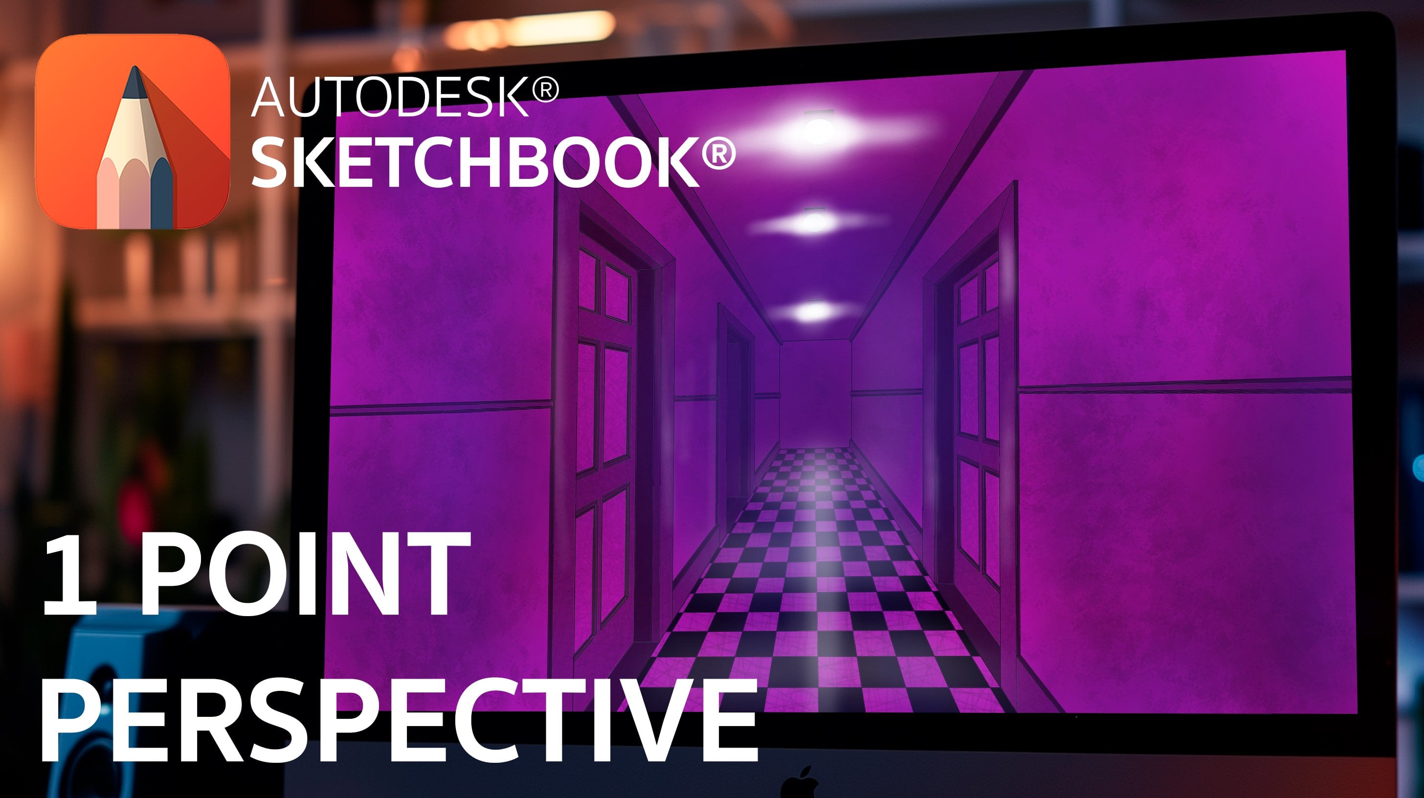
2. Software and materials: Hi, welcome back. In this lesson we'll discuss the materials
you'll need for this class. The goal is to learn how to digitalize and enhance
your traditional sketches, starting with just a pencil or pen and paper. Simple as that. Once you complete your
conceptual sketch, in the next lesson, it's crucial to transfer it to the sketching software,
specifically, Sketchbook Pro. Personally, I prefer
using a mechanical pencil for better control over line
weights in my sketches. But any type of
pencil works well. Depending on the level
of detail M for, fine liners can also be useful. Regarding paper, there
are various types available from card
to marker papers. But for this lesson,
we'll use simple paper. To summarize, you'll
only need four items, a pencil, an eraser, a piece of paper, and
sketchbook pro software, which you can download directly from the sketchbook web page. In the next lesson, we'll begin by creating our
conceptual sketch.
3. Drawing a quick concept sketch: Let's begin with a
conceptual sketch. In this case, I'll use some
reference images I have on my phone for a container with a plastic lid
as an example. If you have references
to guide you, like I do here, that's great. But if you don't,
don't worry too much because the goal is to
create a quick sketch, that will only guide us for more formal initial sketch once we're working
on the software. To start Igs warming up by drawing basic
lines and shapes, that represent or outline
the volume of your ideas. A Then add more lines and shapes where you
want to highlight important aspects
of your concept. For instance, I'll sketch some alternative shapes
for the container in the upper left corner including Section V to understand the internal geometry
of my project better. Feel free to add
more line weight or detail to your
sketch if desired. This sketch is completely
and is intended only as a guide for
the final drawings. F. A
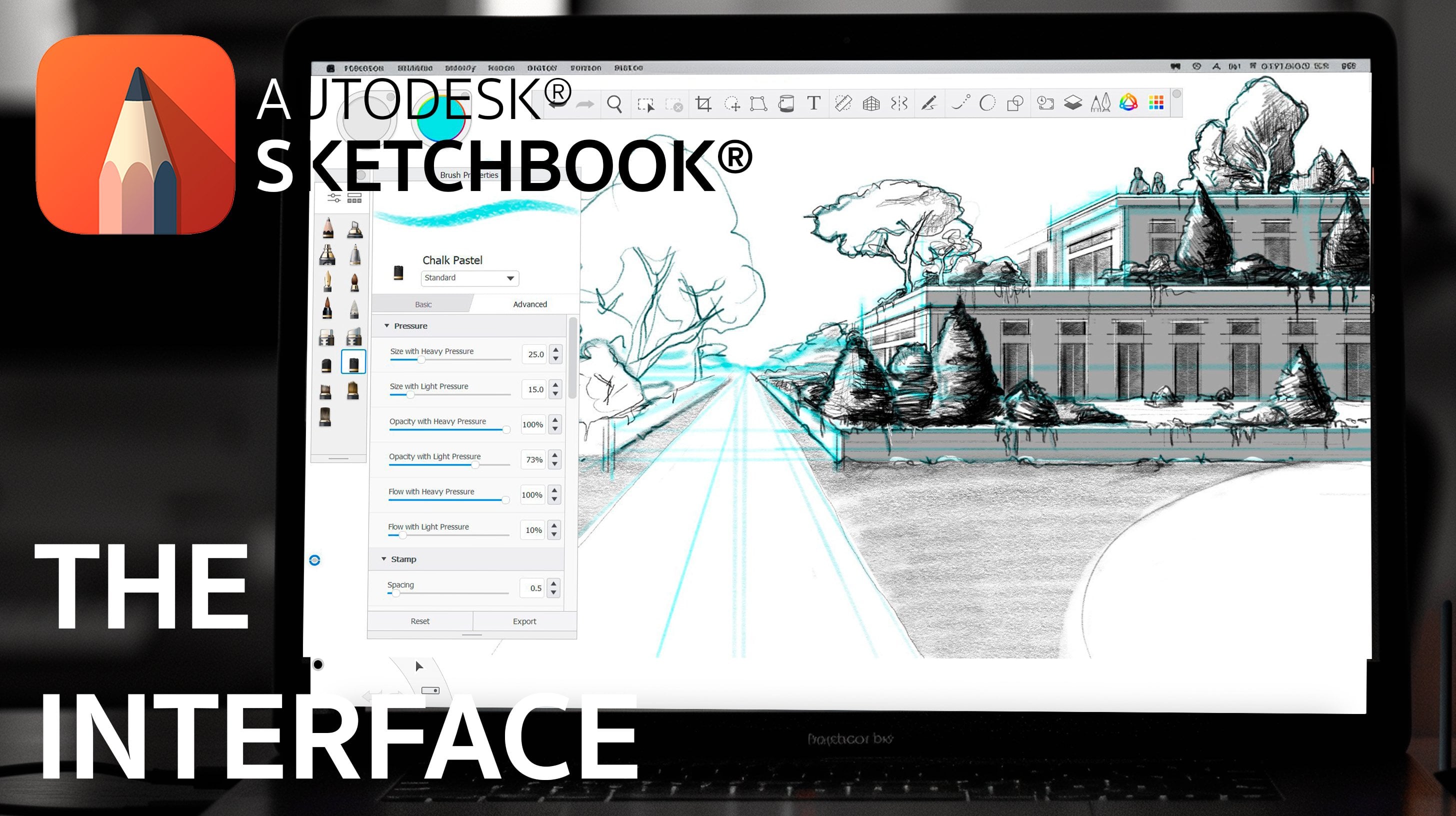
4. Preparing your concept sketch on the software: R. Now that we've
scanned or taken a picture of our sketch and
save it on our computer, it's time to begin digital work. Firstly, we need to
adjust the sketch to an appropriate size and opacity as the background
of our canvas, allowing us to work over
it on a separate layer. Toimport the image
into Sketchbook Pro, navigate to the
layers menu and click the image icon located
at the top of the menu. Choose your file from
the computer and it will appear on the Cvass
at its original size. If the image is too
large, you can resize it. Once the image is added, the Quick transform tool
should automatically activate, allowing you to manipulate
your sketch freely. If it doesn't activate,
select the layer containing the image from the main menu and then use this command
to modify it. Remember, any changes made
to the image layer will be permanent if drawing and painting were starting
on it directly. To preserve the original sketch, always work on separate
layers above it. Lowering the opacity
of the image before starting
our initial sketch and working in different layers provide greater
control over details, as you'll discover later on. F
5. Drawing the initial sketch on your canvas: Welcome back. In this lesson, we'll focus on our
initial sketch, which is akin to our
conceptual sketch on paper, but with more contrast defining the precise boundaries and
details of our elements. To begin, adjust the opacity of the inserted image and create a new layer above it
named initial sketch. Now, where should we start? We can begin drawing anywhere, but I recommend starting with the most manageable sketch
to avoid distractions. In this case, the sketch, which is in the lower
right corner is ideal. Start by drawing a
vertical guideline since the product we're
depicting is cylindrical. Using the ruler tool
from the main menu, align the reference
points vertically for a 90 degree angle and draw the line with your preferred
pencil or pen type. I'll be using a thin pencil
resembling a two H lead. Next, select the elliptical
ruler from the same many of the ruler tools and place a center point directly over
the line you just drew. Adjust the scale of the
ellipse for the upper part of the container and draw it
one satisfied with its size. The elliptical shape
should form automatically. Repeat this process for all the elliptical references
of the object, including the inner diameter, the narrowest part in the
middle, and the base. Once the ellipses are completed, close the sides using the curved ruler found next
to the straight ruler on the main menu to adjust and seal any gaps due to
the curved design. O. Continue this process for the remaining sketches, since the original drawing is shorter than the
sketchbook Cabs, use the additional space wisely. A. Eve. Organize each element in separate layers for easier
manipulation later on. To do this, select
a new sketch with the Lasal selection tool
and then use control X or command X on Mac to
cut and control V or command V on Mac to paste it
into a new individual layer. Now you can manipulate
each sketch independently. For subsequent
sketches, simply add a new layer and start
drawing each element anew. A T Once all elements are
arranged in the cavas, we can proceed to
the next lesson to refine the final line
weight of our products.
6. Adding line weight to the sketch: All right. Now that we
have all our elements in place with their initial
sketches on individual layers. It's time to add a final
line weight to our products. This line weight will be crucial
for the upcoming lesson, so ensure it's well
defined and closed. You can use any type
of pen for this task. It really comes down to
personal preference. Personally, I prefer using the fountain pain
because it produces solid strokes that can vary in thickness based on
the pressure applied, offering precise
control over langight. Similar to the initial sketches, will work on each line
weight individually. At this stage, it
can get confusing to identify which sketch
corresponds to which element. To simplify start grouping sketches together by
individual products. Begin by adding a
new layer above the initial sketch for
the first line weight. Repeat the process, ensuring
that the lines define each other clearly and erase any
unnecessary strokes or lines. Continue this process for
all elements in the scene. Once completed, we
can proceed to adding color and texture to the
products in the next lesson. An
7. Coloring the metallic containers: To begin coloring our products, we first need to decide on the materials or
textures we want to app. For this lesson,
our focus will be on one version,
those made of metal. In the next lesson, we'll shift our attention to those
made of plastic. Let's start with the
metallic element. We'll work with different
layers for the main color, material details, shadows,
reflections, and highlights. Over each line weight
we've defined for metal elements add a new
layer named material. Use the paint
bucket tool to fill the selected areas with
the color of your choice. For instance, I'm using
meat gray for the sides and lighter gray for the upper parts to simulate light
coming from above. Next, create a new layer
called material details. Use the Size two Fontaine
Pin to draw curved lines across the painted surface to mimic a sanded metal finish. Oh. Just the opacity and gently erase unnecessary
lines as needed. For flat surfaces, use
a hatching stroke from the textures of menu to create
straight lines quickly. Now add just the color
of the line weight. Leaving them in black can make the elements
look cartoonish. Click the lock icon on the corner of the line
weight layer and paint the lines in a
similar gray color to the surfaces
you've just colored. This ensures the line weight blends well with the
rest of the element. Create a new layer shadows
and use the airbrush tool with a medium sized
stroke to add shadows to different
surfaces of the product. Apply the shadows directly
on the surface and then erase any axis
outside the element. Alternatively, use
the magic one tool to select areas on
the material layer and then apply
shadows specifically within those selections
on the shadows layer. H. Add another layer called reflections where you
use the airbrush tool with white color to add highlights to the front and edges
of the elements. You can enhance
these reflections by erasing parts of the line weight on the line weight layer. Once you have colored
your first object, repeat this process
for other elements you want to depict as metallic. Great, with the metal elements, we'll now focus on
the remaining objects and the pick them as
plastic in the next lesson. H.
8. Coloring the plastic containers: Welcome back. In this lesson, we'll now apply a
plastic texture to the remaining elements. This texture is much
simpler to create and will follow the same process as
with the metallic ones. However, we'll keep
adding lines to simulate the sanded
finish on the material, and instead, we'll start applying colors to
our containers. Remember, we're using separate
layers for each element, which allows us the
flexibility to adjust colors independently without
affecting the shape or clarity of our objects. Dad. L et's finish coloring the remaining objects, and then we'll move on
to the next lesson, where we'll work on the.
9. Making the containers lids: In this session, we'll focus on creating lids for
all the containers, which will be both
easy and enjoyable. By this point, we've already become familiar with
working in layers and have repeated
the process for nearly all the elements
in our sketch, making this section
fairly self explanatory. Our task is to
design the first lid on one of the elements
we've previously drawn. I recommend starting
with the largest one. Scaling the lids
down one compromise the high resolution
of your sketch, or scaling them up may
lead to quality loss, especially around the
edges of each layer. Begin by outlining the ellipses and applying the leads color. I'll be using red for mine, while also adding shadows
and light reflections. Next, we'll duplicate
the entire lit elements, preferably grouped
together, and place these copies over each
container individually. Adjuster size, using the quick
transform tool as needed. Once completed, we'll move on to the next lesson
where we'll learn how to arrange our
elements within the scene to enhance
their presentation. See you there.
10. Arranging the elements: Welcome back. In this lesson, we'll focus on arranging
our elements on the cavas to enhance the scenes
presentation and appeal. Thanks to the individual
separation of each element, we can easily select
entire groups and adjust their positions using
the Qi transform tool. What I'd like to emphasize
in this lesson is firstly, the importance of organizing our work into different
layers and groups, which allows for
flexible modifications. And secondly, if
there's anything you wish to adjust or
refine on your canvas, now is the ideal time to do so. If you find that a particular
sketch is in achieving the desired effect or doesn't contribute positively to
the overall composition, feel free to remove it or hide it before finalizing
your presentation. Take this opportunity to
freely rearrange and refine your elements on the
canvas until you're completely satisfied
with your placement. O Once you're happy with
the arrangement, we'll proceed to
the next lesson, where we'll add
background colors to further enhance
the visual impact.
11. Adding color to the background: Adding color to the
background is a simple, yet crucial step that can significantly
elevate your sketch. These subtle details can
make your artwork stand out and draw attention to specific
elements on your canvas. When choosing a
background color, it's important to consider its impact and the
contrast it provides. If you're uncertain
about which color to use or prefer a
neutral backdrop, opting for a light gray tone
is often a safe choice. For our background, we'll
select a gray shade and enhance the overall composition
by adding shadows in the corners and highlights
using our green palette. This technique helps balance the visual weight
across the canvas, particularly useful
when you have larger objects that might
overshadow smaller elements. Adding color accents to the background can elevate
these smaller objects, giving them more
presence and impact. As we near the completion
of our sketch, there are a few final
touches left to add. In the next lesson,
we'll focus on incorporating some finishing
shadows onto the floor.
12. Adding shadows on the floor: Welcome back. In this lesson, we'll add the final
touches to our sketches. Specifically, we'll
incorporate shadows onto the floor
beneath each element. Initially, we could have added the shadows while working
on each element separately. However, I chose to lay
this step because adding too much detail to early can constrain where you
place your objects. It's a common issue because
once you define a shadow, it almost fixes
the object and it surroundings, restricting
your flexibility. Now that we have a clear idea of where each object
will be positioned, we can individually apply
shadows to each group. For instance, for the
large central object, viewed from below, will add shadows to the
roof, so to speak. By the end of this lesson, you'll see how this
subtle addition significantly enhanced the
quality of your sketches. E.
13. Saving your file as an image: Great. At this point, we have finally finished our project. Now all we need to do is
savor in a format that we can share and present such
as PowerPoint or Canva. To do this, go to the upper
menu of Sketchbook Pro, and then click on
file and save us. A window will appear where
you can choose where to save your file in the
lower right corner, select the type of file you
wish to expose you draw into. We've been working in APS
the documents so far, and we need to
save it as a JPEG. Select JPEC, and the
location you wish to use, and then click on
save and you're done. This process merges
all the layers and saves them into
a single picture. Just like in the first lessons, you can include this
image in another canvas, share the picture, or work
with it as an individual file. Note that this action only merges the layers
in the JPEC file, not in the original PSD file. In the next lesson, we'll review the final project for the
class. See you there.
14. Adding final notes on the sketch: Welcome back. In this lesson, we're focusing on adding
final anations to our sketch. Depending on your
projects requirements, this step is entirely optional. Not all sketches need notations. In fact, minimal text
often enhances clarity, allowing sketches to communicate effectively on their own. If you decide to
include notations, you can easily do so by using arrows and the text tool
found in the main menu bar. As with other elements, I recommend working
on each notation individually within its
corresponding element folder.
15. Final project: Welcome to the final
lesson of the class. Before we dive into
the final project, let's recap what we've learned. Throughout this
course, we've explored a new approach to presenting
our sketches and ideas, using digital tools,
let's catchp pro. We've mastered techniques
for applying textures to surfaces and adjusting colors for each element individually. Additionally, we've discovered effective methods for arranging our proposals to ensure they are visually appealing
to clients or peers. Now is your turn to put
this knowledge into action. Ketch something
you're passionate about enhancing
digitally and follow the steps outlined
in this class to create a published
presentation of your concept. Once you're finish, plow your work to the
P section below, so other students
can see it as well. Thank you so much for
participating in this class, and I look forward
to seeing you in the future. Have a great day.
 David Gonzalez, Industrial Designer