Transcripts
1. Intro: Linocut print making is the first raw art form
that lends itself to an almost endless range
of subject matter. My favorite type of prints
make is the scenic landscape. It all started when my
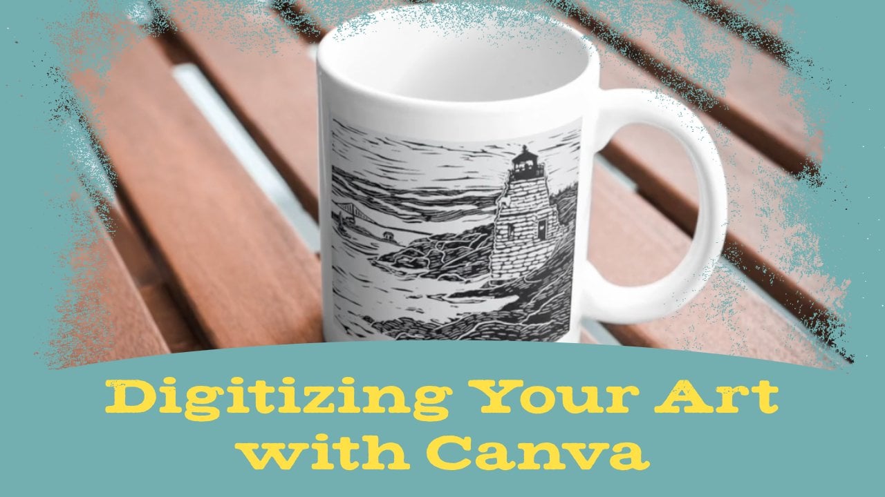
wife suggested I carve this lighthouse scene as a
wedding gift for a couple. The room in this
Rhode Island spot was a meaningful location. After that, I was
hooked on using linocut to capture places
that are meaningful to me, like Vermont or Ireland
or that I think are just playing cool like some of these vintage
roadside attractions. I love working in this style, and now I want to share
my process with you. We'll go over finding
the right shot to use for reference, setting up the block, carving your image, and
making your final print. You'll need basic linocut
print making knowledge before taking this class. If you need to learn or brush
up on the fundamentals, checkout my first class, Carving Your First
Linocut Print. Remember, what I'm going to
show you is my own process. There are lots of great
block for an artist who have found other ways
to work in this style. Keep that until you develop your own unique
landscapes style. Time to go over
the class project.
2. Class Project: Your class project. You're going to make a print
of the favorite location. If you need to get a reference
image online, that's cool, but I would love for you to
use an original photograph. Either use something you've
already taken or take this opportunity to explore your hometown and
capture some new photos. Once you have your
reference image, you'll put it on a block,
carve it, and print it. Don't forget to
share pictures of your art in the class
project section. This is going to be
fun. Let's get started.
3. Taking Reference Photos: [MUSIC] The first thing we need to do is figure out what place we're going
to use as our subject. Now, you may want to work from memory or just use
your imagination. The landscape
doesn't necessarily have to be from a real place, but I like to make prints
of actual locations, usually places I've been, or places I'd like to go, and if you do too, let's
talk about reference images. Of course, you can easily Google a location
and find images, this comes in handy when
you're not able to be in the physical location
and take photos. But if you're doing that, always check the usage rights. You don't want to
get yourself in trouble for violating
copyright law, especially if you're making
art that you plan to sell. I think it's more fun to base your print off your
own unique image, that's why I take my own
pictures whenever I can, like I did recently
while hiking through Raven Run Nature Sanctuary
in Lexington, Kentucky. Although we're learning
how to make prints, many of the same
basic principles for good photography
apply here too. That's because composition
is a key component in art. There are lots of good photography
classes on Skillshare, and I suggest watching
at least one of them. Just learning some basic
composition is going to go a long way in helping you
get better reference images. I'm not going to go into
too much detail on those, but I will cover a few fundamentals while
we're walking these trails. First, look for objects of
interest in the foreground. Maybe there's a large
rock, or stump, or flower that isn't the
focal point of your image, which shows up in front
of your main scene. Those items are great ways to add depth to the overall image. Look for them and set up
your shot accordingly. Another thing to look
for is perspective. Imagine you're standing
to the side of a river. Instead of taking a straight
on shot across the water, turn yourself so that
the rivers width recedes into the distance. The diagonal perspective
lines are going to create a stronger feeling of action
than a straight on photo. It could also create
leading lines. Look for ways that
lines like branches, cracks in the ground, things like that can lead the viewer's eye toward
other focal points. While you're taking photos, think about the rule of thirds. Your camera will usually show
you a three by three grid. Try placing the
main subject matter in the upper right
or upper left third, preferably on the intersection
of the grid lines. This will create a more
compelling shot than having the focal point
in the exact center. If your photos don't perfectly obey the rule of
thirds, don't worry. Later, I'll show you how to dial it in when you're
setting up your block. Finally, look for
areas of contrast. An image of a dense
forest packed with the same type of tree might not make an
interesting print. But a few trees in one
third of the image with an open body of water and
the rest provides contrast. If your main subject is placed correctly
in that open area, it's going to be more
noticeable and compelling. Well, I think I have a lot of good photos from this
hike to work with. In the next video,
I'll narrow them down and choose one
to use for the print.
4. Choosing Your Photo: Now that we have a whole bunch of
photos from our photoshoot, we're going to go
through them and pick out what's going be the
best for our print. This first one, I like it. It has some nice perspective, some nice things happening
in the foreground. There's a lot to work with on this one. This is promising. Let's see what else
we have. I really like this one because the weird shape of the tree is going be interesting
for our print. It's really going to stand out, plus you got the rocks
in the foreground, the mountain is looking good. You can't see a
ton of the river, maybe we have another shot. This one has more of the river going off
in the distance creating more of that perspective plus some nice foreground elements
in just the right places. This is another promising one. I really like this one too. The way the rocks and
the tree is shaped. This one, the river
looks really good, there's not as much
interesting stuff happening in the foreground, there's some nice
leaves, flowers, that's pretty cool, but I
think we'll pass on that. When we get to the trail, this is interesting because of the way the trail is shaped, so think about making
an S line from the different points on
your nine square grid. Now, we're down in this area, there's some good photos here, this is cool, but there's
just a lot going on. I don't know how well it's
going to translate to a print, so I might pass on that. This one is a little
better because of the foreground elements. With these not quite, there's not enough
that's shows clearly, but over here, now we're
getting somewhere. You've got the rocks going
in different angles. You've got a little bit of
that water falling down over the rock that gives
a nice little bit of action that we can
put into the print. You also have the
water going in a bit of that zigzag S line, that's going to lead the
viewer's eye across the page, that's something to
think about as well. This one just too much going on, not enough that's clear. I think if we're
going into this area, it's going to be one
of these shots with the rocks and the water going
in different directions. Back over here, something with the rocks in front with
this interesting tree here, and something where you
can see a decent bit of the mountain and the
river in the distance. Once I make my final decision, I'll go ahead and get the
block ready so we can get to carving that image.
5. Preparing the Block: Once you've chosen an image, you need to get a
pencil drawing of it onto your linoleum block. First though, you should
prepare your block with guidelines so that you know
where to place your image. The first thing you'll want
to do is create margins. Having a white border around
your image is good idea if you're planning to frame it or sell it to people
who might frame it. You certainly don't have to have a border but if you don't, a frame will cut off
some of the image. Plus if you're selling your art, that border helps
potential buyers envision the piece framed or
mattered in their own home. If you're printing on paper that's larger than your block, you don't need to
worry about this. But if the block and
paper are the same size, just take a ruler and make
even lines on every side. Most of my prints are 8.5 by 11 and I take them in by
half an inch all around. You can use whatever margin
size works best for you. Just don't cut the margins away until the end of
the carving stage. Having that thickness
around the block provides a little extra
stability as you're carving. Next, this is an
optional but helpful. Let's go back to the rule
of thirds and create some grid lines to make sure our image has the best
possible composition. Take the width and the height of either your block or the
space inside the margins, divide by three and draw lines to create that
nine square grid. That way, even if your photos composition
was a little off, you have another
chance to improve it. The block is ready, let's
get your image on it.
6. Preparing the Image for Carving: Now that your block is ready, it's time to get
the image onto it. One way to do this is to just draw it directly
onto the block, but remember, you
have to carve it in reverse of how your
final image will look. What I usually do is save a flipped version on
my computer or tablet, and look at that while I draw. If you're not comfortable
with free hand drawing, you can also print
it out and trace. Remember the method of
transferring the traced image. After tracing in pen, scribble over the whole
thing with pencil, then flip it over, place it onto the block
using your grid lines, and redraw onto the back
of the tracing paper. This will put a backwards
image onto the block. If you're making a
really detailed print, don't worry about drawing
every detail onto the block especially if
you're using tracing paper, since that means drawing
in an extra time. It's up to you how much
detail you want on the block. When you're starting,
you may want more detail drawn
onto guide you, but as you get more
comfortable with the process, you may just need to get
a general outline down, and then make detailed
decisions as you're carving. It's totally up to you.
Let's get carving.
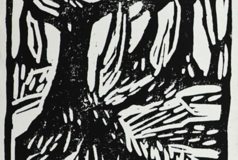
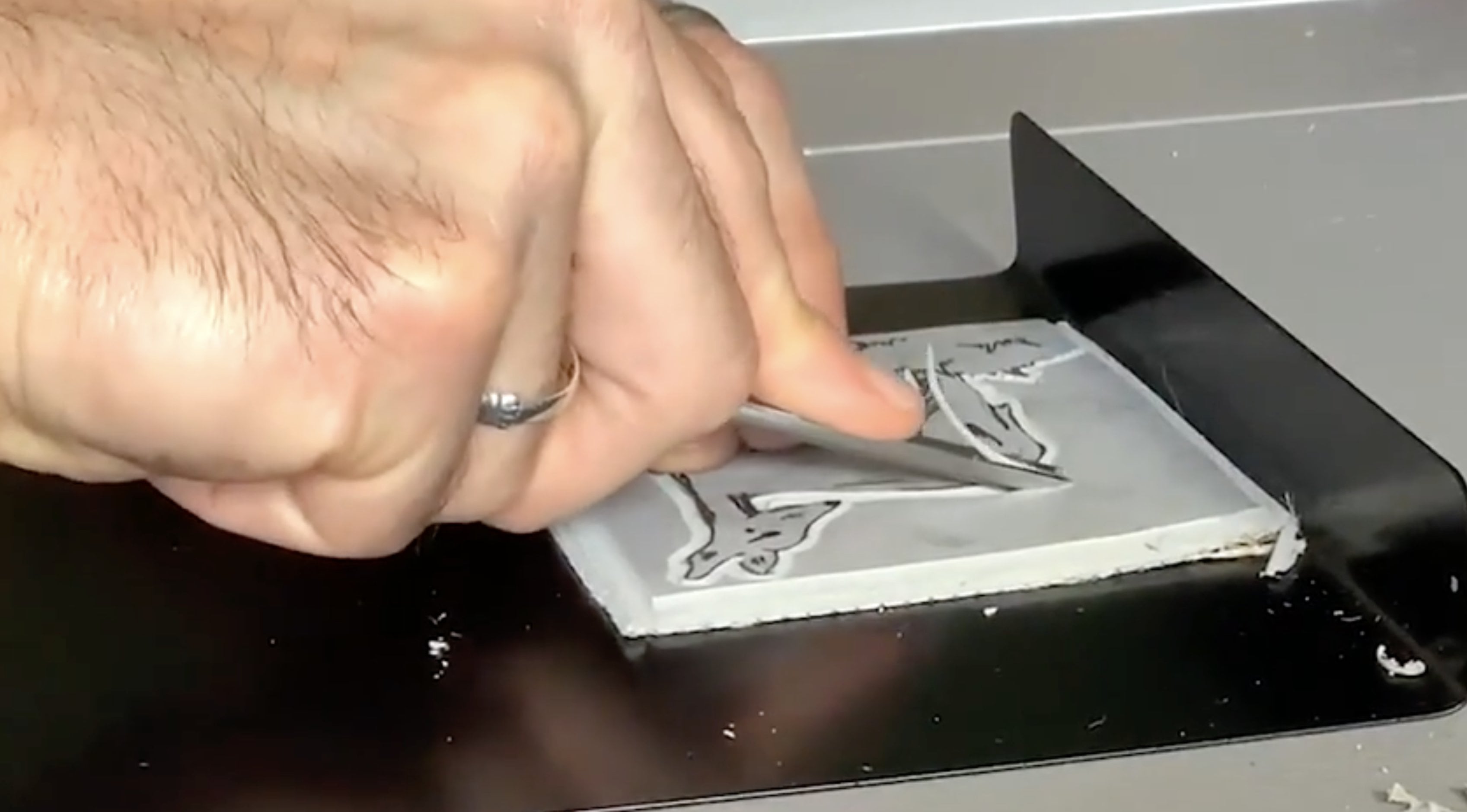
7. Carving the Block: [MUSIC] Once you have
your pencil drawing done, you can start carving the block. I'm using a Blake
battleship gray block. Remember these
blocks are stiff and depending on the type of
carving tool you're using, the tension of carving can
cause shoulder and neck pain. Avoid this by heating
up the block first. The easiest thing to
do is run a hairdryer over it until you feel
you can cut smoothly. I'll be using file tools though. These provide a smooth curve without having to
heat the block. Also, I've said this before,
but it's worth repeating. Always carve away from your body and keep your
free hand behind the blade. Turn the block instead of turning in the
direction of your hand. I also recommend
getting a block hook to provide stability and ease
tension on your body. What do you carve first? Well, that's up to you. I generally try to get an
outline of larger areas done first and then work my
way toward finer details. I don't carve away the
largest area, however. Like I said, with margins, these larger areas provide
more stability so, I save the big sections
like sky for the end. I mentioned earlier
that it's not necessary to draw all
the fine details. One reason is because small
natural elements like leaves and grass are better
off done spontaneously. You also don't have to
carve every detail. Sometimes a better
approach is to carve somewhat of a pattern
into a section to suggest grass or leaves
or whatever that area contains and then be a bit
more detailed in a few spots, such as in the foreground. [MUSIC] You can add an extra touch of subtle realism with your
speed ball number six blade. This is the blade
that's curved on one side with a
sharp pointy tip. It's great for trees or
other wooden objects. You can drag the point to create lines that suggests tree bark. You can also lightly
scrape the curved side to create texture in a
more weathered look. [MUSIC] Clouds can be tricky. If your print has clouds, you'll probably be refining
them after your test prints. If you're going for realism, trying to carve them to precisely might make
them look fake. Also be aware of how clouds affect the overall
darkness of your print. You might do a test
print and find that even though you wanted the scene
to be of a cloudy day, it instead looks like
a storm is rolling in. I found that the
best approach is to carve away your sky loosely with horizontal strokes so
that you leave lines behind. Make those lines a little wavy and random and it will give enough of an indication of
clouds without looking stormy. After your test print, you can judge whether
you left too many lines behind and get rid of
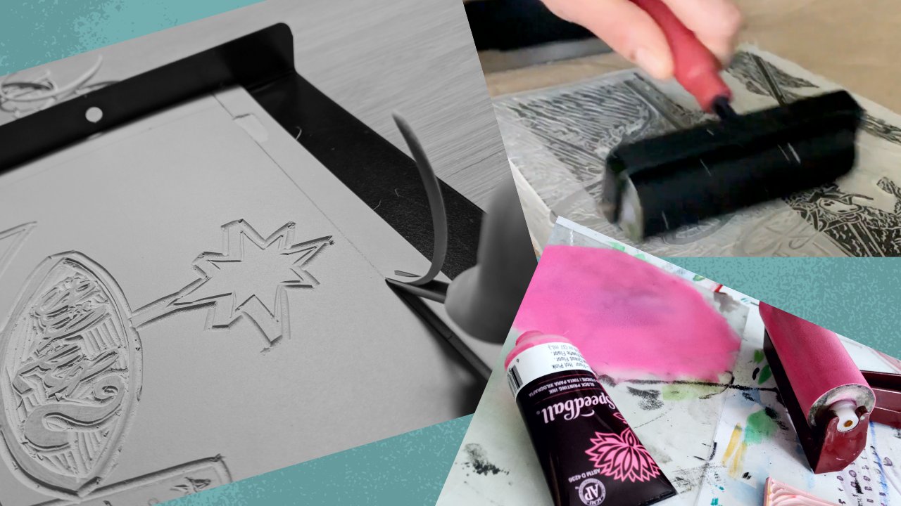
however many you need to. [MUSIC]. Once you're done carving
your main image, you can cut away the margins
with your widest blade. One way to add a
little extra interest to your print is to
break the print. Here I'm letting a
couple of branches and leaves creep into the
margin just a bit. This is a fun trip, but be
careful not to overdo it. [MUSIC] After the margin is carved away, I'm going to go over it
again with my sweep tool. This is a wipe flat
blade that helps make sure you're not
leaving any lines behind. You want your margins to
be as clean as possible. So, a sweep tool is
a great investment. [MUSIC] Then after all the
margins are done, you can move on to printing. [MUSIC]
9. Wrap Up: I hope you had fun learning how to make a scenic landscape
linocut print. Keep in mind that what I've
shown you is my own process. That doesn't mean
it's the only way or the best way to
work in this style. The more prints you make, the more you will figure out little tricks that
work better for you. Most importantly, the
more experience you have, the more you'll develop
your own unique style. I would love to see your art. Please share process
pictures and final art in the class
project section. If you have questions, feel free to leave a comment, or contact me anytime at mattreno.com or on
Instagram, @mattrenoart. Until next time, thanks for
watching. Stay creative.
 Matt Reno, Linocut printmaker