Transcripts
1. Welcome: Thanks for checking out this Skillshare class. Adding color to your linocuts. Like a lot of print makers, I work primarily in black and white, but sometimes it's fun to experiment with color. Linocut can be a little tricky though when it comes to applying multiple colors, depending on the type of image you've made or the size of the brayer, it might be difficult to get the colors in the right spots or to avoid colors overlapping when you don't want them to. As with all art forms, limitations lead to creativity. In this class, we'll go over a few strategies for creating colorful prints. If you're not already familiar with the linocut process, I encourage you to watch my first Skillshare class, carving your first linocut print. There we go over the basics. Getting your image onto the block, carving, inking and pressing. This class is all about color. Grab your blocks, brayers, and of course inks and let's get started.
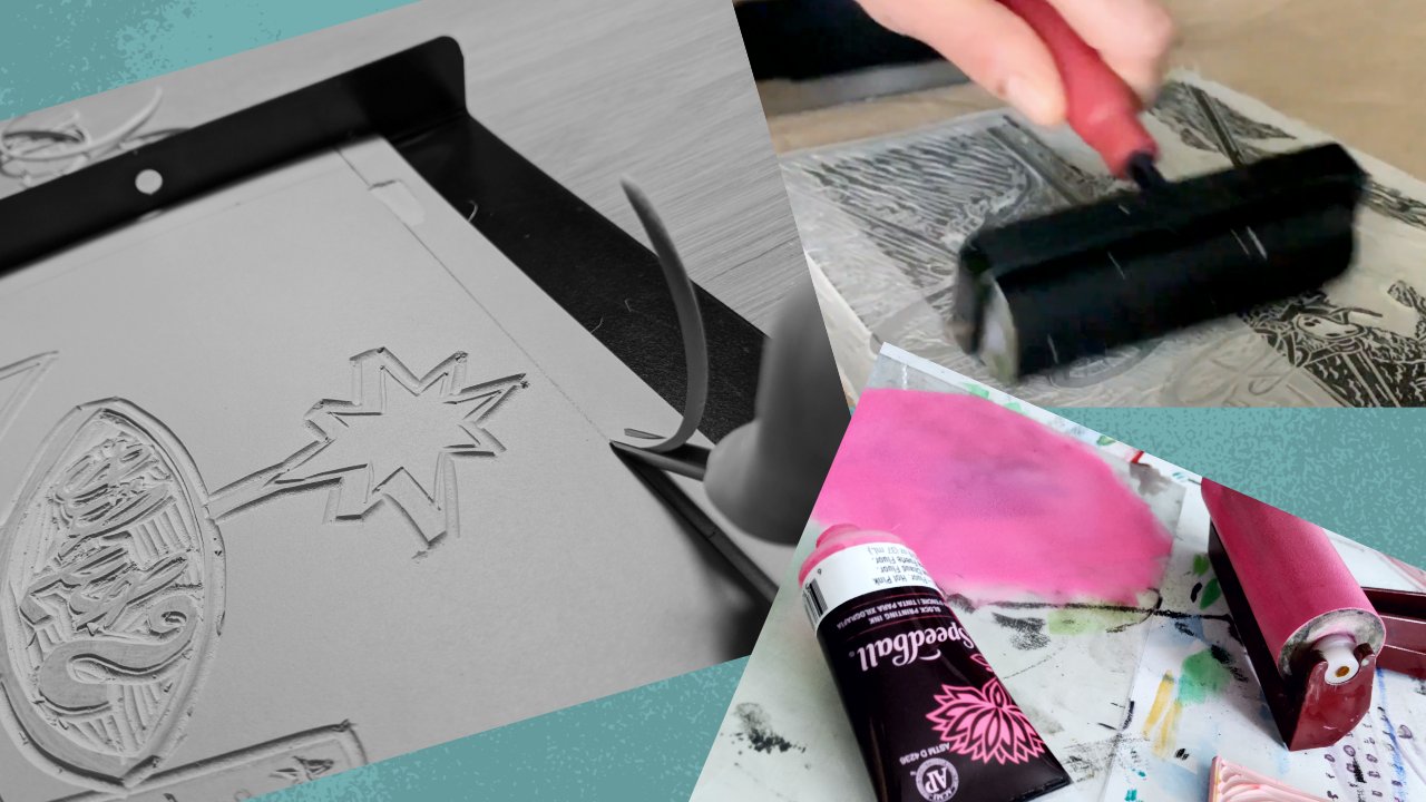
2. A Quick Note About Inks: First a quick note about inks. If you're printing at home, you're going to want to use water-soluble inks. Oil-based inks look great, but they're harder to clean up and not too friendly on a home sake. Also, you can find many different colors of inks, but today, we're going to stick with mixing primary colors. If you're a beginner and not sure which inks to get, just go for primary colors plus black and white. As you progress, you'll figure out which premixed colors to add to your collection.
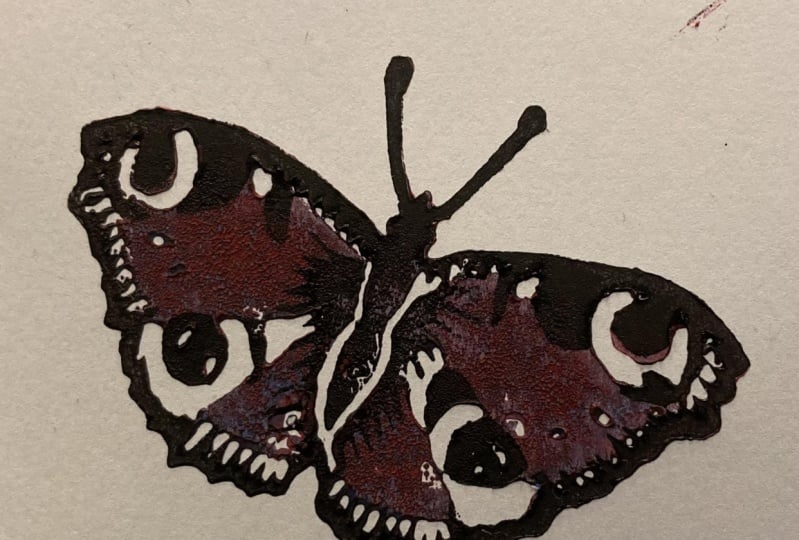
3. Gradient: You want to roll one solid color over your entire block that's perfectly all right, but it's usually more interesting to have a couple of different colors, even if it's mostly black, with just a couple hits of color in key places. Right now, we're going to go over gradients. Sometimes this process is called the rainbow roll because if you have a big enough brayer, you can load it with all the colors of the rainbow and make a really colorful design. Today, we're going to use a standard four-inch brayer and apply a three-color gradients. We're going to a yellow to red gradient with some orange in-between, so I'm going to start by putting down two drops of yellow and then some red on the other side and then a little bit more red in the middle to mix that orange. I've got a small brayer that I'm using to make the orange. Now, you don't always have to use separate brayer, you can do the whole gradient on one, but right now I feel like getting the orange dialed in first and then I'll take a larger brayer for the red and the yellow. This was a little too red, so I'm going to add some yellow to it just to make sure there's a clear distinction between the colors. There we go. Now we got our orange down, I'm going to take a larger brayer and start going over all three colors. Make sure the whole brayer is covered with all three, and you can move it side to side a little bit just to mix them, make sure they're blending so that there's not stark lines in between the colors. Obviously, you don't want a crossover too much, but a little bit of side to side motion is just fine. Now, we're ready to roll it on. Of course you're only going to want to roll in one direction, otherwise that would mess up the whole gradient effect, but just go up and down a couple of times on this piece, and then we'll put our paper on and press it just like normal. Once we've got a good pressing, we'll pull it up and see how this gradient turned out. There's our gradient. Go ahead and experiment with as many colors as you want, it provides a little more life than just a solid color.
4. Two Block: Next, let's look at the two-block method. It's pretty simple. You put pieces of your design on different blocks and press them separately. This is what we're going for today. The deer is in black and white, but standing on a patch of green grass. The main thing you want to pay attention to is registration, especially if your design requires accurate image placement. Alright, let's start by rolling together some some and blue. That's going to make green, and that's what we're going to put on the grass block. The only thing on that block is going to be grass, and on the other side, it's just going to be the deer, and we'll be printing that in black. Right now we're going to put our registration marks on this paper. This is going to help us know exactly where to put the block and the paper every single time, so that we get things lined up. With this particular print, it's not so essential to get it right because it's just a patch of grass that the deer is standing on. Those don't always have to line up. But there are a lot of times when you're doing a two block, or as we'll see later on in this class, reduction prints, where it is crucial to have everything always lined up in the right place. Just put your block on a piece of scrap paper, and then with a pencil mark the corners of the block, and then put a piece of paper on top of that the way you want it laid down when you're printing, and mark where the corners of the paper go. That way, you'll be able to put it there every time. Now we'll press onto the paper, and there's our first layer. We'll set that aside, and then we'll ink our second block. This one will be all in black. This is going to be just the deer. One nice thing about speedy carve blocks is that they're usually thick enough to put a design on each side. So even though this is called the two-block method, I'm just using two sides of the same block, which is pretty convenient. Generally speaking, you want to go from light to dark with your colors. So that's why we did green first and now we're putting black on top of that. Let's bring out that paper with the registration marks again and put the block in the exact same spot that the other side of the block was in. Then we're going to take our paper with the green already pressed on it and we're going to put it on top again using the papers registration marks to make sure those are in the same spot that we printed the green side on. Now we're pressing the black ink onto our previously printed paper. There we go. One print made with the two-block method.
5. Jigsaw: In most cases we want to try and keep your original block intact, but sometimes you have to break it into a few pieces in order to rule multiple colors without having those colors touch. That's what I did with this sprint. To get the three colors in the right places, I had to use the jigsaw method. The first thing we're going to do is carve this piece just like normal. I'm speeding it up because you've probably seen this before. We went over this quite a bit in my first-class carving your first line or cut print. So we won't spend a lot of time on this part of the process. I'll slow it down once we get to cutting this block into a few pieces. I will say one thing that's helpful when you're doing this jigsaw pieces to make sure that you do have some lines that are clear enough and that are carved deeply enough that you can make an easy cut. Now that we've got the block carved, we're going to cut it into three pieces before we put the colors on. There we go. Three different pieces, each is going to have a different color on it. Let's start inking. I'll just color that top part just like normal. Keeping all the pieces separated so that we're not accidentally getting the wrong color onto any of the other block pieces. Grab some of that yellow and use it to mix with blue so we can get green. I'm keeping these colors in separate places on the plate so that I can go back and make more prints if I want to. Now that I've got the green mix, the way I want, then you use that to color the middle block, that will be the mountains in this scene. scene we'll add some blue, and that will be our lake. I'm just going to add another hit of the green and the yellow just to make sure that the original colors didn't dry out too much, make sure they're all at the same level before I actually put paper on the block. Once every piece is inked, we assemble it, just like a jigsaw puzzle. We put these together so that it looks like the original block, but now we've got three colors, and put the paper on top, press and we'll see how it turns out. Not bad. But I'm thinking maybe the sun would look better if it were more of an orange and yellow gradient rather than this dark yellow, which is no problem. The pieces of the block are still separated, so I only have to color the sun piece again. I'm going to apply some orange to this yellow area. I'm just gently rolling onto the bottom of it and seeing how this looks with just a little bit of orange underneath the yellow to give it more of a sunset effect. That's looking pretty good. The only thing is I've got the gradient effect I was looking for on the bottom, but then it's stark yellow on the top. I think this time I'm going to give it one more try. It's going to be more of a full gradient. I think that's going to make it look more natural. Let's roll that out. It's going to be the same principles we applied in a previous video about gradients. Gently roll that onto the block. There we go, it's already looking more natural. I think this is going to be more along the lines of what I'm looking for. This is a good example of one of the great things about printmaking. You can make multiples. If something doesn't turn out quite the way you want it, just try again. Just keep experimenting. Especially with colors. There's so many things you can do with colors. Keep experimenting, pushing the limits of what you can do with your ink. That's more what I'm looking for. That deep orange with a little bit of yellow in the background. It's got a nice rough texture on it. I'm pretty happy with this one.
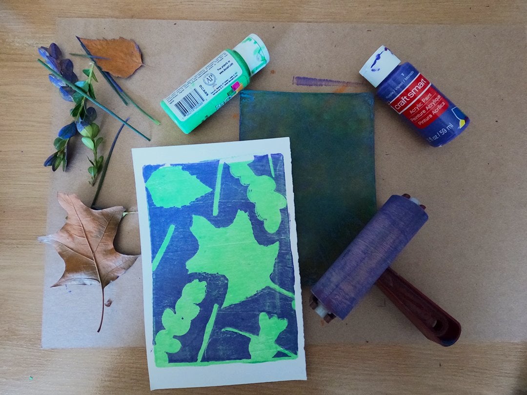
6. Gelatin Plate: In this next lesson, just as an example of how you can mix methods to add colors to your linocut prints, we're going to create a background using a gelatin or a Gelli plate. You can buy these online or find a recipe to make your own. Gelli plates provide a fun way to make abstract designs using household objects or even items from nature such as leaves. They're also really easy for all ages to use. Gelli plate printing is a great art activity for kids. They can use acrylic paint and it all cleans up very easily with baby wipes. Here's our gelatin plate and we're just going to put some bright green paint on it and take our brayer and roll over the whole plate. This is going to be our background layer, so we want the paint on the entire thing. That's all we're going to press right now. We're going to do a couple of colors. This is going to be our first layer. Once we've got it covered, put the paper down and press it just like normal. It's fine to just use your hands for pressing. Let me pull it up, see what we've got. Full block of green right there. We're going to set the paper aside and put some more paint on the plate. The paper picked up most of the greens so we don't have to clean it off or anything. We'll just put this purple paint right on top of it. Again, roll over the entire plate with the brayer. But for the second pressing, we don't want the purple to completely cover the green. We want to make sure there are areas where the green is showing through. Once we have it completely covered in purple, I'm going to take some of these pieces of scrap paper that I tore up into random shapes and just place those in some different spots on the plate. These are going to block the purple from getting onto our paper so that the green will show through. Once you've got them arranged the way you like them, we'll just put the paper back down, green side down, and keep in mind I'm using some registration marks just to make sure that everything lines up fairly accurately. There you go. Some fun little abstract shapes in two colors. That's a basic way to make some fun art with your Gelli plate. You can do a lot of other things though, depending on what kind of materials you want to use to block that second layer of paint. You can even put on more. You can do a third layer, a fourth layer, as many colors as you can. Just as another quick example, I'm going to once again roll green over the entire plate and then press it so I have a green background layer on the paper. Once again, I'll cover the entire plate with purple for the second layer, but this time I'm going to put something different on top of it to block the purple from completely covering the green. We've got this paper here with some kind of weird diamond-shaped holes. I'll just cover as much of the plate as I can with that. Press it down. Yeah, it's going to get a little messy. My hands are going to get some paint on them, but that's okay. That's why this is a fun kid-friendly activity too. You can get your hands dirty, but the clean-up is very easy. I'm just pressing in on there and I'll lift up the paper. As you can see, the paper has pulled up some of the purple. Then we're going to press what's left onto the green. Let me just clean up my hands with the baby wipe first so I'm not getting purple fingerprints all over the paper. I'll put that paper with the green background layer on it, use those registration marks to get it in the right spot, and then put some pressure on it with my hands till I feel like I've completely covered it. Lift it up and let's see what we've got. That's pretty cool. I like that. I like that random pattern going on there. It's a cool background for what we're going to do in a little bit. But before we get to that, before we get to putting some linocut on it, we're going to make what's called a ghost print. After you pull the paper off the Gelli plate, you're going to be left with some paint. If you put a new piece of paper on top of that and press again, sometimes you can get a really cool ghost print. That one's pretty light, but also it's cool. I think we can use this one too. That's a good ghost print. It's a little unpredictable. You don't always know if you're going to get something that's worth keeping, but I think it's always worth doing the ghost print after you do your main Gelli plate print. But now since this is a linocut class, we're going to break out a linocut block. This is something I made last year around Halloween, which is why we have a skull with a scorpion crawling on top. Not exactly my usual style, but I like to have fun with some creepy stuff every October. We're going to start with the darker print we made, which has a lot of purple and green on it. Since that's darker, we'll use white on the skull so that we have enough contrast so that everything is showing properly. This is just our normal linocut pressing process. We roll the ink on and we put the paper on top and press it like this. It's got enough contrast, it's different, it's weird, and it keeps that creepy vibe that I started with last Halloween. This background adds a new dimension to that creepiness. Let's try one more time with the ghost print, and since that one came out very light, we're going to have to put a darker color on it. I'm going to mostly use red. I'll put a little bit of yellow in. Once that's inked, we'll put the ghost print on top, press it, and let's see what we've got. That one's pretty cool too. You can do a lot of different things to make various backgrounds for the same linocut block. Gelli plate prints are great on their own, and I enjoy adding this extra dimension to them with linocut.
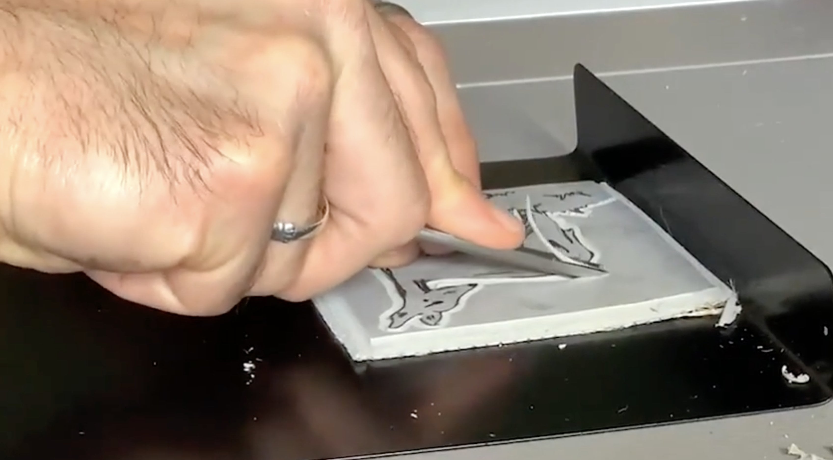
7. Reduction: Finally, let's go over the reduction method. Reduction linocut is tricky, but when done right, it can produce some beautiful multicolored pieces. It's called reduction because you are literally reducing the block gradually with each coloring you want to add. Unlike the jigsaw method, the reduction process is destructive. Meaning once you're done, you're done. You'll end up destroying the block to where you can't make another addition. On the upside, that makes reduction pieces more valuable because of the limited edition factor. Here's how it works. In the first carving stage, you take away only where you want the paper to show. Then you apply a color and press enough prints for the addition. That's key. Make sure you have enough prints in the first round because that's all you're going to have to work with once you start carving again. With each round, you carve away some more and print a new color on top of the previous prints. I know that sounds complicated, so let me show you what I mean. Even though the reduction method is normally used to create very detailed prints, I'm going to keep it simple for this class. We're going to go back to this dear print, but do it in a way that adds more color using reduction printmaking. I'm going to start by carving part of this block. This is going to be the part where the paper shows through. You're only carving away that leaving everything else. So the background and just under the deer's body, but above the grass, that's going to be carved away. The entire deer is going to stay, all the grass as well. I'm going to ink the entire block green for the first pass. Later, I'll be layering inks on top of that green, but first, I just want to get this base layer down. Remember you want to go from light to dark, so our colors for this piece are going to be green, brown, and black. We'll do them in that order. Right now though, again, all I'm carving away is the background and just a border around the block. This is going to be where the paper shows through. I'm speeding it up because this part takes a little bit of time, but I do want to make sure that you see this just so that you can visualize as we go along what you're supposed to be carving away at each stage of this reduction print. I should also mention, you've probably noticed that I've changed the block and the cutters that I'm using. Instead of the speedy carve, I'm using blick battleship gray, and instead of speed ball cutters, I'm using file tools. One reason I switched to these is because I'm better able to get some fine lines. We're going to need that in the third stage of carving. It's a little harder to get fine lines with a speedy carve. Also because I really want to make sure I'm clearing away large sections of the background of this print, I'm using my file tools because as you'll see in a little bit, I have a tool that's called a sweep rather than the usual V carve, or U carve, it's fairly flat and that allows you to wipe away large areas of the linoleum that are left behind from the smaller cutters. So you get a much cleaner background than you normally would when you're not leaving those artifacts behind. Now that it's carved, we're getting ready to ink. First we're going to do registration marks again just like we did in an earlier lesson. We put the block down, we made marks around those corners, and then we put a piece of paper on top before we do any inking and put marks around those corners. We know exactly where we're going to put the block in the paper every time. This is very important with reduction linocut print, you want to make sure everything is always in the same spot. Now, let's put our green ink on top of the block. Again, we're coloring the entire layer, even the deer which is not going to end up green, it's going to be brown with a black outline, but with reduction linocut, we do one color on the entire block during each stage. Now, we put the paper down, again, paying attention to those registration marks. We'll press it for our first print. We'll pull it up, and there we go. We've got a full green layer. I'm going to set that aside, and I'm going to keep going. I'm going to repeat this first stage process for every print that I want in the edition. Maybe even a little extra in case I make mistake or two along the way. But you want to have that number in mind because you can't go back later after you've carved into the next stage and decide that you're going to want to make more prints. The number of prints that you make in your first stage is going to be the number of prints that you end up with. We'll keep going until we have our whole edition. As you can see in this case, we're going to have at most seven. Then we'll do the second stage of carving, basically, taking away all the grass so that all that's left is the full body of the deer. In the second stage, we're using brown ink. I'll admit I don't use a lot of brown, so I had a hard time getting the color just right. I ended up mixing all the primary colors till it was mainly purple, and then I ended up throwing in a little bit of gold. That really did the trick, giving me a nice brown color. Again, we're inking the entire thing. We'll put the paper on the block using the registration marks so that the green deer is going right on top of the brown pieces of the block. All right. Now, it's time to ink and press our final stage. We're using black ink, and we're going over what's left. You can see that all that's left is the outline of the deer plus the eye and some shadows. Back to those registration marks. Sometimes it can be a little tricky. We've taken off a lot of this block. It can be hard to get it just in the right place, but do your best. Then grab one of those prints and line up the registration marks once again, gently place it down on block, and we'll press. Let's pull it up and see what we've got. There we go, a reduction lino print. Again, repeat that process until you've got your edition complete.
8. Wrap-Up: I hope you had fun and learned some new methods for bringing your prints to life by adding color. I'd love to see your creations. Please post them in the class project section. If you have any questions about this class or Linocut in general, feel free to ask them here or visit my website, mattreno.com or find me on Instagram @mattrenoart. Thanks again for watching this Skillshare class.
 Matt Reno, Linocut printmaker