Transcripts
1. Introduction Trailer: My name is Mil Sligo. I'm a lead three
environment artist, and I will be your
instructor in this course. In this large course, I will teach you everything that
you need to know on how to create a medieval style town environment for video games using Blender TD and UnwelgtFV with the help
of Manit and Lumen. This course will cover a
very large number of topics, but the biggest topics
are as followed. One, doing project planning and creating proper blockout scenes. Two, creating modular buildings
with high reusability. Three, sculpting wood and
concrete assets in Ze Brash. Four, using Nanite in
UnalgenFV along with slightly modified
traditional workflows for a higher quality model
while still being able to modify these models
in other Twin software. Six, creating various
tyilable materials using substance three designer, seven, creating unique textures using substance painter, eight, doing lighting and
post effects in Unreal engine five, nine, adding actual geometry
displacement on our modular assets using the modeling tools
in Unreal and ten, doing general level
art in Unreal Engine. And there will be so much
more covered in this course. The general takeaway of this
course is that at the end, you will have the
knowledge on how to create exactly
what you see here, and you can apply this knowledge in almost any type
of environment. Because we want to
make sure that you can follow along with
every single step, we made sure that almost
the entire environment is recorded in real time
and fullly narrated. There will be a few
time lapses which cover very repetitive and time
consuming functions. However, we made sure
that we will never cover anything in these
time lapses that we have not also covered
in real time. With a total of 29 plus
hours of video content, I feel confident that at
the end of this course, you will have to know on how to create a wide variety
of environments, not just medieval types. This course will
also come with out generated subtitles in
English, Chinese, and Spanish. I hope that you will
enjoy this course, and I hope that it will have a positive impact on your life.
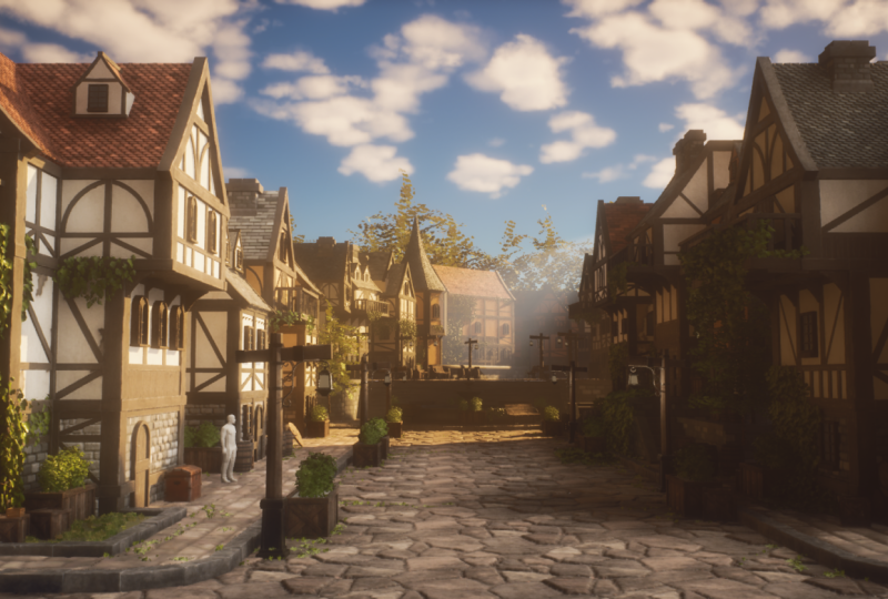
2. 01 Going Over Our Reference And Planning: Okay, welcome to the
very first chapter, where, as always,
what we're going to do is we first of all,
need to do some planning. Now, I already went
ahead and I already gathered all of the images
that I want to use, and I placed them into PureRv. So Pure Rv is basically
a very handy program. You can just go to purev.com, and a lot of artists use it.
You can get it for free. And with it, you can easily
just drag in your images, and they will stay
at high resolution, but they will all be here. So you can just
zoom in and you can just move them around and
all that kind of stuff. Now, let's get some
formalities out of the way. So this is going to be
our main concept art or our main reference that
we are going to base our environment we
have an artist here. So Vincent Lau, I hope
I say that correctly, he was kind enough
to allow me to use this concept art to basically
base our environment on. So thank you, Vincent.
And what we're going to do is we are going to
give it a little twist. So for this environment,
as you can see, it is very stylized. However, I am not
a stylized artist. I'm a realistic artist. So my twist is going to be that I'm going to
take this environment, but I'm going to make
my version realistic, a bit more in the direction
of this and also with, like, a general lighting mood, like you can see over here. So it's going to be
a fun little balance that we are going
to try and create. Next to that, we will also
be using a little bit of nanite and some in engine displacement, which
is going to be cool, and that's one of
the new features of Unreal Engine five,
especially great, for example, for the ground for the wall and over here
for the roof tiles. Now, for the wood, I'm going to show you a special technique because we have so much wood
in this entire environment. However, the pieces of wood are actually
not that different. So what we're going
to do is we are going to create really high
quality wood pieces. We are going to even sculpt them and everything
inside of sea brush. But then we are
only going to use one or maybe max,
two textures for it, which is going to be
quite fun because when we only use one or
two textures for it, we can first of all, it will
be very cheap in terms of, like, the texture space. But second of all, because
the textures will be unique, we can really push in a
lot of quality in this. And then we can basically just reuse all of those pieces
over and over again. So here all of these, we
can reuse and these planks, we can later reuse in
here and stuff like that. But we will go over that
a little bit later. So, yeah, as I said, the mood, I want to go a little bit
more in this direction, like a slightly sunny day. We have some nice
foliage that I'm also going to get,
and for the rest, it will, of course, have
a bit more contrast, and it will have some
realistic textures. Now, I have a bunch
more images here that I just got from Google
Images and stuff like that. I just typed in, I think the only two
things I typed in is medieval buildings and also medieval German town
and stuff like that, because this is architecture that you often see in Germany. As you can see over
here. And for us, I also just went to
the art station, and I just went ahead and
looked up some concert art, which I'll go to the
respective artists. And these artists, the file
names are also in here. So when I provide this,
you will actually be able to see the name of
the artist in the file name. I cannot really
look them up right now because then it
would take me like a couple of minutes just
to go through all of them. I quite like this one. This is also quite
a good concert art that we can use as inspiration. Now, next to that,
I have a bunch of really high quality reference photography that I took myself. So, for example,
for the plaster, we are going to go for
something in this direction, maybe not as damaged, but just like the
general plaster feel. For our ground, we are going to go ahead and
create two versions. So we have the round version, and we have the square
version, which, as you can see, actually fits really well with
these ground pieces. I still need to check out how
I'm going to do the curve, but that's something
that we can do in a bit. For the wall versions,
here we have a wall, and it will probably go more in the direction of these
pieces over here. And we can use those for, like, the side walls and
stuff like that. Then we have our roof, which we will use for our roofs. And I feel like I kind
of want to go for, like, the round versions. They look quite nice
because I'm always using, like, the square version, so I just want to go for, like, something a bit different. And of course, wood. So here we have our wood. Now, in my planning,
what I have, of course, creating
environment is very dynamic, so the planning can change. And what I'm going
to do is for now, the idea is that even though our wood is going to
be unique pieces, we are still going to create our own procedural
wood material so that we are 100% sure that the base material of
our wood is amazing. Now, I can, of course,
tell you all this stuff, but I know that you
guys are our artists. You want to learn
in a visual way. And that's what
we will be doing. So just bear with me if you don't want to
hear about this. Later on, what we're going to do is we are going
to go ahead and, of course, show you everything in detail in real
time how to do it. But for the people that
just want to listen to me for a while,
the plan that I have, when I look at this environment, I already had a little
think about it, of course, because that's something I cannot
really do on camera. And I already did
some prototyping. So our floor pieces. Our floor pieces we have
over here our main floor, and then we have
over here our curbs. The curbs are going
to be modular models, and the main floor is
just going to be like a simple plane that
we are going to use. And now the cool
thing is that we are going to do is we are going to use the new modeling tools in Unreal engine V to basically once we have
a texture on here, to displace our texture and
give it actual real height. And then we will use
Nanite in order to not slow down our level. Now over here, we
are going to do the same displacement
technique for our walls, but our walls are just
going to be simple planes, and they are going
to be combined, of course, with our wood. All of these pieces
are going to be modular so that we can
create whatever we want. Because this is a tutorial,
I don't have as much time. So I want to basically
reuse my models as much as possible so that
most of our time is dedicated in making those
few models look really nice. And then, of course,
also in designing all of our buildings
because you can see quite a few buildings over here. So that is the general
idea for these pieces. These curves that
we have over here, we might be able to also reuse the stairs or we might
simply just leave out the stairs and just change that system over
here. But I will see. Who knows? Maybe I
just throw in, like, a time laps on how to create those pieces because they are so far away from the camera. For our plaster, we are
going to create a plaster, but because it's going to be a procedural material
and tilable material, we are going to
create two versions. One is damaged version, and one is a clean version, so that we can use
some vertex pane to sometimes create
some extra damage. As I said before, for our wood, we are going to just make
a library of wood pieces, and we need to do a very
good job in the planning. And what we're going to
do is we are going to create unique textures
for this wood. Sorry, I cannot speak. And we are then going
to reuse all of these wood pieces all
over the place so that we have really
nice high quality wood. The only thing that I'm
a bit worried about are these pieces over here
and things like the door. So what we might do is because we are going to
create a wood texture anyway, we might leave those as
tlable textures in order to avoid those problems. The roof is going to
be, again, modular, but what we will do is we will
apply a displacement on it so that we can
actually have these cool little roof
tiles over here. Of course, everything will
be done in Unreal and five. And once we've done that,
I will go ahead and show you a quick timelaps on how to do a few of
these extra assets. And as for the background
assets, I don't know. I might do that as a timelaps
or I might just add those. Let's have the lamp over here as one of our main assets
that we are going to use. So it will be, of course, the main focus is going to be on the buildings
and everything. But then we are going to
have this one lamp asset as the main asset that
will just have a nice, unique texture on showing
you how to create pops. These small props are just
going to be a time laps. And then, of course, we have, as you can see over here, a little bit of foliage
here and there. And what I'm going to do
is I will show you how to create some very quick grass. I will show you how
to create, like, a very easy bush over here. And then for the ivy, what I will do is I will
actually to save some time, include the ivy already, but I will also include
a quick little chapter from a different
tutorial, most likely, for my foliage tutoil
on how to create the ivy and also on how
to and for example, the tree, I will just kind of like art because it's
in the background. Reason I do this is to keep the cost of the
tutorial down because, of course, else, I
would need and else, I would just be
repeating myself. So yeah, or you can just say that I'm lazy and I don't want to do the
exact same thing twice, whatever you want
to think about. Basically, that is the general planning of this environment in my head and what
I've also written down. I recommend that you look at the environment and
you write things down. Now, quite important. What we're going to do now is we are going to do a
modular planning. For this environment,
it is super important to do the modular
planning correctly, because as I said before, we need to be able to reuse
these pieces over and over and over again so
that with ten pieces, we are able to create an
entire town, basically. So here we are inside
the Photoshop. By the way, I also
have a keyboard registration sitting down here. I will sometimes move it around. And info shop, what
we're going to do is the way that I do my modular
planning, it's quite easy. I basically just here
I have my layers, and then I go up here
and I go to the polygon, not a lesser tool, the
polygon lesser tool. And then we can basically
just, have a look. Now, first one,
as I said before, is going to be the
modular pavement. I can simply do a
polygon laser tool. This does not need to look nice. You just want to kind
of, like, grab a piece. It's just for you and you alone to see and remember
which pieces you need to make. So we have this
one, and then I go down here and I
add a solid color. I make the color, I don't know, just a random color and
then set paste down. It's just so that I can see, okay, so I need to make a
module piece like that. Then I can see that I need
to make like a corner piece, and I want to make this
quite a sharp corner. So without a lot of straight areas or like
straight extensions, and I will explain
to you later on why. A lot of this is
just experience. So it's a bit hard for
me to explain now, I need to show you, and then
you gain that experience. So we got those. The prop, of course, we know, but let's
go ahead and go over here. Now for these valves,
we can do a few things. What we can do is or we can include the corners
onto the walls, but that will mean that we
need to cp more pieces. Or what we can do
is we can exclude the corners from our valves
and make them super modular, and it means a little
bit more placement inside of unreal engine. Now, I'm going to go ahead and choose for the second
option over here, and I'm going to just
have the corner, as you can see over here. Okay, it can be a
little bit nicer. The corner, as you
can see over here, I'm just going to make
that a separate piece. And I will start by doing
this all quite quickly. Just make it a different color. And then what we will do is
we will have one of these. These are going to be like
one of the default pieces, and then we will have a short
and a long version of this. I always do that.
I always create a short and a long version
to basically save some time. Although or should I
just go for short? Hmm. You know what? Let's only go for short versions because these are
small buildings. If this is like a warehouse, like a really long building, I would go for long versions, but for now, let's go for short. Then we have this door. Is there anywhere else? No, I guess I just need
to select it here. So we have one version
that just has, like, a door in it, and I basically work from
the bottom to the top. So I'm now just
looking at all of the bottom versions that I need in order to turn this into, like, a nice piece. Now, we have over here,
these top pieces. Shall I include I I
include them here, I need to include them here and I need to include them here, but that seems all white. For now, let's do
that. Let's actually extend these top pieces. Like this. Okay, so we are
going to include that C, and that's why it's very
important to just keep thinking about how we are going
to do all of this stuff. Now I want to also create
a version like this. And then this one has
a wall in front of it, but we will also have that.
So that's no problem. Let's make it like if
it's two short versions, I probably want to just
do something like this. I'll figure it out when I'm
actually doing the modeling. So we will have one of
these pieces over here. Here we go. That's
like a window piece. This one is just a
straight wall piece, that's just like another
window piece. That is a door. Let's do this one where it's just like a wood
formation piece. It just has, like, different wood structures,
and I quite like that. We will actually have a few
variations of those later on. So we got those, and
then we can make pretty much every bottom floor
as far as I can see. Yeah, of course, the doors, they will just be the
same, but that's fine. You can later make more
doors if you want, or we can just rip off this
door and then kind of, like, use it, stuff like that. Now the top floors,
as you can see, they have a lot more
structural pieces. So a lot more different
pieces as you can see over here and also over here. So what I'm going to do
is we have, of course, our default, which I'm
going to make like this. And this piece actually
feels quite a bit longer. So we might need to later make it in a blockout like one
metre longer or something. Although normally it would be the bottom floor
that's longer. That's interesting. But anyway, that's something that
we can think about. Of course, I need
to also keep in mind the realistic aspect of it. This is a stylized concept art. I also want to keep in
mind the realistic aspect. But over here you can see the ground floor seems lower
and then the top floor. And if we go, Yeah,
you know what? I think that is just
like in real life. I think it's just how
they did stuff back then, they have a longer top floor
than the ground floor, so that could be
quite interesting. I'll figure out how
long I need to make it. The bottom floor piece has this extra joint
running along it, which means that
we need to create a separate corner for the
top floor piece over here. And I honestly doesn't
matter which colors we use. I'm going to make the window separate because I'm not going to make it see through anyway. So it's just as
easy for me to just have it separate so that I
can use it wherever I want. Now we have, of course,
these different pieces over here as you can see. This we will make a
little bit different, but can I maybe do
that somewhere else? Let's use this one that makes
it a bit easier to see it. Okay, so we got this one,
and let's have a look. So now we are able
to make all of these walls because
we have a flat wall. We have one with a difference. Later on, what we also
have is we also have separate planks and
everything that we can add on top of everything. So that will be fine. And
then we have over here. This is just going
to be a wood row that we can use over
and over again. Maybe we can also use it
for the door later on. So like a wood row piece that we can just
have on top of it. This Top piece. Yeah, we are going to no wait because our
window is separate. So what we're going to
do is we are just going to leave it as like
a normal piece, and then later on, we
are just going to, like, add all of these extra
pieces in the engine. Now we have arrived
at, like, the top, because I think that's
pretty much all we need for the bottom pieces. Remember, we are going
to add variations, but these variations they take seconds to add or
maybe like second, a few minutes to add, so I'm not going to
include those right now. For the top, we are going to
have a default top piece. And the reason I
want to make the top separate is because
it's small again, but I cannot actually
use this one. But it's mostly
just copy pasting. So it might seem like
a lot of pieces, but it will not be that much. Let's go ahead and let's go for like a top
piece that is flat. This is like a top
piece that has a bunch of patrons on it. Then this one, yeah,
you know what? Let's make it like
another top piece. That's just like unique. Next, we have over here. This one is probably
the only time that we are going to
create a long piece, which is like two short pieces, and it's because we have
this door structure. And the door structure, you
cannot really make it just a short piece because then it
will not be in the center, and I want this one
to be in the center. But that's something
that as I said. When we do our blockout, that's why our blockout
is so important. We are going to basically
figure that out. I'm going to get
rid of this piece. You can just press X to
basically flip out your colors. And then if you click
on your mask, sorry, if you click on your mask over here, you can
just press delete, and that will remove
some of the colors. But I do expect that
you kind of know the basics of Photoshop if
you're starting with this. I'm going to have over here. This is going to be
like the balcony. Now, the roof is probably
going to be like one piece. So what I'm going to do is I'm going to simply
select this roof and we will just make
it like a piece because we know that it
will always be on top of, like, a double piece
with two pillars. So we can kind of,
like, measure that out. That should not be a
problem. Let's do this. Next, we have over here, we can just do like a
straight piece for our wood. Let's make this one like dark. And then we also have
this little house house, this little window
piece over here. As you can see, see, it's
still quite a few pieces, but most of these pieces
they will be copy pasting. And that's why I'm not
too worried about like, adding too many
pieces right now. This little housing we can actually also use in over here, these pieces, and then we can just remove the
little window in it. I get that we have this one. This one I might
make as an ardon. I'm not going to
do that right now. That would be overkill for
me to spend so much time on one single piece over
here. Same over here. We are just going
to create a few variations of all
of these pieces. Right now, I'm just focused on enough to make a decent
looking building, and I think that's about it. Next, this, most of these pieces are going
to be also individual. We are going to have
individual planks and everything that we can
just use in the engine. Now, the engine has merging
tools, which is really nice. Unfortunately, it
does break up pivot, which means for modularity, it's actually quite annoying. But I have a work route in
mind, which we can use. So should be fine. But anyway, for now,
I think that's fine. I think, yes, we have the
backside also over here. But you know what? For that,
I might just go ahead and literal just do this. Is like one large
piece over here, or I'm going to use different pieces. But
for now, let's do this. Let's make it like
one large piece like that and then make it in roof piece
because it's around, so we can just keep
duplicating it. As long as the pivot
is in a good location, we can do, like, a perfect
rotation. There we go. Okay, so and this one I quite like having always a
little roof asset like that, just to break up the silhouette and not have only
straight lines. So let's do that one. And
that should do the trick. Okay. Awesome. So we now
got our planning done, as you can see over here, and for the rest, we
have some assets, but we don't need to mesh that. This is just for the modularity. Let's do a Save a copy, and I'm going to save
this one in my folder, and I'm just going to call
this modular planning. There we go. We can just
go ahead and save that. And then if you just grab PUF and drag in our modular
planning, we can drag it in. We can make it bigger, and then we can just set this nicely next to here. Over here. Okay, cool. So we
got that stuff done. Now what we will do
in the next chapter is we are just going to jump right in and we are
going to go into blender this time
instead of Maya, and we are going to go ahead
and create a modular pieces, just the blockout pieces, which we will then immediately set up inside of the engine, and that way we can just go ahead and we
can try everything out, make sure that everything
fits before we start spending a lot of time
creating the final pieces. So let's go ahead and continue with this in our next chapter.
3. 02 Setting Up Our Scenes And Start Creating Our Blockout Pieces: Okay, so here we are
inside of blender. Now, for the people that know, I'm mostly a Maya
and threes Maxuser. So this is definitely not
an introduction to blender. I will be using
universal techniques, which means that these
techniques you can replicate in any
other TIE program. And yeah, because I
don't use Blender often, I sometimes might mess up
my controls a little bit, but you kind of have
to live with it. Sorry. So what we're
first going to do is we are going to
work on some metrics. Now, in your export folder, I have a little Scalf
dot AVX file over here, and that is basically
my scale reference. So what I can do is
I can start by going to File, Import FBX. And then if we go ahead and just import the scale
reference over here, we have this random
guy over here. Okay. Now, currently,
let's have a look and see what metrics are
set on inside of blender. I like to always
have this piece open over here because the little bit annoying
inside of blender, the scale and the dimensions
are two different things. So it's not just that when you set something
to centimeters, that one in scale
means 1 centimeter. You actually need to
look at the dimensions. Now, if you go up here, we have I was forget
which tab it is. One of these tabs over here. Come on. Where are you? I
know you're here somewhere. This one. Now I'm just getting confused because I know in
here we have our scale, but I cannot seem to
temporarily find it. Units. Oh, it's units. Okay. Sorry, I was looking
for the word metric for some reason because it
has the metric unit system. So yeah, if you go to this one, I don't know what tab is
called Scene properties. That's what the tab is called. And then going
into units, we can see that over here our length, we are set in meters. And you can just want to decide. So I guess meters makes sense because we are working
on a very large asset, so it's good if we
work in meters. Now, if you go
ahead and you press Shift A and then go to
mesh and grab a cube, again, one of those
blended things is that a cube is not one
by one by 1 meter, like every other Tri program, it's two by two by 2 meters. Keep that in mind. So if
you set this back to one, then you can just quickly
have a look and see that my scale reference is
generally correct. For example, if I
go ahead and set my Z xs over here to 1.8, which is the average
scale of a human in or a person inside of Europe, as far as I know, and
also US, I think, you can see that we are
roughly like the same. So I made this one a little bit more higher because of the
eyeline and stuff like that. But yeah, it is just generally
it is the correct scale. So that's good to know.
Now that we have this guy, we know that everything
that we make has to be relative
to this guy's scale. So we are going to get
started with an easy one, which is going to be
our curbs over here. Let's go ahead and get
start with that and then already get
inside of our engine. That's why we have
everything nicely set up. So if we shift A
and press a cube, now, for our curbs, what we're going to do is
we are going to go ahead and set the dimensions I
think I like even number. So don't go for like 5 meters, but probably go for like 4
meters at an even number. Then we have our xs, which can be if I look at this, this would probably
be ankle height. So maybe like 0.15, which is like 15 centimeters. Is that a good thickness? Yeah. And then when
I say ankle height, you can see that I can just
basically measure this out based upon this person.
Yeah, that seems fine. And the width, 2 meters is
actually quite a nice width. Now the next thing is that
inside of Unreal Engine. When you export the
model to UnreLEengine, the pivot point will
always be at 000, which is literally over
here where your cursor is. So what we want to
do is we want to set this model also to 000, but we do not want
to set it into the center because then if
we want to do snapping, it's not as nice as snap. Instead, we want to set
it to the very corner. But as you can see,
manual placement is never precise. You
can see it over here. Instead, what I like to do is
I have this tool over here, which is the MaxivsTols. And these are tools that are because I come from Tres Max. There are a few more tools that are a little
bit more familiar. For me to use. So if you go ahead and because
these are completely free, you can just type in
MaxafsTols blender, and then I believe
it's like the second one or the first one
you can also use. And then over here,
you have these tools, and you can just get it
completely for free. So those are the Maxifs
tools that we will be using. Now, I won't be using a lot of it. It's
just like a few things. For example, the Y rim toggle, I can just press
it here instead of going down here and doing it. But the ones that I like
most is the quick pivot, added pivot, and the
target belt toggle. Those are the three that
we will be using most. Quick pivot allows you to
basically set your pivot quickly into the center of whatever object
you have selected. Add a pivot is the one
that we want to use. It allows us to very quickly
move our pivot around. And the nice thing
is that we can use it in conjunction with snapping. So we can go up here
to the snap button, and then what we
can do is we can go ahead and we can
select our vertex. As I said, I hope that
I said it before, and else I've said
it into the trailer, you will need to have
a basic understanding of blender in order to
follow this tutorial. But having this
snapping to vertex, we can snap this to the
very corner over here, and then we can simply
turn off at a pivot. Now, if you go to item, your location is your
location of your pivot, not the location of your
model or your bounding box. So if you just
click and drag and select all of these
and set them to zero, now we know 100% sure that everything is snapped
to zero, zero, zero. Perfect. So we got
this one over here. We can, if we want to
turn off snapping, and now we have this model. Let's say that this
is already our curb. We can go ahead and
we can right click, press move to collection, and we want to just create a
new collection and give it the same name as the name
as you want to export it. So this one is going to be
curb, underscore straight. And so nscore 01. I always like to do
underscore 01 in case I ever want to
make more versions. It just makes it easier. Next, what I can
do is I can press ControZ in Contra
V to duplicate it. Right click and move to collection because when
you duplicate a model, it will only select a
duplication and call this one curb underscore corner underscore 01. And press okay. Now, the nice thing
is that we can very quickly over here in
our scene hierarchy, turn off the curb straight, and then over here we
have our curb corner. Now, I'm going to
set the corner. As I said before, I want to
have a very sharp corner. I'm going to set
this as a square, which is two by 2
meters over here. Next, what I'm going
to do is I'm going to press tab to go
into my edit mode, select this edge over here, and then all I want to
do is I just want to do a quick contra B and use your skull wheel to basically add
like a bunch of segments. And see if I do this, I probably want my corners. Oh, no, my corners
are quite smooth, so that might actually be fine. If you want to have your
corners a little bit rounder, you can go ahead and
you can try to go for, like, a little bit, like a less lesser, sorry,
lesser rotation. And try this over here. And sometimes you
get oats in a way. You can also go over
here to your bevel. So that's annoying. It's
because my keyboard is exactly on my menu.
Let's go over here. So let's say that we move
this, and then over here, we can also go ahead
and we can also set a shape a little bit rounder, which means that we can give it like additional roundness to it. And for us, you can also
change your segments, and you can change
your width, but I'm quite happy with this. Am I happy? Yeah, I think
I'm happy with this. For now, it's a blockout. Just to do some cleanup,
what I like to do is, I like to select
these two edges. And now I have my
quick favorites. If you press Q, you can
have your quick favorites. And basically, you will need to quickly go to ddt preferences, Keymap and just type in, like, quick favorites and
set this one to Q. And the way that this works is whenever you have something
inside of a menu, what you can do is, for example, let's
say that I want to merge at center over here. Now, this menu, I can also
find by going into mesh merge, and then add Center over here. You just want to right click
and you want to assign, so if I press remove,
right click and assign or art to
quick favorites. And then it will show
up in this menu. So as you can see, I
have a by distance. I have a at Center. I have bridge loops,
extrude face along normals, selection, fill and
extrude individual faces. Very quickly, my options
you can find by going to merge at center by
distance. What else did I say? I said that I have my extrude
new faces from edges, which is actually
this one over here because sometimes they just
randomly change the names. We have over here, we have bridge edge loops,
is one that I had. The loop cut and
slide I just said to Contrar that's my
shortcut for it. Extrude face along normals. That's actually the
one that I needed, and we also have fill. So next dis you can
also right click, and then you can also
find a lot of options. Anyway, that was the
introdution, pretty much. So it is now getting
quite annoying. I'm going to move it over here. So I'm just going to merge
at center. Oh, wait. Sorry, I cannot merge at center because it needs to
stay exactly on center. In that case, just go to the
max vistals. Don't worry. All that explanation I did, you still need it because we are going to use it
a lot more later on. The target Beltggle in our max vistals basically
sets snapping on, and then it goes down here in your options and then it
turns on outer merge. So basically, it does
two settings in one, which allows you to basically move your vertices to one point, and then it will automatically merge those vertices in here, and then you can just
turn it. There we go. We can just go ahead and we
can go in here, file export. I should really find a good
location for the thing. It's been a while since
I've used Blender, as I said before, at
least with my keyboards. I have used Blender
plenty of times. But yeah, so we now have a curb corner and
we have our curb straight. What we're going to do now is we are going to export them. I have a folder over here in our Exports folder that I
always call too unreal. So let's go ahead and
just copy this folder. And then if you go
ahead and go over here to File Export and FBX, you can go ahead and
navigate to your location, and we are going to call
it. This is important. Call it the same. So curb straight 01 so that you do
not get confused later on. Next, just go ahead and turn on selected objects and then
you can just press Export. Go to the next one,
which is over here, Export FBX, and this one
is going to be curb, underscore corner underscore 01. Just like that, and we can go ahead and we can export this. So now we have our two FBX
files sitting in here. The next thing that we are
going to do is we are going to start by setting up our
unreal agent project. We go inside of Unreal. Now, often with Unrealizen five, you need to open up the
last project you had, and then you can go to file, and then you can create
a new project over here. So it's something
to get used to. Now, what I'm going
to do is I have in our source files a folder
that I always call Unreal, and I always just place
everything in here. So I can just go
ahead and go to this. And we are going to call this one Town Tutorial. Let's
do something like that. Of course, you can name
it whatever you want. If you want, you can inboard, like a first person and a third person and
stuff like that. A yeah, why not? Then we can just walk around. So let's go ahead
and just import the third person that
I think is a nice one, and let's go ahead
and press Create. And then it will just go ahead
and create the project for us and give that a second. Here we go. So
here's our project, and we have loaded into
the default folder. If you just press Play,
you can, of course, have your third
person character, which is now a lot more fancy than the original
IweelEngine four. So yeah. Okay, cool. What I'm going to do is
in my content folder, I'm going to right click, create a new folder, and I will call this Town. Yeah, that should
be fine. I kind of I don't know if
it will allow me to, but I want to create
a new folder and call this Play content, and then I kind of just want to drag all of these
things in here. I hope that that will work
if I press move. Yeah, hear. That's what I mean.
Like, sometimes it references different stuff. But hopefully, this
time it works. I will just pass the video
until it's done moving. Okay, so that is done moving. It still has, like, the
character's folder over here, but that is basically
just like a little bug. As soon as we, um go ahead
and restart the engine, it will basically go away. But anyway, so I like to do this because
it's more organized. Now, let's get started
with the real stuff. It's a bit annoying because
my microphone is in the way, so it's hard for me
to see the menu. But let's start
with a few folders. One that we'll call scene, another folder that we'll
call assets, another folder, so right click and just add a new folder called materials, another one, right
click and art textures. And another one,
right click and art a. I always do this structure.
It just makes things easy. Then I'm going to go file
and create a new level, and shall we do it like a time? No, let's not do an open
world. Let's do a basic. I want to have full
control over my lighting. So let's start with
just a basic level. And for now, this level
is mostly just going to be about testing out
our modular pieces. But of course, later on, what we're also going to
do is we are also going to actually build our
entire level here. With this level, you
want to right away, go to file, save current levels, and then in town and in scene, main scene, and just
go at the save. Now, another thing when you open up this project next time, it will probably load in your third person
character level again. If you want to avoid
this, just go to settings and then go to
project settings over here. And if you go to maps and modes, you can go in the editor startup and you can
select your main scene. And then it will always
load in this startup scene, which is nice. Okay, awesome. Next, what we're going to do is we are going to go into assets. So as you know, we
have two FBX files, and we have our scale reference. What we can do is that's start
with the scale reference. Now, a few things before
you press Import, the scale reference is already the correct scale
based upon unreal. Meaning that if we
keep this to one and we keep everything also
to one inside of blender, it will all have the same scale. Everything will be
correct immediately. So that's nice. Next,
what you need to do is go into Advanced and
just turn on combined meshes. What this will do
is if in blender, we have multiple measures, which we don't have now,
but we will have later on. I will just combine it all into one, which is what we want. And for now, that's about it. We don't need to import any vertex colors or
anything like that. So we can just press
Import A and then you can just drag in your
character right away. And then you can also
see the direction, which if I just double check, this is my forward direction. I hope. Let's go to
front. Yeah, see? So this is my forward direction. And by the way, by this menu, I press the little
next to your one, you have the little wavy button. I always forget the name of it. So this is the
correct direction, and now we are all set up. All that we need to
do is also import the FBX files of our
curbs just by Import. And next what we can
do is we can click and drag them in
here, as you can see. Awesome. So we have over here our curbs
that's all looking nice. As you can see over here, I have snapping turned on,
and that's important. So with the snapping, we can nicely snap this onto our plane. Now here is the power
of modular pieces. As you know, we have
kept everything at an exact four by four meter, and we have set our pivot
point exactly on the corner, which means that now if I
just press Contra C Contra V, I can immediately and perfectly keep snapping these
pieces together. Now, let's say that I
have another piece over here and I want to switch
it out with our corner. I can simply instead of just
dragging in our curb corner, I can select a piece
and I can simply drag on the curb corner
into our static mesh, and it will instantly work. Now, if you want to see
something really cool, then if we just go
ahead and I'm just going to nicely place
this guy over here, you can turn off snapping if you need to do more manual movement. But something that is really
cool is that over here, we have, of course, a curb. We can Contrace Contrave
it and move it, and then we have a
curb corner over here. But of course, you might think, but that does not work, I need to create a flipped version. You do not. Because
this is all snapped and it is all perfectly aligned
by one by one meters, all we have to do is rotate this rotate also has a
snapping of ten keys, and then we can simply move it, and it will still
perfectly fit just fine. See? And just like that,
you can just keep going. We can duplicate this, have another curb straight,
move it over here. And just like that, you
can basically create, as you can see over here,
all of our pavements. Now, knowing this, there's one more piece
that we need to create, and that is one that will still look the same as
the curb right now, but become different later on. If we copy and paste
our curb straight, right click, move to
collection, new collection. Curb or let's just call
this one pavement, underscore flat, underscore
01, and press Okay. The reason I call pavement is because this one will
not have a curb, and I will show you
why we need that. So if we go at an FBX, Pavement underscore
flat, underscore 01. And you can just export it. And now you can see
how quick that this goes because we can just
quickly go in here. And just wide away, input it and we are ready to go. Just input. And that's a nice thing about
having the correct metrics. So you can imagine
that if you want to go ahead and make your pavement, so your curb is the end. The pavement is just a site in case you are not a
native English speaker. So if you want to go
ahead and you want to make your pavement wider, you can copy this. But later on, we will have
this end this curb end on it, so that will not
look nice instead. What you can do is you can switch it out with
your pavement flat, which will only be like this area over here.
And there we go. Now we have this one, and now we can go ahead and we can just easily make this a
lot bigger again, also, just like that. Then, of course, over here, what you can do is you can go ahead and just turn
this into a curve. I just want to make a quick little I think we need
to rotate it this way. It's a bit difficult to
see which way to rotate, but I just want to make a quick little scene for our building. So we have this over here. You can also select multiple, and the snapping will still work totally fine, as you
can see over here. And let's just why not
always also move this? We don't actually
need to do this because we are going to
have a building below it, but I just want to make
sure that everything perfectly fits, as you
can see over here. And then it's just a matter of, let's say, duplicating
these ones over here. We can even rotate this 180, and it should still
all perfectly fit. It's just like a
bigger snapping point. There you go. And there we go. We now have a nice little
platform to work from. We can save our scene,
save everything over here. And that's basically
the introduction of creating our first blockout. So now what we're going
to do is in next chapter is we are going to dive in a little bit stronger and faster, and we are going to start by
creating all of our pieces. And the goal is to
create enough pieces to first have an
entire building and then create all of the
extra pieces that are needed to create every
building variation we want. That's the goal.
So let's go ahead and continue with this
in our next chapter.
4. 03 Creating Our Blockout Part2: Okay, so now we are going to get started with our
building blockout. And the first few pieces
are the most important. Actually, the first
one, because that one will decide the actual
height of everything. So we have this piece over here. Now, you sometimes want to try and find, like,
a height reference. For example, a door
would often be like, Well, it is medieval, so let's keep it at 2
meters and not 2 meters 20, but like two or actually, people were hochrn that time. Yeah, let's stay around two. And then this seems to
be like 40 centimeters. So maybe two meter
50 or two meter 30, something in that direction
is what I'm feeling like. So what I can do is I can
turn off my pavement, and we can go ahead and we can
shift A and create a cube. And then for this cube, I want to just add a pivot, turn on snapping, snap
it to the corner, turn off snapping and add a
pivot, and then set this 20. Because the nice thing is
that you can actually change these dimensions while you
already set your pivot, which means that
it will actually change them based
upon your pivot. So it will not move it up and down in the center.
I'll show you what I mean. It's literally means
that if I go 2.3, see, it will only
higher go higher. 2.3, 2.3. If we do 2.3, then maybe we can make
the beams 30 centimeters. That would feel no, I need 2.5. I think I need 2.5. Yeah, let's probably go for 2.5, and then like 25 centimeters of it will be like
the final beam, probably something
in that direction. Like I said, like this one
takes a lot of thinking. We just need to kind
of figure it out. Next, what we have is we are
going to have a let's do X, and let's keep it at four. Oh, no wait, this
is a short wall. These are short walls. So
if I keep it at 2 meters, see, this is where we come
in with the thinking. Now, if I do 2 meters, yes, that would make
sense for a while. However, for our corner pilars, we need to include those also to basically have everything
kind of matching up. So if I make my corner
pilars 30 and 30, then it would become 5 meters, which in this case should
be fine if we do five. So let's do 2 meters and then 30 centimeters
per corner pillow which ends up with an
exact five meter radius or five meter length, which hopefully will
work totally fine. So 2 meters, 2 meters
and I know it's a wall. I'm just going to make
it like point It's 0.15. There you go. Something
like that. Okay, so this is our base wall over here.
Now what I need to do. So this one is 2.5 meters, so I'm going to start by let's quickly go down here
and just turn on IFrame. Makes it a bit easier to see. I'm going to get started by
adding a cube over here. Then I'm going to quickly
add a pivot, snapping, snap my Verz, turn
off at a pivot, but I want to keep snapping on because I'm
going to snap this. Oh, that's weird. I
snapping to vertex closes? Yeah, I am. I don't
know why it's deciding to change whatever I do this. Okay, very strange.
But basically, so we have this one over
here. And let's see. Xxs needs to be, what did I say? 0.25, right? Yeah, that is actually quite
a nice dimension. So 0.25, and then the Y axis, am I able to maybe
move this down? I'm able to move this back. And then with this,
the Y axis would be around 0.2 no 0.25 also? Yeah, I feel like that
gives a decent extension. And that extension is
handy because we can actually use that also to just generally have a
little bit of playing around if we ever
want to move around top pieces that
they do not stick out and that you cannot
see, like the bottom. Now quite a nice thing that you can also do
is with this one, if you want to
just move it down, just go ahead and go to
tab and I'm just pressing three to go into
my phase select, and then I want to
set my selection to phase because then over
here in my snapping, because then if I
move this down, I can nicely just snap
it onto that face, which means that it should
stay pretty much the same. Okay, awesome. So we
got this one over here. Now, with this piece, I'm going to duplicate
this and I'm going to turn on my
snapping to vertex. The blockout always
goes a little bit slow. I have no idea why. Let's turn off snapping
and try to move it closer. I don't know why it's
messing up like that. There we go. It's
probably because I did not have it
correctly selected. So basically, what I'm all
about is I want to create a 0.02 so with 03 maybe. I want to create another plank below it, which is this one. And for those, I also want to have slightly
standardized metric. So let's probably 0.2, which means that this one is 25, which means that 2 meters is roughly just below
here is the 2 meters. Let's make it 0.15. Then, that looks good so that we have
a door later on here. For now we are not
going to do that, but later on we
will have the door. Then we have this piece
which I can turn off snapping and I can
pretty much just move it roughly down here and we can just make
up where we want it, and I'm going to
make this point too. There we go. That's
probably going to be a very basic wall over here. And now, what I want
to do is I want to straightaway also create
the corner for this. So right click, move to
collection, new collection. And now we want to use prefixes. Prefixes are often
quite handy to have. So let's call this one
G F as in ground floor, underscore Wall
underscore zero, one. Yeah, that's probably fine. And then later on
we can also say Wide and stuff like that. So we got this one over here. Now, for our floor, what I'm going to do is
I'm just going to do Ctracna Contra v. And then I'm going to do a control Control G. No. I forgot the short gut. Sorry. I'm going to go
ahead and where am I? Oh, wait. I did not
forget shortcut. It's because I don't have
a properly selected. You need to select
one. If it's all red because we
just duplicate it, it's technically not selected. So we need to select a
parent and then ControJ. So what I thinking like, Is it CtraG for group
or contro J for join? But now, okay. So basically, we have this piece
over here. It's fine. That's I just need
it as a template. Because what we're going to do is we are going
to go ahead and do Crow now my shortcuts
are all over the place. Create cube. So Shift
A, but you can also, of course, look at my keyboard
registration if I mess up. Saying stuff. I'm going to
place my pivot down here. I'm going to set
this one to 000. And then I want this
to be. What did I say? I wanted to go for
30 centimeters, so that's 0.5 by 0.50 0.5. Oh, that's very large. Hmm. That's too much. That's 0.25. 0.25. Ah, that's too small. That's annoying. 0.35. I know that we
are going off metrics. That's why you hear me saying, but it's kind of needed. And this one is going to put
2.5, okay, for the height. Okay, so we have this, so we need to be a
little bit careful with this and basically
just see if it works. So it should not
matter too much. I'm just a bit worried that
later on when we arrive at the higher pieces that we have some
troubles with this, but we honestly
just have to see, and often we can easily fix it. So what I'm going to
do now is over here, we have this piece and
basically the stop pieces, they need to kind
of guide around this same area and the same
like the bottom piece. So what I want to do is
I want to select this, and I actually have my shortcut, which is the select Link
shortcut, set to four. If you go to Select, you can go Select
Linked and then Linked, and you can right click
and change the shortcut. Setting it to four means
that I can quickly just select individual elements, and I can basically just go
ahead and press Delete and then just press pass and
then we can delete them. Okay, so we have these
pieces over here. What I can do now is I can turn on my snapping and I'm going to snap
this one to vertex, and then I'm going
to duplicate this. And then I'm just going
to hold control to a snap rotation and snap
this one over hoops. Do you need to do that? Over
here. Let's move it out. Okay, that does not work exactly the way that
I want to because, of course, it's
snapping to the corner but not to the side. That means that I would need
to quickly have another wow. So I'm just going
to quickly grab these pieces, copy them, turn off my snapping and
pas contro J. There we go. We basically need
these as templates. But the snapping will
work technically the same way here as it
does in other places. However, I don't need
exact snapping right now. I just need to have
this sitting over here. I guess let's do this snapping, let's add a pivot and let's set a pivot over here
to this corner, turn off add a pivot. And it's doing that
weird problem again, which is starting to get really annoying because I
never had this before. Maybe if I said it's to center. Okay, that seems to work.
So we got that one. We can go ahead and delete this. No, wait, sorry, I
want to keep this. I want to grab
this and I'm going to also move it over here. Aw, so now the piv
point does work. Okay, strange. Anyway, we have these pieces over here,
and then for this one, if I just go ahead and
move this over here, they should pretty much
just intersect correctly, as you can see, like this. And yeah, that's looking fine. Now, a little trick
that we can do, which I sometimes do is I sometimes literally
just duplicate my mesh, and then I select my
first mesh over here, go to my modifiers and then
add like a boolean over here. And then I'm going to basically
select my second mesh. But it doesn't always work here. In this case, it does
not seem to work. Sometimes it does work,
sometimes it does not. It's like a handy way to
basically cut things up. But, oops, didn't mean to do it. If that does not work,
what you can also do is you can simply, I guess, it's probably way easier even
to select these pieces and then snap them to faces and then snap them over here
exactly to the face. And see this one
we can now delete. And then for this one, I need to probably snap. I have Alt x, so Altex
for me is set to C thru. It's this button over here, which is like the X ray button. You can right click
and you can change it. I just use Altex because
it's the same as threes Max. I don't know if it's also the
default inside of blender, but I'm going to snap
this one over here. Okay. I know it's a bit awkward, but I need to do it
is super precise. If we are even a millimeter off, then we messed up, basically. So we got this one. Then this piece can go
here, snap to this phase. This piece can go uh this piece we can actually just merge together.
That's probably easier. If I just move it over
here, that's fine. Like, at this point, we have
a bit more flexibility on the corner because the corner
is not linked to anything. So I could merge it, or I can just kind of leave
it because it's a blockout. Let's see. So that seems to
be running all totally fine. So if I delete
this, there we go. For now, we just need to
have exact measurements. Later on, what we're going to do is we are probably going
to give a slight bevel here to almost make an organic transition
between the wood. You don't see it over here. But it is something that you
can often see in real life, where they have the wood beams, but then over well, here it's really hard to see. Basically, woodbams they
are not often super long, especially in those times. So they just have a
general break in between. But quincentn, okay, so acts, they are quite long,
but we'll see. We will see. That's why we are
doing the blockout to see. Right click. Move to
collection, new collection, and just call this
one GF underscore, Corner, Biller underscore
01, and press Okay. Okay, cool. Let's give this
a try before we move on, so we can export this. GF corner, Biller underscore
01. I don't know. Every time I say GF, I think
about the word girlfriend, but that's not what it
means in this case. And then we can
go ahead and FBX, and this one is
going to be GF on the score L underscore 01. Here we go. And let's just
quickly tie this out. So we have our
while in a corner, we can scree the bus imports. Nice. Now, this mesh
should have collision, which means that
if I drag it on. Exactly. Oh, no,
collision is one. Let's go ahead and click on
a pavement flat over here, and I just want to double check. If you go to Show and go to simple collision, the
collision is fine. Then I guess it's just being
a little bit annoying. Yeah, that's interesting
that it does that. Because it's trying
to snap to the grid, it's not trying to snap
to your actual collision. What you can do is because all these metrics we use even number, so
we can press one. And then only once, do we need to set this really on
the ground or just have it sunk into the ground a tiny bit. That's
all totally fine. And then we can set
this back to ten. So, okay, let's have a look. Let's say that we
have a building and a building is
going to be two pieces long and it's going to be like roughly in the
center over here. Then we are going
to have a corner, so we can right
click and duplicate. And then we have a
corner over here. And as you can see, because
we went over metrics, we can no longer use the ten as a metric to
set our snapping. We can use five because we made this in
incumbents of five. That's why you see me keeping
the standard numbers to try and keep things with dimensions of five or ten so that
I can easily do this. Now, this one, technically, we should be able to simply
do a rotation and move. Okay. So let's see. So we got a nice
joint over here. If you want, you can
quickly just drag in this random gray
material that has been imported with our
piece over here. Oh, wait here. I see that
I did something wrong. Yeah, see, there's
something wrong. Let's quickly go into
the gray material, and I'm just going to make
it quite a bit darker. There we go. Okay. So it looks like I need to
rotate once more, 90. There we go. So that looks like it
gives us a nice joint, which is exactly what
we're looking for. So I guess I think we have these standardized
metrics over here. You can see that we also
have this variation, which is just like another
plank in the center. That's quite an easy
variation that we can make. However, if I look at this now, I can see, let's go
here that for this one, they made the corner go
before the extension. For this one, they go after. What we can do is
we can give it. Yes, we can actually make
this a little bit different. Let's do something like this. Where's a corner?
Here's a corner. Let's get rid of. And if you want, you can just press select this over here, press four and then delete. Or you can also just
right click and you can I think you need to go in here and
then you can ungroup. Set mine. I I press Q, I set mine to separate selection, but we
need to delete it. Separate selection, as
I showed you before, it will basically just
separate your mesh, so we can go to mesh, separate, and then selection, and that will separate
whatever you have selected. So what I'm going to
do is I'm going to on purpose, have this
one like this, and I'm going to select
these two sites over here, and I'm going to go to Q and
extrude pass along normal. The reason I want to do that
is because if I just do AldE it does not know
where to extrude to. So instead, if you go to phase and then extrude
pass along normal over it will give us
a better extrusion. And we are going to basically extrude this out on purpose. Then select one phase, scale it a tiny
bit on our Y axis that we can get this resize menu and then set the menu to zero. This makes sure
that everything is exactly flat on that axis. And here, again, zero. So I made this bigger,
and in theory, if I now export this it should give us a little
bit more flexibility. So we have a corner pillar. We can just overide it
and then go in here, right click a rear board. Okay, see, and this
is why I did it so that we have
all these planks, they basically just hit
against the corner, which is made out of wood. And that makes it that
we can also just, like, create these
extra planks over here. So just to give you a sense, what I can do now is I can Oh, wait, it would be nice if
I actually save my scene. I still not saved my scene. Wow. Let's go to SourceFils and let's make
a new folder called saves. And let's call this
one modular assets because I want to always have my props in like
a separate seen. Okay, save my blender sin, and now we have our
WAL 01, selected. And you can often see me first selecting one and then
selecting everything else. It's habit. Contra Z Contra V, move to collection new, and now you might guess GF underscore underscore
02, and press Okay. Then we can turn off all 01, and now we only have Wall 02. And for that one, it
looks like that we have another plank over here. And I like to try
and keep things fairly even in
terms of the size. However, I can see
over here that there's quite a big difference, but we don't have
enough room for the big difference because we only have room up
until this point. Maybe I will make this
one, a little bit bigger. Let's do like, let's extend
this out at oh, wait. I almost No, wait, Texi
that does not matter. I can just do it manually because this one does not
need to perfectly transition, only the bottom pieces
need to transition. So for now, I'm
doing it manually, and later on I will
make this nicer. Only reason I'm
doing this so that I can go in here and
make this size. For example, 0.03. Let's do 0.05. There we go. Let's make it like a
bit bigger or thicker, so to speak. There you go. And now we have
this one and we can once again export FBX. And this time we can just grab GFL 01 and change name to 02. And that's basically
the general idea for this. We can just
keep doing this. We can keep grabbing our
walls, importing it. And now let's say
that's over here, we have a corner so we
can just test this out that if I would place
this over here, Perfect. It snaps nicely. And then you can see that
in our reference, this wall is actually being cut off, but that's
totally fine. It does mean that we
need a center pillar, but what we can do is we
can simply rotate this. And now, this one
is 2 meters long. If I go ahead and I set this to the side over here and then
set my snapping to 100, it should snap exactly
on the 1 meter. It's just a nice way
to keep things even. And then this one you can go here and then
we can go GF wall 02, that has that extra bit. Then you can copy
this and you can once again throw on a pillar. And now, then the
last one that we'll probably do for this chapter is we are going to it feels very
long. But should be fine. What we're going to
do is we are going to have a center pillar over here. For this center
pillar, super easy. What I want to do
is I just want to create a slightly
thinner pillar. So let's do a cube. Let's turn off. Actually,
let's leave it on for now. Add it pivot, snap pivot to
the corner of the vertex, and then set the
position to zero, 00. And I'm just going to go
for probably 0.50 0.25 by point by 2.5. There we go. Too
thin, too thick. No, I think that's
fine. And then we can move this one to GF 02, and this one can be moved to
collection, new collection. This is not
technically just like, Yeah, let's make it GF. Like, technically, you can
also use it for other places, not just for the ground floor, but let's do ground
floor underscore. Pillar underscore,
plain underscore 01. And then we can go
ahead and export this GF Pillar underscore
plain underscore 01. And these prefixes
are very important, especially when you have
a lot of buildings. Like I worked on D division where we had hundreds
of buildings, and then it becomes
very important with so many pieces
because those are thousands of pieces to have all of these
little prefixes. GF Pillar plane 01, import. And for this one, we can just basically move it over here. And you can turn off
snapping if you want, or you can just kind
of leave it on. I like to basically
move the pillar roughly in here like
this. Yeah, here you go. Great. See? So that will
give a natural transition. If needed later on, we can always move this back
if we feel like it. It depends on a
case by case basis. But we now have this one. And now let's say
that we want to go ahead and just continue on
this while because as I said, we are trying to actually build an entire building
out of a blockout pieces. So we need to place this anyway. Oh, wait. Sorry, I need
to turn on snapping. So duplicate then immediately
after duplication, swap it out with
the mesh that you want and then move it over here. And looks like we are going
to have two over here, and then we need another pillar. And the reason we need that is because we know that
if there is a roof, this extension piece can only be too wide
with two pillars. That's how we are going
to make the roof. If it is wider, the
roof would not fit. And by the way, I do see, I see, slightly different
roofs over here, but we can work with that. That's no bom. So we have these
duplicate another pillar. And we know that
this is going to be the width of our
building, which is good. And then I can go in here.
I can do another one. And then for this one,
I need to rotate at 90 like this. And there we go. Okay. So we now got
this size over here, and then maybe we want to, for example, go ahead and turn this into
like a normal one. So I can set this to the corner. I forgot if it was this
corner or the next one. 100? Yeah, it's next one. So set it to this corner. And now we go for
100. There you go. See, snapping is amazing to just do stuff quick
and accurately. So we have this one,
and then in this case, this is just because I
want to keep it even, I am going to now
actually duplicate this once more and
maybe once more. This is going to
be a long building or Yeah, let's do that. And then we are going
to duplicate it again. But this time it's going to be a simple corner piece over
here, as you can see. And just like that, we
can now just quickly continue on building
this building. Let's see. We have this
one what I'm going to do is I'm probably going to duplicate this entire
area over here. And then I do need
to make sure that I do everything equally, but you should be able
to just do a 180. And then as long as we snap this sit properly
against our pillar, it should all fit nicely. See? So that it is
exactly the same. So we have this one,
and you probably guess what we're going to
do next is we are also just going to have this
all symmetrical nice and symmetrical and stuff like
that so that it will properly fit when we actually place
our roofs way later on. And it's important to do this correct now and not to, like, find out later that we need to change the entire design again, because this building, yes, we are building it as a blocker, but we will actually
already use it also. So as you can see over here, it's like a little cos
section, something like that. That is looking pretty good. So as you can see, this
one is extending out. That's why we have
these pieces over here. This one is just flat. Here you can see it better, see. Some are extending
out, some are flat, so that's totally fine.
We can work with that. Now, I'm going to go
ahead and save my scene. And in the next chapter, we will just go ahead and create like a door piece over here, and then we can get started
with the first floor. So let's go ahead and continue
this in the next chapter.
5. 04 Creating Our Blockout Part3: Okay, so we now got a
basic ground floor done. And as far as I can see,
so we have this one, but I realize that I'm just going to make the
window separately, so I can actually just use this piece that I
have over here. And then what we will do
is we will simply swap out the wall over here so that
we have two versions. We have a plaster wall,
and we have a brick wall. So, honestly, I don't
need to do that. I just need to keep in mind
that I need two windows. For the rest, Yeah, I guess we can do something
like that lastly. So if we just go in here, we can make one more
wall variation. So we have this one. And what I'm going to do is I'm just going to Condo C, Controv, move to collection,
GF, WAL on scorot. Here we go. And then what
we are doing now is, yes, we are just
creating the basics. Later on, as I said before, we are definitely going to Add even more variations
and stuff like that. But for now, it's just
about the basics. So we have this one. Let's
turn off my snapping. And I'm going to
probably, let's see, rotate this 90 and
roughly like the center. Yeah, let's do that. Let's
move, roughly in the center. And then I'm going to just alt X so that I can select
all of my vertices. I'm going to move
this one over here, I'm not going to
move it down here, just because for this one, that area will probably
be hidden behind a little stone structure that we will most likely
also be creating, but that one will be
like a unique prop. It will not so much be like a modular piece. So
we got this one. Let's do a quick pivty
in my maxivist tool so that I can properly copy it. And then also moved over here. Don't just like clip it through. Of course, it's a blockout,
so I guess for now, you can clip it if you want to, but it makes more sense if
you do something like this. So we have this one. I'm going
to actually select both of them by holding Shift and
then go to Edit mode. I'm going to make them
a little bit thinner. And maybe move them a bit. And now we have this
one, what I'm going to do is I'm going to move this. And for now, I'm going
to make the super basic. I'm literally just
going to clip it in here because I
don't want to spend my time properly cutting off all of these pieces and
all that kind of stuff. So for now just simply
clip it in here. Let's do a quick pivot
again. Rotate it. And we are going to
move this one over here and over here, you know what, for these pieces, I'm just going to
make them thin again. I feel like that
makes more sense if these ones are a
little bit thinner. Okay. Actually know what I'm going to make
these bit thinner. But yeah, it's just
like a wall variation. We are going to make this
a lot nicer later on. Let's make sure that it's all in the correct layer
export FBX, GF wall 03. There we go. Wall 03 also done, and we can already import it into our assets
folder over here. Nice. We got this one
and maybe you can even. That's a double nice that we can literally
just use it over here. So that's really
cool. Yeah, that's really cool. That we
are able to do that. And because we are
cutting it off, it feels like a natural
cut. So that's great. Now over here, it will
not work because it would only work one way, but
that's totally fine. We now know that we
have this extra piece. So let's get started
with the top floor. For the top floor,
I need to figure out how high I'm
going to make it. So we have our Bsewall that
is slightly different. Let's have a look, yeah. So this pill over here, it will basically be
aligned with the rest, so we don't need to create
these pieces over here. This means that
if we go in here, we want to have our Oh, move those two count
floor wall 01. S. Let me just check. No, I want number two. Count four wall number two, CtolC Consol V. Move to
collection. New collection. Uh let's do f01 as in floor one and then
underscore well underscore 01. That's probably best because we might have
multiple floors that again have unique pieces specific to floors because
this one is like a short one. So that's probably best.
Then we can delete this one. Am I editing the correct one? Yes. And we are going to move this down somewhere over here. Yeah, that should work. Now, in terms of the height, I said that this one
was going to be higher. Have a L. Right now, it is at if we just press the wavy button
next to the one, sory very professional
wavy button next to one. We want to do an
absolute grid snap, and let's just leave
this at 3 meters because it's a nice even number. So go to increments and
turn on absolute grid snap, and then you can carefully
snap this exactly to the top. At which point these pieces, it is mostly just a matter
of turning off snapping, going into ddt mode,
selecting all of them. And then I guess, if you want to do it precisely, you can snap the face or not. I guess because we are editing multiple, it's not as easy. In that case, just Do this. There we go. Okay,
so a bit longer. Yeah, that should work. I feel like when it's longer like this, I want to make this a
little bit higher also. There we go in there will be windows and stuff
like that on here. So first floor wall
01, let's export. F01, wall score 01. Here we go. Let's import this. So Okay, so we got a slightly longer
wall that we can use, and I assume that we can also
use it totally normal here. And this is also
why we want to keep the heights correct to the correct values because else we are not able to
just snap it like this. So that's wall 01. Now we have a corner. That's going to be interesting. So this corner is
going to be thinner. Let's move this guy
a little bit away. And let's see, ground
floor corner pillar. This is the one that
we have right now and we would need to keep do
we need to keep this stuff? Does not look like Oh,
yeah, yeah, definitely. We do need to keep
this stuff over here. And then what I'm going to do is I'm going to probably
make my pill a little bit. I cannot make it thinner. A, that's annoying. I think I guess we all just have
to keep it this size. Like, I wanted to
make it thinner, but I simply cannot do that. So what I'm going to do is
select all of these three. Control C, Contra V,
move to collection, f01 on the score corner, on the score pillar
on the score 01. There we go, turn off the ground floor pillar and
see this one we can delete. Oh, God, they are
part of one thing. In that case, just
select this and delete, press four, select
this and delete. There we go. And now all we need to do
is we just need to select these three pieces, select everything over here, and most likely this
will not snap correctly. No, that's unfortunate
that it does not snap exactly the
way that I want to. Um, there is a work
round, of course. So first of all,
what we can do is we can get it as close as possible. And then the workaround
is pretty much to select the lines one by one. So we have, like the bottom, and then we have the
top there we go. That's pretty much
your workaround to do with something like that, and that should already be it. This one is actually really
basic one, export FBX. FF 01, underscore corner pillar, underscore 01, and that should
take care of those pieces. If I now duplicate
my corner pillar, import my new one, and replace it Nice. That gives a good
transition. Okay. Awesome. So we got
these pieces done. Now, at this point, what
you can literally do, and that's the nice
thing about just having these module
pieces that can stay on the same site or on the same locations is we can literally just
duplicate everything for now, and then later on we are, of
course, going to improve it. So duplicate it, snap
it all to the top, and then it's just a
matter of going in here. And I'm going to get started
by just selecting all of the corner fillers and replacing those with
the correct one. Like this. And then it's a matter of selecting all
of these walls over here. Replacing those with
the correct ones, and then we are going to
just create a bunch of variations and making sure
that everything works. We now have floor number two. Now floor number two has, again, one of these pieces over here, which we can do something with
the blender there you are. Floor 01, duplicate,
move to collection, new collection, f01,
unscoe, un score 02. And then what I'm going to do
is I'm going to wide away, CtraZ contra V, duplicate, move to collection new
collection f01, un score, unscore 03, turn number two off. One variation, two variations. That's one we can do in engine. Let's do three variations. So once again, Contras
Contrave, move to collection, new collection, f01,
underscore well underscore 04. There we go. We have a few variations now, and now we can get started
with variation number two, which is going to be just like a single bar at the
bottom over here. So we have, turn off snapping. We have this piece. I'm going to make it a little bit thinner. And I'm going to move
this up a little bit. So it's like a thin version. Let's do a quick pivot. And in our quick pivot, we can kind of just get it
roughly to the correct size. And then it's just a matter
of moving the ends over here. And for now, they will
just kind of like clip into whatever.
So that's number one. Next, what we can do is we can duplicate this,
move to collection. Number three, this one, actually move to
collection number two. Okay. Number two, done, number three is going to be the version over here for which I want
to duplicate this. It's actually annoying
that I did that. Let's duplicate this one. It's annoying that I changed my vertices before
creating a backup. So let's try it again. It doesn't have to
be too precise. Honestly, like we're doing
just a block out here. The side, the snapping needs to be precise,
but not this stuff. I'm going to rotate
this 90 degrees. And it should be
actually exactly in the center because we had a
pivot exactly in the center. And then what I'm going to do is for now, I'm just as I said, I'm going to break my rule and just clip it
straight through. And it's mostly just
because I want to do this a bit quicker
because we're spending a lot of time on something
that we are going to completely throw away and
change later on anyway. So we have this one Sorry, I meant to go this direction. There we go. And then
we have this one, for which I'm going
to rotate this so that it roughly points towards the corner at
the top, like this. And then I'm going to
move this. There we go. So this is number three, move to collection
while number 03. Then lastly, we have that one
for which I can copy this, move to collection,
while number four. And now you might be guessing, why don't you just do
this inside of wel? Why don't you just
make one wall, and then in unwel create your variations and then use the modeling tools
to merge them. The reason for that
is because they need to stay snapping, and I will show you
just like a bit. At the end of this chapter, I will show you what
I but basically, when we merge all of our
models together in real, it is a very powerful
way of doing things, but it messes up our pivot, and a pivot is super important to stay on this one tiny corner. And yeah, that's what's
a bit difficult. I just think of, like,
I know a way that you might be able to make that
work, but in the end, there isn't a massive difference
in time, to be honest, between doing it here
or somewhere else, maybe like a few
minutes difference. F01 WL underscore 02. Export f01, will underscore 03. And finally, f01, will
underscore 04, and there we go. We can save that, and now
we can go into unreal and import these wells Here we go. Basically, what I was thinking about and I will show
you in just a bit, let's also already export
because we need it anyway. I think we can export this one. Let's duplicate this and let's snap up pivot
to the other corner. And then we can set this 12000. Right click, move to collection. Wood underscore, plan, clank, underscore, Tick Underscore 01. Here we go. And it's
just also to show you. But we need this one
anyway in our engine. Later on, we are going to
export all of these wood pieces also individually just so that
we have some flexibility. So Woodslk tick,
underscore 01. Here we go. And now I want to show you a quick technique
which is really cool. So as you can see all of these planks, we have
all of them here. However, Unreal five
has new modeling tools. Now, I'm going to
show you technique, and then I'm going
to show you an idea that I have on how we
can maybe make it work. Normally, when you have
over here your wow, and that's just drag on
a different material, we can, for example, also
import our wood blank, and then technically, you
can go inside of unreal. You can place this wood
blank however you want. So let's say that I want to
move it over here like this, change rotation and maybe
do some careful scaling. As you can see over here. Now, if you want to do
more precise editing, what you would do is these tools are completely new
in nulegen five. They do not actually work in nulegen four if you
happen to use that one. But if you go to the
modeling tab over here, you can actually
do some modeling directly into your engine. If you go to poly edit, what you will see here is
you will see an error mode. This error made basically tells us that it doesn't
have any poly groups, which is something it needs. So what we can do is we can
go down or up over here, go down to attributes and press group generation and
then simply press Accept. And now, because these
are simple shapes, now what you can do is
you can actually select these vertss and you can
do almost like in blender, you can do some custom modeling and you can even do
extruding and stuff. But of course, that would
later on break your textures. But you can place
it more precise. Now, as you know, we need our snapping
here at the bottom. So what I was thinking
at first is like, Okay, I want to group this. I want to select these,
and then I want to press mesh merge over here. And I'm just going
to call this test. But the problem with
this is so this one merge these two
pieces together, but it will mess up
our Pivot point. It will set our pivot
point in a I would almost call it
like an estimation between the two Pivooints
of the two models. Now there is a function here, which is called pivot, which allows you to
move your pivot point. The only annoying thing is that it does not actually allow you to snap your
pivot to vertices. This is something I hope that
they will change later on. It does allow you to
snap, for example, to the center to the
bottom to the top, left, right, stuff like that. Now, what I'm thinking about now and I
literally have just thought about this is that we are allowed to
do grid snapping, which means that if we
set this to the bottom, we should be able to sort
of snap to the grid. Now, it will not work perfectly right now, as you can see, but my idea is that if
we go ahead and do this, so I want to just try this
out just for the future. I know that I'm doing
this in Tutorial, but it's good to show you that I'm also still
learning everything. What if we simply set our
location to 000, which is here? And what if after
we've done that, we, for example, art
whatever we want. So I will do this super quickly. Here we have plank,
and let's say that we just have this plank over
here and we want to arts. Now, my idea is that
because it is at 000, we can simply snap a
Pivot point also to 000. So funny enough, I actually
did this prototyping before, and back then, I did
not think of this. And now, while I'm recording, all of a sudden I think of this. But it is quite nice. So let's say that now we
go to our modeling tools, we select these two pieces. We do a mesh merge and just press test under score zero and two
and press Accept. And now if we go to a pivot, what I want to do is I want to snap I cannot snap the pivot exactly to the bottom because
over here you can see that it will try to snap
it to this bottom. But what I can try to try and do is I can try and snap it, let's see, to the world
origin over here. And the world origin means 000. So if an Opres align
or a press apply, I think that actually works. So if I would now go in
here, and drag this one on. Perfect. Okay. So that works. So that's a technique
that we can also use. It's up to you what you
want to do if you want to do this in engine or you
want to do this in blender. I've now shown you
the technique, even though I kind of winked it because I didn't even think
of that technique beforehand, even though I literally
did a lot of prototyping. But it's nice that
we found this. So we can use this later on. That would be nice if
we just use it in, like, a few specific pieces. What I will do lastly, is I will just make a quick window. So for now we can delete this. I don't need those pieces right now because I already got
all of them over here. And personally, I
do actually prefer the blender technique because
with the blender technique, I can also like boolean. And yes, you can do
boolean inside of unreal, but it will change the
material, and it's a holding. So quickly, for our window, what we're going to do is
let's grab wall 02 over here. This is going to
be the wall that will later on have a window. And let's create for now
a very simple cylinder. Just leave it 32 sides. That's totally fine. We're
going to move it up here. We're going to low down scale, let's set the width to, like, 0.1 to make it nice and thin. Let's turn of our
snapping, by the way. And now you just want
to basically create the radius of your window. So let's go for
something like this. I think will look quite nice. Next, I'm going to delete
these pieces and this one, and then also select this one, press four and delete
this. There we go. Next, we have these
two pieces over here. I'm going to extrude those down up until probably like
this point and then Q, and I'm going to do
a bridge edge loop. Remember the inch is my
favorites that I use. I'll click to select this side. And now what I want to do
is I want to right click and you want to grab
new face from edges. Don't just do fill because
fill will triangulate. New face from edges will
not triangulate it, which means it's
easier for me to then press the I
button to inset. And that way I can now just do lt E and then I can
extrude this in. See? Makes it just a
little bit easier. At this point, right
click, move to collection, new collection, window
under score 01. Sure. That's already fine. And you guessed
it, it your pivot, snap it to one of the corners. I'm going to snap it
to the back corner this time. Over here. And then what I'm going
to do is I'm going to turn off snapping and move it
a little bit further back. This is so that it will
actually clip inside of my wall as soon as I
drag it on my wall, and it will just make
it fit a bit better. I will show you what I
mean. So we got this one. Windows 01, export FBX,
Window underscore 01. Next, let's go ahead and
go into real, import it. And this is basically
what I mean. Now when I drag this on
here, it will wide away. I will have a window,
but it will also sink in a tiny bit so that we do not
have exact pixel or pixel, and often this will work
a little bit better. So what you can do
with this one is, let's say that you have
this piece over here, and we want to turn
this into like a window and it has a beam. We can go in here, we
can grab this one. Then what we can do is we can grab that ground
four pillar plane. And as I said before, we can also use this pilar
for other stuff. So all I need to do is
let's see if this is ternal snap I think this
is about the center. Move this. You can do a
little bit of scaling. Even with our final models, we can do a little bit of
scaling without actually seeing anything wrong because it's wood and wood is grainy, so it's like a perfect
thing to scale. Track this one in. Oh,
it's snap rotate 90. Let's turn off our snapping. And here we go. Here
we have our window, and maybe we want another
window here. Nice. If you want to
permanently change these materials to our gray, we can, of course,
open up our window. And then or drag on
our gray material or select the gray
material and press this little button over here. And then you can go
ahead and you can quickly the annoying thing is that sometimes it
just randomly changes where we have our
window or our viewport. So I'm just opening
all of these up, do a tiny bit of cleanup here Sef and
then select your grip. For some reason, this
one opens up here. It's Unreal engine thing. And then over here,
I can just go ahead and I keep pressing this arrow button because I still have my
material selected. And then it will
automatically assign this material whenever we
drag in a brand new asset. We might not have noticed
it as much because we are duplicating assets rather
than dragging them in, but it is something that is
nice for your organization. And now just press
Save AL there you go. Now they will always stay white. Awesome. So we got
this one done. Over here, what we can do is we can grab, for example,
one of these, and once again, you get something nice that is
still slightly different. So those things are cool. Over here, we want to
wait until we actually have like these
pieces over here. So that's something we
will do next chapter. But as you can see,
just like this, you can just randomly change
the ones that you want. So let's say that
we do this one. And then we want to have
let's say this one over here, and then we can, of course, just quickly grab this pillar, move it in here, just like that. I would say that if
you are doing that, just as well also
place the pillar down here so that it is like
one continuous thing. I feel like for this one,
I might want to just do this. I'll just leave it. I know. But yeah, basically, we will make this
look extra nice later on. For now, it's just about
structural pieces. Next stop is going to be
our top floor over here. So let's go ahead and continue with this in our next chapter.
6. 05 Creating Our Blockout Part4: Okay. So we left off
creating our window. Oh, I don't know
why this is so big. Let's do this. There we go. And what I wanted to do
now is I just want to quickly create the
second window, and then all of these
floors are done, and then all you have to do
is focus on the top floor, some unique pieces,
and that's about it. So for this one, it
looks like just like a super basic window, scrap wall number 02,
I believe, over here. Let's create a quick
cube, shift A. And yeah, for the windows, I'm not going to stick to
super precise metrics. It's just going by feeling more. So if I go by feeling, I feel like this will look nice. And then I'm just going to
go ahead and push this in, make it a little bit
more like a rectangle. Yeah, something like this.
Maybe do a contre R. That's my shortcut to
add a loop over here. I assume that if you know
the basics of blender, you definitely know
how to place a loop. And let's then do like an Alt
E over here and maybe like an I over here to do a inset, and then Alt E. There we go. Very basic window.
So right click, move to collection New
Window underscore 02. Easy, does it? So
we got this one. We can just go ahead
and we can go to Max istols add a pivot, and let's go ahead and set a pivot here and then turn off our snapping and move
it back a little bit. Again, same reason as before. And now all we have to do is we have to set this one to 000. And now we can go
ahead and we can export this as Window
under score 02. And now that this is done, we can go into real inboard
window 02 over here. There we go. Yeah, that works. So this one we cannot use for that, if we
would want to do that. Let's quickly use this
one just like a template. So we have ground floor
wall 01 over here. And then these pieces
would get like a window. Yeah, the window looks
better on like a top floor, but we can always
crab this window. And honestly, what
you can even do is you can even scale
it down a little bit. No one will really notice
that kind of stuff. And because we are making
an environment more because we want to make it
look nice, it should be fine. So there we go. So those
windows are also work. Okay, top floors. Those are going to be a
little bit more extensive, although not too much. So we will have a
few variations, as you can see over
here of the top floor. This variation over here, it's going to be extended out. Yeah. That looks like
a two meter extension, so that should be fine. But let's get start with
like a very basic one. And I want to make it Um, probably a little bit shorter
than the ground floor. I think that will look best. So let's get started
by grabbing a grab a f01 as a template. Yeah, f01 and template, Contra C Contra V,
move to connection. F02, underscore will
underscore zero, one. There we go. And this is
going to be the one that we need to decide for. We go to our front view. I think I want to
set it like, Well, if I set it halfway, it will just become a ground
floor or not. Let's see, ground
floor is halfway. So yeah, ground
floor is halfway, we probably want to
actually go even lower. I hope that that is enough, but we can have a look. So we want to move this
one if we just go ahead and set the snapping to increments in an
absolute grid snap. We want to set this low. That feels really it
does feel very low, but it also feels a bit logical. Maybe what if we
do this? Oh, wait. Because my cube is not square, I cannot go exactly like that. But what if we go a
little bit higher? So I'm artificially going
off my even numbers. But I'm not too worried about that because
it's the last floor. So even though the numbers
are a little bit uneven, I often don't have
to snap to it. And if I have to snap to it, I know ways to still be
able to accurately snap. So that's why I'm
deciding to do this. But LSA just becomes too short. So we can move this down, and then this one, we want to actually
move down quite a bit, and then probably also make
it a little bit thinner to make it fit the style
a little bit more. So let's say that we have this one and this will probably now, wait, let's delete this. Yeah, let's delete that, and now this will become
like a default wall. I think that should do the
trick. So we got this one. We once again do need
to add a corner. And I know that
this time we often see these extensions over here. These extensions, we are
probably going to just manually dd on top of it and just kind of try
and clip them in there. But I'll see the best
way for as do that, the best how it
will look the best. Wow, my speaking
is not very good. I'll have some. But anyway, so we have these
pieces over here. Now what we can do
is we can go ahead and this is f02 wall 01. And if we just grab
f01 corner pill and that one can stay the same. Yes, that one can stay the same. Duplicate, move to
collection, f02, underscore, corner underscore,
pillar underscore 01. Here we go. And then if we
scroll all the way down, we are starting to get quite
a few pieces over here. When we go all the way down, what I can do is I can
select all of them, move this down, and then use the same technique
where we first of all, set it very close, and then snap the faces and then
grab only the top, snap this to the face, grab the bottom, snap
this to the face. There we go. So that should
be totally fine, yes. Okay, so we have the two base
walls ready to go. Uh oh. What did I dit? F01, F two corner. I think I accidentally
edited all of them. Yeah, F two corner, and this one is f01,
wall and corner. That is unfortunate. That
just means that I need to change this one. 1 second. I just need to
quickly set this back, but I don't undo it because
then I lose all of my work. So rather, what I want to do
is I want to select all of this and because it doesn't take very long,
just quickly redo. This work where I move it, select the top,
turn on snapping. There we go, and select the
bottom, turn on stopping. See, as if nothing
happened. Sorry about that. I thought I turn it off,
but I guess I did not. Anyway, so we now have
these two pieces. We can go ahead and export them f02 score Wall score 01. And this one is going
to be f02 on the score. Corner on the score. Pillar on the score 01. There we go. That should
do the trick for those. Let's import them. And now, this one is going to,
as I said before, a little bit trickier because these ones are extending
out, as you can see. But I have a pretty
good idea where we can use this as like
an underground. So it should not
be too difficult. The first thing I want to do is I probably want to go ahead and extend this one out, make sure snapping is turned on. So, we are going
to extend this one out and this one is
going to be f02l. Then if I move this,
that's not enough. I want to extend this
out quite a bit. Let's say that if I want
to extend it out up until probably this point, I'm not sure yet because what we need to do is we need to add a corner and the corner
has to become like this. Okay, so no, Yes,
this is correct. So we got this maybe
move it one or two back. There we go. So we got this one. So yeah, let's just go ahead
and the extend this out. That should be fine. So we have these pieces extended out. Next, what I will do is
I will duplicate this. I don't know exactly at which point that we
will need to end. So what I can do is I can
add already a wapiece here, and then I will know if I place a wallpiece
here and here. This is where the ends will be. Then this pillar is going to become a corner
pillar like this. Yes, no. Well, yes, but
I need to rotate this. That would be heady, and then have it exactly
on this line. There we go. And
that should be it. Yeah. Okay. So that's
one is now just kind of like hovering over
here, but that should be fine. And then we will just simply
stick these pieces inside of the mesh because you will
not be able to see them anyway because there's going
to be walls in front of it. So we got these pieces over
here, that's totally fine. Now what I'm going to do
is I am going to already start by placing all of these, it will only stick
out on that end. On this end, I will just leave
it like normal over here, especially because
it's the back. I want to save some time
because it's age oil, and some of the times I can save it by simply not making or not making anything I can not see or barely see very detailed. It's a common time
save that you can use. And it's also
something that they, for example, often do in
movies and everything, where whatever you cannot see, they simply do not make because
it would be wasted time. Same with video games, as soon as you go
outside of the map, it will be very low quality. But yes, I'm sure most of
you already knew that. I have feeling like I selected
something else. Yeah, see? Yeah, extent selected the sky. Here we go. Okay, so that
one is sticking out, and then here it will
stay totally fine. That is good. Now, it does mean that for
these pieces over here, I might not get exactly
what I want out of it, but it is something that we
just need to have a look at. I'm going to move this one up. So this one becomes like a
corner pillar over here. Yeah. Okay, so that does
nicely break up the corner. And I don't know, over here, I feel like I
should be able to do that. I just I just makes everything much easier
if we keep it at one. Yeah, you know what? That should do it.
It would not be too logical if it's extending
out too far anyway. We can always mess around if we want to have it
extending out further, but for now, this
should be fine. And what I'm going to
do now is I'm going to probably create two variations
over here of my walls. That should be no problem.
And I am going to do it in blender because I feel like it's
faster in blender. So we have variation one. Right click, move to
collection F zero, two, underscore
wall underscore 02. Okay. Select it again, Contra
Z Contra V, right click. Move to collection F zero, two unscoe walls 03. So we have three
variations for now. One, two, and the default. Yeah, that's fine. Later on, we can also create plain
walls and stuff like that. But those are just
if we need them because this isn't
so much a pack for the asset store
or something. If it is a pack
that you make for the asset store or to sell
or anything like that, then you would need a
lot of different pieces, or if you have level artist
and stuff like that. But for now, it should be fine. So what I'm going do is I
can quick pivot that one. Rotated 90 degrees. Oh, something went wrong. There we go. We got
these pieces done. Let's move this down. These ones, what
I'm going to do is I'm going to make them
a little bit thinner. And next just rotate one. Kind of, move it over here, and then just use your
vertex selection mode to go and move these
back. They go. Quick ivot, Rotated again. And move it. Like that. Okay. So that is Will's right click Move to
collection will number 02. And now, wall number 03 is
going to be like this pattern, which is around, not the
most handy one, but okay. Actually, you know
what? Wall 03, I'm going to delete
what we have now, and I'm just going to
recopy Wall 02 again. Wow, I can't have like, Oh, God. I didn't mean to do
that. There we go. I again messed up my rotation. Let's go in here.
Let's have a look. I said this to zero. Okay. Weird. Anyway, as I was saying, select this, right, click, move the collection.
Oh, no, sorry. Select everything, Contra C, Contra V. Right, click, move the collection,
while number three. And now all we have to do for these ones is create a bend. Yeah, I guess it would
be quite a long bend, so I'm not sure if we are going to make it exactly the same. But let's just see what
we're going to do. So let's say that
we have this piece, and let's say it need to
become like a 90 degree bend. What we can do is
going to edit mode. Add some edges, and then use your scroll wheel to add a few. So I have contra R. The loop cut and slide is
the one that you want, which you can find
somewhere over here. Loop cut and slide, they go. I set mine to contra
R. And now what I'm going to do is I'm just
going to go to my modifiers, add a simple deform modifier
and set this to be a bend. At 90 degrees and
then just go for the If you don't see
anything happening, then what you want to do is
remove your simple deform. In object mode, I have
another quick favorites menu, and I have an all
transforms note over here. You can find this note by
going to object, apply, and then all transforms, and that will reset all
of your transforms. Sometimes things get a
little bit confused and then your bend does not work because your
transforms are confused. Doing this allows me to now
go into simple deform again, bend, and now you
can see if I said it to 90 that it does
actually work. I can also see that
90 is not enough. We want to go probably 180. What if I do 90 but
then do a rotation. Yeah, I guess something
like that can work. It looks a bit strange, but then again, it also
looks strange in here. I don't know if there's maybe
some real life reference where they do bends like that. Yeah, yeah, I don't see
any real life reference. And later on we can also look at these extra references to have, for example, different ideas
for patterns and stuff. And sometimes it
would be nice to have one that just does
not have any wood, and it's just going to
be mostly plain walls, all that kind of stuff. Now, I don't see any
reference, but it's fantasy. So I'm still going to go
ahead and create this one. To apply your modifier, just press Control A, and then
we'll apply the modifier. And next what I'm going
to do is I'm going to go into Face mode, edX, and I'm just going to
delete these pieces. And then I'm just going
to quick Move this one, and that's about
it. There you go. Now, next, what you want to do is you want to
go ahead and go to your Mx vistals and then edit your pivot and move your pivot roughly in the center over here. The reason I want to do that is because I'm going to mirror this object and it will mirror from the center of your pivot, which in this case,
is sitting here. So what will happen
is if I go to my modifiers to mirror on the Okay XX does
not seem to work. Flip I'm trying to
find a good mirror, but let's go ahead and press
Q again and transforms. And let's again
do a quick pivot. Move it over here. Let's try it again because it
looked a bit strange. Mirror. There you
go. Now it works. So now what you can see
is if I move my pivot, as soon as I go outside
of the added pivot mode, you can see that
the mirror updates. So basically what you
want to do is you want to set it roughly
in the center, and then the mirror will
simply update a little bit more to the 0.1. Of course, what you can also do is you can also
say, like, Okay, I have enough contre
A to apply my mirror. And then I'm just going
to select my model and then I'm moving it manually,
whatever you want. I need to turn off at a bivot. There we go. So there we go. That is variation number two or three, depending
on how you look at it. Move to collection wild three. Start with Wal two,
file export FBX. F02 wall two. And this is also
why we turned on that combined meshes option way in the beginning because else, these would all be imported as separate meshes, and
we don't want that. So we got these. Go ahead
and input them. Import. And now you can just go
ahead and you can drag these in like that. Awesome. That looks good. Okay, in the next
chapter, what we will do is we will create a longer door piece,
and for the rest, we will also go in
and we will create this wood piece which we can
then also use down here, and we already
have some pillars. We might want to create
a ticker pillar, but we'll see about that
that we can use to basically guide along this line
to give a nice closure. But as you can see, it is
starting to get somewhere. So let's go ahead
and save scene and continue with this
in our next chapter.
7. 06 Creating Our Blockout Part5: Okay, so we left off with all
of these pieces over here, so let's go ahead and continue. Now, what I want
to do is I want to create like a separate piece that is just going to
be like this top beam over here that we can use. So if we go in here, we should be able to do it as easy as just duplicating this. And let's move to collection. I'm just thinking what
I'm going to call it. Uh, horizontal. Builder on the score 01, something like that because I know that we have
a vertical one, so let's just make this
like the horizontal one. And in terms of the position, let's di it up pivot. And let's go probably for like a corner position over here. And then it's just a matter
of snapping this to 000. Here we go. And let's go
ahead and then export this. File export APX. And next we can go to words folder to unreel
like close blender, so I just need to
reset my settings, and this one is going to be horizontal pillar
underscore zero, one. There we go. Okay, let's input that and
immediately have a look. I often like it when it
is quite complicated, modular pieces like this one, I consider a little bit
more complicated because we just need to make
sure that it works in many different ways. I like to do the pieces
more like one by one, which is like nicer. So what I'm going to do is I have my horizontal
pillow over here. And the idea is that turn
on rotation snapping. Okay, we probably need to make a Shall we make a long and a shot version?
That might be best. For now, I can just kind
of like move this in here. That should be no
problem. Also, cool trick if you want to do that. If you want to do
some quick snapping, you can hold V, and then
you can snap to vertex. And as soon as you
move your pivot point, it will snap to the
closest vertex, which happens to be this one. So knowing this, yeah, as I said before, we
probably need to go for, like, a short and long version. So, this one is long version, which we'll call 01. And then for the short version, all I'm going to do
is select my edges. Actually, I don't
need to even do that. Just do like a simple
contre R over here. And then delete one side. And then go ahead and just like, oops, I use Control. Let's go ahead and
bridge the other side. And I realize that
I'm being very dumb because I'm doing
this on our original. I need to, first of all, copy it and paste it and then
add it to a new selection. Horizontal pillar 02. Now, that's a little
bit more logical. And now I can do
this. Because, else, of course, I lose
my original work, and we don't want to do that. Okay, then we can go
ahead and we can export this one. Where are you? Horizontal pillar 02. And honestly, that
should do the trick. I should give us
more than enough. To properly create this so I can go horizontal
pillar 02 up here. And at this point,
it is fine for me to just do, a
little bit of scaling, as you can see,
although it might be nice to have it sticking
out a little bit. Yeah, who knows? That might
look actually quite nice. Now I'm just going
to duplicate it. I'm going to rotate
it 90 degrees, set my snapping to five. And now I'm not completely
sure. Let's have a look. Okay, yeah, that works pretty
decently in terms of, like, snapping, I mean, Okay. And then for this one, we
can just use a longer one, and it will probably
not fit exactly. Oh, that's actually
quite annoying fit. What if we do like two small
ones or three small ones, I wonder, Oh, wait,
that, of course, does not actually matter because it's exactly half of a long one. So I guess that we will
need to do a little bit of snapping over here. Now, for example,
with these pieces, what would happen
is that they would be scaled down too much
if I do all the way this. So then it's easier to just
select the previous one. And then in your snapping, set your scale snapping. Just set it on like a low
value into one, two, three. And hopefully I can, here a Cesar does break the snapping. But now it works to be better. So it does break how we can properly snap
things together, but then we can use the V
trick where we just press V and move this
forward over here. And then for this one, it
should be just a matter of moving this up here. Oh, wait. I forgot that we are
going to have that one, so it might actually be better. Let's set this back
to one, one, two, three, one, two, three, I'm just going to do
something like this. It's quite high up, so
you probably won't really even notice these small
corrections I make, but it's good to know that
sometimes you just want to spread the scaling across,
like, multiple areas. And here I can see, like, it's still a little bit
sunken into much. So I'm just going to go
down here to my scale and set this to 0.11, probably. There we go to make
it a little bit less. Okay, that seems to work. Now what I want to do is
I just want to create these little wood planks
that we have over here, and you can see
them in more areas. And then what we
can do is we can also use those as
like an underground. So we can use them
here, but we can also use them over there. So it's just a little
bit of reusing. Now, for these, we probably want to once again go for,
like, a short while. So if I just grab and
does not really matter. Let's see. I need to grab f01. Let's just do f01, well 01 over here. There we go. So this is going to be the
height that we need. So based upon that,
all I need to do is Um Yeah, you know what? Let's just duplicate
this. Why not? We can duplicate this, move to collection, new collection. I'm going to call this Wood wood plank
row underscore 01, something in that direction. Next, what I'm going to is I'm just going to go ahead
and select this pace, press contra I to
invert my selection, and then I'm just going to
delete everything else. And now we have a simple plane. At this point, I can just
move my plane back a little bit until it's just in front of everything else,
you can see a rear. And then I'm going to
select the top face, and maybe I'm able to
snap it two pass already. Oh, yeah, yeah, perfect. So I am able to snap it to pass. At which point, we can
just press controle R, give it as many
planks as we want. So let's say that because
it's quite a short area. Let's do something like
this. I don't know how much. 15. And then all you need to do is because it's a blockout,
just do Control B. And just give it a little
segment in between, at which point we can just
go ahead and hold shift. And just for the sake of
showing that these are actual planks and not
just a flat plane, I'm going to select
all of my planks and then do a simple LTE
and extrude those out. Something like that. Just
something quite basic, doesn't have to be
anything special. And I'm actually
going to leave it on this position because
if this is zero, 00, it's nice that the
planks are not sunken in so that when
we drag them on here, they will be in the right
location right away. So now, this one is done. Let's go in and export
this and it's going to be wood plank row zero, one. So that will fix those. Yeah, it might seem like
we have a lot of props. Yeah, we have a decent amount, but there's going to be
so much reuse going on that I'm not too worried
about it right now. You see? So now when I drag it on here, it is in the correct
location right away, I can probably turn
off snapping for this. Because there's some
spacing in between, so it never has to
be 100% precise. There you go. Yeah, that works quite well. So we got these and now I'm
just going to duplicate them. And then the idea was
that I'm rotating them. Oh, I definitely need
more space for this. Let's scale these in a
little bit. There we go. And because we need a bit
more space for this one, because we cannot just
add another piece on top, it's often easier to just do, a very careful sideway scaling, like you can see over here. And then it's up to you to decide if you want
to give it like a really thick base like
this or like a thin one. I think I'm going to go
for, like, a thinner. Perfect. There we go. So that will sort out all
of those pieces. We have this one, we have
this one, we have this one. Next, we want to do
probably like the door one. For the balcony, I kind
of like need to have a look and see where I'm
going to place these pieces. I might do them separately
because the balcony, you never know
exactly the positions based upon all of
these other areas, and I need them
separately, anyway. So yeah, let's probably
do them separately. Did I feel like I
forgot something, but I doesn't look like it. Okay, analysis what comes to me. So we got these pieces. If you want, you can just
quickly open Then over here, select gray and quickly apply our material here just to keep everything
nice and consistent. Whoa. Here we go. Okay. Yeah, and I like the scaling, compared to like the person.
It works quite well. What happened to our door? Did we ever make
one with the door? Oh, wow, we forgot to do that. I forgot to do that.
I forgot to make a ground floor that just has
like a simple door in it. I am very sorry. Let's go
ahead and do that right now. You guys probably knew I was. I had forgotten that like half an hour ago
but an hour ago. But, yeah. So here we
have our ground floor, duplicate move new collection, GF underscore wall
underscore width, door underscore 01 in case I want to make
multiple different doors. I know it's all
the way down here, but that should be fine. Okay, it's the same
as the window. It's pretty much just creating a simple cylinder because
our door has a round top, and I'm going to just like,
move the cylinder in. I'm going to have this nicely, and of course, this is a door that's going to
be quite a bit bigger. See if this is a person. Yeah, that seems quite a good
height to go for our door. Try and place it like
nicely in the center. Yeah, that should work. And
I'm going to move it here. Let's get started by deleting this face. The two big faces. You cannot see it,
but I also deleted, no, wait, I tried to delete
all the back over here. And then I select this and press four to just do
like a selection. Next, I'll E and then just
right click to leave it in position so that I can manually
move it down over here. And it's mostly because I
wanted to make sure that we have a slight extension,
as you can see over here. It's a bit difficulty, but there is often
a little extension. And later on we can maybe also, add some bricks and everything around it for
another variation if you want. That is why we call it zero, one, 02, all that stuff. Let's go ahead and bridge this. Let's go ahead and
select this loop. Excuse me. It's right click
and new face from Edges. And for this one, I probably
want to once again, just inset it over here. For now, I'm just going to
make this like a lot lower. It will look ugly,
but it's no problem. And then like LTE
and inset it over here. Something like this. Okay. And then just a matter
of grabbing this one. And just moving your line
until it is no longer visible, at which point you can select
these pass and delete them. There you go, so that it's not extending out. And that's it. So super quick, super easy. Let's go ahead and
export this one. So this is going to
be ground floor wall with door underscore
01. There we go. Sorry about that. Just
see there's a warm up for the second door that
we are going to create. So we got this one Here we go. Nice. So we got
one with the door. As good. And then if you want, you can always just like it
multiple multiple locations. That's up to you. Maybe
have one that has like a little window
sitting next to it. You never know. Just something that looks a little bit nicer. Stuff like that. But
as I said before, we probably won't be able
to see most of that area, so I'm just going to
leave it nice and simple. Okay, so we got that one done. Now what we're going to
do is we're going to focus on this piece over here, which looks like it's
going to be like a double wall this time because we want to have the
door in the center. So it's one of the few times that we go for a double wall. I'm going to grab, move this to the one with door. I'm going to grab and see. No. This one might be handy because it already has a bunch of
elements that we need. So let's go ahead and
duplicate it or copy paste it, move it to a new collection. F02 underscore WAL the
score with underscore 01. Yeah, that should be descriptive enough for what I'm looking for. Okay, we got that one. As
you can see over here, we will have these planks, then we will have that
wood sitting over here, and then we have two wood
pieces for our door. So what I'm going to do is
these pieces over here. Let's for now just
move them out here. Then we have this 14
and this one, yeah. Let's go ahead and do
Control J on both of these. And then Control C Controv. The pivot point is already
in a good enough location, so I'm just going to snap the pivot and I'm going to snap it. There we go, so that it
becomes one long piece. And then for this piece over here, just
select your faces, set your snapping to face
and move it over here. Okay. Now, these ones are going to come for the
outline of a door. And for that, I kind
of just want to go in here and roughly guess, Oh, turn off snapping. Sorry about that. So it's not going to be like a
really large door, so I want to have
something like this. I want to have it quite
thin. So we have these ones. Now place them nicely
into the center. You can see it's pretty much a center because I have
my piv point here. So that is fine for now. Let's see. We got
those pieces done. Those pieces are sitting
on top of this area, which means that
they do not just do contra they do not extend out. Here we go. Then
the bottom pieces are going to have a wood planko. So let's copy that one, move to collection,
the one with our door. So the bottom piece
have wood planko except, of course,
where there is. So if we want to place an edge
here and another one here. We can delete that stuff and
just quickly bridge this. Then we have our
Panko over here, which I'm going to
actually move a little bit closer because it
looks like it's a bit closer in the reference.
Move it down here. Let's go to face select
and select these faces, including the little
tin line on the side, and then probably just
go ahead and just carefully scale it maybe
I'd like the last moment, give it a little
notch like that. Let's go ahead and
duplicate this. Okay, that will take
care of those pieces. Next, we have a door over here. So if this is going
to be a big area, then yes, this door
looks a little bit shorter compared to here,
but it should be fine. What I'm going to
do is I'm going to grab these pieces again, just to indicate a door, I'm going to make
them a little bit bigger so that we have four of them in this one area. And then go to Oh, do
you mean to do that? Go to face select and delete these additional
pass over here. Let's move this nicely back. I probably doing this way
too precise for a blockout, but okay. We're almost done. So we got this one, so we are
going to just move this up. So this would be like
the base of the door. And then if I just
grab, for example, this plank over here, it's like a template, do a
quick pivot on it. Move it white next to here, and this one is going
to just basically cast some outlines. So for this one, we can just
move this all the way out. So this one blocks off the rest of all
of the planks and everything so that we
don't see any errors. And that's also how it
is in the reference. So we got this miss
click something. Sorry. There we go. So quick pivot. L et's
have one over here. Let's do another quick pivot. Rotate this one and move
it nicely down here. So we'll have another
one over here, and then we will
have another one for which I'm going to just
push this back a little bit, but make it a lot wider. Something like that
should be fine. If you want, you can also have another trim at the bottom and the top just to really indicate
that this is more like a door over here. But for now, this
should be totally fine. So yeah, we got these pieces
over here. Should be fine. If you want, you can have,
I was moving too fast. If you want, you can have
one over here. Why not? And then I will
probably, you know what, let's have another
one down here. I feel like symmetry
would be nice for this specific piece.
There you go. Okay. Awesome. So we
can select everything, make sure that everything is
in your correct collection. And then what we can do is
we can do Quick Export. F02 on the score, WOW on the score, Wi
door on the score 01. Here we go. I'm just trying to find it on my
other screen. There we go. And now, you should be able
to just delete this one, select this one
because this is like a long door and then
just extend it out. Awesome. So we got our door
also done and ready to go. What I will do is
in the next chapter is we will just work
on the balcony, on the roof and also on this little extra
roof mesh over here. So let's go ahead and continue with this
in the next chapter.
8. 07 Creating Our Blockout Part6: Okay, so let's go ahead
and get started by focusing more on the
roof and everything. So the roof is going to
be an interesting one because this is almost
like a custom piece. We need to make one that is exactly two walls and
two of these long. And then for the rest, we
just need to keep that in mind whenever we
make these buildings, but you can see most of them will pretty much be
the same length. However, we sometimes also have these type of
roofs over here, and I guess with
those, we can be a bit more flexible
if we want to. Yeah, you can see
it over here, too, but we'll see how we
are going to build it. So let's have a look. Roof. Let's go to Blender. And we need to create
like a template first. That's going to be
roughly correct. So let me just use a simple one. F02, whereas f02, f02, well, three, two, one. That's the one I need.
So we got this one. Let's go ahead and copy it. Move to collection.
New collection. I will call it roof front under Score 01 because this is just
the front piece. This is not going to be
the actual roof piece. So we want to have that one, and then I can turn off f02. But then I also want to
turn on f02 corner pillar, and I'm just going to
select everything then maybe deselect that so that I only have the
corner pillar selected. And Contra Z contra V, right click, move
the collection, and just also throw it into your roof collection.
There we go. Okay. Now what I'm
going through, I'm just going to select these three pieces, press Contra J. If you want, you can
press height temporarily. And then same over
here, contra J. And there we go. Okay. In terms of the snapping
that we now need to do, that should not
be too difficult. So we have over here our
corner piece. One sec. Okay, corner piss piece
is sitting at the front. I've temporarily
forgot about that. So what I'm going to do is I'm just going to move this out. And then it's probably
easiest if I just press add a pivot and I just snap my pivot to this
corner over here, and then just do, like, a normal snapping like this. Duplicate it. Another one. And then we have this one, and I'm just going to turn off
snapping, duplicate it. And rotate it like 90. And for this one,
let's it a pivot and snap a pivot to this corner. Turn off, add a pivot and just move this over
here. There we go. So that will be the
same as it is real. So now we can just
decide on our roof. Now, in terms of the
height of our roof, that's going to be
a bit interesting. Let's use a simple cube
as like a measurement. Oh, let's turn off snapping. So we know that this
one is, what was it? 2 meters? Two point something. I already forgot
how much it was. But it's basically I just
need to have a guess, and I feel like this
would be quite high. And for this one, we have a little bit more
flexibility on the height. I'm just trying to see let's
go for Let's try 4 meters. And I just want to
see how height Okay, that might be a bit too
much. Let's try 3.5. And then this one, you can
just s to like 0.1 and 0.1. And this is just going to
be like a measurement tool. So to know roughly
where the end is going to be because these no longer follow the exact
standardized metrics and the place like
Raffln Center. Yeah, I feel like if
we create a bow like this, that should be good. What we can do now is we
can basically go ahead and so it's probably easiest if we use
this beam over here. Although I feel
like it might be a little bit too thin,
this one here. Let's go ahead and
press four to do select link and then Q and
then separate selection. You can find it in your
menus here. There we go. Yeah, yeah, that looks like
a pretty decent thickness. I'm not too worried about that. Okay, so now we got this one. Now, it's a bit awkward on
how to actually place this. What I like to do
is, I like to go from Global over here to local, which means that your
Pivot points will be local to your mesh. Wow, that's actually
really steep. Now I look at it. Maybe I'm
going to go more for like 3 meters because I feel
like 3.5 is yeah, see here. That feels a little bit better. So we got this one. And then what I want to do
is I actually want to extend this out a little bit. I'm going to extend
this out a little bit. Scale it Yeah, I think it does feel like
it's a little bit too thin. I do feel like maybe
let's say 0.3 by 0.3, it's better to do
this now than later. Yeah, I think something
like that will look fine. So we got this one. Now what you want to do is just
going to edit mode. And for this one is quite easy. We are just going to
kind of place it flat, and then later on
we will mirror it, and then we can exactly decide how far out
they need to be. And then over here, what I want to do is I'm just going to do like a quick boolean to
basically cut this piece out. And of course, we do
need to bend everything. So what I will do is I will first do the bending
most likely. Let's go at the new contre R. You know what?
Let's undo this one because it makes the bending really annoying.
So we have this. We push it down, and then we do this
sometimes happens. As you can see, the bend
is just all broken. Just go to object
mode, press Q and then freeze your transforms
again. And now. Okay, so that's so I just need I'm doing
this very quickly. Of course, I will do
this, better later on. But now what I can
do is just, like, set a nice position for your angle and then
just kind of, like, use your scroll
wheel to add like a bunch of segments like this. And you know what we can do is we can turn on target
weld and maybe we can then just like weld Come
on these pieces together. And kind of push this down. Yeah, for now, something
like that should be fine. As for this piece over here, all we need to do
is just go ahead and do a shift A
and create a cube. And I'm just going to do a
quick boolean to cut out like a shape over here because having it clipping even
though it's a blockout, I want to remind myself
to just do it this way. So we are going to select our original piece, and
then we have a cube. And this cube, as you
can see, it is slightly overlapping over here
on our actual mesh. It looks like I need
to overlap a bit more. And then if we go to
our original shape, we can go down to modifiers and Boolean and then simply
grab our cube over here. And then if you press Control A, it will collapse the modifier
so that it will be applied. Then if you delete your cube, now you can see that we have this very quick and easy piece, and I'm just going
to, like, move it a little bit here and there. To get it somewhat looking
nicer day, go see? So it's just like they
cut out that piece so that it kind of rests
on top and I on purpose leave a little
bit of space just to indicate for myself to say, Okay, remember, do this,
that kind of stuff. Now, let's do a quick pivot and then just an de pivot and
we've done this before. We want to place our
de pivot roughly here. And at this point, I want to probably or hide or just
like, delete your cube. And then if we do a modifier and go for a mirror over here, and then kind of like just move your pivot back a little bit. I do want to try and
get it very close. But it's, of course,
annoying because it's a big mesh. So there we go. Okay, we got that
one. Now, before we apply our mirror modifier, what we first want to do is
we just want to now go in here and actually change
the mesh a little bit. So if we move the mesh closer and move it up a little bit, do the same over
here. There we go. We get more of like
a connection point, but I still want to keep, again, a little bit of space left in between because else, it will feel like a cliche. Else, it will feel like we just literally did like
a quick mirror on like a random bandy machine. It just doesn't look as
nice. So we got this one. Now we can just press
contre A over here. So now we just need
to make a front, and we can start with a very basic front and then
make variations later on. So seeing this, let's get started with just
a simple cube again. And maybe make the Y axis, like 0.1 or something like that. And this one we can just
kind of like sit in here. We know that it will always
be in a location like this, so it's no problem to kind
of sit our cubes in here. And next, I'm going to just move my cube so that I can no longer
see sticking out. Maybe select the top face, do an ld E, extrude it. There you go. Something very
basic and simple like that. And now I'm going to probably
just place like a beam, and let's just grab this one. Once again, let's
go ahead and well, you can also just press
Contra I and then just press delete and
delete all of the faces. That's another way if you
want to get this one. But basically, we have this
beam that I want to now use, and I'm going to kind of, like, just stick it in here
just to showcase, like, Oh, this one is a sideways beam, and it can have extra shapes. And then there will
also later on be like one that is like for
a window, stuff like that. But for now, we are going to go for something
nice and basic, and then we will make some
more variations later on. I think that looks pretty good. Okay. Yeah, I'm not too
worried about that. So what I'm going to do is for now these pieces, I
still want to keep them, so I'm just going to
Oh, if you have this, make sure to set your pivot
orientation back to Global. And let's just move it
out of the way for now. Let's move you also
out of the way. And then I'm just going to have this roughly in
the center because we still need to have the
pivot point somewhere logical. And having it in the center for this specific piece
because we don't need to place it as
often, it's fine. Like, I'm not too
worried about that. And finally, I would say, just select everything
and make sure that it's all in the correct collection. And now it's just a
matter of exporting it. Roof front underscore
01 and export. And now we can go in
here and we can go ahead and find our roof
front 01 and import it. Okay, let's have a look. So if we just track
this on here, it's just a matter of getting it in the
correct location once, and then we don't have to move
it anymore. There you go. We got our roof front, and
we should be able to very easily then snap rotate it
90 degrees and also place, for example, one over here. And at this point,
it's just a matter of just getting this one looking correct. There we go. And it's probably not
exactly in the center. So if I rotate this exactly
180, is it in the center? No, here, it's not
in the center. But to be honest, it would
be quite a, that's tricky. I kind of want to
have it in the center so that I can do
the rotation stuff. The only thing is that it's a
little bit of a pain to do. I guess what we can do is we can select everything
and press contro J. To join it altogether. Go to our Maxivist tools,
press quick pivot. So now we know that the pivot is exactly in the center
of this model. And then if we set up pivot
location over here to zero, so that now we know that exactly our model is in the
center and then move it up manually like this. We can even go to
a front view and we just above so that we don't have to move it
up inside of our view. That's probably a better
way to place the pivot. So let's quickly
export that again. Yeah, Biv points it
just about preparing it and trying to make
your life a bit easier. So now you can see
that we just need to readjust this one a little bit. Over here. And here. And now, hopefully, when I duplicate it and
rotate it, there you go. Now it's exactly in the center, which makes it easier
whenever we have things like, Well, we almost
always have this. The only thing is that
it looks like that our actual building
is not in the center. That's interesting. If this one is exactly in the center,
it has to line up. So somewhere along the line, I must have missed
a snapping point. What I can do is I can just
simply move this over here. Same over here. Just go
ahead and grab this. And then move this
one back up here. So this one does work, and it's just a matter of grabbing these pieces and getting
them in the right location. And as long as we
don't have any holes, oh, wait, here, see? This is where the problem is. Here, the problem is fine. Let's turn on snap. Oh, no. No, yeah, the entire
thing is offset. That is strange. Let's just
select everything and just see how much of an
offset we have. It's nice thing we can just go ahead and select these pieces. Where's my pivot. There
it is. Let's see. If I just do like one snap or a few snaps, that
is interesting. It's not long enough. And over here, we can
also not go too far out. What I will do is I will set
this one as far as we can. So up until this point, and then we would need to play some space in between here. But then it looks like that
we simply for some reason, somewhere along the line, we
went wong with our snapping. I must have just missed, like, a single version, but
here it looks fine. Oh, no, wait. Now
this one is Wong. So this entire one is Wong, see? It's a bit hard to see, but you can see that there's
clipping going on. So that's probably the problem. I must have accidentally
missed a snapping point here, which means that if I just move this to up, that
should do the trick. Okay. And then over here, that's interesting that
this one does not connect. You would think that this
one should still connect. If these are connecting. Oh, no, wait, because we extend it out. That's no problem. So it looks like that because this
one we extend it out. And I remember we actually
had to do that before. We just need to have
one of these pieces. Maybe turn of
snapping and kind of place it a bit nicer
in the center. There we go. And that
should do the trick. Okay, so that's now all correct. So we now have our roof pieces, and now you guess what
we're going to do. We just need to create
an actual straight piece that we have our roof tiles. That one should not
be too difficult. If we go ahead and go into
blender and have a look, I will see it's probably easier
if we literally use this. See how far does it extend
out up until that point. The reason it's easier to
use this one is because of the bend because we
already have the bend. So let's just go ahead
and duplicate it. Right click Move to
collection New collection. Roof slates underscore
01. Let's do that. Roof slates underscore 01. And for this one,
all I'm going to do is I'm going to select
this line over here. And select it up
until let's see. So you are extending
out up until here, and I want my roof slates
to be roughly here, but this cutting
is really close. I'm just having a
thing out loud here. So this cutting is
really close because we don't have a lot of space
left, but we can see. Let's so Alt E that
was the wrong one. Alt E and then extrude this out so that
we have like this phase. And then just go
ahead and select this hold Alt and
select the bottom one, and then it will do
like a loop selection and then u and then
separate our selection. And now quick pivot. We can have a look. I'm
going to move this one down because we don't want to have it exactly on the same line. So what I can do is
move that one down. This one here. Let's do contra R roughly around this point so that we can select this
phase and delete it. There we go. That's
probably as far as a slate roof needs to go. And now what we can
do is we can go at and Alt Shift and just,
like, loop around. There was another shortcut,
but I temporarily forgot it. And then what I'm going to do is I'm just going to do Alt E. And let's just right click
and then move it manually. There we go, to
give it some depth. Let's go ahead and de select these two pieces and then and then do like a bridge
edge loops. There we go. Okay, so we got this
piece over here. It is fine. Now, it's probably easier if we
already do a mirror on this. So let's go ahead and quick pivot and then move
it and for this one, I'm just going to
kind of clip it in because this one is not as important for
the blockout yet. Since it's going to
change a lot when we actually make this mirror. And then I guess what I need
to do is I need to move this one a bit
further back so that it's just hitting
like that edge. And then I need to move
my pivot point for my mirror until it's
roughly the same like that. Okay, cool. So we got that one. Now the question is, these are a little bit tricky to get like acron measurements. Like we want to
probably end up using some booleans here
and there to cut stuff off inside of
the actual engine. I think having per eight is probably best
instead of per four, just to make our lives
a little bit easier. So what I can do at this
point is I can delete this. I can select Oh, press Control A.
Yeah, se like that. Let's go to our top view. Snapping increments, and then press absolute Gridsnap
and snap this one here. And now our grid point
should be 1 meter. So one, two, three,
four, over here. Yeah, that looks about correct. Okay, let's go ahead and because it's already
snapped on this line, it should already be fine in
terms of the pivot points. So right click and just
make sure that this one is in the correct collection. Let's save our
scene, by the way. And let's export this and
call this Roof slate score 01 and export don't worry. We're getting closer to
the end in terms of, like, the blockout pieces. Just quite a few pieces, and then later on
for the variations, if we find out that we
need even more variations, we can just kind of like
do them in the final, but we'll see because what we're actually
going to do after this is we are actually going to already build our entire
environment as a blockout. I know it might seem
excessive, but it's important. First of all, it's easier
to do as a blockout, and then later on we
can simply replace the blockout pieces with
our own final pieces. But that way we are sure
that we have all the pieces needed and that the pieces work in any way that
we want them to work. And then on top of that, we
already have a composition. So it is quite important to make this entire level
first in blockout. It's something that is also very often done in the game industry, almost
always, actually. Now, over here, you can see that you have, this strange look. This is because our
normals are flipped. You can often check that by
Iblender going down here. To your viewpoint overlays
and turn on phase normals. If they are red, it's bad. Often they turn red because we did or because we didn't
extrude from a plane, then it is not able to properly calculate it or because
we did a mirror. But if you just go
ahead and go into face mode and then press A to basically select
everything over here, and then simply press Shift N, and that will
recalculate the normals. If something still
happens to be red, you can always turn
this box over here to manually flip your
normals around if you want. But now that this is fine, we can turn off has orientation. And if we would
export this again, let's have a look,
Roof slate 01. Reimport. There you go, see. So now that fixes it. And then it should be
exactly in the center, which means that if I
select this roof over here, right click and press
copy on our location, just in the empty
space next to it, I should be able to go in here, location, right, click,
and press paste. And I wonder how
precisely it placed it. It looks like it placed it
very precisely over here, see? So this is what I
wanted. I wanted it to, like, stick out a
little bit more. Looks like that. In this case, I might want to, like, move it back just like a
little bit more. It will have some here, see, it does have some empty
space, so it's up to you. But now we have it sticking
out a little bit more, which also happens over here, and it just looks
a little bit nicer than having a
perfectly flat roof. So we have the pieces.
It's exactly 4 meters, which means that if we
turn on our snapping, we can even set it to ten. It should snap exactly correct. And now over here you can see that we have that
little mismatch. For now, what we will
do is we will scale it. If the scaling turns out to look too dramatic when we have
our textures on here, then what we will do is
we will use Booleans, which you can find in your modeling tools,
but that comes later. I'm going to duplicate
this, rotate it 90, and then I'm just going
to copy dislocation, select my roof, and
paste dislocation. And then it's just a matter
of doing the same thing. Now, over here, you
can see that we have a really drastic overshot. And this is probably a good
time to show you a bullion. Why not? So let's say that you
have this piece over here. It's too much overshot for us to scale because it will
just look strange. Instead, what we're
going to do is we are simply going to cut it in half. We can do this by going
into our moding tools. And now you might guess from, why don't you use an added poly and yeah, well, first of all, you need to turn on your group generation because else it's not able
to justifie it. Um from connected
Trist, there we go. And then you would
say, like, Okay, why don't you now
go to add a Poly? And then, for example,
insert an edge loop, and then you can try and
place inserting an edge loop, which for some reason,
doesn't work now. But anyway, the reason we
don't do that is because when our mesh is more complicated,
it's just annoying. So to add it in here, you can even now
our YDC prompts. Instead, if we just grab a box, place it into our
level over here, and then literally
just like scale it up until it covers
our entire roof, we can use it as a boleon. So what we can do is we can turn over snapping, move it back. And then, basically, what you
want to do is you want to select your roof
first and then hold control and then select your Boleon which is the mesh that you're going
to use to cut it. Next, if you go up
here to mesh boolean, well, I guess that it would be easy if I actually do
this. There we go. Let's try again, mesh, cube mesh Boolean, and then
it cuts out the entire cube, and then you just press Accept. And as you can see, now it
has become its own mesh. So remember that if
you update this mesh, this one will no longer
also be updated. This is why we need to
do this at the very end, but for now, it's just
for example purposes. But now you can see that
this one works quite well. And finally, just to
do a little cleanup. Let's open up our roofs
over here and just quickly drag in our gray material like that to make it
look a bit nicer. This one, I'll just
write it in manually. Awesome. And there is our
first building, pretty much. We still need to make
a few variations. But in general, that's
looking pretty good. So what we're going to
do next chapter is we are going to create a
few variations, yes. And then we are going to
create some roof assets like this little window thing
and like the fireplace. I forgot the English
word. Sorry, Exhaust. No, it's not exhaust. It's I
forgot it. Chimney, chimney. That's it. So that's
what we're going to do. After that, we also still
need to focus on the balcony. And yeah, then we will
just have an overview to make sure if we have enough variations,
and based on that, we are going to create
our attire level, and then as soon as we
need a new variation, we will create it and move on because we are sitting
at 29 pieces already. However, these 29
pieces literally use the same wood pieces over
and over and over again. So that's not too bad. Yeah, and there's a little
owner of his house. Okay, awesome. Let's
go ahead and save scene and let's continue
on to the next chapter.
9. 08 Creating Our Blockout Part7: Okay, so we now got
our base roof done. So I first now
want to focus just on this little thingy over here, which should be
quite easy to do. And after that, yeah, we are going to do chimney, and then we will
focus on the rest. For this, I'm just thinking
if I can literally just grab this and
scale it down for now. To be honest, that might
just be enough if we grab our roof front and
everything here, this stuff and
just duplicate it, right click, move to collection, new collection, what
would I call this? Roof window on score 01, something like that,
maybe. Sure. Why not? Then let's see. So B it's pretty much like a smaller
version of the bigger one, what I would do is I
would then go in here and delete this stuff, place aipsPlay a bridge here. And yeah, let's first of all, do this one, and then we just do like a target belt
to clean it up. So we delete these. We
place a bridge here, and then just a
quick target belt and just weld this all together to properly
clean this up. Like that. Yeah, that should
do the trick for now. It's just a blockout, so I'm not too worried. In the final, we will
probably remake this stuff. There we go. Okay, we
got that one done. We got this one, which I will probably
move later on. But for now, let's say that we have these two pieces Silvia. I'm going to turn on my woods
late for now. Yeah, okay. Let's turn off
target, well toggle. And let's go ahead
rotate this 90. Let's move it over here. I'm just going to use
this like a template, and then later on,
we can, of course, set it based upon a pivot. So let's say we have something
like this that looks fine. Okay, cool. Now I can
probably reuse this one and do like an ld E, and we probably just want
to move it down here, see. Then based upon this, I can
see that I need to move this forward a bit because I need
to move this down enough. So that we have room
for our little window. And then when we
moved it down enough, we can then just
move it in here. And then based upon that, I can see that this one needs
to be pushed further back. Yeah, that's quite
nice. So it follows the polygon lines quite nicely. Okay, cool. So we
got that one done. Now what I will do is
I will grab a cube and create some custom planks and stuff like that and beams. Nothing too special, something
to finish off the corners. And if you press, I keep forgetting which
one it is the dot and the delete button on your numpad to zoom
in onto your mesh. I don't know why
they pick that one, but that's the one
that you need. So what I can do is
I can move this over here. Move it down. Move one here. Et's see. This one. Is this already
in a good location? I will probably want to
move it down a little bit. And then what I will do
is I will first of all, move it out on both these sides and then also make it a
little bit wider. There we go. Okay. So we got that one done, so
we are ready for our window. Lastly, there's pretty much just one more that I need to do, and it's just an extra
piece over here, which is going to be a
bit wider, a bit longer. Actually, you know what I'm
going to leave it like that, and then also extend
it out over here. Here we go. Okay.
Now, let's probably steal the Window 02 that
we already created. Right click, move to collection
Roof window over here. There we go. Pretty
much just steal everything so that you need
to do very little work. That's a general idea
for this entire project. Although we, of course, call it reuse because it sounds
nicer than stealing. Yeah, we got something
like this, maybe make this one a little
bit wider or something. Let's see. For now,
this should be fine. I guess one last
thing I want to do. Oh, yeah, and I need
to close the sites. I forgot about that
is I'm going to have this beam
sitting up here to basically give us a nice
and that might also be nice later on for our
final roof to give, like an interesting
transition like this. Scale this up a little
bit and move it back. Yeah, it doesn't need
to be anything special. Maybe scaled in a
little bit like that. There we go. Okay, awesome. And then over here, we can hopefully do contre
R and you cannot see it, but I'm placing my
loops behind here. And then if you do ld, not Aldi, I always
forget which one it is. I forgot select. I keep forgetting
which version I have. Oh, shift age. Shift age. And then
old age. That's it. So Shiftge will pretty
much isolate the object. And then old age. Why
do I think about Aldi? I don't know why I
thought about Aldi, but basically shift age. And then what you
can do is we can select this and then old age. Uh One sec, it's confusing. You need to be in object mode, old age, and then it works. But, yeah. So basically,
I'm just extruding it out. Just like that.
That's totally fine. Now, if we scroll down,
we have our roof slates. We can get rid of those, and we can just select
our little model, rotate it exactly 90 degrees. Move it here. Yeah,
that should do a trick. So let's go ahead and
just export this. And this one is called
roof window 02. And we can save that.
So that one is done. And now, you know what?
Since I'm working on here, anyway, I can just do that one. The chimney because
it's very fast to do. Let's make sure that all of
this is in the roof window. So roof slates again, and the chimney is literally just like a cube, pretty much. So let's scale this down. Make a bit longer. Let's
move it over here, and it looks like
that the chimney, it's never like the
point, which makes sense. It's like, kind of to the side. Push this back in until
it reaches the end. Let's make it like a
little bit thicker. Let's see. Let's do a contre R here and a
contrer just below it. And the reason I'm doing
that is because I feel like I don't know what's
happening because I feel like, let me just try it again. I tried to do loop slack, but I think I messed
up my shortcuts. I want to extrude this
or extrude scale this out a little bit like that. Sorry. As I said before, I'm so used to my
IMC shortcuts that I tend to sometimes
mess up my shortcuts inside of blender because
blender uses so many more that it's sometimes
just hard to forget. I like to sometimes just
press a smart loop, if I forget my shortcuts
in the Maxifst tools, that's my workaround to
still work quite fast. Now over here, you can
see another problem, and this is again, it's
like an extruding problem. All you have to do is
just go to object mode Q, and once again, apply
all of your transforms. And now that should Oh, I don't know why these that. That should roughly fix it. I think something went wrong in my merging. Yeah, there we go. So Q, try it again. There we go. Now, it
works. Something just went wrong when you merge
your mesh together, and then Alt E once
more over here. And then if you
want, you can place like a single loop here, press contro B and
use a scroll wheel to only have one line in between and then simply
select this line and delete the pass and then select these two
phases, bridge them. These two, bridge
them, and these two. There you go, see. So I
think that should do enough. I do want to move this
down a little bit more. There we go. Okay, and that's
pretty much the chimney. So all I have to
do is right click, move the collection,
chimney, underscore 01. And then we can turn
off our roof again. And for number 01, I will probably
just add my pivot, and if I just snap
this one to, like, the center vertc or
something like that, it will save me a bit of time to now set everything
to zero, zero, zero, rotate it 90 degrees and maybe move it
now a little bit more in the center. There we go. Okay, export FBX. Chimney underscore 01. And let's go ahead
and next spot. Awesome. So those two
are now also done. We can go ahead and we can import the chimney and the roof. Where are you? Where are you? Why did I call it
Roof window 02? Let's I'm just going to change the FBX name over here because for some
reason, I called it 02. I must have mistaken myself, because, yeah, we don't have anything else that's
called the roof window. So input make double sure
that it's the correct one? Yeah, see, here,
it's correct one. So that's just my mistake. I don't know why I made
that mistake, but oh, well, we can now go ahead
and we can input this place it roughly
where we want it to be. So for this one, the way that you want
to place it is just kind of like yeah, make sure that it's sort of
like sitting in the roof. But of course,
it's up to you to, like, figure out what's the
best placement and stuff. We can open these two up, quickly throw in already their own gray materials.
And then we have that one. And then, you know
what, for example, I will have the chimney
sitting over here. Okay. Awesome. So those
are now also done. So the next stop would be the balcony and also
then the supports. And those supports,
we will make it so that we can reuse
them everywhere. So balcony and sports, yeah, that one we will do
way later when we already have most of
our environment done because I'm still not sure how important
it's going to be. So let's go ahead and
continue on with the balcony. Okay, so for the balcony, we know that once again, it's often going to be
two walls with a pillar. And as far as I can remember, we saved in our roof, no, wait. Is it still here?
No, not that one, that one we can get rid of. Roof front. There we go.
Here, we save these. Even though it's a
roof front, it's like, the same width, so
it doesn't matter. So I can just go ahead and
I can, let's do, like, a quick control J so that we
nicely join this together. And now let's go ahead and, um Yeah, it's duplicated. Right click, move to collection. New collection.
Balcony, underscore 01. There we go. We can
get rid of our roof. Okay, our balcony. So yeah, as I said before, we know that's going
to be on this line. As for the height,
we can just need to figure this out later on. What we can do is it looks like it if I just duplicate this and grab this one and press contra I and
delete everything else, it looks like it's a single beam like this that's a
little bit thinner. So let's make it a
little bit thinner. And rotated 90 degrees. And then the beams are
connected around halfway, which makes sense on
the pillar because it's a stronger structural
piece. So we have this one. Then we can also have
another one over here. And then we are going
to rotate this, and now we are going
to decide roughly how far this needs
to be sticking out. If we go to our top view, like around here,
it's roughly a meter. So, you know, let's
try and get it nicely halfway over
here like that. And now if we go
into Addit mode, let's just push this
one all the way out, grab these two pieces
and move those. If you want, you can snap, of course, two pass again. Although for this one,
it's not as required. So we got that stuff. Next, what we're going
to do is we are going to quickly rip off our wood plank row over here because we can once again use it as
like underground. So let's move our duplicate
to the balcony. Rotate this. It's pretty much
like an extension like we did inside
of the engine, but then it has a few
extra wood pieces on top. I should probably need
to I should probably, like, make an extra
extension like this. But this is going to change
completely in our final. So for now, it's not
really that big of a deal. Spress contra J, do a
quick pivot and then do, like, a quick scaling like that. Next, we want to
also go ahead and place a duplicate of this over here so that people
can actually stand on it. Even though you
probably won't be able to really see it. It's
still nice to have. And next, what I'm going to do is let's just reuse this one. And this is going to
be the little pillows, so they are going to
be a lot thinner, but they are just
going to be like these pillows and
stuff like that. So we will have a thick
one on the corners. In terms of the height, for now I'm just eyeballing it to roughly
something like this. You can use your
character to kind of make a more accurate guess that if they are sitting here
to keep things safe, they would probably want to lean their hands on the balcony. So it would probably be
somewhere along this line, for example. But
I'm not sure yet. It also depends on how
it looks because that's the nice thing about medieval we can cheat a little
bit with the logics. Maybe they would not have built it as safely and
stuff like that. So we got these next, we want to grab another one
that's going to be even Oh, let's make it even
thinner and then also make it maybe a little
bit flatter like this. And let's see. Let's
move one here, and then the rest
will be extended out. And let's move one
roughly in the center. Again, this is something
that we will do way more precisely in our final, but it's no use right now
to make it as precise. And next, let's go ahead and rotate this Oh, I accidentally went
into Autographic mode. I do not want that. Let's
go ahead and I tend to just go to top view
and then just move it back and then I'm
in prospective mode. I don't know what
I press to go in autographic mode, but again. So for this one, cool trick, because we need to make
a few more even ones, we can just go ahead and add a modifier and then
add an array modifier. Next, what you want to do is
you want to set the number. Or that you want to extend. So over here, if I set this
to five on the Z axis, since this time we
have the Z axis, it's a bit strange because
even though this says Z axis, it is the X axis, but you kind of live with it. So let's set this to six and then just turn up the
count and then it will keep duplicating and spacing
these things out for six. And then what I can
do is I can then move my value to make things quickly, a bit more preciser and
then just press contra A. So we got that one done
next, and finally, we have this one
for which I'm going to Let's do this in two parts. So we have the flat
part over here. And this one I'm just
going to pretty much like move all the way up here so that it kind of sticks
into the wall later on. So let's see. Let's make it a
little bit thicker. There we go. Flat
part number one. Flat part number two
and then number three. And in real life, they would probably or they would just use willy big nails, or they would kind of, like,
make this one a little bit thinner and then sink it inside of the
original one like that. So that's like an old technique. It kind of depends on location, especially in Asia,
they would use this technique where they
can just sink it in. But I don't know,
probably in Europe, which is more based on Germany, they will probably just use Wybg nails or
something like that. I'm not completely
sure, but yeah, anyway, we got
this one done now. Now what I'm going
to do is let's select everything and
just move it down, even the wall, just so that I have my reference point still. Yeah, up until here, and then I can hide my wall and select all of
this, export FBX. Balcony underscore
01, save scene. And then later on we just
need to create the sports. But I want to do
those separately because I never know exactly
where all of my bills are. So doing it separately
gives me more flexibility. Balcony 01 over here, found it. Let's open it up and white away, throw on like a gray material. And let's have a look. So
that should do the trick. If I move it, and you look at it from below and just kind of moved
into the center, and then over here it
will be on this beam. That looks good. I think it's
just a little bit too long, like it's too high,
I should say. So I'm just going
to select all of these, go to Addit mode, select all of the top vertices,
move them down a bit. Yeah, I think that
will do the trick. If I move them down this far, It's reimport. Yeah, see here, that feels
a little bit more natural. And if we just place
the guy up here, it will probably
also not be too bad. It might be a little bit low, but we will just account it to, like, Oh, it's a
very small balcony. It's not built that safe, and it's also very
thin to stand. Yeah, that looks
good. Okay, cool. So we have those, and now all I'm going to
do is make these, and I'm going to go
for the closed ones. The closed ones will translate
better from a distance, so you won't have like wy
tin etches from a distance. And next to that, they also look a little
bit more supportive, which for the balcony
might not be that bad if they are
not as supportive. But because we also are going
to use them on the houses, they need to look a little bit more heavy duty, so to speak. So what I will do is in blender. I will go ahead and
let's do Old Age. Old Age, yes. I will just use this one
it's like a template. And let's grab a cube to get started. Let's
move it over here. So it's going to
have two tick plates that are like the bases. And the reason I make
them tick plates is so that we can kind of
just clip it in here. Here, let me show you
because of course, over here, we cannot always be sure that there is
perfectly flat surfaces. So just keeping these
nice and thick, it will save us the hassle. So I can do this. Contre. Do this. And now, so we want to basically have
another piece in here. There's a few ways
that I can do this. There's a really
quick and ugly way or there's the clean way. A, let's do the clean way. The clean way is basically
having a separate cube. The ugly ways to just extrude
it all out and then kind of mesh it all together
into empty space. But let's just do this. So we make a thinner version over here because we need
to have this all closed. Let's give it a little
bit of space here. Let's move the scales in a bit. There we go. Keep a little
bit of space over here. And then what I'm going to do is I'm going to
probably, first of all, place an edge at the top
and the bottom to kind of support the shape
that I'm about to make and then move
the shape back. And that's why I wanted to support it because else it would literally just cut
half of our shape off. And when I move it back, just do contre ar and kind of just, like, use your scroll wheel
to give it a bit more edges. And yeah, for now, that's totally fine for what
we are looking for. So we got this one right
click, move to collection. Su let's do building. Support underscore 01, so I don't know what
else to call it. And now I can just go down here, turn off my balcony. Oh, let's hide that, and the select my balcony and actually add it to our
balcony collection. And let's do tag and
now we have these two for which I do
want to go Oops Dimet. I want to go to my top view, and I want to just move it
in the center and to have it roughly just over it, and then also on the left view, have it just over
the center line so that it will kind of
stick into our mesh. I explained before why you would sometimes
want to do this. So FVX it's going to be building support under
score 01 over here. And then export Let's go here and building
spot 01, Import. Okay. So for example, over here, we have
three of them. We should be able to just
grab the building spot. It has an inverted
normals I can see, so that's something
I want to fix. So first of all,
let's move it here, open it up, throw on
our gray material, but more importantly, grab this one and just go to Adi modes like
face and press Shift N. And then you can
double check just quickly un on face orientation, and then we can see
that it looks correct. So we can now reexport this, and that should fix everything. It does not. If it
does not fix it, what I recommend is to
press Q in Object mode and apply all of your
transforms and then again, check your pace orientation. Then you can see that
it somehow reset itself because it turns out that Blender did not yet notice that the
faces were flipped. Let me say like
that. So applying the transforms
makes it notice it. I know, not the most logical
thing, but there you go. Now it's fix it. And then we can have one
there, one there. And then later on
in the balcony, we can probably also
place a flat area here. But we can also have another one sitting over here for now, and that looks good. And then what I can
do is I can have another one rotate that's around here. Here we go. Another one here. And let's
say that we want to have like two more versions
and try to kind of, like, place them in
the center like that. And then you
probably guessed it. It's just a matter of
grabbing, for example, one of our pillars over here, moving them up, scaling
them in a little bit more. And then this is basically
how we would go about having that extra
structural pieces in here. And at that point, you can
also go in grab a window, maybe make this
one a bit smaller. I doubt that they would have perfect window sizes
in those times. So what we can do is
we can kind of just very cheaply scale our windows until they are how we want. And then based on our windows, we can also see roughly
where we need to be with our center
points like that. And that actually
adds quite a bit to our scene. So we
got that one done. Last thing I want to
do is this does not look very nice because
it's hard edges. Cool trick that you can do. Just go down here to the
object data prop trees, the green button, go to normals
and turn on Outer smooth. And now, if we go
ahead and turn off our wire frame and then click right click
and press Shade Smooth, it will smooth, but it will only smooth whenever we have edges
with the specific angle. In this case, edges with an
angle lower than 30 degrees. Yeah, that's it. And now
you can do one last export, and then we are done
with this chapter. Here we go. Okay. We got the
exports done. Next chapter. Next chapter will probably be us starting to build our street. Yeah, we will probably start
by building our street, and in between that, we will also go ahead and, of course, create
some new pieces. Now, building our steet
is very time consuming, so there will most likely be
some time lapses included. I will probably do one more
building like this one. I will polish this one up. Do one extra building
in real time, and then I will start kicking in quite a few more time
lapses to basically save time. But this is looking good. We got our little building over
here, which is nice. So let's go ahead and continue
on to our next chapter.
10. 09 Creating Our Blockout Part8: Okay, so we have pretty much
done most of our pieces over here that we
need to basically build pretty much almost
our entire environment. There are a few pieces
I still want to create, and I decided off camera that I am going to create
them in a blockout. I'm not going to
wait until final. And for example, one of them is like this roof
piece over here. Now, the reason I
decided to do that is basically because when we
start creating our final, we need to be 100% sure that we know every piece that we need to create in terms of the wood, mostly because the wood is going to end up in,
like, a unique texture. Now, if we forget some pieces, we can always just redo those. But it's just annoying
if we need to do that. So there are a few
pieces over here that I'm going to First of all, what I want to do is I want
to check this building, and I'm basically just going to go down to the ground floor, check if everything looks correct and the way
that I wanted to look, and then I will go to the
next floor and next floor, and that's how we will also
create some extra pieces. And then we are going to get started by just
creating this street. I'm going to probably
create only two buildings, and then I will kick in the Taps because the rest
is all placement, and even in the Tabs, you can see exactly
how I'm placing every. So that would be else a lot of waste of time because doing
this in like a blockout, expected to take at
least a few hours at the minimum to place
all of these pieces. It's something it's just time
consuming. So let's see. We have this one, this
one. This looks fine. Then over here, I end it.
And then what I want to do. And the reason I'm going to make my entire building all
around look perfect is because I might want
to end up later on duplicating this building
and using it somewhere else. So then it is nice
if I am sure that every side of the building looks correct and
that I don't have to worry about all
that stuff anymore. I know that we are doing
some scaling here. I expect the scaling
to be totally fine in our final version. If it is not, then we can
always just fix it later on, and then it might become
a little bit more time consuming to fix, but
it won't be too bad. Over here, I'm now just
duplicating this corner because I would like to have
this corner everywhere, since it will give
us a proper closure. But anyway, so over here we have our wall and maybe
our door, sorry, maybe it would be
nice to have one of our windows bit smaller
sitting next to it. Let's see wall that's fine. Over here, just make sure
that this wall kind of has a proper closure to those
ends, which it does. Okay. And I'm not
sure yet if I want to do if I want to
end up with, like, a perfectly
transitioning wall or if I want to go for
like a little gap. That's something I'm
going to think about. After this, well, I already
have had to think about it. Oh, here I did the
same with the window. This one feels a
bit out of place. So what I'm going to do is
I'm just going to replace this one with one
without the wall. See? It's just going to be
a clean wall from now on. And then over here, it's
fine to have this one. Okay, so that is looking pretty good.
We got that one done. Now we are going to go up to
the next floor over here. Yeah, those details are fine. We got some extra
details here, here. We have this one, which is f02, but I feel like I
also want to give it like a flipped
version over here. So let's go into blender, f02, because this flips version, even this one, because
of the Pivooint, you cannot do a mirror
inside of in real because it's really
annoying with the PivoPoints even that trick that we discussed
or while later, that still does not
work in this case. F02 wall 02, that's
not correct, is it? F0201. Sorry, f01 wall 02. I was already thinking
f0102, selected. Contra C, CtraV, right
click, move to collection. New collection, f01, underscore
WALe 02 underscore flip. That's what I'm
going to call it. And then turn off
the original one. While we have so many
collections by now. Butke should still be fine because we are going to
reuse the hell out of this. Of course, if it's not
a titoil, then you can, of course, add a little
bit more variation and if you have the time for it. But because this is a titoil, I'm here to show you the techniques while
making something cool. It does not have
to be a quality, but this will still
be very high quality. Don't get me wrong. It will just not be the highest I
can do, so to speak. Let's go ahead and now go
into in real, where are you? F01 wall 02 flip. Import open it up, throw on our material, and
it should do the tricks. Now, if I go in here,
here, see, symmetry. I like that. I like having
some symmetry sometimes. So it's good that this is just going to be our
symmetry version. Then we have plain walls, and it feels more logical that the walls are more
plain in these areas. Over here, I have this
one. Let's have a look. So over here, I have f0103, but then I would
want to flip it. But then again, I also
want to flip it over here. So it almost feels nice if we also have a
flip version of that. F01 wall 03. So that one can also use a flip, and then I will stop
flipping stuff around. It's just for symmetry, it makes sense to sometimes
have these symmetrical walls. So for this one, let's go
ahead and contraz contra V, move to collection,
new collection, f01, nscore Wall nscore 03, nscoeFlip Hi to
the original one. This one is going
to be a little bit different because we cannot
just swap it around. So we are going to
select the val, Control J, join everything. Then what we're going
to do is we are just going to go in here
and we are going to do a you can do a flip, but I tend to just do
a mirror. Over here. And then I tend to
just quickly set my pivot point further
apart. There we go. So it's just like a mirror, and then I just press Centre A. And then it's just a matter of selecting this one
and deleting it. That's another way.
That's the way that I tend to do it in blender, because it seems to me
like the easiest way. I might be wrong with that, but for now, it's the way I use. If you know a better
way, let me know. For now, we can just edit
our pivot and then we can simply set our
pivot back to 000. And now we have our
flipped version. One thing that because
we flipped it, we just want to check
the phase orientation and press Q and transforms and just make sure that the phase orientation is still correct, and it
looks like it is. So I can now just export this 1f01 underscore L
underscore 03 sco flip. These names are starting
to become quite long. F one. There you are. But luckily, it's very quick to just add these variations. And even in the final version, it will be just as quick. So we don't actually have
to really worry about it. But we have this one. Now
over here, I should be able. Where are you? I
already lost you. There you go. To
flip it around here. And I also wanted
to flip it around here because it feels like
it looks interesting. And then maybe we can later on just do another thing here. Okay, so we got those versions. I'm going to, Yeah,
let's do that. Let's add another version here. Now we have arrived
at the top floor, which we have a little
bit more intense stuff going on, which I quite like. And we want to go
for F zero twos. And let's do, like, another
one like this here. Still the same over here. So we have another one here
and another one here. Just try. It feels logical to have a lot of
symmetry going on in here. So I feel like there's
a real lack of windows. Over here, I can
see that I actually needed to make a window. Now, this window that they did over here is slightly different, because it's like a
little bit bigger, we are going to go for
probably because I don't think I have
a version without the plank in the middle. I don't know if I want
to make that version, because I guess just making the window and just
making two of them, that will save us
a lot more time. Yeah, that is pretty much
in the center, I believe. We moved like a little bit. Yeah, here, see, so that
does save us quite a bit more time and we don't have
to make entire versions. We have that one there. Let's
just use another one here. Do these have my material?
No, they do not. I forgot to apply
the material to it. They just happened to show the material because
we did that manually. Let me just quickly swap
in these materials. There we go. Same over here. Okay, so we got those
versions, then we got these. And then here, I
just want to grab a probably a round
four pillar plane. Do we have more horizontal
pillars or wood plank? Let's go for the
wood plank tick. Rotate it 90. It's nice to move it in here. Oh, that is quite a scaling
that we need to do. I will see if that's enough,
and else I will later on just do a Boolean function
instead of scaling. I want to try and avoid doing booleans right now because they actually because they
create like a new mesh, which means that I could I would later on need
to do it again. And that's not something
I'm really in the mood for. Okay, so we have these
versions in here. Let's push them in a bit more. Yeah, okay. That
looks pretty decent. And yeah, I think, because there is also going to be like
another version over here, wood plank Tick 01. Let's just create another
version that is smaller. Wood, plank. Oh, God, where is it? Pillars, pillars, Wood, plank, tick, zero, one. There you are. CtraZ Contra V. Right
click, move the collection. Wood, plank, Ti 02, and hide the original one. I'm just going to
do simple contra R and just leave it in
location over there, and then just delete
one side and then bridge the other
side that we have a short version and export this. Boot plank Ti 02. There we go. An import. Quickly apply
our material already, and now we can just replace it. Okay, see that makes a
little bit more sense. Then I will also have the
versions going down here. I guess I could have
just used this one. I guess I could have literally
set this to one but no, actually, that will
not look very nice if we do that because then
there will be clipping. So for now, later on, I will probably end
up just having this, and then I would end up
just like scaling it down like that because that way, when we actually
create our final wood, our final wood have
a nice ending, and it will not look like it's clipping through
another piece of wood, because that clipping kind
of stuff on big buildings, it doesn't look very nice. I know that it will save time, but it's just not like
a nice thing to do. Over here, I'm going
to keep it flat. I feel like there is a real lack of windows going
on on those ends. So let's see. So we have
those windows in those. Maybe just like another window, maybe make it like
a bit smaller. Maybe let's have another
two windows here. And maybe push it out
a little bit more. Let's see. Another two windows
over here, that is fine. And this one, because
it's like an aquard well, I do not want to make
it more complicated. F01. Yeah, let's not do that. Let's not make it
more complicated. This one can maybe have
just like a simple plank. Maybe I will flip
this one. You see? So this one, the
plank goes like this. And then over here, the
plank goes like that. Okay, so that is that floor. And now let's go on with the floor that I
was actually working on. So we have our side
floor over here, for which I'm going to
probably keep this flat. I have an idea of having
the plaster damaged, and it will probably
look quite cool if we have a bit more plaster
damage over here. Over here. Let's see. So let's say they
make this building. There's light going in here. There is a door in here. It feels like there would also be some light somewhere else, but I don't want to just
add another window here. Instead, what I will
do is I will see, I'm going to just
retrag that on. Have a window. And I'm just making this up as
I go along, by the way. So let's have a window,
a bit over here. And then have the window
on the exact same side. For that, I need to
first of all, rotate it, and then I just need to move it in roughly the same
location as the window. A few centimeters away from it, you will never ever notice. So we can be a little bit more relaxed
with that. There we go. So we have two windows here. I'm going to probably
have some kind of a center beam. Let's see. So we have one here
which we actually need to move over to this point. So we have some
centers beams, sorry, beams here. We have a wall here. And now if I grab this one, scrap this one and
let's move it yeah, there isn't really a
center point exactly. So we just make up our
center point roughly here. Then it makes sense to
just move this window to the center and then duplicate this once
more, scale it down. Okay, so yeah, that feels like it does have a little
bit more breakup going on. Over here. Over here, it's a little bit trickier
because we have our door here. But it does feel in
the center. Hmm. I'm going to probably replace my door with
like an original one. Move this window here, and then replace this
one with the door. There you go. See? So that's probably a little bit easier. Flatwall window window, that
is fine. I'm fine with that. I feel like it does require one more pillar beam over here. So, as I said, we are literally designing our entire
buildings now already. And it is a bit of an art form to do this blockout like this. Funny enough, I'm actually hosting a challenge as we speak about creating blockout t. So people just
need to compete in creating large
environments as blockouts. But, of course, you
might be watching this way beyond the point that the challenge
is still active. But yeah, so we got
this version over here. Now at the top version, we need to have a variation, actually two
variations, probably. Let's make two variations
on top of this. But this is starting
to look really nice. Like we got already, like, a lot of interesting
details going on over here. I'm quite happy with
that. So variations. And after that, this chapter will be over the next chapter, we will actually start designing the other
building in real time, and then yeah, then we
will time lap stress. Let's have a look, or
at least time stress. Not everything. We'll
see how far we get. Roof window. Mm. Roof front. That's the one that I
need. Conv Roof front 01, so move the collection. Roof front under score 02. And then again, duplicate,
move to collection. Roof front underscore 03 because we need two
different variations. Okay, variation number
one is just going to be some wood that we basically rip off from the original version. I'm going to turn
on my wire frame because it's a bit
difficult to see. And I'm going to get started
by selecting this plank, moving it up, and scaling
it in a little bit. Then what I'm going
to do is I'm going to grab which one is it? F02 war 03. F02, well 03, this one, and I'm just
going to grab these pieces, these pieces, and these. Yes, Contra C Contrave, right click, move the
collection, Roof front 02. There we go. So we are just
going to steal some stuff. I'm going to get started
by placing one plank over here because I cannot always even though
in our reference, it's just going straight
into the large beam, I cannot account
for that large beam always being exactly like that. So it's better if I just have a center plank and
then over here, I will have another
piece that's sitting in the center like this, move it up and
then move this in. And then we can
simply use this one. This one actually is different. I'm going to grab one piece and then select everything Q
and separate the selection. Remember, you can
find this in mesh, separate selection that will
turn it into two pieces. And then I'm actually going to swap this piece around here, like in our reference in
this piece around here. There you go. Same piece, but we can still
make something nice. And later on we can actually
do the same with our finals. So we got this roof over here. Double check that it is
in the correct location. And once we've done that,
we can do our second roof, which oh, no, wait, actually, there's one more thing
that this roof has. This roof also has another plank here and another plank
here. There we go. Okay. So now what
we are going to do. I'm going to select this one. Let me see everything
I need to select. I think I only select
this one and this one, Contras Contrave, move
to collection Roont 03. And for Roofon 03, we want to once again move this up quite a bit because we need to have space
for the window. And then move this one. It looks like in our reference. So if you hear that noise, I'm very unprofessional,
and I forgot to turn my phone to
silence while recording. So but this is going
to be a two tutorial. There will be some hiccups here and there.
Sorry about that. But anyway, so we place
these two pieces over here, and then what we're going
to do is we are going to grab the round window, which is probably
window 001 or 02. 01, duplicate it, move to
collection Roof front 03. And now I want to turn off
Window 01. There we go. Okay. And scale this down place it in the
center, and there we go. Save scene. And now we have this one and
just make sure that everything is in the correct
collection over here. Perfect. So now it's just
a matter of exporting. Let's have a look,
make sure that everything file export, FBX. And this one is going
to be roof front zero t and this one Roof front 02. There we go. So that's
now also sorted out, so we don't have to worry
about that anymore. Let's go at an input, then. Is there anything else
that I forgot to apply my material on that I'm
looking at it anyway? No, looks like everything
else is applied. Awesome. What we can
do now is we can say, this one is going to
be a roof front 02. Yeah that looks cool. This one, what I'm
also going to make 02. This one, zero, one, and maybe this one also 02. There we go. We got
the roof fonts, and then later on we
can always just go ahead and go for a nice window. Awesome. We got that one done. We got our little house
thingy sitting on top. I don't know if I'm going
to maybe do another one. Somewhere here. It
would not make sense to have it in the center because there's a structural beam here. That would mean
that the beam would also be at the
center over there. So that's why it's more logical
to have it around here. But there's already
a window below here, which also makes it a little bit strange structurally wise. So that's why I'm
going to probably just go and make
another one over here. But yeah, for us,
that should be fine. Like over here, you can see that because there
are just like a wall. It's more structurally
sound to have that. Awesome, our very
first building is completely done.
That's save Asin. And as I said before,
in the next chapter, we are going to
create this building, which is, again, like a
slightly different look. I don't have too much
reference at that point, so we are mostly just going
to make it up as we go along. So let's go ahead and continue with this in our next chapter.
11. 10 Designing Our Buildings Part1: Okay, so we are now going to get started by creating
our second building, and it actually
looks like there's, like, a small
building in between. So I kind of want to go like big building, small building, big building, open space,
big building wall. Oh, no, no, no, open space, wall, and then the big building. And then after that,
it's just to be honest, we're probably going
to copy paste. Like, after that, we
will also do this site, and then we have enough
buildings to just copy paste them down there
and then maybe, like, add this extra
addition to it. As for the wall, that is something that we'll probably do like a little bit later on, along with also like
this piece over here. So what I will probably do
is later on in the Taps, you will see me
just using cubes. And those are literally
cubes that don't worry. I will show you
the scan, but you can just go to, like, shapes, and you will just see me
using these type of cubes, or I will just
interrupt the Taps. It depends on my
timing because I don't want to interrupt
the Taps halfway through because
then you guys will not know when I actually
end the time laps. So having a look at this, the first thing that I'm going
to do is these pavements. Well, Alex, first
of all, let's grab our walls and nicely
sort everything. It's important that we do that. So I will start by sorting
out the curbs over here. I feel like there
should be more on. What you can do, so
you select them. Okay, so yeah,
that's all of them. Basically, you select
them, and then you just add a
folder and you will call this pavement.
There you go. And then I select all of these other pieces which are pretty much our entire building. So you can see you can move it, and then I extently
select this cube. And that's why I
like to wiggle it around to make sure and also Scalf and just add another filter,
building underscore 01. And now you can hide this, and now you can see how nicely organized your scene
is compared to this. So the first thing
that I want to address is that this
pavement over here, it's quite a bit wider. So I'm going to actually select my pavement, select everything, and I'm going to basically
move this further apart until we have a little bit more
space that later on we can like some nice plantas
or something like that. And then I'm just going
to select this site. At this point, I'm going
to turn on my snapping again. I'm just
going to move it. And this pavement, it
basically continues on until the very end over here. So it's almost like
a little block. So it is around three houses. If the average house is
going to be let's see. Let me just check
because then I can already know how long my
pavement needs to be roughly. Of course, I might need to
adjust it a little bit. But let's go ahead and
add another one here. So this is basically
where the pavement ends. So it is around
three pieces long. And we have this one house, but this one house, it
is like a thinner house. So let's say that we do
another three, four. Let's do five. Let's do six pieces that we have a little bit
more space on the end. Let's add six more pieces. And then we don't have to worry about any of
that stuff anymore. So let's move this away. And I get that in real life, it might not be as logical to have the pavement
all the way around. Like, there might be like
dirt roads or something or it just depends because it's like the
back of the house. But in our case, because we are mostly focused
on the main street and not on whatever is behind it, I'm just going to do it now. So one, two, three, four, five and six. There we go. Okay, so that is going
to be the length. And then after that,
you can see that here we have a little seating
space and everything, but these are just going to
be like some extra assets. So we have this. So over here, that's just going
to be rod and rod. And then I'm just
going to later on create like a round
version over here. So that should all
be no problem. And something to
keep thinking about. So we now have these pieces, and that's pretty much it. So now what we can
do is we can get started by creating
our second building. And now, for our
second building, it looks like this building, it is later on going
to be mostly plaster. But that's no problem because we are just going to have, like, one version that is stone, one version that's plaster, and the stone
versions at the end, we just have displacement on it. And Tin building two stories straight before the roof starts
and the roof is sideways. Okay, if the roof is sideways, that means that I
might need to make a wider version because else
the roof will be let's see, the roof will be roughly
around like here, and that means that
it would need to be like a very thin roof. So I might make like
a single version. That is just like one side, and then we can basically
just make it longer, and then we have another
side going down. So it becomes almost
like a flat roof. I feel like that would
make more sense. Anyway, for now, I can pretty
much just grab this one, this one, this one,
this one as a template. And let's also grab these
as a template over here. And I can see that these walls, if I look on my reference, they are aligned with no wait. They are sticking out
a little bit more. Let's do that
because it's nice if you have things a
little bit uneven. Nowadays, in real life, they would make
everything perfectly aligned throughout the road. But that doesn't always
look very interesting. But that slight variation, it adds, like,
interesting compositions. Now, it looks like it is quite close to the
next building, so people can still
walk by here. The windows won't do
much, but they can still, it's like an alleyway
that they walk past. So we got these pieces. Now, next we are going to decide on the length
of the building, and I'm just going to duplicate
this one and another one. Let's make it like
a small building. Like this is going
to be just like a small two story intermediary, I don't know, building. So we have like one here. If you have this problem, you can see that I just
had this problem where I'm looking at it
like this and it just blows out the lighting. It's because it's
trying to compensate to make it realistic based on
my eyes. I don't like that. So what I can do is I can
already go down here, visual effects and add
a post process volume. This is something that we
later need for lighting. For now, all you need
to know is scroll down. Turn on infinite extent, which means that it will always be active no matter
where you are in your level and then go to exposure and turn on
exposure composition, minimum brightness and
maximum brightness. Set the minimum brightness and maximum brightness both to zero, and then you show
exposure compensation to basically or actually, sometimes one is also nice. Here we go. And then set your exposure compensation to
something you like, for example, two, and now it doesn't matter
how you look at it. I will always stay this value. So maybe what's 1.8, something like that.
Okay, there we go. So we have this
building over here. We got our wall, and then
what we will have is we will have our sideways roof. Hm. But for a sideways roof, we kind of need
something like yeah, we would need
something like this. That is interesting. But
you don't see that in here. So it looks like those are going to be some custom pieces that we are going to create. Let's first of all, focus on
just like our normal walls. So we have our ground
floor wall over here, and then we have
these two pillars. What I'm going to do? I'm
going to first of all, turn off building one. But before I can turn
off building one, I actually need to select
these pieces because they are still in the
building one folder. That's the annoying thing when
you copy paste something. Although it's not annoying
most of the time. It's just in this very
specific instance. So selected New folder,
building underscore 02, and then drag it onto your
main scene because it will create that folder inside
of your Building 01 folder. Now I can turn off Building 02, which means that
I can just, like, have a proper look over here, and I can see that
let's say for this one, maybe have something
interesting. Ground floor wall here, let's do something like that. And then these ones are
going to be normal versions. So we have this
version, this version. And then maybe over here,
I'm going to go for, like, a sideways version. And then I want to have a
pillar sitting roughly here. And then for my ground floor, Oh, yeah, so Count floor does not have a lot of those
versions, actually. You know what I'm going to then actually leave it the same. And maybe for these ones, let's do something
like this, maybe. Yeah, that might or not. No, you know what? I'm
going to leave it. At this point because
I need to make things up just in my head. That's where it becomes always a little bit more difficult. Also, my sun is a
little bit bright, so I'm just going to quickly go to my directional light and set my intensity maybe to like four or
three or something. There we go. That makes it a bit easier to
see everything. So we got these ones
over here that is fine. Then over here you can
see this variation. You could swap this out. If I just have a look
at my building 01, I can so if I swap that out
now my roof will be here. No, I don't want to swap it out because if I
make it shorter, it will become like a really short building.
So let's not do that. So instead, what we're going
to do is we are going to have a ground floor
corner pillar, which I will turn into
a ground floor wall. Probably only too white, I think. Yeah, two. I don't know. Is two
too short or not? Tight three. No,
three feels too long. Let's stay with two. And
then just duplicate this again and swap it out for
a ground floor pillar, which we are going to just
simply rotate over here. Okay. And now that
we have done that, what we're going to do is
we are going to duplicates, and this one is going to be f01, and we are going to go
for probably This wall, and then the flip version or
maybe the other way around. Yeah, let's do the
other way around. So we have this wall,
and then over here, we, of course, you have
a normal corner pillar. Then I'm going to over
here, use my door. Over here, I'm going
to use a let's do a window I feel like I'm scaling up or scaling down the window so much I could have just as well, like, done the tire scaling
butter well, too late now. I'm not going to bother with it. And then I'm going to grab this pillow and let's
turn of our snapping. Grab this pilar
and just place it. Nicely in the center here. And when we've done that, I'm going to also
have this window, and I'm just going to go
for the square window. And I'm going to have
one sitting in here. Shall I do it in
the center or down? Yeah, let's make it a little bit bigger. Let's delete this one. So let's do this
one in the center, another one in the
center over here, and then make sure that
this one down here is the exact same position. Okay. So we just have something quite simple but effective. And now, later on, I wanted to get like this
version for my door, but I realized that I don't
have any space for that. Like, you don't really if I just use this as
like a template. I don't feel like I have space. I'm even if I would
make it smaller. So I might just not do that. I might just instead
go for, like, a prop like you
can see over here and use those just to
give it a little bit of, like, an extension going out. That would probably
be better, yes. I also feels a bit unlogical. There must be like,
a lot of weight that is sitting here if it's
just floating in midair. So knowing that, we can
now delete this one. Now, our roof slate 01. Actually, let's just
quickly create these walls. Creating these
walls is not going to be difficult
because it's just us duplicating these
walls, pretty much. Like, you cannot
really see them. I do not expect any angles in my camera where I can very
clearly see them. And based on that, I can
just keep these quite basic. And if I happen to all of a sudden get an
angle like that, then I can always just
quickly change it. I can see over here that
I made a mistake of not having snapping turned
on while I moved them, which means that now it
does not fit anymore. That's why it's
important to keep snapping always on when you move modular pieces that need to snap because
now there you go, see, now I can do snapping. Oh, no. That's interesting. Why is it not
allowing me to snap? That is surprising. Let's go ahead and because
over here, it is correct. Yeah, over here,
that is correct. Okay, that is weird, but what
you can do is you can just simply copy your pillar and then paste the position
of your pillar in your ground floor,
one, two, three. And now we are sure
that it is correct. 123. And then the last one is going to be a ground
floor corner piece. Like that. And then we are going to simply
duplicate this. And this one ground floor
will 02 is going to become first floor wall 03. And yeah, you know
what? Let's do this. Let's do these actually, let's flip it around again, these flipped
versions over here. And then let's do another
flip version over here. And then if I grab this one, I can at this point, just,
like, move it mainly. So we have, like,
one version here, one version in the center. One version near the
end. There we go. That does look
quite interesting. I think, you know what?
Let's not do it here. Let's only have it on this side. Although, you know what?
Now, let's do it here. I know I'm a little
bit indecisive. The reason I'm indecisive
is because on the one hand, I don't want to overwhelm us
with the amount of shapes, but on the other hand, this
is like the only place where where we might
be able to see it. So to have all of
that nice detail on the other end would
be a bit of a shame. So instead, we can just
leave it like this. Okay, so that's, like, quite a basic
looking house, sure. We can just go ahead and
duplicate this and Okay, luckily, those do fit. I was a bit worried that
maybe I made a mistake, but that looks fine. F01. Here, these are
just going to be like simple walls that
we have over here. And then what I will
do is, I guess, drop in some quick windows just in case we are going to use this building or
house somewhere else. And I'm kind of okay with just
like scaling it like this. I feel like that because
these are medieval buildings, they would not really
bother too much about keeping perfect metrics. Of course, they
probably will because else the buildings would
not keep standing, but it's like our
logic that we are going to use. Now
comes the tricky one. This roof, we need to be
able to make it more times. As you can see over
here, it does look like it has Like over here, they don't do it, but it
does feel like it has, like, this roof front. Only thing that's a little
bit annoying is that I want my roof front to then go
almost like straight. And I kind of need to just
make up a design for this. It probably won't be the
most logical design, but let's say that we have
our roof front over here, and we are going to, like,
rotate this 90 degrees. And I'm now just
basically guessing. So let's say you have this roof front and it
would be over here, and then it would also
sit on the other end, what if we split
this roof into two? Like this does look
nice from this point, but of course, it is going
in a point way too fast. So what I wanted to do
is to have it over here, and this is almost
like a centerpiece, and then it will just
simply move straight, and then we will need to
do some more manual work. So in general, and then
the more manual work also means that we will probably need to create a custom
front inside of the engine, but that's good to
teach you guys. So it's not really that bad. If we go ahead and find our
Roof front 01 over here, let's go ahead and duplicate this. Move the new collection. Roof, front, underscore, half half underscore 01. But I don't think we need to
create two versions of it. I'm just having a t here. So this one we need to
kind of get rid of. Oh, almost made the mistake of not turning off the original. Delete. This one we
need to get rid of. Delete and this one or one of them we need
to get rid of delete. Okay, so we have this
version over here, and if I export this, I might be able to
just flip it around in the engine or I might not even need to flip it
around, actually. Yeah, I might not even need to flip it around now
I think of it. So Roof front half 01, export. And now if we import that, give me one sec. Here we go. Roof front half normal material. And now, if we swap this out, and then the general
idea, is that over here? Yes, this will happen. But
because it's the center pivot, I should be able to
simply rotate it exactly 190 or 180 degrees, and it will be in the
exact same position. And because we are
making this roof to work on all sides, we
don't need to worry. So now we have these two, and we can just duplicate them. And I do kind of wish that
Unreal did the same as Maya, that when you select multiple, they will have the pivot
point in the center, and I feel like there was a way that
we can do that, but I kind of forgot, so we just need to mainly, there are so many ways and tools and you can't keep track
of every single thing. But we are just going
to move it like this and then move it
forward over here. There you go. Okay,
so now we have this. Now, for the center beams, that should not really be a
problem because what we can do is we can simply grab
our horizontal pillars, for example, and just manipulate those and
use those a little bit. So we have two of
them pretty much, you can see, if you want, you can grab one, scale
it out a little bit. Grab the second one, scale
it out a little bit. So just like two
very thick beams. And now if I turn
on my snapping, I can just snap it, and that will actually
snap perfectly. And the reason it will
snap perfectly is because we work with metrics
with all of the valves. So that's always a nice thing
about metrics and stuff. I don't know if it will
snap, it won't do that, so we do need to
turn off snapping and just move it like this. Okay, so that is
basically going to be the look of the roof
for this building. Now for the centerpieces, I'm going to show you a
new technique now, and you might see me using
this technique later on also for the stair over here. It's like a blockout
and for the walls. And then later on, that stair I will just make
properly in real time. You go to Molntols. This is super easy. It's
the basics of molntols. You go to the modeling tools, you grab a box, and just
place your box roughly here. It will snap to the surface. Next, what you can do is
you can scale this box in a little bit and
just make it here, just move it in here until it's nicely where you want it to be, maybe, like, sink
it in a little bit. This is going to be a while. Now, if you go to Poly ddt, you will have a lot of added
tools that you are used to. First of all, you have
the tools that you can simply move faces around. The selections are not always
amazing, but it does work. You can go in here,
move these pass around. And now, in this case,
we can probably just grab this little scale
tool on the side here. Scale is in, and that
would already be enough. You also have extrusions here, inset here, insert
edge loops here see. I can lit the insert edge loops. She can see all that kind of stuff and I accidentally press Undo because I was
inserting the edge loops. That is my bet, but now you
can just see me do it again. So I'm just going to move this from this
side to this side. Move this up and then grab the little green
bar at the side to scale in and press
Accept. And there we go. That's it. So now, this one, you can just apply
a gray material, and later on we
are probably just going to have a world
space material in here. And that's world space material
you don't need UVs for, or we can literal UVNwpi
using the moding tools. But basically, now
we got this stuff. Next, we have our
roof slate over here. What I'm going to do is I'm going to have
this roof slate. And I'm going to kind of, like, Oh, that's interesting. Oh, yeah, of course,
it does not fit because we are using
it in a different way. So what I'm going to
do is I'm going to, first of all, see
if I can kind of, like, move it correctly. And I think I need to, like, move it up if I don't
want to have any clipping going on. Yeah, here. See, I need to kind of move
it up, something like this. And now for this slate roof, hopefully we can
get away with just doing a scaling. I hope. But else we will need to use the same techniques
that we did here, which I accidentally
removed, I guess. 1 second. I must have
accidentally removed one piece here, let's
move that back. There we go. Okay.
So we got this. How is the organizations going? Building one, okay? And then over here. Okay. All of these boxes
and all of these things, except for your scale v and your ground, set
into building two. Okay. And now,
with this version, what I'm going to do is I'm just going to
make a basic edit. So later on, we will
do this edit also with our final version. But for now, I'm just
going to mesh duplicate, Roof, slate zero, two,
and press accept. And all I'm going to do
with this one is I'm going to can I select
everything over here? I forgot how I can
select the entire piece, or I don't know if there even
is a way to really do that, but I believe that it
is actually one piece. Yeah, yeah. So it is one piece. So it actually does not matter. And because this is a duplicate, we will not be
editing the original, so I can just go
ahead and kind of go in here, change this. And now for the top, that
one is a little bit tricky. Like we would probably just
like, create the top slate. What we can do is we
can press Accept. And for now, I can literally
just go down here to my group gen and create a group gen from normal diversens
then press accept. And now if I go
to my added poly, I can select this top face, and I can extrude it. You can see I'm extruding it. I should not have
turned on snapping. But not now that
I've extruded this, I can grab my side angle. And for now because you will probably not even be
able to see this, so I'm not going to
worry too much about it. I can place it like this. And yes, it has become
a unique piece now, but if we turn on building 01, it does look pretty good. So yeah, we now got
this version over here. I know that this version
also has some of these beams that
hold up the roof. I don't know if I maybe
can reuse the one I have, but I don't think so because
mine are way too large. Maybe I can make it like
a very small detail. I know it might look a
little bit silly, but yeah, it does feel kind
of funny and cool. And I'm just going to
do the old school way of making sure that
something is in the center, just by breaking it
into even centers and then kind of just guessing. There you go. Like a tiny
little extra detail. Why not? So we got that
extra detail over there. Now, over here with these
roofs, we can go ahead and, for example, use these pillars
as like an extra detail. Let's also do this one.
Oh, hey, over here. Is this a mismatch,
f01 floor, f01? There seems to be a
tiny mismatch here. For now, I can do this,
but I might not have noticed that mismatch because let's keep track of that
in our final version. I think for now, it might have just been like a small mistake or something like that. But yeah, let's keep
an eye out on that. Let's move this one over here. I know that this
chapter has been going on a little bit longer, but that should not be
that big of a problem. It's just us taking
our time over here. And maybe let's go
ahead and 1 second, let's turn off building 01
because it's in my way. Let's do, like, a
nice little pattern design by having this one, And I'll turn on
snapping so that I can do like a pretty decent snap, not perfect one, but
pretty decent over here. Next, I will go for my horizontal
Oh, no, you know what? Let's go for wood plank tick 01. Rotate that 90.
Move it over here, move our wood slates back. And move this nicely down. Make sure to have snapping
turn on whenever we duplicate something like this.'s
twilight again. Make sure you have snapping
to on when you duplicate. Do I have a Oh, I have the tiniest
rotation in it, which means that the tiniest
rotation when I move it. Hey, that is strange. It's my PivoPoints not on the
Wood plank tick zero, one. That is very strange. Wood plank, tick erra one. So that's something
we need to fix. Pivot point problems we
need to fix early on. Wood planki 01. Huh. You are correct. Press reimport. Oh okay. That's worrying. That means that
we need to double check the rest of our pieces. Let me just place one
extra pillla here. And you guessed it.
Actually, let's go for maybe round windows. Just like place an
extra window here, even though there
would not be a lot of light coming through the window because it's literally looking
against another building. Let's just say that
they did not know that when they first built this
stuff or something like that. Okay, so I just need
to double check that my horizontal builders are not causing any
serious problems. It looks like I have not
used them too often, luckily, so there should not be any serious problems
here. No, okay. Okay, so it's good that
we caught up on that. But basically, we now have
this building over here, and let's just leave
this one flat. Once you can add one more
pillar in here. There we go. But this is just going to
be like a flat building, and then over here we
have some windows. And I don't know. Maybe it would be nice to have that looks kind
of funny. I like that. I don't know if you want
to go for like two. Or one. Now, you know what? Let's do two. I kind
of like two. Yeah. And they are already on
pretty much the nice height. So yeah, I'm quite
fine with that. Okay. Awesome. So that's
building number two. Now, what we're going to do now is we are going to
kick in the time labs. You now know how to create the two most
important buildings. So the next one is
going to be this one, which is very similar
to our roof building. It just has the slate
roof sitting on top of it instead of below it, but
we can probably do that. And let's go ahead, jump
in and get started. So the next chapter,
will be a time lapse. It will not be narrated. It will just have
some music below it, but I will not be
covering anything I've not yet covered
in real time. So I do encourage you to watch it if you want
to follow along, but you will not technically
miss anything very specific. So let's go ahead and continue with this in our next chapter.
12. 11 Designing Our Buildings Part2 Timelapse: I The Oh. Mmm.
13. 12 Designing Our Buildings Part3 Timelapse: Mmm. I I No.
14. 13 Designing Our Buildings Part4 Timelapse: Mm. I like
15. 14 Discussing Our Progress So Far: Okay, so I wanted to take
a little break for my time laps because now most of our main buildings
are standing over here. So we are now going to focus, whoa, this is a why big view. We are now going to focus
more on the background, and I just wanted to
have a little look and a talk about it on how
we are going to do that. Now, this background, I'm
going to consider that our camera is just not
getting very close to it. So that's something that I
do want to keep in mind. This means that mostly I
will just be duplicating the buildings that are already existing and just
placing them there. Then maybe later on if I feel like something
looks too much the same, then I start changing
it up a little bit. But for the blockout,
I want to keep this to a minimum in
terms of, like, the time. So as you can see, we
have the street here. Now, you might have
noticed that I created a camera
in my time labs, and I just went down
here and just, like, create camera actor, and all I did is I set
the camera actor, field of view to
60 instead of 90 because you can see that that makes quite
a big difference. So setting it to 60, I felt like that gave me most of the similar look to the concept. Sometimes we will not go 100% like the concept in terms
of our final renderings, but it is nice to at least start with having roughly
the same concept. Angle as you can see over here. So you can see over here, like, okay, the buildings are a
little bit cut off here, so they are a
little bit shorter, but for the rest, here if I go down a little
bit, that looks fine. Now, this image, I
checked the image is 1920 by 1080, which
is my camera also. If I really wanted
to cut things off, I can always go in here
and set my aspect ratio a little bit lower
and then maybe, like, do something like this. And then we are technically
having a cut off image. But for now, I like
to always just keep it to 1920 by 1080, you can see over here,
just get start with, and I might make some more
cinematic shots later on. I can also just, like, play
around a little bit more with just my angle,
like over here. Like now I am sort
of cutting it off, but I feel like just
looking up a little bit more and sideways. And I do want to try
and keep in the center, so you can see that the
center is roughly here. This is where roughly
the center is. So of our street. It's a bit tricky to
get it exactly right. But it doesn't need
to be perfect. Anyway, we now got this. As you can see, what
I did is I focused on having these buildings,
having the height. So I use my moling tools to just create
some quick stairs. And also, you can see
that these buildings they keep etching forward
more and more. So over here, I try
to do the same where I have one that ok, it's not etching as far forward. I might actually make this
one a little bit more. So select immediate children. Here we go move it forward
a little bit more. And then we have
the next one that's moving even more forward. And then we have this
building over here, which is quite visible,
as you can see. Although I do want
to probably like later on art some
changes to this one. Now what we are going to have is the next
building will be on this raised platform over
here that has like a stair. What I will also do
in the time maps is I will also just create
some blockouts for our props and just
place those around because that's super
basic blockout. I'm not going to bother
doing that in real time. And fres over here. So what I had in mind is, of course, anything beyond this point, there
will be nothing here. Like, I'm not going to make
anything here because it's simply it won't matter. Now, one thing I can do is
I can check on the shadows, and I can see over
here that there are some large shadows. So what we can do later
on is we can place some cubes and
everything here to indicate where
buildings would be, and then they will create
some shadows for us. But that comes in
the lighting stage. For the rest, I just place
like a quick wall here just so that you cannot
look into the open field. I might actually want
to duplicate this well. And then later on I
will just make it like a normal wall or
something like that. It's just that you cannot
really look through it if we do something like this or
we make randos like this, that there's at least
something blocking it. Over here, I left some space. Sometimes, you often see those old buildings
that there's like this tiny bit of
space in between because I don't know why
maybe they didn't have, like, the skills yet to really make the buildings exactly
against each other, so they just left
a little bit of space and over
here, another one. And then over here,
I just want to make like little seatings and everything so that so there is a little
bit more space here. Here, we did not
have as much space, but that's totally fine. And these are being raised, as you can see over here, and then we have our
normal building. So that's looking pretty good. Now, this is going to
be like the roundabout. The tricky thing is to try and keep like a decent distance. Now, there would not be any
how would say cars here, but there would be like horses, and maybe the horses
would carry horse cars. I don't know what they're
called carry ways or whatever. So I do want to give it like
a decent amount of space. Now, what's a decent
amount of space? Let's go ahead and
create a cube. And I would say that 3 meters is a decent amount of space. So if I go three,
Let's do 4 meters, 4 meters over here. Then what I can do is
I can kind of, like, guess by rotating this
and moving one here. One roughly over here and
then move this forward. Okay. Next, what I want
to do is I can see that roundabout it kind of
stops a little bit earlier. So right now, ours is
a little bit too big. So you can select this
corner over here to evenly scale this down and
then place it over here. And then, of course,
sometimes you look in your camera to see if this
is the scale that you want, and I still want to make
it a little bit smaller. Over here. And next, what I can do is I can
duplicate these pieces. And let's just do like
an rotation over here. And over here, doesn't need
to be absolutely amazing. But there we go. Okay. So here we have some
of those pieces. Let's also just Whoa,
didn't mean to do that. I will also just place
another one here just so that I can keep it in mind. Okay, let's have a look. So now we have our
stair, what I'm going to do is I'm going to move my
stair quite a bit closer, which I think will also
look nicer, yeah, here see. That looks a little bit nicer. And now the stair, you can
see that there's, like, a bend wall on both sides, and then the stair kind of,
like, goes around that. So what I can do is
I can, first of all, just kind of, like, make sure that this is
roughly in the center. Now, it would be roughly
in the center if I move it like this. This would be roughly in
the center, technically. The thing is that it's probably because this
building is further back, so you can see more of
this site than this site. And I'm not sure if
I like that so much. But that's a little bit tricky. Maybe when we place
some more buildings, it will not be as bad. And maybe what we can do is we have this building
which is number. You can see that
I made sure that everything was nicely
organized into folders. So let's go ahead
and move this one. Yeah, I think if I do that, if I move it a
little bit forward, it gives me a nicer
presentation. Mm. Maybe a little
bit more back. And then for this one, I am just going to keep it like this because I can
always just kind of, like, rotate my camera around, and we probably will have
angles like this mostly. So that should be fine
if we keep it like that. Okay, in terms of the
scale of the stair, I feel like, let's see. So I feel like the stair
would be not as big as this. It would be like a little bit shorter and maybe also
like a little bit lower. So let me just
carefully scale that. Yeah, I feel like it would
probably be more something in this direction. Tone these down. I am going to held up because,
of course, over here, we need to kind of
clip the stair in, and then later on we will
make a better stair. Yeah, I feel like
that's a better height for us to go for
something like this. Okay, so yeah, that is
looking pretty good. Now, we got those pieces done, so we got all of the
elements we need. By this point, we can delete
these pieces over here. So we got all the
elements that we need that is totally fine. We got these pieces
now over here, I will just make sure that your camera cannot
look this far. So we will, of course, very strategically
place our cameras so that I personally only have
to make what I want to see. Now at this point,
we will, of course, have just these height areas. What I can do is I can quickly use my modeling tools over here. Let's do a poly at it. And let's insert an
edge loop like this. And next what I'm going
to do is on this side, I will probably want to extrude this just to make it look nice. So let's extrude and then extrude selected
tangle normals. There we go to indicate
that that is the WOW. And then on this side, I want to extrude in a
single direction and then simply move this
entire direction down here and you can
also scale it flat. There we go, see.
So at least we have a clean break going
on over here. Okay. That is looking fine. Next, we have this
version over here, but we can just duplicate this. Modeling tools, mesh duplicate
raised well on score 02. By this point, I already
messed up all of the names for these type of blockout pieces,
but that's okay. Now what I'm going to do
is I'm going to mirror it I think that is correct. Yeah. And then go pivot and
then just center your pivot. And now I can just go in here, delete the old one,
leave the new one. Okay. And basically,
the reason that I'm doing this is so that now I have an easy way for us to
go to our Mlling tools, create a simple box over here, and add a poli the box. My camera is a bit fast. But this box is
basically going to just become the ground over here. And now, what we can do is we can just
make this super simple. It's just going to
be like a mass cube. And then our buildings
will basically make it look like a street. So even though there is a cube, because we have our
buildings in, like, a direction, it will just
look like a big street. So we got this.
We can accept it. For when you can throw on
the gray material also. For you can also
throw it on here. I like to keep it with
our squares that makes it a little bit easier
to read. Okay, awesome. So now that we have this piece, as you might have guessed, what I'm going to do
in the timelaps is I'm going to just place
a few more of these buildings and
try to make them go into this angled direction. For this round bit, I will just do
that in the T labs because it's nothing special. It's just creating walls again, and then all we need to do is rotate them around
on like an angle. Most likely, what will
happen is we will make the walls only 2 meters
instead of 4 meters. Or something like that.
So nothing too special. You can see exactly
what I will be doing. And for now, let's go ahead
and kick in the Taps, and I'm going to start
by placing my buildings. Then I will start by creating the pop blockout and
also place those. So let's go ahead and continue with this in our next chapter.
16. 15 Designing Our Buildings Part5 Timelapse: And and and and and and and and and and
17. 16 Creating Our Round Roof: Okay, I just wanted to
interrupt the time lap. So we are doing a good job. Like, we got these buildings. They are at an interesting
20 degrees angle. That's totally fine. Like, you would probably need to make it way more
neater if you are actually planning on walking here and you want to have
a super high quality, but then you would need to study building architecture on, like, circular
basis in this time. That's quite a bit of work. Anyway, what I
wanted to do is for our roof I decide to go
with a different method because we have a bit of
a tricky shape in the end and this different
method I did not yet show you how to
do in real time. That's why I'm going to actually not have a time lapse
and just show you. Basically, it is quite easy. What we're going to do is
we are going to select our roof piece or assembled
pieces over here. We got this flat piece and
then we just create a corner, so nothing too special. Here we go. Then what I'm going to do is I'm going to go
to my modeling toolkit. Do a mesh merge and make sure that it becomes a new
object over here. And then what I'm
going to do is, I'm just going to
go ahead and call this one circle underscore. What do I call it circle underscore Building,
something like that. Then output types is
from input, that's fine. And on except, I want to keep my inputs so that it will
keep the original building. So if I press except,
and give that second. Now it should, as you can see. So now we have our
original versions, and we now have
the solid version. The reason I basically
want to do this is because if I click on here, I find in my content browser. Now that I have
this solid version, I can right click Asset Actions and I can actually export it. And that's the goal for this. So what I can do is I can go ahead and in our export folder, let's make a folder called
from Unreal this time. And then just called
Circular building. And you can just turn everything off over here and press Export. So yeah, the goal for this
is that we can now go inside of blender and we can
just make a unique roof. It's easier if we do this
as like a unique roof. So I can turn off
these two pieces. I can file import, FBX, and from real and just our building and
import, and there we go. See exactly the same scale because we have correct metrics. Now all I need to do is I just need to quickly
create this roof, which should not
be too difficult when we actually
have our building because it looks
like it's just like a cylinder done of our snapping. I'm going to go
probably for 64 vertzs because it's quite
a white cylinder. Then go ahead and just
scale this up until it hits just here. Above it. So this is
all in the center. So this one should also
still be in center. So I'm just going to extrude this out a little
bit or scale this out a little bit until it just
hits beyond this point. Let's do something
like this. Next, what you want to do is you want to go ahead and select this face. Let's go to our font
view, and let's decide. So 1 meter, two meter, three meter, four meter, five meter six meter. I think 7 meters, seven or 8 meters because
it is quite a high piece. So what I'm going to do
is when I have my scale, I'm going to set this one down
into quite a small point, not just completely
small but quite small. And I think I'm actually
going to go even one more. Let's go 8 meters over here. There we go. And now that we have this
small point over here, hopefully we can simply do this. We can hopefully simply do a few segments over here,
just using contre ar. And then if I set my
smoothness, yes, nice. Perfect. It doesn't always work. So I can set my smoothness
over here to -0.1 -0.14. Let's do one tree. Then we can also actually set a few more segments
if we want to. You also have the factor, so we can kind control that. I can go in here and we can
inverse square right now, so we can actually go
for different ones, so smooth and sphere
and root then you can see that it will
slightly change or sharp, the bending. I'm going to go probably
for like a sphere. Yeah, that's fine. And
now for the factor, I want to get this
to start quite low, although the factor, I believe, doesn't actually do much to our shape because we
have so many segments. So let's do something like
this. That should be fine. Yeah. So we got this one, and now all I need to do
is I do need to, like, align some of these
joints over here. These joints, I cannot just extrude them because
that would not work because we are
scaling this down. So what I can do, oops is I
can first of all, go in here. And I can just do do an
I and then right click. Oh, sorry, not I Extrude and then push it out, and then ld E. Move this in to a point. And I know it's like
a lot of segments, but we are going to later
on remake this anyway. There we go. So that's just
a point sitting on top. And now for these round pieces, all we will need to do is
if we just grab a cylinder, Yeah, cylinder should be fine. Let's make it only 12 sides
or something like that. We want to get started by just
moving the cylinder here. And making it roughly
the scale that you want. Later on, we will have
this on a proper location, but for now, we have this one. I can rotate it a little bit. And let's push it not halfway, like a bit more forward. And I'm actually going
to push this over. And at this point, you can choose what to
do so we can if we want, just move this one over here, and then probably
it should still work the same way that if I now go ahead and add like a
bunch of segments here, and I said, by smoothness. Ah, that's too bad.
Because it's a cylinder, it cannot properly see
what it needs to do. Sorry. So instead, what I can
do is I can just go ahead and ld E And even
this incorrectness. So you can see that I'm doing
this a little bit uneven. Now, I'm doing this now uneven because I want
to do this fast. But the nice thing is
that this incorrectness will actually look nice
because this building looks a little bit like
it was not built by the master architecture people of the time or something
like that, so to speak. So we can have a little
bit more flexibility and just kind of winging
it, so to speak. And now I can just
carefully do this. And I don't know. Do I want to I probably do not
want to scale this. I probably want to have
this, and then over here, select this line.
It's really small. Do this, and then
maybe push this up a little bit to
compensate for that scale. Okay, awesome. So we
now got this one. Now, because this is all in
the center, technically, if I now go ahead
and dit my pivot and I want to set
my pivot to zero, zero, zero, so that it is in the center and then
turn off added pivot, I should be able to
now rotate this along. Perfect. Okay. So what I can do is I can
set one over here. And I can then go ahead and
I can just duplicate it. And can I snap it? Okay, so we can snap
it to 45 degrees. Then it might Oh, no, wait, because radio what is it? Radio array is really
annoying inside of at least I find it
annoying inside of blender. So it's probably
easier for me to just simply keep setting this to 45 degrees. Over here. That's make sure to do
-45. I don't know why. I only just noticed that
even though it says 45, it has to be -45 because of
the way that we are rotating. But anyway, so there we go. Quick roof top, TingyFne. I guess one thing that you
can do if you want is you can now go down here and just press like an inset
and then do like an Alt E and extrude this out a little or extrude
this up a little bit, and then just scale
this in a bit, just to give it like
that bottom layer, even though you probably
won't be able to see it. Now I can hide this one. Select all of this
stuff, right click, move to collection, round roof. And honestly, we only
have one of them. So's do a quick pivot. Let's go to our front view and just nicely move this down. That will make it
easier for us to later on properly place it, and then we can go ahead
and export this around roof and now we can quickly go in unreal and let me
just find the round. Where are you? Round
Roof found it. Import. Open it up. Oh, sorry. I input
it into won folder. Let's just move it to
our assets folder. That's quite important,
else I might lose it. Apply my material. And now I can just go
ahead and kind of, like, turn off snapping and just by this point,
I will just do, like, a quick manual placement Yeah, something like that
should be good enough. And let's have a
look. Nice. So it is just like in a reference
quite a bit higher. That is pretty good.
Is it too high? Um, it is a little bit
too high, I think. So a nice thing
that we can do just to fix this is if we
select everything, we should be able to just use a quick FFD in
your Maxifs tools. And what the quick
FFD allows us to do is it allows us to then select, for example, the top
vertices over here. And this is now a box, which means that
when I move this, oh, so I need to combine this. The quick FFD is one of the few times it
does not actually work when you do not
have one big piece. So it's like a lattice modifier. That's basically it, but I
I like to often press this, although for some reason, the FFT is in a weird location. But normally, what
that allows me to do is to select the
top, move it down. In this case. It, no, wait. I can't move it like this.
This should still be fine. There we go, see? And now I can just
push this down. So if I go to my front view, I can just set this
like 1 meter less. And we can just kind
of keep this on. So you can just go into edit
mode if you want to edit it, and I can export this, so this is going
to be round roof. So that's why it's
good that I do this in real time because
this would else be quite a bit
overwhelming if I do this in just like a time
lapse. There we go. It's a little bit lower.
I'm more happy about that. That is looking pretty nice. So I would say that this one is now pretty much ready to go. And then what we
would want to do is we have these site buildings
where we are just going to pick the sites from some of these other buildings and
place them around here. And I will probably also just like place a
few buildings here, but not many of them we
will be able to see. Anyway, that's
looking pretty good. We can always also lower down the height of our platform if we want to play
around with this height. So let's go ahead and kick in the time maps again and
continue with our blockout.
18. 17 Designing Our Buildings Part6 Timelapse: [No Speech]
19. 18 Creating And Placing Our Prop Blockouts Timelapse: An a The the
20. 19 Creating Our Wood Material Part1: Okay, so we are pretty much done with
our blockout right now, and it's looking pretty good. Of course, a bit
difficult to see stuff because there are no colors, but for the rest, it is looking pretty nice, if I say so myself. Now, we went ahead and
create some blockout for our props and also placed those all the
way around here. And we will only be creating,
as I said before, like, the street light over here because that one is also
the most complicated ones. The other ones are going to
be created by another artist, but it will just be
done using aT naps. So you will only see time
laps footage for that. Now, let's go ahead
and quickly do a tiny bit more
cleanup simply by selecting all of the props
that we have over here, deselecting the
camera, which is here. And I believe that that is, and then we can
just create a new folder and call them props. There we go. That is looking
a little bit cleaner. So, that's looking quite nice. It already adds quite
a big difference having these extra
assets in here. Okay, now, what
we're going to do is normally with these
kind of environments, what I would do is I would first create like the final meshes, and then I would create
the textures for it. However, in this case, that is going to be a bit tricky because we
are going to make heavy use of nanite
especially on the ground, which is the first thing
I want to turn to final, also over here on the roof. And we are also going
to still create nanite and a unique
texture for our wood. So with all those things combined, and, of
course, over here, this is also going to be
displaced nanite on our walls. So with all of these
things combined, it is a little bit tricky. So what we're going
to do instead is we are first going
to get started by creating a procedural textures. This can also actually be nice because it's like a
little break for you. So you've now done a bunch
of modeling and everything, and now we are going
to take a little break and go start with our materials. Now, I feel like it is fitting if we just
get started with our wood material because
it's the one that is the most important
and most prominent one. And after that, we
will probably go ahead and get started
with the gown materials. But let's just go
ahead and create all of the materials in one go. So we are just going to create
all of them right away. Now, the nice thing
is, so our wood is going to be
completely unique, yes, so we do need to create
it completely from scratch. Plaster is just not going
to be that difficult, so we don't need to
do too much for it. However, what we can
do is with our stone, and over here with our walkway, we can pretty much reuse different elements to get different types of stone and
wal quays and everything. So because it is procedurally
done using substance Zina, we have that
flexibility to quickly, change the roundness of our stones and everything and to create something a
little bit better. And our roof, it's not
going to be too difficult. The reason it's not going
to be too difficult is because we don't have to make it in insanely
high quality. The height needs
to be really good. But for the rest, yeah, it does not have to be insane quality, simply because we are going to use because they are so
far away from the camera. And then later on,
we will also still need to do a little bit
more modeling, of course. Well, actually, we
will need to do a lot more modeling because we need to turn
everything into inl. Okay, that's the plan. So far, things are looking good. And what we're going to do now is we are going
to just go ahead and dive right in and start by
creating our wood material. Okay. So here we are inside
of substance designer. Now, for our wood, I want to go for, like, this slightly rough, grainy looking wood that
you can see over here. And we are probably
not going to go for this one because this
one is more painted, which they probably would
not do in those times. We would just go for,
like, the more bare wood that you can see over
here and just have, like, the general dirt. Also sitting here, and the dirt, as you can see it kind of goes
with the flow of the wood. So all that kind of
stuff is quite nice. And then we are maybe going to blend in, like,
a few more pieces. Our wood is going to have a
few different variations. You can see over here
these really thick lines. What we will do is, actually, we will create those
inside of sebush. So that's going to
be actual sculpting. We are going to include a
few of them in our wood, but it's not going to be
as intense because else I lose a lot of control over
where I want them to be. So that's one thing
that we're going to do. And for the rest, yeah, it should not be too difficult
or material to create, to be honest, in this case. So, yeah, it's
like the waviness. You can see over here
that we sometimes have like this warping,
which we can also do. So this is like a
good reference. Let's go ahead and
move this over here. Here we are in designer. Now, what I'm going to
do is I'm going to get started by creating a
new substance graph, and let's just go ahead and call this plain boot underscore
01, for example. It can just be 496 by 496, and we can just go for
metallic grapness. So let's go ahead and created. Now, personally, I
always like to preview my materials not in the treaty
preview, but in Mm set. It's just something I've
been doing for years. I feel like I have more control, especially over the lighting and displacement and everything
inside of Momset. So I'm just going
to close that view, and I'm going to make my Tody
view a little bit bigger. If you are a
beginner, it might be nice to see the treed view also. However, when you are a little bit more experienced
with designer, you can actually kind of, like, imagine how everything
will look simply by looking at the TD
view, so to speak. Now, we are going to go
ahead and get rid of our metallic slot. We
don't need it right now. Let's move these up, and
we can already get rid of, like, all of these
front slots over here. Let's go ahead and
file and save. And we are going to
create a new folder that we call textures. In here, I will make a
folder that I'll call plain underscore
wood underscore 01. And let's just go
ahead and save. There we go. So that
one is now also saved. So we are going to get
started with our height map, then we are going to convert
that into a norm map, then the base color,
then the roughness. So we are going to
pretty much get started mostly with
our grains over here. Now, because this is wood
and because it is quite flat and we don't have any planks there isn't a lot of
height map to create. We are basically going to create the grains as height, yes. And then what we're
going to do is we are going to just why do we convert this into a norm map? The grains are too small to actually have as physical
height and unreal. Even though nanite is amazing, the amount of polygons we would need to actually
get to this point, it would simply be far too much. So we are
not going to do that. We are going to use
traditional techniques for our wood textures, but we are going to
sculpt our wood pieces, and those scalps they
will simply be a little bit higher poly than
they would normally be. We will still bake
down our normal maps, but the scalps are
just going to be slightly higher pole than
they would normally be. So let's get started with
our grains over here. So this is a technique that I have used before in tutorials, so just keep that
in mind that if you've watched any
of my other courses, you might already know this one. I believe I used it in
the Western course. However, this is
actually going to be a more simplified version. So the first thing that we
need to do is we need to create the actual grains. For that, what we
are going to do is we are going to convert a very blurry
looking line texture basically into just
like little gradients. It's a bit difficult to
say, Oh, this one is new. This one is new, but I'm not
sure if I can also use it. It does have some
interesting distortion. Which is cool. So I just want to check because they keep adding new
stuff to substance, so you sometimes just
want to check it out. But anyway, the one
that we are going to do is going to be a
bit more traditional. You basically want
to grab, sorry, grab like a grunge that
has some direction to it. For example, grunge map 003
or something like that. And then what you want to do is you want to set
your balance down. And now we get
something like this. So we are looking at for
some type of direction. The goal is that when
I have this stuff, if I add a transform to this
and rotate is 90 degrees, and the reason I do that is
because I always want to have my wood to be horizontal. I believe also most wood is often horizontal in
terms like textures. So if you all of a sudden
make a vertical wood, it will just be confusing unless it's like
planks or something. So we have this one. Now what I'm going to do is I'm
going to just press space, and I do expect that you know the basics of design
up because else, this might be a bit
tricky to follow along. You can totally follow along, but you won't really know
exactly what I'm doing. But basically, I'm pressing space and I click on
the directional blur. I'm going to keep the
blur angle at zero, and it just as Photoshop, I'm going to set is
very high to like 100 or maybe even like 200. The goal is that we get a lot of these tiny little stripes
that you can see over here. Now, next dish, you can also go to your Grind map zero tree, and you can play
around with your seed to get something you like. I'm trying to find
a nice balance between really light areas and really dark areas.
Maybe this one. There we go. That's
like nice balance. It has like some dark, it has some light, stuff like that. Now that we have done this, the next thing that I'm going to do is I'm going to
go ahead and add a blur high quality gray scale. So I just need to
refresh my mind a little bit because it's been a while since I since
I've done this. And this blur high
quality gray scale for now set it very low to 0.2, and later on we
are going to make this a little bit more intense. So we got these lines over here. Now, next to these lines, the next thing that
you want to do is you basically want to give
some deformation. The way that we can do that is I used to use a
directional warp, but I want to this
time try a multi. So if you just type MU, you can already find it
and you can use your key. So multi directional
warp gray scale. And then what I like to do is I like to set my
directions to one, and now we need an
intensity input. For the warping, we just want something that is very floppy. Not so much like
a Gaussian noise. I think we won't have
a noise in here. The Voronoi is close, but it probably does not have
enough space in between? Yeah, maybe it does. Maybe
it does have enough space. So we have some space,
and this one is also new, by the way, so I've
not used it too often. So that's why I'm just like,
having to think about it. So we got this stuff
over here that is fine. It would have been nice
if we get some int well, actually, I guess we do have some intensity
control over here. Distance mode, an atom, now we can leave the same style. I've never tried out style,
so let me just quickly. Oh, that's pretty cool
that we get random color. Hmm, that might be interesting. Let's go for F one for now. And now that we
have these pieces, I'm pretty much
just going to add a blur high quality gray scale. Make this quite soft, and I do not think
I have enough. The annoying things that
I don't really have control over how
many there are here. I can play around with my seat. But if this does not
work, we will just do a slightly more
complicated version. So let's throw this into
our intensity input. And now what you want
to do is basically set your warp angle up, and then you can see that we
start to get some warping. You can try to set
the mode to minimum, which means that it will only show up whenever
there is a light. But I think in this
case, it's not that bad. I'm going to go in my Voronoi. I'm going to set my scale
a little bit bigger, and it feels a bit sharp. So let's try and
set my blur again, like, a little bit lower. And basically, we are just
trying to get some of these waves because over here, it's a bit difficult
to see on this one, but just in general, wood has, like, you can see the tiny bit. It just has, like, this
general random direction. So we got some waves over
here that's looking fine. And now let's say that
we want to go ahead and we want to actually
convert this into grains. It's not the easiest or
the most fun way to do it. But if you add a gradient map, what you can do is you can
actually add custom gradients. So the gradient map it basically maps a color per gradient. So you have 255 different
colors in here, because that's often
how many gradients there are in here. And if we click on
the gradient editor and just make it quite large, you can see that we can
choose from black to white. The way that you can
make your grains is, first of all, just click once, and then it will
add some segments here that are just the same. And now we can start
with the black. Basically what you
want to do is you want to have your black line, and I want to actually make
this quite long like this. And then you want to just click right next to it and
make this white. Click White next to
it, make it black. Right next to it, make it white, right next to it, make it black. Now, you don't have to do
this for the entire way. There is a clamp going on. So at one point, there simply isn't any data anymore needed. So we probably need to
go up until this point. Now, if I do this, you can start to see
some of the grains. I will probably need to go
ahead and do this quite a bit, but then you can see the grains, and then you have
full control over how the distance between the grains also,
which is quite nice. If I move this bit further away, you can see that the grains
become a little bit ticker. And if I move this closer, here, see, you can see that they start to clamp, as you can see. Now, these grains are
quite close together. It looks like, so I'm going
to basically go ahead and keep doing this
until it is done. So what I will do
is I will go ahead and do this off camera because it might take a while
and just literally do this. Just keep doing it until all
of your spaces are filled. So this might actually
take you a while, but once you've done it once, it will be done. So let me just go ahead and
quickly do this off camera. Here we go. So as you can see, I basically went ahead and did this over and over and
over and over again. And then at this point,
I started to get a little bit bored because
we are getting at, like, the areas where, as I said before, there is a clamp. So there is just
like an area where you don't see much of an effect. And in those areas,
I just meant, like, a little bit
further apart. Now, if I close this, this is what we currently have. It is really strong
in the grains. What we can do is we can try to now play
around with our blur, high quality gris girl. To get slightly softer
grains or stronger grains. If I look at this one, they are quite large. So I want to go ahead. Here, if I said
it's like Wi low, you can see that the entersing
just cannot keep up. So let's go ahead and
just play around with mine density until from
a slight distance, it's still a little
bit readable. That's 2.6. There we go. And now we start to
get these wood cranes, and you can see that we also
get these pieces over here. The reason that these
are happening is thanks to our blurriness. If I would not have those,
it would look very boring. Well, boring, not too
boring, but basically, so the gradients and everything, they all help each other, and they all add this
extra wood detail. So that's pretty nice.
Now, what I like to do is I always like to blend
this using something else. This is something you do
often see in references, but sometimes you just have
these really straight lines. It's not always wavy. Sometimes they are just
like really straight areas in between here. And it's also something like I've seen it in many
more references. I just happen to not have
those right now here. But this is super easy to do. So basically, what we're going
to do is we are going to blend our gradient map
using another gradient map, and this one will
be a very easy one. All you will need to do is you need to go to your patterns and grab your gradient
linear one over here. And if I set my tilling
to like 256 or something, Yeah, 256 should be fine. You can see it just
gives me, again, a lot of these little gradients, but this time they are straight. 25, six, maybe five, 12. I hope that that's
not that's 2300, but I'm not completely sure. Because of the anti
alysing might look bigger, but you need to really zoom in. Now, the next thing
that we're going to do is we can like a HCRm
scan in between. And if you set the
position to 0.5, which is default, it just
means nothing changes. You can then use your
position to basically control how thick your
lines are going to be. And after that, we can do a simple multidirectional
warp grayscale and make the warp again in, like, only one direction. And this time we are going
to go for a classic. We can go to our
noises and we can grab a purlin noise over here
and make it quite big. Something like scale of around eight or
something like that. And now, if we set a warp angle, what you can see is you will get this really strong warping. It's not this strong. You
need to look closely, and we are just
going to give this a little bit of
warping over here. And after that, what I
like to do is I like to use a note
that's a little bit stronger and has less control. It's the warp node. The warp node will just give or it will just
have a raw input, and we will not have
any control over the scale or scale direction. But what we want to do is we
want to import this texture, which we already created, so that we can then
set the intensity, and that will just
give us a little bit more of like this sharpness
going on over here. And it has quite
a different look, as you can see. So here, see. So it does, again,
like it breaks up the wood type a
little bit more. I don't want to use it too much, but it is something that I
quite like to use sometimes. And sometimes if you
go really intense, you can get Yeah, you
can go a bit crazy. I think what I want to do
is I actually want to go in my sets to 512 in my linear. I think that's the
problem right now. And for now, let's say
that this is fine. So we got these two
pieces over here. Now, oh, and basically, when you have your gradient map, just go ahead and
select the yellow line, press space and type in GR
for gray scale conversion, and then press D and D will
basically dock your notes. So we now have this one, and we basically want to blend between these two versions. Now, how are we going
to blend? Quite simple. Just go ahead and use a
histogram scan, for example, and just grab your
blurry maps over here. Play around a little
bit more like your contrast and your position to get a few of these areas. And then what I'm going to do is I'm going to first of all, let's add a transform and just change this up a bit
so that it's not exactly the same in case that we will else get very
specific details, only very specific locations. So we've done that, and then I'm going to just add a blur, high quality gray
scale because we don't want to I don't know if we want to blend
this very sharply. That's why I'm adding it.
Plug this into your paste. Now you can see
what your blur you can see how sharp that
the transitions are. Looks like they don't
have to be too sharp. I do think I need to go in here, set my contrast all the way up. Okay, so now it is
properly replacing it. And then it's up to my blur
to give that little bit of, like, a difference.
And there we go. So we now have these
wood cranes over here. At this point, pretty
much all that we want to do is we want to break
them up a little bit, and we can do that using
a slope grayscale. And that's pretty
much it because we don't have enough
resolution to go in and do the tiniest bit of details or
something like that. Now for a slow block rascal, I often just use or a
moisture noise I use, or I use a clouds two over here. These two are often quite nice. The moisture noise often gives
a slightly smaller detail, but let's start with
the clouds too. And I probably need
to go in here and set the scale of it
quite a bit lower. And then what you want to
do in your slope rascal is set samples all the way up, intense the all the way down,
and the mode to minimum, which means that it
will only affect white. And then you can see over here that I need to set my
clouds to way smaller. Sets to like 16. And then if I go in here and
it's super super sensitive, so let's go for 0.01, 0.00, five, even less
0.002, maybe three. And now you can also see that if I swap in my moisture noise, you can see that one might
need a little bit stronger. Yeah, you can see
the difference. I quite like the clouds, too. Let's go ahead and
use the clouds too. And that will just
as you can see, add the small bits
of damage over here. It's 20.0 025. And now probably the moment that you've been waiting
for and where we will end this chapter is that now that we
have this height map, what we can do is we
can convert this into a norm map simply by dragging
and typing in normal, and the norm map is often
a bit easier to read. I like to work in OpenGL, even though unreal engine
reads as direct X, it's just easier to read my
norm map in OpenGL, I find. But now you can see that if
I lower down my density, you can see that in normp it
starts to be a lot easier to actually read all
the details in here, not from a distance
but up close. So you can see all
of these little details that we have over here, and I can see that I
might need to like art. I don't know. Yeah, I might need to like
art a few more segments. But then again, over
here, we also have these really soft areas. So we got this stuff over here. That's looking pretty nice. Now, what I will do is
in the next chapter, set our intensity
to like 0.30 0.25. In our next chapter,
we are going to add a little bit
more detail to this. And after that is done, we can already go ahead and we can start with our base color. So not too difficult,
like a little setup. So let's go ahead and
continue to our next chapter.
21. 20 Creating Our Wood Material Part2: Okay. So what we're going
to now is we are going to add a few more extra
details to our norm map. And after that is done,
what I will do is I will probably set up my
painter scene and just go ahead on like a nice base template so that we can preview
our actual scene. So for our extra details, what I want to do is I
just want to get some of these more stronger cuts that I've shown you
before over here, but not this strong, but just have some
stronger cuts in here that we can also
give a different color, just like an extra
bit of variation. Let's just use an anastrophic
noise that we have here. That one is often pretty good. And let's set the Y amount
by resolution to on. And then what I'm
going to do is, I'm just going to duplicate my multidirectional warp gray
scale that we've used here. And that's what just give
me some extra a variation. Let's make this one maybe
a little bit stronger. And then what I
want to do is Ma, add a blur high
quality grayscale, and after that, a
histogram scan. So the blur high quality
grayscale is used to even out all of this anterising
that we have over here. Sets to 0.15. And the histogram
scan is here so that we can play around
with our contrast and make sure that we only use few of these lines as
you can see over here. So if I set my
contrast quite high, but my position quite low, and I can play around with
my contrast a little bit. You can see that it
will only pick out the strongest lines over here, which automatically gives us
just like some variation. At this point, I don't I feel like that we will need another blur high
quality grayscale. Let's art the norm map. If I do OpenGL, I
will need to invert grayscale my norm map
before it goes in here because that's pretty much the only difference
between direct X and OpenGL that the green
channel is flipped. And yes, I'm going to add like a very small blur ray quality
grayscale after this. You'll notice that I
don't use the quality. The quality will just make
your note a lot slower, but it will often not really
add anything to your shape. So sets to 0.05. There we go. Okay. Now what you want to do is to
combine these maps. You just basically want
to add a note that is called normal combine. Over here, and you want
to set the quality to high quality and then simply
plug these two together. Now what you can see is
now we have our norm map, and it will just
randomly have some of these little cuts just going
through it, and you can, of course, play around
with it based upon your position of your here Scrumscan,
how many that you want. Now, also a nice thing
that you can do is, let's say that we want to
keep this nice and organized, we can select everything
that we want to organize, right click and ter frame and then click on the
frame and just call this strong cuts and
do the same over here, right click art frame, and this one can
just become grains. There we go. Nice and organized.
That's pretty much it. That is where I
want to start with. So I'm going to go ahead and throw this into my normal map. I'm also going to add
an atras embolusion. That is the one that says RT AO behind it for
atrice emo glusion. And you just want to plug in only your height map over here. And we are just going to
use the grains sight. And we are going to
use this as our AO. Now, let's go ahead and set the height scale very, very low. So 0.001 maybe 0.002. Now, see, that's
already too much. 0001. I have a feeling that
maybe a, this might work. Sometimes the old ambient lution the HBO works better when
we have tiny greens. So 0.01, 0.001. Here, see? In this case, the HPO
works a little bit better because it can pick up
on these smaller grains, which the rate raising often
cannot really pick up, although you can
probably set like the maximum distance. No. Normally, yeah,
oat, yeah, you can. It's just very slow. So you can see over here
like, it's a bit difficult. So let's just use the old HPAO which stands for
forgot what it does. Horizontal based
ambient ilusion. Okay. So yeah, that
one will just give us a little bit of AO in here
that is all looking good. Let's go ahead and save sine. Now, what we're going to do
is in our plain wood folder, let's make another folder
called final. Copy this. And in here, we are going to
now go to our plain wood 01, export outputs as Bitmap, and set this one to
the file folder. And I always like to
export as a taga file, TGA, except for my temp. My temp, I often just do PNG or TIF files,
whatever you want, because a temp needs to
be in a higher bit depth, which is 16 bits, and TGA can only
handle often eight. Now, not often always,
as far as I know. So you want to turn on
the automatic expot. Basically, what this does
is if you now press Export, then it will save
the setting for you. Whenever we make a
change to our graph, it will automatically export. This is why I'm fine
with previewing this in MMSet because I can just immediately see everything
inside of Momset. So let's open up marmoset, and I have this pre
made scene over here. Now, this scene, so it's simply just like a
sphere, as you can see. So we just have a normal sphere, and this sphere has a
subdivide turned on with five. Next this, we have three lights. One light is coming they are just like
directional lights, one coming from the top
right to the bottom left, and two of them shining in
the background over here. I'll go over this
a little bit more, and then I just grab a random
sky that I wanted to use. If you want to learn how
to actually create this, what I recommend because
it would just delay the tutil is I actually have a free
tutorial on my YouTube. So if you simply go to Fast
Track Tutorals on YouTube or type in creating a high
quality material render using Moms TR four, you are able to learn exactly
how to set this one up because I do not really want to focus on
this specific case, since we are building
an environment, not so much previewing our materials to create
really high quality renders. But anyway, we just
have this sphere. We have a few lights,
and for the rest, we have a nice camera
that is just square. And the way that you can
get this camera square is by going into render, and by the way, ate
racing is turned on. And I'm just going to
turn those on over here. And just set your resolution in your image to 2560 by 2560. And then on your camera,
turn on safety frames. The safety frames will actually cap wherever
your resolution is because we have a
square resolution, it will show us like a square. That was the intro. So what I'm going to
do now is we are going to use this scene to preview
all of our materials. I'm going to create a new
material and call this one plane underscore
Wood underscore 01, and I might change the scene
up a little bit later on. I don't know yet. This
is just my default team. And now over here, we
just have our textures, and we are just going to drag in our normal map and drag
it onto the normal. And Momset does read OpenGL, so we don't have to worry
about that and then go to Ambit seclusion and drag
in our ambit occlusion. Now at this point, you can just drag this
onto our material, and now you can see our grains. So this sphere often requires my tiling to be set to two in order to properly
preview my materials. And for now, I can play with my roughness to make it
maybe a little bit duller. But as you can see over here, you can also play with your AO to make it more or less strong. Let's set this one to 0.8. But as you can see over here, we now have our grains. And honestly, it's looking fine. Like, I'm happy with that. Maybe I'm going to make my lines a little bit stronger.
These ones over here. Let's go ahead and just make
it a little bit stronger. And then later on they
will also show up a bit better and set them to
0.4 around for now. And it will
automatically, of course, export this because we check
that setting on the Export. Oh, won one. There we go. Now our lines are a little bit stronger. You can
see them here and there. And basically now
that we have this, as said before, later on
when we have our base color, which we are going to
work on now actually, we are able to see the
details a little bit better. So for our base color, let's say that we now just
have a decent render. We have a norm map over here. If you want, you can even
right click and ArterFrame and call this normal
underscore combine. And now we are going to get
started with our base color. Our base color is
not too difficult. We basically want to get started with a simple gradient map, and we are going to grab
our grains over here, throw these into
the gradient map. Now, for your gradient map, what you can also do is if you go into
your gradient editor, is you can pick the gradient. The cool thing is
that you can pick gradients from images. So if we have our image here, which makes it a bit smaller
so that we can actually see what we're doing and
press pick gradient. We are able to now just
drag over this image, and what will happen is that you can see over here
it will pick the gradient. Now, these are way
too many inputs because I did that on purpose. If I just do a thin line or I try to kind of
go with the flow, you can see that we can
pick different gradients. And the first thing I
like to do is I like to just try and find
a nice threshold. You can also try different
colors and areas just to get something or sometimes I just like to not make
as large of a cut. Until I get something that
looks pretty interesting. It can look a little bit
grainy, don't worry, because we are going to
add more details on top. But we want to get started with like a pretty strong base. I think something like
this looks pretty good. Now, it might seem very intense, but that's what the next
note is going to be for. So we now have this, and I
was more looking into being able to define our
greens quite well. What you can also do is you can also go in
here, for example, select a few notes and
simply press the lead if you feel like that there's
too much stuff going on in between
certain areas. And when we press the lead,
we can simply delete some of those really strong transitions
and stuff like that. Or if you want to add, for
example, more transitions, which I don't know.
Alright, that's over here. So here you can
see that I can now just add a few more
transitions here. And this one it might be a
little bit tricky to find. I think it's like
somewhere here or here. It's always a bit tricky to
exactly see. There we go. So what we can do is
we can, for example, make this one, a
little bit lighter. And this one like a
little bit darker again. It's a bit like the same concept as when we did our gradients. But basically, once you have
something pretty decent, what you can do is you can add a replace color range node. This node only works if the
general color is the same. In our source color, you want to pick your picker and just click over here on
your source color and then set the
range all the way up. And now you can see that now it has replaced most of the colors. Now, if you pick
your target color and click on your source color, it will reset to default, and based upon that, you
can now tweak your color. So if I have a look at
my reference over here, I can because I know that the color is
already quite strong, but I can go in here, and I can say I want this to be a
little bit warmer tone, but I also want it to be a
little bit more gray scale. Something like this. I
also need to keep in mind how it will look on here because I don't want to
have it like that way too intense wood color or
that I don't want to go for, like, the typical brown color. Those two things I
want to try and avoid. So I'm just kind of like playing around with my
colors here until I get something that
feels quite neutral. There we go. Now
we're getting there. I feel like this, like tiny bit more a tiny
bit more gray scale, but then still a little bit warmer and tiny bit more brown. So now you can see the
difference between the two. So that's like a
nice quick balance. Now, there are two balances
that I want to create. One of them is I'm going to just implant those stronger
lines that we have. The second one, which is
the more important one is that over here on our grains, we can see that we have like this blackish color
sitting on top. So that's what we're going
to work on mostly right now. First of all, I'm just going
to add a simple blend, and I'm going to blend my replaced color range with a simple uniform
color that's black. Now, you might have
guessed in your opacity, simply input your ticker lines so that now we have these sticker lines and
we can just play around with our opacity here to basically make them not as prominent but still
have them stand out. Next, we are going to
go for another blend, again with the black color, and now we want to create those effects that we
can see over here, which are a little bit
more tricky to create. So right now what we
have is over here, which means that black
means that it goes inwards. So we can kind of use
this one already. I just need to kind of figure
out the best way to use it. Most likely the best way
would be a his crm scan. I think that might be
the best to, like, try and Yes, no, yes, no. I think we need to blend it a little bit with
some extra colors. So we have the top colors
over here. They are in here. But then let's say that I don't want to have
them everywhere. So let's go ahead and
blend this together using Let's see
what shall I use? Let's do Grunge map 002 that has a transform which rotates at 90 degrees and play around a little bit
more with your balance. And let's throw this into the foreground and then set the blending
mode to subtract. So now you can play
around basically with your balance to get
more or less of those black colors on top. We then blend this Not
as strong as I expected. That is not as strong
as I expected. And I guess that
is because it has, like, still a lot of
gradients in here. I'm a bit worried of doing this, but we can give the ty. Let's go for another
Hcm scan on top. Set the position 2.5, and then carefully push your position and maybe
all your contrast a bit, to get a little bit
more white area. See, so now it becomes
a little bit stronger. Now, I feel like that's over
here, just a black color. It would not do justice. So instead, what I'm going to
do is I'm going to replace my color range or I'm going to duplicate
my replace color range. And then in my target color, I'm going to actually
set this to be like a more darker black color. And then maybe blend
this darker color with our black and then play around with o paste
and throw this in. So this will give us she can
see a bit of a better look, and then it's mostly just
a matter of trying to get a nice opaste in here. I'm not happy with it yet,
but we can give this a go. I feel like that our waves are a little bit too grainy
right now in our color. But we can, of course, check. So we got this one. Now, we don't actually need
our height for now. So we have our base color, and then for our roughness, just ready to quickly
create something, throw on a gray
scale conversion. And grab your base color
and throw this in here. Next, add a histogram range note and set the range
all the way up, and then your position you
can kind of play around with. White means that it looks dull. Black means that it looks shiny. So we want to go for
quite white because wood is often not that shiny. I'm then going to art a blend, and I'm going to art once
again, my ticker lines, and I want to set those to art, which means that
they are over here, which means that they are white, which means that they
are even duller. And then what I'm going to do is I'm going to
blend this again. But this time using
my addons on top. I'm going to set these
ones to subtract, and I'm going to actually
give these a little bit more shine like this and throw
this into our roughness. And that's pretty
much like the base. Now, if we go to marmoset, we can go in here and we can
set our plain wood color, and we can set our base
roughness in here. And let's have a
look. Okay, yeah, as I expected, like, it's
way too grainy right now, so that's something
we need to fix. And our roughness
is a bit too shiny. Let's start with an easy one,
and that's our roughness. Let's set our position
up a little bit. Okay, that fixes
that. For the rest, like the wood is
good, but, yeah, it's all a little
bit too grainy. Now, what I can do
is I can try and see if I can fix it at the
source, which is over here. Or what I can do is
I can blur it after. What I want to do
now is, let's see. So we are adding it on top here. I almost feel like
what if we add a quick blur just behind here. 0.1. Let's have a look at my
normal map while doing this. So that definitely
gives me softer grains. I just hope it keeps translating
and the reason I'm a bit worried is because sometimes blurs can also look
low resolution, but I don't feel like that's the case right now
if I have Lu Oh, yeah, worried that is the case. See? You can see over here, it makes everything feel a
little bit too low resolution. But here it does look fine. Yeah, actually, you know
what it does look fine. I think what I'm
going to do is I'm going to set my no map stronger. Let's set this to one or
something to go very strong. And I feel like
that it's just like my gradient map might not be mapping everything
as well as I wanted to. So let's get started
by going in here. Okay, so one is, of
course, way too strong, but it's just that I
can get a good base. Let's set this to 0.5. 0.3, maybe. And let's set our blur
high quality gray scale to 0.07 to make it a
little bit sharper. And then of course,
our slope gray scale arts like a little bit of that extra sharpness to it, too. Okay, so we got this. Now the problem does seem
to be in our base color, like it does not feel really
high resolution right now. So there's a few
things that we can do. Of course, what we will do is we will edit our gradient map. But what we can also do is
we can also actually overlay a real world wood
texture on top of this to kind of
get better effect. But first of all, let's go ahead and duplicate my gradient because I do not want to
accidentally lose my process. And I'm just going to
pick gradient and I will just go in here and I
will just basically be picking some areas. And I will show you later
on which ones I picked. This one is very dark. It is very dark, but I do
kind of like it. Let's duplicate
this again and pick another area This
one is just pixels. This one gets closer
to what I want. Okay, so this one
looks quite good. So I got these three areas. One of them I picked here and one of them I
actually did on a different wood
texture over here. And now what we can
do is we can go ahead and add some replaced
colours to this. And then set our sauce color. Over here. And then our target
color it kind of depends. So if it's dark, you cannot really push it as strongly as other colors,
you might be able to push. So you would want to
go for dark wood, which I don't want,
so I'm already going to exclude that one. This one, it's close. I think I want to go for, like, a slightly lighter
wood over here. And then if you want
to test this out, you can simply hold not control, hold Shift and then
move it over here. And then over here, that
already does look a bit better. So you can test
it out like this. Now, one thing to
also keep in mind, I am currently recording
on 1920 by ten ATP, while I'm looking
at a texture in four K that does not often work. If you want to kind of, like, give it a better look, what you want to do is, first of all, I want to actually go into
my roughness and I want to try and give it like a Not that. I'm trying to give it. Let's add a levels to go a little
bit more manual. I want to make the
grains show up a bit better in my roughness. Let's make also this not as strong, so a
little bit duller. And let's make this one also, like, a little bit
darker for now. Yeah, the darkness
definitely is not working. It's not the way
that I wanted to, so we do need to play around
with that a little bit more. It's mostly just a mask that
we want to play around with. So here we have our
ears to come scan, and we probably
just want to, like, play around a bit more with my position until we get something a bit
more interesting. Yeah, that starts to look
better. That's okay. As I was saying, I'm adjusting my roughness
a little bit more. And I can just use
my bottom sliders to make it a little bit whiter, to make it not as reflective. And now, if you want to
go ahead and you want to try out and see if this looks
good in high resolution, you can first of all,
save your scene. Then in texts, I like to
always create a folder that I'll call images over here. And copy that location. And then if you go to render, you can scroll down here and just set your
image location, and I will just call it wood and make sure that down
here, you have your camera. So if you are creating
a brand new scene, which I assume you will, make sure that you add camera A and uncheck the main camera. And then go for a
nice high resolution. I'm just going to go
for 2560 by 2560. You can go even
higher if you want, but then simply
press Render image. And now what it
will do is it will render high resolution
image for us, which means that I can have a proper look to make sure
because I can then zoom in, that it does not
just look blurry because because of my screen, but that it actually
looks blurry because of the texture because those are
two quite different things. And for the rest we are
getting there with our wood. So I can open up this texture. And what I can see over here, I need to kind of preview
it on my other screen. I can definitely see that
there's something going on. But what I actually think
is happening is if I go in my camera one and
go to my focus, it has a depth of
field. There we go. See, and that's something
that again, like, it's hard to notice until you
actually see it on image. So now it's actually
a bit too sharp. So our depth of field was basically messing
up our sharpness. So it's good that we see that. That's a problem that
only I will have, most likely, and not you guys. And for the rest, so yeah, uh, it is
missing something. Is it the embitclusion? No, I think it is
still missing a bit of that strength that I want
to see in my normal map. What I'm going to I'm
going normal map to 0.5. And this is quite a cheeky
way of doing things, but sometimes I like to
add the sharpening on top and at a very low value. Just in case I ever
done any blurring, it will just Oh, not 150.15. It will just like bring back
that tiny bit of sharpening. Here see. Now you can see it just looks a
little bit sharper. Next, you can also play
around with your wood tiling. Yeah, you can definitely
see it when we are going for, like, a higher. So if I'm going to go for two, I probably want to set
my final normal 20.4. So exactly in between. And then I do need to work
a little bit more on, like this darkness that
we have over here. But because we are almost
done with our wood material, what I will probably do
is I will just make this like a long chapter and
work on this a bit more. So we have our
darkness right now. I feel like my
darkness in the end needs to be dull after all. So that's the thing
with substance inner and procedural
texture generation. It's all about just
playing around. You just go back and forth until you get exactly
what you want, and you just play
around with things. So even if it's a tussoil even if I make this
material already before, because this is like
the fifth or sixth time that I've created
the wood material, it will still be that we need
to play around with things. There's always like
subtle changes. Now you can see, for example, that I made my roughness dollar, and you can see over here that the darkness does come
out a bit better, but it's a little bit too dull, so I can then go back in here, tone it down a little bit. Now, next thing
that I wanted to do is that I feel like
that my color range, this technique in the end
is not working really well. I'm going to go for a
uniform color instead, but I want to ty and get my uniform color to be more
of like a brownish color. And we are going to
get started with this, and then we can later on
just like improve things. So if I set this to color, now this will be like super, super strong, but it's just that I can kind of see what I'm
doing. So I got this one. If I now make the
base color lighter, to go more in the
direction that we want. And if I then go ahead and blend this using another
uniform color that is, for example, slightly
darker over here. Let's make it a little bit
more gray scale. There we go. And we can just plant this
using a simple grunge map. Maybe we can use
this one, actually. Or shall we use the
very first one? Mm N you know what? I'm just going to go
for something smaller. Let's go for like a Cloud
01. Throw that in here. So now we have these
two different colors that are just being
blended over. And I'm going to set
my scale a little bit smaller for my Cloud
01. There we go. And maybe also add a
histogram scan behind. That can give us a little
bit of a stronger variation between the two
pieces. Here we go. So now we got those colors, and that's starting
to look a little bit better for what I wanted. So you can see over here, okay, so it is getting there,
it's getting there. I'm now going to tone down
my opaste a little bit more to still bring out a little bit of
those original colors. And then what I will do
is I will just go into my output color and I'm going to make these both
a little bit lighter still. There we go, so that they
fit in a little bit better. And you can even see that even the base color now starts
to really look like wood. There we go. Okay, so now
what I'm going to do is I'm going to make
everything a little bit less in terms of over here. So we have our here comes scan. Let's make that one a bit less. And then over here we
have a grudge map. I want to also make
that one a bit less. There we go. So let's see. To less. Not enough. I do want to get a
bit more out of this. Okay, that is quite nice. A tiny bit more, maybe. And maybe over here,
that sets to 0.95. Yeah, I like that. That
is looking quite nice. Now what I will do is, in my roughness, I feel like it's still
something missing. I want to get some dullness in there that looks a
bit more stripy, but that's often a
little bit tricky to do unless I go to,
like, the source. So what I want to
do is I want to do one more blend and go for, like, a Hticam scan and grab
the actual height map over here because it seems like that is the only
way I get what I want. I then play around a little
bit more with my contrast, and now what will
most likely happen is that it will be on
the same areas, as you can see over
here, that is tricky. So right now it is a little
bit on the same areas with my roughness
as my black color. What I can do is I can push
this out a little bit. And just to cheat a bit, I can add to transform
and just move my transform around and kind of just like set this one
to art and add some of that extra
dullness. There we go. Now here, C, you
can see the edges, you get that extra
dullness over here. You can, of course,
also play around with your lights if you just
select on a light and then go up here to rotate
or you can press E. You can go ahead and you can set my lights a little
bit different. But honestly, I'm not too
worried about that right now. I'm just previewing stuff. So let's say we have
something like this. Let's go ahead and
save our scene, and let's render
out another image. So we can go down here
and render image. And hopefully this is
starting to look a little bit better and more in the
direction of what we want. And now we can give this a look. So this was the first
one, but of course, it was blurry, and this one is the second
one which if I zoom in, I can properly see
the resolution. I also want to check it
out on my other screen, which is at four k and
has more accurate colors. And that one, yeah, that one I like the woods.
It's looking nice. I'm going to reduce the
darkness a little bit more. So I'm just going to go in
here and set this maybe 02.85. There we go. So like
a little bit less. And for the rest,
I think for now, it is pretty much fine. Yeah, we got our
damages in here. Maybe I will do one last thing. I'm going to set my norm
map back to 0.35 to make it a little bit more subtle because we now do have
our sharpness to kind of, like, sit on top of it. And maybe make
this norm map one, let's make it two to make it actually a bit stronger again. And I think that does the trick. Well, did Momset froze
for some reason? It might have frozen. Let's go ahead and say Racine
at this point. But that is looking pretty good, and now everything froze.
There we go. It's back. I don't know why
for some reason, my entire PC froze a bit. So what I'm going to do
is let's delete this one, and let's go ahead
and go in here. Now, there's a bit
more stuff that we do need to do in just a bit. But what we can do is
we can do this when we actually or when we actually start
using this texture to have a clean break
now with the chapters, I'm going to just
add a frame here. Call this base color
later on we just need to expose some values so that we can use them
in substance painter. But it's easier to do that when we actually do our texture. Let's add another frame here, and call this one roughness. Let's save our scene.
That one is all good. Mama said it's also working so we can also save this scene. Great. So now that
this one is done, I believe that in
the next chapter, what we can do is
we can probably get started with our
flooring over here. Yeah, we got the wood, and this wood will
be used everywhere. We will most likely tweak it a little bit by the time
it gets into unreal. But for now that is
looking totally fine. Checking if I did
not forget anything. No, I think that's it. Okay. Awesome. So let's go
ahead and continue on to next chapter where
we'll start by creating our pavement materials.
22. 21 Creating Our Pavement Material Part1: Okay, so we have now finished pretty much
our wood texture, although we might change
it a bit later on. So what we're going to work
on now is we are going to work on our ground
or floor texture. Now, what I want to
do is I want to go more in this
direction over here. You can see this is quite nice reference and high quality, so we can definitely use this. And then what I will do is I will also make a
version like this, but it will not look
exactly like this. It will have this type of smooth stone patterns instead
of like the wi heavy ones. Although we might add, like
a little bit extra on top. Who knows? So, anyway, we have this, and let's go
ahead and just jump right in. I'm going to create a
new substance graph, and I'm going to call this one. Oh, that's a good one.
What do I call this one? Um, Pavement underscore. I think master because
whenever I say master, in my language, what I mean with that is that it
can do multiple things. In this case, I call
it master because it can have multiple different
types of pavements. So we have that one Fouquet, metallic roughness, that's all fine. I'm not too
worried about that. I'm just going to go ahead
and make new folder pavement. I call master. And
in this folder, I will already make a
folder called final in which I'm going to later
on export my textures. And then we can close
the tree review, right click and do a
quick saves and save it. I saved it in the Wong folder. Right click saves.
Pavement master. That's the folder. I
wanted to save it in. And I'm just going to quickly go ahead and set everything up. Okay. We do not
need to metallic. This time we do need
to have a height map. So what we're first going to do is we always want to work, especially when
creating height maps from large to small details. So the large details are
we have the base shapes. Then those base shapes, we
might want to break them up here and there sometimes with some cracks or
something like that, like you can see over here, where they are a
little bit broken up. Then we have the smaller rocks and stuff sitting
in between here, and then we have just like the micro noise and stuff like that. So that's a general idea. As for the foliage, I'm
going to skip that right now because that one would
make it quite advanced. However, I might add a
little bit of foliage, but what I will do is I will use substance source for the
source of the foliage, and I will go over that
a little bit later. It's something that I
have not yet decided. So I know, I come very
prepared to this. But, I have a very solid idea
of what I'm going to do. It's just like these
small decisions. I like to make while
talking to you guys. So what we're going to do
is this kind of shape, it looks a little bit like
the shapes that I get when I actually do a crack generator.
So let's try that out. Let's go ahead and go
to our tile generator, and we are going to make a
very basic crack generator, but we are going to
make it very large, which means that in the end, it will basically look the
way that it looks right now. So just bear with me. We are going to have
a tile generator. Then we are going to set up
patron simply to square. And what you want to do
is you probably want to set your amount quite high. So let's say 40. For now, it's probably
way too high, but it's just like a basic. And then you want to
scroll down to your size, and you want to lower
down your size. The goal is to get pixels. Very small pixels,
something like this. So that's fine. I'm going to actually set
my amount probably to 20. Now the next thing
that you want to do is you want to mess
these pixels up a little bit because right
now they are way too even, so we would only get
really nice squares. So if we mess this up by throwing on some offset random
and some position random, over here, I can see that
we have way too many, but rotation random, you
don't really need to. But basically, we
have these pixels. And now the important thing is to turn on your
luminance random. The reason why I want to do that is because we need to have a way to detect
every single pixel. And with the luminance random, it is able to detect the pixels even when they
are very close together. Like even over here, if we don't have the
luminous random, it would have a lot
of trouble trying to differentiate between
these two pixels because it's all just white. Now, having this, the
next thing I like to do is I like to throw
on my mask random. And if I said it's a lot bigger, hopefully we get, like,
a bit bigger stones. So, how are we going
to do this? Very easy. The first thing you want
to do is you want to add a histogram scan. This histogram scan
is just a mask. You base going to push your position and
your contrast all the way up yes, all the way up and
just make sure. Okay. So that we are
basically removing again that luminance
random that we have. And now we have a
mask and gradients. Now the next thing that
you want to do is you want to add a distance note. Now, what you can do
in your distance note is you can have a source input, like you can see over here, and then you can
have a mask input, which is going to be our mask. Now, next thing is, if you
set your maximum distance really high to like
5,000, you get this. You get these type of stones
that we have over here. So, well, at least we get the base shapes of these
stones that we have over here. So based upon this, you can see that we have some
interesting stones. Now, what you can do is
you can basically layer on some extra some extra
pixels to get more quacks. So let me just show
you what I mean. So let's say I have my
tile generator over here, and I'm just going to go ahead
and give it a random sat. And then I want to
add a blend mode, and I'm going to
start by blending these two tile generators using the blending mode Max ten. And then if I plug this in here because we are breaking
them up a little bit more, we get, as you can
see over here, we get some large pieces for where we did
not add some extra. And then we get some
smaller pieces over here, which correspond a bit more with these smaller pieces that you can sometimes see over here. And yes, there is
quite big damage, but that's something
that we are going to work on in just a bit. So we now have all of
these pieces over here. Now, what we can
do is we can add an edge detect note
on top of this. And because they
are all different, the edge detect notes
is able to detect them and immediately make the
edges nice and round. You can choose how round
you want the edges to be. But if we look over here, these are we round
edges everywhere. They are all worn
down by weather and everything like that.
So I quite like that. Now, what you can do
is you can actually create a blend between them. So let's say that
I have this and I want to go ahead and I want to have one version
that is willy round. Over here. And then I'm just
going to duplicate this. And then another
version that's, like, quite a bit sharper,
for example. Next thing is by the
way, the edge width. Uh, So 1.8 for the edge width. Not too big, but good enough. 1.8. There we go. Okay, so basically all
we need to do is we just need to blend between these two pieces
using a very soft looking at least I assume it will be a soft
looking where are you parlis? There we go. So what we can do is we have
this pearl noise. We can add a histogram scan on it to basically give it a
little bit more control. And then what will
happen is it will, we need to looks like
that we actually do need to go for a bit harsher. So let's do some contrast. I was hoping that it would
give me some proper blending. I don't think it's actually
doing that right now. Let's try this. Ah. Yes, no. It does it a little bit, but it does create some
unfavorable pieces. So if I have a look over
here, Yeah, you know what? I'm not too happy about that. Another thing that we can do is instead of using
a His cram scan, is we can detect them
based upon our etches. So if you add it's a little
bit more expensive, this one. And when I say expensive, I mean the milliseconds. Every node because it calculates from the
back to the front. Every time you make a change, it needs to calculate
every single node. And when you get
too milliseconds, it will take a
while to calculate. Now, this one is always a bit
expensive, but it's fine. So what we want to do
is we want to grab the version that has
a bigger surface, which is this one because we
have less stuff going on. So you do a flood fill,
and then basically, you do a flood fill to Oh, I'm saying this, but I can
use a different technique. If I go this, flood filled
to random grayscale. But now I think about it, we might be able to use this one, even though we have our edges, I hope that we are
able to use this one. So basically what you would do is you would add
something that is called a Oh, no, wait. Yeah. Sorry, there are a
few methods here. I'm just trying to
think of the best one. You have Histogram select over here in which you can
plug in this version. Yeah, the axis
should work already. And then stray sorry, set up position and
contrast all the way up. And then you have your
range in which you can basically randomly detect
these different pieces. And then if we plug
this one in here, you can see that now it is switching out some of
these pieces over here. And we can basically
just go ahead and, for example, change the range to have more or less pieces. I guess this one
works. I will show you the other technique just
in case you want it. So we have this
technique over here. Now, you have over here a flood fill to
random gray scale, but there's also a flood fill
to gradient or grayscale. No, a flood fill to
greyskll over here. And what you can
do with this one is you can input
basically a mask. So let me just go
ahead, for example, grab Grunge pap 03, and you can just make
it like a strong mask. And what it will
do is it will only detect the pieces that are inside of the mask, as
you can see over here. So that's another way
that you can kind of, like, play around with this. But this technique
is way cheaper. So I just want to show you this is really
cool if you want to, like, do some very specific
masking. So, great. It's nice that we
can use this one. So now we have like this extra
blend between these two. Okay. So the next thing that we would need to do
is, as you can see, there's, like, a little
bit of bulging going on, and, of course, the
edges are very soft. So we want to go
ahead and we want to make we probably later on also
going to add some cracks, but for now, let's focus
on the base shape. We want to make these
edges a bit softer. And then what we
want to do is we also want to give
it a little bit of, like, a bump, and then we
are going to break them up. Now, you have the classic
technique, which is a bevel. However, a bevel technique does not always look very good. We can give it a try. Basically what you do is
you grab your bevel and you set your distance lower. And then we get the soft edge, and then you can turn on
your smoothening to get it a bit softer like this. Yeah, let's set to
maybe like 0.015. It looks okay, I guess. So there's another
one also very easy, and it is the non uniform
blur gray scale over here. And then you basically
just plug in both of these puts into the
griscl and the blur map. You set your samples
all the way up, and there you go. And then
you get this technique. So you can see that there's
quite a big difference. This one is a little bit softer. And then when I
set my intensity, I can get closer to the effect that we have with our bevel, you can
see over here. However, it gives me a
little bit more control, and I feel like that right now I want that control
because I want this to be quite a soft stone
piece over here. The only thing that I'm
worried about is that this edge is always
a little bit sharp. So what I can do is I can
go ahead and blur it and I can probably even it's curious
if I do the blur here, will that be too much? Yeah, yeah, that
will be too much. Okay, then we are just
going to add a blur, high quality greyscale
just after it. And it's important to do
this now. Here we go see. And now if I set this
on, that will give me a smoother fall off.
Let's do 0.25. And now what I'm going to
do is I am going to go ahead and break up my edges. So when we look at
the broken edges, there are two stages. We have the edge
damage over here, and then we also have the much larger chunks that
are sitting in here. So I kind of want to try and get both of these
effects over here. You can also see
them a little bit. So for our edge damage, what I like to do
is let's start with a not a non uniform blur sorry, multidirectional
warp gray scale. And then I'm going to
go ahead and grab like a clouds too and throw
this one in here. And now what you can see is so this one already does
something with the edges. I'm going to set
my mode minimum, and now you can see that
this one already adds some quite strong breakup
to our edges over here. Now, it might make everything
feel a little bit wavy, but I will kind of just
have to see how that goes. So let's say that we
have this one for, like, some overall edge damage. You can play around with your directions to
get what you want, but I'm quite happy with this. Now what I'm going to
do? Let's go ahead and actually A to frame base shape. There we go. Okay, so now what I'm going to do
is we have this one. I'm going to now add
a sloperGray scale, and we might be able to
just reuse the clouds, too. That will again, save a
little bit of memory. So if we set this to
minimum and then intensity, and let's have look That looks a little bit
too glassy right now. I hope that you can understand
what I mean with glassy. You can kind of see it like it. It's not as nice, and that's what you often
get with these gradients. It's a bit tricky to
get the right look. So let's go ahead and
try our moisture noise. Oh, wow. That one's even worse. Okay, then another
thing that we can try is, if that does not work, we can add an edge detect again and grab our
as far as I know, these lines do not
change, right? No, they do not change. So we can actually grab
our blend again. But this time, oh,
that's interesting. I was expecting it to give me a Well, we can still do this. What we can do is
we can go ahead and set this a bit smaller and then
add just like a blend. Probably move this one into the top and this one
into the bottom. And set to be
subtracted. There we go. So I kind of expected
that it would do this from the first place, but it looks like that
it's not able to detect the edges in the way that I want them to detect because there
are no gradients in it. But basically, what we
can do is with this, we have a little
bit more control over where we want the edges. So now what we can do is we
can, of course, just, like, not blend it, blur it, blur high quality grayscalt. And also cool thing
that we can do is we can even filter
out some damages now. So if I plug this in here. No, wait. Sorry, I I add a
blend and then plug it in. So this one goes down here, and then we basically
just switch between these two versions, opacity. There we go. Now you can see that
the edges are more contained towards
the very front. And now what we can do is
we can blend this one, along with something very soft, like, again, a pearl noise. Over here. And that will basically make
sure that we don't have damages everywhere. Because even here, sometimes
you have, like, clean edges, as you can see over
here, and sometimes you have really damaged edges
like you can see over here. So I am trying to get a
little bit of that balance. So what I can do I can
add a H cam scan to this. Lower it down and simply
set up blending mode to something like subtract and then play out
with my contrast, and there we go, see? So now, these damages will only show up in some locations
and not in others. And that will just give us that extra little
bit of variation. So we can right
click Arthur Frame, call these ones Edge
damages over here. And now the next one that you
want to do is we want to do some cutting damages that
you can see over here. Now, the cutting damages
are interesting because there are so many ways
that we can do this. Let's try a multi
why can't I type it? Multi That's strange.
Directional. Okay, now it works. Okay.
I must have made a typo. Anyway, multidirectional
warp, rascal. And then we are going to plug in our clouds in both inputs. And what that will do
is it will basically warp the clouds a little bit. If I set this to, for example, it sets to just average. You can see that it's going to warp the clouds a little bit to give me a bit more
like a softer effect, but it's still I know, it's an interesting faect
If I add a nome map to it, you can see that it gives
a bit of a stone effect, while if I don't
have the intensity, it just looks like the
basic clouds effect. So that's why it's just nice and you kind of need
to play around with the warping to not make it too strong, something like this. Okay, so we have
this warping effect. Let's see. What else can
we add on top of that? Hmm. Interesting. What
shall I add on top? I'm just having a
look over here in my I feel like
adding some kind of, like, a noise on
top, but it's a bit tricky to play around with. So B&W spots three well, two. Two dusk show me some
more stronger details, which is quite nice. So I might just want
to go ahead and add a, Add a blend and then add
these B&W spots two on top. They might be a
little bit too sharp. We kind of like need
to see, but what you want to do is you
want to multiply it. And then what I can do
is I can actually just copy this Hcum scan of
our pearling noise. Make this quite a bit softer. Oops. Plug it in
here so that we have a little bit of this extra
detail sitting in between. And now what you can
do is you can use your Passy slider to
make it more or less. And now you might want
to try and also do a multidirectional warp
B&W spots over here. No, I don't think that
will look very good. So basically, if we
now go ahead and add a normal modifier just so that we can easily see
what I'm doing, here, you can see that
you have like this. Oh, that's a little
bit too grainy. Let's set our blend quite
a bit lower over here. I just wanted to get
a bit extra detail. That is tricky. Maybe
let's try BW spots three. That might be better
because it's not as sharp. Let's try BW spots three. And for now, we have this piece, and what we can do is we
can go ahead and we can basically plant this together. Et's move this one up. So these are going to be our big damages, and we are going to
then copy and paste. Um, where are you? Not the edge detect. Oh, here we go. So
we are going to copy and paste the
Hit grm select. Over here and give it a completely different
position and range like this to basically define where that we roughly
want to have these masks. And then what we're going
to do is we are going to start a blend. Blend is using some random
type of grunge map. Let's try Grunge map 001. I quite like that one often. Let's play around with my seat because I don't actually
like the first seat. So we can play around
with this grunge map. And we probably need
to blur the grunge, but we can do that
probably after. So if I go ahead
and set this one to subtract and play out a little bit more like
my grinch web to get these damages
only specific areas, and then most likely
we will need to blur because else the
details will be too strong. So I'm going to kind of, like, blur this out plug this in here. So now we kind of have defined
where that we want to have these damages over here. And then if we set
this one to be subtract and tone
down our intensity, what you can see is over
here, it kind of, like, just chips away from my stone. Now, it's not looking if I
just add a norm map here, it's not looking as
good as I want to yet. So yeah, it does. It feels too blurry. But if I do this, yeah, that's what you get. So that's something to
have a think about. You know what? We got some pretty decent
base shapes right now. Of course, there's
still a lot to do. But what I will do is I
will end the chapter here, and in the next chapter, we will simply continue with this. And we are going to just
work on our damages, and then we will need to go back and forth a few more times, just polishing up
our height map and getting something that
looks even better. So let's go ahead and continue with this
in our next chapter.
23. 22 Creating Our Pavement Material Part2: Okay, so this is what
we have right now, and I'm not very
happy with it yet. So we are going to go a little
bit more back to basics. So over here, the
damage that we have, I'm just will not happy with it. So what I want to do for now
is to actually just, like, leave it in the background
and first of all, start working on
getting my stones to look a little bit better. This often quite a good
technique that you can do that when something is
not really working out, just, like, kind of go back and first of all fix the
bigger problems. So the stones, right now, they feel a little bit too
bumpy, not bumpy, bold. Puffy, I don't know
the word for it. So what I'm going to do
is I'm going to go to my non uniform blood rascale and then lower down
my intensity a bit. Until I can get
there you go, see. So you can see me working with
that, something like this. Okay, so I also feel like the breakup needs
a lot more breakup, as you can see over here. It's like there are
multiple layers of breakup. So let's see. First of all, we have this one, which already does pretty
decent breakup. Let's just quickly
go to my norm map. However, I also want some
more bigger scale breakups. So what I will do is I
will actually duplicate my directional warp gray scale and just add another
one in front of here. And then what we can try is you could try to scale
up your clouds too, or instead, what
you can do is you can add a pearly
noise over here. And plug that one in, and let's change the warm angle, set the intensity for
now quite strong, and then set my pearling noise
a lot bigger. There we go. See so that we are like some of that more intense breakup. And let's play around a little
bit more my directions. Set this to one and
just see how it works. And it's now try four. Yeah, I like four the most. Okay, so we start now to
get these bigger breakups, and then I'm making them
a little bit smaller, adding even more stuff to it. That's already getting
there a little bit better. The next thing is that there's also some blending
issues over here, but these blending issues,
they will not really stay because we are later on going
to add some ground to this. And what I might want to do
is I might want to add like a height blend node
for our ground. And with the height blend node, what you can do is
you can just plug in, like the height top. And then for the bottom, you can basically plug in
whatever is going to be your ground if I go ahead and
let's move this over here. Let's move this. Actually,
let's move all of this down here so that I can
just save it for later. So what we can do is we can already add like
a little bit of, like, a ground plant to this, and we can probably actually
steal some stuff here. If I go ahead and just let's steal these few
things over here. So because it's pretty much the same technique.
So we have this one. Now, this one does
not look like ground. So what I want to do
is I probably want to swap it out for something
else. Let's have a look. Let's swap it out for
a clouds tree maybe. No, Clouds tree is too blurry. Let's try to be W plus tree. So we will, like, messing that one up a little
bit like this. And let's add already like a normal modifige so I can
kind of see what I'm doing. Yeah, that does feel a
little bit more like ground. Mm. Let's see. Let's plant this together with cause it will, of
course, not be this strong. It will be a very subtle
effect on the ground. I'm just having a look
at my reference to see, and then we are going to overlay a lot of stuff on top of it. Let's try also B&W spots two. A Hmm. And let's try a Let's try a
fractual sum base over here. I'm just trying to get like one that it does not
look as liquidy. And for some reason, right now, they are more
intense than normal, or at least that I
would normally expect. Let's set this one
a bit stronger. We can go into our fractual
sum base and simply set the roughness
a bit stronger. This is a tricky one.
This is a tricky one. Let's grab a Hmm. I'm just having a thing here. Let's grab instead, let's do something a
little bit different. Let's grab a dirt one. Or dirt two. Let's see.
Let's do a dt two. And let's add a Blend and a histogram range over here. Now I'm going to grab
my B&W spots too, and I'm going to basically set my range quite a bit lower and play around
with my position a bit. I'm going to blend
this together with my dirt and set the dirt to route like art or
something like that, and then play around
with your BSC again. And let's see if we
just go this way. Yeah, this might actually work a little bit better if I do this. So let's not do a
multi direction warp because it just feels
a little bit too liquid. And right now, I
just want to see if I can get something that is
a little bit more subtle. Let's play right
now with the range, as you can see we're doing over here to make everything a
little bit less intense. Something like
this. Okay. So now that we have a pretty
decent underground, what we can do is we can add that height blend
that I was talking about, where you want to
grab your top layer, and then you want to grab
your bottom layer over here. And now, what you can
see is what it will do is based upon
our height offset, we can add in this
top and bottom layer, and it will have often like
a nice blending effect. I don't know do I need
to swap it around? I always get confused if I
need to swap it around or not. Yeah, yeah, I needed to swap
it around. There we go. So that gives us a better
transition between these two. And now if I plug this
one into my nomp, you can see that
we get the ground, but the ground is
just in general, transitioning a little bit
better, a little bit softer. You can play around with
your contrast and stuff. Like that to get a more
interesting effect. Okay, so we got that one
that's looking pretty good. I do feel like we want to add some bumps and everything
to this later on. But for now, let's have a quick look already into
getting this into marmoset. So I'm going to just grabe my original nor map over
here and plug it in. I'm going to plug in my height
map into the height map. And this time, I am going to
go for atraceemuto glution. Plug in your height, tone down your height scale a bit and
plug this into your AO map. Okay, so we got
something now like this, and it is just good
that at this point, we have a quick look to make sure that
everything looks correct. So I'm just going to navigate
to my folder over here. And I'm going to export this. Oh, and don't forget to turn on this little
checkbox over here. And now we can have
a look at this. So I'm going to duplicate
my original material. Pavement under score 01. And what I want to do
is I want to go into my displacement and
turn on the height map because we are going
to use the height map this time just to get an extra good feel for things because since we are
going to use Nanite, we will actually have
geometry displacement. So it's important to know
that the height looks good. And I'm going to just plug in my displacement, my norm map, and also plug in my
occlusion map over here. Throw this on here.
Tone down my occlusion. Let's go to my texture, set my texture to two, and I play around with
my displacement. So as you can see,
the height actually adds quite a lot to this. So right now we have
something like this. And yes, I understand that it does not yet look anything
like what we want, but that's what we're
going to work on now. So we are going to like
it has the elements. We just need to
go ahead and work on it a little bit more. So having this, first of all, I'm going to reduce the
size between the two edges. So I'm going to go
to my edge detect. I'm going to make them rounder. And then I'm going to
lower down my edge width because I lose some
of this width later on when we start
blending our ground. So first of all, that's just 1.4 and the edge width and also
go over here, 1.4. And then for this
one, I'm going to make it again, like
a bit rounder. You go. So now we
still have some of that variation
sitting in here, and then we are blurring it. That's fine. Okay, over here, we seem to have
another problem with our multidirectional warp
because it is quite close. Having the directions, it
will not look very good. So we are going to go for one directional warp because yeah, I think even two, even two creates these extra splits
here. We don't want that. So one directional
warp, that's fine. Then we add the second one. And now for the second
one, we can now go in here and you can see that it has
already updated a little bit. Sometimes you just want
to turn on and off your displacement to
reset the viewpoint. So that's what we like
a little bit better. Now, the damages are
not very strong. So what I'm going to do is I'm going to increase this one. And then another thing that
I want to do is later on, I want to just get a bit of
height difference in here, which I have completely
forgotten about for some reason. So we will go ahead and do that probably now. So let's see. We have this one over here, and then I am blending
this together, and I want to probably
blend this using like a few more areas that have a
damage, something like this. Okay, so we got this
stuff over here. Now, for our height blend, I want to probably do
that one pretty early on. I have a feeling to do
it pretty early on. Let's do it after our blur, high quality gray scale. In here, let's go ahead and get started with
our height blend. Now for high blends, we
should be able to still use this node over here. And what we can do is we
can go ahead and we can add a simple blend and then
grab our distance node, throw it on top and set
this to be a multiply. Now you can see that we will have all these
different heights, and then if we just tone it down to not make it as intense, that will look pretty good. Now, another one that
we want to do is we also want to have some
difference in angle. The annoying thing
is that for this, we will need to
have a flood feel, and I basically
need to just have a tink I believe that I want to have
the flood fill coming from this blend. I guess at this
point, you can do a flood filter random
grayscale if you want. I don't think that note
is very expensive. It's just two ways that
you can do it. Yeah. If you want, you can do flood
filter random grayscale which might be a
little bit neater. I think, yeah, that looks just
like a little bit neater. And then what we're
going to do is we are also going to add a flood fill to gradient. Now what you can do
is you can plug in your flood field and simply
set the angle variation up. And then it will give us different gradients
based upon the angle. Then if you, of course,
add another blend on top, plug in the angle variation. And set is also
to be multiplied. Now, you can see
that we start to get already quite a bit of variation in our angles
and everything like that. So if I now go to Mom Set and just turn on and
off my displacement, you can see that now, it starts already
look a bit better. We do need to work on our ground over here because our ground is overpowering everything
a little bit. So we want to go in here. And lower down our
ground offset. But it's nice because now
we get that effect with our ipland that the stones are kind of like just
sinking into the ground, which you sometimes also
see over here a little bit. Now, the next thing that
I want to do is so yeah, I think next I want to work
on my edges a little bit. Mm, it's still overpowering
in the ground quite a bit. It's twice and set my contrast a little bit higher over here because I'm also losing some of those nice edges that I
was trying to create. Okay, so we start to get already something a bit
more interesting. It's a bit weird that there's
some overpowering here. Now, for the overpowering,
balanced height, there is a mask option, but I don't really want to use the mask option because I don't think it
will look very well. Instead, let's just go ahead
and tone down my height even more and just hope that the blending
is still correct. Yeah, I think now the blending is getting closer
to what we want. I don't mind, of course,
having a little bit of height, but I'm just trying to
get that nice balance. So now you can see that
we are starting to get a little bit more in the direction that
we are looking for. We get some of these edge
damages and everything. It was just a little
bit of back and forth to balance
everything out a bit more. So let's go ahead and I know it's a lot
of back and forth. It's just something that
happens in substance. Sometimes the techniques
that you normally use, they don't always work exactly the way that
you want them to work. And then you just need to,
like, play around with it to get it better. So minimum mode. Let's set this minimum mode to, let's set this one to
four and leave it. I'm a little bit worried
about these areas over here. So be a bit careful about those because we get
that splitting again. But what I'm going to
do is I'm going to add another
multidirectional warp. And this time in my
intensity input, I want to add a transform
to my clouds too, and I'm going to
actually go up here and press X two
and maybe press it twice and move it around a bit to get a really
large clouds two, which if we then set the
minimum direction to one, it should give me actually, let's set minus two. Let's make it a little
bit smaller. There we go. We should get some more
stronger effects over here. Now, the next thing
that you want to do is this clouds, too, because we scaled it
up if you press space, you can see that it is no longer tilable and you will actually be able to see this
in your texture, which you do not want. So just add a very quick make a tile photo grayscale node. See? That makes tilable again, and then just go
ahead and press D. This one works great for noises, not so much for much more
complicated textures, but just like for noises, it's generally pretty good. So we got that one over here, and now we have our
high blend over here. Let's go ahead and
give that a go. Yeah, see here. Now we start to get those damages that
I was looking for. That is starting to
look pretty cool. I'm going to set my
angle variation down a tiny bit. Over here. So now let's go ahead and go back to over here our surface. I think what I'm going
to do is I'm first of all going to work on
the surface noise, and then I will blend in the
stronger noise in between. Now, as you can
see, these stones are actually quite smooth, but there is still
surface noise. So I want to get almost
like three layers. Layer one is going to be just a little bit
not this strong. See. And layer one is just
going to be the average layer. Layer two is going to
be the smooth layer, and layer three is going to be the really damaged
layer over here, and we're just going to
work with those three. And then later on we also
have some little stones here and there
sitting next to it. So let's use this image over
here, and let's have a look. So we had this
version over here, which is how I would
normally do it, but honestly, I don't like this, so I'm just going to
literally delete all of it and try again a
little bit later. Just need to move these pieces
out of the way over here. Now what we can do is we can start adding
these details here. The first one, we
are going to go for a similar technique, to be honest, because it is
quite a solid technique. Let's instead grab
a Where are you? There's, crystals. Let's grab some
crystals over here. That's like a nice one. And then what we want to
do is we also want to grab probably a cloud one maybe. And then let's do a non
uniform blur, not that. Sorry. Multi directional
warp grace guard. That's the one I want.
And let's have a look. So first of all,
as I said before, I am going to do this technique, which may be sets to minimum. Ooh, minimum is two here we go. So let's tone that down. Then what I'm doing is a histrm range to
get started with, and that gives me a
little bit more control over how strong I want it to be. Then I will blend this, and I'm going to
blend this using another multidirectional warp. And this time we do our
crystals over here, and oh, yeah, let's leave clouds one into the intensity
input over here. There we go. So we
got these crystals, which are quite broken
up, as you can see. And now what we can do is
we can plug these into our blend and set the
mode to subtract. Yeah, subtract should
probably be like the best one that I want, and I'm also going to just
copy my norm map because it's way easier to read this
one into your norm map. Okay, so here you
can see that we have some pretty
strong surf noise, and it just needs
to have that rocky feel a little bit.
That's basically it. So this one can be our strong damage and also if we make it go
inside of our rock, our medium damage, and
then our soft damage, it will basically all
be blended together. So this is our new ground so we didn't have to
redo a lot of work. Now, in order to blend this, the best way for me
to blend this I'm 17, you can do it on
the norm map level or you can do it on
the height map level. To be honest, I would like to do this on the
hype map level. But we had some problems before with our
blending over here. So what I'm going to do
is I'm going to create a few masks to get started with. We are going to basically blend the entire thing over
our stones over here. So we have our stones, and probably best to do this
as like a multiply. So we are blending
the entire thing, not as intense, of course. But let's just try it out. Inside of here,
inside of Mamset. I'm not too happy yet about it. Let's try subtract, maybe. Okay, yeah, subtract
does look a bit better. Like, it looks more like
it's being cut out. Now the next thing
that we're going to do is we are going to
generate our mask. Sorry if you hit me
interrupting a few times. I have this really
annoying little fly that keeps flying around,
but I think I got it. Anyway, so because I'm just scared when I'm talking a lot like that, it flies
into my mouth. Anyway, one of the things with recording editorial
in summer can happen. So enough about that. We are going to generate a mask. I want to have a mask that
basically gives me, like, a washed out feeling in the
centers, but not everywhere. I think probably the easiest
way to do this is to get started with with two masks. One of them is going to be
like your can we use this? Let's have a look, has
it changed too much? I think we should be
able to use this. So one of them is going to be our flat filter
random gray scroll. Let's add a histogram
select to this. And what this one
will do is it will dictate which stones we want to have most of our noise
on so that we don't have the stones or not have
the noise on everything. For this, we can set
our contrast up and then later on we can
just play around a bit more like our range
and stuff like that. Now the next one is we
need an edge detect node. I don't think this
one will work, but yeah, yeah. Ah. No, yes. No, no. Okay. Fair enough. I think we need to go again, all the way back to basics, which is this edge
detect note over here. But if we already have this, then we can probably rip off. Where's that
technique? We ripped this off before. Here we go. So we can just rip off this one because
we've done it before, which is this edge detect where we detect
all of these outrages. But this time, I'm going
to make it a lot bigger. Over here, and then I'm
going to just blur it, and I'm going to blur it quite strongly,
something like this. Okay, so we have that one. So the first one is going to define the first one is going to define probably
like the smoothness that we have over here. I'm going to add a blend, and I'm going to add
this blend on top, and I actually want to have
these ones to be a lot less. I want to only have because these are going to be
the stones that will still have some of that
extra noise in here. Trying to fight like
a nice location. So we want to basically
set this one to add so that we get this
kind of an effect. And then we are blending
in that noise over there. So if we set our
paste, there we go. Now some of these stones, they do have the
noise sitting in certain areas on our
original stones, and some of these stones,
they are very noisy, which just brings out a little
bit more of that shape. Now what I want to
do is I want to probably grab this one, and I want to just kind of like add some extra stuff to it. Maybe I can use a
multidirectional warp greykl with like a purlin noise. Can we maybe reuse this
purlin noise over here? And then said to one needs to
be a bit careful for this. So I'm basically warping
it that our noise will sometimes hit more of like the out edges and sometimes it will not hit
the edges at all. It doesn't have to
be very precise because we are using subtract, which means that it
will not show up in all of these extra
areas over here anyway. So let's have a look so far. Okay, so we got some damage sitting over here,
and there we go. So we get some of these damages in certain areas here and there. Now the next thing
that I want to do is for my black areas, I'm going to add
a histogram range probably and then push it down a bit more so
that the black areas do have a little bit of noise. So if I just go ahead
and set my range down there we go, see. So you can see that they
do have some noise, but just not as much. I'm trying to basically use as much as I can into
one mask over here. Okay, so we got those areas. So now we have the strong noise. Now what I want to do is I
also want to kind of, like, cut out some areas where we have some smaller noise in
some of these locations. I have a feeling of
doing it this way. So let's see. So we have, like, a stronger noise. So that would become
that would become like a blend that also blends this
noise as like a subtract. But this time it would be
like super super strong. And then for our mask,
I want to again, use that multidirectional
war grayscale technique. But this time, I'm going
to mask out some areas. So let's go ahead
and add a blend. So it takes a lot
of thinking work to think of which
order to do this in. Even if I would
make this material two or three times before, it still requires quite a bit of thinking work to think of the order in which
you are going to actually have these pieces. I'm just going to basically
change my position and range a little bit for the
duplicated hair scrum scan. This is going to dictate which stones will have
the heavy damage. Next, what I'm going
to do is we have our multi direction wb
gray skull over here. I'm going to set that
one really intense to, like, Well, okay, 40
is a bit too much. Let's try to set it really
intense and then plug in the Hcrum scan in the top of your blend and in
the background, your multi direction
warp grayscale. I want to set this
to be multiply. Okay, multiply. Yes. So we got that one done. Now I want to probably before
we add it to this blend, let's add another blend. I know it's a lot of blends, and I want to have
a purlin noise. I can probably reuse this Hcrum scan that is
attached to this pearl noise. So let's copy and paste that. Plug this in here and set
this to subtract to even here we go to reduce some
of these areas even more and then plug this in here. There we go. Now we get
some really strong damage. Is the damage too sharp. That might be a bit too sharp. You might want to add one last blur high quality
gray scale behind it. There we go. Okay, let's
have a look at that. Okay, okay. Not bad. So we got some of these damages over here. That's pretty good. I feel like that there
isn't too much of a transition between the
really strong damages. Unless it's this one. No,
that one is not a strong one. The strong damages
are just like some of these really small areas. Here, this looks great. You can see that break up the same as that
you get over here. I want to probably let's
increase the range a bit more. Yeah, you need to kind of
play out at your position to get exactly what you want. Okay, so let's see. So now we have some of those
stronger damages. And then maybe in
the smaller damages, I want to set this
version over here. It's Arthur Hiscom Range. Set the range all the
way, but this time, let's set the position a bit down so that when we blend this, oh, we probably wanted
them blend this as a mask because right now
it's not blending correctly. When we blend this, let's
have a look 1 second. I just need to check if
it is really worth it. So let's plug this one in here because some of those damages
are too overpowering. Yeah, let's have a
look. So we got now the strong damage
over here, okay? That is totally fine. We got
it to some other location. And if I add this one, we get it on some stones, we get all of the damage. I do kind of like that. I
kind of like the stones. I just don't like the
intensity of the damage. But if I reduce the intensity
of the overall subtract, I'm not sure if it will
give the same effect. It's twice, something like that. Okay, so yeah, we got some of that reduced
effect. That's pretty good. Over here, our second subtract, it's a little bit too strong. You can see it no
longer looks real. It doesn't look
like stone anymore, so I'm just going to
tone that down a bit. Okay, so we got that done. We got those little pieces here. I feel like that we got
something pretty solid. Let's have one extra look at our height blend over here
and see if we can maybe tone that down a bit more
to bring out a little bit more like the stones
and less of the ground. Okay, so yeah, yeah, that is looking pretty good.
Okay, so we now got this. What I want to do in
my next chapter is I want to start adding these
extra small stones in between. And then I just need
also add some cracks, and for the rest, I want to just tweak
most of my materials a little bit more to get
a little bit more of like an interesting effect. Right now, I feel like they are probably still a
little bit too smooth. So that's one thing that we can already try removing here. So we have our non
uniform Blur rascal, set our intensity
a little bit low. Because by this point, we
have so much breakup going on that by the time
that we reach the end, we don't need that
smoothness anymore because the smoothness will
have been broken up. See here, that starts to
feel a little bit better. Maybe it's a little
bit too perfect. So let's set our intensity
maybe to like two. And I think at this
point for now, I'm happy to leave this chapter. So I do apologize for things going
a little bit more back and forth in this chapter. I will try to not
have that as much. But for now, what we
can do is we can go ahead and call this
one new frame. Surface damage. And
then over here, we can go ahead and
add another frame. Ground blend. Like that. Okay. That is looking
pretty good already. We got something that
looks interesting. So let's go ahead
and just continue with this in our next chapter.
24. 23 Creating Our Pavement Material Part3: Okay, so we left off
with this result. It is looking
pretty interesting. I feel like the damage
is a bit too strong, and maybe my displacement
is a bit too much, but we are starting to get more closer to our
reference over here. What I want to do now is
I want to, first of all, just quickly go in here
and then tone down this damage a little bit
more. So it's this one. Okay, so, yeah, we
got this damage. Let's tone this
one down a little bit more because it's
a bit too intense. Now, I want to have stones and I want to have cracks for this. Now, I have two notes over here. I have the master crack generator and the
pebble generator. I add them in my texts
and in my notes. These notes, I actually created
myself, but don't worry. If you want to
learn how to create them because they are a
little bit more in depth, a little bit more
technical, you can again, go to my YouTube channel, and there is a
quick bit creating quick cracks in substance Ziner. So just go to
FastRtorals on YouTube. You can just type it
in. Another one is creating a stone generator
and substance tree designer. You can often find them very quickly over here in my videos. What I might also
do is I might also include an extra folder inside of the video files
that I will just call YouTube videos where these
raw videos are included. So this is again a little bit of a time save because
else we would need to spend 1.5 hours on literally just having a
few extra stones in here. And that's simply
not worth for me, or to have a tiny
few bits of cracks. So these notes are
quite powerful. I'm just going to track
them in, then you can see. Over here. So we have these two. We have a stone generator, which just creates like little
pebbles and everything, and we have a master crack
generator over here, which creates
interesting looking cracks that we can also use. Let's get started probably with like the cracks.
Let's do that. So I want to move this
here, move this here. And probably at this point, we have some extra damage. I'm going to add another blend. And now for my cracks, I will need a refresher
on my own note. So what we have over here
is we have some masks, so large cracks mask,
and then the final. And the mask basically
just gives us the cracks, and the final is the one that
we actually want to use. This one, although I messed
up the output names, it looks like, one has just like some
gradients for your mask, and this one has some
random gradients. This is because I sometimes
also use these quacks because I made the note myself to
literally do what we just did, what we did over
here, this stuff, where we include some
of these layers. You can do the same
with the quacks, but I did not just want to
make a tutorial where I literally just have
this ready to go. So what I'm going to do is
I want to have my racks. I know that there aren't
too many in here, but I still see them
like a little bit. I want to have these very
subtle looking cracks. They're almost
mostly in our color. So I quite like what we have over here that we
have a bunch of these really small cracks
sitting over here. You can play around
with your crack scale, custom masking amount. The custom masking amount is
if you have, for example, a mask over here. However,
we don't have it. So what we can do is we can just play around with this value, and it will revert
back to the default. And the default is
basically going to be just like how many small
and large cracks you want. The warping is pretty easy. It's literally just
like the multi direction warp gray scale
that you are used to, to give it some warping. Surface cracks. Yes. If they are not surface cracks, then I can remember
that I made it so that when we look in our
final, here, see? It basically just make sure that there's always a
pixel of black in between, which you can use for your
flood eels and stuff. But we are going to set this on, which means that it
adds a little bit of extra damage. The
cracks push out. You can see that over
here, we can quickly turn this from cracks to tile. So we are going to
keep this like, nice and see, let
me just do this. There we go. The edge breakup, I want to probably tone
that one down a little bit. I don't know why I
cannot. That's weird. 05. For some reason, it does not allow me
to change the slider. Oh, there we go. It
does change the slider. It's just like the breakup
is a little bit sensitive. Then we have the
breakup number B. It's interesting that
it's so sensitive. I probably said it to
be like steps of 0.03, but I didn't want to go like, very subtle right now. So we now got these
cracks over here. You might have guessed we
can just add this to our final and set this one to
be subtract, I believe. No wait. Sorry, multiply. And then it will add
these quacks in here. Now the next thing that
we are going to do is we are going to shuffle
some stuff around. As you can see over
here, these cracks, they basically transition from 1 stone to the other
completely perfect. That's not really realistic,
that's not really nice. What we are going to do
instead is we are going to add a directional
warp over here. You plug in in your
input your large cracks. And then what you want
to do is you want to plug in a grayscale mask, which happens to be this one
over here to your intensity. Because what it
will do is it will basically warp based
on the gray scale, which means that if I go here, I set my warp angle
lower and I set my intensity very
high to like 500. At one point, it literally
just shuffles everything around so that if you
can see it like this, now you can see that
the cracks no longer line up because it
shuffles it per shape, and these cracks
no longer line up, and that makes it feel
a bit more realistic. You might guess what
else we are going to do. We are going to duplicate our Trusty histogram scan that we have used
quite a bit for now, and we are basically
just going to check and see where do we
want to have cracks? And just plug this
into your obste so that we don't have
the cracks everywhere. And maybe let's set
the position or set the range up a
little bit like this. Finally, all we want to do is we want to just go ahead
and tone down the opaste. This is going to be a
very subtle detail. We can have a look
into our non maps, and even here, you can see how strong of a detail it can be. There we go. We
just want to have some nice solder
cracks going on. And as you can see over here, let's just turn off
my displacement. You see, you can see
the slow cracks, you might need to
wait for the Well, that's a little bit awkward. The actual tray smoothing, the denoising algorithm, kind of removes
cracks a little bit. So we might want to, like, make them a little bit stronger, but we might end up in
wheel to kind of, like, tone it down again. There we go. Okay. So we got these cracks over here
that's looking pretty nice. Next up, we have some cool
looking stones over here. Now, these stones are going
to become quite small. We can do this by
setting our amounts. Sorry, not our amounts. Our amounts just like
the amount of stone. There's here our size, and we guess that
it is quite small. Now, the cool thing is
we have a height map over here and see, we need so not the
dynamic scaling. I believe the custom
AO enable AO culling, custom AO, there we go. And this one, what we can do is we can make sure
that the stones only are in wherever we
have our sand over here. Now, I can remember that this
one creates a hight mask, see, from our hd bland. So what we can do
is we can plug this into our custom AO, I believe. Uh, was it the dynamic scaling? Did I just mess up
the naming of it? I kind of forgot which one. Oh, no, no, no, here. Okay, so now, so
it's not the casamo. Sorry, turn off the casamo
and get rid of that. It is the dynamic scaling mask, but then what we need
to do is we need to invert gray scale the mask. There we go. Okay, perfect. So now we get our stones wherever we have
our sand over here. Now the next thing, the
cool thing about this note is that it is really good
at creating clusters. So if you set your amount up, it creates these
little clusters. And what we can do is we can
later on blend this mask to, of course, break
it up even more. But now you can see
that we get these really nice looking clusters that are a little bit more in the direction of what
you can see over here. So if I have a look
at these stones relative to the
size of the rest, I want to probably go down. I want to add quite a
bit of size variation. Let's just set it all the
way up. That's quite nice. And then set the scale. You cannot go too low. If you
go too low, this happens. That's just the thing
with this note. Like there is a limit
where it kind of breaks. Let's do -0.2. Yeah, let's get
started with that. Let's do the amount, maybe a
little bit less. Like this. Okay. Now what I'm
going to do is, I'm just going to go ahead
and position this order. You can leave the
inflate and deflate. What that will do is it will make your stones
a little bit like puffia which will help with making them feel like they are sitting against each other. Most of this stuff I
don't really need. The cutting is quite cool. The cutting basically just
randomly cuts off some of the shapes if you
don't want to have super round stones, but
a bit sharp stones. But the one that I'm more
focused on is the surfacing. If you want to know
everything about this note, I would recommend following
the YouTube video. I'm going to set my surface noise intensity a
little bit down, surface distort intensity
one a little bit down because you can see
that on very small scales, that one has a little bit
of trouble to hold up. Okay, awesome. So we
got this stuff over here, and we got this mask, and now you might have
guessed we can simply blend this mask using
something cool. I can't remember using Didn't I use like some kind
of a mask here? I guess what we can do is
we can use a Histom scan. I don't want to, like, create
an Italian new Grange map. So let's just try and
grab the Cloud 01. Play around over here like
a scan and plug this in here and set this one
simply to art. There we go. And that will again, see, it will break up where
we have our stones. Now our stones are
in some locations. There are somewhere
where there are a few clusters here and there, and that's looking quite cool. Now what we can do at this point is the stones are
probably need to be added on top of our ground blend because else they would just
be blended out. So I'm going to add
a blend over here. And now, what you
want to do is you want to add your height to the top and
it's a bit tricky. So you have your mask over here, but it's not always very good. So we have our height and
then our mask, of course, it will not always work because it will give us a
black outline, as I said. So instead, what I'm going to do is I'm going to go ahead and I'm going to set this to art, but art would normally lose a few extra details because we want to
change the opacity. So instead, what I'm
going to do is I'm going to add a blur, high quality gray scale. And then we grab basically
our height blend and we blur it like a lot like this so
that it is like a soft blur so that it does
not show up as detail. And then if we just
blend this blur together using that smooth
mask that I was talking about, or sorry, the normal mask, then what that will do is, as you can see over
here, it will blur it, and then it will kind of add the stones and then play
around a bit more with your blur and set
your stone ops down. And that will just give
you that little bit of extra softness. I feel like this mask, I need to also blur this mask
because it's really sharp. Let's go ahead and
just tone it down. There we go. So we
add those stones. Now if I go in here, you can see that the stones are being added. And if I go ahead and go
into marmoset, there we go. Okay, so I can see the stones. The height map of the stones is actually a little
bit too much. So what I'm going to do is I'm going to tone those
down a little bit more. However, I feel like there are
not nearly enough of them. So I'm going to go my stone
layering and I'm going to push up the amount
a little bit more. Let's til it again.
And the next thing is I feel like they
are too small. So let's go ahead and also set our scaling a little bit higher and then tone down our amount again to compensate. Maybe set the
scaling even higher. Like, even though
you do the scaling, they will the notes
will be able to figure out that stones do not
start to overlap and stuff. Let's go into my main camera. I yeah, so we got the stones. Those are looking pretty nice. I still feel like
maybe just like an unfavorable location
where I'm adding my Hcam scan over here. Oh, you do not want to do that. Do not change the opacity. You want to change
your scan position, maybe to have, like,
a little bit less. No, that should totally be fine. I feel like I just
need to increase the amount again over here, because there's, of
course, also only so much that can fit within
these spaces over here. Yeah, I got my stones here and I got some of
these clusters. I feel like in the large areas, I want to have a
bit more clusters. So those are these
areas over here. Yeah, so there are stones
here. Here's another one. And I feel like it just so happens that in
some of these areas, we maybe have a histogram scan. If I just bypass that one
just to see how it looks. Yes. Um, tricky, tricky, tricky. Let's for fun, rotate
my sphere around. I think it's just because
of the white box like that, I cannot really see them because they are
definitely there. So I'm not completely sure. Let's go ahead and
let's have a look. Let's set our Hcm scan a
little bit lower even. And yeah, let's
just use that one. That should be fine. Like, we have quite a few stones now
sitting here and there. So I'm quite happy
that I'm going to set my size variation
down a little bit. And try to make these
a little bit bigger. Yeah, that's the tricky thing. Like when we make them bigger, they also start to
it spun rate amount. When we make them a
little bit bigger, they start to disappear
because they are too large. See they become too large
for some of these areas. And I do want to add a bit of size variation or inflation. Yeah, you know what? I
think this should be good. I think this is like a
solid point to stop. So we got some of these stones sitting over here that's looking nice and most of it is going
to be in our base color. We got some cracks
sitting in here. We got ourselves
here. I feel like our ground might be it could
be a little bit stronger. Let's go at an ter frame
and call this one 1 second. Here we go. This one
is being will be called stones and cracks. And then we have a
groundblnt over here. Okay. And then, of course, here we have art
frame stone combine. Okay, so our ground over here. I want to make it a
little bit rougher. So what I'm going to
do is I'm going to set my range up a little bit. I don't want to
change my contrast. Yeah, I think I just want to set my range up a little bit, just to make it a little bit
stronger in those terms. And then when I look
at my norm map, that's like, nice and strong. Next, we have our stones. They are very flat
in my norm map. Is my flattening
causing problems. No, flattening is turned on. Set the intensity bit
down. Let's have a look. Let's try because it might be that it's just
like the blending. Okay, so yeah, there's
not too much difference between this blending
and this blending. It's just a little
bit more sallow. So that's totally fine, then. It just means that we need to rely on our
height map a little bit more to really get those
really strong effects. It's just because
they are so small and trying to sit in between
here and stuff like that. In that case, I am going to work with my stone layering
a bit more and maybe set the size a bit
lower so that I can get a few more stones in between
some of these areas. Like that. Let's see. So we have some
clustering going on. Okay. Yeah, I think something like that should
work totally fine. One thing that you
might also want to do is you might want
to add another normal. And then this normal,
if you make it quite strong and then have a normal and then
another normal combine, you can actually combine
these two normals together. And that's where you can make the stones you can
see over here, pop out a little bit
better in your nom map. See, so they do feel like
a little bit stronger. Okay, so that's
looking pretty good. What I'm going to do is I'm
going to save my scene. I will make a screenshot
or screenshot, I will make a render
shot over here, 2560 by 2560, that's
totally fine. And then we can have a bit of a better look what we are
going to do next chapter. Because if I see this, I'm
going to probably want to, like, add some more
general surface noise. Even though this looks smooth, I feel like it's a
little bit too much. I might want to work
a little bit more, also on these larger damages. Maybe I can run really large cracks through it or something like
that. Let's have a look. It's done rendering, so. Okay, so this is what
we got right now. I know the cracks
feel very intense. This is just because
of how you say it? Because it does not
have a base color yet. Okay, I don't like to transition from my ground to my stone. That's something I want
to kind of work on, maybe just by reducing that. Over here, this does
not feel very nice. I want to get some kind
of direction in here. Further rest, we have
something that starts to look pretty decent already. We got a little stone
sitting in between here. We have our ground,
which I quite like. So that's all
looking pretty good. So a few more things that I will do in this chapter
is I'm going to reduce my quacks a
little bit. Over here. And the tricky one is
we have our ground. And I need to kind
of see how low I can make that before it
really just starts to completely disappear
in my height map. And else in my height map, I can always just bring it back by making it stronger
than nor map. Okay, so we have those done. So that will fix that. Next, we have a strong
height blend over here, which I art on here, and I feel like that and I
kind of need some more space. There we go. Okay, so we have a strong hide
bland over here. Maybe what if I add like a directional warp and then I have my intensity and maybe my input and
then just give it some kind of an angle. I have a feeling that this
will be way too strong, but it's something that
I can play around with. And then if I add another blend and then another
directional warp over here, that's going to be crystals. I was hoping that maybe
with my crystals, I can also like I was
hoping I can set those to, like, some kind of an angle or what I can
do is I can try to grab, I don't really want to grab
any other type of noise. Let's add a blend with our crystals and make
this just like a lot stronger. There we go. So now we make it
a lot stronger. And let's see. Does that it
doesn't seem to do anything. Let me just quickly do like a manual export just to make sure. And else might I just happened to not have hit
that specific area. Okay, so the blending is
already quite a bit better. Yeah, here, see
that does already, break it up a little bit
more. That's quite nice. And lastly, I was
just going to go into my general surface noise over here and grab
my Hcrum range and set this range to be
a little bit light or even so that it adds more surface noise
to our general stones. Over here, there we
go. See. So now we get some more surface
noise on our stones. Okay, pretty cool. Let's go
ahead and save our scene, and let's close
the chapter here. In our next chapter,
what we will do is we will just go ahead and polish
this a little bit more, and then it's probably time
to start with our base color, and then later on we
might come back to our height map and again,
do some more balancing. So let's go ahead and continue with this in our next chapter.
25. 24 Creating Our Pavement Material Part4: Okay, so let's go ahead and
continue with our material. Now, we already got
something pretty solid. So as I said before,
I had a look. We already made
some changes here, and I feel like if I just
have an extra right now. Yeah, like, the only thing I
can think of is if we maybe want some really large cracks
sitting here and there. But those large cracks, the easiest way probably
to make them would be to quickly grab the crack generator
that we have over here. And make it quite a bit larger. So set the rack scale
up quite a bit. Let's go like, something
like this, for example. And then if we set our
what was it a pushout? I kind of forgot which
one it was again for the L to make
the edges bigger. Yeah, I thought it was pushout. No. Oh, okay. Masking amount? No. It's also not the one. Oh, wait, maybe it's because
I'm looking in my mask. There we go. If I
look in my final, that's a little
bit more logical. So I believe it was
the pushout, yes. So here we have some pushout
like that. Surface cracks. Yeah, I want to have
that one turn on. It's just this looks not
very nice right now. So let's just add some
large crack random masking. Yeah, I don't really
care about that. I just want to go
for the warping, make that one, like, a
little bit stronger. Edge cut off. Nah,
let's leave that one. And then we have
the edge break up. What I will do is I
will probably just, like, set the edge breakup. Lower, and then I will
add my custom breakup. If we just had the
final one and then do a multidirectional war
gray scale and just throw in a cloud two
or maybe a clouds one, probably not clouds one,
probably clouds two. Throw in like a Cloud two over here and set the
intensity quite strong. There we go. So we
got some breakup. And let's have a look.
If I just go ahead and make another comment, a frame over here for outputs. I'm doing this a
bit quick because I don't know yet if it
will look good or not. And I want to arts one probably at this point over here.
Let's do another blend. Once again, we grab another
his scrum scan over here and change the position up and the range to get only a few of them that have
these really strong cracks. And then we just plug in
these extra cracks on top and set them as
like a multiply. There we go. So now we get some of these cracks over here. Now the next thing is that I probably want to shuffle them, but before I do that, I want to actually check to see
if this looks correct. I got them, but I
don't cut them in, like, the locations I want. Oh, actually, yeah, over here. So yeah, that looks
really nice, actually. Now I look at it. If
we go, for example, for the main camera, It's a bit difficult to find
here you can see one. Here you can see one. That
does look interesting. Let's go back to camera
A, let's have a look. I'm going to go ahead and set my opacity a
little bit lower already. Then what I want to do is I
just want to shuffle around my position and also my range to get
hopefully a bit more. There we go. I feel
like that would be a little bit more interesting
areas. Okay, nice. So now we get some
damage here and there. That's looking pretty
cool, actually. Better than I expected even. I'm going to tone down
the intensity a bit more, and then just to
shuffle these around, we are just going to do again, like the direction
warp. You know what? We can even download
or download. I don't know why I got
the word download. We can even duplicate this direction warp and just
change the input over here. And then if we go ahead
and just plug this into the top, there we go, see? That we'll just have some
random cracks here and there. Awesome. Perfect. That works. So we got now all these little
layers of damage going on. I'm quite happy with that. What we're going to do now is we are going to probably
get started by creating the base color and then
we can always go back and change things up a
little bit later on. So for our base color, let's go ahead and
grab this one. Base color seems to be
divided up into, like, a few cases, and that we are
just going to use green map, but the stones do have slightly different
color variations, and then they have some
white residue on top, and then they are just covered with a layer of dirt and dust. And, of course, we have
also the ground dirt. That's pretty much what
it looks right now. Yes, there is some foliage, but I might just do that as like a polishing task
quite a while later. So not exactly right now. I'm going to go into design I will if it allows me to move this up,
move this one here. Okay. Perfect. So for
our gradient map, what we're going to do is we are going to go
for a gradient, and the technique that
I often like to use when it comes to
concrete or stone is, I like to use B&W
spots too, actually. So with B&W spots too, it just gives quite
a nice gradient that has a bit of everything. So if I go ahead and go in
here and click on my grain, I can pick gradients, and let's say that I start with this one. Here, you see? It just
has like this nice, not too blurry, not
too sharp style to it. And I can just go ahead
and I can basically choose which gradients I
want? So I have this one. Now I can go to the
next one and I can say, I want you to be like this lighter gradient that
we have over here. Cool. And you can see
it's subtle changes, but in real life, these are also very
subtle changes. Next, I have one here that's
a little bit stronger, than a little bit too much. Trying to find a nice balance. No. No, maybe if I
go for this one. And then the white residue I kind of want to
ignore for now, maybe this one first. Yeah, let's do this one first. So we got these three versions, and then one last
version over here, which is going to just be
going to give it another try. Yeah, you know what? Actually, that might
work, something. Yeah, let's do this.
Okay, awesome. So we now have these few
different colors. 1 second. I'm just looking
at my reference. Let's make sure that they
are different enough. Yeah, those look
different enough. Awesome. Okay. So
with these colors, you might have guessed
what we're going to do. We are simply going
to blend them together using a histogram mask. So what we can do is we can
simply add a blend over here, and then we can blend these two together, add another blend. Blend the next one on top, hoops on top and add another blend and blend
the next one on top of that. Okay, now, all we need to
do is we need to mask it. Now, for this one, I want
to make this time the mask needs to be very accurate to what we have over
here, to be honest. So what I'm going to do is we have this
height map over here, and I might be able this height, it looks like that this is the one that we
probably want to use. So what I'm going to do
is I'm going to invert, gray scale the height from our height blend.
So that's this one. Next, what I need to do is that we are going to
convert to a flat fill. However, flat fills really do not like gradients like this. So what you want to
do is you want to add a Hcrum scan and set the position to like 0.5 and then set the
contrast all the way up. And then maybe also play
around with the position, move that one up a bit until we get this really sharp mask
that we have over here. Next what we will
do is we will add a flood fill and then a simple flood fill to random
grayscale. There we go. Now we have generated
a pretty decent looking mask from our scene. Now that we have done this,
what we are going to do is we are going to add a few
histogram selects. Plug in this Hogram select, set the contrast all the way up, and then what I will
do is I will go ahead and basically have
three versions of it. Version one. We just want to
play around with the range. Here we go. And now you can see that it will switch
between these two. Version two, we want to again completely swap
out the position. And what it will do is even if we have already
in the Version one, it will just overlay it on top. But now we have version two
and then version three. We can go ahead and it looks
like that I want to go a bit more in this
direction. There we go. Version three. So
one, two, and three. Ooh, two does take out quite
a few pieces. Try that one. That looks a bit nicer, I think. One, two, and three.
Okay, perfect. Then, of course,
everything that's not included will just be one
of these default pieces. Now the next thing
that we need to do is, of course, we would
need to add our sand. So what we can do is
we can blend this. And for our sand,
we can simply grab this hight mask that we
have over here because I am sure that that one is exactly the sand look.
I can plug that in. And now for my sand, I am going to go for
another gradient map, and I will use my B&W
spots this time again. Go to the gradient editor, and this time we
are going to go for h probably something in this
location. So let's pick. It's a bit tricky
because the colors in the reference
look very much like. Oh, and we have this
that's also nice that we have this darkening
going on over here. So our sand is
looking pretty good. I will most likely just add a replace color
range to the sand. Set the source color to
be like the color of the sand and the target color
to be the source color. And then we can go
in here and we can make this maybe a
little bit more like a darker brownish
look. Over here. So now we have the sand
sitting also in there. Cool. So we got those. Now let's go ahead and
start working a little bit more on our stone
because as you can see, it is actually quite a
detailed stone version. Now, in order to save time, I might not make it as detailed, but I do want to just
try and get some of these pieces in here. So we have, these white areas, and they are mostly
around the corners, and then we also have
these dark areas. Let's start with,
like, the darkening and then we can layer
the lightning on top. So for our darkening, we are going to Add the blend. And I'm pretty much just going to grab two
uniform colors. Now with these colors, I'm
going to go use my picker, and I'm just picking, like, a color here and
then, for example, a color a little bit in
another direction over here. Next what I will do is,
I'm just going to push these colors a little
bit less brownish. So we're going to make them
a little bit more like black dollish looking
something like that over here, and then simply blend these two together using some
type of grunge. Does it really matter which one? Let's say we grab, for example, clouds
one over here. I'm just going to
reuse it in order to save some memory.
There we go. Okay, I feel like that they do need to be quite
a bit darker, actually. So let's set both of
these quite a bit darker. There we go. Okay. So for now, that's the basics
that we want to have. In terms of masking this, so this is pretty much
just an edge detect. That's a bit how it looks like. So what I can do is I can do an edge
detect that we have already, and then I can do
a slope grayscale, and then I can blend it out. So the edge detect that we
have already is that one. So this one is the
really thick one. I might want to go for the
thinner one. Just making sure. No, that does not align
good enough, to be honest. So I might actually use
this version over here. This version, aligns
a bit better. So let's do an Etche
detect on this version. Tone down the roundness
a little bit. And what I will do is I
will blend this version, along with your original over here and then
simply subtract it. So we are just 1 second,
I will do it this way. We have the base. There we go. And we are basically
just subtracting our edge detect from our
original mask over here, as you can see, and
subtracting that, and now we can use our edge
detect to basically control. But we kind of already
went over this before. Now what I had in mind is to do a really strong
slope log rascale that has like a moisture
noise, for example. Well, actually, let's
do Barlin noise. Berlin noise might
be nice this time. The Berlin noise, what
it will do is it will give us more softer follos. If we set the mode to minimum, here, see you get this effect. So we just get this
random damage, and we can play around
with our edge tact to make it stronger
or less strong. Now having this one, I'm now going to add
another sloperGrekal. And we have our Do we already
have a moisture noise? Would have been nice. Maybe we can try B&W spots. Maybe that one works good
enough, samples all the way up, intensity down, mode to
minimum. Oh, no, God, no. Let's go ahead and then
go for a moistion noise. Where are you? There you are. Which will give us more
of like a glassy look, which is one of the few
times that I actually want the more glassy look because it often gives a
nice transition. If you set it just a little
bit too high almost. Like for your feeling, it
will be a bit too high. And then next what
we're going to do is actually before we
have the second sloper, let's add a blur, high quality grayscale
and soften it a bit. And then we can, so
soften it a bit. Then we can do the sloper now we just kind of
want to blend this using something I feel
like histogram scan, and let's grab our
Clouds to over here. I think that might
be a decent blend. So hisocram scan in Clouds two. And then simply subtract it and play around a bit
more with your position. There we go. So now we only get these darkening areas
in some locations. So if we plug this
into our best mask, you can see that now we
only have the darkening in some specific locations. Now, it's a little bit strong. What I'm going to do is I'm
going to, first of all, set my position a little
bit down like this. And now I'm just going
to match the colors a bit better to fit. So let's make this one,
a little bit lighter. But maybe, okay,
maybe let's go for, like, a more warmer
color after all, not too warm,
something like this. Now, this might
look very intense, but later on this
will be improved. In terms of the mask, I don't really like like
this mask it's too soft. So we can try and BW spots. That often does do a
pretty decent job, as you can see over here. Okay, so we now got
something like this. It does not look good
yet, but don't worry. That's something that
will come later on. So what we can do I will go
ahead and for white bits, we can reuse the mask. I'm just like these white
bits, they look familiar. They look a little
bit like this stuff. If you grab a purlin noise, actually, can the caustics maybe do the same trick?
No, probably not. The plasma, no. I'll try this technique. So you add a slope
blur grayscale. To your pearl noise
in both samples. And then you set your
samples basically all the way up and
your intensity down. What happens then is you get
these weird looking shapes. You can try and set the mode to now let's keep
the mode to blur. And if you then set your
pearl noise like quite small, you will need to balance it out. Yeah, so you get these shapes
that you have over here, almost like they are
getting pushed out, and it almost feels
like those shapes. But then what it feels
like it has like this rougher edge on top of it. And that makes it a
little bit trickier. Yeah, to be honest, I have a
feeling that might not work. It is a cool trick
to do this one, but I think we need to
take the long way around. The long way around
is basically by creating a tile sampler
with a mask in it. Now, this tile sampler, basically, the general
concept is you grab a shape. Where are you? Here
you grab like a shape. This one will definitely
be a little bit longer. Just keep that in mind. I will move this up
here, this one up here. So we have a shape and we go, for example, for like a disc. We set the scale a
little bit lower, and then we just completely
need to mess up this disc. We can do this using
two or actually, let's do one
multidirectional warp and one slope blur gray scale. The multidirectional warp
can have a purlin noise, and we can probably just re use a purlin noise that
we've used before. Let's go for a big
one over here. And let's set the
intensity to like 30. Oh, and let's set the
directions to one. Intensity can be even higher. So 6,100, maybe even. There we go. So it's like a
really weird looking shape. Then what you can do is you can have your slow blur grayscale, and you want to grab a
moisture noise in this. Samples all the way up,
intensity down, mode minimum. That's really
sensitive. Interesting. What if we do a pearling noise? What if we do a bigger
pearling noise? Yeah, that's also
not really doing it. What if we do a
bigger clouds stool? We did that one before also. Yeah, I guess that's
a little bit better. It doesn't have to
be super precise. I just want to try and get that more crisp edge around it. So let's do one last multi
directional warp grayscale and grab again like
our clouds too. I think that will do the trick. If we have one more
like that and play out a little bit more
with the mode to minimum, there we go. Yeah, there we go. If we set this to like
40, Okay, there we go. So it's like nice and broken up. Now, next thing that you
want to do is you basically just want to go ahead and
create a few variations. So you want to copy
and paste this, and I will keep it very
simple and keep it to three. And then basically in
your multidirection warp, change the angle that you get immediately some different
variations over here. See? So we got like this one might be a little bit too much, so let's just tone down in
intensity. And there we go. So we got these three shapes, and now all that we have to
do is we need to splatter these shapes around
hundreds of times, and then we will mask out
where we want to have them splattered around simply
using a normal mask. And that's kind of like
the general idea of this. So to splatter it around
in your patterns, if you grab, we can probably get away
with a tile sampler. It's a cheaper node. Yeah, well cheaper, cheaper
compared to, like, the shape splatter,
I believe. Oh, no. Shape splatter is cheaper. Oh, although it might become more expensive
when I add my patterns. Let's do a shape splatter. Set the pattern input number to three over here and just
plug in your patterns. Now the next thing that
you need to do right away is you need to
scroll all the way down, and then in your height
scale out adjust, set this to off because LSD will try to adjust the
height based upon the scale. And we don't really
want that. Now, next, what we can do is we
can set the amount to 40 by 40 or
something like that. Yeah, like that. And then you might think, like,
Oh, that's a lot, but now if you add
some scale random, and you then make the
scale quite a bit larger, as you can see over here, and
then the position random, then you can see that
it becomes like this Wi then the rotation
random also, there we go. See, so now it feels it starts
to feel a bit more unique. Now, we need to have,
of course, our mask, and our mask is
going to be a blend of edges with some
extra bits in between. For this, what we can do
is we can probably Um, Let's shall I grab this one? I'm just having a think
about how much I want to. I think all I need because this does not work the same
as this type of mask, it works slightly different. I think all I need
is I need my H detect and my blend over here. And yeah, it is definitely getting a bit
bigger than I expected. And then all I want to
do is I want to blend this in two ways, let's do the first blend, which will subtract stuff. And I'm just going to
go for Grunge Map 01, change my seat, change
my balance a bit. And basically, what
this will do is it will subtract random bits of information as you can see over here. All we need is white. It works the same
as with the stones, is that the stones will just show up wherever
there's white. In this case, the shapes will show up, wherever there's white. Now, if I add to this, I can remember that I had like a scrum scan
using a Clouds one. Let's do it just like
another Hcrumscan. If I add to this, for
example, a Clouds one, histogram scan and set the
position up and the contrast. So in some locations, even if it is on the
middle of a stone, I want to set this to art. It will add these extra bits. And now you might guess if I throw this into my mask random, click on my shape
and then scroll down all the way and set my mask random
map multiplier on, you can see that
it will only show up wherever there is
white stuff going on. And now, finally,
we have our blend. We can blend in another, and I'm just going to
use a gradient map. Plug in the same map as before, and I'm just going to grab
a little color over here. So gradient, big color. Maybe I should also do this
with the, you know what? I'm also going to
do this over here. I feel like I will
have less control. But then again, it
might look a little bit better. You know what? We might even be able to
literally just use this one. Yeah, we might literally
just be able to use this one and just get
rid of everything else. That saves me a few more notes. And then all you want to do with this one is you probably
want to go ahead and get rid of some of these really bright
colors over here. Just by deleting
them. That's often the quickest way to get
rid of those type of colors. Something like that. Okay. That might actually
look quite interesting. It might be a little
bit too brownish, but that's something
we're going to work on. And also the edge blending
might not be perfect. I don't know if I hire this. Or lower this. I'm not sure. Like the annoying
thing is that it also takes away the edge
blending on the other side. But anyway, we have our
white stuff sitting on top, and we can then
plug in this mask because it was all for the mask, and now we have these
extra pieces over here. What I'm going to do
is, first of all, that's really, really bright, and it's not even close
to what I want to. I'm going to add a
H let's actually a color replace Note on top. Sauce color, target color. Start by just toning
down the target color. Oh, interesting. Why
is it behaving like this? That is interesting. I'm going to temporarily just use a uniform
color because I don't know exactly why it's behaving
in such a strange way. So let's do that. Yeah, like, it's overlaying, but the mask
does not show overlaying. The mask is completely fine. Ignore Alpha. No, huh? Because it's almost
like it's set to blend or art or
something, but it's not. That's what makes
it a bit strange. I don't know if
there's something in this mask going on or something. But anyway, what I
wanted to, first of all, do is I wanted to set my shape splatter
amount way higher. So let's go to
probably even higher. Let's go like, one, two, five, six, maybe. No. Let's do one to
eight, one to eight. Then you want to go ahead
and just set your scale up. There we go. That is
very interesting. Something is
definitely wrong here. I will have a look at that soon. But now you can see that
when I set up my scale, I get more of these white bits sitting in some areas
here and there. And yeah, that is starting to look already
like a bit better. Now, as I said before,
something is wrong here. You can try to art to
transform in between. Maybe that resets my mask. No, that does not reset my mask. Uh, to be honest, I've never,
ever had this problem. That is very interesting. I wonder what the
problem will be. So we have this one that's fine. Oh. Okay, so it was
a bitmap problem. I set my bitmaps to eight
bits, and that worked. It was probably sitting
at, like, 16. Huh. Interesting. Okay, I
don't know what it was, but it's fixed, I guess, yeah, I don't like this. This is not looking very good. I definitely want to change it. Let's try just like
a different mask. Do I have, like, a
mask in here that I might want to try
Clouds one maybe. Cloud one always
looks to liquidy. Let's try like a moisture noise. I think substance is
crashing a little bit. Let's quickly save my scene. Because there's
something going on. Um, yes, are you recovering? I think I will need
to pass the video. Something is going on.
But you know what? This is actually
quite a nice moment to actually end this chapter. So we have done, there
we go. So now it back. So yeah, as you can
see, we have done most of our base color over here. So we will just go ahead
and in the next chapter, we will just go ahead
and continue with this because something
is going on, and I have a feeling
that everything is crashing a little bit. So let's go ahead and continue with this in our next chapter.
26. 25 Creating Our Pavement Material Part5: Okay, so let's go
ahead and continue. I had some strange
audio problems, so I hope that everything is
fine now. It should be fine. So what we have over here is we left off
with these pieces, and it is not looking good. Like it's just a little
bit all over the place. I don't like where the
direction that this is going. I'm going to get started with
just like a uniform color, make it a little bit whitish, and just try and get started
with something like this. There we go. So it
is a tricky one. It is a tricky one to get exactly the looks that I want
from this kind of stuff. You can see over here.
Yeah. So let's have a look. What shall we do? We need a
gradient. That is correct. I think what I will do is I
will start by just going in my gradient editor and grabbing something that's
a little bit more uniform. Or maybe something that's
actually really noisy. Yeah, you can see
that over here, I'm trying to go for
something very noisy. Now I'm going to get rid of my moisture noise and I
need something that is as little of the liquid
look as possible. So maybe like a fracture
s one could do the trick, but that one is
probably too blurry. Yeah, this is too blurry. If I do my fracture some base, maybe if I don't set
my roughness up. Nah I need something
that's like, really, really sharp, grunge galvanized. That one is liquid
in and of itself. Grunge concrete.
That might work. Try and throw that in here. It does do something. It does do something, yes. Let's go source color is
going to be this color, target color is going to be
this and throw it in here. So it does add some noise. And now if I go in
my target color and go for something
that's like a little bit more whitish, For some reason, it's really
slow with the updating, which is strange
because it should also still using
my memory a lot. That I find a bit
strange because it should not be this slow. Oh, wait. It is
this slow because it has converted to
eight K resolution. Where did it become eight K? That is strange. Somewhere
along this line. Oh, I think over here
my stone layering. I have no idea why,
but for some reason, my stone layering is
at eight K resolution. So let's quickly go ahead and convert the
spec. Oh, no, wait. Actually, no, it's not
that one. 1 second. We need to figure this
out. Because this is why the graph is slow. And I don't understand why. Why has it converted
something to eight K. What we can do is we can actually click over
here on the pavement master, and then what we
can do is we can check over here and
parent plus one. If we just set
this to one lower, will it just convert
everything to four K? Okay, that seems
to be four K now. I honestly have no idea. It's the first time I
see something like that. Normally, it only happens when I accidentally make
a small mistake. But, yeah, we don't
need eight K taxes. That's a little bit
overkill, I would say. Anyway, so we have this shape over here that
is looking pretty cool. And what I'm going to
do is I'm first of all, going to add another
blend to my transform. And I am going to grab this
noise that we have over here. So let's hold Control
and throw it in my blend and set this to be
subtracted. There we go. So that we only have
these white spots on our stones and
not on our ground. So then we have the black
spots sitting in here. I probably want to get
some more white spots in, like, the center bits. So what I can do is I can
go in here and I can grab my hcrm scan over here and just boost up that
position a little bit. Okay. And then
maybe what would be nice is if we give it a
little bit of an opacity. Over here, this is
starting to look quite a bit like our reference. So if we now just
lower our opacity to maybe blend it in a
little bit better, that might look quite nice. Okay, so let's say we
have this one now. Now what I'm going to
do is I'm going to add another blend
on top of this, and we are going to go
for some stone colors. Now, with our stone colors, what we want to do is we
want to have a graded map, but this one is going
to be a bit different. So we want to have a graded map, and we are basically
going to just add, like, a couple
gradients like this. Just click on it.
Next, what you want to do is you just want to
basically click on stones. So you go in here and
you grab one gradient, and then you grab the
little pick button and you just pick a stone. Grab another gradient, pick and pick a different
color stone. And you just basically want
to keep doing that here. So now we have a white one. Then we can go in here.
We go for like a red one. And then if we go in here, we basically want to just get various It's not always
perfect, of course. So sometimes you just want to make it all a little bit darker. But the goal is to get
various types of stones. Just like this. And then maybe we want to
later on make them a little bit darker
and stuff like that. And what we can do then
is with grade map, just like the other
times we used it, or just like the
multi direction wp. The normal directional warp the technique that we use here, the intensity input, we can
do the same with the stones. Sorry, that took me a
bit longer to explain. So if we go in here and we grab the random grayscale values
that we have in our stones, what we can do is
we can basically blend the random gray scale
values with our mask over here and set this mask to be multiply and I just want to double
check that this is exactly covering the stones. Yes, it should be.
So we have this one, and what we can
then do is we can simply plug this into
our gradient map. And then as you can see, it will just randomly change the stones with these
gradient values in between. So we get a lot of nice
different colors of the stones, and based upon the gradients
that we gave it over here, it will just randomly
pick a color. And also, the nice thing is, it will not just pick
the colors that we have. I will pick also all
the colors in between. Now the next thing
that we want to do is we want to probably do a quick little blur high
quality gray scale and grab our stone mask over here. Give it like a tiny blur just to make it fall off a little bit. To 0.1, maybe
something like that. Throw this into our blend, and now we have these little
stones also sitting on here. Now, finally, one
last thing that I want to add before
I will actually quickly create a base
roughness and then try and see how this
looks inside of Mamset. We are going to add
a blend and then add a curvature. I
like to do this stuff. And after the curvature,
you want to add a gradient map to convert
this gray scale into color. And now what you want to
do is wit this curvature, set to open GL and
simply grab your normal, and you probably
want to go ahead and grab this normal over here. That should be fine. And that will just give us
some highlights, which if we go into our blend
and set to art subtract in our blend and then just tone
this down a little bit. You can see that it will just give the tiniest
bit of highlights, and I often like the
look of that. Okay. So that's looking pretty
good. I like this one. Like, this is a pretty
good looking stone. Over here, it's a little bit
too intense with the colors, but we can give it a try. So we can plug this one
into our base color. Now, for our roughness, you probably guess it
same thing as before. We go for a grayscale
conversion, and we just grab everything
before our ground. And then do like
a histogram range and set the range
all the way up, but then set the position. Actually, yeah, the position can pretty much stay like this. We blend this using
our ground mask. So you can see that
I hold control, and I then drag and set this
to add the ground mask. So the ground will be
even duller over here. Next, I'm going to
blend this again. And in this blend,
what I will do. Oh, wait, I still need
to add some cracks. What I will do is I will
add these pieces over here. And set these one
to be subtracted. So these are going to give
a little bit more shine and then one more blend, and this one is going to be
for our stones over here. We want to go ahead and set
these ones all set the art. Actually, you know what,
set these to subtract. They're stones. They can
have a little bit of shine to it over here. Let's go ahead and plug
this into roughness. And then as I said
before, one thing that I completely forgot to
do is I want to add one very quick blend on the end and just grab something like a
brownish color like your ground color and then grab your these cracks over
here that we have. Let's see, directional bobs. This is the one that
we want. Plug this all the way here at the top. And then what you want to
do is you just want to add a quick invert grayscale and
then press D to dock it. So here we have these cracks. Now, it looks like
that these cracks, I need to actually
do a separate blend where I am blending the
cracks with my mask, and I set my mask
to be multiply. Let's see. Yeah, multiply. There we go. So this is the
mask that we need because, of course, we are blending
it also later on. So we have this mask, and
that's a little bit annoying. I'm not going to set
this to multiply. I'm going to set this one
to Let's invert my mask. Invert grayscale. 1 second. I'm having a think about. I need to swap these two around. That's it. I need to grab
this one in the top. And then I can do a there
we go. And then an art. And then it should be in the correct Is it in the correct location? I
have a feeling it's not. I will check. Yeah, it's
in the opposite locations. So art, subtract. That is annoying. What
am I doing wrong here? Is it because I'm inverting it? Let's have a look. This one
is the one that needs it. Like there is another
way that I can do it, but this should be the
easy way to do it. So maybe I should not invert it. Maybe I should go ahead and
do this. There we go. Okay. So set it to subtract with your top mask or your
cracks at the top. And at the background, you
want to have this mask, and then you set it to subtract, and now you just
tone down your paste and that will give you
some of these cracks. Okay. Awesome. Now, these
cracks are actually going over my white spots. That
should actually be fine. So let's go ahead and let's
do a proper fill export, even though it has
the automatic export, just to make sure that
everything is properly exported. And then we can give
this a go. So it's going to Momset. Here we go. Pavement material.
Is my roughness? Yeah, my roughness is fine. I'm going to art my Albedo map, and I'm going to add my
roughness map over here. Okay, let's see what
we have over here. Of course, you can
never expect the very first one to look amazing, which it definitely does not. So I'm just having a
look at my reference. And if I have a look at this, so the base elements are there. There's just like a bunch
of stuff that we still need to fix. Let's have a look. I'm going to go ahead and just go back and forth
with this a little bit. I'm going to start by reducing the strength of my ground color. Right now it's really
dark. I'm going to make this quite
a bit lighter. And let's go at the switchback. Oh, wow. Does it need
to be even lighter? That's strange. Or maybe it just takes a while. That's the thing. So when you have a big graph, it might take a while
to actually update, or you might need
to quickly go here. I'll Emuleclusion. I wonder how that one is
looking by this point. Oh, mclusion is pretty
nice, actually. Yeah. The amucrusi
is pretty nice. Now I can see the ground, it is very similar. I do want to give it, of course, a little bit of differentiation,
but let's have a look. Over here, I'm adding
some of these details. A nice thing that
you can also do is if you are adding extra
details to your stones, you can often, for example, over here temporarily set your
paste down on the details. That's where you can see the bare stones and that
gives you maybe a better impression
of what you need to do. I got this stuff. Now I'm going to apparently make my ground color even stronger, although or even lighter,
although, at this point, I feel like that must be
more than light enough. Like, let's go ahead and
export it because I mean, sometimes I like to do
manual export because it, Okay, fair enough. So we got light and
as you can see, I turned everything down
a little bit so that I can have a better
look at everything. So when I see this and have
a better look at everything, the first thing I want to do
is I want to add some dirt. Now, sometimes there is actually a dirt generator over here, which sometimes might be
nice for specific cases. What I can do is I can add, for example, my ambient
occlusion to the top. It's been actually quite a
while since I've used this. I want to add my curvature, and I don't I should be able to
add the curvature here and then still
use it later on. And let's have a look.
Does that generate also in my stones. Let's have a look. What I was looking for is
these areas over here. So these areas over here, I don't know exactly where
they are. Here they are. I was hoping that they would
Okay, so they do generate. So what I can do is I
can add this stuff and maybe push around my dirt
and my grunge mount. And then in your mask, you can add your
dart mask actually over here. Hold control. Art this into mask. And then what you want to
do is you want to invert, grey scale this mask.
There we go, see. So now the dirt is mostly
around these outer areas, and that will also enhance
the darker dirt that we have. So I'm playing
around my contrast a bit more and like with my grung amount and maybe
tone down my edge masking. And then what I can do is I can simply add a blend over here. I can once again just grab
this normal dirt that we have before and plug
this in as a mask. And then you can see that here
that I already like arts, especially in these areas, it adds a little bit more. Now, if I would go
ahead and then blend this using my let's see. I want to do one more blend. I'm going to blend these
really large cracks over here along with my mask, and I'm going to set
the blend to multiply, and then I will
most likely need to invert it in order
to add it over here. We definitely do not have
a lot of space for this, so let me just create some extra space over
here. There we go. Okay. So if I now go ahead
and invert Grayscale, this now it will most
likely just give me, again, that problem that we had before, four K. Now it's all
of a sudden 2048. What's going on here? 2048, 2048, 2048. This is very strange. I
don't know what's going on. So now I need to go back
over here on my input. Something is a
little bit confused. Now it's four K again. Okay. Let's double
check at the very end. Strange. Very strange. That feels a bit like
a bug, actually. I don't get those
often, but anyway, what I was going
on about is that I have these pieces over here, and I'm more focused
on these extra sides. So what I might do
is I might once again flip these around where I have the top layer as my cracks, and then the bottom layer
over here as these pieces. And let's see if we go for subtract and then
just get rid of this invert and then set
this one over here to art that will add
some darkening. And if I then play
around with my paste, I can add some extra
darkening on top of it, even. So this is like a general dart layer that we
have over here. For the rest, so these layers, they can actually become
a little bit sharper. So let's see. So
we add our dirt. That's pretty nice.
Then over here, what we do is we add some even stronger
dirt sitting on top, and let's have a
look at this first. Okay, so we add some dirt.
Definitely over here. See, that's already
looking a lot better than we have in those cracks. I think the problem
was that our dirt is not sticking out enough. I think that's the
problem. I think I'm not liberal enough with it, so I actually want to go
my edge detect and like, push out this dirt. However, I want to go ahead and play around with my
intensity also over here. And then, sorry about that. I bumped against my microphone in case you could hear that. And then, yeah, just
make it quite intense. So we got this one. Stone down your paste like a little
bit, and let's have a look. Okay, so that does add
a bit more darkening. Let's tone it down
a little bit more. The only thing is that
it feels like there are sometimes some really
strong cut offs, which I don't like, but I don't actually see them in here. Like this seems
fine, to be honest. I don't know where
the cut off happen. Maybe it's just like over here, but it might just be a little
bit an unfavorable one. Let's wait with fixing that until we add more
stuff on top of this. Okay, so we got, these
pieces over here, that's all looking pretty good. I guess if you want to fix it, you can just change your
hiscum scan. Or, wait. No your hiscum scan. That of course, does not work. Maybe like change
your pearl noise. There we go, change the
disorder that will also change around where you
have your dirtsy and that kind of fixes
that one small issue. Okay, so we got these
pieces over here. I do want to also add some more stronger and general
height map variation, but let's work on that
just a little bit. What I'm going to do now is I'm going to make my
noises a little bit stronger. So over here, it is a bit It's a bit tricky
to make this stronger. Sometimes it literally works
to just add a sharpen note. But I don't think, not
this time, not this time. We have these notes over here. I feel like I want to create a screenshot
before we do this. We might actually pick this
up in the next chapter. Let's go ahead and also turn on our white spots over here
and have a look at those. Okay, so the white spots
do work quite well. So we got this stuff. I'm actually going to
go to my dirt layer and I'm going to increase
the dirt level a bit more. There we go. And what
I most likely want to do is I probably
want to break up this dirt in just a bit. I will do that in
the next chapter. Okay, so here we got our
dirt, we got our white spots. We got a pretty solid base. Our stones are
looking pretty good. Last thing I probably
want to do is I want to make the normal of my dirt a little bit stronger. And we can do that by grabbing our norm map pieces over here. And if I then go ahead and add a normal combine note and
then copy my normal output. And in this normal output, I want to just grab my dirt. And what I can do is I can
blend this dirt using a mask, and this mask is going to
basically be the dirt mask over here that we have here
minus our Stone's mask, which is going to be
this one over here. So we just subtract it. So now we are basically masking out wherever
there is dirt, and you plug this
into the opacte. And then you create a
node that is called the normal color
node into the top. So now what you
can see is if I go ahead and do need to
invert, gray scale, this. Now what you can see is that
it will add that extra dirt, but it will mask out the stones. So if I throw this on
my normal combine, we can basically have control
over how strong we want the actual dirt normal to be because I want that one
to be a little bit stronger. And what I will also
do is I also want to go in my racks and just make my cracks like
a little bit stronger also. Over here. I'm going to leave
it at this point. It's getting quite
messy, as you can see. I will clean it up
in the next chapter, but we are getting
close to the end. So we got some cracks here. Those are actually
now too strong, so I want to go in my Yeah,
I need to go down here. 1 second. Sorry.
Let's tone that down. Then I'll just create
a quick image that we can have a final look.
So let's save our scene. Go here. Let's also
save this scene, just to be sure and render and let's go ahead and
render out another image. And then we can have one quick
look before we move off. Here we go. Okay, so
let's have a look. So we started off with
this one our last image, and now we have this. So it is starting to get
there if I zoom in. Oh, wow. That's a really strong problem. Yeah, we need quite a
bit more surface detail. So we are definitely just
mostly going to work on our base color and
a little bit more on our height map and everything to make this look a
little bit better. And definitely also like these white patches are not
looking very nice right now. So there's still
quite a bit to do. I don't know if we can get
it done in the next chapter, so I think it will be two
more chapters, to be honest. But this stuff is really
cool that we have like this damage sitting
over here and over here. For the rest, like
our ground, ah, it could actually
be a bit darker, but we just need to define all of the shapes a bit better. So let's go ahead and continue with this in our next chapter.
27. 26 Creating Our Pavement Material Part6: Okay, so what we're
going to work on now is we are just going to basically go back and forth and keep defining our texture. So it's going to be a little
bit fiddly, so to speak. But this is actually
quite an important stage. So you will slowly see the texture coming
together more and more. Now, what I'm going to
do here is I'm just basically trying to
compress these text a bit, as you can see over here. You can see there's a
lot of connections. If you don't like
looking at these, like I'm used to looking at them like this, you can
also go up here, and then you can go for what many people think is
probably like an easier way, but I prefer to look
at them like this. Actually, it's difficult for me not to look at
them like this. So for now, I'm not going to
have any boxes around here, any frames around here,
because I'm just going to go ahead and work a bit more. Now, what I first want to work on is I want
to work more on the base dirt and the base
look of our stones over here. I'm going to try and
get a few things in some general dirt. I'm going to try and make the differences in the stones
a little bit stronger, and I'm going to try
and add a little bit of this cavity dirt in here
that you can also see. So let's go ahead and
do that stuff first. So over here we have our stones. Now, let's go ahead
and first of all, get started with
some general dirt. So we have our stones here. Let's add two blends like this. And both these
blends are going to, you know, at this point, I probably want to just
use a uniform color. For now, I might want to change my mind later
on, but for now, let's use a uniform color that's like a little
bit of, like, a dark brownish color
over here. Like this. Okay. So the first one
we can actually rip off from this grunge over here. And then we just kind of need to define where we want
to have this one. What I will do is I
will probably add like let's see if an
ambient occlusion. It doesn't have to
be rate raised. Just a normal ambient
occlusion, because often, what you can also do is you
can use your ambient clusion as like a little mask, as
you can see over here. So if I would have this one
and do an invert gray scale, I get this interesting
looking mask and then if I add a
Hcam scan to this, you can see that I
can just kind of like control how much dirt we
want to have on here. Now, the last thing
I would need to do is I would need
to blend this one together using a let's do a
uniform color that's black, and you want to go
ahead and turn on the grayscale button so that it actually connects properly. And then for our mask, I'm going to have
one more HCN scan, and I'm going to
plug in this mask. The reason I want to have
an HCRM scan is because, yeah, this mask I actually,
I kind of need this one. I'm going to probably let's
blend because this time we just need to
have a solid mask. So that's actually a blend. This one, together with this version before we
add our Higa ranges, and a cities to art over
here, and just use that. And it looks like
I want to invert these outputs There we go. Okay, so now we have,
this extra dirt over here, which we can use. Now you might have
guessed that we do need to break this up
a little bit more. So what I'm going to do is
I'm going to blent this, and I'm going to can I just grab like something to break it up. Let's add a histogram
scan and just scrap, our clouds and let's grab
the scaled up version. That might be nice. Yeah, here, let's grab the scaled up
version and use that. So that's why we have
so many connections because we are re using a lot of these nodes to keep our graph a
little bit faster. And I'm going to
set this one to be subtract and plug this
into the first one. There we go. So now
we have this stuff. It might look a
little bit strange, but later on, of course, once we get all
the way over here, it will probably look a
little bit more logical. Okay? I don't know
why it's so dark. Oh, wait, it's so dark because
of this version over here. So for the next one, we
are just going to go like super simple and basic, and we are just going
to add a crunch map. I don't know if there's anything already in here that I can use. I don't think so. So let's
go ahead and go down. And I quite like to use the
crunch map 013 I quite like. So what we can do is
we can grab this one. And next, we want to add a directional warp because we want the artists to
like different areas, set the intensity to like 500 and play out a
bit with your angle, and then we want to grab
this version over here. There we go and
plug this in here. So now we have this
extra random dirt. And what I can do
is you know what, I can probably just simply
play around with my opacity, and then I can also play
around with just like the balance over here of my
dirt to get more or less. So that's just adding that
extra layer of dirtiness. Then it looks like that we add our ground for which I wanted to make my ground a little bit
darker, I can remember. So I'm just going to make
that a little bit darker. And I wanted to
go ahead and make the color intensity between these few stones over here a
little bit different also. And yes, we can use a replace
color range for this. Yeah, actually, yeah, we can
use a replace color range. You can also use an
HCL note if you want, but the HL note is
more for lightness. So it might be easier. If I do a replace color range, just takes a bit
longer to set up. But this might also be
nice if you want to expose values to
change the colors. And then just keep clicking
on your sauce color for every single one. Like this. And then your target color, just click on the little box of your source color to get it
back to what it used to be. There we go. Okay. So we
got those pieces done, and now what we can do is we
can just go in one by one, maybe set your
source range a bit higher and then go in here and try to make It's sometimes
easier if we look at it a bit further along. So over here. And
I'm going to turn off these white spots
for now. There we go. So now we can look at
it a bit further along, and we can go in one of these
and we can say, like, Okay, I want to make these ones like
a little bit more orange. This one is going to become Let's make this one maybe a little bit more whiter, and then this one maybe
a little bit darker. And maybe also like a bit more red or something like that. There we go. Just to get some interesting
variation in here. Okay, so we got
those things done. I feel like that over here, we are blending out
too much stuff. So I'm just kind of, like,
toting down my scrum scan. So we are adding
our dirt on top. Then we are adding
even more dirt. Then we are adding our ground. Then we are adding
even more dirt. This dirt is a bit. I probably want to break
it up a little bit. So what do we have? We
have this mask over here. And I'm just having
a I'm probably just going to break it up by
adding a plant over here. And let's add a
histogram. No, wait. Let's add a transform
and then his cam scan. You cannot add a transform or the Hcrum scan only works
when it's a gray scale. That's why it didn't show up. So a transform on this crunch and just
move it around a bit. Then a Hcrum scan,
this is just that we are changing up a little bit
where we have our grunches. Throw this in here and
set this to be subtract. There we go. So that in
some of these areas, you can see that they are
kind of like fading out. And we can now just kind of, like, play around with how
much we want to subtract. I don't want too much, but
now it just gives us, again, that little extra layer
of variation over here. Now, let's see,
we have this one. I feel like adding a
little bit of AO in here, but I'm not sure yet. Let's see. So this arts some of
these outer edges, maybe make this one like a little bit darker by this point. And then we have this
one which would add those extra splotches over here. And I think I'm just going to
make them, like, very soft. And now, maybe it's
nice to just look. Let's make it a little bit
stronger and then just try out a few extra gringes to see if it gives us
a better result. Let's actually try
this. Yeah, see, there's almost no
variation in this. I do like this crunch
more, actually. So we have our
replaced color range. That's white. That's fine. Then we probably
want to just blend it together and blend it using a I don't have a uniform
color that's black yet. Well, I have one, but that
one is turned to grayscale. If you really want
to save space, what you can do is you can
grab this uniform color, add a gradient map. But ing a gray map will be more expensive,
as you can see, 2.5 milliseconds versus 0.14 than just simply duplicating
your uniform color. So it's like those
kind of things that you sometimes
need to keep in mind. Now, of course, this story, I have not focused too much on keeping this super, super cheap. We will do, like, a little
pass on this later on, but for now, it's
not that needed yet. That pass comes
later on when we do our boot because yeah, right now, it's just
not that important. I'm going to go
ahead and just like, Art some of these
darker colors in here. So that in here, see. I just add that extra variation. Let's make this one a bit
more intense, probably. It's probably a bit too
much. Okay, let's see. So we add those pieces on top. Then we have our stones. And for our stones, I felt like the red stone was a
little bit too intense. So I'm just going to tone
that down a little bit. So we add our stones. Then we add a curvature. You know what I'm going to
do? It's a little bit sneaky. Oh, by the way, our cracks
were a little bit too strong, so let's turn that
one down also. One thing that I'm
going to do ***** is a little bit sneaky is
I'm going to just add like a tiny bit of my AO into my actual basec just to
push everything a bit more. Many people might say
this goes against PBR, but these type of
subtle changes, they do not really
matter too much. It's more about getting
a good end result. So what I will do is I
will add a gradient map, and I will simply drag in
my existing AO in here. And plug it in my blend. You can pass D to dock it, and then set this
simply to multiply. And then just give
it like a slide, maybe like 0.3,
something like that. There we go. So
for a base color, if you know that we
have literally started simply with plain colors almost, this is starting to
look pretty good. I'm curious to see what it
looks like inside of Momset. Okay, so that is starting
to look pretty good. My cracks are a little
bit too strong. I like how we have our
damages over here. I'm going to add a little bit more displacement
information and also tone down my cracks. So if we go down here, ground surface
stones and cracks. Here we are. This
one is the cracks. I'm going to just set the
intensity to maybe like 0.35, something like that.
That should work. Okay, so we've done our cracks, and now I wanted to go in here. I'm still a bit worried
about my ground, but I'm going to go to
these versions over here. And I will clean this up a
little bit more later on. What you can, for example, do is if things get a
little bit too crowded, you can right click
on this line. Actually, there was
another shortcut. I always just not add a pin. Add a dot note. Come on. Add a For some reason,
now it does not work. I'll second. I forgot the shortcut for it. Oh, I checked and
for some reason, I don't have that
shortcut anymore. You can go down here to
edit and then preferences. So that's why it wasn't working. And then you have your dot node for which you can
set a shortcut, for example, N, and that
should do the trick. So normally, what I do is
I just select the line, right click and then add a dot note and now
it is working, for some reason beginning not. And that allows you
to basically track these dot notes around to
keep it a little bit clean. I believe that now if I
do N, there we go, see. So now we can, for example, nicely track this over here. We can do that, of
course, but, like, all of the lines like that. Anyway, I don't tend to use this too often unless I need to make
something very clean. But right now I'm more focused on actually making
my material look good, compared to the other stuff. I'm going to add a little
bit more angling over here. You can see that by this point, it takes quite a while for us to generate our entire graph. And that's why I
keep talking about, making sure that
everything is nice and optimized because now it needs to run through
every single node. And with this many nodes, it starts to add
up in the seconds. So we got the slightly more angling the ground is still
looking correct, I think. Let's change our
displacement a bit. Okay, so yes, our count
is still looking correct. We got the slightly
more angling. This is nice that we have over here where we have
that extra damage. One thing that I still
do not like is that really strong damage that we have over here. I
just don't like it. It looks a bit strange. I also want to add a little
bit more surface noise. So these are the edge damages, and these are the
surface damages. This one is the really
strong damage that we have. And I just don't know
what to do with it. I think I will just,
like, reduce it for now. And then I want to
go into this plant, and I want to actually increase
the overall damages in here because I feel like it
just needs something more. Even though it looks
very flat in real life, although if you look up close, it's not actually that flat. Yeah, it just needs
something there. So we got this one.
Let's go ahead and go and paint again. Yeah, see here. So now we have added, a little bit more damages, but it's a little
bit less strong. It's slightly too strong still. I'm going to go in here in this one and tone this back
just like a little bit. Over here. And let's see. Next, I don't like my stones. The stones, they are not clustering the way
that I want to. They are still, like, a little bit spaced out and
stuff like that. Let's see if we can use
a note to give us, like, a better result
because to be honest, normally this note
works quite well, but this time, it
does not really feel like it so we have our amounts. Let's allow overlap.
Ah, that was it. Allowing the overlap
a little bit, that will increase the
clustering a lot more. So we want to allow the overlap. And what I will do is I
will actually look in my base color that might
be a bit easier to read. So now go back to our stones. Stone down the overlap
a little bit more. Now we can just well, our size variation is
still almost there. And what we can do now is we can play out a little bit
more like the amount. Over here. And now we can play around with our H Com
scan a little bit, also, to get areas where we
do not have as many stones. So let me it takes
a while to update. There we go. I feel like that they might
be a little bit too big, but let's try this. So now we have these nice
clusters sitting over here and just wait a second
for everything to load, and then we can go into Momset and maybe turn on and
off my displacement. There we go. So now we
have a lot more stones, a lot more clusters that's
looking a lot better already. So we got those
things ready to go. I do not like that they
are sitting on our stones, however, as you
can see over here, but there might
just be something that will be a bit hard to control because we
have that overlap. So like, at one point, you kind of need to take
peace with what you have if you want to have
this to work properly. Now, what we can do is we
are adding our stones here. And we are basically
combining those on top. Et's make those maybe a little
bit stronger like this. And next, I want to go all
the way to my stones, color, and I want to make the
color a little bit darker because right now it's a little bit too
colorful, everything. So let's go into our
gradient editor. Crab these stones, and I'm just basically moving all of our
colors down a little bit. Make everything like a
little bit more darker, which will hopefully
make a blend in a little bit
better over here. So we made our stones
a little bit darker. That's all fine. Yes, our stones are flat colors. I guess if you really
want to, you can why, but it probably won't work
to add a blend and add, for example, your
one of your noises. And if you then
multiply this at, like, a very low level, it might give you some here, see, slight color variation, but it's tricky
because, of course, yeah, your noise
needs to be very low and you don't want to have multiple different
colors in one. Like here, you can
see that there's 1 stone that is kind
of like bugging out, but it was already bugging out a little bit. So I guess
that doesn't matter. This sometimes happens,
but this is because there's overlap going
on in this case. However, I'm personally not too worried
about that that you will actually notice
it. It's going here. Now my stones are a
little bit too dark. So let's go ahead and
go back in. I know. It's just you kind of need to keep playing around with this until you get
exactly what you want. Go to make this last one
also a little bit lighter. This one. There we go. So that already starts
to fit a bit better. Okay, so we got that one done. Sometimes if you're not happy with the angle of your texture, you can always just use like,
sorry, not this offset, your offset to kind of change
the angle to get maybe like a more favorable look Let's
see that I go over here. Yeah, this is quite nice. Like this stone,
it's really damaged. And then also it has
that extra noise. This one is also damaged and Dells has that extra
noise and everything. I quite like that. So for
our white spots over here, I'm going to probably
increase them just like the tiniest bit more. Let's see. I have them over
here. Let's increase those a tiny bit more. And I know it does not look exactly the same as
what we have over here, but please keep in mind that we are making this
in a few hours. If I wanted to make
this material, just like completely from scratch at exactly the
same quality as real life. So photogram re quality, it will probably take
me six to 8 hours just to make this one material. So that is something that you do need to
keep in mind that I'm showing you the core elements
that you need and also to, of course, get something that
looks a bit interesting. But you kind of need
to take it from there. You kind of like need to try and play around with
things a bit more. Now, this is looking
pretty good. I don't know if I want
to add maybe like some larger changes to my
height only if I add a blend, just before it goes
into my height input, I can sometimes
add, for example, a large pearling noise or
maybe like a clouds to that has a histogram scan and change the clouds to random seed because we already use
clouds a few times. But like a cloud
suit that has, like, a Hcrmscan and then if
we are like a blur, high quality gray scale, that's quite strong like this. And if you plug this on top
and set the blending mode to, I don't know art or subtract, probably subtract this better
and then tone that down. And you can kind of
just play around. What that will do is it just
for only your height map, if I turn this on and off, you can see that it arts
like that extra bits of I don't know how to call
it, height differences. Maybe I'm going to
go for like an art, but the art actually blows out. That's the annoying
thing. And a multiply, Yeah, maybe a multiply. A multiply might be a little bit better to keep the
shape more intact. And if I then increase my displacement a little
bit more, here, see, you can see that it just adds that extra tiny
bit of variation, which might be nice when
we start using our nanite. So for now, I'm going
to probably keep it at this and do one more render. And while it's rendering,
we will do some cleanup. So let's render it. Oh, wait, roughness, roughness.
I almost forgot. I don't like my roughness
too much right now. So we have our range. I'm just going to set my
position a little bit lower. Yeah, then I'm going to make my count a little bit duller. I'm going to make these
bits, stand out a bit more. I'm going to make these
stones stand out a bit more. And then what I want
to do is I want to add one more blend, and I'm just going to
have some overall grunge, and I'm just going to use this grunch that we have over here. And I'm simply going to multiply
or sorry, not multiply. I'm going to add this on top. There we go to give it a
little bit more variation in that one because
by this point, we have added quite a few bits. Maybe add one more blend
and grab our cracks. Um, here we go. Grab these cracks over here and just set
those also to art. Tone them down a little bit. There we go, so that the
cracks also have, like, some slight roughness changes.
And let's have a look. Yeah, it is starting to look
a little bit better already. I'm going to quickly
go let's see, let's go into my
Hikm range and add a sharpen note behind it. I feel like the roughness needs a little bit
more sharpness to it. And, of course, it's a bit
difficult to see right now. Like I can see it a little bit, but I'm looking at it
in very low resolution. I'm looking at a four k texture on a ten ATP screen right now. Well, it is a four que screen, but I set it back for
recording. So we got this. For now, let's just go ahead and let's render out an image. And while that is rendering, I can go in here
and I can go ahead and clean this up a little bit. So frame roughness. Frame normal combine. And then over here, we can go ahead and we can make a frame white spots, mask. Yeah, for this one,
I'm just going to create a frame
called base color. Because all of these masks kind of just belong to
this base color over here. So we got something
like this ready to go. Yeah, that's fine. Now, I will probably run through
in the next chapter. I will probably run
through the milliseconds for a quick bit because
what I also want to do is I also want to
be able to create a square variation so that
we have, that extra control. So I will probably do that
here instead of the wood. But for now, how's the rendering going?
Okay, that one is done. Let's actually have
a look at our image. So textures images. One seconds loading.
There we go. Okay, so we started with this. Then we got this,
and now we got this. See subtle changes,
but they do work. Okay, when I have
a look at this. So this is something
I need to fix. That's way too harsh of a cut. I feel like I don't know
what to do with the ground. The ground feels a bit off. Maybe I can give it
some height variation. I will actually
make a little list. So you can just make, like,
a no Pad list of camera, or I will make it off
camera if you want. So add height variation to ground fix hard slashes. Yeah, my cracks
are, I guess, fine. For now, Yeah, these splotches there
are also probably fine. Add noise variation to small stones because
right now the stones, they do feel very flat, and I don't really like that. So I will do that.
Add color sorry, add big color variation to ground to get a little bit more color
variation in the ground. Increase surface dirt on stones because right
now the stones, they are still
feeling very flat. Now my roughness is
pretty much good because this is quite a specific rock. So I'm fine with that. I can also go ahead and
use Light one to kind of play around with
things and maybe get, like, a slightly stronger contrast and
everything like that. And then maybe like light three. Oh, that's light too. Yeah, play around with,
like, the brightness, also, just to get like something
a bit more interesting. And you can hold shift, and then you can rotate your sky around to also get like an
interesting look. Okay, so we got those
things done in our list, and then it's
probably a good time to do this in the next chapter. So anything else I forgot. I think for now, this is fine. Like it does not look like real life or it doesn't
look exactly like this. But I think once we
have our changes, it will definitely give us a really nice look that we
can use for our environment. And then it is up to you
to just keep improving upon this and making it
look more like real life. So let's go ahead and
continue on to next chapter where we will finalize
most likely this material.
28. 27 Creating Our Pavement Material Part7: Okay, so we left
off getting pretty close with our general material, and we are now going to go
into, like, the final stages. So as you know, I got my little list over here of
stuff that I wanted to do. And let's just quickly
work down that list. Then I will show you how to optimize your graph
a little bit, and then we are going to be able to add some changes
to our graphs. Add height variation to ground. What I mean with this is that we have our
ground over here. And yes, we're adding
like a high blend. But what I want to do
is in my ground itself, although I might actually not be able to do this on the ground
because we are blending it, I might want to do this here. If I add a blend, it's the same concept
as what we do here. Pretty much over here, we
like these little bits, and we are going to do
the same over here. But this time we want
to probably go for like let's do a HCAMScan with a blur and let's grab the clouds one that
we've used before over here. So let's do that and play around with your contrast a bit. So we have this. We
blur it quite a bit. And then we basically just like, Oh, well, actually, we don't even
need to blend this here. We need to blend this using
our height over here, and then set this want to
be subtract, for example. And then for our mask, you just want to use
the height mask. So maybe sets the art
instead for this case, because we already
are quite low. So we have this
difference in height. And now the cool
thing that you can do is over here you
have your height. You can hold control or control, hold shift, and you can swap
these two pieces around. And then it will
automatically just swap everything
around like this. And that will hopefully give us some very subtle change if we
just turn var displacement. Yeah, there we go. You can see, you can see that there's
now some bump going to the ground. So we
have done that. Next is these hard slashes, which I'm not sure
where they are coming from. They are
probably over here. It's probably like a mismatch in our somewhere along the line, we have a mismatch
in our masking, and that's causing these slashes
to happen. So let's see. So we warp. Like, that one
is not really a problem. That's not really the
problem right now. That's one, that cannot
cause some of the slashes. See, then we go,
Ah, there we go. Okay, so here is the problem because we already
changed the warping so much that when we actually use this version,
it is not good enough. Instead, what we can do is we
can use the other version, but I believe that over here. See, we are using this
version at the high blend. Now the reason why we
cannot use this now here is because substance Zina reads
from the back to the front. We cannot have a note at the front and then use
it again in the back. So instead, what we
will do is we will simply copy this structure, paste it over here, and then we are going to need
to generate a histogram. Oh, no, wait, not a Hcom scan. We can probably just get rid of this note, plug
this one in here. Try and match up your positions
with roughly the shape, and then we flood fill it, and then we add a
random greyscal. And then this random
greyscle we add in here. Okay. Now, of course, because the gray scale
change that will change up how we have
done our shapes. So we've done that one, and then we also
want to probably let's go at and this
one is an edge detect. Yes, so we can grab
this version over here, throw this into the edge detect, so it should be able to just tone down the
intensity a bit. It should be able to
detect the edges. And let's make my edge
with a little bit bigger. And it detects the
edges using again, the same I'm just
basically replacing all of my mask outputs
with these outputs. Okay, so we got that stuff done. So now, there should
be no more slashes. Let's just keep going through our graph just by double clicking on every
node to make sure. I can see some slide
slashes going on over here, and it's because this
one is once again using that Hcme slack. So let's just simply
swap out whenever we have one of these that
we cannot really use, swap them out with the new one. There we go. So that
will, of course, make some changes.
Let's have a look. So this one should not
give me change the strong. It probably does it
because once again, over here, we need
to swap it out. It's quite a bit.
So there we go. So we now break that one up. That's looking correct. And now we go through
the height blend, and then we fix also some stuff. Then we have this one, then we have. I think that
should do the trick. If we now go ahead
and go into Mom said, No, that does not fix that one. It fixes the smaller
ones, so that's good. Semi displacement is actually
a bit higher by this point, but it does not fix the big one. Where the big one is
probably just an arrow, press space and try to find it. I'm having a hard time
just even finding it. Or what we can do is we can
try to do one more export, but do like a manual
export to make 100% sure that it has actually
properly exported everything. And else, that is interesting. There must be just like
one tiny little problem. Here, see? Now it's fixed. So that was the case. So I was already thinking
like we fixed it. So yeah, we basically
had to just do like one extra export to make sure that everything
works correctly. Okay, now you can see, so our sand and
everything is fine. It's all sitting in there. Okay. So yeah, that's
looking pretty good. We got that stuff done. I'm now going to work probably
on my stones. So the next one in our list is add noise variation
to the small stones. And with that one, what I
meant was that over here, I'm adding my stones, but I'm still not happy
about the flatness of them. And what I will do is, this might be as easier
just like adding another gradient and
then in between, and then slightly changing
up the gradients. Until they get like a
bit more Over here, a bit more variation. So yeah, here, this is
starting to add, like, a bit more variation to things. And then another thing that
we can do once we've done this is we can go ahead and grab our I believe this
is our noise, right? Yes. Let's add the
transform to our noise. And simply said this two minus two to make
it even smaller. There we go. That should give us enough variation
for our stones. It does not have to be that amazing because
they are so small, you probably won't
even notice it, but it's just nice to have
that extra bit of variation. Now, art big color
variation to ground. With that one, what I meant is if we just simply go
to our ground over here, I just wanted to blend this with a much stronger color to
give it more variation. So just do like a blend, and let's use, for example, this uniform color
and then again, use your just like a ground
like this one, for example. And then when you
can see over here, you can see that you get
some more color variation and not have the ground
to look as flat. So if we do this, we often need to make this actually quite strong
to make it visible. For some reason, ground
is always a bit annoying with actually showcasing the stuff that you
wanted to show. There we go. Se and now we get, like some color variation. Yeah, Easy does it. So
we've done that one, and now the last one is just increasing some surface dirt and everything on our stones, and that one it's literally
just going into our notes. Let's see over here, increasing
this one a bit more. We have a ground
and then over here, what I will do is I will
go ahead and go into my Amtltion and just increase the grunge
amount a bit more. There we go, see,
I'm just making them extra dirty because you lose some of that dirt in your resolution and
also in general, you often lose a little bit of this dirt and the look of
it and stuff like that. So that's why it's
nice to just quickly artist and increase
this a bit more. And now we have this,
and then you will see that it will
probably look, see? I will not look as strong, but it still looks
quite nice in here. Now, having that done, what I will do is
I will just to be sure have one final
proper manual export. And then what we're going
to do is we are going to go ahead and clean up
our graph a little bit. So we have done this.
Yeah, there we go. I like it. Maybe
what's extra cool, what you can do is we are exporting this
at four K, right? I just want to make sure, yes, because I want to have this four k. And what we can do now is
if we go into our render, I'm going to change this
one to 3840 by 3840, just to get extra high
resolution screenshots. And let's just take a
screenshot like that. Now, for our graphs, there are a few
things that we do to basically speed it
up and clean it up. One of the things is to lower down the resolution of
the notes that you do not need and to remove or reuse
notes that you can reuse. You've seen Asa Wadi
reusing notes many, many times because we've done that in all of
these clouds here. Look how many reuses we have. And for the rest, we
can just reuse notes. So if you don't
have these numbers, you need to go down here
and show display timings, and that one will
show you the numbers. Green is often fine. If it is green, the system expects it to be this expensive. Does not mean that we
cannot optimize it. So over here, we cannot
do much optimization. These are all just
like base notes. There isn't too much
that we can do. And yeah, like the flat
fill and everything, we just need to go
through the motion. The non uniform bleuvo example, sometimes we can lower
down the samples if it does not make too
much of a difference, and then you can see that
it's slightly optimizes. So let's say that let's
see, eight samples is fine, and it does not always
optimize right away, but it should compare
to 16 samples. It does normally. So if
we probably restart, it would lower down
my milliseconds. Right now it's not doing
that for some reason, but that happens more often that it just does not
properly update right away. So our clouds too, we need
to go for high resolution. So we want to keep
it at four K. Now, our purlin noise over here, we don't really need to
keep at four K resolution. So as long as you do not use
your Perlis as a base input, which is your background input, you can lower down
the resolution. The reason you cannot use it as your background input is because your background will dictate the final resolution
of your entire graph. That's why we had that
problem at the beginning or halfway through,
where it was at eight K, and you saw me looking all
the way back where that the eight K started
because it just goes, the resolutions
keep going through. Now, the pearl noise
is already blurry. So what I can do is I can
probably set this to be like a's press space, sorry, over here to
like 512 by 512, or maybe let's say 1024
by 1024 just in case. And it would not really
make a difference. So we can go through that. And then over here, we
have another pearl noise where we can again just go to, like, 1024 by 1024, and it will not really
make a difference. Now we can see six milliseconds. Here we have another one that is 118 milliseconds. That's a lot. Let's just double click on my or you can also
right click and you can do over here, compute
node thumbnails. And when you do
that, it will also compute often the
milliseconds for us. It's the same as when
you just double click on your base color and that it will basically
showcase everything. So, 180 milliseconds. I've never seen it that high. Let's have a look.
So for this one, I don't think we can really
lower down in samples. Takes a while to load. Um, let's set the samples
lower a little bit, but I don't think, like,
this one is so important. We just need it. So
flotilFlat fills are always. Yeah, these notes,
something is wrong. I think I want to,
like, restart my engine because although it
might be that it's just used displaying old it might be that its old milliseconds and when
I double click on it, it displays the new ones, which are at four K, but that
does not really make sense. As I said before,
it's the systems not perfect in reading
exactly our milliseconds. So you just kind of want
to optimize where you can. I don't really see much
optimizations that I can do over here because we need the resolution of all
of these noises. Normally, you would just
like optimize the noise and that we lower down the resolution of your noise,
and that should be fine. But in this case, yeah, the stone layering is
very expensive, I know. In this case, I don't see much going on here that
we can really work with because all of these noises have to
stay at high resolution. Let's go over here. So here's another one like
our uniform color. We can just go ahead
and set this super low because it's just
like a plain color. So I don't know what
I set it to 32 by 32. See? It's a simple plain color. We don't need to
do anything else. This crunch map, we need to
keep at high resolution. This is another plain color, so you can just lower
dose down over here. I know that the dust
is quite expensive, but kind of is needed. The Hcum scans do often or they are often
cheaper than the levels, I believe, if I go for, like, a levels, six milliseconds, 1 milli second C. So
that's another thing. That's why I use Hcum
selects and scans and everything and not
levels because levels are always a little
bit more expensive. So most of the
optimizations I did unconsciously con I
can pronounce that. Sorry. And then I just, like, pass that information
along to you guys. But for now here's another
pearl noise that we can lower down quite a bit. No, wait. Sorry, this purl noise is
one of the few that we cannot lower down because
then it would break, we can lower down a little bit. Let's do 1024 else it would
break our slope blur, but we are now kind
of just like breaking this all up. Okay. Here's another black color that I'm just going
to tone down. And honestly, at this point, I don't think there's much
else that we can really do. So it was just like, some small, easy optimizations
for us to run. I'm just going to go ahead and because I don't know
why when I press Compute, right click and
compute no thumbnails, that it's not
computing everything. But anyway, at this point, ah, our image is also done. Let's have a look at our
final materials so far. Yeah, the displacement is a
bit strong, but for the rest. Yeah, I'm happy
with that for now. I might want to do some
polishing a little bit later on when I
actually see it real. But I think for now, that is pretty solid material
to get started with. So all I would do is
I would lower down my displacement a little bit more like this, actually, maybe a
little bit more. Here we go. And there we go. So then I would say
that this texture for now is already done. Now what I want to
do is I want to give the ability to quickly
change the stones. Now, for this, we are
going to do two things. We are going to expose
some parameters, and when we expose them, I will show you actually
that might be easier. Let's do this simple one. So at this point over here, we have our stones
and then we are just adding some
extra variations. What we can do is we can
add, for example, a switch. Let's say that we have a
switch grayscale here. And if the switch is true, which it is, it will
just use our stones. If it is false, it will use
a different type of stone. And for the different type,
we can go, for example, for this type over here, like a pretty much like a brick. Let's say, here, let's literally just use like brick
one, for example, and I want to try and get the width
to be roughly the same, which it is right now. So here we go. And we plug
this one in our switch. Now, what we can do is we
can go into our switch, and yes, you could
technically turn it on and off here every time
you want to change it. But another thing that you
can do is you can right click and expose as a new graph input. Exposing is the
same thing as what you see in Substance
painter when you use, for example, a SMOG material, and you see that it
has some sliders. So I can go ahead and I can call this brick type and copy the identifier
also in the switch, and you can also
just copy it into the description and
simply press Okay. Now you can no longer
change it here, but if you click on your
pavement master over here, you now have a brick
type over here, and if you go into preview, you can go ahead and you
can turn it on and off. So what I will do is I
will do a few things, and then I will show you the
actual techniques of them. So let's see. Over here,
we have some warping. What I will do is I will change the
intensity of my warping. So I will go ahead and expose
the intensity and call this one large brick warping. And just press
Okay. And it might take a second because this graph starts to get a bit slow. Let's go ahead and
expose this one. Medium, brick warping. Copy it everywhere.
And let's see. And then we have Edge damage underscore zero, one. Press Okay, and then
this one will be edge. Oh, wait. And then this time
we need this intensity. Expose. Edge damage
02 over here. Now the cool thing
is that you can also set the minimum and the maximum. This edge damage is super sensitive because we go for 0.2. So if we just sent the
minimum and maximum 0-1, it might give you an easier way of moving around your slider. You can also change it into
a group and call this group, for example, height
map over here. And then if we just press Okay, it will be placed in a group. Now, if I go into
my pavement master, you can see that now we have
a group called height map. If we go into parameters, we can quickly go in
here and we can change the group to height map
for the other values also, just to keep things consistent. Over here, see? So now
we can already expose and we can very quickly change
all of those parameters. Now, what else do we have? We have some surface
damage over here, and I would just say
this one would be surface damage amount and copy this into the
label and set this to the group height map over here. And now we probably also
want to go ahead and, um change the range over here, expose surface
damage, strong range. And let's go ahead. And
again, there we go. So now we can
control how many of our stones are
going to have that really strong surface damage. This one, I'm just
going to leave. Here we have like crack
amount for which I can, I'm probably just
going to leave that. Like, that should work. This one, I can go ahead and probably change this his Cram scan and go set
the range, expose. Large surface cracks amount. I actually don't want to,
amount is actually fine. I would call it strength if I change the opacite. There we go. So we got that one,
and just like that, we basically go through
our entire graph. So we have a ground
blend over here. What we can do is we can
quickly go in here and expose this one and just call this stone height variation. And then you guess
it, this one can become stone angle variation. Here we go. Okay.
Awesome. So that's pretty much our height
map ready to go. Now in here, what we can do is we can that's a nice thing. We can actually
expose target colors. So what we can do is we can call this one color underscore 01, for example, and add
it to the group color. And then we can go
in here and we can just expose stone color 02. Color expose stone color iot And finally, we have this one expose
stone collar 04 over here. There we go. Okay, so now we have control over
our stone collars. Next upop let's give it some control over
the surface dust, sir face dirt sorry, dirt. Amount strength. So, this might take a second
to expose everything, but then we will have
a lot of control, and we can very quickly
change up our entire graph. I will call this one dirt color, and I will show you
the power also soon. This will be a
little bit of like a longer chapter, but
that should be fine. It's like the last chapter
for this one thing. I'm just going to for now, leave this expose Leeches. Yeah, I often call these
leeches, so leeches, strength and then
set this to color. And maybe let's see, over here. Expose the random mask and
just call this leeches amount, so that we also have
a little bit of control and set
this one to color. There we go. Just
so that we have a little bit control over
how many there also are. It doesn't take long to
add these extra bits. You can change the stone amount. I will probably do that
also. Yeah, I'm done here. So the last one would
be going in here and exposing our stone amount,
small stones amount. And set this into
the height map. Awesome. Okay, wow.
That is now done. I try to do it
quickly for you guys. So to actually see this
all working together. Now, if you go into
your pavement master, we can set presets and
we can set previews. What I like to do is, I like
to always go to presets, and I like to start with a name, default around stones, and
then I just press new. Now we will have a preset that has all of our settings
that we already have. The cool thing is
that now if I go, for example, rectangle
stones over here. I can then press new again, and whatever I change in here, we can save, and then we can simply still switch back
to our round stones. So let's get started
with the easiest one. Turn the brick type to false. This will take a
second to load because our graph, not that long. But as you can see now, our brick types are
instantly set to files, and if we then press
Update, it will save. Now, with this one, you can, for example, say, if I
have a look at here, there isn't as much warping,
so I can say, like, Okay, I want some less warping. And of course, the further
down the line your notes are, the longer it will
take to update. Let's set the medium
brick warping a little bit down. Let's see. We have some edge
damage, which is fine. Edge damage two is fine,
surface damage amount. Set that one, a little bit up. Let's set our angle variation, maybe down a little bit, and I'm doing this mostly
for memory and set the small stones
amount down quite a bit to have a lot
less small stones. Now, we can go
into our color and we can say, Well, that's
the tricky thing. If we go to our reference, the colors are very similar. So I might not want to go ahead and change
the color too much, but I might just want to make everything a little bit of like a darker color because
there are different stones. So it might be best if
we just give it like, you know, like a slightly
darker color for these. And that means that also our
leeches need to be, like, a little bit less, but just like that, we can
just keep going on. So we can see that this is fine. We have our dirt color,
which I'm also actually, I'm going to leave
it because the dirt colour would
roughly be the same. Let's set our leech
strength down a little bit. And then if we want to,
we also have the amount. Cool. So we now got this stuff. Only thing is that this there we go. Et's tone
that one down also. Now you can see that we very
quickly made some changes, and you can see how
quick that it is. That's the amazing thing
of procedural texturing, how quickly we can
change these things. And if we would go back to
our default round stones, it would just simply use our original settings,
and there we go. So we can go to our
rectangle stones, maybe just in case, let's do a proper manual export. And then what you
might see is that in Mmset it should work
pretty much correct. If we just turn on and off our
displacement, there we go. And just like that, we
have a second stone. And all I would say is at this point is you
can, for example, expose the roughness because it looks like the roughness
is a little bit shiny. So we can go in here and expose and just call
this one base roughness. And let's make a new group
called roughness over here. And now we can, once again, simply, if we now, for example, click on our roughness, we can
go to our pavement master. And in our presets, we have a rectangle stones, and we can set our roughness to be there we go, less shiny. And then if we go
in here, you can see that now they have
become less shiny. You can also, of
course, at this point, just play around with your displacement and
get whatever you want. But you can see that we have
the same elements still sitting in here and that's
working pretty well. And we can also choose how broken up we
want everything to be. All I would say at
this point is I want to have a little
bit less stones. So I would go ahead and
set my stones amount even less and maybe give it a little bit more
height variation. But for the rest, I
don't really see Yeah. Well, actually, I
think we need to have a proper export for
this because yeah, that set the stone
amount even less. But basically, you
can just input as many bricks and everything as you want using a multi
switch parameter instead of like a normal switch. So we got these. Can go in here. And there we go. Okay, cool. And just like that, we quickly have some extra variations. This variation, I
will define more when we actually start using it inside of unreal
because right now, I'm not sure yet exactly
how I want it to look. So that's pretty much it
for our pavement material. It took a little bit
longer than expected. But we do got, like a pretty
decent looking material. And we can probably reuse
elements of it also in our brick material over here because you can see that there isn't a big stretch
between these two. Now that that is done, we have our pavement and we
have our wood done. I think in the next chapter, what we will do is we
will probably go ahead and get started by just
creating our brick material, which is just going
to be an adaptation of what we have so far. And once we've done that, we will probably
go ahead and work on our plaster material. So let's go ahead and continue with this in our next chapter.
29. 28 Creating Our Brick Wall Material Part1: Okay. So in the
last few chapters, we went over on how to create
our pavement material. Now, it is looking okay. I'm not happy with it yet, but this is what
polishing stages are for. So for now, it is fine. I just
want to go ahead and focus on the other materials so that we have, like, a bigger picture. And then later on what we can do is we can always go in and, like, slightly
polish our material. The important thing, however, is that the height is pretty
much where we want it to be by the time that we
actually move to unreal engine. So keep that in mind. Anyway, what we're
going to do now is we are going to work on
our brick while over here. Now, I have a few different reference images
for my brick wall, and we are pretty
much just going to make a bit of a mesh up. So because I want to just get a few elements from
some of these things. So we'll probably go
for, like, generally, I want to make it
look similar to this, but the difference in sizes
will not be as intense. They will be more
in this direction. And or this direction,
like one of these two. And yeah, for the rest, like the grout in between, I probably do want to make
something similar to this. And just in general, because it's just going to be for
our buildings over here, we don't want to go to extreme because we
need to have like us nice cutoffs at the top and the bottom
and stuff like that. So that is generally the plan. Now, the nice thing is that now that we already
have our pavement, we can pretty much just go ahead and use that as a basis
for our brick wall. It does mean that sometimes
it's a little bit messy. So let me just move
this over here. Let's go over here,
because, of course, we have a big graph, and it is very where are you?
There you are. We have a big graph,
and it's very specific. So it might be a little
bit messy at first, so we need to, like, clean
things up a little bit. And once we've done that, then we're going to create
a proper brick wall. We definitely do not want to
also make this brick wall inside of the pavement
material because then it would just
become like a big mess. And because the brick
wall material is still quite different
in terms of the height than you might think
compared to the pavement. The pavement has
its own elements, which we simply do not need, but we do have a
nice height map over here with pavement
to get started with. So what I'm going to
do is first of all, want to right click
pot outputs is Bitmap, and you want to turn
off this setting because we are now going to
do a saves on this file. When you turn off the setting, you do need to press
the EpotOput button because else for some reason, it does not change. It does not save the setting. Now, once that is done,
what we can do is we can go ahead and we can go
to our pavement master. And we can just right
click and then do a saves. And we are going
to go to textures. Let's call this
brick WOW master. I just like to use master. And then over here we have brick WOW master
again, and save that. And then finally, you
also need to go down here because this will
be your file name. You need to write, click Rename. Brick WOW Master. Okay. Awesome. There we go. So now we have a
completely unique file and we still have if you go
to your open resent, you can see that
we still have the pavement file also in here. So we are going to get
started by working, first of all, on our height map. Our height map is once again, the most important one
for this kind of stuff. And now what we're
going to do is we are going to get started
with like some cleanup. So first of all, I
pretty much just want to remove the stuff
that I do not need. Now, our base color and all of these masks we are just going to
leave behind for now. Like, I'm not going
to bother with that. I'm just going to go here. And oh, God, this is a lot of, we definitely need
to clean this up because these are
a lot of lines. But basically,
let's get started. Now, all of this system over
here is going to change, but first of all,
I just want to go ahead and see what I can remove. So what do we have here? We have our stones. What you can do is you can just press back space if
you want to remove it. I know that I do not
need the stones, so I can just remove that. This one is my blur. I can also remove that. I
can get rid of this one. I can get rid of this one. And I just keep
going further back. So what we have here is we have I don't like having this
kind of Here scram. Now, we have a high plant. I know that we will
probably need to change that high plant, but
for now, let's leave it. Over here, we have
our larger cracks, so let's get rid of those
our smaller cracks, let's get rid of those. We don't need those. Let's get just delete of your
stone layering. I know that it completely breaks our base color,
but that's no problem. This one and this one. So now we are arriving here. I just want to keep basically, I want to keep my surface noise, and I want to just keep some of these
deformations over here. That is pretty much the
only thing I want to keep. So over here, I'm adding
some let's get rid of those really large areas and we can delete this,
delete this, delete this. What am I doing here? I'm
adding some surface noise. I want to keep the surface
noise, but for now, I'm just going to delete
the actual connection. Should I do the same over here? I probably don't want to do the same over here
yet because we have so many connections
going out of this one node. So let's just for now, delete
this, de this, delete this. TheletT I don't
need, delete this. Okay, now we have
arrived pretty much at our slop ler gray scales,
directional warps. Yeah, so that is more logical. So we got those pieces ready to go. See, that's the thing. So we are in the long run, saving a lot of time by not
creating one from scratch. But of course, it does mean
that we have a little bit of messiness that we need to
go through at the beginning. So these defamations over
here we will also need. I don't know if I need
a blur. Let's see. So here, at this point, yeah, roughly at this point, I want to basically delete these pieces
and go for something new. I'm just going to
leave my slope. Oh, sorry, I'm going to
leave my switch for now, just so that I have
something that I can quickly connect all
of my new pieces to. So what we're going to
do is we're going to create a brick
structure right now. The brick structure,
as you can see, I do want it to feature some
slightly different scaling. Sorry, my There we go. So slightly different
scaling of my bricks. I know that over here,
they are fairly similar, but I quite like having
a bit of difference. So what we're going
to do is there's pretty much only one note
that I tend to use for this. And that note is a tile
random note over here. So what we can do is
we can plug this in. And then we just need to play around with
this a bit more. So here you can see
your tile random notes. The nice thing is
that it just creates some random tiles, as
you can see over here. Now that we have done this,
I'm going to go ahead and oh, it's always a bit messy
to play around with this. Let's scroll down and set
your split to none for now. And your sizes also to random X and Y like
this, all the way down. And it's just that I can kind of define the actual sizes
of my base bricks. So we are going to go for, maybe ten by five. I want them to be
quite big, yes. Yeah, let's try ten
by five over here. Now what we can do is
we can go in here, we can set the mode I probably don't want to have Auto because I don't want to
split them too much. Let's go ahead and just use
your scroll wheel, vertical. Let's do random H plus V and
tone down our threshold. Oh, that's very sensitive. Then maybe random let's have a look at my
sizes first because that one is very sensitive
and I don't like that. The random sizes,
that one is fine. So we can some random sizes. I just don't want
to push it. I do want to get those splits. Let's also actually add
some offset over here. And if we set the offset to 0.5, it should look like
a brick wall, see? 0.5, so brick wall. Let's go back here. So we
have our random sizes. Yeah, the size is the one that I probably
want to work with mostly and split split, split. Why are you not really giving
me yeah, it's like super. I don't like how many we have, but for some reason, they are really sensitive
with the amounts. And that is tricky. I don't know why it's doing
that. Hm, interesting. Since I don't know
why it's doing that, maybe for now, I'm
going to leave that. First of all, let's
have a look over here. Let's add some scale
random to this, so to make the bricks feel
a bit more interesting, we can tire rotation random
at a very low level, like 0.05 Oh, wow, way lower. 0.005. Maybe a little
bit less even 0.003. Let's do 0.0, let's do 0.003. Basically, what you
want to do is you want to make sure that
they do not touch any other bricks because else it messes up our
grayscale conversion. Now, for the rest, yeah, I'm fine with this. We do need to have a
color random soon. So if you want, you
can already add that. But the one that I, of
course, as I said before, I don't really understand is why my split is so sensitive. Maybe I can let's
see, between 0.2. Let's set this to. What if I set this lower and
then set a multiplier? Maybe that works. So multiplier. Oh, that completely destroys it. 1 second, guys. Like, this is
something that it's quite tricky to get white. Because you can see, you can do really
cool stuff with this, but it's a little
bit unpredictable. And I feel like the reason
it's unpredictable now is maybe because of my X and Y
amounts, how I set those up. Zero point. Can I go half value, 0.2, three, five yeah, okay. So it seems like there's
some kind of a clamp going on between the 0.2 and 0.3, basically, where it's
super, super sensitive. So let's do 0.232. Now, I want I just
want to have a few, like two or three. So 0.23. I think we need to go lower.
0.225 getting there, 0.222. Yeah, I feel like that let's
just do something like this. As I said before,
I just wanted to get a few small splits in here. I really did not want
to go to intense. Now, another thing and that
is the annoying thing about the tile random over here is that we can
have a patron input. So we can actually
have a brick input. However, this brick input, if I go to Patron
and a patron input, unlike the other nodes, like the tile generator, in a tile generator,
you can basically have multiple inputs, see? So it will just replace them. Unfortunately, for some reason, the tile random never
got to that point. So you can only have
one patron input, which means that we can only
have one brick in here. Now, knowing that, because we have a bunch of
different sizes, and I don't just want to
have a square brick that I need to break up later
on because trust me, that will not look
nice if we do that. And with the round corners
and everything like that, we are going to use
a little workground. So I'm going to have just
this on my reference. Basically, what we're going
to use is we are just going to use a shape. Where are you? There you are. So we're going to use a shape. And then we are going to
create a few different bricks, and we are going to then
basically mask them out. So just follow my lead. It won't be too difficult. It's just difficult to explain. First thing that we
need to do is we need to tone down our scale. And then what we want
to do is we want to add a what are you called Edge text. That's
what you're called. And the edgitect if I
set my edge roundness. It's mostly my edge roundness
I want to work with. If I set my edge roundness and then set the edge
we down over here, it will just create
like a round corner. And the smaller you
make your shape, the more intense it would
become at one point, but you do need to, of course, play around with your values. So let's say that this is maybe I can make my
shape a bit bigger. There we go. Let's
say that this is going to be our base brick. So this is the one where we
are going to get start with. And now we just want to create
some damaged variations. What we can do is here, if I plug this one
into my tile input, as you can see now it will
have this brick with, like, some of these
round corners. They are a tiny bit warped
because we are, of course, stretching the shape, but don't worry about that too much. That's something that you will not really notice later on. So let's say that we have, I don't know, four
different variations. So what you can do is
this is why you need to make sure that you tile random, that you're happy
with the end result. So we are going to create
four different variations. Worst case, what you can
always do is you can always expose a value here, for example, just expose it, and then just use the same value as an exposure for these pieces. And then you would be able to change them all
at the same time. But that's something that
we don't need right now. I am going to go ahead and
I'm going to add a Oh, God, go away virus
scan. Sorry about that. I'm going to add a blend, and I'm going to
basically blend my shape, and I'm going to blend it using something that has some damage. Let's go ahead and grab
another shape over here, and I just need to
have a I don't know, like a rectangle,
something like this. Then what I need to
do is I need to add a transform to this so
that I can move it around. But right now when
I move it around, as you can see, it is
overlapping or it is tiling, so I want to go in
my tiling mode, set this to absolute no tiling. So now I have full
control over this piece. Then it should be a matter
of just going in here. And with my blend, if I
set my blend to subtract, I'm now able to basically
cut out, you can see here. Let's say this one
has a corner missing. We are going to cut
this one out over here. Now, one thing that also
I wanted to show you that I almost forgot
to do is turn on your rotation and
symmetry random. The same over here. You
won't really notice much, but what this will do
is it will randomly rotate and change the
symmetry of our shapes, which means that since
we have four axes, this one cut can go in
every single direction, and that's how we are adding
a lot of variation to this. So let's say that we have this one cut and
place it over here. Now you can see in your
tile random, this one, see? The cut is all over the place. And now, of course, when we have multiple variations and
we blend them together, we will get a nice just like a general
difference between them. So let's duplicate
this twice more. And I'm going to go ahead and let's go ahead and we also need to
duplicate the transform. Another two times
L this in here. Okay, blend number two. I'm going to go for maybe, like, a more wider softer
cut like this. And then blend three. I want to go maybe just like
a small corner missing. So let's go ahead and just
go for something like this. Right now it looks very
harsh, but, of course, what we're going to do later
on is we are just going to smooth this out using
our non new fumbler. So what we can do now is we now have our
tile randoms here, which are working fine,
although it's a bit slow to switch to them,
which I'm surprised. Oh, something is wrong. It
is bugging out a little bit. I don't know why because
it's not actually showing up when I click on
it. Oh, there we go. For some reason, it was
bugging out a little bit. Anyway, so we now have these different variations
over here. That is fine. Now what we need to
do is, of course, we need to blend them
together in a natural way. Normally, you would
do this simply by having multiple patrons, but because we have
a tile random, unfortunately, we don't
have that luxury. So the long way
around is to create blends and to keep blending
these pieces together. So blend, blend and blend, one blend for every
tile random over here. And then you probably guess it we can simply use
a historm scan. So we know, um, Histogram, select,
I mean, sorry. We know that this version, all of our stones are derived.
Come on. There you go. All of our stones
are derived from this version and we are
only cutting away pieces. We are never adding
to the shape. This means that we
know that this stone always covers all of
the other stones. So if we use this
stone as a mask, it will also be fine
because even though we cut away over here, some pieces, the mask will still be able to mask
out this entire stone. So what we can do is we can
have our histrm select, set the contrast up, play around a bit more
with our position. That's interesting that
it gives me those lines. I'm not sure why
it's doing that. Let's try and just play around with our
range a little bit. It should be fine. Oh, yeah, over here, for some reason, the lines are clamping
a little bit. So let's set our
position interesting. But anyway, that should be fine. We just need to be a
bit careful for it. If we go ahead and play out with our range and now
just plug this in here, you will see that this blend, it will have these two
different variations. Now, you can imagine that if
I now go to my ICAM scan, and I set my range a bit
lower and then change my position up quite
a bit over here. If this is causing
problems, I will fix it. But if I don't see any problems, see here, it's causing problems. Easy way to fix this, it's
strange why it's happening, but you can just
go ahead and add a blur high quality grey
scale at a very low level, just to blur these
edges like 0.05 80.08. And then if we just
add a HcaM scan, and what you can do with this
is if you set this on 0.5, you can then go ahead and you can push up your contrast and then push down the position, see, to basically
get rid of them. I don't know why
it's doing that. I've never had that
problem before, but that's just how it goes. Whenever you're
recording a tutorial, that's when all of
the problems happen. It's just part of the job. But now, basically
we have that one. Now we can go ahead
and set our range even lower and just change it
up again for this version. So now you should see
that we have variation A, then we are adding
a few more bricks. Do I still get some Problems. I think because now
the shape is too small, that's where
the problems are. So basically, number
two and number three. Sorry, let me just make
sure to have like, Yeah, that is decent variation. So the problem right now, which is a bit annoying is that I push my shapes down
a little bit, see? They are just like the tiniest bit smaller because
I wanted to get rid of those shapes.
That is annoying, yes. That is annoying. Having a quick think about this. So why are you
behaving like this? It's probably because there's
a blurry edge around here, but this blurry edge
is not present here, so it should be because
of the down arrest. So we are now just going to
go a bit into debugging mode. And if we go in here, yeah, our color random,
it is totally fine. I will have a quick
look off camera, the best way to change this. Yeah, so I just end up
going for the lazy method, which is literally once again, duplicating your blur, high quality grayscale and
your his came select. Here, I'll do it again, just because I wanted to try
and find a smarter way, but honestly, I'm not
really in the mood for it. You basically just
duplicate this again. Plug it in here. And
then for this one, you set your blur a
little bit higher, and this time you simply push
your H CRM scan position up so that we are again,
masking it out. And now you can see
that that does work. I would say for this one,
once you are done with it, for example, your blurs, you
can press D to dock them. And here, let's also dock my hist gram scan because
we don't really need these. So what we can do is we can dock these versions.
It's a lot of them. But, yeah, I guess
it is not too messy. Like, it's definitely like
a super valid method. I just wanted to see if I could do something a bit more smart. But I guess that that would just be a waste
of time. Position up. What's happening
here? Why are you? 1 second. Let me just
blur this a bit more. For some reason,
there is something going on with my thumbnails. I don't know what it is, but
I might want to just end up. Oh, wait. The
connection is broken. That's why it wasn't
working. That's strange. Sets them back to 0.2. I was already thinking like, why aren't you working?
You used to work. So let's see, we blur it, we push it up, we
throw it in here. And then I just
want to make sure looks like that we need to
push it out a bit more. Here we go. Okay, finally. So D and D to dock it just so that we don't
have to worry about that. And then you can just I like to always then if I
have a lot of docks, I like to do something
like this where we just have like a slow line. But anyway, the main goal is that we get like these
variations over here. And at this point, what
we can do is we can hold shift and we can on our weight, I think we at this point
need to first of all, add a histogram scan
because those gradients, we only needed them in order
to get our HCAM select. So at this point, we
should be able to just do a HcaM scan and push
up our position again. And now we can just
hold Shift and then delete the switch and then have everything
into our HCAM scan. So that should pretty much work. Now, if we go to our
non uniform blur, we again have the smoothing
that we have going on. Although this smoothing might be a little bit too intense, so let's go ahead
and just go down. And I feel like if you
look at these stones, you can see that some are
really smooth over here, some are really sharp over here, then they are semi
smooth and semi sharp. So there's a lot of
variation going on. Now, I do want to try and
capture this variation, and I'm going to
capture that by see, let's set the base intensity, something like one over here. And let's just do classic. And when I say classic, it's literally just
duplicating it. And then for this one, add a stronger intensity,
let's say, 1.7. And then we are basically just blending those two
together over here, and we can just use one
of our HCAm slacks, which hopefully
don't mess up again. Here we go just before
we add our Hgram scan. So with this one, what we can do is
we can just change our range and position a bit. There we go. Plug this in here. And then, as you can see, now we have, like, a
difference in stones. So some of them are sharp, some of them are not so sharp. So let's see if maybe
with my position, I can play around with
it without getting all those annoying lines. I think I'm going to just swap
these around. There we go. So yeah, that's
looking pretty good. So we already get a bit
of variation on here. I'm a tiny bit worried about
these edges over here, but I'm hoping
that the grout and also the blur will make it so that you don't
really notice those. So we got that one done. Then what we're
doing over here is we are adding a flood feel. And yeah, so this flood fill
has this random gray scale. You might think, yeah, but why don't you just use this blend, but that's because, of
course, we also need to generate a gradient anyway. So we have this one. I'm going to reset my opacite for these two temporarily so that I
have a bit more control. So I want to have
these sticking out in and out quite a bit more so that there is quite
a bit of variation, but I don't want to
have them tilted as much because you
would not really tilt these stones too
much on your brick wall. So we've done that,
and let's have a look now we have
arrived over here. Okay. So I'm going to get
started by just resetting my values over here so that I have more
control over them. Okay, there we go. So, let's get started with the first one. And let's see what
do we do here? We are breaking up
some of the edges. That's fine. Just
making some space. So the first one is we
have some big warps. I want to have these a lot less. So we would not really
have that kind of warping. However, one thing that
we would need is you can see it quite often happening in almost
all of these stones, is there are these type of cuts that you can
see over here, see? You can see that
there's like it's almost like shaved off. So over here you can
see, another one. And then even if we go to
these different bricks, yeah, you can see the tiny bit over here and over
here, you can see it. So I see this coming
back quite often, which means that we should
definitely add it ourselves. Now, this one is
actually quite easy. All we need to do is, let's say that over here, we are adding some
large scale variation. Then what I want to
do is I want to add a slope plur gray
scale over here, and I'm just going to duplicate pearl noise because I want to have full control
over my scale. So duplicate it, make
it a bit smaller. And basically, when you throw a pearl noise into
a slope grayscale, set the samples all the way up, mode to minimum, and
then the intensity down, you get coincidentally almost
exactly the same thing as you see in your reference. So what we can do
is we have this. We can make the
intensity, of course, very low over here, and then you can use your pearl noise to basically control the scale So let's say you
set the scale to around 17. You can also play around later on with your
Perlinis seed. Yeah, let's set the
intensity to around 0.25. So I don't want to
have two intense play around a little bit
more with at I can use my disorder until
I get something a bit more favorable, like this. Okay. And then what we need to do is same thing as before. You just want to go ahead
and blend this parlanois with your direction wall before you actually do
anything with the parlanois. And then we can blend this
using a Am I warping this? I hope that I'm not
warping this too much yet to basically use a histogram select from
all the way over here.
30. 29 Creating Our Brick Wall Material Part2: Okay, so we left off by creating our
base bricks over here. Now we're going to
work on the grout. The grout for this one, it
is a little bit tricky, but I'm sure we can manage. So what you can see compared to, like, this grout over here. So it's not really
grout, it's sand. So it's quite flat and just just kind of
like sitting in here. However, this grout, it
is almost like here, it has like a curve to it. It's like curving up towards
the stones a little bit. And I want to try to get
something quite similar to that. Over here, what you can see is the grout like really
white up to the stones, and I want to make
them a little bit more detached from them a little
bit like you can see here. And then this one
is way too intense. But yeah, so you get a general idea of what
I'm looking for, and we're just going to make
something nice out of it. Now, we are going to use a pretty cool technique for this, and that is once
again using your Oh, no, wait, not once again. I don't think we've
used this one before. Your non uniform blur grayscale. Have I used this one
before? No, I have not. So the cool thing
about the non uniform blur gray scale
is what we can do is we can plug in into the grayscale or four
ground over here. And then we need to have a
histogram scan probably, probably a hiscum scan over here to create basically
a bit of a mask, and we want to plug
this into our blur map, and then we need to invert
this mask, actually. I keep forgetting that
invert gray scale. And you can just
spread D to docket. Now, what it will do
is, as you can see, it will invert mask
and it will give, if you set your samples
up a gradient here. See if I lower this, you can see that it's like a nice gradient. And you know how heights work with gradient stay of course, um dark means down,
white means up. So yeah, you get the
gradient effect. So what I can do is I can set
this something around this, something around this point. The reason why I said that this was tricky and you
can also by the way, put your blades up is because of the connection between the
bricks and the gradient. Sometimes you get like
these black lines. Like, over here, the
connection is fine, but then sometimes with
the lighter versions, we get these black lines. And I can try and play
around a little bit basically in my HCM
scan to see if we can sort of push that
towards a nice value. But, yeah, it's a tricky one. I also probably want to push my intensity a bit
more so that we have a little bit more of a
softness in these areas. Now, once we've done
this, basically, the way that I feel like
that this often will work is to combine this with
our normal map later on, over here, just like we do
norm map combining here. And it's the same technique
as what we did with our dirt. Yeah, here, we literally
did it with our dirt. So we are adding our dirt, and then I also want
to add that on top. So let's have a look. We
have this version over here, and then we can get rid
of this one and this one. Then we have over here our brick noise for which we can probably use this mask
over here. So let's see. Let's blend, and I do want
to grab a norm map from it, but let me just first do this. So the ground actually does also use a little
bit or looks a little bit like gravel or like what
grout cement, like cement. Sorry, although the cement does have a few more wavy lines. So we are going to make
something interesting from that. First of all, let's go
ahead and blend this one. And what I'm going to do
is I'm going to art and outer levels because else it
will mess up my multiply. So I'm going to art
and outer levels and then set this
one to multiply. And see if I do not
do the outer levels, it makes stones too dark. So what you can do
is you can kind of just set this at quite a low value because
it's quite sensitive. And actually, for now, let's set it to high so
that I can see my mask. Okay, so I got this mask. Yeah. Okay. So we got this one. I'm going to do this. But right now it's a
bit all over the place. And just like with
our previous stones, you sometimes have
soft areas and you sometimes have more
stronger and harsh areas. So what I'm going to
do is I'm going to probably let's blend
my outer levels with, like, a large purlin noise. Is this? Is there a larger one? Ah, this one is quite large. Let's use this one
over here and set this one also not subtract
to multiply. There we go. So now we should have in those areas less intense
noise compared to the rest. And yeah, we basically need to see how well it will look
and stuff like that. And maybe we will also add this one to our normal.
I'm not sure yet. So, okay, now we have
arrived at this one. We have a mask, okay our height mask
for which I want to use the Hrum scan white. Oh, no, wait, invert. Let's use an invert grayscale
of our histrum scan. Like this and replace
that because we are using this
note way too much, as you can see, for
me to just ignore it. I don't know yet how I'm
going to use it later on, but for now, let's just
leave it like this. And then we have our height blend over here for which we can just hold Shift,
plug it in here. So now we have this
blend. Oh, hello. What happened? Oh, my noise. Let's grab our mask
and blur it because it is taking back those really
dark lines again. See? So we just need to blur this
a little bit. There we go. And that should I'm
not completely 50 50. Like, we still have
a black line here. We guys need to see. Let's just go ahead
and we just need to basically make sure that this
is all working correctly. You can try to do, like,
an outer levels on here, but that probably
would not, hear or see that would
not do anything. So let's first of all, add a little bit of
our ground blend. Which is going to become
the Grout later on. So grout quite close. And for this one, I'm
going to just do like a I don't know why I did that. Just do like a simple
blend over here. And let's do another Auto levels and then plug this one in here. And we probably want to
also multiply this one. Quite a low level, and then grab I don't know, this version. No, I want to grab
the inverted version over here. There we go. Go, we grab the
inverted version. That's fine. And
let's have a look. What am I doing here? I am let's get rid of
these bits for now. So here we are also adding
the ground, which is fine. So that means that I can
just hold control and copy this opacity so we
can reuse this stuff. Of course, I need to. Now I need to use the one that
is not inverted again. It's always a bit back
and forth. So we do that. I don't want to
have it as strong, so let's just tone it down. And over here, we
grab our normal, which is an eight
bits for some reason. And let's double
check why it isn't eight bits, eight, eight, 16. Over here, it goes into
eight bits for some reason. That is interesting because
these are about 16, so I don't know why it did that, but let's just force
it into 16 bits. And let's check 16 bits, which means that now
we won't have those. We still have those lines. I'm also going to
just force it here. Somewhere along the line.
Here, you can see the lines. Somewhere along
the line, we have a eight bits. That must be. Let's have a look. Let's
just add a normal note. Oops. Miss clicked. Let's add a normal node. And let's check. So,
here it is still fine. Where is this
problem coming from? Here it is fine. It must be
a slope blow racer, then. Yeah, here. Huh. Let's force
it because it says 16 bits. Is there something in here
that I missed Blades? No. So let's have a look. 16 16, 16, I'm just looking at this
number here. What are you? Ah, there we go. So
the invert is still, I don't know why because it
is set to relative to parent. Yeah, relative to Oh,
input. Fair enough. Okay, so let's go. You should be able to,
let's just do absolute. I don't like to work
with relative to parent. 16, 16. Come on, dude. This should work. Why are you not working? 16, 16. Sometimes it helps
to just quickly uncheck and check again the notes. Not this time. Maybe there's this one also.
Yeah, but this is a mask. So masks actually don't have
to be 16 in terms of inputs, but this is a
little bit strange. Let's also force
this one to be 16. So 16, 16, 16, Okay, well, guys, I have to have off camera because
this makes no sense. Everything is 16. So
somewhere along here, there seems to be a weak link, so let me just have
one quick look. Okay, I found it's
super strange. I simply set my non uniform blurb back to relative to input, which is literally also 16, like the rest, and now it works. So I start to suspect that there's
something iffy going on here, like a buck or I don't know. But anyway, I think that
should fix everything, right? So now if we go in here, oh, my God. There must
be another one. Let's have a look. So
this one now works. This one is broken
again. And now, this one is broken
again. It's a bug. This is a bug. That's a
little bit unfortunate. Like, I know it's a bug because we went ahead and it's fixed
and then before. So what I will have to
do is I will have to do an unscripted workaround to
see how we can fix this. And want to bet that
if I now set this back to absolute and
maybe to 16, see? Yeah, there is a bug here. I just need to try
to get it working. Let's go over here. Let's see. I'm going to do
this in real time because you guys might
also sometimes have this. So let's switch this around 16. No. Okay, so this
time it doesn't work. Let's try to set this one
just in case also to 16 bits. But of course, yeah,
that would not work. I like to just
have, like, a look. So this norm map is fine. It is just that this multiply
over here is breaking. So a few things that
you can do when you get a bug like this, it's strange because
I've never had this, and I've used this
technique many, many times before, is I can
try to just do like a blend. Now, if I go in here, does
it, now it's broken again. See? So I'm not sure if the bug happens
with my normal map. If I said this maybe
to like 16 bits, or if it happens with my
actual height over here. Okay, so I know that this is a quick cut because I did not want to waste
your time too much. How did I fix this? I
did the classic stuff. I just closed substance and opened it up
again and it's fixed. So, as I said, weird. First time I ever had this
one. But it is fixed. Now, I can see some
errors here and there, which I'm a little
bit worried about. But in general, my settings, I just set everything
to 16 bits, just like I did before, and it's yeah, I guess it works. I'm going to push up my
probably my noise a bit more. But yeah, this is like the
stuff that I'm worried about these harsh edges over here. But anyway, let's see if this actually finally worked or if it is still giving me a bug. Finally, it works. Okay, weird. Don't ask me why it happened
or anything like that. Also, I also noticed that I really don't like these
bricks over here, but we'll see in Mom's
set how that looks. So anyway, we got this. So let's just quickly
go to our normal. So over here we have our grout. Yeah, I definitely don't
like the look of it. I'm going to change that up. So what I will do
for now is I will actually get rid of the Grout, and I'm going to do something
slightly different. So I am still going
to use this one. What I want is I want to have
a normal note from here, open GL, make it
nice and strong, and then I want to
plug that in here. And then mask it out, see? So that we just have
our norm map in here. And because we are
overlaying this no map, it will give us a
stronger effect. Now, also something that I sometimes like to do
just with cement. I know that we don't
really have it here, but it is a trick I
want to show you. The non uniform blur is
also quite cool because if you scroll down and you
set your samples down, you get this really messy
blobby look over here, and I'll show you how it
looks inside of a norm map. It's a weird trick.
It's just like one of those tricks that you
find out by accident. But now if I just throw this
into my normal, you see, you get like this, and then
you can go in and maybe, like, play around with
your samples a bit more. But I don't know. I think it is quite cool. Maybe we can work with it. The blades, I tend to not touch. So if we set our samples
to, for example, two, and that will already give us, something
more interesting. And if we don't example,
add a let's do, or non uniform dressenw
or a slope gray scale, one of the two will
probably work best. Let's try the first one, and you want to grab something
quite noisy for this. And scrape something
quite noisy. Fractual some base maybe. Samples all the way up, mow the minimum and
just tone it down. And I'm just looking
mostly at like my Okay, God, let's not do that.
Clouds, too, maybe. I'm basically just
looking at center it pieces and see if I can
maybe if I set my mode blur, see if I can break it
up a little bit. 0.01. Now that looks too strong. Let's then do a non directional non uniform
directional warp Crisle. No, I'm saying that one. What am I saying? Multi directional war. So many names. I by that. Multidirectional. Why are you not
working? There you are. Okay, let's try that again. So we're going here. Was that the mode minimum? Is that changing it up too much? It does look like it's changing it up a
little bit too much. But it's just something I just wanted to see
if this works. Maybe set my cloud scale
like quite a bit smaller. I just want to get
a little bit of like you know what I mean? Just random variation. I don't know if it also
works if I maybe like blur, high quality in front
of it a tiny bit. This one, it's unscripted. Well, most of this material is kind of unscripted
by this point, but I just want to get a nice material or a
nice look over here. Okay, let's say
something like that. And now if we have our normal, what if we now do
a normal combine? And then we combine
this at high quality? And let's see. So at that point, we get something like, Oh,
that does not do much. I feel like maybe I'm losing. I don't know if it's
because of my intensity or my blood that I'm
losing some of that. I set my samples back to one. Yeah, here see. It's almost like I know it feels a
little bit like an error, but it does make it
look a bit nicer, although I feel like
I still want to have a slope gray scale in here. But for now, let's just say
that here, we have this nice, messy looking grout
sitting in here, and this is a normal combined, but I can get rid of it because it's not
connected to anything. And finally, so we have a
normal that we can test out. We have a a ambit clusion yeah, I'm not too happy about it yet. Maybe like, increase the
height scale a bit more. Getting there. I
definitely want to get, like, a bit more
variation in here, and we have a height over here, but I want to tone down this blending down
here. Awesome. Okay. Let's go ahead and actually
preview this inside of Marmoset before
we go on too far. So textures, breakwil master. Make a fo called final. Copy that. And it's going here. Right click Export
outputs as Bitmap. Final select folder. I'm just going to turn
off my base color and roughness because
I don't need those yet and turn on the automatic export again
and let's export this. I'm quite curious to see
how this looks because we have been going on
quite a long time with, let's duplicate them, just looking at the height map and
not actually looking in td. But often you only need to do small balances once
you get to this point. Brick while score 01. Let's go ahead and
for brick wall 01, get rid of my albedo
and my roughness. Color is fine, okay. And now we can
import our height, our normal NRAO,
throw it on here. Let's play around a bit more
with my height over here. Okay. Okay, that's not too bad. No. Um, let's have
a look at this. I just want to have a quick,
closer look because I have a feeling like I don't have
enough geometry on this one. If we just go into your sphere, let's have L 12 million. Ooh, we are quite high. In that case, I'm not
going to go any higher. So let's have a look at this. I'm going to tone down my
displacement a little bit, but it is looking pretty good. I'm going to now go back and forth to
make small balances. The first small balance is that my bricks are all a
little bit too sharp. So I want to go in here, go back down here, and I want to see. We have this one, and then
we have this version. I'm going to set the
intensity a bit higher. And then maybe for
the lower version, set the intensity even
higher. There we go. Then another thing that I want to do is I want
to just give it a little bit more angle and
height variation over here. And does that still
translate at this point? Yes, it does. We need to be a bit careful when
we make these changes, that the changes are
still working in our non uniform blur over
here. So we got that. Let's go ahead and
go back. Okay, so now we are a little
bit smoother. That already, as you can see, makes quite a big difference. Ah, yeah, I like that. We have our grout
here. That's fine. It's a bit hard right
now to see because, of course, have I set my
AO a bit higher also. Yeah, it's a little
bit difficult to see because we don't have a color difference
between the two. I feel like, I quite
like the noise. I do feel like some of the warping is a
little bit too strong. So let's go in our
see which one? Slow blog rascal over here. And I'm just going
to go ahead and set the intensity to 0.15. And then maybe we'll play around with the
position a little bit more. Okay, so we do that. Then I'm probably going to go in
here and just, like, add a little bit more variation
to my stronger noises, just to break up things because some of those stronger noises
that we have over here, they get kind of,
like, dragged into the background because we
use a non uniform blur, see? So because we use this non
uniform blur, some of these, you kind of need to make
them a bit stronger in order to still make them
stand out a little bit more. So just something
to keep in mind. Let's see, we have
that, and then I felt like that over here. We did not have enough
surface noise everywhere. Now, the reason this is probably happening is because we
are using a multiply, which means that on
some of these bricks, they will simply not show
up as much because we have a difference in height going on. I can have a look and
maybe set them to art. With art, they will
always be on top, but then, of course, it will
literally art to everything. Subtract, no. Art subtract Art, I can use art subtract
maybe. Or min darken. Let's try art subtract, but art subtract is a really
strong blending mode, so you want to
always go ahead and tone it down a bit
more. Let's see. So that looks,
that looks better. Okay, another thing
is that right now, maybe I will make them
like a tiny bit off. So let's say we set
this one to 2.2. And this one to, let's
leave this one at, like, 0.1 0.5 maybe. I know. You know what? I want
to go 1.8, actually. Why not? 1.6. Okay,
fine. So we got that. So yeah, this one over here, it's looking really smooth. I don't know. It's
probably because of my blending mode. Let's see. So I'm just like having an internal think about maybe changing this hist
come scan a little bit. But the worry is that that will, of course, change some of
these edges like over here. That's why I want to
try and avoid that. What we can also do is over here we have a blur
high quality grayscale. If we now add a
tiny or an invert, if we now add a tiny blur
high quality grayscale, let's go back again to our normal that I can
see what I'm doing. Hopefully that gives me better
transition. There you go. See, that gives a slightly
better transition. Okay, so, so we got, some of these normal
bits. That's fine. I don't know if I want to add those also in my height map. Because they are quite specific, but if I add them
in my height map, it might not look as good, but we can give it a try. Let's say that we have this,
and let's say that now we add a blend over here. I'm going to then add
this one in the top, and I'm probably going
to set this as like an art at a very low level. And then I want to
grab my not that one. I want to grab this
blur over here, and I want to set like a That's quite a low level because I don't want to
push it out too much. Okay, let's have
look still in the normal. Yeah, so
we're getting there. See, so you get like this
interesting grout look. Now, for our grout noise, I think that's the
last thing that I will do in this chapter for now. I'm just going to work a little bit more
on my grout noise. So this grout noise, Oh, that's annoying that I get
out. Sorry, there we go. Okay, so for this grout noise, we just need to
enter it in here. We have an out levels, and right now we have this
kind of noise bit, which, yeah, it is more
like a sandy noise. The Grout noise, I basically
just want to go for, like, very fine noise, and I want to include
a little bit of, like, stripes and stuff
like that in here. We can pretty much use elements that we've
learned before. So let's go for maybe a Oh, actually, we have
a concrete grunch which might be interesting. I'm just going to
check 1 second. Because I don't know. It's like, it's
going to advanced. Yeah, that could be
like a nice base because it has some of those types that I
was talking about. So I'm just having like a look sharpening large variation. Yeah, so if we do this and we add a blend and
we are blending this one combined
with where are you? I forgot the name. Fractual
sun base there you are. So with something like this
and then maybe set this one, the roughness is a
little bit stronger. And let's say we multiply
this or maybe arts on top. Let's try multiply for now. And then if we just
blend this and just go in here and I
can reuse this one, blend this with
some small specs. And then if we blend this again, using some more stronger
stripes for which we can use, for example, a astrophic
noise, let's say that. Maybe do a Y amount
by resolution and then set the X
amount a bit lower. Let's go ahead and
add a histogram scan and just tone it down a little bit that we
don't have it everywhere. Then what we can do is we can
probably out like a slope, blur grayscal and
grab something. What do we have here?
Clouds too, maybe. Samples all the way up, mode, minimum, intensity
quite a bit down. 0.01, like super down. And then if we just
do one last Oops, one last blend, and
blend is using, like, a pearl noise or
something like that. Yeah, let's try this one. Mode, subtract. Okay,
so we got that. And if we then blend this
together and set this also to probably subtract because we want to probably have
these cutting inside. Now what I'm going to
do is before artist to my normal map because I also want the artists
later on on top. I'm just going to go in here and actually see how it
reads in my normal map. Because right now what
I can see is that it reads very sharp. So let's just a blur, high quality gray scale
before we do our noises. 0.02, maybe maybe four. Six? I don't know. Let's do five. 0.05, and then
we can press D to dock it. Over here, we have these specs, which I can make a little
bit stronger over here, C. So we got some random
specs in here and just like, Yeah, this is starting to look a little bit
more like concrete. Maybe tone down the
intensity of my scratches, and then we add like
an outer levels which kind of balances
everything out. And then over here, we are
setting this to multiply. Hmm. Maybe I want to go for
art instead of multiply. Like we are adding this on
top at a very low level. And then what we can
do is we can later on because this
is a grout white, so we can use let's see. We are combining that here. Yeah, so we can probably
just add a normal combine on top of this set to
nice high quality. And then because we
are cutting it out, we will have a grout back. And then we can just control how strong that we want
to have a grout. And now at this point, see that looks already
quite a bit stronger. So let's have a final look. For this chapter, let's just turn on and off
my displacement. I can see that I
created a few arrows. I don't know if
those are in the AO. Yeah, they are mostly in
the ablusi, but yeah, so there are a few arrows here, but our grout is starting
to look more interesting. We start to get like
the surface noise, and as you can see, it is
starting to look pretty cool. Now, actually, yes, there are
arrows, but you know what? They do have something. Maybe if I just break up
the edges a little bit, that might actually
look quite interesting. So in our next chapter, what we're going to do is
we are just going to go ahead and polish up our
height map a little bit more, and then we are
going to probably already move on to
our base color map. And then, of course,
later on when all of the materials are done, we
are just going to do, like, one last polishing phase on all of them,
just tweaking it, using everything that
we've learned so far to get something
looking nice. So let's save us, and let's continue with this
in our next chapter.
31. 30 Creating Our Brick Wall Material Part3: Okay, so we are getting closer to or start working
on our base color. I'm just going to go
ahead and try and see if I can fix
these lines over here or at least make them
look a little bit more interesting
because you can say, like, it's almost like a
happy accident because, in a way, it just
looks like grout. Like, you can see the
same effect over here. But then, of course,
you would want to, like, break them
up a little bit. So right now, it's a bit
tricky, where exactly? Okay, so this problem
is happening here. Let me just quickly copy
my normal so that I can see at what point the
problem starts to happen. Not here. Okay, so here, the
problem starts to happen, and it looks like that it
happens because we are okay. So yes, technically,
it would not be an error because I'm literally
introducing it on purpose. Like, I could just
turn this off, and that should pretty much
fix most of this or not. Let's look. Yeah, see here. So that would fix most of this. So in that case, what I'm
going to do is I'm just going to reduce it because I do want to have those effects in here. I just don't want to
have them as strong, but this actually makes total sense that it is here
because that's what I was doing with my norm map detas
all the way up here to get that extra bit
of layering on top. So let's do something
like this. There we go. I think for now, that
is totally fine. Okay. Awesome. So we
got these pieces. Now what we're going to
do is we are going to start with our base
color, which, oh, God. Okay, so let's have a look. If this is going to become
our base color over here, I'm not going to ask
those white spots because you don't
see them too often. I will most likely set my base color texture
more in the direction of, let's try to make a
blend between these two, but I will probably go slightly
more in direction color wise into these areas over here. So these leeches that
we have over here, what I can do is I can
already delete those. Just quickly delete, and I'm just going to go
ahead and go over everything that I
need to delete. So curves fine. I don't know what
we have over here. This is a we are adding
some Emig occlusion. Let's just delete that for now. Over here, we can delete this one because it
doesn't do anything. This version does not do anything, so let's
delete it also. This version does
not do anything, so let's delete it also. I should actually
not press delete, but backspace for
these. Let's see. Over here, I am adding some darker details
around my stones, which I do not
need in this case. Over here, I am
adding general dirt, which I can use. So let's just leave
those in for now, but we will probably need to, like, add some changes to that. And I definitely need
to clean this up. So first of all, let's
get rid of all of these pieces which
I just clutter. So here we have some general
dirt that I'm adding. This stuff I can
just get rid of. Let's see, this
one is the grout. Yeah. So I can
leave that one in. Over here, we have,
like, the stone mapping. So we have the grout, and then this is just
some overall dirt, which I can also leave in. I just need to, like,
redo the stone mapping. And for that, I just
want to kind of, like, make this a bit cleaner. S, let's delete this. I don't know what
I'm doing here, but I think I'm just going
to delete that. There we go. We can always, remake it,
of course, if needed. But yeah, the stone mapping is pretty much the same concept, so we can leave the
same thing in here. So we have these
three over here, and now I just need to make sure that this stone mapping
here is correct. So what am I grabbing? I am grabbing I'm
grabbing this version, which is the version before
we mask out these pieces, and I'm just making
sure that I do not change the
shape of my stones. I do not. So, okay, can you use this version,
invert it. His to gram it. No, I want to make the his
scrum actually quite a bit. Lower. I'm a bit worried
about that for my his scram. Maybe I will set the
contrast down, actually. Yeah, I'm just going
to keep the contrast down so that I have
more control over it. Okay, we have that. Then we do a flood
fill, which is normal. Then we swap it out for a flood fill
to random grey skull, and then we are adding
these random collections. Perfect. Okay. So that's
all looking good. So we got that. Then we
add some dirt on top. I'm just going to reset my dirt opacity and
for now lower it down. Then we are adding our Grout, which I'm also going
to lower down for now, and then we are just
adding a dirt layer. I think that that is a pretty solid base to get started with. So we can move this a little
bit lower again over here. And then our
roughness, that's just like, get rid of this, this, this and the rest, we will kind of just bounce out. Awesome. Okay, so you might have guessed
for our gradient map, what we need to do is we
need to roughly get some of these stones or we
just need to get one that looks a bit decent. I'm probably just going to
go ahead and go over here. The image is not very sharp, so that's my own fault
because I took the image. So sorry about that. Let's grab our gradient map, and we can just
use the B&W spots. I'm just going to go to my
gradient at big gradients, and I'm just going
to, for example, just like, go over
this area over here. And honestly that looks fine. Maybe try a few
more just in case. No. That one also
looks quite nice. I just went over
here on this stone. I just went out and just
did like a little wave. So that is fine. So
we got that one. Then what I want to do is I want to reset my target color. My source color is going to become a new source
color for my gradient, target color, same
as source color. And I'm going to do
so I'm just going to temporarily delete these one, two, three, copy them, and then re plug those in here. There we go. And now
it is just a matter of going in here and we can
change the stone color. So in terms of the stone collar, we have a base over
here, target color. I'm just going to try and
select something like this. And we have another one.
I'm going to try and select IG like a different one. And I'm just selecting
them here, by the way. And then another one, and I'm going to go ahead and select. Mm another one. So let's see. One, two, three, and four. I'm a bit worried
about the noise, but let's you see
how that divides up. Also, one of them
seems really light. Well, actually, you know
what these versions can be actually a
little bit lighter. Let's grab this version. Yeah, let's make the
boat a little bit lighter. I like that. Okay. Then we have our
grout color over here, and our grout color
is pretty much just, that's just that one. That's fine. So that's going
to be our grout color. And for our Grout
color, I want to just grab this one over here. I know that will probably
be a little bit too green, but that's something
that we can work on. So let's go ahead and
swipe this. Yeah. As I said, bit too green, so now we can just
reset my target color, grab our sauce color, and then click on the target color into
the sauce color again. And let's go for a little bit
more like grayish version. And let's see what I'm doing here is I'm adding, oh, yeah, I'm adding some dirt, which
can still be relevant. I think I'm going
to, in this case, make my dirt a
little bit lighter. And let's see. So we
want to add a grout. Yeah, it needs to be
a little bit lighter. Okay, so we are adding
our grout on top. Then we are adding some
general dirt over here. And for the dirt, I have
a mask here, which I use. I don't know. Do
I need that mask? Um No, I'm not going to use that mask, I think, but I will go in
here and I will go and set my dirt level and grunge
amount a little bit. Maybe my edge masking also down a little bit. So let's see. So we break this up.
Let's use my ESCRm scan to break it up a little bit
more and plug it in here. What I want to do is I want to instead of the gradient map, see, this looks
interesting enough. Let's just go ahead and delete this and use a uniform color. And I'm going to go for, like, a slightly whitish, white, bluish, uniform color, just
like a light dirt, basically. Okay, yeah, we might
need to break it up a little bit after all. Because it is a
little bit too soft. Fair enough. Okay, so we need to break it up a
little bit more. In that case, let's
use a grading map. But I don't want to use again, the exact same B&W spots. So maybe go for,
like, a clouds one, which probably will
be too liquidy. But let's pick gradient. Let's pick a gradient around
these edges over here, because that's where we can
find some of that dirt. Here we go. Okay, so
clouds to, no, to liquid. Um, it's twice something else. Let's have a look. Here's
some grunge. That might work. It's a little bit liquid,
but you won't really notice how liquid this one is in here, but it still gives like
an interesting effect. Okay, so we have
some light grunge for which I'm just going to
do a replace color range. Sauce color, grab your grunge, target color, grab
your sauce color. And let's go probably
a little bit more of a Let's go in here,
like a darker. More gray value. Okay, it needs to be subtle. And then we have our
curvature up here. And yeah, I am going
to once again, add a blend with a grading map, and I'm just going to basically blend in a little bit of my AO, just to define the shape
a little bit better, which is no issue. If you just do it not too much. So don't do this because then
it will look like an issue, but if it's just
like a subtle bit of shape defining over here. Okay, so we got
something like that. Now, for our roughness, we have a histogram scan. I'm just going to
reset the position, and we want to have
this one quite dull. We sharpen it. Let's tone
down the sharpening. Then we are adding our grout, which is even
duller. That's fine. Then we are adding
some dirt on top, which I'm going to
make a bit stronger. And for now, let's
just leave that. Yeah, I think that is a base. Oh, no this stuff can. This one can go away. Yeah. Okay, so let's go ahead
and just save our scene. And now I do need to reexport because I turned
off those settings. So let's export, click on the base metal roughness
and Export again. Here we go. And now if we go
ahead and go into marmoset, I'm quite curious to
see how this looks. We have our base color, and we have our
roughness over here. And let's have it render out. Okay, so first of all, the ambient occlusion around those edges is way too strong. I don't know if it's the normal
or the ambient occlusion. I think it's mostly like the AO. So that's something
we need to work on. I want to get a little bit
more roughness variation. The color is interesting. I'm going to probably make
my gut a little bit lighter. I like just the general colors. Yeah, like, maybe make this
one a little bit less orange. But I'm not happy about this. I think if it is causing
me that much trouble, I can just as well turn it off, and then at least I don't
have to worry about it. So for my gut, my
grout is here, right? Yes, I'm going to go for, like, a slightly lighter
color over here. And then the orange color, I want to tone down a little
bit or just like that. Okay. So those were a few
things I wanted to fix. Let's turn on and
off my displacement. Okay, so here, that also tones
down that edge over here. I'm going to
roughness variation. I also need more noise
in my grout, definitely. And I want to have more
noise in my stones also. So I'm going to get started with just like balancing out
my roughness a bit, and I probably want
to go ahead and make my base roughness
a little bit shinier. And then my grout a
little bit duller. And yeah, then we have like
this dirt on top over here, and maybe add like
one extra blend and grab these second dirt
highlights that we have here. And maybe just for the
fun of it sets to, like, subtract to give it
maybe like a bit of a punch of shine in here. I'm not sure if it'll work. It's something that
we can just try out. My AO is yeah, L here, there is some darkening here and
there, but that's fine. I was going to grab this noise over here and make
that quite a bit stronger. Let's see, my normal map, that is looking pretty good. I was going to make my grout
also quite a bit stronger. So let's go in here and
set this to be like, quite a strong norm map grout. And then maybe over here, we can also make this one a bit stronger for like
that extra push. So we got those okay. Let's have a look again. Here, S now we're
getting somewhere. We get like this strong
grout over here. I'm still not happy
about these edges. I don't know why they are
giving me so much trouble. Like, I know that
it's partly just like the occlusion because our
occlusion is quite strong, so we need to,
like, tone it down. But yeah, I don't know. I don't know. Um, do I like
the displacement like this? Yeah, you know what? Yeah,
I like the displacement. I don't know if
you want to, like, go a little bit lower, maybe. Or maybe actually, like,
a little bit lower. Keep it a little bit solemn. I'm going to make my
angling a tiny bit less. Yeah, I like how we do dystocia. So let's go ahead and
make the angling up. Where are you? Up here.
A little bit less. Like that so that they
are a bit straighter. For the rest, the
general shape I like, like it is an interesting
looking shape. I'm going to just
try and get rid of those harsh
lines that we have. And for that, let's have a look. See, we have our normal
for which it can, that should not show. Actually, it also should
not show in our base color. Yeah, it is really
the ambient clusion. It feels like that's what is causing some of
these problems. Maximum distance. Maybe we
can play around height scale, we can tone down a little bit. But then what I wonder
is that if I go in here and I just turn off my
embclusion completely, there are still
some arrow go on. Now, this arrow can
probably come from our ambit clusion over
here if I turn this off. Oh, no, that's not
actually that strong. So then it must be the
normal white or ambito glue. Hm. Maybe it is our
albedo map after all. Yeah, maybe it is our albedo map after all. Let's have a look. I am adding my AO here. It's just tone it
down a little bit. It is hard to see
because over here, of course, I cannot
see those arrows. Over here, yeah,
we do have them, but it's not like I can tone it down a
little bit in my norm, but that would not
actually do anything because over here we
have the set to zero. I can even press backspace. I can literally just remove this entire effect and
just leave it over here, which makes me curious why that effect is still
happening so strongly. I think I don't need to
get rid of it completely. I think something like this
is like a pretty solid base. Let's at this point, let's
first of all, save our scene. We can try to go into our
sphere and actually add one more subdivision just for
our renders at this point. So it might take a second
because this means that we will go from 24
million to well, honestly, I don't know how
much, but quite a bit. So let me just pass the video
until that one is done. That will also
refine those shadows on our noise that
we have over here. For us, I'm fine
with my roughness. That's looking quite
good. I probably want to make my
Grout even stronger. The normal map of my Grout, I'm going to make even a little bit stronger because I want to really
make it stand out. What we can also try and do is, let's see, over here, we
are adding our grout also. So maybe also in my height map, I want to actually increase the grout in the
hope that it will actually show up as a
bit more how you say, a bit more geometry, but it doesn't have to be like
super intense because you cannot we don't have enough actual polygon counts for that tiny bit of geometry, so we do need to have
it more in our normal. But it's just like for
example, for the presentation. So now if we go marmoset, and I think I will need to pass the video until it's done. In the meantime, I can go ahead and have a look over here, and I can see that
probably my curvature it is not working so well
for this specific texture. Maybe give it like a tiny
bit of an intensity, but it's way too sharp. So we got those pieces. And while I can feel from the slowness of my BC that
Mm said is still working, while we are working
with that, I just want to have a quick think. Yeah, like we are going to do some polishing in
which I might decide to, like, add some of these cracks, but for now, I don't
want to do that. For now, I will just go ahead
and I will probably only make my grout a little
bit lighter even. It's like a tiny bit. Over here. Let's save sin and
at this point, I will just go ahead and pass the video until Mom hass done. Okay, so Mom said is done. However, I don't
find it worth with the extra quality
because we are right now at 100 million triangles, which is just simply too much
for me to properly work. So I'm just going to go ahead
and tone that down again. The edges have came back
again, so that is weird. But for the so it has slowed in. So yeah, the gout is
looking interesting. There we go, so that's
done. That's just an on and off our
displacement again. And that's hold shift,
and I'm just going to also rotate my sky around a bit to see
if we can get, like, a interesting shadow I know, something like that looks
actually quite interesting, but then it is toning down
the lights from above. Let's just go ahead and
set my lights that are coming from the bottom over
here a little bit stronger. And the one coming from
above, a little bit stronger. Okay, so we got
something like this. As I said before, like, our emtocluson I'm not too
happy about it yet. That is something that
we can figure out soon. First of all, I want
to save my scene, and I want to take an image so that we can have
a proper look at, like, a high quality image. So let's go down here. You are still in
the correct folder. Yeah, you should be, so let's go ahead and render the image. And while that's rendering, I will navigate through the images that we
have over here. Okay, so that is done. And here it is. Oh, that looks, yeah, that does look
pretty much fine. Okay, so this is what
we have right now. So the grout is
looking quite nice. I don't like the stones, surface noise, I
don't really like. And also, I want to have a little bit less variation
between my height details. This stuff over here, honestly, I'm fine with it. Like, I don't really
mind it that much. I will see if I can maybe
tone it down a little bit, but that would just be
probably using a blur on my um, on my stone. So if I have a look, I was going to go in here, the biggest problem
right now is that I don't like the noise
on my stone grout. So for the blur, it would probably be
something as simple as having a look over here. Let's go down here and just, like, set a small blur. So let's make it 0.3. Which might be able to give us, like, a slightly
softer transition. And then also over here, we want to set this
one just like to 0.8 or something like that to tone it down
quite a bit, also. Oh, wait, over here. This is also causing problems. Let's blur. This is probably
causing the biggest problem. We have our grout over here
because we increased it, that is causing those
extra problems. So if we just go ahead and
blur this out a little bit, the mask, then it should
give me a better transition, which in my normal will
translate to just like a softer grout near the edges. Want to bet that
this is the issue? I hope. Maybe not. Yes. There we go. See? Yeah. So now that
is already a lot less. Okay, awesome. So we
got that one done. Now the next one is going to be that I wanted to go down here and just tone
this one done. So yeah, it's just
a lot of bouncing. That's just the nature
of substance designer. It requires quite a
bit of balancing. Now, over here, this one
is a little bit trickier. So right now, I feel like that our noise is a
little bit too liquid, which comes from this
version over here. There's a few things that we
can do. We can have a check. No, it looks like
that we already have quite a few notes over here. We can try a different noise and see if that maybe
does something, but I don't think there are much noises that will
actually, look correct. Let me just have a look. Strike grunge map 01. Sometimes if you do set the contrast all the way
down on Grunge Map 01, it does give an
interesting effect. Sometimes, not always. Yeah, so it does show quite
a bit of noise, still. What I'm going to do
is, I'm just going to duplicate my gradient, and I'm going to see if I
can add even more points. The way I would do that
is I would just, like, go really, like, criss cross
all the way across here. So I need to get more like a noise rather than
actual shapes. No, see, now I got
like an insane amount, and it still feels a little
bit noisy, to be honest. Mm, that is tricky. We might need to go for an
entire different way route. I'm not sure. Let's just go
ahead and try this one out. Actually, I don't know why
I use so many grading maps. I only need a single one. Like, here, I'm just
gonna keep this one, of course, just
as like a backup. So let's see. So
we got this one. We break it up. I wonder
if how this will look. That does feel a little
bit better already. Maybe I need some
more micronise on my normal in order to
accompany that shape. Let's go in here. I think I'm just going to add the micronise over
here because yeah, these stones they do
look quite soft still. So let's add a
normal combine here. And then I want to just
have, like, a blend, and we are going to have
our normal up here. And then for the micronise, it is just going to
be a simple normal, but for example, our
fractual s base, which I can remember I used here So let's have this in
here at quite a low level. And then we just need to grab a mask for which I'm
probably going to grab probably this mask over here so that the noise is only
where we have our stones. Here we go. So we got
some micro noise. The noise right now
it's not sharp enough. Let me just go ahead and grab
a fractual sun base again, and else we might need
to use our concrete and you said the sharpness
like really strong. Oh, hey, you can actually
see artifacts a little bit. Never knew that. Yeah, I don't like this.
Let's go for maybe, like, the concrete grunge that
I've used before over here. Because it's technically all
concrete. Yeah, see here. So that adds some
extra micro noise. And hopefully that's
already enough, and else we might need to make
it a little bit stronger. But I do want to finish this
while off in this chapter. So, Okay, yeah, that does
look a little bit better. When we have some of
the micronise in there, I'm going to make it probably, like, a little bit stronger. And then I think I
will call it today. So let's make this 0.3 in
terms like the strength. And then, of course, later on, which is, like, in a few hours in this course, when we already have our final models and
everything done, then we will do a
little polishing phase in which I might
want to add, like, a few small things
here and there, just like to really
finalize this. That's just how I like to work. You can, of course, really spend 8 hours just working on this material because
that's the thing. It is a tutorial course. Normally, if I would want
to make this material full on IA quality, like the highest I can go, I would actually
spend like 6 hours literally on this
one single material, and I would do that for
every single material. However, we don't have
that luxury right now. So this is looking pretty good. I'm going to do one
final clean expot. And as I said before, this is going to
be like 80% there. And then we are going to do
one more polish later on. It's like a final push, just to get a little
bit of extra quality. And that's how I like to work. Just depends what
you want to do, but let's just render out a single image, and then
we can have a look. Okay. That is now done
rendering, so let's have a look. For some reason,
it feels a little bit darker, but I don't know. Okay. Yeah, I like that. I think that's
looking a lot better. In terms of, like,
the surface noise, I think I'm fine with it. Like this really harsh noise, it does make my stone
feel a little bit bumpy in this actual view. But I'm not too
worried about that. I think it will actually
add some interest. And, of course, it
will work a little bit different than real, so we kind of need
to balance that out. Fresh yeah, the grout color, maybe make the grout a little
bit more whiter and maybe, like, increase my displacement
a little bit in here. Yeah, so maybe increase
my displacement a little bit in here and
then just go in here. And then of course, because we make it stronger in one version, we do need to go in and just
make it a little bit less strong over here and then maybe make my grout a less green. So just go a bit
in this direction. Over here. There we go. Something like
that. Okay. You know what? I think this is a
pretty good point to end this material for now, and we will revisit it
again a little bit later. Oh my displacement is
a bit too strong now. Hey, I think we got the pretty
looking material. Awesome. Okay, so in the next chapter,
now that we've done this, we will go ahead and
we will probably start working on the, let's start working
on the rooftop. And then the
plaster. The plaster is actually quite an easy one. I don't know if I want to do the peeling, but
that's something. Yeah, it kind of depends if you want to do that, yes or no. So let's go ahead and continue
on with the roof slates, which, again, are not
going to be too difficult. It's mostly just
like the height map. Okay, I will see you
in the next chapter.
32. 31 Creating Our Slate Roof Texture Part1: Okay, so we left off
with our bricks, and now what we're
going to do is we are going to work on
our roof over here. And I felt like creating
this type of roof. Now, we're not going to create
the top pieces over here. We will just go ahead
and do that using geometry in a slightly
different way, but we are going to just
create these little slates. And they are quite easy. As you can see, just like a height map. Once you have the pattern down, you can see some edge
damages on here, which we can do using
a slope gray scale. And for the rest, we just
want to go ahead and work a little bit more using color. So let's just dive right in. Also, the quality of
this does not have to be absolutely amazing because
it will be quite high up. So in order to save
time in this course, the quality is just
going to be like medium. Like, we're not
going to go super high quality or
anything like that. So metallic roughness,
let's do slate roof. Let's go ahead and press,
okay. There we go. Okay. Cool. So that is here. We do not need the metallic. We can just go ahead
and delete all of those temp inputs over here. And now what we can
do is we can get started with our height map. So for height map, we
first of all need to go ahead and we need to
actually have the pattern. And the patron pretty
much just looks like, it's like a semicircle,
and then it just goes up. And then what we
will do is we will, of course, have some
overlaying going on. So we do need, like,
a gradient on it. So seeing that, it
pretty much looks like two shapes. Here we go. Two shapes. Shape number one is going to be a simple disc. Set it a bit smaller
to, like, suzer point. Let's see. Actually,
they need to be quite close together. So the closer you
are to these edges, the closer together they
will be. So it's this one. And then we are going to blend
this using another shape, and this shape is going
to be duplicate 0.98. Let's go over here, 0.98 to make it the exact
same fall off. You want to basically
set this to art. And then what you can
do with your shape is there's a few
things that we can do. We can all set the Y amount
over here a little bit lower and then push it or you
can just use a transform. I'm just going to set
the Y amount lower, use a transform and
set my tiling mode of my transform in the
absolute to no tiling. Then now all I need to
do is just move this up until this
point, there we go. And now we have this
shape over here. Maybe I want to make
this tiny bit smaller, 0.98, 0.97. No,
that's too small. 0.975. 977. Okay, 0.98, I guess. Fair enough. I just want
to make extra sure. So now that we have this, now what we would
need is we would need a gradient because else we cannot fit them under
the other pieces. So for the gradients, we
are just going to blend this using a and we have
actual gradients here. Let's do gradient linear 01. And we want to set
the rotation to 180. So we want to go from
the tip to be white and then start to go dark and then just multiply
it. There you go. Something like that. Okay,
so now we have a base shape. Now comes the tricky part. At least I always
find this tricky because it has to do
with the sorting. So because we need to sort
them in very specific ways. We want to go ahead
and probably grab a tile let's do a tile sampler for this because
it has the most options, and that's why I don't
accidentally make a mistake and need to switch out the options again later on. So we plug this into our patron, and we set our patron from
square to patron input. Okay, so yeah, this
is what we have right now. That's totally fine. I'm not too worried about that. Now, the scaling
is pretty close. So what we are going
to do is we are going to set the
scale over here, and we want to set this one up. And now the offset will most
likely not work, actually. So we can give the try, but most likely what
we'll need to do is we will need
to create a mask. So if you go over
here to position and set this offset
to 0.5 over here, now, what will
most likely happen is if we scale this up here see, it will get rid of
all of these edges, and that's not
something you want. So you want to kind of have
these really close together. But like 0.985 maybe. No, 0.99. It needs to be quite close
together, and then 0.95. Like, I want to have
them almost touching. Oh, so now one does work. Okay, that's strange because
I thought it did not work. 1.1? Oh, yeah. I see. So there seems to
be a little clamp, 1.051 0.01. I think 1.01. Yeah, let's just keep it
as one, just in case. So there we go. So okay, we have these lines over
here. That's totally fine. Now, normally, there are
also like masks over here, and there is so
we have this one, see, maybe it's a ti generate. There is like a checker
mask also in here. The vertical mask
and horizontal mask. What I was hoping is that
we can actually use those, but I'm not completely sure. So let me also just try
placing that in here. Well, I am sure, but I'm not sure the best way to do this. Well, that's also not true,
but you get what I mean. Like, I want to try it out. Let me say it like
that. So offset 0.5. And what I was talking about
is that I want to make sure that if I mask
a horizontal, okay. So if I do a horizontal mask, that seems to be fine. So we have, like, this off. However, this falloff
would not be enough. As far as I can remember. So we would need to probably
scale them up a little bit, but that's something
that we can go ahead and give a try right now. So if we just go ahead and
use this version over here. So what I'm talking about is that I always mess
up the blending. The beginning of the
blending is quite easy. So you basically have
this tile generator. And then what you
want to do is you want to add a transform. And it's important that we have masked out the
horizontal version. So you just want to
end up with this. Now, with your transform, what you're going to
do is you are going to blend the original
with your transform, and we need to do this
a few times in a row. And then in your transform to D, you want to go ahead and
set the offset first. You can see this
better by setting your blending mode to art, and then you can just
go to your transform. And it is often a
default value like 0.05, and then you also want to
set your Y offset down, and your Y offset would
also probably be like 0.05, something like that,
to get even spacing. Now, basically, if you
then add a Hram scan, we need to do some
smart masking. So we have a histrm
scan and we can push the position then
we need to have another Hitcm scan over
here for the top version. Actually, I will do this slow. For me, for some reason, I always have difficulty with this with finding out
the correct blending. Now, you then want to blend
your first histocm scan. And then what you want to
do is, as you can see here, you need to cut out part of it. So you need to cut out
from the second version. Actually here, if we
do the second version, you need to cut out
the first version. And often with the
blending mode, if you do subtract,
you can cut this out. And then if you plug
this into your bestie, you can see that now
we have a cutout. We basically need to
repeat this function. The only thing is that later on, we have one that
is overlapping on both sides and that
one is always a pain. So I normally do this
with square ones. So of course, the round ones, they might later on
cause more problems, but we'll see because I'm normally used to doing
this with square versions, but it should all be
same basic concept. So we are going to go ahead and then temporarily set
this one to art again. Now, let's go ahead and
move this probably down to -0.1 and then set this
one back to zero. See? So then we have another overlay. And then we need another
his scrum scan over here. And this time, we need to cut
out this version over here. So we need to blend, have the his scrum scan from
the top and cut it out with the bottom version and
set this one to subtract. Okay, so far so good. Then we have the next one
that set this to art, and now comes the fun part. And that's sarcasm. So this one we are going
to set back to zero and then set this lower
Oh, no, wait. 0.15, we need to set this one back to 0.5.
Actually, there we go. Okay, so we have this one now. And actually, I don't know
why I keep these at art. You want to set these back
to copy once you're done. So now with this one, we need to cut out. See, I assume you can understand
why I'm talking slowly. So we have this version. We need to cut out
the top version. Which is this one. So we blend. This time we pick
this blend over here, and we subtract that. And then we also need to cut out this version from our
original version. Oh, God. Okay, so let's see. So we cut out the top. And then we need to find
that's not the one, is it? This is the one. Yes. So this one, I need to now go in and add a blend I believe after, but if I add the blend after, I will change it. So I think I need to just
add the blend over here. And then I want to grab
this version over here. And cut this version out. Subtract. Then we place this. Then we place this, and
then we place this. Okay, we got it. So
that's what I mean. So that one is always
a bit tricky for me, and for some reason,
I just get confused. So basically, we
have over here to his scum scans and we just simply blend them
using a subtract. Over here, we have just
like some offsets going on. And then for this
one, what we are doing is we are quickly grabbing the very final HCAM scan and subtracting that from our
actual original gradient. And then we simply start
blending these on top. And then over here, we just do the same technique where
we just have a HCAM scan. We cut out the top part. And there we go. Now,
we still have some of these hard edges over here. That's something that
we are going to work on probably right now. So the way that we can get
rid of these hard lines is to just basically go ahead
and blur everything a bit. Now, we definitely
do not want to blur this version because this is the version that goes into
the hist crumb scans. We want to blur them after. So, for example, this one, just before they
go into the blend. I can go in here and add a blur, high quality gray sc and set the intensiy
all the way down, go all the way down here,
and then we can have a look. So if I now set my
intensity up, here we go. You can see that
that just masks out, and we want to do
the bare minimum. So zero point let's
do a nice 0.1 value. I don't need to copy this
over. Plug it also in here. Copy this over again,
plug it also in here. Copy this over again
and plug it in here. And if you want to
organize things, you can always just press D to basically dock these
pieces over here. And then I can see
that one of them, I don't know which one,
this one over here. This one is not yet perfect. So there we go. Let's push it up a little
bit more, 0.2 maybe 25. Yeah, like 0.25 is fine. So now we have, like, these
nice soft slates over here. And that's pretty much
it. So we got this one. We can go ahead and we can
right click call these slates. And then what we want to do is we want to go ahead
and start by adding some edge damage over here and also just like
some overall damage. So let's throw in a
couple of things. Let's throw in a multi
directional warp. Where are you multidirectional
warp grayscale. If you want, you can already
plug this into the input. We are going to drop in
a slope plug grayscale. And I can see that we also have some of these slate
cracks sitting on here, but those we will do in a
slightly different way. So we are not going to
worry about that just yet. So let's stick with
these two, and then we are going to
add some micro noise. Now, if we go ahead
and grab a Cloud two, we might be able to actually use the clouds two for
both of these. So if I plug them in here, the multi direction
web race scale, you know, just go ahead
and set this probably. Well, the tricky thing is
that minimum is not as easy in here as it
normally is because, of course, we have a gradient. So the minimum will
still show up in here. So what I'm going to do is
I'm just going to start by just adding some small
details over here. Then what I want to
do is I want to do another multi direction
web gray scale probably. And this time, I want to
just use some purlin noise. And it's a very
large purlin noise, just to add some general
movement over here, so we can do this here see. Just adds that little bit of extra movement
here and there, and I kind of like that, just having that extra variation. Then we have our
slope, grayscale. This is where it
becomes a bit tricky, where we need to, like, mask the edges because right now the slope blur is literally
just going everywhere, and that's not something
we would want. So what we want to
do is we want to set the edges roughly
how we want them. And then what we
can do is we can go ahead and we can do a mask. And we needed this mask anyway, because we don't want to have
all of the edges damaged. Original version, and then the edge damaged version
in the top of a blend. And then for our
mask, we can do maybe we can just do like a
simple edge detect. Let's have a look. Edge roundness down. Oh, wow, it really does not like that. Maybe because we go to an L eight again for some reason,
which I don't want to. So let's set this quickly to 16 before we make the same mistake as
using our brick wall. And then over here,
again, like L 16. Okay, so we still needed
to do that anyway. If an edge detect
is not working, then we can try just like
a simple histogram scan. There we go, which will give
us some of these edges. But I can already see
some problems arising, and I hope that it is not the same bug as that we had before, because I did just
update substance. So maybe there's just a little
prom going on inside of substance that is causing
these errors. This is tricky. This one is tricky
because we cannot just cut those out also since yeah, we don't have grad Normally, the dgetect would actually work. Are you really not working this time? That would
be a real shame. Okay, so this one
is not working, but I have a feeling
this is again, like the same bug as
that we had before. So what I'm going to do is I'm going to first of
all, save my scene. Textis Slate, roof over here. And let's save that. And now what I'm going to do is
I'm just going to restart substance to make sure that
it is not that problem because we once again have the same issue as
that we had before. Okay. Yeah, see? So it's a bug. I will go ahead and I will
report this to Adobe, because this is definitely because now it is
working totally fine. All I did was I just
restarted Adobe. So we have this stuff over
here. We can invert it. Sure, it's not perfect, but the nice thing is that
we need to blur this anyway. So what we can do is we can add, like a blur high
quality gray scale, and I hope that
it will not break again later on, like this. And then you can go ahead
and add another his *** scan just to kind of
push it back down, and then we basically just
want to have this over here. So now you can see that
because we blurt it, it will only go
around the edges. And then in order to
basically add some variation, we want to blend this using
a purlin noise over here. Set to multiply and make
this go not too big, and then we do need
to add another his *** scan on top of this, just to basically push the details a bit stronger
like you can see here. And now you have a
bit more control over where you want to have these pieces and I
can make them bigger or smaller like this. There we go. That's quite annoying of
a buck that we have that. But I guess that's a
risk when I always update my software before
I start a new course, and this is just
to make sure that you guys are on the
same version as me. But, yeah, it's a bummer. Anyway, we now know workaround, really strange one, but just start it up on and off
or turn it on and off again. So I want to add a little
bit more contrast, I think. Yeah, I feel like it needs a little bit more
contrast in order to properly actually
show the full strength. Let's say something
like this for now. So we can go ahead and add another frame and
call these ones. Damages. And now at this point, let's just go ahead and just to finish off this
chapter, have a look. RT AO, tras and utoclusion over here.
Ooh, that looks nice. Maximum distance is a bit much, but that's something
that you can just, like, tone down, and then the height scale, you can tone down, see. But that is actually
really nice looking AO. It's really clean. So I have a feeling this
is going to be like really nice and clean texture. Normal, although I do
think that I need to blur my slope b gray scale
a bit, but we'll see. Set a normal nice and strong to around three for now.
Yeah, here, see? I want to just like
a tiny bit of, like, a blur high
quality grayscal. You often need to do this. If your details are too strong. Yeah, to these pieces. And very low, 0.05 or
something like that. 0.07. No, that's 0.06. There you go, see? So just like a tiny blur,
something like that. And we have these pieces. The normal map colors
look a bit interesting, but that should be fine. So let's go ahead and save this. Slate roof, export
outputs as bitmap. Create a folder called
final in your taxis folder. Select that, turn on automatic export, and
then we can have a look. Okay, here we are. I'm going
to probably just duplicate my brick wall, slate roof. Let's get rid of my base color, my roughness because
I don't have one yet. And then what we can do is
we can just go ahead and import our slate roof textures. So we will have our we scroll
down and we occlusion. Normal height, set
my height quite low, and then plug this in here. Okay, okay. Set my color
a little bit down. So let's move my AO
up a little bit. But that is looking pretty good. Like, I don't know
what you would expect. It's just like some
interesting shapes. But yeah, that's
looking qui nice. It also looks a bit like scales. And I like the edge damages
that are happening. I actually want to
have a few more, but it is funny because it
pretty much looks like, Yeah, I'm going to
make a bit sharp. How reptile skin,
stuff like that. So all I'm going to do
to finish this off is I have my non uniform bloc rascal, and I'm just going to set
the intensity bit lower, maybe like one to make
them a little bit sharp. And then over here, what I want to do is I just
want to go ahead and maybe set my his cam scan a
little bit less like that. See, now they are a bit
sharper. Okay, awesome. So that is a really
good start already. I'm just going to go ahead and I'm going to save my scene. And in the next
chapter, we will like a little bit more details like some surface noise and
some surface damages. And once that is done,
we will go ahead and probably already start
with the base color. Awesome. Yeah. Okay, so let's go ahead and continue with
this in our next chapter.
33. 32 Creating Our Slate Roof Texture Part2: Okay, so we have left off with this over here,
which is looking pretty good. Now, let's go ahead and start
working a little bit more like the surface noise
that you can see here. Yeah, that's about
it. So what I want to do for my surface noise
if I have a look. Now, the cool thing is, so we have some of these
quacks over here, and these quacks
almost look like very large versions of our clouds too with
our slope blur. Here you are. Here, it
looks like basically like a sloper and then you
have your transform. If you just go to Cloud two, add a transform node and then temporarily scale them up just by pressing the X two
button over here. And then have a look and you can also actually add an
extra normal over here, quite strong and then X
two again. I don't know. Maybe it needs to be a
bit stronger, maybe. Here, see that does add some of that interesting
damage that we have here. However, we would not
want to have this damage, of course, around our edges. So what I'm going to do is, first of all, right now, because we have scaled
this up, as you can see, when you press space,
it is no longer tiling. So you just want to add a make
it tile photo gray scale, and you can just kind of
work with the warping a little bit to get just like a slightly more interesting or slightly better
transition, I should say. There we go. And
that now also works. Then the next thing
that you want to do is you want to
do some masking. So we have this one, which is actually pretty good. So since we have this
mask, we should be able, if we add a hist grab scan to turn this into a flood fill and then add like a selection to it. So first of all, here's the gram scan and we make
this a little bit bigger, maybe push up our contrast a bit more. Yeah, that should work. And then if we go ahead and add a I don't think I
can invert it here. No, I would need to probably
add an invert, grayscale. Then a flood fill. And after that, we are going to just do like a flood fill. And I wanted to show you
another one that you can use, and that is the flood
fill to gradient. So the good thing about Oh, gradients, flood
fill to grayscale. So flood fill to
grayscale over here. The good thing is
that with this one, we can plug in a map and then it will mask it
out based upon that. So it will work something
like this. We have this one. We can grab a mask where we
want to have our damage. So actually, you know what? Let's do a Hcrum scan
on our clouds, too. Over here in contrast, and you just want
to have whites. It's a mask. It needs to be white and black in
order to select it. And when you plug this in here, you can see that now it will randomly wherever we
have some white areas, it will start to just pick
out some of these pieces. And then what you
might guess what we can do after that is
we can go in here. We can then go ahead
and we can blend this and what should I
blend this in my norm map? This might actually be a lot easier to blend in my
norm map than on here, because if I blend it on here, I can't give it to go, then we would need to rely
on blending modes, as you can see, because
of these areas. Or we can blur. Let's see. So blending modes probably
would not work well. Yeah, here. So blending
modes would not work well. Now, I can see if
I can just blur, high quality gray scale my mask, and I'm just docking
it wide away so that I can softly transition this. So yeah, I guess that
blurring does work. I wonder if it is also strong
enough when I blur it. So if I now go my
normal, Okay, yeah, so that does actually
add some strength. That is pretty good. Okay, so we got these pieces, and what I can do now
is I can go ahead and simply use my opacity to kind of tone down
the intensity of these. So this is one way that
we can add some of these larger chips that we have that you
can see over here. Now, for the rest, it looks
like that we just have some general noise and
some general noise, we might be able to actually
kind of rip this off. So let me just move
this up over here. If we just go ahead and
open up a brick wall, then we can rip off
from grout that we used and reuse
those pieces in here. Here we go. So this is quite
nice because in designer, you can simply copy
and paste stuff. So what I can do is I
can grab probably yeah, I probably only
need these three. I'm just going to go ahead
and grab these three. Then click on my
slate roof again, double click on it, and then
it will open that one up, and now you can very simply go in here and then paste them, and that will do the trick. So we got these
versions over here. That is fine. Let's add
Auto levels on top. And then in here, we
want to add a blend. I'm not sure. We
might need to do this mostly in the norm map,
but we can give the go. So if we blend this as like a multiply probably, Let's see, will that add some Okay, so that does add some surface
noise if we just said this quite subtle like that. And let's give this a look. Oh, did it not export? I do have the option, Mt.
Yeah, I do have the option. Maybe just did not export
correctly, or I was too fast. There we go. So if I now
turn on and off, my noise. Okay, so right now,
there seems to be a problem over here
with like the transition, and I want to have quite a few
more of these transitions. I like my norm map
details on here, although I want to make
them a little bit stronger. But over here, it seems like that it does not give me
the transition I want. So instead of just
bothering with this, what I will do is let's add
a frame here, micro noise. And instead, I'm just
going to add this to my normal. So
we have a normal. I'm going to add
a normal combine. And then I'm going to
duplicate my normal over here. At this point, what we can do is we can just delete this version. We can grab this mask and plug
in over here, this normal. Then if we blend the
normal color top. We are just going to blend
these two using my mask. And I want to actually
invert my mask. So let's just invert let's
do that over here 1 second. Or you can technically
just do this. I guess that is also technically another
way that you can do it. I'm going to go
ahead and let's see. Let's increase the blur
amount a little bit. And then I want
to go to my mask, and I want to add a few more of these pieces in here because I quite like the look of them. So I'm just going to
add a few more and plug this into my
normal combine. Make sure it set to hypole
and let's give that a go. Okay, so now we have this now our surface noise is
too intense again, so we need to tone
that one down. Over here. Let's have a look. So yeah, we now got
some of these damages. That is looking pretty good
having these damages here and there. Let's see. I'm not sure if my blur is actually causing problems
because you can see that the blur arts those
extra bits here and there. So if I maybe tone down my blur, that might actually be better. And at s, we have this many. I actually want to
have a few more. I'm just gonna play with my
random sat to see if I can get a better Oh, wait, the random seats
would need to happen here. Well, we can still change this random sat.
That's no problem. There we go. See, that's
like a better cover Okay. You know what? I think
that looks pretty good. Yeah, I like that. Okay, so we have now
all of our damage, and we have all of this stuff
in place. That is good. This means that now
what we can do, we can start focusing
on our base color. And for our base color, it looks like we do want
to create a mask that we have various different colors, although the colors
are quite subtle. And yeah, for the rest so
we have various colors. Then we are adding just like
some general noise on top, some white specs here and there, and maybe some random damage. Yeah, that should not
be too difficult. Only thing that will
be difficult is to generate the correct mask. And I have a cool tick that I also want to
show you for this. So let's first of all, go
ahead and add a normal. Now, the trick is
with the base color, not with the mask generation. The thing with the mask
generation is that if we grab let's see, so here we are
creating the mask. This is still too
thick of a line. So we would need to push
that in quite a bit more. However, that is
easier said than done. So as we have seen, the edge detect is not able
to get these we thin edges. However, there is
a note that I tend to use if I need to go
for very thin edges, and it is called the
fine Ach detect note. It is made by Adobe. Unfortunately, because they
are revamping their website, it's currently you
cannot find it on the substance share website
where it used to be. So what I'm going
to do is it will simply be in your notes folder, along with your cracks and
your pebble generator. And if we plug this one in, what you can do is you
can just plug in like normal a over here like this. And then you can see that
now this one is able to generate quite softer edges. So what I want to do
is I want to twy and get these base edges over here. And then I want to add
like a his Crum scan. We basically for a flat fill, we are going to
generate a flat fill. We need to get a
continuous edge. So I'm just trying
to play around with my contrast over here. And then. Yeah, that's tricky. I think we need to still
go quite a bit stronger. Let's see if we can then
reduce this using blurs. So we have this one. Right now, what will most
likely happen if I add a flood fill and
then a oh, wait. I want to invert this. Make sure to invert before you
add the flood fill. Flood fill. Okay, so it
is able to now generate different nodes and then flood
fill to random gray scale. Now, my idea, and this was the trick
that I wanted to show you, is that if you add a
gradient map like normal, but you actually plug
in a map like this, what will happen is, this is like, we need to
make this a lot thinner. Um, we may try a distance node, but the distance node
probably doesn't work because of the black areas. If we do maximum
distance, yeah, see? That's a bummer. A distance node only works if it
is white or black. So if I would artist do my Hcam scan over
here, oh, sorry. After we have done this one No, wait, that's still not correct. No, the distance note
doesn't need this. I just don't know. There we go. Okay, so that might
have pushed it out. What I did is in
my source input, I added my gradient,
but then I added my mask in my mask input. And what that does
is, as you can see, it kind of just pushes out
those colors a little bit. It's not perfect, but let's
try that because else we have this really thick line in between, which simply
would not work. The only thing with
distance note is, as you can see, it's a
little bit buggy sometimes. Anyway, let's say that now we have generated a pretty
decent mask over here. Now, what you can do is if
you plug in a mask like this because the gradient
map reads gradients, you can actually go in here. Simply for example,
click on like this. And then if we go ahead and
then grab, for example, our texture, we can
click this one, pick gradient, click on one. Hello. And then it
crashes for some reason. Let's try that again
because that's weird. So try again. Delete this fresh start. Click. You can do it. Let's get rid of this one. Black collar pick. Click. There we go. Oh, I must have pressed
the Pi gradient. Basically, what we
can do with this is now if we just simply click on a few of these
nodes and over here, also click on, for
example, this one. And then what you can do is
you can just click to add more points and keep adding more and more values like
some slightly darker, press like a darker one,
sometimes a lighter one. And what it will
do is it will map these values accordingly
to the gradient. So if I go in here
and I add all of these small variations
in gradients, it will just nicely
map these gradits and everything in between
that we did not click, it will still map
it to just like a value between those
two values over here. So I can go in here. And
now you can see that we have slightly different
colors like that. So that's your general
idea for the bases. Now, once you've done that, you can go ahead and
you can now start by adding a bit of extra Dort. So I can add a
frame and just call this one mask generator and
then we have this gradient, and I'm going to let see. Let's start by adding
some Let's start by just adding some small things like one blend for
the black dirt, one blend for the white specks, one blend for the
strong white dirt, another blend for maybe, like, some position style leaking
or something like that. Like the bottom over here, just like some darkening. Yeah, let's stick
with this for now. So the first one is
some white specs. We can go ahead and
add a uniform color. And simply make this
color white like this. And then for our white specs, we can just use our
noises and we can use our probably DRT. Let's do D two, but I
want to have a few more. So if you add a
transform over here, move it around and then blend these two transforms
together using a Max lighten. Now we can see that because
we are moving it around, we can quickly just increase
the amount of spots that we have like this and then
tone down your opacie. Now the next one would
be some darker dirt that you can just get
some overall dirt. And for that one,
I'm going to go for, let's try for now, just a uniform color
that is black. And I'm tempted to use, like a smart mask or something
like mask generator, maybe just like a dirt mask. It's good work. I
know these ones, they are not the
best, I will say. So top to bottom. Sorry, I'm just distracted
because I'm curious if we can use this one for
what I want to use. Uh, yeah, we might
be able to do that. Okay, so that's something to keep in mind for when
we do our position. I know another way that we can
create leaks or something, but it's not the way that
I want to create them. Ambient occlusion. We
can plug this in here. For curvature, we can simply
add the curvature map, plug in our curvature over here. And for the position,
your flat fill is actually a position map. So you can use that one
to add some position, and now you can see that Oh, that will actually take care
of the dirt right away. Nice. So it's like
a two in one deal. So we get this dirt
around the bottom, but we also get some
dirt around the edges. So that's quite nice. That will save me a little bit of
time and a few extra notes. Now, what you can also do, you can always try to
use a custom grunch if you just type in or tick on use custom grunge
always go in here, for example, let's say that
there's some new stuff here, some grunge leaks, for example, Stipe these into the grunge. And then what you can
see is we get more of like a leaky version. Now, I don't really
like that one. So let's try 013 maybe. And maybe tone down the
contrast and play around a little bit more
with our random seed. Yeah, but, yeah, you
can see that we get some slight variation
in the dirt. If I plug this into my opacity, now, I made this black dirt. I'm going to go for more of like like a brownish
dirt like this. And would I want to maybe
add some variation to this? I'm going to add some variation, but I'm going to do it
in a very cheap way. And when I say that it is basically by adding
a gradient map, plugging a random mask, for example, this mask in here, and then just set the mode to subtract or
something like that. To get some very slight
variation like that. It's really cheap,
but it does work. And then in your
bestie over here, just tone it down a little bit. Yeah, see, that's starting
to look quite nice. I quite like the colors. They are working quite well, and the dirt is
also working quite nicely. So we got this one. Now let's go ahead
and go for, like, some edge highlights over here, for which we can just
steal this mask over yeah, this mask, but I want to
still capture a bit of it. But I don't want to have
the exact same breakup. So let's just go ahead
and duplicate this. And then in the top,
we are adding a mask. What we can do is we can
add a transform to the top, move it around a bit
and see now it's like a slightly different
positioning. And if we go ahead and
just plug this one, probably like a histogram
scan before we plug it in. Over here, you can see that
we can now play around with our scan and position like
this and then simply set this, for example, to overlay that often works and then tone
it down quite a bit. And it's just like to add some randomized edge highlights, as you can see over here. But we want to make this
quite subtle. Like this. Okay. So we got those
done, and let's see. Yeah, we have some extra
strong white dirt also, for which I'm going to
add a gradient map, along with a B&W spots too. For your gradi map,
just pick, like, something, let's go like here. Yeah, something like that.
Just get something in there. And then for my masking, I'm going to basically add a histogram select and grab the mask that we used
over here with our distance. Contrast position, range, and just give
it like a few of these are going to have this
extra strong dirt. And then what you want to do
is you then want to plant this using something
to break up the dirt, which is just going to
be like a grunge map. The B&W spots tree. Now, maybe like a
grunge map 001. Let's see if we do this
maybe like a low level. That might work. Let's set this to subtract and
just plug this in here. Okay, so maybe set the
contrast a bit up. Play around with the balance
a bit. Yeah, here, see. So that starts to
add like a bit more of that extra dirty and we can play around with
our range to get more or less of
these broken pieces. And I'm just going to tone down the opacte a little
bit over here, just to make it not as
intense. And there we go. That's already looking like
a pretty decent base color. So base underscore color. Let's move these out here. And you probably guessed it. At this point, we are just going to also generate a roughness, which should be just like
a gray scale conversion, and I'm just going to convert. Yeah, let's convert like
this one over here. Add a histogram range to it. And we want these. I like to have them always like
a little bit shiny. So I'm going to set my range a bit lower because else
we have too much of a difference and then
set the position yeah, let's leave the
position around 0.5, 0.6 to give it a
little bit more shine. Then if we blend this
a couple of times, so blend, blend, blend. The first blend will
be our mask over here and set that one to art. So that one will add a big
bulk of those highlights. The second one will be
these edge highlights, which I'm going to set
to subtract to give them a little bit of
like a glistering punch. Then we have over
here our extra dort. I'm going to also
set that one to art. Make those extra dull, and then I feel like what
would be cool is to actually add another blend and those specs that we added
over here, the dirt specs. If we set those to subtract, they might give
us again a bit of that glistering effect
that you sometimes see. They might be too big.
If they are too big, we just flip around the colors, but they might also
look quite interesting. That's pretty much it.
We now have our maps, what we can do is we can go into Momoset and I'm
quite excited to see how this looks because I feel like the base
color went really well. Oops I accidentally
opened 1 second. Let me just quickly
save my scene. I accidentally miss clicked. You guys didn't see because
it's on the other side, but there we go. Okay. So we have our base color for which we do need to set our
color back to white, and then we have our
roughness over here. Honestly, that
looks pretty good. See, we got some nice
highlights here. Play out a bit more
with, like, my shine. Yeah, you know what?
I quite like this. I think it looks really cool. Maybe we can gather
some darkening from somehow, maybe from, like, I don't think
we can, but well, we can with a lot of effort, but I don't think
it is worth it. So let's see. Do we have
a fine edge detect? I doubt that it will work, but, yeah, I guess
it sort of works. So if we do something like this, and then if we add
a blend on top with a uniform black color, and for the mask, we
are going to basically grab an edge detect
from this mask. And it's basically just to map or to remove those outlines. Can we invert it?
Yes. Okay. Okay, so that might actually work. So if we have these pieces
over here, I don't know. We don't even need
to blend, do we? Oh, yeah, yeah, we
do need to blend. So we have these
pieces over here, and now if we are like
a histogram scan, for example, then we can, we need to be quite careful, so we cannot push those a lot. But let's say that we
have this and I just plug this bind here and use my dark noise. Yeah,
that might actually work. And we can always,
do a little bit of blurring and stuff like that. So let's go ahead and just call this one damage
mask in our frame. And let's have a look. Okay. It's a bit difficult to see. That might also be
because of the highlight. So let's see if we can maybe
do something like this. So we have this one.
What if we now just add like a tiny blurry
quality grayscale? Also, one thing
that you can do is you can try to add a shadow. I doubt, or I don't
think it will actually be able to register, but what you can do
with the shadows, if you push it down and
then invert grayscale, you can often get like
a slightly strong map. But as you can see here, if we now maybe do an outer levels, it's really difficult to
get the right effect. But yeah, we might
be able to do this. I don't need that many samples. I think I only need
like eight samples. Let's not do outer levels. Let's do a histogram scan
so that we can push it even more and try to get
something like this. Let's see. Okay. I instead
of using the brown color, if I make an even
darker black color over here, would that show up? Okay, that shows up
a little bit better. And then maybe if we also
artist one into our roughness, it can actually bring out
the color a bit more. So if we artists blend, second, blend over here and then plug this into the top
and set this to be an art. Yeah, see here. You can start
to see it a little bit. It's quite tricky to get because
it's such a fine detail. It is just difficult to
get stronger vector here. Let me just add my
shadows a bit more. Maybe at this point, I
do need more samples. And see after this, we can also blur it a little
bit and do that. But over here, I'm
starting to see it. So yeah, I'm quite
happy with this. Let's say that at this point, this material is once
again also, pretty good. So we are done with this. I'm going to save my scene. I'm going to render out a nice image just so that we
can have a close up look. And then if needed, I don't think this one actually needs to have a lot of polish. Like this was quite
a spot on material, if I say so myself,
probably because it's like, quite simple shapes compared to, for example, bricks
and everything. But yeah, I like it. It's
looking pretty good. I'm going to violet rendering out image
called this roughness. I will later on do also an optimization pass,
but right now, I'm just focused on getting
all of our materials, or at least the basis of it. So the next one would be the last one, which
is our plaster. Once the plaster is done, I might do a little
polishing around, just like a little one, just
to prepare it for unreal. And after that,
what we are going to do is finally go
back to modeling, and then we will go
ahead and start by modeling our final wood pieces which are going to
be very important, and then we will
go ahead and work on the ground and
everything like that. So are you done rendering?
You are done rendering. Let's have one extra
look at our image. Yeah. Yeah, I like that. That looks cool. Okay.
Nice. Yeah, solid material. Awesome. So that is now done. You can save your scene, and let's go ahead and
continue on to the next chapter
where we will work on creating our
plaster material.
34. 33 Creating Our Plaster Material Part1: Okay. So now that we
are done over here with our slate roof material, which is looking pretty good. Now what we're going
to do is we are going to start working
on our plaster, which for some reason
is really big. There we go. So what
do I want to create? I have a feeling because, like, this is medieval and
everything that the plaster would not be like super
nice and polished, and maybe it would
actually be cool to have a rough looking plaster, like you can see over here. So yeah, let's go ahead and
go for something like that. Let's use this one probably
as my main reference. Now, we are going to
make this in two stages. The first stage is
we are going to create our concrete wall. The second stage is we are going to create the plaster on top. And then we simply have
a mask which will have some warping and
stuff like that to also give us a
peeling variation. So basically, we end up with three variations in
one single texture. So let's get started with
the concrete wall over here, and you probably guess can guess what I'm
going to use for this. I will create just
like a new scene. I'm not going to
copy anything over. So let's create a new substance,
plaster wall, master. There we go. And let's
press okay. Here we go. And now what I'm going to
do is metallic can go away. These inputs can go away. It's right click and press Save. And we are going to save this as a plaster wall master
folder in your text folder. And safe. Okay, easy, does it? So we are going to get started
with the concrete wall. Now, the concrete
wall is probably just going to be
like a normal map. I think the only time we
need to height map is to actually blend between
these two plaster pieces. So we're just going to go
for, like, concrete map. It's a concrete map.
Normal map, I should say. And you probably guess, like we have this grunge
concrete here, which actually might work
quite well for this. So let's add a quick normal, and then we can just
like, build upon it. So you know, if we
open GL and just do, like, a soft normal, see,
I quite like this one. It's new, so I'm still
getting used to using it. But, yeah, we can use this
in, like, various ways. Let's first of all, get
starts, base noisiness. Let's tone that one down a
little bit. Dirt specks. Yeah, let's add a few of those. The scratches. I don't want to have too many
scratches on here, so I'm just going to tone
those down quite a bit. Sharpen. I quite like to not have too much sharpening in here because it is an map. It's not just like a grunge
variation, large variation. I quite like having
the large variation a little bit bigger. Okay, so we have
this one which will generate a base noise over here. Now, I can see that there
are some direction going on. This direction is
often like when they are actually
applying the concrete, they are using tools which
create this direction. Now, what I can do for
this is probably like a really cheap and
easy way to do this is you grab a anastrophic noise at, like, quite a low resolution by setting the Y
amount to resolution. Maybe the X amount, we
can go a tiny bit less. Let's do around Let's do
around ten. Over here. Then what we want to do
is we want to go ahead and probably not yet
art edge damages. We will probably do that after. Instead, let's add a make
it tile patch gray scale. And with this one,
because of the octave, we can, as you can see,
make it tile many times. But what I'm interested
in is that we can add a rotation variation, which will give us like
these randomized strokes, and now if we add some purlin
noise and stuff like that. So first of all, you can use your mask precision over here to kind of like
tone this down. It's not perfect, but it's
like a decent way for us to very quickly, generate
some variation. So disorder and size variation,
we can also add here. And then we might need to set our mask a little
bit bigger again. And then if we have this and do a multi directional
warp gray scale, along with, like,
a purlin noise. So at this point, most of
the stuff that we are doing, we already covered
plenty of times before. Purlin noise and
probably one Here we go. Just like a direction of one
should be fine. Like that. So we are adding some warping. Let's make the pearl
noise a little bit smaller over here. Next, what we are going to
do is we are going to add a histogram scan to basically
tone down most of these. Like this. Then we
are going to add a slope blur gray scale for which we are going to use probably like a moisture noise, samples all the way up, mode
to minimum, intensity down. You know the drill by now. And that set to 0.05. That's a little
bit too much 0.02. Yeah, that should be fine
for now. So we got this one. Let's do, I just want to see if another mult direction warp will add a bit more variation. So let's do another
multi direction warp, like a cloud stop and set the clouds so
to be quite small. The mult direction
warp can be set to one and then mode to minimum. Okay, here, so art a tiny bit of variation
also, which I quite like. So let's do an
intensity of round two. So it can be very subtle. Okay, so we've done that. And now, finally, we
just need to, of course, blend it because I don't want to have this all over the place. So let's blend this
using I don't know. I don't feel like using a pearly noise because it is such an even map
to blend it with. Maybe let's do a grunge map 01. Let's play out a bit more like our balance and contrast
and all that stuff. Subtract. Yeah, so now we have, like, these random bits
and pieces over here. I'm probably going to add a quick blur high
quality gray scale. And then just soften
out those transitions a little bit over here on top of my grunge
map, of course. So now the cool thing is that with this
type of concretes, because we are going
directly to the normal, we can just go ahead
and we can just do like a normal node here. And it is just much easier to blend these type of normals. Let's do invert grayscale
before we go into normal. Yeah, it's much easier to blend normal maps compared to
blending height maps. So here you can see
that now we get like some of these
random streaks, and based on this, I can
go into my grunge and, like, add more or less. And that looks, that looks pretty convincing,
I would say. And then it's just a matter
of doing a normal combine over here and combine
these two. There we go. Maybe tone down the intensity of the second one
a little bit more. But yeah, that's already pretty much it's tone down a bit more. That's already pretty
much fine for a normal. Like, I don't expect much
from a concrete normal. So what I'm going through
is I'm going to just go ahead and right click art frame. Concrete, underscore
normal, and then later we will have a
plaster normal below it. And now what we can
do is we can already start working on turning this into a grunge map or a grunge
map into a base color map. So what I'm going to
do is I'm going to add a gradient map. And I am curious if this
grunge map that we have used. I've never actually used
it for my gradient map, but it would be nice
if I'm able to use the same one as I am using for my normal because it
gives you the colors, they feel a little bit more
in the correct places. And else, we have a few other
techniques that we can use. So let's pick gradient, and let's just go ahead and
do something like this. Okay, that is quite interesting. I'm just going to
move this over here. Let's see. Pick
gradient smaller? No, so we definitely
want to go for, like I think we want to maybe go for something
a bit more uniform. Let's say that we go
for the white areas. Yeah, that's getting closer. And then we will just add like the dark areas on top
as like an extra mask. Okay, that's pretty good.
Yeah. That's pretty good. So I just added, like, quite a bit
of notes over here. Next, what I'm going to do is replace color range because, of course, when I
took this picture, I've taken these
pictures myself. This was in I believe this was in Vienna
on a very sunny day, which means that Orange
was Italy, anyway. So it was, like, very sunny day, which means that the
orange is a little bit too overpowering
because of the sun. So we are just going to go
and replace color range, set the target color back. I still like having a
bit of orange here. But what I'm going to do
is I'm just going to set my color a little bit
more in the direction of, like, darker gray scale,
something like this. It still has that little
tone of orange in there, but it's not overpowering. Next, what we can do
is we can blend this. And this time, what if we blend this together using another
replace color range? But this replace color
range is going to be like a darker version, and we are going to just find something cool
to blend it with. Will this one work?
Where are you? That might work, but I might
need to then duplicate it because I don't want to have it in exactly the same spot. So let's change my
seat again and set the contrast quite low
and the balance up. Yeah, that looks pretty
cool. I quite like that. Play around a bit more
with my contrast to see. Nah yeah, we definitely want to have a low contrast for this. Okay, so let's say that we
have something like this. Now, next, I want to just highlight some of these
scratches a little bit. And maybe add some more
intenser dark spots. Let's go ahead and blend this, and I'm just going to use like a simple uniform color that is probably like
white at the top. And then I'm just going to use these scratches that I have over here at the base, and just tone those down a bit. Just to highlight the scratches a little bit more like that. Then what I'm going to
do is I wanted to have some slightly more
intense colors, which are going to be if I just do another replace
called range over here, make it like quite
intense orange like this. I don't know yet how
this is going to work. So here you have some spots. What I want to do
is I want to have some overall spots
and then tone down the opacity to see if that maybe adds some
general interest. I don't know. Maybe we can
use some type of leaks. That could be interesting. Here, see? Let's see. Leaks. Let's set the contrast
up a little bit. Tone down the balance. So the only thing I'm worried about is that if I press space, these leaks are very tilableO
I mean it in a one way, like you can very easily
see all the tiling. I'm not sure if that's
something I want. But these leaks over here,
they are probably way too Let's see. Well,
actually, you know what? I like these more. I
felt like they would maybe be too sharp,
but now I look at it. That's actually the subtlety
that I'm looking for. And in terms of our paste, we can also just tone it down
a tiny bit to maybe 0.9. And I think that's already
it for our concrete. So we can go ahead and
call this one art frame. Concrete underscore base. Color over here. And then the last
one that we would need is we would need
a roughness because the ambient glution and
height will be more for our peeling effects. So roughness, we are
going to go for, let's track this in here, this in here, gray
scale conversion. Let's use my you know what? Let's use the base
color over here. You know the drill,
hissed gram range. Set the range, in this case, up, but it's concrete, so I
want to have it quite dull. I'm going to blend this using
our mask, set this to art. There we go to art
even more dullness. Blend this again and this time using some
of these scratches, which I will set to
subtract to hopefully get, like, a few more
highlights out of them. And then what I want
to do is I want to blend this once more, again, using an art, and this time I'm using
this version. There we go. And I'll turn
this into your roughness, right click art frame. Concrete underscore
roughness. And there we go. So now you can see that
we very quickly create, just like a base
texture over here. And now, if we go, Oh, it would be handy if
I actually export this. We can go ahead and export this. Create a folder called final. In this folder, I will make another folder called
concrete because I might want to end up importing these
separately also into unreal. So for now, let's create
a folder called concrete. I am going to turn
an automatic export, but of course, later on, we just need to make
sure that we turn it off when we do our very,
very final export. So I'm just navigating
to it textures, plaster master, final concrete. If we go in here, we can
just go ahead and do, like, a, I'm just going to duplicate
my slate roof, plaster. Well, for now, I'm going
to set the scale down, turn off my displacement. I'm going to turn
off my occlusion. And then we have our base
color, normal roughness. And I'm quite curious
to see how this looks. Okay, let's have a look.
What do we have here? That is looking pretty good. I'm going to make, I'm going to make my norm map
a little bit sharper. I'm going to tone down these wavy lines a little bit more, and I'm going to tone down my
roughness and make it look a little bit duller.
So it's going here. Set a position up to just make everything a little bit more duller
and more intense. Like that. I was going to go in here and just
add like a sharpen. On top of this.
This only something that I would do with concrete because though texture,
it wouldn't work well. I know that we can do
sharpening in here, but it's not exactly
the same, I feel like. And then what I'm
going to do is we have over here our lines. I'm going to set these to 0.05, just to tone them down a
little bit. I don't know. Do I also need to have sometimes it's nice to also add
sharpening a very, very slight sharpening to your base color because when you have very
grainy textures, and concrete is like a
very grainy texture, and it just brings out that
graininess a little bit. But you want to be careful
with it because it can also look bad very quickly. But there we go. See? So now we have some more
roughness variation going on. I'm going to Well, I'm not sure. Yeah, Stone down that
very strong orange, a tiny bit, but not too much
because it's not that bad. I still around 0.8. And let's just do
a quick render. And then what we will do is
we will end this chapter, and in the next chapter, we are going to create
the pasta variation, and that won't take too long, so then we will probably
also immediately create the pedaling variation. And then once that is done, I think what I will do
is I will give you guys a break from materials
because we've been spending quite a few hours now and quickly go back to
doing some modeling, like just creating the
final models over here. And then later on we can
always go back and, of course, plish whereas it's going be
interesting to do some of these final models
because we need to use unreal in part of our
modeling workflow. But yeah, anyway, for now, the rando should be
pretty much done. So let me just open
up this image for us. Here you see? Now it looks a little bit sharper
in the image show. You can see that
looks quite good having the tiny bit of
extra sharpening in here. And yeah, I'm quite
happy with that. I think the last
thing I would do is I would just make the waves
a little bit less strong, which is going to be
this version over here. There we go. And that's it. So save my scene, and let's go ahead
and that's with. And let's go ahead and continue on to the
next chapter where we will just finish off
our plaster material.
35. 34 Creating Our Plaster Material Part2: Okay. So we left off with
creating our concrete. Now what we're going to
do is we are going to create a clean version
of our plaster. So without the actual holes and everything and just make sure
that that one looks good, and when that one looks good, then we can just go
ahead and break them up. So yes you can see,
it's just like a willy bumpy looking plaster. Now, I have a feeling. I can also see some little
stripes here and there. I have a feeling that
if we go over here, one of these B&W spots
might work quite well. Let's just go ahead
and add like a normal. This one is really
bumpy, number 01. This one is too sharp. This one, when inverted
looks also pretty good. Let's use B&W spots three. And let's see. So B&W spots
three we are going to use. I'm going to give
this a slight blur, although I also want to try and use a non uniform
blur grayscale, over here, because sometimes that gives an interesting effect when you set it to
a very low value. Okay, not this time. Never mind. In that case, B just
gonna go for, like, a default bleu just to give it, like, a little bit of,
like, a softness to it. No, it's really sensitive. 0.05? No, 0.076, I think. Yeah, let's go for 0.06. So we got these ones. Okay. Now, there is quite a bit of size
variation in here. So what I'm going to do
is I'm going to combine these using a let's see,
dirt one, probably. Let's do like a dirt
one with, like, a blur, high quality gray scale. Give them some softness, and then let's add
another normal over here. So we got this one, and then I'm just going to add a HCRm scan in between so that I can sort
of control how many I want. And I'm going to
just set my blur a little bit lower 0.06. And here's Scrum
scan again, see? Then we can get something
a bit more interesting. Let's also add a histogram scan behind our other
version over here. Okay, that definitely does not work the way I wanted it to. I was hoping that we can
use some of the contrast, but that's not going to
work. That's no problem. It cannot catch up with
those really tiny details. So we have these, and then we have, like,
the bigger ones. And then what I wanted
to do is I want to have, some kind of micro noise for which there was one
that I quite liked. I think it was number two. B&W spots two at
like a small scale. And then if we add a
normal to this at like a very low level, here see? It creates that tiny bit of
micro noise that feels a little bit more like concrete again or something
in that direction. And normally what we
would do is we would, of course, break things up, but now we're just directly
inputting it into a normal, which does work a
little bit better. So what we can do is we
can add a normal combine. Start by combining these
two, high quality. Set the intensity a little
bit stronger over here. Okay. And let's tone down this intensity
a little bit more. And then we are going to add another normal combine and plug in the top
versions and again, tone down the intensity to
make it a bit more logical. Over here, you can see that
I've set this to direct X, that's technically not the
right way of doing things. What you want to do is you
want to just invert it because you want
to keep everything uniform and cross
the entire line. So we got something like this. Let's tone this one
down a bit more. There we go. We got quite
a rough looking plaster that feels quite
similar to this. Now you can see like
it has some very, very slight stripy details. So if we go for an
anastropic noise, why amount by resolution
and then rotate it. So just to rotate it through. And then if we just
go ahead and add a multidirectional
warp grayscale along with a pearling noise for which I can probably
reuse this one. Directions one, mode, minimum, and just give it some very
slight Warping over here. Let's see. Let's add a normal to this at a very, very low level. I think I actually
want to blur it. Yeah, I might want to
just like a quick blur, high quality greys
go just to give it a tiny bit of extra softness. 0.1 maybe 0.08, probably. Yeah, let's do
something around 0.08. And now, what we're going to
do is we are going to first blend this normal
using a simple, normal color, which I think I have not
used yet, no. Okay. So we're just blending it
using a simple, normal color. And then what we're
going to do is in the opaque, of course, grab something like I know we can probably even
just grab this one over here. There we go, see, to break
things up a little bit, and then we will do a
simple normal combine, plug in the top, and now we have these very faint lines
also running through here, which adds another little bit. Probably going to make my
base a little bit less, 0.05. And probably also make this one. I don't want to have the
plaster too intense, so I'm just toning down all of my normals a little bit to get more of
like a flatter look. Let's try something
like this. We just need to have a look and
see if it works. So right click art frame, and let's say that this is
our plaster normal over here. Yeah, so pretty easy. Now, for our base
color, let's see, it's mostly just like yeah,
it's mostly just, like, a fairly plain yellow color, and then it has, like, dirt
leaking added on top of it. And then it also
has maybe, like, some general details in, like, the shadows
here and there. So let's try
something like that. Let's go for a let's go for a gradient map.
How did this one look? That one looked quite even, so that might actually also work over here if we just grab this color or this grady map
because it looks like that, like the grinch map, it works. And what we can do is
we can have look, pick, gradient, Yeah, let's go around here and
just, like, criss cross it. Yeah, something like
that. It's actually quite close to our original. So then we add a
replace color range. This time, I want to go for
white plaster, I believe. Yes, I want to go for
white plaster myself, but that makes not a
lot of difference. So sauce color, gradient map, target color, source color, and then just go ahead
and turn this into, like, a fairly white
plaster version over here. Next, what I'm
going to do is I'm going to blend this together, and I'm going to
blend this using a, again, like a
replace color range, but this time we're
going to go for more of a like brownish version, and I want to get some leaks. Let's see. I use
these ones over here. I quite like them, but I need to duplicate them because I want to have
a lot more of them in here. So let's plug this down here. And what I'm going to do is I'm probably going to add, like, a directional blur
at an angle of like 90 degrees and then
tone down the intensity and just give it like a
slight blur. There we go. We got that, and let's add another slope blur Grisko and maybe add like some
moisture noise to it, just to make the
shape a little bit more interesting
and a little bit more broken up here, see? So that starts to add a
little bit more detail. So 0.1. I don't know. Maybe we want to actually
do a clouds too. I feel like a clouds to might. Work a bit better.
Set this to 0.1. It's a bit too strong.
0.07 or five maybe. So 0.05. There we go. Okay. Then I'm going to just
tone down my opacity a bit because I don't want
to have it as strong. It's still just
like plain plaster. Okay, we got those. Now,
another thing that if you want, you can do is you can
add another blend, which, again, like the brown dt. But this time you
can add a shadows. And if you grab, like the
biggest details which are these bumps over here, and add those to your shadows, we can give it maybe
a little bit of like a sort of like an angle that has some dirt coming from these really
dark bumps over here, like the dirt to start kind, just like collecting
down at the bottom. And if you then
invert the shadows. So you get this very slight mask which you can then plug in. And now you can see that you get this very
subtle detail where there's some little dirt
accumulating in these areas. And let's see, we
have done that yeah. I think because the rest of
the dirt is fairly localized. I think for now, we want
to keep it quite plain, because it is still like this is just like the plain
plaster that we will need to reuse very often for when we do
not want to have any, like any warping, how
do you call this? I have a brain freeze.
Peeling peeling, any kind of peeling
and missing plaster. So we are going to later create the system inside
of unreal where we can literally vertex paint in those extra details where we want to have peeling
plaster and where not. So knowing that, let's
go ahead and for now, add a multi switch color, and the first one is concrete. The second one is
going to be plaster. And expose the input selection. And let's call this one
material underscore variation. And also copy this in the label and description
and in the group. Let's create a group cup
material and just press. Actually, for your max, you want to probably
set your max down to around three because we will only have
three variations, and that makes it easier
to move it around. So let's press okay,
plug it in here. And then we can simply
copy this and we can do the same thing here where we
have our concrete in one, our plaster in two. And then the last one is
that we need to duplicate. No, not that. We need to
duplicate our roughness. Over here. And I'm going to plug in my base
roughness in here. And this one we can
go for probably a little bit darker
because it's plaster, so it can be a little
bit more shiny. Then we can grab one of
our leaks over here. Then we can grab one of our
shadow masks over here. And finally, we can just go ahead and get rid
of the last one. And then we can once again
add a Act for this one, let's do a multi switch gray
scale because these are, of course, gray scale, you can see it from the inputs. But what you can do
is you can simply go to your multi selection, and then you can over here see the material
variation because it can see that this is
the same type of input. So now it is sharing
by selecting this one, it is sharing the same input. So they will all be switched at the same time whenever
we make a change. And I think this is actually the first time that
I'm showing you that. So we can right click
Ara frame here and call this frame plaster, like that. We can save sin, and then temporarily going into plaster wall and it's
going to a preset. And just go ahead and quickly in material
variation set this to number two over here.
And there we go. So here we have our
plaster, as you can see. So that is looking pretty good. I'm just going to
render out an image, and I will pass the video and then we can
have a closer look. Okay, here we go.
So the first thing I noticed that everything
is a little bit too sharp. As you can see over
here, there's, like, a blurriness to it. And that's not just the image. Just in general,
everything is quite soft. I'm going to so the general
base color, it's fine. I might want to tone down
the darkness a little bit, and then I'm just
going to lower down the stripes and soften the rest. So base color, tone
it down a bit. Over here, and then I'm going to lower down the
stripes intensity. Let's do 0.015. And over here, I was going to. So this one is the
very base, I believe. Yeah, so the base is fine. It's this one over
here that I want to probably set my
density to 0.1. Now, there is a risk. Basically, the risk that you can have with this is that
your texture will actually feel low resolution
because we are blurring something that we technically should not really be blurring. So that's something
to keep in mind that it might actually feel a
little bit low resolution. So over here, it is working better because we
have a Hitrum scan that's kind of like
clamping everything down. But yeah, just in
general, keep it in mind. I'm also going to tone down the really strong details because I can remember yet here. They are a little
bit too strong, so let's set to 0.1 over here, and let's give that another go. And also you can also
play around with your camera A and make sure that you sharpen isn't too
strong over here. Okay. So I think that
works a little bit better. We have our roughness
that's working. Maybe set our roughness
leaks a little bit stronger. Here we go. This one, you
definitely need to take images in order to have a closer inspection
if you do not want to at least move the camera around
and stuff like that. So while that is
rendering, that's fine. I think we are
getting quite close. Now, what I want to do is I want to go ahead and have a
look at the peeling. So the peeling over here, it's basically like a grunge
map, and as you can see, when you would
smooth those edges of the grunge map
and then add some, normal details to it, you can
get like a peeling effect. The tricky thing
always with peeling is that it is very repetitive. Like if you do peeling, you will need to use vertex penser. You cannot just repeat
it over and over again, like you can do with,
like, a plainer texture. So that's something
to keep in mind. And for the rest, you kind of
just need to find something that you like to
use for peeling. So I believe that at this
point, it's done rendering. Yeah, see that already
looks quite a bit better. So a little bit
softer and it feels like a lot closer
to this effect. So they are quite close. Of course, you can
keep refining it until they are one on
one with real life. But for now that's looking fine. So anyway, as I was saying, let me just quickly
close this one also. And over here, and now
if we go to designer, let's create our mask over here. So our mask it is
always different. It just depends on
what you want to use. I often like to or
use grunge map 01. I like to create like a system. So I use a few crunch maps. Let's say 01, 013. Is there maybe a new
one that I can use. You can also use something more uniform like a clouds too. And basically, this
is how it works. Let's use this one as a base. So you basically create like
a balance and you want to have the contrast of this
balance to be quite strong, like you can see over here. Yeah, let's do something
like this, for example. Now the next thing that
you want to do is you want to go ahead and you
can do a few things. Or you can do an edge
detect if the notes are not large too large. Here Oh, sorry, too
large, too small. And then you can kind of try and push them out until
you get only, like, the very large details. I think in this case, that one does not seem
to work very well. Another version, which is
more like a layman's version, is to simply add a blur
high quality grayscale. And then add a histogram scan. And with your histogram scan, if you set your contrast, you can go up here
and you can kind of, like, try and get some of these. Now, the annoying thing
that I find is you have these really small little bumps over here, and I
don't like those. Like, as you can see, yeah, you have a few of them, but
you don't have a lot of them. Now, one way that we can go ahead and select those is
by adding a flood fill, and then we can do a flood
fill to bounding box size, which basically
selects the shapes based upon how big they are. Now, once you've done that,
you probably guess that now if you do a histogram scan, and set the contrast up, you can then based
upon your position, increase them to more or less, and then we can choose how
many we want to have included. So that's one way to
basically have this system. And at this point, you
can simply plug in, for example, a different map. So if I go for this one, contrast up, tone this down. This one has a lot
more smaller bits. But technically, if
I plug in this one, E. It gives me a slightly
different effect, but it still has roughly
the same style and effect. And yeah, it looks
quite similar to this. Of course, we need
to make the edges a little bit more interesting. That's something that
we are going to work on later. He come scan. We can do the same
over here, contrast. Do this, plug it in here, and then you can
see that we get, all of these
different variations. Now, I quite like this one. I think I'm going to go
ahead and use this one. I will keep these versions in here just so that we
can use them if needed. So we end up with
these edges over here. I want to make them now a
little bit more broken up, and I think that is
a perfect job for the non uniform blur, for the multi directional
warp gray scale that has, like, a clouds too. Can I reuse the clouds too? This one is tiled.
Well, it might work. Maybe even though it's
tiled, maybe that's fine. And then you want to set
the directions to one. Or, actually, you can try
to set the mode to minimum, and then you can see that
it technically also works. You have one versus four. So it does add like quite
a bit of extra damage, but that might look interesting. I'm actually going
to add a transform in between my clouds, too, and I'm just
going to dock it, and I'm going to set this
to minus two to make it even smaller because apparently, I feel like I need an
even smaller variation. And then for the directions, yeah, you can kind of just see. Yeah, I'm going to go for
probably four directions. Yeah, because it creates some of those more sharper edges, which you can also
see over here. Actually, here, you
can literally see those same styles coming
back in real life. So let's say that we have
something like this. Okay. Now, we can go ahead
and create a frame over here and call this
frame peeling mask. So there's now a few things
that we need for this. The first one that we
need now that we have a mask is we also want to
have some norm map details. So we can create
another variation. Let me just move this over here. And let's start
with the norm map. So for the norm map, I'm
going to simply blend my concrete and my plaster and I'm going to blend
them using this mask. And then I just need
to make sure that I want white to be concrete. And right now, it's
the one way around. So let's just go
ahead and grab this. See, white, concrete. Okay. Perfect. So that works. So we now are just blending
between these two. Then what we can do is we
can add a normal combine. And in order to get that peeling effect that
you can see over here, you basically want to use a non uniform blur
grayscale and plug in. One of them again,
needs to be inverted. As I said before, I
always forget this. Just set your blades
and samples up. I think I need to
invert the mask. So if I do invert gray
scale, Let's see. So this is the plaster. This is the concrete, which means that
I need to go in, in the plaster, I need to
go from white to black. Which is correct. Okay,
so that's correct. So yeah, you need to go from
white to black over here, which basically means that
we are peeling it upwards, so down to up in these areas. So let's go ahead
and just add that. Then the next thing
that we need to do is we need to blend, and then we need to
subtect our mask again like this so that
we get this soft effect. After that, we want to add
maybe like a nice little bu, give it a little bit
of softness to it. Then once that is done, we probably want to
add some balancing. Yeah, I want to add
some balancing. I want to add two ways of balancing, actually,
now I think of it. So the first one that I want
to add is to add another non unfamblT one I'm going to make quite a bit
stronger like this. And then I want to do a
classic blend between the two using something very
soft like a pearl noise. Do I have a purlin noise? I do, but I want to
have a much bigger one. So let's just duplicate it
and set the scale down. And then you can
see that we should get I need to have a histogram scan because I want to clamp
it down a little bit. You see? So we could get some areas that are very
white and some areas that are very soft
and stuff like that. Okay. How does that look? So white and thin, maybe play around with my
hiscum scan a little bit more. Yeah, that adds
variation number one. And then I wanted to add
variation number two, which is as simple as just grabbing again, our
pearling noise. But I want to change the seeds and change the scaling a bit
and stuff like that, and just simply
multiply it on top. To add also differences in strength on our
peeling, like that. Okay. So we've done that. Now what I'm going to do
is I'm going to call this one starting to run
out of space here. Let's do this. Peeling
underscore normal. And then if we add a
normal note over here, OpenGL, you can see that we
get this peeling effect. However, this is eight bits now. Before I do that, I
just need to check. Concrete. Okay, perfect. So eight bits, where are you
turning into eight bits? You are turning in this
blend for some reason. Let's hope that we don't
get those bugs again. So let's set this
to 16. Okay, I see. So now 16 bits works a bit. No, we still have it. I'm going to restart. I'm not even going
to bother right now. I'm just going to
quickly restart substance Ziner because
that seems to work. But basically, when
you add this to your normal combine,
you get this. And then you can go at it. You can play out with your blur high quality
gray scale over here, 05 to make the edge
a bit sharper, see? And that's basically
the peeling effect that we are going for, and then we can go over
here, maybe that's to, like, two to make it quite
strong or maybe like 1.5. But as I said before, let me just quickly restart substance because it's again
giving me this annoying bug. Okay. And we are back. So yeah, you can see
now it is fixed. So it's a bug. Yeah, nothing we
can do about it. So we have this
peeling over here, and what we can do is
in our input number, we can set this to three
on all of these versions. And the norm map version
is the most important one. We just want to plug
in this version. And the other two versions
is literally just blending your what was it? Is the first concrete? Yeah. Blending your
concrete with your plaster. Oh, yeah, wait. We want to
add some dirt over here. That would be nice to
add something like that. So let's first of
all, also go here. Roughness, plaster.
Plug this one in here. You can already plug them in. We are just going to add
some more stuff on top. So okay, we got this one. Now, just to get a little
bit of a feel for the dirt, we can add another blend. And this time, go for
like a uniform color, and it can just be yeah, like a really, really dark, brownish color probably
over here at the top. And then what we can
do is we can add ambient occlusion and
just use the cheap one, the HPAO and turn on GPU optimization if you
want to have it even faster. And now for our peeling, we want to grab we want
to grab this version? And yeah, I think we want
to grab this version. Or not. Let's try No, yeah, we need to grab that one. Okay, so we can grab this
version and then invert it. And then, of course, blend it using just something. I don't know, B&W spot three
or something like that. So just multiply it. And then if you plug it in here, you can see that we get a
little bit of just random dirt. So let's do B&W
Spot three and then maybe add a histogram
scan behind it to give it a bit more variation like this and just in general, control where the dirt is. So yeah, we got stuff
like that that we can do. And you can always
go in and you can, add a little bit
more dirt on top. You can even try to use your
dirt generator over here. And then it's asking for
ambullusion, which I have. It's asking for curvature, which I can simply plug in my let's plug in only this
normal for the curvature so that it only generate
that one over here. And now you can see that we
have some additional dirt. We can play out with our
grunges, maybe go for, like, a custom grunch and
grab something like some leaks or
something like that. And see over here,
we have some leaks. Let's throw those into
the grinch input. See? So we get just some general
leaks and stuff like that. Maybe set the grinch
scale a little bit lower. Plug this in here.
And you know what? I'm going to go for,
like, a different color. I'm going to go for slightly
more brownish color because, of course, right now,
it's overlaying on top of the other crunch
that we already had. So let's go for, like,
a brownish color. And I don't know. Do we
need that previous crunch? Yeah, the previous
grunge is nice. I just want to not
make it too strong. And let's see. So
brownish leaks on top. And then if we go
into our roughness, we can simply blend
our roughness. And I'm only going to blend
like this mask over here. Set this to art.
And there we go. So let's say that this
right now is the base. So let's start the frame. Peeling underscore base color. And we can save our scene. And at this point, we can
just go ahead and I'm just going to still export
it into the same folder. Of course, later on, we
want to change this. But now you can go into
your presets and down here, sets to variation number three, which means that
now all of these are switched to number three, and hopefully that looks decent. Okay, the dirt looks really bad, and we are going to add
a little bit more stuff. So we want to add our RT AO, tras and meta glution for
this version over here, tone down the height scale. And then for our height, we are going to
literally just use this version also over
here into our height. Okay, so we've done that,
plaster wall, final. I'm just navigating to it. I'm going to go in
here and I'm going to tone that dirt way down. And I might just
make the dirt mostly like, this dirt over here. Let's make this dirt
quite a bit stronger, but let's make it only
around the concrete. So what we can do is we can
blend this using our mask, which is this mask over here. And then we can set
this to multiply. And then if we do one
last histogram scan, let's push this out. And yeah, maybe we go also for, like, something not as dark, so I'm just trying to kind
of get a nice balance. Okay, so that's it for concrete. Then we add this dirt on top.
Let's have another look. Okay. And yeah, the plaster wa it never looks
really nice when we have no AO or height in here. So we are going to go down. I'm going to drag in
our ambito glusion make it not too strong. And let's also just
for the presentation, drag in our height
map over here. For which we can do,
like, a little bit like this. And let's have a look. So first of all,
I'm a occlusion. Yeah, I want to make very soft. The next one is the dirt
really is not working. I don't like the dirt at all. And also these there are
too many small spots. So for our dirt, like, the dirt, it is working. It is there, that kind of stuff. Just want to see if I
can, like, tone it down. 'Cause right now it
just looks too dark. So we got those
pieces, and then, oh, yeah, what's going to make, which is just like
a masking feature. Let's go here, and we had
too many small spots, willy. Huh? They are sort of connected. So let's try
something like this. And you can always just
turn off your displacement. Okay, so these spots
that's interesting. Why are they staying here? I cannot actually see
them or do they happen? Oh, look at that. They happen on the
inside. Ah, okay. For that one, that one is a little bit
trickier because you would need to try and
do another detect. So if we go because we are
doing this before, yeah, if I just do like an invert
gray scale over here, see, so now we have
another detect node because I don't think I
can do that here, can I? No. So I'm just going to make this a little bit more expensive just to
save some time. So another flood fill
to bounding box size. So now we again, have a bunch of these really
small pieces selected. And then if we just do another
histogram scan over here, we got those pieces masked out. And now, can I
just use this one? If I invert this, I think
that's pretty much the same, but then a cleaner vergenc. So now we are
basically just cutting out some of those pieces. And then I'm just going to
hold shift here like this. So now it has become a
much cleaner version, or it should have. There we go. Now it's a much cleaner peeling plaster
version over here. Okay, so we got that. I
feel like now my concrete, I want to make it a
little bit rougher, but I don't know.
Let's do an image. I know that this is
quite a long chapter, but I kind of want
to just, like, finish this texture
in this chapter. So I'm going to make a render. And while doing that, I also want to just, like,
quickly inspect. Yeah, because our concrete
looks quite strong in here. So I'm surprised
how flat it looks. That might just be
because I'm rendering in ten ATP right
now on my screen, so that might just
be the cause of it. Let's see. This one is
almost done, so images Yeah, so I don't know if we can maybe increase the strength
over here a little bit, like, increasing this intensity. Let's see, it's done rendering. So, see, so if I just increase
the intensity a little bit, that
should be fine. And for the rest, so we got this one
all I want to do now because here, the
plaster it's fine. Maybe I'm not too happy
yet about the dust, but that's something
that we can look at. So I increased that
nor map strength. I'm just going to for fun, try out, as I said before, like, a few different
versions over here. So we got this version, and then you do need
to by this point, wait for it to update. In here. So I keep looking into this folder to make
sure that it is done updating because now we
have quite a large graph. Oh, it looks like it did
not do a proper export. Let's try again. Export. Over here. Yeah, you know what?
I like this version more. It has a little bit of
leaking effect on it, and it doesn't have as strong
of these areas over here. I'm going to lastly just tone down the norm
map a tiny bit. So we have this
norm map here, 1.5. Let's tone it down to, like, one, just to make it a
little bit more subtle. And then after that,
I think, lastly, all I want to do
is maybe do like one slight slope blur grayscale and grab a moisture noise, which we have over here. And just a samples
all the way up, mod the minimum, intensity
all the way down, and just give it a
very slight 0.05, 0.01 even or two maybe like
a very slight variation. We need to be very softly. 0.01, probably. Over here. Yeah, see that adds
like the tiniest bit of extra damage over
here to our plaster. Okay, I would say that I'm going to call the
plaster done for now. There's still some balancing
needing to be done. But let's say that for now, we are going to take a
break from our materials, and we are going to start
working on our wood. It's something I
also like to do. Sometime often I
even do it more. I try to balance it out. But because it's a tutorial, I do want to try and keep all
of the chapters combined, because normally I would
literally just do, like, the pavement and then I would make the models, then
I would do, like, the brick wall and the plaster and I would make the models, just like to give
me a little bit of, like, peace of mind. So we are in the next chapter, going to probably start working
on our final wood pieces. Those are super important. And the rest, like the walls
over here, the brick wall, the plaster wall, those
are literally just planes, so they are going to
be very easy to do. The cobble stone or whatever
you want to call it. The pavement, this one is
just going to be a plane. However, we will need to
have an extra look on how we are going to do the
actual curb over here, but that's something we
are also going to work on. And then yeah, the
roofs are also plain. So actually, the modding
is going to be very easy, but we are going
to use sea brush, so we are going to do
some fun stuff in there. So yeah, let's go ahead and continue with this
in the next chapter.
36. 35 Selecting Our Wood Pieces And Preparing Them For Sculpting: Okay, so we are back
inside of blender again. Now, what we're going to do is, as I said before,
we are going to start working on
our wood pieces. So if we just go ahead and
grab our reference over here. So the wood pieces are by far the most important
pieces because they are used so many times and because we are
going to reuse them. Just as a recap, what
we're going to do is the wood pieces
are actually going to have their own
unique texture. We are going to have all of the wood pieces into
one single texture. And then what we are
going to do is, we are going to reuse
these wood pieces. This will both allow us to
create high polish sculpts for it using Zbrush to add a
little bit of extra quality. It allows us to add a little
bit more texture quality also in here, compared
to, for example, tilable textures because
with tiable texture, we would need to also create masks and like shaders
and everything, it would be a whole thing. And then on top of that, it
will also save us a lot of time because the wood is
used by far the most. So those are the three elements. Now, there might be
some elements, like, for example, as
far as I can see, maybe for, like, the door
and for the windows, I might end up creating a second texture just because
those are really specific, but that's something
that we will need to see how much texture memory or texture space
that we have left. One thing that is super important with our
wood is that well, we can go back
later on out more, but we need to do that using
an entire new texture. So it is quite annoying. So let's try to get all of
the wood pieces together for which we are sure that those are the ones
that we are going to use. So that was all of the talking
for now. Let's go ahead. And we have our curbs, pavements, and here,
ground floor wall. So over here, this is
one of the just zoom in. Yeah, this is one of the
common wells that we have. So what I will do is I will basically just go ahead
and duplicate it, and then I'm going to move
everything that we need. I'm going to move over here. Then add a few more variations
for just in case scenario, and once that is done, we can go ahead and just
I'll combine it. Move it here, move to
collection, new collection, final wood pieces underscore 01 just in case I
want to do more. We got this one.
We got this one, and I believe that
this one is well, it's not exactly
the same, is it? So what I can see over here is that this one is a little
bit wider than this one. However, what we can do is we can kind of just
scale this one down. It is so close that it is no effort for us to later on scale it or squash
it a little bit, and you won't really
notice the difference. The reason why I make sacrifice like this is simply
because I want to make sure that I have enough
texture resolution and not that all of my wood pieces
end up looking really blurry. So we can now go ahead and yeah, we have both of these
white final wood pieces. We can now go ahead
and go to, for example, the corner pillar. So the corner pillar, it does have some
wood pieces here. However, these wood
piece are once again pieces that
we can probably. Actually, you know what? That
might not be the best case. If we end up reusing this one, we might not have a nice corner. So instead, what I
will do is I will go ahead and use this as
like a single corner. But I want to turn
this into like a let's duplicate it.
Let's go into added mode. Basically, what I want to
do is I want to select it and snap this two phases
and then snap it here. And now Oh, wait, I accidentally like the Wong
one, so let's hide that. This one, yes, over here. And what we can do is we can do ld age to just push
this one back. So I just need to
keep this organized GF corner pillows here,
one. There we go. Okay, so now we have the square, and we know that we can
use the square down here. And then up here, it
is the same square. However, it is, again,
like a ticker version. So what I want to do is I'm
going to go ahead and I'm going to move this up here. And what I will do is I
will go to edit mode and then just again snap this one to the bottom face and
this one to the top. I like to keep my sizes
sort of universal. So now that we know that
we have this, by the way, this one over here,
we can delete because I don't need that one. So, okay, a square piece. So we have a square
piece for our pillows. We have a long piece
for our walls, and then we have, like, a thin plank over here, which is just automatically
a general plank. And let's go ahead and
move to collection, wow we have so many
collections by now. I did not expect that we would end up with this many pieces. So these two can
pretty much just be this one plank. That's fine. Ground floor pillar plane 01. Would that one be
similar to this one? If the size is similar enough, then what we can do is we
can just go ahead and we can create a few variations. So let me just quickly Yeah, so like the size
pretty much looks. Okay, so knowing that
this one is similar, what we will do is
because we are going to create a few variations
of this anyway, let's have so we have 1 second. We have a long version, and we never willing to
go longer than this. Then we have a shorter version. And then we will go ahead and
do we need another shorter? I was thinking of maybe having
an even shorter version, but for this one, I believe that we never really
need such a short version. So what I'm going to do to save memory, I'm not
going to do that. This one, however, I do
want to go ahead and I want to create another
version, which is longer. So with this, you can
be quite flexible. We can go ahead and go to, for example, our font view, and let's say that we make
this one long Oops over here. You had to do long shot and then this one is
going to be extra short. There we go. So we have
three variations of planks. And from this, we can always
just go ahead and scale up and down because small
scalings like that, you won't really notice
in your texture. You won't notice intense stretching or
anything like that, as long as you keep
it to a minimum. That's why I'm going to go
for multiple variations. Because if I would scale
this one down to this size, yes, then it will not look good. Let's see, ground floor wall. So these planks are
the planks that we are going to use here. So I don't need to
worry about that. These ones we already
have included. And we just go basically
by every piece. And make sure that
every piece that we can create with our wood pieces all of the wood that we
need for those pieces. And it looks like for this,
once again, we have, like, these planks over here, so that is looking pretty good. This one, I just want to
see how long this is, if it is getting close enough. Oh, yeah. Oh, yeah,
that's close enough. So I don't need to add that one. Here we have a
normal wood plank, which is a thicker version. And what I will do is
I will actually grab these versions and make all
of them a little bit thicker. It's also easier for sculpting, and then it's easier
to squash them. So let's make those all a
bit thicker. Our windows. Now, our windows what
I will most likely do is our windows are going to be unique because they are
like this standalone piece. They have very
specific wood pieces, and it would just take up so much space that I
don't really want to. So what I will do is I will make one unique texture
that's going to be for our windows and
also our doors, probably, and then
we can immediately, include all of these metal
bits and stuff like that. Yeah, that is probably best. So we will do that later. Window, window. This wall
we can create this wall, we can create this wall. A bend piece of wood. We should be able to simply
bend this piece of wood, and it should not alter
our textures too much. Of course, cutting
it up near the end, that's a question that
you might ask yourself. But that's something that we will do then because even if
we like kind of cut it off, roughly, I have tricks to
make it look very natural. So I'm not too worried
about that band piece of wood, horizontal pillars. Ah, looks like that I end up with a small horizontal
pillar anyway. Okay, in that case, I was worn. I'm going to then grab this one. And make it roughly, let's just duplicate this so that
I can see. Yeah, here. Let's make it roughly that size. And let's go ahead and go next. Okay, so these ones are
like the tin planks. These tin planks, that's interesting because
we cannot just use the same wood over and over again because then
it would look very nice. So what I want to do is I
probably want to go for, like, four of these planks. What I will do is I will
duplicate this here. And like four of these
wily tin planks. Let's see. Let's delete
these faces in between one, two, three, and four, and then just press four and
just delete everything else. So we have these
planks over here. Yeah, let's shall we make it? No, you know what? I want
to also make the bag. The reason is when
I make the bag, so just bridge the
bags over here. It means that we can
rotate this around, and then we have eight
variations right away. With just four planks, we have eight different variations. And then if we rotate
them upside down, technically, we will
have even more, so we will have 16 variations. So that will give us
enough variations to quickly create like a
row of planks like this. What I will do is I will
go ahead and queue, separate selection, four Q, separate selection, four Q. All of this modeling,
I'm not going to explain again
because we went over this already many times
before previously. So just keep that in mind, all of the shortcuts I'm
using and everything. If you are new to this, just go to the
previous chapters. Let's go ahead and right click, move to collection and throw
it in the right collection. So our door we are
not going to do. We have over here
these wood blanks. We can I'm just going to cut them off here. I'm not
too worried about that. So yeah, door is
going to be separate. We are going to make
these from here. These pieces we can
make from our planks. This piece is going to become a door so that will
once again be separate. And these are also
just going to be two separate pieces,
so that's fine. Okay, this one. This one
is a little bit trickier. As you can see, we have this really large
piece over here. What I want to do is we
have a roof front sera one. And I want to
basically check that our other roof fronts have
the same roof, which they do. Okay, if they do, then
probably the best technique that we can use
is to select one side, and then just
contra I and delete everything else and then
turn off roof font. So we are just basically
going to add this, and it will be quite
a large texture. So this one will take up
quite a bit of space. But we are just going to go
ahead and add this one piece. I just want to hold Control and then snap it exactly to -40. That makes it easier later
on to just rotate it back. So we got this one over
here. Yeah, that is fine. Let's see. Yeah, I do need to because we are going
to work in size of brush, press K to go to
your knife tool, and then just quickly Come on. Okay? Add an extra edge here. If we don't do this
inside of brush, it will just give us an
error with our jom tree. And just in case, let's
also do one here. So Z brush does not like me having floating
vertzs like that. Sometimes it works, but it's
better to just avoid it. There we go. And then over here, I can see we have
if I press Alt X, it looks like that these
are double ertzes. So let's merch them center. Let's turn on
Target Weld toggle, and then just weld
these together. There we go. So that's
now all connected. Yes. And that one
should be fine. However, what I can already see happening is that in zebras, this will not look very nice. Let's do a contra B to give it a little bit more
space for when we turn this into a hi poly model. What we're going to
do is these pieces, we are first going
to turn them into hi poly and because I want to use Nanite we are then going
to optimize them in zebras and UV unwrapped those pieces instead
of just doing these. If you would not be using Nanite and you want to go
super optimized, basically what you
would do is these would already be your
low poly pieces. And all you would do
is inside of Zebra, you would add small
damages that do not divert too far away from your low poly in
terms of the shape. And then you would
go ahead and do the baking and the
entire process that we are going to also do. However, in this case, we are going to go for nanite so we go for slightly
higher quality, which I mean slightly
more geometry. So let's see where we leave of horizontal pillar,
Roof front 01. Roof slates are their
own ting and texture. Window I quite like having
some of these blocks. So let's do a large one or a large ish. And
let's do a small one. And what we can do with
these is probably here, if we do this, we are probably able
to also use them on here because these
windows are really high up. I'm not too worried about that. So we are probably able
to just use them up here and also use them
up here and everything. And this one would once again become like its
own little window, which will be a
separate texture. Chimney is going to
be its own thing. Yes. So we are going to use
our brick wall for that, along with the
concrete that we have created for our plaster
to basically create it. So we don't need to
do much for that. And I am going to try
displacement on it, even though it might
break a little bit. So these pieces we
can use up here, and then I want to go ahead
and let's go One of Oh, I still have snapping turned on. There we go. So let's see. We have this one,
which we can use. I'm going to go for
maybe, like, one, two, three, let's do three
variations over here. I will do more variations is if this would not be a
tutorial and I have more time. This version over here. That one is a little
bit trickier. So here they have wood planks
sitting in front of it. And here what we did is we
just did some of these. So what I can see is they would just have these planks
sitting in front of it, and then behind it,
they would have maybe, like, a smaller
version like this. And then here, these versions are once again made
from these planks. I think I can make this balcony with
the pieces I have here. Yes, the only thing that would
be nice is to maybe have a an even longer
version of this one. So let's go and duplicate this and go for like a
let's go to a front view. Let's do something like this.
So an extra long version that we can use, and then we can fill that up. Okay, so we got those
balcony can go away. Oh, this piece. This piece. So these are just planks. And then the inside
is going to be woot. You know what? If
those are planks, then what I feel like yes, yes, no, I don't know. Technically, what we can
do is we can just throw on a tilb material for
weird pieces like this. Just like a big tile bom material that will
kind of fit in. But it does have
some of these edges. So then I would need to warp some of this wood
in front of it. I can do that. Yeah, I'm going to warp some of that
wood in front of it. So I'm going to use
these wood planks to basically construct this. And then for the inside, we are going to use a tilable material, just on like a simple
material inside of a reel to basically add
that extra bit on there. So I don't need
that one. And now we have pretty much
just arrived at, like, some duplicates,
so wood plank tick. I already have a small version. This one I'm able to construct. This one will just have
like a door, roof front. This one will also be
part of the doors. This one I can construct. Yeah, I should be able to
construct all of that. This piece, what I'm
going to do is I'm just going to use basically
tlable materials. It's so far away. It's
such an annoying piece. I'm not going to waste
my UV space on it. That would be a really,
really big shame. This one, I'm also
going to go for, like, slate roofs, so we will
do that separately. So that pretty much
marks the end. Yeah, we got, like,
a nice collection of some wood pieces over
here that we can use. Different variations is fine. What I'm going to do is
so these variations, we will have two sides
on both variation. I think because this is
the most common one, what I will do is I
will move this down. It's one extra variation
for this because if we use the same wood very often next to each other and it's the
exact same looking wood, that, of course, will not
look very nice because you will be able to see that the textures are
exactly the same. That's why we are basically just adding a few variations
here and there. Now, for these beams, I don't
really need to do that. They are pretty much squared, so I actually have four sides
that I can rotate them on. The roof are really high up, so I'm also not too
worried about that. Here we already prepared for it. These ones we are not going
to use that often also, so I'm not too worried about it. So yeah, I think this should
be fine. Let's have ath. So we have all of these pieces. Is there anything that
we need to prepare for? Of course, as I said before, we can technically just
add more pieces later on. But for now, I just
want to make extra sure that I got
everything I need. Yeah, even like
these white pieces, we can just use one of
these white wood Hmm. Yeah, you know what?
I think this is fine. Yeah. Okay, awesome. So we got these
pieces over here. You want to make sure, once
again, like I said before, over here that you do not
have floating vert season that everything's
nicely connected. Of course, because
these are all squares, we don't really
have that problem. What I will do is I
will go ahead and make these a little
bit wider that makes it easier for me
to sculpt on them. And now I'm ready
to go. Awesome. Okay. For these pieces, what we're going to do is you are going to
save your scene, make sure that
everything is in the correct collection over here, and then we can go ahead and we can start by exporting this. So we can go file export Cebush I don't know why
it took so long. Sorry if my window
is really big, it's because I go from
four K screens to ten ATP. So we have all of this selected. We are going to simply
export this as an OBJ because Zbrush prefers
if you import OBJ files. And then selection
only OBJ object. The rest can be
pretty much the same. Yes. If you have input problems, you can try to turn
on triangulate faces, and that might sometimes fix it. But for now we can
just go ahead and call this Boot pieces, underscore 01, underscore
base, and Export. And there we go. And now what we will do is
in the next chapter, we will load up Zbrush, and then we are going
to start by slowly sculpting some of these
wood pieces and yeah, do some fancy stuff like that. So let's go ahead and continue with this in our next chapter.
37. 36 Sculpting Our Wood Pieces Part1: Okay, so we have
arrived at sea brush. Now, what we're going
to do in brush, it's not going to
be super difficult, so don't worry about
it too much if you are not super
experienced in brush. We are just going
to basically add like slight edge
them just maybe, like, a few deeper scratches
and stuff like that. Just to add, like,
a little bit of an extra polish to our wood. Now, as you can
see, my Z brush UY is slightly different
than the default U. It's because it's a custom one. However, I have
included it for you. So in your source files, there is a Z BS folder, and this one over
here, you can simply go to preferences config, and then load UY. And if you load this file, you will get the
same UY as I have. It is quite nice because it has a few brushes over
here at the bottom, and then it has some
directional control. And for the rest, when
we start sculpting, it also has a few more
menus here at the top. So what we're going to
do is we are going to get started by first of
all, going to document, and I always like to set my
range down here a little bit lower because I don't like the really strong gradient, and this just makes it feel a little bit nicer to look at. Then when that is done, we are going to import
our wood pieces. So let's just go ahead and
go to import over here. And then if we just go ahead and navigate to our OBJ file, we can simply press open. Now, if you've done it white,
you will not get an error. If your jometre
does show an arrow, it will show something
around the lines of import it as a triangulate model or
something like that. You can press it, but
it doesn't always work. Anyway, what you can
do now is you can simply direct this in
here and make sure to not click on anything
else after you've directed in before you
pressed dt over here. Now I'm going to move
my keyboard over here. So now you can see
that because we have connected all of those
third sheets down here, everything is working
totally fine. Another thing that I really
don't like is this red look, so I can just click on my
Viewboard to move around. I do expect that you know
the basics, by the way, of C brush, you definitely
will need them. So I'm just going
to go down here to my material and select
a basic material. Okay, so now that this is done, now what we want to do is
we can do this in two ways. Or what we can do is
we can dynamesh this, which is what we
are going to do to basically add more geometry and turn this into hi
pool all in one go, or we can dynamesh them
as separate pieces. I think it might
actually be easier if we just do it
all in one go and then separate all of
our chunks like that. One thing to keep in
mind is that normally, if you have modular pieces, you would want to not
sculpt the corners. The corners you want
to keep the same so that they will
perfectly transition over. However, with sculpting,
that would be one, very annoying and
difficult to do. And two, in our case, we don't actually
need to do that. We don't have perfect
transitions like that. Sometimes we have a longer
transition like here, but it is okay for us to have a slight seam sitting
here down the middle. So I'm not going to
worry about that. It will make things
a lot easier. If you do want to worry about
that with these pieces, what you would want to do is you just want to avoid
sculpting near the corners and
just make sure that the dynamesh looks exactly the same on the
front and the back. So dynamesh. If we go to geometry, now, with your dynamesh, it kind of depends on the scale. The dynamesh looks at the
scale of your actual model. Right now, I'm not
completely sure how big brush
considers the scale. So what we want to do is we just want to go ahead and
try and press Dynamesh. And what that will do is
if we press poly frame, if you press dynamsh as
you can see over here, it will basically just
add redo the geometry. Now, as you can see, the
dynamesh was so low, it literally fused
objects together. So what we can do instead
is we can press Control Z, and let's say that we
set this one way higher. Let's say 2,500 and
press dynamesh again. And then we can
have another look. So, of course, because this
is a lot more jom tree, you can see that sea brush
will freeze a little bit. It is working in the background.
Don't worry about that. It always shows basically a screenshot of your scene while it is working
in the background. So let me just pass the video
and see if this is enough. And if that is not enough, then I can show you another trick on how to get even more. Oh, I was just
about to passe it. Okay, so this is what
we got right now. Let's turn off. So the edges
are looking pretty good. At this point, what
I will do is I will switch over to my
drawing tablet. And the way that I can
test over, oh, 1 second. I need to change the settings
of my tablet. Here we go. So yeah, I'm just
using a Wacom tablet, and I also have a
little menu here, which allows me to
control my brush size, so I don't have to go up here. But anyway, the way that
I like to test this is I like to crab a trim
dynamic brush, which if you use M
UI is down here. But all of these brushes
you can also find, of course, in your brush menu. And I just like
to kind of, like, go down here and see if I can sculpt it and see
what it looks like. It doesn't look perfect. You can try to subdivide and then have another
look over here, and you just want to see
roughly like a smooth view. Right now, I'm not
very happy about it. So what I'm going to do is I'm going to go ahead and Undo. And for my dynamesh, I actually feel like
that if we go to 14 96, that might be enough. So that's the absolute max. And what we can do is we can
press one more dynamesh, and let me just pass the
video until that's done. Here we go, so that's now done. Yeah, I think we finally
have a geometry that I like. Once we have subdivided,
this should be fine. So just as a trick, if you feel like that your
geometry still is enough, what you can do is you
can undo the dynamesh, and then what you can do is
you can go down here to size, and you want to basically
set your XYZ size a little bit bigger,
as you can see. And then you want to dynamesh
again at a high value because I'm just going to undo that because I don't
want to do that myself. Uh, dynamesh looks also at
the size of your model. If your model is
bigger and you then dynamesh on like a larger value, it will pump in more geometry. So if you just temporarily
set your size really large, dynamesh and then set it smaller again to the value
that it was before, then you will have
more geometry. But it's a common technique. You can also find
this on YouTube for free if you want
to know about that. However, we made sure
that, of course, our scaling is exactly
the same as real life, which often works
quite well with brush. Now that this is
done, what we end up having is we have
one big poly group. A poly group, you can
see by the colors, it is like one big red color. Now, what you can
do is you can go to subtols and normally we
don't need poly groups. You can create them, and poly groups are a nice way
to divide up your model. But often because all of these meshes are separated
and they are not connected, we should be able
to go to split, and then we can split two parts. And what will happen
is that it will now, if you press Okay, it will split all of these models into separate
different models. So now, as you can see, you can see that now it
is all one model. If you hold Alt and
click on a model, you can see that it
will select that model. So these are not all
separate models, which means that we don't
have to worry about it. We can now just go ahead
and start sculpting it. So knowing that, let's
go ahead and grab a, let's just do this
blank as like the very first one because it's a
nice small one, easy to do. What you want to do
is you can hold F and sometimes need to
press it twice to zoom in. And if you turn on
solo down here, it will basically only
show this one model. So we have this model. At this point, we can
often just, like, hide our subtols,
go to geometry. And what I like to do is,
I like to often just like, set the subdivision
to around two. There are a few brushes
that we are going to use. So we are going to basically just damage the
edges a little bit, subtle damages,
nothing too strong. And I'm going to show
you the few types of damages that we
are going to do. First of all, one thing
that I don't use it often, but I do like to load in
if you go to Light box, you want to go to brush. I still don't know why
they don't use Arts in the default because it's
such a popular brush, trim. And then you want to grab
the trim smooth border. As soon as you double click, it will actually show
up in my Ui over here. So we have a few brushes
that we want to use. The trim smooth border, if you set the Alpha
to be a square Alpha, like Alpha 28, basically,
this is how it will look. It will give us this very
sharp damage over here. You can see that I'm
simply just ticking. You can see here I'm just
slightly ticking on my model, and then you can see it creates
these very sharp damages. If you set your
focus shift lower, they will become even sharper. And although then you start to get trouble with trying to
just get them on the edge, and if you set the
focus shift higher, they will have a smoother f off. So the focal shift basically controls the f off a little bit. You might guess that,
of course, for wood, we want to go for quite
a sharp focal shift. Now, another really cool thing, I went back too far. There we go. Let's say that
I set my focus shift lower. Down here, we have our
orientation, once and count. So mouse down orientation
and continuous orientation, and also a selected orientation. If you do not use my UI, you can find these by going
into picker and orientation. And here you can find them,
too. What do they do? Once Auri is the default, it just behaves like this, as you can see, and it just generally guesses
your orientation. Count orientation. That's one I rarely use. So that one is the
way I see it is that it's less harsh.
It's more subtle. It is able to go around the edges better, like
you can see over here. Now, next what we have is we
have selected orientation. Selected orientation is really cool because what you can do is you can click and just
drag to set your pencil, and then it will always use
the direction of your pencil. Now if you can see,
you can see that now it will use this direction. If I go up, it will
use that direction. So that's really nice,
especially if you sculpt rocks or
something to get like, or you want to have a
little cut like this, which you often
see in wood also, like these little damages, you can easily do this also. So that is it for the
directions over here. We are just going
to go to one or. The next brush that
I want to show you, which is also one that
we are going to use a lot is the trim dynamic brush. With your trim dynamic brush, it's a really, really
popular brush. Without any
modifications, it just adds like a very soft
damage over here. But if we add a
square alpha to this and set the focus shift quite
low, it will also give us, like, a more smoother
even version that allows us to just, like, add these type of damages. This one is great, of course, for, again, rock sculpting, but also if you ever do like
really soft concrete. Like, imagine this
being concrete. Concrete is often a
little bit softer. At times, when it is worn
down, it depends how. If it's broken off, it's harsh, but if it's just worn
down, it's softer. And then you can
see that over here. You can very quickly create
some interesting looks. Now, we have those done. I would say the last
one that we might want to use is the Dam
Sandal brush down here. That one would be
great if we want to, like, create some of these
really harsh wood lines. And what you can do is you
can kind of combine those. So let's say that we create these really harsh wood lines, and then we use a trim dynamic and click between the wood
lines and then kind of just like break them up simply by drawing over them to
make them less soft. And you can, of course,
work with this. So now you can see
that we can get like, if we do this and kind
of soften this out. Also for the dam standard, I should have set my focus
shift quite a bit lower. And then you can like
it a bit better. But with this, if I
would do this properly, and you can sometimes try also your trim smooth border
to kind of, like, flatten some stuff out, you can create like some of
these really harsh cracks. I'm not very good at
doing them myself, but it is something that
we can definitely do. And if I just like undo
this up until this point, it is something that I would often just use around the edges. So if I have the edges, I would sometimes just
around those edges make my brush nice
and small okay. And then just like go in here. And then try to give
it some more here. Now I'm trying to do it a
little bit more precise. We definitely need more Oh, wait, did I lose No, I did not lose my subdivision. We definitely would need
more subdivisions for this. But then you can do
this and you can do, like, a larger version. And again, like a
smaller version or something like that below it. And like that, you
can roughly sculpt, like some very specific
wood lines if you want to. But we, of course,
have a wood texture that will do a lot of it, and then you can again,
break this up a little bit. And just like that,
from a distance, it feels a little bit like wood, except for these down here. So that's the general
overview of this. Now, at this point, what I'm going to do is I'm
going to go ahead and turn this all the way down. Let me just see how
far I need to indo. Oh, wow, we need to little undo all the way
to the very base. Okay. So for this wood plank, what I want to do is, yeah, I think I have enough jom tree. Let's go ahead and grab our trim smooth
border, in this case. Spice okay and set your
focus shift quite low. And we basically just want
to go ahead and I'm going to very suddenly add
some damage over here. And this is like the
strong subtle damage. I feel like I need to
subdivide this once more. This is like the
strong subtle damage. And then later on,
we can also add in some more softer damage where the wood has started
to kind of age. But I first of all, want to get started with
something like this. Now, sculpting all of these
pieces will not be fast, so I will at one point,
start with the time labs. I'm just going to
show you, like, a few different examples and
then kick in the time labs. But over here, at this point, I also don't want to spend
too much time on this. So you can see that
I'm just quite quickly and quite messy. Go over here. It's such a small detail, like I don't need to
go absolutely perfect, at least not for a tutorial. Then over here,
it's up to you to decide if you want to go for, like, a slight transition. I'd like to do that.
I just like to make sure that it's
not too intense. Or if you want to
go ahead and have a perfect transition,
at which point, you would kind of stop damaging it around these areas like this. Then we can always
use a trim dynamic, for example, and let's
say that over here, I want to go ahead and, like, soften this out
a little bit to add some extra softer
damage to my wood. And let's say that
say like over here, I want to also soften it
out a little bit more. So because wood is
often it's organic, it does often have
some softness to it. Or what I can do is I
can use my trim dynamic. Let's see, once Auri
also gives me a sharp. I can use my trim
dynamic along with my direction in case I
want to, for example, create hoops, a little
cut here and there. So the cut does depend on the
direction of your camera. So the stronger your direction, the stronger the cut will be. But you can see that now I
can create like little chips. So I can go in here and
say, create a little chip. And then I can, for example, set this to ones Ai again. Sorry, not once, Auri. For this one, you
need count, Auri. And then I can, for example, just paint around here. We don't have that
much resolution, but we are already at 2.6 million for this one piece so
I'm not going to go higher. You can, of course, create
a little damage like that. And in the end, you have something like this in
terms of, like, the damage. And what I recommend
is that you vary it. Let's say that this one is
like a very clean edge. And let's say then over here, what I want to do is I'm
just going to go ahead and sometimes start with, like, some larger etches, let's say, some actual wood chips
and stuff like that. I don't want to make it
too intense because we are going to reuse these
pieces quite often. And when you reuse
them, you don't want to see the same damages
over and over again. But now what you can see
is I can go in here, and I'm just
basically tapping and slightly painting my keys. And then when we are going further away from
the large damages, I'm going to go back into,
like, the small damage. And then over here, I want to make the damage a bit larger, again, almost to
give a fade out. And you can see that over here. I'm just kind of
like damaging this. Sometimes I also like
to just go sideways. Oh, I to saving. Oh, yeah, that reminds me
I need to save my project. I'm going to show you how
I like to save my project. There are two ways that
you can save them. Oh, no, wait, I can't do that
because it's a tutorial. Okay. If it's a tutorial, there's only one way that I can save it because I need
to make sure that no matter what seabush version you have, it is compatible. But I'll show you the
other way just in case. So here we can do
some strong damages. As I said before, this will take a while to just sculpt
all of these pieces. I will, of course,
do this quite a bit quicker when we
really get into it. Now, I'm just going
to go to my trim dynamic and some of these areas. I like to soften them
out, as you can see. Over here, just to make sure that it does
not look like stone, and it does actually
feel a bit more organic. Okay. But now what
you can see is that now we have one
that's very subtle, and then we have one that is starting to be a
little bit stronger. On the subtle version,
I actually want to also soften out a bit of these areas so that we don't see the obvious tapping
that I've done. So I'm just basically
softening this out, sometimes and just adding
like a few cuts here and there. You'll see. So, I like to then maybe a cut on the side over here,
stuff like that. And just like that,
as you can see. We can add those different
types of details. Awesome. So we've done this. Now, if you want to
save your scene, the way that I will
save my scene is to actually go into saves
and go down here, and I like to save the tool. So I press Save as.
Wood piece of 01. And then press Save, this
means that you guys can just press Low tool and you can just drag in all of these files. If you like to actually
save your entire scene along with getting it exactly
the way that looks here, you can also go to file and press Save As here
and then open. However, this method is not compatible with any
other version of CBRh. So well, unless the
version is higher. So because I'm on the very
latest version of Cbsh, this will not be compatible, so you will need to
only do this if it is your project and you know
that you don't really have to share this or
anything with other people. So that is now done. I would say that this is a
good end for this chapter. In the next chapter, we will finish off
this piece of wood. I will also show you
how to do, like, a ticker piece of
wood, and after that, it's pretty straightforward,
and we can just go ahead and kick in the time laps and sculpt all of these
little pieces. So let's go ahead and continue with this in our next chapter.
38. 37 Sculpting Our Wood Pieces Part2: Okay, so let's go ahead and just continue with
our wood piece. And I'm just going to
quite quickly over here. Oh, wait, we on trim dynamic. Let's go for the
trim smooth border. Sometimes it takes a second
to get a nice rotation. And at this point, I'm just going to do
this quite quickly. So this one is quite
a soft version. Let me just quickly also go over here and not
add too much damage. Sometimes it is
nice to just like a little chip, like you
can see over there. But for the rest,
it's almost like creating more
interesting bevels. That's how I like to see it.
So it's like adding bevels, but they are just a
little bit more detailed. And we can just go ahead and do something like that over here. And then, of course, will just
go over it and once again, try to balance things
out a bit more. Excuse me. So let's go up until, like, this point here, and then I'm going to
go to my trim dynamic. Go a bit closer and
then clean it up a bit. And I felt like that I've noticed that this is often
like the quickest way. If you have to do
a lot of stuff, this is like the quickest way to just do it quite roughly. It will even look a little bit more organic if you
do it quite roughly, but then it does require often
a little bit of cleanup. Now you can, of course,
like, super precise, but, um that often in
the long run takes longer for minimal quality
because don't forget that we are going to still bake this down from
high to low poly. Even though we are using nit, we are going to bake this down. I don't want to have
like millions of bools just in our wood that would just be
annoying to handle. Let alone, just like
the UVN wrapping, the UVN wrapping would be super annoying also, but
just in general, also exporting, importing and working with
models that are very, very high pole inside a substance
painter and everything. It's just not an
easy thing to do. Even when you have
a powerful PC. So that's why I'm just trying
to get some balancing. So we got this one and now
let's do this over here. Let's go trim smooth board. Often corners are actually like the best places where
you can add damages, but, of course, we don't want
to art too many over here. So we would go in here and, like, I'll just do, like, some very subtle damages, like something like this. And now I can just
go in here and start by breaking this up
a little bit more. And don't worry. Like, I won't spend too long on this
one piece after this. I just want to show you
that larger pieces, we are going to do a bit more larger damages so that they
actually do show up. So damages also
kind of depend on how large that wood
piece is that you have, but I just want to first
of all, finalize this one. Now as you know, that we are just going to add
large details to this. You don't really
want to add noise to these measures because
that would interrupt the normal maps that
we are going to add from our tilable
wood material. That's why you won't
see me like adding micronise or adding Alphas that have wood on it because it just does not look good
in the final result, since it will be working
against each other. Let me say it like
that. So we're nearing the end over here. And then around here,
it's just like a metro. As I said before,
we're gonna like some very careful
corners like this, I don't want to make
them too strong. Oops. Let's go over here. Here we go. And now if we go back
to our trim dynamic, we can cleaned up a little bit, and I'm adding
especially over here, I'm adding very subtle changes, just because I never
know how I'm going to connect these pieces along
with other wood pieces. So I'm just going to do this. And I've got I believe this is the one where we still had to do a
little bit of clean up. So let's make my brush size a bit smaller and just kind of like soften this out
and just work with it. Yeah, this one does not actually require that much cleanup. Or maybe I already did
the cleanup for this one, and I'm just mistaken
on which one to use. But we will just have,
like, an overall view. So over here, we still need to polish this up a little bit. And then we just have some old rough looking wood, at least, by the time that we get to
Mm set to substance painter. Like when we have
the final textures, everything will come
together very quickly. It might be hard to see
now because right now, it might feel more
like concrete. But as I said before, because we are going to
combine different normals, also, some of these details, they will kind of get lost. So you do want to
make them a little bit more intense than
they would normally be. But also, of course, don't
go too over the top. Let's have a look. So,
let's say that yeah, something along this line. Is looking pretty good. Yeah. And, of course, remember, look at it in context. If we go all the way here, you will probably never
get closer than this. So you just want
to be able to see, a little bit of the damages. And, of course,
you want to, like, add a little bit more detail just in case that
you get closer. But this is looking pretty good. Now, Oh, God. I accidentally if you
accidentally you know that. If you extend you hold control
and accidentally drag, if you have dyna mesh turned on, it will try to re dynamesh. So make sure to just
turn it off so that you do not accidentally
get that issue. Now at this point, you can go in and try to
use a dam standard. Now, I want to show you, another quick trick for
that. I'm not sure. I don't think I need
the dam standard, but like you never know. The reason it's a bit
tricky, normally, dam stand is great
if you want to do some very specific
directional stuff, but I don't know in which
ways I'm going to use this. One way to basically prevent
in case you make mistakes is by going down to your layers over here and
pressing this new button. Now that you have
created the layer, it's anything that
you sculpt in here. You can easily turn
it on and off. You can reduce the intensity,
all that kind of stuff. So what I can do is I can go in and let's say that
I have this one. And let's see. Does that look Let's go for a
lower focus shift. I just need to make
sure that the first one looks kind of decent. Yeah, I think that
looks pretty, okay. And then what you can do
is we can just, like, give it a few very long lines. And that's also often the
easiest way to do this, if you are a bit ****
at sculpting like I am. Because what you
can do is you can basically cover up your arrow. So you have these pieces, and then you would
cover it up by adding your trim dynamic if you want to go a little bit closer and just Change the intensity of it. Over here. Like that. And also, if you want
to fade them out, you can hold shift to
kind of, like, smooth, and then you can basically
just smooth the ends, which kind of you can see
here, it will kind of, like, fade them into the wood. And then once it's done, we are just going to tone
down the layer, and that will roughly give you, like the final result. So I'm just smoothening this and adding a
bit more damage. And it's just to get
a few streaks in here later on in our normal map when we have all of our micronis. It might look pretty
bad right now, but it's just from experience, I know that it will
look a lot more decent, not amazing, but
it will still look quite cool a little bit later. So I'm now just smoothening
out the ends by holding shift because it's nice to
have that smooth transition. Like this. So you have these pieces, and you can see that here, because of my hand, I keep
going in the same direction. So you do want to try and go
for different directions, but this one is like
a little warm up. And then if you just turn
off the rec over here, you can then tone
this down, see? So we can control how
strong we want this to be. So if I go ahead and
now turn this on again, I can go in here. And let's say that
now I'm going to try and go for like by the way, I'm holding shift to snap. Let's say I'm going
to try and go for, like, slightly different angles. As you can see over
here, here, see? I'm just trying to go for slightly different
angles like this. And then we can
once again do this. But at this point, because
I have so many pieces, I'm going to actually
do this, like, quite quickly and just kind of, like, go over the entire thing because there's not too
much of a difference. If we just flatten this out, soften it a little bit here and there to give it
a better effect. And just like that, we later
on have like one beam. So this is like
the medium length, I should say, in terms of how long it will
take to prepare this. Now, over here, we can
once again do the same. And of course, if
you want, you can do more directional
stuff like over here, for example, later on, I wouldn't do that
for these ones, but we can do them for
one just as an example. You can add some stronger
details in here. And then by the time
that we break them up, it just looks like
a little bit of wood damage and stuff like that. Okay, so I'm just going to also sometimes
it's good to maybe, like, rotate your
brush a little bit, because I can see
that we get a little bit too many squares in here, the typical square
look that you get when you use a square
Alpha on a trim dynamic, you kind of want to
try and avoid that. But for the rest. Soften this and you can see that I'm now starting to
just move really fast. It's mostly because I
don't want to waste this entire chapter on this. This is something that I
will do in the time laps. But we will go over that
in just a little bit. Okay. And finally, the last one. Mmm. Let's do
something like this, for example. And
here we go again. Just break this up. And
we'll also add like some slight imperfection to
the surface, which is nice. Now, next to this, there's one
more thing that we can do, but you need to be
very careful about it. And that is that we can actually
add some imperfection to the overall geometry
of our wood beams. And I'll show you
that after this. So let me just quickly soften this Like that. Okay. And I'm not going to bother Wi with
the sides for now. So we have this. Now, if you want to
keep your layers, you would need to
add another layer on top in order to do
this, which is fine. So we are going to turn off Reg record and now
we have this one. And then I'm just
going to press plus, and I like to always
move this then on top. So this one is going to
CanameT one is going to be called strong
grain, for example. Wrong. There we go. Grain. And this one
would be called Edge bubble, for example. And now, if you just
press record on this, the cool thing about this
one is what you can do, because, of course, it
is wood, its organic. You've probably heard about
this rule quite often. Nothing is ever
perfectly straight. So you can break your move
tool and you can go in here. And add some very
small adjustments over here to our wood, which will make the
wood feel less perfect. And then you want to
avoid doing that on the ends because
I don't know how I'm going to use the ends. But basically doing this, it will make the wood feel
a lot less perfect, which once again will look more realistic in
the overall picture. So here you can see me just like adding some very
small movements. Sometimes I add them inside. Sometimes I just move them up, whatever you think works best. So that's when you hold Shift, for example, you go to the
site, you can kind of, like, see the slight differences, you see that the wood
is no longer perfect. Like that. And there we go. So let's say that this is our very first wood block,
as we can see over here. I'm not too happy yet about
the stripes over here. Maybe I'm going to just make
those a little bit less, but that's something
that we can have a look at inside of substance
painted with our nomp. And if they still don't
look even with the nomp, I can always go in and I
can always alter them. So we have this one done. We can go outside of solar mode. And now you will also be able to see, of course,
the difference. So you can see that
overall this is still quite a big
difference with the wood. You can press the PBR button
up here if you want to ever do a quick render here see. And now you can see that
it does read quite nicely, and compared to the old wood, there is quite a big difference. So basically, what I want to do now is I just
want to show you, let's say that we
have over here like our long wood Hmm,
you know what? I know a way that
we can cut this. Yeah, I know a way that
we can cut this piece. That would save us time. What we can do is we can
literally just sculpt this willy long wood
and then cut it into pieces until we have these
three scalings over here. And once we've done that, we can just, like, fix up the ends. So that's something I
can show you how to do. For that, let's first of all, just show you that on
these wood pieces. Basically, all you
want to do is you just want to keep your
brush a bit bigger, and you probably
want to use trim dynamic a little bit more. We need way more geometry. So it's subdivision 12. There we go. So yeah, for these larger wood pieces, you often want to
go for quite a bit smoother and quite a bit larger damage,
like you can see over here. It almost is the same
as with concrete. But then, of course, try
to keep it quite smooth. You can, of course,
go in and, like, sometimes do like some cuts. And the way that you
can see it is that these hard cuts are like fresh cuts that are
broken off the wood. And then like the soft cuts, they would be the ones that have been here for
quite a while. Sometimes, I can also
just literally do this. And then sideways
again, you know, you get like this
really soft wood look almost as if the wood
started to rot a little bit. And you can work with this. And I will just, like,
finish one of these pieces, and then what we are going to do is I'm going
to have a little chat, and then we will kick in
a bunch of time lapses. But, as you can see,
mostly I'm going straight, sometimes I'm going a
little bit sideways. And there we go. Okay, awesome. So if we're going
into solar mode, you can see that here, that
is a lot more readable from a distance if we
do it like this. So we now got this done. The plan is that I will go ahead and I will
kick in the Tinaps. However, because we have a little new plan for these
pieces in the time maps, I will only do the long one, this long one over here, and I will do this long one. And then there will
be a quick chapter, just like a very smart chapter where I will show you after Taps on how to
duplicate these pieces, cut a little piece of it, but still give it a proper end and on how to then add a
little bit of variation to, of course, change
things up a little bit. That's plan right now.
Let's go ahead and continue with that
in our next chapter.
39. 38 Sculpting Our Wood Pieces Part3 Timelapse: [No Speech]
40. 39 Sculpting Our Wood Pieces Part4 Timelapse: And
41. 40 Sculpting Our Wood Pieces Part5: Okay, so as you have
seen in time lapses, I am finally done
with the sculpting, which end up still
taking quite a while. So as you can see, I only
did, one of the big ones. I did two of the medium ones and two of these blocks because the first one
we kind of already did. Over here, for these ones, I did one and two. This is just like a
bit of variation, but I did not add those wood grains because
they are so small. And for Russia, we
have the bottom block, and this really big one
because it is so high up and it will be very specific. I also did not add
any wood grains. If I really wanted to, I can even add those
inside of subs painter. That's actually the case
with most of these. If I wanted to, I can do
them in subs painter. The reason I did them in here is because I
am going to use nanite and it might be cool to actually have some deformation. And for the rest, of course, I made the edges a
little bit uneven. So what I want to
do now is I want to show you a trick which we can use to save a lot of time. And with this trick, we can basically turn this
one also into these two. Now, basically, the
way that we are going to do this is we are
going to duplicate it. We are going to
cut a piece of it, and then we are just going to
re sculpt tiny bits of it. For this technique, so there's a few ways that you
can do this in Seabrs. The first one that you might
think of is using booleans, but I feel like booleans
are a bit overkill. We can probably do this easier. So what we want to do is we want to get
started by pressing bake A on our layer so that
it is one solid object. And then if you go
to your subtols, you can simply press duplicate, and then it will duplicate. And then if we go
to move over here, now the move tool is still
set to the entire here we go. It is still set to
the entire model. What you want to do is
you want to turn off this little lock and then you can quickly just
move this down, and then you can turn
on the lock again. Now because we duplicate it,
you probably guessed it. We can just go ahead and we
can duplicate or duplicate, we can move this up
and then do another duplicate and move
this one up here. Awesome. So now this is going to be quite easy, the way that we are
going to do this. For these pieces, I
am probably going to because I need a lot
of geometry for this. So I'm probably going
to go ahead and press Delete lower over here on my geometry to make
it one solid chunk of geometry at 80 million polis. At that point, what
you can do is you can go ahead and double check your wire frame here to make sure
it's all one color, and then just go ahead
and hold Control and then select up until the point where we have
our original blockout beam. Now what we can do is we
can add a Poly group. So we can go to poly groups, and then we can set
group masked masked. Sorry, I cannot pronounce it. Now let's say that
if I just hold Control and drag out here, make sure that you do not have dynamesh turned on anymore. Let's go ahead and
isolate this so solo. Now you can see that we
have these two pieces. Basically, we are
just going to remove one piece by holding Contra
shift and clicking on it, and then clicking on it again. Just click twice, and then now you can see that that
one piece is hidden. At which point we
can go to geometry. Modify topology and delete all the hidden
geometry. There we go. So now if we would go ahead
and go outside of solar mode, you can see that now it
is just like one piece. If you want, we can also
already do that here. So it's basically selecting
to the point that you want. Then just go ahead and go
to Boler groups. Over here. And this is what I find to
be often the quickest way. And then we are going to just do a group mask and then
shift click once. Shift click again. And then you just
want to go ahead and I do always like to unmask it just in case and
then delete hidden. Oh, sorry, we need to
press Delete lower. I don't know why I did that. And now delete
hidden. There we go. So, see, that's why I was, collapsing all of my polygons. So now we have that done. If you want, you can go to your Subtool and you can delete the original and the old one
here, delete and delete. And now we have
these two pieces. Now, of course, you
might have guessed, we have a little
problem, and that's that over here, we
have this chunk. But what we can do is we can
simply dynamesh it again, and that should fix the hole, and then we just need
to do a little bit of sculpting around it because dynamesh fills in
holes, basically. So what we can do is we can
go to geometry, Dynamesh. Now, we need quite
a bit of geometry. Dynamesh will not
keep into account. It's not like a multiplier. It will not keep into
account millions of polis. So what I will do
is at this point, I will save my scene
because we are now starting to work
with a lot of polygons. So then it's good to just keep saving your scene just in case. Since we are close
to 100 million polis and we still need to
duplicate quite a few pieces. And then let's just
go ahead and do one dynamesh at
the highest level. And I'm going to, this
will probably, no. Ah, awesome. So that
went really quickly. As you can see, so the dynamesh
is at the highest level. The polygons are now back
to, like, 1.8 million. This is just because
Dynamesh does divide everything
up quite nicely, and at this point, you can. Basically, what I want to do is let's go outside of my mode, and I want to make sure that
the sharpness is similar. It doesn't have to
be exactly the same. Here, see, this is what I
mean. This is not what I want. I don't want to have these
type of polygons over here where we can clearly see that there is not
enough sharpness going on. So instead, what we will
do is we will do it and do it again. There we go. Now, one thing that I've talked about before is that our dynamesh is
already at its limits. So what we will need to do is we will need to
temporarily scale up our model and then we can do a dynamesh, and then we
scale it down again. This is quite easy.
We just go to scale. And on the XYZ scale, just simply copy
contras your model, and just in case that
you do not lose it, I am going to go ahead
and I'm going to white it down in my notepads. You cannot see my notepad, but I am you see, it does. For some reason, it
never likes me copying. Now, I need to wide
it down manually. That's the annoying
thing for some reason, it never likes me to copy. 0.91 203. So white
down the number. And then at that
point, you just want to go ahead and you
want to scale this up quite a bit to a point that you think that
the dynamesh will be fine. So this is scaled up by three, which means that the
dynamesh amount will also be roughly
three times more. So let's pass dynamesh again. And then we can go ahead
and give that a go. Okay, let's see how many
poises we have now. I assume we have like six, around 6 million or eight
or something like that. I think I will pass the video. Oh, no, wait, there
we go. 30 million. 13 million is quite nice. That's very close to
what we had before. So basically, let's
just keep that in mind that we need
to go around three. And then now you can see that
we have a lot more polis, and now if we go
back to our size, set back to 0.91, two, 03. And now the polygon
count, of course, stays the same. So there we go. We now have this dynamesh model, which this time it looks very similar to
the previous one. At this point, you
probably guessed it. I don't know why all this
text there, but okay. At this point, you
probably guess it. We are going to clean this up. Personally, I find that when
you use the trim dynamic, it is better because these
are such harsh etches. So I'm just going to hold
shift and quickly soften it. It makes it easier for me
for the trim dynamic to catch the corners. Here we go. So we just soften
around these edges. And this will still
save a lot of time compared to
needing to re sculpt. And at that point, you can
just sculpt it like normal. You can see over here. And we are just going to give
this, like, a nice break. This is also a good technique if you actually want to make your models modular and you just want to
have a super sharp, clean cut on the ends. This is another way
that you can do that. You can simply cut
off the very end, and then you will, technically, as you could have seen, you will have a very
sharp, clean edge. But in our case, we
now have this version, and as you can see, you know, if we maybe do like a bit more trim smooth border to kind of like give it some more
harsher edges here and there. There we go. Yeah,
that's pretty much it. That's how I would go about just quickly
cutting up models. And now you can see now it feels just like the same model. After this, what I would
recommend is what you can do. I will probably not make
that big of a difference, but you can go in
and just, like, quickly go over your edges and maybe see if you
can break them up a little bit more just by doing a trim smooth border or
trim dynamic around here. Now, probably to save time, I will not do this
because I know that it does make a
difference, of course, but the difference is so minimal that with all of the
rotating that we will do, yeah, you probably
just won't notice. That's honestly it. So you can go in here and, like, do a bit of this over
here. You can also go at it. You can also add maybe,
like, some more lines. One thing that could be nice
is to if we go ahead and oh, I was looking need
to look that font, what you can do is we can like Sorry about that. Miss click. Here, we can add some
movement like this in here. That would probably be pretty nice to just slightly change the movement like that,
just to change things up. But yeah, pretty much,
that's the technique. So what we can do is we can go ahead and do the same over here. And at this point, I will once again kick in
the time laps and do this for all these
pieces because it's the same thing over and
over and over again. So I just want to
explain this to you. Now, let's go ahead
and just kick in the very quick time
laps where we will finish this off. So
42. 41 Optimizing Our High Poly And Exporting It: Okay, so we are now pretty
much done with our assets. Now, we do have quite a polygon at this point with
120 million polis. The reason I'm saying
that is because it can sometimes be a
little bit annoying to use this amount of polygons. So let's see, we are
going to render a Mm set. For me, Momset
starts to struggle roughly around the 100
million poly marks. So this should be fine. However, it does make
it more annoying. To handle and also to export
this outside of brush. So there is one thing
that we can do, and that is that we can do
some basic outo optimization. If we just go ahead
and go in here, you probably all know about it. So we are going to save this one once again as our wood pieces. And once that is done, I want to go ahead
and do another saves just to make sure that
the outer saving does not mess up. Here we go. So now do a saves and
just call this one. Wood pieces zero, one, underscore optimized Actually,
that's the underscore MP. MP stands for mid poly
instead of high ply. So MP, we can just go
ahead and do this, or it stands for multiplayer, depending on how you look at it. And then what we can do
is we can use a plug in, which is called
decimation master. This plugin is great
for our high polis. We will not be using
it for low polis. I used to do that,
but in this case, I want to have a clean new V I'm going to show you a
different technique. So decimation master will basically just
decimate your model, so reduce the polygon count. However, what it will
do is it will dedicate most of our details, sorry, it will focus most of
the geometry to our details. That's how I should
say it. So basically, knowing that, this
will take a while. I'm skunk to go ahead
and press preprocess because they are all roughly around the same polygon count. So let's go ahead and
press preprocess. And yeah, you do need to
bake all layers for this. So give that a
second. Here we go. And you probably want to just keep pressing this.
So that's my fault. I forgot to bake my layers down. Um, palla Fres you can
see that over here. It is switching to the Subtools. It is calculating everything. Now, at this point, it has
baked all of the layers, and now it is
starting to analyze the mesh. This can take a while. Honestly, like for 120 million polis this can take like five, ten, 15 minutes just for
it to process all of this. So what I will do is I
will pass the video, I'm just going to get a drink. And when we are back, it should have preprocessed
all of these meshes. Okay, so that is finally done. Now, this took way
longer than I expected. It literally took me like
1.5 hour before it was done. So I definitely underestimated the time it takes to do this. Anyway, when you've
preprocessed all of them, because it's still often easier to just do
that because you can walk away from
your PC instead of needing to come back nonstop, over here, you have your
decimation percentage. When it says 20%, it means 20% of the current
pol count will be left. So if it is 120 million, it will be like 24 million
or something like that. Now, 20% is actually fine
because one thing that we need to keep in mind
is that it will keep all of these etches
as long as possible. So 20% is often fine because it took so
long to pay process, just in case I'm going to
set this to around 30%. That's still totally
fine because I know that Momset can handle
up until 100 million. So just in case let's
keep it around 30%. And now we are going
to press decimate. And this once again will
probably take a while. It will not take as long
as the preprocessing, but it can still
take quite a while. So I am once again going to pass the video and then go
ahead and then it is done. All we then need to do is just quickly export it and we are ready to go with
creating our low bowl. So, you will see that
it's reading our meshes. It should not bring up
any messages again, and later on, it will
show a loading bar. So let me just
pass the video and continue with this
once it is done. Okay, so that is now done, and we are now at around
36 million polies. But as you can see, even though
geometry is quite messy, up close, it still
looks pretty good. More than good enough
for our non map baking. So yeah, I'm quite
happy with that. Now that we have this one,
let's just very quickly do a saves and save this one. Okay, I don't know why I
changed my location again. Saves Mid poly, yes, quickly save before
I need to again wait one half to 2 hours just
to get this stuff done. Now what we're going
to do is we are going to go ahead and
just export this. I brush, you can
export two ways. One way is that you
can export OBJ. However, if you want to export all of your subtools
at the same time, you would want to make use
of your decimation master, and then over here you have
an export all Subtool. You can also export as
an FBX in which you have a setting to actually
export all subtols. It's a bit tricky, so OBJ can handle higher
poles a little bit better, but 36 million we should be able to handle
that with the FBX. So I want to show you how
to do it with the FBX, mostly because almost
no one shows this. So it is like a cool thing
that I want to show you. Now, what you can
do is you can go ahead and go to
Export over here, and oh, it once again does that. Let's go to Exports. Oops. I didn't mean
to make a new folder. Cebush Wood pieces
01 underscore MP. And then what we can
do is we can just drop down here and
grab a FBX file. And as soon as you do that,
you will get a little menu. Menu, where are you?
It's probably loading. Maybe it takes a little white to load because it is so high poly, although normally it
does not do that. I will just pass the
video until it is loaded. Oh, I'm very dumb. It's literally on
my other screen. Oh, that's annoying. I cannot actually show you. That is weird. So I'm
not able to show you how because it switches
over to my other screen, and, of course, because
I'm recording this screen, for some reason,
that's really strange. Brush FBX, wood
pieces, 01mp. Come on. Just give me it on this screen. There we go. Okay,
wow, really weird. Anyway, what we can
do is if we just set the export options to A, it will export all of
the subtols in one go. FBX 2020 is fine. I think you can even
go higher if you want, but I don't really care. And for the rest, yeah, all of this stuff
is pretty basic. It has some extra stuff in here which we don't really need. So we will just export
it, but of course, it won't be visible because we have such
a high polygon count. So at that point, we can
pretty much just press Okay, and then it will
start exporting. And now it will take a
while before it exports, but it should export
everything in one go. And the thing is with
the whiting data, so it will show you
this little box. If after, let's say, for 14 million poles after, like five to 10 minutes, it still shows this or it
shows like white screen. It means that you have
too many pulleys in order to export using a FBX. Now probably at one
point, it will recover, but would you really want to wait like an hour just
to export one FBX, if you can wait five to 10
minutes to export an OBJ file. So you just want to have
a think about that. For the rest, it will later on, show up in here. So it's not in here yet, but it will show up in here. So what I will do is
I will go ahead and I will pause video and
see if this works. And if it does not work, then of course we will just go ahead and export as an OBJ using
our decimation master. So it ended up
being that this was slightly too hypol for the FBX. It will have probably worked, but it took so long that
I just went ahead to the decimation master and
press Export All Subtools. Now, one thing with this one is that sometimes
it randomly forgets a piece. So if that does it,
then we would need to select the piece
and also export it. That's why I like to
use the FBX first, but unfortunately,
it doesn't work. Anyway, we now
have a Wood pieces 01 underscore MP over here.
43. 42 Creating Our Lowpoly Wood Pieces: Okay. So now what we're
going to do is we're going to start by creating
our low polly versions. And these are the
actual versions that we will end up using
in the engine. So over here, I don't
know why it's so slow, but as you can see, we are still in our mid
Polly Zebrah document. So this is the one
that we already had a little bit of
optimization on. If I just go in
here, we will use this one as like an
example over here. So yeah, as you can see, the jumtrees quite ugly. Now, what we're
going to do is we do need to optimize
it even more, even though like they say, you probably heard it like, Oh, Unreal engine, Nantes, they
can handle 1 billion polis. Well, theoretically,
this is true. However, in terms of the file
size and in terms of being able to edit these measures in other software like blender, smuV and substance painter, this is not the
case because those softwares are not designed. Even Z brush is only
designed to go up until like 100 to 200 million polis before it really
starts to struggle. So knowing that, what
we are going to do is we are going to optimize this
down until we still get, like, a really nice
look over here. So it's very close
to our hipoly. However, it will not be
like at an insane amount. So knowing that, I will
pretty much show you, roughly what Bccunt
we're looking for. And then we do need to do, a
little bit of editing on it inside of blender in order
to make the UVs nicer. But we will be using RsmUV
for our UVon wrapping. Now, if we go ahead and I
accidentally closed it, so let me just
quickly go in here. Now, for decimation master, we do need to preprocess. For now, I will do a
preprocess current. What we can do later on is we
can preprocess everything, but don't forget that now
we only have 40 million, so it will be a whole
lot quicker to do this. So for now, I will just
preprocess this one over here, and then you can have a general look for
what I'm looking for. So let me just quickly
pass the video. It's been a lot of passing
these last two videos. Here we go. So that is now done. And now, if we go ahead and
for the decimation master, at this point, we
are at 700,000. I probably want to make
these pieces around like, I don't know, 1020000 polys, which is still a lot
compared to the original. For example, when we
would do low poly, I would literally make this one only like maybe 100 poles or something like but we are still going to go for
like ten or 20,000. So for now, I'm
just going to set this decimation
percentage to around two. And then I'm just going to go ahead and press
decimate current. And then you just
want to have a look. So now we are at 15,000, and you can see
that we still have quite a nice looking mesh. It's following our
hypol really closely. And once we actually
have a non map on this, it will be indistinguishable
indistinguishable. Sorry, I cannot pronounce
that from our hypol. So it will look
exactly the same as our hypole so let's aim
roughly around here. But what I'm more
looking at is I'm not so much looking
at the polygon count. I'm just looking at that the triangles do
not get too big. They might look
very harsh in here, but this is because sebush
always shows hard edges. It doesn't actually
show smooth shading. So because of that, it
might look a little bit rough around the edges.
But this is pretty good. And then what we
will do later on, is to prepare it for UVs. We are basically
just going to use CAT tool to place
a few lines here that we have straight
seams because if we would UV andwp this like this, we would just get like these
really weird jagged edges because you can see that
nothing here is straight. So that's something that we
will need to spend time on. The only annoying thing
about decimation master, basically, that it's
not clean geometry. Now, technically, you can use the XR measure function
or you can even use the function where you simply
select this technically, if I go down here, it should still have
oh no, it does not. Some of these still have
the subdivision sliders. Oh, wait, you know,
all those sliders are gone because we
already optimized it. In your hypol in your hypol it does have those
subdivision sliders that you can actually
lower them down, and then they will
be 100 K each, but that's still a
lot of geometry. For example, this one over here, it is 500,000 polys. If I would be using this one, yes, it would look very nice. But I'm planning to
use this one like 50, 60 times within blender. So that adds up a lot in
terms of the polygon count. So what I'm going to do is I'm just going to go ahead
and at this point, past the video, we will go ahead and preprocess
everything again. This time we will
manually decimate them because they are all
slightly different. We just need to keep
a close eye on them. So I will preprocess
and once again, I will go ahead and
pass the video. So this is pretty
boring these parts. But, yeah, I will get
back to you soon. Okay, so that's now done. Now, I think that
the baseline of around 2% for our
decimation is pretty good. So if we just say
decimate current, 10,000 yeah, you know what? That's fine. I think
10,000 is fine. So if we also go over here, now we can just press
decimate currents, we no longer need
to preprocess them. So we got those. Those are fine. This one over here
is already 15,000. This one, because it's
technically the same mesh, just a bit bigger, it
should be the same. Oh, no, 15. This one is 66,000. That's a bit much. Let's
look at my geometry. Yeah, you know what? So when
it is a bit much like this, like six, 6,000, I
find a bit much. I can just go ahead and
preprocess current on this one, which will be very fast at
this point, as you can see. And then what we
can do is we can set a decimation, let's say, a little bit higher, like 50%
decimate current here, see? That does almost nothing,
but now we are at 33,000, and I do not really want to have any pieces that go
above 30,000 probably, especially because
it would just be like a pain with RUVs. So, oh, I'm preprocessing current while I
don't even have to. But you can No, you
cannot press backspace. That's a little bit unfortunate. That's just like a force habit. Let me just pass
the video. Okay, so that was 2 minutes wasted. Anyway, let's try again, 2% decimate current, 40,000
pre process current again. And I think we can just
go ahead and go for 50% again, in this case. So 50 and decimate. Yeah, that should
be about enough. For these ones, they can be pretty low because
they are so thin. And I also want to
use them quite often. So I'm just going
to go ahead and go a little bit lower
with my body one. Oh, my God, I did it again. That is really a force of habit. Let me pass the Vo again. Yeah, really sorry about that. I really need to
keep it in mind. So decimate current, 8,000. Honestly, I can probably, like, this time, I do
want to preprocess here. This time, I was scared already. 50 decimate current.
Yeah, let's do that. 4,000. So here we go two. And this time, I did not
make the same mistake. So desmde current, preprocess. 50 decimate current. Two, desmde current reprocess. 50 des made current. So, yeah, it goes a lot faster
when we start arriving. Oh, I almost did it again. When we start arriving at, like, these really low values. 50 decimate. Okay. So yeah. Oh, God. Sometimes my
mouse doesn't register. That's why you
sometimes see me, do those crazy rotations. For this one, I probably
don't want to go above, like 10,000 for these. So we can go ahead and set
this to two, 3 million. Let's set this to one, actually, and then press decimate current. 39,000. Yeah, we still
need to preprocess. And let's do maybe
set like 30 yeah, I think 30 is fine. So we have this one. We set this one
to one, decimate, pre process 30 decimate. Oh, this one goes a lot
lower though to 4,000. I don't want that. And in
that case, let's go 70. Yeah, that's better. I just want to have it hovering
around 10,000. I feel like that should
be a decent value. And then later on,
some of these like the actual wall
pieces inside of in reel will be way higher ply, but we will actually
set aspect one. That's made gun. We will
actually go ahead and we will use the
subdivision tool inside of Unreal to basically add the subdivisions to
avoid needing to work in blender with like
a couple million polies with that kind of stuff. So you could see me already prepossing that
decimate current. This one is 20,000, so yeah, let's keep that 70
preprocess. Decimate. Okay. And yeah, the UVs on these
are going to be interesting. I have a technique on how
we can make it easier, but it's still always a
pain to work with UVs, especially on really high
poly out optimized measures. So this one, 3 million, we can probably go back
again to one, 30,000. Probably let's hover
around 50,000 for this. Oh, wait. I need to Sorry
about that. Let's Uno that. I need to preprocess
that. Here you can see what happens if you
forget preprocess. It will try to redo the
decimation on the old process. So decimate current again. Yeah, here, 15,000. Yeah, it looks pretty decent. And then, of course,
don't forget that we are going
to bake a norm map. Once we actually
have that norm map, it will be looking so good. Like, it will be really nice and smooth and everything
will just be perfect. 50 decimate. Did I say 50? This one is 40,000. That is 19,000. Yeah, I guess,
compared to, like, the smaller one, that
does make sort of sense. But let's go let's not go above, like, 22 or something like that. So one decimate pre process. If it is 50,000, I want to probably go for, like, a 45% decimate? Yeah, 24. That's fine. So we got that one done
and only two left. And now you can see
that we are only at 4.6 million poles
for all of them, but we still have two
really high pool ones. So this one we can go
ahead and decimate urns on 1%, 17,000. Let's preprocess. It's such a small piece. We can definitely remove
50% on top of that. Yeah, 8,000 is fine. And then we have like
this really big one for one decimate and you know what? Because this one is so big, I'm going to actually
keep it like this. So total points, 263,000. That's what we have left off with with all of these pieces. Now, I'm just going to do
a save as, and this time, I'm going to go ahead
and I'm going to save it as let's go in here. Wood pieces 01 underscore LP.
And let's go ahead to save. Like that. And now what we can do is we can go ahead
and we can export. And this time we can
actually export as in FBX, like it's easily able to
handle something like this. So Zbrush W pieces
01 underscore LP, and we can set this to FBX. And then the next time
that we are opening this is going to be
inside of blender. So save it should give me this, make sure that it's set to L,
and then you can export it. And now you can
see that here see. It's switching the subdols, but this is where
it crashed last time because it had to
switch all of these subtols. And that's what makes it a
little bit slower to export. But we should end up
with a pretty good file. Over here. Give it a
second. There we go. Sometimes when you see
this arrow over here, just press Shift N or CtraN sorry contra N.
And when you do that, it will reset it's like
a weird documenting. But we now have our
FBX file over here. So that was a very
short chapter. In the next chapter,
what we will do is we will go ahead and we
will start, first of all, by preparing our mesh for the UV Nwapping by adding
some specific edges. And then what we will do
is we will go ahead and we will start with the UV
unwrapping inside of Rhythm UV. So let's go ahead and continue with this
in the next chapter.
44. 43 Preparing Our Lowpoly Wood Pieces For Uv Unwrap: Okay, so we are back
inside of blender, and these pieces over here. If you want, you can pretty
much just delete them. The reason you can delete
them is because, of course, we have a wood pieces 01 base, so we still have a backup of it. So what we can do is
we can go ahead and just press delete
on those pieces. There's this weird little
cube which does nothing. Okay, let's just delete
that. And now what we can do is we can go File Import FBX. And then just navigate
to your folder and grab the low ply FBX file over here and you can just
go ahead and press Import. And then it should import this in the same
location over here. Now, give it a second
because for blender, this is still quite
a few pieces. Did that work? Yes, it did show. Did it mess up, I
messed up the scaling. It set the scaling over here. Really small. So what I'm going to do is we need to
be a bit careful with this because it
means that our hypol will also have no wait, our hypol will probably
have different scaling because we used OBJ. So that's always a little bit annoying with these
kind of cases. Let's go into where our
review rotation. 1 second. Let me just go ahead
and grab this one. I have a brain freeze where
my there we are item. Okay, so what we want to do is we have this
scale over here, 0.01. So often it's quite uniform. So if I set this to
one, it will work. What I'm not so happy about is that all of these
pieces would need to be, it's not able to register them. I guess what you can
do is you can go ahead and press Contra J, but that will most
likely mess up my pivot. If I do Contra j, Oh, no. Okay, so it keeps my
pivot. That's fine. So now I can quickly set
this to one over here, and now we have it set
back to the original. And now all that we need to
do is we can just go ahead and we want to go in edit
mode and separate them. Now, honestly, at this point, we should have just
exported them probably as an OBJ. So if you
want, you can do that. Or what I can do is I can
just go ahead and u separate and it will be a
bit slow at first. That's why I'm already
regretting this decision. But I can just go
ahead and press four to select all of
the linked pass and then separate the
selection over here. Like this. And then what we need
to do is we need to prepare some of these for UVs. And that's what we
will do after this. So now we have prepared
our models pretty much. And yeah, you can see that imagine that if we kept
this at a higher pol, it would be very slow
inside of blender. Like moving these and duplicating these
inside of Blender, that is not that big of a
deal. Blender can handle it. It's more like editing them. Like Blender really
does not like me editing these kind of meshes. So I can go selection and
selection. There we go. Okay, so these are now all
their own little objects. If you want, you
can just a quick pivot to also center the pivots. Let's use this one as
an example over here. Let's go ahead and do a shift He to isolate it, basically. And now with this mesh, we are now going to
prepare it for our UVs. That is the tricky thing
with this kind of jom tree. The jom tree is very messy. If I would place a UVCm now, this one is actually
pretty decent because the UVcem will be along here. So I guess that this one is
not really a valid option, except maybe around these areas. But if we would place a UVCm I need to give you
guys a better example. 1 second. This one
is a good example. Let's just use this one again. So if I would place
my UV sm here, you can see that this will not be a nice and straight seam. It will just be all
over the place. And because the UVSm
is where we can most likely see a break
inside of our model, it will simply just
not look good. If you are ever up close, it will just look really
messy, especially with wood. So what we want to do
is we want to try and create like a straight
seam down the middle. Now, for these pieces, there are a few things
that we can do with this. We are basically are
going to play some cuts. The tricky thing where
this comes from, is that we need to you
need to know a little bit about UV Unreps in order
to properly do this. I will try to explain my best, but you need to know
the basics of U V Unrep to really understand
the decisions that I'm going to make now. So that's just like
an experienced thing. So let's say that
we have this wood. Now, this one is actually
going to be quite easy. When we are UV unwrapping it, because we are unfolding
a mesh from Twi D to Tod, we probably want to have as
little seams as possible. Now, we cannot just unfold this because
it's a close mesh. So we would need to
cut off the front, and we would need to
cut off the back. Now, this piece,
if we just place one single seam down the middle, we would be able to
just nicely unfold it all the way down
until that one seam. So in order to have clean seams, what we are going
to do is we are going to play some
cuts here and there, which will be perfectly
straight cuts, and those perfectly
straight cuts allow us to then later on inside of
Rhythm UV select the seams. So this one is quite easy. Basically, what
you want to do is, let's say that we
go into added mode. We want to go to our
top view over here. Press A to select everything. And then down here, if
you click and hold, it will probably be on Knife. But if you click and hold,
you want to go to bisect. Now, what you can do with
bisect is with it's selected. When you have all
your faces selected, you want to basically
try and find a pretty decent position. Let's say over here, and then you can see that I can click and drag and I can basically
art an edge like that. And if I then go ahead and press W over here and the deselected, you can see that now we have
this one edge over here. Now, this edge will loop
around, as you can see, however, it sometimes creates very slight arrows,
like you can see here. If you have these arrows where the smoothing groups
are a bit messy, you can try to just queue
and merge at center. You can basically or use your Maxifs tools
with your target well toggle to weld some
of these pieces together. There should not be
too many arrows. Now, as I said, like this or I don't know
if I said that before, this might look very messy, but remember how much
geometry we already have. So in the entire grand
scale of this model, it will not be that messy.
So we have this one. So now what we can do is let's
say that we go to the top, and let's say we put this into a bit faster practice.
So we have these pieces. We can go here, and then
we can say like, Okay, I want to have another
bisect sitting around here. There we go. Then we can go ahead and just select
everything again. And then I can say, I want
to have another bisect, and I want this
one if I go here. I want this one to be over here until it hits this
point over here. There we go. And now
you can see that now we just have these
edges over here, which will make it easy for
us later on to inside sumi v, select exactly a straight seam. I'd rather have a straight
seam going further away from this edge than
have a really messy seam going around this edge because this type of straight seam is easier to hide inside
of substance painter. So that's often
like the solution that I use if I
need to work with Nannie meshes that have
very messy geometry, or if I need to work with meshes that have very messy
geometry in general. So now you can just
go ahead and do LDH, and let's say that we do. So for these ones, these
ones are a bit interesting because they are often there are sometimes meshes
that are really good. What you can do is
you can just press K, and then basically just
press cuts like this. If your mesh is clean enough to basically have a pretty decent cut going all the way around, as you can see over there, then, honestly, at that point, all you need to do is
just make sure that the tops can be easily cut off. So over here you can see that I'm just following this line. So this is really like
a case by case basis. So it just depends what
works, what doesn't work. Of course, you can use the
bisect in here if you want. That's all up to you. I'm just going to use you this technique. And honestly, for me, the goal is that I show you,
this one is actually fine. The goal for me is that I,
of course, show you, like, a bunch of different
techniques that you can use. And this one is not fine,
so I can go in here. There we go. So, yeah,
that's pretty much it. I'm just showing you a lot of
techniques that I can use. Now, if I do what was it ldHe, I know that these pieces
are exactly the same. So what I can do, although you need to be able or, you need to move this exactly
in the same location. Oh, let's turn off
target. I'll toggle. Over here, you need to well, exactly the same, almost
like one on one like this. He, delete and
then dg to unhide. And then that will save us, a little bit of time needing to so that we do not need
to redo those edges. So I can go in here. He delete Aldag to keep the old one left. There we go. Okay, so
those pieces are now done. This piece is also done, and that's basically how
we go on about this. So all of these edges, they
are super straightforward. It's just placing some
cuts here or there. So what I will do
is, at this point, I will go ahead and I
will just kick in, like, one last little time
laps and we will just go ahead and start by placing
these cuts everywhere. The only thing is that this one, we probably don't really
need any cuts because this one is so specific
and it's so round that, yeah, we probably are just going to follow the
edge around here. That will also be good
practice to show you like the difference in
these kind of pieces. So that's just going to
be its own little thing. Don't worry about that. For now, I'm just going to start
by placing these etches. H
45. 44 Uv Unwrapping Our Wood Pieces Part1: Okay, so we are now pretty much done by
preparing our models. There's just a few small things that I like to do personally. And that's like, because these models they
are, of course, jump trees quite messy, now it's a balance to be struck. So, of course, what
we can do is if I quickly go ahead and
turn off the wire frame, the first thing
that I like to do, which you have already
seen me doing 1 second, let me just go ahead
and over here, is I like to just have like a look around and
see if there are any really strong arrows
like you can see over here, these smoothing arrows here. And then I just press
the Y Riptgle again. These arrows I never will like. Like, you can kind of get around them because technically, when you have your norm map,
it will kind of compensate. But personally, I just
really want to avoid them. And it's sometimes as simple as just moving some
pieces around. So over here, it looks
like that the arrow comes because of this
floating vertze. So I can just go ahead and I can just start by merging some stuff together here until
the arrow goes away. So we got this one This one
is quite tricky, actually. Let's press K, and let's
place a cut like this. See, here. So one of these
edges is a bit broken. Let's delete this
phase. That's why. Looks like that there
has been just undo that. Here, see, I must have
accidentally mismrged something. So let's try again target
Well toggle and make sure that I merge it
on the correct side. There we go. And this
one can go here. This one can go here. Yeah, and then there we go. So yeah, of course, it
will not look perfect, but this is all we need. So it's looking fine.
That's looking fine. It just sometimes
happens because dynamesh or sorry,
decimation master, it's not great the greatest at, like, keeping clean
geometry, not the greatest. It's absolutely not the great
at keeping clean geometry. But right now it is not really needed as long
as that we end up with, like, a good looking model. Um, I see, like a tiny one. Yeah, sometimes see. I just
oh turn off target toggle. It sometimes just kind of
like moves in an awkward way. And this one is extra awkward
because it is so long. So let me just see if I
can merge this together. It looks like that
this one over here. Yeah, some of these are
causing quite a few problems. What you can also
sometimes do is to simply delete some of these faces that cause problems over here. And
then what you want to do. So you want to try not
to change the shape too much is you want to try and I like to just
pass a smug loop over here in my Mcivis tools
so that I select everything. Q, and then I add a fill. Or you can right click and
you can add a fill here, ld F. So that will
just quickly fill it, and it will also triangulate it. Looks like that over here. I still delete these also. Smug loop. Q, fill. There we go. That
should do the trick. So yeah, basically, just try and double check if there
aren't any intense errors. See, these kind of
arrows over here, they are often just simple
smoothening arrows. You can try to shade flat,
shade smooth, and have a look. So here, see, that's
kind of like fix it. So these are just
quite small arrows. Yes, you can fix them by
pressing K and, for example, play a cut along here, and that will kind of
break up the smoothing. But often it's just not really necessary because by the time that we have our no map on here, you should not be able to
notice those smoothing arrows. If you still notice them
after we've done nor map, we can always add
these edges after. That's a nice thing. Adding
edges as long as you don't move them around does
not change your UVs. So for the rest, like, these assets are
looking pretty good, they are quite nice and dense. However, I do want to say, like, I'm not This is the
first time, well, not the first time,
but it's, like, the first extensive time that
I'm using this workflow. So even I'm still developing it. Right now, I have to
workflow working. So it is working, totally fine
the way that we wanted to. It's just that it
has still like some of these iffy areas with, for example, unclean geometry that is not looking the best. This one seems really serious
shade flat, shade smooth. That actually seems
really intense. I'm quite curious about it. Another thing that I
also wanted to show you, so let me just quickly see if that one does anything else. Okay, so it looks like
it's only on those areas. So another thing that I
wanted to show you and I can use this one is I like to sometimes just press A to select everything and then Q and
then merge them by distance. Remember, you can
find these in where are you mesh, merge by distance. And then what I like
to do is down here, I like to merge them at
a very low distance. Let's say 0.02. And the cool
thing about it is that it will merge any overlapping
vertices or that are so close that just Oh, God, that it is just not I
keep doing that Q by distance. It's because my microphone is
in the way of the settings. Yeah, let's just see up a five that you barely see any changes. So it will also optimize your mesh, but it
will just, like, clean up some messy areas
automatically almost. Now, I can see that over here, it really does not like
me using this line here. If I just go ahead and
do another smart loop. Oh, God. Did it freeze? Nah, yeah, it's not able
to loop around here. So it happens from here to here. It's not able to properly
select everything, so I'm just trying to kind of, like, select by hand. Hmm. Interesting. So if I would go ahead and press delete
and dissolve the edges, which means that it will
just get rid of those areas, yeah, that does fix it. And then over here, I
would want to clean it up. What I'm going to do is I'm
going to target to toggle. I'm going to guide my edge around this site over
here because I feel like that it else just would
give us worse results. So maybe do like
one K. There we go. Knife tool. Okay, so, yeah, that's something
that I will just go ahead and do for that one. It's all like a
case by case basis. Over here, I have another one where I just need
to quickly hide it. So here we have another error where I probably
ought to just, like, delete it or just shade flat, shade smooth. Oh, no, wait. When I know, yeah, yeah.
So there is arrow. Let's delete the face. And I feel like it's because there's too much
stuff going on here. So what we might want to do
is we might want to place a cut that also
sometimes happens that you have too many
of these edges, so you want to sometimes
just, like, place a cut. Oh, God, that does not look
good at all. Never mind. Let's not do the cut because the cut just breaks
it even more. That is tricky. I don't know. Is the arrow too bad
to leave or should I just Let's see if I can
carefully place some cuts here. Because the smoothing is quite fragile with these
kind of assets. This is all like a
case by case basis. That's why it's so
difficult to teach you because it's just well, yeah, case by case basis. Let's do a loop, you fill then I like the
previous one more. I think I'm just going
to leave it here and let the normp
take care of it. No Map should be able to compensate small smoothing
problems like this. So yeah, this one could really
benefit or it could have benefited from maybe
a few more polygons using our optimization. But for now, it should be fine. So let's have a look. We got those pieces done. As I said before, one
thing that you can do is Q by distance, and it will remove or it will remember our previous setting. So we can do this
actually quite quickly. A by distance, A by distance. And you can see that we are removing some vertices
here and there, which could have caused
problems, so that's always nice. I'm actually not This one is also on the edge of
being acceptable, but that's something
that I want to just have a look at
when we start baking. Like when we start
baking, that's when we can still fix those
problems often. Okay, there we go. So
that should be done now. As you can see, there aren't
too many smoothing problems, especially from a distance, so I'm not too
worried about that. So our mesh is now ready to start with
the UV on wrapping. Let's go ahead and save sin. And what we will be
using is we will be using a Rhythm UV for
a UV on wrapping. Now, one thing I want to
do, so I want to select my mesh and file export, and I want to export
this one as a OBJ file. And the reason I like to do
that is because the OBJ file, if I go exports and make probably like
a new folder Rhythm. And in here, I'm going
to export this one as wood pieces, 01, no UV. And then if you go
down into Jumptre, make sure that selection
only is turned on, but down here, you can
turn triangulate faces. So yes, the FX version does
not have this setting. For the FBX version, you need to add the modifier. But in here, I can just press
triangulate faces, export. And because we are exporting from blender and
back into blender, the metrics should
stay the same, unlike exporting from
sea brush to blender. That's when the metrics
sometimes change a little bit. But if you else want
to triangulate, you would need to, like, select your object,
add modifier, and then you would need to add a triangulate
modifier over here, which is just a little
bit more of a hassle. That's why I like to do OBJ. So let's go ahead and
go into Rhythm U V. Now as a fill
disclaimer for people who have watched my
previous tutorials, this is the first time
that I actually will be using Rhythm UV
inside of a tutorial. I feel confident that
I know enough of it now to actually show
you how to use it, else I would not
be able to create the artwork we are
about to create. However, I will still
keep it quite closely to, like, the basics because
it's a Willy arson program. I really love it, but I'm going to go ahead and
not go too complex, especially because we have
quite messy geometry. Now, what you want to do
is when you open it up, it might be quite overwhelming
with all of the settings, but there are just a few
settings that we want to use, and I will just go
over it in real time. Just move this here.
So if you go files, this is not an
introduction, by far, by the way, and then we
just want to press load. You can also load with
your original UVs if you happen to have any UVs,
but I do not have those. So I'm just going to go
ahead and I'm going to load this and then go
exports, Rhythm, and then simply
load my OBJ file in here and give that a second because it's still
quite a bit of jom try. You can see the loading bar down here and then shoot
load in. Here we go. Okay. So what we can do is we can move this window a
bit smaller over here. If you go ahead, an old
left mouse button will allow you to rotate around a mill mouse
button to move around. So a few key things that
we are going to use. Let's use, once again, this one as a prototype. Over here, we have
our island mode. The short hot key is F four. I should mention that I'm still getting used
to the hot key, so I might not always use them, even though it's quite
obvious to use them. And what I like to
do is I like to always select the object
that I want to work on and then press I to
isolate it. I press O. Or you can go up here and
press Isolate like that. And you can also press Show, and then you will
show everything. So with this mesh, there are only a
few small things that we are going to use. The first one is that
we want to go ahead and go into our edge mode over
here, which is F two. And basically, we are
just going to play seams. So the seams are going to become the places where we
are going to art our cuts, just like we placed our edges in our preparation. This
is why we did that. Now we are also just
going to play seams. This mesh, because of the
geometry, it is super messy. That's just what happens when you work with decimated meshes. Decimated meshes are by far, a lot more difficult
to work with, compared to, of course,
clean geometry. This means that if I would do the traditional way of, say, I want to do control, you can see that it just
does not loop around. I don't know I cannot even
probably show you like, yeah, here, I cannot
even show you, it literally just does not loop around because it's
all triangles. Triangles do not like to loop. However, Rhythm UV has this really nice function,
which I like to use. And yes, you can do automatic
UV unwraps inside of RsmV. I personally do not
like to use them. Because, of course, we spend so much time placing our edges, and I want to have full control over where I want
to have my seams. This all becomes clear later on when we
start using our wood. It's because our
wood has grains. If it would be like plaster
or something like that, I would be way more relaxed. But because wood has a
very specific structure, just like bricks and everything, you need to be very specific in where you want to
place your seams. So what we're going
to do is we want to create a seam all
the way around here. Now, this is quite easy. So we select this, and there's this really cool
feature if you hold shift where it will try to calculate the
best map for you. And what I like to
do is, I do not like to go all the way over here, but I like to just give
it small structures. You can keep holding shift. And then around
here, you can see that I just release shift, basically, and then
I hold it again. Release shift and hold it again. And then I will slowly just like map around here. Release shift. Oh, see, now you can see
that I went almost along. Here see? It's not able
to properly do that. Another way that we
can do it because it looks like this
jumtree so messy is to release to hold shift
and then click like that. That way, it will
keep our selection. And now we should
be able to kind of and if your selection
is not good enough, so sometimes you can see that
it just goes a bit messy. Let's say that if I do this, for example, over here. Okay, this happens to
be a pretty good part. But basically, if it
does this, for example, where it has this cut why
you want it to go this way, just basically make
your edge less long. And just see what you
can get away with. I hope that that
somewhat makes sense. But basically, this is probably the quickest way, as
far as I can see. Now, as I said before,
I'm new tourism, so there might be quick ways, but this is the way that
I tend to use in order to UV Unwp and select
Willy Messy geometry. You see, and now
I got this one, I can just press ControZ to Indo it because I
made a small mistake. Yeah, C, you can
see that these ones really do not like to
have a proper selection, so you need to go
in smaller steps. And yes, this will take a while, but you will see. I will do this one in real time. And so now we have this one
then you want to press C, which is cut or you
can go up here and press CAT and that
will place a Sam. And I'm going to show
you the power of rhythm. So this is really awesome because once we actually
have placed our seams, it can do a perfect unfold, even with such messy
geometry as this. And that's why I
really love Rizvi, and the packing tools. The packing tools are awesome. Like, it's able to pack everything really
nicely way better than Blender or Maya or Max or
basically any three program. 1 second. I messed up. This edge, I can't remember that we placed
this quite accurately, but maybe I was mistaken. But basically, you just
want to place an edge and try to keep it as
straight as possible. That's the whole goal of this. We want to try and
keep straight edges. So here you can see
that I'm messed up. I should have grabbed this edge over here because
this eedge is way straighter, even though it's further
away from the corner. And now you might have seen
that in our time lapse, sometimes I decided not
to place a 1 second. It's hard to think
while doing this. Sometimes I decided to not
place an edge along like the long version over here because it was simply
not straight enough. For those versions, we
are simply going to follow the seam as closely as possible to still get quite a
clean looking UV. I might not be perfect, but it will be pretty
clean. 1 second. I need to Oh, I almost lost my UV selection. This one is a bit
tricky. It gets a little bit confused into
where I want to go. At the very last
moment, there we go. Come on. And you can always hold control if you want to do a custom selection
on top of this. So we got this one.
We can press C, and that should now be all
one line because we use the Shift function
and Shift function always make sure that
we are in one line. Then over here, you can see
that I made a small mistake. So I can press C here. And then for these
versions over here, what I can do is I can go
ahead and just press weld. And that should get rid of that edge over here. Oh, sorry. I must have mis pressed. Let's try that again. Oh, no, I did not miss press. These maps, it shows these maps. You can go down here and
kiss at it to disabled. It's basically to show
distortion, but of course, we have not yet
unwrapped our model, so that's why it was giving me those colors, which
I kind of forgot. So anyway, we now have
this corner and we have that corner
completely welded off. Now, next thing that
we are going to do is we are going
to go ahead and go here and now we are going to basically
follow along this seam. So here we have not
placed a straight line. So what you want to do is you want to basically try
and follow along, and I'm trying to basically avoid some of these
really large damages. If I avoid them, it will
mean that in the bake, it will look nicer
because it will not have a big seam running
straight through it. So here you can see that I'm just trying
to kind of, like, get a decent look over here. Sorry if my voice
sounds a bit strange. I have a bit of a cold. So
that's why my voice is a bit, deeper and I know. So basically, here, I'm just trying
to make the best of it. But you can already see why
I sometimes took a lot of effort to place some extra straight
edges inside of blender, because it is both
easier to select, but also because the seam
is just like cleaner. So we can go in here and
we can move this along. And yes, once again, it is a bit time consuming. But after this, I will show
you one more technique, and then I'm just going
to probably do, like, one more and then
kick in the time laps just to go through the process. And I just keep using
the shift method and I keep clicking to
basically turn it into a selection because it's
a little bit safer when we have messy geometry than just to keep holding shift like this. Since it might here, see, I sometimes just tends to recalculate in a way
that we don't want to. This one is quite a big damage. Let's just go around here. And for the rest, if you make small
mistakes in the seams, there are ways that I'm going
to show you how to kind of hide the seams inside
of substance painter. So it's not the absolute
worst case scenario if you mess up a seam. But of course, because we are going to reuse these measures so often and because
they are so important, I want to try to do my best to avoid things
as much possible. Let's press C here. And
now we are ready to go. So basically, we
have a it crashed. Okay, we are back. So that
was a very quick crash. Unfortunately, I
did lose my work, so I just redid them. And it just reminds me that we always need to go file and
always like a save as. Oh, wait, of course, because
it saves it as an OBJ. That's the annoying thing. Yeah, I guess we can just do like a save and
just keep saving it. So let's do a save over here. And then it will overwt the UV. So maybe that's not the best. Maybe let's do a
save as after all. Exports would be 01. With UV. Let's do this. And OBJ, yeah. Okay, let's save
that. So, there isn't really a save inside of Rhythm. It will save as the OJ, but we can load in the
OBJ just with the UV. So technically, that
is considered a save. Anyway, sorry about that. Actually, the first time
I've ever seen Rsm crash, so I don't know what happened. So we now have these pieces. If you go to your
elements elect over here, you can even see and you
can even double check that if you select on it,
it will be one piece. And one piece here. If it
happens, also select this, so it does something like this where it
selects everything. It means that you somehow missed an edge somewhere and you just need to
place another cut. So we have these three pieces. Now, at this point, you
can go ahead and you can go in here and press unfold. And what it will do
is it will unfold the piece that you
have selected. You can, of course,
also select all of them and then automatically
unfold everything. But I just wanted to show you
the cool thing about rhythm is that it's really great
at straightening our UVs. What I like to do is
I like to unfold, and then I like to
go in here and just, like, click and track
to select everything, and then I like to
quickly pack it. So if I press pack, it will
do an automatic packing, but it's great for us to show. So now you can see that we have this perfect unfold.
We have these two. And then this wood is
perfectly straight, and it's nice like one piece. And that was the whole goal of this because this is
nice and straight, and we have fairly
well edges over here. Like the edges are not
too bad, and over here, they are way better even, so they're nice and straight. This will give us a very
good look on our wood because our wood grains
will all just be going nicely in this direction. So if you go up here to texture, you can press your
checker box board, sorry. And then if we just said
it's normal shading, you can see that we
have a super clean UV. So that's basically how we are going to do most
of these pieces. At this point, I can just go
ahead and I can press show, and now I can go in here. So these pieces are all
quite straightforward. Maybe, let's see, these are all straightforward.
Let's do this one. I'm just going to UV unwrap this one for you because it's a little bit more difficult. And once that is done, I will kick in the time laps. So we can isolate this one, and then we can go
back to Edge mode. Now, for this one,
so we probably want because of the unfold, we need to have a check how
maybe I unfold it from here to here to here and then this becomes another
piece up until here. I'm a bit worried
about these areas, so we can give it a go. So over here, as know that we did not place
any specific edges. So what we would need to do
is we need to hold shift. And at this point, I am going to do this one a bit quicker, and also it will
probably not be as precise as that we've
been doing so far. And it's mostly because it's such a large piece and high up, like you probably should
you should not notice too much of it by the time that
it is in our environment. So over here you can see
that I'm just holding shift, and I'm just going quite
quickly. Follow the edges. Over here. I still try to
do it somewhat precise, but it's mostly that I'm
just, like, being zoomed out. Like, I do not want to do this. Like, that stuff is way too bad. You still want to try
and kind of, like, follow the lines even if it means it will take a
little bit longer over here. And yeah, I just do not trust outoUVs with something like this because the
edges are so messy. Outer UVs, they would
probably end up placing weird cuts like
they would go like this, for example, which is just not nice when you can
nicely go around here. But we might end up doing
some outer UVs on something. Let me have a tk. We might be able to do it on the windows because the windows, we might not end
up sculpting them. We might end up just
using weighted normals. And the only reason we would do that is because I want to
show you that technique. Like, I'm trying to
cram in a bunch of different techniques in
here so that you learn a lot from it and that you know also like how to use multiple
different workflows. So even though it would make more sense to just sculpt them, weighted normals is like a
faster way of making them. And it just means we don't
have those sculpted details, but we can then also show you some outdo unwrapping and just like some
general techniques. Yeah, I've had that in my mind, but now I talk
about it out loud. That does make more sense. I'm going to go ahead
and zoom out a bit more because it's taking too long because this is
such a long piece. Oops. Let's go here. And it's also always
a bit scary to, like, accidentally lose your selection
or something like that. You can always
place cut earlier. So let's say that we
arrive at the top, I can always place a cut at
the top and then just keep going because the
cuts will be saved. They are not like
selection based. So then we can literally
just deselect stuff. Let's go around here. Mm I think I'm just gonna go here because there is quite
a bit of damage going on. You see, you're starting to see that I'm losing my patient, so I'm taking really big jumps. And normally, if I'm
really in a rush, this is how I would do it. I would just, like, sacrifice
a little bit of, like, the UV cleanliness, but it is such a minimal sacrifice
that it should be fine. But of course, in the tutorial, I want to show you both the
right technique of doing it and more like the rushed technique because the right technique is not
always very efficient. So we are going to unfold
it all the way down here, which means that I'm just going to let's place a cut here. There we go. And let's see. So I'm going to unfold it. It's probably cleaner if
we go this direction. That's probably
cleaner. And then the other one will just be
unfolded automatically. That's a nice thing
once we have done this. The other one is
automatically also cut because it's all
part of the same piece. So then we don't have
to worry about that. We can just, like,
unfold that one also. Since this UV or this seam
is cutting on both sides. Okay and then down here,
it can just go down. Let me just place one
more cut so that we have a clean over the top. Okay. And now we just want to go
ahead and go down here. Let's see how far I can push. Yeah, see, you can do
this quite quickly. It's just those areas over here are a
little bit annoying. And, of course, we
have so many etches, it's sometimes difficult to
see where you're clicking. Yeah, this one I don't like, so I rather just want
to go around here. And then I can again, zoom out a little bit and go for So longer cuts over here. These ones are quite
straightforward because it's just like
almost a straight line. So that's quite nice that we have cleaner geometry
on this side. Geometry is very
unpredictable when you use the decimate function. It's can be exactly
the same size, but they would
still look slightly different with your decimate. This one, I'm going to
not go that far out. I want to try and stick
fairly close to the corner. Let's go here here and here. It's Undo, dad. This one is
a bit trickier. There we go. And now let's just
hope that I did not forget an edge
somewhere accidentally, because that would
be quite annoying. Here, we have another one of those where I want
to kind of, like, go a little bit closer
around. My edge. Ah, how far did we go
here? Oh, yeah, yeah. So also I already forgot that we did this in the last part. I feel like, Uv unwrapping. It's more fun with rhythm, but I still just don't
like UV unwrapping. It's quite boring to me. To be honest, I
have the same with sculpting when I need to sculpt, the same thing over and
over and over again, like with these wood pieces. Then it is quite boring. Let me just quickly go around here to go a bit
closer near the edge. At this point, I'm
just going to place a quick cut over here. And let's also just do a save. What is this one? Which UV? So let's do a save just to
make sure. And let's see. So this one is going to be cut a long would that be too long? I'm just having
to think about if this entire piece is probably
going to be too long. So what I would want
to do is I will cut this for now along here, but then I'm going to
place a few more cuts. Because else we would
have such a long UV. And the thing is if you
have a lot of meshes, both big and small in your UV, and then one of the meshes
has a really, really long UV, it will make all
of the other UVs a lot smaller in order to
keep the taxi density. And you don't want to do
that because you cannot just have one really large model
that looks really blurry, and then all of the smaller models that you
just scale them up. Well, you can, but it
will not look very nice. So you want to twin and
keep the same texO density, which just means the
same rough resolution across all sides. So what I can do is I
can place a cut here. And now what I will do
is I will also place a cut probably here
to split this up. This feels like a natural
place to place a seam because it's inside
of another area. So we can go in here
and place another cut, which means that this
piece will unfold its own. This piece will
unfold up until here, and this piece will
just unfold like that. And yes, that would
be like a long piece. I don't know if I want to split it, we
kind of have to see. So we now have these pieces. I'm going to do again to save
because I'm a little bit paranoid after that
first. Crash over here. But what we can do now
is we should be able to let's go into face mode. And we can probably just go ahead and press Control
A to select everything. And then up here,
we can go ahead and just do like an unfold. And give that second because these are quite a
bit of jomtres. Okay. And then what I want
to do here is actually let's do also Control A, and
let's just do a quick back. So we have this
piece is unfolded. This piece is unfolded, and then we have this
long straight piece. I think, yeah, that
should be fine. Worst case, we want to place
a cut in between here. But, of course, doing
that, we would still have this long piece so that we would also need
to place a cut here. But I don't like to do that
because I don't like to have a seam down the
middle of my mesh. That's something I want
to avoid, if possible, because you will be able to see that seam if we do
that. But there we go. So here we go for, like, a more difficult model. And you can see
that our UV seams are still quite straight
and quite cleanly. Oh, that's basically
it for resume UV. Oh, 40 minutes. Wow, I still spent
quite a bit of time. So what we're going to do
now is in a time lapse, I will simply UV unwrap
all of these pieces just because it's
the exact same thing over and over and over again, and I do not want
to bore you with it because that would take
me probably one half, 2 hours just to do this. Nine night would
take me like 1 hour because without talking,
it will be faster. Awesome. Once that is done, I will have another
chapter where we will actually be
packing everything, getting it back into blender, preparing it for baking, and then we are going to
start by baking our mesh, and then you will see
what all this prework, if you are not experienced
with this workflow, what all this prework was about. And then I will give
you a little talk about specifically why
we did specific things. So let's go ahead and go on with this time naps
in the next chapter.
46. 45 Uv Unwrapping Our Wood Pieces Part2 Timelapse: [No Speech]
47. 46 Uv Unwrapping Our Wood Pieces Part3: Okay, so most of our UV
unwrapping is almost done. But there was one
technique that I forgot to show you and I did not
want to do it in a time naps. So basically, if you have
the exact same model, you can actually transfer your cuts from one
model to another. And basically, the
way that you would do that is you would go ahead and let's say that we grab
both of these and let's isolate them because
these two are the same model. Then you would just place your selection like you normally oops, like
you normally do. I'm already messing up. Here we go. So I'll just do like a quick
selection over here. And with this technique, it's sometimes easier to just do all of your
selections in one go. You can do it separately, but it just means that you need
to press more buttons. So what I will do is I will go ahead and grab that one and then just kind of move
it down right away. Over here. And then at, let's say, this point, we are just going
to go ahead and then navigate all the
way around here also. You see, this one
is not really nice, but for such a small
piece, it should be fine. So now that you've done this, let's see, almost
here. There we go. So now we have placed all of our selections that
we need to cut, and then all you want to do
is you want to press ALC. And what it will do with
ALC is it will find out other meshes that
are exactly the same, and it will place the same cut. So automatically, you can see
that or the same selection. So you can see that
now the selection is automatically
transferred here. And now if I press cut, both of them will be cut, or they should be.
So again, cut. For some reason, it's not.
Oh yeah, yeah, there we go. Okay, took a little while. And now, you can double check to make sure
that everything is correct. And then you can
select all of them. You can go ahead and unmap them. And then you can if you want to quickly pack them together, also. And there we go. So now you can see that now we have this one also ready to go. And the same happens
for this one. So we have this one,
this one, and this one, which are all the same one.
So let's isolate this. And let's just quickly
finish this one off. This one should be
easier because we have placed correct edge
all the way around. I lost where I
placed it, I think, here, here and here. And then down here, we are
just going to go ahead and bridge matches go all
the way down here, like. I don't think we can go very wong with this. Yeah,
that looks fine. And then around here, going to wrap it
around like that. And once again, we can do C, and it should transfer
over to the other pieces. Give the second to
load. There we go. Yeah. That looks good.
And now we can cut them. And now we can go ahead
and we can do a console A, unfold, pack them because packing makes it easy to
see, and there we go. So these ones are now also done. And that marks the
end for this stuff. Awesome. So if we now
go ahead and show, all of our pieces are
now UV unwrapped. You can make double sure simply by going into the text mode. And if everything has, like, pretty square boxes,
like you can see here, then you know that
it is pretty much all unwrapped. Now,
that's really good. At this point,
there's two things that we can do. Or we can. So we are going to pack UVs now, which as you can see,
will take a while. Now, we can all pack them all in the
direction of the wood, or we can pack them
the most optimal way. I think for these pieces,
because they are so important, it's easier for me to just pack them the most
optimal way and then simply inside of substance painter just flip
around the wood, because we know that
our wood is horizontal, so the direction is horizontal. So basically anything
that is vertical, we would just simply
need to rotate that material inside of
subspin to by 90 degrees. But I rather just
leave the system on to give a really
good packing over here. So at this point, what we're
going to do is we are going to pretty much just press
contra to select everything. And now what you want to
do is you want to go over here and you can scale
by tile average, and this one is
scale to average. I believe we need to have
the scale to average, which will basically scale
your UV islands based upon the real world or
the T world scale. As you can see now, the scale of this one is much bigger
than the scale of this one. You know that it worked
by just looking, and you can see that
all of the squares are pretty much the
exact same scale. So all of the scaling
is now uniform. Now, next to this,
what we want to do is we want to just go ahead
and select everything, although I believe you
don't even have to do that. And then we can simply go ahead and we can pack over here, and then it will pack
all of these islands. Now as you can see this
might take a second. There we go. Okay, so it has packed the islands
now at this point. There's still some empty
space which I don't like, and there's quite a bit of space in between my islands over here, which I feel like it's
like the padding, but I feel like that should
not really be needed, or at least not this large. When I say padding or margin, whatever you want to call it, it is the space between
these two islands. So the way that we can
fix this and honestly, I feel like
everything right now, it is already pointing upwards. So I am tempted to simply rotate this to give us an
easier time inside of painter. Let's see, if we
select all of this, I should be able to go up
here and press this button, which will be the transa button. And I believe it is, which one I always forgot. I think it's this one, but it will be quite slow to rotate. So yeah, here, see,
that's really slow. We should be able to Rotate
it over here by not 180, I think 90 degrees. So let's rotate it once
over here. There we go. Now, you have another
packing mode, and this one will basically
keep the translation. So it will keep this
orientation over here. That's another one
that we can use. Basically, sorry, this one
is supposed to be like this. So this is the settings
that you will have. I'm going to go ahead and
set my margin probably to, like, three and my
padding to around eight. So I'm going to, let's
do the margin to two. I'm going to reduce
it quite a bit. And now if I translate, it should over here, see? It will leave less space
in between of our wood, which will mean it packs
everything a little bit closer. So that is looking pretty good. Now, right now, I just need to see I feel like that
these two pieces, they feel a little
bit overpowering. The way that we can make double sure is by simply
selecting them, and we can go ahead and we can right, I do need
to use this one. We can move it out of the way. So this is what I mean. Like, these are
really long pieces. They are the longest pieces, which means that they take
up quite a bit of space. What I want to do is I
want to make sure that if I select these pieces
and I would pack them, it's not like these
pieces are just basically causing everything
else to be quite small, because we have quite a
bit of space left now. Now a little bit of space
left, that is totally fine. Like, that can happen
around these edges, we will simply have a little
bit of space here and there, just because not everything
can fit perfectly. But as you can see over here, this is more like a pack
that I was looking for. That means that I will most likely place a cut down the
middle and hope for the best, that I will clean it up
inside of substance paint. So what I'm going to do is you can also go in
here and select. Oh, wait, let's turn just
like the normal selection. I go to this carefully. Try to pick the best part. Let's go here.
Like this and cut. And because we
already unfold it, we don't need to
unfold it again. This one is even
trickier. Let's go here. Here. And this we
will basically I have a few tricks inside of
painter to hide your seams. And at this point, I
just hope that it will be good enough because
this is quite a big seam, but it also depends
on the only reason I would be willing to
do this and not just, like, split this up
into, for example, two texture or texts or
artists one, two, for example, the window textures is
because it is so high up. So that's why I'm not as worried because it is all the
way up at the roof. You probably won't
really notice. So now that we
have these pieces, now what we can do is we
can try another pack. And this time because I haven't selected anything, here we go. See, that's a little bit better. So because these
are now smaller, it's able to pack everything
a little bit closer. And the empty space
that you see over here, this is just because
these pieces, they keep the same text identity so that we do not
have one piece that looks higher resolution and another piece that
looks lower resolution. However, that simply means that sometimes you will
have empty space. But I'm quite happy
with the speck. It is quite quickly
or quite quick. You can, of course, try to do some more manual
packing, but honestly, that would be a lot of
work just to go maybe from 83% coverage to, like, 85% or 87% if I
would do it manually. So that would be too much work for little or too little result. So that's now all
looking pretty good. We got that one done.
Nice. That means that our UVN reps
are currently done. We can go ahead and we
can save our scene, and that means that
it will save the OBJ. At this point, what
we're going to do is we are going to start by preparing our final
measures for baking, which is actually
very easy to do. All we need to do
is we need to go inside of blender over here. We have these final wood pieces. What we can do is we can Oh, no. Why is it not working? My viewpot is broken. 1 second. Let me
just save my scene. Reopen. Am I so blind? Yeah, my viewpoint is I
need to restart blender. It's not allowing me to rotate. Maybe something went wrong. I don't know. Okay,
now it's able to No. Again, not. It was able to. Oh, there we go. Finally, yes. So now it's able to rotate. Anyway, what I'm going to
do is we have these pieces, but these pieces,
of course, are no longer UVNwp so we
can delete them. File, Import, OBJ. And let's hope that the
metrics are still correct. Rhythm Wi UV, Wood checked jomtre that
should be fine. Import. And give that a
second to load in, and that should do the trick. Oh, wait, I have one piece. Base serrate. Let's
keep that in mind. I don't know why that piece is. That's just an empty piece.
Let's just delete it. There we go. So
that looks like it is still absolutely correct. All we need to do in
order to properly prepare this is quickly select your meshes and you can go to your UV editing and
just double check, that your UVs are imported, which they are, as you
can see over here. And then the next thing that we want to do is we just want to right click and
press Shade Smooth. Just make sure that all of
our etches are shaded smooth. And the next time that we will need to edit this
is if there are any problems that might
occur during the baking. Now, the first thing that I'm worried about right now
is that the baking, the meshes are so
close together that the ambient occlusion might
give us some trouble. However, we can fix
this inside of Momset, so I'm not too worried.
I have this mesh. I'm going to do a final
export and this time, yeah, I'm going to just
stick with OBA probably. And we are going to go exports. Let's do new folder baking. And in here, selection only, let's call these pieces. Wood pieces,
underscore zero, one, underscore LP because
these have now become our final lowly pieces.
And we can export that. And now in the next chapter,
what we will do is we will launch up Mum'seTolbg, and we will start
with the baking, fix any problems
that might occur. And once that is done,
we can start with the texturing inside
of Substance Painter. So let's go ahead and continue with this in our next chapter.
48. 47 Baking Our Wood Pieces: Okay, exciting. All that work we did, we are now finally going to see the result of baking
from high to low poly. So we are going to use
marmoset for this. Of course, you can use
substance painter, hell, you can use normal, whatever you want to use, whatever you're
comfortable with. I like marmoset,
mostly because of the cage functions and just because it's very
visual and very quick. Next to this, if
you want to do hi poly baking, I recommend Kal. I've lately been
using alt also for W willy hypoly I'm talking
100 million plus poles. I use it mostly
for photogramtry, but I just want to let you know. Anyway, for the baking, what we want to do is
we are just going to simply import already
our low pool in here. It gives me a huge
amount of materials. That's not very nice.
Let's quickly go in here. Basically, all you need
to do is select one. Hold shift. Sorry, I'm still
thinking about rhythm. Hold shift, select
everything else. Go down here to materials and simply this little drop down and press copy material
to select it. And if you want, you can even call this whatever you want. Like I'm going to call it Base. Now they all have the
same material because we copied this one
material to everything, and let's just do a quick
reexport there we go. That will make things a
bit easier because we are also going to use this one
inside of substance painter. And I'm not really in the mood to have so many materials
because substance painter, every material
means one texture, so you do not want to do that. And then I'm just going
to go ahead and Oh, God. Just delete out of
this. There we go. Okay. Is that done exporting? Yes, it is. So let's just drag it in again.
There we go, see? One material. Okay, so we don't need a lot of
settings inside of marmoset. This is just because, yeah, like, what can you do? Go to color and maybe, like, set the color a bit
down that makes it a bit easier to view things,
and that's about it. But we have already used Momset so I'm not going to
go over it again. I'm going to now go
ahead and also import my hypol and my hypol is going to be the Z
brush, wood pieces, MP. That's going to be
the hi Pole version. So let's just go ahead
and input that one. Might take a little bit
longer to input because I can remember it's
like 40 million, something like that,
40 million bools. So let's just give that
a second to input. And I don't have anything
else to say, I believe. So I'm just going to pause
the video until it's done. Actually, you know what? There is one thing I want to do that I just thought about. Like while I was waiting,
I thought about this. I am actually going
to triangulate these pieces and just by
adding a triangulate modifier, and I'm going to
export this as an FBX. The reason I want to do that is because a little bit
about experience. Basically, what I'm worried about is I'm worried
that I export this as an OBJ which has its own triangulation and that it starts
baking these messes, but that the
triangulation is slightly different from an
FBX triangulation. What happens is when we do
that and when we start adding these pieces to our
other models and importing them into
unreal engine, we might get smoothing problems because the geometry
that we bake on needs to be
exactly the same as the geometry that ends up
inside of unreal engine. So because of that, I don't
really want to take the risk. I'm just going to go in
here and I'm going to triangulate these and
then quickly export them. And while it is importing
hypol that's no problem. File export at this time
exported as an FBX and we can just go export baking uh, wood pieces, zero, one, underscore LP and
selected objects. And this time, make
sure that in geometry, you have apply Sorry, my voice broke up a bit. You have apply
modifiers over here, so we can now export
this as an FBX. That's it. That's just something
that I'm deciding to do. And by this point, here
we have our baking. So let's keep the OBJs
like a backup. Why not? So now we have a low poly. And as you can see, if I
just go ahead and delete my low poly over here.
So this is the hypol. This is the one that we have, and you can see that Mom said, It's already getting
a little bit slower. But as you can see, this is
the full hypoly version. So now all that we
need to do is import our low poly. Here we go. Sorry if my voice
breaks up sometimes, as I said before a
few chapters ago, like I have a little
bit of a cold. But now we have a low
poly and a mid pool. Now, to activate the Baker, we just want to select
this little bred icon. And then for our low poly, we can just drag it into
low and our high ply, we can simply drag it into high. Whenever you do that
alismtically hight the high pool what you can see now is that
it seems like that our low ply the
metrics are wrong. What I can do is I can press low poly and then press
the arrow keys, and I can see over here, it's a bit difficult to see. Let's press Control F. I don't know if it's
bigger or smaller. I think let's see. We have that one and our mid poly It's quite difficult
to see which one it is. Is it bigger or is it smaller? Oh, there we go. It's bigger. So this one is our low poly. So if we go to the mid
pol we want to set the transforms probably to 100. So this is what I
meant about metrics, but we only care William about
metrics inside of blender, because those need to stay the same as the ones
inside of unreal. So if I go ahead and
set this to 100, 100, 100, E. That's it. It's just the way
that it exported it. Anyway, we now have
these two pieces, and the next thing
that we're going to do is next after it's out saved. Speaking about outer
saving, let's go saves. And let's select this
folder and do File, Save CNS. Baking. Let's go ahead and
save that. Here we go. Okay, so now what we're
going to do is we are going to define the
cage around it. That's actually
super easy because the shapes are almost identical. So we don't really
need a big cage. If you have very low
polyly models and very high poly models that slightly change in
terms of the shape, then it would be more important. Saving your seed. At this point, everything will be
a little bit slow, like saving, doing functions. The baking will still be fast, but you might see me sometimes just quickly
cutting away the video, and that's simply
because I'm waiting for saves. Here we go. So in your low, quite important, set the outer bake
to none because we not yet have anything set up. And once that's
done, you can now already see the cage around it. We are going to make
this way smaller. You want to just basically have your cage around your
mesh to make sure that your high pool or your low poly
encases the high pol. But another thing is that you don't want to make
your cage too big. It can create artifacts. So you just want to try
and go for, like, a nice, just like slightly above your all of your meshes,
something like this. So I set mine to like 0.376. That's why it's a cage. It's something that
goes around it. And at that point,
all we need to do. Honestly, at this is we need to let's turn off the
high. Sorry, over here. So turning off the
high poly means that later on we can
preview our low poly. And then in our bake project, we can at this point, textures. I do not have one yet. Wood, pieces underscore 01. Let's create a brand
new folder over here. I don't know why
that took so long. I think my drives are
starting to get slow, but I'm waiting for an upgrade. And then we are going to have
a Bags folder over here. And we want to basically
in the output over here, set the Bags folder
and give it the name. So I'm just going to
call this Wood pieces, 01, that will be the file name. I tend to just leave it at PSD often and then just press safe. Now for our samples, we are
going to go for 16 samples. That's the one that
I like to use. And what I basically like
to do is I like to first, always just bake my normal maps. Now, usually in the past, I would bake it at
a lower resolution first and then a
high resolution. But right now, I'm just
going to bake it at four k because Mom said it's so
fast with the baking, like it's almost instant. So we have our
normal over here at four K resolution on 16 samples, and all we need to do now is
scroll up and press bake. And then it will quickly bake our mesh over here,
and that's it. Already done. So as I
said, it's really fast. We have our normals. And now what you
can do is if you press this little P button, it will preview or it will automatically apply our
normals to our mesh. So if we just press
the P button, you will see that now, here
we go. Just make sure. It might be it's subtle, but as you can see, I don't
know if I can show you. Without normals, with normals. Without normals, with normals. So now it is almost
identical to your hypol. If I turn on my hyply, you will see that if I
turn off the low poly and hypol it's pretty much it's
just almost identical. So that was the
whole goal for this. Now what I want to
do is I just want to inspect my models
before I continue. So over here, I'm basically
just looking to see if there are any weird type of
smoothening sorry problem. But it's, of course,
a bit slow to navigate because
of our high poly. Since we since even
though it is hidden, it is still showing up as having 40 million polies
that I'm rotating around. You can technically go up here. You can said is to gray, but I believe that Oh, yeah, see, that that's not of
draft quality, maybe. Maybe the draft
quality does not work because it is not so much
about the rendering, but about the polygon count. That works faster if you want to temporarily go outside
of rate raising. But anyway, for now, this looks pretty solid. Like with this one, oh, wait. Here we go. Here we
have a small issue. So this is causing
a small issue. And for the rest, you know, see it is causing some smoothing problems,
which I was worried about. For rest sideways over here are also causing some
small smoothening problems. Those I am less happy
about, to be honest. Here, a tiny bit,
but this is fine. It's not that intense. Let's have a think about it. So there is a margin
of error where we can get away with where
even though it has, like, some small problems, by the time we have
a texture on it, you will no longer
see those problems. Like, this one is one of them, because I know that this as you will barely be able to see. So I'm not going to bother fixing that right now in
terms of just saving time. The rest, like over here also, this will all be covered
by something else. This one I feel like this
one might be too bad. I think we will need
to fix this one, just because you are able
to see a little bit. Oh, I don't know what that was because you are able
to see a little bit. These pieces over here, these beams will always be
covered by something else. So I'm not going to fix those. I'm not too worried about those. So the only one that I'm worried about really is this mesh. This mesh is on not yet correct. If we just have a
quick look in here, now what we can do
with this mesh is we can technically just fix
it inside of blender, and then what we will do is we will go ahead and
just quickly do like a UV Nwap in blender
and just like add this on top of our
original UV Nwap. So at this point, I'm going to let's have a
look shift ge, wireframe. Just go to turn off
my triangulate. And basically, what I want to
do is I feel like for this, it would be safest if I
just delete the top and the bottom and then add
my own faces to it. Let's do this from the top view, AldX It's called shift. Going to it's really messy, I know, but we're just
basically going to remove a bunch of these
faces over here. And I'm starting with,
like, a top selection because it's a bit
faster to work. And then I can do Alt x. I can go here and
I can just decide. I only want to select,
like the flat areas. It does not have to be perfect because
we're just going to replace it. Oh, wow. And that problem I
need to fix also. So yeah, this one I
probably need to redo. Anyway, so we have this one
and we can go ahead and press delete and then
delete the pass. And now, pretty much,
if we just go ahead and select this edge and let's
do a smart loop around, hopefully, the fill option. See? Yeah, the fill
option does create a cleaner fill than the
decimation master did. So let's do Smart loop, Q, fill. Yeah, that should be
a little bit better. And then over here, it looks like this is
just like a bunch of edges that are broken. And this, wow, this
is really broken. I think the easiest
thing for me to do is to simply merge them at center because this
is on a flat face, so it should technically not
give me too many problems. It's interesting that there is a smoothing problem happening. Let's press K, and let's
do a knife to over here. Let's delete and
dissolve this vertex, and let's get rid of this phase. Let's also get rid
of these phases. As I said before, your low poly can divert a little bit
from your high pool. That's why I'm not
too worried about just filling this up again. And then if I go ahead and shade smooth, that one is not yet. Perfect. No. Let's
go ahead and yeah, we definitely need
to redo this one in terms of like the UVs. Let's delete all of this, select it again, and fill it. Almost there. Almost there. I need to target, well, toggle this one. So yeah, this is just
the annoyance of working with these type of
meshes shade smooth. Turn off the wire frame. I'm still not happy about it. No, I'm like, I'm not going to take I'm not just going to say, Okay, for something like this. I'm going to go ahead
and I'm going to Oh, oh, wait, sorry, I'm
not in face mode. Select some of these. I know that you can
select by angle. However, I'm just going
to do a manual selection. Just because it's a
bit more precise. Okay, let's delete all of that and loop and fill
it again. Shade Smooth. Turn of I it's not perfect, but no wait here. Yeah,
it's not perfect. Wow, this one
really is annoying. Even in blender, it is not
able to properly grab it. In that case, I'm just going
to scale things back a bit. I'm going to basically
merge these pieces back to give it
less surface area. But I make sure that I don't
change my shape too much, of course, because else,
that would be a shame. But here, if I just
do this and make it all like a little
bit straighter, a little bit cleaner,
my hope is that then it will all
work a bit better. So target will toggle. Fill shade smooth. Yeah, I think that
should be enough. I know that it might
seem quite extreme, but I think when we
start baking it, that should be
enough for our bake. And then we can maybe
press K and maybe do like one or yeah, one cut down the middle to basically give the smoothening a little bit more of a break. Here we go. So that would give the smoothening a
little bit more of a break. Mm. I don't think that this ticket actually
looks better without. Yeah, to be honest, I don't
like this one at all. I will leave this in because I know that some
people will like it. But what I'm going
to do is I think I'm just going to delete this one. And then inside of Z brush,
I'm going to do, like, a cleaner optimization,
and then I will just bring it back in and then just quickly, like, do the rest. Let's see. Over here, we had, like, those
smoothing problems. I just want to make sure
that those are also not causing me any
serious problems. You can do it by
just holding shift and like, rotating your sky. And I can see like some
tiny problems over here. So these ones might also need re optimization or they could
use some re automization. But I feel like they
are not strong enough that by the time that
we have our wood and everything on it, you
probably won't see it. So, I'm now just starting to
make, how do you call it? Um, I forgot the
English word for it. But basically, sacrifices or whatever you want to call it. In this, this one is not good
enough, but the other ones, I'm just making a
small sacrifice in leaving it instead of me reworking or doing the topo. However, this one,
I will do this now. So if you want to fix any of
these smoothening problems, you can do the same technique as what I'm going
to do for this one. Basically, inside of
Z brush over here, we are going to just
select this one mesh, and let's just go
ahead and sold. And we are going to go in, or what you can do is you can do from your high pulley,
another decimation master, or you can just do a more drastic measure
which is going to ZR measure and just using this to basically give it roughly the shape
that you want, but then the geo will
be a lot cleaner. So here, but this does
mean that we have 100,000 pulleys
on this one mesh, which I'm not sure I'm really happy about
to be very honest. So I think what I
will do is yeah, I'm just that feels
like too much for me. So I'm going to probably
go in and load in my normal pieces over here. And I'm just going
to do reoptimization and quite a higher poly. Now, I will also show you
another trick if you ever have these problems with
the really long pass, which decimation master does, because that does
sometimes happen. I'll show you a little trick. Just let it load. Here we go. I should not need
to be dragged in. If I just press F, here we go. We're still in solo mode. This is our high ply version. What I can do is I can
go in here, solo it. Let's see. We have this one. I'm going to still keep this polygon count,
maybe one lower. Let's do one lower. That
saves us a bit of time. Delete higher, delete lower. No layers. Okay, that's correct. So basically what you can
do in order to not have these really long straight edges here is to simply
use your move tool, and I currently don't
have my dialing table, so I'm just going
to do it like this. And just give it some
slight variation in here. The reason why you want to
do this is because then the system will
basically decide, like, Okay, so these pieces
are not very straight, and we should have
done this anyway. And because there is a little
bit of defamation going on, I will add more polygon
counts in the flat areas. And that's mostly our problem. That was the problem
with the smoothing that we had two flat areas. So that's another reason
why you would want to not do that. So I can go in here,
give it a little bit of, like, a variation
here and there. And I'm just doing it all
over just to right away, give us a good result. Like that. Okay, awesome. So now if we go to our Z plug in and we are going to use
our decimation master, we can preprocess
current. Here we go. And now we can decimate current, and we are going to go for
something slightly higher. So let's preprocess again. See? This is what I
mean, now it's real art. It won't be clean geometry, but it does not really
matter because of nanite. So this workflow, it's still
work in progress for me. Like, I'm still developing
it more and more. So if you have any
feedback on, like, some ways that you
think like, Oh, what if you do this, then
maybe it will be even better. I would be happy to hear that. But because right now, it's mostly handling
the geometry. That one is quite a messy
way of working with this. I'm going to go probably, like, a little bit lower just
because I'm not in the mood for the UV on
wrapping to take super long. So let's set this to, like, a let's do yeah, let's do 50. Decimate once more. There we go. See? So now we won't have any smoothing problems
anymore in these areas. So what you can do at this
point is you can just press Export on
this one Subtool. And then we can simply go to our source files,
exports and Zbrush, and we can just call this
like Boot underscore 01, underscore revision,
underscore LP. And let's just press
save. There we go. Now what we can do
is we can probably get this straight into
Rhythm UV, I would say. So let's just go at the load
in new mesh from Z brush. I hope that it will o Wow, I mistyped, but it doesn't
really matter at this point. So let's try this
one over here, okay? And now, you probably guess it. We just need to go at
and Y frame again. And I know that I did not
place like these strong edges, but I believe that I
did not even do that anyway for this piece. So I'm just going to do, like, a very quick UVNwrap over here. And you know what, honestly, I don't know
why I'm recording this. I'm just going to go ahead
and I'm going to pass the recording and
get this UVNwp done. Okay, so that is done
and export it already. So all we need to do now is we just need to replace
that version in here. We don't need to replace a
hypoly or anything like that. That's what makes this quite quickly or quite
quick to just fix. So we can source
files, exports rhythm, Wood revision 01,
Import over here, and you can see
that now it works. I can just hide it, delete the old version, and then press
Aldag to unhide it. I then want to go ahead and I want to just make sure that, um all of our materials
are still the same, so I'm just going to go
copy material to select it. Right click Shade Smooth. And this time, make sure that
shading is correct, see. So now the shading is
a whole lot better. And then, lastly, all
I need to do is I need to quickly go in here
in my UV editing, and I'm going to press this
little button over here, which means that the
UVs are synced so that we can actually
preview them. And I'm going to move
these UVs out of the way. Then I'm going to
select everything, again, go into tab to
go into Added mode. And now we can see that,
Okay, so these UVs are the ones that we
need to fit in here. It looks like that the old
ones used to be in here. I'm just going to go over here and select this one
and press Control L, I believe, to select the
link. Yes, it works. The shortcuts for me are
a little bit different. Um I was going to rotate
that, but you know what? Maybe not maybe it's
best not to do that. Let's go ahead and
select this one. Control L, and we can go ahead and we can
just hold Control. Not the best snapping but okay. You'll see, it's really slow
to use inside of Blender. That's a little bit annoying. But what I'm going to do is
I'm just going to kind of, like, fit this one in here. It should be fairly
similar to the other one. I think we want to
rotate it to 180. Didn't mean to do that?
That's because it's slow. When it's slow, the selections kind of go out of the window. Here we go and move it. You can do it. In
here and scale it up. So yeah, that's the only thing
like we do now need to do, like, a little bit of manual
stuff, but it's not a lot. And then for this one, we can do let's
select both of them. And let's just go ahead
and move them here, scale them down so that they
are roughly the same scale. And then we can do Once
I gets really slow, then we can go ahead
and select one of them, Control L. You can go in here. I'm just going to press
S. I'm kind of sick of using the Pivot point, and I forgot that, of course, Control we can also do. And then the second one,
I'm just going See, it's really annoying to
work with high polymsh. And it's the whole thing
about working with Nanite. Like, that's why we are going through so
much trouble over here, not just use a
multimillion dollar multimillion dollar
multimillion polymsh because it's just simply so slow
to work with it inside of blender and painter and
all of the other software, even if it would
run fine in unreal. So what I'm going
to do is, Oh, God. I didn't mean to scale it
up that much. There we go. Here we go. Okay,
so those are now also inside of our
UVs, and that's it. Now we should be able to
just go back to our layout, select our pieces
and re export them. As in FBX. Oh, wait, Montag. Let me just re art my
trangulate modifier on here. There we go. Sorry about that. Well, it's something
that I cannot avoid. This jom tree is
so unpredictable. It's something that
just it will happen. You guys probably will
also have problems, but I doubt anyone will have the exact same
problems as me. Everyone will have, like,
slightly different problems. And that's just unfortunate, but that's the way it
goes with this workflow. So we create a hi poly. We sculpt it, we optimize
it using decimation master. We usually unwrap it, and now we are baking it. When I say it as a list, it doesn't sound that difficult, but, you know how it goes. It will out load in the new low poly because
we've overwritten it, so all we need to do
is press bake again, and then you should
be able to see that no more
smoothening problems. At least that's what I'm
going to keep it at. So finally, that is done. Okay, what we're going to do now is we are going to first of all, bake our ambient
clusion because I'm worried that these
meshes are too close together and that
the ambient clusion from one mesh will
shine on another mesh. If that is the case, it might
just be that I literally just not bake an ambient
seclusion because these pieces technically
do not need an AO. Um, the AO would be nice for grunge maps and everything, but
they are not needed. So we are not actually using it. Yeah, maybe down here
you would want it, but that's not why we are
using the ambient occlusion. We would use the ambient
declusion for mask generators. However, it's not a mask. I'm just going to
go down here and in my occlusion and then
in my Bags folder, which I'm navigating
to on my other screen, would be seran bakes. Okay. Yeah, see? That's what I mean. So they are right now they
are too close together, and it is causing them to have the AO from one
piece to another piece. In the event that you want
to fix this, technically, what you can do is you can
turn on your high poly and you can go ahead and you can select basically your low poly
and your high pool, but it will be super slow. So you can select over
here your low pole. Yeah, here, it's too slow. I would not even
recommend doing this. Basically, what you can do is
you can select your models. So you can go in here and
you can select these pieces. And what I intend to do is here, let's say that this is 16, and then I would need
to do better naming. And then if you just go up
here to your Move tool, you can temporarily
just move them down, and that would avoid
any AO baking. But I do not recommend
this technique. It will be way too slow, and it's little useless
because we don't even need the AO that badly in here. So instead, what
I'm going to do is, I'm just going to
leave it as it is. I'm going to bake some
of my remaining maps, which if we go into our
bake project, Configure. You want to have normal map,
norms position, curvature. Let's turn off the
embltclusion now. We don't need a material ID. Technically thickness, but I also don't really
care about that. So I'm going to
leave it at this. These are the maps
that we need just for some mass generators inside
of substance painter. So I'm just going to go ahead
and now turn everything on the one final bake to
get all of that bake down. And then what we can
do in the next chapter is we can start by setting up Substance Painter and
just getting it all working. And then we can finally start
by texturing our assets. After which, it's just a matter of placing it in our levels, and then we are ready to go. So let's go ahead and continue with this in our next chapter.
49. 48 Texturing Our Wood Pieces: Okay. So here we are inside
of substance painter. Now, this is the first time in this project that we will
be using Substance Painter, but I do expect that
you know the basics of it, because, else, yeah, it's very similar to designer, but of course, it does
have different functions. Now, what's the
first going to do is we are going to go ahead
and create a new seen. So file new and
let's have a look. First of all, for the templates,
you just want to go for a metallic roughness
template over here, and then the file refers to
the low poly that we have. We can go in here, exports, and we want to go baking
and we want to grab our low poly FBX and
let's open it up. Document resolution can be
changed later on, but for now, we're just going
to go a nice high four k. Non map format. The bags that we have done are open GL inside of Mam Satolbk. The only difference
between the two is that the green channel is
flipped pretty much. You want to turn on compute
tangent space per fragment, and finally, make sure that out NWP is turned
off, by the way. And then in your
Import baked maps, you want to press art. And of course, you
want to go ahead and select your baked maps. So wood pieces, bakes
and just go ahead and select everything
except for R and bitltion. We don't need that one. And
then we can just press Okay. And now it will load everything in and create a nice scene for us. There we go. Okay. So we have scene. Now, the first thing that
we need to do is we need to probably go ahead and
assign our baked maps, because as you can see, this
is still the oboiversion. We can go ahead and well, so there are a few windows here. If you don't have these windows, you can simply go
to window views. And here you have your text
set list, text set setting. So here you can
find those windows. I'm going to call
this one Wood pieces under score 01 in your
texture set list. Basically, if you would
have multiple materials, you would have multiple
different textures, but this is why we
created one material. The name for this will
be your fine name, so just keep that in mind. And for the rest,
we are going to go to our texture settings, scroll down, and in here, we can add our baked mesh maps. Normal if you click on it, you can select your normal, your wordspace which this one, your curvature, and
your position map. There are a few
other maps in here. However, they are quite new. We don't really need them
and the amputeclusion map we are just not going
to use on purpose. Now if you move
around your scene, you can see that
now our norm map and everything has been added. So you just want to
have a quick look yeah, that looks pretty much fine. Awesome. So our scene
is now ready to go, and we can start
with our texturing. What I'm going to
do is I'm going to, of course, save our scene. It would always be nice. And let's go ahead and
save in our says folder. You know what? No,
I'm going to go Wood pieces and save it in here. Wood pieces underscore 01. Awesome. Now, what do we need? We, of course, need the star of the show, which is our wood. For this, we are
going to go back into design right now because
as far as I can remember, we have not yet prepared
our SPSAR file. No, we have not. So that's what we're
going to do now. So for our SPSER file, we are going to
expose some values, which I've already showed you. I need a refresher on this
one if I actually let's see. Did I actually end up
exposing something? No, it looks like I did
not expose anything. So we will need to
go ahead and just, like, expose a bunch
of stuff in here. When we expose our
values in here, we can export what is
called the dot SPSAR file, and this file actually allows us to import this material
in substance painter, but also change all of the
values that we expose. So if we go in here, most of this, like the
slope blog rascal, we can maybe expose
this one and call this one grain damage. Art is also in the label. And then for our group, we
can set this group to height. Actually, let's
do normal because we don't really
have a height map. And then I'm going
to set the minimum to zero and the maximum, as you can see, it's
super sensitive. Let's set to 0.01 and then
press Okay. So that's one. Over here, we can
expose this one. Grain, normal, strength, coping label
and Nelson description, set this to normal,
and let's press Okay. Here we go. Let's
expose this one. Let's do cuts, normal strength. Once again, throw
it into our normal. So we have that one
exposed so that can control those few
things over here. Yeah, we have our cuts.
I guess over here, we can do another one where
we can set our position. Yeah, we can set up position and we can
expose this and call this one cuts amount. In label. Let's just keep this
into the normal because this is all
affecting normal. We have cuts amount.
Then over here. We have our color range. We can go ahead and set the target color,
right click expose, and let's just call
this one wood color. And in the group, create a
new group called base color. So that is our wood
color over here. So we've done that
also. And let's see. The next one that I'm going
to do is, that is fine. This one is considered to be um let's do grain darkening. Let's call it like
that, and let's also expose this one
in our base color. So this is just like
an opacity slider for our grain
darkening over here. And then our
roughness often just kind of goes
accordingly to that, but you can use your Hikm range and then your position
and go ahead and call this Wood base roughness. And create a group called
roughness. There we go. Okay, awesome. So we
have done those things. So now we have our
wood, and we have all of these base
pieces in here. And you can see that if
we go to our plain wood, we now also have them exposed in here and also in our preset. So this is pretty good. So it's just like quite basic. I just need something
so that I can edit this inside of
substance painter. Now, one more thing
that I want to do is I want to have a
look and see if I, for example, need to
optimize some stuff. Here we have, for
example, a Perlin noise, and I can probably just, like, set this quite a bit lower to 512 by 512
without any difference. Over here, I want
to keep this one at four K just because else it
might change a bit too much. This one, we can go ahead
and also lower down. And it should still give me
roughly the same look, okay. So just like a few things
that you can lower. For the rest, everything
is pretty cheap. Over here, we have
another four k by four k that we can lower because
it's just like a plain color. This one, we can also
lower the output size. We already went over this
in previous chapters, so I'm not going to explain
too much about this, but yeah, we can just
lower those things. Over here, what I'm
going to do is I am going to set this one back to four K by four K because we are
using a clouds over here. And yeah, I think that's
pretty much good. So now what we can do is
we can save our scene. And finally, all we need to
do is we need to right click and then publish a
dot sps AR file. We can go in here, just
publish it wherever you want. I'm going to have it in the same folder and
then press publish. Awesome. We now have
a file over here, and now we can use it inside
of substance painter. So that is now all prepared. So now we can just
jump right in and we can start by
creating our texture. Now, our texture is not
going to be too special. It's going to be
quite easy to do, and we're just going to
basically do the base texture, give it some highlights, give it some extra dirt,
stuff like that. But most of the
work that we spent, we already spent in
creating the wood. That was, like, a
big part of it. Let's go to File,
Import resources and import your dots BSR file. It will automatically send
it to a base material. You can import it into
your library if you want, then it will forever stay in
here, even in other scenes. But for now, I'm just
going to input it only in this project and press input. Awesome. Now what I'm going to do is I'm simply going to
drag this base color in here. So now you can see that now we have our base color ready to go. Another thing that I want to do is I want to go
to my projection, and I want to set
this projection to triplanar projection. I know that triplanar projection does kind of defeat
the purpose of why we set the specific
direction of our wood. However, it will help
better with seams. So we are going to have
two pieces of wood. We have this one for
which you can scale it down by pressing R and using
the scale button here. Or what you can
do is you can set your tiling and set it to like 44 or maybe three. Um let's try to go for
T. I quite like tree. So we have this plain
wood. We set it at three. At this point, you
can, of course, play around with
your base colors and your norm map and everything because we already had a base. I think the only thing I'm going to do is I'm going to go to my base color and just set the grain darkening a
little bit lower over here. You can see that
now it also adjust that based upon how
I want it to be. And I'm going to
probably go into my normal and I'm going to set my overall grain normal
strength a little bit lower. Something like this. But this is something
that we will need to preview inside of Unreal engine to properly know if
this is what we want. Now, I'm just going
to go ahead and call this one Wood
Underscore horizontal. And once that is
done, what you can do is you can go ahead
and duplicate this. And call this one Wood
underscore vertical, and all you really need to
do is you need to go in your rotation and
set this to 90. See? And then you get this. Now, we are going
to go ahead and add a black mask down here by pressing the second
button and adding a black mask mask to
both of these because, of course, we want to define which ones needs to be
vertical and horizontal. It's super easy to. All you need to do is you go up here to your polygon fill tool and then set this to
be an element fill. So it will just select
your entire mesh, and then it's just a matter of selecting all the
pieces that are pointing horizontally.
Which are these? Next, what you can do is you
can go to your vertical, and then you can just select everything that's
pointing vertical. That's it. Those
pieces are now done. You just want to
double check that everything is in
the correct layout. You are able to rotate. That
does make a difference. You are able to also rotate
by holding Shift, your wood, and then you can decide,
how do I want to transition my wood down the flat area
or down the top area. I actually want to
transition it Oh, actually. Mm. I might make more sense
to have it like this. Yeah, that makes more sense. And as you can see what I was talking about
with the seams. You can see the seams
if you go very close. However, because we use
a triplanar mapping, it is quite difficult to see, especially by the
time that we have added some extra dirt
and everything on here. So we have these pieces
that's all looking good. This piece over here, it
is a little bit round. I can show you a quick trick. If you go ahead and
duplicate your wood vertical and just call
this one wood roof, set this to black, and quickly go into
your wood vertical, back to a polygon fill and
set this one also to black. Then go into your wood roof.
Select this the white. The reason I wanted
to do this is because what we can
do is in our wood, we can go ahead and we can set this one to be a
warp projection. If I set it to be
a warp projection, and go ahead and move this down. Oh, wait, encases it. That's a bit of a pain. I was going to do this, and then I was going to basically
warp it around. So we have a projection
depth, which does work, but then we would need to
again switch it around here. I'm not so sure if
I want to do that, to be honest tre projection. So what you can do
is you can basically go in and you can go down here and press
transform No, not transformable, added vertex. And then you can
click on the vertex and you can basically move it. And when you do that, it will slightly bend your wood, see? So you can actually,
bend your wood to get it going along the curve. However, I'm not sure if that is worth it because
I forgot that, of course, the projection like this, you would need to cut it out here, but what will happen is that you will be able to see
the seam better. So instead, you know what? I'm
just going to remove that. Still, if you ever
want to use that, you now know how to do it,
so it's not like lost time. But for what we have here, I'm not too worried about it. Might even make sense that it's just like a
straight piece of wood, and they just kind of, like,
cut out the shape from it. So, we got our base wood. We can create a new
folder over here, call it base colors.
And plug this in here. These pieces are simply
really easy to texture. But what we now want to do is we want to create another
folder called dirt. And in here, I'm just
going to go ahead and start by adding
some highlights. I like to do this
simply by going to add a fill layer over here. Highlights. And
let's set this to be only our color and maybe
our roughness over here. Let's make the roughness,
dull or shiny. They are highlights,
so they would catch up a little bit better if
they are a bit shinier. So let's just keep
it nice and white. You can even go
like fill on white. And then all you need to
do is add a black mask and we can add a mask generator. So if we just go ahead and go down to the third icon here, they are often like
etches, basically. So we have concrete edges. Let's see. We have edges strong,
scratched, Uber, damage. Let's do edges dusty. It just dusty. By the way, this problem that you have
here with these blocky looks, this because I forgot that our position is
baked in eight bits. An eight bit position
will cast these arrows. So if you just go
ahead and close it, quickly go into your baked maps, and we can just set
this to four K, press use low pol as hypol and then only
bake your position. So we are just rebking
a position map, but the position does
not necessarily need a hypol in order
to properly bake. So now that I've done
this, you can see that now that works
a lot better. So here you can see
that this will just add some general highlights and we can go into our mask editor. Give the second to load in. That took way longer
than expected. And then what we can do is we
can play around for example the balance to get more or less highlights and
stuff like that. And just in general, to see what you want you can break up using the
text show here, you can break up the
amounts of highlights. I would want to do that a bit, maybe a little bit less. And once you're happy
with it and you can even add your custom grunges
and stuff like that, I do expect you know how
a mask editor works. You can go down here to
the 100 and just tone it down to basically make
it less or more strong. So I want to kind of look
at it from a distance. There you go. Tone it down
a little bit like that. Now the next thing
that I'm going to do is I'm going to go ahead and probably add let's press C.
And if you keep pressing C, you will cycle
through your maps. And I'm probably going to go to my roughness map over here, and I'm going to add
a new fill layer called roughness variation and turn everything off except for
your roughness map and set your roughness map to
maybe a little bit duller. Then press art Black mask. And then what I'm
going to do is I'm going to add a fill layer. So if you add a fill layer, it allows you to input a map. What we can do is
we can go down here to our textures and we can, for example, grab
an interesting map. Let's say, um, grinch charcoal. No, maybe some dirt. Leaks, maybe. I don't know. I don't know if I want leaks. This one is more like a paint L. Let's do the one that I want, I cannot find for some reason. It's called cobwebs.
Ah, here it is. Grunge cobwebs. So that one, we can just go
ahead and input it. And next what you can do is
you can go and set this. Also to be a
triplanar projection. It's rotate this 90 degrees. For example, scale
is up and down, and now you can see
that just in general, we can very easily add
more or less grunge. So what we can do is we can
set this quite a bit higher. And now you can see
that we just have some slight grunge
variation in here. So that we'll just add some
general roughness variation. Now, we can do the
same with dirt. We can even literally
duplicate this one. Dirt underscore 01. Let's go down here
and let's remove the cobwebs and set
this one to be. Yeah, let's keep the roughness quite dull and then add a color. And the color for now, I don't know yet what
it's going to be. Now, for this one, we can choose or we can once again use one of
these grunge maps. Or what we can do is we
can use a mass generator. And there is one that
is called surface worn, which often is quite cool. Which is this one over here. So, oh, it does not work as
well as I was hoping to. It does work well over
here a little bit. It's mostly on,
like, flat areas. It adds most of your dirt. Now, I like to always keep
my color quite intense, and then I can just play around with the
balance here, see. So yeah, it does work somewhat. You can play around
with your texture. Of course we don't have an
embientoclusion over here, which is probably
the one that is causing it to not be perfect. But the one that I was
working on is the curvature. So let's set the
embclusion quite low, but let's set the
curvature quite high because that one is able to
detect where the eedges are. Since I want most of this
dirt to happen more in the areas where we do not have
edges and stuff like that. Play around to the
balance a bit more. Stone down our curvature, maybe a little bit over here. And then the next thing that
we can do is we can scroll down and we can change our
crunch maps if we want. So right now we have
crunch map 014. Let's see if there's
maybe anything else that is also interesting. Charcoal, Nah, don't I'm not even reading the names and just looking at thumbnails to see if there's anything interesting
I can get from it. So I like to
sometimes just spend some time to just drag in
a bunch of stuff in here. Sometimes it's also good to just play around with your balance. And then you get, for
example, stuff like this. So grind dirt is quite nice. Most of these do not look
really strong enough. 013 is also in here,
which is like a classic. 013 is actually pretty
cool, which is this one. This one is like the paint look. Nah, I want to go for something
a bit softer, probably. I think 013 was quite nice. Is this one over here. Crunch map 013. And we can, play around with
our contrast and our balance, and there we go. So once we have this crunch
map roughly in place, we can now go back in here, and we can play around with our base color and set
it, for example, to be like a slightly darker, maybe still brownish
color in here. Like this. And then we
can play around with our opacity of our mask also to, for example, tone it down
just like a little bit. And then we now also
have a little bit of extra dirt sitting in here also. So that's also
looking pretty good. So yeah, we start to get
something quite interesting. I think at this point,
what I want to do is I just want to go ahead
and give it a quick preview. Let's go and save our scene, and we are just going to
preview it straight into Unreal because that's where
we need to use this anyway. So what we can do is we can go ahead and load up Unreal Engine. Here we go. And in
our assets folder, let's create new folder
that we'll just call TEMP. And then in here, we can go ahead and just
like in our baking, we can just temporarily
import our wool pieces 01. Like this, double check my
settings. I'm looking good. Awesome. Okay, of course, the lighting won't be perfect, so it will not be exactly
the way that I wanted to. But that's step
one. Step two is by going inside of Unreal engine. And if I have a look
at my reference, there's also some more hand painted dirt that I want to do and like some
highlights here and there. But that's something
that we will work on after we've got
this into Unreal. Yeah, like, um I
got some elements, but there's still some stuff. We cannot make it too unique. That's also like
the tricky thing. And we also need to, of course, balance out our general color. Anyway, we want to
go to File Export. Now, you can export using the PBR metallic
roughness preset. However, if you do
that, you would also be exporting your height
map and all this stuff. So what might be nice is for you to just set up
your own preset. That's what I like
to do. I like to always go to my output template, and I will just
create a new template for you by pressing
the plus sign. And just call this one
How do we call this? Mt toot for example, then we can go ahead
and press the RGB. We have base color,
normal roughness, and yeah, base roughness. I think that's all white.
Yeah, that should be it. Then what we can do is we
can remove these names. And what we can do is down here, say dollar sign texture set. Underscore base color. What it will do is it will set the name of a
file to texture set, which is going to
be Wood playing 01, underscore, and then it
will just give the name. So I'll show you in just like a bit, underscore Roughness. And that should be
it. So at this point, you need to drag in your map. So the base color, you can
go in here and you can find your base color map and
just select RGB channels. Normal, you can go for
normal Open G. Actually, this is normal direct X because Unreal engine
uses direct X. And then for our roughness, we can just go ahead
and go in here and find our roughness and just
drag that one in here. So when I say texture set, I mean this one. This will be your name,
this underscore base color. So at this point, we can put this you can set
your file location, which I will set
to a folic called final inside of our
Wood pieces 01. And then we can go
down here and you can find your mat tooth. I like to export as a taga
file and set this to four k, but our document is four k, so you could have just
left the original setting, and now it will export
those three textures, and you can see that
we have a base color, a normal, and a roughness. So inside of Unreal engine, we still need to create shaders and all
that kind of stuff. But don't worry about
that right now. Let's go in our textures, right click and create
a new folder and call this one Wood pieces score 01, because we are now testing, so I'm not going to
bother with that yet. Drag in your three textures. Double check your nom map
to make sure that it is in direct X format
by zooming in. It's a bit difficult to see. Worst case, if it
is not direct X, you can always go down here to Advanced and turn on
flip green channel. And then you can see that that's literally the only difference. I think I actually
need to do that. It's really difficult to see. Do I need to flip
my green channel? This is why I said about losing some of the details. No, I
don't need to flip it. This is why I was talking
about that you might lose some of the sculpted
details and stuff like that. Anyway, so what
we're going to do now is we have our
temp asset over here. We can drag it in here, and here you can see if we
just like I don't know, give the nice rotation. Here are our wood pieces. Now, all that we
need to do is we need to have a
temporary material. However, let's just go ahead
and make a proper material, which we can then
later on turn into the full blown nice material. So let's right click
create the material. Call this one asset. Or let's just call this one. Yeah, yeah. Asset
under sco master. Yeah, that's asset under scommster because our til materials might
be slightly different. We want to open it up over here, and then all you want
to do is drag in your three textures
that you've just imported and simply
drag them in here. Now we have our RGB from our base color
goes into base color, RGB from normal,
goes into normal, and from roughness
goes into roughness. For now, that should
be everything. We should just be able to press Save and then drag
this material on here. So materials, and for now,
just like, drag it on here. And there we go. So this is what we have inside
of Unreal Engine. You can see that we have
some nice roughness going on. Let's see. My grains might be
a bit too strong. I can see that the sculpt the details are
working quite well, so that still has
quite a nice quality, especially from,
like, a distance. I'm going to go
ahead and let's see. I'm going to go ahead
and going to painter. Let's set my highlights
a little bit shinier. Let's set my base color
wood and then set the normal grain
strength a bit lower. Let's do 0.17, and let's do the same over
here for the second one. 0.17. Okay, so that's now
a little bit less strong. Next thing is, if we have
a look at our reference, you often see quite a
bit of light variation, of course, in here, you
won't really see that. But if we go in real life, there's, like, some darkening
and then it goes lighter. I know that, of
course, we already have that somewhat done. I just want to go in and balance
things out a little bit. If we have a look,
what is kind of like the most common color? I feel like this is roughly, like, the most common color, but I don't want to make
it as dull as that. So what I will do is I will
go into my base color, and let's see, I'm
going to make it, like, a little bit darker. Oh, that's that one.
A little bit darker. S. Let's give it still a little bit of
color. Let's try this one. CtraciG in here, paste color, boot, and just paste
the same value. Okay, so now our wood is
like a little bit more of like a natural color
that's looking pretty good. Next, what I'm going
to do is in my dirt, I'm just going to go
in and I'm going to add a paint down here
with the magic wand, a paint on top, which allows me to basically paint in just like some extra
details in here. I will probably go for
like an artistic hat. I have a lot of
custom brushes here, which you can also buy on the Fast Track
tutorials marketplace. However, for now, I will not use those because it's not
absolutely necessary. I'm just going to go
ahead and basically, like, I don't like that one. Let's go for, like, a different
one, charcoal, maybe. No, I want something
that's, like, quite soft. That's way too soft. Hmm.
Where is F soft white? There's one that's
called First soft white. Is it down here? Ah, here, first soft white. Let's try that one. Here, see, that's like a little bit softer. And then if we set
our flow a bit stronger, you can hold Shift. And with shift,
you can basically just very quickly add
like straight lines. So I'm now going to start by just making this
quite intense. Let's make my size a
little bit smaller. But then, of course, later on, I'm going to balance this out. So make my size a bit bigger. Let's also set my size jitter, a little bit bigger and my
angle jitter all the way up. That will basically just give me a little bit more variation
for when I hold shift. And the same. For this one, I need to set my size
a bit bigger again. And I'm just basically
adding some manual. And I will first
only do the front to make sure that it
is how I want it. And then later on, I can always go ahead and also do the back. Yeah, let's do this.
You can also press X. And if you ever
accidentally have, where the dirt is on top of a seam and you can
see it very visible. Then you can press X to
kind of, like, reduce it. And what you can do is you
can always, of course. Oh, this one I probably
need to change, but that's something that we
will also go ahead and do. Flow lower, and now I'm
just doing some manual, just traditional click and
drag painting like this. Over here. And it's just like some quick darkening details, which now that we've done this, I'm now going to go
in and I'm going to, let's see, base color. Let's make this maybe
like I don't know. What if we make this
one a little bit whiter and then maybe break
it up using another dirt. Let's break it up
using another dirt and then make our base color
a little bit darker. So this one is now a
little bit whiter. You can break it up
by one. Let's see. Can I go a bit more Here we go. You can break it up
by basically adding a fill layer on top and then
multiplying this fill layer. So we are basically
just multiplying a grunge that we select, so we can go in here
and we can select like a grunge dirt on top, maybe set the tiling
a bit higher to like five and and then just play around to your
balance and your contrast. And then you can
see that you get, a little bit more
broken up pieces. So maybe go for
something much bigger, let's say, tiling of 30. Play around with my bell and something like this
to get started with. And then I was going to
go in my base color, and I was going to make
this one a bit darker. Yeah, let's do that.
Let's make this, like, a little bit
darker over here. And, of course, I'll
copy it to the next one. Okay, so we got that stuff done. I have this really weird arrow here, which I don't
know what it is, but it is hidden, so I'm not going to really like you won't
be able to see it. So only if it becomes a
problem, I will fix it. I know, at this point,
I've just arrived at that moment where I don't want to spend too
much time because these wood pieces alone have
taken us hours to make. And I'm sure that you
guys want to just keep going on with, like, the more
interesting stuff, which is actually getting
it all into unreal, setting it up and getting, like, a cool look from it. So at this point, I will take on the mentality
to only fix something if it is
actually looking bad. And not fix stuff that
you can never see anyway, which often how it
goes in the game try. Okay, so we now have a few
more pieces here and there. Let's go ahead and pass C
and look in my roughness. Switch height roughness. Okay. So our roughness, right now, it's like this dirt. Maybe we want to
actually make this a little bit more highlighted. Something like that
to get started with. I'm not yet too happy
about the color, but let's just give this a try. Let's go and save scene. And now we can go in here, and we can just export textures and once
again, export this. And then it's just a
matter of going into reel. And in your wood pieces, simply select all of them, right click and press Rembot. Okay, so right now
that's way too white. I think our colors
are getting closer. I'm going to make this
a lot less white, so it tones down. And maybe also in our
base color over here, we can also tone down the
intensity of the base color. So we got that, and
let's see what else. Yeah, our highlights are
here, so that's fine. I feel like I want to make
the bases a lot darker also. But like a more darker color, but still also like a
little bit more orange. Let's try something like
this. So a bit more darker. So now it's just like
a bit of balancing out till we get
something that we want. Export. Right click
and reimport. There we go. So we got
these white highlights. We got our wood in here. It has, like, a fairly
interesting roughness. I think this is a
pretty solid base. We might need to, of course,
balance it out a bit more once we actually
have it on our scene. But this is looking pretty
cool, what we have now. And of course, we don't
have proper lighting yet. So let's end the chapter here. Let's go ahead and
save our scene and also save substance painter. What we are going to do in
the next chapter is we are, first of all, going to import
all of our other textures. So we are going to export
them and input them into unreal and set up
materials for them. And once that is done,
what we will do is we will start by just creating
a few prototypes of, like, the very final pieces. So, for example, we
will set up a few of these very final pieces to make sure that everything
is working correctly. And then if everything
is working correctly, we need to go through
the process of basically updating all
of our blockout pieces, which will just be a time laps, since it is just like placement. So we are going to do some fun stuff with the
prototyping and everything. I also already have all
of these assets that are done assets are done, and we have a time laps
on how they are created, so we can later on
also replace those. But for now, let's start
focusing on the importing and setup of all of our textures inside of Unreal Engine
in our next chapter.
50. 49 Setting Up Our Final Modular Assets Part1: Okay. So in this chapter, we are mostly going
to make preparations to get our final models
and textures in here. Now, we have already imported our wood pieces, so
you know the workflow. Of course, we have quite a bit more materials that
we want to import. So I'm just going
to go ahead and I'm going to create a few folders. So let's create a folder called
plain Wood underscore 01, just because even though we have wood pieces, we never
know if we need it. Plaster, underscore
let's do master. Another one that is going
to be pavement, nscomster. Then we will have
our slate roof. Well, we still have
quite a few materials. Plaster, pavement,
brick wall master. And then inside of
our pavement master, we are going to go for
to round pavement. And square pavement. I like to do my naming in
the folders rather than the file names because it makes
it quicker for exporting, because the file names within these two folders of the
texts will still be the same. But because they are
in different folders, I can, of course, see
which one I need. Then we have our
plaster and we can do concrete clean plaster. I think the plaster
will need a lot of work with the peeled version. But for that, I want to do
that during the polish, not really now because
I'm not in mood for it. There are other things I
want to focus on that's as easy as it is, sorry. So our Begoir master, most of the time we
can just use sorry, my PC is a little bit
slow, for some reason. There we go. Most time we can just use these
versions over here. That is no problem. The
only thing that we need to do is for our displacement. Oh, no, wait, we don't
need to do that. If you want to use
Poalex occlusion mapping for the people that
know what it is, then you will need to
add your height map, also in the Alpha
of your height map. So not just in the base,
but also in the Alpha. However, because we are going to use ato geometry and anites, we no longer need to do that. So we can literally
just grab all of this stuff and just
drag it in here. And of course, if you
want to do optimization, you could have your
ambient occlusion inside of your roughness,
for example, like that. And, yeah, you could even have your height map
inside your alpha of your norm map or whatever. It's just that
stuff is possible. When you input it, you want to go ahead and
just double click on it and go down here and flip the green channel because
these ones are OpenGL, and here you can
see the difference between direct X and OpenGL. It's literally just that. So I don't know why people
bother with it, but okay. Yeah. So basically, we are
not going to the automization just to make things a
bit more visible and make it a little bit
easier to follow along. However, of course,
you could do that, that I will even show you in just a sack like a good way
to do it inside of Mamoset. Okay, so over here,
we have the first one where we will need to
later on export this. So I'm going to go ahead and
open up our pavement master. Pavement master over
here. There we go. And what we will do is
in our final folder, let's make a folder
called Round pavement. And another folder
called square. Pavement. The reason it's sometimes slow is
because I'm working from HDD with this one because
these are really big files, so I'm not working from SSD, so that's why sometimes you
see my BC hanging a bit. But anyway, so we have
my pavement over here. That's all totally fine. Now what we're going to
do is we're going to go down to our Export outputs, click this option once, and then just press
Export to save it. And once that is done, we can
go in here and from final, we can do round pavement,
select folder, export. So that is the round
pavement version. And then what we can
do is we can close this presets and we can set
this to rectangle stones. So square rectangle,
whatever you want. And then what we can do is
we can do another export. But this time, set this one
to be your square pavement. So that's why we turn off
the setting because ls it would just
export our changes. So now we have these
two settings over here. Perfect. Yeah,
that's all working. And, of course,
as I said before, if you want to combine stuff, let's say you want
to combine your Abid seclusion with
your roughness, you can simply add a note
that's called RGB and then so press RG and
then Alpha merge. And here you can, for example, merge your roughness along
with your Abd seclusion. And then your roughness, it
will require like an RGB. But what you can
do is just convert this to a gradient
map like this. And there it goes. Now, you
would have those two bits. You can go down here
and then you can well, it's hard to see, but
you can see the Alpha. See? So Alpha, you can
see the amadoclusion. But yeah, as I said before,
we are not going to do that. I want to keep my
shaders quite simple. It does mean Avro
is a little bit more expensive in my textures, but those are very small details that you can art if you are actually making it
for a video game. So we have a pavement
master, so those are fine. You can go in here,
round pavement and then simply import round
pavement stones. Square pavement. Don't forget to open it up and flip
the green channel. Here we go. Plain boot. That's this one for
which I only need my base color normal
and roughness. And this is something you
want to keep in mind that we have textures that only have a base color normal
and roughness. And that we in our
material later on, we, of course, need
to work with that. Plaster. For our plaster, we once again need
to open this up. Plaster wall. There we go. So that we are going to export
a few versions of this. Plaster wall, final. So
we have our concrete. So here I already
prepared for that. Concrete, plain plaster. Peeling plaster. There we go. So in our concrete, we can just go at an
export, of course. You guessed it, our concrete. And it's our height map.
So let's go in here. Presets. Material. Okay, so this is
the concrete variation. So let's right click Export, and then just go
ahead and turn off the automatic export
and export this. Now it's well export also
our height and our AO, which we do not need
for the concrete. So if you want, you can
literally just delete those. We only need those
for the other one. So then what we want to
do is we want to go ahead and set this variation
to number two, which is our plain plaster, yes. So export again. This
time we are going to export to our plain
plaster over here. Export. And now, finally, what we can do is we
can just grab the third one over here, and we can do one more export. Like you can see, peeling
plaster, select folder export. Here we go. Okay,
so that's now done. So if we now go in here, clean plaster, which is, I should call it plain plaster, not clean to keep things
consistent, plain plaster. In the plain plaster, we'll once again not need a height and a a O so we can import
this peeling plaster. That's when we'll need those
bits and then concrete. Here we go. Okay,
so that's answer. Let's now go ahead and open
up our no maps over here, and then just flip the
green channel around. Like that. Okay. That one is
done. We're almost there. Slate roof can just
be a normal import. This one we will also
make use of the height, and then we have the last one
which we already imported, which is our wood pieces. Awesome. Okay. So, oh, and don't forget for a slate
roof to invert our normal. So that is now done. Now what I'm going to do is
I'm just going to go ahead and create a few test
pieces inside of blender, which are literally just like
the fire pieces over here. But then we can use that also to probably test out our material
and everything like that. So let's go to blender. Now, over here we
have our wood pieces. I just want to make extra sure that they are in
the correct collection. And what we're going
to do is so I am, of course, going to keep these, but I will basically go in and let's say that
we grab our curb. Oh, not the curb straight. Let's start with the
ground floor wall. So we are just slowly going to create all of these
final pieces. And then once we have all
of the systems in place, then it's just easy going to create everything else. So
what does this one need? This one needs, like a white
beam I believe this one. Oh, let's just do
a quick pivot on all of them. There we go. So, a white beam like
this is what it needs, and it needs a short
beam like this. Yes. And then this one
is another white beam. Oh does it need this one? Let's grab this one. This one is a bit closer. And basically what
we want to do. So we know that we
have these ends, but we also know that
our viains will almost always have a beam sitting
in between the next one, which I did on
purpose because it just makes everything
a little bit easier. Like, I could not do that, but then this tto would add another half hour or an hour just to literally have
that one feature. So pick your battles,
I would say. What I'm going to
do is I'm going to press contre A by this point. On my triangulate to make sure that the
triangulate stays. And then for these
pieces, as we have, as I've said before,
we are going to basically scale them
down a little bit. But you will not really
be able to notice that. So we're going to scale it down. And now for this, there's a few things
that we can do. So I tend to use the lattice
modifier, which nice or, like I said it roughly to the location or
the first location that I want, let's say this one. And then over here, here. See, this is not
exactly perfect. So what I'm going to do is I'm going to go up
here to Quick FFD, which is just a
lattice modifier. I don't know why
it's down there. I want you to be Let's go into object mode and
move this actually here. There we go. And now if
we go into addi mode, we should be able to just
select this, and then we can, very carefully move the entire environment
or environment. The entire model back you can even go over
here if you want. See? So I just like doing that because it's a
little bit more precise. And then if we go to our model, we can just press Control
A to basically accept. And now that we have this one, let's say that we have the top. So the top version, those
do transition, I believe. Yeah, the top versions
do transition, but it should be
fine for us to just have a slight seam in between. Like they are their
own separate bars. That's totally fine as long
as they still hit the center. Let's do another quick pivot
to make sure it's in center. Let's rotate this one, 180 because we, of course, want to add a little
bit of variation to our environment and not
have the exact same piece. Move it down. Seeing this
piece definitely needs a bit more scaling up like this. Maybe I'll like a little
bit more over here. So we got this one. I think I will mostly want
to keep it at the top. So I don't want to
really scale it up even more because if I
have a look at this, yeah, of course, the more we scale, the more it
will stretch out. Oh, yeah, see these lines. I believe that these
lines we end up not even seeing. That's what
I was talking about. Maybe I can enhance
them a little bit, but that's what I meant. So pick your battles, and I did not pick the
right battle, in that case. And next we have this
version over here, for which I'm going
to now go in, and I will basically
slowly start deleting some of these versions. And replacing them with my own
stuff. So we got this one. What I can do is I can press
contra A on triangulate, quick FFD, go to
object mode and just quickly, move it here. If it looks a bit
strange, I guess, it doesn't matter because we need to rotate from
left to right, but you can always rotate it
and place it into position. It's quite annoying.
I don't know why it leaves like that. Maybe it's a bug from this too. But anyway, now we
can go in here, and the goal is just to make sure that over
here and over here, it does not extend
out like this. So we have this one, contra A, and then the lettuce modifier, you can
kind of just delete. Okay, awesome. And then this
one we can also delete. So our first wood
pieces are done. Now, for our wall, it's going to be
slightly different. So this one is the
ground floor wall. The ground floor wall is actually going to
have right away, like one of our most
difficult pieces, which is going to be the brick. The reason it's difficult is because nulgenV and modeling
tools are new and we cannot yet properly select
where we actually want to have brick or not in terms
of the displacement. What we're going to do
with our cut floor wall is we are going to only
grab the plane. So plane No, sorry, I say that one because
it's nanite and yes, no, yes and no. Nanite cannot have
two sided meshes yet. So if we look at
it from the back, we cannot yet have
two sided meshes. On the other hand, yes, because we have everything
closed off, don't we? Like, we never actually have the model in a place where there's no
dark on the back side. But what we will do
is we will go ahead and I have a, let's use a trick. Let's move this up over here. Basically, what
we're going to do is only this side of our mesh
will have actual displacement. The rest will not
have displacement. So that's basically the
idea that I'm going to do. And what we will do
is we will literally paint in the displacement. The only annoying things
that here on the sides. If we do not have
a wood beam here, it would look a little bit bad. But that's something
that we can work with. We have this mesh.
Let's go ahead and select these sites and already go in and alt or art E. Contra R, sorry. I meant that. And I'm going to already give it like a bunch of segments. So let's do something like,
Yeah, do you want to go for, like, even numbers or fairly
even squares like this. This is just preparation because when we are going
to subdivide this, it's easier to subdivide a
plane or a cube like this than to subdivide something that
is completely how you say it? Flat. So let's say that we
have this version over here. We can go ahead and
we can right click, move to collection,
ground floor wall 01. And just to keep
things interesting, as soon as we are
done with a version, I will just go ahead
and go into Unreal, and then we will set up whatever we need for that version. And then the more we set up, the less new stuff
we need to create. So this one is
going to be an FBX, and we are going to replace
this one with our original. So we can go to
exports to Unreal. Just double check
it. Apply, modifies the noon and selected objects. And F make extra sure
ground floor is no, yeah, we need the
ground floor wall 02. No, wait. Sorry, 01. Export. Okay, that means
that there are now two different materials because this one states
its own material, and this one is a
material. That is correct. However, if you want,
you can go in here, and you could add a new material and just call this one brick, if you want to make things a
little bit more organized, and this one is just
the base materials, which we duplicate it. So no, that's not correct.
Let's call this wood. And then select these two and then select
the wood version, and then just go down here and copy material to select it. It's important to select the
material that you want last. So wood, wall that's
more like it. We can go ahead and
export that Walt 01. And then the nice thing
about the way that we worked and placed
everything in here is that literally as soon
as we just import it, it will replace all
of those pieces. So ground floor wall 01, reimport reset to FBX, and boom. So that one is now
everywhere replaced. And as you can see, this is
the SM I was talking about, but it feels quite natural. So we have this piece over here. Now, of course, it will
not look very good yet, but what we're going
to do is we are just going to load it in here and start working on it. The first one is easy.
We want to art our Wood, but we can literally just
go to our materials. And what I will do is we
have our asset master. Let's right click and
create material instance, which we will call Wood
underscore pieces underscore 01. And that is the one
that we want to use. Oh, plug it into, like, the actual correct slot
over here and save. As you can see that now
our wood is dded on here. Okay. Now, WWF WAL, we need to create
a new material. So let's create a new material, and let's call this one
tilable underscore master. Let's open it up, and there's a bunch of
stuff that we need. We need a brick wall over here, and let's just import
everything except for the height map. We don't
need that one yet. In here. I realize that I forgot to actually create
UVs for a brick wall, but they should be fine because it's a
square, probably not. But that's something that
we will have a look at. So we have our meshes. Now, the first thing
that I want to do is because this is the
tiilable master, I want to be able to input whatever texture
I want later on. So I want to right click
and convert to parameter. Base color, these textures. This one is Ambusclusion,
right, click, convert to parameter A
O, normal, right, click, convert parameter,
normal, right, click, convert to
parameter roughness. Next, what I want to do is I just want to add some basics. I want to add a
constant t vector, and this is basically color. So we can right click,
convert the parameter, and call this one color overlay. This is literally the
same as having a color as a uniform color inside
of substance designer, and then you want
to multiply them. So add multiply and multiply the color overlay
with your base color, which will allow us to control the color a little
bit of our base. Next, what we want
to do is we want to add a scalar parameter. You can do this by pressing
S and clicking one, and then you can call
this one roughness, strength, and set
the default to one, I believe, and then multiply your roughness with
your roughness strength. This allows us to have a bit of control over how strong
we want our roughness map to be because sometimes you just want to do
some small tweaks. Our normal can just be
plugged into normal, and our AO can just be plugged
into our Amit occlusion. Finally, we have our tiling. Now, for our tiling, I
do not really want to change the tiling whenever I need to use displacement.
It's a pain to do. So instead, I will just do
like a texture coordinate. So I will add it
control for tiling, but I do not
actually want to use it just in case I ever need it. So we want to have a taxi
coordinate in the multiply and a scale perimeter
called tiling, which we will set
to one down here. So we are multiplying
the taxi coordinate, which is the actual tiling
amount with a random value, or not a random with a value. And then we plug these
into our UVs over here, and that will just
make sure that these maps are
going to be tiled. We can now save our scene
go to our main scene, and then we go to our materials. And then we can
just right click on our Taiba Master and call this one brick while score 01. Then open up our
ground floor mesh. Now what you can do
is you can click on your brick wall Z one, go to your ground
floor and just press a little arrow button
to basically assign it. And now you can see that
our UVs are not good. So that's what we're going to
fix now. Let's go in here. So for my UVs, I'm mostly interested only
in the front of the UVs. We have our brick
wall over here. Now, it would be a
bit difficult to see our UVs if we do not
actually check this out. So let's go to our base color, click on the little dot
and grab a image texture, open it and select your
brickwall base color over here. Then you want to go up here and just go to
text it for you. Now, for this one, we
are not going to go to sum UV. It's
literally a plane. All we need to do is
we need to go ahead and go into our UV editing mode. And we still have
that stuff turned on, return on texture
mapping over here. Yeah, see? So what I'm
going to do is I'm going to go ahead
and go to my Select, and it's probably easier if I
just go to the top view and just select over here, my front. That's the one that
I want to have. And then what I want to do is I want to go
ahead and press U and then simply do a unwrap. Now the thing is, this
is not a perfect square, and it is sideways, also. Let's go ahead and Come on. Rotate. Thank you. No, no, wait. It's not sideways. Oh, so it is a perfect square. Oh. Yes, yeah, yeah, yes. This is correct. It's not a
perfect square at the top, but I don't care about that
because thank you past Emil. So Emil from the past
had a think about this. Although they are really white. Sometimes I like to use press
Q and reset my transforms. And then let's try again. Oh, no, no, see, here,
it's not a perfect square. I knew it. I knew that I
messed up. I did not mess up. Don't worry. It just means
that we need to take into account that the tiling
over here is not perfect. So if we would place these
ones next to each other, the tiling would not transition
over properly, basically. Now, what we can do is we can
just make the best of it. That's generally the idea. So we got these pieces
and what we can do. Almost, I do want to kind
of, like, tile them twice. But, maybe we can
try and do that. If we set them like this, we should be able
to tile them twice. You can also go in,
and if you want, it's been a while since
I've actually used the UV editor inside
of Blender over here. Let's see. If you go in, oh, yeah, that stuff. And so this is annoying where
you can see that it slacks. I don't like the U Veta. But basically, what we can do is we can turn off
this button over here, press A to select everything, and now I am able to select it. And then I am able to turn
on my snapping over here. And then we just
want to basically snap this to the corner, and this one is already
snapped to the corner, I believe. Yeah, here you see. So now that these are
snapped to the corner, now they are perfectly tilable. Here at the top, they will
not be perfectly tilable, but that should
not be a problem. The only thing that
I want to try and do is I want to
carefully grab this, let's grab the transform
over here and just go in and let's do a control
L to select all of this. And I want to basically
move this up a little bit. So that my stones end
just before my wood well, because else when we
do a displacement, it would have this actual wood would just be like
clipping with our stones. It might still do
that, actually, but it's something that
I would try to avoid. Now, down here, it's another annoying one
where we kind of, like, have to I think at this point, I'm just going to go in here. 1 second. Let me just
go to my top view, and let's do Alt x. And let's actually just select the font faces and now turn
off this option. There we go. So down here, this one is fine, but I might want to just do, a little bit of stretching. So if we just go
to our Move tool, let's turn of our snapping. Mm. I'm not sure if
this one I can see. So you can see that
I'm just moving them down a little bit. I just want to be a
bit careful about it. So that is not too stretched. And you can also then select like the bottom
one and maybe use that to kind of
compensated a bit. There we go. So we have
a brick wall here. We have a brick wall over here, and we have brickwall
ending here. So that should be correct now. And they are quite big.
But I'm fine with that. Like, as I said, I don't
like to use the tiling. I can use the tiling if needed. And now the tiling is perfectly tilable because these
sites over here, they are perfectly
transitioning, so that should be totally fine. Um, so now that this is done, we can go back to our layout, and we can go ahead
and we can save scene and export this. But yeah, the brick
walls are definitely the most annoying
ones because we need to have them very precise and they will have very
heavy displacement. The plaster walls and everything are going to be way easier. That's literally just like
an auto map, pretty much. So ground floor Wall 01. Let's go in here and let's
grab our ground floor Wall 01, right, click and reimport. Okay. So now our brick
wall is on here. Yes, it's very light,
but we are looking at it in the sun. If
you don't want that. Yeah, if you want to have a bit more like an interesting
color, you can do this. So the next step would
be displacement. Now, one thing that
we want to do is we want to go ahead and
go into our ground floor at this point and turn on enable Nanite support.
That's all you need to do. Just press apply, and
now this mesh will be converted into a
proper Nanite mesh. Give it a second to load in because it needs like
reloaded shaders, but our shaders should be totally fine to work.
Yeah, here, see. Okay. There we go. So this is now a nanite
mesh, as you can see, and you can also see
it by going from lit to nanite visualizations
and triangles. And now you can see
everywhere that we use this one nanite
mesh. And that's nanite. The closer we go, the
smaller triangles, the further we go away,
almost like an LOD, the softer the triangles. So for our displacement, we are going to use
our modeling tools. Now, I've only done this on pavements, not really on walls, so bear with me what
we want to do because same basic concept is we want to go into
our modeling tools. And then we have this
material over here. Now, if we just have a
look at our displacement, you can see the
options, scroll down. And here we have our displays. Now, for our displays, we can set a type down here
to be a texture to the map. This texture to the map would, of course, become our
displacement map, which if we go to our
brickwall brickwall height. You can see that here. We can, like, add it in here, and that would add
some displacement. Now, displacement
currently is being set on everything, which
is quite annoying. And also on top of that, does
this one have subdivisions? Yes, so it does
have subdivisions. Technically, it also adds these subdivisions to our root which we don't really want. Basically, the workaround that I found for this that
generally works. And maybe now, it
should not matter if we have our whales on here is that, well, we can, first
of all, just like, have a look, the side
nu exceeds number four. Oh, that. So the side num or subdivisions exceeds
maximum number four for a mesh with this
number of triangles. Oh, it's asking me
to re triangulate my mesh, which I don't want to. It just means that
we need to add some more subdivisions in here. So I guess I still did not
add enough. Let's do Shift H. Let's do three. I'm just going to pass the video
until this is done. Sorry about that. Here we go. So now that we have done this, we can just re export
it one more time. And now importing it will
take a bit longer, of course, because it needs to recalculate Nanite every time we import. But if we go in here, right click reimport, I should probably not
do that while I am in my displacement mode because I know that this is
still a bit buggy. So let's try it again. So
we go to displacement, and it will automatically
remember this. So now you can see that we
have our displacement on here. If I would do this,
it would look great. But what you can do is we can already set our intensities, and then later we are
just going to have a map, and we are going to paint in where we want to have
our displacement. As I said before, the
annoying thing with this is that the painting
is not super acud. I wish that they had like a UV select on here,
but it's a new tool. We simply cannot have
the luxury for that. So let's say that
this is pretty good. It's quite nice intense, maybe even set to like six. Here, make it like extra intense just because
it's like medieval. Okay, that's a bit
much. Let's do five. So now that we know that we need something
called a weight map. If you just temporarily
press cancel, you can grab your weight
map by going down here, and then we have
our group paint. Yes, group paint. Then action is going to be
brush, Am I in the wrong? Am I in the correct one? This looks different.
Attribute editor, I believe it is, actually. No. Map paint. Mm. Yeah, that's one. So map paints, but I forgot that I need to
create a float attribute, and that's one Oh, God. It's a bit of a confusing
way of working here. A float attribute doesn't
use attribute editor, where is my attribute. There's my attribute editor. Okay, attribute editor. Then I need to add a
new attribute here, which I will call GF underscore
01 underscore brick. And then you want to
add a weight map layer. If you guys know a better
way, please let me know. This is the only way I could
find to get this to work. So we want to add a
weight map layer. Then we want to go
into our map paint. Select GF brick, blah,
blah, blah, blah. And then we should be
able to Here we go. So now we should be able
to basically paint, and I don't think the flood, you see the flood
fiel, that's annoying. So the flood fiel just
grabs the entire mesh. I don't know maybe if I said,
like, fall off to zero. No, it does it just Yeah, I see. So, unfortunately, we
cannot really do that. We need to use the
paint function, and that's what I was
complaining about. But what we can
do is we can just basically paint the outside very roughly like this and then just make your brush
size a bit smaller. And this is basically where I was talking about that it
might look a little bit bad. It's because we cannot really
go around this corner. Like I can temporarily go
set is very small, 0.02. I can temporarily go
around this corner. But I would want to, like, paint this out again. Which you can do by using
control, but as you can see, there's it needs to
share this edge, and that's basically
the annoying thing. So there's like this clamp
going on up until this point. And yes, we can increase our polygon count even more
technically to fix that. So so far, this is what
I found to be East. The reason we cannot
just split this mesh up. Of course, we could just split
this mesh up and then just do like the stuff
and be done with it. However, the annoying thing
with that technique is that we can no longer have this to be
proper, proper modular. Now, one thing I can try to do is I can try to maybe split up or I can see if I can make my UV
super small on this side. Of course, it also does that. I can try to make my UV super
small on the back ends, which will hopefully make it so that it doesn't actually
show any height. That's another thing
that we can do. I actually just thought
of that on the spot. Because, yeah, this is a bit of a pain that we have over here. Technically, you
could probably even, like, export only the wall
and then export the rest. And I don't know if it will keep that intact,
but it is a way. So let's say that we have this, and we now have this
painted in here. It's not perfect, but it has, like, only a fade
off around the wall. Let me just also give it a fade off here just to
see if it works. As I said, brick walls are
the most annoying ones. But what we can do
is we can go ahead and do this. Here we go. And let's press Accept. So now we have a paint map. This means that now if I go
to displacement, over here. And I set my weight map
to be the GF 01 brick. It should only show
up Ta on your brick. Now, I wanted to have look. Yeah, so like the edges,
when we smooth it out, it's not perfect,
as you can see, but it might work. And then over here,
because we have this site, it's fine to not
have it as intense. I can see that over here, my wood is still being deformed. So I will need to
go like one lower. But that is generally like the idea I had for
this to make it work. So if I go ahead and
just quickly cancel, go back into our map paint, I'm just going to go
ahead and I'm going to lower this down by like one value here. And then just try
to carefully yeah, I don't think I can
hit that value. Then I rather just would
not have it like that. So let's press accept.
So with the brick wall, you kind of need to see what
you want to do with it. Now at this point, we can go ahead and we can
press displace again. So we have our texture, five, PN triangles, three. We have our weight map
that's all looking fine. Our texture you can set your
UV in here if you want. So you can tile it by
twice, for example. So if you ever have it
that you tile it by twice, you can go in here, but I
feel like that's too small. So I'm just going
to go for one and once you're finally happy
with it, Whoa, 40 minutes. Sorry, I did not realize
this was taking so long. We can press Accept.
As you can see, this will not work
well with dialing. If you ever, you
need to place like an extra piece of wood in between here in order for
this to properly work, or you just need to create
versions that are longer. That's the way that
you would go about with modular pieces
with this technique. But as I said before, like,
these are all new workflows. These are all new techniques. It's just they are still polishing out
all of these tools. I hope that later on they get
like a UV select in here. But technically, now,
on nanite is done, this piece has now been saved. And if we would go
ahead and we would go to our visualization Nanite
visualization triangles. There is a bug. That is a bug. I don't know why. Yeah,
okay, I don't know. Unreal engine five, it's a bug. But anyway, so this one, you can see that sine
is still running. Whoa, we have a memory leak. I will restart Unreal. But basically, over here, you can see how it sort of works. Our material is
completely gone, however. Oh, wait, it's
completely gone because we dragged in our own
textures in here. So you would need to, like,
press the reset button on your material at the very
bottom. I forgot about that. It's because when you
drag in a gray material, even though you
reimport your mesh, it will save that gray
material in here. See? But anyway, you get the
generalist, I hope, from it. So this is how we can go ahead and go about creating
these extra pieces. And this is also why I will do it in a time
laps because it's quite time consuming.
Now, this one is done. I'm going to save
all of my scenes. And now in the next chapter, we will simply go ahead and continue with a few more pieces. Like for now, our ground
floor wall is fine. I will do the ground
floor pillar next. Then we will go ahead and
do some intermediate floors and maybe like the rooftops
and everything like that. And once you kind of, like,
have the feel for it, then what I will do
is kick in the time laps because then
it's just a matter of placement and redoing the same techniques
over and over again. So let's go ahead and continue with this in our next chapter.
51. 50 Setting Up Our Final Modular Assets Part2: Okay, so we are
back. One thing that I forgot is that when
you re import your mesh, which we did with our
UVs, it turns off nanite. So you just want to go ahead
and turn it on again and press apply because
else you scene will be quite slow since we would have like 1.9 million pulleys, which we have right
now, or triangles, 1.9 million triangles. So let's turn on and that's
also why the nanite view did not work because
it simply turn it off. So basically, we
have that one done. While that is loading,
we can go in here. Okay, so our pillars
our pillars are not transitioning as
far as I can remember. Here you go. See, that's
quite a bit faster. So does mean that Unreal
is able to handle. Okay, so it only
transitions here and here, but we can have, like, a
joint in between that. So that should be fine. So all we need to do
is we need to go to Blender and Oh, really? Did I? Oh, okay. Looks like I
did not create this web, but it should be fine. Like, I'm not too
worried about that. I'm a bit worried,
but we'll see. So let's rotate this.
It looks like that I underestimated how
thick this piece was. What I like to do is, I like
to first scale it up a bit. Now, I know about texta density, of course, if we scale this up, it will look a little
bit lower resolution. It's up to us to decide how
bad the resolution would be. So if I scale this up
over here and over here, and then I would need to kind of push it down, but I
don't want to do that. So let's scale it Yeah, actually, we will
have to do that. Let's scale it down
here. Let's have a look. This is the ground floor piece. The ground floor piece just
kind of goes into the ground, and over here it
is being covered. So that is actually saving
grace that we have that. So it means that I can
kind of just like, let's do the ground
floor piece here. And because this one is
covered at this point, you could sometimes
even do it as easy, like it will not
be the cleanest, but you could
literally just grab a bunch of pieces over
here and delete them. Looks like there's, like,
a few left to lead vertex. Like here, it's not clean. Actually, yes, it's not clean, and that means that for
the nanite it will not work very well. That's annoying. Yeah, that's annoying. So if
we do this for the Nanite, it might cause us
some problems or not. No, no, it should not
cause us problems. Let's just leave it
like this because we're not doing any type of
weird displacement. So let's delete the original. So this is like the
version that we have now. But what I will do is because
I have this block over here that since I'm going to use this block on top,
theoretically, that should make
everything work, and it should not look
too ugly because we have, of course, like tire ending. So that was hopefully
the goal right now. So we move this into
place. Over here. I know it's kind
of ironic that we spend so much time making
it perfectly modular, just to end up by kind of, like, winging it a bit. But that's just how
things go sometimes. Scale this out a
tiny bit. Let's see. So we have this one,
this one, this one, delete this and this. Oh, let's not do that yet because it looks like it's
connected to the base, so let's just go ahead
and duplicate this here. I don't really want to
use the same version, so let me just go
ahead and rotate this 90 degrees so that we have a slightly
different version here. And the nice thing is
that all of this scaling, we pretty much only
need to do once. And once we've done
that, we can just use them again and again.
So we got this one. I hope that that
transition here, we might need to
increase the transition here a little bit, to be honest. Now we can delete these. I'm going to do a quick pivot Q, and apply transforms, and then I'm going to get a
quick FFD over here. J move it a little bit closer. And it's just kind of like
move this one here and this one, like that. I think that should be fine. Let's press C A on our
meshes and delete that one. There we go. That looks okay. See, you cannot see that I like that messy deletion that
I did here at the top. So it's like it never happened. Okay, let's try it out.
So we got these pieces. These are all wood pieces. I did not even check. Yes, these are all wood pieces. And what I'm going to do is
I'm going to export this FBX. This is GF corner Pillow 01. GF Corner Pillow 01. Let's export that. And no,
I forgot to do one thing. Make sure to apply your own or the same material
to all of them, and let's throw them
into the correct folder, GF corner Pillow
01, and try again. So I'm still warming up with
this part of the workflows. You have Corn pel or 01. But it is something that we
will need to work on a lot. So Cornapil 01, reimport, reset to FBX, the materials.
Let's open them up. Let's go to materials. And then the next one that you need is we need some plain. On the way, these
are all wood pieces. So we can use our wood pieces 01 over here so
we can save this. And then in here, you do want to,
of course, reset. But there we go. Yeah, I don't think the scaling is that
bad with our wood over here. So we can just go
ahead and that's a little bit annoying that
we need to go in here, and then every time
we need to, like, reset the stuff. But that's
looking pretty good. If I go here, we already have a complete wall here, you see? Except for, like,
maybe this Breeze. But for the rest,
yeah, pretty cool. The lighting is
absolutely the worst, but that's something
that we are, of course, going to work on. All of this resetting,
I will also do later. I just want to make
sure that look good and that our transitions do
not look super strange. And to be honest, like, that transition, it
does not look strange. Only thing is that
I'm going to flip around my texture over here, but I will leave until
the polished phase. So we got that one done. Now, let's see what else
do I want to show you? So the rest these are just walls that this just like
a basic pillow. We can do all of this stuff
easily using a time lab. It will not teach you anything. This wall over here. We can also do during a Tips. The only thing that
I'm going to do is I'm simply going to go in my
brick wall, duplicate. Call this plaster plane. And after our Taps, we will need to go ahead
and work with this. So plaster plane,
I can for now add my plaster. Plane. Here we go. Oh, turn on some
of these outputs. So one thing that
I want to do with my material now is we have
our roughness over here. And yeah, let's make
this material now. Why not? So basically, we want to do a few more things. We have our main material, which is our tilable master. The first thing I want
to do is I want to give control if we ever
have an AO map or not. So I can add a static
switch parameter over here, and I can call this has AO. If HAO is true, it will use the AOM
if it is false, it will use a constant
that is set to one, which means that it
is white, I believe. You can right click and
press Start previewing note. Yeah, white. So zero is black. Excuse. One is white, so stop previewing. Here we go. And we plug this into
our average seclusion, which means that if it
has an AOMp which I will just set the default
to true by taking this box, it will show up our map and else it will just
show a white color, which white in AO means nothing. So we have that one done, so we can set those three up. Now we are going to create
an entire system for our vertex painting on
top of this where we can actually paint in
the damages for our wall, for our plaster wall. But I don't really want
to do that one just yet. So now you can go in here. Yeah, you can turn
off the SAO and that means now we just have like a normal plaster wall over here. So let's see, we
have done that one. Corner Pilar, wall, wall. Yeah, all of this stuff like the windows we
will do way later. That's going to be like one of the last things that we make. Honestly, I don't think there's
much. Oh, yeah, the wood. Oh the roof is probably one
that I wanted to show you. And see, this is all wood. Wood. So the roof front
also doesn't have too much. The only thing is
that we are going to, actually, yeah, it
doesn't have too much. We can just reuse this one. So let me there we
go. Wood slates. That's the next one that
we are going to work on. And after that, the chimney,
we will do a bit later. So let's finish this chapter
off with our wood slates. And then what we will
do is we will do a time maps where we
will start by adding our final meshes to most of
our shapes, importing them, and setting them up and
all that stuff that we just did with
this one version just to save a bit of time because else I wouldn't need to spend 3 hours redoing two, 3 hours redoing the
same thing over and over again because
I would be talking. Yes, these pieces over here. What we can do is we can
turn off our wood pieces. And now, these shapes, as you can see over here, they are not transitioned
very nicely. We just have a look Yeah, so they just come into
a point over here. We are once again just going
to use displacement on it. But this time we should be able to just displace everything. So what I'm going to do is I'm
going to go ahead and have a quick look at my
thickness because it will be overlaying on here. I think that thickness is fine. We will need to, like, later on, push this down a bit to
make it work better. But let's go in here and let's make the thickness
like a little bit less. You can do this simply
by selecting it and selecting of the
pieces over here. Now, they used to
actually be like a push button, swing flatten, which allows you
to kind of, like, the normal swing things, which in this case,
means that we can make our thickness
a little bit less. And then over here,
we can do the same. So we have this one,
shrink flatten. And I kind of push this down
a little bit. There we go. I want to make this quite thin, as you can see over here. And for the rest, so once again, I don't really
care about these sites. Actually, what I want
to do is I probably want to make these sides wood, and the site over here, I want to make the
actual slates yeah. And then on the side,
we won't have that. Okay. So that means that
I'm going to probably, first of all, do a
quick UVon wrap. So let's create a new material, and then we can add
another material later on. Image texture,
open, and let's go textures, slate roof, final. And let's use our
base color over here. Now, the next thing that
we're going to do is we are just going to go ahead
and go to our UV editing. Like this. And let's start by just selecting
everything by pressing A. And that's going
to U and then do a smart UV project
and then press Okay, this will do an outer UV. The outer UV is often fine for
our wood pieces over here. And once that is done,
this is a square, which is quite handy. It means that I can select
this piece over here. I can go U unwrap, and it should unwrap
almost exactly. Let's go over here. Select this one, U unwrap. So this one does
slightly better job. But what we're going to do is we are just going to stretch this a bit so that
the nmap is correct. I'm going to select this piece. I'm then going to go
in here and I'm going to go to my transform,
select everything. First of all, let's go
ahead and actually, let's go to rotation,
rotate this 90. Yeah, like that so that it
is in the correct shape. Next, what I'm going
to do is I'm just going to go ahead and
go to my transform, and I'm going to get
started by just moving my transform a little bit out like that. And then what I'm going to
do is I'm going to go to press let's move to press one, turn on our snapping. Snap two vertex. No, sorry, increments. It's not this one.
It's here. Snap. Snap to pixels. Ah. Yeah, so it was supposed to be this one. Center, I believe. It's Twyt. Yeah, that sort of works. So I'm just going to start
by just selecting these. And also these ones over here. And then the rest ones, we can just go ahead
and select them in. I wish they had grid snapping. It's so sorry, I really dislike. As you can see, I rarely use the Uvitor for blender because
I just dislike it a lot. It's really left to be desired. And I'm sure like most people in industry I've heard
say the same thing, but still blender does not seem to improve it
for some reason. But yeah, so we are just
going to snap the pixels, which is still not even perfect. E over here. Here you see? You can try to snap
them to the corner. Maybe that works. Yeah, I
guess that that does work. So if this looks a bit clumsy, it's because it is
because last time I used the I kind of forgot
that I had to use it here because last
time I used the blender, UVditor was like, I don't
know, four or five months ago. But anyway, so like
this one now does work. That's more what I
was looking for. I can select this site. I can once again go in here. I can rotate Let's see. Rotated 180 over here. And yeah, the scaling
is pretty decent. So let's just go ahead
and go to move to, select these pieces, and
let's just move it up here, although no, never mind. So I thought I can
remember another way. But anyway, so what we can do is we can go ahead
and I'm just going to snap this one to
pixels and this one, and the rest is pretty
much fine already. Yes. So that should not give us any tiling problems,
as far as I can see. So that one went a lot better. Anyway, so we now have our roof. So let's quickly go away from our UV Editor. We have
our roof over here. What I'm going to do
is I'm just going to go ahead and contre R and give it like a bunch
of segments like this. Let me just pass the
video until this is done. Here we go. So we now have all
of our segments. I was not very smart because I still need to add my
material, of course. So what we would need to
do is we would need to select these bottom
sits over here for which we can go in and we
can do a select similar. I forgot where did I do that? I forgot the shortcut for this. Select, yeah, shifty,
shifty, select similar. And then you can do often
or normal or coplanar. Let's try normal. Just select a few of them because it's bend. Coplana might
actually work better. So let's do Shift gi
normal. Here we go. Yeah, see, I'm really
not smarted with this. Maybe because it's morning here, so I'm just like warming
up and stuff like that and can think I don't want to do copland now because then
I might mess things up. But anyway, so we have this
one over here selected. To make it even easier, what
I will do is I will simply press Q and I will just
separate the selection. So that's why I can
just go in here. I can get rid of this material, and I can add a new material, which is just going to be
wood material like that. So now we have these
I forgot I messed up Indo Indo Let's see Q. No, white shifty, normal. Twi Cplaner maybe.
Yeah, did that work. Double check. Okay,
so it was Cplaner. Separate selection.
Get rid of them. Get Oh, my God. Sorry, I'm a bit frustrated
because of the UV stuff. There we go. New Woot. Thank you. Okay.
Awesome. So the roof is now pretty much done. The reason I want to show
you this one is because we are going to use a little
bit more tiling on this. So we got these pieces
ready. Save arsine. I believe there is
not anything else specific that we need
to do at this point. We can go file export FBX, slate or Roof slate 01. And now we can go in
here, and we, of course, need to go ahead and duplicate
our brick wall 01 and call this roof slate score 01. Let's plug in our
slate roof textures, so ambient eclusion, base
color, normal roughness. And then the next thing
that we need to do is we need to add
another material, which is going to become our
plain wood 01 over here. And we can go ahead and
go for our plain wood, turn off the SAO, and now we have a base color, normal, and our roughness. Okay. Finally. So we
got that stuff done. Now all we need to do is
we need to go in here, right click and reimport our
roof slate and reset to FVX. Open it up, go into materials, and you probably guessed it. We are going to have our
slate roof in the first, and we are going to have our
plain wood in the second. Now, for our roof material, what we're going to do is we are going to just
set the tiling. So let's set the tiling
over here probably to two. And then hopefully it
is tilable Yeah, okay. So our UVs were
pretty much correct. Two seems fine.
So let's do that. Those are rouse. I might end up making
another Oh no wait, I will just make
color variations, and that's how we can, like, break things up a
little bit better. But let's use this
one over here. What we're going to do is we have our slate roof material, which I will actually
drag in here. And we can once
again, we can add our modeling tools and pretty
much do the same technique. But this time, what
I will do is I will just like end it
just in front of the end. So let's go and add
our displacement. First, let's do our
attribute editor, new attribute name, slate, roof height, art weight map. Press complete. Next
go to our map paint, and then we are going to paint our slate roof height over here. And basically, what I'm
going to do is I'm just going to end this just
before the edges, and you should not really be
able to see it for this one. So this one does
not have to be as precise as the previous one. Um let me just quickly make
this very large first. So, yeah, that's the
annoying balance. That nanite does not allow for double sided measures yet,
so they are working on it. That's what I do know. But at
the time of recording this, not, so maybe it will
be easier for you. And then on top of that,
they do not really have a good selection mode
for our displacement, but they remove the
displacement functions inside of the actual material, which it used to be that you can lit the geometry inside of your material and then
use the existing UVs. So I hope that they fix those things with the selecting
and everything like that. And just in general, if
they want to force us to use the modeling tools
for our displacement, it would be best to, of course, make sure that they are
easy to use and not that I have to do this
workaround over here, which I personally, I don't
like to work this messy. Like, for the people
that know me, they know that I
can handle, quite a bit of messy working
here and there. But this is sometimes
a little bit much. But over here, just ended just before the end that will also keep everything
like a little bit cleaner. In general, over here. So we got that one done. And then over here,
we can do the same. And yes, you can also if you want to have
even more geometry, you can try to remash. It should be able to keep
your UVs if you remash, but be careful with it. I don't want to do it with pieces where I have my
wood, because remember, our wood is using a very
specific norm map that is all tailored towards the smoothing groups
of that norm map. That's why I didn't do
it on our wall on here. If you want, you
can do a remash, but I will only do it really if I feel like it's necessary, especially now
because it would mean that I need to
repaint this again. So, let's say that we have
this. We can accept it. We can now go to our displace we can go for a
texture to the map. I said this only to like five set the displacement
a bit higher, and then we can go to our
displacement map and we can find our map, slate roof height over here. And then we want to set
our UV scale to two by two so that it is actually
correct. There we go. Maybe set the
subdivisions to like six, but it is quite far away, so I don't want to go
over the top with it. So as you can see now, we
have this really cool, especially from a distance. We have this nice slate
roof, seven maybe. Yeah, there we go. See? So that is the cool thing about nanite. So yes, it takes a
bit of work around, but we get this
really cool effect over here where it is just like, well, it's actual
displacement and everything. So at this point, we can just
go ahead and press Accept. Then one thing that you really do not want to
forget is to turn on nanite because right now it will be rendering out
millions of polis. And of course, we
do not want that, so it will be very slow
until we turn on nanite. That's what you can
see over here also. So that's done loading. So let's quickly go into our slate roof. Nanite support because
here 1.8 million poles, and let's go ahead
and press supply. Give that a second.
And at the bottom, you can see that
there's a bit of displacement on the bottom, but you cannot really see that. Like we could also
delete those faces and do a bunch of
even messier tricks. But if it is not needed, then yeah, why would we do it? So basically, we got this
one now also done over here. I can go outside of
my mulling tools, and that's delete this. And now you can just
have look and see here, you can already see
how the light is catching the actual jom
tree. So that's really nice. So over here, it is
working quite well, and we got, these slate roofs, and they also transition, well, except for here because
I moved this one down. But just in general, they do also
transition quite well, and they are still
perfectly snapping. See? So there's, like, this is the problem with
displacement that there's, like, sometimes tiny problems, but I'm not too worried about
that, in this case. This more like a
showcase of nanite also. And for Roof, yeah, you won't be able to see that. But yeah, in general, like over here, I might This
one I don't really like. So we might want to just
alter that a little bit more, but you will probably see me
do that in the time naps, because it's just like
me painting in a little bit less of my height map in these areas and
stuff like that. Anyway, that is now done. I think we are ready for, like, a proper time laps, and in our time laps, we will prepare most
of these measures. I will make sure to not
cover any new techniques. It will just be like recycling the same techniques over
and over and over again, but this will be probably quite a big time laps in order
to get all of this done. And then after this time laps, we will just go ahead and
address some issues we had or I had and
just in general, finalize most of our assets. So that's going to
be pretty cool. And once all of that is done, lighting pass finally,
and then well, of course, the pavements,
I will do in real time. But yeah, lighting
paths, and then we can polish up our materials. So let's go ahead and continue with this in our next chapter.
52. 51 Setting Up Our Final Modular Assets Part3 Timelapse: D at so D. D. D. D
53. 52 Setting Up Our Final Modular Assets Part4 Timelapse: M. An I. I. I I I I Mm. Hmm. T oh
54. 53 Creating Our Street Light Part1: Okay, so that was
quite a time lapse, but we are finally done
with all of our pieces. In the end, it took
me around 2.5 hours, I think, maybe a little bit more to do all
of these pieces. So, yeah, it's just
quite time consuming. And what we have
now is we have most of our modular pieces
completely done. We still need to focus
on the pavement. I wanted to do that
one separately because it is a
lot more in depth. We still need to create some of these windows and all
those kind of pieces. But what we are going to
do now is we are going to, first of all, get started by working on our lamp over here. Basically, the reason why we
are going to do our lamp is because I will be using a
few different techniques, mostly weighted
normals on this lamp. So I will not actually
be doing any sculpting. Normally, if this was like
a normal environment, I would be doing sculpting because I've done
it on these pieces, but I just want to show
you also these techniques. And the reason we do the lamp first is because then
you know the techniques, and then what we
will do is we will time laps creating the doors and windows and everything using those same techniques
because as you can see, they all have the same elements. They got wood. They will
have weighted normals, and they got glass
and they got metal. Just like the doors, they
have metal, they have glass. So it's a perfect match. And right now, I
just want to focus on getting all of the
assets done so that we can then just make a really
cool looking environment with our lighting and
all that kind of stuff. So if I have a look around here, once we've done that, we've
done our window door pieces, and then we are going to
work on our pavement. By that point, I
also have all of these final assets over
here, which I will import. Then we are finally ready. To just improve our
general variation. Right now, everything feels
very plain, very boring. As you can see, all the
wood is exactly the same. All of the white is exactly
the same, all of the walls. All of the roofs are
exactly the same. And that is not
very interesting. So it doesn't really add a nice visual interest
to our environment. Over here, they achieve
a variation by adding different rooftop colors and by adding foliage and
just like in general, also playing around
with the overall, like, plaster and
stuff like that. And that's something that
I also want to work on and I might want to even, like, increase it
a little bit more. Another thing which I kind of forgot is you might
have heard me speak about vertex paint where when
we were making our plaster, I totally forgot that
currently with Nanite, they do not yet allow
for vertex paint. Like, that system just
does not work yet. So I will need to go ahead and just simply use material
swapping for it. It's a little bit less accurate, a little bit less nice,
but it does still work. So that's something that
we will also go over. After which we are
going to start with our first lighting pass, and then we are really
going to get into the depths of polishing up our environment
and finalizing it. So creating a lamp asset. For that, what I want to do is let's go ahead and
let's have a look. Most of it will all
be new geometry. Just going to go ahead and create something
not too difficult. I just want to showcase the weight normals and
everything to you. So let's start by getting a new scene
because by this point, this scene is really
big and everything. So let's do a new general scene. Let's save our old
scene over here. And then one thing that
we want to do is we would want to import and then go ahead and export scale rev and just import our scale
reference over here. That's also fine. So basically, if we have a look
at our reference, the base is metal, so this
will be a unique texture. Then we have some mood pieces, and then we have some
metal in between. And then over here we have
this general structure for which we will
be using splines, even though I do not
like using splines inside of blender,
you will notice why. So but we'll make
the best of it. I'm going to get started by just creating a simple
cube over here, and I'm just going
to go ahead and I can use S to scale down. So I'm really used to using
my pivot for scaling. That's why you
often see me, but I do know that, of
course, in blender, there are some controls
that we can use like just S. But FRS, I like to use this. So just basically follow along. I'm going to make my base
a little bit thicker. The reason I do this is
you can also see it over here because we are going to have extra height
to our pavement, and I want to just go ahead and sink this inside of our mesh. So once we've done that,
we can go into added mode. I'm going to press I to
insert this one over here. Let me just move this
down here. And let's see. Let's insert it a
little bit further. Then I'm just going
to hold Alt and do contro B. Oh, when this happens, that the bevel is not correct, just quickly go
into object mode, Q, and apply all of
your transforms. There you go. So we're
going to give this a bevel. And ld E to extrude this. I don't know if the shortcuts might be different
for you, of course. I to inset it again. And now what I will do is I will go ahead and I
will add two edges here. Push those out, two edges here. Push those out until we have
a square and like this. And then I'm going to
do like one edge here, here, here and here. We will optimize actually, no, we won't optimize this later on because we're
going to use nanite. So why would I bother
optimizing it? So basically, the reason I
want to do this is that I get a pattern like this with, like, a little square around it. There we go. And then what I will do is I will
go ahead and add E, and I will move this up
roughly around this point. Let's s and scale this in
a little bit over here. Okay, so we have
this mesh over here. Let's not waste any time, and I will show you right
away weighted normals. Weighted normals are a very
powerful technique to make your low poly mesh feel high poly without needing
to do any norm baking. It is also very easy to use. All you need to
do is you need to place specific
bevels on corners, and these can just
be small bevels. And then what we do
is we manipulate the smoothing using a
modifier inside of blender. And when we manipulate
our smoothing, it will feel like that this is a hypol model because
of the way that the light bounces off our edges. You want to always have
these weighted normals, these bevels, you want to have them simply on the corners. So over here we have
a corner on the side, and the bigger the corner,
the smoother it will look. Sometimes you will need to
make really small ones. There are ways that
you can also go in. And for example,
have hard edges. We might come across that, but I don't think so, but I will explain it to you a
little bit more in just a bit. For now, I'm just
going to go ahead and I'm going to select
these corners over here. And you would even
do this. Oh, God. I made a mistake there,
so let me just fix that. You would even do this with like a normal low polysh if
you don't use nanite. But then, of course, what you
would do is you would clean up all of those rates. Over here, I made a mistake
because these ones and these, let's just delete the phases. I did not want to do
that. I want to see, select this, hold
shift, this one. This one, this one, and this one and extrude and move this back over here. Now here at the top,
it's quite easy. I need to select them, Q, and merge them at center. Oh, yeah, I guess
I could have also just symmetry to
this part because over here it is quite
annoying the way that it moves because what you want to do is
you want to kind of, like, pushes out again like this that the betel
actually properly transitions. There you go. And now what we're going to do is we
are going to select these two and then do a bridge edge loops and select these two
bridge edge loops. There we go. Okay,
so sorry about that. That was my own mistake. Now I'm going to I need to
actually loop this around, not just select one edge. Loop this around, contra B, give this a small
bevel over here. Awesome. So we got these
pieces over here done, and now we don't
actually need this stop. So what I will do is I
will select it, Shift G, and select Cplaner which
will basically select everything that is flat
and connected to it. And then we are just going
to delete the vases. Same over here. Shift G, Cplaner, delete the vases. So as you can see, every
corner currently has a bevel, some big, some small. Once you've done that,
the way that you can apply your weighted normals is by going to the little data
properties step over here, and then you start by going to normals and
turning on Oo smooth. This is needed
because it needs to automatically be able to
calculate your smoothing. Then all you need to do is
you need to go down here to your modifiers and add a
weighted normals modifier. I like to set my
face weight to 100. It will give me, slightly
sharper weighted normals. To be honest, I actually expect
them to be even sharper. Okay. So open one?
Yeah, it's still fine. I just expected them to be a bit sharper, for some reason. But basically, yeah,
that looks fine. I feel like maybe this one. Let's add a small bevel to these two. There we go. That's better. Now, as you can see, our weight
nomals are working well, and wherever we have a bevel, it looks really nice
and smooth like this. So having this done, I think that's about
it. Corn angle face. Now we are going to
do for this one. They still need to
improve this a bit. Like this one is a little bit better inside
of Max and Maya, at least if you use a
custom script in Maya. But for now it is totally fine. So as you can see, from
like a bit of a distance, it looks just like
a hipoly model. Now that we've done this, all
I'm going to do is maybe, like, add a few segments here. And this is purely, and you can just keep editing your mesh. As long as you keep
adding your bevels and do not collapse your weight
to normals, it will be fine. But I'm just going to add, like a little bit of
imperfections over here just because
that looks nice. Like that. Okay, that's
piece number one. Piece number two is just a simple transition
piece for which we are going to go ahead and
create another cube. And remember, this
one is more stylized. So I do want to keep
in mind that it should be a little bit
logical also for real life. But so far, that should be fine. I'm just going to have this one. Here, we actually turn on Y and Fram toggle,
along the top. Next, I'm going to go
ahead and move this down, scale this in, and let's do Alt E to extrude
this up, Alt E again. Let's go to our left view, and I want to move
this a little bit out what you can do is you can
click and then hold Shift, and then you can do
more precise movement. Yeah, something like
that should be fine. And then we will have
the circle in here, which means that
for this version, I might want to actually
embed the circle in here, so I'm not going
to bevel it yet. Now, yeah, okay, so this one
is technically not a circle. It's like it has some squares
to it. It's not eight side. I feel like it's like 12 or something like that,
but we can do that. We can go ahead and
add a mesh cylinder. Annoying thing with the
cylinder is that you need to apply your
vertices here. Before you actually
move it because else it loses these settings. So six is way too little. Eight is not enough. 12? One, two, three, four, five, six, one, two, three, four, five, six, seven, eight. Oh, no, so they need to be
eight. No, that's not it. Nine? Nine. They are nine. The front, two
sides, three back. Although technically,
they are four back. But okay, it's fine. Like
nine should be fine. One, two, three. No, I don't
like that. Sorry, guys. 1010. Also not. Oh,
that's annoying. One, two, one, two,
one, two, one. Yeah, yeah, ten.
So ten is correct. Okay. I wanted to get
like an even number. That's basically why you see
me going back and forth. So now what we can do is
we can scale this in, and I'm just going to go
ahead and I'm going to rotate this using snapping,
like a little bit. So that we have the
font view is flat, scale it in a little bit more. And let's have a look
at my reference. I'm going to push
this in over here, scale it in a little
bit more to give a bit more space. I like this. And then what I will do is I will go ahead
and I will select the top and go to our
font view. And let's see. This should be like, fairly high,
something like this. And then it looks
like that it kind of goes inwards a little
bit over here. I feel like maybe scaling
it in a little bit more. My moving it up a bit more. Yeah, I think something like this should
be pretty decent. We can always scale it
down if we need it. So, we got this one
over here. That's fine. I'm once again not
going to yet edit it. The first thing I want to
do is I want to finalize this piece by adding
another cylinder. And this time I'm going
to go for 12 sides. 20. Let's do 20. And then we are going to
basically use a Boleon to cut out the shape a little bit. So we have this one.
We select the base. We go for Boolean and then select the object over here and then set
it to difference. And once you've done that,
if you press Control A, you will see that if we delete this one, we have the shape. The only thing that I did not think of is that I, of course, need to not push this in that
far. So let's move it up. Control A, delete, and now you can see that we
have this shape over here. At this point, we can
go ahead and we can select this ring 1 second. We first need to clean
up or mesh, of course. To clean up or
mesh, I just mean, like, turn on
target well toggle. Start by just connecting
these two bits, and you basically
just need to add connection points because
else it does not like that. I'm going to add
one here, one here. And then these points,
I do not yet want to connect because I'm going
to do that in a cleaner way, since they would be tilted or
they would be too angled if I would also connect
them to the corners. So we got that. And then what we can do here is
we can simply place a connect nicely
around like that, and that will give us a much cleaner result over here. And now at this point, we can
go ahead and we can select this and control and then on your numpad, if you press two. Zoo that's Aldage. There we go. We can now just scale this in a little bit to place
it a little bit closer. And now if I isolate it again, it's just a matter of
adding a bevel here. Adding a bevel around here. This is why we also
need clean geometry. And then I'm going to
add a bevel here, here. Here and, of course. Here, for this one, on the
corners, it might break. Oh, no, it's pretty good. It might break over here, then, in that case,
but we'll see. So don't forget every
corner needs a bevel. Yeah, see, here it kind of, like, breaks up a little bit. But if you really
want to work cleanly, what you can do is you can use your target
well toggle and basically connect
these like this. But I have the urge to save time because we are using nanite and just not do
that kind of stuff. But I know that it might
be annoying when we do our actual UN rep.
For this one, we can, by the way, also do
a little bit more like manual or sorry, automatic UvN reps instead
of everything manual. So that might also be quite
interesting to show you. Let's go ahead and
out smooth it. And then add a weighted
normals at 100. I turn off my wire frame
toggle old H. There we go. See? So like this, we can very quickly generate
assets just like we need to. Now, we are going to
do a boolean here because we're going to cut this shape straight through it. What I'm going to
do is I'm going to shift A mesh and do like a cube. Oh, turn off my target Welltgle. Move this cube down here. To roughly the thickness I want. It's going to be probably
something around this. Next, I'm going to insert this. And I'm going to on one
side, if we go to our front, one side roughly around, say, here, skirt is in. And then another
side. Like, yes, it's a realistic environment, but I guess that this
one is like a little ode to more stylized type. Let's move it roughly over here, scale this up a little bit. And then what I will also do
is I will also rotate this a little bit because it just makes sense that it's a
little bit rotated. And then from this point,
you can set this to local to basically move
this a bit easier. So now that we have done this, what we can do is we can go ahead and Control
Zn Contrave it. And then when you have
your Contrave selected, also select your round shape,
and now we have these two. So we have this one
and we have this one. This one is a duplicate, which means that we
can simply boolean it. So we can go in here and we
can go ahead and actually, if you want to even
prepare for the boolean, you can press a Control R, and you can press a edge over here where we know that the boolean is going to end up. This will make it
easier for cleanup. So we select these two or
sorry, we select this piece, Boleon it, and then
select the second one, and just press Centre
and then delete. And now you can see that
we have this boolean. Now you might guess like, Okay, but how are we going to make it so that you can even
see this? Very easy. First of all, we are going
to clean up our shape, and then when we bevel
it, it will automatically be seen in here. So what I'm going to
do is I'm going to use Target WellTg and connect
these ends over here. This is why I basically
placed that line. And yes, I am aware
that for some reason, it went into orthographic mode, which I'm going to just go
to top and flip it back. There we go. That's
better. See, I'm basically now just connecting this stuff over here to make sure that
it's nice and clean. And once that is done, we
can go ahead and we can select the inner sides
and Control B them, which will automatically place a bevel on the outer
side everywhere. Well, just places a
bevel everywhere. The top, I'm going to also
place quite a large bevel. And now, so you will see
that if I do dH, see? So you can actually
see that there's like a connection point
where they go inside, you can even make
them a bit bigger by moving your edges out
a little bit more. Which for some reason
does not seem to work. I don't know why. Oh,
because I have talked. We'll talk turn on, of
course. There we go. Season now we can move
them out a little bit more to make them
a bit more visible. But yeah, this is
just basic modeling. At this point now that you
know how weight normals works, so I'm not spending
too much time. For these, I would actually keep the of these connections
with our weight normals, which means that we
actually need to select these corners. No corners, I wouldn't even call them corners, but
you get what I mean. We will need to select all of these and then do
a small contra B. And that will basically keep these actual segments in here. Normally, you always want to
avoid that with cylinders, but this is one of the few times where we
want to keep that. And then what I will do is I will go ahead and I
will kind of, like, clean up the shape. Like that. And now if we add outer smooth on our normals and then
a weighted normals, it should give us a
pretty decent effect, as you can see over here. So that now looks quite similar. It feels a little bit
like an arrow int D, but yeah, it looks quite
similar to what we have. And at this point, all
you need to do is maybe, add a few segments
here and there. And for these, oh, wait. I forgot to do one thing, Shiftg Here you can see the difference. When you do not a, use a bevel. You can see that the
smoothing is wong. So I'm just going
to delete that one. And now I can just
unhight everything. And I'm just gonna
go ahead and see. Let's move this one. Let's
turn off target Well togle. Keep forgetting
that. This one here. And sometimes I
like to only, like, change a couple of vertices and not like
a whole lot of them. Like that. Just like some
very slight imperfections. So we got that one done. Now, this one, at this point, it's, this would be
like super easy. It's literally just like
press A to select everything, and maybe just do like a and
reset all of the transforms. And at that point,
you can just do it like a Contra B over here. Places a few
segments in between. And let's go ahead
and there we go. Also add some
imperfections over here. At this point, it would be
good that we save this. So let's save this as
lamp on the score. Let's do street light
on the score 01. Now, the cool thing
that I was also thinking about is this
lamp that we have. We can actually use only
the metal part with the lamp and just hang
these on the buildings. That's like another one that
we can do just like art, a little bit of extra interest. For now, I will
just, first of all, create these brackets
that we have over here, which should be quite easy. It should be like
a simple cylinder. And we went for ten, I believe. Once they have the same
segments as the round bit. You can also extrude. Now, let's just do a new one. Like I was thinking
about, we can, of course, technically, just duplicate
our original pole. But let's just do this.
Rotate this correctly. Let's hold S and move this
out a little bit more. And then at this
point, I'm going to go ahead and let's see. Let's do one shape over here. Move this in. Quick pivot. Set my orientation to
global and just give it a little bit of like an angle so that it fits a bit better. And then for this one, we
pretty much just want to press A and then literally
bevel every single one. And then just do
like an outer smooth and a weight normals again, just like that. So
we got this one. We want to do another
one which goes here and I'm going to
just go in my rotation, and I'm going to set my
rotation up here to zero by zero so that it is like a
nice flat rotation again. And it will probably
be somewhere here. I'm not sure yet exactly. And then what we can do
is we can do one more, which I'm just going to
scale up a little bit. Do I like that? No, I do not. I'm going to not
rotate it like that. I'm just going to
move it over here. I feel like that looks a
little bit more natural. Okay, so we got
those pieces done. Now, for this piece,
we were going to create like a shell around it, and we will need to have
the shell here and here. Because of that,
I'm probably not just going to duplicate this. So for this piece, we
can just go ahead and throw on our weight
normals, like that. Oh, set them to like
100 in our weight. And then what I'm going
to do is I'm just going to go ahead and
create another cube. And do this. And
then, you know what? We will stop this chapter,
and in next chapter, we will work on our light and our splines and all that stuff. For now, let's just go ahead
and push this in here. Let's go to our front view. Let's move this back
a bit and set by this point our scaling
to local so that we can do a bit more precise
scaling over here. And then for this
one, let's see. I'm going to probably,
first of all, duplicate it and I'll
already place it over here, and then we will go ahead and next work on making
it look better. So this one is going to be roughly around
around this point. Like this. And
then for this one, you basically want to go ahead and apply all of your
transforms just in case, select these inside, inset, and then I like to
just press the lead. And then I like to select these pieces and
then bridge them. And then you can see that
we have here the inside, at which point you
can, if you want, scale them down a little bit
to make them a bit closer to fitting and then select
everything and do like a Contra B because
coincidentally, every single edge would need a bevel in order for the
weighted normals to work. Next, what we can do is, sorry, I sometimes press C
because I want to zoom in, but I keep forgetting that, of course, I'm
working in blender. So apply transforms in set,
and then for this one, we're just going to
go ahead and press Q, and we want to extrude
them along the normals, and that's mostly just because
of the angle that we have. Since else we extrude straight,
and we don't want that. For then, again, A Contra
B, grab everything. And now it's just
a matter of adding our outer smoothening along with our weight
normals weights 100. There we go. So very quick
way of creating these assets. Now in the next
chapter, what we will do is we will
finalize this asset, then get it to a rism for some UviN wrapping
and then we will simply go ahead and texture
this inside of Subspainter. Not going to be too
special. The only thing is that we will have
some metal which we've not worked with before,
but that is about it. So yeah, let's go
ahead and continue with this in our next chapter.
55. 54 Creating Our Street Light Part2: Okay. So now that
we have this shape, we are going to start working, first of all, on our metal, as you can see over here. Now, for this, we will be using
blender curves or curves. I forgot how blender
calls them because everyone calls them
differently, curves over here. And we are basically just
going to draw the shape, create a mesh around it, and that's, like, pretty much the quickest way for
these kind of shapes. Now, personally, I don't
like the curve system, as you might have
heard me say before. But we are just going
to make the best of it. So you want press shift A curve, and I like to use a
Basier curve over here, and then I like to
basically scale it, let's move it, let's
go to the front. Now, my short cuts
will most likely be not correct because curves use slightly
different shortcuts. However, I use them so
little that I'm probably not going to bother completely
changing my workflow. I'm going to basically just
try to draw out the shape. When you have your
curve, it's easier to go to your front
view over here. As soon as you go into tap
mode, you have this one. So every vertex, which
only is two right now, it has two points. You can move the vertex around
to move your curve around, and then you can also
select the individual vertices to manipulate
your curve even more, as you can see over here. If you want to extrude one, let's say that we so it
looks like that over here, we want to set this. It's a bit bigger. And
let's move this one. T one, I mean these
shortcuts are now changed because we
are using curves. Normally I have W E and R
set to these shortcuts. I don't have those right now. I'm just basically moving
some stuff around until I get roughly the shape that
I want, which look. That one goes
roughly around here. And this one goes
roughly around. S here, so let me just
quickly rotate this around. Yeah, let's say
something like this. So let's say that
we have this shape, and now we want to
create a little loop where our light can go into. Quite easy, all you really need to do is
you need to press the E button and that will extrude your shape
out like this. And then you can just go ahead. You can use your rotate
tools and your move tools to manipulate this to be in
like a favorable location. So let me just move this
stuff around over here. I'm going to go ahead and move this one out, like
you can see here. So this one needs to go
roughly around this point, and then this one needs to go out a bit more and keep a little bit
of shape because, of course, there's going
to be jom tree here, so else it might clip too
much with our other jom tree. But let's say that
now we have this loop going around here, and that we'll be able
to hold up our light. Now, if we go down here, so we want to basically go down and then create
another loop. So I can kind of move this
around up until this point, and I like to then
move this one back because when I
press E to extrude, it will keep the same distance. And if we have that one really long, we would need
to change that. So now you can see that over
here. We have this one. I can go ahead and I can rotate this roughly around let's see. Yeah, roughly around here. And then what I'm going
to do is I'm going to just move this one further in. See this one a little bit out. And let's press E again. Rotate this and move this roughly around here and let's try to give it a
little bit of like a loop, and then I'm going to
press E once more, and then go ahead and create
another loop like this. We have a loop going over here, smoothly down here, and then it goes around this
point over here. I'm going to probably move
this one a little bit further down yeah, let's
say something like this. So now that we have
our first shape, one thing that you
might notice that we don't have a lot of
segments over here. I do like to add quite
a bit more segments. If you go down here just to
your object data properties, you have your
resolution preview, and you can simply move that up and that will give it a
little bit more segments, as you can see over here. Now, the next one I'm
going to look at this, I'm going to kind of like move this a little bit over here. Okay, so now let's say
that we want to turn this into a proper tri mesh. Quite easy. All
you want to do is again in your object
data properties, we have our geometry here. And what we can do
is we can basically set our extrude function up, and that will create
a plane for us. And then if we set
our depth over here, will control the
thickness of our plane. And I quite like this. I quite like having like a
round bit over here. You also have your
offset for which you can push in and out your shape, but I tend to not
always use that one. Your depth over here because
we have a round object, and then you have your
resolution for which you can reduce the
roundness on the side. But I quite like
having a round object, and that's quite handy
because it means that I also do not need to
edit my shape too much. If you would not want
to have a round object, you can always just
set this to zero. At which point you can extrude your plane to have a square. Version. I'm going to tone this down up until
roughly this point over here. And now at this point, I'm
going to see set my offset a little bit less. I want to go for a little
bit more thickness, 0.025 maybe. And now you can also have a better into just
like your shape, and you can read it a little bit better to make sure that you get the desired shape
that you're looking for. So you can see, over here, I'm definitely not
happy with this loop. This loop over here, it's okay, but it's not perfect. This loop over here, we want to make it a little bit wider. Yeah, something like that.
So let's see, smooth loop. And I'm just trying to get a nice look that from a
distance, it looks quite nice. So over here, I'm not
happy with this one. What I'm going to do is
I'm going to actually move this one over here and I'm going to basically add
one extra segment. So I'm just going to
press S, and with S, I can scale both of
these pieces together. And then basically if I
just go ahead and hold E, we can create another
loop, which I will do. And now I just need to go
in here and I need to, like, rotate this
and just in general, get a more decent look. And I want to get it all, like, a little bit closer. Like, I want this to be
quite closely located. Yeah, like, something like that. It does not need to be the most amazing loop for a tutorial. You can, of course, go
ahead and just, like, play around with it until you
get exactly what you want. I feel like at this
point, Let's see. I'm pretty much fine with this. So we have it basically attached to this side and then
here at the top, and then it nicely goes down, and then it is also hitting
this side over here. Yeah, I am fine with that. So that is probably the
first shape that we have. Moved into the setter. Then the second
shape would just be some decorative stuff that
you can see over here. And for this, I'm going to go ahead and because it's quite hard to do a proper split like this and still
have the geometry work. We will probably just make
this into two versions and then later on merge
them together into one. So what I want to do is I want to go ahead
and front view, and it's probably easiest if
I duplicate this version. Then for this version, I'm
just going to go ahead and temporarily set the extrude and the depth all the way off. And let's see. So we probably want to keep this
part over here. Let's make it a bit bigger,
and then it goes down here. So if we just select all of
these and just delete them, let's delete the
vertex. There we go. So now we have like
this one loop. I can quickly go to my Max
vistols and do a quick pivot. Scale this one
down a little bit. Let's have a look. So we
have this loop over here. Scale it down also. And then we can just
go ahead and we can do an E. And just like
normal, we can extrude this. But this time, it's
going to be quite a tight extrusion over here. And let's do another E. And let's now just um, Here we go. So let's see. Just try to get
something close to, like, the direction that I want. And once we've done
that, so 0.03, 0.025, we can go here, 0.03. And then 0.025. Okay. And then we can just go ahead and we can move
this in a little bit more to merge this together. Yeah, that's looking
pretty decent. I would like to have
a little bit more of a curve on this
side, if possible. But then the annoying thing
is that it then starts to clip a little bit. Here, let's do
something like this. I feel like I would want to have them a little bit
closer together, also. It just needs to be nice and readable
from, like, a distance. So if they are closer together, I would probably want
to try and make, let's plus S, I
would try to make this circle a little
bit less large. Let's see. How does that
read from a distance? Yeah, that looks quite good. And then the next
one was going to be another loop that's basically so it's basically like this one. Oops, this one over here. And let's just do a quick pivot. And this loop, it would
be rotated around. 180 Yeah, let's move this here. And let's go ahead and
probably delete this version. And then this version,
we can just do like an E. A nice connects in here for which we will once we turn this into fill geometry, we will, of course, give it
a proper blend together. Yeah, I think something like
that works pretty well. Lastly, I'm just going to go in here and I'm just going to maybe scale this one up. I
didn't mean to extrude this. Rotate it a bit, and move
it down a little bit. And maybe over here, scale this in a little
bit, move it back. Scale this one in a little bit and make it a little
bit smaller like that. Yeah. So pretty much that's
the general basics if you just want to do some quick
curves for stuff like this. Now at this point,
what I'm going to do is I'm going to
select all of them. I'm going to go ahead and
press Control J. Oh, no, not Control J. I'm
going to go ahead and convert them for which we need to probably
do it one by one, go to object,
convert, mesh object. Convert, mesh, and object. Convert to mesh. Maybe let's wait with CtraJil to shift H until
I've actually see, can I properly join
this one together? So you can see that over here. It would be pretty
annoying to join together. Now, we can use a little
bit of Z brush in here. Since we are going to
use those shapes anyway, that might be pretty
cool if we just do that, just to show you trick,
it's basically just using Z brush and
then the dynamesh. If we go Q and just fill
these ends over here, Q, fill Oh, no, you know what? I know even better.
Let's not use a fill, but let's right click and
use a new face from Edges, because if we do that, we
can do a contra B on it. And that will give
us a little bevel, which we can later on use
in our weighted normals. So let's go ahead and
do that right click, new phase from Edges, Contra B. It does mean that when we
input this into ZBrush, it will give us an error, and now it just depends
how bad the error is. It probably isn't that bad, and else we will just need
to fix it inside of blender. But for now, right click, new phase for Edges, Contra B. There we go. Okay,
so what we can do is we can quickly
take this into ZBrush, select
everything export. OBJ exports, Z brush, light fixture,
something like that. And again, we are not
going to actually do any type of high
pool to low poly. We are just going to
put it into Z brush, which allows us to basically
merge this together as if it is one solid piece,
which will look really nice. So we have that one done. Our light is not going
to be very difficult, so let's just quickly
first jump into Z brush. Here we go. So let's go ahead and set my document
background a bit lower. Exports, Cebush. Let's scrap. Imports over here or
light fixture open up. See, this is what I
mean with that error. Just press quads and triangles. And then basically
once you draw it in and you press edit and I
like to set my material, just double check that Whoa, I don't know why
it's doing that. Here you can see those
arrows that I was talking about and then double check
if they are bad enough. Right now, they seem
to be contained on this one edge, which is fine. That means that basically
our dynamesh will fix it. Now, another thing is that I'm a bit worried
that we do not have enough segments in
here to make it look good, but that should not
be that much of a problem because we are
going to remsh later on. So first of all,
what you want to do is you want to go ahead
and do a dynamesh. Now, let's start with, like,
a very low level, see? And you can see that it starts like merge everything together. Let's go for, like,
a higher level. Let's like 1,000 or
something like that. Let's go quite a bit higher. Let's to 2000. Now, as
you can see over here, yeah, it does add like
quite a few segments. We should be able
to subdivide this. And then the only thing
that will happen is that it will break
it on those ends, but I can fix it
inside of Cebus. So I just added a
couple subdivisions, and then I press delete lower. This is just so that it doesn't
catch up on those edges. And now let's try
another dynamesh. But this time, I Sorry,
once again, I forgot. This time, you should not
be able to see those edges. I'm also going to grab my
drawing tablet at this point, which I have right over here. And let's have a look. So that's already looking a lot better. And for the rest, all
we really need to do is we just need to use
our smooth options. So here we go. I'm now switching over
to my draw tablet, which feels a lot more
natural inside the sebush. I'm just going to basically
lower down my brush size. And then in these areas, I'm just going to nicely smooth that because as you can see, it will instantly really make it feel like this is all like one solid piece of metal over here because it is
so nicely connected. And this is one of the things where I will say
that it's really nice to have nanite that I don't have to worry
about the cleanup. So this is a lot faster to
do because I know that I don't really have
to do any type of cleanup, and I can just, like, use my XI measure
for this kind of stuff because we are also not
rocking millions of polis, or we should not when
we connect this. Because doing this manually
by hand inside of blender, yeah, that would have taken quite a bit longer. It
would have been a pain. It would have looked quite nice because it's all connected, but sometimes it just nicer
to basically do this, get all of these shapes in here. Let's not forget to
also just hold shift and smooth out these areas. And then we are just going to
do a very simple 1 second. Here we go. A very
simple XIRR measure. Because it's a hard
surface object, I probably don't want to do a decimation master
if I can avoid it. So we have these
pieces over here. And because we are
using weighted normals, we can also get away with
quite a low poly version since we are going to
smooth everything. Now with this, let's go
into our XII measure, and let's start by just pressing the XII measure with
the current settings. Just to see if that
works or if it is too high too low,
that kind of stuff. I'm just going to go ahead and
I'm probably going to pass the video until this
is done. Here we go. So as you can see, that is merging together. And it is yeah, that's actually
quite a nice Polycount. You might feel like
it's not enough, but that's just because brush makes it look like that, always. But yeah, around these areas, it might be a little bit less. You can try to hold
shift and carefully, like, smooth this
out a tiny bit. But I feel like let's have a look at it inside of
blender to make sure. So let's go ahead
and export this. And we can export
this from Zbrush, and let's just re export
Oh, that's annoying. Light fixture underscore merged because I never like to overwrite my original
in case I ever lose it, because what I'm going to do here, of course,
is delete this. So let's go in here and shift. Oh, no AdgH there we go. And delete these three. Import, OBJ export, brush, light fixture merged, import. And now, basically, if we
just go at an outer smoothes and then add a weight
enormous modifier and turn over YRmtkal, I just want to see if it still reads. And honestly,
that's fine. What I see over here,
we can even throw like a subdivision modifier
if we really wanted to. But I'm quite happy with that. See? So now that's
nicely blending. What I was talking about
is you can literally go multi resolution and you can probably subdivide this once. If you really wanted
to, but that would make it a pain in order to UVNwap. So let's go ahead and do that. Now that we have
these two versions, I'm not going to save
an entire zebra schne, so I will just
kind of move this. And sorry, I'm just moving my
drawing tablet to the side. And now that this is done, what we can do is we can
focus on our light over here. I first of all, going
to create a light, and then I will create the rest, and I will probably start at the now let's start at the top because that makes
it easier for measuring. So shift a mesh, and let's create a simple
cube to get started with. Scale the cube down,
move it over here. Let's go to our front
view, scale down, move it roughly here.
Make it really thin. And I'm basically creating
this line as our base, and then we can kind
of take it from there. So we have this. Yeah, I don't know. Does that look good, or
do we want to maybe, scale it in a little bit more? Yeah, let's scale it in a
little bit more like that. And now what we can do is
we can go to our face mode. In here, we just want to
start with a simple inset. And then what I'm going
to do is I'm going to go ahead and I'm going to Alt E, extrude this, and
then maybe, like, scale this in quite
a bit over here. And now what I want
to do is I want to do one more contra E over here
and set my fact sorry, not my vector, set
my smoothness out, and then give it like
a bunch of segments. Set the smoothness to smooth. Okay, never mind. Let's start with one segment
and then just do a bevel because it looks
like that the smoothness does not really want to do that. So let's do something like this, and then just contra be
give the bunch of segments. I know that over here, I
overshut things a little bit, but I should be
able to just clean this up by deleting some of these phases. There you go. And then adding a Q and
like a bridge over here. Okay, so we got this one. If you want, you can still
edit it a little bit, for example, by rotating this or rotating scaling this a
little bit over here. But it's just like a
quick basic shape. Like, I'm not too
worried about that, especially because it's
such a small detail. Like, in terms of the grand
scale of the environment, it's a very small detail. So let's go to our front. Let's do an Alt E, and let's extrude this out. So this is where all of
our glass is going to be. Scale this out a little bit. I, I want to look at it
from the bigger picture. And from the bigger
picture, that looks fairly I think I want to
have the entire thing. So just like scale the entire
thing up a little bit. But that's about it. Yeah,
I think that's better. So we now have the top
or sorry, the bottom. There's going to be the
light fixtures in here. What I'm going to do is
I'm going to go ahead and alter E and
extrude this out. Select all of the sites, Q, and extrude pass along the normals to extrude
them out over here. Next, I'm going to go
ahead and I'm going to lt E and extrude
them out again. Scale this in roughly
around this point, and I want to actually keep
this as quite a sharp look. And let's do one
more lt E over here. It's do another I and then move this up just to give a little
bit of a detail. I'm just going to see how we can make this
look interesting, maybe by Oh, wait. We need to object mode Q
and reset our transforms. Maybe by going in here and
giving this a bit of a bevel. And also over here
like a bit of a bevel. And then I can, for
example, see, like, Oh, I want to make this a
bit longer over here. Next, we are going to
work on our glass, which is actually the
most simple thing ever. It looks like it's
literally just selecting all these
pass, insetting them. And then what you want
to do is in the inset, you want to say individual. So that we'll give
an individual inset, and then you can still play around with your
thickness in here. So we give an individual inset, and then just acue
and extrude faces along the normal like this. Yeah, that seems to work. Next, we are going to prepare this for our weight normals, for which I'm going
to go ahead and start by just adding weight
normals to the corners. It's probably the easiest one. Over here, contre B. Next, we're going to do also some I'm going to
show you a little trick. Let's say that you
have the glass and you would not want to do
weighted normals there. We will need to, first of all, do weighted normals
on these corners because they will change
the shape of the glass. But I'm just going
to show you, like, a little trick that is super easy that
I just tend to use. At least for the
blender version, I do it differently in Maximia but everything has its
good and bad things. So if we just go
ahead and, like, blend this and actually, sorry. Let's also select this one. It will be a cleaner bevel
if we also select the top, and we need to bevel
the top anyway. And then probably, I
guess, also the bottom, because you could
see those arrows a little few seconds ago. And those arrows are because we have an edge sitting in between. But now since we have
this edge selected, it will see, give me
much smoother bevel. But okay, let's say
that you want to bevel, these corners over here, but you do not want to
bevel the glass because the glass you just want to have for some reason
like a hard edge. Just go ahead and then select the glass and simply
separate the selection. That will keep it harsh. I found that that's the easiest
way in blender. Normally, you would sharpen some edges and
smoothen the others. However, because the
system inside of blender is automatic, that
does not work as well. We want to bevel the top. We want to baffled the base.
And I think that's about it. I think now if we go ahead
and out or smooth it, add our weighted normals. Oh, I I selected the glass, not the actual shape. Let's try again,
out or smooth it. Weighted normals, 100. There we go. So
that one is that, and then we have a little
sort of loop around it, for which I'm just going
to shift a mesh cylinder. By the way, by this
point, let's save sin. And let's set this one
to, like, I don't know. Honestly, at this
point, let's just do something like 24
because we are using anite so we don't really need to worry too much anymore about polygon count as long as it's still usable for UVnwrapping
and stuff like that. But you can Uvnrap
millions of pool. So at least hundreds
of thousands before it gets really annoying. What I'm going to do
is I'm just going to move this down over here. And basically, what
we will do is we will end up just
extruding this in. So you want to
select these bits, set them, delete them, delete the pass, l X, delete these bottom faces. And then what I like to do is
I like to go ahead and cue and add a bridge down these
two bottoms over here. And then I like to add a loop, hold control to select these two pieces and
then bridge them. At which point you
can just go ahead and if we do like an Atg, we can select these
two and just do an Alt E and basically
extrude them down. And then it's up to
you to, for example, move this down a little
bit to, for example, delete these bottom faces
and go to edge mode. Control B them. Oh, I can see that my bevels
are not very good, so let's just go ahead
and go in object mode and apply all of our transforms. And now outer smooth
weight to normal. So yeah, these are, of
course, quite basic models. You can make them
much more refined, especially if you do a full
on high ply to low poly. You can have like,
perfect welding where this is all welded together and all
that kind of stuff. We can even do welding
inside of substance painter. That's no problem. But for now, I'm just making a quick asset, which you will see
from this distance. And as you can see,
that looks fairly similar to what we
have over here. So that is basically now done. Now, what we're going to do
in the next chapter is we are going to go ahead
and UV unwrap this. So let's finish off this chapter by do we need to
do anything here? No, we got all of our
weight to normal, so we can probably
literally just export it. I'm going to this time
export it as an OBJ file. The reason I do that is because FBX files triangulate when you import them inside of Rhythm UV. However, OBJ files
do not triangulate. So just call this like street
light underscore, no UV. And let's export all of
that stuff. There we go. We can save a scene,
and let's dive into the next chapter where
we will UV unwrap this, and then we are going
to go straight into Substance Painter and start
by texturing this asset.
56. 55 Creating Our Street Light Part3: Okay. So here we are again
in resume V. So we're just going to load in
without UVs or files, which is going to
be street light, no UV and open it up. See? And no triangles,
which if you want, you can try to load it up
with your what do we call it? Tingis. Well, I have
another brain freeze. Or you can load it
up with an FBX, and then you will see triangles. So let's go ahead and let's use this one as an
example over here. So let's put I to isolate it. Now, for this one, we could, of course, do a
manual U V. However, what we can also
do if it allows me to we can basically give
the Auto U visa toy. Now, I've not used these tools
too often, but basically, if we go up here to
our edge detect, what we can do is we can go
ahead and press Oto Select. Now, this will
Aselect as good as it can our segments over here, didn't really do a good
job, to be honest. Yeah, sometimes it
works, some doesn't. And then what you would be able to do here is you can press this out unwrap and then it
will automatically unwrap. And if you do out or pack, it will quickly
pack your meshes. So over here, as you can see, it's white, it's best, but we want to go for
something a little bit better. So let's just do this. And let's instead go
for a here, if I go, just go ahead and double click here because I probably
just want to kind of, like, move it along this corner, because I only want one seam. So having this one,
I can just proce and if I now go ahead and, like, select everything
and unwrap it. It's not perfect. Like, there's a little
bit of warping over here. However, this warping
that we have, you can see the tiny
bits of warping down here using our
distortion color, it's kind of up to you to decide if this is what you
are okay with or not. I know that this is going to be plain metal, as you
can see over here. So, to be honest,
I'm okay with it. Worst case, what you can
do is you can go ahead and add another loop. Down here. And that will
reduce the amount of warping. So if we do another C here, and then just do another
contre A and then just unfold and let's do
another pack. Here you go. Here you can see that that does resolve everything
a little bit more. So basically the out on rep, yeah, it is cool.
It sometimes works. I personally like
to do manual stuff. So I like to go to show, and then let's say that we
grab this one, I, who knows? Maybe this one works
a little bit better. Let's go ahead and do an Ato. Yeah, that's too bad. It's just not really
able to properly Now, it's not able to
properly do that. So we will just need to go
ahead and do some manual UVs. But thanks to Rs MV, they are super quick to do. So I can go in here. Let's say that I want
to have a loop here. I want to have a loop in here. I want to have one cut here. I want to have
another loop going around here so that this
becomes its own little plane. I like this. And then we are
just going to basically hold shift and kind loop it
around up until this point, and then one more loop here. This one will go
all the way around. And now if I press C, and if
I then go ahead and just, like, unwrap it and pack it
together, ah, good enough. So whatever you want. So that also works. Let's go ahead and go
onto the next one, which is going to be
this one over here. And this one, I don't know, doesn't need Oh, yeah, yeah, definitely needs,
like, something special. With clin dust there
will always be a seam. Like, you just cannot get
around it, unfortunately. So what I'm going to do is I'm just going to
make the best of it. I'm going to go ahead
and hold control and select these loops, hold control and select
these loops over here, and let's do one more loop, and I'm probably going
to, like, hide it. Oh, no, let's hide
it at the bottom. That will be the most difficult
place to ever see a seam, not that we will be able
to see it on any side. Let's cut it over
here, and then I'm going to probably let's go ahead and select
this face and cut. So you can also just select
entire faces and cut it. And then I'm going to
probably go in and, place my seam somewhere
here and cut. And that should do
the trick if I now unfold this and quickly
pack it together. Yeah, decent enough job. I don't need much from
this kind of stuff. So we got that one done. Now we have this one over
here. Let's I. And for this one,
I'm just going to go ahead and let's do, like, a loop here, a loop here. And a loop over here, cut, overlap, back.
Easy, does it? Show. Let's go ahead and grab this one,
and you know what? I'm going to grab these two and just do them
at the same time, just to save a bit of time. I'm going to have a cut here. Let's see. I think it should
be able to actually handle that type of warping
all the way down there. So if I go here and then
place one more loop here, cut yeah, you know what? Actually, I'm just
going to select one loop here and also cut that so that it will
unfold completely, and it will also unfold here. And then for this one,
you kind of want to have a cut here, here, here, and loop, and then another
cut here, here and here. And the reason I pick
the tops is because we will be looking at the light
mostly from the bottom. So at least you would
think so so that's why I grab the tops for my seams
and not like the bottoms. And now we can just go ahead
and unfold, unpack Perfect. Seeing how quick it is to UVNwp inside of Rhythm,
I really like it. Even though I'm quite
new to Rhythm UV, this is only the fourth
or fifth time that I'm actually using it for a
decent sized project. But it's really nice. But yeah, of course, I'm
also still learning. You can't expect me, even
though I'm the tutor, you can't expect me
to literally know everything for every program. And I just want to bring you
guys the stuff that I learn. And if I like something, I just want to show it to you. And this felt like the perfect project to basically show off. What I've learned from Rs MV because it's just a lot of
not too difficult models. So now we have this
one over here. This one is going to be
a bit more interesting. Let's isolate it. And let's have a loop. Let's
do one loop around here. So let's cut one here. So we're basically
cutting off the tops. Oh, see, that's what I mean. So the loops are
not great because they come from Siri measure. And sometimes I measure
has a tendency to just literally loop all the
way along a shape. And if you have that, you will need to do a little
bit of manual. I don't know why I'm doing
it like this because I can literally just hold shift. And then basically
you just need to, like, have it go down. Where are you? There we go. Oh, wait. I want to go Up. There we go. And then we
can do, like a cut here. So that will break up
these loops over here. Now, let's have another loop and do another loop here. So we are cutting this one out, and then in order for this
to become one simple shape, we would need to, like,
double click and cut. So we are double clicking, so that one will be unfolded
all the way over here. Not all the way over here unless I select some of these shapes, which is once again a
little bit annoying, but we can just hold
Shift and try to go in between these
shapes over here. So let's see. So we are cutting it down there. We are
cutting it down there. We are looping it here,
and then it might be easiest if I place another cut. Oh, wait. Another cut
going from there to here to here so that this
one will basically loop out. And then this one, if I place another cut
here in the center, it will loop these two pieces, which means that I
would need to do another cut down here, which luckily does not give
me any selection prompts. So I'm basically just trying to find the best way
to cut this up. So these ones will be cut here, and then there will
be another cut going on all the way along here. So this one will unfold. This one will unfold. This one will unfold
if it ends up with, like, a loop there. So this one will unfold. So that's it, I think. If we
now unfold it and pack it. Close. I was very close. I need to have one loop here, and I'm going to
have one loop here. So let's see unfold it again. Uh, excuse me. It's twice to just basically
select it, unfold it. There we go. Repack
it. There we go. That's a lot cleaner. So,
yeah, that's pretty good. There's, like, a little
bit of warping down here, as you can see in
our distortion, but it's not enough for
me to worry about it. So that was basically the
most annoying one to do. We have this one over here, which is literally just
I know, one loop here. Is that already enough? Yeah, that's already enough. So literally just
one single loop. And then we have
these pieces for which I'm just going
to go ahead and I'm going to select these and just do a quick
unfold and a pack. I did not mean to
pack everything, but that's not really a problem. And then we have the
last one over here, for which I'm going
to just isolate it. And I'm going to go
in and let's see. Let's do a loop here. And then it will unfold. So let's do another
loop around here. So let's press C, and then I'm going to focus on that one a little bit
later on the center. So let's do another
loop around here. See. And then this one will go down. Let's do another loop here. And then we need to find, like, a corner where we will
actually make this go down. So let's do this corner here. And I like to keep my seams
always in the same corners. If I have them, I don't
want to have them all over the place that if you
happen to see a seam, you will only see
it in one place. You will not get a
really messy look. I think this should
be enough to unfold. So let's have a look.
Yeah, that's Oh, no, wait. There is some serious warping
here in these places. I think what we need to
do is we need to go ahead and cut up just the inside. So let's just do a double click. Over here like this. And let's do a cut. And let's see this
shape over here. I'm just going to go ahead
and I'm going to place another cut and here also, because it seems to be
having a lot of trouble just getting a proper shape. Let's just go ahead
and control A unfold, B Oh, wow. It will. Okay, I guess we will
have to cut it in four because it is not able
to make this corner. I can vaguely remember that happening with
these kind of shapes, so I'm not too surprised, but a little bit surprised that it's not able to
wrap around here. So C, and the rest is all fixed. So what we can do
at this point is we can already do a
pack with everything. So just having everything
over here selected, I'm going to go ahead and I'm
going to do a pop up pack, and let's set the
margins back to four and the padding to eight. And let's just do a
nice pack. Oh, wait. Let's also do a Sorry,
scale select everything. And we also want to go
ahead and do like a scale over here to make sure that
the scaling is correct, but it looks like the
scaling is already relative to the scale
or to the size. So yeah, another pack. Let's set this back to sorry, let's set this back to eight. Set march into two.
Let's try another pack. Yeah, okay, that's a little bit closer together. That's better. There is quite a bit of
quite a bit of space left, and I think it's these
pieces over here. These pieces are causing
us to have a lot of space. So what you can then
sometimes do is simply cut them up a little bit. And because they
are being cut up, that will save some space. This one, I'm not going to cut up, so I think this is about it. So let's just do contre A, and let's do another
pack. Here see? That definitely saved
a bit more in space. And for the rest,
I'm just kind of, like, going to leave
it at this point. I'm fine with that. I'm not worried that it's slightly
angled or anything like that. So I'm quite happy with this. I'm just going to go
file, Zoo a saves, and let's save this one as street light underscore with UV. And let's do another save. Now if we go inside of blender, we can go ahead and
select this one, right click, move to collection, new collection, backup
and press Okay. I want to select it and press CtraJ and quite important,
once you've done that, you want to go ahead
and you want to just double click on the
name and just call this backup because
if you try to import an FBX or OBJ
with the same names, it sometimes tries to overwrite the original and of course, when you do that, it just
gives us more problems. So we now want to just
import and what did we, we exported this as
an OBJ, I believe. So Rhythm, streetlight
with UV, open it up. No. File, Import, OBJ
Streetlight Oh, no, wait, sorry, that's no. Street light UV OBJ. Did I set the wrong Import? Or is there like an
isolate Old Age? No. It is here. Oh, is it like
super super small, or is it like super super big? That is strange. Old Age, it is here, so we have a backup. Let's go into items. Scale looks fine. Let's
set this to like 100. It's missing something. Let's just delete
that. Let's try again. Let's go into Rhythm. File, Save. Let's try FBX. Over here. Binary. I didn't even know that there
were so many FBX versions, but binary should be fine. It's safe. Let's try that.
Let's go in here. File, Import FBX. Rhythm streetlight with UV. Import. They are here. Most definitely. They are not too big, they
are not too small. That is very strange. No, no, wait. No,
here, I can see it. It's really, really tiny, because of the metrics, of
course. Tends to happen. I'm going to go ahead and I just want to
double check before I scale it up that it does not
have any triangles imported. Okay, perfect. It does not. In that case, I'm just
going to select it. And let's press Control G. Yes. Because else if I try to skate all of this
at the same time, we could try it, but
it probably won't work because I don't
like to merge. Let's add this back
to one. Yeah, see? Yeah, it will only do
one object at a time. That's one of those things that I personally really
hate about Blender, that it just does not allow a
lot of multi editing tools. But basically, we now
got this one over here. I'm just going to go ahead
and I'm going to get rid of all these weird
materials that we have because they have just been
imported here because of, yeah, street light because we had so many different
models that we exported and imported
and all that stuff. But that's all looking good. It still has the weight
and normals on it, so we don't need
to reapply that. So this mesh is now
ready to be textured. So what we can do is we
can go file and save sin export this as a
proper FBX over here, and we are going to export I'm going to since this is
going to be our final model, I'm just going to go to unreal and I'm going to wide away. We should have a props, and we should have
a street light. The scaling is
probably off because I completely forgot that I
made a blockout for it. But let's use this
street light over here, and then we can also
import this one inside of substance painter. So probably nice to just go already into
Substance Painter. New asset that I
will just set up. In the next chapter, we
will start the texturing, but I'm just going to
go ahead and, like, set up the street light
in here 40 96, OpenGL. We don't have any big Maps and just BB MtelGrfhness,
so let's press Okay. Like the wood, this is pretty much the same
work flash wood only we are going
to do the baking inside of substance painter. So our asset is
called streetlight. That's fine because we named
our material like this. We are going to go
in here and we are going to go down and you
want to bake your mesh maps. Set this to four
k, and you want to use your low polars
high poly mesh. Now, it doesn't work
perfect with all of them, but most of them
are totally fine. I'm not going to bother with the thickness or all
of these other ones. You basically just want to focus on the position, curvature, AO, world space, and normal, and then you can go
ahead and press bake. Actually, the normal, you don't even have to do because
it will just be b it's the amtoclusion
and the curvature. So you can see it
happening over here. If you salt it like
a split second. So those are the ones
that you want to focus on because we need them for
our mass generators. And now you can see
already our shape would like our AO over here. So that's looking pretty good. Let's go ahead and save this
scene so that we do not, of course, lose it. Textures. Let's make
a folder called street light, and in here. Come on, you can do it. My drive is not this slow. It still has a wide speed of 7,500 or something like that. Okay, let me just
pass the video. Oh, there, there we
go. Okay, weird. I don't know why it's so slow. I know that it is close to being filled, but not that full. Street light safe. And let's also go ahead and
next we can close rhythm, and we can go into unreal. I hope that it still
holds up a little bit. So let's just reimport this. Right click Remport. Reset rafbgs. Okay, not perfect. But this is actually
the correct scaling for a person now I think of it. So we might just want to do
some more manual scaling. Now, if you want to scale all
of them at the same time, it might be easier
for you to just open up your shape, and we
are just going to do, a little bit of an
unrealistic scaling, but it's just make it
nice and go down to import settings and transform
and set this one to 1.5. Okay, that's a bit much. 1.3
and then press reimport. And then it will re import while scaling our
mess a little bit, which is, yeah,
that's a lot better. So we got these
pieces over here. At this point, you
can click away. I will just go ahead and I will quickly rotate and just, like, move these in the
correct location, although we might need to
move them again once we actually have our pavement done. But, I just like to quickly
fix this up over here. And because you guys know that I don't like
to skip anything, because I don't want
to give the impression that pieces of the
tutorial are missing, even though it is
something this small, it's just like a force of habit. I'm just going to go
ahead and I'm going to leave this in here. But later on we will have,
of course, polishing phases. And in those polishing phases, I will go back and
forth a lot more. I can't really do
that in real time, because it would be way too messy of a tutorial
because in real life, because I RD, of course, know what to do, I
sometimes literally just do one thing and
then just randomly start working on windows, and then halfway, I stop with the windows and I
just start working on something else because I see it and all that kind of stuff. But this is looking pretty
good. It's a nice model. And later on all of these other small assets are
also already done. So let's save our scene. And in the next
chapter, we will go ahead and make and already finalize our entire asset over
here and get it into real. After which we are going to have another time maps for our
windows and our doors, which will use the
same workflows.
57. 56 Creating Our Street Light Part4: Okay, so here we are inside
a substance painter. Now, this a looks
pretty easy. It's wood. It's a bit of metal and a
bit of glass, pretty much. And the metal just
has some highlights, and we're just going
to give it like a general metal look to it. But it will probably
be like painted metal, so it will not
actually be metallic. Now, the first thing that we're going to do
is we are going to import our wood over here. Base material, street light, import, and we can go ahead and we can drag
this in right away. Let's set our rotation
to 90. And let's have L. Nice. Looks like most of this
rotation is already correct. I'm going to go ahead and
because this is an asset, I will be a little bit more
critical in the rotations. Let's set my tiling
to round two. That should be
fine. And maybe set my UV projection to triplanar.
I always like to do that. And then we will call
this Wood under score 01. And then we will go
ahead and we will duplicate this Wood
under score 02. And then art a black
mask to both of them, it's the exact same technique
as we've been over. We go to our polygon fill
and we select Wood 01. And then we select Wood
02 for the second one. At which point I want
to go ahead and I want to rotate this until it is like exactly in the same angle as you can
see as the rest of the wood. And I probably, yeah, probably want to go
around it like this. So that's also fine. Awesome. So we got
that stuff also done. Now, for our wood, yes, what we can do is we
could, of course, go ahead and like,
remake everything. Or what we can do is we can
simply steal it a little bit. We can go over here
to our wood piece 01, and we can quickly just, like, grab that one, throw
it into our new scene, and just apply it the
way that we wanted to. So if we go ahead
and go in here, we have our base colors,
and we have our dirt. Go ahead and call
this dirt folder. Let's call this met
tooth Wood dirt. Right click, and then you want to create the smart
material from it. This will basically store all of this information inside
of substance painter, and it will be across projects. So if I would now go to another project like our streetlight, and I'm just going to, let's
save the scene. Why not? And I do know that I need to change the colors of
my wood a little bit, but I quite like having maybe, like, a different
color for this one. You can see that
even in this one, we still over here have
our dirt included. At which point for our dirt, we can do a black mask to this, and we can go ahead
and we can say, Okay, all of this dirt will
just be for our wood. And if we go in here, we
can just go ahead and see. Okay, so we have some highlights
which are showing up. That's totally fine. Maybe go ahead and make them a
little bit stronger. Then we have our
roughness variation over here, also fine. And then we have
our dirt over here, which does have a paint layer. And I'm going to just go ahead
and close the paint layer. And instead, I want to go
in here and I want to grab my mask play out a little
bit more your intensity, and then maybe add a
new paint layer on top, at which point we can
go to our brushes. I think I used the first
soft white last time. Here we go to add a bit
of this type of dirt. Now because this object has a much more specific
ambient occlusion, what I want to do is I also
want to add some AO dirt. And the way that we do that
is basically very simple. We want to let's say that we duplicate this dirt over here, call it OCC underscore dirt. Close off everything else and
then just make this, like, quite a stronger, darker
dirt and set to like 100%. So it's like really strong dirt. And then in our mass generators, there is one that is called
OC or dust occlusion, I believe. No, no,
that's not the one. There's dust occlusion,
and there is OCC dirt or occlusion. Okay, I guess it was dust
oclusion. Yeah, yeah, okay. I can remember it being
called different. Weird. But that must be it because the other
one is occlusion strong. Okay, anyway, I guess that I was just
mistaken in the name, even after six
years of using it, maybe not the best, but we can basically play around
with our contrast. And that way, you
can see that now we get some extra strong dirt, and it's pretty cool
because the dirt also happens in
the areas where we have metal connecting and over
here and stuff like that. And then maybe, like, tone down the intensity a little bit more. So that's also pretty
good to just have some more stronger dirt, maybe a bit higher over
here for our wood. So that can very
quickly just like, make our wood work quite well. I'm going to go
ahead and let's see, for my wood color, let's first of
all, go to normal, and that's at the
normal strength. Again, quite a bit lower. And then I want to
go to my base color, and I'm just going to go for
a slightly darker variation of the same color levels
that we have now. So I'm just setting it
a bit darker and then copying my hash and
also adding it here. See? Okay, so that
one is also done. If you want, you can create
a folder called wood. And you can place
all of that in here. Next, we can create a
folder called metal, but we will probably just have a smark material for a metal. So it's more like
black painted iron. That's more what it looks like. Now, I can remember
that there are similar smark
materials included. So here we have iron, forged iron, ooh, iron Alt. Let's keep that one
in mind. That one might be quite good. For what we're looking for.
And then we have plastic, and here we start to get
with, like, the steel. But I feel like it's not really like painted
steel so much. I want it to be like
really old because it is, like, medieval and
stuff like that. So let's go and drag in
an ron old over here. And let's have a look. Yeah, I quite like
that look of it. I do want to go in here and
it looks like I need to well, set my nor map
format to open GL, and it looks like I'm
just going to go in and add a fill layer and call this iron color and just set this to
be like a multiply. And then on on our color values, we are going to use this to
make this quite a bit darker. And then we have
coincidentally, our etches, which happen to already be
like pretty good lightness. I'm going to probably make
the roughness a bit less. Yeah, the metallic, it makes sense to
keep the metallic on. So yeah, roughness is a bit
less and maybe set my height. So it has some
actual height damage in here, which is pretty cool. Let's also make that
one a little bit less. And let's tone down the
color to make it all, like, a little bit more subtle. Now, at this point,
let's create a folder that we'll call metal. Plug this in here. And
then on our metal folder, just out like a black mask, and you know the drill,
go to selection mode, select all of your metal pieces. Over here, there we go. So that very quickly gives
us some interesting metal. I'm going to go into my edges, add a paint layer, and I'm just going to basically press X to flip around my color, and then I want to
basically paint out some of these damages on some of these areas because
they are really heavy. I like to keep the
damages closer to the wood because that makes a little bit more sense as if because of the wood
it has damaged. And then over here, the
light and stuff like that. The reason that there
are so much damage is just because the etches
are quite smooth. So in our curvature, it reads as if that it is a really smooth object and
it needs a lot of damage, but I don't agree with that. So I'm basically just, like, painting out some of this. Over here, it's great.
Like, I like these etches. It saves us a lot of time compared to, like,
custom painting. Now, of course, you can Well, I will out like a
bit of variation. I have made tutorils
where I go very in depth, for example, my AircuntTil
on the texturing of assets. That's Wi for hero assets where you literally
create masks, and those masks have
realistic like wear and tear, and you will just like paint in those masks and all
that kind of stuff. However, it would be
way too much overkill, especially on already 25 or 30. I think we are over the 30 hours already for like a 30 hour toil. So at this point, when you
make these kind of assets, you just want to make
them quite quickly. And the speed that
you make them at, imagine me just
making them twice as fast even more just
because it's a toil. And theoretically,
this is pretty much just throwaway work,
unfortunately. It's just how it works.
We won't be using it. I can see some kind of
height going on somewhere. Over here. Let's
add a paint layer. And in this paint layer, you want no paint layer. I'm basically thinking about how I'm going to
paint out the high. Oh, yeah, yes, yes.
Add a paint layer. Set this to height. I don't think this will work X. No, because my paint
layer can only, my paint layer pass
through the height. And then on my sorry, let me just quickly see if I can disable it
on other layers. And else there's another way to do it, but it's a bit of a pain, and it will make my graph
slower. Give me 1 second. I just want to
quickly try this out. Ah, okay, perfect. That works. So what I did is basically
on my paint layer, I switched to all of the
channels like base color, and I disabled my paint layer. And I did that for the base color roughness,
metallic and normal. And then on my height, I
set it to pass through, and pass through basically
means that it will immediately go to the same
direction as our iron. I don't even think we
need pass through, but this one is quite handy
because for some reason, I have these really
strange seams over here, which I've never seen before. Maybe it has something to do
with this specific height. But of course, I would not
want to have these seams here, but I also would not want to remove all of my
height everywhere. So instead, what I'm doing here is I'm just kind of
like painting out those seams only in these areas, and then we can still nicely
keep everything else. Or all of the other details. So very strange that I
have the seams there. I don't know why.
Maybe with triplanar, I could have also fixed it, but honestly, it's too late now. And at least now you know like a little trick. Yeah, here see. There's like some
strangeness going on, so I'm just going
to, like, paint out the seams in some areas. Most of these areas, they
have the seams in, like, quite logical places, so
you won't really notice. So you can see over here. So I can literally just do this. And here they are on
quite logical places. I think just like the damage, it just did not going like
a very good direction, but oh, well, I'm just kind of painting
this out here and there. There we go. Okay, so we got our metal also
pretty much done. If you want with your metal,
let's do one more thing, and let's add a fill layer, and let's just call
this OCC dirt again. Like we already have
our edge damages because those are included. But we can add like
a dirt with like a, let's do something like that. It's going to be very subtle. Black mask, and once again, just grab your dust
occlusion over here. And we are just going to, like, give it a little bit of play
around with our roughness. Yeah, I'm going to give it
like a tiny bit of, like, a white is glow in some areas where we
have occlusion like that. Just like in these areas, I think it will
look interesting. So we got that one also done. Next will be our glass. So let's go ahead and create
a new folder and call this glass and keep in mind that we will do the same
later on for our windows. This is why I chose to make this asset before
I make my windows, even though I was kind of all
in focused on this stuff. In your metal, just go
ahead and set this to be UV and set this to black and simply select these
pieces over here. Like that. And then
we have our glass, and I'm just going to go ahead
and create a fill layer. Call this glass underscore base. And what you want to do
with your base glass is you want to set
your metallic up. Your roughness, you
want to set quite high. Turn off height,
turn off normal. Your colo can be a
little bit darker. And then what you want to
do is, well, first of all, te black mass to your glass
and just kind of like, make sure that only
shows up here. But the next thing that we're going to do is we
are going to add a roughness variation which will basically
break up the glass. This really depends on unreal. Like, it will look very
different in unreal than it does here because we are using the
base lighting in painter, which is not very good, but it's good enough for
what we need it for. So we add some
roughness variation, and literally it's
just going to be roughness and we set
it like quite dull. And then we add a black mask dis a fill layer to
this black mask. And I like to use some
leaks for this often. And I can't remember
there's like these really soft leaks
somewhere here, I believe. These were like grunge
stains heavy, for example. And if we just go ahead and
set the UV projection to triplanar and just like
scale it down a bit. Here we go. We can
create some dirty glass and then play around
with your balance a little bit more
and your contrast. And then I like to duplicate
this places at the bottom. 01, on the score 02. And this one, I want to go for something a little
bit more softer, like, for example,
some wipes over here. We have these wipe stains. And what I can do now is I
can now you make the softer, but I'm going to basically
set my roughness to be a little bit shinier so
that it's not as intense. But then, as you can see, it will just give us this quite interesting
glow look over here. Now, next this, they
are turned off. However, we can art in the missive in case we
want to turn them on. That would be maybe cool to do. First of all, let's
go to our class base, and I'm going to actually make
my glass a little bit more like in the bluish direction. And in order to art
emissive here, super easy, just go to your text set
settings and in your channels, press the plus sign
and art emissive. And then if you go in here, you basically want to I like to go ahead and create
a fill layer at the base and just call this base and make sure that your emissive is set to black. And then by the time that
you get to your glass, you can add another fill layer. Call it emissive and simply turn off everything except
for your missive and make your emissive. I tend to do a white color. The reason I tend
to do a white color is because I want to
actually control this inside of inside
of Unreal engine. Like, I can go for,
like, a darker color, and then you can see that
I can see my roughness. But white makes it easier to mask because this will
just be like a mask. Now let's say that we are
now pretty much ready to preview our texture and
all that kind of stuff. We can go ahead and streetlight, make a folder called final. And here we go. We can copy
this folder, save our scene. Now, if we export this, remember how we created our preset and our preset
the met to the preset. If we just go ahead
and go in here, it does not have an emissive. So what I can do is I
can add an RGB plus A. Actually, sorry, I
can click on here, and then I can split does
not allow me to do that. Not at least to
the point of one. Okay, then just RGB, A, copy my base color
and paste it in here and just remove this one, and this one is going
to be the base color. Where are you? The
base color in the RGB. And then in the Alpha, I
want to add my emissive. So it will place the emissive
in the Alpha channel, which we can access
inside of Unreal engine. So now that this is done, we can go in here, Targa file. We can go ahead and copy and
paste our export location. Four K, nice and high. Why not? Because it's not for a game. If this was a game, I would
go for like 2048 or 1024. And I can go in
here. Town textures, New folder, street light
import are textures in here. They come from
substance painter, so they should be
already direct X, so I don't need to
change that up. Oops, I changed my final camera, not that it is very final yet. And now all I need to do is I need to go in my material and in my asset master over here, we need to, first of
all, right click, convert to perimeter so
that we can expose it base color, normal Roughness. Let's like a multiply
and multiply our roughness with a
scale perimeter called roughness amount
because now we are starting to get a little bit
more in the polishing also. So it's good to
already have this. A multiply in our base color with a constant we've
already been over this, so I'm not going to really
explain color overlay, so this is just like
a constant color. And white means that it doesn't overlay
any type of color. And finally, we want to
go ahead and we want to add a multiply and we want to multiply our emissive using
a constant three vector. And the constant three
vector this time is going to be called
emissive color, and you want to set it
to be a little bit of a yellowish color over here. And then what we want
to do is we want to multiply this again. And this time with
a scalar peameter called emissive strength. And we will set the default to zero and add this to
your emissive color. So first of all,
we set the color of the emissive
using a multiplier. And then we basically control the strength of the coolor
by making it darker, which means less emissive
or making it brighter, which means more emissive. And because it will be an Alpha, it will simply be ignored if
it does not have an Alpha. So now we can simply save this, and that should be it. That's literally how
you set up an emissive. So we can go in
here, asset master, right click, create material
instance, street light. Let's open it up.
And, of course, yeah, you do notice that we've been now that we've done so much stuff already
with our environment, I'm starting to go a little bit quicker because I don't want to keep talking to you guys as if that you are
absolute amateurs, because at this point,
you simply are not. Once you've gotten this far, of course, some people might
have skipped the beginning. But yeah, it's just something that
we will need to work with. So over here, we can
save this street light. I'm going to not close
it because I might want to alter the settings. I'm going to go to my street
light asset over here. And then go to my
materials and just apply my street light in here. Okay, that's not too bad. It has a nice roughness to it. I'm going to set my
roughness a little bit less or more, so 1.3 maybe. So you can see that the
higher the roughness, the duller it looks no wait, sorry, the lower the
roughness. Yeah, yeah. So the higher we
set the roughness, the duller it looks. So
I'm going to go 1.5. It's a little bit hard to see or 1.7 maybe over here, see? And the same for our wood. I don't need an overlay, and then over here we
have our emissive, for which I'm going
to set my emissive, Meissive is not Oh, wait, it's because I don't
have a metallic map. I need to go in my asset master and I need to give
control for the metallic. Let's first of all,
file export textures. That's also why the
roughness probably was not that or a
little bit strange. MT tutorial RGB, and let's call this one texture set
underscore metallic. And let's add our metallic
map in here and reexport. And then if we go to unreal, we can go to our street light, input our metallic map, drag it into our asset
master over here. Right click, convert
to Pemter metallic, M not do aesthetic Switch. Come on. Static switch parameter
has metallic, if true, use the map, if false
use a constant, and the constant
is again just like that value that is set to zero, which means black, and black
is nothing in metallic. It means just that
it's not metallic. So we can keep it to
false by default. And then what we can do here
is we can simply turn it on. There we go. See, that makes also quite a big difference with our other pieces over here. And then what we
want to do is we want to set our
emissive strength to maybe like zero point,
it's really sensitive. 0.05, for example, 0.02. So give it a little
bit of light, and it looks like that
I'm going to go to my substance painter file. Temporarily turn off the
emissive and in my glass space, I'm going to basically tone down my roughness amount because
it's a little bit too strong. And is it dark enough
or, that is fine. Let's export this
again over here. Let's go ahead and select all of our textures,
right click, reimport. There we go. It's looking a bit better.
I'm actually going to make it a little bit darker
now that I see it. Let's make our actual
metal a bit darker. There we go. See, that
feels a little bit better. And there we go. So that is another way of creating assets. As you can see, you don't
have these sculpted etches, and like these wood pieces, they feel very good because they feel imperfect
because they are all, like, sculpted and everything. And if you go up
close, they actually have these logical etches. And if you go really
close, you can see the actual damage
and everything. So that's nice. So that's one thing that this
one does not have. You can see that it looks
a little bit more perfect, and it does have some damages, but it's not the best. But it is a very, very
quick way of creating assets compared to
me needing to go in and sculpt this entire thing. Like that would
take a lot of time. That's also why I choose for windows and everything
to not do that because it does not add
too much value to this tutorial and limited
value to the actual scene. Cool. So we are now done
with our lamp assets. The next chapter will be a time naps or the next
few chapters on creating the window and door pieces using the exact same techniques as that we have used for our lamp. We will probably
even literally use the exact same textures like as a smog material and
then change them up just to fit them
with our design. And once that is done,
we will go back into real time and start
working on the pavement, which the center is
going to be easy, but it's going to be interesting how we are going
to do the curbs. We might end up needing to create one more
texture for those, but that's something we will check out a
little bit later. So yeah, let's go ahead and continue with this
in our next chapter.
58. 57 Creating Our Doors And Windows Part1 Timelapse: Oh B. Do. So M
59. 58 Creating Our Doors And Windows Part2 Timelapse: Uh, Mm and
60. 59 Creating Our Curb Part1: Okay, so we are now done by creating our
window and door pieces. They can still use a
little bit of polish, but that's what the
polishing scenes are for. For now, this is looking
totally fine. I got these also. And these type of things are also going to be in
the polishing scene. Oh, wow, I don't know
what happened there. We are just going to
basically paint out the attribute web a little bit more to make it more tillable. So what we're going
to do now is I want to start focusing
on my pavements. And I have decided
that for the curbs, because there's this not really
an easy way of doing it, I'm going to create
a custom sculpt for the girl custom model
for the curb alone. So these are just
going to be planes because planes are
very easy to displace, and then we are going
to have a custom sculpt over here for our curbs. So knowing that's
what I'm going to do is I'm going to
get started by just going into blender and then we have our curb
straight over here. Now, this one will basically be turned into a plane later on. And then for our curb pieces, what we're going to do
is we're just going to go ahead and create a cube. Let's pushes up a little bit. And I am going to kind of like clip it in here.
That's no problem. So, but I don't want to make mine as white probably as here. Oh, no, wait, they are
actually quite white. Okay, let's make it
a little bit white. In that case. Do
something like this. And then I'm going to basically
have this one over here. And we're just going
to basically throw on a unique texture on this
just to save a bit of time. So let's move this. Um, four pieces. Yeah, I think four
pieces would be nice. So let's duplicate this. Move it again. Duplicate this, move this again,
and duplicate this. And this one it's
important that it kind of like ends here. And then what I'm going to do is I'm going to go ahead and I'm going to add a little bit of angling going on. And these points it
might be nice to when you press rotate to
hold shift to do, like, a more subtle rotation. And maybe for this one,
let's move like one of these things down and in and maybe like rotate
it in a little bit. Uh and this one can just be
like something like this. There we go. So we have a curb, and from these few models,
we can, of course, just generate many more
different type of models. I'm going to go ahead and
turn off my curb straight, and I'm going to and this one will actually
become the curb, but I will just call it
like a new collection, curb underscore end or
something like that, and preso. So that is now all looking good. We can go ahead and right
away export this as an OBJ format and make sure to turn on
selection only Z brush. Curb, underscore two Z or low poli or whatever
you want to call it, and just go ahead and press pot. So these measures
are going to be almost the same as
how we sculpt wood. I'm just going to make the
sculpts a little bit rougher. So here we are in Z brush. Let's tone down our
document gradient. Let's go import, and I want
to navigate to my folder, exports, Z brush, curb to Z, drag it in here, press
edit, change material. You can see that after a while, you've done this so many times. It's just like doing this
over and over and over again. In this case, I'm
going to go down to my subtols and I'm going to already split them into parts. Over here so that we
have different paths. And then based on these, I
can go ahead and I can well, I probably don't even need
to use dynamesh for this. I probably just want to XR
mesh because as you can see, the X remesh does
quite a good job with these type of pieces. So let's just press XI mesh over here. And
then we go to one. We subdivide it like
a few times until we get a pretty decent poly count, and then we are
going to switch to our or at least I am going
to switch to my draw table, but I highly recommend
it if you do the same. Don't forget to go to light box, brush, trim, and just double click on the Trim smooth
border over here. And now for these
pieces, I'm going to use the trim smooth border
a little bit different. The trim smooth border is mostly here to create some
stronger cuts. So and for the rest, we are going to use the, yeah. So here you can see,
like me trying to use my pencil to basically add
a few chips here and there. And that's mostly going to
be it for these pieces. The rest is going to be, what do you call it? Let's
do this one also. The rest is going to
be the uh 1 second. I can't move this
using my drag table. That's really annoying.
The trim dynamic. That's what I was trying to say. Yeah, sometimes you
seem like placing some more stronger
cuts over here. And sometimes I can
move this again. Just to add basically
some general damage. But once again, we are going to use these pieces quite often. So we want to make sure
that we don't go too insane with the damage
and everything. And, of course, as I said, like, I'm going to do
this quite quickly. Just not to waste anyone's not to waste too much
time, say it like that. There we go. Okay, so we basically
go to the first one. We don't really need
to scrap the bottom because the bottom
will be hidden. So at this point, you want
to go to your trim dynamic, set your focus shift quite low, and add a square alpha. And then it's the
same as the wood. The only thing is that I'm
going to go for, like, a bit more softer and not so much like the
really strong wood. So you can see me basically, and then I kind of
just ended there. H Yeah, you can see me doing this, really quickly, but that's
pretty much all we need to do. Over here, I like to just hold shift and just kind of like
soften it a little bit. And then some of them, like, a lot of damage to the edges. And then, for example,
the next one, I will make it quite subtle. But just in general, just to
get a little bit of, like, a visual interest into
these extra models. And that's about it. See, just like from a distance, it will just be like a quick, quite easily readable
asset over here. And with this one, I'm
going to do the same. And then later on, I will
still use my move tool. For this one, maybe
let's not make it as intense the damages, just to add a bit
more variation. Over here. The nice thing is these are
not technically modular, so we don't have to also worry
too much about everything. Here we go. Yeah, of course, I would say, like for you, take your time. Just make it look extra cool. But, um, for me, I'm just doing this
quite quickly. So number two, number three. Over here. Just make this
one also not too intense. And then the next
one, I want to make a little bit more intense in
terms of the damage again. And then we can, of course, swap them around, rotate them. And that way, we can create quite a bit of variation using just this one asset or one using these four
bricks, pretty much. And for our unique texture, I might just rip off
part of the texture from our curb or our
pavement material and use that to make it
fall in line with the rest. But that's something that I need to have a look
because it does mean that we need to
change our substance design file a little bit. So let's have a look. Okay. And then the last one, I was going to make
a little bit more intense for which I just go over it like
a few more times. Here you go see. So it's just
a little bit more damage. And then this one, yeah, we can probably not use
this one too much. So maybe we want to
create like to curb variations later on in our polishing phase
where we just because our polishing phase is mostly just adding variations
and stuff like that, and just like fixing problems. Because, yeah, if we make
something this damaged, you will be able to
see it quite easily. But again, so we got
these four over here. That's looking totally fine. Now what we can do is we can go ahead and go to our C plug in, throw it in here,
decimation master. And first of all, I want to
export all of these subtols as my Kerb underscore. Let's do this for
baking, actually. Baking, New folder erb. I might later on also like organize this in
folders a little bit better. So we have a curb, and then
this will be Kerb underscore H P, save. Okay. There we go. And then for these pieces, you
probably guessed it. We are just going to
do a unwrap for it. And if we just go in here, we can go ahead and probably going to cut
off the base later on. That's pre process, and I will just pass the
video until that's done. Okay, so that is done, and I also put away
my drawing tablet. So now we can just go ahead
and we can set this 400,000. Let's set this to,
like, 2% decimate. 9,000 yeah, you know what? That's fine. So here,
decimate current. Decimate current. Decimate current because
it's the same brick, so it's all going to be 9,000. Okay, so we got these pieces over here. That's
totally fine, also. Now what we're going
to do is we are just going to go
ahead and once again, export all of our subtols. You can try to do UvNwrapping inside of sebush,
but personally, I do not have good
experiences with that when it is slightly
height, hard surface. So we are just going
to use rhythm, curb underscore LP let's
go ahead and save this. Okay. Now, if we go in here, I just want to these pieces, I'm just going to do a delete because we have a backup inside of our normal files. So we have our baking, curb low poli over here. Okay. Next, what I want to
do is I want to have a look. If I go to my front view,
well, first of all, what I want to do
is I want to cue and separate all of these out. I don't know why they are all
one piece because normally, I can remember it
separate subtols. Quick pivot on it. And basically, what I
was thinking of is just deleting the base because it will make things
a bit easier. So if we go ahead and just
go only to this version, AldX could it be as
easy as doing a lesso? I don't think we need to do a whole bisect on this because the edges are
like a natural barrier. So if I do this, Yeah, you know what? I
think that will work. I think that will
work. I do want to actually check also at the back. Mm, will that work? Yeah, yeah, that should. So I'm just having a think
about how high it is. Let's go curb straight. We would need to, like,
lower them a little bit. It's still beneficial
to just cut out the basis for this one. I also don't need to worry
about having these open faces, simply because it's going to be into the ground instead of just like on a building
or something like that. So if I go in here,
Let's hold control, like delete some of these. Maybe t Ctran like get rid of some of these pieces in here. There we go. Next one. Here we go. Delete that. I think for this
one, we need to go a little bit higher because it is angled quite
heavily over here. And then just go ahead and get rid of those pieces
over here. Yeah, see? It might look messy, but by the time that
we arrive into real, just like you've seen before, but the other stuff, you
won't actually notice it. So we got those pieces
also ready to go. Now what I will do is
I will just export these to Rm UV file, and let's do an FBX export. Rhythm it seems like
let's do OBJ, actually. OBJ export? Oh, wait. I forgot. Almost forgot to add my
triangulate modifier. Tranlate. Trying late. And since it is triangulated, it actually does not
matter if I export it as an FBX to Rym because it's not like we need to preserve the perfect geometry
with this one. So I'm just gonna,
yeah, just do FBX. Rsm and just call this one
Kerb underscore, noUVEport. Here we go. File, load rhythm, curb nouv open it up. That's looking pretty good. Now, if we just go ahead
and select this one and eye to isolate
it, once again, I highly doubt that the automatic selection
will work here, see? Like, that sound fortunate. So we're just going to go ahead and we are going to unfold it. Um, let's just cut
it along here. So if we start here,
let's just hold shift. Just do like a quick cut. Yeah, you can see that I'm also not really that
focused anymore with this one on making the edges. I like a perfect position. I just want to get,
like, a quick cut because there are so
much damage going on here that we just cannot really do an easy,
perfect position. So then it's easier
for me to just save some time by going for
a slightly messier UV. But of course,
don't go overboard. Like if you see a
really bad edge, C, then of course, just
go ahead and fix it. But if it's just like some small like this where it just kind of slightly
goes through some damage, then I would not worry. And here I on purpose
go a little bit around the damage so that I end up closer to
this edge at the end. S, there isn't too much
to say about this. We also cannot transfer our UVs or anything
because they are, of course, completely different. So I will need to go ahead
and I will do this one. Then I will probably just,
like, cut off the camera. And then magically,
when I come back, everything has been
already UV unwrapped. There you go, because it's literally just me
doing this four times. At which point you can go
ahead and press contre A, and you can unfold
and you can pack. See? That's it. So nothing too special. Let me just go ahead
and quickly pass the video and just do
these other three also.
61. 60 Creating Our Curb Part2: Okay. So as you can see, all of my UVs are done and packed. And I also already went
ahead and imported them inside of blender to make sure
that they are all correct, and then exported them again
with smoothening set to one, right click and Shade Smooth. And then export them
and overwrite them over my curb low poli that
we have over here. So I just over widen
this one file over here. And now all that we need to do is we need to do some baking. So let's go to Momset. Let's import our low
poly and our high pool. Over here, let's
create a baking tool, low pool into low, high pool into high, set the baking to none. Just quickly lower
down our cage. Then the next thing
that I wanted to do is I wanted to go ahead and go to my move tool. And basically what I
need to do is I need to move these away from
each other a little bit. The only thing it is that is annoying is that I need to
be able to select them. I just click and I just basically hold Control
and click like a few more times until I
select the second version. So it's not a rocket science, but that's how I just quickly
move them apart like this so that now I can also bake these etches without
having weird no map or, sorry, weird ambient occlusion
and stuff like that. At this point, samples, 16 bits. Let's create a folder, textures. Kerb bakes. And this is going
to be our folder. And let's just call
this Kerb Save. Yeah, I always like
to bake in fo ket. Okay, normal, normal object
space. I don't need position. I'll do that inside of subspat although I probably don't
even need to do that. Curvature and A O. Yeah, those are all fine. So we can just go ahead and
we can save sine first. There we go. And let's bake. And while that is baking, I will load up substance
painter already. Here we go. So basically what I did is
I'm trying to cut out more of those will mediocre tasks
like setting up a scene, importing my model,
and selecting my maps because I feel like that's just not really at the
order at this point. So as you can see over here, we have our baked mesh. I have simply imported it
and just add my maps here, just like we've done
multiple times already. And now what I need to do is because I do
want to sort of, like, have it match
with the rest. I want to go inside of it's
actually close Rhythm. Let's go inside of designer,
which I also load up. And then over here, I
want to see if we can maybe just create
another switch version, which is just going to be plain pavement or something like that. And for that, what I will
do is let's go to presets. Let's create a new
preset that I will call. I'm going to call
this one plane, and let's press new over here. And then in my plain preset, I'm going to set my brick type. And let's see, which
colors do I like? Yeah, that's set the brick
type to just like falls. I'm going to get
rid of my stones. So small stone amount, can I just set this to zero? There we go, so it
gets rid of my stones. Next, what I want to
do is at one point, I want to basically add Mm. See, here we have a
switch gray scale. Can I literally just I
will probably break, but I just want to see
how bad it breaks. So if we go and just
temporarily swap this one out, just to see how badly
it breaks at the end, because, of course,
it's a white color, so many things will be broken. Okay, that's not
too bad. Yeah, so it looks like that only
at our flood fields, it starts to break where the flood fiel simply don't
know what to do anymore, so they just create four colors, as you can see over here. So just in order to not
break my graph too much, I'm going to create
a another Switch? Because, I can do
a multi switch, but then I would
Yeah, okay, fine. No, no, I'm not
going to do that. The reason I don't want to do a multi switch is
because I want to use this switch
that I'm about to use in multiple
different locations. And with a multi switch switch,
it's just a pain to do. So let's do a switch greyscale, and then we will
expose this one and simply call this one I plane. Over here, and we can set this
also into our height map. So that's set a default to fills and plug this
one into falls, and then if it is true,
it will become this. And then I'm just going
to copy my switch, and I'm going to basically
go in here if it is false. So this one will also
just become white. And now I want to go to
my presets over here. And then we have an I plane. And if I set that
true an update, I basically want to check
Where is another flood fiel? Here is another flood fiel. So what I'm going to do with these pieces is I'm
going to once again, copy And then if it is false, if it is false,
but if it is true, hold shift, and
just basically swap around these inputs and
then keep having a look, and now we can see that we are
getting closer to the end. So now all we have left is
just like a small seam. So we can just go
through the motion here. You can see that we still have a little bit of brick noise, which is really nice because that's what
I wanted to keep. And it looks like that I
just need to go in here. If it is false, if it is true, and let's check at this
point. Okay, there we go. So now we have converted
this mesh very quickly into, like, a plain mesh,
it looks like, see, which still
some brick noise. It has some roughness. So
everything else is still here. It's just a matter of switching out mostly our
flood fills because flood fields need shapes
in order to define and, of course, switching
out the very base. So now that this is done, I can go ahead and I
can save my scene. And then in my pavement master, I'm not going to export this
as a as an actual SBSCR file because this is a wi big graph it will be super slow to use inside of subs painter. I'm just going to go
to four the cup plane. And in here, I will simply
export what we have right now. And then we will
just input it as normal texture maps inside
of substance painter. So substance painter,
File, Import resources. I'm going to go ahead and import my textures Bavement master
final plane over here. And I'm only going to input my base color normal roughness. I don't really need
my height and AO anymore. Just set
them to texture. You can simply
select everything, set it to texture, and
just in this project. And speaking of this project, I'm going to go ahead and file saves and save
this project also. And at that point, all we
really need to do is we need to this is going to be a super simple material because
I don't want to make it super detailed since then it would look strange
compared to the rest. So we have a base color. We have a normal,
which we can plug into normal laid down here, and we have our
roughness over here, which already looks
a lot better. And then maybe we can
just go ahead and do, if this is like the base, we can go in and we can add
another color OCC dirt, maybe a little bit of occlusion dirt or
something like that. And said this only to
be color roughness. Set the color a bit darker. Of course, there probably
isn't a lot of occlusion, so we might want to switch
this out for something else. Yeah, so that's
literally nothing. So then maybe use like a
surface worn over here. That looks a little bit better. And then maybe go for, like, a more noisy grunge map. Let's see. Grunge dirt. That looks pretty nice,
but let's try a few more. Alright, that one looks nicer. So we got something
like this and maybe change the color a little
bit, you get the drill. Like, it's just
balancing it out a bit, maybe setting myopathy a little bit lower over here like this. And maybe then also adding some edge highlights because they are like bricks with
edges and everything. So and then maybe my roughness, like a little bit
stronger and black mask, Scrap like a concrete edge. There's a concrete
edge over here, number one or number two. I think number one is not
maybe try number two. Yeah, so number two over here, and we can go into
our mask editor and play around with
our general balance. I feel like the roughness
is a little bit too strong, so let's tone it down a bit. But you get a few
etch highlights here. I'm also going to go down here
and just in my base color, I'm just going to tone
down the base color a bit. There we go. Just like a little bit of shine. And for the rest, of course, we can just keep working on this. But for now, let's
just use this one as, like, a pretty solid base. So we can go in and yes, save sine's create a folder that we will call final in here. And then we can
export this stuff. And select a folder, mat, tooth, Targa file. Honestly, we only need two K. We don't really need four
k for something like this. So let's just go ahead and save. And I might also, if I don't forget, show you some optimization
techniques inside of unreal. Well, so that I don't forget, you can always
open up a texture, and then you can go
ahead and go down to Oh, God, they changed it again. It should be in advanced. I guess it's this
one. I guess you can use the downscale factor. But there used to be a way. It used to be up
here at the top, but they changed the
position of it where you can actually select your
texture resolution. I'll figure it out
and I'll show it a little bit later
because for now, I temporarily get I'll find it because location
has been changed. So textures. Let's
create a curb texture. Art in our base color
normal roughness over here. Next, what we're going
to do is we are going to go in here. I'm going to export
this one as like a normal FBX, too unreal. Let's call this one curb. Edge underscore 01. Kerb at one? Yes, that is correct.
Export. Okay. So that's fine. We still need to make like a curb
around the corner. But I will work on that
a little bit later. So these ones, they can go
to new collection Curb edge. Next, what we have is we have our if I just turn this one off. Oh, curb end. Well, it
doesn't really matter. We can always right click and we can always
just delete that one. We have our curb straight over here for which now will
become just like a plane. So you select the top, contra I and delete everything else. Now, the curb straight has now become the same as the
pavement flat, basically. So what I'm going to do is
I'm going to UV unwrap this. In a way that it
is tilable once. We cannot make it tilable twice. So if we duplicate
this to the right, I can make it tilable, but if
it then duplicate it again, I cannot make it again
tilable because then we would need to have a square
or a rectangle texture. So for example, 40
96 by 2048 texture. But right now because
it is not a square, we cannot really do that easily. But although, yeah, we can technically
flip around texture, but then we would need
to have multiple models. So it kind of depends. What I'm going to do is I'm
going to art a material, and I know that we
have the Kurb flat, so we might be able
to do this after all, and I'll show you. So we want to import our texture
that we're going to use, and we are going to use
the square one for this. So let's go to textures, and then we want to go to
pavement master, final, and we want to have
the square pavement, and let's use the base color. And let's go ahead and go
to our text fiel over here. Okay. So this is the
square pavement. Now, I should be able, if I go into my UV editing, let's start by just pressing Q and applying all the transforms. And then I just want to do U and just like a
simple map over here. So that should already be good. If I do this, that's actually Wow, that's
actually really good. So we have this one. Now what I was thinking about is we have also a curb
or a pavement flat. It looks like the pavement flat is exactly the same as this one. So what I'm going to do
is I'm going to yeah, this is now UvNrap. I'm going to Contrac
Contra V. Right click, move to collection, pavement flat because that's
when we already placed. Turn off curb straight,
turn pavement flat. It's exactly in the
same position so I can delete the base. And then for this one, what
I need to do is I need to get this curb basically
to the top over here, this texture over here. Now, in this case, we should be able to go to the
move and turn on over here increment
snapping because this time it would
work. Let's see. So I'm snapping this, but I also need to rotate this. Yeah, I first of all,
need to rotate this 180 so that it is
flipped around. And then because I snap
it to the top over here, it will perfectly
transition from one point to another point
as if it becomes a square. Yes, that's correct. So
that one is As done, which means that
we have that one. And then our pavement corner is a bit of a pain, to be honest. The transition of
the pavement corner, I cannot promise
will be amazing. Unfortunately, I'm
going to select the top console I and delete the rest that will already make our life a bit easier with, like, our displacement
and stuff. And then what I'm going
to do is I'm going to where's my curbs straight. Select your Oh, God, select your pavement corner, which is not as
easy as it looks. There we go. And then your curb straight and just copy
material to selection. Let's have it go from this
direction to the other one. So if I go into my UV editing, Q and apply our
transforms, and unwrap. Yeah, so see, so
we have this one. If I now go ahead and
go to my scaling, I want to scale it
from this point. Down until it is roughly, I can hold control
actually to do snapping until it
is roughly here. And then we will have
some cutting off, but hopefully it will not look as bad because
we will have, big curbs sitting around it. But then over here
at this point, yeah, it will just have a
transition like this, which means that we will
not have the nicest cut. But once again, we can try to hide it by placing decals,
by placing models. Hopefully, maybe even just having the geometry there
because we are going to displace this might already be enough to basically give
it that extra look. Another thing that's
a little bit tricky is that right now, these
are not connected. However, we need to have
fairly clean geometry. I can rematch this
inside of Unreal. But it's sometimes easier to just fix this over
here. So let's see. I want to place
these edges here, and then what I'm
going to do is I'm just going to place them again. And then inside of Unreal, we will use the
subdivisions to basically increase the amount
until we have something that looks nice. I am a little bit worried
because off camera, I was just repainting for the door because when
you re import the model, it loses its
attributes painting, and one of the doors has a bug that literally crashes
entire unreal, because, of course,
the tools are new, so it is normal that
there are problems, but it does worry me that it might become all of a sudden
a problem that I cannot fix. Anyway, at this point, I'm just going to switch
over to this side. And basically cut it
like this almost as if it becomes like
a clean square cut. So that when we subdivide it, it will not have a
super messy geometry because if you
subdivide triangles, especially if they are
like long triangles, it will not look very good. So we got this one done. Here we go. And then at this point,
in order to, of course, keep it consistent, you
just want to continue on, even though these already have connections to the
point where it becomes too angled for us
to logically continue. And, of course, we
will also paint out the displacement
on those areas on the very ends as to not mess up our curbs Here, you can see that
I'm just kind of like skipping one,
and there we go. So that's the most annoying
one for us to prepare. Now we have a
straight version for which we can literally
just contre ar, give it a bunch of segments. Also here, try to keep
them fairly square. And then we have
a pavement flat. There we go. Okay. So those should now
be fairly prepared. It's done of my
snapping over here, file export, FBX,
CRP straight 01. File export FBX, curb corner 01. File export, FBX, and
curb or no soy pavement. Why did I call that differently? I like to make things more difficult for myself. Let's
just call it like that. So we got those pieces done. We can go to assets,
curb corner, C straight so still
needs to do the chimney. And then we have over
here pavement flat, right click and reimport
all three of them. And just reset to FBX. Let's see, number
one. Number two, number three, and
let's not forget to also import or I'm
just navigating to it. How do I call how did I call
it curb edge over here. So that one is still looking
correct with settings, yes. So we have our curb
edge over here. And our curb edge is the
one that does not need a, all that one needs is
it needs a let's go for A, where are you? Okay, let's just
use the windows. Duplicate and call this one
curb edge underscore 01, open it up, turn
off the hemetaic, go to curb, and we
have a base color. Normal roughness Emissive
is going to be set to zero, Roughness amount is going
to be reset back to one. Let's save this. And now let's open
up our curb edge. And we can just import this
one and don't forget to, of course, apply
some Nani to this. And there we go.
It's a bit light. That's something that
we will have to fix, but that's materials. That's
not so much the rest. And now for these versions, what I'm going to do is
I'm going to duplicate my brick wall and call this one pavement,
underscore square. And then if we go to our pavement master,
square pavement, we can go in here, and I think I want to
set my tiling to two, which should be totally fine because of the way
that we created this. So we have this one
pavement square. Let's just move it
over here temporarily. Curb straight, curb
corner, and pavement 01. And of course, the last one, it just randomly
adds to this window. It tends to do that. So pavement
square just like added. 1 second, I'm just
moving it over here and also add it to our other
pieces like this. There we go. Next, we are not yet going to
give it any nanite support. I want my tiling to two. Yeah, two seems fine. So this is the transition. Yeah, once we have
some displacement, unawat because displacement
will be mapped out. But I still think, you
won't really notice that. See? That's not a
noticeable transition. So we did a pretty
good job with UVs. So we got this one tiling
of two. Remember that. All we need to do
now for this one, we don't need to do
well, yes and no. We can do the painting out
or we can just leave it. It might be good
enough except for maybe this edge to just
not do any painting. So we might literally just be able to go straight
into our displacement. I'm going to save my scene
because as I said before, for some reason, at this point, it has become very crashy
to do displacement stuff, or most like painting stuff. So let's display
Pavement square. So we go, of course, for a
random noise not random noise. Texture to the map. Maybe
like a displacement of five. Go down here, plug in your pavement and set the
UVscalter two by two, and maybe set my
subdivisions to five or six. Let's make my displacement
to density maybe seven. Yeah, there we go. I think that will look nice if we
have something like that. Of course, if we end up drastically changing our height map in our polishing phase, we just need to redo this part. But I think that should be fine. And also over here, Yeah, because everything gets
moved up when we got. So I don't think
that will be a palm, but, of course, we will see. We can go ahead
and press except. We can go to this one over here. And we can, again, displace, and it will probably keep
in mind the same stuff. Although, for some reason,
the shadows look different. To by two, six, does it not have
enough geometry? Sorry, let's go wire frame. It seems like it has enough
geometry to subdivide. Let's display again. Maybe it just needs
here, a good 12. That is strange. Why
does it do that? This is the pavement flat 01. Let me just double check. So pavement flat 01 does not seem to have
anything special in it. We have a curb over here. Let's get back to
that one. Let's first of all, try this one, maybe. Yeah, let me just
reset my tiling. Ah, there we go. That was pure quizes that I figured
out what was wrong. I think it's just like a bug. So I guess that it
remembers our settings, but it does not
remember the tiling, and that's what is messing
things up a little bit. So we can accept this one, and let's have L.
Honestly, no, wait. I cannot live with this. This one I can probably
not live with, and we use it too many times. So we might need to
do like some map painting near the ends Yeah, but I will only do
it near the end. So and I will that's too bad. The tricky thing is, so
we have this corner. If I map paint the
end over here, I would also need to
map paint the end here, but here it transitions. If I end up not doing it here, actually, yes, yes,
that should be fine. Sorry, I'm going a bit back and forth because I don't want
to spend a lot of time doing something that I will
just end up throwing away. Let's go ahead and
go to reimport. And when you re import,
it will basically just, like, remove those effects. So this one I also
need to repaint. Let's re input this one also. And all we will need
to do, in this case, is we need to go down
to AttributeEditor. At a weight map called height. I press Okay. Now what I was worried about is
that last time it crashed when I
pressed or map paint. So let me just go ahead and
prepare for that. So save. Map paint. Okay, so this time, luckily, did not crash. So we have a paint. Strength
is going to be set to one. Size is going to be set to 0.1. Now let's do 0.05 because
I don't have it too soon. What I'm going to do
is I'm just going to paint the corner over here. Actually, that's still too big. 0.03. I'm going to paint the corner because I
can actually invert this map. Mmm. Yeah, that should be enough. I just want to do as
little as possible because if we make
this too noticeable, you will be able to actually see and it will not
look very nice. So let's do this. Press Accept. Let's go in here also. AttributeEditor, height
Multi weight map, complete map paint. So in our displacement, we can literally just
say invert this map, which means that we need
to paint a whole lot less instead of that one side. I don't really have
a steady hand. Okay, so we have done that one. And then over here,
we just need to do these two corners here. Yeah, that should be fine. The rest will be in our curb, so I don't need to
worry about that. Height, art weight map,
complete map paint. And just nicely go out. Here. Accept. Awesome. Okay. So now if
we would go to this place, it should still keep
our same settings here. Let's set this from
one and then back to two because it seems to not
be able to remember that. And then in your
weight map, just say height and then invert. See? So now just very
quickly, it tables off. That's why I don't like using this technique because
as you can see, it does not look the best, but hopefully from distance, although this one
looks even worse. But hopefully from a distance, it will be fine. So let's just go at it accept. Let's go over here,
displace, one, one, two, two, height, invert. Except, and the last one
displace one, one, two, two, and except Yeah, it's not great, but it
does somewhat work. But then over here, we once
again have some extra pumps. So we would then also need to, like, paint out these areas
if we want to really do this. Oh, that sucks. I did not want to do that,
because what you will get is you will get this
effect, pretty much everywhere. That's why I don't
like doing it. So let's have a think
about it. Can I hide this? Is there a way that I
can hide this one I can probably hide because we have this stuff
around here anyway. That means that I can
also hide this one. At this point, I'm just going to kind of cheat a little bit, so I can also hide
this one with curbs. Then over here, we
have no problems. And then over here, this one, if I just push this
building out a little bit, it would also be
hidden, although, at that point, I'm not even
ever going to get this close. So I'm going to make the
decision for me to not hide it. You can always
hide it with like, curbs and stuff like
that or to hide it. You can always hide it with
curbs and stuff like that. This one we still need
because we simply need to be able to transition over
from one to the other. So for now, I'm just going
to leave it like this. The last thing that
we need to do is, yes, we need to delete this. We need to open up our
curbs and our pavement. And now we want to apply the
changes to our NaniteO here. Here we go. So
that's now all good. And then for our curb, it would basically mean that we do need to change some
stuff around here, which ironically I already
predicted a while back. But then our curb
would just go in here, and I would quickly
go to my curb edge, set the color overlay
be quite a bit darker. Here we go. So let's go for, like, a slightly darker color. Maybe also go for a bit more in the direction of some blue, which will kind of offset the yellow color that
it has right now. And at this point, it should
still be able to snap. So if we just turn on
snapping and do this, we are able to basically
go around here. And of course, it means that
we do need to create also a round version that goes
around the other pieces. But that should be no problem. Let me just quickly do this. So this is going to be like our prototype curve over here. There we go. Yeah, that works.
Yeah. That seems to work totally fine for me. There's going to be
another one here. Like that. Okay, so I'm going to go
ahead and for this chapter, create the round curb. And after that for our
pavement. Yeah, you know what? Let's make this a long chapter. I know Bild it's nice if we just get most of this
stuff done in here. So basically, with our corner, I'm just going to go to
my curb edge over here. Duplicate these. Oh, well, let's turn off my
text shift view and set this one
to be curb corner. And then for our curb corner, I probably want to go ahead
and place these in here. And the reason I did
those other ones separate is because I wanted to have more control over
where I'm going to place them. You can also place them,
of course, in here, but I was not sure how it would work with our displacement
and all that stuff. So what I'm going to do
now is I'm just going to try and get this
to some what work. That's like a corner piece. By scaling them
down a little bit, and then basically just
going in here and, I think we need to do
some extra movement, but that should be fine. So if we do this one
and then this one can go A little bit here. Let's set this to local
in terms of scaling, and scale this one
out a little bit, scale this one out a little bit. Let's make this fit up until this point and then scale this one
out a little bit. And then for these pieces, I was thinking of just
doing a simple quick FFD. Let's first of
all, cue and apply our transforms on it. Try again. So select this quick FFD. Well, it still has
this weird shape. The reason it has this
weird shape is probably because it is angled. So if we do this and
then scale it in, it should not change our shape. But definitely this one
needs to be quite accurate. So we got this, and now we can go ahead
and go in here and just kind of like move this out. And then over here, we can do another quick FFD. So we're making good
time with the curb. I expected the curb to
take a little bit longer, but except for those little
edges thing near the corners, which I did kind of expect because I've had
that problem before. I was just hoping that
it would not be as bad, although it's not that bad. But yeah, like, that's the only thing that
was a bit of a setback. For the rest, this
one went quite well. But I think it's nice. The speed that I'm
working at now, it's closer to what I would do in real life when
I'm not recording. I think, 1 second. Let me just There we go. Okay. Yeah, I think
I would be like, probably 20 to 30%
faster if I work without actually talking
or doing anything like that. So we got this one. Now, our corners will
always have Gurp around it. So maybe it might be
easier if I literally just make sure that these
have the same material. If I simply export this one
as one piece. Oh, no, wait. No, not going to
do that. I forgot. The reason I did this is because, of course,
displacement. Else, I would need
to, like, mask out around these corners also, and I'm just too lazy for that. So let's just export this
one as a separate one, curb, edge 02. That was the reason. Sorry,
after 30 hour tutorial, you just start forgetting stuff. Like it's a big environment
to do in a tutorial. I did not expect
it to be this big, but it is going to look awesome by the
time that we are done. Once we get, like, the
variations in and the foliage, it will look really cool because that's where everything
comes together, having some extra greens and extra colors and
everything in here. Right now, everything
just feels. It reminds me right now a
little bit like not Titan fall. Attack on Titans,
like the anime. I can remember the houses
in there were also like, really monotone and
they all look the same. And that's kind of
what it reminds me of. And that was also
medieval setting. So we were going to go
for curb. Where are you? Curb Edge. There
you go. And apply some Transform over here. Set to 90. And because these
curves are quite white, we are able to basically have a little bit
more flexibility. There we go. Okay. And then for these
pieces, as I said before, what we can do is we can place the curb roughly
here, and then we can say, there's going to be like plants in here or like some grass
or something like that, which will be like extra
focus or extra polish. Like, we have normal polish, which I will do in real time, and then we have extra polish, which will just be
me adding maybe like some mega scans and
some other stuff just to really finalize
this environment. But I want to limit the amount of mega scans I
use in this environment. That's why even the
assets you will be able to use yourself, and they will be created. It's just like Mexicans
probably used for, like, some decals or just like some of that stuff
that's just not worth spending time on There you go. Could be like a little gar. See? Yeah, that does
not look that bad. If I go ahead and even hire it, I think it will look better if I make it a little bit higher. Yeah, there we go. Okay, awesome. This
one we can remove. Also, for this pavement,
we can probably even go even simpler by literally going in and after
it's done saving, go down here to
basic shapes plane. And for this plane, if I set this plane to
let's say eight by eight by eight, Yeah, that
should be fine. For now move it down here. What we can do is if we
go to our modeling tools, would I want to go
for a plane here? It might be easier
if I do this plane. I believe that this plane
is slightly more Oh, God. I believe this plane is
slightly more optimized. So let's do 800 by 800. And then my subdivisions, I'm going to go for 100 by 100. Over here. That's complete. So this one, we do want to turn into a nanite but now it becomes its own mesh, doesn't become like a
floating random object. And now, if we go in
here and materials, pavement square, let's
duplicate this call this pavement underscore round. And if you want, you can just, like,
find this material. It has a strange name, but we can later on just
drag it into our own stuff. Throw on our pavement
around over here, and I'm going to go
to my round pavement. Base color, normal roughness,
ambient occlusion, tiling, two, three, Um maybe extra big. I don't know. That does
feel really, really big. Oh, no, actually, no,
no, you know what? That does not. Let's do tiling
of two. So tiling of two. And then if we go to this place, texture to DMpT one, one, one, two, two. There we go. Subdivision
seven. Let's do eight. Display intensity,
maybe to eight. I know. I feel like ten, maybe even
intense. Shall we do ten? No, it's quite intense, but
that would be maybe critical. We can always scale
it flat if we want to have it less intense.
So we got this one. This one we definitely need
to quickly turn on nanite. You can see like it's
starting to have trouble. I wonder how hypol
it is right now. 1.6 million. Oh, I expected
something like 2.5. But what we can do
is we can go ahead and apply these
changes over here. And this plane, because
it's just a plane, it should still be all snapping
and everything like that. So if we just set
our snapping to 100, that will save us some
time. So let's save this. And if we then go ahead, first of all, set this to
be the height that we want. It's already at the
height that we want. Okay. We have this plane. I'm going to delete
this at this point. Go to grab this one and
move it. Let's see. Let's move it somewhere
like over here. So Nanits turned
on. That's correct. Let's turn on snapping
set this to 100. Perfect snapping. Yep. Awesome. And since we have a little
bit of leftover space, I can just as well move this
bit more in the center. And at this point, this would only be possible with
nanite. So that's wical. Like if I would do this,
with normal geometry, 1.6 million per square
or my PC would cry out. It would not like that. But for now, we can just go
ahead and do this. But it's still easier to use smaller squares than to
use a massive plane. So it's also easier to
render at this point. But if we do this
one and over here, this one, and then you should not be able to really see it. I don't want to also push it, even though it is nanite. I want to make this
one a little bit more. Oh, in this direction for our camera so that we have a little bit of some space. Here we go. Okay, so this is what
we got right now. If I press G, you can
get rid of your plane. So yeah, except for maybe
like this shape over here, it seems like that our
tiling is not perfect, so that's something that I
could fix in the polish, or I could literally
just, like, move all of these rectangles and make
it part of the design. So sometimes a bug can
also be a blessing. What we can do is we can maybe give it like some guidance. If I hold Control and control again and move
this in the center, you can see that that
feels a little bit like almost as if it is logical, see? Like it guides the center. But there is some
series tiling in here. So what I will
probably do is I will probably go ahead
and add to one of my variation books that I want to just change things
up a little bit. We can do the bit
colors or other stuff. I really wish that we
could do vertex painting, but unfortunately we cannot. But, yeah. So we have spent
almost an hour on this, but we have made
really good process. Let's save our scene. So we got our pavement over here
down. We got this done. Off camera, I will just spend my time placing this pavement that you have over
here over here. You can see that
the pavement also works a lot better
with, like, the edges. Here, as compared to,
for example, our wood. Our wood still shows, but because of the grains, it's always a bit
difficult to see. Now in the next chapter, what we will do is we
will just spend some time creating our chimney
that we have over here. And let's also finalize these roofs over here so that those things are
also out of the way. And once that is
done, there will be a quick time maps
where I will just be importing all of these small
assets that we have here. Without the foliage
on it, we will make that foliage ourselves,
except for the ivy. The ivy, I will direct you to both a free tutorial
and a paid tutoil for that that I created. And yeah. So then we will do, our
foliage bit later on, and we are going to finally get started with
our vertex c
62. 61 Finishing Our Roof Assets: Okay. So before we are going to start with
our time labs where I will just be importing and placing all of these
smaller assets over here, I just want to spend
a little bit of time finalizing the chimney, which we'll just use
these bricks over here. And for the rest, we're
just also going to finalize the roofs
because those pieces, yeah, we just kind of like need to get them out of the way. For our chimney, that's going
to probably be super easy. I think I will literally
just use bricks. So and then maybe over here, I'll use, like, some kind of concrete or
something like that. It's going here.
Is this one part of the small assets or is this one part of Oh,
yeah, here it is. There we go. Okay. So we got this
version over here, which is pretty close
to what I need. I think I will
place bricks here, and for the rest, I
will just use, like, a concrete version for which I believe I can use the
plaster concrete probably. Honestly, this one
is so high up, it doesn't need to
be anything special. Let's go ahead and
do, like, inset here. And let's do, like
an Alt E and just extrude this down in here. So this one is going to become bricks. And then over here. So if I I don't know, delete this let's go ahead and select this contra B, maybe give it, like, a bit more segments this
time, just for fun. You know what I'm going
to do these one separate. Over here, let's do contra B. Oh, hey, did not
select. There we go. Now, I did. So just like a normal bevel
here, not too big. Then we'll go for, like, a slightly
smoother bevel here. Normal one here, here and here. I will probably not have here, see, we need
to like, also. Select these inner centctes. And let's not forget
the corners over here. Yeah, let's do like a contra B. Normal bevels here. And then I will go
ahead and select these centers and just do
also normal bevel here. I guess with Nani, technically, we can also just not use
weight normals and just go fill on geometry with all of it and just like a
bunch of segments. But I feel like that would also make like the UVNrapping everything a lot more annoying. So we got this version here. Let's go ahead and create a new material and
call this concrete. Image, open, textis plaster
wall, final concrete. And we can use that one
to light bounce duck. I basically want to see if I
can get away with just doing a automatic unwrap or if I
need to go into a rhythm. So if I just go ahead
and select everything, smart UV project and press Okay. Yeah, I think I can
get away with it. And then, of course,
for this one, we would need to go ahead
and let's press and press unwrap and then quickly
go in here and just place like one extra edge and
then and then Maxim. And now if we go back and do another U and
unwrap, there we go. Now it's one piece. And
we probably want to go ahead and we probably want
to rotate this piece. And at this point, I'm
going to probably go in, and it's probably I'm not going to use displacement
for something this small. It's probably easier if I just queue and separate
the selection. And then in here, I can
just go ahead and call this brick base color image. Like, this one is so high up, that's why I'm not
really worried. And we go brickwall
master final brick wall. There we go. Let's just go ahead and select everything
scale it up a little bit. I'm basically just looking for, like, a nice position. Yeah, I think that will work. There we go. Super quick. Right click, move to
collection and chimney place to keep it in here,
and that's it. Just like a very
quick chimney asset. I'm just going to go
ahead and I'm going to export this as an FBX. Where are you Chimney, chimney? There you are. Now we can go
ahead and we can go in here, right, click, reimport
reset to FBX. Now, one of them is easy. One of them is just going to be a brick wall. It's
this one, actually. And then the second one, it's
quite cool as a brickwall, but let's just use concrete. So pavement round,
duplicate and just call this one concrete
and open it up. Have I imported my concrete? Plaster? Yes, I have. Perfect. Turn off the SAO
map. Okay, we got that. And then for now, because we still need to, like, balance this out, we're going to go ahead
and go for, like, a slightly custom texture. But it's a bit tricky because I still need to balance
out my material. So it's hard for
me to really get, like, a decent
color out of this. So for now, let's just
use something like this. And then what we'll do is
later on, we will just, like, nice the polish all of our materials and make sure that everything
looks great, which we will do after our
lighting pass because it's important to have good
lighting before you actually start working
on your materials. So that one is done. Now, over here, we
have this piece. This piece is pretty much like what is
actually, what is this? This one is a wood slate piece. Did I get it from here? Okay, so I got it from here. So it looks like that I just duplicated this version and
then added something on top. And I did this for
multiple pieces, white, 02, 02, 02, and then this
one becomes zero hue. And then this one is also 03. So, okay, so we have
these two pieces. What we can do is we can try, first of all, do you
use the modeling tools. I don't tend to
use them for this, but if we since
it's just slates, if we go in and drag on a
slate roof material over here, you can actually UV
unwrap inside of unreal. But as I said before, I don't
normally use it like this. So what we can do
is we can go ahead and do probably
like an outer UV. Yeah, a UV. Checkerboard. Original. Okay,
let's see original, and maybe I can patch Builder. UV Atlas. Feel like UV Atlas might we can also
change the UV later on, but I just want to try and get, like, the initial let's
do patches like 50. Okay, so now we have
like this swap around. So that if I go 2048 in
my texture resolution, Oh, no, no, way, that
does not change it. I need to, like, tie it. But I don't know where
I can tie it here. I don't use this
one quite often, so it is like a
first for me, also. I think if I press except now and then go to
my UV Transform, I should be able to
get this version, and, like, can I snap it does not
allow me to snap, really. You would think because
I have snapping turn on that it would allow me to snap, but okay, if I cannot snap, as I said before, like these tools are
all work in progress. So let me just try and
get it somewhat correct. So this one, this
one is correct. Then this one I'm just going to the selection is a bit messy. There we go. Okay, so let's
say that we have this, and I guess if I want to scale
it, I would need it now. Like, Wow, can I really not
even just select multiple? Okay, it looks like
that we cannot select multiple pieces. That's a little bit of fortune. Then I'm just going
to scale it in my actual texture, probably. So I'm going to go in here, and yeah, I don't trust doing anything else.
So let's just press Apply. And in that case,
I'm just going to do wood slate underscore
tile underscore three, maybe,
something like that. Strike this one on here. Go
in here and just Oh, wait. Let's do tiling like five. Okay, so let's do
that. Tiling five I'm trying to right click
Rename tile five over here. And now we can also, if we want, add displacement on it, but I don't think
it's really needed. So that might
complicate things more because I do not have full
control over this mesh, and it has, like, these edges
and everything like that for which I can later on
displace like a wood beam. But for now, just
keep that in mind. Slate Roof 02, slate
Roof 02. Slate rose two. Oh, here's another
one. Oh, yeah, that's also something
that we need to fix, but that's
just the boolean. And now we are going to go for the bigger one over
here, tile five, auto UV, 50, let's set this one to 30
because it's not able to. There we go. So what
set is low so that it does not try to
change these UVs. And then I'm going
to just go ahead and press Apply UV transform. Sa, it is cool to have these
tools, as you can see, we can use them, but do not expect to really use them for
anything super complicated. But it's nice if we
just want to very quickly make a change like this. Of course, the tools like I'm using the very basics of it. These tools are a lot better than I'm showing
you how they are. Yes, sure, they are a little bit buggy,
like they have, like, small stuff like
you can see here where it's not as easy for
me to just stitch this up, and it's not like traditional
Mlinter, of course. It's a game engine, but it
will still work just fine. One thing I do not get is why
my U visa this time bigger. I can go in here and
set them smaller, although I want to be a
bit careful with that, because I need to
do it one by one. Maybe because it's
a bigger asset, maybe it calculates
based upon the size of the asset. And
a then over here. I know that that one. I do not care too much about
it, but if you want, you can go in and
change this and, like, scale this down
and stuff like that. But of course, you
could also lower down, but then I would need to
redo the entire UVs again, just like you can lower down your that value that we
have in the outer UV. So I think that's about it.
We got that one done also. Stuff like this that will
come in the polishing phase, that's just going to be
adding some plaster. So let's say that we
have this one over here. I'm going to go ahead and
I'm going to delete that, and I'm going to turn on my
snapping sets to like ten. And basically, all you want
to do is you want to go ahead and snap this mesh here, and then you want to go into your modeling tools and then just do,
like, a boolean. So I'm just going
to grab a cube, and I'm trying to set this cube fairly much in the center. So let's just set the
rotation back to zero and zero and then just scale it up. Push it in. I don't know. It will probably turn off
the nanite of course. But if we go ahead and select this and then select this and then mash Bool Oh, wait. I need to make my cube bigger.
Yeah, it looks like that. Let's make my cube
a bit bigger over here.'s try it again. It's just like I don't know
how it behaves with nanite. It might just say, like,
Oh, I cannot do this. Or we need to turn off nanite
and then it will work. But of course, turning off nanite will make it quite messy, or it will just crash, which I feel like it's
doing right now. Difference A and B. Yeah, it's I don't think it's able to N it's not able to do that. That's unfortunate. I think we need to just turn
off the nanite. So what we can do is we have
our roof slate over here. Let's just go ahead
and duplicate this and call this roof
slate underscore. Cut underscore 01. Because when we duplicate it, when I then replace my mesh, I will not accidentally turn off anite for all of
these pieces because else we will instantly get
millions upon millions of polis in our scene just for this one piece
that we want to cut. This way, I can also just simply replace this mesh later
on once we've cut it. So let's turn off
nanite and press apply, and then it will
instantly go up to, like, a really high value. Once that is done, I will actually go ahead and
actually save machine. And then if we now do a mesh
boolean, yes, mesh boolean. Come on, please work
difference BA, Abe. Oh, wait, I cannot even press
Apply. Try to fix holes. I'm afraid this one
is not going to work. White to first input object. Yeah, I'm afraid this
is not going to work. If I have a look
at it like this, I don't know why maybe
it's too many polis, because we are engaging
it completely. I'm going to have
a look at that off camera to see the
best way for this. So let's see. Next to this, what
else was there? Okay, so it was just like
placing these pieces here. For these pieces,
what you want to do is if you have your plaster, so we have like a
plain plaza plane, you simply want to drag
on your plaza plane, and then in your modeling tools, just do a very quick outer UV just press AceptOh
sorry, outer UV again. Does it still have
that one selected? Set to five. There we
go. And then accept. And that's basically
it. So for these ones, we can once again plaster
plane Oo UV, accept. So these are just
like custom pieces, we don't need to worry about it. I'm also even going to
just like plaster here. These roof pieces, yes, they are more annoying now that they are
hiaplunftunately. So that's something I did
not really prepare for that. It would not work on a
higher poli go count. But don't worry. That's something to figure out. That's just how Gamat goes. You just keep trying,
figuring things out, and at one point, you got
the perfect solution. Those windows and
stuff, I'll fix later. So all I need to
do is, let's see. We have this one left. Outer UV. This one left, out of UV. And after this, I'm going
to place my small assets. Well, I will first off camera. That will still be
in this chapter. I'm going to off camera
find the solution. But so I will just
pass my video, and then I'm going to
give you the solution. So we got those pieces
pretty much done. And now what I will do
is I will go ahead and I will pass the video, although I know a solution. I know a solution that I can do. But that would reset everything. This is the solution, actually, very easy. Now I think of it. Completely forgot
about that. If we simply grab our roof 01, let's first of all, go in here, replace Roof slate cut 01, which is Roof slate
01 and then save sin delete the cut version and import and then
set it in here. So here we have a roof slates. There we go. Because this one, if we just do it before
we actually boolean it. So before we add
our displacement, it should technically work. So if I go ahead and export
this as an FBX and just call this one Roof, where are you? So many pieces. Round oof slate, 01, call this one root slave 02. Short, for example, export that. Let's try that out. But Roof
slate, zero, two, short, because I like to show you
my debugging if I can. So roof slate 02 short. Let's drag that one in
here. That's totally fine. So we got that one, and the base is for now
just going to be wood, but I feel like I'm going to change that later on to, like, concrete or something because I think concrete looks nicer. Yeah, I see. Concrete
looks nicer. Even so nice that
before I forget, I'm also going to
grab my root slave 01 and just throw on
concrete. There we go. Okay, so what we're going to do is with this
version, we have that done. We just need to tie it. Right now, it's not using
the correct material. We wanted to use the
roof slate material over here. So save that. And let's try that
because this is now a much easier model. So if we select this and
then select the cube, mesh Boolean, see, now it works. Okay, so that was basically it. So if we just go
ahead and accept it, and now if we go in
here and we just grab our tata this place. Oh, wait. Do I need to paint
this, don't I? Although it doesn't really look like I can remember
that I painted it. But let's just for now just
have a quick look and just displace the texture roof or slate roof height one and one three and three, maybe? Oh, so it has to be two and
two. Okay, two and two? Oh, yeah, yeah. So that's why that's where I painted
it. Okay, no problem. I'm just going to go in here. I'm going to go and
attribute editor, hide art weight Name, complete, save my scene
before it crashes. And I'm just going to
do this quite quickly. So map paint. Okay? Nice.
Did not scratch this time. Let's go ahead, and
yes, you can do the corners and invert
it, but with this one, it's maybe easier to just
quickly paint it like this. Over here. Honestly,
not much to say. Just fixing this stuff. But I'm quite excited for,
like, the lighting pass. That's going to be quite cool. Here we go. Just accept that, and now we can try
another displacement. So displace triangles
ten, one, one, two, two, just to be able to
reset it, weight map, height, turn off the invert. There we go. And
let's pass accept. And then all we need
to do is turn this into a nanite mesh, and then we should be able to
simply replace this one on also the other
pieces because it is technically pretty
much the same piece. So slate roof short. The reason that it's still in here is because I turned on that setting with replace
in the Boolean. I turned the setting
just replace the initial version rather
than doing something else. If we ever want to, like, re export this from blender,
just duplicate it, and then you still keep the old version. So
we can save this. But now we should be
able to, for example, in these pieces,
duplicate one of these, swap them out, you can see. And then it looks like
that for this one, you probably want to, like, set your Oh, no, wait, it was not a roof that
we were going to set higher. We were going to set these
pieces over here a bit lower. Looks like I kind of messed
up the displacement amount. That's a little bit unfortunate. That's something that I
will simply fix off camera. I'm not really going
to bother with that, for now I will just
place these here. And then off camera,
I will just go ahead and I will just redo
the displacement. Now, this one needs also, a little bit more
fins. Here we go. And if you ever have this,
just kind of, like, scale it. Like, at this point, you just kind of want
to get everything to quickly fit together. You don't really want
to spend too much time. At least I don't want to spend too much time. I
should state that. Like, you can spend as much time as you want
on it, of course. But if it does not
perfectly fit, I just do that. Okay. Awesome. So off camera, I will go ahead and I will
fix the roof displacement. I will also UV unwrap this one. And then in the next chapter, what we will do is it will be
a Taps chapter where I will just be importing and I
will be placing my assets. There is bonus material
where you will see the timenps of the
creation of these assets. They are not created by
me, but by my artist who works for me, who
is named Cobus. So he will create these assets, and he has recorded the
timelaps for us so that you can still follow along
if you really wanted to. And yeah, pretty
much after that, we are going to start
with our lighting pass. So let's go ahead the Sava scene and continue with this in our next chapter.
63. 62 Placing Our Small Assets Timelapse: [No Speech]
64. 63 Doing Our First Lighting Pass And Adding Variation: Okay, so I have finished
placing our assets, which are looking really nice. Now, what we're going to
do is we are going to focus on two points at the same time because they
go hand in hand together. One of them is doing our
first lighting pass. The second one is
adding variations to our materials and
just in general, just like you can see over here, have a nice amount of variation. And then, of course,
we still need foliage to basically increase
everything a bit more. And these two yeah, they just go hand
in hand because, of course, the look of
the materials changes the lighting and the lighting changes the look
of the materials. For lighting, I want to go
a little bit more in, like, a direction of a combination
of these two over here. So it is going to be like a nice sunny day,
a little bit warm. Maybe also get like a little
bit like you can see here in real life reference where the shadows are still quite dark, but then the sun
is quite strong. So I'm just going
to generally see and get a feel for it, and
that's pretty much it. Now, if we go over here
into our lighting, I'm going to so we
have right now, we have our volumetric clouds
and our sky atmosphere. I'm going to delete
my directional light. I'm going to delete my
exponential height fork for now, and I'm going to delete
my sky atmosphere. My skylight is fine. It no longer has many settings. And the reason it
doesn't really have these settings anymore
is because of lumen. But I want to now
just re art them so that I reset all
of the settings. So we have our sky
atmosphere over here. Which we can just drag
into our lighting, and we want to go ahead and grab our lights and our
directional lights over here. Now, with my directional lights, I want to set this
to be movable. Then I want to go ahead
and where are you? Here you are. I want
to just go ahead and set this to local
and never mind. Let's just keep it as
worldspace over here. Everyone's kind of like tone
this down as she can see. Now, the reason you see this it's because
of our skylight. Let me just also reset
my skylight over here. Lights, skylight, there we go. So I'm just going to
grab these two pieces. And now what I want
to do is I want to basically try and figure
out like a nice sun angle. Right now, it will look
very bad, of course, because we're still
working on this. So I'm going to get started by just trying to
find a nice angle. And I do want to go something in this direction where
these buildings over here are mostly
sitting in shadow. And these buildings, I
want to have them kind of like maybe ping in shadow. So let's see. Let's just go to our skylight
and temporarily set this to be movable and turn on
the real time capture. And then you want to set
the intensity quite low, 0.2 or something like that. And then in our direction light, set the intensity a
little bit lower. There we go to, like,
something like five, and now it gives me a bit of an easier way of checking
out my lighting. Because, of course,
you want to go and get quite an interesting
lighting in general. If I do a light a little
bit like this and then place a building behind
me, that could work. That's sewer lighting
that's coming a little bit from the site over here and maybe try to
capture a little bit of those ceiling or
rooftops at the back. Yeah, let's try
something like this. And then what I will
do is I will later on just like maybe for now, I can just use this
one over here. Basically just twin and show that we do have some
shadows over here also. See? So it always adds a
little bit of visual interest, even though we have
nothing at the back that we still like a bit of
shadows here and there. And then, yeah, we can maybe even grab another one over here. Oh, no, that one
does not do much. Okay, so we got
this base lighting. Now, let's have a look and see, so I'm going to use the
temperature of my light, and I'm going to start by just actually going into my skylight, and in here, I want to see
for my intensity scale. So the darkness
that we have now, there are two ways that we
are going to solve this. One of them is by
playing around with the intensity of our skylight, setting this higher
will basically bounce the sky off more
from your buildings. Which means that
the shadows also become a little bit less dark. I actually like having my
shadows a little bit dark. So I'm going to go
for probably around 0.4 or 0.35 or
something like that. Now, you also have control
over your color over here so you can actually
change the color of your sky. I feel like always setting
it a tiny bit of blue, and it just makes more sense to me because
the sky is blue. It bounces off light, so you would think
that the skylight will also have a
slightly bluish tone. Next, we have our
direction night. And if you turn on
the use temperature, we can quite easily here, we can set this and
then basically control the general temperature of our light or we can
use our light color. In our light color, it does
give me a bit more control, but it won't be as
realistic often because you tend to set
like a strange light color. So give it a second to update whenever you
drag the slider. So let's do 5,700, maybe 6,000. Now, 6,000 is too white. 5,800. Let's do 57 50. Yeah, I think for now,
57 50 looks pretty good. And then play around
a little bit more with my lighting
angle over here. Maybe set my Oh, no, wait. So now what we're going
to do is we're going to Arts and Volumetric
fog and that will also tone down the darkness, especially in the
back over here. So we have our clouds
and everything. If you want, you can
also play around your volumetric
clouds by the way, and you can see here you get, like some different effects on your clouds just by simply
dragging this up and down. But what I'm going to do is
I'm going to go to the art, visual effects and add an
exponential height over here. And as you can
see, that will add a little bit of fork
especially in the back. Now, if you scroll
down on this one, you can so volumetric fog, which will just give you
an overall volumetric fork and also if you
have any lighting, it will interact with it. You can even see it because if I have this volumetric
fork and then go into my directional light and set my volumetric scattering in
there and see to like 100. You can see your even ten, you can see that it becomes
a lot more foggy because we basically tell the light to
interact more with our four. But right now, we only
want it quite subtle. So that is good if you
want to make, like, a really moody
scene, for example. Right now, what I'm going
to do is I'm going to work with my albedo and maybe
give a tiny bit of, like, a bluish tint or
a bluish orange tint. And then you have your
extinction scale over here, which you can set it down to give it a little bit less fog. And then up here, you
still have your density, which you can also
play around with, which also both of them, you kind need to
balance them out. So over here, so that tones down our harsh shadows in those
areas a little bit more. So we got this now. Now what I'm going
to do is I'm going to go to my post effects. Now, most of the values in
the my post effects are no longer very valid
because of lumen. So lumen is taking care
of a lot of stuff. Of course, you have
your blumen density, but I would recommend
to keep it quite low, which will just add like a glow. Your exposure
compensation over here, that is the one that we
already said previously. I'm going to just go ahead and tone this down a little bit. So 1.08, for example. Then most of these pieces you
can kind of, like, ignore. Chromatic aberration, we add that lens effect that
you can see over here. Sometimes it's nice to keep
it at a very low value, like 0.1 or 0.07 to add like the tiniest bit of chromatic aberration
around the edges, and that will give you almost
like a cinematic feel. Then for the rest, we have
a vignetting over here, which we can set a little
bit darker if we want. So that's 0.45. And then the fish scroll down. So the color grading
is one that we are going to work on quite
a bit more later on. But, oh, let me just
remove this cube. Before we can do
that, I first of all, want to like add some more
variations because once again, color we need to
balance it all out. So I lost my Post
Effex. There we go. So what I'm going to do
is the only thing in color grading is I'm going
to go to my shadows, click on the Gamma and make your shadows
a little bit blue. Again, shadows reflect
from your sky. If your sky is blue, it makes sense that your shadows
are also a bit blue, and then you can also play
around over here with your intensity to make
it more or less strong. But I tend to keep
it at one because this is something that we can control in the color grading. In the color grading, we can control everything
from contrast, brightness, overall colors,
highlights, all that stuff. That will be quite good,
but it's something that we are going to work
on a little bit later. Here, you can see
how we are going to do that using a color lute. But I'll get back to that. For the rest, there
isn't really much. Like, sometimes you want to set your global elimation quality to maybe 1.5 to increase it, but it's not really
necessary right now. So let's say that now we
have a base lighting, it is far from perfect. Like, there's still a
lot that we need to do. I think I want to
go in my skylight and maybe increase it a bit more since we lower down our
exposure compensation. So maybe set this
to like one, no, zero point maybe 0.8 or 0.7, something around those
values over here. Now that we have done this, now what we need to do is we need to basically do a lot of
balancing in our materials, just getting a bunch
of variation in here. Over here, this is
our clearest look and how we can get
some variation. It's going to be
like for example, starting with some
rooftop colors. Then over here, you can see, there's also some variation like the wood, and just in general, it has the broken
plaster also in here, which is also again, something that we're going to
do with variation. And for the rest, it uses the foliage a lot
to add also more variation. Over here, also like
differences in plaster. So there's a few ways that we can add quite a
bit of variation to this, and we're just going to
play around with things. Now, let's probably
start with our roof. So our roof, I want to do
the variations in two ways. I want to have color variation, and I think I also want to
have square slates over here, which we can just create
using our texture. So I don't know if
green make sense. Let's go for a grayish, gray bluish and red color. And maybe also
like a dark color. Yeah, that feels more logical to go for those
colors over there. Now, basically, because these colors over
here are quite gray, most of the time we can get away with simply grabbing our roof, slate 01, duplicating it, and calling it 01
underscore red. And then let's say that for
the first one over here, we simply want to drag this go into our material
and set the color to be like a red color or like a brick style
color like this. And then, of course, just track these on the other
pieces also over here. And now you can see
that instantly, that's already the arts like
a little bit of variation. So we have red. Then we have, for example, gray. Let's do another
one that we'll call underscore Black drag that one. No, donuts want to
drag that one on here. And probably also not on here. Oh well or do we? No.
Let's delete this one. Slate roof tile five, duplicate five underscore black. Let's do that. And let's see. So if we go for this, this, and then we have,
like, a gray version, and then over here,
we are going to go for our strike it on
here, our black version. It's just going to be a
darker version, basically. And then the black version, we will also have here and
maybe also here. So let's see. So red, this, this, and then behind here, I want to go for the bluish version. So let's duplicate
our red on the score. Blue. Track this on here, and of course, change the
colour to, for example, blue. So just like that, we can very quickly
add some variation. And then we are also
going to again, add a, I want to go for like a darker, bluish color, something
like that, maybe. Let's have a look at
it from a distance. No, that's too blue. Let's
do something like this. So we have these
slates over here. Let's say that in this roof, I want to change the slate
to a different color. This roof, I can, for example, see how blue looks
or do we want to go maybe for red, blue, red? Let's go for dark.
Let's go ahead and duplicate our red and call
this one underscore Black. Throw this on here. So let's go for like a black
color on this one. Don't forget to also do it on your small roof tiles over
here or your roof windows. And this one, of course,
turn it to black. So let's go for something like that. Yeah, I quite like that. Like a little bit of,
like, a black color. And then over here, I
will do normal slates and then maybe here in the back. This one, I will turn
into the square slates, and then this one will
be normal slates again, maybe this one also in the square slate,
something like that. So right now we have our roof. I'm going to then
probably open up substance designer. Here we go. So we have this structure
already over here, which we can just go ahead and we can basically duplicate, and then we can add
a switch later on. So for this one, we
have this shape, so we are turning this
into shape like this. However, what we can also do
is in our tight generator, we can simply set our
pattern to be a square and, actually, you know
what I might even be easier if we do use
a pattern input. So image input over here, but then just use
a simple shape. Where are you? Shape. That has the scaling down a little bit, but that's still a
square over here. Like that. Then you
basically want to go ahead and because we are
all using the same one, we are going to go for a
longer shape like this. And does that actually
work completely? No, of course, not.
That would have been really cool if that
worked completely. Let's remind me, this
one is using gradients, but that's not really the point. The point is that over
here, oh, yeah, yeah. So it does technically work. We just want to add
some bevels to this. That's it. So we have
our shape over here. Let's add a quick
bevel modifier on this and set the distance in the minimum, you
can see over here. So that should Maybe I wait. We need to assign it
first. There we go, that should sort that one out. Then we are cutting it up. And then the next thing
that we need to do is we still need to
add our gradient. So we have these pieces. So we are adding a small bevel that's
said this even smaller, like Zeoint Zeot
and then we want to blend this still with
our gradient because, of course, they are slates. So let's multiply this, which at this point, does
something like that. And now if we go into
our tile generator, and this is nice why
we made it procedural. So we can literally
just go in here, and we should be able to
pretty much change it. It's strange that
it does not change. It fails to change
at this point. Why would you do
that? It probably has to do something
with the gradients somewhere along the line. So let's see, because this, of course, quite annoying
to properly read. Let's start by just double checking our histogram
scans over here. And it looks like that
our hisgraM scans are Oh, yeah, they create
shapes like that. Do I want to offset this? I have a feeling like
I need to go in here and I need to set my offset. Does not feel like
a logical offset, to be honest. You see? Like the offset, it works
all slightly different. Let me just check 1 second. So let's go down here
and set the offset to 0.5. Yeah, yeah. So that makes no difference. Okay. Anyway, we have
this shape over here. If I would just quickly map this out, we have a big shape, and then we have a
smaller shape below it, an even smaller shape below it, and then over here we go wrong, where we cut out a weird shape. So we grab this, we subtract
that, which makes sense. And then over here,
we grab this and we subtract this version again. Hmm. I'm going to have a
quick think about this because this one is a little
bit even less organized. Unfortunately, it
kind of sucks because it all has to do with just
like this one version. If for some reason, it has
to do with the height. If I go in here, I said
my Y amount, you see? My Y amount breaks as
soon as it goes lower. But in terms of the tiling, I believe that we will
have to change that here. So this one or I can do this. Yeah, let's do that because I'm not in the mood to
try and figure this out exactly like why it is not working and
all that kind of stuff. So let's say that we do a
switch gray scale over here, and true and false. And then over here,
I can see that this one also has still the
black gradients around it. So it looks like that's something that
we'll fix later on. So in our switch, we
can go ahead and expose this and just call
this one round slates. So if round slates is true, it will go ahead
and use this one, and if it is false, it
will use the other one. So now if I go into my slate roof and then just
turn off the round slates, I want to see how it behaves. So over here, I'm Okay. Ah, okay, so let's set
our bevel a little bit or a little bit
quite a bit lower. I think our bevel
is far too strong. Let's set our bevel
to like 0.0 or -0.01. And let's have a look.
So we have our switch. We then smooth it out, add a bunch of damages, more damages, more damages, turn these into normal. I feel like we then also
need to kind of, like, expose our slate blurring, let's call it slate blurring. Over here, and press okay. And let's go into our slate
roof and let's just create a quick preset. So presets. Square slates and press new. And then for the square slates, what I'm going to do is I'm
going to go in my normal, then go back to
my preset and set the slate blurring to like
0.5 or something like that. Here, see, so that becomes
now a little bit better. Then over here, we still
have our slate roofs here, although there's a lot of
space in between them, and this space is
coming from this dirt. Let's see. Is this
something that we can fix with our dirt level? No, that space is coming from here because it's not able
to detect our edges as well. Okay, so it's not able to
detect our edges as well. And also, I want to add, like, a bit more variation. Um, that is a bit tricky. Et's go ahead and first of all, what we can do is we should be able to also go into
our tile generator, scroll down and give this
a bit of luminance random. This will already like art a
little bit more variation, and I just want to check that
that does not break, okay? So now we have a bit
of variation there. Now we have this one, and now the etched detect does
seem to work a bit better. It's not great, but
it does do something. And let's see. So if
we now go to our dirt, Okay, so now we
are able to, like, play around with our
dirt level and grunge. So let's expose
these Dirt level. That's artist to a group
called Base Color. And Grunge amount, and that's artists also to the
base color group. So that now if we go
to our final version, if we now just go ahead
and in our preset, set our dug level
quite a bit lower, but then our grunge amount a
little bit bigger over here. And then it looks like we have
some kind of black color, and this black color is
coming from our darker bits. But that's really dark. So let's also expose this one. Black damage called black
damage or something like that. Base color. And then
we can go back into our slate roof and
just tone down the black damage. Let's see. Base color correct.
Normal is good. Roughness is okay, and then AO, and then
we have our height. Let's give this a try. Let's go ahead and right
click and Ater frame, and call this one square slates. Let's save our scene and
let's export our bitmaps. And in our slate roof final, we are just going to make
another folder called square. Come on. Square. Here we go. I don't know why my PC
sometimes does that. It's something I need to check. And then we can
export this stuff. Now, what I'm going to
do is inside of blender. I'm going to open up our
modular assets scene because I always like to do, like, an extra export like that. I guess what we can
also do to even quicker is just go
to export to unreal. And copy your roof slate 01, duplicate it and call
this Roof slate 03. And this is just because since we need to use our displacement, it's just easier I find B now I can just
go into my assets. I can import roof slate 03 and know that it's all corrected and
everything like that. So we can go in here. Where are you? Roof slate 0303. Here we are. Let's
also drag it in here. Oh, yeah, it felt shorter, maybe because it's bigger. And then with this version, we can go in and this
time in our textures, we have our slate roof, create a new folder
called square. And the tiling and
everything should still be fine because
it's all tilable. So I can just go in
and I can go textures. I'm doing this on my
on screen, of course, Square and just
drag all of this in here and double click on your
normal and don't forget to, like, quickly flip it around
in the green channel. And next, if we go to
materials, slate roof 01, duplicate this slate roof square underscore gray
or something like that. Plug this in here. Plug in our concrete in the second one. There we go. So that
we already fix that. And then we have our slate roof. Where are you? Square.
And we can just drag in our other textures over here.
Okay. That's number one. That's looking pretty good, yeah. So we have that one. And I don't know if I want to actually set my
tiling to one for this one, because it was
already quite small. So we have slate
roof square gray. Let's set the tiling to one. Yes, I think one might
read a little bit better. And what we can do now is
we can go in our modeling. Sure to save your scene
before you do this stuff, just in case it crashes. And for this one, I
basically wanted to only do attribute editor. I did not want to
do the, let's call this height, apply complete. I did not want to do the site. I wanted to do the
top and the bottom, actually, even though over here, I did not do a very
good job in that. So let's go to our map paint, and let's just this time
do like an opposite. So basically we just paint this, and then we say invert the paint map when we actually
do the height map. So we wanted to do it here. And also down here so that
the transitions were better. Okay, so we can press Accept. And now this place and
where is Where are you? Slate Roof square. That height map is
the one that you want to use are tin in to one by one over here, and then invert weight map. Yeah, you know what? That
works. I'm fine with that. Maybe we go for, like, an eight in or sorry,
not in the subdivisions. Subdivisions can actually
stick to around seven. I meant five, like a six in our displacement or
maybe like a seven even. Yeah, I quite like that. So let's go ahead
and accept that. Give it a second because, of
course, that's very hypolew. And yeah, now we might need
to also do like a boolean. That's the only
annoying thing that, of course, now we also
create a variation. It has, like, the boolean on it, and that's the
whole thing again. But just in general,
for this chapter, I want to finish off
our roofs and just get those looking
fairly interesting. And then in the next chapter, we will just keep working
on our buildings. So first of all, apply
some Nani to this. And yeah, the foliage will
actually add a massive amount. So I'm going to definitely increase the amount of foliage, maybe even more than
what we see here. So Id like a bit of green. Like these models over here, these are just custom models. We are going to do that
in like a time labs. That's no problem.
Same with, like, the grass and
everything, it's just going to be a plane
with a grass texture. But, yeah, I definitely need
to balance out a bunch of these materials get
different plaster, colors, stuff like that. So save scene, this
one can go away. And I wanted to go in here. And for this version, I wanted to use these slates. And then that one, of course, although technically,
you cannot even see it. But yeah, that definitely
looks a lot better. So we have these slates.
And you know what? I'm also going to
do the slates here, but I'm going to make
them a different color. Oh, I didn't mean to do
that. I meant to do this. I'm going to make these a red. And then over here,
I want to also do this one and probably
also make it red. And then maybe also here. And for this one, because it
is so far away and I'm not really in the mood to do
another boolean at this point, at least not for
something like this, I will probably end
up just deleting this, swapping this one out, and then just simply selecting these pieces
and moving them forward because you will
not be able to even see. Well, actually, you literally do not even see that building. And the same over here, we have this version. And what I'm going to do
is just kind of cheat and scale this one
out a little bit. Just to kind of avoid needing to do an entire boolean
and that kind of stuff. Okay, so materials,
slate roof square gray, slate roof square red, open it up and also open up your red color
so that you can copy your hex SRGB and
then paste it in your color value over here so that it becomes
the same colors. And now we should be able to
simply drag this on here. I'm also going to
drag it on here. I'm going to make this one like the blue color and
maybe like this one, the black color so that it
reads out a little bit more. One, two try. Let's see. Do we need slate hoof? Yeah, that would
actually be nice if we go in here and use
slate roof number three for this. Let's see. So that already
adds quite a bit. So we have these colors.
I'm fine with this gray. I want this one to be black down here to add a
bit more variation. So let's do this
one, make it red. This one, make it black. This one just delete? Okay, so that is dark, dark, light, gray. Yeah, that does art. Yeah. Okay. Yeah, that's pretty good. I don't like how
blue this color is. Like, I just wanted
to get, like, something that was, like,
a little bit more bluish. So let's do maybe something like something like
this. There we go. So like a very subtle change from our gray. Okay, awesome. So we got these pieces done. Now, in the next chapter, we will work on our plaster and we will work on our bricks. Over here for our pavement, you can already try and just lower down the
intensity of this color. And that will actually probably make quite a big difference. And just in general,
I'm also going to change the color here because right now it's
the exact same color. I think I'm going to go for
a different brick color. So let's go ahead and continue with this in the next chapter.
65. 64 Adding More Variation To Our Environment: Okay. So now that we
have done our rooftops, now what we're going
to do is we're going to work on our
plaster over here. And for our plaster, there's a few things
I want to do. First of all, quite an easy one is we have our plaster plane, and I want to
duplicate this and add a plaster. Damaged over here. Now, as I have spoken
about before, normally, what I would do is I would use vertex painting and I would paint between the
different pieces. However, because we are
using nanite unfortunately, vertex painting
does not yet work. Technically, vertex
colors do work. However, at that point,
you can just spell art and new material because doing
vertex colors is a pain. And let's not forget that vertex colors are
also per model. Which means that if I would add art vertex colors to this model, it would happen on all of them. So instead, what we're
going to do is we are just going to do
some material switching, and we just basically
need to be a bit careful about what is
damaged, what is not. And we are just going
to generally use, probably a few decals from
mega scans to kind of, like, enhance things a bit. Now, I'm going to go ahead
and go to my plaster master, build plaster over here. And once again, we don't need an AO map actually and a height map for
something like this. So we can just go ahead
and we save this. Maybe AO. Why not? If we can plug it in
anyway? There we go. And for this one, it would
be as easy as, let's say, this one, I want
to have peeling. I can do something like that. And I can then also, of course, just play around a little
bit more with scaling. So let's say we have
this one over here. Right now it won't
look very nice, but if we set the scaling
quite a bit bigger, I think it can look
pretty decent if we just do something like that.
Don't know if in here. Let's just test it out, setting
the scaling to like 0.3. Yeah, here, see if we set the
scaling quite a bit bigger, then it would make more sense. I don't know if 0.3. Yeah, honestly, you
don't really notice the difference between
this and 0.3, I would say. So like this, we can go in here, I'm guessing, don't
overdo it, I would say. So just like in some areas
so overhes like one, maybe like here this back one. I want to also give
it some damage, maybe overhear this one. I want to give it some
damage like that. So just like something
quite subtle. Let's go here. Let's give this one some
damage, and maybe over here, we will do like this one and
then this one over here. Maybe also this one. Oh, no, wait, let's
not do that because it does not
transition very well. This one. Here, see? It's just like adding some small variation
here and there. That one we cannot do
because it looks like it also does not transition well. That's a little bit unfortunate. Student. This one
but maybe also add, like a little bit here. And also, if you don't a try not to do them
next to each other, if you can see it because you will be able to notice that
it is just like the same one. So yeah, it's
definitely not as ideal as it would be when we
would use, for example, as I said before,
the vertex paint, but it is doable. So we got this one.
Now the next one is that I want to
have little look at real life to see which versions we have in
terms of, like, the colors. And I can mostly see
that we have or like white or we have quite
a strong orange, and then there's slightly
different levels of orange. So what I'm going
to do is we have a plaster plane over here, and this one is, like, nice
and white white. Yeah, yeah. I'm going to if I
have a look at this, do I want to make
it even whiter? You can go into
your base color and maybe set the
brightness to like 1.5. See if that's here, let's go even whiter
for this one, and then I'm going
to create, like, a few variations that
we are going to use. So we have plaster plane
that's duplicated. Let's call this plaster plane,
underscore light orange. Wow, I really cannot type, underscore light
orange over here. Let's open that one up, and
let's duplicate this again. Underscore dark
orange over here. And let's open that one up also. So this one I definitely
want to have white, and this one I also
want to have white. Now, maybe over here,
it would be cool. I think this one. This
one would be cool to have a light or dark orange. Let's go for, like,
a dark orange and maybe this back one for, like, a light orange. So over here, we can just
go ahead and start by doing a dragging on a dark orange. And then we, of course,
need to go in here and dark orange color overlay, go for like a something
like that, I think. Yeah, that looks pretty
good. I like that. So we have a dark
orange here which we can then simply drag on here, which will take a second. Now we are finally
starting to get in, like, the final polishing
and just getting all of those small details
and everything in here. So that's always quite nice
because it is the moment where you will really
see your environment come together quite quickly. But it's also the moment
where it's just tricky to get all of the stuff
that you want in here, at least for me because I have minimal time and
resources to do it. But that's the trick about it. You rarely have all
of the resources you want to create the environment you want within the
time that you want. So in my case, especially
with the soil, it's all a little bit limited, but we can just work on it. So we got this one, and then I was also
going to go for, like, a light orange, and
I wanted to make this one over here,
a light orange. So let's just open it. Yeah, so orange, and then I
just basically tone it down, go for, like, a slightly
lighter variation. Yeah, see? Yeah. That's
still next to white, it still makes
quite a difference. And then, yes, this
one I was going to just not have it damaged
and instead have it orange. We can always add the damaged version later on if we want to. Okay, so we have this,
and now after this, what I will do is I will just select a few more buildings where I want to
change the colors. Then what we're going to do is we are going to actually go inside of substance designer
and for our brick wall, slightly alter the colors to get something a
little bit more decent. And after we've done that, we are going to work on just
like some general balancing. We're probably
balancing the wood a little bit, all that stuff. And then there will come a point where I'm
first of all going to add the foliage for
which we'll do 50 50. I'm going to show you a
little bit how to create some simple foliage
inside of spit tree, just like a bush and a tree, and then ivy we will
just add separately. Let's see. So white,
white, orange, orange. I want to have
probably like this one and this one to also be orange. For this one, I'm going to see, dark orange, maybe the color
that we want to go with. No, let's do light orange. And the other one, I
will do dark orange. So light orange over here. Yeah, it does mean I'm
just getting rid of it. But it's like I'm just replacing the damage with something that
also adds visual interest. And at this point,
I will just kind of like only do the
ones that I can see because we will never get this
close to this environment. So just leave it like that. And then over here, I wanted
to go for a dark orange. That's a bit of a shame.
Let's for a dark orange. Let's go ahead and because
that one is very visible, let's copy our SRGB
and then duplicate our plaster damage
and just called plasma damage
underscore dark orange. At this point, I'm
just going to move my keyboard registration away because it's a little
bit in the way, and I don't really think
it's very useful anymore at this point because we're not really doing any shortcuts
or something like that. So now, here we go. See? It does not work
perfect because, of course, it makes everything orange, but it works good
enough for now. This was a good idea to do like the little loop over here. Maybe what I can also
do is also create, we'll create a few
wood variations. I'm thinking of
having black wood on some of the white buildings, but I'm not sure yet. Something I need to have
a little think about. Is that everything? Okay. So here we have a cool
little switch going on. So we got that stuff done. I'm fine with having it white. So now for my wood, I'm going to see wood be ScraO. I think I want to generally make the wood a little bit lighter. I feel like or not. I feel like it will read a bit better if it is
slightly lighter. Oh, I don't know what it is. Less warm. I think that's it. I think if the tone is going to be less warm,
it will be better. So let's go into our woods over here in
cyto substance painter. And I'm gonna go, so we want to go less warm
maybe tiny bit lighter. Let's go. Less warm,
tiny bit lighter. Something like this, maybe. Let's copy the value and also add it to the
second version. Yeah, this one is
really just like going back and forth and just
seeing whatever works. It's because now our
lighting is a little bit warmer than I expected. Of course, we are going
to balance it out, but it just means
that we need to balance things out
a little bit more. So we have our wood
piece over here. We can now just right
click and re import. Yes, that is looking a little bit better,
having it like that. And then what I was
going to do is, let's go into our materials. I want to see what it looks like to have like a black wood. So Wood pieces, 01, wood pieces, 01, underscore
black, for example. And then for this version, set your color to be
quite a bit darker. And maybe your roughness
strength to be like 1.5 to make it a bit duller
and have a look. So if I have these pieces, which one would I
want to turn black? This one, maybe. But
this one. That's why. Let's see if I turn
this one to black, how it will translate, if it will look good or if
it will look really bad or something like that. Just doing the front, just to get a general idea of things. Yeah, it does look interesting. I just I'm having trouble, like, getting the amount
of variation I want. I should probably just, like, switch over to the
foliage quite soon, and then I will know more. Why are you? Uh, there you go. So Se, look, if I do this. Yeah, that's quite nice.
Having a little bit of another color in
here. It's quite good. And yeah, the color
grading, I don't want to do yet until I actually have my, let's just do this. Color grading I do
not want to do yet until I have my foliage in here, because the foliage adds
quite a strong green color. And it would be a bit
strange colour grading without actually having that
green colour ready to go. At this point, I
cannot really see it anymore, so I'll just, like, leave that one Yeah,
yeah, same over here. Like, if you want, you
can replace these. But I'm just right now, the reason I don't spend
a lot of time, like, properly replacing
everything is because I'm still having a lot of
thinking in my head about, like, Okay, how are
we going to make this and that work and
what it will look like? And I want to focus
on the bigger picture first before doing all of
these really small details. I can always do these
details in, like, time naps or something like
that. That is no problem. So let's have a look. So we got this one, which is now black,
so that starts out, also a bit of variation. I don't know over here. Like, I definitely to change
my brick colors. Also, maybe red, red plaster
in the back. I don't know. It does look interesting, and just in general,
like my wood, I need to add maybe some kind of decals to my wood to
make it more Yeah. So I'm just thinking
about, like, adding some whitish
decals that will just, like, generally change the
color of my wood a little bit. I'm gonna go in here.
Duplicate plaster plane, and let's call this
plaster plane underscore. Red. Now, I'm a
little bit worried that because my
roof is also red, it will not translate as well, but then we can just
change our roof color. So let's say here, this one. I want to have this maybe stand
out a little bit and have quite a strong color in here. And also, by the way, go to your peeling plaster
and set the base color also to 1.5 in your
brightness so that it is the same as the one next to it. So here we have a strong
red. How does that look? Strong red looks okay, but then maybe we want
to go for a gray roof, after all, like
this and maybe make the red a little bit more light Okay. Like that. Maybe like red here. I'm just, yeah,
that looks better. I'm literally just
trying to figure out where which
colors look best. This is not something
well, I could rehearse. Like I could off camera, literally just figure
out all of the colors, but then it would make
no sense because you would just be looking at
me applying materials. So right now, what I'm trying to do is I'm trying
to get a balance. These two are the
main buildings. I want to keep them white
so that they stand out. And then slowly over here, I'm just trying to basically
alternate the balance. So we have some red wood, and then over here we
have just in general, some yellow wood,
and then some white, and here white and here also
have, white, white, orange. And then here I'm going
to do light white, orange, and then
here, normal white. And just in general, I'm trying to get, like, a
decent effect from this. I feel like that now
that we've done this. That's looking
already pretty good. I want to go in and start working on my brick
wall. I will do that. And after that, I think it
is best if we first add some foliage to this before
we will start balancing. After we've done the foliage, it's literally
going to be polish, polish polish polish, doing another lighting pass and just finalizing the environment. So just keep that in
mind that at this point, it will just be going
back and forth, and it will be quite messy at times because I will
literally be jumping from textures to placement to other random stuff
and things like that. So the brick wall,
it's going here. So we have a slate roof. Let's just go ahead
and save this. I'm going to go and where
are you brick wall master, while that is loading,
and let's see. So we could maybe try two
different brick walls. I don't know if that also
adds in two different colors. So right now we have, like this. Maybe we can try, like a
brown color and we can try more dark darker concrete
color That could be cool. So let's go and
start with this one. Did I expose looks like I
have exposed some stuff. So let's go into
preset Okay, cool. So I have exposed
a bunch of stuff. Um, rectangle stones.
Is that my preset? Nothing changes, so I think that's the preset that we use. So what I'm going to
do is I'm just going to go ahead and I'm
going to in general, we have our stone collar one, and I'm just going
to make most of this a little bit more like a darker bluish stone. That did literally nothing. I don't Am I editing it, or guys, I think this one
is not the correct, here. These are the old
settings. So that happens. So when you do a saves, it will keep your parameters. So what I'm going to do
is in my stone collar, let's just go ahead
and get rid of those. The annoying things that I have no idea which one is
still exposed or not. So I'm just going to
basically try and do this mostly manual that
should be fine for now. So No, wait, that's not fine. Let's go ahead and let's have
a look. Let's go in here. The height map has
the brick types. I'm just going to get rid of probably all of my color stuff. Small stones amount can go away, base roughness can stay
because I believe that those ones are still exposed
or not. Oh, no, not. Okay, so we have
this. So now I'm just going to go in here
and I'm just going to expose my target
color and just call this brick underscore
01, nscore color. And just throw this into
a base color group, save and now we can
go to this one, expose brick underscore 02, color expose break score 03. Color. And finally, we have brick score 04. Color. And at least this
way, we have presets, so might not be the
most cleanest way. The cleanest way
would be to literally remove all of the outputs, double check your entire
graph to see if there are no errors and then re
art all of the outputs. But of course, that's a lot of work for what's
going to be here. I'm even going to reset this one and can
I just delete it? Just delete the
preset and just call this one brick color on the score 01 and press
new. There we go. And now we should be able
to just change the color. So I was going to make
this one a bit more like a blue darker concrete color. Over here. These ones
are even darker. Let's make these ones
a little bit lighter. And then I was also going to probably my grout
color over here, expose grout color. Here we go. So normally I work with this type of balancing I often work really,
really fast with. So I do this quite quickly. I'm still trying to do it slow, but you might see that
I have the urge to just go quite fast on
this kind of stuff. Here we go. And let's go ahead and actually, let's not forget to press Update on our preset, so update. Save Exports. Oh, automatic export
is turned on. I am going to actually turn off automatic export
because I later, of course, also create
the warmer variation. But if it is turned on, then that should mean
that if I go in here, Bicoimster select these
and right click reimport. I should There we go. So that's already
quite a bit darker, as you can see, just
in general for stone. I'm going to add a little
bit more color variation to our stones. So for example, Brick Wall two. I'm going to make
quite a bit darker. Break while three, for example, going to make quite
a bit lighter like this and break while four. Maybe after the tiny bit more
warmer tones, like this. And let's re export
because inside of unreal, it seems like it loses some
of that color variation. So I'm just going to right click and only re input my base color. Yeah, there we go, see? That's already arts
like a bit more color. I'm going to make one of them
a little bit darker also. I feel like it still
needs one of them to be let's do this one over here. And maybe this one can
be a little bit lighter. This one a little bit darker. Okay, so we got
that version. Done. Now let's go ahead
and press update, and then we call this
brick or 02 and press new. And then for this one,
we are going to go for much more warmer tones
still around this darkness, maybe slightly whiter because warmer tones are often
a little bit lighter. But try to go for, like, more in the direction of orange and stuff like that. Over here, and we
can right click Export final and create
a new folder called warm and select and
do another export. And then inside of in
heel for these ones, we can just right
click and reimport. There we go to that.
Yeah, I like the balance. Create a new folder called warm. And in here, I'm just
going to go ahead and I'm going to only
import my base color. That's really the only
one that has changed. So that's the only one
that I need for now. And then, of course,
in our materials, brick wall 01, duplicate
brick wall 02. And and then go for a base color and just
give it some warmer tones. And now we have, for example,
this one and this one, and let's say that over here, I want to go for some
more warmer tones. I can simply select
these pieces, materials display all
of our materials. So we have brick wall, 02
and 02 also over here. There we go. That's
quite warm tone. And maybe also then over here, it would be good because
they are sun here, so it's a bit easier to see. And this was the door that I still have to do because
it kept crashing unreal. So hopefully by this point, it magically fixed itself. You would think like that happens more often
than you would think. But for now, we have that one. I'm also going to go in here
and set my roughness value to maybe like 1.5
on both of these, because I don't
want to have them as shiny as they are right now. So those are like, again, like some small balances
that we can do, just to add more
visual interest. Same over here, brick wall
two. Like that. Okay. So that's already starting
to get a little bit better. Now, let's go ahead
and save our scene. Now what I'm going to do
is in the next chapter, we will introduce some foliage. So I'm going to create
some foliage insider ptr. I will guide you through how to just do, some of the basics. Like it's not going to
be anything intense. And once that is done, we can get it in here, get in a little bit more of those
stronger green colors. The pavement also
requires quite a bit of work because right now the
tiling is way too bad, so I'm probably going to
create variations of that. And just in general, things
still feel very monotone. I need to get in more colors. That's the first thing that
I notice even in here. It's mostly the foliage
that you can notice, but even without the foliage, you can see that it's a
lot easier on the eyes. This one is also a little
bit more monotone, but the foliage once
again helps it out. And, of course, the
real life version, real life is mostly quite
monotone, to be honest. But yeah, keeping that in mind, that will be the focus
for the next chapter. So let's go ahead and continue with this in the next chapter.
66. 65 Creating And Placing Our Foliage Part1: Okay, so we are now going to go ahead and get started
by adding our foliage, which will make a very
large difference. I have a feeling to
our environment. Now, for this, we
are going to be using mega scans for textures, and we will actually
make the foliage customly inside of speed tree. But creating actual
foliage textures, that's a whole different thing, so I will not be doing that
in this specific course. So to keep the
textures to a limit, I want to go ahead and
simply use one leaf texture. That's all that we
need to a leaf texture and a bark texture, technically. So I will use one leaf texture for both the trees
and over here, these little bush over here. So we are going to create
like a little bush, like you can see here, and we scrub scrub, whatever you want to call
it, and a little tree. The Ivy I will get back to, we will be using different
resources for those. Now, atlas. So you might know
that you can go up here and you can go to
the Quick or Bridge, and here you can
find a lot of stuff. You can find models services. One of them that we
are going to use is, for example, in services, we can use some bark. So we can go here to bark. And then if we
scroll down, we can find ready like a
bark for a tree. Let's say, like a lime bark,
for example, over here. You want to do is you
want to quickly sign in. Here we go. And you just want to sign in with whatever
account you have, specifically your
Epic Games account, which you would need
anyway for Unreal Engine. And then what you
can do is you can go ahead and you can go
down here to download, and you can simply press Download and you can
choose your quality. I'm just going to go
for medium quality. It's basically going
to be like 1024, 2048, 40 96 and 81 92. So in terms of the resolutions,
come on, download. It's a little bit buggy. I don't know why. Try again. Quick or bridge and surfaces, bark, lime download,
there we go. Now it works. And because
it is integrated into reel, we can simply download it
and w the way we can also go ahead and we can add it.
So give that second. Here we go. And now
we can simply add. And that we now have added. If we close this, you
can see that here. You will have a new
folder called mega Scans, and in here we have our bark
along with our material. Now, for our leaf textures, we can actually not get
those inside of Unreel. This is because atlases are not yet added inside of Unreal. So if we go ahead and just go to the mega scans website over, quicks dot come slash
Mega Scans, then in here, we have our atlases
and here we can actually find something
to throw on our trees. So let's create a folder, leaf so leaves over here. And in here, we will just go ahead and throw in the trees. So let's have a look. I'm going to go ahead and swap freshwater grass plant Hey, you would think that
there's something more specific in here. Let's scroll down. I just
want to or I want to basically have branches or I want to have
individual leaves. The thing is we cannot
use mega scans. We cannot use nanite and the reason for
this is because nanite does not support a double sided, especially not translucent
leaves over here. So I was hoping
for some branches. Let's try branch over here, atlases I'm not going
to go for pine needles. These are our flowers. That's a little bit unfortunate. What we can also do is we can also try and go to texts.com. And with text.com, you can also go in and get
some free stuff. So let's go to our
treaty scan Atlas. And here we have
branches. There we go. That's a little
bit more like it. So sorry, Mega scans, but we are going
to use these ones. And I feel like, yeah, like the hornbam for example, or the one, the birch
is pretty good. Let's let's do this
one over here. Like, it's small, it's compact. I think that will
work quite well. And you can just
go ahead and you can even get free credits, or you can download these
for free if you want, for the Lower resolution. I'm going to get the albedo. I'm going to get the normal. I'm going to get the
roughness, Alpha. And yeah, we can use the translucency. And
then just set it up. I'm just going to
drag these textures in my folder over here. There we go. Okay, so
textures are sorted. Next thing is, let's dive
right into Speed Trey. SpeedR is quite an
easy program to use, but I will still not explain to you the basics. I do
expect that you know that. What we're going to do is we
are just going to start by creating that little
bush or swab, sorry. And then we are going
to go ahead and already get that into unreal and make sure that
it looks correct. Now, this one is
not too difficult. You want to go file new, and I'm just going to go ahead and you can even have
some presets here. So we can literally
just use a preset, for example, for our
tree, if we want. But for now, I'm just
going to do a blank because we don't have a
preset for this specifically. Left mouse button, I
will put this back up. Middle mouse button
means panning, left mouse button
means rotating. Now, the way that we're going to create this one
is we're basically going to create a lot of small
little roots at the base, and then those roots, they
will have their leaves on it. It will work a little
bit like this. You want to right click
Art geometry to select it, and then I don't think
will branches work maybe. Then go for branches. And then if we go to spine, oh, oh, I don't have
a lot of space here. So you have a few
tabs over here. I like to use the L tab, but often you want to go and generate spine, shape, and skin. Those are the ones where
you find most of the stuff. For example, you find the
parent, which I have over here. So I can use the parent
as like some branches. And then down here in the spine, you can find the
length for which you can see this value over here. The plus percentage
of parent just means it will extrude the length
based upon the parent, but because it does not have a parent since it's
on the ground, it will just kind of do this. And then in a generate, what
we can do is we can add a bunch of extra
pieces over here, see? So we can just like
a bunch of these, and then you can imagine if we add smaller bunches to this, we will slowly start to create something a
bit more interesting. I'm going to set my first down. This is like the position at where our
branches first spun. And the last I'm also
going to put down, which is the position at
which our branches extend to. Next, what I want
to do is I want to go go to my skin. And let's see. So over here, this rays, it's interesting that
it Oh, here, see? So yeah, it does add
something to the radius. I need to have a quick look and see where this
radius comes from. There is this 0.5% over here if you click on it. There we go. Basically what this does is
it's a randomization value. If you click on here,
this will basically adds some randomization to this. I want to actually
tone that down. And this is not actually
going to be the one that we are going to use
to actually add leaves to. We want to go ahead
and because of that, tone down the number that we have because I
don't need that many. I just need a few of these. Next, I want to control because they're all
sticking outwards. You can often go to your spine, and here you have a start angle. You start angle,
you can set like a little bit straighter. And if you scroll down, you even have some noise
and some gravity and stuff. Here's some gravity, which allows you to basically do this, which might be nice
if you can bind this with your first
and last like this. Here, we can get a little
bit of a round look. Next, in our length, you can go in here and a more variation for your
length if you want, just by clicking
this little value. And for the rest, so we
have some noise over here, which can add some randomized
noise to our shape. So it is quite cool and quite an easy quick program to use. Now, on top of this, what I'm going to do is I'm
going to right click Art and I want to
art if we go branches, let's do twigs over here. And these little twigs are the
ones where we are going to get or where we are going
to stick our leaves on. So we have these
twigs over here. I'm going to start
by setting the skin, and then the parents
a little bit thinner over here so that
they become quite thin. Spine length. Let's set the length
a little bit less, and I want to go to generate, and I want to set the first
and last a little bit lower. Let's see, can I push this in? Maybe set the frequency
amount a bit more? Not we kind of like need to see. So for now, I'm just going to
set my length a bit higher. But basically, what
we need to do is we now need to add like
a bunch of leaves, and we want to get
something that looks a little bit more in this
direction over here, but it's all playing
around with it. So let's go ahead
and add our leaves. Now to add our leaves,
we first of all, would be handy if we actually
have a leaf material. Now, what we can do is we can go over here and
press the plus sign. Oh, sorry, not the plus sign. Go over here and press
the plus minus sign. Add new, and then it
will add a new material. And we'll call this one leaf by pressing rename
and pressing O. Now it will create
this leaf material, and in this leaf material, you can, as you can already see drag in your bido in the color, your Alpha in the opacitie normal into normal,
and at this point, it doesn't really
matter too much because the rest
is not needed yet. Now that we have these leaves, we want to set them to be two sided so that they will
render on both sides. And basically, we
need to generate meshes that we can
use for our leaves. The way that we generate these meshes is by
going to cut out a meshes and then pressing
the added button over here. This will bring up this window. This window is quite handy. What you can do is you
have this orange center, and this will be
your pivot point. So if I place my
orange center here and then change the angle up here to the direction
of my leaf, my pivot point will be centered here and it will
go in this direction. This is important because
when we spun our leaves, they will spun at
the pivot point. This one over here,
these points, you can see they are a mesh. So you can click these points. And if you want to
create new points, you can simply click
in empty space. And this way, you
can go in here. And you can click and generate
an actual mesh around it. You can also get rid of
the points by pressing this button over here and then painting them out, for example. Now that we have this, the
next thing I want to do is I want to add a little
bit more geometry. This is simply because I want to be able to
bend my leaves. Right now, you can see that
we only have three edges. So if we use the tesselation
modifier over here, you can see that now you can see some of these smaller
edges in between. At which point, I'm
just going to press my arrow button to
add them to my high, mid and low poly. This is because we are going
to do our level of detail, you can actually
set the translation lower and then go to mid
poly and set it lower again. The reason we won't do this
is because we are going to go ahead and do our LODs
inside of Unreal engine. But now if you click away from this window simply by
clicking outside of it, you now have this cutout. And at this point, we just want to go
ahead and we want to add a few of them,
so I can go in here. And this one I do a little
bit earlier over here. And once again, I can just go in and quite smart in calculating our mesh, give it a few segments, and add another one. We go back to material, press it on the third one. I can say, I want this
one to be the third one. And you don't need
to do the leaves, I will do probably just four
and that should be fine. But the more leaves you add, the more variation you
will, of course, get. So we can do this one,
tesselate it a bit, add this over here. And then finally the last one, we can go ahead and we can go, let's do this one over here. Angle it. And I'm just clicking basically on the edges to add a
few more of them. Over here also because it's
kind of getting cut off, and then we can just go
ahead and add this one also. And now that those are done, we have all of our meshes and we have our
material ready to go. So all we need to
do is on our twigs, right click, art
geometry to select it. And we can go to leaves
and try to use these ones. So let's try scattered leaves. That often looks quite good. And now you can see that it
already starts to look a little bit like a
round bush type. And then what you want to
do is you want to click this little hand button and drag your leaf material
on your leaves. Next, if you go to skin, over here you have
your leaf material and you want to add the amount
of meshes you have. We have four, so we can go
to leave leave cut out. And then over here we can
go leave leave cut out too. Leave, and these are I'm just selecting the meshes, basically, so that it will alternate between these four
meshes over here. Okay. Awesome. So that
one is now also done. Now what we're going to do is now we just want to kind of, like, play around with
things a bit more. So first of all,
in our generation, we can set like the number
of leaves that we want, and we probably
don't need as many. So let's set this
to around seven. And let's see, for
our orientation, we have over here
some adjustments. We can set this a little
bit lower and rotate a bit. I like to, of course, set
the oritation to be a little bit more flatter because I want to go for,
like, a round shape. Then you have some folding,
which is quite nice. So you can actually
fold your leaves a bit. You can curl them up
a little bit more or down and you can twist
them a little bit. And then we also have some
random vertex changes. Next, we can also play around with our leaf
size, actually. That one is probably easier
to do in our skin over here. And here we have our leaves
and we have our size. If we simply press
this plus button and adds a bit more
variation to our size, you can see that we get a bit more size variation
in our leaves. Okay, at this point, most of our changes is that
we need to work with our branches over here in order to get everything
where we want it to be. I'm going to get started by
just going to my branches, my bigger branches, sorry. Go to generate and set the first to be a
little bit lower. And the last, he can kind
of choose how far out. You can even make it
like a little bush and scrub or
something like that, if you want to want to, sorry. But what I'm going to do is
I'm just going to go ahead and give this quite
like a short focus. Now, over here, we have a
little bit of a problem where our generate let's see, not to sweep our first and last. Oh, no, wait, actually,
it is working. So we have our first
and last over here. And right now what is
most likely happening is that our length is being determined by how
high up our branches are. So if I go here,
set this quite low, I then want to go
probably to my spine, and here we have our
length. A, yeah. So with our length, what we're going to
do is we're going to tone this down a bit. And then if you click on
this little graph over here, here you can see how the
length is being affected. If I would lower this, you can see that the scale
basically goes a lot smaller. And if I set this higher, the scale becomes
bigger at the base, and here you can see
that it becomes smaller again at the center. Just like that. So
just like that, we can quite quickly generate something that
looks pretty decent. If you want, you can even
see if you want to save some jom tree by maybe hiding the shapes and seeing if that still
makes a difference. I know that now everything
is floating over here. So in this case, we want to press unhide because it doesn't
look very good, but it's something you can
often play around with. Same like these base
branches, if you hide them, if you happen to barely be
able to see them like this, it might be good to
just not include those base branches
to save some jomtry. Another way that you can
save geometries by going to segments over here and setting the accuracy a bit lower because that will basically
add optimizations. It will lower down your geometry amount
by lowering this down. So in general, I'm
going to and yes, this looks quite large
right now because we are just not really working
with scale as much. But in general, you can see that here I'm just kind of playing around with my
frequency of my twigs. And in my leaves, I like
to just set the last, maybe a little bit lower. And let's see, number seven. I feel like maybe if
we go for a little bit less five or
something like that. Let's go into our
branches and maybe reduce the number of
branches in here also, and then set the general length. A little bit lower over here. And then if we go
back to our twigs, I'm going to maybe play around a bit more
with my gravity. So I'm going to start
with the length. But if we go down, we have some gravity here, which we can use to kind of
make it all a bit rounder. Let's see. Start angle. Yeah, let's do that. Let's
set the gravity a bit lower, but then set our start
angle to be quite a bit around here. And next I'm going to go
to generate and maybe, like, add a bit more of
these branches in here. And then we have our
leaves, so maybe let's add. Um, yeah, maybe let's add, like, a bit more
leaves over here. What I don't like
with my twigs is how they are sticking
out this much, so I can try to go to my length, but of course, here, it would also push in our
leaves a little bit. That's the annoying
thing for this stuff. But let's say that
now over here we have something like this,
which works quite well. If you have these openings here, what could be handy
is to just go to your branch, go to your skin, and then in your radius, simply double click once here to the point and
then tone this down. And now what you should
be able to see or maybe we need to go
ahead and do it on the absolute over here. Let's do it on the absolute. What we can do is click
here and tone it down, and now you can see that it
will reduce the thickness. I don't know why it's not
very sensitive right now, but it will reduce
the thickness. And then I guess what we
can do is we can right click art geometry and cap, and that will just like a
little point at the top, since for some reason, the scaling down did
not work as well. I feel like I don't
really need to cap on these pieces on these
really small twigs. What I can do is I
can just go to skin. Sorry spine. And in here, I'm just going to tone
this one way down. To scale it down. Over here. Okay. So we got the dead stuff
ready to go now. I'm going to make my branch
radius a little bit. Oh, sorry, that's my length. My branch radius a
little bit thinner. And then my twigs, once they actually become a darker color, like we are going to arch
just like a bar color. Don't worry. It's
automatically textured. I don't even need to check the texture because
I know that it will just most of the time it
will work totally fine. For this one, I'm going to
go ahead and let's see. So these are length. I had to go to a radius to actually tone down
that. There we go. The length is a little bit of a tricky one because what I
want to do is maybe like I want to tone down my length and then maybe tone down the variation amount
also quite a bit. Tone down the length and
then go to our leaves and probably set the
last of our leaves a little bit further
up. There we go. So that we are covering a little bit more of
those branches. So once you think that
you are happy with this, and sometimes if you want
to do some manual editing, let's say that I
don't like this one, I can go in here and I can go to note and then
select this version. And then you can
see that over here, we have a control with it, and then we can use our
scaling tools normally. Maybe not this time.
Come on, branch. Or you can literally
just delete it. That's also a possibility. It does not show my gizmo. Yeah, it doesn't
really show the gizmo. I think it sometimes
that happens. It just kind of depends
on length and everything. You can try to go in here
and tone down the length. Normally, you also
have a little gizmo, but I guess that in this case, it does not show up as well. But having this stuff
over here, that's fine. I'm going to's see orientation. Mm having a look there. Used to also be
something where you can basically break it over here. Here, see, you can break it, and then you can set the spot where you want
to break it, see? And then because you set spot, you can control roughly
if you don't want to have it extending out too much. And I can do the same over here, so break it and then
basically control the spot, and then it will still
keep those leaves. Break it by setting
the chance above one and control the
spot. There we go. That's just a messy way of quickly getting
this done over here. So we now have this done, and let's say that I'm now
happy with my little bush. It's a little bit messy, but it will work for our focus. This is not really
a foliage tutorial. So for now, please don't judge
me like this will be fine. I'm going to go ahead
and I'm going to file and do a quick saves. And just call this
Schwab underscore 01, and let's go ahead and save. And now, if we also go
ahead and export this, we can indicate a all
that got exports. Speed tree over here. And you can export
in a few ways. You can export directly
to Unreal Engine. But what we are going to
do is we are going to export the game just
as like a normal FBX, Swap 01 and press Save. And what I will do is highest only no atlas because I
already got my textures. If we set this to non warping, it will export its own
textures, which we don't want. And for the rest,
that should be fine. So we can just press
Okay and we can just basically prepare
this inside of blender. So here we are
inside of Blender, and what I'm going to
do is I'm simply going to file import FBX, and I'm going to import my swap. And basically, the only reason I did is so that I can
properly scale it up in a way that it looks
correct and also rotated. You can set these settings
inside of speed tree, if you want to, but I'm just
not really in the mood. Like, it's often quicker for
me to just do it like this. And the materials should
still be different. So it should have
multiple materials in here later on also. Although it does not
seem to look like it, we can go ahead and we can go in here and
let's go into Speed tree, create a new material, and just call this
bark and press Okay. And then you can
temporarily hide your leaf and then just
drag your bark on here. And if you drag it on the base, it should also apply
it on your branches, but just in case I will
also just apply them. And then we can just do in
height again to show it. There we go. Let's try it again. Let's save export Swap 01, okay. And now if we go in
here, we can just go ahead and delete
this version, for example, File import FBX. And now it should have the multiple materials
rotated nine degrees. That's fine. There we go. Yeah, that size is also fine. I'm just going to go file,
and I'm just going to save my scene and just call this foliage over here
and let's press saves. Okay, so we got this one, and now I can just
go file export FBX and selected objects
only export to unreal. Let's great new folder
called foliage. I cannot type, so let's
just write click Rename. Foliage. Shrub score zero, one, and let's export. Okay, so that's the process
of creating our mesh. Now, setting it up should
not take too long, so I can just do that already. We have our mega scan bark already with our
material and everything. However, we need to import our textures. So
let's call Leaf. And let's go ahead and import the textures that we
got from texts.com. So, um, here we go. Double click on your normal and flip the green
channel around. And next what we're going
to do is in materials. Let's just go ahead
and right click, create a new material. I'm just gonna call
leaves because I know that I'm only going to
use one leaf material, so I don't want to, like,
spend a lot of time on it. And then I'm just going to
drag in all of these textures. Over here. And most of
these are quite easy. So we have our base color
goes into base color. We have over here if we
click on our leaves, we want to set this to be
from opaque to translucent. And then from default lid to two sided foliage and
turn on two sided. So we have our
translucent or cut out. In order to get these maps, we need to scroll down what was it surface forward
shading? Yeah, yeah. So scroll down to
the lighting mode and set it to surface
forward shading. And now we can also
plug in our normal map. We can plug in our roughness. And for translucency over here, you basically want
to add a multiply, and you want to multiply
your translucency using a scale parameter
called sub strength. Another word for transluenc
is subsurface scattering. And basically, this will control if we turn this into
subsurface color. What this will do
is it will control how much light shines
through our leaves because, of course, leaves are very thin, so it needs a little bit of
light shining through it. And if you want, you
can also multiply this using a constant
three vector, which we'll call COVID
perimeter sub underscore color. And this way, you can also have a little bit control over
the color to make it, for example, a little
bit yellowish. So you want to plug
that one in here. Next, let's do one more
multiply over here. Constant three vector. Convert to perimeter and call this color overlay and set
this to be white by default. There we go. So that's basically all we need
for our material, just to have these few
extra bits and pieces. So as you can see, our leaves are now working so we can save, and we can actually
try them out. Let's give the moment to save. And while that's doing it, I'm going to navigate to my two unreal folder and
get everything ready to go. Wow, how long can it
take to save this? Come on, Unreel? Thank you. Okay, so materials. Leaves. Let's create
a new instance, Leaf underscore 01, and that should already have
everything ready to go. And then assets, let's
create a new folder called foliage and import
our swap in here. Like that. Next, what we can do is we can go
ahead and go down here. And I can see that, for example, now it's a little bit too big, so I'm probably, let's
scale it in here. That's probably easier
because I want to dig this in quite a few times. So scull all the way down, and then in your transform, set to like 0.7 and
press reimport. Yeah, 0.7 is like a nice size. Scull up, and now we have
two materials that we need. The first material
is going to be. You probably guessed it
our leaves 01. Here we go. And that is not looking good, but that's something
we will fix. I think we will need to
go for, like, a cut out, and then the second
one is just going to be that bark material over here. So leaves let's set this
from translucent to masked. And then don't forget to set our paste into
our paste mask. And that probably reads
a little bit better. Because translucency on top of each other never reads well. See? There we go. So I just
had the wrong setting. And at this point,
what you can do is you can go into
your material, and you can kind of, like, play around with some
of the settings. Like the subsurface scattering. So let's say that I'm
going to make my color a little bit darker, like this. The subsurface scattering is
basically that if you have your sun and you set
your scattering higher, see, the sun will kind of,
like, shine through it. So if I set this to 0.15, when you look into
it in the sun, it will just shine
through it a little bit, and that makes it look a
little bit more realistic. And at this point, what you
can do is you can duplicate this rotate it around
like this over here. And you can, for example, scale it up and down a little bit. This is why I chose to
do this separately. And then we have already, a little bit of
foliage ready to go. And we could also
move this over here, and you probably guess
it that we can also just download a dirt texture
and use that one for the base because
I'm not going to create an entire dirt texture for
something you can barely see. And like, try to kind of, like, change the scaling a
little bit here and there. And then if we go to cameracor, let's go in and let's make our color overlay
a little bit more in the green variant over here. But when we have
our color grading, we are going to make this
quite a bit stronger, like a really nice green color. But yeah, for now,
it's a base. It works. We got a little bit
of foliage in here. It's nothing too special. Yeah, I would say at
this point, also, maybe one thing that you can do is now that we have
a few variations, we can go to our modeling tools and basically select
these three and then do a mesh merge and say
new object and just call this one flower pot, variation 01, from
input, except over here. And now, technically, if I go and find the mesh
and go in here, I should be able to
just replace it. Yeah, so it messes
up our pivot point, of course. We had
that problem before. But it does save a
little bit of time. So if you go in here
and just mesh merge, flour, pot, variation 02, except and then this
one mesh merge, flour pot, variation
CO three, except. Now we have a little we can
be a little bit faster in how we switch these materials out because all we need to do is just move this up a little bit. So like this one, move it up a little bit and move
it back a little bit again. And this one. So yeah,
you get to drill. Just to add some the foliage a little bit quicker
on these things. That one I'm going to
do bit more custom. Because it's so close,
so we have this one. S. Over here, we have another
one that we can do. Es move it a bit. Here we go. And then
what we'll do in the next chap is we will
go over on how to well, create our tree is a big
work because we're just going to steal tree that is
already in the template, and we are going to
alter it a little bit, because I mostly want to use the trees for, like,
the back over here. I might also use,
like, one or two here, but the main focus
is to have it around the back and to get that
row of trees in there. And for the rest, we can also
just get some foliage from, like, grass and everything
we can get from mega scans. But yeah, for now,
give it a moment. I'm almost done
here. At this point, you can just click away from
this chapter if you don't want to see me do this
stuff. So we got this one. I'm going to go foliage. Here we go. So those are done. Oh, there's one more over here. And also, to keep
things probably a bit more organized
is let's select these three and throw them into our foliage folder and
just press move here. There we go. It makes it
a lot more organized. And by the way, these
things over here, we can pretty much just
get rid of these textures. Same with these materials, because we no longer use them. So I think that's
about it, right? Oh, no, wait. A few more. There's a few more over here. Yeah, of course, we also need to rework this
wall and that kind of stuff. But that's all going to be
like, just quick handiwork. So should not be too special. Here we go. No, already
a little bit of foliage, so that's already arts a
little bit more color. Still a long way to go. But
yeah, it's already something. So let's go ahead
and continue on to the next chapter where
we will create the tees, and after that, we will
go ahead and place them, and then we will start
or I will import all of the ivy and we will go ahead and use that and also
start placing that, which will probably be like
a small little time naps. But we're slowly getting there. We're getting there. So let's go ahead and continue with
this in the next chapter.
67. 66 Creating And Placing Our Foliage Part2: Okay. So now that we are done
with our shrub over here, we are going to
cheat a little bit, and we are going to grab
one of Spetrees trees, and we are going to basically
use that one over here. It will save me a
little bit of time. And the reason I'm
doing this is simply because this is not
a foliage tutil. The foliage is literally
just an add on, and I just wanted to show
you where you can get it rather than just literally downloading something I pay for online and just using that. I will later on use a bit of that foliage, but not right now. So basically, in Spetree if
you ever want to get one of dare trees that are provided with it, you can
even go to open. And then if you use
the native dialog, it's often nicer
to use over here. You want to go to
the installation folder of Speed tree itself. Here we go. And in your
installation folder, I believe it is in samples, and then over here,
you have a few. So you have your broad leaf. And then there's like
a few ones on here. You want to get and see, let's do Oaks. I don't know. Yeah, probably oaks or
let's try this one. To see which one will work best. Oh, sorry, these are the actual textures.
Sorry about that. But now you can see
that now if I open it, I can actually see the
images, so that makes it a lot easier. This is
the one that I wanted. The sampling. So the oak leaves, you can also generate
textures from here. But basically, this one, yeah, it's like a nice little
sampling that we can use. And as you can see, it's bark. This bark has some branches,
and then these branches, they use a slightly
different technique of generating leaves. And the reason for that
is because these leaves, even the branches
themselves are textures. So it's just like a slightly
different technique, but the general premises
is still that it just adds leaves on top of
branches on top of bark. And what I can do with this one is I can go ahead and I can often just export it right away. Of course, if you want
to make any changes, you can just edit
any of these values. What I'm going to do is I'm
going to export the game, and I'm going to call
this three underscore 01. And then save it. And for the rest,
I'm just going to import some extra
foliage later on. And if you want to export
also your textures, you just want to set your
atlas to, for example, or everything, although
I want to go for non warping over here,
and that's about it. I can now go ahead
and can press Okay. And then it should export this along with everything else. If we go to Exports
Speedte Yeah, see? So now it has imported
these trees over here. The leaves over
here, I'm just going to the litos because
I don't need them. Also, all of these,
I don't need. It just sometimes throws
in a little bit of junk. And over here, we are going
to just go for a normal bark. So yeah, you just want to basically get your
leaves in here. And now you get the drill or you know the drill.
We can go in here. Right click, move to
collection new collection. Shrub underscore 01, and let's go ahead and
then hide that one. And I'm just going to import
FBX three underscore 01. And, of course, scale up bit. Let's start with
just doing a bit of rotations over
here, 90 degrees. And I'm going to make this one, not too big, but
still, of course, quite a bit bigger,
like you can see here, maybe rotate it a
little bit more. Something like that.
Okay, it's that easy. We got that one, and now
we can just go ahead and move to collection
three underscore 01, press Okay, and now
we can export this. That's just a quick way
if you want to find some free trees that
are truly free that you can use already. You can use this
one. But nowadays, you can also even mega scans
offers trees nowadays. So that's why I'm not spending
too much time on this. And in our foliage, if we now
go to unreal foliage 301, we can just simply
import this Se Outlook. Import failed. Um, that's
strange. Let's try again. We have this one. Oh, I
probably have missed selected. 30, one, try again. There we go. Now it works. Must have mis
selected something. And it will also
automatically, which is nice, import our texts over here, which we can use.
So we have 301. If we just go ahead and
make this a bit smaller, we can go to materials, and we have our oh, no, sorry, we need to go to mega scans and for our bark,
we have our bark. And then for our leaves, if
we go to materials, leave 01, duplicate this and
just call it leave 02, drag this on here,
and then open it up. And then for this one, oh, we need to expose our leaves. So let's convert to
premor base color. This one is mask. This one is going to be our normal roughness and subsurface. Over here. Now we need to have a
little bit more control because these trees over
here, they do not come with, I believe, many textures, normal Okay, yeah, so they
do come with some of them. Let's have a look and see how
many are actually exported, because we don't
act need so many. Speed color normal, the subsurface is the one
that has not imported. So if we go in our foliage. So here we have our trees. Let's for now just
input it in here. I will clean it up a
little bit more later on. Normal, I probably want to
flip the green channel. Yeah, I think I want to
flip the green channel. And now what we are
basically going to do is just to alter things a bit, I want to have a static
switch parameter, which becomes cut, cut
out on the score Alpha. And the reason I
want to do this is because I want to have control that if a mask is in the Alpha, if that is set to true,
it will use the Alpha and else it will use a
separate mask over here. Just plug these in here.
Normal we have base color, we have Roughness,
I'm just going to have a actually, not a multiply. Let's have a static switch
parameter has roughness map, set this one to true and
then add a scale parameter. Called roughness and set this
10.7, something like that. Is what I often do. And
artists want to our roughness, and we still have subsurface, so we have control over that. So now what we can do
is we can save this, and then we should
be able to just plug in some of these
textures in here. So we can say has cutout Alpha, and we can turn off
the has roughness map. And then if we go in here, we have a color,
normal subsurface. We can go open up sui for which I'm going to go to my materials and add a leaves 02 over here. And then for the leaves 01, I just want to quickly turn
on my roughness again. Okay, so that is now done. And now if we go
into our foliage, we should be able to
drag on the tree. And I need to, like, balance
things out a little bit. Let's go in here. I think it is our subsurface. That one is not really
working very well. So let's just go ahead
and have a look. Subsurface strength
set at a bit higher. Color a bit higher over here. Our shadows are quite
dark. That's interesting. Why? Are you almost pitch black? It could be like to have something to do with
the smoothing or it's just like a lighting problem. Let's go ahead and have
a look at our tricolor. Okay, so our Alpha is
not very good right now. Um, I think we are
able to actually go in here and max Alpha that sets
to like two. There we go. Okay, so I think that fixes
at least the Apha problem. But the shadow problem
is still here, which is quite surprising. I don't think it is
because of lumen, because else it
would also happen. Oh, wait, yeah, it
also happens in here. So I guess it's just
like my lighting. I still just need
to work a little bit more on my
lighting for this one, because right now it's
a little bit dark. But yeah, basically, this tree, we can scale it up and down. I'm going to very quickly. Yeah, let's add these pieces. Into our leaf move here. Delete this one, delete this one so that we
have a clean folder. So basically what we would
do is if I go in here, I can choose some
places that I want to, for example, have my tree. Let's say, like over here like an interesting location
to have a tree. Because when we look
at it from the side, you can see that we
just are able to get a little bit of this
tree greenery in here. And basically, we can
just place this tree in a few other locations
also like over here. Which this once again, this already adds a little
bit more to our scene, especially if we then go to the back and use this tree to, for example, let's see. If we go a little bit more
like in our reference, you can see that these trees, they are basically
having various scaling. Over here and also various distances
and everything like that. But you can see that
we can slowly start adding some visual
interest to this. By placing some of
these trees back here. Something like that.
But, of course, yeah, we definitely need to
work a lot more on our material and
just in general, do some polise and
stuff like that. For this, what I'm going to do is let's have a
look at my list. So we got some
variation in here. What I will do is I will
go ahead and I will import a little bit more ivy, and I will show you how to place a few of those ivy pieces. And then I'm going to do, like, a quick time lapse. Oh, yeah, I will also probably have a look
at the material. And then I will do,
like, a quick time laps, where we will play some ivy, we will play some extra foliage. Then there will also be another time included
where I'm just having some marketplace assets that I'm going to use just to polish up my scene because there's only so much I can do in a
short amount of time. And by this point, we are really starting to blow the budget in terms of how
long that we have spent on this one tutorial. And, of course,
also don't want to, like, keep you guys
here for too long. So we are starting
to get slowly there. The foliage is
definitely not where I want it yet. It
looks very sharp. You can go up here and try to also increase your
resolution a little bit. And in general, yeah, there's a bunch of
polishing we need to do. So at this point, it will be a balance of time lapses and, like, just real time scenes. So the next chapter, Ivy, placing our foliage,
fixing our material. And after that, what I'm going
to do is I'm going to make a list of everything
I want to polish. So let's go ahead and continue with this in our next chapter.
68. 67 Creating And Placing Our Foliage Part3: Okay. So what we're going to do in this chapter,
it's quite important. We are going to place our ivy. Now, I got a bunch of
ivy imported over here, and I feel like that
will add a lot. So if we go to foliage, over here, you can
see I got, like, a lot of ivy pieces, and if I drag one in Oh. Here we go. As you can see ivy. So it's just like
a normal IV piece. Of course, we can scale it up and down and
stuff like that. They are optimized for games. Now, I'm not going to go
over how to create this. This is because I have done a lot of IV already
in the toils. So what I want to do instead
is want to show you. So if you go ahead
and you can just go to my publership page
on my YouTube channel, I also have some toils
on how to create Ivy. But here, these ones come from the creating interior
environments for games, but I also have an easy
foliage for games, which is all about
creating foliage. So that's why I did not want
to spend any more time on that in here just because it's not really
part of this oil. This toil is more about
creating the town. So having this IV, what we're going to do is we are going to place it around. We are going to use this
roughly as a reference, and then we finally have all
of our big elements in here. At that point, we are going
to do another lighting pass, and this lighting
pass will be well, I don't know if we need
to make a lot of changes, but it will definitely, like, transform our
environment quite a bit. So we are really going
to go ahead and, like, try to get very, very close
to the final lighting. After that, we are
going to make a list of everything that we
want to fix, for example, the road, changing of colors, like just every little bit of polish so that we do
not forget anything. And then we are, of course,
going to do that polish. Most of that polish
will be done in teness. For example, creating
these pieces over here. I'm just going to do it like a Tens because it's just like these random pieces
where I just need a map on some brick
walls. Same over here. I just need a map
on a brick wall, and then for the rest, add some bevels and stuff like that. So that is the general
idea right now. For our ivy, let's go ahead
and let's have a look. So if I go here and start with this building and this
will be a Tyout building. And I got a bunch of ivy. I also got ivy that's actually
hanging over a corner. Like this one, but I don't
know if it will fit well. Of course, it's IV, be a little bit flexible
with it, I would say. So you guys can, of
course, just have this. So you can just use
this however you want. It will stay in this project. One more. But turn of a rotate. I'm just thinking of maybe like doing something like this. But, of course, it IV. It's technically not
made for this scene. So you can see that we sometimes get a little
bit of incompatibility. And if we have
incompatibility like this, It depends what you can do. You can do a little
bit of scaling, which I'm going to do
now, or we can just like, add some extra ivy on top
of this and just like, in general, get it working. Nice thing about iv because
it is kind of messy. L you won't be able to
see clipping as well, because if I go here, see, you don't really notice any type of clipping or
anything like that. We also have some smaller
ivy like we have these ones, which I guess are not small yet, but they will be when
you scale them down, still on my snap
rotation actually. And what I can do
is, for example, I have one of these,
place them here. I can then duplicate them. And then I have,
for example, IV 01, which is just like a
slightly different version. And then you might guess,
yeah, but this does not look nice because it's
just going to be cut off here. For those pieces, I also have, these smaller bits over here, and I have square ones. I have round ones like
this one over here, and you can kind of use
this basically to fill up some extra space. Like this, just to kind of
get something in there. And that already
arts quite a bit. Just having that little bit
of extra ivy here and there. I'm going to add a
little bit more ivy in here. Let's do this. Let's move this forward. I should have like a ivy that
is climbable. Here we go. So what I can do is
I can, for example, add some climbing ivy. And yeah, if we
need to make all of this ivy in the tutorial, it would add another
four or 5 hours. So I highly recommend and I'm not just doing this to make more sails or
anything like that. I'm simply trying to
keep times in bay. I highly recommend that you get, for example, the easy
foliage tutorial. That one has, like, all rounder. Then you also learn how
to create the tree, how you create all
of the how you say it, grass and plants. So I think that one is
like a good all rounder, not too big of, like, a time. To do that stuff, and make
this one bit smaller. We want to kind of try to get the leaves to be
somewhat similar. And then let's move this,
rotate it a little bit. Here we go. And then
what we can do is we can also move this and maybe like up here. Do one of these. And then I'm thinking of
maybe having another one, but this time grabbing a
round version over here, which technically is
meant for the floor. But if we just kind
of use it here, we can sort of overlay, see. And with this, you
can also actually create some really heavy
thickness if we want to. But I don't want to go too overboard with
something like that. I'm mostly just using this over here as like
our testing version. I also have actually a pillar. You can see over here, this
one works great for pillars. If we do 90 degrees
and scale it down. So that was just a coincidence that these happened to fit so well with other pieces
that I'm making. Here we go. See? So
we have a pill ivy. And then if we, of course,
combine that with, for example, where's the
small one, again, 013. The only thing is that
this one is meant. Oh, sorry, this is
not a small one. These ones are meant to be for, like, they are meant to be
really, really large ivy. And we are, of course, going to convert them into just, like, small bits of ivy because
these are meant to hang from ceilings
and roofs and, like, that form a big
distance that you can see, like, massive amounts of ivy. That's why they are so big,
compared to, like, the rest. But here we go. So as you can see, we
got our ivy over here. And I think once we actually
have some proper lighting, this will add a
lot to our scene. I think this will
look very nice. Maybe I'm going to
go ahead and do, one more over here. And then, duplicate it, and then also scale down. And then for this version,
let's turn off our snapping. Here, let's try scale is down. Something like this,
see? So that the ivy is kind of like growing
against the side. And then from a
slight distance here, it will look nice and thick. So, yeah, we got this stuff. Now what I will do is I will go and I will kick
in the time maps. We are just going
to place this ivy in random places to
make it look nice. In the time laps after
this, you might see me also place some other stuff like
some windows and just, like, in general, just trying to get a bit more of an
interesting look. I won't do too much
of the polishing, but just preparing
it for lighting. So yeah, kick it. Let's kick in the time laps and
continue with this.
69. 68 Doing Our Second Lighting Pass And Planning The Polishing Fase: Okay, so as you can see, we now have placed our
foliage over here. So yeah, I just placed in, like, a few random places over here. There wasn't too
much logic to it. I tried to have a look mostly at these two pictures
over here just to get a sense of what I want. But I did not want to overgrow it as much as we have over here. Now, what we're going to
do now is we now have all of our big elements
here, ready to go. Of course, we still
need to do, like, this kind of stuff, but things, but that's not what
I'm talking about. I'm talking about that for
the pieces that we have created that make up most of the environments, we
all have them in here. If we go over here to a camera. Now, what we're going to do now is we are going to rework on our lighting because right now our lighting just
is not very nice. So we definitely want to
go ahead and work on that. We are going to do
another lighting pass that's going to be very
close to the final. And after that, we
are going to create an extensive list of
everything that I want to go ahead and
polish up and change because we are still like
the big elements are here, but right now, to be honest, the environment does
not look very good. Like it looks cool, sure. And we can, of course, alter it. But I want to make
it look good from this main angle and
also from other angles. If I just do this, it's like, Yeah, there are a few
buildings with flat lighting. It does not feel very
interesting, and it's artwork. You want to, of course, make it feel a bit more interesting. So for our lighting, I want to go ahead and go for a better balance between
maybe like a lower sun to get a bit more of like an
intense lighting you get over here and combine that
with yellow light. But then, of course, having
our shadows and everything to be quite toned down. It's sometimes a bit of
a hard balance to get. And then I want to get a
little bit more of like that fantasy glow style
effect on top of this. So if we go ahead and
go into our lighting, we can go in here and let's start by going into
our skylight and I'm going to turn off real
time capture over here. Let's just turn this off
because the real time capture, it is controlling the
color of our shadows also. If we make our
light more yellow, our shadows will
also become yellow. Instead, what I want to do is I want to go ahead and go down here and go for SLS
specified cube map. Now, I have imported a few cube maps over here
they are called HRI maps. Now the cool thing is
that you can actually go to a website called
polyhaven.com, and in here, you can get free
HRI maps, hundreds of them. So I literally just went to
Urban and I just grabbed a few that I felt were like,
fitting for what we have. For example, stuff that's
fitting is like this one, the studio garden or maybe something that has a little bit of like
a street in it, something that has
a bit of foliage, a bit of street,
this kind of stuff. So yeah, basically, I just went ahead and
I downloaded a few, and now I want to try them out. So I just track them in here. Now if we go ahead
and these effects are often very strong
at the beginning. If I turn this on her see, it's super, super strong. So that's something that
we want to keep in mind. Let's go a little bit closer
with our camera over here. I'm going to go down here and set my screen percentage plus percentage to 150 because I'm working in ten ATP and it just makes it a
bit easier to see. And now, first of all, what I want to do is I want
to just go ahead and drag in and just look at
the overall color that cube map makes. So
this one is more blue. Yeah, this one is a little
bit more tone down. I quite like that studio garden. This one is really,
really blue again. This one is also a
little bit more tonal. Let's try studio garden
to get started with. So we now have the
studio garden cube map. The next thing that
we can do is we can control the angle simply by clicking and dragging here and give it a
second to like update. You can see that it
also definitely or dramatically changes the color of your shadows and everything. But let's have a look. It's quite difficult
right now to see, so I might want to legally leave this angle until a
little bit later. Let's go for
something like this. 55. Let's go for around 55. And now, what you
can do is you guys can also play around
with your intensity. For example, 0.5, it
will make everything feel a little bit more
darker and tone down. Okay, so we got our skylight
over here, ready to go. For the rest, I don't see anything else that I want to do. You can turn on cloud shadows, but I don't over here, that will add a little
bit to our clouds. But yeah, I don't know. It's not something
I tend to use. Now, what I want to do is
the most important one, I'm going to work on my
directional lighting. And I'm going to get
started by turning off the use temperature and then
go into my light color. And rather than use
the temperature, I'm going to go for a little bit more of a custom light color over here because it does give you a little
bit more control, even though it might be
slightly less realistic. But now you can see that here
we get quite a warmer tone. And then if I increase the
amount to maybe like eight, that's already starting
to get a bit better. Now what I like to do is I
like to just go over here to my rotation and on the Y
and on the Z rotation, if you just click and drag, you can actually get Oh, that's already
looking quite nice. You can actually get
interesting rotation. Now, I quite like that. Let's try. Can I
get it a bit lower? Now I'm playing around with, for example, my Z rotation. And I'm just trying to
get a nice balance over here because I feel like this environment can use a little bit more
stronger lighting. No. I feel like this building, like this building over here, it's really flat, so
I want to try and get a little bit more
lighting on here. So that's why I don't really
want to rotate my light, even though over here, it might look interesting at the front. Let's tone this down and
let's set this back a bit. So yeah, we are basically
just switching around a little bit where we are
going to have our lighting. And of course, our shadows
are almost non existent, so that's something we
also need to work on. I quite like this, having like a little bit of shadows
going over here. And then we also have over
here our building Uh, I'm just I'm having a look
at this shadow back here. Let's do something like this. So I end up with 205 and 53. Now, these values do
not really matter because you probably have
a very different scene, or at least it will
change a little bit. So okay, so we got
something like that. That's quite interesting. Now we are going to
basically go back and forth, so we go back to our
skylight and then play out with our cube
map again because I drastically changed
the lighting. So I want to make sure
that my cube map does not mess it up. Here, this is what I want.
I want to try and get, like, a little bit more like
a darker lighting here. But then this one
is way too white. So let's go into
our light column. Maybe I can tone
down the lighting because I quite like this,
what we have right now. So we are getting
close to something that at least has the
elements that we need. Now the problem is that
this is really nice. It has this thick
lighting in here, but then directional
light over here. By the way, setting
the source angle, what it will do is it will
soften your shadows a bit. If you look at it to the front, you can use it to get
a bit soft shadows. Then for the light
color, I'm going to go for a let's see, it's always tricky to
get the perfect balance. I can also try more
HRI maps, of course. Set the volumetric
scattering to, like, three, four, three. Let's set the volumetric
scattering intensity of our light to three. And the let's see. Okay, that does bleed out
a little bit too much. Let's set this to two.
Honestly, at this point, I'm just changing my values. The volumetric light
intensity controls how much the light affects the volumetric fog
that we have in scene. And I'm just playing around with my intensity because
I want to twin and get a strong look, 8.5 maybe. The tricky thing is so I
really like this site, but now I don't like this side, but I know that if I'm going
to change my cube map, I will lose this area. So it's like a really
tricky balance to get. Let's go into our
exponential height four and just play around with
the varies simply by dragging them up and down, okay? And volumetric fork, let's give that a little bit
more like a bluish tone, probably in the albedo of a vimetricFk Set us to 0.82. Let's do just like 0.8. I know, at this
point, it's mostly just like tweaking stuff. You have over here your falloff, if you want to play
around with that, but I'm going to
set that quite high because I want to keep
my sky to be quite blue. Okay, so we got
soft lighting here. Our fork is basically
also where I want it. So this area over here,
it's looking really nice. It's like a bit of depth
in it, as you can see. Here, that feels nice. This area is very, very sharp. So we need to find a way to basically get that
sharpness out a little bit. Now, let's go into
our post effects. And what I'm going to do
is I'm just going to go to my bloom and then also
turn on the advanced. So you have, of
course, over here, your intensity where you can set your bloom that can add a
little bit of softness, and then you have
your threshold. If you push this up, you can also control the
threshold of your bloom. I'm going to actually
set the intensity a bit down and then maybe play
around with my size, which will increase
the bloom size, and you can kind of just like And then of
course, over here, you can even control various
sizes to add more variation. But it's quite subtle because my bloom is not very strong. Let's set it to 0.8. Okay, so that's our
bloom. Ready to go. Our exposure. Okay,
that might work. If I lower down my exposure
just like a little bit. Let's add it to one,
0.9, 0.8 maybe. Okay, let's keep my
exposure at 0.8 because we can also control our
exposure in our color grading, which we are going to do
in a bit. Okay, so 0.8. And at this point, I think we are ready
for color grading. Let's quickly go into
shadows and in our gamma. And here, I just want to set my shadows to be a
little bit more bluish. Here, now you can see, it gets quite an
interesting effect. And I'm basically just moving it around until
I get something I like. Let's keep the gamma at one. Let's only just play
right with our col. It's really hard because it goes very quickly into,
like, the green levels. Okay, let's start with
something like this. Let's say that this is a pretty decent basis
for us to have. Now what we're going to do is we are going to work on
the color grading, and the color grading will also drastically change how
our environment looks. So definitely save your
scene at this point. And what we want to
do is color grading, we can actually do inside of Unreal engine or inside
of Photoshop, sorry. So what we're going to
do is we first of all, need to bring an
image into Photoshop. We can then change the general
colors of those images and we can translate this
back into unreal. So if we go down here to
High Resolution screenshot, and let's set the resolution to like two. It's a multiplier. It will just take this
resolution over here times two, and then we can go ahead
and press capture. At which point it
will show a pop up, which you can quickly click.
And now we have that. And now let's go ahead and
load up Photoshop. Here we go. So in Photoshop, I have
loaded in my image. How are we going to do this? Very easy. Now, UnwelEngine
has color lookup tables. That's what it's called.
We often call them Lutes. It's basically a way. If you just type into
Google UnwelEngine Lute, you can go over here
and you can see that it basically allows us to change the general tone and
colors of our Luts sorry, of our scene over
here using Photoshop. So what we want to do is
I will just show you, you can read this
document if you want. If you want to get a clean
Lute, you can, of course, find it in my project,
or you can go down here. So don't forget Google
UnreelEngine Lute and it's like the first file, and then you can
click down here, Lut example, and you can
just save this image. But I will have a clean
version for you guys. So what we want to
do is we have over here our image
inside a Photoshop. Now, in our files in
the textasFolder, I create a folder
called LUT and I have this little table over
here, our Lut table. This Lute table basically
is registers colors. That's what it does. You want to go ahead and just
drag it in here. Oh, by the way, go to Image
and I like to always set my image to 16 bits because
the Lute is also 16 bits. And now that we have
this, we can just have this here at the base, and this will
register our colors. Now, what we first need to do is because they're technique
that I'm going to use, we need to merge them down. However, I do not want
to lose the selection. So I hold Control and
I click on my layer. And then I go down here and add a solid color and
then just press Okay. The only reason I'm
doing this is so that I can hold control on
this solid color, and then I instantly
have my mask back. Now at this point, I'm going to just select both of these, right click and merge them so
that they become one layer. And the reason I like
to do this is because I like to use filter and my camera raw filter in order to basically balance
out all of these colors. It's a little bit
faster than adding all of your samples on top, but it also is a little bit more destructive because I
cannot change this after. Well, I can change it after, but I would need to
go in here again. So how do color
lookup tables work? Basically, anything
that is affecting the overall color or light
of your image, you can use. So you cannot use like sharpening or textures
or something like that. You also cannot
paint in any colors. That will not work because
it cannot translate that. The only thing it
can translate is the stuff things like
exposures, contrast, colors, highlights, curves, those kind of things are the ones that you
want to work with. So having this, I'm going
to have this one over here. Well on my other screen. Then for the rest, we are just going to go into our camera and we are just basically going to
just play around with this. Let's see, and I like to
just often move my slider. Let's say that I tone
down my exposure, boost up my contrast
a little bit. Tone up my shadows a little bit to get a bit
more of those shadows back, boost up my highlights, maybe a little bit so that we get some
stronger lighting here. The black, this will just
control all the black colors. I don't want to play around
with those too much. The white colors, I'm going
to push up a tiny bit. I'm just trying to
get a nice contrast between our soft darkening, and then of course, over here
our more stronger light. So you also have over
here your temperature, but that's one I would
be very careful with because it is very powerful. I'm going to actually leave
that to zero for now. Here we go. And
that's already it. So the basic ones are just like some exposure
controls that we can use just in general to get
something interesting. Now what I'm going to do
is I'm going to go down. Over here, you have your curve. The curve is also quite nice. The curve allows you to
basically click and drag to control a little bit more like your intensities
in between. So I can, for example, change my highlights at the mid
levels and the lower levels, but then at the top levels,
I can increase them. So I can go here and then
over here if I increase them. You can see that because
our white areas over here, they have a lot more highlights in here because it's white. They are a little bit stronger than our red areas because I'm toning that down a little bit, as
you can see here. And then I want to actually push up my dark areas
here a little bit to make sure that these areas these houses over here
do not become too dark. So that's it for the curve. Now, next the detail, you can skip because it's just noise reduction sharpening
it does not translate. But this one is the one that
I like the color mixer. With the color mixer,
I can slightly change the specific colors. So for example, we
have a red color, which is mostly being
used on our roofs. If I change the saturation up, you can see that the saturation changes slightly up over here. And what I can do is I can also even play out like my luminant. Now, this one is very subtle. I think the reason it is subtle is because it goes
into the orange. However, the tricky thing is
that our light is orange. So even though I would want
to change these buildings, it's not best to do it in here because it changes everything
to orange, as you can see. But we can change up the
saturation a little bit. We can even, like, play out with our coal to maybe make it
a little bit more reddish. And here, just try to get, like, a little bit of
that warmth in here. Then we have a yellow. My yellow, what I want
to do is I want to see, bring it a little bit
towards orange in our hue. And then maybe, like, tone down the saturation a tiny bit. And then for lumens, let's tone down our
lumens also a little bit because it gets a bit more
of like a softer feel. There we go. Our green is mostly being used
by our foliage. So what we can do is we can say, I want to make my
folic a little bit more saturated and visible. In the color amounts, if our scene is already yellow, you probably don't want to
make your foliage too yellow. So I'm just going to
I am going to push it a little bit more towards
yellow, but not too much. And then our luminance, I'm going to also tone that
one down a little bit. Next, we have blue. That one
is mostly used in our skies. This one is light blue, which is not looks like it's
not being used too much. I think it's dark blue
that is used more. Oh or is it purple? Yeah, I don't think the sky registers too much or maybe
it's just too subtle. Like, I can see
very small changes if I move my slides around. And the reason I cannot tell you about the slide of values is because I'm literally
looking at the image. I'm not looking at my sliders. I'm looking at the image while
I'm dragging this route. So I can go over here in purple. Oh, yeah purple
does a little bit more of the shadow colors here, which is actually quite
interesting. Let's do that. Let's push up our
lumens a little bit. And let's add a little bit
of saturation to our purple. And yeah, our pink,
I don't think. Oh no, it's a pink
also, actually. So it looks like
it in the shadows. It manages to pick up
a little bit of pink. But let's say
something like this. Yeah, I quite like this. So over here, as you can see, let's say that we now
are pretty much done, and the rest we can do inside of unreal, as far as I can see. We like balancing out
the colors and adding some more color variation here and there,
that kind of stuff. So I think for now, I'm going to go ahead and
I'm going to press Okay, and then you can
see the difference. So that was quite a difference. I don't know if I can 1 second. So here you can see
the power of lutes. So before, after. Before, after, see? It just like ards that
extra little bit. Now, if you want to, of course, go ahead and export your lute and then import
it into unreel, all we need to do is
we need to control click on our mask of filler, and then it will
select our lute, go to image and crop
and then over here, we have this one and then file, and then you simply
want to do a save as, and we are going to save
this as a oh, sorry, save because it's a new version
of hotshop save a copy. And then we basically in
our Lute folder, as a PNG, call this Lut underscore 01, and then you want to go ahead and just save and press Okay. And now we can just
directly import this into n reel so we
can go into Unreal. And I like to just throw
this always in my scene. So I can just drag
in the Lute 01. And quite important, you
want to double click on it. And then you want
to go down here to your texture group and you
need to set this to be a color lookup table
because else it compresses your texture and then
it will not work. Now, to apply it, super easy. Just go to color grading, go to Misk and turn on
these two settings, the color grading
lute intensity and, of course, your selection. And now just have a
look at your scene, and then you can see
the magic happening. So if we drag this on
here, there we go. So now we instantly
have our lute in here, and now it will just
keep this lute. So even if we are moving around, you can see that now that's already starting to
look a lot better. Okay. Awesome. So we have this. Now what I'm going to do
is I'm mostly just going to balance things out and also play around with
lighting a little bit more. So let's see. We have this one. Let's go into our
directional light. Let's see what it looks like if I tone down the
intensity a little bit. Yeah, okay, so I'm going to tone down the intensity
probably to like seven. Now, my sky, I want to see if I can make my sky
a little bit more blue. So let's go into
our sky atmosphere. We have the ground albedo. If you set that one to blue, it does change the
lighting a bit, but it also changes
your sky a little bit, as you can see. But there should be
more. Let's see. The me scattering does not do anything, no, absorption, no. Ray light scattering often does. Add quite a bit of color. Oh, yeah, hear. So what we can do is we can
probably use this. And, of course, don't
go too over the top, but I do want to give it a slightly bluer tone
than you would expect. Something like this. So just to add a little bit more blue. And School that we also
have our volumetric clouds. I don't know if there's
anything we want to do on that, maybe altitude and layer height. They are not amazing,
but they do work. Oh, this is just like
the rate race distance. Yeah, okay, so I'm not going to spend too much time on
my volumetric clouds. So we got this. We got
our light. Let's see. May I feel like at this point, I'm just basically looking
at my reference and just seeing what I can change to basically improve
my scene a bit. Let's go into my bloom and just make sure that
that's not too intense. No, yeah, I'm going to set
my bloom to, like, one. And in general, like, I
feel many of the changes that are needed to be made to really take the
seed to final, they are not lighting changes. They are actual, like, color changes, like changing around the colors and
working with that. Our foliage is also not, like, the greatest right now. It has this quite strange look. I will see if I can
improve my shaders. But, um, here, like the
ctr is also very dark, but it's a bit tricky, especially because unrealgdb
foliage is not amazing yet. Let me say it like
that. I have this. What I'm going to do
is I'm going to place a few fake lights. I think that's what
I want to do now. And it's mostly in these areas. I sometimes like to just place a few fake lights just to
enhance our scene a little bit. If we go to lights and grab a rectangle light
over here, basically, let's make it a bit bigger by setting the source
width and height, and then just
basically placing it, for example, quite
close to this one. And it will just be here
to create some highlights. So if I set, for example, my light color for this one
to be a bit more orange, I can go to my angle over here, and you can see here that if I increase this just
like a little bit and maybe play out a little
bit more with my angle. You can see the difference here without width,
without width, see. So even though it's
not super logical, it just adds that
extra little bit. What I can do is
I can go in here. And for example, this
building over here, it is very orange. So what I might want
to do is I might want to rotate this a bit
from the top and set my color to be quite a bit more orange and then try to
also have this orange hit the base a little bit more so that almost
like there's, like, a fake GI coming
from the building where the orange
bounces off the rest. And then I just
basically play around a little bit more with
my intensity like that. Okay, so that's also
pretty cool. Let's see. Now let's do, another one, and I feel like that over here, I want to have
another highlight. Here, something like this
will work quite well. I don't know if I
need a highlight for the building that we
have next to this. There's a lot of foliage here. Maybe I want to
make my highlight for this one a little bit more greenish, let's have
a look at that. Yeah, let's give it like
a very soft highlight, maybe like two in our intensity. And then maybe for the color. Let's sit right
between green and yellow. There we go. Okay. So like you can see,
if I would turn these off before, after before, after. So it just adds that
extra bit of detail. Now, I also want
to go ahead and I want to have one more all the way over here because
these buildings are also not really getting
a lot of detail. So let's do one here. Let's have a look at it from a camerangle. Yeah, maybe I will also do, a little bit of foliage there, but that's something I
can do in the polish. And then I'm going
to probably do one more highlight sitting roughly over here because
this one also does not have a lot of interesting
things going on. So let's push up the
orange color for this. Maybe also the density a bit. And let's go to our sideview I want to tone down the
intensity a little bit more. Let me just go to my
last rectangle light. Oh, sorry, that's a sauce width. I need to go to the intensity. Let's set this to
around nine over here. Okay. Awesome. So
that already makes a very big Oops,
very big difference. There we go, in our scene. I'm going to grab these lights, and I'm going to add them
to our lighting folder. Now, in our skylight,
if you want, you can play around a
little bit more with your cube map angle. I'm going to copy my old angle
so that I do not lose it. Here, and then just
like around this area, I just basically rotate it around a bit to see if
I can get Because here, you can see that
the cubeb angle can also completely ruin your
environment like this. So it's very sensitive. But now that we have all of our colors and everything in here, I want to see Hmm. I feel like we're getting
really close to something. I'm just going to
copy back in the original and then just
like tiny adjustments. That's one, I think, 201 Yeah. So we went with like 190. 201. Oh, no, wow. It's even more sensitive. I will need to go in here
and there we go. Two oh 1.6. Okay, two oh 1.6. And the intensity I at 10.2 0.3 0.4 0.5 0.6 Okay, so 0.5 was already correct. Okay, so we got that done, and it adds a little bit more interesting shadows
in this area. I think at this point, let's see, maybe play
around a little bit more. I know it's a lot
of back and forth. It's just how it
is. Like, there's a lot of it all needs
to work together. That's the annoying
thing. I cannot just give you a value
and tell you like, Oh, this is how you
create perfect lighting. If that would be the case, then lighting artists would
not be an entire profession, which we are now just dabbing into that entire
profession slightly. Let's go into
highlights and Gamma. Okay, that doesn't do
much. That is fine. Let's see, Global. Let's see if there's do
I maybe want to have, like, a bit more
contrast in my scene? Tiny bit more, 1.02 maybe. Do I want to set the
entire scene a little bit more bluish or darkish? I can do that also in here by adding it in my contrast, maybe. If I add it in my contrast, it will mostly stay
in the dark areas. But I can also try to
do it in my Gamma, which means that it will
go here see everywhere. So then you can change, like, the entire color. Okay, so giving it more
blue, that's way too much, but giving it a bit more
blue is quite interesting. Something like no, to green, something like this. Let's see. Before, after. Before, after. Can I like tone it
down the tiniest bit? Let's see. Before, after.
Yeah, I like that. I like having a tiny
bit more bluish tones in here for my sky. Okay, so that is also
working pretty well. I think we have
arrived at a point where we can make our list
for what we need to polish. And this polish will happen during time lapses,
because it's just, like, very small things going back and forth
many, many times. And I don't want,
let's say the two. And I simply do not
want to bore you with literally changing the color
of a house five times over. So what we can do now is
let's do one more capture. And then we can, like,
have a quick look. Of how our lighting changed. So before, sometimes I need to I need to zoom in for my
resolution. So before? After. Before? After. Yeah, that does definitely make
quite a difference. Okay, awesome. I'm going to basically leave it
here with my lighting. In the polishing
phase, you might see me going back and forth
a little bit more. So what we're going to do now to end this chapter of is we
are going to make a list. I just have a notepad over here, and I'm basically going
to make a list of all of the polishing things
that I want to change. And then based upon that,
we can change all of those. And that's what I'm going to go ahead and just have a look. Yeah, we'll have a general look maybe like this that I can see a few of
these images also. And just let's get started. So the first thing I
want to do is play with the back red building
color and add more ivy. I want to go ahead and add more color variation to the left side because
right now this is white, white, white, white, white, white, and I don't
really like that. Art ivy to back building. Okay. Quite an obvious one is
take stair pieces to vinyl. Take stare pieces
and wall to final, which by this point,
you should have the knowledge on how to
do all of that, also. Next to this, I'm going
to go ahead and see if I can let's see. Play with shadows to get
more visual interest. I'm going to go ahead and fix ground tiling and balance colors because we still have like this massive tiling
going on over here. I'm going to go
ahead and art grass. And when I say art grass,
I mean, like over here, remember that we wanted to
add some grass in here, but we are just going to
use mega scans for that. So add some grass and and weeds. So yeah, also for Mexicans, it's like adding a little bit more foliage and everything in here and weeds and especially between the cracks,
that would be perfect. So tim grass and weeds, improve the trees in the back. So I want to do that one
and have a look Yeah, and also like, Well, of course, by this point, we
cannot really look too much for lighting
at this one. Add additional mega scans, props, and if possible,
fountain water. I do not know how to create
water for the fountain, but what I do know is that
there is a marketplace. So maybe I can get
some particles for some water
from the fountain. So I want to go ahead and play around with that, maybe, like, add more visual interest to
the back, maybe a market. I will see if I can find some assets that we
can use for, like, over here to maybe create like a little market with, like, some food stamps or
something like that, just to add a little bit
more visual interest. I'm going to go ahead and say, add more camera angles because right now we only have like this one camera angle, and I just want to, for example, have a nice shot like this
that still looks interesting. So general play with lighting. So I'm going to generally
play a little bit more with my lighting to see if I can get something interesting. Art more visual interest
on main street. I feel like right
now the street is very empty. There's
nothing going on. So I want to see if I can maybe, maybe, like, art a cat
or something like that. Okay. I want to turn on street lights at low level
and support lighting. I want to go ahead and
because now it is quite dark, so I'm going to turn
on these lights with their missive
and also have some of that orange light just
shining on our environment. I think that will
look quite nice. So we got that stuff done. Yeah, over here, like,
it's really dark, especially when I go here. So let's also do like
balance shadows up close, which is quite surprising
how dark it is. Like here, this tree is
literally black, pretty much. But that's because we went for a very specific look where there's a lot of
contrast between the two. So but for the rest,
like, from a distance, if I don't get too close,
it's just a bit of balancing, and then it will be
fine. Let's see. Wood colors. How
are wood colors. Play with wood color variation. Art generic dart decals. I will not go over
how to do decals. I often have done that
in many other courses, but it's such a
minimal thing here. So I will just import
some decals that we can use because they are
very easy to create. And I have tutorials on YouTube
on how to create decals. Or if you want, I literally have an entire decal tutorial
also on my page. So art generic
decals, let's see. This point, yeah, we are really working just like
finalizing the environment. Fix roof top clipping because
we have some clipping. And you can see by this list that there is a lot
of stuff still to do, and because of that, it's
better to just time naps it. So we got that clipping
done. Let's see. So we are going to make
our floor more readable. I'm just having a look at my reference over here, basically. Okay, play with foliage, shader, and try to fix flatness. That one is a bit tricky. Like the flatness, it's mostly
talking about this one, but we have a sun
sitting right on it, and I'm not really good at creating advanced
foliage shaders. So I'm not completely
sure how we will do that. Oh, art, displacement to roofs. It turns out that now
with a strong lighting, it is better if we add
displacements to this roof, this roof, and mostly this
roof over here because it is a little bit
too flat right now. Yeah, we're going to, of course, like, add the floor
and stuff like that. Over here, we'll add,
like a curve thing. Yeah, for the rest. Maybe add a few more buildings over
here also that I can create some of these
angles, but we'll see. Okay, so let's see. Is there anything else
that I need to do? Um, Nah, I think, I think that this
is pretty good. Maybe play with
particles and got ways. The good ways are just
a pack that I get from the unreal marketplace for like ten euros or
something like that. And it can just allow me to
add some manual good ways. So I think that's about it. We have got quite an extensive
list here right now. I wanted to still go
over in real time with this list so that you know
what I will be doing. I will just be going from top to bottom in the Tenabs and just
fix all of these things. So knowing that, this will be quite a big
time as probably also. So let's go ahead
and continue in the next chapter where we
will do our time naps. And don't worry, it's not like the tutorial ends
after the time maps, although the environment
will pretty much be done. I will then have one more
ending chapter where we will go over on how to
take some cool screenshots, maybe some videos,
and just in general, really finalize
this environment. So let's go ahead and continue with this in our next chapter.
70. 69 Polishing Our Scene Part1 Timelapse: I A and Mm. M Okay, so now that we got most
of the basic stuff out of the way for which I did
not really need to narrate, else I would just be
silent most of the time. What I'm going to do now
is I'm just going to go ahead and talk you through
what we're doing over here. So over here, I
got some foliage, as you could have seen
from the MgScan store. Now, if you go to
your foliage mode, the nice thing is that it will automatically
arts foliage. So all you have to do is select the foliage that you
want to activate, right click and press activate, and then play around with your brush size and your intensity. And then you can go ahead and you can actually
paint in some of this foliage. This is really nice. So Mega scans does
this automatically. It sets it up for you as
soon as you import stuff. And here you can see me also
working with my brush size. I'm actually also
going to use this for our weeds over here. I'm not using it for the grass, so you can see me turning those off by pressing deactivate. And then I just basically select a bunch of
my weeds over here, and as you can see, I'm
just double checking, making sure that everything
works and looks correct. I'm going into the materials and balancing things out a bit, going into the texture, playing around with
the saturation, anything to make
everything feel a little bit closer to our scene, like you can see over here, and now it is just a matter
of painting this stuff in. And yeah, this will take white. Now, I like to paint most of this stuff like
in between the cracks, and that's really perfect that
we now have displacement, like actual geometry
displacement, because what we
can do is we have, like, almost like a ruler
of where we need to paint. Like, where do we want to
paint these pieces in. And this foliage
ended up helping out quite a bit in terms of
how you say it, of, like, breaking up our surface
because our surface was not amazing because of the
tiling and everything, but it's just the best
we could do right now. So with our foliage, we can kind of break up the repetitive tiling that
we have with our floor. And then if we also add some extra props and everything
on top of this, just in general, in the end, it will all work out quite well. So, yeah, you will see me spend most of my time just
painting this around. I always like to paint
this foliage often in, like, corners and
stuff like that. And as you can see over here, what I like to do is so I start within the corners
because it makes sense that there are still
foliage there because those are the areas where people are
not baking and everything. So there will be the foliage
can grow a little bit more. And then I like to
try and kind of like bleed it out
from the corner. So you can see that
very often, like, of course, over here, I do
some random placement also. But often what you
can see is that I go from the corner
and then I kind of, like, just have it go
outwards from that point. And I'm but in this case, what I'm probably doing, I kind of forgot at
this point because I'm narrating after the fact, is I have another screen
on my second screen, which shows our main view, and based on that view, I'm basically just
painting stuff in. And you can see, also to, like, fix those kind of seams, you can see that I'm
also just, like, painting in a little
bit of extra foliage. And that's putting my head. So it's just repainting stuff. Nothing too special over here. But it definitely
does art a lot. Just like in this scene, the foliage is not amazing, I would say, but
it's just because it was not really the
heavy focus of this scene. And also real engine five, it still has its
problems with foliage. Let's just admit
it. Like there's a bunch of stuff that
still isn't working. You can make foliage
work when nanite, but it isn't great. And just in general, like
the materials and lumen, with subsurface scattering,
it's all not amazing. So here you can see that
everything looks very dark. This is because there
is another texture, and or sorry, another material. And this material
is for your LODs. So right here, I'm
just like having a look and seeing
why is it so dark. But then I realize,
like, Oh, okay, it's the LOD, so I open
up the LOD material, and then you can see
that I just play around with my color overlay, and I'm also basically playing around later on with the albedo in order to get lighter foliage, as you can see over here. So I play around
with the albedo, I play around with, like, the saturation,
that kind of stuff, just to get something that feels a little bit more
fitting for scene. And for rest, I'm just
doing random tweaks. Like this is also nice in a time labs that I have a
little bit more time to spend just on tweaking stuff because it won't be like 2
minutes of real time time. And yeah, over here so the LLDs they are quite needed because we do need
to optimize them. As I said before, we
aren't using Nanite, so then LDs come
handy quite well. And then over here, basically, what I'm going to do is
I'm going to go ahead and find some more mega
scans assets that I can use. And I mostly just went
for the Wild West assets. And I just got, like, some
barrels, some wheels. I just got some stuff that does also fit the
medieval setting. It does not only need to
fit the wild west setting. So here I got some crates, some berls just like
some random stuff that I feel like we just add
a little bit to our scene. And since it's all free anyway, that's like just extra benefit. You will basically see
me do this for a while. Over here, I'm just trying to have a most of these assets, they are modern,
which means that, of course, it's not as
easy for us to use them. Yeah, to be honest, there
isn't much to say over here. So, yeah, I got some assets. I'm just like I imported them, and now I'm just randomly, like, placing them in some
interesting locations. I'm not spending too much time on storytelling in this case, just like trying to find some fun places to
place these pieces. And now at this point,
we are getting close to the end of this chapter
of the time naps. In the next chapter,
we will just go ahead and we
will continue on. But there will also be some timelaps in the beginning in which I will not be speaking. So because it will literally
just be me doing this, it will just be me placing assets over and over
and over again. I also got some assets later on from the Unreal marketplace, which will also see me placing, and they are just like some
medieval marketplace assets that I found online. You kind need to work
with what you got, and I managed to find some nice assets which
happened to fit. And they were also
not too expensive. They were like like 15 euros
or something like that, which is like $18 or
$16 or something. And we are also going
to work later on, of course, creating this
roundabout over here. But that will also all come
in the later chapters. So now, we'll stop speaking and I will see
you in the next chapter.
71. 70 Polishing Our Scene Part2 Timelapse: Okay, so I went ahead and kicked in another voice recording over here because now what
we're going to do after we've done some of
the more basic stuff is there's just a little bit
more specific stuff that I want to deal with in
this short chapter. Later on, we will be
going back to music, but mostly what I want
to focus on right now is on optimizing my scene a little bit because it
was running really slow at around 25 to 30 FBS. And I realized that I just
had to basically turn more of my message to Nantes because I forgot to
turn some of them, which means that
we were rendering hundreds of thousands of polygons for no
reason, basically. And for S, we are also going to play around a little bit
more with our lighting. And after that, I will kick in the music
again because then we are just going to create
the roundabout and do some really slow work. So what you can see
over here is I'm just adding LODs because we cannot actually have nanite on these props because
of the foliage. So you basically just
go to the LOD settings, and then you turn
on I set it mind to small prop in the LOD
group, and that's about it. I just press apply,
and that we'll add some LODs to still
keep a little bit of optimization in here instead of rendering
the fill polygons. No va see that I'm also
just once again playing around and adding my Nantes
even to these big meshes, which do not have
a lot of polygons. And then for the
marketplace assets, those were already
quite optimized, so I end up just not
really bothering with it. For this one,
unfortunately, I have a bug that I cannot get
around that literally cashes my entire unreal
engine if I try to paint our attribute on our map
for our displacement. So I basically gave up on it because it's not a
very visible prop. So it was not really
worth the effort of trying to find
out the solution, since it would take me probably a very long time to find it out. I tried to find it
out, of course, but I was not able to. And now for the rest, I'm just like, optimizing
my scene a little bit. Nothing too special over here. And for the rest, what
I'm doing now is I'm just trying to optimize
my lights a little bit. I do this by going
into every light and turning on and off my
cast shadows option. Cast shadows are very
expensive because, of course, yeah,
with the lights, it's a lot of calculations. So whenever I have a
light, when I turn it off, there's almost no difference compared to when
it is turned on. I simply turn off the cast
shadows to save a little bit of that memory that
comes from our lights. And yeah, in the end,
once we've done that, and I also end up doing a
little bit more Nani pieces. And then the scene was
running really nice at around 45 to 60 FBS, which for a scene we very
quickly drew together without much thought about
optimization is pretty good. So now for the rest, what I'm going to do is I'm
going to actually Oh, yeah, I was going to go
ahead and turn on the emissive for my lights because now our scene
is a bit darker. So I want to have
those turned on. And I'm going to add some
point lights over here. So some simple
point lights inside of these lights
to basically give the effect as if they are actually turned on and they
have a little bit of light. I did not do that
for all of them. I only did it for, like, a
few of them because else it would have been a little
bit too much overkill, since most of these lights
are inside of the sun. But yeah, in general, I'm just checking to make sure
that it all looks good, and then I'm duplicating this
over to the other lights just to give a tiny bit of
extra lighting in here. Because you having
a basic day scene, it's always quite
difficult to light a scene like this and make it
super visually interesting. Especially when the scene,
because it's, of course, like a medieval scene, there aren't a lot of
sources of light. Like, yes, you can try to
play some more lights, but it's difficult to justify
where the lights are. Now I'm just placing some
sphere reflection captures. I forgot to do that. You can simply find these in your Create tab, and
they are very common. They will just make sure that
the reflections that you get are fairly accurate and um, yeah, I just basically
place a few of those. You always need
those in your level. It's quite common for real. However, lately with nanite, it is not as important anymore. Like you still always
want to have them, but it just isn't as
important anymore to have the reflection capture if you happen to
forget them in nanite, but make sure to just
always have them because your reflections can be messed
up if you don't have that. Now, here I was
trying to play around with my smoke particles,
but in the end, I decided to simply not do
that because it just did not look good and I was not able to properly change
any of the settings. But, yeah, in the
end, I just went ahead and just did not do
it, and I just moved on. And now, what we're
going to do is I'm going to add some good ways. I got this once again from the Unreal marketplace.
It's really nice. It's a really cheap thing.
It's just called lazy got way, and it's only like ten, 15 euros or something like that. And you can basically
get it in order to add some very specific
lighting to your scene. Yeah, specifically good ways, but to have fill control over where you want
the good ways, how strong you want them,
and all that kind of stuff, which is something
that I feel like the default of Unreal is missing a little bit to get the good ways always
from a specific angle. And that's where
this pack comes in. So you can see me just
placing around one of these good way elements
in here just to give a little bit
more of a foggy and, like, a nice sunny feel
in the background. And then I placed another one, for which I'm just now playing around a bit
more with, like, the positions and
just the general strength and that kind of stuff. And I'm still also organizing
my scene a little bit. Yeah, those work quite well. So I like that the fact. Yeah, it's just
one of those extra quick ardens that you
can add to your scene. But I personally, I
wouldn't know how to create the blueprint that would take me a while
to properly figure out. Now I just keep continuing on by optimizing my scene by making
sure to turn on nanite. Here you can see that I literally forgot
to turn it on for meshes that have more
than 700,000 polygons. And that was definitely making my scene run a
little bit slower. So Fres this is not too special. Just wherever you
can, turn on nanite. And nanite actually also helps with your
lighting in general. So it's not just about
polygon optimization, but it's also about global
elmation calculations and that kind of stuff
with the lumen effects. And you can see that
the roofs I'm not yet doing because what we're
going to do later on, this will be during the music, we are going to actually add more displacement
to our roofs. And Feres over here you can see me also just grabbing, like, a few assets here and
there and just turning on nanite if I feel like
that they are too hypole. Now we're getting pretty
close to the end. What I will do is I
will go ahead and soon kick in the music again. Later on in this chapter, we will have another part
where we are talking. However, I will just put
on a little message saying exactly the time at which that I will
start talking again. I hope to speak to you
in just a little bit. U Okay, so I am back with a
little voice over. So basically, now we're just going to do a few
more small things. Over here, I'm just
playing around with the cube in the air, and it's a little trick to try and get some
interesting shadows on this back building because I don't really like how
the back building looks, but it's a balance to get this cube high enough
that you cannot actually see it in your camera
view and to still have, of course, the shadows
in the right location. So that's just me for the fun, I'm just playing around with it, seeing if I can get some more interesting shadows
here and there. It does not make total sense, but it will just add a little
bit extra to our scene. So that's why I'm
basically doing that. And yes, it is still interview. I actually did not notice that, but I'm fixing that later on. And now that we have done this, I kind of forgot what
else I'm going to do. I'm just playing out
a little bit more with my lights and everything
and just doing, like, some general balancing, but that makes quite a bit of sense. So yeah, we are
going to focus in this chapter mostly
on our decals and I'm also just doing a little bit more
placement stuff and just like just trying to add a little bit more visual
interest to our scene. But most of this is
going to be placing a few extra assets,
doing some decals. Then there will be a
very quick few minutes where it's just me
placing decals, so I will just, like,
kick in the music again. And after that, what we
will do is we will create our final cameras at which point that we are pretty much done with our
polishing scene. Now over here, I got the black
adder pack for mega scans. If you go to Google, you cannot find this in the
unreal marketplace, I believe, or maybe you can. But if you go to Google
and just type in C Brush, type in Quiksle or Mega scan Blackadder
or mega scan trees. These are actually trees
that are from mega scan. So they are free to use. You can just download them. And I felt like I just wanted to get a little bit
more variation, a little bit higher
quality trees for the background over here. So I just imported this pack. It is quite a big
import because these are all really
expensive trees to use. But for me, I just wanted
to get an interesting view. Now, you might see, like, how does he know
where to place the trees? It's because I'm looking
on my second screen on a second view board that
shows our main view. And based upon that,
I'm basically placing these trees in
certain locations. And then you can see that if
I switch back to my camera, the trees are in
logical locations. Although we still need to go ahead and we need
to kind of, like, play around with our um,
over here are textures, and we also need to play
around a little bit more with our material because our material had
some settings on it, which basically turned the trees in like a yellowish form
because it was summer. So they had a setting on it,
which is called seasons. And as soon as you
turn off that setting, the trees will use
just the texture that we can easily balance. And that's what you
will see me doing here. I'm just trying to
find this setting. And down here, I went
ahead and I found it. You can see it down
there, but, of course, at this point, it took
me a second to find it. There we go. And now we have
a lot more control over it and we can control the
brightness and stuff like that. And then we have
some pretty good looking trees for
in our background. Now, at this point,
I'm just going to do a little bit more
like prop placement. I'm basically just
looking at my main view and seeing where I can add a little bit more
visual interest. And what I notice is that
this roof over here, the red one, it is just
feeling very flat. I'm just going to
go ahead and even though the angle is a
little bit annoying, I'm just adding a
little bit of props. I'm adding here, some of these roof windows and
some of the chimneys, and that in the end actually
made quite a big difference. So sometimes something as subtle as that can make a
really big difference. And then at that point,
what we are going to do is we are going to
work on our decals. Now, of course, I did not go
over this tutorial on how to create decals and how
to actually place them. I have an entire
tutorial course on that, but you can also find a
lot of free content on YouTube if you want
to know how to do it because it's as
simple as possible. It's just creating
a decal material, which is a very
specific material that is set to be a decal. And then all you
need to do is you need to drag it into your scene. And then it's just
a bit of scaling. So that's why I did
not really want to bother including it in here. It just felt a little
bit more overkill for something that's
going to be a very quick, additional detail,
and it did not really feel fitting
for this course. So yeah, I have these deconsimpott because
I created them before. I will show you a little
bit on how to use them. But mostly, as I said, it's literally just dragging
in your decal material and then just go ahead and rotating it to the position
that you want. You can press G, and then
you see the arrow button and then scaling
it down so that it does not because
it's projecting. Now it is literally just a
matter of playing around with your material opacity
and then placing them. So let's go ahead and
kick in the music and start by placing all of
these decals in our scene. Okay, and now it is time for the last part of this time naps. At which point our course
will pretty much be done. Yeah, after this, it's
just like out row, and then we are pretty much
done with this environment. And I just end up off camera also playing a little bit more around in light room
to get a little bit more of like that
fuzzy medieval look like, the more glow and
stuff like that. But that's just like
some extra balancing which it's up to you to choose
if you want to do that. Like there's no shame in doing some small
balances inside of, like, a light room for just your images and stuff like that. It does not take away from the environment that
you actually created. But over here, this art
to look pretty cool. Now, what I'm doing
here is I'm just going to add a few
extra cameras. I'm creating an additional
folder that I call cameras, and I simply
duplicate the camera, contra Z Contrave, and then place and then move
the camera around. And I'm just trying to find
some nice interesting angles. That's basically why you will
see me flying around here. So this angle is quite nice. And basically, I
just keep copying my camera and just trying to find like an
interesting angle. So you see me moving
around a lot, playing around my field of view. I always like to have a field
of view that's quite low. To give that more
zoomed in effect. I quite like that effect, most of the time because it just feels a little bit
more cinematic. And then over here,
I saw a few bucks, like a few windows that I
felt like I could be placed. And now over here, I duplicate another camera and I go
a little bit closer. But you don't want
to go too close to these areas because we did
not polish them as much. As you can see, I'm
very strategic to not show the outside. And then now what I'm trying
to do is I'm just going to play around and
find some top views. So here I'm playing
around with my field and I just want to I just
felt like it looked cool to have a few of
the stop views to also show the logics of this environment because
I'm not afraid to kind of, like, hide away from
the fact that I'm not creating the entire
environment or I'm not creating an entire city
because it would not be logical for me to do that for
tutorial course, at least. And for the rest, I'm just going ahead and fixing some problems, playing around a little
bit more with, like, my material, just make those boxes at the end
a little bit white, just to make them feel a
little bit more polished. I don't know why I did this.
I just felt like doing it. So I just made, like,
a very quick material that is just like a gray. Or awight at, I used our original gray
material and I just changed and drag those
ones on. That's about it. Now let's go ahead
and start with the Atro video and then
this course is done. I hope that you enjoyed
it so far and let's continue on with the last video.
72. 71 Outro: Okay. So we are finally done, as you might have noticed from our time lapses in
which I narrated. In the end, it took
quite a bit of polishing to get this to a
result that I'm happy with, even though it's a tutorial, I always try to get a
result that I'm happy with. And environments like this
just take a lot of time. They take a lot of
techniques like the decals. It all needs to work
together the foliage. We, of course, had the Nanite
aspect on top of that. But I think that in general, we have end up with a pretty
cool looking environment, and I've showed you
all of the techniques that I wanted to show you
on how to achieve this. And, yeah, we got some sss here. These assets will
not be included in this course because
they are simply not mine. Like, yes, I bought them, but I'm not allowed to
just redistribute them. But everything else that
we made in this course, like the smaller assets and the buildings and everything and the
entire environment, everything will be included. Okay. Awesome. So at this point, what you can do is
you can just go ahead and create your
portfolio screenshots. As you can see, I just
create a few cameras, and all you really need to do is you need to go down here, high resolution screenshot,
set this to two, and then you can go
ahead and press capture, and that will capture
a nice screenshot. Now, I went ahead and
I already did that, and then in side of Lightroom, I just balanced things
out a tiny bit, just like a little bit of
color extra color and stuff. And basically, this is
what I end up with. So this one, it really doesn't
look very good in ten ATP, but it looks better in Fouquet. This one, this one, this one, and this
one and this one. And these are the
images you will most likely also see when you actually bought
this tutorial course. I hope that you bought it. If you are pirating this, please just bock me and
actually just buy it. But anyway, so now
that this is done, I would say that at this point, we are pretty much
done with this course. I still have no idea
how far it went, but I do hope that you
learned a lot from it, and I hope that you enjoyed, even though it was
quite a long course, and that you also end up
with a really cool result. So I would say,
thanks for watching FastTrack Doyles and I hope
to see you in my next course.
 FastTrackTutorials, Premium 3D Art Education