Transcripts
1. Course Trailer: Name is Justin Wallace, and I'm a freelance three D
artist in the games industry. I'll be your instructor
for this course. In this fun but intensive
15 hour course, you'll learn how to create
a stylized environment in Unreal Engine five
from start to finish, resulting in an impressive
portfolio piece that demonstrates your
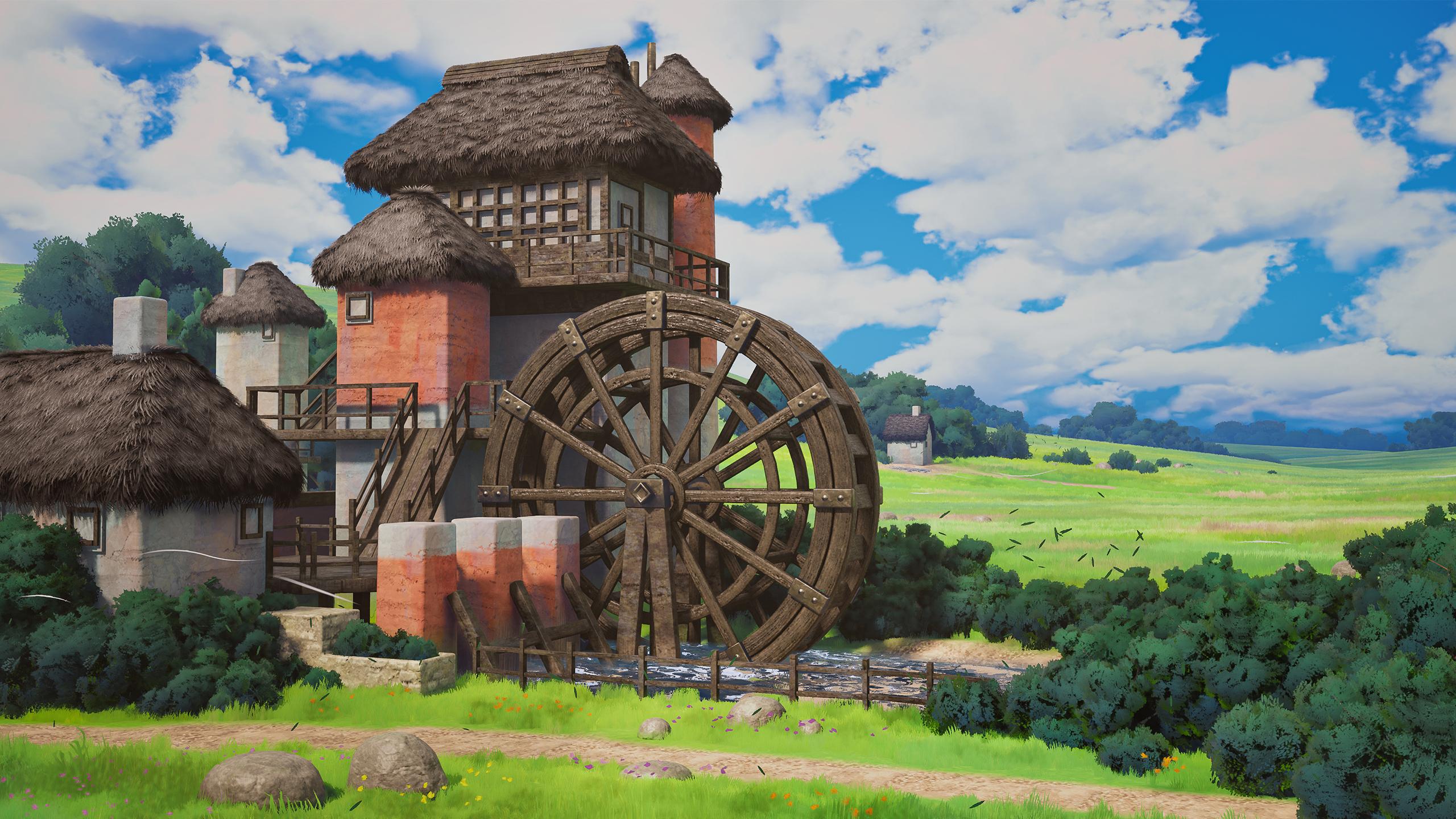
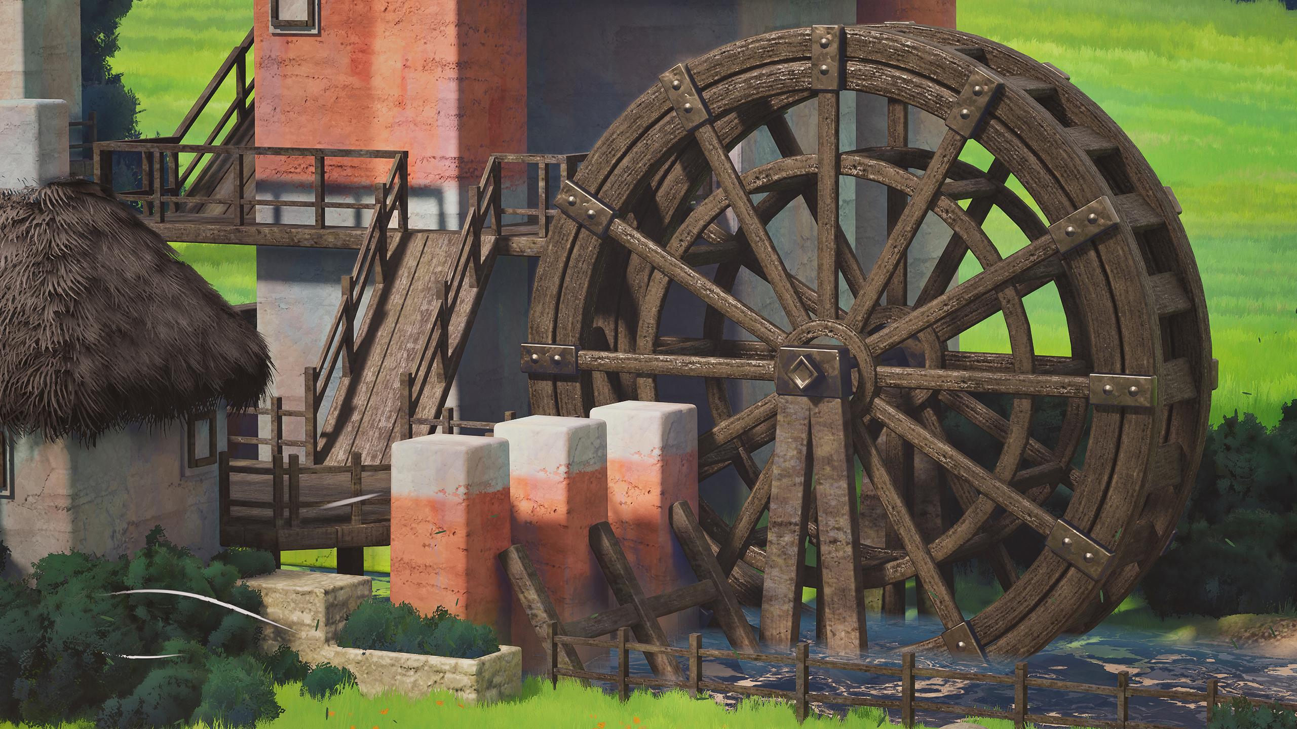
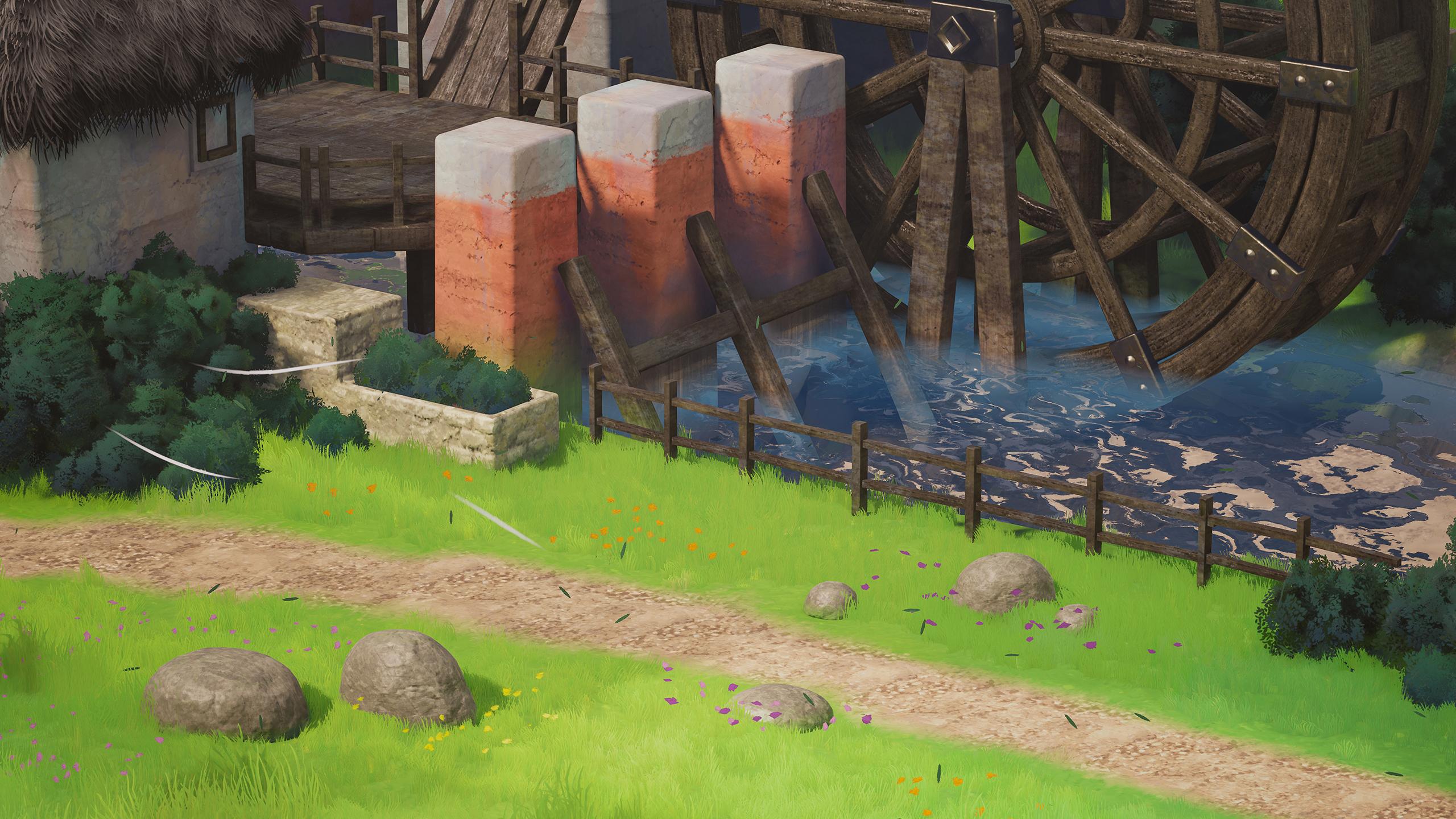
environment expertise. This gibbe inspired concept was provided by the talented
John Wall and Laberto. So it's a pleasure
that we get to work on this scene together. Go over a lot of different
concepts together, like translating
concept art into a three D blockout with
camera and lighting matching, creating painterly
PBR materials for Giblisque scenes with substance designer
and paint box too, creating organic props with the high to low game
asset workflow, painting stylized foliage cards, and modeling low polyfoliage
with blender and tree box, modeling and UV mapping a modular set piece with Tylan
materials, vertex paint, and particle systems,
creating a collection of powerful shaders that blur the line between
realism and stylized and level design and
lighting fundamentals to get the most control out of
your scene and materials. To get the most out
of this course, we'll need the
tools and software necessary to complete the
environment and follow along. I'll use Blender for
modeling, UV mapping, and look development
along with my blender add on tree box to model
the trees and bushes. We'll learn substance designer along with my other
add on paint box two, to create ten portfolio
ready materials to populate our scene plus a bit of substance
painter when we need it. Zbrush will step
in to take care of any sculpting in the high
to low game asset workflow. I'll use Photoshop to draw
our foliage textures, and last but not least, we'll take a deep dive
into Unreal Engine five to supercharge our assets
and create our final scene. By the end of this course,
you'll have an in depth understanding of the
fundamental workflows, skills, and assets needed to create an industry standard
stylized environment for games and cinematics
from scratch. I follow this concept closely. The same principles
can be applied to any concept you're
looking to replicate. While this course is suited
for all skill levels, it's essential to have
a basic understanding of the software listed. All the project files, including
the nrailEngine project, student resources
and source files will be included in this course.
2. 01 Introduction: Okay, everyone, my name
is Justin Wallace, and we are officially
in the style Emil for allowing me to be
on his channel and to get to teach you guys
about my style and my production process
and how I go about creating these really
fun Gibby like scenes. That's the main inspiration
for me is Gibi art, and so trying to
translate that into three D has always been a
really fun challenge for me and getting to
share that with you guys is a total honor. And another thing
that's an honor is, um, getting to recreate
the scene based off an awesome concept by the wonderful artist
John Wallen Liberto. To be quite honest, getting to do anything with Naughty Dog is really,
really awesome. So to even be in
the same scope as some of these talented
artists really blows my mind. And so I'm really privileged to get to work
on this with you guys. This particular video is going to be about
preparation for planning. And that's right. It's got to get boring before
it gets interesting. You need to prep, and
then you need to plan. So for the prep stage, and I'll be recording
the trailer, actually, at the
end of this course. What we're looking
at here is the look development version
of the scene. So this is everything
I had created to get us ready to
start on the course. And so, luckily, or actually not luckily
through sheer will alone, I wanted to dissect this as best as possible so that I could teach you guys how to replicate
this as best as possible. And that means we need
a couple add ons, a couple of resources, and we had to know what
softwares we're. So I'm going to go into one of my favorite,
like, you know, brainstorm applications
called Pure F. And quickly, I want to talk
about the software that we do need for this course. The base scene,
the final scene is going to be in
Unreel Engine five, and that is, you know, discussed in the
trailer, obviously. I'm going to be using
Blender for my modeling, but you can use three DS
Max. You can use Maya. You could even use ZBrush
if you're crazy, right? A lot of the village pieces are basically kind of low to mid poly models with
weight to normals, and that's because
the concept is not demanding that we deform these models to an
extreme degree, say, like in Zbrush, right? We're not aiming to
destroy every edge here. Of course, if we can
put some love into that by getting some variation width in the final stage,
that's always awesome. But no, these are not
extremely complex models. So so with that
discussed, let's go back. And I am going to be
using some Z brush, and it's just for the rocks. That's because a lot of
these models, you know, they're very squarish and garish and man made
and manufactured. But the rocks, they're going to be a little tougher to pull off in this specific style. Let's actually move this window without a little
bit of Zbrush work. So there is another triplanar
mapping material on here, but most importantly,
it is getting its curvature edge
detail from a sculpt and so we'll be going over a
little bit of that, as well. Bring up the concept right here. And, um, so where did
we get these materials? We're going to be
making the materials in substance designer. If you're an intermediate to advanced artist,
you know the deal. You know that you're going
to be getting most of your custom materials
whenever you come up with an idea in three D
from substance designer. While substance painter
is typically used to take those base materials
and then use them to texture assets in
substance painter. So for small assets like rocks, we are going to be using
a substance painter. However, we don't need to take these modular village
pieces into painter, actually, we're just
going to be using tilable UVs based off the materials that we make
in substance designer. So we're going to be
doing a ton of this. Honestly. That's a really
underestimated part of the three D pipeline that
people always underestimate. They're like, Oh, I
got to be the best modeler, the best sculptor. And it's like, Dude, we can't hire you because this whole
thing is black and white. There's no texture on here.
And so then they're like, Well, where do I get the
textures I'm seeing in my head? It's from designer.
It's from designer. In terms of, um other
softwares we're using. I am very old fashioned
with my foliage, so I'm just going to be using Photoshop to draw my foliage. If I go really insane and the brush is not
collaborating with me, which on my 9-year-old Wakeham
Intuos might be the case, I might also use Procreate, or, you know, the foliage shapes are
really simple, right? You could even
vector draw these. You could do
Illustrator. You can do anything you want. The
list goes on and on. We just need a way to create some nice little two D images, and those are going to be our Alpha cards and stuff like that. Until I have a big epiphidy, I believe this is all we need in terms of the actual software. So again, we'll take a look
at this nice concept, art. I'll provide this in the
resources, actually, so that you can have
the full res image of this. Thank you, John. I want you to really take this in if you're going
to be following along. If you have your own
concept, your own idea, then shift your mindset to, Oh, this guys going to teach me how he would at least
approach the concept, and I just need to copy kind of kind of what he's thinking
when he approaches it. Otherwise, yeah, don't you know, the world's always there. I just want to give
you the tools. So when it comes to those tools, though, there's a couple
of things we need. If you go to my ArtStation
page, and I'm Justin Wallace, I'm Shingdora it's
artstation.com slash Shinggdora We NT tools. And that's because there are
no other tools like this. I've developed them over
months and months and months, and I'm very, you know, privileged to have been
gotten so much support by the community to improve it and to take it to a level
where we can actually, you know, develop a whole, like, portfolio ready
environment with it. So that is really awesome. So this first one
is called Tree Box. It is a blender add on to create stylized foliage canopies
based on volume generation, and that sounds super nerdy, but basically, it's creating
these little clusters. It's spawning
canopies around them. It's auto smoothing the normals, and it also has, like, an entire crazy branch
system. Come to think of it. If you look at the concept art, there are no branches, right? I like to take things just
a little bit further. So if we can get away with yeah, obviously, these were trees. They're not just
painterly blobs. Treebox is up for the
challenge, which is fantastic. So I'm only going to be using the base version in this course. You are more than
welcome to look at the extra tools and look
at what Tree Box Pro does, or you can use it to
sell your game Ya yada. But for the course, you only
need this Base version. Similarly, paint box two. That is something I've been
working on even longer. You can see this little
thumbnail down here. I've used this tool to create painterly environments
for quite some time now, and I've improved it
time and time again. If I go to the page itself, the entire goal is
to be able to create substance designer materials
in, like, less than an hour. To me, time is a very,
very precious thing. So we know that designer is the perfect suit to create amazing materials
as a professional. However, there comes a time in every artist's life
where you realize, Oh, I've plugged and if you know designer, maybe you know what
I'm talking about. I plugged a slope
blur gray scale into a non uniform inverted mask
for the 5000th time in a row. And eventually, you realize, Okay, for stylized art, there's a lot of
things that we're doing time and time and again. And so with that in mind,
these are things that I have created to just get us
there a lot faster, right? I don't want this to
be a 50 hour course. I want this to be ten to 20. And to me, that's
a beautiful thing. I want you to continue
on with your life, have something incredible
to show people, have a ton that you
learned from it, and, you know, maybe tell your
friends that you found a really cool tool along
the way and then give them the discount code and tell them tell him how cool this guy is for teaching you
how to do this. You can go much deeper
into this, right? You can learn a lot
more about these tools. I even have videos,
but I don't want to talk your ear off
for that reason alone. Let's go back. Um,
to the Pure Rf. So with these two tools, use Fast Track Shin 25 at
check out, 25% off forever. You guys deserve it.
For paint box two, I'm using paint box two. For tree box, I'm
using tree box. Yeah, seriously. Don't
get the wrong tier. Don't get a version
too expensive. I'm just showing you guys what I'm using to create
this course, okay? Okay. So these are my tools. In fact, we'll drag
this up a little bit. And these are Blender addons that I'm using in this course. Every tool can be
replicated with different modeling
packages of your choice. So for Perspective plotter, this is the new working
version of FSpy. If you have used FSpy before, that is a free add on that was used to match
perspective and blender. However, as a 4.1, 4.2, that has stopped working. This talented artist has
created an alternative. And so I had used this to say, Okay, this is my concept art. I need a way to match
the camera view so I can create a blockout that matches this as close as possible because it is
totally also possible. To eyeball this and kind
of go step by step through the sequence and figure out how big a building
should be real engine. And that's a perfectly
valid way to do that, especially for level design. But because I'm matching
concept art that is really meant to just be
viewed nicely from one angle, I wanted to get a little
assistance from this. The reason why I say all that
is because it's 18 bucks, and so in the official
course resources, I have provided the blackout. So that's it for
perspective plotter. I'll show you how
to use that when we get to the blackout stage. And for UV squares, this is a free add
on at this link. I've provided the links
where we need to in the text file and also
include the concept. And so this is just to
straighten out UVs. If I have a circular
wood ring like this, and I'm going to want to
straighten out those UVs so that the wood grain
follows that mesh. And I could explain
that again later. But this is free, and I
would recommend that. And then I believe,
funnily enough, that I paid 30 bucks for
this back in the day, but I think it's an
official blender extension now, Texel density checker. And this is this is
a really easy tool. Once you set it up, I'll
explain the setup later, and you click a button, and all your UV islands
are the same scale, the scale that we desire
actually in engine, right? Because we don't
want the wood to be super low resolution
and we don't want the walls to be
super high resolution. And, you know, so this
will solve that problem. So those are the three blender
add ons, the two tools. And again, this is
my art station page. None of these are necessary. These are If you want to
learn substance designer, I personally think these
are a fantastic deal, but again, they're not necessary
for the course at all. Or just use these for this
if you get a little lazy. I don't know. Hey, quick edit. I shouldn't forget to
mention that this is also one of the resources that
I'm using in this course. It's an incredible resource of Z brush brushes
for stylized art. It's called the or Brushes Pack. And it's by Michael Fasene. You can find it on his discord, and I highly recommend it. If you're using blender, I
know if you search it up, there's also a blender
version of this out there. And now I'll explain the
resources folder real quick. So, like I said, we have the
blockout that I'll provide. The text is just the
links that we may need. The white HDR is the HDR
used for the skylight. I guess I could go
over that really fast. If we currently
have the white HDR. If I switch it back to
the captured scene, because our sky atmosphere
is very stylized, it's reflecting a
ton of blue light. And so I like the cleaner
look of the white HDR. These three folders
are the textures, and they're not textures
for the materials, they're textures
for the shaders. So I personally
don't find a lot of value in recreating shader
noises over and over again. These I typically drop
into my unreal scene, so I have a little
bit of a head start. So that's something you got. This is an extra discount
for my store cause why not? And then the final
scene, whether it's this look
development version or the one we created
in the course, one of these will be provided in the final version in the
resources folder, I should say. So, yeah, you got
your software, right? You got your tools, and you have your
resources folder. With that in mind, that
should be what you need to get started
on the course. Again, I'm pretty excited to get
started on this with you. Hopefully, you enjoy
the sound of my voice. I'm just an innocent
little artist that wants to share
some tips with you, and I'm very grateful. So let's continue on to the next video where we've
moved on from preparation, and we go into a little
bit of planning. So I'll see you there, where we've moved on from preparation, and we go into a little
bit of planning. So I'll
3. 02 Starting The Blockout: So in this video, we're
going to be talking a little bit about planning
and then hopefully starting the blockout, as well. I'll try to keep this
short, in essence, everyone's challenges are
going to be different when observing
environment art concept, but I'll show you kind of
how I tackled this one. At first, I stared at
this for a while to decide what assets I needed
and how to approach them. I was pretty lucky in the sense where I knew that this village would pretty much all need to be just low poly to mid Poly, right, if we bevel those edges. Pretty much the only
difference between low poly and mid poly anyways. And so I was like, Okay, then
what could be duplicated? The houses had some
different proportions in which I didn't know if I wanted to duplicate these
large base shapes, but I knew the pillars
could be duplicated. I knew this fence, as long as it was, like, a little bit varied, could
be duplicated across. I knew a ton of these wood
planks could be duplicated. And I'm just trying
to figure that out as I stare at this concept. And so the asset names might be like house
one, house two. And furthermore,
and furthermore, because I didn't know exactly at first what approach
I wanted to take, I kind of got those
jitters out of my system by sketching
a wire and this had allowed me to confirm whether
or not that vertex painting would be suitable for a project like this, and it
totally would be. There's a lot of different
ways to approach texturing, and one of the most
popular ways is just putting the asset
into substance painter, but I wanted something a
little bit more flexible. So we're actually blending
tiling materials together through these simple
quated up mid poly shapes. And so, after we're
done with the blackout, that's something we'll
definitely get into. So I'm thinking about modeling. I'm thinking about
the assets we need, and then I'm looking at
this and thinking, Well, then what tiling
materials do we need? Since this is the
only baked material, the rock, everything
else would be tiling. So I'm thinking that the
grass grass and dirt, obviously landscape
material is very popular. But then we have a pretty
unique stone texture, a white wall and a red wall. We have construction wood. We might have bark underneath
the leaves. We have leaves. We have a texture that
we'll have to see if we can maybe push that fidelity with some Alpha cards later
on in the course. And I'm looking at all that and deciding what my final
material list would be. Once you have this, you know, depending on the
scope of the project, you could look up all of
these on textures.com, right? But for this, we need something that fits our purposes
for the Syl scene. So that's why we're
going to be hopping into designer to make these
tiling textures. Now, I had brought this
up in the last video, but the tools that I developed
are tools that I wanted to make sure could handle a project similar to this and
projects beyond that. The whole essence of these two tools, if
you break it down, is to say, I need fluffy foliage and I need paint worly material. So that could be applied to
a lot of different concepts. And throughout the course of the last few months when
I was developing this, I had updated these
products a ton to meet the needs of this more high
fidelity, awesome concept. And so I'm really
happy with some of the tools that we get to
look into in a little bit. With that in mind, we'll do the blockout first and then we'll go ahead and set up, our folder structure and
our unrail engine project. But I'm going to go ahead
and switch over to Blender, and we'll see if we can
get a nice little blockout similar to this going.
So I'll see you there. Okay, so before we
hop into blender, I'm going to make a
master project folder. I'm going to call it
village because why not? That'll be the master folder. And we'll create two
folders in this, one called projects, and
one called textures. We can create more
folders as we go. And then we'll open a blender and we'll save it in
the projects folder. So I'm just going
to go ahead and delete everything here.
I'm okay with that. I'll save it as the blockout. Again, I have provided very similar blockout to
what we're going to be doing here in the
resources folder as well. I just don't I don't want to force you to get perspective
plotter. It's not my add on. But if you did get it, we
are going to be going over the blackout process with
that just about now. So I'll go to add ons to Perspective plotter.
It is installed. And so if I click
on the end panel, we can see Perspective
plotter here. And so the first thing we
need to add is a camera. So I'm going to go ahead and
find the camera and add it. I'm actually going to
minimize this for a moment. And in our Master folder from the from the course
files provided, you should be able to download
a folder similar to this. The keyword is resources. I'm going to go
ahead and extract. And this should be what I wanted to give you
in the course. And so in this, if we
click on reference, we will have our concept. With that in mind, I'll
go back to Blender. And in the camera settings, I'll go to background
images and add an image. I'm going to go ahead and click Open and I'll go to desktop, find our resources, and
we'll use the concept. I can press zero to
preview my camera, and it'll show us that
background image. I'll press zero again to hop
out of that for a moment. And I'm pressing, you know,
one of the numpad buttons to preview or holding
Alt and middle click to quickly scroll in
orthographic views. At the top view, I'm just
taking my camera away. And let's see. What I would like to do is
add a little human reference. So this adds a two meter cube if we press Shift A and add a cube. For me, I have hard Ops, which means if I hold tab, I'm going to be switching
between these Edit modes. However, it is the
same on clicking on Object and then switching
to Edit mode right there. Again, with that in mind,
this is a two meter cube. I'm going to drag it up and that should be about the
size of a person, right? We're just going to say this
is our six foot tall guy. He is not that wide, and we'll have this
be a little head. His arms can be this wide. If I click on both
faces and press E, S, and Y, we're now scrolling and bringing
his arms outwards. And we'll just scale
him in this way. Now, I know our
front view is one. So if I click one, I'll see he's actually facing the wrong way. So I'm pressing R, Z and negative 90 to
get him facing us, and I'll just click
All transform. So we know that this
should be about the size size of our guy. And let me bring the
concept over one last time. And we know he might be a
similar height to this. And so we could understand that if he's around 2 meters and we import all of
this into unreal, it shouldn't be some crazy
different size, right? As long as we have the
export settings correct, this should look fairly similar. One thing to note
about, you know, this three D perspective
plotting process is that even when
it looks correct, like you could be dragging all of these models to the correct
places in this view, and then you press seven on the numpad and everything
might be in the wrong place. And that's okay. It just means it's probably
at the wrong depth. So you could start
bringing things forward once you have
the base shape done, and that's kind of
how you fix that. There isn't a secret workaround for that, as far as I know. Okay, so in blender, I might have moved
the camera during a recording just to
test the process. If I press one, I'm
going to want to move the camera. Somewhere
around here, right? Somewhere around here, right? This will not be
the final position, but now I'm going to click
on Plot perspective. We have our background
image assigned. I don't mind getting
this a little closer. Might reset it in
a moment, though, but it might help us visually. We know we needed
to go this way, and the horizon's pretty flat. So once I click
Plot perspective, it does get a little crazy. I'm going to use the river as
our main perspective, like, guideline, and, you know, hopefully we don't have to
be 1 trillion% accurate. Um, I know, as well that the Y axis should actually be
going this way, which means our X axis is
horizontal in this situation. It's going to keep
looking crazy, but just trust the process. Okay, okay. It's
detecting something. Our horizon's a little flatter. I think we squeeze in the Y axis here a little bit.
Maybe that's too much. So we see this
white.in the middle, and I want that to be like kind of our frame of reference
for the world origin. I'm going to click Flat Horizon. That did a little
something, if anything, it told me that our horizon
is a little bit long. Something closer to that
for now. So I'm going to take this middle three
D cursory point, put it around right here, and I think our X axis is flipped, so I'm going to try
to flip that as well. We're getting there. Let's
put them right here. I'm also going to increase the camera distance because we know this is about six feet, so I'll say 18 meters. Don't think a focal
length matters. Target location. I'm okay with that being at World Center. I just want to make
sure that this is really as close as we
can get it. We can even. I'm going to see if
adding a cube can help us determine whether or not we've gotten
the scale correct. So I'm gonna get something similar to this and scale it up. And let's just try
duplicating it a few times using shifty and Y.
Oops, soup, soup, soups. Okay. Okay, let's just move
this a little bit. Oh, okay. See, I had moved my
camera, and it kind of messed up the math of
the perspective plotter. However, however, I'm
going to turn that off. I'm gonna go to view
and turn off camera to view, and I'll see
how this looks. You know, I don't think
that's too incorrect. If we think about the scale, our human guy would be looking
out into the distance, and the three pillars for the houses would probably
be somewhere around there. They do look a little far. I don't know if changing our camera distance would help that. So, what if we took these three now being that's more
than helping us. If anything, it might have
been around 20 meter distance. I'm getting a little bit
better of a feeling from that. Turn that off. Okay. We'll stick with that
for now. And once we're done setting
up the shapes, we'll determine whether
or not the depth is extremely inaccurate or not. But, you know, this doesn't have to be at a minuscule scale. I'll apply the rotation
scale for that. So that is a pretty
good starting point, actually. Camera views off. It was pretty fun
to use this tool to get as close as we could, and then, you know, we'll
change it up if need be. So we do have our
perspective ready to go. I'm going to split this window. And right now, this
is our camera view. I have a set the wire frame now, and I'll probably
do solid view in this one with free perspective
so we can actually work. I feel like to get a good sense of if we got the perspective, right, I'm going to go
ahead and add a plane. And I think if we start
with the ground path, we might and I think if we
start with the ground path, we might be able to get
a good sense of where this path is going and what the ground plane is in
terms of the height. So I'm just adding
loop cuts with Control R and moving these
around on the X and Y axis. I'm actually not moving
it on the Z axis at all. Doing G, Y, bringing it forward, bringing it back, checking
out what looks good. Yeah, no movement on the Z axis. And I'll drag this one back and I'll drag this one forward. I'll do S Y and zero to
give us a flat perspective, and that's probably as good as we're gonna
get. We in a side view. I know it's got a dip
because it's a river, so I'm bringing it
down, looks a little steep. That looks okay. Bringing it across
here. Let's see. Do I bring this forward? I'm
trying to see where we would like the edge of
the river to be. So that makes me guess that n is just a little bit forward. Remember to go back
to overlay mode. It does reset in newer
blender versions. Okay, okay. And this
should be okay. We'll take these edges past the path and we'll
extrude them outwards. And it seems as though we
know, let's play with this. Let's play with this right edge. I'd like to find where we think. It seems as though this planter might hit the edge of this one, but I'm just kind of double checking by sort
of staring at it. I think if we bring this
one closer to here, that's actually reference point. So in this background, let's actually extrude it out to the X axis this way first. Pretty okay with all
that. That's fine. So we know that
this would be our center base, pretty much. I'll do one big extrusion for the back and then
probably split it up. It's definitely going far. Let's scale it out. Looking
at it from a top view. I know it's huge and
scary as of right now. I'm looking for a
loop cut to sort of bring to where we want the
house to be in the back. And then it sort of
looks like it dips down. So I'm turning on
proportional editing up here. Let's see what we
can do. So, the bigger I make it with
the scroll wheel, the more it affects
my selection. I'm cool with that. And then lifting these back ones up just to sort of match
that silhouette better. We'll let the detail kind of
fade out in the final one, so we don't have to worry
about this too much. Now, let's get the
side ones again. I'll extrude them
out on the x axis. Uh, I'd say, with one more
loop cut sort of right here. This one suggests a
little bit of a lift. Let's see where this
edge is leading us. Do we need to bring
this one back more? I'd rather not, so I'm
just gonna lift this up. Uh, do, I'm gonna add a loop cut to make sure
that we're perfectly. Um let's go pretty flat
on these vertices. And then I'm going to
turn on vertex snapping that we're just at
that same ankle. Okay. Oops. We're in Global. Let's go back to
increment, turn it off, and I'll do E and x.
Let's just drag it out. And this one, I'm going to start rotating
towards the camera, and I'm going to scale it
as appropriately as I can. This is just going to be
a very, very big mesh. And it's just for
reference purposes. We're not actually doing a final production work with this. I'm gonna try to
lift up these two. This one? We're just filling up that
silhouette as best we can. Um, I'm okay, seeing if it works better when
this is lifted up or down. I don't think I want to
mess with this vertice, but maybe these two. Okay. Okay. Not bad. Not bad for a
background landscape. Everything that does not consist of this main
area within the camera, I'll even take these back ones. I'm going to separate
the selection, basically. I'll take
these ones, too. So that way, I'm not
having to accidentally click on this background
element the whole time. Okay. Not bad. Not bad. Let's see if we can get the fence in the correct
position because I feel like it's a little
smaller with asset, and we want to make sure that they can actually fit
within our scene. This one might be
a little tricky. I will let's take this cube up. I added a 1 meter cube
and back in object mode. I'm gonna scale it
down. Let's see if we can meet the
correct edge. H. Scale it down a little
more. Edit mode. Let's just lift
up this top face. We may end up using
the blackout pieces. We may not, but we need
to make sure we at least get the proportions correct. Okay, okay. Not too
bad. Not too bad. I'm gonna duplicate this cube. Bring it out this
way, lift it up and scale it in on the y axis. This will be our
horizontal plank. Let's drag it in. If we look a little closer, we don't have to
make it as tall, lift it up, duplicate it with
Shift D and drag it down. Let's take these Shifty X. These ones have some kind
of inconsistent widths. When it comes to final
asset production, I prefer for them to follow
like modular grid pieces. So if you want to create
duplicate pieces to have these all be
different widths to meet the standards
of the concept art, you're totally
welcome to do that. It would just be
a case of, like, finishing your asset and then
duplicating it and then, you know, kind of
changing this up, maybe moving one of the
planks a little bit. And that's how you'd
create your variations. So we'll continue withdO just the basic
proportions for now. And, you know, if
you're especially particular with how you're
using your blockout messages, you could do Alt D
instead of Shift D. And that'll make it, so you're editing
these pieces together. However, I'm not too emotionally
attached to these cubes, so I don't feel the need to make sure these are all sharing
that same information, not until we get into the
production phase, at least. So I'm going to pause
it here for now, and we will continue
in the next video. So this was, you know, setting
up the blockout phase. In the next video, I do hope to perhaps finish the blockout, and if we're lucky,
hop into Unreal right after. If
not, that'll be the
4. 03 Continuing The Blockout: In this video, we are
continuing the blockout. Let's go ahead and continue
adding just some cubes. In this scenario, they
are other 1 meter cube, so it takes a little bit of accuracy to get
them on the floor. G and Shift Z to drag without
moving on the X axis. We're just going to
scale these out. Shift again, and scale. It's good to know where
the placements are. That way we can
decide what kind of variations we might
need for these rocks. Let's skip this
down. It's looking, Okay, perspective wise,
I am grateful for that. Shifty Shift Z.
Let's scale it up. No scale. Let's go
this one up too. Oops. Shift Z. There we go. I tried to duplicate
it and accidentally put it down into
the floor there. Let's go ahead and
scale that out. I think that's already
the rocks taken care of. Let's go ahead and
tackle the planter. Once again, 1 meter cube. Let's see. Let's drag this
one out. We'll make it wider. The Y axis. We'll bring
it out on the X axis. And I apologize. Sometimes I click
around and go, y, no, X, now, Z, no. And I try to look for
the correct axis. It's totally bad muscle memory, but you could always use the transform tool and be a
little less crazy than me. So I'm going to drag this.
I'll take these back a little. Maybe I'll bring this one
forward. Yes, I will. And I'm a little
crazy, so I'm going to grab the edges of that, as well, so we have it
nice and proportioned. Okay. I'd say that's our
planter pretty taken care of. Gonna bring it back a
little if we need to. So I guess the next best
thing would be the pillars. I'll go ahead at a cube. I am guessing they're
around this size. This one might not be
exactly on a grid. So Shift Z. G Shift Z, looks like we're gonna Oops. We're gonna bring it
out on the X axis. We're gonna bring it
out on the y axis, push it out a little bit. It's wider than it is, uh, thick. If that
makes any sense? Let's just extrude this one down so we know what
the ground level is. Then I'll extrude this one up to the base point.
Nice, nice, nice. There was an original attempt where these pillars, I like, put them down, and they
were all the way down here, but they looked correct
here, and that wasn't fun. So, luckily, you're getting to correct the
version of all this. We'll bring it out one more
time. They don't seem to have perfectly proportionate
distances and heights. I might change that just
because I don't know, it's nice to gratify things in production pipelines and then
scale them, like in engine. I think it's a better habit. That's a little bit
besides the point. So I'm going to turn off the overlay for the
wire frame here so we can get a better sense
of what we actually need. I'll duplicate this woodplank. I will drag it out, bring it in. Let's rotate it a little bit. Because I've already rotated it, I'm now going to scale it
on the local axis up here. So by scaling on
Z, I'm gonna co. I actually don't work with
the Gizmo a lot, apologies. And I'll just bring that
to the correct location. Because it's in local,
I can press S Shift Z, and it'll actually
just thicken it. Let's bring it down to the
base level of the river. And then I'll also press GZ
to take it to that spot. I'll just make them flush. Let's take a look back
at the global editing, and I'll duplicate it once. Let's see if we can get the correct proportions
for the second one. We're going to need to go into local and I'll drag it down. Duplicate it again. Let me bring it up a little. These seem to be in
the correct spot. These seem to be pretty good. So I think in global, I'm going to rotate it this way, then I'll rotate it this way. I'll lift it up. Back in Global. I'm just going to take
a front view at this. Let's just get the
correct rotation here. And in local, we can
change its X axis and lift it down
and bring it in. Well, let's find the
correct axis for that. That's what I mean. Sometimes you just got to
talk with the accesses and see what's working best
because I was in local view. I don't know why
I moved it down, but there we go. There we go.
Somewhere in between. Okay, not perfect
and not terrible. It seems like these
are supposed to be flush against them. So I'm going to break
the rules a little bit. And there we go. That
should be a bit better. Let's take a look.
Everything's looking okay. I'll press Alt H, and our landscape
still looks good. Now we'll add the cylinder. I'll just make it 32 by default. We're not actually
editing this one. If I rotate it on the X axis, scale it in, bring it back. Okay. Let's check out
it's correct CenterPoint. Let's scale it up. We're gonna find out why the
perspective is incorrect. It's probably a little bit of this and a little bit of that. A moving it on the X and Y axis and then
scaling it on the X and Y axis. So it's incorrect. That's
fine. That is fine. Let's see if we need to play
with these pillars first. That might be a little
better 'cause we still need some room in the river for this. I'll bring it behind. You know, this is the stage
where we find out what needs to be changed and
what needs to be moved. So it's still behind
these pillars, which I'm okay with. I want to see if I
need to unfortunately, squeeze these a little more. And I'm bringing this up,
but then scaling it back. Just trying to find
out what is working. Okay, so now I'm gonna move
this landscape and see if that alleviates the
issue a little bit. It seems okay. Let's take
a look. Let's take a look. So my guess is
that that is okay. It's just that the
bushes are going to kind of be part
of that slope, so we'll have to take that into account during
the blockout phase. That's probably the
closest we're gonna get because hmm hmm. Actually, let's bring
this one forward as well. I'm gonna
bring that forward. In fact, let's just
get these flesh. I feel like a little
bit more forward is just going to solve our problems in terms
of these pillars, bring it over here,
and we can even make this a little
thinner now because we've alleviated this
space in between them. Okay, okay. I'm actually going to keep that
in it's nice to see how you can approach sort of alleviating perspective issues like that. I think that's going
to be our best bet. Okay, I'm going to continue
with the house meshes. So I'm actually going to
start with a two meter cube. It is easier to snap
them to the floor. It's just one move up like that. And let's go ahead
and start moving it. Um Okay, okay, probably
somewhere around here. Let's scale it out.
Let's lift it up. Let's see if we need
to move it this way. Do we need to bring it forward? Probably not. Maybe we just needed to move it back
because it looks like, um, looks like some bushes might be able to
creep in between there. So let's keep going. Lift it up. Turn around.
Let's take it out. I don't necessarily know how
wide this house needs to be, but that feels that
feels about right. So for our roof meshes, we're going to start really
simple for the blackout face. They're going to
be duplications of the top faces of our houses. So once we have a house done, I duplicate it with
Shift Deep and press P to get a new selection. And that's the same
plane as a new object. I'll take it out some
on the X and the Y. Whoa. Okay, so I'm going
to lift it up, bring it in on the Y, then bring it in on the X. And so we're just lifting it up and scaling it in both ways. That was actually a
little slow of me, but I guess I'm just preferring to get complete
control over that. So to get this cube, I think it'd just be
easiest to duplicate the main cube and
create a standardized, little chimney for us. And then we'll apply
the scale and rotation. So we know it extends a
little bit over this way. And let's bring
it down a little. Looks like we might have to
play around in edit mode. I'm gonna grab this
whole whole mesh. I guess we got to
bring it forward, and I'll bring this in. And then it seems
as though it's not gonna extend through
the other side. Oh, this one's a little
tough, huh? Oh, okay. And that might mean that
this is this should be a bit steeper. So
I'll test that out. Hmm. We're just going to keep going back
and forth till we get something we're
medium happy with. You know, I think
I'd rather give it a little bit of a square
shape and push it this way. That's pretty good.
That is pretty good. Nile bevel downwards, and this shape matches
pretty evenly. Just sorry it took so long. So we have our cylinder. We'll just keep going
with the houses. I'm gonna get this one now. I know it should go
behind the wheel. And I am going to prefer for it to be as
forward as possible, so I'm gonna watch
the scale from. Let's lift it up and see
what we got going on. Hmm. Moving it out a bit. Gonna bring it forward.
Supposedly, it's a pretty thin house. Yeah, it's definitely
just some sort of small extension for the
wood to wrap around. We'll bring it. We'll
play with that. We'll play with that. So let's duplicate this P for selection. Let's
make our roof again. I'll do S and Y and
extrude it upwards Z axis, and it's pretty even a scale. And it seems like we
could add a loop cut, bring it up and then
scale it out a little. We'll do the same thing for
pretty much all of these. Let's get some
consistency going on. So we'll get a loop
near the bottom, and then just trying
to make sure it's even ish on these axises. We'll go ahead and scale
these on the Y at zero, and we'll do that for the sides. That way we have some
reference to work off of. I just accidentally
clicked Slash there that'll
isolate a selection. Not bad. Not bad. Okay, let's continue on. I know I don't want this next
house to be too far back, and they share very
similar topology. I'm sure they're
similar in size, so I'll base it from there. It might be thinner on the X axis and might
be whiter on the Y. And now I'll get one of our
chimney blockout pieces and duplicate it and move it,
see what we got going on. I will start by bringing it here and there, and
let's scale it down. Lift it up, and let's keep bringing it forward.
A little more in. Again, I prefer these
chimneys to be a little more squarish rather than
too thin in this direction. So to me, that
looks pretty good. We'll take another look. That is three houses down. Why don't we start
tackling this one in the back? Let's get her. Let's open up our landscape,
the original one we had. Okay, I'm going to stitch
these back up together. Mm. Well, we'll get
the active selection, the active vertice, and
we'll go to vertex snapping. Click on active right here, and I'll do G and just hold control and
move that back there. It's not completely necessary, but I wanted to know
where our house was. It was back here. So we'll start from there. It might be closer,
it might be farther. It seems like we got seems like that would make some
sense back there, though. It's a bit of a smaller house. Let's get it on the X axis. I guess it rotates a
little bit towards us, so let's get the
scale down first. And it might not even
be rotating towards us, but we might rotate it
a little near the end. So I'm going to
go intoFace mode. Let's drag this down.
Let's extrude this up. And that's our
little roof piece. And we can grab these three
and duplicate that selection. Let's see. How do I
want to tackle this? Let's extrude this up and we'll get these front
and back sides. We'll press ES and X. And then I might even
want to grab the sides, as well and press ES and Y. I'm thinking that maybe
for these side edges. And by the way, I just did click Hold Control
and then click again, and that's going to give
me the shortest path, so I can make my selections
really fast like that. I think I'll drag these down. I think that's a pretty
good blackout shape. Let's grab another chimney mesh, and I'll bring it down. Okay. And, you know, you
don't have to follow this specific
concept. Once again. You could be trying to get the correct proportions
of a door or an alleyway, or a Sci Fi cord or pretty
much so on and so forth. It's just I'm showing you how
I would approach, you know, matching the perspective
of a particular piece, and I think this
beautiful concept art is a fantastic example of that. You know, there's
not too much science behind this blackout phase, but it could be a little
bit tricky, right? So that house looks
pretty good, too. We got one, two, three, four. Why don't we challenge
ourselves once again? I'm getting to big piece last. I just feel like that'll
kind of force us to scrutinize our perspective and get the scaffolding in
the correct position. So let's get the cylinder
tower in the back first. I'm just going to grab
a random cylinder, it's already in the
correct orientation. I know that this
house would be first, the big house in the middle, and then this one in the back, so I'm going to bring
this one back more. I will scale it up.
Don't go ahead. Ooh. You know, I'm
going to unscale that. And I'd rather drag
it up first a meter. I don't know if that
worked, but it did. Yeah, I I hold control
and bring it up, it should make a two meter
object snap to the floor, which is how I
prefer my modeling. So now I'll scale it up. I might have messed
it up a little bit. Let's try that again.
Let's just delete this at a cylinder. It is 2 meters. Oh, but we weren't in
increment snapping. There we go. Perfect. So
let's bring this back. We know it should be
somewhere around here. We'll press S. Yeah, I'll just press S, actually. G shiZ. And I know it's going to taper as it goes up unless that's
a perspective thing. We're about to find out due to our perspective
matching pretty well. So let's grab a face,
and we'll drag it up. And if you ask me, it is
tapering a little bit. So go to taper it. Now, just like the other ones, I'm going to duplicate this. Get that face, and we'll
go back into Edit mode, and this is our new roof. So like before, we'll have
that little kind of flat ring, but then we bring it up and scale it, just like
the other roofs. We'll see if I need
to reposition this, um, as shift Z, perhaps. Okay, so I am going to be a little safe
and get another cylinder, but this time, we'll make it 12. And we'll bring it up again. Let's get it back to
our cylinder house. I want these to be the little chimneys that are
protruding from here. We'll scale it, bring it out, find that correct axis. Again, I'm always looking
at the concept art, dragging it up. Look how simple. It took me a lot
longer the first time. This is why we practice and
get that preparation ready. That was a quick duplicate,
moving on the same Shift Z, not moving to the floor,
and bringing it down. I cannot personally tell if, this one is part of this house, but I'm pretty sure despite the perspective it is
part of this house. So I'll see what I can
do with that right now. G Shift C. Let's just
bring down to face. That is a pretty tough
one. In the meantime. I might, um, I know, I'll scale it down, and I might have to bring
this out on its axis. As Shift Z. We're gonna find kind of
a negotiation between these two elements between the three D and the two D. I'm gonna make
this one thinner. Bring this one in a
little bit more this way. That's not a bad
compromise between what the concept is sort of demanding and what we
can pull off in three D. I'm gonna untaper
that just a little bit.
5. 04 Finishing The Blockout: Okay, that is good enough for the blackout
phase for that one. One, two, three,
four, five, houses. We have our cylinder,
we have a river, we have our fences or rocks. I believe the last one
might be the big building. Oh, you know what's funny is there is a little
extra small house, or at least I believe
it to be, like, a very similar shape to
that in this concept art. It's like, right in this
area. I think I'm going to try to take this
house and duplicate it. I'll rotate it this way, 90 degrees, and I'm
going to bring it in. I think I think this is the correct orientation to
scale it from, surprisingly, and I think I'm just going to extrude these
two elements forward. Let's find out. So this could totally
be something else. Don't get me wrong.
This a little bit is up to interpretation,
especially around this area. If you ask me, John, might be kind enough to tell me, like, What are you kidding? The scaffolding? Of
course, it goes this way and then this way
and then this way. That's the perfect, you
know, plywood fence. But to me, I see this shape when I work on
it, and so that's okay. We have the scaffolding
going this way, and I think I'm totally cool operating off that
interpretation. Let's see if we need to bring it more one
way or the other. Well, that's okay. And
if we decide to change that shape or you'd
interpret that another way, that's more than okay.
Let's add a new cube. We're gonna bring it up. This
should be our large house. Let's see. So start
by scaling it up. Let's bring it. We
know it's behind here, and it's close to flush. I know we have some
scaffolding in between. So let's just start hoping for the best and
moving things around. Okay, let's bring this out. Bring this out, too. I know the perspective isn't
exactly perfect. We'll keep playing
around with that. I know we got to bring
this back quite a bit, which means that all this
is gonna be taller. Okay. There is a potential chance
that this building could, in general, be
rotated towards us. That could very
much be the case, but I think it's
something where, if anything, we'll go a
little bit off for now. And if we need to rotate that
mesh, near the end, we can. So for now, I'm not
going to do that. For now, let's
keep it like this. Yeah, don't let your OCD get
the absolute best of you. We are A, okay. We are A, okay. So bring that
forward. We'll keep it a little farther back. And if we bring
this back forward, now we're playing the
perspective dancing game. You know, we're bringing stuff forward and back and
seeing what works. I know for a fact, like, we have this scaffolding
that wraps around, so we're gonna need some
distance in between there. And then let's just try to
drag this down one more time. Looks a little more accurate. Maybe what could help us is trying to start
with the scaffolding. I'm gonna get a cube shape. And we're starting to
head into the wild west of how these shapes down
here are interpreted. So I know we have a slightly thick scaffolding
that is covering this area. It seems to be in
the correct place when you account for the fences, and I'm going to drag
it out this way. Or, yeah, let's actually
get the correct depth. We know it should be
pretty flush against here, which means we're raising it up. Nice, nice, nice, much better. So we know it probably wooden
cross into the water wheel, but we can extrude
this out this way. And to. Okay, okay. We're getting
somewhere, for sure. I think we would need a way to get up to that scaffolding, so I will extrude it somewhere
around there for now. And then we know we want another type of scaffolding
cube up in this area. So I'm gonna drag this back
and see what dimensions, you know, we need to change. Lower it a little bit. I'll see if I can find a corner piece, which I can't actually. Which means it wants
to be further back. Okay, and I'm actually going
to take my little human guy. Try to bring him a little
closer to this area. Try to figure out what type of logic we want
to follow in this blockout. I noticed the stairs are
definitely going up. It seems like the path
that is interpreted between here is not at
the center of this. So it leads me to believe, and I'm going to shorten
this guy for now. I'm going to shorten
that. That'll be a little bonus piece, you know, if we
really need that. So if the stairs go
from here to there, and it seems like the edge of that would be
pretty flush with it, that means we would be something
a little closer to that. And the scaffolding pieces would probably also be as close
to there as possible. And at the same
time, it seems as though that this edge
is going inwards. So I just press G double
G to drag that in. And now I'm going to select everything with A and press
M and merge by distance. So let me merge those
shapes together. You can scale it
a little bit more and see what's
going on with that. Okay. Okay. So another I want to know if we need to
bring this forward or back. This is where it can
definitely get tricky. We have a plank. Let's go
ahead and make a cube, and we'll drag it up. And we'll start interpreting
some sort of ramp shape. That way, we can see how
everything would connect. Let's see what we need to do. We're gonna drag
this one forward. And we know we need
some sort of shape to go from here to down here. So I'll start with an extrusion
and then lift this up. I'm not gonna look pretty yet. We just want to see where
everything connects first. So if I bring this
forward, Okay. Starting to look a little
better. I'll drag it up. I'll have it pretty much
meet the scaffolding, and this doesn't have to be exact because we're
not working with the perfect grid
system just yet. But I also don't want to mess up how this is
being interpreted, either. With that in mind, I might bring this house
out more this way. And then once again,
adjust those faces. Okay, okay. So that means
it's really kind of Hmm. For the sake of,
like, realism, right? I am okay deleting that and then having a different ramp
shape lead up to here. Even if we never see it, we know that some potential player could walk up there in this fashion. I'll
bring these four down. As much as I love that
wonderful brown blob, I think it'd be easier
to interpret it as the area that the player
would enter this scaffolding. That's good enough for the
blackout shape itself. So the stairs, they're
a little steep. Let's figure out the base
level of this first, where we actually walk
Oh, grab this right here. Okay, okay. I guess we're
gonna have to start by taking the whole thing. We'll
bring it more this way. I'll grab these faces and I'm trying to find that correct thickness
between these stairs. 'cause I know the
ramp goes there. Oh, and then I had actually pushed these ones a
little bit too far out. Then this rail kind of
goes down a little low. So we're going to make our
own rules here at this point. We know we don't need this
extra large shape anymore. Because we're gonna
have to interpret these as stairs at a later date. So that's one of the ramps. And let's go ahead
and bring I just duplicated it and
brought another one out. Um, I know we're gonna have to play with where this
comes up right around here. You can also tell it
doesn't immediately ramp, so I'm going to extrude it outwards and press
F to fill that. So I want to check this out. I'll make this
thinner for starters, 'cause we're more worried
about what the shape of the rails are doing
more so than the stairs. Let's bring this one forward. G Y. Okay. I'm going to
duplicate this face, press P for selection. Once I select it, I'll press object set origin
origin to geometry, and I'm going to
press A R, Z, 90. Now I have a new
nice little plane to help less face the other way. See what happens
if we extrude it. That does seem to
be pretty accurate. I think both of these can
be lowered a little bit. And I'll take another one
and bring it out here. Obviously, this face is going way too crazy, so I'll
bring that back in. And I'll get our Y axis railing and just
flatten this one out. I'm okay, bringing
this far to the back. I'm just gonna bring
this back, as well. Hmm. I just wasn't comfortable with
this extension being so thin stylized or not. I think this one needs
to be whidened as well. Now we're starting to
be like, Okay, well, we got to change some things
in order to make this really fit in the three D perspective that
we're working with. That's not bad. That's not bad. However, now the casing in which the stairs would be at this angle is a
little choked out. Wonder what's going on. Okay, that should
be good enough. That's wide enough for
a person of sorts. Grab this shape. And now
I'm just gonna start interpreting maybe what
the back would be like. So if I had imagined
that this goes we could have this
keep going really and then lift up this edge. And perhaps, this one's
going crazy, step now. Okay, okay, okay. There we go. I think just we
need to deal with the top edge rather than
worrying about the bottom. If that were back there, we could take this
face, lift it up. We know it's supposed
to be something to that thickness. So
let's fill this face. Now I will be taking in a sense, it's also decent to practice
probably what shape is going to be used as
the actual scaffolding. So instead of this
very thick shape, as we get to a bit more
of a challenging part, I think it'd be
important to also practice the correct
thickness of that floor. So I'll extrude this out
here, put a loop cut here. We're gonna keep wrapping
around this guy. Cause in this area and
we notice, actually, that we're a little we
might not be steep enough. So if I raise that out,
bring that in a little bit. Hmm. Okay. I think we're a little
bit more accurate now. Constantly working around
the clock for this guy. Alright, cool, great, cool. We're totally getting there,
turn off overlay mode. Let's move this edge. Okay, we'll find that more appropriate
angle for this guy. I think we'll have it end
like around right there. We might need to lower it again. And in terms of the thickness of how I wanted this to look in the Redi space,
we're pretty good. I'm gonna lift up this edge too. That means we need to bring
this one forward as well. And this scene will
start building itself a little more logically
as we continue. It could be a little bit tough to get those
perfect shapes in at first. Yeah, we can even
lift these two up. Now I guess we could just
start following this. Yeah, it's not horrendous. And we can find out the correct
height of these rails in just a moment as we get this
edge back to the concept. So I'm putting in edge loops, grabbing that correct thin face, bringing it out, doing it again. Yeah, these look a little
tall. I don't know. We'll find out. So down here, they are about this
height. We go up. Seems to, it seems to
get a little bit tall. Let's take these back
down. What happens if we lift up this shape a
little bit? No, it's okay. It's okay. I think we're
from about this height. Let's hide this landscape so we don't lose our cool out there. Okay, we are making
some good progress. I'm gonna go ahead and
duplicate this face. Get our base roof shape, shifty selection or Pifer
separate selection. Scale that up, extrude it up, and I'll start bringing it in. But not too not too
scaled in on the X axis. And I think I'll tackle this by just adding a cylinder for now. You know, we could
suffer the consequences of two meshes in one, but we're gonna rebuild
it later anyways. 'cause I know that we
just quickly needed to get that really nice
rounded cylindrical shape, it is a little shred
it upwards this way and separate that, give it a new origin. Now, let's play with this face. No, I'm taking a
farther look at it, trying to see what is working, what is not working. And I'm gonna see if we need
to bring this one out more. But I'm not entirely sure. We're just doing a bit
of troubleshooting. I know those edges
meet correctly there. Okay. And so the elevation is correct. However, we might
need to bring this, this and this backwards. So I want to drag that
back and that might have to be a little bit closer
to what we settle for because I don't
want this roof in this building to fight
each other so much. And at the same time, I want this to have a
little bit of thickness. It's still thick enough to where someone
could get through. They could walk up, trying to decide what to do with this. Okay. Let's go back to vertex. Just trying to grab
the bottom vertices. Okay, now it's a little more familiar to the shapes
we're actually looking for. I do notice, as well, to take this cube and
bring it back, bring it in, scale it in, drag it up, make it thinner. That is probably this red
area we're seeing here, like a nice wall or
a dam for the river. I'm not entirely entirely sure. We do got to bring
that back. Yeah, we'll make it so that someone could walk around
here, come on in. They'll climb up
this scaffolding. That seems to be
pretty appropriate. I'd like to take one
of these fence meshes, shift D, Shift Z to bring it under, hide
this wall for now. And I just want to get,
like, a little bit of some supports going on, just to help me feel better
about how this thing is being lifted. Not bad. Not bad. I do want fence meshes
around here as well. So if I rotate this
after duplicating it, start getting a little
something. Drag that up. Do the same thing again for this side. I'm gonna bring this face in. And then I know we got to, like, get that 45 degree
angle right here, um, for a fence in between. We'll figure out the precise, like, proportions
for that later. So, so first is, like,
major proportions, and then we start
adjusting to what would the official
grid side of this be? But if, you know, it can
get a little challenging, just jumping straight
into modeling without at least
spending a little bit of time interpreting
how these pieces would connect based
off one concept art. Sort of cool with that.
What I'd like to do is, I'm just going to put an
edge loop here, I bevel it. And then I'll grab
each of these faces, duplicate it, press P
to select, and boom, we just got the perfect, like faces for the ramps right here. You know, work work
smarter, not harder. I do not live by that,
but it is something I will try to remind
myself. Very cool. Okay, I would consider that to be some sort of
railing on top of the wall. I'm not sure why that would
entirely be the case, but we can just grab that
duplicate that selection. You just drag it up and
make it a little wider. We'll make it probably
like a wood beam. So, so, so so. I know that this
house in the back also has a little
bit of scaffolding, so I could duplicate the pieces, at least some of them, right,
and try to bring them down. Looks like it's Whoops. It's meeting down here, and it's not bad in terms
of how deep it's going. I wouldn't mind a
full wrap scaffolding in this scenario, whether
it makes sense or not. We're really building this
environment off of one angle. We're not gonna scrutinize about how every angle corrects. However, for that main
part of the house, I think it was worth
the effort to be like, Okay, well, how do they
even get up there? In fact, this piece is
bothering me a little bit now. I don't know how far we
do or don't want that, but let's test this out. I think it should connect
to the house itself. And then, um, maybe we can
put an edge loop here. And find out what
edge we can collapse. That's not bad.
It's kind of like a little little more construction
looking in terms of, you know, saving planks
where you need to. What was thinking? In be impossible to
duplicate this edge. I want to make a little
construction piece out of that. Cool. I just filled a triangle
and then extruded. And I'll try to remember this should be like a wood plank, wall, if we even see it
back there, we kind of do. It'll be behind the house. But that's a good
world building, right? We don't want someone
to fall through there, and this thing goes up,
but the shape is strange. So that's my
interpretation of it. If you want to approach it differently, that's super cool. I'm no architect. Maybe
I'll go to school for that one day, so that's okay. That's right. I know
that this will be handled in the block phase. I wouldn't mind getting
an edge loop here to determine kind of what these large sections
are looking like. I'm just pressing I to inset
and then E to Extrude. And that'll give me a
decent interpretation. I think this is too wide. Mm hmm. We'll
probably Oh, shoot. What we're going
to do is re tackle the proportions of
the specific house later at the modeling phase, but I'm pretty
happy with where we are in the blockout phase. So I'm going to go
ahead and let's get this ready to export.
Throw the camera in there. Call this collection blockout. See if I need to
change anything. I'll press A, get
an active object. Control A. I'll do
rotation and scale. I don't know if I want to
join everything in one mesh. But shoot, I might need
to because sometimes when you import a bunch of
meshes into real at once, it can get really fussy. So I'll duplicate this.
Duplicate the collection. Random objects? No, and
then I'll press Control J. Let's check out face orientation
in the overlays panel. This should tell us if we have any nasty flipped
normals, and we do. Oops Strange, strange. Uh, I shift N on that
selection of polygons that I selected with L to
flip those normals. It's gonna be really hard to rotate around now
that it's based in it's orbiting around
it as one object. But this should be the
proportions we need. I'm not going to
fuss over it too much. Let's call this blackout. Let's do static mesh. Bout. So when I go File Export,
I'll click on FBX. I'll go to Desktop.
Let's go to our village. Let's make a new folder called FBX and another one
called game FBX. That way, if we're
importing exporting stuff, we know which ones we need, and we know which
ones will be the final you know, game ready mesh. I'm okay with the blackout
in either one of them, so I won't select
a preset, right? Quick mesh is basically
what I'm about to do here. It's mesh, and by holding Alt and selecting one, you're just isolating that. We only need the mesh, right? So pretty self explanatory. We want to click
Selected Objects. All of this should
be left at default. And in smoothing,
we'll click on Face. That's the way Unreal
likes things to be. Armature, do not click leaf
bones or uncheck that and unclick animation.
Everything's looking good. I'll call it SM blockout.
I'll click Export. So I think I'll save
our blender file, and this is our little baby
blockout. It's not perfect. It's not bad either. I really
enjoy looking at this. It was fun matching
the perspective, and we'll fix up any
inconsistencies in the scaling or how meshes are flushing with each other during the
actual modeling phase. But it's good to know that we have that correct
scale so we can get our landscape going and have a good frame of reference. So we're finally going to
start opening up on real, and we have some project
settings to get through. So hopefully this
is exported now. You have your files ready, and I'll see you
in the next video.
6. 05 Setting Up Unreal: Okay, so close down blender. I have my blackout file saved, my blackout FBX exported. And in the Epic Games launcher, I'm just going to go
ahead and click Launch. We're going to wait
for it to load, and I'll see you
back in a second. So here in the Epic Games
Unreal Project Browser, I'm going to go ahead and
click on Games third person. I don't think we need
starter content, so I'm going to leave
that alone for now. And I'm going to
call the project Village UE for Unreal Engine, and I'll save it in
the village folder. Yeah, I'm going to save it
in there. I'll press Create. So it's funny because we're going to do
something boring first. We're gonna wait
for the salode and then we're gonna
close it immediately. We also have all these
shaders to compile. So I will also see
you in a moment. So, we are here in Unreal. This should be the
basic third person map. Let's go ahead and test
that everything's working. There's a third
person character. Um, one of the thing
about the courses is that this probably shouldn't be your first time in all
of these softwares. Of course, I'm
going to able to go over and totally
explain what I'm doing. But, of course, you're
gonna have a better time if you at least get yourself
familiarized with, you know, what I'm clicking
around with in Unreal. So first things first, we're
actually going to close it. Too bad. So sad. We're gonna open up
the master folder, go to the Unreal Engine project. And in configuration, let's open up default engine dot INI. Um, in the Purifile, we should have a couple
console commands that In Unreal Engine. Well, we're not
going to be putting in const comands
outside of that, because I do feel
as though a lot of the default values work really
well with Unreal Engine, but at the end of the
day, these ones will help Lumen and our foliage interact with
each other better. I believe it's render setting. So I'm going to go to dot
Lumen dot screen Probe gather. Dot screen traces
dot HBZ traversal. Yeah, we'll do an equal
zero. Syntax for that. Now, let's get our second one, which is array
tracing dot Geometry, equals zero. You know what? Let's not do this one.
Let's not do this one, because if you do
end up playing with the automatic grass function, you're actually going
to want that disabled. But we will do the
third one, right? So it's screen probe
gather, short range AO, dot screen space, dot
foliage occlusion. 1s1s. And we're going
to have an equal 0.1. This kind of reduces
the flickering, and this reduces the harsh AO. So that's pretty
much all we need. With that in mind,
we're going to go ahead and open up Unreal Engine again. And then we're going to dive
into the project settings. You probably got a
little sneak peak in the window to your left at the moment, but let's
go through it together. So let's go to Edit
and project settings. We're going to search up
the settings we need. The landscape is going to give the grass
its color, right? And that is done through the
runtime virtual texture. So I'm going to type in enable
Virtual texture support. That's one of them. It will
want us to restart soon. I want to turn off enable
virtual texture Import. Okay, yes, everything's
good looking there. Now we'll double check
for something that should be on by default, which is generate
mesh distance fields, and we'll look up the
anti aliasing method. M. So I personally am a
bigger fan of TIA. There are literal videos talking about how terrible it
is if you're a gamer, but I don't know, it totally works for the style. And it's much cheaper
on the hardware, which is something that's important to developers
at the end of the day. Let's look up Ray tracing. Use hardware ray tracing when available. I'm
okay with that. I'm also okay with
detail tracing for my specific hardware.
It is more expensive. You don't have to use
it, but it just helps the global illumination
a little bit. I'll turn on a trace
shadows as well. Let's hope that this didn't just log out my entire
computer. We'll find out. No, it didn't good to go. Support hardware reason. I'm going to turn
off path tracing. And I'm pretty
sure that's all we need in the project settings. We can also go to
maps and modes, and we could make our map first. In fact, we could start with our kind of official
folder structure. Why don't we call
this one unreal? I'd rather have this extra stuff be in a folder that's
not distracting us. I'll click Move here,
and I will click Accept. I don't think this is
going to break anything. Okay, as far as I know,
it didn't break anything. If I click on content and click on Update redirector references, this will clean up a
lot of the folder stuff that we end up doing. So I'm going to click on
Delete on these three folders. Let's see what
happens. Yeah, we're just going to try to delete these folders and
see what happens. Yeah, we're perfectly
fine. Cool. So we have the unreal stuff. Now, let's call Let's get
our base folders going on. Let's get textures, and
let's get materials. Let's get maps. For now for now, let's
start with this. So Indi Unreal One, I'm going to get the
third person map, and I'll press Control C, and I'll go to our
maps and Control V. Let's call this the village. For now, we haven't made our
textures and materials yet, but what we could do
is grab the resources. So if I go to the resources, and then we can go to the textures and add
a resources folder. Now, I do want to take in RGBA. And I'm okay with
bringing in defaults. Let's bring it into
the resources folder. And then let's also get
the black and whites. So now we have a couple just
base textures we can use for the simplest of
shader formulas. And I'd rather give you guys these shaders rather than force us to waste a bunch of time, make it a bunch of brushstrokes no one
really cares about. And I'm sorry to say, but
that's the way it goes. Cool, cool. So, let's open up the Village map.
We're gonna save everything. We will keep some of the space structure
just for a moment. What I really want
to check out first is the post process volume. And we'll restart
this in a moment. I like to go to convolution, first and foremost
because it's a bit more of an accurate
bloom algorithm. And then in exposure, I am definitely I do prefer
that we stay in manual mode. It definitely helps us get the consistent lighting
that we're looking for. Or actually, you take it
to zero, go to basic, and then you clamp the values of the min and max at
your desired scale. So probably first things first, we should change
the sun intensity. I'm going to bring it
to something like 12. It's a little stronger to
the point where some of that global illumination isn't struggling so much to
reach around the corners. And there's a bunch of different ratios that you could
use in terms of lighting. Like, some people might do 2000 and then just
totally ramp this up. But in my experience,
somewhere around 12 works best with the post process materials that we'll take a
look at later on. Because I can't read
the scene color if it's just way too bright. So let's keep it at one for
now and see how we feel. Okay. How about zero. How about 0.5? Cool. Now let's look
at the skylight, and what I'm going to do is, let's go back to the
resources folder. Including the one in our finder, and I'm also going to
bring in the white HDR. I believe that's all
we need for now, but I'm going to put that HDRI into the cube map
of the skylight. And you can already
see the difference. I showed it a
little bit earlier, but this is the natural, very bluish global illumination
from the sky atmosphere. This one kind of
just cleans that up with more monotone values. It also looks pretty
good at one intensity, so I'm going to leave
it like that for now. We'll go back to the
post process volume, and let's see what else
we need to change. I'm okay with this. Color grading doesn't
need to be touched, but we can look at the global
illumination settings. We are going to be using lumen. This is an lumen deep
dive, but for now, let's just boost it
up a little bit, and then near the
end, I want you to boost this up to
the maximum value. There's no reason
why you should be hiding detail away from
your work and near the end. We'll check out in
advance for a moment. Skylight leaking might
be interesting later on. We're going to
ignore that for now. And then in reflections, let's just take the quality
to two because we only have one reflective object in the scene, and that's
going to be the water. We may as well double check
that it looks pretty good. We'll keep this bounce
at one for now, but that's what you
want to aim for. Of course, if you want to go the most optimized
route posible, you can turn both
these features off, and it messes with the foliage a little bit
if you do turn this off, but I can show you how
to alleviate that later. And then in the post
process materials, this is something we're
going to look at at the end. But I basically just wanted
to make sure that we have the correct settings
in our post process that we have the
correct exposure, that we have the correct
directional light. I'm okay with the
fog density for now. This is unreal note their stuff when it
comes to their settings, but I am going to
select volumetric. I do prefer that. Let's
double check that retraced case shadows are on for this, and
they definitely are. And in the volumetric
cloud, real quick, I'm going to duplicate this
material. We'll browse to it. It's going to open up, um It's going to open up
the engine content. You could see that
out here. When I really just we'll close
that in a minute. I just want to go to materials, maybe make a folder
called FX or something. Or, actually, let's
put it in maps because I think maps should be a little bit of
our messy folder. I don't want to make
I would rather have one messy folder rather than 1,000 folders that just
happened to be organized. I learned that the hard
way many, many times. So in maps, let's call
this Village Clouds. We'll go ahead and edit
that in a little bit, but at least we know that
they are assigned to there. I'm going to delete the sky
atmosphere or the sky sphere, sorry. I wasn't even active. I guess they've replaced
that in future builds. And we have some settings
we can look at here in a little bit once we get
to the lighting stage. But next, we can
keep players start. We could keep our
lighting information. But I'm going to start
deleting the meshes. I'm not a fan of the world
partition system in unreal. So I'll probably include edit at the end of this
video discussing if it was difficult to get
rid of this because this is how the landscape layer
system works for now. Look at that. It's
already being fussy, so I'm going to look
up world partition. Does it give me anything?
Let's try to disable this. Wow. Very cool. So look up World partition
in the world settings and disable the heck out
of that. That's awesome. Okay. I'm glad we figured
that out live. Very cool. Lighting playground, let's
delete the playground. And let's delete our cylinders
and blocks. We'll mess. So with this should be the most naked
version of our scene. I'll click Control S, I'll click Control S. Everything
should be saved. And next, we'll get into
the landscape really quick.
7. 06 Landscape Blockout: So I've restarted Unreal, and I'm also going
to go to the project settings into maps and modes. And in the Editor startup map, we can set it to village. We'll do the same for
the game default map. I'll close that. Everything else should
have been applied. And then for the landscape, we're going to press Shift two. And we're going to be
able to see what we have going on. But
that does remind me. Let's go into our content, add a folder. Let's call it mesh. Now let's find that blackout
we created earlier. I'll go to my village documents, and let's find the FBX. No go ahead and
put it in meshes. Um, Okay, we got a couple of things to check out here.
I'm okay with this. Um, I'm okay with doing whatever it wants to the
normals in tangents for now, but I do want to combine this, and then I don't
want to build Nani. I just don't find it
needed for this course. Turn off animations,
turn off materials, um, yeah, we want to set it to do not
create materials, right? We don't need any textures. There's just so much
stuff that we're just like, don't it. Um, maybe I'll turn
this off for now. Maybe we won't
have it recompute. Let's import it
and check it out. Let's set it to zero on the map. Let's see if our scale is anywhere close to what we
actually need for now. Okay, let's go here. Let's
turn off the collision. I'm going to type
in collision, and I'll type in no collision. Now we can better check out
the landscape and build size. I'm assuming it will let us translate it for
now, and it will. So let's go let's go to 127
by 127, let's move this. If need be, we could do 255. You just got to be a little careful and a little conscious
of what you're doing. But actually, this could be good because in the background, we could probably get some
more hill like details, kind of obscuring itself into the fog. I'm
okay with that. I'm going to press Create. And so let's see
if we could find a base level that
we're happier with. I'm switching between
landscape and selection mode with just shift
one and shift two. As well, shift three
is foliage mode. Shift four is vertex paint. I think that's all
the ones I use. I know Shift five
is modeling mode, but we're not going to get
into that in this course. As well, those selection
modes are right here. So I'm going to bring
this up a little. And it looks like we'll
have to bring it forward. And right away, let's go
ahead and create a camera. If I click on the
plus, let's go ahead to maybe not visual
effects, but cinematic. I'm gonna look for the
cine camera actor. I'll rotate it this way. And
what we're trying to do is, to the best of our ability, let me get my PUF back. On my other monitor, I'm just trying to match this
as best as I can. We are just eyeballing it at
this point, and that's okay. I know that if you're looking at the reference,
the same one as me, you know our guy is a little bit close to the center,
but not exactly. In fact, I'm going to pilot it. So I'll press perspective and
go to the cin camera actor. I also know that the
edge of that building is obscured and that
the back building is not only in between those
two, but a little bit lower. And we have some room for
the rocks in the back. In that house is a little further back than
originally anticipated. In fact, I can go back to the blender blockout and
we can double check it. So back in the blackout,
I'm just double checking the wire frame
against the camera position. I'm gonna go to Wireframe.
I'll go to camera. And that is in the right spot. So I can go back into Unreel and just be a little
fussier with this. I'm assuming it
could have something to do with the focal length. So let's go ahead
and play with that. The current focal length is 35. What happens if I set it
to 18 or maybe even 12? 12 is a little steep. So let's go back to 18. We know our rock is at
the bottom corner there. We know our building
is obscured. We know this is
lower than this one. If I can bring that up a
little bit, not so bad. And then the back hoouse is
pretty close to the wheel. So as far as I know,
that's looking good, it seems like the horizon, surprisingly, does not
follow the rule of Thirds. It seems to be at
the halfway point. So I'm dragging it back down, and I'm zooming in a little bit. You know what? I think
in this scenario, as we're not dealing with
the exact focal length, something like this is
gonna have to do for now, but at the same time, we
could zoom in a little more. Because I noticed
the top of this is sort of close to
the top of the canvas. Also, that's good looking to me. If you go to the film back
and type in 16 by nine, I also wanted to make
sure that we get our sensor width and sensor
height in the correct spot. And it seems like
that might have even affected the focal
length a little bit. So, let's try 15. You know, it's a little
bit of a tedious process, but we will totally get it down. I noticed that the
landscape is supposed to be in that spot, so
that's pretty good. Bringing that main house or that side house
closer to the wheel. And that perspective
looks pretty good. It seems as though, however, that the actual ratio of the scene might be
something like 18 by nine. So I stretched that out a little bit. And I think that works. So I'm going to exit the camera, and for
now, I'll lock it. We can move this again later on. But for now, I'll press Shift two to go back
into landscape mode. I wonder if we could
select the camera at the same time. We
can by pinning it. I'll press Shift two. I'm going to bring down the strength, and let's make the size. What? 1,000. This should be a pretty straight
path, correct. So if I press Shift, we're
going the opposite way. The brush is a little
big, so I'll go to 600. And I'm just sculpting it a little bit
right there, right? And I'm mostly relying
on the flatten tool. I do feel like it's
better for the initial, especially the blackout phase
of the landscape sculpt. I think we'd even bring the flatten back to
this side, as well. We're just playing with the
heights between these two. At this soft strength, it
shouldn't be too egregious. Maybe I'll make this a little
thinner before we take another um let's see. I want
to flatten it from here. And already, that's
not bad looking. I'm extending the
length of that river. And so now we can take a look at these slightly rising elements, and I'll bring my brush up to
something past the default. 6,000 looks okay, and it
has to be pretty darn soft. So when I start sculpting, I do not want a lot happening. I want to be able to
tap on this and get the values I need
so that after that, I press on smooth. And as long as you're careful, the landscape tools are
pretty awesome and unreal. Took me a long time
to get used to them, and still, I don't
think they're perfect. I just feel like the
secret is to just have that really
low tool strength. That's what they don't tell you. And even then, it's not gonna be perfect,
but that is okay. Going underneath, you know, finding those
forms, and I'm just trying to match what we
had in the blackout. And then once we get
to a later stage, you know, it is a flexible
landscape system. So we're going to be able to re sculpt this, not resculpt it, but smooth it out in a way we're just really happy
with the final result. But no, this landscape
is a one and done deal. This will be the one
used in the final one. Let's go ahead and
even this out too. Now, if I look at the
camera right here, I can see that I definitely
don't want it to be that I don't want it
to be that bumpy, so we're going to have to take our smooth tool and see how
far we can push its strength. I don't know if changing the strength of this
to something over the maximum does something in
the way that I'm intending. But see, even with a
low sculpt strength, it is still very
possible to kind of get these way too bumpy areas. So we're smoothening that out. I need be, I might speed up me wiggling
this mouse around. So look forward to that. A long story short, you know, scraping by with the sculpted brush got a little messy, right? So I was able to take
the flatten brush and kind of do a little bit
of a dance between those. You take sculpt flatten
and smooth and, you know, eventually, you'll be able to get something
a little calmer. But, you know, these
are rolling hills. They're not too they're not
supposed to be too lumpy, yet it can be easy
to sort of fluff up. But, you know, with a
little bit of flattening, I think the smooth tool also operates just a
little bit better, see if that full strength can
work out for us for once. And while it's not perfect, I'm looking at the canvas here, and I think it's
personally a lot better. I want to smooth the transition between these hills
and what is going on in the main scene, smoothing,
smoothing, smoothing. We might even be able
to alleviate some of this bumpiness with
the ramp tool. If we take the ramp
tool and decide it's two position points,
you can take it in. Click AD RAMP. And this is a pretty good way to get
the smoothest forms possible. We will increase the fall off. Okay, we're just gonna have
to bring this one a little bit lower, a little
bit more forward. And let's try to add a ramp. Pretty cool. I'm just adding one more
ramp seeing if we can get a nice silhouette there. We totally are. Going to lift
this up? Re add that ramp. And we are You know, I didn't want to start with
the ramp because I feel like getting that
sculpted smooth flattened process out
will help you at least determine your proportions
in the best way possible. So now with a very smooth ramp, we're not having to guess where we need to place our points. So I'm gonna bring this back now I see if we can get just, like, one or two
little elevations. That kind of offset
with the background. I'll lower this a little
and I'll try to add a ramp. And I think that kind
of did the trick. I do want to add
another ramp back here with a bit of
a smaller width. And just I'm aiming to kind of smoothen
out this position, whatever's going on back here. That's kind of okay. Let's make this 0.03 No,
I don't want to do that. However, I kind of want to clean up just
this area back here. So I'll re increase the
smoothing, bring these points in. And I'm just being a little
finicky with the landscape. So I'll click on my Smooth tool, and now I can start cleaning up the edges between
these ramps as well. And the smoothing responds a lot better to the
ramps than it does to the sculpting modes
for some reason. I think it's that sharp
transition that really allows it to understand where
it needs to be smoothed. I'll click on my camera again, check out what we got going on. I'm still just smoothing along. Um, I'm a fan of these smoother shapes because even though it's less realistic, it tends to push the
composition a lot more. I think we're pretty much there. Okay, let's re flatten
this one more time. Or, I'll just let me
undo that last one. Okay, so for now, I'm
okay with this landscape. We'll do that second
polish pass near the end. But in theory, we have taken our blockout. We have
put it into unreal. We've set up the
project settings. We've gotten a very base
lighting pass down. We put the blockout
where it needs to be, and we sculpted the heck
out of that landscape. For fun, we could go to
the volumetric Clouds, and let's go to the
sky atmosphere first. Let's continue our
base lighting pass. And so, first thing
so is I'm going to decrease the ground radius. We want these clouds to
be lower to the ground. Multi scattering
can be increased because we want the
scene to be brighter. And this is a little
more stylized, but I'm going to input some thicker
atmosphere up in here. And as well, in the concept, the concept is a bit
bluer in the sky. It's like a nice, it's very
hard to pick this sort of blue because go a little too green and it's nasty and go a little too blue
and it's purple. Personally, I'm okay
working with this. This looks okay.
I guess for now, I'll work on the
brighter end of this. Okay, not bad at all. And then in the sky
atmosphere still, the last thing I
want to check out is the MIE or the M
scattering scale. And I'll start playing with
what I think looks good. I'm okay kind of cooling those colors down by
increasing this just slightly. So now we can check out
the volumetric Cloud. This is our duplicate material
version, and, you know, I did not create this material, so I couldn't perfectly explain to you what every
single setting does. But I did take a bit
of a look into it, and a lot of the things in these sub panels are going to give us some interesting shapes that are a bit closer
to the concept art. So if you give me just a second. I'm going to look at
my concept art to the right of me, and you
should do the same too. And we noticed that
the clouds are really close to the ground, and they're a little fluffier and they're a
little bit crazier. So I'm going to keep pumping
out these sub menus and see what we could change to
get these looking crazier. Cloud coverage, I think
that's going to work because the clouds in the
concept are fluffier. I'm looking at
these base passes. You know what? This might
be the second layer. Perhaps we're going
to look at the cloud per type scale first, okay? I see small changes, and let's actually go into seen a camera actor,
see what we got going on. Okay, okay. It's affecting
the shape a little bit. This one seems to have
the largest effect. So I'm looking for
something with a little bit more
volume like this, but then maybe a little less
density at the same time. I'm okay with the larger scale. Seems to affect the base pass. Velocity, only it's more like the seed. It's
just moving it around. But I really want to
find out how to get the most change in density. I think it's going to
be our global scale. And as well, we have
these other settings, not gonna play with
clown shape, or maybe. Let's see. Let's play
with noisems. Okay, okay. Okay, this seems to add a
little bit of directionality. I'm a fan of that, too. Let's go ahead and
check out storm clouds. And that that actually that
fits a lot for these ones. These are very,
very full clouds. Don't know if colors gonna
do anything for us, but, no. And I'm trying not to press
Control Z two too much. Okay, I'm going to
redo that one as well. Check out face controls. We
can check on multi scatter. We're just seeing what is going to help our
composition the most. I think the intensity of the multi scatter
works well for this. I think the occlusion boost
works pretty well for this. I'm wondering if there's a way to change the tone of
the shadows themselves. That is something
I can find out a little bit later
because I noticed that the shadows themselves are
pretty gray in the final, but at least we
have our base pass. We'll see if a certain
velocity looks good. Just playing with the values. I'm pretty okay
with this for now, actually. I am a fan of that. So I'm going to take one more look into the
cloud settings themselves, see if we can find any other
fun settings with the menus. And let's check out
the bottom altitudes. This is how we're going to
find some thickness controls outside of the material itself. Let's see, cloud material, maybe some art direction tools. Oh, oh, very interesting. So this is pretty
cool. We're reaching outside the realm of what the
sky atmosphere can do now. We're able to add some warm
values to these clouds. I think I want, ya, like, just a little bit of warmth in these. I think that'd
be pretty cool. I can see more clusion in the
back by changing this one. I'm pretty okay with that. I don't want to change
the view distance. I'm gonna play with the
layer height one more time. Let's reset that,
see what we like. Maybe we'll leave those
at default for now. I'm gonna save this, make sure we got everything taken care of. And, you know, as far as I know, with all that taken care of, we are ready to get
into the next step. And the next step is to build
the library of materials slash textures we would use to then start the modeling
process, right? In some environment,
art pipelines you are going to do the
modeling first, and that's completely valid. But because we know
what materials we need and we kind of want to see how those would look
with those materials, we're going to
build those first. So long story short, get your knuckles ready
for substance designer. If you haven't used
it before, I'll be as giving as I can, but we have a lot of
materials to go through. So I really hope you ready. Look Look up a
beginner's tutorial before you hop in because
it'll be a lot of fun. But I'm also happy with
where we are here. And so I'm glad we have
unreal setup for it. Trust the process. This thing will come out looking
cool eventually, so I'll see you in
the next video.
8. 07 Designer Introduction: Okay, so before we hop into Substance Designer, once again, I do want you to check out the store page
because we're going to be using paint box to
build these materials. Again, I'm using the
base $20 version. This includes all the nodes that you could need to
build these materials. It's just that
they don't include the crazy source files that honestly aren't entirely
necessary for this course. So we can take a little peek at what kind of materials
they're suited for. They're basically um pretty ready to go when it comes
to Gibiesque materials, and I feel like that's a really popular
and growing style. And so I put a lot of
effort into adding tools over time to make
that process easier. We could see one of the first
demo environments I had made when developing
these products, too, and you could take
a little bit of a look at kind of how
this operates, right. If you're a substance
designer beginner and you create some random
noises together, close enough to what
you're trying to achieve, just a couple of extra nodes
can really push it far. And we have some kind
of cheat sheet nodes to be able to do very repetitive
tasks a lot faster. Uh, including some
fun color notes to kind of bake in light into our materials,
so on and so forth. This thing goes crazy. I think there's a lot of
value in this product. So on my page, I can't I can't
download it off here. Again, the discount
code is Fast Track 25. So once you check
that out, it should be in your art station library. And once you download that, I'll go ahead and open
up Substance Designer, and we'll see how this all operates together. So
I'll see you in a second. Okay, so I'm going to go ahead and open up
Substance Designer. And from paint box two, the nodes that I want to look at are in the nodes SB SAR folder. We are pretty much going to be ignoring the nodes
in this trim folder, but the generators
and filters are some pretty powerful
shortcut nodes that we'll be using in the
process of this course. So I will go ahead and start
by making a new project. And I'll call this
village materials. I'm okay working with two K. I don't think we
need to go lower, and I don't think we
need to go higher. I am okay getting
us a little preset, which is the metallic roughness, because we're making
a PBR material, right? So I'm gonna press Okay. And, I suppose I could
be kind enough to just give a little
bit of a breakdown on how these output
nodes are working. I'm not going to have time
to be able to show you how every note in substance
designer works, but we're going to be, you know, operating in a very live way. So if you need to, just
copy what I'm doing. But if you see sliders and options that you think make
your material look better, you know, while
you follow along, please feel free to do that. And as well, you're not even forced to follow this
specific concept, right? If I pick green and
you want to pick blue, that's perfectly valid. But it might be
worth understanding, at least why we're
plugging things into here. Um, so let's zoom into
our three D cube. Let's say I want
a tiling texture that is made of a
bunch of dots, right? So the main shape generator in designer is the tile
sampler or tile generator. Tile sampler has a
couple more options, and then you'll work with the
generator, and you're like, Oh, I just need that one
option, and it just so happens. It's in here. So
maybe I want dots. So if I change the
pattern to a disc, we already have
something like tiling, like one of those
plastic floors. So how do we translate this
shape into this material? Well, the base color
maybe in real life, it'd be something like yellow. So we know that a color file should probably plug itself
into the base color. I'm not a fan of that,
Hugh. There we go. And for the normal, we understand that
these dots would go up into the
surface a little bit, and then light might
bend around the edges. And so the way we generate this normal map is through
the magical height map. We put a ton of work into
the height map from here, a node goes here,
goes over there, swings around here, and it all plugs into the
height at the end. And I'd say the height input
that we're working on, that is so easily
converted into these ones. I'll show you that
process right now. With this shape, like I said, I want it to go up a little bit. So by changing the bubble size, it's almost like looking at
it from a top down distance. We know that these edges are now changing
up a little bit. With that in mind, maybe I can change the
scale of these discs. And then I'll just plug it
directly into the height. Now, we see it
affecting the height, but we don't we can't really tell what it's
doing to the surface, and that's because we're
missing the other parameters. So for the normal, it's as easy as plugging the height
into the normal node. And you can change
the intensity. And now now the
surface knows how to read where the light is
bending around the surface. And furthermore, if you
take that same height map and plug it into an HBAO node, that is generating the fake ambient occlusion in
between the height. So we're already getting a
pretty nice looking material. We could pretend that this
was metal, and in real life, metal is either black or white.
You know, I'm no genius. There could be instances where some materials out there in the real world have a half value. Perhaps it was
manufactured that way. But most of the time
we're playing either between full white
or full black. However, I will say for
stylize in between, can be perfectly valid, depending on, you know,
what the goal is. So I'll leave that
a black for now. And for roughness, that
is just the shininess. If it's black, it's super shiny, if it's white, it's very rough. So as I drag that along, we can see the shininess
of this change. Something that is very,
very common, in fact, is to invert the
ambient occlusion node. And if we just get some control over that
with the levels node, we're basically
saying where there's more shadow, it's less shiny. And where there's less
shadow, it's more shiny. So if I plug that
into there, you know, you barely tell, but
at the same time, we know that these darker parts are just not going
to be as shiny. And so we're playing
with blacks and whites, getting the features
that we need. As long as you know how
these output nodes work, you're basically already
a master designer. Then it gets difficult
in terms of, well, how do I achieve
this specific shape that crosses away this way? And, you know, I'm no expert. You learn that every single time you hop into this program. So we'll be discovering
new things, maybe switching nodes
around if we need to. You know, there might
be settings live that I feel worked better than
my previous practice. And that's kind of how this
Um, this software operates. It's great for creativity, and it's also a little finicky. For preview purposes,
one last thing I'll show is to boost up that
tesselation factor. It's not too expensive,
so I believe, and you can always
change the height scale. You know, sometimes during the development process itself, I'll keep it at zero, but one is perfectly okay. So that was our test material. And I think first, I want us
to make a grass material. So I'm going to go ahead
and click on New graph. Actually, not new graph. No. Mm. We'll just
duplicate this. I'm pressing Command C here, clicking on the package,
and pressing Control Ve. I will save the package. That's what's going to
hold all of our materials. And I'll just put it in
the projects folder. Okay, so in a second, we'll
get started on the grass. Okay, we're gonna get started on the substance
designer adventure. I'm gonna save some of my
talking energy because this is going to be a battle
of attrition. So I'm going to delete
this first one. I just wanted to
show you guys how to copy and paste materials, and I'm gonna rename this with
F two or double clicking. And the first one I want
to tackle is the grass. Like before, we're actually, you know, luckily for you
guys, my glass is broke. So now we're gonna zoom in
extra hard on these nodes. The first thing we're
going to start with is the tile sampler gray scale. So, in theory, this will be able to duplicate
patterns across our, you know, material in
many more ways than just this very manufactured
looking pattern. And that's because
we have a ton of different sliders that can
really take this from, you know, pattern to noise. Um, including brick walls,
including tiling rocks, including grass,
pretty much everything that you need to get
started with a material. So the tile sampler gray
scale is very powerful. I'm going to make a
grass blade shape, and I'm going to start
that with the shape. Bring the scale
down a little bit. What I'd like to do is start moving this around
with a transform. And to see what that's
doing, I'm going to plug that into a mirror
gray scale as well. So if I start
moving this around, maybe we can get
a thinner shape. And if I go to the tiling mode, I can select absolute
and no tiling, and we have just the mirror. So I can scale this up with
the transformation two D. And now we have a
base grass blade shape, and I'm going to start
creating variations of this with the
directional warp node. And we'll do that twice. So I'll get a new shape now. I'm just pressing
this Control C, Control V. I prefer
that rather than, you know, looking
up the shape again. And I'm going to
change it to something with some gradient value in it. If I plug that into the input, we can see that this
black and white is forcing it to start to warp. We can use a transformation
two dende on the shape. And we can move it
around a little bit. You know, I think I'm
gonna want smoother shape, so I'm actually not
gonna move it much and maybe just change the scale. Or the warp value. I'm a fan of changing
the warp angle to something like 62 degrees. I'll just try, we'll
use the same one for this and just change
the warp angle again. If this one's 20, maybe we could try something more
intense, like 50. And we do have
three grass blades now and in the tile
sampler grayscale, I'm just going to
go ahead and set it to pattern input and
set it to three. We can go ahead and
plug each one in. So if I go to our tile
sampler gray scale, we can see that we do have
the base shapes going on. But in order for them to
blend together correctly, they're going to need different
black and white values. And so for each one of these, I'm going to take a blend node. Hm. Or maybe we should just do it once after
this original one. We can hold control or sorry, shift to move the
inputs and outputs. We're going to plug this into here and reconnect
all these nodes. And I think I'll just
take a gradient. Let's find gradient
one. I'll plug it in instead it to multiply. So now we have a little bit of a different height
value going on. We could even use the levels
node in between these two. And we could clamp it
a little bit more, get something kind
of intense going on. We don't have to clamp
it too much, though. So back in the tile sampler, I think what I'd like to do
is we'll start scaling these up and we'll
increase the amount. Let's go to something
maybe 128 is too much. Let's try 70, 70. Looks like we might
need a little bit of random rotation, so
I'm scrolling down. I think a little bit
of that. And we're going to increase
the scale more. I don't really want black
values in between there, which means we'll also
have to increase this. Let's try, uh yeah, these thinner blades are
working, so I'm increasing the X amount compared
to the Y amount. And now we're going
to take one of the first custom
paint box nodes. So if you have the
nodes SBSAR folder, we're just going to go
ahead and go to generators, and I'm going to get the brush. I'm keeping this folder
in a different window, and it's probably
advised not to move these materials in your
folder until you're done. That way you know
how everything is being referenced
with this add on. So this is like a pretty complex tile sampler
node that comes with a bunch of presets to help get us some very interesting
painterly noises. It does include a
couple presets. You know, there's a lot
of settings in here. We'll also try not to go too overboard to allow
for a lot of fun, different shapes without needing to plug 100 things
into each other, which if you open
up the SBSAR sorry, the SBS file, you'll see how this operates
in the pro version. But I want to plug this into both the color and the rotation. And I do want to change
up this pattern a bit. Let's see if I
could find a preset that's a little bit noisier. And I think I'm looking
for something like that. So I'm increasing the position. I might keep the contrast
somewhere around there, and I'll use the
slope subtract to get a more interesting shape
out of these brushstrokes. So with that plugged
into those two inputs, now I'm going to go to the
rotation map multiplier. And we can see now
that the grass is moving in a similar way to what the white
values of this is. So if I increase the white values with
that position node, we'll see that do something, and the contrast is also changing
how these are affected. And I'll also apply this to
the color map multiplier. We're giving it a
little bit of depth. Let's see what color
random does for us. Okay? We don't need to turn
it up all the way if we do, you know, actually, why don't we boost both up and
see what it gives us? Yeah, we're going to have to
find a mix between the two. I think that looks pretty good. So for our grass, we're not necessarily
going to bevel it, but we're going to be doing some things to add
some detail in it. So let's organize
this really quick. Because these are grass blades, and I'll delete this for now. So when I select everything
and click Ad Frame, I'll call this the
grass pattern, and we'll go ahead
and get started on the grass details
in just a sack.
9. 08 Grass Material: Hey, continuing on
with the grass, I'm going to go ahead and grab another one of the custom nodes, and we can go ahead and put two in here just so we don't
have to get them later. Let's go ahead and get
LZ filter grayscale. LZ is short for lazy because this was originally
called Lazy Paint box. And then we're also
going to grab colorize, and I want to grab
masks and light. We don't need these
ones for now, but it's nice to just
have them in the project, and I'll explain those
in just a little bit. So for the filter, we're
this filter node is pretty much just a
quick and dirty way to get some a little
effects on here. And one of the things
that I want to do is kind of inflate and
soften up the shape. That might require us to blur this as the slope
input a little bit. So in that blur, just gonna
take it down to, like, one. So a little bit of smearing, a little bit of inflate, and we get something more
painfully in that way already. I don't think I want to play
with the filter in smooth. There's a lot of fun
options in here. Like, for the slope intensity, you'll see it's not
doing anything until we increase the mask position. And that way you can have
some interesting ways of distributing that sloper. So we're kind of busting up
the height map this way. And so for the grass itself, I'm not too interested
in the slope, but I did want to kind of
painterize that height map, and we could even give it the
slightest blur if we need. I don't know if 0.1 is
what I'm reaching for. It is pretty cool. Okay, so I'll take a blend node, and we're going to put
something pretty cool in here. What I'd like to put is a, we'll take it from
this blur, actually. And I think I want to warp
it, just a regular warp. I'm going to plug the brush
into the actual input, and it's going to be
warped by the temp. So now we have these random
brush strokes that are being distributed kind of
across our temp. We can play with the intensity, see if we find something that
looks a little more tame. And so now we have these brush
strokes that are sort of following the edges of the curvature without
going too crazy. I don't mind taking
another filter node and sort of seeing if that same effect does
something cool for us here. It does. It does. I could even have it. I could even have it be a little tamer. And so, yeah, this filter nodes are really a fun way to start inflating and smearing your
shapes based off an input. And depending on what
style you're going for, there's even a quantized node, so you can quickly, get those values without having
to add to your graph. Really fun and easy to use. And the PBR version applies to the whole material
at the end that'll be really cool to see as well. I think I am going to
quantize it a little bit. Let's see what that
warp can do for us now. See, we're just
experimenting and seeing how these custom modes can help boost sort
of the creativity of how we approach a
substance designer. So I'll take this, and I think I'm just going
to try to overlay this. A small overlay of 0.3, add some, you know, cool, interesting effects
to this hype map. This is no longer, you know, and the AO and the normal. You'll see it's not exactly realistic in terms of
what the temp is doing, but that's because
we're not going to use this iteration
of the hep map. We're going to be putting more effects on it
soon to give it a very painterly
abstract effect. So after that blend node, I'm going to go ahead
and get the full value out of this with the
Auto levels node. And now this has brightened up our image quite considerably. I also wouldn't
mind trying to get another blend out of this cool
paint jelly image we have. So I'm just gonna
blur it a little bit, and for this one, I think I'm just gonna
try and multiply. And even more so we're getting some cool
variation out of there. So you shift to drag
these outputs out. And I'm also going to add a
histogram the final values of what our height map
is doing, um yeah, the final 'cause you're not
going to always want that full zero to one range
within the height map itself until you're getting
to that output phase, because, yeah, yeah,
simple as that. So let's frame this up, and I'm actually going to make sure we leave
these I'm going to unplug these PBR attributes because we're going
to be using something else near the end to get it actually working
the way we need. So plug these basic
inputs back in for now. I'm going to frame this, and we'll call it the grass details. Looks like I deleted
the Instagram range. That's okay. Very cool. So what we're gonna
do is actually take one more custom
node from the paint box, and we're gonna get filter
PBR from the paint box, and we're going to
get filter PBR. So we're going to
start setting up our base painterly output. This is a pretty crazy node, and it just makes it so that the final outputs, which
would be these, we're plugging
into here instead, and it's going to let us pump some of the similar
effects we have going on here into the
entire PBR material, which is just pretty cool. So for now, let's delete
the default inputs, and let's plug
these in correctly. Normal does go to normal,
roughness, metallic. Height, or ambient occlusion. And we'll see these
two nodes right here, and I'll explain
them really quick. O stands for occlusion. R stands for roughness, and D stands for displacement,
which is also height. When you're packing
your textures for unreal, you don't want
to work with, like, 50 black and white textures, and you can actually pack for black and white textures inches. So this is like the
optimized output. Depending on what
the shader is doing, you might want the metallic
in the blue channel or you might want the
displacement in the blue channel. So we actually do have,
you know, both options. And in fact, I'm going to add another we're going
to add a few outputs. Um I'll type space
space bar output. And this one, I want
to be normal GL. And that way, we can preview the materials
correctly in blender, as well as we're
previewing the materials. So I'll take that same output and just plug it
into the normal GL. I'm actually not
going to use any sort of output for that
for the three D view. So I'm going to get
another output, and we'll call this one ORD M. We'll put the same
thing for the label. Um, and I don't think we
need a usage for this. Just go to switch the
letters around for this one, ORM D and ORM D. Very cool. We have both pack textures now. Let's make sure that
normal GL has a label too. We have all sorts of
outputs ready to go, except for the fact that
these are in the wrong spot RDM and RMD. Awesome. So before we get
started on the color, I think it would be cool to take care of the other outputs first. So this is our base
height map, right? And already, I want to see if we need to un smear or
uninflate some of this. Perhaps we're going to go
with the regular version. Yeah, that's a
little more subtle. I do enjoy that more.
Then we'll have this blur take care of this
pattern, plug it to here. I just kind of refining
this a little bit. I think I enjoyed that
a little more as well. So with this being
our final height map, let's go ahead and process
it for the Lazy filter PBR. If I press Alt when I
have a node dragged out, I can create a dot node, and it can help me kind of organize my graph
a little bit better. So first things first, let me go ahead and
get our masks node. And this is going
to help us create our roughness map because it takes the normal, it
takes the height, and it processes it in a
way where, for example, that inverted ambient
occlusion little formula we did is automatically
built into this. You would just increase
the opacity and find the values you enjoy along with the change in blend option. So it gets a little abstract. It gets a little crazy, but
it's better than trying to figure out the perfect
solution of nodes. So I'm just playing with what I find to be the
most interesting. And if we're trying to raise
some of these black values, we probably I'll
increase that even more. Painterly materials aren't typically extremely contrasted. However, I will plug
this into a levels node after or actually
a histogram range, and we'll get a little bit more control over that final output. So maybe I'll decrease
the base position now and we'll have the range take care of
some of that contrast. Cool. And so I'm going to
plug this into the roughness. Let's get the same one and
get this for the height. And before we do that, let's actually get the auto levels. And I'm going to press D to dock the Auto
levels node because, you know, there's no settings
to change in that one. The same put if I hold the same put if I hold
and click on the node, it'll add a dot node
so I can start, you know, bringing
them out from here. Another one I'll grab is the ambient oclusion node
again from our height map. I'm going to make
this really subtle. Or actually we'll yeah,
yeah, I'll change it in. And that looks pretty
good, pretty good. Roughness looks good. And
so to get our normal, we'll just take a normal, and you can choose between
the normal or normal Sobel. In my experience, I appreciate the output of this
a little more. I'm not exactly
sure how it works. I'm going to set it to something like five so that I
can actually take down the intensity in
unreal engine, if need be. And then we will start working
on our color in a moment. For the metallic, I'm
just going to get a uniform color and
set it to grayscale. It's at black, we'll dock that. And I'm going to get
another brush node. I'll copy and paste
that over here. And preset one is definitely
my favorite when it comes to a starting point
for how you want to slope blur in a
pretty painterly way. Despite how this
specific pattern looks, it does the job of what the slope blur needs to
do really, really well. Let's increase the Y amount. And I'm playing with the depth. Maybe the fade a little bit. This has a lot of
cool, interesting effects built right
within this node. And I'm going to put
this into the output. We will call this section, if I frame it PBR.
We have our outputs. It's definitely coming together. I'm going to make sure we
take the intensity and just put all of these at zero. Nice, nice. Put all of these
at zero. Nice, nice, nice. Okay, so we're going to be taking the initial
height map output, and we're going to start building our color
map out of that. For starters, we always want some sort of effect
to overlay it on. So I'm actually going to get
another brush node for now, and I'll actually get
another masks node, too. And I'm gonna plug the original
height into this mask, and I think I'm looking
for something similar, but I want less AO in the
mix and more curvature. I think I'll invert this. We're looking for
something to give us some detail around the edges. I think we're almost
there. Don't want. I think we're going to need
more range. And there we go. Yeah, some of these other
sections were taking down. I'm playing with the we have some interesting
height information to work off of for a blend. So first things first, I think I want to
take a regular blend, and we're going to get our
crazy version as well. We're going to put this on top and plug this into
the colorized note. Not only is it going
to be the slope blur, but I want it to be
the mask, as well. It creates some really
interesting effects. We can go ahead and pick
our first two colors, so I'm going to grab
a uniform color, and I'll find it green, kind
of unsaturated a little bit. And we'll get a dark
one and a light one. See if I need to change
the hue a little bit here. Maybe that was too much. So I'm just gonna plug both
of these in here. Color Is notice, like,
a quick a blend. Like the traditional
blend, but it comes with a couple extra effects to get a pattern that's a little
extra interesting. I'm finding two values that I find work better
with each other. Even if they're
not too different. So with this, we could
change the way that the mask is distributing
between these two colors. So if I go to the
position, we can get a different threshold of what
we find looks interesting. That's what's pretty cool
about the colorized node. We can always distort it
up with that same slope. And we can always plug a different input into
the slope blur section of Just a little distraint of bit. Just a little distortion
is not bad. Not bad. Okay, so with the
brush node two, I just want to create, like, a new type of little
overlay pattern on this. So I'm okay having
some black in the mix, so I'm going to increase
the mask random. I might change the slope scale or actually with that in mind, with the slope scale increase, we could change the
regular scale, increase, subtract and just try
to find something new and interesting
from these effects. Change the mask again. And I'll plug this
into the opacity, and I'll find one more
color that I enjoy. Let's go with something I guess based off
this and a little bit darker and
yellower saturated. Let's find out. Plug
this into the color. See how I feel about
that. Looks like we can increase the position. Okay. And so now I know
I want something a little more green,
maybe brighter. Change the contrast.
Yeah, that's pretty cool. And the thing is with
the grass, though, is that in the final tiling, we're gonna have to take
out a lot of this contrast. So even the stuff
I'm doing here, we're going to kind of green
it out because we do need the base landscape grass texture to be a simple grass texture, to be as simple as possible. Uh, with that in
mind, we can create, you know, the world's
simplest painterly noise. This is kind of like
the fast food version of lazy brush right here. And it's how we all make
our stylized materials. It is just a Clouds, too with
a kind of a histogram scan, and don't let anyone tell you
that using this is wrong. Look at that. It's
still a wonderful noise that can do a ton of things. I'm going to take a blend.
I'll create one more brush. And what I'm looking
to do is create a very small, small
version of this. I want little dots of detail. I'm not sure if this is going to be the correct shape for us, but I'm going to
take out the fade. Maybe undo that scale, and that can even
change the brush shape. So I'll unmask some of these, take the scale really low, including more scale variation. Just want this to be
really dottish and weird. We could even change
the scale so that they are less elongated if we need. Okay, and now if I
plug this into here into the background
input of the blend with this in the foreground,
set to multiply. Now we're taking out, you know, these little dots in a
more interesting way. So I can plug that into
the blend another time. We need this to be the opacity. Get this as the background, we'll get one more
color of our choosing. This one, I want to
be brave and say, I want something more
saturated and more yellow. That's pretty cool. Okay, let's consolidate this a little bit. As confusing as it
looks, sometimes, you won't regret having
your graphs look smaller. I prefer consolidated
and smaller over spread out and out
and I don't know, makes 1% more sense. It doesn't have to
be extreme, though. And the whole point of
paint box is to sort of be able to create these
materials without, you know, plugging a ton
of nodes into each other. I want to see if
this is benefiting us for the height map. You know, it helps a little
bit for the multiply. I'm gonna get rid
of the overlay one, and we are using it. What I wouldn't mind is taking a histogram scan on this guy. Hm. Yeah, I want the
original height mask here. These are extra
effects layers here. And I'd like to give our original wacky overlay
a dedicated, like color. So I'll just take a blend. For the histogram scan,
I'll increase the position. Just play around with that.
I'll find a color I enjoy. Alrighty. Not bad. With that in mind, we might want this to be
more yellow, too. Now we're being a little
bolder with our colors. Okay, very cool looking.
I'll bring this up. Let's see what we
need to drag out. Looks like you know, for sakes sake, let's see if this can be
pulled off as the slop ler. You want a little more yellow in this now? Okay. I just didn't want a node to
be used all the way across here for no good
reason, if you ask me. Now, I'm okay, making this
one a little greener. And we'll mask out
some of these guys. So the last thing
I want to do to the color is take
the light node, and this is a fun one to where it's going to read both
the height and the color. There is a normal map version, excuse me, I'm going to
switch it to height Map. We're going to plug the
height map into there. And it's reading that height map information height
map information and projecting colors on it. And so it's going
to be able to blend with our color map really well. I'll probably have to make
the default values better, but here's how it really works. Just take everything
down to zero. It's just letting you know
that it works, right? So AO, opacity, nun, shine, none, casado, none. And we can start from a
better starting point. So we typically only need
one or two in each section. If it looks funky, right,
like it does right here, that means we need to increase either the height to
normal intensity, the threshold, or the blur. So let's take another
look at our height map. Maybe let's get the auto
levels version of this. That might also help
us a little bit. Okay, so opacity one
is the top down light. This can be You know, I'll actually set it to
none for this one. Mm hmm. Direction works better
for some of these. I think this kind of north
facing light going downwards, actually looks a little better. And I'm just working with
these at low opacities. You know, for now,
we'll keep it a little higher and we can
change the final blend. But these are different
shadow directions, as well. I find AO to be a little
more useful in this case. Set it to something
super, super subtle. Changing its position adds a
little more variation there. And maybe we just don't Hmm. Yeah, we need this
really, really subtle. And what I will change, though, is the shine opacity. These are little speckles
of speculators that are being baked into the
light in a very fun way. Okay. And I've scrutinized
this enough. We even have mask
outputs if you want to see how that's all
being operated on. I went really subtle
with this. I really did. Maybe I do want
some top down now. I can blur it. Okay. Let's
put that into color. And now we're starting to
get there. In this scenario, the normal map is super strong. So first things first,
it's just grass. Let's take it down. And next up, we'll check
on the ambient occlusion, and that's pretty
rough looking, too. For painto materials,
I go really light on the ambient occlusion. We'll try to be brave and
boost it up a little bit. Okay, so we have this material,
and first things first, I'm gonna Okay, so we
have this material, and first things first,
I'm gonna go to quantize. I'm just gonna quantize
the whole thing. I'm going to see what
amount of steps. Don't push it too far, but add
some nice color variation. God I liking that. So 20
steps isn't bad for there. Let's check out what we want
to do in the Effects panel. I think a little bit of inflate looks good
with this grass. And more than anything, yeah, I don't know. I boosted that way too far, but in theory, I don't want the sharpness to demand too much
attention in this. So I am trying to play with both the filter and
the smoothness. And this is from the
built in Kuahara filter. It's just part of this package. I don't think smear is gonna work for us
in this scenario. And again, because
I know that, like, this is going to be this is the part where I'm going
to get one more blend node, plug it into here and just
get a uniform color that is kind of being the deciding factor as to
what the main color is. And so now the quantis
might not give us hues that I was
exactly desiring. And so that's where
you play with both the quantis and the fact that this HSL node comes
before the quantis. So with that in mind,
it just seems like the darker variation within
here might be too saturated. So I'm going to bring
up the brightness. Take down the saturation,
change the hue. Okay, so we're getting
some little bit of greens in there. And let's see if
we can hunt down a fun, maybe bluish hue. You know, this part,
be a little finicky, but you're just trying to decide what color makes
you the happiest. And lastly, for the
slope intensity, I'm going to start busting up this material with the
pain to the effect. Okay. And, you know, it's basic, but that's exactly what
we need for the grass. So I'm going to take down
this and this fade, no depth. I want these to be pretty
sharp, contrasty differences. You can even see if it's
busting it up to the way we desire by changing
that height scale. Change with the Okay. Cool. So you can always
change the saturation. You can always change
the quantize amount. In fact, I think I do want
a little more control over that. And we have a nice grass. You can even undo this blend if you want to get
your complete colors back. I just know I want
this to be pretty subtle and its color changes. And then in unreal, it's not going to
have tessellation. So it'll look something more like this in
the final package. But that is going
to be the template basically for a lot of
our other materials. So hopefully we
won't have to set up every single color combination
for all ten materials. We'll pat ourselves on the back. Good job on this material. And next, I think we'll
go ahead and make the kind of a similar one to this with the roof texture.
So I'll see you there.
10. 8: Okay, so we've finished
our grass material. I put a little color
frame around here. And, you know, one of
the best parts about substance designer is that
even though it could be a little difficult to
set up, you know, some of your first materials, you're basically building little formulas that you can then replicate for other materials. And so you're able to make
things faster and faster. Speaking of which,
the next material, which is the roof material, be pretty similar to this,
because we are spawning, you know, these fur
like grass blade shapes onto a tile sampler. We add some details to it. We are deciding the colors, and thanks to Pat box two, a lot of the final PBR material setup process is
kind of automated. So with that in mind, we're going to duplicate
this material. So Brest Control C, go
to Village Materials, Breast Control V, and
I'll rename this roof. Let's open it. So first, we'll
tackle the pattern. And for the roof, I
don't think it's gonna need a lot of random rotation. So I'm gonna find
the rotation map multiplier and settle it down a little bit.
We can have some. For the actual rotation, why don't we change its
direction to downwards? And I'm thinking I
might want these to be a bit bigger, as well. So instead of
changing the scale, I'm going to change the amount. And I'm already kind
of enjoying this. For the brush strokes, I feel like we should maybe match
this a little better, too, so I'm going to change
the random rotation. And just to get a little
more variation out of this, we change the seed. And we can play with
the color random. Besides making these just
a little bit longer. I'm pretty okay with
this as sort of the base impression
of the roof material. And so now I'm going to
go into the details, and I think I want to
put levels on this. I feel like these are a
little steep right now, so I want to get the
white values out of there a little better.
We get a brush shift. And we'll check out
what we got going on. Let's see what happens if we
boost the warp a little bit. Maybe we should blur this, too. That's a bit more interesting. We're just creating some
new variation shapes out of this a little bit
of smearing and inflating. Let's see what the
slope can do for us. Let's try the original height. It's a little intense. But at least we're getting
some distortion out of there. So we're starting to
see some painterly roof like height gouache coming
out of the displacement map, and it's being distorted by the PBR filter, which
is really, really cool. So let's go ahead and
just hop into the color. Maybe for masks, we want a little bit more
contrast out of this. We're just
experimenting, trying to see what looks interesting. Blending some AO in
there is pretty cool. We're just using this as
sort of a distorted mask, and let's go ahead and
change the colors. I know I want something a
bit browner and darker. We'll get the duplicate
color for the one above. I'll just raise the
brightness on this. We'll check that out and we'll play with the
sliders a little bit. Maybe I want a little bit
more of a yellow or actually, that red was pretty cool. Mm. But we'll probably have better luck with
a more yellowish tone. So I'll start that a little
bit with the mask intensity. Now we'll hop into the
next color and see if we want to change the histogram
scan of this mask. I think that looks pretty cool. Maybe we will raise the
brightness on this as well. Or actually, that
already more yellow tone sort of does the job. I know there's so
a lot of yellow in the roof material
in the concept. However, I think I want to get something a
little bit browner, and then we can lower the brightness and
change the hue in the shade or I just
want something a little bit more
generic for now. So maybe changing the seed
on this could do a lot. Already, that's not so bad. We could play with the fade and maybe we can play
with the position. Even changing the
contrast is pretty cool. Now, I'm going to do something
similar with this one. I'm going to add a warp, maybe
even a directional warp. And I'd like to I just
want to get something based off the hike map
into this intensity input. So we could try this mask
and see if it does the job. And it pretty much does. I just wanted to
get some distortion around what this brush is doing. Let's go ahead and change
the angle, if need be. And I think I'm
enjoying the look of the warp, actually, directional. You know, it's good to
experiment, find out what works, what doesn't in this case, it's all about what
you prefer look wise, and I'm enjoying the look of this more scratchy
directional. So again, I'll change the hue. But I don't want
something too complex. You know, these are
gonna be tiling a lot, and the last thing I
want is giant patches of paint that break
up that tiling. Nothing wrong with a little
bit of darker tones there. If I zoom out, we can kind
of observe that tiling. I believe we can also observe
the tiling through this. And we totally can. So let's see if we want to change
the hue once again. We're just finding
our favorite tone, being a little picky about it, trying to see what's
gonna work the best. In fact, you may
be using this as a tool to break up some
of this variation, it's gonna be better
because right now it's a very similar tone. So if I increase the scale, we're kind of blaring that up. For these little extra details, why don't we
elongate them again? Let's go to the brush and then
turn off random rotation. We can mask more random and
we'll increase the scale. I do want these to
be pretty thin. See if we just change the
disorder on these clouds. And I'll go ahead and
just make this a brown, dark, slightly desaturated tone. A more saturated and darker. Now we'll see how the light
is working with this. Let's go ahead and turn off the opacities and
start from scratch. Mm. You might even change some of the
colors. You never know. So let's go to the
light first. We'll see which opacities we
enjoy the most. Would you like that to add
some depth to this one, but I think it's
mostly about, like, what the AO is trying to
give off for this roof. Very top down type of material. So just by changing the
sliders around here, I'm getting a top down light, and I'm just trying to see
what mask looks the best. I'll also see if a certain
color looks better. Mm. Sort of okay with the
light being a little bit more grayish and
desaturated on this, but, you know, we'll
keep testing that out. I'll take a look at the ambient
occlusion, if I need to. I'll go desaturated
for this one, too. So this is another type of material where sort
of less can be more, so we do have the option to decide if we want
to blend just one simple base color
over all of this. And that's probably
going to be a good idea. I'm also going to decrease the
amount of blades going on. Let's see if we can find
the X and Y amount. We can start seeing
in the three view how much noise we might
want in that material. Still a little large now, but at least giving off
some directionality, maybe with really long strands
will help us achieve that. Okay. So maybe even
for the slope, maybe I'll try turning
off the random rotation. We can zoom in and play with the slope and see how
it's affecting it. This is our base material. This could be a
situation where I might want less of these sprasttrokes, but still pretty contrasted. I'm gonna turn off the grain, turn up the depth. We're just seeing how it
pushes this material around. I think it might help us if
we turn up the tesselation. And then this does
seem to be a situation where we might benefit from a little more ambient eclusion. I know in the concept
art that this is definitely not
this saturated. Then I'll also quantize
this to a lower amount, see if we can find some
interesting tones. So where are we getting
our green tones from? Looks like playing
with the contrast, alleviated those
grains, which I like. I'm enjoying where
this is at more. Just gonna play with the
slope a little bit more. I want to see how
it's affecting it, and I feel like we're losing a little bit of sharpness
due to the depth. Kind of like that
a little bit more, but perhaps with a
lower intensity. I'm pretty okay with
that. Let's turn off the height tesselation. And if we're previewing
this, you know, at the angles and the view
distance we intend to, it's a little sharper
so that it gives off some kind of
alpha cart effect. Well, of course, we'll
add the alpha carts, but at least right now, it's it's a bit of a rougher grass blade type
fur. So that's pretty cool. We have some color variation
in here through Jaquants. We could see, now that we have this if perhaps adding some light through here
will do us any good. Maybe through a different side. And I enjoy that extra
variation, definitely. So, we didn't have to
add that many new nodes, but we have a pretty different looking material
than the grass itself. So this is what we'd be
putting on top of our roof. And, you know, maybe at
the end of the course, we'll go back to this graph and see if we can add
an opacity map, maybe create a shape
similar to this, and then populate them
on the roof meshes, you know, if we want to
take it to that level. But in the meantime, yeah,
that is our roof material. And next we can tackle the bark. So I'll
see you in the next one.
11. 09 Bark Material: Okay, let's go ahead and get started on the
next material, which is going to be the bark. So I just copy pasted, T Bark, let's open it up. So, in theory, a lot of what is going on
here with the masks, we can keep a lot of what is going on
here with the color. We can also keep we'll be
adding some stuff to this. But we pretty much I'm not too interested in
this height map anymore, to be quite honest. Let's see. So I'm just going to go
ahead and delete this. What I will do is find or let's see if we
can keep any of these. I'll keep a filter and
I'll keep a brush. And we'll go pretty
crazy from there. So I'll look at
this brush first, and let's see if we can
find a preset really quick. You know, surprisingly, kind
of what I'm going for is based off a pretty much
based off the shape. I just want to rotate
at 90 degrees. Let's see if we can find
the rotation. Let's try 90. And then we can
add a few more on the X amount with a little
bit of random rotation. Maybe a couple less on the Y. We can play with the
contrast position, and so on and so forth. Maybe some mask random. Kind of like one of these dark
spots. I'll keep that in. And, you know, these
kind of look like overlapping bark
features, if you ask me, you know, we're going a little
bit impressionist here, but it's because we have a
lot of materials to make, and I think that
looks pretty good. So I added an auto level so that we can get the full
black and white value. Now I'm going to add a
little detail on this. So this and the purlin noise are pretty
similar to each other. This one is a little
bit more organic, and these are super popular
for very soft deformation. So for this one, I'm going
to use the Gaussian noise. Maybe make it a little bigger. I set it to multiply wherever
it ran off to. There we go. Next, I'll take another blend, and I'm just going
to start getting more of these brushes so I can make some cool
overlay patterns that get slightly more detailed. So I could change
the brush shape, see if something wants to agree with what I'm looking
at the X and Y amount too. Bring that back out. I'm just trying to see how I can
get some cool details out of this, maybe less steps. It's pretty interesting looking. Well, maybe I'll bring back,
some of these features. There we go. I'll plug
that into the foreground, and maybe I'll set
this to overlay. Now we're getting some really interesting patterns
out of that. And I will do this one more
time with another brush. And I'll say this
one to multiply, and I'm going to
increase the contrast. And I want some very
horizontal details up in here. Come to think of it with these shapes that are
popping out of here, maybe add is the better
approach or Max. That's pretty cool. So from here, I think I just want to get AD
is the better approach. Or Max. That's pretty cool. So from here, I think I just want to get
a quick filter on this. So let's get that same filter. Let's see if we either want
to plug it in with itself. First, let's maybe we don't
need quantize just yet. We'll see if we want to
plug the original height or this edited height
into the slope. We'll test both. Surprisingly, I'm a fan of this more subtle distortion effect that comes with
the original one. You know, we could put all sorts of little effects on here, huh? I think I want to keep it. Okay, okay. A little
bit of smearing will probably be good to get some
variation out of the height. Just the slightest
amount of inflight. Very cool. We can take a
simpler slope blur gray scale, and we can just kind of add
a more detailed grunge map. Maybe I want to go
with, we'll try five. We'll play with the bounce cause this one's pretty
directional, too. We'll increase the samples. And maybe I need to blur this. We're getting a little bit of distortion out of
the edges of this. Max doesn't look too bad
for that blend mode. And so let's find what we
enjoy the most right here. And so for a slope blur gray
scale, and the actual one, you could change your
mode between blur, Min and Max way at the shape, as you can notice the
Max is inflating it. So for this one, either Max or Min would be cool. I don't
want to blur it too much. Yeah, it looks like we're
chipping away at the edges a little bit, and
that's pretty cool. I don't mind getting a little
bit of levels on this, seeing if we can push the darks. And perhaps in auto levels, too. Cool. I'll work with that. For emergency sake, we can always get a
histogram range on here and then change
the range through here. So yeah, I'll keep
it at one for now. We'll call this we'll
call this the height. And first things
first, let's plug it into the PBR and check
out our roughness mask. Maybe we'll want one
more brush so that we can overlay a new
roughness pattern on this. So I'm going to paste
that in pattern on this. So I'm going to paste
that in, check this out. We can do less smearing. We're just changing up
the shape a little bit. I'll do less random rotation. And let's just plug
it into the overlay. We'll start with maybe
a inverted blend and change the opacity of this. And I'm increasing the roughness of the ambient occlusion. And I think I'll increase the
base amount of roughness. I'll increase the range. That's pretty interesting
looking for the roughness. I'll increase the normal
intensity for this bark. Something like, three
looks pretty materials. And I think we're going
to add this node, which might be a normal invert, because we do want to flip the Y channel of the normal
map for the normal GL export. Let me double check
if that's correct. So if this is our direct X normal and this is
our OpenGL normal, going to see if
flipping the Y channel, A green channel does the
job, and I think it does. I think it's working
correctly. And I'll double check that
in a little bit. So with our height, we can
now move on to the color. So I'll plug this
into this node, and I'll also plug it
into the masks node. Let's check out masks first. And I think I want a
little bit more of a base position maybe
invert one of these blends. Just get something
new out of that. Just get something
new out of that. And I think I want the full
range to come out of this, so I'm gonna get
the auto levels. I'm also going to make some
more room for the color. Let's go ahead and drag
some of these back, and then give this a
little space as well. So we'll pay attention
to the colorize first, and we can shift to drag
these to the correct one. First, I'll get a little bit
of a brighter color here. I'm okay with this being
a little more contrasted. We'll play with the
position and range again. And again, I'm just
moving stuff around, seeing what looks good, and
what doesn't look good. I might want to switch
these colors around, so I'm gonna drag or yeah, drag my mouse over
these two connectors and press X to switch them. You can do that with
any two blend connect. And I want something
more like that. And for this next
blend, you know, we'll keep this little effect where we blend it
in with our height. Ooh. Yeah, we can go
back and you can change how this mask is operating
on this colorize. In fact, I'll double click
this one more time and see if what I prefer
more little bit. Something around
there is pretty cool. And I will keep this extra
histogram scan version just because it's nice to get information based
off the height map. But I do want this
to be more subtle. I'm already going to
grab the original color. And I'm also going to increase the contrast,
decrease the position. And so the real goal is to take a couple of these brushes, and I want to get some very
directional ones out of it, I might take these
two, actually. And I don't know if we
need these warps anymore, but we'll get two
brushes and two blends. So I'm adding two. You know what? We'll
even add three because it's not so much about what the height map is
doing in this style. It's more about what
the color map is doing. And we want to use
these brushes to add some fun variations, and I'm just going
to do that by really just going through the controls, adding some randomness
through this, seeing what I can
find that's abstract, yet yet still interesting and
kind of horizontal looking. So cool with this one, I'm going to go into
the mask capacity, and we'll change the
hue a little bit. Alright, let's make
this one brighter. And let's see if we just find something that suits it nicely. Not bad at all. Let's
check another one of these. And you know what? Maybe I'm a little
crazy and we can add a directional work
to some of these. Let's just plug the
auto levels into there and set it kind of high. We don't have to do
this for everyone, but it's cool to always get some color information
actually wrapping around. So in this one, we can go
kind of crazy and let's see, I might decrease the
position of this one, and I want to add something
that's less saturated. Maybe increase the contrast.
And that's pretty cool, too. Now I feel like we could totally grab another
one of our masks, and grab another one
of our masks and just overlay a little bit of
height information on it. So I'm going to go ahead
and grab another mask. We'll put it down here
and I'll get a blend. Or let's just use Do we
want to keep that one? Yeah, we do want to keep
that one. I'll get a blend. We'll plug this into the
opacity, get it here, and just add one
more brighter color. First, we'll play
with the mask itself. It should definitely be
pretty pretty contrasted. We'll see what opacity
is affecting what? That's kind of cool.
It's kind of cool. And so masks operate
similarly to the light node, except, you know, we're getting
a lot more control out of one mask rather than some simple masks at
different colors. So I'll increase the
brightness of this. This will be our,
like, edge curvature. I'm not sure what
the perfect hue for this is gonna be,
but we will find out. Almost okay with, you know, this kind of greenish
look to the curvature. We'll definitely have to
replay this light threshold. Let's play with some
of these sliders and see what's gonna get us back
to a good looking spot. Oh, and it's because no height
map is plugged into here. So let's take this
down a little. And let's go ahead and I'm
going to add a dot node. Just take our auto levels,
plug it into there. And as well, we do
have one more brush. We can check out what we
want to do with this. And so I'm already kind of a fan of the
actual shape of them. Okay, I'm going to go
back to the light note, and now we actually
have the sliders playing around appropriately. So let's see what's doing. What? I notice we
definitely have a lot of light coming
from somewhere. It's probably the shine, which is not bad, but let's go to the regular lights first. It looks like I might have to increase or decrease
the threshold. And I do like that. I just
want to change the color. Let's go back to something warm. I'll change the opacity. Let's see if a side
shadow do us any good. Yeah, this bottom shadows pretty interesting
for this bark. I do feel like it could
be the wrong tone. Maybe we're aiming for
something a little more on the red side
for the shadows. Really, I think that
looks pretty interesting. Then let's go back to the shine. Have it be pretty subtle.
But I do want some there. Yeah, the light node
takes us really far from the original blend
node, that is for sure. I feel like we don't
need too much overlay for one final blend color, but I'll change the hue. Let's check this out. Cool. It's a little soft, but we can always increase the contrast. Maybe we want it to
be a bit darker. I do like that. The sloper is already behaving pretty
well with this one. I'll see if random rotation
works better with it. Random rotation
works better with. And then maybe we'll extract a little bit
of detail out of this. Yeah, that seems to push it in these directions a lot more. What I wouldn't mind
trying is going back to the light and finding
our ambient occlusion. Yeah, and we're going to get a lot more depth out of that. It's already the
correct color, too. So it's even going to the
output nodes correctly. The AO seems to be at
a pretty good level. Could bring it down one or two. For the roughness, if it's a little shiny
for your liking, you can always go back,
increase the position. And for the over I kind of want to increase
the contrast to that. We can even check
out a different, you know, shape for this. I think that's pretty
good for the bark. I'm really enjoying the
colors coming out of it, and we could always play
with the quantize them. Cool. So, similar to
the grass and roof, we're going to be able to
duplicate this in a minute and get started on the actual wood, and we'll use that wood texture to apply to the wood beams. But this will work
really well for any foliage based assets you have or if you add
trees and whatnot. So awesome job. We'll get to the next
one in just a minute.
12. 10 Wood Material: Okay, now we're going to
continue on onto the wood. So I'm copying and pasting
into village materials. I copied the bark. Call
on this one, Wood. Let's go ahead. So we're going to be, you know, going from left to
right, once again, trying to tackle this material. And, you know, when
I think about wood, I know that there isn't too
much wildness going on, but there's a lot of variation, and it's very directional. So, if anything, we
would have very, very little on the X axis. So I'm just going to go
ahead and play with this. Let's see if I could find
something interesting. I'm definitely looking
for a lot of contrast. I don't know if the answer is maybe scaling these in more. And, you know, that
might be the situation. I'll test out six on this. And, you know, for now, I'm okay with this one. Let's see what we got going on. So we could always
change the disorder for some new height variation. And for these two brushes, I know I want to do something
similar to that first one. So I'll get rid of that random rotation or at
least a lot of it. I guess none for this one. I'll mask quite a few of them. And I'm just, you
know, trying to get a feel for what would be a nice addition without
overtaking what we had. Maybe this would make
for a good multiply. And then for this one, let's get something a
little bit blotchier. But I still don't
want random rotation. And we can go ahead and play
with the shape a little bit. I'm just testing out what works, what doesn't And I know I want, like, a low scale for this. At least we're getting some
tapered shapes out of this. Definitely gonna need
a lot of masking. Cool. It's definitely a
bit of a harsher wood, but we're gonna overlay
that a little bit. I want this to be less inflated. And we'll see what's
going on with the slope. I do like how the mosaic
blends it together in that horizontal fashion
a little bit more, so we'll keep that for now. And I'm still okay with how
this tackles the slope blur. I'm going to see if
changing any of these. Mm mm. That seems to Vignette inwards. And
that's pretty interesting. After the levels, let's get rid of that and
just go to auto levels. We'll keep all that
for the range, and we'll double check the PBR. I definitely want to play with
a different brush pattern for the roughness overlay, and already this preset
is pretty interesting. But is preset six. So it's very harshly
changing the slope shape. So I'll change the X amount
here or maybe the Y amount. That seems pretty cool for
a painfully type overlay. I'm going to uninvert that. Let's see if we need some
contrast to go with this. Maybe we do invert
this. Very interesting. Very, very interesting.
We might even copy this brush for use in
this section, too. So first, I'll check out
our mask once again, and we'll get a new base type of pattern out of this
for the colorized node. I'm just moving stuff around. And I like this high
contrasted look. Go to the colorize.
We have these two. I guess we'll get a little
more variation out of here. And then I can change
mask intensity, color intensity,
position, and range. Maybe we'll even switch these two around, see how we feel. I do enjoy that, so
let's continue on. For this second one,
we're not going to want as many original brown
tones as the bark, so now I'm looking
for some dirty definitely some dirtier colors. It's already pretty
cool how it's just one big, you know,
breaststroke here. We can increase
that a little bit. And I like that it's kind of
like fading out right there. Let's see if we want to
change some of these brushes. I definitely do a little bit. Why don't we use this brush instead and then make something
different based off this? So first things first, I'll
go to the mask random, and I'll also go to
the scale Y, scale X. Let's see if regular scale
random does us some good. Now, we'll play with
the shape a little. Cool. We'll try that out. Let me see if we want to know, we'll have to play with
the tone with this one for sure. See what looks best. I think we're going to go with
a sort of green, actually, see if we can find
the right tone, a little darker, saturated, and we'll make these longer, as well. Pretty cool. And I'm already a fan of
how this one is distorting. I guess we could just
change the seed of this. Pretty much want, no
overlay or very little. Also, pretty cool with that, but this time, I think I want
to go for a darker color. I'm just trying to see if a
cooler hue works for this. We're going for some
really dirty wood. I actually really like how this kind of covers
up some of that. And so I'm going to let's
see what we want to do. Maybe increase the
histogram scan of. Maybe we don't need
it at full opacity, but it does add some nice
original reddish hues back into that. We can
check out the light. This time, I feel like the
green is a little bit strong. So I'm going to look for a
more yellowish reddish tone. That's pretty cool. And I
know we're going to want some strong ambient
occlusion for this one. Maybe less on the position. And then we'll see
what tone works best. It could be blue. It could be red. It's
kind of hard to pick. Maybe the secret
answers is pretty gray. Gray with a little red. I think the difference
between those is pretty cool, but I do want to play
with the threshold still. The AO is a little
strong. Go back down. Let's play with our lights. I like these horizontal changes. And the underneath
shadows would probably benefit from being a
little bit bluish green. Maybe not at such
a high intensity. But that is pretty, very,
very interesting looking. Again, very little
overlay going on here. And we'll check out what
we can do with this. For this one, I think
I want to filter it much less and sharpen it. I want the wood to demand
a bit of attention. Always blur the height a little. See if one of these effects
does something for us. Okay, so I don't
want to inflate, but I do want to slope blur it. That is pretty cool.
Play with the steps. Now we're getting some
really deep reds in here. Check out how that looks. Intensity off? Pretty cool.
Does something for us. Okay, so I don't
want to inflate, but I do want to slope blur
it. That is pretty cool. Play with the steps. Now we're getting some really
deep reds in here. Check out how that looks. See intensity off, pretty cool. And I think that's
doing the job. This one seems to kind of not
want its random rotation. And then we'll play the
detail of this a little bit. I'll go back to our
original first preset and turn off the
random rotation of it. And I do really enjoy
that directionality. Let's see if we just need to
get a little more detail. That's cool. And then I'll bring down the intensity a little bit. Well, and the wood is
always one of my favorites. It's pretty forgiving in terms of the tones
you could pick. You get, like, a lot
of age out of it, and I always have a
lot of fun with it. Super directional. So we'll
be able to use this one ton. It has so much variation in it that we can move any of
these planks around, and they should look
pretty interesting. If need be, you can always add
In fact, let's do it live. Let's get one more blend. And for this one, let's go set it to multiply
or actually, let's set it to minimum. Then what I'd like to
do is find a way to get some really, really thin lines. So if the answer means that we got to scale
these in like this, then we can get
some really, really deep cuts in the wood, as well. So it seems to slope
it pretty intensely. So we'll actually keep it
pretty minimal back there. Then we got wood and maybe that AO could behave a
little more strongly. So And if we don't like the tone
in the final one, you know, we can
increase the lightness, see how it's playing
with those hues. We can decrease the saturation and just find what you think looks best for this material. It is a little bit
strong here still, and maybe it could use a little fade and
maybe a little bit of random rotation and maybe
even larger strokes. Very cool. Awesome. So
that one was a lot of fun. I think the next one is
going to be pretty abstract. We're just looking to make
some grayish extract. We're just looking to
make some grayish noise with the tiling rock material, which we'll use on our
baked rocks later. So let's look forward to that. Good job on this one. And I will
13. 11 Rock Material: Let's go ahead and get started
from the wood to the rock. I'm pretty sure we can copy this graph and then
change some things up to get a bit of a simple
rocky surface material. The thing about this one is it really shouldn't have a
lot of detail because we're going to be
relying more on the sculpt of the rock
to extract detail. I just want a little bit of extra PBR and color
information with this rock. With that in mind,
let's go ahead and start with the height map. While we'll keep, you know, some brushes, I kind of want
to start from scratch here. So I'm going to chop
this down, honestly. And we'll start
with a new brush. I'm going to find a preset that might be able
to help us get to that starting
position a little bit faster. And it
might be this one. It's kind of organic and noisy. And so I'm going to
increase the scale. I am going to try to smear
this up a little less. Keep detail, keep fade. Perhaps this needs
to be even bigger. So I'll play with the position. Let's see if Fade can introduce some cool height variation in there. That's pretty cool. Similar to our grass, we're going to get
a warp and we're going to plug this into a blur. Then I'm also going
to get a new brush. Sort of change this one up. Let's let's just add
something kind of crazy. Let's just plug this
into the input, and we'll plug this into
the gradient input. Let's see if we
need to blur this a little bit more and
increase the contrast. That's a bit cooler. So let's go ahead and take our actual. We'll keep the original as the height map will just
keep the blur for the input. And let's go ahead and blend
these two with each other. We'll try overlay.
That's pretty cool. I'm also going to try Let's see what a non
uniform blur does. This is a bit of a strange node. It's also good for
inflating shapes. Sometimes you want
to even invert the input and see how
it operates with that. It's some pretty subtle stuff
and maybe we won't need it, but it might calm some of these quantized overlays
down a little bit. So with that, I'm going
to get a new custom node. I'm going to go to
my SB SAR folder. And And I'm going to go ahead and
drag in the cracks. Maybe even the rocks, too. We'll keep rocks
over here for now. But for cracks, let's
plug let's plug this in. And this is just a
quick way to get the cavity of the height map, and it'll start, you know, generating some
pretty lazy cracks. We could even pre
bevel them and see if it gives us a more
interesting shape. I don't think we're going to
do that for the scenario. And I might blur this. So
we'll increase the blur. And I'll keep that in. I'm gonna go to another blend node. Maybe I'll blur this, too. I'll go ahead and set it
to Let's do subtract. Now we can experiment with
this a little bit more. That should be a
pretty, you know, noisy base, rocky surface.
It's not too bad. I think what I might
want to try to do is get a sloper and plug a
crystal one into this. This could be at a
pretty high scale. Increase the samples. Let's
just set it to minimum. And so we're putting
in these choppy little distortions into it. And all the same, I'm also maybe we won't slope blurt
with the clouds just yet. We can test this
out. But for fun, I will get one more filter. So we won't inflate. Let's see if some directionality could add some interest to it. Maybe even some sharpening. And let's go ahead
and just try one of the older inputs for the slope. And we'll stick with this
as our height map for now. These are our backup notes,
so we don't have to keep reaching into the task explorer. So I'm going to frame this
and call it our height. Whoops. Now, first things first, let's plug it into the PBR, and we can go ahead and decrease the contrast
for this brush. Actually, we're gonna
have to add some, like, fade and a little blur, maybe not too much blur. That's pretty cool. We're just trying to find something new and interesting. Let's try this shape. And now we can play
with the actual mask. This would be the cracks. So the rougher it is here, that's actually what
I'm looking for. And for the curvature, I do want it to be a bit
shinier at the edges. So that also looks okay to me. Now we'll play
with the base. And this note is definitely
one of my favorite way to get a quick roughness map when you're dealing with
a lot of materials. I definitely want this
to be fully rotated random And that doesn't look
half bad as the normal map. So now we'll plug
this into the color, and we'll go ahead and get
started changing this up. Okay, and now let's start
changing up these colors. I definitely want perhaps
less contrast than this one. So I want some values to
play within the color eyes. I'll decrease the intensities
of these distortions. And now let's start
picking our colors. I know we're definitely not dealing with a
lot of saturation. If anything, we
can handle that in substance painter
with some huge shifts later on if need be. You know, I don't
mind a little bit, especially at the
variation stage, but I'm not looking to create anything too
distorted right now. Or to contrast it. Excuse me. So we want to extract a new
mask out of this or actually, this is the one being
used as the colorize, because I wanted to
switch between those two. So now we can change
the position of that even make this
one a little darker. And so it's capturing
the cracks, thanks to the histogram
scan really, really well. I'm just going to see
if I can increase the contrast a little and
decrease the position. Check out those colors.
And for the cracks, you know, it's not bad
that they're that dark, but for fun, I'm kind of
looking for a more bluish tone. I guess just less saturated
at the end of the day. Yeah, that's fine.
So we want to get some new less repetitive
variation out of this. So I just want something
pretty large and in charge. This mask doesn't look too bad. I'm just scaling it up and down. Even that in between, it doesn't add too
much information, but it is pretty cool. Uh, so I definitely going
to change the hue of this. See if even saturation
looks any good. I guess just a little bit does. And, you know, we can change the shape a little
bit more, if need be. And that's not too bad. Now I want something
a little bit messier. I don't know if we want this
same type of distortion. It is cool that it wraps
around the cracks like that. So sure, why not? But let's take out some
of the mask random. Let's see what looks
good. This might look good a little bit brighter. So this seems to be like
our basic overlay color, and I don't really
want to get there yet. So I'm going to add a
mask in between here. I'm just going to
add a new brush. Want to get a couple more
variations in the color. So I'll have these
ones be smaller. We'll just play with the
different brush shapes. Definitely just testing
stuff out. Nothing crazy. If you see something
that looks better, please feel free to switch to You can always make
your own crazy masks. But with this, I'll
increase the position, decrease the mask random. I'll do random rotation. We'll do more fade and
we'll add to the scale. So now I can increase
the position and increase the contrast. And look at that. We got
something new and noisy. So for this, I'm almost
okay with it being brown, but I definitely want to
change the not too bad. That is actually completely black because our copy is off. So let's go back. Let's change the color, and
we'll see what looks best. Seeing what amount of
saturation I can get away with. And I think that works. Now, let's see what
this mask is doing. This was an original
cavity capture. So I don't know if
we still need this, but I'm going to see if
we can get something interesting out of it anyways. I think I mostly want to
play with the curvature. Let's decrease the
other opacities. So if I blur the
input a little bit, we might get something
new out of this. Let's go back to the curvature. See I'm just trying to
get something in between, kind of cartoony and
pretty interesting. I'm not looking at
the three D view yet. I typically look at that last. So with this being curvature, maybe I want to add and make it really
subtle around here. And for this one, I just want really small specs, actually. So I'm totally go to decrease the scale and we'll
do random rotation. I do want to make them a
little rounder, right? So I don't know if this
is the correct one. Scale Y. Yes, it is. Increase the regular scale
or decrease mask random. Actually, let's do that.
And for the color, maybe something pretty
light or pretty dark, something whatever
suits this best. I think I'm going
to go with white, and I'll decrease the
position of this scan. So let's see what the
lights doing now. We're gonna have to
reset these opacities. Let's turn everything off. And yeah, the AO was definitely
doing too much work. That was adding a lot of chaos, but we could always use could
always use a little bit. Like a super small
amount for this one. We'll check out which
shadow we can pull off. I do think the bottom
shadow has some potential, even at this bluish green phase. But, um, maybe I will
try to desaturate this. I think that's for
the best. And even so for these cracks,
they're a little intense. And then this is just not random enough for me, this colorize. There we go. I think we've
busted that up a little more. Um, I'll play with this again. Maybe we'll take out one of the mask randoms and then brighten the color a little bit. I'm playing with
the opacities now, see how much of these
details do I want in there. Check out the light again, and let's see what we have going on. Okay, very subtle in the shadow. I do want I do want this to have a good
amount of light in it. I want it to be mostly light. And I think this one's
gonna be our best bet. I don't know if the top down
is up to the challenge. Uh that was light, too. The so again, I'm playing
with the opacity. I'll even check out the
final blend opacity as well as the threshold and, you know, just the
input sliders. I think it looks
pretty good with a smaller normal intensity, and maybe we could start increasing the
opacity from there. We have a final color overlay. Let's see if we just
want to go gray with this one. And check that out. This is basically
our anti contrast. So, again, I haven't looked at the actual three D view yet. We're going to check
out and see if we can make this look
a little better. We'll start with contrast off. We'll check out what it's doing. Okay. So first in cracks, maybe we need to decrease the
intensity. Or better yet. I want to find out which
one is adding these very, very small blobbish details. It could be the warp it
could be the overlay. But I know there are probably
better ways to handle that. So I'm checking out which blend am I just not a huge fan of? It could be the original
one. Probably to check that. Maybe to check that. Maybe the overlay will
solve some of that. But it might not
at the same time. You know, that in
between look does not look half bad. I'm
not gonna lie. But we're getting
there's definitely a stage where it's losing
sort of its character. Some of it could be from here. Some of it could
be from this blur. And maybe we got to go a little more in between on that blur. And I think that helped
solve some of the issues. We still get some of the cracks. Let's see if beveling
it looks better. And increasing that position. In a sense, it depends kind
of what you're going for. I'm actually going
to keep that. I like these larger
deformations in there. Now we'll check out
the PBR filter. So let me increase the contrast, and I'll even take this
back to some saturation. If we could test this out
with a higher saturation, we notice that we could even turn on a
little bit of filter. I think a slight inflate
looks pretty good. We'll take this back
to base saturation. 555, maybe even less
contrast, we'll see. And sometimes the quantis can
help us pick a new palette. And it seems like this rock I'm going for a little
bit more subtlety, so I don't think
I want these too harsh of quantis in that. I will add some sharpen. And let's see if changing the lightness does
enough for us. I think it would look a
little better darker. And then the contrast doesn't look half
batter right here. I'm just trying out
the sloper and we'll see if we'll see if light needs
to be adjusted from here. That part doesn't
look bad. Maybe we might need more
ambient occlusion. They're pretty small divots, so that might not be
the case, either. And then at least this adds
a little color variation, so maybe I'll play with the hue. A bit of blue to the
mix looks pretty cool. So you can tweak these
settings around for the rock and see what you think
is going to look best, but I'm pretty
satisfied with that. And so we can take this very
noisy type of material, and we're going to be
duplicating it for both the wall for both walls. There's a red wall and
there's a white wall. They'll be super similar. We're just kind of picking some different
colours for those. So we'll get the wall started in the next video.
I will see you.
14. 12 Wall Material: Hey, we are making some
progress, if I do believe. We're gonna keep duplicating
these graphs, right, because the next three, which is wall A,
wall B, and metal, they're all pretty
similar to rock in which it's more of an abstract, noisy pattern that we
just need to pretty much just nail the colors
and PBR aspects of it. So I'm going to duplicate
rock and put it in here and call this one T, wall A. Let's go ahead and open it. And we're going to restart
with the height map. I don't think we need to take
out everything, actually. I just want to start
with the brush and I want to try to get
a new shape out of it. The answer could be, you know, subtracting from it
and smearing it. In fact, that really
might be the answer. Look, those two sliders
already did a lot, and I am surprisingly
already enjoying that shape. I'm looking at what this
other brush layer is doing, how it's being warped and
how it's being overlaid. We'll see how much of that
we want to put in there. I don't think we
want to put in much. And then instead
of a non uniform, I think I'm more interested
in a slope blur. And what I think I want
to grab is a clouds to that we then
change the size of. So I believe if we make
it smaller by 256, increase those samples,
maybe set it to minimum. We're going to be able
to get some really nice, large deformations. I'm even gonna set
this lower to, like, 128 and see
what that gives us. You know, it's subtle, but
I think it's better than the non uniform blur right now. We'll see how the cracks want to interact with
this height Map pattern. You know, I don't mind some. But what we're
gonna have to do is plug this directly
into the filter, and we can play with
this blur separately. Just playing between
the difference between the position
and the intensity. And, you know, maybe
if we have this pretty averaged out like this, and blend it back in. I think if we keep
it really subtle, it would actually add a
nice amount of depth. Right now I'm seeing a bit
too much detail in this, so I'm going to
decrease the size of it by lowering the count. And that's not bad. Just checking out what
parameters we can play with to add a little
more variety to this. The slope smear is
a little intense. Yeah, I think I want something much less
intense like that. Subtract more out of it. And then maybe the filter
node could be the answer, but, you know, it's
already at this stage. So let's say we have a
blend with some cracks. We're slope learning that by crystals, which I'm
also okay with. Maybe we decrease
the scale of it. And increase the strength. So I'll check out this filter, and I know I don't want distortion or direction
intensity right now. We can unsharpen this, as well, and just kind of go from the top down and see what we do need. Let's see. And I am okay with
this slope intensity happening here coming from
the original height map. Yeah, if this is
the new version, maybe we could add one
more detail into here. Let's drag this out
and add a blend node. And I think we could be brave
and just reach for a brush and see what we can overlay
on this or minimize from it. So I can hunt for a preset. And I think with enough depth, something like this
could do it. We'll see. I Let's get some
random rotation up. I'm actually going to
change the slope shape. And so, decrease for this. Now I want a bit more
of a rounder shape. Now we're getting somewhere
pretty interesting. I'll increase the scale of this. Color random, maybe
some mask random. I'm basically just hunting
for something to add some different types
of variations in here. So I think if I do set it to multiply, we'll see
what we can get. We'll test that out and play with that near
the end, as well. I think what I want to do is maybe use the blur
for the slope. Yeah, and I think
I like that more. And honestly, this could be the height for the wall for now. Let's go ahead and
check its PBR inputs. This isn't bad, but I want
to take out random rotation. I want to make these larger And, you know, maybe we
could even slope blur this with the clouds, too. Just looking to get some kind of big breaststroke
looking variation into the roughness map. So samples high. We'll try these out and maybe
changing the slope scale. And then changing the contrast. Oops, we'll increase
the position back. That's pretty
interesting looking. I could decrease the opacity. We don't need the
strongest blur. I also want it to be
that smaller variation. Maybe a little larger, four. Let's see what we
want to play with for the final output
of the roughness. I'm sure I will want
some curvature opacity. But very subtle, actually. Then for Aban occlusion, if we really increase
that position, but decrease the opacity, we can get something
pretty cool. And then we're just checking out that extra overlay variation. And then I'm just checking
out the histogram range so that we have that final
control over the roughness. I think I'm going to have to make this a little
more interesting. We can increase the scale, and that's fine. I'll
check out the normal. Normal looks pretty good. I do want the same brush for this, but I know I also want, like, not too much
distortion in. So I'm going to see if changing the scale of that
could be pretty good. So moving on to the color, let's change up our mask. I think I just want to increase the position a little
bit on the base. Just get something a
little more averaged out. I know that opacity was doing some pretty
interesting stuff, right? So let's try that again.
That looks pretty good. And we don't need two
dissimilar colors for now, we're gonna be tinting
it at the end. And with that in
mind, I'm just making sure that we really take out
that saturation for now. I'm probably going to be going back and forth on
whether or not I like this contrasted look
or the uncontrasted look. But that is pretty, pretty cool. Maybe it just needs
some range like that. So, this one, why don't I think I'm going to
make this one brighter. But I think I would have
to change the mask first. So I'm increasing that contrast. And then I might have to blend
this with the clouds, too. Also, assigned to
a histogram scan. I don't like getting
too busy like this, but I think it's important
to blend these two together. So increase the position, increase the contrast and check that out on
multiply. Okay. Okay, I am enjoying that more. I don't know if I want it
to be brighter or darker. I think for now, brighter
looks pretty interesting. And now I'm just gonna
be going through the blends and changing
up the brushes. We don't need to add too many. We don't need
to add too little. We're just going to see and
feel out what looks right. So I know we went a little crazy with one of these blends, so I'm going to make some room. Yeah, this was the
extra crazy one. So, we know it's
leading to this blend. The colorize came first. Just keep bringing this back. So this was the height map. This blend is the height map
plus the mask version of it. And once again, we keep switching between
that with the blend, just for fun in the
colorized node. So I'd like to know what we
got going on here still. Yeah, I'm okay keeping this stuff here.
That's our height. This is our PBR, and
we'll continue on. I'm looking at these
brushstrokes onwards, so I'm also going to
bring this forward. So I'm counting one, two, three, Um, okay, I guess this counts as four of
this masks and five. So we have five brushes
that we're gonna change the masks of and
change the colors of. And then this is us using
that LZ light at the end. So let's go ahead and start
with the first brush. For this first one, let's
just see if changing the shape is gonna do us any
good. Maybe not the shape. Oh, I think we found something. So at four and three, we get these really
nice brush strokes. So I'm also okay with
how that looks there. See if we need to increase
the rate of rotation. I'm kind of okay with actually this specific seed and
kind of how it's working. Maybe it doesn't need
to be so long or wide, and we can mask out whatever
we think looks good. And so if I look into that one, I'll put it at a full copy, and we'll play with
the correct tone. Since we have all
these dark values, we're pretty much just
overlaying lights back on top to try to make
that extra messy. So it gets messed up here, and we're going to be seeing if these other brushes can
also do us some favors. If we look at the base
of this, you know, it's always fun to put a little extra attention to detail in there and focus on the brush pattern yourself
and what you're seeing. I do think that looks better. Yeah, pretty cool. And so for a second brush, whether we go lighter or darker, let's try to find a new pattern. Maybe for this one, the
secret is to just go really, really large and really vertical or even maybe very horizontal. We can find that out
right about now. For the directional warp, yeah, it's good for this big one
to be kind of messed up, so it's not too uniform. Just testing out what
works best. I like that. And whether it's
darker or lighter, like I said, let's
see what works best. I want to do a full copy still. Let's play with that. Would the answer be
some saturation? Maybe a slight
slight difference. That could be pretty cool. Next, let's get something. This is already in
a pretty good spot. I think I want to
give it more depth, though. Look at that. That one was already
really close, and I'll change that
sat up by adding some little different
counts. And the color. Let's make it extra
bright for now. Interesting. Very interesting. Maybe to sort of take in a little bit more
undirectionality, actually. Oh, this brush is actually this mask is doing pretty
much the same thing. I was going to say, let's
add a brush that's, you know, sort of like
this but a little messier. But this mask really does
give that impression. So the answer might be
to take a filter node. Let's see if we Let's
see if we can find one. We Let's plug the filter
node into the mask node. And I just want to find a way to mess it
up a little more. We could even use perhaps one
of these brushes instead. So take this down,
blurring it a little bit. And I'll see how far I
can push that inflate. Yeah, I do think
that looks better. So take this into copy
and pick a value I. And maybe the answer
is a bit more of an overlay type
feature on this. We once again have
these little speckles, which is always nice for, you know, these
types of materials. We just want to make
sure we get the They don't always have
to be brighter. I think it looks better with a little bit more
darkness like this. And then I am going to
increase the scale, and then I'll change
the disorder on this. And that one looks good. We do have our final
overlay color. So we'll have to play with
the light first. Let's see. Let's get the final blend
opacity first and check it out. What I'm thinking
is, unlike the rock, I think Well, this
light looks fantastic, but I think I'm going to
bring it down because the wall in general is a bit of a flatter, you know, surface. And then with that
in mind, again, this is our contrast control. And the only thing instead
of covering all this up, the only thing I'm
not enjoying is how dark some of the base is. So first, I'll play with this. Maybe it should have
even been brighter. Or maybe darker, you
know, we'll see. Okay, so this hue
might have been fine, but then this one's
just a little intense. So let me raise that up. Now, it would be
interesting if we could introduce these brushstrokes
into the height map. So after this, I'm
just going to take one more blend node down
here at the height, and I'll take this pattern. And I think I'll
set it to subtract. And that's adding
all the detail I was looking for in our height map. So the masks node was able to generate this
for us, and it's, you know, overlaying that
back on top of each other is definitely
super powerful. Well, it came from
the brush node, but it gives us that
nice distortion thanks to this awesome
curvature map. So that's really
cool to introduce. With that in mind, I'm just going to make a
little more room here, and we'll see if we
can tint this as well. If this is our anti
contrast node, you know, I'm I'm okay with
some contrasts for now. Actually, the only thing I
want to change in the contrast still is maybe taking
down these dots. I'll make it a little
smaller and unmask, so just for fun. Now those dark
parts aren't taking up too much energy out of that. Check that final blend opacity. Oh, check out the threshold. Okay, yeah, definitely
super subtle. And I think we should keep
it like that, if you ask me. Okay. We'll take some
contrast out of here. And I'll take a new blend node, and let's add a new color. So we're going to try out
different blend modes to get the tint we
want out of this. So far, overlay seems like it's totally
gonna be our best bet. I'm not trying to be too
picky over the tone. I know it's like a reddish pink. And, you know, we can keep on
taking away that contrast, depending on how much
detail you want, be I know we're gonna have to
take out some way somehow. Looking at the offending
hue or the offending value, if you ask me, and I still
think it's this one. And then this noise pattern definitely goes a little crazy, so I'm going to take that down. Now we'll check out
the PBR filter. We'll take down the contrast. Let's get these
base values back, and I will check out quantis This might be a situation
we're changing to hue. I'll just give us
better base values. This could be a little
tricky because I definitely don't want too much variation. And so, increasing the contrast
would be quite offensive. I think the slope ler
looks good on this. I think we might just have
to increase the quantize on the sky, and that is a okay. So I'm looking at this.
I'll check this out. Maybe we will get some
scale back into this. Ooh, but that works
perfectly fine. Okay, I'm okay with this
being our red wall. We kind of rebuilt
the height map. We made some room so that
we can get all sorts of different nice color and
value variations out of this. Even though this wasn't
color variations this time, still setting up this system
so that they can be straight up color changes, is
a great way to work. And our height Map
isn't too complex. Easy to use PBR system. We even added a new,
piece for the height map, you can keep adding
in different blends, and, you know, you could have this scratch into the
surface like this. I just don't want to overcomplicate the
height and normal map, so I think this is a
great solution to that. And we will also get started on the second wall in a minute.
So I'll see you there. So really quick for
the second wall, we are going to
duplicate the graph. Sure, I save everything, and we'll rename it to wall B. And this really shouldn't
be too difficult, since the second wall is actually just the
same thing unpainted. So if we go back to our original and then play with the seed, we're already getting really cool variations
out of there. I don't know how destroyed
I want this to be. This one is pretty
cool. You know what? We could do something
crazy like this, but then just take
down the subtraction. And yeah, that is the fricking awesomeness of the power of substance designer along with paint box, too. Once you set up the system, you change a couple of
brush strokes around, all these procedural
brushstrokes have their own
seeds within them, so you're able to get wildly different results
with just a couple tweaks. As you can see, I actually I'm not sure how I feel about
this hype map anymore, right? So I still have the option to change things around and find out
what works best. So for now, I think this
one looks pretty good, and we're going to go ahead
and hop into the metal into
15. 13 Metal Material: Okay, with the other wall done, we're going to go ahead and
continue on to the metal. So I'm just copying a wall B, I'm going to call it T metal. Let's double click
it and open it. And I've changed the
parent size to 124, and that's because my computer was getting a little
bit slow with that. In fact, why don't we control C on this and just
double check that our normal invert is connected
on all of our materials? That way, we don't
feel like we're missing anything later. And I know from here we were using that, so that's all good. And so the metal
should be simpler. I'm going to go ahead and
hunt for preset really quick. You know, I think,
surprisingly, shape one is gonna be our best bet. I just want to
look for something that crosses into
each other a lot. You know, really not
that much information. I don't think metal
needs that, you know? I'm gonna take down the grain, increase the depth,
and the fade. Seeing if we can get something
new and kind of abstract. There's not much that
the metal is demanding. I do like how this
shape came out, so I'm gonna want a
stronger overlay on that. Maybe we'll decrease
the position of this main section.
It is pretty cool. I'm also okay with how the
Cloud is interacting with it, but I'm going to
get clouds, too. And I'll set it to negative
four, not negative five. Go be a bit sensitive.
Let's check out this. Pretty interesting, even
at a high intensity. I think I'm also
going to introduce the non uniform blur gray scale. That way we can calm down
some of these shapes. I think I'll plug
it into itself. Let's see if Auto
levels will help us. That's pretty cool. Okay,
I'll plug that into here. I also don't mind
blurring our new effect. See if cracks does anything for us in terms of
the look for this. And I don't I don't
think it does, so I'm going to delete
it for this one. That the inverted shape
is pretty interesting, but I don't think we need
that right now either. I do want some stronger large, and I want a little
more detail in here. Well, let's see if we can
get this information back. That's pretty cool. Maybe we try an overlay on that
or maybe even a copy. And because now that we're working with just 12k material, I don't mind uprising
that so we can get a better feel for
what we're doing to this. So, you know what? I don't want that to
be the slope anymore. I want something a little bit rougher decrease the intensity. Let's see how it's affecting it. Maybe we change the slope shape. We're just seeing how
these different shapes can help us affect the
slope a little bit. That seems pretty
rough, actually. I'm gonna go back a little bit. Sometimes you don't sometimes you try things to try things and they don't always
work out. It's okay. So I will distort it.
Pretty weakly, but I will. And Why don't we work
with that for now? Let's take a look at our masks. Going to decrease the AO. Just make sure it's all working together. Why don't we try that. Go to Colorize, and I will
make one of these darker. Okay, with some
contrast in here, I don't know if we need to
get rid of some shapes. Kind of like that it's not fully messed up in this warp anymore, but that still overlays
it pretty coolly. I'm starting to think
that we could use even maybe a duplicate brush. And what I'm going to do is make these a little more
rounded and I'll invert it. And I'll blend it right
after this first one. What I want this to be is
sort of the metal dense. So let's see. Maybe we
set it to subtract. With auto levels. So, so so S if changing the scale here
does anything for that? Or maybe adding or taking away. I think that is pretty
cool, in a sense. So we could see how
that final output is being affected a
little bit later. I don't think I want a
copy on this anymore. But the overlay is still
pretty interesting. Let's check out the slope. I'll try make it
pretty strong but make the mask
position sort of low. I'm just checking that out. Okay. We can go
back to our masks, go back to our color yes. Happy with that so far. I might want more range, and we're checking out
what these ones did. This was based off
the curvature. I'm always okay
keeping some of that, but I don't know how strong
I want it to be yet. It is pretty interesting
in that position. If we see what happens
if it spreads through the whole entirety of that
map and is then darkened, I think that looks
pretty cool, too. And for this one, I know I
want to keep subtracting it. I'm gonna see if contrast
changes anything. Changing the depth or detail? Yeah, I want something,
like, pretty messy. If I need to turn up scale
random, that's okay. And color random is
looking pretty good. I'll try something like that. So I will mask
some of these out. That's not bad. We just don't need
it to be so strong. So this brush isn't half bad. Might want to change
the base shape of it. Being a little picky,
but you want to find something that's not bad. We just don't need
it to be so strong. So this brush isn't half bad. Might want to change
the base shape of it. Being a little picky, but you want to find something
everyone's happy with. It's actually a little bit more painterly and still
pretty interesting. We can darken. And for this brush, I don't want to keep it the
same horizontal streak. I actually want to
take that noise we've been using a lot recently, which is the one
that's pretty graphic. Let's see if we can
find it. Oh, this one is that might be the one. So let's decrease the scale. I'll subtract it more, maybe even increase
the scale of that. Just try to find something
new and interesting. Again, going to make
it a two K texture. And don't want it
to be that grainy. You don't need it to
be blurry either. I'm okay with a
little bit of fade. And we'll mask these out
with some random rotation. So now we have all these, like, kind of messed up looking
scratches on the metal. And so with that, we definitely don't need such a strong warp, if at all, but we'll keep it in for a moment and see
how we feel about it. Let's lighten it
for now, like that. And for this one, I want to really elongate it. Maybe that was the
incorrect direction. There we go. This might look a little grainy, but I am okay with that. I'm looking for some
thin scratches that'll be pretty fun to put on here. Um, maybe increase the position. Actually, let's decrease it and then increase the contrast. These can be brighter. This one is just meant to be, you know, a little bit messy. We can see if a
better AO position does something for
us on this mask. I think I like that
a little more. Just adding a little
bit of life to that, and we'll increase the
scale of these dots. But I'm also gonna
try to elongate these Now we have all these different types of
scratches overlaying on top. Is really cool.
So, this would be, you know, our uncontrast node. Maybe I'll darken
this a little bit. Let's see how light is
operating with this. It looks a little glitchy. It's probably something to do
with the normal intensity. So if that was
opacity one, yeah, you can put in a
pretty small amount at a warmer color, if
anything, just white. And I know in the concept art, there is a color to this metal. I'm going to make it
pretty desaturated and a little orangish. That could be due to the light, but I'm okay having
just a little bit of color information
in there as well. And we'll see what
the quantize does. Okay, so I'm going to go
back through the color. Yeah, I'm looking
at the light now. So I don't think we need
opacity one per se, but I want to check out
what the others can do. I'm okay with some
of opacity two on the light and some of
opacity two on the shadow. I don't really think I
want ambient occlusion in the color map of this. It could be super light, but
I would be okay with some, little shiny blotches that
are kind of baked into this. Make sure it's
not pure white. And I just want
to make sure this is completely unsaturated. We'll see if there's something
we enjoy with the angle. This is the cast shadow
operation. What's in the light. It's kind of, like, a
cleaner AO right now, so I'm going to say that's okay. We'll play with this threshold. We don't really have to blur it. But that looks pretty
good for the color map. I'm going to unquanti
some of this, maybe change the saturation. So something is pretty splotchy, and I'm guessing
these two colors are just too dissimilar. I'm going to raise
this color up as well. Then we'll play with the final blend opacity
for this light. As well, we probably don't need these very, very dark scratches. If anything, it's
okay that it sort of matches the lighter
color of this. But it is all pretty contrasty. So as of right now, I'm going to sort of
blend that in with the base color again, with
the base color again. So the slope is
definitely a bit strong. I'm going to turn this off. We're going to examine what's going on with the height map. So it has this crazy
height being overlaid, but I want to try out
the scratches instead. And so with the uniform color of our metal, let's
bring it up to one. Okay, so seem to have fussed
up some of the colors. We'll increase the
lightness of this. We'll check out some of the other details
we have going on. Let's see if the slope is a
bit forgiving on this metal, and it isn't unforgiving. But we have really deep pockets
of both dark and light. I'm guessing it's from this
very intense metal range. As well, I want
something more similar to this for the overlay. Okay, we're definitely
getting there. I noticed in the
filter our distortion was a little strong. So I'm going to
turn that off and double check on all this again. Okay? That is looking
a little bit better. Pretty cool, pretty stylized. And then we can check again on that color
overlay blend to it, and you can decide
how much color information you
really want in this. For me, I'll try to be bold and, you know, leave in the color
information that we can. But in theory, you
could have that be as simple as possible. It
should still look okay. Just go to take one more look at the saturate and everything. Maybe this should be better
tinted within the shader. I know a little bit of those
hues I just saw right there. It's pretty cool.
I just don't want to boost them up like crazy. And let's just try the inflate. And middle is sharp,
so we'll sharpen it. I don't know if middle
sharp, but, like, you know, it's all about the minds
eye. Very interesting. I am okay with this.
Lastly, I'm checking out the bit of dark spots we've developed
from the cracks, and I'm just gonna
raise those up a bit, 'cause we already have
the height difference in. So that's really
cool. The normal looks okay, too, not too strong. And I'm a fan of
that. Let's check it out as a sphere, too. Cool. It's reflecting light in a way that I can appreciate. So, one, two, three, four, five, six, seven, eight, I believe we have two
more materials to make and I don't want to
say toughest for last, but these ones are a
little bit longer. It's stone, like the brick stone in that one planter prop. You can use that as the third vertex material
when you're blending. We're not going to be
making a three material vertex paint blend shader. But yeah, at least having that material will look good on anyone's
portfolio, really. So anyways, next up is dirt. Let's get on that and
good job with this one.
16. 14 Dirt Material: Okay, let's go ahead
and get started on the dirt and the stone. We will start with
the dirt because the stone is really,
really similar. We're actually just
adding some bricks on top of the dirt. So let's go ahead
and start with, um, maybe we'll have more fun
starting with the Walla B. Actually, probably won't matter. We'll call it T and dirt. So for starters for starters, what I want to do is grab
a tile sampler gray scale. And I'm going to use
this brush, actually. I will copy and paste it. I'll see if I just want to maybe get some more
contrasts out of this. Cause I already think
this looks like a pretty dirt like
texture. Not bad. Not bad at all. Okay, and so we're going to plug this into a bunch of
different sections. We're going to take
it to the two below the vector map and the
two above the vector map. And this one will
be our large one. And so what we're going
to do next is grab the rock note that we had introduced just a
little bit earlier. I actually didn't use it. And so with the rocks, we have a couple of
different sliders, and I'm just going to
play around for a moment, see if I can find something fun, maybe a little bit of smoothing. And in the tile sampler, we'll set it to pattern and
input and set it to four. That way we can just put
all four rocks in here. And for this one, we're
trying to get a large, large, rocky surface,
which is why you could use this for the actual
rock material as well. I just wanted to give us some more brush
practice, really. And so now these rocks are
just creating a really, really easy and
very large shape. Let's see what color random can do for us and maybe
some mask random. And we'll just keep messing
this up a little bit. I'll rotate it randomly. Maybe I won't mask
so many of these. Okay, and, you know,
we can go back to it. If anything, I'll actually just decrease Random
rotation a little. Okay. And what we're
going to do next? Oh, actually, you notice how we have these
inputs in here, we're going to start
boosting some of these up and see
which ones work. So part of this
is the color map. Part of this is the rotation map and the displacement map. The displacement map is kind of what I want to
play with the most. It's going to offer us
some shifting shapes as we blend these two
tile samplers together. So I'm going to duplicate it. And I'll make these
rocks a little bit smoother. Just change the seed. And I want a large,
large amount of these. These rocks are getting
a little crazy. Okay. So let's get a ton
of these rocks. And we have very similar
displacement to this one. We might change this just
to here with the shift key. You look at the color
random again the color map. And now I do want to get a little bit more
abstractness out of this. I know I'm being
picky with this one, but it's always
worth the effort. So let's height blend
these two together. The contrast, I'm okay
with it being there. We're just trying to
fit in, you know, rocks in between here and in pretty interesting,
interesting fashion. Uh, one more auto levels. Looks like it doesn't
it doing much? Little bit, little bit. And
then what do we want to do? We're gonna blur it
just a little bit. Now we're going to
take a blend node. Now we're going to make
a new version of this, and it's just going to be distorted a little
bit differently. What we're going to
do for starters is get the non uniform
blur gray scale. Go be kind of difficult
to grab sometimes. And we're going to take
the unblurred version of it as the input and the blurred version
of it as the blur map, see if we can find the
right spot for these guys. Yeah, I'm not
looking for too much rock detail for this version. And now I'm going to
grab a directional warp. And with this as the input, I want to warp it with pretty much like the substance
designer default paintly noise, which is us just
putting a non uniform blur and slope blur
on the clouds too. Let's slope blurt. Now I want to start warping
that around a little bit. Oh, I actually want to
switch these around my back. I'm basically looking
for this pachllly noise to be warping around the height of the
original height map without getting too
much distortion. So that's why I'm playing
with the blur as well. So I'm going to plug this into
the foreground, actually, and our original height map
can go into the background. Let's see if we want to change the warp angle
of any of this. So I'm just going to set this to multiply or maybe overlay. Overlay looks pretty
good with that. Now we can start distorting
this up a little bit. We'll start with
a slope blur gray scale and purlin noise. It's one of the more
natural and smooth ones. We're talking really subtle. Maybe set it to minimum, too. And now we can get another
sloper gray scale. And this time, I
will get a brush. Let's just take this
brush. We'll steal it. I'm going to set it to preset one start looking for
the details I want. Just set this one a minimum. And let's just for fun, see
if another preset works well. That was probably our best
bet with that first one. It's pretty much meant
for that anyways. Okay. And we can distort
it one more time with a slope blur in that same
clouds from earlier. Set this one to minimum, too. It's starting to
look interesting. Okay, maybe we'll take one more brush, and
I'll take a blend. Maybe we just want to
find something, yeah, a little bit a little bit dirty, almost as if some people were
walking across the surface. So I'm almost imagining this breast stroke to
be like little tracks, and that means they'll
have to be pretty massed out and a little bit
of random rotation. Let's see what happens if
we set it to subtract. Maybe we need to slipler this. That looks pretty cool. So
as long as that's not too, too apparent, it should
look pretty good on dirt. Another thing we're
going to grab is one of these pebble generators, and we'll actually delete this height because
this is our new height. So we'll grab the pebbles. Suppose we could use
a new one of these. Um, yeah, let's
replace them this way. Just plug everything in. I change the see
to this for fun. Okay, so we definitely need random rotation
on both of these. I'm going to turn down
the displacement for this one and put position
random here. Check that out
again. That's cool. I might increase the amount
of this for the dirt. Let's see where it ran off to. Cool, we're starting to get a little bit more
interest out of there. We can even play with
the pebbles height. And so we're back here,
and what I want to do is blend this with this. And I just want to
add some pebbles. So I'm gonna be making these smaller full position random, and most of these
definitely masked out. Hmm. What I am thinking is that maybe we want to te
blend them instead. And so with that in
mind, what I might do, I might take a levels node and find that gray point
for these pebbles. Let's try out both versions. We'll try a regular blend, and we'll try out the height blend. I think this one does
retain detail better, but this one gives us the mask. However, it's actually
a huge point. That means I'm going to
lower this gray point value. And I'll keep it like that. I'll use the height blend
for this just so we have access to the height map mask. I don't think we need to put
a histogram range on it, but I will get an auto levels. And I'll also just slightly
slightly blur this. So with the auto levels there, it is showing me that, you know, there's a way where we can get some of the
gray values back. It might depend on changing the height of this a little bit. That's probably the case. Yeah, and we'll just be able to change the color for
those little ones. So with our height
map completed, let's organize
this a little bit. I'll frame it. Call
it our height. I don't think we need these. So I'll just plug
this. Let's see. Let's plug this into
the background here. We'll plug this into
the connector here. And I already kind of like that. I just want to see if
maybe we need less AO. Okay, that's just
pretty cool, huh. So I'm gonna find the
appropriate colors first. We're gonna want to
find some browns. It's a little too yellow. Let's get this color again. Already, not bad. With this, this is our little
extra curvature mask. Let's change the Yeah. Yeah, let's actually decrease the contrast, change the color. Maybe not so bright. I'd like to see if no,
let's not go redder. We'll stay around this tone. We'll figure out what
looks good over here. I want to get some
less contrast. Change the press strokes. You know, not too different than the
original one, really. Let's see what it
looks good. See what happens if we desaturate
this but keep it at yellow. It doesn't Theodor
Dexter doesn't seem to enjoy the lack of
saturation, if you ask me. Maybe it's time to go bolder. Yeah, we'll keep it
bolder right there. So we could play with the
random rotation of this one. And I do want less directional
warm intensity on that. You know, all similar tones, all similar hues, if you want to change the hue up a little bit. For example, I don't mind
that, and that's pretty cool. Even a little bit
of graze in there. Think about these, though, to be, like, a darkish brown. Maybe change up the seed,
see if that does something. What did we just
change? The fade? Yes, we did. That
is pretty cool. Okay, now let's lower the
precision. Up the contrast. That's pretty cool,
look. No, you know, these could act as a
little subtle pebbles. So now I want to check
out our hype blend. And if this is the original one, let's find the
original hit mass. There we go. So I'm
going to take this down. Whoops. Let's take
this down, press Alt, drag it out and press Alt. And for the blend, we could put it right
after the colorize. So I'll take the
opacity for that. And let's see what colors gonna
fit best for the pebbles. Not much to say other than that find that gray value
that makes you happiest. We've covered it
up a little bit. You know, same with this mask. I'm actually going to
bring it up this time to drag it around
and bring it down. So I'll get a blended
between here. The exact order
doesn't really matter. I'm just getting a new
color to pick from. Maybe the darker pebbles
work better for this. So now one of my favorite
notes, we'll check out light. Let's go to the
final blend opacity. That halfway normal intensity
doesn't look too bad. But I like less of
that threshold. So we'll check out our opacities now. I always like to reset. Check out light first. We can put a little bit of
light in here from a top down. I think those always work better for the landscape materials, and I'll set it to something a little bit yellower,
maybe even reddish. Okay, that's fine. Then I'm okay with something a little bit stronger at the top. Once again, we'll get
something on the yellow side. I'm gonna try a little
bit of blur on that. Now, Ambien oclusion? Not a fan of that AO, which
means we need to play with either the normal
intensity or the threshold. We're gonna find out
what's going on there. This should be a
pretty complex map. And so should this, which means this is plugged into here. Yeah, our AO. Oh, it's probably our AO
position. Whoops see. There we go. My mistake. Playing with the
shine is always fun. And now I just want to add at least one
strong shadow color. Maybe it belongs to
the case shadow. I guess I'll hunt for
something a little bit redder. That is pretty cool. Now,
just to test things out, we'll check that
final blend opacity. That's a fun fun amount of
detail thrown in there. It's a little bit dirty. So let's see if first increasing
the saturation of this will And we can always lower
opacities in some areas. I might try to be bold
and increase this. We'll try to make it a brown. We're gray, you know, I
just want to see what that right balance is
between these details. Or that darker brown
go. There we go. Okay, so with that
light baked in, I'm gonna bring that
final blend opacity down. We'll check out what color
we want to blend with it. I do like this
base orange a lot. Okay, a little bit of
blend within there. We'll leave the overlay alone. So let's check out this color. Do I want to boost
the saturation? A little bit of
red added to that by change of the
hue is pretty cool. And then I don't know if Infer inflate or Smear is
gonna do anything for us, but we're just trying stuff out. This one does not benefit
too much from quantis, so we'll try to not
push that one too hard. But it seems like
sharpen definitely benefits something like the dirtier landscape materials
that you kind of want more detail packed into there just by
changing the sharpen. I'll try contrast,
then I'll just try playing with this copy node, and then I'll play with
the light intensity. And that's pretty fun, too. Now we can see some
light reflecting off the rocks, which
is pretty fun. Just to double check,
I'm going to go to Edit material,
check out the scale. And yeah, we're getting
the rocks still poking out while blending in, while also being abstract.
Very, very cool. Increase the amount
for both of these. And that is pretty cool.
It looks like we can use a little more shadow now. Very cool. So we're going to be taking something similar
to this dirt material, and we're going to be blending some bricks into it
in just a minute. But this one is just
really, really fun. I always enjoy making
landscape materials, and, you know, we're gonna be
changing the tints in the shader, but
we're almost there. So let's get ready
for the bricks. Um,
17. 15 Stone Material: So with our dirt material done, the last one I want to
work on is the stone, so I'm going to go ahead
and paste it here. Okay, so we're going to
add another height blend. What I'm going to do is
grab one of these brushes. I'll paste it here. And one of the last presets
are these bricks. And so we're gonna have to kind of fix them up a little bit. We're gonna turn
off the distortion, and we'll change up the scale. And now I will you know I'll leave these at
color random like this. We'll see if we want to change any of these
other details. I like adding a little
bit of depth to them. We're gonna see what the
slope shape is doing. And I don't think I want
to deal with the slope. So I'll take away the detail,
and we'll leave that there. And I'm going to get
a filter note now. Let's see if we could find
one somewhere. Here's one. Oh, so before we plug
it into the filter, actually, what might be
interesting is taking a new node. So I'm going to go ahead
and grab one of my folders, and in the paint box
folder in the nodes SBSR, I'm going to go to either
generators or filters, and I'm looking for
the carve node, and I'm going to drag it in. And I just realized we should probably lower the scale
of this a little bit. And then I'm also going
to take away that depth. I want these to be pretty
solid when I plug these. So I'm just looking
for a way for us to access these bricks. Oh, I think we actually just
need to take this out of the slope and put this
into that but there we go. So I'm going to this carve node is detecting these solid shapes, and then it's kind of
carving away at them depending on the position
and the contrast. So I'm actually
going to increase that make sure that the range
is not being messed up. I think we're going
to want that at full opacity. Yeah, we are. So I'm cutting away at
some of these bricks. And we can even
change the sat of it. And this has a built
in random gray scale, so we're able to change how
these are being affected. Let's see. For the slope, why don't
we see if it could still detect this
with the depth, and it can, which is good. Which means I think I
want to just plug this into the filter and maybe we'll grab this brush
for the slope input. So I'm just changing up the
slope intensity a little bit, breaking up these bricks, and I'll put it in auto levels. So with this p
blend ready to go, I'm just gonna plug
this into the top. We'll see what we like
the most out of this. Oh, the grey scale
should go in there. I'm gonna be checking out.
Yeah, I did not want inflate active because I still
want these carvings to be pretty crazy. So back in here, back in here. And we'll even try to see if we could push
the scale a little bit. I'm gonna boost the
position a little bit. And now we're getting some different
heights in our bricks without them being too random. Let's go ahead and change
the connector inputs. I'm going to go ahead and see
how that looks height wise. I think that's given
the right impression. If anything, let's see if
Smear does anything for us. It's kind of cool, and then I'll take down the slope for this. I'll see what our
height mask is doing. That does look pretty good.
So we'll check out our mask. We're ending up creating
a pretty polished, like, template to where we end up not needing to
change too much. Okay, so first, let's clean this up and put
this into the height. We know that these are
our brickstone here. Why don't I put a
little note here? Let's check at our PBR. What are we blending into here? The nice little differences. And I do like that
it has the potential to go over those bricks,
so that's pretty cool. I think I'll leave it
at a similar intensity. So I definitely want something a bit more
interesting here. I'm just going to break
down the scale of that preset. Scale randoms okay. Yeah, I'm already okay with
that, and I'll overlay. See if we want some contrast
with that. Why not? Scrum range. I'm okay
with it being there. We'll actually make
this larger again, and we'll do less random
rotation with that. So firstly, firstly, instead
of using these pebbles, let's see what our
first unique mask is. I believe in the original, we had a mask going
to the color, but this time, we're going to make some room for this
and add a blend in between. Oh, it looks like we do have this extra blend coming
from the original dirt. Do we want to keep
that? Yeah, we do. So yeah, let's make
one more blend node. I'll add one more color.
And for this one, let's get the height
mask from the bricks. See what happened here. Okay,
yeah, that's pretty good. I'll bring that into the
opacity of this new blend, and we can go ahead
and change the color. I might want this to
be less saturated. Gray is plenty fine. I'm also going to
change the seed for this dirt in
the first place. That one's a little intense. This is not bad at all. Okay, for now, we'll stick
with something like this. Let's see how these colors
are operating on here. So it does seem to go
around the bricks, which is not bad, which means this could be active as a sort
of, like, dust layer. So I'm going to brighten
that up a little bit. And I'm totally okay with this. I think I want the
same directional warp on this brushstroke, as well. Maybe a little less intense. But we're seeing it distort
over the height lap now. I think I'll change the tone.
A little bit more grays in the mix. We can
brighten this one up. Let's see what this color does. Oh, it's one of our more
random brushstrokes. So don't want that
too saturated, or maybe I do. We'll see. Yeah, maybe that should
be our darkest color. We're examining, trying to see what works and what
isn't now it's time to get kind of a new shape out of this. Let's
double cluck this one. Put in some detail in
there, some depth. I think we need to mask
leites scale random. Just trying to find out if we can get something
good out of this. Let's start off random rotation and just start
changing the shape. Okay, maybe something
from there. I'm just going to
keep going back and forth between valleys
until we find something new and pretty
cool. And it's the motto. Maybe we could use
a filter to see if we can bust this
up a little bit. What master I want to use? Let's use this. So we have this brush,
plugging it in here. Yeah, and that's definitely
a little better. Okay, so we have that
being masked out, too. I'm gonna decrease the contrast. Okay, let's see. It's kind of just a regular
dirty overlay, now. Maybe I'll get rid
of these clouds and boost up the position. Okay, let's see
what color we like. Okay. So I'm going to get
I'm going to duplicate that same blend we
did for the bricks just to subtly get that
color back in there. So I'm doing Control
C, Control V, and I'm just plugging
this in in between here. Just make it a little room. Okay. This doesn't have
to be at full opacity, but in playing that they
weren't fully covered up, it's always welcome. Okay, good enough.
Check out the light. So I'm gonna check out the top, maybe lower the base, lower the cache shadow, maybe increase the ambient. And then I think I just
want to lower first of all, change the normal intensity. Looks like the shine
amount should maybe be white and same with the light. No, maybe not the
same with the light. And I'll lower the shine
position and the AO position. So then I'm going to take
the final blend opacity, find that in between value
that we might like the most. Don't think I'm going to
play with these overlays. Maybe I'll desaturate it. So, so, so. I'm okay with it
keeping at the sharpness. Can we boost the
quanties a little bit? Not much. I kind of trust
it around 25 to 35. I'll take a look at how the
slope is treating this. That's perfectly fine to me. Pretty subtle, but pretty cool. So let's go ahead and just
give it one more quick look, seeing how these all
operate together. I'm okay with this. The
ambient occlusion is not bad. We have all our masks, and we'll test out the
height for this for fun. Cool. That actually does
look really good to me. So congratulate yourselves and really congratulations
to me, too. You and me have created ten really bad ***
materials that we're going to be able
to use as tiling textures for an
entire environment. So there is one or two
more boring things we would have to do first. The first one is to make a
new input called Albedo, and I'm not going
to give it a usage, and I'll just recall it Albedo. And we just want a version
that could export as, um, both the SRGB version for Blender and then a linear
version for Unreal Engine, because we at least want to preview these materials
in blender while we're UV mapping to give us a good feel of the
texturing process. So I'm going to speed
this up a little bit, and I'm going to copy and paste this albedo output into all
ten of these materials. And so we could export this as one K textures or
two K textures. I am okay with my computer
running these as two K. So before I go ahead and set
up the folders for export, I'm going to go ahead and
set these to two K as well. Okay, so going into
the task Explorer, I'm gonna go into
our project file. And we have our projects. Now I'm going to go to the
Textures folder we created, and I'm going to
quickly create folders that copies the name of every single one of these materials. So let's give us a
second to do that. Okay. And now for each one of these, I'll go to the material, and I'll right
click on the graph and click on Export outputs. And I'm just going to double
check on all of these. For the albedo, let's go ahead and set that to linear and make sure we do that
for every single one. Double checking for the normal, comparing it to
the actual normal, and I'm okay with the rest
of these being at raw. So yeah, let's just
make sure that our albedo is set to linear. You know, you have the
option to either say, okay, the base color
should be linear. I'm okay with that,
too, but the fact that this defaults at SRGB,
we can keep it at that. So now I'm just going
to double check the folder in our
village textures, and this one is grass, so
I'm going to select grass. And when I export, it should
export everything we need. I typically click Export,
save, and then close. So, you know, this is
one of the boring parts. I'm going to do that for
each and every one of these. So, you know, let's
do that together. And with our textures
ready to go, I think the next thing
that we probably should tangle before we actually
get into the, you know, bunches of village pieces is getting one more
type of asset ready, which is the rock asset. For the rock asset, we we'll block it out. We'll sculpt it,
decimate it, UV map it, and then we'll use
the rock material to texture it within
substance painter. Speaking of which,
if we want to make any last edits with
this one, we can. And we could always
re export it. And then for this
specific rock one, since I'm going to be using it in substance painter as well, I'm going to right
click it or actually, I'm going to make a new package, and I'll copy this rock, and I'm going to paste
it, and I will save it. And I'll call this Hm. Let's call it Rock SB SAR. And I'll save it as Rock SB SAR. And then I'm going to
publish by right clicking on the package itself and
clicking Publish SBSRFle. We can generate it, and it is in the correct folder.
And I'll publish it. So so for the other ones, we were just exporting
the texture images. And in order to export
the material itself, like for use in
substance painter, we typically have
to have our own packages as far as I know, I've tried to do my
research on that. So we've created
our own for that. Let me rename this
to Rock SPSAR. I'm actually just going
to republish this. Okay, that way, we know what we're going to
be using in painter. Alright, so ten hole materials. Next up is the rock asset. After that, we will get
into modeling the village, and we will get into
modeling the village, and then we'll have a
ton of assets to start populating our scene
with an unreal engine. My production style is to go deeper within
the assets first, and Unreal Engine is where you're setting it
all up together, right? But we can't build our
Lego set without legos. And so, you know,
you're going to grit your teeth a little bit
and build your legos first, and then it'll feel super satisfying once we get to
build the set with it. So that's ten materials. Awesome. We'll do rocks, and
then we'll do the village. So I'll see you in
the next video.
18. 16 Rock Sculpting Introduction: Is before you start
to hate me for keeping you stuck in substance
design or purgatory, I think we should start working
on a simple rock asset. So I'm going to go ahead
and open up lender, and I'll start a new
project and delete these. We can save it in our village. I'll just call this Rocks. Now, for me, this might
take a bit because I like to sculpt my rocks in Zbrush, but I do do my simple
blockouts in blender. Now, if I go to my concept, we can see that the
rocks are pretty simple. So I don't want us to
stress and overthink this. There are plenty of
concept art with the world's most incredible
rocky formations and giant cliff structures. But I really love this concept
piece because it is just the perfect beginner's
palette to start exploring a lot of elements of environment
art, including these rocks. So they're pretty flat at the bottom and
rounded at the top. I think I want to make about
three different rocks, and it should be easy
to get the base shape. So I'm going to add
a cube with shift A, and I'm going to subdivide it. This should already be
pretty close to what I need. I'm actually going to grab these faces or the faces below, sort drag them down a little
bit. I'll scale that. Maybe we'll take
the four corners and bring them back
in a little bit. And if I subdivide this, we're already getting close
to the base shape, but I kind of want for
the smallest rock. Honestly, that is pretty
close to exactly what I need. These are gonna
be really simple. So we'll get another
one. I just duplicated. I'm going to go ahead and widen this one S shift Z. I'm
going to flatten it too. Maybe we can extend
this on just this side. We'll see if that shape is
a little bit different. I'm turning on and off wire frame in the
overlays right here. So I'll turn both of these
up, maybe even to three. I'm going to do two
for both of these. I wanted to see if
adding another edge loop will give us some different
types of controls. And I think I'll
just leave it as is just kind of pushing the
limits of that a little bit. We always try out new things, see how round or
flat we want these. That's pretty cool. So if
this were a small one, we can even scale
this out this way and apply the rotation in scale. This could be our biggest one. So I'll scale it bring these edges down,
bring these edges up. No drag this one
up, scale it in. Then I'm getting a little bit more irregular
with this one. So I know I want a loop in the middle so we can keep
some of that geometry. Now, I'm looking
here, and I might try to extend this out if I can. I notice it gets a little
too flat for my liking. And I could start carving around this a little bit better. Think if I just
scale this out too. If we want, we could change
it on this ankle, too. But, you know, I
might save that for the Zbrush deformation phase. I'm trying to see what is upsetting me about
this specific silhouette. Maybe I just need
to lift this up. Maybe we should extend this
one out. That's a bit better. I think that would make for
an interesting largest rock. Let's see. So we could
actually name these. I'll call this Let's go
by smallest to largest, so this could be
Rocko three B for blockout Rock oh
two B and Rock 01. B. Now I'm going to
reset their locations. Make sure everything is
ready to go looking good. I don't think we need
to triangulate it. We'll double check face
orientation. Looks good. We're at the right scale. So
with everything selected, we're just going to do Export. Let's go to our
village, find our FBX. We'll call this rock blockout. That quick mesh is the same
setting we discussed earlier. I'm just doing mesh, selected
objects and set it to face. So I'll go ahead
and export this. So you have the option to also go into the sculpting
mode in Blender, and you can use a bunch
of different so you also have the option to go
into Blenders sculpting tools, and, you know, you could actually make sure I just
have this one selected. You can go into sculpt mode after you've applied the
subdivision surface. I actually don't use blender
sculpting tools often. But you can make your rock
inside blender and just start deforming
it from here with your brushes, and
then, you know, actually keep it duplicate so
you can keep the low poly, but I'm going to be doing
my sculpting in ZBrush, and that is simply
because I've done a lot more of my
practice in ZBrush, and it can handle a
lot more polygons. And I'm a fan of
kind of treating my sculpted objects as much as clay as much like
clay as possible. So I'm even bringing back
that subdivision surface as much like clay as possible. So I'm even bringing back
that subdivision surface. And I'll keep these as in. So now that these are exported, I'll see you guys in ZBrush. Okay, so now I'm in Zbrush. If you own Zbrush,
you'll realize mine looks a little
bit different. And in the resources folder, I've actually provided
the same user interface. So you can go to
preferences configuration and then load that same one
from the resources folder. It's actually just double
check and make sure it works, and it does. It's
the exact same one. Zbrush has an issue
where some of the brushes don't pop up, but there are more here, and then we need to go
to our light box. And I like to click on
Dynamo Sphere 128 as my default project because it lets me access Edit mode
in ZBrush immediately. With that in mind, let's go ahead and try
the Import tool. And let's go to the Village FBX, and we'll import our blockout. We'll just click Okay. Oh, wrong blockout. Why don't we try the rocks? Be a little easier to handle. If we check out our Subtool, we do have all three rocks,
which is pretty great. If I click on the second
one and then press W, we're in transform mode,
I'm going to move it. I'm going to click on this one. I'm going to move this as well. If I hold Alt, we
can move the Gizmo. So I'm going to
click to unmasked let's say, unmasked Mesh Sender. So I'm going to do the
same thing for these ones. If I hold Alt and
click on a Mash, I'm actually switching the Subtools without
needing to click here. So I'm holding Alt clicking
still holding Alt, I'm clicking that I'm
resetting those positions. You know, click
reminder and Zbrush. You're going to hold your
left click to orbit if you're orbiting
around and you hold shift, you'll start snapping. I'm going to let go of shift, and I'm back to regular orbit. And typically, at the
end of my orbits, I'm holding shift right
at the end to snap to a build Alt while
doing it, I'm panning. I'm not holding so
now I'm orbiting. And then last, if I
hold Alt and pan, and then I let go of
All, then I zoom. That could take some
time to get used to, but that's the way
it goes for Z brush. And I think blender chugs a lot when it comes to
high polygon content, and as well, I don't typically enjoy how their
brushes work as much, but I think it's a much
better modeling tool. You know, with that in mind, we can start with
the largest rock and just go ahead and start
challenging ourselves. I don't think we
have a large use for the blackout
shapes unless we do. You know what? Let's
make a new folder. Let's see where
we can find that. Let's call this blackout. We might want to keep
these just and try out the difference between
a remash projection and a decimate later on. For now, I'm going to
click on the gear, and I'm going to duplicate
the folder if I can. There we go. Scroll
up, scroll up. I'll hide this one, and
I'll rename this folder, and I'll call it sculpt. So we're looking at
our first rock Okay. It looks like I was working at the side view in
Blender, and, you know, we can change the
orientation later on, so or should we change it now? Maybe we should change it now. Let's see if I can select
everything in here. Oh, I see what had happened. Okay. So I'll grab these. I'm just gonna move them
to the appropriate set. I'll turn off, transpose
for the entire set. Oops. And I'll move this. Apologies. Come all out again. I'm gonna turn off dynamic perspective just
to make sure they're still on the same level. I just want to make sure
they're at a similar space. I had moved it in a
non orthographic view. Okay, I'm going to
hide the other two. Or I just want the
large one perfect. So I'll start by just
kind of subdividing this. Divide once, twice, three times, and I'll
delete the lower. Now, I rely on the dynamesh
a lot when sculpting, so I'm going to see if
this resolution feels good when I click
on Dynamesh here. I'll probably Shift F
to see the wireframe. 4.8 million polygons. So I don't think we need
to go that high. Okay. Still a little bit steep, so I'll try something like this. We'll try something like this. And we'll get
something in between. Okay, I'm feeling good
about that for now. And I have my silly little
Wakem intos tablet out, and I'm going to press Q
to go back to draw mode. I'm going to test X if I need to Silcal transformations
and local symmetry. I'm guessing that I'd have to bring this back to
the world origin. So you saw alter
orientation to unlock? Let's see. I'm just trying
to reset this. Oh, I see. So the local
symmetry is on here, but I want to take it
to the Unmasked Center. I want to see if I could
bring it to the world origin. Oh, it's fine. Okay. We
don't typically need to work with symmetry anyways
when dealing with rocks. So if we scroll along here
or brush if we hold alt, we go the opposite direction. The brushes I do want for this rock are trim
dynamic, H poldish. And as well, I'm going to
go into the brush section. And I'll go to the trim brushes, and I'll click on
Trim Smooth boarder. Luckily, it did pop
up there afterwards. And another brush I'm very
much into is in the orbs pack. So this is the one I told you
guys to download earlier. If you look up how to
install Zbrush brushes, it will direct you
to the correct system folder and you
just slap it in there. But a lot of these
are really good, including flatten
and orbs cracks. So these two did not
pop up down here, but, you know, that can
be a little bit buggy. So we do start
with the H polish. In my experimenting with a little bit more
subtle rock shapes, I thought this was
nice and subtle. Like, starting with that one
is fantastic for cliffs, but it kind of destroys
the topology a little bit, especially if you're going
for a nice smooth rock. So I'm really just lightly
scraping against it, thinking, how would nature
go about deforming this? Kind of like our substance
designer practice. We're just looking to create an interesting yet
appealing noise pattern, you know, nothing too crazy. We'll even consolidate some
of these flattened edges. You know, I'm not a
fantastic sculptor. I'm not a fantastic modeler, and I'm not a fantastic painter. I'm just a guy who's just passionate about game art
in general and is really happy to be showing
you guys what I've learned about that along the way, if that makes sense. Cyberpunk, Japanese samurai
character sculpting, Zbrush, and it's like
1 trillion polygons. Maybe I'll call myself, like, an official badass artist. You never know. But, you know, today we're doing nice, gibbly simple beach rocks. And it's not as hard and
it should be relaxing. I'll be honest, my
first practice attempt at this was not relaxing, but that's because no one told me, you know, kind
of the process. So I'm here to tell you I would recommend scraping along with
the H polish brush first. That's my biggest tip when starting out with
this softer style. As another demonstration, and we will use this brush later
for trim smooth border. This is really good for cliffs because if you want this vase to really extrude
itself inwards, especially with a square Alpha, you're going to be able
to really carve into these shapes and then you
can continue to dynamesh. And we'll touch up
a little bit with this trim smooth in
just a bit, really. But the first stage
would be some He polish. Intern dynamic works kind of
similarly to this, but, uh, to me, it's a little bit more destructive than
what I'm aiming for. So I'm already
kind of going back 'cause I don't want to
destroy too much of this. Although I don't want
too much bumpiness. So if that means I need to carve away at parts, that's fine. Okay. Minimal detail over there. So now we can take it
to that little bit of some second stage with some
stronger trim dynamic, and I might try it
with a square Alpha. Depending on how it's
forming into it, I might increase our
dynamish a little now. Okay, trying something
around 600 now? Let's see. Okay, yeah,
it's still working for us. So as you can see, I'm
not looking to really, really mess up the shape, but this is where
we're gonna get some nice breakup h. And this will be captured
in the normal map. A lot of the beginner rock sculpting tutorials
that I come across, don't get me wrong. It's the only reason why
I'm able to do this. They kind of go really crazy on the details because they want
to get the point across. And so I'm here to show a
bit of a different type of demonstration to show how subtleti can be our
best friend, man. We're not looking
to be overwhelmed by a ridiculous
amount of detail. We're looking to find an
appealing and fun scene. That's the best part about
stylized art, if you ask me. Of course, some styles
are harder than others, but As you can see, my brain is a little
less cooped up. Now that we're out of
substance designer, I hope you're happy to be out
of that program, as well. Really, I'm just going across
here, clicking and dabbing. If I pressed Alt, it
would protrude forward. Maybe I'll see if that has
a place in this sculpt. And we can sort of fit that in just by doing
light layers over. It's giving us some very
subtle but nice detail. So I'm going to go ahead and scrape along a
little bit with this. And I might be a
little less detail oriented on the next two rocks. No entirely sure, but, you know, they're smaller at
the end of the day, so maybe they'll be even easier. I'm willing to bust up this rock a little
bit more in the back. Maybe some diagonal aging
happened around this part. I do want to still clean
it up a little afterwards. I definitely don't have to do it to the whole part because we will add a little
Alpha at the end. I'm not looking to create huge, huge messed up shapes, but this will catch the light pretty nicely
in the normal map. So still just clicking around. And I go one brush at a time. You know, there are definitely more free flow
approaches to this. There's so many different
ways you can tackle this, especially for the
sake of educating you guys and breaking this down into a bit of a
simpler system that could still look
pretty darn good. I'm working one brush
at a time, right? So we went through
our H polish phase, and now we're going through
the trim dynamic phase. And in a moment, I think I'll play with the trim
smooth border. Yeah, that way,
hopefully some of these processes are a little easier to remember. So
we're blocking out. Now we're sculpting. And so I will grab that trim
smooth border brush next. Well, keep that square
Alpha on there. Maybe these should
be really small. But not every detail is going to be captured
on the normal map. So it's important to add a little bit of, you
know, sharpness to it. Maybe I'll consolidate
this a little bit. I'm just lightly
scraping against it now. Now, tap, tap, tap, tap, tap. Seeing what looks
good and one doesn't. There I held Alt to go in
the reverse direction. That gives me some extra room to start carving extra detail. We'll see if we
can make something a little bit edgier
work over here. It's a little messier
than the other parts, but it still reads
nice from afar. I'm starting to add some
funner details where I can. I don't want to go too far. Sometimes up, sometimes
down with this. I don't really
want to time lapse this because there's always little small details that
you might catch in this, but I'm really not trying to
change my brush too often. This next brush, yeah, now that I'm reading
it from afar, I still want to get
bigger details in there. Okay, Flattenge and orbs
cracks actually had come out. Flatten edge it
doesn't seem like we need it unless we really want to clean up some of this
trim smooth order, but I actually like some
of these extra details, so I'm going to leave
flatten edge alone. And orbs cracks can definitely
take some practice. We could try to do one
crack through here. Sometimes you have to scrape
along a couple of times, and then we're going to pinch
it, trim, smooth border it. You know, whatever
feels the best. And then it can be pretty tough to find the right wraparound. But we're gonna try anyways. Let's think how we do
want this to wrap. Maybe it should converge
back with itself. We'll see. You know, perhaps we could find something
smaller and more subtle. I'm not trying to go
for too curvy of lines. We'll get some variation in here through the pinch brush
in just a little bit. I'm okay having that sort
of crack on that side. It kind of gets weaker
as it goes across. We don't need it to
meet the whole mesh. So I'm pretty interested
in that. And like I said, I will take the pinch
brush, which is BPI. You especially want to
converge in the middle. Or maybe even the
other way. We'll see. Oh and now I want to try one more brush
within the light box, and I believe it's in
the mallet section. Haven't messed with
it in a while. I think it's mallet fast, too. We're going to go ahead
and try to get in there. Let's see if increasing the
Z intensity does it for us. And that's not bad, but maybe another brush will do
the trick better for us, so I'm going to
go back to brush. Maybe we'll go to
the orb section, and I'm going to
select clay tubes. I think this works
a little better. I'm looking to create
little small holes. This is our fun little tertiary detail. In fact, we can get
some actual, like, small carving
patterns out of here. So, for now, I think
circles look best. Not thinking too hard about
where I want to put these. I'm just kind of feeling it out. I think I'll take a double
up here, though. And okay. I'm happy with that
being our first rock. If you want, you could always go to the rock detail brush, and this one is so subtle that, like, I don't blame
anyone for using it. I just want to decrease
the Z intensity. Um, or just E intensity. We're just make sure I'm not changing the
silhouette too much. And I like that a lot.
We're going to keep that. Yeah, we could have made,
our own rock detail pattern within substance designer. We could put a vignette on it, import it as an Alfo
and then use that. But I find that the
one from the orb is very well crafted, and it totally meets the
purpose of these rocks. So that was polish and then trim dynamic
trim smooth border, a little bit of orbs cracks, and then a little bit
of the let's see. Let's double check its
name. The orb clay tubes.
19. 17 Finishing Rock Sculpting: So that's rock number one, and let's find rock number two. At least we have a bit of an easier reference
this time around. So I'll subdivide this a
couple of times again. I'll do it one more
time, delete lower. And let's go ahead and test out a dynamesh around
600 once again. Oh, in fact, for this, we could try to we could try two different
polish methods on this. Let's try the polish
on the dynamesh. And that's not bad. But first, I want to try out this
clay polish, as well. Okay, I'll check
out the topology. And yeah, nothing's
distorting like crazy, so I'll go with the regular
clay polish for this one. So I'll dynamish this.
There we go for this rock. And like last time, we're just going to
start with polish. I'm not going to try to use too much on the regular
polish because it can kind of overly distort the shape
changes we're going for. So, you know, we start soft, and then we start getting
deeper and crazier. Looking for ways to kind of
wrap it around the rocks. Oh, I'm not only doing big
circles the whole time. Takes a little longer, but I think some directionality
is always worth it. Even if it's not perfect. For example, I'm not looking at a bunch of
references next to me. I'm just kind of feeling
out, what would look good. I know these rocks are sort of close to the
river in the concept. So they're a little bit smoother due to
water type erosion. I don't know if erosion is
the right word for that, because it's not
eroding from sand. But nonetheless,
they'd be smooth ish. And I know the other rock is getting in the way
here and there, but, um, it's not like we're working on a character,
you know what I mean? Okay, so that's a bit busted up for the H polish.
I'm okay with that. Trying to get a good angle here. Um, yeah, I'll keep
that reference for now. For some reason the thickness is still bothering
me on the crack. So I'm gonna go for
the pinch brush again. And then I'm going to try for
the maybe the trim dynamic. I kind of bust up the crack
itself. Going in and out. A little more subtle that way. Okay, so continuing with that. Now I got the trim
dynamic brush on me. Don't be careful
with the alt key, but I do want to add a
little bit here and there. Not being as careful
as I was last time. But it's still coming
out, pretty good. You know, if I'm
gonna be repeating the same process, which again, is H polish trim dynamic trim smooth border,
little bit of cracks, flattening and clay tubes, then I'll really just use
this opportunity to say, first of all, thank you for getting this far in the course. Know it feels a little dorky because TDR is totally my thing. I really, really,
really enjoy doing it. And as a small creator, the opportunities to
do something like this for you means a lot. You know, I know I
haven't been working in the games industry
for many, many years, so to have the trust from incredible
creators like Emil and many others within the community is one of the biggest
privileges of my life. However, it's not to say, I'm not gonna try
to hide the fact that this isn't
difficult, you know, this stuff is hard work,
and if you're doing this along with me, you
probably know that. So, you know, not only
am I rooting for you, but at times I hope you
guys can root for me, too, you know, I
like it in person. I really want all
you guys to succeed. And one of the things about my style is I want us to be able to accomplish a
lot with a little. You know, it's not fun
to have to buy add ons or packages for uh, you know, accomplishing the
art you want to create. But it's because at least to me, there are tools out there that still need to be made in terms of how you approach game art. I think we found
that out the hard way through substance designer. Luckily, the lazy brush nodes and those filter nodes
really came through for us. But as well as the
light and the filters, I couldn't imagine
how I would have done that without
the hard work it takes to want to be a
better game artist. And at times, you
know, sculpting 100 rocks isn't the most
exhilarating thing ever, but the final piece of it all is always more than
the sum of its parts, and that's one of my
favorite things about this. So now I'm going to
Trim Smooth border, and I don't want to
mess this up too bad. So I'm gonna be real
careful and try not to tackle every single edge. Just feeling out where it
might need more detail, or maybe some
storytelling occurred, even if I don't know
what that story is. And I really love Zbrush, and I love sculpting,
to be honest, even if I'm not fantastic. The issue is that if
we're going to be creating a whole village
with this type of pipeline, we will add 20 hours
to the course. And whether or not you like my voice, we just
don't have that time. So what we're going to do is for these extra organic
shapes like the rocks, they definitely deserve
the zebrus treatment, but we're going to
go with a bit of a retro we're going to take a bit of a retro take
on the village assets using weighted normals
and mid poly assets, which still come out looking
fantastic at the end. So that's pretty okay with
that being the second rock. I know, for a fact,
I don't want cracks. I will take the clay tubes. Get some dots up in here. And my Wakem is
very old and dusty, so there are parts where
getting a little sensitive up in here can be a
challenge for me. But these rocks are,
you know, a little bit, a little bit gibbly, a
little bit Genchin impact, a little bit heroes of storm. It's just It's a mix
of those styles, and, you know, I think that's
a little bit of my style. I really like all of
those coming together. And so that's rock number two successful, and
I'm happy with it. So we'll get on to
this third rock. Okay. Okay, so I'll
move this rock first. And I guess I'll hide our original for now.
Use disguis reference. So let's just go ahead and
do the same thing the vitam. Delete a lower, and let's
try a 600 dynamesh. And once again, like last
time, I'll actually go to this one and give it
a quick clay polish. Yeah, totally okay with that. I'll just start with each
polish here and start scraping. I don't want to match the exact same patterns as last time. So I'll try to get some
more squarish rather than rectangular plainer
cuts in here. So it's a little more
chicken scratchy, but this won't be demanding
much detail from us. I wish we did have the
time to be able to sculpt all the village
walls and wood planks, but, you know, you never know. There could be future
tutorials where we're mostly sculpting and taking our
time on less assets. But we have a lot
of assets to make. I guess, not a ton, but I want
to keep this educational. And there's no point in using these same four brushes
on 1 million cubes. Let's be real. Luckily, there are other ways around
that. There are solutions. You know, there's
quality graphics mode, which is this and Z brush. And then, you know, there's
medium and high mode, and it makes your
game run better. It still looks great. We'll find out what that workflow
is very, very soon. Okay, let's start busing this up a little more. Now
we're at stage two. I'm just kind of going
over where I think it gets a little bit dare I say boring. That way we get better and
different size variations. You know, I'm not gonna try
to go to tots on trim dynamic because I want to
save a little bit of room for that trim
smooth border. Keyword is try. Okay, let's get the
trim suit border. Now, these are like, you know, our sharper tertiary cuts. Remember, we can press Alt to add some surface
detail, in fact. You can always add a
couple more here, too. I'll go back here. You know, wherever I feel like I went
too crazy with trim dynamic, I could start squaring that
up with trim smooth border, and other parts can be a little more
messed up than others. But maybe we get some more
variation when we rotate. Trying to see if
I can find a more interesting large
shape around here. Go back to H polish
and smooth that out. See if we can pull
off a little crack here. Okay. I'm just making sure we,
this one could wrap around. I'm pretty okay with that, too. Um, I'll do one more little
pass over the center, make sure we get that
detail in there. And now I'll get the
pinch brush again. Get a little variation in there. Once again, use the
trim smooth border. Whoops. And I think, as far as I know, we
have three rocks. So let's see. Let's see. Let's see. What I'm going to
try to do is it looks like because we
moved stuff around, we're gonna have to move
stuff around some more. Oh, oh, oh, I apologize if
that made you mad, Dynamesh. Okay, so something is very upsetting when
it comes to that. It does not want to move. I'm
going to turn off Dynamesh. Make sure the mask is off. And it just seems like
some polygons were masked, and it was not happy about that. Same with this one,
it seems like. Okay, and so now
for the blockout, I'm actually gonna turn this on. And I'm gonna try my very, very best to just match
these within sebush. Looks like I rotated this
one. Double check that. We'll lower it.
Same with this one. Check the top view,
bring that in. So what I'm gonna do now
is merge both of these. I'm gonna merge this
folder, the blackout. Let's merge that
folder, and then I'll merge the
sculpt folder, too. Let's move some of these around. We could hide both of these.
So let's rename this sculpt. And let's rename this. Blockout. And if we want
to move individual pieces, I'm going to click on Auto
groups for both of these. And I believe if
I click Shift F, go to my blockout, and then, let's see. Control Shift. Yeah, so if you control shift, you'll isolate one polygroup. You can hold Alt to
reset both of those, and you can move just
one piece around. We'll practice that again, Control Shift Alt to
bring those back. And then I'm still holding now I'm letting go. I'm just trying
to match that. Okay, so for the blockout one, what I'm going to try
to do is go to Project. I'm going to click Project A. Let's actually
unmask everything. Click Project A, and
let's hide the skull. Let's see what it did. You know, the poly coount isn't bad. In my original test, we just did a decimation,
but, you know, with the blockout shape, it
is pretty cool that we have all quad topology already
without distorting all of this. If I want to be brave,
I could subdivide this, delete the lower, and
then try this again. It's pretty cool, but I
think it's a little high. Hmm. Tough to pick, huh? The silhutes pretty
good like this, and I'd rather have us
practice getting the most out of our topology. So I
think I'll stick with that. One more time, I'll
click Project A. Now on the sculpt, I'll double check that this
is clay polished. I'll try to make
sure that I'm not destroying too much
information when I click this. It can handle one pass.
However, let's see. If I click Auto groups, let's press Shift F. What happens if I control shift here? Okay, it isolates
that Auto group, which is awesome because I'm
just going to go back to the light box and
get the rock detail. I'm really not a fan of when it changes the whole silhouette, so I have to be kind of careful. Yeah, see, it did
it quite a bit. So we'll have to go
with smaller details. Just going around.
We'll do one at the top. Okay, good enough. So yeah, by holding
Control Shift, and dragon. We can invert that
selection or I can click and bring
everything back. We put it on this one already, so I'll just go ahead
and isolate this one. Get that rock detail. Doesn't
have to be everywhere. Okay, Let's bring them
back to the front control, click and drag. That's
pretty cool, too. To be nicer to blender,
though, when we import it, let's go ahead and
go to decimation Master for this sculpt object, and let's click
preprocess current. Depending on the message size, this could take
quite a few minutes. However, on my computer, it seems to be making
pretty okay process. And so I'm not trying to
decimate this in an insane way. In fact, we'll preview
the wireframe. I just want to get it
down a little bit, so we're not exporting
this many polygons. We could try 20%. And if I press Control
Z, we can preview that. And, yeah, that's
definitely a lot better. I'm going to put my
little pen down, and we have our blockout,
and we have our sculpt. I am just going to
export everything as is. Let's press Control
S, make sure we save. I'll go to Village Projects. And I'll save this as rocks. Okay, let's go ahead and
export everything we see, so that means we're going
to go to FBS Export. Visible is totally okay. The rest of these
options are plenty fine. And let's click Export. Go to Village FBX and
call it Rock Zbrush. Well, I think I can go ahead
and close Z brush now. Yeah, the Zbrush section of
this course is not that long, but I introduced
you to the brushes that are most used when it comes to getting those rocket details. Sorry, stylized details
on not only rocks, but wood as well
and ground details. You're really just
trying to bust up that original shape
with the trims. You can extend the shape
with trim smooth border. You know, one more
trick you could do in the future is if you wanted to make let's
actually make this smaller, we're not going
to actually do this. But let's say you painted a bunch of holes with
the mask, right? I'm holding control. If I invert that selection
and then use inflate, that's how you're
going to get a lot of the basic extrusions that
you would see in blender, and you can go pretty crazy from here, remshing
it and everything. But this is a very, very
introductory take to Zbrush. And at the end of the day,
I know you had a custom UI, but it's really
because these buttons, you shouldn't have to
navigate these menus over and over and over again to do some simple stuff
like sculpting rocks. So, you know, you always have this video if you need it for some sculpting
tips and yeah, try to apply this
to wood, as well. Just get some deeper
cuts in there, more plainer changes, and I wish you the best of luck on
your sculpting journey, too. Now, in the meantime,
let's get this back into blender so that we can get it ready for U VN
wrapping and baking.
20. 18 Rock Asset Texturing: So here I am back in Blender, and this was our
rocks Blender file. This collection
was the blockout. So I'm going to name
it that. And for now, I'm just going to hide that. And I'm going to go
ahead and important FBX and I'll select the rocks from Zbrush.
They're looking good. Let's put them in
a place we like, and I'll rotate them towards us. So I am going to separate
these by their selection. I'm going to select everything
and press P, shoot shoot. Not by the selection.
Apologies. By loose parts. That way it detects each rock. We'll do the same
thing for this one. So let's move this small rock. And let's rename everything. I guess going backwards
in this sense, but it's gonna be low and high, so rock oh two, low, Rock oh, one, low. Or, actually, these
are the sculpts, huh? So this one would be high. The high would be the sculpt. And we're naming it
like this because for substance painters
baking process, it wants that lowercase
low and high. So I'll do the same
thing, Rocko three low. Rock oh two, low, and Rocko one. Let's fix this. This would
be Rock 01. Whoopsi Daisy. Okay, so let's make
some new collections. Let's call one ow. And
let's call one high. I'll put them in the
correct collection. And for now, these should all have the should all
share an origin point. So I'm just going to
select everything and press Control A and
all transforms. So I'm going to hide
the high poly for now, and I want to try to find a way to get just a couple
UV islands out of these. And this should be pretty easy
because we have all quads. I know I definitely want the
bottom to be UV map seemed. So I'm going to press
Control E and Mark Sam. And I'm trying to think
about where else I would want it without
too much stretching. So I'm going to make a seam down this edge and we'll go
to UV Editing mode, and I'll press
Unwrap I'll press U, and then click Unwrap Angle Based after selecting
everything. That's not too bad, but we may need to alleviate some of it through this side as well. I think that's a
little bit better. It's not There's no perfect
unwrap where you're not going to have any seams on your model, but the bake should
still look really good. But for substance
painter, we're going to select all the seams, so we're going to
click, let's see. I think it's Shift G. Yeah, let's select a similar seam, and then we'll press
Control E and Mark Sharp. So now they're sharp and Sam. They look a little
awkward in this version, but once it's baked down,
it should look okay. So we're going to do the
same thing with this one. We'll get to cut
here and a cut here. Mark Sharp and Mark seam. Let's do that one more
time for this guy. Vertical edge here, a
vertical edge here. And again, I'm using
shift and then Control click to just quickly select
the edges in between there. And I'll mark the
sea with control. You know, Mark it Sharp.
So I'll select all three. Select everything, unwrap it. And I'll select all the
islands, and first of all, average island scale, and then I will click
on Pack Islands. Let's see. I'm okay with
it being rotated anyway. I think I want a larger margin. That might be huge,
but we'll see. No, if anything, if anything, let's pack it again with
0.02 or three. Okay. So that UV map is what's
going to be taking in the normal information from our sculpt onto this low poly. It's double check
face orientation. That looks okay. I am going to put a triangulate
modifier on this. And I'm not gonna apply it, but I am going to let's
export all three of these. So I'll select all three.
I'll go to Export FBX. Let's go to the village and
call this one Rocks Low. Just mesh, selected objects. No animation and face. And yeah, we'll keep
that one as the low. And then we'll grab
these same three. Or let's double check
that everything is in. Yeah, actually, it was. We
applied the transformations. Just go ahead and make
sure you do that. I'll export these
three as rocks high. And, you know, once we're
in the baking process, it'll tell us if we
mess something up, but next up, I'm going to be hopping into substance painter. We're going to import
the low poly model, and then we're going to bake the high poly information on there. So I will see you in painter. I did make one little mistake. It typically
punishes you for not having seams on your hard edges, but you don't necessarily
need hard edges on your seam. I had gotten that mixed
up for just a moment. So I'm going to go
ahead and select one of these and brush Shift G,
select all the seams. I'm going to clear the sharp. So all of these should
actually be smooth, and I'm going to go ahead
and export this back to the low poly. And now I'm going to
go ahead and open up Substance Painter, so
I will see you there. So now I'm here in
Substance Painter, and I'm going to
go ahead and make a new project with File New. And make sure you select
the Unreal Engine template. I'm okay with two Ka resolution. I'm going to go
ahead and get the low poly. I'll click Okay. And, yeah, like I said, we don't need hard
edges on the seams, but whenever you have hard edges in your model, you do
need a seam there. So don't get that twisted. I'm going to click on that
croissant button up here, and it'll take us up to baking. And for the map itself, I guess for output,
we'll keep it at two K, and let's go ahead and find
the high poly you know, I'm not seeing any
egregious errors, and what you want to
try to do is pull off a shorter max
frontal distance. So that's going to be the best
we're going to get there. In the match section, let's do Bmesh name. Let's see if it flips out on us and knows it's
lows and highs, so I think it's good there. And we'll do some
high anti aliasing. I'm pretty much okay with
trying to get all these maps. Yeah, let's just click on BC. And if we're lucky, hopefully, this should look good
in the first pass. So far so good. We can
go back to painting mode and check this out. Let's see. Shift right click. Yeah, if we go to
the masking section, we can check out the topology, and we can see just how that bake is interacting
with our wireframe. And if you ask me, that's
looking really, really good. And the triangulate modifier
is to make sure that these are all shared the
same way across all three. Oh,
speaking of witch. Let's do some live
troubleshooting, actually. It looks like we forgot to put the triangulate modifier
on the other two rocks. So let's select this one,
this one, then this one. I'm going to click Control
L and copy modifiers. So with all three selected, I'll do File Export FBX. Let's go find that
Village again. Village FBX, Rock Slow. And I'll do my preset
and click Export. I'm okay with just
closing that down. And then let's see if
Import Mesh does the trick. And it does, but it might
have messed up our BAC. You never know. So
I'm going to go ahead and click on BAC again. And yeah, it's just
a good habit to triangulate it before you bake. So you have something
consistent to work with. So we're turning to
painting mode. Very cool. I don't typically work with the paint layers in this scenario, so I'm going to get
rid of this layer. Now, the base layer
that I actually want to get is the rock material
that we had worked on. So let's go ahead and find it. I'm going to go to
our village, and let's go to the textures, Rock SB SAR, and I'm
going to import it. It is a base
material. We'll just put it into this project. I'm gonna go ahead
and save this. Um, let's go to our
village projects. We call this rock texture. Okay, so we're going to
kind of do this live, try to feel it out and
see what looks nice. So holy moly. The rock material, least we've made
in this demo, is doing quite a bit
of heavy lifting. This seems to be a little
difficult to get rid of. I'm going to see if changing
the tie does anything. Oh, I think I know
what's going on. When you see these seams from importing
your own material, what you should do is
probably turn off the height. Yeah, I think that just is breaking up the
padding a little bit, and it's not necessarily
something we need. Unless we are able to
change the strength of it. No, I don't think so. So I'd rather have less surface detail than to break up that scene
with a height map. And I don't not entirely sure if triplanar
projection will fix. I kind of did in the scenario. So we're going to be
happy little campers and stick with
triplanar projection. We can find out if some tiling
works better than others. I already looks
pretty good at one. And, you know, we spent a lot of time on this
material, right? So we don't need to do too much. We're just going to look at
the base color and try to think how we can push this
a little bit further. And so one of the first ways
that I want to do that is by grabbing the curvature
of our skull. So I'll make a fill layer. And, yeah, I'll set
it to only color. Even this color is kind of fine. I just want to go
into the smart masks. And, you know,
we're not trying to be too lazy, but at
the end of the day, all these generators is just
the combination of noise, curvature, ambient occlusion,
position, and thickness. These are all
different variations of combinations of those
types of elements. So at the end of
the day, there's only so many smart
masks that can be made, and don't let anyone
convince you otherwise. So let's just find
something with a strong tunish curvature. I kind of want to keep
that one for later, and I'll keep this
one for later. But right now, we're
looking for edges strong, and if we're feeling brave, maybe edges strong, scratch. So I'll try to put this into
the mask section of this. And already, we can see that
curvature growing on it. You know, if you remember how we were operating in designer, you'll know that even though I really like these patterns, I don't want them
to be too strong. So I'm going to turn down
the opacity of this. That's my thing is, like, don't overdo the elements
you're doing, and they'll all add up
at the end. Right cool. So I also don't mind just getting another
random artsy fill there. Let's make this one darker. And I kind of am just
looking for a texture, really, like a random fill. Let's see. We're in
the texture section. I don't know if I want
to find a grunge. I'm looking for something
to where we can clamp it down and just have a
couple dots on here. So I'm going to try this, and it does look like it has
some balance controls we could play with, but not a ton. Not a ton, so I might
try a different texture. Okay, maybe instead of dots, I'm okay with these
different brushstrokes. I just don't want the exact same tile across
the whole thing. That's pretty cool. I might put it underneath
this first one. See if we can get away with pushing any amount
of saturation. Not bad. Or maybe even green. No. Let's do reds first. Let's get some browns in
there. Call this dirt a one. Let's duplicate it. Let's see if we can actually
just change this one around. You know, just increasing the contrast of
that a little bit. This one, I want to
have a little color in. Maybe a little yellower. Okay, and this one
was the curvature. And back in the smart masks, I saw a couple that
kind of interested me. So I'm going to go hunt down. I think we'll do Let's
start with ground dirt. Let's make a new fill a, and let's start with ground dirt. We'll go ahead and play with
the settings if need be. Let's preview that.
Okay, it's that white. Let's make it darker. And what I'm going to do
is use the mask editor to find the position
and raise that up. I don't know how much of these
other parameters we need. Balance is probably
important. You know what? We're gonna go with
some higher contrast or more powerful
looks like that. And then, Oh, how much
contrast do we want? That is a fine amount. I
just want much less opacity. And we're gonna make
another dark filler. Oh, first, we'll call
this one ground dirt. And this one's gonna be the AO. We're gonna make
this pretty dark. If we want, we can
add some tone to it. But we're gonna get a I don't know if we
want to use one of these since we're looking
for something pretty simple. But dust seclusion could
be pretty cool. Let's try. So that actually
does kind of work in the sense where if we changed it to a darker tone, we'll
get some better luck. Where we could have some offset
color there a little bit. And that helps its
interest quite a bit. As far as I knew, I was
already using grounder, and then there was grounder one and grounder
two. You know what? Let's try the other one. Actually, a bigger fan of the first
one. Look at that. You got to try stuff
out sometimes. And then maybe if I make a new filter and put
Ms from top on this one, maybe instead of
using it as moss, we could switch it to,
like, an ad layer, and we'll play with the levels, find that right amount of
grunge decrease the curvature. And in a sense, maybe if we
really take down the opacity, this could just make for some
nice fake aging at the top. Now, I'll check it back
in the material mode. These are starting
to look pretty good. However, I want to show a nice little trick with paint box. So what I'm going to
do is go to paint box. And what I'm going to
grab is the filter. And I'm going to
get the filter PBR. Now, what I'm going to do
is make a new paint layer and I'm going to put
this filter on it. I'm going to set this mode
to pass through, as well. And now that same filter from designer in paint box two
is working in painter. And what's really cool is the lazy brush node also
works in painter. So you can kind of overlay
a ton of noises in painter, as well and make a
material that way. But I wanted to show you how
to do it in designer first. So yeah, paint box just keeps on give it and
give it, doesn't it? So I'm going to go
ahead and check out some of these settings. Probably don't want
that much quantization, but a little bit
never killed anyone. Yeah, so now I want to start
giblfying these effects. So we're going to need a
slope blur input, right? So this could be a situation where we're just
going to get clouds, too, and maybe we need to change the scale and we'll
check out the intensity. I just want to see how far
I can push that scale. Okay, and then we always
have the filter blend. Checking out the
sloper intensity. There we go. Pretty cool.
Change the contrast. Now we've got something very
unique, very paint chilly, very fun, very gimbly
and very awesome. So, you know, that
was live, too, and we're able to play with some of these colors and still
see what looks best. I can even go back
to base color and just really double check on
what values I like the most. I might duplicate the light, and then I'll add a fill. Whoops. Let's add a fill
effect through here. Mm, it looks like it has to
be a It might be a paint. So I'm going to set
this to black and fill this whole mesh with black. So on this second light, I wanted to be stronger, and I wanted to hit these
other rocks as well. Can I turn that off? Yeah, now some light
is hitting that, and I can even increase
the amount like that. Cool. Now they're all sharing a little bit of
different information. We'll call this filter. Is there anything else we
want to play with? We could even try
sharpen a little bit. Well, and I'm satisfied. I'm really happy
with these rocks. I'm a little bit of a chicken, so I'm going to desaturate this. In fact, now encourage
it because we are going to be doing some landscape blending
in the shader, so may as well not double
layer that too much, but I'm really proud of everyone involved here for helping us get these far
with these rocks. Last thing we'll
do is just quickly test this material and blender, because we still have
more assets to make, so we may as well make sure that these textures look
good in blender. So let's go ahead and
export the textures. And let's go to desktop,
Village textures and let's make a new folder
called T Rock Prop. Let's select it. That's
pretty much all we need. So export, Save. Let's
save the project. And so in the Village folder, I'm also going to make sure
that in these textures, they have the desired
name we want. So I'm going to call this
T Rock prop base color. T Rock prop ORM, and T Rock prop normal. Now, let's go ahead
and open up blender. We'll open up our rocks, and we'll start with the low, but I'm actually going to
duplicate this collection. We'll call this
final. We'll just get rid of these suffixes. Okay, so we got our three rocks. Now I'm going to do object set
origin origin to geometry. I'm going to Edit mode just to lift these up a little bit. And I'll press Alt G for now, but then I'll move these a bit. So now I'll enter into
shading mode, and, you know, we're going to keep doing
our basic materials in blender before we start diving into the
real complex stuff with unreal shaders. So let's make a simple
one. When you open it up, you might get your
original Zbrush material. All this is fine, but let's
turn metallic to zero. And we do want the principle. We do want this normal map node. You can always press
Shift A to add something, so there's the normal map. Let's go grab these textures. O. So because this is the unreal engine
version of the normal, we have to do some
silly silly math. I'm going to press separate XYZ, and I'm going to set
this to non color. Now I'm going to add a combine
XYZ, put it over here. And for the Y channel, kind
of like earlier and unreal, we're just going
to invert it here. So that is the inversion
trick for that. Plug the color into here. If we preview it, yeah, that normal is
working correctly. Awesome. So that's the
blender fed version of an unreal engine
substance painter export. And then for ORM, let's do a separate Color. I'll set this to
non cour, though. So if red is O, that's the ambient occlusion. It's probably best
belongs in a mixed color, since this doesn't have a dedicated ambient
occlusion node. So if I take the base color, this maybe the red channel can go in here and be multiplied. Okay. And then green
would be roughness, and blue would be metallic. We go back to layout,
get a feel for that. Here's our rocks, material mode. Go back to layout,
get a feel for that. Here's our rocks, material mode. And awesome. Very awesome. Let's
go ahead and put static mesh prefix
in front of us. Cool. So we're going to be
doing more shader effects to these rocks in Unreal Engine, which includes runtime
virtual texture blending, as well as some world
space paint based stuff. You know, this just keeps
getting crazier and crazier, but so far so good, we got
some really cool rocks. I have decided that, you know, we're going to build pretty much the entire asset library before
we hop back into Unreal. And I think before we go into a ton of the
village modeling, I think I want to do what
I was going to do after, which is the foliage. I think we should
tackle that first, and I think we'll learn a lot, as well as we'll educate ourselves on tree box and how that operates
within blender. And this will be a huge, huge deep dive into foliage, but we'll break it up, dive into foliage, but we'll
break it up, right? So I don't want to go
straight from a bunch of trees modeling to a
bunch of trees shading. So let's do some foliage now. We'll take care of the
village modeling right after. So
21. 19 Drawing Foliage Textures: Okay, so now that we're
done with the rocks, I've decided we're
going to start working on our foliage
a little bit first. And the first step
to that foliage is Photoshop or the drawing
software of your choice. We're actually looking
to just create these simple black
and white masks. You know, if you want them
really sharp and accurate, it'll take you longer
if you want them messy and you want to use some
messy breast strokes. You can totally do that, too. For me, personally, I do want to go for something a
little bit sharper. And with that in mind, I've
decided to record this um episode a little bit
differently or this chapter. I'm going to commentate on why I'm going to do what
I'm going to do, and then I'm going to just
speed it up a little bit to make for a user
friendly time lapse where you're just watching
me draw some very, very simple black
and white mess, and then I will come back to
narrate for a little bit, and we'll go back to drawing. That way, I'm not
talking your ear off during the entire process, as it is just a bit of one of the slower
tasks in all this. It depends on your
practice and how much you've done this before and the quality
you're going for. So I want to make
something nice for you, and there's not
too many concepts outside of what I'm
about to show you here. So the file resolution
I'm going for is one K. I'll call this foliage
and I'll create it. So for the background, I
think we can delete this. We'll have to make
a new layer first. This is a bad habit. I just always delete that
background layer. And I want to set
the background, the true layer one
to just black. And I'll add a new layer,
and I simply just want to draw white in the same
shape as my foliage. For me, in the free
Photoshop brushes, let's see where it
says, Get more brushes. It'll take you to the
Photoshop web page. And I looked for one of them called the
Megapack, I believe, and there's a really good brush in here called To
Smooth to be forgotten. There's plenty of brushes. You can go with any
style you want for this. I just like how this one's
a little bit more pen like. I think for testing purposes,
I boosted up that smooth, but I'll switch to
my pen in a second. And get any grass
reference that you want, find any picture of stylized
foliage that you enjoy. You could look up grass texture. You can copy that.
You can trace that. I'm just looking to create a stylized grass blade drawing. So there's no other
information to give you other than enjoy the
drawing program of your choice. In Photoshop, I'm drawing, and I'll change the
size with the brackets. And I'm not looking to cover
this information with Black, so I would switch
to the straight up eraser tool if I want to
get rid of some of that. We can switch to a hard
brush for that easily. So that's pretty much all I'm doing when it comes to
silly grass blades. I just have to take it a little slower because I've been
pretty busy with three D, and I don't have a ton of
drawing practice recently, but I know what the
artistic goal is. So get your drawing hand out
and you can follow along um, Okay, test test. I know I'm on. So we
finished our grass blade. You know, for now,
we can keep poking away at it, making
edges sharper. You could be using
a different brush and going for something
a little more painterly and messy
and half opaque. But I want to work with
something pretty clean here, and I think I am okay with this. This one is a little bit tall. And it's okay if it takes
you one, two, three, four, five, 678910 tries. You know, this is how it goes. I know this looks super simple, but in my experience, Photoshop was pretty fussy
in the drawing experience. This brush helped me out a
little bit with that, though. So I don't know if it's
best to handle this within Photoshop right now because it can kind of mess
up our channels. So we might do some
extra layering within substance designer. I'll think about
that, but we still have more mass to
draw in the meantime. So for now, I'm
just going to add a new layer and hide
that original one. I'll show you a quick
sketch of what I'm trying to aim for in terms
of this next texture. It's basically the tree canopy, and let me make my brush bigger. In a sense, we just want
something a little bit messy. Oops, let me not set
it to the eraser. We want something messy
that kind of goes outwards. You can imagine you're
looking at a bunch of tree leaves from
a top down view, and we don't want them
to be perfectly square against each corner
because then we can tell that it's a square texture. But it's always it's always good to fill up as much space as you can at the same time. So that's where something like this can get a
little bit tricky. If you're going for
extra stylized, sort of closer to
Fortnite or Valorant, one of the tricks is to
really fill up sorry, fill up the middle of that
space and then work with what you have around it to give off the impression
of more leaves. And there are more
advanced ways to do this. I mean, Geez, I shouldn't even be saying that in the context of
looking at this, but what I'm trying
to say is you can create this in substance
designer if you want to. You can kind of create this
from a sculpt within Zbrush or blender and then bake it down to give it the
alpha maps you need, and that way you have
that normal information. That's why we went
through Zbrush earlier so I can show you a bit of
the high to low workflow. But this is one of the
more painterly approaches to creating tree leaf canopies. I say, the most
photorealistic way you can approach it is in
speed tree two. You know, I'm not
here to try to, um, they feel like you guys don't
deserve to know more about the foliage creation process because this is one of the
most beginner friendly ways, but the result still
comes out great. So if I were to ramble
for just one more moment, I'd say, if you want more
detailed tree leaves, what I'd suggest is to
create a top down view of some sculpts of trees
within Zbrush or blender and get your Alpha
and normal out of that. You could texture that
in substance painter and then you'd basically
put all that together. So we're doing the
same thing here, with simple black and
white painted the masks and I want us to get a little
bit of drawing practice, too, so I'm not
forcing you to use substance designer
anymore for this course. Maybe unless we want to export this with a little wind feature. Again, just maybe look up stylized Genchen
bush and you'll kind of see what textures
we're aiming to achieve. So I'll clear this original
layer, start from scratch, and we'll see if we
speed it up or not, but I'll see you guys with my
voice in a couple minutes. O I'm going to consider that finished for
our tree leaves genuinely. Happy with it. Just
make sure we have our layers correct or
grass or tree leaves. And, you know, in your
drawing software of choice, you're basically
just duplicating your layers and putting
them in the correct place. I hope I didn't need to over
explain anything like that, but hopefully you
saw the process. I was trying to come up with a more natural way to
distribute these leaves, and sometimes that
goes terribly wrong. But luckily, in this course, we had a pretty
good attempt at it. One thing I'm going to
do is make one more, and we're going to
do the flowers. All I'm looking
for is four very, very simple flower shapes
and a square at the bottom. That's going to be the
stem of the flower model. And so come up with
any shape you like. You can look up flower
shapes you like. They could even be just, like, really random braststrokes, and those still those are still flowers,
especially in this style. But, yeah, I've decided that
we're going to be doing the RGBA masks for this foliage
in substance designers, so we'll import
them in thereafter. So all we have to get ready in your drawing program is
the black and white mask. So we've gotten one
done with the grass, tree leaves, and, you know, like I said, super
simple, super cartoony. And you can watch me work
on these flowers right now. So I went a little bit more stylized here for the flowers, and I'm very much
okay with that. You know, it's
nice to always get a little bit of fun and
color in your life. So for this stem, I'm really just looking to
create a box and fill it. We'll take that
first layer and just give everything
the room it needs. I'll go ahead and group it
and we'll name everything. We have flowers, and we have a tree leaf. And we have grass. So we'll do the boring bits, and we'll export
these. You know what? I don't want to immediately
export them. Let me think. We're going from Photoshop
to substance designer. So in that sense, maybe it does make sense to have the
full resolution first, and we can export that at a different resolution
in designer. So let's definitely go ahead
and get the main ones. So go ahead and just start grabbing them
from the desktop. I want to make sure
we don't overwrite it. I'll even rename this. Not too concerned about the
final naming convention, as we still have some
processing to do. We'll call this flowers. So within our village folder, I'm going to go to our textures, and let's go ahead and make
a new folder called foliage. And just for fun, let's make
one more folder and call it Dev because these ones aren't going to be
our final ones. Well, close, but these aren't the ones
we're actually going to import into Unreal Engine.
So I'll save this as well. I'm going to Save As, make sure it's inner Village. And let's go to Village
Textures and Dev. Why not? So foliage is okay with me, and
I'll save it there. So I'll hop into
substance designer, and we'll go ahead
and get started with adding a couple extra RGP maps. Now, with Designer open, I'm okay going back to our
original village materials. Go ahead and move my pen,
and let's make a new graph. I think I want an empty graph, and we might be exporting
this at 512, but for now, we'll leave it at one
K, and we'll call it we'll just call it foliage. Okay, so we do need
an output node first. Let's add a node. I'll type an output. And we can have multiple
outputs in one graph. So maybe we can make one for both the grass tree leaf
and flowers in one graph. Maybe we can give the outputs the correct export name too. So I'm going to put
that T in front of it. So that is both for the
identifier and the label. Sometimes you have
to double click to refresh them and we'll do grass card for this one. And so with everything there, now we can go ahead and find
those original textures. I'll drag all three in.
I don't need to do much. I just need a way
for there to be a stronger wind effect on some parts of this
texture rather than others. And I know that's
going to be done through merging RGBA files. And let's think
if we want to put a separate one for each one
of these, we can and should. And the base black and white, seems like we might have to do a grayscale conversions
do that for all of these. We're kind of figuring
this out live right now. So with all three of
these, ready to go. I know I want the
black and white one to be both the red
channel and the Alpha, just so we have it in
both of those spots. For this course, I'm also going to put it in the green channel. For more realistic foliage, I would actually
recommend putting a unique subsurface map in here. So we could blur this
and bevel this and then plug that into the green
channel of the subsurface. But I don't think this
particular concept benefits from unique foliage
subsurface scattering. If we want to be brave and
try it anyways, we can. But in the final iteration, we'll have to see how
we feel about it. I will be nice and
do it as an example. We'll take a threshold
and check it out, and why don't we try
to bevel it inwards. Better yet, instead of a bevel, which is a little bit
harsh, we can look for a non uniform
blur gray scale. We might need to invert
this. We'll check it out. And it doesn't seem like we
do. We'll try that first. And what I might also
do is take this mask. So I'm enjoying how it gets it has a change of
effect in the middle. First I'll invert this and what I'd also like to do is blend it with this
original threshold. I think that'll give
me the true mask that I'm looking for with
a multiply node. And that is sort of
what I'm looking for. When it's a denser
in the middle, I actually don't want
as much subsurface. Again, we'll see if we want to use this in that final
material instance, but I do think
knowledge is power. So now you have a little
bit of understanding of how we would take this and
turn it into a subsurface map. Now, for the blue channel, that's what I want
to use for the wind. So I'm going to look for a
gradient one for this grass. And I do like putting a
little love into each mask, so we will take our
threshold again, and I do want to blend it. I'll try and multiply. I think this is good for the
engine to say we want less wind at the bottom
and more wind at the top. So we'll plug that
into the blue channel. For each one of these,
we'll bring some room back, and we could try actually duplicating this section for each of these different bitmaps. One and two. So the
flowers are a gray scale. We're going to check
out the subsurface. We'll see if changing
the intensity. Benefits us. I'm
totally okay with that. I'll plug that into
the green channel. Again, the original one can go into both the red and the Alpha, and we'll see the blue. So for the flowers, I'm going to want the
stem to maybe start here and rise up this
way and get more wind. So first, it might be beneficial to get
a shape node so we can mask out this gradient. We'll make some room over here. And first, what we'll
do is we'll rotate it. I think I'm preferring to go
the other way for this one. So then I'm going to
take the shape note. And we'll start by
decreasing the scale of this and I'll transform it. I'm also going to set it to absolute for the tiling
and set it to no tiling. I'm holding control
shift to drag it from the center, and
I'm dragging it out. So now I'm replicating
what area I actually want this gradient
to be affected by. So in between here, we might
take another blend node, and we'll try the
multiply or the subtract. Give that a shot and
plug this to here. And we are affecting that
strip in the way I intended. Yeah, and then we'll have
to get one more blend plug the opposite
mask into here. And now we have both
of these combined. A little bit of a brain twister
in terms of the blending, but it is looking
the way I intended. I'm okay with change
the intensity. And that's not looking half bad for a more naturalistic
subsurface. Can't stress it
enough. Don't know if I'll use it, but why? No? So we have a tree leaf, and
so we'll get the output. We have our flowers
and grab this output, we'll grab our grass card
and grab that output. I think those are the
only three we need for this wonderful concept. So I'm going to go ahead and right click this
and click Export outputs. These are labeled correctly. We'll change the folder and
just put it in foliage. Click Export outputs,
and that's awesome. Next, we will be taking
these grass cards into blender to
build our foliage. We're not going to need the tree leaves for the
blender demonstration because we're going to be using the default tree box leaf
texture as we develop this. However, these are the
ones that I want we're going to be using
the default tree box leaf texture as
we develop this. However, these are
the ones that I want to throw into unreal
because we made this ourselves, and that's always preferred. So good job creating
these textures. I will see you in blender
in just a moment. Hey, so before we continue, there is a quick fix
that I want to do. For the flowers, I don't think we need
to change these masks, but I have decided that
it might be best if we also give the flowers
a dedicated color map. That way, we're not kind of bloating our shader
with a bunch of different masks that need to color each of these
flowers differently. Sometimes older
approaches are the best, and that older approach
would just be to give it a nice color
within Photoshop itself. So I am going to
open up Photoshop. Let's see if I can take care of this before this
video gets too long. It should not take long at all. So we got foliage right here. And I'll group this before
this video gets too long. It should not take long at all. So we got foliage right here. And I'll group this
for black and white. I'll duplicate this
and call it color. And all I want to do is add a new layer and put
a clipping mask. And we don't even need to add a gradient to this
unless you want to. I'm just going to find probably
the most universal shade that will allow us to hue shift this without making this
absolutely terrible. So you do want to be kind of careful with your colors here. So I'll be spending just a moment being a little
bit picky with this. I think I'm pretty
okay with that. I'm not even interested in a gradient going downwards
in this specific style, but there are plenty of
awesome art styles that do involve a ton of gradients. For this, we're going to
keep it kind of simple. So in this clipping mask,
I'll just skip my brush. And we'll pick a
yellow gradients. For this, we're going to
keep it kind of simple. So in this clapping mask,
I'll just get my brush, and we'll pick a yellow, orange, pink and purple. I guess we can keep
them sort of bright. Sometimes I struggle
picking the right yellow. The best way to pick
the right yellow is to compare it to the
correct orange. So I guess I'll let our
orange be a little darker. Then we'll find a purple. Don't know how strong it wanted. And now I'm looking for a pink because these shapes
are pretty abstract, we can also build these in
interesting ways in blender. I let this pink be
a bit brighter. And I think this shows off
the four shades pretty well. And I will double check if
I want to make I think this shows off the four
shades pretty well, and I will double check
if I want to make our orange a little bit redder. Getting a little bit more
difference between these. So I'm pretty okay
with that as well. I do see the thinnest,
like, you know, micro pixel disturbances
in these lines, but it doesn't really matter. So let's go ahead
and export this one. We'll put it in the
Village textures. And I'm okay with this being the You know
what? We shouldn't. Let's put this in here
as flowers color. And in our foliage,
designer graph. We'll go ahead and
throw it in here. And the reason why
is because I wef. We'll go ahead and
throw it in here. And the reason why
is because I want our outputs to share
the same resolution. Uh, yeah, we'll put a hyphen there. Or
an underscore there. Tea, flowers color,
just in case as well, instead of having
this subsurface mask, I would probably, I'm
being a little indecisive. We'll keep the
subsurface in there. I was wondering if
we wanted to have a dynamic mask for
this green stem, but it's probably
unlikely we'll be changing the color that
stem too much anyways. However, I am, okay. Taking the same
mask and blending. That way, we can pick between let's take this
into the opacity. We can pick between the
original colors and Hue shifted one depending on this mask because I know I
want to keep the same color. Let's take this
into the opacity. We can pick up between
the original colors and a hue shifted one depending on this mask because I know I
want to keep the same color. So put this in here.
I'll get the HSL node. We'll zoom in on here and
we'll check out the node. And it's not going
to work so much in there. So we'll have to
live with that for now. That's why, you know, you should be careful with your colors, but it's not going
to be at the end of the world in this situation. We can always go back into
Photoshop and change it. So now we have four exports, and now is a good time to
change all of them to 512. They don't need to
be one K at all. In fact, we could push
256 and see how it looks. I understand that it's still
outputting them at 2:56. So I'm going to
check this out and see if we can change
the size from the root. Let's try 512 and see if we
can change the size from the root. Et's try 512. I'm just kind of previewing
it how these look. Okay. And we're going to
leave this at a 512 export. We do want to export
it as its parent size. Should be detecting that. We
have our outputs, textures, foliage, select, grass, tree, flowers and flower color. We're going to export
these as SRGB, as well. Mm. Okay, maybe just the color map. It's fun deciding
because we do want better resolution in
our individual masks. So I'll go ahead and
export, save, close, and thanks for dealing with
that little hiccup with me, but now our flowers have color. Again, we can change them soon. So now we'll hop into blender and start modeling.
I'll see you there. Hiccup with me, but now
our flowers have color. Again, we can change them soon. So now we'll hop into blender and start modeling.
I'll see you there. See you there.
22. 20 Small Foliage Modeling: So now that I'm in blender, we're going to go ahead
and start on the foliage. I have ae project. I'm gonna go ahead and save it in village. Let's go projects, and
we'll call it foliage. Now, before we get started into the whole tree box dilemma, we should go ahead and finish our grass and flowers first. So we'll go ahead and get started with the
grass with a plane. We'll go into shading. Let's start with
this basic material. I'm going to add
an image texture, and I'll open this up and
hunt for our textures. And let's get our grass card. Might be easier in the future to just grab
them from the folder. And we can duplicate
these in a little bit. So for this grass card, we could separate the color, set this to non color. And I'll just plug the red into the Alpha, it's already working. Like you said, we defined that
within substance designer. I'm going to decrease the
padding a little bit. And to me that looks
a little bit better. So I'll go back to my layout, go to front view, and I'll
rotate it towards us with RX. Let's try RX, something. Okay, it would be RX 90. I apologize for the
little goof right there. I'll bring it up a meter. We don't need too much
topology on this, but we can add some for sure. So I'll start with
two loop cuts, and I'm going to turn on options in the tool panel and click
correct face attributes. So we can move these vertices around without
destroying the texture. I'm gonna start moving it
around so it has a bit of a tighter curve or a tighter threshold
around this grass mesh. So we're not wasting
too much transparency. I'll just put a
loop cut down here. Let's see if putting
this forward looks good. We can even get away
with just two loop cuts. So I'll merge those vertices,
the ones we slid down. Now, I'm just trying to see if I could smooth this all out a little bit in different ways
to make it look organic. Seeing how do the
grass correctly, let's move this
forward just in case, actually, create a duplicate in case we mess everything up. Who knows? I'm okay
with its origin point. I'll bring it forward. I'm just going to duplicate
a few of them. We're just looking
to fill some volume. I don't even know if
we need them to face the opposite direction
because we're going to have so many grass cards that
the random rotation of those might do it for us. So I'll even bring the
center one here and here. I don't want it too symmetrical. And so now I want
some random size, I'll go to individual origins. I'd rather not just
do it procedurally. I kind of want to check out what looks good
through my own eye. Maybe we have one extra
large grass carp. We will see, we
will see. We might not even need this
one in the back. This is not an instant process. Not particularly against this. Check out the side view. I don't think I do want it to kind of radially expand across there. And I'm okay with this. I think we only need one
grass card for this course. We can get rid of the duplicate. I will keep this in a group
and call it grass group. Let's duplicate the
group. Call this. Don't need to name it
because we're gonna join it. Let's join it. And I paused for a moment
so I could set up the keyboard recordings. You know, at first, it
was just like I showed before Shift D to duplicate
and then Control G to join. We can't call this grass final just in case we
keep this collection. And what I'm going
to do is apply the transforms with Control A, all transforms we did
rotate it earlier. You know, I'll try not to get too geeky about this for now, but I did hop into Edit mode, and if you check these overlays, you'll see the vertex normals. What I'm going to do is select everything and press Alt L, and that's point to normal. So if I click anywhere, really, what I did was
take it from zero, which is at its default
to something really, really high on the
Z axis and they'll point all the normals
completely upwards. I think I want to even out
this shape just a little bit, though, add one more. Again, you can always do
whatever you need to at this. I want to find something
that genuinely happy with. That's good. And maybe the more meshes we have within
the actual static mesh, the less we need to dynamically spawn within the foliage editor, and that should be good
news for us as well. Oops. I accidentally press
I'll bring that down. So we'll call this
our statics grass. Why don't we have a
final collection? Let's just call it final,
and we have our grass. So we'll hide everything, and now we're going to get
started on the flowers. Pretty much straightaway. Looks like we need something
selected in the scene. So I'll get this. We'll
call it grass and blender. I'll just duplicate this and
call it flowers. Let's see. With our textures we have,
we have two flowers, and we'll get rid of the grass. So for flowers, I
want to plug it into the base color and
for the under. I'll just duplicate this and
call it flowers. Let's see. With our textures we have,
we have two flowers, and we'll get rid of the grass. So for flowers, I want to
plug it into the base color and for the Oh, yeah, these are masks, and I will plug them
into the color of here. That is correct, on
the wrong model. So let's go ahead and
make a new plane. And let's go to material view. We'll assign the
flowers material. In our grass, let's go ahead and assign that back to grass. So we can turn off the
vertex normal overlays, and I'm just going to cut
these pieces out with Control R and
transform attributes or correct face attributes
and the knife tool if needed. So I'm putting in some loop cuts and on your keyboard
to split a face. However, I have an add
on called mesh machine, so I'm actually going
to disable that. Disable this one, disable
this one. Let's see. Yeah, why should split that face for us just in
case we need that. So I'll press why for there. Why and why, why? Why, and why? Select everything and
separate by loose parts. So they're all
separate meshes now, and with correct
face attributes on, I can play with these same
vertices to my liking. And, you know, if we zoom in, we're suffering the consequences of Photoshop's fill tool. So off camera, I am
going to just take my white paint brush and fix
up these little alist edges. I don't think that's
appropriate to, you know, waste their time showing you that in the course. But if you have something
like that going on, watch out for
Photoshop's fill tool. I don't appreciate that
specific fill bucket at all, and I'm paying the price for it. So I'll go back to that probably a little after this video, you'll
see the difference. But for now, we're
just working on our grass and our
flowers. Might need two. Do we rotate this around? This one might benefit
from another edge loop. I think all of these will
benefit from another edge loop. There we go. We're
getting something where we're really not wasting
too much space at all. See how the orange is doing. And we'll check out
the yellow flower. And again, you don't
have to do the individual petals and
then build them together. Yeah, for some reason, they didn't give the feeling I
was actually going for. I think these are a little
bit more fun and friendly. You think we should
keep it that way? Because our grass is
already a little bit. You know, it's grass and
our tree leaves or leaves, but we can add a little bit
of variety through this. And also, originally, I had
built these as clusters, but I think we're going
to benefit more from having these as
individual flowers. So we'll keep a version
of the cards here. We'll just do a quick
origin geometry. We'll make a new
collection called flowers and another one
called flower cards. But now we also want to
group to where we're duplicating these and really
building the shape out. So let's start with
the purple flower. Again, I went with
individual petals last time, so who knows how
these will look? But I'm thinking we
could just sort of raise them up thinking we could just sort of raise
them up and then potentially duplicate them
around here and there. When we point the
normals upwards, this should look
fairly interesting. And I'm already
getting a silhouette. I enjoyed more than last time. But maybe we can press
S and Shift Z so that they're not all
overlapping each other or figuring out
the style together. Yeah, so how about no overlap? And then we'll see what else is flipping
out a little bit here. What we should do for
each of these is poke the face. That's
not going to work. So we need to get that middle vertex transparent
mode will show you, and we need to put a
triangle in each of these so that these vertices are bending correctly, are
bending correctly. We don't want the
engine to interpret the incorrect direction
of these triangles. I was just this one
left. It does well. Let's shade smooth. Now,
if we need to, let's see. Yeah, they're all in a
slightly weird spot, but it doesn't really matter. Let's go ahead and
grab a cylinder, but we'll make it like you could pick between three sided, four sided, or six sided. I'm going to try out
four sided for this one. So I'll delete the
top and bottom. Definitely don't need those. And do my standard, like lifted oometer I'm
going to press S and shift C. So if that's we're going
to scale this object mode. S everything is looking. Where is this on the location? This is definitely a meter high. So yeah, let's keep
bringing this down. I do a tenth of a
meter as shifts, we want to find a new length. No, I'm just going to add
some, let's add one loop cut. And in overlay mode, I'll
scale this one down. Scale this a little,
and let's bend it on both axises just a little
bit. I'll press bevel. And we'll give it some
fun loop cuts like that. It doesn't have
to be this thick, so it's up to you how you want
to approach these flowers. Let's unhide the purple. And now we got to really
zoom in here. There we go. I think I am going
to be a little bold and try to move
these origin points. I'm not sure why it's
grabbing this one, too, when I'm not even
selecting it, but sure. I'm just gonna move these to their at least correct point.
Sorry if that bores you. Okay, so now I'm gonna shave these a little
bit on the ZXs. And now for this stem, instead of giving it a scene, I'm going to project from view. Let's check out UV Editing, and we'll check out
the flowers texture. I know I wanted to go
this way for the wind. So yeah, I'll clean up
these little bit of edges off video, you know,
fine tune that color. I highly suggest you do, too. I'm ashamed I didn't notice
these at first, but yeah, these will not be the version
that goes in the engine. Again, you got to re export
into substance designer, but that's okay. You
will survive that. Okay, but purple's
looking pretty good. I'm gonna make sure we
assign the material. Let's do flowers for this one. We'll shade everything smooth. And I'm going to duplicate
this cylinder stem a couple times we are gonna
have our other color flowers. However, I am ready
to join these now, or, you know, we could
keep it as a group, right? So I'm just going to make a quick
collection called purple. And I'll duplicate it. I
like to have my backups. Make sure everything's applied, and with Al to L, I'll
point the normals upwards. We'll double check
that it's working. And it is. So that works
for me for the purple one. Move it here, hide that. Let's bring this
stem. Now, we'll go ahead and play
with this orange one. I don't mind duplicating
it, bringing it over. I like last time, let's
triangulate this first. And I'm going to hit
that middle vertice and click on cursor to selected. I'll go to Object set origin and origin
to three D cursor. That way, it is at
that middle vertice. So if I select control I, it could lift up
everything else. So I'll press Shade
Smooth on that. Okay. Then I'll shave this and instead of that more
complicated mix we did last time I
got an easier idea. We'll duplicate
it, bring it down, scale it up and rotate. Then we'll do that again.
Scale it down on the Z, scale it up here,
and then rotate it. Then we'll just shave it
in general on the Z axis. That was a bit less
painful at that time. Still going to
give it. It's much a little bit of randomness. These are very simple
flowers. We could have done an additional leaf. You could always
do that, make one green and put some on there. But these are kind of
going to be obscured at the same time by the grass. Okay. Maybe we'll scale it up
on the Z axis a little bit. Interesting,
interesting. So we'll put this in a collection.
We'll call it orange. We'll duplicate that. And we'll join all these together
based off the stem. Let's make sure
these are hidden. Now we can apply all transforms, go to Edit mode, and point
those normals upwards. That is flower number two. See, we'll hide the
original collections. We'll call this SM flower A one, I guess the orange
was our second one, so there are two final
flowers ready to go, we can delete these
empty collections. Let's just repeat that process. Not as much to commentate over. We'll bring it in if we
can and bring it closer. Okay, let's check out
yellow. Duplicate it first. Let's point that three
D cursor to here. First will poke the face, and I'm combining
those vertices with J. Then I'll click on
that middle vertice, cursor to selected, and
Oge to three D cursor. Shading it smooth, and let's
place it. So I'm scaling it. Yeah, I'm scaling it in
again with S Shift C. Let's put it in
the correct spot. Let's repeat that same process. Scaling it down, out a
little bit of rotation. Trying to guard that bottom
one again, scale it. Oh. I'm just checking that out. Seems like we need a little more forgiveness on this angle. At least it's not so bad. So again, do collection
and duplicate and join. I'm just going to
call it fiber three. Oh, but let's not forget
to point our normals, I'll tell and upwards. We have one more to do. Let's go ahead and
duplicate one of these pink ones.
Poke that inwards. Let's get that middle vertice Shift S. Oops, I drag
down super fast. Cursor to selected, though.
Origin a three dcursor. Not press command I to grab
the rest, bring it in. And let's shade it smooth. Oops. Let's find
that correct space. In the same process. Okay. A pink collection. We joined it all together. And we point those normals up. As in flour. Oh, four. We'll just call this cards. And we have our final collection
still. So, let's see. That means this grass
might be 2 meters tall. Yeah, almost, right?
So we don't want that. We want something around here. I'm applying all
those transforms. I'll hide the cards. I'll just hide that collection 'cause now we have our
final flowers, too. I'll move the grass
here for now. So that's really cool. We have our grass and flowers models. Next, we are going to
hop into my add on tree box to look into how we're going to make fluffy
bushes and foliage. I've definitely put a lot of research and time
into making sure that we're able to get foliage we're happy with for the
value of the product, and it's also really fun
to learn at the same time. It's very flexible for pretty
much any game engine export as long as we
rebuild our shaders. And so I'm really excited to be showing you how
to do that, as well. Really hope you enjoy learning
how to make trees with me. With this add on, it's
still pretty new, but I've updated
it a lot recently. It's at least really, really ready for the fight
for this course. So good job on these plants. We're going to work
on the tree box stuff within the same file. And in the next video, I'll
show you the same file. And in the next video,
I'll show you what the installation process
is like if you've purchased it on ArtStation
or Blender Hive, I'll remind you in
the next video, too. But remember, the code
is Fast Track 25. So, see you in the next video. Good job on these guys. Loving how the shadows
came out on these flowers. Painter was the way to go.
23. 21 Modeling With Treebox: So I'm still in blender, and welcome to the
tree modeling episode. So the main hero of this
would be the Tree Box Bundle. And again, this is an add on
I've worked really hard on. I am grateful for
all the support and feedback that
I've gotten on it, and I've worked on it much, much more since release to
bring us better controls, easier use, and the tools we need to take this
into Unreal Engine. I'm very proud of its
ease of use, too. So again, I'll type it in, like, the video editor,
but the code is Fast Track 25, same
with paint box two. And after you download it, you should get a folder that
looks something like this, like tree Box unzip me. I'm going to go ahead
and extract it. And if I open it, we'll
check out what's in here. So we have some extras. We don't need to worry
too much about that, but if you want to
use the same textures I used to make the add on, they are in this extra
textures folder, so you can use those in
real engine if you want to, but in this case, we've
made our own textures, and this would be the add on. So if you check the read me, it will tell you to just find that treebox dot ZIP and so we're going to
install that into Blender, and we're going to link
it to the library. It's a little weird, but
it's pretty easy to do. So let's go ahead and press
File or edit preferences. Let's go to add
ons. I'm going to install from disk and
I'll go to our desktop, and let's find that add on. There we go. Tree Box add on
looks ready to go. And it should be on our
end panel as well now. This is the basic tree box. The P one comes with an extra pine generator and
some IV tools, and I do hope to
expand both models, which I have in these updates, and most if not
all the love goes into the actual tree
and canopy generator. So now you have that
add on installed either through the
preferences or through here, we're going to link the library. So same in that folder, I'll double click this
and just click Accept. Tree Box is pretty ready to go. I'm just going to move
these really quick. And we'll press to open
and close this panel. Let's hope this works, and
I'll click Create Tree. Totally worked. If
our export scale is a little too intense for us, we're going to go into
the actual tree designer to change its parameters. By going into the modifiers, one of the first options we
have is the transform scale, and we can make this smaller
depending on our needs. Let's see how tall this is in the item menu. It's around 7.6. So if this were the
height of a person, we're going to bring
this downwards. We could bring it to 0.05. This is because
we're taking game engine measurements
into consideration. I'll play with the
scale a little bit. So I'm also going to bring
up the concept art again. And if you'll notice, we don't really have
any regular trees. So this first tree, which I want to be
pretty regular, just to introduce you to
the tools in this addon, we could put them in the back or sink them lower into
the ground because it will have some
complex fluffiness that we can use to
populate our scene. And so what I'm aiming for
is one big ish regular tree, one thin regular tree, which I'm interpreting
as these ones back here, and that regular tree could
be used back here as well. And I also want two
very small trees, and that would be considered
the short trees that were populating with these more complex canopies
down at the ground. So that's four trees total. And then I also want two bushes. And so those would be populated
somewhere around here. And instead of using the
actual tree generator, we use just the canopy
generator to get these shapes. Because in the newest update, I've also created um, a canopy to mesh button, which is great to create bushes. So we'll take one
more look at this. Again, this is provided
in your resource file. And again, I'm looking for
four trees and two bushes. Hopefully, this won't
be too difficult. It would definitely take us a lot longer doing it manually. So let's see the
power of this add on. So looking at this first tree, and this includes a preset
material that we're also going to we're not going to be translating this
into Unreal Engine. We're going to make our own
Unreal engine based shader, so don't worry too much about the included
material right now. However, I know that we're not going to want too much
feature on the trunk itself. So I'm going to look for the
trunk radius near the top. I'm going to make that
thinner, and I'm also going to take the trunk length, if I can find it or trunk height, whichever
one it is called. I've recently added
some new features, and we're going to
drag this down. Now, as you can see, it's made the branches a little crazy, as of right now, I'm
pretty okay with that, but we can play with the
start and end range to start to get branches that agree with us a
little bit better. Already, not so bad. We can play with the shape
of these primary branches by playing with the
flare and the radius, as well as the thickness. However, we know as well
that we're going to be covering most of
this with canopies. But I think with tree box, there's no reason why you
shouldn't be able to reach the same fidelity that we're reaching with everything else. I think it's
important to include the branches and show
how those forms grow. And as well, this is pretty darn optimized for game
engines, as you can tell, you can also change the count and the resolution at both
the sides for the curves. And the sides themselves. So even so these
could be at four, and these could be at six. And because we know that most
of this will be covered, it's still going to look pretty good with its smooth shading. Definitely wasn't
an easy endeavor creating this. I'm
so proud of this. It's my little tree child, and hopefully you guys
learn to enjoy it, too. Hopefully, the new update
treats you a little bit easier. So we can play with
the access rotation. And before we go much farther, I'm sure you want to know
how we get leaves on here. So I'm going to click on
the button, create Canopy. It's going to load the
shader for a moment. And we get this
crazy looking bush. If I click it, we get a
whole new set of options. If I drag this to the side,
it doesn't really matter. It will spawn on this tree. So if I were to give a little introduction to the
canopy generator, we can spawn this shape that we're looking at
all over this tree, or we could just set it to the much simpler
volume scatter and do the complex type scattering
on the tree instead. For this particular style, I think it might serve us better to pick
the default scatter. And you've taken if
you've seen one of the alternative stylized
tree shaders before, you'll know that you can
also use this style in which it is just a solid
UV map to those quads, and these can billboard
towards the camera as well. But we want to go
a little bit more traditional with the
default scatter. There was as much love put into this guy as
there was in this, so they worked
fantastically together. Know we're we're going to want to start
with smaller leaves. And Unreal Engine
is pretty powerful. It's not like we're going to
be placing 1 million trees. So with that in mind, I do
want some pretty dense cards. We can change the scale, and as you can see, they're
disappearing a little bit, and that's because
the density is low, but we could start
boosting that up to get a more detailed
small canopy. Recently, the normals have been updated so that they can each have their own
very smooth normal, or you can use it from the
source itself or the tree, and it gets crazier and crazier. So we'll play with these
values a little bit. We can always change the seed. And we can even make this
denser with the triple scatter. If we do enjoy
that, that's great. Hmm. Yeah, I'm okay
keeping that for now. We can get quite a bit of detail into these
leaves through that. We'll make sure these are at a more similar
scale right here. I think this is
where the density is going to serve
us best around 15. And we have Aligned rotation
to canopy on right now, and I do prefer it that way. In a future update, I want
to introduce a type of Z axis offset so that when you click Aligned
rotation to canopy, you could start pushing potentially curved
leaves outwards, and you're going to get very
fortnight style bushes. But that is a future update that I'll still be working on. So for now we're
going to work in this more Genchenimpact style, and even so this can
be pretty hard to achieve by default
terms. So we have this. I'll play with the canopy
scale one more time. And I just don't want this
to be too dissimilar. Whiter could be okay. But I also don't want that to demand too much attention. Okay. So with this tree, we can scroll all the way down
to the leaf section. And by default, it's leaves inactive so that we
don't do anything crazy. But with leaves active on, we do have the preferred
default scatter mode on, and maybe, you know, future tutorial on my channel, I'll show off the volume
scatter mode more. But we have a full tree, which means we can
link a collection. That means for this
canopy generator, I'm going to want to
link a collection to it. So I'll make a new collection
and just call it canopy. We'll just throw it in.
Let's go back to the tree. And I'm going to select
the canopy collection. And we can see it, start
to go wild already. So the canopy is pretty
dense by default, and we don't know if we want
these to be this dense. However, I know if we
bring these inwards, if we scroll down back
to the leave section, first, we'll change the seed. See if these change places
differently, and they don't, and that's because the
start and end range are in pretty similar spots. I should probably update this to make sure one of
these are at zero. But, luckily, you're seeing
the solution to that live. I'll push these out more. And these scale tools are
going to help us a lot. So for Mint and Max, I'm just
going to boost these up. And we're already
getting some very, very cool complexity
through this. If we check out the solid view, we'll notice that these
don't have smooth normals. However, when we click
Treetomsh later, it will automatically do the UV mapping process and the smooth normals
process for us. So right now I'm paying
more attention to the actual scattering
of these tree leaves. And this can have its own
distortion in it as well, and the seed will give us a lot. We can even go back
to the trunk if we want and increase
that height again. It's orbiting a
little strangely. I'm not sure if there's some
ghost object in my scene. It's probably the export
scale not being applied yet, and so I might
click one for now, orbit around it correctly. So orbiting around it easier. I'm giving it the
kind of visual test. So in the canopy generator,
if I move it out. I'm going to decrease the
density. First play with that. Then back in the tree generator, I'll play with the start and end ranges all the way down
at the leaf section. It looks like we'll have to
change the seed for this guy, give it a slightly
higher density. I want this to be
evenly proportioned. And it's up to the
density to make sure that we're not going
too far out of our range in this area
and then playing with the seed because these are just procedural scatters at
the end of the day. Go back to the tree. Let's get
that length one more time. I think I do want the
optional choice to have some trunk data in here. That way, we can always just
sink it into the ground. We can also change the
primary branch seed. I already felt like we got some luck at zero, so I'm
going to leave it alone. You could change
the branch count. And I think this gives us a nice silhouette on
all the angles. So I'm going down
to the leaf section to see if I want to
change anything else. Can even check out
the random rotation. Go to the canopy generator, just chest out, test
out the double. And then one more time, see what random rotation and base
rotation is going to work best. Okay. Sometimes the
tertiary can push out shapes a little
bit more and same with the secondary length. You always want to check
at it from multiple sides. I think I'm happiest with this. This is not the final material
we're going to use either. This is just for look
development purposes, right? I'll duplicate this tree. And, we'll keep one
duplicate for now, and I'm going to click
Tritamsh for this one. So I went back before clicking
TritaMsh really quick, and I'm going to check
out the volume radius. That is what determines the
final normal output for us. So I'm checking out what
would be the smoothest. And I like that little mix
between there and there. So now I'm ready to click
Tree to Msh and that's a pretty important secret that I should probably announce
in a future video of mine, but this tree is looking
a lot better now. So that is one of
our final trees. We can make another version. So let's duplicate it
and just bring it in. For this one, I just want a different variation of
pretty much the same thing. It can be a little tricky
to find the correct seed. We can change the length
of any of these branches. And I think some of these
primary rotation features can help us get a bit
of a more lively shape. Changing random
rotation on this. Is it different from
this one? It is. It is. It even has a nice kind of
interesting flat side to it with a bulbict if we need.
I'm okay with this one. So these are not
our regular trees. We're working on our kind
of bushy canopy trees first that I mentioned will be somewhere around this house, and we'll work on, like, a regular tree and
a tall tree next. We're almost done
with this one. So I'm going to check out that
volume radius again. 0.03 looks pretty
good with that. You can change the amount. And I can always play with
other rotation values, too. Interesting. Okay, I'm gonna keep this one. I'm gonna click Trita Msh. And once again, in one click, we have it ready
for game engines. We'll take another duplicate. And for this one, I want to
increase the trunk length. I'm just checking out the seed. We could draw the
trunk, too, if we want. I can go into Edit
Mode after clicking on Draw Trunk and
delete these vertices. And if I go to the
draw curve mode, we can get our own
shape that we enjoy. So change the primary, count. Actually, maybe the seed
will serve us better. That one has a lot of
different placements, so maybe increasing the
count would be interesting. We might need to increase
the start range. And if the leaves were
off, we could see that we are bending the branches
with these ones. The tilt is an
alternative rotation. I I want it to tilt upwards, give it some strength. And we'll get the rotation
to something we enjoy. It gives a good
shape at the front, and it gives an okay
shape at the sides. We could keep playing with
this a little bit or see if the secondary counts and
seeds can do anything for us. I don't like it
when they extrude outwards and then
taper alone too much. Might be a case where
the random rotation is getting a little extreme. Instead of changing
the secondary seat, I'm gonna change
the primary seed. And I'm pretty happy
with this silhouette, I think, you know,
I always get picky. I'll stick with this
one. I am happy with it. You know, we don't
necessarily need this longer trunk ling, but just in case we do,
it's always nice to have. So we're not changing
too many settings. I'm scrolling down
to the leaves, checking the volume radius. 0.02 looks good. I'll get a longer range
for the leaves out here. I'm just playing with
different values. See what looks nice and fun. This isn't too difficult to use. Let's see if the length the tertiary does
anything for us. It does give us control.
We could change the seat. I just want to fill out
this side a little bit. Do you mean I might need
to change the leaf seed. There we go. I'm okay with that. So that's our nice, very, very regular tree, and
I'll click tree to mesh. Maybe I'll duplicate
this one, too. It's nice and fancy.
That's one, two, three. Didn't take us too long. And this add on is
definitely more suited to this specific style. However, I do hope to expand upon that more
and more in the future. And there's a lot of
other tricks you can do. You can assign your
own leaf cards. You don't have to use
the canopy generator. And in fact, we're
still not using the leaf texture we made. Well, we could use
these ones if we want, but we're going to try to use
the ones we made in engine. Let's try to duplicate this one, and it would be pretty similar. It is tall. I know the trunk
is being a little weird, so I'm going to undo draw trunk. And I want to bring these primary branches
downwards and then I'll take the rotation and see if we can get them a little more a little more tapered
towards the center. Not bad. I'm just gonna play with the rotation until I find something
we're happy with. Maybe at primary
size at the high, we can bring it in.
Same with these. Actually, yeah, they're
cool when they're longer at the bottom, but not too much. I'm just trying to
find a way we're gonna get the shape
we're happiest with. The leaf scale high might
do something for us. We can always change the seed. I'm gonna lift up the
end range a little bit, change the scale. We'll check out the
rotation one more time. It is interesting,
for sure, for sure, but maybe another seed can give us something just as cool. I really like that. It gives me exactly what I want kind of from both sides,
actually, too. Let's find out what that
leaf radius can do for us. Let's not make it too big. We're looking for that smooth
transition. Looking good. I'm going to put these
procedural trees in a new folder called Procedural. I'll just hide those. And I'm
going to click TritaMsh on this one. Move it over here. Now I'm going to duplicate the cantaby generator and, like, move it out of this
collection immediately cause if it spawns both of
these, we're screwed. We got it out safely. That was some assassins Crete
stuff. Very good job. So the reason why I want
a new canopy generator is because I want to
create two bushes, and we don't necessarily need the entire tree
generator for that. We just need the
canopy generator. I'm gonna hide these
procedural trees just focus a little
bit more on this. So I can turn on
model canopy mode, and now we get to actually
choose the shape of our bush. So as usual, I'm gonna
drag it up in meter. I'll scale it down and
apply that transform. So you want these
trees out of here. And so now we can just do a
very simple, low poly shape. What would the world's
lowest poly Bush look like? And you can create, you know, entire complex models
and then attach that attach the canopy
generator to that so you could spawn these nice paint
ofly leaves all over it. I'm also planning on
including an option so that they don't spawn from
the center of the grid. If you use custom leave objects, I want them to spawn
from those origins, 'cause right now they
can only spawn grids, like little planes, and I want to be able to get
custom objects in there. But as of right now, you
can't put custom objects on the tree generator itself. So, you know, a lot of work to do, a lot of fun to be had. We'll see if playing with the
density helps me out here. Then we can get some more
randomness in the minimax. I want a lot more
random rotation. I think this was a feature
in development. I apologize. Yeah, exactly that Z offset is definitely something I'm
working to achieve still. Let me just change the seed. Yeah, we can even change the proportions of these planes so that it adds a
little more variety. Part of the foliage shader is changing the perpendicular
values of these. And then, although it's not
part of this generator, here, I'll leave this
one as a backup. What I'm going to do is
duplicate this bush. First, I think I want
it a little bit wider. And if I apply it
with canopy to mesh, I can then go into here with
a randomized transform. And alternatively, this is
a little bit dangerous. Let me move this into a new
collection called Bush. And if I separate this by
loose parts and go into objects of origin to geometry, I can then randomize this
type of transform, as well, and we're able to now change up these
leaf cards even more. That's something I'll
have to introduce automatically in the add on. But I do know what type of features I want to
automate within Python. So we are on the right track. It didn't destroy our lives, so I'm going to click
on Control J for this and Control A for
applle transforms. Actually gonna lift it up a
little. And that's a bush. That is one of our
bushes. So if I'm in a top down view, where
do we want to move it? Okay, yeah, that's
the right view. This is our original
canopy generator that we're using for the trees. So if need be, let's make
our trees collection, and we could put canopy in procedural and put
that in the trees. So this is our new one. And we don't have to make
this much different at all. If anything, maybe you
can just make this wide. We could be fancy and
do different types of minimax scales. Rotation seed. So once I go apply it as a mesh, let me do that same thing where I'll put it in a new collection, and I'll separate by loose parts and
randomized transform. Oh, we'll have to do let's see. Don't flip out on me. You
get all these little planes. Gonna go to object mode. Let's do object set origin
origin to geometry, and that will let us
randomize the transform. Again, you can automate
a lot in blender, so I can't wait to include that as part of the canopy
generator as well, but at least I'm teaching
you how to get down and dirty and how to improve
on specific workflows. So I'm already okay with this. You know, you can
make them denser. You can make them less dense. I'm just here to show you
the tools you need, right? So I'll click I'll
Control J for this, and it is not in the center, so I'm going to do Control A. Get all those transforms. I'm going to take both of these. Now I'm actually thinking
about the scale, so we don't need
them to be 2 meters. We can have them be a little less than a
meter, maybe even less. So I just press Control A for
combining all transforms. I'm going to press Alt H and get our trees. Check it
out their location. I'm going to press Alt G to bring everything
back to the center, and I'm going to
scale them down. Let's see what our
bushes are doing. So we know that, again, 2 meters is the
size of a person. So I think I'll
have these defaults around three to 4 meters. Whoops. No press control A for getting all the transforms. So let's name these SM. Let's actually see
which ones these are. We'll be a bit picky. I'll have the
regular tree B tree. And I'll have the
tall tree B tree two. I'll have this bigger
canopy tree as tree three. And this last one is tree four. Last but not least. So please remember you can be less fussy with this. You
can be more fussy with this. I hope you have a little
fun trying to see how fast we can create some
awesome trees for our scene. So I really appreciate
the support. I appreciate learning with me. These are going to look super
hot fire and unreal engine, once we get our own custom
foliage shader on these, these are meant for, you
know, game development. So their wireframes are ready. If we go to the UV Editing, we don't have to worry
about that either. We can keep leaving the jungle. Their normals are
expanding outwards. You could, if you want to, um, pack these UV maps, and there is, you know, a couple of glitches when Oh, actually, no, these are just the
thin tertiary branches. As you can see, they do overlap. That's why I mentioned
you could always pack the islands if need be, but it and you could
turn off that rotation. It all depends on what UV
mapping purposes you need. I'm okay with these being
overlapped in this case, and the main featurette is
about the canopy leaves. So let's go back to front view. We have a SM Bush 01. And where did our other Bush go? SM Bush 02. Delete those old ones. We can just put these in
final, hide the trees. We can apply all the
transforms, really. I think all these
normal ZV maps. I think they're all good to go. So I'll press A G on these. And this is our entire
foliage collection. Like the rocks, we're
not going to worry about FBX exporting just yet. We're going to have a big
video just, you know, going through the grind and importing everything and setting everything up because then we'll have all of our
lego pieces done. But this is what you need. Nothing should broken
when you import it. I promise you, we were talking about what scale you
should be looking at, how easy it is to
install the add on. And 1,000 times over, I'm so, so grateful
for the support. I hope you can see
how this can benefit your blender foliage journey, and there's a lot
more to come with it. Thank you for supporting me
as an artist and Gadora. So let us continue on to
the village modeling. It is going to be tough, and who knows how
long it'll take, but it'll be hopefully
a lot of fun. And we've already
worked really hard on the substance
designer materials, so you've earned the right
to model the village. It's going to be kind of, again, low poly to mid
Poly. It'll be easy. It'll be fun. So I'll see you in a new blender file in
a minute. Great job. See you there. Look Look
at all these trees.
24. 22 Village Modeling Introduction: Here I am back in
our blockout file from way earlier in the course. And I'm preparing us for
another battle of attrition. I think this course comes in difficulty spikes,
much like darksls, but we've gotten all the
other Lego pieces done, so we don't have
to worry about the more abstract pieces of art. We're going to be making all of these assets with
the same system, which is just assigning our tiling textures to some
basic mid poly assets. And so it's not going to be
as difficult as it looks, but it definitely looks
daunting. I can give you that. So what I'm going to do
is press Control Shift S, and I'm going to save this as our village because we are working with
something brand new now. I think it's time
for us to close the camera and this view. We are in layout mode. I am sure we kept the
original blockout. I'm going to go ahead and
delete the landscape. We don't really
need that. And I'll go ahead and delete
these rocks, too. They could make for
good reference. So I guess we can No,
no, they're gone. Sorry cubes. We have
our scale here. We'll call this a guy.
I'll move him out here. And so what we're looking to do is I'm going to
take our reference. Whatever reference you have out, I want you to take
a really, really strong look at it
while we're modeling. We've already come so far by
creating the basic shapes. And now, you know, I'll talk us through
some of the process, but we're just trying to get
a little bit closer to this. We're just replicating
it in a low poly style, and then we'll bevel these
edges as we continue onwards. And I'll show you a little bit about the UV mapping
process as well. So, like I discussed
earlier in the course, I do want you to install
both UV squares, which is from that GitHub link and then Texel density checker, which is in the
extensions folder. And after you have that done, we can go ahead and start with
this Beast of a blackout. So what we're going to do is the major
elements that I know I want to assign as one
asset within Unreal Engine, we can go ahead and join those pieces together and
give them an asset name. Or, actually, we
don't even have to give them an asset
name right now. I'm deciding that I want this
piece of the scaffolding to be one piece to reference on, actually, maybe not the rails, maybe just the floor
panels for this. See if we can play with
these vertical edges. And let's see. Looks like we should go back and maybe we'll I guess we should
combine these two together. I'll combine this with
the bottom piece. Maybe we don't need to add the
rails for now to this one. Join those together.
These rails look good, but maybe I want to take
out these floor pieces. Make those separate objects. We're just testing all this out. That's okay, looking floor. I'll keep this one
with this one. Maybe we don't need to
add the rails for now to this one. Join those together. These rails look good,
but maybe I want to take out these floor pieces. Make those separate objects. We're just testing all this out. That's okay, looking floor. I'll keep this one. With this
one. We have a floor panel. This is one house, two houses. I don't mind combining these objects to this
scaffolding with this house. That way we know
which one it is. We'll combine our
little back house. Well, this is fine for now. The head cannon. These all connect
with each other. And in local perhaps we can it looks like we
applied the rotation, so's gonna bring that up. I it'll allow me. Okay. I'll have to live with that.
We'll make this one object. And we are not gonna join
these. We're not gonna join. That's gonna be one of the
duplicate objects anyways. We know we took care of this and we have a beam and a wall. So fibrous alt H now. Now we know that these beams
could most definitely be part of the bottom scaffolding,
and I'll raise them up. I know I want a size like
that. So I'll combine it. We know what the ground
level is, as well. So far, you know, looking at our
original blackout, I'm still okay with
this perspective, and I'll start basing
things off of this. I do want to decide
the final roof, sorry, not roof,
the fence width, they're all a little
bit different. I'm a fan of grids. So so far, this looks
like our shining pupil. We'll be courteous and join the rest of these
together because we know we're just going to be duplicating one or two across. So hide that. I think everything is in an
appropriate space. Let's just do one more
hiding test and find out. Let's hide this floor first. We have an extra little
guy from our blockout. We can delete him. I know we didn't make the wheel
support in this one. Maybe we should
have done that one. Maybe we should have
done that before, but I'm sure we could figure
it out as we model along. Okay. I guess I'll combine this two and just like we can
call those the extra later. Okay, and that is everything. So if I unhide it, we know at
least where everything is. If I duplicate it,
we could bring everything back to the center so that we have an easier Oh, we might have to
do that manually because it would take us moving some of
these block points, and it might be easier
to do it one at a time. So we might go object
by object with that. But what I was going
to say before I end this part is that, um, we are tiling textures
that we made in designer across our
low poly objects. I like to work on a grid system, so that's why we're recreating
these so that we can have really nice game assets that you can use for
future purposes. For this, that you can
use for future purposes. For this scene, you know,
I'm following the concepts, so they're not going to
be extremely modular, but at least if they're
attached to a grid, we'll have an easier time
assigning them an engine, and it's a really
good habit to have. Speaking of which game
studios, I am open to work. I promise I always try
to know what I'm doing. So we'll get started on
the modeling process. And again, to continue, once we bevel the edges, they're going to
blend really nicely with our tiling materials. And instead of fitting them
in the zero to one UV space, we're going to be
using the textil density checker to make sure that these just
tile appropriately across our final models. So we've come far and
we're going to go farther. So I'll see you
in just a minute. So before we actually get started on the
modeling process, there is one more
thing we should do. We should go into
the shading tab and set up our materials because it's just
a good practice when you're working
with tiling materials, to see how they'll
operate on your mesh. Practice, when you're working
with tiling materials, to see how they'll
operate on your mesh. So I'm going to go ahead and
I've got to get a sphere. Let's shade it smooth
and I'll bring it out. Looks like we'll have to
create our first material. And so I'm going to go
into the textures folder of all these materials we made, and I know I want metal and wood and the two walls
and the roof and stone. So that's six materials. So I'll set up the
first material live, and then I'll probably speed it up a little bit because we're just doing the same repetitive
thing a couple times. Now, I think Blender is going to appreciate the base color
more than it is the albedo, but I think unreal
will want the albedo. So I'll get base
color, normal OpenGL, and I'm going to choose
the ORM for this. Now, I'm going to set
this to non color and same with the ORM. We'll get a separate
XYZ for this one. We'll get a separate
XYZ for this one, and a separate color for this one. It's
just the way it goes. So again, for that, oh, we actually don't
need to invert this at all because we were smart
enough to do the OpenGL. That was just silly enough
to add a node for it. Let's take the color and just
plug it into the normal. For the metal, again, it's AO roughness metal. So if we want to be kind
and rewind for a second, let's get the mixed color,
mix it in with here. Redwood going here. We'll set it to multiply. Oh, so I took a
pause and tried to reason why it was
panicking at me, and I'm very, very
silly tonight, and want us to get the normal map strength in between there. This should reflect the
information better. I want to double
check that this blue is Um, pretty white. So I'm checking that
out, and it is. It is. So I'm checking
that out, and it is. It is. I'm just double checking, considering the
lighting conditions. It is a bit of a
rougher metal, too, and again, we'll tint
that in the shader. So these are little things
that you might want to pay attention
to per material, but um, I'll call this metal. So we have an SRGB color, two non colors for the
ORM, and the normal. The normal does need
its normal map, almost flipped out not
knowing what was going on. And we know we need to split
up our mask for the ORM, and there's nothing wrong with multiplying it by the ambient
occlusion a little bit. So that is a standard
PBR shader for blender, and I'm going to
repeat that five more times because I want to
preview five more materials. So forgive my mouse, if
it's a little messier, it's going to be the
exact same process, sped up a little bit. So I'll see you after all
these spheres are set up. Increment snap. Sometimes I already have
it in the right spot, so I could just move it and hold control to snap it
in the right place. My way of my approach to modeling this is
a little bit weird, as in even though these
cubes are super basic, I think I still want to
rebuild them and just and check double check to make sure that everything
is snapping to the grid. I'm a bigger fan
of modular pieces, especially for
architectural assets. And so I'll just go
ahead by starting with a new cube. I'm dragging it up. And with the X ray toggle
on, and these days, if you go to Object
and back to Edit, it turns off, so I'm just
always clicking around here. I'm going to bring these and
match the same proportions. Even if these ones
were already on the grid, they might have been. I just want to make sure I'm making the
assets the way I please, which is pretty modular and
pretty snap to the grid, at least in the beginning
stage to the grid, at least in the beginning stage. So I'm okay with the
pivot point being here for this fence asset. I'm actually going to get
my front view, get the top, and I'll start moving
these because we have a duplicate blockout with things in the correct
place anyways. Okay. I'll even Let's see if we want to make
a new collection. I'll call it modeling. We have our guy. We
have our spheres. I'll put this in a
collection called materials. And what I'll do is when we finish an asset
for the blockout, I'll just call it, um, lock out done. So we're just going to start
shaving down this asset list with some very simple
low poly modeling, beveling, and UV mapping. So I'll definitely go
slow the first time, and we'll just be repeating that process a bunch of times. I probably won't time lapse
this as in speed this up, but there might be a point where I announce that there's
not too much to narrate or commentate on for the rest
of the modeling process because these houses would
share a very similar workflow. And you'll just see me push
and pull polygons around, pressing UV Nwap
and beveling that. But we will go through the
couple of first ones together. So I'll press TH, make sure that the original blockout
is not being hidden, and I'm zooming in. So I'm just going to
duplicate this original plan. Or maybe what we
should do is give a little attention to how
I want each model to look. So the stages would be you
get your base low poly shape. And if you weren't
going mid poly, you can UV unwrap this
starting from here. What that would look like
is I want each plan here. What that would look like
is I want each plank to be one UV island so we can see the cap lifting off right there and then maybe
one seem in the middle. Sort of like a
cylindrical UV Nwrap except we're not getting
these back edges. If I go into UV Editing mode, I can press to unwrap and we'll see that
it is one island. And so for the low poly
style, that's perfectly fine. But the issue, is that
what I want to do is add a bevel to each one of these because we'll get some nice chamfer topology on that without adding
too many edges. But if I apply it,
we'll see that it splits up the UV islands. I'm not sure if that works the same way in Maya
or Cinema four D, but in blender,
we're going to have to bevel and then
UV unwrap these. And I'll do this
again in a moment. Or actually we'll keep
it from here, right? So we've modeled our
low poly object. We've added our bevel modifier, and we've modeled
our low poly object. We've added our bevel modifier. And once you have the determined
thickness that you want, we could even zoom out to determine if we want
a thicker bevel. It's always good to
test the distance. And you can push it a little farther for stylized objects. I'll keep it at shade
flat for just a moment, or maybe we should
try Auto smooth because we'll see. We'll see. I'm not sure what
shading model is best for the modifier
we're going to add next, but we're going to add
a weighted normal. Let's do our due diligence and double check
what looks best. If we shade it flat,
and we shade it smooth, it does pretty much give
us the same results. So to be nice and double check, we'll click Shade Smooth, not auto smooth for
this weighted normals, which seems to break the output. But the order would be a bevel, we'll even shade it flat,
and then a weighted normals. And that way, those tough chamfered and then
a weighted normals. And that way, those
tough chamfered edges are being blended together
by the vertex normals. And this is a very
popular method of modeling environments
to a faster degree, especially for something
that doesn't have as much organic attention to it, such as these nice
painterly buildings. So the topology for this
wood plank is already okay. I'm going to add a few
most likely near the end, I will be adding these
extra control loops. That way we know how
we want to distribute our vertex paint while
we're painting in unreal. But for the sake of
managing our topology, I'll save that for a later
part in the modeling process. So if I go to material mode, we'll give this a
minute to load, and we'll preview the
material I want on here. I'll click on Wood. And so
we could see, once again, that that bevel is now
splitting up the seams in a way that doesn't
really benefit our model, at least in blender. So even though we selected
our seams, again, that same simple top down
and then vertical slice, let me unwrap it again. Creates this model,
and we want to kind of reflect that in
the bevelled version. So if I apply it now and I'm pressing Control
A to apply both of these, I'll turn on my screen recording my keyboard
recordings in just a moment. But we can see that these
UV islands are split up. And so I'm going
to press Control E and clear these seams, and I'll go ahead and turn
on my keyboard recording, and we'll go ahead and UV
unwrap this the correct way. So with our bevelled
version of that cube, I'm going to go ahead
and UV unwrap this. It's gonna be the same
principles as the previous one. You'd even cut into these. So I only need to grab
one vertical edge. And that's why I didn't want to grab that's why I
didn't want to add extra control loops earlier
because it's easier to Uvnwrap these with a little
bit of less topology. So let's try out this Uvnwrap. And that's pretty good.
That is pretty good. For Sake's sake,
we can also test out the bevel when it reaches around the entire bottom cap and by clearing just those seams. Maybe we'll even try a
different vertical position. We could try conformal. Okay, so a vertical edge a little bit of way
to split the difference, and then probably leaving
these back bevels alone when trying
to seam these caps, along with U, and then Uv nap conformal
creates just a really, really nice UV map
for these planks. So again, I'll go
into material mode, and that is mapping
a lot better. We still have, the seam
at the top and bottom, but we're pretty much looking for our vertical orientation, especially for it
to follow along. And so if I click N in the UV mapping editor with
Texel density checker, again, that's in
preferences like extensions, Texel
density checker. We know that our texture
size is around two K, and then what we're
going to do is test out what size looks best for
these wood materials. You just tested out
5.12 pixels per meter. Per meter, per centimeter. We can try ten, and
we can try 2048. So it depends what amount of detail you want in
your wood planks. I think I'm going to
go somewhere around the middle to a 1024, so that's 10.24 pixels
per centimeter. And that's a pretty good preset, and it's deciding what size our UV maps take across
these tiny textures, use it doesn't have
to be in this space. It could be around here. It could be let's duplicate
this just for testing sake. Oops. It could be a
really large object. And if we were to unwrap this again and then select
our textil density, it's totally okay that it reaches outside the
zero to one space. It is still the same
size resolution as this, and that's how you're getting
your different sized assets while still maintaining
that same resolution. That had bugged the hell out
of me when I was a beginner, so I hope I explained
that correctly. So that is one
successful wood plank. Let's make sure we unhide everything, go to
our front view. And luckily, we can actually
duplicate this wood plank. I just duplicated it with Shift, and I'm going to rotate it. I'll place it where
I think looks best. We'll go into Edit mode, and if I press on N
in the end panel, make a little more room here, I can go to tool options and
correct face attributes. And that just means that when I move some vertices around, the UV map will move with
it, so I'll show you. If I move it on and I'm very
sick of local space here, if I move it on the
X axis and Global, you can see that our
UV map resolution is still maintained correctly. So for this asset, I know I
want it to be 2 meters wide, and I'm not sure if
I want the fence to split the difference
down the middle of this or if we should
push it forward. I'm a pretty big fan of grids, so going to be a little weird and push this
all to the side. And we can even keep
correct face attributes on because we're just picking a different spot in that UV map. So we'll have this end
where this one would begin. So yeah, this reaches
down that two meter line, so we'll just end
it at 2 meters. For this one, we can scale
it down without the X axis. So selecting everything S shift X, and I'm
making it thinner. And I don't mind making
this one thinner, too. I just like to start off
on a grid based system, so I know what proportions
I'm working with S shift X. Hmm. Well, for this one, it's still important that I want it to end right here at
this two meter mark. So this one might benefit from
a bit of manual attention, turning on the X ray overlay. And see with absolute
increment Snap on, it kind of busted up the
distance that it travels, so I'm turning that off here. We're just seeing if we
like those proportions. I'll hide the blockout. So it looks like it's
ending at the 1.6, but it'll have it end at 1.5. I'll bring in our plank. I still want it to end
at the two meter mark. We might have to it looks like we had absolute
increment snap on, so we're going to
have to do this a little bit manually,
and that is okay. And we can fix it by
turning increment snap back on and then just
moving these forward. Let's see if it matches
that same bevel distance. I'll duplicate
this and bring one down, and we'll unhide this. You know, we're not
being too picky, but we are going to move
this UV map around. I'm going to re unwrap it. See, now sometimes when you move the entire model with
correct face attributes, it can sort of mess up
the original model. We'll give it a double check. It's very easy to unwrap
these simple planks. And so now I'm
just going to move the actual UV map itself. I'll get the three of these and set their textil density to 10.24. I'll just
move them around. So that is one plank asset, and I'll end the video
here because I wanted to take the explanation
of, you know, the UVs, the transform attributes, the bevel, the weighted normals, and the modeling and U V on wrapping process in general,
a bit slower in this video. So the next couple
of videos will just be us trying to take down
this Beast of a Village Live, and, you know, I might ramble, and we'll figure
that part out later. Good job getting the
process started. I'll see you in the
next one to take the explanation of,
you know, the UVs, the transform attributes, the bevel, the weighted normals, and the modeling and UV
on wrapping process, in general, a bit
slower in this video. So the next couple
of videos will just be us trying to take down
this Beast of a village live, and, you know, I might ramble, we'll figure that
part out later. Look good job, getting
the process started. I'll see in the next one. Process started. I'll
see you in the next one.
25. 23 Village Modeling Part 01: Okay, so I'm not
going to worry about naming every one of
these planks right now. I'm just making sure they're
in the right collection. So I'm going to
hide that for now. You know what? Change my mind. Let's duplicate this
because this makes for a really good
example of just what the master wood beam
would look like, right? We don't need to do this single process every single time. We could just start
duplicating planks around, and we can change their UV maps very easily by
moving them around. They're still respecting
the same textil density, especially when correct face
attributes is still on. So we'll keep this
as our example mesh, but we know that this is our
finished one, just for fun. I don't know how brave
I want to be by moving these around and breaking up how they're grouped together. So what I'm going to
do is actually make a new collection
called finished. And I know it's going to get a little messy collection wise, but we want to make
sure that things we take care of are just
in the right spot. So it's like, Oh,
we finished these. I don't want to look
at the materials. I'm in the process
of modeling this. This was our duplicate blockout. I'm going to call it a zoom, 'cause we're going to do
whatever we want with this. We can move it around, figure out what we'd
like to do with it. And that's what I mean. We want to at least
stay organized. So this can be our first win
and blackout done, right? And it'll automatically hide because we're in the
process of doing that. So I'll take another
look at this. For the fence, I
think it's time to put this in the Done folder. And so now we can
take a look at this. I'll press Alt G to bring
it back to the center and see if I can give us a
better reference point to how we want to
model all this. Luckily, I guess I did rotate it with stamping on
in the first place, so it's still safe to
look at from here. And this would be a
fun reference point so long as our original
planks are out of the way. So while we can
duplicate this plank and try to move it in and see if we can get a little bit better
on both of these positions. In overlay mode, we could start moving these vertices around. And that's probably
the most valid option if you don't want to have to repeat that same UV mapping
process over and over again. But the problem is is that for
some of these wood planks, depending on their
width and height, we might want to
change the bevel size. And so if you get used to
that UV mapping process, it really won't be
that difficult. So again, this is valid, but I'm going to go ahead
and see how fast I can make a new cube and get a wood plank similar to this with
a larger bevel size. But go ahead and make a new one. I'm going to make sure it ends where I want on the
grid this time. I could for now move
it in this spot. And then raise it up. And I know that everything is still
on the grid in that way. We don't need to UV map that
yet. Let's try a bevel. I'll hide this. I want
something larger this time. I'll check it out in solid view, and I'll add a weighted normals. And I'm a fan of
these larger planks that catch the light a
little bit differently. So I'm going to accept that.
I'll just UVap these again. That's all we need at the top. This is all we need
at the bottom. We'll take that one
vertical edge there. Mark a seam, Uv unwrap. Check it out and press, set the text of density. U v unwrap it again you should pick conformal for
these types of planks. Now, in material mode, I'll just quickly
assign the material. And yeah, you can definitely
get a lot faster at that. Especially for wood planks,
especially for this style, this doesn't demand too
much labor per plank. We could be taking these
in Zbrush and creating a modular wood plank kit based off a bunch of
sculpts and bakes. But I didn't want to take
it that far. In the course. We're already covering a
lot of different concepts. We still have a lot
of concepts to go, and I find that this is
a perfect solution to not only this
particular village but the type of concept that we're
trying to reference here. So I'll unhide
that for a moment. Let's just start
building this asset out. It depends how picky you want to be with
modular grid snapping, which is why I'm not going
to be commentating on every single part later because many moments may just
be dedicated to me, being a little finicky
and making sure that they're on a place on the
grid that I can appreciate. I want to make sure that's
the same height as this. Now I can get a
plank in between. You know, we could make
this just one plank. And so, you know, even
though these are beveled, I'm not obsessing over where
these edge lines are inside, nor am I trying to
be too picky with the actual width of everything
on a microgrid level. I just want to show you that it's probably preferred
to make a new one, depending on the width of the bevel and what
you're trying to edit. It actually makes your
life a little bit easier. So this one looks okay, but
I'm going to try to bring in these a little
bit, or a lot of bit. It'd be fun to see
something a bit thinner. You know, okay, pushing it out. Let's actually start
from the origin point and just move
it from there. Something a little
more like that. The more you zoom
in and blender, the more it lets you snap to the smaller
increments of the grid. Just to prove to you,
I'm not trying to be that obsessive Worthy snap. This one might have been
further back because they all rotate towards a specific plank. With that in mind, artistically or maybe environment art wise, I'd rather just have these be
a little bit more similar. And we know they're hitting the planks, and
speaking of which, let's try to find where these might best suit us on a grid. I think I most prefer
active mode to where I want the last vertice I select to be the one
I'm looking at most, but, you know, people have
different preferences there. So I'm just holding control, moving stuff back on the grid, and seeing what I think
is gonna look best, that seems to be divided
in the middle, right. So should we do 3 meters
across or 2 meters across? Why don't we give it a stress
test by looking at this? I don't know how
'cause I think I'd like our pillars to be
evenly distributed. So I'll be a little brave
and actually bring this out. We could always
scale it in engine. See how the origin points here, so I'm bringing it back instead, 'cause I don't want to mess with its relationship with
the origin point. You might prefer scaling
it from the center, but I enjoy a corner
point for the planks. That way, I could
scale it based off a location that I
know it's going to be even if I have to rearrange
the other side sometimes. Speaking of which, we're
going to bring this one back. And for my active grid snapping, I have a vertice selected, and I'll just bring it forward. So it's a lot easier to put together because I decided
to create on a grid. That would have taken
me much longer, or I could put on Face snapping but I have to do actually, much less thinking so long as
I respect the grid system, and I can appreciate that. So let's see if we can find the best final origin point
for this particular model. I guess it would be best here. Maybe I'll just rotate the
whole thing 90 degrees. So we'll rotate it
from the three Dcursor and when I put it in engine, I think that is the location
I want it to be at. So I'll just put this
in the you know, we can get our
backup planks first. This can stay in the
modeling section. I kind of want to keep it to a grid, make sure
it's duplicated. And I can put this one
in the finished area. If it can respect the active
element when we move it, that is also fine
because that way, if we unchecked finished we're not seeing a whole blob of finished assets together, so we could safely move these. But you have to be
kind of careful. You got to be careful
and make sure that if they're not
joined together, you're not breaking up how these are snapping together
and everything. So we have some extra wood
beams to play with now, and that's kind of it's kind
of the whole point of it. We're building our
little wood kit system as we model along. So we know we have this plank, and let's see if we want to
scrutinize the origin points. H Let's see how these
are working together. Yeah, I might bring
this one down? Let's see where
these points are. Yeah, no, they all
have something similar going on,
origin point wise. We'll even check
out this beam two. Pretty one metersh
but at the same time, pretty awkward looking as to
where it snaps on the grid. This might be a situation where if these are
still on the grid, I might select these two
points and press Shift S, cursor to selected
or actually, no. Maybe just this vertice.
Shift S, cursor to selected. Objects set origin,
origin to three dcursor. If I'm not mistaken, that
should snap pretty darn well. Okay we'll check
its back. And I'm trying to make our lives as easy as possible
so we have easy to use wood planks to use
for future areas of this. That was a duplicate
one. So we can go ahead and just decide what
we want to tackle next. I think we'll go for
this stone planter. So I just press Alt G. I am looking at the original
blockout mesh first, just using it as an idea as to where I want it to
snap on the grid. I'm going to turn on
absolute increment snap for the single vertices. That's when it works
best when it's just a row of vertices
you need to move. Check it out for here, too? I'm kind of using this as the deciding factor
for the snapping. In fact, maybe we do move this one to the
modeling section. You know, it's sort of
a free flow process because this is
snapping pretty well. I know I don't want it to be
any much thicker than that, but maybe we can
bring it out to, like, 1.6 meters wide. So, yeah, I will use
this one for the final, so I'm going to move this
into modeling, actually. See if we want to put
it on a corner point. Yeah, you know, this is
a really simple model, so we're not going to need
to really mirror this. I just want to
test out an inset. Very simple. But if
we go to the level, we'll go back to solid. Depending on the
thickness of that model, you could add another segment. And for this particular
type of modeling, I might prefer the patch or
arc for the mit or outer. I'm going to check out
these different ones. Yeah, we can see it changing
right around here, right? So we have sharp,
patch, and arc. We can add a weight
to normals before we decide on that final one and see how it
interacts with the topology, we're gonna have to clean
up the normals anyways. So, you know, for things
outside of wood planks that we're not duplicating a ton
with really thick bevels, we can test out just how
many segments we want. I wouldn't push it past three. And for this, it
really might not need. But it doesn't seem to hurt
the shading over here either, so I also might keep it. Why don't we keep it for now and see what we have going on? We're going to have to do
a little bit of cleanup, but probably not a lot. The reason why we don't
have to do a lot is because these are
planar surfaces, even though they're engons. So I'm going to delete
actually these edges, and I'm going to put a loop
cut down the middle here. I'm pressing K, A and C to cut and then on an
angle and cut through. I think I will straighten
this out on the Z axis, and I'm going to straighten
it out with vertex snapping. So if I select an active vertex and then press G and X, we
can straighten that out. And the same goes for this side. G, Z, straighten it with that. Looks like this got
messed up here, and it's probably
probably because we added a knife cut after the
weighted normals. So what I'm going to see is if adding it again can help us. It looks like it did.
It's because we've baked in that weighted
normals before. So you can always, reshade
that smooth and go from there. So it's already looking cleaner giving it the ocular pat down. And so long as you know, I know we have some engons
as long as it's not too bad, we should be able
to unwrap this, but we'll go ahead and see maybe what needs
to be changed. Perhaps grabbing the
side of this would help, and we can turn off this scene. Let's just unselect these edges. I'm I'm imagining how
I would want this to unfold as a paper cut out in the easiest
way possible, right? That's what UV mapping is. And I'm thinking, I don't want, like, a vicious seam here, so maybe we have it
wrap a little bit. If it can't
successfully do that. I'm thinking it might be
a little tougher to do that because it's getting
so close to the edge there. But this edge a
little closer to us, might be a different story. It can actually bend around
a little bit easier. So I'm grabbing these edges. Okay, okay. So I think I just
have to deselect this edge. You know, I am okay with that
one being there because, you know, this is the view
that faces the camera. So we're just organizing
appropriately here. And I'm looking at the
bottom to the top. And what I think I want to
do is add a seam right here. Or it might be better
to put it back here. Let's press Control
E and Mark Seam. And I can see that this would be a top
down projection then, right? I'm thinking, do we need
to put a seam here? Maybe not, but at the
same time, it might help. So I'm looking at this
big fat and gone, and I'm wondering how bad blender is going to
punish me for this, but I'm going to
click Unwrap conform. That looks good, man.
Engons be damned. Even though we could fill up these vertices with
correct edge loops. In fact, what a good
artist does is take his knife tool and he cuts away so that he can
eliminate those engons. We might end up doing that. I won't lie, but I don't
feel as though it mentally stimulates anyone because it would be the same lesson
over and over again. You would look at where a face has more than four
vertices in it. In fact, you can go to select Select All by trait,
faces by sides. And instead of four, how about
you do greater than four? And I'll show you
where the endgons are. So I'll tell you
what. We'll clean this one up in two
different ways, and then I might do a time lapse at the end cleaning them all up. But they all do triangulate
engine at the end of the day, and we're being we're not building the
cystine chapel when it comes to our vertex placement
for the vertex painting. It could be a cruel
dark world out there. So I'm pressing knife, A and C. Uh, you do have to click first, K, A and C. And I'm
putting in loop cuts. I'll connect them down
at the bottom, too. And I'm going to show you
two different methods. Method one is with this, the quoted up cut through
with the knife tool. We could even do
a vertice there. So let's get this
top really quick. I don't think I
want them to reach all the way across
the box over here. Okay, A, C. Take a moment. Get your left arm moving. We'll see which ones need
to meet down the middle. And I'm just pressing J to
connect those vertices. And we don't have vertical
cuts going through here. So what we'll just do
is press J on this. And if we need to J on
those two corners as well. So besides this face, now, if I go to select select all
by trait faces by sides, greater than four, that whole
face is definitely cleaned. And then we probably could
have put vertical edges here, but I'm just going to rudely
clean that up like this. And so for this one,
instead of needing to use the knife tool,
sort of like a madman, because these are not
going to be changed later, you could just select
the offending vertice and just find a vertice
that joins things together. So we'll give that another shot, select all by trait, and that one was cleaned up. I can see that there's
five vertices here, so I'll do the same thing. Now that's cleaned
up. Of course, I could repeat that
for the other side. But basically, you're just
looking to eliminate engons. And 100% of the time, you
should totally do that. However, we will examine
the topology at the end, see where we especially
need to clean this up, and then we'll be able
to use the Knife tool, if need be, to add some vertices around and
merge things together. We just don't want
extremely complex models, but at the same time, if you unwrap it before
applying the bevel, you will have terrible
looking seams. And so this is the
pain that we got to go through in order
to alleviate that. So I'm just going to go ahead and continue on with this one. So I'm actually going to go back and I'm not I'm not worried about these
loop cuts, yet, right? If I check out the UV map, it's still looking okay, and that's what I'm
worried about right now. So go to the stone. Let's
check out the material view. So we'll see what faces
we want to turn around. If I press L, now we're
selecting a seam and I can rotate it 90 degrees. I'll do the same with this one. Check out this bottom,
and I think this will benefit from I think it should face this
way, actually for now. Maybe same for this one,
maybe same for this one, but it'll press everything,
go to the end panel, make sure we set
our texil density. And now we're able to
see how those bricks truly align across this
little stone planter. You could, if you want, change
the material down here. So I'll press L,
add a new material, and I'll choose
the roof for now, it's not going to carry
these materials over. We could fit in the
grass material here. But yeah, it's good
for previous purposes, and you especially
want to assign your material instances
within blender. That way in real at least knows that you have multiple
material instances. Then you place that
material in the engine. So, honestly, pretty
simple model, even if it was a bit of a hassle to explain the
cleanup process, which, you know, we might time
lapse through later if we need to because again,
planar surfaces, right? They'll triangulate
perfectly fine in engine, but that is the stone planter. I'd like its position. These
are other finished assets, so I'm just going to make
sure grid snapping is on. Is increment snapping, actually, they've actually
split it between two different functions,
and placing it there. So that's another asset done.
26. 24 Village Modeling Part 02: So back in it, I
think I want to start with a kind of a
difficult asset, and that would be
the water wheel. I'm a little nervous about starting this one for you guys, but I think we'll
make it through. And I'm thinking that I'll explain how to
go through this one. I'll explain going through this house and the scaffolding. But then after that, everything else would be a repetition. It would be the same
house, same house, same exact process. Talking through it would
be a little exhausting, especially repeating the
same information one, two, three, four, five, six times in a row. So we'll take care of the
difficult assets together, and hopefully the
time lapsed content can help you understand
the rest of the process. It might be sped up, might not be. We'll find out. So for this water
wheel, I think I want to and I'm going
to my pure refile, and I'm once again
looking at my concept. This one is going to demand
kind of extra attention. So I'm looking at it closely. I'm okay with this
starting at the center. But what we need
is a new cylinder. I'm going to make
it 72 vertices, and that's because I had counted 18 beams
in between them, and I was doing some
math, thinking, Well, how many edges do I want
between theoodplanks? And so I'm going to make a 72 vertice wheel and
we'll scale this in. Let's check out which
one's the old one. This one is, so we're
going to move it to the finished or
not the finished. I'd like to move it
to blockout Done. So I'm just paying attention
to this face, really. I know I want a band of wheels to be wrapping
across here, or sorry, a band of
wood, apologies. Pretty much. I guess I'll keep
this face just so we know what the goal is
in terms of the width, but I'll delete
these edge loops. Maybe I'll even
separate this piece. I'm going to extrude this
out. Let me check that out. You know, before we
extrude it out, maybe we should get that second ring, as well and really decide what the scale of
this should be. For starters, I think
I will scale this in. And I'll just duplicate
the ring in edit mode. So A, Shift D. Scaling it in. I'll also scale in that inner
ring a little bit, too. There is another
beam in the middle, but I think I'm going
to keep that for what we want to array. So I'm looking at
these. The rings look pretty good.
I'll extrude them. Now I'll separate this beam. We'll see if we just
want to duplicate this one in a moment, but at least we
know the width of it. So I'll add the bevel. I'm checking out the
width at which I want that. Let's apply the scale. I think that's what has to
happen rotation in scale. I'll do rotation
in scale for this. Okay, so I'll shade
smooth, shade smooth. I'm checking out the
bevel width for this one. I'm going to shade
flat, actually for now, just to check out the
actual width of it, and I'll do weighted normal. Okay. Let's just be
a little brave and do the same process
for this one. Let's shade of flat, bevel. What's the width of this 0.05, 0.05, and then weighted normal. So that looks good.
That looks good. Just go to apply both of these. And I'm just going
to put a seam here, a seam here, maybe
one at the top. We'll do the same
for the inside. I can still see those edges. I'm pressing I'll shift so that I can select
the entire edge. That's my middle edge
right there. Marken. So let me try unwrap conformal.
This looks pretty good. I'll try setting the taxodnsity and we'll check
out the material. Et's try Unwrap and formal. Set the textil density. So this is what I want to
straighten out, right? So we're going to
start by putting a seam at that
whole loop instead. We'll hide this original one. So I'll clear that seam.
We'll mark this entire one. Let's try Unwrap
conformal again. Now, we know that it
has a space in between, but we still want to
straighten it out. And so that's where
the UV squares add on is going to come in. That one I told you guys
to download from GitHub, and then you would install
it from the disk there, and it should be UV squares. So that's when I'll click
on to grid by shape, and I'm pressing L
to select the island and just doing to grid by shape. Now is a good time to select
everything and then go back to textil density and
get our desired density, and we can move
these in if we need. So now the wood grain is following across the
material correctly. We'll repeat that same process. Let's move this
to blockout done. Now, let's check out this
one. I'll hide this one for now. Check out the modifiers. Except, except, I want to do this twice
just for practice. We're selecting these edge
loops and these edge loops. Then we'll select one in
the middle. Mark the seam. Unwrap conformal, we'll
go to the UV map. We see that space on
this circular one. So we'll do grid by
shape, grid by shape. No, rotate this 90 degrees, bring it all in, and let's
just assign the material. Along with the textil density, let's go ahead and set that. Go to textil density and 1024. And that is our second ring. So now I know I want around
18 beams going around this. I typically use an add on called hard ops
for radio arrays. It is possible to duplicate that same function
within vanilla blender, and we'll try to do
that, but it could be a little bit fussier
in vanilla blender. So we'll still give this
a shot nonetheless. Let's start with one
of our preset beams. I'm going to go ahead
and bring it in. Okay. So I'm gonna go ahead
and lift it up towards the top kind of where I'm
looking at in the concept. And it looks like we
can make this thinner. You know, you can duplicate
a different sized beam depending on what bevel size
you want at this point. That looks good. So right away, I think based off this shape,
I'm going to duplicate it. Actually, before I do that,
what I'm going to do is go to origin and three Dcursor. That way we are going
to be able to more easily array this
around the center. Look at that with
the rotation tool. So I'm going to
duplicate this to get my metal object shaped too. I notice it covers both
of these wood beams. So dragging this one down.
Just making it wider. And it'll be another unit
on the y axis thicker. Thinking what I do like,
what I don't like. I think I want it
to be a little more flush with these beams. And I'll make it share
the same origin point. Origin to three D cursor. Same for these, let's just set them all to three D cursor. Okay, so I'm gonna set
this one to metal. I'm just gonna make some really
small little bolts, too. I think they only need to
be like eight vertices. And I just scaling
it up and making, like, a little bolt out of this. I'm gonna poke these faces just by merging
them to the center. And I'll give this a small
extrusion at the bottom. You save on straights,
you spend on curves. Okay, things that are
curvy or cylindrical, you just need more
polygons for them. Let's see if shade auto
smooth looks a little better. I'm okay with the
look that gives us. So I'm gonna rotate it. And I'm not being too picky with
where these are being placed. So I'll set this
to metal as well. Gonna just unwrap this base. To make sure these are all
the correct texil density. Looks like I'll have
to re unwrap this one, set that texil density. That looks a little better.
You move this. Easy, easy. So we have one of these beams, and what might be a little
difficult is finding a way to get the horizontal
beam moving across all here. But for starters, I'm
just going to join these objects
together at the base. Forgive me if this first
attempt doesn't work, maybe it does, but I'm
going to add empty here. And for this object, I
want to add an array. And I will set the axis to, I guess, negative one for now. What I'm really
looking for is for a way for the empty to
control the rotation. So that means I'm
going to change the relative offset and maybe I have to apply
the rotation in scale. And that seems to do the trick. So if we increase the
count to something like 18 and then lift up the space, That looks like a
successful attempt at creating 18 of these
wood beam arrays across. I am going to duplicate this particular wood
beam and make sure that transform attributes
is off, rotate it. And I want to connect these And we'll check out which
way we want this to rotate. And if you want,
you could lift up this edge and bevel it. I'm okay, personally
with that rounder shape. But then you do have to kind of adjust the curvature
a little bit. We're also going
to move this plank back. Checking out
the back here. And I want these to
blend together well. So I'm also checking out the
rotation of these end caps. Cool. Now the inside of that looks a little bit better, too. What I might try to do is duplicate this inner ring,
and just scale it down. So I'm just scaling
it, trying to fit it in an appropriate way. I'm also going to
grab the inner edges. I think if we scale
it with S Shift Y, we should be able to get a new desired
thickness for this. And I'll just re unwrap this. Set the UV square grid shape, and set the textil density. Okay. Given this a good look, and so far so good, I'm going to unhide
this plate back here. And what I'd like to try to do is duplicate this
to the other side. Let's see how big of a
trouble it gives us if we apply all the transforms. And if we duplicate this, rotate at 180 degrees. Let's see what kind of trouble
they wanted to give us. So it's not happy
when this is rotated. So what I will do
is select all of these except for the empty, duplicate it and convert this
visual geometry to a mesh. Now if I rotate it, it should
be much more cooperative, and we can check out
where we want this to be. I'm just deciding if we want
to move it forward or back. But I think with this, we're in a pretty good spot to the point where we could delete this. So now we'll need
some wood planks in the middle and maybe a beam in the middle to connect these. So I'm just going to play with these planks and see
what I can find. I'm rotating this one. And what I might do is just
join it with this. So now we can duplicate array, that wood plank, and I'll
just move it around. See if you just want to
bring it to the center right there. Check it from atop you. Looks like we're not going to
get that perfect grid snap, but we'll align it
as best we can cause we're getting the rings are kind of obscuring
it a little bit. So that's one plank. Why
don't we just duplicate this plank and
then I'll raise it up and scale it on this
axis. You know what? Instead of that,
instead of scaling it is I'll press Shift so I
can just grab these vertices. And now I'm able
to get these wood planks a little bit wider, and I can unwrap that again and set that
correct textil density. Now I'll press alt and for
this plank, I'll separate it. And instead of 18, maybe we duplicate that by
two, which let's see. 28 36. So the array
should be based off this empty I see, Let's duplicate this empty. We'll set it to
empty duplicate one. Now I'll make sure I
am selecting that one, and that should have worked. And it did work. We'll just
see what is fitting best. Not sure why it's
operating like that. Let's go ahead and
check the number. We'll start with 18. We'll
check Empt's rotation, which is 30 degrees.
Check this rotation. We'll set it back to 30 for now, and I'm actually going
to set it to 15. Now we'll just increase
it through here. Maybe maybe we'll try 30. Let's see, one, two. It seems
to fit in two in between, and, you know, that
actually fits well. So it's 24. Which
means I'm going crazy, and I apologize and that
still looks completely fine. We do have the option to
rotate this plank, if we want. You think that's a
little bit more correct. And it looks like
we'll also bring out or sorry, bring
in these edges. So I'll go to top view. And we'll see if I'll turn
on cracked face attributes. Seeing if vertex snapping would
do anything. That's okay. And the water wheel itself
is looking pretty good. I don't want to celebrate
just yet because we have these big woodplank
supports to give it. So I'm trying to decide how deep in the ground
do I want this to be? I think we'll just reach the
bottom of these 10 meters. Now, I'll bring it forward. We're going to try
to find the right with that would make for
an accurate support, and I'll also lift it up. Um, sure, and I'll
start it from here. Looks like a lot to
eyeball that grid view. That's okay. It's
not a modular asset. So what I'm trying to do is
rotate it towards the center, and I'm okay with
that, you know, just being how the wood
plank was built into there. So I'm just testing that again. I'm rotating that inwards, and I'd like to do the
same thing to this side. So I'll see if the mirror
modifier can serve us well. I'll have to apply the rotation. And I want the mirror
object to be empty one. You can see I was scrambling
there for just a little bit. Oh, but it's copying
the rotation. So we're going to
make one more empty. Let's make a new empty. Find that caractation,
and that looks better. You know, I'm okay with them merging together because
we're going to be covering it with another
object right now. I'd like for it to share
the data from this cube, so I'll press Shift D P, selection and I'll just
turn off the array. I just need a metal cube. So bringing it out,
bringing it in. And I'll just use the grid or the overlay view to
bring out the edges. Now I'll lower this, and we can even taper
it in a little bit. So even though it's in
the correct position, I'm going to bring it
back a little bit. Okay, and now I'll get another one of
these cubes, actually. You know, I'm okay just
duplicating this one. I'll press Shift. Now
I'll bring it out. And what I want to do is actually be a little
brave and untaper this And I want to bring in one of the edges and try to get a good square. And I'll bring it in. And I'm gonna
rotate this. I want this to be a sort of just
funky diamond shape. And if we want, we
could bring this in. I'll even do see if Live
Unwrap does the trick for us. It didn't. So what
I'm going to do is instead inset it again. Bring it more, scalt it more. And I'll even chant
for these as well. Maybe it's not needed,
especially from this view, and especially when
I want this to be smaller. Looks pretty good. I'll test the weight in
normals on it again. Okay, maybe we will need
to chant for these. I'll just do one small
chaf There we go. Soft but cartoony. I'm gonna undo these seams.
That's looking a lot better. Okay, so that's the front back. We can also connect the middle with probably
a similar asset. However, let's get a new type of reusable asset in the mixed. I'll make a cylinder
that's about 16 polygons. Let's lift it up. I'll
bring it out on the x axis, and I'm going to scale
it in Kind of a lot. I'm pressing S Shift
X right there. How tall is it 2 meters? I'm okay with it being
2 meters right now. We can always make a
different variation of this. But I'll press shade Autosmooth I'm going to do the same
process to this with a bevel and a weighted normal. Oh, sorry, my shade
flat, regular shade. That's looking pretty good. I'm going to apply
both of these. And then I'll poke these faces
with face and poke faces. And then I'll just grab
the caps of these, put one edge in the back
and mark those seams. So if I unwrap it now, that
is what I'm looking for, and I'll set the
textile density, and I'll give it
the metal material. So now we have a pretty
reusable metal pipe, including for the chimneys in that back house. So
I'm duplicating it. I'm just seeing where
it's going to look best. So I'm going to
hide these planks because they are in my way. These are in my way. Okay, so on this three D cursor, what I'm going to do is
grab these three assets, make sure all the
transforms are applied, and from the three D cursor, I'll press Shift D
SY negative one. And now from here, I will extend this topology with correct
face attributes on. That should be the
bar in between. And congratulations. We do have the wheelbarrow done. I'm going to put this in a group because it's one of
the more complex ones. Wheelbarrow. Sorry, water wheel. It's been a long day,
huh? But it's beautiful. And I'm going to Hm,
we could apply it, but I'll duplicate
it, hide this one, and I'm going to convert
this one to actual geometry. We'll find convert to mesh. See if these three empties
can survive being deleted. And then I'll join all
these meshes together. So I'm just checking
it out, seeing if it survived the process. It did. But there's one more thing that
we're going to change. We're going to hide
these supports, these interior base supports, and this is going
to be one object. And then these are
going to be one object. That way, on real engine, we can assign this differently and have it rotate
in the blueprint. So this asset is a
lot of fun to make. I'm just going to
go ahead and move it wherever we choose. So we're starting to
build our library. Pretty happy with our progress
with that water wheel. Next up, I think we should tackle maybe either one
of the scaffoldings, or actually, let's
do this house. Let's do the challenging house. Then we'll do a scaffolding, and then the rest will be so we covered pretty much every single concept in
this wheelbarrow. I just want to fit in the
water wheel. Excuse me. And I just want
to repeat some of those processes for these so that we can keep
learning together. So I'll see you in
the next video.
27. 25 Village Modeling Part 03: I guess we can go ahead and get started on another kind
of difficult asset. I'm not going to over explain this one as much. We
know the process. We take a basic shape, and we're just trying
to figure out how to make it a little more high fidelity with the bevel
and weighted normals. So we can go with a
more basic proportion. And it's super similar topology, but it's pretty much all we're looking for,
and the base shape. I don't want to do
too much to it yet, in case we find out that we do need to change the proportions. So I might level this
and the roof last. However, I'm going to make a new base shape for this roof. Just to double check that we're on a grid level that we prefer. Checking out where it would
look best on the grid. She's okay. I don't know how it went up on
axis, but that's fine. Okay, we're gonna get
there slowly, but shortly. So if this one goes at 1.5, maybe I do want to be a braver and set it to two or
an actual full meter. Gonna hide this one
for a sec? Okay. See what width is like
on both these sides. They both go a meter out. How about this front? Looks like I might look good
at 2 meters out. Okay, let's just
bring these sides in. The center correctly. So from this point, I'm
going to grab this face, and I'll put the
cursor right there. That way, I can grab a circle, and I'm okay keeping it
at 16 or let's do 32. We're going to cut it
into 16.5 anyways. Let's go to Vertex mode. What I'm doing is
trying to create the top of the roof, that
cylindrical formation. So object mode, I can rotate it half or dissolve these
edges over here. These could make for the
distribution of wood planks. So we'll join them together, and I'm going to
delete this vase. I'm just going to fill
these faces for now. Oh, let's merge these vertices
with selecting everything, pressing M, and then
merge by distance. I'll press F to fill that face, and I'm filling
this phase as well. Just Take a good look at it. And I know Indi Oh, let's merge these vertices
with selecting everything, pressing M, and then
merge by distance. I'll press F to fill that face. I'm filling this phase as well. Just take a good look at it. And I know in the
blackout phase, I had mentioned that I wanted
a small extrusion down. We could make that
like half a meter, so it'll go back
to increment mode. I'll go down like this.
Let's start looking so bad. We'll see if we
can get away with elongating the cylindrical shape with snapping off and
proportional editing on. We'll grab both of these
vertices and try that again. I'm gonna check out Auto
Smooth, see how it treats us. And I think I do prefer that. Yeah, we have some curve
shape, and, you know, I'm just checking out
the basic proportions before we do a really
big deep dive. I'll check out the original
blackout for a second. And I think we will be okay with that thickness. I know
I brought it forward. This will be more of a decorative facade
type of scaffolding. That way, we still have
room for that front house. So I'll hide this block out. And I'm looking at my reference, trying to see what goes
where on the grid, looking at everything
around me, deciding, how big are these wood planks? Because in the reference, I'm looking at these
horizontal beams, and I'm looking at
the scaffolding. So we're just going to try to
put some wood planks there. So I just duplicated this one. And we're going to go back
to solid mode for a while. In a sense, I'm gonna check
out that first blockout. Stuff like that is good to
know. Like, where do I want the beginning of
that scaffolding to occur at the floor level? This could be
considered a floor. So I'll continue on here.
And I'm taking a look at how wide this building is really quick. Let's hide the blockout. Something one, two, three, four, five, six, seven,
eight, nine and ten. Don't know if I want
to change it to nine, considering we do have three
equally sized sections, but we'll see if we
could figure that out maybe with
some extra planks. I'm gonna hide this one, and I'm gonna extend this one out. That original scaffolding
can go out, S 2 meters. It might want 3 meters. Checking out the silhouettes, I look at the
reference beside me. If now, I'll push it
out a little bit. So from here, I'll
go to the top. If now, I'll push it
out a little bit. So from here, I'll
go to the top you. And I think I want to make
these wood planks wider. So just in case you want to keep this proportion of wood
plank, I'll keep it there. That looks like a
pretty good sickness. I'm trying to look for
the active vertice here, and I'll see if absolute increment snap
will help us or hurt us, and it does not really
help us at all. So we're gonna lie ball that.
It's just the way it goes. Put another one out.
Let's check the Xray. So these seem like
pretty good thicknesses. For this bring them back
a couple of meters. Turn off absolute. And now I'm just making
extra wood planks for this scaffolding, deciding
different lengths. Kind of building these
like lego blocks. So I'll duplicate these across. We can check out the
material as well. This might be a good time to just kind of move
these islands around. The islands are a
little bit scattered, but it's most
likely just because of the transform attributes. I'll also test out with a painterly look can get away with 5.12. Do you like
it a little more? We might change it at the end gonna take the not the active element.
I'm going to move this. I am going to set it
to active element and just rotate this around. I'm just building out
that scaffolding. Trying to grid snap it
on the correct spot. I'm not sure if these
ones actually are. So I'll turn on absolute. Test out it's grid snapping. It can be a game of patience. We actually have to check out just how wide these are, huh? Looks like these are
a little bit wide. Now we're doing some
live demonstration here. Taking taking one last look at these wood planks
and just making sure that they are
at the correct, width might have made
them a little wide, something like that is going
to treat us a lot better. I'll do it for these as
well. And for the rote head. That way, we don't
have to do it again. We're just lifting these up. By the way, we'll
be able to change the normal intensity
to something stronger in unreal engine. I just don't want to play with the shaders too much in blender. Okay, so I'm hunting
down what I want to use as the base for
this rotated side. And let's see. Let's see.
We'll grab this plank. And we're just slowly but surely building out this scaffolding. But silly me might
be a good idea at this point to actually
grab that blockout asset. I'm not gonna do it from this
one. I'm gonna do it from our duplicate. Okay, okay. So we made this a little long. We can get rid of this one. We can bring these planks back. That looks a little
more accurate. See where we want these
to end on the grid. I think where this wood plank is ending is ending
could be the best, or it could be where
the blackout is ending. I guess we could do this
slightly off amount. Yeah, we'll have
it end there, too. I'm gonna hide the
roof. We're just making sure we get
everything correct. Oops, I'm into solid
mode. There we go. The issue might be the
increment snap again. It could be very
unforgiving. Okay. No, I'm just kind
of eyeballing it. I think I'll bring this one
down meter, duplicate it. And we are definitely
getting there. We can go ahead and
duplicate all of these planks. Let's see. Which one is in an
inappropriate spot? This one is. So let's delete it. Let's just bring this one.
We'll duplicate these. So I'll make this one
the active object. So I want to rotate
it from there. Well, first, I noticed that
these are kind of off. I'm gonna do SY zero. Okay, they are
aligned correctly. Just double checking. We'll
have a end around here. And for fun, we can
add a very thin rail, see if we can get away with it. On the side, a little extra
for the construction. I think I'm just going
to extend these Look, send it out to that meter point. Get some grids back into
our life. We'll examine it. It's looking good
in the model view. It's looking okay in
the material view, and we'll continue on downwards
with the scaffolding. We'll work on these
assets in tandem. Okay, continuing on. Just
grabbing more wood planks. You know, as you can see,
I'm not trying to get the exactly what the
block I was giving us, but just giving us something that we're happier with
in the modeling process. So for these, I'm just gonna
make these ones really long and extend them downwards. We'll see where I want these Looks like I'll have to change the dimensions of this one. Looks like I also have
to UVnrap this again. We might go through just
another UV unwrapping pass. Just checking out
how I feel about that same plank being over here. Let's see if we can match
where these ones are. I'll hide it for a moment.
I like how that looks? Just gonna start moving
some islands around. Again, we'll take another
UV map, pass at this. All we have to do is reset the unwrap and set
the textil density. So I remember I talked about wanting a little
bit of space right here, so I might grab It's like we're using these as actual construction plans
with transform attributes on. I'm just playing
around with that. Okay, now, we'll
see if we can get something where these lines can still be parallel
with each other. Our best bet might be to grab these and grab that
active vertex. And if I press no, that
doesn't work anymore. I'm gonna open up the tool bar right here and look
for the shear tool. It is going off the
active element. So I'm gonna see if I can
successfully shear this. I'm gonna lift it up still? And we'll check that out. That actually looks pretty good. Again, I'll grab some
of the UV islands. We're still just examining
the scaffolding. So we can start by
duplicating these planks. I'll duplicate it downwards. See if we can find the
right elevation for that. That actually seems
to be correct. I'll double check. No,
but we were close. Okay. I'll lift these up. I'll just grab two
of these rows. And I'm duplicating it across. I'd rather just make these ones thicker rather than
adding another plank, go to Edit mode and grab the Xray at the front edges
and bring this forward. So we see these crossing
into each other. Let's see if we can
alleviate that. Let's see if we can
alleviate that. We don't want polygons
to be crossing over each other, so I'll
bring this one back. Then I think I'll just
bring these ones forward. Let's see if we can
get that correct view. That surprisingly is. Again, I always would prefer
to move the origin point. Checking it out. There we go. That fits together
well enough for me, but wanted to be kind
of OCD about it. I could see what another
one of these can do. In fact, I'm not happy that
that's in the wrong spot, so I'm bringing it back a meter, putting it in the correct spot. So now I'll duplicate that. I'm just checking
out the silhouette. It looks like it's gonna give us more trouble than it's worth,
so we'll keep it like that. I want to double
check that weighted normals is doing its job. Hmm. Seems like because
we changed it up a bit, we could redo those normals. So at the end, we'll
put a weighted normals back on everything as well. O Present dH, checking this out, seeing how far this goes. Looks like these
ones go too far. And we'll even these ones out. Well, I'll hide this first. Just these ones. I'm just bringing it back to the
same spot as the blackout. Okay, still just
look, look, look. Okay, still just
look, look and look. I'm going to bring these planks forward by duplicating them. Bring back that block out. And the floor scaffolding,
I'm okay with. I'm gonna hide the building
assets just for a moment. Look down at these
select them all. I'll select one of them as the active and get that
weight to normals. Middle press Control L
and copy the modifiers. So hopefully everything
has a refreshed way to normals. Yes, it does. So just for
cleanliness purposes, I'll convert it back to a mesh, and everything is also applied. We'll do that probably a
few times before we export. So we still have
our rails asset, and in our concept, we have a ton of different of pretty much that
same structure. So I'll be taking that as the base and duplicating
that around a lot. So going into material view, looking at that
original rail asset, and I'll duplicate it. And I think I'm going
to join them together, just so we have an easier
time working with these. And in theory, this should
be pretty lego like. We just want to match the same proportions
as the blockout. So we might move the rails part over to So, I'm going to see if I can isolate just these two together. See if it's in that
correct spot that we originally envisioned,
and I think it is. I think that is the
correct height. So move this outwards a
little bit or hide the roof. Just finding a spot
I enjoy for it. And it's flush against the wall, So RZ and 90 are just
rotated with control. We could keep this, but it does seem like compared to the fence here that the railings reach all the way to
the top for this fence. And then in general, it's just a little bit taller. So I'm going to
change this version. Let's see how tall that is. That is 1.8. But it honestly does look a
little better at 1.7, so we're going to keep it there. So we'll lift this up. Let's
see if we can eyeball this, and I'm taking a look at the
structure of it one more time seeing does the railing
stay flush with this? I'm thinking we'll want to
extend this one out all the way and then we'll
lift up this entire. I don't want to put
this one below it. I'll try to put this on
the grid as best I can. Let's see where it's meeting. Okay. I'm thinking
it would look good. It just a little
micrometer taller. So I'm okay that it
reaches 2 meters across, and it looks like this
middle railing is actually doing the
correct thing. We can scale it out a little bit without
breaking the bevel. Just go to go for
the median point. I am going to grab the
edges, though for this one. So we're hiding this. I'm checking out
the topology of it. We'll put a weight to normal. Wrong one. Wrong one. I think that's
okay, but I'm also going to thin this
one out a little bit. I think this top
pillar should be the kind of striking force
within this structure. Double check away
to normal on that. Okay, so I'm okay working
with this for now. We'll check the material.
It's doing its job. I'll start duplicating
this across. You always have the
option to go back into substance designer and do more base level changes to it to the wood material
and so on and so forth. So I'm playing with the
width of these fences, and they should be
pretty modular. That works out good enough. They reach in just a little bit, but not enough to make me worry. I'll hide the floor
for a moment. Don't want to go off of this. So I'm wondering if the
answer is to extend it. One, two, three, four. I think we'll just be a little kooky and bring this fence
back a little bit. Go for a nice,
interesting corner shape. So now we don't have
to overthink this. We have a very, very repeatable
stair railing asset. I I use my thinking noggin, I think the entrance would
start about right here. So I'm just going to
put an end cap plank. I don't know if I
wanted to start before. Looking at my reference, I know it extends out
most of the way here. So instead of reaching
all the way around, I do want it to end
right around here. So for this first fence, I'm going to delete
these two beams, and this one earlier. Let's see how this one ends? Where do we want these
to typically repeat? Yeah, because I want
to cut off here, I'm just going to
join these together. Now we'll see how we feel
if we can just finally start duplicating this base acid around on the other side. So I am looking at
where this ends, and it's like 0.3 meters out. So I'm thinking,
and I'm okay with the entrance of this
being 2 meters. So I'm just looking at that for the width of the stair railings. Co, check out that corner
piece we originally made. See if it could do
something for us. I'm trying to match
that rotation. Okay. Might be best if it faces this way
and then ends this one. So check out these beams. Bring them in. Looks like we're gonna have to eyeball
this just a little bit. Depending on where
the duplicate of this rail would probably
go on the grid. I want to check that out more. Not sure where these are
going to different points. So let's see the real
increment snap of these. Okay. I think we have a
better reference point. Of this extend out here. G one more before it
changes elevation. Actually, it does seem
to, we'll get one more. So I'm going to
bring this right to where these four
wood planks end. And the next railing will be something for something
different, something elevated. See what this
really ends. Let us see who's under the mask. Okay, there we go. This could be tough. This could
be really easy. I think I'll aim to end one
of the railings right here. What I'll do is start
with a duplicate. And this should help me find the best reference point to
end these other wood planks. Okay, correct face attributes. Oh, I'm actually going
to turn correct face attributes off because we're
bending these really quick. Looks like the answer to relieve this one would be to put
a loop cut through it, and I'm going to drag this back. Now I'm going to try to bend this shape upwards after clearing this loop
cut Looks like, Okay, I guess we had quads. I just did it the
good old knife way. I want to try to meet these two. I'm okay eyeballing it. Same with this one. Just seeing if it
would be better to bring this edge down.
I think it would. So I'm taking a look at
this vertical railing. I'll keep that. Let's see if it can repeat
across with any success. I'm okay with how
this comes out, as well. Let's see. I know we want it
to bend this way. Yeah. Yeah, we'll live with
this little square nub. Checking out the original
duplicate back here. I want to be a little
crazy with this one. Okay, so for these ones, I'm going to UV
unwrap them again. Let's get these middle railings. I'll just press
unwrap Conformal. I'll check out that
textil density again. Now, they're more similar. So we can keep going
and just try to wrap these railings around. Let's get one of
the bigger pieces. Checking all this out. Seems to start at the correct point. Let's go ahead and
hide the building and get a better
look at the grid. Okay, let's just extend
these planks forward. Make sure X ray toggles on. And I'm gonna end
these right here. Actually, let's extend it out. Yeah, here's a good spot. I'm looking for
where we should put this sweet little
corner railing. And if you want to build this
in on real engine, you can. I just like to control over
having larger pieces to work with when dealing with
replicating concept art. So I'm seeing where the Scott jumbled up in the silhouette, looks like these ones extend
outwards too much. Okay. Absolute Grit Snap is on. I see. We just had to get
little finicky with it. So I'll just rotate one
of the longer pieces. We can duplicate this
across a couple of times. An Im pressing Shift R now
to repeat that last action. Okay. I'm gonna rotate
this right over here. See if we can pull off the square being
right here, we can. So we'll just extend m. Maybe we just duplicate
this corner piece. That's interesting.
Okay, take a fence. As you can see, just
the earlier wood beams we built give us all the materials
and resources we need to start building
much larger structures. Whoops. I'm just going to keep
duplicating this across. G sure we hit the correct axis. If you're having
trouble seeing it, you can click on the wireframe
toggle in the overlays. You'll have access to seeing
these in material mode, too. Let's repeat what we have going on right here at
this bottom corner. Make sure these snap
appropriately to the grid by moving each individual piece instead of both
of them together. We'll just keep going. Don't forget to look at
the concept art beside you and not just
follow what I'm doing. So if you're working off
this piece, you know, you should get a good feel for how these modular pieces are snapping together in the
frame of your concept art. Let's take a corner piece. And we'll do one last duplication
for this scaffolding. And that's really
cool. We'll continue on with the building
in the next video. Maybe the video I was doing
right here is split up into. You know, there's just a
lot of modeling to do, but so far so good, I'll see you in just a moment. Just a moment.
28. 26 Village Modeling Part 04: So now we're going to
continue on to the house. I'm gonna see which one
the blockout model was and go ahead and
hide that for now. I'll take another good
look at my concept art. So I'm gonna take one of these wood planks and make
something new with it, but I might want to take one of the slightly thinner ones. I'll try to work
with this plank. Now I'm looking to create the horizontal beams
of this house. I'm gonna re rotate that. Let's try RY 90. And yeah, that seems
like a good spot for it. So I'm trying to decide how big I want
these planks to be, and I think I'll go with
about this height, like 0.4. So I'll raise these up a bit. We could make it a little more visually interesting and
just put two of those. So I'll grab these
just the side ones. That ends at the correct
enough location. Let's UV unwrap them and
set that taxil density. C, and I'll hide the
roof for a moment. Let's duplicate these and put them on the four
sides of the house. Gonna join these together. It's not perfect, but, you know, that's okay. Let's see. Let's also bring
these ones out a bit. Change that in a
moment. But I want to duplicate these two again and just bring
them out here. Now we can really see what the real length of this is,
and we'll bring it down. Looks like it might not have Looks like it might
be rotated awkwardly. And I think I think
that's what had happened. Let's go ahead and match
these two heights. Okay, that is very, very close. Pretty darn good. Okay,
we're in Edit mode. We still have the
wireframe on. You know, we can turn it on and off. Checking all four sides. Hoops. Let's go ahead and get that one. Okay, so this one might
benefit from bending, I mean, rotating both of these on this axis so we can get
the correct origin point. Then we can move them up.
That works a lot better. So I'm still looking
at the house, seeing what needs to be done. And, you know, we have
those three large windows with the nine panels
in each of them. And so we have to define the height and distance
between those. So I'll test that out by
working with these wood planks. Looking at the distance
between all of this, I know there's 4 meters
across right there. So right here actually
might be the best. But let's go ahead and define the distance between
each of those panels. And I'm talking about
these three panels. I'll just start
with one for now. Looking at the total
width of this, again, I know this was 10 meters. I could do I knew it. It'd be crazy, right? So could
eyeball it. We might not. What we could do is make each of these 3 meters We can make each one 3
meters and then just have another wood plank that's just acting as the
structural support. It's a little high. What I'm going to do is try to hide these wood plank assets. We'll get a better look
at that. Much better. So with overlay mode on, go to hunt down these
vertices and bring them down. I think we'll just make
this one wider if we can. Maybe we'll extend that
on this side, too. Make sure overlay is on. We'll have to move it back
through this through this way, and then we'll extend the
forward ones actually. So I'm gonna UV on
ap these once again. Get those in line again. You know, put one of
the panels over here, so I am counting at least
as close as we can get. Maybe we should put
them on both sides of these three meter marks. You know, we're kind of making our own style
a little bit here. But these are pretty squarish. I want to see if these respect all the measurements correctly. We'll make this one thinner just because match
the other one. Okay, so what I'll do is
just duplicate one of these. We'll move it. We're gonna build the actual insets instead
of insetting the polygons. We'll build the wood
planks like this. Notice this one is a
little bit thicker. You know, I'll keep face
attributes on for this. We'll see if that duplicates
correctly, and it does. Now we'll go ahead and check
out the vertical beams. I'll duplicate that, and we'll
make these separate beams. So we'll bring them
all the way down, and we'll start
duplicating them. Adding an extra horizontal
bar at the top, trying to create a style
where we're dealing with squares instead of rectangles. I guess it's okay that this
one's cut off a little bit, but we'll see if we can get away with kind of evening goes out. Let's see if just moving it slightly to the left is
going to do the trick. It kind of does.
Okay. Gonna make one more set and bring these in. So it looks pretty
good for the top. I'm also noticing that there's
more beams that would go down to the bottom
of that floor, we'll bring these tops down. Maybe instead of these doubles, we'll try to replicate the
look on this side, as well. The modularity is a little
off, but we'll make it work. It's okay that if it
goes in a little bit, at least it ends at the
correct location right there. And it looks like these are full just straight
up wood panels. So they're pretty tall. Let's imagine how many we need. Maybe two tall ones,
one short one. Oops. So I'm going
to bring these in. And I'll bring these in as well. I'm going to close
this toolbar panel, excuse me, for having that up. You know, you can operate
off your own window. As you can see, I'm
not stressing about the modeling process too much because my
window is that small. That's one of the benefits
of working with the grid. I'm really not too stressed
about how much detail these wood beams can
pack because it's more about the sum of its parts. Looks like we'll extend
this one out a little bit. I would like to match
These side panels. So now I'll bring
out these ends. Good enough for me. Okay, let me hide the blockout
for just a moment. Okay, let's go back
to these beams. Overlay is on. That
looks pretty good. I'll just duplicate
these across. Again, we'll do one more UV
mapping pass at the end. Bringing these ones in. And already, before
we even continue, let's just move some
of these islands, rewrap the conformal, correct. Texel density, and
move them around. Okay, now I'm checking out
the side of the house, and it looks like we might
duplicate these one more time. But first, let's get
the corner pieces in. Close enough, but we're going to move it just a little bit. I guess, in a sense, it
is slightly on the grid. You know, it's okay
that we're going off. We're building something
more complex here. This wall seems to
be pretty white, and I'd like one more plank to go in here to
split up the side. Now, I will take
these two planks, so I'll go to the top view, make sure they're
rotated correctly. And now I'll start being
finicky with the location. I'll go into solid
mode, get the X ray. I want to see how far these are meant to be protruding out. It looks like these are all
dug into the wall, huh? Let's go ahead and check
out the solid view. So what I'm thinking is,
let's hide this water wheel, these assets really quick. Unhide things for
a moment to get our bearings go
into material mode. These, while they're in
the correct location, we're going to scrutinize
a bit and to hide that. I want to take the front of these and bring these out more. See if it captured
everything? Not exactly. Los I had to hide these railings and these ones and these ones. I want to capture all of this. We can deselect
these side panels. Now I want to move
them forward if I can. Trying to capture everything
around there, too. I'm just going to unhide it, and that is in the correct spot. Which means I'm gonna re hide that really quick
with everything selected. We have our front view, and we'll bring these
planks inwards. Okay, and it's
looking okay so far. Paying attention to
that roof again. I'm looking at my
proportional editing, and I'm not sure if I
was the biggest fan of that huge difference in circlness, if you
know what I mean? I sort of turned
it into an oval, and we don't need
it to be perfect, but something like that
just might work better. I'd rather play with
the total scale of. Okay, so I'm looking
at the walls here. If we want, we could
try duplicating these to give this a
little bit more life. I'll try moving those
out just a little bit. We're just making something new at the bottom really quick. Et's try to get
new corner pieces. Bring it in. Looks good on this side, looks
good on this side. And we could use this as the basis for our
modular window. What I'll do is let's get let's create a cube
shape out of this plank. And I'll change this one
to the wall material. I'm shining these really quick to see where I want this to go. I'll bring this in the X axis. It could either be
wall A or Wall B. We'll stick with Wall B for now. And from here now we'll take individual planks and build
a little modular window. Let's see if I can
isolate these two. We'll make the wall
part pretty thin. I'm bringing up back
the object origin. No, I'm just making thin window plank shapes
on each axis. I'd rather have them
be separate planks. I think it'll make for
a pretty cool look. Not being particular about
how thick these planks are. Just rotating them
in the ways I need. And we can make them all thinner or let's just make these two side ones a little
thinner on the X axis. It doesn't look bad, but now
it's all a little bit wide. So let's start by making
these side ones go up. We'll lift the bottoms down. Now, we'll take it
to the correct spot. No, it looks a little better. If we want, we could set a little bit of an
intrusion in here. But we can't go far because
there's a wall right here. So I'm actually going
to keep that as is. So we don't have a window
material for this course. So this basic shape doesn't
need to be touched too much. And before we continue,
I'm actually noticing that we have this
bottom scaffolding, as well, and I don't
want to ignore that. Let's just start with one of
these really long planks. Just creating two quick
duplicates. This does. But we didn't
capture the overlay. The Xray overlay.
That's super important. I'll extend this out here.
Just go to duplicate it. Rotating it. I'm just checking
out this, this and this, I'll press shift H. And I'll actually just increase
the length of this one. Hm. Maybe we're
better off decreasing the width of this
one. These edges? I'll bring these down. I'll
bring these out 2 meters. I'll test out this
side, as well. Mm, it looks like we
don't need to do that. Let's take these two.
Duplicate. Just zooming in. It covers it pretty nicely. And I guess this
one does have to extend past the other two. That's why I like
doing this in blender because you get your
transformed attributes. You get to get your more accurate
modeling placement when it comes to your kits. Unless it's a four very
large scale pipeline, then you're definitely going
to want to prioritize very, very planned out modular pieces. We're just building
out our village here. Okay, not bad at all. I grab the bottom ones, change their UV islands. Okay, I'll just
grab this one, too. So now I notice these
little triangle points, and we'll try to get
these really quick. I'm guessing, as usual, this will be best started
off from a plank. Start from top you,
rotate it this way, then RX let's do RY negative 90. Do we want to bring
these out more? No, I'm okay with that. So we're just gonna bring this plank in. Yeah, that's in
the correct spot. I'll bring in this side. I think I just need to
bring in this side. Double check its way to normals. Yeah, yeah, I'm okay with that. I'm just gonna duplicate it. Let's re try that. I'm
going to do shifty X. We're gonna cross a few times
and then press Shift R. I'm to check out this
other side, too. So RZ let's try
negative 90 RZ 90. Okay. And I'll do Shifty X or
sorry, let's try that again. Shifty Y and Shift R. That
looks pretty good, too. I don't think we need it
on these other sides, but we might need
it on the back. No need it on the back. I guess I'm being a bit particular. Nothing wrong with
putting this on the back if it supports
the scaffolding. I'll rotate it on
the active element. I'll check out solid mode. That looks pretty good to me. Okay, now let's tackle this really quick. I'm just
gonna bevel this. I don't mind two
or three segments. Now, I'll add a
weight to normals. What's assign a
material right quick. I know the backhuse
is the base color. So with this box, let's go ahead and UV onwrap
it the way I wanted to. But we have to apply
our bevel first. I'll press Shift H on this. So I'm checking out the top. Checking out the corners. And then I'll do that
same for the bottom. I like where those vertices pinch right there. I'm
grabbing those ones. And now it'll just grab one
of the back vertical edges. Control click, Control
E, mark the Seam. I did live wrap. I never worked with that, but it
totally did the trick. I guess it's just automatically resetting that unwrap function every time we place a seam. So check out the
textile density. Yeah, this kind of confirmed
to me that our textures are a little bit small, especially for the two K. We
probably don't need 1024. But we'll fix that
a little bit later. At least it's tiling correctly. So I'm checking out
the weighted normal. I'm checking out the UV map, and this is pretty good to
go for that building shape. Now, for this roof
shape, originally, I tried a bevel system, and we could totally do that. Take a look at this and see
already why it's being fussy. Let's go ahead and find out
why. Could it be the normals. And it was the normals. So originally, I did the
weighted normals with this. I'll shade smooth. Let's see. Why clamp them? Will they
automatically merge? Maybe I'll try weld. That
doesn't look fantastic either. So you may as well not have
those bevel edges reach. So we can go with
this or you can go with just a simple
subdivision surface method. You know, it looks
worse right now. But we can add some loop cuts. And I'm going to look at
these edges over here. And I'm just adding
some support loops. This gives us a different
type of smooth effect. And hm, to put dge loop through here
wouldn't it be impossible put one down the middle, bevel it. Actually, without breaking this wire frame,
we'll check it out. We'll bevel this. Then I would probably, uh, inset these. Then like join these
vertices together. Oops. I'm gonna have to do
that one split at a time. See how I'm grabbing
these back ones? Whoops. I'll merge
vertices by distance. Dissolve some edges. And now we can put in a vertical
edge loop, as well. So this would be the subdivision
surface version of it, and I think I do
want this version simply because not
only will it give us more room to play with for the vertex painting or actually. In this version, I'm actually not looking for more vertices
due to the vertex painting. I'm looking for
more vertices due to the particle system that
I would like to use later. We're going to use
the same grass card to spawn some fur for our roof. And so instead of that simple
weight to normal method, I do like some of
the more organic shapes that we're
getting out of here. I could even lift this
up a little bit and be a little less off grid now. We can go ahead and get
some softer shapes. Take a look. Yeah, I really
enjoy the softness of it, but we're gonna
have to apply this. Check out the total density. And we'll see if we
could survive with one. And we'll be completely fine
with just one subdivision. 'Cause we'll spawn roof
cards on this as well, but at least we have a
nice even distribution. So that's how you would
handle one of the roofs. The reason why I'm talking
about it so much is because I'll just be repeating
all this for the house, and I've decided these
will go uncommuated. You will survive
because we've learned a lot through this house alone. This is the only one with
the complex scaffolding. So let's check out what we have to do next for this house. Let's just see if we could find a UVN wrap for this
guy. I'll isolate it. And I know I want to isolate this bottom face so I'm
grabbing the boundary loops. And I'm not entirely
sure if we want to cut off the sides from each other or if we want to split it
down the middle. But we'll capture
the sides first. That might not be the
appropriate side, either. We'll try something like this. I'll unwrap it, and we'll
try unwrap conform. Not much different
on either one. I just want to preview
the underlying sorry, the underlying roof material. Okay, I would just rotate
all this 90 degrees, really. And, even though this
will be covered in fur, it does match the
direction I was going for. Yeah, officially 1024
is just too big. This might be a
good outlet to find out what official
textil density we want. Even if we view
it at a distance, not sure if we want 256 or 512. We'll be brave and do 512, but I definitely
wouldn't recommend 1024 for the rest
of this project. So with that in mind, I'll
go to the water wheel. This is Water Wheel one, and it is the one object I wanted. Now I'm looking for the
finished collection. I'm gonna move this into
finished, get rid of this. And we don't need the procedural version of
this waterwheel anymore, so I'm going to
delete that, as well. I know we worked hard on it, but we still have a
beautiful final version. So I'm checking these out, and I will join these together. I'll join it with
this one. Just trying to get a little more organized. I will move these
assets over here. So I'm just trying
to make sure I have a good view of everything that we finished because I'm
going to select all of it. Go to Edit Mode, and I'll set all the texil
density to 512. If this crashes blender, I totally regret this. So, luckily, it did work.
It didn't crash anything. Yeah, I like that
texil density more, and we have roughness
controls and tip controls we can
play within onRelater. Yeah, I'll keep this
beam and rotate it. But we can always use it
for something else soon. But I'm looking over
here. I'm giving it one last ocular pat down. And the last thing
we need to do is add some of the wood planks. So I'm going to be a little
bit messy with this. I'm not looking to create
the perfect circumference. Just want to get the general
orientation correct. I'm gonna turn off grid
snapping, as well. I know it feels barbaric to
duplicate without a curve, but this is not gonna
take long for me, and I just feel like
it takes less hassle. Uh, let's see. SY negative one.
Did not like that. Shift D. Control A, rotation is scale,
SY negative one, and now it's less fussy. Not bad at all. I'll
grab a couple of Zs. And I'll just move these around. Oops. Move these around, make sure they're at the
correct textil density. They are. And near the end, we will scatter our
cards onto this roof, but we're not going
to handle that right now. So look at these. And let's take one
last examination. We would use the rails from earlier to modularly
scatter this. These would just be
simple walls that were beveling with those three
segments, and then UV mapping. We would copy the
exact same process from this roof to
this roof to these, including the scaffolding, just a couple
modular wood planks. This is just going to
be one simple cube and one simple plank
that is UV mapped. We'll UV map these
cylinders and get those pipes we made
earlier to place on top. And we'll do this one last house with all the exact same methods. So the rest of this
modeling session will go uncommentated, but probably untime lapsed. I'll just try to dig
through these models, and after I'm done modeling, we will discuss final
preparations and how we set this up for unreal
engine. So don't worry. I'm not hiding anything
from you. I just don't think these are an essay's
worth of information. We're just going to be watching a nice amount of modeling. So let's go back
to material view. So I'm going with the
5.12 Texel density now, and that's what we'll aim
for with these assets. You can always pick
whatever you like. But enjoy the rest of the modeling session
in the next video. These are an essay's
worth of information. We're just going to be watching a nice amount of modeling. So let's go back
to material view. So I'm going with the
5.12 Texel density now, and that's what we'll aim
for with these assets. You can always pick
whatever you like. But enjoy the rest
of the modeling session in the next video.
29. 27 Village Modeling Part 05: [No Speech]
30. 28 Village Modeling Part 06: Oh
31. 29 Village Modeling Part 07: So my models finished. I've consolidated them in a way that I think I want to snap them together
in unreal engine, even though this
isn't a modular city. And all I did off camera was share the origin points
of these random, like, additions of the houses to the same origin point
as the actual house. So I would press something
like shift cursor to selected, and I just select everything in object set origin
to three D cursor. I just did that a couple
of times for these houses, and that was pretty much it. They're still separate objects. I just wish I didn't join the wood planks earlier
during the modeling phase. I know that was time lapse, but still super embarrassing. Keep a couple of
these so that you can duplicate them
across much easier. But luckily, at least
we're done with the modeling and
everything's looking good. A bit of an impromptu
addition to this project is, I'd like to find a way
to add a couple of Alpha carts to these
roof haystacks. What I'm thinking is we can use our original grass
particle system. If I go into shading, I
can try to add a plane. I'll rotate it towards us. And I'll apply the
rotation in scale. I'm just going to make
a new material for this and call it a roof card. And it's going to use the
same Alpha as our grass card. So I'm going to go ahead
and hunt that down. And here's our grass
card. Now, I'll just use the Alpha for this. We can get a similar color
to that current brown. Again, we can tint
this in engine. But here's a pretty
simple grass card. We want to spawn this
on the roof meshes, and we're not going to
dive into geometry nodes, so we're going to use a pretty
simple particle system, and we'll see if it can follow
the normal of this roof. So there's the modifier stack,
and below it is particles. But go ahead and add one. So there's a couple
settings we need to change, and the first one is
I'll set it to hair, and I'll also click Advanced
so we have rotation. For Render, we're going
to render as an object, and I'll select Roof card. Let's name it just in case. And I'll select it as
the instance object. It's looking pretty crazy, but it is spawning on there. What I'd like to
check out I think I'm okay with having roof
cards come out the bottom, but we're going to have to
check out the rotation first. Let's go to the rotation.
I'll check it on, and I think normal
or normal tangent might treat us a
little bit better. We can check out
the phase at this. So it seems like it's going
to rotate it on its Z axis. So what I'm going to do is press Shift S,
cursor is selected. I'm going to lift this
card up a meter with transform attributes off or
correct face attributes. So this at the three D cursor, I think I'll want to rotate the card in a specific
way around that cursor. So I'm just looking
at these cards. I'm going to press
R and Y or R and X. So we see it bending
forward or bending back. I'll press RX again. We're seeing that
kind of lift now. See if we need to
change its Z axis. It doesn't seem like it.
How about its Y axis? And so far, it seems
like a rotation in this direction is
going to do us well. So I'll rotate it
this way, as well. We'll take another look
at the particle system. So we can definitely
increase the hair length. And we'll probably want all these to face
the other direction. With some randomized,
that's always okay. And, you know, we're working
with Unreal Engine five. We're being a little bit cheap with the
opaque surfaces and then kind of expensive with
the Alpha cart surfaces, and that's okay because
we're not going to be making our opaque
shaders too wild. So I'm taking a look at how it's distributing across
here, and I do like it. I'll see if we could
find random scale. I enjoy that, too,
and a little bit of randomized phase
never hurt anyone. So it could be better,
but it could be worse. I'm enjoying how it's looking. We could always see if normal versus normal and tangent
work better for us. So maybe I could change
the phase once again. I think in this scenario, normal is going to
work better for us. I'm going to see if we can maybe copy paste the same
particle systems. So let's see what we can do. I see the options copy active
to selective objects and copy all copy particle systems from the active object
to selective objects. Maybe we'll try this one. So I'm going to select
these roof meshes. And that seemed
to work out well. I don't think I'm going
to cut out reading out which one of these
options worked out because you just
want to take a look inside the software
and get to know it. The conversion to
actually turn this into a mesh can be kind of funky
as far as I remember, so I might cut, I might not. Okay, so I did cut because there is a little
bit of a process. So I'm going to switch to layout mode to make
our lives easier, and I'm also going to
isolate these roof meshes. I'll press Shift
H. For this one, this first roof, I'm going to
make some new collections. I want to put these in
their own collections because converting
them to a mesh can be a little bit messy. The names don't really matter. So what we're going
to do first is click Make Instances Real. See how this is all
isolated in a collection. We're going to delete the
particle system because it's still on this roof,
so I'll delete it. And so with that deleted, just hit the other
collections really quick. This is our roof
mesh, so I'll press Control I to select everything else and
select one of these. And I'm just making sure
that this is a single user. I'm creating a single
user by clicking on that little panel in
the data properties. And I think if we
press Control J, it should be able to join
without duplicating the mesh. And luckily, it did
do that successfully. So yeah, that would be the mesh. These would be the
particle instances. And if you don't click on that number to make
it a single user, it will duplicate that
roof a bunch of times. So I had to cut a
couple of times to make sure that we did
that process error free. I'm going to go ahead and try that out for
the other roofs. I'll just hide this collection. Okay. We'll make
the instances real. I will delete that
from the panel. We'll go to a roof card, and we'll make it a single user, select everything and
deselect the roof. Grabbing one card. I'll make the single user and
press Control J. Okay, and I'm going to
repeat that process four more times and it might be sped up
just a little bit. Okay, these should be our
completed roof meshes. I'm going to unhide the
finished collection, see if everything is
in the right place. We're not going to need
to export this card. Don't mind putting it in just
one of the random sections. And let's go ahead and
fix the normals on this. I'm just going to press
Select all vertices and press Shift N. I
should fix that. And we'll do the same
for this object. Shift N. It's just
recalculating those normals. Taking a look at how the normals are smoothed on
these hay meshes, and I'm pretty okay
with how they came out. So now I'm okay joining them. I just didn't want
to join them at first to make sure that everything is
operating and being joined together in
the way I intended, making sure that these
roof meshes are clean. So I'm bringing it back
down, and I'll just press on both of
these as Control J. Control J. Just repeating that. And like before, I do want
to make sure that they share the data of the house
or the same location. So I'm putting the
three D cursor there, set origin of three D cursor. Do the same for
this house. Do the same for this one.
One's in a good spot. Checking out if I'm okay with
the location of this one, I might want to center
it out a little more. So with everything selected, I think I could just go
to the top down view, go to Edmo You know what
might be a little bit safer, actually, is just grabbing
this middle vertice. Let's just put the cursor there. Objects at origin origin, a three D cursor, and I'll make sure that they all
share that same location. So I'm seeing that if I select everything
and I press Alt G, I want them to be
joined together. Not sure if that was the
case for this window. Let's hide this and find out. We'll get these
our little tests. Just double checking
that they all share the same location. I'll press Alt G to
give that a quick test. And they did all move
to the same spot. So this is what I want to
move around in unreal. So I'll move the for sure
finished assets over here, and we'll keep giving
these a quick test. Just go to make sure
that they're all in the spot that I want
them to be and I'll press Alt G. Make sure we grab that window
at the side, too. And that also works correctly.
We'll try out this one. Seem to have survived,
move it over. This house G, move it
over. Let's get this one. We're just making sure that
these are going to move the way we want to in real engine. Checking out this I'll price AG. And I know I do
want this to rotate around from the
center of that wheel, so I'm okay with this
at this location. Going to make sure I
select everything, literally everything, and
apply the rotation in scale. What I'm also going to do is on every single one of these, I believe, except for
these roof mesh Okay. I'm going to select all these and add the way to normal again. So let's find our active object. Let's make sure we
have an active object, add a way to normal, and I'll press Control
L and copy modifiers. That should clean up
all the topology, and I'll press convert
to mesh really quick. That's the wheel looking good. These were our kind of pieces that we didn't need
for the final iteration. I think we'll keep
this one, though, because that's the one
we could just kind of duplicate around in engine. So I'm just going to move
these to a random collection. We can always find those later. This wall, yeah, they're all sharing a location I appreciate. So I'm giving that a good view, and that works out for me. Ps TH make sure all
that's working together. Okay. And we'll move this one. Let's see how our main house
is doing. Select everything. Um, let's just bring this let's bring all of
this to the world origin. I'm just going to
press Control A and apply all transforms. That way, for sure,
if I move this, our main piece and our scaffolding is
in the correct spot. This is just one mesh. This is just one mesh, and
this is just one mesh. I'll bring this back. This is our little fence object that we'll have
towards the front. Gonna rotate it this way,
apply all transforms, and maybe I'll want one
that's pretty standard, and maybe one that
is slightly tilted. We can even create
another duplicate and see if we can kind of even out how we feel about these planks doing what
they're doing artistically. We could have two fence meshes. There are definitely no rules. So maybe I'll drag
this first one down. Maybe just lift this one.
Just giving the quick test. Okay. And yeah, I'll
keep it like this. We'll have two fence meshes. Are they any different?
Did I really model them the exact same way? And
I did. So you know what? Real recognizes Reel. That was a good fence mesh, and
we'll just keep this one. That should be it for the actual modeling process of this fantastic job, everyone. I know they're not
all joined yet. What I'll do is I've
already been a little bit destructive with the
modeling in the first place. So first, I'll make
sure that everything is just in the finished collection, and I don't want to join
a single other object. I have gone much
too far with that. So we'll just duplicate
this hierarchy. And, you know, not
joining things can kind of bloat your
modeling process. We already have so
many folders here just for the sake of keeping
things if we need them. But it's not always
necessary and we've totally survived the process while
joining things together. I still looks okay. Okay,
so with this finished one, I'll just duplicate
the collection. And now we can probably join
our house meshes together. Just pressing Control J on these. I'm not gonna join this. Taking a look at that. Okay. Okay, these
ones, these ones. Now we can start naming things. So I'm going to put the
prefix static mesh first. We'll call this pillar support. Static mesh fence, static mesh, stone, duplicate the collection. And now we can probably join
our house meshes together. Just pressing Control J on these. I'm not
going to join this. Taking a look at that. Okay. Okay, these
ones, these ones. Now we can start naming things. So I'm going to put the
prefix static mesh first. We'll call this pillar support. Static mesh fence, static mesh, stone. What is this? We'll call it planter. This is the house closest to us
house closest to us. We'll call it house one. This is the 1 second closest to
us, so it's House 02. Let's make sure we get
the prefix on there. I think we should consider
the main house House 03. These ones are further back. We'll call this one
the fourth one. This is the fifth. Look
at this as the sixth. Check out what these others are. Okay. Let's get static Mesh, Water wheel Static Mesh,
water wheel support. And I'll just do
static Mesh wall. Yeah, we're going to
have to live with these two being joined together. You know, if you wanted to extend farther
within the engine, you can export these as individual planks and
start going really crazy. If anything, you have
those extra pieces in the little Zoo file
or the Zoo collection, and you can make a
couple more planks to if you're working
with your own concept, if you want to do
modular level design, because we did work within the grid system within Blender, but you can also work with
the exact same proportions and units within unreal engine. So I wanted to do
the modular building within Blender because we were able to deal with the UV maps a lot easier
in this scenario. So I'll name this collection final and we'll
hide the other one. Oh, in the Zoom, we actually almost lost our
pillar. Don't forget him. Let's bring him back.
And I'll move get him. Let's bring him
back. And I'll move this guy to Or we'll
move him to finished. Finished, we'll duplicate
him and put him in final. Like I said, it's
always nice to have clean backups when you can. So we'll just call this
static mesh pillar. Perfect. So I'm going to
grab all these and press Alt G. Everything should be
back to the world origin. And these are all in okay areas and what are and with
our final meshes, I'm just going to hide
the other assets. And what I'm going to speed up is the process of
exporting these meshes. So with this fence, I'll
give you an example, and then we'll be going through the rest a little bit sped up. So we have our fence asset, and I'll go to game FBX, and I'll make a folder called the village again there again, the preset is selected objects, mesh, face smoothing,
and then turn these off. And we'll just add
a preset for that. So checking all that out, knowing that all the
transforms are applied, I'm going to go
ahead and name it to the exact same thing, and then I'll click Export. And that'll be the same process for all 13 of these meshes, and we will meet up to do the exact same process for both the foliage and the rocks. So this is about us getting
the meshes into unreal. So turn off my mic and I'll
see you guys in a little bit. You can watch me export these. And now I'm in the
Rock project file, and I'm pretty much
going to repeat the exact same process. We'll set it to the mesh
Export we've developed, and we're going to
go to Game FBX, and I'll name it appropriately. Do the same for these
ones live with you, and then we will hop into
the foliage project as well. I'm just going to go
File Open and foliage. Here's our final
ones. So, again, probably speed this up a
little and just export these one at a time in a folder called foliage within that
game FBX tection as well. I guess we could do that
a little bit after. So like the other names, you copy the Static Mesh name, get your preset and export. I'll see you in a minute once
all of these are exported. Stop the export process. Just make sure to remember
the fundamentals. Everything should go
at the origin point. And you can always use
a little two meter cube because that is the same
height as a six foot man. And so I'm making these trees just a little taller than a guy. And then we did that
same process for scaling for both the
village and the rocks. So we got an awesome
portfolio ready asset kit ready to go in our three
D modeling packages, and now we're going to hop into the adventure of
how to convert uh, simple mesh ideas into awesome, lovely final Unreal
engine assets. So we have one giant last
adventure to go through, and I'm looking forward to it. So thanks for getting
this far with me. Next, we will hop
into Unreal Engine, see what we can import,
see what works, see what doesn't, go from there, and then we'll begin working on shading our
Unreal Engine world. So I'll see you in
Unreal in a little bit. And then we'll begin working on shading our
Unreal Engine world. So I'll see you in
Unreal in a little bit.
32. 30 Landscape Shader Part 01: So after many, many moons, we finally have our lego pieces, and we have our blockout. We have our, you know,
strong three D reference. We have everything we
need to build a level, except color and shading. That is why we have to go
on one last giant adventure to shade this level as
professionally as we can. And that means we're going to
go beyond just the basics. So take one last look
at this gray world, and it might get uglier before it gets prettier, but
that's the way it goes. So we're going to take this
into a specific order. I want to start with
the landscape shader because that's going to develop our runtime virtual textures. And then those textures will
blend in a little bit nicely with the bottom of
the blend shader. And so the blend shader, I
just want for the walls. Everything else can use a little bit more of
a basic shader, but I really want the option
to vertex paint on the wall. So we're going to be blending two materials together for that. Once we have all of these
colored appropriately, we'll go back to
our landscape and start focusing on the
grass and foliage. We're going to make on
the grass and foliage. We're going to make
a trunk shader, a grass shader, a flower
shader, so on and so forth. And after that, you
know, the rocks will share the same basic prop
shaders the rest of these. So then we'll hop into more,
you know, bonus shaders, like the water, and, you know, we'll polish up the
scene a little bit and add a cool lighting
effect here and there. So this will really
come together nicely. But I'm not gonna lie. We do have quite a
bit of work to do, even though we've
already come so far, so don't give up on me yet. We've come a long way. I'm going to make a new
folder in the meshes file called Village and
one called foliage. Now, I'm going to go back to the game FBX
folder that we had, and I'll start dropping in
these assets, and, you know, sometimes it doesn't always
work out on the first try. And that's why if we need to go back to blender for a
little bit, we can do that. But like I can do
that. But like that. And then in static meshes,
I'm gonna check Build. And this isn't really a course
about nanite type assets. So we're not gonna build Nanite. No importing animations
or materials 'cause we've made our own, and that is fine. Let's see if it imports
everything appropriately. We'll cross our fingers. So these meshes seemed to
have imported correctly. Before we continue,
let's move on to the foliage we had
developed as well. And I'll just throw all these
in with the same settings. And that looks good to me, too. So I'll look at our And
that looks good to me, too. So I'll look at our materials. We know that it's
empty right now. And so there's a couple
of things we could set up for our landscape. Select the landscape, giving
it a good bird's eye view. I'm thinking about
what we need. And we want our runtime
virtual texture. So I'm going to go to the
add asset and volume, and I'll add a let's see if we can find it a runtime
Virtual texture volume. I'm going to rename it
and call it RVT color. And let's go ahead
and set the bounds. I'll click on the eyedropper, get the landscape. Let's see. It's not going to
let us change yet, and that's probably
because we need to assign a texture, so we
will go back to that. In the meantime, I'll
duplicate it and call this one RVT height. And so in this Maps folder, because we're working
with our shared resources, our messy folder, if you will, I'll
look for a texture, for a texture, and I'm going to look to add a
runtime virtual texture. We'll just use the same name, RVT color, and I'll
check out the settings. And I'll bring this
up a little bit. We can always increase
it or decrease it depending on the
needs of the asset. And so for the color,
in this scenario, we could inherit the base color, normal roughness and specular, as is often recommended, but we're going for
something pretty stylized. I'm only worried
about the base color. We could use texture
compression. In fact, I think we may
want that because we don't want too much detail within
these grass maps anyways. I'll save that. I'm going to duplicate this and
call it RVT height. Let's see if we do need
to change anything. Let's go ahead and change
this to world height. For now, that's all
I'm going to change. I know we're working with
a really large texture, so I'll see if 1024
can pull this off. But back to our volumes, I'll assign the correct texture. So in height, assign it
to height and color, assign it to color, and we
can't set the bounds now. So select the landscape,
select set bounds. RBT color, select the
landscape and set bounds. If we change it, we're
going to have to reset the bounds,
and that's okay. So the textures are set up, our volumes are set up, and now we need our landscape to recognize these two volumes. So we're going to scroll down to virtual texture and add
two array elements. I'll go ahead and add
color, and I'll add height. So we have the basic
setup we need for the runtime virtual
texture, and Immaterials, we'll go ahead and add our
first official material, which is a basic material, we'll call it master material
underscore landscape. Let's open it. We'll
it Let's open it. We'll make it full screen, and now we're going
to take a bit of a deep dive into creating
our landscape material. So I took you in. Now I'm
going to take you out. Let's make sure that all these textures we've
worked super hard on are actually in the
game engine, as well. So I'm going to make a
new folder called tiling, and I'm also going to hunt down the textures we've
created earlier. I'm going to go in one by one because I don't want to
grab every single map. I know I want the Albedo
normal and perhaps the ORM, or actually both of these,
both the OD and the ORM. Maybe the height just in case, and I think just those five. Put this in a folder
called T Bark. So now I'm going to look
at my Textures folder, and I'm going to copy the
same folder names only because I'm not looking to
drag in every single one. And so in each of
these folders, again, I'll go into the appropriate
folder and grab the Albedo, height, normal or M or
D, not the roughness. So those five maps. And it looks like we didn't
set this one to linear, so the texture came in
a little bit bright. And so we can fix that
pretty much live. I'll go. So I'm going to click
on reimport file, reimport and fix that up. So go back to the
textures folder, and I'm just going to repeat the process for each
of these folders. And I am going to make one
more folder for the foliage, top back into our
landscape material, and we can actually start
working on adding our textures. So the first thing we'll do is press T and then click
to add a texture, and I'll convert
this to a parameter. I'm going to call it grass color because we're looking to
create two materials, both our grass and our dirt. So I'll duplicate this and I'll rename it to grass normal. And for the landscape materials, I want to use ORD
instead of ORM, just so I have access to their height maps
in case we want it. So for this one, I'll
call it grass ORD. Let's go ahead and hunt
down our textures now. Looks like what I might need
to do is go to the main tab. I'll click on settings, and I'm going to uncheck
show engine content. That way, we're not searching
up too many random things. So I'll look up grass. And here's the ORD, a
look of grass normal, a look of grass normal,
a look up grass color. Now, what I would like to
do for basically most of our color textures in this is be able to control the saturation, brightness and hue, as well. And so instead of
kind of muddying up our graph with a bunch of notes just to be
able to control that, I'd rather introduce us
to material functions. So in our materials folder, we're going to have to
make some new folders, one called master. We'll
put our landscape in. One called instance because
we're going to be making child materials based off of these shaders and one
called functions, which are these tiny graphs that we fit into
our master graphs. So I'm going to right
click and make a material and make a material function. In advanced. And I'll
call this MF for material function and function and call this one
color controls. Let me go ahead and open it up. And I just want
to get the input, the color map we put into it, and I want us to be able to
get our colors out of it. So I'm going to right
click and create an input. And I do want it to
be a vector three. What we'll do first is
multiply it by a tent. And to get a tint, I'll hold three and click down and I'll
convert it to a parameter. Actually, we don't
need to convert it to a parameter in the function
unless we really want to, but there's going to
be a lot of cases where I want to deal with
it in the master graph. So we'll use that
as a preview value. Let's get a new
input and just call it tint with that in mind. I'm okay with it also
being a vector three. So now I want to get
a desaturation node, and it does the opposite of
changing desaturation slider. So we could invert this, but
I think it just makes this, but I think it just
makes more sense in this scenario to understand
that it's desaturation. So I'll make a new input,
and this is a scalar. It's just a number,
right? It's a strength. So I'll call it desaturation. And that would be the
strength in there. You can actually
double check to make sure that is how
that is working. Yes. Yes. That's correct. So we're saturating
it, we're tinting it, and I also want to
add a hue shift. What I'm going to do is
just duplicate this and call this one the hue shift. And this should go
into the texture. I think if I hold control,
I can move the connector. And if I just take
a multiply node with a scaler, I'll
use the input. This will be the
final brightness of it. I'll call it brightness. Just for fun, we can
even add cheap for fun. We can even add cheap
contrast to this. I'll do the RGB
one in this sense. I think we would want to
leave some default values in, but we'll take care
of that in engine. You know, since it
is important to make sure that these default values are at least agreeing with us. So we know we're not
looking to change the hue shift by
default. Zeros okay. By default, I like to
multiply this all by one, and the brightness should
be one by default. In the contrast, I think we're actually going to
leave it at zero. I believe that's the
correct default value. So I'm just going to plug
this into the output. And in these functions, if
something is plugged into it, I'll use preview
value as default. I'm going to do it for
this one. And yeah, we'll just check
them all for all of these because they seem to be the correct values I want by default anyways.
Default anyways. And we'll call this first
input the base color. So that's what we
want to put into it. Now if I save it,
what I'm going to do is press control space to
open the content browser, and we can find that function. And I can drag this in here. So it does want the base color. And the rest of the
values are at default, which is perfectly fine, but we are going to add some
scalar parameters to this. So the value of that goes
into the base color, and I want to grab
three scalars, the way I'm going
to do that is by holding S and then
left clicking, and we can name these numbers. I want to get one for
the desaturation, so I'm calling it
grass desaturation. I'll duplicate it twice. And I know I want controls for the brightness and the
contrast and the hue shift. So for this one, let's do
the hue shift I think I only need contrast for I think I only need contrast for
the landscape materials. But yeah, even though I don't
want to overload the amount of scalers we have, contrast is pretty
important when it comes to the final output
of the landscape. So I'm going to do
grass contrast as well. That's why we have
these default values, so we don't have to plug
them in every single time. Get hue shift, desaturation, you know, put brightness. And we could even
put a tint in here. So let's just fill out
the entire function. By default, we will be
tinting it by white. And so we're actually
going to make another function for this
grass color because instead of creating a bunch of different grass
layers that we would then have to paint
with different colors to get some variation, what I'd rather do is
just add a function that sort of overlays a couple
of different noises on it, and then a couple of
different noises on it, and then we can overlay
colors on that. And so if you can imagine this to be a big,
grassy landscape, we can end up getting
some yellows here, some blues here, and it'll look really nice in the
overall final picture. But what we'll have to do first
is create a new function. So I'm going to do the same thing material
advanced material function, and we'll call this one
landscape grass color, little long, but we will
survive through it. So in this new
landscape function, we got to add a bunch of
landscape coordinates. So I'm looking at landscape
and then layer coordinates. Let's go ahead and get that one. And it's really big by default, so we're actually going
to divide it a little bit. I'll make a new scaler. We'll call it color
oh one tiling, and for now, we'll
just set it to two. Like, we'll just set it
to two, like this divide. And so we need a mask
that's going to generate these they could be brushstrokes,
they could be grunges. What I think I'm
going to do is go to the resources folder in our texture and look
up the RGBA textures. We could pick any one of these. For example, I think
for this one for fun, I'm going to pick number four. We'll choose this texture. And the mode I want to set this to is shared wrap. That way, if we
duplicate this texture, we're not adding more samplers, we're just telling unreal to look at this texture once again. So I'm just going to
plug a really quick, a cheap contrast into it and
actually don't want the RGB. I just want the red
channel for this one. I'll add a scalar, and I'll
call this mask contrast. I'm going to get a multiply node so we can set the strength of it and set it to
color one strength. If you play with the
contrast too much, you might break out of
the zero to one range. So I'll plug a saturate
node in there, and that's just the quick
way to clamp numbers 0-1. And this would make
for a great mask. And so similar to a
blend in designer, we're going to use a larp. It's just a copy blend
between two different values. And so our base value,
we should get an input. I'll get the function input. And that should be
what we're working with in the master material. It could be the base color. But now we can pick a color to blend in between these two. So I'm gonna press
three to add a tint, and I'll call it color one. I'm just going to get
something generic and green. And we'll plug that into
the B channel of the larp. And so we basically want
to replicate this type of math just two more
times with color one. I mean, color two
and color three. So I'm just copying and pasting. And instead of that base color, I'm going to plug the larp
into the A value of this larp. So let's call this
one color two. Maybe not color
21 and color two. So for this one, I'll
just get something a little bit more blue for fun. And we'll keep mask contrast the same, or we can change it. It'll really be up to us
and how we're feeling. So we'll duplicate
this one more time. We'll plug the AVL and we'll
name this color three, so we can get all three
channels from our masks. Now we're going to
use the green channel and blue channel of these masks. So I'm just going to plug the green channel into
this cheap contrast, and I'll plug the blue channel
into this cheap contrast. And that's pretty much all we
need for the output result. We have the option to mess
with this mask more, right? We can duplicate this
on top of another noise so we can take some
of it out and we can decide if we want
to do that later. But for now, we'll
keep it like this, and this is our
landscape grass color. So back in here, I can grab our material functions and just plug the base
color into here. We should have all the
scalar parameters we need into this function
itself itself.
33. 31 Landscape Shader Part 02: We've come far. We want actual tiling for our
base material, as well. So I'm going to get the
landscape layer coordinates. And we can divide
this once again. And I'm going to make a
scalar perimeter and coll it craft tiling instead of looking for a node
that might be called one. Sometimes I do that. Base material should have more tiling than
our brushstrokes. We'll just plug that into here. So let's grab our other maps. And instead of plugging these
into the base landscape, what I'm going to do is get a node called make
material attributes. And in this landscape,
we're going to set this to use
material attributes. That way, we're basically making multiple materials
in one landscape. So with that, we know that
this is our base color. For our normal, we're going
to plug this into the normal. And we have our occlusion
roughness displacement. So I'm just going to
plug this directly into roughness and for the green oh, sorry, I'm going to get
the red and plug it directly into ambient occlusion. If we could find
it. My apologies. We'll take the green and
plug it into roughness. And this isn't metal, right? This is our displacement. So I'm actually going to
get a new node called the named reroute node
and call it grass. Height. For now, we can plug that directly into the
displacement if we need it, but we may use it and we may not use it because
in this specific style, I may want a specific
height tile. I may want a specific
height texture to blend between these materials. So
I'm going to frame this. Oh, and instead of right clicking to frame,
like in designer, we're going to click C to
comment in Unreal Engine, and I'll call this the grass. And so I'm basically
looking to duplicate this for now because we
want to create our dirt. So I'll drag this down. And it's time to start renaming
a ton of things. I'm renaming this
to dirt color dirt norm dirt RD, dirt tiling. Dirt height, and we don't need the landscape grass
color for this, so I'm just going
to get rid of that. So so far so good. And yeah, we're going to use a new height texture to
blend between those two. I'll get a landscape
layer coordinates, and I'll divide it
so we can get some tiling in here and
height tiling. As you can see, I'm getting a little
faster because I know I can press S to get
some scaly parameters. You can always slow this down or pause it or
take a screenshot. You know, we're just looking
to build our materials. I'll give this a similar tiling, but we'll give it a
larger value with five. And so I'm going to get a
new texture sample I don't know if we need to
make this a parameter if we find a good noise
right off the bat, but I'm typing in noise, and I think I'm going
to pick something kind of contrasted
like this one. It's a lot more
interesting of a mask to use rather than
our base height maps. And this is what will
be used to create a little bit of an
interesting variation in our material blending. So I have a cheap contrast node, and I do want the ability
to change the contrast. So I'm making a node
called height contrast. I'll leave it at default. And so to blend
everything together, we're going to need a node
called landscape layer blend. And its settings are
in here in the left. We're going to add two layers. The first one will be grass, and the second one will be and we're going to set
the mode to height blend. For the preview value, just so we can see something up here, if this still works,
I'll set it to one. And our first layer
is the grass, so I'm going to take that whole material
and plug it in here. Our second material is the dirt. So take that whole material
and plug it in here. And remember, all the project files are
going to be included. So when the shaders
get really messy, you could always reference
the final shaders. So now we can use this as the height of both
of these layers. I'm going to click on break or I'm going to
add a node called break material
attributes because now Unreal Engine is considering
this to be one material, and I can even add a couple of edits to this material
before we In fact, I just realized because we want individual
control over these, I'm going to unclick
use material attributes because as long as it accepts
these, I'm perfectly happy. So for Sardis, we'll
grab the normal, and I'm going to get a
node called normal flat. Or it might be flat and
normal. There we go. And it's sort of
like desaturation in which the number is reverse. So by default, I'm
going to leave it with the name normal flatness
and dragging it to negative one would
actually make it stronger. So just keep that in mind. I'll plug that into the normal parameter of our landscape. And for our base color, we know that we want
to plug it into here. But we also want to start outputting the runtime
virtual texture. So I'm going to get a node called runtime virtual
texture output. This is a little formula that you just learn
time and time. Again, you take
the world position and with its new update, with its new update,
you could drag the Z channel and
plug it directly into World Height,
and we can do that. However, the
traditional alternative is to take the XYZ and get a mass component and then Mascots blue channel,
which is the same thing. I'm a little bit of a chicken, so I'm going to keep
it like this because I did not come up
with this method. But basically, as
long as our color is plugged into the base color
and it can review our height, it can now output
the final texture onto the grass shader that
we'll be creating later. So there is one more material function
I would like to create, and it's because I like to have control over my roughness, specular and metal, as well as my ambient seclusion whenever I'm generating the final
output of a material. So there is one more
material function to make. So let's go ahead and create it. We're going to go to material
advanced material function. We call this material function rough spec. Too hard to create. We just need a couple inputs
and a couple outputs. These are just very basic
things I do to each input and output regarding
these values. We'll call this metallic
and we just need roughness. And specular because we are going to do a little
something something to it. And I'm going to get one
more for ambit collusion, even though it's
not so prevalent in the lumen versions of Unreal. So now we need our
input version of this. I'm going to get some
function inputs, and these only need to
be scalar values because the mask is from the
ORD Ms or the ORMDs. And so we'll call
this one metallic. We'll do that a
couple times so that we can get the roughness and
ambient occlusion, as well. We could put some
preview values in here. I could set these to one. By default, these to one. By default, it's
just a full value, so it doesn't go
completely black on us. For metallic, I want these
to be zero by default. We're not always dealing
with metallic values. And what I basically want is
just the ability to define how strong metallic
is in each material. Not always necessary,
definitely, but it's good to set up
your little systems. Yeah, by default, it's zero. So now every time we
plug the value into it, we can change the
strength of it. We'll just put that in there. And for specular, I
am just going to get a quick scar parameter and
call it specular strength. We don't really need
to mess with anything. I just quickly want
the ability in our material instance
to change its value. And the best default
value for that is 0.5. There's no input
to put into her. So we'll get a preview
value for this and by default,
let's set it to one. Lug this directly
into the actually, let's get a multiplier similar to this one. I'll
copy and paste it. We'll call it the
roughness strength. I will clamp the
metallic to one. See how I click there
and click Slider Max. But roughness, I'm okay. Leaving it at whatever
value we need. We just need to
saturate it at the end. So it has its preview value. It's checked on, and we're
putting in that roughness. Make a little room,
one, two, three, four outputs, and that's
pretty good to go. I'm going to click Save on that, go back to our landscape, and we'll grab our function. The wires might get
cross, but it's okay. You know, roughness
can go into here and occlusion can go in here,
normal tan it can go here. So I'm just going to plug these
into the desired outputs. And that should pretty
much be all we need for the actual
landscape material. We'll go ahead and save it.
Let's do a quick hot fix. I want to make sure
that we plug correct the correct UVs into
the correct textures. And as well, let's go
ahead and actually make sure that we assigned
our textures. So let's get the albedo. Let's get the dirt norm I need dirt or D. Go
ahead and save that. And I'm going to assign it to our landscape after we create a material
instance from this. I'll call it MI landscape. And L, put it into
the instance folder. Landscape selected. Let's
scroll up to the material in a and we might have
switched them around. Let's get our master, put it in here and make sure we
assign those correctly. Okay, and now I'm going
to assign this material. And in Unreal Engine 5.5, the setup is a little different. So I'll click on the landscape
and press Shift two, and you might be a manager
sculpt at the bottom, at this bottom right,
there's a button called create layers
from assigned materials. I'll click on that, and it
does detect our materials, but we need to also
create the layer info. So I'll click White
blended layer, and I'll just put it
in the Maps folder. Now, do it once
more for the grass. And I'll click on Fill
Layer for the grass. And so far so good, nothing
seems to be broken, and I'm really enjoying
all that hard work we put into the grass
in the first place. If I go to the village and then make our landscape
window smaller, this is our material instance. We have a couple options
that we can go through. A lot of color
options, definitely. I might even click on
the cinicamera actor and then take a moment to
look at my reference beside me and see if I can get
the sun direction and landscape lighting I can get the sun direction and landscape lighting to
agree with each other. So first with this
directional light, I'll try to find a new rotation. Probably something
closer to this. And I notice that the landscape
is a little bit shiny. So this is why we
made that function earlier and I'll set
the specular to zero. In this style, I don't think a lot of specular
is going to help us. Roughness, by default, I do want to change its
preview value to one. So in the rough spec, I'll go to that scalar
and set that to one. I'll save it and go back. And if I reset it, it should
set to one correctly. Normal flatness looks okay. I'll leave the
view for a moment. And we'll check out
normal flatness. And it's totally okay to get
some extra normal detail in there by going the reverse
direction for the flatness. Damon are these grass colors. We'll see what the
tiling does first. So that's pretty
cool. It doesn't seem like I changed this
third color enough, so that's a good
enough reason to go back into the
landscape grass color. And I'll look for something
a little bit more yellow. We'll go back. Play
with the strength. So now we get three
different hues to play with. They're obviously too
strong right now. And so we can fix that by going and changing the
tiling of each one. I'll increase them
by quite a lot. We're going to find something where these overlay with each other in a pretty
organic fashion. And this might also be a
good opportunity to go to the landscape grass and perhaps convert this
to a parameter. We can call it the paint
grass paint texture. I'll save it and go back. And now we have that
texture available to us. We could even change
these around. I'm detecting that it didn't apply to all the
landscape grass colors, which is a good reason to go back and make sure that we're
doing things properly. So we want these to all
share the same texture. I suppose converting
it to a parameter made it think that it
was a different one. I'll press Save on this.
And we'll try that again. And now we have the
whole texture changing. Obviously, you could set
this up in different ways. In so far, grass mask number two is doing the most for me. I could check out
the mask contrast and lower it or decrease it. Oh, whoops, crab the wrong one. Vector or be really sharp. I don't even mind something
in between so long as we change the strength
of each of these. So I'm going to go ahead
and make all this subtler. And play with the values
that it is the happiest. It seems as though in
our mass contrast, we might need one final linear interpolation
between all of these. So I'm going to take the base color and we'll drag it down. And let's put it into
a linear interpolate. We'll put this one
into the B channel, and we'll add a scalar
called grass paint strength. I'm going to plug this into
the Alpha and put this into the output result. Let's
save this as well. By default, I'll set it to one because we have other
opacities to work with. So it's a good time
to go find that now. I'm looking for grass
paint strength, and we'll see what that
final output is doing. So it tells me that I
kind of want to lower the grass brightness in general. And now we have some more fun
colors to overlay on top, and we'll just find that
balance with the strengths. Little bit more greens,
nothing wrong with that, but maybe we could change
the tints slightly. Play with different tilings. I'll go pretty low for the blue. And I don't mind some
stronger yellows. And now our grass
has all these nice, pretty colors that distribute
pretty nicely across the entirety of the landscape without needing to add an
excessive amount of layers. And now add an excessive
amount of layers. And now I'm just going to
quickly check out the path. I can click on shift two
again and go into paint. I'll lower the brush size. We'll go with 0.3 for
now for the strength. And let's see if the blending
is working correctly. It does. I'm okay
with the strength. Let's lower the brush size, so I can press Shift to
start erasing that layer. And I'll start
dragging this across the path that we had
in our blockout. Just slowly drawing across. Might take one or
two passes through to get the fullness of the
path that you're looking for. And that painterly
height map we plugged in is definitely doing a good
amount of work for us. It's a little messy right
now cause of the blockout, but it won't stay like that. It's also Whoops. It's a little bit
dark. So we can go into the dirt path brightness. Let's see if we
can hunt it down. What we might have done is not changed or added color controls. And this is why I keep
these windows up so we can navigate this stuff together
and finish error free. Very easy fixes, but, you know, there's always nodes flying
at you from all directions. So it's good to keep an
open eye and test out a material instance before you
move on to the next shade. Much better. And
let's find maybe the contrast. Don't
mind lowering it. Or perhaps the answer
is the normal flatness. It is a little intense. I'll make the dirt brighter. I'll make the dirt brighter. Play with the saturation. I'm going to maybe get
a wider brush in here, but then lower the strength. Okay. And the dirt path even looks pretty good,
along with the grass. We could change the height
texture if we want to. You could change it
to a different noise. I might change the height
tiling and the height contrast. You know, you can get some interesting
variations in this. I'll press shift as well. Fun. We're doing
little polish passes as we move in before we know it, our unreal engine level will be looking
really, really good. I'm going to extend this path
a little more out this way. Okay, that came
out really great. I think next, we should
probably start tackling the village assets that we worked really hard on these
architectural assets. What we're going
to do is make it both an architecture shader, which means we're
going to vertex blend and paint the walls, as well as a simpler
prop shader. I say simple, but both
of them are going to require some custom functions
that we're going to create, and, you know, like I said,
34. 32 Blend Shader Part 01: So going back into
this, like I mentioned, we're going to
texture the walls and all the wood beams with
our two new shaders. So first, I'll make a new master material
called MM Architecture. And this time first,
I'd like to work on the new material
functions that we need. And there are two
material functions. Let's go ahead and add one. This one's going to be
called World Space paint. Similar to landscape
grass paint, but it's going to work
a little differently. We're going to copy
paste that and make a new material function
called RVT blender. This will be responsible for
everything that takes in the runtime virtual texture and will help us blend
it into the assets. So we can work on world
space paint first. What I'd like to do is
get a texture object. We can convert it
to a parameter. We'll call it the paint texture. Now the reason why I'm picking a texture object is
because we're going to plug this into a world
aligned texture. That way, it's like the triplanar projection
in substance painter. We don't need UV maps
to project this at all. So we'll get three
different types of tiling. Actually, I want to be able to get a couple
more controls over this, so I'll make a new scalar
called paint tiling, and we'll put X Y
and Z, so I and Z. So let's copy and paste these. I'll get one called
Y, get one called Z. And I'm going to go ahead and put this into an append node, actually, not append many. We're trying to build
up our vector, right? So I'll get a pen vector. So it knows it's
X, I knows it's Y, and now we're getting
it to know it's Z. Now I'll plug this into the texture si. So
that is its tiling. Now we can add a couple edits to this with the X Y Z texture. I'm going to split
the components. And in that paint texture,
let's just go ahead and grab the RGBA mask
of our choice. I don't mind trying number
four this time, or, you know, you can use any RGBA
noise that you please. So I'll get a cheap.
And I will be duplicating this three
times or two times. I want three of them. Let's
put this into the contrast. And I will be duplicating this
three times or two times. I want three of them. Let's put this into the contrast and I'll take the RGB values for this. So now we're getting
all three masks, and this one slider
is helping us control the contrast
of all three of them. So now I'm going to
get a tint or a color. I'll convert it to a
parameter and call it color one, similar to before. And I don't know, we can pick different
colors this time around. Something that resembles
red never hurts. And I'll call this
one color two, and we'll get color
three as well. I'm just getting a nice
version of R, G and B. And so we have two choices. We can either use
these sma larp tints. I think because our walls
are pretty darn simple, I'm okay trying out larp tints. So I'm just going to get a
linear interpolate or a larp. And what I'll do is
get a function input. This will be the base color
that we actually plug in, so we'll call it base color. Now, I just need a scalar
called color a one strength. That could be plugged
into the Alpha, and this can be plugged into. Actually, let's get this into the A value and our new
color into the B value. And then we'll take it further
with these next colors. I'm just connecting
them together. So now I'll get a
color two strength and a color three strength. I'll set these to one by default, so we
know it's working. I'll saturate these
nodes as well. Et's try not to break our masks. So I'm totally having a moment. So we're going to make
some room for these lbs. And, of course, we should multiply these
strengths by our mask. So we're multiplying
the mask in the B, we're gonna plug the color
strength into there. So I'll grab another multiply. And I can also press M to
just add a quick multiply. So now we'll larp
it one more time. Larp it just one more time, like we did with
the original one. Base color can go into A. This can go into B. And
we'll call it paint opacity. Just getting a quick
saturate in there. So we may not
always want this on every single blend that we
create in the future, right? So I am going to get a new node called the static
switch parameter, and we can actually just
give it a name such as RGB paint with
a question mark. And if it's true, we'll plug
all of this data in here. And if it's not true, we'll just get that
original base color. Let's plug that into the output, and this is the
WorldSpace paint. I press Control Shift S
to make sure I'm saving everything. That's
WorldSpace paint. And now let's go ahead
and hop into the runtime virtual and we're going to continue on with
this material function, but with another feature. And that feature is
called the gradient. Put a question mark
on. So if it's false, we could still just pretty
much use the base of this. And if it's true, we're
going to add some nodes. So we want to create some
nodes that'll let us take the total size of the objects and allow us to add a world
space shadow to that, and we can use a multiply
to tint it into that. It's a little bit
weird of a formula, but it always works well. We're going to take it from
the object pivot point. So from its location,
I'm going to get a fancy node called
the Vertex interpolator, and I'm going to add so it's taking its
base bounding box, and we're going to
convert that data. We're going to add an offset
to it, an offset to it. Whoops, we're going
to add a scalar. Like I said,
sometimes I just type in the scalar note I'm thinking of so I'll call it the offset because it's going to help us move it up and down, and by default, I'll
set it to zero. And I want to add a
static switch parameter just because I want to see
what blend mode works better. Call it gradient pivot mode. I know I want this information, but if we only need
the gradient offset, as if it looks good just
from one base orientation, then maybe we'll want that off, and so I'm just adding
a quick switch. I'm going to get
a world position node because that's
how we're mapping the gradient and I'll
subtract it from that offset. Now, I'll get the divide
to control the contrast, and I'll get a new scaler and
call it gradient fall off. And I've done some testing on these some testing on these so that it makes our lives
a little bit easier. It might be different in scene, but I'm also going
to give us the base values that worked great for me, you know, in my
original testing. So let's put 150 there, and we're going to mask
it's Z channel once again. Okay, it's B channel. We'll just saturate that mask
so we're not breaking it. Now, this will be the total
strength of that mask, so I'll get a new
scalar and call it gradient opacity and
plug that into the B. By default, we can
also set it to one. And this would be the arp
Alpha of the base color. So I'm going to get
the base color. And for now, I'm going to just
plug this into a multiply. We want to tint it by a color, so I'm going to get a new color, convert it to a parameter
and call it gradient color, and also something
kind of dark brown. Don't plug this
into the B channel. So this would be
plugged into the B. This is the Alpha. And
I'll see if I could double click this node so we can move it
around a little bit. And this is the base
color back here. So we could even plug this
just into the A channel, and that is the final
output of there. So that would be true. And so this would be the
finished world space paint. I just want to grab
the different scalars and parameters and
put them in a group. We could all put them in
one group called paint, but sometimes you can't select
everything all at once. So I'm getting different scalers first. I'll call it paint. I'll do the same for these
static switch parameters. Should be in the right group
and same for these colors. And I'll get the paint textures looking
good, looking good. I'll save that, and I'm
just double checking now. Because as the materials
grow more complex, we're not going to
want to get confused in the material instance itself. That seems to be
in a good place, including these switches,
and I'll save this. So this is our finished
worldspace paint function, and now we're going to
go ahead and work on the runtime virtual
texture blender function. So I'm going to open up
our other new function, the RVT blender. And what I'm
basically just trying to do is create a
bunch of masks. We're going to take our runtime virtual texture
sample as the color, and I just want
different masks that we can use to overlay on
top of our assets. So, in theory, these
masks could be used to overlay different
materials on your assets. It doesn't have to be the
runtime virtual texture, runtime virtual texture. But I think this
specific function is a good example of showing different blending
types anyways. And we're going to work
with two different blending types, the height one, which will come from the
ground and the slope one, which will act as a sort
of moss a little bit. And then we're going
to break that up with a third little formula,
which is the mask. So it's going to be
just follow my lead. I'm not going to try to
overexplain everything. It's just a bunch of math
that we have to work with. We're going to take
world position and mask it at the B channel. Now we're going to take the run time virtual
texture sample, which is reading our texture,
and we'll get the color. And we're going to subtract
this from the world height. We will add it back on top. And then I'm going
to get a multiply. By default, this is the height, and I found that
this value worked pretty well with
it, negative 0.05. And I'm going to subtract this, use control to drag that to the B channel and use the original subtract
from that in the A. So now I'll take a divide node, and this will be the fall
off, like the contrast. I'll set it to 50 by default. I'll saturate this. And then, lastly, we're going
to invert it. So I'll do about one minus. So this is one of the masks. And I'm going to call
it the RVT height. So that's one of them. Now we're going to
create a new one. We're going to start
with a vertex normal. Vertex normal world space. Now let's find the dot
product of that and a normal. So I'm just going to go at a tint at a color and
go 001 for RG and B. Going to plug this
into a normalize and plug this into the dot. Going to get a multiply and get a new scalar called
slope sharpness. I'll plug that into
there. And I'm also going to subtract this one. Well, from this one from
a node called slope bias. We're going to add
these two together. This will be the final strength, multiply with a scalar
called slope strength. We'll keep it at zero
by default because I'm more interested in
the height mask. I'll plug this into
a saturate node. And before we continue,
let's comment this. Call it RVT slope. And we'll create one more
section for the RVT mask. Let's create a texture, convert it to a parameter
and call it RVT mask. We're going to start
with a texture coordinates for its UV. Oops. I'm going to
type text coordinate. We're also going to compare
or sorry, multiply. And I want to get two different scales for this
texture coordinate. I'm actually going
to add two scalers, noise tiling X and
noise tiling Y. Now, I'll append
these two together. Again, it could be a
little tough to get the original append
append vector. I'll set this one to eight
T one to eight as well, and then we can
change that later on. So I'm plugging that
into the multiply, and these will be the
UVs for our RVT mask. All we need to do is to
get a strength for it with a scalar called mask strength and also rename these to mask. By default, I'll set it to one. And in between it, we could
also get a cheap contrast. Get a new scalar called mask. Contrast there, I'll
set this to zero. I'll comment this one out
and call it the RVT mask. Now we can start adding
these up together. So I'll take an
add for these two, and I'll do a subtract
for this one. Now we can have the final
strength they multiply. RVT strength. And we could just go ahead
and saturate this. Now, in case we want all of the features off for this
blending on an asset, I'm going to go ahead and add a static switch parameter and call it RVT blend question mark. If it's true, we'll
plug it into here. And if it's false,
I'm just going to put a constant by holding
down one and then clicking, and I'll leave the
default at zero. Now, we're just going to add
this to the master material, and it should give us
all the parameters that we need within
the function itself, because every time
we would add this to a master material, we would probably just want the same controls again and again. So I'll put this
in a group called RVT Same with this texture. And I'll leave this one alone. See that static switch. Let's put it in RVT. So I'm
going to save that, as well. And from here, we can hop
into our architecture
35. 33 Blend Shader Part 02: So open up our
architecture shader, and this one is going
to be organized, to the best of my
ability, in theory, what we have to do is
for every section, we're blending two
textures together. So we kind of have to do almost
twice the amount of math. And that's why I
don't want this to be a three layer vertex
blend material. It would be the
exact same process. You're just adding more and
more to that, in that sense. So first, we're going
to need the things we'll be plugging into
everything the most. One of those things would
be the vertex color. And if you haven't used it
before, it seems scary, but in vertex paint mode, we'll use the red
channel as a mask. And I'm looking for the
named reroute node, and I'm going to
call it just red. I'll even color it red. This just lets us
know that we're going to be using
this node later. So we're also going to add a couple scalar parameters
I want to use later, which is heighten up contrast. And I want the tiling as well, so I'll take the texture
node, texture coordinate. I'll make a scalar and
I'll call it material a one tiling and we'll
multiply those together. And I'm going to make a new
reroute for all of these. Basically, this one will
be material 01 UVs. And this one is just
height map contrast. I'll just duplicate this,
bring it down here, and I'll call this
one material oh two tiling with material two UVs. I will comment this, and I'm going to call
it presets for fun. Now, there is another little setup block
we have to create, and that would be
our height texture. I know I want it to come from the ORD channel of
these textures we made. So we'll do a manual, a
slider for the metallic, which we have for the metallic, which we have in our
function we made. But I'm going to also do the shared wrap
method on the ORDs so that I can kind of do a little bit of different
stuff with that height map. So first things first, let's
get a texture sampler, and I'll convert
it to a parameter and call this material. 01, ORD texture. And I'll make a copy and
just call it 02 as well. Let's make sure we set
these to wrap mode. I'm going to pick Wall A and
Wall B for these textures. So I'm looking for the texture, and I'll do Wall A
ORD, and Wa BRD. So we have both of them,
and I'm going to add a static switch parameter because I might want to
pick between which one of these I actually want to use
as the height map source. Call it Hip Map switch, or I'll call it
switch Hight Map. So like in substance to designer,
there is a levels node. It's just called the
three point levels, and we'll have to
make some scalar parameters to control this. Which is going to be
height low, height, mid and height high. And like the levels,
the high would be one, and the mid would be 0.5. And we're going to plug
these into the new values. So try to keep them close
to here or remember that the mid should be in between
the low and the high. We're just going
to saturate this. And we will give it a named rewrote called
the height texture. We'll just comment it and
call it the height texture. We will work with
our color map first. Oh, but first things first,
let's drag this out. And we will take those UV
nodes we created earlier. We can get them by
typing them in. So material one UVs
and material 02 UVs. I'll go ahead and plug those in. So now we can start working
with our base colors. I'll start by getting
some new textures. Well, actually, we'll bring these down here because
I know I want to use the RDs again later. So copy them once again. We'll rename these
ones to material oh one color texture and
material oh two color texture. Let's go ahead and get the wall A and Wall B for the color. And that should work,
okay. We'll also go ahead and grab the nodes. We'll just plug
those into the UVs. Like before, what we did with our landscape is we took
those color controls. So I'm pressing
control space again, and I'm dragging those in. We are going to make a little room for this
because I'd rather have separate color
controls for both of these. I'm going to go into
the landscape material, give you a moment to do that. And I want to copy the same
parameters that we had from our landscape into
the architecture shader. Except I'm going to rename
these appropriately. So instead of grass, it
would be material 01. Looks like we'll have to go back and convert this to
a parameter and call it grass, grass tint. We could always do
that for the same one here to dirt tint. Pressing Control Shift S a couple of times
to save everything. Sometimes it just
does not listen. So I'll go ahead and continue. I'll plug these into
the appropriate maps. And I'll get the base color
and plug this in here. And we will blend
these together. But first, let's get
another color controls and just rename
these appropriately once again to material two. Should not take long at all. So I'll plug that color into the base color of here as well. We'll organize it a little bit. And so now we got to ask how are we going to blaze together? And we're going to
do it with a new node called the height ert. And so while A would go in A, while B would go in B, the transition phase is just
asking what the mask is. And so we're going to get
our red for text paint node, so it knows to change
it based off that mask. And it's also wondering, well, how do I distort the mask
based off what texture? And that would be the
height texture we created. And because this has
a contrast node, it would be a good time to
get that height map contrast. And we put some work into it, so I'm going to press
Control space and also get the world space paint
that we could just take the results from
there into the base color, and that should be good to
go for a base color for now. So next step is to
just comb at this, make sure we frame it correctly. I'll call it color, then I'll organize this just a little bit. So now we're PBR attributes, and so we have our two
textures once again. Let's go ahead and get these
two material UV nodes. Then I'll bring them in
and assign them correctly. And pretty much we don't need
to adjust anything here. So we're just going to
take these nodes from the hetert, copy and paste them. And these are our
new PBR attributes. However, we are
going to then split the components and we know
these are our ORD values, and so I'm going to press
control space and get the rough spec material
function that we created. So we know that
green is roughness. This is ambient occlusion, and we don't have a metallic, so we are going to
leave that alone, but it will give
us the slider we need later on when we need to assign that metallic
value to our metal material. So for s specular, I'm just going to plug all
of these in for now. If I'm missing something,
I'll make sure to address it. But as of right now,
this should be good for our PBR attributes. And all we have to tackle
last is our normal. So I'll duplicate
these two textures, and instead of ORD,
we'll call it normal. See if I'm missing a space. Yep. Material 01 normal,
material oh two normal, and it's going to be the
same deal, copy and paste. Plug into A and B, and
like the landscape again, we're going to get a flat
and normal and just make a scalar called normal flatness. So I'm going to
leave that at zero. Everything seems to be
in the correct spot. I'll plug this into the normal. I'm going to make a little bit of room for that base color, and I'm going to
go ahead and grab a runtime virtual
texture sample. Miss double checking that this
is the one picture sample. Miss double checking
that this is the one that we are referencing. And in this example, again, we didn't assign other
values to these, so we only want to blend the
base color in this scenario. So if I go between here
and a linear interpolate, I can take this as
the base color. This is the base color.
And then as the Alpha, we'll press Control space and get our runtime virtual
texture blender. Then that should make for
a perfectly fine Alpha, plug it into here and we'll
just comment this RVT color. And the material is
getting kind of crazy, but it is done. It is finished. In my experience, this is the
perfect setup to go much, much deeper than this
and accidentally make your material way too crazy, but I wanted to limit us here because it should be able
to accomplish everything we need unless these are incorrect for
the normal texture. And the last thing
we need to change is to give it the
default of one. Well, breast control
S, save that. And that's the architecture
shader complete. Next up, before we start
texturing our village assets, we have one more quick
master material to make, at least a little easier,
and it's the simpler prop
36. 34 Village Materials Part 01: So text paint blend
material finished. We can move on to
the simpler one, and then we can start creating the material
instances from there. But I'm going to rename
architecture to blend, just to make it easier for us. So I'm just going
to go ahead and actually create a new
regular material, and call it MN prop, and I'll go ahead
and open that up. We're going to build something
similar but simpler. So I'll start with
a texture sample. I like the other ones,
we're going to set up a basic PBR texture setup. So I want to name this
one the ORM texture. We'll use an ORM for this one, and this can be the
normal texture. Now for the color texture, we can go ahead and
copy some of the color controls from one
of these other sections. We don't even need
to change the names. I'll leave it like
that. But I'll press Control Space and get the WorldSpace paint so
we can use it on this. And I'll also use a
linear interpolate so that we can blend between this and the runtime
virtual texture sample. I'll just plug the
base color in here, make sure we have the
right one selected. And for the Alpha, press control space and get the RVT blender. I am just going to plug
this into the base color. Let's go ahead and
select a texture. I'm going to go ahead and
find our rock prop textures. Or, actually, in this scenario, let's go with the
wood, since we're gonna be dealing
with that one first. I'll get the wood color. The wood O M and
the wood normal. So for the ORM, we'll get our rough spec
material function, and it's R for AO, G for roughness, B for metallic. We'll go ahead and put that into the slot that we need to. So the normal's looking okay. And what I'd like to
grab is the flat and normal with a normal
flatness scalar. And now I want to blend
this with a detail normal, and we might do
the same thing to the blend shader, as well. I'm looking for the blend
angle corrected normals, and I'll go ahead and
add a detail normal. I'll start by adding
a texture object. Let's convert it
to a parameter and call it detail normal. Now I'll just look up normal and see which ones we
want to start with. Any of these could be okay. I might start with the metal. We could change the
tiling of that. It'll be projected differently. I'll start with a scalar
called detail normal tiling. I'll just put texture here. So I'm going to plug this
into a world aligned normal. And this will be
the texture size. And just in case we could get an append vector and give
this X and Y tiling. Snoa has X and Y, and it can
detect that XYZ texture. We might actually
we'll actually keep it just like this ****,
delete that part. And out of the XYZ texture, I'm going to flatten the normal. I'll just put the word detail in front of this, plug it in. We'll put this into
the additional normal. And I'll plug this into
the final normal slot. And I think I'm okay copying this section of the detail normal and pasting
it into the blend. So let's comment everything
that we need to. I'll press C and call
this the detail normal. This is our regular
norm. This is our color. These are our PBR attributes. So I'll copy this. Oh, let's actually fit
some tiling in here. Set this to eight.
And then let's take care of our UVs
before we continue. It's a texture coordinate. Now, I'll just add
a multiply to this. Call it material tiling and
I'll just set it to one. We'll plug these into
each of the textures. I'm going to leave this
one alone and have the size of the world line
one take care of that. So I'm saving it. A quick fix before I continue
is that I was, I think, a little bit careless
with the blend and prop in both of these. So make sure that we're
putting the brightness and contrast for the color
controls in the correct slot. So for prop, it's
only one material, and for this one, it's two,
but brightness goes in here. We're gonna switch these around. So make sure we have something a little
bit closer to this where we can actually
see the color apologies. This can tile if we
need it or we could put a baked normal in here, and this would be the final
prop material instance. So with that done, now we have the basic master
material setup to start working on our
village instances. So I can also quickly copy that detailed normal function into the blended
material if we want. We can just plug this
into the base normal and plug this into the input. And that should work properly. The material instance settings might be a little bit messy, but I'm sure it's nothing that we won't be able to handle. So again, for the walls, I'm
looking at the blend one, and for the wood and metal, I'm looking at the
prop material. And we're going to be taking
care of the furry roof a little bit later once we take care of our
foliage shaders, and then we'll
transfer that over. But in the meantime, I'm
focusing on the opaque surfaces. So I guess we should go ahead
and look into our meshes. And yeah, it looks
like we need wood, metal, and the two
walls and the stone. So for the wall itself, we will duplicate this or we will create a material
instance out of this. So MI wall, but in instances
just a good habit. So for the meshes themselves, I'm going to open up one
of the meshes like House. We can go ahead and check out how this would look with these
materials we've created. So first, let's try isolating the material and seeing which one we're
actually looking for. It should be this one.
That should be correct. So we're not dealing with
this roof asset right now. Those are wood beams. We can use the prop shader to make the underlying
tone of this. So I might already
go to the materials. Master. Let's create
a material instance for this and call it MI roof. I'll duplicate it.
Call it MI wood. And so I'll open
up the roof one. Put it here, and I'll
look for my textures. I'll head down the roof, and
I'll start replacing these. Then I'll preview this. I'll try to place that material on there. So I'm taking a look
at how it tiles, and I'll take a look at
the material instance. I want to see the
detailed normal strength. Okay, so there is
some data in there, so I'm going to set
this to one by default, including within the
master material. That way, it's more
of an optional toggle we can bring into each material. And as well, we could
check out the brightness. And I know it's pretty
dark in the concept art. The roughness looks okay. We could check out the
base normal flatness, see if we want to boost it. I prefer to have it pretty
weak in this stylized style, and it'll also be covered with the roofy grassy hair cards. So that can make an okay, basic roof opaque material. We're isolating that that'll
be the foliage later. Let's go ahead and take a
look at the wood beams. If you place these down. We'll see what part of
this we need to change. Going to go ahead and look
at the normal flatness and I'll look at the
desaturation and the brightness. Okay. Well, let me play with
the tiling if we need to. I'll play with two for now. That way we get some
nice horizontal streaks across even the small beams, but we'll test that again later. And so now looking at
the wall material, and it's probably going
to be our best bet to find the asset we're working
on and place it down. So in my concept art, I'm going to bring it
over for a moment. I'm looking at
what buildings are white and what
buildings are red. So if you have this
on the side of your monitor, you'll
know where to paint. I'm looking at most
of these pillars, the top of this house and the top of this
cylindrical house, as well, and the wall, right? So some, but not everywhere. Go and bring that back.
The wood is looking okay. And just for a quick test, let's see if the vertex
paint is working. I just pressed Shift four, so I'll bring these back here. I just pressed Shift four to enter Vertex paint mode
and we have this selected. If I click paint, we know we were only working
with our red channel. So who cares thinking
about the green and blue. And it's currently black, right, because we
imported it it's black. So if it's set to white,
now the mask will be white, and we should be able to
get something in here. Unless I'm wrong, and we
should be going reverse. I guess it's white by default. So let's get the opposite
and set it to black. I'm going to increase
the size a little bit. You can see now
the two materials are blending pretty
nicely in there. But if I open the wall
material instance, I will bring it into here
so we can preview this. We can take a look at
the height map contrast and these height levels. So looking at the height values, what I had the most luck with is only barely
moving the contrast, and then in the mid
value for the height, I'm boosting that outwards. And so I actually also switch switch height map
if I turn that off. We can see which height
map it's actually using. And so we don't need to
go too extreme with it, but we could start playing with the other values based off
of these contrast values. And so I think when
it is being painted, it would look really
interesting like that. You know, we'll keep
going with the test. But only this wall material is the one that's actually
being painted on, and it looks pretty good
like that, as well. I could use the fill tool to fill it with the
opposite color. And, yeah, that's
my biggest step. Be careful with these values. It looks like the mid value
is doing the most work. And then you can
boost that contrast once you get the shape you like. If anything, you could even set your material up so
that you can use a different black and white mask similarly to how we
did with this paint. We might decide to do that
later, but we'll see. We'll see. Right now,
I want to continue on with building our assets. So I'm not worrying about
the roof material right now. But I'm going to
assign these materials to the other assets. I'm going to also duplicate this one and I'll create MI metal. Let's bring it in. Check it out, and let's go to our
textures and fine metal. So get color, normal O M. So the regular
normal flatness, I'll keep this up. Material tiling,
I'll keep at two. Desaturation. Let's leave
this alone for now. And for this metal, we're gonna have to find
an asset that needs it. So I'll go to our water wheel. I'll put it in our other window. Let's check out our
instance materials. We have wood, and we do have metal metal. And we're
going to need that. Let's try the ORM
and not the ORD. So the metal, excuse me, for dropping something
out of my pocket. I'm looking at the metal ORM, and I'm also going to
look at the brightness, as well as the roughness. You might need to manually bring that metallic
strength up to one. There we go. Nice and metal. So it looks pretty cool. It looks like in
the concept art, it is a little bit brighter. And then there even seems to
be a little bit of a tint. Go ahead and check it out
right at the water wheel. Looks good for now. We can
always change it later. But that's our metal,
that's our wood. We're going to go
ahead and keep going through these assets
and see what we need. If anything, we could
start just by getting our stone material
ready as well. MI stone. I'll open
it, bring it in. And I'm looking for the stone. Wherever it ran off
to, we'll change these textures and
reset some of this. Not the detail
normal. Excuse me. The regular stone. And I'm
looking for the stone OM. That's the normal. There
we go, and there we go. So now I'll play with
the normal flatness. Could be cool to boost
this one up a little bit, and we will check
out the meshes. Let's already just
check out that planter. And I'll go to the instance. I'll also check out
Roof. Interesting. Just go to play with the
normal flatness one more time. A little bit of a shade,
never hurt anyone. It's a little saturated. I'll bring it down.
Actually, it's pretty bright in
the concept art, just not so saturated. Yeah, I'll put in some
canopies right here. That looks interesting.
It's gonna keep going. So with fence, I'm
going to close down these materials now because I want this to open in
the other window. So we can always open
these back up if needed. We're gonna save ourselves
a little bit of ram. Am I saving everything?
We're making sure that they are applied to
the actual world. So maybe that's all for
the best for this fence. Go into here. We'll start
dragging assets in. We already edited
these materials so I can close
them for a moment. We'll check, and
that's looking okay. Water wheels textured,
planters textured. So let's see what we
haven't textured. I'll be brave and open
up the rest of these. Okay, so we'll make
ourselves a little bit of room and find our
instances folder. We just need wood for this. Sometimes we can highlight these to find out what
we actually need. So I definitely don't
want wall here. I'm going to reset
that. Let's isolate or highlight what we need. Okay. Wall, for the first.
Yeah, that was our roof. And underneath, we'll
do the actual MI roof. This is our biggest hero asset. And we have crafted
every piece on our own, which is the best part of this. Everything is a hone, which
is the best part of this. Everything is 100% yours. So that's underneath
for the roof. And these are the actual cards. So we'll leave that
alone for now. We'll put it in wall. I'm guessing these
will be the metal. And that's the roof opaque mesh. We'll keep going.
Those are the cards. We'll skip those, and we're
blasting through these, and then we'll paint
them in engine. We didn't have to build a
ton of materials, right? We're building simple
versatile materials that we can populate all over our scene. Surely, it'll just
be wall and wood. Then this would be wood and
metal. Let's look at it. Looking at how all this came
out, go to close everything. And we'll texture and
shade these soon we still have to build the
shaders for these props. And for these, I'm just going
to take a moment to say, great job building the
architecture and blend shader, and we'll spend a moment
populating the scene with these assets and Vertex painting them for a moment.
So good job so far.
37. 35 Village Materials Part 02: Continue building our village. So I'll take it a
step at a time, and I'll start placing
things where I think they look best on that blockout
we've already created. I don't feel the need to go
into camera view just yet, not until we place
some things around. We're just going ahead. We've put a lot of
time into making sure our assets
look pretty good. So it shouldn't be
too much of a hassle, just placing them in engine. Check out our pillar support. You know, we get to
decide that rotation. If we want, we could still lift up some compared
to the others. But we keep it at pretty
much the same right now. Pretty much the same. I'll look at this
wall. I'll rotate it. You know, very simple
level design right now. I'm gonna lift that up. Looking good. Let's
bring it our wheel. Okay. Bringing in the
wheel support now. You know, we'll double
check that everything's in a good spot once we
hide the blockout. I'm using this as a
strong reference guide. I like how these are
all snug in together. If we need to, we can
bring this back one. We'll find out so that the pillars are in
the house one is in, House six just around here. And House five was
just around here, it's very fun to
just kind of match where the blockout pieces are. Nearly finished assets. So I'm placing the biggest
one last that might require the most
thinking around. Okay. Now, let's try and do
our best with house one. Try to actually match
the side angle over here and see if dragging
it in will do us any good. And we're going to
place our fence act And I'll duplicate this a few
times. And I have an idea. Let's go into our meshes, foliage, actually,
material instances, and I'm going to
duplicate wood and call this one MI rock prop. Let's open it up. We
can make it smaller. We can go ahead and
reset the scalers. This might have a
detailed normal in it, but I'm mostly worried about
the rock prop texture, so I'll get the color
and the normal, the RM, making sure that
metallic is set to zero. Now I'll go to our meshes
like I said, I would. I'm going to click
on all three rocks and see how these look on here. I'll place them first and
then check out how they look. So it's not in a
bad spot at all. I actually kind of like how they're a little bit shiny, too. I'm just going to
split that window. See if we could scrutinize
this a little bit. I'll look at my concept
art for just a moment. And I suppose we could
give this a small tint. And we could change the
roughness a little bit. And I'm looking at the
detailed normal flatness now. I'll set it to zero. And now I'm taking a look at the tiling. It might actually
need some strength. And yeah, these are
rocky micro details. Even though we're
using the metal one, these are all pretty abstract, so they give us a
good starting point. We even get our nice sea
brush details in here. So I'll keep it
like that for now. I'll close these windows and
go back to the building. So right now, I'm going
to get our rock assets, and we'll just place them
where these cubes were. This should be a pretty
forgiving process. I'm even going to turn off scale snapping and translation snapping with those buttons up And it seems like they didn't export at the location that
I wanted them to. So we're actually going to
hop in a blender superfast, and I'll show you
how to fix that. I'll hop into the
Rocks Blender file, and I'm just going to
select all of these and press Alt G. Make sure
they're all selected. Apply all transforms, and I'll export
these one at a time. I remember we made that
mesh Export preset. So in game FBX, I'll hunt down Rock one and
export these one at a time. Rock two and rock
three. I'll save it. And I'll just re import that. And now they are moving
to the correct position. Very simple to fix. So
here's two small rocks. I'll duplicate this larger one. We can rotate it and
scale it differently. Maybe I'll stack two rocks on top of each other
for this section. Scale it in. Just finding what I think is going to
work best near the end. We still got some
work to do anyways. So all the houses are in place. Let's go ahead and
hide the blockout. Pretty beautiful,
pretty beautiful. I'm going to scale
this one down. And so now we get to vertex
paints a little bit. First, I'll select these
three and press Shift four. Let's go into paint, and we can go ahead and just
start tackling these guys. This might work
better with a fill and then reversing this paint. And that was pretty
easy and pretty fun. It's working well. So now I'm
looking at this building. I'll press Shift one
again to deselect those. I'll press Shift four again. That way we can
set the brush size to something that
matches best with this. So now set this too black. And this shouldn't
be too tough at all. We even lightly
click around here. The breath strength
is really high, but, whoops, the breath
strength is really high. So if I lightly press, we could start getting
some more variation on one side than another. And again, you can
always play with the contrast sliders
in a little bit, but that's looking
pretty good to me. So I know we have three pillars. Now let's select our wall, and I'll paint, and
then I will fill. I'll even check out
this one again. Whoops. Let's go to paint mode. And I will turn up
that strength again. I think that's pretty
cool, too, for now. So the top half of this
red cylindrical house is also pretty red. Gonna go with
everything above here. And we're making good progress. So taking a look at it. I think this is at a pretty good spot, being a little extra
picky with this one. And seeing if the
reads are all in the correct spot, and
I think they are. I'm actually going to see if I can fix up this
window a little bit. So I'll select it, paint, decrease the size,
set it to white. Maybe we could just grab
these window vertices. Yeah, not too hard. We have some color
variation there. The windows a little
lower in the concept art. You know, you can
go into the blender file and just drag that down a little and see if that happens. But so far, it's mostly
awesome. It's mostly awesome. So we have our rocks, our village buildings
mostly taken care of. I'm thinking before we
move on to the next part, though, we can take
a look at some of the new shader features as well. Let's go to the rocks
first. This might be a little easier
to start with. And I want to take a look at the RVT blender.
Let's turn it on. Let's see if it actually
works after all this setup. And it looks like
it's kind of upset. First, let's put
it texture here. And let's see if we
can fix it right now. So it seems like
it's an error within our actual material function. And I'm thinking that this
does need a texture asset. So I'll assign one
really quick and see if that fixes and I'll go back. And at least it's
not gray anymore, so that was a quick fix. We're gonna have to see if
the height blend and height fall off can help us fix the
fact that I'm not seeing it. Okay, so the only thing
we're going to change within the actual material function
itself is the mask strength. So I'll set that
to zero. And I'd rather change that
ourselves manually. So let's go back. And now we'll play with
the mask strength. You get some. Let's get
the tiling up in there. I'll get the overall strength. And that's something I
enjoy a little bit more. So again, because we're
working with grass, if you want the material
to go on top of it, what you're going to do is set the slope strength
up and the bias up. That'll give you a nice slope on top of your material as well. As a quick test, I set all of the slope values above
one or around two. Let's see if we could
find the correct bias. And that is how
you're going to get the RVT textures on top
of your model as well. It's a very interesting effect. We could keep it for the rocks, but maybe I want the strength of that to be super, super low. And because it's so
low, that's actually the kind of painterly
effect I was going for. We may not turn on
the paint function for these rocks, but that's
looking pretty good. Let's bring in this fence. And so now let's try to
repeat that same process for this wall material and
even the stone material. But the stone, I'll quickly
click on RVT blend. We could boost the
strength to one, even two. We'll check out that
height blended fall off that we want for this acid. That's good enough for me. Let's check out
the wall, as well. Let's check out the RVT. I'm looking at RVT strength. I'm actually going to
set it to one for now. That way we get a nice
longer green tint. Suppose we should do that
for the stone, as well. And that's already okay for
the RVT blend on the walls. Now we get to check
out the gradient. Did a quick check to see what scalar value we're looking for. And we're looking mostly for
the scalar gradient offset. We could change
it to pivot mode, so it goes through each
individual object as well, and we can find out which
look of that we prefer. And for now, I'm just
going to keep it at that and have a
really high fall off, and it's going to be
more impressionistic that dark to light value. And I did a little whoops. And so for this one,
it turns out that if we have gradient
mode on the walls, then it turns off paint mode. So let's go ahead
and just reroute this blending in MF
WorldSpace paint. So if this is true, we do want to do all
of this blending, and if it's false, we
want the original color. If gradient is true, we're going to be
doing all of this, as well as the option
to add the RGB paint. So maybe it's best to
plug this into here. And then the base color
should go into the false. So that way, we do
need the gradient on, but we could always set
its strength to zero. That's my workaround
for that right now. And let's see if that worked. Now we do have the
option to add RGB paint, and it'll take a second to get used to in terms of
what we're looking at, but we'll go ahead and play
with some of these values. By default, looks
like we'll have to hop into the world
space paint and make sure that our tiling is set to maybe something
like ten by default. I apologize for
leaving it at zero. That's why we build the shaders, like crazy first
and then just find out what little things
we need to change. So tiling should be at ten, ten, ten, so reset these. And at least we have
a starting point. Maybe I find out which one of these scalers are better
suited for the task. So I'm getting an
okay feeling when the elements are
somewhere around 600. So that means for the
worldspace paint, I'm going to set the
default value to at least something
close enough, like 500. Let's go ahead and save that. Very interesting looking.
And what I'm going to do now is check out our
very interesting looking. And what I'm going to do
now is check out our paint, make sure we're in the wall. We'll play with the
scaling a little more. And now we can get our
individual colors and strengths. This should be on both
materials, which it is. And so this default one, we're looking for
naturalistic colors if they're going to
be on both materials. So I'm looking at
some paintolyGuahes, and what I'm going to do is
find the contrast for this. And now I'll just go ahead
and decrease the opacities. They're going to be pretty
low because we want it to be a little bit of a compliment instead
of overtaking them. I'm going to lower
the yellow one. Maybe the blue will do
us a little more good. I do enjoy that
blue offset so long as maybe there's a little bit
more tiling going around, and I'm going to decrease
that contrast now. I'll play with this other hue. Color two strength. It's
pretty darn strong. I'll actually leave
this one alone. It looks like we will
need a little contrast to keep things together. So pink contrast,
at least a little. Turn down the yellow again. See what makes us happy. I like the extra hues I'm
seeing in the reds over here. I like that the green
is going up due to the fronti virtual texture, and we get it dark to light
thanks to the gradient. So that looks really
awesome. And for the wood, really quick, for this static
mesh, in particular, the water wheel, I want to actually duplicate the wood
and call it MI water wheel. Cause not only is it a
little bit brighter, but we don't want any
world space texturing going over something
that's going to end up rotating in the final image. But in general, for wood, if I can get that open, I'm just going to
go ahead and match the concept art a little better with the hues
that I'm looking at. I can still play
with the tiling. I still think it looks
pretty good at two. The normal's a little strong, but actually like it like that. I don't think this needs
a detailed normal, but we'll go ahead and find out. We'll see if another
normal does us any good. We can look one up. And maybe if I make it really large, we can add some sort of deformations to this
wood, in a sense. That looks pretty
interesting. So for this one, I do want RVT blend on. I'm going to look at
the height fall off. These strength. Maybe something lower than a full
strength on there. And I will see if the slope strength will do us any good for
these wood assets. I'm sure a little bit of
moss never killed anyone, but I'm looking at the top, and I don't know
if that's giving me the features I really want. We'd have to play with
the slope strength first. I'm actually going to set
it to something like 1.5, bring down the height fall off and height
blend if I need to. I don't bring these back down. So we could see the
moss overlaying on top, as well as the height
blend going up. And I think I want to give the impression that
all this is happening, as well, I will add some of the mask strength
back into this. However, I think I also want
this to just be really weak. Barely give the impression
that light and age and dust and moss is doing its
thing to these wooden planks. So now we can add our gradient. We'll look for the
gradient offset. I think I'll set it
to the pivot mode. And I notice it's being
very harsh on this asset. So maybe we don't set
it to pivot mode, and we pretend that this
is the river, like, wetness that is going kind of
surrounding the aging wood. So we'll just take the
opacity of that and lower it. Now we'll add our paint. We'll just play
with these values. We won't need all three
at full strength. We can change the
RGBA mask anytime. So maybe I'll make this
one a similar wood color. Maybe this one a little less
saturated or more saturated. And then we could
always play with the contrasts and opacity. And that's subtle,
but it looks good. So I don't want the
gradient or the slope or the RVT on the
waterwheel because that's going to be a
moving object at the end. So I'm going ahead and taking a final look at these shaders. The metal doesn't need
that much extra attention. The gradients are
doing their thing. And if I'm not mistaken, I just think it looks
really, really good. We could always change
the tints of these. So for material two, maybe we do want it slightly more
aged and yellow. Want it to be a bit pinker. I'm looking at the stone, and I'll desaturate it
a little bit more. Maybe even Hugh shift it. Okay? And I'm really happy with how all of
this is coming out. Keep gandering at it. See
if you miss something. I'm taking one more look at it before I hop off this video, and I really do think
that we're there. You know, we can
move this guy out, and now we have
individual pieces to move for the perspective. But I'll find that out in the camera view in
a little bit later. Next, what we're going
to do is we're going to start setting up
our landscape grass. This thing is coming
together quickly.
38. 36 Foliage Material Functions: Okay, so this next video is
going to be kind of boring, so much as I want to make
this course exciting, we have a bunch of
material functions to make for our grass. I can barely even pretend
to sound excited. The final result
comes out fantastic, but we have some work to do. So that's six
material functions, and the sixth one
is actually kind of optional depending on if you
want ray tracing on or not. So we're going to chin
up and cat through it. We have the first
one to get through, which is the foliage subsurface. So we're going to
start with a bunch of material functions advanced
material function, and it's MF foliage subsurface. There might be a point where
I might need to separate these functions or
at least have one dedicated one for foliage. Double check on
which one that was. I'm going to move it in here. So for foliage subsurface, at least these functions
aren't going to be too long. I'm going
to full screen this. And the way the
subsurface is going to work for the foliage
is with a Ferneel. So I need a scalar called
sub surface radius. By default, we'll
just set it to zero, actually. I want
to preview this. It's not going to be okay, yeah. By default, it'll have
the full value around, but if we did set it
to five, it'll start curving around the
curvature of our model. But by default, I want
that full value in, so I'm going to keep it at that and stop previewing this node. We'll make sure
to saturate this, and I'm going to multiply
it by a subsurface color. I'll press three to get a color and convert it to a parameter, and I'll call it
subsurface color. I'll plug it into the multiply. By default, we can get
a nice strong green. And I'm going to assign this to a static switch parameter
called custom subsurface. If it's false, I actually
just want to use the original color map
we use for the foliage. So in that sense, I want to get our input and just
call it base color. We'll plug that into the false. Now, whatever we plug into here, though, I do want to
give it a strength. So I'll multiply, and we'll call this subsurface intensity. I'll give it a half value
of 0.5 to start with. And we're going to assign
this to the output, and we're going to call this
output subsurface color. And we're going to
make one more output called subsurface opacity. And that's just a
really simple one. We're going to get a scalar
called subsurface opacity. We're going to invert it with a one minus and get the
absolute value of it. That way, we're always working
with the positive values. And suppose we could
also saturate it. So both of these look okay. By default, I'll
set this to 0.9. I'm also going to
saturate this one. And that is our
subsurface color. So once we put the input in, we have controls for both subsurface
opacity and intensity. I'm going to make
this window smaller. And the next material function
that we need is a new one. Going to go ahead
and make a new one. And I'll call this one material
function foliage wind. This one is a little more
intense because it includes a special billboard shader that is quite popular for
stylized leaves, and I want to be able to
implement it into here. And I want to be able to
implement it into here. And we're going to implement
a couple of things. For this foliage, we're going
to have simple grass wind, which maybe you have seen
before. Lets our grass move. We're going to add a
very crazy math function for the tree trunk wind. And that way, we can
have a master wind that sort of sways the
entirety of the mesh. And as well, we're going to have that special
billboard shader. So we'll start with the easier one and we'll add a
simple grass wind. Let's promote this
to a parameter. Actually, I'm not a huge fan
of how the name comes out, so we are going to put the work in and call
it wind intensity. I want to put a
function input for the wind weight
because I know we had made a gradient for it. However, I think I
also want to add a static switch parameter
and say custom weight. If it's true, we will take an input and we can have
the input be a scaler. By default, we'll set it to one. And we'll plug this
into the wind way, and if it's false, I think I just want a texture
coordinate, actually, a texture coordinate that
is massed on its B channel, so a mass component or on
its G channel and invert. That way, we're just
going from black to white by default. And if we turn on custom weight, which is true, I'd like to
get an input of our choosing. So I'll call this wind weight. So if it's checked
off, you know, in a sense, we can just
have that texture as is. So this would be the
simple grass wind along with the wind speed. We'll have it pretty
low by default at 0.1 and 0.1 for this. We can always increase
it soon. I'll save it. So if this is the wind
for the additional WPO, most of the time we
plug in nothing, but this is where
we're going to plug in our special billboard shader and our special
billboard shader. And that, along with the tree trunk wind shader, I'm going to be honest with you. I am not a technical artist. I didn't I did not
develop these formulas. I understand how most of
this operates together, but it would be a waste of
my breath to explain why certain vectors are transforming into each other and
doing insane things. At the end of the day, we're
going to comment this out so that we know at least
what does what at the end. So speaking of which we'll call this one the simple grass wind. Some of these don't need
to be commented out, in my opinion, they're
just simple like, Okay, we have a couple functions plugging
into each other, but these bigger ones
will comment them out. So let's start with
our billboard shader. I'm going to grab a
texture coordinate node, and we will invert it. I'm going to multiply
it by a constant, so I'll hold one, and
I'll enter two for there. So I'm multiplying that by two. Then I'm going to subtract
it by a constant of one. And we will multiply
that by a vector two. So I'm actually holding two now. For Y, it could be one, and for X, it's a negative one. We'll plug that
into the B channel. We're going to append a vector, and we're going to add
a constant at zero. Now we're going
to get a new node called the transform vector. Or it might be the
vector transform. Now we're going to get a
new node called Transform, and the setting we're
going to set it to is in the left camera space
to local space. We're going to
normalize this input, the normalize node, this
input, they normalize node. And I'm multiplying this
by a constant of one. Just for sakes,
we'll plug it in. I'm going to get
a transform once again and I'm going to select
local space to WorldSpace. Now, I'm going to get an Ad node and we'll
move this to the B slot. I will multiply
this and we'll get a scaler and we'll call
it Billboard scale. By default, we're going
to leave this at zero. And for this A channel and add, let's get a multiply. We'll plug it into the A. But then we're going to take
a vertex normal world space. I think that means world
space. I'll plug it into here. And I'll get one last scalar and call it billboard inflate. The relationship between
these two scalers help us define how fluffy we
want the final leaves to be. Both will be left
at zero for now, and this will be
plugged into the additional world
position offset. So I'll make some room. And I'll com it this
out and call it a special Billboard Chatter. When it comes to things
like this, especially if you're more on
the artistic side, it's kind of not worth
overthinking elements like this. It's like building a
library of functions that you need to
achieve your art. So with that in
mind, you can always go hunting for more functions depending on the
concept art you're working with and what
you're trying to achieve. So we have a little more to add, and that would be the tree
trunk wind I talked about. We take the result of
the simple grass wind, and we're going to multiply it by an object scale
no XYZ into here. And now I want to add this. What we're going to add is
another crazy math function. We'll start with time
and object position. We're going to add
these together, and I'm going to plug
this into a sine node. And this goes into a node
called the constant bias scale. That's right. It's
getting a little scary. We're going to multiply this by an absolute world
position node. To get that, we never type
absolute. That's the secret. XYZ can go into a distance, see if we could just find
the regular distance, we're going to get the
object pivot point. So now with the tree, it is contributing to the
strength of a new sway. And once that's
assigned to the leaves, it will be added on top of it. So that distance can
be multiplied by the actual a scalar strength
and we'll call it tree wind. So things you want with the large swing effect, for example, probably most foliage
outside of the grass flowers and the roof fir will
want some tree wind. I think with that in mind, we could give it a default
value, but instead, I'd rather work off something that we'll know will repeat instead of assigning
it to everything. I'm thinking 0.5. We'll go with that. So
that multiply can go into the ad and this can go
into the foliage wind. So that is actually done. We're going to move on
to our next function. I'll save. I'm going to add a
new material function called material
function grass Shine. So we have two things
to add for the outputs, which is a specular output, and I'm going to duplicate
that and a roughness output. We're going to start this crazy formula with the world position, and I'll mask its G channel. Apologies. I'm going to mask its B channel. Same
as taking out the Z. So I want to subtract this by the runtime virtual
texture sample. And I'm going to
grab the height. So that way it can
find the height and then kind of get
a distance from that. And I'll add a new node
called object bounds. That way, it's kind of
looking for the size of the grass with a component
mask at the B channel, and I'll add these two together, the size of the grass with a component mask
at the B channel, and I'll add these two together. And to change the
strength of this, I'm going to multiply Woops. Let's get the multiply. And I'm going to
add a new scalar called grass shine height. Plug it into there. By default, we'll put it at one. And that's going to be
subtracted by that height. So now I'm going to
take a I'm going to create the fall off by
getting a divide node. And I'll call this scalar
grass shine fall off. And I'll set the grass
shine fall off to 45. Let's go ahead and saturate
all of these numbers. Now we can add one
more little node, which is the frenel node. That way, we have
the option to also change the furneel
based on the angle, and we're getting
all these cool, crazy height based
effects on our grass. We'll see how it operates
in the material instant. I'll let the default
frenel scalar be four. I'll just plug that
into the exponent. So now we just got to add a couple controls because
this is our mask. I'm actually going
to invert this. It's going to be our
mask of some larps. So I'll get two larps. It's the Alpha of both. And for the B channel, we're going to get
some constants. For the specular, I want
it to stay at zero, and for the roughness,
I want it to be at one, like our original
default values. And then for the new ones, we're gonna get a new specular. We'll just call it shine
specular and shine roughness. There we go. Now we have
all these cool controls for a Fneel and height based
shine effect on our foliage. We're putting some love
into the stylization of it. Yes, I am open to work. And so now we're gonna go back. And the next one we're
going to work on is the colorful wind that
blows across our grass, which means we need a
new material function. We'll call this one
MF, Color wind. So we're going to start
with the world position. And this is going to be
basically textures coordinates. For these scalers,
I'm gonna call it wind noise tiling tiling. We'll call it the wind noise. By default, it's got
to be really huge. So I'm going to pick
something. Thousand. And the new node, the Panner node will let us move this texture
across the world space. So I'm going to get a
new wind noise speed. And I believe it's got
to be also really, really low. So 0.003. I'm plugging that
into the Panner node, and it's telling a texture
to move across, right? So this can go into the
UVs of a texture sampler. I'll convert it to a parameter, call it the wind noise texture. And I'm going to look
up noise in here. And in the resources folder, I think our best
one would either be noise four or noise two. I'm going to go ahead
and pick Noise two and just get this for the UVs. Let's get the strength for this. I'll get a new scalar called. And so I'll get a new scalar
called wind noise, strength. And then I'm going to get
a new one called with a cheap RGB contrast
or not an RGB one, just a regular cheap contrast. Let's just duplicate this and call it wind noise contrast. And then we actually want to give it a couple more strength
parameters, this wind noise. So this is like the
base version of it. You know, it's not
getting too complex yet, but I still want to
get our input color, so I'm going to get
a function input. We'll call it base color. And we will multiply
these two together. We'll make this
one the B channel. And next I'll grab
a multiply again, and this will be the final
strop wind noise, opacity. Actually, maybe we
should make this one the strength and
this one the amount because we're kind
of double layering the strength effect
just because I want the contrast to be affecting this a little bit differently. So I'll plug this
into the multiply. I'll saturate. Now, similarly to the
simple grass wind, I think I'm just going to mask this by the inverted
texture coordinate. So let me get a
texture coordinate. Let's mask its G
channel because it's the Y channel, and
then I'll invert it. So now it's being masked
out a little bit, because this is only
going to go on the grass. So with that in mind, all
we would need left is to get a larp p and this
would be the Alpha, and the color would
be right here. And now all they
need is a color. So let's convert
it to a perimeter and call it wind noise, color, it'll make it light and yellowish
and not too harsh. I'll plug this into
the B channel. We did use the color channel to affect the mask
itself, and that's okay. We're just looking
for some varied interest to break up that noise. So I'll save this. And we're
making fantastic progress. We just have two more
functions to create. We've got a material function, and this next one is going
to be the MF foliage shadow. So on the underlying
faces of these cards, we're actually going to
be able to make them darker and give it a fall off, and it's a really
interesting effect. We're overlaying
colors just like we are with the opaque material, with the opaque materials. So for this one, speaking of which we're going to
get the vertex normals. I'm going to break out
float three components, and from the B
channel, I'll add. Or we could mask this, actually. Let's try a component mask. Let's try that B
channel, we'll get the. So what I'd like to do is get a new scalar called
shadow height. This will be
basically the offset. And we'll give it some values
that I know work kind of well without giving us a
base opacity that way. They don't have to be
active on all of them. So I'll multiply
this by just 0.5. Soften this up because I want to invert this and then play
with the strength from there. I'll get a power. And if you've taken,
I don't know, middle school math, you know what's going on here or
multiplying it by itself. Power. I said it's something
pretty weak by default. You don't want it to
be too contrasted, I'll saturate this mask. So if I press L to
quickly add a larp, this can be the Alpha, and I want to get our function
input base color. Base color. We're gonna start
adding some more scalers. With a multiply,
I'm going to add a new scalar called
shadow brightness. And it's basically taking
the color and making it darker wherever this is so we don't have to do
too much color work. And by chance, we could
plug it into a hue shift, change this to the texture, and I'll add a scalar
called shadow hue shift. I'll just plug that
into the B channel and the original base
color into the A channel. And I'm actually
going to add one more scalar for a multiply. It's scalar called
shadow opacity. And it'll be one by default. But then we can add a
static switch parameter. And say fully shadow
question mark. If it's true, we
use all of this, and if it's false, we're just using the base color
we put into it. And that one's done. And
there's just one more to go in advanced
material function. And I call this one material
function cross fade. And if you turn this on
when ray tracing is on, it gets rid of your cash
out as for the foliage. So don't pay too much mind to this for this portfolio scene. But if you're turning ray
tracing off for your game, turning ray tracing off for say your game and you don't want these perpendicular
planes really close to your camera,
these can fade these out. And it's a nice little function to have under your belt.
It's not too tough to make. We'll quickly get
a world position. And we're going to get two
nodes called DD Y and DD x. Got the X Y Z of both of
these and plug them in, and we're going to get the
cross product of the two. I'll normalize these vectors. And now we're going to
get the dot product of this and the camera vector. So that perpendicular
comparison. We'll make sure it's the
absolute value of that. So it's always a
positive number, and we will multiply this by the opacity map that we
plug in from our foliage. So I'm going to right click
and get function input, and I'll call it opacity map. Go ahead and saturate it. And now I do want that
switch for that reason I mentioned regarding
the ray tracing. So I'll call this cross fade. If it's true, we use
this, if it's false, we just use the opacity map. And this would be plugged into
the opacity near the end. So that is the six foliage
material functions that we're going to be using
to build our mass materials, and it'll really help us fill out this scene in
a wonderful way. By the way, I had entered the my camera actor and I just moved the rocks
around, like, like 5%. And I think I moved the
house like a little bit. So, you know, whatever you're working on as you're developing your scene, just keep
touching things. See what looks
right. We'll go over
39. 37 Grass Shader: Okay, we have our foliage
functions completed. We can go ahead and make
a new master material called Master material Grass. Let's go ahead and create it. And for the shader type, we're going to set
it to mask for the blend mode and two sided foliage for
the shading model. Double check two sided there. So we'll start with
the grass color first, which would be the
world position. And we're going
to plug this into a runtime virtual
texture sample. This time we'll grab our color. So we'll plug the world
position into the correct slot. And if I'm not mistaken, we have the option to
change the MIP level, and I do want that
because I want this to be a little bit
more low resolution. So I'm going to grab a
constant and press two. That's why we don't have
too much texture detail on the base color of our grass. And now I'll just
make this smaller. I'm going to hunt into one of our other materials,
put it in here. I'll close these extra
ones so we're not working with two extra windows. And I just want to grab
one of the color controls. So I'm pretty much
okay with all of this. Except we don't really
need that texture because this RVT is going
to be the texture. So what I'm going to
do is just get rid of these extra prefixes
in these scalers, simplify the name a
little bit. There we go. And so now we can use some of our new functions to
build out this material. I'll press Control space, and I'll click on our
foliage functions. So the first one I'll
get is color wind. I'm just going to go ahead
and plug that in there, and this can go to
the base color. For the roughness and specular, we're going to get the grass
shine material function. And from this base color, what I'd like to do is get
the foliage subsurface. We can plug the
color into there, and we can get the
subsurface opacity, which would be opacity here and the subsurface
color right here. Next, I'll grab the foliage
wind. Which is right here. And I'll plug this into
the world position offset. Now, it does want
the wind weight. So next we'll get
our texture sample, and I'll look for our
grass, our grass card. And let's see if it was the green or blue channel.
Might have been the blue. I'll click Preview node. I'll click on the plane, and that is the wind weight
I was looking for. So I'll plug this into Windwt. And the R channel can go
into the opacity mask. And on first check,
this should be our grass shader completed unless it gives us a
scary error like that. So I'll click a board
and check the stats. So we can go ahead and
debug this a little bit. It's upset at color wind. Invalid input types, float
two with Vector three. Let's go ahead and check it out. So I quickly found the error, and it's that for
the world position, we just only want
XY for that divide. It was pretty scary
looking at first, but we totally made it through. And now we can see
that grass texture. It's a little glitched
in this preview, but setting it to
the sphere mode will show you that it's
working correctly. I'm going to save all of this, and I'll make the window smaller and as much as I would like to use automatic landscape grass, I don't think that's
going to give us the controls we need. In theory, you can go
to the foliage section and add a landscape grass type, plug it into the landscape, and it will spawn
grass everywhere. But I don't think it's
going to help us in this scenario because we have
a really wide landscape, and I think it might
just crash our engine. So hand painting some
foliage in the view and letting it fade out
is never a problem. So I'm going to go to the
meshes and check out our grass, and we'll go to the
foliage master materials. And for this being grass, I'm going to create a
material instance, call it MI grass. We'll make sure we save
this grass material. And in instance, put it in the correct spot and I'll
assign it to this grass car. I'll go a full screen for a moment just
so we can see this. I'm going to go back to
the mass materials grass. And what I'd like to do is change up its normals
a little bit. I'm looking at this and thinking we have our normals
pointed upwards, but I also want
them to be evenly distributed on both sides. So all we have to do is grab a tint a vector three and
set it to 001 for the blue. And I'm going to multiply it by a node called
the two sided sign. I'm just going to plug
that into the normal. We can start commenting things. Normal. And we know this is subsurface and
specular and roughness. So we'll just put this up
here and call it color. There we go. I'll save that. So then that means
it's time to grab our mesh asset and click on Shift three to go
to foliage mode. I'm going to drag the foliage in here. Should be easy, if not. So I'm going to right
click in this menu, and I'll go to foliage and
add a static mesh foliage. And I'll call this SMF grass. Let's open it. And
now it wants a mesh, we can quickly put
our grass in there, and this foliage painting tool
will accept this version. If I click on it, we can go ahead and change some settings. I know right away, I think
I want to lock the X and Y, but be able to change the Z. So if I make the brush smaller, and give it a quick test run. We could see just how
crazy these are getting. So they're pretty small right
now. I'll press Control Z. We'll average these
out at around three. Maybe that could
be its smallest. Maybe by default,
we'll make it four. And I want to test
out six around here and maybe eight for the Z. Eight's a little tall or
this is a little wide, so maybe I'll set this to five, five and seven with three
here and three here. And I'm going to turn off
cast shadow for all of these. I don't want our grass to
be casting any shadows, basically, especially
for this style. In more realistic styles,
you should do that. And now I can go ahead
and start painting. I think I'll increase
the density. Since we're painting manually, and I just want to keep it
in the camera distance, not too worried about the
actual density of it. And we're using lit wireframe
because it's going to blend in to the path
very, very well, almost too well to the point
where we're going to use size variation to get the
depth out of this grass. So I'm already going to
press Shift one and just make sure that I could
find our camera. I'll pin it, put it in here. Make this window
pretty darn small. I'll go back to
it. We can see how that grass blends in with
the rest of our terrain. It's pretty nice. And it is
a little tall right now, but we will be using
the reapply tool so that we can change
the size of it. Make the scale of this bigger. I'm just painting
across. I'm going to erase it right
here for a moment. And I'm going to
change the settings to turn off static mesh. I only want it on the landscape, so I could be a little less
careful with the grass now. Okay. I'm just trying to make
it more dense if I need to. It's reaching okay spot. I don't even go
into the back and start painting in the landscape
with a bigger brush size. Checking out where
we actually need the grass and where
we might not need it. So I'm seeing how far
back we need to push it. I think I'll take the grass
as far back as the house, trying to fill out this space,
bringing it forward now, checking out where
that grass ends, and I'll have it go
across or around this river as well so we
know what's going on. Before I continue,
I'll play with the material instance
of this grass. So I'll go back
into the instance, get the grass, and
it'll make this larger. Maybe we'll go into the
camera view for this. We will be changing
the grass size, too. For starters, I'm
enjoying the fact that it's sharing the same values
as the terrain successfully, so I'm not going to play
with the color too much. We're going to do that through
the landscape material, but I do want to find the
wind noise and see if we can actually find the noise
texture I was looking for. And there it is coming
in successfully. Maybe we could speed this up. And we can now see
the grass moving across our terrain in a
pretty beautiful way too. Just want to make it
a little more subtle, and we can always change
the tiling of that. Already very soft, really cool. I might slow it down more. And that's looking pretty cool. For tree wind, I definitely
want it at zero. I'm enjoying the opacity of
the subsurface for this. I'll set the specular to one
for the fnel so that we can actually see Now, we'll
see what this number does. So now if we go back, we can actually see the grass getting shinier
towards the back. Might mean we need to fill out our space a
little more so if your computer can handle
that, you know, all as well. I could even decrease the
roughness if need be, and we get that really
big extra shine. I don't think we need that.
I'll leave it at one. That might even take the
speculator down to 0.7. You can always change
the height fall off too. I don't know if you
could see that, but we can definitely see
that right there. The billboard inflating scale is more useful for the foliage, so we're not going to need
it too much for the grass, but even adding a
little effect on there, you can actually
see how it works. And so you can use a couple less cards to populate
your scene really nicely. In fact, we might
work a little bit off that. I'll definitely
bring it down. So now I want to play
with the wind intensity. And we're going to have to
find the wind speed, as well. So it looks like the wind
weight might be inverted, so I'll go ahead and see
what's going on in the grass. I don't think it
should be incorrect, but we're going to invert this. Now, I'll go ahead and the wind weight of the grass
is actually working now. I couldn't tell you why since it went from black to white, but maybe the white function in real works a
little differently. Couldn't tell you
the real answer, but turning up the wind
weight is a lot of fun, and then I'm going to change
the wind speed again. Something maybe a little lower. You know, now I'm just testing out values, seeing what works. So I'm going to go back
into foliage mode now. I'll leave this view. I'm going to go ahead
and paint a cross. You know, in your
material instance, find the values that you think
work best for your scene. As you can see,
none of these are very official or
beautiful numbers. So I'm not being too careful. In fact, I'm going to go here
and increase the density, maybe a little bit,
increase the brush size. Just go kind of
wild around here. And so I have to be
careful with this next move that I'm going to do. But I want to find
the reapply tool, and I want to make
the edges smaller, and I want to make
random strips smaller. So I'll get the reapply and we're going to go
to the scaling. And we'll be we're just going to have
to remember five, five and seven, right? So I'm going to set this to, I don't know, one,
three, and three. I'll go down the path. And I don't want to do
chicken scratch strokes over the grass it'll just
make it way too small. In fact, that's
already too small, so I'm gonna go
two, two, and two. So if you go over
it multiple times, it might really
just make the scale way too aggressively upset. So take a look, and
it's doing something, but I think I got
to make this bigger and be a little kinder
to its max scale. That's looking a little
better. Seeing what works. So I'm going to go back
into foliage mode now. I'll leave this view. I'm going to go ahead
and paint a cross. You know, in your
material instance, find the values that you think
work best for your seene. As you can see,
none of these are very official or
beautiful numbers. So I'm not being too careful. In fact, I'm going to go here
and increase the density, maybe a little bit,
increase the brush size. Just go kind of
wild around here. And so I have to be
careful with this next move that I'm going to do. But I want to find
the reapply tool, and I want to make
the edges smaller, and I want to make
random strips smaller. So I'll get the reapply and we're going to go
to the scaling, and we'll be we're just going to have to
remember 55 and seven, right? So I'm going to and we'll be we're just going to have to remember
55 and seven, right? So I'm going to set this to, I don't know, one,
three, and three. I'll go down the path. And I don't want to do
chicken scratch strokes over the grass it'll just
make it way too small. In fact, that's
already too small, so I'm gonna go
two, two, and two. So if you go over
it multiple times, it might really
just make the scale way too aggressively upset. So take a look, and
it's doing something, but I think I got
to make this bigger and be a little kinder
to its max scale. Nuts looking a little better. Nuts looking a little better. I'm going to erase
this, if I can. Let's take paint. I just
try to erase some of these. And I'll regular
paint some of these. I'll just take the reapply tool and start busting up the
height variation of this. Okay, so really quick, before I start working on
the foliage shader for fun, I'm just looking at
the concept art, and I'm looking at landscape
mode with the paint tool, and I noticed that
we have a path. Now, you know, unreal engine landscape tools may
not be as kind, but we will give it a shot. We're going to go ahead and
hide the foliage for now. We'll bring that back later. I'm just looking at
the reference down here and I'm seeing if I
could replicate this path. Right now, I'm okay zooming in. Seeing if we can get
this around. Oh, whoops. I'm in foliage mode
for some reason. I want to get out of that. Okay. So I'm painting
around that. Checking out the tool strength cause I'm interested in what
kind of shape it gives us. Even in the back, I want
something pretty natural. So I'm lightly scraping across. Now, I'm looking at
the concept art, and I notice yeah. So I'm lightly scraping across. Now, I'm looking at
the concept art, and I notice we have a little
bit of a taper this way. Seems like we have
a little bit of path action going down here. Maybe I can make it
a little lighter and thinner to suggest a
bit more distance. Play with the gradient
from what I see in D. In the concept or sorry,
in the camera view. And that's good enough
for me. Now, I'm going to take that path forward. And I'm frequently looking
between here and here. Oh, and I had also changed
the tiling, just a tad. Oh, and I had also changed
the tiling, just a tad. So I don't think it's
coming in forward enough, so I'm gonna get rid
of some of this. Try to bring it
forward a little. I'll keep trying to
taper it this way. Okay. We're adding a little bit of complexity to that path. I want to go a bit softer
towards the camera. I'm even adding little streaks of brown across
because up close, that detail kind of makes our
grass a little bit harsh, but far away, it should look pretty good as a little
extra color detail. So I'm even pretty good as a
little extra color detail. So I'm even brushing horizontal strokes across
with the dirt layer. It's getting a little bit toasty around here,
bringing it back. Make it a little bit
weaker back here. I'm playing with those values. So just in case, we'll check out the instance
foliage actor again. And while that looks
great, now it's time to erase the grass in that area. So I'll take the paint tool, select the brush
size that works, and I'm going to go for this. I'm holding shift to
take away that grass. That way, we're breaking up the background silhouette even more. We get a little swaler. We even have some of the
paths break up over here. We get a little swaler. We even have some of the
paths break up over here. Take a big view of the grass and see if we can even
some of this out. I definitely know that
we have a lot of these. Let's make this 20,000. And while I will fill
it perhaps more up here before I place it set that density lower
to something like 100. I want to bring
it up closer over here and bring it back here. I think everything
behind can go. So getting rid of all this
grass in the back and hopefully it could
save us some polygons. Go all the way back here, make sure it's not going
behind our mountain. And thanks to the wind, we can spot the grass a
little bit better. And thanks to the wind, we can spot the grass a
little bit better. You know, kind of creating
a manual camera culling on that grass. We'll go back. And just for fun,
let's go ahead and check out the volumetric
Clouds again. I think I want to still
keep playing with these sliders until we get something new that
we're happy with. I could even change up the
material a little bit. I think increasing the
amount of clouds is a bet, but I'll lower the velocity. It's a little bit fast. And in the sky atmosphere, maybe we could try going to the art direction and in
the sky illuminance factor, we could boost up those
blues a little bit. Could try going to the art direction and in
the sky luminance factor, we could boost up those
blues a little bit. And I'm looking at the skylight. We'll see if increasing the sky intensity
helps or hurts us. I actually like the
lighter skylight. Now I'm looking at the
directional light. We can change the source angle. If we change it to
20, it gets a bit softer at those edges,
which we might prefer. I'm still looking at
the concept beside me. I might increase the intensity to 13.4 that's already
looking pretty good, looking at the colors beside me, and that looks pretty awesome. Now I'm ready to move on
to the foliage shader. So this was just a
quick polished pass to make sure that we're happy with the direction that we're
going with this scene. So, you know, we made our
grass foliage functions. We made our grass shader. We painted our landscape
with the grass. We find tuned and polished up the background of We're going with this scene. So, you know, we made our
grass foliage functions. We made our grass shader. We painted our landscape
with the grass. We find tuned and polished up the background
of our landscape, and then we polished up
our lighting a little bit. So we've done a lot. Now we're going to work on
our foliage shader. So really, really
good job. Work on our foliage shader. So
really, really good job.
40. 38 Foliage And Trunk Shader: So getting this far, we've pretty much gotten everything we need to get started on the
foliage and trunk shader, and that's so we could
build our trees, bushes, flowers, and hay roofs. So I'm going to make
a new master material and call this one foliage. It is different than our grass. For now, as well, I'm going to select
our grass and hide it. I don't feel the need to
render it out right now. I'll make sure we've
saved everything. Let me go ahead
and open foliage. So for the specular
and roughness, I want it to be pretty simple. It's not going to have the
same values as grass shine. So I'm just gonna
get two scalars. One specular, one roughness. It's set this one to one
and this one to, like, 0.1. I want it pretty low. So now we'll get to work
on the base color. I'm going to add
a texture sample. We'll convert it to a parameter, and I'm going to call this
one the color map texture. If I take a static
switch parameter, I can pick between a solid color and this color map, right? So I'll type in color
map question mark. And if it's false, I just
want to use a regular tint. So I'll add a vector
three with the three, and I'll call this
foliage color. I'll plug the RGB
into the false. So now I'll press Control space, and I'm going to add the foliage shadow
function we made earlier. Go ahead and plug it
right into there. And, you know, this will take the shadow controls for this
amount of color information. But we also want to lurp it
between one simple color. So I'll use a three
to add a new node, convert it to a parameter, and it's going to
be our gradient. So I'll call it our gradient
color, and in general, just give it an
average dark blue. We'll plug this into B, and now we're going to
build D gradient mask. So what we start with is a
bounding box based 01 UVW. And this will take the Z
channel of that object. And so we'll divide it and
get a gradient, sorry, we're just going
to add a scalar, and we're going to call
it gradient balance. You guys know by now
that I tend to do that. So let's add a new scalar and call this one gradient contrast. As usual, we want or to be consistent with
our previous ones, we can go something closer
like gradient offset, and I'll get a cheap
contrast, as well. I'll just plug these
in. With the offset, we'll keep it at one,
gradient contrast. I'll keep this at zero for now. I also want to invert this and I'll multiply it
by final strength, and I'll call it
gradient opacity. By default, it could be one,
and I'll plug it into B, and I'll saturate this,
and this can be the Alpha. So we can stay a little
more organized now and I'll comment on these elements, and I'll call it gradient. This is our regular color. So what I'll do is
I'll take these boxes and stretch this
comment out because now we'll go back up and
we'll get the color controls. So that typically means
that we're going to go into one of our other
materials, to a master, like blend, and we'll just start from there by grabbing
some of these nodes. We'll go back to foliage and we'll put in
our color controls. Move this back if we need to. So I'll keep this, this, this. I don't think we need
contrast too much. You know, unless the tint of the flowers are just incorrect and we need
that contrast control. So we'll actually keep
it as well as the tint. So I'm just deleting that
extra material one name. Okay, with all of this, and this will go into the base color. And for our foliage, in order to get a little extra
color variation out of it, we're going to add a node
called spe tree variation. Color variation. And for the amount,
we'll add a scalar, call it tree color variation
or just color variation, and we'll set it to
something really low like 0.05 in my instance. You can try something
higher if you like. I'll press Control space and
get our foliage subsurface, and I'll plug the base
color into there. And for the shader, we'll
make sure this is also set to mass and two sided foliage,
just like the grass. So for the subsurface opacity, we'll do regular opacity,
subsurface color. And this color variation up here can go straight
to the base color. And we're also going to
grab the foliage wind and we're going to put it in
the world position offset. It's a little mat without
its weight again. So we're going to
get its opacity. Let's go ahead and convert
it to a parameter. I'll call this opacity mat. Plug we'll plug the red channel into the opacity mask for now. Let's go ahead and
grab a base texture. I know we're mostly going to be working with these tree
leaves that we had drawn. So the blue channel can
go into the wind weight, and this should work
perfectly fine, but in our experience
with the grass, we had to invert it. So maybe we'll add a
static switch parameter and call it invert wind weight. If it's true, let's
invert the blue channel. And if it's false, we'll just take the
blue channel as is. We can see that the gradient
offset is a little high. I wonder if I set it to
zero. We'll figure that out. So I'll press Save,
and we'll go ahead and I'll minimize
that for a moment. Duplicate this and create
a material instance. And the first one is tree leaf. That's what we'll get
for the first one. Let's go ahead and go
to our foliage meshes, and I'm just going to
grab the bush for now. Now, I'll take the tree leaf
and I'll put it on there, and it looks like we'll have
to solve some problems. Okay. So, if you'll notice,
our bush disappeared. And there is unfortunately
one small problem with tree box that I hope to update before the course is
officially released. But if it's not
officially fixed, I'm going to show you the
actual fix for it right now. We're going to go
ahead and open up blender and go into
our foliage project. And this bug does not
apply to the trees. This only applies to the bushes. So I'm going to hide the trees and look at our two bushes. Let's double check the names as well if this is Bush two
and this is Bush one. So normally, you'll have
your panel look like this, but we're going to go down into the object data and
click on attributes, and it does supply
us with the UV map. I just have to make sure
that it automatically transfers it to the
actual UV map section. So let's fix it
for both of these. For this attribute
called UV Map, I'm going to click
on Convert attribute I'm going to click
on Face corner for this and a two D
integer or two d vector for the data type. If I click Convert,
it is now a UV map. We'll go ahead and
try that again for this one. Let's find the UV map. Convert that attribute to
face corner and two D vector, and it is applied as a UV map. So now we can go ahead,
reset their position, and I'm going to export
both of these again. File FBX, we have
our mesh Export. I'll go ahead and hop into our village with our game
FBX and get Bush one. We'll do the same for Bush, too. Again, I hope that doesn't
apply to the final course. So at least we know what the issue is
for things like bushes. That should automatically
be applied for the trees. So now back and unreal, I'm going to go ahead
and re import these. Now if I click on the Bush, we could see our
material finally come together a little bit. I'm going to go ahead and
place one in the scene. We'll go ahead and check out the tree leaf material instance. I did set the default color as well to a green when it
was originally black. That is all I changed. So back into the material
instance for the tree leaf, let's go ahead and play
with this a little bit. Maybe we should take
this bush as well, assign the instance to it. First of all, put it
in the correct folder. And we're taking a
good look at that, going back to the meshes. Now we have two to play with. So we'll use this. Now we
have two to play with. So we'll use this
really quick as the basis for what the colors
are doing in this shader. Looking at the tree leaf, I think the first
thing I want to see is the gradient color. And instead of a blue, I'll
make it a darker green. And then we can also change the subsurface intensity to
something a bit brighter. And I'm not going to add
a custom subsurface to this just because this
is already acting sorry, interacting fairly well
with the light around it. So I'm looking to see if there's anything else we
want to change with this, we could hue shift it to a little bit bluer and
change the brightness. But before we change
the brightness, let's go ahead and
see if we have any other options like
the foliage shadow. We'll go ahead and
click on that, and I've put those scalar nodes in a little group called shadow. Let's see what this
mask is doing. So we can see it's raising up
into those tree leaf cards. And so maybe instead of a
huge brightness change, we just want to get a
nice little hue shift. We can always change the opacity and the power of that mask. Cool. We also have the
gradient opacity and offset. So I'm going to
change the offset and get a make sure
it's working correctly. And I do that by
changing the color. And now I'm blending,
you know, the vertex shadows with these new shadows, and I still know I
want to just get a nice darkish green,
a very dark green. So I'll check out the
wind next. Let's see. And maybe in the master material in my little debugging process. I wanted to find
debugging process. I wanted to find
out what was wrong. So I unplugged the foliage wind. But it turns out it
was that UV map issue with tree box, so I
totally apologize, but it's better than
needing to make a whole bush and tree
from scratch, isn't it? So let's check out our wind. And for materials like this, this one would
actually benefit from the billboard inflate and scale. Now we're starting
to see these tree leaves expand
towards the camera. We could play with the balance of how these tree
leaves operate. For example, you might
want more inflate but less scale or vice versa. I think I'm satisfied with
something around there. And so we need to decide
a universal tree wind. So we'll see what this
looks like first. It's going to be
one big movement. I'll slow it down. I think I'll stick with
0.05 the functions. I'll see if I can find
the foliage wind. Maybe we could slow down
the trees a little bit. Oh, but nice, it does depend
on the object position. So when the trees are larger, this will be a
little bit calmer. So I'll go back to the instance, and now we'll play with
the wind intensity. Maybe I want a high intensity. For the wind intensity and
then more wind speed here. I want to see if
this is actually contributing in the way I need. No, it looks like
maybe it's because we inverted our wind
weight will find out. So I'm just going
to plug, let's see. Let's actually invert
it and find out. Okay, so now it's
working correctly. So yeah, even though we set up our masks correctly,
as far as I know, it's still being
pretty fussy when it comes to as far as I know, it's still being pretty
fussy when it comes to the mask for the wind weight. So now I'm just binding
the wind numbers I enjoy, and near the end, we'll go
with something pretty windy. So I'm just setting this
up for success there. Oh, and I totally apologize. Let's do one more quick fix
for our tree leaf material. I'll hop into foliage, and I want to replicate that two sided sign
action we had going on with our grass into
these tree leaves. So I'm going to grab a
vector three with one at blue and multiply it
by a two sided sign. So go ahead and plug that into the normal.
Again, apologies. I try not to do this
stuff too out of order, but we know
what's what now? Normal, and we have windpacity and you know
the rest of the story. So very cool. And then before I total that one last
function we made, which is material
function cross fade. Now that the UVs are working, we're okay with
that extra action. Now, I will remind you
that if we select it, let's go ahead and turn it on. We're looking for
the cross fade. It does work and it does shave out those perpendicular
polygons. However, it for some reason, just erases the
retraced cast shadow. So that is something you
want to consider when either developing
a portfolio piece or a larger game project. And this episode was
a little bit messy. There was some things
we had to fix, but this should be
a finished bush, and we'll go ahead and
discuss, you know, final lighting polish
a little bit later, but we're making good progress. So we'll set up the trees next. Okay, so continuing on, we're going to get started
with the trunk shader. It's going to share a lot
with the prop shader, so I'll just open
this one up as well. And I'll make a new
master material, not a news material trunk. Let's just delete that. I'm also thinking I want to
make a quick lighting edit. I want to make sure that
our ray tracing is on. I'll click Enabled, and I want that to be the same
case for skylight. I'm gonna turn off
real time capture, and I'll go to Ray. And, yeah, I want these
to definitely be enabled. And as well, I'll change
the source angle. Maybe five is okay for
now, or maybe even ten. Let's go in between. Try seven. I'm just going to change the rotation around
a little bit. We think that does look
pretty good so we can get a little bit of shadows
underneath that foliage. So now I get started
on the trunk shader, I'll open that up and
I'll open up the prop. I'll put the prop with this one so we have
an extra window. So really, looking at this, we can actually copy most of it, everything outside of
the detail normal. I'll paste it in here. We'll plug in the
appropriate slots. We get our specular
ambient occlusion and metallic and our normal. We don't need the detail
normal in this case, and all they want to add
is the foliage wind. So I'm going to go
to the functions, make sure I'll find the wind, and I'll plug the result into
the world position offset. So I'm also going to change
the base texture to bark. Let's find the color map we made and the other maps we made. Try the ORD for this one. Or, I apologize, the OR. We'll try the normal
for this guy. So as usual, we'll give
it the stress test. We're gonna open up
one of our trees. We'll go to our master,
and the stress test, we're gonna open up
one of our trees. We'll go to our master,
and I'll duplicate this, call it MI truck. Let's go ahead and put
it in the instance. Oh, I actually didn't
mean to duplicate the master material,
so embarrassed. I'm meant to create a
material instance out of this MI trunk. What a day. So let's go back to
the foliage mesh. And then let's go
back to the instance. And this should be
the correct one. There are times when you may
need to restart unreal if the textures start coming
in low resolution. I'm going to scroll through these parameters and make sure that nothing is
particularly offensive. In the master material, I don't think we have a
use for worldspace paint, so I'm just going to
get that out of there. Now I'll go back to the mesh, and I'm going to check
out the RVT blend, and we will have to
bring in the asset to really test that out. So I will go into trunk, make sure we're sampling
the correct one, and I'll go into the material instance and see what we can do. We could try RVT
strength set to one, bring up that height blend. We can see that going up
there, which is pretty cool. I'm going to give
the tiling a shot, see if that changes
anything or maybe even just clicking
on the bark texture. Sometimes, yeah,
sometimes that'll reset the resolution
of that texture. We'll have to restart unreal
soon to calm it down. So I'm continuing
to take a look at the trunk material
it's assigned to, and I think we want
more normal strength. So I'm bringing the
normal flatness down a little bit,
more normal strength. So I'm bringing the normal
flatness down a little bit. I'm going to bring
up the tiling. And I want to take a
look at the wind 100%. So I'll click on wind and actually don't want
any wind intensity, but I do want tree wind. So 0.020 0.01 or
0.05. Sorry, 0.005. Think of looking for something
a little closer to that. And for the leaf, I think we're just going
to go ahead and try to assign the same leaf
material for now. So in instance, we'll
get the tree leaf. And we can tell
that the billboard has gotten kind of crazy, so we're going to go
ahead and look at the wind and play with that. I'm also going to
make sure that we have our cross fade off. I go to make sure that this is And that totally
did the trick. So I'm going to look at
the tree leaf again, and I know that the
tree speed was 0.005, and now let should
match a little better. We can go ahead and play with the billboard until
this looks pretty good. I'm gonna go ahead and look
at the gradient height, too, radiopacity
gradient offset. That is still
looking pretty good in the grand scheme of things. I'm enjoying the colors of that. I will take a look
at the subsurface. It's doing an okay job, but maybe we do want to
try out custom subsurface. Check out the radius. That's probably the
best we're gonna get. It's okay to add a
little yellow tint. Just go to turn down the
intensity a little bit. And, you know, we' still
getting a lot of shadows due to more more natural
global illumination. If you want to turn
off ray tracing, you turn off the
distance field lighting, and then this will have
less dark shadows, but this still fits pretty
good within our scene. Seeing if there's anything
else we need to change, we could always preview how the specular works on these trees. Get a little bit of shine. There's really nothing
wrong with that. I think I'll keep it
around 0.2 for now. Play with the
brightness. And for now, I'm going to
leave it around that. And so I always give the shader a stress test before I move
on to the next element. So it's matching
the trunk speed, and I'm pretty happy with that. Maybe I'll find a way to change the rotation speed of that
while retaining the strength, but I'll let you
know super soon. So with that, the next
thing we'll move on to is the hey roof cards because
they share a similar material. So I'm going to go ahead and make sure
everything's saved. Let's just close everything.
Material, and I'll call it MI H. And for this one, I want to use the grass card. And I know I'm gonna want
some brownish colors. We'll see if we want to
keep foliage shadow. We know we're not going
to have any tree wind. We know we're gonna have
much less billboard inflate. I'm going to turn off
custom subsurface. And I think for
the rest of these, I'll keep them as such. So we will test out this
material right now. Let's go to meshes
hop into our village. Let's open up a couple
of these houses. Now I'll hop into the instances and see what the hay
material looks like on here. See what the hay material
looks like on here. So I'm going to
drag this one out. Let's play with the tone, see if we need to play
with the hue shift and maybe the brightness. Kind of almost want to
see if I can get it to a similar hue to the
roof underneath it, but that's it's a bit of an ask. However, maybe the
desaturation can help us. Now we can still play with the billboard inflate
and the scale. And we're actually
going to save this and see if we can apply this to the rest of our houses, as well. Okay, given it the
stress test with my eye. And so now I'll just play with some of these extra
features going on. But we'll see if the
shadow is on, it is. I'm assuming just that some of these controls are a little
bit finicky. There we go. Now we can see some difference.
I'll play with the power, see if I can get
the height correct. Now we're getting these
fake painterly shadows. We can even change
the hue shift. I we might need more power. Make sure the opacity is at one and then take the
height from there. Yeah, that's going to
work a little bit better. And then for perhaps
the gradient color, maybe we want to desaturate it. We could still keep
it plenty dark. Now I'm looking at the
actual foliage color. Maybe we need to desaturate
this and make it darker. Now I'm looking at the
subsurface archer. Now I'm looking at
the subsurface, seeing if any of these values
will treat us differently. Not too much on this one.
There is a lot of them. Let's see if the specular
value treats us well. We're going to need
low specular on this. Just quickly testing out the gradient fall
off or the offset, but I think I want to
change that contrast fall off and just try to find a value so that
all these houses benefit from this color scheme. I think this will be our
best bet with the hay. Okay, and so let's just
finish up our trees then by assigning the
correct materials, then we'll quickly make
the flowers instance. Go ahead and assign.
T subsurface is really, really strong. Let's bring it down
just a little. There we go. That
looks pretty cool. Tree leaf, tree leaf,
and let's not hide it. We'll assign the trunks, too. They're gonna be
completely green in this view, sometimes, sometimes. So now with our tree saved, all we got to do is check out the flowers. I'll
open all four up. And I'm going to
duplicate tree leaf, and I'll make a new
one called MI Flowers. So for these materials, you can see our little
flowers right here. We'll go ahead and assign
flowers to all four of them. They should be UV
mapped correctly. We'll go ahead and we'll find out what the appropriate
settings for these are. I think we're going to
have a better time right now if I have a better
time right now, if we place them
down in the ground and see how they operate
within the world. We'll take a good look at that. Okay, let's open up flowers. And the first thing we want
to change is the opacity map, so we'll change it to flowers. And I'm not too upset
with how it's being treated by the wind weight,
but it is a little strong. I'm gonna take down
the intensity. And still have some
speed to that. And then I'm going to
go into the color map. We need to make sure that
we turn it on as a switch, and then that is already a sign. So let's make sure that we're treating the
subsurface correctly. I don't want custom subsurface. I'm okay with it
being pretty intense, actually, so we don't get
harsh shadows underneath. These are a little
bit dull looking, and I'm guessing as linear
with in substance designer. So I'm actually opening that up quick and seeing
if we need to change Go ahead and
check on export outputs. And yeah, it's being a little bit rude so we're just going
to try out the linear, save it, close it, even be
brave and close it again. And I'll go ahead and re import. And these colors seem to
be working a lot better. So I'll check out
brightness again. Check out desaturation. And that is all working way closer to how I
originally intended. I'm going to delete them
from the scene really quick. And I just want to take a
double check at our assets. So they are all
officially textured, which means we're going
to take a breath, and in the next video, we're going to place
our assets around, and the final effect
shaders like water, cloud shadow, and the
shadow post process effect. So we are really getting there. I'll see you in the next one.
41. 39 Level Design Demo: Ad Napa and Artisators two's ta. Carce. I just cars I'm already be stings and
trees in with the furniture. Ready put in the fries in
freezer. AttriTre versus not. Sir, we're come through. I just ditsy and ten cartas.
I'll see it doesn't hurt.
42. 40 Water And Polish: Alright, so we're back,
believe it or not, even though it looks
quite a bit different, I didn't do much. I made a new tree material, and I went into
textures and just made one more tree leaf that I
thought looked pretty good. I just wanted it a little bit
less dense in the middle, and it took me a little time, so I didn't record it, and I'll just include
it in the um, both the resources and the
actual project file itself. So don't worry about that. You'll be able to go ahead
and grab that texture. No problem. And another thing I did was decrease the
roughness for this wheel. That way, once we add the water, it'll be nice and shiny. I changed some of
the tints around, and I will still do that until I get to the final
rendering stage. And I just added, like, one
or two trees back here. So, yeah, do what
you feel looks best. Like, there are
actually no trees at the top of this
in the concept. So I'm going a little off here. So I might even delete that one, but these are things
I'm just adding to put my own spin on it. Maybe for the base wood, we'll actually increase
the roughness. We can increase the brightness and change the normal flatten. That's gonna be good enough for right there, it looks like. Yeah, that lets us
know the difference between this very dry wood and this wood that is constantly going to be going up
against the water. So why don't we actually learn how to animate
this right now? I'm going to go into meshes
and make a blueprint class. Just go to add a common actor
and we'll call it BP wheel. When I open it up, I'll
be in the viewport, and I'm going to go ahead
and see if I can drag this static messi
in here. I can. If I select it, we'll
get the details, and it's good that
everything is at zero. This can be a little tricky
to get the hierarchy correct, so hopefully this is as
easy as I think it is. But we're going to
get the rotating movement object and
add it to the scene. I'll look for rotation rate, and I'll set the Z to
zero and set the Y to something small
like 15 degrees. And we'll give that a
quick test by clicking on these three dots and
clicking on Simulate. And it didn't seem
to do much yet, so let's see if we
need to rotate it. So with that done, I'm
just going to replace the original wheel
with the new wheel. It shouldn't be too hard. If I go to the world settings
and do gameplay mode, I want to start with none
because I want to surprise us. So in the meantime, I'll go
to Cine Camera actor on this, and I'll click Simulate And
it is correctly moving. So our wheel looks good. And in this same video,
I'm going to go ahead and get started on
the water material. I'll make a new material
called MM Water. And first things
first, we only need two new material functions. But go ahead and go to material advanced
material function, MF, water opacity, and we'll
make one more material. MF water normals. Now, I'm here to remind you that this isn't an effects course. And so these last couple of effect shaders we're going to work on, they're not complex. We're not going to be working
with particle systems. I just want to get us a
simple water shader since that's such a basic foundation
to most environment art. It's just that it leans more towards the Vec side of things. And at the very least, I can get us, you know, sort of a head start
in that direction so that we can at least
fill out our scene nicely. So I'll go open water opacity first. And this
won't be too hard. I want an output called opacity, and I want an output
called refraction. All right, we're going to
get this is we're going to start with a node called
the depth fade node. We'll take a constant for this
opacity and set it to one. Now I want a scalar I can change and set it to
opacity distance. By default, I'm going
to set it to 500. And I'm going to
clamp this instead of saturate so we can pick the
values that it's clamping at. So I'm making a new one. New scalers, 14 opacity
shallow and opacity deep. So when it's fully deep, I'll set the opacity to
0.9, being a little picky. For the shallow, I'll
leave it at zero. And that's pretty
important because it'll create clipping if we don't. We'll go ahead and go
forward, and we can add some cheap contrast and add a scalar called
opacity contrast. We'll just get that final
strength with a multiply, and I'll make a node
called opacity final. Set that final opacity
to one or 0.95. We don't need to change
the contrast yet. You need that opacity out, and we're just going
to saturate this mask. So from this cheap contrast, we're just going to do
something a little bit funky. Let's drag some of this back. And we'll plug this into a multiply with a
two sided sign. Two sided sign.
We'll saturate it. And this will be the mask between two different
refractions. So we'll get a larp. We'll move this to the Alpha, we'll get two more scalars. This one should be called refraction and
inverse refraction. So this one is just
regular refraction. For the water, I'm
actually going to go to the monitor to my
right and look up water IOR. And it says it is 1.333. For the inverse refraction,
I'm going to set it to zero. So this is going to go into the refraction
output. Saving it. And that's our water
opacity function. So now we'll go ahead and get started on the water
normals, as well. We'll start with a
texture coordinate. We'll get some tiling going on. Get a quick multiply. We'll call this normal distortion tiling. We're setting up the distortion, we're setting up the normals, and we're going to have
these distortion plug into the UVs of those normals. So I'm getting a Panner node, and we'll get a
new scalar called normal distortion speed. Oh. By default, I'll
set it to something pretty slow, like 0.05. And the default tiling for
this can be around five. Plug this into the speed. Now I'm going to get
a texture sample, and I want to decide
the input myself. So I'm going to get
a function input. I'm going to call this
the distortion map. And we can have this be
plugged into the texture, so long as we set
it to a texture two D. Plug these into the UVs, and we're going to do some
more stuff with this. So I'm going to plug
this into a multiply. I'll get a scalar called
normal distortion strength. Hate that that hides
the title every time. Okay, we got to multiply. Let's go ahead and grab an
Add, plug it into the B. So by default, I'll set
the strength pretty low. I like 0.1. So now we're gonna plug in some chaos into this ad node, as well. From the texture coordinate, I'm going to get a new
multiply in scalar. And I'm gonna call this
the normal map tiling. So I will do the same
thing with this with the pannerEcept I might want control over two
different speeds. So in that sense, I'm
going to duplicate this and append these vectors. And I can name one
X and Y. Whoops. As well as putting the word
a map instead of distortion. Okay, we'll pin those vectors. We'll keep the same
speed for now. We'll see what we need to
change in the actual engine. I'm going to add
these two together. And then pretty much all of
this can be plugged into a new texture sample that
we'll call the normal map. So this is super
simple, you know, we are just taking
a distortion map, and we are using it to wiggle and warp the UVs
of this normal map. That is pretty much
all that's going on. Flattening the normal,
getting normal flatness, and that's pretty
important for the water. We want a lot of
control over that. By default, I know I don't
even want it too strong, and I'll go ahead and plug
this into our output. Now, the normal map
can pretty much be any one of the more
generic ones we had created, they're all pretty
noisy in that sense. So I might get some luck
with the rock, surprisingly. We'll check out a
couple of these and see which one looks
best in a moment. But that's the opacity.
That's the normals. And now we'll go
into the master. And we can start combining
everything together. So we'll start with the color. I'm gonna get two tints. I'll call one the shallow color. And let's set a lighter
color for this one. And we'll do it
again for this one and call it the deep color. We'll get something
darker. And we're just going to mix between
thee with a larp. And we're going to
get that same type of depth fade logic going on. So a depth fade with
a constant of one. And we'll call this the
color fade distance. By default, I'll also
set this to around 500. We can also get some
contrast for it, too. Plug in cheap contrast. And I'll name it color contrast. Maybe color fade contrast. So for the results of this,
we'll plug it into the Alpha. And just in case the colors here aren't
really treating us too well, we are gonna just
hop into any of these and grab some
color controls. That should work out
pretty well by default. I think I'm just going to plug
this into the base color. Let's go ahead and get our two
functions that we created. See water opacity
and water normals. So messed up a little bit. Let's go ahead and
open this up still. So we know we have
our distortion input, but we also want to be able
to change the colors of this. So instead of having
it be a scalar, just go to make a
new normal map. Or, sorry, a new
texture sampler. And I'll call this function
input the normal map. It could be a texture
two D. We'll get the UVs from there, and
we're just replacing that. Make sure this is spelled
correctly. Yes, it is. I'll save that, check
that out again. And for opacity, what we need to do is change the
shader settings first. So the settings are going to
be a translucent material. We're okay with default let. I think I'll leave off
two sided for now, but it might be easier to
click with two sided on. Oh, it's actually important for this translucent
material, I suppose. We don't need the screen
space reflections because we're dealing
with lumen reflections. But I guess if we turn it off, we can have that checked on, and the type I want
to set this to is surface translucency volume. Now we're starting to
add the correct settings that we need, and
the last setting, I believe, is down
below in refraction, and I'm going to set it
to index of refraction. We're making progress. Now, for the opacity and refraction, I'll plug that into
the correct slots. The result of this can
go into the normal, and now we just need to
give it to textures. Our distortion map
and our normal map. Let's see. It wants a texture two D, so I'm going
to check this again. So I think the reason
why it's getting upset is because we're using
an RGB texture here. I'm going to see if
we can alleviate that with just the red
channel down here. So with that in mind, that should be
everything we need to get the water material
instance kind of ready to go. And so, you know, sort of last but not least, let's go ahead and add a plane. And we're in perspective. So I'm going to hunt
down that plane. Let's drag it down. And
I'm not looking to make it too rectangular because
then it'll squeeze our UVs. What I would also like to do is add a little
pool for this house. So I'll assign the water
material to this, as well, and this will be
way in the back, but it should still
look kind of nice, a little tint of blue. Okay, let's go back to the
river. Let's lower it. And we'll go ahead and create
a material instance from the water MI water. Drag
it in the instance. I just went ahead and placed it, and it definitely
seems like it's going to need some attention. So I'm going back to details. I'll open up our water instance, and we will explore
this together. Already, I'm thinking mostly
about the opacity right now. So for starters, it's
the opacity to one. Right now, the
shallow is at zero, so I'm going to check
on the distance. We're already really
getting somewhere, so we'll have a shorter
distance for shore. I think I'll have a
higher deep opacity. Then we can also check out the opacity contrast if needed. I'm trying to see if I can get away with dragging that
down just a little bit. And we also definitely have
to play with the colors. So first, I'll actually
look at the colors and see if we need to
saturate them more. That definitely seemed
to be the case, so we're also going to look
at the color fade distance. There we go. Now we're getting a much better look at how these colors interact
with each other. If contrast, maybe now
I can bring that down. So now, bring in the normal map. And we're looking for
the correct speed. Maybe a little
slower from there. Unless it goes slower
when we do this. You know, I'm just going to
find that correct speed. So we'll check out the
distortion tiling. Distortion strength. We don't want to go too crazy with it, but that
is looking cool. We're gonna have to
change that speed so they're overlaying in different ways,
maybe opposite ways. So I'll check out
the actual colors. And I know this water reflects pretty dark in the final image. So I'm okay having a
little color with it. We can't play with
the saturation. You know, sometimes I can
just go so crazy with the water that I don't even
realize how saturated it is. So I'm really just trying
to see how I can get closer to the concept art. Maybe I'll increase the contrast but increase the fade distance. Seeing how I can get some
fun colors out of there. And I think I need to hop
into the water material. And I want to add some
scalar parameters for the specular and roughness. Should be very easy to add. By default, we'll get
our zero and one, because those are
stylized defaults, but we'll change it from there. So let's go back to
the water material. Playing with the roughness,
making sure that if need be, it can reflect very, very well. So even playing with
the opacity contrast, it's pretty cool right there. We're getting more
colors reflected. Play with the normal map tiling. And the water normal strength. Lastly, it looks like I'll
just have to be careful and make sure that our
water is slow, but also fast enough for it to move the actual water wheel. So, you know, it's all
about give and take. I'll go ahead and simulate that. It looks like I'll
have to reverse the direction of this wheel. First I'll lower. And so I'll go into the blueprint of the mesh whereve ranolp too. I'll go into the rotating
movement and put it at 15. I can't remember which way
I was rotating it earlier. I'll just simulate that.
Yeah, that water is pushing the wheel
that way. Awesome. Now, pretty much from here, we have our water. In
fact, all lifted up. Oh, let's go ahead and
assign water to here. Does it show? Let's
force it to show. So as I was saying, I wasn't trying to build up anticipation, but believe it or not, the course is pretty much done. We're just going to be
adding a pretty cool effect with the cloud shadow material. The other elements
from the teaser was just a simple wind
particle effect, as well as some leave
sprite particle effects. It's just not an element in this course that I
feel qualified to make you the masters
of since they were researched off of from
the asset marketplace. So this is looking fantastic. And the next video we rock
with the cloud shadows and get that final little bit of polish in there.
So I'll see you then.
43. 41 Fx And Goodbye: Okay, to be completely honest, I could get a little
bit emotional. I guess, first things first
to keep things on track. I went ahead and made sure that everything that
you're going to be provided with in the
project files is included, ready to go and very organized. So you get all the original
project files we worked on. You get the entire Unreal
Engine project file. You get all the textures,
all the resources, and a little bit of a read me. And that read me
also now includes an exclusive invite
to my discour channel where people are
sharing their art and helping each other out
with tree box and paint box, talking about their art
and their dreams and overall help and updates as to what I'm doing because
I'm always around town. And I also have a
YouTube channel. This is where I had first
introduced Tree Box, and I'm really grateful for
all the support it's got. I'm trying to get
into YouTube more and take it a little easier
on the freelance side. So if you enjoy my voice and
want to get to know me more, this is my YouTube channel. I'm saying all this
because, you know, I feel like as soon as we
finish the cloud material, you might leave me,
and you're going to say goodbye before I can, and that's going to
really hurt my feelings. So when I go into the scene, I've also boosted the wind in all the material
parameters just for fun. And so the two
particle effects are the wind and the
little grass leaves, you know, something I made from an old course, but
it took a while, and we're already kind of
maxing out on this scene here. So I hope if you want
to learn more from me, you can go check out
my YouTube channel or my discord or art station, and I'm extremely proud of us for having
made it this far. Spent three months just grinding the heck out
of this scene so that I pretty much give up all that I know so that
everyone can do this. I really don't want
anything to be gate kept. So, you know, you
took all my secrets. The least you could do is hang out again
with me some time. I hope to see you
around on my channel because I'll have to catch up to you guys now
now that you have all this awesome information
under your belt. Let me stop yammering, and we'll go ahead and
create that master material. We're gonna make a
material for our sunlight. It's gonna be a
really cool effect. I'll call it MM Cloud shadow. Let's just go ahead
and open that up. It's gonna be a bit
of a funky material. Basically, we're looking to assign this as a light function. It's only going to have
an emissive color. We might work our way
backwards for a second. For the larp at the beginning, I just want a constant
set to one at first. And we're going to get a new
node called the smooth step. We'll plug this into the B and the Alpha will be
cloud shadow opacity. So now we'll make a
little room backwards. I'll get another lp
and this to 0.1, so we know that
they're both active. And for this lip, we're going
to need a texture sample. Let's get two of them, and
we'll set it to shared wrap. Let's see if we can find that.
Shared wrap, there we go. In the sampler source. So now I'm going to get
a texture object. We'll convert it to a parameter and call it the shadow texture. So for now, I'm
going to plug this into the textures of this. We're going to go ahead and
make the UVs for these now. We'll start with
the world position, and we're going to
mask the RNG channels. Now I'll multiply this by
some crazy values over here. Put it to a parameter and
call it the shadow texture. So for now, I'm
going to plug this into the textures of this. We're going to go ahead and
make the UVs for these now. We'll start with
a world position, and we're going to
mask the R&G channels. Now I'll multiply this by
some crazy values over here. G to get a divide, plug
this into multiply. First, we'll get a
constant at 0.05. Then I'll get a
scalar at 1,000 and I'll call it Cloud
noise tile one. Or how about cloud noise? A one tiling. It's a little
more suited to my liking. I'll plug these into the divide. And I'll duplicate this divide. Go ahead and make a little room. And I'm going to be multiplying
this by the same thing. Both of these multiplies,
we'll go into a Panner node. And this can go into the UV. Then we'll just assign a
quick scaler for the speed. Set it to something
really low for now. 0.01. So now let's pick
a noise for clouds. And I think I'll pick
noise one or two. I might clean those textures
up before the final export, totally fine for you guys. And I'll get the RG I'll either get just the
RGB or the R channel. I think for now, I'll just grab the R channel and put the R channel and put
those into the two lops, and I'm just going to
set the Alpha at 0.5, and we'll clamp it
out with these ones. So for now, I'll plug it
into the emissive color. I'll save. Let's
minimize this window. Now I'm going to check
out the directional light and scroll all the way down. Oh, also, let's make sure
light shaft bloom is on. It's always fun to have a
bit of that in the scene, depending on how
the volume metrics interact with each other. So I'm still scrolling down,
and I'm gonna look for my light function material
and get cloud shadow. So this should be the
correct material instance. And Whoopsi Daisy, we know we assigned the correct
master material. Let's go ahead and make
a material instance. It's been quite a long one. Put the inner trusty
instance folder, and let's go ahead
and reassign that. We've open it. So
we've been open it. So I'm going to leave the
camera view for a moment, and we're going to be
seeing if we can get some cloud shadows
in the mix here. So by just setting it to one, we can already see it in action. And by playing with the minimax, as well as the tiling, we'll get some really interesting
variations. Now, for this concept, art, it doesn't need a lot. But I do want some, and maybe we won't have
it at full opacity. As well, let's change the
speed to negative 0.005, and I'll change the tiling more. Then I'm going to play
with the opacity. I'll take one last
look at our grass, see what the color
wind is doing. I'm just going to see if
I can find a new contrast I enjoy more or a new pattern. That's pretty cool, as well. Looks like I'm gonna
change the direction of it to negative. And I think everything is going
in the correct direction. Honestly, I'm going to go crazy
because as far as I know, this is the final scene. I know I amered on earlier about where you can learn
more about me, but first, I want you to
congratulate yourselves. This came out really,
really incredible. I'm still being a
little picky about it, even still looking at the brightness of this
medal just to get something a little bit in
the mix between all of this. And, you know, I'll
end it by saying this. I spent a lot of years learning, loving, living and
breathing, three D art, and I wanted to create a few years ago, I
really couldn't, and it took all my
might to create something like
this still because it took so much
practice and learning. And in a sense, when
you look at this, everything that I know
and everything I put my time in, this
is my life's work. And so I'm honestly extremely humbled and grateful that you got to join me on this journey. I am still working to join the games industry in a really
official capacity one day, and I think this course brought me one step
closer to that, and I think it brought you
one step closer to that, too, because I think everyone got
to learn a lot from this. So really longest story short, thank you for supporting
me as an artist. And in general, in the future, I really could use your support. I really hope you can
look out for some of my future releases and maybe I'll make courses
on my own one day. But in the meantime, I am so
grateful that Emil had me on Fast Track tutorials to be able to teach you
guys everything, literally everything that I know about stylized
environments. I do not take it for granted. Do not forget me.
I'm Shingadora. My name is Justin Wallace. This was an excellent
adventure in building a three d
environment of your own. From here, you'll be able to take high resolution
screenshots or learn a little bit
about the movie Render Q to get your own
renders out of this scene. And as a final goodbye, we can take a game
override and go into third person,
and I'll press Play. And we worked our hearts out for this awesome next
gen stylized scene. I could see a lot of
potential from here. There's a lot of unique tricks that you're not going
to get anywhere else, and they come from the
lovely Shin gadora. So take a good look at our wonderful environment,
be proud of yourself. Uh, you know, remember me well. I hope to stick around. I'm so thankful you stuck
around with me. And this was the
adventure of a lifetime. This was the adventure
of a lifetime. I will see you in another
course, another video, hopefully not another lifetime, and make sure to come
reach out to me and show me the environment that
you made with these tips. I'd love to come check them
out. So thank you so much. Have a fantastic 2025. My name is Justin Wallace
again, Shangadora and
 FastTrackTutorials, Premium 3D Art Education