Transcripts
1. Welcome to the Accordion Concertina Journal Adventure: Hi, I'm Barbara Worth. I'm the biggest cheerleader of Accordion journals
you have yet met. And I'm hoping you're gonna join me on that
cheerleading team. Once you try it, I think you
will definitely be gone. I want to do more. And I'm
here to help you make them. Give you techniques,
give you prompts, give you the inspiration, themes, different
reasons to do it. 15 minutes a day, it isn't a full canvas. You're not trying to
make a finished piece. All you're doing is
dabbling every day, and it is so fun. I want to give you
a little example. Do you remember maybe
when somebody offered you that first piece of chocolate and you tried it
and you went, Mm. This is good. Can I have more? Every page of according journals is a little bit like
a bite of chocolate. It's sitting there waiting
for you to have more. So join me in classes. I'll teach you how to make them. I'll give you techniques on pen and ink, sketching and painting. We're not going after perfect. And you'll see that
in my classes. It's not about perfect. It's giving our
heart that joy when we express the art that's
in our heart down on paper. Then in Accordion journals, you can look at it and phantom open and close and wait till other people are fanning
closing and seeing the smiles. You'll smile, too. I really hope to
see you in class. Will you join me?
Great. See you there.
2. Meet Your Guide: My Studio Life: Hi. I'm Barbara Worth. I'm an artist just like you who loves the feeling of putting a paintbrush to the
paint and putting it on paper and seeing something
wonderful. We created. I live on five acres
of beautiful land, often standing here painting
and seeing a turkey go by, a fox, coyote, a deer. That feeds my soul
in a certain way, but not like art does. The art part is a creativity
that I've had all my life. Came out as an
interior designer. But 2008, economy said, That isn't going to
be happening now. So after a short
time and feeling that creativity bubbling
up and having no outlet, I got a woman who added
watercolor to her sketches. And I said, I want to do that. And she said, Come
paint with me. Very much like I'm
saying to you today. Come paint with me. And one of my beliefs in life
is pay it forward. So not remembering even how accordion journals
came into my life, I simply thank God they did, and I'm passing that on to
you to explore the fun of it. It's small. Tiny. You
can't expect perfection. There's a playfulness
to it. It's quick. I just hope that you will
give it a try like I did and find the joy that I
did in Accordion journals. We as artists just need that. And the Accordion journal for me gives a purpose so
that a page a day calls me to paint versus canvas that would just sit
there and maybe someday. No, there's a magic in the
Accordion Journal saying, There's a page waiting
for you today, Bar. It's quick. Take a few
minutes. Have fun. So join me on the adventure. Join me in the class. And let's have fun together, because it's so much more fun to paint with a friend.
I'll see you there.
3. Your Creative Journey: The Project: Let's talk about your project. I want you to have
fun with this. I want you to take the
journal that you've made and choose what you
want to paint on each page. And in the end, sure, one page or maybe
all of them with me. It is just beyond words to
tell you what fun it is to fan these open and remember how much fun you had
with each one of these. And yes, did you have
some hurdles to jump? Sure. And if that's
the one you want to choose to put in the
projects below, fine. Tell me what it was. Let's have just the
journey together. So take your blank, get out that pen, get
out the paint brushes. I'm gonna demonstrate the
four different pages. And then the title
page at the end. And we'll see what you do with this because I think
once you do one, you're gonna be
making plans to do a whole lot more giving yourself just the fun of
art without being perfect.
4. Gather Your Tools: Supplies You'll Need: Et's talk about the supplies
it will take to create this Accordion journal
that you're gonna fill page by page and
have such a great time. Opening and closing
and enjoying your art. To create this, we will
start with a blank paper. There's a nine by
12 that I'm using. A 140 pound paper. You can go 90 pound. I wouldn't suggest
going less than that. And really beyond the 140, it gets a little
too stiff to fold. So 140 is pretty ideal. This is watercolor paper, so we will start with a full
sheet of paper like that. We will need pencil, ruler, this is screw drive. I chose it out of a
drawer that I have. Commandered it, really. It has a fairly narrow point. It's somewhat sharp, but
it's not gonna cut you. So that will help us score, which will mean that
we can fold it easier. Okay. This is a bone folder.
Never had used it. A couple of months
ago, someone said, Why don't why aren't you using? So it's inexpensive. What it does is help
crease the edges. So much easier so that your fingernails not
trying to do it, and you're not roughing up
that edge of your paper. So bone folder if you have it. I've also tried the side of a scissor or something like
a ruler. That can also work. Pencil sharpener. This is an eraser that is called
a kneaded eraser. And the magical part of
this is that it simply lifts up graphite or you can rub it and it does
not hurt your paper. So this is great. Otherwise, there will be an eraser on the end of
your pencil that can work. Okay, so those are
the things that we will use to actually
create the journal. So I'm going to put those aside, and Hey, let's talk
about the fun. Well, this is fun. However, we know sketching and
painting is even more fun. So for your supplies, a palette It's any
palette that you have. It could even be your
child's watercolor tray that they take to grade school. Whatever you have, that
will work as well. I do have a spritzing bottle
because watercolors dry, but they are
reactivated with water. So it's simply going and
spritzing to reactivate. Let's talk brushes. This is a brush that has
the point on it. It's called a rounded brush. And that's an advantage when you have a small
part to paint on. If you're familiar with
flat and you like that, no problem using that. An alternative to this brush, which needs the water to
then wipe is a water brush, and it simply has
water in it already. Take top off, put it on there, that balance the paint brush. Then you simply will
be squeezing water out into your paints
and then painting, then you squeeze water out again and wipe until you
don't have paint in it. So I love these. Handy, wonderful. And sometimes that's just my
brush of choice that day. The paper I love to wipe
on is made by Viva VIVA. The reason I love
it is that it's smooth on one side, it's
rough on the other, but always using the
smooth side protects that brush so that you're not
working down that brush tip. So Viva, for that, the pen I love is by
micron. It is indelible. That simply means that
when your water from the paint touches
that sketch line. It's not going to bleed. Any indelible pin that
you enjoy, that works. My favorite size is 05. Sometimes I'll use 08, which means it's a
little bit bigger. But going down lower than that, for the cording journals and
my style, I like this best. It does have a point. It is not a brush. Any pin you have that is
indelible, go for it. So these are the supplies
we're going to be using, and we quickly will get into
the fun of ing and painting. I'll see you in the next lesson.
5. Let's Build It: Mark, Cut, and Fold: H Let's get into how to make this cute little accordion
concertina journal. It is simple. It's easy. We're gonna start with
one piece of paper. This is what we're going
to want to end up with. So I'm gonna put that aside. We are going to start
with one page of paper. Mine is a watercolor paper. It is nine by 12. It is a 140 pound. And you're going to
see as I bend it, it's a little stiff. So you could go
down to a 90 pound. Whatever paper you have that's in that range
would be fine. Just don't go below that. I'll get too flimsy and don't go above it because it's
going to get too stiff. So starting out with one page, what we're going to
do, you can see that this one is literally
half of this paper. So I'm gonna fold
this paper in half, and you have to be very specific to get those
edges just right. Then I'm going to
take a bone folder. And I am going to bring down that crease so that
it's nice and crisp. Folding it that way, I am going to turn it inside out and use that
bone folder again. I don't know if you have
ever had a bone folder. I had not until a
couple of months ago. And how did I ever
live without it? So we are now folded in half. I'm going to take a scissor. And I do let me stop a second because I do have
my ruler and my pencil, and if you preferred
to break this in half at 4.5 and at 4.5, you could have done that,
marked it, and then cut. So whichever way works
for you works for me. Go, cut down here. And you could be doing
this right along with me, or perhaps you want to
watch this in total and then come back and you can start and stop it at any point. I'm going to put half of
this aside because that means we can have two
Accordion journals. So I'm now going to fold
this and half and do this. So I'm going to do
scoring on both sides, turning it inside
out and doing that. Again, more you have this
as a nice crisp crease, the better it is for folding it and unfolding
it afterwards. And you're going to
see that actually, because this is a
fairly thick paper, I actually have marks that
are created by that crease. And again, I say, that's fine. That is just part
of this process. You know, nothing in
nature is all perfect, and I just kind of
use that as a rule. Go on both sides. And we have a journal. This is the front
side of the paper, which has more texture
than the back one. So I am making sure this
is the way I have it, and then this will
be my title page, which is fine but it doesn't
have as much texture. So you now have an
Accordion journal.
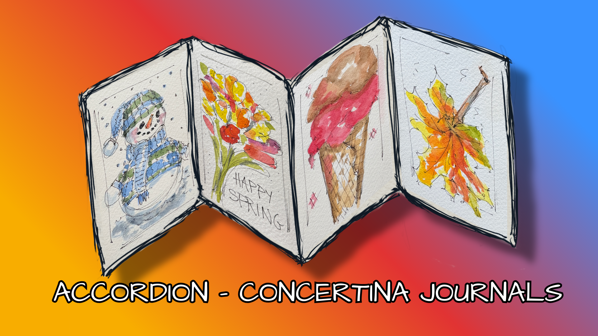
6. Creative Prompts to Get You Started: So we've made our five page accordion journal,
and it's blank. So how are we going to
decide what to paint in it? To end up having it be filled
with images that we love. You can just sit and go, okay, maybe perhaps or
you can do what I do. And I have provided for you. There prompts, and the
prompts are not cheating. They are simply a
way to make it easy, fun, and not a struggle. So if you have prompt, such as the first
page being in mine, I did seasons of
the Year favorites. And so in mine, I said, Okay, for
winter, it's a snowman. Spring, it's flowers,
summer it's ice cream cone, and in fall, it's leaves. That way, when I just
picked it up and said, I 15 minutes, let's
have a good time. I didn't have to
stress about it. The last thing you need is
more stress in your life. So these are below as PDF, you can print them off. For now, let's make it easy. Let's make it fun.
Let's get going.
7. Sketching Magic: We're gonna do a five
page Accordion Journal and have fun with this. You're gonna say, Barb, I only
see one, two, three, four, but when we fold it and
then bring this back, we'll use this as
our title page. So that actually is five pages that you will be working on. I have this
watercolor paper that has a texture more on
one side than the other. I am using the face up
texture on purpose, so I'm folding it, making it come this way. And you're going
to see there's a little scrub across there. I'm saying, that's fine. We are not thinking that
this is gonna be perfect. I'm doing the seasons of
the year favorite things. In other words, when I think of winter, what do I think of? I think of a snowman. In the spring, I
think of flowers. In summer, I think of
that ice cream cone. In the fall, I think of the
leaves that are falling. This PDF is below. You can print this off.
Let's start with that. I'll do other classes
that will show you vegetables, dogs,
something else. Let's go for it. I
have chosen an image, and I'll bring it over
and show it to you. This is the little
Snowman image. I will keep this as the
image for you to be able to see because I move it off
to the left top corner, about 10:00 image for
me because as I sketch, I can look up and
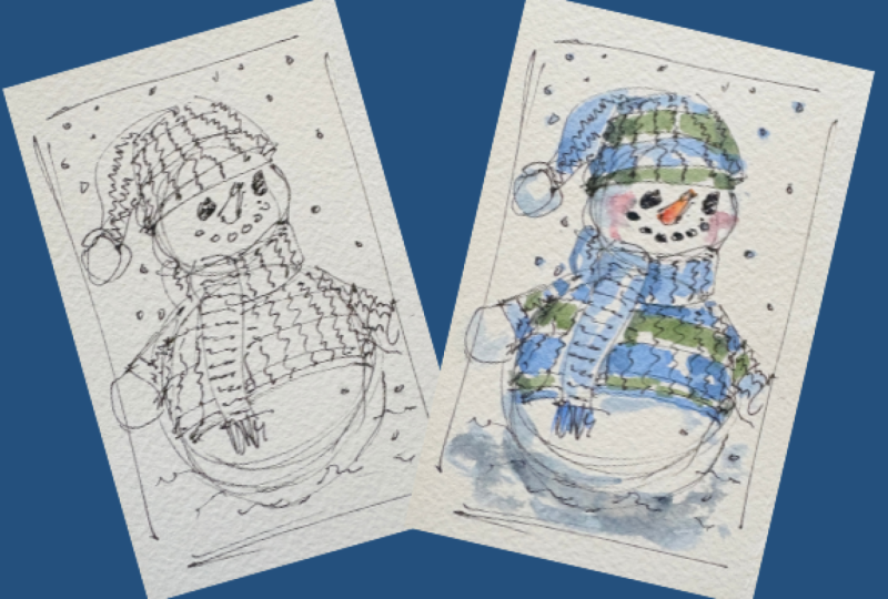
see this easily. This is the first getting it started I'm going to go and put a border line just to help me kind of get the space on it, and let's go like that. And Snowman, remember
rolling those snowballs. Big one for the base, another one for the head. I'm using multiple lines. You can use one
single, if you wish. Whatever works for you. I'm just going to start with a little neck scarf that has
such a cute shape to it. Let's go down across
the tummy so I can gauge how far
do I want to go. Go put some fringe on it, and then I'm going
to go ahead and do some stripes and might not be exactly the size from the
image because I know I'm going to use watercolor and the brush isn't
quite as precise. So I'm going to put
an arm in here, and his little arm comes out over the edge, not a problem. In fact, it just
adds some interest. So on that one, I'm going to let the arm go behind our border. So let's see. Okay, here. Really chubby cheeks. And then he has a
hat that's gonna go. Let's see what the shape is. It's going to follow his head, so it's going to
be big and round, and then it flops
over down to a ball. There's a ball that was
knitted on that side of it. You know, I'm wanting
his bottom to be bigger. So I'm just gonna go
ahead and large it. I'm gonna put some snow in
just a few lines for snow. And let's go. He has a rim up here, and let's go for that carrot. That carrot that's that nose. Every house has a carrot, right? And then he has I and, and these probably would be
stones today, maybe marbles. But years ago, those
were pieces of coal because every house
was heated with coal. So the child just went into the basement and
pulled out some coal. I'm gonna go ahead and ink in that eye as though
it's a lump of coal. Let's see about some
stripes on his head. Okay, he's looking
fun and funny. I am going to now put some
lines to add interest, and this is what's
giving him personality. What do you think we should
call him? What's his name? Charlie? Okay. Let's
call him Charlie. Hey, Charlie. And in doing the line, they're going to be further apart in the middle and they're closer together as it
goes away from us. That gives that dimension
of he's big in the middle. Okay. He has some stripes over here. Let's go down with some
textures and texture. Put a stripe in there, and his hat has texture. So let's go down
that angling over, someone knit and
scarf and sweater. Okay. Let's go down.
He's looking cute. And for just marks to
make it more interesting, let's put some snow. He is hoping it will
continue to snow as each of the person
who made him. There. Alright. What else do we need? You know you can always
go back later with more marks. That's not cheating. That is not cheating. That just is if you want
to add some more, do it. Okay, I'm going to call Charlie
complete for right now, and we're gonna go to
watercoloring him. So I'll see you in that video.
8. Painting with Playful Strokes: Charlie is ready to be painted. He wants to come to life. And I am showing you my setup, thinking Charlie
in blue and green. I just think of blue for
winter for being cold. So that's gonna be my choice, even though my image
actually has red, red and white in the
sweater and the hat, I'm gonna do Charlie
'cause we have Leeway. Do it the way we want to. So I am because my
blue is way over here and it's hard for me
to be crowded like this, I am going to push this. I am sorry it's gonna be a
little out of your way, maybe. And I will move my image
that I refer to here, but I will put a
still image for you. So again, because of this being long and therefore kind
of crowding my palette, I am going to hold cloth just so that it's
not taking up space. If I were doing something small and singular, I could do this. And, in fact, you know what? I can do Charlie this way. And you can see how I
wipe across my paper. Let's get going on, Charlie. I am going to pull some
blue into my palette. Area. The very first time you're going to stroke on something, you're not quite sure how
much paint you have on here. So you know you can
always go back later. Let's just do it the first, and let's see how much paint
actually do I have on here. I like to leave some white. In other words,
you're going to see me sort of scrub across, and the collar is
completely blue, so I'm going to go that way. Coming down, I am
not filling him in. Now, you do it the way
you like to do it. I am not saying this. It has to be the way. I just This is my style. So, let's see, up here on the pick up a little
bit more paint. You saw. I had
just enough paint. I was pleased with the amount
of paint I had on my brush. So, I need to leave
every other one up here, but it looks like what drapes down the back is all
blue, one color. So I'm gonna do that. Let me see if I want to fill
in a little bit. I do. I want to shade
a little darker. So I'm gonna pull a pain's
gray very carefully and come where it would be shadowed where it would
be a little darker. In adding contrast, that
just adds interest. So you're seeing me do it at different places where it
would disappear darker, which means as it's
going away from us, or if it's shadowed
by something. So let's just touch
here and there. I think it would be shadowed
as the little thing. I'm happy. I'm gonna pull in a green, and I'm gonna pull a green
that is a yellow green, but it also has some blue in it. Say it would show up up here. Say it would show up up here. Again, I'd like to shadow shoes. Touch. So again,
Pain's gray coming in on the edges where it
would be disappearing. I love Pain's Gray as a shading. It just isn't like black. Black gets pretty quick as
severe tone. So let's see. What do you think? Charlie,
how are you doing? I'm gonna say for the
very moment I'm happy. Look at this orange
nose, shall we? I'll dip into that orange. Just go for his nose. I might shade it
just a pinch of red. Yep. I'd like just
adding a touch of red. We do need to add that coal. So I just dipped into that Pain's gray let's get
his eyes a little darker. Oh, and I see I have
fringe right down here that I totally
miss, didn't I? So let's go back with some blue. And while I've got some
blue on my paint brush, I'm going just to touch into that pain's gray
that was sitting there. And let's put some snow. The pain's gray will simply be, just adding some interest. I'm gonna dab in some blue
into some of these snowflakes. Not all of them.
Oh, you know what? He needs some blue right
there on that little puff. Turn it upside down so it can come toward me
a little easier. Yeah. And on the
side of his face, let's come in with bit
under his hat, on his arms. And where I have come
off a little bit on the snow on his
hand, I leave it. If you want to try lifting it, you can go in with some
clean water on your brush, just not water water, but just a clean brush
and try to lift it. That works, too. Now, I think Charlie needs
some pink cheeks. I know he's a boy. I know. I hear you. But I
just want to do it. I'm gonna give him some cheeks. There we go. I think that's fun. My image has that. I liked it. I'm gonna say, go for it. So I shade just inch more under where he would be
sitting and scrub it. I'm gonna lift, clean my brush, lift some of that 'cause that was darker
than what I wanted. Let's do it that way. And I'm gonna say, as far as I'm concerned,
Charlie is complete. So, what do you think? Shall we go on now
to doing spring? I'll see you in that video
as we sketch spring.
9. Sketching Your Flowers: Okay, Charlie says he'd like somebody else
right next to him. And since he's winter,
it's gonna be spring. And I have chosen a bouquet
a bouquet of flowers. And I typically think of tulips as being a wonderful
springtime flower. So I have chosen this. And in sketching, we're
gonna go for a shape. We're only going
to sketch a shape. I will put that as a
single image for you. And let's just see what that is. As I'm looking at this
again, I'm wanting border. So I am going to just do a
side border and a side border. I don't yet know if I
want a bottom border, and I'm thinking,
put it on the top. So this is giving me a
parameter in there of a shape. And I'm seeing these as coming up as though
you would be holding the bouquet or getting
ready to put into a vase. And then the shape, I'm going to just put
it loosely up here. Then what I'm seeing is the tulips are pretty
much just layers. So I can go and put different
ones coming in here, and I'm doing this loose. As I'm sure you
would be doing too. It's like I'm not planning it. I am not even looking
up at my image, although I did just then because I was going to admit to you that I wasn't looking up there. So let's see. Then there are leaves. The leaves are Hash. They're not much of anything. And so I'm just gonna do them as though they're
a suggestion of a leaf. Now, the greenery, there
is a tulip right here, and it has multiple. As you look down into it, you can see multiples. And what's happening
here? Give it a stem. Okay, I'm happy with that. I am definitely thinking that's as much as what I
want to do on a sketch. So let me pull this back over. And you can see
pretty much the same. Alright. So, I'm
gonna see you in the next video where we're
gonna watercolor best. This is gonna be fun.
Alright. See you there.
10. Painting Your Bouquet: We have our spring
flowers sketched, and we're ready to paint
them with watercolor. The bouquet is colorful. It's wonderful. I will use it as a guideline for the colors. I'm getting more
just the impression that yellow is strong. There's some
oranges, some pinks, and I'm thinking maybe
this one is a red. So let's have fun with this. Alright, having it
flat out is going to interfere with getting
close to the palette. So I'm going to fold it back. Charlie can be up
there, but it will. Let you watch as I dip into
the colors and go for it. So I'm watering my brush. I'm taking some of
the water out of it, and I'm going to start
putting colors on my palette. I'm going to start with yellow. Actually, if I did every
one of these yellow, that would be fine because behind an orange is the yellow. The red is the one that I would probably start with more of a pink. But you know what? I'm just gonna go in
yellows right now. And this I'm gonna
call my pink one, and I'm gonna just
start with this. Blend it and pull out. And I'm gonna pull an orange. I'm orange. But here, I'm gonna end up with something that's
very impressionistic, and I'm gonna be
quite happy with it. I am going to do the
red one just so that I quit being tempted to
make it some other color. I'm gonna pull some orange in
just to give it some life. And let's go for some pink. Pink typically is just you have to water it
down to the point that it's a tone you like
or I'll pull one here is pretty bright. And if you like that, good. You know, use it. It's just looks like there are just some
different colors here. What do I want? And the
eye likes odd numbers. So if I have three of something, it's gonna be happier than
if I only have two of them. So, one, two, three
on the oranges. Oh, what I say I am the happiest I've ever
been with a bouquet. No. But it's giving
the impression. I'm trying to figure out what
do I want to do over here? I'm gonna do another
pink and actually pull a touch of purple in that one and do one could
be purple back there. And you're just watching
me sort of go after it. With abandoned. Going to. You know, I'm gonna say, I don't think anybody would know
these I'd be tulips. They just somehow know
that it's a bouquet. Let's see what our
green will do for. I am going to pull a green that has quite a bit
of yellow tone to it, and let's just come up
like it's branches. Loose, and green would show
through different plates. I'm gonna use Pain's gray
to come in and shadow that. Who shadow that a
little bit in depth. Make it interesting. And you know what? I am simply gonna call it quits. I feel like this
is pretty vacant, so I am going to get my pen, and I'm going to
write some words. And I'm going to say I'm
going to say happy spring. So these letters would be in
place of marks down here. I'm gonna go ahead and do a
few marks, different places. And I'm I'm going
to say that's it. I think I'm finished. What do you think? Is what I thought
I was gonna end up looking like? Not really. But compared to my image that I had pulled,
it represents it. And that's all I'm after. I have fun doing it. Not perfect. I'm not trying it to identify a
particular flower. You can just think in
your mind a flower. So, see you in the next one. We will go into summer. And I'm thinking Ice
cream so. See you there.
11. Sketching Yummy Details: We're ready for the summer, the favorite image for summer. For me, that's an
ice cream cone. I think of being outside walking along a street and stopping
at an ice cream shop. So my image that I have pulled is a chocolate and a
strawberry ice cream cone, and it's going to be fun and
the fact that it has a shape that is really easy and
expressive and quick. So I'm going to move this aside, and I am going to
glance at it as I go ahead and get my
pin ready. I'm looking. And again, I'm thinking
I need borders. So I'm going to do a side
border and a side border. I'm going to leave the top and the bottom without
borders at this moment. So I'm thinking that this ice cream cone
is gonna come way up. It kind of hooks
over, it dips down. I zigs along on top
of the strawberry. And then the strawberry lumps
out and lumps out again. Goes across and scoops
down, and then another. So somebody really
was good behind the counter and gave
me a lot of ice cream. I love it. Then the let's see. We need to have an
angle because we know this cone goes down at an angle. And oh, the fun part
of this cone is that it actually has a shape to it. And it comes down. I think I could be a little
bit more loose with that. And when it comes down, it goes down one more time. So let's make it a little
bit more specific here. And now the fun part comes in the fact that there are lines that come across as making that waffle, the
waffle appearance. I'm going to first do
this one and let's see. How is it going to come? Let's just start with it here. And oh, yeah. Look how fun that is. And these tend to come down
more just in a straight line. So let me go this way. And then they tend to
go across as this goes. So wait to see when
I finish this. Let's make that
line more specific. 'cause actually, it
has a little ridge on. Oh, look how fun. Can you not feel that that was
wrapped? I love it. Okay. So at this point, do I want to do anything else? Actually, I don't. I'm thinking that our watercolor is going to be what really gives us more that personality. So the fact that I took
the ice cream off the top, I am going to come in
with just a side edge, but I am not going
to at the bottom. I think this just feels like the ice cream cone is being
held without an end to it. Let's call it quits for the sketching on
the ice cream cone, and I'll see you in the
video for watercoloring. Get your watercolors
ready. I'll see you there.
12. Painting the Flavors: We've sketched the
ice cream cone, and we are setting ourselves up for some fun with
the watercolors. The way it is here, I am going to go ahead
and fold it back, so it's not quite. So long and maybe just
less distracting, where I can simply see this. So I think at this moment,
that's how I'll do it. Although I may change. And you can see I have the
ice cream cone. I will move this aside so
that I can look at it, and I'll give you a still photo so that you can
follow along as well. I have spritz my watercolors.
I am ready to go. Centrally, I am going to
think using pink and bros. So we'll pull a pink up. Let's see. What does it? Does it look like strawberry
or raspberry, maybe? I'm gonna pull another
one that we might use just as a
secondary color in it, and we might even have just a touch of red in so
let's start with that one. It's easier to start with
light and then go into darker. Let's start with our
strawberry ice cream. And, you know, as I say, you never know in the beginning how much paint you have
on your paper brush. So let's just go and you know, me, I kind of slurt around. Keep some light, keep some dark. Can see I went off on this one. And because I'm not
real happy with that, I'm gonna add some clear water, and let's see if we
can pull that up. Some watercolors
are very staining, and I don't remember whether this one is staining,
but you know what? I'm just gonna pull it
up as much as I can. And then I'm just gonna
be happy with it. Alright, am I making it worse? Maybe? I'm gonna at this
point, call it okay. So I'm gonna go in and add a little bit more where
I'm wanting it to be. And then I'm gonna start
with a little shade. And this is certainly darker
than what the example is, let me make this look
a little bit puffy. And I'm gonna wait till some brown till I pull
up some brown now, and I'll come under this area, which would be shaded by
that chocolate ice cream. So let's pull up some brown. What are we looking at here? Here's a brown or
that one looks good. Good chocolate and pull
up some more of that. So, start with the lighter
and go into our chocolate. I love Chocolate. Do you? It just Yeah. I'm not even that fussy about what chocolate it is. I sort of. Semi sweet. And I do lunch into the chocolate chips as I make chocolate
chip cookies. Yes, I do. I'll admit it. So I'm going now with a darker, just added dimension of it
coming over and dropping down. Pick up some more of that. Okay. Let's see
where we are with. Okay. And I'm looking at my reference picture and
seeing that they kind of have some lobs as though there's either a density
or maybe there's some chocolate chips
in it, this pink. I'm gonna come down to
make it as though that shadowed the chocolate
has shadowed the pink. See what
that just did? And this moment, I'm gonna
move on down to the cone. It should have just
a different tone to it, a yellower tone. There is a bulge out here. I will leave that without
paint on it at the moment. Come down, and because
this is now wet, I am going to use that opportunity to come
in on the sides and darken it because that shows I just want some detail
now in the waffle pattern, and I don't want to
do every one of them. That's not what I'm wanting to. Who, how about that? Now, that's just
a normal boo boo. So I'm just going to daub it, lift that up, and it'll just
fit in to the next one. I'm going to pick up a
little bit more brown, and I'm just going
to go in a few more of these to give a dimension. Just add something
to that pattern. I'm go ahead and put some pink. And that's just whimsical. I also am at this moment, going to take some pink, and I'm just going to put it
up in here almost as though the guy at the counter still had strawberry on
his on his scoop. I actually am also going to just drag it
slightly down there. You can see it adds
some interest. You don't have to do it,
but it adds interest. And I'm just trying
to say to you, Don't worry about pruning it, but just do something. So right at this moment, let me see if I can lift that
pink a little bit better. See if wetting that down and
daubing it with my brush. Well, you know, it didn't
lift it very much at all. It really did not. So
that's where it is. I am going to act as though because I have
this little mark here, I'm gonna act as though
some ice cream is dropping. And when that's dry, I'll be able to take my pen and just make it as
though it's on purpose. So that's just call it. In fact, I'm gonna
leave that out, 'cause it diminishes that
there is a pink shadow. So let me blow. Let's see if that's dry enough. You can use a hair dryer. If you are really in a
hurry to do something, but sometimes the heat
will make your paper. Maybe it's called warp, so I'm very cautious
about ever doing it. Okay. I'm gonna go down. Oh. This is dropping. How about that? Ta adds
something fun to it, doesn't it? And do remember, at this point, you can go back and you
can add stronger lines. You can add anything you want. Nothing says. It's done
until you say it's done. But at this moment, I'm gonna say it's done. How about that? And now look how it appears. So I'll meet you in the
sketching part for fall. So see you there.
13. Sketching Challenges: This is what I
ended up doing was pulling a single
and expanding it. So it has the direction I like. I'm going to put this aside
and look at it as I am sketching and have it so that it's coming down and it's like, do I first start it that way? Well, no, I really am
saying I need a border. I'm going to do a
border and a border. Not sure yet on top or bottom, so I'm just going to
stop at this point. But it gives me the idea that the stem is going to be
coming down like that. Then let's see. Everything seems to be
really full of curves. I think I'll turn it
this way actually because I can sweep
easier with points when I do it this way and
the leaf is going to go off on that point and it would
be coming back over here. I'm going to start out
here and it'll give me an easier way to come That looks a
little odd, doesn't it? Yes, it does. But, you
know, that's life. This guy looks really strange. So let's see if we
can improve him. So let's do it as though it's this it's just
putting in a change. And have you ever seen a
perfect leaf, you know, in each one of those, there are veins that come down. So I'll do that, as well. And it's looking a
little confused. That's where I am. I'm
a little confused. So many times it's just the
details that tell your eye. What is? Okay, I'll go for it. It can be a leaf. Not perfect. And let's go
to the end where it has. So at this point,
I think I'll come across partially as though
it has come on down. So, goodness, do I think it
has ruined everything else? No, I just might not be my favorite of the
four. Who knows? So I'm gonna stop on
this one at this moment, and we're gonna go
get our paints, 'cause this is gonna be
fun with yellows and oranges and maybe a touch
of green. See you there. But
14. Painting the Vibrance: We're ready now to
watercolor our fall leaf. And I'm just showing you
how I This is real time. Where I just continue
to fold over my paper, my Viva paper that I love, making sure that it's
not the rough side, but the smooth side. So rather than getting
a brand new one, I did clean up my palette
for you because some of the colors from here would not be compatible on my palette. So I did that one. But you're seeing real time. This is what I will
be using for them. Image to follow. I will add it as just a
still picture for you. Let's just have some fun. The fact that is
that a perfect leaf? No. If I wanted to
make it perfect, I'd have to start
all over again. And that's not reality. That's not keeping it loose fun, but it's not perfect. So, you know, here we have it. I have a little pink over here. Is that ideal as a sketch? No, but let's have fun with it. I'm going to turn it. Actually, what I think
I'm going to do on this. Let me see if I can keep it
down firm enough down there. I think I will try it that way. So getting some water on my
brush so that it's not dry. I have spritched my watercolors. I'm gonna pull out
some different colors. I'm gonna use yellow. Okay, because yellow is a base that everything
can go beyond that. I'm gonna pull some orange. I'm gonna pull you're going to when I have gone
into one color, I do not take the
previous, like, the orange into the next color, I do go ahead and clean that. This is a color I love. It's called new gamboge. So that'll be a color. And then let's get
something else out here. How much deeper is this? Well, that's interesting.
Certainly a rig could come into play. And let's pull a burt sienna
that would be over here. Don't always get my
paints out here ready. Sometimes just
spontaneously, I find I'll need to go into something
else and that works as well. But that water is
turning a pretty color. Let's start with yellow
since that is a base, and I'm going to be
pretty loose with it, leaving again some white
where I have not added paint. But the edges, you know, would have paint on them. It's just more of
the centers that don't have the paint
and can reflect that. White. Okay, so
we're yellow so far, and I'm going to come in
with some yellow gam. Let's see how I'm
gonna pull it from where it would go to its center. Let's see how that
works. I'm liking that. Let's go with some orange because we do know
there's orange on here. But not feeling like that
has to be everywhere. I'm gonna keep that
more to one side. So here we are so far. And let's take something
that's it's almost combined. Something that we
might feel would be toward the center
lines. Right. You know what I don't want to
do is lose the liveliness, because my example still
has a lot of life to it. It is not so dried. So let me maybe an
introduction of some reds. I'm gonna work that
in a little bit. Oh, yeah. I'm liking this. Turn it. So more one
side has a red tone, but take into this other side. And I am going to pull a green, pull a green and a green. Me as though the
green would have been still coming
from the stem area. Just tuck a little green, lift it this point, I am going to do a brown stem. See how I like that. However, I'm going to
start with a lighter. We can always darken the stem. But with watercolor,
it's harder to lift that pulse paints gray
and barely have it. Just dry stroke, which
means not laying that down. See how that ends up making
it feel woody. I like that. Now, the veins ended up being a brown and actually
the stem on this one. Turns out to be ready brown. So I missed that one, didn't I? I'm gonna pull. Let me pull I picked up
some burnt sienna. I may do that, or it
just has a brown tone. And what it has has
pulled that same. And I'm gonna try it. If I don't like it, cro. I didn't like that. I'm lifting. I'm just gonna adapt
because at this point, I'm liking the leaf
the way it is. I am not happy with that stem, so I am going to
get a clean brush, and I'm going to see what I
can lift to light. And up. That just became dominant. That's better. I think I'll
take a little orange into it. And I'm going to add
some marks that would be almost in the movement of leaves coming down
from the trees. I'm liking that.
That's just enough. See how dry this is. The watercolor has to
be dry enough that when you put your
indelible ink on it, it actually can stay there
and not skip some blow. This is where adding those extra lines at
the end when you say, Yeah, I need to something. Okay, let me look. Let me look. I'm I am going to force myself to put my pin
down to clean my brush. Look at all this paint from these four that
we've done together, and I'm going to just wipe. I can squeeze. It's all clean. I'm gonna put it aside and say, We have had a great
time doing the four. I am gonna wait till this
is thoroughly dry because it will be turned over
in the next video, we'll do the title
pap. See you there.
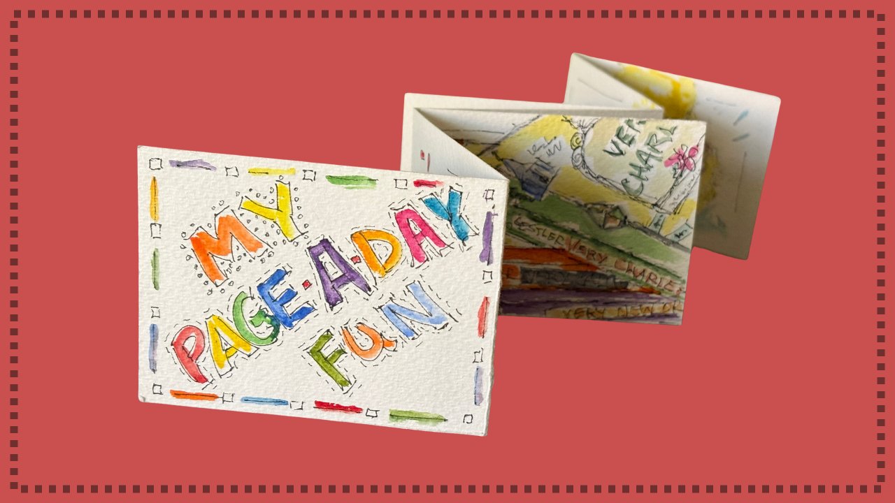
15. Setting Up Anticipation with Your Title: Mm. We have our four images that are from the
season favorites. And typically, I do wait for the title
page to the very end. Doesn't have to be that way, but most of the time, it seems that once
I have done this, I really have the idea of
how would I like to title. So when somebody you and
other people open it, they'll be seeing this first. Then they'll open. They'll
go and they'll go, Wow. Wow. So I'm thinking that because there are four colors
that are pretty distinct, that's what I would
like to go ahead and pull out onto my palette
when we're ready. And we might as well do it now. So I'm seeing a color of blue. Let's get our blue here. We felt like this
was yellow, right? So let's pull yellow. Here. Let's go pink
pink on this one. And this one, let's go why. Tying all this together. I'm gonna go ahead
and pull out green. Is just a color we may
use on that fifth word. So let's go. Let's
lay our brush down. Let's flip it over and go. What would we like to title it? And truthfully,
that's up for grabs. But now I am thinking
seasons of the year favs. Meaning favorites. Seasons of the Y's favs. So I'm going to start it out. And I really don't need a border because this crease
is showing me enough. So I'm going to go. S O N S of the year fabs. And you're probably like I am. You're saying, Oh, the
lines seem pretty thin, particularly for
what we see here, which was more full and bold. Let's go in here, let's just double the lines, not being precise, just
having fun with it. Sometimes they overlap, and
we're just taking it loosely. Let's fatten up this. Let's just I'm kind of
'cause I'm concentrating. I'm having fun, but I'm having
to look at not wanting to miss different ones and having a playful feeling
to it seems neat. So I'm gonna make faves
really stand out here. Ss are not my favorite letter. I'm going to even add
more personality to it. So I'm gonna put dots in it. I could have striped
across them. I could have angled straight. There are all sorts of ideas. And I'll do a separate
course that will just show you different marks
that I like, give you ideas. And you'll probably then
start looking for ways. Where can I use that? Let's quickly paint them, and you're going to
see what color can do. It's going to give our
title page personality. Thanks so much for doing this with me. I hope this is going
to be a favorite of yours and that it will
inspire you to do more.
16. Your Turn: Create & Share YOUR Journal!: Okay, it's your turn now. For your project, please take your empty journal
that you've made. Let's have fun
with your project. I want to see what
you've done, post it. I'll comment on it.
Other people will give you the great
encouragement. You go from a plain journal
that you've made. Easy fun. I showed you how.
And you're going to end up having a filled journal. You've used your prompts
and you have a journal. So take one of these as a project image and post
below what you've done. Give a comment on
how fun it was, what you found that you succeeded with or what
you tripped up on, and what's next for you. I hope there'll be many
journals in your life. I hope you'll let me be part of that journey and that adventure. As I say, it's your turn. I can't wait to see
what you've done.
17. Thanks & Let's Do More!: We've come to the
end of this class, but I hope it won't
be the last class. I'm going to have others
that you will be able to have different prompts,
different techniques. And let's make it a community of Accordion journal Concertina
journal enthusiasts. You've learned how to
make one and watch me demonstrate so that
you can do them too. I can't wait to see your projects that are
posted down below. Remember to follow me. And
if you'll give me a review, that will help
other students join our community as they learn
how much fun you had. I am so happy you were here. Thank you so much for
taking time to add 15 minutes of fun in your day every day with
Accordion journals. See you in the next
class. Have fun.
 Barbara Wirth, Artist, Illustrator, Educator