Transcripts
1. Introduction: Hello I'm Phuong Lempinen. I'm surface pattern designer and
illustrator based in Finland. And I'm delighted to welcome
you to my Skillshare class. I'm based in the picturesque
landscapes of Finland, a place that often finds
its way into my art. I specialize in creating
captivating surface pattern and illustrations that reflects
the natural beauty and rich textures of the
world around me. My works can be found on my
own website and Partten Bank. You also can explore my fabric and Home Decor
design on Spoonflower In this comprehensive Skillshare class, we are going to
dive headfirst into the mesmerizing world of digital watercolor
painting using Procreate, Procreate - a versatile, and intuitive digital art tool is beloved by artists
and illustrators worldwide. Now get really to
immerse yourself in the delectable world of digital watercolor
painting using Procreate. This class is a
celebration of fruits, from the tantalizing
burst of colors to the unique pictures that make each fruit a work of art in itself. Throughout this class,
we'll master Procreate watercolor color brushes delicately capturing the intricate details
of fruits with precision. We'll craft visually
pleasing compositions, select color palates inpired by nature, vibrancy of fruits. And we also add depth and
dimension to seamless blending. Last, we'll get ready to
perfect your fruit art with highlights and shadows and make your creations pop
up the screen. Now this class is designed for anyone who share
a passion for art. Whether you are completely
beginner to digital art, or you are an experienced
Procreate user, All you need are your enthusiasm and a tablet with Procreate installed to embark
this creative journey. Let's make art, learn and have a wonderful time together.
See you in the class.
2. Class Project: For the project for this class, use all the tips and
techniques that you have learned in this class to
make your fruits artworks. And you can follow
these instructions to help you along the way. Here are some project tips. Select the fruits that
inspire you and allow you to experiment with the
techniques you've learned. Explore creativity. Don't hesitate to infuse your unique style
and creativity into your artwork to make it truly
your own. Master techniques: Experiment with different
brushes, layering, blending, and lighting to create a stunning lifelike representation of your chosen fruit. Attention to detail. Pay meticulous
attention to the detail like highlights,
shadows, and texture. To achieve the look
that you want, Share and connect
Beyond submission. Actively engage with
the cosmic community by providing
constructive feedback to your peers. It's a wonderful opportunity to learn from each other and
grow as artists. When you're ready to
share your project, upload your final artwork
to Skillshare class project, be sure to include a title for your artwork and a
brief description of your creativity process and any challenges you overcome
At the project privacy, You can make this
project private. But I recommend you
to make this project publish because this is a
fantastic opportunity for other students to
learn from you and for you to receive feedback
from your fellow classmates, Showcase your new found skills and connect with the
creative community. I'm so excited to see
what you come up with. I'll ask you in the next lesson.
3. Gathering Your Art Supplies: In this quick video, I'm going to walk you through the materials you
need to get started. First, you want to
have some traditional sketching materials
at your disposal. This includes pencil eraser and of course, sketching paper. The reason we start with sketching on paper
is they give you the chance to get
comfortable with your chosen shape and details. To pen an ipad, you need
an ipad with procreation. With these materials in hand, you'll be all set to embark on our creative journey together, garden supplies, and
let's go to the next let.
4. Choose Your Fruits: In this lesson, we're going
to choose our fruit and find creative inspiration for our
digital particular painting. It could be a single fruit or a combination of your favors. The choice is entirely yours. Once you decided on your fruit, let's move on to the next step, gathering visor inspiration to find the perfect reference
images for your fruit. We are going to visit Splash, a fantastic resource for high quality and
free to use photos. The best practice is
that you can choose whether photo from Google or from entries,
or from unsplash. And combine them together
and make your artwork. Then you don't need to
worry about the copyright. Now go to the search bar
and type in the name of your chosen fruit and
explore the available photos. Look for images
that inspire you, whether it's the color,
texture, or composition. Once you filed the images that resonate with your
creative vision, sell them to your
device or create a dedicated folder for easy
access. But that's not all. I have also repaired a Pinterest board
filled with food art. Let's explore it together. Here is my interes board. Take your time to browse
foodies, beautiful creations. Pay attention to
different styles, color palettes, and techniques
used by other artists. This can spark on new ideas and help you refine your vision. As you explore these visuals, think about how you can infuse your unique style
into your foot art. It's all about fighting
your creative voice. Don't forget to keep
a sketchbook or notebook handy to chart out
your thoughts and ideas. It's a fantastic way to prins storm and sketch
out the concepts. With these tools
at your disposal, you're well on your
way to creating a standing digit of part
color out art inpropreate. Let's go to the next lesson.
5. Creating Composition: In this lesson, we're
going to explore how to create cultivation
compositions. And first have fantastic
resource to share with you. Before we dive into the details, I want to remind you of the endless
possibilities when it comes to food combinations. Take a look at these bets or filled with standing
food bookcases. These beings are
not just beautiful, they are a rich source
of inspiration. Different fruits are combined to create visually
pleasing arrangements. Notice how color, shapes and textures are
harmoniously blended. They use start sketching your foot art to keep
these pins in mind, you can use them as references
to decide which fruits go well together
and how to arrange them while sketching
your combinations. Refer to these pins. Pins for inspiration, how you can adapt their
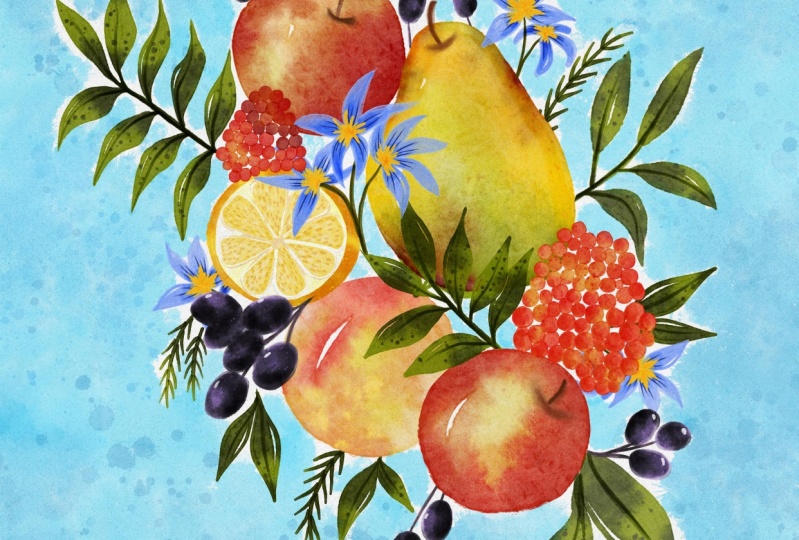
concepts to your artwork. This is my moodboard. After fighting
inspiration for my work, I assembled them
into a moodboard. As you can see on the mootboard, The number one, I am to create a vertical piece
with a layout like this. Number two and number three
serve as fruit inspiration, which all combine my artwork. Number four, revise the
background inspiration. I like the background style and planning to incorporate
it into my work. Number five, please cut my
eye with the colors in style. I may adopt the particular style of color usage in my piece. Number six serves as my source of inspiration
for drawing leaves, which are coming out from the force with the mood
board is my guide. I will sketch out
my ideas and keep it nearby as I can
create my artwork. Begin by sketching your
fruits on the page. Don't worry about the
perfection at this stage. It's all about exploring ideas. Try different arrangements, sizes and angles
for your fruits. Feel free to fill multiple
pages with your sketch. This process is about
discovery and finding the composition that
resonates with your vision. Take a moment to reflect
on your sketches. Which composition feels
the most cultivating, Which one best conveys
the message or emotion you want to
express Your food Art. Once you've made your selection, it's time to transfer your
chosen composition. Duplcate. This is where your
sketch on paper becomes the foundation for
your digital masterpiece. Join me in the next
lesson where we bring your sketch
to life in pate.
6. Importing Brushset into Procreate: In this lesson, I'm going
to show you how to download and add your brushes to
the Brocade Brush Library. This skillshare has
recently been updated, allowing you to download
the brushes from the project section on both
the web browser and set up. However, I'm going
to demonstrate how to download them
using the web browser. In the project section, simply swipe up until you see the download
resources option. Tap the file and
then tap download. It will be downloaded
to your device. Depend on your browser, whether it's Supery
or Google Chrome. Go to your downloaded files
and then tap the bet file. It will be imported into
procreate automatically. To verify that the Bst is
now in the brush library. Navigate to the Brush
library and see the, you might see two of them here because one of them
is the original. Now let's take a look
at these brushes. We have six quatcolor brushes, six stamp brushes, and six
qatcolor paper tector brushes. To test the brushes, select the color and
paint on the canvas. Feel free to experiment with all of them in your
own grade space. Now I'll see you in
the next lesson.
7. Adding Texture to Your Procreate Canvas: This. I'm going to show
you how to install quart color paper
texture to the canvas. First, let's create a canvas
using an four document. I'm sure it's available
in your prod to do this Top the plus button
and select a four. I have no idea what
it's not showing here, but you can adjust the orientation of
your document by using your thumb and index finger to hold and rotate the canvas. However, if you prefer
a vertical canvas, that's now ensure that
your brush set is imported to the
brush library and swipe up until you find the quarter color
paper texture brushes. Before selecting the quarter
color paper tectu brush, we need to change the color, hit over the colors at the top right and
choose the grey color. I often use a gray color
located around this area, but feel free to assert
it to your liking. Now go back to the brush library and choose the quarter color, paper texture brush
that you refer it, just the brush stock setting
located in the top sidebar, which is on the left
side of the canvas. In my brocade interface, start painting on
your canvas and make sure not to
lift your pencil, as doing so might affect
the pacity of your canvas. Next, go to the layers and change the layer
mode of the layer. You've just been to line
burn duplicated the layer, while ten use linear burn and
colburn adjust the opacity. In this case, the canvas is
white enough and I like it, I'm just leaving it. Feel free to rename your
layers if necessary. Now let's draw something on the canvas to see how
the paper texture works. Remember to draw below
the paper texture layers. You can even lock
those layers if you want to avoid accidentorly
drawing on them. Now go to the brush library and choose your car color brush. Then select your. You can see different cart
color paper textures here repeat the same process with other Ra color
paper texture. Different papers can
have different feelings. Take a moment to
examine the piece. You can see the
texture app lied. This is how it looks with the texture with
an architecture. Now that you know how to apply pero texture
to the canvas, let's move on to
the next lesson.
8. Ready Your Sketch for Painting: At this, listen,
we're going to import our sketch photo into Procreate. After completing your sketch, take a photo using your
phone or your ipad. I usually do it on the ipad. Now let's open Procreate. Create a new document
with dimension of 4,000 by 4,000 big cells. Top the plus button at
the top right corner, you will see the
custom canvas option. Change the width and the height to 4,000 by 4,000 big cells. And set the DBI 2300 to add
the photo to your canvas. Go to Actions at the top left. Then select Add. Insert your photo and choose it. It will automatically be
added to your canvas. Next, let's make some changes. Tap the arrow at the top
and your photo will be selected to crop the photo, move the parts you want to cut to the edges of the canvas. Anything outside
the canvas will be remote move and place your photo on the
canvas age you desire. When you're satisfied, turn off the arrow and go two layers. Turn down the opacity
of your photo. I'm going to add the paper. Tu, you've learned how to
do this. Repeat after me. After achieving the
desired paper look. Ensure you lock all the
paper layers because you don't want to
accidentally draw, create additional layers below
that you intend to draw.
9. Bringing in Your Colorpalette: Welcome to the exciting lesson. Using the right colors is crucial for creating
captivating artwork. Let's dive in and
discover some tips for selecting and testing
your color palette. Before we stop pending, first consider the mood and
emotion you want to convey. Warm color evoke
energy and passion, while cool color
offer a calm effect jus palette that aligns with
the emotion in your artwork. Next, nature of
reference images. For inspiration, analyze
the color relationship. In flowers, landscapes,
or even fruits, nature revives an endless
palette of possibilities. You can experiment with
three main color scheme. Parliamentary, where
opposites attract for plan. Analogous where
neighboring colors on the wheel create harmony. And driadic tree of colors, even space for vibrant
and lens combinations. These theories get
you in crafting visually appealing and
harmonious color palette. If you are looking for
really met palettes. Pins is transf, search for keywords like color palette or color scheme or
color combination. Save the palettes that
catch your eye, one self. Import these palettes
into your procreate. Now I'm going to show
you how to select colors and add them to your
procreate color palette. In procreate interface, navigate to color
at the top right, and then select palette top the blast button to create
a new color palette. Since we're doing this, manually choose create new palette. To pick colors from
your reference photo, simply use your index
finger to tap and hold on the desired color
until a circle appears. Move the circle around until you achieve
the colors you want. Then add it to your palette. Feel free to add as many
colors as you like. Now let's talk about testing your chosen palette before
committing to your artwork. This can save your time and ensure your colors
work well together. Try to apply quickly
those color palettes on your artworks to see
what you like best. There is no rule here. Be creative and have
fun with the process. Using a testing your
color palette is a vital step in the
graded process. It tests the tone
for your artwork and ensures a harmonious
visual experience. Another way you can use to
add colors to your palette, change the value at the color section you can see
next to the palette value. You can change the
value of the color by adjusting the hue
saturation brightness. Or just you can import color pallets from interes by simply changing the
code from the color, then added to your color pallet. In our next lesson, we'll apply these colors to
create standing fruit art. I'll see you in the next lesson.
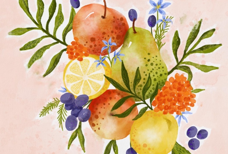
10. Painting Apples: Before we stop ending, I just want to let
you know that if you don't have much time
to sketch your own, then you can use my sketch to practice ending with
quarter color in procreate. Buy the sketch in the
class resources under the class project section and add it to your
Brad on your own. Keep your color
palette photo nearby, so you can easily refer
to the colors just like your mood board to keep
your vision consistent. Now let's stop ending
beginning with these apples. If you're using my sketch, feel free to get creative. They don't have to be apples. They can be any other proof. First, let's paint the
base using quart color. With tax your brush to the brighter red or you can take the red from that
area on the screen. Adjust your canvas by
zooming in or zooming out or rotating it to find a
comfortable working position. Bend is your wooden paper, you can lift or not lift
your pencil as you refer. After bending, you can use the smudge tool to plant your pending and
make it smoother. Feel free to adjust your
brush to refine your piece. I often use the same
brush that I use for bending repeat the
brushes for other apple, create another layer and
set it is clipping mask. A clipping mask
allows you to paint only within the area
that's already painted. To keep things organized, group these apples
with their names. Now go back to the
clipping mask layer, gender brush, to the stem brush, quarter color leap, and use it to add shades
to the edges of apple. Add some green shades and
red shades where needed. If there are areas
that need highlights, use the same stem brush with the erase toll to
erase some paint. When it comes to shading, feel free to be creative brushes with more transparency to shades and use the
smooth toll to adjustments for the apple stem. Choose another
color such as brow, and draw a quick
stem with one line. If you feel the shades, the apple are not
quite what you want, go to the shading layers
to make adjustments. Adjust the opacity of the shading layer to align
it with your vision. Now to recap. First we paint the base with
the quart color, with the quart color
with texture brush using the bright color tone
as shades to the edges. Sam brush Articolo lead. Use the other brushes with lead paint to adjust the
shade of your subject. Experiment with the smush
toll and the eraser toll. Paint everything on
different layers and then adjust the layer
to align with your vision.
11. Painting Pear: Let's pin the peer, go to the layers and turn
on the sketch layer. We will pin on the new layer, but I want the per layer to be between those apple layers. I'm going to flatten this apples group and then separate them
into different layers. To do that, first, we need to turn on the
selection tool and make sure you are on the apples
layer to the lower apple. And then use your three finger
to swipe out the screen. You see the window
of copy and pasted, Peer to cut and pasted. Then go back to
the layers again. You see they are now
on separate layers. Go to the layer where
you want to paint. The peer chose a color and change your brush to
potter color with ticture. Adjust your brush
size and need it. I broke the per layer between
these apple while painting. Feel free to add some
highlights by leaving some small space
on the pier empty. If you wish to delete those
white spaces within you, the smug hold that error or paint over it and then you
smug hole to smooth it. Now make another layer
and set it mask. We're going to add shade to this per I'll go for a
brown or some red. And also green chose the
Sam Brush quart color, Led top outside the pier edges. So it still provides
paints on the pier. Use the eraser tool with the Stam brush for
erasing some paints. I need it try to add depth to your peer
by using different brushes. Brought the pierce them in the same way as we
drew it on the apple, Making as many
adjustments as I needed. We are dealing with it peer. Let's move on to
painting lemons.
12. Painting Lemons : With the lower lemon. Apply the steps you've learned from painting the
apples in the peer. Check out the speed band
at the end of this lesson. Now I'll show you how to paint the other
half of the lemon. These don't need to be lemons. If you use my sketch, feel free to turn them into orange juice or
any other fruits. First, use the
quarter color with picture to paint the
base of this lemon. Use the lighter yellow to paint another circle smaller
than the first one. Duplicate the circle
you've just thrown. Then make the gleaming mask
and Janet's color white. I'm going to change
the color of the base. I think the yellow is so light, so I want it to be
more saturated. So I'm just to another
yellow and then paint it. I also make some
adjustments with a shape to now go to the light
yellow circle layer, move it to the brant and use the eraser tool to erase
the light yellow paint. We are going to make
the lemon wedges. I think I want the
white part to be clear, so I'm going to duplicate the white circle and then
merge them together. Now make the clipping
mask clear to the base. And use the stem brush, auto color, to add shades
to the lemon base. But you know what the visible part of
this base is now small. I decided to get another
brush with less paint to add some shades
in the process. There are many times
when you want to adjust your element right way. Just do what you feel it, right? I'm going to change the
yellow of the lemon wedges. I want another yellow tone. Now we'll draw the details
for the lemon wedges. I choose the hard edges, Articolo brush for this part. And another dark yellow. Draw short lines one by one until you feel
all the wedges. After you finished
the first line layer, continue with the
white shot slides. Now I'm going to make
some adjustments. I'm going to add
some darker shade around the white circle here. I don't like the look of the
white part when I'm out. I'm going to make
some adjustments. First, I need to select all the layers that
go with that part. You can choose the layer
by sweeping right the top, the arrow at the top and you can rotate or even genie
shape rotating is enough. I'm going to the
shading layer and edit the shade under
the white part. I use the much hole to blend it, then add more depth
to the lemon skin. Now I will organize these layers by group
them and men them. We've just finished
the painting. Lemon lesson, Jake, the pet pin to see the
brushes of another lemon.
13. Painting Berries : We'll continue with the berries. Make a new layer and
choose a new color. I'll go with this bubble, choose the quarter
color with T to brush. Now we're going to
paint the base. I'll start with
those big berries next to the upper lemon. I broke the berries layer above the upper lemon group
and started painting. I painted the base two times
to give it the big base. I make another layer for the berries below
the fruit layers. Then I go through
the same process with the other bubbled berries. When I set these, I plant the
berries to be blueberries, but they look a lot
bigger than blueberries. More like grapes, maybe. But the way I paint them makes
them not look like grapes. I just want to say
it's your art, so you can decide what it is. Even if your elements look
weird and unrecognizable, they are still your art. And still work with your ideas. Now let's move on
to orange berries. I use the same to color with. Take your brush and adjust
the birt size as needed. I randomly paint these orange
berries until they are in. Then I add variation by
painting some berries on top. Now let's add leaves
and other tiny flowers.
14. Painting Leaves: Make a new layer under all the other layers and choose the green
color for the leaves. I continue to use the
quarter color with Take brush, paint your leave. But you don't need to
follow the sketch. You can go with your
imagination at the moment. Don't lift your pencil to
get the beautiful paint. Ta, you can leave some little spaces
on your leave to make it look like
real quarter color. Continue painting on the
leaves in the same way. With this kind of leaves, you can just follow
the sketch and add some variation by going
in different directions. Choose another green
and draw the thumbs for bubble berries on the same
layer with the leaves. Then make another layer at the top to bend those
leaves at the center. Now make a new layer and it needs to be on top
of the fruit layers. And we're going to add
some tiny flowers. This is not complicated, so watch my speed bend
and follow along. Now I'm going to add some
shade to the leaves. I chose the green, make a new layer and set
it as the clipping mask. Then I stop painting. This looks more interesting when there is variation
on the leaves. We'll finish the basic
painting of this artwork. In the next lesson, we'll add some background
for this piece.
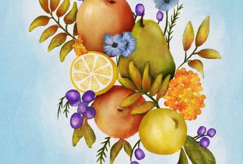
15. Painting Background : After you feel everything
is good and you don't want to make any
changes to the main elements, then we're going to
flatten on the fruit. And every element will
be on each layer. Then group all the
layers together. Now make another layer
and bring it forward. You can see on the
screen the Bush was the United
Bush in your bust. This is the hard
brek edges brush. I'm going to use it to
paint the background, the big size of my brush and
paint around my elements. I left my brush as
many times as I want. After finishing the background, I want to refine a bit. I used the **** toe with quit color with Tto to
blame the background. Now I feel like I don't like
the ink of this background. I want it to be brighter. So let me show you
what we can do. Go to the adjustments
at the top left. In saturation brightness,
I'm going to adjust the background by playing with saturation and brightness
until I get the color I want. But if you don't like
the being back route, then you can also
change the back route. Here is how make a new layer above the back round layer
and set it as a mask. Go to color and choose
the color you want. When you have the color
you want to change to tap the color circle at the top right corner fold and drag the
color to your canvas. Make sure you're on your
clipping mask layer. You can duplicate the
clipping mask layers and give them colors. And you can switch between
backgrounds that you want. Now let's put to
the next lesson.
16. Adding Shadows and Highlights : Go to the layer with
apples and beer. Make a new layer and set
it as a clipping mask. Crap your blue quarter
color brush with less end. It's a versatile
tool that allows you to create, solve
realistic shadows. Choose the shadow
color you desire. I'll be using a
slightly darker turn to at de chang the mood of the clipping mask layer to multiply and bring down
the opacity of this layer. This blending mood allows our shadows to interact
with the underlying layer, giving a more
realistic appearance. You can also use the same color, because the layer is
in multiply mood, then the shadow will
be darker anyway. Now, carefully paint
shadows where your fruits meet or where you want to enhance the three
dimensional field. Don't be afraid to experiment with the brush size and res, for more natural effect. Focus on areas where the fruits overlap or cast shadows
onto each other. This gray a sense of death
and realism our composition. Now let's bring out the
brilliant with highlights. Choose the stain, brushed
part, color bled. This will give your highlights
a soft and organic feel. Instead of using the erasortle, we're going to use a mask for this layer because I don't know if I would like the result. The mask will protect
your original painting. When you are on the mask layer, make sure your color is black. This will work like
the Erasortle and the toe black works like
100% of the opacity. Tap on the areas where you want to add a touch of brightness. Perhaps where the light catches the surface or where you want to emphasize certain details. This could be a top of food, or the edges
catching some light. Feel free to experiment with
the size and opacity of your brushes by justing them to achieve the perfect balance of your shadow and highlights. With those orange berries, I choose the same orange
and make a new layer. Then set it in the
multiply mode. I start pending randomly
on the base to make more variation and
active to those berries. This is a step after adding
highlight and shadow. I recognize that I want my
artwork to be more vibrant. I have shown you in
the last lesson, we're going to use
the same method, but you can choose to platen
on the fruit together, then adjust the saturation
and brightness. Or you will adjust one by one when you are satisfied
with your artwork. Let's go to the next lesson.
17. Finalizing Your Artwork: Make a copy of this
document to back up. If you are satisfied
with your work, go ahead and flatten all your layers before
making any changes. Duplicate your work to have a backup and hide one of them. The smoke toll with
a quarter color with texture brush to play with
the paint on your artwork. Tap randomly on the edges of each fruit and see if you
like the way it turnouts. Now create another layer
and try some time brushes. This step is just needed
if you would like to. I don't often do
with my artwork, but I want to show
you what you can do to make your work
look more interesting. Start with part color plaster, one with the biggest size
popping randomly on the canvas. Try bringing up and down the splatter layer
to see how it looks. It's better if they are in different layers so you can change the colors
whenever you want. If you don't like a
particular shade, create clipping mask
for each paint layer and find another color that
catches your eye to change. Let's talk about style. You can see that
they have changed color of the
background to being. Again, in art, your
unique style says your part and makes your
work instantly recognizable. One way to enhance your style and to your artwork is
through educate details. By incorporating distinct
elements like lines, starts, dashes or textures to infuse your creations with
personality and individuality. Experimenting with the details allows you to create
fascinating burdens, emphasize specific features,
or convey a particular move. These small but importul touches not only make your
work visually appealing, but also contribute
to its tinctiveness. They can become your signature, giving your art a unique voice and resonates with
your audience. Don't let your
creative flow and use the elements to express
yourself uniquely. Remember, it's the little
details that often make a biggest difference in
defining your artistic style.
18. Exporting Your Artwork: Now after finishing
your painting, we will export our artwork
to share it with the world. Check, if you want
to change anything, then go to auctions
at the top left, top share and choose the file format that
you want to use. I often choose Back or A, B, and G after seeing export successful to
your photo gallery to find your artwork. However, since it's a
high resolution photo, if you plan to share
it on the Internet, make sure to reduce the quality to avoid unauthorized copying of your artworks next to Canva.com You need to sign
up for a free account. If you already have an account, go to create your design. At top right here, I will go with the custom
side of 2000 by 2000, big sales after your
canvas appears. But your photo from camera O at the left
end of your screen, Choose your photo and
will plot, automatically. Drop your photo onto the canvas and this will
fit the background. Now you have two options. You can tap the download
button and download A, B, and G to your photo gallery. However, if you
would like to choose the photo mark for this work, then go choose the Share button. You can choose the ice type
and even recite your photo. Or just the quality I with 80% quality
and the same size. Lastly, top the down log button. Let me show you the
difference between the original artwork and
the lower resolution work. Now we then and
make sure to share your work to the class
project section.
19. Final Thoughts: Congratulations, you
finished this class and I'm so proud of you. This has been an incredible
creative adventure, and I hope you enjoy
it as much as a head. Remember, this class is not only about creating a stunning food, art in procreate is also about discovering and nurturing
your artists voice. In this class, you explore
the techniques and learned about composition and also
experimented with colors. Your final root art
is a reflection of your unique style and
creative journey. If you're interested
in this class and you found it useful, please give me a review
in the review section that also have other students
can find this class. Thank you for being a
part of this class. Keep learning, keep creating
until next time. Goodbye.
 Phuong Lempinen, iPad artist| Surface pattern designer