Transcripts
1. Intro: Do you love watercolour or gouache? I always love artworks which are made with watercolour or gouache. Do you know you can draw on
your iPad and still give your digital artworks that feeling like you draw with the real watercolour, and gouache Hi! I'm Phuong Lempinen. I'm a Vietnamese self-taught iPad artist and surface pattern designer
living in Finland I love making digital
brushes in Procreate in. I also love when
people ask me, what brush that I use to create my artwork. I also love to share
with you my method to make digital brushes in Procreate, I have my first class on Skillshare about making
custom brushes in Procreate. Make sure that you also check out that class on my profile. And in this class, I'm going to share with you my ways to make watercolour and gouache brushes in Procreate. Then we also paint together and make our postcard that you can send it to your parents or your friends. And I also share with you my technique to paint digitally and still keep the look of traditional watercolor and gouache. This class is designed for beginner. So if you just started
using Procreate, you can also follow
along easily. And if you don't have
a scanner at home, making digital artwork can also help you save a ton of time to what matters most to you. So you in the class!
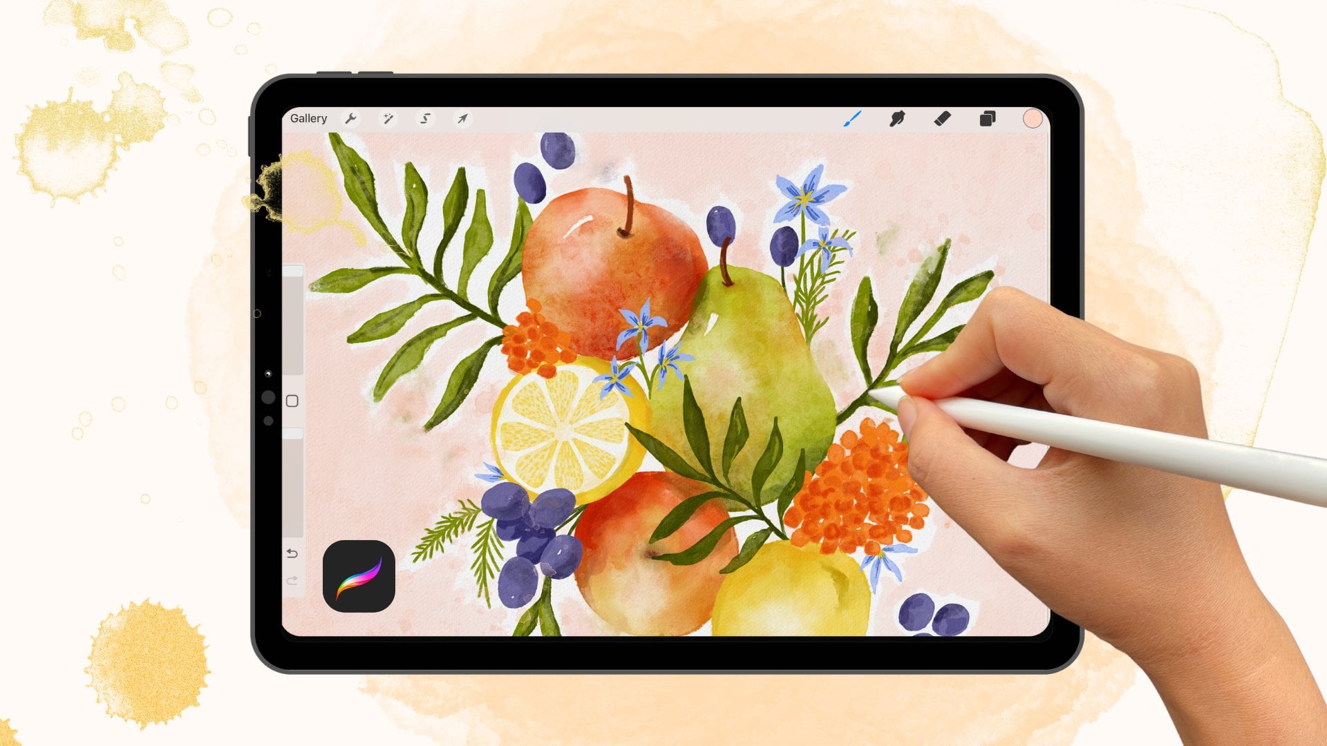
2. Class Project: For the project of this class, I would love to see your
postcard illustration with your watercolour
brush, gouache brush. or even you can show
us both of them. I would love to
see whatever you make. So please make sure that
you share with me and your classmates in the
class projects section, you can make your own
postcards illustration. Or if you want to practice, you can use my
fineline artworks to colour or paint along
with me in this class. And you can download all the Class Resources by clicking on the link in the
project description. You will receive a pack
of brushes that I created by making this class
and two sketches, one for watercolour
and another one for gouache. And you will find the
Pinterest board that I created for you also
in the project section. And I also uploaded
my thank you card PDF file in the download session
for you as a gift. Thank you so much for taking this class and being
with me on my journey and make sure that you share with us your
class project. And I really, really
love to see it.
3. Paper Texture : Okay, In the last lesson, I'll show you how you can download class resources. In this lesson, I'm going to show you how you can apply the paper texture to the Canvas. So let jum into Procreate. Now I'm already in Procreate. So the size of the paper texture is 5000 and by 7000 pixels, I'm just going to show you how you can apply the texture. So we actually don't need a big canvas so let's choose some size here. So the screen size is also okay, I'm going to click. Now at the top left corner, you can see the sign and it's called actions, so tap it. Now, here are all the practical features you need to insert, share adjust your canvas and any of the elements within it. And here you can also adjust interface and touch setting to get more out of your workflow. But we actually just need the Add button. So it depends on where you saved your paper texture. When you download it, you save it to your files. So you can lick to insert a file if you saved it to photo gallery so you can tap, Insert a photo. So I actually saved it to photo gallery. So I'm going to click to insert a photo. And here is my photo gallery. I'm going to go to album. So here is my texture, paper texture. Now to the top right corner, you need to go to your layers where your photo is now a and adjust it. Tap to the twins square here. So this is where all your layers going to be. So this is my paper texture layer. Then I'm going to tap to the letter N. Here. What you see here is a list of different blending modes. The blending modes let you blend the contents of multiple player together in various ways. This lets you create a mixed variety of visual effects, like that, you can see when you change the mode and the effects of your paper texture also, also changed. So with this layer I'm going to , I'm going to choose Linear Burn. This Linear Burn decreases the brightness of the color based on the value of the blend color. This is the result that is darker than multiply, but less saturated than color burn. It produces more contrast in darker color than all the blending modes. So tap it like this. Okay? Now swipe left. Then we're going to duplicate it. Again. We need to make a texture more visible. So now you're going to need to change the mood. We're going to use another mood. We're going to multiply to make it a little bit more texture. But if you don't like the color of the paper now you can change, you can change it to Color Burn. This Color Burn increases the contrast between the based and the blend colors. These results is higher midtone saturation and a reduces highlights usually produces a darker result, than multiply. So if you don't like the paper like this, okay, so I think I'm going to change it to like that. And my oh, great. This one to this. Now we need to make it to fit to screen. Okay. Like this. You're going to need to lock them because you don't want to pay into these layer. But I think this is a little bit pink to me. I'm gonna, I'm gonna, I'm gonna turn down the opacity of this layer. Now I think it is okay. Okay, so you're going to need to lock them because you don't want to paint on this layer. by accident right? So we're going to lock them. Okay, So when you draw, you need to create other layers below the layer. And that's it. Okay, so I'm going to show you how you can create new layer here with the plus button. And now like this, you can create a lot, like several layers, then you don't need to duplicate every time. Yeah. Some like this. Okay.
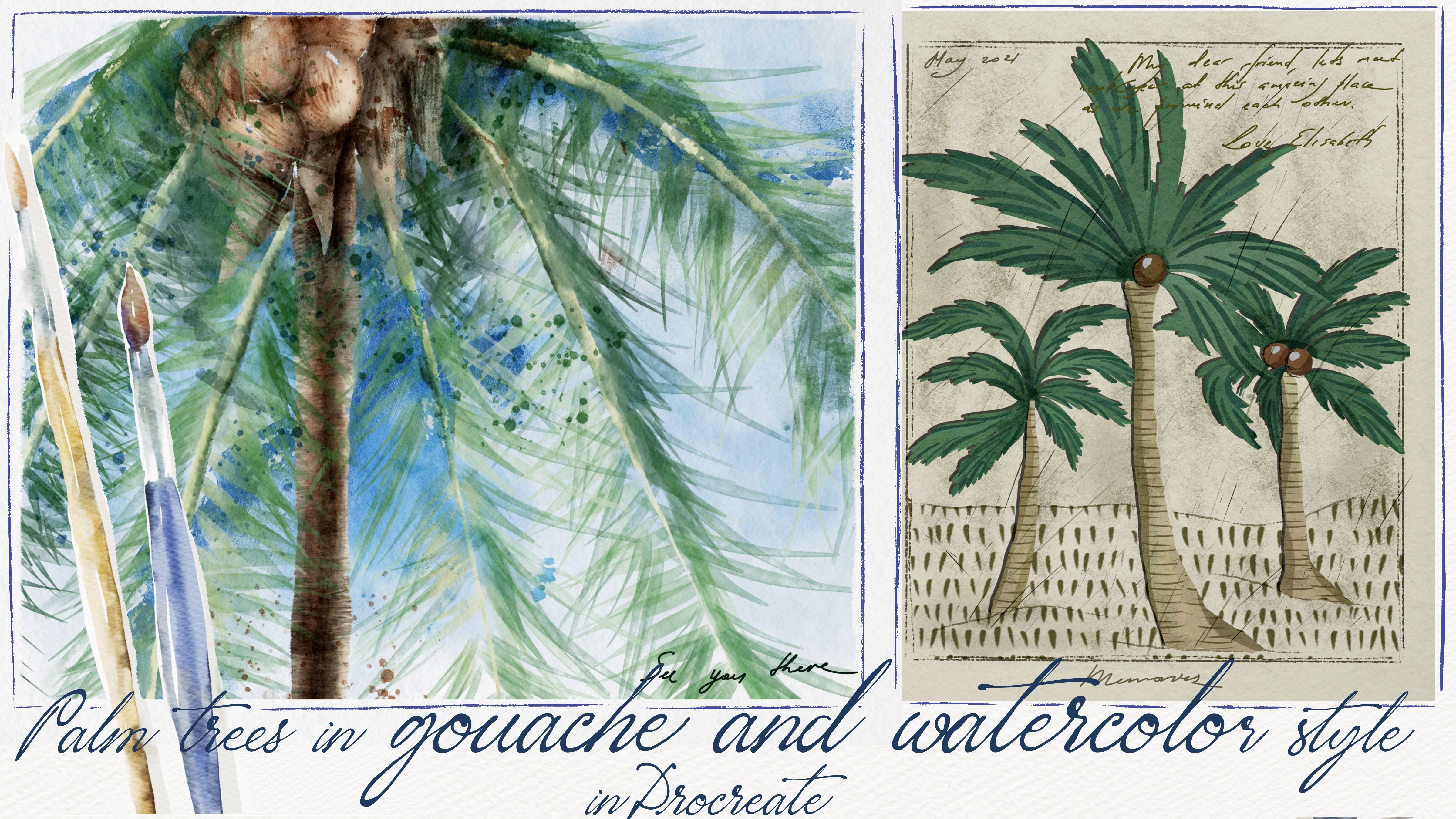
4. Watercolour Characteristics: In this lesson, we're going to talk about watercolour characteristics. watercolour is the paint made of pigment and a binder. So let's go to the first characteristic of watercolour paint. Transparency and opacity, watercolour paint is identified a transparent, semitransparent, semi-opaque,
or opaque transparent watercolour allows the light to come through and reflect from the white paper, which makes the colors glow, semi-transparent or semi-opaque are some where in between. And the opaque color blocks the light from shining throw, so it looks thicker and somewhat cloudy. The next characteristic of watercolour paint is mixing Water is the solvent. That's mixed with the watercolour paint to make it the right fluidity and concentration, whatever the type of watercolour paint being used, how much water you mix with with the paint will determine
how intense the colour is
00:01:21.935 --> 00:01:25.820
as well as affects its transparency. Different hues can be created by mixing color on the palette. So these are just important characteristics of real watercolour that digital watercolour can also have. The important thing you need to remember is digital watercolour is not the real brush, and we make it based on a real watercolour look. So if you know the look you want to achieve, it will be easier to get that look. Go to Pinterest to get all the looks of watercolour that you like, and then collect them into the board, and that will be your moodboard. So you probably found my Pinterest moodboard by link in the download and resources lesson. If you don't have time to search for your inspiration you can use my Moodboard. as your inspiration to make the watercolour brush. In the next lesson, we're going to make our watercolour together. So see you there.
5. Watercolour Brush: In this lesson,
we're going to make our watercolour
brush in Procreate. So go to procreate, we're going to use Procreate
sources to make our brush. So actually, we don't
need a big canvas. Let's use the document that we
used for the paper texture. Now I'm in that document. So let's jump into the Brush Studio by
tapping this brush sign. And let's make a folder, a new folder. So I'm going to call it
watercolour and gouache. And and gouache. gouache. Okay. So done yeah. And let's go to the Brush
Studio by tapping this plus you have a new brush now. And what you need to do
is just turn off this. And if you want to understand why I did that
In my first class, I talked more details
about the Brush Studio. So in this class,
I'm going to talk about what's important
for making watercolour Okay, but first, I'll repeat again, the Shape source and Grain source are the most important when
you're making a brush, they determine the outlook of your brush. So often you need to change these sources first to make your brush a different outlook before you and make other adjustments
for your brush. With watercolour brush, you can try some watercolour shape that procreate offers. So let's go to the Shape Source tap EDIT, Edit again -> Import
-> Source Library. So you see there are
lots of options here. And what the... For the watercolour brush, you can consider
these ink shapes or some thing looks like watercolour
like this, this and this or this. But I actually choose this I'll choose this oval Okay, tap Done. And now go to the Grain Source. We're going to make some adjustments here.. Import Source Library.
Import -> Source Library.
With the Grain Source. You can choose some Grain with the texture look transparent or, paper texture or something like that. Okay, I think I'm going to choose this Done. Let's test it here. It's not a watercolour brush now, it just a normal digital paint brush. So to have the watercolour vibe the next step we're going to take is go to Rendering. Make sure you are at a Uniform Blending in the Rendering source because this is the best blending mode that works so well with the Wet Mix And this is the Wet Mix source. Let's set it to Uniform Blending and
then go to Wet Mix. Wet Mix is the most important source that, that determines if your brush
a watercolour brush. So I'm going to walk you through
these functions here. So first, Dilution, Dilusion here could be understood like water in this case. And the Charge here is most like paint. So when you make your watercolour brush, make sure that Dilution is always at Max, and it should be higher than the Charge, like real watercolor, the water is always more than the paint. So yeah, you can set the charge as you want, but I recommend it to 66, 67, to 70%. Okay. Okay. Uh, Attack is how much more paints you can add with the pressure
throught out stroke. If you don't want too much pigment or paint, set the Attack lower than 20% Let's set it to Max and see what happens.
You see? Your stroke has the same tone everywhere. But when you set it to 20%, you don't want a lot of paint, your stroke looks like this. And it looks more like watercolour, than when it's set to 100%. Now, the pull the Pull determines how the pigment that you started with is going to travel with your stroke and how much water that's gonna smudge up underneath it. So so when you said the Pull to the maximum The paint travel with your brush stroke So it's maybe causes some some effects by
some effects like semi-transparent. So if you want it to have more, more like transparent, you should should set the Pull at 50 percent. And so let's see
what happens now. Grade should be always at smooth because it's going to cause some choppiness in the stroke, but that's we don't want. So let's test it here. Blur is going to make some
blur effects on your brush. You can set it, but if
you don't want you can't just leave it. I often don't set it. in my watercolour brush, so I'm going to
set it to be None. And Blur Jitter. Blur Jitter
affects, the randomization
of how much blur on its stamp laid out by the brush to you apply a brush stroke. So I often set it about 5 %. Yeah. Like this. And Wetness Jitter. It. it randomizes how much
water mixes with the paint at any point
during that brushstroke. These helps give your stroke
a more realistic effect. So let's set it
about 77 percents. So yeah, it looks pretty much better. So now your brush is
watercolour brush. And we're going to
test it in our Canvas and then decide what
we're gonna make next. Okay? But first, let me
summary these again. So what do you need to
do with watercolour? So let's look at the
screen right now
6. Testing Brush: Now we're going to test our
watercolour brush here. It look really great I'm gonna try. I'm going
to try with another colour No. Yeah, I'm going to try
the pink color here. So you see, it
mixes really well. So your brush really has watercolour
characteristics here. You see this transparency and the mixing
characteristics there. And you see, you can see the pink and the green
mix really well. So yeah. One thing I want to
do now is to turn this brush into
a sensitive brush. What do I mean by that? You see now the beginning and the end of our brush
is really the same. But if you want it to
be small and shape, you need to make some
adjustments in your brush. So let's go to the
Brush Studio again by tapping your brush like this. And it, it took you to the
place where you left it. So now we're gonna go to the Apple pencil to make
the brush to be sensitive. So with all the adjustments that related to
your Apple pencil, you can go to this
Apple pencil source Now we're going
to, we're going to bring up the pressure here. Yeah, we actually
don't need anything. Other thing here. So let's see. You see now, when
you press hard, the stroke tends to be bigger. Now we're going to
go to the Tapper. Here in the Tapper source you can change. You can shape your beginning and the
ending of your brush. So let's set it a little bit like this, I love, I love to
see it like this. Yeah. You see. So Done. So let's test it here. Even when you press really
hard to paint comes more. And when you when you
press lightly the paint , even if an, even disappear. So yeah. And the next thing we can change to have the
more realistic look is, you know, I don't know
if you can see it. Yeah. But sometime when you paint, you can see the edge is a
bit darker than this part. So we also can adjust
to get that look with your digital watercolour Let's go to the Brush
Studio again by tapping your brush and go to, go back to Rendering. And you see here the
Wet edges where you can add more water to your edges here. So let's try another color. We can see better And now we're gonna, we're gonna turn this
burn edges to maximum. Actually you can, it
depend on depend on your purpose And sometimes this causes
really weird look for your brush. So be aware that! In this case, I'm going to set it to maximum. And with a Burn Edges mode, I'm going to set it
Multiply like this. And with the blend mode is
a darker color, I think. Yes. I'm going to tap Done. Now. We're going to test it with
our color. Another colour. You can see like
this. Let me show. You can see is it's a really darker but I don't know if
you can say it ,like, you see? Okay. Yeah. I'm gonna make some flower here. I always love flowers. So let's make the flower
look like this. Okay.. This is, if you want, it beautiful, you need to
take a loss of tamper. It actually you see it too small, but it took me about
30 minutes to complete it so yeah, we are done with our brush. In the next lesson
we're going to learn about gouache
characteristics. It doesn't have not a lot of differences from watercolour So I'll see you in
the next lesson.
7. Goauche vs Watercolour : In this lesson, we're
going to learn about the difference
between gouache and watercolour I mean, traditional
gouache and watercolour Gouache is also watercolour Soluble. Gouache can be
used like watercolour laid in washes by diluting
with water or used, like acrylic. more
thickly or opaquely. The big difference between
gouache and watercolour paint it the opacity
and transparency. You can get the watercolour look with gouache by adding a lot of water
and you'll get the opaque look by using just a little
water or without water like when you paint
with acrylic paint. So with the digital gouache we're going to create a semi-opaque look for
our gouache brush. And the big difference between digita gouache and watercolour
color is just their opacity. So in the next lesson, we're going to learn
to make our gouache brush See you in the next lesson.
8. Goauche Brush: In this lesson, we're going to learn to make our gouache brush. And we're going to use
the same document with watercolor brush so you don't need to
change anything. So let's go to the Brush studio by
tapping the brush sign. And we're going to make our gouache brush with this
this watercolour brush So duplicate this brush. Duplicate. So the first thing...
and tap this brush. The first thing
I'm gonna do here, he changed the name
of this brush. I forgot to show
you how to make it, how to change the name. So let's go to About this brush. So here you can, you can actually
rename your brush. So I'm going to call it basic... So basic gouache gouache Yeah. And you see here you can set your signature or even you can set your photo or something, your brand name here. Now we're going to now
go to the Rendering. As I said in the last lesson, that the digital gouache
brush actually doesn't have Al lot of differences from the watercolour brush So the first thing
we're gonna do is go to Rendering. With the gouache brush. You can actually use these Uniform blending
or Intense melanin. And it, it it doesn't
it doesn't matter. And the gouache brush, I think
I'm going to I'm going to turn this off because
I don't thing with the gouache brush, we need
the burn edges effect. So the next thing we're
going to do is go to Wet Mix. And here Here, the most important thing
is turn off your dilution. As I said in the watercolour lesson the dilution here is
can be understood like water in this case, right? So when we paint with gouache, we need to turn
off the dilution. I think other things are
going to be the same. And the next thing I want to do, The color dynamics here I didn't tell you about
that in the last lesson, but you can actually play
around with these section here. So let's me show you what
what what it can do. See this Hue here. When you change, you
can see your colour Let's change to another colour Let's see. And saturation Or the lightness, you know, you can actually play
around with this, but what I wanna
do here is just turn a little bit darkness and the second secondary color
in every section here. So with the Stamp colour gesture, I think I'm going to change... I'm going to bring up a little
bit dark, darkness here. I wanna... I will tell you why
later. And the second colour is I don't know, maybe a little bit like this. And Colour Jitter I wanna lightness a little bit Darkness a bit. And second color, I don't know, maybe just a little
bit like this. Color pressure. This means..
let's try our brush I'm going to clear this pad. Clear. Now. Yes. It's really dark It's really dark right now. Okay. And you see if you bring the darkness to maximum
is actually change. But yes, the little bit
darkness, darkness. And then I'm gonna color
brush so I don't know, just a little bit, I think. And I don't need the
secondary color here. Here doesn't need secondary color to let it a little
bit like this. So one important thing we're gonna do here is change the
shape source and grain source. But now let's just use the same shape
source and grain source And let's see what
see we get with our gouache brush
right now. And then we're
gonna come back to change if we don't like it. Okay? So let's tap Then I'm going to make
a new layer here. You see, I just lock this
layer and turn off it. So you don't see the last layer But we can try with
another shape. Actually. Absolutely! So let's go to
Brush Studio again. Now I'm gonna go to the
shapes source. Edit. Import ->Source Library and with the gouache brush you can
choose some shape like, like acrylic or this kind of shape So let's try this. Acrylic depth. it looks so thick and I think
it's going to be good. So I think I'm going
to turn it. Use your two-finger and just
to turn it like this. And now we're going
to go to tap done And now we're gonna
go to Grain Source, Edit, Import, Source Library. And we're gonna choose
some some paper, paper paper grain here is
great. I think, actually this can be again, but okay, so, okay, Let this be like that, we just
tap cancel and tap Done We're going to test
it on our Canvas again or test a little bit. Done I'm going to clear this Okay, What we're gonna
do here is ...let me see... I'm gonna choose this colour and
I'm gonna make, you know, a background with this ... when you paint with digital gouache you actually need to paint
yourself like this. If you want to get the gouache
effect or a gouache look, you need to paint yourself like this not just not just drag the colour here, is not gonna give you
the gouache look So yes. Continue painting. I just wanna just want a background
with the gouache look. So I just paint it. like this, you can see...
it a little bit thin. So I think I'm going
to duplicate it. And we're going to
merge them together. Yeah. Yeah, it's
maintained. It maintained the look And now we're going to use this. We're going to use this
white, off white here. And I'm going to draw a daisy It's just to test this
brush just to test it it looks more real when
you paint with the brush that doesn't have the
same color everywhere, the darkness is going
to be darker when you, you, you, you, you
press slighter When you draw with the
gouache and watercolour if you want to have the
real effect you need to spend more time for it
because you can't just drag the
colour to the shape and and and you receive the look of gouache
or watercolour. No.. you just need to paint like when
you paint with real watercolor. So in the next lesson we're
gonna learn about how to design a postcard in Procreate
So I'll see you there.
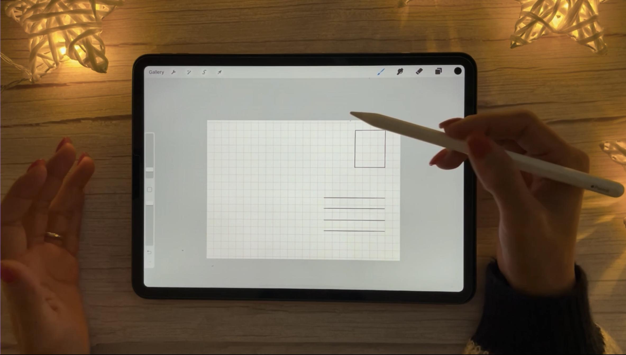
9. Design A Postcard : In this lesson, I'm
going to show you how to design a postcard in Procreate. And there are many
types of postcard so, but I'm just going to offer
you two sizes of postcards, is the A6 postcard and
the medium postcard. So let's look at the
screen right now. So let me show you I have
these DIY postcard at home. And I bought it from a store, It looks like this. This side You can make anything you want, illustration, painting,
drawing anything. And this side is where for
the address, but the stamp. And here you can
write what you want. I often use this for lineart, and it's actually smaller than the average size of the postcard. So in this lesson we're going to make some thing like this and this side we're gonna make in
another lesson. So let's go. We're going to set
up our document. Good, tap this plus, then this plus. And it brought you to the custom canvas where you
can customize your Canvas. So make sure that the pixels are active and your postcard size is 2138 pixels and 1538 pixels. Yeah. This minimum layers
depends on your iPad. My iPad is iPad Pro, so it gives me 200 layers, it actually a lot. So tap Create. First we're going to duplicate this document because we're gonna use the document or the
another side of our postcard. So tap gallery, and
then tap Select, select this, and then duplicate. So we have two right now. Actually we need to duplicate again because
we're going to make of postcard with our gouache brush too so like this and duplicate again. Okay, So we're gonna change. So we're gonna make the stamp and this place for address
00:03:17.720 --> 00:03:19.775
with the straight lines like laid these lines So I'm going to show you how you can do that in Procreate. So let's go to this actions. And we need some guide
for that straight lines. And we're going to turn on
this drawing guide here. And you see now there is
a grid on your canvas. And you want to edit this. You just tap to
edit drawing guide. In here. You can make your greed
bigger or smaller. I think I'm going to leave it
at 80, something like that. And here you can change
the color of your grid. I think. I can leave it with this
orange to tap Done. Now you have a grid here. I'm going to go to the, I'm going to choose some
brush here, actually. Some brush in Procreate inking. And the studio pen. Yeah. Okay. Stop.
Okay, so tap it. I'm gonna make it bigger. This so I'm gonna
draw a line here. I think. Yeah. Just draw and hold and
you receive a really straight line or I often
call it very beautiful line. Yes. And then you just grow
in hold very beautiful line. Head. Then I'm gonna, I'm gonna, I'm gonna bring it up when you want to
move your layer or you just have to tap this and then you can move
it around like this. Now I'm going to make another layer. Now we're going to make some
lines for the address here. I'm going to make it. Okay. So now I'm going to merge
these layers together. Then I think I'm going to
move it a little bit higher. Now. Tap. Now we're done But you see in this postcard we have a line here like a boundary or something like that. But if you want it to just
can you just draw it here But if you don't want it is okay. So in my postcard, I don't I'm not going to have that line
because I just don't like it. I will now have more
spaces here too write So that's it. Now I'm going to turn off
the drawing guide here. So we are done with the
side of our postcard. In the next lesson,
we're going to make illustration with our watercolour brush So see you there.
10. Process of Making an Illustration: Let's talk about the process
of making an illustration. In this lesson,
I'm going to share with you my own process of making an illustration
and it goes like this. First you become with an idea. Your idea can come from a brief that you receive
from your client. Or if you work for
your own project. You're going to need to know
what topic you want to make. Making a postcard
is also an idea, but what kind of postcard? There are many types of postcards or topics
for a postcard, uh, maybe you want to
make an illustration of a new city where you
visited and put it in, into a postcard
and send it to your parents or friends
in your hometown. Your illustration would
be about a season. Some something such as a
Christmas card or New Year card. Mother's Day, Father's Day
something like that. Your illustration
could be a flower. Even your postcard can also
be your thank you card. And it is really important
to know what you want to do to come up with an idea before you go to seeking for inspiration. So let's say I want to make my thank you card with flowers, with my watercolour brush. What should I do? I need to research what kind
of a thank you card with flower illustration
that people make. So I often go to
Pinterest first and then Google and then
Instagram, just my habit. And often I do, a research when I
don't have any idea about the card I want to make If I have already idea I referred to skip this step. The next step I'm gonna do is, uh, kind of preparation. I got the inspiration
to a moodboard, then I also choose the color
palette for that illustration. Some artist has recognized
color palette for their style. But in my opinion, I want to learn more about
our color combinations of my palette actually
depends on the mood that I wanted to bring
to my illustrations or it actually changes
every time The last step is sketching
and making illustration and my final illustration
should show clearly my idea. So it is a circle for me These steps are
really common for all artists, illustrators, and designers. And it's also depend
on who is that person. Okay, so in the next lesson, I'm going to show you
have to make a Thank you card See you there.
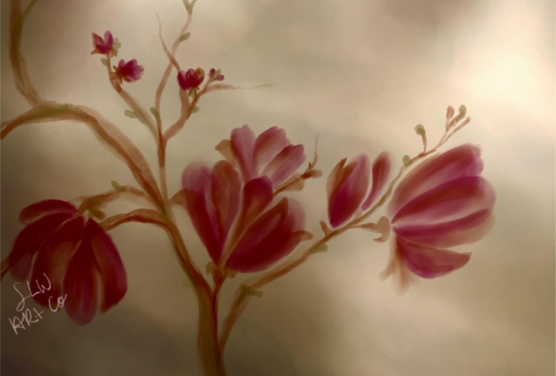
11. Watercolour Illustration: Now is the fun part
in this lesson, we're going to make illustration with our watercolour brush. And you haven't had any idea yet you can download the fineline artwork that I
prepared for you in the download section to paint along
with me in this class So let's start and create
our thank you card. Okay, so now I'm already in Procreate and I have already
the paper texture applied. And now we're going to talk a little bit about
painting technique for digital watercolour and gouache brushes. It is not
important how many watercolour brushes you
have, you can always make. other watercolour
brushes based on your basic brush by
changing shapes, grain, and make some adjustments in the color dynamic or Wet mix, or other sections the same with the gouache
brushes. It's necessary, but it's not enough. You should know how to paint
with your digital brushes. How to make your painting
look like a real painting. So in this lesson I'll also
talk a little bit about that. And I'm going to show
you my new brush. It's made from the
basic watercolour brush I actually just
changed the shape. and the grain and I
got a new brush. So in this illustration, I'm
going to use this brush. So now we have a
sensitive brush here. Do you remember when I told
you that when you put hard, you actually receive
a loss of paint. you put a lot of paint or your Canvas. And when you just put slightly you receive a little paint
and it looks like... You are blending. Okay, so now let's draw something. We're going to draw a petal here. You see? the paint is not the same everywhere, some, some, something that
looks so weird. So I think I'm gonna
use the blending tool here to blend or fix the some places that
looks weir and not natural I used the same
brush with the paint brush Okay, So let's make another layer and I'm going to hide this and here I have sketched my,
my illustration already. This one. And if you wanted. You can download it in
the download session. Yeah. And now I'm going to
turn its opacity to low. I have already painted 2 elements Here. if you want to see Now I'm gonna show you ... we're
gonna paint together. Other, other elements Turn on it. I think I'm going
to make it lower and then block it Okay, So let's paint this flower So I chose the brush, the new brush that I told you now. First, I just paint all the petals
together like this. Then like this. So if you want your painting
look like the real painting, you should paint
like a real paint You should paint like you paint with your real watercolour brush. you just cannot drag the
color like this Is it not gonna work like
that? Now I'm going to make. More color. these places need more paint. So you want more paint You just you just
press your brush a little bit harder? Yeah. it looks weird here.
I'm going to blend this. Now. I'm going to choose
a darker color. I want to make a shadow where the petals
meet each other. And I just do that
for all the flower Everywhere that needs the shadow You can decide If it is long painting for you, I often just stop when I
feel it's right for me. I actually love more details And if I have my time, my
painting often often takes me a lot of time. And it is really long painting. So until it's finished, you just see the speed
paint that I made for you. And my method is just paint like you paint
with the real watercolour. Hello. So now it is the final piece. I hope you like it. You can download it in
the download section. So see you in the next lesson.
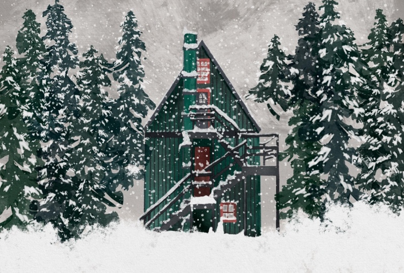
12. Gouache Illustration : In this lesson, we're going to create a winter scene postcard. And I got to photo reference
from unsplash.com and that I used to create a house that you can see
in the fineline artwork. If you use that fineline artwork for painting along with me in this class. But if you have your own idea and what you want to create for this illustration section, feel free to do that
and remember to share with us in the project section. And I would love to see it. So let's start and create our winter scene postcard Using a photo reference to practice painting for me is the best way. And this is that photo
reference that I told you. I believe for photographer
also makes art. So I credit this photo a little bit. Even you can use photo from
Unsplash without crediting. But anyway, and here is the sketch that you can download in
the download section. Now go to Procreate. And I want to bring this illustration as
an art print later. So I'm going to paint a big size. When you work with raster based software, you should have in mind what you want to do with your final artwork. Then you can choose
the right size for it I'm going to make this with the A3 size. Here is the A3 size that I used. Okay, so 3,508, it gives me 34 layers. Tap Create. Now I'm going to add that sketch to the Canvas. Make it a bit smaller. Now I'm going to turn down the opacity of this layer and I give it multiply blending. I also make new brush here
from the basic brush. So actually I just changed the grain source in this case. Now I'm going to turn
on the reference photo. Go to Actions then Canvas. Turn-on Reference. Now, you can import the
photo reference you want to use for this illustration. I'm going to bring it to the side. And you can pick the colors from photo then fill up your color palette like this. I've already picked the colors
from that photo so you can see they are here and Okay. Now, make sure you have
the brush you want. And now just paint as
you paint on paper. I'm just going to paint the
base for this house first. So Let's go. Now I'm going to paint the shadow is, as you see where the color
is darker in the photo And I'm going to pick
up colors in the photo then make another layer. Then I continue painting as I did with the base and use the blending tool as much as you need it. Okay, So I don't know what
this part called in English, but I would call it column. Now I'm painting this column. And then the next step is, I'm going to paint the
shadow for this column. I'm going to pick
up another color or color of the window. And then I'm going
to paint the window and door of the house. Hi. Okay. It is. Okay. Okay. Director of justice. Hello. Okay. Okay. Okay. Okay. Directions back in today's unit. Hello. So now we are done
with our illustration. And the next thing I'm
gonna do is go to the Gallery and then select our document and I'm going to duplicate it. And I want to flatten
on the layers together in the Copy document, because I want it to have just one layer that
I can copy and then add to a postcard side. And I'm going to go to, to postcard 3 here and
I'm going to paste. So we're done with our postcard. I hope you like this lesson. See you in the next lesson!
13. Final Thoughts: Congratulations you did it. You're finished this class
and I'm so happy about that. I hope you have
had really fun time and enjoyed our time painting and
creating brushes together. Please tell me the
discussion section or in your class project that what is your favorite watercolour or gouache? I hope you have learned
new things from this class, and I'm looking forward to
see your class project, so please make sure that you share with me and
your classmates. And if you would like me
to share your artwork, on my social media, please tag me at @lemfindesign. on my Instagram and
I would love to share your artwork and it would be
my pleasure to do that. If you have any question for me, please go ahead and ask me
in the discussion section and if you have any feedback for me
about my teaching skill. So please let me know
because it would help me improve my skill in the future. If you like this class, please leave me a review in the review section and I'll
be very grateful for that. And if it would be really
big motivation for me to create the next class. So thank you, thank you so much for taking this class
and being with me here, so I'll see you
next time. Bye bye.
 Phuong Lempinen, iPad artist| Surface pattern designer