Transcripts
1. Introduction: To the enchanting world
of watercolor painting, whether you're just starting out or looking to
refine your skills, the journey to mastering loose yet precise
watercolor techniques can be both exciting
and challenging. But where do you begin? Which techniques do
you need to focus on? And how do you bring
your creative vision to life on paper? Coastal landscapes offer a mesmerizing array
of subjects from shimmering waters and
bustling boats to majestic mountains and
charming buildings. In my course, creating stunning coastal
watercolor paintings, you'll uncover the
essential techniques and processes needed to transform any coastal photograph into a captivating
atmospheric painting. Under my guidance,
you'll learn to create masterpieces that not only capture the essence
of the scene, but also reflect your
unique artistic style. Throughout this course,
I'll walk you through my entire process
in real time from the initial drawing
and scene composition to the delicate layering
of light and shadows. Finally, the intricate addition of details and highlights. Join me on this
exciting adventure into the vibrant
world of watercolors, you discover how to create stunning landscape paintings with confidence and precision. Whether you're an experienced
artist or curious beginner, this class will equip
you with the tools and techniques needed to unlock
your full creative potential. I can't wait to get started. Let's unleash your
inner artist together.
2. Materials Required: Okay, so before we get started, I wanted to go through
some of the materials that we'll be using in this course, and this is going to give
you a great little rundown, especially if you don't have
any particular materials at the moment, you're
looking to purchase some, or if you're just
looking for an idea of what to use around your house. So over here and left, this is the paper
that I'm using, so it is 100% cotton
watercolor paper, and it does come with
a bit of texture. So this is a kind of
cold press texture. So you do see when you look at the paper,
especially from the angle, there are little bits of groove and bits of paper pattern, I guess on the
surface of the paper. So this actually helps a lot in terms of
dispersing the paint, so you don't get kind of choppy areas or areas
where the water pools. So I do recommend
some textured paper. It doesn't have to
be 100% cotton, but if you can get that
100% cotton paper, that's going to be
the best option. And I do have one
particular scene in this course that I've
painted on hot press paper, which is completely
smooth paper, and you can see the
difference there. It's quite tricky to
paint smoother areas. You do get more blotchiness
and you do get, I guess, more sharper
transitions at times. But it also allows
you to get a lot more detailed in
faster and easier. So yeah, it's
difficult to work on, but something else
that you can try out. But for a beginner, I would say probably stick
with your cold press, somewhat textured paper compared to this stuff here hot press, but yeah, differ
slightly different looks at the end when you finish
with your paintings. These are a bunch of
brushes that I use and a lot of people
surprise when I show them, I only use a few brushes. In this course, there's
only four brushes that we'll be really using, so this is the mot brush, and it's a squirrel mot brush, so it contains has
a large belly here, which allows you to
soak up a lot of water. And this is great for getting in large washes, things like skies, sand, water at the back without having to reload your
brush constantly. And you've also got a sharp tip, and this sharp tip allows
you to cut around shapes. So say, when I'm painting around these sort of cliffs
in the background, I can cut around them
without disturbing the wash here in the front
and getting into that white. So really important to
have something like that. Now, these brushes here are just a bunch of
synthetic brushes. They look fancy, but it's
just because they've got these copper handles. But essentially, you need a bunch of synthetic
round brushes. If you've even got
one or two of these, maybe a large one and a
smaller one, you know, that's going to do
completely fine, even if you've got maybe
like a medium size one now, these are great for detailing. So as you can see
here in the boats, a little bit of detail
on the top of the boats, the bottom, you know, some of the line work as
well, some of the figures. It's a lot more difficult to
do that with the mop brush, so these are really important. So make sure you have
some of those around. And here are some of the
colors on my palette. Now I've got a lot
of colors here. But for this particular course, you're only essentially
going to need a few. Now, your primary
colors are going to be yellow, blue and red. And you can see
here on the left, you've got a crenacon gold. I've got a yellow ochre, which I use a lot in
this course as well. A couple of oranges
there, par orange, and I've got a pral
red here as well. That's a nice primary red. I've got a bit of yellow here. This is Hansa yellow. So it's more of a
vibrant yellow. Don't use this all too often. So essentially, if you've just got maybe like
a dull yellow, a red and a blue, like an ultramarine blue here, you're going to be
absolutely fine. I do have this color here, which is cerulu blue. This is a great sky
blue that I do use. So you might want
to get that one. Another color that I'd say is
essential with landscapes, is some type of brown color. So, you know, either probably like a dark
brown would be best, so that way you can
lighten it with a bit of titanium white or a bit
of yellow, as well, if you want to make a kind of redish reddish brown or a
lighter earthen brown as well. So, yeah, that's a burnt sienna. But if you've got basically
a few of those colors, you know, you can mix green yourself. You don't need that. But color here
called neutral tint, which is just a pre mixed gray. But if you've got a brown, you've got a darker blue, you've got yourself
a yellow, a red. You know, that's really all
you need for this course.
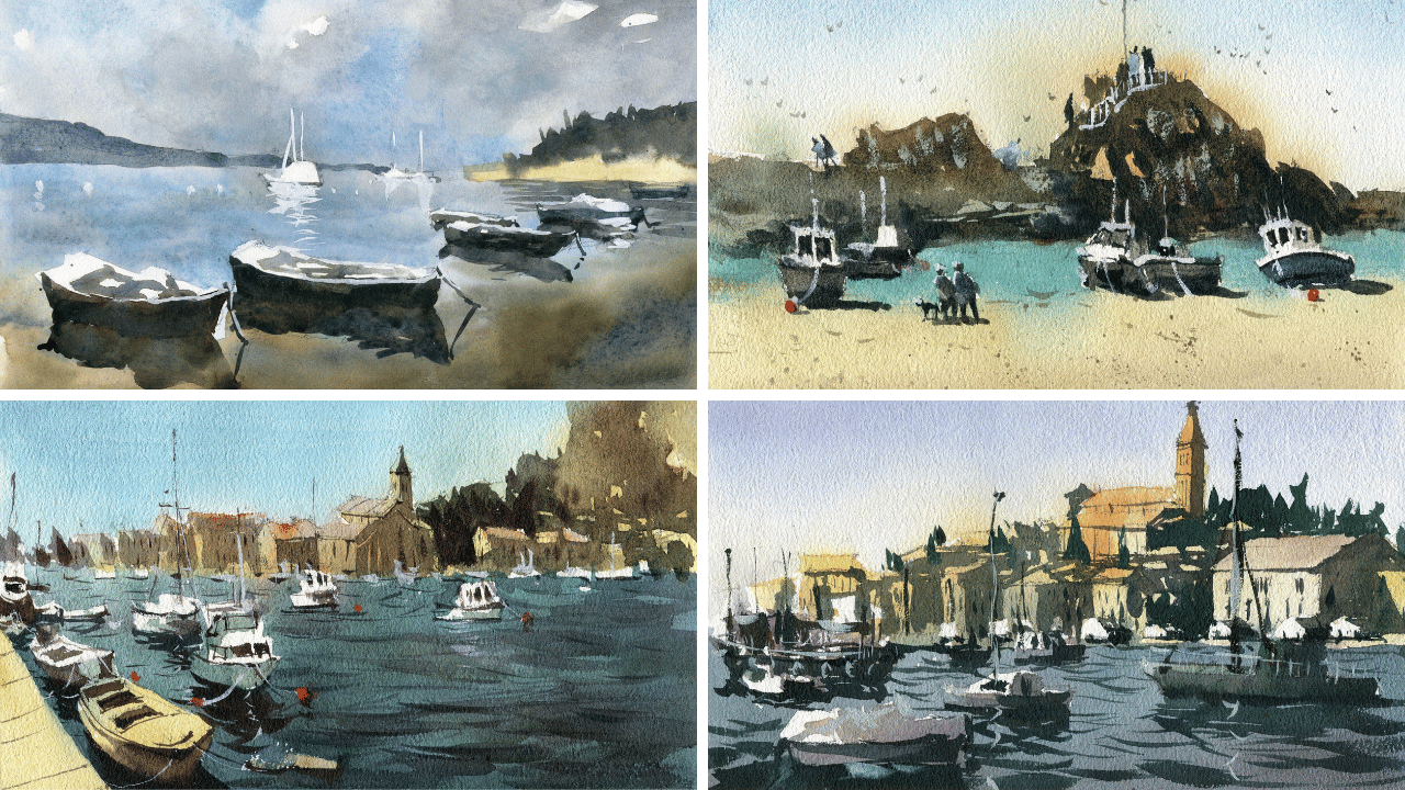
3. Simple Boats: Drawing: All right, so let's go ahead and start off firstly
with the drawing, and it's quite a simple
horizon line, you can see, it cuts straight through
the center of the page, and I'm using a mechanical
pencil here just to draw a line running right down the center
of the page like this. Separating the page in half. You can use a ruler. But I just tend to draw it free hand. Now, what we want to do is we just want to pencil in
a little bit of these. You can see there's these
kind of reads here. The yellowish reads
here in the back, just a little indication
of where they are, and sometimes also just
like to get rid of a bit of that line that I drawn before, just to clean it
up a little bit. Don't have to do that, though, but just a something like that. You can see in the background there is a tree line and I'm going to increase this
tree line a touch. Make it go up a little bit further like that because I just thought it looks a little bit
too flat down at the back. I just wanted to extend a little bit further
up into the sky. Now here to the
left, you can see there is also some mountains, some distant mountains out in the back section
of the scene. I might also extend this
one up a touch as well. There's another Just just give
it a bit more prominence. Make it look a little
bit more prominent. Now, starting out here
in the back you can see, there is a yacht here
just underneath. If you have a look at
it, just underneath the horizon line. So I'm going to zoom in the reference
picture a little bit. Let's just draw this one out. Remember this is going
to be all pretty much white by the
end of the scene. Just a little top of the boat. Now, always separate and try to draw things
in by their shape. If you see here, it's just like a longish rectangular
like shape like this. The front does jut out
a little bit more, and you can see
there's something hanging off over the side there, some little covers or shades. Here, we've got the masts
and they just go up. I don't need to really do
too much with those masts. I think we can safely get them in with some
gouache afterwards, but just a something
like that does help to position them for later. So you don't have to
guess too much they are. Now there are a couple of
little yachts here as well. Little boats think, so just
going to make them smaller. It's always something
to keep in mind when you're drawing shapes that
are all the way in the back, you want to make sure
that they are smaller. You don't want gigantic
looking boats out the back. Otherwise, it's just going to make the perspective
look a bit funny. That's all you need like a
box or something like that. With the mast attached to
the top. Here we have it. Couple of smaller
boats out the back. You can see these little bits
and pieces in the water. These little floating
bits and pieces. I'm just going to draw a
couple of those in like that. Now here comes the
fun part, of course. We've got these four boats, and we're going to make sure
we spread them out enough. But also, I want to potentially just make one
of them like this one here. I want to make this one
a little bit closer. I'm not worrying
too much as well about the exact proportions. But I want to make
this one a touch smaller just so that I can get a reflection that stretches out more to the front
of the scene like this. Just just I just a
different choice, I guess, because I thought that boat looked a little
bit too far away. You can see inside
the boat that there are some bits and
pieces as well. You can see in here there's a what Mccall I don't
know what this is. It looks like a
seed or something. Maybe who knows. But
just a little bit of the insides of
the boat like that. That way I can darken
down a little bit of detail in there once
I get the chance to. That's one boat. Let's get in
this other one at the back. Starting out at the back end of the boat and moving all
the way to the front again like this to a smaller
point up the top here. I'm making again this
one a bit larger. I want this to to also be a bit more closer to
the front of the scene. You can always alter
and change things up depending on how you
feel about the scene, whether it needs a
bit of modification. For me, I really
think it does it would look better
with these closer up. I want to make the boats
more of a subject, which means now this
reflection is going to overlap a bit with
this other one here. Can you see tiny bit?
Actually not really. I got confused. That's the bit that's
going into the water. It's just the bottom
part of the boat there, the reflection of the
bottom part of the boat. Good into the water like that. That can be a nice maybe like a white bit that
goes in the water. Now inside the boat as well, just a little bit of detail
for the insides like this. But most of it, we're just
going to keep it pretty white. There's nothing in this
boat. There's not really much to draw in there. Here we go down the
back and this is where I'm going to decrease
the size of these a bit more. This one is coming
across here like that. There. Into the water like this. And this, maybe. Again, the reflection, and the reflection just mirrors the top of the boat,
if you look at it. Just a mirror reflection. That's all you need
to do like that. This boat, especially,
it's pretty basic. There's not much I
need to put in there. You glimpse a little
bit of the insides of the boat from that
section there. But apart from that, not really. No really much else
to paint in there. There's another boat
behind as well here, which I will also get in. You can't really
see it, but it is hiding a little bit behind and a little bit of a
reflection there as well. Touch the side, the
top of the boat. You've got this one
here all the way in the back and it's
covered as well. I'm just going to at the bottom of that
boat in like that, a bit of that reflection coming through at
the base like this. And there is this kind of white cover tarp or whatever on the top of
the boat like that. You even see another one here
all the way at the back. Barely actually almost
missed this one, just all the way out
the back like that. That's it. For the drawing. We can pretty much start
with the painting now.
4. Simple Boats: Light: And I'm going to pick myself
up a bit of clean water, and I'm just going to
wet part of the sky. And now the sky
is looking a bit. It's mostly blue and
areas, bluish in areas. I'm just dropping a bit of
this serian blue in here. But also, notice it's also quite gray in some
other spots as well. So I do have some neutral tint, which I'm just going
to mix up here. Let's drop in some of these
darker looking clouds, especially up here in
the edge of the scene, a little bit of darker
neutral tint sort of color up and you know, bit of ultramarine in there just to give it a
bit more of a cooler look. But predominantly,
you're going to want to use this cerulan
blue for most of it. In some parts, you can
just leave it white. That just for like the edges of clouds and stuff like that, see, a little bit of
the edge of the clouds. But because we've wet
the page already, you find that the water just spreads around a
little bit, which is great. I really like that rather than having trying to
control everything, letting it do letting it mix in itself and do that
hard work for Okay. But one of the things
I do notice is it does get a little bit darker
here at the base as well. I'm going to pop in a touch of purple to this neutral tint. Let's see if I can just
darken a little bit down. It's almost like
there's a storm coming, a tiny bit of that grayish neutral tint color
here at the back, but I still want to keep it still don't want
to go too dark. Just being careful here. You know, you got
these boats here. I'm just cutting around those
boats to prepare for later. Bit of this darker color here, that's dark and this top bit
here as well, a touch there. Remember this will all dry a
little bit lighter as well. But I just wanted
to get that section in nice and of fluid
all in one go. Another thing you can do is
also drop in some paint. If you've got some
additional paint here and just leftover
on the palette, I can just mix up a bit of gray, a bit of purple together
and come up with some cloud color and
do this thing as well, just feather in a bit of
darker paint in areas. It looks a little
bit more moody, little bit more moody now, but
I don't want to overdo it. And now we are going to go into we're going to
go into the water. Firstly, let's think about
what we want to do here. Firstly, what I'm going to
do is just mimic the sky. I'm going to pick up more
of this seran blue here, drop in that seran blue
into the back end, and I'm going to this mix a touch with the
sky. The sky wash. See how I'm just letting
the sky wash come down a little bit
into the water here. I want to do just get
it to mix in a touch. With the water. Bring that all
through this entire scene. You basically just
want seran blue mainly throughout this back and maybe a bit
of gray in areas, but you can see already some
of that gray has already carried down from that
previous wash in the sky. I'm connecting that wash up
using this same mop brush. Doesn't really require, a few little strokes like that and you can get in
most of what you need to. Now one thing I've
noticed as you move down the front
is that the water gets a little bit less vibrant
and it also gets darker. We really want to make
sure we are implying this. I'm going to mix in a bit
of browny color here, just a warmer browny
color mixed in maybe with a bit of neutral
tint as well, and see how we can just
get in a bit of this. It's like the rocks and stuff. Can me mix in a bit of
green in here as well. But yeah, I don't
want to overdo it. Just make it a little
bit darker and almost warmer down at the base here. This is just a bit
of burnt umber and a bit of burnt
sienna mixed together. The lighter brown
is burnt sienna. This darker brown
here is burnt umber. This also reflects that cloud a touch in the sky a little bit. But I maybe want to put in a bit more a little bit
more blue in here. This is just some
ultramarine that I thought, I might just jumble
a little bit, just scumble a little
this color in here. Okay. The great thing as well, what you can do is, while
the paint is still wet, I'd like to just drop in some indications of some
slightly darker areas of water. Just these tiny little
indications here of little waves in the distance
on that. Here and there. You get some more of them near the bottom of
the water here. It's not as apparent
near the bottom, but as you can see, just a little
something like that, while the paint is
still wet because this just makes it blend
in a bit better. You notice I'm using hot press paper so it's
tricky to do this. I'm finding that it does refuse to work with me sometimes because
it dries quickly. But I just want to make
sure that I've got some of these little softer
tiny little bits of waves or whatever here running
through. Just like that. Fantastic. And I'm going
to leave that to dry to go ahead and sort
of do its own thing. Okay. And thinking, what else you should we put in
for this particular scene. I'm thinking, you know, let's get in the
bottom of the boats, a little sort of darker
parts of the boats. But I do want to let this
area dry a touch first before I actually
go in and try to mess around with the
bottom of the boats because you do need to
make the boats quite significantly darker down
at the base as well. So I'm thinking probably
the best thing to do at the moment is just let
it kind of dry off. And come back to it and we
can finish off the rest.
5. Simple Boats: Shadows: Start getting in some
additional bits and pieces. Now, one thing I really want
to do is work a little bit on this back section here with
the mountains in the back, just a bit of ultramarine
blue mixed with gray, and I'm going to do this
all in one kind of go, needs to be kind of dark. That. Yep. Yeah, just a
bit of ultramarine blue. If I can just do
this in one wash, that's going to be ideal. And we see where it just sort of touches the
water like that. That's really all that I need. Goes behind this boat, goes a little bit down
to the right hand side. But, you know, that's it there. Basically, that's all
I need to really do. On the right hand side, this is where it gets a
little bit interesting. I'm going to pick up some
yellow bit of yellow ochre, and I'm just going to drop in a little bit of that
yellow ochre here. Just to get in a bit of that
grassy sort of effect in the front and up the top back
to that ultramarine blue. And I do have some of
this greenish paint leftover from before as well from one of my
previous paintings, and I'm just going to
get this darker sort of silhouette of the trees in
at the back quickly and let it blend the touch
with this yellow. Okay. This will do
its thing like that. I'm just going to leave it
for the time being. Okay. Now, let's go ahead and work on some of the
effects of the water, and, of course, these
reflections here at the front. And for that, I'm going
to mix up kind of a mixture of burnt umber here, a bit of ultramarine blue
together and burnt umber. All right. Now, I do notice
some of the boats, they've got different
colors in them. I'm not going to bother
too much with that. I'm just going to try to
get this all in and one go. But one thing that you
can do is you can give it a quick load a little bit of this wash with some red or something
on the side here, so you can pick up a
bit of read that there, can pick up a bit of blue, put that there on the side
of your palette like that. Just for later, if you want
to cool or warm up that mix, then you've got your neutral
tint there on the side. So for example, this first boat, maybe I want to
get it in a little bit more reddish colored. I just dropped in
a touch of red in there to do this wash, the bottom part of the boat, as you can see, pretty dark. It's pretty much the darkest
section of the painting. Let's get in this bottom
part of the boat, and if I can use as few
brush rocks as possible, consciously use as few brush as possible. It's
going to look better. Okay, so like that.
And the reflection is a little bit lighter. I'll come back to that
reflection in just a moment. I'm going to mix some of
this ultramarine blue into into that grayish
mix that I prepared. And here, just again,
same sort of deal. Get that side of the boat in. Here we go. There The They're kind of touching
the water like that. I want to get closer to
the edge as well. Good. Got a couple more. Well,
not a couple more, a few more up the back as well. Let's just do this one as well. You can see like that, and then we might have
another one here. As well, at the back
another boat there. And as you can see, they're all pretty much a
very similar color, but you can load some other color in there
like this blue. I've just cool down
this boat a touch. You know, there's another one
here at the back as well, loaded in a touch of color. Now, there's a little bit
of detail inside the boat, and I'm just using this same
little round brush to go in there and darken some parts of it in this section of the
boat, just inside of it. It's not much, but just
something like that to indicate the inner part of the boat without actually having to wait for
this to all dry. I'm just letting it mix in like that to imply
a touch of detail. In the boat itself.
There's not much here. It's really just a bit of white. Then you've got some
gray underneath the tarp or whatever. Now, underneath the boat, I'm going to just pick up that
same kind of grayish mix, and let's get in
this reflection. Okay. It's good that I kind of drew it out
before. That really helps. Down below, just
going to create like that a little bit of
that connection here. And where did I draw it's
kind of like this, isn't it? Let's try not to
overthink it and do this in one go like that. Good. Then we've
got this other one, of course, at the
back here as well. Let's get this one in
another quick wash. And of course, there's
that reflection further down that I'd
painted in before, drawn in before, s. So that helps a
great deal as well. That connected on to the
actual boat itself as well. Just remember, it's all
just almost one shape. But the boat is a touch darker. I might have to darken
that boat afterwards. More reflections here for
this back one like that. Quick one reflection like that. This one here as well, this reflection of that
boat in the water. K. That one you can't
really see much anyway. Okay. I do notice there are some tiny little
reflections just from this you see the
back of the water there. So I'm going to bring
some of this down. They're kind of like the
little reflections of the darker trees and
the reeds and stuff out the back and it comes
down the front like that. Okay. Just a slightly diluted
version of this paint. U Yep, yep. Yep. That's looking decent. Yeah, you do see
some of these like tiny little that what
you may call it, these little bits stick sticking out to the water
to where the anchors are. You know, something like that, something simple like that, and actually connect on to the connect a bit on
to the reflection, in fact, that as
you can see. There. Now, while this is all
pretty dark drying, I'm going to add in a bit of darkness to the
bottom of this boat. See, I'm just adding
in some pure paints. I'm like black paint. I just darken the
base of the boats a little bit so that it
just sticks out of the shadow here so the
top of the boat just looks a little bit darker when compared to the reflection. That's quite important. That there is a slight
distinction between the shadow and the actual
boat itself. Okay. Even see the ones in the
back could do with a tiny little it's too much, but a tiny little darkness
at the base like that as well just to indicate
where they are. Okay. Good, good, good. So we are o pretty much
almost done in this scene. I'm going to use a bit of
white guash to just bring out some of the sails
and bits and pieces, mass of the background as well. So I'll give it a quick dry.
6. Simple Boats: Final Touches: A little bit of white gash. I've already got a little bit just dried up here
in the palette. And I'm going to just
drop some of it in in areas like this back end here. There's a mass that just
goes directly up like that. K, and this one kind of crosses
over a little bit there. There, there's maybe
another one here and here. Kate. And of course, you can bring out bits of light on the boats
as well like this, just little indications of that light touching the
top of these boats, as you can see here. There you get a
bit of reflection even under there like
that, underneath the boat. I use the gouache to sharpen
up some little areas of detail because when you finish painting pretty
loosely like this, you find that you end up losing a touch of
detail here and there. So this is a way to just bring
a little bit of it back. Without much effort. Let's redo this part of the
boat a little bit. The little edge of the
boat here as well. Maybe just another a bit of a line running across
the front like this. There. There's a bit
of this detail as well for this rope that's
going into the water. Let's see at the back there. A bit of that white bit running
into the water like that. Okay. Good, these little boards here in the
water as well, a touch of that tiny bit of tiny bards off in the distance. Do you see a bit of a
reflection here of the boat? So I'm going to just
get in a bit of that. Running down to the front
cut runs all the way down, doesn't it? Like that? And that the sail, little indication of
the sail as well seems to run through it and
through the water a touch a bit more here at
the front, perhaps that. The ones at the back bit. Kind of just downward
brush strokes, really, not much there at all. Okay. Okay, I'm going to
work on the sky just a tiny bit more and maybe put in some guash in
some areas to just bring out some white
clouds in some areas. I've just dropped in a
bit of white guash here. And just because
there's a bloom here, so I just want to I guess add in a bit of gash to cover up that bloom touch
and add a kind of smokiness feeling of that heavy cloud
running through like that. You know, you do get a bit of this over this side as well. So just a touch of that
gas here and there, and you can really create an
indication of these Yeah, kind of intermediary clouds that sort of join onto
other ones like that. I think that just makes the
painting look a little bit smoother than it did before. A bit of ultramarine and some of these cloud areas as well, not ultramarine, serian blue. Okay. And that's
it. We're finished.
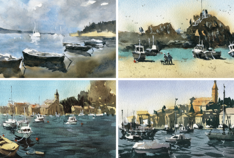
7. Boats Scene: Drawing: Okay, let's make a
start on the drawing. I am going to start
by just dividing the scene into half like this. All the way across the
line running all the way across because
that's essentially where the buildings in
the background stop off, and in the front,
we have basically the water and a bit of the
walkway here to the left. So yes, let's just get
that line in first. Now, the next thing, I think would be good
to put in is basically all these little boats
and features out in the front because
obviously in the front, so we're going to have to just avoid drawing over the top of any of the buildings
out in the back. I think this is the
best way to do it. Now, this little pathway
here in the foreground. I'm going to estimate that
it comes in just underneath the midpoint of the page and
finishes around about here. Okay. So it doesn't
really go too far in. So I normally just do
a couple of dots like that and just draw the dots. And that will save you
a little bit of time. Now that will give
you a good indication of where to put in the
rest of these boats. We've got this boat, this
large boat here in the front, which I'm going to just
draw in connect it up. That's like a rounded front
end of the boat like that. Side there comes in. There you go. I curves around
the back down the front. We've got that bit of the
boat there there and that comes all around
curves curves all the way back and goes to the
back of the boat here. Okay. It doesn't have
to be 100% accurate, but just enough to indicate that the boat is there
in the foreground. You know, there's
a bit of some bits and pieces there. Okay. Also a fairly large shadow just underneath
a reflection or shadow, I guess underneath
the boat here, which extends all the
way out to the front. Not left as much space as
in the reference photo. Really this boat should be a
little bit further behind, but no big deal. We've got a couple of bits and pieces in the boat as well. So in the back
here, there's like a darker edge comes
up joins there, and then we've got a couple
of spaces in here as well. So that's like a seat
and another seat here that's a little bit
recessed hidden away. A right. And there we have it. We've got the boat in. Let's em besise the
side of it ale. Okay. Good. I think
that's enough. I think that's enough detail
to get by with this boat. And probably next
thing I'm going to draw in is this boat
here to the right. So there looks like
this is a sort of raft. I don't know whether I'm
going to put that raft in. I don't quite like that. So I'm going to edit that out, and I'm just going to focus on the the actual boat
here in the back. So roughly it lines up with
the back of this boat, but it is further behind. Let's get in the front of it. This and you've got
the bottom part here. That. Then you've got the side
of the boat like this and the other side here.
Touching the water. Got to get the shape of this take bit of time
with the shape of that front of the boat and it goes all the way to
the back like that. Then we've got the general
features of the boat. You've got this window there. You've got a Other
window like here, a larger longer window. Then we've got this part of the boat that comes out
towards the front end, which has a cabin window, a couple of windows here
in the front of the boat, and of course, you've
got the roof as well. There's a bit of detail
there in the back. I'm not going to worry
all too much about that. I put a couple of these
just on top like that. But that's a basic boat. Let's get this one
here in the back. Feeling a bit more
confident now. I'm just holding the pen more
towards the back and taking extra time to make sure every single line
that I put in counts. Now, the top of this
boat, it's difficult to de pencil and there's all types of stuff
in there but it's really just a white shape. You've got sort a window there, a couple of spots there, and then we've got
mast heading up that. That's all I need
to imply for now. I mean, I could put
in more afterwards, but that so be good for now. Remember the light
source is coming from the back the top
left hand corner, top or top left hand corner. You're going to get
a bit of shadow on the right hand side and
underneath the boats. Sun is still overhead. Let's put in this
boat here behind. I just notice there is an e little indication
of the engine here, which I will add in like that, a rectangular like shape
on the back of this boat. Put in like that. Not much too much detail. Just show that it's
attached onto the back, and then of course, we've got another boat here. And let's get in bottom
of this boat like that. And again, just a few more bits of details here
on the side for the boat, and you know a bit of Again, the sating space within
the boat like that. Again, you don't have
to really detail every single little
thing in here, just enough to indicate that there is a smaller
boat back there. There is one here as well. You can just see the
front almost of the boat. It's very difficult to see, but just something like that is really enough a couple of
shapes that are overlapping. There's even come to think of it another larger boat behind
that's overlapping here. Top of it is not a large but
kind of around this height, and you've got kind of like a white spot and a window there. When you get up to these
shapes out in the back, there's really not a whole lot that you need to imply because they're just smaller shapes
and we can kind of wing it. But there's another speed
boat or something here. You've got another one here. Again, just
simplifying that down. No, there is actually a
bigger boat behind here. I might shift that boat. There is one already
just down on this side. Let me just let's draw
one in here first. Coming in. It's pretty
small actually, so I don't want to overdo this, goes up, comes down like that, the front of the boat, and the side of it,
what have we got? We've got this three
dimensional shape like this. A couple of windows. You
know, there we have it. We've got another
boat like structure. Polish off that front
of it a bit more because you just polls that
off a little bit more. There we go. Looks a bit better. Okay. There we are. There's a few more bits and
pieces here at the back. I want to change the location of that boat there because I
don't have enough space. The one that's just
directly behind there. I might move it here and
use this again as a way to indicate another object further in the distance in this case, another boat further
in the distance. Doesn't have to have
too much detail, but just something
like that. Okay? Great. So look, we have a whole
bunch of different boats. There's even on in
the background, can you see just tiny
little shapes or indications of some boats
and things as well, which I'm just implying, but not with too much effort. Okay. Bold, something
here. Let's look. Yep. All right. So that's pretty good for
the shapes of the boats. Let's go into the background. In the background, what
I'm going to do is just simplify down
this building. Touch all of these buildings, and the side of it here. Looks like a large building
with the tower next to it. I'm going to make it a little
bit bigger than what it appears to be in the reference. I quite like this
building, actually, say, why not just sort of
emphasize it a bit more. And top of it's just
consisting of all these bunch of trapezoidal shapes like that. This right side comes down, like that. I can't like this. And we have another building. We have another building. Well, we've got the
first building in. There. Okay. And now we just got to
put in the tower on top, which is like a squareish rectangular
type of shape like that. Okay. And on the top
there is a triangle. There we have it. We have
the building back there. So little architectural details. It's not that important,
some windows there. We've got some trees
here on the side. There's so much detail
here that you really have to just think, what
do you want to put in? What's the most important
thing you want to apply? For me, I just want
to make sure I've got a few little houses and
stuff out in the distance. This is a road, obviously out or like the side of a a
hilly sort of area, but the road there in front. You know, there's some buildings here in the back, you know, but a lot of that stuff
is not a huge deal to me. There's people living in there. You know, there's some rooftops. You know, apart from
that, it's no big deal, really, some kind of
building over this side. These buildings to
the left hand side are getting a little
bit trickier. Again, there's a few
things to put in there. You may or may not
want to add in. For here, I notice it like this building here is
triangular building. Again, rooftop like this, simplifying and I'm
making them a little bit bigger because I quite
like these buildings, and I just want to
emphasize them even though they're not true to size. This can also help to indicate some light all the lights
coming in from the left, and then you're
going to get a going to get more darkness here on the right hand
side of the buildings. As we move out to the back, it just becomes really, for me, a bunch of squareish
rectangular shapes, that can be a roof top. This can be the
side of a building. I don't really want to
focus too much on this. You've got the side
of the building here, you know, just more shapes. But one thing I should do is just make sure that these buildings
or the shapes of these buildings kind of don't go up too high
and they get a bit smaller in the
distance that helps to imply this sense of
depth in the scene, and we can just put some trees
and stuff down the back. So there we have it. We've got you know, we've got a good
little indication of what of this scene
at the moment. I put in a bit of shadow on the right hand side of
some of those buildings. But Last thing we
want to do is make sure we get in some of these mountainous areas
here in the back. Just going to go up
like this rock here. Again, don't have to really follow too much of
this reference, but I still think it's
kind of important to make sure you have some areas of light and dark
indicated in there. There we have it. And I think we are ready to get started
with the painting.
8. Boats Scene: Light: Off with a mixture
of Naples yellow, or you can just
use a yellow oka. I'm going to just pop
this straight in here. You have a little bit of this
crenacodone gold as well. Drop it in there with a
bit of the Naples yellow. I just want to get in really light wash of lighter color out in
the back regions. Now, I'm cutting around the
rooftops a little bit because the rooftops the rooftops
are a different color. They like a reddish
color orange color. I want to make sure I
apply that for later. But for the time
being, look, I'm just going to get in the
bottom of the buildings. One Brush stroke as a few
brush strokes as possible. Making sure it's a
yellowish color. Yeah. Naples yellow is
basically just a really light yellow with some gash
in it some opaque white gash. And that just smooths
it down, makes it look, gives it that kind of here, that sort of subdued like look. Sandstone kind of look. We've got those
buildings out the back didn't take too much. I'm going to use this
same Naples yellow for this boat here in the front. All right. And I think I can crew just color almost
the entire thing in. To the front. You going to make sure that you're
going light here, so I'm using about
55 to 10% paint, and the rest of
it is just water. And the trick here
is really just to go very easy on the paint. Don't put too much in here. I've got a bit of titanium
white that I'm just dropping in at the bottom, buff titanium, which is like
a very off white color. Drop that in there, no big deal. This boat, I don't really need to do all
too much with it. But I will put in
some grayish color. Usually I will mix up a
bit of ultramarine blue, a bit of ultramarine blue with a little bit of a darker brown, and that will give you
a simple gray color. That's my kind of hat to
making a basic gray color. Because I just
noticed, for example, underneath this boat, that there is a bit of
color in there, but I'd say it's moly it's
mostly just a grayish value. I can add a bit of this in. I'm just picking up really all the lighter values that
I care to put in there. This window, that's
a bit lighter, window on the side there. We've got window
on the side there. Underneath this
boat there's a bit of grayish color as well. Some of this stuff, you know, if you can get it in earlier, it's easier. You have to bother. Afterwards, bit underneath
this boat as well. Let's look. Try to do this all at the same time and if it blends into each other, that's not too bad as well. Just let it do its thing. But I do want to maintain a lot
of this Naples yellow, so I'll mop up a
bit of this color if it's starting to
blend in too much. H, bit here. What else do we have roof tops? I'm going to put in some orange really light orange color. Drop that in and it will potentially blend in some areas. Don't
worry about that. Continue one. As as you've got a bit of orange on the
roof tops, that's fine. I'm not concerned with it Mt
mi in with the rest of it. We'll just deal with it. He another roof top or
something here here. You know, pretty vibrant color off in the
background, actually. There this roof top. You can also wait
until later if you don't like the mixing
of the colors. Some of this gray
would be good if I can just drop that
into the top of this tower as well, like that. That's a little bit
of gray. There. And maybe a touch of
that light color, a little bit of that
yellow to the left. Good. I'll probably have to go over that again
one more time. Fantastic. I reckon, what I'll do now is start working on the
top of the scene and we'll pick up a
really light blue color. You can use whatever
blue you want. I do have a few
different blues here. I'm going to use ultramarine and I will just really dilute
this down as much as I can. Stop right start right
from the top of the scene. So a light wash of color. That's here to cut around these rocks a
little bit as well. I like this. I think while I'm at it,
I will actually add a bit of lighter value
into these rocks, so a bit of bath titanium. Just to lighten up
this area or a touch. A bit of yellow even in there. Mainly, just like a
mainly just some type of sandy sort of color in there. A lot of this will actually
be green afterwards anyway, so it's no big deal at all, but just I thought
I'd why to add in a bit of something Now. Same wash of ultramarine blue. I just want to carry
this down the page. One thing I'd like to do is make the top of it a bit darker. That helps again to increase this sense of depth
in you're painting. This will run down the page. I'm continuing to just
add in more water as I move down because
I want it to be really light as we move down the page. Almost white right at the base. The cutting around
these yellowy buildings as well, like that. Some things will mix,
that's not a problem. But yeah, you do want to make sure that there's
a bit of a separation between the color so that not
everything just turns blue. But hopefully these rooftops
should be dry by now. But if there's a bit of mixing, it's not the end of the world. Okay, so there we have it. The lighter wash back there. Do you notice this area
is not dark enough? I'm going to just feather in a bit more blue back
in that section. By this point, some
people like to put in clouds, that kind of thing, but I reckon I'm
just going to leave it because I always
tend to put in clouds. And as we move down
into the water, I'm going to mix a bit of I'm going to mix a
bit of green in here into the water so that
we've got a kind of a greenish blue color. I've got a darker green. I'm going to mix that in there. So almost like a dark turquoise
color. I would be good. A darker turquoise color. Y. Mixing the darker
green in there. Doesn't matter what type of
green, long as it's darker. Trying to just match
this scene a bit. And same mop brush, again, in the back, you'll notice that there's
a lot of a ton of light. The green out here
is going to be quite light compared to the
rest of it up the front. Here I am. I'm just
using the tip of this brush tip of this mop brush and see
how I'm just cutting around all these shapes of the boats and also connecting it onto the
background as well. Right. But I'm trying to keep the background
lighter, as you can see. Let's go around this boat. We've got this one, which
is quite crucial to cut around here in
the foreground. Good. That one underneath here. These ones here. Now,
we starting to get into the darker areas, so we can start mixing a bit more of the darker
green in there, less using less water. I'm just facilitating the paint to move down. That's
all I'm doing. Facilitating it, not bothering too much about the accuracy, but more so cutting
around these boats, especially this one in the front because it's right
there in the front. It's going to be very obvious
if there are any mistakes. Mixing up some more of
this turquoise color. There we go it. We've got the
bottom of that boat there. D. Okay. Going to just start
getting in some of these areas under near
the front of the scene. And go pretty dark
actually around here. Bit darker. Still
cutting around the boat. I will add in mix in
the shadow of the boat, the reflection of
the boat later on. But that should be
good. Continue on. More blue and more green
mixed together to create, again, just a turquoise color. And letting things mixed together on the
top of the scene. You'll have some
sharper bits as well. Use those sharp
little highlights there to indicate some
boats in the background. We can bring some more with a bit of
white quash afterwards. But if you don't have you
missed them out no big deal. Is just cutting around, just cutting around everything. Good. Right. So we are right at
the bottom of the page now. I like to just add in a bit of extra darkness here in
the bottom as well. Put a bit of brown and just
mix that in with some blue. And this is just creating an extra darker
spots at the bottom. Another thing you
can do as well is just drop in some
darker paints in areas, just feathering in a
bit of darker paint. More blue, blue and brown, just to feather in some of this stuff with
the tip of the brush. This will create an illusion of these softer waves running
running through the sea. But again, you just got to make it be quite sparing with
these brush strokes.
9. Boats Scene: Shadows: Okay, so everything
has dried off now. And before I begin
with the next step, I just want to make
sure that I get in this part here in the
front of the path. Okay. Just a bit of
this Naples yellow, really light yellow here. Okay like that. Also for this bad or
whatever here in the water, I'm just putting a bit
of brown in rusty color, light wash of that. Just indicating that maybe that it's getting
hit by the sun, whatever that is
there in the water. We can now get started on the buildings
in the background, and of, on this rock face here. Again, I'm going to mix myself
up some different colors. Firstly, I've got a
bit of this green, which I'll just start
dropping in here. I'm going to be really using more contrast than in the reference photo just
to simplify this off and make the everything
else stand out quite quite a lot as well. So starting out
here, first, again, these like, little bits of green for the trees,
stuff up here. I'm trying to just
think to myself, how can I use as few brush
strokes as possible? And I'm also cutting around the, you know, the shadows, the
buildings here as well. Okay. That. And We use a bit of lighter green in
some spots like here, you know, here
underneath as well. It's like kind of very yellowy, kind of like yellowy
green here underneath. Yeah, that. Just a few little
brush strokes should do it. Okay. Cutting around
again, these buildings, U You know, again, a lot of this stuff
I've just kind of made up before
because I couldn't really be bother drawing
in all the buildings back here and if we drew
them all in as well, that would really just take up too much too much
space and attention. So there we go just making this bit of that green go
up into the mountains. Now the rest of it, I'm going to just use a kind
of grayish color. Do you have some leftover grays and stuff just on the palette. If you've got all your
primaries just mixed up, you can use that really to, you really form the basis
of your grays like that. Bit more light gray on
the left side here. Good. Trying to get it with one
big shape. If possible. Some more trees
and stuff here at the base darker values here. One thing to keep in mind with
the buildings is that they are a little bit darker
on the right hand side. I'm get using a bit
of this yellow and I'm mixing it with some brown. What I'll do is just
add in this shadow, I guess, on the right hand
side of these buildings here. Tip of my brush, just go in
there and get in this shadow. It's like a warmer shadow. Right? This leaving out a bit of that previous wash to indicate some
highlights as well. Here we have it. That. Top of the building, I'm going to just
darken it down a bit of neutral tint to
just darken the top of the tower that just a bit
of darker paint really. Doesn't matter what color it is. Actually some windows in here. Well, I didn't quite pick up, but I'll paint them in. A couple of sharper
windows on that side. Let's say, what else can we put in a couple of these
windows here like that. Side of this building here, maybe a few little windows. You can even just
start putting them in for this building here. And like, what I'll
do is I think, I'll I'll just do that
same shadow pattern. There. Little shadow
pattern. Maybe there. It doesn't have to be
much like that. Yeah. And a couple of windows
and things windows there. The rest of this, you
can feather it in. You can feather it in like this. Indications of these windows. I don't want to put too
much emphasis on this side. Just want that to
go into its thing. There are some darker
shrubs and bits out here, so I can flick in a bit
of this darker paint, increase sense of contrast
and make these bits of these trees and things look a little more little
more interesting. That. Times you get these
little trees that stick up on top of the hills, something like that can work. I've noticed there's just a bit of something missing
up here as well, just a bit of shadow,
more of that gray. Just feather that in while
the paint is still wet. Continuing on to
this left hand side, we have more of these shadows. Again, just simplify
this down and you see how now this forms the bases creates the
side of this building. You've also got these
buildings here. That I'm going to just create a bit of
darkness, like that. You move out to the
back, you don't want to use too much paint as well, start to lay lay off using too much paint so
lighten it down a lot and really to a point, just want to leave some of them completely unclod as well. And goods. Some trees. Here to the left.
Hoops too dark. Let's just lighten
this off a bit. Here, lighten off
some of these trees, so that you have
some indication of, you know, something
going on back there. So, while this is all
drying and doing its thing, I'm going to work on the boats and some of the reflections, details of the boats,
that kind of thing. So let's get in. Now, the reflection is
just going to be like a darker darker sort
of turquoise color. We'll start with this one. I'm going to just darken at the bottom of
the boat like this. Some more brown. I just want to neutralize this blue a little
bit so that it's more of a grayish color. Good. Now, this darker line underneath the boat will help
to anchor the boat, make it look like it's
sitting on top of the water. One thing you have to remember as well is
to just make sure you're getting in these
ripples in the water, which I will work on now. But you can see here this
reflection comes out, and I'm trying to get
this dark as well. Running down the page like this. Yep. Without really
overdoing it. That's the front
of the boat there. This one here has some
darker bit there. I'm just going to put it
in a bit of grayish color. This Okay. Bit of light hitting
the side of the boat. I'm going to soften this
edge down a touch like that and we will continue
darkening further here. Let's have a look at this boat. This also needs to be darker. Underneath, I'm going to
just darken like that. Remember, just to
cut a bit around that engine of the boat
in the front as well. A minute detail
really minute detail, but could really help. H. You're really at this
point where you can just start to imply the
details inside the boat boats as
well, dark area here. For example, you've got this
darker spot in here in here, to with a few quick
brush strokes, you can imply quite a lot. Don't spend too
much time in there. Remember the darker
spots in there, that's all you need to get in. There's bit of detail on the
side of the boat like that. We've got the same deal
here, these windows, let's get some of these in and I haven't drawn them
in so well before. It's your chance to detail beta. Yeah, my go to is again, this ultramarine blue mixed with a bit of brown that
will create you a nice dark value that you
can use for these windows, shadows, reflections, I
mean, underneath the boats. And this window up here as well, it's got like a kind of a bit of the frame or
something like that. Y. Even this window back there. There, you've got that as well side of the
boat, like that. Great. Underneath this one. Just a bit of darkness again. And you know, we've got that little reflection
in the water blue and a bit of green and
all mixed together for this reflection. Like this. The reflections only really occur with the boats
that are closer to us. If the boats further away, you'll notice there's not
really much of a reflection, though you do see a
reflection of like things, for example, the masts
and stuff like that, which we can imply later. Okay. We've got these ones here. Again, just simplify this down. Don't want to don't want to
spend all day doing this. Again, in the water,
like I mentioned, you want to put in some
of these little marks in the water to indicate waves. The waves in the background
are going to be very little, tinier compared to the
ones in the front. Make them a bit varied as well, keep them all exactly the same. Some of this stuff here. Yep. Kind of blend them on a little bit with the
reflections. Okay. Now, this reflection
is pretty solid. It's just, it's just
a really dark color. And I'm going to go all
pretty dark with this, blending everything
else onto it like that. Okay. That's all we need to do. Really dark reflection
for that front boat. As dark as you can go
and this one as well. So I'm kind of just joining
up to the side of that boat, the reflection of
that boat behind. Okay. All right. I'm just going to lighten
the side of that boat a little bit lifting
off a touch of paint. So just so that the
reflection is darker. And maybe just feather in a few stray marks
here and there. Maybe in here as well, just a few little stra marks. That and I've got these reflections of that
boat there on the back. Maybe imply a bit of this one, tiny bit of that the base.
Some of these other boats. Look, you can't really again see what exactly is going on, but you can imply there are a few maybe just
bases of some of these boats. Later I'm going to go th and maybe add in
a bit of white on top to just bring them out,
bring them out better. Good. Bit of gray here, top of that roof as well. There we go, just a bit of that. Color tap that off. So tissue. I've put too
much paint up there. You know, even you see sort of boats here to
the left hand side, you can just indicate
like a window like this, the base of the boat here. Because there is just so
much going on back there, and I don't want to imply
a great deal of detail. All you have to do is just just put in a touch of
color here and there, emphasizing the shape of the
boat, and you're good to go. Okay. What else do we have? I think we are most were almost sorted with some of these boats. I will just darken
down this one as well, Attle bit to the right
hand side there like that, perhaps pop on some windows,
darker colored windows. Three windows. In fact,
this one does also. Simplify down, of course. That. Fantastic. Now. Let's think about what
else we can do here. So I will start putting
on some colors, some really dark values
again to bring out the windows of these
buildings here in the back. So let's put in what
else do we have here, me couple of windows here. Yeah. Because this area
has already dried, so you can really
get back into it. Now, the side of this building
looks a little bit bare, I'm going to just imply
some structure there. Maybe here, here. You
don't have to do this. This is just something
I'm deciding to do the sides of these buildings as well,
a little bit there, but more of these ones
as well that we had missed out before because we're waiting for
that paint to dry, just to help them read
more as buildings. Just a few vertical
lines appearing. There. That is all you need. You don't need anything else
really from to suggest that. The thing I like to do
as well is just in areas that areas of focus
like like this tower. I do like to just use the
brush and just dry brush on a few more little bits of
detail here and there. I can be like a shadow underneath that side of
the building like that. Again, if you overdo
this, it does. It will start to
look artificial, so just as minimal as possible, as few brush strokes
as possible for this. Here I'm just trying to bring
out a bit more darkness around these buildings that
when the water color dries, it just does this sometimes you lose that a bit of darkness ad. This is just going to help me
to bring out the buildings It more. I think
that's necessary. Maybe some more darks
around the back like that. Okay. Good, good. All right. Let's put in some
of these masts. Now, there's kind of
one here for this boat. I'm going to just put a vertical running down this
using the tip of my brush. Don't overdo it, use the tip
of your brush and really hold the brush right at the
end in order to imply this. We need just a few
little verticals. This one here as well. There's some vertical of that boat there here,
what else do we have? This one, I could
potentially just add some bits and pieces up the
top of that one as well. This one here could
just again, Yeah. I always like to
add in a touch of gash and stuff as well just
to really bring things back. This pathway, I thought
it would be good to get in a few little
brush strokes like that just to indicate the
directionality of the path. Difficult to work out
unless you line here. All right. And what
else do we have? Bits and pieces
coming off the boats. And I reckon a bit of gah should help a little bit of white would you have
a tiny bit leftover. So let's get a bit of this
white quash mixed up. Tiny bit of white ah, which is more kind of grayish
colored now, to be honest, but this should help just
to add in a touch of this color running off cut and imply some
light like that. For these bits of rope, rigging that kind of thing
for some of these boats. I might just imply
a bit here as well, and then there's not
really anything there. Little board in the water. This one here. And
maybe this top part of the boat here. Bit of white and stuff
just to bring out maybe some details again of these boats off in the distance. You know, they're
really just going to be quick bits like this. Okay, not much happening at all. You know, quick little
impressions in the water as well, maybe some reflections
in the water, little white reflections. That And. When you have these mixtures of light and dark colors
running with each other, you'll find that it just
looks kind of magical. You have to kind of preserve
some of that stuff. Good. I might just actually go back into this this one here, this boat here I forgotten
to get in a bit of the inside of it like that. Imply the inside of that
section of that boat. Good. Thinking can I add some really dark bits right for the end.
Blue and brown. Just the side of
this boat as well, just some little tiny details outlining the edges
of the of the boat. Let me finish.
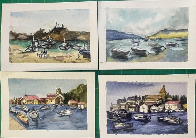
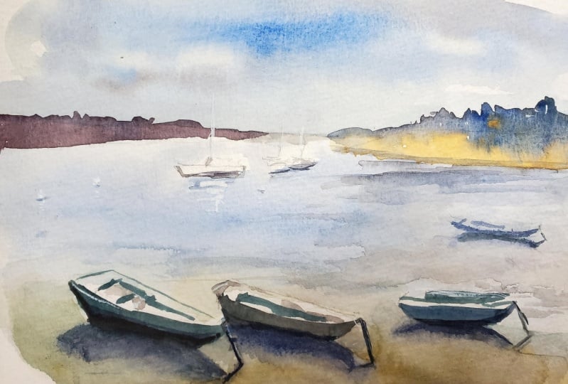
10. Coast Scene: Drawing: Okay, so, so let's get
started with the drawing, and the first thing that
I'm going to do is put in a bit of a line where the water meets
with the land behind. And I'd say it's about a
quarter of the way up the page, if not slightly further up about a quarter of
the way out the page. You know, just drawing a
line across. Like that. There we have it. We've
got a bit of separation between the water and of course, the boats up in the front. Now, what I'm going to
do is start working on this boat here in the
front of the seam. We've got this sort of tarp that's going over the top
of the boat, you know, very loosely just penciling in. Okay? And I'm actually trying
to make this boat a tiny bit than it appears
in the in the sea. Okay. Just a tiny,
little bit larger. There's the bottom
of it here. Okay. That, I just want to, you know, the reason why I'm
doing this is just to make emphasize, hopefully, the the depth in this scene, so, you know, a bit of a reflection also here
underneath the boat like that. And this little bard here
in the water like that. We have so many
different boats here. I'm going to get this
one in behind first. So the front of it there. That. Okay. And we're going to get the side of
the boat in like this. The back of the boat is
roughly this sort of shape. We've got the little cabin, the front cabin of the boat
as well coming up like this. Okay. There we go, got the back end and
inside the boat there. Okay. And remember, you know, you've got the
light source coming in from the left hand side, so we have darkness running on the back side
of the boat like that. This one here again,
we've got some darkness there on the underside
of the boat like that. Good. Lo you've got a few
more coming in, but I do like this boat
here to the right. I'm going to work
on this one first. It's pretty large and roughly around the same
spot as that one. So it's the front of the boat. Let's just bring this one
all across like this. Again, here's the back end
of the boat like this. A little indication of that, and then connected up to
the sign of the boat. There. There we have it. And on the side of
the boat, you know, just over here, we
have got the cabin. So, you know, it's really just a square squareish
looking shape. Okay, here's the back
end of it there. And actually, this bit should extend a bit a
little bit further out, to be honest, like, about here. Just change that touch
lengthen that boat. A little bit. Okay. Good.
And let's put in some, you know, windows here. You know, just a quick quick little indication of
some of the windows. A lot of this I'll get in with
the water colors later on. That's up. Little darker section inside
the boat here as well. This is all going
to be pretty dark. There They we've got a mast, just going directly
upwards like this. Okay, probably get
that in afterwards. It's not a big deal. As well, we can put it in now,
like I have, though. There's a boat
here, and I'm just going to get this in. It's
kind of like a barge. It's a, a people
sort of carrier, maybe there on a tour
or something like that. And just, you know, the bottom
part of that boat there. They've got these round
little guards or whatever. You know, even a boat here just in front in front of it there, sort of blocking out part of it. This is going to be interesting
to put this one in. Okay? Something like that. Overlapping shapes
always something I try to incorporate
in all of my scenes. At the end of the day, you
have to remember that, you know, you want to
create a bit of, you know, a bit of a bit of
interest in terms of these overlapping shapes
gives the scene more depth, makes it look more interesting. And, you know, inside, as well, you can see inside this
sort of The ship here, we've got a lot of dark areas and doors and
that kind of stuff as well. You know, I'm not too
fast, but behind it, you know, there's more boats. There's a lot of stuff
going on here that I'm not bothered emphasizing at all, but just shapes, I suppose, like of other ships and
things that could be docked. Larger ships that
could be docked around in the background. Here's another another boat, perhaps, I'm going to
indicate this here. It could be another boat. There's another
one here as well. Again, the back end
of the boat there, and we have got a cabin
there like that. Gates. I'm just trying to find
a few different ships and things to indicate
here in the foreground. That one looks pretty good. I don't really need
to do much to it. That one's just Again, more in the foreground, but it's covered. Okay. I could probably just re
draw this one a little. Okay. Not a big deal, though. Now in the background, we
have kind of a wall here. All right, just behind. And this is actually
where the road starts just over here. We've got some cars,
believe it or not. There's a bunch of cars here, so that you know,
look at that's a car. I don't want to spend all day drawing these cars and stuff, but I certainly think that does make it look
more interesting. That indicating a couple
of those cars back there. And they all seem to be driving
to the right hand sign, if you look at them as well. Another couple of
wheels like that. The pencil I'm using
is just a really, just like a really
thick leaded pencil. So there's not a whole lot of detail that I can get in
with this with this pen, which makes it with this pencil. So it actually
makes it a lot more easy to put in the detail
for some of this stuff. Okay. Simplifying this
down a lot, Well, maybe a few cars just
sort of parked facing directly forwards
like this. Okay. Whatever they are,
they just shapes, indications of these vehicles
off in the distance. All right. I'm
moving to the right. Great little indication. Now, starting to put in
some of these buildings. Now, what I'm going to
do first is maybe just work on a quick little
silhouette of some of these buildings and roughly put in indications of how
far up I want some of these, you know, I got this really
large building here. Okay? And this needs to
be kind of going up here, but not too far as well. I'm just thinking perhaps finishing off here
because I want, I do want this this tower to
finish roughly about here. So some of this stuff I
will just quickly erase. Okay. And that will be
the tip of the tower. Okay, just simplify this down. Again, we've got a triangle,
this little triangle. The base of it, here, here. What else do we have the side of of the tower running
down the side like this, here, a bit of light
down the side of the tower as well. Okay. And yeah, from here, I can just actually
start working in this side of the
building like that. Not really concerned at all with the details,
but definitely, I'd say this part of
the building is quite important because Because again, we've just got, you know, that focal point there
next to the tower. Okay? There we have it. And, you know, underneath,
we've got rectangles. It's just think about it as little bits of
indications of light. Okay, little rooftops on
different angles, like that. Can you see just
little slithers of light indicating the
top of these houses and things that's the
side of a house there disappears off into the
distance, Okay, like that. I've kind of gone a bit
too far with this one. But we have a house, actually. In the foreground. Here. That. That kind of like a building here. I extended out a
little bit, as well. And another square shape
there to the right. There is a shadow cast here. And, of course, this whole area of the building is in shadow. Good. And bring this line across like that and a
line going downwards. So this is kind of like
the side of the building. And we've got doors here, so let's just put in some
of these doors like that, Windows, you know,
simplify that down. Windows like that. Okay, I'm going to go back in
here and just put in a few more shapes
and things off in the back and not to mention,
we've got some trees, you know, some
little darker trees, and that's going to
help to bring out the light on this
building as well, so I might actually
emphasize that more Yeah, actually more than
is in the reference. Bringing these little
buildings down us. Well, looking at them just
as rectangular shapes, you know, there's
some separations in some of these features here. You know, we've got
some of this stuff. A lot of this, we'll have to put in
the details afterwards. But the rest of it,
you're just looking at these tiny little rectangles and things that are catching
the light in areas. Catching the light in areas. This actually doesn't
go up that far, goes up around about here. Which is why it's
good to just go light with some of
this planning work, and you will alter
the altar as you go. Okay. Let's have a look. Good. I don't want to spend too long in
this sort of scene. You know, that's another
building like that. You know, I I can just put
some simplified buildings, the rooftops there
in the background, catching the light, that's going to be good enough for me. Then when you get
to the foreground, this is where you
can just emphasize some of these buildings
a bit more here, like the rectangular, bits of the buildings that are
overlapping with each other, the sides of them
anyway like this. And, you know, there's a
bigger feature sort of building here that has
a kind of orangy roof. So that's going to be
one large building that I can emphasize, and again, get a bit of that shadow effect on
the right hand side. You know, you've got this
sort of building here that I'm going to play
around with as well. This can be a little bit of
the side of a building here. There's another building there. And again, that sort
of thing there. What else do we have? I mean, I think that's That
is pretty good so far. Looking around,
don't need to put anything else in?
I don't think so. I reckon we can go ahead and get started now
with the painting.
11. Coast Scene: Light: So, first things first, we want to put in the light. I've got some buff titanium starting off here
on this building, and I'm going to go
very, very, very, very light into some
of these parts. So cutting around
the cars like that. The rooftop does have a
little bit of warmth to it, like a kind of like a
grayish brown color. So I'm going to drop in
some of this grayish brown. And the older color here is
just is just about 5% color, and the rest of it 5% paint, and the rest of it is
water, five to 10%, really. So this building is actually
a really yellow color. I'm picking up some but yellow, straight
from the palette. Hacking it straight onto
that building to the right, does look very very saturated at the moment with
color, but not to worry. And, you know, moving along
to some of these buildings, they need some color in them. So just going one by
one through them. I'm cutting around the cars
a little bit, as well, just so that I can
get in more color with the cars later on, change the color and still
preserve the light on them. Bit of yellow ocher
on is golden. This is just a bit of code
gold mixed with Naples yellow. And these two just, you know, mixed together help subdue
down the really bright color. And yeah, continuing on, really, a lot of the rooftops
of these buildings, you're finding that they're
just like a yellowy color. So mixing that same same
sort of cnacdo and gold, and Naples yellow to
just get in a bit of that light into some
of these sections like this, top of this building. In fact, some of
them are just like an orange color as well, so we can get in a bit of that orangy orangy
sort of color parts. It's kind of just emphasizing
or capturing the light. But for the most part of it, I look all I want to
do is to just add in this sort of yellowy color. Okay. It's not a huge deal. I don't want it to be too
saturated out the back. So just as long as you
have yourself a bit of warmth back there and change around the
warm colors as well. Don't use the same ones. You know? As you can see,
I'm sort of alternating between highly saturated colors and just some duller ones. You know, as long
as you got some of that coming through,
you're going to be fine. Alright. Usually, I leave the most saturated colors on the rooftops, some
of these buildings. Just to imply the light
coming through to a greater degree
like that building there, more buff titanium. You know, there's a
ship in the distance and all kinds of details. But just cut around
those cars, of course. And the road does have a bit of, like, this yellowy color to it. It's really, like the edge of where the water
starts as well. It's a color, a bit
of that in like that. Good. Now, moving down, we are going to work a bit on these boats. We're going to add in
some color. So let's mix up a bit of brown
and ultramarine. Brown and ultramarine. And hooks And this will create a kind
of grayish color. But I do want some
more coolness in it, so I'll make sure I've
got more blue in there. And I'm just going to get in a bit of that bottom
part of the boat like this. Okay? A. All the way
to the back here. There. You know, the top
of this boat, as well, does have some darkness as well. You know, on the top there, it's actually kind of like
a brownish color, which I will get in afterwards. But the main thing
I want to do is get in a bit of darkness at
the bottom of these boats. So let's do that. And looking at the right hand
side of the boats, as well, we see that the shadows are cast on some bits and pieces on
the right side of the boat. So, you know, keep that in
mind and preserve a bit of that white so that it does
show through later on. What else do we
have? We have got, this boat as well here, which is A little darker, especially
compared to the, you know, this boat, smaller
boat in front of it. So you're kind of having
to cut around that one. And these little boards that
are on the side of the boat. They're like this, again, just cutting around
with this paint. We can simplify this down
just with a bit of with one, a few little brush
strokes like that. And noticing how some of the
yellow is running into it. No a big deal, just
let it do its thing. Good. Good, good, good. Even back there, it's just
Yeah, it's pretty dark. There's not a whole lot of
color we want to add in, but, I think later on, it will be easier once we put in some of the lighter values. But just a bit of darkness
in here will be good. Indicate that ship. Okay. Now leaving a
bit of light on top as well there in the distance, this boat here
just going to have some darkness here in the
back of it, like that. That Maybe a bit here. Okay. So really, the sun is just hitting the front
left hand corner. Right. And this one
here in the front, I'm going to use
a bit more blue. And let's get this all
in again with one shot. This really subdued
grayish blue color. Goes up into the top of
the boat as well here. There we have it. Okay. And in terms of the sail, I'm probably not sail
the little cover. We put in just a little bit of this buff titanium in spots. But in other spots, I'll also just leave in leave
the white to show through. Okay? More blue on this
right hand side, to just signify that it's darker and more in shadow there. Okay. So a lot of the time, I'm not even really looking at the the actual reference photo, but when I am, I'm just looking at whether
it's light or dark. Okay. So that's going
to be darker on that right hand side,
cooler as well. Okay. Dropping a bit of this darker paint in
there to do its thing. And what else do we have? We've got this again, this little boat
out at the back. More gray actually in there. A bit more gray. There we have it to the
base of that boat, darkness behind there as well. This one here, I just made up, actually, I'll put put in a
bit of color for that one. Bit of a bit of something. Okay, so time to start working
on the top of the scene, where we have the sky. And I'm going to be mixing up some blue bit of
ultramarine blue. A little bit of
vultramarne blue and lots of water drag that
across the type like this. Okay. I want there to be a
lighter value at the base. It would be good if I could
mix in perhaps some orange into this blue to dull it
down a little as well. I do find that that's
just a bit too much. A little bit too
much saturation. Moving down the page. But keeping the top, I like
to keep the top a bit darker. So I drop in more
paint up the top. I don't want to overdo it, but just more paint up the top, but continually
moving this wash down and adding more water
as we move down. This is going to carry
this wash further and tre better gradation
from white to dark. More water more water. He had H At we're almost using just
pure water at the base. Okay. Good, more darkness
somewhere out the top as well. That, Okay. Now, moving further down, I am going to start adding
in some extra color. So in the water,
we're going to mix up some darker blue Okay. Ultramarine with
a bit of orange. And that's just to
dull it down because the orange is a
complimentary to the blue. Okay, so just mute that
blue down a little bit. And I want to now start
working on the water, adding in a bit of darkness
here to the water. Okay? Look at that.
Now, the water needs to be well, from, you know, still a little bit still a little bit
lighter than the boats. There's touch lighter
than the boats. And I'm gonna get this
all in one go with this, you know, still using
that same mop brush. Right. Let's work on
the right hand side, left hand side, sorry. And you know, going
through like this, cutting around with
that tip of the brush. So crucial. Don't worry if
it mixes upwards as well. But definitely cutting
around these boats. The light and some of the
boats is really crucial. Okay. Now, at the base, I
do like to put in a bit more darker color, so some more of that blue, mixing up and darkening
more along the base. And I'm mixing in some grays
as well in here to just, again, increase the
concentration of paint. Okay. Good. All right. So we're gonna let all this and come back
to it in just a moment.
12. Coast Scene: Shadows: Everything is dried off. So what we can do is get
straight in to business, start putting in some
of the dark values, and we'll start off, I think, just looking
at the shadows. Some of the shadows
on the buildings. I'm going to mix up a bit
of a gray color here. Now, if you've got yourself, your three primaries, red, blue, and yellow, just
mix those three together. And you'll get this self
grayish value, water it down. You should be able to get this nice sort of grayish
color that I've got here. I might actually add in touch of this like
purplish color as well. A little bit of this
purplish color. As well to darken it
off a little bit. And I reckon I'll start right at the tip of
this building here. So this tower kind of got
a figure on top there. And you know figure and
some details up there. Just make sure you're doing this with a few little brush strokes. Don't spend too much time in here that side of the
building, the tower. And, you know, we've got some shadow as well
connecting on. For the most part, though,
it's just As you can see, just that right hand side that has the shadow
because we've got the light coming in from
the left hand side. Okay. Let me have it. So that's the building. And of course, there are some smaller little details
as well that I can add in, like these little windows, quick little windows like that. You know, there's a separation in the building
like that up here. You know, you know, you can pick and choose certain things that
you want to emphasize. Tip of that brush
makes it really easy to get in little details. And continuing down the page, I'm really just working out ways to cut around this
these shapes here. Buildings in there. The rooftops, as you can see that
I'd left out before, notice how I'm just
cutting around to create this sort of
sense of shadow, light and shadow in here, especially this building here in the front right hand side, that needs to have
a bit more needs to have a little
bit more contrast. Okay like that. Alright. Okay,
so here, maybe a bit more. I've got a bit more blue. I get a bit more blue in here. Darken this down a touch. Okay, good. Like that. I mean, a lot of these
buildings, to be honest, have very little you have
very little light inside. These little sections like this. So I'm just picking up some areas that I
want to leave out. Here, especially
there's actually a bit of a greenish
greenish value. Drop that in a bit of green. Contrasting with the
side of this building, and of course, the car
down below as well. All right, that. Let's get some more of this in like that. And, you know, we've
gotten more of these little bits
and pieces of light showing the roof tops
and things like that. And I'm just simplifying
this down as much as I can. To make sure I've
got that impression of light on the right hand side, left hand side of the building, and on the right hand side. We're just adding in more
shadow, more darkness here. Okay? That building as
well, this one here. But cutting around these cars. Good, then what have we got
on this right hand side here? We do have a bit of
a shadow as well. On this side of the building, lighting this one down a bit. Okay. It. There some windows the side
of this building, just some darkness really to
indicate some of this stuff. That Underneath the
rooftops, like here, there's some darkness, just indicating that with a
bit of darker color, dropping it in and
letting it go. And then here as we, that
this needs to be dark and a little Okay. Fantastic. Now, the cars, I think what we can also do is imply some darks in the car. So like, you know, just with the tip of the
brush there and there on the right hand side
of the car to just show that maybe there's a
shadow on the right hand side, this one as well,
we'll just do that. There. Okay. I'll leave
the left hand side of the car in the light. But this side will be
darker. What that. The little wheels
to just get bit of darker paint and blue and brown, mix those two together. The wheels. L this can't use that to sort of mark out a bit of a bit of darkness
underneath the cars or this. Maybe a little bit of
darkness in there is. You've got objects that
are close to each other, I like to paint them, you
know, alongside each other. It's just going to
make it a lot easier. You know, there's another
car down there as well, so why not just work on that
at exactly the same time? You know, it's going to
save you a bit of effort. It's difficult to
put in, but there is a bit of a shadow
maybe that would run underneath some of these cars all the way in the back
back side of that road. And this kind of wall
as well, you know, I do need to emphasize that
wall next to the water. So it looks like
the cars are not just floating floating around, and they are part of, something there in
the background. More of this work. Here,
again, of the car. You know, there's some just
facing us this way there. Okay. Now, moving all the
way to the back again. I'm going to just start again, just simplifying some
of this stuff down. There's all types
of these roof types and details in here. I'm not concerned
about getting in every little detail because
we will be here forever. But just a little indication
of this sort of stuff. You know, there's
a structure there, like a kind of structure there behind this building
that I just noticed, so just cover that in like that. What else do we have? You know, this could be a bit of darkness. I could emphasize more darkness around this side of
the building as well. Yeah, anytime you
see opportunity to put in a bit of light, emphasize a bit of light on the left side of the
building, do so. This could be another side of the building
here. Look at that. Again, just a few brush strokes, leave out more of this
little fleeting bits of light running
through the scene. And moving towards the left, same sort of deal that a lot of these buildings now
have more light on them, being on the left hand side. Okay. Some little windows, you can just sort
of pop in while we're while we're in that
part of the scene as well. Why not just get
them in all at once? This, there's a window here. I forgot to put in, on
this building there. Maybe some like a entrance
or something like that as well. Okay? Now, I want to put in more like a greenish darker green
values behind here for the Dark green values. There, Oh, that's too blue. Let's get in some more green. It trying to mix blue and green to get in a
really darker green. Ultramarine blue and a
bit of darker green. Still too bluish, more green, needs to be added in there. This gets way more.
In there. Good. Something like this.
This kind of indicating the the sort of darker shapes and stuff behind the buildings
for the trees, for that, just a
quick indication, and it will as you can see, brings out the buildings more. I'm tempted to just overdo it, but you have to be
careful, make sure you are being sparing with this. The top there. Some of them are a bit taller, so this is going to be good to just get couple them like that. Some of them are more like
around as well like this. I can be tricky. There's trees in here as well. There's a tree in there.
Another tree here. Just a few little
brush strokes here and there, tree back there. You know, looking in here, even this really should be a little darker on this right
hand side of that building. I hadn't noticed before, but
it should be a little dark. I'm going to makes
innovative brown. In this section, brown and blue, dark and off this
shadow a touch. That. There's also some
darker sections here as well, where the cars are below and a great opportunity to
cut around the cars. And in these juicy darks, that. Where else do we have maybe
some trees or whatever here? You know, at this point, I'm going to just making stuff up, but, you know, a
little bit of that. And because the paint
is still sort of wet, these will blend in the touch. Okay? So there's not
doesn't look too obvious. Alright, so time to work
a bit on the boats. And I'm going to mix up
some ultramarine blue again with brown. Ultramarine with brown. And this is going to create a create a nice,
subdued grayish value. Dark gray value, you guess. All right. So let's
start this right side of the the boat does
need to be darker. Like this. Underneath, we
have a line like that. There is again, this sort of backward section of the boat that we can darken off a touch. Okay? No. Underneath here. Darken off a little
bit more. Okay. It's kind of tricky
because this is really the entire
boat is pretty dark, except for the front side of
it, which is like a brown. It's a bit of brown in here. I'll just indicate some of that. So look at this one. You know, a bit more darkness. The the back as well. This one here does
need to be darker. Again, This one here, a bit darkness like that, and the boat there
in the back as well. So yeah, in a nutshell, the boats just need
to be overall darker, but un leaving some light
on the left side of them. Okay. And we're going to go get in some little reflections. I might start off perhaps
with a bunch of these here closer to the back. And there's not much
with those reflections. I mean, at the end
of the day with boats that are all
the way in the back, you only get a little
bit of an indication of those reflections there
at the base like this. But for boats like this, you see that there's
actually more of a deeper reflection. It's not so visible actually
in this referenced photo, but I will I think I'll
emphasize this more like that. You can see a bit of that
reflection there in the water. Hold the brush near
the back as well. And I'm going to just mix some
of this paint up and move, you know, get that shadow, that reflection in the base, and then move some of this down to emphasize it even more. More blue, perhaps Okay. And notice how also, the waves, you just want to make sure
you get some waves running in the front so that it's not just the reflection
of the boats, but also general motion movement of the water that needs to
be implied running through. The waves get tinier
and tinier at the back. So see how I'm just
feathering the brush. This is going to imply some
smaller waves back there. This one here just
has a pretty large reflection in the water. A like that. And this one here is a little bit
of a reflection, but not too much, as well,
same with this boat. A few of these, you know, tiny little waves running through the back,
as you can see. The waves get bigger here in
the front, so you just can, yeah, add some more
some more in like that. Okay. Base of the boats just go to have some extra
darkness as well. Blue and brown, just for this darker spot directly
underneath the boats to anchor them a bit to to
the water. All right. Do get, like I said, these little windows
and things on the boat, so like this, just, you know, imply some of the details
there that window, you got a window back here, that same little brush
tip of the brush. You can indicate this. You know, here the outline, the
structure of the boat, as well can be reemphasized, and, you know, there's
some kind of board. You know, it's connected
to some sort of ballard here in the water as well.
You can get that in. The reflection of the ball ard that Don't be afraid
to use your darts. Add on add on more
contrast this way. Of course, there's some other
details of the boats here. I just want to get
in, emphasize. You know, this one I forgotten, but there is this sort of
barge here that needs to be emphasized and put
in a bit of orange. Thought I put in a bit of
orange in there. Why not? Dude. Darkness on the
edge of that boat. In the background, things
have started to dry off, so I can start going in, see with this brush and
emphasize windows as well and bring out little
details that I thought, you know, might
have missed out on. You know, for example, the cars, if you want to add in more darks and some of the
cars like the wheels and that, it's not quite necessary, but if you want to do that, which is what I'm doing anyway, it does help. Okay. That that that whoops. Hay guy. You know, there are some verticals I've
got to put in here, so there's a pole that just runs up this mast for this ship here. I'm going to do this in just one quick go like that. All right. And I do know it's not in the same spot as in the
reference. Doesn't matter. Put it in where you think, if you've changed the
position of the boat like I have, it's no big deal. Okay. There we have it.
Another one here. As well, for this
boat, just a vertical. It's all it is. And I thought maybe put in
a few here as well, because because we're missing
just some vertical action, I think, and would
be looking better. That Okay. And some little finishing touches that I'm
going to add on. This will just be
really some guash to bring out the
light on this scene, some extra little bits of light. So I've got some guash, just rewetting a bit of it here. And it's almost like a bit
of a grayish color actually because it's just mixed in
with some other paints. But as long as you've
got a light color, really light opaque
color that you can use. Even if you've just
got a bottle of titanium watercolor
titanium white. This can work. This stape
isn't 100% necessary. It's just the finishing touch. And you're just picking out
some areas that you think you want to bring out some
high lights or extra details. So one thing I've figure is that see on this boat how
they are these little, what you call them rails
and things like that. See just catching
the light slightly. So I can just emphasize this with a bit of
guash, come out, bring it out of bring it out of the scene a
touch like this, give it a give that boat a bit
more of a presence, right? That some of this stuff here as well, noticing that this boat kind of lost out a bit
of the light up there. So I'll just, you know, add a bit of gray up the top there, these boards on this boat. Se just bring some of that back and continue
working on the, you know, these tiny
little details, as you can see that, running
from the left to the right. There, bit of the roof top, it's kind of tricky to to imply, but you get the idea. You know, even on these
sails, you notice like, perhaps a bit of
light on the mast, is what I mean, on the mast and on the left side of some
of these boats like this. And the reflection in the water. Look at that, just a little bit of that reflection
in the water. Even here for some of that Yep. And we are finished.
13. Simple Coast: Drawing: Let's go ahead and start with
the drawing of this scene and the actual reference picture is a bit longer than
the sheet of paper, but that's fine we can make do. Now I want a little
slither of land here. This is the sand essentially, and you can see it creeping up a little bit down the back. But at the front, it's a little bit further
down the page here. You do see a bit of the
sand come in as well, so I'm going to just mark
a bit out like that. Maybe there's a bit of sand
coming in from that side. Now, in the back end, you have a little bit of water, and that's separated
out as well. By this whole bunch of
rocks and stuff out there. I'm just indicating roughly where the water
is, so it's here. And then in the
back of the scene, we have just basically the
rocks and things up the top. Now we'll do that a
little bit later. First thing I want
to do is just put in some indications of these boats. Now, the boats, they just look at the general shapes
of the bottom of the boat, so we can see this one
looks a little bit almost rectangular, but Not exactly. So that's the
bottom of the boat. You can see the top of it here, you've got bits of white spots, and then you've got
these two large windows that we need to get in. These are kind of like darker
sort of windows like that. Around the edge is
a bit of white. Then, of course, on top, we have the roof of the boat and a little little antenna
coming off the top like that. Okay, so that be yeah, I think that should be
pretty good. Pretty good. That particular boat. You
know, there's a little bollard there necked in the
background, you know, as another boat that looks to be just sort of sitting in the
middle of the water here. So we'll indicate that
maybe a bit further off, actually, somewhere like here. It. There we are. Okay. And then here as well, there is a bottom
part of this boat. There's another one here
in the back, of course. And you can see
it's kind of like, square there, and then it sticks out to the
front like that, ok? And, you know,
generally speaking, when we're looking at
the light pattern, it's coming from
above to the left. So, you might be
able to just sort of imply a bit of shadow
on the right hand side, definitely a bit of shadow
underneath the boat. So here, that's going to be dark on top running to the left. And I might even be able
to emphasize it more than actually is seen in
that reference photo. Darken off the edges of this
boat a little bit more so that I have a better indication
of where it is later on. And some more over here, you know, this one There, maybe just simplify
this one down as well that and it's all just
kind of dark on the base, but we've got some windows here that bit of the roof that, and that just comes down. There, we've got another
boat that sort of just overlaps with it. So I'll just rub this
bit out actually, I've forgotten that there's
a boat here that overlaps, something like this,
and you can see it just sitting on the sand. Sitting kind of on the sand
there bit of a side of the boat like that. Yep. Here the front of
it and underneath, you've got a bit of darkness there as well and a shadow
running to the right. This one sort of just
covered up behind. There's not a whole
lot of detail there, so we don't have to worry
that really much about it. Okay. There we have it, sort of in the background there. What else do we have? We've got another one here. Re
light this boat here. Sort of sitting on a
bit of an angle and see just sort of the side of
the top of it like that, looking kind of like
a boxy like shape. Then the sides of the boat, see just coming up like that. Bit of darkness
underneath as well. Maybe extend this one out a
little bit further like this. Okay, a couple little
antennas or things up there. Well, these windows
darken those off a touch sides as well. Okay. Basic of basic structures. Now, I do notice there's a bunch of people walking
here on the right, I've missed out and
putting them in. I think I'll actually add
them in here instead. Maybe just walking along here. Walking along beach like that. And they have a dog with
them, I think, as well. Looks like a dog. Could be a big little
indication of the dog. There. There's a couple
of old there as well, something anchoring the boat in. Well, let's have a look. So I think that's pretty
good for the boats. Let's put in some of this
background stuff, and you know, I'm going to keep
this really loose bit of rock like weathered away. These bits of stone. Then on this right
hand side, you know, you've got all kind of the
rock face that's exposed, and not only that, you've
got this kind of look out there on the top
that comes down, Okay? And then just disappears off almost to the
right hand side. There. On this side, it just is more or less flat. I can just draw that in so
that it's more or less flat. Then you've got some rock feature there in the background, let's just put that in. It doesn't have to
be too complicated. Just keep it simple. And there's some stair You know, some stairs or
whatever going up. There's something up there. Maybe it's a light. There's a
bit of a lookout area here. You know, we can definitely put this in with a bit
more detail later on. Not too worried about how
it looks at the moment. And let's take a look,
what else can we do? We've got some people up
here as well walking around. Just make sure if
you're putting them in, you keep them pretty small, given that they are all the
way off in the distance. So it's going to kind of look funny unless you make them
smaller just to scale. Everything in the background
needs to be smaller. You've got people
up here as well. Look tiny little heads and just standing up the top there. You know, compared to
these people here, they're going to be
smaller out in the back. Okay. Whoops. Good. So, I think that's all good. We should be ready to get
on with the painting.
14. Simple Coast: Light: Okay. For the first
part of this painting, all I want to do
is start adding in some of the warmer colors first. Yellow cha is my go to sort
of yellow, subdued yellow. I'm going to pick up
some of this stuff. Let's drop that in
in the background, here a bit of yellow
ochre for that rock. Not only that, but I'm
probably just going to paint most of the
rock this color. It of cnacoe gold
in there as well, if you want to
just spruce it up, make it a little
bit more vibrant, but yellow ochre is pretty
much all that you need. Also, there's other
things like there's some bit of brown here. This is a bit of what is it? It's burnt sienna and a
bit of raw umber as well. This here is my way of just blending some of
these colors together, but most of it is just
going to be the yellow. And these rocks as well come
out a bit grayish looking, so I can mix up a bit
of ultramarine and a bit of brown to just create a more of a
grayish value over here. Du that down a f bit. As we come down. Now, one of the things I really want to
do in this scene is to make the background darker in order to get more contrast
out of these boats. As you can see, I'm just
doing a little bit of cutting around a little bit of
cutting around work. But remember, this is just the first wash. We don't
really need to have really dark colors in here. Though I have dropped in
some darker values in here, we're just feathering
them out a little bit. Because I reckon another wash over the top of
that will be ideal. Yeah, just cutting around
all these boats here, top of this little thing here, that little feature coming
down all the way to the right. Here we go. Lots
of light in there. Okay, now I'm going
to just start putting in a bit of the water. And I reckon I'll use some turquoise color for the
water. A bit of turquoise. Turquoise color. Drop that
in, let's see how it looks. Yeah, not bad. And also, don't worry if it mixes
a little bit into the background color into what's happening
in the background. And you can leave little bits of white peeking
through like this. Se every now and then, just let a bit of
white show through. And sometimes that can
help just indicate a bit of a bit of the light through. Good. That Yeah. Fantastic. Just moving this a bit
further down and also cutting around these
figures a little bit, as well, right? Os. Now, all this, I just want to blend in to the
bottom the scene. I'm picking up a bit
of yellow ochre. Let's drop that
yellow ochre in here, but also will mix in a
bit of titanium white. Such a titanium white. I just want to change this
up, make it look a lot more lighter at the base and look how I'm just letting the water blend in a
little bit as well. I'm not worried that
you get a bit of mixing in here because
that's just going to make it look more interesting
at the end of the day. And more kind flowy. Let's bring this down here
to the front of the scene. One thing that I
will do, I tend to do as well as in a
lot of my scenes. I'll add in a little bit of darker color right at the
base, just a tiny bit, not too much, but this will just help to imply
that perspective. Make it look a bit like this
helps to push everything, bring this part of
the scene forwards, then push everything back and doing it very lightly as well, not Too much paint
in there at all, even actually a bit of purple could work because
that's going to be a complimentary color
to this lighter value. It's yellow. Okay.
Now, into the sky, we're going to have to
go into the sky now. Just dropping a few
more big little strokes of this turquoise in here. While while the
paint is still wet, it's a great time do this? Great time to do this. Now
in the background, let's go. We have let's think about it. We have got some Seran, I think, we'll get some seran, but
we'll make it really, really light light seran blue. The top, like that. Applying it straight to the top. We'll bring this
wash down the page. Make it again just a little bit slightly darker at the top. It's still about 20% paint, and the rest of
it is just water. I'm going to bring this
wash down the page. Maybe tilt the paper as well. This can help and
just continually adding water as you move down. This will create hopefully
a nice little gradient. Some of this will blend in with the rocks and
that type of stuff. I'm really worried about that. I just want it to
look at the base. Right? Got that. Looks a little bit darker
at the top. That's good. Some of this stuff is
accidentally mixed in. I'm just going to mop up a
little bit of this stuff. A bit more of that
turquoise in there. And that turquoise in there. Good Mop some of
this stuff up here. That's what happens
with watercolors. Bits and pieces will
mix together in ways. It's a good thing
and in other ways. It can be a little
bit annoying as well. So just trying to reste some of these areas out in
the back that I think need a bit more warmth that the water is
kind of washed out, maybe a bit more blue here. Good. Okay, I'm
going to let this dry and we'll come back to it.
15. Simple Coast: Shadows: Okay, so the next step
of this painting is to put in all the dark values. I think what I'll do is start
off with the background and we'll work our way
down into these boats. But yeah, let's go ahead
with the background first. And we know that the background just needs to be
darker than the boats. For sure, we just got
to cut around them. So I'm going to mix myself up. Now, it's kind of tricky, but
I'm going to mix myself up a bit of round and blue to create myself ultramarine
blue and a bit of burnt umber or raw umber,
either of those will do. But just that blue and brown, ultramarine blue and
the brown will create a nice sometimes a lighter
brown popped in there as well like this brown
ocher will create a nice earthen grayish color. Okay? You see that really
on the left hand side, there's a lot of light on some parts of the
rock make up here. I'm going to cut
around that a little bit and work my way
through and holding the brush at the
end as well to just intentionally create this
looseness around here. And this is like a bit of the
rock catching some light. We're going to have a bit of light on this rock here
around here as well. Look, you've got a
bit of in another bit of light the left hand
side like this part here. I might have to just
darken that a bit. A lot of this stuff, if I if I can just kind of dry
brush a bit of it on as well, this will save me some time. You dry brush it on,
it's going to look more like just a bit of the
rock showing through. That's just around this. This like that. Maybe a bit of blue, tiny bit more blue running
into the base here. If I can just simplify
this background down, I think I'm going
to be happy rather than try to get in all the little shadows
and stuff like that. We can always bring some of
that back later on as well, while the paint has
dried off. So guash. Over here, it gets pretty dark, so I'm starting to just mix
a bit more blue in here. Look at that, a
really dark value. There's even dark
values in here. You just not even looking at times at
exactly what I'm painting, I'm just looking at the values. Here around this
at the top of it. Be very careful, of course, just to cut around
bits and pieces. Okay, sort of gets a bit
lighter on the right hand side or just a simple brush stroke a couple of brush
strokes like that. Okay over here, we got, we've got this bit of
land there, this rock. It touches the water. Okay. And up here, we have got kind
of grayish color, but not all the way through, so I'm just coloring
that in with a bit of same grayish color
that I mixed up. Yeah. And notice how I'm just letting things
kind of join together. Yeah. I don't want to spend too much time on all the little details of this because at
the end of the day, it's not really that important. A we need is just a
bit of cutting around work for some of these boats, just to make them appear
more in the foreground. Often this a bit here. And this rock in the background, it's kind of like a
bit more brownish. Drop in a bit of brown ocher here and lend that
downwards a little bit. There we have it. That's A. Just picking up some darker
paint and finding again, just some of those darker
values I want to imply in here, because the last thing I
want to do is to go in there later and try to bring
some of this stuff out. I just want this to
be a once off thing. Bit of darkness here. While the paint is wet, you can just drop
paint in, continue on, and leave these impression, these fleeting impressions
Wearing too much. Good. Good. Okay, so we've got a
bit of that going on. I'm going to work a
bit on the boats now. At the bottom of the boat
just some grayish color. So yeah, of that grayish
color for this boat. Notice, I'm just trying
to blend this in a little bit so that it connects sometimes with
the background like this. A bit of that grayish value. Dry off the brush so
that you don't get too much paint on
there. There we go. We see touch the beach
sand here. All right. We've got this one here
as well in the back. We need to imply. We have it. Of course, there
is a boat directly behind that is kind of like
a really dark blue color. I'm going to add in over here, just a bit more ultramarine, dark in this side of
the boat out more. That There we have it. Indication of the boat. And also a bit here on the
side because technically, you know, this boat is going to be getting a bit of light
from the left hand side. Okay? Yeah, it's just sort
of just mixing bits and pieces in here.
On the windows. Let's just put in some indication
of these windows here. Tip of the brush. Something
simple like that. Okay. Good. Now, this boat here on
the right hand side, I'm going to have to
imply the bottom of this barge barge there. All I want to do is just make
it a little bit darker at the base and this one as well. It is a boat and you can see
it kind of on the shore. Pitching the shore there. And this one, I'll just move
some of the paint over. That. What else do we have on top? We've got again, some of
these darker sort of areas of windows and things
on the top the boat. Really just picking out
all the mid values. This boat actually
has some blues in here like some darker blues. I'm just going to
indicate that.'s mix that with some gray as well, but it mixed together. Good. And really at this stage, we are And really at this stage, what we are doing is Just putting a little
bit of detail in, but not getting too bogged
down in what's happening. Just a little bit of
detail for these windows, see a bit of darkness
there, sides like that. There. Re we still want to
leave one wash right to the end and some little
finishing touches. And what I'll do for this area as well, is
where the boats are. I'm going to add a bit of darkness to the
ground, the shadows. Bit of blue mixed
in with the gray, give myself a nice dark value. And to the right hand side. And this is going to just melt in a little bit to the boat. I'm going to make these
shadows just a little bit more a little bit more coming towards the
front on a slight angle. So I guess more dramatic the
right way to describe it, O looks pretty good, actually. Others need to just
be darkened more. Blue in there. Good. I sort of goes up into the
boats a little bit as well. It just kind of helps to almost anchor the
boats in a weird way. The shore. Now we've
got some people here. I'm going to switch to a smaller brush, smaller round brush. This is going to help me get the details of these people in. So, you know, there's people up there as well that we're going to be
able to put in. But might as well
just with this hole. A Something simple like that. And some people in the
background we've got. They're going to be
pretty dark as well, with some blue black
mixed together. Actually you got too much,
way too much paint on there. Just a little bit so that
when I get in with that tip, that's all I need to do
just kind of in the sh, head and the
shoulders like that. They are quite dark, actually, these figures
out in the background. It's more of like just
a silhouette of them and less really little detail. Be really decisive as to, you know, the legs, if this one didn't look so
great, I'd have to redo it. I like that. These could be a
couple of people, maybe a person
that's climbing up the stairs or something
here out the back. No. What else do we have? You know, I do notice that there
are these little which you Mc call them
railings and things like that, which I'll get in afterwards. Get in a bit afterwards
with some guash. But these people here. They're also going to be
great for just detailing, maybe some darker
blue for this figure. But this one darker blue, and maybe let's match
this one a bit, but I'll add in a bit of yellow in there as
well to change it up. So we've got a couple of
people here in the front. And legs just a bit of
darker value in there. Okay, as well. Standing around. We've got also that dog implying the dog,
not much at all. And again, the shadow, which is I'm going to just
do in one go, hopefully. The right. That's Yeah. Dog is a bit of something. Right? Asic. I know, whose legs are O and I
connect on with the body. Bit of red or something
for the faces. Sort of play around with
the hair a bit as well, put a bit of brown or
something in there. It's difficult to really do much because
they're quite small, on pretty small bits of paper. Right. Another thing I
want to do is add in some kinds of stuff
here in the foreground, so just a bit of, you know, sort of, muck and stuff, you know, seaweed and things maybe just washed
up on the shore. It doesn't have to be much, but just some little little
bits and pieces here, just to kind of break up this wash because
as you can see, it's pretty That's pretty
stark here in the front, and you can even just tap in
a bit of color like that. And to do this
from time to time. Helps to make things look
a bit more interesting. It over this one a bit,
so I'll just mop that up. If you get any
splatter in the sky, you can just turn those into some birds or something later. Let's give this a quick dry. Okay, so some little finishing
touches on everything now, and it's really just picking
up some darker paint. I've got blue and a bit
of black mixed together. And we'll just drive
off the brush a touch, and let's look, say,
for example, here. I think this boat could
do with a bit more detailing just around
here, for example. There. Even the bottom of it, there seems to be
a line that maybe runs towards back there, the windows, we can just
tidy up some of the windows, a little bit holding the brush further down, as you can see. This allows me to
just detail better. Even something on top there. Look, what else can we put in? Not really a whole lot. Just got to be quite
sparing with this stuff. Over here, again, this boat could do with maybe a
bit of detailing here. Back one line. That's all you need to do just one little line.
Don't overdo it. The bottom of the boat as well, does look a bit bare, and I thought to myself, well, you know, it's
actually darker, and there are some
more details in there, so you can esually
add in and wash such, you know, like
this, for example. And then you can see, there's
actually these little lines that kind of run down the
side of the boats like this. Why some of that,
not super necessary. Just go to darken
this shadow or touch. E to that. What
have I got up here? Yeah, I think I might add
turn this into a window. These be just a couple of
windows there or something. Yep. It's better. And picking up a
touch of gray too, darkened down perhaps
the right hand side of the boat like in there to indicate some shadow
bit of shadow. The right side, here as well. Little bit of shadow on
the right hand side. Very light gray. Let see. Just look at that tiny bit of that
right side there. Yet the others, you
don't really need to do much on this one. That. Then again, you've
got these again, these sort of darker
marks and things here as well for the
larger kind of barge, which I will imply
the structure of it. That Even underneath, you notice there's actually
some darker spots, some little darker
spots in there, which I will imply. Okay. Fy bits of this detailing work can really help your paintings, just look more interesting
and more detailed, right at the end, especially. Remember to leave out that
white These windows, again, I just I sort of went
through them before, but I will sharpen
them up a little bit, add a bit of darkness
in the windows. You know, maybe a
bit of sharpness around the front of the
boat like that as well. Underneath the boat, like
I was showing you before, just out a little bit of blue and I just darken
underneath here. And of course, again, I'll have to darken the shadow
a little bit due to that. Hey, it do we have? Can we detail? These boats
here in the background, like the bottom of that boat? I can just put in a bit
better side of it as well. This boat here in
the background, you know, I know it
comes out like that. And and out there sort of I have to play around with a bit of
titanium white or white gash. And this is just to bring out the highlights,
lighter bits of color. So there are some spots, for example, the masts. I really want to bring out
wet a bit of this white. Corner of my palette. Okay. And what I can do is just
start going into say, the tops of these like that. This little Boat here go a bit
of detail like that. A few little bits and
pieces sticking out from the top of this
boat that I can imply. It's really just
pure white in there, and you can also go over some other bits in there that
you might have lost out, so I've just put in a
little bit more white there there, perhaps here. Sometimes you just
lose a bit of it, to add it back in there. There's this bit of
rope or something here. You can see that it's
electing some of that light and connected to a ballad or something
on the ground. This boat here, this
is kind of lost. I've lost a bit of that light, so I can just bring it
back as you can see here with this vertical, this one here as well. I'm sing really the tip of
this little round brush for this so that it
doesn't overwhelm. Here you get these bits hanging
off the boat like that. Yeah. Let's catch
some of that light. Mm top of the boat. Lost I've lost some
of that white. I'm just just bringing
it back carefully. Tricky because some
of this white. If you're not careful,
it already starts turning into like a
gray or something. Is due to the it mixing with
other colors on the page. There, here, that
there's a bit of white high light on the
edge of the boat like that. So I'm just going to
imply some of this. There might even get a bit side the these people bit of a bit of light on the
left side of them like this dog as well. This one here, this
boat to the left desperately needs a
bit of rejuvenating. So I'm just going to re dig
this top part of the boat a little and put in a mast
up there like that. There we go. And it
looks like there's something here for that boat
in the distance as well. I might as well just add
another one in on this one too. But again, yeah, you can sort of just bring back a little bit of a high light or something
like that on these boats. Window light there as well. Okay. Good. Mastic old here as well. And yeah, in the background, like I was mentioning before, there were these little kind of theirs that people
walking up the railing. So I will just maybe imply this. Yep. Color for this one
bit of blue in there. Bigger. Change it up. Tu colors. Sometimes, you've
just got all these warm values and changing, adding a little bit of
blue or something in there helps to bring
those figures out. I'm going to mix
a bit of yellow, bit of yellow ochre
actually into this white. And this is what I'm
going to do basically, just bring out some of
these highlights by dry brushing onto
the page like this. It's almost like getting
some of the texture of the rocks back in the distance. There's some of this
stuff here that I've lost out in a bit of detail. So just carry that along parts. Even on this rock,
you notice there's just some little
highlights and things that I haven't managed to get in and I'll just bring
some of that back. Okay. At the same time,
what I will also do is try to draw out a little
more contrast in the boats. So check this out. I'm just going to pick up a
bit of this darker value. It's basically just black, and I'm going to continue
working on this section. But see how I'm just cutting
around that boat a bit more, including the mast,
don't go over the mast. Otherwise, you'd
have to do it again. Be very careful. And I am
just darkening around boat, and this is going to help
to bring it out better. Even in this boat here, do a bit more there. Carry along so it looks natural, but then over here as well, extra darkness in the
background and around these bits of white
I'd put in before. I's got to be so
careful with this. And Notice how the boat is really start
to stick out now. Just due to that extra contrast. One thing I remember is well, just to dull off the edges of that black or that dark color there just so that
it doesn't end abruptly and it appears
as it's part of the rock. That. Putting around stuff can can even keep
continuing to put in a bit of darker spots and
areas to the rights of some of these rocks and things just to increase the
contrast on the cliffs, just to make it look
like the light is hitting the left hand side
of these rocks, Okay? Which it is Yeah,
extra darkness here. Well, I just really got to
be careful not to overdo it. Otherwise, this becomes
like a whole painting about the background,
which is not what we want. You know, here as well,
picking up a bit of extra paint and just
cutting around these boats. Again, that that I
want to draw out more. E. And why not put in a
bunch of sea gulls. I'm just going to get some gray, a little bit of gray and some
birds in the background. Just a few of these sort
of birds, as you can see, I'm just putting
in a bunch of them just kind of like these
little s in the sky, really. Sometimes they
hang up near these like holes and things there. But again, it helps to just
break up the sky a touch. Overdo it, though, just
got to be careful. All right. And we are finished.
 Watercolour Mentor (Darren Yeo Artist), Art Classes, Mentoring & Inspiration!