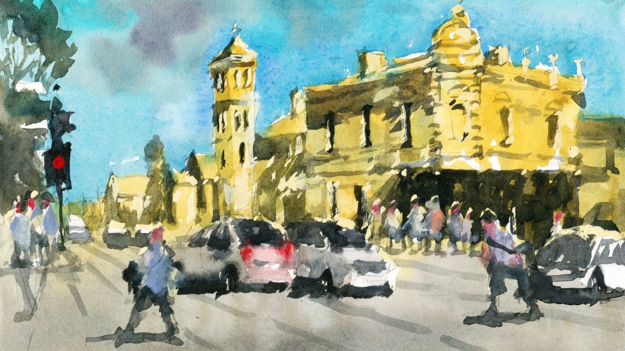
Transcripts
1. Introduction: Welcome to the vibrant world
of watercolor painting. Whether you're a beginner or an experienced artist looking
to enhance your skills, Mastering loose yet precise
watercolor techniques can be both thrilling
and challenging. So where should you start? What techniques
should you focus on? How should you bring
your creative vision to life on paper? Urban landscapes provide a
dynamic array of subjects from bustling streets and
towering buildings to hidden alleyways
and lively markets. In my course, expressive urban
landscapes in watercolor, you'll discover the
essential techniques and processes needed to transform any urban scene into a captivating and
expressive painting. With my guidance,
you'll learn to create masterpieces that not only capture the essence of the city, but also reflect your
unique artistic style. Throughout this course,
I'll guide you through my entire process
in real time from the initial drawing
and scene composition to the delicate layering
of light and shadows, and finally, the
intricate addition of details and highlights. Join me on this exciting journey into the world of watercolors. You'll learn how to create stunning urban
landscape paintings with confidence and precision. Whether you're an
experienced artist or a curious beginner, this class will equip you
with the tools and techniques needed to unlock your
full creative potential. I can't wait to get started, so let's unleash your
inner artist together.
2. Materials Required: So before we get started, I'm going to show
you the materials that I'm using for this course. So over the left hand side here, these are the bits of paper obviously that
I've been painting on, and I am using 100%
cotton watercolor paper. It's coal press as well, and coal press allows a bit
of texture on the surface, creates some of this
natural texture, and it allows you to basically just paint a bit more freely. And stops the paint from
pooling in a certain areas. I find that when
the paint dries, it dries a lot more evenly and compared to hot press paper
or a very smooth paper. So get yourself some
textured paper if you can. Cotton, 100% cotton. It's not a must,
but I think it's important if you want to
have a bit more time to paint because cotton
paper just takes a bit longer to dry
than cellulose paper. So that's what I'm using for
paper, what I recommend. But again, use what you have at home if you're not
able to get the stuff. In terms of brushes, I've
got a bunch of brushes here. These are the main
ones that I use for all of my paintings
and for this course. And this here is a number two mot brush
to small mot brush, and they have a large belly, which allows you
to absorb a lot of water without having to
reload your brush constantly. It's also got a
sharp point which allows you to cut
around objects. This is really
important so that you don't have to reload and you can still retain a bit of
control in cutting around some of these
shapes because you want to retain
some of the light, for example, these buildings. Now, in terms of other brushes, I've got these
three brushes here, these are round brushes, synthetic round brushes, and you don't need
to have all of them, if you just got a medium
size one like that, this is going to
allow you to get in little details and
paint in shadows for areas that are a bit
smaller and you don't want to risk going into
some of the light. Medium sized brush
like that is great. Even a larger one like
that you can make do with, got a three set from a
travel kit that I just use. In terms of colors, here is
my palette to the right. And for this particular course, all you're going to need are
just a few basic colors. Now, I've got some
yellow ochre here. Do you have other colors
like ronacrodone gold, which you can use if you
have, but you don't need. Yellow ochre, got
a piral orange. I've got an orange here
and another orange here. It's kind of like a more
granulating orange, less less, I guess, saturated, and over
here, a pyal red. So Probably pyro red, some type of permanent red even, and a yellow ocher is
going to be fantastic. D also have a bit of seran blue, and the seran blue is great
for getting in sky washes. This here is a bit
of ultramarine blue. Do use that from time to time. Some of these other colors here, I've got burnt sienna. I've got a bit of this round, this burnt umber here on
the side, a darker green. Okay. But a little
bit of orange is, I think useful to just paint in the rooftops for some
of these buildings. Tough if you don't have orange, you can always just
mix up your yellow and you're red and you
can get one anyway. Another little color
that I use from time to time is a
bit of white gash, and this just helps me to essentially get in some
highlights at the end. If you've got some
titanium white as well, that works quite well. Just use that straight with a little bit of water to
get in some highlights. Sometimes I mix it in
with some yellow to get some warmer lights. And there are a few other
convenience colors that I use, such as neutral tint and purple. The neutral tint is just
basically a pre mixed gray, which you can mix from all
your three primaries anyway, red, blue and yellow. But do have that just
because it's easier. Don't have to bix
it up. A bit of purple as well
from time to time. But like I said, as long as you've got your
three primary colors, you've got a yellow,
you got a red, got a blue, a dark
blue, especially, My be a brown, that will get you through this entire course.
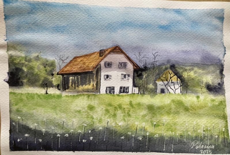
3. Country House: Drawing: All right, let's go ahead
and get started with the drawing and going
to leave a bit of space down below for this grass and we can see it runs
down a bit of a slope, but it's roughly
around the same height even from left to right, but I'm just going to put in just a basic line running
from left to right. This is where the house is
going to basically sit on. So, let's start drawing the house and I
think probably the most the easiest
way to do is just figure out whereabouts house actually is sitting on the page. Now, if you divide this
section of the page in half, you notice the right
hand side of the house, roughly sits right in
the center of the page. So let's draw it in. Now, the white bit is
basically a square. Basically a square.
But the rooftop, I might have to just
actually put in a quick little something
like this with the roof. You see it curve up, this run across to the right
hand side like that. Then it curves down
again to around here. Interestingly, there's
this structure here that I've not
really see before, but it's runs like this
structure like that. That's no biggie. Let's get in this left side of the roof and
you can see the structure, it runs underneath
as well there. I'm just going to
imply it like this. Y. There. Okay. And the top of the roof is
like this triangular shape. I'm just going to draw that in. This triangular shape here. I kind of flares out a
bit more, doesn't it? Like this lays out a
little bit more like that. Just changes angle that part
of the part of the roof. Okay. And so we can go back now and just work on the
back of the building. So it's just sort of comes
down here like that. There and just dips
off there, really? Um dip off in the back. And yeah, it's almost basically it for the main structure
of the building, but we still have to
get in some details, I suppose, for the rest of it. Let me just have a go at this. We've got two windows
lets put in two windows, two rectangular shapes
like this, right? On the edges, there are some shutters that's
put in the shutters. Simplified down, of course, and another set of windows
directly beneath here and here and another set of windows here or perhaps
entrances like that. Okay. Okay, and there's some kind of white structure
behind as well like that. Really, the whole left side
of that building is covered, mostly covered by this large
shrub here behind the fence. You can see there's
a white fence running all the way
towards the back. And you've got of course, some of this stuff here. It's a larger tree
here in the front, some more trees and things
out in the back as well. We've got another structure here at the front of the house. There's like in. It's like a rick
triangular roof like this. This one's a little
bit easier to draw. Only There is a smaller
sort of building like that. And there's some, you know, more trees and things
running around the front, well as this larger distant hills and
things out in the back. Okay. And we've got a large
shadow here in the front. We'll get that in afterwards. I think we should be pretty much ready to
go with the painting. I'm just going to lower that side of the house
down a bit more, and also put on
some indications of this these windows
on the side, Kate. Just also want to maybe raise this part of the
roof up slightly. That, Kate. A look. I think there's a little
structure here as well, chimney. Okay, let's go ahead and get
started with the painting.
4. Country House: Light: I think probably the
first thing I will do is work a bit on the roof of this building because that's going to be probably one of the first things I want to
dry, so a bit of brown. This is just a bit
of burnt sienna. But I'll double that
down with a touch of gray as well in there. Now, I do want this to be fairly light still because
the light source is coming from directly above. Though we'll be able to get in just a nice little wash of
this kind of brownish color. Okay. The roof top really light. Probably some yellow
would be good as well, some yellow ocher in there, a yellow ocher. Okay. Good, running along
the right hand side. And I'm just using a
mot brush for this. It's small enough to be able
to accomplish this Okay. Good. Okay, so that's going to be dry doing its thing, of course. While that's happening,
I'm going to start working on
everything else. So side of the building, I'm going to just use touch of this yellowish color
that I have already. Okay. Let's bring that down. And remember, this
is you have to preserve the whites
of that house, so I don't want to go
into that house at all. Drag that down like that. We'll get in the darks of the side of the
building later on, but just to add in a
little bit of color first to the side,
something like that. We'll do just fine. And time to put in some
different yellows. I've got some
yellow and a bit of basically a bit of seran blue mixed in with some yellow ocher. This is going to create a very, very dull down green. The trick is, you
know, you want to use a few different kind of greens. So not just not just the
same color the entire time. A bit of yellow
for this rooftop. I've forgotten about this
building before that. Okay, bit of darker green
they're running through. But I reckon a bit
of hans are yellow. It's going to brighten
some of this stuff up. Yeah, just give it a bit more
a little bit more contrast. We're just running
through the sides. And this is just
the initial kind of wash for these greens. So I'm not fussed at all
about the details or, you know, getting in any, like, big contrast at all. We're going to wait a
little bit later for that. But some different variants
of light green, I think. That's what you want
to aim for here. Okay. For the sky, I'm going to
just grab some seran blue. Work my way down from the top. And this is a very light
wash of cerulan blue. It's almost you know
it's 90% water. So just dragging this page
and might even want to add in some gray bit of gray to
this actually so that it's not too bright, cheerful, just a bit
of a bit of gray. Cutting around also the
house roof of the house. Into the trees, Into
the trees, it goes. Tiny bit of bluish color. Got some ultramarine blue. Just imply some of these
distant mountains. Ultramarine blue, drop
that straight in there. This can just be our
way of saying there are some distant mountains
and stuff back there. Oops too spread this
out a bit more. But et's keep digging
it a touch like this. Okay? Now, time to
bring this wash. Further down the page. Okay. So down here, I'm going to just start
mixing in some green. A little bit of lighter green. I just going to use more
water in this section. This And through
this mid section, you really want to keep it quite light because that's
what we're implying. We're implying the
light just running up through the center
of the scene there. And then and then down
the base down the bottom. We've got you know
more darkness. So it will slowly start to feather in
here, some darker green. Check this out.
Bit darker green, just at the edge of where
I finish painting off that lighter green,
feather that in a bit. Have some that just sort
of runs through, but it. The idea here is to just
increase the darkness, the concentration of paint
as you move down the page. All the way down,
you get to here. You can even mix in a bit of ultramarine that will
darken that even further. That way now you have a nice
little gradation effect. Okay. All in one A in one, go. Okay. Might not
be strong enough, so you just have to continue
playing around with this. Like, I'm putting in some more ultramarine blue
and a bit of brown in here just to really darken
that off in here as well. M. Leave this for now, we'll come back to it in just a moment. So further up in there as well, we want to just
imply some details. So little round brush. And here I am. I am just actually putting a bit of color
at the base of this tree. And really just
really quite dark. It's almost black. We're
just picking up a bit of black even just to drop
in here at the base. And you can see as you go up, it just becomes
lighter, you know, you just sort of picking
up bits and pieces of, you know, little bits and pieces of of color, but that's it. Drop that in. A lot of this
stuff is just wet into wet. Okay? Bottom of the trees
here, there are darker. We really want to preserve that darkness at the
bottom of the trees. But also preserve preserve
a lot of the light. That's betrayed
in there as well. Okay. Of course,
you've got the side of this house, which is darker. But I reckon we'll paint that
the rest of that later on. I'll leave that mostly for now. There is a bit of darker area here as well in the
background of the house. There there structure here, get a bit of detail in for that. But a lot of it is just just implying some darker
bits here and there. Now, the reference picture
has a whole bunch of these leaves and
things coming in. I'm not the biggest fan of this, but I do want to get in some verticals
running in later on. Okay. Maybe some verticals, running into the
right hand side, but let's see how we
go with this first. I'll just fill in this
touch of white here. You know, at this point,
you're really just facilitating where
the paint goes. You're not really
doing much at all. More darker colors at
the base of some of these trees You notice that there is a tree running up here like a
sharp sort of tree. I'll just imply that
with some darker paint. Yeah. This is quite
rare at this point because there's almost no
sharp edges in this scene. So little bits of this
is going to be great. Just imply something different, and some sharper edges, bit of black here as well, again, just to indicate
some darkness. I'm using black and green mixed together really
for some of these spots. Okay, I'm going to work
on some of the windows. Just start kind of putting in a touch of
detail for the windows. So I trying to do this as well with as few
brush strokes as possible. So those are the center part
of the windows, you know, the shutters on the side. That's. Okay. There in the front is
started to dry off. I'm going to pick up
some darker paints. So basically just a
bit of ultramarine. Drop that in here. To really just add in another layer of
darkness right on top. At the front, I want that dark. And let's give it a quick dry.
5. Country House: Shadows: Okay, so continuing to
work on the building now. And I'll need to do is just
put a light wash of gray running underneath sort
of around here and over the top of some
of these windows. Okay? So I've just
mixed up a bit of gray, and I'm going to go in and draw the line where it cuts off
about here comes down. That's about it like that. And let's just p that shadow in. Go. This should be enough paint just on your flat
brush to do that. Good. Okay. And same thing
for this one here as well, bit of shadow to the left
and underneath parts there. I'm going to mix some
ultramarine with a bit of brown to get really a nice juicy dark
color running to the left hand side
of this building. And what I want to do is just ensure that we have
ourselves of contrast here. Get in this sort of
indication the roof top, and also some of this
stuff here as well, the side of the building. Hank. And putting some leaves and stuff around here just to really draw out the
rooftop better. Hey, I want to darken the
roof top a little bit. It's not dark enough and
more brotle bit more brown. A And again, picking up some
darker color here, just to detail the edges a little bit of vertical, some verticals up here just to help frame the house better. Going to spray this
bottom area quickly. And what I will do the little pocket knife
to sort of scratch out some vertical lines. This. These can be like
the stems of some of these dandelions running through which will help to give
it a bit more depth and sort of softness as well. It's nice little
softness running through Some of these trees, you can also make
them lighter in parts by just scratching off
like this in the distance. Bit of wash. Going to drop this in here. You have a bit of titanium
white does the trick as well. Just at the tops of some of these stems and things
that you put in before. Because that area
is dried, still, you can see that it's nicely s a soft kind of effect happening. A quick dry. So final
finishing touches. You know, the house just
needs to be brought out more, and I'm going to mix some
brown with black neutral tint. I had to get a
really dark color. And I'm going to start working
on just some darker areas. So we can see, for example, let's start here
first, on the sides, there are some
darker spots here. To get some of these
windows and stuff in there. Underside of the roof here. That's darker. Yeah. Bit here. The. That. A lot of this has kind
of been lost out before, but we can bring some of
it back. You can see. A detailing on the
roof, as well. I just want to make
some line marks running across this way, Really just bringing
out this house a bit better side of
the there's work. You notice there's not really much contrast on the right too, so you can always do something
like add in a branch, some branches here or a tree. And really in the
reference photo. But can do that. Barker spots here. We picking out a few spots in the reference that
are looking darker, but I have not wished to
betray them that way yet. Again, a little bit more detailing for the
windows, just square them off. Sometimes just a little bit of sharpness added in
at the end really helps because we've got all this softness really
on the rest of the scene, so a bit of this can help. Add in another bit of
shrub or something here to the left left of the house. It Marks. Well, really at this stage. It's just tiding up
some bits and pieces.
6. Street Scene: Drawing: The first thing
you want to do is just get in a line
about a quarter of the way from the bottom of the page as I've
done here, okay? And this just gives us enough
room to put in the figures, bits and pieces in
the foreground. In the reference photo, this line is actually a little
bit further down the page, but I think it just looks
better with a bit more room. That way I can get in the legs of the figures rather than have, most of them cut off
down at the base. So Got that line in. Now what we want to do
is start working on some general shapes and on the right hand side,
you can see here, we've got an umbrella, these umbrellas are just like this triangular shape
as you can see there. Trying to just make this
as loose as possible, but at the same time, making
every kind of line count. All right. For the sake of this
scene, you know, I just don't want to spend too much time in
one particular area, but at the same time, you know, I think it's important to
have enough space for sure. So we go. A bit of the another
triangular shape, more triangular shapes here. Okay? As long as we've got a bunch of all these triangles
running down the back, we should be good to go. Over here, we've got a building, so I'm going to just pencil in the edge of that
building here, and Make sure that I've got that line straight through
some of these umbrellas, and we can see the building
just sort of disappear off the right end
side like that. Now we've got another edge
of a building sort of coming out there and downwards as well. You know, not a big deal. On the top of the buildings, we have a bunch of these bits and pieces there.
So we've got that one. We've got this one here. Well, k. Make it look like there's
some details on the rooftop. And we've got, of course, all these kind of windows.
We've got one here. There's actually three,
four, five, one, two, three, four, five windows. Coming down to the middle, you've got 12345 at the base, we have a few more one to three with some windows there
as well, four, five. Underneath is just all kinds of it's just really darkness. But we do have a
nice little lamp here that I want to
indicate later on. I'll draw this Mm. Almost a diamond like shape, isn't it? The lamp? There's something like
that, because we'll go in and get in more
details afterwards. I might actually add
in another umbrella little umbrella just
there behind that lamp. Okay. And, you know, you
see under the umbrella, it looks like
there's all kinds of restaurants and people
sitting inside. But there's so many
people walking around that it makes it quite tricky actually to
figure out what's going on. So, I'm just going to go put in some details
of these figures. You know, you've got this
lady here in the front. Going to make just get
that legs in a bit more. As you can see, I've just raised that horizon line a little bit so that I can actually put in these legs of these
figures better. Right? There. Okay? And it's almost if you
want to picture this scene as the camera looking
upwards a little bit. So from a lower vantage point, because normally
the heads would be directly on the horizon line? Yeah, more people
here walking around. Let's put in these buildings here in the middle of the scene. I've got one here, like the roof top
of one building. It's of this orangey color
like that comes directly down. Side of the building is just
a white color, you know, a bit of this side section of
the building there as well. And, you know, Got a couple of something
up the top there, a bit of the architectural
detail of the roof. Like that. Just something
up there like that. Okay. And underneath here, we've got another part
of this building to the left, this
tower, essentially. So I'm going to
just put that in. And let's continue just
working on this a little bit. I think I'll actually got this section in a bit awkwardly, but I want this to go up a bit more like that,
cut through it. Good. And here, I
like that orangy. But then we've got this
we've got this tower. And I'm going to
emphasize this a bit more than is
in the reference, but you can see it goes
directly up like that. And, you know, you've got some details on the top
of the tower as well. You know, there's actually
quite a lot going on. Three sections like that. And on the top, we've got, like a dome shape like this. All right. There we have it. It's top of a tower. And some bits and pieces up
the top there like that. The interesting thing as
well is that on this tower, we do have some side this side section here
that catches a bit of or cast a shadow because the lights coming in
from that right hand side. So I can just pencil in that
left hand side of the tower. Make the right hand
side of the tower, just jut out a little
bit more as well. Okay. Good. It's still the base
of the buildings just over this
side of the scene. I'm going to just
continue getting in some more details
of some figures. And again, simplifying
this down, I don't want to spend all day
drawing these figures in. But some of the ones down
in the front, you know, definitely does warrant
some additional detail. Apples up in there. I can just get those
legs in and scribble in a few details that
work the rest of it out later on when we are doing the actual painting.
Person back there. And here, this
person can be really kind of a bit more forward into the scene closer
by the scene like that. You know, you've got some more people out the
back and they become smaller as you go
into the distance, so you can just kind of imply people standing
out in the back, but you don't have to you don't have to really
add too much in there unless they're just directly in the front
like this figure here, you know, it's not
a big deal at all. You know, you've got a lady
that's kind of just walking here with this bucket
hat or something on. I'm going to put her in a
beaut extra detail here, that C of the legs out of the scene
because she's quite close to the front of this front of this scene. Just lower the head
of this person a little bit than
this one as well. Just have the heads a bit
too high up. You have it? Good. She's a bit shorter
than these other people. So that makes sense. Now you've got someone sort of walking
this direction, maybe. Another person there
standing around. You know, the smaller
figures I find just a lot easier to be here to put in. You don't have to put too
much detail on there. Wearing a hat, lady
wearing a hat here, just kind of hidden a
little bit hidden behind. But I'll actually make
her come out a bit more. They could be friends
or something. Yeah. They could be friends, just kind of walking along to the left hand side, like that. You know, this building has
some of these windows here, there's window here as well, a couple of windows
here, more windows. You know, I'm just trying to indicate these as
quick as possible. And, you know, below here. We've got some extra detail. We've got some of
this. Looks like some kind of door here window. Re more of a window because it doesn't extend all the
way down to the ground, but there is a window,
something there. You know, this What
shimmy call it, this uh tower has a kind of a left hand side to
it section there like that, and there's a bit of darkness underneath and there inside. You know, there's a
poster or something. And then, of course, you've got this door right at the base, which I'm going to
indicate like this. And actually, this
goes all the way down this, edge there? Circular. There, there
is a opening up the top. That darker in color. If you look closely, you just start to find
more and more details, but again, I I don't want
this to take too long. Hey, this probably would do with just slightly indicate the
right hand side, like that. Okay, and let's start working on the buildings
here to the left, there, sort of another building. Yeah. Running
downwards, one behind. There are some of these
shades and things. But before I get that in, I think I will just
put in a quick silhouette of these buildings, running down like this,
all the way down. And this is actually you need to put in some of the line work for the a
bunch of these buildings. And these shades, of
course, here as well, they go all the way out
and come down like this. And all we need to do is just Yeah, that's just these shades that you find on the front
of these restaurants, right? Quickly indicate them. You know, you got a
lamp here as well. Sides of these shops, you've got doors and
architectural details, even a couple of
windows up here. You know, it's all a
matter of you know, just putting in the
shapes of the windows, but not worrying too
much about the details. We'll work out the
details later on. Just some verticals like
that for some of the windows that you can see running down
the side of the buildings. That's going to be good
enough. There's also a lot of darkness underneath the
sides of these buildings. So there's not
really a whole lot yet, especially down here. There's going to be
this whole area is just going to be pretty
dark just due to the shade from these
bits and pieces hoops. Bits and pieces sort
of cast shadow cast. And, you know, you see
this building here, especially there in the back, and there's all just
darkness underneath. And I don't notice a lot of shadows
actually on the ground. And I think this is
something I want to emphasize a bit more
in my version of this, my version of this scene. I do want to add in some
more stuff going on in here, if possible. So Yeah. Shadow pattern, I'm
going to change that up, make the shadows more, yeah,
more interesting looking. I think I'll actually get the
shadows running a bit kind of more directly across
the page like this. So and also for the buildings, then we'll be able
to get in maybe like another shadow
coming in from the right. So, let's go ahead and get
started on the painting.
7. Street Scene: Light: Sized mop brush. And we're going to start
getting in some colors and for this building
here to the right, we're going to use some yellow
ocher and a bit of anum white to just dull off the
part of this building a touch, getting a bit of yellowy color. Okay. But apart from that, I'm really just
going to leave these other buildings almost white. Just draw out that maximum
amount of contrast. Bit of yellowish light there, but not too much go over the top of Good. And just bring this
down the page. And as you get into
these umbrellas, I'm going to stop for a second. Put in bit more. Yellow char. Just to
touch more yellow char. Because it needs a
little more contrast, especially against the
buildings in the background. This is going to help out? Reckon, what I'll do is it have tightened white
to this section. It is a kind of off white color. We want to maximize
that contrast as well. So be careful with this. Don't add too much yellows
and stuff in here. I'm just going to bring
this wash down the page. You have it. Top of the Yeah, these buildings are
really just kind of, like, an off slightly
off white color. On the left, I'm going
to start adding in a bit more of that yellowish
color again. And it's just e, again, yellow ocher mixed with
a bit of titanium white. R Okay. Fantastic. Into the grounds, we're going to put
in more of this sort of an white bit of yellow
ocher mixed in there. So I'll definitely a
slightly warm color, but, I'm keeping it
very very light. Bring out that maximum contrast
of the shadows later on. Bit of g cutting around
the figures as well. Where I can get in some color easier on their clothing
and stuff like that. Roof tops of the building, we are going to use orange. Current a bit of orange,
like this so that we indication of roof. I'm not really
concerned if it does mix in a touch into
the buildings as well. Just as long as we have some
of that color on the roof. I I like to get things to
mix together if possible. And let's have a look. Top of the scene,
I'm going to start putting in some blue. But before I do that, I'm going to just wet
some areas of the sky, with some normal water. Then I'm going to grab that cerulan blue and just
drop it in like this. Drop it in straight away. Now, this way, see, we have some of these kind
of cloud like effects. I'm going to start on
the right hand side first with this same mop brush. I'm going to cut around the roof top and some of
the details on the roof. Building didn't draw in, but leave a bit of white. The blue, because I'm
going quite dark, I'm using probably about
50% paint, 50 per of water. It's allowing me to sort of
get in a darker contrast, I guess, for what's going on. Up in the sky here
and the clouds. But just around the
sides of the buildings. You know, this just lets
me cle more contrast. Leave a little bit of white on the edge as well if you
think it's too much. But around this tower, I think we just got to be
a little more careful. Some more of this seran blue, see how I can do this
quickly, going around. Here we are. And you can dry it with hair dry in between, but I'm not fat. I just want to everything with that same wash. Okay, around the edges of
the dome, tower like this. Fantastic. This tissue paper is going to really come
in handy here and we're going to dab off a bit of
that paint that's gone onto the building and
downwards as well. Other than that, no big deal. We should be good.
Tidy this edge better. Sometimes you do find little bits that you can
sharpen up here and there. Good. And, yeah, you know, lifting off some clouds as well, just with the tissue
paper, some spots. Sell and blue dries fairly
quickly for some reasons, so I yeah you can do this, and it pretty much starts to
dry almo almost immediately. Hey. Fantastic. Let's start working
on the buildings now.
8. Street Scene: Shadows: All right, so let's go ahead and work on all of the shadows. Now, first shadow
that we are going to put in the building
these sort of buildings here to
the right hand side, and I will mix myself up
a bunch of paint here. I'm basically just going to
be using ultramarine blue. A color, ultramarine blue, mixed around with
a bit of brown. I've got different
types of browns here. This is burnt umber. I do also have this
other stuff here, which is round char. Well, a, just as
long as I've got a good quantity of this stuff. I want it to be more on the slightly cooler end.
Just testing that out. It's about 50% paint, 50% water. So this is using that
larger mot brush. Let's go ahead and get this part of the scene
in and remembering also. Oh, I've got this
secondary brush here. Ing. Use this detail to
detail a little bit more. Using the mot brush
the entire time, so just to get in that
little slither of light. Parts. Actually, the mot brush
is more than Okay. This Good. Let's move this
wash down the page. Well, a bit of brown in here, as well, just a
bit of dark here. Side a little bit of that
building connected on. Now, here's the interesting
part because we have got. We have got all these umbrellas. We do need to cut around some
of them, not all of them. So cut around this one here. There may be these two I
can get a shadow on them. I want leave a bit maybe like
a slither of light edge, some this in there, which I will leave
partially unpainted. Okay. Great. And, you know, I need to mix up some more of
this paint and b d as well. Yeah. Ultramarine
and brown dark brown of any sort is great. Sticks co value. And depending on how
much brown you mix in, if you want a warmer brown, just mix in a warmer gray, just mix in more brown. You want more coolness,
mix in more blue. And the underneath, I'm
starting to just paint in bits under sides,
I guess here. What's here and here as well. Some of this stuff,
not a big deal, but it is a bit
darker in some areas. But do you want to
leave that background that might showing through back? As you can see, I can just cut
around, for the most part, all the other figures
and bits here. Alright. Right. Right? And this is sort of
where you can on figures as He's dark
at the same time. Though I know here's a leg. That can be one leg. Leg of this figure
here in the back, be in there walking in front of the scene. There could be some more figures or something out the
back here as well, so I'll just indicate for the
legs there at person again. Front. And I really am just
simplifying down these colors. Could add in a lot of
different colors for the legs, but I'm not
going to do that. Just just lighten
that gray mix a bit. Now, these figures
are really standing around in full pleat light. Makes sense to
just have a bit of a lighter value. Some of them. We can add in a bit of color for the legs for the shirts and things afterwards. Figure there. Few brush strokes, you
know, you can even put in, like a bag or something
that could be hanging onto a bag that. You know? And joining on all these shapes, joining on all the legs of the figures secret of
it just making sure that the connect up and little brush strokes. I don't need to spend
all day working on them. Now, do have a need to
put in some shadows. And do think bring in some
shadows running across them. Shadows running
background this one with this one. The legs. Yeah. Yeah. Cher. That one there,
those two figures. These ones in the
background bother with because they
off in the distance. But as you can see,
because I've left a lot of this ground, you know, pretty much white, with a touch of touch of
yellow in there, it really it really sticks out. The shadows coming
off from the legs. Here's another figure there and that shadow connecting up. These two figures here just sort of walking in the
foreground, perhaps. See too much,
something like that. No. Of course, there is a
little bit of darkness. Please. Just dark enough nena. Much, but just some
spots here and there hopefully bring
out the detail. Contrast and people
walking around. You know, this could be like a shadow that's hit the side of this building there,
ad to portray. And of making up the shadow. I think carrying some kind of shape running
across the back end of the scene. It's
really difficult. You can't quite
see that shadow of this building here
right hand side. It's very difficult
to see what doing. But you know extra darkness
in certainly help. Maybe a a larger shadow coming through the front
of the scene as well. Put in at the front something external shape or what running in from left hand right
hand side of the scene. Se down through the
bottom, the pieces O. I have no. Good. Now, on this left hand side, I want to start working a bit there and also through
the center of the scene. Going to be mixing
up the same color ultramarine blue and a
bit of darker brown. And let's work our
way through this, so there are some little
bit of darkness there. And really just kind
of a lot of browny here and a bit of
that blue steel to. And this comes in just directly behind
these figures here. So it might actually help to bring out the contrast on some of these figures
to particularly. Yeah. Here as well for this figure. You'll notice there's actually
a darkness underneath this part scene or the
bits of shades there. It do need to be a
little bit darker. Just going to pick up a bit of yellow and gray
mix that together. And combine this just so that it looks like these shades
are a bit darker. Met. Some more shadows in the back. And also, I'll really
go quite some spots. For example, this
top section there, that's got a lot of darks in there, that
needs to be dark. This do, this archway here
needs to be d as well. So let's just put
in almost 100%, 80 to 100% paint through there. Okay. Dark color. Maximum contrast. What else do we have this
window here as well. Does have a lot of
darkness in it. When you look up even at these
sort of bits and pieces, they do have a lot of
darkness in there as well. Mix some purple in it. You know, subdued, more subdued. There's a couple of windows, the top of the building. You've got some of
the bits and pieces here side of the building that I've got a little rigger
brush, and this rigger brush, I think I'll just use to indicate some
extra little details. For this collection, you'll see there are
some kind of lines connecting the connecting
these shades to the building. Also, you know, for this lamp like that. Holding that brush
right at the end. And using that as an opportunity to put in
these funny little details. Here and there there
keeping it hopefully to just one brush stroke per each. More darker browns in
here. Have a look. What else do we have? You know, the
windows, for example, you know, and
especially this bit here have got to
get this one in, but there's a Met
this one in quickly. Good. Draft. The brush a bit, and
what you can do is just indicate some of the
details on the buildings. So like these it's here, there. Kind of architectural details, I guess that don't want
to over exaggerate, but we want them to
show through in areas. You know, these windows, want to in a few little
details there for some of these windows frame here that
we were painting in before. Another thing I've
forgotten, actually, is just that the fact that
this building has actually this tower has a bit of a
dark side there on the left. I'm going to pick
up a bit of gray, go in there with the
round brush, do this. That. And it kind of carries
on downwards, actually. A bit. Up a bit. Hey, good. Outlining some little
architectural details, and this can also be
a way of indicating the shadows underneath the roof. P of roof there. Things like that.
Pit a shadow there. Yeah. The dome. And a bit. Left. Alright, I'm going
to start putting in some colors and stuff
for the figures. This figure here I might put in some blue ultramarine,
but serian blue. This will mix in kind of
to the legs hopefully. Do the same with
all kinds of di. You know, this one,
I could make it sort of orangey color example, make this one more of
like a gray color. Some of them, you just want to probably leave them leave them the same color to help bring out more
contrasts in the scenes. So, for example, you
might have this one here wearing dark next Ha. Ha. Even this one here looks great kind of with I went off. Details with the pulling onto a bag or something. Details. St, here. Darker values here for the
windows of this building. I'm just going to
drop this in with a bit of neutral tint. This is going to just
sink in nicely to this aection, and Oh. That little bit of darkness. That some dark spots. We'll just indicate that's it. Overdo it. I think here for these
two, because Yeah. And adding in another
figure there behind or of something darker
back there as well. And just fixing up
this one a bit, I think we just lost some detail in the s. Well, Drop in some Hair for some
of them, if you like. I'm just going to use some
darker color most part. I'm not gonna bothers H. Sometimes you might want to go in and just sharpen up some of the details like on
the legs I'm doing here, really finishing touches
just at the end. I dry off. Small round brush, and I'm going to
pick up just some of that titanium white. Make white color. And we can do things now. So little high lights. Top of this there, for
instance, shoulder. Tiny bits pieces that might have missed bring back a touch
of lights in areas. That making this more sort
of on the right hand side. Try not to overdo it as well, just a light touch
normally enough. D. Final touch of black. Rings out the Oh. This guy I could be
wearing like a suit Often, I find it pays off in a little bit. They sharpened up. Some of these figures brings back a bit
of detail bit of structure tricky
to imply before. Tables and things
running through here that I didn't
really buy before. Kate, some stuff like under bb. Additional little details
Windows as we go darker. Some of them out more do. Bag. Bag. Might actually cry
shadow through this sort of background shadow
building carry that through. And last minute thing, could be of a building back or something like
that, a shadow. Across the building like that. This feel helps to join right
hand side, seen better. Really the rest of
it fiddling around with some of the darks here
now in the background. Yes, looks like we are finished.
9. Dubrovnik: Drawing: Okay, time for the drawing, and I'm going to draw a line roughly halfway
down the scene. Now, this is interesting
because at the halfway point, right in the center as
well is about where we see that little tower
off in the distance. This is probably the
easiest part to mark just really the center of the page. And I reckon from here, what we can do is get in
a very quick indication of the little walkway
or the road, I suppose. It's a walkway, running all the way down to the
front of the scene, going quite light,
really quite light, right to the center of the page and noting roughly
where it finishes off, this part here just
so that we can get in an indication of the
building later on as well. On the right hand side, here, I'm going to draw a line that pretty much
goes straight down. If we look at the
building to the right, that line that se this little area that separates
the building and the path is almost
It's almost parallel. I mean, it probably goes
to the left a touch. Almost completely straight. So something like that, right, that doesn't have
to be 100% perfect. Okay? Everything
else around there. You've got this tower off
in the distance like that, I'm just going to
quickly scratch in a few details next to it, I don't even know
exactly what that is, but there is some type
of building and you've got a bit of light
reflected off, same here on the right
hand side as well, a little bit of
light reflected off. And this is subject
to a bit of change. If you hold the pencil
right at the end, you're going to find
that it's a lot easier to change things around
as time goes by. I'm going to start working on this building here to
the right hand side. And if we look at really the bottom of the
building there at the back, that tower, and the
bottom of the page here, that halfway point,
roughly the halfway point is where the roof of
this building starts. The one closest to us anyway. I'm going to use that as a
little guiding line like this. There are some structures
on the roof that I just want to probably
simplify down, so I'll go like this, and then you've got another bit
that runs up like that. That can just be the top of that roof, running across here. Then we've got a bit that
runs down like this, and we've got another
building here to the right. Into the right hand
side like this. I've got to curly
quite a lot of space. Probably should have extended
this building out of touch. That's no big deal. I think I'll just go with it. That's a side of one
of the buildings. This is the other side there
on the right hand side. Prob there will be a little
bit of shade in there. On top of these
buildings as well, you do have some
little structures, like for example, here, there is a little a bit of a bit of this I guess it's an attic
or something like that. There, and this is going to cast a little
shadow to the left. You've got another
structure here that doesn't need to
really be defined. I'm just going to shade
it in a little bit. Like that's just like a chimney, I suppose there, little chimney. And on top of the roof, this is where we got to
be a bit more careful. I'm putting in a square shape. And this is part of this
other chimney structure. Again, it's dark,
and the light at, as we can see runs down
finishes about here. It's just a bit of a little
bit of shading so that I'm not left completely blind
later on down the track. Okay. Okay. So that's the side
of the building, and we do have a couple
more here as well. So let's just space
these out enough. So I've got one you
think about it. They're just these almost these tiny little rooftops again for for this little attic or something like
that back there. Of course, that's the side, and you've got that
same shadow pattern, and you're trying to just copy that same shadow pattern so that it runs in the same
direction as that one. Shadows have to run in
the same direction. Otherwise, it just doesn't make sense where the light
source comes from, you have to make it consistent. Underneath, it's
all pretty dark. We've got another one
over here as well. I pay more attention
when we've got stuff here in the foreground
because I do find that Because it's larger, everything
down the front is larger, it's going to just
take up more room. Therefore, if you
make any mistakes or if you make it too loose, it tends to just be
it just tends to be a bit more noticeable than if you have something
down the back. For instance, we've got these kind of roof
structures done, and I'm just going to outline some of this
stuff a little bit more. One so that you're able to see, can be a little bit tricky to portray this stuff on camera, but also for my own
benefit later on, because I want to
make sure that this is a lot more detailed. Good. Let's have a look
at what else we can do. Okay. There is a chimney
like structure here as well. Again, it's very
difficult to see exactly what is going on. So all I know is that
there's just a kind of rectangular
structure like this. Just a little
rectangular structure, and there it is. Chimney. Who knows what it is. On the right hand side, we've got a few more
little structures as well. So this one, it's two little it's on the roof. W is there like a window, this bit here connecting it. But a lot of light
just hit in the top, and then you've got that shadow just running
down the front like this. There. We've got another one here just a little
bit further up. Let's draw this one in. I'd like to take my time with this stuff here in the front, especially if you're working
a bit larger as well, you'll find that
it really does pay off shortcut some of this stuff, but you can make it looser as long as you've got
in the general shapes. When I'm drawing these
things in, especially, I'm looking at just the shapes, is a triangle, a triangular
shape here. Let see that. Just a triangular shape. So you've got the square
and here, the window. You know, there's little
patterns that you can spot. Sometimes, what I'll do is
that I'll just put a.in some sections say of
the roof like here. Outline some parts a
bit more, and this way. This way, once we go in
with the water colors, it's not just going to
completely disappear. You're going to have some
details showing through and look a bit more
interesting my opinion. Especially with this
stuff down the front. It's okay if you want
to to detail much more. We got what else
do we have here? There is some kind of structure on top of
this building here. I don't know what this is.
I'm just going to make it up. Just square a box or
something like that there. K? Maybe I'll make up another one of
these bits like that. Oh. Good. We've got a few things going on. We're gonna cast a bit of
a shadow there as well. We've got some windows here, so, you know, this is where
I just go quite loose. You know, I know we've
got to put three windows on top and three
windows down below. So let's just look at that. I'm just penciling in rough
details of these windows. This one is more like
a rectangular shape, same with this one here. This one's got some shutters
coming out like that, so let's imply some
of them shutters. This one here has got
also some shutters. I'm going to get in a
couple of those like that. Probably should have spaced this a little bit closer,
but it doesn't matter. I'll just bring in the
side of this building a touch and bring this
one out a little bit. Maybe put in a little
shutter there as well. Help balance this out a bit. I just don't want to make
the space between here and here and here and
here too different. No. There's all kinds
of things you can do. You can spend more time just drawing in the frames
of the windows as well. L what I'm doing here. It's not 100% necessary, but certainly does help. Yeah, it really does help to make the scene look
more interesting. Right? All right. Now, here's this other
building here to the right, they go to square there,
another square there. Another rectangle
here, rectangle here that I'm going to spend too much time doing
this, another square here. You know, looking
at them as shapes, don't worry too
much about whether they look like windows or not. And because I just, you know, sort of made this building a bit longer
than I should have, I put in another row here on
the right hand side as well. Even this out of touch. Right. So that side, these buildings closer by done. Now, as we move up
into the distance, you'll notice is another row of buildings here in the back. We just need to
imply some of them, but as we go back, it becomes you have less
and less work to do. This one here is just the
roof, moving that across. The roof of a building
there in the back. And I'm just going to extend
this all the way because it actually goes all
the way here and then comes down like this. In fact, there's a couple of smaller chimneys or something
like that here, you know? There's That chimney there
even comes up a little bit. That's another building. We have off in the distance and look
at them just as shapes. Don't worry too much about
all the little details. Here is another shape. This
is another trapezoid shape, which just represents a roof, and underneath,
we have darkness. That's super important to indicate a bit of darkness
there because again, that's going to
make it look like the light is coming through. Okay. I don't know what
this thing is here, but, you know, I
might get rid of it. Thinking, I don't
really like that. I'm just going to put
in another one here. Okay? I have to draw something in
there to break these two up, but it could be ricky, Tricky. Let's just draw this
one in first. Okay? So another roof top of the house or something
like that there. You know, you got
another pick up some shapes as a triangular
shape like this there. Right? That shape there, sort of
indicating the side of it. That. And all along streets, you kind of got these
some bits coming up that similar to this structure here goes up into the roof. So they just repeat
along all along. And because of the
angle of this scene, you can't really see Yeah, you can't really see the
sides of the buildings. You can only see
the front of them, a bit of the side there, but that's about it. So for the most part,
just, you know, little indications, some
rectangular shapes like this. These little rectangular
shapes that I'm drawing in. That's all you
need. Don't worry. But as you get to the back,
make sure you draw them in a lot smaller as well. Okay? And you know, vary
their position bit. Some more triangle, another triangular
like shape back there. It all becomes quite difficult
to see what's going on. And that's what you want
to imply back here. Not too much detail, just enough just enough to get a gist of
what's happening. And that's it. Okay. That's it. Some
chimneys and stuff as well. Okay, here's the thing I didn't really want
to put in there, but let's just simplify
this, perhaps. I don't even know what
this is. It's like some looks like a kind of rooftop thing actually
now that I look at it. They a Draw this
thing in like this. That's like the side of
it. It's almost like a little balcony or
something. There. And then this center part underneath is kind
of all in darkness. I mean, it's just a
simplified version of it. Is this a chimney or something? I'm not sure. It could be. Is a chimney here on
top of this building, and, you know, just a
three D out that bit. This Okay. And one thing I really like about this scene
is that there is a nice little kind of dome
like structure out the back, and I want to want
to get that in. So let's put in another little row here at
the back of these building. Another rectangular, long rectangular shape
like that, okay? In fact, there's a
little dome structure here. So let's put that in. And the reason I like these
little dome structures is because well, one, it's there in the
reference picture, but also it changes
things up a bit, makes your scene look a bit more interesting
rather than having the same old rectangle triangle, rectangle, triangle
kind of thing. You've got a nice
little dome there for some other building,
some other structure. And it just blends in
with everything else. The triangular structure here, I think, you know, In essence, all I'm doing is just drawing
triangles and rectangles, you know, blending
them into each other. Okay, here comes this now. I go to need to just put a bit
more effort into this one. Roughly, it's going to be
There is like a dome here, so I want to make sure the dome is a little bit higher up. That's the dome. And look, don't
worry if it's not. Don't worry if it's
not. You know, you can even make this one up, just change change the
size a little bit, only because I think to myself, well, I do like that
dome structure. Why not make it, you
know, more obvious. Why not make it more obvious. Another building behind it. This is all almost like a
silhouette in the background. It's very hard to see what
is going on back there. But, you know, these domes
do have a smaller base here, you know, more rectangles,
and who knows what? There's a house, another sort of larger shape there
in the background, more side with kind of
structures like that buildings. Okay. A lot of this is going
to be a way for me to just get in some
darks running through some sections like under
here in here in here, for example, in here as
well underneath this one, implying that sense of light. Most of these rooftops are
going to be pretty dark, and the lights alas is coming in from the top right hand side. So you're going to
see most shadows guess moving a bit towards
that left hand side. Okay? Right. Good. So we've got that
right hand side down packed, mostly down packed, I suppose. You can start putting
in over here, you know, there might be some smaller buildings
and stuff like that. You know, you can put
them in if you want to. At this point, I think
there's enough detail in there for me to get going. This tower, a little
indication of the tower, the base of the tower. You know, again, cause I did put the the drawing in
quite light before. Okay, there's a bit of
darkness around the tower. I mean, tally, there's a
lot of darkness back there. You know, even the entire tower really is under some shade. K. Okay, now let's work on
the left hand side buildings. And it's going to
be a little tricky. So this larger building,
what we want to do, what we want to do is make sure that we leave enough space for some of these
buildings out the back. So I think the way
I'm going to do this is look roughly
between here and here. I'm going to divide it halfway. Okay, so let's say roughly
there, roughly there, which is about where
this building, the first building here ends, roughly about maybe here. And I'm going to draw a line of vertical line going upwards. This can be the mark
of where the tower is. Where the tower is, the tower
is going all the way up. Draw that in in just a moment. But the side of the building, lot larger than we think it is. But to top of that part
of the building there. Aligns with the tip of that
tower in the distance. You're always trying
to find patterns? Once you put that
horizon line in, you're just trying
to find patterns as to different things
that you're drawing in, different shapes
that you're drawing in, how it's aligning. Now I do have to leave enough space there at the
bottom as well. Now it's aligning with
everything else in the scene. So I kind of have that on
a bit of a funny angle. Let me do that a touch. It should be more
straight like this. Okay. And let's draw a line
running around to here. It actually, it
doesn't really much of a angle to it. A like this. All right. And it exits out
side of the scene here. That. These two lines
should be parallel. And then we've got a top
part coming in like this. The roof. Connect this
up. Here we have it. Put the roof in. This part of the roof is actually quite
got a few things going on, but let's pencil this part
of that roof in that. I actually get smaller. Always have to
remember when you're traing things going
into the distance, the lines do converge and they converge to
a smaller point, th. So the lines become
thinner, close together. Was out up here, you can really see everything
that's happening. Okay. So a vertical line just running downwards like this,
So there we have it. We've got the side
of this building. Now this is going to
be all in darkness, but there is some
structures here. We've got a building here. I don't want to overdo this, but there is a building
here with some of these interesting
structures like this. So I can go ahead and
draw some of these in. That simplified down. Of course, this part is going
to be in shadow. We'll work on that a bit later. The building here is
divided into not half, but close to half. I'm interested to
draw a line running across just above
the halfway point all the way to the end
of the building here. Sort of indicating
the two floors, and then we can then use
this to put in the windows. One, two. How how
many are there? Three, four, five, or and five. That five little
windows, and, you know, again, with the frames, you can just sort of play
around with those a little. There is a doorway here as well, just where the building
hits the ground, so tiny, something
like that can help. All right. That building is more
or less finished. So let's work on the tower now, this tower, put in sort
of the side of it here. You know, it's actually pretty it's all the way up so you got, one, two, three bits. And then up the top, you have
a sort of section up there, third section, and
then then the dome. So we'll put in the dome. That bit of the detail
of the top of the dome. You've got a window there. You've got another window,
another window here. You know, you've
got this is where the first part of the
part of the tower starts, you know, just
underneath the dome, I mean, here the side. Let's get that in one. Go. I'm just trying to
be pretty careful with this art because this tower is just really such a central
part of the scene. Take your time with
your drawing and make sure that
you've got some of these features in
the right places. These are a couple
of windows there. There's another couple of structures window
structures here as well. But most importantly,
the right hand side, you'll find that this is where
the light comes through. I just need to make sure
that that's nice and Trade ply. This one I just not
long enough there, and then I'm going to bring
this down one more here, and this is going to be
the Otton part there. What I'll have to do is maybe bring this one up a
touch just to make it. There we go. That looks better. W I also change
just the angle of this line so that it comes in at a bit more
of a higher angle, but then comes
downwards like this. Yep. Better. And let's finish this off, make sure touches the building. Good. Okay. Fantastic. So
we've got that tower in now. I sort of just comes and
peeks behind this building, a touch like this as well. So to see the it sort
of behind there. Now, we've got room for
all the other structures, buildings and stuff
like that as well. And let's put this in in a very, very sore line running from here all the way
to that building. No left a heap of space, but this should be enough
to imply bits and pieces. So that's the rectangular
building here, these rectangle
rectangular buildings, just kind of getting smaller and smaller as you go
into the distance. But the best thing about this is that you really
want to make sure you put in these little shades
that run across like this. Okay. Look, these little shades that sort of cast
a shadow there. I mean, that's pretty much all you need to do
just a few of these, making sure they're in the same, running in the same
sort of direction, they get smaller as we
go into the distance. Amost to the point
where you just can't barely see them at all. Okay. Good. Now, there is actual
some type of window here, window, but, like, a
door here as well. I'm going to put some
indication there. That was too loose. Something
here to just indicate? Good. We've got all people and figures that kind of thing just walking
around as well. So you know, I'm going to put
in a few of these figures and make them fairly small have a couple of them
just paired up like this, you know, change the direction some of
them are walking to. But the most important thing is when you get up into
the distance here, you just want to make
them look really like a lot smaller than the
ones in the background. So just as soon as
you get up the back, they become a lot smaller, almost like I just put the torsoes in and
indication of a head. But some of these ones
here in the foreground, you can detail a little more. Right? A bird's eye view, and with some down here off
in the front as well. Okay. Good. The rooftops of these buildings need to
be indicated as well. So I'm again, just
simplifying this down. And we've got all kinds
of structures back here. We got rectangles, we've
got triangles, you know, but we just got to connect these kind of onto the
rooftops like this. Get small. So of
the rooftops get s. That more triangular
shapes that are teslating, overlapping, you know, whatever they are is not huge deal. As long as you got
indication of some of them is a rectangular
shape there. I'm going to merge this on with some type of
triangular shape like that and the side of an
imaginary building there. You know, it's all just
triangles, rectangles. Okay. Indications of that stuff. In the distance, you'll notice that there are also some
houses and that just, you know, all the
way in the distance. So It's up to you how much detail you
want to put into these. I think for me,
I'm just going to put in some of the rooftops and use that as an indication
of these houses and stuff. But really, besides that, I'm not going to bother with all the tiny little
details back there. I just want to I just want there to be an indication
of something going on like a building or some buildings and
houses out out on the top. They're just little boxes that
I'm drawing on like that. Little boxes, you
know, You don't want these to be too detailed
as well because this is going to be yeah, all the way in the distance. You know, there's even some
bits and pieces up here. Well, very tricky to draw in. But I'm just putting in these longer
rectangular shapes to indicate perhaps
some rooftops and stuff of people living
off in the distance, now, I'm going to put
in this line here for the the mountains and stuff
out the back, coming down. And another actual
part of a mountain. Well, k. So that's it. We should be ready
for the painting.
10. Dubrovnik: Light: Okay, so for the
first step here, I just want to get
in a very light wash of the lean blue for the sky. And I'll mix this up here. It's just really about 5% paint and the rest of it, water. I want this to be
really, really light. Okay. So starting straight
from the top, let's do this. And usually, actually,
I make the top a little a little bit darker. But I want to keep
this really light. And often often people think that it feels way
too light, you know, but you have to always remember that once we have
all the shadows, once we have all the dark
bits and pieces in here, it becomes really makes those
shadows pop out better. So, some of it goes into the mountains
there in the back it's f. Just want to get in
a nice flat color. Roughly the same color. I mean, Some people like to put in clouds and stuff
like that as well. I might do, actually, just thinking about this. Yeah, why not? Let's add in Why not add in some
clouds while we're here. But for this next section, I'll just leave that a
little bit wet on the edges, so I can blend some
of this downwards. But let's have a look. For clouds, I think what I'll
do is just pick up a bit of a bit of brown
and a bit of purple. Mix these up together. Purple them. With a
little bit of sin. And you want this to
be kind of thicker, about 50% paint, 50% water. And what we can do
is just drop in a few little
impressions like this. Very, very soft impressions
of some clouds. And like that. We get down, move
downwards as well. Remember the clouds get smaller. 't really intending to do any
clouds. But you know what? I think it's a good
little practice, and also makes that sky look
a bit more interesting. You don't have to do this.
You can just leave it. Before. That's it. I'm not going to touch that
to let that do its own thing. Now moving down to the next
stage of the painting, I'm going to mix
up bit of green. Now, this is a color
called undersea green. You just need really
a darker green and a dull green as well. You can mix in a little bit
of red into the green in order to just dull it down. Because if you mix
complementaries together, they just get a
little bit more dull. I do have some other
greens in here as well. It doesn't matter
what, but just have some type of green
running through here. And actually, what what
I'll do as well is, since we are already
in this area. I am going to I'm going to just quickly
put on a bit of golden color acridone gold. All these houses
out in the back, the roof tops of some
of these houses anyway. A little bit of that gold there. Really enough to indicate some of these houses and stuff the roof tops there
in the distance. Now, chances are I'll probably have to redo that
afterwards anyway. That go through, you know, Just get in a quick little
indication of this. Now, remember also that the mountains that
we're putting in now, they're not going to be
this isn't the end of it. We're going to put
in some more color afterwards to darken them down. This is just a quick base wash. It does look a bit darker, but it still I'd consider this still one of the lighter
areas of the scene right now, cutting around some
of these houses. Notice how I let the brush skip over parts of
the paper as well so that I get a bit of
light coming through, bit of the white
coming through, I mean So that just means that I
don't have to, you know, imply a whole lot of detail there because it
looks like there is some detail just by skipping
over some parts like that. Okay. Moving over to the
right hand side, let's mix up some bit of this green. It's
a really dull green. There's not much do it really, cutting around some of the
bits of white and whatever. And really have to be careful, make sure that this don't go into the side of
this building too much or at all really because that's where the
lights going to bounce off. So the tip of the brush, tip of this nice little Mott
brush is just a miracle in my just makes things so much easier 'cause you have to keep reloading the
colors onto your brush. Cutting around these domes and things cause
they're going to be there's going to be a bit
of a bit of color in there, a bit of warmth in there, so cutting around bits
of that warmth. I'll probably go in
another time later on or maybe not, we'll see. And of course, there's
a building here to the right. No
building, sorry. There's a bit of blue mountainous region
there I will imply, as well. In fact, a lot of this area
is sort of bluish in color. That's what happens when you have objects that sort of recede back or features
that recede back, you get this kind of bluish
like effect in areas. So I'm going to just, you know, drop in some of that stuff. A huge deal. Something like that. We've
got sometimes too much. Ain't I move, move it
around a bit more. But some of it needs to be maybe in here as well,
have it come on. This is just going to make things look a bit
more interesting. Not just that same old green
run through everything. It's interesting
bluish color as well. This will fade in and dissolve. No to worry. Now, moving
on to the next step, we will now start placing
some of the warm colors. And because this tower is still quite close
to this green area, hasn't dried yet, I think I'll actually start here
on this rooftop. Okay? And acrid gold, I'm going to use But I will dull that cincodon gold down with a little
bit of purple. Now, why am I using purple
again because it is a complimentary
color to the yellow? If you want to dull down yellow, you don't want it too gaudy
and bright and go for that. I'm just testing that
out. That looks okay. Still want it to be light, but I don't want it to
be too saturated with unnecessary color. Just
something like this. And notice how I've let some of that green blend in as well,
but it doesn't matter. A lot of this stuff at the
end of the day should, in this first wash should
blend with each other, except for maybe the
areas of high contrast, of the really bright areas, light areas, perhaps, you
want to just be careful. Okay, so running down the
side of the building, all this stuff.
Yeah, blanket it. Blanket it with
some of this color. Acridone gold. Here, the side of this building is kind
of a more sandy color. I'm going to mix
up some bitanium white with a bit of acridone gold and
just go for it here. This is really more
of this white. Let's blend this all together. Blend this all together.
Bit of this white. We'll make it the touch opaque, but that's not a problem. Down. As we get into the ground, I'm just going to
carry the same wash through and I'm
going to add water. Make it more diluted out. Remember to leave
these little shades there in the back buildings because they're
completely white. The rooftops here
as well because they have a bit of an
orange tint to them. Yeah, but everything else, I can just go through the
sides of the buildings, especially just put in the same yellowish color
back there as well. We have it. But yeah, remember
the rooftops want to apply some of that
orange in there. All right. Look, this yellow sides
of the buildings in here. There there this building
here at the bottom as well, a little bit of yellow. And we'll add maybe a
bit of red in there. Well, just warm it up. Reddish yellow. Change it up a bit sometimes. Don't use the same color. That does actually look
a tiny bit more red, warm down the bottom. These buildings,
for some reason, so good up a bit. Good. Okay. So moving along
now into the buildings. What I will start doing is
picking up some orange. Orange couple of really, really decorated orange colors, and there's really no
way around it here. Got to go in there and
see what it looks like. This is just pure orange, really croon nacrodone
orange color. Just checking that
to the reference. Do with a bit of
yellow in there. I don't want it to
be too saturated, but see how we go. Here really, at this point, just can paint this
almost this entire thing in same color orangy
sort of color. I don't want too much
of it to mix down yet. I'm just leaving a bit of rooms. Here where the road
is or the walkway is. Difficult to just
in yellow ocher. Yellow ocher is difficult
to see bit of yellow ocher behind for this roof top there. It's actually lighter,
not light move back, so I'm just going to
lighten this wash up. Some of this stuff
starts to run into the page mias that
you don't want it to. Pick up a tissue
and just dab onto it sections like
that, if you'd like. Really, it's not a deal. Just let it do its
thing most of the time. Just to fill in
some of these gaps. I have to fill them all in. It's really directing the
water colors where to go. Yeah. I mean, with a lot of these buildings here
in the back as well, remember to make them
a little lighter. So as I go back, see, I'm just putting more
water into that mix. That's how you imply that
sense of depth, more water. Yet, as I keep moving back
to here, look at that. It starts to really
look it's receding, bits and pieces there. Even on this building, do with a bit of yellow.
Ch of yellow there. The rooftops, again, let's grab that orange value out and
let's drop that in here. Good. See how it just blends in.
Nicely, that's what you want. You don't want
everything to just be separate from each other. I'm too happy with
this lifted out bit. I'm trying to just fix it a bit by shifting some of
the paint back onto the roof can still make these minor adjustments while
the paint is still wet. Stick. We also just darken
some of these rooftops. Just to try to imply
that it is closer. Now, everything out the back, same deal here light values Yes. Hy. Of course, you've
got little bits of white and stuff
coming through. That's not a big deal.
Just leave some of that. Okay. Last thing I'm going to do is just go
into that tower because it's the last thing I
wanted to make sure that this area was dry
before I went into it. I'm going to pick up nace gold and a really concentrated
nacide gold, and I want to just
touch on here that. Get this indication of
light onto the side of the building. Like this. Most like a glowing
color, glowing yellow. And to achieve
that, you're really just using a lot of water in there and a touch of
that nacodone gold, okay? So moving on to the left side, I'm going to start
putting in some of other yellow ish color. Whatever you have, really, this is just some yellow ocher. Okay. That all the
way up to the top. Leave some little white
high light up there. I can always bring it
back afterwards with some guash, but That good. So, that's it. Let's leave this a dry and
we'll come back second wash.
11. Dubrovnik: Shadows: Okay, so time for a little
bit of detailing work, and I'm using now these round brushes that have a sharp point,
not much paint. I able to pick up much paint, but also that same mot brush that I used before
because some parts, we're going to have to use
that mot brush, and hopefully, I can paint most of it
with the mot brush, but I don't think I
can paint all of it. So let's go ahead and, let's go ahead and get started. The first thing I want
to do is just put in the kind of mid
values, I suppose. So really not the
darkest of the darks. And I think the darkest Yeah, it's going to be
difficult because we're probably going to
have to combine it. Especially here, we've got some really dark shadows
for that building, and also here underneath, it's kind of a mid value. So these two will probably I think it'd be better to
merge them together into one. Okay? But for example, this area in the background with these darker mountains stuff we'll do that just
at the end, okay? So, but for the most part, yeah, we're going to be just
painting the mid values. So I'm going to mix up a color. This is just going to be bit of ultramarine blue and brown. And I'm trying to mix myself
up a nice cool gray color. A little cool gray color. But then you can also just vary the variate as well on the side here to make
it more neutral gray. That. And so I always like having a few different grays that I'm
playing around with. So this is about 50%
paint, 50% water. So we can pretty much do this whole section
in one go here, this building at the front. And I'm using this mop brush, again, really only have one chance to do a
lot of this stuff. So here, that's
just a little cheap or whatever that comes down and merges lightly with this building,
a cross like that. Okay. Move a lot of this
stuff down the page. Some more blue. This
is what I mean. I'll add in a bit of blue or something down at the bottom. Just to change it up a bit. Too much, not too much blue. But that pretty dark. Sharpen off this edge better. That's where it goes to
the lead pencil. Good. R o. Also, now I got a few
other things like this hot part of the shadows. Bits and pieces. I'm
going to pick up again, that mixture of gray that
I'm playing around with and tip of the brush tip of the brush underneath
here. Look at that. Bottom of the this structure. Let's go for this one as well. Hopefully, with just as few
brush strokes as possible because it's going to
be in the freshness, then too much time in that area. You know, rather just, you know, get it in looking a
little bit loser, but still it works. Alright. And look at that. We're just going to move the shadows Go
into the roof top. Oops. That Dark and just the top line of
the roof top here. This one here running downwards
like this the roof top. Downward value like downward
shadow something here, shadow behind structure as well. Of whatever that is, I don't know what even this thing is. It looks like an air
conditioning duct or something, but I'll just paint
it in anyhow. Hey. Here as well. Look, there's a little
chimney or whatever and the shadow that
comes off it like that. Roughly all the same
kind of color and value. Okay. Here. Another shadow for this part of the roof that's catching
the light, right? And of course, there's this
structure behind here. Not sure again, this is like a chimney or
something like that. Just pink that in. Okay. Using the same sort
of mixture of paint. I'm going to continue
on down the back. I'm going to dull it off a bit. I'm just going to put in a
little bit of brown in it now. Okay? Maybe switch to
a smaller round brush, in fact, easier to work with. I don't normally like
using smaller brushes, but in some cases, is warranted just to
get in that detail. A bit of darkness there. You know, we've got a
chimney here, chimney here. No casting a shadow. But, you know, for some of
these rooftops, for example, we've got some lines that
just separate them out. So I'm going to
yeah just sort of reig these lines a touch. There. These buildings
here on the front, I might even have to darken
them down a bit later on. He underneath these buildings, you can see there's some
darkness, but, you know, I'm starting to
make sure that I'm not going too dark here
in the background, so the value that I'm using
is not as dark as that. Might not make a whole lot
of sense at the moment. But once everything is in, all the darks, the
really dark values, it's going to make sense. You just got to
have a bit of faith that it's going to
work out this dome. In the distance.
I'm just going to paint it in that same color. My goal is simplification. Overthink things as well. Here. Well, then. Just imply a bit better. Don't take much. Vercular like semicircular
like shape, and you've got it. Some of the slightly darker
sections here to the left. Dome here is a bit
darker as well. You're trying to just capture like in between the buildings, you get little bits of
darkness that show through. And that's what I am trying
to imply in some parts. You know, even in some areas, I'm not even really looking
at the reference photo. I'm just you know, I'm just trying to get in a very rough indication
of what's happening. You move out to the
back, it's just you got to be careful
with adding into dark sections that
pear too dark as you will just destroy
that sense of depth. A little bit of a line
work here as well, just for the side
of that building. And that's why
your drawing is so crucial because you really, you're using rush to do a lot of that
fine detailing work. Blend this, get this sort of
shadow running downwards, that chimney should
have a shadow. Mm, have a look, what else do we have here to
paint a whole lot, really? You know, what you can do
if you really want to is also start putting in off
the brush a little bit, but some little kind of lines running across
the roof top like this. And what this does
is that it just indicates some
detail on the roof, little bit of
detail on the roof. Like, there's all
these tiles and stuff and spend all day doing that, but this is the easiest way. And, you know, also for
these little bits here, they do might have a little
bit of pattern on the sides. There's even some vehicles. I didn't see that before, but there are some verticals, but you just want to
make sure that you're not over doing it. And it's difficult to
really explain this, but you just want
to make sure that you skip over some parts of the skip over some parts so that it's not just completely straight lines running
through the whole thing. And these ones in the back. That's just so much
stuff going on, but the only way you can imply this is just simplification. You don't have to do
this, by the way. But it's just a
little technique. P this stuff in the background, I'm not going to bother
too much with it. A bit of darkness here
on the left hand side. I'm going to go
with some blue and some gray on this tower. Blue and gray, bit
of ultramarine blue. That is, let's just do this
all and one go this tower. That Move that down. You're remembering to leave the light on the right
hand side of the building. Well, a little slither
of light there. So tricky to do, but
if you miss that out, it doesn't look the same. Into the roof. And actually, actually, it will form a
bit of a shadow. The left. More blue and a bit of gray, sort of mixed
together, bluish gray. And we can see here there is a shadow building itself behind. That lend it on with the actual hour
itself. Hey, good. Then now, we've just got the opportunity to just
continue this one along, get this side of the building? Yeah, side of the building. And underneath here as well. A door there at the base. I'm just picking out some details and stuff I can paint in here
at the same time. Even these sort of bits that I didn't put in
before, but why not? Let's just paint
those in. More paint. Again, the more loose
that I can make this, I honestly think the better. I don't want to be
spending all my time, just getting in all the details. We can put in another
layer of that later on. Right at the end, we put in the final dark bits and pieces, but L et's just get in that side of the
building very quickly here. Quickly. I've almost got
rid of that careful. Just cutting around this
structure here to the left. That All right. Straight good. And yeah, this is like
another building or something there that I almost neglected, but we have enough. Just imply that there's a building in front.
That's all we need to do. No big deal. Good. I think
this needs to be a darker. I'm just going to pick
up some more paints, a bit of blue and a bit of a bit of that touch blue just
coming through here. It's two bluish mist,
mixed in a bit of brown, ultramarine and brown, most simple gray that you
can come up with, Milly. Good. Now, on the ground here,
I just want to put in some really dark shadows. So I'm going to use
some neutral tint just to shortcut this process. Neutral tint, bit
of blue in there. And it's got to be darker than this value on
the building. B a quick dry. Okay. So let's just go in. That doesn't need to be darker. They're really running
all the way up to here. T creating a sharp contrast with this building
here in the front. Tricky. It is pretty straight. Underneath these, as well, there's going to be
some bits of shadow, so like that in between, just, you know, some bits of shadow
underneath the shades. Good. And With all the people, you can actually start
putting some of them in now. Same color. You know, here just putting a
few in in spots, legs. Let's get a few legs in that the shadow is kind of coming over to
the left front area. So get this shadow pattern, the same sort of shadow pattern. I just imply that
across the board. It's smaller. These people get a lot smaller off
in the distance. So this becomes, like, kind of little points of color really at
a certain distance. D you got a small enough brush, and dark beyond that building
a little bit like this. There show that there is
a shadow behind there. Good. All right, so I'm going to just start
putting in and all the final, I guess, finishing touches, all the really dark values. So just picking up some black. I mean, you can use neutral
tint anything really. But here, for example, in
the window, look at this, I can just pop in some
indications for that window. And here, Window here. Oh, simplify down O rectangular shapes. Well, Do notice there's also some areas like underneath the rooftops here that
could do with a bit of darkening like this
that does help. And even here, there's
just some details with these windows and
stuff that we painted in or you can just
going out to bring out the extra darkness in there. Windows. Just again, pretty
dark. Three lines. That's all I need
for these windows up the top here again, same sort of deal. The top of this tower
is a lot darker. Add a bit of extra extra of
paint up the top like that. Imply that. Good. Of, the top of the as well as some bits
and pieces up there. Windows and things again, dark enough color, detail on
the side of the building. The underneath it
perhaps as well. These tiny little windows
here that you can see here in the back
end of these buildings. So just a touch of detail
there will be good. And we'll start joining up some of this stuff as
well. Here in the back. This tower is actually a
little bit darker. Exon. Some of these buildings
and stuff as well. So does help to get
in a bit more of that extra detail. Good. What I'll do as well, is just again work a bit
on the background, bringing out some darker values. Over the top. We
use larger brush. Okay, just to get
some sharper details. And move that brush
around a touch like this. I think this will
help really bring out that light on the tower more if I dark and
around in areas. I will leave some
other bits and pieces. See, just of that
previous wash in there. It gives it an extra sense of depth and dimension
when you do this. More on the left, left hand side, as well. Do this extra blue in there, maybe blue, green color. It is just helping
to bring out some of the light on this
rooftop as well. Look at that. It comes
through a bit better. But I'm not eliminating all
of that previous wash there, so be careful not to do
that because there's some really nice details and things you want
to imply back there. Cut ad, make some sort of
rectangles and square shapes. Leave some of that previous
green wash on there as well. That will do you good. Just going to work in a
little bit of grayish color. A of grayish color, perhaps in these buildings to the sides of some
of them buildings, needs to be a bit of
separation in here, not just the rooftops, but some darkness running in areas. They're doing it as well. Mark off the top of
that dome a little bit. These three domes. Et re emphasize them, really. I meant to be one there. Lines running across
the roof top like this. H.
12. Dubrovnik Scene: Drawing: Let's go ahead and get
started with the drawing. And I'm going to put the line where the buildings right
at the back hit the ground. It's roughly actually. I
thought it was further up, but it's roughly about
halfway through the page. If you just look all the
way in the distance, you'll see there's
a tower right in the back through the
center of the scene. And that sits about
halfway through. I'm going to draw a line running halfway through the
scene like this. There's so much
complexity in here, but we're going to
try to just get in a very simple
impression of all this. And the first thing that
I'm going to need to do is just put a couple of guidelines running
down to the front. Where the path is essentially, that's where I want to mark out. I'm going to start
drawing in from roughly around the
back section here, just the back center
section of the scene, a line running from
the back all the way down to the front
of the scene here. Like this. I'm going to draw in another line running all
the way roughly about here. Just to the right of the
center portion of the page. Center mark edge a little bit to the right
hand side of it, and this is going to
give me some Some room, essentially to start
putting in these buildings. I've got this building here in the front and it's a square
shape, as you can see. We're going to use
the perspective here just to continue along. And again, this is where the side of the buildings
hit the ground, so we've got the side of
that other building here. There's more buildings
just running up up into the front like that. Of course, we've got
a roof top here. And, you know, there is actually a lot of details and things. So I'm just again,
simplify it down. There's a little chimney
there, shadow to the left. Here, there is some, again, a little feature there. I just going to indicate
that very quickly like this. And again, a bit of shadow
running to the left hand side, like this, what else do we have? The side of this building? This is where you
can really try to guess simplify things down because there's so
much going on here. I know that there's some
kind of square rectangle, whatever thing here, and
there's another chimney here. Underneath, you've
got another bit of a section of that roof there. And this is where the
roof actually goes up. So there we have it. That's one, and I'm going to just replicate this going up. Sometimes what you
might want to do as well is put in a little bit of shading if you feel like it's tricky to work out
where everything is. A little bit of
shading does help. But this is the rooftop. The first one, I think is
quite important to get in to get in correctly. Okay. So we've still got a
fair bit of space up the back. Yeah, there's another
building here, and again, just sort
of goes up like this. This is the roof top like
that in the background. And just to simplify it, I'm going to make it go all
the way across like that. But then you've got this section like that running as
well down the front. And of course,
this building here just comes up there as well. A lot of this stuff, you don't have to bother
too much at all. I just want to create really quick impression
of these rooftops. If you can get a few of them
in, you're all good to go. As you get down the
back, you can really start to relax a bit, and just simplify
these roofs down. There's one there. Again, this forms the side
of the building here, here, a lot of
this stuff, again, is just real basic. I'm not trying to put in all the detail in here
because if we try to do that, we are going to be
in big trouble. It's going to just
take way too long. If you spot a rooftop, put
that in like that, you know, I can sort of spot other houses and things
and other orientations. I can just indicate
something like that. There's another shape up here, which is kind of
another house there. I'm just sort of picking
up a few different A few different shapes and
working with it. All right. Just some of these shapes
that need to catch the light, these rooftops,
and some darkness and bits in there,
but that's about it. I don't want to really bother
too much into this section. Out in the back, you
can see a little tower. Okay, I'm going to just
draw that tower in quickly. Like that, where does it run
down roughly about here? Say there is another entrance
to the left like this. Then running down the left
hand side of the scene. You have got similar
bits and pieces. But what I really want to do
on the left here is work on this larger building and
the tower that goes all the way up until the
top of the scene. We know that the rooftop extends the mid line
section of the scene here, that's the rooftop, then
it comes down like that. I'm going to just draw the
rest of this in right. And bring this down like
this vertical. Okay. And there is actually a section here in the
front that you can't see, but it's in shadow as well. But that's roughly it. You've got shadows on the
front of the building, you've got windows as well, so I'm just going to put in a few lines indicating
those windows. Perspective lines there as well for the side
of the building. But then of course,
you have this tower. Goes all the way up.
Where does it end? Ends roughly, Let's think
roughly about here, I'd say. I can just put in
the dome first, little indication of dot,
just like a semicircle. Then the bottom of the dome. You've got some bits like this, the sides of the where you've got what you call them
little little windows, I guess here up the top. Just indicating roughly
where they are. Got this base here, which is a square
shape like that. How many other?
There's really that and then there's two
more isn't there. I'm going to emphasize the side of the building as
the tower as well, so that needs to be really need to make sure that light
shows that second part, and might extend this out a
little bit more actually so that I don't have to Yeah, just extend this out
a little bit further. L there just so that I can get in the
side of that building. And it looks like it
kind of joins joins onto the actual rooftop of
this building as well. So there we have it. Good. Okay. Top of the dome. There's some details
there to good. And what do we have
behind more buildings, tons of buildings stretching
out into the distance. And I'm not having
to really bother too much with the
details of this now. I'm just trying to
make sure that I've got I guess some indication
of these rooftops. Okay. But a lot of this is
going to just be kind of in orange sort of
orangey color later on. So I'm not fussed about that, but just the sides
of these buildings, I need to put some of that
going in the background. Now, you've also got
these kind of shades that run right across the sides of the
buildings. Look at that. These little it's
difficult to see, but these little
kind of shades of the shops just
running by the sides. You can only see the
tops of them like that. I'm going to just
indicate you really just, a rough indication
of them, this. But you're going to get
kind of a bit of shadow underneath and also
some light on top too. Okay? And you know, this
shadow pattern, especially coming from
the left and the right. This is so interesting, and I can play around with
this a little bit myself too and decide what I want
to do with this shadow. Do I want to make
it actually more You more obvious. And I think I'm going to
actually do that. I just want to make as I can
see in the reference photo, there's different slithers
of light and stuff like that, you know, obviously running
on the buildings, but I want to make
this I want to make that light much
more contrasted, than it actually appears and the beams a
bit wider as well. Okay. So Yeah, this can be another shadow
running across for just cast from
that building. Okay. But this stuff
in the middle is just the light eaking through. Okay? You've got then some people from this sort
of overhead position, and tiny little people just
kind of walking around, you know, I'm probably going to do a lot
of this later on. But just something
here to you know, to keep Keep it looking
more interesting, I'm putting them in the
light as well so that I can maybe get some more contrast for these people and really bring out that light
effect as well. You can't really see too
much on the background. It just all becomes quite dark, but with some light peeking
through here and there. So more rooftops and
square shapes, whatever. This is just like I said, I'm making some of this
stuff out in the back. It doesn't really matter. As long as it looks
like there's buildings of receding off
into the distance. Even this tower isn't really drawn into a huge
amount of accuracy, really. And we've got some
mountains off in the back. I'm going to just draw
the silhouette of them. I don't think I'm going to
put in much detail at all. This is just too much to do, especially for scene like this. And I think we've got it. I'm just going to raise some of the encil here so I can get
in some more vertical lines, and this is going to make
it look more interesting, a little bit more
detailed out the back. You know, we've also
got, of course, some more buildings
and things and more square shapes there to
the right of that tower. I'm just indicating there's even a bit of the s that
you can see back there. It's tricky, tricky to see, but there is a bit of
blue off in the distance. It's hard to make out. But a couple of windows just to indicate
roughly what is happening. Here, there's
another window here with some shutters on the sides. There's a lot going on on the
sides of the buildings so I don't have to really worry
too much about that. But by now, you should have something that
resembles this, I guess, a simplify drawing. And we're going
to give this ago. Let's start with the painting.
13. Dubrovnik Scene: Light: So first things first,
I'm going to start picking up some warmer colors, and I have some
ronacrodone gold here. I really like, and I'm
going to mix this in with some whittle bit
of titanium white, and this is just going to do that just dull down that coronacrodone
gold a little bit, so I can emphasize this light on the side of the building
here without overdoing it. Probably the most
The most amount of contrast that you get
in this scene is between these little white parts there of the shades
of the building. But I'm going to just do
the sides of this first. Now, another thing to keep in mind is that the ground also, you need to get some
color in for the ground. I'm going to put in a
bit more yellow here. This is some really
light yellow. That's a bit of hansa yellow, and I'm mixing it in again with with the touch of
that, that titanium white. In this wash, you're
really looking to get in a big light wash running
through the entire scene. A lot of this stuff is a lot of this stuff
is really going to be the same yellowish color to start off with and
we're going to change it up by adding in more shadows, more colors later on. But for the main
part of this scene, you just want to
mix this up with a 10% paint and the
rest of it water. Majority of this is just water. It will imply that same
consistent light running across the entire scene. Now the rooftop here, it looks like a little
bit more brownish. I'm adding in a little
bit of this color here, which is burnt sienna. A little bit of burnt sienna. There. Look at that. Nothing much at all.
Just one little wash of burnt sienna and
there's some yellow mixed in there as
well, no big deal. Moving along to
the tower itself, I'm going to put in
a bit more contrast, a bit more yellow on
the right hand side. Let's have a look a
bit more yellow there. And really but the
whole thing is going to be this color anyway. All right. The whole thing's
going to be this color, and we'll get in more
details afterwards. But like I said, we're just trying to get
in basic indication. Now, I need a bit of orange, tiny bit of orange and burnt
sienna, which I have here. Doesn't matter what kind
of orange that you have, pop some of that onto
the rooftops here, and I've diluted
that down as well. This is quinacodon
orange that I'm using. And again, this is
all just one color. I want to mix in a touch
yellow with it as well, so that it dulls
it down a touch. But you knows it more maybe
yellowish values here. Want to change it up a bit, but Lo for the most
part, all of this stuff. You just want to
paint it all in one go this orangey color. And don't be afraid to leave out a bit of white as well in some areas if you feel
that you don't want to paint the entire thing in, leave out some of that
white I done here. Okay. All right. So we've got everything down the bottom pretty much painted, let's work our way into the
top section of this scene, and I'm going to start really right at the
top with seran blue. And again, lots of paint, large mixture of paint, but you're still looking about 10% concentration
of 10% paint, and the rest of it just water. So very diluted mix because
you just want that sky to look definitely just look a bit more lighter than the
rest of the scene, especially because this
cerulean blue as well is pretty is darker than
the yellow itself. I'm letting this mix in. I mean, some of this stuff, some of this stuff here is
mixing in. It doesn't matter. I'm just going to go with it. All right. No big deal. I've forgotten to put a bit of orange on this side
of the building. I'm going to just chuck
some of that on like that. These roof tops there. Okay. Good. And as we move down, some more little
bits of green here. This is just darker
green paint that I have. A little bit of
darker green paint. Drop that in there. You can mix this up yourself
as well very easily. Yeah, just with the
blue and a yellow, if you don't have your
own pre mixed green, I'm going to cut
around this building for the front going
a little der. Now, do notice that
there are some bits of white and stuff running through in the
background as well. I'm not too concerned
with that just yet. I want to get this out the way. Then later on, if we want to add in some of those buildings, we can do so with some white
wash or something like that. But just a silhouette
down the back is going to be enough for me. Maybe mix in a touch
of ultramarine, just a little bit of ultramarine
so that it is darker. Touch darker in areas. Going to mix some of
that up there as well, but no problem. Okay. Good, good. All right, so I'm
going to let this dry, and we're going to go back in and get in the rest
of all these details.
14. Dubrovnik Scene: Shadows: So everything's
all dried off now, and the next step is working
on these little details, working on the shadows. I'm going to use a
large round brush here. It's a synthetic, large
synthetic round brush. And let's go ahead,
start working on this. First thing I'm going
to do is mix myself up a kind of neutral color. Okay. So I'm going
to mix up a bit of ultramarine blue with a
bit of this brown here. Ultramarine and a
most dark browns will make a kind of
neutral gray color, though I am intending
to make this a bit more bluish the shadows. Just in order to just in order to of contrast with some of
these yellowy bits as well. So we're mixing in some
more of this brown, but overall, the color that we have here is
like a bluish gray. That's what I'm looking for. Not too blue. So
there we have it. I'd say it's about
a 50% mix of paint and water. Paint and water. 80%. Now, I'm going to go ahead. Let's see what we can do first. I reckon, I reckon, I'm going to start the shadows. Let's have a look here. I'm actually going to start the shadows a little bit
lighter on this building. I want to make a
warmer thinking, I want to make actually
a warmer gray. Let's mix some brown here. We've got a cooler gray
and a warmer gray. Because the gray on the buildings is
actually a little bit warmer than the shadows
here on the ground. I want to use some of
this stuff that I have, some of this yellowy color
there to just really help warm up this
grayish mix of color. Fill with a bit
of blue in there. Okay. Let's try that. Okay, that looks pretty good. That looks pretty good. It still needs to be a little darker, you know, then the rooftops, really to just make the
roof stick out more. Okay? Nice. Sharp point on a round brush does so
much to bring that out. Here we go. And let's
bring that down. Okay. It's going to
color this all in Now, the interesting thing is
that actually the side of the building is a little bit of reflected light coming back. So, it's actually a
little bit lighter. I'm going to mix
in a bit more of this lighter color in there. Drop that in. Okay. And why not do this
all at once, actually. Just lend this all in like that. Okay, good. Sides of these
buildings like that. Darken this side of the side of this building
a little bit with this darker gray that I
mixed up the top as well. Okay. It's like a bluish gray. Almost it's mostly
blue, isn't it? Now we have, of course, all these little details and
things up here on the roof. Now, the shadow, the light source is
coming from the right. So I'm going to
put in this detail of the bit of the roof. Yeah. Okay. Smaller round brush
will do the trick better. Want it to be darker as well. I'm going to use
some neutral tint just to darken
this a little bit. Okay, Gods. There we have it. The little feature
there on the roof. And we've got a chimney that also is kind of darkened
down a little bit. You've got a shadow
running to the left of that chimney like that. We'll have to redo the shadow
touch shadow under here. Like that. Shadow running like
this here as well. I mean, for the most of it, most part of this stuff, it becomes pretty dark after
a while, like back here, for instance, the side of
this building as well. There is pretty dark, right? Mm. You know, these interesting kind of aisles also running
across the roof top. I'll just indicate
this stuff as well. Some downward brush strokes
to indicate this these tiles. Okay? Like that. Some of these ones in
the background as well. You don't have to
do them all, but just a few bits and
pieces there does help. Okay? Good. And yeah, some more of the sides of these
buildings here in the back. Well, I'm going to draw in a few more of the rooftops of the rooftops
and things like that here. Rush. That quite quick
little impressions. I don't need too much
going on in there. K. So there we have it. Now I'm going to
start working on these shadows in the ground now. Bit more of neutral tint. Bit more of these cool colors and warm colors mixed together. Ultramarine and brown
just mixed together. This is going to
create a darker color, which I'm going to
use for the shadow. Want more blue in there. I'm going to swap over to the larger brush as well to do this. It's going
to be quicker. Okay, so I'm going to
work on this shadow here. Just running across the ground, and I'm connecting it up to the building, as
well. Look at that. Connecting that shadow up to the building and
really trying to maximize that contrast
by using a darker value. That The other part
of the shadow here, running off the side of hitting that side
of the building, but coming from this side, here, from the right hand side. Just join that up in one go. Like that. Good.
Let's have a look. Maybe you got another one coming across as well here, joining up. As you see in the
reference like that. Really take note of
the angle at which the light hits the building
to the left as well. A lot of these figures that
we've drawn in there before, they've started to disappear because I've gone over the top. Now, as we get down to
this back end here, you'll notice that really
it's just tons of shadow. But you have bits of light
peaking through in areas. So just leaving a little bit
of light here and there. Right. I'm using the reference photo, but I'm just keeping it very, very loosely based
on that reference in terms of the light
pattern because I want to put in maybe a bit more stuff, a bit more light going on
there in the background. Tricky to do because I'm working on quite a
small piece of paper. Just looking at this
light pattern here, and I don't think it
really makes sense. I need to make it more
straight like this. That's better. So that the angle of the light matches what we have down
in the back as well. Good. And I got a bit of shadow here on the front
side of this building. Not as dark as
what's on the road, but very on the path, but getting close to it. So just darkening
that down like this, Eight. I want to outline
the roof a bit there. Not too much. Height. Windows a little bit of details for the
buildings like this side of the building that does help. You got like some kind of doorway or something
there that I will quickly indicate there's not much to do there to be honest, but just indicating perhaps there's a door there
and a door here. Just made some of that stuff up. The rooftop, kind
of tricky again. Put in a few maybe a few lines. I'm running a few lines
across like this. A little bit of hatching
on the roof top. And I'm going to start putting in some color for this tower, same sort of bluish color. Okay? And again, just mat
that shadow pattern. Hey. Bring that down. Just to go all the way to the rooftop here and
just finish off. That that sort of makes sense. A window, a little bit of
that window sticking out like that and the rooftop horse. And put in a bit of more darker paint here as well just up the
top of the roof. This will blend and mix dos But I will leave a bit of that lighter portion on the right hand side. Lift off a bit of paint here. Ip. But I dark on the
left side of the dome. It's always important to
make sure that you've got that same light pattern
running through the scene. Okay, bit more detailing. Darkening suddenly
shadows a little bit. Re emphasizing some areas,
especially underneath, maybe the rooftops
here with a bit of bit of darkness
in there. Okay? A bit of gray for the this
tower here in the back. And these surrounding buildings, like a warm gray color. I'm going to start putting in some little windows and
things in some darker. I some black, and I'm using a really really small round
brush here to do this. Some of that I just want it to be loose like this
here in the front. That it doesn't draw
too much attention. Darker bits here in
the tower, as well, just letting it melt
in top as well. There's a couple of little
darker spots that I can imply. That's In the background, I'm just going to darken
more with some of this green I have already
mixed on the palette. Okay. And will try to just get in an impression
of this background. Okay, the green of
the background. About too. Darkening a really
one last time. This in turn will really help
to bring out the contrast, the light on the buildings, especially this
tower and the front. I got to be quite
sparing with this, make sure I don't go too much into the
buildings and stuff. And the kind of turn a
bit bluish, actually, pick up a bit of seran t Marine. Drop that in. Do get
some of that happening, of this effect happening
further out in the background. Da off some of this stuff. Splattered somewhere, cut
around these buildings. This is going to help
as well just, you know, imply the rooftops
of these areas 'cause it's tricky
to see unless you've got a bit of darker color
there in the background like I've implied, a? Good. I It's all sort of just
mixing together in a way. R A quick dry. The smaller brush, I'm going to work in some of these people, that we ain't on before. So I'm just going to
make this really simple in really just just one color
for most of these figures, so a bit of black, and the legs in of some
of these figures. That one's actually
a bit too big so reduce the size of
that figure down a. That Maybe be another one there. Have to really keep this keep them looking fairly
small from this angle. And you can see how I've
made some of them kind of this one here just
on the light section, so we can then that
add a little bit of shadow running to the left of that one and this one as well. No so apparent like
in the darker areas. But yeah, look it's
just a few people like I'm just implying
off in the distance. Smaller and smaller. You can't really see too much of what's going on with some of these figures, but, you know, just a quick lob for
the head and a torso, you know, Legs don't need to
really put all of them in. And I was probably a little bit too big, actually. Lower the sides of that one down a bit. I. And you know, adding on a few little things
like windows and stuff onto the sides of
these buildings as well. Not really concerned with the
with a whole lot of detail, but just, you know, touching up bits and pieces like the side of
this building, for example, I'm just going to
emphasize it a bit more in some of the line work running
through the building. That This is just like some tidying up work. I suppose to bring back some
structure and form because I do find that you lose
out of that quite easily if you you paint
as loose as I do. So, you know, this just makes it kind of makes some of this
stuff come back to life. That tower in the back,
there's a bit of darkness there dome of the Well, probably I'll just emphasize
that a little bit like that. You know, you have
some darker bits even running to the
left of the dome. Dome, but the tower
and the dome, really. There's really some
darker bits of green and stuff
really for section, which I'm going to ether in
to the background like that. These almost like, slightly
darker green areas, if you can see just all those
trees that are closer by. Gives it a better sense
of perspective as well. Just by adding that
other layer of green in front gives it like
a double layer, double layer of trees, one closer, one set that's closer and the other set that's further back
in the distance. Again, this helps to create this feeling of
depth in the scene. Just contrast, bit more contrast near the edge of that tower. We'll start to lose
lose a bit of that. Let's see, what else
do we have here. We want to add some of
these stuff running across. This one in the front, this
building in the front. I want to overdo it as well. You get a lot of
it for, you know, some of these background ones
as well, just the rooftops, the And these little
bits of lines, lines and stuff running
through the back, indicating the one
s on the roof Okay, so some finishing touches, I'm really going to be using a little bit of gouache here, a little bit of white gouache
mixed with some yellow. Create some really high lights on the side of the buildings, and also let me have a
quick look at that one. Yet just a bit there. Probably need more white But you do see here on the right on the back of the
scene as well, where I was thinking
of putting in some buses and stuff like that. We can do this. Just
quick indications of stuff in the distance. I mean, I don't want to we don't want to
overdo this at all, but stuff that's hanging around
there in the back maybe, and I'm brushing it as well
so that I don't overdo it. Houses and stuff
in the distance. Light on the shoulders of
these figures as well, the ones that are like very close to the light section here. You know, just a touch of light on their heads, shoulders. You know, some of these
ones might catch a bit, but just these ones walking walking through
the kind of sunlit areas. Y. Really, it's another chance to just bring out another
dimension to the scene, just add in a few little
bits of sparkle and stuff. I pretty basic. I will highlight something on the side of this
building the windows here. And we're done.
15. Suburban Scene: Drawing: Right. We're going to start off here with the drawing first. If we have a look at
the reference photo, notice that there's a
very strong light source coming from the right
hand side of the scene. The shadows move
from right to left, a car, in the foreground
slash mid ground, large shadow near
the front house near the back, little bit of detail, but I really like the trees and the contrast between light and dark and the trees as well. It looks like this
neighborhood or this car looks a bit old it looks like it's going
to been abandoned, but let's see how we
go with this one. I might change it up a little bit so that it looks, you know, especially with the
front of the car, just change it up
so that it just looks a bit newer, supposed. And yeah, imply a general
neighborhood type of scene. So let's firstly put
in the horizon line, and we'll notice that
these power lines here running across the sky, they go about midway
through the scene. So if we want to draw
a line just underneath where we estimate
those power lines to be in the center
of the scene. Just below the halfway
point, this here, is your good old horizon line, and this will form the basis of everything else in the painting. It's a good little guiding
line that you need to have from the start
the get go. All right? Now, if we look at where
the car is sitting, we can see right
here in the front, but before we even do that, I think what would be helpful is if I just start drawing in a little bit of the detail
of the road, I suppose. So we can see here there's
a bunch of driveways. There's another driveway
coming up around here. A bit of grass or something up coming up around here as well. It's just asphalt on the ground. But just a little indication, just so that I can place
the car and what have you. Let's firstly have a look. It's roughly, I'd say the
back of the car starts just around here underneath
the horizon line. It's around the middle
of the scene actually, it doesn't have to be exact,
but I'm going to draw the back of the windscreen. Like this. Let's
put that in there. L quick little rough
glide of where it is. We'll draw in the back
of the car as well like this, like that. Okay the top of the
car also is visible. We can just see it here. Top of that car is visible. All right. And
let's have a look. What else do we have
going on the back? There is a and just draw this line
running across like that. Now, there's a couple
of windows here. I'm going to separate these
windows out into two, so we've got one
window here just starting right beneath
the roof there. Then we've got another
one running here there, forwards, like that. Then we've got the wind
screen here in the front. You can't really see it all
that much, just like that. And then we're going to
get in the front of the A. Just the pot of the car. S, it's quite boxy on the front. So just draw that front part, that boxy part of the
front are of the car. You can see the wheels
as well out here. Let's put in that
wheel like that, where the wheel should
go, I guess anyway. Also, keeping in mind, just looking at where the wheel is relative to the windows, so you can see it
actually starts a little bit further up from where the window finishes
off like here, so that can be a wheel there. Now that doesn't
have to be perfect, but just keeping in mind when you're drawing all
these bits and pieces in. It has to everything has to be proportionate,
proportional to each other. So back of the car there, that's kind of like the bottom. And then again, you've got this area underneath
the car here, where the wheel shows through. Okay, so there we have it. We have a you know,
we've got a car here, probably this part of the car is probably a
little bit further up, but that doesn't
matter the wheel. I'm just going to
emphasize that area. There we have it. So we've got this car sort
of parked here, this grass all around. And you know, like
I said before, I was kind of deciding how new want to make this car look. But I think this should be good. And we've got a bit of a shadow of the car
running to the left. We've got these tufts
of grass here that also creating a bit of contrast. Okay. There we have it.
Let's have a look here. Make this front part
of the car a bit more A little bit more
detailed, like that. And we have the house here
in the back, and I mean, this kind of starts off in the middle of this
front part of the car. Remember, this is
all just a shape. Up here, we've got move it up. How far do we want to make this go up probably around here. Triangle. Not only that, we've
got the actual roof of the house coming up here. Feet of this triangle, a little bit more of an angle. I'm going to just
quickly modify this. Get the angle of this right. There we go a triangle
for the inner part. House. Then we've got the actual
roof sticking up here. And it comes down there. Now, the bit of paper
that I'm using is actually wider than the
scene that I'm drawing. So you see it leaves a lot of room on the
right hand side of the page. So I'm going to carry
that on a bit further than what is present in
the reference photo. We're going to have to make up a bit of stuff on
the right hand side. But I'm not concerned
with that at all. We can just continue some of these windows and
stuff like that. You see there's a window there, another window there on
the side of the house. What else do we have? We've
got this other window here. It does look like this house has been abandoned or
something like that, but I do like the shadow
pattern on this scene. We can see how we go later in terms of
tiding it up a bit. There is another
window that I will probably put in on
the right hand side, just to balance
out the fact that we've got a window
to the left as well. And I think that should do it. I think that should be decent. I'm just taking a
quick look at it and seeing if that is
sufficient or not. And that's not bad. There is another house there
in the background like here. So I'm going to just draw
a bit of that house in. In fact, the roof goes up
a bit further here, maybe. And we will bring
this as well down. Looks like there's another
house or some sort of structure behind
there as well. Indicate what's going on. Something here, some kind of shape oxy shape here sitting
on the front of the house. I'm going to go ahead
and indicate that. The light bouncing off it. And here's a good opportunity, as well as just to outline
the shape of the roof of this car here because
It's going to be a little bit difficult to
see what's going on afterwards if I'm
not careful enough. So if I just make it darker, it will stand out from the
background stuff as well. Okay? Bit more darkness on
the back end of the car here. There we have it. You know, and there's a shadow running
along the back of the car. I really like that dark shadow and running through the back of the car and carrying down the back there onto
the ground as well. It's just one of my favorite things of this
reference photo actually, so the house and that for
me is important, too, but, you know, it's part of the big picture of
what's going on in here. This roof is pretty, there's a lot going on these little tiles and stuff
on the roof as well, so we'll remember to
get a bit of that in. Might even get in some type
of we'll see how we go. Linking or putting
in maybe a shadow, running across the side there. Could put in a bit of shadow this large shadow running along the ground in
the front as well. I think this is going to be
great for just emphasizing a light pattern like
this across the ground. Yeah. But I'm putting a lot
of emphasis in the car. I just like I just really
like the look of it. Now, it takes up main
is the main subject, I suppose in this scene. Okay. Just a bit bit more outlining for the
rest of these windows. Now, remember, with your
drawings for watercolors, you want to put in just
enough detail so that you have a good plan to go with
once you start painting. But you don't want to go too dark and get too
bogged down with all the little details
of your drawing because you do that. You end up You end up overworking
it in the beginning and boxing yourself into a
certain way of doing things. So, you know, it's
good to have a vision, but also let allow yourself to have a bit
of freedom as well, just in case During the scene during the
time you painting. You want to change
bits and pieces. That's the car. That's the
house. Let's have a look. What else do we have here?
Well, we have a tree. I really like this tree here. Let's draw the scene and
I'm holding the pencil down in the back.
Why am I doing this? I'm doing this in order to get a bit more variation
and a bit of looseness in how I draw. Here's a branch coming up here. Now, just use the
reference photo in a very in a very loose manner. General use it as a guide. Don't get too obsessed with making it look all the branches look
exactly like the reference. So there's a branch that kind
of goes off to the side. In fact, it should have gone up a bit further,
doesn't matter. I'm going to continue on anyway. That's a great thing
about trees because you don't have to at
the end of the day, follow the reference
photo exactly with trees. They all look different, and no one is going
to notice at all. That's what you will notice
is if The style of the tree is too sharp or to too
overworked in some areas, so really important
to keep things loose and not get too obsessed with all
the tiny little details. We've got a branch going there. We've got a branch going up. There's even a smaller branch running through here,
doing something. I don't know what that
is, but it's a branch, there's some more white branches
kind of coming up here, they look like dead branches,
just something there. There's tiny little
branches interconnecting all this all this stuff. But don't worry about that. Just look at the main
branches that you can see. Here's one, here's another one. Main branches as looking at these thicker branches
that are darker. They are going to form
the basis of the tree. Then later once you
work with the brush, you will be able to add in those additional smaller
branches and twigs if you want. But for the time being, think about general idea of the tree, get in the main branches, you'll be fine.
We're almost done. We're just going to get
this branch going up here. There's so much detail in here. So you just have to look at
it as one whole structure? And not get worried at this stage because I
think a lot of people, they see the branches
and they just start to think it's too, too much to do. Just draw it one
branch at a time. And as long as you following using holding the pencil
at the end and drawing, I guarantee it's going to
look it's going to look like a tree branches branch off
in these looking shapes. There we have it.
We have a tree. That's the one I wanted to draw. That looks pretty decent. Now, there's a shrub large
tree there in the back. Noting that we have
other trees here. Can't really see
what's going on, but I do know that
there is a tree there. I'm just going to
indicate where it is. There is a house or
something in the distance. Let's put in the roof top that and just the bottom
of the house like that, just sitting on
the horizon line. For all for all we care, this is just A, a rectangle in the distance. It's all It's all we
want to draw in there. Okay? There is another
tree here to the left. I might actually darken
this one to touch later on. Okay. There we have it to me, it's just a shrub or something. Okay. And, of course, you have just all these
all these like shapes, all these shadows
running to the left. All over the place.
So the sun looks like it's probably lower in
the sky because that's the only way that's the
only way essentially that you get all these shadows that are running quite long. So you know it's near
the end of the day, and you can get away
with sometimes making these really long
shadows that seem to be seem to not connect
up with an object, but it's only because the tree is all the way in
the distance here. So for example, here, we've got some trees
behind the car. Now, these are great because the trees help you to help
to increase the contrast, see the contrast between
the white of the car, the light colors of the car. So you want to just make them almost look like they're
growing out of the roof, but they're not, they're
actually behind. So three branches, and again, use them as a bit of a guide. Don't be too worried about
getting in the exact shape of each one and making them look identical to each other
as per the reference photo. All we know is that there are some branches that are
going up like this. They're just trees that
are growing upwards. But at the same time, I do
want to make some branches, some stray branches
go off to the side, something like
that because these are not perfect
looking trees as well. They're not all growing
in the same direction. This will make your painting
look more believable. Even this tree here,
it looks a bit too well growing in the
same direction. I'm just adding a few branches there on the side to
mix things up a bit. Behind this house here, you've also got some
additional branches. I'm going to go up
like that. Let me just emphasize this rooftop
a touch as well. See, just a bit more
darkness up here and a bit of darkness in here as well
underneath the roof. That way, I know
where the roof is, so I don't get lost later on. We've got some more trees. So many of these trees and it does it a bit much at times, but they are important because
as you'll find out later, they help to bring out
the details of the roof, the light on the
roof specifically. You need to have
a bit of darkness contrasting against
the light of the roof. Here's some more again, some branches going up and These are kind of
tentative marks on the paper. Probably change later on. Now, I think I might
change this up a bit, and I'm going to
put a shrub here. Just want to put a little shrub
here and perhaps a shadow running across the ground
from that shrub there. Just so that I can cover up
parts of this tree, not tree, but cover up parts of this
bottom of the house like that, bit of shadow on the left
side of those shrubs. There, all these tufts
of grass, I mean, this car looks like it's probably been sitting
there for a bit too long. All right. There's a bin here. Don't know if I want
to put that bin in. Don't quite like it. So if you don't want to put
it, just leave it. Just leave it. And continue working on what else you have. And we have it. There is this bit
of what you call it darker shadow behind this tree that seems to be
originating from the house. You've got these tufts
of grass here that are getting a lot
of light in there, there's green back there. In the distance here, you
have yourself a bit of, I don't know, like some hills or whatever there
in the background. I might just
emphasize this more. How about that?
Let's just emphasize some of these hills in the
background, a bit more. It really look like
that in the scene, but I'm just going to try to emphasize maybe some
distant mountains. This can be maybe a light
blue color in the background. Okay, a tiny bit more
detail on the house. Okay, given that
this is going to be quite quite apparent. A little bit more
detail on the house. Now, I need to know exactly where the darkness on
the house is, as well. It's going to be
on this left side. So just go to make sure that's pretty straightforward as to where I'm going to be
painting, looking around. Do I want to add
anything else in? You know, that's the
million dollar question do you want to add
some people in? You know, you could do. Or you might just want to
leave it as is. You can even add a car here, maybe moving driving
away in the distance, or maybe it is You know? Maybe it's
approaching, you know? Just putting something in
here doesn't mean I'm going to I'm going to have
it in the final scene, but just having a look. I think that
actually works okay, mainly because I
feel that there is something lacking over
on the left hand side. You know, a car moving
down here might be good. And yeah, do I want to
add any people in here? I mean, that's another question. You know, you can do that. If I what we can do, we could add a person here. You know, behind this car even indication of a
person bigger here. Hanging around behind the car. Could be each another shadow running to the left of
where that person is. The feet of this person's kind of missings were sort of behind, so it's not a big deal. Where else could we put someone? Could we put a person? Maybe put a person here. Why not just around the same area as where
this other figure is. And you know, maybe they're
just standing Yeah, near the front of the scene. And another shadow
the left like that. The shadows all quite straight, flat, running to the left. So it does make it a lot
easier to get the shadows in. But I like the idea of the shadow of this
figure running into the shadow of this car, this person as well, helping
draw you into the scene. All right, I think that's
good for the drawing. Let's go ahead and get started
with the painting now.
16. Suburban Scene: Light: Going to get in a light wash
of paint all over the scene. And the idea here is
just to paint the light. So you can see a bit of my palette here on
the right hand side, and I want to put in really the lightest
parts of the scene. That includes the
side of the house, the sky, you know, the light on the trees. I've got a bit of
nacrodone gold here. Which I really
like. I'm going to add in also some yellow ochre, and the mixture of the yellow
ochre and nacodon gold, it's about 50 50, but the water concentration
is about 90%, so it's mostly water, not much ain't in there at all. And You know, I'm
thinking to myself, could leave that comp
completely white, but I think I want
to just change it around and make it
a little lighter. I do have some
white here as well, a little bit of white paint. It's titanium white. I'm going to add some
of this in here. But it's a little bit, warmed up because we've got some of that yellow
in there as well. It's going to be throughout
the entire scene really. Yeah. I even a bit
maybe on the roof, and I will add in some red, some colors there as well, but I just want a bit
of light the car. I want to actually add in a little bit of bluish
tint to it all. Before I do that, I want
to make sure that I've got got enough light here in the ground and
I'm mixing up more cnacodon gold and using
that in this area. It's like a more I guess a more saturated
area of rinacrodone gold. I'd like to change around
the colors at times to make sure that I've got
variations of yellow, so it's not all the same yellow that I'm using here and there. But especially in this section, I want to draw out this
nice golden quality of light on the ground, and yeah, not have too much of it focused
in on the house. So it's going to be
everywhere. I mean, you've got this all
across the ground here. So a large mot brush like
what I'm using is so helpful, and you don't have to worry
too much about the exact A. Just make sure you've got a nice light wash running through here. Even in the background, you
can see these pieces here. There's a light yellow
running through, on the trees as well. You've got little bits of
yellow running through. A we got to do just touch onto some of those
branches like that. By the time we start
putting in the shadows, the bits of yellow
there will dry, and also keep in mind that we do need to put in the
blue for the sky as well. So I want this to more or less be mostly dry when
we go into the sky. So We do some of these trees a little bit of that yellow for the
trees and stuff now. It will just make it a
bit easier for later. I went a bit overboard
there, but doesn't matter. But a lot of this yellow that we see
here will be left over for later as either a guide or just to be left over
to indicate the light. A bit of brown for the roof. This is a bit of burnt sienna. A bit of burnt sienna here. It's like a reddish brown. Drop that in for the roof, and it's a very light wash
of burnt sienna as well. Keeping in mind that this is
a way that we're going to preserve the light by using
a light wash of that brown. And see how it just melts in the yellow as
well. That's what we want. I don't want too much of a sharp change or
anything like that. This whole wash is just
really getting in. Really just getting
in the basics. Now, in the background, do notice a bit of
us some lavender, touch of lavender here. Bit of bluish color. These mountains whatever there in the back. Indicate them. I'm not interested in
detailing them too much, but just a little bit of
that blue back there. I'll leave that house
well off in the back. That kind of indication
of the mountain, I guess, back there. There. Now across the ground,
I'm going to need to mix in a bit of grayish color. So I've got some blue
ultramarine blue, and a tiny bit of brown. And this will create a sort of grayish
color that I can use, but I do want it to
be a bit more cooler. So a bit more ultramarine
blue when compared to brown, no matter which
brown that you have, just as long as you've got
yourself a darker brown. Mixing these two creates a general as you can see
this sort of grayish value. But again, we don't want to use too much paint here,
so lots of water. And notice how, notice how, I'm just mixing it in
a bit with the light. But the road does
need to be gray, so this is a
important step here, and I'm cutting around the car here as well because I want to leave some of that light there. There's a little figure here as well. Cut
around that person. It's so tempting to
just put everything in, paint everything in, but you
have to make sure you leave a bit of light running
through the scene. Okay. And look at that. We've got a
indication of a road. You can darken it a
little bit if you feel like there's just not
enough happening in there, but there has to
be the road has to be darker than this yellowy
stuff there on the right. So and do you remember, by the time you finish this
is finished drying as well, it's going to be quite
a fair bit lighter. So sort of it comes over even becomes a little
bit brown, actually. This sections, just indicating
some of this stuff. And the opposition you know, the opposition of the light in the dark sections here will really really help to bring out the impression of
light, that kind of thing. And I do like to have
areas where it just is some softer shadows
like we have here. And we can only do
this while the paints, you know, the paint
is still wet. So why I'm kind of going
in here and around with the colors and dropping intra colors down here as well. Just feather it in,
let it do its thing. That's all you have to
That's all you need to do. And now, oops, what I've
forgot to do actually is there is a bit of this here on
the top right hand corner, it requires a little bit
of yellow for this tree. Or just a bit of
warmth for this tree. With this small brush. I'm just going to go
and indicate that. I've thought to myself as well, perhaps I need a
bit more going on. Perhaps I have another
tree or something here. Just to balance it
out a bit more. Even in this section here, I feel that there should be
something here, even there, but I suppose what we can
do is just also make some of these branches go a bit
more to the left like that. A bit more to the
left. No big deal. Leave that side of the sky. And now, time to work on, of course, the sky now. So, unfortunately, this stuff I've just
painted in pretty quickly, so it's not going to have it probably will mix
in with the blues. I want to make a little
reflection of the sky, the blue of the sky, it's a Ceran blue, just in the windows, see, just a touch of a cerulean blue into the side of this
window like that. That's all I want.
Just a little touch a little touch of blue there. That's all I really need. And also the car. But maybe something
a bit more go down. Just a slightly cooler
color for the car. Bit lavender, a bit
more of that white. Want to get a very, very light cooler color
through this car, but I don't want to, you know, darken that too much. So yeah, just to get rid of the white there on the car.
That's all I'm trying. Not for any other reason. Okay down there, Look b
in the windows as well. Okay? There's just one kind of like
a base coat for the car. And you notice I just let it blend in with everything
else as well. It's not too you know, I'm not trying to get perfect. Have it, just a little
coat of color. Like that. It is, like I said, a
bit of a cool color. Cooler color. So that's the car done at
the moment anyhow. And now, of course, let's start putting in some details on the top of the scene. So I've got myself this
little bit of Ceran blue, just mixed up here, a bit of seran blue. And a little bit of
titanium white as well. Just to make it a
little bit more opaque and into the sky straight away. And most of the stuff
should be should be dried. I mean, some of these
branches and stuff, they are not completely dried, but I'm not too fast about that. I just want to said get an
indication of that sky, and we're using a wash. That's about 90% water and
the rest of it paint. So cutting around the
branches, the tree that. Making it pretty much the same light blue all
the way through. They're taking a
little bit of care to just cut around the tree itself so that we leave that nice golden
color going through. And if we do that, and
we're very careful. It should mix in some parts, making the painting
look more cohesive, not have any areas of too intense contrast
on the trees while also preserving the
nice golden light that comes out of the tree. So you really have
to strike a balance. You really have to
strike a balance here. And even in this part, I've left too much white in
the sky so I can just go in and again have a
bit of a play around there. Not a huge deal. Some people tend to notice
this in my work and comment, you don't have
to get in all those. You don't have to leave as much whites and
stuff like I have. If you really want to
make it look more. Want to make it look a bit
more separate from the tree. But look at that. Using the tip of my mop brush, we've painted almost
everything here so far, some more sully in blue. Let's continue this onto the right hand side
of the scene here. I do you like to make the top of the scene a little
bit darker as well. Adding some paint at the top. Helps to create a
sense of depth. The top of the scene is
a little bit darker. Don't overdo it as we
want to make sure that we have got light here. That's the biggest aim,
just to make it, you know, make it a light enough
wash to make it look like the light is
coming from the sky. Sky and this sort
of warm area on the ground, yellowy
warmth there. That is pretty much the
most important part of the scene preserving
those through parts. And at this point, you look at the painting and you
really think to yourself, it doesn't look like
anything at all. But this wash is absolutely crucial because
this is what's going to show through in the
end and make it look like make it look like the light is
originating from somewhere. This roof is mostly
dried so I can go in. Some people like to do
the light later on, the sky later on, but I've now come to
realize that doing it this way me ensures that I
preserve a lot of those blues, not the blues, but the yellows. So there we have it. That's a bit of
the Oh everything really, for the first wash. And you know you got a bit
of time here to put in some Smaller brush strokes, and the smaller brush strokes
will indicate grass. So let's go ahead and drop in a bit of
color for the grass. And a lot of it is, I mean, not much to
put in there anyway, but there's lots of yellows, running through different types like darker yellows as well. Maybe with a bit of brown. So for example, here, I can just drop in a bit of additional color or some of
this grass here and there. I can just change it up a
little bit because it's really the only opportunity that
you're going to get to do this until later on. And, you know, it's still
paint is still wet, so it's not going to
look too overdone, little bit of that yellow. What else do we have? You know? We've got greens as well, so I think this is a good
opportunity is to drop in a bit of green in some spots. You know, these shrubs that
I was painting before. I thought might be a good
idea to add them in, see how they look afterwards, but a bit of green
there for that shrub, perhaps some more yellow. I do want this
yellowish value to be predominant the
predominant color running through a
lot of this stuff. So No big deal. Some little tufts of grass. And you see some of these bits of paper here are
already starting to dry. So you get these
sharper marks in areas? Don't worry about that just. Let it do its thing. And that will actually make the scene look more
interesting so that you haven't got the same
old tufts of grass or the same softness running
through the entire scene, you've actually got a bit
of variation there as well. What makes it look you know, gives it a bit more character. Good, good, good.
What else do we have? Well, let's think. Well, we have some
more greens maybe running up here for this here, this tree there in
the background. Just around that figure. Why not just add in
some color there. And, you know, even behind here, there is a bit of green
there isn't there. And I don't know what it is, but it seems like there
is some kind of larger tree behind
shapes behind there. And because we've
already, you know, just painted the sky, when you add in a
bit of this green in the background,
check that out, it just softens off the
background a little bit, and it allows you to
imply that there is a tree or some shrubs
or whatever back there. Without overpowering and
reading any sharp shapes. So there we have it. Good. So let's go ahead
and dry this off and make sure firstly that
I've got enough up here. Oops. S I've got enough up here
because I think I've missed some but we can dry this off and get on
with the second layer.
17. Suburban Scene: Shadows: Okay, so now we are on
to the second layer, and what we want to do is just painting all of the shadows. And really, I mean, for me, I just start at points where I can identify
maybe some mid values. So if we look at the darkest
regions of the scene, we notice the trees,
perhaps here, really dark on the
left hand side, that one there, that tree. Side the windows, the dark
shadows on the ground. But you have some lighter
shadows, for example, in the back of the car here on the side of that house there. So those are the shadows
I like to paint first, kind of slightly
lighter shadows, and we'll put in the really
dark shadows in afterwards, pretty much at the same time. But we do want to make the. We do want to paint these first. If they run together
with the dark shadows, it's not a big deal. I still want to
preserve some of that. Let's mix up some color. You can mix up a gray using
your three primaries, which is basically
red, yellow, and blue. Otherwise, what you
can do is just mix up your blue and a bit of brown, which as I use, a bit of brown
cha and ultramarine blue. And this give you a nice kind of Warm color. Warm gray color. Depending, I mean, you
can add more blue, and it becomes a
cool gray color. Right. In this particular case, I think a cooler gray
will look better, and perhaps even some
purple in there, a little bit of purple. So I'm going ahead,
just mixing this up. Sometimes a bit
of seran in there also some reason, I
think just helps out. Brown. Do have some bit of
neutral tint here, which is basically a mixture, a pre mixed gray. All you want to have is just a nice grayish
color to work with. So I think that
should be good to go. Now, getting the
proportions of paint right. Now, this first wash of gray, I just want it to be about
50% eight and 50% water, sting that out on the side here, and that looks pretty all right. Let's continue down. Now,
we want to make sure that we are using a sharper
brush like I've got here, like a nice sharper
rush sharp point. And it's really I've
got a round brush, and this that and it just allows you to cut around some of these details, the
windows, especially. Let's have a look here
at the top of the house. There is a bit of darkness
there as well there, just paint that in. In one swoop. That, good, good, goods. And the side of the house, and remember the right hand
side of the house is pretty. That's a light there, so we
just want to leave that. And here's an important
part as well. This part of the car here, where the front of it is. We just want to make sure we cut around the front of that car. Right? Now, it
ends roughly here. Now, I'll put in some more
details there in a moment. I'll come back to
that. We've got the other part of the roof
top there of the house. Whatever is in the back there. Again, this is all just
kind of one color. Just connect it
all on like that. And you notice,
there's just a lot of darks behind as well, and here, and behind this car. So you can really just maximize this darkness here as well, just by going a
little bit darker near the car and at the
bottom of the building. A little bit more, so vary
the concentration of paint. It becomes a touch
darker near the base. And you can actually see
here where the bottom of the house just sort of
has a darkness there. Yeah, a little bit of
darkness at the base. That. And we've, of course, got a little bit of
detail for the windows, a tiny bit of this darkness
on the window sills, running inside as well. I'm not fussed about this, just a little bit of
darkness running in there. Just mark out The edges of the windows. I'll go back to
that in a moment. I do really want to leave
in some of the blue though. I can be tricky at times because I the urge to just start
painting everything, but really got to monitor that that it doesn't
get out of hand. Now underneath here,
we've got a bit of darkness as well, see. A we got to do is just make
one large stroke of paint. This running across
right hand side, I missed out some of
that. Quickly redo it. And also, you see these little, I don't
know what they are. Little parts of the roof
seem to be sticking out patterns of the roof
or something like that. I'll just get in an
indication of that. No much, but
something like that. Good. And you do notice on the
side of the house as well. You have tiny little, I guess, you know, indications of of
the wood and things. So I'm just going to put in a few little horizontal
lines like this. Quick, little horizontal lines. Indicate a bit of detail there. On the rooftop, I'm not going to go to bother
really with that. I might go through
that a bit later. Around the car. Let's
just darken a bit more around the car as well. Underneath here,
there's a bit of, you know, where the wheels are. I'm just going to darken around where the wheels are like that. Okay. But remembering
to leave some of those tufts of grass
showing through, k, the windows are another area that's
pretty dark as well. So again, using the same
brush going in there. I do need to make this paint
a bit dark or actually a bit more bit more of that
concentration of paint in there. You can see we can just put in of that darkness in
the windows by this. There we can go ahead and do the right window
here as well. The tip of the brush. You can really get in so
much bits of detail here. Okay. The top part of the window
is actually a bit darker, but we'll fix that up in a
moment. Once that stride. Yeah, you know, Running down, this is like the windscreen, I guess up the car,
the front of the car. Okay. Good. What else do we have?
Underneath the car as well. Look, we've got
some darkness here. So dragging this around the edges near where
the wheel the wheels are connecting it on
a bit to the wheel. That. Okay. Good. Now, the back of the car, I'm going to again pick up some of this darker paint and
work on the window? Because that's where the
shadow is coming from. So this part of the car
it's like this shape here. It's pretty much dark. No much there at all. And in fact, this is going to have to be darkened a
bit more later, in fact, but we can just do this all
at once from this large, shadowy sort of shape coming
from the back of the car. There. You can see it's like just that And on the ground, we've got a a darker shadow. We don't have to
do that just yet. I'm going to just continue
working on some of these little details on the car. I can indicate with
the tip of the brush. Tiny little details,
little bits of line work running across
the top of the windows. You don't need much
in here at all. Just a little bit of something
to indicate, you know, there's a handle there, for example, and a door
handle there again. What else do we have? We've got this sort of part
of the car there. There's a bit of
this and what do we have a bit of this sort of thing running down the
side of the car there. It's actually
coming around here. The window. And down feel like that. You just start noticing
little, I guess, little bits of shadows running across the left side of
these wheels as well. Okay, just continue
on and, you know, Remember to just preserve the big picture here
just to preserve the colors lighter
color in this car. So yeah, in other
parts like here, you, looking at how I'm just bringing out more
contrast in the car, by course adding in darkness
around the edges of the car. This is going to bring out the details of the car a bit more. And of course, at this stage, it might look a little too dark, but it will actually, It will lighten up a
bit once it's dried. Like how this is sort of blends. We've got a lot of darkness
underneath the house. Starts getting a little
bit lighter up there. But I'm using that to
my advantage in order to to darken this car ale bit. Now, time to put in some
colors for the These trees. I've been messing around
with that for a bit now. So I think I'll just start working a bit
on these trees here. And tip of the brush again, paint concentration,
lots of paint, really about 70 plus percent
paint, the rest of it water. And this is to get in really
this nice, dark color. Okay? And you might
even at this point, want to switch to a brush. That's ales smaller tip. I always have a few of
these brushes around, so then I can just quickly swap over because I do
find at times that the I do use the larger
round brush a lot, but at times, it's
just a bit too much in order to get in
these smaller details. Remember, hold the brush
near the end as well. This is not the time
to get too bogged down again with these
details of the trees. You want to preserve that
looseness of the entire scene. Having it having
it quite loose and using using your brush by holding it at the end is
going to make it look better, going to make the scene
look much better. And change the brush strokes,
vary the brush strokes. These trees are pretty dark, the branches of them anyway. And kind of just scumbling the brush
around to get some of these branches going
upwards, that kind of thing. Even this brush, I
feel it is getting to the brush strokes
are too large. I swapped down to
even smaller brush. Just to get these bits of
the trees and stuff in. Here. Let's get
in this one here. Even I find at times I
do use a flat brush. You paint in the trees. You can use the edge
of a flat brush. And this is a example of
one of those flat brushes I have up a bit of paint and
do the same sort of thing. And the great thing about these flat brushes is
because they have a slightly irregular
irregular point. You get not really a point, but, like a sharper
edge on the brush. You do get some kind of
varied brush strokes. So it's funny, but I tend to find sometimes using flat
brushes to paint things. I actually looks better.
Hopes, that's good. I went too far into the roof, but you can try to
fix this a bit. You got to try to be more
careful with this difficult. Here, I've noticed perhaps put in a bit more detail there. Because we've
extended this house out a little bit more
to the right hand side, that now demands, I think, some more detail and
additional trees and stuff like that. So normally, I leave it, but it's going to
look unbalanced. Add in a bit of detail on the right hand side
here for these trees, and it does take a
bit longer to do, but I think it's worth it. We put in a bit of
effort with that. All right, so we getting there. We are certainly
getting there. Let's work on this tree here, you know, in edge of that brush, holding it at the end, and
this allows you to have a much lighter touch
as well on the paper, much lighter sort of touch. And we're never
going to replicate the amount of detail
and the amount of the complexity of the trees here in the reference photo. It's
not going to happen. But what we can do is get close enough so that it looks it resembles what
we have in the reference. I'm going to switch back
to the round brush now, just show you the difference. The round brush, again, it's probably you go to
if you're a beginner, don't bother with what I've been doing with the flat brush. Just go straight to
the round brush. A smaller round brush is going to be probably
easier for you until you get used to using other types of brushes
and experimenting around. I mean, a lot of
artists don't even use flat brushes anyway. It's more of an a
painters thing. And more of a side effect. I guess, for me, having
worked with s in the past. So let's go ahead and get
this tree and look at that. We've got a bit of that
base of that tree. This is the important one, one the tree that's right
in the center of the scene. So this is important to just focus your
attention more on it. And preserve some of
that light as well. Also remember that we can lift off some of
this paint afterwards, and that's always
actually what I do at the end, because in fact, that's one of the few
ways you can actually get nice soft contrasts
sometimes with these, these trees, the lights, and the dark contrast in here. It's near impossible to do at
this stage of the painting. So I just go ahead and I
work in all these branches. And right at the end
when things are dried, I'll show you what I do later. The finishing touches
just lift off some details or the branches. But I don't want to miss out
any of these little details. So I will work on
them now. Okay. I mean, there's really
so many little branches and things running around, which we will Yeah, we will work on a
bit later as well. Not a huge deal.
Let's go up here. And I should paint this
a bit quicker, actually. I've been taking too long, but this one goes
up there, there. And, for example,
this branch here, kind of like a white branch. Yeah. And yeah, you've got all this
light hitting the tree, which is making it
look more interesting. And what else do we have? This tree would normally be. Yeah, this tree would
normally be in more light, but because we have because we have the shadow of the house or whatever
hitting the left side of it, that's why it's
darker on the trunk. Want to replicate that.
And you might get some spots where it just
appears a little bit dry here. Just continue on
and do your thing. Don't worry much about that. We'll look fine in the end. Variations of
brushstrokes. I mean, that's always a good It's always a good thing
when you're painting trees. A lot of people paint trees, and they spend tons of time just trying to detail
the branches and stuff. But if that can work very well. But if you don't make them look more varied,
they just start. The branches look more vary,
they just look a bit more. Look more kind of artificial. So do take your time. But also, don't worry if you go off tangent
here or there. Okay, so we're getting
there, we're getting there, and probably some of the things
I want to put in as well, as you see on the background, we do have some other trees and I'm going to mix in
a little bit of brown. And you know, we've
got these they're like lighter but of trees and branches just running
out the distance. Whatever they are, just some verticals out here,
the background. This is going to help give
a little bit of detail. Maybe some darkness underneath the roof top of that house. There, whatever that is, of yellow up the
top of the roof. There may be more verticals there. Bit of green now for
this shrub behind this figure green there
18. Suburban Scene: Finishing: It more green on this tree
that I had invented earlier? We have a car here
that I didn't put in. Didn't bother to
detail much before. But I do like how it just
looks pretty white there, and so I'm going to leave it. And let's go and start
working on the shadows. I'm going to use a bunch
of round brush for this and merge all the shadows and things together
here on the ground. And we're going to need
some darker values. So really about as dark as
that bottom part of the house. Again, let's mix up some gray, either some
ultramarine and burnt umber or ultramarine raw umber, brown ochre, or your
three primaries mixed together.
We'll do as well. Often now, I just use these two or really out for some
of that neutral tint. Put in a little bit of
purple as well in there. Alright, so we've got
a nice little mix, and I'm going to put, I'm going to start with this
shadow maybe on the car, just running behind the car. So put in Oh. Dropped a bit of
paint on the house. Just dab that off quickly. But roughly around
here. Let's look. And underneath the car as well, we've actually got quite a
lot of darkness in here. Need to just emphasize,
reemphasize that. And here we have it.
And this will run into the car a little bit.
I'm not fussed with that. Here we have it. We've got
a shadow now for the car. I'm trying to do this all in
one quick swoop, I guess, so that I'm not over
over working it. And you'll notice as
well, underneath here, you get these sort of puffs of grass and things
that have shadow, bits of shadow and stuff. So putting some of this in is also helping with the
shape of the car, making it come out a bit more. There we have it.
We've got a bit of a shadow shape behind the car that connects directly
onto it, like this. Yep. And you're going to
need another shadow, I think here in the
something like that. Yeah. I a bit more ultramarine
maybe and make it. Good. It trying to get this just shape in something
out in the distance. I'll probably have to swap
over to this larger mop brush. I think this is going to be
easy just to make it quicker. O something he perhaps a bit. Afraid dark to some
purple dropping in it of extra darkness and
some variation as well. All right. Now, I did think to
myself of putting in some tufts of grass or something like
that here as well, just to create extra
shadows and stuff running. I really just drop in a few
little tuffs of something. These drain on with the going on with some of the shadows,
running from the right. There's I don't know, just to get in a
bit of variations. It's not just yellow running
through the entire thing. Bit of gravelly.
Using the side of the brush gives you
this opportunity to get in guess this kind of and a dry brushed parts. Brush. Yes, I'm just letting the dragging the brush
across the surface. And yeah, because said we've done these sort of tufts of
grass and stuff here. I only now makes sense
to put in a bit of shadow some of these grass and things running to
the left, right? And also a bit of darkness
to the left of these tufts of there could be shrubs
or grass or whatever. But This is just a way of me
adding in a little detail, a little bit of detail
because I do think that that air in the middle
is just missing something, want to connect it up a bit
more, imply that light. Better. Air underneath the house. I just keep going back to it, but want to make
it pretty sharp. Darkness in there, very obvious about the extra
darkness in the car. You even that The little trick I use as well is
using a pocket knife, just to scratch out some paint. So we can just do that mias
here just to indicate like some puffs of grass or something growing up into this area. H, look at that. You
get some of this going running to create
a little interest. You have to do this
while the paint has almost dried,
you can't do it. You can't do it while the
paint is completely wet, so, change up a
little bit like that. All right, so some more
shadows running over. Firstly, I want to
put in some shadows for this person,
this figure here. So again, let I'll put
in the legs like this. Legs of this figure. Dark legs like that. The person is just kind of
walking and Got a bit of that. Darkness underneath,
just joining up, joining the legs to the ground. This one's kind
of a bit missing, but go in that leg. Maybe carrying something
here on the side as well. Holding something here,
that across the body, that difficult to see. Sometimes it helps
to just the figure. This emphasize size
the details. Figure. No really that. We do have
the shadow of this tree, which is going to help a great
deal, so with the figure. Running to the left, a bit
of shadow to the left. There, this runs kind of
across the scene here. All the way really to the
end of the to the road. So that's all I need to do. With that, the car. This
is going to be fun. I'm going to join this up.
This little brush here, a couple of little
bits for the wheels, Ak underneath like that. Oops, too far to the
right, will be okay. A bit of darkness to the
left hand side of the car. Again, that can just join up
to the left as well there. Bit of detail for the car. In the background, again, I'm just going to re
emphasize a bit of darkness to bring out the light on the
windscreen of the car, the details of the car, so I'm just going to put
in something here. It's really shouldn't do this, but just just doing it so I can bring out that car better. B the car. Little mirrors there. Got a car. There. You know, you got shadows here
in the background as well, kind of running
through the scene. And I want to just
create the same sort of, I guess shadow
patterns that you see in the reference photo? Running across coming from trees or whatever that are out here. These longer that just sort
of reach up to the sky. You know, these
shadows to the left, it has to make sense
in terms of what is Responsible for them,
what's causing the shadows. So they're now bit
of a bit more here. Again shadow here running
towards the house. That's right? Some more blues wish values running across
the back here as well, there's just some lighter
shadows, I guess, running in the distance, and I'm not I'm not a big fan of trying to emphasize
them too much, but just a little bit
of darkness, I guess, some of those parts in the
back that you can see there anything I can do
to just bring out the details of the top of this car because it's so tricky. It gets lost if
you're not careful. Really bringing out this car
is probably the hardest part of this entire scene
because you got to make really make it
pop out of the scene. So I'll have to continue
just working that touch. Now, this figure here also has a shadow
cross to the left. The legs, not
really here, maybe. But I don't want that interfere as well too much with the car, so to interfere too
much with the car. Do want look like
a figure person probably not the wisest place to put that figure actually, but we can't do much
about that now. I'm going to just go stick
with it, stick with it. Thing you can start
to do as well is, you know, when parts of
the car start to dry, you can go in and detail the edges of the windows with a little bit of darkness and help it
to come out better. That lights and
things as well there. Extra darkness in the
wheels, lease part there. It's the bits of fixing up
and added details really. It detail the bonnet. That that aside that line so good and so good at the
start, I'm just redoing it. Bit more dark and parts
of the windows. There. Some of this stuff is like
dried or just about dried, so not much I can do,
but something like that, plus, you might have some areas underneath
the roof here that just require a little bit of darkening darkening
down, so just like here. There. What else do we
have here as well. This side of the roof
top, as you can see, there's actually it
is actually darker. Well, I'm going to create
extra contrast here. I not so concerned if it blends
in a bit the other side, but, you know, just a bit
of something like that, that roof or whatever
there in the other side. What do we have?
We've got, like, some verticals running
down the page like that. And not too fast with at all. These are like traffic poles or something like off
in the distance. That's what's called headings
bits of shadows and things. But you can I put
a shadow running across back of the scene tree or something here as
well. Bit more there. I'll put in a bit of, maybe
some seran for this figure. Bit of seran blue. Bring the figure out
of the darkness a bit. And that figure
there to the right, I reckon, I'll just
leave the most part. Darken the legs a little. Put in a bit of
darkness to the left. The bit of round for the
hair or something like that, just to indicate person. Light source coming
from the right, so you're going to see that bit of light coming from the figure? Good. Now, here's a little chance
that for you to start to, I guess, soften some of
these trees and things. I'm just going to pick up a
bit of water and clean water, dried on some paper dry it
off in some paper or a bit of the and I'm just rubbing like scrubbing at the paper a bit in some
areas like here, here. You know, anything where I see
like more of a sharp edge, and we can lift off and create, like I was saying
before, some nice, little softer contrasts
of light on the trees. Okay, especially around the sort of regions here on this
tree, where you get, variations of the shadow, it just starts light
and turns into shadow rather than just
suddenly start off. I'm going to be
careful with my hand. I started to, any areas that
you want to soften off, this is a really
great technique. I'm doing it mainly on this tree here because that's really
the most obvious one. An parts that you feel,
just look a bit too sharp and want to add a
bit of variation in there and even readd in darks to at the base and things
if you really want to darken off some parts of it. A. Maybe some shrubs and things. Hiding out these trees a little. Any way that I can
just make this roof top stand out better. And I'm going to do as well
just change a bit of this, add a little bit more
to this shadow here, just that bit of line work kind of running,
mixing around with it. Good. Kate, hey, Kate. And some got of white guash. Bring back some highlights. The figures and maybe the
car, that kind of thing. Sing it out of the
tube, unfortunately, it's dried up, so mix
this around a little bit. It's a bit on the head.
There the shoulder. The bag here to the side. That would be the same
thing for this figure here. Right hand bit of
light to the side. Bit in the car as well, just in some spots to bring
out touch of the light. Let's There. Okay, and we are finished.
 Watercolour Mentor (Darren Yeo Artist), Art Classes, Mentoring & Inspiration!