Transcripts
1. Class Introduction: Welcome to this class on how to create a seamless wave
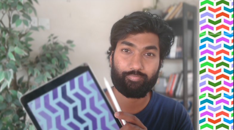
pattern in Procreate. Hi, my name is i Hari. I'm a digital artist, and I have an experience of over three years in creating
patterns like these. This class is designed with
actually beginners in mind. Every single aspect
of this class is divided into step
by step lessons. We'll start off
with understanding what a wave pattern is
in the first place, and then we'll create a template followed by a color palette. Then we'll brainstorm few ideas and then create a
final patel tie. As a bonus, we'll create multiple variations
of the designs from the basic palette tile, and then even create a seamless pattern brush in Procreate. As a class prerequisites, you just need an iPad with
the latest version of Procreate installed in it and an Apple pencil
to go with it. After taking this class
as part of class project, you'll be supposed to do three, uh, wave patterns
like how you see on the screen right now and post
it in the project section. I'm so excited to share
everything I know about creating these seamless
patterns in the wave format. I'll meet you in the
class section below.
2. Understanding Seamless Wave Patterns: So welcome to the
first lesson on understanding what we'll be creating in this entire class. Okay? So we'll be starting
with wave seamless pattern. Now what is a wave? We'll start off with
a small segment of a curve or a wave, and then we'll try to create a seamless pattern out of it. So we'll start off with
creating something like this. And then after this, you'll get a result,
something like this. Okay? So the entire process will play around with
multiple colors, multiple positions of the unit or multiple sizes of the units. So when we talked about units, this is a unit which
we talk about. So this will be the
basic unit actually from which we will create
a particular tile, a seamless pattern tile, and then step by step, we'll go on creating variations and creating
seamless pattern out of it. So in the next
lesson, we'll start with creating our base template.
3. Setting Up Your Base Template: So welcome to Lesson two, where we'll be creating
a base template. Okay, for our seamless
wave pattern in Procreate. So for this, we'll
open a new canvas, tap the plus icon on the
top right hand corner, then go for the custom Canvas. We'll go with 1,000 by 1,000, uh, because at least we
need at least 50 layers, but 1,000 itself is good enough because the unit
which will be creating will be very small and it'll be multiplying across the
multiple shapes, right? So we'll start with
1,000 by 1,000. You can even go with 3,000
by 3,000 or 5,000 by 5,000 depends on your iPad's RAM so that the number of
layers can be compromised. Okay? But ensure you have at
least 50 layers available. The DPI when it comes to DPI, ensure you at least
have 300 DPI, because if in case you want
to print it out the pattern which you're creating
on a merchandise or any print on demand websites, then 300 DPI is minimum to get the same clarity of what
you do digitally, right? After this, when it
comes to color profile, we'll start off with RGB
for printing, CMYK is best. But again, since we're
doing it digitally, we'll start off with RGB, and then if in case you want to print it out on a merchandise
or something physical, then we can always convert the particular final patent
tile into a CMYK format. Okay. Once all these
things are set, tap the tick mark on the top right hand
corner and you have your template ready. Okay. So first, we'll create
a base template out of it. Okay? What does I mean
by saying that is, choose a gray color, which is dark enough for you
to see at the same time, not very dark, so it
blocks all the thing. Drag and drop onto
the canvas and ensure the layer is switched on and reduce the size by half. Okay? Ensure the snapping tools, the magnetic and snapping are on and reduce the size by half. So it becomes 500 by 500. See where it snaps on exactly,
and then you can stop. To come out of this
particular change, you can tap the same arrow mark. Now, select the layer. You will say there's an
option called save and load. Once you tap it,
you will see that the square on the top
left hand corner, which we have already selected is selected and all the rest, all the other three segments
are being hashed in gray. Okay? That is what
we are looking for. Now, tap plus. So the top left hand corner
square is your selection one. Okay? We'll do the same for the selection two,
three, and four. So come out of the tool. Now, move the square
to the right corner, ensure it snaps exactly on on
the top right hand corner. Once it snaps, again, select the layer, go
to save and load, and add the selection. You must remember the selections
so that you can see that it's coming in a clockwise angle which you are taking off. Now again, move the square
to the bottom right, go to layers, select the layer, and then save and load again. And this will become your
selection or Section three. Once this is done, again, move the square to the
bottom left hand corner. Once it snaps into
this place, again, go, select the layer,
then save and load. Now, add one more selection,
which is selection four. So now you have four parts of your canvas divided
into four selections. Okay. And each selection is
numbered by one, two, three, four, and they follow the
order of clockwise direction. Done. Perfect. Now you can
come once you're done, you can come out of
the entire thing, can delete off the square
which you have created. Okay? Now we have a new layer. You can take the black
colored brush and ensure the brush is calligraphy and monoline brush
which you're taking off. Then go to Actions
menu, go to Canvas. We'll switch on
the drawing guide. We'll actually start off with creating a
seamless pattern. This is just to test
the R template, right? Perf we'll go for quadrant
and then tip mark. Perfect. Okay. So again, as I mentioned, this
is just a test. Perfect. So we'll start. Again, as you see, I'm just kind of testing out the pattern. This is not the
final wave pattern. This just to see if a
template is working, right? Once this is done, ensure everything is invoice
in one layer. And you can place
white on the outside. Perfect. Now now go to the third tool on
the top tool bar. There's an option
called save and loads. Okay, so before that, duplicate this, it is very important. Hide the bottom
layer, then select the top layer and then
go to save and load. You see selection one. So that particular selection
is highlighted now. Now, flip it vertical
and horizontal ones. And we'll do the same for
other three quarters also. Save and load, selection two. Flip it vertical and horizontal. Perfect. We'll do the same once again for
the selection three. Flip it vertical and horizontal. And then again for
the final selection, selection four, flip it
vertical and horizontal. Perfect. Perfect. So this
is our template. And this is a patent
tile in a way. So we'll test it
how we test it as, duplicate it, select both, reduce the size by half. Select one layer and
move it to the side. Perfect. Now, combine both, duplicate it once again, take it to the bottom and hide the drawing guide to see if a seamless pattern has worked. Perfect. It has worked now. Okay. So this is
the overall idea of how a pattern template works. So now our template is ready. You can remove all the
layers which we have created for our trial. And this is our pattern file, so you can come
out and rename it as wave pattern template. Okay. So when now you want
to create a wave design, you can always open
this template and it can start off
creating immediately. Perfect. So the next lesson, we'll start with creating our color palette which
is very important. I always recommend
creating the color palette first because once
the design is ready, then you should not be able to think which color I have to put. You must already have
ready color palette sheet which you have created
for this specific design, which you can dragon
drop quickly. That's overall idea.
So in the next lesson, we'll create that. A
4. Creating a Harmonious Color Palette: Welcome to lesson
three, where we'll create our own custom
color palette sheet, which we can use while we're designing our wave
Semless pattern. Okay? So we'll start off
with creating a new canvas, tab the plus second on the
top right hand corner. So for for color palette sheet, we'll go with a vertical canvas. The reason so I'll
explain you in the coming lesson when we are implementing that particular, uh, sheet in the design, right? So go for new canvas. We'll go with the width
of 250 and height of 500. You don't have to
worry about the DPI or the color profile
or even the layers. Even one layer is good enough. So you don't have to
worry about that. Once you have given
the dimensions, make the checkmark, tick mark. Then you got the canvas. Go for the black and
the monoline brush, and then create a circle on
the top left hand corner. And once itomes using
the other finger, tap and you get a
perfect circle. Once you have it, drag
and drop the same color. Duplicate it three times
and move it horizontally and place them next to each
other. Combine all the three. Perfect. So this is our
first color palette set. Okay? So each color
palette sheet will have multiple color palette sets which you have created
for this specific design. Okay? So this is our first
color palette set template. We'll create multiple
of those now, duplicated. Duplicated
once again. Perfect. So combine
all the five. So in this color palette sheet, we have five color sets
which we can create. Okay? So in this case, we'll start off with
two monochrome colors or monochrome color
palette sets, and three multicolor
palette sets. Okay? So first, we'll go
with a gray tone instead of going for black. A darker gray would
be good enough. Dragon drop in the
first Uh Track and drop in the first circle. Then slightly reduce the
intensity of the color, second circle, and even
more for the third circle. Again, as you see, this
is not a white color. There's actually a light
gray, which is good for us. This our first color set. The next colour set will go for purple shade and darker purple. Again, since the first
two are monochrome, it'll be of a same color,
but a different shade. It's just like it'll become more lighter and shade.
That's it, right? The second color would be
this at brighter purple. The third one would be
almost very light. Perfect. This is also good. We can actually create one more
monochrome and have only two colors of
multicolor because monochrome looks very good
in wave patterns, right? So we'll go with green because
green goes really well when it comes to multiple
shades darker shade of green. Ensure, actually ensure the
medium, kind of middle shade. Don't keep it so bright. It should become like
a substitute rather than an empowering or
overpowering color, right? Because the first
and last color would be overpowering in
overall design. And the middle
actually middle color will just be a supporting layer. Okay. And then
green, light green. And so, again, it's
not very bright. Should be a subtle
green. Good enough. So we have three monochrome
color sets we already have. Now we'll create two
multicolor sets, right? So first one we'll go
with typical RGB shades, but with a kind of
actually subtle palette. So our G, and B. Perfect. And then the next one, I have taken an inspiration of the Mc over closing buttons. So red, orange and green, a brighter shade
of green, right? Perfect. So we have the color
palette sheet ready for us. So when we're designing it,
you don't have to think about colors when we kind of
completed the pattern, you just have to import
this sheet, drag and drop. Now, how do we export the
canvas which we already have? O to actions? Share
JP. And save image. So this particular image will be saved in your Apple photos. Okay. So now from
the lesson two, we already have created the basic pattern
template, right? And then the lesson
three, we have created the color palette sheet. Now, the coming lesson,
which is lesson four, we'll do a small
brainstorming of how kind of wave
pattern should be there and then sketch
out our basic tile, then fine tune it
and create our fine, uh, kind of wave pattern, seamless tile in Procreate. I'll meet you in
the next lesson.
5. Designing Your First Wave Pattern Tile: So welcome to Lesson four. In this lesson, we
will start with creating our pattern
template tile, okay, for our wave patterns. So we'll open the
pattern template, which we have created
in Lesson two, right? So the wave pattern template, which we have renamed
for can open that Ensure you choose the
black color brush and the monoline under
the calligraphy brush. Okay. Ensure the
drawing as it stays on. You can check that
by doing this. Now first is the
brainstorming, okay? So if you want, you
can switch off. You can actually switch
on the drawing guide also for your visual
reference, right? Oh, it seems like this
particular brainstorming is as good as a final product. I just want to change certain
things of the central part. So we'll redo it once again. Yeah, perfect. Or we'll
try one more also, okay? So there's a trick. If you want to
remove everything in a particular layer using three fingers, just
scratch it like this. Okay, or just move your hand
like this on the screen, then the entire layer
will be empty, right? Now, This looks a bit boring, right? Not much of things
happening in there. Okay. Perfect. This particular design, I'm interested about because there's a lot of
variety into it. At the same time,
there are spaces here to create the other aspect, right? So we'll go with this. Perfect we'll go with this
now. This is layer one. The second one is layer two, and the third one would
be layer three. As I mentioned,
always create a copy, so that it's easy
for you when you're doing the final design, and we'll actually
segregate it also. So this is layer one, right. So we have segregated,
this is layer one. So we'll erase the
central part so that we don't confuse
each confuse, right? Perfect. Now second layer. We'll erase the outer part. Now, the third layer, we erase both outer two
layers, right? Perfect. So if you switch
on all the things, it'll be a very dark thing, but we'll actually bring in multiple colors here
just for visual variety. So we'll actually bring in the color palette sheet which we have created
in Lesson three. How do we do this go to actions. Go to Canvas. There's
an option called reference, switch
on the reference, thenmportimport image
you go to the gallery, then you can choose the image
which you have created, which is our canvas or
the color palette, right? Choose the dark gray, go for original the outermost
layer, and fill it up. Then go for the second layer and choose the second
color, fill it up. Again, go for the third layer. Choose the third
color and fill it up. Perfect. So this is our uh, you can switch off the drawing
assist also or drawing guide just to see how your
overall pattern is, right? So this is our final pattern. Now we'll incorporate
the template into it, the template which
you have created in Lesson two, right? That one. We can switch off, um the whole color
reference as of now. And you create a basic white colour
outline behind everything. And then combine
the main pattern, duplicate it once again, and then create a layer with the wide background
attached to it so that we can incorporate that
in the template, right? Perfect. Now duplicate
it once again. As I mentioned, always
duplicate things if in case you want to redo thumbs,
kind of something, okay? So again, kind of choose
the third option. This option called save
and load, selection one. Now move it to vertical
and horizontal flip once. We'll do the same again
with the second selection. Move it vertical one
and horizontal ones. Perfect. Again, selection three. Move it flip it once
horizontally and vertically in a similar fashion for the last selection
or the last quarter, flip it vertically once
and horizontally once. And then the entire
thing, flip it once. I won't impact much,
but still you do it. Okay, perfect. Now we have to see if there is any changes
we are to bring in. Okay? Especially where it meets. Yes, there's a small change. It feels like there's
a small cut, right. So you can bring in your brush there and clear it out by
creating a small curve. Perfect. Everything
looks good now for me. I don't have to change
anything right now. Okay. Perfect. So now
we create this color now and ensure the
drawing guide is on. I can duplicate it
once you have created that image and then switch
on the drawing assist. Perfect. Can switch
on the drawing guide also so that you can see
where the lines are. You can select the central panel and copy and paste
it in a new layer. This is a central panel which
we have to work on now. Okay? Alpha locket. So whatever you are
sketching, it doesn't go out. It's just a trial on how the color flips
the entire thing. Perfect. Now we'll sketch the central area sure the drawing guide is on,
so it's easy for you. You don't have to do it
in all the quarters. Perfect. But the curve
looks a bit rigid here, so we'll try on one more. Yeah, this is better.
This is better, so we'll sketch
the entire thing. Don't have to worry of
it going outside because Alpha lock is already on, right? Perfect. And now we'll
bring in this color. Again, we will seg the central
part, copy and paste it, and move it to the new
layer, alpha lock it, and fill it up with
the outermost color. And then combine
both. Okay, perfect. So this is one patent tile
which we have created. But always kind of actually before finalizing
the patent tile, if it's working or not,
always test it with the seamlessness. So
we'll do it right now. So while testing the
seamlessness switch off the drawing guide so that it doesn't disturb in
our visual aspect. And as I mentioned, always
duplicate it and hide it off. Then work on the ones
which you have duplicated, reduce the size by half. Move one layer to the side. See the seamlessness of it. Combine both, duplicate it once again, bring it to the bottom. You combine both,
duplicate once again. We'll do once again the
entire seamless nature. Select one layer,
move it to the right, combine both, duplicate it,
and move it to the bottom. Perfect. So to check
the seamlessness, you have to zoom in and
see where the lines might appear or the
kind of joining of two units and seeing if there is any mismatch
in terms of the pixels. It doesn't seem so here.
Every single pixel is right. Yeah, if you zoom in, there is no lines you can see anywhere. So which means that the
patent tile which you have created is successful to
create a seamless pattern. Okay. Perfect. So now we have
a patent tile ready for us. So you can export it once so that you can
have a copy of it. This is a patentile right. So export it by
going to Actions, Share JPEG and save it
to your Apple photos. Or you can even save it to the files app, whichever
you want, right? So in this lesson, we
have created a final, um, let's say, a seamless pattern
tile with a wave pattern. In the coming
lesson, we will look into creating multiple
pattern variations, using different color
palettes which we have, um, kind of created or creating multiple textures or kind of kind of actually kind of slightly changing
the position of it. So those are things
we'll look into it. I'll meet you in
the next lesson.
6. Bonus: Creating Wave Pattern Variations: So welcome to Lesson
five on creating multiple multiple
color variations. Uh, so this is a bonus lesson. This is something
in add on which you can use in your
designs, right? So we'll start off with
it. So I want you to open the final tile
which you have created. Okay. So there are multiple
things you can do with this. First, we'll play with
the size of the tile. Second, we'll play with the um, kind of color variations. Okay. Perfect. So as I always say, duplicate it and rename the
main thing as original tile. You can delete all
the other layers. And then in the working layer, as I mentioned, we'll
change the size here. So now if you see,
you're going to reduce the width of the overall tile. Let's assume we are reducing
the width by around 750. Okay? Okay, so move, go to the layer, then move, tap any one blue corner, and then type 750. So instead of, like,
one is to one, we are creating a
particular canvas now, which is three is to four. Okay. Once you're done, press the enter and
move it to one side, you will see that
the overall pattern itself has become a bit
more vertical, right? So if you kind of test
it now, duplicate Combine both, duplicate it. Move it to the bottom. Do the
same thing, repeat again. Combine both, duplicate
it, move to bottom. Right? So if you see
this particular pattern compared to the previous one, the previous one
was one is to one. This particular pattern
is three is to four, so it's a bit squeezed. So this is what you
change by creating a kind of change of the
patentle dimensions. Okay. Now we'll work on
the different colors. We'll save it and
hide it, this one. We'll rename it as size
duplicate the original tile, move it up, and we'll play
with the colors this time. Select automatic. This
color is selected. You can import the reference
which you created. Perfect, right? You can add the same
color here also. So again, automatic selection. Perfect. Now we'll go
for the dark violet. O. Again come out. Once this is done again, come out, then select
the dark violet, and set the central part. Perfect. This is one. Duplicate it once again, select both, reduce the size. Move it to the bottom. Again,
combine both, duplicate it. Select both, reduce
the size by half. Combine both, duplicate it,
and move it to the bottom. So this is one color variation
which we have created. Right? So you don't see
any line in between, everything is taken care of. This is one particular color. So you can rename
it as color one. In similar fashion.
You can incorporate every single color we have every single color set which we have created in
the color palette, or you can go to colors
which you really want also. That is also fine. Okay?
Now, the third aspect of the third variation
is textures. Procrit is filled up with a lot of texture kind of
brushes, right? So we're going to incorporate the textures also. So
how do we do that? Again, hide the kind
of color sorry, you had to rename it as
color, not color one. Perfect. Now, duplicate the
original tile, move it up. Switch it on, rename
it as texture. Perfect. So now we
have the texture file. What you do is you can
switch off the reference, decide on which texture
you want to go with. That is very important. This is good. You can switch off
the drawing guide. It's a drawing assist.
It's not necessary. Yeah, and we have to
even choose the color. That is also very important. So we'll actually switch on the reference which
we had also again. This time we'll go
for, the green, kind of color set, go for
the dark color green. This time not the color fill, select both these things. Okay, swipe from bottom
to top and copy all. Or you can do is automatic
swipe from bottom to pot, and you can do cut and paste. So that particular
part is separate now. You can select both, fill
it up with a green color. And then on top of it, you can use stucco brush and change the colour
to very dark green. So can you see the texture here? Eight. That's one. And you can even
add a shadow to it. So what you could do
is you can remove the Alpha lock or duplicate it, switch on the alpha, make it black completely,
and fill it up. Now that you have done the black color and
it's in the bottom, now we'll introduce the
gaussian blur to this layer. Okay? So go to adjustments
Gaussian blur, slightly increase
the gaussian blur. You could see that
this particular, uh, layer which is underneath the main layer is
showing a slight shadow. Can you see it here? Yeah. So we are adding texture and depth both in this particular thing. Now perfect. We'll combine
both these things. We'll go for the
next set of layers. This this swipe
from top to bottom, cut and paste, so that becomes a separate layer
for you all together. We have chosen a wrong
element also in this, so we had to be aware of it. Zoom in well. Yes. Now it's correct. Now swipe from top to bottom and
cut and paste. Yes. Now, duplicate it once again. So for that also we'll
have a slight shadow. Fill it up with black again,
remove the alpha lock, go to gauche and blur and increase the gauze
and bur slightly. You don't have to worry
about other aspects because it'll be
anyway seamless, so these shadows will even be followed in the
seamless pattern. So now we have three
layers of depth. And in terms of color, it
needs to be this color. So again, fill this
particular layer with that. Perfect. So combine both now. Now the last layer will be filled up with this
particular green color, Alpha lock it, and fill it up. Or, for the second layer, we
have not added the texture. So before adding texture, we have mistakenly
merged the layer, right? So yeah, so for this, we'll fill it up with the color first and then we'll
add the texture. Texture, again, it'll be a same brush with
a darker shade. But we can have a
lighter shade also. That also work well. All right. Can you see here?
There's a slight difference? Yeah. Perfect. That's good
enough. We'll combine both. And the third layer is this
last light color. Fill it up. And in the central, we can do something a
white colour tint. Okay? So that we could do. So use the color. Perfect. Now again, we'll
combine all the three, and this is a pattern Tyler. You can remove the alpha lock
and we can duplicate it. We'll test for the seamlessness. You can close the
reference which we had, select both, divide it by half. Select one, move
it to the right. Again, combine both, duplicate
it, move it to the bottom. You can kind of test the
seamlessnessnes by zooming in. You'll see there's
no problem here. Combine both,
duplicate once again. Well again do the entire
process of seamless pattern. Moving to the bottom.
Perfect. Can you see the texture, shadows depth? So can add in these kind of shadow and depth on different
color palettes also. Combine both texture. So in this particular lesson, we have created three
different variations. One is with a texture and
depth, which is this one. And then we have created
one with a color variation, which is the pinkish
monotone and the size variation, right? So based on one
single kind of like the tile which you have created
in the previous lesson, we can add in
multiple variations. You can even add
highlights to it. So shadow and highlight both combined in a seamless
pattern will be very good. Okay? So you can try out multiple variations
on this also. So the class project is
also revolving around this, which we'll be talking in
the last lesson, right? So this is the end for
this particular lesson. Then the coming
lesson, what you'll be learning is how to create a seamless pattern brush
on this wave pattern. Okay? I'll meet you
in the next lesson.
7. Bonus: Turning Your Design into a Seamless Pattern Brush: Hi, everybody. Now, welcome to this lesson where
we'll be creating a seamless pattern brush using the wave pattern tile
which we have created. Okay? So now open the procreate. Open the wave pattern template
which we have created, the pattern tile, right? This is a pattern tile, right? Now, ensure you are on that
particular layer using the three fingers swipe
down. And copy all. Once actually that is
done, tap a new layer, hide the pattern layer, go to the black color brush. So you're making
things ready once you can test the brush,
go to the brush set. You can go for
calligraphy, mono line, duplicate it by
swiping from right to left, then duplicate. Once you duplicate it, open the copied version or
duplicated version. Go to green, choose the grain
source, import and paste. And using two
fingers, tap on it. So that you invert the green,
which is very important. And then tick mark, and then choose the
texturized version and increase the scale
to at least 20%. Perfect. Now, we're good to go. You can test it once. It
seems the scale is huge, so we can reduce the
scale to let's say 15. Yeah. Perfect. So this is
a seamless pattern now. Okay. So let's say you want
to change different color. Instantly, you'll get the
entire pattern field. See the entire page, you can
fill it up with the pattern. Within a moment, the
entire seamless pattern is ready for you just
because you have created a seamless press from the pattern tile which
you have created, right? So there's end of this class. I'll meet you in the
next lesson where we'll be talking about
the class project and the conclusion and the entire recap of
what we have learned.
8. Class Project: So you have achieved and reached the final lesson of this class. So we'll first recap everything we have
learned right now, yes. So first, we have started
with understanding what a basic wave
simulus pattern is. And then in the next lesson, we have created a base
template, if you remember, by using this option called save and load and four sections, yes. So we have done that. And then we have
created a basic shape, and we have tested it
in the same lesson. The next lesson, we have
created a color palette sheet, which we can use while
we are designing. And then after that, we designed our final seamless pattern tile with the wave pattern and even tried it with
multiple colors. And then as a bonus lesson, we have created
three variations. If you remember it right,
first one was with the size, second one was with the color, and the third one was with
the texture and depth. And the second bonus
was we created a seamless pattern brush using the pattern tile which we have created in the Lesson four. Okay. I'm actually sure that you have learned
kind of quite a thing. Um, so as part of class project, I want you to create at
least three variations. It can be black and white or monochrome like how
you see the image, or you can make it with a depth, which we have done with a
texture brush, and the shadows. Or you can just kind
of play around with different colors and
create three different, let's say, color variations
or variations of a surface pattern
with the wave design. I'm so happy that you
have taken this class, and I'm so hopeful of your let's say projects
which you have done, and please do post it
on the project section, and I'll be so happy to look at them and give me
my opinion on it, and you can see even your classmates projects
on the project section. Please do leave a review onto actually how good
your teaching was. Like, how were you
able to go through every single lesson
step by step. And if in case there is
anything I can improve on, I'll be so happy to do that. Thank you so much, finally.
 Srihari Muralidhar