Transcripts
1. About the Class: Hi, everyone. Welcome
to this Guash class. I'm Bianca Ayala, a visual artist and
Skillshare top teacher. I work with brands
like Schminka, silver Brush Limited,
and Arkon Mounts. I love exploring
different mediums, and Guach has become one of my favorites for its versatility
and rich vibrant colors. Whether you're new to Guash or looking to refine your skills, this class will guide
you through creating landscapes with easy
to follow techniques. So in this class, I'll walk you through how to create a muted, neutral palette inspired
by this landscape. We'll then apply these colors to paint the Mountain river
landscape in guash. Guache is such an
exciting medium. It gives you the bolus
of opaque paint and the softness of watercolor and the flexibility to
work in layers. You can create crisp edges, blend effortlessly, or rework details
even after they dry. In this class, I'll
show you how to harness its unique qualities to bring the and expression
to your painting. We will focus on
different techniques like mastering consistency, how to get the right paint to water ratio for
smooth application, how to build depth
with layering and understanding how
opacity works in guash. You'll also learn
creating texture and movement with bold
expressive brush strokes. By the end of the
class, you'll have a finished painting of a
beautiful landscape and a deeper understanding of how to confidently use guash in
your own creative practice. I can't wait to see how you bring these paintings to life, so grab your brushes, and let's get started.
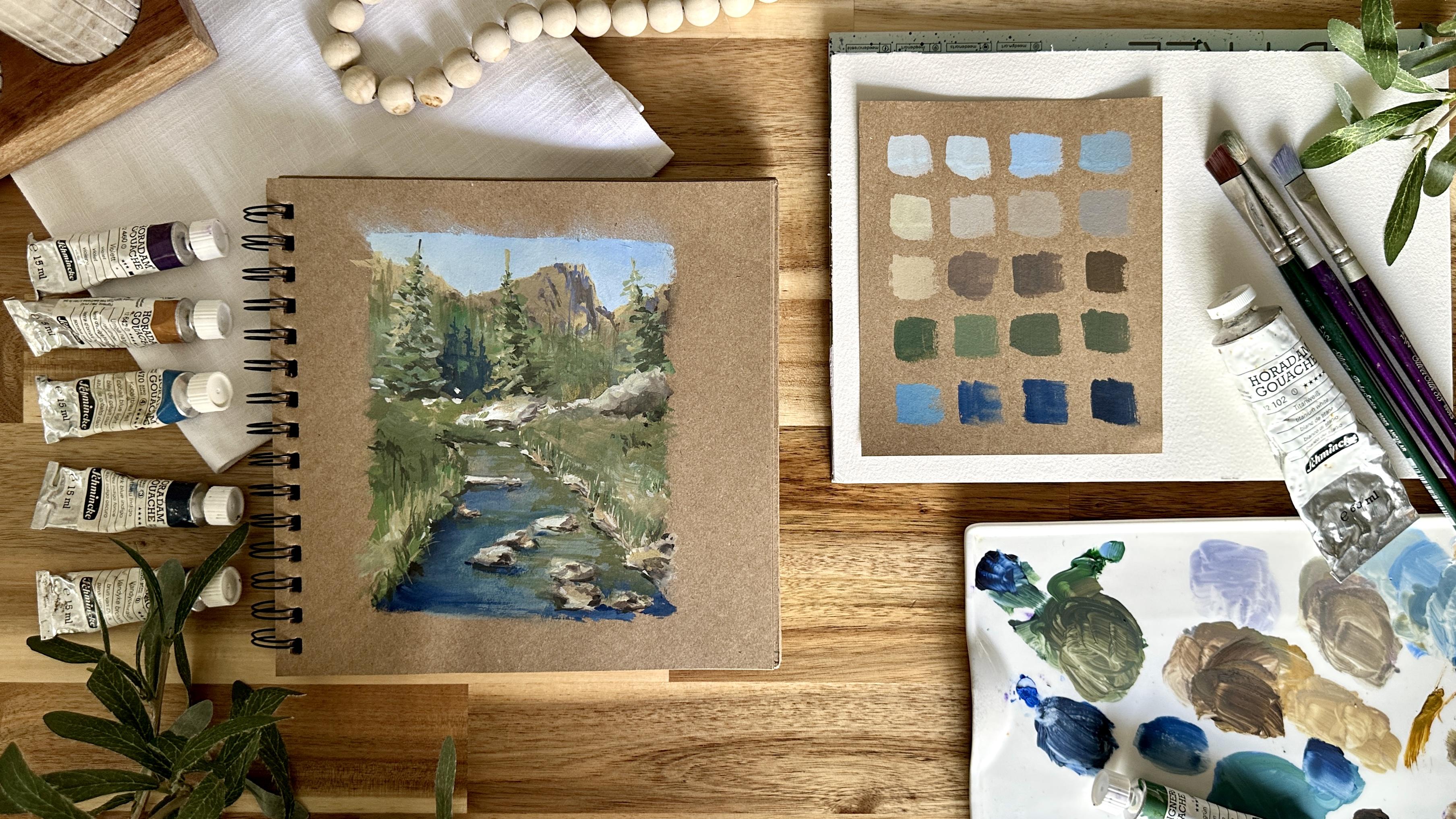
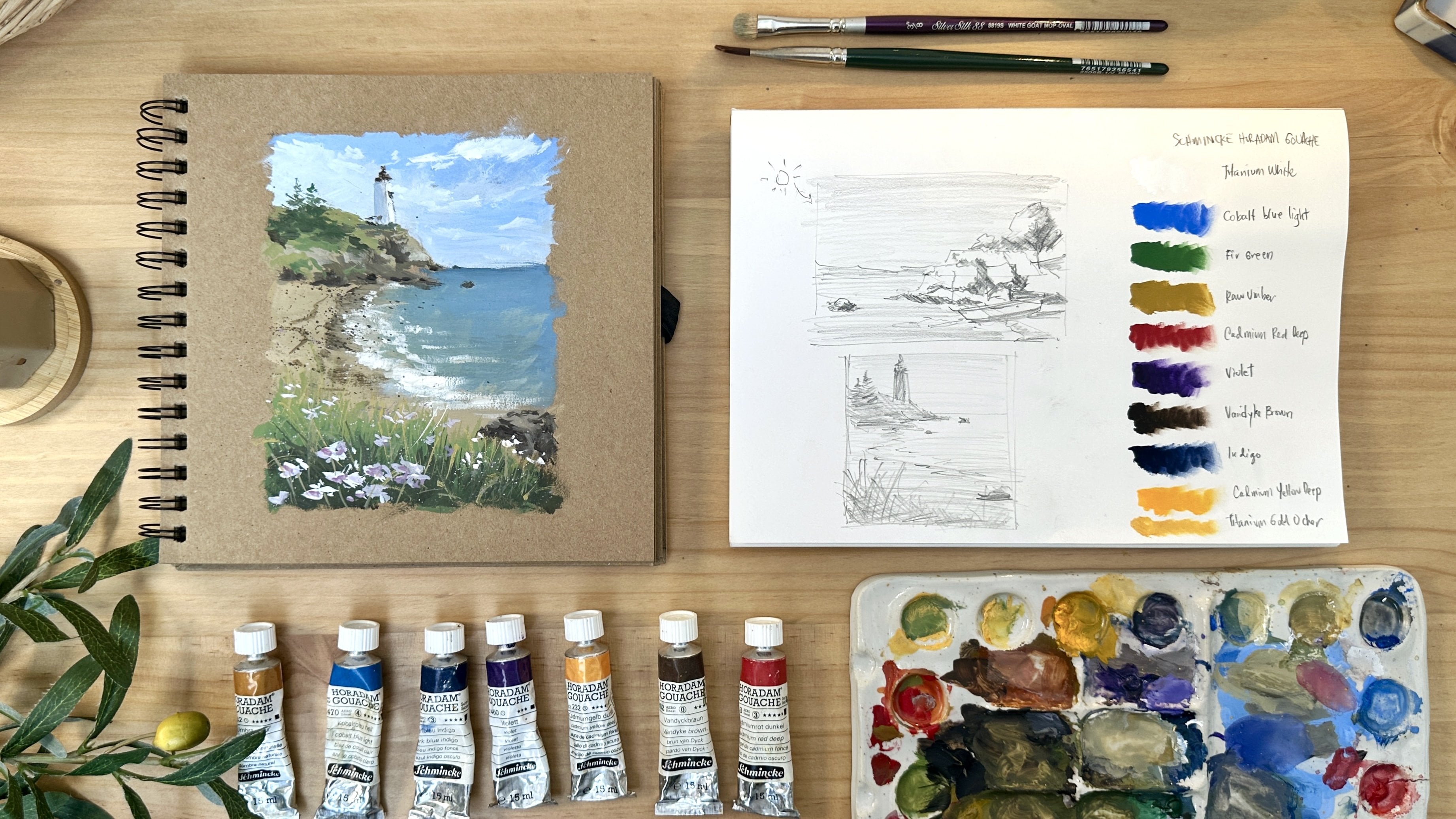
2. Materials : Before we dive into painting, let me walk you
through the materials we'll be using for this class. I'll also share why I personally
love and recommend them, though feel free to use what
you already have on hand. For this class, I'll be painting on a tone paper sketchbook. I'm using an anco
scrapbook album made with acid free craft paper. It's eight by 8 " in size and
has 180 GSM weight paper. I specifically chose tone paper over white paper because it gives an immediate sense of atmosphere and mood
to your painting. Tone surfaces help you
instantly establish mid tones, allowing you to focus on
highlights and shadows. Achieve a richer and
warmer underpainting and soften the brightness of gouache for a more cohesive,
natural looking result. It also gives your
landscape and seascape a grounded and earthy
feel, which I really love. Now for the paints, the paints I'll be using are from Schminka, a trusted brand of
artists grade Guache. Schminka paints are known for their high pigmentation
and vibrancy, smooth, creamy
consistency that's easy to work with and
excellent light fastness. So your paintings
stay vivid over time. Here are the
specific colors I'll be using for class projects. Titanium white, a mask
Tav for gouache painting, cobot blue light, fair
green, raw umber, cadmium red deep,
violet, Van **** brown, indigo, cadmium yellow deep, and titanium gold ochre. Feel free to use any brand
or substitute colors that are close to these. One important thing to keep in mind when building your palette for landscapes is to
have the primary colors, red, yellow, blue for mixing. Earthy tones for grounding your landscapes and most
importantly, the titanium white. This is essential in
guash for mixing, layering and creating opacity. I'll be using a few favorites from silver Brush
Limited for my brushes. First is angle brush. This is synthetic in size
one half or three eighths. I use this for
most of my washes, and its shape gives me control for both broad
strokes and tighter edges. Another one is the
blender brush. It's called the white gold
mop oval from silver silk 88. This has a stiff texture, making it perfect for
blending colors smoothly. And lastly, the
ultra round brush from silver Silk 88 size six. I use this for adding
details and fine lines. Other essential materials
are mixing palette, two cups of water,
one for rinsing, and one for clean water, a paper towel or rug to wipe off excess paint or
water from your brush, and a pencil for sketching out your compositions
before painting. These are all the materials
that we'll be using, and I'll see you in
the next lesson.
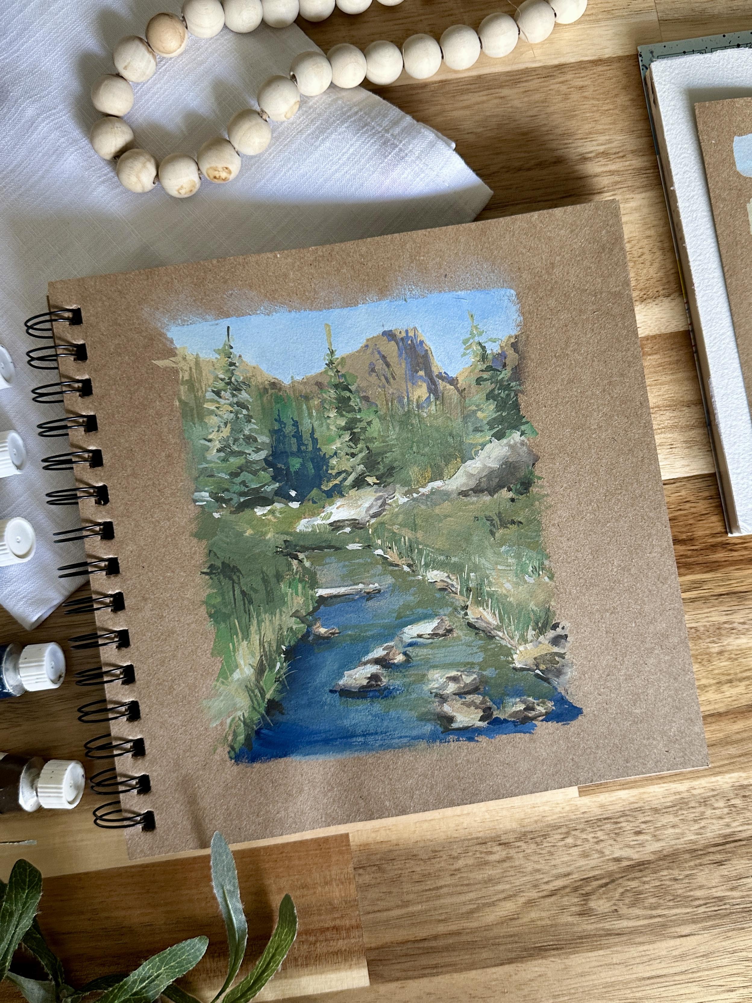
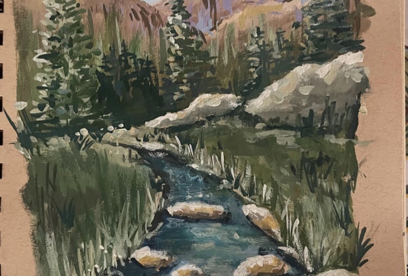
3. Class Project: For our class project, we'll be creating
a custom nature inspired color palette and then using it to paint a beautiful mountain
river scene in a gouache. This is the reference
photo I got from Piners that people
use for class project. I was immediately
drawn to it because of the incredible variety
of natural colors. It's calm yet vibrant. You will notice the clear
blues of the river, the deep greens of the pines, and the warm browns
of the rocks. It's such a rich
and balanced scene. Now, it's important to say this. Our goal isn't to
perfectly duplicate every single shade in
the reference photo. Instead, we're aiming to capture the boot and
the feel of the scene. That's why your personal
color preference plays a big part in
shaping your palette. For example, I personally
love the muted, subtle mixes often used by classical
impressionist painters. I tend to gravitate
toward neutral, desaturated tones
that feel soft and atmospheric. But that's just me. Other artists might prefer
bold, highly saturated colors. Both are valid and
beautiful approaches. Your palette should reflect
your personality and taste. So in this class, I'll walk
you through how to create a muted neutral palette
inspired by this landscape. I've already shared in the materials lesson
the colors I will use, and in the next lesson,
I'll show you how to mix them yourself step by step. We'll then apply these colors to paint the Mountain River
landscape in guash. You learn how to build up the scene, use color
intentionally, and bring out the atmosphere of the setting using your custom
palette on tone paper. By the end of the
class, you will finish a full painting and feel more confident choosing colors that reflect your style.
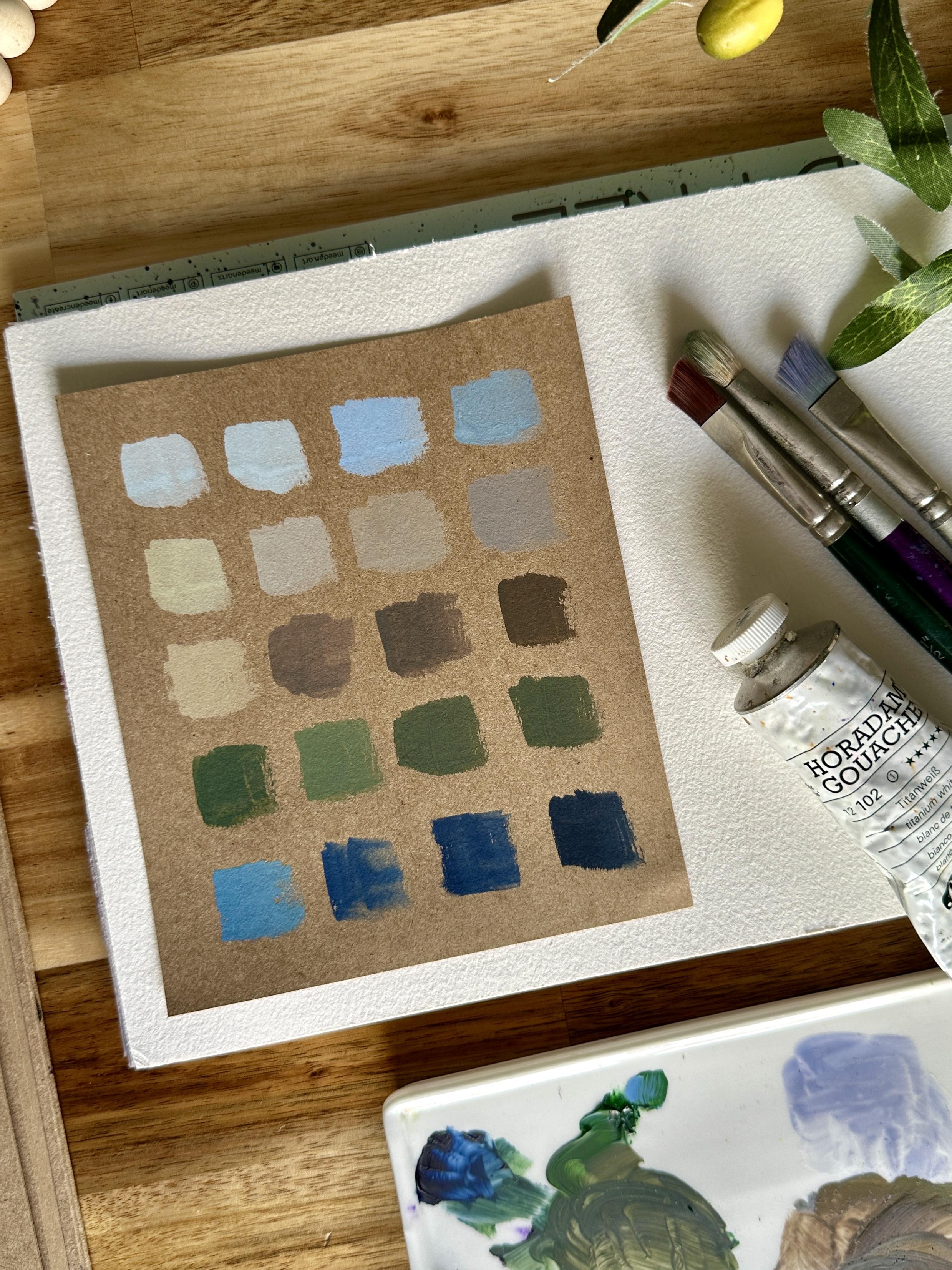
4. Creating Nature-Inspired Color Palette: Let's take a moment
to talk about creating a nature
inspired color palette, something I always do before starting a landscape painting. When we're painting a scene like this Mountain
River landscape, it's important to choose colors that reflect the mood of nature, not just what we think we see. So instead of reaching for
bright or artificial colors, I like to build my palette by observing real natural
elements like rocks, trees, water, sky
and distant hills. You'll notice that
most colors in nature are actually muted
or desaturated. They're not flat
or dull but soft, layered and beautifully complex. That's what gives landscapes
their natural harmony. For this painting, I
specifically chose colors that allow me to
mix natural looking tones, nothing too vibrant
or synthetic. These pigments help me achieve soft transitions and
atmospheric depth, which support the quiet, moody feeling I want for
this mountain river scene. So here are the colors I'm
using. Titanium white. This is to lighten
mixes and create softness and atmosphere,
cobal blue light. It's a gentle, slightly cool blue ideal for skies and water. Raw umber is a muted, earthy brown, perfect for rocks and neutralizing
other colors. Cadmium red deep is a warm, subdued red that helps create
natural browns and grays. Violet, it adds a soft
coolness and depth for shadow, especially in the mountains. Fair green, it's
a dark green base that looks natural and
can be easily muted. Dark blue indigo, it's a rich, deep blue for shadows
and cool toads. And lastly, Vandyck brown, a deep, neutral brown for
dark accents and structure. Now, the sky in this scene
is overcast and quiet, not a bright sunny blue, but a soft diffuse light that sets the tone for
the entire painting. So we want the sky
color that feels gentle and natural
without being flat. I will mix cobalt blue light
and titanium white to start. Then I add just a
touch of raw umber to tone it down and make it feel more grounded
and realistic. I vary the ratio of
cobalt blue and titanium white with just a controlled
amount of raw umber. The raw umber is there only to saturate the blue,
not to darken it. So be careful not
to add too much. This creates different
subtle tones of blue for the sky that feel
atmospheric and natural. Now, let's do the mix for the mountains and distant hills. These layers are far away, so they appear cooler, lighter and less detailed due
to atmospheric perspective. We want the tones
here to feel soft, misty and push back
into the background. For a color recipe, to get that distant
feel, I mix white, cobalt blue light, violet, and a touch of raw umber
to mute the overall color. For the middle
distance mountain, I deepen the tone slightly by balancing violet and raw umber. This mix gives us that cool receding
mountain color that sits nicely behind the rest of the scene without looking
too harsh or saturated. Now, the river banks and the rocks are
neutral and earthy, never overly brown or orange. They catch both
warm and cool light depending on where
they are placed. So we need versatile
neutrals here. For the lit rock surfaces, I mix raw umber with titanium white to create a
soft stone gray. For shaded areas, I use a mix of cobalt blue
light and violet, slightly softened with white. I created the darkest
tones by adding more Vandek brown into
the original neutral mix. A good tip here is to add
Vandyke little by little. You'll find it easier to
control the values and create multiple dark shades without
going too dark too fast. Now, for the trees and foliage, the trees in this scene
aren't fresh spring green. They are more subdued, leaning towards far
and forest greens. And since the overall mode
is quiet and natural, we need our greens to
feel deep and believable. For our colour recipe, I start with fair
green as the base, and then to mute it, I
mix in a little indigo. For lighter foliage
and sunlit branches, I lighten the green with white. To aviation in
trunks and shadows, I use a mix of fier
green, raw umber, and Vandyck brown to get a
more grounded natural green. This gives the trees a more
realistic tone and helps them blend harmoniously
with the earth and river. The river reflects
both the soft sky and the dark greens
of the trees. It needs to feel cool
and flowing with slight shifts in tone
from light to deep. For the top layer of the water, I mix cobot blue light, white, and a hint of fair green to
reflect surrounding foliage. For deeper shaded water, I blend indigo with cobalt
blue to get a rich, moody tone perfect for reflecting the depth and
stillness of the water, especially in the shaded areas. Finally, for the darkest
elements, like tree trunks, under rocks or where
shadows are strongest, we want a deep neutral that
doesn't overpower the scene. For the color recipe, I mix Vandyk brown and indigo. This gives a dark
tone with depth and softness much more
natural than pure black. This palette serves as
our foundation by using the same color mixes and simply adjusting the
ratio of pigments, maybe adding more white, more blue or more umber. We can create a wide variety of tones that still feel
unified and natural. That's the beauty of a limited
nature inspired palette. It gives you freedom
while keeping your landscape consistent
and harmonious. Now that our palette is ready, we're all set to start painting.
5. Pencil Sketch: In this lesson, we're
going to sketch the Mountain River scene using just a pencil and
our tone sketchbook. I'm using a portrait
orientation for this painting, so I'll start by
creating a border. I won't be painting
on the entire page just within this space. Now, let's identify the horizon
line and vanishing point. This helps us place
the river properly. From the vanishing point, I lightly sketch
the two sides of the river to show how it
flows into the distance. Next, I'll draw the large
stone in the foreground. I focus on the big shapes
rather than every small detail. This helps simplify the drawing. And remember, we don't need to copy everything
from the reference. The goal is to capture the mood and the
essence of the scene. Pick out the dominant details
that help tell the story. Now, onto the slopes on the
right side of the river, I sketch the curves and
define the river side gently, then add a few
hints of grass and shrubs to suggest texture
and natural elements. Oh Moving to the background, I'll
draw the mountain. I keep the strokes jagged and angular to show this rocky form. I also add a bit of shading here to guide me later
when I start painting. Finally, I sketch
some vertical lines. These are placeholders
for the pine trees we'll paint later
on, and that's it. Our pencil sketch is ready. It doesn't need to be perfect, just clear enough to guide
you in the painting process.
6. Painting Process: Let's begin painting. I start by preparing my paints
on the palette. For the sky, I take
titanium white, cobalt blue, and raw umber. I first mix white and blue to
get the right consistency, then little by little adjust the color by adding raw umber. I use my angle brush to
paint the sky fragment, and I love this
muted blue color. It creates a very
realistic sky tone. I adjust the tone in the upper portion of
the sky to create aerial perspective and then take my blender brush to
soften the color transition. Now that when I
blend the colors, my blender brush is dry. As I paint the sky, I make sure to skip
the mountain fragment. The key to painting a nice
sky is the play of tones. Even if we're just
using three colors, varying the ratios
and controlling the amount of water really
makes a difference. B next, let's paint
the distant mountains. I use raw umber, white, and a bit of violet
to make a brown mix. We want a light cream base wash for the tips of the mountains, so we need to control the
amount of violet in the mix. Notice that the wash is
slightly diluted with water because I want a lighter
tone for the background. I also paint with
strokes that follow the direction and plane
of the mountain ranges. Now I take Van **** brown
and slowly introduce a darker tone into the mountain by mixing it
with a color I already have. This creates a
slight variation in. But I take my round brush, then I get violet paint and mix it to the existing
mountain color mix. I use this to add fine details
and create rough texture. Again, we're not
aiming for realism. We just use suggestive
details and strokes to capture the
essence of the scene. That's why we don't need to
put too much detail here. I also take a darker shade
of the brown mix for the right side portion of the painting and in some
areas on the mountain. These marks may not make
sense at the moment, but trust the process and it will come together as
you continue painting. Now, I will be transitioning
to the pine trees. I'm taking a little white
and figrein and I add a bit of water so the
brush glides smoothly. As we paint the
green background, I want to create depth, so we'll do some color play. I add other colors to the
green mix to create richness, like a bit of cobal blue
or some leftover browns. After laying down the stroke, I take my angle brush and
drag the color upward to create the texture of
tall pine tree tips. This technique helps the trees blend into the
mountain background, making them look like
one cohesive picture. I continue painting the greens, varying the tone and also
the thickness of the color. Here I added a bright
whitish green mix to create a patch of
light on the fragment. Now I blend in a
yellowish green colour, which I got by adding raw
umber into my greens. As I move closer to
the middle ground, I add Vandek brown to the greens for extra
depth and contrast. I also intentionally
make my strokes rough and hard to create
that kind of visual texture. Using the round brush, let's paint
silhouettes of trees, then blend them
into the background so they look like faded images. Now, let's begin painting
the rocks by the river, starting with the one
lighted by the sun. I just use leftover paint
from the sky mixture for my braise wash. Then I add a bit of rhomber
for a neutral layer. I also focus on painting
the general shape first. We'll define the form and add dimension using tones later on. I now paint the other
rocks near the foreground, still starting with
the light color. This part is so
therapeutic for me. I love laying down the colors
of light on the rocks. It feels so relaxing. Now I take more raw umber
and add it to the light mix. This will serve as
my transition color to build the form of the rocks. The key here is to
understand where the light is coming from so we can
paint the shadows properly. I now paint the shadowed part of the rocks using a
dark brown mix, and I practice squinting
my eyes as I look at the reference to see which areas have mid and dark values. This is a helpful
technique to know where to place colors to build
depth and dimension. Now I take indigo and place it near my white
and cobalt blue. I will prepare the
river colors next. But before that, if you
look at the reference, you'll see a green undertone
on the river fragment. So before painting with blue, let's first apply a light
green wash in the foreground. I mix white and green
with some water to create an almost transparent wash
and apply it on this area. Next, I take indigo
with cobalt blue, with almost no water to
paint the riverside. I make a small stroke, then use my blender brush to blend it into the
green base wash. I slightly wet my blender brush because my indigo paint
is very dry and creamy. I need to activate it a bit. As you can see, it
softens and blends well. I add bits of dark blue
strokes to outline the river, and this area should
have high contrast to separate the water
fragment from the grass. From here, I connect the colors together to make a
seamless transition. Now, I get a deep dark brown
color from my leftover paint and use it to paint
the impression of dark reflection on the
side of the river. And I repeat the blending process until I achieve the right tone. I continue painting
around the rocks. We need high contrast here
to make the rocks pop out. I place a fine stroke underneath the rock and blend it
gently with my finger. I also add some horizontal
strokes in the foreground. And now I paint the water
underneath the rock closest to us using
indigo for contrast. We can slowly see the
painting coming alive now. Let's continue painting the
middle part of the water. I repeat the same process
placing a dark stroke, then blending it with
my green base wash. D I go back to the rock portion and refine it using negative painting. Next, let's paint the river
with a pale wash of blue. I simply add more water to the paint to make it pale
and semi transparent. I take more Vandek brown and add some dark highlights at
the base of the rocks. Using white and some
leftover background paint, I paint a rock on the right
side of the middle ground. I begin with a light tone, then add a bit of brown
for the mid tone. I use the belly of the brush
to make a wide flat stroke. And next, I mix green and Romberg to paint the greenery
on the right. Like we did with the pine
trees in the background, I do color play by creating
different tones of green. I also vary the direction of the strokes for
texture and movement. Keep squinting as you
look at the reference so you won't get lost in
painting the fragment. Focus on tones, and the color will naturally adjust to the tonal
value you need. In the lower corner, I'll add another rock figure to enhance the composition and break
the chunk of greens. I use the same
technique, paint first, then slowly define the shape by adding mid and dark tones. Next, let's add details
like grass blades. I take my small
round brush and make swift upward strokes to paint the grass along
the river side. We want to bring out the
illusion that this area is full of grass while only
suggesting detail on the edge. I also add light strokes to break up the dark
chunk of color. If you're not used to doing
this kind of stroke yet, I suggest practicing on a
separate sheet of paper first. That way, you'll get
more familiar with it and your strokes will
feel more fluid and fine. I take a darker brown color
and paint random portions, also adjusting the contras under the big rock in
the middle ground. Now I take some red
and mix it with rumber and white to paint
highlights on the ground. I use the same color to
add a hint of light in the grassy fragment and
create a warm shade in it. I continue adding tiny strokes
to enrich the texture. Let's now paint the
left side fragment. I still use the same green mix, far green, Romber white,
and Van Deck brown. On this part, I start with
a light shade for the base. Notice the energy
in my strokes and the playfulness
in the direction. Then I transition to a mid green color and
more controlled strokes. Take a darker green mix
by adding more Vandek brown as I paint the upper
area closer to the trees. Again, I squint my
eyes and notice that the porch at the end of
the river is bright. Now I paint the grass in the foreground
using light color. This time, my grass strokes are longer than the
ones on the right. I also place Sims dark strokes
on the top for contrast. And I create darker
spots of color in the corner to separate
the river and the ground. To create more depth and
contrast in the middle part, I add few more strokes. It's so satisfying to see the picture come
alive at this stage. We just need to add
a few more details, some highlights in
the river fragment and on the pine trees,
and we're almost done. I add tiny horizontal strokes to represent reflection
on the water. Note that the reflection
should be darker in tone and thicker in
consistency than the water, so it will stand out. Now, to finish the painting, let's add some pine
trees in the background. I take white and mix it with my greens to
paint the trees. I start with a one on the left. My paint is thick and opaque
so it can be seen clearly. I dab the tip of my brush to create the triangular
form of the pine tree. Then I dab some dark spots here and there to paint shadows
and create dimensions. I dab lightly and even
blend a bit with my finger. Next, I paint the
area behind with a darker green to bring
the tree forward. I soften the edge of
this dark background, so it blends beautifully. In reality, it's the shadowed portion of the trees behind. Et's now paint another
tree in the center. Make sure it's not as tall
as the one on the left, so the composition
doesn't look symmetrical. I use dots and dabs of paint
forming a triangular shape. Then add white dots to highlight the lighted
areas of the tree. Then I paint the
third main tree, leaning slightly to the left as if it's behind the
big rock over here. Just remember to paint with
varied tones, light, mid, and dark to make the object feel alive and
dimensional, not flat. Lastly, let's add some lines and strokes in the
background to make it look fuller and busier. I'm just adding tiny dots and
highlights here and there. And we're done
with the painting. Gouache is truly magical
and satisfying to use. I personally love the
contrast it brings and how it makes the
picture feel so alive. I'm excited to see your
work and how you'll apply everything we've learned to
other references as well.
7. Final Thoughts: And that's it. We've completed
our gouache paintings, and I hope you enjoyed the
process as much as I did. Gouache is such a versatile
and forgiving medium, and I hope this class gave you the confidence to
explore it further. Remember, the best way to grow as an artist is to
keep practicing, experimenting and
most importantly, paint from the heart. Let your creativity flow and use your art
to inspire others. I'd love to see your work, share your finished paintings in the class project section or tag me on Instagram so
I can check it out. Seeing your interpretations
always makes my day and encourages others in the
community to keep creating. If you really
enjoyed this class, I'd appreciate it if you
could leave a review. Your feedback helps me improve my classes and
allows me to create more content that inspires and supports your creative journey. And if you're looking for
more ways to explore guash, be sure to check out my
other classes where we dive even deeper into
techniques and creative ideas. Thank you for joining me today. Keep painting, keep
experimenting, and most of all, keep
creating with joy. See you in my other classes.
 Bianca Rayala, Top Teacher | Watercolor Artist