Transcripts
1. Introduction: Welcome to the studio. It's frail here. I'm so glad you found my class. I'm a mixed media
artist and I had been painting and exhibiting
for over 30 years. As a mixed media artist. I absolutely loved the
creative expression of Delhi printing when I found this fabulous
technique and quickly became a complete
obsession in my life. Because it's so versatile,
it's highly creative, it's very experimental,
and you can make a whole beat, an absolute stack. Hundreds of jelly creates
really, really easy. And if you've already
experienced jelly printing, you know what I mean? So tell me, what
are you going to do with all of those
hundreds of jelly brains? In this class? We
are going big baby. We're going large-scale. We're going to be creating a large-scale jelly
pre collage on Canvas. And this is so much
fun and I'll be with you every step of the
way from start to finish, even run a warm. In this class you're going
to learn how to create a jelly print colored
artwork on Canvas. And I'll be showing
you what to do with all of your hundreds
of telling breaks. I'm also going to show you
how I organize my friends, how I work in my studio. We're going to be
discussing elements of design and composition
foundations that are going to help you with this
abstract application of your collage papers. I absolutely loved
abstract that. It's my very favorite. It's all about the
shapes and the textures. Anyway, we'll get to that. Then I'll show you
how to finish it like a professional
so you can hang your glory that work on the wall for all
the world to say. This class is suitable for
anyone wanting to create a beautiful mixed media painting on canvas with your papers. Absolutely perfect if
you're a beginner because I will lead you step-by-step
through the whole process. I making a canvas
right along with you. And let me tell you, it turned out rather beautiful. So you're in good hands. Ready, ideally print it and
you have hundreds of three, then this is perfect for you
because we're going Yes, I know I've told you big baby. So he can pull out all
your print and have an absolutely fabulous
time on this Canvas. Also, you'll be able to
learn some of mine different tips and techniques
that I like to use when creating a jelly proof. How do we get them and how to compose them in an
abstract design? We get to hang out in my studio, which is always the best. At the end of the class, you will have gained
the knowledge to create your beautiful colors artwork
from start to finish. And you'll have
the confidence to hang that beautiful
artwork on the wall. It's so exciting. I just kept white. I would love to see
what you create. So don't forget to add photos
in the project section. You can add some
of the prints that you make with your jelly play, or you can add your
finished piece, or you can add both of them. Show me, I want to see
what you're creating. I absolutely love it. I'm really excited to be on this creative
adventure with you. This I live together
how material, and let's make art.
2. How To Organise Your Gelli Prints: So how do you like to
organize jelly prints? The first thing that I do when I start a project
like this is to go through my prints and pull out ones in the colors that
I'm wanting to use. Now what I like to do to
organize my print as I put the big paces into
a draw like this. And my drawers have
blues and greens, reds and warm colors, or a neutral palette
which is like this with all the bronzes
and golds and browns, and black and white
and these kinds of textures and colors. I like to put them
in these files, clear plastic files, because
I like to find things easy. So when I print a
batch of papers like this one where I've got the bubble wrap prints
and different sizes. And I did some of the circle prints fired
by the beehive paper. If I've done a whole session, I've spent hours
making these papers. I will then put all of them into a plastic folder like this, so I can find them next time. I want to use them. This folder here has got ones that have got the
writing printed on it, or a stamp or a stencil in that kind of theme
and in nice colors. I like to group my jelly
prints together so I can find them easy when
I want to make projects. This one's got a
different stencils and different mark makings
and it'll be in certain color tones or it'll be for when I did printing at a certain time
like these ones with the stencils thoroughly in this fall rub because they've
got the same stencil. So I like to be
organized with my jelly prints because I want to be
out of fine things easy. I don't want things to be a hassle when I'm trying
to look for things, I want to know where they are. So this box has got all of
these kind of color tones. They may have been printed at different times when I've
made different projects, but I know where they
are when I want them. White on white for this just mark making jelly
brings together, go on and on and on. So if I'm wanting papers in
the more warm tones like red and orange and fabulously
dramatic colors like that. I'm going to pull out
this drawer here because that's where I'm going to
find these particular colors. Fabulous sluice and
green and cool tones are going to be in this drawer, then it's really
easy to find them. What I like about
being organized is that you don't
waste time then you're not running all
over the place trying to find where the jelly prints
or that you want to use. If you can just put your hand on them and know where
to find them, it just saves you time. Now, I have the same system for smaller pieces of papers
and jelly prints. I have a box for warm colors, beautiful reds and
golds and oranges and evens glorious
purples in this box. I have blues and green and
cool tones in this box here. And I have the neutral
ones in this box, blacks, whites, and other beautiful
brand new tons and bronzes. The glossary has colors
that are in this box here. So these pieces in the
same color blocking system that just smaller and
they fit into these boxes. And finally, smaller again, they are in these fabulous bags which are glorious
and stayed through. You can find what you're looking for days on my scrap
bags that absolutely fabulous because they've got little pieces and sometimes it's just a little tiny bit that you need to finish your collage. So there'll be neutral
tones in this one. Warm tones in this one. Hence the pink gonna have some reds and purples
and glorious colors. And in this one
we've got the blues and greens and cool color tones. So anything smaller is
going to go in these bags. They asked my fabulous, when you're looking for
a specific little paste. So I find by color
blocking them and putting them in a size where
I can easily find them. It just saves time when
you're looking to create. And I just like being organized because
I know what I want and I know where to find
it and I just have to grab the bag when I'm
working on a project. So I'm telling you it's
a really good idea. Color blocky prints
and put them into areas of sizes where you can find them
when you want them. Easy peasy, lemon
squeezy. Right? Now in the next lesson I'm going to show you
the benefits of creating your jelly prints in
a particular color palette. In fact, if you limit your color palette to
only a few colors, you can then focus on creating the texture and produce
even more amazing prints. If you have an idea of what colors you want to use
for this particular project, then you can create a whole second jelly prints
in those colors. Unless you already have
hundreds, of course, which could be possible, and in that case, disregard the idea and
use what you have. But creating jelly brings in
a particular color palette, or limiting your color
palette can really go a long way to developing
your creativity. So it's an exercise
that you might want to try because really it's
a whole lot of fun.
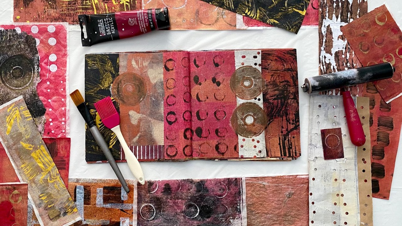
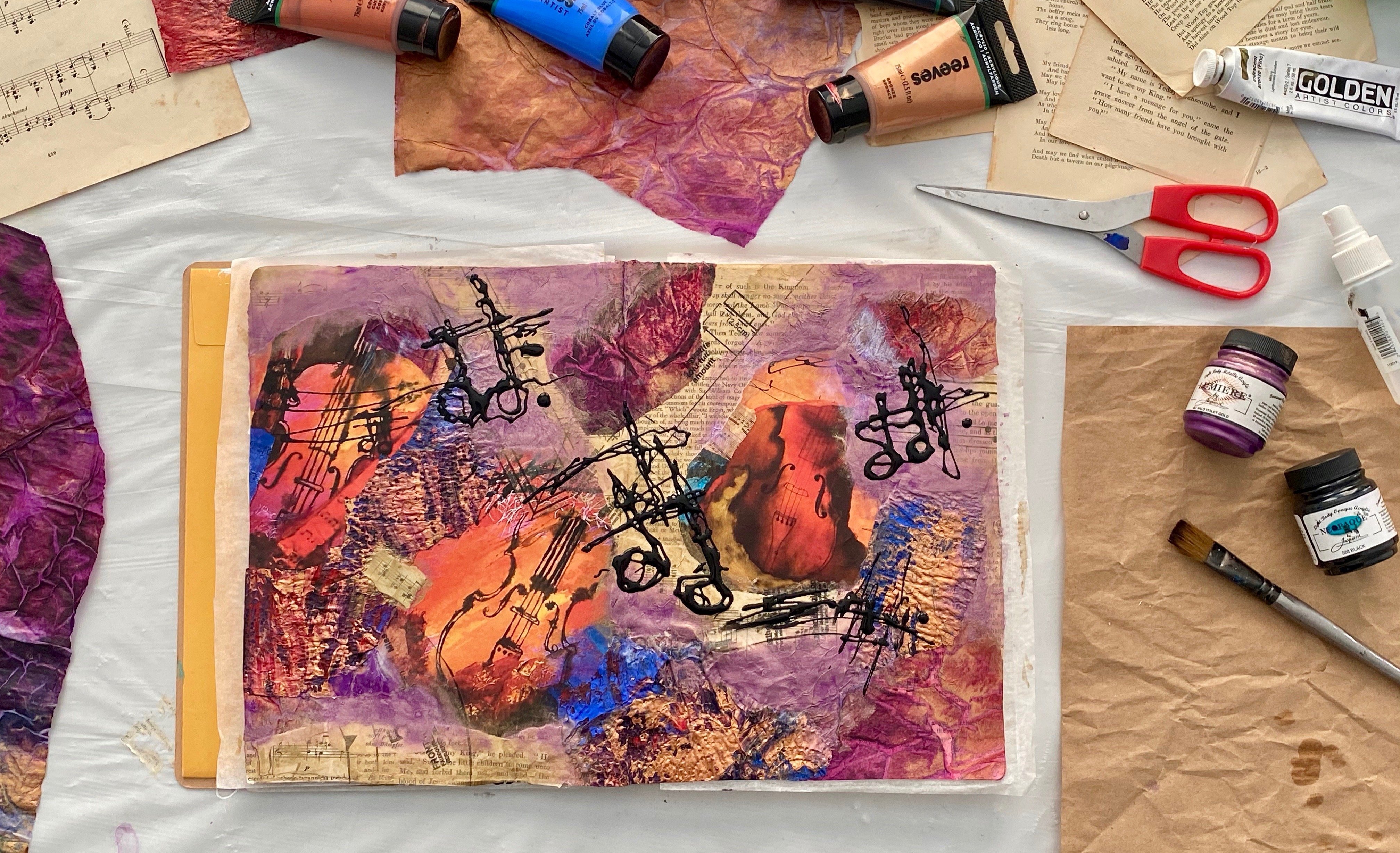
3. Creating Gelli Prints in a Limited Colour Palette: So one of my colors, and once the benefits of limiting your color
palette, well, for me, it's about expanding your creativity when it
comes to texture and design. Because if you've got a
limited color palette, then you're not going to stress out about what color you should use or if it doesn't mix
or if it doesn't go well. And you'll focus more on the actual print and the
design and the texture. So I'm using brown black, which is this color here. It looks like black but it's
not annual. See how much? It's not black once it mixes
with these other colors. So that's brown, black or sepia. This is also known as CPR
on bleached titanium, which is this color here. This is the liquid texts bronze. It's quite a brownie bronze. It's beautiful and loving. And then of course
we have the golden, iridescent bronze
fine, that is one of my favorite colors,
that one here. And I'm adding in black and
white because then we can deepen the colors are light and the colors with
black and white. So out of these 123456 colors, we are going to
make huge amounts of jelly prints and you're
all going to be amazed. Now, you don't have to use
this particular color palette, but it's a really good exercise. If you want to
broaden and expand your creativity by setting
yourself a limited right? I know it sounds
like you're being restricted, but you're not. It will definitely develop and expand your creativity
by trying this exercise. So I have my jelly
at Joe client, it's a ten by eight plie. I love it. I use it so much and
a brand to Rome off. I also have a pile of
Japanese calligraphy paper, which is from this pack
that I bought on Amazon. Easy peasy, lemon squeezy. Now I'm going to
stop by just making some solid print so that I can do some second layers
of some different colors. And it's a really
good way to warm up your gel play and just
get just still moving. Now, this is the CPR
or brown, black color. It looks like Vegemite. If you've ever
been to Australia, It doesn't look like a Vegemite. I don't actually like that, you might, but this
is the color of it. So I'm just gonna do a couple of solid colored frames just so I can put some
background sound. And then we can have
our whole lot of fun. Hello, beautiful. That
brown, black color is, it's not as dark as
the cabin blast, and I absolutely love it. Now there's some hind legs, so on the pipe, I'm not going to claim that. I'm not going to wipe it. I'm just going to add one
of my other colors to it, which will make my unbelief
to titanium a literal day. And that's okay. Now, I personally like to leave these abstract
shapes on my plate. I loved that so much. I loved the prints
that they make. I loved the abstract
quality of them. And I just think they make really interesting
backgrounds. So that's just straight away
the assemblage titanium on the plate with the roll-off still having
the sepia color. See how those two colors
work really well together. I know this is gonna
be so much fun. We're going to work really fast. We're going to bounce around
with some creative ideas. And this is going to make you a whole lot of Delhi prints. We can add some white to this and make a little
bit lighter print. We can then add some black, which would make it
more grayed out. You don't have to clean
your plate in-between. And all of these colors are
going to work well together. I absolutely love the color
and texture of these great. I loved the way the
blacks not solid. It has multiple patents because of the
continued printing. I'm telling you this
is so much fun. This time we're adding
bronze to the black. And that's going to
be just beautiful. Look at that glorious pattern. Right now we have all
these fabulous brings. Just so exciting. I love it. So this is a full base colors with
black and white and look, the possibilities are
endless from very lightly textured to
a dark solid print. And the variations in-between
absolutely endless. I love the texture and
the mark making of the abstract of not mixing the paint
entirely on the plight. But if you'd like more blended, you can do that too. This one's got the
Liquitex brands. It's more of a coppery
kind of bronze. And this one has the golden bronze with a
little bit of the black. You can tell because
it's more grayed out. This one has the brown, black or the CPR because
it's a warmer tone. I know. Right. Isn't
it just fantastic. They just go on and on and on and they're
absolutely gorgeous. I love all of them, right? So what we're going
to do now is create a second layer on these beautiful
background pretty well. There's so much we can do
with these fabulous print. I'm going to add some of
this stencil onto this one, and that is a fabulous
Look at that. Now I'm going to print it straightaway onto
this dark background, which is the brown black color. Because it'll look
really dramatic. And we know I do love
me a bit of drama. And yet look how fun that is, that printed up glorious. Look at the background
coming through and the multiple layers
of the textures. It creates so much texture when you just keep working
on top of your life. And because these cut, you know, these colors are going to work. You don't have to stress out
about how it's gonna look. I'm just gonna do it again
because that was really fun. Look how fabulous this is. I'm mixing the bronze with the white because
it was still on my roller and I put
the liquid texts bronze on my palette over there. Oh man, yes, I know I'm getting into a
bit of a mess here. That sound like when you
get into a creative Friday. There are just so many options
that you can create with such a limited number
of colors of pipe. It's just absolutely incredible. Now of course you can
put the paper on first, especially with that
fabulous build up layers of texture
that we're creating. Put your stencil on and then use the fabulous
texture of that stent. So to add a layer onto
your glorious background, There's so many options. It's endless. No wonder why we come
up with hundreds of jelly brains to use. Because there's so
many fabulous ways of creating the prince, creating the texture,
doing the mark-making. It so very exciting
and thrilling when you pull up that piece of
paper and say that bring, oh my gosh, it's just
the best look at that. That is just glorious.
I love that. Look at that texture and
those marks That's from our multiple layers
of prints we've been pulling and putting the
stencil on top of the pipe. Love it. And sometimes you can just add part of the stencil
onto your printer. I leave pushing it on
some of the sections of your paper and it
looks really cold. You might just want
a little bit of the texture and not all of it. There's so many possibilities. I love that. That's just picking out
different sections of the stent. So have a look at all these. Yes, I did get carried
away because I absolutely loved this process
and I loved the result.
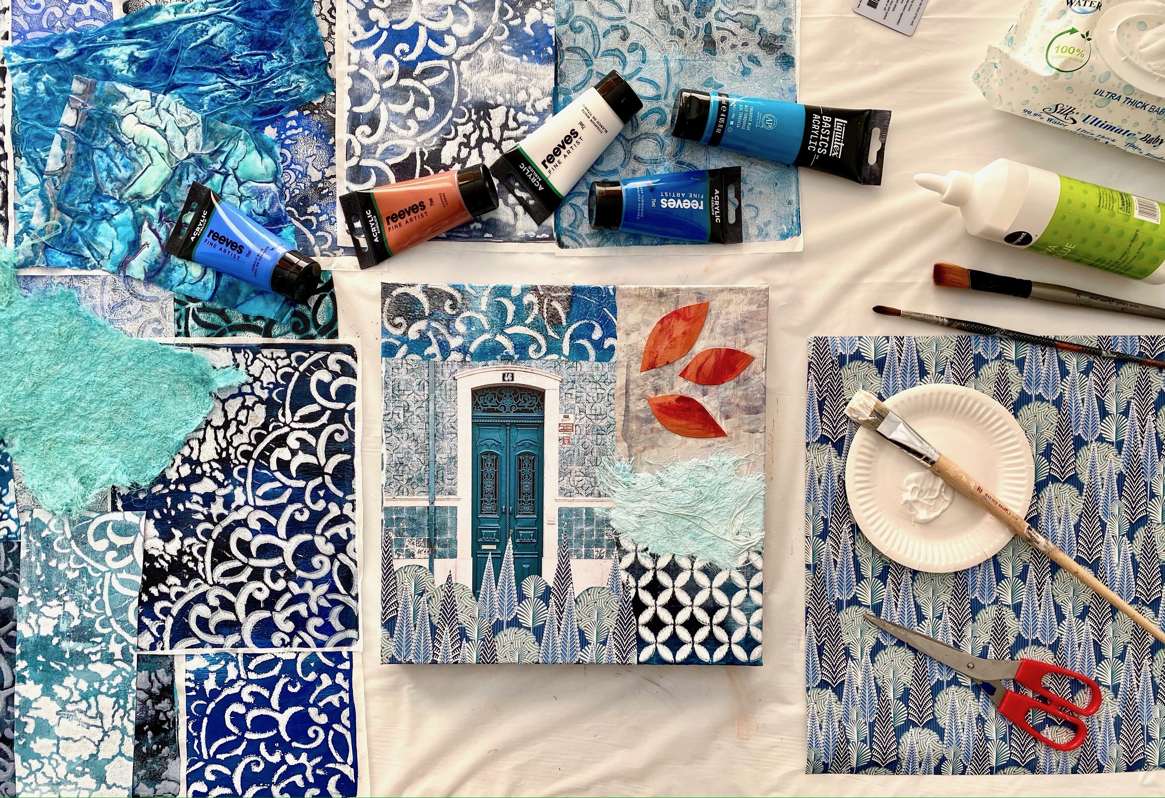
4. Start With the Biggest Pieces To Cover the Background: Right? So you've chosen
your color palette. You have got the
glorious jelly brains and textured papers, some image transfers or
some bubble wrap prints. I just love these papers. You've got all your
papers together. You've decided on what
palace game you going with. Now, what do you do next? Well, I got this Canvas. It's a recycled Canvas. I've painted over it because it was something
that didn't quite work. And it measures 76 cm or
30 " by 102 cm, 0, 40 ". So that's a fairly big canvas. And like I said, it's
a recycled Canvas. I've painted over it, which is just like a primer and it covers a
multiple decisions. So if you've got a canvas that you're not happy with and
you're bored with it. Or you think maybe you
could do something girls pile divert
with just a primer, which takes the canvas
back to white again. And then you can collage on it because collage will
cover everything. We've got our papers, we've chosen our canvas. We're doing a nice
big size today. It's so much fun
doing a big size. You get to use all of those
glorious prints and papers. And we're ready to go. Now, where do you start? Well, number one, you have to decide what your glowing
or the pipe is down with. I personally like to
use matte gel medium. You don't have to, but this is what I use. You can use a whole array of goo or merge pads or anything
else that you prefer. I like this brand and I
like this particular well, I like to brush it on. That's how I like to put
my papers down and I'll put it on a little
disposable plate like this as my palette. So then you just need
a pair of scissors, maybe a couple of
different sizes. I like a couple of
different sizes. And Joe or why it really doesn't take very much to get started. So what's the first
pace that you're going to put down
on your Canvas. I know it's so exciting. Now, I always find
that starting with your biggest pieces is
the best way to begin. Because you want to
establish your background. And collage really in this particular style and technique is about
multiple layers. So you want to put down frames. You're not overly stressed
about if they get covered up as they are
going to be backgrounds. And as you add different
layers on top of your collage, things do get covered. So don't put your
favorite pieces down first because you might
not see it at the end. Now, the way stock is not necessarily the way
that it will finish. So don't get stressed out
at any stage along the way. If you don't like something
because you can change it, you can collage over it. You can paint over it. You can do so many things
to make a difference. But you, what you want to do, first of all, is established
your background. So put a whole heap of your
prints on your Canvas. Don't think about it too much. Don't stress out just kevin, your background with the ones that you're not precious about. And then you'll be ready
to create the next layer. It's a whole lot of fun, especially if you put on some music and you just
pick up the prince, you put them on the canvas
and document too much door. If your prints have been created in a similar
color palette, hollow, like the
previous lessons. Going to match together. And it's all going to be fine. This is a really
fun way to begin. It'll get you moving. And also once you've
covered your whole Canvas, especially if it's as big as this one is behind and
just feel a whole lot better about the artwork
because you won't have a struggle with having a
big white blades spice. It gives us up behaving
and jelly print. That's going to make you happy. So stick them on and cover the entire canvas with a background of your
beautiful prints. Don't stress about it. Don't think about it. Jot get it covered and
it'll be fabulous. Don't stress about it. Just get yourself moving, get the papers on the
canvas and get going. Because once you get going, that's gonna give you
the creative energy, nothing of the next paper
that you want to put down all the next
color or the shape. What you need to think about is this color working
with that column? Yes. Or the shapes working? Don't stress out about that just yet because we're just
doing the background. So put your fabulous
jelly breaks down on your canvas and come up
your whole background. Then we can have a
little discussion in the next lesson
about composition. The colors of your papers. If you continue the brand, the side of your Canvas, and blew them on, it looks really beautiful and
very professional. When your canvas is hanging on the wall and you're
walking up to it. You can see on the
side a continuation of the collar and patent from
what's happening on the front. And that works really well. Tissues, great for that, but also the jelly
prince de work really well getting folded around
the side of the canvas. And it just looks neater
and more finished. Have a look at how fabulous
my background has dried up. Yeah, I'm pretty
happy with this. These jelly prints
worked really well. And if you follow the lesson on using a limited color palette, yours well toes, they love it. It's come up with really well. Now, if you're looking at the composition of
your background, you'll notice that if you did, yours is like mine. There's quite a bit of
squash shapes because I was using a lot of A4
prints the background. So now we're going to have to change that because
we can't have it looking entirely
like a patchwork quilt. Even though the
papers are beautiful, we're going to need
to vary the shapes.
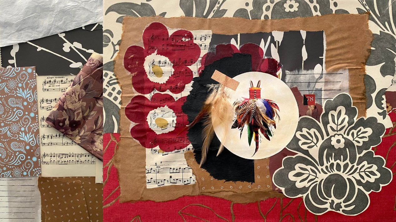
5. Second Layer: Considering Composition: See here how I got these blocks. That's because I stopped the A4 printer jelly prints on here and they look fabulous. I'm loving my color palette. I'm loving all the textures, but I want to break
up all of the same, same number one tip
for our lessons or composition is you want variety. We can all just have
the same size and the same shapes on the canvas
because that's boring. We need something interesting, we need to mix it up. We need to have mystery. And that's why this
particular type of collage is most successful
when we create it in layers. So now we're going to add some more pieces to the collage
that's going to break up the sections and create more interests and
layers and shapes. Now, number two in our
composition tips is repetition. I loved the why
of gut, the sign. Jelly prints stencil
in the print. So I've got this stencil here that I've
used in the print. It's the same stencil
is here, and here, and over here and here, I've repeated that same stencil. I've used the same palette
of colors with that stencil, so it all matches really well. And I absolutely loved that. Also. I've got this tensor here, which is the same as here. They are N over D and
the other section. So that is also
working really well. I'm loving it. Then I've got this stencil, which is a similar
one to this tensile, but not the side. And a couple of these
random jelly prints that are put in
that kind of give you a bit of a rest area because we liked
the patterns and textures. But you also have to have some
plane or some rest areas. So it's not all too much. Sometimes I can get a
little bit too much. I know my colors
are working well. The similar palette
is working well. Number three,
composition tip is, do you want a contrasting color? Do you want something to add? A little bit of present are a little bit of highlight
or something that's going to pop out and really
be a feature of your collage. So I'm thinking, are
you thinking what? I'm thinking? You know, I love me some red. So I might bring
in some red into this beautiful neutral bronze, brown and black palette because I know it would
work really well. So I'm going to my jelly Prince, I want some shapes to break up. The lines and Squarespace
is of these texted print. And I'm going to bring in
some highlights or pops and read the benefit and
using the same state. So in a lot of the
jelly prints is that it creates a
rhythm or a movement, a range of Canvas. So if I'm looking
at this one, i'm, I'm seeing there and then over here I'm saying it down
there in through there. So your eye is
traveling around and seeing the same pattern
in numerous places. So it creates a harmony or
rhythm in the composition. And that works
really, really well, especially when something
is so patterned and texture and completely
abstract, right? So I'm going to bring in some
pieces that are going to just mess up the
bulkiness of the lines. Not sure exactly how I'm
going to put them in, but I absolutely loved the free flowing max
on these pieces here. They're just made
on the jelly play with some ink blots
and some loving it, gonna put that on there somehow. I'm also going to bring in some little areas of warm
tones with some red, like some of these
numbers and some of this writing that's
going to work really well with these
beautiful textures. I had some of these ones here that some more free-flowing
scribbles on paper packaging. God, I love that. And I've
done a few other kind of random jelly prints
that have got far more free-flowing
text in maths. I've pulled out some of
those from my boxes. That's the size you need for the second layer are the ones that would fit in your boxes. Yeah. Telling you this plan
works really well. So a folded out some more texts
to pieces from the boxes. I just have to decide which ones I want to put
on which you're going to enhance the composition and
which colors I'm liking best. I'm definitely going to
add some more white, probably some more black or
some more black and white. I'm loving quite a
few of these cases. And you want to keep working on getting smaller and smaller
with the bits you pulled on. But don't be in a hurry to
put just smallest pieces on yet because you still got another light to
go on your Canvas. Right? So I just need to make some
serious decisions with all of the papers I've pulled out
and stick some things on. Don't forget when you're adding the second layer onto your
fabulous collage painting. You want to make sure you're repeating some of your shapes and colors because it creates that rhythm
around your canvas. So I'm putting the red writing
script, jelly print here. I'm also going to
put another piece up there and another
piece, death. So it creates that kind of triangle there in the
middle of the Canvas. Also, I'm going to put
this section of the gel pretty up here with another piece here and
another piece there. So your eye catches the attention there and
then it travels down the. So thinking about putting three pieces on your
Canvas stationed around where you want the eye to flow and where you
want people to look. Now you don't have to do three, but it is a pretty standard
universal number of in-design elements to
create that flow in that triangle aspect
on your canvas. And especially in such
an abstract collage, you want to have those
connection points of shapes and textures. So it's all very harmonious. We do like a little
bit of harmony. So I'm going to put
these beautiful pieces on and then I'll decide
on the next pieces. Really, it's about
building up the layers and creating the textures and the shapes the way
you like them. Not everyone's going to like your artwork and you won't
like everybody else's, that's just how it is. But create your colors the
way you want it to look. You can think about these design aspects that
I'm talking to you about. But if it doesn't suit
you and it doesn't suit your style or the way you
want to create your colors, then you do it your own way. Really, there are no hard
and fast rules, not for me. Anyway. I create intuitively. So I put this piece down, then I think about what piece
I want to put next to it. I don't have it all planned out. If I don't like it
as I'm going along, I will change it. And if something's working, then I'll keep doing it. That's an intuitive way of approaching this
kind of project. You can lay it all
out specifically on your canvas and have it all
planned out before you start. If you're that kind of person that really
wants to do that, I don't wanna do that because I just find that
a little tedious. And I liked the
excitement of creating it in the process as
we're going along. Because I know if something
doesn't work the way I want, I'll just change it. And also, this type of collage
really is about layers. So you just want
to keep creating the layers and putting the
brakes on until you're happy. And if you're not happy, then you're not finished. It's that simple really. You just keep at it until you're happy and then
you'll be finished. With each layer, the pieces
will get smaller and smaller, and they can also become
more transparent. I'm going to put some
transparent layers on which are just different jelly prints
or mark making or textures, stencils that are
put onto tissue. And the tissue goes
more dissolved, so it looks more transparent. But you want to do
your smallest pieces on your top layer. Otherwise you just
cover them up. And that can be really annoying. Just remember that and you can change things as
you're going along. It doesn't have to stay the way that you
first put it down. Now, I changed my mind and
I don't like this pace. They I can just change it or cover it or put
something else over it. Which way does it
even go that way? And then let's go that way. What I love about this kind of application is that
it's really very free. It doesn't have to be one way. And depending on how you feel on the day when
you're creating it, you could actually make
it ten different ways. Today, I'm loving
what I'm doing. I'm loving these colors. I love these shapes
and textures. And it's a real pleasure. I'm just going to keep putting
them on until I'm happy, until I feel like it's
finished right now. Probably halfway back. We'll get there. Right. Which is the next page. Gonna put this one
down over here. And then I'm gonna go back to my boxes and have a
look for some more. So what I'm doing with these random shapes
pieces is breaking up all of the strong sharp lines and edges from my jelly prints. Because they were Mosley a
full sized pieces of paper. And I do like
having a completely look like a patchwork quilt. I'm making random shapes and breaking up
those hard lines. That's what I'm doing. I'm adding a little bit of
red into the canvas just a little bit because
I want to add some highlights of
some more times. I'm only going to be
adding a little bit. Well, we'll see that's the plan. Right? I'm gonna go and find some more bits from the boxes.
6. The Final Layer: So I'm putting some fabulous
textured paper right here. I loved this. It does go a little transparent, which is fabulous
because I'm very happy for these textures to
come through underneath. And it's just glorious. I love this pipette. Like I said, I'm just
breaking up the sharp, hard lines with
more random shapes. That will be just beautiful. White's going to work absolutely
with this color scheme. Doesn't matter where I put it. It's gonna look fabulous. So I'm going to add a few
pieces of this beautiful what? Haifa. And just keep going
round the canvas now, looking at where the
sharp edges are and the definite blocks of
shapes that I don't want. And I'll keep adding little
pieces of random shapes. I put a red piece
in over here that's on tissue and it's got a dark background so it
won't stand out a lot, but it's a fabulous shape. It's got glorious free flowing mark-making and I'm
just loving that. That's going to
work really well. I think I'm going to
add some more of that, that piece of this
piece of tissue, white tissue, recycled tissue, splash with a pastry
brush with acrylic ink. It is absolutely glorious. One of my favorite ways
of creating colors paper, because it's so versatile, we can use it to so many things. It's soft, as easy to put in
and it does go transparent. So I'm going to add
some more of this somewhere where I'm not sure, but it's going to go on because I like a little
bit of red in it. I think I might add some of
these numbers somewhere to bring some of those in that
could look really good. Or perhaps in the
black and white. I've haven't got many
of these pieces left, but that piece is really nice. And perhaps some of my
glorious bubble wrap pain, there's so much to add, I just love it. These are really
simple ways to make papers printing on your gel
plaque with bubble wrap. You can't get much
simpler than that. Running a stencil through with some paint onto a jelly print. Easy peasy, lemon
squeezy. It's fabulous. It works well and
look how good it all comes together in
the right colorings. So make sure you're choosing
your initial palette of colors and you stick
to it because I'm telling you it
works really well. Of course, black and white, always good to add with
your color palette. And I'll think going
rummage up two mode shapes. Of course, I'm going to add some fabulous circles under
this beautiful campus. Numerous styles. I would say. I've pulled out some
of these made for my fabulous secret sacral
makeup so long ago. And now I'm just going to
decide on which color. If this one, they might
be a bit too light. Niobe, alright, downward, but
there might be a bit dark. Oh right, this one perhaps
could be just right. And I'm going to put them
right up the top there. And I think that
should look great. Let's put those on. Now. This circle shape comes
off the same sheet of this fabulously
scribbled mark-making pattern with the reading. So I'm thinking I might
put it right here. Now, when you've
finished putting your mid-size shapes or
your medium-sized shapes, then you can start
looking at, okay, what little pieces
do I want to add for highlights or for
little focal points? For areas of interests. Or if you find something
that you think are these areas a bit
blend or lacking, you can add a little
piece of something. So that's pretty exciting. That's what we're doing
now we're going to add some little pieces on top
of this fabulous layer. Remember, you could pieces get smaller and
smaller and smaller because they sit on top of
each other layer upon layer. And it just makes such an interesting and
fascinating collapse. So I might add some of these, I might cut some of these
little shapes out of this one or even this one, those colors are going to
work and I'm going to pull out my little scrap bag and
have a rummage through them. I also might find some of my favorite shapes and
add those to the class. I mean, there's so many options. Now you might want to add some letters or some
shapes or some writing or texts or something that pulls your eye to it to create
that focal point. I might find some more of
those papers somewhere. Let's have a look. I think it's coming
along nicely and we just need to add a few
more beautiful pieces. Here's a good spot. It's not entirely centered
because that would be boring. It's a little off center
and it's going to create a really
nice focal point. It's quite big in its shape
and it's very demanding and. Redness. So I think just off-center a little creates an
interesting focal point. I could even develop
some shapes around it. And I think that that
will work great. The tissue part will
become more transparent. And you'll see those
layers underneath. Love using white tissue. Really. So to me, this style of collage application is
like painting with paper. Because you're considering
each piece of paper, like a stroke of pipe, where you're going to
put it, the color, you going to put it, the
shape of the stroke, the text of it. It's pretty much all the
same design elements, but it's just using
a different medium. I absolutely love it. Look at that, look how
the tissue is going transparent and there's just these beautiful
brass circles on top. I loved the fact that
there's only some of them. It's a bit of a tour and paste that I pulled out of my fox. And I think that looks fabulous. The colors working
well with the bronze. That would be a golden,
iridescent bronze fine. Because I can see
how it's gone into that greeny color of the
patina couple of these places. And that looks pretty cool. I'm going to build
up this section as much Good point,
That's my plan. And I might do a sub
focal point here. That's what I'm thinking. But it's covering, well, my mid-size shapes
and now on and I'm just going to add a few highlights with
some smaller pieces. Anything could change
at any moment. Just so I might suddenly come upon an incredible idea that I just have
to follow through. So, you know,
anything's possible. Don't limit yourself, allow yourself to look around
at what you have. The pipe is you have and work
with the texts you've got and don't limit
yourself with what you think you have to do. Because truly everything is
possible, baby loving it. So I'm going to add
some numbers here. I think the Black and
cream color works really well on top of
my red, loving that. And then I also put some
over here and some more of the brown circles as like a secondary focal point
or smaller focal point. I love these colors
and textures together. I think it's looking
really good. Now of course the question is, how do you know if
you've finished? Well, yes, that is
a little tricky. If you put in more on
your canvas because you liked the papers and you
just want to use the papers. You need to take a step back
and say to yourself, Okay, is this pace contributing to the overall impact
of the artwork, or do I just want the
paper stuck on there? Because you are going
to have to come to a stage where you actually stop. Now, I'm loving
this composition. I loved the free-flowing
max of the papers of added. I love my solid
foundation of the base. And I feel like I have
added enough organic, odd shapes on top of the squared format of my base
to make me feel happier, I've got quite a few
different forms of free flowing lines
that makes me happy. I love this textured
paper on top. I love this layer
upon layer with the bronze rings on
the, on the tissue. That's working really well. If I look at this, I can see multiple shapes
in different places. I have the round
circles up there. I also put these round circle shapes down here from
that same sheet. And I have a few more of the similar elements
around the collage. I've got this free-flowing read in a few different places. I have a couple of these pieces. I've got more than one
type of pace around the canvas to create a
harmonious composition. I'm pretty happy with this. I think my focal point needs something more
dramatic to finish. So I think I'm going
to add this here. Now this paste technically is a stencil from PM at a studio, but I'm going to use
it as a collage pace. And I think I'm gonna
put it right there. That makes me happy
because it kind of adds more drama and impact
to my focal point. I also think I might add
a smaller black circle, which is one of these
handmade roses papers onto my secondary focal
point over here. And then the drama of
those two circles, I'm thinking finishes my
canvas really nicely. So that's the plan. Now, if I want to put
more on the canvas, I think I might be just
adding it because I want to add it rather than
contributing to the composition. So I'm going to glue
these pieces on that. I'm going to leave it overnight and look at it tomorrow and see if I'm as happy or if I want to add
some other pieces. Sometimes I wonder into my studio at night
and add another page. What you got to tell
me you don't pay it in your pajamas because I might see an area that looks undeveloped or that
needs a little interests, but it is also good
to have some spice. I liked the space
in this area here. It gives you somewhere to rest. And unlike the space
around that section two, this is quite filled up
with shape and texture, as is this section here. So I'm going to
leave those spaces so they're more open
in the composition. I'm pretty happy
with this, right? I'm gonna glue those down and then I'm going to look at it tomorrow and see if I'm just
as happy as I am right now.
7. How To Finish Like A Professional: So I'm very happy with how
my conscious turned out. I really liked the
multiple layers. I think the limited palette of colors is a very
successful idea. And I love all the textures and patterns and stencils
of my jelly prints. Yeah, I got to use up quite a few on this very large canvas
and that makes me happy. So what we're going
to do next is we're going to finish
like a professional. Now, I personally like to vanish my collages because it's
sales all the papers. It gives us a final coating. It means you can wipe it over when it gets dusty on the wall. And I think it's
really beneficial. Now, I personally like to use this particular
satin varnish. A matte varnish
will be met flat. A high gloss will
obviously be high gloss. But a satin is like in-between. It's not fully glossy, but it's not flatMap as well. So I like this particularly
for putting on the papers. Now you don't have to
manage your collage. Sometimes it does have a
negative impact on your papers. They don't look as paperless. If that makes any sense. I disliked too, because then, you know, all the papers
have been sealed. Satin varnish is what
I personally prefer. I'll just put it
in a plastic goal. Sometimes I'll even
just use a disposable. It really doesn't matter. A nice soft brush that you
just used for varnishing. Don't use like one of your
old brushes that have got crusty bits of
paint in it because that won't give
you a good result. Nice clean brush, soft brush, soft bristles for varnishing. Now, the satin varnish does
come out white and milky. I know, right? It looks pretty weird,
but it will dry clear. It won't dry white and milky. And I just prefer the way it
has a slight shade but not absolutely flat like the medium than I've been using to
glue all the papers on. Say I've just started in
one spot and then I will cover the whole canvas
in the varnish. Sometimes I'll put
a second coat on, but often it only
requires one coat because I just like my
papers to be sealed. And that really
only requires one. Easy peasy, lemon squeezy. This off course is optional. You don't have to, especially as it is
beautiful textured papers. You can just leave your
collage painting as it is. If you want to know what
I use for vanish. Now. You just need to
give your canvas a nice even coat all over, right to the edges. Now, don't forget, you
need to sign your work. And if you've just completed your beautiful collage painting
that you're an artist. Beginning me that
I'm not an artist, that I'm signed my work rubbish. If you've got a beautiful
collage painting that's now all finished, you are an artist. You feel competent enough to
call yourself that or not. Now, I highly, highly recommend you sign your
artwork because number one, you're going to
appreciate it yourself. And people only know how to treat you the
way you teach them. So if you consider
yourself an artist, you consider your work
good enough to sign, whether or not you
sell it is irrelevant. Good enough to sign. You're saying to somebody
else, this is valuable. This is my expression. This is worth something. And you really need to do
that because it's true, it is worth something. You've spent all this time and money creating a
beautiful jelly prints. You've spent all
of this effort in putting this beautiful
colors painting together. It is worth signing. Sign it. Now I put black fluid paint
into a fine line applicator. This is just what I
like to do because as you saw me do that,
It's really easy. And I like easy. You can just use a liner brush. I did this for a lot of years until I found an
easier solution. But if you haven't
gone, either of those, just use a black
permanent marker. And so I, you beautiful
colors with that. Because truly you are saying to yourself, I'm
worth something. This is valuable. It is a piece of
art that I've made. It's worth signing. So yeah,
go on and assignments. And then always got left to do is to type and string the back. And then you can
hang on the wall. How fabulous right
now that you're beautiful collage painting,
artwork, masterpiece. They've been vanish and you signed it and you've
got it all finished. You're going to want to
hang it on the wall. So I'll show you the way that I like to tape and
stream my canvases. First of all, you want to make
sure it's completely dry. The vanishing and
your signature, and then your table that
you're working on is clean, put down on a nice table
cloth or something soft. Because when you turn
your collage over, you don't want it
to get stuck on any stripe Heinz
or sticky bits are papers that you don't want on your beautifully
finished colors. Now, as this is a
recycled Canvas, it's already been taped once. Look at the mess up make with all of the papers that
have gone on top. So I personally like to use a framing type that
I will buy from a framing shop just to neaten the back of it
to tidy it all up. So it looks clean
and neat and it just has more
professional edge to it. You don't have to do this. If you do want to
sell your artwork, then this is a really
good way to finish. Like a professional. It looks clean and
neat and tidy. And it does make
a big difference. I just run the tape along
the edge like this. And then I put a little cat
mat folded over the side. And it just gives it
a nice neat finish. Then I like to measure down
about a third of the canvas. Roughly. It doesn't have to be, you just have to
make sure you do the same measurement by sides. It ends up rather wonky. So make your measurement, put a Mac and then do that both sides of the canvas
for your string. Now I'm using the small D rings which I get from
the hardware store. They come in a pack of a few
and they're quite handy. And then some code. You can get this from the framing shop when
you buy your tape. Or you can even get it from the hardware store depending on what your stores are like. One end through the D-ring, make sure you measure out
enough to tie off your string. Because it can be
really annoying when you go to put the string
on and it's too short. Yes, I've done that. So make sure you've got
enough length on your chord. Two rates the other side, give it a good, pull it tight. And then I like to put
a little tight on it. That's just because I
like keeping things nice. Yes. I know. I'm quite identical about that. So I like to just put a little
bit of tape on the wind it up so that the
strings are nice and nice and everything looks tidy. Then I like to use a little
electric screwdriver button. You can just use a
normal screwdriver. You don't have one. Hello, you are missing
out on a lot of fun. It just makes it
easier with them. Now you want to make
sure the other side of your Canvas is firm with your
string but not too tight. I like to just
twist it like this easily because I had
my string too long. But also it just reinforces the cord and makes it
a little stronger. There you go. Give it a test, see
if it's tight enough. If it's not, you can
just readjusted. Now again from the hard way, I like to put on these
little soft felt pads. Because that just
makes the Canvas sit nicely on the war when it's
leaning against the wall. And it finished things
off really nicely. To some little black felt pads. And we're done. Now. All that's left to do
is hanging on the wall.
8. Thank You & Farewell: Thanks for joining
me in this class. I really hope you were inspired and you created
a fabulous project. Don't forget to put pictures
in the project section. I really love to see
what you created. I hope you learn new skills. You've gained new
knowledge, but mostly, I hope you've gained the courage to really
create the art that you want to create and to continue with your
creative inventors. Putting your artwork
on a canvas and hanging on the
wall can be scary, but she can do it. The competency gained by creating your art
and showing off to all the world really can be
so beneficial to your life. You can view more
of my paintings and find out more or fewer
him on my website. Also, you can find a
free print of one of my favorite paintings
at fro lot.com. Have a look at my other
Skillshare classes. I do have quite a few
others on Jelly printing. Like I said, I've got
a little obsessed. I love this technique because
there's so much to explore. There have a look at
the other classes. I know you guys love them. They are just as much fun, just not as big a project. But I have loved this project. You can also join my
private Facebook group, creative ventures, making up. It's a beautiful community. Can find me there. You can show me more
of what you'll create. We can chat, you can
ask more questions. It's all a beautiful
people making out and traveling together on
this creative with Beta. Now if you have any questions, if you've got stuck
on something or you just want to know
more information, reach out and message me. I would definitely
get back to you. I love making these
Skillshare classes and I'm so glad you joined me here all the best
with your creative inventive or hope to see you
in the studio again soon? Yeah.
 Froyle Davies, Mixed Media Artist