Transcripts
1. Class Introduction: Every day at sunset, there's a small window of time when the most amazing
photos can be taken. This magical time of day
is called the Golden Hour. I love the Golden Hour. But what if we could make all of our photos that
warm and beautiful? Well, with a power of
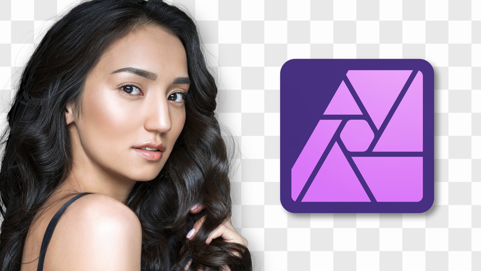
affinity photo, you can. That's why I'm excited to tell you all about my
brand new course. We we'll learn how to create Golden Hour lighting
in affinity photo. Affinity has all of the tools you need to transform a photo. But to make Golden Hour
lighting even easier, I've made 40 assets that come
included with the course. With these assets, you
can easily add sun rays, boca balls, and golden
lighting to any image. These assets are included
with the course and we'll practice using them as we edit a series of
photos together. I'm a big believer in
learning by doing. That's what this
course is all about. We're going to edit a
ton of photos together and learn golden hour
techniques all along the way. We'll start by editing
some simple photos to learn the basics of
adding Golden Hour lighting. Then we'll work our way up
to more advanced projects. We we'll learn powerful
techniques for combining the course assets with
affinities built in tools. That way, you'll be totally
prepared to add Golden hour lighting to your own photos
after you finish the course. But before we dive
into affinity, I want to mention that
this course comes with some important
exercise files. We'll be using these
exercise files all throughout the course. Be sure to download them before continuing with the
rest of the tutorials. You can download the exercise
files in the next lesson, and then we'll jump
right into making Golden Hour Lighting and affinity photo.
Let's get started.
2. Download the Class Files: Before you begin this class, I recommend you download
the Exercise files. These files will be necessary for you to
follow along with the tutorials to
download the files, come to the Project
and Resources tab. Then click on the download link. The files will
then be downloaded to your computer and you'll be totally prepared to follow along with the
rest of the class.
3. Introduction to Assets: The first chapter of the course, I'll show you how to use the Golden hour assets that were included with the
exercise files. I think you're really
going to enjoy them, so let's get started.
4. Installing the Assets: This video, I'll show you
how to install the assets. You should have
already downloaded the exercise files and we'll
use those in this video. The first thing you
need to do is to go to the very top of your screen
and then click on Window, and then click on assets. This will bring up
this assets window, which we'll use
throughout this course, because we're going
to use it so much. I'm actually going to click on the word assets right here and drag it over to
dock it like that. That way, this will just stay
accessible the whole time. It'll just live over here. Once you have that docked, go to the very top
hamburger menu. And then go down to where
it says Import assets. From here, go ahead
and navigate to this very first
Exercise file folder. It's called
Introduction to assets. Then you can click
on the Golden Hour Assets file and press open. And just like that,
you have all of the Golden Hour
assets installed. In the next video, I'll show you how to apply these assets.
5. Applying the Assets: Let's learn how to apply
assets in this video. First, I want to open
up an example photo. I'll go up to file, and then down to open. I'm going to choose this
adorable duck photo from the exercise files. I'll just open that up. Now that we have a photo to
apply our assets to. We can start adding assets. Now, there are two ways to
add an asset to your photo. The first way is just to click and drag on the asset
to bring it in. This will place the asset
at its native resolution. For most of these assets, the native resolution is
4,000 by 4,000 pixels. This means that it will probably be a little bit smaller
than your photo. Once you have it in,
you'll need to adjust the size of it to make
it fit just right. Because this involves dragging
it and then adjusting it. I actually prefer the next
method for bringing in assets. I'll just delete these. I'll show you that my
favorite way to bring assets in is actually to
double click on it. This will load your cursor
so that it's right here, and all you need
to do is click and drag to fill your
document with this asset. If you have snapping turned on, this is super easy to get it snapped to the edges just right. Once you have the asset added. The different blend modes and opacities will be
your best friend. We can go ahead and change
the blend mode here. I think I'm going to
change this one to screen, and then I'll lower
the opacity by clicking and dragging
on the word opacity. Here's the before
and after of that. Just like that, you've added
your very first asset. Great work. Now that you
know how to apply assets. In the next video, I want
to give you some tips for using the asset panel. T.
6. Assets Panel: Now that we've installed
and used the course assets, let's take a minute
to learn a little bit more about the asset panel. The first thing I
want to show you is that if you go to the
Top Hamburger menu, you can actually go down
and click on Show as List. This will display your assets so that their name
is right next to it, which will be pretty
useful in this course. That way, as I click on
different assets and apply them, you'll be able to
see the name of it, which will just help you
follow along better. I tried to name each one of these something useful
and descriptive, but it was a little tricky. If you want to
rename any of them, you can just right click on it, and then click on rename asset. Another thing I want to
show you is that up here, we have different
categories of our assets. We have the default, which is just the assets
that came with the program, and we have our
Golden hour category, which is what you
just installed. Inside of each category, you have different
subcategories. This is just useful for
keeping things organized. For example, you might have
a category for web design. Then within that, you
might have subcategories, four different types
of websites like blogs or social media
or cooking websites. Having subcategories is just useful for keeping things
like that organized. As you can see in this
Golden hour category, we have two different
subcategories. We have the default, which is what we used in
the last video, and we have ready to go. The ready to go
subcategory is actually extra useful and here's why. When you apply one
of these ones, I'll double click and then
click and drag this one in. You can see that we already have the screen blend mode
applied to this. So it automatically
blends in with our image, and over here in the layers, we already have the FX icon applied here so that
we can just click on that and then adjust the gaussian blur from here
to blend it in better. You might not need to
blur every one of these, but it is useful
just to have this available to you
right in your layers, because we have the
blend mode changed and the blur extra available to us. This just saves some time as
we're applying the assets. I'm going to be using this ready to go category
throughout this course. One last thing that I wanted
to mention is that you can actually arrange the
different assets within their categories. For example, if you find
yourself using this one a, you can bring it up
more toward the top. I'll just bring it back
down to where it was. And you can also click and drag to rearrange
these categories. Okay, now you know how
to use the assets panel, which is perfect
because we'll use it in the next video to make
a new assets category.
7. Asset Categories: This video we'll make a
brand new asset category. For the next two videos, I want to show you how to create your own categories and how
to make your own assets, just in case that's something
you're interested in. To get started with this video, we'll create a new category by going to this Top
hamburger menu, and then clicking on
Create New category. I'm going to name this
category, colorful assets. Then I'll press, and we're in. It automatically becomes
the selected category. We already have one
subcategory here. But let's just make one more subcategory to make
multiple subcategories. Just come to the top
hamburger menu and then go down to where it says,
create subcategory. We have a category with
two subcategories. I'm just going to
rename the top one. I'll call this one red assets. I'll rename this
one blue assets. Once you have a subcategory, you can make an asset
to add into it. I'm just going to
pick any shape. I'll just choose
the rectangle here. Then I'm going to drag out a
square while holding shift. I want to put this
into our red assets. I'm just going to make
this a red square. To add it as an asset. All you need to do is
have its layer selected. Then go to the Hamburger menu next to the subcategory
you want to add it to, and then you can go
down to where it says add from selection. As you can see, we now have
this asset added right here. This will also take the name of your layer as the
name of the asset. But you can go ahead
and rename that if you want by right clicking
on it and renaming it. Next, we can go ahead
and make this rectangle blue so that we can add
it to our blue asset. I'll also rename the layer
by double clicking on it, and I'll just call
this blue square. Now that we've changed the name, watch what happens when
we add this as an asset, I'll go to the hamburger
menu and add from selection. You can see this one's named Blue square because that
was the name of our layer. I'll just delete this
blue square now to show you that we can go ahead
and add these assets now. I'll double click.
It's loaded into our cursor and I can click
and drag to add this asset. Just like that, you've make
your very first asset. This was just an example though. I'm going to go ahead
and delete these. I'll delete the blue square. To delete just one subcategory, you can go to the Hamburger
menu and go to delete. Press. Or if you want to
delete an entire category, you can go to the
top hamburger menu and then go down
to where it says, delete category. Press yes. And just like that,
it's deleted. Let's go back into the
golden hour assets. The blue and red assets
really was just for practice, but here's an example of a subcategory that you might
actually want to make. I'm going to go to the top, and then I'll press on,
create subcategory. I'm going to rename
this subcategory, and I'm going to call this
one favorites. I'll press. Then I'm going to close this up and then drag it to the top. With that, we're all set
up for the next video, where we're going
to learn how to add assets into this subcategory.
8. Making Assets: Learn how to make beautiful
assets in this video. When I make assets, I like
to start with a blank slate. I'm going to create
a new document to make our assets on top of. I'll go up to file and then new. From here, I want to
make a document that's 4,000 by 4,000 pixels. Right now, we're in
the print section, which is making our
measurements set to inches. I'm just going to go down
to where it says web, and I can click on any of these to change our
measurements to pixels. Then I'll just click in
this box and type in four. Then I'll press Enter, and I'll do the same for the height. Now we have a perfect square
that's 4,000 by 4,000. You could really
choose any measurement you want for this file. But just to keep
things consistent with the other assets
I've already made, I'll go ahead and
set it to 4,000 by 4,000 for this one.
I'll press Create. Using this blank document, we can go ahead and begin. The first thing I want to
show you is how to save existing assets into our
brand new favorites category. To do this, I can
go ahead and just click and drag to add this in. Since these assets are the
exact size of this document, clicking and dragging
is no problem. It'll fit perfectly. Now that we have it
in our document. All we need to do is go next to the favorites and click
on a Tamburger menu. Then click on Add
from Selection. Just like that, we've added this asset into the
favorites category. You may have noticed this is a pretty roundabout way
to duplicate an asset, but that's what we have
to do because that's not actually an option when
you click on the assets. This is just a
little work around. I'll delete this one
and I want to show you that you can actually add
multiple assets at a time. I'll just click and drag a
few more assets into here. With all three of these assets, I'll hold shift and click. Now all of their
layers are selected, and I can go up here
and add from selection. This allows you to add
multiple assets at the same time as long as their layers are
selected, which is. I also want to show you
that you can actually modify your assets
before saving them. To do this, I'm first going to start by just bringing
one of these circles in. Then I'm going to
add a blur to it. I'll go to our f X. I'll check on the
Gaussian blur option. Then I'll bring
the radius all the way up to make it
nice and blurry. With that, I'm just
going to go up to our favorites category and
add this from our selection. Now you can see we have
this blurry circle saved. Another way you can
modify these assets is actually taking any of these top ones here,
bringing it in. Then you can actually
change the colors in this gradient because I just made this with
the gradient tool. Go ahead and click on
the gradient tool. You'll be able to see all of the different colors that
I added to create this. If any of these colors aren't
really working for you, you can just click
on one of the color stops and you can change the
color from right over here. Once you have that modified, you can go ahead and save this into the
favorites category. Once again, I'll click
the Hamburger menu and add from selection. And just like that, we have
a brand new asset created. Of course, I want to
show you that you can also make your own
assets from scratch. To do this, I'm just going
to click on the rectangle. Then I'll click and drag
fitting this to size here. This has actually saved the colors from
the last gradient. I'm going to click on
the gradient tool, and I'll just delete
this middle color stop, and we can create our own
brand new gradient here. On this top one. I'm going to make this a nice
dark blue color. And for the bottom
one, I'll select that. I'm going to make this
a nice light blue. I'm going to double click
to rename our layer sky. With that layer selected, I'm going to add this to
our favorite category. And just like that, we have
a brand new asset saved. You can also make
any photo an asset, which is what a lot of these assets that came
with the course are. You can use your own photos
or you can find them online. Then you can just save them as an asset just as
we've been doing. With that, we're done
with the first chapter. Great job. Now that you know
all the basics of assets. In the next chapter, I'll walk you through some practice
projects so that you know how to make
the best use of the assets that come
with this course.
9. Practice Projects: That you have the
Golden hour assets. Let's learn how to use them. But instead of doing a bunch
of boring technical lessons. Let's have some fun
and learn by doing. In this chapter, we'll learn
practical skills for using the Golden Hour assets by editing a series of
photos together. We'll start off nice
and simple and then work our way up to more
advanced projects. By the time we finish, you'll
be totally prepared to add Golden Hour lighting
to all of your own photos. I'm really excited to do
these projects with you. They're going to be a lot
of fun. Let's get started
10. Simple Sunburst: For this first project, we'll make a beautiful,
simple sunburst. First, we need our
exercise file, so I'll go up to file, and then down to open. This is the second
exercise files folder, and I'm going to choose
the first one for this, and then I'll press open. For all of these projects, we're going to use the ready to go assets just to
save a little time. To add a simple
sunburst to this one, I'm going to scroll down. I'm actually going to add star explosion
three to this one. I'll just double click on this. Then I can click and
drag to add this end. Just as a quick tip, you want to place your asset where the
light could be coming from. In this picture, I think it's coming from this top corner. I'll just place this right here. I actually think this one
might be a little too much, so I'm going to delete this one. Sometimes it might take a little experimenting to find
just the right one. I'm actually going to use
unburst number three. I'll double click, and
I'll add this one in. You can see this one's
just a little bit softer, which I think will look
really nice for this picture. I want this to cover
the whole picture and be set in this corner. I'll need to make this
a little bit larger. All right. I think this
one looks really nice. Here's the before and after. In this video, I just wanted
to show you how sometimes you'll need to try
out a few assets to get the look
you're going for. Keep that in mind
as you use them. There's no shame in trying out a bunch of them to
get the right look. Now that you know
that. In the next one, we're going to add
some rays of light.
11. Simple Light Rays: Let's add some simple
light rays in this video. For this first image, it looks like there's
a skylight up here with light shining down
behind our subject. I'd like to add some
light rays up here that are streaming
down onto our subject. To do this, I'm going to scroll down and I'm going to
use light ray one. I'll double click to load that. Then I'll zoom out
so that I can cover the whole picture with
these light rays. I think I'm also
going to angle this a bit so that it looks like it's streaming
from this direction. All right. That
looks pretty good. I think I'd like to customize
the blur a little bit. I'll click on the F
X icon right here. Then I'm just going to increase the radius to soften that. Next, I want to show you a little trick that you
can do with these assets, and that's that
you can mask them. I'm going to apply a
mask to this layer. Then I'm going to grab
the paint brush tool. Now I can paint in black
paint with a nice low flow. I'd like 10% for this. We can go ahead and remove the asset from off of areas where it
doesn't quite belong. In this picture, since the light is coming from
behind our subject, I'd like to remove this a little bit from our
subject's face, and any other areas where it's just standing
out a little bit too much. Here's what
that looked like. Here's the before and
after of the mask. Here's the complete
before and after. I think I'll also
lower the opacity of the light rays a little bit. But I think this looks
great before and after. It's so much fun to add
light rays to things. Let's do it one more time. For this example, I'd like
to add some light coming from this direction with a rays streaming down onto our subject. For this one, I
think I'm going to use a light ray number six. I'll double click. I'll
zoom out a little bit, and then I'll cover the whole photo with these light rays. These light rays
are pretty harsh. I'm going to go over to our ef and I'm going to increase
the blur to soften them. That already looks nicer. But I'm also going to use our masking trick
to remove it from our subject just so it looks more like the light is
coming from behind her. I'll add a mask. Then I'll grab the paintbrush tool and I'll paint in black paint with
a low flow once again, just to remove this
off of our subject. You don't need to be too
scientific with this. Just do whatever looks
good to you to your eye. You might not need to remove every single light ray you see, but I think just
softening it a little bit off of our subject
looks pretty good. Especially on her dark pants, these light rays are
really standing out. I'm going to pay
special attention to remove the rays
from that area. The reason I like using a
low flow is because you can slowly build up
your paint to remove. I think this just makes
it look a lot more natural because you have
more control over it. With that, here is the before
and after of our mask. I think I might paint a little
bit more on her face here. And here is the before
and after of that. Now, this still looks
pretty intense to me. I think I'm going to lower
the opacity of this one. Just to tone it back. But
here is the before and after. I think this looks so good. Now that you're acquainted with light rays and you know
how to mask assets. In the next video,
we're going to have some fun as we add some
light rays to a window.
12. Window Light Rays: This video, let's add some
light rays to a window. I want the light rays to be streaming into our
subject from the window. I'm just going to double
click on L light ray six. Then I'll drag this
out so that it covers the whole image with the center point of the
light, landing about there. First, I'm going to remove
some of the harshness of these rays by customizing
our Gaussian blur. I'll click there
and drag this up. I think that looks pretty good. Next, we're going to do some painting to remove
this from some areas. I'll add a mask. I'll grab the paintbrush tool and
let's paint in black paint. Now, this window
image is a little bit trickier because
there's more elements that are blocking the light. For example, this
window pane area right here shouldn't have
light cast on it too. It should have a little
bit of light since the light is probably
bouncing around the room. But for the most part, I'm going to remove it from this area. Then I'm going to remove it from our subject just so I can see
here a little bit better. It should be coming
from behind her. Especially make sure you
get it off of her legs, since it shows up pretty
harshly on her pants. I think I'll paint it off
of this side of the chair a little bit since this part of the chair should
be blocking those sun rays. Anywhere where it makes sense to you that the light
wouldn't be shining, go ahead and lightly remove
it from those areas. Another thing that
always helps with this painting is just to
lower the overall opacity. First, I'm just going to show
you what this looks like before and after with the mask. Now I'll lower the opacity and show you the before and
after with those light rays. I think this looks pretty
natural before and after. Now, one thing I
want to show you in this video is that
you can combine adjustment layers on top of your assets to really
help sell the effect. To help this effect
stand out more, I'm going to add a
curves adjustment. To start, I'm going to
drag up the black point, which will just fade the
shadows a little bit more. Then I'll bring the white point over just to make
it extra bright. I don't want the whole image
to be this bright though. I'm actually going
to add a gradient, so I'll select that tool. I'm just going to drag
it up from the bottom. You can see this is
mainly being applied down here and then
it slowly fades out. Here's the before and after
of that curves adjustment. You can see this is
especially just helping this area to brighten
up those shadows. All right. With that, now
we can see a complete before and after of this
window light ray project. How fun is that? Great job. In the next video,
we're going to do another effect by adding
a sunset to a photo.
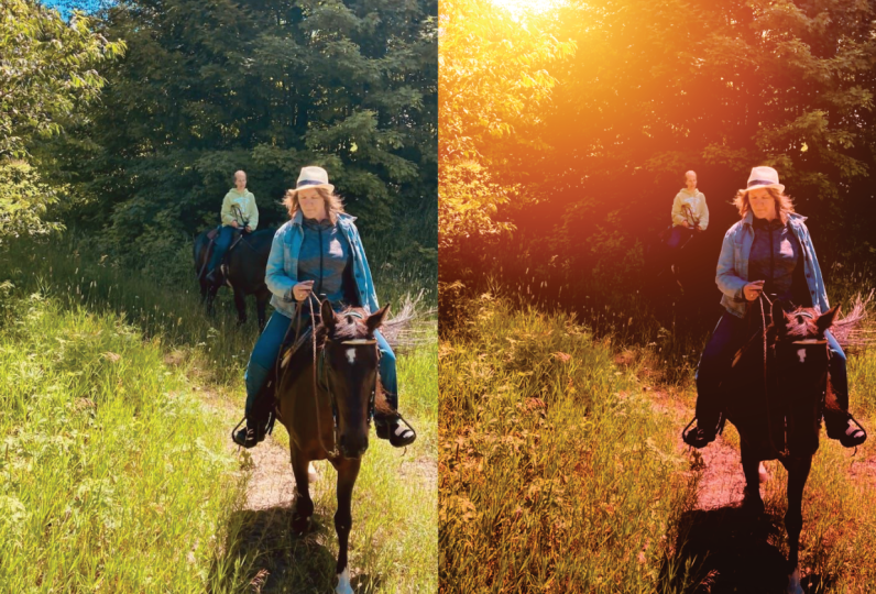
13. Walking at Sunset: This video, we'll use the assets to create
a beautiful sunset. For this picture,
I wanted to look like this couple is
walking toward the sun. I'd like to place it
somewhere around here. I think this will also
look good because the clouds look like they're
going out in that direction. That could add to the effect. The asset I'd like to use for this is called Sun flare two. There it is. I'll
double click on that. Then I'll just zoom out a
little bit so I can cover the whole picture
with this asset. I wanted to be in this area
but I also want to angle it so these harsher rays aren't
directly covering her face. I might need to make this
a little bit larger. Another strategy is
just to rotate this. Now you can see her
faces in between those rays. I think that looks. With that set, I'm
just going to go over to the layer and
click on the F X, and I'm going to increase
the blur, just to soften it. I think around ten pixels
looks pretty good, so I'll close out of that. Then I'm just going to
add a mask to this layer. Now I can grab the paint
brush and I can paint in black paint just to
remove it from a few areas. Again, I just want
to make sure it's definitely not on her face, but I'll also paint
it off of her since the sun should
be shining behind her. I'll paint it a little bit
off of this subject as well. I think that looks pretty good. Next, I actually want
to add one more asset, and I'm going to fill the whole photo with this
Sunburst square right here. I'll double click, and
then I'll click and drag from edge to edge to
add this to the photo. Right now it's set to
the screen blend mode, but I'd like to try different
blend modes for this. Let's just see what
could look good. I think we'll go with
overlay for this one, but I'll lower the
opacity quite a bit. We have that nice warm
coloring being added. Here's the before and after. I think I'm done
with the assets. I'm just going to add a few adjustment layers
to finish this off. First, I'm going to add
a curves adjustment. Because I want to just
make sure that this photo is bright enough for it
to make sense for sunset, all these sunrise
are streaming in. I'm actually going to take
the white point and drag this over and you can see
how bright this becomes. It's way too bright right here, but we'll fix that in a second. I think this looks pretty good. To remove it from that area, I'm just going to grab the
paint brush and I'll paint in black paint over the sky
just to tone that down. But you can see the rest of the photo is a lot brighter now. Here's the before and after there's still a few areas that are a little too bright
like the sky behind her. That's okay. We can just
quickly paint that. Here's the after of that. As one last step, I think I want to add even
more saturation to this ph. I'm going to go ahead and
add an HSL adjustment. I'm going to increase
the saturation. I think this is actually looking a little bit too red
now on the skin. I'm going to take the huge
shift slider and I'll just bring that down a
little bit to remove that. Just a little bit. Here's the before and after of enhancing
the colors a little bit. Now I'll just select all of
the layers to show you a complete before and after. All right, this looks so good. Now that you know
that you can stack multiple assets on
top of each other. In the next video, we're
going to do this again. Using multiple assets to
create a beautiful effect.
14. Summer Drive: 's use the assets to create a summary effect for this photo. Right now, this girl is
just sitting in her car. It looks a little dark. But I want to add some
nice sunshine to it, just to make it look
more comfy cozy. The first thing I want to add is called a star
explosion number one, which sounds really
intense and it is. I'm going to double quick. Then I'm going to zoom
out quite a bit so that I can drag this over
the whole image. You can see what
this looks like, and I think I actually want these to be
streaming downward. I'm just going to flip this
upside down like this. Then I'll place this up in the top corner where it looks like the
sun is streaming in. I like these light rays and
these little dots here, but I want to soften
them a little bit, so I'll go into our effects, and then I'll just increase
the gaussian blur. About like that. Maybe I'll also lower the layers
opacity a bit. Here's the b four and after. It's always nice to make this
a little bit more subtle. But you can still see the
nice sunshine effect. I want to keep it subtle
because we're going to add a few more assets
on top of this. The next asset I want to add is called the lens flare Boca. I'll double click, and I'll drag this one out. I like this one. It just adds these
two circles here. I think I'll angle
them like that. It looks like it's coming
from this direction, and I'll just push
these off to the side. I'll go into our
gaussian blur next, and I'm just going to tone
this down by blurring it more. Something like that. I'll lower the layer
opacity as well, just to tone this down.
That looks pretty good. Here's the before
and after of that. As one last asset to add, I'm going to go back
up to our squares and I'm actually going to
select the colorful square. I'll double click and then I'll click and drag to fill
the whole picture. I don't actually want this
to cover the whole photo. I actually think it'd be nice if it was streaming
in from the side. To mask this. I'm
going to add a mask. Then I'm going to grab the
gradient tool and I'm going to click starting
from the left side and I'll just bring
it over to the right. Now that we have that
beautifully streaming in, I'm just going to
select the whole layer again and I'll
lower its opacity. I think that looks pretty good. Here's the before and after
of adding in that color. We're almost done.
I just want to add a few more adjustments. First, I'm going to add
a curves adjustment. With this curve, I actually want to add a little
bit more contrast. To do that, first,
I'm going to brighten the photo a bit by bringing
over the white point. But then I'll darken the rest of the photo just to enhance the
shadows a little bit more. Here's what that looks like
before and after, after. I think that's a
beautiful difference. Last, let's just add an HSL adjustment to bring up the saturation
of our colors. I'll bring that
up to around 10%. Here's the before and after
just a subtle difference, but it adds a little bit more
color there before, after. And now I'll just select all of our layers and I'll press H
to get the hand tool out. All those boxes go away. Now you can see a complete
before and after. V n. All of those layers
made subtle differences, but I definitely think this
looks more like a warm drive. Very nice. In the next video, I'll show you a few
examples of how we can get even more creative
with our assets. A
15. Getting Creative: Let's get creative
in this video. So far, we've seen a lot of ways to use the Golden Hour assets in sunshiny photos to add a sunset or to add
some light rays. But before we continue with
more golden hour projects, I just wanted to detour
and show you that you can use these assets
in a lot of other ways. Even if that's not necessarily
what they were made for, we can still get creative. For this first one, this isn't exactly a golden hour lighting, but we're going to add
some beautiful rays coming from this lantern. To do that, I'm going to use a sunburst number three.
I'll double click. Then I'll just zoom
out so I can bring this over the entire
picture like that. Then I'll just place
this over the lantern. I'm just going to blur this a little bit using
the Gaussian blur. Bring that up a
little. All right. This might not be a sunset, but as you can see, this light looks just
right for the lantern. I think this one turned out
really nice and very simple. Let's go to the next one. This one is a nice
dark nighttime photo. It doesn't really make sense to add a sunset or
something like that. Instead, we're going to use this really cool one
called a light leak. I'm just going to
double click on the first one, Light
leak number one. Then I'm just going to click and drag to bring this
over the photo. And I'll lower it
down like that. I think I'll lower the
layer's opacity a little bit. I think this one looks
really nice so far. I just want to add
an adjustment layer to enhance this even more. I'm going to go down to our
adjustments and add a curve. For this one, I actually
want to brighten the black point to fade out
the dark areas of the photo. But then I'll just
click and drag to the rest of this to the spline in the
middle like that. Maybe even more. Here's
the before and after, and you can see how that's
faded out the image. Now we can select both of these to see the complete
before and after. I really like how we
use this light leak to mimic the colors of the car
lights in this parking lot. It's definitely not golden hour, but it's making
this nighttime shot look really interesting. Let's do one last one. For this one, I
want this to look like a beautiful
sparkly fantasy. This might not look
the most realistic. But for this one, I'm going to add a bunch of golden
sparkly light. To do this, I'm actually
going to use the golden Boca, and I'm going to use the
one that says bottom. I'll double click on that. The reason this is called
bottom is just because the light is coming from the
bottom area of the photo. You want to position
this so that you can still see her face nicely. I think that looks pretty good. I'm going to adjust the
Gaussian blur next. I'll just increase
this a little to soften the edges of all
of these boca balls. Then I'm going to
add a mask to this, and I'm just going to
paint in black paint to remove anything that
doesn't look quite right. One thing that
definitely doesn't look right is this line going
across the bottom. That's because this is
where our layer sits. You can see it
right across there. If you want to get rid of that, an easy way to do that is
just to make the whole image. But if you don't
want to make it, you like the positioning, then you can go
ahead and paint in black paint on the mask
to remove that line. So far in the
course, I've always made our asset picture larger just so we don't
need to deal with these edges because it's
annoying when that happens. But I just wanted to show
you how to deal with that. And I think I'll also mask some of the sparkles
off of her face. I just want to add one
more sparkly Boca asset. Just for a variety,
I'm actually going to use the Golden Boca Top one. I'll double click and I'll
click and drag this out. But I'm actually going to
flip this upside down, and we're just going to fill
this bottom area with it. To bring in a little
bit more sparkle. I'll click on the Gasian blur and I'll increase the
blur of this one. Then I'm just going to
add a mask to this, and I'll paint in
black paint just to remove this line right here. You can even increase
the flow all the way if you want to
just make this faster. Paint it all the way away. Then I'm going to lower my
flow with a larger brush, I'll use the bracket
keys to make this. I'm just going to lightly
paint over the area, just to blend it in nicely. Let's just add a couple of adjustment layers to
round this all out. I want to make the
photo brighter because it's starting
to look pretty dark. I'm going to go and add
a curves adjustment. I'm going to make the
White Point brighter, which will just brighten up
the highlights even more. I'll bring up the
midtones as well. Here's the before and after. I don't really like how
this is brightening some of the voca balls
a little too much. I'm actually going to lower this underneath so that we're
only brightening the photo. I'll click on the top
layer again and to finish, I'm just going to add
an HSL adjustment. I'm going to increase
the saturation. That's pretty bright.
I'm actually just going to invert this with
command or control I. Now it's hidden, and I can
paint in white paint to reveal that saturation wherever I want with my low
flow paint brush. I'm just going to lightly
paint and white paint over her face to add
that warmth then. I'll paint it over
her hands as well. With that, I'll
just select all of our layers so that
you can see the before and after of
this magical portrait. As you can see, with
a little creativity, these assets can be used in so many ways to create
unexpected effects. Now that you know how
versatile these assets are, let's keep going and make a beautiful beach sunset
in the next video.
16. Sunset Beach: This video we'll add
a sunset to a beach. This picture already
has a sunset going on, but I just want to raise
the sun in the sky a little bit so we can see its beautiful
rays shining out. To start, I'm going to go to
where it says Sun flare two. You'll have to scroll down
a little bit to get there. I'll just double click on it. Then I'll click and drag
this over our document. All right. I think that
looks pretty good. I'm just going to click on
the F X so that I can blur the rays. That looks pretty good. Now, at this point, you
could add a mask and remove some of these light
rays from off of their backs. But I think I'll just
leave it for now. Next, I want to add a little
bit more color for the sun. I'm going to do that
with solar flare one. I'll double click, and then
I'll click and drag this out. You can see how this just adds a little bit of
golden color there. I'll put that like that. I think I'll click on the blur just
to blur this even more. It's already pretty blurry. But the more you blur it, the more the colors will spread, so I think this will be
pretty good to blur it more. Last, because I did insert
this at a smaller scale. You can see the lines
going around it. I'm going to add a mask, and then I'll grab my paint
brush and I'll paint in black paint on the edges
just to smooth them out. We don't want to see these
lines going around this. I'll increase the
flow a little bit, and then I'll paint
it off of the edges. And then with a nice big
brush and a lower flow. I'll just smooth it all around. Next, I think I want to
add even more color. I really like that
golden coloring, but I want more color
in the picture. I'm going to scroll to
the top of our assets, and I'm going to choose
the Sunburst color circle. I'll double click on that. I'm just going to put this
right up here at the top. Then I'll go ahead and click on the F X so that I can blur this, and I'm going to
blur it quite a bit. When I raise it all the way
up, that's pretty good. But I think I'm going
to type in one. Which will really blur it. Now you can see what
that looks like. Here's the before and after just adding some of
that pink color to the sky. Because we blurred it so much, it's also coming
down even farther. I think this looks pretty nice. For one last asset, I really like the
lens flare Boca. I'm going to use that
one again in this one. I'll double click on that. I'll click and drag out these
two little circles here. I think I'm just
going to angle them, so it looks like
it's coming from the sun and I'll place it. It's overlapping with our
subject a little bit like that. I'm going to blur this. I'll just raise this
up about like that. Once again, I'm going
to add a mask so we can just remove the
lines going around it. These ones are a little faint,
but they're still there. I'm going to grab
the paint brush. Once again, I'll just raise up the flow so that I can paint
this a little quicker. The ones on top I
can't really see. I guess if I can't see it, they're not really a problem? I'll just leave it like that. Then I'll select the whole
layer and I'm just going to lower its opacity to
make this more subtle. All right. This looks
so good so far. Here is the before and
after with those assets. As one last step, I just want to add
a color adjustment to really help bring
all of this together. I'll go to my
adjustments and I'm going to apply the color
balance adjustment. This adjustment allows you to change the colors
of the highlights, mid tones, and shadows
all separately. It's very subtle,
but I think this makes a really good
difference in the end. First, for the mid tones, I'm just going to
increase the reds. Maybe I'll add a little bit of magenta by bringing
this lighter down. Then I'll add some yellow by bringing this s lighter down. The yellow magenta and red will all help to
warm up the photo. But I do think this is
getting a little too warm. I'm going to go to the
highlights next and I'm going to cool them down a little bit
just to counteract this. I'll add Cane by bringing
the slider down. I think adding a little
magenta actually looks good for this. I'll do that. Maybe I'll add a
little bit of yellow. I think it was just
looking to red before. Yeah, that's what needed fixing. Now that that looks
nice and balanced, I'm just going to go
to the shadows and the shadow sliders are actually
really sensitive here. You can see as I drag this. This whole sandy beach
area changes completely. I want to be very careful
of this and I'll just add a little bit of
yellow and call it good. Now you can see the
before and after of that color balance
adjustment before and after. Now that we finished
adding in all of those assets and adjustments. I do think that I want
to go back and just mask this first sun flay off of
their backs just a little bit. It was a little more
subtle before we started stacking all
of these adjustments, but now I think it just
looks a little too obvious. I'll click on that first
layer and then add a mask. With my paint fresh
tool, I'm just going to softly paint
across their backs. I do need to lower my flow
a little bit to make this more subtle. All right. So I'll just paint this to
remove this a little bit. All right. I think
that looks better. And now we can go ahead and select all of the layers to see complete before and after of
this amazing sunset photo. This photo just looks so
warm and relaxing now. I want to go to the beach. I think changing the
colors like we did with that color balance made
a huge difference. In the next video,
we're going to continue this process by using more assets and more
color adjustments to warm up another picture.
17. Sunny Field: This video we'll add warmth
and sunshine to a portrait. For this portrait, I want to add a little bit of sunshine
coming in from this direction. You can see she has a lot
of highlights on her head. I think it makes sense
to place it over here. I'm just going to
scroll down and I'm going to use the one that's
called Sun raise one. I'll double click. Then I'll just click and drag to add
this over our portrait. I think this one's so
pretty with all of its sparkly boca balls coming
in and the light rays. But I do think I want
to tone this down. These rainbows on her face
look a little unrealistic, even though they are beautiful. To tone it down, first, I'm going to click on this F X, and we'll just
increase the blur. And I'll increase
it quite a bit and you can see how this has
removed those rainbows. But we can still see
all the sparkly light and this big red spot. I'll just close out
of that. Next, I actually want to
use an adjustment to modify only this asset. I'm going to go ahead and
add an HSL adjustment. But instead of
affecting the whole, I'm going to place it as
a layer to our asset. Now as I adjust this, you can see only that asset
is being changed. The first thing I
want to adjust on this is actually the
luminosity slider, which is a little strange
how this one works. We don't usually use
the luminosity slider, but in this case, it actually tones down
the colors in the photo, and I think this
looks pretty nice. I'm going to lower that down. But now it's starting
to disappear too much, so I'm just going to increase the saturation to bring
back some of that color. Now I'll just go to our
child layer so that you can see the before
and after of that. With that nice and tone down, I'm just going to select
the main layer again. I'm going to add a bunch of
global adjustments on top of everything to really help
sell this sunshine effect. The first adjustment will do is the color balance adjustment. I love the color
balance adjustment for how subtle it can be. Let's go ahead and start with the mid tones and we'll
subtly warm up the mid tones. I'll bring it over
to add some red. I'll add a little bit of magenta and a little
bit of yellow. Next, we'll do the shadows. I just wanted to explain
really quick how I'm deciding where to move the sliders because it might be
a little confusing. For this, usually, I just
move the sliders back and forth and decide which color
combination I like better. Do I like more blues or
do I like more reds? In this case, I think
the shadows look nice when they have a
little bit of blue added. I'll move it over like that, and I'll do the same
for the next one. I think the magenta
looks pretty nice, so I'll bring it
over toward Magenta. And I just do that for
every single slider. If I run into a
slider like this one where I don't think
either look very nice, I'll just double click to reset it and leave that one alone. Last, let's do the highlights. Don't like that one. That
one looks really bad. I think it will just cool down the highlights
a little bit. I think that looks
nice to counteract all of the warmth
that we've added. This is pretty subtle, but
here is the before and after. It's added some nice
warmth to her skin, and I think the
biggest difference is definitely the
shadows over here. But I think that's a
really good start. The next thing I
want to do is just add a little bit of contrast. I'll add a curves
adjustment to do this. I'm just going to bring the
white point over to brighten everything and I'll bring the black point over
to darken the shadows. You can see how pretty
this makes her hair look just to enhance the
shadows a little bit. But I don't want the
photo to get too dark, so I'll just brighten the
mid tones a little bit. Here is the before and after
adding in that contrast. I think this took a lot
of the grayness out of her face. This
looks really nice. To really sell this effect even more and
enhance the warmth. I'm going to add
an HSL adjustment. This will make it look
a little extreme, but we can always tone it down
with the opacity later on. First, I'm just going to
increase the saturation. Then I want to add a
little bit of red. I think this photo looks
very yellow right now. Just adding a little
bit of red like that. Like I said, this
is way too much. I'm just going to
lower the opacity of this layer and we can
decide where it looks best. I do like the warmth this
redness is adding to her skin, so I think I'll leave
it about like that. As one final touch, when there's
sunshine pouring in, this will often lead
to more highlights and shadows in the picture
in different areas. I actually want to paint on
some shadows and highlights. To do that, I'm going to
add a curves adjustment. I'll make this one dark. Then I'll invert
it with command or control I, so it's invisible. Now I can just grab my
paint brush and I can paint in white paint to
reveal this darkness. The sun is shining in like this and it's hitting her
head very brightly. But I think her neck would
be covered in shadow, as well as the right
side of her body here. Before and after. Then I'm just going to add
another curves adjustment, but this time, we'll go ahead and make this
nice and bright. I'll invert this with
command or control I. Now I can paint in white
to add some more light. I think I'll add a
little more light to her face and the left
side of her body. I'll select both of these layers by holding shift and clicking, and you can see the
before and after here. I think I want to tone down the opacity just a little bit. But I think that
looks really nice. With that, I think we're done. I'll select all of the layers so that we can see the before and after. Nice job. This photo looks so much
nicer and warmer now. Great work. In the next video, we're going to layer
multiple assets to warm up a wedding photo.
18. Autumn Wedding: This video we'll take an average wedding photo and turn it into a
magical autumn scene. I took this photo
because I thought this would be a really nice area
to have light streaming in. To start, I'm just going
to go to our assets, and I'm going to choose Sunburst
two. I'll double click. Let's zoom out a little and I'll overlay this and
place it right there. I like the light rays coming in. I'll just click to blur
this a little bit more. All right. And that's
looking pretty good. Here's the before
and after of that. Next, I want to do a
very similar technique to the one I used in
the Sunset Beach video, where we take a colored
circle and then blur it a lot to change the
colors of the whole photo. For this one, I'll double
click on the orange circle. I'll click and drag to
add this to the top here. Then I'm just going
to blur it one and like I did for
the other one. Now you can see what this
looks like before and after. Let's add one more asset. For this one, I'm going to
use the light leak asset. Let's go with number
one. I'm going to click and drag
this so it covers the whole photo and brings
that light in like that. Maybe I'll angle
it a little bit. There we go. Just going from
one corner to the other. I think I'll lower
the layer opacity down to make this more subtle. Like that. Here's the
before and after. Very nice. I think this
looks really pretty. Now, you might be wondering, how does Ali know
what layers to use? The thing is, I don't. There isn't really a
right or wrong answer. Just have fun with it and layer different assets and adjustments together and see what you like. It's a lot of trial and error, and that's just how I do it. Now that I have all of
these assets in place. I think the next
thing I want to do is just start layering on
some adjustment layers. To start, I think this
whole image is just looking a little too bright
after all that we've done. I'm going to add a
curves adjustment. And I'm just going to make
this a little bit darker. I think that looks better. Now, another thing
that the lighting, now that I'm looking
at the picture is that it looks a little unbalanced because this side of the picture just looks so
much darker than this side. I don't know if
you can see that, but maybe if I zoom out, you can see just a lot more
darkness over here with the dark bushes and
things and then her white dress really
stands out, which is nice. This is a wedding photo. But I think I want to add
just a little bit more depth and darkness to this
side to even that out. I'll add a curves adjustment. Let's darken the shadows by bringing the
black point over. To add it just to this side, I'm going to grab the gradient
tool and I'm just going to click over here and drag it to about halfway
in the photo. Now you can see the
before and after, and how that evens
out that darkness. But her white dress still
stands out very nicely. We're just darkening
this background area. To finish this off, I'm going
to add an HSL adjustment. I just want to boost the
colors a little bit. I'll increase the saturation. I do think there's a little bit too much redness going on. I'll take the hue
slider and bring it. When you bring it
downward, it adds green, which counteracts the red. But of course, I don't
want to do this. Just a little bit like that. Now you can see what that
looks like before and after, and I'll select all of
our layers so that you can see the complete
before and after. We layered a lot of
different assets to make this magical photo, and I think this is a
really big improvement. In the next video,
we're going to do another wedding photo just because I think it's really
fun to add sunshine to them.
19. Summer Wedding: Let's do another fun wedding
project in this video. I'd like to add some
light to this photo, streaming in from behind
them right up here. To start, I'm going to add
the solar flare asset. Let's go with number one. I'll just zoom out
a little bit so that I can click and drag
this over the whole image. This one adds such
beautiful warmth, but I think these light
rays are a bit too harsh. Let's click on the F X and
increase the Gaussian blur. I'll close out of that. Now that we have such beautiful
orange colors up here. I'd like to add a
little bit more of this orange
coloring down here. I'm going to do this by using
the orange circle asset. I'll double click on that. Then I'll just click
and drag it so that it covers the
bottom area right here. I'll raise it just
so it includes both their faces like that. Then we can go ahead
and go to the FX, and I'm going to
really increase this. I'll type in one and, and then I'll press enter. We definitely need to
lower the layer's opacity. I'll just click and drag
to lower this down. All right. But you can
see what that looks like. Here's the before and after. Adding that same hazy color
to the rest of the photo. I'd like to add one more asset just to bring some rays
of light coming down. I'll go to our assets, and I'm going to use
light ray three. There it is. I'll
double click on that. I'll zoom out a little. I'll click and drag to bring
this over the whole image. A Let's just blur this. And we can lower the
layer's opacity. Very nice. So far, this image looks very majestic
with all of these assets. To enhance this even more, let's just add a few
adjustment layers to bring out some depth. I think that this looks
really bright right now. I'd like to add a little bit of darkness with a curves
adjustment to start. We're losing a lot
of the shadows on his tuxedo right here and
their hair is pretty faded. I'm going to go over
here and just darken this area, darkening
the shadows. But then I'll bring
the highlights back up to meet the
spline like this. And you can see that's
already helped a lot. Here's the before
and after of that. I really like how this has added some nice darkness to
the edges of the photo. I think I'd like
to add some more darkness to the bottom as well. To do this, I'm just going to add another curves adjustment. This time, I'm going to darken the black point to really
get it nice and dark. And then I'll select
the gradient tool so that we can just have this
applied to the bottom area. I'll click and drag like that. Now you can see this
is adding some of that same depth to the
bottom of the photo, which just frames out
our couple nicely. The next adjustment
I want to apply is actually some color
correction to their faces. After all of the
lighting that we added, I think their faces just need a little bit more
saturation added to them. I think I might do
them separately. Let's start with the man first. I'll add an HSL adjustment. I'll increase the saturation. I think I'll make his
face a little less red. To do this, I'll just
bring the hue slider down. Just a little bit. Since I only want this
applied to his face, I'm going to invert this
with command or control I. Then I can grab the
paintbrush tool and I can paint in white paint
to apply this to his face. I'll use a nice low flow just so it doesn't
look too extreme. But I think that
looks pretty good. Here's the before and after
of that color correction. Maybe I added a little too much, so I'll just lower the opacity. Before, after. In
addition to this, I think he needs some
contrast added back into his face since it
looks a little washed out, and that does make sense with
all the lighting we added, but I still want him to be the star of the show
as well as the woman. I'm going to add a little
bit of depth here. I'll add a curves adjustment. I'll make it a nice dark curve. I'll invert this with
command or control eye. Then I can just
paint in white paint over the areas I
want to enhance. This would be his eyebrows
and his eyes, his eyelashes. We could also paint
this over his beard and his hair anywhere where
there's already shadows. I'll look nice just to bring out the shadows even more
with this painting. Here's the before and after of bringing
back that contrast. It might be a little too much, so I'll lower the opacity. But now you can go ahead
and see the before and after of his color correction
and lighting adjustment. I'm going to do the same
thing for the woman now so that she has nice saturation
added to her as well. I'll add an HSL
adjustment to start. I'll increase the
saturation of this. I think I actually want to add a little bit of red to her. I'll raise the hue
slider a little bit. I'll close out of that and invert this with
command or control I. Now, using a low flow, I can just paint
this over her face. Just to add a little
bit more of that color. She actually already
has some nice depth to her hair and her eyelashes. I don't actually think I need to paint on more contrast for her. I think she already
looks pretty good. Now I'll just select all of
those layers we just did, so you can see them before and after of their
color correction. We added a lot of color
and warmth to their skin, and I think this looks really
nice for this picture. As one last finishing touch, I think it'd be pretty fun
to add one more asset. I'm going to go over
here and I'm going to apply the Star Boca asset. We haven't used this one
yet. I'll double click. I like this one because it
applies some beautiful, sparkling stars to the image, which just adds to the magic of this beautiful day for them. I think this is really fun. It's actually already blurred
enough for my liking, so I'll leave the blur alone. As usual, whenever you add an asset that doesn't
fully cover your image, we should double check to make
sure there aren't a lines, and I do see a line on this one. I'm going to need
to paint that away. I'll add a mask. And then I'll
grab the paint brush tool, and I can paint in black
paint to remove those lines. I'll just increase the flow. I'll make my brush
nice and large, and I'll paint that away. Then I'm just going
to lower my flow. We can also paint away any areas that don't
really make sense. For example, these areas that are overlapping
on his face, I think I'll just remove those
little Boca stars there. But I think this
looks really nice. Here's the before and after
of adding in those stars, and I'll just select all of
our layers so that you can see a complete before and after. All right. That was
a lot of layers, but I think the end
result was worth it. It went from a cool toned photo to a very warm sunshiny one. In the next video,
we're going to do one last project together.
20. Golden Hour Portrait: This final project, we'll do one last portrait
project together. Honestly, I just
couldn't help myself. Making these projects is so fun. I had planned to only
do ten photos with you because ten is just
a nice round number, but I couldn't help
doing one more with you. This portrait is a
little bit different. It seems like the light
source is in front of her based on the light in her
eyes and the way she's lit. But just because I
think it looks nice. Let's tick another light source right up here at the top left. Sometimes in photoshoots,
there's multiple light sources. To start adding our
first light source, I'm going to scroll down
and select Starburst three. I'll zoom out, and I'll click and drag this
over the whole image, and I'll just place this
right up here at the top. All right. I'm just
going to blur this. I'll click on the F X and
I'll bring up the radius. I think I'll blur
it all the way. That softness looks
really pretty. Let's add some more
light rays now. I'm going to use light ray one. I'll click and drag to add this. Then I think I'm
going to angle it, so it's coming from that corner. This looks pretty intense. To start, let's just
add some more blurring. Then I'll lower the
layer's opacity to make this less extreme. Here's the before
and after of that. These assets look
really nice so far. The next thing I want to
play up is the colors. I'm going to scroll
up to the top and I'm going to use that
Apricot square. I'll double click on that, and I'll just drag this from end to end of this document here. I'm going to change the
blend mode to overlay. Then I'll lower
the layer opacity. You can see the beautiful
colors that this is added. Here's the before and after. I think this is really nice. Next, let's add some
adjustments in. I think I want to
add a little bit more contrast to this image. I'm going to add a curve. I'm going to make a
little by S curve here. I'll bring up the
highlights just ale and I'll bring down
the shadows a little. I really like the
way this contrast has darkened the shadows. I think I want to do
that a little bit more making more of
the photo darker. Let's add a curves adjustment.
I'll make it darker. But then we can go ahead and invert this with
command or control I. Then we can grab
the paint brush and just paint this darkness
where we want it. I want to paint this
pretty much everywhere except for her face and
the stun burst area. I'll darken her
hair a little bit. Make sure you have a
low flow for this. I think I'll paint a
little extra darkness at the bottom of the photo. Maybe I'll add some
extra depth under her neck because the lights
coming from up here, there should be some
more shadows over here. Here's the before and
after of that darkness. That contrasts really nicely
with all of the light. I think I'll just lower
the opacity a little. But I think that
looks really nice. Now that I've darkened that, you can see that some areas
of the photo have made her skin look a little bit
too red compared to her face. I'm going to fix that
with an HSL adjustment. To start, I'm just going
to drag the hue slider over and remember we're only trying to
affect these areas. It's okay for face
looks green right now. Maybe I'll take away a little
of the saturation as well. I think that looks pretty
nice for the colors. I'll invert this layer
with command or control, and then I'll paint this in white paint only over the
areas that look too red. You see how that
fixed it by adding a little bit of that green
and desaturating it. This made a really good
difference for this area. So far, we've added a lot of darkness with our
adjustment layers. Next, I want to add some
shine to the photo, especially her hair, where
the light is coming from. I'm going to add a
curves adjustment. I'm going to watch her
hair as I do this. I'm going to really brighten these areas to add
some highlights. Then I'm also going to add
some depth with some shadows. I know this looks extreme, so I'm just going to
press command or control I so that I can paint this
just where we want it. In this case, I mostly just
want it to be on the top of her head down on the left
side ale bit as well. I did paint a little too. When that happens,
just switch your color to black and remove. You just want to make sure
this doesn't bleed out onto the background or it'll
look a little strange. Here's the before and after
of adding that contrast in. I think that looks pretty good. To finish this off, I think
I actually want to add a little bit more color to
her face and neck area. We took away a lot of
the red from her arms, but I do think she could use a little bit more
redness up here. I'm going to add another HL
adjustment, and this time, I'm going to increase the saturation and
increase the red. I'll just drag the
hue slighter up. I'll press command or
control I to invert this. Then I can use white
paint to apply this. I'll just apply this
over her face a little, her shoulder and her
hand right here. But one area you do not want
to apply to is her lips. You see how bright
they became before, after not so good. I'm going to grab
the black paint. I'll just carefully paint
on her lips to remove that. There we go. Okay, now here's the before and after
of adding that redness in. I think this looks really nice. I'll just select
all of our layers so that you can see the complete before and after of this
magical golden portrait. And with that, we're done. Great work on this
final project.
21. Class Conclusion: Great job. You
finished the course. I hope you had as
much fun as I did. Now you're totally
prepared to add Golden Hour lighting
to your own photos. Thanks so much for
watching and I'll see you in the next Affinity
Revolution Tutorial.
 Affinity Revolution, Affinity Instructor