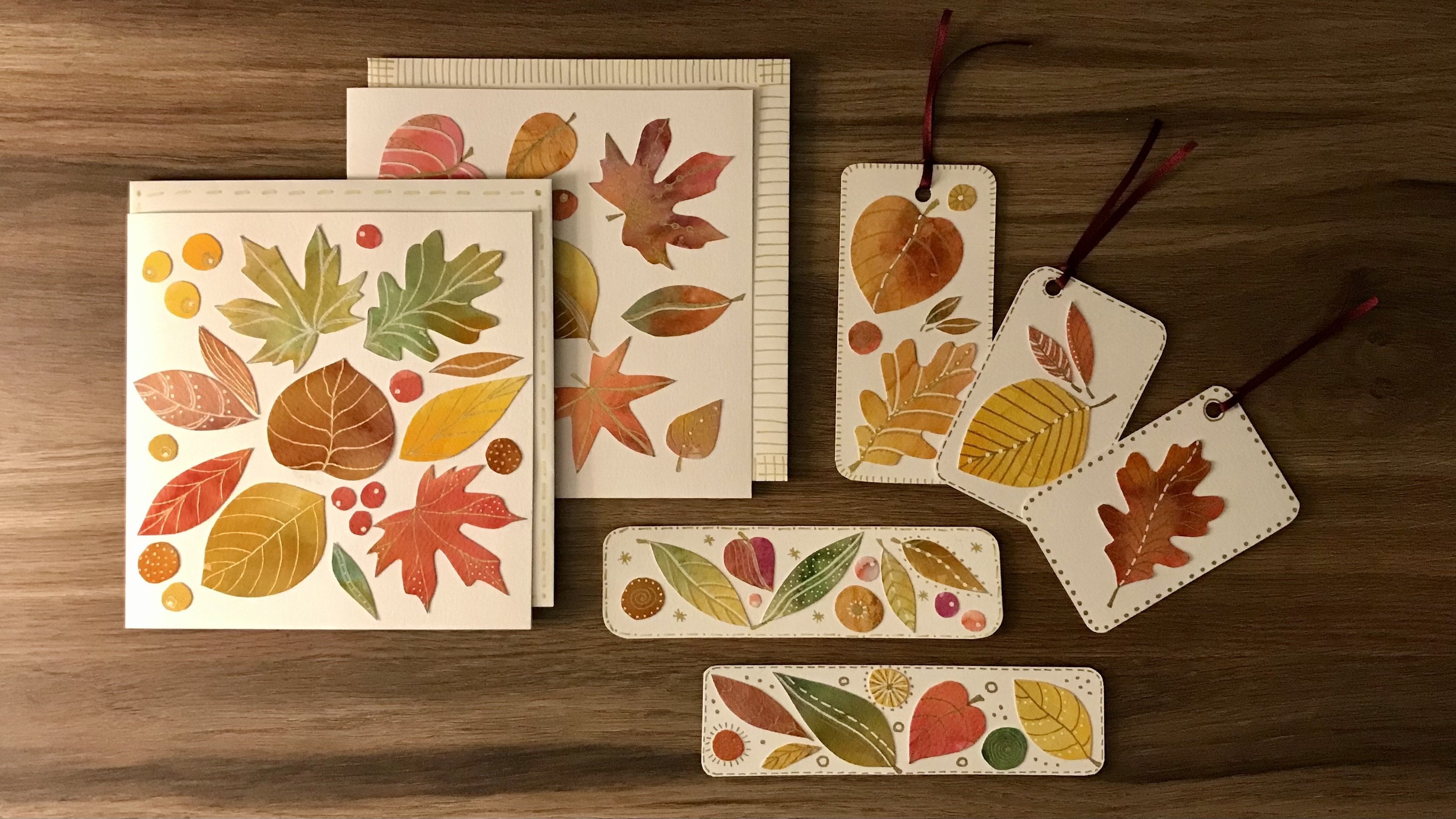
Transcripts
1. Introduction & Project Overview: Hello, and welcome
to this class. How to create pretend
stained glass folk Birds. I love stained glass,
and I love folk birds. And a couple of years ago, I discovered a little
technique using pro markers and bleed proof paper that gave you a
kind of stained glass effect, and I want to share that
technique with you today. I'm Dawn Codra. I'm an artist, designer, and an alistic
health educator. And I live in the
North of Scotland, and I've been teaching classes
for a long, long time. Let me explain a little bit more about what this
class is about. Two years ago, I
was asked to take part in a community project
where we were asked to make something that
looked a little bit like stained glass that
we could then put up on our own windows
and then allow the public to come and
view what we'd created. Playing with the pro markers
and the bleedproof paper, I managed to create these
wonderful effects here. This one had stencils
added on the top of it, which elevated it even higher, and it was an amazing result. You can see from these
two figures of Angels, the one on the left is
the bleed proof paper, the one on the right is just
a photocopied version of it. And you can see how
totally opaque that one is compared to the more translucent one on the left hand side. We'll be focusing on simple folk bird shapes with a little heart in the
middle if you want it. And we'll also have a look at how to create little
decorative birds as well by taking photocopies of the original that can go
onto your mantel shelf. As always, this is going to
be a very easy relaxed class. I'll take you through
all the processes, starting with what
materials we need, how to create the grid, how we plot the bird, which then turns
into a template, and how we look at what decoration we're
going to add to it, which then of course, will lead on to filling it with color. And deciding what color
combinations we want to go with. We'll look at how we photocopy
it and add pattern to the photocopied
version so that we can then use that for doing
the shelf decorations. Now, if you're a little
bit unsure about pattern, nip over to my class
exploring color contrast and pattern because that gives you some great
ideas for pattern, and it also delves into the whole world of what color combinations work really well. I'll share with you my
techniques for strengthening the printed birds so that we can make shelf
decorations with them. And then finally, we'll look at the way in which to attach
the birds to the window. So I hope that you'll
join me in this class. It will be just as easy and relaxed as
all my other classes. A lot of fun. So I hope that I'll see you
in the next session.
2. Materials: These are the materials that
I recommend for this class. First of all, you're going
to need some copy paper, you know, printer paper. If you can get one
that's 120 GM two, then that's better because
you're going to be drawing your grid onto this and it
needs to be quite robust. So it would be better if you can use a higher quality
paper rather than, you know, really, really
lower quality one. You're also going to need some
bleed proof marker paper. Now, this is Windsor and Newton. You don't have to
go with this brand. You can go with whichever
brand you like. Again, this is 75 grams. It's a decent
quality as this one, and you're going to need
this because it's going to sort of become
a tracing paper. In effect, as we create a
template of the bird shape, and then you're going to need more pieces of paper on top
of that to draw around it. And depending on how many
birds you want to do, I would suggest maybe three
or four sheets of this. Obviously, if you've got a pad, then you can use as
many as you like. You're also going
to need a ruler, scissors, an HB pencil
if you've got one. If you don't have an HB pencil, then one that's quite soft
rather than a hard one. You'll need an eraser. I've got a selection here
of acrylic paint pens. I've got two gold
in different nibs, a fine one and a thicker one. I've got a white
in a thicker nib, and I've got a black fine liner. You might not use all these. Don't go out buying things if you haven't already got them, see what you've got
in your own supplies. It's not totally dependent
on your having those things. What you will need, though, is a selection of pro markers. Now, these are
some of the colors that I'm going to
be using in mine. My suggestion is that
you try and find some pale colors as
backgrounds because they're easier to then go over the top with the darker colors. But again, I would just
have a play and, you know, do yourself some little color
charts and see what colors you like when you've then created more
color on top of them. And what do I mean
exactly by that? Let me show you. Basically,
let's have a look here. You know, if I'm
going to be using orange for one of the
bird's wings, for example, I just draw this orange on
here as opposed to, let's say, a darker blue, then it's going to be so
much easier for me to put pattern on top of
the lighter color. Like that, than it is for me to be able to put
pattern on top of that one. Now, this is quite a
dark color in itself. You know, I can put
some pattern on it, but you can see that
it's not contrasting enough really for you to be
able to see much difference. So starting off with a
lighter color underneath will probably give you
better results or yeah, results that look a bit more that let the light through
is what I'm trying to say that actually let the
sunlight through easier. It would also be
handy if you had a black sharpie pen because
that's really useful for when we do the outline of the bird that then becomes
the template like this. And I think that's about
it, so let's get started.
3. Creating the Grid: Now you could draw your own bird completely free hand
on a piece of paper, but I've sort of created
a rough grid here which helps me to just plot a
template a bit easier. And it's an A four sheet
of photocopying paper. Again, it's the
strong stuff so that, you know, it lasts me, it
doesn't tear so easily. And basically, what I've
done is I've gone in, I've measured across the top. And I've taken it roughly
to 7.5 centimeters. I think you end up with a little bit extra
on this one here. So let's call that
7.5 centimeters. 7.5 centimeters.
Same on that one. And I think that one ended
up being just seven, and that's absolutely fine. So market the
bottom and the top. You know, mark it 7.5. Keep moving it on 7.5. Market and then join those
lines vertically like that. Then you can turn your page around and measuring
that across, I had to turn it around
the other way around and do it with inches. So, again, we're
just over 8 " there. So I've roughly done it as 2 ". Well, what I did was I kind of like, you know, it
doesn't matter. You don't have to be
so precise on this. Do it as 2 ", 4 ", 6 ", and then 8 ". You can see there
that if I've got the four inch mark
in the middle line, then I'm just a bit
short of 2 " there, and I'm just about 2 " there. So it's roughly 2 " across that way as well.
Don't worry too much. This is not meant
to be precision, calculating at all
here. It really isn't. So then you've done
your verticals, and now you're going
to mark it out each section along those
outer edges and then draw a line so that you end up with roughly equal rectangles, 16 in total that are
more or less the same. What am I trying to
say? Same dimension.
4. Plotting the Bird: Next, I want you
to take a sheet of your bleed proof paper and put that over the
top of that grid, so it kind of acts like
tracing paper so that you can see you can see the
grid underneath. And I want you to take
your HB pencil and mark a little point halfway
along that grid there, where the two lines meet
there, another one. Call that number
one and number two. Halfway along, actually
know about a third of the way along of
that next rectangle. Go to make that number three. We're going to go all
the way onto here onto the last rectangle and put a point there,
make that number four. And then, more or less halfway, we're going to put another dot
and make that number five. We're going to come down
to this section here. Another dot, make
that number six. Go along to the next
section where they meet, put another dot, make
that number seven, go all the way along there, so that it's lining up
with number four above, and we're going to make
that number eight. We're going to come
back to this line here. In that section or that intersection of lines,
make that number nine. We're going to go
across here and not quite as far
as number eight, probably about two
thirds of the way along. We're going to make
that number ten, and then midway between these last two rectangles
at the bottom, about midway, we're going
to make that number 11. And the reason that we've done that is because
we're going to then plot out a bird
shape like this one. So I'll show you how we're
going to join those up. Now, this really is
just a rough guide. You don't have to
do this at all. If you'd rather do it freehand. I find it quite helpful in
creating templates for myself. So we'll start, first of all, with joining number one to two. Then we're going
to go on to three. And we're going to stop that there. We're going to go 4-5. We're then going to join
number two to number six, but I'm going to bring a
little curve in there. So I'm not going to go down
and do it as a straight line. I'm going to bring a
curve in like that. Then I'm going to more or
less follow that line. It's not quite
straight. It's got a slight curve to it
to number seven there. And I'm going to go
back to number three, and I'm going to create
a double curved line that meets number seven. Do this lightly because you'll end up having to do one
or two rubbings out, I can tell you. Right, from number five, we're going to
just bring that in slightly and then come
out to number eight. That's actually
where the beak of the bird is, if we look here. Can see there we've gone 5-8. We're going to bring a curve
round and go to number ten. So let's do that.
Carry that curve round to number ten all
the way down to number 11. Join that up with number nine. And then we're going to go
right back to one and bring a big sweeping curve down
here to that number nine dot. Like that. Now, we have
to get the wing here. So I'm going to put a dot here. If we just look at
this rectangle here, I'm going to put a
dot about there, and I'm going to bring
that number four to there, and I'm going to bring that
wing down to there as well. In fact, I've gone a
little bit past it, but that looks about right. Now, this is where we
make the adjustments now. So if I take that grid
out from underneath it, when we look at the
shape that we've got, this is where we can
do a bit of refining. So again, I'm going to just curve that a bit there
and bring that to the beak. So that's a line there that is going to end
up being rubbed out. This is why it's
really good to do it very lightly because
at this stage, you will end up doing quite
a bit of rubbing out. That looks a bit wobbly to me, so I'm just going to bring that down and straighten
that up a little bit. There we go. Get rid of that
slightly wobblier line. Now, you're not
going to be actually drawing on this piece of paper. So it doesn't matter at
this stage if you've got, you know, a few lines showing. But we do want to make sure that when
we're doing it on the correct piece of paper, that we've got no pencil
lines showing that we do want because those pencil lines will show through
the pro marker pens. Now, do we like this section
here with this wing? I think I'm going to bring that down a bit further
there, actually. To the like that. And that
looks a better shape to me. Now, this is only the way
that I'm doing it for myself. You might decide you want a completely
different wing shape, and you can use the grid in a very different way to
the way I've used it. There's something not quite right about this
section here, as well. So I'm just going to play
with that a little bit more, bring that in a bit more. In fact, I think
that's probably. Let's just make that a bit. Take that back on there
and bring that round there a bit and see how that looks. So keep just, you know, playing with the
shape that you like. Does that feel better
for me as a bird shape? With the beak, now,
yes, that's better. That's better. So
a little bit of adjusting in that bit
there in that area there. And there we've got a bird shape that I'm
quite happy with. Now, if I compare it to that
one that I did earlier, let's see how those two compare. So actually, with that one, I've got a much wider wing. You can just see underneath there that I've
got a wider wing, and the shoulder, as it were, of the bird is a
bit wider, as well. So you can see how you
can do these differently. In fact, the head shape is a bit wider as well
on the one underneath. But basically, that's
the way to use the grid just for you to get a sense of what kind of
bird shape you want. And it might be
that you, as I say, you use totally different
shape to start with. You can, you know, make
that go like that, or you can give it tail
feathers like this. You can do whatever
you like with it. It was really just using the numbers and the
grid to give you a starting point for which to decide what shape
of bird you wanted. And as I say, if you don't want to use a grid
at all and you just want to go straight in freehand,
please do that as well.
5. Adding Decoration: I'm going to use the
original template that I created for myself, and I'm going to take a sheet of the bleedproof paper
again, put it over that. And that one that's
underneath now, that will always be my template. In fact, it's worth writing on the top so that you don't
end up coloring on there, because you can use
this template for, you know, creating
lots more birds. So I'm going to
take my HB pencil and begin the process of
tracing over the top of that. I'm using a pencil very
lightly as I go around. I might even make some more
adjustments. We'll see. In fact, I think I want that to be over there,
actually, like that. That's it. Drawing around that. I'm doing it so lightly
I'm not even sure you can see this on the
camera, actually. And they pop the eye
in at this point. And then the template
can come out underneath, and that's now ready for
me to start deciding how I want to add the
decorations on it. I've kept it pretty stylized. I've used a bit of a
flower theme going on, and it's now ready for me to
start adding some colour.
6. Beginning the Colour Fill: Before you start
to use your pens, don't forget to
put something down that can protect your
surface underneath. I've just got an old piece of plastic sheeting here that
always does the trick. It won't bleed through onto
the back of the paper. You'll see it, but
it won't actually bleed through onto the
surface underneath. But when you're using your pens, if you go out over the
edge of your paper, that will go onto your
surface that you're using. So best just to have
some kind of sheeting. As you can see from the design, I've kept it quite simple. I will add other
details to it later on, but I just wanted to get
the basic shapes down. And I'm going to start
off with canary yellow. And I'm going to
do a combination of using the thick nib
and using the thin nib. And usually I end up having to put more
than one layer on, and that's absolutely fine. Now, don't worry
if you go out over the edge of the bird because you're going
to cut it out anyway, so it really doesn't matter. If you end up, you know,
going over the lines, in fact, you know,
just go for it. I encourage you to release that old thing where
the teacher or the parents said you're coloring out of the lines,
that's not allowed. Just color out of the Color outside of the lines.
That's what I always say. But not on the inside, only around the outside
edges, of course. So that is the start. Now, it might look depending
on what colors you're using, it might look a bit.
How can I describe it. Sort of like this, you know, as if you've got lines into it. Depends on how much ink you've
got in your marker pen, and if you get that
kind of effect, it's fine because you just
put another layer on top, and that will make it all look a bit more even as it were. So I want to carry that
yellow down and round here. But what I'm going to
do is I'm going to use the finer nib to go around these petals because I want to color them in
a different shade. So I'm going to use this
fineer nib to kind of do the outline bits or to get into those areas where
if I use the fatter nib, it would go over the petals
and I don't want it to. I want to keep
them pretty clean. Now, the reason why I've kept the pencil light is because when the markup pen
goes over the top of it, in fact, let's show
you what I mean, let me just grab a pencil. The marker pen doesn't
cover up the pencil line. It shows underneath like that. So that's why it's great to be able to keep your
pencil lines very faint. And why you know, rub out your pencil lines before you put your
marker pen on, um, if you don't want
them to show through. Now, that all looks a bit
scruffy at the moment, but it will dry
like the head has. It will dry much more evenly. So don't worry too much if that's what it looks
like to begin with. You can always even
out the color, like I say, with a second coat. Now, I want to carry on that one through there and through
into the tail, as well. So I'm going to turn my page
around so that I've always got the paper at an angle where I don't have anything obstructing my eyeline
as I'm using the pen. I'm doing fairly
broad strokes there, all going in the same direction rather than this
kind of coloring in. Keep turning your page around
where you need to turn it. Now this is a color that
I've used quite a lot, so I can tell that it is beginning to run
out of ink a little bit. Now, when two colors
meet each other, you might get a little bit of bleed going on into each other. So the way to get around
that is either to let it dry completely before
you add the next color or just don't be bothered
about the fact that it bleeds. Personally, I'm
not that bothered. So I'm going to go ahead here and I'm going to do the wing. And for this wing,
I'm using sunflower. Now, I'm going to
do it in two well, in different sections here. So let's start this one here. I'm going to do that
section in the same color. Now, I'm not doing second
coats on these just yet. I want these first coats to dry, and then that'll give
me an indication as to what might need a
second coat on it. I'm going to go with a
slightly deeper orange here. This is pumpkin. And I'm going to do
those two bits and infill this color into there. So you can see how quickly this is beginning
to take shape now. I gave that bit
there. Round we go. I think I'll join
those two bits up. Now I have got a little bit
of bleed going on there, I can see that's just gone
into that paler yellow, and that's absolutely fine. I really, really, really don't mind. And down we come. So you're getting the idea
here of how I'm using these pens to color in the
different block shapes. So I'm going to do a little bit more off camera so you
don't have to watch the whole process and bring it back in when I've
taken it a wee bit further.
7. Completing the Colour Fill: So as you can see, I've
added some more color there. I want to find a way
now to be able to link what's going on here with
what's going on down here. So I'm going to take
that color there, which is the sunflower. And I'm just going
to fill in those. Oh, no, this happens
to be a brush one rather than a small nib. You can get them
as a brush marker. I've probably got a
mixture of quite a few of the things
depending on what sets I bought originally. So that starts to
link that in there. And I actually picked up
honeycomb by mistake. I meant to get that pumpkin
colour to bring down here. But I picked up the
honeycomb by mistake. So I had to find a
way then to link what was going on down here with what was happening at the top. So that's why I ended up
using it up there as well. So now I'm going to
bring that pumpkin back in and do those
little dots up there. Oh, here we have another
brush one, look. I must be honest, I don't really pay much attention to
what I'm picking up, and it's always a nice surprise then when I actually
take the nib off. So that's it there before I add any other
pattern whatsoever. Now, as you can see, the yellows dried quite nicely. That pumpkins dried nicely. I could do with putting
one more coat of sunflower onto that bit there,
so that's what I'll do. Give it one extra coat, and it has bled. You know, a lot of the colors
have bled into each other. And what happens when you
have a crossover at the edge, it often creates a
slightly different color. But like I said, this doesn't matter
because you're either going to
outline in black, or you might use
gold or you might even use white with a posca pen. So it really, really does not matter if you
bleed over the edges. And as I've already
done that one, I may as well give this
one another second coat, and then they've
got the same depth of color to them both. Turn that around, so I don't
go over that cyan blue. Now, what I did was, as I was using each color then, I did a little color chart to remind me what
color was what? Because in my, you know, excitement to get it colored, it's easy enough for me
to pick up the wrong one, and I think that's the
one I've picked up. So you can see here that
the can is quite streaky. So I'm going to just give
that another coat, as well. And that will even
that out a little bit. Turn it round again so I
can see what I'm doing. And I'm going to use the
finer nib just for these bits here because I really don't want it to go over this yellow
that I've just done. You can see where the
two are meeting there. It's got a slightly
greener blue, and it will either stay like that or it'll
get covered up with something else depending
on what I decide. Now, what I also used
here is rather than leave any of the paper
completely bare, I've got a very pale
pen called almond, and this is what I tend to use for things like eyes and
face as if I'm doing angels, because it gives you, it still stays pale, but it gives it a little
bit of color there. So if you want to also create birds to put on your mantelpiece
or your mantel shelf, this is a good time now to not do anything else to
it just for the moment, but take a photocopy of it. So that's what I'm going
to do, and then I'll show you I'll show you why we take
a photocopy at this stage.
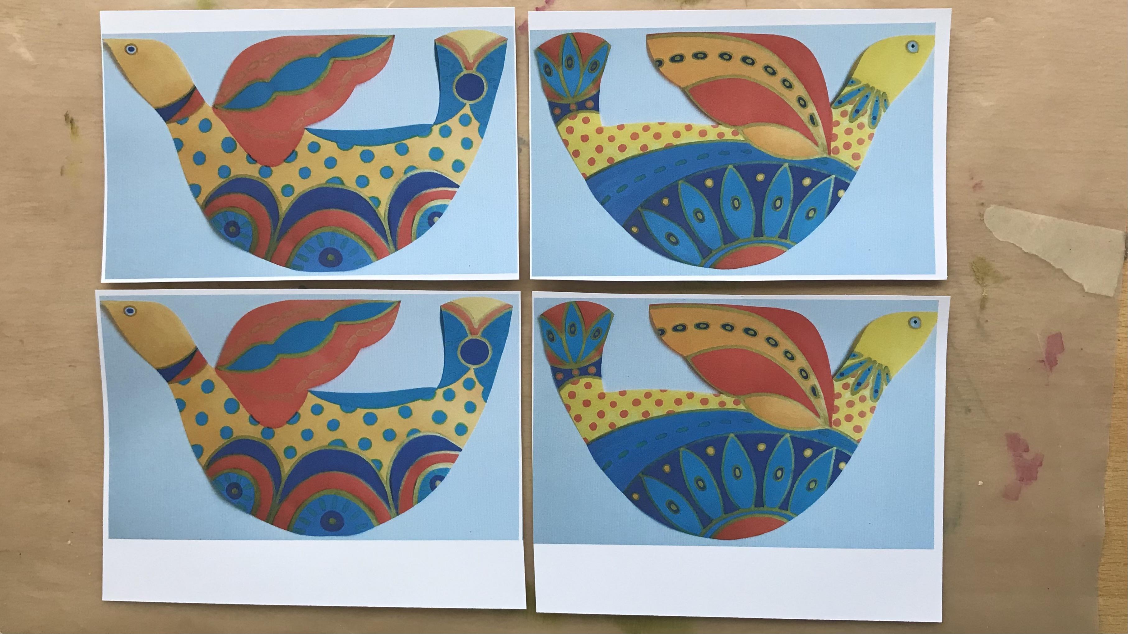
8. Adding Pattern (part one): Here we've got the original one, and here we've got
the photocopy. And it hasn't come out
too badly, actually. That one there's come out ever so slightly darker
than this one. But the lovely thing
here now is that I can put the original to
one side for the moment. And on the photocopy, I can now practice
doing some patterns. And also, I've used the
good quality copy paper. When that is then glued
onto a piece of card, this bird here now can become the bird that
goes on the mantelpiece. What I could also do if I wanted to is to reduce the size on my photocopier and make it slightly smaller
or slightly larger. But for the moment,
I'm just going to use this particular copy here just to practice doing one or two different
designs on it. And that means that I'm not, you know, making a hash
of the original one. And then having to start the
whole thing all over again. I can do a little bit of
practice on this one here. So I'm going to go in with
that lovely royal blue color. If I can find where I've
put it, here we go. And I really like this
color. I love this color. I'm just going to link
this section here now with this section here and have a
little practice if you want. What happens is when
you use the very edge of the nib here and just
press down on it there, it gives you this kind
of lovely oval shape, which is really nice. So I'm just going
to go into this, I'm gonna go over
the edge because don't forget it's
going to be cut out. And I'm going to bring
that down to there. Now, because it's gone on
top of a different color, it's not going to
come out exactly the same blue as that one there, but at least you start getting this darker depth of color that's happening
in the bottom, now happening on the top. And I think I'm also going to link that same pattern down in the bottom
as well, like that. Let's take it one step
further and we'll do it up here on these higher petals. And if I use the finer nib, might just do a little Now, that doesn't look
quite as dramatic. No, dramatics the wrong word. Not sure what the
word is, but I'm going to just change
the shape of that. That's better so that it
looks more like the ovals. And I'm going to
give it some little dots up there as well. So you can see what I
mean about how you can play around with
the pattern here. Gonna also use this color
to outline the bird's eye. 'cause that needed
to be stronger. So this is where I can bring in gold and white pens, as well. So because this isn't one that we're going to
be putting on the window, so you need to be able
to see through it, I can really add a lot
of gold onto this now, if that's what I want to do. So I'm going to do. I'm going to use it for going over
some of these lines. And that's what I meant by don't worry if you end up going
over the lines because, you know, when the two colors
bleed into each other we can use exactly
the same technique on the original as well. So I'm just going to go follow the lines where they join color. And take this gold pen there. So it starts to really take on quite a rich feeling to it now. So I'm literally just
going to create gold dots, which gives it more of a
texture to that yellow. Again, those of you
that have taken my other class exploring
color contrast and pattern, you'll remember how much I
just love creating pattern. Sometimes it's hard for
me to stop, really. Now, if I ended up doing
this on here and thinking, No, I really don't like it, then what I could do, of course, is go back to the original one
and take another photocopy and have another play
until I got it to the point where I really,
really did like it. I'm going to put a gold.in
the middle of there. And up there. And to
keep it consistent, a little through there as well. Now, I've got finer gold pens. This one is a one MR. Just
pump it a little bit, make sure the ink's
coming through. And I want to do
some outlines coming down here like this. There we go. Right, I'm going to do something
now on here. With this, I'm going
to just outline these lovely shapes
with the gold pen. Go outside the line 'cause you're going to
be cutting it anyway. I think this also needs
a bit more definition, so let's use that gold pen up here to define these
petals up here. Now, I do feel that these
sections need something. So I'm going to use
the gold pen again. I no, I think I will use actually the turquoise
that I used earlier on. So this was the turquoise. But before I do that, let's just see what happens if I put turquoise on
top of that color. So this is where it's
a good idea to have given yourself a little
color palette down here, you can just have
a little practice there as to what that
might look like. And that's actually quite sweet. So that's what I'm going
to use with this pen here. Now, I've just put gold on there. I've just
put gold on there. So I'm going to turn this around make sure that I don't
smudge what I've just done. I'm just going to
do this kind of effect onto these
solid colors just to break it up a little
bit. Not much. I can still see much of the color underneath
it, which is good. But it also brings a
bit more texture that would even suggest a bit
of a wing on a bird. And so on and so forth.
9. Adding Pattern (part two): I carried on doing that
pattern here as well. I took another look at it, and I've outlined almost
everything now with gold pen. I managed to smudge that eye and get it over there, but
it doesn't matter. I can always cut that little
bit out if I need to. And I've also taken
a fine liner, and I've added some little dots across the top of the gold spot, and I've added some lines around here and some
lines around here. And that, for me, brought
it more in line with the darkness of that
wing section there. It just made that
there was, again, a connection going on
with the whole bird. What I could do if
I wanted to is also bring this stripy
effect into here. So let's see what
that would look like if I did that as well. You know, I'm just playing. I haven't really got
a design in mind. I'm quite literally just playing and seeing what
works and what doesn't work. Now, that to me,
finishes that off and it links in with what's going down here with what's
going on down here. So that will get cut out. Well, actually, yes,
it will get cut out, and then it'll get stuck onto a slightly
harder piece of card, which will then get cut
out again, of course. And that will become the
mantelpiece decoration. I'm going to go back to
the original one now, and using that as a bit
of a bit of a guide. Decide what patterns I'm
going to put onto here. And I'll be mainly using
the pro markers still. I will bring a little
bit of gold pen into it, and I might bring a little
bit of white into it as well. So I'm going to finish
doing this here. You can see what it
looks like just now. You can see it compared
to that bird there, and I will decorate
this and then let you see how it looks
when it's finished. Now, interestingly, I decided that I would outline
these bits here, not with a black, but with that royal blue to sort of give it a stained
glass leaded feel to it, and I really don't
like it at all. And that's on the original. So what can I do to
bring that back to, you know, something
that I prefer? Well, the first thing
I'm going to do is I'm going to take my
thicker gold pen, and I'm going to go over these lines now that they're dry and just see if I can
really soften them all. And you can see that
that's working. So I'm pleased about that
because I would have preferred not to have started
the whole bird again. So there's a little tip. If you end up going darker
than you, um, well, not darker than you wanted
because you wanted it dark, but if you don't like the
result after you've gone dark, here's a little tip to
bring it back down again. So to keep that consistent, I'll take that round
there as well. And if you look on
the one here that, you know, was the photocopy, that's what I'd done anyway. So I think, actually, I'm just going to do
something very similar to that because I rather liked it. I might not put patterning
these two here. But let's see let's
see how I get on. First thing I need to
do is to get rid of that really dark dark
blue, that dark blue. This is the beauty
of these posca pen. Well, this is a pilot
one, the acrylic pens. Generally speaking, I tend
to use the brand posca. I'll just show you I also
have moloto as well, which is also a
really good brand. One's neither better
than the other. Just use what
you've got, really. But I'm going to carry
on doing this and really knock this back so that I
really don't have that deep, deep blue into it. I'll do that. I'll show you
what it looks like when I've altered these bits and added a little bit more
pattern to it, as well. So here's that one now
finished and cut out. I've kept it much simpler
than the one above. I haven't added the pattern. Well, not in that section, you know, that I did on the top. I have added the
gold pen everywhere. I decided that I wanted to keep that block color blue rather than adding
more pattern to it. And as you can see, I haven't added more pattern to
the wings, either. So I'm very pleased with that. I'm going to start
the next bird, the one that will be facing it. So I'll see you in
the next session. I
10. Drawing the Second Bird: I'm starting with my
original template again. And what I forgot to mention
before was that after I had drawn that
template in pencil, if you remember, that's
how it ended up. I then outlined it with a black sharpie pen so that
it was much easier for me to see when I then put the other paper on top of it to use as
light tracing paper. So what I'm going to do now is because I want this
bird to face that way, the shape has come through
to the back, which is great. I've already altered
a little bit of the wing shape and
the body shape. So what I've done then is
I've traced over that, put another piece of the
bleed marker paper over it, traced over that, and then with my HB pencil again and then started to
add some decoration to it. Now, as you can see, it's a little bit different to
that decoration there. But what I am going to do is
use the same colors that I did in that one because I
want it to be quite cohesive, even though the patterns might
be a little bit different. Rather than you have to watch me do the whole process of this, it's going to be
exactly the same principle as doing that one. Although I'm not
going to outline it in black or royal blue. I'll do it just like that
one with the gold pen. So I will do that and finish it completely and then let
you see the final result.
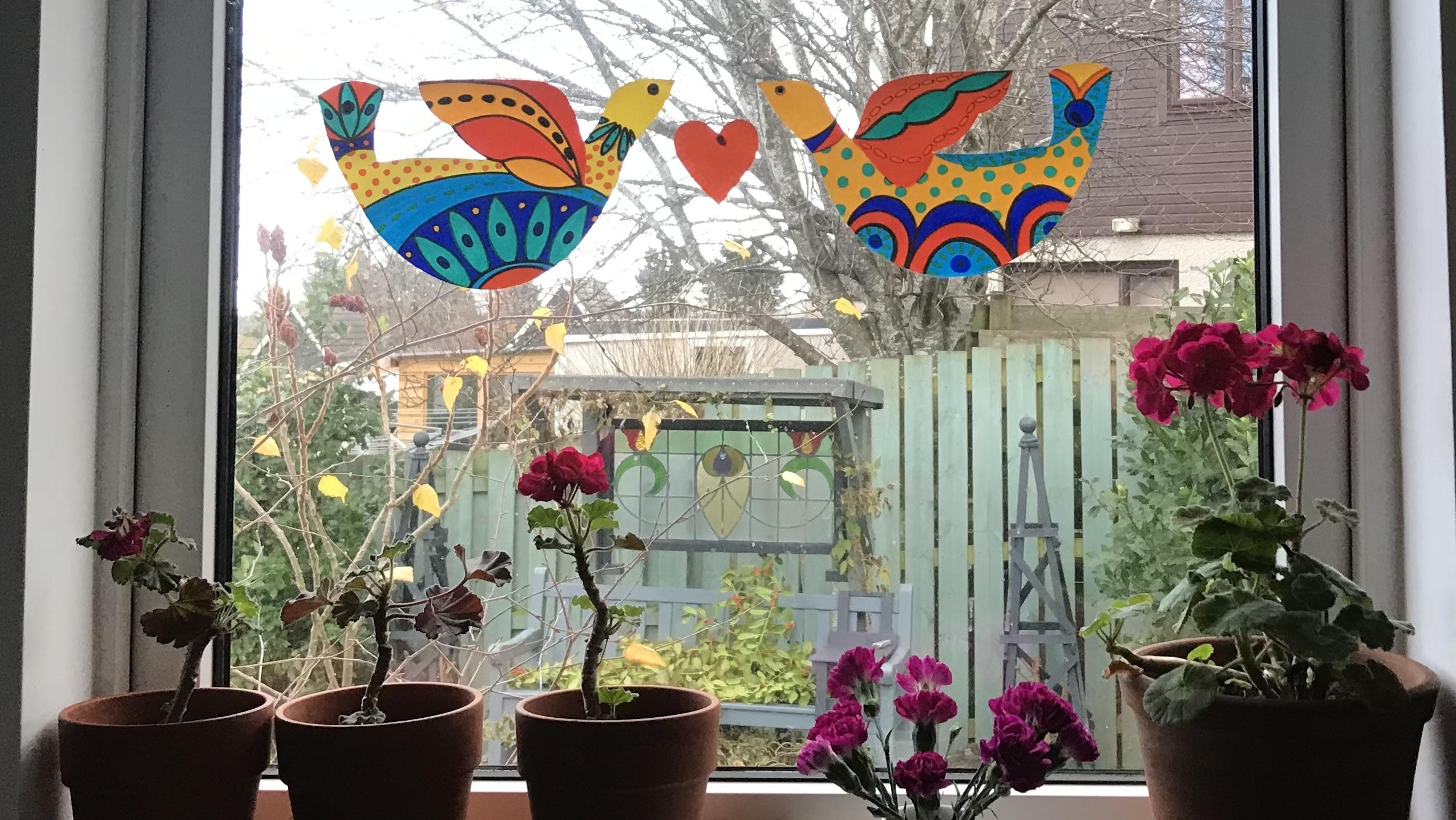
11. Final Designs: Here's a second bird
colored in now. I decided also to do a little heart so that when
I pop it on the window, that can sit between
the two birds, as well. I had a little play
by drawing it out first because I wanted to know what sort of pattern to do. And in the end, I decided that the
gold pen was too dark. This is me holding
it up to the light. So I decided that I
would just keep it very, very simple by using a really pale color
and just doing some mark making over the edge of it, as
you can see here. The next thing now, of course, is to attach it to the window, and it's really simple. I'm just going to use two really small pieces
of blue tack. If that's smaller than a P, and I'm going to attach
it to the back of the I on each bird like that, and also to the back of where I've got
some pattern there. And the reason that you
do it there, you know, where you've got some pattern is so that when you hold
it up to the light, you actually can't see that
blue tech at the back. And because this
sits quite flat, as opposed to one that's done with the photocopying paper, excuse me, as it
sits quite flat, you really only need
to use two pieces, and it'll just sit quite
nicely against the window. You don't even need to
put one on the wing. So I will use the blue tack
for both of the birds, and then I'll just pop
a tiny bit at the top, where the heart, you know, where the two
shoulders, as it were, meets, so that you'll
see a little bit. In fact, let me show
you what I mean. You'll see a tiny little bit. So you could make a pattern to disguise this
if you wanted to, but I was okay about
just doing it. You can just see a bit of the
blue tech showing through, which will show more when
you hold it up to the light. So if that bothers you, do another little tiny pattern just there that will disguise it. As you can see here,
the photocopied one, you know, it really curls up
once it's dried completely, which is why if you
decide that you want to use it in any
further decoration, where it's more of
a stand up one, then you'd need to put
it, you'd need to glue it onto some card, as
I mentioned earlier. So let's have a look now
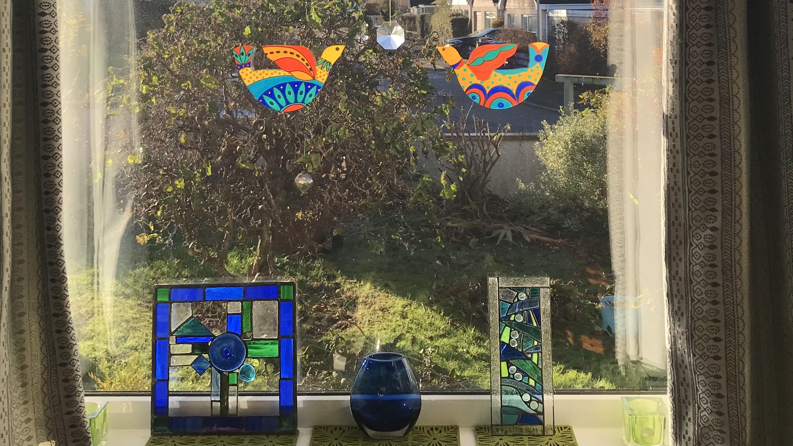
at these three pieces of our pretend stained glass birds as they sit on the window.
12. Viewing The Birds: This is looking at
the birds from inside the house to the outside
on a reasonably sunny day. This is looking at
the birds, again, from the inside to the outside, but at nighttime, and you can
see how cheerful they look. But actually, they look
even prettier when you're viewing them
from outside the house. So the birds are on the
inside of the glass, but this is how you're seeing
them from the outside. I'll see you in the next session where we look at how we can photocopy the originals and make them into different sizes, and then get them to card so that we can use them
as shelf decorations.
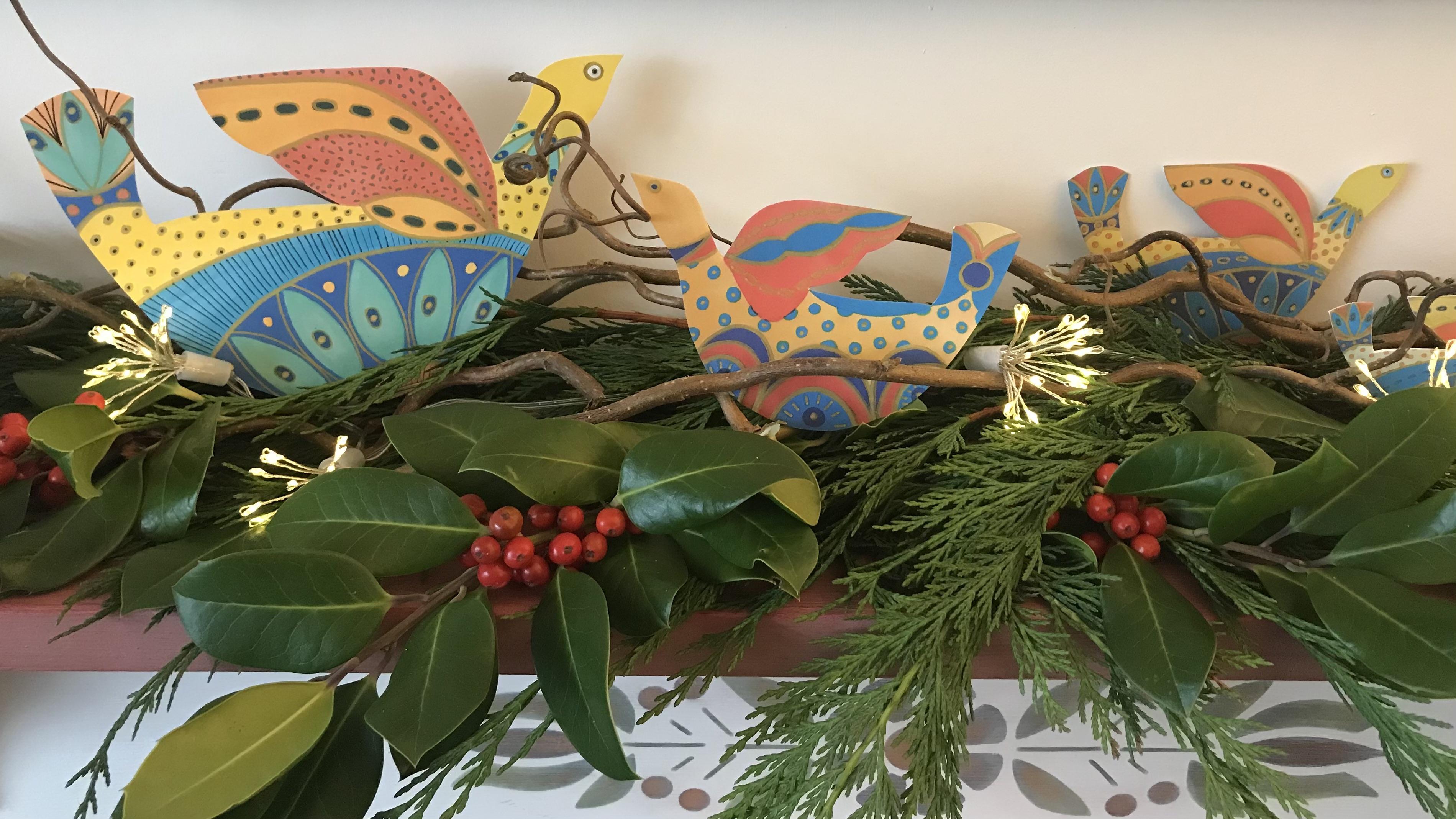
13. Creating Shelf Decorations: I've printed off different
sizes of the birds, and now I'm just
cutting them out. Drawing around, you can see that I've cut them out
just slightly beyond the actual outline of the bird itself because that's
just a bit easier to glue. And I found some old card in my drawer, which
I'm just using. It's, you know, not too thick. It's easy to cut with scissors. If you don't have anything
like that, you can just use, like, card stock that
you'd make cards out of. So I'm basically just using
pritstick, a glue stick. I'm gluing over the back of it. And then I'm sticking
it onto that piece of card stock. Like that. Cutting it out with a pair
of scissors till I end up with a much thicker
one, as you can see. And then I will add a
little bit more decoration. I've already done it
on that one, probably with the gold pen just to highlight where the
gold was originally, it goes a bit dull, of course, you can see when
it's on a photocopy. So I'll just go over
those a little bit. In fact, I might even
do it before I cut them out and highlight them a little bit and
then cut them out, and then they'll be
ready to go onto my shelf as winter decorations. Here are the decorated birds now on top of the mantel shelf. I like to put something
on here each season, and I think that in this sort of dreary winter light that we can sometimes get here
in the North of Scotland, that this is just rather nice having these birds
on here nestled between the twigs and the
berries and the lights, and it all just
feels very cheery. I hope you've enjoyed taking this class as much as
I've enjoyed creating it. As usual, I would really
love to see your work. So if you want to just press the Project tab
at the top of the page, that will allow you to upload some of your lovely work there. And if you'd be kind
enough to leave a review and let me and others know what
you think of the class, then that helps them to decide whether they want
to take it or not. Wherever you are in the world, whatever the weather's doing, I hope you take
care of yourself. We're having some
really mixed weather here in the North of Scotland. One day, it's really hot,
the next day, it's snowing. It's really quite bizarre. So please take care
of yourself and just try and find time over
these winter months to do something creative. Have fun with this technique, create all sorts of
different shapes with it, hearts, angels, birds, whatever your
imagination can come up with.
 Dawn Cawthra, Artist, Designer, Holistic Educator