Transcripts
1. 1 Introduction and Project Overview: Hello, everyone, and welcome
to my slow art challenge. I'm Dawn Cawthra, an artist, designer, teacher, and
holistic health educator. And I just love it
when we can combine our creativity into some kind
of practice that really, really makes us feel well. I love going out in nature. I love looking at all its color, its form, the flowers,
the seed heads, the berries when they come
through later on in the year, and seeing those
beautiful umbelifas when they show they like little stars that pop out of the plants. These are the things
that have inspired me to create this class, and I really hope that you will love it as much as
I've loved creating it. It's absolutely packed with little treasures, is this class. And the first thing that
we're going to be looking at is creating colour discs. And I'm going to
take you through the whole process of
what colour discs are, why we would use and how we create them because
they are such a tool, one of my what I call
golden tools to help me when I'm making color
choices in a composition. And I think once you start
to use these colour discs, they'll actually really become your best friend like
they have done mine. Using color recipes really
takes the guesswork out of, you know, what colors to put together that will make
a harmonious palette. And you'll gain confidence
as you start to mix these colors and begin to apply them for your own
botanical compositions. I'll be taking you through a few techniques of how to
draw your own botanicals. You can either draw
them freehand, or you can trace them, but I'll take you through
it step by step in a really simple way so that you feel confident enough to
be able to do your own. These are what you'll use
to inspire you in creating your own botanical
squares that we'll then use for creating
different kinds of brids. I'm also going to share with you a technique which looks quite chaotic when
you're doing it, but the result of the beautiful, colorful leaves when they're
revealed at the end of the process is really well
worth giving it a go. Do two different kind of grids. This one's a patchwork grid, as opposed to a more
symmetrical one, and it's using softer colors. And the technique for getting the botanicals on top of it is actually tracing
in this instance. It uses a different painting
technique as well to the one that you did in the more
symmetrical color block grid. We'll be having a look
at how to draw flowers, just using a circle,
which will then give you your own ideas as to what you want to include in
your composition. And then finally, I'm going to share a technique with
you called masking, where we paint a background
using leftover paint in the same color palette
that we will have chosen to do our
patchwork gridding. And we're going to be
using masks to create a really simple and beautiful little still
life composition. So I do hope you'll join me. This is kind of like a
little mini course, anyway. I'm thinking of it
as being a mini creative break for you. You know, be able to
take your foot off the accelerator pedal
for a bit and break free from overdrive and just try and schedule
a little bit of UT. UT for yourself on
a daily basis or a weekly basis or
whenever you can make it. So I'll see you in
the first session where we have a look at
what materials we need.
2. Materials: Okay. Let's take a look at the materials that
you're going to need, then. First of all, you can
either do it on paper. You can do any of the
projects either on paper, board, a wood panel
or even fabric. I'm choosing to do it on paper, and I like to basically work
just through my sketchpad. I've got a couple of
sizes of sketchpad here. I've got an A three size, and the paper quality
is about 250 grams, and that's absolutely fine for the amount of paint that you're going to
be putting on it. And then I've got a smaller one. A smaller pad. Again, paper
quality is still the same. I do favor these pads
because I like the spiral, you know, the spiral spine
because they're so easy then to be able to fold over
and work on both sides. But you don't have to
have them like this. Whatever paper you've got, whatever size you've
got, work with that. If you can do something on an A four size, that
would be great. Its you just need
to make sure that it's about 250 grams or above. So that's your paper done. You're gonna need
acrylic paints. Now, I am using blue,
red and yellow. I happen to be using
the liquitex basics, but you can use
any brand at all, and then I'm using white, and I'm using black. Now, I'm actually adding
a couple more to these. I'm using a different
red as well, a cadmium red and
a cadmium yellow, and I'm also bringing
paints gray into it. But you don't have
to do that either. If you've got just those
three basic colors, plus black and white, you can do every technique that I'm showing
you in the book. Now, if you don't
have those colors, then use whatever color
acrylic paint you've got. So long as you've got some
black and some white, and you'll still be
able to do all of the techniques in each lesson. I'm also using two posca pens. I'm using a white one,
which is a one size, and I'm using a gold one, which is also a one size. And I'm using those just
for extra decoration. You're going to need a pencil. I'm using an HB pencil, an eraser, a ruler, and a pair of scissors. And if you have them, a cutting mat and a craft
knife would be really useful. But if you don't have those,
don't go out and buy them. You can manage
without. Next thing you're going to need is
a sponge of some sort. Now, you can just use an ordinary kitchen
sponge if you want. I've got a little
art sponge here. Makeup sponges are of a
very similar quality, or you can use a roller. Or you could use one of
these little craft sponges, or, as I say, a
kitchen sponge that you perhaps cut down into
a slightly smaller size. Two or three brushes. I've got a very thin one here. I've got, what size is that one? That's a ten. And then
I've got a flat brush. But again, use the brushes that you
feel comfortable with. You will need a thin one
for one of the exercises. But don't go out buying anything until you've actually
seen the lesson, and then you'll get
a much better idea of what brush you would
prefer to use in it. You're going to need
water and a paper towel. Well, you don't have to use paper towel if you
don't want to, but I like to have one handy. You're going to need something
to mix your paints on, either a palette
or a mixing pad or a glass board or whatever you normally mix on a plate,
anything like that. And then if you can download, the PDFs that are under your resources section,
that would be great. You've got two leaves
and two flowers. They're there for a
reference for you and also for you to be able to
trace from if you want to. And that's basically it. And I would suggest
that you just have a look at a couple of the
lessons first before you decide that you need any
extra materials because sometimes you can easily do a workaround with
what you've already got.
3. How Colour Discs Work: Whenever I get a new set
of paints or pencils, what I like to do is to do my own little swatch color of what those paints
actually look like. So for example, this is the ink tens paint pan studio
set from Derwent. And that's the color palette or the color chart
that comes with it. But as you can see, if I
compare that, to mine. There's a huge difference there. So it's always good to actually do your
own color palette. Now, I've also recently
from the same company, Derwin Ink tens, got these
lovely watercolor pencils. And as the name suggests, they are really
intense in the color, unlike other watercolor pencils. And what I've done there
is I've done exactly the same as I've done with my
little watercolor palette. I've drawn out the
different colors. So here's charcoal gray. I've drawn out the different
colors with each pencil, and then I've done it again
and added water to it so that I can see what they
actually come out like. Now, in addition to doing this, and this is the tip that I
want to share with you all. This is the golden tip. This is where it gets
really easy to decide on what colors work well together and what color
palette you want to go with. So as well as doing that
for myself on there, I've also done an
extra sheet where I've just put the pencil on the
paper and added the water. So I haven't got
just the pencil bits because I've already got that
on that color chart there. But what I've done here is I've made so let's have a look. So that's bark,
tangerine. Sherbet lemon. You get the picture here, fern. I've also done extra ones that I can then look
at like this that I've got there that I
can hold in my hand. And the reason for
doing that doing this extra one is because if I wanted to decide
what other colors that I wanted to put
into this painting here, which I've done with
the ink tense pencils. That's what I've used for
this particular composition. If I decided like, Okay, what color do I want to
do these two flowers in, it's going to be a bit
hard to kind of go with the chart and decide
which colors I want. Whereas by having
them like this, I can instantly see what colors are going to work or not work, for example, do I want
to bring a red into it? No, I don't. Do I want
to bring a pink into it? Well, actually, I might. So
these are so, so useful. I rather like those
two colors together. This is a really, really
useful way to be able to use these little color chips, as I call them,
little color discs and put them onto your
work and just decide, is that the color that
I want to go there? Now, obviously, I
wouldn't put that there because it's too much like
the background color. Would I bring a yellow in? Maybe. Would I bring something completely different
in and darken it entirely? Probably not. Would I go
with this kind of color? Possibly. So it's a lot easier working with
the color chips or the little color discs
in helping you to decide on what colors you want to put in
your composition. Now, I've done this painting
here or started it, as you can see, about two
thirds of the way through, and there's something
about it that I'm not quite happy with, and I've realized that
actually I'm loving the colors I've chosen and I'm liking
the elements of it, but I don't like the
dimensions of it. So this is where composition can get really interesting because although I've set it out
like that initially, the minute I bring
a frame into it, I realize for myself that that's a much more pleasing
composition for me. And so from that basis there, then I'll probably start
to decide what colors I want what other
colors I want to bring in to finish this
composition off. So you can see that just by
using these little discs, that gives me a much
clearer picture now of what kind of colors I want to bring to this painting to finish
this painting off. Now, that looks nice. And as I've said in lots of my
other classes on color, color is quite an
instinctive thing. And sometimes, you know, you don't even have to know why you like a color
in a certain way. But it was interesting
then, you know, to have that there like that, it's kind of like, okay. The minute I put that
there, instinctively, it's like, Okay, those are the colors that
I want to put there. They work together really
well with what's going on, you know, what's going
on in this corner here. I might decide just to
stay with the greens in this corner or once
I've done those, because I'm clear
about those colors, those will be the things
that I paint next. What I might end up doing then is in these little spokes that are coming out
of this flower, for want of a
better description, it might be that
I bring that red down there into the spokes, and the background of it is
just a paler version of this. But what I'll do first is I will paint paint those two
colors in there first. No.
4. Invitation To Make Your Own: Depending on how keen you are to get color chips
made, obviously, you could just do
a color chip for every tube of paint that you've got in whatever
colors you've got. Here you can see that
I've been playing with the yellows to see what colour yellows and golds I've got. But you can imagine, you know,
I've got endless greens. I've got loads and loads
of blues, different blues. I got loads and loads
of different reds and pinks and
yellows, of course. But rather than do color chips from paints
that are already mixed, I'm going to invite you
to mix your own colors. It is to actually take the three primary
colors plus black and white, and actually make up a color chart with just
those three colors. Although I'm actually
going to use two different yellows
and two different reds, plus a blue and black and white. Now, you may remember if you took my Bclor
confident class. You may remember that we made a color wheel from those colors that I've
just suggested there, but we're not going to do
that in today's class. We're not going to make
a color wheel today, although you can see here very quickly how many different
colors you can get. And if you this is we reminder for those
of you that took the class and for those of you that
didn't take the class, it's worth popping over and
having a look in that one. It's the B color
confident class. I'll put the link to
it because that just shows how many different colors
you can get from a very, very limited range of paints. So what I'm going to suggest
today is that we use those yellows, reds and blue. Here we go. And then
a primary blue. And we have a go at mixing these and doing our own color
charts and then cutting those into chips and using that as the basis then for the composition that
we're going to be doing.
5. Beginning The Process : So basically, you're going
to need two sheets of paper. I'm going to keep mine in
my pad so that I've got it there as a color
chart in my pad, although I'll probably
end up cutting it out later and stick it on the
wall with the rest of them. And then I've got a spare
piece here as well, because obviously we
want to have some that we've got as a reference. Well, actually, it's up to you. If you're not bothered
about keeping it as a reference as a
whole color chart, then you can just do it on one sheet of paper. It's
entirely up to you. This is the one that I'm
going to be cutting out from. But I am going to do it
twice for my own benefit, but if you can't be
bothered to do it twice, that's absolutely fine. So basically, I've
got some cadmium red on my palette just now. Now, it doesn't matter if
you don't have cadmium. You use whatever
you want. If you've got a primary red,
that would be good. The purpose here is to just
used a yellow and a blue, and let's get some
color mixing done. I've also got a titanium white, a mars black, and a pains gray. Doesn't matter if you
haven't got the pains gray, but if you've got a
white and a black, well, you will need a white
and a black frize to get some really
good mixing done. And the reason that
I've got these in a separate jar is because I found these little
lids that come off the top of a pringle pack, and they just fit
nicely on top of those, which means that I can keep
the paint moist and use it, you know, another day
without it drying out. So let's get started with
mixing these paints. I happen to be using
a number ten brush, but you just use whatever
brush you've got that picks up enough paint for you to do
a reasonable size circle. Now, why are we
painting in circles? Well, again, if going to put those little chips
onto your composition. Then doing it in a
circle rather than a square just gives you a lot
more flexibility, really. I mean, if I let's take some of these chips, you
know, straightaway, if I'm doing because we're doing a botanical painting here, then you don't really get
squares in botanicals, do you? You get circles and curves. So it's much easier to use that. I mean, that's almost a
flower in itself there. Oh, well, not quite, but you know what
I'm trying to say. Um, so it's a lot, it's just a lot more
organic looking. Circles are a lot
more organic looking and natural looking
than a square is. Right, so those are
the first two down. Now I'm going to take
some of this white. Well, actually, what
I'm going to do first, just move this over
so that you can see is I'm going to just use a palette knife and
take a little bit of that cadmium red and put it into two sections because
I'm going to be adding white to one and
black to the other. So what I've ended
up there with is little three little dabs
of cadmium red paint. So I'm going to do this to
try and keep my brushes, you know, as clean as possible. I'm going to add the white
into that one there. And let's get another brush. And take some of that black
and add that black there. And I'm just gonna
fill these water jugs up a minute and keep
those brushes in the separate jugs so that
they stay reasonably clean. Now, then, take some of that red and add a
little bit of white to it. You start to get that
lovely coral color look. Int that gorgeous.
So here we go again. Now, already, that's going
to work in a color scheme. How can it not work
in a color scheme? Because it's the same color with just a little
bit of white added. So it already has
relationship to itself or to each
other, I should say. Was that brush out a bit. And then add a bit more
white to that coral color. Maybe even a bit more white. Isn't that just gorgeous? Such lovely colours. Now, I'm not going to add any more
white to that at the moment. Only because well, it's
quite addictive doing this and you could probably do a whole page just of
colors from cadmium red. So I think we just need
to limit it a little bit. Now, what I'm going to do here is I'm actually
going to pick up, Let's move that over
so you can see. I'm actually going to pick up the tiniest bit of that black, and I'm going to put
that into that coral. And see what a lovely
neutral tone you get there. A bit more water. I think I'm gonna have to add a
bit more white to that. Kind of getting a top
color. That's better. Do that one on
this page as well. You can see as I'm mixing here that it's very easy to get lots and lots and
lots of different shades. In fact trying to get exactly
the same as that one. Well, we're near enough, look. We're really near enough.
We're not far off. Put a bit more of
that into there, so they're a bit more
matching as it were. So we've put four different
colors of paint on there, all starting with that cadmium
red and adding a bit of white and then a little bit
of black to that coral color. And you can see already
that you've got a harmonious color
palette going on there. If you didn't do
any other colors in your composition
other than those, it would work simply because they all have
relationship to each other. So let's take the red now and add a little bit
of black to it instead. I haven't added much there.
It doesn't take a lot of black when you're adding that to colors to change
the color itself. Now, look at that. Rich, really rich, beautiful,
beautiful, brown. Isn't that just gorgeous? Color magic. I've said this before
in my other classes, but honestly, I could
do this all day. Just play with the colors. Put a little bit more
black into that now, and that takes it into
another tone entirely. You don't have to
be too precise with these circles because you're going to be cutting
them out anyway, right, I'm just going to bring a bit more red into that only because I've used quite
a lot of that paint up. Bring a bit more black into that or a bit too
much black there. So bring some more red into it. Yeah, I overdid the black there. Bring some more red. And then see this lovely tone that's
coming out here now. So you don't need
to go and spend a lot of money on paint at all. You know, make color mixing part of the joy
of your painting. And by doing this, you really
get to know your colors. You really get to
understand and develop your own intuition and awareness of how
they work together. And, you know, it's not like
I've got it all off to Pat. I'm still discovering
things years and years and years later. So there's always some gorgeous, magical moments happening
with color mixing. It never fails to be a surprise. Now, in the same way. So we did red, white, white, and then added
a bit of black. Now we've done red, sorry, we've done we've started
with red, go black, black, more black, and now
I'm going to put some white black into this color here and see
what we end up with there. Like a mocker color. Wow. Fantastic. Who would have thought red, white, black can give you
all these amazing colors. And let's add the
last of that white to that to take it
down even further. And so on and so forth. I mean, you could
carry on going in just getting it paler and
paler and paler. Okay. So before we forget
what these colors are, now's the time to be writing
what you've just done. So cadmium red, plus white, plus more white. Then we're going to put
a little plus there because that's what we've
started there plus black. Let's make that into a little
arrow that plus black. Then we've gone cadmium red. Plus black plus more
black plus more black. Then from that, we've
gone plus white. Well, we could put in brackets
plus black, of course, that plus more white. Now, what you'll do, the benefit of having it on here is that you've got
something to refer to when you cut all
these little circles out because you
can then write on the back of your little circles exactly what colors you've got. You get the idea there of the process of going from your original color down using
the black and the white. So I'm going to
show you one more. We're going to go with
the other red now, and I'll do that process
with you as well. And then I'll do all the others, because it's going to
be a bit boring for you watching me doing it all. So I'll do all the others
off camera and then bring you back in so that I can show you what the color
chart looks like.
6. Lively Red Tones: So we'll just do the
primary red just now. So a little bit, perhaps,
give it a shake. That's quite different red. It's a lot pinker is this red. And take that palette
knife and split that red into three like we did
with the cadmium red. Slightly different
consistency this as well. Go. Take some of that black
out, bring it to here. Take some of the
white out. Let me go. So let's start off with
the red on its own. And really, it's just to remind you what we've
just done on that one. Not that I'm sure
you need reminding, but so here we go. You can see that's quite a different shade
altogether, isn't it? And yet that's considered
to be the primary red. Yes. Now we're going to
take some of that white, put the white in with
it a little bit. I love adding white to red. You get these beautiful pinks. I probably added a wee
bit too much white there. Well, not that I've
added too much, but if I'd have
added less white, we would have got a
slightly darker pink. But let's just keep adding white to it and see
where it takes us. Bit more white, I
think, into that. Better. That is just delightful. Whoops. Then I'm going to take
the tiniest bit of black, tiny, tiny bit and
add that to that. It's lovely, lovely,
pearly gray. So you can see depending on what color you start off with. So for example, I've got
two different reds here, and they're producing
very different colours. And that's really
worth knowing when you go in buying paints. So we'll add a bit more black. No, in fact, we'll leave
that one there, actually. And what I'll do is I'll add some black now to
this cadmium down here. And then you start getting these gorgeous purples
Mulberry colours. I mean, look at that. Honestly, it is.
It's pure magic. Bit more black again. Let's do one with a
wee bit more black, and then I'll add some
white to that one. Now, this is where you can bring contrast between the light and the dark into
your compositions. Because, again, you
know that this is going to work because look, it all relates to each other. Don't worry about
getting these perfect. Now, let's add some
white to that. Gorgeous. Gorgeous. More water. Don't forget if you push is dragging a bit more
water needed on it. And then more white again. Yeah. Lovely. So let's get that written
down, what we've got on there. Oops. So we've started off
with primary red. Plus white. Plus more white. And we've gone from that to that with plus
black. Plus more black. Oh, no, sorry. That was
the red, wasn't it? We started off with the primary
red there. Primary red. But let's just rub that
out a minute. Plus black. Useful to use a pencil,
plus more black. Plus more black again. Then we've gone from
that to that by adding plus white plus more white. So hopefully, that's giving
you the process there, and this is where the slow
challenge comes in because I suggest that you try and
do one color per day. So start off like I've done
here with the color red and just see where that process takes you. There's
no rush at all. It's a really lovely process, and I would just say enjoy it, have some fun with it, do as many colors from
it as you want to do, but just do one per day. Obviously, if you want
to really get ahead of the game and do more than
that, that's absolutely fine. But I'll see you for
the next color yellow.
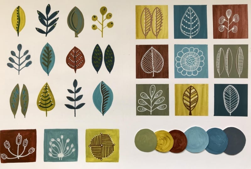
7. Delightful Yellows: Here are my yellows. This is
on the sheet that's going to get cut out with all
the discs cut out. And here they are in my
sketchbook, as well. I had to go over the page there. I also, as well as doing the primary yellow
with the black, I also did it with the pains gray because I wanted to see
what a difference it made, and it gives quite a
different effect, actually. But I do like the
effect that it's given, and that's the same here
with the cad yellow. So you can see there the
cadmium yellow and black and the cadmium yellow and pains gray have given quite a
different effect there, and I rather like
this effect here. What I decided to do as
well was rather than write every single bit of information
on the back of each disc, I decided it would be
easier just to number each disc and then write the corresponding number
on the back like this. Just ignore these two here. So for example, if
I turn that over, obviously it's one, two,
three, through to nine. When I turn that
over like that way, then I have to write the numbers from right hand side to left hand side so that they
correspond on the back. So that's basically
what I've done. Right through to number 51, that's how many colors I've created so far with just
the red and the yellows. So I can see that these color discs are going to
be in the hundreds. Way, how did you get
on with your red? I hope you've
managed to do that, and I hope you have just as
much fun doing the yellow. I mean, look at all the
gorgeous greens that are coming out here and these
lovely gray colors. It's really quite endless. Yeah, just absolutely
delightful. So I will see you in the next session where I show you how my
blues turned out.
8. Moody Blues: So how did you get on
with your yellows, nice sunny colors. This is the book that we used in the other
class that I did, the B Color confident. And you can see here how I just collaged some of the yellows together just for the fun of it. And you can see here how I collaged some of the
blues together, as well. And these are the blues now
that have come up today. Now, the top, just ignore
that part for the moment. This is the primary blue that is considered
to be primary blue. And apart from these ones here, these are the kind of colors
that you're getting from it. I mean, you know,
they're quite something, really, and let me put
something over the top of this. So you can't Oh, never mind. You know, the sort of going
into turquoise almost. So I decided as well that I wanted to
try a different blue. So I actually brought
in cobalt blue. And just to see
because that's how I think as a blue color, if you were to ask me what
primary blue looked like, then I would probably have
chosen something more like that rather
than like that one. And the cobalt blue, again, takes you into a very
different color tonal range, and, you know, they're
both fantastic. So it just goes to
show really that depending on which blue or which initial color you choose for doing
your color discs, then you will obviously get
very different results. So apart from those four there, because I had a little bit of a space that I
wanted to fill in, this is the color chart, if you like, for the primary
blue, starting off there. And again, you know, we're going into these lovely
duck egg colors, which are absolutely gorgeous and these kind of moody grays. And then you've got these
really dramatic blue grays up at this end here once you're adding pains gray or black. But then going back
to the cobalt blue, you know, it's a
much softer blue. And that takes you into
these kind of tones, which, again, you know, are absolutely gorgeous
in their own right. So, have fun with the blue. Now, what I'm actually going to do because that's the reds, the blues and the yellows done, but I'm actually going to
now do some more mixing. I'm going to mix the
blue with the yellow. So I'm going to mix
the primary blue with the primary yellow and
see what greens I can get. Because, again, when I
look through this book here and go up to the greens, I want to be able to
do some discs with these because it's so much easier than looking
at it from the book. As we said earlier,
and being able to use the discs on your
actual piece of work. So I'm going to have a play
and do the greens next, so I will see you in the next session and share with you how
they also turned out. Have fun with your blues.
9. Calming Greens: Well, as you can see, I really
did have a lot of fun with these greens because not
only did I do one green, I ended up doing three greens. So I started off
with the mid green, if we just look at
the color wheel. So that's basically
equal amounts of the primary blue and
the primary yellow. And that's how I got
with the mixed green, the mid green there. Then I decided to
see what it was like with the more blue green. So again, taking the primary
blue and the primary yellow, but having more
blue in it and less yellow brought me into
this color hue here. And then I decided
to have a go with the spring green, which, again, the blue and the
yellow, but more yellow for this
one and less blue. And basically, these are the results that
I've got from it, and I'm really, really
pleased with them. So I would say, you know, have a lot of fun
yourself with the green. It is a really good
color to have, as I said earlier, as a balance. You know, it does help to
balance the composition out. So I would say
have a go as well, doing yourself a
green color chart. And before you end up cutting
them all out, of course, don't forget to either
number them like I've done or to write on the back of each disc exactly what
you've got written, either in your
sketchbook or maybe if you're not having a
reference in your sketchbook like I have, maybe
well, hopefully, you've already been writing on the back of it as
you've gone along before you cut the discs out. A
10. Cutting Out The Discs: Now's the time to get your favorite music on or listen to your favorite podcast, get the kettle on,
make itself a brew, and just have fun. Cutting these circles out is quite meditative
in its own right.
11. Choosing Colours: Over the next few lessons, we're going to be taking a
look at different ways as to how to use color and
botanical shapes together. It's just going to
be quite playful. It's not going to be the
finished product or anything. We're just going
to have a look at how we can have a
little plate and experiment with them using
different elements of color, different elements of linework
to suggest botanicals, this kind of thing, just a lovely little
gentle play with it. I'm going to suggest
that we actually start off with doing some color grids, given that you've just
now got your color discs. So let's start off with this lesson where we actually
take a look at creating some color palettes
that you're happy with and then doing some simple
line work on top of them. What I've done here
is just create a 15 centimeter by 15
centimeter square, which I've then broken up into nine smaller squares
of 5 centimeters each. And basically, I could either use it for drawing
in the middle of it, or I could use it for drawing
around the edge of it. And what I'm going to do is
draw around the edge of it and get as many squares
as I can on this page. This is about an
A four page here. So depending on the size of the sketchpad or the piece
of paper that you're using, will depend on how many
squares you can get. So here are my 12 squares drawn, and I've already chosen the discs that I want
to be working with. Now, just to show
you here, you know, I've spent a little bit of time looking at these color discs, and this is the choice
that I finally made, but I just want
to show you here, what a great little
tool this is, if you like, for being able to see what works
and what doesn't work. You know, the minute I
swap that color over, it changes things completely, and it's not as harmonious
as I want it to be. I could swap out that green
for that green, and again, it kind of suddenly
dulls it all down, whereas bringing that one back in gives it a little
bit of a pop. What happens if I take that yellow and put
that in there instead? Can you see what I'm
trying to show you here that, you know, it's a really good way to see what harmoniously
works together? Now, what I could have done
if I'd wanted is I could have just used all of
the discs on here. Because then I would have known that those would have
worked together, or I could have
used all this line of the discs that I knew
would work together. But I wanted to just
bringing some green. I did start off with one. Let's just take
those out a minute. You can see there that I've got a color harmony going on there, and that was from the primary red color palette
that I did on the chart. But then I wanted to bring some greens in to balance that out. I've already written
the numbers there. You can see so that I don't
forget which is where. And that's what I mean
about the greens, how they bring
balance to a palette. Now, if I'd have gone with
the other kind of greens, if I'd have gone with
the more blue greens, let's take those out so
that I can show you. That would have created a
very different palette again. And not that there's anything
wrong in that at all. In fact, it's quite
nice, actually. But it's not where I wanted
this color palette to go. Let me just show you if I brought some blues in with this. I'm just randomly
picking blues here. Um You know, that doesn't
work for me at all, in fact, might work for you,
but it doesn't work for me. And I can't emphasize this enough in a way
that like I said, color is quite an
instinctive thing. You don't necessarily
consciously know why something's working and something
isn't there'll be a kind of instinct that says, I don't know why, but
that's not what you know, that's not where I
want to go with this. So this is where these
color discs are so, so useful in being able to kind of help us
make the choices. And take the guesswork out of
what colors work together. What colors, you know, work either harmoniously
or in contrast. I mean, I've got some
pale ones going on here. I've got a pale, more neutral
green going on there. And then I've got some darker contrasting colors to go in, as well to make it so that
it doesn't all become too, well, too boring, actually. You know, there's
a nice interplay there of colors that are
balancing each other out. So that's the color scheme that I'm going to go with there. Now, the reason
that I like to use a five centimeter square is that it's small enough for you to
be able to get some color on pretty quickly without
feeling overwhelming. And basically, I'm going
to be cutting these out anyway and even
then rearranging them. So once you've
done your squares, do what I've done and leave a bit of gap in
between because you can paint over the edges because we'll be cutting
them out anyway. It just means you've got a
bit more of a free, you know, you're not trying to get it
all in the corner perfectly. So you can paint
over the edges in a nice kind of even brushstroke. What do I mean by
that? You know, you can kind of go across
like this and go over the edges without then bashing into the next
one or go down the way. And it just makes for
a nice grain of paint. So I'll get these colors
painted into here and then bring you back in and
let's take it from there and see how you know, I might rearrange them all again once I've got them
into the colored squares, and we'll have a look
then a little bit about what kind of
composition works. So this is my last color to mix, which is number 25, and that started off
with a primary red base with a bit of pains gray. A little bit more. If I look at my little recipe book as it
were. This is the color here. I'm wanting to get
to that color there, which is about that one. A bit more red in there maybe. This is the color
that I'm looking for. Here and thereabouts
and then some white. Let's see if that's enough. Now, as you can see, that's
not quite the color there. So that's because I know that
I need some more red in it. So let's just pop a bit of red. And this is where
the color mixing it is like using a recipe. There, now you can see that
we're getting much clearer and much nearer to
that color there now. And the more you do it, the more you will become more
accomplished at it. And this is the
lovely thing about learning in this slow
manner and actually taking the time to absorb what you're actually learning rather than just be a quick fix. So that's pretty good, actually. I'm going to paint
that on there. Nice broad strokes going down. We can track over the edges. Pull it down one more time
across the whole surface, and that gives it quite
a nice finish then. So those are the color
blocks finished there. And what I did was
I just, you know, went straight back into
what I'm now going to call the color recipe book and looked at the different
combinations of color. And let's see, we're
not far off here from getting these just how
they are in the recipe book. And, you know, if you're
a little bit off, it doesn't matter because
the flavors there, you know, you're almost at
the right point with it. So it doesn't have to be
absolutely bang on. There we go. But that's pretty
good, isn't it? That is pretty good actually at being able to match those
colors on the colour chips. I'm really, really
pleased with those. So I'm going to let those
dry before I cut them out, and then start looking at a few botanical
shapes that we could draw into these. Really
pleased with those.
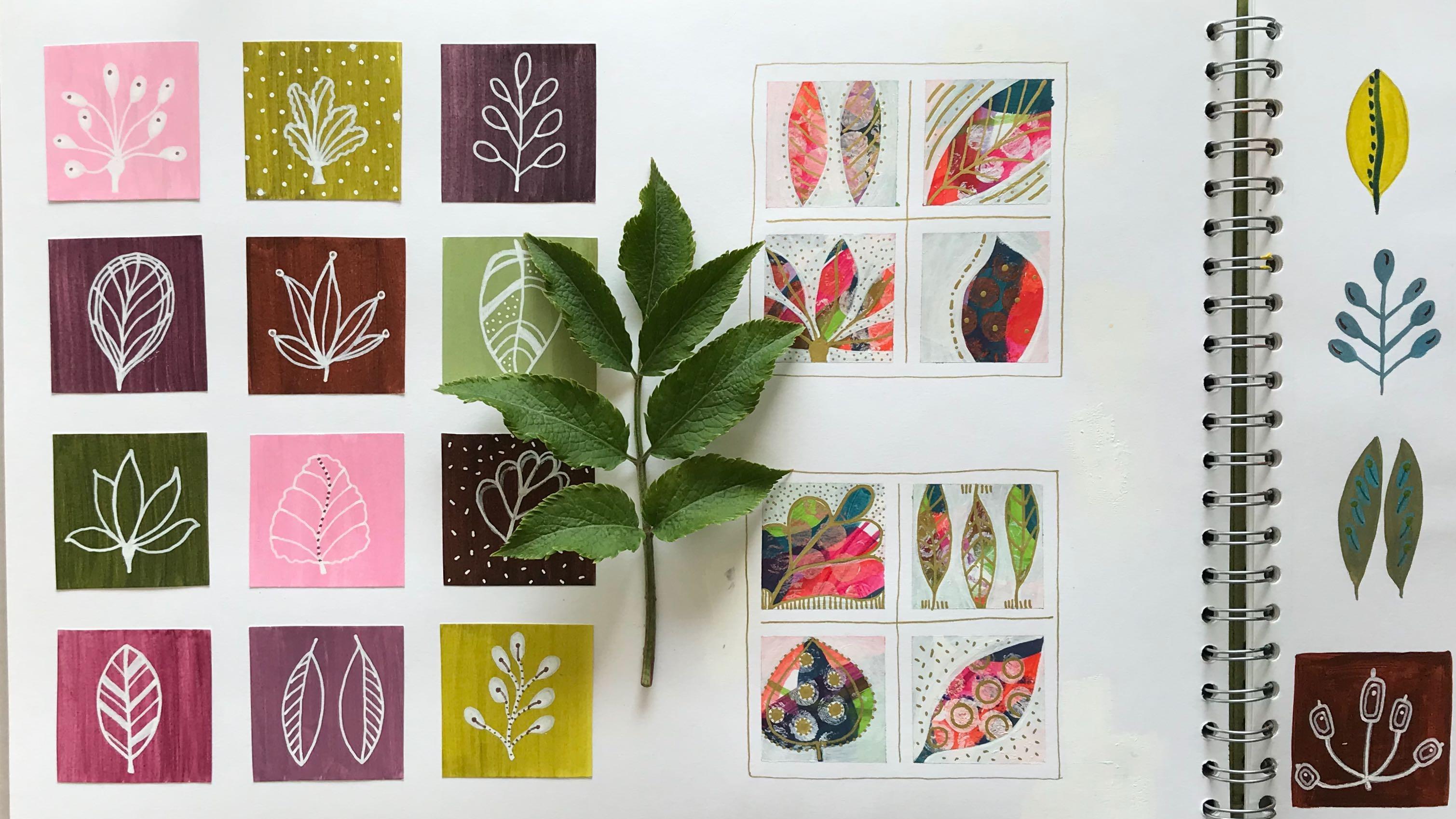
12. Colour Block Botanical Grid part one: These are my color
blocks cut out. And I can already
tell that I'm really pleased with the combination of colors that I've
got together there. I'm just going to put
them to one side for the moment because now I'd like to focus on the
botanical shapes themselves. And you've got some PDFs as
resources, downloadable PDFs. That you can print off and use as inspiration or use
for ideas for shapes. Now, if I just take a
look at these here, what I've done is I've given you PDFs that are this size here, so you've got a really
big version of it. And then on my printer, I've just printed it off
at ten by 15 centimeter. So obviously, if you've
got access to a printer, then you can reduce it to
whatever size you want. But let's just take
a moment, actually, before I start drawing
them in my sketchpad, to have a look at the
shapes themselves. Now, if I look at this one here, really, we're looking
at an oval shape. That one's also an oval
shape, but slightly wider. Again, an oval shape. I mean, really, that's a
smaller version of that one. You could put that
into a circle. This is definitely an oval
shape but much more elongated. Here again, this maple leaf, we could put that into a circle. If we made it touching
round the edges, that makes it even easier. Let's rub that bit out so you
can see that a bit better. You can see that's an easy
way then to copy that. Again, this one down here, we can put that into a circle. We've got another
oval going on here, again, a wide oval. In fact, that's almost a
teardrop shape, actually. Then we've got another
elongated oval. And this one here, we've kind of got an upside down egg shape. So it's narrowing at the bottom, getting wider at the top, and coming round like this. So that one there. That's a similar
shape again, as well. Wider at the top,
coming round like that. This leaf here, again, we can put that into a circle. So if that helps to be able
to start your drawing, if you're not particularly confident at drawing
these, I mean, I've purposely kept
the whole projects as a stylized botanical. So it's not about
being able to draw, you know, really, really well. It's about looking at the shape of a leaf and then bringing
it to its simplest form. And straight away, you
can see that that's a maple leaf,
that's an oak leaf. That can be various leaves
of different plants. So let's have a go
at reproducing this in sketchbook or on a piece of paper,
however you want it. Now, if I just draw
out, first of all, if I start off with a few ovals, let's put some ovals in, and I'll do different
shapes of ovals. Upside down ovals. I mean, I'm drawing
this free hand. You can, if you like, in
fact, let me show you. I'll just get it. If you've got access to these
little templates, these are quite useful because
you can obviously just go straight in and draw
around them like that. There you've got circles. So that makes it really easy. Or, of course, you can draw
circles around a coin or, you know, a glass jar,
whatever you've got. But just for the moment, let's just stick with me
drawing this free hand. So I'm going to do a long oval. Kind of wide oval, there we go, simmer
all the way around. Let's do another circle. Let's do two circles. And then we'll finish off
with an oval like that. Now, I'm going to go straight in with my trusty lac fine liner, but you carry on
in pencil if you feel more confident being
able to just do it in pencil. And basically, I'm going to use these outer shapes as a guide
for doing the leaf itself. So let's see what we
can do in this one. So I'm just going to
follow that round. Put a little stem on the bottom, carry that stem through to the top and give it some veins. Now, because you're doing this freehand and not digitally, you don't want it
to look like it's a digitally printed leaf. You want it to look
like you've drawn it. In fact, I'm going to take
that little middle stem and take it through
the top as well, because this is where we use our imagination a little bit and add things to it
that you wouldn't necessarily find in
the leaf itself. So on the edge of this, I'm actually going to
put some little dots there because I can And this is really about making your
leaves if you like, a little bit sort
of illustrative. Imaginatively illustrative.
Let's call it that. Let's put it that way. So let's see what we can do
with this one here. I'm going to go from
that top point there, and I'm going to come round, and I'm going to give it
a little bit like that, almost like an
upside down heart. Bring that stem down. And now what to do with it now? I could just do
crosses like this. So I'm taking some
basic leaf shapes here and I'm making
them my leaves, and making them do what I want them to do rather than trying to reproduce something exactly
as I would find it in nature. So let's have a look
at this one here. I'm going to put the
stem in there first, and then I'm going
to go from the top, bring it down.
Same on that side. And I quite like, Well, I like that just as
it is, actually. In fact, I'm going to make that an upside down stem by
then bringing that out. And that looks like
an upside down stem. So I could turn that around, of course, and use it
that way if I wanted to. So this is where
it's good to have some outer lines just
to help you yeah, get a feel for the shape of it. Let's have a look
at this one here. Now, if I put a little
dot there, and, you know, I could take this
little maple leaf as a bit of inspiration for it. So if I draw up there, then I'm going to draw
another one to there, another one to there, and
the same on this side here. And I'm just going to create some leaves around like this. Now, that's not
exactly a maple leaf by any stretch of
the imagination, but it still looks like a leaf. That's rather lovely.
If I wanted to, I could bring that all
the way down there, that to there and that today. And now we've got a
really nice leaf shape, and yet, you know, using that as a bit
of inspiration, the rest came from
my imagination. Let's see what we can
do with this one here. As it's already that shape, let's keep it that shape. I mean, I did that
with the template, so let's give that a stem, and maybe I just do
something like this. So, you know, I'm bringing
in my own style into this. Using these as, like I said, kind of the guide,
the outer guide for want of a
better description. Oh, you know, I could just make them a bit more realistic. And have something that, you know, is very
obviously recognizable. It doesn't matter what you choose. It really
doesn't matter. You know, it's up
to you what you decide to do and how you decide to style your leaf. And that's the whole
thing about having stylized botanicals
that they are, in fact, your style. Now, that said, if you're
completely new to this and feel a bit daunted
by it, by all means, use the leaves or
as near as you can get to them from the printout, that's, you know, absolutely fine. That's why I've
given it to you. So again, let's just Now, what I might do on
this one is put some little dots along
there, just because I can. I like that phrase
just because I can. For me, in this kind of imaginative art,
there are no rules, and the only limitations
really come from, you know, how we think, whether we think something's okay to
do or not okay to do. And as far as I'm concerned, anything like this works.
It's absolutely fine. Let's go with this circle here. M I'm going to do something a little bit
similar to that one there, but keep the lines straight. From there, it has its
stem there as well. So you can see how easy it is. I think it's easy.
I hope that you're not you don't feel
overwhelmed by this. You know, it is quite once you allow yourself
to just play with it, I and, you know, allow any shapes to come out that are really part
of your imagination, then that's absolutely fine. You'll have fun
with it. So that's what I'm going to
encourage you to do to spend some time
doing a couple of pages of these leaves, and then we'll have
a look at how we then put those onto the squares, how we draw them
onto the squares, and then creating a composition with these lovely color block
squares that we've done. So I'll carry on doing
a few on here and bring you back in when I've created another
page with them as well.
13. Colour Block Botanical Grid part two: That's a few more drawn on
that bottom page there. I've rubbed out the outline on the top one so that you can see them without
the outline. And I've managed to
smudge quite a bit of the ink, as well,
but that's okay. I've managed to
smudge the ink on this one anyway, even
without rubbing them out. But you get a sense of different shapes that
you can then draw. Not too keen on that one.
It looks a bit rude, but we'll just leave
that one as it is. I won't be including that one in any of my squares,
I don't think. So now let's put that to one side and bring
the squares back. And here, I'm going to
decide obvious well, I was going to say
I'm going to decide, am I going to use a black
pen or a white pen? Now, my white pens, I've got a pen touch here, which is an extra fine point, and that's really good actually for doing on these because
it shows up really well. You could also use
a white posca. That one's a bit
thick, is that one? You need a slightly finer one. A one M, PC one M, that's got a finer nib. Or in terms of the black, you could use a fine liner. Now, the only thing
with a fine liner is that they do smudge if
you get your hand well, they all smudge if you
get your hand on them, but these take a bit
more drying time. And also, if you were to end up putting water on by accident, it would bring this ink off, whereas these kind of pens, because they're
actually acrylic paint, then once they're
dry, they're dry. So let me get a little
bit of scrap paper. And with these posca pens, you do need to just give
them a good shake and then pump them ever so slightly to make sure
that the inks coming out. That's coming out nicely. So let's take one of
these darker ones, and I'm going to look at the
leaves that I've just drawn, and I'm going to draw something similar
to that one there. So I'm going to start
off with the stem. To bring that round like that. Now, it's gone on quite faint at the moment,
but that's okay. Because I'll go over it again. And I'll leave that
leaf just like that. Now one thing you do have to watch is that you
don't end up blobbing. So let's just go over that
real careful. That's better. That's coming out much nicer
now. Much, much nicer. Now, it's better to do
your little drawings first on each square
before you then collage them into your final
composition because A, if I was to have
got a big blob on that one there, then obviously, if that was in a
composition already stuck down, it would
ruin the whole thing. At least if I only ruin one, I can replace that
one quite easily. So let's take another one here and decide what I'm
going to do on this one. And I think here, I'm going to start with that little point. I'm going to go right up there. Give this 15 leaves. Let's bring that one behind that one just as a little
bit different. That one behind there so that
it's not quite so uniform. And another little stem. Very effective, aren't they? Now, I'm going to try white
on this lighter one here. And if it's too light, then what I'll do is I'll go
over it with a darker pen. So because I'm not
sure whether the white's going to
work on here or not, we're not going to do too much
of a complicated one here, so I'm just going to
bring a stem down. Oh, that's working well.
That's okay, actually. Yeah, that's quite nice. Well, in that case,
let's go with that. I do like these sort of
multiple leaved stems. I think they're rather
sweet, actually. And it's interesting sometimes just to not do it
so symmetrical, which creates a wee bit
more visual interest than if it was completely
the same on all sides. So I'll carry on doing some filling in all
of my blocks here. I do have a lovely copper pen, actually, which I will probably use on the pink because I think the white
will be too light on that. And by using this copper pen, which is also quite a fine nib, then it will echo
a little bit of the two colors of the
brown there as well. So I think that will
tie in quite nicely. So I'll do those and then show you how
they've turned out. Here are my finished squares. And in actual fact,
on these paler ones, even the pink ones, the
white pen worked out okay. So I haven't used
any other color other than the white posca pen. The one, wrong one. The one Posca pen, which is filled with
white acrylic paint. I did call it ink earlier on, but it's not ink. It's paint. So now what I need to decide is what grid composition am
I going to put these in. So let's first of
all, put them all on, and then I'll obviously
end up having a little play to decide
what colors I want where. Oh, that's so exciting. Sorry. That really is quite
exciting for me, I must say. When you start seeing it
come together like this, you know, it's like bringing the individual pieces together to create the overall effect. Now, of course, what I've
done there is I've left those two colors till the end,
and they're very similar. But doesn't that
just look lovely? I mean, that just looks
really, really sweet. I am so pleased with that. I really am. So the things
to consider, for example, is not only the color that
goes next to each other, but also the leaf shapes. So for me, those two leaf
shapes are a wee bit similar. So I'm going to swap
that one out for this one for the moment
and put that down there. And these two leaf shapes
are a way bit similar, and those two leaf shapes are
a wee bit similar as well. So I think let's swap
that one out for there. Although because that's a kind of really nice reddish brown, that actually looks better
in the middle for me. So we'll put that one back. And we'll leave that one there. And maybe I just
let's have a look. How about swapping that one? No, they've got too many
greens together there. So you can see how you can
play with this to decide, you know, just exactly
how you want it to be. Now, that looks nice.
That looks very nice. Very pleased with
that, actually. That's worked straight away there once I've done that
little bit of swapping. So the question now is, do I keep it all like that
as you know, this shape, this landscape composition
and use all of the squares, or do I take three squares out and make it a
square composition? Now, for me, actually, something's been lost there
by taking these colors out. So let's put those
colors back in. And let's try taking
those three out. Now, that's slightly better. But I think it's still
missing something. I think I actually preferred
it as a longer composition. Yeah, I like the balance
of colours overall there. Now, if I turn it
that way around and turn the pieces that way up, do I like it just
as much? Let's see. And yes, I do like it
just as much that way. I think that's rather
nice, actually. Now, if I bring the
bigger sketchbook in here, you can see, I actually painted these directly into the
sketchbook by using washy tape around it all to obviously give
me the grid pattern. So once they were
painted, that was it. They were in and, you know, everything was painted
directly onto the page. But doing it this way and
then gluing them down, I've actually got a bit more flexibility as to
what I put where. So I think what I'll
probably end up doing is putting these into this sketchbook and
gluing them in place, and I'm really, really
happy with that. Or I might, I just
might end up taking this page out of here and gluing them down and putting
them in a little frame, because I think they look
really, really pretty. So that's the first project
completed in a way. You know, this was
really a practice piece, so you don't have to be doing anything with them
if you don't want to. It was really just to
get you, you know, coloring some blocks in and
getting you used to actually starting to do some of the
botanical leaf shapes on them. So, you know, if you
don't want to do anything with them at all,
that's absolutely fine. You can just pop
them to one side, and we'll look at the next
lesson to see how we're going to use color in a
different way and how we're going to
bring the botanical shapes into that, as well. So I will see you in
the next session. Hope you have a lot
of fun with this. No.
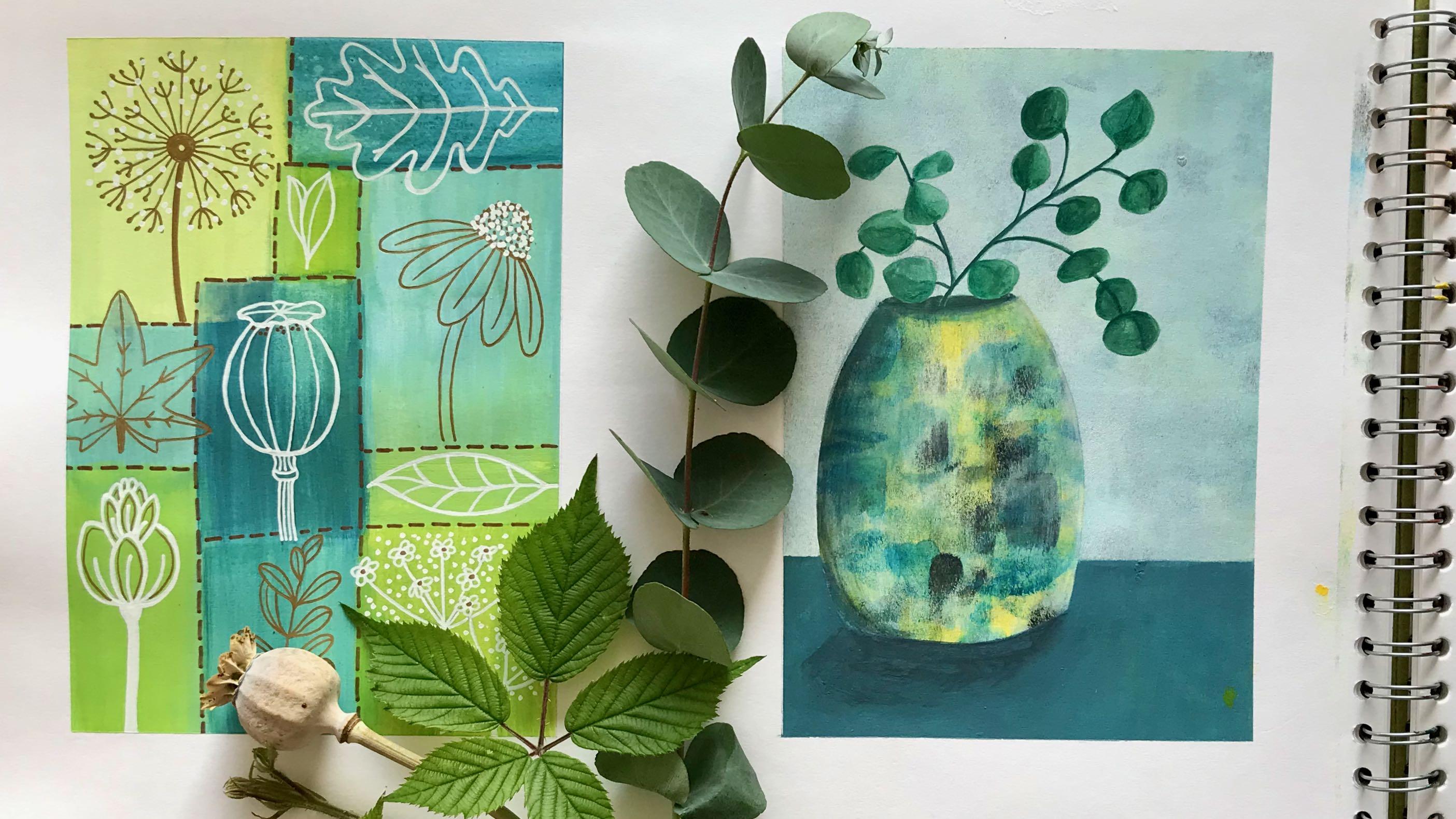
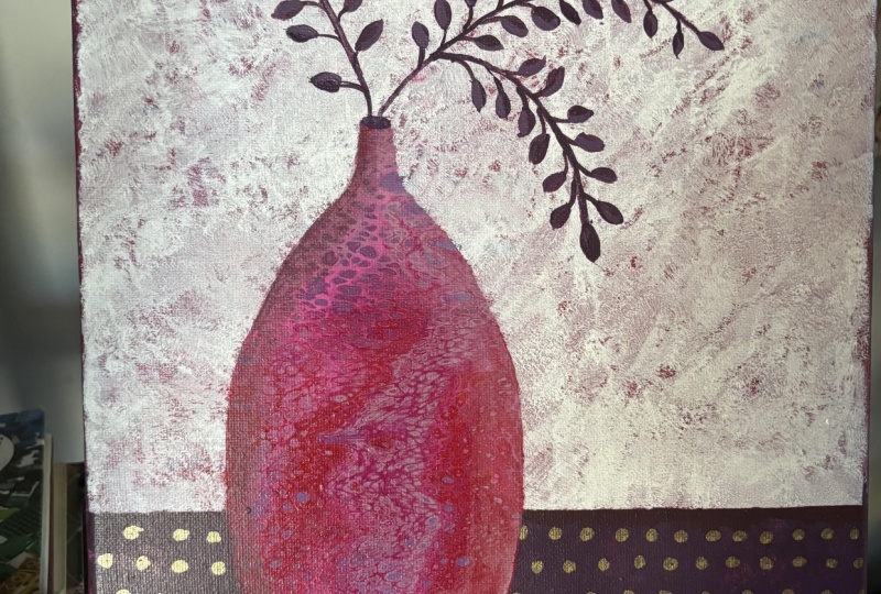
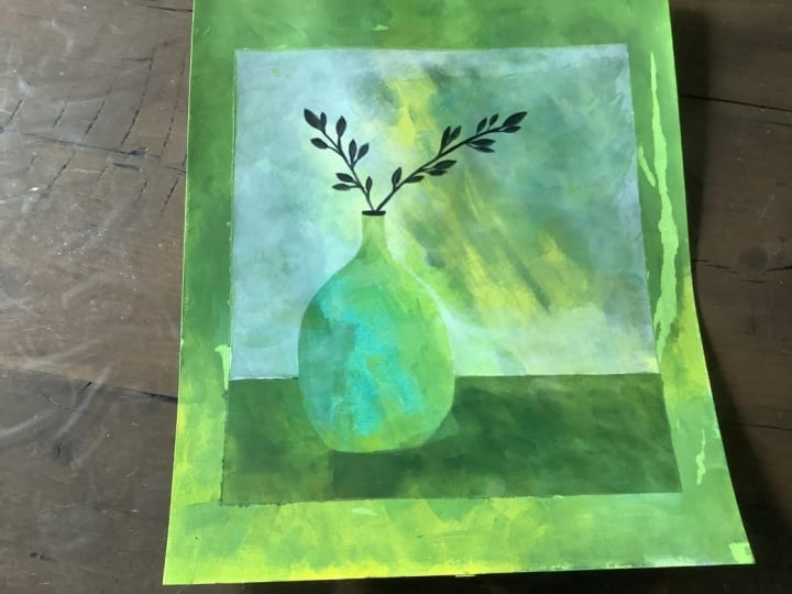
14. Multi Coloured Background : For this next little
exercise, we're going to be, again, using the color discs
to choose a color palette. I'd like you to limit
it to five colors. You can do less if you want to. Um, and I would encourage you to just go a little bit out of
your comfort zone. So I've chosen
these colors here, which are really
not colors that I would normally put
together at all, but I'm going to just
experiment with it. And so you'll see
with me in real time what these colors end up
looking like put together. But I quite like
them as they are. They're quite poppy, as it were, quite, you know, quite vibrant colors,
apart from this one. But in a way, if
I take those out, they're of a similar
kind of vibrancy. And then I brought that one in, which is much more dull. Because I want to see if that balances that out or
not. I think it will. So the way in which we're going to put the
color onto these squares now means that I'm
going to have to mix all these five colors
all at the same time. So I'm going to put those up
there just for the moment. I've already written down
what recipes they were. So I know what it is
that I need to mix. And you're not going
to need too much color here because these are
very small squares. Basically, it's a ten centimeter by ten centimeter square or
a four inch by four inch, which I've then proportioned off into four, five
centimeter squares. So similar size, well, the same size as these here. And I've just used washy tape
basically because I want to try and keep a fairly
clean edge around it. So that's easy enough to do. And I think we'll just start off with the two
simplest colors here, as in the two reds that are, you know, already mixed up. So let's go in with the red. Now, I just want you to be
flowing and free with this. Don't want you to
overthink this at all. Really don't just
get some color on. However, you want to put it on. I'm going to do it
on both of them. But what I'm going to do
with this bottom one is put it in slightly
different proportions. Okay. Get some of
that cadmium red on. If it runs into the other
colors, that's absolutely fine. I'll create a
different color again. So you can see
here that I'm just literally very
liberally applying this paint without
really any kind of plan as to where
it's going to go. I do love those
two reds together. I mean, basically, they're like bright pink and
orange, aren't they? Okay, I'm going to go
with the green next. So that is the blue and the
yellow mixed together. Okay. Now, I can already see
that that is too blue. That's much too blue. So that needs more yellow in it. And this is what I
was saying in one of the other lessons that
the more you do this, the more you will get to really understand what the color needs to get it into the
color that you wanted it, to get it into the
mix that you wanted. So I'm even going to
take that into there and put that So basically, I've taken that green out and put it into
this yellow here. So it really is just a
question of practice. Practice, practice, practice. But in a fun way, you know, not in a way that
is a real chore. When I say practice,
that makes it sound like practicing your scales
on the piano or something. You know, this is fun. This is okay, I'm not
going to call it practice. I'm going to call it playing. Play, play, play. So is that near enough
to that color there? Yes, that will do nicely. So let's put a bit
of that in there. Oh, now, look what
happened there. Interesting. So without
cleaning the brush, I'm going to see what else that produces
if I go over there, look, and that's producing. It's pulling that red down
that red hasn't dried yet, and it's bringing another
shade in completely. I like it when that happens. So you can get different
effects by not cleaning your brush. See
what happens there. Now, that red underneath
has actually dried, so it's not dragging
that one off. This is such a freeing way
to produce images because, at this point, you don't even know what we're going
to be doing next, so you can't overthink
this at all. And it's really best if you don't don't even
know how it's going to turn out. All right. Let's bring in that blue there, and that is the primary
blue with some black. Just a reminder that
you never need much black for it to turn a colour into
something else entirely. That's it, look. That's getting much nearer to that one there. Probably put a tiny bit
more black into that. A little bit more black. Probably gone too much, but
that's okay. But there we go. That's the color that I'm after. Wow, that's very
strong, isn't it? Because it's such a dark color, it's actually
covering up a lot of what's underneath it,
which I don't really want. So I'm just going
to be a bit more mindful about how I apply this color because I don't want it to be too overwhelming. I'm also going to leave
a little bit of white in these squares as well as a contrast to everything
else that's going on. I It's part a little bit, just coming through
there like that. Maybe a bit more down there. Okay. Tiny bit there. Don't want too much on that one. And then the final color. Number 83, that's
cobalt blue and black. Here I've got I've got the
cobalt blue just here, put a tiny bit of
black into that. And it needs more black. And then a little bit of white. So that's not bad there. I'll leave that color there. And again, this is a
very strong color, so I'm going to be careful
how I add this to it. We've got a little bit of abstract art going
on here, aren't we? It's quite fascinating just allowing yourself to
play in this way. I say, not getting
too hung up about where colors are actually going, allowing the playfulness
to come through. And as you know, right now, for me, you know, that's the important
bit, really. Just allowing yourself to play. Because, actually, it's well, for a start off, it's
more relaxing for you. And, you know, if you're not
so attached to an outcome, then I just think it makes
for a freer expression. I think you end up
being more well, just more carefree with what you're putting
on your plate, what you're putting
on your paper. And it shows through
then in the work itself. Now, I've got a bit more
white than I want there, so I'm going to go back and
add in some more colour here. So I'm going to put
some. Oh, look at that. Look what's happened there now, 'cause I had something
on my brush. Let's take advantage
of that, shall we? Mm, very nice. Say, happy accidents. Bring that down there as well. And I think that just needs a bit of a pink
something over there. All right, that needs
to dry, actually. In these areas where
there's a bit more white, I'm going to take a fin line. With this pink. Maybe if I've still
got enough paint left because I'm not going
to bother mixing anymore, pick up no that
green's already dried, I think, I might just
get a little bit there. Bring a bit over there. And maybe a little
one through there. So that looks, you know, a bit of a kind of colorful mess at the moment, which is great. That's just what we
need it to look like. So I'm going to let that dry, and then I'm going to
peel off the um actually, no, I'm not going
to peel it off. I'm not gonna peel that off yet. I'm gonna let that dry first, and then I'll show you
what the next stage is. This paint is now dry. And what I'm going
to do here to add even more complexity to it
and more chaos, if you like, is I'm going to put a little bit of white onto some bubble wrap, and I'm just going to press
that into certain parts. Now, if we were doing this
on a much larger scale, you could use all sorts of
pattern mark making tools. You know, you could use
bubble wrap like I am. I see that's rather
interesting, isn't it? You could use patterned rollers, anything that gives a texture, basically, and just makes
more visual contrast. Mm. A bit more. I've got a little bit of
red here, still wet so. I'm going to bring
that in actually onto this bubble wrap, which has created a
kind of coral color. And let's try that on there. There I go bit
more around there. But I'll do just the cadmium red that's left on my
mixing pad here. That's quite a bit quite a
bit on the bubble wrap there. I'm just going to pop
that in that bit there. And then let that dry again. Oh, I leave something
on this one here. Let's do a bit more
of that cadmium red. Put that over there again
onto the corner of it. Oops, and press that
down there. There we go. I'm going to let that
dry one more time. And then take you to the next stage or take
this to the next stage. Actually, that's looking a bit I could do with something
else in that as well. So let's bring the
bubble wrap back into that and see what other
color I've got here. Got a little bit of
the cobalt blue left. Tiny tiny bit. Let's see. What that might look
like, might look rubbish, but let's just give
it a go and see. Kind of looks like
a bit of a smudge really rather than
something else. So I'm going to go back
into the white, I think. Is that dry? That one's dry. Let's bring a bit more white
from my trusty little pot. Let's have the
white in it now for quite a while. Take
some out of there. Bring it back over that
coral color that I had. I put that over there instead. That'll do. Wow. Wow. Oh,
I'm really liking that. I'm gonna have to
do more of that. I was a bit tentative, actually, with putting the bubble wrap
on these other sections, but I really like the
boldness of that, so let's give it some
more bold over there. Just because we can.
And a little bit here. And I think we'll call that a day and just leave
that now as it is. Of course, part of the thing of pattern making is non to stop, and that's always a bit
of a challenge for me, to be honest. But there you go. Right, we'll leave
that to dry and then I'll show you
what happens next.
15. Adding Botanical Shapes: Following on from the
little sketches that I did to get the leaf shapes, to get some basic leaf shapes, I'm going to carry on in
that little sketchbook now, and I'm going to use my
little five centimeter buy five centimeter template, and I'm just going to
draw some squares. Again, I'm not being too
precious about this. Basically, what I'm doing
this for is because I want to get a sense of,
again, composition, simple composition onto the so that I can project
that if you like, onto the squares that
we've just painted. And when I say project, I don't mean project
it like projector. I mean, have a close
idea as to what kind of shape I want to create
within those squares. So let's just look at
those squares again. So here, we've got
the colored squares. I've got the same size
squares here now. And what I want to do is to
just put in some really, really simple leaf shapes. Because these are really small, it doesn't need to be as complex as doing
something like this. It just needs to be, you know, a fairly straightforward
leaf shape for this particular exercise
that we're doing here. So I'll have a look
at that one there, and I'll put that in. So I'll start off
with the circle. I'm going to take that almost
up to the top line there. I'm going to take
that one out of the frame and that one
out of the frame as well. Or you can imagine it
going beyond the frame. Let's make that one up
there, bring that down here, and then another one that goes slightly out of the frame
and comes in there. So it's not exactly the same as that one, but it's similar. And I'm going to take
that stoke down to the edge of the frame like
that. So that's one idea. Let's have a look
at that leaf shape. Now, when I drew it originally, it was the other way around. But as I was sticking them down, I thought it looked
quite interesting to actually have it coming
as a hanging leaf. So let's do a hanging
leaf on here as well. Now, already you can
see that I've gone wider than the original one. To make it look as
if it's hanging, I'm just going to bring that little curve
to the edge of it there so that it
looks as if it's coming down the way rather
than going up the way. And there is the stoke
that it's hanging from. The next one, I'm going to
use this leaf shape here, but I'm going to
set it at an angle, and I'm going to make it bigger. So I'm going to have it
coming in from this corner here and I'm going to
take it all the way through so that it actually goes right off the edge
of the square there. Quite like this idea
here of using two. Again, when I drew those, they
were the other way around, but I think they look quite
nice again as hanging leaves. So let's do something
really similar here. Keep it very simple. So I'm using pretty solid
shapes here, as you can see. I'm not going in for the
smaller detailed ones in this particular exercise. And as soon as I start drawing into it, you'll understand why. Excuse me. Let's take one
where that's going up there. But I'm bringing that
round like that. Round like that. And again, that's going slightly
out and back in again. So what I'm doing
here is I'm making the leaves bigger than what they are in
these squares here, and I'm expanding
them so that they really go up to the
edges of the square. Let's do one final one. Keep it nice and simple. I'm doing that slightly
off center look. So it's not quite in the center.
It's a bit further over. So what I'm going to do now
is I've got eight squares, so I need two more designs, but I'm going to
put these designs here into these squares here. And to do that, I'm actually going to use a white pencil so that I can
see a little bit better. Maybe I'm not. Maybe I'm
just going to carry on using my HB pencil. So if I take that over
there and bring that here. Now, basically, what we're going to do
is we're going to put these designs into here and then we're going to paint
out the background. So we're going to paint out the background with white paint. So what I want to
do here is look at each little square that
I've created there and just see which I think of these designs would suit the bit of pattern
that's going into there. Now, again, I'm not
overthinking this. I already know that I want
to put that one onto there. So let's just bring
that down like that. In fact, quite like that to
be a bit wider. There we go. Now, I'm going to rub
that initial line out because I don't want that
to be in the middle there. Keep your pencil line, you know, fairly light so that you can
quite easily rub it out. So that's that one. So I'm going to draw
all these in once I've decided which design
is going where. I think that would be quite
an interesting one into here. So let's draw that one out. There we go. That one, I think would be quite interesting
in that one, actually. I'm going to take that one up
to there like I did before, bring it around in the
circle. Bring that to here. Now that's going
slightly out of there. Bring that around there.
And that one's going well out of the square. So I'll carry on
doing this just for a few minutes and then let you see them all when
they've all been drawn in. I'm not sure that you
can actually see very carefully the outlines
that I've done there, but I want to just
show you the idea is that we are going to do something
along these lines here, whereby we're painting
out the background, but letting a little bit of the shadow of it
still come through, but it's making the
botanical shapes then really stand out. And then, of course, you can go in and add further detail. Now, obviously, you know, with this being a bigger square, I could do more things in it. Just wanted us to play with
this shape to start with. Sorry with this size, just so that it wasn't
too overwhelming for you, because what we can do then
later is do a bigger project, a larger project
with this technique, if that's what appeals to you.
16. Revealing The Leaves & Adding Decoration : So I've got my pot here
of white acrylic paint. I'm just going to put a
bit of water on my brush and pick up some of that
paint from in there. Add a little bit of water to it. I want it to be
not exactly runny, but not just quite as thick as it would if it was coming
straight out of the pot. And I'm going to now
draw around the outline, sorry, paint around the outline of the things that
I've just done. I've just realized
that I haven't done one there, but
never mind, that's fine. We'll just leave
that for the moment. So let's start with
this one here. Now, even that's
slightly thicker than I want the paint to be only because I want to try and get a little bit of the background, a very sort of faint idea
of it shining through, not shining but showing through. So here, I'm going to paint around the outside of that leaf. I can even make that even
more translucent that paint. The thing with white
paint, of course, is that it's actually opaque, meaning it's very thick. Some paints are a lot
more translucent. You, you can see through them, which is why sometimes
when you're mixing paints, you can see this on the green. You can see through it
more because it's not a full thickness of paint, whereas a white paint is so to make it be a bit more
see through or translucent, you will either have
to put a little bit of map medium in with
it or water it down. Then now we can see that's
about the right consistency there because I can see little
bits coming through there. So I'm going to do
that on all of them. It's exactly the same as
what I've just done there. I'm just going to paint
out the white background and then let you
see the results, the final results of that. Well, here are the squares
all painted out with white. You begin to see now the technique and how
that's going to be working. So let's peel off
this washy tape and see what's underneath. See
how they've turned out. It's as much of a mystery to me as it is to
you because I don't know until we get
them off until we get the washy tape off as to
how they're going to look. But already, I'm really pleased with what I'm
seeing has happened here. So there we have the
eight little squares. And this is where, you know, you can start adding a wee bit more detail
if you want to. If you don't want to, that's
absolutely fine, as well. But what I'm going to do here is I'm going to bring
in the gold pen. I'm just going to
add a little bit of detail to some of these. And I notice I particularly want to bring in a line here to join those up. So just doing something as
simple as that on those. I think that needs a bit
more paint coming through. Yeah, that's better. Bring that through there. That's better. That one through there. Let it join in that middle bit there. And already, doesn't
that look lovely. Just go over that bit and that bit and give that
an outline there. Now, if I wanted, I
could fill in that completely with gold or I
can just leave it as it is. I'll just leave it as
it is for the moment. I don't have to add gold pen
to all of the things at all, but it might be nice to just add a little
bit of something. Okay. As you know, always my thing
is about pattern. So just adding a
little something and I love the patterns
that have been revealed just from that simple mark making
with the paint that we did to start off with. Now, if I look at
this one up here, that does need a little bit
more work on it for me. So I'm going to
take that gold pen and put it up to there. Excuse me. I just get
rid of that hair. And I'm going to be a bit
more obvious with this one. And partly that's because there's that big
block of blue there. So by doing this, it makes
it much more obvious to me that actually it's about the leaf rather than
the color itself. It kind of joins it and
brings it together more. And I think as
well, I'm going to sort of just do a bit of
an outline around there. And let that linework kind of bring it in
to the leaf itself. So it brings the eye into
what's happening with the leaf. Isn't this fun? There we go. And so there you've got
some more really fun, very, very colorful, botanical shapes
again, some leaves again. So I hope you have fun
with this technique. Do experiment with it. And again, do take
your time with it. You know, you can play around I can play around for
days with this technique, you know, seeing what
comes out with it. And you can use it, of course, not just with botanical shapes, but you can use it with all
sorts of shapes, birds, whole compositions, you
name it. It's a lot of fun. I couldn't help myself.
I went in and added even more pattern because I was having such a
lot of fun with it. Anyway, I'll see you
in the next session where we look at how we're going to use the colors again and
adding even more botanicals. I'll see you there.
17. Drawing Flowers And Seedheads: In these next lessons, we're going to look at how to create a different kind of grid, more of a patchwork effect
with much softer colors using a combination of both seed
heads and leaf shapes. But just before
we get into that, I want to have a little play
with you with how to create different flower shapes and create different angles with
your flower shapes as well. Now, here, I've given you
this as a PDF download, and this is what I've
used here to create this by cutting out to
create the composition, cutting out the shapes,
and also tracing. So I don't want you to get too anxious about not feeling that you can't draw like this because all of this was done by tracing. Let's just concentrate
on this for the moment, and then we'll
come into this and I'll show you how to merge
the colors together, how again we choose
a color palette from your color discs and how
we can create something, you know, really pretty
and simplified like this. Let's just have a little play, first of all, with circles. Although you've got a PDF
downloadable resource with some flower heads on it, I just want to show
you how easy it is to create your
own flower head. If you start off by drawing
yourself some circles, let's just take this one
here and think that we're looking at a flower
head straight on. So if we draw a circle in
the middle or roughly in the middle and then give
ourselves across like this, and then sections in between those so that it looks a
little bit like a pie. Then what we can do there is
use those as a guideline. So we're using the edge of
the circle as a guideline, and we're using those lines as well that we've just drawn. So we can go up like this
down up again, down. And that's so easy to then give yourself that
kind of flower shape. Now, we could make
those petals a lot narrower look by doing
them like that instead. Or we could make some
shorter ones and wider. We could even then extend
that like that around there. I hope that hasn't
confused you that I've done all of those
in that one circle. But that's an idea how to get a daisy kind
of flower going. Now, let's have a look
in this one here. If I use the circle again, but I just put the
middle up here instead and make
that a bit more of an elongated oval or
an elongated circle. So it looks a bit like an oval. And we start to
put some petals in this way, like this. Then means that we start looking at the flower
from a different angle. Then the petals up here
would be a bit shorter. We're looking at that from a different angle
entirely there. If I show you on this one here, if we just turn that circle into a semicircle or a half circle, imagine that the
stork is coming from there and we draw some petals like this
following that shape around. Just like this. Then
you can see there, if I rub out that guideline, let's just rub it out
a little bit so you see that what we're
doing there is we're looking at the flower kind of from almost underneath. That's a little bit
like a crocus flower. We could keep it like that, which makes it look as if
we're really looking at it up the way or we could add some more petals around there so and that kind of makes it look as if we're just about to go and look
over the top of it. Now, with this one here, again, it's a circle that I just
almost cut in half there. We can look at this flower or any other flower that has a
let's go with a cornflower, for example, that
has a larger kind of head on it like this. That bit of line out
there so you can see. And then we bring
those flower petals down this way, like this. Following those lines
around as a guide. Rub that bit out and you see there there you've got a lovely cone shaped
flower going on there, and you would have your stork coming down
the way like that. We can also create movement
in a stylized flower head. So if I think of a seed
head, for example, let's just put that there
like that and start off by putting in some
curves like this. And then adding little seed
heads on the top of those. Let's rub those lines
out again so you really see the full effect here. Remember, this is your
style, your imagination. It doesn't have to be exactly how you're going to
see it in nature. But then again, look, we've got this lovely little
seed head going on, and we can get a bit playful, make that cross over there, do another one that
goes over there, look, bring another
one into here. And that creates something
really lovely that you could then add onto your grid that you're going to be doing now that you're
going to be doing next. Another way of doing
a simple seed head. There I've got the circle again. I'm going to bring that down
as if that's the stork. And I'm just going to make some little stamens,
I guess they would be. Rub those lines out again. And you could get
really playful here, put some little dots
on the end of them. You could even create
some more in there, more dots. You get the idea. So starting off with
a circle and then just seeing where that takes you and you can use the PDFs
as a bit of a guide, but I would encourage
you to have a little go yourself and see if you can create some of
your own flowers as well as the ones that
I've given you there. As you can see from, you know, from the couple of pages
in my sketchbook here, you can see how creative and
inventive I've been here. So I really encourage
you to have a play, do a couple of pages
in your sketchbook and see what you come up with. Mm.
18. Soft ‘Patchwork’ Botanical Composition Part 1: From two of the sheets that I've given you
as PDF downloads, what I did was I cut out
some of the shapes for them. This is how I've created this particular
composition here. So you can see that
that's the leaf. That one was that bit there. Here we've got this. This one. That's what goes on like that. That one in the
puppy in the middle. And basically, that's how I started off by
cutting these out and then laying them on
my sheet of paper. Well, in my sketchbook
here, obviously, now, I'd already put a border around
it with, you know, tape, and I had measured it out at 14 centimeters across or 5.5 " and 20 centimeters
down or 8 " down. So 14 by 20 or 5.5 by eight. Then basically, I wanted
to just try and create decide once I positioned the
different elements to it, I wanted to try and decide then how much space each one needed. So basically what I did was, I just drew around with a
pencil this particular shape. And with that one there, I drew it a little bit narrower. Here, I've drawn
that size and shape. Again, you can see, I've done the same with
this bit here. Which left me sorry,
get that out. Which left me that little gap, which was great because
it meant that I could then fit that little
shape in afterwards. I've done the same thing there. You know, looked
at the size that that particular
poppy head needed. Similar again with
that, although I think I use that one next, which gave me a
more accurate size. And then the one that was left, that one there, I could
then kind of do partially, draw it as it tipped over into
the other squares as well, which is what happened
here with the maple leaf. So that's roughly how I got that particular
configuration there in this little composition here. And what I did was that was obviously the front
of the maple leaf. I drew around it in pencil. Positioned that on the top, and then went around the
same shape in pencil again, and it left me the impression underneath of that maple leaf. Now, this one here, I actually did it
slightly differently. I used the top bit. You can see here
what I copied out. And I altered it
slightly because I didn't want it quite
so rigid looking. I wanted it a little
bit more flowing. Same with this here.
What I did here was, I actually turned that flower
head at a slight angle, and rather than have the
stork going, obviously, at a funny angle there, I then just added the
stork in free hand. So again, it didn't look
quite as rigid as that. So I've used these as my, you know, inspiration and guide. I mean, the poppy head. Is, as it was from the printout. So if you want to do something similar to this, then please do. That's again, why I've given you these resources so that you can have a good play
with it, cut them out, create yourself a
little composition, how you want it to look, and then trace the elements of it onto the actual
grid work itself. So basically, you know, it ended up looking before I put the colors on,
it ended up looking, you know, something
like this with a bit of pencil line on it, not too heavy so that I
couldn't rub it out afterwards. But, you know, something
along these lines, basically. As you can see what
I'm doing here. Yeah, something like that,
it ended up looking like. They're in thereabouts
with a bit of a So that was the grid work there that was created with just very
faint pencil lines, and then I put the
color over the top, let it dry completely, and then added the elements to it through the
technique of tracing. Once the pencil lines were
in and again, very faintly, then I went over it then with a very fine if that extra fine. This was the extra
fine pen touch, which is an opaque,
permanent marker. So you can see it
goes on really, really well and stays
on, which is great. And I also used
the one Posca pen, the paint pen with the
white acrylic paint in it to do the white elements. As you can see, I've then
added other little bits and pieces on top of as well and
combined those two together. Now, I also have a very
thick Posca pen of five M, you don't have to
be buying this. It's just I happen to have it, so I decided to add some bigger dots rather than these little tiny
ones that I've got here onto these elements here. But that's entirely
up to you how you decide you want to decorate. Anyway, I'm going to do a demonstration now of
how we're going to get the colors and make it
that lovely soft look, and show you how
I've achieved that. So here I brought back my
15 by 15 centimeter square, and I've taped them off, giving myself two options there of what I want
to do in each square. I'm going to use this one here for doing this particular
demonstration. And that just fit
nicely in there, and I could draw around
it and then tape it off, same with that in there as well. And here now I come back to the five centimeter square that I cut out of
the center of it. And I'm going to use this to
create myself a new grid. Now, because I'm going to draw all this completely free
hand and not do any tracing, I'm doing this in a
slightly different way to the one that I've
just shown you from, you know, using the
cutouts from the PDFs. So I'm going to start off here. And this is, you know, just a very rough guide. It's not set in stone. I might decide that
I want to do it slightly differently
once I've seen it. But I'm using this
particular little template here to kind of give me an idea as to what I might want to try gridwise and see
if that works or not. So I'm trying it in
different positions to see whether I like it or not. I think I'm going to
follow that line up there. And maybe take that
one up even higher. I'm sort of imagining that there's a line
going across here. So I'm sort of
doing it, you know, 1.5 times the size
of the square. So it still works proportionally
in this composition. If I brought a line down there, that would be roughly middle. So you can see how
I'm creating this. Again, it's just about playing around with
it a little bit. If you don't like
it, then change it. It's all in pencil, so it doesn't really matter
at this stage. Just have a play with it and see whether you
like it or not. Whoops. So far so good. We'll bring that one down there. And maybe go over that
with half, perhaps. Actually, no, I don't like
those two looking like that. So let's take that one out and bring that one all
the way across instead. That's better. But
let's have two there. That looks okay, I think. And then maybe go
halfway up there. Well, actually, let's do
another corner one up there. Like that. And I think
that looks okay. It might be that I end
up doing that as well. In fact, yes, I think
that's probably better. So I'm going to stick with that. So now it's about
getting some color on. And unlike the way we
did it when we were creating the color block grids, where we painted them all
separately and stuck them on. I'm not going to
get really super specific with the colors here. I don't need them all to
be exactly as they are, you know, from the
color recipe book. Basically, I'm
going to go cadmium red with some of the white, and I think in this instance, I'm going to choose
the pains gray. And basically what I'm
going to do then is just do a mix of these colors. So not trying to get them to
match the recipes exactly, but just seeing what
comes up in the palette. So I'll get these on
the palate and start mixing and we'll see where
these colors take us.
19. Soft 'Patchwork' Botanical Composition Part 2: I've got my three colors here, cadmium red, white,
and pains gray. And I'm just going to
go straight in and do a mix with this cadmium red. Now, I want it all
to be quite soft. I don't really want very, you know, bright
bold colors in this. So I'm going to keep this fair fairly soft and pastely but obviously bringing
a bit of contrast into it where I can, as well. Now, because I want
the colors to kind of merge into each
other a little bit, I'm making it a little bit more watery than I normally would. So let's just have a look here. I'm using a flat wide
brush, as you can tell, because it's very
easy then to get the paint actually onto the, you know, the
rectangular shapes. And I don't want any hard edges, so I'm coming over into the other squares
a little bit, as well. Now, let's just put a wee
bit more red into that one, a little bit more red. Let's see what happens here. Now, where one color
needs another, I'm going to take another brush with a little bit of water
on it, quite a thick brush. I'm just going to pull
that up a little bit so there's no kind of you know, obvious edge to it. We'll even get rid
of a bit of that there and pull this down a
little bit. There we go. So we're getting a bit
of fading going on even, which is quite nice, actually. When I say fading, this kind
of effect here, I mean. Now, I think that needs something darker
there, doesn't it? So let's take a bit of that
pains great into one of these reds and poll
that down there. We know this color
is going to work because it's all in relationship
to each other again. So we know that this color
palette is going to work. Now, I'm going to smooth that over a little bit there and
then pull it back down there. So I'm kind of softening the edges a bit here,
as you can see. I can always go over
a color if I need to. But kind of what I'm
doing is I'm brushing out any strong lines. I just want that to come a bit darker down
at the bottom there. I'm even going to go into that one there a
little bit, as well. So a bit like you
would kind of allow watercolor to run
into each other. That's sort of the Well, yeah, a little bit like that effect is what we're
trying to achieve here. So again, just bring some
water into it, soften it out. There we go. Now, what happens if I bring
a bit of white into that one that I've just
created? Let's see. That's rather nice. We need
a bit more white, though. It's too similar to
that tone there. So let's go in with a bit more white and a bit more water. I mean, although I
want to get this fairly, overall, fairly pale. I don't want it to
look too boring, so I do need some
contrast in this. I do need to bring some
darker shades into it. So I'm going to add a bit more pains gray to that one again. And just see what colors
come out of here. And this is where, you know, well, a bit more black, I think, a bit more paints gray. This is where the
color mixing is, yeah, very magical in the sense that you just keep playing until you get the
color you want, really. It is like adding
different ingredients to your favorite recipe and seeing what a
difference it makes. Until you just get that shade that you're after. There we go. So without it being too strong, it's still a nice contrast to the other colors
in there so far. And again, I want to kind of just soften that
out a little bit, round those edges there. It's got a bit more water there on the edge of that brush. Actually, that's okay.
That's quite soft. Pull up if you need to. Now, I think something like that
would work well there as well. So I'm even going to add a tiny bit more pains
greater that and make it even a fraction darker
and come up the way here. So that's that one completed right now, and I'm
letting that dry. Whilst I'm letting that dry, I'm just taking colors from that palette and just
very quickly getting them onto this square here in a kind of
cross hatch motion. So I'm literally just taking
off what there is here and bringing them in might
need a little bit of water on some of them and basically
just using up the paint. I don't really want there to be any white or obvious white
bits showing through. I'd like to get most of
that covered if I can. It's starting to dry on
the palette a bit now, and I don't want to go in and
mix anymore, particularly. I just want to use
what's already on here. Now, the trick here, of course, is to not mix it so much that it just
sent up a one color. I will just put a bit more white onto my palette because I've completely
run out of white. And what we're
going to do here is the same technique that we used when we were creating the very colorful botanicals. So when we did that one, we had a very specific
color scheme, and we did, you know, slightly more intentional marks, but this is the same
principle where basically, we're just putting
some background color onto the page here,
onto the square. Make sure it goes
right up to the edges. Keep mixing while you've got
some paint on your palette. Just use it all up. Get right up to those edges
so that you've got a nice sharp edge
when it's finished. So you can see that I'm
getting rid of all the white, but trying to make it, you know, so it's as I say, so it's not all looking
like it's one color. I'm trying to add bits and pieces to it so that there's
contrast going on in this. Getting all that
filled in, like this. So you can see that it's the same color palette
as that one there. Last bit to finish off up here. Don't bother, you know, wiping your brush in between. Just pick up a different
color because that's nice. It creates yet another color as well without having to think about what
color you're mixing. And even when you pick up
a color and mix it with some paint that's
already on the paper, it creates yet
another color again. Got all sorts of depth
of color going on here. It's lovely. There we go. That'll do. That'll do nicely. So I'm going to let both
of those completely dry. Oh, I do need to go over
that slightly, don't I? So now that I've
mixed all my paints, that's going to
be interesting to try and get a
similar color there, but I'm sure I'll
be able to do it. So I'll refill that one
there, let them both dry, and then show you
what happens next in this lovely alchemical process of color mixing and botanicals.
20. Masking Technique: Here are both squares
nice and dry. I'm going to work on
this one to start with. So what I've done
here is I've cut out another 15 by 15
centimeter square, one that fits that
square underneath it, and I've drawn a really,
really simple composition. A vase and an horizon line. Now, I did the horizon line
a bit lower to start with, and it was too far forward. So I've rubbed it out and
I've put it there instead, and I like the position of that. So that's again, part of
deciding on your composition, you know, what looks right and what doesn't look right
and then changing it. So what I'm going to do here
now is I'm going to cut out that vase with a craft knife. Move that to one aside a minute. And I'm going to cut
it out very carefully because I want to
use it as a mask. Turning that board around as I need to. Now. If you don't like using a craft knife and you'd
rather use scissors, then the way to do it would have been to have
folded it in half, cut a little snip and then gone in from the inside
and cut it out. The only thing
with that, though, is that you really want to
try and keep this bit intact, and I'll show you
why in a moment. And this is why it's
good to just keep the vast shape, you
know, pretty simple. So here, I've got the stencil, and here I've got a mask. And what I want to do is decide
where on this piece here, I would like the vase to sit. Now, I'd already decided by doing it on a
separate sheet of paper, that's the position I
wanted it to be in. Now, if I take that put
that back on there like that, now take that off. That shows me where, in
fact, it's going to sit. Now, is that where
I'm happy with it? Or do I want to move it a
bit further over that way? I think, actually, I'd like
to move it a bit further that way now that I see it. So just slightly off center. And because I'm going to draw some simple botanical leaves
just coming out of here, I want to make sure
that I'm leaving enough room at the top for
something to come out. So basically, that is where
that's going to sit now. There's the vase, and now
I want the horizon line. So put that back
over there now that I've decided exactly
where the vase is going. And basically, it's here. That's where I want the
horizon line to come, so I'm going to mark
that on the tape. Carefully take that off
leaving the vase in place, and I'm going to get a piece
of rough paper, old paper. And I'm going to lay that across that line there so
that it matches that mark there and
matches that mark there. Now, when we did the
botanical leaves, basically what we
did was we used paint to paint out
the background. Well we're going to do
exactly the same this time, only we're going to
use a sponge instead. Now, I'm going to use
this little sponge here. I think I actually bought
it as an art sponge, but I think you can
get makeup sponges, which are probably a lot
cheaper and just the same. Or you can use an old kitchen
sponge. It doesn't matter. You know, kitchen sponge will
do the job just as well, or you can use a
roller and roller eon. But just in this moment, I am going to dip this
into a little bit of water and then dip it into the white paint that I've
got here on my palette. And basically, I'm
going to dab all around this mask so that I end up with a really nice sharp line that will then show
me where the vase is. Now, the difference between
using a paint brush and using a sponge is that you can really blend this together. Can really blend those
marks in blend that painting in a way that it's a lot easier to do
than when you're painting. So I actually really
like this technique. But obviously, if you've got multiple forms or
multiple masks, then you've got to be able
to hang onto them all, obviously, while
you're doing this. So for this particular technique that I'm
showing you here, I wanted to keep
it really simple. But you can see here
now how, you know, some of that is shining
still showing through, which is what I want to
tapen with the leaves. But as I say, it's a lot, lot easier doing it with a little sponge to
get this really nice, kind of muted background. And if you sort of twist
your sponge a little bit, it sort of puts the paint on, but then takes it
back off again a bit. So you're making the
background disappear, but yet still allowing a little bit of it
to show through. Now, what I don't want is I
don't want these circles. So that's when you just
sort of just daub, daub. What a great expression. You know, dab the sponge on and get them to
merge a little bit. Get them to blend more. Now, of course,
not only have we, you know, created
a vase shape here, but we've also underneath, created the horizon line
or in this case, like, let's call it a table
that the vases sat on so let's have a look at that. So I'm careful going to take off this paper.
Yeah, that's worked. And I'm going to leave
the vase in place. Well, actually, let's
just have a little peep. Oh, look at that.
Isn't that good? That's so exciting. And then I'm going to turn this around, and I'm going to put
it on top of that now so that it covers up the
white that we've just done, but it meets again, it meets the horizon line. So it meets the edge of
the table or the surface. And obviously, I'm using
the same color palette. I'm just going to
mix. I want a dark, I want it to be quite
dark as it sits on it as it sits on the surface. But let's put a little
bit of white into that because I don't want it
that dark. There we go. And we're using the
same sponge again. Actually, I'll get a clean. No, we'll use the
same sponge again. That'll be fine. This time, we're taking out the bottom bit. Now that's not dark enough.
I can see that already. So let's add more
to that mix there. I really want it to be
different to the vase, so it does need to be
considerably darker. So a bit more pains gray.
Mix that in with it. Let's see what that looks like. Better. I'll take some of that black and just put
some more of that black in around the area there to maybe suggest a
bit of shadow, perhaps. Back to that red. Let's see
what that's looking like. Wow. Isn't that just gorgeous? So I'm going to take my brush and just clean up
that edge there. In fact, I'll take a slightly
thinner brush, I think. Rather than a flat one, I'm going to take one with
more of a pointy edge. And just clean up that line. Before I add that
leaf and stem to it, I'm just going to give this
a little bit of shadow down this side here
because it's looking a little bit sort of
too deep and flat. And obviously, it's
a rounded vase. So the way I'm going
to do that is to just get a little
bit of this red, a bit of the black
that's almost dried. Even a little bit of that white that's yet, also almost dried. And I'm gonna make it
really, really watery. I'm just going to bring a
line down here and around that corner to just
slightly darken it ever so slightly and bring
it around the edge there. You can see straight
away that that makes a difference to it. It just helps it to look a bit more three d instead
of two D. Don't want much. We want to give the impression that the light is coming
from this side here. That's fine. We'll
leave that at that. I always say that, and then I go in and add a bit more, don't I? Let's just I don't
want to overdo this, but let's just, add a little bit more around
this corner. That's better. There we go. Corner. How can you have a corner around
vase? You know what I mean? This curve, I should have said, around this curve and
bring it around there. And that helps it to look a little bit more three
D like. Okay, great. Now, what I could also do is exactly the same with the white. Again, making it really watery. I'm gonna have to turn my
pad around to be able to do this I won't be able to
do it from that angle. You're gonna see me doing
this upside down a moment and just making sure
that's watery enough. Just suggest that there's
more light down this side. Now, that's a
little bit obvious. So what I can do
with that is just take a piece of kitchen
towel and just absorb some of that and go back in with water and no paint and just
soften all that again. Okay. So now I have to decide what kind of leaf and stem I'm going to do. Before I do that, I
just want to share with you some compositions that I did quite a long
time ago, actually, that helps you to
decide on, you know, perspective of things
and where you might want your horizon lines to be. So this is a really useful little exercise to do, actually, before you even start
your composition, and, you know, look at
where you might want to add little botanical shapes. Do you want lovely little sort of feathery seedling
type things? Do you want bolder
type of leaves, depending on the
shape of the vase. Do you want something
a bit more delicate? I think that's what I'm
going to go with today. So doing this is
really quite useful. And also, you know, without actually adding
color to it as such, by adding a little bit
of pattern, again, it gives you a kind of flavor of which composition
you think you like. That one there is, you know, the horizon line is
in the middle there, and I don't think that that
works quite so well on that. Although the horizon
line is here, it sort of works
better on that one. So this is just a nice
way to be able to play around with
things like that. And obviously, if
you wanted to add a bit of color as well to just help you decide what kind of color palettes
you wanted to use, then that's also quite a
useful little exercise. But I'm going to go with
something like this. Again, keeping it
really nice and simple. So I'm going to do
it with my pencil. I'm going to do it
really softly because then what I'll do is I'll go
over it either with paint, probably with paint,
in this case. So join me in the next
session where I begin. A
21. Adding The Stems: In this case, I want
the leaves to come off little each little stem rather than the leaves be
attached to the main stem. See how effective this is. I have to make it
too symmetrical. I could even do another one
here just to balance that up. I got one going behind
the other there. And let's have one
coming down here. It goes behind that one as well. And I'm going to
leave that at that. That's all I need
to do with that. Now, if I'm going to do it
with paint rather than a pen, I'm going to use a really,
really thin brush. So I'm going to use, again, the same palette. Let's see if I've got any, um I knew that paints gray left just got enough left there. A little bit of white because
I don't want it completely. Looking as if it's black, even though it's pains gray. That's quite a nice color. Make sure I've got enough water. And again, I'm going to sort of turn this around
a bit as I go. Let's start off first of all. What I want to do here is
just give a little line around there as well to suggest that it has
got a top to it. There we go. That's better. Now, you need a bit of
a steady hand for this. And you don't want your
brush to be dragging, so do make sure that it's
got enough water on it. I'm not sure at this stage whether I'm going to
color these leaves in or just leave
them as silhouette. I'll decide when
I've done there. So as I was drawing that out, I managed to create quite a
thick line on that one there. So that's determined
really that I will, in fact, color all
the leaves in. So I'll just do that for now. And then you can see what that looks like when it's complete. And what I'll do
is I'll just use slightly different
shading on the leaves. So, you know, I've got this dark gray here and I might
add a little bit of white to some of them just to give
it a little bit of contrast. I hope you'll join me
in the next session where I add the flowers, leaves, and seed heads to the final composition.
I'll see you then.
22. Adding The Final Touches: It's taken me a while to
get this composition right. I've done a bit of rubbing out. I've changed a couple of things. So I've put it in
in pencil already. Otherwise, you would
have been sat here watching me for quite some
time to get this right. So, you know, with that in mind, I really encourage you to
just take your own time, you know, give it some thought, swap things around a little bit until you know that you've got
it, how you want it to be. So I'm going to go
straight in here now and begin to go over these pencil lines
with the white marker. I'm not going to
talk much in it. Now, I'm going to let
all of those dry, and then I'm going to go into that middle section there with the gold pen and
add a little bit of gold pen to some of
these around as well. So I'll bring you back in
when I've done that finally. And here is the finished result. I've added gold pen into it. So every section's got some
gold and it's got some white. So the question is now, what does it look like without the tape around the edge of it? Let's give it a go and see. I do struggle with
trying to find tape that doesn't
pull paper off. I've gone from low
tech masking tape to regular masking tape, washy tape, and this is decorators tape,
known as frog tape. And it's probably
the best so far, but it still does pull a little bit of paper
off every now and again, which is why I'm taking
this very, very gently. It does look good when you've
got a really sharp line. I can see there it's beginning
to pull the paper off, so I'll try it from
the other end. See if I can minimize that. Now, I must say, these
colors here are not colors again that I find
myself normally working with. So it's been a bit of kind of coming out of my own comfort
zone here. I do like them. I think they're rather lovely. I particularly like this. I like the contrast of the
different elements in that. That one I wanted to keep soft, which I've done, and I have
got a bit of contrast in it. Excuse me, but it's not quite
as contrasting as this. And I think looking at it, I actually prefer the balance of colors that's going on
in that composition there. But I do like this, and it's
been really lovely to do. So I really, really
hope that you have a lot of
enjoyment playing with these and creating as many as you feel
inclined to create. I see you in the
very last session where we do a quick recap of everything that we've
covered over these few hours. I realized that I hadn't added the little stitch marks
around each section, and I do think that
makes a difference. In fact, when you
see it up close, it actually looks like a
piece of Indian embroidery, which is rather sweet.
23. Well Done: That was a big class, and I hope that you will have
found it very interesting. You know, the techniques
that you've learned there, you can use and all sorts of other different
projects as well. So I really hope that
you found something that's made you want to
explore a little bit further, be a little bit curious as to where you can take
those techniques, see in what other projects
that you could use them. I'd love to see what
you managed to create. I don't know how
long it's going to take you to do the class. So even if you, you know, uploaded some of your projects, just as you're going along,
that would be absolutely great if you wanted
to share, you know, some of your doodles around your creating your botanical shapes or your squares or your little composition
or even your color chips, that would be so nice for me to be able to just see how
you're getting on with it. It would be great also if
you wouldn't mind leaving a review because that helps other people then also to decide whether or not they
want to take the class. So as always, dear ones,
I wish you all the best. And just please take
care of yourself.
 Dawn Cawthra, Artist, Designer, Holistic Educator