Transcripts
1. Exploring Color Contrast and Pattern Part 1: [MUSIC] Hello and welcome to this
two-part mini-series exploring color,
contrast, and pattern. I'm Don Cordera. I'm an artist, a designer, and a holistic
health practitioner living in the beautiful
Scottish Islands. I've been teaching art and design classes for
over 25 years, helping other people to unlock
their creative potential. I'm really passionate
about color and pattern as you can
probably tell. If you'd like to broaden
your knowledge and understanding of how color
combinations can work well together and how to add visual interests so that your work has that
real wow factor, then this class is for you. Or maybe you just like to
have a little play with ink markers and acrylic pens. Well, I invite you to
join me in this class. It's full of ideas and inspiration to get your
creative juices flowing. This class is suitable
for beginners, will start off by looking
at the color wheel and playing with different
color combinations. It's not about seriously
studying color theory, but it's about
understanding some of the basics and then trusting your own instincts
as you build up your confidence and develop
your own favorite palettes. Using ink markers, acrylic pens, and a fine liner, we're going to be creating
lots of small samples. This is a really playful way to get your creative
juices flowing. We'll experiment with how to add contrasting elements to
create more visual interest. The icing on the cake is
that for your class project, you'll be collecting all
of those samples into your very own personal
color and pattern book. It's such a valuable
resource to have at hand as it can be your go-to reference
for any future projects. Whether you're
painting, printing, surface pattern design, illustrating, you name it. I'm very fortunate to
have my paintings, art cards, and print shown in different
Scottish galleries. I'm often asked how I
actually start a painting. I rarely know what I'm going
to paint before I begin. Color is always my
starting point. Then slowly, but surely the image begins
to reveal itself. This is going to be a very
easy and relaxed class. If you feel inspired to make your own personal
resource book and have lots of fun in the process
creating a gorgeous samples, well now's the time
to put the kettle on, and make yourself a copper. I'll see you in
the first session. [MUSIC].
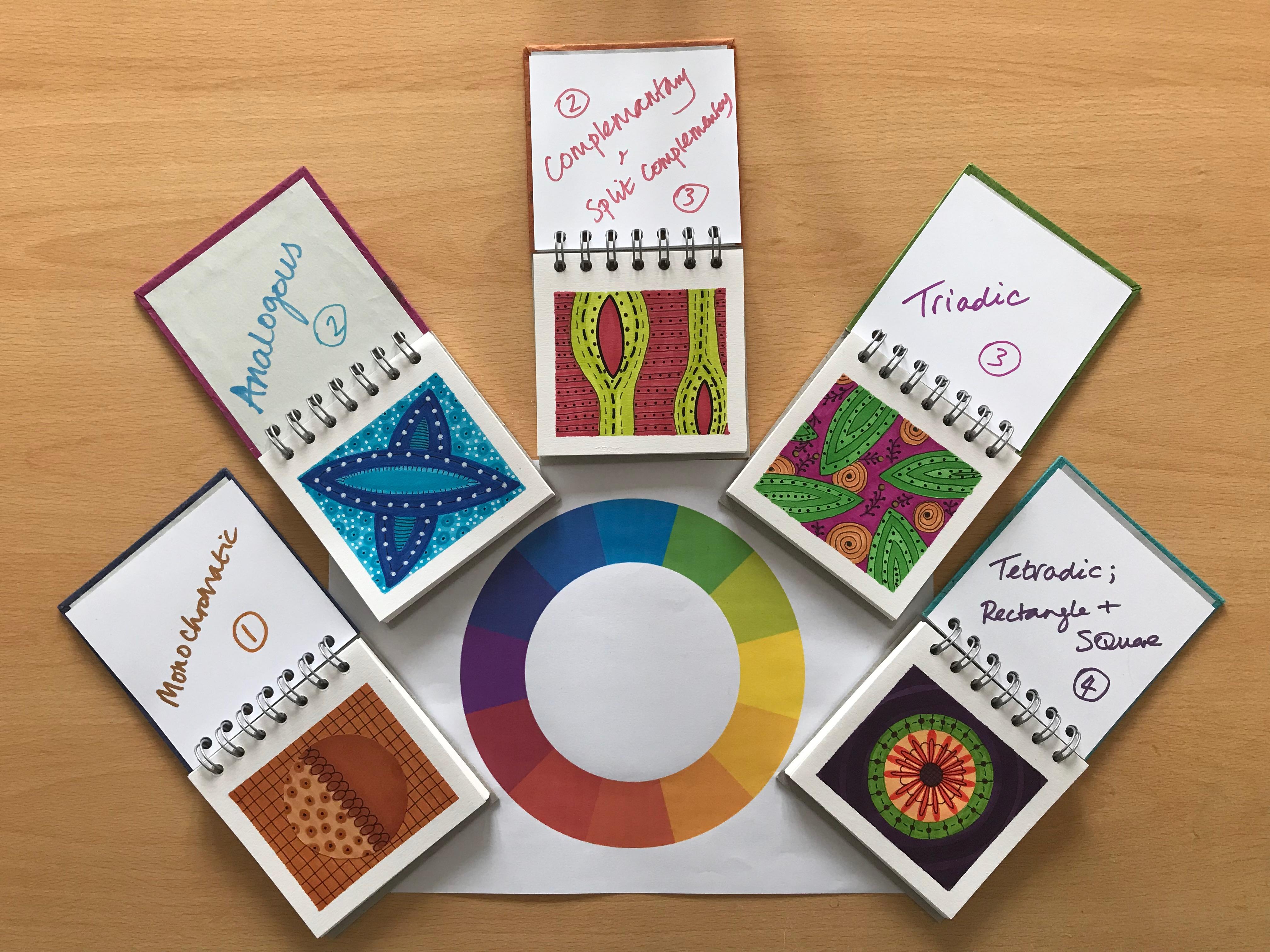
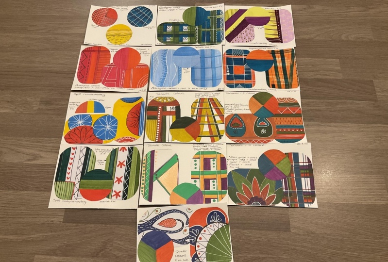
2. Project overview: The project for today's
class is to start the beginnings of
your own pattern and color resource book. Now, I'm saying at the
beginnings because, in Part 2, we'll look a bit more deeply
at pattern-making and also play and explore a
bit more about what your favorite color
palettes might be, which hopefully
you'll be developing as you go through the
lessons in this class. This is such a lovely
way just to play with color and just to
have some fun with it. It's completely
suitable for beginners. So I would say give it a go. As I mentioned earlier, I really love color and pattern. I find this such a valuable
resource to refer to either before I start painting or maybe if I'm feeling a
bit stuck creatively, I'll just flick
through my books. As you can see, I do have quite a lot and I'll always find some inspiration
to get me going again. This was the
inspirational palette for my enchanted
forest painting. It was great to be
able to have that as a resource and nowhere
to start color-wise. As you can see from this split complementary
palette here, this was the starting point for my lovely
dandelion painting. We'll start off by just
using single colors, otherwise known
as monochromatic. This is where we'll
play with creating contrast and start by
adding simple patterns. In each subsequent lesson, we'll play with a different
combination of colors, using the color wheel
as a loose reference. Starting with a monochromatic, we'll add pattern and contrast and see what different
effects we can get. We'll move on to analogies, which is next to each other on the color wheel
then complimentary, which is opposite each
other on the color wheel. We'll look at split
complementary, I'll explain that in the class. Triadic, which is basically three colors and then we'll
finish off with tetradic, or otherwise known as a
double complementary, which is four colors. You don't need anything
special for this class, just your own enthusiasm
and a willingness to play. I'd love to see what you create. So please share your work
in the projects gallery. I'll see you in the
next lesson when we have a look at what
materials we need.
3. Materials and Resources: These are the markers that I'm going to be using in this class. The brand I happen to be using is Winsor and
Newton pro markers. But they come in any brand so you don't have
to get that one. I obviously have a
large selection of colors much more than
I'm showing you here, and so it's a question of what do you want to buy and
what do you want to use? If you're new to pro
markers or ink markers, I would suggest
that at least you start off with the
three primary colors. As we add yellow
here onto the paper, by using the other
two colors as well, we can get another
three colors from this. So as we add red
onto the yellow, that gives us orange, as we add blue onto the yellow, that gives us a nice green, and then you can see
the blue on its own, then you see the red
color on its own, and if we add blue to the red, we even get a violet color. So out of the three
primary colors, we actually get six in total. The paper that I'm using here is cheap and cheerful
printer paper. I've got Hewlett
Packard paper here at 100 grams and a
navigate paper at 120, which is a little bit
thicker than the other one. The only thing you've got
to be aware of though, is that the ink markers
will bleed through. So you do need to
put something on your surface to
protect it from that. I'm using Posca
acrylic paint pens. Again, they come
in various brands, you don't have to use Posca. I'm using two sizes here, a medium one which is a 3M, and a finer one which is 1M. I'm also using a
black Posca pen, which is also the
medium-size 3M. In addition to that, I'm
using a pilot fine liner, which I think this
is a nought 0.7, but you can get any brand
you like so long as it does the fine line work
that we want it to do. This is how we use this
pen because it just gives it such lovely, fine detail. You can see in comparison to using the
black Posca paint pen, what a difference it makes in terms of being
able to add contrast. Now, you need to just put the nib on the
paper first of all, gently just to make sure that the paint's running
through into the tube. If you press too hard, you'll end up with a
big blob like that. So you just have to be careful and it's always good
to do on a piece of paper first before you
actually do on your work. So just do a few lines just to make sure
the paint is coming through and then put it on your work and you can
see the difference there. You can see that lovely contrast between the thick
and the thin lines. Always remember to give these acrylic paint pens a good
shake before you use them. Just to make sure that the
paint's well in the tube. Again, don't press too hard because that's
what will happen. Well, you have to
press a bit hard to get the paint
to come through, but then make sure that you've
just got it coming through nicely before you put
it onto your work. So that when you're doing
your patterns like this, it's coming through nice and evenly and you're
not getting blobs. Always practice on the paper first to make sure that acrylic
paint is coming through. Again, you can see
this lovely contrast between the thick
and the thin lines. So there we have two black, two white, and those
are what we're going to be doing all
our patterns with. Because we do all the
patterns on the print paper, you're going to need
something to stick them into. So I would suggest here that
you use an A5 sketchbook. I really like this size. It's very handy for
doing small samples and it's not too daunting or
overwhelming to have to fill up. It works well for the
smallest circle pieces, and it works well for doing the slightly larger ones when we get onto the different
color combinations. A5 size is really, really good. Because you're not actually drawing straight into the book, it doesn't matter what the
quality of the paper is like, so long as it can take a bit of glue and be able to
sticky pieces in nicely, that's all that matters. You'll need scissors for
putting out your paper, and then something to
stick it in your book with either blue tack
or a glue stick. I'm using Pritt
there, but again, it can be any brand
that you like. It doesn't have to be Pritt. You'll need to download
from the projects and resources section,
the color wheel, and the circle template
because that's where you'll be doing the coloring
on and cutting out, and then the rectangle template because you'd also
be coloring that. Can't wait to get started. So see you in the next session.
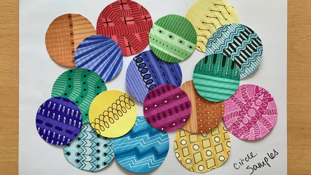
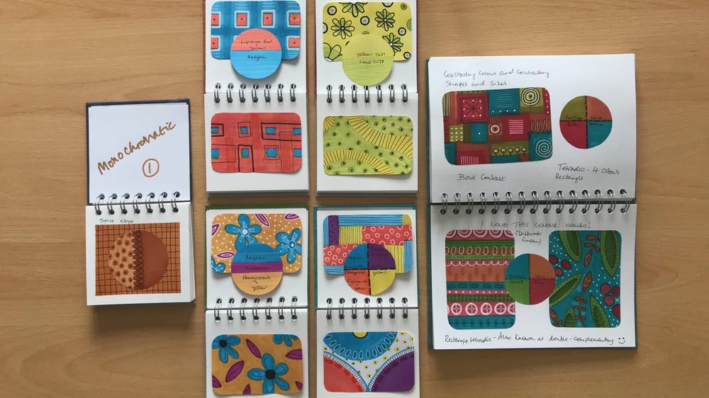
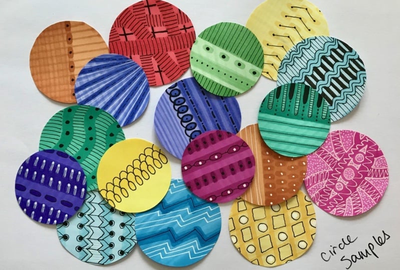
4. Monochromatic (One Color): In this session,
we're going to be using single colors and focusing on how to create
contrast using tonality, size, shape, and added detail. First of all, put something
on the surface to protect it. I'm using plastic sheeting. Using a circle template, I'd like you to color in each circle in whichever
color you like. If you've got 12
different colors, that's great, if not, then use the colors that you've got and double-up because we can get varied patterns even
using the same color. Keep doing this until you
cover the whole page and that will be your first
layer of ink that's gone on, which we'll then leave to dry. Have fun coloring outside
of the circles and do the exact opposite
of what you are probably tool to do in school. When you've colored them all in, cut it up the middle because that'll make it a lot
easier for you to then work into with some finer detail for more visual interest. We're now going
to look at adding the second layer of ink. If I start off with this
color at the top here, you can see that
I've already got a green going along
there in stripes. To create some contrast, I'm going to put my stripes of the second
layer going the other way. Because yellow is
such a light color, you won't get a great
deal of contrast, so I'm going to do
this as a block color to make it more obvious. This is how I'm going to do
it for my second layer of ink and I will put a third
layer on a later stage. This is the stage to
start considering about what effect is
that you're wanting, what do you want to create with the different nibs
that you've got? You've got three
different options here, you can use the very thin nib or you can go onto the one that's got more of a blunt edge and use it as a fat nib
or you can turn that on it's side and you can use
it as a slightly finer one. These are the things just
to be thinking about as you begin to put
the second layer of ink onto your circles
and as I said before, you'll be going over
those possibly with a third layer if you
want to at some point. As you can see already, you can create some
quite different effects just by using the
different sizes of nibs whether you use the flat end or the chisel
end or the thin end, you can already create
quite a bit of contrast and that's just your second layer of ink before we've even
gone into your third. Do put a third layer on in areas where you think it's
going to make a difference. For example, it's worth
putting another one on the yellow one because that's
such a low contrast anyway. It's also worth
putting another one on the pale green next to
it, on the apple green. There, I've done a little bit of extra third layer
and left some on the second layer and then added a little bit
of pattern as well. There's no point in doing a fourth layer because the paper is now as saturated with
color as it can get, so you won't add anything
by adding a fourth color. But it is worth just reviewing what you've done
and seeing whether or not it makes a difference to add that third layer or not
and that might be just simply by going over
what you've already done with a slightly thicker
nib or keeping it to the same one like I'm doing
here on this one where I'm using the smaller
end of the blunt nib. If we take a look now at
what's going on here, we can see that we've created contrast in two different ways. We've created contrast by the
tonality, in other words, with light and dark and we've
also created contrast by size in the sense
that we've gone with thick and we've
gone with narrow. That's two ways already that
we've managed to create some contrast there and that's before adding any
further pattern. By using the same color on this, which is maroon and just
using the blunt chisel end, I'm already getting
a really nice effect here by doing that. Taking the lines one way and
then taking them another, again, that adds more contrast. You can also get a similar
effect with what's called a blender ink pen. It doesn't actually
have colored ink in it. What happens is when you
use this one is that it lifts the color
off a little bit, so I'm going to
try it out on this Prussian blue and see
what effect it gets. The whole point
about this is just to play and experiment. It might not work. So just give it a go
and see what happens. You can see that the one on the maroon color that looks
very striking and dark, this is beginning to lift
it out a little bit. But maybe I'll have to
work into that later with finer detail just to
highlight that a bit more. It's worth taking
another look at what you've done here
just to see if there's anything else you
want to add with the nib before you then start going in with your finer
pens and your acrylic pens. Is there anything
else that you think might lift it off
a little bit more? For example, on this
green one here, I'm going to use
a really thin nib just to give that
another bit of detail, going on to that layer that he had two layers
on it and again, that creates a wee
bit more contrast. Then you can start
looking at what do you want to
start picking out? What details do you want
to start picking out either with the fine liner
or your acrylic pins? This is where it starts to
get really juicy for me. This is the bit that I
love the most I think, where I can really start
picking out these patterns. I'm outlining the
horizontal marks on this maroon circle
and then I'm putting little dots into
the vertical ones because I don't want
it all to look the same but I think just by adding this small element of black, it lifts the ellipses
sample considerably. I'm also going to outline
the vertical marks on the yellow one
as well because I think that that
needs it because it's such low contrast. I'm quite just enjoying
adding this detail here. Again, I haven't got anything
in mind before I start, I'm just really going
with the flow of what I think might be interesting and add some nice detail
because I've got lots of green going horizontally
on this circle. I'm actually adding
vertical lines now again as a contrast to
those horizontal lines. So it's all about contrast. You're probably fed
up with hearing me saying the word now. To add even more contrast, I'm going to add some
deeper black using the acrylic pen
because that gives it's more intense
than the fine liner. I already knew when I was using this Prussian blue color
that I was going to have to put white on it to
create any contrast. The question is, what
marks would you put on? Maybe I'll just
step in going with stripes and maybe I'll
just stay with stripes. Although actually I don't know, that looks a bit boring to me. He might redeem itself
later let's see. It's certainly didn't work, lifting enough of the color
off when I use the blender, but let's see what happens
with this one here. I think on this other one, just to use the really
fine acrylic pen. That's working well. I like that because
it's creating some really nice thin
lines in-between those blue and it's just
lifting it a little bit. Yeah, I like that effect. I think that's rather nice. Last but not least,
let's see what I'm going to do with
this green one. It's already got a
fair bit of contrast going on with the
vertical lines and the horizontal lines
so I'm just going to do a little bit of
fine detail in here. I almost wish I hadn't because I think that's spoiling it. But I've learned
this trick before that don't just stop
right now because again, it can turn into something
that you didn't imagine, just keep going with it. I'm going to outline, see even just doing
this outlining of what I've just done that
makes a difference. A lot of it's instinct it's like what I'm I going
to do next then? Actually, I'm going to do the same shape in-between and I'm starting to
like it again now. Fascinating. I love
it when that happens. I think I'm going to darken those stripes going that way and that does look a
bit more interesting to me, I'm still not particularly keen on this Prussian blue one. I'm going to just add
another little something and see if that makes a
difference but overall, I'm not too keen on this
one and that's okay. Once you've finished doing
what you want and you think that all your
patterns are complete, cut them out and keep
them to one side and then you can decide
which ones you want to put into
your sample book. Let's recap then on what
we've learned today. We've come from a
single flat color to three layers with
gorgeous patterns on them and we've had a look at how to create contrast by
using different tones, light and dark, different
sizes of dots or lines, large, small, narrow, wide, we've used soft and hard lines and of course we've
added detail. Hope you've had as
much fun as I have. I'm looking forward to seeing
you in the next session.
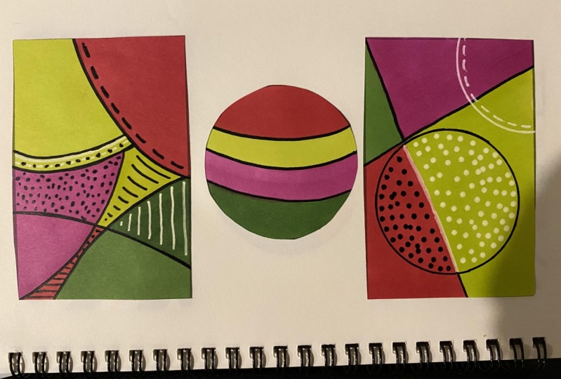
5. Analogous (Two Colors): Hello everyone. In this session, we're going to be
building on what we did with the circles. Learning about different
tonality, light and dark, different shape and mark-making, hard lines, soft lines, all the added detail. As we look and play with the analogous color
scheme today, which is basically
any two colors that are next to each
other on the color wheel. Here you can see two examples
of yellow and yellow green, red and orange red, red purple and purple. I've got here blue, green, and blue, but further down, if you were to
imagine that going further down and getting paler, this is where this come from on this section of the
color wheel here. What colors appeal to
you to play with today? What combinations do
you feel drawn to? Do you want to go with the
greens, with the blues? Are you more in the mood
for oranges and yellows? Don't worry if you don't have the exact colors that
go next to each other, it's about getting them near. It's really about you understanding the
different terminology. To create your analogous
color samples, you're going to
need the template that's got the rectangles on, printed off so that you
can start on there. I suggest you cut it in half
and then just use one of the hubs of the paper to work with because that'll
be a lot easier for you. What I'd like to suggest
that you do today is to do two samples using the same color combination so that you'd end up with
something like this. Because they will
then very easily fit into your sketch book. And we'll also be using
the circle template to cut out the circles and just do the two half colors that
you'll be using, like so. Here's a closer look at
some of the samples, to just give you
a bit of an idea. If you're feeling a little
bit stuck for patterns, do feel free to copy anything
that I've done here. But I'm sure that once you get going with your own colors, you'll find your
own inspiration. So here you can see a little
bit of my process as I was making the samples
for this session. I went over some of
the lines again, so I had one, two
or three layers. Some of the things
needed highlighting even further just to give them
that way a bit more contrast. This bottom right-hand one, I decided that actually, I was really quite surprised that I liked the color scheme because it's not a scheme at all that I've been
drawn to in the past. I do tend to use a lot of
blues and greens in my work. But I really liked this
and I decided to keep it very soft and not actually
add any black to it. It reminded me a
little bit of items for babies and young children with that little soft palate. The only thing I
decided to do to just highlight it a
little bit further, I'll give it a bit
more interest, was to just add another of the lovely saffron colors
that I've been using. The one next to it, I decided that I would use
black in there just to see, because I was
curious to know what the result would be
by adding black. I absolutely loved it. All of a sudden just
by adding black, it took on a retro feel, which suits me because I really love
mid-century furniture. It also reminded me of 1950s wallpaper,
that color palette. I'll definitely be using
this in future work. I've been quite surprised here, this because it's really not my normal palate
as I said earlier. If you really feel stuck and don't know
what colors to use, see if you can take a walk in nature and see what nature
has to offer because she's fantastic and
inspiring us and she does plenty of analogous
color schemes. Once you're happy with your lovely analogous color samples, cut them out and put
them to one side. I like to round the corners off because I think they
look so much nicer when you put them
in your sketchbook rather than sharp edges. Of course, don't forget
to call your circle in, that tells you what
colors you used. Please share your work in the
project gallery and I look forward to having
fun with you in the next session. See you there.
6. Complementary (Two Colors): Today's session is focusing more on color and less on pattern. In particular,
complementary colors. Let's come back to the
color wheel now and have a look at what
complementary colors are. Basically, complementary
colors are ones that are opposite each
other on the color wheel. You can turn that
around and you can get six different color combinations
using this scheme here. If you start off with purple, that gives you to yellow, blue purple down
to orange yellow, blue across to orange, etc. Before you get stuck into
your pattern-making today, I'd like you to do
a quick color chart of the 12 colors that
are on the color wheel. Now you might not
have all of those 12. I don't have them
all. I've had to do a little bit of
mixing to get them. But again, just work
with what you've got and do the
best that you can. Starting at the top
with purple and then going through all the
way through and round, give yourself the 12 colors
that you've got here. Now, I didn't have the
right oranges here at all, so I've had to do a little
bit of mixing to get the different oranges here with some of the
colors that I've got. You may well have
to do the same. Now again, I just want
to reiterate here, this is about having fun, it's not about
getting it perfect. We're using this color
wheel here as a reference, but you could just as
easily have printed a different one off the
Internet that would give you slightly different colors and you would end up
working with those. It's not set in stone,
isn't this at all. It's really about you getting to understand
colors a little bit more, hopefully in an easier way, and seeing how they
can work together and what combinations you could put together that work
really nicely. Now, having done the
color chart here, then what I've done
is I've pulled those two colors together, and that's giving me a nice chart of the
complementary colors. We've got the purple and yellow, blue-purple and
orange-yellow again, etc. What I'd like you to do today is to choose one of
these color schemes. Obviously, that
depends on the colors that you've got available
to you as well. We're going to do a couple of samples with just one of them. Now, I'm going to
choose this one here, which is the blue-green
and orange-red. To get that orange-red, I had to mix the lipstick
red and the yellow together, and that's absolutely fine. You'll see here that
what I'm doing with these two samples is making
the blue more dominant in one sample and the orange-red more
dominant in the other. I'm doing this because
I want to show you how when you use different
proportions of color, it gives you a very
different result. I'm adding the yellow on top of that lipstick red
here so that I can get the orange-red
shade that I'm after. That blue-green has
dried nicely now. Now I'm going to add the orange-red into the
squares that are left. Again, adding the
yellow on top so that I get the right orange
shade that I'm after. Using the blue-green color then, I'm going to add
that to the red in much the same way as I've done
with the red to the blue. Now, I haven't just got those little squares quite the same proportion as I have on the other
one, but that's okay. Again, it's an
exercise in color, not about getting it
absolutely perfect. They've dried very nicely now. The one on the
right-hand side was very saturated with ink. I wanted that to dry before
doing anything else. What I am going to do is to add a little bit
more of the blue, the same color blue just to emphasize that
color a bit more. The contrast is
there, like we said, with the two opposing colors, so it doesn't need a great
deal I was adding to it. But I think that does create
a bit more visual interest. Because I didn't manage to get the little blue squares as symmetrical as I
did the red ones, I'm doing this one slightly more randomly and just choosing that rectangular
shape, if you like. Just give those one
extra layer there. I'm going to echo the shapes of what's already going on in
this little piece. I could see this being
a bigger artwork, or the inspiration
for a bigger artwork. This is what I love
about playing, but it just takes you to places where you
didn't even know you were going to go in your imagination,
which is wonderful. Always recommend playing, can't get enough of it. I want to add white
onto the blue here. Again, I don't want to
detract too much from the gorgeous pop of the
orange and the blue together. I'm just going to
add a little bit of fine white alongside that thicker white there
and see how that looks. I do love that color
combination together, I think that really
works well actually. But it just needs a
little extra something, and I think that's just
some tiny black dots. You know the routine now, cut your samples out and do your circle that shows you
what color you've been using. You can see these two
very different looks, they're very playful looks, and even when you
move them around a little bit and change the
direction of the pattern, you can get something that looks again entirely different. Please share your
work in the project gallery and then join me in the next session as we
look at split complementary.
7. Split Complementary (Three Colors): In this session, we're
going to be creating a three-way color combination using what's called a split
complementary scheme. Now, if we look at
the yellow and the purple as a complimentary
combination, what you do there is then
instead of using the purple, you go to either side of it. In fact, you would
be using the yellow, the red-purple, and
the blue-purple. Similar to the color chart that you created in the
complementary scheme, I'd like you now to create one in the
split complimentary, but only using the
three primary colors. Going from red, now
I put the names here of the actual colors that I use, but I don't want you to get
too confused with that. You use whatever red you've got, whatever yellow you've got, and whatever blue you've got. From the red, the
split complimentary there ends up being
blue-green and yellow-green. From the yellow, it's
red-purple and blue-purple and from the blue it's orange-red
and orange-yellow. Here you can see that I've just again pulled those
colors down and created the little
color pallets from those three main primary colors. I'd like you to choose one of these color palettes and create
yourself a small sample. I'm going to be using this one here because I'm actually taking my inspiration from the pansies that are in my garden
at the moment. It's not often that I actually plan a design out beforehand, but because I'm taking
my inspiration from the pansies and they're
quite circular in shape, I decided that I would go
with this circular design. I'm using the blue-purple, the red-purple, and yellow
as my three colors. I'm starting off in the
middle with a nice, big, yellow circle. Looks a little bit like the sun. Actually now it's starting to look a little bit
like a fried egg. Notice, as I use this
lovely reddish color, this lovely red-purple, I'm drawing outside
of the line there. Because I do like to draw
outside of the line. I'm coloring in a really
scruffy way as well. Please don't be too
neat about all this. Don't take it too seriously. It will look a lot different
once I've got the edges right and it's cut
out at the end. I'm speeding this video, as you can probably tell, because if you had to
watch it in real time, it would be like
watching paint dry. Here's the background
of the blue-purple. Almost done there, just
a little bit of extra. That's perfect. Now
I like this color. I think it's rather nice. But I do want to add
some pattern to it because it looks a way bit flat. I do find pansies such
a cheery little plant. Although I'm not trying to draw an actual image of a pansy, I do like the way that they radiate their cheerfulness
from the center. This is what's
inspiring me to do this re-like pan around the edge. Also from the middle as well, they remind me a little bit
of some beams coming out. I often use this design. It's like the spokes of a wheel. Or you could say the
segments of a lemon even. When I'm drawing it to
try and make sure that I get the segments
fairly equilateral, I think of the hands of
a clock so I start at 12 o'clock and then I
draw a line at 3 o'clock, I draw another line at 6
o'clock, and 9 o'clock. Then when I'm filling in
the gaps in-between those, they're all pretty even. As you can see, I'm just adding extra detail as I feel
that it needs it, giving a little bit
more color depth to that blue background. I'm not sure that it
will show up much, but it's showing up a
little bit, which is fine. It's just a question
really of going with however much extra detail you
think that the work needs. Sometimes it's knowing
when to stop, of course. I'm going to highlight the spoke pattern a little bit more because the white just feels
a little bit lost actually. By adding that final black, it makes the white
even stand out. Of course, I'm going to go round with a black outline onto those lovely shapes I had
going in the maroon color. It needs a middle. I do think
that it needs something like these white dots just again to lift it a little
bit because tonally, it's all looking a little bit
same apart from the yellow. By adding a little
bit of white here and there just lifts
it a bit further. It also gives it a bit more of a focus and draws your
eye into the middle, which makes it a bit more of
an interesting composition. Actually, it needs
a black dot in the middle and that
just finishes it off. That's great. I
think I'm going to just add a little
bit more black. Where I use the acrylic pen, it actually went over
those black lines so I'm just reinstating them, if you like, to give it a
bit more of a bold look. Now, of course, when I finish this, it needs to be cut out and the little circle drawn to
show what colors I've used. Then that'll be ready to put to one side before it goes
in the sketchbook. Here's the finished
sample along with my color reference in a circle. I don't like it anyone near as much as the one
on the left-hand side, it looks too fussy somehow. I prefer the overall
design on the left. It has a retro feel to it and
it's got more space in it, which is why I think I like. The color scheme, that
was the first one using the red and the blue-green
and the yellow-green. I just like that one better. I learned from that that perhaps instead of going with the
floor like I normally do, I actually try to plan that
one out and that's okay. I'd love to see what you do and which color
palette you choose. If you'd like to put something
in the gallery, please do. I'll see you in the next
session where we do another three color way using what they call a triadic scheme.
8. Triadic (Three Colors): How are you doing? I'm glad you've joined me for
this session as well, because there's
been a lot to take in in the last few sessions, learning all about contrast, how you create it, how the color combinations work together with two more color
combinations to look at. Today is triadic, which
is a triangle of colors, if you like, and we
need to work out which one is going to be
the star of the show. Let's start back off
with a color wheel again and we'll
take it from there. Here we have the
triadic color scheme, which is basically a
triangle of three colors. Starting off with the purple, that gives you the
green and the orange, you turn it round and you've got the red and
the blue and the yellow, which are the primary colors. Turn it again and that takes
you to the tertiary colors. You've got your secondary, your tertiary and your primary, and you basically got
four combinations using this color scheme. What we need to work out is of the three colors in that
particular triadic combination, which one is going to be
the star of the show? Think of it in terms of a lead singer with
two backing vocals. I hope that makes sense to you. In other words, which one of the colors is going
to take center stage. I've got some examples
here in my resource book. In this top one here on
the top left-hand side, you can see that the yellow one is clearly taking
center stage there, but it might not be quite so obvious in the two
at the bottom. I'm thinking that
the purple disks here are taking
the center stage, and you've got a fairly loud backing vocal
there and then softer, harmless in the background. I hope these analogies
are making sense to you. It might not be quite so
obvious with this one here. But a good way to
work it out to see whether or not
your image has got enough contrast in it
or not is by taking a photograph of it
and using the filter, if you've got that
facility on your phone or your camera to then turn
it into black and white. That gives a real
indication there as to A, who's taken center stage and B, how much contrast
you've got a new piece. When we look at
these two images, it's clear that the yellow is definitely taking
center stage, and in this one also as the
background is very muted. The purple disk here
is taking center stage and also the purple disk
here is taking center stage. This is a great method to
use if you're in any doubt. Here we have the four combinations
in the triadic scheme. I think it's worth you're doing yourself under the
color chart to show the different combinations
because you can instantly see how the combinations work together and which ones
you feel drawn to. I keep using this explanation, which ones do you feel drawn to? Because color is such
an emotive thing. It's such an instinctive
thing that we're either drawn to it or
we're not drawn to it. It's not something that you can explain with thoughts and words. Again, use your instincts, go to the one that
you feel comfortable with and work with that
color combination. In part 2, we will
delve a bit deeper into the different qualities of
color and how they affect us. In today's session,
I'd like you to create two sample pieces. I've got an example here. We'll just use my example
in my resource book again. The top one, I've used the color palette of the
red, yellow, and blue. In fact, what I
did was to create one pattern which I
then cut in half. As you can see from
the left-hand side, I added black details, and on the right side
I added white details. In the bottom one, I did the same again. I did one pattern, cut it out, and I used the blue-purple, the orange-red, and
the yellow-green here. But in actual fact,
when I did this, I couldn't get the orange-red, so I used spice. This just brings me back to, again, what I've
said in the past, don't worry if you don't
have the right colors, just go with what you've
got because this still makes a really nice
triadic scheme. On the left, I've added
the white details, and on the right, I've added the black details. Please feel free to do two color schemes if
you feel inclined. If not, only do one. If you feel inclined to do more, then please do as many as
you like because I'm all for encouraging you to
play as much as you can. Here's a speeded up peek at my process as I use
the blue-green, red-purple, and orange-yellow combination of the
triadic scheme. As you can see, I added the
pattern over two rectangles, so that you've got the same
flavor in both pieces. I then added the
orange-yellow background and added white to one side
and black to the other. You can see here that the
blue-green flower took center stage and the others
in the background more. Here are the finished
sample pieces. You can see such a difference
with the one added in the black and the one
added in the white. I hope you've enjoyed
this session. Please join me in the next
one where we'll look at the tetradic color scheme.
I'll see you there.
9. Tetradic (Four Colors): We're on the home run now, the last of the color schemes. Let's dive straight in and see what tetradic is all about. Tetradic color scheme
involves four colors. You can do it in
two different ways. You can do it as a cross
section here like this, where you've got two
complementary colors going one way and two complementary
colors going the other way. Or you can do it
in what they call a split complementary, where you choose two
colors that are next to each other and their opposites. This color scheme here, where it's the
blue-green, green, the red and the orange red, is what's happening in these little compositions
here in these samples here. I really like this color scheme. I like the tetradic
color scheme. I think it's probably
my favorite actually. There are, again, a couple
of ways of approaching this. You can take two of your colors, the ones that are
next to each other, and make them slightly more prominent than the other ones, which is what I've done here. The marine and the forest color here or the blue-green and the green have got more
availability if you like, in this little composition here, and the orange, red
and the ruby less so. Whereas in this example here, I would say that I've used all the four colors more
or less imbalanced. I think that one
works just as well. There's no hard and
fast rule with this. It's a question of your
preference really. You can go back to your
complementary color chart, and that might be a help in deciding which one
you're going to do. You might want to do
a cross-section one, or you might want to do the two that are
next to each other. You might want to
do one of each. You can use your
complementary color chart to help you decide. As these little pieces
here we're done using the complementary color schemes that are next to each other, I'd like to share the process
with you that I've done creating two using
the cross-section. I've got a rough idea as to what I want to
do for each one. I want one to be more curvy
and the other one to be a little bit more rigid
with straight lines. Here I am doing the
curvy one and using the two colors to make the purple as I didn't
have that one in stock. Also I'll need to use the yellow over the red to turn that
one into the orange. Just adding another curve here. I am making up a little
bit as I'm going along, neatening some of the edges
up and adding extra detail. I keep using this word
intuitively, don't I? But I am just going along with how I feel the pattern
wants to be really. As always, it's playtime
for me and this is fun. I always consider
this to be, yes, something that I
just loved to do, to relax, to turn my mind off. Just go with the flow with it to see where patterns
want to come out. I always like to see
what's going to reveal itself if I just let it be. I try not to dictate it too
much or direct it too much. What lovely little pattern wants to come out
and be revealed. I'm just making some
of these marks a bit more distinctive again by
doing another layer over them. I don't want to add
too much pattern to any of this actually, because the colors are so highly contrasting that they speak
for themselves in a way. I want to keep the patterns
to a minimum and let the colors be the stars of the show in these
two pieces here. This is the thing with
doing a square tetradic, that the colors are so
opposite each other. They really are
very high contrast. You don't really need a great
deal of pattern with these. It's amazing actually how the composition
starts to build up. Then as soon as you add the
yellow, it really pops. It just takes it, again, to a different level. I do like this color
combination of the greeny-blue, the orangey-red, and the yellow. In all honesty, I would prefer
it not to have the purple, but I did need to do you an
example of what it would look like to see the
four colors together. But as I look at that
now even with the white, I do prefer it to then
adding this purple. The square tetradic is not my
favorite color combination. I prefer the double
complementary because it's more harmonious. This bright scheme is used for
lots of different designs, particularly in
children's products. It's playful, it's fun, and it's very cheery. Here's where I like to look
over what's happened so far. Is there anything that needs
highlighting or adding to? Certainly this needs a
little bit of pattern on it. As the blocks of color are
predominantly vertical, I want to put some
horizontal lines in to act as a contrast with it. Let's add my dots because they always add a little
bit of contrast as well. A final look to see what
else might need adding. A little bit of white
here and there. I think the orange on the
other one could do with some white circles just
to lift it a fraction. I think the patterns now are more or less
ready and complete. Well, for all that,
the square tetradic is not my most favorite
color combination, these are quite fun
and I could actually see them as a funky,
rugged design. Even though I did end up adding quite a bit of pattern to it, it's still the colors that
speak for themselves. In the next session, we're
going to be gathering all our gorgeous samples and putting them all together.
I'll see you there.
10. Putting it all together : In this session,
we'll be gathering all our lovely samples that
we have done throughout the class and putting
them together to create the beginnings
of our resource book. There's no right or wrong way to put things into your sketchbook. With the single
monochromatic colors, what I've done here
is I've just used Blu Tack to tack them in
gently into the sketchbook. The reason I've done this is because it's quite
useful to be able to take them out and try
different color combinations together just to see whether you want to play with
those colors or not. You might decide, for example, that you want to have green
in there or you might decide that you don't want green and you actually want
to use the peach color. It's a very useful way
to be able to have a quick reference guide as to what colors you
might want to play with. I quite like this method. Another way of doing
it, of course, is to just stick them straight into the sketchbook with glue. I use a dry glue stick
because unlike PVA, this doesn't bleed
into the paper itself and cause any
distortion with the color. As you can see, I'm
going from the middle to the outside a
bit like you would, if you were doing wallpapering, putting wallpaper on a wall. Stick it down, gently do
it with your hands and then give it a quick once-over
with a bit of paper towel. If like me, you've ended
up with quite a lot of monochromatic circle samples, it's quite nice
just to give them their own little resource
book because it shows what different colors and patterns that you've been doing. It's a bit like having
a color chart in book form and as you build up
your stock of pro markers, you can just keep adding
the colors as you go along. I like to do a background of one color without any pattern or contrast on it and then use the circle sample over the
top to show the difference. Use the same method for
gluing and sticking your rectangles into
your sketchbook. You don't need a
great deal of glue. Again, from the inside going out because this stops you from getting
air bubbles in it. As soon as you've got enough
glue on, flip it over. Do the same again with
your paper towel, give it a quick wipe over. What I've noticed is it just helps to stop the glue
from spreading around the edge in a way that's better than trying
to do it with your hands. It doesn't matter how you
display them in your book, it's entirely your choice. Isn't that wonderful that
we always have choice? Because I've got
lots of samples, I've also done another
little sample book for my split complimentary. In fact, I have sample books for all the different
color combinations. If you have plenty of samples, feel free to do the same. Here you can see my
large resource book and my smaller ones. Do join me in the last session where we do a recap on
everything that we've learned in this class
and a quick peek at what we're going
to be doing in part 2. I'll see you there.
11. Well done: [MUSIC] Thank you for
joining me in this class. I hope you've enjoyed
it as much as I have. Let's have a quick
look at what we've learned throughout the
last few sessions. We've gone from
applying a single flat color to learning how to add contrast using the different nib options
on your ink markers. Then we created lots more
visual interests by adding further details with your acrylic pens
and your fine liner. [MUSIC] As we've worked through the different exercises
using the color wheel, and the color charts as a guide, we've practiced how
to put together different color
combinations using two, three, and then four colors. We've then gathered
all our lovely samples together and looked at
how to display them in the resource book
and even looked at further options for creating
mini resource books. In Part 2, we'll be taking pattern-making to
a whole new level, going much larger and
much more complex. We'll look at the process
of how we start off with something like this and
how we get to this. [MUSIC] We'll take a look at how we take the larger
pieces and break them down into small individual
designs without spoiling the original one and how to add even more hand-drawn details. Do you feel more confident
now about how to play with color successfully?
I hope so. Please share your
work with me on the project gallery
because I'd love to see it and I will respond to you
as soon as I possibly can. If you'd like to
join me in Part 2, then click the button
at the top that says "Follow" or you could sign up from a website
to get my newsletter, and both of those
things will help you to find out when the
class is available. You can find my
website details at the bottom of the class
description page. In the meantime,
everyone, take care. Hope to see you again. [MUSIC]
 Dawn Cawthra, Artist, Designer, Holistic Educator