Transcripts
1. Introduction & Project Overview : Hello and welcome to this
class on how to create a Playful Mixed
Media Painting using gouache and acrylic.
I'm dawn Cawthra. I'm an artist or designer,
holistic health educator. And I've been teaching Art, Design and Heritage Craft
classes for many, many years. Today's project is to
create a stylised bird and flower painting using lots of pattern and
different texture. As well as learning how to do a composition in a really
easy and simple way, we'll take a deep dive
into understanding how to paint with both
gouache and acrylic. So that you will increase
your knowledge and build your confidence in using
the different mediums, either on their own or together. If you're already familiar
with gouache and acrylic, but would like a
little refresher than this class is for you. But it's also totally
suitable for beginners. Because I take you
through the whole thing step-by-step in a very
easy to fall away. We'll start off by
taking a look at the different types of
acrylic that you can buy from artists range down to basic student's range
and how they differ. We'll paint some
swatches so that you can see how the different
qualities work. What happens when you mix the higher and the
lower qualities together and when and how
to add the Matt Medium. We'll take a look at the two
different types of gouache. And we'll experiment with
the traditional gouache and the acrylic gouache so
that you really get a sense of how those two
different paints work. I'll also show you
how you can create a really rich color
palette using only two colours plus
black and white. Before we start
them in painting, we'll practice
applying and blending acrylic paint using three
to four colours plus white. Once that's dry, we'll add
some simple patterns with the gouache paint
so that you can see how the two mediums
work well together. Will then play with
the acrylic paint pens and add that on top
of the gouache, will practice the
stroking technique that's used to create the textured background
that gives it the movement. Starting a new composition can sometimes be a bit daunting. Particularly if you're not
that confident about drawing. Don't worry, because I'm
going to share with you my cut-out and collage
technique that will make the whole
process much, much easier. I love birds and I
love painting them. If I need a quiet moment in
the middle of a busy week, I liked to take a walk
down to the we'll lock that is quite
near to where I live. I like to watch the
Bird just saw during the goals particularly
taken off and landing. I just find it very
graceful and it just calms my nervous system and
makes me feel very peaceful. There's something about
the birds and the water, the freedom that they have, and the way they just
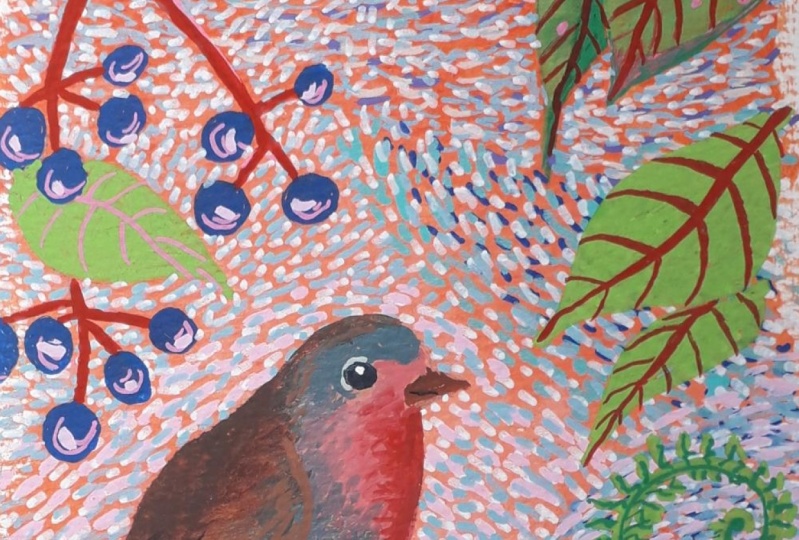
land so gracefully. I really enjoy it. But I'm particularly interested
in little garden birds. And those are the ones that
I like to paint the most. We have a cheeky
little blackbird that comes and visits
our garden often. He's bobbing up and down in
the foliage looking for food. Sometimes it brings his
Layer different with him. And it's one of these two get together and I'll
watch the antics. That's what inspires me to start painting a
stylised picture. I hope you'll join me
in doing the same. I could watch these
two 4 h. I'll see you in the next session where we look at the materials we need
2. Materials : I like to work with
two or three brushes. I like to have a fairly fine round brush
and a medium round brush. These happened to be a number
one and a number eight. And I also like to work
with a flat brush as well, which happens in this
case to be number six. But you don't have
to have those sizes. What's important is that you're competent with the brushes
that you using and they do the job and get the
paint where you want it to go so long as you feel competent and
comfortable using them. Use what brushes you've got. I also liked to have a stash of paper towels and a couple of sponges just to wipe off
any excess paint or water. Personally, I like to have two or three water
jars on the girl. These happened to be little glass jars that had
chocolate mousse in them. Not that I need an
excuse to go out and buy glass water jars
because I'll have a chocolate mousse anytime. But they are very handy
for using after that. And I also like
them because if you happen to have any acrylic paint left on your palette afterwards, you can pop that over
the top and that will keep that usable for
up to a couple of days, providing the temperature is not too hot where you're working. You could use any
kind of palette. You can get ceramic ones, plastic ones, tear off. One's an old plate. I just happened to light using an old glass chopping board. I'd just like the size of it. And I can have acrylic on the gore and gouache on the gouache because
it's big enough. And of course it's very easy
then to scrape off and wash. At the end of the day. The first layer of the painting, we'll be using acrylic paint. Now it doesn't matter
what quality of God's, whether you've got craft
paint or basic student range, or whether you've
got what they call a more professional artists range. Wherever you've
got, just use that because you'll still get
some really lovely results. Will also be using acrylic pens. Now, I, you can imagine
have quite a selection. This is just a small selection of the colors that I have here. What I would suggest if you can, is to get yourself
a white or ivory. I happen to have one here. That's a pilot Mick. This is a Posca. These two here are
the molecule range. And I've got them in petrol
and grasshopper green there because they
happened to be the colors that are
suitable for my painting. I've also, I'll also be using these colors as well
in the posca pen. But again, you might go with completely
different colours to me, which is why I haven't
said that it has, you know, you need to
get a specific color. Once you've done your samples, you'll get a feel
for the kind of colors that you like hopefully, and you'll work with those. I also have, um, a couple of fine liners
that I like to use just for adding a little bit
of extra detail onto it. Again, it doesn't matter
what size you use. It all depends on the depth. Sorry. On the yes. The depth of the
line that you want, whether you want it
to be a fine line or whether you want it
to be slightly thicker. So whether you're
going from craft through to professional, it doesn't matter,
use what you've got. And in terms of the
acrylic pens, again, try and get yourself an ivory or white or dark one could
be black or dark blue, maybe a green, but
that depends entirely on the colours that you choose
to do your own painting. We'll be using gouache paint
on top of the acrylic paint. Now I'm quite a fan of Winsor and Newton designers gouache, but again, they come in all
sorts of different brands. So you go with what
you've either already got or go with what
your budget allows. These are traditional
gouache, not acrylic. There's a difference. I'm, I'm going to be working with this particular
colour palette here. And I've got that colour palette just by using Naples, yellow, deep primary red, a little
bit of ivory black, and a little bit of zinc white. So that's, those are the only colors that I've used there in terms of the gouache for
quite a bit of my painting, I have brought in other
colours for the leaves. And for those, I've actually
used acrylic gouache, which is a slightly
different product to just the traditional gouache. Now, if you don't
have acrylic gouache, it doesn't matter because
I'm going to show you how by using less Acrylic Matt Medium and adding it to your
traditional gouache. You can make a product very similar to the ready-made
acrylic gouache. So if you don't already have some of those, don't
worry about it, just use the gouache
that you've got, but I would recommend that you get yourself some
acrylic medium. If you can't get
yourself some of that and you just want
to go with gouache, you can still get some
fantastic results. So again, you know, there's lots of flexibility
in this painting, lots of flexibility in the
process of it, I should say. So again, go with
what you've got. I've shown you the two colors
that I'm going to be using, but you might want to choose completely different
colours for you painting. So again, it's down
to personal choice. With regards to what we're
gonna do the painting on, you've got lots of
different options here. You could go with paper. I've got a watercolor pad here, which is a 200 GSM. It's suitable also for
gouache and acrylic, which is why I like
this gold line on. It's a nice thick paper here. So it'll take a few
layers of paint. If you go for
something 200-300 GSM, either in a watercolor paper
or in a cartridge paper. That would be absolutely fine. You could also do it
on a canvas panel. These are great for doing
Acrylic paintings on, again, the common all
sorts of shapes and sizes. I like to also paint onto these wooden panels are like them because
they're very solid. And I can get lots and
lots of detail and texture onto these without
spoiling the surface. So I do enjoy painting
on these quite a lot. But for today, I'm
actually going to be painting onto Mount board. I'm going to be doing
my acrylic sample onto one this shape. And then I'm going to do in
my painting onto a piece of card like this That's just a little bit
bigger than that one. I'm basically it's the same
kind of card that's used for when you are mounting your
pictures and your paintings. You can get these from most Art Supply shops and
the very easy to combine, very easy to paint on. So that's what I'm
going to be using.
3. Understanding Acrylic: Let's take a look at the different types of acrylic
paint that you can buy. It's basically a
water-based paint that has a very
quick drying time, usually 10-12 min, and it often dries to like a
nicer Satin sheen finish. Most manufacturers have two
lots of pin that they have. One is classed as the
student quality paint, and the other one
is the artist grid. So what's the difference
between the two? When you're using
a student paint, the pigment in it, That's the little granules
that carry the color. You don't have as much pigment
in the student quality. Whereas in the artist quality, you've got much more pigment. And even within the student
and the artist quality range, even that can differ
a little bit. For example, Liquitex are the, this is their basic
syringe here, and they maintain the
quality of their pigment in the student range is just as high as the quality of the pigment in their
artists range. The only difference is, is that there's less
pigment in here. I don't know about Dealer one. Again, this is a
very similar range to the Liquitex range here. I'm and what that means when
it's got less pigment is that it wants stand
the test of time in a way that the artist
grade paint would. So it may well feared a
little bit all the time. But for what we're doing
here, It's perfectly fine. Is actually great for
using as backgrounds. And then you've got other
color going on top. Deal around and do this
system three acrylic, which is classed
as an artist grid. There's a much wider
variety of colors in this range here than there
is in the graduate range. And then when you go up to the heavy body, are
artists acrylic. This has the purist
pigment in it, and it also has, again, a wider variety of
colors available. If you're a
professional painter, then probably you'll use these paints more often
than you use these. Having said that, I very often
use a mixture of them all. I don't get too hung up about it really about which
ones I'm using. A generally speaking, go
for the color that I want. And if I don't happen
to have the color that I want in the basics range, but I've got it in this range. Then I'll use this
one and vice versa. As I say, for what we're
doing with our project here, It's perfectly fine to
go with the student. I'm grid and it's a lot more
budget friendly as well. So let's just have a look now at how the different paints look on the page so that you can
just get more of a sense of how to work with
the acrylic paints. This is the liquid
tech Liquitex basics. Primary blue here. I'm just going to paint with. And he could see what a
nice strong colour that is. And I'm the consistency
that goes on. It's quite opaque. In other words, you can't
really see through it. But obviously, just like gouache
or like any other paint, if I add water to it, that will make it
more transparent. And you can see there as well. But it also changes
the color slightly. So you can get some
lovely effects, thereby just adding more water. Now, it's recommended though, that you don't put
more than 25% water in it because that then alters
the ratio of the pigment. And so you'll end up
with a weaker color. And obviously it less
pigment in your paint. If you want to take it
down even lower than that, then you're better off adding
what they call an acrylic medium to it because it's
made up of the same thing. That paint is, that
the acrylic paint is. But it acts as a dilution, but of course it's
got no color in it. So you can add that
to your paint quite readily to make
it, um, you know, if you want to
lessen the dilution, but without actually
listening the pigment itself. So that's the
basics range there. Let's use now the system
three from Dale around it. Now that comes out. It's
got a nice flow to it. Just get some of that water off. And you can see straight away
though that that has got a higher pigment level
to it than that one. You're not seeing
through this tool. It looks like a flatter
color than that one. You're not seeing
the brushstrokes. Again, if I put a bit
of water into that, I can water that
down to a degree. But you can see the difference there in
the pigment quality. And if I watch it down
again, there we go. So the same rule of thumb
for this one as well. If you want to dilute
even further than dilute it with a Matt Medium
rather than with the water. I don't have a pure
pigment of a similar blue. So we'll just, I'll just
show you this in comparison. Again, the quality there. Again, you can see the difference between
that one and that one. So it's all dependent
on the pigment, the level of pigment
when the paint, and depending on the
brand of paint as well, some pigments will be
of the same quality, even in the student range, just less of them. But some of the brands will have a less quality
pigment in them. So again, it's a bit of
trial and error really, and just playing around
with what you've got and seeing the different
results, each one gibbs. Now that I've got
all those on the, um, on the page, I'm just going to mix a bit of this student range
with the artist range. And that's often
what I do there. To get different colors, to get different effects. Isn't that just beautiful? Again, just keep
adding a little bit of water to get a slightly different, more
transparent effect. But you can see that
the two qualities actually mixed up
reasonably well. Even though we've
gone from the most basic up to the purist pigment. Basically just play around, use what you've got. Play around, make sure
you have FUN with it. That's what it's all about. And rather than waste the paint that I've got
on my palette here, I'm just using these colors
up to have a little play. Practice some strokes. This is what I call
crosshatching. It's funny just to do this with the parent that
you've got left, just simply because you
can I'm going to bring a little bit of white
because I'm curious now, let's bring that
in there as well. It's a good way to practice blending paint together as this. This is a technique
category that we're going to be using for doing
the background. So again, it's a nice
way to just put in a few minutes of practice
with this practice and play. We go, I'll do from before we've even started
doing proper Painting.
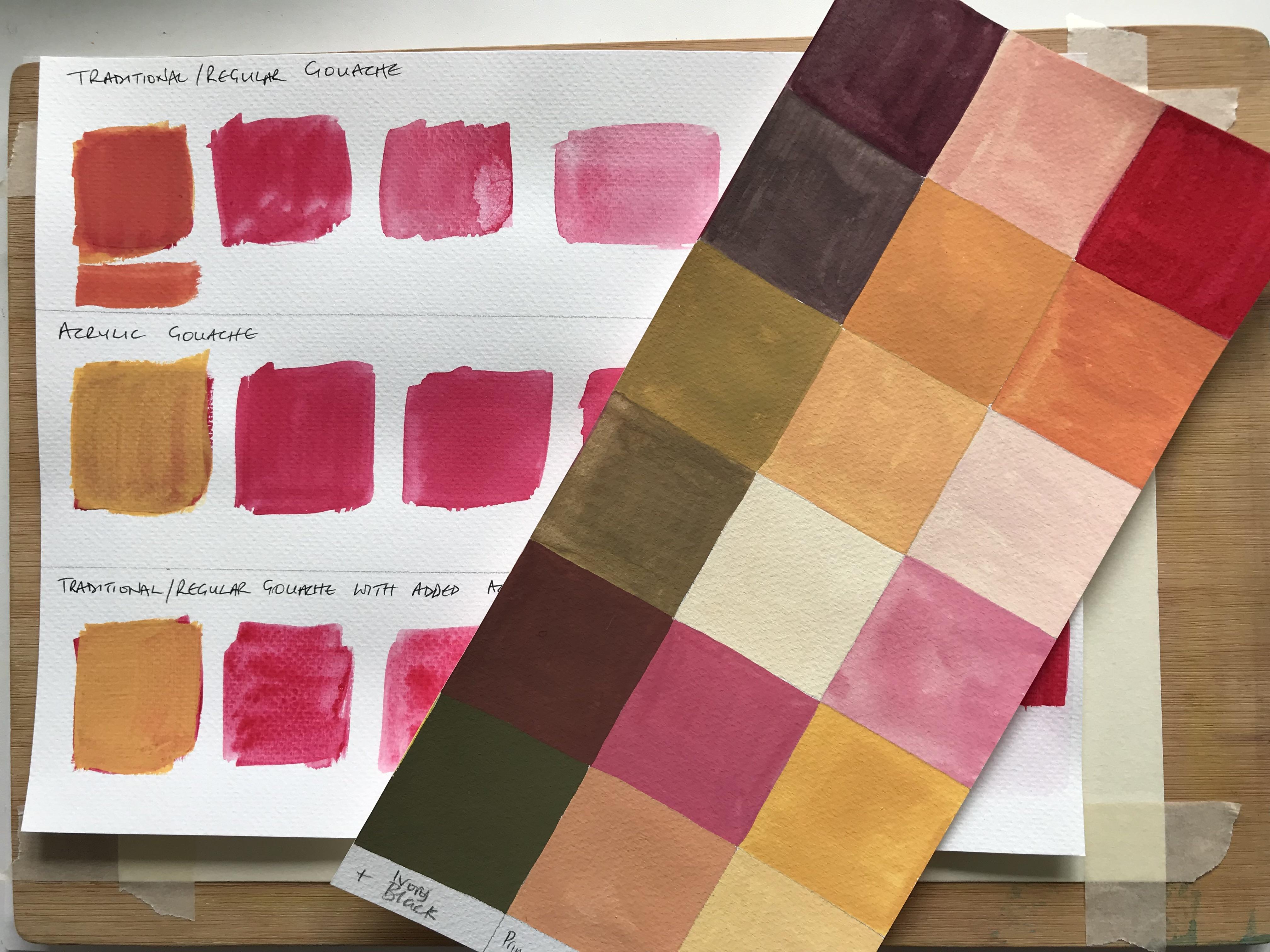
4. Understanding Gouache: There are two types of gouache, regular or traditional
gouache and acrylic gosh. The traditional gouache
behaves like watercolors. Do. This means that
when the paint dries, you can still reactivate
it with water. It's made from natural
pigments and a binder, which is usually gum
arabic and water. Acrylic gouache is
slightly different. This is made from
pigments suspended in an acrylic polymer emulsion. It's still water-based, like
the traditional go ashes, but it's Polymer elements
give it a more durable, a water resistant
finished when dry. So unlike the traditional
gouache, acrylic, gouache dries quickly
and once it's dry, it can't be re-wet it. So let's have a look in practice how these two
things work differently. On my palette, I've
got some Liquitex, acrylic gouache in primary red. I've got the Winsor
and Newton design ago, ash also in primary red. And I've got some of the
acrylic matte medium. So I'm going to start off with the traditional Gosh, first. I've probably put a little
bit too much water in there, which means that you can
actually see some of the brush the brush marks. But that's okay because it'll dry to a fairly
chalky finish. And if I can still see the brush marks in it
and I don't want to, I'll just put another
layer over it. Whilst I've got that
on my palette there, I'm going to take a bit of that paint and I'm going to add a little bit of the acrylic
matte medium to it. Now adding them up medium two, it will change the color
slightly, as you'll see. It has turned that ever
so slightly pink here. In a similar way as to
how it might do if I went and added white to
the primary red. But there's not much difference. That's okay. I'm going to still with
that on the brush. I'm going to just
put a little bit of water on my brush
and show you what happens then when we keep
adding more water to that. Acts in a very similar way to
how watercolor paint does. Of course, with the
matte medium in it. You're also diluting the
matte medium as well. So that's just something
to be aware of. But I'm going to explain
a little bit more about this map
medium in a moment. I'm going to just
wash my brush out and take the excess water off there and go back into
that primary red. But I have got water
on my brush now. Add it up to there and you can see because it's
got water on it, that it's again, beginning to act a bit like you
can do with watercolor. Can keep diluting
it and diluting it to get some really
transparent finishes. So here's the acrylic go wash. The brush isn't dragging at all. It's very thick. That will also dry to a nice
chalky finish. I'm going to add a little bit of water onto my brush there. So as you can see, you can still start getting
that same effect where you're getting a more
transparency through your paint, although not quite as much as the traditional
go as you can see. I mean, I've hardly got any
paint on my brush there. And it's still eventually get
into something like that. I need to let these dry before
I show you the next bit. I'm so I'm just gonna put these two one-sided
moment, let them dry, and then come back
and show you what happens and what really defines the difference
between the traditional go ash
and the acrylic gosh. I've been aware, made
myself a cup of tea. And as long as that's taken
me probably about 10 min. You can see that this
paint has dried well enough now as has
all this paint. I've, I've added
these here because I want to show you something
with these here. So this is just a
repetition of that bit there, the traditional goulash. And I want to show
you what happens when we add water to this. You can see that that's reactivating the
paint underneath. And it's pulling that
paint down. Like so. So in the same way there as
it's doing on the paper, we go back to this bit here, which is the traditional
gouache on my palette. And you can see there that I can reactivate that paint
on the palette as well, just by adding some water so that I've been able
to reactivate it there. If we go to the acrylic gouache Let's see what happens there. There's no dragging
of the paint. There's no
reactivating the paint because it's got that
water resistant finish, um, because it's in that
polymer emulsion binder. And if I take the
water onto my palette, we're just getting a little bit of reacting there, reactivation. But actually it's
gone into bits. So if I tried to put
on there from there, you would end up
with a very bitty. When I'm saying bits as
in bits of pigment look, he can just see that there. So that's not good to
be painting with that. And actually, if
that had dried on the palette for
another 5 min or so, I wouldn't have even
been able to do that. It would have just been
hard paint as it were. So now let's have a look
at what happens with the traditional go Ashe that's mixed with the acrylic matte medium. Now that also doesn't
really can just see, it's bringing a tiny bit
of color down there. Look, it's, it's nowhere near as much as the traditional go ash on its own. It does bring a little bit off. But not, not nowhere
near as much as that. But obviously, it's
not, you know, like the ready mixed
acrylic gouache. But let's see what
happens again when I activate that on the palette. So you've got something
similar going on there too. What happened with the ready
mixed acrylic gouache? It's now gone into bits. So you can't really reactivate that either because it's
got the acrylic in it. So the question is, why is it important to know the difference
between one and the other? I'm going to put some yellow Naples deep or Naples yellow
deep onto the palette here. If I wanted to change the color, for example, if I
had worked on, um, some of the painting and decided
that I didn't quite like the color that I had
chosen and I wanted to alter it slightly or put
a different color on. Let's see what happens
if I add yellow over to that original color with
the traditional gouache. Now you can see that that's two, that's changing that
into an orange color. Which, you know, that's
okay. I quite like it. It doesn't really
matter. That's fine. But what if I had wanted
really to actually change the whole color into this yellow Naples,
yellow, deep color. Because I really, really decided that I
didn't want the red. You can see that it
stays yellow because the acrylic binder in that Gosh doesn't
reactivate the paint. So that's a huge difference between that color
and that color, even though it's the same
colors on top of them both. And what happens if we
do it on top of the, um, traditional gosh, where I've added the acrylic matte medium. Let's see. That's also pretty good. Now the reason that
I wanted to show you this ready
mixed one as well, is more to do with budget
than anything else. Because the acrylic gouache
paints are quite expensive. And if you budget
doesn't allow that, if you can't afford to get that set or to get
some of those paints, then it's worth just
buying yourself an acrylic matte medium tube and adding it to your
regular gouache. And the beauty of that is, is that it gives you two options then it means that
you can still use your traditional gouache paints in the way that you
would normally use them. But if you really
wanted them to, you know, give it
an acrylic polymer, then you can just add that map medium and you've got the best of
both worlds there. So you don't need
to be going out and buying the acrylic gouache
if you don't want to, if you've already got it, great. But if you don't want to
add that extra expense, then just invest in some of
the matte medium instead. I hope that's, I hope
that has made sense for you and that you've, you've, you can really see the
difference there between the three types of paint and why it matters that you
know that information. I'll see you in
the next session.
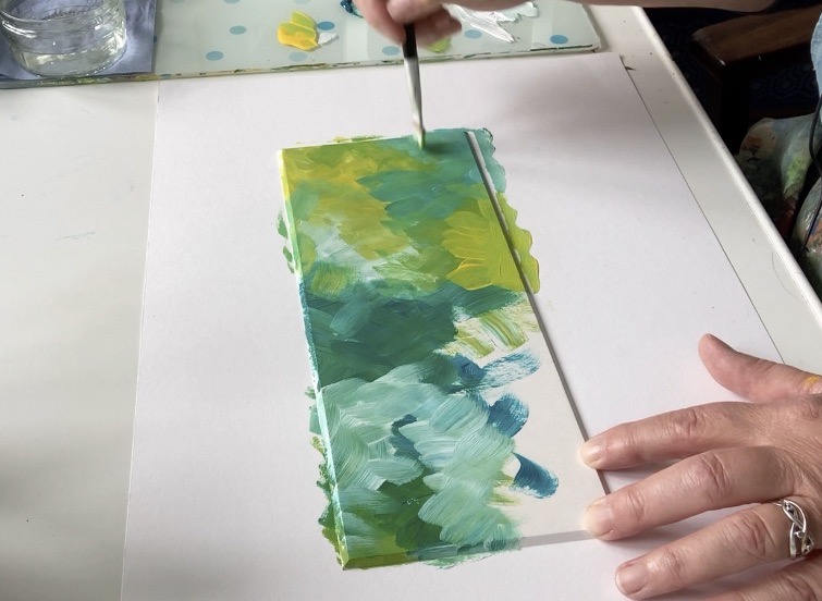
5. Playing with Acrylic : I'm not palette. I've
put some titanium white. I've put some heavy
body, yellow, green. I've put some golden
fluid in the, not even going to attempt to say this benzimidazole
on yellow medium. And then I've got some of the
phthalo turquoise as well. And I am quite literally just going to pick up
little pieces of color onto this board here
and just spread it around. Not going to overthink it. I just wanted to get some color on in this kind of what I call a cross hatching motion. You can see I'm just
picking color up here randomly using
these four colours. Because I literally
just want to get this acrylic on cover the background so
that it's ready then for us to be able
to put the gouache on, then the acrylic pen on
top of that as well. So don't spend too
much time doing this. You know, you can see I'm doing this really, really quickly. What I am trying to do though, is just getting a bit of a contrast in the different
areas with different shades. So it might be a
bit greener in one, a bit bluer in the other. Just make it a little
bit more contrasting. Add a bit of water if you paint, starting to drag paint
around those edges as well. Unless you brush needs a little bit of water
because you paints dragging, then I would say
don't bother mixing. So we don't bother washing it in-between picking
up the colours because when you pick one
called loop after another, it creates some
really nice tunes. So you can see how
quickly I'm doing this. We bit more white up here. Pull some of that. Hello
turquoise back in. See the lovely texture that
this is creating as well. And that's what we're after. We're after some nice
Textural Background. Basically. That will be the
backdrop to the painting. Bit more yellow down there. I think. We're not trying
to create anything here. We're not trying to make it
look like anything specific. We're just getting this acrylic on so that we can
then add to it. Once it's dry. There we go. Doesn't get much better or
much quicker than that.
6. Playing with Gouache : This middle one
is the one that I painted whilst I was on camera. And then because I'd got more
paint on my palette left, I decided to paint another
couple of panels as well. So what I want to do now is to just add some gouache paint. I'm just going to spread it
across these three panels, but you don't need to do
three, you just do one. That's absolutely fine. And I've put different
colors on the palette here. I'm, I've got some
ultramarine blue, primary blue, primary red, yellow Oxide, primary yellow, and a little bit of Mars black, doesn't matter what
color pinch you use. Just go with
whatever you've got. Because we're literally
just going to have a play. How about putting some
pattern onto here? Again, we're not trying
to create flowers or birds or anything like that. It's literally just to
have a play to see how the gouache reacts with
the acrylic underneath. So he goes, I'm
just starting off. Now that's dragging.
With the gouache. We need to make it more creamy. So let's just redo that there. Get a sense now of how this gouache will work
on top of the acrylic. Again, don't overthink this, which is put in pattern on. Sometimes I'm going to just
go from one paint to another. Well, the times I will
wash my brush in-between. Again, you can see that
that's dragging a bit. So I'm gonna put a bit
more water into there. Now look what happens because I'd already
got some of that red on my brush. That's brought a lovely
kind of stripy effect, which is really nice. Like that. Lovely. Do alter your brush. I'm using the same
flat brush here that I used for putting
the acrylic on. It's a flat and
it's a number six. But again, it doesn't
really matter what size brush you use at all. It's just, as I say, a question of getting some
pattern onto this acrylic. I'm really, really, really not thinking about what
I'm putting on here. I am quiet honestly just going with the flu of what
appeals in that moment. This is playtime at its best. You just go with what seems to be happening rather
than overthinking it. Have a little experiment in turning your brush
two different angles, or bringing a different brush. Let's choose a different brush. Let's see what happens here. When we use round brush. This is a number ten. So just keep playing
with the marks. Keep playing with the
different colors. See where the shapes take you. Like I said earlier,
don't overthink it. You can see here that just
by adding a tiny bit of black to that red gives
you a very rich color. So again, it's really worth
just playing with the colors, see what colors you can mix. Basically just have
some FUN with it. That's what it's about. Just have some FUN. Don't try and, um, you know, paint something
that's recognizable. Just put some shapes on
and have some FUN with it. It's really about
getting to see and feel how the gouache works, the consistency that
you need to get, the kind of result
that you want. That's basically
what this is about. He could try adding pattern
on top of pattern, dots, stripes, little dashes, whatever comes to
mind, just have FUN. So I'm going to
leave that like that for now and I'll see you in the next session
where we start to add some more detail with
the acrylic pens
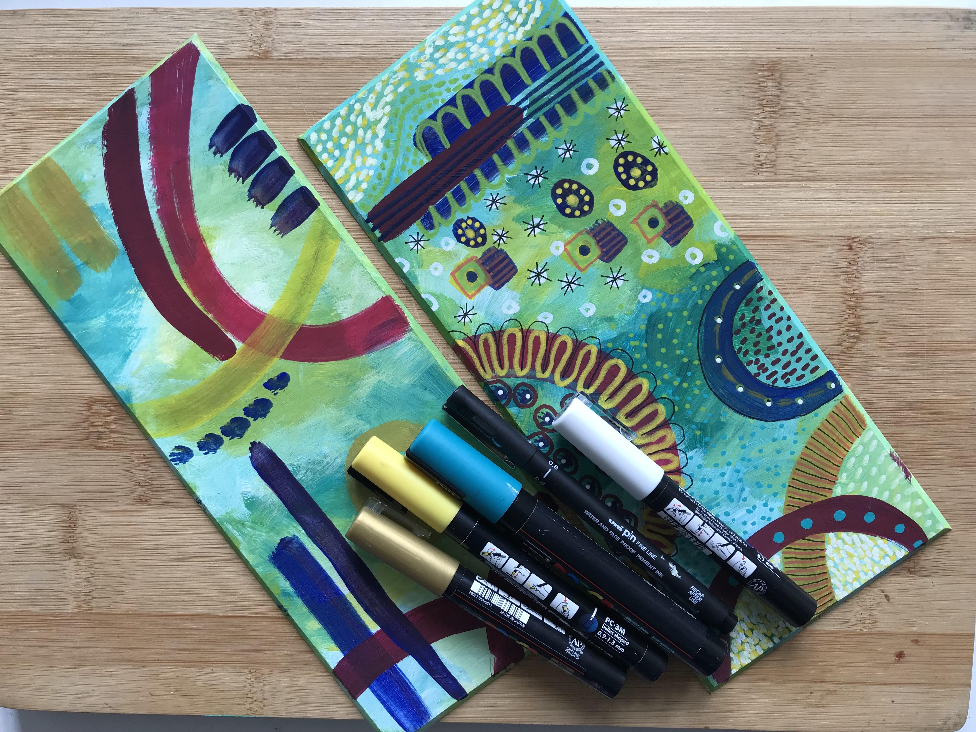
7. Adding detail with acrylic pen : That gouache has dried. So now I'm going to add
some detail on top of it with some of
the acrylic pens. Again, I've got a variety of
different brands in here, so it doesn't matter
which brand to use, and it doesn't matter
which colors you use either just go with what you feel drawn to in that moment or
whatever you've got. Don't forget to just
give them a good shake. And you might have to
do a little bit of pumping just to make sure
that that comes through. I'm doing this really random. No rhyme or reason,
particularly. Just making marks. That's all it's about, really
Mark Making at this stage. Now the one thing to just watch with this when you working with acrylic pens is to remember that it is actually paints that you're working with. So if I were to just
put my finger put my the edge of my hand onto that bit there
that I've just done, it would smudge it. You better off turning year, painting around as you need to, so that we don't end up smudging what you've
already done. This is one year.
Painting can get quite transformed into
something entirely different. I'm going to do here
on this bit here is do the stroking method. That makes up quite a bit of the background so that you get
a sense of how to do this. Now, I like to use a combination of yellow, ivory and white. Let's do it on both
of these bits. What I like about it is
that it still allows the texture on the contrast of the Background come through. Turn that round, do a bit
more down here as well. Let's create a bit of movement
with this one. We go. So you don't cover up
all of the background. You cover quite a bit of it, but it's still just allows that very interesting
texture to come through. It's rather similar to how
Van Golf would have painted. Let me he wouldn't have used
acrylic pens, obviously. He would have done it with
his own brushstrokes. They can see there that there's quite a bit of movement
that's been created there. And that's what I'm after, I'm after that movement. This is what we're
going to have in the background of the painting. We're going to create lots of
movement in the background. Go just back onto that ivory. It's good if you can let each layer dry before you
put the next layer on. Otherwise you'll end up
with a very dirty nib, whatever color you've put
on Biddle beforehand. So I'm using the same
stroke and method. I'm going from kind of like the top to the
bottom as it were. And I'm going partly over the yellow and also over
the background as well. It's really worth playing
with this technique on here. This is what you practice pieces for to have a play with this. Let's see what happens here. If we don't put the
yellow one first, but we put the ivory on first. You get a very different
effect. Lead to let that dry. That one's still a little bit. What two are there? So let's see what else we can do as well. So using this technique
with the acrylic pen on top of the gouache and
on top of the acrylic paint underneath it means
that you can add some really fine detail to maybe flower petals or your bird wing or
leaves, whatever. And wherever you want to add
a bit of extra interest, you have a play with what
Mark Making makes you smile. But you can really see how this little sample painting is beginning to transform into
something else entirely. Now that we've got
these details on and is still getting that lovely texture coming
through in the background, which is what we wanted. It's worth also,
I've used that pen there to put on top
of green so you can see there how that color acts with one underneath
it that's very similar. What happens if we put
it onto a darker color that's almost the opposite end of the color spectrum from it. Let's have a look. Has a different feel
entirely, doesn't it? Of course, we are, in fact painting this because that's
what's in here. Paint. Go back to this bit here and do the same direction with the ivory pen so that you keep that sense
of flow and movement. Now, if I go
background to this one here and put some
white on top of there. These are all different size
and libs I'm using here. And again, you just need
to experiment with them. Obviously, if it's
a thicker nib, you'll get a thicker line. If it's a fine and
you'll get a final line. That goes without saying, of course, we've got three
colors going on there. We've got the yellow underneath, the ivory on top, and then the white
on top of that. When I bring the white
on top of this as well. But you can see there's quite a different effect there simply because of the colors of the acrylic paint
in the background. So this one's
feeling quite a bit lighter than what
that one is there. And that's what brings
the interests for me. Which is why I
wanted you to really give some depth of color into your acrylic background
to begin with, so that you'd end up getting some very different
effects there. We can also use a fine liner as well to
add even more detail. So if you wanted to
outline something, for example, you could always use a black fine
liner for doing that. I just think it adds, again a bit more
interest to bring some very varied Mark Making in. It gives your painting
a kind of wow factor. Instead of it just
being quite flat. So don't be afraid to
try on your samples here and create some
different patterns. You know, if you
don't like them, you don't like
them, that's fine. That's as, that's as
equally valid to find out what you're not so keen on as it is to find out
what you are keen on. So have a play with that. See what you think to it. Just get used to having all the different
stratas together. Here. Acrylic, gouache, here, acrylic, and a bit of fine liner. And when you feel happy
with what you've done there and you've had
enough of a plate, then it's time for us to get on with the painting of
the Bird and the Flowers. Hopefully you've built
your confidence up a bit there to be able to
start your main picture
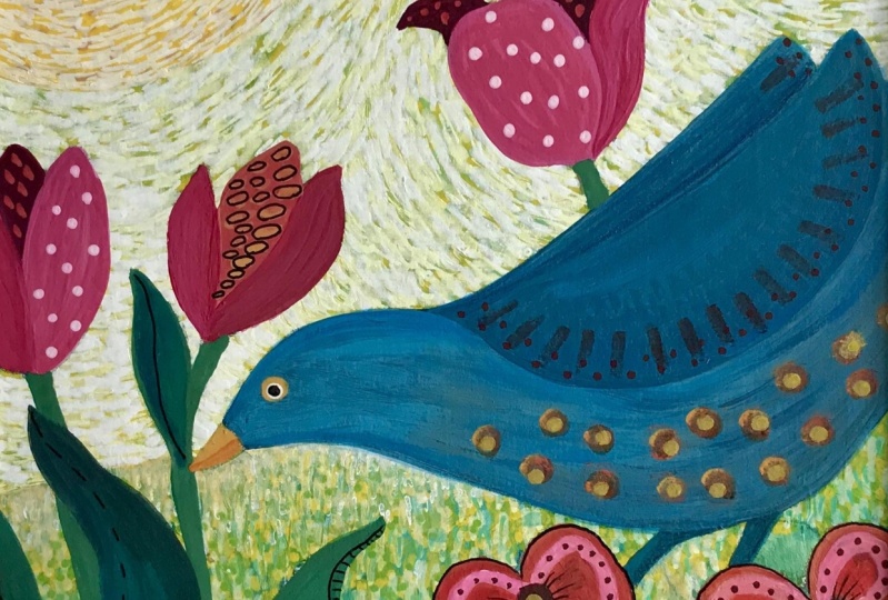
8. Composition and Balance : How do you choose a
subject view composition? So in this case, it's going to be a competition
that's going to include a bird and some flowers, maybe some berries,
maybe some leaves. I'm an avid collector
of magazines. I have to say, I quite like going through with
a nice cup of tea, just having a look at some of the pictures in
the magazines and cutting out any that I
think might be of interest. I also took copious photographs, tons and tons of photographs, which are then might
print out myself. And I can also use
those as a reference. Plenty of reference material, of course, in magazines. You can see here. It's very easy for you to
find shapes of flowers. And it's not even that you
need to copy them directly, but to give you a bit of an
idea of what they look like, it's a good starting point to be able to just think, okay, so that's how a foxglove looks, and you can then stylize
that in your own way. But magazines are
a great place of reference for both
birds and for flowers. And I use them both. Of course, I find it
easier than being online and looking
at them online. I know a lot of
people use Pinterest, which I have used as well. But I do prefer, I noticed my preference is
actually to just look through magazines and see
what photographs, what lovely images that
I can find in there. I mean, there's some
gorgeous ones here of birds. I mean, how sweet is that? And then, you know, find a way, See that's such a beautiful
shape there, That's lovely. And you can easily trace
around that one and make it into a bit more
of your own composition, your own stylized
version of that. It's very simple.
So I would say, when you're looking
for inspiration by all means go online and have a look on Pinterest and wildlife sites,
that kind of thing. Um, take your own photographs or just have a look
through some magazines. And this is a picture that I got out of a
magazine as well, um, and it's the artist, I believe, if I remember
rightly, of Angela Harding. And it's interesting to see how she's stylized as Herbert. Um, so, you know, you can do what
you want, really. It's just you having the
competence to do it. Here's my board that I'm
going to be working on. I've put masking tape around the edges because I want to keep that a nice clean line at the edge rather than paint all the way over to
the edge of the board. And I'll explain why I
do that a bit later. When I'm looking at a
composition of something that's recognizable as opposed
to an abstract, then I like to give
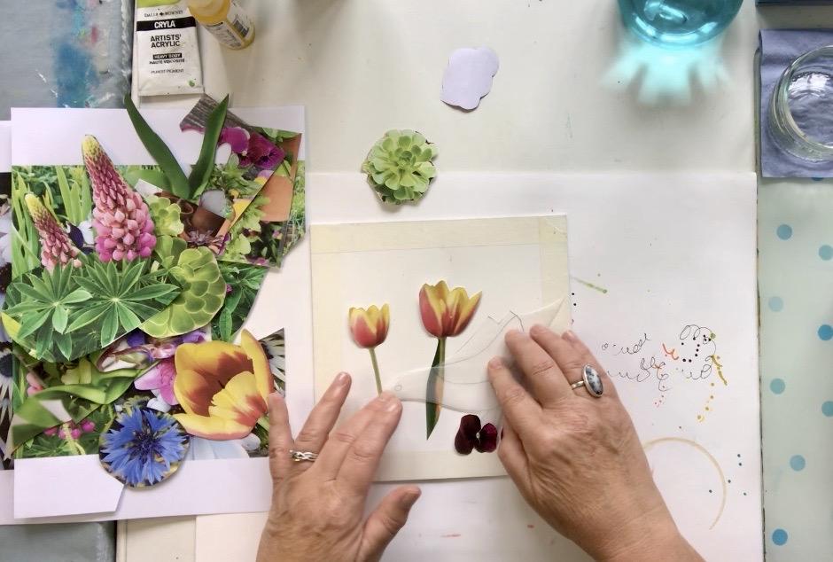
it some thought and use why call a cartel
and collage technique. Now, I have this little
bird shape here, which is a composite of
other birds that I've seen. Um, it's not an exact
bird as you can see, but I rather like
the shape of this. And given the antics of the black birds that
come into my garden, I wanted to create a composition
that somehow reflected I'm there cheerfulness and
their quirkiness, if you like. So I want this
competition to feel as if the bird is in and
amongst the flowers. Now, I've got photographs that
I've taken here of tulips. Um, then I printed
off and I've cutout. If at all these cutouts here are flowers that I've actually
photographed myself. And I'm just going to play
around with them here to see whether or not I want to bring those
into the picture or not. Now, I want the bird really
to be the star of the show. So in a way, the
flowers need to be, you know, round the back of him and perhaps in front of him. So using these little
pansies, for example, they would be quite good
to be at the front of him. But then I want some
slightly bigger ones, um, maybe tulips or
something in the background. I also want to bring a son
into it somewhere as well. So when I've finally got the composition in place
where I want it to be. I'm going to do then is
I'm going to draw around these shapes and get my
composition that we're basically, I might have missed
something from a magazine and cut it out. Or I might just have seen
something directly in a magazine and cut that out
or taking my own photos. I'm going to play
around with these, you know, I've got leaves
and all sorts here. And just see what I might want to bring into
this little painting. I'm sorry, I'm going to just have a little
play around with that. And then I will
bring you back into the lesson when I've decided exactly what I'm
going to be doing?
9. Acrylic background layer : That's the composition.
Now as I've drawn it, as you can see, I've traced
around the bird shape. I've traced around
the tulip shapes are added some free form leaves. And I've roughly traced around some pansy
shapes at the bottom. Now, if I think about
this as being a stage, then I want to know
what the backdrop is. And the backdrop of course, is gonna be the sky and it's going to be the
grass or the ground. So I want to paint
the backdrop first. Some people prefer to do the
back, the background last. That's entirely your choice. There's no right
or wrong to that. It's just preference
and I prefer to do mine first, the background. So I'm going to
depend to some water. I've got the four
colours again that I had when I was playing
with my samples, when I was doing the acrylics. So I've got the, um, heavy-duty yellow, green. I've got the primary yellow. No, it isn't primary yellow. It's that funny named on benzimidazole alone,
yellow medium. I've got fallow, turquoise
and I've got white. And again, just these are all different quality paints and
a mixing them all together. So again, please just go
with what you've got. Um, because you'll still
get a lovely result. So I'm going to start off by doing what I'm calling the sky. Now again, the choice of
color is entirely yours. Funnily enough, I'm gonna
go with green and yellow, which sounds a bit bizarre. But of course, when we put the stroking technique
over the top of it with acrylic pens that you lose a lot of the
background color anyway. So this is really just
to add a texture. And the color that I'm
putting on both the sky and the ground is really about
building up texture. So I'm going to do what I
did with the, um, samples. And I've got a
smaller brush here. I'm sorry, I can't tell you
what size it is because it's a it's peeled off but
it's a flat brush again. And I'm just gonna go in with that little
crosshatching technique. Now, you can see
that I've drawn, obviously, I've drawn over the, um, you know what I've traced, I've drawn around
the outline and I'm, I'm painting right
up to those edges. And the chances are, is that they'll end up
going over the lines, over the pencil lines. And that's absolutely fine because I can reinstate
them if I need to. The real they're just
there as a guide for me. Some of that yellow in
there because that's a wee bit dark for me
that I want there. What I'm trying to
achieve here is a contrast of shades and tones. So I'm just starting off by
putting on a layer here, which I'll keep
working into and going over until I get the
effect that I'm after. As I said, I want this to
be a wee bit lighter up here because obviously
the ground's going to be, you know, a bit darker. So I'm just literally working these strokes into each
other and building up the layers so that it creates a nice texture for me to then add the acrylic pen tool in the same way that I
suggested in your samples. Don't overthink it. Just get the paint on. As I say, think of
it as the backdrop in the theater, on the stage. This is the back curtain. Keep working at it. Until you've got the tonic. Doesn't take long at all. It really doesn't. He can definitely see here that I'm going over
those pencil lines. But as I say, it
really doesn't matter. It's not important. If you want to make your
pencil lines a little bit thicker than mine, a bit heavier than mine so that you can definitely
see over them. Then please do. Just going to put a bit more white up here because
I really want that to be a little bit paler, but I'm not covering up
everything that I've just done. Because again, it's about
leaving some nice tunes for me to be able to then work
around with acrylic pen. So now I want to come down to this bottom layer and I want to make that
slightly darker. So I'll bring in more of
that turquoise color. And again, I can lighten
it up if I want to. Just playing around there. Around the edges of
the Pansy shapes. I'm calling them shapes
because they might not end up being Pandas by the time
I finished with them. Who knows? We'll see. Now what I do want to
do in fact is just define where the sky begins, where the ground begin. So I'm just going to make
their way a bit stronger. They're just so I remember that. There we go. That's almost done. Do take a bit of time just
to blend those colors in. Um, but as I said, leave, leave some nice
textured lines as well. Try not to make your
design too complicated, otherwise you'll forget
where you're painting. Um, well, I shouldn't use
a statement for myself. I forget where I'm painting sometimes if I make
lead designed too complicated to turn
it around as you need to pop a tiny bit of white in there just to bring a little bit more
contrast in the color. I think, well, I've
someone that down there as well because that's
rather nice, isn't it? That needs to dry. And then I'm going to
start working on that. I'm with the acrylic pens before I then paint the
Bird and the Flowers. But before I do
that, once it's dry, I'm gonna just reinstate some of these pencil lines so
that I couldn't remember. Western bits are. But that's it for now. And I'm gonna leave that to
dry and then come back to it.
10. Adding the 1st Textural Layer : I'm going to start
doing the lower part of the painting now the ground stroke grassy
area with the acrylic pens. And this is why you'll see why I prefer to do
the background first. Because show you going to
start off with the yellow. And I'm gonna do a straight
up and down stroke basically, or a stroke like
this that starts at the top and comes down
to the bottom like this. And I'm going to start
with the yellow. And it will go over the
edges of the leaves, the Bird, the flowers
at the bottom. Now, that's okay because as we know from having
done the samples, the gouache will cover over anything that's underneath it. But if I painted
the leaves and the Flowers and the burden,
everything first, then I would have to be much, much more careful about doing this stroking technique source to make sure that it didn't go. I'd already painted. So
this is why I prefer to do the background for this
technique in particular. Why I prefer to do it first, I'm using quite a
thick nib here. This is the, um, five M in the Posca pen
range for this yellow. But again, you can see how
quickly that's going on. Doesn't take long at all. Now where is the line? I think it's about there. I can always alter that later. If I find that I want
that to go either slightly up or even
slant is further down. But just for now,
that's absolutely fine. Now, of course, I can't
do the next layer yet on here because this
layer needs to dry. So what I can do is go
up and start doing it on what we're calling
the sky area. So I'm going to turn that around so that I don't put the edge of my hand into that
I've already done. But this time I want to create some kind of movement to this, I want to create some
kind of flew going on. So what I'm going to
do is in fact I'll just do the first bit so
I get the flow I want. And that's a sort of flow that I'm interested in
creating their. And then it will come around
here and round there. So you start to
see the direction that I'm taking this in. Again quite quickly to get that sense of which
direction which the sensor, the sense of where the floor
he's going. That's lovely. That's great. So I
turn that around and just follow that through with the same
sort of strokes. But this time are
going from left to right rather than up and down. Now, don't forget, we
want to keep some of that lovely texture
showing through underneath so we don't
want to be covering it all with these pen marks. Don't worry if you go
over your pencil marks. Like I said, the gouache
will soon cover those up. Now when you get when do you get it Come into two
different directions here. So we've got the
floor going that way and we've got the
flow going this way. And basically all you do is join them up in the
middle, like that. Keep turning your painting
around as you need to so that you're not putting your hand in paint that
you've just put on. And keep doing this until
you've got that first layer on. You could try in different
colors if you wanted to. You could try it
with a pale blue. Or you could go really
dramatic and go orange. You can do whatever you like. The sky's the limit to quite literally the first layer of the yellow or
pin, the sky area. I'm going to bring
this lovely green. This is in the molecule
range and it's, um, it's actually
called grasshopper, which is a lovely
green. Actually. I use this one a lot. And I'm going to go over that yellow on the lower
half now with this one. And again, making sure that I
keep some of these textures showing through from underneath
with the acrylic paint
11. Adding the 2nd Textural Layer : I'm just gonna keep doing
this all over with the green until I've covered most of
that lower surface area. That's starting to
show some really interesting textures
coming through there. Now, see this lovely dark
color showing underneath. And we'll end up putting one
more layer on top of that. But you'll see what that
looks like in a moment. So backup to the top layer now. And I'm going to
use the ivory pen, this one, and I'm using the
one with a really thick nib. This is another posca
pen with a five nib. I'm going to follow
that line round. That flew around that I started. And again, just continue
until I've covered all the surface area that we're considering
to be the sky. Keeping that flow going. Same kind of strokes. Left to right. Because if you're left-handed, you might prefer to do
it either way round, go with whatever is
comfortable for you. Starting to get a
sense now of this flow on the second layer of I'm acrylic paint markers on top of the original acrylic. Can you see what I did that I've just so much that bit there, so I'll quickly go over that. It will get another
layer on top of this. So it's not the
end of the world. But you do have to be
careful on mindful. You don't have to be a
bit mindful of where you're putting your hand. Mindful of where
you've just painted to bring another
yellow into this, but a slightly lower nib
or a 3M into this one. Now, i'm, I'm making
this slightly more of a dot coming through
rather than a stroke. And again, it's just to keep
that texture interesting. You can see how the two are beginning to look
quite a bit different. Now. I'm going to go back
up to that one there. And I'm going to
bring in a white. And this is only a one M
12. Adding the 3rd Textural Layer : Okay, and don't forget to just shake it and pump it through. That's not written.
That's better. Just needed a bit
more paint to come through there. That's better. I can just keep going on top
of what you've already done. Keeping that flow going. And it doesn't take long
to do as you can see. Now, you can make
these lines as close together or as far
apart as you want, depending on how much texture
you actually want to show. And of course, you can always add a little bit
more to it at the end. If you feel that you want
to just refine it slightly. You can see here that this is much more of a loose texture, whereas this one's now is starting to look much
closer together. And that's intentional. Because I want to really create a different feel to the upper part of the painting and the lower part
of the painting. I'm putting quite
a few of these, um, finer white strokes onto it. For that very reason. To make this top layer a
bit more compact looking. I'm just going to carry on
with this until I got it too. I want it to be.
If you end up with something like that where
I've got a bit of a smudge. Their fancy, just need to get it off with a
piece of kitchen roll. Pen is not behaving
very well. Is it? Good? I can of course, leaves some areas a
bit looser up here, not do it all quiet so tightly done together
so that again, it brings a bit more contrast. But actually I want this one to be generally fairly tight. Over most of the sky area. Quiet small strokes are these? When I say small, I
mean small in length. But look at that. That's
been created now. That's just lovely,
really lovely, lots of lovely movement there. So now I'm going to come to
a more narrow 3M ivory pen. And I'm going to bring that down small strokes again
into this area here. Quite loose over the top. Not too close together, not as close as it was on the
upper part of the Painting. Because I've used similar
color pens in both the upper and lower. It works. It looks cohesive. Even though the
strokes are going in different directions
and this one's looser. It definitely works. For the moment. I think that that's all I want
to do actually. Do I want to do it? No, I'm
going to change your mind. And I'm gonna go with
this lovely pen here. I'm, It's called aqua
green and it's just a one M. So again,
it's quite light. I'm just going to add a
little bit of that too here. Just a little bit in parts. Not even everywhere. Again, that just
brings a little bit of a different tone to
it in certain areas. That's it. That's as much.
So I'm going to do there. If I decide once I've got the painting with the bird
and the flowers in it, that I need do a
little bit more on that area than I will do. But for now, that's where
I'm going to leave it
13. Painting the Background Flowers : This is all nicely dry now. And what I hadn't realized was that hadn't filled
in this little bit here. So I've been over this as
well and I've just reinstated a stock there because I'd obviously painted
over that as well. I'm ready now to get to
the really sweet stuff and that is to start
painting the flowers. Now, if you remember, I suggested that we thought
about it as a stage. So we've already
done the backdrop. So now it's like, okay, who are the players at the
back of the stage now? And they of course
are the flowers. Then it would be the Bird, and then it would be the
pansies and the leaves below. That's because what we're
thinking of is what stays behind everything or
look at it the other way, what comes in front? So the flowers come
in front of the bird. The bird comes in front
of the Flowers there. So we're going to paint from the back forward as it were here. I've got the colors
on the palette, and I've also added
a little bit of the Acrylic Matt
Medium so that I can turn my gouache into a water
resistant one if I want to. This is the palette,
just a reminder that I managed to create from
these four colours. And I'm going to use
that as a guide to, um, give me some ideas as to what colours I actually want to paint the
petals themselves. Now, again, when we're
thinking in terms of what's at the back
on what's forward. If we look here, that petal there
and that bit there, and that bit there
are at the back. So those are the ones that
I'm going to start off with. And because they're at the back, I'm going to make them
a little bit darker. Then I'm gonna do the
petals at the front. So I'm going to take
some of that red out. And I'm going to add the
tiniest bit of black to it. Not much. Look how rich that
looks, Isn't that gorgeous? I'm gonna put a little bit of the medium in with that as well. Because I want to make sure
that that's water resistant. And I'm going to be painting
those petals there. Don't worry. If you go over any of the edges of the other parts of the
petals, like I'm doing here. Look, because the minute you put the other color on top of
that will just cover it up. Keep turning your painting
round as you need to, so that your brush is always
where you can see it, the tip of your brush. And not I'm shielded by your
hand like this for example. I'll put a little bit more black into their for the other one. Now because I'm using a very
limited colour palette. I just know that it's
going to be harmonious. That the effect that I'm
going to get at the end, even though I don't have a plan as to what colours
going to go away. I just know it's gonna
work because I've got such a limited palette and all the colors are coming
from that palette. So it's all going to work, which is useful to know. That petal there is
slightly behind that one. So I'm going to take a bit more black and
darken that up even more. Then I'm just going
to play around with mixing the different
colors I've got together here to fill in the colours
of the other petals there. Paint a bit more of
this off camera, and then I'll bring
you back in again to let you see where
I've got to with it, that color there's looking
a wee bit flat to me. So I'm just going to pull in some of that yellow on top of it and see what happens.
That's too much. I'm going to pinch some of that red and join that with it. Because I want it
to be in a more vibrant orange as better. And this is the beauty of working with gouache
that you can just keep reworking it until you
get the colors that you want. Now, I also liked the fact that because that colours mixed
with the one underneath, It's giving it a little
bit of texture as well. In fact, you'll notice that's better, that's
a much better color. You'll notice that there's
some texture in these, um, leaves as well, which I really like
that just lifts it all. Now, what I'm gonna do here, and this is where we get
start playing is an I might change it again just
so do you know I might change it if
I don't like it, but I'm forever just trying out. Does it work? Does it not work? If it doesn't work,
I'll alter it later. But let's just have
a look because I quite like that color that
I've just created there. And see what happens if I just put some little
dots in there. See, I think that's
rather sweet. Probably will end up
leaving that like that. And I think we'll just do
the same in here. We go. I'm going to leave
that for the moment. Now that's the
Background Flowers done. And then I'm going to
move on to the Bird next. So I'll join you in
the next session or other see you in
the next session. When we start looking
at how to do the Bird
14. Painting the Bird: But the bird, I'm gonna be using the ready-made acrylic gouache. And I'm going to use
a mixture here of the routine hue and
the primary blue. But I might also mix it with some of the
traditional gouache, white as well, just to get
the color that I want. So I won't need the
Acrylic Matt Medium. I'm, I'm just going
to play around here. I've already got the two
colors on my palette. I'm just going to add
a little bit more of his primary blue. And I want to put this
on fairly lightly at the moment because
I'll probably go back in and work into this with
a little bit more paint. But just to start with, I'm gonna go from
whatever's behind first. So that's that back wing. Can you see there? You can actually
see little bits of color coming through
from that background. And I actually don't
want to paint those out, so I'm going to leave those in because I think they
add quite a bit of interest on a take a little
bit of white from over there, mixed it in with a portion
of the paint on my palette. I'm bringing the other wing. I'm not worrying too much of this stage about
the brushstrokes because I'll probably end up adding something on top of that. Again, I'm just going to
leave that there for now. And I want the actual bird
itself to be slightly darker. Ever so slightly darker. So I'm pulling in more of the
viridian hue into the mix. Let's take a little
bit of that black from the traditional gouache and
add that to it as well. Now, that's made it too dark. So I'm going to
just mix everything together that I've got on
my palette here in terms of those blues and what
I've created there. And see if I can get more
to a color that are alike. And let's just see. Yeah, that's lovely.
That's very nice. Do like that. I must say. I'm going to paint all the way right up to the beak
around the head. Doesn't matter if
I go over the eye, I'll reinstate it lead to owe to their very carefully
and round this wing. I'll do make sure of course, that all this bit here is dry before you start putting
the side of your hand in it. Because we know what
happens there when you don't see how nicely it covers up that
background there. Which again shows you why I like to do the background first. I'm just going to take that
color ever so slightly. Hope that wing there
just along the edge of it and then water it
down ever so slightly. There we go. Without getting rid of that level
of texture behind. Now I could at this stage add some different detail
onto the bird's body. I'm really liking this
kind of feathery effect. Again, I haven't planned it. It's just the way
the pin is going. And I'm rather enjoying that. So I'm going to leave that just as it is for now and let it dry before I add anything else
to the body and the wings. But I am going to paint
its legs in just now. I'm going to take some of that
black because the legs are usually darker than
the rest of the bird. And I'm adding it to
what I've used for the colour of the body there. You can see there that's
quite a bit darker While I'm waiting
for that to dry, I'm going to go back to
me traditional gouache with the Naples yellow deep. And I'm just going to do
the first layer of the Sun. Taken the column more or less as it comes out of the tube. It's quite watery at the moment, so I will need to put
another layer on it. But I just wanted to get
a sense now of where and how that sun is coming in. And we'll add a little
bit more white. Actually. As you can see, I'm putting that white directly
on top of the elephant. I just wanted to turn
it down slightly. And I might end up putting the or the yellow back on top
of that once that's dried. But we'll see, we'll see what I think about it when it's dried. I'm going to come back
into this yellow again. And with the number
one round brush, I'm going to put in the first
layer of the bird's eye. And I'm also going
to do the beak. Starting to take shape now isn't Epstein to look really
sweet actually. I think whilst I've also got this yellow because this
is how you can start linking the painting together and linking the
colours together. I'm gonna do a little bit of decoration on this flower here. Now remember, we're
not looking to make this look like a proper flower. We're stylizing them. Can you see the color
coming up from underneath? That's okay. Again, it gives us, it gives it quite a bit
of interests there. That's good, that's
already dried. So we'll go back now. And I'm going to take
some of the black, put it into that blue I
created for the body. I'm gonna do some
tiny little marks just coming around here. Let's add a little bit of detail to that underbelly on the bird. And for that, I'm mixing
the yellow Naples deep in the traditional
gouache with a bit of the primary red in the
traditional gouache. Lets sorry, in the
acrylic gouache. And I'm going to take a little cotton bud
and just dip it in. Test a bit. First of all, on the side there, I'm going a little bit more
yellow in that I think. And I'm just going to
do this onto the body. And I think that's
enough. I don't think it needs
anymore than that. So I'm going to leave the
Bird like that for now. I'll probably end up
doing some more with the acrylic pens later. But for now, that's as much
as I want to do on the bird. So let's have a look next
at filling in the storks
15. Painting the leaves : I've got a mix here of the viridian hue and
the Naples yellow deep. And I'd quite like
in that column just going to do a little
test out of it there. I'm gonna do the
stocks with that. In fact, I'm going to use a much finer brush for this one. Let's start with that
one at the bank, they're going to do the
leaves the same as well just for the moment. But again, I might
end up adding a little bit more
color onto these. But just for the moment, gonna do it all as
this one, flat color. Do this one here with
a bit more blue in it. And of course, once I've seen the painting with the
panties on as well, if I decide that it needs
another little leaf somewhere, that's something that
again, I can always add. Because as we know by now, the gouache covers everything
up underneath it really. Well. I think I might just add a little
leaf here and there. And basically that's just to balance the composition, really. Nothing culpable.
Another little one here. Look. And that's
looking really sweet. I'm going to carry on
playing around with this for a little bit and
then let it dry. And then I'll take
an overview of it to see if I want to make
any changes to it. So I'll do that off
camera and then we'll be ready to start painting the
flowers in the Foreground. I'll see you in
the next session.
16. Painting the Foreground Flowers : As you can see, I've made
a few changes to the Bird. I've softened it all and
I've lightened it all. I felt once it had dried, that it was actually
a bit too dark. And I've just done that by using the gouache and going over in I'm watery, feathery strokes. You can see here
that it's still got some of that orange
and the underbelly. And I'm going to
leave that because it's nice at this moment that it suggests that there's some kind of texture going
on on the belly. So I'm gonna leave that. And, um, you can see that I've lightened
the head area up here. And again, just by putting the gouache over
what was already there. So this is where it's good
to let things dry and see if you need
make any changes. Have also darken some
of these leaves here. And don't be afraid to put some dark colors
in because again, it gives it a nice
lot of contrast. Now I'm ready for painting
the little pansy shapes. And I've mixed on my palette
some of the primary red in the acrylic gouache and some of the Naples yellow
deep in a traditional. And I've just mixed
those together. I'm gonna get the first
layer of paint on to see. Why think it looks like. Now, painting is not a science, of course, you know, it's very much an
emotive I'm activity. So you can start off
by doing one thing. And as you go along, you know, recognizing that actually
that's not what I want. I want it to be
slightly different. And that's why I
say it's good to just go in, have a look, you know, take a step back
from it every now and again, and just see, is that
actually what I'm after? And if it isn't, then change it. When I'm painting and
decorating in my home. That's the kind of
attitude I have as well. If I don't like it
when I've done it, don't put up with it, change it and get it. Keep working at it
until I get the, um, the shade that
I really want. I do a lot of my own mixing
when I'm painting the walls. And sometimes it just
takes a few girls. I know that sounds like
a lot of hard work, but because I love colour
so much, I don't mind. I don't mind taking the time. So I'm just getting
this color on first. It's covering quite a bit. What's underneath it. Very good. It's doing well in covering those acrylic marks and
some of the pencil marks. Now, I obviously don't want them all to be exactly the same, so I'm just going to pull in
a little bit more red there. And that gives a bit
more shading look, a bit more contrast. So again, I'm just
using the two colors here and creating a
different mix with each petal up yonder
there as well. And of course, I'll be
adding more pattern on top of these with
the acrylic pens. You can see how this color palettes working
really well together. There's a lot of
bright colors in it, but they work because as I said in one of the
earlier lessons, because it's a limited
colour palette. And the mixers are
coming from those, then you just know that
it's good to work. Keep dipping the brush into the water if it's starting
to drag a little bit. These are looking sweet. Obviously, if I can see the acrylic paint underneath
after the first layer, then I will go in and put a
second layer on top of that. So that's the first
layer on things. I'm just going to let that dry and see where else I need to go in and do an
extra layer on top. I've let it dry. I've
gone over these with another couple of layers
just to make sure that most of that
background was covered up. Reinstated. The little belly texture. And I've just deepened
that sun up there. I'm going to pinch a bit of this black and pop it
into that red there. I want a little bit more. And I'm going to get my cotton. But again, I think these cotton buds
are on the way out, so let's find another one. We go up. And I think that needs to be a
slightly watery mix, more and more watery
mixture. That's better. That's better. I'm going to give these
little flowers now, always still thinking
of them as pansies. Now, that's still not
going to do is it. Let's add a bit more of that black to red and make it a bit of a thicker consistency. And that's what we need to do. That's better. Dip that in
there, have a practice. And let's try it. If it doesn't work, then I'll think of
something else. I'm just twisting
that as I put it in. Now you can see that by
doing it in this color here, it's pulling in this color now. So again, we're getting
some correlation between what's happening up here on
what's happening down here. That for me now is as much as
I want to do with a paints. So I'm going to
completely let that dry and then I'll be going into
it with the acrylic pens. I see you in the next session.
17. Finishing Touches : We're now ready to add
the finishing touches. And I just wanted to show you this painting that I've done
of three birds obviously. And you can see how by
adding the different marks, adding extra details
with the acrylic pens. It really takes it from a much flatter level like this into something
quite different. So that's what we're
going to be doing now on this painting here. And you can see here
in the background, there is this
suggestion of a son. And we're going to
start with that one there and really knock it back so that it's nowhere near as bright and
loud as it is. We're going to be using
a similar technique to what we used
for the sky here. I'm gonna go in with the
large nib, white acrylic pen. I'm going to start
around the edges, covering those edges. In fact, I'm going to
do that all the way through until I've
covered the whole thing. I'm keeping the curve going. I created with the brushstrokes because that's the movement, the direction that
I want to go in. Now of course, I'm
going to have to let that dry because reminder, it is paint that's in these pens and it will
take a few minutes to dry. So whilst that's drying, we can just turn that around and start looking at where else. Want to add a little
bit of detail. And what I really want to do
is to give the Bird, it's I. So here we go. Width and
white thick pen again, right in the middle
of that yellow. Then I'll be adding
a little black spot to that a bit later. I'm also going to put some white in the middle of
these flowers here. Now you'll notice that these
pansies are starting to look much more like puppies. Now. This is the beauty of
allowing the paint to unfold, allowing the painting to unfold, allowing it to evolve, and not holding on
to tightly about it. So that what ends up
coming out of it ends up coming out of it from a
more playful perspective. Rather than absolutely,
it must look like this. We're going to go now in with the pilot pen, the fine liner. And I'm going to do
some small details on these leaves here. Now, again, don't forget, I've just put that
white people there. Don't be putting your fist
in it and smudging it. Turn it around as you need to. Create some different marks. Don't all have to be the same. Let's add some dots on this one. You just have to go with
what appeals to you. I want to just I like these little seeds in
the middle of here. And I can tell already that that white paint that I've
got my handover was not dry. Can you see? It's smudged but
it's okay because I know that I'm going to be
putting on at least two, if not three more
layers on that. So at this moment, I'm not really too
worried about that. Can see how the painting starting to lift
now current year. And I want to add something here to this one here, Mark safe. But I think I'm going to do
that with the white pen. I'm just going to put some
dots on the outside like that. And I'm going to do the
same for here as well. Taking that slightly
high white nip. I'm also going to add
some freely around here. See what you like. If you don't like it. I'm gonna go back
up now to the sun. And I'm going to bring in the very thick nib to ivory pen, which has got a bit
of yellow, white. And that's okay because that's actually what I want to do. And I can feel that. And if it hasn't fully dried, I can always do this with
a bit of paper towel. But here we go again. So I'm totally softening that colour of the
sun underneath But still allowing some of that golden yellow
to shine through. Can see how that's now
starting to transform. I'm going to put yellow
on it at the end, um, but not just yet. Obviously, I need
to let that dry. Wants to do a little bit more
on these leaves down here. And it's all about just adding
more and more interest. A little something
with that leaf there. I think that's all
that one needs, doesn't really need
anything else. Now, I know I keep
saying to you, if you don't like it, change it, and I can't emphasize
that enough really. What I notice I'm
not particularly caring for is the white. So I'm going to go in and
with my orange posca pen, which is a 3M somewhere.
It'll tell me it's a 3M. Yeah. I'm just going to soften that light
up a little bit. Now that's not really liking
what I'm doing there, is it? This pens not really
wanting to play there? So I'm going to swap it. Library pens said that, let's go with the one that's
got quite a bit of yellow on it and see what happens. They're not quite as
bright as the white. And I'm even going to bring this lovely big thick yellow nib and pop that in the center. Instead of that white. Let's go back up to
that. That's fine. Keep following the
same curve round. I'm going to be put in
the final layer of very fine white on top of that
one providing the nibble. Let me do it, of course. Um, so I'm just going
to let that dry fully. And whilst that's
drying a little bit, I'm going to give the Bird, it's final bit of
black in the eye. There we go. Just
going to let that dry. And then I'll come
back into that with the fine white pen
That's fully dried. And so I've started
adding this white, very fine liner to it. You can see how that's
really not that back now. You'll also notice
that I've changed those Flowers down at the
bottom of the painting. I didn't like that ivory. It was just too stuck on it. So I've added a pink
posca pen to it. And then gone over it
with this one here, this pen here, which
is a burgundy color. I'm gonna do one
final thing with this color, this burgundy color. And that's to just do some weed dots around
the edge of the wing. I don't want to do too
much on it because there's a lot going on in the rest
of the painting as well. But just to define
where that when is the one behind that's
the finished painting. I'm going to tick this off
and have a final look at it. And we'll just add
some final thoughts. And I'll see you in a few
moments in the next session.
18. Final Thoughts 2: Here's the painting with
the masking tape off. And I like to give myself a border around the
edge so that then I've got a couple of options as to how I want to
finish the painting. Quite often. I like to give it a green border around
the edge which pulls in some of the color
from the painting itself. But I think for this painting, I'm just going to use a mount and frame
it with the mount. If you're interested
in learning little bit more about how
colors can work well together and
how they mix and the different combinations
that you can use. Then feel free to
pop over to my class exploring contrast,
color, and pattern. It's in two parts. And the first one shows you a lot about how to
mix colors together. And the second one is
all about pattern and how to add pattern by
hand or even by printing. Hope you've enjoyed the class. I hope you've enjoyed
it as much as I've enjoyed teaching it. I'd love to see what
your managed to do. Whether you get to paint the whole picture with
the bird and the Flowers, or whether you just
do the doodles where you're getting a feel for
the gouache and the acrylic. I hope that you've
really got a sense of how those two mediums
work together. Now, the so forgiving in the sense that when
you make any kind of, we'll call it a mistake, but it's not really a mistake is it's just a learning, you know, that you can always
paint over it and that's what I love
about that Medium. If you'd like to show me what
you've done and leave it in the project section by
hitting the project button. That would be great because
it helps other people as well to have a look at other
people's work and see whether they want
to take the class. And if you'd be kind
enough to leave a review, that also helps other people see whether they want to
tell the class or not. I think we can all probably learned a thing or
two from birds. I'd like to leave you with a
little exit from the book, Jonathan Livingston
Seagull by Richard back. It's a beautiful book. If you've never read it, it's really worth having
a look at it. Until I see you
again. Take care. They came in the evening
and found Jonathan gliding peaceful and alone
through his beloved sky. The two goals that
appeared on his wings, what pure starlight
and the glow from them was gentle and friendly
in the high knitr. But most lovely of all was the skill with which they flew. Their wing tips moving a precise and constant
inch from his own. Who are you? He asked, we are your
brothers, Jonathan. We've come to take you higher, to take you home. I'm ready, he said at last. And Jonathan Livingston,
Seagull rows with a two-star bright goals to
disappear into a perfect sky.
 Dawn Cawthra, Artist, Designer, Holistic Educator