Transcripts
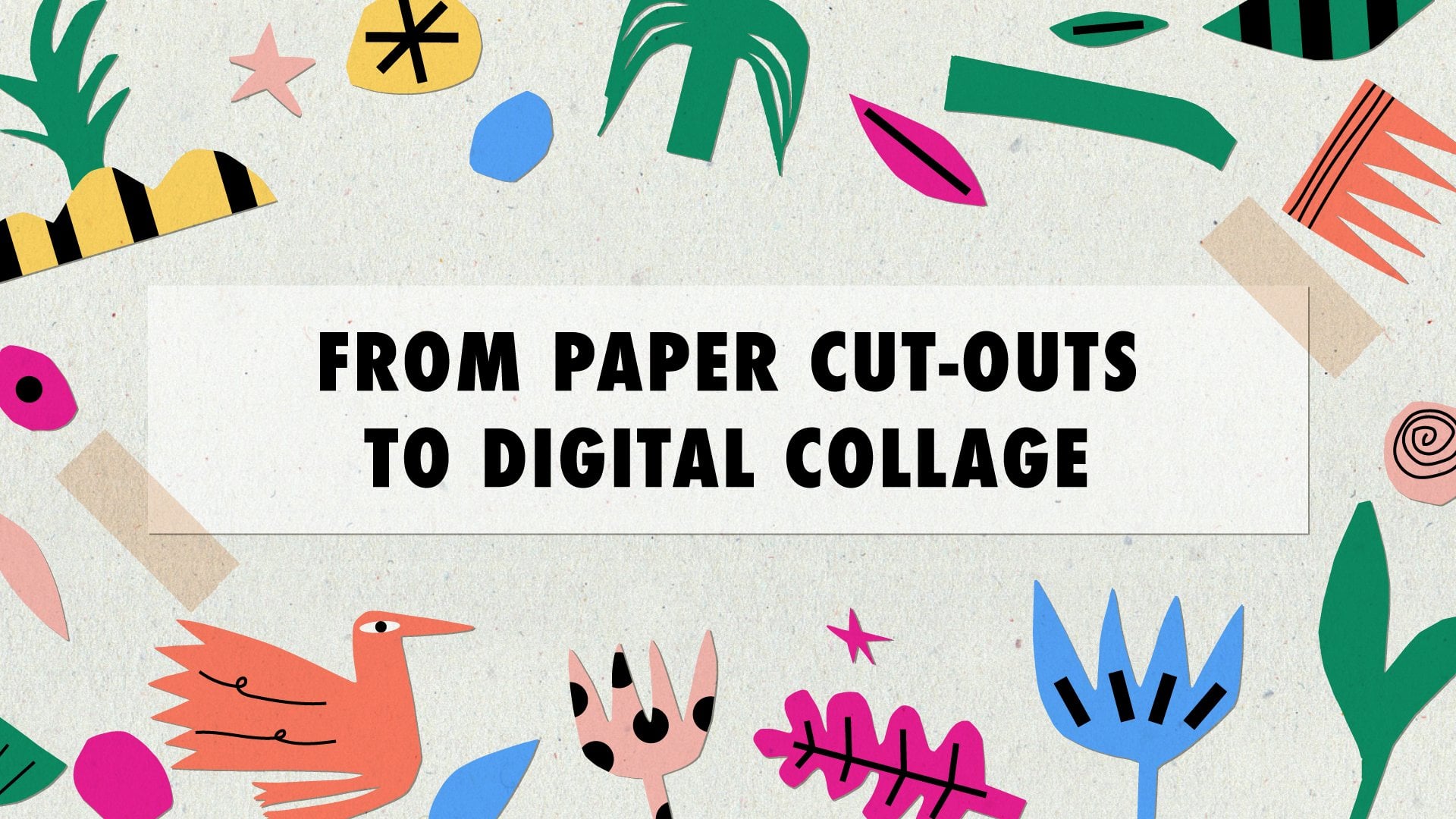
1. Introduction: Hello and welcome to this course where you will learn how to create compositions with cutouts in Adobe Illustrator. I'm Joanna Maria, a digital illustrator from Poland. Using paper and scissors has been one of my favorite ways to overcome creative block
and make my work more spontaneous. In this class, you will learn how to create
colorful, eye-catching collages using handmade paper cutouts and Adobe Illustrator. Your project will be to create a vase with flowers
from vectorized cutouts. You will enjoy this class when you're just starting out in digital illustration or want to try this simple but rewarding exercise
to boost your creativity. You will learn how to cut out interesting shapes
and prepare them for processing, use image trace and create vector shapes, make custom color palettes, combine different shapes into attractive compositions. As a bonus, you will learn how to create
a cardboard background and place your compositions on top. You don't need to have any special skills
or prior knowledge of the software used. When you follow my instructions, you will get to know Adobe Illustrator, it's settings and shortcuts. But most of all, you will create a unique piece of art, full of character and color. The best approach is to take it slow and make it fun. Sometimes we just forget how satisfying it is to grab paper and scissors
and cut out any shape that we want. Some of us haven't done it since primary school. This time let's gets back in time and be like kids again. Although with a laptop and software that we need for this class.
2. Class Project: As a project, you will create a vase with flowers from vectorized cutouts in Adobe Illustrator. Look for inspiration in my Pinterest board
that I have curated especially for this course. More about it in the next lesson. The class videos will show you the process steps
needed to achieve your desired goal. You will need colored paper, scissors or paper knife, a scanner or a camera and Adobe Illustrator.
You should have access to most of the listed items. Adobe Illustrator is available as a seven day free trial, if you don't feel like purchasing the program
that is unknown to you, yet. Let's get started.
3. Inspiration: There is nothing wrong with being inspired by other artists. As long as we don't copy their work and sell it as our own. Henri Matisse, for example, was influenced by Japanese prints, among others. And he turned out to be one of the most influential artists
of the 20th century. He approached paper cutouts in the 1940s, when his health deteriorated. He called this art form drawing with scissors. You can see multiple puncture marks in his art because he has repositioned the cut out elements many times
before he was satisfied with the result. His work wasn't supposed to be permanent. He aimed at evoking memories and emotions during the time when he was not able to live life at its fullest. Compositions from paper cutouts, created in the final decade of his life turned out to be some of his best-known art. Anna Kövecses is a Hungarian artist
creating mostly digital collages. She uses simple, bright colored shapes and turns them into naive art
that has a retro feel to it. It is a perfect example that sometimes less is more. Clover Robin is a mixed media artist from the UK. She combines paper collages with painting, printing and hand drawing. Her illustrations feature flowers, landscapes, animals, and everyday scenes. Marine Doazan is a French illustrator and graphic designer. Her work is characterized by the use of fresh, energetic colors, mainly indigo blue and cherry red. She likes to use both irregular shapes and strong lines. You can find all mentioned artists and many more in my Pinterest board that contains over 60 elements. I put the link to it in the course description.
4. Paper Cutting: I picked brown paper for cutting out shapes. Actually any color will do. The main thing is that It's not white because we later scan them or photograph them
and turn them into black shapes in Adobe Illustrator. I started by outlining the shapes with colorful crayons. I picked blue for flower petals and flowers shapes. I wasn't trying to be too precise because the shapes
can always later be improved with scissors and I wanted to make a variety of shapes
that I can later choose from. I also did a berry, as you can see, With a green crayon I sketched out stems and leaves. After that I cut out the shapes
with smaller and bigger scissors. I did the center of one of the flower with a hole punch. And as you can see, I have already started to arrange some compositions. So later on I know how to place them
for scanning, for photography them. After that, I did some other stems and flowers shapes. I also did some geometric shapes like triangles for the petals. The size doesn't matter that much because you can later change it in Adobe Illustrator. But it's good to know
that you can have different shapes to use after. Leaves also can have many different shapes. The bigger scissors turned out to be actually better for cutting out shapes because the lines weren't too smooth, they were a bit rough and that's the effect we are aiming for. Even with the smaller shapes. I did some other leave shapes, for example, of a palm tree and of a monstera - the second one. With a brown crayon I outlined the shapes of the vases. I wanted them to be different. So for every bouqet I could use another vase. Circles in the center of the leaf indicate
where I wanted to use the hole punch. That creates a really interesting effect. The vase at the bottom has a handle and for that I have used a paper knife. Alernatively, you can always use a hole punch, which is even more precise. We are obviously not going to use all of the shapes. We will pick the most beautiful ones for the composition. I decided to photograph the elements
on a white sheet of paper instead of scanning them.
If you want to scan them, do it in 72 dpi. It turns out that the higher quality
actually distorts the images here. It is important that the shapes don't touch one another
because we want to create separate shapes and later group the ones
that we want to have next to each other. Here, the leaves. I forgot to separate this shape, but we can fix it later with an eraser.
5. Image Trace: We open a new file. It's important that we have RGB color mode, not CMYK. By default, we have 72 ppi as a resolution, but I wanted to change it to higher resolution. Let's create a new file. I close all the unnecessary windows then I go to the folder where I have my photos. I simply drag them to the program. Then I go to Window, Image Trace. We go to Advanced Options and select Ignore White. This is important.
The mode that we're using is black and white. And let's try the Image Trace.
Actually it's quite fast. Let's check if all of the shapes are consistent.
If they don't have any holes. One of the vases does. Let's see what we can do with the threshold. When I decrease, we have even more holes. And when I increase it the hole starts to disappear. We can still see it. I'll try with even higher threshold. Okay. 140 turned out to be just enough. Now I click on Expand and we have separate shapes, but they're still in one group. Let's select the second file and drag to Illustrator. I repeat the process. Black and white. I increase the threshold and ignore white. We see a lot of holes in this one. So I increase the threshold even more. Okay, and that's enough. We expand the shapes. Now the last file. We need to make the threshold a bit higher. We need to experiment with that. You never know.
With every file I had to pick another threshold. I expanded the shapes. We have three groups that we will use later on
to create our compositions. Now it's time to recolor them. To save the file, go to File - Save as Adobe Illustrator format and save. We leave all of the default settings on.
6. Color Palettes: I have downloaded the images that I'm using
for creating the color palettes from unsplash.com.
It is a website where you can find photos to be downloaded and used for free, for commercial and non-commercial purposes
and you don't need the permission to use them. The artist that took the pictures that I'm using
is Nicolette Meade, I will link her site on unsplash.com
in the course description. I started by drawing small squares
with the rectangle tool from the toolbar. Then I picked the Selection tool and holding Alt key
I dragged it to the right. I repeated the process. Then I clicked Command or Control + D. If you want more colors, you can obviously create more rectangles. To take the color from the image, you click on the eyedropper tool or I on the keyboard. You have to have the square selected
that you want ot change the color of and you repeat the process. I started with selecting colors for the leaves and stems, then colors of the petals. I wanted them to be as natural-looking as possible. So I picked the pinkish tones and some orange, yellow tones and some reddish tones. Final two colors, I picked the darkest color
and the lightest color. I didn't want it to be white, to make it look
as natural as possible. Then we go to the swatches panel. By default, we have the colors that we don't actually want, so we drag them to the bin. Then we select the first group of colors, make it green colors, and we click on the folder, new color group. We repeat the process for flower colors. So we select them all. Then we click on the folder icon again, and name it. Finally, it's time for that darkest and lightest color. Now we can save our swatches. Then we can use them for every project, every file that we open. Obviously, when you want, you can create more colors. I started by recoloring the flower shapes. I picked the direct selection tool
and clicked on every flower separately. And I simply clicked on one of the colors from the swatches. This is not the final result. Of course, I will change the colors as I go. This will do for now. I just want to have an idea of how the colors look together. Let's do the same for other flower shapes. So with direct selection tool and Alt key, we select all of the petals of a flower. Then we click on the color in the swatches. We don't use the normal selection tool
because all of the shapes are grouped at the moment. I repeat the process for the vases. I try to pick neutral colors. Finally, petals* and leaves.
(*I meant stems) I just have three shades of green. I wanted to keep it simple. You can adjust the shapes, with the selection tool.
7. Compositions: Now it's time to arrange the compositions. The colors aren't exactly the same
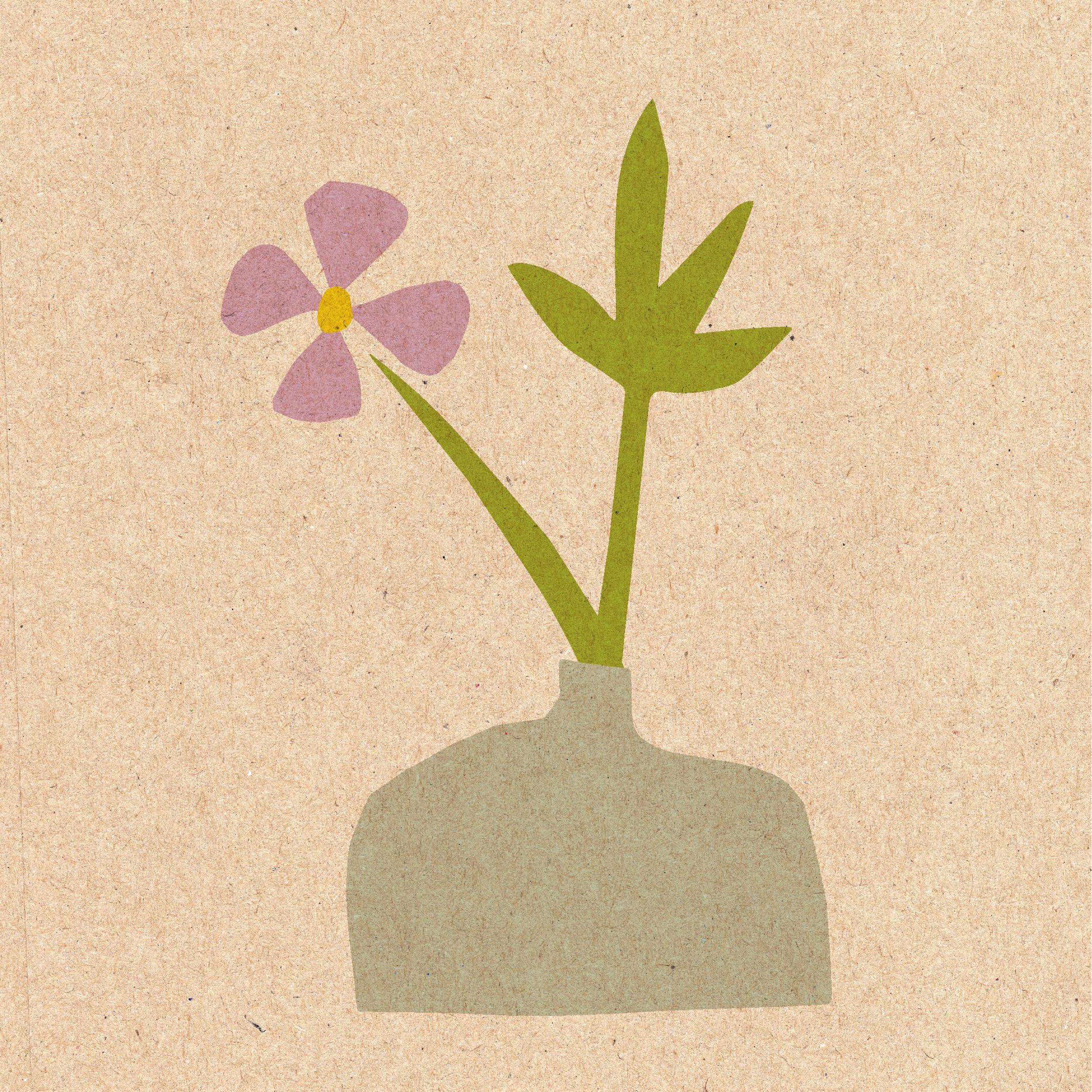
as they were when I colored them first. I do the selection of shapes that I liked most. Let's start with the simplest vase with just one flower and one leaf. I tweak the shapes, make them bigger or smaller. I change the stem to the same color as the leaf is. I use Control or Command Shift + left bracket. to place them at the back, behind the vase. I rotate the flower and the leaf a little bit. Then I use the arrow keys to move them until I'm satisfied. Finally, I use Command (Control) G to group the shapes. I named them "vase 1". And we have the first vase ready. Let's do the second one. I choose two leaves, with holes in them, two different flowers and one stem. I hold Alt and drag to duplicate it. I do Command or Control Shift right bracket
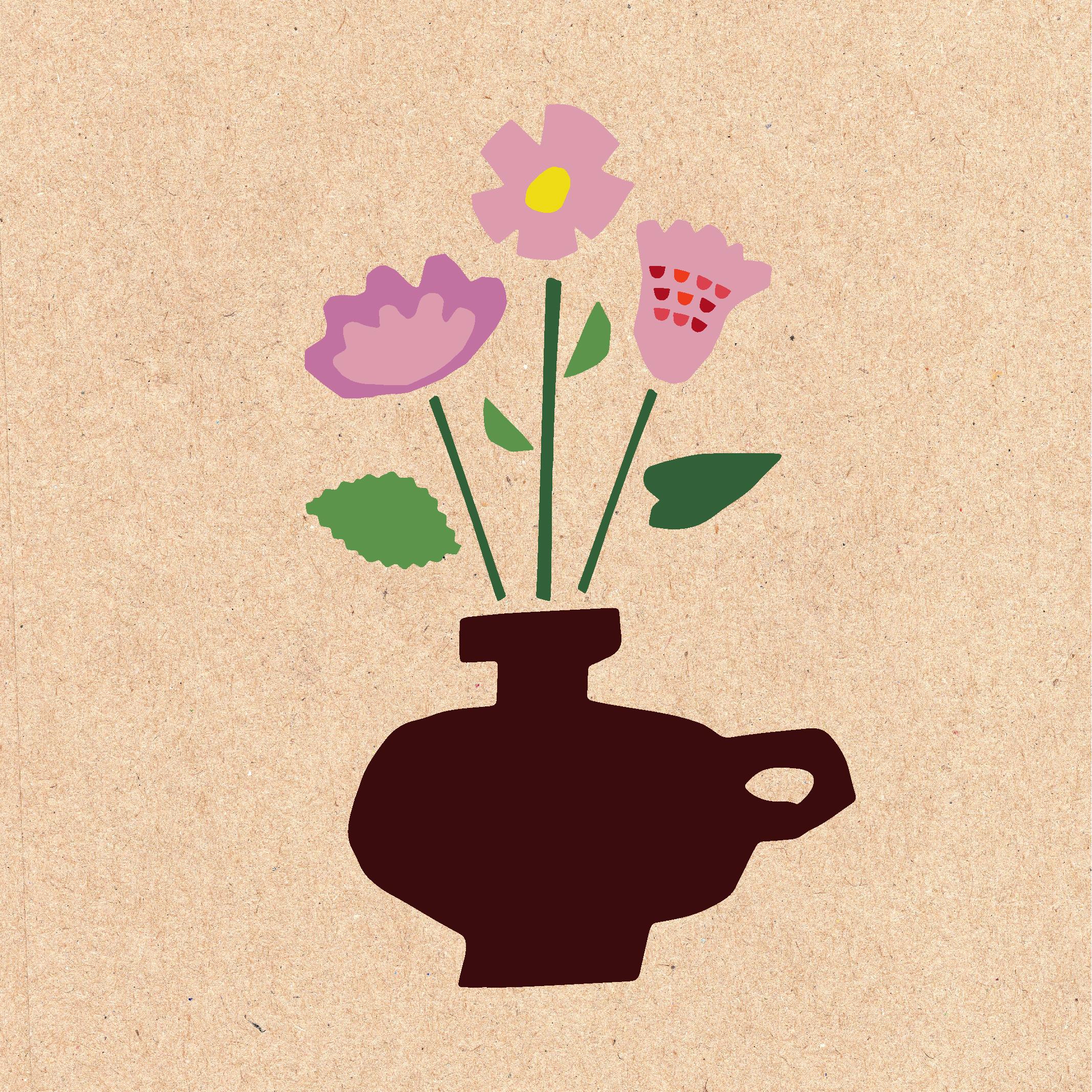
to place the vase on top. I rotate the stems a little bit and make the vase wider. Here, as you can see, I used the Reflect tool. I go to Reflect, select the angle that I want to move the object in. Now I can place the flower in front of the yellow one. I double-click on the petal to do the isolation mode. Then I move the leaves and rotate them. Using the arrow keys, I move them just a little bit. I do these little tweaks and changes until I'm satisfied. I group all the elements and name them "vase 2". So we have the second one ready. Now let's move on to the last one, our most elaborate composition yet. I group the elements with Command (Control) G. You can always ungroup them with Command (Control) Shift G. I hold the Alt key and the left mouse click, change the colors. I place the half circles on the flowers and duplicate them. I rotate them a little bit and group them. Let's change the size of the vase and other elements. Let's create different stems. We can also use the Reflect tool if we want.
I find it actually easier this time to just rotate it, not use the Reflect tool. Reflect tool works as a symmetry, as a reflection.
We don't need that here. Every flower will have different leaves here, different sizes and shapes. I arranged the flowers simply by rotating them,
moving them a little bit. And the last leaf. We group the elements, name them "vase 3". Now we have three ready compositions and we can move on to placing them
on a cardboard background.
8. Bonus: Cardboard Background: You can find the cardboard background
that I'm using in this project in the class resources. You can download it and place in your project folder. I drag the background into Illustrator. I don't use image trace on it. I simply drag one of the vases onto it. Now I go to Transparency mode. You can also find it in Window - Transparency. Click on the vase and select Multiply. You can change the opacity, make it lower or higher. Let's move it the way we want,
place it closer to the center. Now we group the objects and export them. Let's rename the asset that we export. It's best to export it in 300 ppi,
in the same resolution that we used for the project. And do it in a JPEG format. Here's the final result.
9. Thank You: Congratulations!
You've finished the course. Now you know how to create your own compositions
from paper cutouts. As soon as you're ready, save your collage as a JPEG
and upload it in the project gallery. I can't wait to see what you have come up with.
 Joanna Maria, graphic designer and illustrator