Transcripts
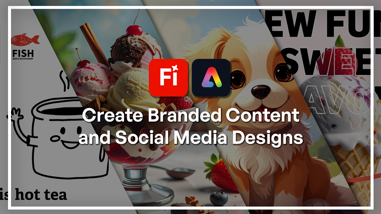
1. Welcome to the Adobe Firefly & Express Branded Content and Social Media Designs Course: Every brand begins with a story, and in today's world, stories are told
through visuals. Whether it's a social
media post, a carousel, or a flyer, visuals are how people are
going to remember you. And that is what this
class is all about, turning ideas into
eye catching content using Adobe Express
and Adobe Firefly. Hi, I'm Hosta Kehii, a graphic designer and digital artist with over
six years of experience. I have worked with
different brands and different types of visuals. I've seen how AI is playing a big role in that
in today's world. But the point of this class
is to show you how to utilize AI to be able to have more efficient workflows
and be able to expand your knowledge beyond
just the basic tools. As a part of the
Skeletamia team, I'm very excited to
show you guys how we get to combine
Firefly and express and basically apply them
to real world projects. In this class, we're
going to learn how to combine Adobe
Fireflies image and text generation with
Adobe Express's templates to build cohesive and
professional branding. We'll go step by step as we generate the images
in Firefly and then bring them into Express to apply some layout and
carousel effects, and then finally learn
how to export it properly for you to post
it on various platforms. You do not need any
prior experience with AI or design because I will be walking you
through every step. So if you're ready to build some branding content,
then let's get started.
2. Setting Up Adobe Express & Firefly Integration: Before we create everything, we have to make sure
that we understand the flow between Firefly
and Adobe Express. I'm just going to
quickly show you where all the parts are
inside Express, since we already know how
to use Adobe Firefly. This right here is the homepage. It's pretty much a place where you get to make
different medias, whether it's a video image, graphics, presentation,
sort of thing. And right off the bat,
on the left side, we can see where all the
different compartments are. This is the homepage. This is where you get to
create things with it. Everything you make is
going to be saved in here. Even your Photoshop and
Illustrator files are going to show up
here because it's all connected to
your Adobe account. We also have brands
for brand kits, which we're going
to set up later. We have templates. This is
just a place you should go if you want to quickly get started
with a sort of graphic. So we have Instagram posts,
we have backgrounds, we have videos as well
with transitions, resumes, flyers, and
so many other things. You can filter through
them over here. If you want just photos, you can look at the photos, videos, design
assets, backgrounds, text, and everything else. If you go to the
general templates, we can see them
based on price and depending on whether you have
the premium access or not, you're able to
access everything. I have this already, but if you're not seeing this, then you're on the free version. You can look at the size, the output, region mood, even they have mood right now. This just makes it easy for
you to just find something, a base and then build up on it for your own events. All right. And then the way it works with fireflies
that first of all, we do have some generative AI
pathways on Adobe Express. Right over here, if you go all
the way to the right side, we have generative AI. Generate Image will take you to a similar interface to Firefly. You can see that it's
powered the same way. We have the other versions
as well, other models. But it's a lot less detailed compared to the actual
Firefly interface. We only get one style
one composition, and this is all we get to do. Same prompt boxes over here, you get suggestions, and you just generate and
then edit as you go. So it's pretty much
the same thing as what we do in Firefly. Then we have remove
Insert object, which is basically
the generated fill. Although when you click on it, you have to upload
an image first. Then finally, we have
generate text effects. And when you scroll down, you can see some of the prompts that Express has
available to you. Now, how do you go from
Firefly to Express? That's actually really
easy to do when you are in Adobe Firefly
and you make your image. So let's just real quick, go to generate image, and let's actually use
one of the Firefly ones. And just to show
you a side by side, this is the Firefly interface, and that's the Express one. So not that different.
But here's my image. Let's say I'm happy with this. I did my generator fill, and all I want to do now
is maybe put some text in there and use Adobe Express
Tools to make this into, let's say, an Instagram post. So just go down to where the Share button is and then
there's Open and Express. You also have the option
for Photoshop web, but this is what we're
going to focus on. You click on it, it opens a new tab or your
Adobe Express account. Here's my strawberry cake. Now, I could use some
more Adobe Firefly accounts to edit this. You can see immediately
on the left side, we have removed background, arrays, remove objects, insert, set background, and
even generate similar. I don't have to
download anything, save it to my computer,
upload it and all of that. You also have an auto
enhanced features. If I click on this, going to try to edit it maybe and right now, it really added some contrast. If you don't want to
do any manual edits, you can click on that, but if you do want to do manual edits, there's an adjust button. You have all the
classic sliders. And then we can maybe
try the set background. We're going to get into
all the details later on. But this will let you
reframe the image. And then you get to build
something behind it, and then I cannot move this anymore because I decided that this is the position
of the object, which is the cake right now. So that's pretty much how the general flow is going to work. We're going to work on building
some branded visuals in the next lesson just so
we can get started on how to incorporate Firefly
and Express together. I'll see you guys
in the next lesson.
3. Generating Branded Visuals and Elements in Firefly: Now, let's start designing your visuals that are actually
going to build your brand. We're back in Adobe Express and we're essentially
going to use Firefly through Express and not go back to the
old interface. So I'm just back
on the homepage, and right over here, you can see that we get started things for
the AI features. I'm going to start
with Generate Image, and that's basically where
you get to create graphics, art, images, and anything
else that you need. So first of all,
choose your model. I'm going to stick to
Firefly Image four, that is the latest version. And then we already know how to use style references
and composition, but we're going to get
back to this later on. The content type is the
important part right here. So unlike Firefly, we don't
only have image or art. We have something
called graphic as well. So if you want to make an
icon a certain texture, that's going to
be in the graphic category because it's a lot more simple compared
to the art category. And of course, if you're not
sure which one to choose, you can always leave it on Auto. And then down here, we
have all the styles. Once again, they're filtered, like the Firefly interface, the prompt box, and all you really have to
do is start typing. So we're going to get
started with a photo. Through the snow, I'll use
one of the suggestions. If you're not seeing yours, just make sure this is turned
on and then hit generate. So here are four images, and if you just
click on each one, you get to expand it and
we're seeing all of the dogs. You can see how
hyperrealistic this is and that's only because we
made it into a photo. We got started with
the image version. So we got some snow,
it's pretty cool. Then there's some options down here so you
could give feedback, of course, and you
can download them. But you can also just go on the image and open it in Editor, which when you click is
going to bring you to the place where you
get to add some text, some stickers, change
the background, edit the image, and then build up your layers
on the right side. I'm just going to
go back just to show you the other ways
that you can build. We had our dog running
through the snow. Now I'm going to do the
same thing, but on graphic. But I'll do a dog icon. Maybe with the word help
written with sparklers. Let's see what that looks like. Once again, I didn't
choose any sort of styles. Here's a little
icon that we have. You can turn this into a
sticker and then posters. And then we could
specify in terms of style or use one of the
options on the right side. Let me just go to some
let's see techniques maybe. Try this linocut effect, and then I'll generate
one more time. Now you can see it's a
whole different style. We have this pencilly
looking thing, and then we can also switch
into something a little different such as pop art maybe. I'm going to generate
one more time, same prompt, didn't
change anything there. I'm actually applying
two right now. You can see from the number
how many you have going on. I'm just going to regenerate one more time without
the first one. You can just go to selected
and deselect that one. But when I combine the two, you can see we're getting this very creative
abstract version of the dog with the word
help written in the middle. Go to remove the text. Completely, and then generate with the pop art version only. Now this is very huge. I can use it in my
work very easily, either downloaded and imported, use it in a different
software or just go straight into the
Adobe Express Editor. Next up, we have art, which is going to
be a little bit different in terms of detail. We'll try something else here. We can say back to
the first prompt, dog running through the
snow in front of mountains, and then we can try
something else. Let's do a digital art, and I'll do a neon effect
as well. There's my dog. The snowy mountains
are there and it added that neon effect
through these lines. That's looking pretty clean. If you wanted to make a texture, you could do the
same thing here. Let's do a paper
texture background. Then we have some
suggestions here, I'll do crumbled
and then I'll clear these stils and here's a
very detailed paper texture. I could use it in my design, blended into my
background as well. That's in terms of imagery. Once again, we have
photo, graphic and art. C leave it on auto if you
don't know where to start. These ones, like I said, you just upload them instead of making this your
composition reference. That's the only con to
generating stuff here. But now I'm going to show you the text effects. Which
is the next thing. Remove and insert. Those are things we
can explore later, but generate text effect
is all regarding text. In Adobe Express, you have
so many options with that, but you can also make
your own letters. So let's just try
something here. You can describe a
texture and then talk about how it goes
around that letter. We have tight, medium, loose. We have tint if you want to
tint it a certain color. Then we have the way it's
going to look realistic, embellished, pencil
sketch and other things. Then down here are
some inspirations. Let's try, I'll write the
word dog, select it all, let's try making this into a diamond glitter and then it's going to just
start building it down here. There's my letters. You can see how there's
so much detail and it also maintained the three D
structure of the letters, and we got some
shadows on the edge. I'm just going to
regenerate this with a looser version
and I'll keep it realistic with tinted pink and then see what the
difference is going to be. So now I have this version. It's a lot loose, so we're not getting that three D curve, and of course, it's pink. You can also start
describing something here. So let's do shiny or maybe
just balloon texture. Let's see how Express is
going to interpret balloon. Sometimes it does get
tricky with a prompt, but that's just
something you get. You can see I got an error, so we can do let's see. Wooden maybe. Something
a little simpler. That worked. We're getting this they look more like logs and I think I still
have the pink tint. That's pretty much the text effect and how it's
going to work. Then you just go about making
the rest of your designs. You can also add to
your elements here, if I go to elements. I have some pre made stuff
that Express has to offer. Maybe we could do this frame, click on it and it shows up. And if you want, you could do the whole generative AI thing. So that's what we
were doing earlier. Here are some examples. You can generate the image, and it's going to just pop up on top of this
so you don't have to go back to that window and then I'll just
type something in. So a cute dog. Once again, decide on
what you want to do, choose your style and generate. This is going to be the result. So there's my cute dog. Now that I have it, as we saw in the previous
lesson, I could edit it. Now I don't want the background. I just got to click on
this once the Firefly is going to separate our
dog from the background. As we're doing this, you can see we're getting separate layers. I could just layer
around with them. Let's try putting them
all in this frame. Use the rotate tool. So if I want to grab the dog, I could also just go to the layer and make
this small enough. And then you can put the dog in the frame by moving
this in between. And that's pretty much how
you continue on building. So I'll put the dog here. We made two of these things
with Firefly and one of them was a premade
element from Adobe Express. Now that we know how to
build the elements and the textures with Adobe
Firefly in Express, let's see how we
can start building layouts and template
in the next lesson.
4. Building Social Media Layouts in Express: Now that we have our visuals, it's now time to
put them all into one clean layout
using Adobe Express. What we're going
to do is just go ahead and click on
this big Plus button. We're going to make our Canvas. I'm going to go for an
Instagram care herself, but you guys can choose story, Facebook post or
whatever you want to do. For my case, that
will be a square. I'm going to just click on
it, and this is my Canvas. Going to give this a name.
I just gave it a name. What you can do
right now is instead of just making
something from scratch, you can just jump straight
into some templates. If you go to
templates down here, there's already some premade
things for this canvas. You can also see that it figured out that I'm trying to
do an Instagram post, it has that look to it. You can favorite something
to come back for it later. Filter through the free
ones and the premium ones. It depends on your
Adobe account. But you can also search here. For me, basically what it
has is Instagram square. That's the search result. But I could look
for, I don't know, a party invites, and now
I'm getting party invites. It really depends on what
you're trying to do. So what we're going to try
to do here is take one of these posts and
essentially try to recreate it with the AI elements that we looked at earlier. So I'm going to do
something food related. Let's look for food. And I will grab this guy. I'm just going to click on
it just so you guys can see and I'm going to
hit on Ad as Pages, so it's in this document. So now that I edit it, you can see on the right side, we have all of these
different components. This is essentially your layers. You can actually
move them around. Now you can see this guy got highlighted and I
could maybe rotate it, duplicate it, delete it, change the opacity,
position, color, even, and just make
any edits that I want. I'm just going to look at what we have here
and we're going to just try to make the
main components, and then I'll leave
it to you guys to use your creativity
to change the font, the colors, and all of that. So the first thing
is that big burger. I'm going to make my
food be ice cream, and I'm going to go to add
content, generated AI. We're going to
generate image square, and I'm just going to put
it right in the middle. Let's look for something, do a prompt like ice cream. Sunday and I'll do realistic. You can choose your references, but I'm going to
go for just photo and I'll leave the
styles as it is. So very simple prompt. Let's hit generate. The result is going to be
in this frame right here. Here's my ice cream.
It looks pretty cool. If you guys want, you could replace it again
with something else. But I think this looks fine. If you want to change it up, you can just click on that setting and then
have it regenerate. But the other results
are down here. I think I'll do just ice cream. Not Sunday just because the bowl is going to
have reflections in it, and then it's going to look a little bit weird
when we cut it out. This is not that bad. Let me just see which one I like better. This looks pretty good. It looks pretty appetizing. I'm going to keep
this and then hit X. Now what I can do
with this image is the stuff we see right here. First of all, I can
remove the background, insert something,
remove the object, expand the image if I wanted to. But for me, I just want
to isolate my ice cream. I'm going to click on
Remove Background first, and now you can see there's no more that bluish background. Next, I want to get rid of the ice creams that are on
the left and the right. Let's hit arrays. I'm just going to
go over it and you can see magically it disappears. There wasn't much for
me to do. Let's see. Let's restore a little
bit from the edge here. Oh, wait, let's go back. Command. Trying to get
that tiny piece the leaf. Let me zoom in here.
Get the leaf in there. Maybe if you could do
quick selection with a smaller brush,
that could help out. It's such a tiny detail.
Okay, that's working. Then we got this
whole stem situation. If you ended up bringing
something back, just switch over to erase, and I'm going to use, let's actually try the circle brush. It's a lot of back and
forth that you have to do. But at least with
the circle brush, it doesn't assume anything. Then down here we
had this issue to just clean this up
as best as you can. Bring the hardness up. You can always come back to this if right now it looks perfect, but then later you notice maybe you took too much out
from the ice cream, this isn't a permanent thing. I remove a bulk of this, and I think we could get rid of that
second time actually, just to make things
a little easier. Then I'll remove this you know, well, let's just
remove the stem. Actually, I noticed it's not
a cherry to have a stem, which is called a hallucination. I'll keep the little
green leaf though. But other than that, I
think we're pretty good. All right, so let's hit done,
and there's my ice cream. Now you can treat this
as a regular image. So do with it as you want. I'm going to just
scale it up like this. And if you want it, you could also adjust this, which is what I'm going to do. Let's go to adjust and play around with a few of
this, lower the contrast. I'll make it a little bit
darker on the shadow side. Saturation is a
little bit too much. Just make it a little colder. So that's my ice cream. Then if you want to also not do this whole
adjustment thing, you can also click
on Auto Enhance. I like to do it myself so I
could have more flexibility. All right, so there's my food. You try to make this
a little lighter. We have our food,
Let's go back here. We're also dealing
with some text. I'm going to grab the text
tool very straightforward. You can do something AI
generated or not because there's a lot listed and you have some pre made
things down here. If you scroll down, there's
so many categories. I'm going to click
on this big one and we get this whole
recommended fonts. I want to go for something
playful like this, maybe. Do new flavors, maybe. New fun. And Command A and then we're going to go back
here to do some edits. Let's make this bigger. I'll go for bold. Okay. We go for 100 something. Okay. And we're going to click away and put
this right in the middle. We're going to duplicate
this Commander control Dam, position this right
on the old one, and for the one that's on top, we're going to get rid of the fill colors or
hit on this no fill. Instead, we're going to give
it a white stroke color. Then we're going to take the ice cream and put it
right above the black text. Now it looks like the ice
cream is in between the text. Something fun and
easy you can do. Then we're going to
grab the black text, and I'm just going to
squeeze it in a little bit. Let's grab the go to more
and reduce the line spacing. 0.95, I'm just going to copy this and always
make sure that both of your texts has the
exact same setting, so 0.95. Then when you click
away, now it looks a little bit more
compact. All right. We had our text and let's do a price and then
finally a discount. Going back to add elements, we're going to go to
elements this time. I'm going to try generative AI, but you guys can just skip into the elements
that already exist. Actually, let's do that so
we get a mix of everything. Going to look for price, and then we get some
pretty cool things. I think I'll do I think it's
called I want this shape, but I'm not sure
what this is called. It's multiple stars put
together, actually. Okay. It's one of these stars, but you can also
grab something else. Let's do this guy maybe. Scale it up, rotate it. Or actually, it's a
little bit too thin. I think I'll just circle. You could draw your own shape if you know how to do cool star. You can just click on that, but I'll just do a circle, something simple and
I'll put it on top of my ice cream and then I'll
give it a little text. Let's click on the heading
inside the circle. Dollar 499, little bit pricier
for a vanilla ice cream, but we're going to
assume this is the best. So let's scale this up. And just to add some color here, I'm going to switch this
from black to something more fun. There's my price. I didn't make this smaller
than my other text just because the most
important thing is the slogan to invite the people. I'll put this here.
The next thing we said was some discount message. So let's grab a body text. Now, 10% off. I'll make this bolder, bigger. And I'll group
these two together, so grab both then hit
Commander Control Gene. I'll just group it like that, and I'm just going
to put this like so. Get up. So now I'm just going to finish this off with some
decorations in the back. So let's do, let's go to shapes. So add elements,
and then we'll do lines and just grab a couple of these fun lines just
for decoration. Scale this up, and I'll
put it behind everything. So just click and Drac it. Like so blocking the text. I'll give it another fun color. And let's do another shape. Something like this, maybe. I'll switch this out
for something more fun. So this was your
first branded content that you made with
Adobe Express. Now we're going to
move on how we can add some animations
and then some videos so that we could
elevate this for maybe a Instagram story
or some YouTube shorts.
5. Creating Animated or Video Posts: So this is where we left off
from the previous lesson. Now we're just
going to duplicate this design and essentially just make one animated and one static just so we
can see the difference. So I just made a duplicate. This second one is going
to be my animated one. And essentially the
way it works in Adobe Express is that you
can either do a transition, if you imagine this
to be your timeline. We can do a transition from one page to another
similar to a slideshow. You can also animate
singular components. There's a whole animation
tab right here. I'm going to click it and
then make sure it's selected. Go to animation, and then there's some presets
for us right here. When you go on any of them, it shows you a little preview. There's Pop, grow, blur
in, flash Gray scale, but I want to do
Rs like we said, so we can hit on RC
as soon as I do that, I get this whole new timeline, just like any sort of
video editing software. This right here is my design. We can see how long it goes
for which is 5 seconds. We can add some audio as well.
We'll get to that later. But that's the first
animation that I just did. If I hit Play, it's
the same thing, and I'm just going to
start building up. I'm going to just
minimize this for a second and then go for
my next component. Now for the top and bottom text, the outline that's on the top, which is right here
and the black one, which is behind the ice cream, we're going to have to
make sure that they have the exact same animation so that it doesn't look like
they're two separate things. We're trying to go for a
very natural look here. Start with the one
at the bottom. I'm going to go to
the animation tab. You can see how if they're
not done at the same time, it's a little awkward. I'm going to go with
this typewriter for the one behind it, and then for the one at the top, I'm going to do the same thing. Then when you play it,
hopefully, it looks the same. Now because they start
at the same time, you can see how
it's it's one text. The outline shows up as soon
as the black text does. That's perfect.
We get a bunch of little components
like the price tag. I'm going to do a
spin for this one. And then we have these lines, maybe drift. Let's see. Which angle do we want
it to move ins to drift. If you go on it again, you get to decide the direction. This one has to come in
from the right side. This one is the
exact same thing, but from the left side.
It's already on left. We have this guy. Let's give
this a little different, maybe just a drift. Then finally, this little text, we can have this one fade in. When it comes to
choosing animations, you want to make sure
that you're choosing the biggest and loudest ones for the most important thing. For example, the ice cream, even though it's the biggest
component in the design, it's not exactly the
most important thing. So if this is a product for me, that's going to have
to be the price. So people want to know
how much this is. So I chose the pop animation, which is going to be
the most attention grabbing for the 499. So choose your animation
styles wisely. So if you, for example, gave this like a pop animation while you gave everything
like a simple fade, people are only
going to consider this and not so much
what's happening here, at least at a first glance. So now that you've chosen
all of your animation, I'm just going to hit
play to make sure I didn't leave anything
behind. Okay. So the problem right now is that they're all playing
at the same time, and that is not very natural. So we're just going to
go to Edit timeline. And then you're essentially
allowed to go into each of the layers and
then you're dealing with the animation
duration here. The order for the animation is going to be first
the ice cream, then the text, and then
finally these little accents. So the ice cream, I want to make sure that it's playing
this entire time, so all of the 5 seconds. But the text, we're going
to reduce it from the side. And remember what you
chose, maybe 4.5. Then I'll grab the
other text and make sure that it's
the exact same thing. You can see that express
remembers what you did, so it snaps into place. Now when I play it, you can see that the text doesn't show up until after the ice
cream is halfway up. We're going to just repeat
this with the other ones. This guy we want it to
show up a little later. You can use the
playhead right here to decide on where you want the
little accents to show up. This is where I want mine
to show up and then a little later is this guy. Going to snap it like that. Right now, this is what
we're dealing with. Then for the price, I think I'll have it show
up around this point. Snap that this guy a little bit after the price shows up and then this guy we can put
it somewhere in the end. Now when I play it,
you can see how there's an order in
place and it's perfect. I can also just increase
the length of my video if I want to do a ten second clip so that after
everything shows up, it just stays on screen
for the audience to see. It is also going to adjust the animations so that it
doesn't look too weird. And there we go.
That's my animation. You can see that the
little text disappeared. So I'm going to
go on that layer. You can see didn't really
expand this one thing. So if that happens, don't panic, click on that layer,
go to animate. You have your animation, you
had your design already. Let's talk about sound. So there's a really
simple way to do it. You can already see
the button down here, and there's a lot of
stuff to choose from. There's also an anime
character thing, but this is still in Beta mode, so I'm just going to look
at the audio down here. So I'm going to just
stick with this. It's giving very much summer. So just click on this,
and now it's inside your timeline. We
have the volume. Obviously, it was
a little too loud, and then you can
also do some fades. Basically, it starts slowly
and then or it ends slowly, or you do both so that it's not just like
popping with music. So I'm going to do both and I'll reduce the volume to 30%. So that slow increase, that's what the fade end did, and then it fades out
on the other side. If we didn't have that, it's
going to sound like this. So it just stops out of nowhere. That's why it's
important to make sure the transition is smooth. So that is ice cream nuation. You can see how just
by having the design, it was just a few clicks, a lot of the work was
done with Express. We have the static post and now we have this cool
animation thing, which is the exact same design. If you were doing this
for your company, it's always a good idea to
have different versions of your designs so that you could reach to more audiences
and engage more people. This is a good option. You can also
duplicate this and do Instagram story or
export this for Tik Tok, whatever platform
you're trying to go. This is the start
of a brand kit. We're going to continue this on with a carousel
in the next lesson, which is going to
be a little bit longer than one page post. I'm going to see you
guys in the next lesson.
6. Creating a Branded Carousel or Ad Set: Now we're going to extend
what we did last lesson into building a carusel
or just a presentation. Back here we have
our regular tools, but essentially
what we're going to focus on is transitions between slides and then how
we can maintain margins. If we have a logo, let's say, how do you maintain
that brand identity, fonts, the styles
across multiple pages. So once again, we're
going to go up here for the plus button and you can
choose one of these pages. I'm going to do a Instagram
Carusel but you can also do a 16 by nine landscape for a PowerPoint
presentation if you want. Once again, I'm going
to choose this and immediately I have the
templates on the left side. So what you can do is click on any of these
to get started. But what I'm going
to just do is just bring up very few
simple components, and that way we
can focus more on the multipage aspect
than the design itself. So I'm just going
to go to elements, and we're just going
to find a shape, let's say, I'm going
to go for these icons. Let's say I'm making a
post about winter foods. So I'm going to have
this guy chilling, and then we're going to
make a logo real quick. I'm just going to hold
down Command or Control, click on the logo I could make a logo in the second page and then have the other
one be there. On this new Adobe
Express homepage, I'm going to scroll
down to Logo. Then using one of
these templates, I'm just going to
choose one so that could be the branded
aspect of this design. Let's choose something that
goes well with our aesthetic. I'm going to choose
this guy. But let's get rid of the background so
that we only have the fish. Going to grab, copy, go to here, paste. You can see how the
aesthetic is now matched. I'm just go to change the color into something a
little different. Let's go with black. Or maybe the fish can be red just
for fun. There we go. First thing is, let
me also add a text, actually, so we can
look at fonts as well. I'll do this is hot tea. Change the color up. Let's choose hot tea. Let's choose a font on
the recommended side, you can see how it was able
to move with this design. We have that serif vintage
look for this text, and I'm going to go for
a more heavier style. Let's go here, maybe
a little bit less. Let bold. That's better. Let's put this somewhere
where we can see it nicely. Then we can add in a
nice little element in the back let's go with
shapes into a flower, scale that up, have it overlap with some of the other designs. Then I'll pull this
guy below everything. Then to allow us to see
the other elements, we have to just
change the color. Perhaps we could do I
wouldn't say a yellow, maybe like that, and
we'll try to see if we could fill up the
background color. Okay, so something like this, actually, I think without
it, it was better. This particular element doesn't
have a background color, so it wasn't looking that good. Alright, so we have
this first page. Let's say this is
my brand identity, this font, this style of
graphics, and then my logo. So in order to
duplicate this actually duplicate it or start with a blank page, just
click on this. You can do same size to maintain it or you can
make another size. We're going to do same size, and now we have two pages. But let's say I want my
logo one there instead of dragging it in from the elements again
and then resizing it, what you can do is
just copy this here, Commander Control C,
and then paste it here. I go in the exact same spot from the document
you copied it from. Now, if I were to drag
in the same elements, let's see what this is called. So let's say I duplicated it. You can see that
when you do that, it just goes a little bit offset and it's not going to
be in the exact same spot. But if let's say I put this
here and I copied it again, Command or Control Sam, here, it's going to show up
in that same spot. That's one way to make
sure everything is nicely aligned,
especially with logos. You want to make sure
that's the case. Another thing that you could do is when you have
a different text, let's just put
something in here. Let's say this is what I have. But it's nowhere
close to this font, this style, and let's just change the color. And
of course, the color. Instead of grabbing
this text and then changing the font
size and all of that, I could go to the text
that I like, click on it, right click copy style, then grab the second text, right click paste style. It's going to put
the exact same font, color, size, and style. Only thing you need to
do is work around with the placement and then how
big it is. Just like that. Now, we can also
extend this with shapes and any other
elements really. Whatever you grab in
from the library, if you copy it or copy it style, it's going to allow
you to maintain a certain pattern across your
presentation or your care. Now we're going to talk
about transitions and how you get to go from
page one to page two. This is pretty
straightforward because it's essentially what
we did last class, and that is to put some
in and out animation. So on the top, we have
in loop out for this to, for this to work properly
is that you want the animation from
the first page, the ending of it to match with the beginning
of the second page. I'll show you what
I mean by that. Let's say I want to
create an animation with this cup and then
with this text. I'm going to keep
the logo as it is. With this skyw just
going to go to animation and let's
say I just fade it out or I make it drift
away on out to drift out, and then here, I go
to animation again, and instead I drift it in. So drift, and then
we go in here, I'll choose it to come
from the right side. So when I play this, you can see that my first
thing is going out, and then when I go to the second one, this
guy is coming in. So there's a second
where there's nothing in the middle because both
thing kind of faded out, and this is something I could use to build some engagement
for my presentation. And then of course, there's another thing where if
you have a lot of pages, let's say you have 20 pages. I'll show you that
with an example. Let's go to templates and
I'll look for presentation, something that has
more than one page. Let's actually
start a new thing. I'll actually search here presentation to make it simpler. We got some templates
and then look for the ones that have
more than one page. Let me see how many
pages this guy has. So multiple pages,
click on that. Then, for example,
this is two pages. They're all two pages,
but I just want to make sure that there's
something consistent. What about this one?
So we have the flour. Okay, let's customize
this template. You can pick anything
else, really. Then these are the pages.
Let me use them out. So we have a lot of text. Now, with a multi
page presentation, let's say you quickly just
switch up some of the texts, but you don't want to go
through every single page and find that one area
that you need to fix. One thing you could use is
this quick replace tool. When I click on it, you can see that it lists all the text. And I could just click on it
and it highlights it for me, and I could just make edits
right then and there. And this applies for
every other page. Now, over here we have a lot of a lot of little text
and some media. You can also grab media here and replace it with
either a video, something else you uploaded and keep things
consistent as they are. So that's pretty much how you can work with multiple pages. It's pretty straightforward. It's really an expansion of what we did with
a single page. But if you are planning to use Adobe Express for some
presentations or some carusels, just make sure that you that
design across every pages. Use the copy and paste tool and the margin tool and
that way you are able to make some
pretty cool stuff.
7. Exporting & Sharing Your Designs: M Now, let's make sure
your designs can be shared anywhere in any
size that you need. So I have all three of the
works that we did so far. We had the animated
ice cream post. We had the multipage
presentation, and then we also had
this one singular image. So how do we go about making sure they're in the right format and how do we export one
image in multiple formats? Starting with sharing,
you just add in someone's email or you could just copy the link
and give them access. It's the same sort logic as Google Docs or
any other gram. You can also make
a view only link, meaning that they
can't edit it at all, and then you can also convert what you have into a template to share with your
colleagues or to share it with the
AtoBExpress community. There are more options on
different social medias, and you can also just
order it as a print. That's going to
be charged extra. We have some storage. So if you want to have this automatically share to
your Cloud storage, you could do it right here.
You just have to sign. So that's regarding sharing, and then we have download. Download first asks you to decide on the file
format and you can see as the parentheses
telling you exactly which one you should choose based on what
you needed for. P&G best for images, best for small file sizes, and then documents,
then printing. So the first two are for images, and one major difference between
them is really the size. But with the size,
the bigger size comes, the better quality. So if you want a very high
definition image of the stock, you should go with a PNG, bearing in mind that it's going to be a rather heavier file. Now, it's not going to
be anything insane, so I'm just going to download it for you guys so you can see. So you can see it's
2.2 megabytes. So it's not like 7
gigabytes or anything. Then downloading it,
again, we have JPEG. So when I download this, you can see this one
is 289 kilobytes. A major difference there, but you just have to see why
you need this image for. If you want to either print it or display it somewhere,
you should go for PNG. But if you want to share
it quickly or place it on a website and you want to make
sure it loads fast enough, you should go for JPEG. So regarding images, those
are your only two option. There are some PDFs as well, but I wouldn't
really go for them unless you were asked
to or you want to print you can see how just
by changing this I'm getting different things being
asked of me. That's image. Let's go over to this
multi page document. Sharing is the same
thing across everything, so I'm just going to
show you the download. Now, when it comes
to multipages, you can see that first,
you need to decide if you want to do all
the pages or only a few. You do that right over
here, selected pages. Right now, I only have
page one selected. But if I want to do all
pages, I just click on this. Then we can decide
on defile format. Once again, we have the
same set of things. For documents or just
any multi page thing, I would go for a PDF. And then if you're not
going to print it, just go for standard, which already has
that in parentheses. There's also accessibility tag, which is done automatically
if you click it, and then you can also download each page as a separate PDF. If you do selected pages, let's say, I grab one and two. Selected pages, you can see here it says
two instead of one, and it's the same thing
with the download. Now the last thing is the video. I think this is the one we made. Yeah, so this had the
music and all that. I'm just going to
go to download, and you can see now the
format is p four or a gift. So you just choose depending
on what you needed for. Remember that the Gift file doesn't have the audio in there. So if you want the
audio animation and like the best quality
for your videos, you should go for p four. And it's the same thing here. You can do all pages,
selected pages. And then we have some video
resolution depending on how large you want the file size to be and how a quality it has. So if it's four k, it's going
to be a rather larger file. Then when you're
done, you can just download it and
you're all set to go. The good thing about
Express is that all of your projects are
saved on your account. You can always come back here. Let's say I exported this as Bfoe but later on I want a PNG. I could always come
back to download, get the PNG, and then
go about my day. You're able to take
one design and export it in as many
formats as you can. Possible. For example, this guy, there's nothing
animated about this, so if I hit Download, there's no P four option,
so there's that too. Now you know how to
export your content and have them ready
for various platforms.
8. Class Project: Create a Poster or Social Media Post: In this lesson, I'm going
to walk you through the entire process of taking an idea into a finished product. So we're back in Adobe Express, and for my project, I'm going to focus on a poster, but you guys can do a post, a presentation, or an
Instagram story, for example. As you can see, there's tons of templates down here for
you to get started. So what I'm going to
do is go for a poster. So let's just
scroll up to print. And let's see. We have an imitation. Let's
do one of the classics. We have a brochure.
I'll do a flyer. Let's click on
this. There's going to be tons of
templates out there, but we're going to focus on
using Adobe Firefly to build our media and then Firefly
for some text effects, too. Let's think of what we can do. I think for my case, I want to do a flyer
for a disco party. The first thing I need
to do is start with the background and then
the main component. For my background, I'm
going to just click on this and get a
simple gradient. We can also go to custom and change up the
way colors look. The angle and everything else, let's get more black. I think I'll do a
radiant, actually. Let's switch to colors. Maybe this guy can
be a little darker. There's my gradient. Now we're just
going to go over to generative AI, generate image. Let's do a square. I'll just scale it up like that. Over here with our model, I'm going to choose
type in a disco ball. With a black background. And then we can decide if we want to do a photo or a graphic, I'll go with picture, and I think that's it. So let's generate it and then see if there's any need
for some adjustments. So here are the disco
balls looking pretty good. I think this one looks the best. I don't know what's
happening here, but I'm going to just keep this. So let's click away, and then
when you click on it again, it's a regular image. I'm just going to remove
the background with this button and now I have
this cool disco ball. Let's bring it up here
so it looks like it's hanging and then I'll do
something regarding space. Basically, we're going to get
an element, go into shapes. Let's grab a rectangle and I'm
going to just scale it so. It's almost as wide as the disco ball and then
we're going to bring it below now we have
that three D effect. Just have to change the color
and the stuff of the shape. I think what I'll
do since I have the gradient background is
actually focus on a border. I'll do white and then we can increase the border and
maybe add some roundness. I think very minimal. That. What we can also do
is grab our disco ball, go to effects, and we
can add some shadows. We have some classics or glow. I think I'll go with the classic and if you weren't able to tell, now we have slide
shadows on our shape. So this is without anything.
You can look over here. Classic ads that shadow effect. If you do glow, it's going
to be from both sides. That's what I'm
going to stick with. Then we want, we could
add in some tones. So I'll do let's see. We can do portrait just to
add on to that glowy effect. You can also go over here
and increase the intensity. Okay, so there's my disco ball. Let's add in some text. So I'm just going to
increase this a little bit. So it's like evenly spaced. Now let's grab our text. So let's grab here and put be welcome to the party
Command or Control A, and I'll just choose a color
to it to make it stand out. Okay. So here's my text, but now instead of just
leaving it like that, we're going to use
the text effects. So just grab the entire thing, go to effects,
generate text effect. You go on the little pencil
and describe what you want. So there are some inspirations
down here, which I well, we actually have a disco ball, so I'm just going to
click on this and we'll have firefly generated for us. If you're not
seeing your design, just describe it here. So maybe we can do
a glass effect. Type in glass, maybe write
glass, that sort of thing. I have different versions
of my disco ball going to click away so
we can see the letters, can see how it's
working on making each of the letters shiny. Then I have the set to medium, but we can also do loose. I'll generate one more time and see if that's going to make it a
little bit more natural. I think that's pretty
good. I'm going to go with a colder disco ball down here and it's working on
bringing it to all the letters. All right. Welcome to the party. What we can do now
is just go back and there's some stuff that you could do regarding shadows. Again, I think I'll do a glow shadow so that it's
popping out a little bit. We can let's see,
do a custom one. I think a blur needs to
be a little less intense. Now we have our
ball and our text. The next thing we could do is
add in some other elements. So I'm going to head
down to elements, and let's scroll here. Design assets. Here again, AI is giving us elements that are
related to our disco theme. You can see we get a lot of dancers and party decorations. For me, I'll do
party decorations. Let's just grab a few of
these like it's glitter. I'm just going to scale it up, have it going around, and then we have
some other stuff. I want to go for
something realistic. Let's see. A little hat. Let's perhaps
rotate this and put it a little bit overlapping the ball so we can show that
three dimensional effect. And yeah, it's
looking pretty good. I'm just going to
grab my text again. I feel like actually,
I think it's fine. I'm just going to
work with the size, but that's okay to go. Let's grab some motion for
our disco party flyer. Go to increase this all the way, and I'll start with
this actually. Animation, let's try spin. Shrink. Shrink is better. I'll shrink this in and
then I'll do a loop. Let's try actually a loop. That looks good.
This is spinning. Let's try scale maybe. Okay. So I'll do scale
for the little confetti. The ball, we could have
it on a loop again. Let's see what spin looks like. I guess we could do
this pulse effect to make it like it's a party. We'll do soft. You can decide on the
speed, and then that's it. Then the hats, I think
something really simple. See what wind is. So maybe this bob effect, it's like rowing, and
then we have our text. So for the text, I think
something straightforward. Okay. So breeze is very chill, it's just moving the
letters around a bit. Then we have this
rectangle in the back, and I'll do this
blinking effect. So when I hit Play, we have
this very dynamic and fun, I guess, poster
invitation for our party. Now, once again, you
could edit timeline and then decide on when
the animations pop in. So the first thing for us is
going to be that rectangle, I think you can have the
text show up near the end. The hat a little after the text, the ball, a little later, the confetti somewhere
in the middle. There we go. You can put
in some music as well. I'll just do
something like this. We can loop it out, and I'll leave this be actually.
There's my invitation. Pretty straightforward. We
made a few of these with AI. Well, most of these with AI. And if you want
you could lengthen the animation or just
have it the way it is. You can also cut
out the animations if you change your mind, so you can just click on remove all instead of
going into each one. And then you can also add one animation to
the entire thing. That's not really
what I like to do, but you can have everything
be like waterfall. They all fall at the same time, and that will save
you a lot of time. When you're done, you can
hit on Download and before. Share it on your Instagram story and invite people to
your birthday party. But this is the exact workflow that you're going to use
for your class project. You will have your own idea and then use Firefly to
build that main image, use it for some text effects, maybe some edits, like how we did with the
removed background. You can also use it to
generate similar things. So if you didn't like the ball so much, you can click on this. You can remove an object, add an object, erase, and there's so much
more that you can do. So now that you're
done with this lesson, you're ready to start
your own class project.
9. Congratulations! What’s next?: A rep. You just
learned how to turn Adobe Firefly creations into social media designs
inside Adobe Express, all with consistent text, colors, graphics, and branding. Now it's your turn to design your own branded social
media post or carousel. Begin with Firefly generated
content and then bring them into Express where you add your own logo, colors, and text. When you're done, you
can upload that to the class project
gallery where I will be checking in from time to time to see how well you
guys are doing. Try to put all of your
prompts in there, as well as it helps others understand how you came
up with that concept, and it's a community where we
all learn from one another. Thank you so much for
watching this course, and I hope to see
you guys in the next one where we see how else we could use Adobe Firefly
to enhance our workflow.
 Skillademia Academy, Creative Skills for the Future