Transcripts
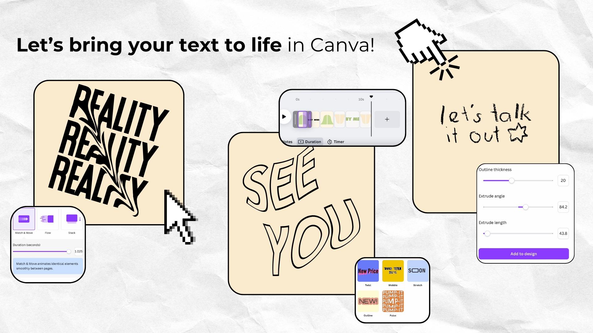
1. Intro: Hello. This course will
unleash your creativity. Today, I'm going to show you my favorite animated
typography styles and effects and a few Kanva
hugs that I truly love, and I hope you will
love them, too. When you think of
animation or typography, Kanva might not be the first tool that
comes to your mind, right? I get it. But today, I'm here to
change that a little bit. My goal is to show you that
Kanva makes it shockingly easy to create impressive
dynamic typography, even if you've never
animated anything before. And we are not just covering one easy regular style today. No. We're going to explore many different animation styles, many different
typography styles. So you can find the perfect
look for your project, for your social media presence, for your business presentations. Honestly, for whatever purposes, you are going to use
these animations for. I think you will be
deeply surprised at how simple and how fun
this process can be once you know how
to connect the dots and how to achieve the
effect you want to go for. I will be showing you
everything step by step can follow along in your own canva while we
go through each step. Today, you will have
the skills to bring your text life
more effortlessly. So let's jump in.
2. Class Project: Class project. More
than anything, I want you to create
your own animations, your own animated
typography in Canva and feel confident and really
creative while doing it. That's the goal here. That's the goal of this course. And that's why I put
this class together. So what's your
homework for today? Well, by the end of the course, I'd love you to take screenshot
or a few screenshots of your favorite
animation of one of your favorite animations
and share it right here. Unfortunately,
Skillshare doesn't allow video uploads for now
for class projects, but a screenshot or even a few screenshots
will do the trick. Whether your design is bold, playful, super sleek, or maybe
rather super minimalistic, or maybe it's for your
business purposes, show me what you've
made so I can be proud of you because I
really want to see it, cheer on you, and yes, be ridiculously proud of you. And, of course, if you
like some feedback, don't be shy, this is the space where we
support each other. So now without further ado, let's go and let's make
some amazing animations and amazing animated typography
with Canva. Yeah, let's go.
3. What Can You Use These Canva Animations For?: What do you use these
kindva animations for? So you may wonder, what can you actually do with these kindva animations when you can achieve the effect we
will be talking about? Well, a lot. These animations are perfect
for adding energy, clarity, and engagement to your content across
different platforms, whether you are creating
your social media presence, your social media videos, maybe online courses,
presentations, or even marketing materials. So let's break it down and I will also show you inspiration, how you can use these animation. So your motivation level
can be really, really high. So you can use them for your reels and TikTok
and also for blocks. As you know, short for content. All about grabbing
attention fast and animated text
is a great hook. And also, even when this animated text isn't at the beginning,
isn't the hook, it's also always a great way to grab that attention we need. So I will show you how you can add movement to your words, making your Instagram reels or TikTok videos
more eye catching, dynamic and more memorable. And you can use the
animated text we will create together to
highlight important points, make your storytelling
more engaging. At creative subtitles for this creative accessibility
and create fun, fast paced kinetic
typography effects. Of course, YouTube shots. If you are creating
YouTube shows, you already know that
standing out while scrolling while your potential audience scrolling is the key. So you can use the animated text to
emphasize your message. Keep viewers more engaged
from the very first seconds. Add this polished
high quality feel to your content to highlight
the vibe of your content. And I'm really sure
that whether you are making tutorials, minivlx, drama videos or very creative
or even cinematic edits, these animations will
help your videos pop. Stay in your audience memory. Long form videos. Of course, it's also an amazing idea to use them for long
form videos and presentations because
animated text isn't just for quick and
short video content. You can use the
techniques we will discuss also in long
form YouTube videos. From intros to more creative
captions, lower fits, and call to actions, business presentations
because many times, adding smooth text animations just make your slides
more engaging and they can also highlight how professional and dedicated
to your job you are. So it always shows
that you spent more time just polishing your presentation,
and, you know, that's always a good idea to
gather some extra points, webiners and online lessons
because breaking down information visually will help your audience stay more focused. And if you are watching
lots of online courses, you already know how it works. After some time, when you
just watch someone talk, talk, talk, you just
start losing your focus. So this kind of animation
can easily help you regain this
focus because that's a proven fact with the
right animation style, you can hold attention longer, explain ideas more clearly, and create this professional for basically any kind of content
and any kind of video. And of course, for your own courses because
I bet that among you, there are many very talented, very skilled ones who dream of launching their own
course one day. Am I right? So if someone is you, I think animated text
it's a game changer for making your lessons not
only visually engaging, but also easy to follow. And you can use this kind of animation for
introducing concepts, adding emphasis to
important takeaways, make your lessons feel more modern and more
dynamic, of course, and guide your
students step by step through processes you will
explain or instructions. And I think that's
very important. You don't need any fancy editing
software because today I will show you how to achieve this effect
right inside Canva. No need to no need for
other tools to do that. And that's also the best part. You don't need any prior
experience because I will be walking you through
everything step by step, so you can follow along
No Canva as we go.
4. One-Click Animations: Or with simple animations. One click animations. Okay, so for now, let's start with very,
very basic animations. I'm sure most of you
already know them, but sometimes there are cases, there are projects
when you don't need more advanced and more
complex animations. And in that case, when you just need
that click animations, you can very easily achieve that result just by
clicking, I will show you. So I have presentation material, first dimension
for presentation. Let's arch text here.
Let's write something. For example, this will be
a one click animation. And I will also show you
how different types of One click animation are a good match for different types of videos. But for now, I will
show you just how to activate this one
click animation. As you can see, Canva
is constantly evolving and right now we have so much
more options than we had, for example, a year ago. So that's good news. For example, this type of one
click animation typewriter, I really love to use it in
my blogs and in my courses. I also love to pair it with sound design with just
the sound of writing. And when it's synchronized,
it's really impressive. So right here, when it comes
to this one click animation, you can choose whether
you want it to appear on Enter on exit or both. I prefer to do it only on Enter. I don't know about you.
You can adjust the speed. It can be very, very slow, or it can be really quick. It's said so it's medium. You can also animation can be, you know, animated character by character or word by word. I think when it comes
to OnClick animation, this one is the
one I'm using the most in my own projects. But as you can see, there
are many, many more, and you can also choose the
direction of animation. So there are tons of options. They are all very useful. Some of them I find are just too complicated or not very
natural or too slow, even in the quickest mode, but that's just my
personal preference. And many of them will
be a great choice for short film
content of courses. They just make the loud pop. And some of them will be a good choice for I will
show you, for example, let's say we want to do an
intro for a cinematic lock. So we need to find some
nice landscape video. Okay, I think this one will do. And now we are adding text. So we don't want it to be
too vibrant or too quick. We want it to be calm and
to highlight the vibe, the cinematic cinematic
style of this video. So I think shift is a good idea. Let's put it right here. So as you can see, when we
slow down the animation, it's very, very, very calm. And yes, it really looks good. This one is also a good choice. This one, as well, but
this one, in my opinion, is too vibrant, too energetic
for this kind of video. This one paired with good sound design and
incredible effect. Okay, right now, it's too slow, but you get the vibe. And now let's change the video to something
much more energetic, so I will show you how
different animation One click animation styles can correspond with very energetic,
very vibrant video. So let's say maybe we'll find something related to carnival. Okay. And now let's put it here. Now, for example, this
one, I think it's really, really nice, or this one paired with sound
design as well. This one. Okay, this
one is too short. Okay, I really like this one. And as you can see, this animation really
makes the video pop. So, yeah, we have so many
one click animations. There's a lot to choose from. So sometimes this option, even though it looks very easy, can be a great choice just
to highlight something, just to pair it
with sound design. So right now, I will show you
how to create this kind of animation with our one click animations because it may look
complicated, but it's not. Okay, so right now we
are going to create a presentation about the
product for this effect. Let's say, our product is, for example, a toad bag. So let's find a white toad bag. Yeah, I think this one will do. Now, let's remove
the background, so we only have the toad. Now let's edit the photo, and I'm adding a shadow to it. Yeah, I think this one, but yeah, we don't need it. That intense. I think
this one will be good. Okay, now we can
change the background. For example, too. Yeah, I think this one will
be very minimalistic. I'm always keeping my
projects minimalistic. So don't be This is
only my suggestion. You can make it as vibrant, as colorful as you prefer. I'm just showing you one option and you can make
it totally yours. So now we have to find the
design for our toad bag. Let's say we want joyful quote. Of course, this is
the moment where you can upload your own project, your own design if
you are, for example, producing some kind of
products that have a design on it like a t shirt
or maybe toad bag, maybe as some poster. Maybe it's a print. Okay, let's say this is
our design for this tot. Okay, now it's time
to add the text. Okay, so I will
go with this one, but, of course, I will
change the color. We'll change it to sale. Okay, and put it right here. And now we are going to
duplicate it a few times, and of course, align them. So they are all in one
line that's very imprint. Read And, of course, when it comes to this, these ones, we need to
send them to the back. So we are sending all those
duplicated texts to the back. Yana, it's good. Are you doing the same
with this column. This one, it also
needs to be aligned. Okay. And the last one. Okay, right here. Perfect. Now we need to add a drift animation to
all the text layers. So animate, and we are
looking for drift. And yeah, it's very important. We need to change the
direction for it to be upward. I think we can change
the intensity to maximum to make it more
flashy, more eye catching. And we are doing the same
thing with each text layer. So we are choosing
the same drift. And of course, we need to change direction to upward as well, and the intensity
needs to match. And the last column, we are doing exactly the same. So also drift and also
full intensity and upward. Okay, now we are going to
look for the text that says sail and the already pre
designed canva elements. And, yeah, we are looking
for a circle circle design. So this one can do
and also this one. Okay, I think this one is nicer. So we are changing the
color to match our design. We will change a little bit, so it's more vibrant. So I will we auch the outline. So it's just more popping. I think with this white,
it's more visible. It's really nice right here. We'll put it right here. Now we can also add
a circle to make it like pop and
akachi even more. So I'm creating this circle, and now we need to send it back. That's the way we like it. Now we need to pair it. Okay, and we choose animated. And here we have
animated rotate. And that way, we have two separate animations going
on, and there you have it. Now we can duplicate
it a few times. So our animation will
be displayed in a loop. And now we need to download
it just to enjoy the effect, all pages, of course, and we need to give it a moment. So now we have our
animation ready, and it can be used
in your project for many different purposes
of your choice. And I also want to show you a few different projects
where I use this method. So as you can see, they can be really,
really different. But what they have in
common is that I have used the effect of
this scrolling text. I think the scrolling text
is very easy to be made as you witnessed a minute
ago, a second ago. So now it's your turn to experiment with this
one click animation, which when you look at it, it may look more
complicated than it is. So I'm here to make
you notice that.
5. Animated Text Split: Animated text split. I decided to show
you this effect as a second one because I
think it's very impressive, and it's very easy
to create because I wanted to escalate the
level of our animations. But at the end of the course, there will be one surprise for you one surprise
waiting for you. I will share one of my
favorite Canva apps to create animations that I also use myself in my
courses and in my blogs. But right now, let's focus
on animated text split. Hi. Hi. This animation will have two different options, and let's start with
the easier one. Shall we? So we are starting as always with opening
a new project, so create a project. I really like creating
in this dimension. So let's stick to it. Now we need to set the background color to
the color of our choice. I don't want to be boring, so I want to choose the same one as in
the previous project. Let's say we will make this
one more energetic this time. So I will go with this yellow. Is very bright for me. Now we need to add a bold text with the
font of your choice. Let's say I will stick to
this one. This one is better. Yeah, I think this one is
better than you think. Yeah, so I will go with this one and you can
write anything you like, but I think the
effect looks the best when this text isn't too long. So keep that in mind. Now next step, listen because
this is the crucial step. We need to download
it as a JPEG file. Set the quality to the maximum. Okay. And now we need
to delete the text right here and upload the
file we have downloaded. And now we need to do the second very, very
important step. We need to duplicate our text, and we need to crop
each one in half. So one is the top and
one is the bottom. Will show you how right here
and the same with this one. Okay, so we have two
halves that way. Now we have to duplicate
the first slide, the whole page right there. And on the second slide, we need to split
them a little bit. For example, that way. We need to add a
rectangle, the same color, the same color as the text in the middle,
just between them. Okay, and we are changing
the color, right there. Now we can add the
text right here. Let's say start today, and we need to change the
font so it looks nice. I think that way looks good. And this is important. We need to choose
the same color. And now we need to
edit the color and choose the same color
as the background. So this is this
yellow in our case. Okay, now we are going back to the first page to
the first slide. We are selecting both
halves of the text, and we need to rotate
them a little bit, just a little bit, as you can see right here, just six will do. Now we need to add a transition
between our two slides. In the name of
transition we are going to choose is match and moves. Now we need to
adjust the duration. That way, it's very, very slow. In that way, it's much too
quick. That's the best one. Because as you can see here, this type of transition animese identical element
smoothly between pages. That's why this effect
is so nice right here. Now we need to change
the duration of the animation because
this is way too slow. That will be the good duration, and I'm choosing
apply to all pages. And now you can
click here just to preview how it looks
before we download it. If you don't like the speed, if you don't like the pace, you can adjust it once
again because right here, you can just look at it and
analyze if it's not too slow, if it's not too quick. And if you like the effect, I think it's also a good idea to add a texture on the top. I've seen the textures on
effects like this very often, Let's say grain texture or maybe grunge
texture this time. Yeah. Okay. Making it big. And, of course, I'm
adding it to both slides, the first slide and
the second one. We can add a little
bit more just to make it even more complex. Remember to add the same
textures to each slide. So the first one and the
second one like this. And here is a split text. Voila. And right now, I think you already understand how
to achieve this effect. So I'm going to show you
one element we can add to this project to make it
even more eye catching, even more attention grabbing. So we are going to start from scratch with another project. So you can remember the
way to achieve this effect even more because I think repetition is the best practice. So we're starting from
scratch once again. I'm choosing my favorite
dimension as a presentation one. We're setting the background. Let's say we will go with
this creamy color this time. We are choosing the text. Let's say we want to write
old songs, making it big. And do you remember
what's the next step? Yeah, we need to download
it as a JPAC file. I'm deleting this text, and I'm uploading the one we have downloaded a second ago, and I'm putting it
where it needs to be and I'm duplicating it. And as you can remember, now we need to split
them into two halves, the up and down one. Okay. And now we need
to duplicate the slide. And what's the next step? You tell me. No. Yeah,
we need to split them a little bit just the way we
want something like this. And we're adding a rectangle in the same color as the text. And now we need to rotate
the text a little bit, so it's angled, for
example, like this. Now we are adding the
second text old songs, and we are setting edge
to match the background, maybe some handwritten one. No, no, there's too
much going on, I think. Okay. Okay. I think this
one is a good choice. And right now, we need to add
a transition between them. That's match inmoth of course. Change the duration to 1.7
and apply to all pages. Now we're adding
some grunge texture. That's my favorite step. Okay, I don't like this one. This one is much better. Maybe something with
smaller pattern. Okay, this one will do. Okay. And the same
to the second one. Okay, I think we haven't added the same texture
to both of them. Okay, I even like it with this small movement of
the texture as well. So I think that's
a nice experiment. We can also add, for example, a neon effect to the songs. And we can also copy this
text and put it here, but we will make it big
and put it to the back. So as you can see, now we have
it in our transition life. It's moving toward the
screen and it's made bigger. That's the effect we aimed for. So that way, we are making this whole animation
even more complex. I will show you how our layers look like
on the first slide. That's the way they look.
Because I know sometimes you don't get the same effect as me because you have layers
in different orders, so these are the
layers with texture. And the second one,
here are the layers. And now, listen because this
is going to be really nice. We are looking for lens flare. No, this one is too bright. I think this one is okay. That's a hard choice,
to be honest. But I think this one
this one will do. I'm putting it that way so it
can cross the text in half. And now we need to go to animate and click
Create Animation. And now we need to select
the path of our animation, and we need it to
cross the whole line. Oh, whoa, whoa. Okay. That way. And we are choosing the movement style and
setting it to steady. You can also change the speech. Yeah, I think this one is good. And now we are
going to make sure we have the right
transition between them. We have match and Moth. That's good. And as
you can see that way, even though we have
only two slides, there is a lot going on on
these two slides because not only we have splitted text from the first
option I've shown you, but we also have the
songs text going bigger. And we also have
this flare going across crossing the path
and cutting songs in half. So that's the more advanced one. That's the more advanced
version of split text. I hope you are keeping up. And now I'm going to
show you the next very, very interesting effect, which is surprisingly
easy to make. So let's go. And this
effect is called
6. Animated Stacked Text: Now. Now, this effect
is really exciting. And I'm going to show
you how to do it, how to achieve this effect
step by step, as always. By. So let's look at it one more time to
level up your motivation. So as always, we
are starting with a clear background
with a new project. Let's say we are creating a
social media Instagram real, and we need a very, very vibrant background
for this one. Let's say we will
go with boom boom, let's choose from the palt. Yeah, I think this one
is vibrant enough. Now we need to
look for the phone that is named sicker black. Okay, now we are adding
text. This is our text. And I'm choosing the
font hit and run. Now we need to stretch
this space a little bit. And now this is important. We need to add effect, which is called splice. We are choosing okay, like this, and we
need to duplicate it. And we can change the
duplicated text into, for example,
something different. For example, wins today wins. Now now we need to rotate it
a little bit. We will do. And now we need to duplicate
each text like this, the same with wins. And we need to
change the colors. We need to follow the same sequence when
it comes to colors. So they are not random. We need to stick to the pattern. So we starting with this one, they can stay white. Now we are choosing
the second one. Okay, now the third one. In our next one, let's say this color
and the next one, and they need to be symmetrical. So this one also needs
to be this one done. We need to put them into the
position they were before. And remember that we need to
have a white one at the top. So I will change the layers in a minute because the white
needs to go to the top. Now we need to duplicate
this solar frame. Okay, now this is a very tricky part because we
need to create a formation. So wins is like this. Each one should be a little bit bigger than was
the previous one. We have today white
today at the top, and the same here. Okay. Now we need to add the
transition between them and the transition. We are choosing smash and
moose and it's ready. We need to change the
timing to 1.8, for example, apply to all pages, and we can also duplicate
them several times. So we have this one elope. And you can also play with different
different transitions. So we can have
something like this. Slide, I really love
this transition, and I have created a very, very complex presentation
with this transition style, and I hope I will
get a chance to show you this in the future,
in the near future. So yeah, right here,
it's up to you. But remember that
the initial choice for this chapter was tied with. And this is the effect. This is the effect
I really love. As you can see, it all depends on the fonts
and colors you choose. You can create many
different creations for many different
purposes, yes, even for business purposes, because this
animation is really, really eye catching
attention grabbing. So I think we should use it
in many different situations.
7. Animated Shine: Okay, now it's time
for animated shine. Does it sound good? Here
going for this effect? And now I'm going to show you how to create it step by step. So as always, we need to start
by creating a new design. Let's say we need
a presentation, and we are setting
the background color. Let's say, for example, to this kind of green greenish, and we are adding a text. It looks the best when
it's bold and thick. So I think I will stick
to the head and run font, and you need to write the text you want to write and
set it right here, and we need to
duplicate it two times. Now we can change the color. It looks really
good when it's gold or brownish, similar to gold. I think this one pops
more on the background. And the middle text
needs to be white. And now we are adding the white animation
to the two top texts, so to the top duplicates, Okay. Now we need to put those
animated texts on this one, and there is a
problem with layers. Okay, now it's good.
Okay. And now we can duplicate the text and
play around with effects. So it looks like
this. If you want, you can also experiment
with the first text. Left, I think left will be good. Yeah. And as a reminder, I will show you the layers. So that's the way
that's the order because I know that
the position of the white text is important. So you can look at this. And also, to make
it pop even more, you can look for
elements, sparkles. Let's filter only
the animated ones. And now our animation
looks like this. So there's a lot lots going on. And now we can, it looks
better on this background. So as you can see this shine, this type of animation
is very impressive, but it's very, very
easy to make it. And it's very important that we have applied the
animation only to two layers to top text because if we apply the
animation to all the layers, we will have
something like this. So it will be a disaster
as you can see. That's why each step is so
important because otherwise, even though with the fate
effect, it looks good, I have to say, we can also
use it for some purposes.
8. Dynamic Progressive Text: Animated progressing text. So we will go for this effect, and it's also very universal. You can use it for your reels, for your Tik Tok blocks, for your presentations,
for your courses. So I think it's so universal, you need to know it, and I'm going to show you
it step by step. So let's begin because this one is just a
warmups really easy. Do you have any idea
how it can be made? Because animations,
when you look at them, I when we think a lot, when we overthink
how it can be made, we can guess which effects, which steps needs to be taken
to achieve this effect. So I'm really curious
if you already have an idea how this
effect can be made. If not, let's go.
I will show you. So, of course, first, we need
to start with a new design. Let's say we will create a social media real and we need to put a video
at the background. So let's say we are looking for Japan and we will use this one. Next, of course, we
need to add text, and it needs to be involved. That's very important.
First adventure. And this is very important. This text needs
to be in one line because when you
choose a text that, for example, is divided
into two lines, the effect won't be as nice. So that's not the
effect we aim for. So this text needs
to have one line. One line of text. Okay, I will look for something
a little bit bolder. Okay. So this is the font
I have chosen hid and run. Of course, you can
change the color, but I think I will stick to black because I prefer minimalistic tens
or maybe to white. Yeah, white is better. Now we need to
duplicate the text. And choose effects and hello. Of course, you can play
around with the thickness. I think this is the thickness that is the best choice for me. And now you need to
put this text at the top of the previous one. So they are just exactly
exactly on the top. You need to make sure
that it's centered and aligned so that way you can make sure they are in the
spot they need to be. Now we need to go back
to the layer view, select the bottom layer. And click Animate. And from here from our
One click animations, we need to choose, of course, you can choose
different animations. But for me, for this effect, I have found that typewriter or the wipe effect is the best. So with the typewriter, you can achieve that
type of effect. I think it's really nice. And as you can see, you can
play around with the speed. It can be very slow.
It can be very fast. Yeah, I think this
one is also nice. So as you can see you have so many options when you play
around with this effect, but we are going
with the wipe to create this progressing
text effect. And here we need to slow
it down a little bit. And you can also
change direction. But I think this way the effect is the best,
is really progressing. And yeah, that's the
effect we aimed for. So as you can see, I'm reminding you once
again that when you play around with this effect and
you create those two layers. And the first layer is
full thickness, bold text, and the second layer is the
text with the hollow effect. You can create so many amazing, amazing effects for your videos. As a reminder, we have
chosen the wipe effect, but here are different options and all of them look amazing. So you can play around with
them as long as you want. And also, remember that we are applying the animation to
the first layer of text. So to the thick bold text, it's the one we need to animate, not the one we have applied the hollow effect.
That's very important.
9. Rotating Text: Rotating text. Now it's time for another very, very
impressive animation. That is going to be super
quick because you can create it in just 30 seconds. Let's go. Okay, you must admit that it looks a little
bit complicated, but there is a plot
twist. It's not. So I'm going to show
you how you can turn a very, very
simple project, a little boring one, like,
for example, this one, come alive and look like this. Let's go. I'm going to show you everything step by
step so you can also recreate each step in
your Canva and follow along. So, as always, we
need to start with a new design, create
a new design. Let's say it's Instagram reel. We are setting the
background color to maybe different color this
time, let's say, to Bash. And right now we are looking
for a circle element. For example, this
one looks good. Yeah, I think it suits my style. And we are going to arch text. It's going to be bold. Of course, we need
to make it curve, so it's going to be
inside a circle element. Let's say it says new post. It needs to be more curvy. Okay, and new post. And, of course, we
need it that way. I'm also choosing neon effect, and I'm lowering the intensity
of the effect to one. And now, for example, new post. Let's look what we
can have right here. In the middle maybe hard icon
will be the best choice. Yeah, I think this
one is matching our project and add low to it. So we need to start by duplicating and
enlarging our text. Now we're duplicating the
whole slide just like this. And this is an important step. We changing the text
color to white, and we need to give it a
spin in any direction, for example, like this
and here like this. And make it a little
bit bigger this time. Okay. Now we need to select the middle text and rotate
it a little bit as well. Both parts of this text
like this, for example, and we need to make it
smaller to scale it down a little bit like
this, for example. And we are now choosing the transparency of this text right here and
we're choosing one. This is very important step. So remember to choose
the transparency one. Now we need to change
the icon a little bit. So we are making it bigger, and we are rotating
it a little bit. Also, we need to make the center circle a little bit bigger. Okay. Now we need to make
a smooth transition. So we need to click
in the middle of two slides and click transition, and we're choosing the
transition match and mooth. And now duplicate both sides. And this is important. We need to make sure
that we have applied the transition between
every element. So now we are duplicating and we need to choose
the transition, apply between all pages. And because now the animation
takes ages to load, we need to change
the time because we need to make it snappy to 1.7 and apply to all
pages. And here we go. And to make it even more flashy, we can change some
of the colors. For example, here we can
change the color to brown. Here we can change the background
color to brown as well. And now it's much more flashy
and much more creative. I'm not a huge fan of the font because this project looks a little bit too cardic for me, as you know, I'm minimalistic. But I think we can make this
whole project even prettier, and here are the options
I want to show you, which I have created using
this method as well. So as you can see,
using this method, we can create really amazing and beautifully well crafted
posts and videos. And I'm really huge fan of this animation because it looks complicated, but it's not. That's the kind of
animations we prefer, right?
10. Canva Apps for Typography and Animations: Okay, now it's time for my favorite Canva apps to
read Amazing typography, which is motion type
and type extraute. So I'm going to show you
them in practice because I think you might have heard
those apps names in the past, but do you know what you
can create with them? Let's start with motion type. So as always we creating, we are creating a new project. Let's set the background to paper background as my second favorite
type of background. Okay, this one looks good, and we are looking
for motion type. And as you can see here, we have five templates to choose from five very different styles, very different
typography, animations. And which is very fun. You don't have to animate
anything on your own. You just choose premade things. For example, love it here
and you can edit to design, but you have to be patient because it takes a while
to edit to design. And this is also the effect
which I really, really like. Let's say today
and you can change the stretch effect
coordinate as you can see how long
you want it to go. I prefer it that way. Let's change the color of the text to some
kind of brownish, and we are adding it to design. And here we have it. It needs a second to be
animated because, yeah, sometimes this effect
really takes ages to load, and I have a good internet
connection, so that's not it. So in the meantime, let's change the background in the
first slide as well. And let's go back
to our motion type. And I'm going to show you the one I love the
most, I think. New post to design. Let's give it a moment. And honestly, I haven't seen these effects very often
on Instagram or Tik Tok, or I haven't seen them anywhere. So I think people don't know
about this up so commonly. So it's a good opportunity to use something that
isn't very popular right now because I think when something starts to be
trending, it's everywhere. So it's not everywhere at this point, and
that's a good thing. Okay. And here, here
we have our animation. And the second one is loading. You can then duplicate it. So, for example, it's
animating like this. I really like the effect. And here we have this one, and we can edit it
and change the color, for example, and then we can update the
design and replace. And as you can see, now we have two separate
individual animations which look super cool
if you ask for Modine. And also, I want to show
you another Canva app, which isn't for animations, but you can create very
cool typography using it. So let's copy our
background and I'm going to show you it's named
Type extrude. And that way, you
can create as you can see that way of typography, you can change the
text right here. For example, can also
change the fonts. Let's use this one. And here you can, as you can see, you
can create very, very long angles,
which is super, super cool like this. So if you need an animation
which looks that way, that app is amazing for that. You don't have to
do it yourself, you can use this up. I think those both apps are
very useful many times. So give them a try.
11. Zoom in & Zoom out: Zoom in and zoom out. Okay, now we're going to create another amazing effect
that is very impressive, and I bet your audience will think that it's very
complicated, very complex. And indeed, it's a
little bit more complex and a little bit more complicated
than the previous ones, but you can easily
recreate this effect. So take a look at it. And now I'm going to show you how to recreate it step by step. So as always, we need to create a new project to create a new project
to start from scratch. Okay, so we are going
to create a new design, and we are going to choose a presentation format because it's the easiest one for
me to show you because, you know, when we choose
a real dimension, the whole project
will be much smaller. So I prefer to show you it
just on bigger picture. So the presentation one is
the best choice for now. And right now we need to choose the color
of the background. I will choose the light base. Maybe it's not base because
it's very, very warm. So maybe it's a cream one. White cream. And now we need
to go to elements and go to shapes and choose
the shape we like. The shape of your choice. Shape we will use in
the whole project. So I will choose that one. Now we need to set
it to 90 degrees, and then we need
to duplicate it. In that case, we
don't need to flip it because it's
very symmetrical, so we don't need to do that. But with any other shape, you will need to
flip the element. So maybe I will show
you it once again with another shape with a shape
that is much more complicated. Okay, let's say we will choose that one. We
will use that one. I will set it to light green. Remember, we need to
set it to 90 degrees. And when we duplicate
it, as you can see, it is not looking the
way we need it to look, so we are flipping it vertical. And now together,
they're shaping this element that
looks like a bell. Now we need to make
sure that they're in the middle of the page that is exactly where
it needs to be. So as you can see, Canva
will tell you when is exactly in the center of
the page. So now it's good. So now we're adding a
text to this design. So let's say fancy design. I don't have any specific idea. So let's say this will
show you how to do it. And now you are choosing your preferred font
as you already know, I really like the
font hit and run. And now we need to
resize it a little bit, so it's going to
fit into the shape. Okay, like this, like this. Okay. And now, this
is an important step. We need to set it to the back. So send it to the back.
Oh, no, as you can see, it's visible, so I need to
make it a little bit smaller. Yeah, we need to
adjust it once again. Okay. Okay, I think right
now it will be much better. Let's see if it will height. Okay, it's much better. We can say it's right. And now we need to duplicate the whole slide and do it twice. So now we have three slides. And now, this is
an important step. We are choosing the
slide number two, and we need to set them
apart a little bit more. So they are going there, and now we need to
resize the text. So it's sitting right. So it's right there, it uses the space between them. And right now we are
creating a new page. We are changing the
background color to the color of your choice. I think I will go
with this one and we are copying both
elements we have here. And this is important. We are flipping them. We are flipping them
horizontal like this. And now we need to add text. So I'm copying this text
from the second slide, but we need a different text, and we are adjusting it we are changing the color. And this is an important step. We are also sending
this text to the back. Right here is good. And we can also change
the color of the shapes. So I will go with
this light cream. And we need to duplicate
this slide, this page twice. And as you can easily guess, we need to set them
apart a little bit more, and we are adjusting the size. We are adjusting the size of the text. We are resizing it. And this is very important. I totally forgot
about the order. We need to change the order. So this one is in the
middle between those two. Okay, and now right now
we have those six slides, and if you try to
animate it right here, you will see that it's
not working because it's too slow and it's not happening the
way we need it to. It it's changing the slides, it's changing the pages, but it looks like a
PowerPoint presentation. So what we need to do we need to add transitions between them, and we are adding
transition Match and Moth and I think we need to set the duration to the maximum for now and
apply between all pages. And as you can see, now this animation is also
very, very, very slow. So we need to change
the timing right here, and I think we will go with
1.8 and apply to all pages. And yeah, it's working. Of course, it all depends
on which color you choose, which fonts you choose, which shapes you choose
because with some fonts and with some shapes just looks
better, more impressive. So, you know, like
with everything, we need to experiment just to
discover the best options, the ones that we like
the most because as everything as well,
it's very subjective. Some people will say that it looks the best with
this type of shave, and some other people
will tell that it opposite and looks the best with something
totally different. So you need to discover your own favorite shapes and colors and fonts
for this effect, for this animation, and let me know because
I'm really curious which option looks the best for you and what you will create. And just to show you how
different the result can be, these are two other results I achieved using the same method
I've shown you second ago. So these animations are also
made using this method, and as you can see, everything depends on
the shape and the color. So now it's your turn to
experiment with this method.
12. Playful Text Bounce Effect: Okay. So right now we
are going to create this more complex and even more impressive
animation with Canva. And to be honest, this kind of animation takes very long to
create an audit software. So it's really good. We have
Canva, and it's really good. We have transitions, Canva. Introduced you to a while ago, so we can create this kind of effect more
easily and much quicker. And right now I'm going to
show you how you can achieve that exactly the same effect and recreate it step by step. So are you ready? Let's go. So, as always, the
first thing we are going to do is create a design, and I'm going to use the presentation one because
as I've already told you, I really like this
dimension because I feel I can show you
everything step by step, much much better when
we use this one. And now we need to type in
the text we want to animate. So let's take a moment to reflect what we
want to animate. Let's choose a short word, so it will be quicker
and you won't get bored. Let's say we want to
animate the word coffee. Let's say we want to
animate the word coffee, but we don't do it like
this because we need to have each letter separately. So we need to do it
letter by letter. Okay, good. Now, let's make sure it's right
at the center. Okay, now it's good. And now we are duplicating
this page, this slide. So now we need to apply
the first change. So let's move those letters
a little bit closer to each other like they are touching each other a little bit more. Okay, that's kind of
effect we go for. Of course, it all depends
on what you have in mind. You can experiment with
the distance between them and you will just
get different results, but I'm sure it's
also going to be very creative and very
professional looking. So go for it. You don't have to do everything exactly as I'm showing you. You can apply little changes to make the design more yours. And to make the change a
little bit more drastic. So the animation, you know, the change will be more visible, let's rotate some of
them a little bit, just a few degrees. Okay. And now we
are going to add the first transition between
those two slides to add this smooth movement because
if we don't do that, remember, as I've shown you
in the previous chapter, we will just have
two separate slides that have a very rough cut, so we don't want that. So we need to click here in the middle and you
will see this icon, and we are clicking here, and we are choosing
match Eenmus. So as you can see, we can click on duration to
see the animation. And as you can see, we have the movements
is a smooth one. They are just coming together, and then a little bit later, we'll also adjust the
timing and the duration, but we don't have the
whole project right now. So let's do this at the end of designing
when we will be just more sure which timing and which duration will be the
best one for this project. And what we need to do
right now is to duplicate the second slide and put them
a little bit closer again. So we are moving each
ladder one by one. And right now we are doing exactly the same step
as we did a moment ago. So we are adding a transition, the transition match and move. And as you can see right here, they are coming a little
bit closer again. Okay, and right now we need to apply a little different change. So we are duplicating
the third slide, and what we are
going to do right now is to move them away, move them away from each other. So they are giving
this illusion like they're just drifting apart like they are exploding
a little bit. And we are going to
place them right here. I think, maybe a
little bit more in the circle, so it looks better. My word is a little
bit too short. Okay. Let's make it look like this. And now let's add some text in the middle
right here at the center. Okay. Let's say coffee
with with milk. We can change the font, can change the color as well. And what we are going
to do with this one, maybe I will change the
font because I think it's too big for this project. Yeah, this one is much better. So right now, we need to
change the letter spacing, so they are close to each other. We will leave it. Yeah, I
think that's good for now. And remember, we need to make this text very
small because, yeah, we will make it
bigger in a moment. But the first one
needs to be very small because what we aim for is to achieve this
expanding text effect. So this one needs to be small to make it
bigger in a moment. Okay, and I think it needs to be a little bit
more in the circle. Like I said before, I
will also show you how it looks like with
a longer wood, but I didn't want to choose the very long wood to
show you everything. Because it will
just take longer. And right now we
are going to add a transition between
those two pages, and we are going
with Magen move, of course, and let's
look at it once again. It's starting to
look really good. This is the effect
we're going for. And we need to duplicate
the last slide once again. And now let's make it
a little bit smaller. And then let's duplicate
this once again. And now we can make
it much bigger, even bigger than it was before. And of course, we're also
adding a transition right here. And of course, here we already
have the smaller text, and here we can make
it much bigger. There are no limits. Okay, there are limits, but I think we can make
it really big like this. And of course, we need match and move transition
right here as well. Okay, perfect. And I've once heard in one
of the Kanva courses I've taken a long while ago that
the last slide make it, you know, the first slide and the last slides are the
most important ones. So we can make this last
slide even more puppy with making each letter animate
with the motion effects. So let's select all the layers. Without with milk and click right here in animate
and scroll down. Once you see the add on effects, we can go with rotate. We can go with wiggle. And we can also just pulse. And what I want
to use is rotate. And my favorite actually
is rotate or wiggle, and I think we can go with
the rotate one for now. And as you can see,
the default version is very, very slow. So I think we can make it
much quicker now that quick. Okay, I think that
one is optimal. We can also change
the direction. And as you can see, now they are rotating
the way we want. And right now, once we
have all the slides ready, we need to change what we've
talked at the beginning. So the timing and
the duration because we don't want animations
to be very slow. We don't have our audience to wait for the
things to animate, so we need to change it. So right here, you can
see that the timing is set to 4.7 seconds, and I'm going to make it 0.8, and we need to apply
it to all pages. Or maybe 1 second because I
think that will be too quick. And let's click the first
slide and change transition. And right here, you can see the duration
of the transition. And we're going to set it to maximum and Well we
have our effect ready. You can also change the
duration and the timing to see the difference because you can see now it behaves a
little bit differently. And we can also
set timing to 0.4, and now it's much quicker. I think it's even
better that way. Now we have our effect ready. You can download it. You can use it in your
presentations, in your videos. We can also change the background color and
on the slide as well. So it looks like this. As you can see the
transition is very smooth. The color is changing
very smoothly. We don't have to worry
about the catch, and it looks really, really good, like,
complex animation. And right now it has taken us a few minutes
because I was explaining everything and I was doing
it much slower than I would normally but as
you can easily guess, it can take you 1 minute or even quicker if
you do it like, like the tenth
time, for example. So it all comes
down to practice. So I really love this effect, and I think it's
really easy and fun. So now it's your turn.
13. Final Words and My Question to You!: Words and my question to you. And just like that, we've
made it to the end. If you've stuck around this f, that means you've
officially level up your Canva game and unlocked some seriously cool
animation skills. So let's recap. You now know how to create dynamic eye catching
animated typography that doesn't look basic. Use text movement to add this dynamic and
energy to your design. Master different
animation styles to make your content feel more polished
and more professional. Work with Canva, build
in tools in ways that most people don't realize
are possible inside Canva. And now, you know,
the course is ending, but it's time to put
all of this into action and experiment with your projects,
with your designs. And, of course, as you
might probably know, I'm a really curious person, and I want to see
what you've created. So just a friendly reminder
share a screenshot of one of your
animated text designs in the class project sections, so I can be proud of you. And if you want my feedback
or you have any questions, don't be shy and don't
hesitate to ask. You can also start a discussion. That's a very good idea to communicate and to
just keep in touch. And the projects
I've shown you are my choices of fonts,
colors, timing, duration, and now it's your turn to
make all these methods, all these effects
your own because it's all about trying,
experimenting, discovering which shape, which font looks
the best for you. So it's all about
making these designs, these methods feel
more like you. And before you head out, I have one last favor to
ask if you enjoy the class? If you learn something new
and had even a single, Mm, that's pretty cool moment. Please leave a review. It helps other people find
the scores, and honestly, it helps me know what you liked or what could be
better in the next one. And I want you to know that
I read all the feedback, and I take your words
very seriously. I want to make my classes
better and better for you. Another final
question to you is, what's the first project
you're going to use those new animation typography
for social media post, a video intro, a
project for a client. Drop your answer in the
discussion section because I need to know. So thank you. Thank you for hanging
out, learning with me. And now go to your Canva and animate something even more epic with the methods
you already know.
 Kasia Pilch, Online Strategist & Marketing Specialist