Transcripts
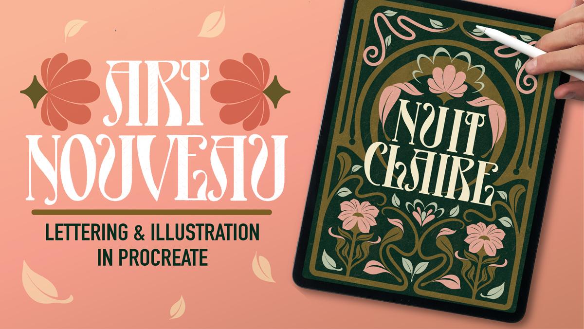
1. Welcome!: If you love experimenting with different art styles and everything retro, this
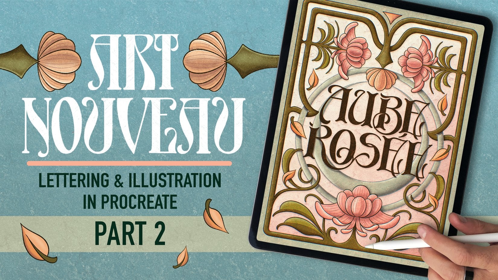
class is for you. Today we'll be creating
an art nouveau inspired poster in Procreate. I will show you how to create both the lettering and
illustration around it. My name is Jim Bobernaus
and I'm a lettering artist, an illustrator and an
educator from Barcelona. Oh, and I'm also the co
founder of Shou BEM. With over ten years of experience
in this creative field, I've had the chance to work alongside with brands
such as like paper like, Calsberg, Espresso displace,
booking.com, and Sabilo. My biggest passion
is sharing my love for art and design
with people like you. Been teaching lettering
and illustration for a few years now through
my patron and YouTube, participated in dozens of online and offline
summits and also created over 30 best selling
procreate products to help creatives push themselves
and learn new styles. In this class, we will explore
the world of art nouveau, a design style known
for its flowing lines, intricate patterns,
and timeless elegance. And you will learn how to create a lettering piece from
beginning to end. Sketch and refine your letters. We'll also get to
prepare a couple single brushes in
the brush studio. Use the key features
Procreate has to offer from the Transform tool to
different kinds of selections to using two
kinds of symmetries, add decorative details like floral motives and
ornamental borders, and finally, add colors
and finishing touches. And, of course, having a
lot of fun while you do it. By the end of this
class, you'll have your very own art
nouveau inspired piece ready to share with the world and add
to your portfolio. So, whether you're a beginner
or a seasoned artist, it really doesn't matter because this class will give
you the tools and techniques to experiment with this beautiful style and
ultimately make it your own. So let's travel in time and draw something
awesome, shall we?
2. Today's Class: For this class
project, I'll guide you step by step to creating your own Arnvau inspired
poster using Procreating. I chose this theme because Arnvo's elegant lines and intricate details
makes it super unique. And I studied it
back in university, and since then, I've been
super obsessed with the style. You will see that it's a
little bit challenging, but it's also super
rewarding to explore. But now, remember
this is your project, so feel free to experiment
and add your own twist to it. Maybe it's a modern take of an old poster or
maybe you could do a tribute to your favorite movie or band in an audibo style, the possibilities
are really endless, and I would like you to explore. Now, I encourage you to make it personal and super meaningful. This project combines hand
lettering and illustration, which is a big part of
what makes this style so captivating and also kind
of what defines what I do. I always love combining
one and the other. I think it's super powerful. To complete this project, you
will need an iPad you will also need the Apple pencil
or any compatible stylus. You don't have to have
the Apple Pencil, per se, and also the drawing
app Procreate. Or even you could
do this project with any other software. And yes, you can also
follow these steps by just grabbing analog tools
like pencil, paper, or paint. Since I show you how to create the letters and
illustration from scratch, you can really use anything
else other than Procreate. I've also included
some resources to help you along the way. So you will find Procreate
texture brushes, a few color palettes that
go well with the theme, and also a link to my
Art Nova interest board. They're all available in
the class resource section. Yeah, I don't know where
it is. You will find it. So if you're ready,
grab your tools, and let's create
something great together.
3. Inspiration: Okay, so to get
some inspiration, you could go to Pinterest, and now remember that I'm
giving you the link to my Arnovo and Deco board. Now, here you will find a lot of Arnovo and also art deco. Inspiration. But you can really see there's a lot of things that are
made with the eye, so you have to be very wary when it comes
to pinterest lately. So, for example, if
you see these frames, you could get inspired
and, you know, do these roses, do these
kind of leaves here. Then if we go down, for example, this is something
that I really got inspired with when
I created my piece. I wanted to do something
a little bit flatter. So that's definitely something
I got super inspired by. And now as you go down,
you're going to see a lot of color palettes as well that
you can take from here. For example, this one is
fantastic, in my opinion. So you could basically just take colors that are
similar to this. Maybe you want to make
something a little bit simpler. You could go with
something like this. This has three colors, and
that's pretty much it. I mean, I think I'm going to
use four in today's piece. Now, there's a lot of also
these things that help you create these kind of
ornaments around your piece, and it tells you step
by step how to do them. Then you have really
good examples. For example, this
one is from one of my favorite
designers, Nick Misani, who's a very, very, very inspiring artist, so you should definitely
go check him out. So anyway, now you have a
lot of inspiration here. Now, the other thing that I wanted to
talk about is books. So I'm going to
leave my iPad here. And I'm going to
get now a couple of books that I
wanted to show you. So, for example, this one is called the World of
Mukha by Hiroshi no. It's a compilation of the
word of Alfons Mukha, who was one of the
main artists when it comes to the
Art no Vaux style. Now, here you will find
really a lot of inspiration. I'm going to leave
you the link as well in the description below. But you will see
that Muha was one of the best art nouveau
artists out there. Look at this, for example, here. See, this is super, super inspiring. So now. Look at the color palettes. It's just, like, impressive work by MuhaO even look at this. These are more like commercial
work, just put this here. Look at this. So, yeah, this book, an amazing book. Go check it out. I'm gonna
leave the link below. Now, you have also different rnubau books that you can find in secondhand shops. I found this in Madrid when
I was Mm traveling in there. And here, you can also get
inspired by even by vases because Artnuvau is not just a style, an
illustration style, but also like a whole movement where they would do objects and buildings and interior design and whatever you can
actually think of. So you see you can get inspired by any furniture
that was you see, look at this, for example,
super inspiring, right? So you can really, like, get any any any Art Nouveau book and just apply it to
your pieces as well. So it's very interesting. A L. I think we are in some
Moja as well here. But again, any Art Nouveau
book that you can find, sometimes these are way
better than just pinterpards. So and now finally, I got one that's
not really Artnvau, but it's super inspiring, which is graphic Adele's Rambles. That's the signs of
Barcelona by Louis Philly. Um, there is a lot of
inspiration in Barcelona, as well, different styles. Obviously, they are
not all Art Nouveau, but the whole thing in the north of Spain in
Catalonia was very big, as well. And here, Luis Phil traveled
to Barcelona and got inspired by the streets and
got to see a lot a lot, a lot of these signs that
were in the streets. Sadly, now, there's a lot
of them that are gone. For example, this
one is still there. I'm not sure where,
but for sure, I saw this like a month
ago when I was there. But you can see
that this book also will give you a
lot of references, not just again for Ar Novo
but for other styles as well. And also, if you ever
go to Barcelona, there's still some
of them there. I think some of these
pharmacies are still there. Look at this. This is so pretty, right? Okay, so now we got
some inspiration and we know what the
project is about, so let's get started.
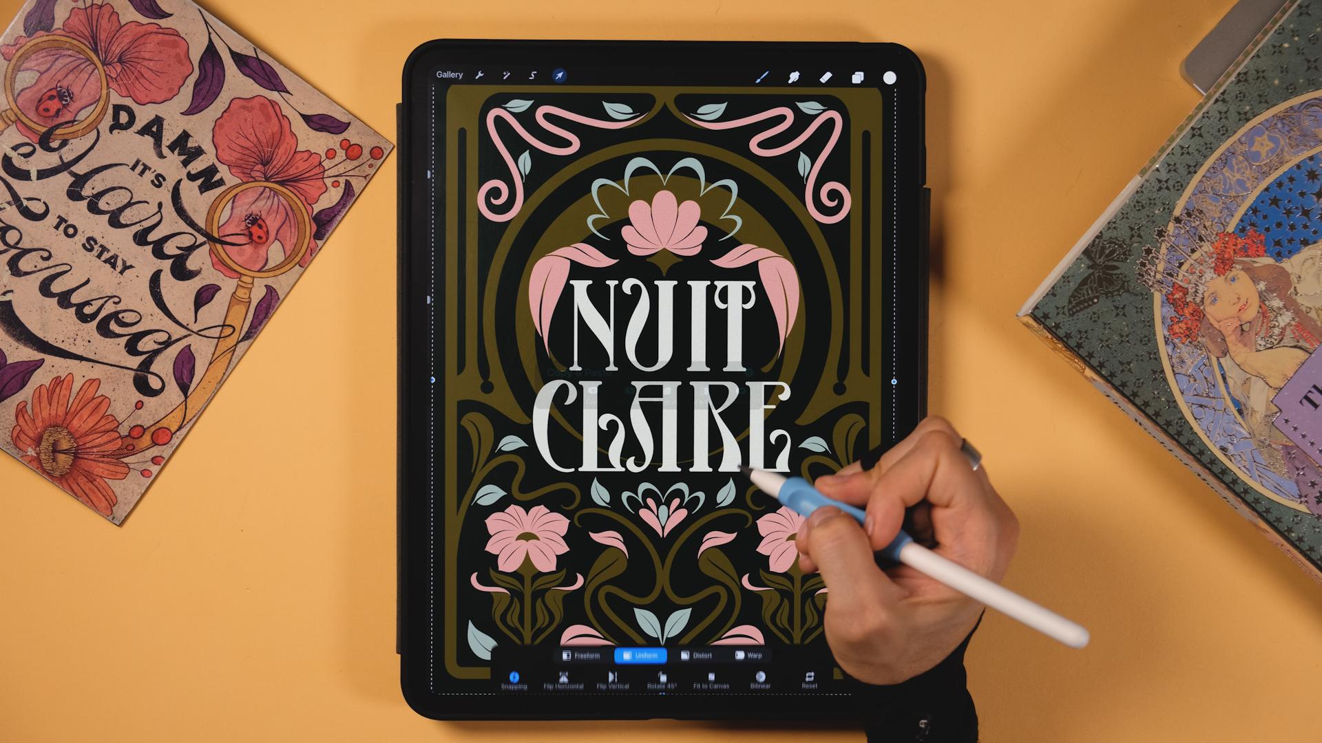
4. Crafting the first word: The first thing we
will see is how to design a system to create your letters from
drawing the base of our letters to define
aspects like width, weight, and also contrast and see what kind of serve
we use across our piece. We'll also get to draw our
first four letter word. Okay, so we'll get started
by tapping on the plus sign. Now here, tap on this
little button up here. And now here, I'm going to
choose the size of my canvas. Since I'm in Europe, I'm
going to use centimeters, and I'm going to use a 22
times 30 centimeters canvas. The DPI here, I have it at 500 just in case I want
to do this whole thing bigger later on in case
I wanted to print it or whatever it is that
I needed just bigger. Now DPI should be at least 300 if you want
to print it out. Here, since I have a new iPad I have even though I'm
choosing 500 DPI, and the canvas is quite big, I'm using sorry, I'm getting 36 maximum
layers, which is good enough. Now, if you go to color profile, this is going to depend on what you want this artwork for. If you want it for
printing, it will be better if you choose CMYK. If you're doing for client
work, they will tell you, also which one they're using
at their printing store. Now, since I just
wanted to so far, use it just for screens, I'm going to choose RGB and display P three,
it's good enough. Now, I'll tap on create. Now, here we have
the new canvas, and every time that we
create a new canvas, there is automatically
a new layer. So what I'll do is to create some guidelines
for my lettering. And then later on when
we have the letters, we're going to create
the illustrations. Okay, so here, you can use
any brush that you want. Here, I'm going to
use the six B pencil. But if you bought any brushes from any creator or you
made them yourself, you can also use
whatever you want, as long as it's a pencil, so it's easier to sketch
the piece before. Okay, so now, I'll do a straight line and then remember that if you don't lift the pencil off the screen, you will get this perfect line. And if you tap with the
other hand with your finger, it's going to log into an angle. So let's lock it into a
90 degree line like this. And now what I'll do is
to duplicate this layer, go to the Transform tool and just bring it
down like this. I think I'll do something
around maybe. Here. Now, I'll pinch this together, and I'm going to duplicate it
again. Now, let's bring it. Let's bring this down as well. And this is going
to be the spacing in between my letters. So I'm just gonna
put them around. Here, There you go. Now I'll pinch these
two together as well. And then I'm going to go
to this selection tool. And out here, I can tap on snapping and I'll turn on
magnetics and snapping. And I'm going to just
put this right there in the center until I see
you see this yellow line. And I'll do the same until
I see the other line, the horizontal center,
which is here. Until we see this complete
yellow cross here. Okay. So now I'll start
doing the letters. Now, I'll bring the
opacity down just by tapping on this end and just
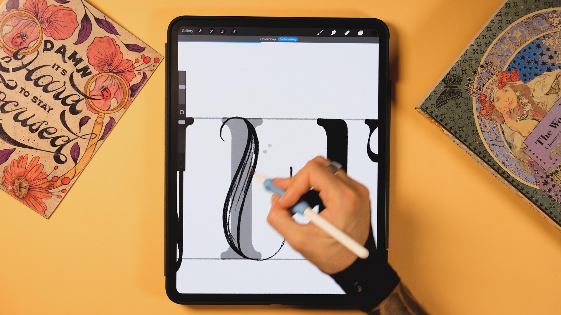
bring the opacity down, and let's create a new layer. Now, the first thing that
I'm going to do is to create the main vertical stem that is going to be the
base of our letters. So when I say the stem, it's going to be like you see
the main part of my letter. Then I'm going to duplicate that so I can create the
letters on top, so we get the same
weight all the time. Okay, so I'll start by
creating a vertical line, tape with your left
finger until it locks. Remember? Let's
lock it down here, and then I'll zoom in. Now I'm going to do the serif. So I'm going to
start down here and I'm going to do
just a small serif, something that is a
bit rounded here, it goes up like this. Okay. Yeah, that will do. Now, horizontal line, lock
it with your left finger. And now let's
duplicate this layer, go to the transform tool, and now here flip horizontally. Now, this will depend on how much weight you want
to put in your letters, so you can make it way heavier
or way slimmer like this. So I think I'm going to go
with something like let's say, just a bit more maybe. There you go. Now, let's
pinch these two together, duplicate it, transform
to flip vertically. And adapt it to your guideline. Perfect. Now let's again, pinch these two together,
and we have our main stem. So that's going to be the
base for our letters. Now, if you grab
this black color here and you drop it inside and you move from right to left, without lifting the
pencil off the screen, you're going to see how
much fill you want. And let's say now you're just
filling up this shape or maybe it's filling even
like some right part. But let's say we leave
it like this. Okay? Now you can go here
up, continue filling, and then you just step
inside the empty spaces, and you've got
your filled shape. Okay, perfect. Now, we are gonna build the lettering
with this main shape. And the sentence
will be in French. I don't know French,
so I'm probably going to butcher
this pronunciation, but it's going to be Nut
Clare which is clear Knight, I think, I believe, 100%. I'm not sure 100%, but
I think it's that. So now, the first thing
that I'm going to do is maybe to build the maybe, like, the easy letters. So let's go with the letter you know what? Et's
build the letter I. You could leave it like this,
or what you could do is to just erase a couple parts here just to make it a
little bit more stylized. So we have the main shape, right, and you saw
that I duplicated it. So we'll always do the same. Duplicate it. And
then the second one, I'm just going to
bring it far just for the next letter. Now let's
go to the first one. And now we are gonna play
around this one right here. So again, you could
leave it like this, but for the letter I, I'm just going to
erase this serf here. Remember with the eraser, I'm just going to erase this. And I'm gonna make it
a little bit curved right here. There you go. There. Now, let me retouch
it a little bit. We've got the letter I. Okay. Now let's go and do
the letter T. So remember, always duplicate this,
and then the second one, bring it far, and then
let's play with this one. Now, I'm going to create a new layer to create
the rest of my T. But first, I'm going to
erase these two serfs. So we have like this curve
erased, just like that. Perfect. And now
that I have this, I'm going to go to the new layer and I'm going to
finish this letter T. So I'm going to do
a horizontal line, lock it, so it's 90 degrees. Again, Then here, I'll
do this similar serif. So it's gonna be a little bit bigger as I see
something like this, the same that we had before, but remember it's
here instead of here. And I'll do just a
little shape here. You can play around.
You can do maybe something even longer,
maybe more curved. You can play around. It's gonna mirror from left
to right, as well. So I'll do something like
this. Yeah, this will work. Perfect. Now, you'll
see that I go from pencil to eraser really fast because I have the
new Apple pencil Pro, so I'm just, like, squishing this and you'll see it
changes as I do it. So now what I'll do is
here it's gonna be thin, and then we're
gonna go thick up. There you go. And then here, I'll also
do this thick part like this and bring it closer to my main vertical stem here. Now you can fill it up. Sorry for that. Make sure
that when you fill it up, all the spaces have to be closed up otherwise, it's
going to go wild. Continue filling,
boom. Now here, this shape should be better. So like a circular shape that kind of
continues like this. So just a picture of that. And we are done with this. Now, duplicate this, Transform to flip horizontally and
drag it to the other side. Good. Now, I'll pinch
these three together, and we have the letter T done. Perfect. Now that we have this, I'm going to do let's say, the letter N. So let's
do u which is Night. It's NUIT. So I'm just going
to bring this IT closer so we have
part of it done. Now let's do the end. I'm
just going to move this. Here again, duplicate it, bring the second one far, and then let's play with
this one right here. Okay. So what I want
to make sure here of is that I keep
the same serfs. But for the end, since we are doing letters that will
have a high contrast. I'm just going to make sure
that this is thin so I can then duplicate it and put the thick
part in the middle. Now, let me tell you
a little bit about what high contrast means. So contrast is the difference between the thick parts and
the thin parts of a letter. Okay? We won't get into so much detail
today, but you see, like, this part would be the
thins and this part too, and then this one
will be the thicks. So the more the difference,
the bigger the contrast. Now, if we go to the, the letter N, let's say, if I construct it
here, it would be like thin, thick and thin. Okay, so now what
I'll do is to select, okay, get the selection tool, and get the rig tango
one, tap on it. And now I will just
select this middle part, something like this. Okay. And now three fingers
on the screen and cut. Now, I will select again, maybe the right
part or the left, does matter, and then
bring them together. There you go. Zoom out always zoom out just
to see if this looks right. Yeah, I like what I'm seeing. So that's gonna be my thin part. Perfect. Now, let's
duplicate it. Let's bring it here.
The second one. And this letter will define the weight of the
rest of the letters. Okay? So now, the T is usually slimmer than
the rest and the I as well. So the letter N will determine
the rest of the letters. There is some letters that are paired up
when it comes to this. So the N, the U, the A, the R, the E. Some of these letters are always kind of, like,
the same width. And then some others
are thinner and some others are wider, like the letter M, the W, et cetera. I'm not going to get too
technical today, but the, right? The will determine how
the most of the rest go. So I'll just make
sure that I don't want something super wide, so I'll do something that
maybe something like this. Yeah, this looks good enough. Okay, now, I'll pinch
these two together. I'm going to create a new layer. And here, if you were
doing a normal serif type, you could just bring down
from here up till down here, and then from here,
you could do this, and you would have a normal N. But since we are doing art
and Ball letters today, I'll do something a
little bit more special. Now, I'll do maybe like a curve that starts here and
does something like this. And from here, I'll do the same. So it starts right here and
it does something like this. I'm actually going to
do this surf maybe, like, a bit to the right,
so I have more space there. Perfect. Okay, now
let's do it here. Now, I want to make
sure that this part here goes perfectly to my serve. So yeah, way better. Okay, let's drop color inside. Okay, so I didn't
close the shape, so make sure you close
the shape, always. There. Actually, now I'm
realizing that I want this letter to be
a little bit thinner. So what I'll do is to go
to the Transform tool, grab the free form, and just make it a little
bit thinner like this. And now let's move this by selecting and just
bring it to the right. Yeah, maybe something
like this way better. Okay, now what I'll do is just to pinch these
two together. We have the letter and done, but I want to make it a
little bit better, even. So I'll erase this serif down here and I'll do
something special with it. So let's make something that maybe that's
something like this. It goes down. What do you think? Let's see what happens
here. I'm going to erase all of the
serif, actually. And here, I'll do something
that goes like this. Remember, thin, and then
here, we got the thick part. There. Perfect. Okay, now let's erase a bit more just to preserve that natural curve. There you go. Perfect. I think I'll do this a little
bit thicker, even. Remember, it's all about
zooming out and see from afar, just to see that if your letters make sense or they don't. Okay, now you have
to compare always this with our main stem. Okay? So it obviously
needs way more weight, so I'm just going to add more. Just a little bit more. Maybe we can edit here. Okay. We got it. Perfect. Now, I'll bring this. Here. And again,
I'll duplicate this. But this time, I'll
bring this second one down because we are done
with the word night. So I'm just going to now use
this one as a reference. What I mean by that is
that I'll bring down the opacity and then
I'll create a new layer, and then I'll use this to
create a part of the U. So for this U, I want to do
something special as well. So I'll do a curve
that goes about here. And then it goes
into my main then. So I think I'll do
something like this. Now remember that this
U and this letter N should be similar width. So keep that in mind. You
can also put the N under this and see and compare as you draw,
but I won't do that. I will just let myself
go and see what happens. Okay, so now this is going to be a little
bit complicated here up. I'll make sure that it
does a curve like this. And this part right here is
going to be the thin part. So So let's do this now. Let's see. You can always throw lines, and then you will see how
you go about it, after. So let's do this. And
then as it goes down, it's also thin here.
So keep that in mind. I always keep my razor close, so And remember that you can use this tutorial
as well in any other using any other software. Even by hand, actually, I would say that you can it's
just constructing letters, so you can use it
anywhere, really. Okay, let's drop a color inside. Let's see
what happens now. There. Okay. Okay, this is nice. So now I'll do I'll
finish here like this. Following same logic, you see? For a lettering or
typeface that makes sense, it has to follow similar logic. So you see, like we have this, we have obviously the weight, we have the contrast, and
we have the serfs as well. 'Cause now imagine that I
did something like this now. You see? We would be doing
a different alphabet, which is something that I
want to avoid at all costs. So let's keep it
the same like that. Let's drop a color inside. Sorry. Let's do it again. Okay. And now, I'll use this main stem here and
I'll put it around here. I'll bring the
opacity back again. And I'm going to erase
some parts here. There. Now pinch
these two together. And we'll make sure that
they connect to perfection. So let's do this like this. There. And then
from here, there. Perfect. There. Perfect. We have the letter U. Now let's bring this closer
something like this. Then the I and the T also
a little bit closer here. Zoom out, maybe squint your eyes a little and see
what's the deal here. So what I see so far is
that the letter N is maybe a little bit
lighter than the rest. So maybe what I can do is to get a bit more
weight, let's say. So I'm going to select
it. And maybe I can just move maybe this part and maybe add a little
bit more weight up. There. Okay, that starts
being a little bit better. We could do something else, maybe because we are
missing some spacing here. So, sorry, this is just
maybe too big here. So maybe we can add
something later on, but so far, I'll
leave it like that. Let's see what we
could do after. But maybe even, like, something nice from here, maybe you see? What do you think about that? I could do something like this. So I think I'm I'm
just gonna leave it here because I kind of
like what I'm saying here. I like this ornament.
Well, which is actually a flourish
coming from the letter. And now, this will ensure that the weight of this letter
is a little bit better. So I'm gonna leave
it right there.
5. Let's do the second word!: So how are you feeling? Let's
tackle now the second word, which will be Clare,
which is clear. I don't know if that's
the exact translation, but I think it is. Anyway. So I'm going to do maybe first the letter L.
What do you think? Because we already
have the stem here. So, again, same
process as before, duplicate it, bring the
second one to the right. And then let's do this one here. So what I'll do is
to with the eraser, erase this serif here, something similar that we
did with the T, for example. I want this to be straight here. Perfect. And now,
bring a line here. Until something
like this, I guess. And then you could do
the L in a lot of ways. So this part of the L, you could actually make it point outwards, which would be
something like this, or even inwards, which is something that I'm
going to use today, which is like this. You see, it kind of points here, and then the other
one points out. Just I want to show
you something. This is the tutorial that
I did over at Patrion this month, and there you go. Well, this is the
sketch. Sorry, let me take you to the final piece. So this is the one that we've
been doing over at Petrin. And for example, you see
this L that goes like this. Well, here we are
going to tackle it differently and doing
it to the inside. So let's go back. And now here, I'll
do something that goes let's see what
happens, right? Let's do the shape
first. So I would say something that does
something like this, maybe and then like that. Yeah. There. Okay. Now, let's try to
add some weight here. Remember, this is going
to be the thin part, and then maybe the thin
part will end here as well. So that's going to be like this. Following the same logic
as we followed before, for example, here
in the letter U. So let's do this and then
make it thicker here. And so it goes to thin as
well here down. There. Okay. And now let's do
this little part here. Maybe even shorter. There. Let me retouch it a little bit. There you go. And now
let's just fill it up. And now, remember, this is the same kind of serif
as we have here. So I'll keep that in mind. Let's make it thicker like this. There. Now, this line should
also be thicker. Remember that we want to keep the same thicks and
thins everywhere. And then you have
different options here. You could also do something that curves here like
this, for example. This would also look cool.
But I think I'm just gonna leave it just like this. Now, I'm actually going to
select this and I'm going to distort it a little bit
because it's kind of nice, but I see that there is a couple of things that
I could do better. So go to the selection too, go to the free hand
too, and let's select this part right here. Now that I have it here
with the Transform tool, go to tap on Distort. And out here you can play
around with the shape of this. So you could distort
it like that, for example, So now I'm going to just
going to zoom out and see what can look best. Maybe you could even
go about it with a free form tool and just maybe bring it a
little bit more up. Go back to the distort
tool and see what's best. I think something
like this I like. Yeah, let's leave it like this. So we have the letter L. Now let's repeat the
same process before. Duplicate and then
bring the second one far, get to the first one. And now we will do the letter C. So I'm going to bring opacity
down, create a new layer, and let's make the letter C. So to create a C that
looks t nu Bois, we cannot have the center
right here in the middle. Like we would do, for
example, a normal C, which would be
something like this. Let's say, we want to bring the attention and the weight to the
upper side of the letter. So for the letter C, which is a little a little bit tricky, I would say, I would do
something like this. So this will be the
weight of the letter. Then here I would go a
little bit like that. Again, this can take you
a little bit of time. I'm not used to do this
kind of cs either. Still keeping these
two parts kind of, like, on the same vertical line. And then we're gonna
finish it like that. That's how they finish it all. So it's kind of like straight, which is a bit weird because we always see something
that goes up, but let's see what happens. Now, a good trick always is to fill it up as
soon as you can, so you can then subtract some parts and add new ones and see how is this looking like? But when it's filled up,
it's way easier, actually. Now I'm going to add
this little syrup here. There. Okay. Okay, I'm close enough. Now, just to ensure that it
doesn't fall to the left, I'm just going to go
to the Transform tool, and with the distortion tool, I'm just going to
play around with it a little bit until I see what I like best. I like this. Maybe, like, let's make it a bit smaller. There you go. Just
keep comparing it to the rest of the
letters and see if it fits. You can always bring
it here as well, and see the weight of it
and the width of it and Okay, I think so far,
I'll leave it like this, and then if something, I will change it later on. But I think now, if I just do these
couple things here, maybe make this a little bit thinner. B. Okay, good enough. Now, let's go ahead
and do the letter A, which is probably going to be the most interesting
of them all. So I'm just going to
get this guide that I had here. Just move it here. And then I will just
bring the opacity back. Move it here. And then the letter A is basically sort of
similar to the letter U. So we can get the letter U, duplicate it, then flip
it. Bring it here. Bring the opacity down. And here we can play this
to see what looks better. But I think if I place it
somewhere around here, now, this could look good. So now let's go move
this letter A here. And then on our main stem here, I'm just going to again, follow the same steps before. So just make this
straight. And now. Look, we will actually do
something different here. So I'll just select this
serif here and move it here. Yeah, perfect. Now I'm just gonna put it here. Perfect. And now we are kind of done with the letter A,
actually, when I look at it. So let's try to figure out
this shape right here. So I'm gonna first of all, finish this, ring it up. Okay. And now from
here, I'll do this. Okay. Perfect. And now I'll do this shape, but adapting it to the
letter A, obviously. So maybe I can go about it
like this. Let's do it again. Doesn't have to be doesn't
have to be the same, but just following
it a little bit. Now here, I could do
something like this. Oh, okay. Looking good, I think. But I will know when I start
filling it up, of course. Okay. Now let's continue
it. Let's bring it down. There. I think I'll bring maybe this
thickness a bit up. Actually, it was good like this. And now the last thing, let's do this crossbar here. Let's put it up here. Okay, now let's make
it a bit thicker. And we're done
with the letter A. Perfect. Now, let's I'm
just gonna start kind of, like, putting this in
order. So that's the L. Somewhere around
here, then the A And now we are missing just two. So I'm going to
duplicate this again, bring this summer there, and start playing
with this one now. I'm going to do the letter R. So for the letter R, I'm going to do Okay, now, I'm going to erase
this first as always. And now a normal letter R would be like this and
like this, right? Okay, again, nouveau,
so everything up. Let's first from here,
I'm going to do the. So from here, just
gonna bring it down. Like this. Can I
raise this serf, too? Let's make this way thicker. Bring it together. Let's
fill it up with black. Here. I'm actually going to select this now
with a free hand. And I'll maybe
maybe maybe maybe. Just like distort
it a little bit. No, also, you could
use the warping tool. And once you have
this main shape, you can also distort
it, like, separately. And then if you go
to Advanced Mash, you have a lot of control
over your curves. So I want to make
something as thick as the rest of the
letters as wide. Sorry. So I think maybe
something like this, maybe a little bit more
spring this up a little. H. There. I think this is good. And now let's make
the upper part. So it's gonna be around just gonna draw this
line just to make sure where I have to go
somewhere around here. Then I'll go straight up here, there, and then I'll
just fall like this. Yeah, something like this. And then here. Make it thicker here. And then as it goes down, it's thinner. M And now you can also select it. And maybe with the free form, I'm just going to make it so it goes a little bit
more to the right. Again, just zoom out and
see what's happening. Maybe that's too much. You see that it's
kind of like falling, so it shouldn't be beyond this. So maybe something
like this. Okay. Good enough. Now let's
go to the last letter. Now we don't have to
duplicate this again. Now, I'm going to
follow the same logic as the L, more or less. So what I'll do here
is to as before, cut the serifs. There now. Again, keep the same width, more or less than the
rest of the letters. Good references are
the ADR, the U, the N. Something like this. Yeah. I I'm just going to bring it a
bit more up, so select it. Just make it with the free
form, just make it up. Make it bigger, bring it
somewhere around here. Yeah, that will work. Now,
let's make this better. There. And now let's make the rest of the letter. I think here, I'm just
going to do this like that. There you go. And now, just following the letter A. So I could even go
to the letter A, grab this thing with the selection free hand
tool duplicate it. Remember if you have snapping on magnetics and snapping,
then you can just, like, move it vertically until
somewhere so it like this. You know what? Just gonna
brak it a little bit down. Maybe better. Okay. So we are we can actually now pinch all of it together
because we are done. Okay, so I was
definitely afraid that I would mess up because
it's a French word. So I missed a letter I in between A and the R. So
make sure you put it there, and I'll also make sure that I put it in the
end of the class.
6. Refine Letters : Okay, so now we have
our two brushes, and we're going to
use the Monoline one to create our final letters. I'm going to show
you one letter that I'm going to put a
little time laps so you can pause the video and go ahead and clean
the whole thing. So I'm going to start
with the letter A, maybe. I'm just going to
bring these guidelines even more down like this. And then on the new
layer, I'm going to first now the same as we did before. I'm going to create
this Serif now here, you can decide several things. So, for example, do
you want it bigger? Do you want it smaller,
whatever you want. So depending obviously on the sketch and if
you like it or not. Now, I'm going to do
a little circle here, so you can just
draw a circle and then with the finger and just, like, make it a perfect circle, make it smaller, like this. And then I'll bring it here. As we did before, line. And then here the same line. Let's step here,
adapt it, and curve. Perfect. Now, let's
duplicate this, flip it horizontally,
duplicate it again. Flip it vertically,
pinch together, and drop a color inside. Now we have our main base. And remember, you will have to duplicate this as many times as possible and then keep
putting it in the letters. So now, I'll just actually, like, bring this here. Incline. Now, here, if you want
to do perfect curves, that's something
that I always say. When you do, like,
a whole big curve, just don't do it all in
one stroke, but rather do, like, for example, here, just
do a little one like this, pause, then do another one. And it's going to be way
easier for you to have better curves if you have
just like this patients. Okay, so we have the letter A, and now I will tackle
the rest of the letters. I'm actually not
going to put this in the video because it's
going to take me, I would say, like
around 20 minutes. So pause the video,
finish the rendering of your letters or just don't render them and keep
them with pencil, which they always gonna
look good. Remember that? And I will see you in a second. I
7. Illustration: Okay, illustration time. We're about to draw our
main background structure, our frame, and some
floral ornaments using two kinds of
symmetries. Let's do this. Okay, so we've got
the letters done. Now let's go to
the illustration. Now, for this illustration, I'm going to use a
couple symmetries. So what I'm going
to do is to well, so far, I'll leave
this ornament here. I don't know if I'm
going to use it probably not depending on my symmetry, but
I'll leave it here. Now, let's create a new layer. Sorry, let's create it on
top of everything else. And now here, we're
going to go to Sorry. We're gonna go to actions. Canvas. Drawing guide, go to turn it on and
then edit drawing guide. Now here, I'll go to symmetry. And now the symmetry, what it's going to do is to mirror everything that we
draw on one of the sides. So if we draw
everything on the left, it's going to go to
the right and so on. But now I'll go to options, and I'll go to quadrant. Now, everything that I paint
on this quadrant here, it's going to be repeated
on the three of them here. So I'm going to tap on Done. Now I'll go back to
my pencil. The six B? And now I'll start
drawing my novo frame. Now, when we go to
the layer spinel, you're going to see that in
this layer, it says assisted. So if we tap on it, it's
going to be assisted. So let's say you don't
want to use it anymore, then we're just going to
tap here on drawing assist. It's going to deactivate, and
then we can continue using this layer without any
symmetry going on. Okay, great. So let's
start sketching our frame. Now, the first thing that I'll do is to do these lines here. Something like this,
and then one like this. So this is going to
be my main frame. Just make sure that these
both distances are equal, so I'll do it again because it's not quite right. Let's do it. Now, tap here and edit, and then we can move
this a little bit here. I think right now, it is kind of good. Yeah. Okay, so now the
next thing that I will do is to round this
corner like this. And then with the eraser, just erase this perfect. Now we have rounded
corners everywhere. And now I will start
adding other things. So one of the
things that I could do is well, you know what? Let's leave this like this. And then I'm not gonna
use this anymore, but I just want to do maybe so this frame is a
little bit thicker. So I'll repeat the same
steps, but inside, right? So, let's do this, like this. And like this, just make sure that these
distances are equal again. And let's round this
up, kind of, like, following the same curve
that we used up here. I'm just going to
drop a color inside. So now we have the rounded
frame that we wanted to use. Great. So now that I have
this, I'm just going to go, again, to the actions Canvas
and Edit drawing guide. Now here, I don't want to
use the quadrant anymore, just the vertical symmetry.
So I'm gonna tap on done. And I'm going to start adding other things here in the frame. So one thing that I'll do here, for example, is to maybe
add something like this. Maybe I can add a line here. That does something like this. I'll do a mixing between
straight lines and curves. So maybe it can be
something like this. That can come maybe
from there like this. And I'll keep the same
thickness for these bars sort of that are composing the frame. Oh, and now before I continue, I'm going to go
onto a new layer. Now, if I don't put it, it's not going to be
drawing assisted, right? So now, since we're talking
about this Clarent something, I want to do some
kind of a moon. So I'll draw a circle here. We my left fingers
gonna make it look. So it's a perfect circle. And then right after when
you lift off the pencil, you can go up here,
it says circle, tap on it, and now you're
editing the circle. Now, there is a few options, but if you touch here,
it's going to be bigger. But if you touch in the handles, you're just going to
distort the circle. And if you touch outside,
you just going to move it. So there's these three things. Now, I'm going to place it somewhere around maybe
make it a bit smaller. It will be in the center, right? Something like
this, I would say, maybe Yeah, that will do. Perfect. Now, I'll
do another circle. I'll do the same
tap on circle here. And then I just want to
make this moon kind of, like, thin, maybe,
like this thin, and it kind of
like mets here. H. Let's say something like this. Perfect. Now, I'll do another circle that is
parallel to this moon. So I'll do a circle here, and I'll tap again. And now let's try to
make it parallel. So let's make it a bit smaller. And let's place it
somewhere around here. Okay, that will do.
Now that I have this, I'm going to get to
do yet another one, but this is going
to be parallel. I want to see how
thick I can make this, maybe, following the
same thickness here. So let's try to place it so
it's like equally as thick, maybe something like
this will work. Perfect, then. Now I'll
actually I'm going to go back to this layer and I'm gonna erase this because I want to make it a
little bit better. So go down here. Then here's gonna join the
frame. Then I'll do a line. And then here I think what I'm going to do is
now join these two layers, and I'm going to start
erasing this circle here. And actually, you can go to the selection tool freehand and just select this part
and get rid of it. And now here I'm going
to try to join this. Make sure that it's
assisted again. I'm going to try to
join this circle with this line somehow.
Let's see how I do this. So maybe, like, do
something like this. Then from here, it can
do something like this. This looks good. Now, here we could do we could
either join it like this, but I think I have an idea, so I could bring this here a bit. And then this here a
little bit as well. Then do a circle. Make it. Perfect circle. Then
leave it there. Perfect. Okay, now, next thing we can
do is to go maybe up here, and we can do something
a little bit crazy here. There's a lot of rnovoFrames. You will see it if you
get books like this one, which is the World of
Muha by Hiroshi Uno. That's a very good book. But if you go to Paint
Tterest or, you know, whatever other search engine, you're going to see
that Novo, well, first of all, it's always
filled with shapes. And second, is that
they combine a lot of, like, the kind of, like, more perfect, like, spirals here with shapes that are a little bit more fluid
and more natural. And you see, like,
anything that you do here, it's going to look
good because it's doing the symmetry, right? So I'll try to do something
that comes from here. Up. And that's, like, some little weird curves. So maybe, like, let's
say, something like this. And then here there's
another loop here goes up and it finishes here
with this spiral here, and probably it can be touching, like, both sides here. So like this part of the frame with this part of the frame, something like this. Yeah, I like this. Okay, great. So now let's do it a bit better. Maybe I can keep better
distances this time. So can go up here. And then, maybe
something like this. Remember, the eraser
is your best friend. So keep adding lines and
keep erasing them as you go. Great. So what do you think? Now, I can maybe make
this part of the frame, like doing something like this, maybe this little curve here. And then, obviously, we're going to give thickness
to this thing. So we can maybe,
like, come from here. And we can make this thinner
than the frame itself, so maybe h. Now, I'm not worried about doing
pallet lines because I'm going to add maybe a bit more
here and a bit more there. So so far, I'll just, like, keep it a bit intuitive. So maybe, like, now here, I can add some weight here, and then I can add
some weight up. Also, if you feel like a
curve would be easier to draw from the left side,
you can always go here. And it will mirror
to the other side. You see here, for example, we could do something like
this and then make it thick from the other side here. There you go. Okay, so now we've
done the upper part. So let's go down and
fill this bottom part. So I'm going to use the center of the
image to create a flower. And then once I have it, I'm going to put it on the
left and on the right. But I'm going to use
the center since we already have the
symmetry going on here. So again, pencil,
and let's do this. Now, I'll start by drawing a shape that is some
kind of a triangle. Let's do it again. So it's some sort of
a triangle like this. It's like a shield almost. Great. Now that I have this, I'm going to go right here
almost not in the center, but a little bit
up somewhere here. I'm going to create
this semi circle here. Perfect. Okay, so now, I'll start
drawing my petals. So there's gonna be
one and two here. Are they gonna follow
this shape like this? Then there's gonna be a couple
more here. There you go. I'm going outside a bit of
the triangular shape here. Then I will put a
couple more here. And then two more here. Now with the eraser, I'm just going to erase some parts that I don't need and make
all this thinner. All the lines a little bit
thinner here and there. I want to keep the
main structure. But since I'm going to change
the shape of this flour, I'm just going to make
it as thin as possible. So just so I see the guide, but it's but the line is
not overwhelming, right? So something like this. You can also create a
new layer if you rather. Perfect. Now, I'm going to draw this line
that we had before here that I drew already. I'm going to do this in all
the rest of the petals. And now each petal, you see here where this line gets to the corner of the petal. Well, here, I'm going to
change the shape a little bit. And I'll follow
this kind of shape. Look at it. So let's start here. It's
gonna be the easiest. So I'll do a little bit
like this and then go down, see? Just like that. Now, this starts looking a
little bit more realistic. So I'll keep doing the same
in all my other petals. There. Now, the ones
that are in front, so these ones will be
in front of these two, and these two will be in
front of those two and so on. Now, same here and we're done. Ooh. Okay, so let's make this shape a
little bit better now. There. Okay. Now, I'll do the
rest of the flour. So I'm gonna do this
astek as this part here. More or less. Bring it down. And now here, I'll start
adding some leaves. And for this, I think
I'll use, like, a shape that again, it's all about structures. So I think I'll use
something that goes from here to here,
something like this. Now, let's try to fill
the shape with leaves. So I'll start by doing
a weird one here, so I'll do something like this. Again, following the shape
of what we have up here. I think I'll make the
sticker now here. And now this shape kind of resembles the
typography, remember? In these parts right here. And now this I might
touch just like super thick like this.
Let's see what happens. There. Okay. Now here, I'll do
couple leaves that go like this. And here, Or maybe even Yeah,
something like this, just to fill the space.
What do you think? Yeah, looking good. Okay,
so now we have this plant. I'm just going to erase
this flower, sorry? I'm just gonna erase, like
these parts that I don't need. There. And now I
will select this. Three fingers on the
screen, cut and paste, and I'm going to
bring this one to the right somewhere around here. Maybe we can make it
a bit bigger even. What do you think? Yeah. And now duplicate this and
bring it to the left. Let's just make sure that they're more or
less equally separated. And let's join everything together with the
assisted layer. Perfect. Now that
we have this plant, I'm going to start
doing some crazy things here as well. Let's
see what we can do. So I can do a shape
that that's some sort of maybe we can even break
this frame like this. Then it kind of continues
here and it does like some weird shape like this. And then it can
even touch here in the center and do the shape like this. Yeah, maybe better. So it
finishes like like that. Nice. Now let's try
to make this sicker. Can even start painting
this sketch already. And remember, keep erasing and painting, erasing
and painting. And this should
be the same thick as this part right here. Sorry. There. Okay. Okay. We got it. Now we can do maybe what I think maybe a
couple of leaves here. So leaves are really easy to do. So we're just gonna use
this kind of, like, space that we have here and
do something like this. Actually, that's even make it more parallel to this shape. Something like this. And
that's like this shape here. There you go. Okay. There. So here's a leaf. Let's just make it a little
bit better. Perfect. Now we can make even, like, a little something here,
like a little flour, again, but maybe
something simpler, a little bit more
abstract just to kind of, like, you see cover
this space here. Just make it thick up and
then thin right inside. There you go. Now here we can make a little
drop shape, maybe. And then, even a
couple bigger here. Yeah. Awesome. Okay. So now we can cover this space here. So I'll do, again, just to keep a bit the logic of the whole
thing, I'll do, like, a shape that does something
like this. There. And it finishes right there. And maybe even we can do, like, a little kind of like mirrors
this shape with this one the mirror. Mm hmm. There you go. And then here, it can go up, and maybe we can make a
little simple leaf here. Yeah, maybe something like this. Perfect. And now, just let
me do this a bit better. Can make another
of these leaves. There. And maybe here can
be a little circle. So it kind of also does
this parallel here. And again, we can
keep painting this. There you go. Or maybe even this could be one shape because I'll
use flight colors later. So maybe this could
be this shape here. And then, yeah, this
will look good enough, I think. Let's fill it up. Remember that if you
tilt your pencil, the six B will give
you this effect, like if you were tilting
a real pencil, actually. So you can fill up things way faster like this. There. And now we're at it and just gonna paint
everything else here. I'm going to leave
these two plants. These two flowers for later. I keep calling them plants. I mean, they are,
right, technically. Okay. And then finally, I'm going to keep
this line here like this because I'm going
to add a new layer, and I'm also going
to make it assisted, and I'm going to
finish my illustration by adding a couple
of things up here. So so far, I'm
just going to turn off this part here because I think it's going
to be a little bit complicated to fit in here. Now with this new
layer, assisted layer, I'm just going to
draw a flower here. This one is also going
to be way more abstract. So I'm going to start here
adding like this kind of following the same
logic as we did down here. There you go. Now,
let's do this four. Awesome. And now let's
do the flour inside. I'll keep it simple, as I said, so I'll do, like, a little
shape here like this. And like this. And now I'll just follow
like this shape, sort of. Yeah,
something like this. Okay. Now I'm going to erase. Again, the frame like we've been doing with the other
flowers as well. There. And now maybe, like, just to outline a couple of details
that I could put later. I think for this piece, I'll
use like three, maybe inks. I'll have to figure out how
am I going to color it. But I'll mainly use
three, I think. Awesome. And then a
couple of leaves. So I'll do maybe.
Something like this. And I'll paint the
same way that I did the leaf underneath. So just like this. There you go. Okay. Actually, even this, I could maybe, like, follow this shape, and it's
gonna look better. So I'll do it like this.
What do you think? I think maybe, yeah, it follows better the shape. A bit shorter, though, because we're gonna
have problems with Nui. So Okay. We are done with
the main sketch.
8. Colors and refine: So, finally, let's now clean up our piece and
add some colors. And after that, we
will be done with it. The letters will be some kind of a yellowish,
like, kind of, like, white, like this one here, just gonna drop it and then move to the right until
everything is painted. And now what I'll
do just for us to see what we're doing is
to go to the layer five, this one here, and then
go to adjustments, hue saturation and brightness, and then we're going to
bring the brightness up. So now all the
layer became white, and now we see what
we are drawing. So now that I have this, maybe even like
with less opacity. Now I'm going to start creating
layers on top of this. And first, I'm going
to do the moon. So for the moon,
I'm going to use this desaturated, kind of, like darker green in
between green and yellow. And with the monoline clean, I'm gonna do the moon first. So remember, what we did before. So maybe let's make
it a bit thicker. Maybe something like this. Yeah, like a six. Yeah, the size is six right now, so it's gonna work perfectly. So let's do a circle. And we're basically doing
what we did before, but now cleaning it up. Make it bigger. More or less. There you
go. No, the smaller one. Okay. Perfect. That's tropical inside. And we've got our moon.
Now I'll bring it. Well, actually, I'll bring
the letters on top of this. Perfect. Now, I'll
start doing the frame. And for this, I'm going to continue using the
monoline clean, but I'll make it bigger. So just with one stroke, we can do the thickness
of this frame. Let's see about this one.
Yeah, this will work. Okay, perfect. Now remember, go to the same
layer as the moon, tap on it, and now tap
on drawing assist. And now I will go
down here to Canvas, edit drawing guide, and I'll
make it a quadrant, right? Remember back in the beginning. So I can do this
whole frame at once. So let's do this. Let's
do a couple lines here. Maybe just a bit thicker even. That will work. Okay. So now that we have this Okay, we've got the frame. Now I'm going to
go back to Canvas, Eddie drawing guide, and I'm just gonna
remove the quadrant. I'm gonna put vertical, and we're going to
continue with the frame. Now here, since we have
a lot of space here, I thought that just to match
how heavy this part is, maybe we can do a little
curve that is a bit bigger. So maybe with a small brush. There you go. Let's move this. You know what? I won't do it. I'm gonna put maybe a
couple of lifts after. Okay, so I should have marked. So, okay, just here
there's a little trick. So if you want to keep
a size of your brush, just tap on it, and
then tap on plus. So I think maybe let's
say this one was a little bit thicker than
this, maybe 75 74. Yeah, something
like this. So tap on here and then tap
on the little plus. And now you have, like this size saved already. Perfect. Now I'll create a new
layer for this circle. Actually, I'm going to create the whole thing
and then erase it. Okay, so now that we
have the circle here, we will just pinch it together, so it's assisting now. And then I'm going to erase
this part over here there. And let's continue the shape. I think I'm just gonna do
that something like here. And now Now, since this circle
was not mirroring, now I'm just gonna remove
the drawing assist and just maybe make it a little bit
better here on this side. Yeah, this will do. There you go. Let's tap on drawing assist again,
and let's continue this. Circle. Let's do it again. Yeah. And let's fix it. Also here by removing
the drawing assist. Again, this will just happen here in the circle, so there. Okay. Now, let's bring back
the drawing assist. And let's decide how
thick this one will be. I like this, so I'm
just going to save it. Anyway, I think I
will spit this up, and I'll see you in just a couple seconds when we are done with
the main shapes. Okay, so now I'll get to paint a couple
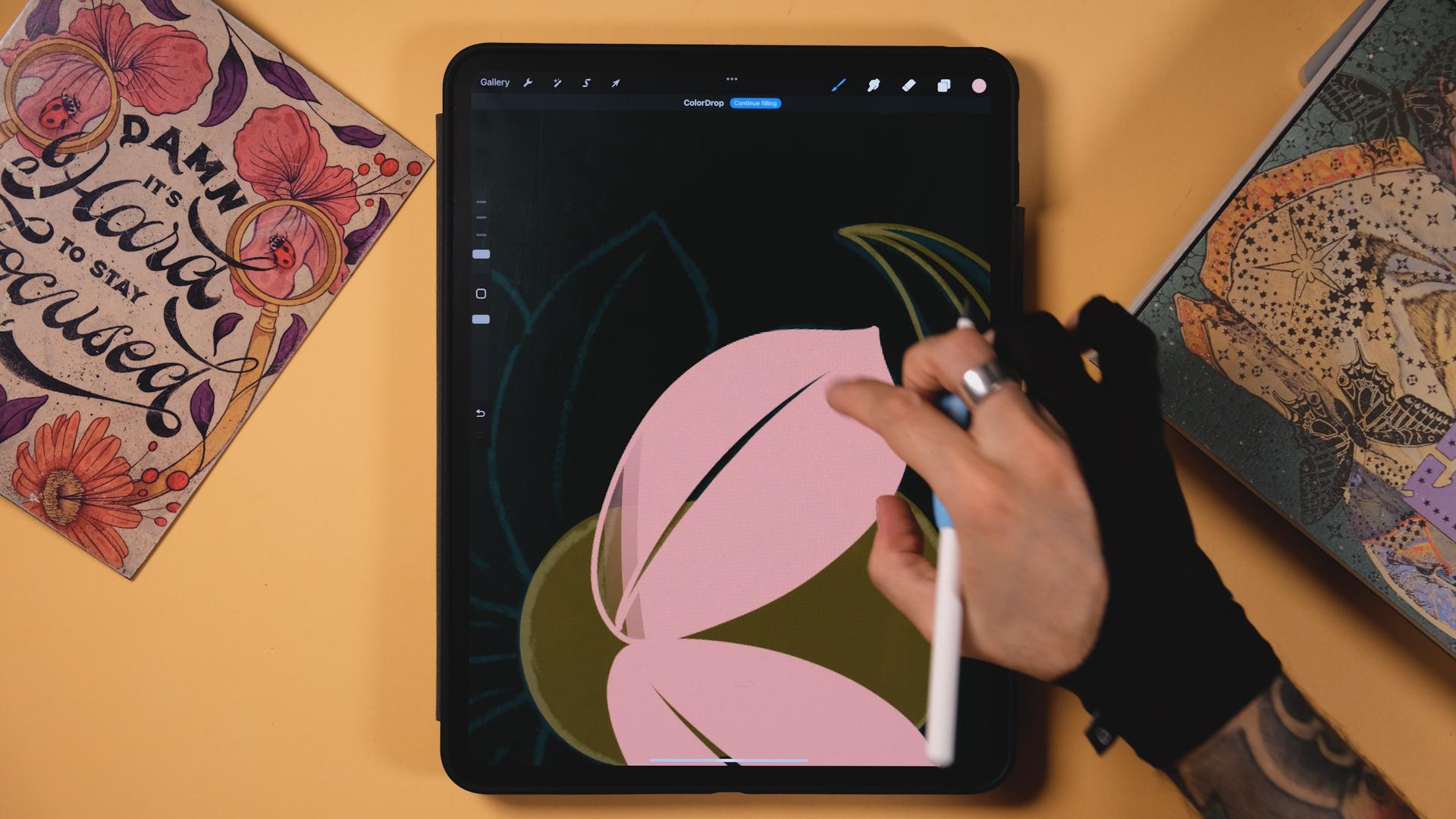
more things in green, and then everything
else will just be pink. So I'll do actually
this part here. Great. Let's now go to
the second color. I will get this pink right here. Remember, like, most colors will look good in this composition
since there is just two. Okay, so let's get
to the pink things. So I'll just turn
this off for now, and I'll do these parts
right here. Let's do it. Now, I still have to do this
little green thing here. Now let's do this plant here. I think I'm going
to do probably, like, these two drops in pink. And then maybe
these two as well. Then I'll leave these two
for another color, I think. Now, let me finish this. And now, obviously,
let's do these flowers. I may bring the sketch on top of the green so I
see what I'm doing. And now here, I will
leave like I did before. So I'm going to start with
these big ones right here. Yeah, let's go to
the pink layer. And then for the lines, I'm just gonna do like a shape that's empty in the middle like this. Drop the pink inside. And let's do the same here. Now here, I'll leave a gap. And I'm actually going to create another pink layer right
underneath the green. So everything that I
paint now is going to be underneath that thing here. So we'll do it like this. Same here. And finally, There. And I forgot to
make it mirroring, so I'm just going
to duplicate it and just bring it here
and that's it. Let's pinch it
together. Let's try and assist just in case. I need to do something else. I'm actually gonna go to the original pink layer,
and I'll do this part here. And now, final layer, I will create one more on
top of everything else. And then with the
drawing assist as well, I'm going to get this
bluish tone here, probably like this one, and I'm going to paint a
couple details here and there, and we are going to be done. So first, I think I'm just going to get this little crown here. I'm gonna cut it in paste
three fingers down, and I'll paint this
with this color. Oh. I think here I will well, I'll just turn off
first a sketch. And now I'm going to
make this into pink. So I'm gonna go through
the green layer. I will cut it here,
just like this. Maybe a bit bigger.
There you go. And now I will just free handed. Hey. There there with you. I'm also going to
cut this one here. And now, finally,
just go to get rid of this like I had in the sketch. You And I'm now officially done. Now, if you want to
add a more retro look to your artwork, you could well, let's turn
off the drawing guide. Now add a layer on top
of everything else, and here I'm picking
a white color. You can use the texture brushes that I'm
giving you today. You're going to find them
in the resource step. So now I'm going to
use, for example, this one that will give
you a nice retro texture. But if you want to add a
texture without any brush, you can do that
in Procreate too. So You can always go to
actions, add Copy Canvas. Then on top of everything else, you put three fingers
on the screen, and here you put paste. Now, your whole artwork will
be pasted in one layer. Now go to adjustments, and then here we can give
a little bit of noise. And by that, we're
going to get like this. You can see this
rough noise effect. You can also experiment
with the options here. But so far, this is good enough. There you go.
9. Recap and outro: Here's a recap of
what we touched on. The first thing is
lettering basics. We explored how to sketch
and refine your letters, ensuring they reflect the
essence of what Arnova means. We also used a lot of
procreate features to make your process a little bit
smoother and more efficient. We edit decorative details from floral motifs to
intricate borders, and we incorporated the elements that give that Arnuba touch. And finally, we brought it all together by applying
color palettes and also added
those final details and textures to make
your piece stand out. I cannot wait to see
what you come up with. So don't forget to share
your project with the class. Thank you so much
for being here, and I hope you learn
just a little bit of what Arnovo I really hope that you got
inspired by doing this class and you will continue doing Art Nouveau
inspired pieces. I would love to
see your results, so you can tag me
on Instagram at Jim Bobernas and at Shao Bem, so we can share the results
with our community. Thank you so much, once again, and I'll see you in
the next class. Bye.
 Jimbo Bernaus - Shoutbam, Letterer & Designer