Transcripts
1. Welcome: Lettering Composition Essentials: If you love lettering and you've ever stared at a quote thinking, Okay, how the hell do I
arrange these classes for you. Today we're going to explore the foundations of
lettering composition. I'll show you a clear
repeatable process to take any quote from short and simple to longer
and more complex and turn it into a solid
layout and a refined sketch. My name is Jimbo Bernaus
and I'm a lettering artist, illustrator, and educator based in between Croatia and Spain. Oh, I'm also the co
founder of Shoutbam. Been working in
the creative field for over ten years now, and I've got the chance to collaborate with
brands like Paperlike, alsberg booking.com,
Stabilo, and more. But honestly, my favorite
thing is teaching and helping creatives build skills that make them feel
more confident, especially when something
feels overwhelming at first. In this class, you will
learn how to choose a quote that works
well with composition, practice, identify primary and secondary
words to create hierarchy. Build layouts using simple structure
lines and containers, then spot blank spaces and learn easy ways
to balance them out. Create a few thumbnails and pick the strongest direction and finish with a clean sketch
that you can later render, refine, or turn into
a finished piece. I'll be using
Procreate on the iPad, but you can follow
along with any medium. If you have paper, a pencil, an eraser, and a ruler,
here good to go. By the end of the
class, you will have a complete lettering
composition sketch, plus a process that you can reuse again and again
with new quotes, new styles, and new ideas. So grab your iPad or
your tablet or pencil, and let's build a composition
that actually works.
2. About this class: This course will be
divided in three lessons, and each lesson will have
a total of five steps. We are going to start
by getting inspired and getting to know our quote and the possibilities
we have with it. In the second
lesson, you'll have all the information you need
to start getting creative. We're going to
split the quote and start to get our first layouts. In the third and last lesson, you'll have to get super
creative and you'll end up having a final sketch
to play with afterwards. I'm going to start
this course by giving you a couple examples of different compositions based on the amount of words
a quote can have.
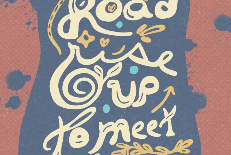
3. Lettering Examples: What Works & Why: So I'll start with the most
basic one I have here. As you can see, it's just four elements and
just one lettering style. Then if we move
on, we can go to, I would say, find your fire, but please don't get
overwhelmed by the effects. I just wanted to show
you that there is just three lettering styles and everything is built by using horizontal
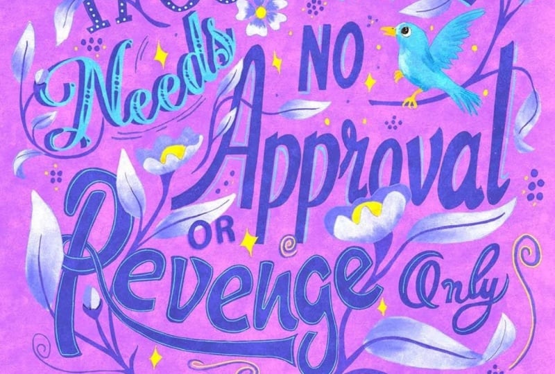
lines on an angle. Alright, so now I showed you compositions
with three words. Now let's get a little
bit more complicated, and I'm going to show you different compositions
with more words. This one, for example, has six. Then this one has five, but two are together,
as you can see, and then you can even get a
little bit more complicated. Well, before I wanted
to show you this one, that it's just quite
easy with four words. And then you can
get into this one, for example, and
you can already see here that the compositions
are a little bit more tricky. But then at the same
time, you can find compositions that have
even ten words but are quite easy to
construct like this one because everything is built
in a horizontal line. So, yeah, I just
wanted to show you an overall of the pieces
that I did in the past and see that some of them
are easier and some of them are a little bit
more complicated.
4. Composition Foundations: Choose a Quote + Set Hierarchy: Step number one. Now that you've seen some
lettering possibilities, let's set up our canvas
and choose a quote. If you've seen my videos before, I always use the
same kind of canvas. Since I am in Europe, I'm going to use centimeters. So I'm going to go to Procreate and then tap on the plus sign. There I'm going to
choose centimeters, and then I'm going
to set a canvas of 22 times 30 centimeters, and I'll tap on Create. Just go out of Procreate for a second and go to Pinterest. You can also go to
Google if you're writer. But I'll go to
Pinterest because I think I always
find better stuff. So I'll just go
to the search bar and put inspirational quotes. And now here, you'll see
that you'll find a lot of sentences that you can
use for today's exercise. If I was you, I would
probably go with something shorter like this one
from Pablo Picasso. You can also choose something
longer, definitely. But I think for starters, it's going to be better for
you to choose something that has 3-6 words. Now, if instead of searching
for inspirational quotes, you put lettering quotes, you're going to get inspired by different lettering styles or composition styles and
colors and all that. So it's better for you to start finding a quote and
then lettering pieces. In the folder of the course, you are going to find a link to this Pinterest board so
you can get inspiration. And I'm going to make it
available for everybody, so you can add your
pieces as well, and we all get inspired. Step number two, let's now draw a horizontal line on our canvas and start
writing our quote. So for doing this exercise, you can use any pencil that
you have in Procreate, then draw the straight line, and I'm going to bring
the opacity down. Now, I want you to write your quote using your
own handwriting. Just don't complicate yourself. It's okay if it doesn't
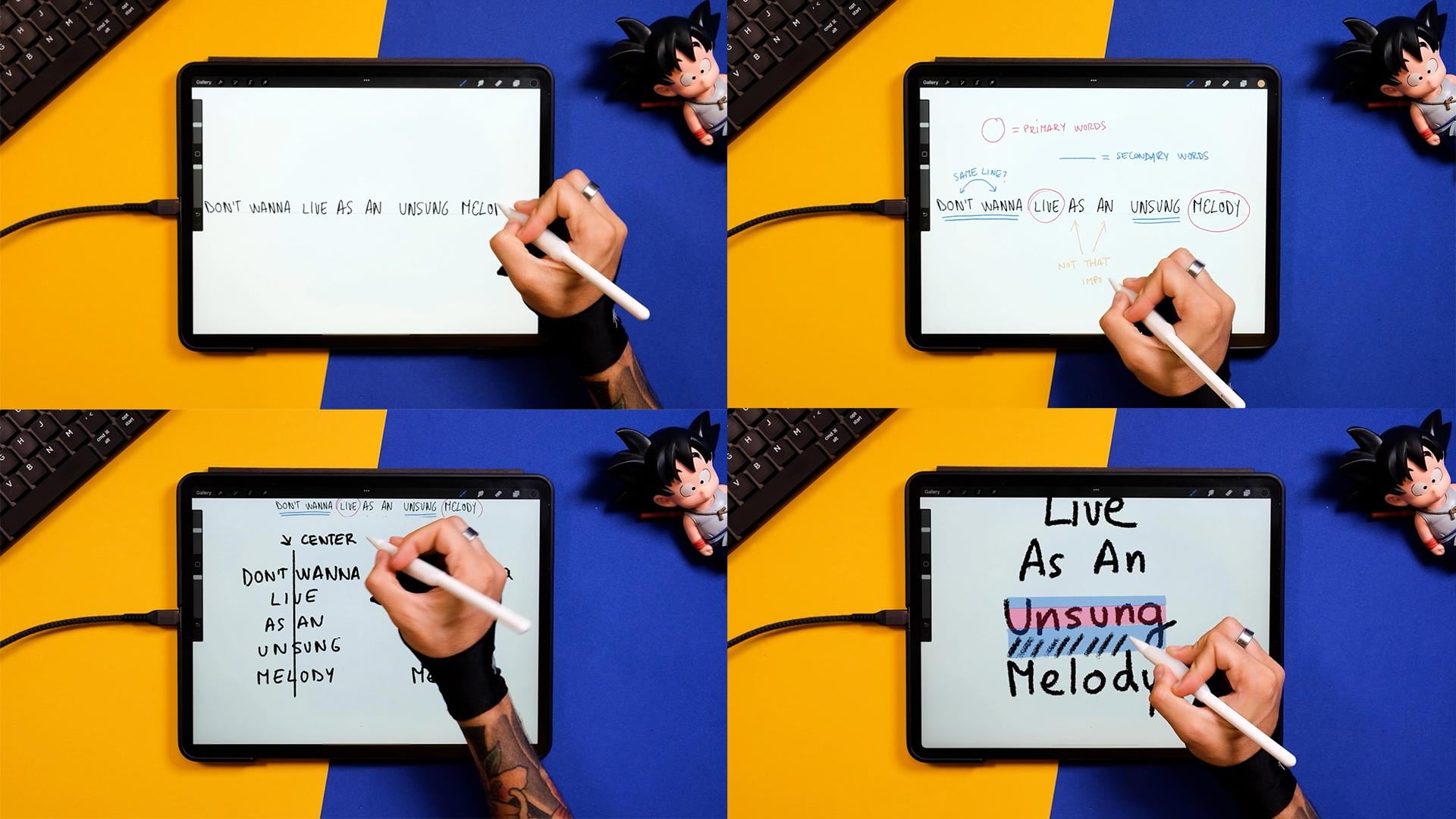
look so pretty. Step number three, primary and secondary words.
Let's identify them. Okay, so I want you to grab a different color, for example, a pink and just circle those words that you
think are the primary ones, meaning the most important
ones to understand the quote. Okay, so now that we have this, for example, in my
sentences eve and melody, now I'm going to underline
the secondary words, meaning those that are a
little bit less important, but you still need to make
sense of the whole sentence. I also wanted to
show you that it's okay if you group some words. For example, don't wanna, for me, are going to
work in the same line. At this stage, you can
leave this just as it is, but I just wanted to show you these two words that even
though they're not essential, they will have to
be in our design. So now we got to understand our quote and the different
primary and secondary words, and now it's time to
start arranging this. Step number four, let's play with a little
bit of hierarchy now. Remember that we are still not
making pretty things here, and it's all about understanding our quote and getting
used to our words. Now as a reminder, I'm just going to turn up the
layers, create a new one. And here you should write your quote by dividing it
in between the primary, secondary, and those
not important words. We are going to explain this
better in the next step, but I just wanted to
have a little recap of what's happening
in my sentence. So now I'm selecting another
color and I'm putting the primary words just a tad smaller than the
secondary words. And now before we move on, I'm just going to zoom out the whole composition and see if I can still understand
what's the quote about. So the primary words should
be really visible and the secondary words should be a little bit less
visible but still there. Now, if I understand
what's happening, if I understand the
meaning of the quote, that means that we are
on the correct path. Oh, and if you're doing
this on a piece of paper, just make sure that you get
a little bit away from it. Now, I just erased what I did, and I'm going to turn on
the previous layers where I had the main
hierarchy of the words, and I'm just going to
make this a little bit smaller and put it
on top of my canvas. Step number five, lowercase
and uppercase letters. Let's study when and
how to use both. For this exercise, I'll first write the quote
using big letters, so capital letters, and
then right next to it, I'm going to write the quote using lowercase or,
like, small caps. Now at this stage, I'm sure that you can already see
what's going on in here. So let's study a little bit
of the spaces those generate. You don't have to do
this with your sentence, but I just wanted
to explain it in a way that it's a little
bit more understandable. So you see that this rectangle, as I adapted to the
different words, all the words are kind of compressed in between this line. And this just happens
with the capital letters. So what happens to
the small letters when we put this
rectangle on top of them? You can see that because of these letters
that go up and down, our spaces are not
going to be consistent as before in the
uppercase letters. But we'll go back to
that in a couple steps. Now, before moving
on to the next step, I want you to draw a line in the middle of the two
sentences you have right now. Now, you understand your quote. You remember the word hierarchy, and you're ready to start
composing a layout. If you want to get better at it, repeat this process
with different quotes, and you'll see that
the more you do it, the faster you'll get to
understand different sentences.
5. Layout Essentials: Scale, Lines & Containers: So let's go to
lesson number two. In these five next steps, we'll talk about lettering sizes and layout possibilities. Step number six, let's now adapt the size of our
words once again. I gave you an example
on how to do this, but now let's do it for real. So go to the selection tool, select the rectangle option, and then separate each line at a certain distance
from the next. By doing this, we'll get a solid space for us to make the words
bigger and smaller. Alright, so now let's select the primary words in my case, leaf and melody, and
I'm making them bigger. If you're doing this on paper, you can just rewrite your
sentence on a new paper. Now, instead of making the
secondary words bigger, I'm just going to
get the tertiary or those that were
not important, and I'm just going to
make them smaller. Remember that while you change
the size of these words, you can bring them together. So the whole quote
looks like a group, actually, and it doesn't
look like individual words. All right, so now select both sentences and bring them in the middle
of the ardbard. Step number seven, why uppercase letters are
easier to play with? Well, lowercase letters have a bunch of ascenders,
like the letter D, and also descenders, like
the tail of the letter G. Meaning they are harder to fit in the grid.
Let's see it. Okay, so now I'm going to
turn off all the layers and I'm going to create a new one.
You don't have to do this. It's just theoretical. It's just for you to understand the difference between uppercase and lowercase and what's a descender and
what's an ascender. So here I've just
drawn a couple lines, and I'm going to
put a word in it. I'm just going to select
a calligraphy brush that I made in the past
for one of our sets, but you can select any kind of calligraphy brush that
comes with Procreate. Now I'm just gonna write the word song since it's part of the sentence
that I'm using today. And as you can see,
now that I did the G, you can see that I'm generating
some blank spaces on the down part and also
on the upper part. This can be filled
by other words, for example, or some ornaments, illustrations, even
some ligatures or some embellishments from
the letters themselves. So, for example, here
I wrote Mellody down, and then up here, I could do a couple ornaments
to cover the space. Now, let's see
what happens if we don't use lowercase letters, and instead, we use
uppercase letters. You've seen this
before for sure, but you can see that
you can fill up the spaces using capital
letters way easier. And yes, you could
complicate things by adding some embellishments
or flourishes. But if you just keep it simple, it's going to be way easier to fill up spaces with
these kind of letters. And now, for example,
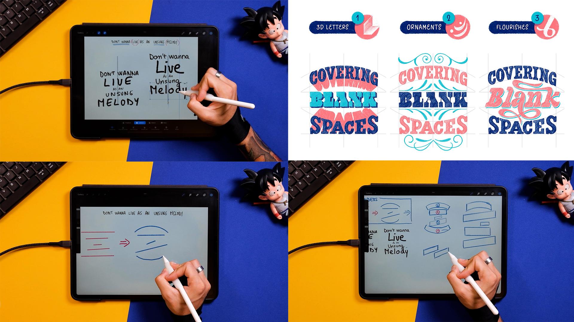
here, we can just move on and write what's
left on the sentence. Alright, so now let
me just show you an image from our set
this layout lettering master class where we kind of clarify how to use blank
spaces with a real example. Here you see the same
lettering piece, but using different techniques
to cover blank spaces. As you can see, there are endless
possibilities to do this. But the first step would
be using three D letters. This can be projected
almost anywhere, so it's a really good technique. Then the second
one is ornaments. And this is probably
one of the easiest. Why? Well, because
ornaments can get more difficult or can
be really easy to do. In this course, I'll
show you how to do my favorite ones
that are super, super easy to do,
and you're going to be able to fill up all your
blank spaces with them. And finally, here
we have flourishes. Flourishes come from letters. You can either make them
from script letters, and if you want to complicate
yourself a little bit more, you can also do it
with capital letters. I just want to give
you a little tip. If you were to do this. Please keep it quite
simple and don't make the flourishes super
intricate because it's going to add too much
complexity to your pieces. Yeah, this is a little
introduction to blank spaces, which is a subject
that can get difficult and probably is a little bit
too advanced at this point, but I wanted to give
you a couple tips just in case you wanted
to get introduced to it. So now, after this little break, let's go back to our piece. Step number eight,
composition through lines. Before jumping into
creating your own grids, I want to show you a few
tricks that I always use. Since now we understand
uppercase and lowercase letters, a little bit what a
blank space means, and we also
understand our quote, I want to give you an
introduction to lines. This is not necessary, and a lot of people
don't use this, but I find it really,
really useful. So what I want you
to do is to create a new layer and just add horizontal lines with a different color on
top of your words. By doing that, you'll figure out the length of
your words and you'll get one step closer to make containers. Let's
see an example. This is quite an
obvious example, but you can see that by
adding multiple simple lines, you can create containers. You can see that
the lines give you the angles your words are
going to have afterwards. You also start
figuring out where your blank spaces
are and what kind of letters you can use depending on the angles and the
shapes of your lines. But let's move on
to our piece again. Okay, so now, what
I want you to do is to hide all the layers and just keep the lines
that you just done. Now, these lines, I'm just going to transform them and make
them a little bit smaller. And now I'm going to show you how you can actually
convert these lines. So, for example, the first one, you could put an arch. Again, this is a really good way to make random compositions, so you don't have to
think about it so much. You can use any
angle, any shape. You can use a wavy form. You can use whatever
you feel like. But in this case, I'm
just going to throw different lines here and there and see what I
can do with them after. It's a good exercise
because it doesn't take a lot of mental space, and the results you get
after are fun to see. Let's move on to the next step. Step number nine, converting
lines into containers. I would recommend for you to try the exercise
of these lines more and probably
come up with like three or four sketches
where you just have lines. But now I'll go ahead and I'll convert these
lines into boxes. So as you can see, for example, this curve line is
just two curved lines, and then you close the
shape after and then mold, same mold with the
other containers. So now I'm done with
the first containers. What I'm going to do now is to select all the info
that I had before. So these straight lines and curve lines and
all that thing, and I'm just going to put it
into the top left corner. For me, it's important
to keep reminders in my artworks because I remember the time when
I was doing it by hand, and I would just get
a big sheet of paper, and I would just write
everything and I would never erase any info
that I had before. This is going to help you
move on faster for sure. So just keep it there and you'll see how it becomes
useful at some point. Okay, so now I'm
just finishing this. And then I'm going to come
back to what I had before. I'm also going to
bring it smaller and put it on the left. Step number ten, our first
layouts will reveal a lot of information that will be super useful in the next steps.
Let's take a look. And now, what I want you to
do is to change the sizes of these boxes depending on the size of your primary
and secondary words. So now everything makes sense because we'll get
the hierarchy done, but the boxes are
already finished. So select, let's say, the primary words for me, remember that is leave, at least the section
that is my primary one. Then a N, I'm going to
bring it smaller here, then unsung might do it a
little bit smaller like that. And then melody, since
it's my main word, I'm just going to bring
it bigger and put it somehow a bit taller
and just leave it there. So now we have our containers, and we also have how big our words have to be based on the information
that we gathered before. I'm also writing
these little numbers, so it gets even clearer what goes bigger
and what goes smaller. Okay, so now that we have the first composition and we had a taste of what making boxes
or containers look like, I'm just going to continue
doing compositions, maybe a little bit bigger
and a bit more detailed, but still not too
much at this stage. Okay, so let's see
what happens here. Since I know that the second
word is my primary one, just go to make this
box a little bit bigger and on an angle, just to see what happens. Then the words as and quite smaller here
on the right side, then song, I'll just make
something straighter like this. And then probably melody, I'm just going to follow the same style of the
container of leaf. And the same size, obviously, because it's also
a primary word. Okay, so I'm done with
this second composition. Now, I'm going to go ahead
and do the third one. And for this one, I
thought that maybe I can break down wana since I was
putting it all together. Now remember that we are
always using one center, and I forgot to include
that in the beginning, but I think it's going to be
easier for you if you draw your center right when you
start doing the compositions. Now that you know more
or less how to convert lines into containers and how
to do your first layouts, we're going to go to the
lesson number three, where we're going
to add words into these compositions at the same time that we
are finishing them. So just a little recap of what
we learned in lesson two. Now you know how to start creating your own
custom layouts, and if I was you,
I would practice more with different sentences. Maybe you could grab quotes with more words and come up with
nice layouts for them.
6. Refine & Finish: Thumbnails to Final Sketch: In lesson number three,
we're going to study blank spaces and you will incorporate your letters
inside different layouts. You'll finally be getting
tangible results. Step number 11, blank spaces.
What happens with them? So here I'm writing
the word live in this box that I did at the
end of the last lesson. And I'm seeing that
there is a blank space. So this is the
perfect opportunity to cover this blank space by doing a better and bigger
L. Don't get me wrong. You can also cover
this blank space by doing something else
like some ornaments. But in this case, I
think it's going to be perfect to include
a script lettering. So I'm just now
doing this script L, and I'm going to write
live m inside the box. So, yeah, you can see this
as just a little reminder. But if there is a blank space above a box that could
contain script lettering, it's the perfect opportunity
to go ahead and use it. Okay, and now I'm
going to continue this composition by
adding different boxes. Right now, for
example, I'm already thinking where could I
place the little not important S N. So I'm doing this curved container that's going to have
the word unsung, and then the little
word on its right. Okay, so now I'm just creating the box for the word melody. Again, using the same
angle as the word live as probably I could also use the same
script lettering style. And here, I'll have
way enough space to introduce a nice script. So now I'm just going
to write the word so you see how it
could fit here. Then the next step I'm
going to do just for showing you, you
can do it as well. If you want on a new layer, you can select another color that is a little
bit more visible. For me, it's a pink. And here I'm just going to
paint all those blank spaces that are visible
and that I would like to cover in
some way or another. Also, if I have in mind that my composition is going to
be completely rectangular, I can consider those spaces on the bottom and on the
top as blank spaces. And here I could fit the little tail of the
Y of the letter Y. And now that I have
three compositions, I'm just going to
do one less one. I'll probably just
use the second, the third, and this fourth one. The first one, I'm not
super happy with it. And since it was just for you to understand
what I was doing, I think I'm just gonna
leave it like that. So here you can see already some blank spaces
that are happening. Then I might have to redo this composition because I think it's going
to get a bit longer, but in any case, I'm going to leave you
a bit with the music and see how can I
finish this one. To Okay, so now that I'm done
with this composition, I'm going to go ahead and
I'm going to identify the blank spaces that
are happening here. So I see these ones on top, and then since the last word is a little bit bigger
than anything else, it goes to the left and right. I also have these
blank spaces that I could probably even cover
with some illustration. I'm going to see what
I do with them after. Now here, there's also
a little blank space considering it's going to
be a perfect rectangle. And I'm pretty much
done with this. But you can see that
this composition is a little bit longer
than the other ones, and I'm going to tell you
how to solve this later on. Now, let's find
some blank spaces in the second composition. This one is going
to be a little bit trickier to find blank spaces, and you can go, you know, nitty gritty and see all the
little ones here and there. Again, some of
these blank spaces, you can just leave them blank
and they won't look bad, but it's good to
identify them in order to have a good idea
of what to do with them. Okay, so now I just pinched
all these layers together. And I'm just going to
select this first one. I'm going to erase
it by bringing it outside of the canvas. Make the information.
You know, the reminders, make them a little bit smaller because I need them less
and less, but I still do. And now I'm just going to reorganize these
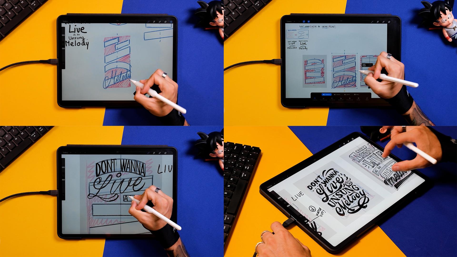
three a little bit. Step number 12,
adapting our layouts into our canvas and start
sketching the first letters. So my canvas is going
to be this whole thing, and I'm going to
make it in vertical. Does that mean that these
three compositions have to be done from scratch?
Well, not really. So now I'm just drawing
here just to show you, let's say that we
have two canvases. One more vertical and the
other one more squarish. Now, what we can do here is just to change the ratio of
these three compositions. So let me put an
example for you. I'm just going to
select one of them. Let's say this one
from the right, since it's the one I
like the most so far. And then I'm just going to I'm just going to
join the squares, and I'm just going to show
you what happens when I deform this composition. So now I'm just going
to adapt it into the more vertical, like,
rectangular canvas. Just go to make it
a bit smaller so it fits and it
breathes a little bit. And now I'm just going
to duplicate this one and I'm going to deform it
using the transform tool, and I'm just going
to make it squarish. In my opinion, at this stage, you can deform the compositions because you didn't put
the letters first. If you put the letters
and then you deform them, then you're doing then you're doing something wrong to the letters, and you
shouldn't do that. So now that you have the chance, just deform your boxes
as much as you can, and then you're going to
include the letters inside. Now, I'm just going to show you the differences when
I put one word, like, right now,
I'm doing the leaf. In the same box but
with another format. So you see what happens,
for example, in here, I'm doing something more
chunkier that has more width. But then when I go to the
more vertical composition, the word leaf cannot be
that squarish anymore, so the letters have to be
a little bit more taller, probably adjust the
separation in between them. So I'm just going to
have to play with something a little
bit different. And then, again, I think, now I'm going to show you
a third example of, like, what would happen if the composition
was super narrow. So let's deform
this composition. And as you can see
now, it would be trickier to put most words, especially the script ones because they're gonna
have to be really close to each other
and you won't have space much to put much detail. But, for example, the word
leave since it's short, there is a way actually that you could make it fit in here. But this is just an example.
You don't have to do it. So let's go back to our
three compositions. Now, you're going
to do a new layer, and you're gonna drop the
color like I'm doing here. Select the transform tool, make sure that it's uniform, and now you're gonna keep the same size of
the whole canvas. So now, make sure that
these settings are on and just put it on top, duplicate it, move it, and do it for the third time, and just put them one
besides the other. Now we join the layers, we bring the opacity down. And now, as I said to you
in the example before, I'm just going to adapt these compositions into the
shape of my final canvas. Yep, the first
sketches are done. So now let's put some
letters in the next steps. Step number 13,
cleaning up layouts and coming up with three
semifinal thumbnails. Okay, so now that we have
these three rough thumbnails, I'm just going to
bring the opacity down and I'm going to
create a new layer. Now, I'm going to show you a little trick to do
boxes that are mirroring, meaning the left and the right side are
going to be the same. First of all, you draw a line in the middle
of the composition. Now, you make sure it's here. Now you duplicate this line, and I'm just going
to put it into three compositions,
just so it's there. Here you go. And the third. Okay, now I'm going
to join these layers. And now what I want
you to do is to bring the opacity down and go up in the panel and go to adjustments
and tap on Drawing Guide. Turn it on like this.
And just tap inside. Now you see a lot
of options here. Now I want to do the
symmetry option. So it's just mirroring
left and right. Here up, you can change
the color of the line, and here you can
change its thickness. And here you have more options, but for now, we won't use them. So now just bring this
by tapping next to the little button that you see and bring it to
the first composition. Now click on Done, and
now go to the layer. Make sure it's this
one, the empty one. So make a new one if it's not. And now here you tap on
it and drawing assist. Now, every time that
you draw something on the left side of this
line is going to draw automatically
in the right side. This is going to
be really good for some containers like this
one because it's mirroring. But, for example,
this one won't work. So just go back to
your compositions and mirror the ones that you think
you can actually mirror. So here I'm also going to do
this curved one right here, and I think so far, I'm done. So now, so now go
back to adjustments, turn this off, go to
layers, tap on it, and tap on drawing assist
so it doesn't work anymore. And now here I'm just
gonna leave you with a little time laps of me
finishing these little boxes. Remember that it's just lines, so there's not
much secret to it. Remember that all
these boxes that have an angle should
be at the same angle, so you can copy the lines
that you've done previously. And now here as
well, I'm going to copy this box right here. Okay, so now here I decided that probably I'm going to go with
something more curved. It makes a little
bit more sense. To too Now here, in order to cover
these blank spaces, I've decided that
instead of doing just a whole box and just maybe playing
with script letters or putting some ornaments, I thought that maybe this word can just be a little
bit more free. So since it has five characters, I'm just going to draw
five little boxes that go here and there, it's kind of giving me the
feeling of a neon sign, and probably I'll
go with this logic, and I'll create the whole
piece in that style. So, yeah, the letters would just be in the middle
of this thing. But I would keep the boxes, actually, not just
as containers, but as illustrative elements. So now I'm gonna
finish this one. For example, I think
what I'm going to do as well is to put, like, some more elements that remind me a little
bit more of a neon sign. And for example, here, I would write the a N
and then here song, and then melody could go really big down with some
neon typography, for example. Anyway, so now that I
have everything done, I'm going to put the
opacity down of each layer, and now I'm going to start
writing the letters. So the first thing I
want you to do is to write the words like this. And then with another color, I'm going to count how
many letters we have. Here I'm putting
the number five. I sits in the space in the middle because
there's two words. But if you have one
word, obviously, you won't have a space in
the middle like this one. So now I calculate that
there's five spaces in Don't plus space and then five
spaces in the word ana. Now this just gave me a
little bit more information, and now I'm going to distribute
these letters better. So I'm going to
start in the center. This first space is going to
be actually for the space, not for the letter. Then the second one
is going to be the T, and then I can go in the
beginning knowing that the O and the N have enough space in the
middle of the composition. And I'll repeat the
same steps with every single word that I have in these
three compositions. Now, the words with odd
numbers are going to be better because then the letter in the middle is going to be
directly in the center. But if you have words like
this one, for example, you can just know that two of the letters
are going to go on the right side and two
of the letters are going to go to the left side. Now here, for example, I
have a blank space again, so I could make the L taller and maybe put
the dot on the I. But I think I'll use
script lettering as the examples before. So you see here, I
have space for the L, and then I'm going to use this blank space down
to even make it bigger, this swash from the L. And now I'm just going to write live with the space remaining. Okay, so now that I have this, I'm just going to
finish the quote. Now, as N, remember, this is the smallest part of it. And now unsung here, you can also select
letters and move them along if you're not
satisfied with the spacing, for example, and I'm just
going to put melody. I'm also going to use the
same style as in leaf. And as you can see, since
I have the blank space up, I'm going to be able to put the N in capital
letters or just bigger. Now, down here, I'm going to do a swash. That's gonna look cool. So now, here, for example, I have a D that is an ascenders, so we have to watch up with it. But maybe later if I decide
to go with this one, maybe I can take care of
it when I clean it up. As you saw previously, in the second composition, I divided the first
group of words, so don't wanna, and I'm
putting it into lines. Okay. So right now here, I'm going to do the uppercase L, but I'll probably select these boxes and just put
them a little bit up because I'm seeing that there is
not enough space for this L. So you can always
move the boxes around. Now, I am doing a circle in here as a little space for me to put the
non important words. And I'm doing these
lines just in case I want to do some
ornaments afterwards. Okay, so now half of
the sentence is done. Now I'm placing song
with the same technique. Remember, starting
in the middle, three letters on the right side, three letters on the left side. And now here I'm just
retouching this box because I thought
the script would go better if it's less tall than
intended in the beginning. And now here I'm
just moving the, and here I'm going to do
that swash as an ornament. Okay, perfect. Let's go
to the third one then. In the third one,
I'm going to have a different approach,
as I stated before, and you've seen in
my composition, they are going to be
illustrative elements that contain smaller
boxes inside. So for example, here,
you can see that I'm doing a box for don't, but I'm not using it fully. And I'm just placing the word
in an invisible box inside. And the same I'm doing
here, for example, in this little neon boxes that I'm going to
be doing after. So just placing first
the containers, then I'm doing this. I'm simulating this kind of
three D. And then I'm placing the letters inside without
touching the margins of the box. Wanna. Okay. There you go. Now, the third word I'm
just making the square, the container a
little bit taller. I'm gonna put leaf
here, and then unsung. And this melody, I'll use
it for a nice neon sign. Okay, so I'm pretty much done with the main
skeleton of the words, and now I'm going to go
ahead and add some weights. So, for example, this don't. I've decided for it to
be a San seri font. Remember that Sanserif
is going to be great for those small sizes
and no important words. Since they're going to be small, they don't have to
have a lot of details. So I would advise you
to use Sanserif better than a more complicated
lettering style like Serif or script. Okay, so now let's do this leaf. Let's add weights
here and there. Okay. And remember that I'm just filling this
up with a pencil. And now I'm going to show you these illustrative decorations
that I put all the time. So they're basically just
little droplets here and there. They're really easy to
make, and they look nice. So you can use this to cover
up the blank spaces for now, and then you can learn
other styles in the future. If I was you, I would be getting some books that teach a
lot of ornament styles, and especially my favorites are the Art Nouveau ornaments, and you can get a lot of
information from there, and you can find all kind of
ornaments, florals, swashes. Now, the word and
sung as you can see, I'm using a script
lettering style. And then the word melody, it's going to be
similar to the style I used up in v. Okay, now let me work a little
bit on this swash, and I think I'm
done with this one. And also at this stage,
forget about perfectionism, since we just want
to get the style and a little bit of the feeling that the pieces are giving us. So let's go to the first one here in the word leaf, again, repeating more or
less the same style that I use in the second sketch, but maybe I'm approaching
more of a monoline style for the script lettering
than this unsung. I'm also approaching another
style with different serifs. There you go. Okay, so now
I'm going to the word melody. And for this, you can just get a thick pencil and you'll get some kind of a
rough monoline style. Just go to make this
a little bit thicker, and I think I'm
done with this one. So let's go and
do the third one, the neon style lettering. So now here, I'm just going to so just
keep in mind that here, I'm sketching, thinking about all those neon signs
from the 60s 70s. So I'm just going to try to make these little three D
parts, like, really easily. Again, this is just
me sketching here. I don't know if I
would use this one, at least in this course, because heat is a little bit
more complicated. And when you start
adding three D letters, it takes time for you
to understand them. And by the way, just a
shameless plug here. But if you're interested
in three D lettering, you can always
check our product, the Easy three D
lettering Builder. Okay, so now let's finish
up this composition. I'm doing this neon
Aero sign here. And then now the word melody, I'm using the same style as
in the first composition. And remember that I'm just
using a thick pencil, and now I'm just retouching it a little bit with
a thinner pencil. And again, I'm just
going to put, like, some tiny details so I get to understand where
the piece would go. Now, I don't know
if you remember, but when we were sketching
the structure of this piece, we said that there were some
blank spaces left and right. So I thought maybe
I could put, like, a little neon tube or
something like that. Okay, so now I want
you to zoom out the pieces and see which
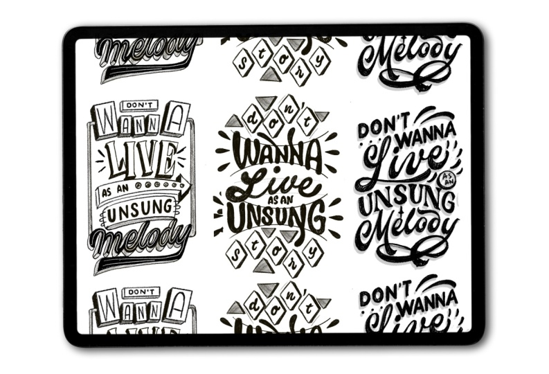
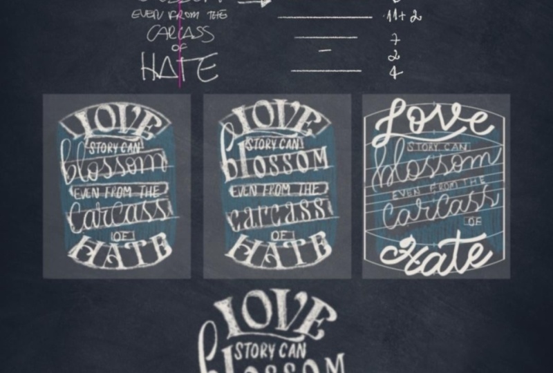
one convinces you the most. Step number 14, deciding which thumbnail is
best and final piece. I quite like the three of them, but I think for the
sake of the exercise, I'll probably choose
the one in the middle. So I'm just going to
erase layers here, and then I'm going to turn my page around so we
get a vertical canvas. And then I'm just going to make the piece that I like
the better bigger. If you're doing this by hand, you can always scan your sketch, make it bigger using any software, and then
you can print it out. Then you can put
some tracing paper on top and redraw your piece. Okay, so now bring the opacity
down of all the layers. Here I'm also turning
off my lettering. I'm just going to zoom
in my composition, so I understand what
I have to do now. And I'm also going
to start adding some new guidelines that are going to be really
useful for you. Here, I'm using one of
our products as well, but you can find a
freebie included in the course with some
basic composition lines. Okay, so now you can
select the vertical line and just stamp it on a new layer in the
middle of your canvas, maybe make it a little
bit bigger like this. And now each line that you're going to put is
going to be on a new layer. So I'm just going to
get this angled one, stamp it, and flip
it horizontally. Now I'm going to bring it up, and I'm going to duplicate the layer and finish
this container. These lines have been
created at certain angles, my favorite ones, at least, but you can adapt
them to your letters or adapt your letters
after like I'll do. They have a little diamond
shape in the center, so make sure you stem them right on top of
the vertical line. Okay, so since like
I'm done here, now I'm going to pinch
all these lines, create a new layer, tap on it, and tap
on drawing assist. Now, get another vertical line, and now we are going to close the whole composition
from the right and left. So as you can see, as you add one vertical
line on the right, it's going to automatically
mirror to the left. Now I'm going to adapt the individual words into
the newly created boxes. So I'm just going to
grab the select tool to grab them individually and then the Transform tool
with the four options down. The easiest one is the distorted tool,
the one I'm using now, and then I can always use the word tool if my words
are, like, really off. So just try to move them here, maybe adapt a couple
letters here and there, and finally, maybe the melody. I'm just going to adapt
the angle a little bit. I'm going to distort it, and I think I'm pretty much done. So just a little recap. Now you know the
basic techniques to come up with your own
letter and compositions. And if you want to
get better at it, try to come up with more
than three final sketches and explore different
possibilities. Remember to use the collaborative
Pinterest board to post some of the sketches
or even you could make some Instagram
stories with them. I would really love to give
you feedback if needed. So now, take your time
and finish your sketch. This process can take hours depending on how much of
a perfectionist you are. I personally like clean sketches because I find them
easier to render after. Spend a bit more time now, and you're gonna thank me later. Here I'm giving you
a fast time lapse of me sketching the final piece. This whole process took
me around an hour, and I'm just using
the same old pencil that we've been using
the whole time. So I'm just gonna turn on the music and leave you with it.
7. Final thoughts & Share your results!: Boom, you made it. If lettering composition felt
intimidating before, I hope it feels way
more approachable now. You just learn how to
break a quote down into primary and secondary
words, build hierarchy, explore layouts, spot
and manage blank spaces, and finally pull everything
into one clean sketch. The most important part is that now you have a
system that you can basically repeat
every time that you want to tackle a
lettering composition. Do this process a few times
with different quotes and you will start trusting your eye more and overthinking less. It becomes second nature, actually. Now it's your turn. Pick a quote you like,
follow the steps, and upload your sketches
to the class project. Would genuinely love
to see what you make. And if you want to tell me
what felt easy or what felt tricky and what you'd like to practice next,
please let me know. You can also find more of my work classes and
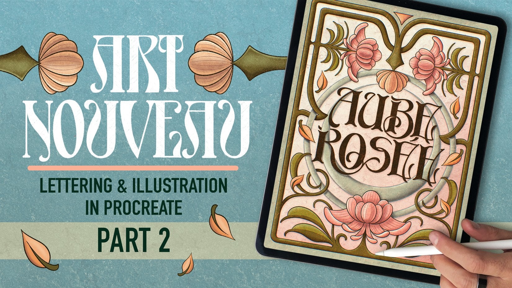
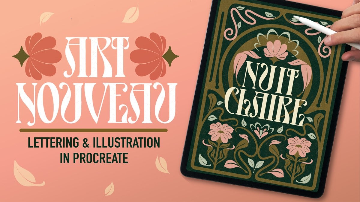
freebies at shoutbam.com, or check out my other
Skillshare classes like this one on Art
Nouveau lettering. Oh, and you can reach
out on social media at Shoutbam and Jimbo Bernaus. And if you want to share
what you did today there, I'm going to share it
with the community. Thank you so much for
taking the class, and I'll see you in
the next one. Bye.
 Jimbo Bernaus - Shoutbam, Letterer & Designer