Transcripts
1. Introduction: Imagine the thrill of seeing your beautiful artwork displayed as a cohesive and
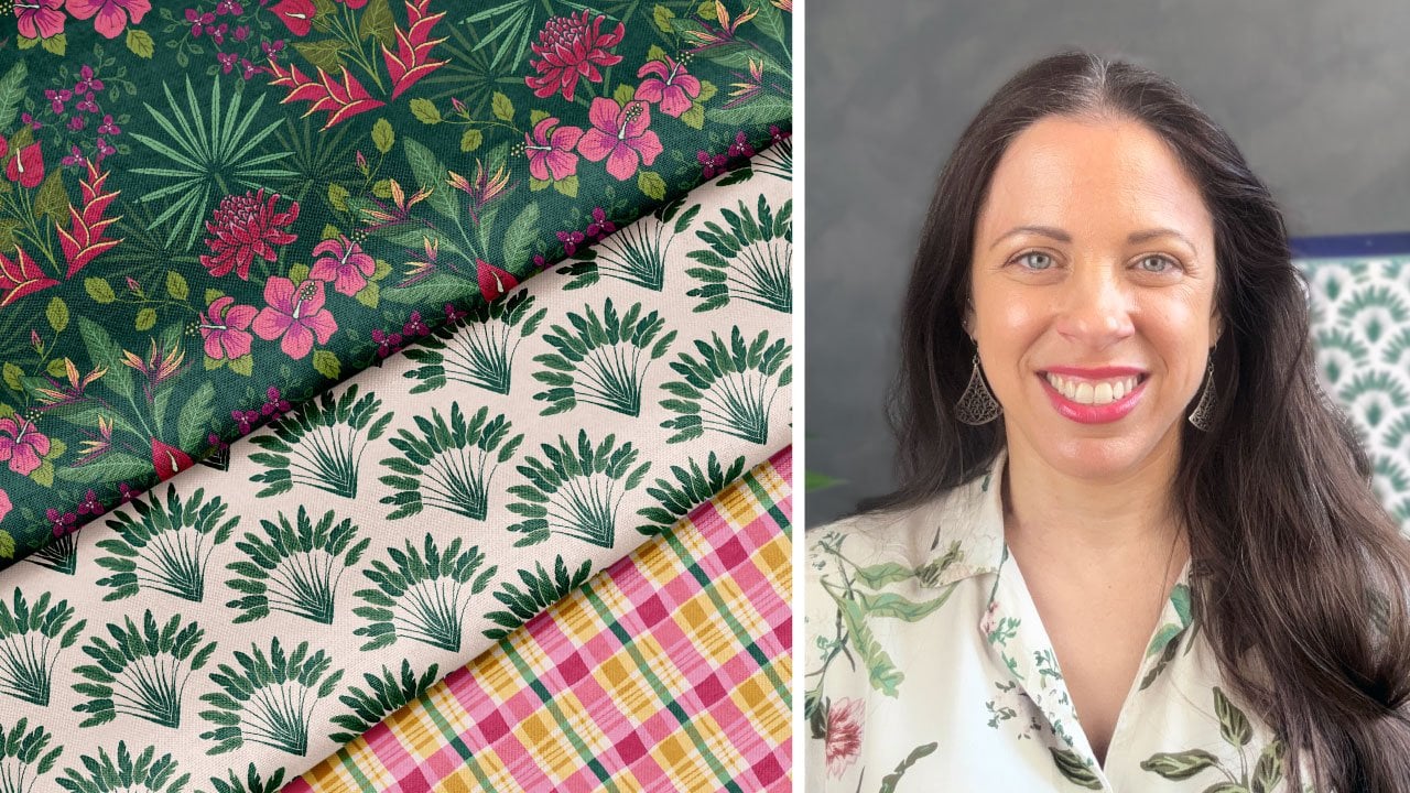
captivating wall art series. Hi, I'm Jamie Alexander, a surface designer and
illustrator in Toulouse, France. I've collaborated with
amazing partners like Target, Disney, Mint, Trader Joe's, and Hawthorne Supply Company. Creating a wall art series
of two or three prints is a powerful way to add a polished
aesthetic to any space. In this class, I'll show you
professional techniques for designing striking
art prints that can stand alone or work
together in a group. We'll decide on a
space to design for, discuss techniques for making a cohesive and
harmonious series, select a theme, and establish
a striking color palette. We'll also cover common
art print dimensions and work on setting up
a canvas in procreate. I'll walk you through
my process from finding inspiration to sketch
to final illustration. I'll also show you how
to prepare your files for print and choose
a fun mock up to showcase our art
print series in your portfolio or
on social media. Finally, I'll provide
recommendation for manufacturing or
selling your art prints. As a mom of three,
including twin toddlers, finding uninterrupted
stretches of time is a big challenge. I bet you also have
a busy schedule, so I'll be keeping
things simple today. While this class is
suitable for any level, I'll be working in Procreate, Adobe Illustrator,
and Adobe Photoshop. So I'm assuming that you have basic knowledge of
these programs. By the end of this class, you'll have created
a captivating series of two or three prints. To elevate your home,
give as a gift, enhance your portfolio, sell
on print on demand sites, or even pitch to a company. You can even apply
these skills to other forms of artwork
like stationary and cards. I can't wait to see
your wall art series. Let's create something
amazing together. I'll see you in class.
2. Class Project: Wo I'm so excited to share my passion for illustration with you and provide my insights into creating a simple and
cohesive series of wall art. In this class, we'll
create two or three prints that can be displayed
alone or in a group. I'll guide you through
the following steps. Choosing a space to design for, ensuring harmony and
cohesion in the series, finding inspiration
and choosing a theme, establishing a beautiful
color palette. Designing for commonly
used dimensions. Thumbnail sketches, setting
up your procreate canvas, illustrating and
inking your design, finishing touches in
Adobe Illustrator, using a mock up in
Adobe Photoshop. And opportunities and ideas
for your Wall art series. Here are the materials that
I recommend for this class. A pencil and paper for
sketches and notes, an iPad, Apple Pencil, and the Procreate app for
the illustration process. I'll then be finishing
up the project and preparing for print
in Adobe Illustrator. Then I'll demonstrate how to use a mock up in
Adobe Photoshop. I have also prepared a list
of prompts for each room in your home in case you need help getting those
creative juices flowing. You can visit Jamie alexander.net
slash Wall Art Guide. In the next lesson,
we'll discuss the most crucial step of
designing a wall art series, deciding which space
to design for.
3. Choosing a Space for Your Wall Art Series: Before we get to work
on our wall art series, it's very important to determine which space
we're designing for. Living room, kitchen, bedroom, nursery, home office, bathroom. H hallways are also a great
opportunity for an art series or gallery wall because they serve as a
transitional space, and they guide people
from room to room. Don't forget the possibility
of commercial spaces like restaurants
or retail stores. Understanding the specific space is going to help us to tailor our design to suit that purpose,
atmosphere and audience. Each room has very specific
functionality, and therefore, different needs when it comes to visual appeal and also
spatial constraints. For instance, if my work were
destined for a living room, I would be aiming for a warm, inviting atmosphere, and the artwork would inspire
conversation or relaxation. If I were designing
for a kid's bedroom, I would aim for a brighter
color palette and use more personal illustrations that would reflect kids
interests or passions. Culinary and food
themed artwork would probably be best
appreciated in a kitchen, and one might expect
a bathroom to feature botanical or nautical
themes on a small scale. So, now it's your turn to decide on the space
you're designing for. Remember to consider
the audience who will be interacting
with your work of art and the overall atmosphere
that you're aiming for. I'll see you in the next lesson
where we'll learn how to create cohesion in
our wall art series.
4. Creating Cohesion: When it comes to designing an
appealing wall art series, it's really important to think strategically and be cohesive. As the viewer, we are going
to be naturally drawn to art prints that
complement one another. Even if the individual pieces
can stand on their own, they are most certainly
better together, and they're going to have a much more powerful
visual impact. Art directors and potential
clients will be drawn to a curated series that is easy to display in various
iterations and spaces. Okay, sounds great.
But how do we do that? Here are a few ways to establish unity between works
of art in a series. Theme or subject matter. Being consistent
with your theme is a great way to create
a cohesive series. This could be as simple as
some geometric shapes or your favorite fruits
or as complex as an illustrated map of your
favorite travel destinations. Color palette. A limited
color palette across a series is a great way to
establish visual harmony. Not only will the colors give your series a
unified appearance, they will also contribute to the overall mood and atmosphere. You can either use
the same colors in each piece or use colors that compliment one another so that the pieces really shine
when displayed together. I usually aim for
the middle ground when designing
multiple art pieces. I may vary the background color for each piece to keep
things interesting, but I'm also going
to incorporate some coordinating colors in the illustration or lettering. I could also maintain the
same background color, but vary the
illustration itself. There is no rule on
how it should be done. I urge you to
experiment and save multiple versions
of your designs to see how they interact. Also, offering multiple
colorways of the same design to customers is a really great
way to maximize your sales. Artistic style. Try to keep your linework and textures
consistent between the prints. Obviously, if I were
working in analog, I would use the same
mediums and styles, for example, watercolor realism
or India ink minimalist. Working in procreate,
I would use the same brush size and textures to maintain
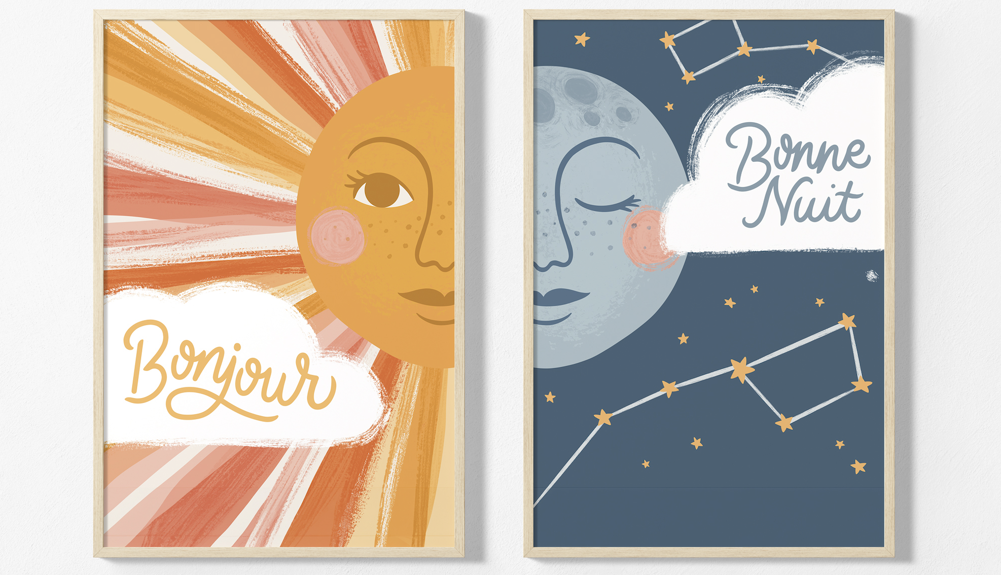
that harmonious effect. Interplay. Interplay
between your pieces can add depth and interest. Perhaps you can plan to make your art prints relate to
one another in some way. They can form a larger
scene, tell a story, and encourage visual movement by guiding the eye across
the multiple pieces. In this dipti, by matching up the sun's half face with
the moon's half face, we now have a full face. I have also explored
a contrast by using bold warm colors for the sun and softer cooler
colors for the moon, and I'm still maintaining some consistent colors
across both pieces. For example, this
mustard yellow from the sun has been carried
over to the stars. You can also see the
same textures for the white clouds and the
same pinks in the cheeks. Using these techniques will really help tie your
series together. If we treat each art print like members of the same family, your art print series is sure
to resonate and delight. In the next lesson, we'll choose a fun theme for our
Wall Art series.
5. Theme: Okay, it's time to choose the theme of our
wall art series. Remember to consider
the room or space, as well as the audience who will be interacting
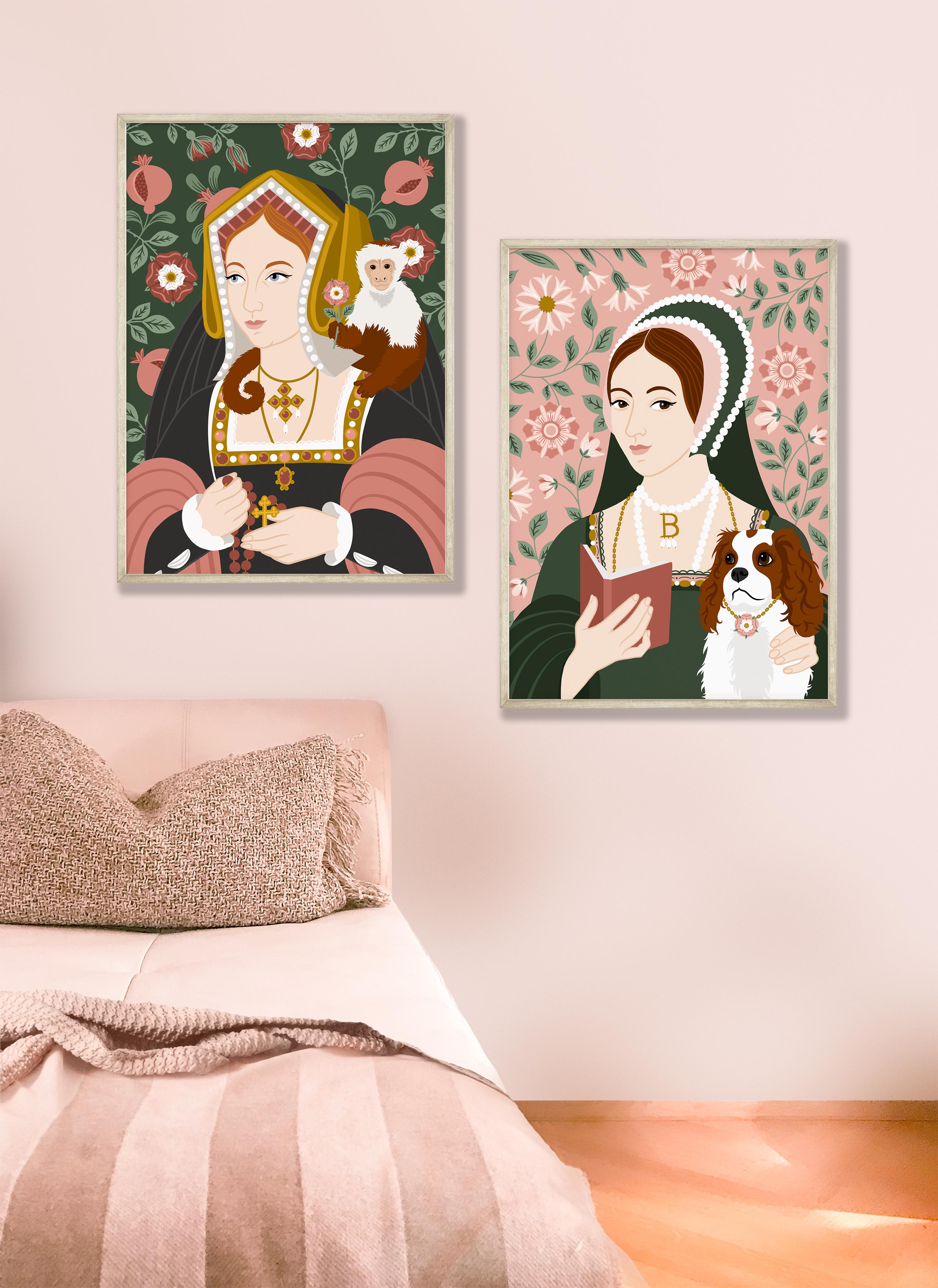
with your work of art. Since I'm about to move house, I've decided to design something
for my future kitchen. As an American living in France, I am deeply inspired by the different breads
and pastries here. So I'm going to take a
little field trip to the local Buongeri to gather some inspiration for
my wall art series. Care to join me, Onva. Oh. Well, as you can see, I have
been thoroughly inspired. While I was admiring
the fancy cakes and pastries which are like little works of art
in their own right. I decided that they would
be a little bit too complex for me to
handle at the moment. I have a tendency
as an artist to set out to create a
simple work of art, and I always give into the temptation to
go full maximalist. But I promised you and myself a simple wall
art series this time. So for that reason, I'm going to be sticking to
just bread this time. They'll be easier
and quicker to draw, I think, and they're
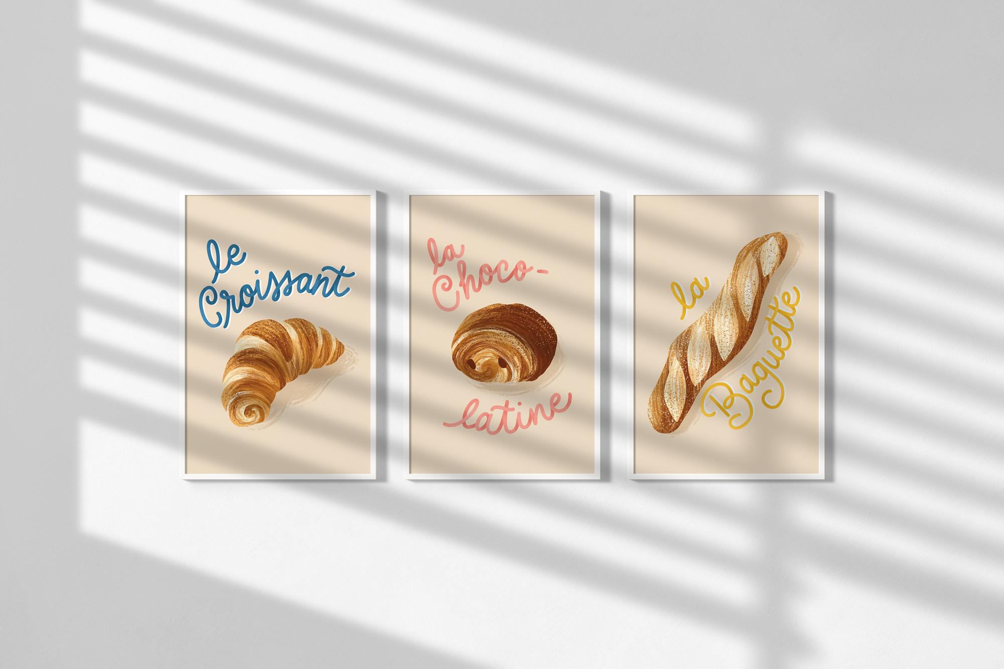
still very appealing. I've got this
beautiful baguette. I've got a ennois chucul. I've got a beautiful
spiral pano sin and a classic croissant. And of course, the
iconic pano C choco. Although here in the
south of France, we call it La chuco Latin. I'm not only designing
for myself, of course. I'm also thinking of licensing opportunities for this artwork, and I think there is potential
for a diverse audience who might be interested in French bread and
quirky hand lettering. I'm thinking food enthusiasts, Francophiles, travel lovers, or maybe educators,
just to name a few. I could also imagine
this series in acute cafe or a coffee shop. How about you? What will you choose for the theme
of your series? Remember to consider the room and the user when
making this decision. You can also check out
my downloadable list of prompts if you need something to get your
inspiration flowing. You can also check out my greeting card class
on SkillShare. Design a greeting card using inspiration from everyday life. In that class, I share
my favorite techniques for vanquishing creative block and defeating the blank page. Okay, once you have
settled on your theme, I suggest making a list of possible simple
variations, for example, types of fruit, breeds of dogs or vintage children's toys, whatever floats your boat. Well, I'm going to take some reference photos
of these breads now in case I end up eating everything before I
have a chance to draw it. I'll see you in the
next lesson where we will choose an inspiring
color palette.
6. Color Palette: Okay, it's time to dream up
a beautiful color palette. Today, we're using
color to establish a visual cohesiveness
in our wall art series, and also to set the mood
and atmosphere of our room. For example, a nursery may
call for soft pastels, while an older
child's bedroom might feature brighter, more
saturated colors. A living room might call
for more calming neutrals, and a kitchen may best shine with some bold dynamic artwork. When it comes to choosing
a color palette, here are a few tips that
I like to abide by. I like to choose a
limited color palette of five or six
colors or even less. I strive for at least
one light, one dark, two mid tones and a vibrant accent color
that really stands out. Even if you're making a brightly colored piece for children, try to include at least
one or two neutral colors. You can also add white and that won't count towards the
five or six colors. Now, this is probably my
biggest piece of advice. Using a limited palette
will add simplicity, sophistication, and
impact to your work. This will really give
us the impression that our artworks in the series
are part of the same family. By limiting our color, we're actually
freeing ourselves to concentrate more on the
illustration itself. I don't know about
you, but for me, the fewer decisions
to make, the better. Also, this makes it easier to recolor for multiple colorways. Now, there's many great ways to find a beautiful color palette. I have a pinterest
board where I like to save my favorite color
palettes that I come across, and I may decide to use
them on a rainy day. But today, I'm
going to share one of my favorite methods for
choosing a color palette, which is using a photo. I'm going to import
a few photos from my bread from the
Boulangerie into Procreate. To do this, I create
a new canvas, any size, it doesn't matter. And clicking the
wrench icon here, which is the actions button. Now I'll insert a photo by selecting my images
in the library here. Now I'll click once on the modify button
on the left side, which causes this little
circle to appear. Now, if you hover around, the circle will pick up
the color from the image. When you find a color that
you like, just release, and the color will appear in the upper right
corner right here. I'll select a thick brush
from my brushes palette. Doesn't really
matter which one as long as it makes a nice mark. I'll use Bardo blobby brush from the Bardo brush basic toolkit. Okay, I'll increase
the brush size and make a little
mark just here. And next, I'll click
on the Modify button once again and select
another color. And I'm going to just
repeat this step until I have a nice
selection of colors. Now I have a pretty good
selection of lights, darks, and mid tones. I'm loving these warm, welcoming orange brown shades. I am also going to use
the color tool to find some nice accent
colors that really pop and also a nice
creamy neutral color. I'm going to quickly check that the value of these
colors isn't too close. If they are, we're going
to see some vibrations and it's going to feel blurry to the eye when
they're used together. I just lay out a line like this with each of the colors and then test each remaining color from my palette to make
sure they look okay. If something appears
to be vibrating, I can use the color
tool to adjust the color to be either
lighter or darker. Now I'm pretty happy
with my color palette. I'm going to save
it in procreate so that I can return
to it in the future. To do this, I simply click
up here on palettes, and I click on the plus sign
to create a new palette. You can give it a
name if you want. I'm going to call mine b. So now I'm going to
add my colors by clicking this modify button here to make the circle appear. I'll pick up a color, come back over here to my
new palette, and tap once. As you can see, this color is now appearing in the palette. I'll repeat the step
for all of the colors. There we have it. Our color
palette is ready to go. Just remember that
nothing is set in stone, and it's completely normal to tweak these colors as you work. More often than not
my color palette is completely different at the end of an illustration project. That's completely
fine because at least we have something
to get started with. One of the beauties
of procreate is the fact that color
modification is so easy. Now it's your turn. Select
your limited color palette of five or six colors max. Feel free to use
fewer colors too. Make sure it suits
the atmosphere and the vibe that you're going for and the theme of your work, and also make sure it appeals to the audience who are going to be interacting
with your artwork. You can use the photo
technique or simply choose your colors from the
color tool in Procreate. You can also use resources
like Pinterest to choose from a variety of beautiful
free color palettes. I'll see you in the next
lesson where we discuss common artwork dimensions so that we can plan our
wall art series.
7. Common Art Dimensions: Welcome back. Before
we start drawing, we need to consider the most
important aspect ratios for framing and display options. An aspect ratio is simply the proportional
relationship between the width and the
height of your artwork. So when we design our wall art, it's a good idea to consider the aspect ratio to make
sure that our design can be easily adapted to various sizes and formats without
losing any integrity. Versatile artwork is going to increase your marketability, and it has higher
sale potential. So here are some
common aspect ratios for wall art and art prints. So we have the A size or the
1.414 to one aspect ratio. So that's A four, A three, a two, or A one. We've got the five to
seven aspect ratio, so that's going to include the five by seven inch
or the ten by 14. Or the 15 by 20 1 ". We've got the four to
five aspect ratio, and this is going to
include the eight by ten, 16 by 20, 24 by 30 inch. We have the three by
four aspect ratio, and that's going to
be your nine by 12, 18 by 24 or the 27 by 36. We've got the two to
three aspect ratio, which is your 12 by
18 or your 20 by 30, or your 24 by 36, and we've got our one to one, which is a square aspect ratio. That's going to be
like your ten by ten, 20 by 20s or 30 by 30s. I suggest designing your
artwork as large as possible to allow for any
resizing in the future. Procreate lets us
create raster images, which means that they are
going to lose quality and probably pixelate if
we enlarge them too much. If we design an eight
by ten art print, we're probably not going
to be able to resize it to 24 by 30 without some loss
of quality and pixelation. It's better to design
larger and resize later. Remember, you can always
size down with raster art. We can't always size up though. It's also important to consider resolution
when we're designing. I suggest designing
at a minimum of 300 DPI to make sure your
artwork maintains its quality. Now, designing for
multiple aspect ratios can increase your workload a bit because it's
going to require an extra step when we
create our artwork. So if you have a specific
aspect ratio in mind, and you are sure that you don't need to design for any others, by all means, go ahead and set your canvasize to the
proportions that you want. I do this all the time
when I'm sure that I only intend to offer my
design in one way. However, I have dealt with situations where I
had to go back and adjust a finished
design and it took a bit of juggling to
make it look right. In that moment, I
definitely regretted not taking the extra step in the early stages
of my design. For this design
that I created in collaboration with
Disney and Minted, you can see that it comes in a variety of different
aspect ratios. I think I planned
the original for a three to four aspect ratio. When my piece was selected, I was asked to provide artwork in all of these
different proportions. Fortunately, I was able
to make these changes easily because I used a
solid color background. I simply resized the
oval illustration and I extended the
background as needed. If my background had
been more involved, it would have been
trickier to make it work, and I probably
would have opted to design for multiple
aspect ratios in advance. If you would like to
design a rectangular piece that works across
multiple aspect ratios, here's what I suggest. Design a composition that works for all of them as if they were all nested
inside one another. Make sure that the
important elements are all contained within that
innermost rectangle. Treat the surrounding areas
as a bleed or filler space. You can use either a solid
background color or make a background of elements that
may or may not be cut off, but won't affect the
final composition. In the course section, you can this template. It's called aspect
ratio dot PNG, and you can use it when
you design your wall art. Okay, I'll see you
in the next lesson. We're going to start
the sketching process for our wall art series.
8. The Sketch Process: All right, it's time
to start sketching. This is your chance to
let your inspiration run free and give
life to your ideas. I urge you not to skip this
step because it will allow your ideas to really take shape before the
final illustration. Thumbnail sketches are small, rough preliminary
drawings that are the basis of our larger
refined illustration. So draw as many ideas and
variations as you can, and try not to spend more than 30 seconds to
a minute on each one. Since they're small and quick, it's not like you will
have wasted a lot of precious time if you don't
end up liking what you drew. So don't fear
making the bad art. No one needs to see
it at this point. I refer to this as the
ugly duckling stage. It's not very pretty to look at, but it will allow
your illustration to grow into a beautiful swan. I recommend drawing eight
to ten thumbnails minimum before you decide
on your favorites. Often, when I illustrate, I have an idea in my head, and that's going to become the first thumbnail that I draw. I strongly encourage you not to stop at that
first thumbnail. My best ideas often don't materialize until I've
sketched several thumbnails. Any ideas that you
don't end up using can be set aside
for another day. You never know when they
might come in useful. In the Project and
Resources tab, you can download my Wall art
thumbnail sketch template called thumbnailketch dot PNG. It uses the nested aspect ratios that I showed you in
the previous lesson. You can either print
it out to draw on or import it directly
into Procreate. If you have a horizontal or landscape
composition in mind, you can simply turn
the paper like this. Now we'll be able to design
for multiple dimensions. We're going to be smart about our design project so that
things will be easier later. For those of you
who prefer a one to one or square aspect ratio, I have also included
a template for you. Okay, so here are my finished
thumbnail sketches for a rectangular portrait
oriented design. I'm keeping things simple. As you can see, I
didn't think too much. I didn't worry about how ugly
it looks at this moment. I'm not trying to please
anyone but myself right now. In my mind, I can envision
how I wanted to turn out, and that's all that
matters right now. Okay, so I've decided
to move forward with these three for my
Wall art series. So, now it's your turn. Choose a template and start
sketching those thumbnails. If you're planning on doing some interplay between prints, keep that in mind, too. So when you're done with that, select two or three
of your favorites, and in the next lesson, we'll begin the
final illustrations.
9. Preparing Your Procreate Canvas: Welcome back. It's time to prepare our Canvas
for our first design. I've decided to make my wall art with the two to
three aspect ratio. This is an aesthetically
appealing and versatile choice because it is a standard
printing and frame size. This will allow me to easily accommodate many other
common aspect ratios. Later on, I'll be able to easily scale to other dimensions if
the need presents itself. If you want to do the same, you can download the
aspect ratio template I created for you in the projects and resources
tab of this course. Otherwise, feel free to choose the canvasize that
works the best for you. Now, here is the thing with procreate that may be
tricky to navigate. The larger your canvasize, the higher the resolution, the fewer layers you
have to work with. Procreate will not allow your canvasize to
exceed the maximum area of 192 by 8,192 pixels. Normally, I am a
maximalist designer and I use a lot of detail. It's not unusual for me to have 35 layers going on when I
design a greeting card. For Wall art, I'm going to shoot for the
largest I can go in the two to three
aspect ratio and still have a reasonable number
of layers to work with. Here are some popular two to three aspect
ratio dimensions for Wall art, eight by 12, 12 by 18, 16 by 24, 20 by 30, and 24 by 36. I'm going to open procreate
and tap this plus sign in the upper right
corner and again, tap this little icon to
create a new canvas. I'm going to set it
to inches now and I'll enter the width
and the height. I'm going to try 24 by 36 ", which is a large two to
three art print size. I doesn't like it, too big. I'm going to try
something smaller. How about 20 by 30? This one will work. I'm
going to make sure that my DPI is set to 300. I see will give me
about five layers. Well, this is going to
be a challenge for me. It means that I may have to
merge down my layers as I work rather than keeping every element on its
own separate layer. Luckily, I'm keeping the
illustration simple today. What I recommend, in case you want to go back to a
point before you merge a layer down is to save multiple versions of
this canvas as you go. In case you need to revisit
something in the future. That is why you can see
multiple versions of the same artwork in my
Procreate gallery here. There is a method to my madness. Now, if you're wondering, what will happen if I
scale my artwork to larger than the 20 by 30 " that we have
here in Procreate. When posters get to such
a super large size, depending on, of course, how far people are from the
artwork and the quality of the printer and the
type of the paper, it's not going to be
that big of a deal if the DPI is a
bit less than 300. Even if Procreate
doesn't let you design a certain size,
you may be okay. I've seen plenty of extra large posters
printed at 150 DPI, and they looked fine. Plus, I'm designing
for the home, and most of my customers
probably don't live in this massive palace that requires extra extra
extra large artwork. Now I'll head over
to color profile and make sure that CMYK is selected. CMYK is ideal for print. You can always convert it to RGB mode later if you need to. All right, I hit Create, and now we have our Canvas. I'm going to import the aspect ratio template
so that my artwork will be compatible with many popular aspect
ratio dimensions. So I'm going to tap the
actions button here, which is the wrench tool, and then add, and
then insert a photo. From my photo library, I will insert the template. Okay. So now I'm going to click the arrow icon and
select Fit to Canvas. Perfect. Now we can make sure our important
details rest well within these inner
guides and treat this upper and lower
area like a bleed zone. If you click on the layers
icon and you tap with two fingers like this
and swipe to the left, you can take down the opacity of these guides and draw on top
of them in a separate layer. Now, a little piece of time
saving advice, right now, return to your
procreate menu and select and duplicate this file so that your canvas
is already set up for the other wall
art in your series. All you have to do is
return to them later, and you're already
ready to draw. All right, I'm ready
to illustrate now. I'm going to return to
my thumbnail sketches, and I'm going to use the selection tool
rectangle to select it. Next, I'll return to
the actions icon, and I'll hit copy. Now I'll return to my gallery
and tap on my art canvas, tap the Actions
button again and hit paste. Now we have our sketch. I'll resize it to get an idea of what the illustration
will look like. Now I think I'll merge this down because I have so few
layers to work with. So now we can see the guides
and the sketch are on the same layer leaving me with five extra
ones to work with. I can toggle it on
and off, like so. And once I get to
a certain point, I can delete this
guide layer to free up another layer if
I get desperate. All right, we're finally ready to complete
our illustration. I'll see you in the next lesson where we draw and
ink our artwork.
10. Illustrating + Inking Your Artwork: Hi, again. Ready to illustrate in Ink
your wall art series. I'm ready to go.
I've got plenty of coffee and snacks on
hand to get me through. Okay, so I'm going to tap the Layers icon and
create a new layer. I'll select the Dry Ink
brush in the Inking panel of the Brush library
and start drawing my artwork over the
thumbnail sketch. I'm going to refine and correct the messiness of
the preliminary sketch. Now, this new sketch may require another layer of refining
before you're happy with it. And if that's the
case, don't worry. Just take down the opacity, create a new layer on top
and redraw on top of it. For the hand lettering,
I'm going to draw some guides
for the baseline, midline, and cap height. And I'm going to use this
really nifty dual pencil brush from Liz Kohler Brown's
hand lettering brushes. And that's gonna
give me a thicker, more chunky style of lettering. Once we're satisfied
with our ink drawing, we can take down its opacity and create a new layer and
start inking our artwork. I'm using the studio pen
in the inking brush set. I've got my color palette
here, and to start, I'll trace my sketch and get that basic closed shape of my cis with this
light golden color. I'll fill it in with
the color drop like so, and now I have a
nice base color. Now I'm going to add another
layer and draw some details. I'll start by tapping the layer once and selecting
clipping mask. This way, anything I draw on this layer will
be constrained to the artwork on the parent
layer, which is below. Everything else will
be clipped away. If I deselect the clipping mask, you can see that everything
I drew is still there, but was simply hidden. Okay, so I'll reactivate the clipping mask and draw some details
with a darker color. Now I'm going to return
to the layer below. I'm going to swipe
to the right with two fingers to enable
the alpha lock. So the Alpha lock means
that I will only be able to paint inside the existing
drawing on this layer. I'm going to grab the Bardo wit streaker brush by Lisa Bardo and use it to apply some
beautiful bread like texture. You could really use
any dry brush you like. I'm going to layer lighter
and darker textures to mimic this texture
of puff pastry. I'm going to try and suggest the shadows and the
form of this cis. Oh. Okay. Now, I'll return
to the layer with the details and apply an
alpha lock here as well. I'm going to repeat the step
of layering some texture. And I'm also going to sprinkle some little speckles that could imitate grain or perhaps flour in some darker
and lighter tones. I like and layering
the color here. All right, next, I'm
going to in my lettering. I'm using Liz oler
Brown's model line brush from her hand
lettering brush kit. It may take me several
attempts to get it right. With hand lettering,
going too slow, will kill the flow
of the letters, and it's going to make
them seem really stiff. So I'm going to try and let it flow for a more carefree effect. And then I can always
tweak the problem areas. Okay, I'm pretty
happy with this one. I'm going to repeat those steps for the baguette and
the Choco latin. I may play around with the
colors again, as well. Once all three of these
art prints are inked. I want to make sure
they compliment one another and look good together. So I'll see you in a bit
when I'm done with that. Oh All right, I'm back. Here are my three illustrations. As you can see, I
modified the color a bit, and now I'm going to
export my artwork. I'm in the Procreate
gallery of my artwork, and I will simply select and
tap the three p that I want. I'll export these ***. I'm exporting my artwork
as TIFs to ensure the highest level of quality and to preserve all
those intricate details. TIF files offer
lossless compression, and they're really ideal for professional printing
and editing. Okay, so now it's air
dropped onto my computer, and I am ready to take
it to Adobe Illustrator. Now, if your art print is
finished and you won't be adding text or
making modifications. You can simply export as your
chosen finished product. So JPEG, PDF, et cetera, right here in Procreate, and you can send them
directly to print. I just wanted to show you some possibilities in
Adobe Illustrator. So that's why I'm going
to take us there next. Okay, so it's your turn. Prepare your Canvas, import the aspect
ratio guides template, if you wish, as well
as your sketch. Create a line drawing and
once you're satisfied, you can ink your design. Wh, rinse and repeat with the remaining illustrations
in your series. Export them to your computer, and I'll see you in the
next lesson where we make the final touches
in Adobe Illustrator.
11. Finishing Touches: Hi. It's nice to have you back. Let's finalize our artwork. I've opened up Adobe
Illustrator here, and I'm going to create a two to three aspect
ratio artboard. I'll select inches as the
unit of measurement and specify a width of 20 "
and a height of 30 ", which is a portrait orientation. I'm going to add an eighth
of an inch bleed and make sure that CM Y K is selected. Now, I'll click Create. Okay. Here is our artboard. I'm going to hit Command
Shift P to place my artwork. Now I will center it
by clicking on a line. You can go to window
and then align if you don't see that
window already open, and click on the icons to center the artwork both
horizontally and vertically. I'm just going to enlarge
slightly holding the shift and the option keys to constrain the proportions
and keep it centered, just to make sure that it
overlaps those bleed lines. Enlarging a little bit
won't be a very big deal, but we should avoid enlarging by a lot because we can
risk pixilzation. If you see that image
start to pixelate, you've probably gone too far. I would have provided
for the bleed in my original procreate canvas. But since resizing it would
then change the bleed size, I chose not to do that. If I had been designing for
one particular size in mind, I would have allotted
for that eighth of an inch bleed from the
get go in procreate. But since I'm designing for
multiple aspect ratios, that's why I wasn't
able to do that. Now I'm going to embed
this illustration so that the image data is fully contained within the
illustrator file. This is going to help
maintain quality, and it's going to prevent
any link problems if I share or print
this artwork later. To embed the image, you can select it and go
to object and rasterize. Make sure you select 300
DPI and transparent. At this point, you can add some text or other
elements if you wish. Since I have already
hand lettered my text, I'm not going to
add anything more. Probably just a logo in the
lower right hand corner. It looks great at 20 by 30 ", which is the two to
three aspect ratio. But why don't we
test our artwork on an artboard of a
different aspect ratio and see how that works out? I'm going to try a four
to five aspect ratio now. How about with a super
common principle art size of eight by 10 "? I'm going to select
the short cut M on the keyboard to select the rectangle tool and click once outside my
artboard over here. A tiny little window is going
to pop up and I'm going to precise 8 " width and
10 " height like so. Now with this
rectangle selected, I'm going to go to object and then artboards and
convert to artboards. Now I have an eight by ten
artboard for another print. You can see that
my one eighth of an inch bleed is already there. I can make several artboards in the same illustrator
document that I can either export individually or as a group of several
individual files. I'm just going to grab the
image and hit command C to copy it and command
V to paste it. Now holding shift, I'm going to resize this image for
the eight by ten. I'm going to make sure to
leave a bit to overlap those bleed lines.
Okay, looks nice. All of the essential details of the illustration are
comfortably placed here. Now, as you can see, I've added a few other aspect
ratios to show you how our art print looks
with different dimensions. Now, what I've done to avoid
confusion when exporting files is to give each
artboard its own name. To do this, I go
to window and then I will select artboards. As you can see, I now have this artboard tab
that has appeared. It shows that I have
four artboards. If I double click on one of
these listed artboards here, you'll see that my Canvas will jump to that
particular artboard. If I click each artboard in the tab only once,
it's hard to see, but the black frame edge of the selected artboard
will become a bit bolder to show that
it's been selected. Now I'm going to
just double click on each artboard and
give it a new name. I'll call this one
Cisson 20 by 30, and I will continue by naming the others Cisson eight by ten, Cisson nine by 12, et cetera. Okay, I'm going to
export for print now. If you only want to export
one of these artboards, make sure you click on
the artboard you want and notice how the black line
around it becomes a bit bolder. You can then use the
shortcut Shift command S, and you can save your
document as a PDF. Make sure the compression
is at least 300 DPI. Also, check that trim marks and Ue document bleed
settings are selected. Now click Save PDF, and you should be good to go. Let's check it out. I'll
open up the document here. I can see the crop marks
for the full bleed, and if I zoom in, I'm not seeing any pixelation, so it's ready to send to print. Now, what if you
wanted to export an individual PDF for each of these boards in
this file all at once. This is also very easy to do. Just go to file Export
and export for screens. Make sure you select the
artboards tab at the top and select any of the
artboards you want to export. Make sure you select
include bleed. We need to make sure
the format says PDF and select the
multiple files option. Now click Export Artboard, and as you can see, I have all of the different artboards saved
to a folder on my desktop. And see why I took the time
to name each artboard. Each files dimensions
are clearly part of the file
name for each PDF. Okay, now it's your turn. It's time to your two
or three series to. Maybe you are just
doing one aspect ratio, or maybe you are
planning on several. Just do whatever
works best for you. Like I said, I don't always plan for multiple
dimensions in advance, but I just wanted to show
you this as an option. I'll see you in the next
lesson where we choose a fun mock up to
display our artwork.
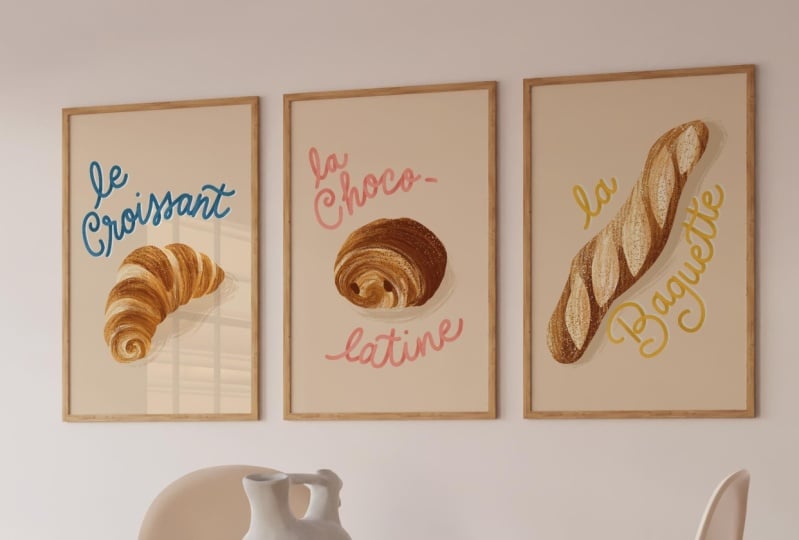
12. Mockups: Woo. Okay, friends, now that
we've exported our wall art, let's have some fun and
show it off with a mock up. Using a mock up will really make your art come alive and help art directors or
potential customers visualize your artwork
in a real world setting. It's a really great addition to your portfolio and your
social media feed, too. I like this one that I found for three art prints on
Creative Market. There are many beautiful options that aren't very expensive here. There are also lots of free download options at
websites like Mockup World, graphic Burger, and Free pick. Although some of them may require attribution,
if you share them. I've opened up the PSD file of my new mock up here
in Adobe Photoshop. It's designed for a four
to five ratio mock up. I'm going to go to my
Illustrator files and grab the eight by ten inch version
of my first art print, and I'm going to
select and copy. Now I can return to
Photoshop and from here, it's really just as simple as double clicking in this
layers panel here. I'm going to double click on the smart object layer to
open it in a new window. I'm now going to replace the
placeholder image by adding a layer and using the Control V shortcut
to paste my image. You may need to resize or
move it around a little bit. Once it looks good,
hit command S to save and then just
close the window. Now head back to the
original photoshop window and the image should
appear in your mock up. Now I'll repeat with
the next two images. I really love this mock up
because in the layers panel, I can play with different
shadow options and mat boards. I can also change
the frame color and even the background color, if I like. How fun? Okay. When I'm ready, I'll go to File Export and save for Web and export
it as a JPEG or PNG, so I can use it on social
media or add to my portfolio. It's really just
as simple as that. All right, I'd love
it if you posted your design either with or without a mockup in
the project gallery. I really can't wait
to see your work. I'll see you in the next lesson. We'll chat briefly about some possibilities for
your art print series.
13. Opportunities for Your Artwork: Welcome back. Let's explore a few ideas for opportunities
for your wall art series. You can explore online
marketplaces like Etsy. You could offer printable
downloads or print them yourself and ship
to your customers. You also have the option of using a drop shipper
like Print full, Print Pi, Gelato, or prodigy. There are also popular print on demand sites like Red Bubble
and Zazzle that reach a broad audience and
handle printing and shipping on a wide
variety of products. You could also sell
your prints from your personal website or with
Shape fi or square space. You could try licensing
your artwork, pitch to an art director
or enter art challenges, open to independent artists. You can also use
your art prints as a freebie opten for
your e mail list. This is a really great
strategy to build your e mail list and
engage with new customers. You can promote the free
digital download on social media in exchange for signing up for
your e mail list. You can also simply
personalize your own space. Creating art is a
wonderful way to create a and inspired touch
to your decor. Gift giving. Framing and gifting your artwork
is a great option. Your artwork is bound to be treasured as a
heartfelt keepsake. Well, I hope these tips
were helpful in maximizing the potential of your
amazing art print series. I'll see you in the next video
for some final thoughts. Oh.
14. Final Thoughts: Congratulations on
completing this class. Thank you so much
for joining me. I really hope you enjoyed
it as much as I did. There are so many
opportunities to showcase and sell your artwork
from selling online, pitching to companies,
to decorating your home, and giving delightful gifts
with a personal touch. If you haven't already, please post your artwork
in the class project tab. I absolutely love
seeing your projects. It brings me so much joy to witness your creativity
and your progress. If you have any questions, you can post them on the
discussions page of this class. Also, please leave a review. I'd love to know what
you think of my class. Don't forget to hit the
follow button by my name. If you'd like to take things
a little bit further, you might want to
check out some of my other skill share classes. In design a greeting card using inspiration from
your everyday life, I lead you on an
inspiration quest through my tried and true
techniques for defeating creative block and designing and illustrating a successful
sellable greeting card. You can also check out
Art of the Invitation, Design and Illustrate
for any occasion. This is a deep dive
into invitation design, tone, typography,
layouts, and more. Finally, if you'd like to
download the free list of prompts that I created as
a bonus to this class, you can visit Jamie alexander.net
slash Wall Art Guide. Well, Mis Ami, I'll
see you next time. Until then, keep experimenting, keep creating, and above all, have fun with your art. I can't wait to see what
you come up with next. Happy creating Abento
 Jamie Alexander, Surface Designer & Illustrator