Transcripts
1. Welcome to the Class!: Hello everyone. I'm
Kito Chandra Mohan, and I couldn't be
more excited to embark on this celestial
journey with you. Welcome to my brand new
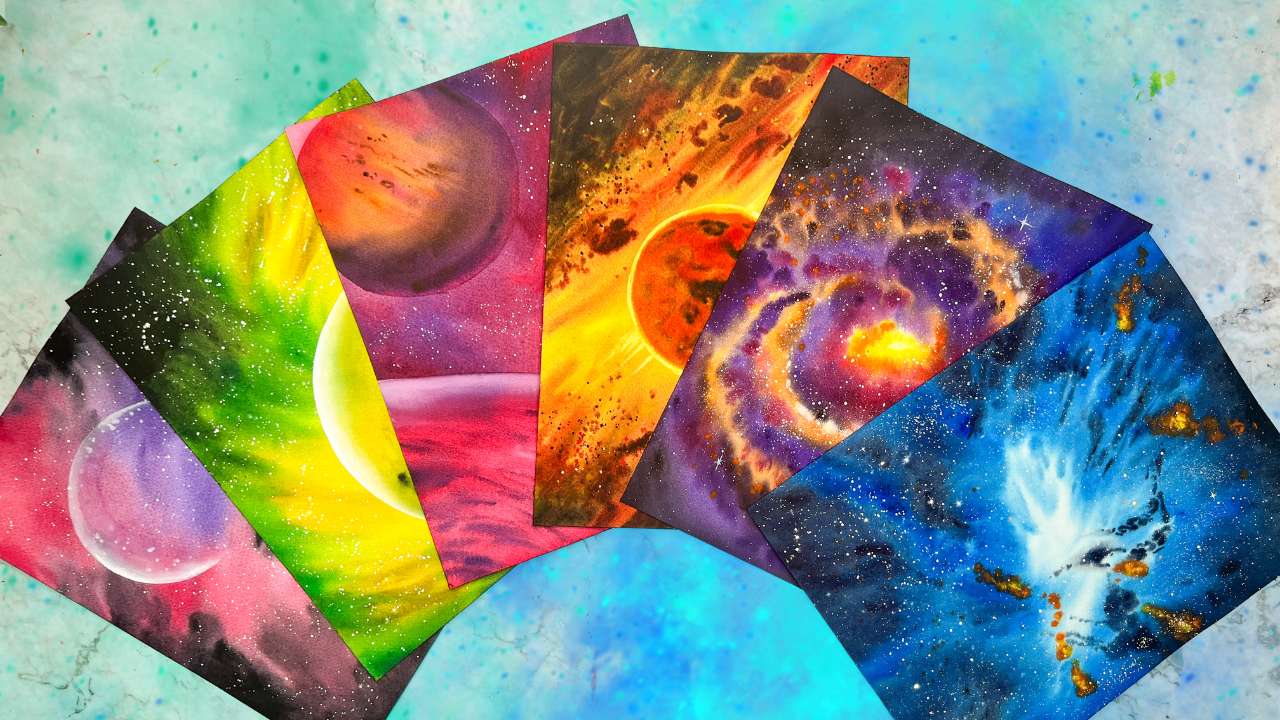
Skillshare class on painting, 15 cosmic themed paintings
with watercolors. Picture this swirling galaxies, distant planets, and the vast expanse of space all waiting to be
captured on your paper. Now I'll be honest with you, idea of painting such majestic
scenes can be daunting. It's like capturing
the infinite beauty of the universe in a
single brush stroke. But fear not because I'm here to show you that it's
not about perfection, It's about understanding
the techniques and letting your creativity. So each painting we create, we'll build upon the lessons
of the previous one. Unveiling a wide array of watercolor techniques
along the way. From blending
ethereal nebulae to casting starlight
upon distant planets. We will cover it all. But here's the best part. By the end of your
cosmic expedition, you'll not only have mastered
the art of painting space, but also discovered
how to infuse your own creativity
into each piece. I have included a bonus lesson at the end where I'll
be sharing tips on transforming
references and making your future cosmic creations
truly one of a kind. As a skip teacher, silver brush educator and ambassador to white
paint water colors. And see that I'm
stationers in India. I have had the privilege of
guiding over 25,000 students worldwide on their
artistic journeys ever since I started
my painting career. Galaxies and the
cosmic space has always fascinated me and
have repeatedly made it onto my Instagram
feet where I share snippets of my
painting process and a lot of insights into my studio life as an artist
through Instagram stories. Rest assured, while this
class may seem intermediates because of the paper size used or the paper stretching
method used, it's crafted with every
beginner in mind. I'm here to break the preconceived notion
that large paintings are not suitable for
beginners or that it takes a long time
to complete, right? From all the materials needed to the colors used in
each of the projects. I will be guiding you
step by step through the entire painting
process so that you can create your own collection
of cosmic paintings as well. So join me and let us
explore the cosmos together. Let's defy gravity
and paint the stars.
2. Class Overview: First of all, thank
you so much for joining the class and I'm
so excited to see you here. Before you dive into
the class projects, I wanted to give you a brief
overview of the class. I know you might be eager
to paint along with me or jump into the projects,
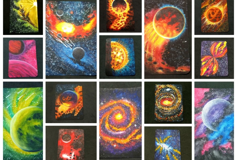
but hear me out. There are 15 class projects, each one a unique and beautiful
cosmic themed painting. We start with the
simplest one and piled upon the techniques on each
successive class project. Chances are that if
you skip one project, you'll probably have
a little trouble understanding something in
the next day's painting. But that doesn't mean
that you have to paint along with me in each
and every project. You can simply watch
the lessons instead and jump into that one painting
that speaks to you the most. Having said that, I
would highly recommend you watch the painting session
once before you start. Because with my
style of teaching, I always suggest a number
of alternatives and other things that you can add to the paintings to
make it your own. If you follow along
for the first time, you will miss out
on implementing those bonus tips
in your paintings. In each of the class projects, I discuss every step in detail, but the class does assume that you understand the basic techniques
with water colors, such as wet on wet, wet on dry, splattering ex tra. So if you're completely new to water colors and you do not
understand these terms, then I would highly
recommend watching my ultimate guide
to water colors and water control classes
on skill share, because they will literally take you to the next
level with water colors. Both of them are linked in the
description of this class. Day one of this class is already available for
you to watch Fridaay. Each of the other
class projects are uploaded every alternate day, giving you plenty of time to catch up and paint
them at your own pace. So if you're watching this 30 days after the
publishing date of this class, you will find all the 15 class projects
readily available. The colors that I
have used in each of the projects are mentioned right before each
project starts. And also suggestions to mix alternative
colors are included. You can find a PDF of my color palette attached in the resources section
here and Skillshare. Lastly, remember we are
a community of artists, so don't forget to share your class projects into the resources section
here in Skillshare, where everyone else can see your beautiful projects and appreciate you for
your hard work. So now, without any further ado, let us have a look
at the materials that I have used for
the class projects.
3. Art Supplies: So now let's have a look at all the art supplies that we
will need for this class. First of all, we'll need paper. And the paper that I'm
using in this class is Sanders Ford
watercolor paper, which is cold pressed
or not texture, it's like a medium
textured paper, yellow, white, and normal white. So this is white and the size
is basically 12 " by 9 ". It's almost like an four size, but I think it's slightly
bigger than an A four. But that doesn't matter
if you're going to be using a four, that's
perfectly fine. But the most important
thing is the 300 SM. It's absolutely essential that the paper that you're
going to be using, a 300 GSM, or 140
pounds, 140 LB. As you can see, this paper
is also 100% cotton paper, but with the technique that
we're going to be using, which is basically the two side water application method
or the stretching method, which is basically you're
stretching the paper so that it absorbs more water and the
paper stays but longer. You're a free to
use a paper that is not 100% cotton as well. Because I've tested this on a 900% cotton paper and
this technique works. So the minimum requirement
that you would need for the paper is to be 300 GSM. That's because if
it's any lesser, then the paper that
you're using might starts to tear off as you
apply a lot of water to it. And we do not want
that to happen. Right? So that's the paper
that I'm using for this class. Next of course, you need water colors because this
is a watercolor class. So I'm using water
colors from a lot of different brands,
such as Sennelier, White Knight, Schminka,
Daniel Smith, Windsor, and Newton,
and a lot more. But I will be sticking to
this default palette of mine. So it consists of 36 colors. Although it has 36 colors, I usually stick to some
common colors because there are other colors
in here which may not be available in
everybody's palette. So I refrain from using that. For example, there's a
petaline green here, paraline violet here,
and some other colors. So I refrain from using those colors because
I know that we can eventually mix
the same color. So I go with the
mixing method instead. Because just I want to make
it easier for you guys. Having said that, you, of
course, need a palette. It makes your paints. So this is the palette that I'm using. It actually came in with the 36 color set of
magella watercolors. But I really love this
palette because it's got the 36 number of wells and
it's a plastic palette. But you obviously can
use a metallic palette, a ceramic palette, or even a
plastic one like this one. But anything is okay for you
guys to use as a palette. So the best, best suggestion for watercolors would be
to use a ceramic palette. Because it's so easy to
clean as well as it's easy to mix the colors
on that palette. All of the colors in my
palette are actually saved as a PDF in the resource
S section of this class. Which you can download
and see or reference, so that you know
the exact colors and the pigment numbers
of what I'm using. Next, of course, you
need watercolor brushes, so I'll be using brushes
in various sizes. But the most highly recommended
one would be to have a large flat brush so that it's easy for you to apply
water onto your paper. Because we'll be applying water onto both sides of the paper. I'll get back to
that in a minute. So the brush that I am using
here are all from silver. So this is the silver
black velvet series. And it is a one, a
two inch wash brush. So it's a fairly large brush. It covers a larger surface area as well as holds a lot of water. So that's why I'm
using this one. Then the other brushes
that I'm using are mainly the silver
Kolinski series, and this is a size
ten, a size four, a size six, just a large size, a medium size, and a small size. You also probably will need a very small size
brush for the details, such as a size two, a size zero, or a size one, whichever is
available at your disposal. And it's absolutely
fine if you do not have a flat
brush like this one, because you can always
apply the water onto the paper using a larger
brush such as a round brush. But obviously,
it's just going to take a little bit more time. Lastly, it's better if you can have a lineup brush
like this one. So a liner brush is
basically a brush that has a longer stretch
of hairs like that, so it comes like a
line when it is wet. Okay, so I've got the size
one line of brush here. This is again from the
black velvet, is in silver. It's okay if you do
not have this brush, because you can always
do the same thing and because it's a
galaxy themed class, we will be using a lot of white. Oh, that's because there
are lots of areas that you will need to bring back
the white onto the paper, as well as for the
stars in the sky. Obviously, those stars,
there's literally no way that you can leave them blank at the
beginning, right? So you've got to
use white quash. So the white quash
that I'm using here is permanent white designers
Squash from Windsor and Newton. That's the brand that I'm using. I absolutely love,
love, love this one. It's very handy to have. But if you do not have guash paint, you can also use watercolors. The white of the
watercolors are actually not as deep or
vibrant as this one, which is the reason
why I use quash. So I would recommend
getting a guash tube, but it's okay if
you do not have it. You can still paint
along in this class. Next is obviously water. I always use two jars of water when I'm
painting water gas. That's because one of them, it always gets muddy. Like this one
because I'm washing my brushes and washing
my paints into that. While the other one, I
always try to keep it clean so that when I'm taking fresh paints or when I'm
applying water onto my paper, I always have the fresh water. It really helps,
because imagine if you're using only one jar and
your water gets this dirty, then when you're trying
to pick up a fresh paint, like for example, see the color here, that's a very muddy color. And imagine you're
going to be painting with a nice bright yellow color. And UGP brush into that one
and you pick up the yellow, that yellow is going to
have traces of this mud. That is why I keep this one so that whenever after
I've cleaned my brush, I dip my brush into this one and I pick up the fresh water. If I want to take in fresh
colors for my painting, that's why I would recommend
two chows. But it's okay. Again, if you do not want any, all you have to do is like
keep changing the water every once in a while
while it gets this dirty, you'll need some paper
towels or a clothes like this one so that
you can wipe off excess water from your paper, from the edges of your paper, and also from your brush when we're trying to get rid of
the excess water on it. I mostly use this cloth here, which I reuse again and
again after washing. So you can always use any paper towels or a
cloth like this one. This is a microfiber
cloth that I use. The next most important
thing actually that you need is fiberglass or an
acrylic glass like this one. It's basically just
an acrylic board or a fiber board on which we will be keeping our paper on and sticking the paper onto it using the
paper stretching. I know that this is what puts off most people
from using this method, but trust me, you do not actually need the
same kind of board. What you need is a non
absorbent surface. A non absorbent surface means it does not absorb the
water from that paper. Plastic surfaces
are non absorbent. Any plastic surface
is what you need. Do not use wooden surface, such as apply wood
or a wooden board. That's because wood
is not non absorbent, which means it is absorbing, it would absorb the
water from your paper, which is why I refrain
from using that. So this one is plastic board. As you can see, it's
literally not that thick, it's just a thin acrylic board made out of plastic, of course. So that is what I would
suggest. But you know what? If you look at this
wallpaper here, this has got a plastic
coating over the top. Even this can be used instead of this acrylic board because
of the plastic coating, which makes it waterproof. Any surface that is
waterproof is what you need. So if you do not have something, then I have a trick for you to get or make your own waterproof. Imagine if you have
like a plywood or if you have wooden board. So what you need to basically do is take that wooden board and then wrap it up with cling film or you know,
that plastic wrap. So if you wrap it up with that, just make sure that
it's got even edges and everything and then use it. It's not absorbent
because you've literally put plastic coating on the top
of it. Isn't that so cool? You can literally make this and please,
please, please, please, do not be put off
by this method, because it's literally amazing. It turns your paintings into a breathtaking,
beautiful masterpiece. So you've literally got
to try this method, and trust me when
you know about it, you'll never go back
to the old method. Last but not least,
don't forget about a pencil and erasor for
making out your sketches. And in this class,
I have also used a compass because there are lots of planets that
we need to trace out, so it's best if you
have a compass. Otherwise, you will also see me using makeshift objects
to create my planets. Such as, sometimes I
use a circle maker, sometimes I use a large plate, or sometimes anything
that's round. So you can literally go
ahead and use any coaster, or a large plate, or a small plate, anything that's round to
create your objects. So just be aware of that. That's what I want to tell you now that you know
all the supplies that we need for this class, let's go ahead to the
next lesson where we will learn how we can prep the
paper before every painting.
4. Prepping Your Paper: Now let us have a look at how we're going to prep our paper. Before we paint in this class, we're not going to be
using the taping method, but rather we're
going to be using the two side water
application method as we've already discussed. For that, I would
highly recommend having a larger flat
brush like this. But if not, there are various other ways as well
which I will discuss now. You can either use a
large round brush is the largest size brush that you have would be highly useful, or flat brush like this one. Okay, so this one is the silver tailored
hake brush and this is the black
velvet series 1.5 ". You could use any of these and I'll show you
how we can prep the paper. So it's basically very simple, there's no taping
the paper involved, so you don't have to worry
about edges or anything. The painting is going
to be edge to edge, which is absolutely amazing and literally good
when you're trying to frame these paintings. Because most of the frames usually come with
a little border. So it's good that your painting
does not have any border. Basically, we've got
to turn our paper. So if this is the
side that you're going to be painting
on, for example, you can see this
is the better side of the paper that I'm using, which is the sunder
spot of foot paper. I've already discussed this
in the art supply section. This is my fresh side. So we're going to turn
our paper over to the other side and we're going to apply
water there first. Okay. So which is why I recommended using a very
large flat brush because otherwise it's going to take
a lot of time for you to apply water to the whole of the backside and
in the front side. For those of you
who are not having such a large brush and you feel that this is going
to take a long time, there is another method as well. All you need to do is to take
your paper and you go to your bathroom or
your kitchen sink and open the tap And show
the paper below the tap. Make sure that the
entire surface of the paper is
covered in water. And be careful
while you hold it, because once the
paper gets all soggy, then there's high chance that
it's going to bend a lot. So just be careful to hold it best at two opposite
sides like that. When you're holding it at two
opposite sides like that, it's obviously likely to bend, but then it'll be more
not prone to any tearing. You can be careful that way. And then now we're going
to apply the water. I'm using the brush method, but you can always go ahead
and just use the tap method. Once both of the side is applied nicely with the water
and your paper is like, soggy and covered in water, bring back your paper
onto your surface and just lay it down
and you stick it flat. Then you can use your brush or something to just soften out and take off any excess water from underneath, which
I'll show you now. Okay, here I'm going to be
using my large flat brush. Okay. So at the back we
really need a lot of water. So here I'm just
basically going to drop off a lot of water here. In this beginning stage. You don't want to worry about this excess water
or anything, okay? I know that, I always say do not form any large pools of
water and things like that. But today you don't have to
worry about any of that. Just just keep applying
because you'll need those extra bits of water. So there you see, keep applying and nicely apply the entire
back surface. Okay? And make sure that it doesn't have any dirt or anything
at the back side, because when you turn it over, that is when you flip it over and you stick it to the board, that dirt is going
to create like a slight bulge on your
paper, which we do not want. There you go. I'm applying water to the whole of the paper. You see how the
nice water worked, and you can see how I'm applying water to
the edges as well. So some of the water
is going to go underneath the paper and
that's fine as well. Okay, let it flow underneath, because we're
obviously going to be applying water over the
other side as well. So here you go. I think I've covered almost all of the areas with nice
amount of water. And the water that's there
on your surface, let it be, Do not drain it off
or anything Now, now what we're going to
be doing is we're going to have to pick up
the paper. Okay? Although there's some part of the paper that's
covered in water now, we'll flip it over and we're going to stick
it so you don't need to, like, press too much and
get your hands all wet. It's absolutely fine because you're going to do
that with your brush. Okay? In the case of when
you're using a tap method, obviously you'd have to have a little bit
of a dirty hands. But, you know, just getting wet hands is not dirty, right? So you can always just use the excess water that's
there on the sides. You can see that there's
a lot of water here, accumulated around the edges from the pool that we
created in the beginning. Then use that and just apply. Okay, a flat brush makes it absolutely easy
as you can see, but I'm pretty sure the larger round brush
would do the same. Just that it's going to
take a little bit longer. That's it. Okay. So if you're
using a smaller piece of paper like you chose to paint
this in an A five size, then it's going to
be even smaller. So I guess I've done the work. Okay. Just making sure
that I've got enough. You can just go ahead and
add some nice bits of water. Okay. So there you go. We've added some nice
amount of water, but now. We need to get rid of
all of the excess water. Now is the point
where you need to get the pool of water
from our paper. Okay, so it's best to use cotton cloth or a
microfiber cloth or a tissue or something
like that and then just remove all of
the excess water. So you can see I'm
running my clothes along the edges and getting rid of those excess
droplets of water. So once I've done all the four edges, we're
still not done yet. There's one more thing
that we need to be doing, which is basically to pick up the surface or that
board that you're using, tilt it at an angle and
let the excess water flow. Because trust me, even underneath the paper and
on the top of the paper, there's going to
be a lot of water. Okay? And that is
really excess water, so we do not want that See, can you see how the
water is flowing out? All of them is going
to come to this corner here because you're
like tilted that way. And then it's going
to come off the board onto your sheet or clothes,
whatever you're using. Okay. You don't need to do
that too much. Just make sure. And you can always look
at your paper underneath, you can clearly see my light. And you can see that
I'm looking at it. And you can see the sheet of water on your paper right now. So that's basically
what we want. Okay. Not excess water, but just a sheet of water. And once you've done that, just hold and remove that excess moisture
from that corner because that corner would have accumulated a lot of
water. So there you go. Once you've taken all
of that excess water, you can obviously lay
your board back down. And then when you
look at your paper, if you feel that
there's some area that's lacking water or like if too much of it has
flown out of your paper, then always you can pick
up your brush again, any brush that you're using. And now when you're trying
to run your brush across, do not touch the
edges of the paper. So if I'm using this flat brush, then I'm going to
be staying inside, right along the
inside of the paper, running my brush
along like that. Okay, So staying right inside
and making sure that my paper is nicely coated
with the water. Okay, We just need
a sheet of water. Let me just show that to you. Can you see how the
paper is shining? And let me tell you the
advantages of this method. The most big advantage is that your paper is going to stay
wet for a very long time. That is because the wetness on the paper is going
to act from both sides. That is, the underside
of your paper is wet. So I don't know if you've taken my previous classes,
if you have taken, you know how I always
mentioned that if you want to keep your
paper wet longer, then you have to apply
with the water multiple times so that the underlying
fibers of the paper get wet. This is exactly the same method. It's just that the
underlying fibers are getting wet from both the sides, so the moisture just stays
longer Okay. On your paper. So this is how we're going to be prepping the paper for
every part of the painting. So this is how we're
going to be prepping the paper for all
of the paintings. So if there's a pencil sketch,
we'll make the sketch. And then I'm going to prep
the paper by applying water, like this method. So I'm not going to be showing
this entire process in all of the videos because it's just going to be
absolutely boring for you. So when you reach that stage where you've done the
pencil sketch, I mean, if there is any pencil sketch, you've done it and
then you want to move to the painting part,
then pause right there in that project lesson and just go ahead and wet your paper
and then come back to it. Okay, so I'll see you in
the first class project.
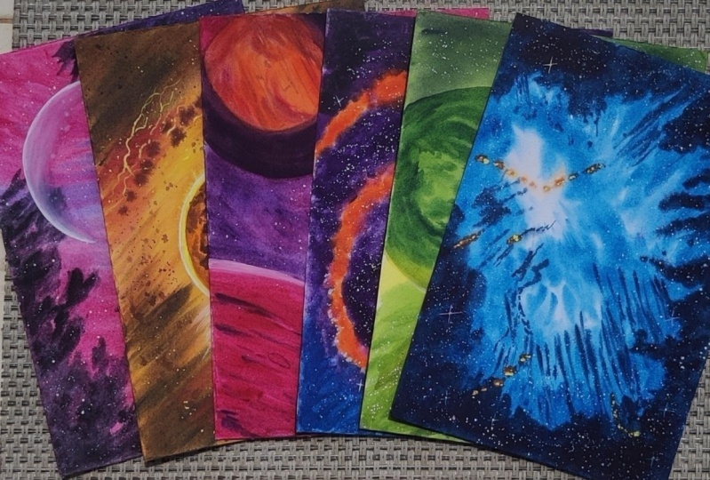
5. Day 01 Project - Moonlit Pink Purple Sky: Welcome to day one. I'm so excited that you're
joining me along in this 15 day journey.
So here you go. This is a painting
that we are going to be painting today,
isn't that gorgeous. Okay, so we're starting
with a fairly simple, simple techniques so that we can build upon these
techniques each day. Okay? So this is
really easy and, you know, quite beginner
friendly as well. So you will be able to
catch up with this and create even more
beautiful paintings in the coming few days. The colors we need for
today's class project are Quinacridone Violet
rose or Quin Rose, which is basically BV 19. You can also use any rose
color that you have. And then a bit of violet, yellow blue paints gray, and obviously some
white quash paint. Hey, welcome to the
first class project. So let's go ahead and start. As you can see, I've already prepped my paper and
there's no pencil sketch. We're going to go and dive
straight in with our paints. Okay? And then create
some sketch later on. So let's just get started. Okay, as I've said, we've already wet my paper. You go ahead and
do yours as well. Okay, so let's start. I'm going to be starting
with a nice quin rose color, which I have some of
it here on my palette. I'm just going to use that. Plus a bit more
quinacdonerose or PV 19. Any rose color would
absolutely work as well. Okay. And then I'm going to
start at the very edge here. See how your paper is still wet. And I'm talking a lot and I've
done so many things after I've wet the paper and like setting up the camera
and everything and the paper is still wet, That's the advantage
of this method. So you can go over to the outside of the paper,
it's absolutely fine. And some of the paint is just
going to go underneath and, you know, ain't the
paper from behind. But who cares about the behind? Right? So it's absolutely fine. Okay. Or you could be very careful and stay along
the edge like that, but you really don't have to. Okay. So here, just pick
up the nice pink shade. Go ahead and apply. Okay. So we're going to be using a combination of few colors now. Okay? So starting with the pink, and then I'm going to move
over to the right side. So one thing I'd like to tell when you're trying
to paint these landscapes is use the entire length of your brush because it covers
a large surface area. Don't try to do your
strokes like that. Hold your brush always
somewhere in the middle. And another reason why I say why you should
hold your brush in the middle is because
it gives a bit of, what do you say, less control. So you don't want control. If you hold your brush there, then you're going to be having control strokes and it's going to be harder
for you to paint. Whereas if you hold
it in the middle, there's much less control
than when it's over here. And if you actually
hold it at the end, then there's
literally no control. That's how you can vary the
abstractness, I would say. When you're trying to
paint with these strokes, I like to hold it in the middle. And when I want it to
be completely random, then I hold it right there
at the very top for details. That's when I would
bring my hand down over to here and try to
make careful strokes. Right now we're holding
it in the middle. Okay. Then I'm going
to start with here, a nice gorgeous violet shade. Okay? And we're just
going to blend it. Okay? So this is
the Regency I've been talking so long explaining about the way you're supposed
to hold your broth and your paper is still wet and you're able to
blend it. Okay? So that is honestly
the advantage of this method Okay, there. So just going to use my brush and blend that along.
Okay? All right. You can in fact pick
up more pink when you want to blend in this side. Okay? And I'm taking it over
to white side, more violet. Okay. Some more
violet over here. Always remember water colors. Try one shade lighter. So if this is the shade that
you're seeing right now, when this dries up, it's going to be much lighter, so you're going
to have to put in a very, very vibrant color. So here I'm going to pick up a nice amount
of my telo blue, and I'm going to use that
here, over to the right side. Okay. So staying
away from the pink, but staying closer to
this violet over here. Okay. So here, just applying
some nice bluish shade. Okay. There, I think
that's enough. Just over to this side some
up until towards the middle. Okay. And you can see how
I'm making these strokes. So remember, this is just
the sky, the night sky. It doesn't have to be exactly
the same as I am doing. So you're free to do
any kind of changes. You're free to, you
know, like make run up strokes in the sky and
experiment yourself. Remember, it's all
about having fun. Okay, so here I've picked up
some nice dark violet now. So now we're going to
go deeper and deeper. And make it vibrant.
So you can see, I'm picking up
paint directly from my palette and then just
like applying onto my paper, because I want this
right side to be deeper. Okay, always go with a lighter stroke at first and then try to
darken your strokes. Okay? Do not try to make darker
strokes at the beginning. Okay? First, it's just like the placement of the strokes
in the beginning here, picking and ice, violet shade. And then now we can
blend some of it into your blue and you can see it turns into a darker blue. Okay, it's just
beautiful, isn't it? See how it turns
into a darker blue? Now let's go back
with more pink. I want to go with moping
over to the left side. Remember water control
is very, very important. So let me just quickly show that you in some
corner of a year, if I've got a lot of water on my brush and if I put
something like that there. Okay. Can you see how it spread the pigment and caused
it to create a bloom? So this is called a bloom or a cauliflower effect,
and we do not want that. Always make sure that you have, you know, not too much
water on your brush. I can pick stat right
now because we're still painting and the rest of
the paper is still wet. Okay, so here if I take
some nice creamy paint, so you can see the paint that I'm using on my palette here, it's very, very cles, not watery at all. If I apply that and I pull all of that water away
from my paper, then you can see how
all that blooms. Now, gone away. Let's
get back to adding. Now along here, it's
okay for you to mix in a little bit with
that blue over there. It's going to create a
different kind of purple. Not the purple that we have there in the sky, but it's fine. Okay. See, it's a
different kind of purple. Honestly speaking,
this bottom part is not that really important. Okay? Because we're
just going to be covering it up later anyways. Okay? Taking up some nice pink shade. Okay? Remember,
you can always use your clothes to absorb excess
water from the very edge, so that this excess
water does not flow back and cause any
blooms on your paper. Okay, blooms can form
along the edges as well, if there's excess
water from the outside flowing towards the inside
part of your paper. So we do not want that, we
absolutely do not want that. And here along the edge, and you can see somewhat
how my paper has like started to make
a bit of dryness. But so long as you pick up
paint and then you brush over, then you'll be just
able to blend colors and create the perfect
looking blend. Okay. So it's absolutely fine even if your
paper has like, somewhat started to bend. So now you can see I'm
taking a bit more of the creamy mixture and trying
to apply onto my paper. And I'm just going to move that big mint towards
the top as well, making sure, see, now
we've got perfect, perfect blend all around. Now we're going to add in the
darker colors of the sky. Okay, so here I'm going to use in a dark paints, gray color. You can also use black. I almost don't use
black in my paintings. What I tend to use is I use paint scray to create
the depth and the darkness. Okay, taking over
that paints gray, we're going to apply
that over the top. The reason why we do not add paints gray in the
beginning is because when you have an underlying tone or color below the paints gray, it's going to create an
even more beautiful effect. We keep applying that darker
tone towards the end here. This is not foliage or anything. We're trying to create some
nice edge to the galaxy. Okay? So it'll give some
nice underlying tones, okay? You can see the
underlying pinkish tone shining from that region. Just going to add in same here. And you can see clearly how
our paper is literally wet, giving us the freedom
to go and, you know, create darker
strokes over the top and still blending along
with the background here. Adding those darker strokes like to add some more darker
strokes over this violet, towards this edge as well. Okay, Some of them just
just move your brush stroke inward like that and
let it just blend along. In fact, then you can also pick up the color
that you used previously. For example, if you want
to blend a bit more, pick up a bit more
violet and blend it over top like that, okay? That way it would not be weird. Okay? If you're not able to achieve the blend.
That's what I mean. You see how it works. Okay, let's not make
it look like folige. We'll add some darker, darker strokes towards
the inside as well. I'm going to take
a bit more violet to add over this region, blending along those little
bits of the blue as well. So it's better if you can add vibrant colors from
the beginning. Okay? So that your pavementing will be vibrant even
after it dries. Okay. That's one thing we have
to be careful about here. I'm going to pick
up a little bit more of my pink and I'm going to apply to this area here because I really want
it to be vibrant. Okay? Because if you leave your colors somewhat
dry like that, not dry, but you can see here that it's got
very less pigment. And this pigment, less pigment, is going to dry out soon, so we do not want
that to happen. Okay. Just showing you
different methods and how you can blend them. We've got some nice
blends in the sky now, in the space now. So now what we need to do is to obviously have this
dry up completely. Okay. Before I move
on to dry this up, I just noticed that, you know, some areas here could have a bit
more color else. This is going to lighten up a lot and I do not want
it to lighten up. Okay. So that's why just
lying a bit more of my ins, gray over top like that. I think that's
probably good enough. So now let's go ahead
and dry this up. All right, here
I've dried this up, but let me explain the process
of how I've dried it up. You can either like wait for this thing to completely dry
up naturally on its own, but that's going to
take a few hours because the underlying
side is wet. Okay. But what I've done is I used a hair
dryer like this one. You can also use a heat
gun or a hair dryer. I have this in my studio. This is actually my
studio hair dryer. Now what I've done
is basically I run the fan along top
surface of the paper, so the top surface
is completely dry. But if you look at
underlying area, that is the underside of
the paper, it's still wet. That is, it's got still
water at the underside. Okay. The other side, we only need to be painting
at the top side, let the other side
dry naturally. So that's what I mostly do. So I'm going to paint over the
top of this one right now. So here's what we
need to be doing. I'm going to just draw a circle. So this is where the pencil sketch of this project comes in. You can use a compass as well, So I'm just going
to make it simple and use this for my sake. But you can just go ahead and use a compass.
Okay, Trust me. So what we're going to do is
don't do it in the center. Try to do it like somewhat
along the focal point. Focal point obviously
is going to be one by third of the paper. If I have divide my paper
into one by third here, so that would be this line. Then one by third along the horizontal, that
would be this line. I'll make the center somewhere
focused around that area. Okay, And draw the circle. Okay? But one thing to note is do
not draw the entire circle. So I'm just going to draw
a three, four of a circle. Okay? Somewhere there.
And somewhere there. So this area here, I'm not going to draw anything. Okay? So I've just made
the pencil sketch. If your paper is still wet, then it's going to be really difficult for you
to make the sketch. So I can see my sketch is there. And along this side, if you make sure that
your paper is not wet and if it's still wet and you're not able to
see your sketch, then you can always go
ahead and use a small pen, like a 0.8 MM size or
something like that. Okay, like this one micron pen. You can use that as well. I'm just going to use that here. Not complete the
circle. Okay, there. Now, that's almost equivalent
to pencil sketch, isn't it? It's better if you stay away from that and don't
use it at all, and just go with
the pencil sketch. But then now we have
to cover this up. We're going to be using our
white quash for this purpose. The whitewash that
I use is this. Designers ph permanent white
from Windsor and Newton. Okay, so that's what
we're going to be using. I have this little
allot over here which I always use
for my white wash. Picking up some nice
amount of white quash. What we're going to do
is we're going to paint along the circular line
that we did. Okay? So make sure that you cover up your pencil sketch or
your micron pen sketch. Okay? Because we don't
want to be seeing that. How do you cover it up? Just use the tip of your brush. And you tip of
your brush is what should be going and
touching that line. Okay? And then just follow
along the circle ski, going until where you've got the end of the three quarter
circle that you made. That's my end. Now what
I'm going to do is I'm just going to add
in some more paint. Okay, towards that region on top of our wide
that we just added. We're going to soften
out the edges. Okay, Softening is basically clear your brush and don't
have any paint in it. It's also not a damn brush. So make sure that there is a little amount of water in it. Okay? And you're going to
pull that paint outside. Okay. See? And then it slowly starts to soften so that you
don't get any hash edge. Okay, That's basically the
softening method we want to be softening such that the
edge seems to fade away. I dropped a little bit of water. I'm just taking that off here. Just want to make
sure that the edge is faded away. See that? Don't want to see any
part of the edge then. If you want to pick up
a little bit more paint and apply towards the inside,
that's absolutely fine. So we're just trying to create an effect
where there's like a blended moon effect
in our painting. Now we've got an eye
blended moon effect. When this dries up, this is going to be absolutely lighter. So that's the reason why you probably need to take in a bit more of your white paint and make sure that you
go over it again. Just make sure that the
paint is not too light. And also, you have
to make sure that your paper is absolutely
dry while you do this, because if it's not dry and then when you're trying
to soften it out, you're going to move
the underlying paint, which you do not want. Okay? So the softening has to be done very, very, very carefully. I love the way it turned out, so I'm not going to wait
for ease areas to dry. So what now I'm going to
do is I'm going to paint and add in the stars and we're
done with this painting. Okay? So basically
to add in the stars, I've switched to a
smaller size brush. Okay? And I'm going to load up my brush with a nice
amount of water. Today we'll just stick with the most basics and just add
in these white stars. Okay? It's okay if your stars go over the tiny moon surface
that we have added, It's absolutely fine as well. So the splattering method for those of you
who do not know. I love to splatter using
my single hand where I hold my brush like this and these three fingers,
do you see that? Okay. That's what's
going to hold the brush. Okay. So it's going to
be this Hold the brush. Have this hand freely. Okay. And then you
tap using this hand. When you tap, it releases those paint and it starts
to splatter over the top. Can you see how it's splattered? And it's kind of created
these wet on wet splatters. I did not expect and I did not intend to do that,
but now I love it. It's needed to be a little wet and we apply the splatters. Okay, just go ahead. The other method of
splattering is to have a brush like that and then
tap using a different rush. Okay? But this tends to be
a little bit more messy. And gets paint all over your table surface
and everything. And I feel that
this is a bit more controlled because
you're just going over next to the
paper and doing okay. Because the other method,
when you do that, the paint even goes
over to the top and everywhere. Trust me,
you don't want that. The good thing with splattering is that you get smaller stars. You get bigger stars and comes in all these varying colors. We're basically done
with this painting. I don't want to pick
it up and show it to you right now because the
underlying side is wet. But obviously you've
seen the final painting, so you know how it's turned out. What I want to say about the underside is
see how it's still wet and see how everything is flown towards the
inside the paint. So now let me tell you
how you can dry this one. So I'll tell it to
you because this is the first painting
of this class. If you need to dry
this up and you want to go ahead and
paint the next one, then what you should be
doing is pick up your paper, lift it off this board. Okay? And then keep
it somewhere else. Then clean out the board. Okay. The entire board
completely clean it out. All the paint, all
the excess water and everything. Clean it out. Then once you make sure that there is no water
on your board at all, no droplets or anything, then you can bring
back your paper, turn it over, and then
dry along that side. Or you can let it dry
naturally on your board, which should be
around a few hours. And once completely
dried naturally, you can obviously
take your paper off and then clean your board. That's it. So that's how you
can work with this method. So I hope you enjoyed
today's painting. Thank you for
joining me today and I'll see you in
the next painting.
6. Day 02 Project - The Green Planet: Hello, welcome to day two. And this here is the painting that we're
going to be doing today. So look at that majestic planet. Okay, so I hope you enjoy
this one. All right. The colors we need
for today's painting are a transparent
yellow, olive green. If you don't have olive green, you can obviously mix it up using green, brown, or orange. Just try wearing those shades in sap green, dark green, indigo. And obviously, hello, green
and lastly white wash paint. So if you're ready,
let's get started. All right, let us
start for today. We do have a small
pencil sketch to do, so we'll do that before we start applying water onto both
sides of the paper. You need a compass
or a large object, A circular object in which
you can make the circle. Okay, So I'm going to
use this large plate because unfortunately I
can't find my compass. So just going to plate that, make the circle such that the right half of the circle
is outside of your paper. Okay, Just to make it
interesting, that's it. So just a teeny tiny bit going outside of the paper and
make it towards the bottom. It's not ideal when
you have placement of objects right in the
center or the focal point. And for the composition
of the picture, it's much better
if you can place them on a slightly
angled or in corners. Ideally one by third positions. Okay, so there, and I'm going
to mark out that circle. Honestly speaking,
using an object like this is much easier. Now, we've got the pencil
sketch done and ready. So we'll start by applying water onto both sides of
the paper here, since I already have
covered one lesson, one particular lesson
on prepping your paper, that is applying the
water onto your paper. I'm not going to be
showing that right now. At this point, you can pause, apply water onto both
sides of the paper, just like we did in
the prepping part, and then we can start painting. All right, there you go.
I have applied the water, so I'm just going to you on the surface without
going towards the ages. Just going to apply
a little bit more, flatten out those areas. I think that's more than enough. So let's now get to painting. Okay, so today's painting, I hope it's going
to be absolutely amazing as I am picturing it. Okay, so we're
going to start with a nice transparent yellow color. So this is transparent yellow, so if you need the
pigment number, that's P, Y one 50. Okay? Taking Y one 50. And we're going to start
here at the bottom. So what we're going to be
doing is we're going to make some lines like
this on the paper. Okay, there, it's
okay. Right now. We're not going to focus on that large planet
that we have made. So we're just going to
add some nice lines, slanted lines like that. Okay. So we can see some of my lines are slanted only
up until that point. Then you can see the creamy mixture that I'm mixing up here. You don't want your paint
to be overly watery, or as I mentioned, it like to be a
milky consistency. Okay, so what do you want
is a creamy consistency? Milky consistency would
mean it's like milk and it's more loose, creamy. It's really creamy. Or you can even call it
like a buttery consistency. Then here, I'm just going
to add some more here. But here I'm going to change
the direction of it a bit. Okay, Now here I'm
going to do like that. Instead it's just these
random strokes that's happening in space and maybe let's follow along
that region, okay? Needed to be some more vibrant. That's why as you can see, I'm picking up directly
from my palette over here. Okay. As vibrant as you can get. If you want, go ahead and
apply multiple times, especially if you're
using paint from hands. Okay, just go over
multiple times and use it. Then the next color I'm
going to do is olive green. So I know that many
of you may not have olive green
in your palette, so you can mix this up instead. Okay, so mixing up olive
green is actually very easy. All you need is kind of
like a nice vibrant green, such as a Hooker's green
or a sap green color. And then you can mix
a teeny tiny amount of orange or transparent brown, or any brown in fact. And keep adjusting the
consistencies of those two colors, and you're definitely going
to get an olive green shade. And if you want, try and mix in a little bit of
yellow as well to, you know, get that exact shade that you
have in your mind. All right, so here I'm not going to even mix
it up in my palette. I want the paint to
be nice and creamy. So I'm here directly taking
off from that palette region. Okay. And then I'm
just going to apply over the yellow that we
did only in some areas, but going to make
my lines like that. So notice my hand movement. Okay. It's better
if you can keep your hand free and do not
do it with your wrist. Okay. So the wrist is not what does the work, but
it's your whole hand. So that's why hold
your brush right in the middle and then just
do that. Okay. See that? Okay. That helps
a lot, trust me. And then I'm going to do
it right here as well. So that's another thing that I'd like to explain when
you're painting. Try and paint with your entire hand and
not just your wrist. It helps tremendously, trust me. Okay, so here added some
nice olive green strokes. We want to be adding
some here as well. So it's just marking up some
greenish shades in between. It's not absolutely green, it's almost closer to the
yellow as you can see. We've got the olive
green in now. Now let's add in the next color, which is going to be a
nice sap green shade. Okay, So here, digging up
that go just sap green. Now we'll just add it back and start mixing it
along with the yellow. Okay. And like I said, don't bother about the
fact that it's getting mixed in with the circle that
we're going to be painting. Okay, so here when you come, try and blend that in, in a uniform direction. When I say uniform,
that's not ideal, is it? So it's like this
here, isn't it? So here, try and just like
bend your strokes such that it comes and blends together and it doesn't
look straight here. And then you know of
another direction here. Just try and smoothen it
out. That's it. Okay. Yeah, smooth, that's probably
the word were looking for. Then this side as well. Now, blend that into the olive
green and yellow region. Okay, slowly. Can you see how it
blends even though your paper might start look
like it had started to dry. But as soon as you touch
your paper with paint, it's going to be
moistened again. That is the best thing
about this technique. The int, and the water that
you have in your brush is going to give the moisture
back onto your paper. Okay. So it's going to
work really nicely. See how I've created
like a swift direction here and how I've just blended that into that
direction as well. So those are the things
that we need to see. Don't try and do the strokes
in very strict directions. That's what, okay, try and just smoothen out
things here and there so that it really helps into the blend that
you're trying to achieve. See here how I got a bit of dry stroke because it's
almost started to dry. But trust me, it's not dry. Okay. Because when you apply water and you just
blend that along, dried area is gone. This is why this
method of blending your strokes and keeping your paper wet
longer really works. So we've covered almost
many of the areas. Just some more to do here, some in between, we obviously
have more work to do. Okay, then here, digging my
screen and going around. So right now I'm not
bothered about my paint going inside of
my planet Circle. Let it go, it's absolutely fine. What we want to do is cover the surrounding
areas really nicely. Okay. That's really
nicely covered. Now we'll start to go with
the darker strokes inward. Okay. The next color
I'm going to be taking is a dark, dark green. Okay? So it's a really,
really dark green. If you don't have this
dark green, do not worry. You can make it up in
two different ways. One is to mix up your soft green with a little bit of indigo, or you can mix it up with black. Okay. I prefer the
indigo method, although that indigo is
going to cool it down. That's okay, even if it gets cooled down because
we're going to be adding some cool colors that
is thalo green after this. Okay. So having that coolness to your green is
absolutely fine. So here picking up that
darker shade green, I'm just going to blend that in. See that from this edge here. Okay. That's where I want
to be adding along here, towards the inside, That's it. Okay, so now I want to blend that green
that we just added. So I'm just going
to pick up a little bit more of the sap green and go ahead and blend
because remember the underlying color that we
just added for sap green. So taking that sap
green and bending that, remember the direction when
you reach this region, okay? So it needs to go and soften. Then we'll start adding
the next darker shade. So this corner here, I want it to be really dark, but then we're going to achieve that darkness by varying levels. Okay. So now I've picked
up my paints gray. I'm going to be adding
that in the corner there. Okay. So there picking
up my sap, sorry. Paints gray. Okay. There.
Okay. I mean, around there. Let that reach into
up until that point, somewhere there but
the end region here. Okay. That needs to
be absolutely black. The reason why we do not apply the pain screy directly
is that because even if there are some
areas that you were unable to cover up
with your paint scray, it would still seem darker because of the
underlying colors there. Okay. If it was
just paint scray, then it would get lighter when it dries up and we
do not want that. Okay, so let's blend that
up again a little bit. So here I'm going with
my paints gray again, and I'm just going to
try and, you know, blend that region
because I do don't want my paints gray to
stand out like that. Okay, so I'm just going to
blend it into the old region. So now let's start adding
some nice cool colors. Okay? So for adding
those cool colors, what I'm going to be doing
is I'm going to take my Hello blue just a second. So my Hello Blue is
contaminated with a little bit of
horizon blue there, I think from a different
painting. Hello Green. Okay. So hello green. I know that you may not
have this tello green, so you can go with a
turkuis green shade as well because that's
going to be cooler. So in order to make
the turkuish green, just mix blue and
a green together. Okay, I deal hello blue
and your sap green together and you
should be able to get a nice turquoise green shade. Okay? But the best one is obviously hello blue
and hello green, which makes the best
turkuish green. But if you're not having
that, then comes this method. So here, just going to
take up that halo green. Put that over our paper, okay, onto that area. And you can see how
it starts to get cooler and blend it along
with our black region. Okay. And here slowly, just pull out your pigment
in those directions. I don't want it
too much visible. I want some yellow strokes
to be there as well. I love that blend. So Sina, how we've got some nice
cooler shades over there. So we're going to do something similar in some of
the other areas, picking up my yellow green. Again, we're going
to add it here, so see how that's like, very vibrant and showing
up over the top. So I'd like to blend that.
So I'm just going to pick up a little bit more
of my yellow paint. Okay. The paint that we applied, don't worry about
the olive green. It's still going to
show up because it's, you know, you're applying yellow over something
that's slightly darker. So the olive green will
still show through. Then here again,
add in this region, I think that's good enough. But this region
here, I'd like to make it a bit more darker. So instead of paints gray, now I'm going to go with indigo. Okay, so here
taking that indigo. Okay, indigo, because
it'll make it more cooler. And try to blend that in. And let's add that darkness. Going to pick up the
thalo green again, going to blend that in
there in that region. See, I dropped a little
bit of water from my brush and it's turned into
a bloom. Let's fix that. As long as you just run your brush over and
spread that water out, you're going to be absolutely
fine blending that in. Think that's good enough. I love the way this
whole thing turned out. Okay, so yeah, we're good to go. So in today's lesson, before we dry out our painting, there's one trick that
I'd like to show you. I mean, I think we already covered it a little
bit in day one, but it's mainly how you can get some wet
on wet splatters. And it's going to look amazing because it's just
going to spread in the water and going to create some amazing wet
on wet platters. Okay, so we're going
to be doing that, so I'm going to use
my quash paint, which is from the previous days yesterday, and it's
quite dried up, so I'm going to have to
take my time and put my brush along to
re wet that quash. Okay, I think
that's good enough. All right, so we're going to do the splatters, so watch closely. I've shifted to a
smaller size brush because I don't want these
platters to be huge. Let me grab that again,
a bit more quash. Okay? And I want
some of them to be majorly over that black paint. Okay, Because it's gonna stand out more rather than
all the other areas. Okay, we've got some nice platters and
you see it's spreading. Okay. So that is the
wet Rex flatters. It really looks amazing. It's going to turn lighter
when it dries out. Going to turn absolutely lighter when it dries out,
But don't worry about that. Okay? Because those are the
stars that we're depicting, kind of like far away. And the closer ones
will be the one that we add with the
wet on dry method. Okay, so another
we've done with this, let's just go ahead and quickly dry this
up so that we can paint this planet over the
top. All right, there you go. It's completely dried up. So I used the hair
dryer to dry this up, obviously because I am recording this and I want to
finish it soon enough. But you're more than welcome to, you know, wait and let it dry. Because I'll just tell
you one disadvantage if you're using a hair dryer. Okay, so see those
beautiful splatters that we did with the
white paint? They faded. They faded because
the hair dryer just pushes the pigment
more and then it just kind of disperses out into the areas surrounding it so that it gets
very, very light. Whereas if you let
it dry naturally, then it would stay
at that point and it'll be a little
bit more vibrant. So you can see those platters
are very light. Okay. So that's one
disadvantage of using the hair dryers
when you're using these wet on wet platters. But I guess it's okay
because I've got some nice stars over there,
which I'm happy with. Okay. And some at
the bottom here. And you can actually
see these ones as well. It's not that faded. So now we go ahead and
paint this planet. So what we're going to be
doing is we're going to start with the bright,
beautiful yellow itself. Now our paper is dry, so you can actually go with a milky consistency
of water and paint. Okay, So that's the
milking insistence. You can see how it's like a nice watery mixture and we're
going to paint over. So obviously it's going to have that underlying color from
the edges shining through, and it's absolutely fine. Okay. So here taking
that nice yellow paint, I want to apply some over there. And I'm just going to
go along the edge now. Careful as you paint along
the edge of the paper there, you can see very,
very carefully. Then I'm going to go with the next shade which
obviously is sat green. So now you can see
again, I'm using a milky consistency
of the paint. And I'm going to start over
the yellow along this edge. Okay, we're going to
be blending that in. So we're going to be
doing a blending, which is the wet
on dry blending. We're painting wet
on dry right now, which you obviously know because we're using a wet
paint on dry paper. Here, what you need to do is you're going to use a
milky consistency paint. Okay? It's watery paint, but then you're going
to apply it onto the paper before your
previous stroke tries out. So you can see here, my stroke that I applied for
the planet is still wet. Okay, These are still wet. The edge is dry, but so long as you go
and add paint over it, see that it becomes wet again. Do you know why is
that? It stays wet. And it doesn't create
the brush strokes because your paper is
still wet underneath it, still has that moisture
and you're able to paint that beautiful wet or dry
stroke using this method. Okay? So here I
just want it to be lighter and some yellowish
region over there, but the rest of this region here is going to be
slightly darker. Okay, so we need to be adding
more darker colors there. That's how we've added
the green, the sap green. So now I'm going to go with a further, further darker green. That would be my dark green. Okay. And I'm going
to blend that in. Each time you blend,
make sure that you know you're careful along the
edge of the paper, okay? Because you don't want your
paint to be spreading. Also, make sure that you
dry your paper nicely. Because if it's not dry, it can spread out. Okay? Because obviously paint
moves when it sweats. Okay. Now I'm using my darker green. And as you can see, I'm making
these circular strokes. Okay? Try and follow somewhat
the shape of your planet. Okay, here in the center. Try and keep the shape
me wash my paint. Going to take some yellow
blend that in here. I want that to be
nice and blended. And then I'm going
to go with a bit of olive green for
this region. Okay? The olive green and
all that you're applying is not going
to be that visible. But that's okay because
you're trying to get, you know, a darker
shaped planet. Okay. With a lighter tone here. We'll make it even
lighter. We'll see that. I mean, you've already
seen the final picture, so you know how it's
going to turn out, You just need to know
how we did that. That's all right. So keep
picking up the darker paint, add it over the top. Now you can start adding random strokes and making
this edge here darker. And try and blend
them nicely together. We need a really nice
darker tone for the edge. In fact, you can also
make it cooler by taking a little bit of indico
and adding that as well. Here as you can see, adding
a little bit of indico, what you always need to do is you need to look at the
surface of your paper. If you look at your
surface of your paper and you feel that it's
starting to dry out, See how I've got some
strokes now. Go ahead. Pick up your paint that was underneath it and just
reinforce that pigment. Okay. I'm just taking up sareen
again and I'm adding over the top and blending along and see how that whole
thing just blended. Okay. And now it doesn't
look odd anymore. Sometimes you can just even you use water, not
too much water, just damp brush to
brush up your pigment. Okay. See how that worked? Okay, So just going to
pick up yellow this time. I'm going to add a yellow over there just because I want
to keep my paper wet. Okay. I just want to let you
know why my paper dried. Actually, I had to like pause in between and go
because my son woke up. So I came back like
after 15 minutes. So it had started to dry,
but it's still not dry. Okay. So that's why
I'm doing this. But you can clearly see how
this method is so effective, it was not completely ruined. Okay, I seriously prefer doing such paintings because even if you have to like go in between, it really works this way. Okay? Some more darker color. That would be my
indico along the edge, and also gives a
nice cooler tone. Okay, some more. Okay. Now, then you can also pick up the color and start adding
dots here and there. Okay. The planet surface
doesn't have to be perfect. You can have dots and
imperfections in there. Which is why do not worry
about any blending. And you don't overly think about the things that
you need to be achieving. Okay, there you go. So now there's just absolutely one thing
left for us to do, which is obviously to add
some nice white paint. So that it's absolutely
shining again. Okay, so here I'm going to be using my white paint.
My paper is still wet. So what we're going to
do is we're going to pick up that white
paint nice and go. Just white paint
and we're going to add over the top,
along the edge. So watch this.
Okay, we start with that heavy white paint
along this region here. And as you go towards the edges, decrees either paint, so here, a lot over the center. And then using the entire
length of my brush. Then as I move
towards this side, I'm lifting my brush. Okay, lifting as in okay,
let me show you that. Again, lifting as
in I'm doing this. But then as I go
towards the site, I try lifting, lifting. So I start only now
towards the edges. The pointed tip of my brush
is touching and nothing else, We need that nice
absolute white shade. Then also add it, then let me wash off
that white paint. Okay? Because I
want to blend now. So I'm going to pick up that yellow color and
we're going to blend that. Okay, so this white paint
that we just applied, we don't want it to be
like shining white, we just wanted a lighter
tone over there. So what you're going to do is
now we're going to pick up that paint that was there
which was the yellow color. And we're going to blend
it into our white. Okay, so don't let the
white be too vibrant. We just need it to be some
lighter tone over there. Okay? Blending that you
can see how it's blended. Wash your brush in
between, if needed. Then going back with my yellow paint and just making sure that
I have a nice blend. I love the way
that's turned out. This is going to turn
absolutely lighter, so we'll have to do some
more work over the top, but that would be
after it has dried up. Okay. So I love the way
this has turned out. Now let's go ahead
and dry this up. All right. There you go.
I've completely dried it up. Now we're going to take up
that white paint again. And now we're going to go over the top and do the
softening method. Okay, This way, this
region at the end, we'll have a nice,
vibrant white. Okay. But then softened out. What we're going to do is we're going to start out with the white that in the center,
nice and vibrant. Then remember to go soften and lighten up
towards the edges. Again, not light enough, but thinner towards the edges.
That's the correct word. There you go, Thinning
towards the edges. Let me take up that nice
white paint for the center. Now, going to soften
that area here, I've got a damp brush. Just amp, that's it. Okay. Nothing else. Every time if I'm picking up too much
pigment on my brush, then I would just wash it off. Okay, so here I've got
the white paint and then I'm going to go over the edge. Let's spread that paint, this edge as well. Now you can clearly
see how we've got that shining white along that region. Okay, If you want, you can
add more white to the edge, but the very edge, don't go further to the place
where you had softened. Okay? Because remember
you went into such great heights to soften that you don't want your paint to be blending again,
smoothing out. Okay. Don't want any
harsh edge at all. So just to smoothen
out beautiful way. So next thing I'd like to take in a little
bit more yellow and I want to add a nice
yellow stroke over here. Okay, So it's okay that some of the strokes on your planet
is going to be a bit dry, but it's kind of depicting like, what do you say texture or the surface texture
of the planet. Okay, that's what this is, so think of it that way, but if you're a smoothie, smoothie person, then you can go ahead and
smoothen it out as well. Okay? Maybe along the edge. So as long as you're
able to match out your strokes and blend it
out, you're absolutely fine. Okay? And plus, when you add in the stars and
everything over the top, then this painting is
going to look amazing. So there I've got the planet. I've got the edge
nice and clean. So I think we're good to go. So I'll just quickly dry this area up again so that
we can do the flatters. Okay, and finish
off with our stars. All right, here you go.
You can clearly see how the white actually lightens
up and it dries up. Okay? But that's
completely al right. If you want it to be
more, very, very white, then what you can do is you can keep applying
some more white and do the softening until
you're satisfied with the level of whiteness
of that planet area. I'm okay with this one, so let's just go ahead and
start adding the stars. Okay, so we've got to be
careful with this one. We don't want stars to
be over the planet, okay, So it has to be around. So what you can
do is I think you can use some kind of
object or you know, a cover to mask out
the planet region. So there I'm just going to use this little board that
I have and mask out, and then add in my
splatters, the stars. Okay, so we can see
how I'm splattering. And we're going to add
in literally a lot. And it's ideal if
we can just use a smaller brush as well. Okay? Because it then just gives a lot of teeny tiny splatters. So because this is a
circular our area, you would have to like move around the cover
that you're using. Okay? Otherwise, if you're using a square or
rectangular cover, just like I'm using, then you're going to
end up with stars in just a rectangular area,
which we do not want. Okay? It has to be all around except for the planet's region. Okay? So like I said, if this method of splattering
doesn't work for you, you can obviously go with
the other method as well. So don't hesitate to follow along the other method if
that is what works for you. You can also use your
hand like that to just, you know, mask over
those regions. We've done some nice ones. Let me just show you one
last quick thing as well. Let's just add some
shooting stars. What do you call them? Comets. Okay, so basically what you're going
to do is ideally a brush that has got a
very nice point of tip and a very detailed brush is
what is going to be useful. Let me see a line of brush or
a very small pointed brush. So this is a size two brush
and it's literally pointed. That's what we need. Okay, And you're going to pick
up your white paint, make sure that your
brush is pointed. See that it's a point.
Let me show you that. To closely see it's
a pointed tip. Then you're going
to choose one of those teeny tiny platter
stars that you just did. And from that star, you're going to pull
outside and draw a line. As you draw a line, do not
draw a line like that, But what you're going to
do is you're going to draw a line and lift
off your brush. Okay, lift off like that. That it tapers towards the end and you get
a very tapered line. Okay? Just like the tail of a. Come, let me show that
to you on this one here. I'm choosing this
teeny tiny star here. I love that. Just going
to use this one as well. I always got a nice tale.
Let's do some more. Let's not do too much,
but there you go. Okay, so if you want to add more, you can do that as well. Okay, so I think that's more than enough
for today's lesson. It's been quite a lot, I feel. Here you go. This is the
painting that we made today. So I cleaned up
the edges so that, you know, it's good when I
show it to you like this. And thank you for
joining me today. I'll see you in the next day.
7. Day 03 Project - Pink Planet Moon: Hey my beautiful people, welcome to day three. And this here is the painting that we're gonna be doing today. So I hope you enjoy this
one as much as I did. Here you go. This is the painting that
we're going to be doing. The colors we need today are
Quinacridone Rose or PV 19, Transparent orange violet,
transparent brown, and a little bit of white quash. So those are the only colors that I have used
in this painting, and it's going to
turn out beautiful. Okay, so let's get started. All right, let's start. So today we have a small
pencil sketch to make again. So at the bottom here, we need to have a planet. So you've already seen
the final picture, so you know what that is. So let's actually trace out
the outline of the edge. Okay, the curve.
So it's going to be quite difficult obviously, to sketch out that
part because it needs to be north end and
like part of a circle. So it's an R, which is a part
of a planet, a huge planet. Okay, So I'm going to take
it somewhere around here, which is again, one by
third of the paper. Okay, Somewhere there. And then it needs to
go way down there. The best way to draw
that arc is to draw it in a one single line
or like continuous way, rather than in a
broken up manner. And instead of using your wrist, try using your entire hand. Okay? So if you use
your entire hand, you get a little bit movement. So you can actually practice in the beginning how
you're going to do that stroke and then continue
on with that practice. Okay, let me show you from here to here. That's
where I need to achieve. So if I were to do it, this is what I need to be
doing. All right? So let me just try that. Okay. See, that's not what I had
in mind. I want it there. So I'm going to try that again, so it's completely okay that if you do not get
it in the first try. So that's what I
wanted to show here. Okay. So again, so it's
supposed to be here. Let me keep that in mind
and try that again. I think that's good.
That's where I want it to be and I've got that
edge of the planet now. The next thing is we also
have another planet to make, which is a smaller one, as opposed to this larger
one that we've just made. Okay, smaller one,
somewhere over here. Let me see if that plate fits. No, that's too big still, so I don't want it
to be that big. Here today I've
found my compass. So we're going to be sketching
out with the compass. Okay, So you can use
any other object as well that matches a circle, that is any circular
object as well. So we're going to
be choosing point that is around lesser than
the one by third point. Okay. I guess some way here. Okay, that's where I'm going
to be choosing my point. And we want a planet
part to go outside. Okay, See a part of my circle
goes outside, come back in, goes outside over there as well, then back into your paper. It's always considered best if you can avoid
tangent edges, okay? When I mean tangent edges, it means that, for example, if you choose some point
on your paper such that the edge of your circle is going along the edge,
okay, of your paper. That's called tangent edges. It's best if you can
avoid that because tangent edges do not
look good in a painting. It looks good when
you have things cut across and like cutting
off from the painting, then it becomes more
visually attractive. So that is why we have some
parts going outside here, Going outside here, rather than this here sitting in
this corner here. That would be not as
attractive as this one. So now that we've made
our pencil sketch, let's go ahead and apply water. Okay, so you already know
how that process is. Just go ahead and apply water to both sides
of your paper. Do not worry about your sketch. Okay, we'll deal with the planets and
everything later on. So just now, apply water.
All right, there you go. So now I've applied
water on all of the areas that is
both the back side and the front side of the paper. So let's get started. So we're going to
be starting with a beautiful pink shade, okay? So it's basically PV 19, Acrodone rose again,
green rose or PV 19. You can even use, you know, like the Neon pings if you have, that's going to look much,
much beautiful guys. So if you have that you
can use that as well. Okay. So I'm going to
start here and I'm going to apply the paint over to
this right side at first. Okay, remember to always notice the direction
of my strokes, so let's go keep applying. Okay, so remember
to take in a nice, creamy consistency of the paint. Not a milky consistency, because you want your paintings
to be nice and vibrant. Right here as you can see, I'm taking directly from my palette because that
makes it more vibrant. When you start like mixing
your paints on your palette, then it starts to become
less vibrant here, taking my paint and we're going to cover it up with
one base color first, and then we'll start
mixing up other colors. Okay, So I think up
until that point is enough because
we're going to be having a different
color over there. I think I'm happy at that point. Got enough pigment. Let's take it to
this side as well. Okay, I've added enough figment
over those areas. As you can see, I've
covered the right side with almost nice pink color. Now let's go ahead
and start with our other colors and start
blending that beautiful sky. Okay, so the next color
is going to be violet. And I'm going to start
with that violet over to this left side, okay? It's okay. If you're going over your planetary areas,
it's absolutely fine. But over here, try and refrain from going
over to that planet. Okay, Over the top
of that planet, just try and be
careful. That's it. You can see my paper has
the moisture has started to decrease which is why it's not going over to that
planet region yet. Okay, Some of it will
flow but that's fine. Okay, here taking my
paint and adding there, then I'll take
over here as well. Okay, I'm going to
add that violet. I'm going to add
some more violet. And we're going to cover the surrounding areas of this planet with
that violet. Okay? And then we're going to blend
that violet into our pink. Okay? So that's what
we're going to be doing. First, lay down the colors. The blending part can
be done later on. That is because the water is still there and it helps
in the blending part. Okay, there now we've
laid down enough color. Let's get rid of that violet. We need it to be more
like a pinkish violet, so that's why we lay
down the violet. Then you blend with more pink rather than violet
blending onto the pink. So if you pick up more
pink and then you start to go over that violet. Okay, See, and start pulling your violet paint over
to the pink area. Okay? But at the same time, can you see how it's becoming a more pink violet region
or a blue violet region? Sorry, a red violet region
rather than the dark violet. Okay, so that's what
basically we want. All right? I'm taking more
pink even on this region. I want it to be
like in a purple, red, purple shape,
not violet. Okay? Taking my paint, always consider the amount of water
that you have on your paper and very
carefully look at it. Okay? So if you have less water, then you're not going to
achieve the perfect lens so when you're doing the
water application method. Okay? And just make sure
that you have covered both the sites with enough water for it to stay wet longer. Okay? That's very
important. All right. I've covered somewhat areas, but now what we need to do is before the rest of the
paper starts to dry out, we need to fill it up
with pigment here. I'm picking up my pink shade and I'm just going to
go over that planet. Okay. And cover it up. Same here, along the edge. Okay. So that it does not
create any harsh edge. We'll create the
harsh edge when we're trying to paint the
planet on its own. Okay. But right now, once
you've added pigment, then it'll stay wet a bit more longer because
as I've said before, you're reinforcing the
moisture on the paper. Okay, again, we've got some pink region over
here at the corner. Then for this planet, I want to bring in
some other colors into the picture here. I'm going to start with a
nice transparent orange. You can also use cadmium orange or any orange
that you have. Cadmium orange is going to make you mixture into a muddy color, which is why I prefer to
use transparent orange. And this transparent orange, I'm going to use it and
create these lines like that. Okay, See how my paper
is dry Over here, I got a dry stroke, but as soon as we
apply our paint, it's going to become wet again because the underside is wet. That part is really
advantageous. Okay. Here I've taken up a bit more violet and I'm going to go over and add some stroke. Then we're going to
pick up some more pink and add some stroke. Okay? Which is basically trying
to blend those colors. Okay? And here again, pink shade. And let's add it. So sometimes if
your paint is like, dark enough, you may
not be able to see your pencil sketch in the
end, but that's okay. Okay. Because we can always
still draw over the top. We obviously roughly know the position of where that
planet was going to be. Right? So it's going to be fine. Okay, so don't
stress about that. You're getting rid of
the pencil sketch. Okay? We're just laying down the preliminary or the
underpainting colors right now. Okay? Even for the
planet to the region. And then we'll add everything
over the top later on. See how we've got nice
blends in that region. I want a bit more
violet here a bit. Let darker, okay, darker
region over here. Going to take some
more and start, I'm going to leave a large
chunk of pink over there. Pick up my violet
again and try and make it darker here at the edge. This time we're not going
to be using paint scrape, we're using that violet
to make it darker. The red purple shade that we will create with
the blend is going to make that region darker
okay here, taking more pink. Just going to blend that. Okay? Right now, while
you're blending, careful not to bring your
violet towards that top region. In order to prevent that,
what you can do is see, I've got pink on my brush. If you apply the pink. Okay? And then once you
cross over to the violet, do not bring your
brush back upwards, wash that pigment off. Okay, That is how you can keep that area still violet and achieve that nice
blend over there. Now, over to the bottom,
let's start blending. Okay, so we've got
the nice violet. Okay, let's bring
down the violet. It's absolutely fine that
we're now bringing down the violet and blending
into that ping region. The violet is not going to
last for a longer region, it's just going to blend and eventually it'll turn
into a pink shade. Okay, I think we've got some nice
background regions. We've got the planet here. I love this, you know, the softer background
of that planet. I'm seriously right now considering if I
should even paint that planet in its contrasting wet on dry method
or just leave it like that. But I guess my original intention was
to paint the planet. So maybe I will,
but this is really, really fascinating
to me that I really love that how it turned out finishing off
the first layer. So what we're just going
to do is I'm picking up a little bit more of my purple
and I'm just going to add, you know, like a line
structure here over my planet. Okay? Lines and some
dotted structure. So these are going to act
like in the background. Okay. Now you can use the
point, a tip of your brush. So I'm holding my brush
straight down like that and adding some strokes. I need some darker
violet stroke here. Okay. I think that's enough. Rest, we will add over the top. Okay, Now to finish off
what we're going to do in the background as
we're going to add in some nice white areas. Okay, not white
areas are not stars, but giving some lighter stroke
to the pink region here. Because we've got
taker regions here, we've got taker regions here, we've got the planet here,
we've got the planet here. Today's new thing would be to create this white stroke
in your cosmic region. Okay, so here taking up
that white paint nicely, it's still the dried up paint. So that's why I'm
running it along to activate it,
taking that nicely. Then you're going to apply. Now observe where I'm
still holding the brush. Okay, And then I'm going
to do this movement and apply the paint. Okay? Something like that.
Applying the paint by doing that kind of movement. Okay? So I've
applied that paint, but now we need to blend it. Okay? Because you can
see that it's not, this is the thing
with opaque colors. They try to form these hairy structures
and not blend properly. Okay? In order to
blend properly, you'd have to pick up the
color underlying color again, and you go over it multiple
times and create that blend. See how I'm trying to blend
and get that color in. This white that we've just
applied is going to turn much, much lighter when it dries out. It's not going to be
looking like this at all. We will still have that
lighter tone there, which was our
original intention. Just going to add some
over this planet as well. Okay, oops, I dropped a large drop of water and
how it's forming a bloom. But I'll fix that. Just taking a
little bit, moping, spread it and let it flow. That's it. Okay, there you go. So now we've got the
nice background. If you want, you can
go ahead and add in those wet splatters which will create those
beautiful, unique stars. Okay, let's do that. Just a tiny, tiny amount, okay? Anything that falls over
your planet is fine, because we're going to
be adding darker colors over the top later
on. So that's fine. Now, I've dropped in some
nice white splatters. Okay. Now, let's just
quickly dry this up and we can go over to the
next layers. Okay? All right. There you go. It's the front
part has completely dried, but the underside is still wet. Okay. So let's go ahead
and paint in the planets. Right now we've got
two planets to paint. Okay, now we're going to use a very milky
consistency of the paint. See how I've loaded up a lot of water into
my palette here. Okay, so we're going to be using that milky consistency
of the paint. Initially, we painted with a creamy consistency because we wanted not to introduce
a really watery area, but rather just applying the
paint onto the wet paper. So here now let me look at
where my pencil sketches, that is the line of
my pencil sketch. It's really very evil,
but that's okay. So what I'm going to basically do is I'm going to start from the bottom and I'm going
to apply my pink shade. Okay, This pink color we're
going to apply over the top. And you will then see how those violet tones that
we applied goes like, you know, one layer below, because obviously it's one
layer below. Okay? So there. Follow along the
shape of the planet. That's very, very essential. Only then you will be
able to get in that, what do you say,
that ideal look. So here loading up, milky consistency
of the paint again, let me, I can't see
the end line here. That's okay. I think
we'll adjust it. Okay. So what I can
see the line here, you can always adjust
with your brush. So even if you go
a little outward, then you can let you
know, straighten it up with your brush. Okay? So there, okay, that's the line. Then let me pick up the paint. Go over again and
this side again. So I'm just going to turn
my paper because that's convenient for me to
paint along the edge. Okay. So you also turn your paper or do however it is convenient
for you to paint. Okay. So that is the
convenient line for me. That's good enough. I don't see the line and I'm
pretty sure that I did not follow the exact line that I had done while catching out. But that's okay because we just need that rough line which clearly depicts like a planet
but not also out there. Or not getting the
right word for this. Okay. Anyways, so there you go. It just doesn't
need to be perfect. That's it doesn't
need to be perfect. So now that you've
added in that planet, you can see how that
planet shines along. But then now we've got
to add in more details. Okay, so I'm going to start
with that white paint because I want to give a nice
white edge to my planet. But observe closely how
we're going to be doing it. This is building on from the
day to lesson how we did it. Okay, so we're going
to pick up the paint. You can use a smaller
brush if you want, but I'm just going to
continue with this brush. Okay, We're going to
apply along the edge. So let me turn my paper again because that's
convenient for me to draw. So I'll basically just
hold it like that. And we're going to
draw along this right, this edge here, the left side, taking up my white paint nicely. Okay, load up your
brush with white paint a nice amount and
then we're going to add that over the top here, so see how that shines through. And then we're
going to draw such that it becomes thinner
towards that side. I guess we need a
little bit more. Let me load up my brush. This region on the left
side needs to be thicker and it needs to taper as you
go towards the further edge. But also the tapering should
last until the very end, which is why we need to
add more along this side. Okay, here, let me add more. If you make it bigger enough, then you'll be able to decrease the thickness as you go
over to the right side. There you go, see that. But we obviously
need to like now perfect it and make it even. Because as you can see, it's very thin all the
way from there, so just going to adjust
and make it even. Make it more thicker where
it needs to be. Okay. See, that's much
better, isn't it? Me load up my white paint
nicely over to the left side. The truth is this is
going to lighten up very much and it's not going
to look like this at all. Okay? So that's okay. We're just trying to give that
subtle lighter tone there. Okay. And you can see the hairs that we
were talking about. It's formed those hairs which
we obviously do not want, But that's okay. We'll blend it. Okay, so here
picking up some more white and then we're going
to add to that region. So now I'm just adding over the top and I
will not blend this. Okay, So I'm just going
to leave it as it is. The next thing I'm going to
pick up some pink shade, but this time go for the creamy consistency,
and I'll tell you why. Because your paper,
with the paint that you applied all
over, is still wet. So when it's wet, remember to load up your brush
with paint such that it's got lesser amount of water than there is
already on the paper. Did you understand
that that's the trick? Load your brush with paint plus water in a consistency
such that it's got lesser water on your brush than there is
on the paper right now. This part of the paper is wet. When you're loading
up your pigment, make sure that it's not too wet. Okay, it's got to have
lesser water only then you'll get the perfect
wet on wet technique. That's actually
like the rule one oh one with watercolors. I'm just trying to
smoothen it out and I'm taking off excess pigment that I'm picking back
up from the paper. Think I need a bit more
white for this edge? All right. Yeah, I see. I like the way
that's turned out. Okay, so we're almost
done with this planet. Just I just want to add in
a few more violet strokes. So for that I've switched my
brush to a smaller size one. You can either use a
size two or a size four. So this is a size two, one, and we're going to load
it up with violet. Okay, so here that's the violet
in a creamy consistency. So you can see here
at the corner, I'm using a creamy
consistency of the paint, and we're going to add it
over the top. Okay. So. This creates thinner
lines and texture. That's why we're adding this. Okay. But it'll be
still above and the other one that we have will be like in an area
underlying it. Okay. What we're going to
do is you're going to do such smaller lines and
details onto the planet. At some areas you can probably
add in these oval shapes. See how I added an oval
shape with my brush. But still remember to follow the oval shape in the
direction of the planet. Okay. My oval is not facing this way, it's facing this way like that. Okay, that's what we need to do. Maybe another oval.
Lend it along there. Follow along the
center direction. All right, there you go. I've added a nice stroke that's more than enough
for that planet region. We'll add more white over
the top if it is needed. Now we'll go over to the
other one and finish it off. For the other one,
I'm going to try and get that circle again. Okay. Because it's
kind of gone a bit. Okay. So I'm just going to add that pack with my
pencil. Sk pencil. Okay. So I can I know
where it would be. Yeah. It was supposed
to go out of the paper, isn't it? Or somewhere there. In fact, you know, you can make your circle even bigger than the one that
you already had. Okay. That would be, let me see. There in this direction, it's coming to be a
little bit bigger because I can't find
the center point where I did the circle. The reason why I
said that you could still draw it is because this side of that planet is going to be in
a different color. So it's absolutely fine for
you to go ahead and do that. Okay, so here I'm
loading my brush with the orange paint again
and we're going to be following along
the direction again. See orange, orange
paint up until there. Remember to load it up with wet water pigment.
Very important. Okay? See how it's a
nice and watery pigment. Okay? Then we're going to go and continue over with our
pink and finish it off. Okay. So now I can see the edge of the pencil
sketch that I just made, so I'm going to follow along
that edge and cover it up. Okay, so now you're not
going to go outside, but you need to follow along the pencil sketch
that you've made. Okay, so here again, this is the other
edge of the planet. The pencil sketch
that I've made, load up your brush nicely with the milky consistency of the
water and the paint there. So now we've added the planet. Now we've got to add
in darker colors. Okay. And we'll be good to go. So what darker color? So I'm going to be
picking up my violet. I'm going to be
picking up my violet. And I'm going to start,
okay, so my violet. I'm going to start from
the very edge here and then I'm going to take
it and go over that orange. See what I'm doing. Okay,
so just going to take, and then I'm going to draw
like an arc over the top. So that is going to be the
area where it's in shadow. So here picking up
my violet paint, but you can take it in a
nice dark consistency, then follow along the
same arc that you did. Okay, I think the arc needs
to be a bit more like that. That's it, two round. Okay, let me take that. Yeah,
I think that's good enough, but obviously it
needs to blend here. I'm taking up my orange. Okay. And I'm just
going to add my orange. You can pull out some of the violet paint and blend
that into the orange. Okay. Like that. So that
you get somewhat color, like a brownish color. You're looking for something that's brown over that region. Even if you did a mistake, then you can pull off pigment. I didn't. I'm just showing
you how you can do that. We're going to put that back, taking that orange and
you can mix that up with the violet and get
some brown strokes. And let that brown stroke be
in there towards her planet. Let me take that violet and I'm going to fill up the edge here, but leave some edge over
to this side as pink. Okay? You want that little
edge to be as pink itself? Let it be a bit pink over there. You can even make it slightly lighter by adding a
little bit of the white. Okay, this is based
on the shadow theory. Here is actually the shadow of another object or when
the planets turn, one side is darker and the
other side is lighter. That's what's happening here. Okay. You're actually
trying to make it, but then because of the shadow, you're going to have
a subtle amount of lighter tone
towards this side. And then the rest of the
region is going to be darker, and then you're going to
have a lighter region again. So that's how it works. All right, there you go. So you see how that turned out. Okay. So any violet that
I'm picking up from there, I'm going to try and add it over the top and
make these ions. All right, so I've
got the planet over there and I've covered
everything up. This would be really good
when it dries up, that's it. Basically we're
done with today's. All we need to do is to add in a lot of tiny,
tiny Plata stars. Remember we have to
cover up the planets, because now we cannot have our stars over the
planet's region. Okay, so let's go ahead
and add in stars here. I've got my white paint. I'm going to lower it
up with ain't nicely. Okay. Then let me cover
up this region first. And then I'm want to
drop in nice Plataskay. Add in a lot of stars more
now covering this region. And adding, I've got a little splatter over there,
but I'll get rid of it. I'll show you how to get rid of any white splatters that falls
onto your planet region. Okay, so you can see you get these stars in varying sizes, which is exactly what we want. Isn't it added enough
of these stars? But now let's clear up any where it's gone over
the top of the planet. We'll start with here.
I've got some here. I'm just going to use the same paint that I
have and run it over. It'll just look like a white region in the end when you do that all because your paper
is still wet underneath. Can you believe that
that's really, really, really amazing part about
using this technique because your paper is
just really wet here. I'm just spreading that white. If you spread it real nicely, it will not be even visible that there was a little
white paint there. In fact, if it's
the violet region, you can pick up more of your
violet and just cover it up. See now we do not
have anything over the planet but rather we have
it in all the other areas. Okay, We're almost finished. I just want to polish this up because sometimes it's that part of me where I tend to do it. Okay. Here I've got my
transparent brown pigment. Okay? And I'm just
going to add in some random dark details
onto this planet. Okay? Maybe like
another oval shape or maybe like some more darker
lines, things like that. Okay? Now I'm satisfied today, an additional thing
that I'll teach you is how you can create
those shining stars. You definitely need a brush
that's very, very small. Okay? An has a pointed tip. You notice the pointed tip of
this brush? Okay? See that? That's the pointed
tip of this brush. What you're going to be doing
is using that pointed tip, we're going to follow
the method that we did for painting the shooting
stars, remember. But instead we're going to do it such that you're going to create the lines of comes out of the star in
all the directions. Okay, we only actually need to do only in four directions. So let's pick one of those
stars and I'll show you. Let me pick up this
one because it's a bit isolated and doesn't have
other stars around it. Too many other stars. In fact, this one is actually
much better because this one's got a
smaller one next to it. So this star here, you see that it's not got
a lot of stars around it, so I'm going to use
that one actually. This is a size four. I want to go even smaller, so this is a size two. I think I should
use the size to. That'll give me even a
thinner line. More thin line. Okay. There I've
loaded up my brush. Okay, with the white paint. And this was the star that
I'm going to be using, isn't it, for this star
from the center outward? All of these lines should be from the center
towards the outward. Only then you'll be able
to get the tapering lines. Okay, That looks like a vertical
shooting star, isn't it? So now you're going to do that vertically downward as well. Okay? See vertically downward, then let's do it other
direction as well. So you can already
see how that's shining right then
towards the left as well. There now we've got
a shining star. Four directions, the
middle directions, okay, like the Northwest,
Northeast directions. You can do smaller ones, okay, Which will eventually make it look like it's
really shining. See that, how that's shining. You can do more of these
stars wherever you want. Okay. Like I think I'm going
to stop at that because I really love that one
shining star over there. So there you go. So we're
done with today's painting. Can you believe
that There you go. This is today's painting. I hope you like it and thank
you for joining me today.
8. Day 04 Project - Yellow Wonder Planet: Hey, welcome to day four. This is the painting that
we're going to be doing today. Isn't that beautiful? Isn't that gorgeous? Okay, so the best thing about these paintings are it
can be in any direction. There's no literal direction
to these paintings. So you can look at it this way, you can actually
look at this way, or in any of these directions. And it will absolutely
make sense, because these are cosmic
paintings, isn't it? So here is, the painting that we're going to be doing
today is not tough. It's really, really easy. And trust me, you
can do it as well. Let's have a look at the colors that we need for this painting. The colors we basically need are transparent yellow
or Indian yellow. Anything Y 150 is the
pigment that I've used here. Then, Quinacrodone gold. If you do not have
quinacrodone gold, you can mix it up using Alizarin crimson and transparent yellow, or a yellow, orange
and brown together. Then also you need Alizarin
crimson, transparent orange, burnt sienna, transparent brown, or burnt umber in gray. And then for the
splatters at the end, and for the planet area, you need cadmium yellow, cadmium red, and
obviously some white. So those are the colors
that I have used. Now, if you're ready and up for this very beautiful
project, let's get started. All right, let us start. So we're going to go for a
different color scheme today. You already know
the colors as I've already mentioned it right
before starting this project. So we're going to draw a circle. Again, you can either use a
circle maker or a compass. I only need a circle
that's this size, which is why I'm going
to go with this. It is much easier for me. That is, today I'm just going to go for a very unusual
composition, I would say. Because usually I
always say that you shouldn't have your planets
right in the center. Right. Today, I guess it's okay. We're going to create something like closely resembling
a photograph. Not realism, but
you know like how the photographers capture
galaxies and everything. Okay, So it's going to
be right in the center. So it's okay if you want to move this up or down or anywhere, and you don't want
to have it right in the center, you
can do that as well. That's our minimalistic
pencil sketch for obviously. We're going to
start with applying the water on both
sides of the paper. So here I'm going to flip my paper and I'm going
to apply the water. We wanted to discuss this, so go ahead and apply water to both sides of the
paper. All right. There you go. I've applied
water on both sides. Now. I'm just going to
make sure that I run my brush along the inside
of the paper so that there's anything
that's dried while I was getting rid of
the excess water would come back onto my paper. Okay, So now let's get started. I'm going to start with a nice
transparent yellow color, or Indian yellow or Indian lake. Any of these colors are
really good. Y one 50. That's the pigment number
that I'm using here, which is a transparent
yellow. Okay. So make that up nicely and observe it's a
creamy consistency. All right, and then
we'll start applying. So we're going to go like in
a criss cross manner here. But do not go it
from edge to edge. Try to keep it like, you know, that part around one by
third to one by third. Okay? Not edge to edge
but this direction. So it should be something
like from here to here. Okay. There,
Something like that. All right. That's the
direction. Keep note of that. The same over on this side. Okay. As we apply. So make sure that you are applying a creamy consistency
because you do not want your paint to become lighter after
it dries up there. We've applied that, let
me pick up more yellow. So now we're going to go around the edges and start applying. Okay, We'll do this like
the base coat at first, in several places,
and then we'll start adding darker colors. Okay, but towards the edge, I feel that we can give
another base coat color. Start with the Indian yellow or the transparent yellow,
whichever you're using. Okay, there, let's go in the inside of
the planet as well. That's absolutely fine. There going towards the
inside of the planet. And as I come
outside here, again, I'm going to extend
all the way down there until this point, I guess. Okay? I'm happy with that. The more vibrant you
apply your paint, the more vibrant your painting is going to look at the end. Okay, so to achieve
that, vibrancy, taking creamy
consistency of the paint is the key thing here that's
very, very important. Okay, so here I think I've put in a nice amount of
my yellow paint. We'll move on to the next color, which is going to be
the Quinacrodone Gold. Okay, so I know that
many of you may not have Quinacrodone gold.
We've already discussed it. But I'm going to tell you again, you can mix in your
Alizarin crimson and a transparent yellow
to achieve this color. Or it's just a simple
mix of orange, yellow, and a teeny
tiny amount of brown. Okay? And you'll be
able to get that color. So here I am picking up
my quin ac done gold. So this is like the base layer before we apply in
the darker colors. Okay. It's always best to have that underlying color because even if your darker color does not get that
vibrancy at the end, there will still be
some underlying color as opposed to showing
the white of the paper. Okay. Which is why
we use this method. So here picking up my inarcrodone gold and
I've covered at that edge, now we need to cover the
rest of the areas as well. So here picking up my paint. Okay. And you can
see just applying along the edges some
around here as well. Now on to the top side, Remember to adjust the
consistency of the paint always. So as you can see here, some of it has started to dry. So make sure to like tip the
tip of your brush in water. So if this is the water,
just the tip of your brush, that will absorb a tiny, tiny amount of water. And then if you
blend that, again, you'll get a nice
something in between creamy and milky consistency for those areas that your
paper has started to dry. If it hasn't started to dry, go for a very creamy mixture. That's how you achieve the perfect, perfect
water control. And that's very
important, isn't it? To get such beautiful paintings, you need to have
that water control. Now, I'm going to go with
another layer over the top, just so that I can darken up
this thing so can you see? It's very, very light here. So I want to token that up. I'm picking up my
Quinacdme gold again. Okay. And I'm blending that Quin Akron
gold is the same as Indian gold in white knight
or Quinacone gold in Schmike. I don't remember the
color name in yellow, but I think there's like
a golden ocher color in Senelio brand that's
almost similar as well. So if you're using these
different kind of France, you can use that
paint. Okay there. So we've applied a base coat and you can see why I ask you to do in those
specific directions. Because in the end you are eventually able to see the
direction of the strokes. So we want to maintain that. We want to keep that,
that is why we're doing next color that we'll pick up is let's go
for like a brown shade. So here I'm going to
pick up my burnt sienna. The best ideal color in
this scenario would be to take up the burnt sienna
from jello if you have, because that is an absolutely
amazing, transparent, yellowish, burnt sienna color that gives the amazing
vibrancy over the top. I love that color. But
because I decided to stick to this palette
for this class, I'm not going to be using it. But then you can go
ahead and use that and you'll see the difference
in your paintings, how vibrant, gorgeous
that becomes. So here you go, taking my burnt sienna and we're going to be
applying over the top. Now, again, careful
about the directions. Okay, so you're going to follow this line and this
direction as you apply. Okay, so start from there. Taking more of my Persia
and applying over the top, it becomes like a slightly
more darker version of the Indian gold or the Quinacone Gold that
you applied, basically. Okay. But you still
need to get it to your paper adding
the various amount of layers. Very, very important. I guess we need to get some
over this edge as well. Here, I'm picking
up my golden color. We need to capture a
nice amount of yellow there on this one by
third part of the line. So remember to keep that
yellowish color over there. The rest of the areas, you can start to like
add your burn sienna. Once you're happy
with the burn sienna, we can move on to
the next color, which in our case would
be transparent brown. It doesn't need to
be transparent, it can be any dark brown. So you can go ahead and use like a burnt umber N dike brown
or a dark brown color. So see now taking up
that dark brown color, we're going to start
at the very edge and we're going to darken it up. Remember to take a
creamy and like, you know, a dark
consistency of the paint. So you can see I'm like
literally taking from, straight from my palette and
applying onto my palette. Because if you go
ahead and mix it on onto your palette here, that's going to lighten
it up a little bit, but we do not want it
to be lightened up, which is why we're using this. Okay? Now remember, remember the direction
of your strokes. This is the direction that
we want to go in, okay? So here I'm going
to pick it up a little along this edge here. Okay? A little along this
edge some more here. But not a lot because we have another color
to be adding there. A little along here. This edge, definitely. Some along this edge as well. Let's bring it inward now. More along this side
as well. That side. We definitely need to
darken it up a lot. So let's bring out
the colors, okay? Picking up that color and
going in that direction, okay? You can see it's
very, very light. I know it's a little
bit tricky there with the light coming
off my studio lights, but I hope you can
still see the color. It's turning into
a brownish shade. But we need it to
be nice and dark. Okay. So here. I have blend up a
nice little area. Now we need to create more depth and darkness
over that region. Now I'm going to give
it a further layer. Okay, That further layer is going to be this
paints gray color, which will make it
further darker. Okay, Picking up my dark paints gray and I'm going to
apply over the top, we start blending it. Okay? As you can see,
blending it inward, but do not mix it
over to the yellow, which is why we gradually
brought in our brown shade. Okay, here taking my
brown shade and mixing into that pain scray so that the end is
like, nice and dark. What I'm just going to do
is I'm going to absorb the excess bit of the paint
and the water here at the end because that can hinder the process
where your paint starts to flow back
inside and creates some looms or the cauliflower
effect at the edge. I don't want that here. I'm just getting rid of that
excess paint over there. Okay. Now, I think
I'll capture a little bit more
picking my dark paint. Did you just see when I
applied it turned a little bit lighter because that was because I had an extra bit of
water on my paper. If you have too much
water on your paper, you're just going to be
picking up the paint back rather than applying
onto your paper. Okay? Always be
sure that you have very less water than what is
there already on your paper. That's very, very important. Okay? Here picking
up the paint, gray. And then I'm just going to
apply now along this side. Okay? Which is going
to apply and create these random strokes
towards the inside again. Okay, let's apply some more here and some along
this edge as well. Okay, Need to make it
darker in around this edge. Now let me show you the
next beautiful color that we're going to be applying. So it's basically
Alizarin Crimson. If you pick up a nice amount
of the Alizarin crimson, remember we already have
some yellow on the paper. So when you apply this
Alizarin crimson over the top, it's going to turn into a
slightly more reddish color as opposed to the pink
that Alizarin crimson is. Okay, so just observe, see how gorgeously red that is. Okay, We're just going
to be applying that over the top in some of the areas. Okay. See closely along
with those brown regions. And let's blend that along Okay. Nicely. And the same
on this side as well. Picking up nice amount of
Alizarin mixed up with that, paints gray and the brown. Okay, so it becomes like a slightly darker brown
or reddish brown. Okay. Not just darker brown, but like, kind of like
a reddish brown color. And oops, I dropped
a little amount of water there and you can see it's formed a bloom, but that's okay. Always easy to fix. You just have to spread
it out. That's it. See, oh, that's gone. I just spread that
water around and make sure that it
like blended into those areas where it's got lesser water or the
water was drying up. Okay, so here again, taking up my Alizarin, mixing it up with
this end region. Remember we added some
paint spray over there, so we're just going
to blend that. Okay, so now that becomes like a brown paint spray kind of
mixture. Dark brown mixture. And remember to keep this
region lighter water again, but just spread it out
and that'll be fine. Now just need to bring that
inward and blend it up. Now we can see how
we've created like a beautiful structure or texture for the background
in this direction. Now over the top
we're going to create some chunky bits and everything that goes
over to the background, it is still the background. Okay, so what we're going to
do is we're going to pick up the Alizarin and we're going to mix up a new color
on our palette. So I've shifted to a
smaller size brush. Here, you can see that. Okay, so pick up nice
amount of Alizarin, make sure it's a
creamy creamy mixture. That's what we're
going to be creating okay, is my Alizarin. Then I'm going to pick
up a nice amount of my brown paint and I'm going to mix it
up at the Alizarin. Okay, so it's almost
the same color that we just created on our palette. Okay, But now on our paper, but now we're going to be
creating and mixing that color. Definitely need it now. And observe the very
creamy consistency. This is like almost
devoid of water. Very less water in it,
because we want to create some structure or
texture on our paper. Now, picking up that
paint that we just mixed, okay, it's very, very creamy. I'm just going to like
place it on my paper and create these random
shapes into my sky. Okay. So these are still wet. Wet, because you're
applying onto the paper, but then it'll be like
really vibrant over the top. It won't spread too much
because you're using a very, very creamy mixture. If you had not used
a creamy mixture, then it would spread too
much and you wouldn't be able to get it
like a texture, okay, over the top. Not texture, but you
wouldn't be able to get it to stay in one place. It will start to
flow everywhere, which we do not want blending that into that sky region there. Then we'll add some here
over at the bottom as well. Okay, If my paint's finished, need to mix up some more. I always say this is the
most advantageous part of, you know, like this. You can still end up mixing
a lot in between and your paper is still going
to stay wet so long. And I love that about
this technique. And then in some areas you can even mix that up
line in some places. Now what I'm going to
do is the same paint. Okay, see that same mixture of paint and we're going
to add some splatters, but this time wet
on wet splatters. In order for the
paint to splatter, it needs to have a teeny tiny
amount of water in it here. I've just made that
into somewhere between the creamy and
the milky texture here. See that? It's got a
little bit more water. I'm going to pick that up and I'm going to
splatter around. Observe. See, we've got
some nice platters. Try to stick away from
the planetary region, which is why I like doing
this tapping method. Because it stays away and a lot on here as well. Okay. In fact, here I would
like it to be more darker, so I'll pick up a lot more
amount of my paint gray. And I'm just going
to add over the top. Okay. The good thing
about when you're doing these kinds of galaxy is
that there's no strict rule, okay, as to how the
sky should look. You just experiment and you
just move on and do all of these things so you
don't have to make the galaxy the same
exactly as mine. What is more important
is the techniques. There are so many different
techniques covered. Isn't it just the techniques
on how and how you can build up layer by layer
of colors over the top? Those are the things
that's most important. Now that we've done that, let's just add some more
lighter color. This time for that
lighter bit of color, what I'm going to
be doing is I'm going to be picking
up my cadmium yellow. Here's my cadmium yellow. The great deal about cadmium
yellow is that it's opaque. And that's why I'm
going to be using it. I want some opaque colors
and at some places, so here, this cadmium yellow, I'm just going to mix
it on my palette, onto that place where there
is my Quinacodone gold. So if you want, you can mix up a teeny tiny amount of the
Uinacodone gold as well. Okay? Because you want it
to be a little bit nice. Like a golden yellow color. Not too much, but just
a teeny tiny amount. Yeah, my Cadmu yellow. And now we're going
to splatter that. Now wash that off. And we need a brush
that's very thin. Okay, so here I'm going
to shift to my size to brush and we're going to
use the point a tip of that. And using that same mixture of the cadmium yellow
that we added, we're just going to create
some nice lines in our galaxy. Okay, it's probably like it's fire in the sky or some fiery thing going
on in the background. Okay, So that's what
we want to capture. So make sure you mix up the cadmium yellow and use the
pointed tip of your brush. And using that pointed
tip of your brush, try and create these
random shapes. Okay, here what I'm going to
do is I'm going to try and go around these teeny tiny
shapes that we created. Okay? And maybe some towards
the outside as well. So it's not going to come over the yellow regions
because yellow is very light and it's not
going to be seen because what we're
applying is yellow itself. But if you apply over to the darker regions, then
it's going to be seen. Okay, here what I'm going to do is I'm going to
take up that paint and I'm going to drop in some of my cadmium yellow
lighter regions there, maybe some more over there. All right. I'm good with that. Now, lastly, before
we give this out to dry and go with our final
layer over the top, what I'd like to do is I'd
like to add some white paint. Okay, I guess I've
got to pick up fresh white paint again because this is like
almost dried up. But let me see if I can salvage it taking a nice amount
of the white. Okay. It's got a little bit of
bluish color mixed into it, but I guess it's okay taking
that a little bit of white, I'm just going to apply it into my planetary region over here. That's because I want a teeny
tiny amount of white there. I want it to be
lighter over there. Okay? Just along the edge here, okay, Where it's
pointing outward. And the same if you take
the criss cross edge here. There, I think
that's enough white. It's not going to be
that visible in the end. It's going to be turning
ultimately very, very light. But that's okay. But still we tried
and we applied a bit. It's going to be at
least lighter than the other areas so you can see the dense, dense background. I'm pretty sure that when
you saw this painting, at first you were
like, oh my God, how on Earth are you
going to do that? You see, it's not
that difficult. It's really very, very simple. So let's go ahead and dry this up so that
we can finish our planet. Okay? All right, there you go. It's all dried up. And you can see how the
background does stand out even with those
lines in the background. It's just very subtle
but also not something. A lot is going on in the
background, isn't it? So now let's go ahead and paint our planet and
finish this off. Okay, so what we're
going to do is we're going to start with
our transparent yellow. At first, I know there's already a background of
transparent yellow there, but we start with the
transparent yellow, because this is just
going to intensify the color as well as it's
going to apply water. So what we're doing is
we're applying water. Okay. So you could
also just go ahead and simply apply water if you do not want to
apply the yellow. But I prefer to just go with the yellow color because
that's going to intensify the color on that planet as opposed to the
surrounding areas. Okay. As you apply the paint, it kind of densifies the color. Okay? And it also moistens
the paper inside a planet. So carefully along the
edge, follow the line, the pencil sketch
that you've done and go ahead and wet that surface. Okay? All right, there you go. I've wet the planet surface. Now we need to go ahead
and add more details. Okay, I am going to start
with my transparent orange. You could also use
cadmium orange. But the thing with
cadmium pigments is that they're so opaque they wouldn't spread out as much
as the transparent pigments. Okay, there you go. Picking
up my transparent orange, and I'm just going to draw inside without
touching the edges. Notice here, okay, I'm not touching the edges and
there's a reason for that. We need the edges to
be nice and gluing. Okay, so we'll be
applying white later on. So now, for now, just apply the orange. Okay, So here applying the orange all over the
inside okay, of my planet. Nice amount of the orange
paint all over the inside. Then the next color that we need is a teeny tiny
amount of brown. Okay, but we'll go with the brown and the
Alizarin mixture. So here I am, mixing up the brown and the
Alizarin together here. And that color we'll
start applying. But now we'll start to apply
it in the form of shapes. Okay, so I'm just
going to create some nice shape here then.
Something like that. Then something that, okay, they're all just random shapes, but the shapes that
go into the planet, let's say some big chunky
data here, something here, and some where you can just
use the tip of your brush as well like to create
these random details. Once you've done that, then you can go with a further
darker color, which would be just the brown. Initially, we mix it
up with Alizarin, but now then you can
go just the brown. Okay, and even for the
lines and everything, we need to capture
some shadowy areas. The bottom part is the area
that's going to be in shadow. So go ahead and pick up
some of the red color. Start applying to the base, on to the areas. Okay, Let's say pick up like the halfway point
along this direction, always go for this direction. Okay? The halfway point is there and I'm going to
apply my darker paint. Okay? But the next color which
makes this region darker. Okay, See I'm going to go around that edge with my see
how we've captured that. Now we need to go ahead and capture the light
that we talked about. Okay, we're going to do that
in a set of two layers. Basically, shift to
a smaller size brush so that you get more
control over the edge. And start with the
cadmium yellow, okay? The cadmium yellow is going
to make it nice and light. Then over the top of that, you can apply your
white paint. Okay? Cadmium yellow along the edge, perfectly along the edge, okay? Capturing the glowing planet. You can see how the planet
area is already gluing. But obviously, you
need to be adding some more colors over the top in order to
make it fully glowing. As always, I'm just going to
turn my paper because that's more convenient for
me to draw when in, you know, careful
edges like that. All right, there you go. So you can see how I've captured a nice edge
to that planet. Okay, so now we'll
start to refine it. Okay? Oh, we start to nicely refine and pull our pigment
towards the inside. Okay, correct any mistakes to the round shape
that you've got. Just like I've got here. So basically that would
mean just spreading out pigment towards the inside
and correcting anything, especially to this side here. We want it to be
nice and glowing, so you could have a bit more of the yellow coming
over the top there. It's already glowing, isn't it? Now, we'll go ahead and
start with our white paint. Okay, so here I've taken some fresh amount of white
paint here on my palette. Okay? Because I really
wanted it to be vibrant. Okay, so now over the top, we'll start applying and
adding that white glow. Okay, so go over to
the very edge and apply it over the cadmium
yellow that you added, and can you see how
it's already glowing? So I've got to turn my paper again to cover the other side, Covered all the way. And now you can see how we've got that glow around
the planet, isn't it? Isn't it looking so gorgeous? Now, along some areas, what you can do is you
can take your paint. Okay. This is dangerous. Okay? Just observe
this white paint. Okay? I have it here
in my brush and I'm just going to pull out
some of those paint. This is just going to be like those fireballs coming
out of the planets. You've seen the sun, the
pictures of the sun. Then you have these surface
things coming out of the sun. That's what we're
trying to capture here. Okay. And then some
along that side as well. So remember, that's why
I asked you to make that little chunk of white,
lighter colors. Okay, So that's exactly opposite here on this
side. Just little. You don't need to add a lot, but then it creates
so much difference. Okay, So this is basically
a bit of a dry paint. It would end up dry as you're pulling like that
and that's okay. Let it be, okay. All right. I think
that's enough. They making you scary and it's absolutely fine if you do not want to do that as well. If you can't do it and if
you do not want to do it, it's okay, just skip that. And you're painting
up until this stage. If you noticed it was
still beautiful, right? So just ignore it. If that is something
that you cannot do. Now, I'm just going to finish
off with most platters, but this time instead
of white platters, we're going to be doing
other colors here. My first splatter part is going to be with
a transparent brown. Okay, I'm just going to hiding my planet because
that's still wet. Adding some nice splatters
of my transparent brown. Then if you do have, go ahead and add some splatters
of cadmium red as well. Okay, cadmium red is this
beautiful, dark red color. Okay? It's just going
to like elevate your piece as you get those
tiny, tiny red splatters. Okay? But it's totally optional. You don't have to do
it. And as you can see, I'm careful about
protecting my planet. Okay, I've got the splatters on my hand because
I'm using my hand. You could use like a paper or anything to protect
your planet as well. One last splatter with the
brown paint on this side. You could almost
say, wait, done. Unless if you don't want to add the white
splatters, I do. So I'm just going to give any tiny amount of white splatters. Literally. We done. Oh my God. So was that
tough? I don't think so. Right? This was
amazing, isn't it? So, there you go. That is the painting for today. I hope you enjoyed it. Thank you so much for
joining me today. So I know that
this is not tried, but once it dries, it's still going
to be beautiful. Thank you. Thank you for
joining me today once again.
9. Day 05 Project - The Spiral Galaxy: Hey, hey, hey,
welcome to day five. And this galaxy here is what
we're going to be painting. Don't panic, this is
absolutely simple, and I'm going to
break it up for you. So I know this looks tough, but trust me, it's not okay. So you just got
to give it a try. And this two side water
application method literally makes anything easier. So let's have a look at the colors that we're going
to be using for this. So I start with transparent
yellow, transparent orange. And there's a little bit
of Quinacridone rose, violet, halo blue
paint, gray or black. And lastly, cadmium orange. And obviously don't forget
the white quash paint. So basically those are the colors that I have
used for this painting. All right, let's start. So I think we've done
enough of the planets, so let's go ahead and do the
galaxy that you just saw. First of all, because
there is no pencil sketch, go ahead and apply water to
both sides of the paper, and then I'll see you for the
first rook al right there. I have applied enough
water onto my paper. Okay. So it's wet
on both the sides. Nice and wet enough for us
to do our strokes. Okay? So shall we get started? We'll start with the center
point of our galaxy. Okay? Because that is
the lightest color. And we want to put that
onto the paper at first, so that we know where
that lighter color is. Okay? It's always best to
start with lighter colors, with water colors, and then you go over to the
darker colors. All right, so here
I'm picking up a teeny tiny amount
of my yellow. Okay? It's nice and
transparent yellow. And choose the center point
of the paper for this one. It's obviously okay that your galaxy is not going
to be like, you know, centered or, you know, like focused towards the composition point.
It's absolutely fine. So here, choosing the center
point, approximately center. Don't go about
measuring everything so there's approximately
the center. So I'm just going to, you know, drop down my yellow paint. Okay? Make sure to pick up that dense,
dense, dense yellow. And then create, you know, like an oval shape like that. Also note that little amount of the white space that I
have left in the center. Very, very, very important. Okay, so here then picking
up my yellow, again, just going to draw and go
around. Okay, Like that. But again, I've left
a little bit of gap. But even if you don't
leave a gap with this one, it's absolutely fine
because we're going to be filling that gap with
another color. That's why. Okay, now that's done, let's move on to the next color. The next color that I'm
going to be picking up is transparent orange. Okay, just a nice, beautiful orange that you have. Pick it up and let's start, let me load up my brush nicely for this
kind of paintings. I feel that even if you're
like working off from a pan, just don't blend it
on your palette. Because if you take aricly
from that bit there, it's going to be nice and greeny going to fill that
orange up in the middle. But do not draw it
in like a line. Let it blend together slowly. Okay, see that.
Just blend it that. Now next thing is where we're going to try and build
that galaxy of ours. We've done the
center part, okay? Now let's go ahead and
build that galaxy there. Taking that now we need
to create that spiral. Okay? Something
like that, so you don't have to do it in one flow. It's absolutely fine. Just, you know, it's okay that your brush
is breaking apart. Mainly also, you
don't want it to be like in a perfect
manner, isn't it? And it's okay that
your pain like spreads around and goes
in different directions. Okay? For example here, I'd like for it to come
out a little bit more, okay, then going over
to the other side. Okay? It doesn't have to be
always in a perfect manner. That's what the abstractness is going to make
that look beautiful. Okay? As you can see,
trying to create like a teeny tiny amount oval shape and then going around again, you can note that
going around now, Coming around like that. This one. Okay? This part of that spiral that's
going to go outside. Okay? So we're not
continuing on with that, but what we're going to do
is we're going to start another one over
here. Okay? See that? Okay. Something like that. And then we'll take it outward. And this is going to
expand out a bit. And that's gone that
direction. See that. So we've put some nice
initial strokes now. Okay, so now let's go
ahead and put some more. So I'm just going to drop in a lot of my orange paint. Okay. Around the areas that I
have added those lines. Okay. Those where our
tracing point lines. Okay. Not the pencil sketch. So kind of like the pencil
sketch with the brush. Okay. So here just
dropping my paint. Okay. It's okay if you know it somehow diverges
out at some point. Okay. That'll just add to
the beauty of it, trust me. All right. There, I think I've gotten
enough at that point. Now we'll go with
our next color here. Our next color is going to
be gorgeous, gogus violet. My other areas of my paper
has like started to dry out. What I'm going to do is I'm
going to fill it up first. Okay, let's just take the violet and add it
to the other areas before we try and begin to add in areas
that we've already added. Okay, picking up my orange
towards this right side, I think I want a
little bit of blue, bluish touch to it here. I'm taking my Theloblue. We'll just blend that
with the violet. Okay, so we're going to be
blending that with the violet. First, apply the thalo
blue, then violet. Okay, here I've got
some telo blue. Do not bring the blue
over to the orange. Okay. That's going to
create a muddy color. That's going to
dilute itself out. That is orange and blue
in the color wheel wear. That is, that is
complementary colors. They are going to mute each other out,
which we do not want. Whatever comes closer to the orange is going
to be the violet. Okay, here obviously
go ahead and mix in the violet and add
it over the blue shade. We only actually want a teeny tiny amount of
the orange to be visible. Most of it is going to
be the violet shade. The orange is going to
be like in a subtle and shining on the top here. I've got to add to
this side because I can see that it's
starting to dry out there. Just keep looking at your paper and do not let any areas dry. So just because I applied there and then I came
back to this side, doesn't mean that you have to
apply to this side as well. Okay. This is why I
always recommend that you watch my videos once so
you know what's coming, you know what I'm doing, and
you know why I am doing it. So your paper might
have started to dry here and not here, so just don't go
there. Go there. Okay. So that's how you
should be working on, depending on where your
paper has started to dry. So if you look at an angle, you'll always be able
to see the point where it's kind of
started to dry out. So use that information
and then paint on your paper so you know
how those strokes are going to be if you
washed this once before. I think I've filled up
a lot of those spaces. So now I'm just going to
do the remaining areas. Okay, let's now fill in
the gaps in between. Like I said, going
over the orange areas. The orange is not what's
important, it's the violet. And the orange is just
some teeny tiny bit that's going to shine through
in between the violet. Just make sure to not
have any white space now. Okay, now we're going to
cover the entirety of the white spaces approaching
the center slowly. Let's tick away from
that yellow shade for now because that's, again,
complimentary color. The complimentary color
of violet is yellow. If you start adding
violet to that region, then it's going to turn out like this brown color here.
Do you see that? So we don't want
that on our paper, so let's just keep away
from that for now. Okay? As you can see, I'm
staying away from that. Okay, Let me get to
the area in between. This is already
turning out to be some kind of evil
looking painting. I don't know why, but
that's the word, you know, I can relate to this painting
at this point. All right? No white spaces. Let me get rid of the white
space. White space. No white space. Most of
the white spaces are gone. I know there's still so many. And that there's that
center part where we said we'll stay away
from the yellow. So when we stay away from the yellow, what are
we going to do there? We're going to put
in a red or a pink. So in this case
here, I'm going to go with the quince rose. Okay, so we'll just see
just adding that quin rose. Okay. And blending that. Okay. So it's going to be
turning into a purple shade, as you can see, see here how it's blended into a
red purple shade. The same along here, I guess you can leave
a little bit of white in the center areas. Okay, So it's absolutely fine. And you can in fact, go
ahead and add in more pink, you know, to the areas
that you see are white. It's just going to attract
and make it beautiful. Okay? It doesn't have
to be entirely violet. So this color combination, that is the blend of
these different colors, it's just going to make
it look beautiful. So that's why I'm now
looking at my paper, and wherever I see white areas, I'm just going to fill it
up with my pink shade. Okay. So there's some here, see some here, some
here, and where else? Here, I guess. And
then obviously you can go over the orange as well. Okay. All right. Some nice shades
already in there. Now I'm going to go with
paint spray because I want to start adding darker
depth and darker regions. Okay, so here loading
up my paint spray and we're going to
cover that region up. If you have black, you
can also use black. This is actually lamp black. I'm not sure if
it's granulating at this point because
I'm not sure if it's lamp black or
you know there. Black from Daniel
Smith that I love. So I'm not sure
which one is this, but go ahead and use any kind of black or a dark color
to apply over the top. Okay, that should
darken that area. We want it to be
absolutely dark. Remember the previous
lessons where I told you that if you want
something to be dark, start by adding multiple
colors over it. Because if you just
apply the black, it's eventually going to
turn into a lighter shade. This is the case even
with a gach paint, because it would eventually
turn a little bit lighter. But then if you start applying other colors and then
apply the black over it, it would be much better. Okay, so here dropping in, as you reach to here, you can start to
decrease the blackness. I want this bottom
to be black as well. Okay, this region here
needs to be black. And this corner as well, basically anything away from the galaxy needs to be darker. That's what we're doing here. Okay, so here is dark, this region is dark. And then as we approach
towards the galaxy, it needs to turn into that
gorgeous violet shade here, mixing it into
that violet again. Okay, so that it's
blended in nicely. So I think we've covered
some bits nicely, and you can see how
the paints spread a lot and created those
beautiful shades. So now let's go ahead and start
refining a lot of things. Okay, so I did take a little bit of violet
and started to add, but what I feel is we need a little bit
more orange. Orange. Because I'm just
adding orange so that the area that we
had applied orange, it possibly might have
started to dry out. And we want to blend that. Okay. That's why we're
adding the orange again. It's not for the purpose
of solidifying the orange, but because that area
might have started to dry, we're applying the moisture
back onto that region. Okay. That's what
we're doing here. These regions are actually fine. I love the way that is. But
if it's dry, then do apply. Okay? All right. I love that. Now let's get back to business. Okay. So here, picking up
my violet paint again, because I can see that this
area is lighter, lighter as. And look at it under light. And if you see that,
even if there is like a teeny tiny amount of the watercolor paper
coming out through it, then that means when
your paper dries out, it is going to be very, very light and you want it to be the pigment
that's shining through. Remember the rule?
Watercolor dries one shade lighter, always. Okay, so now what
we're going to do is pick up your dark,
dark, dark violet. So you can see I'm picking
up straight from my palette. Then dense violet and
start adding over the top. Now you don't need to make it in a single
line or anything. You're just going to create these darker colors
at random places. Okay? Also over
the orange areas. Okay? Because the orange
is going to be like, just like a little
fiery area. Okay. Not a lot. See how
that's turning up that region
now. Not too much. Also, do not cover up the entirety of it,
only some areas. See how I've covered
that region. Let's do it here as well. This region here. I know that we need to apply more blue
and more violet here. I've applied more violet. We'll add more blue after that. This is adding more violet, just like we spoke about, on to the orange region. Blending that nicely. That's a lot of violet done. Now we'll start adding
those missing colors again. This is the telo
blue, like I said. Let me add that taleo blue
color over the top of that pit that we just
applied so that it turns into a darker
blue, tallo blue. And the violet mixed
together is going to give like a darker blue, darker also warm blue. It's going to be
making warmer because a pilet is over to the red site. When you consider it in the
blue spectrum in color wheel, then that's why it would
turn into a warm color. Here we're going to pick up a
little bit more of my pink, the quin rose pink. And let's add it in
some random areas. It's just going to
look beautiful. And see here. Now see how
the pink is. Very light. That is going to show the whiteness of the
paper when it dries out. We literally do not want that. Go ahead and apply more pink, more vibrant pink over the top so that it's
not going to show up. You can mix up a
little amount of violet to get that red,
purple shade Clearly, go ahead and observe all the areas of the paper where it's likely
to turn lighter. I'm looking at my
paper and I can see a little amount of
light region there. Again, there's where
I'll apply the paint. And here, see this region here. Okay? This is
clearly an example. I don't know if you can
see, see this region here. It's got a lighter touch to it. Okay, so let's apply there. All right, so we've
captured some nice areas, we've captured the spiral. So let me just try and
lighten up some part of the center because that white that we applied at
the center is gone. But that's okay
because you could bring it back by
using quash paint. Okay. So now picking
up my quash paint, just going to add
that to the center. Adding a teeny tiny bit to the center as opposed to
the white of the paper. There is something
about, you know, adding white of the
guash paint to galaxies. Because, because
it acts literally different when it dries up, it's not going to look like
the white of the paper, but rather it's
going to look like, you know, chunks of
white details at random places along this
line of the spiral. Let's just go ahead and put in some nice white
strokes, okay? This is going to look very, very light when it dries
and it's going to be different than the
white of the paper, which is why we're
doing this method. Okay? Some along there. And also you see
how that spreads. You can't create that with
the white of the paper. Okay. All right. And
teeny tiny bit there. I'm happy with the
way that area looks. Now, all of the areas, only thing that
spending is I want to add in a little bit more orange, but in
a different manner. So I'm going to be shifting
to my smaller size brush. I think size four because I want to do
some nice splatters. Okay, so here's my brush and the splatters that
we're going to be adding, that's going to be with
cadmium orange this time. Okay, so it's opaque. It's cadmium pigments. It's going to be
opaque and coming on top of our other colors. But if you do not
have cadmium orange, you can go ahead and use
quash paint if you do, and now it's best if you
can do the tapping method. We do not want the
platters to be everywhere. I want it to be closer to where I'm going to be
applying indented for the areas like here instead
of the cadmium pigment. It's actually water
from the brush that's falling o okay
there. That's good. So it's going to
stay in that region. Mostly we've got
some nice splatters over there. I want some more. Ideally, I want it
along this line. So how do we get that? You could actually
use like, you know, two different sheets
of paper and trying, but let me try with my hand. Okay. Just going to hold my hand there and I'm going to put in the splatters just
little and hide off. Not bad. Got it. Along that line also
ruined my watch. And lastly, along
this end here, okay? Okay. I think I
need my hand again. If there are any
areas where you do not like where the
splatters as turned out, simply go ahead and brush in your violet or the dark paint here in this area, it
was the black paint. So I'm just going to be brushing in that black paint over. The splatter itself is
like a very light pigment. There's no too much
pigment when you splatter. It's absolutely fine when you spread it around. It's
just going to go away. You can see that's gone away, I think some more
to take away here. It's just going to
spread out and go away. That region's gone away now. It's this region over here, and that's violet over there. So here it's violet. If I pick up my violet paint
and I go over those regions, yes, I love that. So almost done. Almost done. I'm just looking at how
this has turned out. I love the way it turned out. I missed this stint. Any part here, I
don't want that one. I'm just going to
spread that one. It's amazing, isn't it? So now what you can do is I think more
than enough for today. There was something about stars
that I wanted to include, but I think I'll do it next day. Because, because I think
this is already too much for a galaxy, you know. So all we need to do is now to add in a lot of
stars, isn't it? So let's wait for this to completely dry out and then
you can add in the stars. All right, there you go. So can you see how lightened up it is after it's tried up? So this is what I
was talking about. Even look here in the spite
adding too much black, you can still see here that it's like very light
and it's good. We've got some nice blues
there and oh my God, I love these platters. This straight in here is my
absolute favorite, you guys. Okay. So now if you're done, let's go ahead and, you know, just add in our white paint. That's all, okay. Pick up
nice amount of white paint. This is a size six brush. Okay, and splatters. Just go ahead and add
in a lot of splatters. Try and keep most of it towards the inside of the galaxy and
lesser towards the outside, so basically just dropping. And for the galaxy actually, it's always best to do
the splattering method because it creates
teeny tiny stars. But then it's very hard to
control where it flows. So I'm just going to be, can
you see it gets these tiny, tiny stars when you do the tapping method as
opposed to the hand. Because your hand is literally not able
to do it this quick, to generate that many
stars, that's the problem. The direction that you hold in will definitely
get some extra. Okay, see that? I'm trying to get it along
that spiral line. See how you've got like a real good combination of
stars over there. And observe as I have not picked up any more
of my white yet. Okay, Which is going to use whatever's there on my
brush to the maximum. So it's going to
generate smaller than tiny amounts of stars. We've got some nice good ones and then we've got
some larger ones. I'm so sorry if this tapping has been disturbing my speech. Not speech, whatever I was telling right now, but
I'm sure you heard it. Even my brush looks very light devoid of any
pigment or paint. So let's pick more nice amount of white paint. Back
to the tapping. Now, along this line, I'm trying to follow along
the line of my spiral, those will be the areas that
has most number of stars. Okay. Okay. I think
that's more than enough. We've got stars all over. Okay. So that's basically it. If you want to go ahead and add some shooting stars
or the comets, you're more than
welcome to do so. Or if you want to add in those stars that we've seen
where it kind of like, you know, shines,
we can add that. Okay, I think let's
just add one of those. So where do we add? Which one do I choose one over here, I'm
going to choose that. Okay, so remember outward
from the center top atom, right side, left side, and then smaller one in the
criss cross direction there. We've got some nice
shiny one there. I think I'll take
another one as well. But this time I'm just going
to try and make it a little smaller than the one that's
already there there. So we've got like
two shining stars, and I think that's enough. So there you go. That's today's galaxy. Isn't that gorgeous? Oh my God, I'm in love with it. Okay, so I hope you
enjoyed painting this. Trust me in this technique,
anything is possible. If you enjoy today's lesson, then let's see tomorrow. And thank you for
joining me today.
10. Day 06 Project - Blue Space: Hey, welcome to day six after yesterday's
big spiral painting. I thought that we go
over to something more simpler and this is
actually really simple. It hasn't got much colors, we're only using very few
colors and we're just using wet on wet method
and some splattering. That there is a very big secret to painting stars on this one. And it's okay. So watch out for that one. So now let's go ahead and have a look at the colors that
we need for this one. So basically we low blue, indigo, and paint spray
for the entire background. These lighter color bits are cadmium orange and
cadmium yellow. It's absolutely fine
if you do not have the cadmium orange
academum yellow. Do not use any other
orange other than the cadmium ones because
you want it to be opaque. So if you do not have
an opaque orange, I think probably you
can skip that step. It's still going
to look beautiful, except that it's
not going to have those orange fury bits. That's it. So skip that step. Or you can use quash
paint instead. Just like you used
the white quash over the top of water colors. You can use the
colored quash which is orange and yellow
for these fori bits. And if you do not have that,
skip that step. All right. Then obviously the
other last color that I have used is
whitequash. That's it. Okay, so three colors for the background plus
the adu mellow, and the cadmium orange,
and whitequash. That's it. So if you're
ready, let's get started. All right, here you
go. I've applied water to both sides
of the paper. Okay. So it's all wet
all of the areas. Now, we'll go and stop. So I am going to be starting
with my sis ten rush because it's better to have a
larger surface area covered in the beginning hand, to start with a
smaller brush and keep working on and
on in a larger paper, especially if you're using
the same size as mine, which is the four size. So the first color, obviously, we are going to be starting
with the Hello Blue. As there aren't much colors
in today's painting. So starting with the thalo blue, we're going to start, okay, so we're going to
lay down our colors such that we get
like that glow here. Not in the middle, but somewhere
on the side over here. Okay? So I'm just going to
start in this corner here. Okay? And then I'm going to lay down my strokes such that. And then I'm going
to bring my strokes something like that. Just going to create some
strokes outward like that. Okay? Leaving some gaps
of white. All right. Note that. Okay, very important that I'm leaving
some gaps of white. Taking my brush
again and applying. Okay, there. I've left some
gaps of white and applied. Okay, now onto the
rest of the area. Now this is going
to be much easy. Okay, so just go ahead
and apply the to blue. So this is the first layer of
color that we're applying, so just go ahead and apply a
nice amount of the to blue. Okay, Fill up the entire region. So remember some white
chunks over there. That large piece of white
is what we want to leave. Okay, the rest of the areas, go ahead and apply a nice
amount of the thalo blue here. Taking the theloblue, applying, take all of the areas. Oops. I think I picked up a little bit of some
other blue in between, but that's okay, because
the dominant color in my brush is telo blue, a thing it would not affect. It's quite difficult when it's a very large paper
and you've got to cover up the entire surface. Observe here,
there's that little white that we left behind. So I just touched a teeny tiny amount
there, left some gaps. And then continuing
on the same here, so see some touchings
and then continue. Let's get to adding to
the rest of the areas. It's always best when you can add like multiple
colors over the top. So we've already
discussed, as in plenty of lessons
before, that is, I think all the five days
that's preceding this project, we've already discussed it, that it's much
better if you can do that covering up the entire
region with my low blue. Okay. Actually, much
better if you can grab hold of a brush that's
even bigger than this one. As you can see, I'm still struggling to cover
up the large area. But if you had like
a size 20 brush, just imagine the amount of area you could have
actually covered with that brush, isn't
it? That's okay. Even if you're not having
such a big brush, it's fine. Okay. But I'm pretty sure that
you might have a size ten or 12 because brands
come with it. We've covered up that much. Okay. But now I'm just
going to add some more so you can see the areas,
but it's slightly lighter. This area here, I can see
that it's slightly lighter. So I'm going to darken
it with more of my lo blue over the top.
Okay. More pigment. The more pigment you add, the more docker it
is going to be. Okay. So there thing a bit over here on the
left side as well. So wherever you think that, you know your paper is lighter,
just go ahead and add. Okay, so we've got some
nice white areas there. The white area that we left. But now we slightly need to blend it inward because it doesn't need to
be really white, but it just needs to be in a
very subtle, lighter tone. Okay, so whatever's there
towards that center, just go ahead and blend
that blue inward. Not everywhere, I mean, not all of the blue, but just that subtle
amount. Okay. That way you're keeping
that region wet as well. Because remember, you're
brushed in touch that area, you touch the
entire other areas, so that area is not going to be wet longer if you do
not keep moistening it, which is fine if you
could just like push up your pigments into
that area a little. You could also just use water
and you brush, that's it. Okay, so we've done that now. Let's go with adding the
next layer of color. That would be indigo. Okay, just in some places, if you can just add indigo.
So let's start here. Just going to drop off
my indigo over the top, then here at the base as well as I reach towards
my center point. Not the center, but I call this the center. Okay,
that's what I mean. That is the center part of the galaxy or where the
light source is coming from. So I'm going to touch
up and you know, like leave dots
and strokes there. The rest of the
areas, I'll cover it up taking my indigo paint. Then as I come
towards the center, I'll try adding lines like that. So you use the entire
length of your brush and try adding some stroke lines. Okay, so it's like
adding lines. All right. The same here,
we'll do the same. So here, see I'm just
going to add lines. So now I'm using the
point to tip of my brush. So I'm holding my
brush like that and using the point to
tip, I'm doing this. Okay? Just movement
on the paper. So it's still random. You can see that. See, it
doesn't need to be uniform. But as long as you can get these lines kind of
structure, it'll be fine. Okay, see that I've got
some nice lines over there. We'll continue on
onto the other areas. I think here I want to
have some more lines. Okay, there, adding
some line shapes. Then here I'm just
going to make it chunky again, then back upward. I want to get that darker in
some areas towards the top. So like that, this area
is going to be darker. Okay. So that's why
it's got color there. Then as we come towards
the center, again, we start trying to
add it in the form of lines plus the chunkiness. Okay. I know it doesn't make
any sense. You see that? Some lines and then I use the entire length of my
brush to cover this side. Okay. So there, keep adding
all the way up until there. Then as we come along here, observe the gaps that I
am leaving on my paper. Very important. It's
okay if you do not match the same thing because
it's just a galaxy, okay. But I'm just saying if you
need it to look like mine, that's all, then it's
better to leave it. Otherwise, you can just go ahead and observe
the techniques. Observe the strokes and then
do your own kind of galaxy. Okay, very important that also here, capturing
those lines. And then reaching
towards the outward. Then we'll go with the
next archer sheet, which is going to be
the paints Cray and I'm going to be
using nice pigment. Okay? And I'm going
to add it over the top so that we
get nice and dark. Okay? Onto the edges and some of the areas here adding
that paints gray. And you can see it's turned nice and dark. The same thing. I want it to be nice
and dark over here. Picking up my paints,
gray, adding, then more of the paints
gray towards this bottom. Now, this bottom needs
to be absolutely black. Okay? That's why I'm
adding the paints gray. All right, Then I need
darkness here as well. In random areas where
we did the lines. Some of those lines you
can add with the paints, gray, Go over the top. And I guess some
areas over here. Remember when this
whole thing dries out, Some of these areas are
going to be lighter, some of these areas are
going to be darker. That's what it's
absolutely fine because these are things that
beyond your control. So it's fine. Okay.
Then I'm going to go back with my lo blue and try and add over the
top so that we get some more paint into our paper. Okay. Pigment. Very important
that we keep adding those pigment and you
fill up the areas. So here you can see how
it's coming along here, see lots of hairs. So if I add in my blue pigment over there again and try and
blend that region, it should look much better there and going to start adding lines. All right, there, I see it. I already love the
way it's turned out. I've washed my brush, so now I'm just going to pull
those pigment inward again. Okay? It's going to be lighter, but we still need to have
and moisten the surface. Remember that the part
where we were going ahead and moistening the surface again and again, very important. Then let's see if there are any more areas where you
need to darken it up. So here I'm adding
some more pan screen taking straight from my palette and onto the paper in the areas
where I want to be. Nice. Okay, and I can see that some of these areas
have gotten lighter again, so I'm just going
to go with more paint spray over the top, just going to pick
up a little bit more blue and blended that region. So the indico that I'm using is from white
nights and it has a tendency to go really
light after it's dried up. So I've got to add it multiple times to make sure that I
get the vibrancy. Okay. So work along with your pigment. Even if you're new to water
colors, in a few days, you'll be able to understand
the palette that you have, the pain that you have, and the consistency that
it's making and how many times you
need to apply to get it to work and things
like that, okay? So in my case, I see that my indigo tends to
lighten up very much, so, which is why I'm
adding it more and more. All right, so now that we're done with that
background layer, we need to add like some part of the galaxy and just give
like a unique touch to it. Okay? We don't want to
leave it wholly blue. So now I've shifted to a
smaller size to brush. Okay? And using that size to brush, I am going to pick up a nice color which is a really contrasting
color in this case, which is cadmium orange. Okay? So you need an orange
that is opaque to work, okay? Because if you use the
transparent orange and you apply onto the paper, is not going to work because
these are darker colors. Whereas, observe what happens when you add the cadmium orange. Here you go. I'm going
to try and add here. Okay, see that light
spot over there? That's because it's
cadmium orange. You can also use guash
colors instead if you do not have a cadmium orange
or such opaque pigment. Okay, But it's so worth adding. You see how it displaces the pigment and
comes over the top. Very important in this case. Okay, I'm just adding layer there and then I'm going
to splatter some here. It's okay, it's not going
to be visible much, but when you look closely at your paper,
you'll be able to see it. Now after that, let's go and drop in some more areas, okay? Like here, I want to drop it
more closely attached here, and then some more over here, some in this region. And then just going to
drop some more here and create like a crossover path through that white space. Okay, So it's going to be very, very feeble when it dries out. But that's not the
point. The point is it's still going to be there. So done with the cadmium orange, we will add some
more, the next one. Obviously, you must
have guessed it, knowing that you already
know the colors, it's going to be cadmium yellow. So okay, so we're dropping
that cadmium melo, but we're going to
drop that cadmium melo near to the orange. Okay, so you've added a bunch
of orange there, right? So we're going to drop
it right next to, in the middle of
those orange areas. Okay? So it's going to be difficult to get that
color to pop back in. So long as you keep
at it and you pick up nice amount in your brush, you should be able to get that. We're almost done. Before we add in the stars
and everything today, I want to show you
something special about adding the stars. And to tell you something
about how we all have been painting stars for so long and how we can make that better. Okay, so you know, the stars, we paint them white, right? And we paint them
with the wet on wet splatters and the
wet on dry splatters. But what if I tell you that
stars are not actually white? As in when you look
up at the sky, you see all those
stars. They're white. But why do you think it's white? You think it's white because
you're thinking with your analytical brain
or your left brain. But what you need to actually do is to think with
your right brain, which is the creative side. Now if you look at stars
and you look closely up, you'll see that it's all
in different shades. I'm not telling you like the real color, but
it'll be white. But it'll be a pink white, or it'll be a lavender white, or a purple white, or it might have a
yellow hue to it. So now when you look
at the sky again, go check that and you're definitely going to
see that difference. That's what we're going
to capture today. Okay, so we're going
to paint the stars, but we're going to add
different colors to it. Okay, so for that, let's start with the
white stars first. Let me show that to you. Starting with the white
stars, nice amount, let me it paint nice amount. It's dried up, so I'm going
to have to reactivate it, which is what I'm doing,
splattering it, obviously. We've got some nice splatters. These are hit on wet
slatters, obviously. But now let's do the thing
that we set with two, which is to add subtle
colors over these. Like, for example, if I pick up a little amount of pink and
I add it to that mixture, I think I might need
a bit more. Okay. There, I've taken a teeny
tiny amount of pink. Okay. And I've added it to my white paint,
and if I splatter, that's not going to
be perfectly white, but it will have that
subtle ping hue. Okay? I can see it on my paper, but I'm not sure if this can
be captured in the camera. But this here has
got a pink hue and the one right next to
it is actually white. So when you do it on your paper, you'll be able to see
it closely, trust me. So you can do this
with multiple colors. For example, let me try adding a little bit of my cadmium
orange to my white. And then I'm going to
splatter that one. Okay? So these ones are
orange. See the difference? Oh, oh, this is
clearly visible guys. Now look at this
one, this is orange. Whereas if you look
at the other ones, it's white. Do you
see what I mean? This is something brand new for today's lesson.
We're not done yet. There's just a tiny amount
of details to be added. But now that you've been
adding the stars and your papers are a little bit settled down and
your paper is like, probably starting to dry out. You're going to pick up a
nice amount of indigo this time with a smaller brush and in a very creamy consistency. And then we're going to
create like some nice Strokes. Okay? So these are like parts of the galaxy itself. But these are strokes subtle details that
go on in the sky. You're just trying
to make it look as close to real as
possible, Isn't it? Details then what? Okay, Like something
there. All right. I've got something here going to create a large chunk there. This one that I just applied, I would like to
spread it outward a teeny tiny bit like that. Now we've got lots of movement. We've captured lots of things. We have some colorful
stars and everything. Thinking with your right brain, of course, the creative brain. And we've got a lot
of beautiful stars. Now it's time to dry our papers so that we can add in the foreground stars
and finish this up. All right, there you go.
It's completely dried out. And I want to show
you those stars that we added. See
these ones here. See how orange they are?
And look at this one. It's got a pinkish hue as opposed to this one
which is a bit white. See what I mean? This is hot. But I'll show you how we'll
make this even better. All right, so now that we're
done adding all of that, the only thing left is to
add in the stars itself. Okay, The four
ground stars here. I'm just going to
load up my white. It's actually mixed up with a little bit of orange,
but I'm okay with it. All right, so we're
going to add that, add those stars in. White. Stars in at
various places. Right? Let me wash that off and also try and
clean up the white. I just think that
the more unlock the white paint underneath, it's going to become
more and more white. See it's become very,
very light. All right. Going to do the tapping method because that's going
to make our tiny, tiny stars, which
is what we want. Right before that I've dropped a little
chunk of water here. Let me get rid of
that. I'm going to go with the tapping
now. All right? It's going to be noisy
and it's going to ruin all of your table surface.
So be careful with that. Remember to add in
concentrated stars. Just keep moving your brush around and you'll be able
to make those stars. Okay? Also, do not
point your brush in one single direction because
if you observe closely, the brush is actually dropping those in the direction
that you hold it in. Keep moving the directions
as well so that you'll see that it starts to come
in different directions. Okay. Here for example,
I just hold it, held it in one line and
see that line of stars, which is why we need
to keep it moving. Now all that's left to do is
to add some shining stars. And that little trick
that I said I'd show you. Okay? So remember I
said that we've got those stars that we
added in the background. Okay, Now we're going to make those stars as a
little bit shining. So how do we do that? The background stars already
has a spreading effect, which has created
those stars, isn't it? So for example here, I'm going to choose that orange. Okay, one of those oranges. And on the center
point of that orange, I'm going to drop in a star. So what happens is that
white that we add to the center is going
to be the shiny part. And the outward part of it
is going to look orange. Let me show that to you.
See what I did there? And see how it's glowing orange. But it's still got this
center glow of orange. Okay. So go ahead and do that for many of the
stars or look at that one. So can you see? It's a background
star but still shining. And it's not like those
foreground ones where we deliberately draw the line.
Isn't it really cool? So go ahead and do this to
as many stars as you want. Okay? These orange
bits that we added, those are not stars, those are some fiery things
in the sky, okay? So those are not stars,
but you can clearly distinguish and see those
background ones yourself. So just go ahead and add, for example here have
a train of them. I'm not going to
add to all of them, but like to some of
them I'm going to add, we can see a lot of other
background ones as well, but I'm not going to
touch all of them. Just some of them. We've added enough of those. I love this one, especially because
it's got that orange glow to it. You see? Is that something
new about stars? So I'm just going
to finish off by adding one or two
in the foreground. Okay? Where do I add? I'm scared to go and add in some place where
it doesn't sit. Let's go ahead and
add to this one. Okay? It's just in
the edge, isn't it? And I'm going to make
it as small as I can and subtle see
it's a subtle, smaller one that I've added. Let's try one over here. Okay, Remember outward
from the center there, I think we're good enough. Let's not do too much and
ruin this gorgeous painting. Okay, so there you go. Way done. Isn't that so cool? There you go. I hope you
enjoyed painting this one. Thank you so much for
joining me today.
11. Day 07 Project - The Red Asteroid Planet: Welcome to day seven, and this here is the painting that we're going
to be doing today. Stay here and watch
because there's a lot of differences to the way
we painted the planets, the asteroids, and everything, and a lot of different concepts, new concepts of our
light and shadow as bow. I hope you enjoyed this
one as much as I did. So let's have a look at the colors that I have
used for this one, and you'd be surprised. I have only used four
colors for this painting. Let's have a look at the colors that I have used
for this painting. The colors I have used
is Alizarin crimson, transparent brown, transparent yellow paints
gray and cadmium red. Okay, obviously white quash, but I guess you
know that by now, so I don't have to
probably see it, right? So let's get started with this
one. Alright, let's start. So first of all, we'll sketch that
Dani tiny planet. So here, I'm going to
use my compass again. And we're going to sketch
that planet around one by third position for
the best composition. So that would be one by third of the paper from the top
and from the left. That here, taking that
point as the center. I'm just going to
make that planet, but it's going to
be a smaller one doesn't need to be bigger
and remember not to touch any edge and create any tangent edges.
We don't want that. App simple circle,
and get that glowing. That's basically it
for our pencil sketch. Now that you've
done that, go ahead and apply water to both
sides of your paper. All right. There you go.
I've applied the water in a nice and we'll start
straight away. We're going to start
with the first layer, so we're going to
cover it up with a nice amount of red color. We need it to be gorgeous
and a bright gluing red. Ignore all these colors
in my palette because eventually it's
going to turn out into the red that
we want itself. I know that there's
a little bit of brownish color here and there's a little bit of yellow here. It's absolutely fine because what I'm going to
be doing right now. I'm going to take my
Alisa and crimson. And you see, actually the
color that I need is. I need my Alizarin crimson, mixed it a little bit of yellow. Because Alizarin
crimson is cool red. It's in a slightly
pinkish stone, but we want it to be
nice and vibrant red. In order to make that vibrant, if you actually mix it up with
yellow and then apply it, then you're going
to get that vibrant vibrant red, and that's
what we want here. That is the difference.
Let me just show you what Alizarin alone would be like.
That is the difference. You see this is slightly
darker as opposed to this one, which is more reddish, isn't it? Which is why we're
doing this method. By mixing it with a
little amount of yellow. Another thing if you do not want to mix it
in your palette because you remember
I always say that if you mix it
in your palette, then the color is
going to reduce. In order to get a
creamy consistency, you need to apply directly
from the tube or the pan. What you could do
is you could apply the Alizarin crimson
initially and then add in yellow at initial
places. In some places. That's going to look
even much better mainly because of the
reason that it's going to have varying shades of
red just because of the different or the different yellow that
you're going to mix in. I don't mean different yellows, but I mean the consistency
of the yellow. Some places might be
more vibrant yellow. Some places might
be a little yellow. Then that's going to change the look of the red
color, isn't it? Here, let's go ahead and
apply Alizarin all over. That's going to be
the first layer. In fact, I don't know why
I'm using this whole brush. You should probably do it
with a larger larger brush, pick up a whole lot of pigment and apply it to the
whole of the paper. That would be your ideal case. See this little amount of white there, I am
going to leave it. Something like that,
like a pathway. Then the remaining thing, go ahead and apply the Alizarin. If you do not have Alizarin, you can also actually
apply pink color. Just remember to mix your pink with yellow because if you make
pink and yellow, going to get another
beautiful red. Keep adding, that's
the first layer. Like we discussed, can you
see that area still has a different reddish stone to it because I mixed it
with yellow initially. But we're going to do
that over the top here, which would make
it more vibrant. Cover up the planet for now, we do not mind what the
planet is at the moment. This is our background. We're just filling up
the entire background. Now, I'm just going
to add more color. Over the top into the areas where I want
it to be more vibrant. I can see white areas
here going to add there. You can see my strokes
are so so random, but the best thing about
this technique is that as soon as it starts
to spread around, it just goes away and all of these haphaz out brush strokes, I'm not going to be
seeing yellow paint now. I'm just mixing it
with that red again. Okay. I'm just going to
apply at random places. You can see that as
soon as I apply, the color changes to
a more reddish color. Let's not apply it everywhere. Like I said, let's try and make it into a beautiful mixture. Here applying that yellow. Only into those areas
where you apply, will it look more reddish
or slightly orangish? You can change the
orange look of it. You just need to add
more red over it, that is more Alizarin
over the top, and then they'll be figured out. I think the rest of the areas, you can leave it as the
nice red color it is. This is such a vibrant
red red red painting. You've already seen the outs and say you know how
it's turned out. Here, just picking up
more of my Alizarin, I'm just going to
add over the top, because I don't want
it to look orange, but I want it to look red. If you've made it orange, go back with the
Alizarin over the top. That should make it back to red. I picked up the wrong red. That's get me red, and
I don't want that. There. Now we've got different
kinds of red on our paper. I'm pretty sure that will
work out for you as well. Now let's go ahead and add
dark colors over the top. I'm going to start with
a nice brown shade. So here's my brown shade, and I'm going to start
here at the very end. It is a transparent, so I will have to
apply multiple coats. Here I'm picking up nice amount of pigment and I'm going to apply to the very end
here and this side. We're going to start
blending in and creating the depth effect
in various areas. You can see how that
pro turned out. Is going to add randomly. I think that's good
enough now for this side. Then the next color is
obviously paints gray. We're going to add that
over the top and create the depth to create dark
edges for those areas. Here picking up a
nice nice consistency of the paints gray, and
we're going to apply. Make sure you cover
up the edges nicely. I'm going to go slightly
towards the top. We're going to cover
up that region, I just want to come something. That there will be some parts of the brown
seen through underneath. But most of the edge here on this side is going to
be nice and black, which is why I'm using a very, very creamy consistency
of the paint gray. Let's get to this side
now towards the top, but leave some portion there, which we needed to be red. Let's bring that down but do
not come and touch there. Let's take it towards
the left side. I think I'm going
to drop it there. Then I want to sum on this
region. I think that's enough. I don't want at the top, going to apply more to the areas that I know that
when I look at my paper, I can see that it still has some underlying
colors seen through. For example, here
in this corner, I can see that it's still
showing up some red, but whereas I want it to
be nice vibrant black. Okay, that's more than enough. Now I'm going to go back with my transparent brown
into some areas. So for example here, I'd like it to be more
brownish coming over. Then in this corner here, you can see that the
brown is already gone. It's absorbed into the paper. That's one disadvantage of this, you've got to use a lot of pigment for it to become
vibrant because what actually happens
is the paint just gets absorbed into the paper because of all that moisture. In order to get it to the
vibrancy that you need, you actually need
to apply a lot. Here picking up my zain again. Just going to blend that
picking that color up. Let's blend in, leave that
large white chunky space. Let your color blend in. Can you see how
it's ended there? Just pick up your brush, go over that region so
that it looks blended in rather than having a clear edge to the paints
gray that we applied. The same over this side. If you look some of the areas, I can see that where the
paints gray is ended, which I do not want to depict,
I've gotten rid of that. I'm so sorry about how the light is so
disturbing, isn't it? See, how can we fix that light? See how I've done that region? Do really apologize
for that light, guys. Apight Some more. What you can do is
maybe pick up some nice which is brown shade and I'm going to
do some splatters. Splatters of the brown. Here over the top. Here, this area,
there's going to be a huge planet. That's okay. But I guess the
other areas could be the areas where you add in the splatters and
that'll be visible. I like the way it turned out. Just adding more color to make sure that I don't have
any areas that's going to pop out white in
the end because I know that things turn out very lighter in the end and
that's not what we want. We've captured a nice
white area there, easing the white of
the paper itself, and then plenty of areas. Oops there's a little red in the corner there.
Don't want that. I think we're good to
go. Now what we can do is we can go ahead and add
in some stars over the top. Just those the wet on wet
splatters, that's what we do. I'm just shifting
to a smaller size for brush to do those splatters. Here, I've got fresh quash
pigment here today. Not a lot. Just in some places. This area
is going to be the planet, so no point adding over there. We'll try and add to
these other bottom areas. I think that's more than enough. It's nice, teeny, tiny
background stars added. So now all we've got to do
is completely dry this up. Okay. All right. There we go. So you can see after it's
completely dried out. I love that white space as well as the different
kinds of red on white paper. So remember when I said
that when you apply the red face and then you add varying shades of
yellow, not shades. Why do I keep saying shades. Varying consistencies of yellow onto the paper, then
it's going to look good. So see here, this is like
a more orangish warm red, whereas some areas here
are like the dark red. Then we've got the
nice brown shades there and the black all around. Isn't that looking gorgeous, and then we've got the
background spas as well. Then now let's get to
painting the planet. Today, we're going to be
painting the planet in a slightly different manner as opposed to what
we've done before. Because I want to show you a new technique
where you can paint the planet and have the
areas nice and white. I've got a new fresh tube of white paint because my
other ones finished. All right. Taking a nice
fresh white. Paint. Even if you're taking
using white water colors, just make sure that
it's nice and fresh and it's got nice creamy
consistency of the paint. That's what we
want. We want it to be nice and creamy consistency. Here, loading up my brush
with the white paint. Make sure it's creamy, not a watery and we also haven't applied water to our planet, which will ensure
that it stays wet. We need that bottom part
to be nice and white. Let me explain that first. It all comes down to
the light and shadow. This region here, it's bright white area
where it's got light. It's white because
it's got light. It's a light source.
Not as heavy, but then it still is going to cast light onto this planet. The bottom part of this planet
is going to have light, whereas the other half or the other side is
going to be in shadow. You need to capture that white. Taking down here. You know what? I need to turn the paper because that's what's
comfortable for me. Do as it is for you as well. Now for me, the top part is
going to be where the light is right around there is where
my light is going to be. Needed to be a bit more
greamy need a bit more water, now we can see as I'm applying. This is bright bright white. If you apply to this with water, then it's not going to
be as white as this. That's another technique. This is wet on dry. When I say wet, it's
not that wet either, actually it's possibly you
could say it's dry on dry, but it's not that dry
brush technique either. The paint is still wet, but in a very, very creamy consistency, which makes it this vibrantly white. I
hope it makes sense. This region here is where
I'd like to the majority of my white paint to be You can see I'm applying
over the top there. Then as I go towards
the right side, I'd like to decrease that white and get it
tapered up like that. Now then use the pointed
tip of your brush, taper down onto that side. Nice amount of white. It's okay if you've got some white coming out to
the center like that. Then once you've done that, we'll go ahead and start
adding the next colors. It's best if you can use
colors such as cadmium red, but it's okay if
you do not have. You can use the Alizarin
mixed with the yellow. Make sure you mix the Alizarin with the yellow if you're
going to be adding this because we need the
red to be warm red and not a cool red.
Make sure you get that. Then here, I'm
just going to add, mix it along with the white, so you can see how it mixes up. It's just creating some blend, but then it's going to spread out a little into the inside, but then it's not going to be a very light Okay,
that's what we want. Now I'm going to follow
along the shape, the pencil sketch that
I did and do my planet. Now, I think it's safe to turn my paper onto
the other side. Just going to continue along the pencil sketch
that I have got. It's very tricky to
see the pencil sketch. In fact, you know what?
When you're sketching, if you feel that your paper is going to absorb that sketch, then go ahead and make a very darker pencil sketch because you can
cover it up anyways. It's okay, even if you've got even a little bit of
pencil mark at the end, I guess it's better than not having a sketch where you
can easily do it. Here. Now we're going to use the watery mixture to
cover up the inside. Once you've done the outside. Let's get to it,
adding enough of the cadmium red bringing into the area up until
where I've done. You can see the bottom
half of the planet's got nice and just white shade. But now it looks like a dirty little blop isn't it because it doesn't really
capture what it is. Now we go back and we're going to add in the
beautiful colors. Here, we start with paints gray because we're going
to capture the shadow. Go ahead, add in the
paint gray over the top. Use the edge of your brush. Can you see how I'm using the entire length of my
brush to paint the strokes? That way, you're able to cover
and pass through the edge. Whereas if you were
using the tip, then your hand was going
to kind of like shake, or even if you shake, you're
going to do a mistake, whereas if you do use the
entire length of the brush, then you can see clearly as to how it's
moving and it helps. And remember to paint
with your hand, your whole hand rather
than just your wrist. It's a very tricky business to just paint with your wrist. So if you keep your
wrist as safe as it is and then try to move it
around or spoil it around, it's not going to work, because
that might create errors. Whereas if you paint
with your whole hand, it's more freeing and it works. Just going to turn up my paper because it's more
comfortable for me. Let's get to the inside. Now as you get to the inside, when you come over
to that bottom area, you can have some areas of
the red showing through here, leave areas of teeny,
tiny bits of red. Also, you will notice that when you're blending this
with the paints gray, it turns into a reddish color. It doesn't purely
turn into black. Okay. And that's
exactly what we want. You don't want it to purely turn into black on all the areas. Now, can you see how that
planet already looks beautiful. It's gorgeous. It's
shining, isn't it? Go back with your
red and start to try and decrease some of that white, but do not go over to the edge, but this is just going
to make sure that some of that is blended in. Let's go back with a
little bit more white, and we're going to go
over to the very edge. Now you're going to use the
pointed tip of your brush. So we're going to
create that glow around and goes up
until there as well. That is really promising. Now we've got to capture more black towards
the other side. Here, just picking up more dense paints gray and
add it into the areas, but do not go over
to that edge there. Pick up nice amounts
of paints gray, or if you're using black, then that's even better. I just don't have good
black on my palette here. Paints gray, and
just adding that. All right. There you go.
We've covered up the planet. Also, I wanted to
be a nice blend. Here, can you see there's a clear cut edge between the
planes gray and the red. Going to get rid of
that, using more red. Can you see just
sticking up my red, blending that in blending
that edge in, all right? There. Now that clear cut
edge is gone, isn't it? It looks more reddish,
isn't it? It's cadmium red. The more red you pick up
and you add over the top, it's just going to turn lighter. Here, we've captured
that gotous planet. Now let's finish off with some tiny tiny details and
the chunky rocks in the sky. That's what we're going to
capture here now today. That's pretty easy because you're going to
start with paints gray and you're going to
add in at various places. Let's start over
here to the right. I'm just going to place a
huge chunky rock there. Observe what I did
take the paints gray on the entire
length of your brush, and then use the whole length of your brush and create
some random shape. You're going to do that
in a lot of places. Just keep adding. Try and
make it in different sizes. Do not make all of
them the same size. Some small, some really
huge like this one, a smaller one, small, we're going to do it
in a cross manner. Do not cross over to the edges, and do not start there
and go over to there. That does not look
good in the painting. Like I said, do not create
two symmetrical things. Symmetrical things are
good for photographs, but not for paintings. Do not go over to the
white area as well. I'll tell you why, so we need to capture different colors there
because it's very light. Also, if you start to see that your paints gray that you just applied is starting to dry, then you need to stop and go over to the color
that we want to add. Basically, we'll start
with the red color, and we're going to try and add an edge to it because again,
all of these got light. This is the ltose shining light
and all of these objects. See where I apply the red is at the bottom because
the light is from there. It's not red, but this
whole theme is reddish, so it's going to depict
that red as well. A little bit there,
not too much. That's probably going
to be masked off. I the asteroid underneath here, just blend it in where
would the ltose be? It would be at the difference. Be that one below, the ones at the top, they needn't The thing is, what you're looking
at right now? Is a flattened surface. You're looking at a two D image. These rocks, this one may not be right above it
masking the light. This might be in
different height levels, probably all of them
is going to have that light source,
casting light onto it. That's the thing because
it's a three D thing. All of them is definitely
going to have light source. Red and adding into all of them. This is why I said that
if you start to feel that your paint spray
has started to dry out, then you've got to go
and add in the red before it dries out
because you want to blend. That's what you did right now. See, I'm just adding a lot more, and I'm making them teeny tiny as I reach
towards this bottom. We've got to add red
onto those ones. Obviously, it's going
to be over the top because the light is at the
top for these ones, isn't it? Observe the light source
always and work through that. You can ignore some of them
because for some of them, another asteroid or
this chunky stone might actually be hiding the
light source. So it's okay. We've added the red, but this area is not
going to be empty. It needs the asteroid, but this time the
asteroid over there at the light source is going
to be nice and glowing red. You see that? Do
not add too much. Just a little to depict that yes it is there and it's
actually glowing red. But again, it's
not entirely red. You've got to capture
some light dark and the rock is not
like a steady thing where it's got the
perfect round shape. It's going to be having
chunkiness and uneven edges, and those uneven edges in
itself might have some shadow. Instead of adding red
over to the paints gray, this time we're adding
paints gray over to the red. You can see those two are much different than
the other ones. It's more red than
anything else. Taking that white paint,
we're going to be adding white to
some of the edges. It's absolutely necessary
because some of them will indeed be glowing white
from the light source, So taking that white paint, I guess this one and I
want to give it this one. Just adding to the edge. Let me see I'll make the
top of this one as well. No that, maybe a
little one over here. Not too much on that one. I think that's it. Pretty much. You can go and this
is y therapeutic, so you can actually go and
do as many as you want. But I don't want
to waste the time, but it's all up to you in order to make this
completely unique. You don't have to follow the exact same way that I have done. You could probably switch the planet somewhere and then do the rocks in some other manner or create some other
shape in the sky. Just just imagine all
the possibilities you could achieve with this. That's what I want to tell you. It's going to become
something that's so unique to yours that you could even go ahead and sell
it or do anything with it. That's completely fine.
Let's add in the stars. I'm going to stop right here, but let me tell you about so many additional
things that you can actually do with this painting. You could do those
colored stars. It's actually not colored stars. It's actually the real stars. These are not real stars. These are just stars
that we artists do. If you want it to
be more realistic, give it a slight dint of color. For red, the best combinations
would be try and add in yellow tint to those stars or probably a lavender tint, and your stars are going
to look more beautiful. Okay? So you could add
those realistic stars in. You could add some comts. You could add those
stars, which are like in a glowing or you
could add the stars, which I taught in
the previous lesson, which were to, like, you
know, choose wet on wet one and then draw in the
center so that it glows at 12. Lots of things
that you could do. You could even have added wet on wet splatters
with a different color, the best color to go along with this would be either
green or yellow. Green needs to be vibrant. But then I would prefer more yellow because that's
more pleasing. Although there's no cool
colors in this painting, so that's why I would
have preferred yellow, but you could just
add or Cadm Orange or dam yellow splatters
in the background. That would have been
looking amazing as well. Just telling you
all the suggestions that you could have done
with this painting. There you go, guys. I hope you
enjoyed painting this one. You can see the planet is
still wet, but that's okay. That's our final painting. I hope you like it. Thank you
for joining me today. Okay.
12. Day 08 Project - The Hourglass Galaxy: Welcome to day eight, and this is the painting that we're going
to be doing today. Look at that. It's
a lot of stars. Yes, but these strokes are, you know, completely the
play of water colors. You don't even have to do
a lot because it's just the way the paint and the
pigment moves on the paper. So I know you're
excited to paint this. So let's go ahead and have a look at the colors that
have used for this painting. The colors that we need for
this painting are mum orange, mum yellow, transparent yellow, Queen acridon rose, violet. Paints gray. You can either
use black or paints gray, and then last but not the
least white quash as well. If you're ready,
let's get started. There's no pencil skate, let's just get started
straight away. I'm going to be applying water onto both sides of my paper. You do the same as well. You know the drill by
now, right? All right. I have applied a nice
amount of water onto the whole of my paper on
both sides, obviously. Just make sure that there
is only a sheet of water, you do not want it to be watery or too much flowing water. That's something that you have to be really careful about. The first color that
I'm going to be using is can be Morge. It's usually strange, isn't it? We always start with
transparent colors. But today, we're going to be
using transparent orange. I'm picking up in a creamy
creamy consistency. That is because I do
not want it to spread, but I want this to stay at the place where I'm
going to be applying. If you do not want
it to be spreading, then remember the
water color 101. Just going to pick
up a center point, maybe somewhere there. See, it stays where I apply it. Now what we're going to do
is we're going to create some nice shapes in
our cosmic space. Here, going to apply sometimes
use my entire brush, sometimes use the pointed tip, which is creating
some random shapes. All these shapes, we want it to be in the hourglass shape. That's what we're
trying to mimic here. Something like that. Then a lot more in the center. If you apply nice consistency, then let's go all
the way to the top. Now we'll create the other
side of the R glass. That's going to be
something like that, and towards this side. Just adding some random
strokes and going on. This is what we've
added initially. Now let's continue. I'm going to be using
a nice yellow color. What's my yellow here. Has got some Alizarin overt
from the previous painting, one of the previous
paintings that we've done in this class itself. I'm just going to clean it up. Here, yellow now
and I'm going to just stuff in yellow in between. This is a transparent yellow. It's not going to spread much, but rather it's also not going to displace
the orange much, but then it just stays there
and gives our painting, a nice glowy look some nice
yellow stroke k. Here, I think I'll lie
somewhere there, some more here, just randomly. The main thing is to create that gloss shape on our
painting. All right. There you go. Let's move on
to the next color, shall we. The next color, I want
is quinacridone rose. We want it to be in a
violet touch to it. What we're going to do is
we're going to pick up our quinacridone rose and
we're going to mix up a tiny, tiny amount of violet to it. That becomes a red purple shade and a little bit of violet. Then Using that color, we're going to fill in some
of the areas and drop in, but try to keep as much as
you can away from the yellow. That's very important because
it would turn to brown. But it's okay. It's
totally random things that is going to come
into the sky, isn't it? If there's even some yellow, it's chill absolutely fine, but let's just refrain from it. Picking up those two
colors, adding them, see how it mixes up with the yellowish area to
get a brownish tone, and it's fine, but
don't add too much. That's what I want to
say. Some along there. Let's see. I think I want to drop in just a little
bit of pink shade. Maybe. But the thing with Alizarin crimson or
the quinacon roses, the moment it mixes
with orange or yellow, it starts to turn
into a red shade. Try to keep away and put it into those areas where
you want to see the pink, put it into those white areas. That's very important. There, I've stuffed them
some of the quin rose there. Then I think the
rest of the areas, I'll start adding the violet, so we get some nice
strokes, mixing it up. Then I guess you can go
towards the inside as well. It's going to turn a little bit muddy where you mix it with the Admum orange because
the cadmium orange is an opaque color. I would eventually turn into a muddy color.
But that's okay. Now, for the rest of the
areas in our painting, we're going to first add
in our violet shade. Reason why I'm adding
it violet shade, even though it's black is, we've covered this in
lots of previous lessons. It's because you want an
underlying color before you add in the black because
when the black lightens up, you actually see the white of the paper, which
you do not want. You want it to still have
some underlying tone. In this case, even if
the black lightens up, it's going to have
the underlying tone of the violet and not the black. Keep adding the
violet everywhere. Okay. If you see a
difference in my painting, that's literally because
I had to stop at that point because my son woke
up and I had to run away. Obviously, this
technique one works a lot because my paper is
literally still wet. Here I am going to apply the
violet into all those areas. The only thing I observe is
that some of the edges of the strokes that I had already applied is a little bit dry, but that's for my case, but in your paper it's still
going to be wet. So what I'm just doing
is just I'm reinforcing those orange strokes
back onto my paper. So you don't have
to do this step because I'm sure
yours are still dry. Mine unfortunately, because I'm back after
a long 15 minutes, it's dried up a little
bit, okay? That's all. And because we know how
to fix those things, it's absolutely fine, isn't it? S here, adding in the violet and blending
into all the areas. Okay, then I'll take my violet and I'll start over
to the other side as well. All right. I see that that
part has tried up a bit. Obviously, it's a combination of the red purple, isn't it? If I apply it over to the top and then take
it over to the center, then a bit of orange
in those areas, and orange there towards
the end as well. That works. Then going back and adding the purple
into all the other areas. See here, purple
towards the edge. Remember what I said about
mixing yellow with the purple, but that's okay because here
we're going to be adding another color over the
top. That it will work. Here, purple over
the edge here again, you can literally see how my hay paper has
dried a little bit. But then as soon as I start applying it
comes back to life, and that's all because
it's wet underneath. Taking up the nice nice
nice beautiful consistency of my violet paint and adding. Here, we're going to go
over to that center of that hourglass shape
and added there. You can see the harsh
edge that's formed there, which means obviously, I need to add in those orange
strokes again. I will it's absolutely fine. Back to adding some more
fresh orange paint, and then it'll all be fine. Here as well, some
fresh orange paint. Then I obviously
need a little bit of that red purple shade
and that would be here. I can see that I need a
little bit at the yellow. All of this is just
for me because I had to leave and I'm
coming back after a while, for you, I'm pretty sure
that it's still wet, so don't bother about these. More violet. Now I'm just
looking at the paper and seeing where it is
too light or to violet. I've got to go and
add, haven't I? Then going to take up some more violet and I'm going to fill in some of the
center areas here. We only want it to be
only some areas, not all. As you can see, when I'm adding that violet over to that region, it turns into a black already, which actually helps
us because what want to add over the
top is indeed black. Here at the edge to add in the color again as
it started to fade. I love how the ts formed. Maybe I'll just reinforce
into some of these regions. Then I know that there's a tiny, tiny amount of violet there. Love that. Now let's go ahead and add in the
darker color over the top. You can either use black or
you can even use paints gray. I think today, I'm going to
use that black over here, which I've just recently filled, so I know it's slam black
for sure now and I'm going to add it over
on top of the violet. So that, even if there
are areas which has literally stays white and starts to show off
the layer underneath. It would be violet underneath and not the
white of the pupil. Which is why we add it, the black at first, isn't it and see how this
is going to be helpful. Because remember I said that
it's already turned into a almost black color over there. You just blend it together now. Even if there are areas that
you miss to add the black, it's still going to
be a blend of violet. Isn't that gorgeous? Always not try to
end in between, you can add some strokes Inside of your outclass
shape as well. Don't try to make anything into a perfect blend
or a perfect mix. We don't want that. All right. Now for this very edge, I like how these
hairs are forming in, you know, it's making it
look so pretty, isn't it? Now I'm noticing some
other things as well. So you see this area here, how it's got a dark edge. That's, like I said, it had dried up and my violet was not sufficient
enough, so here. I've just picked
up a little bit of my cadmium orange and applied, and I'm just going
to go over with my yellow as well and make sure that I even out the strokes and re wet
any of those regions. Now, I'm just letting it into a watercolor play because
you can see the glass that I actually painted
is almost gone and it's creeping in and creating these unique
shapes in the sky. Okay. Do not try to fight these strokes and the blends
that your watercolor makes. That's because those
strokes that it actually makes is
what is going to make your painting
unique and stand out. It would not be exactly
the same as mine. It would be
completely different, but it's still going
to be a unique piece. Let let it flow, let it create those
unique marks on the sky. Did I say sky in space? Well, it is the sky isn't it. When you look up,
you see the sky, but it's actually
you're looking up at endless spaces in it. Although I know I don't want to go into
the science of it. There's atmosphere
and everything, but let's not going into that. I've just literally
made it black. I know that there are lots of areas where the
paint is actually shining through and
showing off the violet. Now, I'm just going to reinforce into some of the areas and try to get back whatever
I can, but not too much. Here I'm going with
a cleamy consistency of my orange. I'm just
going to drop it there. It is going to lighten up because what you have in
the background is very, very, very dark, and
it's fine, here. You see how those paint
like bleeds and blends. Let me show that to closely
because I really love it. See what's happened over here. This is actually the favorite part in this
painting for me. I mean, look at that. Isn't that gorgeous
love that part. I know that this light
is too overpowering, let me traffic fix that. Well, I tried, but the light
is still overpowering. It's actually because
there's a lot of water and water reflects light.
You obviously know that. Here taking that orange
stroke and adding it again into those areas and trying to get
that glass shape. You don't want it
to be too much to just try and do
whatever you can. Here, you can see how this
is spread into that region. Here, I'm just
applying a nice amount of my orange and
letting it blend. We've got some nice
flowy bits there. What you can do is if you want, you can pick up a
little amount of cadmium yellow and
drop that in as well. That will create some
gorgeous yellow strokes in between those orange
ones that you're adding. But do not add too
much because there's a tendency that the yellow is going to mix with
the paints gray or the black that you
added and form green. It will form green because the blue in the black
colors are usually very, very dominant, so
you don't want that. Pick it up and add it. All right. That's
really good enough. Now what we can do is we
can go ahead and add in some wet on wet splatter stars. Here, I've got my white, just adding some nice splatters, but I'm trying to stay away from our beautiful
region there, also, today, I'm going to do those realistic the background
color star types. Here, I'm going to pick up
a little bit of my pink. Let me try and mix it in one corner here because I
don't want to my white. I've taken a little bit of pink, and I'll take a nice
stunky amount of my white, mix that in, and I'm going
to add those splatters. It'll have that background
pink in some of the areas. Now that you've added the stars, go ahead and dry
up your painting. All right. There
you go. Here's how it looks after it's
completely dried up. I have a lot of things
to tell you now. See how the color has
lighted up so much. It's literally not black. Only some of these areas here some areas here and some
areas here are black. That's because if you
want it to be that black, then you need to literally
apply straight from the tube a lot of paint and
make it rich and creamy. I did not do that much, which is why it's
lightened up a lot. But you see what I
talked about having that underlying color of violet rather than the
white of the paper showing. If you hadn't
applied that violet, when it lightens up, it's
literally going to look like You didn't use enough pigment
in your black and that's going to be evident
in your paper and it's not going to look good. Next thing, I love this pink. This goes pink shining here. Remember I applied just the
quinace rose over here, and then I like the bleeds
that's formed into the sky. It's just like letting
go of control and letting the watercolors
do the magic on its own. But another thing that actually happened is where
my white spread. You see how the whites spread. This is because I was
using a hair dryer. And in the direction
that I point it to the paint and the water
kind of spread like that. But I like it because it's
given this sky a unique look. Some of them are still there, which are not gone too far. Those could be our stars, and these could be just
random details on the cosmic. The cosmos is just endless and there's lots of colors,
lots of variations. Anything that it creates is literally just going to make
your painting interesting. So now, We can end this by going and adding a lot of stars. That's it. Here's my white man, and we're going to splatter,
splatter splatter. First, I like to splatter
with my hand because those are going to
create larger ones. Then as soon as you start
splattering with your brush, it tends to make
smaller ones. See? Let's make all the stars most of it towards the outside,
rather than the inside. Only some of them in the inside, rest all of them
towards the outside. I want some ones with color now. What I'm going to do
is I'm going to pick up that pink shade, then I'm going to take up
some more of that white, max it into my
pink so that I get some nice light pink splatters. See that. Let's add those now. It'll be a mixture and blend of those light
pink shades as well. Some of them will be light,
some of them will be white. All right. There you go. It's complete.
Isn't it gorgeous. So you can go ahead
and add in a lot of the things that we've covered in the previous projects, such as those comt or those stars which has
the glow or the stars, which has those lines and
glowing in a different manner. So all of these things, you can go ahead and add. You can even add stars with cadmium yellow or acdmum orange or you can add wet
on wet splatters. So you see the
endless possibilities as to how you can
change this picture. Isn't it gorgeous? So
just look at that. So it's not try
yet. There you go. That's the final meeting, and I hope you enjoyed it. And thank you so much
for joining me today.
13. Day 09 Project - The Fiery Planet: Hey, welcome to day nine, and this here is the painting that we're
going to be doing today. As you can see, it looks very, very complex, isn't it? But I've broken down the
steps and trust me it's literally easy because
we just have a ton wet and a ton layer,
nothing else. It's not rocket science, and you definitely can do this. Trust me. So let's
have a look at the colors that we have
used for this one. So we basically need halo
blue and Thalo green, but you can use turquis green if you have that
cause what I have used is a Ty blue and the Thalo green mixed together
to make a turquis green. So you can use that. Then we need cadmium orange, transparent yellow,
quinacridone gold. We've already discussed
how we can mix the quinacridone gold,
but I'll say it again. You can mix yellow and
Alizarin crimson together or a yellow orange and
a slight amount of brown together to create
that golden color. Quin, then we need
Alizarin crimson indigo, then transparent brown
and paints gray. Those are the colors we need. Oops I forgot dum yellow. After that, obviously,
white wash. Here you go. Those are the colors that we need
for today's painting. If you're ready, let's
get started. All right. Let's start today, we will need to sketch
out that planet. I'm going to use
my compass again. What we're going to
do is we're going to choose somewhere around
the midpoint of the paper and draw a planet such that it crosses over two by thirds
from the horizontal. If you split the horizontal line into two by third, that
would be somewhere here. You need the planet to be
crossing that line over there. Stretch out your compass
as much as you can. And then go ahead
and sketch it out. That's our planet. It's looking amazing, isn't it? Let me just finish it off on the side, wrong circle. There. That is our planet. Let me just make sure
that I draw that carefully because once we
lay down all the strokes, there are chances
that we lose out the pencil sketch,
which we do not want. I'm just adding it
nicely. There you go. Now, that's our pencil sketch. Let's go ahead and apply water to both sides
of the paper. You go ahead and do it on yours and I'll do
on mine. All right. I have applied water running a damn
brush to make sure that I have even
consistency of water. Always remember, in this case, we do not want the paper to
be running around with water. What we actually need is just a she of water
on the surface, and there's also water at the backside acting
onto the paper, making it stay wet longer. Let's get started.
The first color that we're going to be using
is a Turquois green shade. If you have Turquois green, go ahead and use
that Turquois green. But what I am going to do is I'm going to make
up by turkisGreen. I do have this aquoGreen color
from Windsor and Newton, which is literally amazing. But you can go ahead and
make your own Turko green. I'm going to be
using thalo blue. This is already a mixture of
tuk green that I have here. That's why I'm mixing
on top of that. Halo blue, and then a
little bit of halo green, and mixing both of them together makes a
perfect, perfect, perfect Ac green or
TurkuisGreen shade. If you have turquis green, you can use that direct
from your tube or palette. Trust me, that's going
to be making it more vibrant because
essentially this one, you're mixing it
onto the palette, and remember what I
always say mixing on the palette surface makes
it actually less vibrant. So here, just going ahead with that go just beautiful
Turks green shade. You can even mix that
onto your paper. I think that might be actually
easier on the mixing side. Because you can just mix the two colors onto the
paper one over the top. That way, remember I talked about this in
a previous lesson. That way, you would
have varying colors. Because some areas might have
the mixture of green more. Some areas might have the
mixture of blue more, that'll make it even more
interesting, isn't it? Note here, I'm going to leave some space right
next to the planet. We do not want too much, but just a tiny, tiny amount of space,
we'll come back. To the planet region
and the blue as well later on after we've
done with the planet, just laying down the
initial strokes. Started with that. Now we're going to paint the
planet region. I'm going to start with a
nice transparent yellow, so you can use any
kind of yellow. It doesn't matter it needs
to be transparent or not. S. It's got traces
of blue in my brush, it's turned out a
little bit greenish. I see that a little
bit greenish. I want it to be nice and
yellow. That's much better. Now, can you see why
I said this has got traces of green because
this is more lighter, whereas this as opposed to being more orangish or
yellowish, isn't it? So We're going to paint
over the planet and have our yellow sticking out like that to the planet
region like that. Just give it a go on the planet. That was just a base color
that we were laying down. But onto the top of
this is what we're going to add in the
next main color, which is going to be dmuorane. We're going to lay down our
cadmium orange onto it. That mixed with the blue is going to give a
muddy appearance. But let me show you how
we can make that better. Here adding that cadmium
orange. You can see. Only some areas the yellow see through sticking my
orange cadmium orange and adding through this way. It's just using the
tip of my brush, I'm making some random
strokes like that. Can you see this is
a mess, isn't it? But now is the time where we're going to add more details. That's it with the
cadmium orange for now. Let's get back to our blue now. And we'll go ahead and add it and cover up all the
remaining white areas, and you can see the blue might slightly mix up with the yellow to form
some kind of green. That's okay. It's
almost going to be similar to the acco green, but make sure that it doesn't mix too much with the orange. That's what we need to prevent. Because it mixing
it with orange can create some amount of mat
colors, which we do not want. You can still see it only mixes up with the orange to form
like a turquis green shade, which is exactly what we wanted. But if you mix too much, then it can turn mat Steer away, from mixing too much. There, you can see,
just going in deeply in between and getting rid
of all the white areas, and also do not have any
line within the blue, keep adding until you get
rid of all the white spaces. Now we've only added the blue, we need to make this into the turk with green
shade, remember. Now I'm going to go
over with my green. Picking up my green and
adding over the top. As you can see, as I add it over the top, on random places. Some of the areas look greenish, some of it looks more bluish. What's this sorcery? It's basically we're
just mixing up the beautiful
turquois blue shade or turquois green shade. Taking up more of
my hello green, you can see how I'm mixing
it on my paper directly, which eventually helps us because if we were to mix
it up on the palette, then it could slightly reduce the color or the vibrancy of it. This way, the vibrancy
stays the same. You can see I'm alternating
between the Tal blue and the alle green on my Aette. Now, that was a lot. Now, as you can see, we did not paint anything towards the center
of our planet, which means that it might have possibly
started to dry out. Let's go ahead and
finish that up. I'm going to start with
a nice amount of yellow. Then a large chunk here, I'm just going to leave white, leave some areas white
just for the sake of it. Then as you move
towards the left side, start using the quin gold color. Quinacdon gold,
that's what we're using as we're moving
towards the left side. Because we want it
to be darker towards the left side and lighter
towards the right, so you can leave
some white spaces over to that side. All right. Here you go. We've
covered up the planet. This looks like some
kind of a glowing sun. We've got lots more to do. There's that brown added. Now I'm going to go with a
more denser quin gold shade, and I'm going to
place my quin gold, into some of the areas
over to the right side. But on the right side,
we're going to make light dots and dotted
structures. You see that. That's going to give the
effect of the planet. Don't bother about the edges. We're pain that
beautifully later on. That's that part of
the planet done. We have more to add
to my quinacro gold, I'm going to mix alizarin. Here on my palette is sardine. I'm just going to
use the same thing. You can see it turns into
a bright orange shade. We're going to use
that you see how it's turned darker. Here's my sarin. I mix that in going
to use that now. We're layering up color by color over the top so that we get the plant tree surface
over to the right side, go ahead and add more
teeny tiny dots, but basically lesser
than the previous one. Here dot, some dots over there. I've washed that off because now we're going to add an
even more darker color. For that, here, I'm picking up my transparent brown and I'm going to mix it
to the same mixture. That's Alizarin and
my transparent brown. You can see how it turns into
this vibrant darker color, somewhat darker than this color that we already
have on our paper. Now that's what
we're going to add. Again, go with the
at random places. But again, lesser than
what's there previously, Alizarin and the
transparent brown. Now we're going to add that more over to a paper on the top. It's like laying by
layer over the top. Now we're going to go with
an even more darker color. For that, I pick
up just my brown. You've seen how many shades
of color we have picked up. Using this darker brown, just going to add
the darker areas at completely random places. I'm going to go with a somewhat
darker shade over there, then, nice bunch
of darker areas. Yeah. Over towards the left, you've seen the final picture. What we've got there is like an asteroid or
like a rocky belt. You can skip adding any
darker color over the top over there because
we'll be adding that with our wet dry method. You can skip that, go ahead
with these areas here. Now that we've added our planet, what I'm going to
do is I'm going to switch to a
smaller size brush. This is like a cs two brush and we're going to get
more of our orange. Because now we need to
refine the thing that we added over here and we have darker strokes to add as well. Here, I'm going to take my orange and then
I'm going to create some wavy structures and
lines going outward. Choose some points, have the
lines go outward like that. Make sure to wash the
brush if you're picking up a lot of noise on the paper. I picked up a lot of noise. When I see noise,
it means just start because when you go
over to the blue site, you're picking up
the blue paint. Then when you come back in, you're putting that blue
paint back onto the paper. You need to keep washing your
brush and do this process. You can see I keep saying that, but I don't do it
myself and I'm. Okay. All right. I think we're good with that. We'll go with another layer
of dark area over the top. For that, I am going to
pick up my indigo paint. Here, I've got my indigo, and I'm going to add that
indigo over the top. You can also add paints gray instead of the
indigo if you want. But today, I'm just
going to use indigo. And we're going to get rid of the areas over here
on the left side. We don't want the planet
complete area to be seen. Here, I'm just picking up
my indigo. Just a second. What I'm going to
do is I'm going to absorb the excess water
from this side because this excess water is
literally seeping back into the paper and
taking off my pigment, which I do not want to happen. Now that's much.
Beta. All right. So is me covering up until that point
with my indigo paint? We'll be adding lots of wet on dry details and see how I
touched my finger there, but it's okay
because that area is meant to be added with indigo. Thank goodness. Here, picking up indigo and adding
over the top, coming up until here. Then I think this region can
be more of the bluish green. I want this top region
to be more indigo, over here as well. Over here. I want it to be indigo, and leaving a light
gap over there, I'll go over with my indigo
over to the right like that. Now we've laid down the colors, but I do not want
hash edges like that. What I'm going to do is
I'm going to pick up the same mixture of the thalo
blue and the Thalo green, making my turquois green shade. I'm just going to make
sure that I blend the same blend that
into my indigo paint. That way. I'll just
make sure that my indigo is not
having any lines. There is a hash edge over here. Don't want that.
Getting rid of that. That's now over here. Now that's gone as well. Now same over on this side. I think now we're
really good to go. It looks nice and I'm happy with the way the
background has done that. Now, what we've got to do is like we've got
to wait for this to completely dry out so that we can add in the
details over the top. That's what's most exciting, isn't it? Let's get to that. All right. There you go. It's
completely dried up now. What I'm going to do is I'm going to start
painting the planet. Because it's
convenient for me to paint the planet
in that direction, I'm going to slightly turn
my paper in that angle, that is more comfortable
for me to draw. Then here, I'm going to
start with my white paint. I've got a gorgeous beautiful
amount of white paint here. And this region here is what
we want to be the lightest. I'll start by applying my
white paint right over there. So this is now wet on dry. We're not wetting our paper before we apply the white paint. I think we did
something like this before in one of
the class projects. Yes, we did start, I think, I'm sure we did over
to the right side. Now, if you can clearly
see your pencil sketch, you're going to get
rid of the pencil sketch by using this
white over the top. Okay. So that's what we're
going to be doing. All right. I think up until this
point is where I want my white paint to be. Then we'll start adding and making random strokes
towards the inside. Random areas, let it blend in. We've covered up and added
some nice white region. Now we had to go ahead
and make the planet hole. Here I am going to
use the next color, which is mum yellow. This cadmium yellow is what we're going to blend
along with the white. Here, as you can see, I'm
blending along with the white, and over to the left side here, as it gets lighter, it's going to be dmu yellow. I think up until the point where the asteroids are going to be the chunky rocks
are going to be, that's leaving around
1 " of the planet. That's where it will
be and the rest of it is going to be with
the yellow paint. Here, go ahead and use your yellow paint nicely
and start adding. Even here, now, go
ahead and add in the yellow paint to the region where you added up the white. You're going to
join it up there. So that that area stays lighter. It's it'll become like a
gradual lightening up. First, it'll be
yellowish region. Then it's going to
be the white area. Now over to the right side
where the white stopped. Again, we'll go with
our white paint. Sorry, yellow paint. I'll be the cadmium yellow
again and we'll go all around. I need to turn my paper again because that's
what's comfortable for me, and we'll get around to adding
up until somewhere there, then let me add in
more of yellow. See that yellow needs to
decrease at that point. Then we're going to continue
on with mum orange. This time, when you're
adding the dmum orange, it's going to be
wet on dry method. It's going to be different and it's going to stand
out over the top. Here, pick up the
dmum orange and go over and see how we've
got that orange shade, then we're going to pick up
more of the cadmium orange. Now to that area where you
actually added in the yellow, you're going to not blend
it with the cadmum orange. There, blending in with
the cadmium orange. That's nicely blended. Wave covered up
until that point. Now, what we need to
do is to make sure that we blend those
areas onto our paper. For that, I think we can
come back, all right. For that, I'm just
going to use water, so we're going to use a
softening method and make sure that those yellow paint
does not have a harsh edge. Blend it in to the
background. What I'm doing. I'm just using fresh water, nothing on my brush, no paint, and then just blend it and remove those harsh
edges. It's okay. It doesn't need to be perfect. Some of it can still be there, and you're probably going
to not blend it properly, but that's fine
because at this point, we already have done so
many details on our planet. Okay? So I'll definitely be just color blending
into the background. Like here, I added a little bit more of my cadmium
low because I wanted it to come down a bit further
and add more details. What I'm going to do is,
I'm just going to drop in some more of my cadmium Yellow, like that
randomly over the top. So I think some of it can
be again in a dry manner. See how that's a little
bit nice and glowing. We'll come back to
this side as well and do the same
thing, soften out. The cadmium yellow
strokes, more here. Any harsh edges that you
see, soften all of them out. Even if it's like
the harsh edges between the yellow and
white, soften that. Make sure you wash your
brush nicely in between. Otherwise, you're going
to pull the color and over on this side as well, you have softened that. You can have orange come inward and create
random details. Okay. So look at that guys. Look at how that planet
is literally glowing. Isn't that beautiful?
We're not done yet. We have just some
more things to do. Let's go ahead and add that
asteroid belt right now. What we're going to do is
we're going to start with a mixture of Alizarin
and transparent brown, which will give us a nice, lighter kind of brown, reddish brown shade to
start with, all right? And start from the very top. And when you add it
over that top region, it's probably going to be turning into a darker
color over there. That's fine. Don't make
it strictly one color. Taking like that, it
goes over like that. Mix it up, mix it up, comes like that, and then comes
over to the bottom there. And then it goes and blends
in. Let's fill that up. Let's fill the go
just beautiful thing. As you can see, it's wet on dry. You've got to mix
up the paint in a nice something between the creamy and the milky
consistency of the paint. Otherwise, you'd be just
doing dry brush strokes. All right. We've added that. Now over the top of this one, we're going to go with a darker color and create
the effect of rocks. That's basically
paints gray here. Adding paints gray, but
you're going to add only in random
places so that all of those lighter areas with the brownish red is going to look like the light
areas of the rocky region. Some areas. You can see how many gaps
I'm leaving in between. As you come towards this bottom, you can make it more
are denser and darker. You do not need to leave
a lot of space here. The thing only towards this immediate right side is where you need
to give the gaps. Otherwise, towards the back
side, make sure it's darker. See, dark dark dark paint
over to this right side. Now that we've added
the rocky bits. We'll finish off by adding
smaller chunks and everything. But before that, we need
to go ahead and add in those background details
that we talked about. For that, I'm going to
grab my cadmium orange. What we're going to do
is we're going to add these random lines over at the
back at the outside space. This is where it's
going to look like, it's like a burning
planetary region. Create these branch structures. Let them cross over at places. This is with the cadmium orange. Any place where you think
you might have screwed up with your orange and
your blue mixture, that is also some
place that you can add these ones again, make those hairy structures. This one here, I want to really add in a nice color over there. I think that's good. Let's go with some
nice yellow as well. Some of the areas, it's good
if you have a yellow stroke, but make it closer
to the orange. Do not make them far off. I think I'll probably
have one coming straight out of the planetary
region there like that. It's as if the fiery thing
is coming out of planet. More let's add. I think that should be enough. Okay. So we're almost done. The only thing left
to do is now to add those teeny tiny bits of
lots of chunky rocks. That's it. Here I am going
to take that same blend of that red brown mixture and we're going to place our rocks in a lot of different places. Some of them can be large. Remember, we did the asteroids and we made a lot of rocks. We're going to do the same. Just using the entire
length of my brush, I'm just going to
place the rocks Lot of them in different places. Over on this side of the planet, I want to have a lot of them Let's see more over here, place a larger one there and maybe some smaller
ones over there. Let's place another
larger one there. We've got the ox covered
in a lot of places. Now I'll tell you the trick
to add tiny, tiny ones. You guessed it is
just splattering. Just splatter in these areas, which will make it smaller ones. But make sure the
splatters are large, which means you need to
use large amount of water. When you use a large
amount of water, the splatters become
large and those become teeny tiny rocks. The only thing that
you need to do now is those rocks
that you just added, try and add in shadows
to some of them. Not all of them, doesn't matter. You have to add to all of them. I'm just choosing
the bigger ones, and I'm trying to add bits of shadow to it. Only
to the bigger ones. The smaller ones, you
can clearly ignore. Like this one is a big
one, a bit bigger. Anything that's big, choose a point and just add
in a dwell color. It really helps to make
your painting stand out because everything's got shadow and light and all those colors. Here, I'm just going to
pick up a little bit of cadmium yellow and a
mixture of Cadmium orange, going to mix that together, and then I'm going
to place it and add it to this rock
over here. Why? Because it's right there
next to that light source. So it's got a lot of light
casting onto that one. It needs to have a
really lighter color than the reddish
brown that we mixed. Just think of all
these scenarios as to light and
shadow as always. Did you get that concept? It's got a lighter
area even lighter than the reddish brown that
we added because it's very, very close to that
light source over here. It's not the light
source, but as you can see this area is very bright, which means it's got
light over there. That is why we're
adding over there. So now just going to finish off with some
dry brush strokes. Here I've taken my white paint and make sure that
my brush is dry. We're going to just finish off with some dry brush strokes. Here, I'm just going
to use my brush and add in some dry brush strokes. Dry brush is basically
when your brush is just damp enough that it does
not have too much water. And because you're using a
paper that has texture on it, the surface creates
these strokes. Your paper surface has grooves in which it's able
to create this texture. That's because when
your brush is dry, the water is unable to get
because there's no water, literally, it's unable to get into the grooves in between. That's why the dry brush
strokes are formed. I'm going to take a little
bit of my brown as well. I'm going to make sure my
brush is dry when using the brown cos.
We're going to add dry brush strokes with
the brown as well. Just in random places, you can see that you can even go ahead and add in the
dry brush strokes with all the colors that
we used earlier on the planet so that your planet
has a bit more texture. Here, for example, I'm
using the golden color, the quin acroon gold and
adding over the top. S. Planet has more
texture in that region. But this is strictly optional. You could have stopped
even before that and you know how your
painting would have done it. It was still beautiful. Now, lastly, just going to
add some white splatters, but we need to make sure that it doesn't fall onto the
planet at this point. Just here on the right side, I want some nice splatters. It's in the sky region there, and over to this side as well. You can see I'm using
a smaller brush because I want the
splatters to be smaller. De So I know this one was
a very lengthy, right? Or can we say a bit lengthy? I hope you'll
forgive me for that, but look at that. Isn't that gorgeous? So I'm sure you're so happy with the way your
painting is done out. Trust me. This is just
beautiful, isn't it? There you go. Thank you so
much for joining me today. I hope you enjoyed this one. This here is the final painting. Thank you and see you on
the next day's painting.
14. Day 10 Project - The Shower Sparkle Planet: Okay. Hey, hey, hey, welcome to day ten. And this here is the painting that we're
going to be doing today. Trust me, it's very
easy, so don't panic. As always, I've
broken down the steps and explaining every single
thing so you can do it. Now, let's have a look at the colors that we need
for this painting. We basically need dmellw
transparent yellow. Cadmium orange, cadenium
red, Alizarin crimson, halo blue, transparent brown
and paints gray or black. Of course, white guash
for the stars around. You can see that and
this white region here. There you go. Those are
colors that we need, and let's get started. All right. Let's start. We'll have the quick pencil
sketch of that tiny, tiny planet on that
right side there. Okay. So use your compass. And sketch out a small planet. Make sure there are
no tangent edges. That is, the edge of your planet does not go and touch the edge. Stay within the inside part. Leave a slide gap on the right side as well as
the top and the bottom. I think I'll come
down a little bit. Yeah, I think that's good
position where I want my planet to be There you go. That's my pencil sketch, and that's where I
want my planet to be. Now, I'll go ahead
and apply water to both sides of the paper.
All right. There you go. I have applied the water
evenly on both sides. Now, let's get started. I'm going to start with
a nice thalo blue color. The halo blue color,
I'm going to apply onto my paper on the
right side here. On the right side of
that planetary surface, that's where we're going
to apply the halo blue, so make sure it's
nice and vibrant. Picking up the halo blue
going over all the way to the left side and towards the
tip over to the right side. Then apply such that you
apply outside of the planet. Even if it seeeps inwards towards the planet,
it's absolutely fine. Don't panic when it
starts to spread inside. Because I know that you've seen the final picture
and you might be wondering what you would do if actually the paint seeps out, but not to worry about that. Keep going around and
applying the color, and I'll come up until here and until there is where I
would apply my yellow blue. Just going to pick up more and
apply to these edges here. Some more over there. Yeah, I think I'm good to go
with my thalo blue. We've started with
the thalo blue. Now let's get to
the other colors. I think before we even
add in the darker colors, let's go ahead and apply
to the rest of the paper. Otherwise, the rest
of the paper is going to start
drying up the drill. Next here, I am going to pick up a nice amount of my
transparent yellow, and I'm going to start
applying here along the edges, but stay away from the blue and very careful that
you also get rid of any blue color from your brush because if
you do not do that, the color that you
are going to be applying onto your paper
is not going to be yellow, but rather a greenish yellow,
which we do not want. Which is why I'm
taking a little bit of my quin acrodone gold
and mixing it with my yellow because that
is definitely warmer and it'll make my yellow
warmer as well. So here, just applying along
the edges up until there. I want to have a large
white space there. I mean, if at all
it ends up having the white space after I finish with all
the other details. Then here going to
pick up Alizarin now and we're going to add
Alizarin over to that blend. Let's get that going.
It's going to be Alizarin that actually gets to blend with the
blue over there. But then clear your brush
out before you blend in with the alizarin because you
brush just such that yellow and you do not want that yellow to go and mix with there. Then it would just
desaturate and create really muddy
brownish color. So Can you see how it's creating a very
dark purple shade, that's fine because
we're going to put darker colors over there. It's absolutely absolutely fine. You can see that I did
not clear my brush after picking up the blue
either on this side, be wary of where you're
applying your strokes. If I was going to apply my stroke here after picking
up color from there, then I would wash my brush. But since I was
applying to this side, I did not wash my brush. Do you see how that works? Here, for example, I'm blending some of the
bluish stroke there. I've got that purple shade. Now I'll not go and put
my brush over there, but rather it's okay if you
go and paint over there. So that's how those things work. You've got to be
extra careful as to where you are
applying your strokes. Just keep that in
mind always and have a look at where you're applying your
strokes, et cetera. Now, see fresh paint because I'm going over to the yellow region. Very less here because remember I said I want it to be white. Then back to more over here. It's okay that
it's blending out. As soon as we finish
laying down the Alizarin, that's the first pass of
color over the entire area. T I need some more over
there because I can see that those strokes
are starting to dry. I need more watery strokes. See how I'm applying watery
strokes over to that region. I'll apply over the top
of the blue as well, and it's going to turn into a slightly darker darker shade, which is exactly what we want. It's fine. Go ahead and apply. Now I'll wash my brush, pick up the red again and go
over here because this area, I needed to be more reddish
rather than the purple shade. Now, let's get the
other areas darker. Here I am going
with paints gray. Picking up a nice consistency
of the paints gray, I'll start over the top of the blue that we applied
and make it darker. But we only need it
to be at random, so you can have some
of your blue showing. Then we'll take our black over
to the left side as well, which is why I said it's
okay that your red blends through because we're anyways going to make it
into a darker shade. You see that. Note here, we have not painted the planet. The only colors that have bled into the planet
is what there is, and it's absolutely fine.
You don't want to blend it. Some of the colors seeped in. We want to apply some of the black over there,
some over here. This region is going to be
slightly more black or dark. Here, we've applied
some nice strokes. Now we'll get back to
our blue because you see on my paper how
those hairs are forming. I'll just pick up my blue in some more quantity in
my brush and blended. Now you see those hairs are gone and we've
got a nice blend. We do the same on these areas picking up my blue and blending. There you go. We've
got a nice blue there. I've managed to capture a tiny amount of
white space there. Now we've got to create this
background on this side, back to the black paint. I'm going to start here at
this corner and I say black, I'm using paint gray,
then back to this corner. And I'll paint this corner here, and then I'll go with an
absolute dabbing method. Here, taking up the pigment
and we start there. Then you go ahead and
you're going to do some of a dabbing like that. Not in all the places, you only need it in some places, and we're going to follow that dabbing all the way
to the right side. Some of the areas you can apply and some of the
area, it's dabbing. Now we've put enough
of the black, I guess. Now let's go ahead and
add in some other colors. The other colors that
we're going to apply are, we're going to use a nice
amount of cadumange. It needs to be dmumorane
because if it's not dmumange, then it will not be visible. For the reason that you've already got a
darker paint underneath. At this point, if you do
not have cadmium orange, then I urge you to
mix up a white quash, a bit of yellow,
and a red together. You orange will be lighter as opposed to what I'm applying, but then that's
one solution that you can implement. Here. Taking up the orange. Can you see how it's come on the top, but it also means you're
going to be picking up black paint back from the paper. I've got black paint.
Let me get that off. Then going to use it again and we're going to create
a fiery structure. That's what we're trying to do. Anywhere that you've applied
that dark black color, you're going to go near to
it and apply the orange. Make sure to clean your brush in intervals when you feel that you've picked up a lot
of black from the paper. Can you see, I've
got a lot of black. But if I pick up more orange, I think that should work out. But now I need to clean it up. I got some nice orange. Then next, I am going
to add in brown. Now, this brown,
we're going to be adding into the areas
that's remaining. We don't want any
red to see through. The red was just an
underlying color. The rest of the areas
will start go ahead and apply that nice brown shade. So no red to be visible
below this arc. You see this arc that we've
created below that arc, no red to be visible. Here here, then here
there's a red area. Let's get that off. Another
red area there, here. All of those red areas, I am going to be covering
it with brown right now. The red was just an
underlying color or the brown for the
orange and black paint, I mean, the paints
gray that we were just applying. All right. If you want, you can
go ahead and pick up more black or the
paint gray that you're using and add to create depth
and darkness right there. I have got it nice and dark. I think I need a bit more of my paint gray over
this side because I can see that the blend has
started to create a hash edge, which I want to get rid of, so I'm just softening it out. See that. I saw it
was a hardened edge, so I immediately
softened it out. Now we've got a random orange. Can you see the paint
bleeds? I love this. When the paper itself tries to do these random
things with me, I didn't even intend
that to happen. And then it just
created on its own. So I'm just adjusting some strokes here because
I saw a harsh edge, trying to get rid of
harsh edges because I want the entire
thing to be solved. Now the next color is yellow. Picking up yellow and
as a cadmium orange. Here, cadmium yellow, and we're going to
drop that in again. These are going to be some
fury areas in our painting. Remember to clean your
brush again at intervals so that you are able to capture the entire color
of the cadmium yellow. Otherwise, you're picking
up dark color from your paper and you won't be able to get
it as vibrant of this. Here dum yellow there, some there, and I
guess some there. Okay. We've got some
nice light areas. We'll also go for a
bit of cadmium red because this is like
we're trying to create a fury region. If you ask me why get rid
of the Alizarin crimson, that f is Alizarin
crimson is cool red. What's wrong with cool red? The problem is when there's a fire or a fury
structure, it's warm. The red that you're using needs
to be warmer, not cooler. So here picking up little bits of red and you
can apply it at random. You don't need to apply
it at all the places. I think you should
have more orange than the yellow or the red. So here, now you can see, it's just got some
nice fury areas. I like how it stands out. We'll also apply a bit
of white to some of the yellow regions
just to depict a bit more glow over
that region. Okay. So here, I'm taking up a
white paint and you can see, I'm adding it over to
where we had the yellow. I would look as if
it's little amount of glow over that region. I
think we're good to go. We've covered almost all of the places and I have
applied paint everywhere, softened every region that
I think had problems. Although I'm still
seeing problems here, it's still showing harsh edges and We're trying to solve that. The problem is I've applied some nice black
paint over there, which is going to now create
harsh edge over to the blue, because the blue
has already started to try out. How do I fix that? I apply more blue. Because we hadn't applied anything over to that
planetary region, it's fine even if it goes and creates a harsh
edge in there. I'll drop it in to
the planet region, even if it's created like
a hosage over there, it's absolutely fine, isn't it? Because inside it, we're
going to be painting with some other color later
on. I think that's it. Now we can completely dry this out and then go ahead
and do the planet. All right. There you go.
I've completely dried it up. Now we can go ahead
and do the planet. We've done this many times
before it's pretty easy, so we're going to go with
a wet on dry method, not the wet on wet. We start with a white paint because we want to get
the glow on that planet at the bottom side.
At the bottom side. I think I'm going to have
to turn my paper for my comfort because
my strokes turn out better when I have
that flow when I'm trying. I think this is the best
direction for me like that. Or maybe this way. Here we go. This yellow region is
our most glowing region. That area needs to be
the most glowing region, which means from around here, you start with the white. That's where you're
going to start with your beautiful gleamy white, and then you go over to the
center and obviously you increase the white as you
come towards that region, and you probably need to decrease as you go
towards the edges again. See how we work that out. I think I need to make that
edge over there creamier, because I can see
it was very less. If you do not put it more
in a more premier manner, it's going to get lighter and your underlying color is
going to see through. It's not going to
turn out white. You need to make that
as vibrant as you can. Now, you've done the white. The next color that you
need to do would be a nice nice vibrant cadmium yellow. So pick up that cadmium
yellow and go ahead around. This time, just touching the white and pulling
out the white. And because you
just did the white, you'll get a nice blend, not wait too much to do this. Otherwise, you won't
get that blend, right? See? Just lend along now
with the cadmium yellow, you want to go all around. So that planet, we're going to do with academy
mellow all around. Look for the edge of the planet. My pencil sketch is
almost faded out, but I think I can still see it. I lost it here. Where
is it? It's here. I need to turn my paper. Can you see where the
stroke gets lighter? You can see through and have a little
greenish touch to it. That's because of all
the blue over there. But that's okay when you apply all these darker colors
over the top. It'll be go. W is my plant? You're okay. I'm getting a hard time
figuring out my stroke. Maybe what I'll do is I'll go and find that
center point again and try and make a
little circle back. I didn't get rid of the pencil. They're just Okay.
Now I can say it. It's how you can save up is when you've done
with your compass, not press your compass or
change the shape of it, so that keeps the
circle as it is. I did not. All I just did is
to put it away on my table. So this was that radius of that circle,
which really helps. You see that? Because
I was able to do the little part
of that planet. Again, the part that
was not at all visible. Now we'll get back
to the other side. Here going over there. That's the planet completed,
but as you can see, the colors have gone lighter, so this is what I
said that you've got to apply it in a
creamy consistency. Here, I'll pick up
some more white, and we're going to go over it. And you can create that go just edge The back to the yellow because I want the yellow to be
vibrant as well. Now we've applied the
yellow all around. Now we need to quickly get
to adding the other colors. The next color over to the
yellowish region would be the cadmium orange and make sure you try and blend
it towards the edge. As long as your paper is
still wet on that edge area, you'll be able to get
them blend nicely. This is cadmium orange
blending and see that. Now I'll take in some
more cadmium orange. Move over to the
center like that. More of the cadmium orange
there. Don't worry. I'll show you how we can make things better on the other side. Then we'll go with cadmium red. This is why I said even if
it's a little blue seeping in, it's absolutely fine because all of these colors that
you're applying onto the planet
are opaque colors. It doesn't affect much. Now, about the red as
you go through the edge, make sure that you create a nice filling it up
with the paint. You see now no blue is visible. The planet is on its own. But now, you only need a tiny tiny glow
around the planet. Go ahead and make the glow around the planet
with the yellow that you did. Make it as tiny as possible. You see that how the line
gets thinner and thinner, you've got to do it
all the way and then as it comes to this
side, it gets. That's how you want to play it. Here, gets thicker and thicker and you can blend
it as much as you can. We've got the nice
splend now we need to create darker
shadows and details. For that, I am going to be using my darker brown and we're going to apply that over
our red shade. Here, over the red. Each time you would have to pick up fresh paint
again and again. B, the red is very dominant
because it's an opaque color, and this brown that I'm applying
is a transparent brown. So it's okay. You don't need
transparent brown itself. You can apply burnt umber
or any kind of brown, but then it's still not going to be as powering as the ding red. So you've got to be careful
and apply multiple times, wash your brush once
or twice again, and then you pick up
the color and do it. So here, more brown. Over to that center, and this region
needs to be darker. Here I'm applying darker paint. Do not get rid of the
yellow, careful about that. These strokes are
really so powerful because you get a lot of
hand control with the edge. Lot of people have
that trouble to my hands used to shake when I used to paint
like circles like these, but now it's completely fine. I think with practice, it just gets better and better. So there, we've applied
some nice darker strokes. I'd like to make
some more taker. Here I pick up a little bit of my black paint or
the paints gray, and we apply that as well. That'll give darker
strokes at random places. See how it's nice and dark. Done with that region, but we have some more
yellow to apply. Need some more light yellow
color over this region. Picking up my yellow and then adding over
the top like that, and also to see those hairs forming. I want to
get rid of that. Here, just pick up more
yellow and add over the top. Just make sure to keep
washing your brush and getting rid of that
red that's coming. So see and try doing different strokes. It
doesn't have to be straight. You can do random
lines, anything works. Here, I'm just going to put a
bit more yellow over there, or see how that planet is
literally gluing. I love that. Created some lines. We'll go back with some
more white as I want to be making it as white as
you can over on this side. Because that is the glowing
side of the planet. There you go. I think I'm happy with the way
this has turned out. Now we need to add some
nice stars into the sky. We did not add any
wet on wet stars. We'll go ahead and add
those dry ones now. I can see I'm getting some
splatters onto my planet. It's okay because once you wash off your brush
and You know, you do a little blending or that white spots
will be gone away. It's not even going to stay. It's good when there's
a variation in color because of the white spots.
Now we've added that. We've added the glue around
the planet. What's left? Let's go ahead and add in a lot of teeny tiny asteroid stuff. I mean, we've done this before. It's just basically
smaller rocks in the sky. Here, just going to add a lot. Wait before we add there. I want to add on this side, some smaller bits.
Another large chunk. The color that I'm using here
is now transparent brown, a lot of smaller
chunky pits there. Now, we're not done yet
because remember light. We need to add a tiny
tiny light source. Here to that yellow to
the transparent brown. I add in a little bit of cadum orange in the direction
where the light source is. Here is where the light is. For these ones, it
would be at the bottom. This one doesn't need.
Let's assume it's too far away and it's completely
in a different direction. These ones need here, this one is big, so you need it to
have a glowy edge. You can add further glow for the larger ones with
a bit of yellow. Those have got a
nice glow around it. Now the next thing that we're going to do is we're
going to pick up a little amount of
the cadmium yellow. Then we're going to take
a little bit of white. And I'm going to mix it
up with get me yellow so that I get a light stroke
and look at my palette. It needs to be in a creamy
creamy creamy consistency. It needs to be as less
watery as possible. Possibly even if it's
dry, I wouldn't mind. Then we are going to create remember we did some
strokes on our planet. I can't remember the day now, it's probably day
three, I think. We're going to do
something similar, and we're going to create some
arcs and sparks like that. It's basically some sparks. As you can see, as it goes away from the paper
from the planet, it gets into a dry stroke. That's definitely a different
technique, isn't it? Let me show that to a bit more. Let me show that too
closely once more. Go ahead to the tip of
that planet, there, and then use the entire length of your brush and see
where I'm holding my brush as well and then
pull out like that in a narc. You're not going to always get complete once, that's okay. Just go ahead and complete
it after. See that? Honestly, if you want to end your painting there
before adding these, then that's fine as well, but, you know, adding
some details like these and still making it
into a beautiful painting. It's a huge, what do you
say, challenge, isn't it? And I like such challenges. Once you've added some
strokes like that, then I am going to draw lines. So for the lines, obviously, I'll use the tip of my brush, and those lines are going to be vanish into this region
over here, okay? See what I've done. So it's
kind of like I don't know, fire coming off a
planet or something. So this is definitely
different, isn't it? So what do you think? Now, we're definitely done
with this painting. This part here was actually
the most trickiest part. Isn't it? There you go. That's the complete painting. The planet is still
wet, but that's okay. You know how it's going to
turn out when it tries out. So here. Thank you so much
for joining me today. I hope you really enjoyed this and also push
yourself to try this. All right. I'll see
you on the next day.
15. Day 11 Project - The Sparkling Galaxy: Hey, hey, hey.
Welcome to day 11. And this here is the painting
that we're doing today. So can you see there's a lot of different
techniques involved. Trust me, you're
going to love it. Okay? So let's have a look at the colors that
we need for this painting. The colors are cadmium
yellow, transparent yellow, a bit of quinacrodon gold
or transparent orange, Cadmium orange, cadmium red, Alizarin crimson,
Indigo and paints gray. If you do not have indigo, you can also use yellow
blue because what I've used the indigo is for
the underlying color before I apply the paint gray. You can also go for a
blue color instead. Obviously, white quash, I hope I don't have
to say that anymore. Yes. Those are the colors. Now, let's get started.
All right. Let us start. There's no pencil sketch, so we'll get straight into it. Go ahead and the fly water
to both sides of your paper. We are going to start with
a nice transparent yellow. As you can see, I have applied water to both sides of my paper. We need that yellow to
be slightly warmer, so you can either
mix a quin gold or a slightly orange
stone to that yellow. Here's my transparent
yellow mixed with the quin acrodone gold here and we're going to start
right in the center. Try and It doesn't need to
be a circle or anything, but I'm just like making a
large blob of color there. Then we'll start to
create some tails to it. You can see how I've done it. It's like a spiral, but also not entirely
like a spiral. It's just some top shapes. Then we'll go with
the next shade, which is basically Alizarin, and we're going to add
that over the yellow. Okay. So that would make it
into a nice reddish color. Alizarin is actually
cooler shade. But then when you add
it to the yellow color, it turns into a warm red, because the yellow is
obviously more mb obviously, we also applied a
very warm yellow onto our paper, so you can see, I'm just taking out that ale of that yellow
and applying my Alizarin, more over the top. You can also add
tails of Alizarin. If you want, just
let little bits like that. We've
got a nice tail. We've got a pair of
yellow in the center, then we've got the Alizarin. Now we'll go with our
main color for today. This is going to be
the underlying color. We will add more
color over the top. You can also add blue
instead if you do not have indigo blue that tip
we've been adding. But today, I'm just going to
be adding this indigo color. So here I go. I'm going to blend in indigo to the whole
of the rest of my paper. Here, I pick up indigo, and I've added it where
my Alizarin stops, and we're going to be adding this to the whole of our paper. Don't worry about the
rest of the region. Just go ahead and keep
applying the indigo. This is like the base shade, like I said, we are going to be applying a darker
shade over the top. I mean, you've seen how
the final picture ends up. You obviously have the idea. If you want, you can also use
other colors, a dark color. Such as maybe violet or darker blue or
even a darker green. That would definitely
make it even darker. We just need a nice
darker color as an underlying color
because even when you're applying the black or the paints gray over the top, you need it such that your color is going to you
don't want it to show through, but you don't want the white
of the paper to be showing, which is why we always
apply an underlying color. So we've got
something to do here. You can see how the
Azarens created a gap. But we don't want that. We want the whole thing to be
nice and blended together. Go ahead, pick up a little bit more of the Alizarin,
blended together. As you can see,
you might get rid of some of the Alizarin, and it starts to form into a purple shade,
and that's okay. You only need the
Alizarin right at the center and the yellow
right at the center. The rest of the areas,
you can just go ahead and keep adding your indigo, like I'm doing right now,
I'm going to fill up the entire paper
with the indigo. So I guess we should probably use a larger
size brush and I'm still using by size ten
brush for this purpose. I think that that's okay.
Let's just keep going. We've almost done a similar
painting in which we did a spiral on the ilet
paper, if you remember. What am I saying it
paper meaning the violet galaxy with the orange
splatters and dots. Remember that one. This is almost going to be similar, but With a lot of difference. I'm going to tell
you some tricks as to how you can
enhance this further. I am not going to
implement those tricks because many of you may
not have those materials, but if you do have it,
then try it out and see how your painting
is going to stand out. Trust me on that. I will tell you when we
reach that point. So here you go, applying, making sure that I fill the
entire paper with that color. Filled the entire paper. I think I need a bit more
of Alizarin to blend here and just going to
blend my yellow like that or Alizarin to be
blend there. That's fine. Now we'll get to adding
our black paint. Now, go ahead and pick up the darkest darkest darkest
paint that you have. It's even better if you can find it straight out of the
tube and apply that. So this is paints gray
that I am applying. So you're going to have
to apply the paints gray. Follow along the line again. You don't want any
color to be visible. It's always best
if you can pre vet your palette if you're
using pants especially. But if you're using
paint from tubes, and try and use fresh paint from the tubes so that you
get the color to be nice and fibrint and your sky turns out to
be Why did I say sky? Your space turns out to
be nice and vibrant. Keep adding the
pigment nice and even. As you can see, see the amount of pigment that I'm picking up. Go ahead, make sure it's
nice and vibrant and dark. Sometimes you might have to add it multiple times in order to ensure that you get the
dark dark effect that we want. We want the rest of the
areas to be nice and black, which is why we are applying
such a dense pigment. Here, the lengthy process
is going to be basically to make your paper get
as dark as possible. I think the rest of the
process is actually easy. It's just this part here, which is the toughest because you've got to get
it to look black. Can you still see some of the underlying indigo
coming through? Trust me when this dries out, it's going to be even lighter, which is why I applied a
darker color such as indigo, but I'm pretty sure that this is still going to be very
light when it dries out. Remember always this
point about water colors, which is your paper
is going to be always at least one or two shapes than what you see when it's wet. When watercolors,
they tend to be a than the color that
you put on your paper. In order to avoid that, the only thing that
you can do is like to keep applying a
lot more pigment. You can see I've just
literally taken a lot of pigment and I'm applying
that onto the paper. I can see how some of the Alizarin here has
started to dry out. What I'm trying to do is I'm bringing more of
the Alizarin again, just adding more
Alizarin onto my paper, and towards the inside. Just try to keep your paper wet always. That's what
we're trying to do. Now that you've
apply the Alizarin, you can see the clear distinct
line where the yellow is. That's because the yellow
has started to dry out. So you just basically pick
up more of the yellow. Go ahead and apply it. But just try and stay away from the black region
that you've applied. But even then, if you get tiny, tiny amount here and there,
that's absolutely fine. That is not going to affect
your painting. Trust me. You can see I'm still applying a little bit of color into my Alizarin as well,
the black paint. I know I say black,
but the color that I actually am using H
paints gray. Okay, there. I think we're good
enough or maybe not. But here, we've covered a
nice amount of the paper with the paint
grace now we'll get to the other details.
It's going to be fun. I am going to switch to
a smaller size brush. Smaller size for brush. You can even switch to
an even smaller one, maybe like a size two. I think size two. Let's do that. Let's do the size two. Then
we are going to do some Dots. This is going
to be tricky. Observe here, I am taking my cadmium yellow on my palette, going to take my cadmium yellow. But I want it to be
slightly a golden color. Here I will take my cadmium orange and I will
mix it into that. Mix your cadmium yellow and
cadmium orange together. The color, I deeply like and love is the cadmium yellow
deep from cellular. If you actually have that color, the cadmium ellow deep from enliar, you can
just use that one. Now we are going to
add dots on our paper. Like that, literal dots. I can see that it's not that clearly visible
because of the light, but then you'll see
it when we add more. The dots, you're going to
follow in a spiral shape. Something like that.
Here, going to add, now you can see that
line. I can see that. Okay? As you reach here, you're going to have a lot more. I'm going to have a lot more somewhere over to the
top there, those lines. Don't worry. This
will look better. Then along the same lines
that you added, go ahead, pick up the cadmium
orange and add it. This is just wet on
wet at the moment. We will add more wet on dry one. This painting is going to be completely different from
what you have learned. Here's the trick that I was
going to tell you about. We are applying cad yellow and du moorge here
at this moment. But you know what you can
do if you have gold paint, like literal metallic
gold shimmering paint, try adding that and see
the magic on your paper. Trust me because it's
going to turn out into you're going to have
these golden areas in between, and it's just going
to be gorgeous guys. Here at the bottom. I'm just going to
add some splatters. I've done that with
my yellow paint. Then I'm also going to add the splatters with
my orange paint. Then I will also add
splatters with cadmium red. You can also add some cadmium
red toss here at the base. That's where we're
going to be adding. Dots like that.
Wash your brush if you're picking up a lot
of those paints gray. Then I'm going to put in
some gating red again there, some over there, some here. We are trying to make it
into a fiery structure. I guess I'm just going
to sidetrack a bit here and create some gorgeous
shapes there, over here. As soon as I've picked up any
color back from the paper, then I wash my brush. You can see it's like a
lighter tone over there. Then I'm going to go back
with a bit more of my yellow. Try that on the areas
with the cadmium red. That will give us nice
deep yellow color as well. What I'm going to do is, I'm going to pick up
the cadmium yellow, and I'm going to mix
up a little bit of cadmium red as well into it. We're going to throw some lines. See how we've done
some nice lines. Next is a little
bit of white paint. My white paint is literally
contaminated with some yellow from the
previous days painting, or maybe it was a painting that I made for a real. I
can't remember now. But anyways, if I
just run across it, I will get back my white there. And then I am going to apply that white slightly over there. Can you see? Just apply
a bit of white there. What I'm going to
do is I am going to blend that blend that
in to the black region, so that it just means
that that region is going to be a nice
lighter region. You can even apply more white. Towards that center point. Just be careful that you do not blend it too
much because then it'll be like a huge blob of
gray there, nothing white. Obviously, now that you've
almost marked the spiral, you can go ahead and add in
some fresh white splatters, which will be like the
usual stars that we do, the ones that are
blended in, of course. When I'm done yet, we
will add more details. This was the underlying
details for our galaxy. Let me just quickly
add some or strokes. Over here. I can see that my galaxy like literally
looks like a dot over there. Do you see that? I don't
want it to be like a dot. Let's just create some more
spiral structure coming out. You can see here.
Probably I'll take a little bit of red
at some places, maybe a little bit of red here. This is what I'm saying
you don't have to paint exactly like me as well. You can literally change a lot of things
in your painting. I think that's the
underlying layer. Now we have a lot to do once we have dried
this completely. Let's go ahead and dry this
up. All right. There you go. It's completely dry now. Now we'll go ahead to
the wet on dry details. As you can see how lighter it is as opposed to the dark black
that we're seeing. This is very, very light.
It's not that black. We've got the white spot nicely, and we've also got all of
those background details, but now we need to really
add in the foreground one. So for that, we are
basically going to start with a nice amount
of yellow cor. Yellow occur is
obviously a semi opaque, not completely opaque,
but because we're doing the wet on dry, it
will come on the top. What we need our pain
to be is semi dry. We are going to do a
lot of dry brushes. Pick up the yellow chor nicely. Make sure you dry it up. Make sure you get
rid of excess water from your brush, and
we're going to do it. First of all, obviously, you can try it out on
an external surface, and I can see that See, I'm starting to get very dry strokes and
that's what we need. We're going to apply dry strokes onto our paper. See that? Using the yellow occur
at first, and at random. The dry stroke means, it happens because I know
that I said it's wet on dry, but this is supposed to
be dry on dry, isn't it? It happens because of the
texture of the paper. This obviously is
only going to work on a paper that has texture, either rough or
medium texture paper. Here, picking up
and we are going to add those yellow occ
strokes over the top. This is why I said
try with gold paint. Now if you are a person
using gold paint, you would be doing this
dry brush with gold paint. It is literally going to be
amazing, with the good paint. That was too much
water. You saw that. I've got to try my brush and I'm doing
this, that's much better. This is why I'm using yellow
cer because I'm trying to mimic the gold effect here. But if you have gold paint, then go ahead and use that one because that's the
best ppe method. Using the dry technique. Obviously, then your
galaxy is going to have that underlying colors
that we actually applied. I can see what I'm
trying to do here. Anytime that I pick up and I see that there's too
much water I try out because I want it to be in
a very light manner, y? You can see that it's not gold, but it still works. But what I am going to do is I'm going to create that
slightly golden effect. How are we going to create
the golden effect? Watch out. If you're using gold paint, then you don't have to
create the golden effect, but then if you're not
using the gold paint, then here's how we can
create the gold effect. Pick up a nice amount
of white paint. Mix it up with the yellow ocher. Now you have a slightly
lighter yellow cer, and you're going to
apply that, again, only in random over the top of that yellow ocher
that you've already applied. Not all the areas, just
in some of the areas. Can you see some of the areas? You will apply that paint. There, I've applied
some nice amount. I think I need a bit of
a yellow cor over there. Now, can you see how it's actually looking much better
than it was before, right? Going with more of my white and more of my yellow
occur mixture. Need to make sure
it's. I need strokes Here. Here, I'm going
to try and reduce it up a little hold
your brush a little further away so that your
strokes are more loose and try and follow that teeny tiny shape that we
have on our paper. Then come over to
the center, see? That's where the spiral
goes spiraling in the center and let it go
on inside to the center. Have a nice chunk of white in the center. See how
that's turned up. Now we will also add some more. The more colors you add, the more beautiful
it's going to look. Here, I'm going to pick up
a bit of my cadmium yellow. But again, now it's a very, very dry consistency and I'm
also extra drying my brush. You can also try it outside
on a paper or somewhere. Just make sure that
you brush is nice and dry and then use that cadmium yellow as
well in random places. That should get a
nice amount of color. Little over here and some nice try spots towards
the outside here, and you remember those
lines that we added, go ahead and apply, you know, the dry cadmium
yellow over there. It's not going to
be visible much, but just some lighter strokes onto the paper. All
right. There you go. I like how that's turned out. You can also add if
you want, white. But I wouldn't add it
at a lot of places. I'm just going to
be adding it just some of the right spot. Here I want it to
be nice and right. All right. There you go. So Now, let's go ahead and put
in some very bright stars. Here, I am taking
my white paint, and I'm just going to add huge bright stars at random
places. As a bright star. Then we have some nice
white areas here. There's a bright star,
some bright stars. Wherever you want, you can
put up a large bright star. I am going to have
center portion of that one very bright. Here are some bright areas. I think that's good enough. Now we can go ahead and add in the splatters
everywhere like we used to do before and get
all the stars in the sky. But before I do with more white. What I'm going to do
is I'm going to put in some splatters with
my cadmium yellow. I want some of the stars to
be with my cadmium yellow. Here, especially in
the center here. Here, I've taken my
cadmium yellow and I'm going to add those splatters
here in the center. Obviously, it's going
to go outside as well, but mostly I want it
centered in the center. The stars are mostly yellow. All right. Now we'll complete with all the nice
white splatters. But again, try to keep most of your stars
towards the center. We'll try and keep the outside a little
bit more less dense. As you can see, I'm putting all my stars towards the center. Lesser towards your side. All right. There you go. You see how that one turned out. This is quite different from the ones that
we did earlier. The more dry brush
that we applied, the more it became better. Imagine if you were
to add gold and literally shimmering
golden dry brush strokes, then this would have
been literally amazing. There you go. That's
our paint for today. I hope you enjoyed it. Here. Look at that closely. I'm just. I actually feel like redoing
this with gold paint. I hope you enjoyed this. Thank you so much for
joining me today.
16. Day 12 Project - Fire in the Sky: Hey, hey, hey. Welcome to day 12 and this here is the painting that we're
going to be doing today. Isn't that gorgeous? I mean, look at that glow. So if you're ready, let's have a look at the colors that we have used
for this painting. It's basically
transparent yellow, transparent orange,
Alizarin crimson, thalo blue, and paint gray. Only those colors. Plus
white quash, you know it. So if you're ready. Let's get started on this one. All right. Let us start.
So we're going to apply water to both
sides of the paper, because there is literally
no pencil sketch. So let's get started. So as you can see, I've applied water to both sides of my paper. I am going to start with
a very warm transparent. Here I am taking my transparent yellow
and I'm going to start. I'm just going to
basically we're going to create an arc shape like that. I need the middle portion
of it somewhat white. What I will do is I will start applying and leave a large chunk of area in the middle white. Obviously, it might spread out later on and I might
lose the white. But I got a try. The, that is the chunk
of for that I've got. Now I'll create that
arc towards the side, and now the same
towards this side. It's like a fiery arc. I needed to be an arc,
something like that. Yeah, that looks much better. Then we'll go with
the next color. Which is basically
transparent orange. You can also use any other
orange that you have. It doesn't have to
be transparent. But it's just it will
enhance the fiery region. Now we're going to add
more of the fiery area, but then keeping some
of the yellow intact. C, no more white spaces there. That is going to extend a
little bit outside of there, going to extend
outside like that. Got that much in some more here. Leaving some yellow gaps there, then some over here. That is the center. I guess. First try to get that shape in. Then over to this side. Leaving some yellow regions
doesn't have to be a lot, get going and some
fury regions there. First of all, try and get the shape that you intend
to put it into the sky. Then the next color
obviously that I am going to be
using is Alizarin, but I want my Alizarin
to be in a warmer shade. What I'm going to do is I'm
going to pick up my Alizarin, and I'm going to mix in a
little amount of yellow to it. That will make it warmer. Alizarin is predominantly
cool color, but also because you already have this
orange on your paper, you can use that to your advantage because when
you apply it over the top, the Alizarin, it's
going to turn warmer because the colors underlying
to that are anyways warmer. See, adding those strokes. Now this time, leaving
a little of the orange. Anytime you're going outside, make sure to make it into a. See how my paper has already started to dry
out in some areas, but as soon as we apply more paint over it,
it'll be remoistened. Not to be stressed
about that part. As you can see you see here, that area is almost dry, but I am not bothered because
we will restore it, right? I just love the way actually always how this
Alizarin spreads. It's just magical and
beautiful is what I feel. We've done with
applying the color. Now let's go and fill up
the rest of the regions. The rest of the regions, we
actually need it to be black, but I'm going to start
with Telo blue at first because that's going
to be my underlying color. So don't worry about your
tail blue mixing and creating black green at this
point, as you can see here. For example, it's created into a green and here it's
going to go for purple. That's okay because when we add in the black over the top, that will go off and see more green over that
side, not to worry. Leaving chunks of red. Remember, to check the
consistency on your paper, always, the consistency
of the water. Because if there
is two less water, then you'll create harsh
headgeF example here, can you see a hash hedge? I'm just going to show you
how we can fix that up. Let me just apply
the color first. Just going to quickly
apply color to all the areas where we will
then cover up with the black. This is just going to be
the underlying layer. As you can see, I'm going
towards the inside as well. T can deal with the
base later because it's wet in the
underside anyways. How we fix that is pick
up more of your Azarin. Go ahead, add it, see, get rid of harsh lines. All you've got to do is apply your paint again such that
you get rid of harsh lines. See that harsh line is gone. Now we repeat the same
process, for example, here, getting rid
of the harsh lines. Going to go with blue back
onto my paper everywhere else. Like I said, over to
the bottom as well. The paint has spread
out a lot and it's gotten rid of the
shape that we did. Which is why you
don't have to worry, you can get back
the shape again. Hash edge here, we've got to get rid of that and
take care of that. Let's go ahead and apply
the paint all over. I keep adding. I must have used I mean, I should have used a
larger size brush. This is too small. We've already covered
all the areas. Now I've got to do
damage control, which is basically picking up
more red over to this area. Can you see how the white space that we added has
literally reduced. But like I said,
that's okay there. You can see we've got
more fiery areas. Now let's get to adding
the darker region. So here I am going to start with my paint gray obviously and
going to apply over the top. It will have an underlying color of blue, but you can't help it, and we didn't want it to
be the white of the paper, which is why we
applied the dark blue. Honestly speaking, if
you'd rather prefer to have the blue there
instead of the black, then go ahead and
skip the paints gray, you know, because look at that. It's already looking
coaches, isn't it? So these space paintings. Trust me, you can
do so much with it. Anything that you do will still literally look like
some element in space. It's that amazing. I think I dropped a little
bit of pigment there, but I think that's okay. I'll just look like some
spot. I don't know. Bringing the paint down. Can you see how it fades into the underlying region because it's got that red there. Now it's got a paint
gray over the top, so we'll do the same
for the other regions. Goh and apply the pigment. Let's get started over here. Honestly speaking, I
think towards the bottom, you can even a of it. As the lighter blue shade. We can see I'm not applying
a lot of dark paint but just little amount and just
blending it altogether. See how that turned out. Just picking up some amount of the paints gray and
blending it so that more of the blue shows through and going to create more
of the fiery region here. And some lines, try and
get that arc in the sky. Oh, my God, I love this arc. Just trying to get
a bit more depth and darker in this
edge over here. It's not getting dark enough. Probably you should
use a really, really black color, if you
want to get that darkness, keep adding darker paint, if you need to squeeze out
fresh pigment, if you need to. Because that will
make it more darker. I've got some fresh pigment
here on my palette, and I'm using that to make it even darker. You can see that. It's a out of the tube,
just going to use that. It's okay, like I said, if you don't have
such a dark amount of pigment and your start out to be lighter
because like I said, the aim is not to make
exactly like mine, but to create a beautiful
gorgeous painting that has your
unique touch to it, and that's all that matters. Here, taking up
that darker paint, going to create a arc or something effect
over to this side. I see. I've created a arc, but then let's not
stop it there. Let's take it all the way down. I think I love the
way that stand out and look at that little
tiny, tiny drop that I did. That's actually looking really nice and I love the
arc in the sky. Isn't that gorgeous. We're almost done
with the background. I'm just going to splatter some of the white stars
in the background, which we always do, making
sure that I have some, nice, white background
stars going to add. That into the sky
and look at that. Now, we'll wait for
this to completely dry out so that we can add
the details over the top. There you go. It's
completely dry now. Now what we are going
to do is it's quite different from what we had done in some of the previous lessons, but I think the day before one where we did
the dry strokes, remember, we're going to
do something like that. Because today's sky has some dry effects which
we need to capture. Here, I picked up some
dry paints gray strokes. I pinsray paint.
Make sure it's dry. Use clothes or a
tissue to make sure that your brush is nice and dry. Here, I've made sure
that it's nice and dry. I am going to start at the very top on the
left side here. You are going to create
some dry strokes. See how they are dry
and those dry strokes. Needed to be more dry. Going to go over some of your fiery region there
starts at the left there. Then continues over to this
region where we add it? See that and just add
randomly over the top. As you approach here, you'll start to see how
the dry strokes are coming in because the strokes
are nice and dry, plus it's really visible over
the lightened background, and can you see how
the watercolors have literally lightened up. That's because what I
always say, isn't it, your watercolors dry
one shade lighter, just go on many of
these dry strokes. All right, I've added enough. Now, all I need to do is add in a few planets and we're done. For this one, I didn't
do the sketch of the planet because we were making the background
really darker, so that would have gone off. But you could actually do it at the beginning if you think that you will be able to see it. So we just need
teeny tiny planet. Here is my compass. I've
made it into a smaller one. We only need very small planets and one of them is going to
be here in the blue area, not the red area. Just quickly trace out a planet. Here, using my
pencil over the top. It's going to be
difficult when your paper is wet because it's
still wet underneath. You can see that. Then I
can see my circle there, which is more than
enough for me to go on. I guess I need to make
some more planets, but that is going to be smaller, so I'm not going
to use a compass, I'm going to use a circle maker. If you do not have a
circle maker not to worry, you can use things like
if you have a small tape, use the inside part
of the tape or find smaller objects which you can
use to make those circles. For me here, I am going
to be using this one. This is a circle maker. And I need another one of my
planets over there. Add to that, it's very tough
to pick up from a wet paper. All right. I've got a planet
there. I've got one there. It's two aligned in
the same direction. Maybe I'll put one over there, and that one's going
to be a smaller one. Add to that. That's basically, we're just going to paint
these planets and dm. Here, we're going to paint that. Let's start from the left side. That one is dark planet. Just go ahead, pick up some nice dark paints gray and
start adding over the top. Just go ahead and
apply over that, make sure that you
cover it up and make a nice nice circle, such that it is visible. You need your paint
to be wet on dry. That's what you're applying. If you do not apply
the wet on dry, then the planet would
not be visible. So if you make it nice and follow your
sketch right there. I know that the light
is really troubling and doesn't actually show how
beautiful it is over the top. Can't help it, sorry. The the smaller planet. Added that one. Now we only
have the larger one left, which is easier
because it's larger. The smaller ones are
difficult ones because you've got to stay
within the inside part. Just trying. As I always say, it's very difficult for me
in that direction. I have to turn my paper in
order to get the best results. That's always the case. Be my hands have
coordination that way. Yeah. That works. That's much better, isn't it? We've got three
planets in the sky. But can you guess what we
are missing right now? Can anybody guess it? The highlights the
light on the planet. Because there is a
huge light source and the planet is there and you've got to have
a light source. Here, I am going to be
using my white paint. Let's take this
one, for example, one facing that side,
that's the light source. Over to where it's
facing the light source, that's where it's
going to be lighter. Along the edge, apply
the white paint, and that's it for that one. Now, this one, it's a bit
tricky because you've got a little bit of lights there and a little
bit lights there. But this one is the main one. You're going to apply
the major chunk of the light over to the bottom. Like that, and then it's
got to fade out that side, but it'll have some
more over to this side. I know that that's not at all visible because
of the light. Let me show that too clearly. Yeah, that's much
better, isn't it? You can actually see
what's going on. Here, I took the white paint, applied an arc over
the planet, see that? It almost turns
into a gray color. Just one more planet left, picking up the white and
going to apply for this one. Again, facing that is
a light source source. Come straight down and where
the light source comes straight down is where
we're going to be having the maximum light,
which is here. That is the area of
the maximum light. Then it goes outward, and papers to the
other side. See that? It's difficult to get the white paint because the
black is actually still wet. Just make sure that
you try up the black and then you apply the white again and then it'll work out. You can do it multiple times and then you will have enough
flight on the planet. I've tried up that
planet a little bit, and then I've taken fresh white again and we're going to
apply that over the top. You can see that's better
and visible, isn't it? The government. Washing off my paint because
I don't want a harsh edge, just going to soften it out
and blend it into my black. Ah, there. I love that. T I ought to do
the same blending for this one because I
can see it's a bit lost. The most done. Now we can go ahead and finish off with a lot
of stars in the sky. Any of the stars that
falls onto a planet, we can fix them on later. I'm just going to
take up a little bit more paint gray and add to the areas where I got some white spots
over the planet, getting rid of those stars. We're done. I love the glow of that arc. It's just looking so
gorgeous, isn't it? I hope you enjoyed painting
this along with me. And thank you so much for
joining me today. Here you go.
17. Day 13 Project - The Violet Giant: Welcome to day 13, and this here is the painting that we're
going to do today. It's quite tricky, isn't it? And trust me, it's
not that easy either. This one is going to
go way over your head, but I am here to
simplify it, right? So let's have a look at
the colors I've used in this one because there
are a lot of colors. So we've basically
used cadmium yellow, transparent yellow, and a bit of quinacon gold as well to
make the yellow warmer. And I've also suggested that you could use the
tenumorange instead of the transparent orange
when you're applying orange on top of black areas. So there's tum orange, transparent orange, then
there's Alizarin crimson. Then there's thalo blue. Then we've used vilet
transparent brown and paints gray or black. Okay? And lastly, white
quash, of course. So those are the colors that I have used in this painting. So there you go, guys. Let's go ahead and paint this
one. All right. Here you go. So we've completely applied water on
both sides of the paper. But today's painting
is going to be slightly different from
what we have done earlier. And let's see how is that. So we're going to start
with a nice warm yellow. So here's my warm
transparent yellow, and I'm going to start
right here in this corner. So I need it to be warm,
so I'm just mixing a little bit of
inacroon gold into it. You can also mix
in a tiny amount of Alizarin, don't
make it orange, but just one, two eighth ratio, maybe, that would
make the yellow more warmer as opposed to cooler. They're applying some nice
yellow in to the planet. So we're painting inside
the planet right now. Then let's go ahead
with the next color. We're just basically going to be a little bit of
transparent orange. And just going to apply that
right there along the edge here and more transparent orange done with the
transparent orange. Then I'm going to pick up a
little bit of burned Ciena. Some nice different
colors today. I guess the burn ciena
didn't actually work. I'm going to skip
that. If you did that, then forget it because it's not coming over the top, but
I know what we should do. Basically we're going to mix
up my favorite gold color, which is basically using
the transparent orange. And brown together. So burnt umber or transparent
any brown shade plus your orange that would give that beautiful golden
color that I usually make. That is what will
come over there. See, that's much better. If you do have the burn
cena from Mjo mission, that's actually a very beautiful color because
that will work. You can use that as
well, all right. Pick up a little
bit of violet and mix that into your
mixture as well. So that'll turn your paint your brown into a
slightly darker tone. Can you see slightly
darker tone, your violet, and
some nice orange. You can also use like that, and then just applying
the nice shades, see, painting the inside
of the planet right now. Let's get back to adding
some more orange. Here I'll pick up
some more orange and I'm just going to put
it there in the center. Something like that towards
the center, happy with that. The planet is just going to be a whole lot of colorful
then you can imagine. Let me just clean up
my violet because we applied orange
and brown over it. I'm just going to clear that up. Yeah, basically cleared it. And then I'm going to
pick up my violet, and I'm going to mix it
up with my Alizarin, so that we get a
red purple shade. See that red purple shade. That's basically violet
and Zarin mixed together, and then we're going to
apply that onto the paper. Wherever it's going to
mix up with the brown, that's going to create a darker brown shade,
but that's okay. Remember, we already
applied a mixture of brown and violet there, isn't it? It's going to be fine. So here more violet. Don't worry about your pains
going outside right now. We're not bothered about that. Picking up nice
amount of violet. Now we're going to go over
with the violet on our planet. He even at the base here, let's bring in some nice
violet. Washing that off. Now I'm going to take
up some Alizarin, and I'm going to use
that Alizarin over here, right where it joins the yellow. Some more Alizarin
here towards the base. I think that's enough
of the Alizarin, going back with the violet. Oh, my God, look at that
gorgeous violet shade. And filling that up on the
planet region. See that? Then as I approach
towards that top region, I'm going to give it
another color guise. That's going to be our
beautiful thalo blue color. It's a nice thalo blue shade right there towards
the top of the planet. As you can see the outside
of our paper has now started to almost dry off because we're
not applying paint there. We're just going on
painting the planet. Isn't that going to
ruin everything? No. It's fine. Let it dry. Okay. This is why I said, today's painting is
slightly different. Here, more violet and I'm
going to mix that violet to the part where we were blending
the orange and the blue. That's where it gets blended. Now I want to add
in darker strokes, so I'm going with
a densit amount of violet at this moment. I'm going to go apply
over to this side. Where we have the
edge of the planet. The edge of the planet, I
want to be having this color and some more than some
random brown strokes. Wherever we apply
the dense violet, we'll have dark brown
strokes over there. Can you see how we get
dark brown strokes because the underlying color is
adding on top of this violet, giving it a nice denser look. Do you see that? Don't worry, go ahead and keep adding
those denser denser colors. Now we're going to
go back with some of the colors that
we added earlier. Basically going to start with the yellow warm yellow again, go over the top of
whatever you did earlier, then what back to the
orange, isn't it? That we'll make
sure that we have a nice blend on our
planet because we just applied a whole lot of other colors again and
you can see how it's spreading and creating
hairs on our paper. I'm not saying hairs are bad, but then if you apply more orange and all the colors
that you did earlier, then you'll get an even
much better blend. Like for example, here, it looks as though
there's a harsh edge. But if I go ahead, pick up some more orange, apply that over the top. So you can see, I
got a nice orange in the middle and some darker
brown at the edges. Then we've got the place
where we've applied our blue and you can see how we've captured that
planet in the center. It's a really colorful
planet, isn't it? What is going on? Why is it this colorful?
Well, let's see. Here a bit more Alizarin because I want
Alizarin over here. And there Alizarin going into
the mixture, blending that. We're only focusing on blending our catary region right now. Lest all of the areas,
forget about it. I guess I am happy with the way things have blended
I just picked up a color from here
and I applied it over there. That's okay. That's absolutely okay. We're done with our painting. I'm just kidding. And you can
see how this is stand up. We've done with the
planet right now. That's how the planet
is going to be. Although I just realized
that I want to put in some darker strokes
in one area over here, which I really missed, and I'm going to
use a paint scray for that because I
want it to be darker. So you remember we
have this plet here, but then I want part of this
plet to be nice and dark, over to some of the
Alizarin as well. And here, so now the
rest of the area is violet and that part is
essentially really dark. Some of the area here as well because it's kind of like the shadow
applying on the planet. Okay. Yeah, that's enough. Now we have our beautiful
orange already. We have the yellow,
we have the red, all of these colors on
the planet, and there. So now the planet's done. Now, what we're going to do is it's something that
we've never done before. We're going to try this
up. Yes, you help me. Without painting
the outside areas of our painting, we're
going to dry this up. But let me be clear on how
you're going to dry this up. You're only going to
dry the top region. If you're someone
that's not using a hair dryer and you're
waiting around for it to dry, then make sure
that the underside of the paper is still wet. So if, for example, your usual process
is to wait for a whole period of time to let
the paper completely dry, then let it completely dry. Then when you've returned,
you got to have to apply water at the backside of the paper again and stick it. In order to stick it,
what you can do is once you've applied water at
the backside of the paper, then just go ahead
with a brush or something and apply
water to the edges. So if you go edge to edge like that, that
sticks the paper. And just make sure
you press nicely, but do not disturb your planet. Those are ways in which you can make sure that your planet
is nice and secure. So we're going with the
opposite process of what we usually used to do
where we used to paint the background fest and then
the planet over the top. Today, we're doing
the opposite way. All right. There you go. I've dried it up. While Love
is using the hair dryer, some of the edges
started to pop up. So I've just run my brush
around the edges, you know, making sure to stick the paper to the board
that we're using. Okay? So now the next process
is we're going to paint. The easiest way
would be to cover as much as the paper with water, but only the areas
surrounding the planet. Do not go inside of
the planet and it's okay if you disturb the
water colors there, but this is where your pencil sketch is going to come handy. Look at where your
pencil sketch is. I think mine, I can see
where it is the yellow, but the other areas have faded. I'm just going to use my compass again and I'm just going to draw that so that it
goes over the top. And I can clearly see
the pencil sketch. Here now I can clearly see the pencil sketch
on all the areas. Yeah, I can see now on all
the edges and all the areas. Then I will use my brush and I will start to apply
my water all around. It's okay that you disturb
the pain that's flown out, but do not go inside
of the planet. And this is why you
have to make sure that it's dry because
if it's not dry, then your water will seep in
towards the planet as well, which we do not want to happen. Now that we're done,
we're going to start. We're going to start
with a nice warm yellow, so you can mix up cadmium yellow and transparent
yellow together or just any yellow in general and look at where
we applied the yellow. That's where we
apply the yellow. But this time, we're going to
stick outside of the planet and apply that yellow
shade and you can see, apply some fiery yellow
towards the outside. There you go. Then my next color would be orange and I'm going to apply that orange over to
where the zain was. See that? Some orange coming
over to this side. Then we've got to
have more orange. I'm going to go over with
orange over to the right side. Over the paint that
you've already applied, that's where you're going
to apply this orange. It's going to mix up and create a darker shade
there more orange. So it's going to mix
up with the violet, and it's going to create
that brown shade that we actually mixed up on the planet itself,
but that's okay. So nice orange over there. Then I want a lighter
yellow over there. So because we have an
underlying darker color, what I'm going to use is a
nice cadmium yellow paint, and that cadmium yellow
paint is going to blend with the orange and
the underlying violet. So make sure that it's
nice and warm enough. So go ahead, apply
that cadmium yellow. The cadmium yellow
over to the area where there is the violet so
that we cover it up. Okay? You can apply it multiple times and going to go back with some more
of the orange paint. It'll blend in a different way than the transparent colors. The orange actually blends in a different way with
the cadmium yellow, because of the texture
of opaque pigments. Opaque pigments are more heavier as opposed to
transparent pigments. They tend to blend
in a different way. We've covered that. We've covered this side. Now we've got to
cover this side. Again, orange over to this side. The fiery yellow part, the other areas here will
be more orange side. Some yellow and more orange
and coming over to this side. Again, blend in the orange
over to where the yellow was. Follow along the
line of the planet. So it's okay. As you can see, it's going to create darker brown color there and that's fine,
okay. All right. All the left region is going to be orange as the base
underlying color, and I'm going to
follow along the line. Okay. So, you know, by now, I need to turn the
paper if I need to get that correctly. All right. Here, I've done
it upside down so that I can paint this
edge in a perfect manner. You can see it's a
darker brown color because of the
underlying violet. But like I said, that's
completely okay there. That's the base part done over there and let the orange
stop somewhere there. We will go with
the next layer of color which is over here. So I'm going to apply
blue itself right now, but what I actually
want is a paints gray. As you know by now, I do not apply paints gray or
the black directly, but I always give it
an underlying color. Here, for this one,
my underlying color, as always for the paints gray is either going to
be violet or blue, and I'm choosing blue for
this part. That's blue. Let's come over to
this part as well. We definitely need
to make sure that you do not make too
much of the green because we will
need to cover it up with paints gray later on. Are here, sorry,
bluhalblue here. In fact, any blue foot work. This is thalo blue
that I am using and it's creating a green
shade on the paper. You can see that, but we will get rid of that.
That's not to worry. All right. Added the
blue over there. Let's go back, tilt my
paper back to how it was, and there's this
side to cover again. Hello blue, which will serve as the base color before I add in the black
or the paints gray. Now let's go in with the
further further darker colors, but always make sure that
your paper stays wet. I can see that
some of the yellow over here has started
to lighten up, so here, I'm just going with another
tiny amount of yellow. Okay. You can in fact take
up your yellow from here and create the glow surrounding
the planet with that yellow, but that's optional because you just need to pick up
the orange and mix up. It's going to be
orange in this side, but because there was
this darker edge to it, that's why we're applying this. But otherwise, just
make sure that you have a nice blend of orange
in that region. Now we'll come over
to the left side. Here, I'm going to pick
up the darker brown and we're going to add
that on top of our orange. It's that golden color
that we want to create. I think I'll take in a little
bit of Alizarin as well, so that'll create a
reddish brown color. Here, let me explain red
brown and yellow together. Orange together, orange. That'll create a
reddish brown glow. You see that guys, and here, we're going to apply this
like an arc over here. I know that this
is somewhat tough, so this is why I
kept it for one of the last last lessons because
obviously it's not easy, but it's doable once you've completed all of
the other lessons. See more red there, the same mixture, applying
more over to this side. Anywhere that you see that
you're getting a harsh edge, go back with the
underlying color here. I'm just going back with my
orange and I blended it. See now there's that smooth
blend between those colors. Now we need to quickly get in our paints
gray on the paper. Here, I'm going to start
and apply my paints gray. The edges, anywhere
that you see green, cover it up with paints gray. Here, I see some green, I'm covering it up
with paints gray, all the greens going
away on my paper. There no more green business. Now, as you apply the paints
gray over the top of this, it's okay that it's
not perfectly black. You can have some
areas of the blue showing through just to
show an underlying color. Just try to get rid of
the green from the paper. Here, for example,
I am applying a whole lot more because
I can see there's a lot of green there and also can you see that hash line because of the underlying color, we'll apply more of the paints gray and get rid of that
harsh line as well. Once you apply a darker
paint over that top, then that harsh line is gone, No, we need to do the
same at the bottom. While you're adding, you can
add large dots like that, which will eventually look like some kind of rocky texture. And like I said,
some of the blue showing at those places
are absolutely fine. We are at the moment, only trying to get rid
of all the green from the paper and
applying a darker to. But you can see some amounts
of blue showing through. All right. That was, right? So now we're going to create some more shapes
within our background, shapes like some
asteroid things, okay. More than enough for now. Now, I'm going to
take up a little bit of Alizarin because I can still see here the edge
has not covered nicely. We're going to blend Alizarin along with the darker pines gray here so that we get that dark brown that we
applied inside of the planet. See that? And blend that Okay. Now, that looks really nice. I got to take some more of
the orange and make sure to get rid of that hairs
that's forming here. Always look at your paper at what's happening in
different areas. If you say too many
of those hairs forming that go ahead
and apply again, but see how things have
changed on our paper, how after drawing
the background, it looks good, and
we have the inside of the planet as well here, just going back
with a bit more of that yellow because I'd like to have some more of
that fury yellow. That fury yellow
is basically here and basically here on this side. That's cadmium yellow that I'm using on top of the orange
that's already there. Taking dense pigment each
time, you can see that. This cadmium yellow
that I'm using is from sli, if you're wondering, All right. I love
that fury yellow. And now I will also add
some fury yellow over to this side because
the yellow that we applied is kind of light, but cadmium yellow is even lighter than the
transparent yellow. Okay? I think that's good enough. We can add more stuff
in there as in. Go ahead, pick in a little
amount of extra white paint. If you want to add
a bit more glow to the area that we've
just been adding. Get rid of excess water. This has got too
much water because I was trying to activate
the squash back. So that means there was too
much water on my brush. The, put that into
the glue region, which will make it
even more gluing because it's got that
even lighter yellow. The more contrast
there is in places, the more beautiful it will look. Can you see how that ball. I mean, the underside of it
is kind of like glowing guys. I think that's good enough. So now, I think because we're confident enough about
all of the sides, let us go ahead and
try this thing up. So now we can dry up everything, and then we can complete with the tiny tiny details
here and there. All right. There you
go. Our painting has now completely dried. But can you see what's happened? Everything is like
a two D image. And your planet is stuck
in that two D world. We need to bring it into focus, here's what
we're going to do. We're going to now paint the planet along
the inside of it, listen to me when I say the
reason why we did not do it the other way around is observe the colors
on the outside. Do you see how dark those colors are when you're painting wet on
wet with those colors, they'll all obviously
flow towards the inside, and it'll be really hard for you to get
this kind of flow. For example, the pens
gray firm here is going to flow towards
the inside and you wouldn't get that
blue there. Then All of the yellow from
here would flow into the inside and you wouldn't be able to get that vilet there. You see these problems
would have existed, which is why we had
to paint it this way. Obviously, you could go
with a drier method, but this way, your painting
gets even more glowing. That's why. Here, nothing much to do just adding wet
on dry strokes itself. Here, I'm just going with a nice amount of cadmium
yellow over the top. Then back to some orange. Again, over the top, just blend it together. You don't even have to
blend all the colors you just need to create
and add in some more of those colors just
so that your painting appears as if the planet
appears as if it's on the top. See here, I'm adding
that orange back. Let's add that orange into the places where it's
supposed to be orange. I was orange in those places. Then if I go back and
pick up Alizarin, This would be quick.
You don't need to take a lot of time in
doing this process. Just go back with the
same underlying colors. That's it. Just here capturing that yellow in to the Alizarin. Then lastly, here the violet. See the violet
just over the top. So look at your underlying color and go with the same
color tone. Okay? All right. I need to turn my paper to
make it better careful. Do not touch your yellow. We're trying to keep that glow over there
and at the same time, have a contrasting violet. Need orange over this area. Remember, we actually applied a lot of brown to that area. At the second pass, you do not need to
apply the brown. That is because all of the colors underlying will
still be there and this time, you're just trying to make it pop into the
foreground. That's it. You don't need to apply
those colors again. Trust me when I say that, you really don't
need to do that. Just go with the colors
that you see mainly underneath and add in then
the blue for this part. Just picking up my orange and making sure I
get rid of all of these hairs in between and we have some
nice orange shades. We have a blend of red there. We have that yellow blend. The cadmium yellow. Let's make that nice and brand. I think that's pretty much it. Now we've got to do is to add in some darker asteroids
in the background. Basically, what
we're going to do is we're going to
pick up our brush and add those random
shapes into the sky. Did I see sky into
the space region. But this time, these
are going to be with the wet on try method. Can you see, adding some
random asteroid shapes. Some of them bigger. I think towards the edge there, you can make it
really, really bigger. S here, some nice bigger ones. Those ones in the background
where we added previously, those will always
be there as well. Here, I only add part of asteroid there because that
has to capture the light. In order to capture the
light, going with Alizarin, then next we'll go with an orange one because that one definitely
needs to be glowing. Even this one, closer to the glow needs to have an
orange glow towards the side. All of it, in fact, needs to have an orange
glowing side to it. This one, look at that one, it's near to the yellow, so we'll have a
glowing orange side. Just mix up with an amount of orange and create that glow. See how that's glowing. I love when things glow like that. Se needs to have that glow. This one will have the orange
glow over to this side. Always think about light. Light is something that you cannot ignore in your paintings. Now we've got a dull color because I just took some orange, blended it into that
dark color that I've been using and
created a glow. This one, again, that's good. Oso brush if you're
picking up too much of the black. That's gluing. I think that's pretty much it. If you want to create some
dense dark background ones, you can add some black. I think we've not
done this before, so I'm just going to do that. Actually going to
take some nice black, going to add this area
to be nice and rocky. That needs to be
random remember, and then painting the
whole side there. That side is covered, but let
me try and create a teeny, tiny amount of glow over there. Go with my orange, going to add a glowing edge. Not in all the areas, but
if you do it in some of the areas and try to put that
orange in, I will pop up. It'll have that slight glow. I think you can skip this side because it doesn't need
to have that glow. You can also use
cadmium orange instead, if you feel that you're not
able to get that glow nicely, Cadmium orange is opaque, so you'll be able to
get a nice orange in. That's what I'm
trying to do here. Just adding some cadmium orange, so that different surface of that rocky edge will
have a glowing edge. I think that's more than enough. And we can finish off by adding some splatters into the sky
but not here in this region. Okay? So I'm just going to
add those white splatters. Don't get it on your planet. If you do you know what
to do to get rid of it, push back the pigment, move your brush around. Now you can see our planet is glowing over the top as well. We've got all of these
background details. And it's looking
amazing, isn't it? Yes. But there is one tiny little detail
that I want to do. There's always
something, isn't it? So just want to add white to the edge where it was
supposed to be glowing. Okay. So we already did
that for the outside, but now we'll add a
little bit of glow there, washing my, picking
up some more white. So this top portion of the
planet needs to be glowing. Here, I am going to
pick up my white paint, and we're going to
go over the edge. Let me tilt my paper so that I get comfortable
in doing that. Created that glow, but
obviously, you know what to do. You've got to blend that so that the glow appears
to be at the top. Now it's looking nice because it's got that three
D effect, right? So if you want, you
can pick up some more and apply over the top, so that it doesn't fade and the white is prominent
enough. Yeah. It is prominent enough for me, so I will leave it at that. There you go. Now, officially
our painting is complete. I kept keep saying
more and more and more isn't So sorry about that, but you see how things
are done, isn't it. You've always got to do
more and more and more to get that perfection that
you want. So there you go. That is the final painting, and I hope you enjoyed
painting this with me, although it's a really
difficult one, I would say, and a lot of new techniques, but I hope you
really enjoyed it. And thank you so much
for joining me today.
18. Day 14 Project - The Lava Planet: Hey, hey, hey, welcome today 14, and this beautiful planet here is what we're going
to be painting today. Let's have a look at the colors that we're going to be
needing for this one. We basically need. Et me
yellow, transparent yellow, Alizarin crimson,
transparent orange, transparent brown,
and paint gray. Obviously, some white paint, that is the white uh
for the stars and this tricky edge around
here for the planet. That's basically it.
So if you're ready, let's get started. All right. Let us start. We're
going to start with our quick pencil
sketch of the planet. That's going to be around
somewhere at the top side. You can make it
centralized or not. I'm just trying to roughly mark the center and a bit more down. I should do, and that's where
my planet is going to be. It's just a simple round
shape that by now. There is my round planet. But make sure to make the sketch a bit more prominent
because by now you know how the sketch could go out when you are applying
too much paint. Now that we have
our sketch ready, let's go ahead and
apply water to both sides of the
paper. Let's start. I am going to start with a beautiful transparent
yellow at first. Going to create a path
in my paper like that. I know it's not easy because
it might look weird, but you don't have to follow the exact same
path. Don't worry. You just try and create
something of that sort. Then we go around the planet. We need a glow there,
a little bit inside, come over to the
outside as well, we even apply yellow to
the whole of the paper so that it acts like an
underpainting color. But that initial line we added, that is where we want
the yellow to be. So you might even ask why follow the line if we're
doing it in the first place. There's two four reasons
for that for me, actually. One is it establishes
that flow in my mind as to how it needs to go and how I need
it on my paper. And secondly, it's for reals. That's because I also post these as reels
to my Instagram. So I like to have, you know, the first stroke some kind of in a tricky manner like that. So that's why I do that. The first reason is
also very important. That is to get you
know that flow of paint or the way it needs
to be in your mind. So now you know in your mind, it's something like that, see. I'm still tracing the same
thing that I did earlier. It's because I have
it in my mind. So that's really helpful
that way as well. So right now, okay, I know. I should have used
a larger brush. I don't even know
why I started with a smaller brush on
this one. Okay. So go ahead, cover up the entire surface with
a nice amount of yellow. Okay? It's just a base layer, so you know that by now added the whole thing.
Not the whole thing. I've just left a little bit on the center of the
planet, but that's okay. And now we'll go
with the next color. So what do you think the
next color is going to be? That's basically a little
bit of orange, okay? So we're going to go with a nice amount of orange
and we're going to start start along the
edges because that's where we needed to be darker
and come towards the inside. Taking up my orange, coming towards the inside. Keep coming towards the inside. But remember to keep the glow of the yellow as it
is. Now remember. Now the next thing that
you need to focus in your mind is where was those
area that we traced out? We traced a line like that
and coming around like that. You're going to follow
the exact same thing, but leaving a lot of
gap for that yellow. The more of that orange paint. But then remember, so then
that wind like that, isn't it? More area for the yellow, you'd understand when
I make the other side. Again, that line was
here in the center. Here again, I will
go with my paint. But do you see that large
gap of yellow that we left? Now over to the right side, you can fill it up
with the orange. The fill it up the whole thing with a nice amount
of orange. Okay. All right. That's good enough. Now we can move on
to the next color, which is going to
be our Alizarin, or you can use quinacridone
rose, anything. But those are cool
yellows, but that's okay. Sorry, I said cool yellows. I mean cool red. That's okay. But because you've got
the orange over the top, it'll turn into a warm red. So it's absolutely fine. Again, now go ahead
and add in the red. But you can see
what's happening. The orange is still there
shining through, so let it. Go ahead and start adding
in the red over the top. Coming over to the
edges, same here, leaving some orange
areas and covering the rest of the area
with red paint, okay? Covered up that much, and you can see how some of the orange areas are
still shining through. Now we'll add the next
color over the top, which is going to
be the brown shade. Again, leaving large
gap for the red. You go ahead and add
in the brown shade. But remember to
leave the gap for that red over to the right, so you can see how much of the pigment is going
over at the top. We had a yellow, we had
orange and then red, and then how brown
going over the top. You can see that when you
apply this brown over the top, you're getting a
reddish brown shade because it's got underlying red. You see that over to the edges. But remember, leave some
space for the red now. A nice amount of my brown
shade and adding this. It's one over the
other on the top, making sure to
cover it up nicely. We've covered that up nicely. You can see how that nice
glowy thing is building up. Next, we need paints gray. We'll give it a further glow
but only in some places, and that would be
with paints gray. Here I take my paints
gray and obviously, I'll give it over
to this area here at the bottom and you can
see how dense my pigment is. Go ahead and pick up
a nice dense amount. You can also use black. Now, start to make gaps and
you can take your paints gray along to some areas of
the red, leave some gaps. Let the brown shine through, so not cover up the
entire surface. This time we're trying to make it only some of the areas
with the paints gray. Here, a little bit of
paints gray there. Then the top, let's
add more paints gray. The top, I wanted to have
more paints gray there. Then I'm going to leave a
slight gap for that brown there and then continue
along over to the left side. You can see it's
like an L shape, but don't create that L shape, go ahead, blend it and
come over to the inside. In here, teeny tiny amount here, and some along the edge here. Taking that upward. I think that so do, but now what I'm going to do is
I'm going to pick up a little bit more brown
and add into areas that I feel it needs to be a
little bit more brown. For example, here, I'd like it to be a
little bit more brown. The Oops, I think I
picked up paints gray. That was the wrong color, taking a brown again and mixing along with
the paints gray. I think some of that brown over here is going over to
the planet on the top. You can see that. That's okay. And somewhere here. Coming outward now. I think that's good enough. Now I'm going to go
with even more red. Some more of the red, and I'm going to apply
into the areas in the gap. Some of the areas because
I needed to be red. You can see some of the
redish regions are missing. I'll go and add
it to be more red over the yellowish as well as
some of the brown regions. Here, I'd like it
to be more red. It's also at the pace here, so the yellow
starts to decrease. Now, now that you've got
all the areas covered, we're going to do something, and this is the crazy part
in this painting, and this is probably the
toughest part as well. Make sure that
you've got a very, very creamy consistency
of the paint. Or you could even say
buttery consistency. So that's even thicker
than cream, right? Yeah, just imagine
those consistencies. What's cream? Cream is a
little bit more liquidity. But if you think of it as
a buttery consistency, it's literally
even more thicker. That's what we're going
to use. Here, I've got a very nice thick consistency
of the red paint. What we're going to do
is we're going to place it inside R yellow, and it's going to be A on wet itself because
the yellow is still wet. Do some with red then do
some of it with orange. Make sure you can
even just pick up dry dry paint as I dried
my brush completely and then taking
the orange because the water on the paper is
sufficient for you to add this. They are kind of like, creating a pathway like that. Some more there. Can you see
the whole thing is covered. I want a larger one there. We'll do add smaller
ones in between. I kind of like this effect here. I don't know
how that turned up. It's actually was
because the yellow and the brown was kind
of like spreading. But it really looks nice there. So just now adding more. So that was orange. So I think now I'll pick up a little bit more
red and try and give some of these
oranges that I added. A little edge and
a little bit of something with the red and the
glow. I think I like that. Can you see now, it's like a
weird thing going on there. This looks really
difficult, but that's okay. I'm pretty sure
that you can do it. Now, before we let this dry out, what we're going to do is
we're going to pick up brush and take a little
bit of cadmium yellow. This time, the cadmium yellow, remember these lines that
we added for I think it was day four five when we made that yellow
wonder planet. Something similar,
we're going to do. So we're going to add some nice strokes coming from the outside
towards the inside. But of course, I'd like it
to be a little bit warm. I'm just mixing a little
bit of orange to it. You can obviously use can
yellow deep from enliar. I love that color,
as I've said before, I'm not just using it
because I'm refraining from using anything
other than the colors in this palette for those of
you who do not have it. So there just a little
amount of yellow in between. Not too much, tiny, tiny amounts. That's it. All right. I think
that's good enough. I love the way it's turned out. Now what we can do is we can wait for this to
completely dry out, and then we can finish off by adding that planet
and a few stars. That's it. All
right. There you go. It's completely dried up, so now we can go ahead
and paint the planet. For painting the planet, what we're going to
do is we're going to start with a nice yellow color, and I'm just going to start
at that base right there, and we're applying the yellow. I know that we already have that nice gorgeous
yellow over there, applying a little
bit more The Yellow, then we'll go with somewhat same colors before
applying the darker colors. So the next would be orange, and I'm just going to
apply it over the top. So that center portion
where it was white earlier, we'll apply orange at first. The nice amount of orange
coming off to the edge. Then before adding red, we'll just dive straight
in to paints gray. This time there, paints gray, but I'm going to leave
a gap for that yellow. And I will tell you
why that gap is there because we're going to add
some white at the end. So we do not want it to be
black underneath because it's going to be
hard to add in the white as opposed to adding
on top of a yellow, right? So that is the reason. The taking up to there
and coming over there. So here, I've added the nice gogus gremy
paints gray over the top. That's where the planet
is going to be darker. Now we'll get back to
adding red over the top. Here, taking what did I do? I went outside a little bit. I'm just going to quickly
clean that up. That's good. Here, taking that red inwards
from the paints gray. That's how it's going to
mix through and slowly. The same thing that
you added outside. We'll try and add some nice structure
inside, but not too much. Bring the red outward. The red and the paints
gray is going to somewhat turn into
a brownish color, more of the yellow on that side. Now, let's get to adding that. Here, I am going to
pick up my white paint. It's fresh white paint. And I'm going to use that, and we're going to start at the top. Remember, I said at the top, we left some gap for the white. Now, is the time that we're
going to look at the edge of our planet and make sure that
we make the perfect shape. At first, try to stay away from the paints gray as well so that you do not
contaminate white, which is why I shifted to a
smaller size brush at first. This is just for the sake, we're outlining it.
Along the edge. See how we're outlining it. I am touching some edge, which is accidental, of course. Oops wind alel outside. I'm just cleaning that bit up. That does not look pretty
because I went outside. Let me try and grab that out. Okay, that's much. Now, once you've done that, you can go ahead and do the magic of spreading
things around. We definitely need to create
the best shape and blend, so just taking some more of my paints gray to make sure
that I blend it nicely, okay? As you can see the top
shape is much better, but then it looks so weird along the other edges
of the planet, right? Because we're not done yet. Now the next thing
what we will do is we're going to pick
up cadmium yellow, and we're going
to add that along the continuity of that
white that we added. You can also pick up some
more white and just, you know, add it
like a continuation. But the majority of it
needs to be in a mix of white and tumulu. So you know what you can
do. You can actually go ahead and add in
the white at first. Okay. But for example,
see this edge here. It's got a brown edge. So because it's
got a brown edge, you can't add white over it. You need to add in mull. So here, I'll pick up mu Milo and I'll continue
over on this side, it'll be more of the
Cadmium yellow this side. Continuing on from
the white over there. We will use Cadmium yellow. As always, if I don't
turn the paper, my planet is going to
look very, very weird. Just because my hands are accustomed to
painting that way. That's why done. Now, you can see how
the planet's actually glowing on top of that
surface, and it's white. I mean, sorry, it's what
was I going to say? It's Oh yes, that's what
I was going to say. I don't know. Something
got stuck in my mind. So just making sure that I
get rid of any unwed or, you know, weird looking areas. Like for example, I
feel like it's too much gray and not looking great. So just got rid of that. And here, there's a
problem with the shape. That's because the white
doesn't continue over. It's got it comes off thick and then goes off thin.
That's the reason. But if I Yeah. Now it's much better. We've got our cadmium yellow
going inward at some places, creating the glow areas. I think I need more of
the cadmium yellow here. Here I'm picking up dmu yellow, then creating these
random shapes, taking up Cadmium yellow and create the random shapes towards the inside. All right. Yeah, I think that's
more than enough, and we're literally done. We just need to add in
the stars, and that's it. This painting is complete. The tricky part was adding
the white and the cad yellow around and the
background, these ones. That was the literal tricky
part in this painting. Be we're done with that. Just going to add in
the splatters and insh Just making sure that I do not put the splatters
onto my planet, but rather only towards
the outside areas. You can go ahead and
do the p splatters. I mean the multiple
splatters, not the big ones. And we're literally
done. That's it. See how simple was that. Isn't that amazing.
There you go. The planet is still wet, but you can see how the
painting is stand out. Oh, my God, I
literally love this. I kept this for one
of the last few days because I know how tough it
was going to be doing this. I wanted to make sure
that you're with all of the techniques and you're
able to do this yourself. That's here you go. I hope you enjoyed
painting this with me. Thank you so much for
joining me today.
19. Day 15 Project - The Olive Space: Hey, hey, hey. Welcome to day 15. This here is the painting
that we're going to do today. Can you believe it's
already been 15 days? I mean, it's the end. It's the last
painting, isn't it? So let's have a look at the colors that I have
used for this one. Basically, we need
cadmium yellow, a tiny, tiny amount of cadmium red, Olive green, green,
transparent and paints gray. Those are the colors that
we need of white quash. If you're ready, let's
get started. All right. Let's start. I'm just going to turn my paper and apply
water to the whole backside. There's no pencil
sketch. We're going to dive into this directly. Let's get to it. Here,
I have applied water to both sides of my
paper. Now we'll start. What I'm going to
do is I'm going to start with a nice
olive green color. Here's my olive green, and I'm going to load
up my brush with a nice amount of olive green,
and I'm going to start. We're just going to
create nice background. Here loading up my olive green and we'll have olive
green over here as well, but then I want to
have a light source in that region. Here's
what I'm going to do. Just going to have this region is where it is
going to be my light source. Anything surrounding that, I will apply my olive green color. You can actually mix
olive green color. It's worth mentioning
that, I guess. All you need is if you
use a bit of green, teeny tiny amount of brown
and yellow together, you'll be able to
approximately get a nice olive green color or another best way is to
actually desaturate the green. If you use sap green and add in a little amount of
the opposite color, that is a complimentary color, which would be either
red or Alizarin crimson and then mix in a
little bit of yellow into that, you should be able to get a
nice nice olive green shade. You can see how I've made a
nice glow of light there. We need to capture the
light more effectively. What I'm going to
do is I am going to create some nice lines. Can you see just use
your brush to lift off paint and create light
source like that. We've done this before. I'm not sure if it
was in this class, but anyways, it's
basically called lifting. You're going to lift off
paint from the center. Towards the outside
of that region. That basically creates lines like that and effectively
creates a light source. Make sure to start
from the center of that white region and
to expand outside. Not expand, but like
to pull off towards the outside and use the
entire length of your brush. Each time you're lifting,
make sure to wash off the brush because what you're
doing is when you do this, you're taking paint, and
there is paint in your brush. See that? Wash that paint off if you want to be doing
that again and again. How we'll create a
nice light source. There, I'm just going on. Repeatedly doing that process. But before you do that, make sure that you do apply enough olive green
over that region. Otherwise, you
won't be able to go back and add more and
more olive green. There, I've got a
nice light source. Let me go back and
add more details. Here, going with
more olive green. I think around up until
the halfway point, I'd like it to be olive green there somewhere up until there, want it to be the nice
olive green shade. We're going to use
multiple shades now. The next color I'd
like to pick up is a little amount of
cadmium yellow. That will not be that visible
over the olive green, but it will be there
and that region will be lighter as opposed to the other
regions in your painting. That's why we're adding
this cadmemulo ver the top. Can you see it's not
even really visible, but that will be because it's got that
cadmemal over there. I've washed that off. Now
let's go with the next shade, which is basically
a sap green shade, and I'm going to put that
over to the other areas. The remaining areas. That's how we'll
cover up our paper. I'm happy with that. Now you can see if we've
got a nice green base, but now we'll start to
add in the darker shade. The darker shade, obviously, that's going to be paints gray. Here, I've just loaded
up my brush with a nice amount of
dark paint gray, and we're going to add
that over the top. That will give us a
nice dark ground. You can add that over
the green and you can add that over the
olive green as well, but stay away from the light. You don't want it to go towards the light source at
all at any cost. That all of those dark lines or darkness would be
here. On the left side. Let's fill up the left side, and then I'll show you how
we can bring it forward and create that beautiful
milky way kind of thing. It's just a cosmic space
and it's going to create a beautiful effect on a paper lighter as you go
towards the right side. I'm not going to add any
more paint over there. Most of the paint
towards the left side. And lighter and lighter blending
towards the right side. See that. More each
time you pick up paint, put it towards the left side, as you go over to the right, try and lighter and
lighter. See that. You can also see how that's, I love the weight spread. Sometimes, the watercolor acts on its own accord and I love it. D love when it turns
out like that. Picking up more dark paint
for some of the regions, I think I'm going to keep
that region as it is, and just add line over there. Now, let's get going. We need
to add a lot more details. The next thing I'm
going to add over the top is basically
a nice brown shade. Go ahead, pick up
transparent brown. In my case, you can
use burnt umber or an Dike brown or
any brown color, and we're going to start. There goes. Can you see that's
the place where it was a little bit yellow, and you can see how that
spreads along with the brown. These are things
creates unique shapes. Okay, that's a unique shape. Got to add more things. Now I'm going to
pick up my pinsra and along in the center of that. Then I guess you can pick up a teeny
tiny amount of green, add it over the top there
on top of the brown. Just a teeny tiny
amount of screen, some over there, maybe. A lot of colors are
going in there. Next, I think a little amount of red as well, but
do not take too much. We only one very subtle. Am of over there. I think a little over there. I love the way
that's turned out. We have some more work to do. I'm going to just pick
up my olive green again and make sure
I blend nicely. Here, very careful because you've got that glow
that you've added. Just try and blend it in a small way and do not introduce a lot of water because if you introduce
a lot of water, that's going to create a
harsh edge over there. Here drying my
brush on my towel, and I'm just running
through like that. Which will make sure that
you know I don't have too many harsh edges and
that I blend nicely. So you don't need to apply
more paint over there. Let that globe be as it is. You can actually refresh
the globe because the center is actually
just white, isn't it? If you go from there,
pull out again, you should be able to
create nice glow again, if something's gone off,
and that should be it. You don't want these ones to be as big as they are right now. I'm just going to,
you know, reduce the length of the glue because I do not want it to be that big. Yeah I think that's good enough. Then now we've got
so much work to do. I can see that some of my brown has faded
away over there, so I'm just going to pick up a little bit more of my brown, go over it again. It will be needed because
your paper is wet. So there is high chances
that a lot of these are just going to spread
out and blend out. You will need to apply multiple
times at at some point. We are going to use
our white paint. Make sure you squeeze up
some nice fresh white paint. That will be really
important because we need to capture some
nice white areas. Here, you see that. I'm literally taking fresh
white paint and that do in a very primi or direct
baste consistency. You see how thick that is. I just took out the thick paint. If using pants, make
sure to wet that pan really nicely and pick up nice thick amount
that thick amount, I'm going to place on the paper. That's a white source. Just going to create some
more white source like that. We're going to put a lot
of these white sources. This is something that
we have not done before. Just introducing a
new technique to you where you want
to create additional white on your paper and to
make sure that it does not go off when it dries
because you're using very thick paint. Let's have some over here. You see, that's really
thick and I'm just making sure to create all of these
random strokes in the sky. I know why I say sky in
on the cosmic space, see a lot of details, but make sure to take up
extra paint when you do that. These ones are going to be lighter because as you can see, I'm spreading around with
my same white stroke. These will be lighter. Only when you take ten paint, would it be really visible? Now let's go ahead and add
in some background stars. Those background
stars, obviously, we've been doing a lot of it, so you know by now, it's
just we or my splatters. Here, I've switched to
a smaller size brush. So that's my size brush, and we're going to splatter. No en Yeah, I think that's good enough. And also, while splattering, I did splatter a tiny, tiny amount of water there, and that's creating a bloom. I'm just going to go
with my black paint and cover that.
There. That's it. Now all we've got to do is to wait for this to
completely dry out so that we can add
some more strokes on the top for this
weird looking galaxy. Okay. All right. There you go. It's
completely dried up now, and you can see
how it turned out. Those white spots that we
added, it's literally white. And see the one I told you about where it's
going to get lighter, it's lighter and see
the background stars. Those are lighter as
well as opposed to the thick paints that we applied on the paper. See that? Okay. So if you go thicker, obviously, I mean, that's a default understanding,
isn't it? If you go thicker, it's
going to turn out. Vibrant. Now let's go ahead
and add in more details, which would be the
one over the top. Here, I'm loading up my brush
with transparent brown, but notice the consistency. I literally do not
have any water. We're going to go
for dry dry strokes. Here, load it up my
brush with brown paint, and we're going to
do over the top. You do not need too much
water and just using brown, we're adding th strokes. Okay? So some of the tri
brush you can do outside. So for example here, I think I'm going to extend
some of my try brush. Let's do that with
another color as well. Here, I'm going to
use my yellow occur. But again, yellow
occur needs to be dry. Making sure I take enough of the yellow occur
and then adding. It's not going to be a lot. It's just some amount
of lighter strokes. Now, remember the
cadmium yellow. We're going to do that with
the cadmium yellow as well. So lighter gluing areas. Here, some gluing areas there, some gluing areas over there. Always closer to the lighter regions
because it's lighter, so you need to have
more yellow on it. That's why I applied. I think there's a little
amount of white region there. Yeah. I think that's enough. Now we can finish off this whole thing with
a whole load of stars. We literally need a lot
of stars. Let's do that. Checking the consistency
of the paint, we're good enough,
so I'm just going to go ahead and
splatter everywhere. Make sure that there
are more stars in that center region. How do we do that? Point your in those angles and direction, more stars there. I'm holding it to that center line so that
I get more stars there. Look at my hands as always. There, that's literally it. It's just this beautiful
thing, isn't it? I want to show you the image of this one so that you
understand what we've created. Also because this
is the last one, and I promised you
a bonus lesson where you could transform the images and create your own galaxy and
cosmic themed paintings. There you go. This
is what we created. I think this is a better angle. We have that light source there. Try and exaggerate and
change things as tine fit. It's like a snake like
object there in the sky. We created something that's similar. See how similar it is. I tried to exaggerate the color scheme and
create a great contrast by utilizing olive green
there as opposed to the dark green over
here on the reference. You can see already how
You can change so much. There you go. That's basically
our painting for today. I hope you enjoyed this and thank you so much
for joining me today. Don't forget to check
out the bonus lesson.
20. Thank you and Bonus Lesson!: Hey, so welcome to this bonus lesson
where I promised you, I'll tell you hacks
or, you know, solutions as to
how you can create your own galaxy paintings
from different images. So that's what I'm going to
show you in this lesson. So for example, this is
fun painting that we did. And as you can see, it's
just very basic, isn't it? But imagine if you were to
change up the colors in this. So for the galaxy paintings, the best thing is the colors. You can literally go
with any color scheme. So instead of this
blue pink and violet, you could have gone with another color scheme like orange, yellow, and let, maybe. I mean, you know, any
other color scheme, and if you do the same
painting, then it's a completely different
one. It's not this, right? Then see this planet. So what if you were
to do a blue planet? So let me show you
something like that. Okay? So, have a
look at this one. So this is just literally
almost the same as this one, but it's a blue planet. So I don't think I
was doing this image, but I found this one, and I thought I could
really show you how different it is. So,
have a look at this. So what if you were to change the entire color scheme
of this blue planet, for example, you decide to
paint all of this in orange. So that would be you would
have because it's orange, lighter shade here,
which would be ideally yellow somewhere there. Then orange on all
of the other areas, then getting darker towards this side it's a darker orange, getting darker would mean like dark brown shade all towards the end, and
then the planet. So you see, you could have this image and then still
paint something else. Isn't it beautiful? So let us keep going and I'll look at these
paintings that we did. I literally love this one. So for this one, again, you could have changed
the color scheme, and then remember these
fury lines that we added. But imagine if you were to add
the fury lines all around, then it's suddenly
different painting, maybe something similar
to this one that we did. There. So see this. We did a lot of fury lines on this one. But imagine if you were to
do the fury lines, I mean, these lines are not in these two directions,
but all around. Then it would have been a completely different
thing, isn't it? Then we have this, which was just again another
magical galaxy painting. Then this one is actually
one of my favorites as well, because I've never literally painted spiral galaxies
like this one. So you have other options to
do spiral galaxies as well. So there is a lot of variety in w the ways that
you can do spiral. So this one was like
flat from the top. But imagine if you were
to do it from the side. So this is like a circle. So you know that a circle, as you start looking
at it from the side, it looks like an ellipse. So then your spiral galaxy would more be like an
elliptical shape. So you could actually adapt the same color scheme from
a reference that you have, but instead of painting
it in a circle, you could change it
into an elptcal shape and under spirals,
entirely different. This one, honestly speaking,
I made this out of my head. The only thing I wanted was to draw some asteroids
and things like that. So I decided a color scheme,
which I thought, Okay, let's take red because we've
been doing a lot of colors, and we haven't done
something that's just red. So I decided we'll
have a planet, and then we'll have
some asteroids. Okay. So basically,
that's just it. See? It's something that you can easily make
out of your head. So imagine if you were to, like, move this planet
somewhere around here and then have the asteroid
belt in a different way. You could literally imagine a lot of other things as well. Like, create cosmic themed
romantic paintings, maybe. Like, for example,
if you were to shape all of these asteroids
in the shape of a heart, but then they are still
asteroid rocks or these different rocks and then have a light source
in some direction. So only this part
would be lit up. Just go and, you
know, freeze out with the creativity as to what you can do with all of these things. Then this was the funnel
galaxy that we did, but imagine if you were to add more shapes into it or
more colors into this, I love the bleeds
here of that paint. See how that's turned
out. And this one, again, it's like the sun, and this one, actually, you could even look at
this painting like this, see if you were to frame it. You could do it
this way as well. And this planet, again, spark sparky elements
coming out of it. And this was like a
background rock formation. But you could make that in
the foreground like this one, and it's entirely
different, right? This is again another
spiral galaxy, but it's again
from the top view. But what I wanted to
show was kind of like how you can create a gold
accent without using the gold. But like I said, try it
with the gold paint. And with regards to the gold, it applies to all of these. You could literally
do more if you have mixed media like
gold in your hand. Then this one is kind
of like a moon shape, but a fiery thing in the sky, which I wanted to
capture, and we also did a lot of
dry brush strokes. So imagine instead
of this shape, what if you were to
create some other shape, like maybe, you know, like
a fire shape in the sky. So just Vary your imagination and think of all the ways that you can
achieve different things. And this one, this was a very, very colorful planet, indeed, but maybe you could create a rainbow planet.
Isn't that beautiful? So this is kind of like a lot of red fury rocks
in the background. But instead of it
going this way, you could change the path
and maybe like, you know, have it split from the top, start as one, and then split in one direction or something. So a lot of different
things that you could do. And instead of this
red fiery thing, if you were to change the
entire color scheme of this one into something like green
or blue, then suddenly, These fiery things
that you added, they would change
into icy things. It would change into
icy rocks instead. For example, if you were
to do this in blue, have a light blue and adding these shapes with a
darker blue would result in it looking like an icy structure going instead
of this fiery structure. Isn't that going to be gorgeous? I've already shown you
the image for this one. This was just a random galaxy. I wanted to make it simple for the last stay, which is
why I chose this one. So there, so that's all the paintings that
we did in this one. If I were to choose
one of my favorites, it would be this and
the yellow ones. So the other yellow
planet and these ones. Somehow, I just love yellow
colors. That is why. So now I want to show you some additional images
that I have of galaxies, so you wouldn't believe
I created this using AI. So I just used this
AI app called Under. And I just asked it to create a glow coming
out of a fairy planet. Just describe what you need, and it makes it
with its own thing. And then it again,
it's unique because it's not out there
anywhere in the world. And then if you were to change this again and make
something out of it, then that's your whole
unique paint thing. So this as well was
made using the same AI. Even T one, T is literally AI. I did not use any
of these images. This one as well.
So this was AI. Oh, this one, this is the green plant that we actually did. This was an AI image, but you can see
how I changed it. We did not change the paint. That small planet over
there will not add those light source as
in that sparkle there. There are two planets there. So many things that we escaped. But this image is uniquely mine because I
created it out of AI. I've given you lots of ideas and suggestions
as to how you can paint your own galaxies and even create and invent things. I really love that romantic
asteroid hears thing. Maybe I should try it out as well. I just really loved it. So there you go. I now
really do need to thank you all for joining me for this class and painting
along with me if you have. And even if you haven't, that's completely okay, but you being here mean so much to me. So thank you so much
for joining this class, and I will see you
in the next one. I've got to go wash my hands. I've just done the
day 15 painting, and then I'm shooting
this outro video, and you can see I still
got all of these. So I'll get going, and I will see you
in the next class.
 Geethu Chandramohan, Colourfulmystique - Top Teacher, Artist