Transcripts
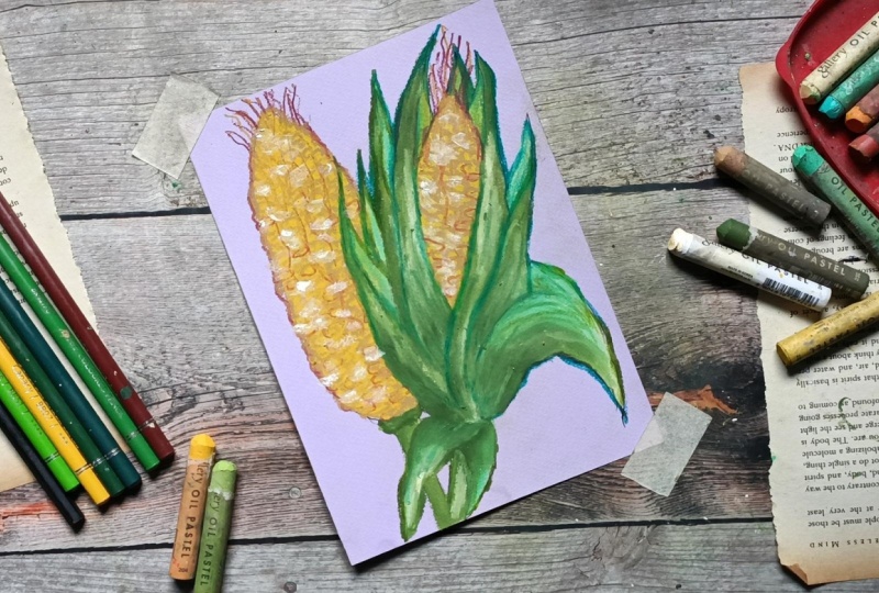
1. Welcome and Introduction : Hi, and welcome to this corn and oil pastels learn sketching, kernels, cups, and much more. So we have got duel
project for this class, and they are very easy
and simple to do. And it won't take much time
around eight to 10 minutes. As you can see, I have used a small sized
paper, E six paper. If you prefer, you can
use other size paper. And we'll have a
lot of fun painting this beautiful and
easy oil pastels cons. Apart from this, we'll be
creating colorful leaves, husk, and silk for the
top of the conn. We have also got additional
ink illustrations. I'll start this class with the basic simple sketches for the cons and different
ways you can create them. Then we will do the seeps using various seeps techniques to create the kernels for the conn. Then I'll show you the
colors that I'll be using, feel free to use other colors. Not only this, we have
additional f project like this ink illustration. Then we have got this
full color illustration of the con along with
the husk and the silk. Here's another one for ink illustration of
the whole plant. And finally, this barbecue corn. So join me in this class, and let's create some
sweet corns. Hi, everyone. I am Vishal an
artist from India. I love creating simple, fun and being new
friendly art classes that anyone can follow. On a skill set, I teach
a variety of classes, including oil pastels, noodles, watercolor and ink
illustrations. You can also find more of my art on Instagram and YouTube. For this class, we'll
be starting with basic sketches and ink
illustrations for our con. Then we'll be moving on
to practicing seeps and strokes to build kernels
and husk and the con. After that, I'll be showing you different oil pistol techniques for texture and highlight. And playing with color
combinations for corn, husk, and surrounding leaves. And finally, five
extra bonus projects, including detailed
ink illustrations, a large full colour
corn painting, and some fun variations like a corn plant and
a corn barbecue. For most of the work,
I'll use oil pistil and sometimes I'll add
colored pencil for outlining and details. This class is designed to
be simple, fun, and bienni. So whether you are a
complete new to oil pastels or just looking for
relaxing little project, you will enjoy painting along. So grab your oil
pastels and let's dive into this easy corn
pistol projects together. Oh.
2. Class project : For this class, your
project is to create your own con drawings and paintings using oil pastel
and colored pencil. You can recreate any of the duel con project that I'll
be covering in this class. You are free to make
changes at other lements. You can play with
the size colors, and instead of using
this colored paper, you can use simply
the white papers and you don't have to create
it in smaller sizes, you can use larger
seats to create it, feel free to make adjustment. You can also see your
practice seeds like this one, that sketches of
the various cons. And in various perspective,
you can see it this, then you have the seeds, various color combinations and presers and the colors
that you'll be using. You can see this all.
Apart from this, you can try the five additional project like this colored con. Then we have got this C
Barbecue ink illustration, this con plant illustration, and this complete con. So please say your project
in the project section. Sing your project will help you reflect on what
you have learned. Other students can learn from your process and get inspired, and I truly love
seeing your project. It makes teaching even
more meaningful for me. The next thing that you can
do is upload your artwork to the projects and resources tab after completing the projects, and please leave your feedback,
reviews, and suggestions. They help me improve
and also let me know what you'd
like to learn next, and don't forget to
have fun with it, experiment with your
own color choices, styles, and texture.
3. List of Supplies : For this class, you will
need very basic supplies, a pencil and an eraser to do the basic pencil
sketches and I'll also be using colored
pencil to do some of the highlights and outlines
for some of the project. Bush to remove the
oil pistol dust, oil pistil, I'll be using
gallery oil pastels, oil pastels paper and
ink or brass paint to do the outlining
for ink illustrations.
4. Basic sketching for corn: M. Let's do some simple
sketching for our con. So before jumping
into oil pistol, I always like to break down the subject into
smaller sketches. Here you can see I'll
be exploring the con in different stages from whole
cop to close up up kernel. So let's start with a very simple sketch
for our first cone. So this is a very simple
sketch of a very simple cone. So this is how we'll be making the cons for our easier project. Now let's do a second one. For this, we'll be
adding the husk. This some small
leaves like structure for the husk that
surrounds the cone. Don't worry about
perfection here. Keep it light, so it's
easy to adjust later. Now let's do the third example. For this third example, let's expand the husk a
little bit by expanding, I mean, let's make it a little
bit more broader and open. So simple sketch for the con and a little bit more open husk. For our main project,
apart from this, we'll be making it more
detailed corn cob, kernels, silk and husk even
we'll be adding the leaves. Now let's do a
cross section area of the cob along
with the kernels. So a simple cylindrical
seep and we'll be adding this kind of small
structure for the kernels. So this is just a very
small specific example. For our main project, we'll be making it more
detailed and long. Let me show you another example. So this is also a cross section of the cob and the kernels. Simple repetitive state
to create the corn. Cn is a great practice subject because of its
repetitive pattern. So adding the kernels on top of the cob will be a very
repetitive process. But since we'll be
using oil pistol, it will be a bit faster
as the pistol the size of the cob and the kernels
will be a bit larger. Now let's darken the pencil
sketch a little bit, and I'll be adding
some rough details, the kernels on top of
this cob to make it a bit detailed and you will
get a rough idea how we'll be proceeding
for our project. The pencil sketch
that we did earlier, you don't have to follow
exactly the same way. So you are free to
make adjustment and changes as you sip it. As you can see, I'm roughly going over the earlier
pencil outlines. For our main project, I'll be starting with
the basic pencil sketch, and when I'll be coloring
them with the oil pistel, I'll be making some
adjustment if it's required, you don't have to stuck strictly with the
pencil outlines. Feel free to make adjustment and change the seeps
or make it long, small, whatever you prefer. So this is the
repetitive process I was mentioning about adding the
kernels on top of the cob. And this will take
a bit of time. Et's do another example. After this, I'll
be sketching out the full corn totally covered with the husk and
a little bit of the silk. Do you know that
corn is grown on every continent
except Antarctica. And one more thing, it silk on a corn cop connects
to one kernel. So the number of silks is equal or equivalent to the
number of the kernels. Let me show you how we'll
be adding the kernels. This is a simple
rough demonstration. I'm using intersecting
line horizontal and verticals to create basic
shapes for the kernels. For our main project, we'll not making them
this much symmetrical. We'll be making it like a little bit lopsided
or a bit ununiform. So yeah, these are some
basic pencil sketches. Now let's make a larger con. Now let's do a basic and very simplified
version of the conn. So here I'm starting with
drawing out the stem. And for this conn, we'll be only creating the husk, the kernels and the cop will be totally
covered by this husk, and I'll be adding
a little bit of silk on top or at
the end of this con. So this is the very simplified
version of the cone. If you prefer, you can
make it a bit detail. And while I'll be doing the
outlining, if you want, you can convert it or make it into ink illustration
for this conn. So this is just a simple shape. Some of the husk
is a bit opened. If you prefer, you can add a little bit more
detail to the husk. And we are done with a very basic simple
sketch for the corn. Now, let's do the outlining. For our main project, I'll be only drawing
three or five cons that have the husk and the silk. So we'll mostly I'll be making the cons
along with the kernels. So visible con kernels. And only for three
or four of them, we'll be making
the husk, the silk and even the lips and the stem. If you want, you can use reference image from the
Internet to mig and create many pencil sketches
and being more famial with the
sketching of the cons, and you'll get more ideas to draw the cons in various ways. Feel free to
experiment on your own with many images
from the Internet, especially from
the main interest, you will find some
very fascinating illustrations of the con. So yeah, feel free to do that, and we are done
with this section. So I decided to make it a
little bit more detail. So here I used ink lustration to add more details to this con. So here I use ink
llustration to add more final lines and
details to this larger con. And I was not able
to record this, so I'll be showing
you how you can add small kernels for
the cons in here. So very small and
repetitive seeds for the cons kernels on top of the cobs and let's do the sea for all the other cons
that we have gotten here. Let's move on to this next one. For this, I am starting going over the outlines
to make it a bit more bolder and I'll be adding fine lines and
details to create more details and make
it look more realistic. It would take a
little bit more time. If you prefer, you can
just leave it as it is. Since it's a
demonstration video, you don't have to create
the small kernels, as we've been doing a lot of
kernels in our main project. But if you prefer you
can join along with me. As for the husk and the stems, I'll be going over the
outlines to make it a bit more bolder and a bit more distinct from the rest of
the cons and the husk. And then I'll be
adding fine lines near the edges and at
the bottom of the husk. Let's add the detail for this
last husk for this conn, and now moving on to the stem, I'll be making it a
bit bolder and darker. Now, let's add fine line
details for this one, a little bit of lines as we have already done
most of the work. For these cross
sections of the conn, we'll be making some section
a bit darker and adding a little bit more blacks to make the kernels a bit more
distinct and detailed. So let's do that going over the outlines a little
bit and making it a bit darker and surrounding some of
the kernels a bit more This process is very repetitive. Here, let's make
it a bit larger. So extending some of the
rows or columns of the cone, let's add the kernels for this. Here I have made the kernels a bit more large and more defined. And with these we are
done with this one. Let's do the same
for this next one. Adding tiny details
for the center of the kernels that are visible. And now let's go over the outlines and make it a
bit bolder and the darker. In our extra ink illustration, we'll be making the kernels
a bit more defined, more darker, and we'll be adding much more detail as compared to the ones that we are doing
in here for the sketches. Here, too, I decided to
make it a bit larger. Now let's add a bit more detail. Make the outlines a bit
more defined and detailed. And with these, we are done
with this additional part. H
5. Detailed corn ink illustration - Bonus project: Welcome to our first
bonus illustration. For this, I decided to draw a
full illustration of a con, a full ink illustration
of the cone. Since in our last
demonstration Vd, I was not able to record
the illustration, the ink illustration of
the con, the long con. So I decided why not create a more defined and detailed
ink illustration of a con? Let's start with drawing out the basic Ps and the
guidelines for the cone. I use center line to determine
the length of the cone. The cones are somewhat
cylindrical in ZIP, so the major section
of the cone is cylindrical and the upper
part of the cone is conical. Very simple C. And now let's
draw the maze for this, I'll be creating four or
five husk that surrounds it, and I'll be making them a little bit more detailed as compared to the ones that we did as compared to the ones that
we'll be doing in the project. Since the paper for
our project will be much smaller A six
and this is E five. So let's draw the
guidelines for the husk. Feel free to use other
reference images from the kit and
practice on your own, it will be a very good Oh. And let's create a few more
husks surrounding this. So this will be very
repetitive process in here since I'll be adding each and every kernel of the cod and we'll be making
it a bit more detailed. It will take a bit more time, and I'll fast forward or I'll skip some part that
is more repetitive. I am basically done with the
basic pencil sketch for it. Let's draw some simple
guidelines to draw the kernels. So I'll be adding the kernels
inside these guidelines. These are somewhat rough ones, but I'll be making
a bit adjustment while I'll be going
in with the ink. Here I'm using the micron pen. You can use other paints
or if you have ink paints, it will be a bit more good. I will add another
characteristics to your painting
as with ink pain, you can create dynamic lines. By dynamic lines, I mean
lines with varied thickness. Here, too, I'll be trying
to achieve somewhat of varied thickness for
the lines later on. For now, let's go with
the pencil outlines. Feel free to make adjustment, change the see sides or add a few more leaves or
husk, if you prefer. As you can clearly see, I'm not following the
guidelines exactly. I am making a little
bit of changes. I'll be doing the same
for our projects too. So make adjustment and changes wherever you
think it's required. Now, let's go over the stem and the rest of the base
for this slice. And I think we are done with a very basic simple
outlining of this con. Let's lightly erase
the pencil marks. I'm also erasing the guidelines that I drew for the kernels. Since this was not
that defined later on, I'll be once again going
in with a pencil to do a better guidelines for
the kernels of this con. Now, let's remove
this with the brass. I use brass to
remove this dust in the oil pastels it ensured that I want me smudging the colors
from the people. So going in with the
pencil to draw out the guidelines for the kernels. So for this, I decided to add six or seven rows of kernels. If you prefer you
can make if you prefer you can adjust the
number of rows in the column. For the kernels, I'm creating this somewhat rectangular polygonal
s for the kernels. So these are rectangular ones. And so, okay, let me
show you what I mean. So these are the saps that
I'm creating for the kernels. And as I mentioned earlier, that I'll be trying to create
somewhat of dynamic lines. To do that, I'm going over
the lines that I created once again and also I'm adding
some lines below or above it. One or two more lines to make a little bit of ununiformity
for the kernels. Also, you don't
have to stick with the guidelines that
we have created. You can change it and
make some adjustment as all the kernels on the core are not that uniformly aligned, feel free to make adjustment, and you can even leave
some of the species empty as some of the kernels are
missing from some of the cons. This is a repetitive process, and let's add lots of
kernels for this con. For the edges or the
outlines of this con, let's make it a little bit in the seep of the kernels,
somewhat jig jag. Not jig jag, but somewhat
in the seep of the kernels. So this process is quite repetitive and it
will take time. So you can consider this as the doodling as you don't
have to apply your brain, do the same repetitive thing. So this is what I was
mentioning for the outlines to make it a little bit like this in the shape
of the kernels. As I mentioned earlier, the
process was repetitive, so I added this manning
kernels on my own, and you can see, and you can see that I followed the same
instruction that I mentioned. And now let's completely fill
the rest of the kernels. To make it a little bit
interesting and fun, you can create some seeps or pattern with it and then
fill the rest of it. What I mean by that,
you do one row, then another row is empty, then do the third row, patterns like that, and later
on, you'll be feeling it. That is what I did when I
was doing it on my own. So I did one row, one column, another column was cap. But then I came back and did it. And we have got only
a few more left. So let's complete this, and then we will move on to the husk. If you want, you can add a
little bit more details, add few highlights and some
lines for the kernels. Now, let's do the husk. So for the husk,
I'll be going over all the outlines and make it
a little bit more bolder, so to create
distinction in between the outlines of the husk
as well as the conn, and then I'll be adding
lines like this for the top and bottom sections of this husk not only this husk, but all the husk that
surrounds this con. If you have ink pin
or breast pain, you can create the outlines
with more dynamic lines, and it would be much faster. Doing the seam in here, going
over the outlines twice or thrice and making it a bit bolder and adding
the fine lines. This lines are not straight. It follows the seam curve of the husk going over the outlines and making
it a bit bolder. If you want, you
can add more husk. In case of real corn, we got a lot of husk, but to make it project simpler, I added few, and if
I tried to add more, it would become a bit more
challenging for me too. So, let's add the fine
lines for this one. And now we have got only two more husk and
the best of this cnlab. For this one, let's make it
a little bit more detailed, so I'll be adding more lines. Also, the densities of line are comparatively more for
the lower regions. And as we move up, it become
a bit las but for the edges, we have got more lines. Let's make the outlines a bit
bolder for these regions. For other extra project, I'll be making more
detailed kernels for the ink illustration. So I think I've got three more ink illustrations
as extra or bonus project. So we'll be making them a
little bit more different, add more details or make it
a little bit easier too. So yeah, let's continue with adding the
lines for this side, and then we will move
on to the other side. Et's make this part
a little bit more bolder since it comes in
contact with the kernels. So we'll have to create
the distinct boundaries. And now let's move on to the last husk that
we have got here. For this curve part of
this curve section, add more lines and make it
a little bit more darker. Make it bolder and then
we'll be adding the lines. Adding few more lines
to the upper regions. If you want to create more realistic ink
illustration of the con, you can use stippling technique. It will take much more time, but the result will be very much different and
more realistic. Now, let's do the outlines of the cons a little bit
and add more lines wherever you think
it's required to make it a bit bolder
and more distinctive. I decided to add
more lines in here and let's do the
base and the stem. Let's make it a bit more
darker and more bolder. And we are done with this pink
illustration for the conn. If you want, you can add
much more details to it, add more lines wherever
you think it's required. But I think I am
satisfied with it. I'll see you in
the next project.
6. Shapes and oil pastel techniques : Now that we have our sketches ready from our last section, let's move on to practicing
the texture of the, the kernels, the
husk, and the silk. In this video, I'll
be showing you the example in a demonstration
how you can create the kernels for the conn
using various kind of preser and a bit of
different color variations. This step is really
important because once you understand how presser and strokes affect your
oil pastel work, the final painting
will feel much easier. So these are the example of very simple oil pastels strokes that I created using
the pale yellow. And to make and to convert
the strokes into kernel, we'll be making
it a bit thicker. By thicker, I mean
making it a bit broader. So let me show you
what I mean by that. So same kind of strokes, but just wearing the angle
and making it a bit thicker. These are the basic
sees of the kernels of the cone that we'll
be creating and we'll be using various colors
and combinations of different varying frecre let
me show you another example. Here I'm applying a bit
more pressure with it, and the cons are
a bit far apart. The kernels of the con
are a bit far apart. Let's move to another example. For this one, too,
I'll be applying high presser to get thicker
kernels for our con. And instead of making
it a bit apart, I'll be making it a bit closer. So here's another example
of the kernels for our con. These are comparatively
much closer to each other as compared to the first
example, which we're far apart. Now let's do a third one. For this, I'll be using light presser or you can
say medium pressure. With light preser we get a very soft almost
pistol like effect. This is perfect when
you want to create a base layer or to sew
lighter areas of the con. But if we press harder like we did in the
earlier example, the colors become
richer and more solid. Notice how the thickness
and closeness of the strokes change the
look farther apart, strokes look rough and textured, while closer strokes look
smooth and more realistic. So depending upon the kind
of project we are creating, we'll be taking these
things into consideration, making the kernels
far apart or much closer to each other or
applying medium light or heavy presers now for
the next demonstration, I'll be showing you a little
sections of the kernels. Now, let's create
a smaller sections of the conn. For this, I'll be using two
or three colors. So as we discussed earlier, we'll be applying all
what we have learned, high presser, low presser, closer and far apart
kernels of the cone. So here I am applying a
bit more presser with it. And here I'm not creating
the kernels uniformly. I am trying to create as realistic kernels as
they are in real corn. And this is our primary layer now going with the pale yellow, and a little bit of other color was stuck to my pale yellow. So let's remove this. I'm using this pale yellow
to highlight or make one side of the kernels a bit lighter, and
on the other side, I'll be making it a bit darker, and then I'll be using the darker tones of
the color like ocher or a bit brown to create outlines for
some of the sections. Create some of the
outlines to make the kernels seeps more defined. And for this here I'm
going in with the ocher. We are not trying to create a total perfect safe or
uniform seep corners or edges a little bit definition
to them to represent that there are distinct
and different kernels present on this cone. So you can clearly see I'm not outlining all the sections, but only some sections and
only a little bit of those. So this is kind of con kernels that can be created very fast
and have a rough texture. For the second l, we'll be
making them more detailed, but it will take
a bit more time. Now going in with a
pale yellow or white to make it a bit more
lighter on some sections. So as you can see the
light reflects from the cons and that's what we are trying
to achieve in here. Oh. So for this, I'll be basically
using white colour or pale yellow or sometime or in this yellow if we
are trying to create a bit darker set of the
kernels for the cn. So this was rough
texture for our conn, and it was comparatively faster as compared to the
other two examples that I'll be sewing Now let's do
the second example. For this, I'll be
trying to create the kernels a bit more
detail and define. So let's make the
kernels a bit more defined in the sp and
a bit more uniform. So for this example, I created three rows
and four columns. Here I started with this pale
yellow as the base layer. If you prefer you can
use light preset to make the process
bit more easier as overlaying of the
color on top of the light preset
will be much easier. Now, let's add
more colors to it. So here I'm going
with the yellow, and I'm overlaying this on top of the pale yellow
for some sections. Here I'm going with another
side of the yellow, a bit darker set and blending it with orange yellow
and the yellow that I add. Now let's blend it to
the rest of the kernels by using the seam orange yellow we used for
the primary layer. We are creating somewhat
of gradient for this con. That's why it will
take a bit more time. And the details that we'll be
creating using this process will be more defined as
compared to the first one. Once again, I'm going back with the ocher to do the outlining
for some of the sections. Now, let's do the
highlights for some of the sections to sow the reflection of the
light on the con. Apply a bit more pressure
with the oil pistol, the white, since we use two
or three layers of the color. So you'll have to apply a
bit more pressure with it to overlay it on top of
all the other colours. So until going back with
the yellow, once again, to make it a more detail, we'll have to go back
and forth till we get the desired effect or the
colours for the corn. So that's why it takes
a bit more time. So feel free to use and
add as many layers of the color till you are satisfied with the kind of
conn you are aiming for. This is our second example, which is comparatively slower and it's a bit more defined. Now moving on to our third and the final demonstration of
the kernels for the con, This is completely
different from all the two examples
that we did earlier. Here I'm starting
with the yellow. You can use any
other sets to create the primary or B slayer for
the kernels of the con. Yellow or a darker tone on top of it in the seep
of the kernels. For this, we'll be using much more defined outlines
to create the distinction. Here, I'm using
the ocher to make the outlines a bit more detail compared to the
earlier two outlines. As you can clearly see, we have got much more
detailed outlines. Going in the pale yellow to make some sections or some
part of it a bit lighter. Here, too, we'll have to
go back and forth with two or three colors till
we get the desired effect. And since we are overlaying this color on top
of the base layer, we'll have to create the
kernels a bit more defined. So the thing is on
a real corn cob, all the kernels are
packed tightly in the rows and they are like
tiny repeating pattern. So when you are painting them, it's okay if every
kernel leg not perfect. What matters is the
overall pattern feels full and structured. So that's what we are aiming
for this third example. And, I think we are
done with this one. If you want, you can
add a bit more detail, but I think adding more detail
will be overkilling it. So these are our three
example of the corn. Now let's move on to
creating the husk for this. I'll be only creating a
single husk for the cons. So here's the first
example here, I'm starting with the
primary layer for it, and as you can see, I have applied medium pressure with it. If you want smoother
consistency and solid color, you can apply heavy
presser with it and just going over
with the darker set to do the outlining and some
umber streaks to create a bit of pattern or you can
see gradient for this husk. Here's another example for this. We'll be using different
technique to create the husk, and here I have started with a light olive so this is the
once again base layer now. Instead of using the dark tone, here I'm going with a bit
lighter grass green in here. And I'm not covering
the whole sexton, but some sections of
it and once again, going back with the olive to blend it together and
doing the outline. Here's another
example for this one, I'll be using a bit
lighter states. Here I am here I started
with this green. Here I started with
the grass green. Now using the same color
combination, the light live. And as I said earlier, I'll be making it a bit lighter to sow somewhat
reflection of the light. So going in with a
lighter sad you can use white or pale
yellow to do this. But before doing this, let's
define the seep a bit more. And now, I'll be
adding the highlights. I decided to make it a bit
more gradient like colors. Now going in with the
white to add a little bit of white streaks to create
somewhat reflection. We are done with a three
example of the husk using three different
color combination and different techniques. Now let me show you the
example of the silk that you can create using
two or three color. Here I started with the ocher and let's create a
bit of contrast. I'm using the set,
adding it or you can see overlaying it on top of the silk that we
created with the ocher. This is the very simple example. Here's another example of using
lighter and darker tones. Well yellow for the lighter
tone of the silks and use russet or ocher or any other shades of the brown for another
layer of the husk. Here I am going in
with the three tones of the color for
this kind of husk. Let me show you one more
example for this I'll be using starting with the yellow. So very simple and jag this kind of line for the
silk of the corn, and we'll be only adding the silk for only
three or four product. And these are very
simple to create. For the first
layers of the silk, apply light presser, and then you can apply
the heavy presser. Otherwise, it will be
a bit challenging. And yeah, with these, we
are done with this section. In the next section,
I'll be sewing with the different
color combinations or the colors that I'll
be using for this class, and I'm using oil pastel,
gallery oil pastels. And also, you can use the
pencils to do the outlining to make your project much
more detail and defined. So here I'm using the
pencils to do the outlining to make the husk more
crispy and defined. You can do the same
with the conn kernels. Darker seats of the yellow or the browns to do the
outlining for those. Same goes for the silk. So using this bancil color will make your project much
more defined detail, and it will be much more fun. Here I'm using sets of
orange to do the outlining. Not all sections of the kernels but some sections of it
to make it more defined. So the choice is yours to
use the pencil color too, so feel free to
use if you prefer. But for majority of the
sections of the project, I won't be using them. Here, see you in
the next section where we'll be using
different color combination. Not using, but I'll be showing you the colors that
I'll be using.
7. Colors for the class: Welcome to the third
and the final video of this demonstration sections. So for this, I'll be showing you all the colors that
I have got from this oil pastels gallery
oil pastels that I'll be using for the cons and the husk. So yellows and the greens. So these are the colors
that I'll be using mostly, I'll be using a
color combination of two or three
sets of the yellow, pale yellow and white
to add the highlights. Also, you can use
orange yellow, too, and somewhat and sometimes oranges to to make the cons
a bit darker than the sides. So feel free to use the sets of yellow and
the orange that you have. I'll be using this eight or
ten colors that we have got. So here we have got yellow. Basically, I'll be showing you all the colors that I have got, their names and the numbers. I am using the
gallery oil pastels, and you'll have to cause us not to do this kind of mistake. So always ensure that the tip of your oil pastels is clean. Use tissue paper or cloth to remove the accumulated
oil pastels, and ensure that
the tip is clean. Otherwise, you will smoge the colors or blend the
colors unintentionally. And so since we are
using oil pastel, it sits most easily. So to prevent then use tissue paper under your palm
or cloth to prevent that. And one more thing
you can do is to start from top and
move to the bottom. In this way, you
will ensure that the colors will
remain smuged free. Here's the last color, the white that we'll be using
to add the highlights. These are the oil
pastels colors. You can use the
pencil colors to do the outlining and
add a little bit of more characteristics
to your cons. And now, these are
the numbers and the names from the gallery
oil pistil set that I have A few more things to
keep in the mind. I'll be using colored
oil pastel paper. You can use any colored
paper or white paper, ensure that the quality of
the paper or the density of the paper is more
than 150 or 160 GSM. Otherwise, it will be a bit challenging to do overlaying
on top of the paper. Since the oil pastel
paper have a bit texture, it's much easier to do the layering of the color
one on top of the other. The paper with a smooth texture will be a bit challenging. We'll be applying two or
three layers of the color. As I mentioned
earlier, we'll have to go back and forth till we get the desired effect
or decided kind of coloring that we
want for our cons. For our project, I'll
be creating some. For our project, I'll be
starting with very small pages. So A six, if you prefer, you can use bigger papers or
bigger size of sketch pads. We have got two more colors. This is lemon yellow, and the last one will be
two, four, four white. Now let me show you
the greens that I'll be using for this. I've got six greens. You can use any other
sets of the greens. You can also use a bit of
black to do the outlining, but I will try to avoid
using the blacks. Sometimes I might use green, but mostly I won't be using
the dark sets of the color. Like earlier, I'll be
showing you all the colors, the sets, and then I'll be writing the numbers
and the names. For the leaves, too, we'll be using two or three
colors combination. Not the leave, the husk.
For one or two project, I think I added the whole plant or you can say the leaves
and the stems, too. But mostly I created the cons and the kernels
and a bit of husk. So these are all the greens, the six greens that I'll
be using for our project, feel free to use other shades
of the green that you have. Let me give you the numbers
and the color name. This is 242 olive yellow,
a bit lighter side. You can also use shades
of yellow for the leaves. And I'll be also
using white to do a bit of highlights
for the reflections. This is 226 jade green. We have got three more colors. I think they are grass
green, yellow green, and last one is olive,
light olive, perhaps. Some of the suggestions that you can use for your project. As for the layering, start with the light layers and
weld up to darker ones. Oil pastels look richer
when you lay it it slowly. And as for the preser start
with the light presser for soft sending and heavy preser for bold and saturated colors. Can experiment with the strokes for texture of the
kernels and the silk. So the angles of the strokes, apply heavy preser and light presser and you
can see what kind of strokes create what kind of texture for the cons and
the husk and the kernels. Blending of the
colors, you can use blending tools like
blending stem, Q tip, cotton, or tissue paper. And with these, we are
done with the colors. See you in the next video.
8. Simple corn - 1st Project : Welcome to our very
first project. For this, we'll be drawing a very simple and
small con along with the husk and silk and a very
small stem to the cone. Here I'm using black
oil pistol paper. You can use other colored paper or simply white paper
will do their work too. Now let's start with
drawing out the sketch. Here I'm using
this straight line to determine the
length of the cone. A somewhat elliptical
seep or you can say cylindrical
see for our con. You can make it a bit
larger or a bit smaller. And now let's add the husk
surrounding this corn. So this is the
piece for our corn, and this is a very
simple save for it. Now let's do the stems
and add the husk. So for the husk, I decided
to add seven or eight. You can increase or decrease the number of husk and
change the pattern, saves and side also. So feel free to experiment and make it as comfortable
or easier for you. So this is our basic
pencil outline, and while I'll be
adding the color, I'll make adjustment if I need. So let's start drawing it. So let's start coloring
it since this is a very simplified
person and there is not that much space for it. So here I have already started
with this pale yellow, and I'm creating small
strokes to create somewhat texture for our
cardinals for this cn. Here I am aiming for
a rough texture, and this will be
somewhat similar to our third demonstration
of the cn. This will act as our best layer, and I'm not completely
covered it, so we'll be overlaying
light yellows and other seeds of yellow on top of it to make it more detailed. Now I'm going with the yellow. So let's add some small strokes
of yellow on top of it. So we'll be covering majority
of the pale yellow with it. You'll have to apply
a bit of preset to overlay it on top
of the pale yellow. Try to create smaller strokes in the seep of the
kernels for this conn, and you are free to use other color combinations
of the yellow. Now I'm going with the
sad of the yellow. And we are done with
this golden yellow. Now, let's add a bit darker red. So a little bit of orange
for some sections, especially near
the husk and near the edges to make those regions a bit darker to represent or so that the cadose is
created by the husk. And finally, going
with the ocher to do a bit darker sets
to add a bit darker side. So we'll be creating
small sizes or small strokes with
this kernel to represent the seeps
of the kernels, since we cannot do the
outlining in here with this ocher this small strokes to represent a bit of darker
regions and outlines, and we are done with the ocher. Finally, let's go in the
white to add a little bit of highlights to
somewhat reflections of the light from
some of the kernels. Since the coin is so small, we'll be adding randomly
the white strokes. And we have got a very
basic coloring for our con. You can make it a
bit more detail by using the pencils
to do the outlining. And now let's do the
coloring for the husk. Ensure that the tip of
your oil pastel is clear, and here a little
bit of dark green was stuck to it. So
let's remove it. It it would be much more easier if you use
cloth to remove it. And here I'm going
with this lime green to do the primary
layer for our husk, applying a little bit medium
presser or you can say high presser to go over
the outlines first. And as I mentioned earlier, you are free to make changes, and I'll be making
a little bit of adjustment to the seeps
and the sizes of the husk. So try to create sharp
and crispy edges. As I mentioned earlier,
you can also use different color
combinations of the green. Also, if you're going
to use colored paper, you can twist out the
colors on it first and then add it on your project
as the color acts different. As color intensity change depending upon the color of
the paper that you are using. Here, I am going with the
darker side of the green, and we are overlaying
it on top of the lime green that
I added earlier for some section or you can say for edges or one sides
of the lime green. Now let's go in with the darker sides of the green to make it a bit darker and to sew clear distinction
in between the husk. So the layers of a husk will be a little bit more differentiated
using this darker side. It will also represent the
darker regions of the husk and create somewhat clear and
definite outlines for the husk. W we are only creating or adding small single straight strokes for this husk with this
darker side of the green. Let's add a little
bit of highlights for our husk using
this pale yellow. Instead of this pale yellow, you can use the white also. Also, I'm using this to
make the step a little bit more defined and adding a
little bit more volume to it. By more volume, I mean, I'm making it a bit broader. So this is our way simplified
version of the cn. You can make adjustment. Instead of a single one, you can add two more. So that will be interesting. Yeah, let's add the small silks. So I'm using this ocher
to heat the silks. You can use other color
combinations, too. Like here I decided
to add russet a little bit on top of
the ocher for our silk. And let's add a little bit of silk on top of
the kernels, too. So extending some thread of the silk on top
of the kernels. Now add more color wherever
you think it's required, and we are done with this adding a little
bit of highlights. So yeah, add a few
more colors and make adjustment to complete
your first project. And to get a more definite
shape and distinct line, you can go in with
the pencils to do the outlining and create some characteristics outline or bowl lines for the outlines
and the rest of the cons. Adding final touches
with this peel yellow. And with these, we are done
with our very first project. Let's unmask our first con and yeah, see you in
the next project. I only used oil pistil
to create this project, and to show you that you can add more details to the
colored pencil, I added somewhat
details and outline. And you can clearly
see the difference between the oil pastel and the one that I added a little bit of
colored pencils too.
9. Semi realistic corn - Bonus Project: Welcome to our second
bonus project for this. We'll be creating a somewhat
realistic looking con. Here I am using I size
people and it's white. You can use the
smaller one, too, but it will be a bit challenging since I'll be making
it bit detail. Our first project did not
turn out the way I expected, so I decided, why not? Let me show you
somewhat realistic kind of con that you can create. Here I have already
started with the outlines a straight line
for the center to determine the length
for the con that I men. And these two lines that I intersected it is to
determine the width. Also, to insure the
symmetry of the cone, I added these two lines. But if you prefer you don't have to use this kind of lines. And let's create the
husk that surrounds us. I'll be adding six or seven
or five to seven husk. You can add more or you
can even add fewer. The choice is yours,
and this is just a basic pencil sketch
for our main drawing. If required, I'll be
making adjustment and changing the seeps and
the design of the leaves. Not the leave the husks
that surround this con. And yeah, let's add two or
three husk on the other side. For this, I'll be using
combinations of yellow, red, a little bit of brown, too, and for the leaves, I'll be going in with
the lighter side. And I think we are done with a very basic pencil
sketch for this corn. Feel free to make changes and
adjustment if you prefer. Since this is a bonus project, I decided to make the outlines
a bit more clear so that you can see the kind of C
that I have created for this, and I'll be applying
heavy presser with the oil pistol to
cover the outlines, the pain outlines that
I'm doing right now. Also, you can turn
this into two project. One will be the ink
illustration and another one will be the
oil pistlillustration. Use reference image to make your project much
more realistic. Let's cover this section
of the con with this husk. And let's do the outlining
for this other side. So the bottom
section of this con, the husk would be a
bit more broader as compared to the con
since it encloses it, ensure that the bottom
section is a bit wider. And we are done
with the outlining. Let's slightly erase
the pencil sketch. Oh, I forgot to add the
outlining for the base. If you want, you
can add few lines to indicate the darker regions, and it will help you to add
the darker colors later on. And we have lightly erased it. Now, let's remove
the erasers dust. And with these, we are
done with a very basic C for this project. Now let's do the coloring. Here I'm going with
the golden yellow, and let's create smaller
strokes for the kernels. This will be somewhat
rough kernels. And if you want, you can
use other weather to create the kernels as we did in
the demonstration video. We have got three or four
ways to create kernels. But here, I'm going
for the rough texture, and I'll be completely covering the entire section
of the con with a color, not this one, but a
combinations of them, and then I'll be going with a darker sets of the color
to do the outlining. Mostly, I'll be using
ocher and a bit of russet. Here, as you can see, I'm not
paying that much attention, but creating random strokes
in the seep of the kernels, and I am leaving a bit of
empty specs in between. I'll be using seeds
of different kind of yellows and a bit of orange
too to do the kernels. And yeah, let's completely fill this entire
section of the conn. I'm going with a pencil to do the rough outlining for the sections of the kernels
that I'll be adding in. So for this, I decided
to create five to 71. If you want, you can
create fewer ones or even you can increase the
numbers of the lines. So these are the rough lines or rough guidelines in which
I'll be adding the kernels. And as I mentioned earlier, I'll be using sets of
yellows in the orange. Here I'm going with
the orange and overlaying it on top of the
golden yellow that we added in the S of the kernels small broader
strokes of this orange, and I'll be adding them
inside the guidelines. So here I'm aiming for somewhat semirealistic
u and the husk. If you want to make it a
little bit more detail, you should proceed with
the second example of the demonstration video. The result will be
more realistic. Now, let's do the
outlining a little bit, some of the cons outline, not all of them,
and I'll be using. Before doing that, let's add a little bit of highlight
for some of the sections. Here I'm going in with
the pale yellow later on, I'll be adding
somewhat of white. Also, I'm covering the white of the paper and blending it with it to make it or create somewhat of gradient for
that small sections. Going back with the chat to
do the sets for the kernels. I'll be creating random kernels, not encircling it properly
or what I meant to say, not going over the
entire outline. Once again, I'm not able to properly express what I want
to see, but as you can see, I'm not creating the perfect
set for the kernel and I'm not adding in and I'm
not adding it properly. A few kernels here and there, and I'll be using
other color to create more kernels so as to create
a little bit of contrast. A little bit of random
polygonal C for the kernels, not that well defined. CM is the one that we
need with the kers. If you want to make
it a bit more detail, you'll have to slow
down a bit and make it a bit detailed
and more defined. We have got only a
few of the rows left, and let's add those. If you want, you can go
back with the ocher and add a few more rows
of the kernels. That's what I'm doing in here, going back and forth till
you are satisfied with the color that you are
aiming to get for this corn. And, yeah, we are done with rough coloring
for the kernels. I'll be adding a
little bit of white for the highlight for
some of the section. You'll have to apply a bit
of presser to add this white since we have applied three
or four layers of the colors, and, yeah, we are done with
the white for the highlight. If you want, you can add
tiny dots of the white for some of the specific
kernels, but I'm done with it. Going in with the
yellow colored pencil to do the outlining once again. As some of the
golden yellow from the first layer was
outside of the outline. Now let's do the greens. Here, I'm going with a grass green to do the primary
ear for the corn. We'll be using a combination of lighter and darker sets of
the green to create the husk. And you can see I'm applying
medium presser with it and not completely covering the entire section of the husk, as we'll be adding the
lighter section and a bit of white to create the reflections
and the highlight for it. So yeah, let's completely cover the entire section of the husk with it as well as the stem and the base of the go and
then we will go in with a bit darker or a bit lighter sets to create the gradient
for the husk, as well as add a bit of
shadows and dark sets to it, and With this be done with
the husk and the cord. I forgot to add the
base and the stem, which I'll be adding later on. Here I'm going with
a light olive. And as I mentioned, I
forgot to add the stem. Now, once again, going
back with a light olive and let's apply for some of
the section of the husk, primarily near the
lower regions. Here, once again, I applied
medium preserve with it. Now I'm going with
the light olive and let's blend these
two colors to get a gradient in between
this grass green and the olive for our
husk of this corn. Here I'm applying medium presser as I am not going for
a complete blending, but a partial blending of the color to get a somewhat
rough texture for it. For now, later on, we'll be applying a
bit more pressure like here that I am doing to get a somewhat more
definite blending and a gradient for the husk. And now finally going with the dark green to create
the darker regions. Here I'm applying a bit
more preserve with it, and the inner regions of the husk will be a bit darker
as well as the outlines, and we'll be adding the mid ribs for some of the
sections of the husk. In here, too, let's
make it a bit darker since it's covered
by the other husk. This side is the inner
side of the husk, so a bit of more dark green. The regions that are closer
to the con that are a bit bent will be a bit
darker. In here, too. Since this is the best part of the husk, it will
be a bit darker. Let's do the outlining for
this husk on this side. And now moving onto
the other side. So the mid ribs will
be a bit darker, and let's do the
outlining for the husk. And if you want, you can create the straight line
for the mid rib, but I'll be not
doing that for now. Let's add a little bit of lines for the base of this
part of the husk. And let's decrease the intensity of this dark green a little bit. Once again, going back
with a light olive. And here I'm applying
a bit more presser to blend it with the
rest of the color. So apply a bit more presser and to decrease the intensity
of this dark green a little bit and do a
partial blending of the color to get a smooth
gradient for the husk. Doing the same for this side. And you can see we have achieved somewhat of gradient
for this husk. And since I was aiming
for rough texture, I have not applied
that much presser to do a complete blending, but a partial blending of the colors to get somewhat
of rough texture, and to see that the greens, the dark green is
present in there and to maintain the see of the
green lines that we added. It's to the maze and the stem. And with these, we are
done with this coloring. If you want, you can
add a little bit more or use other colour wherever
you think it's required. I'll be making the
husk a bit lighter, but before doing
that, I decided to add a bit more
color for our corn. Now going in with
the white to add a bit of reflections
or highlight, you can see, for some
sections of the husk. Here I'm applying a bit
more pressure with it, since I'll have to overlay it on top of the layers of color. And if you prefer,
you can go back with a light olive to blend
the white a little bit, but I'll be leaving it as it is. And with these, we
are done with our very simple, somewhat
realistic con. Before doing that,
I decided to make the lines of the
husk a bit crispier. So I'm going with a pencil
to define the outlines. The edges of this husk are a bit more making it crisp
and more defined. You can do the same
for the kernels. You can go in with the brown
or Ochre, pencil colored. Let's go over the
outlines for the bees. And we are done with this. You can add other
colored pencil tune to make it more detail, but I'll be leaving it as it is. Let's remove the excess oil, pistle dust from it. And this time we
are done with this. I'll see you in
the next project.
10. Light colored corn - 2nd Project : Welcome to our second project, and this will be somewhat
similar to the first one, but we'll be making it a bit more detailed and
of lighter side. Here I am using white
oil pastel paper, and I'll be creating a
slanted con with leave stew. If you are like me are
using this kind of paper, ensure that your
per remains fixed. And now our paper is fixed. Let's start with drawing
out the guidelines for it. So as I mentioned earlier, this will be a
little bit slanted. So this is from the right. And yeah, let's do the
basic sets for our corn. So this will be the seep
and the size of our con. You can make it a bit larger. You can make it a
bit larger, smaller. Instead of placing this con
at the middle of the speech, you can adjust to
the up or down to. For this projective,
we'll be adding the husk. And apart from this,
we'll be adding a stem and a single leaf too. So this is somewhat more detail as compared to the first one. And yeah, let's lighten the
pencil marks a little bit, lightly ease the pencil marks, but ensure that some of
it should remain visible. Use tissue paper or cloth
to remove the dust from the eraser so as to avoid smudging of pencil
marks on your paper. And this will be the same in
case of the oil pistel dust. Use tissue paper or
brush to remove it. Now let's do the coloring here. I am starting with
the yellow instead of starting with a pale yellow like we did in the earlier one, here we are creating small seeps for the
kernel with this yellow. I'm applying a bit more
preserve with it and creating strokes of
varied thickness. Now let's go in
with another color. Here, I'm going with
the pale yellow and feeling some of the empty
spaces in between the yellows, as well as I'm overlaying some section of this yellow
or this pale yellow. Here, once again, we are
creating small strokes with it to sew or represent the seeps of the
kernels for this conn, and we are done with
this pale yellow. Let's add another
color, a bit darker sd. Here I'm going in with
the golden yellow, and let's add this on top of the pale yellow and the
yellow that we added earlier. I am only adding
this golden yellow for subsections of the kernels. And yeah, we are creating similar kind of strokes in
the seeps of the kernel, primarily adding it for the bottom sections, and
we are done with this. Now let's add a Darkt set. Here I'm going with the orchard to make it a bit darker and do the outlines somewhat
outlines of some of the kernels. And I'll be adding a little
bit more ocher on the top. But for now, let's do the highlights going
in with the white and apply heavy preserve with it to create some
highlights for our corn. And we are done with the
basic coloring for our corn. Let's do the husk and the
leaves and the stems. So for this, I am starting
with the light olive. So let's draw the basic outlines and the saps for our husk. And later on, we'll be adding other colors on top of it to add more contrast and more details and characteristic
features to the husk. Here I'm applying heavy to medium presser to
create the husk. And I am trying to create somewhat crisp and
straight lines, not straight, but crisp
and defined lines for the outlines of the husk. You don't have to be
that much rigid with it. Later on, while adding
other colors on top of it, you can make your lines or the edges of this husk a bit
more defined and detailed. Let's add the stems, and later on, we'll
be adding the leaves. Here I'm going with
the lime green and overlaying it on top
of the light olive. So we are creating somewhat of radiant in between
these two colors. And yeah, we are done with this. Now, going with the white to lighten some sections of
this husk a little bit. The areas which
are a bit broader, I'll be adding white on those and near the edges
of the husk, too. And we are done with the
white and the light olive, along with the lime
green for now, let's add the leaves and extend the stems a
little bit more. Continuing with a light olive to add the stems and the leaf. So the leaf will be
a little bit band, so we are trying to create
this in that manner. So the bottom section of the
leaf will be a bit thicker and also the bend part
will be thicker too, but the rest the tip or the end of the
leaf will be thinner. So this is just the basic seep. If you are not that
confident with it, you can start with a pencil outlines and then
add the colors. Here I am done with
the basic outlining To make it a bit darker on the
inner regions of the leaf, I am going in with this
darker tone of the olive. And yeah, let's plant it a little bit to make
it a bit lighter. Blending this part too. If you prefer you
can make it a bit more darker on the inner sides. Using the olive to define the outlines a bit
more, not defining it, but making a bit darker on
some of the sections to sow the distinct husk and to
differentiate in between them. Going back with the lime green to blend this olive
a little bit, applying a little bit of preser and overlaying
this on top of the olive that we added earlier and blending it
with a light olive. Let's ensure that
all the colours are somewhat of same intensity, the leaves, the
stems, and the husk. So you'll have to go
back and forth with the colors until
you are satisfied with the kind of colours
and the color combination. Let's add the silk and a little bit more
details if you prefer. So I'm going with the Ocheuat very tiny
details on top for the husk. I think we are done with this simple coloring
for the husk, the leaves, and the stem. If you prefer, you
can go in with the pencil colour to add a
little bit more details to it.
11. Two corns - 3rd Project : Welcome to the third
project for this. I decided to use a purple paper. Let's sure that
our paper remains fixed and you are free
to use any other color. If you're using
different colored paper, I would recommend you to
first practice the colors on the rough seat and then
apply on your main project as the color intensities
and the seats are a bit different depending
upon the color of the paper that
you are using it. For this third project, I
decided to create two cons. I'll only be creating very
simplified version of it. It will be similar to the
second project that we did. So this is our first con, and I'll be adding one below it. If you prefer, you can
add multiple ones, but it will be a bit challenging
and will take more time. We are done with the
basic seeps for the cone. I'll be adding the husk, the stems later on. For now, let's start
with basic coloring. So once again, I am starting
with the pale yellow, creating random strokes to represent the seeps
of the kernels. This time, I decided
to make it a little bit more uniform
and more detailed. We are starting with
creating very small seeps or very small strokes with this pale yellow to
represent the kernels. So I'll be creating
five or six rows of the kernels for this con, and I'll be doing the same
for the second one, too. You are free to use any
other color combinations and other ways to create the con that we practiced in our earlier
demonstrations video. Now, let's do the same
for the second con. Creating very small
strokes with this pale Yeler to create the kernels
for the second one. For this conto, I'll be
using the lighter sets of the green to create the
husk and a very small stem, and we are almost done with the pale yellow
for the second one. You can increase the
numbers of rows and the columns for the
kernels of the cone. Feel free to
experiment and change the sea sizes or other element, whatever will be easier for you. And we are done with
the second one. Now I'm going with
a golden yellow. I'll be overlaying
some smaller strokes of it on top of the pale yellow. I'll not be covering
the entire section, but only covering
a small sections. And here I'm applying a
bit more preset to overlay it on top of the pale yellow
that we added earlier. Now doing the same
to the other con, adding a little bit
of this golden yellow on top of the pale yellow. Now going with the
ocher and adding smaller strokes on top of the golden yellow
and the pale yellow. I'll be adding this ocher
comparatively laser than the golden yellow
we added earlier. I am using this ocher
to create a bit of darker regions for our conn and to create a bit of outlines, not outlines, but small
strokes to represent somewhat darker sets for some of the kernels
of these two cons. Let's add the silk
on top of the con so here I'm using the pencil
colour to add the kernels. If you prefer, you can create
it using the oil pastels, but it will be a bit
challenging as we cannot create this kind of
smaller and thinner lines with the oil pastels. So I decided why not use the color pencil to add
the silk on top of it, as well as adding a little bit more silk on the
inner regions of this con. If you prefer, you can
add another color too, but I'm satisfied with the silk and the conn that
we had created. Now, let's add the
husk surrounding it. So once again, I
am starting with the olive to create the basic outlines and
the seeds for the husk. We'll be using other
colors on top of it, a bit darker sets and
a lighter sets too. And yeah, let's add
stems to it, too. So I'm not making that
much detailed husk like the first and
the second one. The husk surrounding this
corn are a bit smaller. Now, let's cover some sections
of the conn with this. You'll have to apply
a bit more process to overlay it on top
of all the colors. We are done with this
second one, too, and we are done with the
primary layering of the husk, let's add a bit darker tone. So I'm going with the
olive and creating lines. Not smaller strokes,
you can say line or smaller strokes on top
of the light olive. And yeah, let's add it on top of all the husks
that we created. I'm not covering
the entire section, but small strokes on top of it. Now, let's blend all
these two colors together to get a
very smooth gradient. So here I'm using the
lime green to do that, applying heavy pressure with
this to blend the two color as well as provide a
definite shape to this husk. Let's do the same for the
other corn on the upper side. So applying heavy pressure blend with the light olive
and the dark olive. Now, let's add it for the
stems of this two corn, and we are done with
this lime green. If you prefer you can add
a little bit more greens to get a better
gradient for the color. But here I'm going
with the white to add a little bit of
reflection or highlight, you can see for the husk. So only some sections and
smaller strokes with the white. So to add a more variety
to the color for the husk, and I'll be doing the same to some small strokes of white for the two cons
that we created. With these, we are
done with the white. If they are all pistal dust, you can use brass or tissue
paper to remove that. And you can add more colors to make it a bit
more detailed and defined. Here I'm going in with grease. Here I'm going with the
green sados for it, a little bit of
green surrounding both the cons and you can use blending technique
to blend it or you can use your finger to
do the blurring effect. For blurring effect,
you'll have to apply preserve with the tip of your finger and blend the colors to the
rest of the paper. And with this, we are done
with our third project. See you in the next project.
12. Corn plant - 4th Project : Welcome to our fourth project. For this, we have got a
little bit different thing. I'll be creating the
whole corn plant, the leaves, the stems, and three or four corns. So for this project, I made
a little bit of mistakes. I use a lot of colors
with the oil pastels. I will mention the point that you should keep in mind to not make the same mistake and to rectify the mistakes
that I made for it, I used colored pencil
to correct them. Let's continue with our
basic pencil sketch for the corn plant. So straight line to determine
the length of the plant. And for the leaves
too and the conn, I'll be creating
very simple lines, as you can see in here. I decided to add
four cons for it. And yeah, I think I am done with a very simple sketch
for this one. I'll be adding more
details while I'll be using the oil piece
still to color it. So let's start doing
the coloring for it. For this here, I'm starting
with a pale yellow. So let's go over the outlines
and add a bit more details. Here I'm starting with pale
yellow for the corn first. So very simple sieves
for the conn and we'll not be making
it much detail as we have got very
tiny space for it. So mostly we'll be using overlying technique to do
or add the colors for it. It will be similar to
the third example of the demonstration video
of the conn that we did. Here I'm adding the
yellow on top of it. Adding very small tiny strokes
with this yellow on top of the pale yellow to make somewhat
resemblance of the corn. Now let's darken
it a little bit. I'm adding the golden
yellow for some sections of this conn. And I'll be making it a bit
more darker later on. But before doing this, let's
encircle it with the husk. So here I'm using the olive light olive to do the husk or to create
the husk with it. Let's add the husk for the remaining three cons
that we have in here. You can see, I'm also overlaying this light olive on top of the lower sections of the corn to make it a
little bit more realistic. And here we are done with
the husk for the four corn. Now, let's add the stem, the main stem for
this corn plant and connecting it to the four
corns that we had gotten here. Make adjustment, make it a bit broader or add
more details to it. So whatever you see fit. Now let's do the leaves. So I'll be adding
a bunch of leaves. If you prefer, you
can add fewer leaves, but I decide why not? Let's create lots of leaves
and lots of large leaves. Do the outlining
the rough saves of the leave with light
yellow and later on, lm using other
seeds of this olive to make it a bit more
contrasting and more defined. So this was my
first mistake that I created lots of leaves. In easily I should have
started with fewer leaves, and then later on, I should have added more leaves. So I'll recommend
you to start with fewer number of leaves in
the beginning and later on, you can add multiple
ones if you prefer, but it will be much easier. And in my case in here, I added large
number of leaves in the beginning and to make it broader and add
more details to it, some of the leaves
get a bit muddier or a bit overshadowed
by each other. So I would recommend you
to create fewer leaves in the beginning here you can see that I have already started with
thickening the leave. Later on, I added more
colors on top of it, and the overlaying lead to a bit of overshadows
of the leaves. So try to avoid that mistake. Now, going with the darker side of the olive to add a bit of distinction and to
create a bit of darker regions for the inner
section of the leaves. By inner section, I mean the leaf spot that is
closer to the stem, and the outer section
will be the part of the leaf that is on the
other side that is bent. So I'll be adding the darker
sedes on the inner sides and a little bit or a single
streak for the outer sides. Also, as you can see, I am
adding it for the husk, too. So a little tiny streaks of
this dark live for the husk. Instead of this light olive and the dark olive
color combination, you can use the other color
combination that we did in our demonstration video or in our first section or
in our first project, feel free to use other
green colour combinations. Now let's blend these
two olives together. I am starting with this light
olive to do the blending. If you prefer, you can use
other sets like lying green. I'll be using the lime
green and white later on. But for now, let's
do the blending of the light olive and the
dark column with this one. We are applying a bit of medium presser to
do the blending. Here I'm doing a pile blending. By psil blending, I
mean that I'm not overlaying the entire section of the dark olive that we
added just earlier, only some section or
parsley blending it. With a pile blending, you will get a rough texture as well as you can see that the other color is
present beneath it. Also, you will get a
somewhat rougher texture for the color gradient. That's what I'm aiming for
this project and this leaves. Now we have got only
the leaves at the top. For this projector,
we'll have to go back and forth
till we achieve the desired outcome
or the desired coloring for the leaves
and the rest of the plant. Add more olives
wherever you think it's required to increase the density A more olive wherever you
think it's required to decrease the intensity of the
olive that we used earlier. And I am done with
the olive for now. Let's lighten some sections of the leaves with
this lime green. I'll be primarily focusing this lime green on the
outer sections of the leaf. Once again, I am doing
the partial overlaying of the colour to get
a partial blending. Let's cover most of the leaves and the stems with
this lime green. So yeah, let's continue with
overlaying this on top of the dark olive and
the lighter state of the olive that
we used earlier. And with these, we are done with the lime green phone now. Later on, if you're required, I'll be adding a bit more. I decided to darken
the conn a little bit, so I added a little
bit of more yellow. And to make it a bit
more darker and defined, I'm going in with
this golden yellow, adding three tiny
strokes on top of the yellow for this four con
that we have got in here, and here we are done
with this golden yellow. Let's add a little bit of
shadows and darker regions. So I'm going with the ocher, primarily focusing on
the top and the bottom. So the streaks that I'm
creating with this is a bit larger as compared to the other streaks and we
are doing an overlaying. So we are done with
the conn. Let's move back to the leaves and make
it more detail and defined. Since the leave of
this corn plant become a bit less defined, so I decided to use
color pencil to do the outlining and make the leaves a bit more
defined and detail. I'd recommend you
to do the same, use pencil colors to make
it a bit more defined. Also, some of the
other mistakes that I did that you should avoid Isil, you said start with a
single one or two corn for the plant or like I mentioned, instead of creating
this whole corn plant, you can start with
specific sections like the top part of the corn plant
and then the middle part. In this way, it would
be much easier. And with these, we are done
with the pencil color, add more color
wherever you think it's required to finish
this fourth project. For the fifth project, I
have something exciting. I'll see you in the fifth
project with multiple cons, and it will take a bit more time for the fifth project.
See you there. I was not satisfied
the way it turned out. So later on, I went back
to the So later on, I went back to this
project and used color pencil once again to make it a bit more
detailed and defined. So here I'm using
a bit darker side of the green to
do the outlining. I'll be doing the outlining for all the leaves as well
as for the conns. This side of green
was not that darker, so I'm using another set
of much darker green, and I'll be adding the mid ribs for some of the
leaves, and, yeah, I'll be defining it properly
as properly as it can be. The next project will
be a bonus project in which I'll be creating an ink illustration
of the corn plant with fewer leaves and
a bit more detailed. I have not added the tassels. If you want, you can add those. In the next project, I'll be showing you
how you can create tassels with the
ink illustration. All we have to do is to do the outlining for
most of the leaves. Also, if you prefer, you
can use other shades of the green to create somewhat of blending of the leaves
a little bit more. And for the stems, you can use a bit
more darker greens. Here, I'm only using a
single shade of dark green. So what I mean to say is use two or three sets of the green. It will take a bit more time, but perhaps it
might make it a bit more detailed and a bit better. You'll have to bit
courses around the corn. Now let's move to the bees and do the outlining for
the leaves in here. You'll have to bit couses around the corn to avoid going over it. Also, I'll be going in with
the seeds of the yellow or ocher to define the seep
of the corns a bit more. Let's do the stem at the base. And we have got only a
few leaves remaining. To make it a bit
more distinctive, you can add a bit
more dark green for the inner
regions of the leaf. But inner regions means
the part that is not bent, and the part that is
bent for one side, you can add a bit more greens to create a bit darker regions. What I mean to say is to
create regions of a bit of highlighted sections
and a bit of darker seeds for darker regions. And yeah, I think we are done with the outlining
with this dark green. Now, let's go in
with the seeds of yellow to do the outlining for the conn and we are done with
this seed of the yellow. With these, we are done
with this project, see you in the next project.
13. Tiny little corns - 5th Project : Welcome to the fifth project. So this is one of my favorite
projects from this class, and this will be painting multiple cons of various
sades and color. So this will be a
pattern project. So here, I'll be creating ten to 15 different sads of the cons with different
color combinations, and we'll be also creating
some patterns and design. So let's start creating
our very first tiny cons. Here I'm starting
with a golden yellow to create the very small see for the top of the
conn. A little section of the conn will be
covered by the husk. The remaining part of
it will be visible. I'll be using various
shades of yellow to create this tiny cons. Here I'm going with
a golden yellow. I'll also be using
oranges yellows, pale yellow, and other
variations of the yellow too. So feel free to use any
other color combinations of the yellow to
create the cons. Now, here I'm going
with the orange yellow, very small dots to create
the seep for the corn. Et's use another set. Here I'm using the
pale yellow to create the tiny
seed for the corn. So feel free to use other seeds the feel free to use any other
variations of the yellow. You can also use a bit of lighter sets of the brown
and a bit of orange too. Like here I am using it. Also, you're free
to make adjustment, change the seep in the side, as well as orders of the corn
that we are creating here. You can increase
the numbers of core or even decrease
the numbers of it. You can also add leaves to it. So the choice is yours. Here, I'll be only creating the husk for the lower section. The major section of the
con will be rebuilt. But if you prefer, you can
use the combinations of both. By both, I means only the
husk or only the cons. So feel free to experiment and create varieties of
pattern for this project. And, I think I am satisfied
with the number of cn h Let's add a few more
where there is empty space. In here, I used golden yellow, yellow, pale yellow
and orange yellow. Now let's add another
layers for it. But before doing that, I'll
be showing you how I'll be creating very tiny and minute
husks surrounding the corn. For this, I am using
the lighter side of the olive and I'll be
surrounding the corn with this And I'll be surrounding the conn
like this for the husk. Now let's do another
example of the husk. Here I'm going
with a mint green. So the husk surrounding the corn will be not
that much detail, but try to make the edges a bit crisper, not
that much blunt. Also, this is the primary layer for both the corn and the husk. We'll be adding another layer of the color to create
a little bit of contrast and add and add a little bit of depth
and shadows to it. Here I'm using grass green. So basically, I am
using a single sad of the color and creating
two husks for the corns. Feel free to make changes and adjustment to the
sides of the green. Put the seep in the
sides of the husks, too. You can even add the leaves
and the stems if you prefer. Now, here I'm going with the darker side of the
green for the husk. So in here for the darker
sides of the green, either I'll have to
use very lighter sets of the green to do the overlaying or use white to add the highlights or a
little bit of shadows. Also, I'll be adding
the silk on top of it. For that, I'll be using
the pencil colors. And if you want to
make it more detail, you can use the
pencil color to do the outlines for both the
husk as well as the conn. Here, for the darker
sides of the con, I'm here for the darker
sides of the cone, I'm using the pale yellow
to create the husk. Let's create another husk
with the pale yellow. So this project will take
a lot of time, I think, around 15 or 20 minutes, and this is the biggest project
of all the main project. Let's go with another side
of this olive to add. I already have used it, so now. Now here I'm going with
a turquoise green to add the husk for this corn
and let's add another corn. No, let's add husk for another corn with
this turquoise green. If you want more precise
and detailed husk, you can use the color pencil, two or three sets of the green, and with that, you can create very defined and crisp
edges for the husk. We have got only four, so let's use another set of the green or the same sets
that we have already used. I'm using the same
turquoise green that I used earlier
to add the husk. But for the color combination, the next color that
I'll be adding it, I'll be using a different color. Now, for the last two cons, I'll be using darker sad. So let's see what we
have got in here. To avoid smudging of
the colors of my palm, I'm using this tissue
paper to prevent that. Here I have got a last con, so using the same
turquoise screen to add the husk for it. So we have got one, two, three, four c with
this turquoise green. And yeah, we are
done with the husk. So these are the primary layer for both the cons and the husk. We'll be adding
multiple layers or two or three more layers
of the colour to make it a little bit more
detail and defined. To prevent the smudging
of the color, once again, I'm using the tissue
paper under my palm. As for the second layering, for the darker sets
of the yellow, I'll be adding the lighter
sets on top of it, and for the lighter sets, I'll be going with the
darker sets of the yellow. In here, you can
see I'm applying this pale yellow for the
darker sets of the yellow, the golden yellow that we use as well as the orangish yellow. I'll be creating
small kernels with this pale yellow for darker
sets of the yellows. Also, I'll be adding a
little bit of it for the darker sets of the
husk, the dark greens. Add tiny strokes of this for the corn and a little
bit for the husk. We'll have to apply
a bit more pressure with it since these are very tiny and we are trying to create small
dots for the kernels. Here, too, you'll have to go back and forth till we achieve the desired consistency
or the desired colour. Here I'm going with the
darker sets of the yellow, and I'll be overlaying it on the lighter sets of the yellows. Putting small dots or strokes on top of the lighter
sets of the yellow like pale yellow or oranges yellow to create a little bit of
small kernels on top of it, to create small kernels on top of the earlier
primary layers. Also, I'll be using this to add a little bit of blending for the golden yellow and orange
yellow that we used earlier. So here I am going
with this ocher to add tiny details
for the conn, a little bit of darker
regions for the conn, seven or eight or five
to six small strokes with this ocher for
the outlining or a little bit of darker
seeds for some of the small or larger
kernels for the corn. Apart from this ocher, I'll also using rosette
or other seed of brown, not that dark, but
a little bit dark. So let's add white for some of the cons for which we
have added the ocher. Add a little bit of reflections. And here, too,
you'll have to apply a bit more breaches
since we are aiming to create small tiny
strokes and to create that, you'll have to apply a
bit presser since we have already applied two or
three layers of the colors. Now, let's add a little bit more details using
the colored pencil. I'll make the husk
a little bit more sharper and add more edges
and more sieves to it. So for this two, I'll be using various shades
of the green. And as you can see, just by
using this colored pencil, we have created the
ponte edges for the husk as well as add more definite and
curved saves to it. So you use combinations
or sets of green, the lighter color for
the lighter sets, and a bit darker one
for the darker side. Also, you can use it to create a little
bit of blending, too. For the lighter sets,
you can use a little bit of darker one to do
the outlining and then going back or using the lighter sets to do a
little bit of blending, too. So let's create sharp edges for our husk and use
various seeds of the green to create a
little bit of outlines as well as to sow the
distinct layer of the husks. Here you can see, I am not entirely covering
the entire section of the husk, but using it, but I'm using it in
such a way that it shows that there are different
sections of the husk, as well as doing
the outlining and creating a little bit of
darker regions for the husk. You can use the oil pistel
to do the same thing, but for that, it would be advisable for you to
use a larger paper. Instead of this A six paper, you can use E five or E four. So yeah, let's
continue with adding finer details to our husk for all the cons that we
have got in here. Screen the paper and remove the oil pistol dust
with this brush. Now going back with
the greens to do the outlining as well as
adding more details to our husk and doing a little bit of partial
blendings for the colors. For the corns, too, you can use the sides of the browns
and a little bit of orange or yellow to create a bit more detailed
kernels for the corn. And for the silk, I'll be definitely using
the browns or russet to add finer lines
on top of the corns. And I think we are
done with the greens. If you want, you can add more. Let's do the silk. For this, I'm using this sad of the brown. Creating tiny fine lines for
the silk for all our corns. Seven or eight fine
lines for the silk. Also, we'll be
adding a little bit of it on top of the corn too. And we are almost done with it. Now let's go and add more colors wherever you
think it's required, adding finer details
or making it a bit more darker
or more lighter. So for the husk, I'm going with the seeds of the green to make it
a bit more detail and do a little bit of partial and full blending to
create somewhat of gradient, as well as adding more
details for the outlines. So you'll have to go back and forth once again
with the greens, the oil pastel greens and the colored pencil greens
till we are satisfied, or you are satisfied
with your painting. So this will take a bit of time. And after that, we'll be adding
some tiny dots or create some pattern for the rest of the empty space
for this project. Let's add pattern that
I was talking about. For this, I'll be
using different colours of the yellow to create the small tiny dots,
somewhat circular dots. So let's fill all those
empty spaces with it. So here I'm using
the golden yellow. Then we'll have pale yellow, yellow, and orangish yellow. Yeah, I think we are done with this golden
yellow now let's. Also, not only yellow,
I'll be using white, too. If you want, you can
even use greens. So the choice is yours,
creating small dots, random dots throughout
the rest of the empty space on this
purple paper with this white You will have to
apply a bit more presser with the
colour to create somewhat bold and specific
circular sieves or the dots. And I think we are
done with the white. Let's use another sides. So here I'm going with a pale yellow and doing
the same thing, creating small dots
throughout the rest of the empty spaces on this
purple colored paper. If you don't have to use the
exact same colored paper, feel free to use any
other colored paper or even white paper
or black paper. That will do the work,
ensure that the paper has a bit of texture as the
plain or smooth paper, it will be a bit difficult to
add the layers upon layer. Here I'm going with the
yellow to add the dots. Let's remove the masking team to add a few more dots
on up and down. And we are almost done with it. Let's add some finer
details to it, and then we will move
on to our next project. I decided to use the
color pencil to add a little bit of finer
details for our conn, so doing the outline
as well as creating some tiny minute kernels of different colors
and the seeds. So depending upon the
primary layers of the conn, I'll be using various sets of the yellows and orange
to add the conn. Here I'm using the orange
and apart from this, I'll be using other sheds, so feel free to use varieties
of the colored pencil to make your project more
vibrant and colorful. So let's use this lighter seed
of the One for other cons. You'll have to apply a
bit pressure with it to apply on top of the oil pistils. Now here I'm going
with the ocher. So let's add a little bit of tiny cdons as well as do the
outlines a partial blending. And with these, we are done
with this fifth project. I'll see you in the next
project, happy painting.
14. Corn with more Husk - 6th project : Welcome to the sixth project. In here, we have got
a small project, and it would take
less than 10 minutes. Here I am using a darker side of the paper for our project. Feel free to use other
sides of the paper, and you don't have to
stick with the same size. You can use a bit larger
side of the paper. So let's begin with doing
the outline for our con. I use this straight line
to determine the length of the con Here we have got a
very simple C for the conn, somewhat conical at the top, and the rest of the body's
somewhat cylindrical. Let's create the Bs for
this conn. For this, we'll be creating four
husk surrounding it, and as compared to the
other project mean project, we'll be making the
husk a little bit more bolder and more open. So here, let's do the
outlining for the husks. If you prefer you can add multiple husk or
instead of this four, you can even add less one, but I'll be only
doing the four husk. So this is our basic
pencil sketch. If you prefer you can
add a bit more detail. Now, let's do the coloring. For this, I'm starting
with a pale yellow for the primary layer or the
primary kernels for this cont. I'll be using the rough
texture to create the kernels. If you prefer you can use
other methods to do this. Let's create tiny kernels for this You can use reference line to create the rows and column
for the kernels, but I'll be doing these rough
strokes for the kernels. And with these, we are done
with a pale yellow now, let's use another side. Here I'm going with the yellow. As you can see, I
have not covered the entire section
with a pale yellow. And with this golden yellow, we'll be partially
overlaying it on top of the pale yellow and cover some of the empty
spaces, not all. And we are done
with this yellow. Let's use golden
yellow this time or another side of the
yellow, a bit darker tone. So here I'm going with
this golden yellow. And yes, I'm creating the seam rough strokes for the kernels. This will be somewhat
multi colored cont that we have got in here. Let's add a little bit of
darker kernels for it. So using the ocher, you can even use the set a
bit darker side. I'll also be adding
the silk on top. For now, let's do the husk. I'm using this side of the olive to do the outlining first. For the husk too,
we'll be applying multi layers and use
multiple colors. Let's feel a little bit of this olive for the
insides of the husk. And with these, we are
almost done with this. And with these, we are
done with this olive. Now let's go with the
darker side of the olive. So this will create the
darker regions for the husk. So we'll be applying it on
top of the lighter sades of the olive at the stem. If you want, you can
do a partial blending, which I'll be doing, but later on, for now, let's go with a lighter
sides of the green, this grass green or you
can see light green, and we are overlaying it
on top of the dark green, the dark olive and
the light olive that we applied earlier. And here you can see I'm
doing the partial blending of these three colors together by using this side of the green. And this is kind of texture that I'll be creating
for the four husk. I'll also be adding a
little bit of white for the reflection or you
can see the highlight. So yeah, let's
continue with adding the green for this last
husk that we have got. And with this, we are
done with this set. Now let's go back with the lighter side of
the olive and do a particle blending of
the colours together. So applying bit of medium
presser with it to blend a bit. So applying a bit of medium
presser with it to blend it with the grass green that
we used just earlier. Now going with the
pale yellow to add a little bit of
lighter section for the top of the conn. On top of this, we'll
be adding the silk. Now let's do the highlight and a little bit of
reflection for the husk. For the highlights
in the reflection, I am using this white. I'm applying a bit
of medium preset for it to overlight
on top of the greens. Adding a little bit of white for the highlights
for the corn, too, small dots or small strokes
with this white to add a little bit of small kernels and a bit of highlights
for the corn. And add more white wherever
you think it's required. And with this, we are
done with the white. Now, let's add final details
for our corn and the husk. For this, I am going in with this brown to add
the silk for now. Add a little bit
of more silk for the top and for the
rest of the conn, only a few strand or fine lines
for the middle section of the conn. You can use other sides of the brown
to add additional silk, but I am satisfied with it. Going back with a pale yellow
to blend this silk a little bit with the rest
of the conn. Now let's use the pencil colour
to add the final details and make the husk and
the cons a little bit more sharper
and more focused. Using this light seed
of the green to create sharper and more uniform
edges for our husk. So let's create sap
and define outline for the husk with this green. You can use other variations
of the green to make it a little bit more defined and
add more contrast to it. And with this, we are
done with this project. Let's remove the masking tab and I'll see you in the next
project, happy painting.
15. Half corn - 7th Project : Welcome to the seventh project. For this project,
we'll be creating a detailed section of the
con, not a complete con. And here we'll be
aiming to create somewhat more defined and
detailed kernels for con. Here I'm using purple
colored paper. You can use white or
any other colour paper. The choice is yours. So I'll be using these lines to create the cylindrical sea for our con. The horizontal line is
to determine the width of the con and the vertical line is to define the
length for the con. Let's encircle both
horizontal lines, and let's connect
these two sites to create the cylindrical
sea for our con. And this will be the corn
scop and on top of it, we'll be adding the kernels. In this way, we'll be adding the kernels surrounding this. In this way, we'll be adding the kernels surrounding
this circular top. On the other side,
too, we'll be creating a bit smaller kernels since most of them is
behind this curb. You can use this as
the reference line to add or create lines, and then on top of it, we'll be adding the kernels. I'll be showing you
this just for example, but I'll be using the oil pistol to create the
kernels separately, and it will be a bit more
defined and detailed. So you have got the
rough idea for it. For this con, I'll be primarily using lighter sets
of the yellows. Here I'm starting
with the pale yellow. So apart from the pale yellow, I'll be using light yellow and ocher to do the outlining for the seeps of the kernel and a little bit of white to add
the highlights for this. This is going to be a repetitive process and will take time. So I'll be creating
each individual kernel for this conn. And
as you can see, I am creating them a
little bit separately from each other and leaving
a little bit of space. I'll be filling the spaces a little bit with yellow
and on the other side, I'll be using the ocher. So I'll be adding the
yellow on one side, ocher on the other side. And I'll be using the
talkcha to do the outlining for majority sections
of the candles, and then I'll go
back once again with this peel yellow to blend it with the
yellow and the ochre. And with this, we are done
with all the kernels. Add a little bit more pale yellow wherever you
think it's required. And if you want, you can make
it a bit larger or longer, or you can even add another
rows and columns of the kernels to make
it a bit broader. Now, as I mentioned earlier, going in with the
yellow, primarily, I'll be adding this yellow
on the left side and making it a little bit darker
and on the other side, I'll be primarily adding
the ocher to make it a little bit defined and
using it as the outlines. So let's add this yellow for each individual
kernel of this con. Instead of this
color combination, if you want to make it
a little bit darker, you can use the
color combination of yellow along with orange or you can use
golden yellow along with orange, yellow and ochre. And if you want a bit more and if you want a
bit more darker sets, then you can use orange, then you can use orange,
ochre and rosette. And with this, we are
done with the yellow. Let's go in with the ocher. Primarily adding this ocher
on the left side and creating a little bit of outline for each individual
kernel of the cod. Carefully adding this ocher on the other side to define the seeps of
each kernel on there. Now let's add this
ocher for this side. Carefully adding
it and encircling majority section of the kernels. If you want, you can
use a sette too. Since I am trying to create a little bit lighter side
of the con for this one, so I'll be sticking
with this ocher. But We are almost at the half section of this con, and let's continue with adding more car for
the rest of them. In the next project, that
will be a bonus one. I'll be showing you
an ink illustration of the barbecue con for that, we'll be creating two, two
separate sections of the conn, and we'll be adding a
little bit more detail for that ink illustration. I'll be making each
kernel a little bit more defined and add shadows and
highlights for that too. So that will be an interesting
ink illustration project. And with this, we are done
with the ocher now going back with the pale
yellow and slightly blending it with the yellow and the pale yellow along with the orchard that
we added just now. We are trying to create a
little bit of gradient in between these three colours
for the kernels of this cone. Also, the pale
yellow will act as a lighter section
for the left side, and we have got ocher for the right side to
make it a bit darker. So yeah, let's carefully
add this pale yellow for each individual kernel and blend it partially with the
yellow and the ocher. And with these, we are
done with the pale yellow. A little bit of color wmrged so I am going with the
eraser to remove it. If the colour that
is srged is light, you can easily erase
it with the eraser. If you want, you can add a
little bit of more colours, go back and forth till
you are satisfied with the consistency and
the color combination, but I think I am done. Now, let's add this pale
yellow for the cob. And now let's create a
little bit of gradient. Put the cob with this
ocher and other colors. Adding a little bit of cher. And now going back
with a pale yellow on second to blend it parceling. Now, going in with a white
to add a little bit of highlight for some of the individual
kernels of this cone. I decided that it
would be better if I add white for each
individual kernel. So that's what I'm
doing in here, adding the white for
each individual kernel to so the reflection
of the light, and it will also act as the highlight section
for the kernels. And with this, we are
done with the white. Now, let's define the
outline a little bit more, so I'm going with
this colored pencil to do the outlining
for the kernels. Here I'm using sad of yellow. If you prefer you can
use Rst or Oka two. Now, let's remove the
excess oil pistil dust. And for this side, I'm going with this yellow to add the outlines and give
it a more definition. And if you want, you can add more details to more outlining, add a little bit of
more contrasting color, make it a bit darker. But I think I am done
with this project. So I'll see you in
the next project with ink illustration
of barbecue corns. Happy painting.
16. Barbecue corns - Bonus Project: Welcome to yet another
bonus project. For this, we have got
another ink illustration. This time we'll be creating a
very detailed barbecue con. Like the last project we did, we'll be only creating
a section of the corn. Not a con, but two cons. We have got two cons
for this project. And let's do the basic
pencil sketch for it. Cylindricalc. Simple cylindrical
save for these two cons. And we'll be adding a stick
for the center of the con. Apart from this, we'll be adding few kernels of the
corn on the base and we'll be creating shadows using the hatching technique. The first outlines that I drew for the corn was
not that feasible, so I added this one. And this will be our two cons. These are the basic
seeps and I'll be making adjustment and change
the seeps if required. To feel free to make adjustment and change the seeps
and the sizes. This will be the
scent for the corn, and here I'll be
adding the sticks. And as compared to the first ink illustration of
the con that we did, this will be a bit
more detailed and more defined and will take a
little bit more time. So let's do the outlining. Here I'm using the micron pen. If you are comfortable with ink pin or breast pin,
you can use that too. And I'll be creating
a little bit of dynamic lines of
varied thickness. So for that, I'll have to go back and forth till I achieve the desired till I achieve the desired
effect for the lines. So this will be our
center of the conn, the cob of the conn, and this will be the kernels. So let me show you some of
the simple kernels sap. We'll be adding a little bit
of center for the kernels, too, and we'll be adding
lots of fine lines, small fine lines for
the kernels to make it a little bit darker
and add and to add more characteristic feature to each individual kernels that we have got for these two
individual con sticks. These are the rough guidelines for the kernels of the con. And you can draw
reference line or guide lines using these kernels
for the rest of the con. So whatever makes the project
easier for you use that. Let's do the outline for the last kernel that
we have got in here. And now let's add
the thickness to it. We'll be doing the same for the second con that we
have got in here, and let's roughly define
the outline for the con. I decided to create a little bit circular end
for the con if you want, or if you prefer you can
create the conical ends. Et's follow the guidelines from the center and add the kernels. So this is first column of this is your first
row of the kernels. Now let's add the other ones. And what I mean by I'll
be adding fine lines so you can see the kernels
that I created for the top, I added two or three lines. So I'll be adding
more lines for that. And instead of single
lines for the kernels, I'll be encircling them. It was a bit challenging for me, so I decided why not
add guidelines so that I can add the kernels much
faster and much easier. Let's continue with
adding the kernels. So these are the basic
seeps and as I said, that I'll be creating
somewhat dynamic lines. You can see that I'm going
over some of the sections of the kernels to make it a little bit bolder and more darker. Let's do the same for this robe. And as you can see,
I'm adding tiny lines fine lines to make it a bit
distinct and a bit more bold. You can create or add many
lines or you can even use or you can even use pencic
colour to do the seeding. One side will be a bit darker, other side will
be a bit lighter. So it would be very interesting. So feel free to experiment, change seed and you
don't have to create the two barbecue
sticks for this corn. You can only create one that
will be enough practice. Or if you prefer you can
create a whole corn, too. So a whole corn is on a stick. And since this was going to
be a repetitive process, I did this on my
own, but then I saw, why not let's do
the complete con and I'll increase the speed
of the painting a little bit. So you will see
how I created it. And if you want, you can
join along with me and create this ink illustration. You can create one since this part is a
little bit faster. It's twice the speed of
the original recording. So yeah, let's continue with adding kernels for
the rest of the corn. And you can clearly see that the fine lines that I'm
creating is creating a little bit more bold
sees for the kernels as well as creating a
bit of lightness and sadoy region for this corn. Let's do the second one, too. So starting with the guidelines for outlines for the stick. Now, let's do the center. A little bit of more fine lines for the center to
make it a bit darker. Draw the guidelines
for the kernels that will be encircling
this cob of then. Now, let's draw the kernels. So this is the side
view of the kernels. We'll be adding the top view and then using the reference line or adding the reference line to add all the kernels for this. If you prefer you can add colors on top of it and it
will be interesting. Now let's go over the
outlines once again to make it a little bit
bolder and much darker. And now we are adding
the top of the kernels. Let's use this top
of the kernels to draw out the guidelines for the rest of the
kernels that we'll be adding on this con. And so you can use oil
pastels to color it. For that, I'll
suggest you to use light colors and
use blending tools. So you will start with the
yellows or peel yellows, apply your primary layer of it, and then blend it for a
smooth gradient and then use another darker set of it on one side and a lighter
set on the other side. And then once again, going back with the peel yellow or orange yellow to blend it to a smoother
and uniform consistency. And the outlines on
the sakura micron will and the outlines that we created with
the sakura micron will create the shadows
and the lightness, so it will turn out pretty good. So feel free to experiment with the oil pastels combination
with the ink illustration. Or you can use other
medium of the colors like watercolor or ink
color or even acrylic. Acrylic would be a bit
challenging since it will cover all ink illustration
that we are doing in here. So you can use the
colored pencil or watercolor to add colors on
top of this ink Illustration. But this con, I decided to add more fine lines to
make it a bit darker. Add more kernels for the rest of the conn that we
have got in here. So we have got one,
two, and three, four rows to fill, and then we'll be
adding sados for it. Not that defined sados but I'll be using the hatching
technique to create fine lines to form the sados for
these two cons and adding six or seven or
few kernels at the base, and I'll be adding the
sados for them too. Let's add the fine
lines and make some of the kernels a bit bolder
and a bit darker. So this is our fourth
bonus project, and apart from this, we have
got five more mean project. And after this, we'll be
finishing this class. If you have any more ideas to create different kind of car, let me know in the
comment section. Yeah, let's do the last line in here to create the
outlines for the corn on this side and completely fill the two rows with the kernels of the corn. And later on, we'll be adding the fine lines to make it a bit bolder and create
a little bit of sados and dark regions
for the kernels. Let's add the fine
lines and make some of the kernels a bit bolder
and a bit darker. To make it a bit
darker, as you can see, I'm adding more lines for
those specific kernels. And yeah, we are done with the basic inking
of those two cons. Let's read some small
kernels at the base, very simple and basic seeps. If you prefer you can add few
more kernels at the Base, but I am satisfied with it. And let's make it a
bit bolder and darker. Add more ink wherever
you think it's required and I am done with it. Now finally, let's add the bees. So like I mentioned earlier, I'll be using the hatching
technique to create fine lines for the sado
or you can see the bees. But before doing that, let's
erase the pencil mark. Now, I'm going in with
the micron pen once again and using hatching technique to create fine
lines for the bees, or you can see the
shadows for the cons. If you want to make
it a bit more darker, you can create more lines, more hatching lines and place them a bit closer to
each other. Like here. As compared to the other side, this side is a bit
more darker since I added a bit more
lines in here. Let's add shadows for each
specific kernel on the base. And finally, let's add
shadows for this con, too. As I mentioned earlier, if you want to create
more realistic conn, you can use the stippling
technique in which you will have to
create lots of dots, but the result will be worth it. It will take more time,
but the result will be very realistic and
very dark and bold. We are done with this fourth
Addisional bonus project. If you want to make adjustment,
feel free to do that, and I'll see you in the next
project. Happy painting.
17. Rough textured corn - 8th project : Welcome to the t project. Here we have got yet
another simple project for the conn. A very
simple C for the conn, and we'll be creating
a little bit longer husk for it and a lot
of silk on top of it. Here I'm using a dark
side of the paper. If you prefer, you can use white or any other sides of the paper. The side of the paper
reach once again, A six, you can use a larger you can use a
larger heat of the paper, ensure that the density
of the paper reach more than 160 GSM and the surface of the
paper is not smooth, as it will become
challenging to add multiple layers on top
of a smooth surface. Let's add few more husk
surrounding this corn. So this two will be multi
layered and multiclored. I'll be using the rough texture
of the con to create it. So this will be a bit faster
around seven to 10 minutes. And with these, we are done
with our basic pencil sketch. Let's start coloring it. For this, I'll be using light seats of the colour
to create this con. Here I'm going with
the golden yellow, and let's create the
kernels for this cont. As you can see, I'm creating the strokes in haphazard manner, not following the specific
seeds for the kernels. But since we'll be adding
multiple colors on top of it, we'll be creating specific
size for the kernels later on. And with these, we are
done with a golden yellow. Now I'm going with the
lighter side of the yellow. This is orange yellow, and I'm adding it besides the golden yellow
that we just added. And now we are going in
with the pale yellow. Let's completely fill this
con with this pale yellow, adding it on the empty spieces in between the two
yellows that we added earlier and trying to create somewhat the seeps
of the kernels with it. Let's overlay some of this
pale yellow on top of the other two yellows that
we added just earlier. And now, as you can see, you have got somewhat the seeps of the kernels that was not visible when we added
the golden yellow. Add a little bit more pale yellow wherever
you think it's required and give it a definite
and proper see to this corn's kernel. We are done with the
pale yellow for now. Let's go in with
the orchard to add a little bit of darker seeds as well as cret bit of outlines for some of the
kernels of this corn. And with these, we are
done with the cher. Now let's move on to the husk. So I'll be using combinations
of the green for it. Here I'm starting
with the light olive. If you are using colored paper, I would recommend you to
first try your colors on a rough sat of that
colored paper and then apply on your main project as the colors behave differently
on different colored paper. So the seeds become a
little bit darker or a bit lighter and the
color combination may change depending upon the seed of the color paper
that you are using. Ensure that the kind of color combination
that you are going to use will be suitable with the kind of color paper
that you are using. Let's overlay some section
of this con with this green and now here I'm going with this mint green
to add a little bit of lighter touch to the husk
that's around this conn. I'm doing a partial
blending of the color, this mint green on top of the olive that we
added just earlier. And let's define the seeds
of the husk a little bit, making it a bit more
crisp and define the proper and pointy edges to the husk that we
have got in here. And we are done with
the mint green for now. Let's make it a bit darker. For this, I'm going
with a darker side of this green and adding a little
bit of more outlines and details to this and
we'll be blending it with this mint green to make it a bit
darker and create a little bit of contrast and gradient for some of the
regions of this husk. Instead of this
green, you can use the darker sets of the olive. That will be interesting too. Let's add this dark
green for the stem too. Now, let's add the silk
on top of this con. For this, I'll be
using this ocher. If you prefer you can use the colored pencil
or you can use the color combinations
of ocher along with the rosette and the pale
yellow. The choice is yours. For this, I decided to create a bit larger and longer silk. So yeah, let's create
tiny and fine lines with this cha to create and add
the silk on top of this con. It was not that much
darker and visible, so I decided to go in with this rosette overlaying this streak on top
of the ocher and creating some fine line Finally, going in with this white
to add a little bit of reflection or you
can say highlight and making the Add a little bit of highlight for some of
the kernels of this cone. The silk was not that defined, so I decided to add a little
bit more russet for this. I was not satisfied with
the best of this husk, so I decided to add a little
bit of more greens and make it a bit darker.
So I'm going in. So I'm going with this dark
greens and slide green. And with this, we are
done with this project. Let's unmark this project. After finishing this project, I was not satisfied
with the result, so I went back again and added a few more
details to this one. So let's add the
final details to make it a bit more sharp
and more interesting. So here I'm using
the colored pencil, the dark side of
the green to create the outlines and make the husk
a little bit more defined, detailed, and adding more
characteristics to the husk. You can also use other
seeds of the green. Apart from this, I decided to cover some section of the
corn with the greens. So I'll be covering
the sides of the cn a little bit with
these combinations of the greens and yeah, going in with this light
seat of the green. Let's blend it together. So here I'm using the pale
yello to blend it together. I did not use the same color combination
that I used in seal. Feel free to make
adjustment, or if you want, you can use the same
color combinations, going in with the white
to add a little bit of highlights and making
it a bit lighter. Let's go back with the
greens to decrease the intensity of the white a little bit and blend it
with the rest of the greens. If you want, you can
add more details. I gave up the idea, since
it will take more time. I'll see you in
the next project.
18. Three fat corns - 9th Project : Welcome to the ninth project. This two is one of
my favorite project. For this, we'll be
creating three cons and surrounding them
with two husks. So this is one of my favorite
apart from the one we did, the fifth project, and so these are the two of my favorite
from our main project. Let's start doing
this sketching. This will be quite different from all the projects
that we have did. Here we have got somewhat
circular see for the conns and this is the kind of see
that I'll be creating. And instead of this
three, you can create more or you can only
create a single one. The choice is yours. And here I am using darker
side of the paper. Feel free to use other
seeds or whatever you have. Let's create the
final outline for the third con that
we have got in here. We have got somewhat egg like
seed for the three cons, and we'll be only surrounding
it with two husks. So yeah, we are done with the
basic seeds for the corn, and let's create the husk
that's around this cn. If you want, you can
add one more up here, but I won't be adding it to
make it more complicated. So yeah, only three
cons for this project. I'll be adding the
husk later on. First, let's start
painting the con. So I'm starting with
the pale yellow. Let's define the outline
of this con with it, and we'll be adding combinations of light colors for
these three cons. First, I'm using
this pale yellow to define the outline for this seep of the con and then
I'll be adding this inside. Then I'll be adding
this pale yellow for the inside of this cone. It will act as the primary
layer for the cone. So this is the kind
of con that we practice in the third example
of the demonstration video. Let's do the same for
the other two cons that we have gotten here, using this pale yellow
to create the outline, as well as adding it
as the primary layer. Yeah, this will be multilayered
and multi colored, too. And as for the husk, we'll be adding different
color combinations and a little bit of
different color or somewhat similar
color for the cons. If you want, you
can experiment with different completely
different color combinations for each individual conn, and you can keep the
husk of same color. The choice is yours.
And let's continue with filling the entire section of this third con with
this pale yellow. Instead of this, you can use other sites of the yellow
or you can even use white. I'm applying somewhat
high pressure with it. We'll have to apply
medium or high pressure with all the other colors to
overlay it on top of this. And with these, we are done with the primary layering for all the three corns that
we have got in here. Define the sap a little
bit more to make it somewhat of egg like seep. Now here I'm going with
this golden yellow, and let's create the
kernels for the corn. So here you can see I'm creating definite
seep for the kernels and they are separately and they are quite separated
from each other. Now going in with
the yellow to add more kernels in between the golden yellow kernels
that we added earlier. And with these, we are done with a golden yellow and the
yellow for the first cone. Let's do the same for the other two cons that we
have got in here, starting with the golden yellow to create the kernels
for the conn, keeping it separate from
each other, each kernel, keeping the kernels
separate from each other, and then going in with the
yellow to add more kernels. We are not completely covering the entire section of the
conn with these kernels. We are leaving a
little bit of space for other kernels
of different seeds. I'll be using the
ocher here to add few more kernels in between the kernels that we created with the golden yellow
and the yellow. So add few kernels with this ocher specifically for
the lower regions, and we'll have to go back and forth with the golden yellow and the yellow to add few more
kernels here and there. Here I decided to use salmon, but then I gave up the idea, why not use the same
color combination that we use for the
two earlier corn. So the golden yellow
and the yellow and a little bit of the ocher that we have got for the base layer, or you can say for
the bottom section to make it a bit darker, or you can use the
colored pencil to create the
outlines for some of the specific kernels and make it a bit more
detailed and more defined. Now I'm going in
with the orchard to add few more kernels, especially for the
best of the corns. Let's add a few more
kernels here and there with the three colors
that we have got in here, the golden yellow, the yellow, and the cher you can also
use the other colors that you have got like a bit of orange or
you can use salmon. Apart from this, you
can also use pale yellow and a bit of white too. I am adding this
kernel especially near the outer regions to make the soup a little
bit more ununiform. And with these, we are done with the coloring of
the corns for now. Let's add the husk. Only two
husk that surrounds this cn. So here I'm using light olive to create the husk for
the second example. The second conn that
we have got in here, I'll be overlaying this on
some section of the corn. And here as you can
see, I've applied heavy presser to overlay
it on top of the yellow. Ask for this third one. So here for this one, I'm using the lighter side of the green going in with the mint green. Try to create sharp
edges for the corn. And here, too,
I'll be overlaying this mint green on some
section of the corn. So you'll have to apply
heavy presser with the pastel that you are using to overlay it on
top of the yellows. Add the greens from
this first one. For this, I decided to use a bit darker side of the green. Here I'm going with
the grass green. And let's create the two
husk that's around this cn. Once again, here, too,
I'll be overlaying this on top of the lower
section of the corn. So apply heavy presser
with it and try to create crisp and clear
lines with the husk. Adding the final husk
on the right side with this green and overlaying a bit of this screen
for the corn. So these are the primary
coloring for the husk. We'll add more dark
and lighter colors to make it a bit more
detail and more defined. And now let's make
it a bit darker. For the first one, I'm
going with the dark side of the green and adding
it on some sections, we are doing a partial
blending of the color in here by applying
light preser with it. Now for the second
one, I'm going with a dark side of the
olive and creating fine lines on top of
the earlier light olive that we used to create
the husk for it. Intensity of this
olive was a bit high, so I blended it a little
bit with the light olive. Now for this mint green, I'm going with a dark green, and let's add a few
fine lines with it, and I'll have to blend it
since it's a bit darker. Going back with
the mint green and let's do the partial
blending of the colours. Here I'm aiming for
partl blending so as to preserve some of
the dark greens and to so that the visible
lines of the husk. And with this, we are done with the second layering of
the color for the husk. If you prefer you can add
more colors and you can use the colored pencil
to make the outlines a bit more defined
and more crispier. Here I am satisfied with
this oil pastels project. If you want, you can make it more detail and more defined. But I am done with it. I'll see you in the next project,
happy painting.
19. Husky corn - 10th Project : Welcome to the tint project. Here we have got a little
bit more defined con, and for this con, we'll be adding lots of husk
that surrounds it. So for this one,
we'll be primarily focusing on the husk creation. Almost three fourths of the con will be
covered with the husk, and it will be surrounding
all sides of the con. Start with sketching out
the guidelines for our con. For this one, I'm using
this purple colored paper. You can use any
other colored paper. And this will be somewhat
larger as compared to all the other con
that we created on this small A six sized paper. And we will be
having lots of husk. So let's create the
husk that surrounds it. And also, I'll be creating comparatively more silk for the
top of this con. Let's sketch out the
guideline for the husk for this section and
on the left side. For this, I'll be using
the lighter combinations of the green to create the husk. And as for the corn,
we'll be using the rough texture to
create it quickly. Let's add a few more
husk on this side. If you prefer, you can increase
the number of the husk. But our main goal for
this project is to create numerous husk that surrounds the corn and to make it
a bit more realistic. Our primary focus
will be on the husk, and if you want to make it
a little bit more detail, you'll have to pay a bit more attention to the corn as well. Let's add some more husk
on the upper sections. This is just a basic
pencil sketch. I'll be adding more husk or make adjustment
to it later on. Now let's add the colors for it. Here I'm going in with the
orange callow and creating these random small strokes with it to create the
kernels for our corn. I'll be using three
or four sets of the yellow to create the
kernels for this one. And here, as you can see, and here, as you can see, I'm creating tiny little
dots for the kernels. And if you want, you can use lighter sets of the yellows to create the Bs and
then add this one. But I decided to do
this in this way. So with these, we are done with the first layer of the kernels
with this oranges yellow. Adding a little bit of
more kernels with this. Let me zoom it a little bit so that you can see it clearly. So we have got two. So here we have got four
rows of the kernels. I decided to use ocher a little bit for the
bees and later on I'll be adding the pale yellow or white to add the highlights. So yeah, let's add small tiny kernels with
this ocher on the sides. We are not completely overlaying it on top of the orange yellow, but a little bit of overlapping, but a little bit of overlaying, and I'm trying to create it. And I'm trying to add it in
the seep of some what you can say outlines or a bit
darker sets of the kernels. And as you can see, I
have covered some of the empty species
now going in with the pale yellow and
adding it on top of the ochre and
the golden yellow. And with this, we are done with the primary layers
for the C four now. Later on, I'll be adding
more details to it. Let's move on to
the husk for this. Here, I'm starting with the mint as the primary
layer for the husk. You can use any other
color combinations or any other colors
to create the husk. The choice is yours, but here, I'm aiming to create somewhat
lighter sets of the husk, so I'm starting with this
lighter side of the mint green. So I'll be applying medium
pressure with this, and I'll be completely covering all the husk that
we have created, as well as if needed, I'll add a few more husk on some of the sections that
surrounds the cn. Ensure that the husk
at the bottom is a bit more broader as compared
to the beaks of the corn. And yeah, let's add the
mint green in here. Right now, I'm applying
medium pressure with it, but when I'll be adding
other colours on top of it, I'll try to achieve somewhat
of partial blending. Later on, when I'll be adding
more colors on top of it, then we'll be aiming for a
smooth texture, and finally, we'll be adding a little bit of white or pale yellow
to add the highlights. Adding the mint green for the last husk that
we have got in here. Once again, I'm applying light or medium pressure with it to completely
fill this husk. Let's add it a little bit for wherever you
think it's required, and we are done with this mint cream for
the primary layer of the husk for this conn. Let's go in with the
darker side of the green. So for this, I'm going in with this darker side of the green. And yeah, let's try to create a little bit of sados
or outlines with this. And I'll be primarily
focusing on adding this darker side of
the green to create a little bit of outline
as well as on the lower on the side
regions of this husk. So one or two lines for
each individual husk or a little bit more line if the husk is a bit
broader or more thick. Here I am applying
medium presser with it and overlaying it partsily on top of the husk on top of the mint green husk. For the lower
sections of the husk, I'll be adding a little bit more to sow or represent a bit of shadows or a bit of darker
regions on those sides. Let's add the dark green
for the top two husk that we have got in here and
we are done with this. Add a little bit more dark green wherever you
think it's required. And yeah we are done with
the dark green for now. Go in with another side of the
green, a bit lighter side. Here, I'm using the light olive, and I'll be doing a partial
blending of the color using this light olive to blend it with the dark green
and the mint green. Here, once again, I'm applying
a bit of medium taser, and we are aiming for
the partial blending in here to get somewhat of
rough texture for the husk. So yeah, let's completely
fill the entire sections of this husk and do a
partial blending of this two colors
using this light olive. As you can see, I'm
trying to preserve the texture that we got with
the dark green as well as. Also, I'm preserving the
dark green that acts as the darker region as well as creating a bit of
outlines for the husk. As you can see,
this husk is going to be multi layered
and multi colored, so it will take a bit more time as compared
to creating the cons. And our primary focus
for this project is to create a bit of more defined
and more dense husk. Here, we are done with
this light olive. Add a little bit
more light olive wherever you think
it's required. And with this, we are done with a third layer of the
greens for our husk. Once again, going back
with a dark green to make some regions
a bit more darker. Here, once again, I'm applying
medium pressure with it. As compared to the earlier
layer of the dark green, here I am adding this dark
green comparatively more. Yeah, let's add this dark green for all the husk that
we have got in here. And once again, we'll be doing a partial blending
of the colors. Now, once again,
going back with it, the light live, and let's do another layer of
partial blending. I was not satisfied with the kind of shadows
and the dark region that we obtain when I'm blending
the light olive earlier. That's why I decided to
go back once again with the dark greens and to
redo the parcele blending. So that's what we are
aiming for in here. You'll have to go
back and forth. But if you are satisfied
with the kind of seeding and the kind of blending that
you have got for your husk, then you don't need to
repeatedly do the blending. But here I was not
satisfied with the outcome. So that's why I went back and I'm redoing the parcele
blending using both the colors, the dark greens and
this light olive. Let's add this for the base. And with these, we
are done with it. Let's add a little bit of
white or pale yellow to create a little bit of highlight or reflection for the husk. Here I'm using white
to add a little bit of highlighted
sections for the husk. If you prefer, you can use the pale yellow too, that
will do the work, too, or a lighter set of the green
or yellow like lemon yellow or you can use light green,
that too will do the work. Let's add a little bit of
white for our conn, too, small strokes of white
to add a little bit of highlights as well
as reflection for some specific kernel
or some kernels of the conn. You'll have to apply a bit of
presel since we have a lot of layerings
of the oil pastel. And, I think we are
done with the white. Let's reduce the
intensity of this white a little bit with greens. Once again, you will
have to go back and forth till you achieve the
kind of blending you want. And now let's do a little bit more detailing for our corn. So I'm using the colored pencil. And I think we are
done with this. So let's add more color wherever
you think it's required. In here, I decided to add a
little bit of dark green. And now let's blend it a little bit with
this light olive. And with these, we are
done with this project. Oh, I forgot to add
the silk on top of it, so I'm going with this russet using this colored pencil to add tiny strokes of fine lines to create the
silk on top of the cn. Also extend this silk a little
bit to the corn and add a few more strokes of the silk on the sides near the husk. If you prefer, you
can go back in with the green to blend or decrease the intensity
of white a little bit if you're not
satisfied with it, and I'll see you in
the next project.
20. Another simple corn - 11th Project : Welcome to the 11th project. For this project, I
decided to create a little bit of gradient
like corn and a simple one. Since for the past few project, we are paying more attention
to creating a husk or a more detailed corn or a
rough texture for the corn. So I decided to make this
11th project a little bit easier and create a little bit of different kind of
gradient for our corn. So we'll be creating
a very simplified version of the
corn for this one. So yeah, let's continue
with the outlines. Very simple sp for this conn, and it will be comparatively smaller to the and it will be comparatively smaller
as compared to the last two or three
projects that we did. So this will be the sp and it will be encircled by
four or five husk. Very simple seeps for it. That will be the husk
will not be that much detailed or defined,
simple seeps for it. Let's add the base and
the stem for this one. For this, I decided to create some long husk on the sides. This is our basic sketch
for our 11th project. And if you want to add a few
more husk, you can add that. But I am satisfied with it, and I'll be creating
a little bit of white or pale yellowish silk for the top of the conn, like this. So if needed, I'll be making adjustments to the
cn and the husk, but we are done with
the basic simple sketch for our 11th project. Let's start coloring the cn. So here I'm going in
with this yellow. Let's create dots in the
seep of the kernels. Adding a little bit
more yellow for the upper section and a bit
less for the lower sections. Here I'll be trying to
create a little bit of gradient using these tiny
strokes of the kernels. So we are done with our
primary layer for the cont. Let's go in with another set, a bit darker set of the yellow and let's create smaller
strokes for the kernels. I'll be overlaying
a little bit of this on top of the yellow
that we added earlier, but mainly adding it for the acond spaces that
we have in here. Add a little bit more
strokes for the kernels. And with these, we
added with the orange as the second color
for our corn. Let's go in with another side
of the yellow. No yellow. Here I'm going with
the ocher and I'll be adding this ocher primarily
on the lower sections. We are creating the
same kind of strokes, small strokes to create
the kernels and primarily focusing this on the
lower section as well as a little bit
on the right side. And with this, we
are done with ocher. I'll be coming back
to the corn later on. But for now, let's
add the silk on top. For this, I am using
this pale yellow. And if you prefer, you can use the white too. Let's add a little
bit of pale yellow as the kernels and do a partial
blending of the colors. We are done with
our corn food now. Later on, if I need it, I'll add more colors to it. Let's do the husk. For this, I'm starting
with a light olive, and I'm not completely feeling the outlines
that I created, but doing a partial filling of the color with this light olive, covering some sections
of the corn with this, and let's do the
stem and the base. And with these, we are done
with the primary layering. Now let's go in with the
mint green to make it a bit lighter and do a little bit of partial blending of
these two colors. Here, too, I'm applying
medium pressure with it to do the partial blending
of these two colors. Extending the size of
the husk a little bit. And for the lower
regions of this husk, I'm doing a little bit of
better partcel blending. I decided to add one
more husk in here, so let's create one more
husk around this one. So starting with a slight
olive to create the husk. Now going with this mint green and overlaying
it on top of it, as well as adding
a little bit more mint green wherever
it's required. Et's add a little bit of this
for the stem and the base. And with these, we add with the primary and secondary
layering for our husk. Now for the finer color, I'm using this dark green, and let's create a little
bit of shadowy regions as well as doing the outlines
to separate each husk. Adding a little
bit of dark green for the base and the main stem. Let's blend it all together. So once again, going back
with the light olive and doing a partial
blending of the color, using this to blend the light
olive from the earlier, the mint green and
this dark green. Here I'm applying medium
to high pressure to get somewhat of smooth blending, as well as to achieve somewhat
of gradient for our husk. And with these, we are
done with the greens. If you need, you can add
a little bit more greens wherever you think
it's required. Now adding a little bit
more yellows for some of the regions of this con to make it a bit more gradient like. Also, I'm covering some
of the empty spices, the black of the
paper with this one. Add more colours wherever
you think it's required, but we are not
aiming to completely cover the blacks of the paper. A little bit of black would
be remaining visible. Making the silk a little bit sharper with
the pale yellow. Now let's do the
outlining for the husk, making it crisp and sar
using this colored pencil. Also, I'm blending the edges a little bit by applying
heavy presser with this pencil to
blend it partially or completely with
the oil pastels. And with this, we are done with our very simplified version
of the corn and husk. I'll see you in
the next project, the tools and the final meant project that
we have in here.
21. Large corn - 12th Project : Welcome to the tools and the
final project of this class. For this, I decided to make a little bit broader and
a different kind of cone. So I have already sketched
out the guideline for it. Now, let's color it. For this, I'm starting with
this pale yellow. So I'm creating the
saps of the kernel, each individual kernel,
and as you can see, I am adding them. I am adding the kernel
separately while keeping a little bit of
empty space in between them. So we'll be creating the kernels for this corn in the same way that we practice in
the demonstration video, the third example. So separate kernels and let me show you how I'll be completely filling the entire
section of this. So if you are going to draw
only corn without honey husk, you can do it in
a similar manner. But I'll be adding
the husk later on. But before that,
I'll be showing you how you can add the kernels
from top to the bottom. For this con, I'll be adding very simple swaps or very
simple four or five husk, and I'll be covering
the half section of it. So we'll be using a lot of
overlaying of the colors, and this is going
to be multi layered and multi colored project. Let's finish the bottom
section of this con, and then we will go on to adding other colors
for the cons, and we'll be adding
the husk later on. And with this, we are done
with the pale yellow. Let's add the best and the stem. A little bit of tiny strokes
of white for the top. Here I'm not adding
the kernels as I'll be adding the
silk later on. So just tiny, small strokes
of the pale yellow. Now, let's add the yellow. So I'll be primarily adding yellow on one
side of the con. I'll not be adding it for each individual kernel,
but for most of them. Also, as you can see, the size
of this con is much larger as compared to all the
other 12 main projects. So I decided to make
it a bit larger. Adding a little bit more yellow
for a few of the kernels. Now let's add another color. Here I'm going in
with the orange. So I'll be adding this orange
on top of the pale yellow, as well as I'll also
be adding this ine for the sum of the kernels in
which we added the yellow. Yeah, we are done
with the orange. If you want, you can add more orange to some of the kernels, but I think we are
done with this. Let's go in with this ocher. Creating tiny strokes
with this ocher, as well as trying to create
somewhat of outlines, not the complete
outline for the kernel, but for one or two sides of it. Surrounding or
encircling some of the kernels of the conn
with this ocher as well as a little bit of tiny strokes of this
for the insides too. Encircle some of the
kernels with this occur For some of the kernels, I'm
doing a complete circling. If you prefer you can use half encircling, but
for some of them, I decided to do full
inserting to get a precise or more crisp
outlines for the kernels, you can use the pencil color. Let's add a little bit more ocher for some
of the other kernels. I'll be covering the bottom
section of the cond later on. But to show you how you can
create a complete conn, I'm using the ocher for
the bottom section. And with these, we are
done with the ocher. Let's go in with a darker seed. So here I am using the set, doing exactly the same thing, encircling some of the kernels, as well as adding
a little bit of this set for the insides
on top of the pale yellow, the yellow, and the oranges. We are not aiming for blending, but a little bit of it just by overlaying on top of the
other layers of the colors. Now, you can see that russet and the orchard that
we added is acting like the outlines for most of the kernels of the
con that we added. And that is what
we are aiming for. That is what I was aiming for. And now, let's go
in with the white. Let's add a little bit of highlight for some
of the kernels. Tiny strokes are white, particularly tiny
strokes of white, either you can add it on the right side or
on the left side. So yeah, apply heavy pressure with the white and
add it on some of the kernels to make it a bit lighter to sow
reflection or light. And, yeah, we are
done with the white. Let's create the husks. So let's start with
drawing out the outline. As I mentioned earlier,
that I'll be covering the half of the
portion of this cn. So here I'm using
the dark side of the olive to do the
primary layering for it. So this section of the corn will be covered by the greens. So you'll have to apply
a bit of macer and yeah, let's add the husk
for this side too. And you don't have to create
the kernels that way I did. Since I mentioned this in the beginning that
I'll be covering it, I was just doing it to show you how you can create
a complete conn. Let's add another husk in here. And yeah, we are done with
this set of the olive. Now let's lighten it. For this, here, I'm going with
the light olive. So here I'm applying
medium to high presser, and we'll be completely
overlaying this on top of the brown as well as
doing a partial blending. So apply presser and blend these two colors together.
A partial blending. Add the colour for the second husk that we have got in here. Yeah, let's move on to
the one at the middle. So you will have to be careful while adding it for
the one at the middle. We don't want the overlying of this light yellow on
top of the kernels. Let's add the light olive for the last husk that
we have got in here. For the beets, I'll be applying a bit more presser to get a better blending
of the colors. And on top of it, I'll be
using a lighter sides of the green or pale yellow or white to make it a
little bit lighter, as well as to sow or add
highlights or reflections. Let's make this husk
a little bit larger. And yeah, we are done with
this going back with the olive to create the outlines
and defining it a bit better and create
the bold outlines. And with this, we are
done with the olives and now going with
the mint green. Let's add it for some
of the sections of the husk and making it
a little bit lighter. And with this, we are
done with the mint green. Now let's add the silk
on top of the cod, as well as I'll be adding some silk on top of the kernels. Here I'm using the russet. If you prefer, you can
use the pencil color. And with this, we are done
with this 12th mean project. I'll see you in the
next bonus project.
22. Two large corns - Bonus Project : Welcome to the final
project of this class. So this is a bonus project in which I decided
to create two cons, one with the husk and
other without it. This video is twice the
speed of the original video. So I'll just be mentioning
the steps as you are familiar with how you can
proceed to create outlines, how you can add the colors, the colors combination
with the way you can create the husk, as well as how to use or
apply different kind of preset to get varieties
of strokes and texture. The additional thing for this project is that for this one, I'll be using the
blending tools. Here, I'll be going
in with the tips. If you prefer, you can
use blending stem, tissue paper, cotton, or cloth to get the
smooth blending. Here, I'm aiming for
the smooth texture, or you can see
smooth blending for the whole cd as well
as for the husk. These are the two cons, and to make it a bit more
darker and clear, I'll be going in with
the sakura micron pen to sew the outlines and
make it a bit more clear. Let's add a few more
husk for this first con. And these we are done with
a basic pencil sketch. Let's go over the outlines of the pencilkech with
this micron pen. I'm doing it to make the
outlines a bit more clear. I'll be overlaying the
oil pistol on top of it, as well as apply
heavy presser with it to cover this outline
the pen outlines If you want, you can
use the outlining with the pints and apply heavy
presser with the pencil color or with the oil
pastels or you can use darker seats of
the oil pastel to cover the pin or ink marks. Let's add a few more husk to
make it a bit more denser. And with these, we are
done with the micron pin. Let's erase the pencil outlines, and we will move to
adding the colors for it. So as I mentioned, I'll be
using the blending tools. So first, I'll be
laying a layer of yellow or any other
lighter set for the cons. And as for the husk, I'll be using sides of olives
and lighter sets. So I'll be trying to create a little bit of contrasting husk with sides of green and a
gradient in between them. So here I have already
started with a golden yellow, and let's completely
feel both the cons. Now let's go in with the
greens for the husk. Here I'm using a lighter tone, and to make the
insides of the conn, a little bit of lighter sad, overlaying this pale
yellow on top of it, and to make it a
bit more lighter. Now, let's blend the
colors for this. Here I'm using the tip, applying heavy pressure
with this tip to blend it. Here we are aiming
for a smooth texture for the primary layer
of these two cons. So if you want to make this
processor a bit faster, you can use the tissue
paper, cotton or cloth. But when you are aiming for
pre season and accuracy, try to use the blending
stemp or the Q tip. As for larger areas,
use tissue paper, cotton clothes to do the
blending of the colours. Here I'm not doing blending. I am spreading the colour
to get a smooth texture for the primary layer or the base
layer for these two corns. Let's move on to the husk, applying heavy pressure
with this tip to blend. Both the colors, the pale yellow and the mint
green that I added. You'll have to be a
bit careful around the edges as we don't want
the smudging of the color. Now, let's add another
color for our corn. For this, I am going
with a light olive. Let's completely cover the entire section of
the husk with this. And, yeah, we are
done with this. Now, let's add a little bit of darker seeds going
in with the olive. I'll be using this to create the darker section to
add shadows as well as use this to create the outline bold
outlines for the husk. Now let's blend it once again, applying heavy presser
with this tip to blend to blend all the colors, the inside section,
the outside section. But primarily we are
blending but primarily, we are blending the light
olive with this dark olive. You are free to use
other color combinations of the green and the
yellows to create the cons, and you don't have to
create the two cons even, you can use or create a single
one. The choice is yours. Let's blend the greens
for this base section. And now let's gradually blend moving from bottom to the top. It's advisable for you to start from blending
from top to bottom. In this way, you can avoid
the smudging of the color. Also, to ensure there is
no smudging of the color, please tissue paper under
your palm to avoid that. And as you can see the type
of blending we are doing with the Q tip and the ingredient that we are getting from
this kind of blending, it's somewhat more
vibrant and more chutle as compared to the
other ones that we use only oil pastels. And with this, we are
done with the blending of this first con let's do the
same for the second one, adding a little bit of olive. And now let's blend
the two colours. Applying heavy pressure
with the Q tip to blend it. And with these, we are
done with the husk. Let's move on to the
conn. For this cond, I'll be adding two or
three layers of the color. First here, I'm going with the darker side of this yellow, and let's create tiny kernels. It's not clearly visible
in here, but later on, I'll be using the
ocher and set to make the kernels a bit more
visible and clearly distinct. As well as I'll also be
using pencil colour to create some kernels and do
the outlining for the con. And with this, we are
done with this one. Let's go in with the ocher. So let's create some
of the kernels. Let's create some kernels
with this complete circle, so complete sweep of the
kernel, some specific kernels. And for the other one, I'll be using a little bit
of russet or colored pencil, as well as I'll
be using white to add the highlights along
with the pale yellows. So these are the kernels that I'm creating
with the ocher. If you want, you can
use other dark sets. Since this is not that
much clearly visible, you can use a little bit
darker sets of the brown, too. For the two cons, I'll be using a little bit different
color combination. For this one, I use
the golden yellow, the darker side of the yellow, and the ocher and
for the second one, I won't be using the
other side of the yellow, only the ocher and the other
color to create the kernels. If you prefer you can use the same technique for both one, but I decided to
use a little bit of different
technique to so that the first one is a little bit darker and the second
one is a bit lighter. So let's add the kernels for this one directly
with this olive here. I am creating a little
bit more kernels with it as compared to the one that
we did for the second one. So let's completely fill
this con with the ochre. And we are done with
the ocher for this one. Let's add a little bit
of highlights and create a little bit of lighter
sections for the corn. So you'll have to apply a
little bit of high preser with the white to add it or overlay it on top of the
layers of the yellow. Now adding the
white for the husk. So now let's blend this white with the rest
of the greens, applying a bit of
preser and blending mostly the sides of the white with the
rest of the greens. And now let's go in
with a pencil to do the outlining and make the sees a little bit more defined, more detailed, as well as create some fine
lines with it to so the distinct layer of the husk that we
have got in here. So you are free
to use other sets of the green or combinations
of the green here, I'll be using the dark green, a little bit of the olive green, and yeah, a little bit
of grass green too. So the choice is
yours. And you can also use this to do
a bit of blending. So add more colours wherever you think it's required
and do the blending. Apart from this, we only
have got the silk to add, as well as to the
outlining for the corn and for the rest of the husk
that we have got in here. Switching on to the other
color for this side. So here I'm using the
olive pencil color. And yeah, let's do the outlining for the rest of the husk
that we have got in here. You'll have to apply
a bit of presser with the colored pencil as we have two or three layers
of the oil pastel. Let's remove the excess oil
pastel dust and continue with adding fine lines and
more details to the husk. Making the vase a
little bit more darker. And now let's go in
with olive to make some of the regions
a little bit more darker and act as the outlines. Some of the regions of this husk is a bit lighter in the seed, so I decided to
add more olive for the best part or the
bottom section of those. And yeah, adding a little bit of olives for the lower regions. And now let's go in with
the tip to blend it. We prefer you can use other
sides of the olives too. But here, I decided to
make it a bit darker. And let's go back with a pencil to do the outlining once again. H. So I am using sides of different
green to create a little bit of contrasting and
different outlines. If you prefer you can use only single color
to do the outline, even you can use the
darker sides of the black or brown to do the
outlining. The choice is yours. And now let's do the
silk for both the conn. So here I am using
the colored pencil, the roset, and I'll be also adding some of
the kernels with this. So here, too, I'll
applying a little bit of high pressure
with it to overlay on top of the
layers of the conn, adding more silk with
this ochre color. And now let's add
few more kernels for this con with this rosette. I was aiming to make the
first con a little bit darker and the second one
a little bit lighter. That's why I added two seats of the yellows for
the second one, and for the first one, we only use a single side. Adding a few more kernels for this cone with this
colored pencil. And with these, we are done
with this colored pencil now. Add more final touches wherever
you think it's required. Here I'm making the lines
a bit more bolder to make the outlines a little bit
more bolder and more dark. Finally, let's add a
few more highlights or reflection for the
con for the second con. Using white and applying
heavy pre service to add the small streaks
for some of the kernels. And with these, we
are done with the fifth and the final
bonus project. I'll see you in the next video.
23. Thanks and conclusion : Thank you so much for
joining me in this class. I hope you enjoyed
learning how to sketch, outline and paint corn
with oil pastels. We covered so many
fun techniques from simple as sketches
to building kernels, creating husk, and experimenting with different texture
and the colors. Now it's your turn.
Add love for you to upload your class project
in the project gallery. You can see any of
the two main project or even try the five bonus ones. Don't forget to also see her or practice seats
with the sketches, seats, and color experiments. It's always inspiring to
see the creative processes. Please leave a review if
you enjoyed the class. Your feedback and
suggestions means a lot to me and help me
improve future classes. And if you want to
keep learning with me, check out my other
skills here classes. You can also follow
me here on the skills there so you don't
miss the new updates. Once again, thank you
for painting with me. I hope you had fun,
learn new technique, and most importantly, feel
inspired to keep creating. See you in the next class.
 Vishal Munshi