Transcripts
1. Trailer: This class is called
Composition for Illustrators. It's about how to arrange things in our art,
so it looks great, tells the right story,
and it all seems to fit together
nicely on the page. There are currently no
classes that directly teach composition for illustrators in the specific way
that I illustrate, which is in a flatter
graphic style rather than in a more three D
or realistic way. I made this class to
help make the rules of composition
easier to understand and more importantly to make
them easier for you to use. This class is for anyone who wants to finally understand what the heck composition is
and how the heck it works. My name is Mr. Tom Rose. I'm an award winning illustrator and a top teacher on Skillshare. If you want to become
more confident and masterful in your compositions, I made this class for you. I hope you'll join
me on Skillshare. I'll see you in class.
2. About the Class and Project: This class is all about
composition for illustration. If you're an illustrator and want to learn more
about composition, this class is for you. This class is based on my own
approach to illustration. Which is more flat and graphic and not so realistic
or three dimensional. I need this class because
I've always found traditional teaching on
composition overwhelming. And so much of it is based on a more photographic or
realistic approach. My goal for this
class is to make composition as easy
to learn as possible and as easy to start
using what you learn as soon as possible. By taking this
class, you'll learn how composition works
for illustrators, particularly those working in a more stylized graphic way. What the most important
principles to learn are, and how they can or can't
help you make better art. You'll also learn
just two simple grids for giving your compositions
more structure. Of course, you'll get to put it all together in
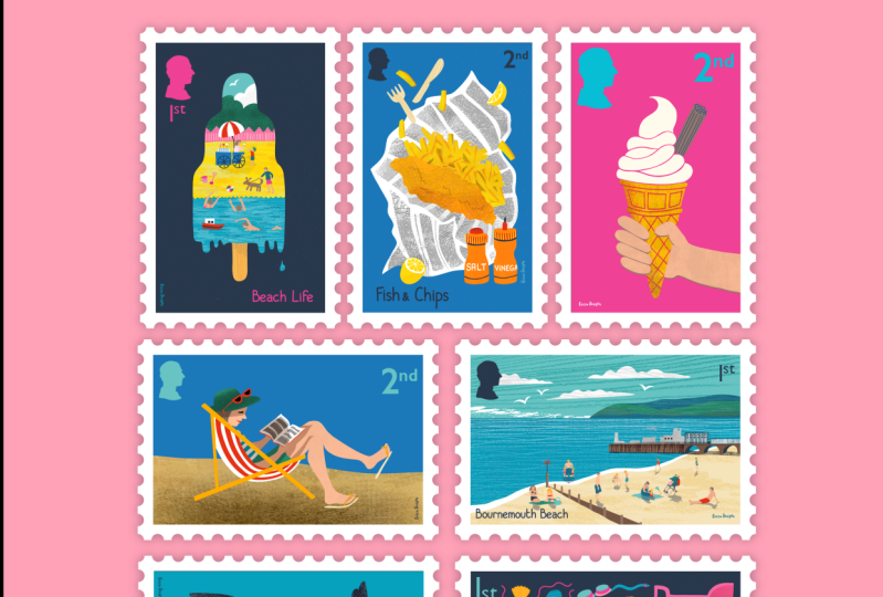
the final project, a series of six
illustrated stamps based on the country and
theme of your choice. In terms of requirements, you'll get the this
class if you're a beginner or immediate
illustrator having some experience working with
illustration in some way and knowing your way around the tools would definitely help. Even if you're more experience, you might learn a lot
in this class if you tend to work in a
more realistic style. Of course all are welcome. Whether you have zero
experience or many, many years. I believe that you're
going to learn a ton in this class.
No matter what. This is not a technical class. I won't be teaching
you every step of my illustration
process in the project. This is really about
the principles themselves and how
to apply them. However, if you're curious about my process tools and techniques, I will be sharing these in a
quick tutorial to show you the brushes and basic techniques
I'm using in Photoshop. In the class project, the class is divided into two parts, the primer and the project. In the primer, you're going
to learn about composition in a more theoretical way in a series of lessons at
the end of each lesson, I've included short
exercises called Try this. These are totally optional, but they're a chance for you to go a little bit deeper with each subject before moving
on with the next one. Then of course in the project you'll get to put everything you learned in the lessons to. I think you'll have a lot
of fun with this one now. Don't get me wrong, just because
these are little stamps, it doesn't mean it's
a little project. Your task is to create six different types
of compositions. So this one is going to
stretch you to the limit, but if you push through, you'll be rewarded with
a beautiful set of illustrations to share on
the class projects page. And of course, wherever
you share on social media. Be sure to use the
hashtag composition for illustrators when you do.
3. What is Composition?: Simply put, composition
is putting a bunch of different things together
to make something new. A chair, for example, is a composition made from different pieces
of wood and metal. A sandwich is a composition
made from two pieces of bread and some kind of ingredients in between
them that aren't bread. The single idea of the
sandwich magically appears once the
multiple ingredients finally all come together. For illustrators, composition means creating an illustration, a picture made from various
marks, symbols, and ideas. We put all these
things together to make a picture that
tells a story, that conveys a message, that makes us feel something. A singular image emerges from
all these separate parts, and that's the composition. The hard thing for
many of us is to know how to make better
compositions in our art. We all seem to sense when a
composition works or doesn't. But when it comes to making a composition work
ourselves on purpose, it's not always so easy. In the story of art, EH Gombrich writes
this little anecdote and anybody who has tried to arrange a bunch of
flowers has experienced this strange sensation of
balancing forms and colors. Without being able to
tell exactly what kind of harmony he's
trying to achieve, we just feel that a patch of red here may make
all the difference. Or this blue is all
right by itself, but it doesn't go
with the others. And then suddenly
a little stem of green leaves may seem
to make it come, right. Don't touch it
anymore, we exclaim. Now it's perfect. This is exactly how many of
us think about composition. That it's something
we just have to work at until it feels right. But if this were the case, there's nothing that I
can teach you and it would be useless for
you to take this class. Of course, there's
tons of teaching out there about the principles
of composition. But the big problem
is that there are so many loose
principles out there, and it's hard to bring
them all together in a way that makes them easy
to understand and use. That's definitely
been my struggle. I look at all the different
principles out there, like balance and unity, and harmony, and many of
them just seem so abstract. Like, what does unity
even look like? I can see how some principles work when they're
pointed out to me, but they don't
guide me in making decisions in my
creative process. Now, in the quote from Gombrich
that I just read to you, there's a clue about what we need to do about this problem. He describes this
experience of not knowing exactly what
he's trying to achieve. Achieve is the
operative word here. That's a great question. What
is he trying to achieve? This is the biggest
question we can ask. Where it comes to working
out our own compositions. We understand that composition exists and we know
what it means. You may already know a lot
about composition theory, but have you been asking
yourself this question, What are you trying to achieve? That question has guided me through many illustrations
over the years. And it's even guided
me in putting together or composing
this class for you. What you're trying to
achieve in your art will drive your every
decision as you make it. If I have a favorite word,
it's probably specific. When you're trying
to solve a problem, you always have to get
specific about the details. Otherwise you can only swirl
around in a vague sense. And in this class
we're going to be very specific about what
composition is, not in a universal sense. But just for
illustrators like us taking this class
who probably work in a more graphic or stylized way to get this class together, I had to base
everything on how I work in my own specific way. That was the only way I
could figure out how to teach you what I
know in this class. Here's how we're going to
understand composition. Composition is inferred. It's the act of choosing what to include and where to place
it in an illustration. It's also a noun, it's the result on this
act of composition. The composition is the
final illustration. Another way we're
going to understand composition is that it's
specific in different ways. First, composition is specific to who you are as an artist. How you approach composition will really depend
on your style, what you're interested in, and your own unique sense
of what should go where. What particular approach
might look good in one style might not
look great in another. In this class, we're
going to get very focused specifically on a more graphic
style of illustration, which we'll learn all
about in the next lesson. Another way in which
composition is specific is in the context. What might work in one
illustration project might not in another. What might look good
in a book might not look right on a wall mural
or on a postage stamp. In the class project,
we're going to focus on one specific kind of
illustration project, a set of postage stamps. This gives us specific goals we should be aiming for
in our compositions. And that will guide
all the other decisions that go into that. The third way in
which composition is specific is to the story, idea, or message, or the
feeling you'd like to evoke. Basically, what is the message or the feeling of
the illustration? Whether to place something
at the top or bottom of your page really depends on what you mean by
putting it there. In this class, we'll
focus on how we use compositional techniques to tell stories and communicate ideas. In the class project, you'll
be thinking about how to tell your own story
in six different ways. Each one is going to require a different
compositional strategy. What is composition? It's
all of these things. Telling stories, cracting
purpose built images. And it's also a unique
expression of your intuition, your sense of how
things just should look while these
things aren't easy. And a pastor in this class, you'll learn how to come
as close as possible by knowing more specifically what
you're trying to achieve.
4. Don't Compete With Your Camera: One pain point I've heard from other illustrators
is that it's hard to illustrate without
using reference photos. One goal in my own life has been to eliminate
the need to use reference photos and draw
more from my own imagination. I want to draw less
from photos and more from what's inside
my head or my heart. Now while I've become very comfortable drawing
just from heart, my dirty little secret
is that I still have to use reference
images all the time. The difference is that I'm not
directly using the photos. I use them more as
a way of learning about what the things
I'm trying to draw look like so that I can
more confidently draw them in my own way from heart. Now sometimes I just use
one image as a reference, and sometimes I just use
a whole bunch and what comes out is sort of a mash
up of all my references. You know, there was a job I
had to do once where I had to illustrate a cozy
French apartment. And I didn't really know
what that looked like, not being French or
living in an apartment. But I went and looked
for a bunch of different pictures of
this subject and I made a mash up of these in
the final concept that I presented to the
client and which ultimately became
the illustration. What I don't want
to do is just find a scene and draw it directly, even if I draw it in my style. So it would be almost
plagiaristic to go and find one photo of a French apartment and just
draw it exactly as I saw it. As illustrators, we're usually
being asked to express a unique idea or
tell a unique story, always in our own way. Rather than just imitating
what we see in a photo, we need to add some kind of value to what we're
illustrating. One challenge I give myself is, how can I create an image
using illustration that wouldn't be possible in
just a regular photo. What's the unique way
that I can represent this idea or story
as an illustrator? Another pain point I
hear from illustrators is that they like how
their sketches look, but when they try to turn
it into an illustration, things seem to go wrong. While this may have to do with their skills or
experience level, it's very much about
composition as well. It's something we particularly encounter when we're
trying to represent perspective and
three dimensionality using a flat illustration style. What works with a
carefully drawn sketch, with subtle shading and
loose sketchy lines, just doesn't translate
when you try to use flat shapes and solid
colors in the final art. What I wish I knew a long
time ago is that not only are some illustration styles more realistic and others
more graphic, but that there's a
fundamental difference in how these can be built up. They're modeled on two
different paradigms. One is graphic and the
other is more photographic. While a graphic style of
illustration looks easier to do, it only works if we
understand how it works. It's more natural
for most of us to draw things as they
are in reality. And that's why it's hard
to step out of this and illustrate in a more
abstract, stylized way. Now let's take a look at photographic and graphic
composition types or paradigms to see what they look like and what
the differences are. Let's start with
photographic composition. When illustrations are more realistic and three dimensional, we can say they follow photographic paradigms
when illustrating. In this paradigm, we think in terms of things like framing, our shot lighting, camera
angles and depth of field. Here, illustrations
are more like little windows into
a world beyond. Now to say an illustration
is photographic, it doesn't mean that it has to look realistic or even photo like even a comic book or a graphic novel can
be very stylized. And also use
photographic composition using certain camera angles
or show scenes up close or pulling back wide as though
there were a camera moving toward or away from the
subject in physical space. Now, photographic
style composition can be very appropriate
in certain settings, like narrative images,
as we might see in many kids books or graphic
novels for instance. Now let's look at
graphic composition. Here we have illustrations
that are flat and symbolic, and we can say that these
follow a graphic paradigm. Photographic means
writing. With light, graphic just really
means writing. And in this sense, illustrators write with symbols, shapes, and other kinds of
visual elements, thus following a more graphic or even graphic design paradigm. In hindsight, I could have called this pictographic
composition. Because we're writing
with pictures, with graphic composition,
we might think more in terms of layout than scenes, even when we illustrate
scenes here, we're not thinking in terms of framing a shot as though there's this entire scene
beyond where we happened to be standing
as we snapped our photo. We're designing a new image, we're not finding it
through a viewfinder. In graphic composition,
we work in a more stylized and flat way to stylize means to represent something in a way
that's less realistic. And it can even be formulaic. We can represent the various
objects, characters, and symbols in a more
symbolic and simplified way. Now, even though a
graphic approach to illustration is
more contemporary, we can find graphic
composition in pre, modern and even ancient art, such as with Byzantine
iconography, decorative art on Greek pottery, and of course, Egyptian
hieroglyphics. In graphic composition,
we're not so much making little windows
into other worlds, but combining
elements on a page, including the page itself, like the surface of the page, to create a new object. In this way, the page or surface is part of
the image itself, not something that we
just put the image onto. In many cases, the context
of the illustration and the illustration itself
are hard to separate. Commercial graphic
style illustration has a very comfortable relationship with the surfaces
that it goes on. These are often products
unto themselves. It's hard to separate the
illustration from the surface. The stamps we'll be creating
in this class project. A great example of this relationship of
context and illustration. While the illustrations
are on the stamps, it's hard to differentiate
the stamp from the art. They work together to create a new object
that we call stamp. Now my dichotomy between graphic and photographic
composition types is meant to make a point. There are two paradigms
that are significantly different from one another when we're trying
to make an image. By understanding
the differences, we can more easily know which paradigms
will work best for our own style and for other
factors in the given job. Sometimes we need to
be a little bit more photographic and sometimes
we need to be more graphic. Of course, there's always
going to be some overlap. Each of us has a range within our own style and
techniques that we use. And then we'll also find
that certain jobs are going to require more of
one approach or the other. As we develop as artists, we begin to understand what our particular blend of
graphic and photographic, or stylization and
realism looks like. Now that we're at the
end of this lesson, here's something for you to try. Look for two or three
pairs of illustrations. Each pair should handle a
common subject or theme, but one image should be more photographic and the
other more graphic. For example, you could look for an illustration of a
popular landscape feature or building such as Al Capitan or the
Empire State Building. By doing this exercise, you'll get a better
sense of the differences between graphic and
photographic composition. You might even start to think
about how you would want to illustrate these
subjects in your own way. Have fun trying
this, and if you do, you're welcome to share it
on the class projects page. I'll see you in the next lesson.
5. The Aspirational Principles: One of the big problems with traditional
composition theory is that some of the principles
are completely inactionable, As nice as they Sound
Principles like unity, harmony, and balance are so abstract
that they don't give us much of a clue about what to do
to make these things happen. Like how do you unity? At the same time, I think we can all relate to
wanting our work to feel more united,
harmonious, and balanced. Perhaps it was your quest to achieve these in your
work that brought you to a composition class like
this in the first place. My solution is to reframe these less
actionable principles. As aspirational principles. There are goals we have
for our compositions, but we can't really
achieve them directly. That's what the
actionable principles, which we're going to go
into in the next lesson, are for the
aspirational principles are ideals not guides. They're like a north star
that can lead us forward, but we can never truly arrive
at them because there's no ultimate singular
expression of these things. But I still think it's worth
describing what these might look like or what they are
as aspirational goals. So let's start with unity. In artistic terms,
unity means that all elements in a picture
work together seamlessly. They form a cohesive whole. One way of thinking about
unity is one thingness. When an illustration is united, it is doing one thing and
it is about one thing. We see an illustration
as a singular image or idea rather than a
bunch of little bits. When we humans stand united
in something as a group, it means we agree on
certain principles and we can therefore work
together toward a common goal. Similarly, we sense
an illustration is unified when we see
the picture as a whole. Before any particular
detail within it. Nothing seems out of place. There's no one element that's kind of rogue in
doing its own thing. Everything is working together. If you've ever sensed
that an illustration of yours is biddy, like you could see all these little bits and parts and they're
all distracting. And you don't see
everything together or you feel like it's
lacking cohesion, you're probably
experiencing a lack unity. The challenge with unity as a principle lies
in its vagueness. The question I have is unity
of what's being united. Just as we humans require shared principles and goals to be united and illustrations, elements need to be arranged
towards one singular goal. It's harder to achieve
unity in your art directly. It's more about understanding the illustration's
fundamental purpose and aiming for that. Instead, the more
specifically we understand what we're trying to make and what we're
trying to say in it, the more clearly we'll
understand what kind of unity we're trying to
achieve in the first place. This brings us back
to the concept of a project brief
where we define the goals and intentions of whatever illustration
we're supposed to be making. Of course, you'll
get a chance to see how this works in
the class project. We don't call it a
brief, we just call it like the set up or the
project declaration, but it's the same thing. Now for me, unity and
illustration is about everything fitting perfectly and feeling at home on the page. For illustrators,
especially those working in a graphic style, unity is often achieved through
simplicity and restraint. Each additional
element, color, image, or idea that you
try to cram into the composition could threaten its overall sense of unity. For graphic illustrators,
a key to achieving unity is in having a
specific goal for the work, plus working in a more
constrained style and using as few elements
as possible. Now, while this might
sound limiting, it's actually a goal that every artist should have for every piece of art they make, no matter how complex the
style or the detail in it, we should always aim for
one overarching thing above all the others in every
piece of art that we make. Now let's look at harmony. Harmony sounds nice, doesn't it? But what does it mean? Harmony is a kind of unity, but it's mostly
related to color. It can also relate to
how certain shapes or subtle qualities work
together or not. It's how separate things
seem to work well together. Some combinations
work and some don't. In music we understand
harmony as being two or more notes that sound
nice together as a chord. Notes can either be in
harmony or in dissonance. We don't know why certain
notes sound harmonious, but we can mostly
agree when they do or don't detecting harmony, especially in our colors. Is much the same.
We perceive it, but we don't understand it similar to achieving
unity overall. A key to achieving harmony
is just having fewer colors or different types of elements that need to work together. Another key way to
achieve more harmony is by developing your
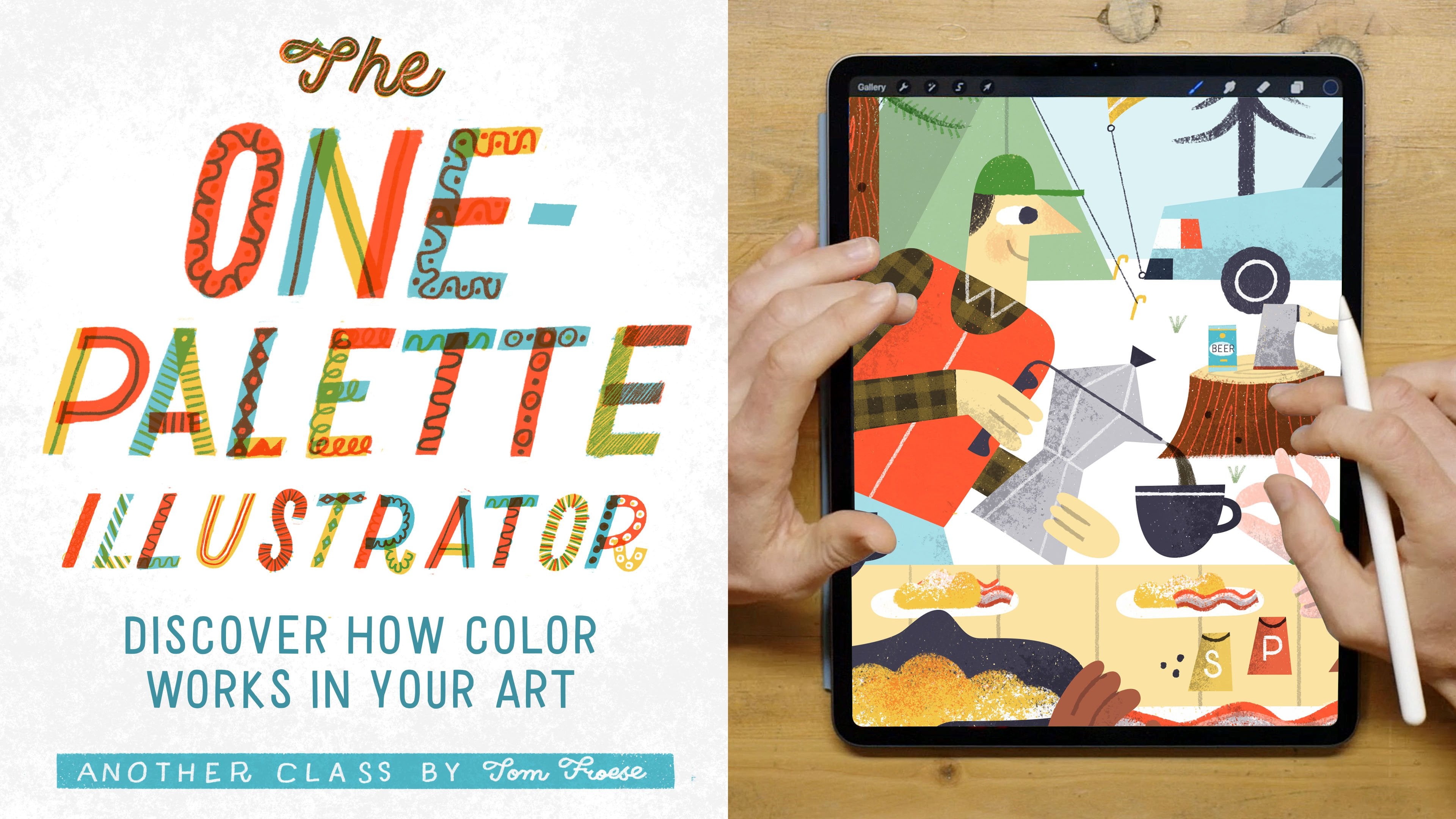
understanding of color theory. For more of my thoughts on that, you can check out my class, the one palette illustrator. I think there's a lot in common between visual art and music. The more complex a song, the more difficult it is to make all the notes harmonize
in the same way. The more complex the
color palette and all the different bits that
go into an illustration, the more difficult it is to
harmonize them all together. So lastly, let's look at balance
as an aspirational goal. We all want to have more
balanced compositions, right? I think we can all say
from experience that a balanced composition
makes us feel balanced. If a composition is unbalanced,
we feel imbalanced. So what does it mean
to achieve balance? Well, it's easy to achieve it in a symmetrical composition. But it's harder when we try to do something
more asymmetrical. Typical advice, if you're
trying not to be symmetrical, is to imagine the
various elements on the page as
weights on a scale. The scale is like this, balance
evenly across the page. And then whatever
you do on one side, maybe with a bigger thing
you do on the other. If they're smaller things, then all those small things have to equal the weight
of the big thing. And then the scale in our
imagination evens out. Now I think balance
is a lot easier to understand than
unity or harmony. But it's also hard to achieve because there's no
physical way to measure exactly how balanced the composition is.
It's very subjective. This is really one of those perfectionistic
principles that we have to feel out with our
own sense of balance. Some of us will be more comfortable when things
are more precarious in an image and others we
just can't stand the tension. And we need everything to feel grounded and
super balanced. Of course, we don't want to be too much of one or the other. We don't want to be too
imbalanced feeling or chaotic, and we don't want to be super
boring and super balanced, and super symmetrical
all the time. Illustration is always
a balancing act. It's a balancing
act of the elements we have to work
with on the page, as well as how those
things relate to the message and overall
purpose for the art. Now that we're at the
end of this lesson, here's something for you to try. Find one or two examples of your own illustrations
describing your own words, whether you think the
composition works or not. And why don't worry about using proper art terms because we haven't learned them
yet in this class. But after you've
taken this class, read through your observations
from this exercise again. Now, try describing
your observations using your new vocabulary
and understanding. In this way, you're going
to see how far you've come in your understanding of
how composition works. This exercise is
like a time capsule. So you're going to evaluate your own art in your
own words right now. And then you'll see how you think about
those same things. Once you know more about
composition, enjoy trying this. And again, feel free to share it on the
class projects page. Otherwise, we'll see
you in the next lesson.
6. The Actionable Principles: Whereas the aspirational
principles are more abstract goals we should
all strive for in our work. The actionable principles
are much more hands on. While there are dozens and dozens of principles out there, I've chosen just ten for how they relate specifically to a more graphic approach
to composition. You can think of these as a starter kit for learning
about composition. One of the biggest problems with compositional theory is that there's just too
much information. And it's hard to use it all
when you're on the job. If you can keep just
the principles you'll learn here in mind
for a given project, especially in the class project, I think you'll find them
to be more than enough. The first principle
is hierarchy. In illustration, hierarchy is the arrangement of elements on the page according
to their importance. At the top of this hierarchy is whatever is the main focus. This is the most important
aspect of your image, followed by other elements in descending order of importance. This structure creates a sense of order and it guides viewers on what to notice first and how to navigate
through the composition. Without a clear hierarchy, an illustration can become
confusing or overwhelming, or it can just look flat. The essence of an
illustration should revolve around a singular
story, theme, or idea. We talked about this in
our lesson on unity. All elements within
the image should contribute to this
central message. Hierarchy helps in emphasizing
the primary subject, supporting elements,
enhancing the mean message. In simpler illustrations
with a single object, the hierarchy is naturally
very straightforward. It's just the one thing, there actually might not
even be a hierarchy. However, in a more complex
work such as a montage, and we'll talk about
what montages are, when we talk about the six
types of compositions, it's crucial to establish a clear hierarchy to avoid
clutter and confusion. One of the questions
we can ask in our illustrations is,
what's more important? Is it the overall image or a specific element
or moment within it? For instance,
illustrations depicting crowds similar to those
in a Wars Waldo book, will often use a flat hierarchy where no single element
should stand out. In this sense, not every image demands a strong hierarchy. In my personal work,
I typically focus on one dominant element
supported by three or four levels
of lesser prominence. Elements higher in the hierarchy
are detailed and larger, while those lower in
the hierarchy are less detailed subdued
this approach is especially evident in my illustrated maps
where the hierarchy starts with the title followed by primary and secondary icons. And these are all
integrated within a network of roads or
geographic symbols. You can see an order
of information. And this guides you
through the map. And even though
there's lots going on, it still holds together
and feels orderly. I firmly believe that hierarchy is the most important principle. In illustration, applying
it effectively can significantly enhance
both the composition and storytelling of your work. The next principle
here is simplicity. This one comes from a set of principles called Gitald Theory, which tries to explain
how we perceive and understand the complex
world around us. Gitauld is a super
interesting topic that I'd like to cover
in a separate class. But I'm stealing simplicity from Gestalt Theory because I think it's such a
useful principle. The law of Simplicity
states that we tend to interpret things in the
simplest way possible. Our minds are going to
do whatever they can to simplify things so that
we can say, yep, got it. And then we can move
on to the next thing. When we're outside and we see a whole bunch of
trees in one place, we call it a forest. And when we do that,
we're simplifying all these many individual things into the most simplest
form we know. In this case, the simpler way of understanding what we see is as a group rather than
the individual trees. We see the group and
call it a forest. You've probably
heard the saying, the whole is greater than
the sum of its parts. This is a gestaltists
statement and it speaks to the way a group of things suddenly becomes a
totally new thing. Now interestingly, sometimes
the simplest way to see a group of things is by
their individual parts. Basically, whatever
is easiest for us to perceive in the moment, that's what we're going to see. For example, looking
at an image of three distinct shapes grouped closely together or even
like layered over top. You're likely to
perceive these as individual shapes rather than as a singular combined blob. This happens because
our minds are more used to recognizing
the familiar, separate, or simpler forms
than the abstract shape. They make when
they are combined. This principle of simplicity is a valuable compositional tool, particularly for discerning if our images are clearly
understandable or not. If an illustration is overly
complex or convoluted, it risks being misunderstood
or ignored altogether. Complexity can be daunting. And if it takes
too much effort to figure out what an image
is or what it means, people are likely to move on
rather than engage with it. In my own work, I frequently
apply this principle, especially when representing
specific objects. My aim is to always strike a balance between
making these objects recognizable while also infusing them with an element
of intrigue. Essentially, I want
my representations to be easily understood yet
visually compelling. When applying the principle
of simplicity to your work, consider how the various
shapes and how they come together are as readable
by others as you intend. You can ask, will
other people recognize this symbol or will people
see this clearly right away? Aim for compositions
that strike a balance between being familiar
and readable in this way. And interesting
because sometimes we do have to add a little bit of noise to an image
or a little bit of chaos or a lack of clarity
to make it interesting, we just want to work out
a balance where what we intend the viewer to see
is actually being seen. The third principle here
is scale and proportion. Now, scale in
proportion different, but they're also very related. I'm treating them as a set here. In composition, scale refers to the perceived
size of an element. We can say that an
object or figure is large or small compared
to something else. When we think about a scale
model train for example, we understand that it's a smaller version
of the real thing, but otherwise it has
the same proportions. When we're making
a scale drawing, like if you're in architecture, all the sizes are the same proportions that they would be in the
final construction. Now we tend to work with scale without really
needing to think about it. It's just such an
easy principle. Things that are closer
tend to look larger, and things that are
far away are smaller. But we can use scale
more on purpose to show that one thing is more
important than the other. As we do when we create
different levels of hierarchy, Usually the top level
of the hierarchy, those things are bigger than
all the other ones below. We can also use scale to
create contrasts in our work. The larger we make
a dominant element, for example, compared
to all the others, the more dominant
it's going to look, and the more dynamic the
overall composition will be. Proportion, on the other hand, refers to the relationship of elements regardless
of their size. Well, a scale model of a train could be
larger or smaller. Its proportions are the
same no matter what. But on the other hand,
think of a kid's toy train. It's probably not designed proportionately to
a real life train. It's going to be sort
of distorted and out of proportion to be
more playful and whimsical. Proportionality is not just about how big or
small something is, but it's about other
things like tall, skinny, squat, and wide. These are all
proportional qualities. So when a graphic
style of illustration, we can play freely with proportions of whatever
we're drawing and how one artist uses proportion can be a defining
feature of their style. In my own work, I freely play with proportion of
my figures to create unexpected gestures or to exaggerate a gesture or how
the person is standing. I might make their hand bigger than their entire
body, for instance. Now, it all really depends on
the purpose of the artwork. Sometimes I'll choose to be more proportionate and sometimes
I'll choose to be more disproportionate
in whatever it is that I'm drawing
in your compositions. You can use your understanding
of proportion and distortion to make certain
elements larger on purpose, even if that's not how
they look in real light. You can distort
proportions to create emphasis or even to fill in an empty space
in the composition, if that's what you need to do. You can also play with proportions to make
something funnier, such as with a caricature. Playing with proportions is
a great way to transform an ordinary scene or figure into something
more extraordinary. In summary, here, both scale and proportion are key
elements in composition. Scale focuses more on the
size of individual elements, while proportion deals with the size or relationship of sizes of things
within an element. The next principle
here is repetition. And similarity. Repetition is another
super useful principle because it's easy to know
when we're using it. Repetition can bring
a sense of unity and harmony to a
composition right away. It can also give it a sense of movement or balance
depending on how it's used. Repetition is closely related to the Gestalt principle
of similarity, which states that we tend to associate elements that
are visually similar. We've seen birds of a feather
and we see them as a flock. Generally speaking, unless
there's only one element, a composition will need some repetition to
achieve a sense of order. If there are numerous elements without any repetition
among them, this would be utter chaos. As a rule of thumb, if you
do something in one place, you should probably
use it somewhere else. You can repeat an element
such as a symbol or mark, or you can repeat a color, a pattern texture, or any
other visual quality. Repetition is how we
achieve pattern flow, or movement, and even
harmony in our work. We also use repetition to
define hierarchy by repeating a certain quality
in the same way across all elements
of the same level. Repeating those same
qualities elsewhere tells us that similar groups are
in some way related. The opposite of
repetition is variation. We usually want to achieve a balance of repetition
and variation, but the exact amount always
depends on the situation. One way of achieving
this balance is if you repeat an element, say in a pattern of some kind. You can make them all
relatively similar, but just redraw them each time. Or vary the shape just a
little bit so that you identify them all as the same
kind of shape or element. But you also see that they
are not just cut and paste. In this sense, you
get a nice balance in tension between
repetition and variation. In a graphic style
of illustration, where we limit ourselves to just a handful of
different elements, we lean pretty hard
into repetition. Working with a limited
style requires a very creative balance of
both repetition and variation. How we use this becomes very
much a part of our ideas, our concepts, and of
course, our compositions. Next we have grouping
and proximity. We can use grouping to organize certain elements on the page by placing them closer together. The same elements
on a page can feel chaotic or orderly depending
on how they're grouped. If they're all floating
evenly spaced on the page, we may see no particular
relationship to them and therefore not know where to look or what to get out
of what we're seeing. On the other hand, if they're organized into
groups of some kind, we'll start to feel
a sense of order, effectively perceiving
fewer things on the page. That's the law of
simplicity at work. Just for example, we might only have to count five
groups of things, rather than hundreds
or thousands of elements that are
contained in those groups. Grouping is related to the
Gestel principle of proximity, which states that we tend
to perceive elements that are closer together
as being related. That's all to say, that when
things are close together, we see it as a group. Grouping can help
associate elements, but it can also create spaces around those
elements that allow the eye to move or
flow around the image. When I think about
grouping, I think about how to organize
things on a shelf. If you have different books and trinkets to display
on your shelf. If you space them
all evenly without grouping them into
smaller clusters, I think it would feel chaotic, it would just look weird. Instead, we can summon our inner Martha Stewarts to cluster our belongings on
the shelf in various ways, perhaps by color theme. We can further make
interesting arrangements by combining a mix of
books and objects. In this example,
each cluster becomes a little moment on the
proverbial bookshelf. The principle at work
here is grouping. We can tell more
interesting stories by how we group certain
objects on the page. And we can create visual moments that the eye can move between rather than getting stuck on a more flat mass of
stuff on the wall. Now let's look at framing. Framing is a
technique for giving emphasis to part of
an illustration. While the idea of a
frame may call to mind a border that goes around a
whole image or a whole page, it's more about
drawing attention to a moment within the image. Framing can be very direct
or it can be more indirect. We can literally frame something
in a window or a door, or even an actual frame. Or we can frame something
in a more subtle way, such as placing a point of interest in the clearing
between two trees. We can use framing to
create a focal point in an image or to compartmentalize
different areas. Of an image that need to
be viewed separately. We can also use it to situate the viewer or tell
a certain story. For example, framing someone
in a window can give us the sense that they are indoors and we are
on the outside. Looking in it gives a sense
of intrigue to the image. We wonder what's going on in that room
through the window. Referring to the principles
of grouping and proximity, a group of elements can be related without
needing to frame them. But you can also
consider the space that happens to be around
them as a frame. But by framing certain elements on purpose or more directly, they're forced into a group. That relationship of
that specific group of objects is made
very explicit. Each framed area in an illustration is like
a smaller composition. In a larger one, you can create a sense
of consistency by repeating this framing
throughout your image. The next principle
here is alignment. Alignment is a great way to get a sense of structure
on the page when certain elements correspond on an invisible axis or a path. We can say that they're aligned when things are far
apart from one another, but they're aligned,
the alignment makes a relationship
between those things. And it also brings
a sense of unity in the overall composition when things are aligned
and closer together. On the other hand, especially when paired with repetition, alignment can create a sense
of movement and flow leading the eye along the same path when elements are too aligned, like there's too many things in alignments and you can really
see a sense of a grid. It's really going
to start looking rigid if elements are
not aligned at all. On the other hand, the
composition may seem to melt or feel blob like now. Any of these scenarios
may be right depending on what you're
trying to do in the image. Sometimes you really want
a gridded structure and sometimes you don't want to have any sense of a grid at all. Alignment can be very loosely based on
things just lining up, either in a horizontal
way or in a vertical way. Or we can do this in a more forced way by having
some kind of a grid. And then we have all these
different regular intervals at which things could align. And we'll look more at that in the lesson on
structural principles. Next, the next principle
is figure and ground, also known as positive
and negative space. Figure and ground
describes the relationship between what we perceive
as subject or figure, and the surrounding
space or background. The principle of figure
and ground states that we tend to perceive elements either as
the main subject or as part of the background. Where there is ambiguity
between figure and ground, we might momentarily be
confused or intrigued. The classic example
of this effect is the optical illusion of
two faces in profile, which can either read as
a vase or a bird bath. Depending on how you look at it, we can use our understanding
of figure and ground to evaluate whether our subject stands out from the background, if that's our intention. This is easier to
do in a simpler, more graphic composition where there might only be
a solid background. But it's a lot
trickier when we have a complex composition
with a foreground and a background and
there's overlapping and adjacent elements and colors all going on in the same area. We can use figure and
ground to help us ask, is the figure and
ground clear enough? If it's not, we can use
contrast and scale to set our figure more apart
from the background. Now typically we'll see
darker and larger things as figure and lighter
smaller things as ground. We can play with this
relationship to create ambiguity, intention on purpose. And sometimes that's something we want in an image
for some reason. For example, some illustrators like Noma Bar or Malaka Fab are very intentional about this relationship of
figure and ground. And they're very skilled
blending these to mean one thing and then another depending on how you're
looking at the image. Even more representational
illustrators like Miroslav Shashek will use this relationship of
figure and ground in a playful way to create
very graphic effects. Now, classic examples
of figure and ground usually have stark
black and white images. Everything's very crisp. But the relationship
between figure and ground isn't always that simple. As we've already gone through
in more complex scenes, figure and ground is just more subtle and we need to find ways to make the figure stand out from the background
without blending in. The next principle
here is closure. The principle of closure states
that we tend to perceive objects as complete,
even if they're not. When you perceive a shape that's may be suggested but
not actually there. That's the law of
closure at work. Just look at a lot
of well known logos and you'll see closure at play. The implied inner circle
of the Starbucks logo or the peacock body
that's not actually there in the NBC
logo are examples. And same with the spherical
shape that we perceive. By piecing together the
four separate shapes in the Xbox logo, we can use this principle
to create a dynamic image that completes itself not on the page but in the
mind of the viewer. Using closure very
purposefully is a key way of achieving a graphic look
in your illustration. Just by leaving out
a part and letting the white space behind
suggest a presence or idea, you can create a powerful,
captivating image. Now, closure is a
bit of an oxymoron. It actually works best when something is left
undone or open, and not fully enclosed at all. In my opinion, closing
up a shape completely, such as with a thick outline, can mean that it gets cut off
from the rest of the image. It closes it off from the air supply of the
rest of the composition. Skillful use of closure
in our work can create a powerful connection between
the image and surface, resulting in a stronger
sense of unity. And of course, it
will also create a stronger connection between
the image and the viewer. The next principle here
is movement and flow. This is another
pairing of principles, but they both pretty much
mean the same thing. Flow is how I describe the
way the eye moves around. In illustration, it's
the same principle as what is more traditionally
known as movement. I prefer flow because it's
more about how the eye flows around a composition rather than suggesting actual movement. Such as birds in flight or
car driving fast on a road. Flow in an image can be intentional or by accident
as much as possible. We should be in control of how the eye moves around
our compositions. This can be done very bluntly, like adding cartoon like
motion lines or arrows. Or it can be done more subtly
by letting gestures and the direction of certain lines carry us around without
realizing it at first. Movement can also
be suggested by the effects that an object
leaves in its wake. If there is a moving object in our illustration,
and it leaves some, a trail behind it, that will of course give our
image a sense of movement. And we can use the
line that's created by this object in motion to lead us somewhere
else in the image. And this creates more
of a visual flow. What I call flow is related
to other principles like the Gestalt Law of
Continuation that says that objects along the same path will
appear to be related. And the principle
of leading lines, where certain elements more subtly lead our eyes
to the main subject. In your compositions,
you can use flow to keep the eye moving around the
page in the way you intend. Keep in mind that more movement or flow in an image
will make it seem more dynamic and less will
make it feel more static. Either of these might be more appropriate for
your given purpose. An illustration of a storm you see at night will jostle A view are more than one of
a calm at sunrise. You can be the judge of
which one of these kinds of feelings you need in whatever context you're
working in flow. And an image can go in any
direction or follow any path. It can be horizontal, vertical, diagonal, circular, zigzaggi
or any other shape. Flow can be in one direction or multiple directions
at the same time. There's no correct shape
for flow in a composition. Just try not to
send the viewer off the page before they've
seen the whole thing. In my work, I use leading lines, alignment, hierarchy,
and even gestures. And where the eyes are looking
in my characters to lead the viewer to the main
subject or around the image. So that wraps up our
actionable principles. Now it's your turn.
Here's a bit of homework. Go on a compositional
scavenger hunt. See if you can find
examples of each of the actionable principles in illustrations that
you find online. By actively looking for these
in art and illustration, you'll start to learn
more about how they work to tell different stories
and in different contexts. You'll also get a better sense of how they might work for you. Enjoy trying this,
and once you're done, feel free to post it on
the class projects page. And then we'll see you
in the next lesson.
7. The Structural Principles: Now let's take a look at what I call structural principles. While the actionable
principles are largely about arrangement and order
of individual elements, the structural
principles are about how these things hold together
as a unified whole. When you look into outer space, what's holding all
the stars and planets and galaxies in place
where they are, Astronomers actually
believe there's something called dark matter. This is the glue that holds
all these galaxies together. The invisible force that
holds a composition together is a lot
like dark matter. We know what's there even
though we can't see it, and we can definitely
sense when it's not there. Scientists can say that dark
matter probably exists, even if they can't
measure it directly. We can see the evidence, by the way, things
hold together. Our solar system holds
together due to dark matter. In the same way, artists
can say that there's some invisible glue that holds
our compositions together, giving it that elusive
sense of unity. We all crave in our work what is this compositional
glue, its structure? And to give our
composition structure, we look to grids. Grids are a great way to
bring a sense of structure to the page where we might
not otherwise find it. While there are
thousands of grids and other possible ways to
structure our compositions. In this lesson, we'll
look at just three. We're going to do two grids, The rule of thirds and
harmonic armatures. And then we'll look at what I call self structured
compositions. Let's look at the
rule of thirds first. The rule of thirds
is like a grid with instructions on
how to use that grid. It tells us where we
can put our subject in an image to make the
most interesting image. It also gives us a
guideline for how to structure the page
in terms of proportion, Like how much of the page should we fill with
figure versus ground. As a grid, it's pretty simple. There are just two
horizontal lines and two vertical lines that divide the page up into three
rows and three columns, which makes nine equals squares. In terms of placement, the general idea is
that you should place your subject at either the left or the right
third of the composition, or at one of the
intersections of these lines. Now, in terms of proportion, the rule of thirds suggests
that the ratio of figure to ground should be 13 to 23. Either one part figure
and two parts ground, or the other way around. For landscapes and other scenes, the rule of thirds will
suggest that you place the horizon line along either
of the horizontal lines. You're going to give
either 23 or one third of the image to sky, depending on where
you put that line. Typically we place the horizon line along
the lower third. Now this rule of thumb is great because of its simplicity, and it really is tried and true. A lot of experts say that
the rule of thirds works, and I think we
should believe them. When we don't have a strong
sense of composition, we can trust that the Rule of Thirds works for
most situations. That's not to say
we shouldn't be thinking for ourselves
here as well. Sometimes just centering
our subject and making it larger in the
frame is perfectly fine. Just ask Wes
Anderson who's based his entire career
out of doing this. Now let's look at
harmonic armatures. A harmonic armature is a
geometrical grid of lines. Not just in straight up and down and side to
side directions, but also on diagonals. In this way, harmonic armatures give us a more
flexible grid system. And this gives us more options
for building structure into our compositions
in more dynamic ways. A harmonic armature has the rule of thirds
grid built into it, but it's like the rule
of thirds on steroids because it just gives
you so many more options with all those extra angles. Personally, I never heard of harmonic armatures
until very recently. Actually, not until
researching for this class. I know what the science is
behind harmonic armatures, but it really seems
to work well for me. I like that it gives me
the three by three grid plus all these various
interesting spaces and intersections to line
things up a more in diagonals. I also find it really
interesting to lay harmonic armature grids
over existing artwork, like by other artists, to see how intentional they are about using such rules
in their compositions. For example, when I've
put it over the work of Miroslav Sasek or Paul Rand, I instantly found a
direct relationship. Between this grid and
their compositions, it makes me think that they must be very intentional about using this particular
kind of grid. Now the question
is, is that true? Are they really using harmonic
armatures on purpose? Or is it a coincidence? Are harmonic armatures just so flexible and catch all
that like a horoscope? They seem to apply no
matter what the situation. Either way, I've
started using these in my own work, just
as an experiment, but also to help create a more complex and
invisible structure in my compositions. Now there is the risk that you will over utilize this grid and your illustrations will be so heavily influenced by it that
it will be very obvious. What should have been
an invisible source of unity in your art could, in the words of
designer Al Rlbert, end up being more
like a street jacket. So the last source of structure that I'm
going to talk about is what I call self
structured composition. When structuring
our compositions, we can create this
sense of everything holding together artificially
as we did with the grids. Or we can find something within the content that
we're actually using in the illustration as the
structure of the illustration. This is what I would
call intrinsic structure or self structure, where little or no help is needed to really help the
illustration hold together. So an example of what
I'm talking about here is maybe an apartment
building with many windows, where in each one we
see a different scene. And we have this
apartment building as the dominant
object in the scene. So we just have this
natural grid of windows that we can structure our
illustration or story around. Another example
of self structure is in a figurative illustration, where the figure just dominates the composition and therefore provides all the
structure that we need. The illustration holds
together just by the way the body or
figure fills the space. An illustration can
also be considered self structured if
it's really simple, if there's just like one
object and it's really large, or it's one dominant object and all the other ones kind
of gravitate around it, almost like moons
around a planet. This is an example of a more organic kind
of self structure. An illustrated map is also a self structured composition
because the roads or other geographical features
at the bottom layer provide a structure for the
illustrated icons and lettering and everything
else that's on top. Even when laying out
an illustration with lettering or type
such as a book cover, it's not always necessary
to impose a grid. It could be enough for
the illustration itself to dominate the page and to just balance it out with a much smaller
title and by line. So those are your three
principles of structure. We have the rule of thirds, harmonic armatures, and
then just self structured. So now that we've come to
the end of this lesson, here's something that
you can try yourself. Gather five to ten illustrations
that you like from the Internet and analyze the structure of the
composition next, using the rule of thirds, four harmonic armatures grids that I've provided as downloads. In the see how many of the illustrations conform
to one of these grids. What did you find? Were
most of the compositions aligned with either of these grids or were
they more random? Have fun trying this.
And again, if you want, you can share what
you find here in this exercise on the
class projects page. When you're ready, I'll see
you in the final lesson.
8. Six Composition Types for Illustrators: As we get closer to
the final project, I want to introduce to you six common composition types as you'll see in the project. These can be super helpful as starting points when trying to figure out our ideas and of
course, our compositions. If you look up types
of composition or compositional
examples online, you'll find many examples of little thumbnail drawings
with different shapes, symbols, and
hypothetical scenes. Some of these are shaped
circles or triangles, or their letter shape like
S, curves or zigzags. You might also find
little thumbnail drawings of little scenes such as boats in a harbor or a
landscape with rolling hills. I think these are meant to give artists compositional
starting points. But because there are so many of these and they're usually
shown without any context, I've never found them
very helpful for me. They seem to put the cart before the proverbial horse
because they suggest a solution before
we fully understood the problem that we're trying to solve with our illustrations. The risk is that we'll try to
conform our ideas to one of these prefabricated
examples rather than finding the best solution for our particular situation. Now that being said, the composition types we're
going to go through in a moment are like these
prefabricated examples. They do suggest a solution before we've understood
the problem. But I think they're
more useful because they're specific
to illustration. And they're specific
to illustrating ideas and stories in particular ways. They don't tell us exactly
how our compositions should be arranged or even what our style
should look like, but they give us a
structure to work with. The closest comparison I
can think of is in music, where we have well
known patterns like two verses, then a chorus, then two more verses, and then repeat
the chorus again, and maybe a bridge, and then back to the
chorus a few times. That kind of thing. You can tell millions of unique stories in any number of music styles using the same basic structure. Another simpler
example would be like the haiku or the limerick
As poetry structures, they are well known
structures that you can conform your words to. You can have all kinds of
ideas and express your self or tell stories in these poems within the constraints
that they give you. That's how the six composition
types can help you come up with better ideas and
compositions in your art. Now let's take a look at them. The first composition type
is the single object. The single object is exactly
what it sounds like. It's an illustration of a
single object on the page. This is the most simple
illustration since there's no deep concept and the compositional problem
is very straightforward. There's only one thing in the overall composition being
the only thing on the page. It's probably going to be
centered and we're going to be focusing on the overall shape and details of the
object itself. The challenge with
the single object is to represent the object in a way that's both recognizable and interesting for this class. Part of the solution
is to choose an object that can easily be represented
in a flatter style. And also to choose
the most recognizable or interesting angle or side. Something from one angle
might not look as clear or recognizable as seen from
another single object. Illustrations are often
used as spot illustrations in editorial or
publishing contexts. If an object has particular significance
or meaning to a certain subculture, they can also be used
as T shirt graphics or a motif on greeting
cards or even tattoos. A single object can be more straightforward or it
can be more expressive. It can be more
proportional and literal, or it can be more
stylized and minimal. Now let's look at
the still life. A still life is a drawing, painting or photograph of an arrangement of
inanimate objects in physical space as boring as a bowl of fruit or an
arrangement of kitchen. Where might sound,
people can't seem to get enough of still lives. For illustrators, the still life presents one possible
way to tell a story. While we tend to think of
still life paintings as studies or something an
artist does for practice, a still life can contain a
whole lot of information that will take on specific meanings
depending on the context. It might even suggest
something about the artists themselves
as a indirect. Self portrait. Or
it might suggest a desirable hearing or
combination of related objects, such as foods that
go well together. Now, challenges with creating still lives include
what to include in the arrangement
and how to arrange the objects that you're
referencing in a pleasing way. Which objects will best tell the story you want
to tell and what is the best way to represent them As a set In some
kind of a space, a still life can be drawn from an actual physical
arrangement of things. Like you can put a
banana and an apple and some grapes in a bowl and start to draw or
illustrate that. Or you can just
illustrate a set of objects as though it were a still life from
your imagination. For graphic illustrators, the challenge is
going to be how to present or represent
a still life without being
overly dimensional. As with the simple object, a still life can be very straightforward or can
be more expressive. It can present the objects
more or less as they are, but with a bit of style. Or it can be a much
more abstract study of color, shape, and space. Now let's look at the flat lay. A flat lay is an
illustration of a group of objects in a carefully
spaced flat arrangement. A flat lay is a lot
like a still life, but instead of representing
the arrangement in a more organic or
overlapping way, the objects are represented
in their entirety without any layering and often
without respect to scale. For example, in a
drawing of art supplies, a pencil may take up the
entire height of the page. While a sketch book, which is in real life, larger than the pencil, might take up only one
quarter, like a still life. A flat lay is a
great way to tell a story about something
in an indirect way. That's why I sometimes call
flat lays object stories. They're also great for showing the idea of something
in a thematic way. If the illustration is
about girls night out, you can think about
which objects are most emblematic of the idea, such as wine, Uber ride,
and maybe karaoke. I don't know why I chose
this as my example, since I've never been invited
to a girls night out. Flat layers are a
great option for simple kids books like
alphabet books or posters, or even as the basis for an illustrative pattern
for gift wrap or textiles. While usually flat lay is an arrangement of simple
inanimate objects, it can also be an
arrangement of characters, creatures, or even
miniature scenes. The key thing is that all
the objects in the flat lay together tell one story
or suggest one theme. Flat layers can be very
rigid and grid like with everything in
perpendicular arrangement. Or they can float more freely as though they were
suspended in jello. The next composition type
will look at is the figure. The human figure is by far the most common subject
in art and illustration, which makes sense because
we are people and we like to draw people and we like
to see people in drawings. When an illustration is primarily based on
the human figure, we call it figurative. The key element in
figurative illustration is, of course, the focus on a human, usually one human,
either in full, from head to toe, or in part, perhaps from the chest up. Figurative illustration
can be more directly about the
person in the picture, such as with a portrait. Or the person can be there as a more symbolic,
metaphorical device. The person might be very
active in the scene or they might be at rest doing nothing
but looking back at you. Figurative illustration
can be simple and straightforward or can be expressive and highly stylized as a storytelling structure. A figure can be about
a particular person, whether real or fictional. On the other hand, it
can be more about what the person is doing
or interacting with. In this case, the figure
is just a holder or just a way to point your attention to something
else in the picture. A figure can also be more integrated into
the illustration, providing the entire
structure and even becoming a grid on which
other ideas are overlaid. The biggest challenge with figurative
illustration, I think, is that many illustrators simply struggle with how
they draw people. That's why when I
started illustrating, I avoided figurative
illustration at all costs. I simply didn't know how I drew people or I didn't have a
consistent way of doing so. But at one point I
had a breakthrough. I didn't really have to draw people proportionately.
I realized this. Was my choice at the time. Even though my style
was very graphic and stylized and unrealistic, whenever I tried to
include people in my work, I unconsciously went back
to realistic proportions. As soon as I started
to play with the proportions of the figure
and bend and stretch them, however I wanted, my
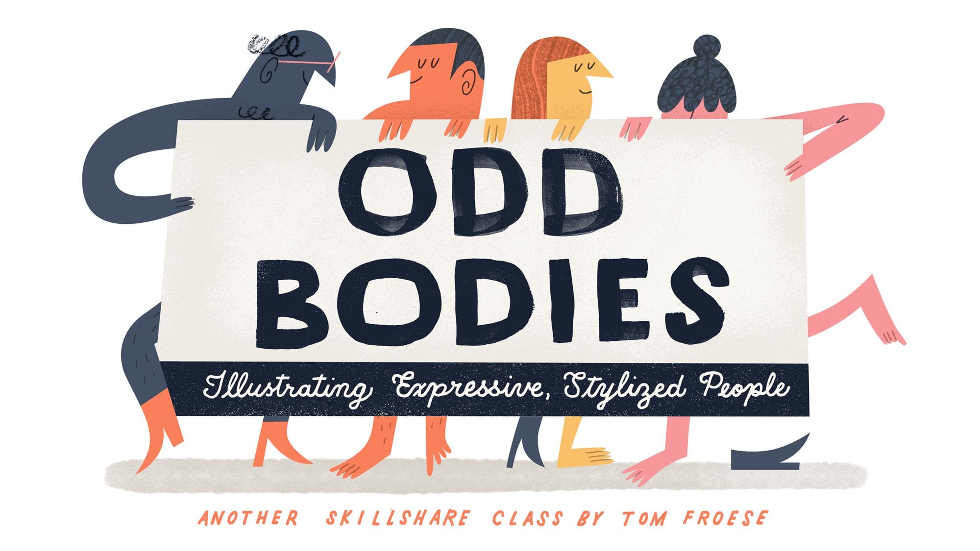
work suddenly got a lot more figurative and it also got a lot more expressive. It was shortly after
this time that I published odd bodies
here on skill share, which today remains one of my most popular
illustration classes. So the next composition
type we're going to look at is the scene. This is another popular
kind of illustration. It's an illustration
of a place or a space. A scene can be
outside or inside, and it can have people or
characters in it, or none. A scene without characters or a central object would be a
landscape or a streetscape, or maybe an interior
if it's indoors. In this case, the
scene is the subject. The challenge for illustrators working in a graphic
style is how to represent a sense of space
even while working flat. How do we deal with
overlapping elements with a very limited
color palette, or little or no perspective, or shading to work with? Now here we have to get out of our natural
photographic mindset, rather than thinking in terms of camera angles, perspectives, and seeing things as either
near or far from a camera. We want to think
more about how to tell the story in a flat layout. How can we represent
things in a way that maximizes the shape of the space or page that
we're working in. Here's where we might
have a fight with our temptation to compete
with our cameras. How can we create a more
graphic representation of this scene? The first question
for a scene is, what story are you
trying to tell? What is this illustration about? What is happening
in the picture? Or what are you saying
about the scene? What's the significance here? Now, as important
as the story is to our scenes as
graphic illustrators, it's not so much how
interesting your subject is, but how you represent it. That's what's
interesting about it. This is where our
decisions about scale, proportion, our use
of figure and ground, and how we cleverly work around stylistic constraints
really start to shine. Okay, so the sixth type of
composition is the montage. A montage is an assembly
of various images, marks, symbols, and other
elements that come together around a
single idea or theme. In illustration, the montage
is a very common approach, especially when it might
be difficult to express an idea in just one
symbol or scene. That's maybe more conventional. A montage is often specific
enough to relate to an overall idea or theme without being so specific
about the message. It's not to say that montages can't be deeply
moving or meaningful, but because they're a bit
more open to interpretation, it's harder to go wrong As
a story telling structure. Montages are great for free
association when you don't need the viewer to come to
any particular conclusion, maybe it's just more about
a vibe or a feeling. The challenge with montages
is finding your limit. It's possible to add
too many ideas or elements into the
composition in this way. It's similar to the flat lay, where you want to choose
just the right amount of symbols or objects to
include to tell the story. When making a montage, I recommend that you add just the minimum possible
separate elements needed to tell your story
and focus on how to compose them in an
unexpected way. Maybe certain objects
are unusually large or everything interlocks
like pieces of a puzzle. In my earlier illustration work, a lot of my concepts
took a montage approach. This was partly because it was an easier way to
represent a theme, but it was also because my particular style was just
better at telling stories in this way rather than directly including things like
the human figure. There really are
many different ways you could go about a montage, as long as you stick with the formula of combining
multiple symbols or elements in a
single composition around a common idea or theme. Montages can be full bleed, extending past some or all
of the edges of your page. Or they can be more of a
cluster of elements floating in space of the page itself or against a
solid background. Now, the ladder is
far more common, and for this class, I would recommend it as
your starting point. Okay, here's one more
thing for you to try before we move
on to the project. See if you can find examples of illustrations for each of
the six composition types. Look specifically for examples that are more graphic and flat. This exercise will, of course, help you see how these
six composition types truly are everywhere
around if you look. And they'll also give
you some inspiration for the final project. As always, once you're
done trying this, share what you find
on the class projects page and then I'll see
you in the project.
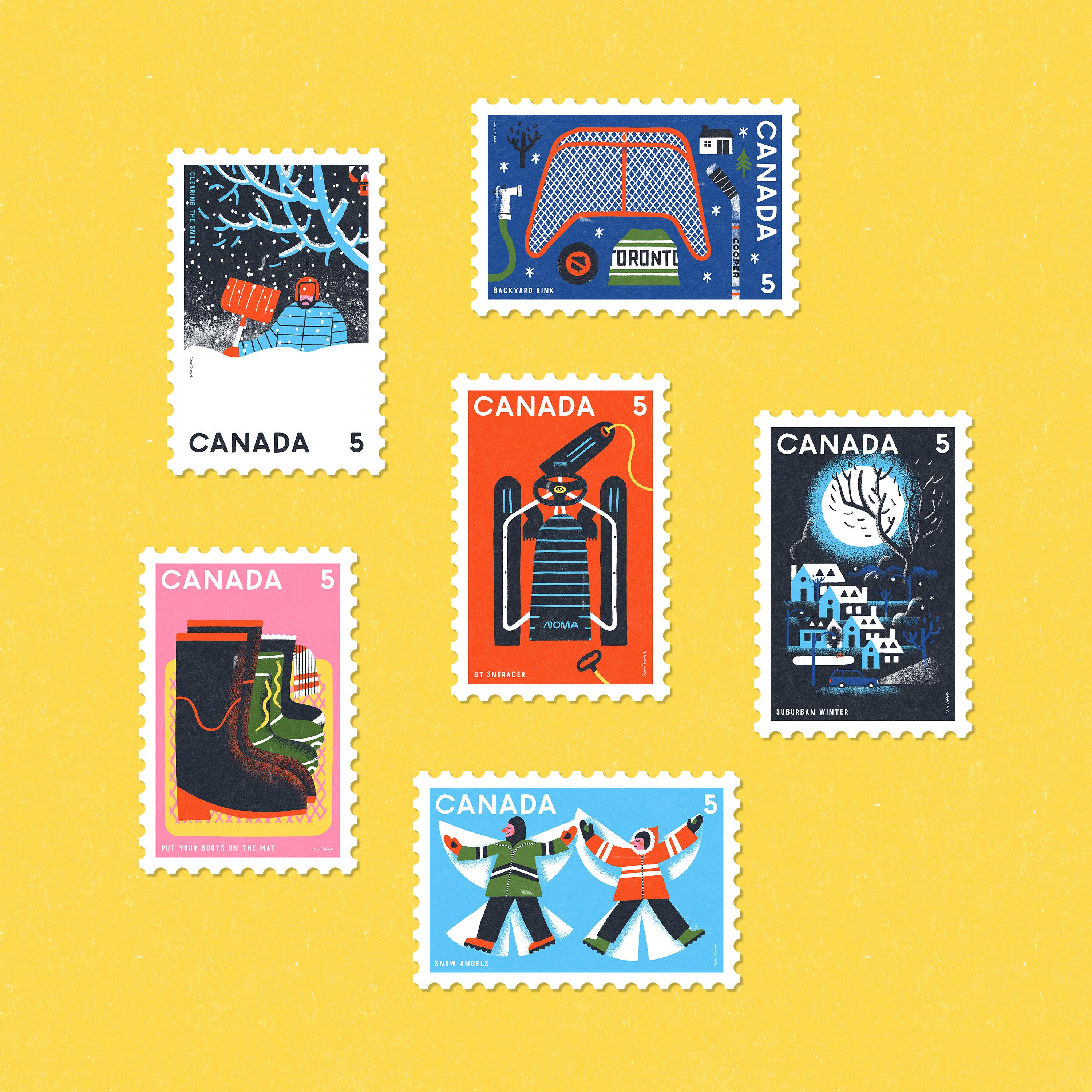
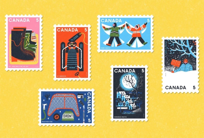
9. Project Intro and Setup: At this point, we've gone
through all the basics of composition and now it's time
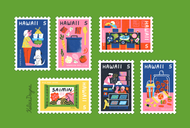
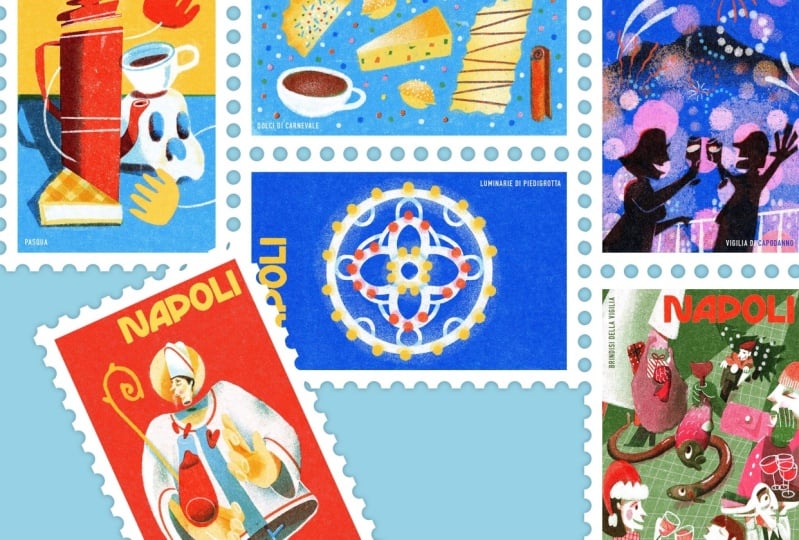
to put it all into action. In the class project today, you'll get to create a set of six illustrated postage stamps based on the country and
theme of your choice. Not only are a stamps
super fun to illustrate, they're also a really great
way to practice composition. Because they're so small, they'll help us stay focused on the overall
composition rather than getting too bogged
down in tiny details. Another great thing
about stamps is that they often come in sets. So we're going to get
a chance to create a set of six different
illustrations, each one based on the
six composition types we learned in the
previous lesson. This is a great way to see
how the different principles of composition work in a
variety of situations. As you'll see in my demo, what seems to work in
one type of composition, me not in another. Just as important.
You'll see how each of the different
composition types allows you to tell a story
in a different way. In my demo, I was able to
use each type of composition to inspire a different idea
for each of my illustrations. Now, fair warning, we do have a lot to go through in
the next few videos, but I'll do my best to guide you through each
step of the process. So the first thing we need to do is create our project plan. This is where we declare
our country and theme, and then we brainstorm
ideas for our six stamps. Let's make our plan right now, and then later we'll
look more into the actual illustration process. To make your project plan, you just need a piece of paper
or the digital equivalent. I made mine in procreate with a basic pencil brush at
the top of the page. Write my project plan Next, write down your country. Of course, I chose the country. I live in Canada. I recommend choosing
your own country because it's more
personal that way. But you can go with
any country you'd like next. Choose a theme. It could be a hobby or
a favorite subject, or a holiday like
Christmas or Halloween. I originally wanted to
choose space as my theme, but since it was November
when I made this class, I started thinking about winter. I thought it would be
fun to try to make a series of stamps based on my memories of being
a kid in the winter, growing up in a small
town in the 1980s. So my theme is winter
in my childhood. Now, just because it's a
stamp for an entire country, it's fun to think
about how I could make these stamps really personal
and autobiographical. I already know tons about my
own life and that will make coming up with my ideas
later on a lot easier. Next, write down the
six composition types down the single object, the still life, the flat lay, the figure, the scene,
and the montage. Leave some space between them
so you have room to write down some brainstorming
notes between them. For each of these
composition types, you can begin to think about what you'd like to illustrate. When I did this
step, I just made a new layer and went
over in a new color in procreate and started
brainstorming right there in the project plan. As you can see, I wrote
out my brainstorm right here in my
project plan in blue. Once I wrote down all my ideas for the six different
composition types, which will end up being my six different stamp
illustrations, I went over them to make
my final selections. I circled what stood
out to me for each one. Of course, we'll all
want to know what size and aspect ratio
we're working in. If you can fit it on your page right in the dimensions
you'd like to work in. Once you complete your plan, you can save that as a Jpeg and share it to the
class projects page. I'm just going to
send this J peg to my Mac and then post it on the Skill Share Projects page through my desktop browser.
10. Project Process (Overview): Now that you've created
your project plan, it's time to start the
illustration process. In this lesson,
I'll share with you the five steps I take every
time I make an illustration. This is a high level look at how I went
through each stage. I'll speak more to my actual
compositional decisions for each composition, type, or stamp in separate
videos as we go, let's just quickly go
through these steps to start and then we'll go through
each one in more detail. Next, in step one, we gather reference images based on our chosen
country and theme. In step two, we start mode or
observation mode drawings. This is where we just
draw from our references. Which is a way of downloading all this visual information
to our memory so that we can draw more
freely from imagination. Later on in step three, we begin to come
up with ideas in what I call high mode
or ideational sketches. In this step, we're working
a bit faster and rougher. We're just coming up
with as many ideas as we can without
being too critical. In step four, we
select and refine 12, maybe three of our
favorite rough sketches. This is where we work
out our compositions in more detail with more
of a critical eye. Finally, in step five, this is where you build up
your final illustration in your own illustration
style using your favorite apps
tools and techniques. If you're still working out what your style is and
which tools you use, you're very welcome
to follow along with me in the Photoshop
tutorial video. In this class, I'll give
you a quick demo to show you how I build my
illustrations using Photoshop, including which brushes
and colors I use. In the mock up tutorial video, I'll show you how to use the
stamp mock up files that are included in this class for
you to use. If you'd like. Remember that the point of
this project isn't not to be perfect but to practice what
you learned in the class. If you're struggling
through the project, it means you're actually
asking questions and trying, which means you're
learning something new. All right, let's look
into the first step of the illustration
process in more detail. The first step is to gather reference images
related to your theme. With six illustrations
to find references for, There may be a lot of
images to keep track of. So for each stamp, I created a folder named
for each composition type. Then I went looking
for images relating to my chosen subject
matter for each one. Now I'm looking for
images that look like how my final illustrations will be composed, if
that makes sense. I'm looking just for images that will help
me sketch them out later and remember
certain details that will give them
their character. For almost all of
the illustrations, I'm looking for images
that show the most simple, recognizable view of my subject. Because that's how I'll probably want to draw it in my style. Basically, whatever
is going to look good in a flat graphic style, it's helpful if I can find
reference images that are close to this as
much as possible. Now, we're not
copying the photos, but if we're using the
information from the photos, it's good to have as much of a complete set of
information as possible. But at the same time,
I'm also grabbing some images that show
other angles as well. I can figure out how to flatten things up in
my own style later. That's almost the whole
point of this project. Often I just need
images that give me ideas for certain details
like the patterns or designs on a 1980s
one piece snow suit or what did a hockey stick
look like back then? I don't need these in
any particular angle to know what those look like. I'd say spend maybe
30 to 60 minutes looking for reference images. Maybe stop at a maximum of
25 images per illustration. You might finish a
step way quicker or much more slowly
than 25 minutes. It really depends on
what you're looking for and how carried away you
want to get with this step. Really, there's no
rush. Enjoy the hunt. And when you're ready,
come back to this video. The next step is to draw
from our reference images. You can do this step with
an actual paper and pencil, or you can use a digital
sketching equivalent. I always use procreate with a six pencil brush for my
drawings and sketches. If you've taken
my other classes, you'll know that we're not
sketching code ideas here, but just spending some time drawing what we see
from observation. That's why I call these mode or observation
mode drawings. This is a nice and easy step, especially if you're used
to drawing anyway, because It can feel really productive. And you get to draw,
but you're not really working your creative
muscles too hard yet. It's a nice, easy transition
as we get closer to actually coming
up with our ideas for our compositions later on. If you're not confident about
your drawing abilities, don't worry about trying
to draw well here. The point of this step
is simply to download that visual information
to your memory that you can sketch from later
without heating references. As long as you're looking
closer at the details of your subject matter while
you're drawing them here, That's all that
matters for this step. I filled one page
and procreate for each of the six folders
of reference images, or one page for each of
my six composition types. Now one of the nice things
about Omo drawing is that as you draw in
cruise control here, you actually find some ideas for the final illustration
start to come up. For example, when
I was sketching my figure reference images, I started to see how I
might be able to use the figure and the
snow angel shape in an interesting way. I also found myself lingering on certain details
that I was interested in, like the badging for
the GT snow racer, which as a little boy I
would have been super into. And to be honest, as a
grown man, I still am. The details you
tend to get carried away with here could
be clues to what interests you the
most and what you may want to include later
in your final concept. Somehow allow yourself to
really sink into this stage. I didn't think about it, but I actually spent 2.5 hours just drawing from
my references here. When you're done, I recommend taking a bit of a break so that you can come into the next
stage with a fresh mind. As you wrap up this step, please remember to share your O mode drawings on
the class projects page. Okay, now it's
time to get out of crews control and start
actually coming up with ideas. This is going to be a
more challenging stage for a lot of us because
this is where we need to start thinking about how
to tell the story or convey the idea that we
want in each composition. This is an iterative process, meaning that we
need to sketch out variations for each composition a number of times as we work out our ideas and
our compositions. Now this is the rough
sketches stage, meaning you can be a bit more free than will be
in the next step. You don't need to
think too hard about composition if it doesn't
come naturally Yet, think more in terms
of what to include in the image that can
best tell your story. For example, with a single
object that's really about how to represent your object in the clearest and most
interesting way. Iterating will help you find what you're looking for here. To help you with this stage, I've included a sketch
template file that you can load into Photoshop
or procreate, or even print out if you'd like. Of course, these
are in the one by 1.5 aspect ratio that
I'm working in myself, but you can easily see
how this could work in any other size or format. To start, I opened the sketch
template in procreate, and then for each
illustration or stamp, I created a new layer. I labeled it in the
top left corner, and then I started to iterate. I always start off a
bit weak and hesitant, but I warm up after a few
iterations In the template, I've included thumbnails from both tall and wide orientations, so I can easily sketch
out ideas in both ways, in both orientations,
to give myself different options for
each illustration. One of the fundamental
questions we ask about a composition is, how do I know what to
include in the image? Now I'll speak more to
how I thought about the composition for each
stamp in the next few videos. But because I did a
lot of preparation in the planning and mode stage, I already knew what
subject matter I was going to include in each
stamp illustration. I didn't have to ask
how do I know what to include here
for any of these. Because that was already
determined for me by the earlier steps
in the process. Mostly what I'm doing
here is looking for how to arrange these
different objects, figures, and symbols in ways that best tell the
story that I want. I also just want to point out
here how much working from a preset composition type almost makes decisions about
the composition for me, I don't have to think
about them at all. For instance, I know that for the single object that
I just need to fill in the art area of the stamp with the GT snow
racer as much as I can. The narrow format of
my particular stamp, that one by 1.5 aspect ratio, further gives me a
constraint to work with. I need to show the
object in a way that fills this narrow area
as much as possible. And it just so happens that the GT viewed from
above works perfectly. Of course, as we progress through the different
illustrations in the project, the compositions do
get more challenging. But each of the six
composition types has some clues about the
final arrangement of things built right into them. Now this stage can take
some time as well. I spent another 2.5 hours
working on the entire set of Iterations? Well,
that seems like a long time to spend
just on rough sketches. Keep in mind that we're doing
six illustrations here That only averages out to about 30 minutes per
illustrated stamp, which in my experience,
is lightning fast. Again, as you wrap
up this stage, please remember to share your rough sketches on
the class projects page. Now that we've gone through
the rough sketches, it's time to find our best ideas and refine them to
make them even better. I recommend taking a bit of a break between the last
stage and this one. I find that I always see my rough sketches
in a new light. If I come back to them later in the day or
even the next day, I see things more
objectively and I even appreciate many
of the ideas more the second day or
later on than I did while I was
drawing them here. I was just judging them
based on my gut feeling. Which sketches did I just like without thinking
about it too much. Like when I looked
at these sketches, which ones really caught my eye. But at this point
I was also asking which ones tell the story
in the best possible way. Which ones filled
the space well, or would work well in
the final stamp layout, where we have to consider the country name and the stamp value, and
very importantly, which ones that I think
would work well in my flatter graphic
illustration style, as we'll see in the final for
the still life for example, I chose a composition I liked. But it was more
difficult to work out in a flat graphic style because it had a lot of overlapping and even some dimensionality
in the boots themselves. I spent longer trying
to work it out. And ultimately, I
don't think I'm as comfortable or as happy about how I ended
up with this one. You know, if I were
to do it again, I'd choose one of
my sketches that had less overlapping of
all the different boots, or I would just resketch
the whole thing altogether. Keeping in mind that
my style just works better when things aren't
overlapping as much. But in terms of learning
about composition, this experience
of mine speaks to the fact that a
conventional still life, where we think of
all the objects together in one physical
place and being in proportion to one another isn't necessarily the right
goal for a flat style, if you're working
in one like I am. Of course, for this project I
wanted to just keep moving. So once I made my selections, I turned to a more refined
style of sketching. I created a larger
high resolution file, placed my rough sketch in there, and I started to refine over
it with more clean lines. At this stage, I'm not
trying to be perfect, but I'm definitely trying to push myself in that direction. I use the rough
sketch as a guide, but now I can start to think more in terms of
the final layout. How can I make the
composition fit the final proportions of the
stamp as nicely as possible? And how can I make
it work in with the typographic elements that have to go in there as well? This is where I started
to use my grids. I use the harmonic
armature to help me place the composition
around evenly. I tend to see things
in a crooked way. And it's not until I turn on my grids that I can see how wonky my natural
perspective is. But even if my
sight was perfect, I also like to use the grid to align things
more intentionally. That's what we talked about in the principles of
structure lesson. As you can see my rous, where I started
making my selections. I started identifying ways in which my compositions
could be improved. In this more refined stage, I was able to actually
make those improvements. I started just refining one
set of sketches at a time. I would refine just one of
the single object roughs, and then just one from the
still life roughs and so on. By the time I had these
six refined sketches, I was actually satisfied
enough to move into the final illustrations if I really feel the urge later on. Maybe I'll go back and try refining a few of the
others some other time. Again, as you wrap
up this stage, please remember to share
your refined sketches on the class projects page. This is the last step and
possibly the most difficult. This is where we
make it all come together in the
final illustration. So most of the composition should be worked
out by this time. In the refined sketches, we know what we
want to include in each illustration
and we should have a strong sense of where things are going to go by this point. It's just a matter of
whether everything is actually going to work
out as we envisioned. Once we really start to create
this final illustration, there is a strong
relationship between how we sketch and how we illustrate
in our final style. If we know our
style well enough, the transition from sketch to
final should be relatively painless if you're
not quite there yet with your style
or techniques yet, knowing this fact should
at least help you by explaining why this stage
might not be so easy for you. In terms of composition, we'll mostly be working
out our colors, textures, matters of
shading and contrast. And of course, the particular details that we might
be prone to fuss over, like noses, eyes, and
lettering styles. You'll see that even for me, the transition from sketch
to final isn't so painless. Like I said, I was
getting hung up on the boots composition because I was trying to show
all those things, all the boots in a very
layered and for me, very three dimensional way. I ended up resolving
it somewhat by flattening the boots and
simplifying some of the details. But I don't see the clarity I'd ultimately aim for in what should be a
simple composition. If I were to redo this one, I'd redo it as a much more
flat straight on arrangement. The other piece I spent a lot of time with was the scene overall. I'm happy with the concept, but I have mixed feelings about where I ended
up with the figure. I think it's mostly
in the gesture and I'd like to resolve
this more as well. But of course, this
is just a detail, We have to remember
that for this class, our focus is more on
composition than on getting those smaller details in the composition
right as a whole. I'm really happy with
how this one turned out. All along the way I was using my harmonic armature grid to help give each illustration
more structure and alignment, and to help me divide
the page up into more pleasing
proportions according to the rule of thirds. Another element that
will all be focused on here is the lettering
for our country, and the value, and maybe even a little
caption for each stamp. You can choose a font that
works well for you or even try your hand at some custom
lettering for mine. I just used a quickly
made font version of my own hand lettering. Finally, as a quick but
very satisfying step, I placed each final piece
into a stamp mockup file, which adds the perforated
borders and adds a bit of papery texture
to the artwork. I've included the
mockup files in Photoshop and procreate
formats as free downloads. In the project resources page, you can learn how to place your artwork in the mockup file and make your own customizations
in the mockup file. Tutorial in this class. Again, please remember to share your final stamp illustrations
on the class projects page as well as on
social media using the hashtag composition
for illustrators, I'm super excited to
see what you make.
11. Photoshop Tutorial: This is a quick tutorial for illustrating
in Photoshop with the same brushes and colors that I'll be using
for the project demo. If you're curious about
how I'm building up my artwork in terms of
tools and techniques, this video will pretty
much explain the basics. I encourage you to create
your illustrations in your own way using your own
tools, techniques, and style. But at the same time, I
don't want any lack of experience to hinder you from
just enjoying the project. Please feel free to
use this tutorial and download my brushes and color palette to use
in your own project. Now, before we begin to
use Photoshop brushes, you're going to need a
graphics tablet of some kind. I use my ipad and Apple pencil as a graphics
tablet for my Mac. I do this using Astropad Studio. I've left a link in the
project description so you can learn more
about how to do this. Other than that, you're
going to need to download the final art template
Photoshop file from the class project page. As well as the brushes
and palette files, which I've also provided. I have the brushes, palette, and final art template files
here loaded up in my finder. Let's just start by opening
the final art template. Once you've opened your file, you can also install the brushes and swatches in the same way. Just open these files
using Photoshop and they should load automatically
in to your Photoshop. The brushes are going to show
up in your brushes panel. You should see a little group of brushes called composition
class brushes. And likewise, the swatches will show up in
your swatches panel as a little group of colors here called
composition class palette. If you don't see either of the brushes or swatches panels, just go to window and
make sure that brushes is check marked and
swatches is checkmarked. And you should see them
probably somewhere on the right side of your screen. If you're following along with me and making
your stamps in the same one by 1.5 aspect ratio, use the final art template
file as provided. The stamps I'm designing
are meant to be one by 1.5 " overall, including the perforated
edges and white border. That means the art area
itself will be slightly smaller and slightly
different in proportion. All you need to know is that if you use my final art template, everything's going
to work out perfect. Just opening my image size
properties here for a second. In Photoshop, you can see that the dimensions are just under
an inch wide in this case, and a little 1.5 " tall. But you will notice
though is that the resolution is super high, 2,400 pixels per inch. I've super sized the image
here so that it will look good at size is larger
than just one by 1.5 ", which is pretty tiny. In order for these
illustrations to look good when sharing on the project
page or on social media, the resolution
needs to be higher. Now, just one more
technical note. If you're using the
provided sketch template for the refined sketches, this final art file is
double the size again, As long as you just use
this file as provided, it will fit perfectly
in the mock up file. And of course, I have a tutorial for the mock up file
in the next video. Now I'd like to take you on
a little tour of this file. Let's take a look at the
layers in the layers panel. Here we have three layer groups. These are little folders that
have layers within them. First we have the
art layer group, this is where you'll build
up your illustration. Next we have the
grids layer group. We're going to go over
these in just a moment. But third here we have
the sketch layer group. This is where you're going
to place your sketch first. Let's just take a look at
the grids layer group here. Here I've included two grids, the harmonic armature and
the rule of thirds grids. We went over these in the
structural principles lesson, but I've provided them here
just for your convenience. I've also included a safe area, this is an even
margin all around the file just to make sure that certain elements stay a safe
distance from the edges, Particularly your
country name and stamp value or any other typographic elements that you're
going to want to place near the edge, but not all the way
to the very edge. Now you can show or hide any of these grids just by clicking the little icon in the left column here
in the layers panel. One more thing about
the grids here is that I've set the opacity to around 30% That
means they're visible, but not too distracting as you're building up your artwork. If you want to make changes
to the opacity here, just click the little lock here to unlock the layer group. And then you can change the opacity to make
them more visible. Or make them less
visible as you want. I like to have the set to around 30% depending on
what I'm doing in the file. I like to just make
sure that's locked so I don't accidentally move it
while I'm making the art. Now to start actually
illustrating, we'll be placing one of the refined sketches that
we made into this file. To do this, you can just drag your sketch file
from the finder into the file or you can use file place linked
and do it that way. Now when I placed the
sketch in my file, it went right on top
of all the layers. You just want to make
sure that you put your sketch in the
sketch layer group. If the sketch is in the wrong
orientation as it is here, you can just rotate
it 90 degrees to match and then scale it to
the right size as needed. So I'm going to use the
transform tool by hitting command and then I place my cursor just at
one of the corners. And holding shift I will
be able to rotate it at even increments until it's at 90 degrees, one
way or the other. I'll also scale it
from the center so that it matches
the size of the file. I'm holding shift and option to make sure that it's
scaling proportionately. And by holding the
option specifically, that means I'm scaling
it from the center. Once you have it in place, you can just double click
it to commit that change. Now you'll notice that
the sketch is fainter because the layer group
is set to 20% opacity. Here again, this is, so the sketch is visible
but not too distracting. While you're building up
the illustration over top, you can adjust the opacity of the layer group as you want. You can make it
super intense or you can make it super faint.
Whatever you need to do. I like to keep it at around 20% now with just one
more note before we move on. You can see that my artwork
is the wrong way around. Everything needs to be shifted counter
clockwise by 90 degrees. All you need to do
is go to image and image rotation and rotate it in whichever direction you need to get it sitting the right way. Maybe this is a
good time to save our file so we don't
overwrite the template. So I'm just going
to save As and call it still life, final art. In my project, I'm using
just four brushes. This helps me keep
things simple and brings an overall stylistic consistency
to the illustrations. Of course, this increases the
overall unity in the work. Now I've included the brushes that I'm using in this class. For your convenience, if you installed the
brushes already, you'll see a little folder of brushes here called
composition class brushes. Three of these are
actually provided for free to creative Cloud users. So if you're using Photoshop CC, you'll have access to these
from Adobe's website. The only exception here
is the heavy grain brush. This one is by Retro
Supply company. This is from their Woodland
Wonderland brush set. They graciously, let me include this for
you for this class. Please consider purchasing the entire Woodland
Wonderland brush set using the link provided in the project page in this class. So now I'm going to
show you how I use each brush to build up
my final illustrations. So let's start
with brush beauty. We want to make
sure that we're in the art layer group
and I've created a layer that you
can start on that says create stamp art here.
Let's start with that. Maybe before we get going, I'll fill this in just with a solid color and then start illustrating my elements
over top of that. I'm going to choose
this pink like that. Just fill that in
using the fill tool. As you can see, even though I filled it in with
a whole solid color, I can still see my sketch
and those grids just enough without them being distracted with brush
beauty selected. I want to set this to a
size of around 100 pixels. I'm going to use this
as a way of defining my larger shapes in
the illustration here, I want to choose a
different color. I'll go with yellow. I'll just start by
creating an outline around one of my larger shapes. Once I've created that
shape and I've closed it, I can hit G on my keyboard to activate
a bucket fill tool, and I'm just going to
fill in this shape. Now if you zoom in real close, you'll see that there
is a bit of a hair line between the area that you
filled in and the outline. All you have to do
to get rid of this is fill it in again, and that hair line
should disappear. Now every time you
create a new shape or a new detail,
create a new layer. This way everything
stays editable later on. As you can see, I
didn't do that when I just made this shape. I made it right
on the background and I don't want that to happen. So I'm just going to undo
and do that the right way. Now I'm going to hit new layer and draw that shape
on its own layer. Just the outline first, and then fill it in once. Fill it in twice, and
then it's looking good. Now let's create a new layer and create one of these boots. I'm going to make this
boot in this blue color. Close up the shape hit for
Phil. Fill it in once. And to get rid of
that hair line, I will fill it in once more
to add smaller details, you can use the same brush
just at a smaller size here. Maybe I'll make
the brush size 50 pixels to add some of the
details over the boot here. Now to create a
consistent edge quality in all the shapes and details, including these white
lines that I just made. You can see that right
now the edges are blurry and aliast compared
to the boot shape. Just to make these
all consistent, I'm going to hit
on my keyboard for the fill tool and just tap
these once to fill them in, and it automatically
roughens up that edge and it's consistent with the
rest of the illustration. Every time I edit a shape or add a new one to restore
this consistent edge, I always fill over
with the bucket tool. Again, this takes away that
blurry digital looking edge. Another use for the brush beauty before we move on is lettering. I'll just create a new layer here for a moment just for a quick demo And I'll
do some lettering, maybe make this slightly larger. I have my grid
turned on so that I can make my letters more or less even to get a nice edge on these letters so
they don't look so obviously drawn in with a brush. I use my eraser tool and tidy
up those ends like this. Just like other details, I can use the fill tool, tap it on each separate
element there, and then they have this
consistent rougher look that I'm going for. In this particular style, you can go over and make a little adjustment here
and there as you need. But if you zoom out and even scale down the
type a little bit, you'll find that everything
looks pretty good. That's another
little secret tip, if you're making type
or hand lettering, make it bigger than
you need it and then shrink it down and
place it where you need it. That way the lettering
will just have a slightly more refined look
to it than if you just. Drew it in at the exact
size that you need it. Now let's look at the
heavy grain brush. I'm going to create a new
layer here for this one. I really want this to be large. Maybe 400 or 500 pixels. So it's nice and chunky. If it's too small, it's
going to just feel like a brush more than a texture. And I really use this heavy
grain brush as a texture, not really a paint brush. Let's select a darker color
here from the class palette. And I want to create some
shading over this boot. In this sense, I want
to create a bit of a shading texture
over this boot. In this scenario, I
want the sheeting to clip just to the boot
or the object below, and not to go outside the
edges like I have here. To make sure that happens, I'm going to bring this texture
layer that I just made, bring it right above the
boot. Right above the boot. And then in the layers
panel, I right click. And there should be an option
to create a clipping mask. As long as that
layer is directly above the object that I want to clip it, I will get this. What you see happening here, as you can see the white detail, the boot is also
going over the edge. So I'll just actually select
that layer because it's directly above another layer that's clipped to that object. If I go create clipping mask, it will join in
the clipping mask. Fun for that group.
This heavy green brush is great for shading
and texture, but it's also good for adding glowing effects as I did with the head light beam
and the halo of the moon in my
montage illustration. Now I'm just going to draw
one of these socks here to get us ready for the
rough rowdy brush demo. In some cases in my project, I wanted to create
more wild texture, something that's different
from the heavy grain. For this, I used a brush
called Rough Route, which almost looks like it's a smudgy ink with some wood green in it.
I'll show you what I mean. So I'm just going to select my rough rudy brush and I'm
going to make that size, pretty big 400 pixels to start and making sure that I'm
working in a darker color. For this example, I'll
create a new layer. I'll just show you what
this brush looks like. It's a very smudgy, distressed looking
texture that it creates. To use this one, I use it more like a
texture than a brush similar to how I use
the heavy grain, but in an even less
controlled way. What I do is I make
it really large. As I did, I made this
one like 450 pixels. Then I make a few
samples to work with. I'm just going to make that one sample there on a
separate layer. I'll create one more sample
somewhere else so that the texture that it
creates is different. I make it a little bit lighter, so it's not as intense and it's more subtle,
something like that. With this one, I
might even erase the edges a bit
just to give them a bit more of an
edge, a clean edge. Then what I can do with
these is just apply them as a clipping mask on
an object below. I'll just bring
the layer that I'm working with here
and apply it as a clipping mask to
the sock that I made. The effect that I'm going for
here is like a dirty sock. It's not really meant to imply shading or roundedness of the sock more just
like it's dirty. I'll do the same with
this texture here. I'll apply it as a clipping mask over this sock. This
is pretty intense. I might want to try
slightly lighter and play around with it a bit until I get
the effect that I want. But that's how I was using this brush in the class project. If you want to see exactly how
I use this in the project, I used it in my scene illustration where I have that driveway
that's being shoveled. By copying and pasting this texture in slightly
different angles and scales, I was able to suggest
the way snow looks on a driveway when it's been
scraped off with a shovel, where you see remnants of the white snow on
the dark asphalt. Now let's look at
the rough eraser, which is just one of Kyle Webster's
inkors that you can download from Adobe's website. I just renamed it
to Rough Eraser. I use it as an eraser brush to get a rougher
edge than what you can get with one of the default brushes that
come with Photoshop. Those ones tend to look
a lot more digital, and I'll just show you
what I mean real quick. Photoshop will give you these
general brushes as erasers. They're soft round and
hard round and they just look really
clean and digital, which I don't like in my
more messy style here. To use the referasersan eraser I hit to activate
the eraser tool, I'll just select referaser
from my brushes panel. I'll make sure that
that's a reasonable size, maybe 20 pixels, and start
erasing wherever I need to. Let's just say I want to
change the boot a little bit. I'll just select the
boot layer there and with my eraser tool activated, I can just start erasing, maybe cleaning up some of the edges there or
maybe if I wanted to create a different
shape at the top. My eraser allows me to do that because
it's a bit rougher, it's not so clean and
inconsistent looking. Now just a tip here, if you erase your shape here, anywhere on the shape, but you want to bring back
that consistent edge quality. You can just go to the fill
tool and make sure that the color of your object is
the same from your palette. And then just tap that fill tool and then that whole edge
is brought back again. This technique that I
use right fill in again to get that edge is very
specific to using these brushes. This may not apply
to every situation. You may not always want such a rough edge like
that in every case. That pretty much wraps up
the Photoshop tutorial. This is just an overview of my brushes and techniques
that I'm using in this class. These are all the brushes
and techniques that I use, and I just use them
very consistently. And you can really get a lot
from a little in this way. Again, if you haven't already, be sure to save as a new file and name it
appropriately when you're done. Once you've completed your illustration and you're ready to share on the class
page or social media, be sure to hide the grid layer as well
as the sketches layer. And then you can save it
out as a Jpeg for sharing.
12. Stamp Mockup Tutorial: Part of the fun of this project is seeing your stamp in
a more realistic way. For this reason, I
provided a mock up file. I have one for Photoshop
and one for procreate. They work a little bit different in each of those programs, so I had to create two
different types of mock ups. Let's start with the one photo. You can download the file
from the class projects page, and then you can just
open it up in Photoshop. And once you have it loaded, you're going to see
something like this. Now in order to use
this mockup file, you're going to have to
work in the same dimensions or aspect ratio that I
used in the class demo. And that I provide in the final art templates For
more information on that, you can use the Photoshop
tutorial in this class. The different parts
of the mock up file are the background that
surrounds the stamp, and then we have this
perforated border. And then of course,
the area where you place your illustration,
it's pretty simple. There's a bunch of
different layers here that you can see
in the Lys panel. But really all you
need to do is go to this layer called
Place Art in here. It's a smart object, meaning you can click
on it and it will open a separate file here. And this is where
you want to place your existing illustration. You can do that just by grabbing your artwork file and dragging it into the
canvas like this. Or you can go to file Place Linked and find it in
your finder or file system. That way once you
get it in there, you might find that it is
in the wrong orientation. All you need to do is
rotate it 90 degrees. I'm going to do that
just by holding shift. Once I loaded it, it was
already in rotate mode. You can see that these little corners are
a little squares. And that just means
I can transform it before committing
it into the file. So I'm just going to hold
down shift so that I can rotate it at these
even increments. And then I'm just going
to scale it up until it is exactly the same
size as this canvas here. Now in order to scale
it from the center, I'm holding down option and shift at the same time depending on your
settings in Photoshop, you may or may not
have to hold shift, and once you have it at
the exact right size, you can just double click it. And there you go. All you
have to do now is just save. I'm going to hit command S to save and then close this file. As you can see, my artwork
is here in the mock up. If you find your stamps in the wrong orientation,
don't worry about it. All you have to do is
go to image rotation and rotate at 90
degrees clockwise or counter clockwise as needed. There we go. Now before
we get too far ahead, let's just save this as a new file because we
don't want to overwrite our mockup file because
we want to keep that blank for future
illustrations. I'm just going to save it as figure mock up because this
is my figure illustration. And then I'm going to hit Save. Now if you want to change
the background color, all you have to do is select that background color
layer in the layers panel. Then you can tap any color in your
swatches panel if you like to change
the color that way. I like this darker blue color. Although I might make
it just a little bit more subdued so that the stamp can pop
forward a little better. And I'm going to hit, okay. Another way you can
change the color is just double clicking on that
background color layer. And you can use the
color picker to change the color from there. I'm just going to
save the file again. And of course if you
want to share this on Instagram or on the
class projects page, you're going to need to
save it as a Jpeg or PNG. Just be sure to save As
and then select Jpeg or PNG and save
your mockup file. In that way, for the
procreate mock up, just download the file from the class projects page
and open in procreate. Once you have it in procreate, you can add your own art
to the appropriate layer. Just going to the layers
panel here in procreate, that layer is down
at the bottom. It says, replace this
layer with your art. In procreate, there are no smart objects you
just cut and paste your artwork into
here or place it from a file if you've
saved it in that way. I'm going to go to
the little wrench here and add a photo. And I have my stamp
artwork here in my photos. And I'm just going to rotate that while it's in this transform mode with
the marquee border here. Just rotate 45
degrees and it will perfectly center and rotate it into the mock up like that. When you're done
you can just tap that arrow at the top
right menu there, and your stamp mock
up is in there. If the entire stamp is in
the wrong orientation, you just rotate using your
two fingers like that and it should snap to a 90 degree
increment like that. That's it, you're done. Now
again, looking up close, you can see that
nice papery texture that all happens
automatically as long as you place your file under this stamp
layer group here. If you prefer not to have
that print papery texture, you can actually just hide that or disable it
in the layers panel. Finally, if you want to
change your background color, I don't want it to
be this dull gray. I'm going to select the
background color layer and then I'm going
to choose a color using the color picker here. Maybe a similar
blue that I used in the Photoshop mock up tutorial. And then of course I'm just
going to tap this disc at the top right corner and drag it until fills that entire
border area a new color. And there you have
it. Now keep in mind the artwork
that you place here has to extend to the perfect
edge of the art area here. The way this file works and procreate is that
it's basically like a frame or a window that your illustration
file shows through. You just want to make sure
that your artwork fits exactly in that area so that there's
no gaps in the edges. You also want to make sure
that you're not over cropping so that things are getting
lost at those edges. And that's it, that's how
you create your mock up in Procreate and Photoshop.
13. DEMO: The Single Object: For the next six videos, I'll go over how I worked out my compositions for each of
the six stamp illustrations. We've already gone
over all the steps of the illustration process, including the more preliminary
steps of gathering reference images and
drawing in mode. Now we're going to take a look at my compositional decisions, both in the rough sketches
and the refined sketches. And of course, also in the
final illustration stages. We'll start here with
the single object in the rough sketches stage. This is where I start
to come up with ideas. Here I've created a
page of thumbnails in the aspect ratio that I plan on making my final stamps in. In this case, it's
about one unit in one dimension and 1.5 units in. The other. Half of my
thumbnails here are in vertical format
and the other half are in horizontal format. And this will give me a
chance to consider both of these layouts as an option
for each illustration. I provided the same
thumbnail template I'm using here as a download in
the class projects page. For the single object, the task was pretty
straightforward, fit the GT snow racer
into the layout. When I sit down to
start ideating, my first few iterations
are usually just warm up. So there's not a lot of creativity happening in the first couple
of sketches here. But then as I get going, you can see that I'm
starting to work out the proportions of
the parts of the sled. There's the seat, the skies, the steering wheel,
and the frame. I'm also thinking about
the inner details, like the pattern of the lines on the seat by the second
row of my thumbnails. I'm being a bit more creative, seeing if I can make variations in the angle that I'm drawing it in or the point in view of the object in the
middle left sketch. I started to think
about the placement of the typographic
elements as well. And this, of course, includes the country name
and stamp value. Because of how
things were fitting, I had the idea of pointing
one front sky to one corner, which makes a more
dynamic composition, There's more movement in it. And the front sky
points your eye to the top right corner
in an interesting way. In the next sketch over,
I started to play with adding some badging
or logos from the snow racer which
are fun to illustrate and add a bit of extra
nostalgia for me. I'm also playing with
showing some perspective. Even though I'm working
in a flat style, it's still an
interesting challenge to see how far I can push it by suggesting some
depth in this way. You can see me just trying
a few other things, some that don't work
and some that do. The horizontal layout got
me thinking more about a side view rather than a
bird's eye view from the top. I also started
playing with adding a tow rope to the piece to
give it more of a story. Now in this rough
sketches stage, I try to just iterate through ideas more quickly
and less critically. The reason thumbnails
are so small is that you don't want to spend
too much time with them. Think about the
general composition here and not get too
caught up in the details. You can also permit
yourself to have bad ideas that go absolutely nowhere here. Nothing is precious
At this stage, we'll get more
analytical and critical. In the next step
in this project, I ended up just filling one page of thumbnails
for each illustration, and then I moved on to the next. After I was done all my rough sketches
for the entire set, I went back and reviewed them, looking for about three of my best ideas to take into
a more refined sketch. In procreate, I just
added a red dot to my selections for my single
object illustrations. I like three of my
vertical sketches and one of my horizontal ones. That was the last one
there in the bottom right. Now, my decisions
here were based on three main questions
or criteria. First, what did I just
like in a gut feeling way? Second, what filled the space? Well, third, what
do I think told an interesting story or made for an interesting or
unexpected composition? This is, at a high
level what I'm looking for in all of these
rough sketches. As I went through these, I realized that I forgot to include a little
detail on the GT, which is this little foot break. This is like a little spring
loaded scraper that you push down with your foot to slow
yourself down on the hills. For me, I think this
is a pretty key detail to this product, to this sled. Now, once I made my selections, I brought it into
the refined stage. In the refined stage, I figured out my overall concept and now it's time to
work out the details. Here, I dropped my
rough sketch into a larger canvas and procreate
where I could do just that. It's at this point that I
can start thinking more precisely about the layout, including having my harmonic
armature grid visible. I've provided the same
refined sketch template that I'm using here as a download
in the class projects page. It includes the two grids, the harmonic armature
and the rule of thirds, as well as a safe
area which gives you an even margin all
around the edge so you don't place your type
elements or other details too close to the edges
for the single object. I ended up going with the
vertical orientation, and I really like the
one with the ski, turned to just one side. It was a perfect balance between a very straight
laced composition. And a bit of quirk to me, the tilted ski makes me smirk
a little bit and in fact, if this GT could smirk, this is probably what
it would look like. I also liked how the ski
really gave you the sense of the fact that you could steer this thing with an
actual steering wheel. This is a pretty
important detail for a six year old boy trying to
dominate the school hill. I'm not trying to pay
too much attention to the literal proportions
of the sled, but I do want to make sure
the skies all relate in terms of width and the round shape
of the ends of the skies. I'm also thinking about
the proportions of the overall object relative
to the overall image. I want to fill the space evenly, but I also want to leave enough breathing room
in the space around it. I didn't measure the figure
to ground ratio here, but the volume of space that
the overall object takes, including the spaces within it, is around two thirds of
the available space. My object is pretty
symmetrical on its own, so it seems very
obvious to me to just place it centered
and lean into this. So I'm making sure that
the two side skis are the same size and that the seat is evenly
centered between them. Of course, I'm also looking for ways to bring repetition in. And you can see
this happening in the details of the
skis and the seat. I'm also repeating the
angles of the frame. So the angles at the front
of the frame as well as angles in the rear
part are the same. They're parallel to each other. For the front ski,
which is on an angle, I'm aligning it along one of the diagonal lines in the
harmonic armature grid. And this will point precisely to the number five in the corner. So of course, as you can see, I'm now including the
typographic elements, which is my country, the stamp value, and even
a little caption for that extra typographic pizazz that I like to bring
my illustrations. Now I fuss a lot with the details of the
foot brakes here. I knew that mechanically they linked somewhere under
the steering wheel. But compositionally,
this would look overly complicated and it would challenge the principle
of simplicity, which is one of our
actionable principles. So I ended up attaching
these to the frame in a way that technically
isn't right or correct, but compositionally, it just looks simpler
and in my opinion, it looks better place. I struggled to feel right. Was the X pattern
where the frame connects to the two side skis
near the steering wheel. It kept feeling
really unbalanced. To me, there was a concentration
of details in one area, just at the front where the
frame connects to the skies. There again, this
challenged the law of simplicity and created
a sense of imbalance. So I didn't end up resolving this particular
detail at this stage, but I knew I could work
it out more later. In the final art stage, again, I went through the refined stage for the entire set
of illustrations. And once I had
them all in place, I was ready to start the
final illustrations. I started with this
one, the single object, and that's what we're
going to go through now. For the final illustrations, I worked in an even
higher resolution file, and this also included the same grid options as the
refined sketch template. I talked through this in detail in the
Photoshop tutorial, including how to drop
the sketch into the file and how to enable and
disable the grids. I provided the same
final art template, which these grids as a download in the
class projects page. In my process, I do find that
most compositional problems get worked out in the refined
sketch in the final stage, my decisions are much more
around matters of style, especially color and texture. But as you'll see in some
of my pieces at this stage, such as the still life, the final stage can challenge some of the decisions
that I thought were bulletproof in the
sketches in this illustration. Compositionally speaking,
I'm definitely working out the relationship
between figure and ground. I want my GT Snow racer
to stand out nicely against the bright color I've
chosen for the background. While the red background color
will pop forward and that blue toned dark color I'm
using here will recede. That's because cool colors like blue recede and warm colors
like red will pop forward. The darker color that I'm using here has a stronger value, so there is a strong
enough contrast to establish this figure
and ground relationship. I'm also looking for
opportunities to use the white paper color in
a graphic way as well. By making the tubing white as well as the
type at the top, I'm creating a more
dynamic figure and ground relationship. You'll see a lot of
repetition at work in the details of the ski and seat. One way I'm doing
this is by using the same line width
for these details. Now I've added some
variation to these elements by making some of them
horizontal and others vertical. And of course, there's
slight variation in the quality of each
repeated line. I didn't just cut
and paste them all. They're all kind of drawn
separately just to make sure there's some slight
variation between them. The main part of this frame
is all one uniform width, and then just the smaller
connecting parts near the steering wheel
are a thinner width, but they're all consistent
with each other. I also repeated
the little rivets in the frame along the skis. I wanted to include
yellow in this piece, but I was struggling to use it in a way that felt balanced. Yellow is such a high viz color that it really draws
your eye toward it. In the end, I used
it as a pop of color on the badge in the center
of the steering wheel, and then on the tow
rope that leads off the side of the
page and then back into it from the bottom edge. Now here, this is the
principle of closure at work. You perceive that the rope
is going off the page and it continues at a sight until it appears back in
the frame somewhere else. Of course, this yellow
curvy line only exists at the top right area and then
there's a little line at the bottom edge and any
sense that it somehow is one continuous line that goes off the page
and back into it. This is all in your mind
in terms of hierarchy. We have just one object, so there's not much
to think about here in the illustration itself. However, as a
typographic layout, the stamp does have a
hierarchical relationship to consider that of the type elements to both the image and to
the layout of the stamp. I wanted to make sure that the lettering for the country in value were identical
in style and size. As you'll see in the set, I've chosen to always have
the country in stamp value along the same edge and never kitty corner
from one another. That means I never
put the country in one corner and then the stamp value on the
direct opposite corner, if they were on opposite
corners like that, because of the law
of similarity, I would associate
them as related, but my mind would leap back and forth across the composition, trying to reconcile
them as one thing. This would mess with the flow of the
overall illustration. With the captions,
I decided to place these much smaller in size. And here it just made
sense to align it to the left edge of the
Canada lettering at the top. I used the Safe Area Guide
in my fat house to make sure all these typographic
elements had a consistent space
from the edges.
14. DEMO: The Still Life: In this video,
I'll go over how I worked out the Still
Life illustration, just as I did with
the single object. I iterated through some
thumbnails for this one. For still life, I want
to think about what my chosen objects would look like together in physical space. But I also want to think
about what story they tell. The reason I chose the
boots Matt as my life, was because of how they
stand out in my memory. I just remember
there always being all these boots by our front
door in a family of six. There ends up being a lot
of footwear to deal with. I particularly wanted
to highlight the idea of my Napoleon Dynamite
style moon boots. And if possible, the fact
that the liners always seem to be coming out along with my foot when
I took them off. I also wanted to show them
alongside adult boots, which would give more context
and a sense of scale. They will look more
like small kids boots alongside larger adult boots. I also remember the brown
rubber mats we used, and how dirty flesh from our boots would melt
and pool up in them. I explored ways of using the
mat as a unifying device. Not only does a shoe maat literally group together
all the physical boots, but it's also a great framing
device in the composition. A challenge for me here was
in representing objects in physical space with laying
and dimensionality, all using my flatter graphic
style of illustration. Normally, my way of handling this kind of
storytelling is by representing each
object separately and in a more flat way. But because I'm going to be doing this in the flat
lay illustration, I had to challenge myself to be slightly more photographic
in my approach. In this piece, I filled
out my page of thumbnails, trying both horizontal and
vertical compositions, and then moved on
to the next step. Just like the last
time I went through my ruffs to find my best ideas, again, I asked, what did I like, just as I got feeling what
filled the space well, and what do I think told
an interesting story or made for an interesting
or unexpected composition? I chose my first
iteration because I liked how it was in a vertical format, which was unexpected for
a shoe mat, which to me, along with boots,
seems more like something you'd
represent horizontally. I also liked how the mat itself
filled only about half of the frame and then left a lot more background
space at the top. I also liked the relative
simplicity of this one, at least in the sketch format. Whether it will work in
my very constrained style and color palette is
a whole other thing. I also like the few of
the horizontal sketches, these gave me more
of a chance to include other
storytelling objects like liners coming
out of boots or perhaps wet socks and mittens. You'll see in some of
these thumbnails that I included the floor
in firmus vents. While I liked how
these told the story, I also felt like they
strayed too far from the idea of a still
life and were actually more like small cropped
in scenes because they included more background context for the refined sketches, I chose to go with one of
the horizontal concepts. I like this one because it had the moon boots plus
some other kinds of objects like
socks and mittens. And not just the boots. As I placed it into my refined sketch template right away, I knew that I needed to flip it to work in the
typographic elements. One constraint that I've set for myself is that I always want the word Canada to read
before the stamp value. The country name had to go where the taller boot was
in my sketch here, so I just flipped
the whole sketch, and that solved my problem. Next, I decided to show more of the background by
reducing the mat, so it only took up two
thirds of the space. I placed the back edge of the mat along the
top horizontal line, using the rule of thirds grid. I spent a lot of time
trying to figure out how to represent these
boots in three dimensions, which as we know, isn't a strong suit
of my flat style. I also spent some time here fussing over what to
include for the boots. Was it just one boot, or one boot plus one
liner? Or two boots? And no liner. And what would the details
be on those boots? I ultimately ended up with the two moon boots sitting tall on the mat on
the right side. And then the mittens and the socks flopped
onto the right side. I like how the mitts
and socks broke through the frame
of the mat to help unify the relationship of the subject against
the background area. By letting the socks or contents within that
framing device of the mat bleed out into the
background color area, It helped unify the
overall composition, rather than keeping things stuck in their own
separate compartments. Now by being indecisive here, I gave myself what the
writer Barry Schwartz calls the Paradox of Choice. By creating a few different
possibilities in this stage, but none really being
significantly different overall. I would have a hard time
feeling satisfied with whatever I ended up choosing. As it turns out, when I
got to the final stage, I abandoned the whole
thing and went for the first iteration,
the vertical one. So with this one, I continued
to flounder about, again, my biggest challenge being
how to represent these boots overlapping one another with some sense of dimensionality, but in my flat style and
with only four colors. In hindsight, I think
I started strong, but I started to
overthink things. Things were looking good
when I had the boots all flat without showing the top
or open part of the boots. Now towards the
goal of simplicity, I was trying to
figure out how to show these boots in the
clearest way possible. So you can see them as
individual boots rather than a clump of
different odd shapes. I tried different
strategies here, including adding
some sheeting and exploring a more
three dimensional way of representing the boots, and trying all kinds
of different details. Now, the strongest part
of this composition was the use of the
Wellington boots, which are very iconic and
simple people recognize them and how they were the
most dominant element. That was a strong thing
about this illustration. The yellow mat as a
framing device is also strong and I like
the proportions where it takes up roughly the
bottom two thirds of the overall space and leaves the top three to just
background color. I liked incorporating the criss cross texture
of the matt treads. This is a use of
repetition and I cut away this pattern to let the pink
background show through. This is a use of figure and
ground as well as closure, as the separate diamond
shapes that are still left behind hold together
as one single object. So now that I'm looking at it, what wasn't working with the
more three dimensional boots was the white parts in the top. In the top parts of the boots, they created too much of a hot spot for the eye
to gravitate toward, since there were no
other areas with that stark white in
the composition. Again, I got super over
thinky here and kept going back on what I think were stronger decisions earlier on. While many things
do get better with refinement and further
consideration, often our earlier iterations
will be the simplest, and that's often exactly
the right decision. In the end, I arrived at
something serviceable. I went back to the
flatter style of boots with a stronger
sense of repetition in the top horizontal lines of each boot as each one
echoes the other. But in on unique way, I tried a few different
variations of the diamond grid
pattern on the Shumap, but I did go back to
just the pink one, and I liked how this created a less distracting
background for the boots and therefore stronger contrast between figure and ground. In this case, the figure of the boots on the
ground of the matt, I ended up choosing white for
the typographic elements. And this brought more unity by echoing the white details
in the boots which would have otherwise been isolated to just the one area
with the kids boots. And the sock bringing white in other places just brought more balance to the composition. Now one element you
might not expect throw off your compositions is where to place your signature. I've heard of at least one
artist who decided not to add their signature to their illustrations
just for this reason. Now for me, it's always been important to include
my signature, not just as a way of
stamping my identity on it, but also to add a bit
of visual interest. Also, I'm not going to lie, this is very much inspired by my favorite designer and
illustrator, Paul Rand, among many others of his era, who would always leave their
signature in the final work.
15. DEMO: The Flat-lay: Now let's go through
how I worked out the composition for the
flat lay illustration. Just taking a look at all my
rough sketches for this one, I'm working out two
main questions here. What collection of objects
can I use to tell my story? And what's the best way to
arrange them all in the space? Of course, my story here is playing hockey
in my backyard, or more generally, the idea of having a skating rink
in our own backyard. When it got cold enough,
my dad would flood a part of the yard
using the garden hose, and soon enough there'd
be some skeetable ice. A flat lay is a way
of telling a story in a more cryptic way, like a bus. Rather than showing
what is happening, you can show objects
that suggest it. This is what makes object
stories like this. Interesting objects
in a flat lay float on their own with even
space all around them. Objects can be all the same size or you can vary the scale. Unlike a still life or a
scene where we might be more inclined to show objects
in a more realistic scale. Here we can make objects
that are small in real life be the largest
element in the composition. If we want, it can take a few tries to figure out
the right arrangement, and that's what I'm doing here. I ended up choosing the 31
circled here in my thumbnails. I like the center one
because of its simplicity. There was also a
dynamic hierarchy, with the net being
the dominant element and everything else hovering around in a much smaller
size in its gravity. In this one, I really
liked how the only clue to this being an outdoor
rink was the tree. A close second was the top
sketch where there was a more even composition
with each object taking up roughly the
same amount of space. Now I ended up
finding the one on the bottom there
a bit too bitty, meaning there didn't seem to be any single object
holding it together. And I think between the shovel, the two hockey sticks and
the net shown from the side, no single object had very
much presence on the page. Now, in my refined sketch, I decided to go
with the top one, since it had a nice mix of objects and told the story well. The composition was
nice and balanced. And there was a variety of different shapes that
interlocked nicely Objects like the hose
and the hockey stick created a nice flow leading
the eye up the hose, over the tree, and then
back into the middle. From the end of
the hockey stick, I spent a lot of time working
out the garden hose detail how much should be coiled up and how much should
be more straight. I ended up with more coil on the bottom and more straight on the top here to suggest how a real hose might look
when it's being used. Now, of course, I second
guessed myself for a few minutes and placed the hockey stick where the hose was. Instead. Later I landed back on a situation where I didn't need to show so
much of the hose. Maybe just the end and the
spare nozzle would be enough. But there was some
awkward space left there. So I added a shovel handle
with just the stick and the little plastic
handle part at the top for a little
extra pizazz. I added in some
snowflakes as well. Repeating these in some
of the spaces would bring more unity and eliminate some
of those unresolved spaces. Now by the time I got to
the final art for this one, I realized I wanted more of my stamps in horizontal format. So far the boots and the
GT were both vertical, so I ended up pivoting and went with the sketch
with the hockey net. Of course, refining that first. Before getting to this
stage for this one, I wanted to add just
one more element to reinforce the
backyard element. And that's what you
see going on with the little house in
the top right corner. I'm a big sucker for flat lays. Especially when I get to add
little graphic details like the NHL crest on
the hockey puck, the branding on the stick, and the lettering on the hat. So in terms of hierarchy, we have the net dominating
the coverage area. I like this element because
it's so airy and it gives a lot of play
between figure and ground. The red frame and the
white net are also highly contrasting colors against
that deep blue background. In terms of simplicity, I've chosen just a few
objects to feature here and did my best to represent
them as simply as possible. The house is very
logo like and not at all like what my childhood
house looked like. The tree is likewise
highly simplified. Now I noticed there was
an imbalance of colors. I had a lot of white
along the right third, and I had green only occurring
in the hat and the hose. I balanced the
distribution of white by adding some blue gritty
texture to the hockey stick. And I introduced
another area of green by placing a small evergreen
tree by the house. I peppered in some more
white with some snowflakes, which also helped
hold the objects together and fill in
the unresolved spaces. Now, can you see closure at
work in the hockey stick? The blue stripes and
the grungy texture actually cut away at
the hockey stick shape. The stick is broken
up into segments, but you still see
the whole thing. Just as one continuous object
for the type elements, I felt that Canada would sit
nicely along the top edge. I wanted the baseline
of the lettering to move the eye inwards. So I placed it on the inside of the illustration
rather than along the outside edge
of the art area. So why didn't I just
make the baselines of the country name and
stamp value the same? Well, it's because
it would confuse the orientation of the stamp. If I had those on
the same baseline, then I'd want to rotate the stamp so that
those were upright. But then when I
did that, the rest of the illustration
would be the wrong way. And then there would just be
this constant back and forth in my mind of which
way is the right way. By placing the five upright
in the final composition, along with the caption
on the other side, we get a strong sense of which way is the
right way around. Meanwhile, the country
name can fit in the composition the
way I want it to.
16. DEMO: The Figure: Now let's go over my thought
process for the figure. For my ruffs, I started
with the obvious one, kid making snow angels in
a vertical orientation. I iterated through different combinations
of limb positions. Should I do the limbs
all splayed out or should they be more
closed into the body? In one case, I got a bit more photographic and showed
a kid getting up and trying to look
down behind him to see the angel that he just made. I also tried some
variations that reminded me of Da
Vinci's Vitruvian Man. Here I was thinking about
possibly showing a fine lapse, trying to show a sense of movement in a
single still image. When I got to the
horizontal thumbnails, I immediately had to
think outside of the box, even though these are literal
boxes that I'm thinking in. I'm so used to thinking about a snow angel in a
vertical position, what else could I do here? I tried a variation with
two figures possibly being the same kid in
two different positions. Like one was all the limbs out, and then the other was
all the limbs together, close to the body in one box. I got distracted and drew a kid going down a
hill in a toboggan, which was totally off concept. And I quickly gave that up. I tried a couple
ideas with footprints leading into or away from
the snow angel shape. And one of these had
just the snow angel and just the figures foot
as they walked away. And finally, I tried to fill the entire horizontal space
with the snow angel kid, but in a less expected,
more foreshortened way. I ended up finding
a few of these as interesting possibilities
for further refinement. I really liked how the top left one showed a contrast in motion. We had the snow angel shape
spread out all the way, kind of up and out. And then the figures, arms and legs were down
and closed together. This created a strong
sense of motion. The sketch is very dynamic, even though it's centered
and very singular. I was also very drawn to the vitruvian concepts
that I sketched out, but only a notional curiosity about the horizontal
piece at this point. So I put a little
question mark over it. This was a case where
the rough sketches were easy and fun
to come up with, but the final execution was going to be a
lot more difficult. I ended up trying to develop
the piece with contrasting motion of the angel shape
and the limbs of the figure. The trick for me was
going to be in how I showed the snow
and differentiate between the undisturbed snow and the depressed area
of the snow angel. This is something I
wouldn't be able to figure out just with a pencil. I'd have to work it out
more in the final style. Seeing what I could
do with my brushes, I was also realizing
that the proportions of my tall format weren't exactly
right for this figure. Unless I really distorted
the proportions a lot. There ended up being a lot of negative space over and under
the figure in the layout, which I thought was too much. In one sense, it did
dwarf the figure, which plays into the experience
of being a small kid in the bigness of the
outside snowy world. But it also felt like
something I could have done shooting a photograph, I could have taken a picture
of this kind of composition. I figured I should be able
to do more as an illustrator by thinking outside this
more literal approach. That being said, I tried
to just be decisive and ended up here and I figured
it could still be charming. Once illustrated
in my final style. Now just like in the flat lay, I changed my mind as I headed into the final
for the figure, I decided I wanted to try
another horizontal layout, and I thought I should give
that side by side concept. I try, I built up that sketch in a more refined way and then headed into the finals
with more confidence. I like how this concept
is more unique for the idea of a snow angel figure. I like how it creatively
solves the issue of how to fill the
stamp area more. The proportions of the
wide orientation art area are perfect for two snow angels, while a single snow angel didn't fit well in either situation, either the horizontal or
the vertical very well. This shows both the figures at the same level of hierarchy. The story is both of
these figures together. I really like the simplicity of the white snow
angel shapes and I decided that the surrounding
area didn't need to be white, like literal snow. The white angel shapes, when combined with the winter
gear that the figures are wearing and also combined
with their gestures, this would be enough
to suggest snow angels without being so realistic
or literal about it. In both figures, we have
repetition and variation. Both are kids, both are over their snow angel shapes and
both are in winter gear. But each one is also
unique as predicted. I spent a lot of time
trying to figure out how to create a snow
effect here with the shapes of the angels
and how I would add a bit of texture here to make
it really feel like snow. I tried all kinds of
different brushes, even some outside. The limited set that I chose
to use for this project, what I was looking for
was a texture that suggested the motion
in a dynamic, surprising way, but
which also felt stylistically aligned
to the rest of my set. No solution that I
could find here really did this for me. So I pivoted. Rather than trying
to represent motion, I would just use the
heavy green brush to suggest shading
within the angel. Instead, I'm sure with
more fussing around, I could have figured out an elegant solution for the motion. But for now, I had
to just keep moving and my final solution ended
up looking pretty good. Now where it comes to figures, one detail you're bound to get hung up on is in the faces. How do you show a
face that matches the style of the
rest of the figure? How do you show a
face that doesn't take all the attention
away from everything else and make you look right into its eyes
and notice that face too much versus like just everything else
in the illustration. Thinking hierarchically, the faces on these
figures is very secondary to the overall
gestures and the angels. The faces are important to include for a bit
of personality, so they don't look too
anonymous or serious, but they're not
the main feature. So here I chose to go for closed smiley style eyes and very minimal details
in the nose and mouth. I figured it out quickly
with the boy inside profile, I was able to show a little joy on the face with minimal marks. And I think the rosy nose is a nice touch for this
little picture story. After much fussing around
with the girl space who was at first going to
be looking straight up. I asked why reinvent the wheel. I just put her head in profile as well and called it a day. Now I have a question for you. Think about grouping
and proximity. The way I have these two figures touching each other and
somewhat overlapping. How do you think the
piece would have looked if I separated them altogether so that the wing tips of the angels weren't touching. With this illustration have
the same sense of unity. Would the story be different? In what way? You can tell us what you think in the
class discussion page.
17. DEMO: The Scene: Now let's look at the
scene illustration. As we move into the scene
and montage illustrations, we're encountering more complex
compositional problems. Of course, to start
in my roughs, I'm trying just to figure out
what my overall scene is. I already spent some time in the initial brainstorm thinking about the story I want to tell. I landed on the memory of
shoveling the driveway. There were a few key elements
I wanted to include here, the house I grew up in, and the family station wagon, which was a blue
Plymouth Reliant. And of course, I
figured I should show someone shoveling
the driveway. I spent some time
looking for images to draw from while I was doing
the old moat sketches, and then I tried my best to build up a scene
from what I could remember when I came to
doing these roughs here. It was definitely
interesting thinking in both tall and wide formats, the obvious approach would
be to do a landscape view, showing the house yard and driveway as seen from the road, but iterating through some
of my tall format ones. I found some interesting ways to show this scene in
less expected ways. The long format seemed like
a natural place to show the long driveway
focusing just on that slice of our property
instead of the whole thing. Choosing how much of
a scene to include is always part of this stage and we're not thinking
about details, but just what is enough of the overall scene necessary
to tell our story. When I filled up my
thumbnails page for this, 13 ideas stood out to me. There was one in tall
format with the tree in front as the dominant object, which would allow me
to frame and point to other smaller moments in the
scene in an interesting way. And then there were
two in wide format, one with my house in the
background and with me sitting on the bank of snow
left over by the plow. And this is me at the end of our driveway right there
in the foreground. And another was more
of a classic scene with more activity happening
on the property with two figures shoveling and then
me making a snow angel on the front lawn under the tree with my little shovel
there beside me. I liked how this actually
created a little reference, or call back to the snow
angel illustration. I also considered showing two neighboring driveways
with a tree in the middle and then a figure on one driveway considering helping
the neighbor. But overall, it was
too much of a concept for such a tiny little scene,
so I didn't go with that. Now, out of all the
refined sketches, I spent the longest
refining my scene. And that's pretty natural given that there's
just more detail here. Ultimately, I was intrigued by the taller format sketch with the dominant
tree in the front, so I started to refine that one. First, I dropped that into my refined sketch template and drew in the
tree shape first. Then I started to
add the figure, shoveling the driveway
to get a sense of how I would treat the scale of
the tree versus the figure, there was a possibility
that the figure would look super tiny in
a distracting way. Like it just would look
very disproportionate and not in a way that
looked intentional. When I started drawing
the house in more detail, I felt like I got too literal
about what I was drawing, or as we now know it, I was competing with
my camera too much. I spent a lot of time just drawing and
redrawing the scene, the tree, the figure, the house, the driveway, until something felt right. I'm using the Wheel
of thirds to place the main axis of the tree trunk, placing it along the
right vertical line. I'm using the harmonic
armature to place the figure at one of the main intersections
of all these points. Down in the lower left area. I'm framing the figure in
what is the shoveled area, driveway, where it's black. I'm also thinking about
how the branches of the tree point back down to the figure and the
figure looks back into the scene to create a
circular visual flow. Even though we're still
only in the sketch here, I'm also starting to think
about how to add white snow on the dark tree and playing with
figure ground and closure. Because this piece was
probably going to be mostly white to give the
sense of freshly fallen snow. I knew there would be some
opportunities to play with light and dark
areas in this way. As I went along, I added back
some perspective by making the garage opening smaller and leading the left side of
the driveway toward it. You can see how I was using the harmonic armature grid as a guide for this new
edge of the driveway. But because I made this change, I suddenly had to add in the neighbor's house
on that side as well. In some pieces, in this
set of illustrations, I opted for a more universal and less specific
representation of objects. For example, the house
in the flat lay was very symbolic and not at all
specific to my own experience. But the house style
in this illustration, or at least the sketch, is very close to what my
childhood house looked like. So I just imagine that this
must give you watching this, a more obscure feeling. Since not all houses
look exactly like this. It's very specific to
my personal experience. So it brings a lot
of feelings that don't always come
out in my work. I don't always expect
to find or bring such nostalgic feelings to my commercial work,
for instance. So at this point, I have most of the details worked
out in the sketch. I go over one more time
to see how I can further simplify and abstract the scene and make it work in
my flatter style. Everything else I know I can work out in the
final illustration. Now I should say, while I did do a refined version of one of
my wide format concepts, I ultimately ended up
going with this one. Overall. I spent over
an hour on my scene sketch refinements for my
final scene illustration. You can see that my sketch
is actually a bit different. I ended up redrawing it so the figure was larger at
the end of the driveway. To me, this felt like a
more believable scale given its position between the tree in the foreground and the
house in the background. To be honest, I
think the scale of the previous sketch was more interesting and made
a more dynamic image. In this one, I find the scene
became somehow flatter, possibly because the tree seems a lot smaller now as well. Whereas my original hierarchy was more pronounced in this one, it's hard to fully say which is the most dominant
element in the picture. That being said, I think we have a serviceable scene
illustration and I did end up reducing the size of the
figure a little bit, and then once I drew that tree
in its final darker form, it regained its indisputable
dominance in the hierarchy. I did have my reasons for decreasing its overall
presence at the bottom there, and that was so I could fit the typographic
elements which ended up having to go down
there because of all the stuff happening
along the other three edges. Now during the final
illustration stage, I had the idea to
bring a figure in the window of the house looking out to the shoveling figure. She's inside with a nice
warm cup of coffee as the man outside labors
away in the cold. This creates a conceptual
contrast between inside and outside,
working and relaxing. There's a bit of
similarity at play here, with the red of her
sweater echoing the red of the shovel and the
checkered jacket of the outside figure. This is the use of similarity or repetition in
terms of framing. Both the window and
the branches of the tree frame the
woman in the window. And they create that
little moment there. The blue station
wagon just popping out of the dark
garage and placed in the vertical center
of the image creates a sense of purpose for
the shoveling figure. He needs to drive somewhere, but he can't until
the driveway is cleared where he's actually
going, we don't know. And that's part of the
mystery of the story. The car is also framed in
the branches of the tree as well as the opening
of the garage. As I described my
thought process here, you can see that the scene presents certain
complexities that I didn't have to think about in most of the other illustrations. Particularly this
relationship of the various objects
in an imagined space. How am I representing
this scene in a graphic way that is
unique to illustration, rather than a more straightforward
photographic approach? At the same time, I'm asking how does this work as a small stamp? In the end, I decided to
change the figure altogether, just going with
another variation I had in one of my sketches. This one had a gesture in proportions that
sat better with me. And because we're
going to notice the figure almost before
we notice anything else, even though it's really
small in the composition, I really think that it needed some extra attention
to the details. Now for a plot twist, as I wrote this very analysis
that I'm saying right now, about a week or so after I
made these illustrations, there was still
something bugging me and I needed to fix it. There was this
visual traffic jam happening where the type
elements in the bottom of the tree all led the eyes into the lower right corner
without anywhere else. To put the type, I had to
take some extreme measures. I removed most things
in the background, I enlarged the figure, and I covered the lower third of the image in white or in snow. The story here is
now more simple, and I think it's
even more funny. Somehow by removing over
half of the details, I ended up with a much more
powerful statement that I believe would work much
better as a stamp. So here you can see the rule
of thirds at work with a lower third completely white aside from the
lettering elements. And the top two thirds
are much darker, and that's where all the
details are as well. Now I stayed true
to my original idea by using that tree as my main
framing and flow device. So the tree is kind of
up front and center, but just not quite so much
as it was originally.
18. DEMO: The Montage: Okay, now we are at the
final illustration, the montage for this one. My concept was suburban winter. This is very much a
part of my memories of being a kid in
the winter time. The idea of suburban winter is very open to interpretation. It's not concrete like boots on a Mad or backyard hockey here, I'm just trying to assemble
various symbols or objects that together
suggest my idea. As an experience,
in my brainstorm, I wrote down things
like at night, empty, street lights,
boring and quiet. In my reference photos and
omo drawings for this one, nothing really inspired me
too much, if I'm honest. But I knew that after
having gone through the whole set of illustrations
before this one, I'd have a lot of
content to draw from by the time it came
to it as a montage, as part of a set, one option is to just use
various elements from the other illustrations and
collaging them together. So this was one direction that I took in my rough sketches. I have various
clusters of elements, almost like a flat
lay illustration, but instead of all
floating separately, they're overlapping in
some way or another. Another direction I
took was to create an abstract scene by having a pattern of horizontal
stripes for roads, and then repeating
various house motifs to create another sort
of pattern over top. Out of my iterations, I chose one abstract
scene variation and two more sprawling montages with decontextualized objects
from my other illustrations. In the end, I went with the
vertical scene based montage. I liked it because it
had the strongest story, as it was clearly a town of some kind in the
winter at night, and it had a large central moon to help hold all the
things together. The moon was a nice
unifying device. As usual, I brought my rough sketch into the
refined sketch template, and with my grid
and sketch visible, I moved on to my refinements. To start, I drew my
dominant object, the moon, and then I
drew my larger tree. From there, I focused on making my pattern of abstracted
houses more clear. Deciding on what details
I'd include in each, in terms of windows,
doors, and chimneys. I wanted to repeat
proportions, numbers, and sizes of all these
things as much as possible. Smaller details I
couldn't work out in the rough started to bear
more importance, including the trees and street
lights among the houses, the car, and the skating rink. I also needed to draw
in the background of the trees or city
buildings in the distance. The trees and lights added even more repetition and
pattern to the composition. And in the final, the street
lights would echo the moon, bringing smaller moments of white or light to the lower
half of the composition. I experimented with dividing
the scene into two halves. The moon and tree above and
the neighborhood below. I was going away
from the rule of thirds here and being more 50, 50 with the proportions
of the page. As a storytelling element, the car adds the
only suggestion of a human presence and gives a sense of
movement in the image, which is otherwise
very still and sleepy. The empty ice rink
would allow me to add just a tiny pop of red
in the frame of the net. And it would also give
the image a quiet, lonely feeling for the lack
of kids skating on it. For the last time, I
placed my sketch in a final art template and got going with the
final illustration. I started with the tree and
then moved on to the houses. I wanted to have variety
within the repetition. So even though I cut and
pasted many of the elements, I also drew many repeating
elements separately by hand. When it came to the white
elements, like the rooftops, I had to fill in the background so I
could actually see them. So I started with this
royal blue color, but eventually I go to
something even darker. For the simple houses, which are kind of three D, because they show three sides, but in a flat way, I'm trying to use a
consistent logic here. Each similar aspect
of the house or each face or side
gets the same color. For all roof, Aspects that face up toward the moon
are going to be white. The one roof that faces
away gets the dark color. Same with the fronts and sides. I tried to apply a
consistent logic here. It just so happens that the
roofs facing the moon appear to be reflecting the light
or they can be snow covered. Both of these
interpretations work. Same with the windows
and the doors. I just repeat the
same color logic across the whole
grouping of houses. All the houses have
directionality in them. They all point back
up to the sky. So do the little triangular dormer windows on the rooftops. This creates unity between
the homes on the ground below and the moon
and sky above. The circular windows
on the homes provide a bit of reprieve from the boxy, angular shapes and also
echo the shape of the moon, thus creating even more
unity through repetition. The chimneys also seem
to reach into the sky, and the smoke that I'll
draw coming out of them later will further
enhance this effect. When I added the moon, I was careful to make it
symmetrical and as perfect as circle as I could drawing
with my free hand. I used the Symmetry tool in Photoshop just to
assist me in this way. So I used my heavy green brush to add in the glow
around the moon, which really adds to the mood. I played around with a
few different sizes to get the right amount
of chunkiness. I don't want it to
be too chunky and I don't want it to be too fine. Now for the satisfying part, once I made the background the same dark color as the
tree and parts of the houses, suddenly the magic of figure and ground enclosure
came into play. Meanwhile, I still needed to see the sketch I was
illustrating over. So I faded that
background layer down to about 50% temporarily. To help the typographic
elements to pop over. The otherwise subdued
stamp design, I set them in yellow, although it would have looked
equally good in white if I wanted to stick with a stricter
four color palette here. As I finished up this piece, I had to work out how to layer the street lights and
trees overtop the rest of the composition so that
there was enough separation between the figure and
ground in this sense. Always, it's a balancing act between clarity and simplicity. What's the simplest way to get the lights to show over
other areas of white, like the fronts of
some of the houses. Taking one final look at the composition
before wrapping up, I realized the smoke on top of the chimney was
connected to the moon. I needed to feather that up a
bit to create a separation. The smoke was way too heavy, so I reduced it just
to a subtle wisp, just enough to
catch the light of the moon towards the end. I realized the
houses were sort of leading the eye down to
the lower right corner. This isn't good, so I worked a bit to move
the trees around and help lead the eye back into the image
as best as I could.
19. Putting it All Together: We're done, our illustrations. I just have this one extra step that I'd like to
walk you through, which is where I look at
all the stamps as a set. And that just gives
me a chance to see if they relate nicely,
stylistically speaking. And it gives us a chance
to make any changes. If we'd like to do
that, I'm going to put them all together in a single image and a
single Photoshop file. And arrange them nicely so that I can share them as a set on the Projects page and
of course on Instagram, I have Adobe Bridge Open. This is a visual file browser that comes with Adobe
Creative Cloud. And it's just a nice place to see all my final
illustrations. In one place, I'm going to
just zoom in on all of these, right, as big as they can go, so I can just see them
all nice and big. Whenever you're working on
a set of illustrations, it's good to do this where you see them all as a set
just to make sure that they're stylistically
consistent and there's nothing standing out too much in one or the other that makes
it feel out of place. Now, mind you,
this set of stamps is varied on purpose because we have a very different
approach to the composition. In each one we will have a little bit of
inconsistency in that sense, but stylistically,
you want to make sure that everything holds up. And you're using the same illustrative
approach in each one. For starters, as
much as possible, we're using solid
backgrounds in all of them. The exception being the
scene because a scene has just a more complex foreground and background
situation going on. And as you saw in my process, I had an even more
complex background than where I ended up
with this one here. One thing I tried to do is
make sure the background of each stamp had its own
unique color as well, Just to further enhance each stamps individuality,
if that makes sense. Another thing that I wanted to do is make sure that I'm only using three or four colors max per stamp so they
don't get too busy. And I think I mostly
stuck to that. I think this one with the boots, I did add an extra color. We have the dark blue, the yellow, the pink, the green, and the red.
That's five colors. I think in everything else, I more or less stuck to
four colors, maximum. Now, one thing that I noticed in the font is that the C
is a little bit smaller, proportionate to
the other letters. And that's just because
it's a crappy font. I made it from my
hand lettering, and if I was being super picky, I'd go in and fix that. What I'd like to do
now is get each one of these into a stamp mock up. And then bring all of those
mocked up stamps into one place so that I can
share all of them as a set. So I have the stamp mockup
file that came the class. You can download that
from the projects page. And I have a whole tutorial in this class on how to do this. Now the one thing that
I didn't go through in the mock up tutorial was this extra step here
that we need to do, and you'll see why in a moment. I want to actually disable the background color so that there's no
background at all. And then I want to just take off the drop shadow effect
that I had going in there. I'm going to now say this as
stamp mock up, still life. I'm going to bring this
in with all the other mocked up stamp files as a set. I've created a new
file in Photoshop. It's 3,000 by 3,000 pixels, and this is a square
format because I intend on sharing
this on Instagram. I've gone ahead and placed all the mock up
stamp files here, except for the still life. I'm just going to
go and do that now. Now, one of the
nice things about the stamp mock up that I made here is that they're perfectly proportioned
so you can align them. I'm going to just make sure
snapping is on in Photoshot. I'll show you what I mean. If you move them close together, they magnetically snap together. That's why I turned snap on. This is just one
way of showcasing your illustrated
stamps is by showing them all attached
together like that. Now the way my particular
stamps worked out, there's no way to get a perfect
grid of all of my stamps. I need to design just one
more stamp here to make a nice little rectangular set. So what I'm going to do
instead is just arrange them in a more loose way
and this is how I'll do it. I'm going to turn snapping off, I'm just going to use my eye
here to arrange them nicely. Now this could take a little bit of fussing
around to get right. We can use some of the
principles of composition here, even just to see if this arrangement
here is looking good. Everyone's going to
have a little bit of a different sense of what
good looks like here. What I want is something
where they're spaced apart, even they don't feel too rigid, I don't want these to
align too much on a grid. I don't want them to snap
together, anything like that. I think these look nice if they're arranged a little
bit more loose like this. And I'm just looking
for even space in between here so that
the eye flows around. I'm leaving more space around the edges than within the set, and that makes sure that they
appear nicely as a group. This is grouping. I don't want these two vertical stamps
to align too much, because if they do that,
then you start to see these as more
related than these. This is also a good
chance to see what colors are standing
out the most. So this red stands
out quite a lot. And maybe I can
balance the set out a bit by moving it somewhere else, or maybe even putting
it in the middle, since your eye goes
to it right away. Anyway, it looks
pretty good to me. Now I have everything on a dark blue background
which does look nice. I might just want to change
it to something else. Let's try yellow. I think
that looks really cheerful. Makes me happy because it's the exact same yellow
I've used in the set, It really coordinates well. Now the reason that I wanted to disable the drop shadow
in the mockup file itself is that I want to apply a consistent drop shadow
to all of these as a set. I've grouped all of my stamp mock ups in
one layer group and then I can apply a
drop shadow effect to that whole group. I want it to be a little bit of a flatter drop shadow effect. I'm going to do a
distance of around ten and maybe a size of five. Then for the background, I'm going to see what it
looks like to have just more of that paper texture that's going on in
the stamps as well. I think it will
help make a nicer, more unified image to share. Here's how I'm going to do that. I'm going to select
the background color, that's the yellow
background there. And I want to create a
layer mask on there. Then with the layer mask square or thumbnail here selected, I'm going to hit command Y that effectively masks out all of the background that none
of it is showing through. And we're going to
use this brush from Retrosupply company to bring
that paper texture in. I'm using the Hizo wet 100% brush that comes in retrosupply company's
hizo graph brush set. I'm going to select that
brush in my brushes panel. I need to make sure that the blending mode of this
brush is set to normal. Otherwise it won't
work. It's quite small for filling in
all of this space. I'm just going to
crank that real big. That's a bit too big. I'm just
going to start painting in that texture using
my stylus and being careful not to lift the
pencil as I'm doing this. Otherwise I'll double up on the texture. I'll
show you what I mean. It starts to double up, you can't really tell because it's such a light color anyway. But you don't want
that to happen I'll, without lifting my brush
paint in all that texture. And I think that
looks pretty good. We show this texture
compared to no texture. No texture is very flat. That works, but I like
this a little more. Now, one thing that I
might like to do is just make that texture
a little bit more pronounced with that Blair mask that we created for
that background color. Just have that selected. And
I'm going to hit command L. This brings up the
levels adjustment tool. By bringing in these
sliders toward the middle, we get a much more
pronounced effect. You don't want it to be too crazy and distracting from
the stamps themselves, but I want there to be
a visible texture in there and just to be a little bit more
intense of a color. I think that works.
It's just subtle enough that you
barely notice it, but there with the
texture and there's without it just gives a
subtle papery texture to it. Now here you can make any final adjustments that
you need to make. I'm just going to save
this as stamp set mock up. I'll save it out as a peg and share that to the class projects folder and of course
on Instagram.
20. Conclusion and Next Steps: All right, that's
it, you did it. Thank you for taking
composition for illustrators. By taking this class
and doing the project, you learned what
composition is and how it works specifically
in a flat graphic style. You learned about
aspirational principles, which are not exactly
easy to visualize, but they're important ideals
to aim for in your work. You learned about ten
actionable principles that are easy to see and to
start using right away. You learned about the
structural principles, including the rule of thirds
and the harmonic armatures, and of course, the self
structured compositions. And finally, just before
getting into the final project, you learned six types of compositions which give
you different ways of telling stories and
arranging ideas on the page. And of course, we put
all these principles into action using the six composition
types to tell our own stories in our
six illustrated stamps. I know this was a
challenging class, but I'm proud of you
for getting through it. I need to tell you this class took me a long time
to figure out, but as I put it together, I really learned a ton
of their composition. And just by teaching
it, I feel like I've gotten much better
at using it myself. All this to say, learning
the principles of design for this class that I had to teach you was a game
changer for me. And I hope what you learned in this class will be a
game changer for you. The biggest thing
that I learned, which I hope you can take
away from this class, is that you can
only get better at composition by spending
a lot of time studying and experimenting
with or otherwise using the different
principles of art and design. And not just those that
I teach in this class, but as many as you can find
out outside of this class. I encourage you to keep your eyes open to how
composition works in the art that you see in
the wider world from now on. And I hope because
of this class, you can appreciate it all on a deeper level. All
right, that's it. Please don't forget to
share your exercises and projects on the
class projects page and share your work on
social media using the hashtag composition
for Illustrators. Thanks again for
taking my class. I can't wait to see what
you make in your project. I'll see you in the next class.
21. Go Deeper with a 1-on-1 Session: Hey, just one last thing. If you enjoyed this
class and you'd like to get to the next level in
your creative journey. I'm pleased to announce
that I offer one on one coaching sessions in
collaboration with Skillshare. These are 1 hour direct video
calls with me where you can get more customized
personal support in the areas you need most, including portfolio reviews
and illustration critiques, industry and career advice, personalized tutorials
and of course, direct personal support with any of my classes,
including this one, sessions cost $130
or $105 if you're a Patrin supporter and
only $80 if you're a student at a qualifying
college or university. Now I know that this is
no small investment, so I'd like to give you
a sense of the value I bring to those who give these one on one
sessions a chance. The number one thing that
my clients say about their sessions is
that I come prepared, I give you my full attention and that my questions
and insights are very personalized to
your unique situation. In one review, Daniel S. Wrote, Tom prepared very
well for our session. He asked very good questions, he was very curious, and I felt it was a very
personalized session. Of course, at the
end of your session, I work with you to
create concrete, actionable next steps to take in your journey
to book your session. Find the booking link in
my skillshare profile page or you can visit Tom
Frost.com slash coaching. I open up just eight
coaching spots per month, so please don't delay
book yours today. I look forward to
meeting you soon.
 Tom Froese, Illustrator and Teacher