Transcripts
1. Trailer: Welcome to this lesson on composition for artists. This lesson is all about introducing you to the foundations of the often challenging world of art composition. Throughout this lesson, we'll establish exactly what OT composition is, what the primaries of design, how to create a focal point in our OT. And we'll finish it all off with some simple exercises that will start to train you into thinking logically, end creatively WO, capital off with an assignment for you to complete. If you've ever struggled with OT composition, then this is the class for you. Let's get started.
2. Defining Composition: Before we start putting pencil to paper, let us first define exactly what we mean when we talk about composition. For many of us, composition is one of those words where it's meaning is right on the tip of our tongue, but we still can't quite describe it. And that's because composition is something that is a little bit open to interpretation. On top of that, when we do start to learn about composition, that really isn't an exact starting point for us. So right at the beginning, we're dealing with a subject that is very non-linear in its nature, which is why it can be very challenging to take on. One of the more common ways to define composition is to call it L visual language. At the end of the diet, when we draw in, what we're ultimately trying to do is communicate our ideas to the audience. So if we look at it from the perspective of it being a visual language, then we can say it's all about communicating our IDs. That gives us a bit more of a starting point, but it's still somewhat open to interpretation. So let's try and grandness a little bit more. Whenever we start to put pencil to paper, all brush to Canvas, what we're doing is drawing from a toolset. Note that pencil all the brush itself, but a series of design components. Now, there are many, many design components that are available to us, but generally speaking, most of them can be broken down into roughly six or seven core categories. If we arrange these components so they relate to our IDs, then what we're doing is orchestrating in the same way. The musician has 12 notes in the musical scale to create his music, we've essentially got our own series of office notes that we can arrange to create our ideas. So what we can say then is that at its most basic, we can define composition as an orchestration of design components. But we can't just rely on the design components themselves in an orchestration. In total, there are four key areas that we need to be thinking about when creating compositions. Out, design components, structure, clarity, and story. One of the downsides to being an artist is that we don't have the luxury of time compared to other creative disciplines, a filmmaker can create a two-hour movie, a story. Radha can write a 500 page novel and I musician can create a 45-minute album in order to keep our audience invested in our work, we have to lead them on a journey through each of these key areas. Taking it back to the idea of it being a visual language, what we're ultimately looking for he is visual literacy. And like any language, the more we speak it fluently become. So this lesson is not about creating drawing skills, but about observational skills. So now that we have a better understanding of what we're doing here, Let's move on to breaking things into more detail.
3. Design Primaries: When we start to learn to draw, the first thing we learned is a series of primary shapes, the square, the circle, and the triangle. And when we start to learn about color theory, we learned about the primary colors, red, yellow, and blue. So it stands to reason then that there are also primaries in composition. For composition, we have primaries of design, line, shape, and form. Line of course is actual lines being drawn, but line is also something that can be implied and used as a tool to create direction and emphasis. It's also something that can be used to create patent or texture or any other type of mocks where the characteristics Lech home shape is flat, two-dimensional design, squares, circles, triangles, the usual stuff, but it's also any number of organic shapes, like line shape can also be implied or used to create movement if objects are positioned to certain white, but shape needs to be looked at not just as an outside contour. It has to be looked at as the relationship between doc shapes and locked shapes. You might hear this referred to as mess or even as no 10, which is a Japanese word which translates roughly into light and dark. Form, is the three-dimensional counterpart this shape, it helps to establish volume that and mood like shape. It can be depicted either geometrically, organically. Form is the relationship between light and shadow. You might also hear this referred to as tourist skirt, which is an Italian wood. Whatever we put down onto paper or canvas, is usually going to have elements of all three of these primaries. What's going to be important, however, is that we don't muddy these primaries together. If we mix red, blue, and yellow I primaries together equally, the result is a muted gray, neutral color, a boring gray mix that cancels each of our three primary colors out. The same thing will happen without design primaries if we mix them together, if we give equal weight to line shape and form and our compositions that we risk making things look very chaotic and our compositions, whatever ID is, we first need to establish which of these three primaries is going to be the dominating component. If we're looking to draw comics, then we're going to lean heavily online. If we're looking to do more 2D animation or abstract stuff, then we're probably going to lean heavily on shape. And if we're looking to pipe realism than foam is going to be the dominating factor. So we need to know what our intentions off first for our composition and then work out exactly which of these components is going to be the driving force behind it and how the two relate to it.
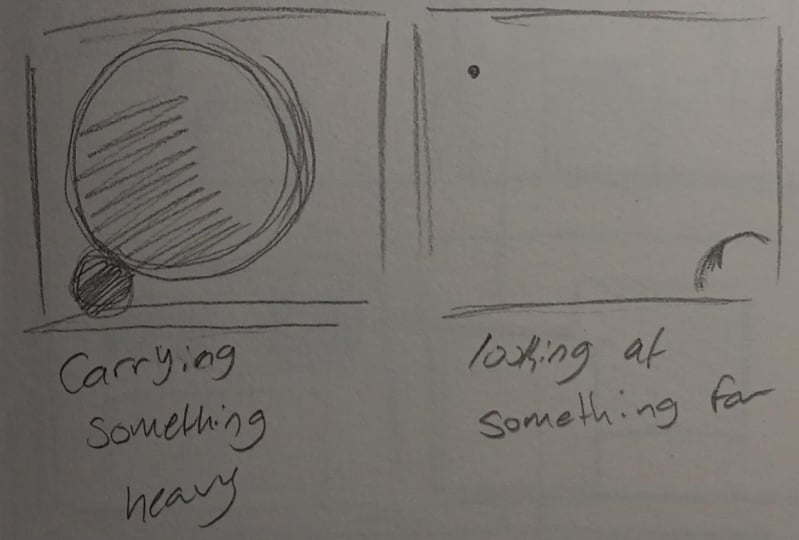
4. Creating Context: So we've got our primaries of design, but where exactly do we go from here? Well, next we need an ID for our composition, but our idea isn't much good to us if we don't give it meaning. Let's say this simple circle is the subject matter for our composition. At the moment, all the audience has to work with is that it's a circle floating in space. They don't know anything about what it's meant to be or what it's supposed to be doing, what we're lacking. He is context. In order to create composition, we need to establish context. The first and most obvious thing we can do to add contexts is to frame our subject. The moment we put any type of frame around our circle is the moment the audience understands is a relationship between the subject and the environment. This frame sits in stone, the world this circle resides in and gives it meaning everything beyond these borders is of no importance. We've chosen a square frame in this particular instance in our circle is sitting directly in the center. So we have no directional bias in our subject or our frame. Everything is right in the middle. Now, if you were to give meaning to this image, how would you best describe it? Well, everything is nice and even all the way round, but it's also not particularly interesting. So we could define this as being either a very balanced image or a very boring image. What we're going to notice very quickly is just how easily we can start to change the meaning of this circle purely by shifting its location or altering its size around its environment. If we shift our circle across just a little, what's the definition we can now attach to this? Well, we've got all of this negative space which is being created, which is pushing our circle across. So we can probably cite that a good definition right now is that this circle is now moving. Let's expand upon this a little bit more and create some more definitions. What if we were to define our subject matter as Big Lodge? Well, the obvious thing to do is to expand our circles at nearly fill up the entirety of the frame. Let's do the opposite and define it as small. Let's shrink. I'll circle down and put it near the bottom of the frame. Again, a couple of small changes have created a completely different context for each image. Let's try another one. How would you draw a circle as feeling heavy? Well, when we think of heavy, we usually think of things that are big, that rest firmly on the ground. So maybe I'll circle is large and is positioned right on the bottom of the frame heat. Let's do the opposite. How do we go about making this circle fill light? Well, it could very well be something slightly smaller. That hub is near the top of our frame. Let's try this again. What about doing something that's very close or very far? Well, things that sit closer to the viewer will often same logic and Loa. And things that are further away often gets smaller and sit further up towards the top of the frame. So we can start to see how quickly we can establish context in your composition with just a few simple changes to our simple circle. These examples shown, no means exactly how this should be done. It's all open to interpretation. This is just an exercise to get us thinking about representing our ID in the simplest way possible. An exercise for you to do is to complete a series of circles and give each of them a different contexts. Do a series of studies. Full balanced, big, small, heavy, light, rising, falling, moving close, far, Fast and Slow, and any other concepts you can think of. This is a very simple exercise to do, but it's also one that's very important because it starts to try and us to think about how to conceptualize our IDs and break them down to the basic structure.
5. Relationships and Dominance: Let's build upon from what we've just covered in the last video and focus not on one subject but two subjects. In the last video, we established a relationship between the subject in the environment. Now we want to establish the relationship between one subject and another. Now, as they currently sit, neither of our circles are really telling the audience anything. For the most part, it tells us there's nothing special bed either. To break this, we need to establish contrast. The moment we establish contrast is the moment we start to tell a story. If we change one of our circles to a square, then all of a sudden, this tells the audience that something new is happening. These two subjects may very well be nearly equal in terms of size and distance, but they've also got their own unique characteristics as well. And if we change r squared to a different color, it starts to show greater difference. So that is certainly a decent stuff for us, but let's build upon this more. Let's go back to our circles and see what happens when we move them closer together. Well, by doing this, it seems to indicate this some type of relationship happening. Maybe their family, maybe their friends. The closer we pushed the circles together, the more a connection forms between them. Let's go the other way. We'll, now we've established that the subjects have less of a relationship. Maybe they are complete strangers who have never met each other, just going about their diet. So we can see just by moving things around slightly that we can start to establish something about our composition and about the relationship between our subjects. Let's build upon this some more. Let's see what happens if we move one of our subject matter is high up and push the other one Loa. What we'll notice is that the moment we place one of our subjects higher than the other is the moment we create dominance. We associate dominance with things that are big tool or things that are sitting above us. So our eyes are automatically drawn to this highest circle. For all intents and purposes, this circle has become the lead character of our story, whilst the other one has become the supporting character for our story. This is a key evolution for us in nearly all instances, we're going to want one subject to take on the dominant role and want to take on the supporting role. How we position them within the environment will help to convey to the audience what exactly their relationship is, as well as which subject is the focal point.
6. Scale, Space and Tangents: Let's create dominance in another way and play with scale. It goes to that saying that when we put a small object next to a large one, the larger one grabs our attention first. But let's move our large circle here off frame and see what happens. Well, all of a sudden L small circle seems to grab our attention. This is happening because the moment we crop a subject regardless of size, means it automatically takes on a supporting role. We see the small circle in its entirety. So that tells our brain it must be the area of most importance. Let's take a look at trying to establish dominance through overlapping our subjects. As soon as we overlap one subject with another, not only do we create dominance, but we also create a sense of space. Because we see this circle in its entirety. We automatically think it's sitting above the other. We've created spatial depth. And if we combine style and Spice, we start to get an even greater sense of spatial depth. Look at these two examples in osteo self, which feels as if it has greater depth. More than likely you'll thinking it's the one on the left-hand side. This is because things get smaller as they recede in the distance away from us. Now, what if our subjects are just touching each other though? What happens then? Well, this is what's called a tangent. Tangents get a pretty bad rap and often one of the first things we are told to avoid doing in OT, this is because tangents create visual tension. In many cases, it's unwanted visual attention. When subjects are touching each other right on the edge, it creates this very uncomfortable feeling. Outbrain for whatever reason feels that needs to be some element of spice between them. Not only that, but tangents tend to make our subjects look a lot flatter. In some cases, blend objects together. But like all things, it's really just another tool for us, if you will, intentionally trying to create a sense of uncomfortable dominance, then tangent suddenly become a very useful tool for us. Tangents on to become a bad thing if they unintentional. This concept of dominance needs to remind true no matter what our compositional ID is. And regardless of how many subjects we have within the environment, if we have a look at these two examples, we've got one very monotonous image and one with an obvious focal point that we can't ignore. It's a different shape, it's a different color, it's in a different position and it's completely broken up the patent that was established originally, our brains are very good at finding patents, equally good at seeing when patents are broken. So again, we've established an entirely new meeting and focal point in your composition with just a few changes. This is all about telling the audience where to look. We want to make it abundantly clear in our compositions exactly what Al focal point is and where the audience needs to look up to that. This is our first, this is our second, third, fourth, et cetera. By establishing this hierarchy now compositions we are able to dictate pacing and lead the audience's eye around exactly in the direction we want. There's a lot more that we need to cover off to this, but this is the best place to begin for us. This is how we start to create our story. So let's move on to doing some exercises now.
7. Exercise 1 - Shape Composition: We're going to start with some very simple exercises for creating a focal point with simple shapes. Now, it really doesn't matter which type you use. He, I prefer to use squares, but feel free to use circles, triangles, mix-and-match, whichever works for you. We also need to really worry about what medium or use any old scrap of paper and pain is going to work perfectly fine for this, the idea is to generate the simplest version of our compositional ideas. So for this one, I'm trying to lead the eye to this mid-sized square by virtue of surrounding it with these much larger ones. Now this exercise might seem a bit simplistic, but it actually works really well as a foundation for our ID. The more we work at a compositional strengths and weaknesses early, the less time we waste later on when we start to tackle the final pace. So with this one, I'm going to add in a lot more variety of squares. He make things look a little bit more crowded. But all the wall trying to draw the odd towards that mid saw a square on the left and that's going to be helped by this square here. When the shape is cropped like this, it automatically becomes part of the frame. So cropping not only frames things, it helps to point everything else towards a particular direction. So in this instance, it's helping to push the smallest squares towards this midsize one. Let's try a couple of overlapping ones. And as was mentioned earlier, once the object starts to overlap each other, we start to create spatial depth will usually relate depth to form, but as you can see, it doesn't really take all that much to start establishing what's lying on top of what. Now, I'm looking at this already and I'm thinking there's a bit of a conflict brewing between what the focal point is. So this is a good example of why clarity is important if we don't have a good idea now, which of these is the focal point then it means our final composition is also going to suffer from this. We really do want to get to the stage where we figured out most of the problems earlier on. So again, just framing things in here and drawing attention to the smallest shapes. And using this logic wanted to help push things over in that direction. So let's do a couple more of these. These are really good exercises that are very quick to put together and you want to do at least eight to ten of these talk of sketches. Now, it's obviously not the most exciting of things to draw, but what this will do is to start to train you to think logically and creatively. So again, playing with scale here, the large square being absolutely dominating over the small one. But notice how this feels less like a frame in this instance, we've got far more of that overall structure of the large square compared to the last one. So we can't get to the stage where even if something is cropped, it can still dominate. Now with this one, I'm intentionally trying to make things look crowded, get still have a focal point. And I'm going to decide that this square in the middle is where I want the audience to look. This is a far more complicated ID. The most subjects we have in the environment, the easier it is to mess things up. So we've used spice heat, dominance. This middle square was overlapped by another square. Then we would need to find something else in this composition to bring clarity. Otherwise, it's really just a series of random lines. So a work or doing a couple of smaller groups. He, now what you're going to find with these exercises that they are translatable to more refined concepts. The next exercise we'll do, we'll build off from this instead of simple shapes, we're going to use three reference images to build a composition. So we'll give those a shot next. Now go to a group sorted now, as we said during elect to the highest something is the more dominant eight becomes. But this low group of squares seems to draw the eye in first and then leads up to the second one. So that's because the scale is overpowering thing. So every so often we're going to get these results which go counter to what we talked about earlier sun, there's a lot of guidelines in generalities. He is. So play around with this stuff and ask yourself what feels like the focal point? Now, this last one, I'm intentionally trying to create tangency. This left square is more of a knee tangent, not nearly as uncomfortable, but still gives a sense that something isn't quite right. Something that Amazon tells us to really push this a little further away from the edge. And these other two here on the right, well, they might as well be one shape. We've completely flatten the shapes together. We've got no sense of spatial depth happening here. So this is the effect of tangents on composition. I get a pretty bad rap and usually for good reason, but we can still use them for effect if we choose, we just want to avoid doing them unintentionally. So do eight to ten of these type of exercises and say what compositions you can come up with.
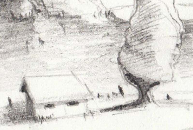
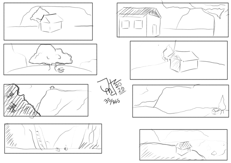
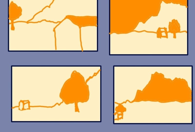
8. Exercise 2- Reference Composition: So these are the three reference images began to be using here, a mountain, a house, and a tree. And what we're gonna do is create some compositions and bring focus to h, one of these at least once. So we're not going to worry about values or details or anything like this with these, we just wanted to do the same thing that we started with in the last series of exercises and just get the basic shape right for H of these three images. So let's move on to creating some compositions for H. So we'll start off with something pretty standard for the most part and we'll get a house and he first and I'm going to put the tree just behind it and then I'll stitch it all together with the mountain in the background. Now, what you might notice very quickly is that old, this feels very safe, it feels very balanced. Everything's Conda directly in the middle here, and that's entirely by design. So we really want to push things a little bit further than this thing, just sort of locking everything off into this sort of rectangular area. So let's try this in a slightly different white. So I'm just going to focus on the house in particular at all. I'm going to blow that up a little bit and I'm going to put the tree behind it again. So pretty much following on along the same lines as the first image that just trying to make things look a little bit more dynamic and create a little bit more spatial depth. So putting the tree further in the background, he has suddenly starts to tell more of a story about what's going on way of putting oldest focus on the house. Something about this house is really important in this composition. So the result is something that is far more dynamic than this first image chain. We've got all these lines, of course, which are hoping to bring emphasis here as well. We've got all these points which are going straight to the front of the house. So a far better result than L first attempts. So let's try another one. And with this one, we'll work on the tree will, might not the focal point and I'm going to make it enormous. I'm going to make this thing look absolutely huge and put the house next to it. Hey, just a tiny little house. He getting absolutely dwarfed by this tree. So the moment we put something small next to something big, we automatically generate style. Now I'm going to use the mountains to drill further emphasis on this tree. So all the little hilly areas or this line work is directing the odd directly to this train. You really can't miss it. So again, a sense of story, he is saying, well, what is this tree all about here? It's obviously the most important part to this composition. So let's move on to another one. I'm going to make the tree the main dominant feature again, but this time I'm going to increase the size of the house, bring it closer to the camera to help frame our tree. There's still enough information here to the audience that the foreground image is a house that's going to be important to. We don't just want to crop everything off. We still want to give enough information to the audience about, well, what is this crock-pot and how does it relate to everything else in the composition? So the shape of this is going to play an important part to convey that information. All right, let's move on to another. So I'm just going to play around with this one and see where things Titus. And that's sort of the beauty with doing these rough little basic sketches first is that we can really throw out ideas out there and figure out which of the strong ones, which are the weaker ones. And we can do it all and just rough scraps of paper and whatever pencil, pencil we've got lying around us. Hey, so in next to no time we've got a new composition here, new ID down, and we can start to refine it then off to the ASAM looking at this right now I'm thinking, well, I think this house is probably a little bit too close to the HEA, little bit of a tangent is sort of starting to be formed t. So we can start to see how valuable the short little sketches off for us. If we were to just dive headfirst into trying to create a finished piece, then we run the risk of having issues like this pop-up way. We don't figure out all the problems beforehand. So doing these little thumbnail sketches here and just working at all the little problems ahead of time is really going to save us a lot of trouble going forward. So quite happy with this one. Let's move on to another one. So I'm going to give the mountains some love and try to create a really epic looking landscape. And in order to convey that, we're going to have to shrink the house and the tree down to be very, very small. And even to push it off towards the frame rate, almost making it part of the frame itself. To put all the emphasis on the mountain and self and really just hint at something else that's happening in the environment. So a house and trachea essentially becoming part of the frame here. But again, there's enough information there to tell the audience that there's more going on here with the story than just the mountain itself. So again, style playing a huge role in this one. Let's do another couple mole or a really going to zoom in onto the top part of the mountain now. And we'll use the tree is a framing device T. And I'm going to put the house rod on top of the top of the mountain he is. So it's a little mountain hideaway for people to go to. And what you might see here is that there's an obvious direction that are all eye follows. He would going from the tree all the way to the mountain heat. So we've got a nice smooth transition that's happening here. And take notice how it almost feels like we're peeking from behind the bushes. He way looking up to see these mysterious house on this hill. So you see that type of effect in horror films and other films with I tried to create mystery. And I'm going to do something similar with this next one. Try to lead the Iran using the mountain in these instances, the framing device and then also using the tree as well as a secondary framing device to really push the eye round all the way to this Halsey, sort of indicating something about this. And maybe it's a lonely little place here that's being overshadowed by these more cropped off areas. Start. Let's just take it back to the previous exercise again and we'll see how we can use our basic shapes as a foundation for something a little bit more sophisticated. So I've got these random block structures, he, just to get things going and I'm going to translate this ADI or Iowa using our reference images. So big cropped off Erin going to use for the tree will use the smallest square for the house. And of course, we'll put the mountain in the background here. So we can start to see just how useful this simplified ID is to helping generate compositions. So if I was to draw these boxes again over these different areas, we can see quite clearly that the only real change is we've developed most sophisticated shapes. So it will start to wrap things up with one more image. So this lesson is all about starting our journey with observational skills, figuring out, well what's going to be mod, dominant subject matter? How does it relate to the other subject matters? And had his oldest work within the environment that we've created. So use those basic shapes, use these basic ideas for these reference images, he, or whatever other reference images you might want to use. So feel free to source your own imagery as well and try to find some unique called Musicians with those two. So we'll finish this one up here and we'll move on to the assignments.
9. Assignment: The assignment for this lesson is a three-part 1. First, establish a series of sketches for a circle and a square frame and position the circle in a different way to establish different meanings referred to the creating context part of the lesson, all to the reference provided in the class assets. Second, draw series of thumbnail compositional sketches using simple shapes, circles, squares, triangles, et cetera. And establish a dominant subject matter or focal point for each sketch. Do about eight to ten of these. And finally, draw series of thumbnail compositional sketches using the reference images provided and establish a dominant subject matter and show you give focus to H subject matter at least once. Do eight to ten of these. So I'll leave you with that to complete and I'll see you in the next lesson.
 JW Learning, Drawing the Body, Head and Hands