Transcripts
1. Trailer: In this lesson, I'm composition for oddest school, talk about developing structure for our outward. Before we worry about diving headfirst into a finished illustration, we have to ensure we live foundations that establish a focal point, mood, and depth. So we're going to cover a bunch of different tools that we can use to ensure our IDs have structural integrity, as well as how those tools can be used to create a narrative. There'll be a lecture followed by a demonstration of how to build up our IDs. And we'll cap it off with an assignment for you to complete. If you've ever had trouble with depth and story in your compositions, then these tools are just what you need. So let's get started.
2. Measuring Keys: Structures the most important part of any composition, even if we're looking to do less realistic work and lean more on abstract design, having structural foundations in place is always going to result in a better outcome for us. So how exactly do we approach this? Well, structure is really just another name for our design components. In other words, our artistic tool sake. And like any type of tool set, it usually means there's some type of measuring involved before we use them. There's no point in hammering and Nile into a couple of pieces of wooden list. The wood has been cut to the right size first. So what are our measuring tools for composition? Well, there are two different yet overlapping tools, cool keys. One is the proportional key and the other is a contrast t. Let's start with the proportional Ki. First H design component we use is going to consist of two opposing ideas sitting on a sliding scale like this. A shadow, warm color versus cool color, strike versus curve, smooth versus texture. There is an infinite list of available to us. The proportional k is about establishing which of these opposing ideas is going to play the dominant pot. Let's break this down more and use our most important component value as an example. Value is the scale between light and shadow. These are opposing ideas for this design component. In this instance, the proportional k represents the amount of light in relation to the amount of chateaux. These images, he also established a different dominance of value grouping. This first image has a large percentage of light values. The second has a large percentage of dark values. And the third is roughly evenly split. If we were to assign a percentage to this first image here, we can probably make an educated guess and say it's about 70 percent light values. So f proportional K is all about which of these two opposing ideas plays a dominant role. In this instance, it's the proportion of light to the proportion of shadow. So how does our second key plane to this? Well, at contrast K or out range of contrast, is about how far apart those two opposing ideas off from each other on their sliding scale. If we look at these examples, we've got the same composition as before, but we've moved the value groups closer to each other or further away from each other. In this first example, ABC contrast snail values is very extreme. In these other ones, it's far more narrow. What you'll notice pretty quickly here is that these changes in contrast along the value scale helped to give the image a completely different field. Take a look at these different images and have a think for a moment how they all look and feel. Well, this first image is quite extreme with its values, light shapes and dark shapes at completely opposite ends to each other. The image is very clean, very bold, very dynamic. It's sending out a very strong statement to the audience. Nothing about this is ambiguous. What about this second image? Well, we've shifted our lighter values all the way to the other side. So the range of contrast between light and dark value groupings is fun, narrower. Now, what statement does this feel like it's making? It's very dark, It's very moody. You could probably say it's depressing or diet. There's nothing about this that feels old, that welcoming, nor is it a very clear statement. Let's have a look at a third image, but this time we'll push the DACA areas to the opposite end, again, giving us a very narrow range of contrast. So what statement does this feel like? It's making? Maybe a serial, dreamy, hazy, atmospheric, even. It's not as clear and images the first, but it feels a little bit more inviting, lost. Let's look at one more where our value groups are about equally spaced apart. How would we best describe this? Well, this one feels quite balanced. It's a PHA strongest statement than the last two, but it's also not nearly as bold and dynamic as the first one. This probably feels safe, maybe a little bit too safe. So we can start to see how we can start to shift the Luke and mood of our compositions by playing around with these measuring case, the proportional Kaizala about which of our opposing ideas in our design component is going to be the most dominant. And the contrast K is all about how far apart these two opposing ideas off from each other. As we mentioned, we can apply these muttering Skiles to not only our value component, but any design component that we can think of. Ask yourself the questions, which of these opposing Audi's do I want to dominate the most and where along their respective scales do I want to place both of them needed fall somewhere in-between the choice is ultimately yours. It's not important that we use these case for everything in our composition. It's about knowing the exist and using them when needed.
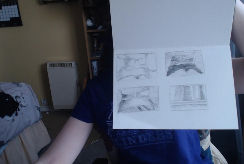
3. Graphical Fingerprint: So we've established L measuring k's way to, from, Hey, well, now we need to establish the skeleton for our composition with what's called a graphical fingerprint. A graphical fingerprint is a simple black and white study that helps to establish the basic foundations for the composition. Another way to look at it is that it's the graphical design for our composition. It represents the light and shadow and how form or the light and dark value shapes. Now composition. Before we start to worry about any type of rendering of colonial style texture, we want to use the simple lot and duck studies to do a lot of the heavy lifting for us. We want to use these simple studies to work out not just at areas of light and dark, but also create areas of interest as well as use it to lead the audience's eye around. If era, because placed next to a series of other people's compositions out goal is to catch the audience's eye and hold it for as long as possible. Unlike film, musical books, we've only got a few seconds to grab the attention of the audience. So we need to do something to engage them for as long as possible. So our graphical fingerprint is the first step to doing this. Now compositional idea is not clear at the stage. Then any attempt to build a fully rendered image from this will result in a pace that is very unclear and unstructured. Let's have a look at an example. We've got two compositions here and next to them we've got a basic fingerprints. Take note of how the graphical fingerprint on image1 already feels a lot more structured compared to the fingerprint on image to. It feels a lot more balanced and dynamic, whilst the second feels a lot more randomized and chaotic. We don't even need to see the finished renderings for H composition to know this, if we hide away our finished pieces, HE, we can tell quite easily with just the design patents. Image one has forbid a foundations. It has a focal point in his eye hierarchy. It leads the audience's eye around in a specific direction as second image in comparison fields all over the place. So these are crucial first dips because it's going to save us an awful lot of time and energy, light or wrong. We're much better off spending an arrow to working on these little black and white thumbnail sketches, then spending ten hours on a fully rendered pace only to discover something about it isn't quite working. So that's the basic idea we need to start with the structure, but let's develop things a little bit more.
4. Light & Shadow vs Value Shapes: Now, as was mentioned, we said the graphical footprint represents either the light and shadow of our forms or the light and dark values of S shapes. So let's just explain what this means exactly because it's something that can get a little bit confusing. In nearly all instances in our composition, everything we pint is going to be a combination of two IDs, form and shape. You'll often hear these referred to in composition as 0 for our forms. Mess, oh no tan for our shapes. We want to think of these two ideas as essentially being two separate yet relighting lies that overlap one another. The flat two-dimensional lab for our light and dark value shapes and the rounded three-dimensional layout for our light and shadow, the shape and form lie is going to be on a sliding scale overlying each other to varying degrees depending on what our intentions up. What we're basically trying to do is determine which of these lies opposite to the greatest area of contrast to start at graphical fingerprint. If he sounds a little bit confusing Still, let's break it down a little bit more. Let's look at these Rubik's cubes. For an example, alphas Rubik's cube has the greatest area of contrast coming from it's light and shadow. This one is formed dominant. In a second Rubik's Cube, the greatest area of contrast is coming from the flat black and white shapes on the surface of the cube, thus making it shaped dominant. What this means is that the more intense the light source, the more contrast will shift from being shaped dominant to being formed dominant. Now the thing about these two layers is that they're often pretty tricky to try to split apart because there's a lot of overlap. Where exactly do our 2D value shapes end and where does a, a light and shadow on our 3D forms begin. Let's look at a checkered flag as an example to try and work it out. Take a moment to look at these three examples and ask yourself, where's the greatest area of contrast? Well, and how first image, the greatest area of contrast is coming from the form lie up. And we can tell this because our checkerboard patent is blending into this flag. The squares in the Lazada and Dhaka shadowy areas are being overwhelmed and a fighting into the flag surface. It feels like there's a more intense light hitting the surface. As second image in comparison has very little form being developed, the light feels far more subtle. Buckets and other cost dydt, We don't have deep shadows and bright highlights. So that lack of intense lot mains at checkerboard patent and light and dark value shapes, I'll becoming the greatest area of contrast. And our third image is roughly about a 50, 50 split between both lie is there's no rule that says you have to start with 10, the yellow. This is purely ice objective tool. This is just about giving us a starting point for our graphical footprint. If how composition is going to have an intense light source, then we might want to approach it with form first, if it's less intense than light and dark value shapes are probably the way to go. It might even be a case where we choose to combine by thought D is perhaps we decided to make our composition predominantly heavy and value shape, only to have a little bit of form as the focal point. This is a great way to direct the audience's Iran because anything with form is going to stand out against something that has flattened two-dimensional. So when starting, you'll graphical footprint cake these two lies in mind.
5. Creating Depth: So we've got our fingerprint worked out now we need to start developing things. One of the greatest problems, oddest going to have to face is the challenge of fooling the audience into thinking that flat two-dimensional surface they're looking at has a sense of spatial depth. So let's look at some ways we can stop turning that flat 2D k this into more of a window looking into the world that we create. Values. The most obvious way that we can help create this illusion of depth. As objects move further and further away from the viewer, that value and value ranges start to shift all set. So by rendering different areas of our composition with different value ranges, we can start to create that sense of depth off the value. The most obvious thing that we can use is size. So it sort of goes without saying, but if we have one object that is larger than the other, it automatically starts to create an album on a sense of spatial depth, our eyes are used to seeing things diminishes, they move further away from our vision. So this is another simple yet obvious tool at our disposal. Next, which is an extension of size, is overlapping, either through overlapping in a straight line or even in a curved line. Anytime that overlapping diminishes into the picture plane means our brains are going to start interpreting spatial depth within the composition. Following on from this, another tool for us is line. For instance, if we have a series of lines tracking back to a vanishing point, the most obvious example being a road trailing off or something like a river meandering off into the distance that is automatically going to lead the viewer's eye along to where the lines converge. So vanishing points, perspective lines, a great visual landmark. But long can also be a series of horizontal lines as well, gradually diminishing in the distance similar to a railway track. A most sophisticated version of light and one that relates to the value is upgradation. Upgradation by its very nature, moves the eye along in a particular direction because it transitions from one value to the next or even one call to the next. If we have a field of grass, It's doc and green in the foreground, and it gets louder and more atmospheric as it recedes to the background, our eyes are naturally going to follow through into the picture plane with it. Allows tool is less of a drawing tool and more of a storytelling device, and that's creating a narrative. This is something that rise in filmmakers do, but this is also something that we have to consider. Two, we don't have words or moving picture. So how do we do that in a still image? Well, we want to separate out composition into layers of spice H with something that relates to the story with trying to tell. So in this example, we've got three layers, the foreground and big grant and a background. We've got the mug still steaming hot coffee, helping to frame things in the foreground. We've got a lit cigar on the table in the mid ground and the man slumped over in his chair in the background. You can even say at the picture on the wall is it's unlike it to this series of Laius dots to develop the narrative. Maybe he's a businessman who's fallen asleep at work. Maybe he's a mafia boss who's just been taken out by a rival. All of these pods within these labs are hoping to move the audiences either through to the back of the artwork, hoping light the bread crumbs for them to interpret the story. We can choose which lie we want them to focus on the most. So maybe it's a case where we want to put more emphasis on the mug for whatever reason. If everything else beyond that stays out of focus, then it's going to tell the audience the mug is the most important part of the narrative. So we can start to see the possibilities that become available to us to help create depth, we can mix and match these tools, place emphasis on one more than the other. There's an infinite amount of possibility. That said, if we make adjustments to one of these tools, it will often mean we have to make adjustments to the Odyssey as well. So there's going to be a little bit of a juggling act involved with this, which going back to the beginning of the lesson, is why we start with the simplest structure for our composition's first, That's going to allow us to make many mistakes and work at how to best move forward with their ID, with the lecture out of the way, let's move on to doing some exercises.
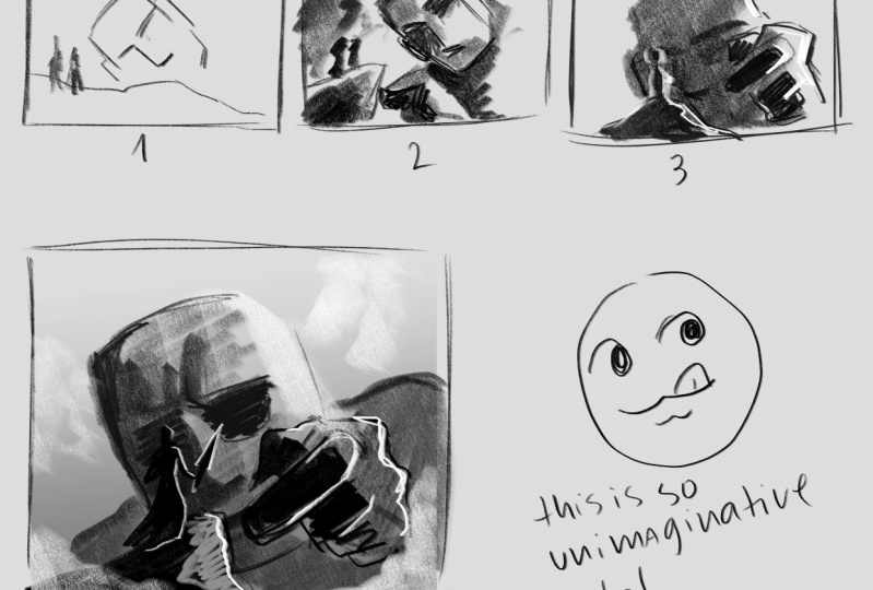
6. Demonstration - Design and Mood: So I'm going to recreate the process that went behind this little fantasy landscape sketch the previously done. So the first step is to create our black and white graphical fingerprint. Now, it should be stated that these top of sketches really shouldn't be worked on for too long. It's going to be very easy to start getting bogged down with all the details. In fact, it could be argued this finished composition is probably a little bit too detail. This exercise really needs to be about basic shapes, basic values with maybe splashes of detail here. And they, so I've got my light shape in the proportion of light shadow is probably a bad eye, 60, 40 ratio here. Again, don't have to be cleaned with these foundations. Any old pen or pencil you've got lying around on any old scrap of pipa is going to be perfectly fine for this. So just blocking in the dock a shape now. So what I'm gonna do he is I'm going to have the costal in the background be part of the dock a shape. Now, you'll more than likely asking yourself, aren't you going against what you talked about during the lecture? The castle is clearly a much lighter value than everything else in the middle and the foreground walls. That's true. Keep in mind that for our graphical fingerprint, we're not necessarily looking to have l values in the right places just yet. We're looking for the most interesting shape design that we can get without black and white sketch. Even though at causal is clearly aligned with the light of values in the sky, it's still a darker value than the sky itself. So I'm making the choice here to look for the most interesting dark shapes wherever they are in the environment. Now, you may very well make a completely different choices. Whether or not you choose to make the costs will be pot or the dock is shape or the law to shape. That's simply going to come down to what you think looks at best. In fact, let's get rid of the costs and the other just to check what this looks like with added and I think we can probably agree that our fingerprint is going to end up looking a lot better without castile being shifted to the darker shapes. So again, looking for the most interesting graphical design at this stage, not necessarily accuracy. So a fingerprint in place. Let's move on to shifting the contrast around now to try to create some mood. So the first direction I'm going to start shifting things is towards the dark end of the value scale looking to create some type of Doc and ominous landscapes. Something like Mount Doom from Lord of the Rings or whatever fantasy fortress you can think of. I'm going to do a couple of contrast studies just to see what the results up. Now, I'm working primarily with Sharpie or no 10 as you might hear it referred to as. But you could just as easily create a graphic footprint with form as well. You'll often hear them referred to as your sclera, which is an Italian word for light and shadow. And no, 10, which is a Japanese word meaning light and dark for our shape. So I'm liking the way this is going, but I think I'll do it just a little bit of a tidy up, hey, clean things up just a little bit. Always ask yourself ahead of time when you're painting from life or from your imagination, how intense is the lot. So it's going to be, and that's generally going to give you a starting point as to whether or not you should approach things from a shape perspective or from a firm perspective. So I'm liking the way this is, but I'm going to try bumping things up in the dock areas and just see what this looks like to make things look a little more mystical and dreamlike and the cereal. So again, just going back to our form and shape, as we said during a lecture, the flat of the light source, the more shape dominant the image is likely to become. If it's a really intense light source, then it's going to start leaning towards form dominance. It's a little bit of a tricky thing to try to separate these two concepts because there is a lot of overlap between them. So a good thing to do is to research findings from all the great artists and look at what loading dye used. It's not always super easy to figure out, especially with colored paintings, but with a little bit of observational practice, we can start to work out whether the work is shape or form dominant. So I'll clean this up a little bit more, but I can already tell at this stage, this one's not really doing a lot for me. So what am I do is try to find a little bit of middle ground between these two extremes. So the importance of doing these quick little studies, well and truly on show here because we don't want to be wasting L was rendering this pace. I like to find out that it's not really working for us. So these quick little studies are perfect for this. So this is all about establishing mood for our work. That's what contrast is all about. All of that other design components can contribute to this also, not just value, value is of course the starting point, however. So when we start to develop things more, we need to start thinking about all that other design components and how they can create contrast in a fantasy world the night, whereas the beautiful, elegant curved on the, so the dock load with the, with the spikes and the sharp edges. So strikes versus curves, smooth versus textured, Shani versus doll. There's an endless list that we can draw on to create contrast. Contrast creates story. So I'm liking the way this is going right now. So let's leave this here and start establishing some depth.
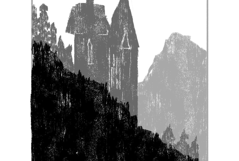
7. Demonstration - Planes and Depth: So let's start adding in some clarity into the sketch and bringing some layers of depth. So the first thing I'm gonna do is add in this value into the same. That is automatically going to start creating spatial depth value by its very nature changes when there's a change in directional plane that's going to apply both to objects in the environment as well as the environment itself, although it's slightly different for both. So on an object like a box, if light hits it, each side of that box is going to receive a different amount of light, which is subsequently going to cause a different value to form. That's how we start to see volume. The same rings true for landscapes like this. The only difference is directional planes in this instance, receding back into the picture frame. So imagine this as a series of gloss window pions that way pining on top of generally things that are closer towards the viewer, a DACA and have more contrast. And as things recede away from the viewer, things become more light in atmospheric and the contrast becomes a lot listened. There are exceptions to this of course, but it's a general good rule to start with. Now, we can say the two value editions have already started to create the illusion of depth giving us three lies, a foreground, mid ground, and background. We could even consider the sky as a full-fledged two. So this would be a good place to stop, right? Hey, and move on to another concept. But Let's just work on incorporating a little bit of depth into this scene. And we'll start with adding a little bit of gradation into the sky. The sky gets lighter as it approaches the horizon. So our eye is naturally going to follow the path he weighed a lot of area is the sky has different plane changes. So it's going to follow the same logic that we talked about. A change in directional plane is going to be equal to a change in value in this instance, it's also helping to lead the eye towards the castle. So this is not only helping to create a sense of atmosphere, it's acting as a visual landmarks. We talked about developing a narrative, deciding on which lie is odd, the focal point. These tools for depth there to help reinforce those ideas and lead the audience to the exact point we want them to look at. So looking at this castle now, and I'm thinking it probably needs to come down a little bit in its value. That will also make it stand out from the sky a little bit more. So really, we are working with four values here. We've already used gradation to help establish more debt. But notice how we've automatically also established overlapping with just our value changes. We've brought that mountainous formation forward with its doc, a value which is now overlapping the mountains in the mid ground, which is subsequently overlapping the costal in the background. So we've established a hierarchy of objects. What we want to try to avoid doing is having two objects at different distances looking as if they are touching each other right on the edge. That's going to create a tangent which is going to cause visual tension. That can be used as a tool, but we want to avoid doing it accidentally. If we have different planes, we want to avoid them looking as if they are blending together because tangents will often flattened and image out. So I'm going to turn my attention to using line now to push the audiences on through to the background. We've got the path and the canyon, the little river snaking its way along. We've even got the cast shadow when the rock formation to so lines converging towards what would probably be the door to the console. But we've also got implied lines here as well. Take note of how the edges of the rocky hills in the mid ground at helping with that direction. They are also converging to the centre of the castle. So I line is more than just the strokes we put down or the literal lawns that something like a road or river mix. It's something that can be in heavily implied to create direction, even closure. Closure is about creating a completed shape, having our eyes move around the picture in a certain way and ending up back where we begin. So you might notice here that the river, even though it is in the midground, that it's closer in value to the full ground rock formation. What we have to remember is that everything we paint is going to have its own starting value. So just because we might have a bunch of different objects in the mid ground doesn't mean they're all going to stop at the exact same value. So in this instance, the water is Dhaka, so its value levels in the midground going to be different from the canyon and the canyon walls and surrounding rock. So it just adding a little bit of detail into the rock he just to help convey the story. Again, this is probably the upper limits of way you want to take your thumbnail compositions. We have the advantage, of course, if we're working digitally way, we've gotten a riot texture brushes and lighting settings within our software that we can use to cite a lot of time and help develop thumbnails quick. So if you're working in procreate or Affinity Photo Photoshop, you can use the curve tools or the Levels tools and those applications to quickly change the range of contrast and try out different overlays and textures. Of course it's different if we're working practically, I'm using realistic paint studio, which is a lot closer to working with real tool. So if we're working practically, we don't have the luxury that is available to our digital counterparts. But whichever way we work, we don't want to spend much more than five minutes on any one thumbnail study it. There's a specific story requirement. You might very well need to spend an additional minute or so just to get that idea across. So for instance, if a client was to say to you, Well, we need this landscape to look a little more scary and intimidating and a bit more of a challenge to add here a character maybe have a couple of dragons flying in the background. Then of course you'd come in over the top with a few extra details right at the end. So just putting in a couple of twisted trees here and maybe a couple of additional shop looking areas of rock. That little bit of extra texture to try to capture the audio over the world, but ignore the tendency to detail detailing really is kind of the fun stuff with illustration, but we also have to restrain ourselves a little bit here and save a little bit of that energy for when we start doing the final composition. Once we've got our thumbnail design sorted, then we can start planning ahead for the real artwork. So we'll start to finish up here. Hopefully these tools that we've gone over help you in your compositional sketches. So just to reiterate everything, always think about your graphical footprint first, your basic light and dark shapes. Think about whether the image is formal shaped dominant. Establish your values and range of contrast and putting just enough details and depth just to get the ID is across. With this out of the way, let's move on to the assignment.
8. Assignment: The assignment for this lesson is to create a composition with at least three lags, a foreground, midground, and background. Now, the composition can literally be anything you want, but try to tell a story within it. It can be a real life story, a fantasy story. Whatever elements you place in the environment have them all relate to each other. Try to visualize something that acts like breadcrumbs and really draws the audiences are through to the background. Along with this and show you design the graphical fingerprint for your composition, as well as some variations of that fingerprint with different ranges of contrast and value, do at least three options and see which looks a bit. So I'll leave you with that to complete practice HOD, and I'll see you in the next lesson.
 JW Learning, Drawing the Body, Head and Hands