Transcripts
1. Trailer: Hey there. Welcome to my comic art masterclass off the Crimson Cat. Creating a full comic book illustration is extremely difficult because it relies so heavily on a clear understanding off your process, which many artists don't fully develop even after they've learned the fundamentals. So if you want to consistently create stunning comic art that earns the respect of your peers, end impresses your fans. I'm going to share my very own process with you in this class and show you exactly how to execute it. For years of toward hundreds, if not thousands of students, the same digital workflow you're about to learn here. No matter what illustration you're working on, you'll be able to rely on this process over and over again, regardless of its complexity. It's simple, easy to follow, and we'll give you consistent results in your work will start at the very beginning with a basic rough sketch to get our idea down onto the page from there, Will Inc in the outline drop in the shadows and render the materials and textures using various cross hatching and detail. ING techniques finally will add mood and drama to the illustration with a dash of color, adding in shadows and highlights to create a whole new level of depth and dimension to a kamikaze. It goes without saying that it takes a ton of time, practice and dedication to master any skill. But having a go to process you can depend on is half the battle. So after taking this class and learning the work foot will be covering, you should see significant improvements within your work and feel much more confident tackling a comic book illustration of any size and complexity. I really enjoyed creating the illustration of demonstrating throughout this class, and I can't wait to take you through the entire process. Step by step, said Buckle up, Grab your stylist and let's get straight into it.
2. Introduction: Hey, hey! Doing its Clayton here from Had a draw Comics start Net and welcome to my new comic art masterclass. In this demonstration you're going toe, learn a complete digital workflow for penciling, inking and coloring. Comic book. I'm going to take you through the entire process from start to finish will start out with a very basic and rough draft of the general composition that will want to develop along the way for our illustration. And then once that's down and ready to go, we're going to go in right over the top and start to ink it with slick, streamlined, energetic align work. And then finally, we're going to give it a splash off color, building up the different forms throughout our illustration and giving it that additional level off three dimensionality. Without further ado, let's jump straight into it.
3. Hardware: So the first thing I'd like to cover here is just a hardware that I use when it comes to producing a digital comic book illustration. Now I don't use a sin teak, and I don't really have a very advanced new techie tablet that I use either. In fact, the tablet I uses a whack home into us three. You can see it right there. This is the stylists that it comes with very, very simple and basic. It's about 10 to 15 years old. I really haven't updated since then. And the reason that I mentioned this is because it just goes to show that whatever level of hardware that you have at your disposal for digital art at this point, it's probably going to do the specs on my PC on all that crash hot, either. In fact, I'm in desperate need of an update. The PC amusing is also probably about a decade old. So again, whatever hardware you're using, as far as your PC is concerned, it's probably going to be beating mine at this point. All right with that said, let's move on
4. Software: all right now, when it comes to software, my preferred applications are clips, studio paint, previously known as Mangus Studio, and I use this application for all of my penciling and inking work. And as for coloring, I prefer to use photo shops. I've got true applications there that I would typically use throughout my digital comic book illustration. Workflow. Now, regardless of the application that you prefer to use, whether it's procreate or something else, I really haven't dabbled in a whole lot of them myself. It really doesn't matter, because a lot of the topics that I'm going to be covering with you and the explanations will be giving you often times they're going to apply across the board, regardless of your chosen application. Now, as far as some of the post effects go within the coloring portion off this demonstration, yes, some of them are specific to further shop, so appropriate them where you can within the application that you're using. I know that prices very as faras these applications concerns, so it's completely up to you at this point clip studio paint. A lot of people are using that. It's a very popular application and also on top of it, an extremely affordable ones. So I highly suggest you at least download the demo for that one and check it out, see if it works for you. All right, that's it. Let's move on to the next listen.
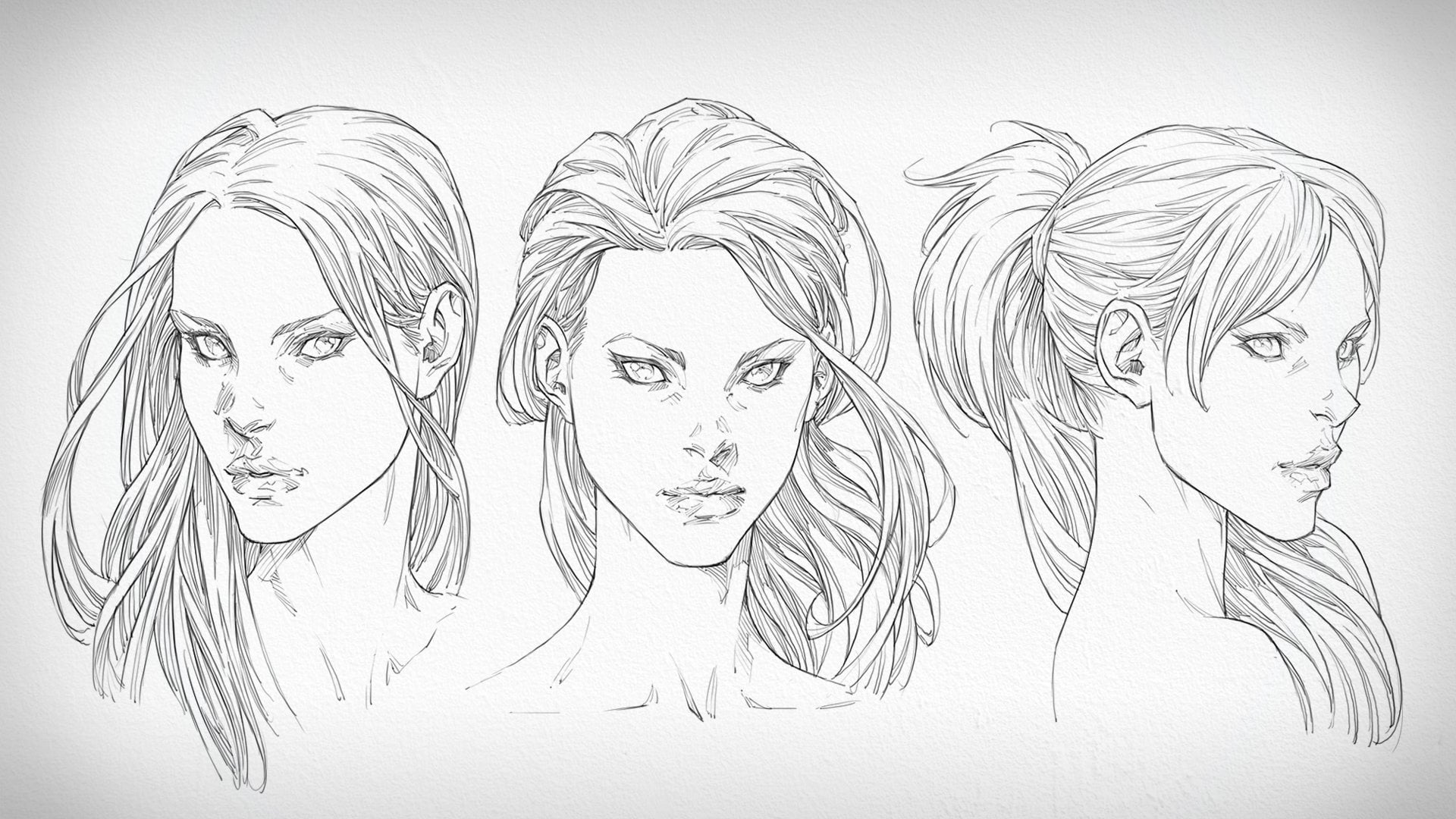
5. Workflow: So now what I'd like to give you is just a really quick overview off the entire digital comic book illustration process we're going to be covering here throughout this master class. Now, as you can see, a broken down the Crimson Cat illustration into a number of steps, and we're going to be covering six main steps throughout this workflow here. So it's step number one is to sketch up the foundations off the illustration Here we're working very, very loosely, very roughly, and a main goal is to experiment and to exp blowed the design so that we can come up with something that we really want to develop and commit to as we enter into the more refined penciling stage off the process. And that brings us to Step Number two, where we're building upon the underlying skeleton off the drawing, we're building upon the blueprint that we initially laid down in the first step. So here is where we refine everything that we've already done, and we start to knock out some of the details within the design and also not just talking about the design in reference to the character but also the background as Well, because that's important. All of this is going to require us to start thinking in more of an analytical way in just a cross check alot of the basic drawing principles that serve as the foundations for this illustration. So what I'm talking about there is things like the proportions of the character and making sure that we correct those if indeed they aren't looking right and perspective. So the perspective of the background and the character herself. Once again, we want to make sure that they are both online was one another and also aligned to the perspective that we've set up for the scene or over roll. Now, once we've taken care off the refined pencils, it's time to move on to step number three, where we ink over the top off our drawing. So we're going to take the base sketch and use it as a draft to create the finish line. Not instead of polishing up the pencils, we're going to jump straight onto the inks to save us some time. Every contour will be waited at this point, the shadow's blocked in and the details rendered here what you're really going to want to focus on primarily is keeping a steady hand. That's the most important part, making sure that you have an excellent use of a lying control as you go over the top off the pencils and lay in what will ultimately be the final Leinart over your illustration. All right, so let's move on to the colors here in the fourth step. Now what we're going to do to begin this is established the overall color scheme that we're going to want to go with for the illustration. So what this is going to require us to do is lay in the base color tones. What were especially considering here are things like color theory, ensuring that all the based tones that were laying in across the character and the background go together well in a complimentary way. And we're focused on here is remaining inside the lines as we lay in those flats, defining what color his skin is going to be her outfit and then the background as well. Next up in step number five, we are going to paint in the first pass off shadows and highlights. This is done in an extremely rough and preliminary way. We have focused on big, large forms here, breaking down the anatomy of the character into nothing more complicated than cylinders and spheres and also the background thinking of it in terms of block formations. And we're considering the light source. This is the most important thing to think about at this stage because as we define the first pass off, rendering here and establish the lighting conditions over the scene, we're going to be building on top of that in Step six. Step six is where we add in the overlays and give the lighting some color. And this is going to establish a more realistic lighting scheme, which will allow us to create a much more enriched color palette in turn. From there on out, it's just a matter of building up the highlights and the forms to give them more definition . All right, so that's the overview of the workflow we're going to be covering throughout this demonstration. Let's jump straight into it
6. Inking The Crimson Cat: hey, hey, doing its Clayton here from had a draw comics dot net and welcome to today's video. In this demonstration, I'm going to be working on a fairly old comic book illustration that I created probably a few years ago. Now I think that it's one of these illustrations that not only lay you to see how I go about laying in the foundations for a character in the background, but also how I go about rendering the various materials that were going to be seeing throughout this illustration. And for this particular video, what we're going to be focused on is really just establishing the every foundations which you can see me putting out here. And then the outline, the ink outline for the character and then in the following video will completely inks for the background and in the video. After that, well, color it up, Let's get into it. What am I doing here? Well, as you can see, I've got the basic foundations for the character established. That was pretty quick, and usually it is a fairly quick process, but it is the most important part of the process overall because, of course, this is the composition that the entire illustration is going to be built on. So the background elements that have been incorporated, although they're not as detailed, they do create a certain amount of visual readability that helps to frame the character and drawer attention to her. And then, of course, the character herself we would oppose established. We've got her positioning a placement and the size at which he is going to be drawn. All worked out at this point, and with those elements figured out, what was then able to do is free up elemental rim to begin adding in the additional details that it going to come in on top of that. And so what we essentially have is I like to think of it as American in a storefront, for example. You know a mannequin. It's it's really just a blank slate that is dressed up right to showcase the clothing that it's going to be trying to sell. That's essentially what we're establishing here, kind of like the mannequin of the drawing in a way which we're going to dress with, oh, the details that they're going to consist within the background and within the character and the design elements that are going to come with that all of the lighting, everything is going to be built on top of this basic composition. So I'm going into the background and I'm adding in some final details for that. It's still very rough and quiet, sketchy. As you can see, there's nothing that has been super fine here whatsoever. But these additional little details are going to help me just to figure out, you know, what kind of materials am I going to be dealing with there in the background? You know what is his building that she's sitting on made off, and very clearly it's made of this bricks and, ah, it's going to be an old style sort of break. So what we're dealing with, as far as the architecture is concerned, is very old aged looking building that's kind of half falling apart. It's maybe abandoned, somewhat dilapidated, and so with that, I'm able to capture the kind of vibe in context that the character is going to be presented in because all of this background stuff is really just a platform that is there to compliment her. If you've ever seen those super detailed quite large comic book superheroes, statues that you can buy from places like sideshow collectibles as an example where they've got the giant platforms underneath the statue and whatever is within those platforms. Usually they're decorated with all these, you know, intricately detailed elements that kind of help to ground the character, to ground the statue and and give a sense of place to help bring across the character's story and just a really increase the amount of mood within their presentation. Well, that's kind of what we're doing here. We're trying to emphasize the mood with a vivid sense of feeling and character to the illustrations, so that we can make a more immersive experience full the audience when they're looking at our illustration here. And this is something where backgrounds actually come into play in a huge way. They're often underrated, and we try to avoid them because they consist of just so many different sorts of detail that take a lot of time to implement. But when done correctly, backgrounds can really help to just compliment your character and to really do them justice in a way to really help emphasize who they are. This story and the willed in which they inhabit. And what that does, in turn, is draw the viewer in more it gets, the more invested it helps to draw them into that very same world that the character is a part off. So backgrounds of fantastic. It's a much better alternative, even though it takes a little bit longer than having a background, which is completely blank having a character, which is this fluting in this white void. So now I'm going in over the top of that really rough character sketch, and I'm using the G pen tool within mega studio A k a clip studio pain to ink in the final Leinart for the character. And this is really just going to be the character that we're focused on again here. We're going to be kind of just leaving the background as is, and Puli just focusing on getting this lineup nice, slick and shop looking to really give the the final presentation of the character the same amount of energy that we saw in that initial draft. And this is a difficult thing to do because when you first start sketching in the character , there's inevitably going to be a greater amount of the energy. They're just because off the characteristics of the lines that you're dealing with, their loose, that rough, there's more movement in them just by default in. So you know the lines, encapsulating the character and really establishing the bounding contours are going to have this additional level of liveliness within them. But want tens toe happen when we go over the top of them and we start to think the mat is the character stance to stiffen up. And so we lose some of that liveliness and and the flexibility within those lines, they start to become a little less lively and more lifeless, and that can really take away from the character and the way in which they depicted, because this is the final I not. So what we want to do in order to avoid that happening in order to avoid a flat, lifeless looking in product is we want to try to get is much energy in implemented into these lines into this Final Inc Leinart as possible. And the way in which I like to go about doing that is by drawing them in fast and confidently by making sure that the way in which I'm stroking in this the zinc contours isn't make but strong and that they're purposeful. They had this sense of or belonging within the illustration, and what I mean by that is often times, especially for unconfident anchors, the declining you tow it, not quite sure, familiar with the tools just yet as they tend to sketch in the inked outline. And I will do this as well from time to time to capture some of the intricacies that I want to incorporate into the line. And sometimes this subtle characteristics that I want tohave within them just aren't going to be able to implement in one swift stroke. So I will go in and all manually kind of. I call it sculpt, sculpting the line right, and that that's really what you're doing is you're sculpting it in there. You're adding a little bit of sickness here, getting the eraser out, trimming it up back there. And that's really what allows you to carr off the line in a much more controlled away. But sometimes that can produce ah, somewhat manufactured feeling to the line and a visual aesthetic which just doesn't seem genuine or I guess you could say it seems contrived, and you want to avoid that as well. So it's always a balance between getting the kind of line you want drawn out onto the page , making sure that it's sculpted in the exact way that it needs to be sculpted in if that's the case. But otherwise what you want to try to do whenever you can pull it off is to just get those lines drawn in. And one swift, fast, quick stroke. But you'll find, is that there's just this inherent energy about them. There's this alive illness that's incorporated into them, sir, That's really something there that you want to try to keep in mind as much as possible and something that you want to practice because, make no mistake, that most certainly takes a lot. Oh, practice to get confident with just being able to throw a line down on once for strike like that. I mean, it's it's nerve racking. If you never use the G pen before, it's nerve racking to do it even more so with a traditional pen in ink because you know, traditionally not just able to is easily erase the inks that you've done yet the pool at the wide out and fix it up that way, and that could be somewhat laborious in and of itself. Digitally, at least we've got the ability to kind of go back and a raise if if we mess it up. So there's certainly no excuse for you to kind of put this often just due to nervous, because with anything to get good at it, you're going to do it over and over again. You go to be repetitive with that. You go to face it, head on and do the very thing that you're not competent with in order to be competent with it. And the brilliant thing about that is that you're able to get good just by doing it. And, yes, short will suck in the beginning. And it won't quite turn out the way that you expected, too. And, hey, that's always discouraging. But just know in the back of your mind that by simply being brave enough to put yourself out there to give it a go, you will get better. You will gain experience points and you'll be rewarded for your initiative to go out there and learn something new. It's something that you really have to talk yourself into and that you have to be passionate about in order to be bored in enough to really attempted in the first place. But if he was passionate about getting good and mastering a skills in the out of Comey pork illustration as I am, then you will do it and and you will be totally okay. In the end, it will be fine. You're just gonna have that faith that you will get better. It's kind of like if you've ever watched the and then they Siri's dragon. Bosie, I know I always reference Dragonball Z because my big Dragonball Z geek, but you know, you got these beings. And if you've ever seen Dragonball Z that these beings called super sayings and the general guest of the super saying is that with every battle they lose, they become stronger, they level up, they power up. And I just love that concept, sir, you know, just like in dragon bullets, that you kind of like a comic book out super saying, you know, every battle you lose, you will get stronger and you'll learn from it your mind will focus in on those areas that can be improved upon, but you can only discover them when you fail. You can only discover them when you run into them, and that's the way in which it works. Mistakes aren't bad things whatsoever. They feel very nice because we feel like failures. We feel like we wanted to do our best. And of course we did. Whatever we set out to do, we want to do our best. We're gonna be the best, the epitome of what we can possibly be. But sometimes we've just got it. We got a little bit of a ways to go, and we have to run into those obstacles in order to get past them, and eventually we will. That's just a matter of being able to see them being able to recognize thumb, because in the beginning you don't recognize anything Until you run into these obstacles. You simply just can't account for them. There's no way for you to know whether or not you're doing the right thing until you do the wrong thing. Then, through doing the wrong thing, you're able to re navigate, find a different route in order to get to the outcome that you're trying to arrive at So you can see me going over the top of the ah, the rough draft here. I've got the head done. I've got a little bit of the ah that the torso done there. The arm is in and you can see now that I'm kinda I'm jumping into the belly here where she's got this waste course it that's wrapping around her torso there and overall. But you probably noticed is this is lovely looking cat lady looks a little bit like cat woman. And initially, she was going to be She was going to be an interpretation off my take on Catwoman from Batman, of course. And ultimately she turned out so different that I thought, Hey, you know what? This could be a completely new original character that have created, even though she was kind of based on Catwoman, Um, she could be completely different. So I decided to instead, and you will see this why, I've I've decided to dub her with this name. I've decided to double as the creams and cat and as you'll see in the colored video, we will be coloring her up with a crimson color palette that really gets the name across in , ah, more literal way. But I thought that would be pretty cool. You know, creams in you that the the association with blood there. So she's a bit of a badass, not someone to be messed with. And, you know, I really wanted to get across somewhat of a seductive dominatrix type vibe. With this particular character, you can see that she's got the with their like Catwoman, But she's also, and this was the kind of mind process that I went through in her design Was that, Hey, if she's got a whip and she uses a whip, well, maybe she has got more of a dominatrix type character design going on that would make sense that would kind of tie the whip and the dominatrix outfit together in a much more consolidated way. It would make more sense, so there's a few materials that we're dealing with in this particular illustration. Most of it is leather and Lycra. Ah, her mosque and the arm sleeve that you can see me placing the shadows and around on the cross hatching. They're made up of a Lycra type material, and it's going to be colored that crimson colored I mentioned before. So it's slightly lighter than the course it which is going to be this black leather. So they're the two primary materials. And then, of course, we've got the exposed areas of skin, which it going to be left fairly blank. There's no going to be, ah, hold a detail incorporated into them, very minimal amount of rendering. So you know, the skin, in a way is and the way in which these areas of the body that are depicted but you've got the exposed areas of skin. A lot of what is going to get them across to the viewer is in an accurate way, is purely their shape. So the outside contours you don't have the cross hatches there, and the rendering and shading that we can see within the darker areas off her character design to help to describe the form off those exposed areas of flesh. So what we need to depend on in that particular case is just the outside contour, making sure that we're able to capture a nice, strong, vivid shape, and that's all going to be encompassed within the primary, outlined the main ally in and you Can See around the shoulder that how we've really tried to incorporate that and a lot of the time in order to make those outside contours look interesting. Look aesthetically pleasing. But we want to try to do is incorporate some well policed line wakes just to make the lion look more interesting. Because without those line waits, what we end up getting is this consistent sickness throughout the contour that just look kind of boring, like there's no dynamic nous to zone, and so it kind of flattens out the image and doesn't really give it the same a metal life a zit would otherwise have. So in order to create a higher amount of appeal for your contours, always try to incorporate just a little bit of line weight, variation and all That is, if you're not familiar with line Wait. I know we've spoken about them before, but maybe you don't know what the heck I'm talking about here. Wine waits a really just making sure that you have certain areas of the line, the thicker than other areas and usually the areas in which you're going to find the sicker , heavier outline occur is in the part of the contour that are facing away from the light. Where is in the lightest areas off the form that the contour is encompassing, You're going to find that it begins to thin out a little bit. It's going to become a lighter, fainter, and it's not going to be a Sevy now. Of course, line weights can be also used in other contexts as well to emphasize that certain parts of the character to again, as we just said, convey where the light direction is coming from. But also on top of that, it helps you to create the illusion off depth. So, for example, here we're drawing in her other arm, and you can see that it kind of jumps had a little bit now that if that uh um was coming toward us and it was pointed directly at us so that we have this much more dramatic level four shortening. But what we would see around the front that the end of the arms of the four on the part of the arm that was closest to us is we would see a thicker outline. So the line weights would be much heavier around that particular part of the armor's. As the arm receded, banking to the shoulder as a pulled back away from us, the the outline would get sinner and thinner. That would create this illusion of depths. Even though we're dealing with a flat piece of paper here, we're dealing with a character that is essentially two dimensional in actual fact, even though we're depicting the mystery dimensional that outline alone would create that sense of depth. And that's in Ah, that's definitely a play on visual, is there. It's one of the tools that we have available to us to create that illusion of death and one that as a comic book artist, you want to make good use off as much as possible wherever you can. Because comic book illustration is all about making your out where pop as much as possible . Now with ease, cross hatches that I'm implementing in around her arm, you know, placed in the shadows of the first thing I do because that kind of told me where the most amount of cross hatching is going to be. It helps me to figure out what density all these tones are going to need to be at in order for the form to read correctly. But once those shadows air in, What I'm doing is, as I place the hatches around the arm is, um, getting them to follow the surface of the arms form. And that's really important because beyond just shading the form, cross hatches also helped to describe its surface the dimensions off its surface by wrapping around it. So never draw your cross hatches in completely flat. They should always have some level off curvature to them. And by doing that, you'll find again you're able to implement that extra level of three dimensionality that gives your overrule illustration that additional level of depth en dimension, something which is incredibly important when it comes to again. Comic book illustration. This is why it's such an impactful art form and why I love it so much. This is what gets me so buzzed about. Comic book art is, it's one of those aren't mediums that just catch your attention and pulls you right in. It stops you in your tracks, but cook good comic art. Does that bad comic Wolcott isn't going to leave much of an impression at all if you leave out of the line weights. If you're cross hatching doesn't describe the form whatsoever and the artwork just looks flat as a result. Then unfortunately, what that will result in is just a a nest, eh? Tickly pleasing, looking out work. It won't have the same amount of appeal. It won't have the same amount of impact. People will just walk past it without fluttering. And I lied. So you can see here that with the shadows that have incorporated into her design, they contrast quite dramatically with the bare areas of skin throughout her body and around her leg. Here, the have thighs, her anything, her out of thigh. We will see once more that we have this section where her body is revealed, the underlying flesh will be exposed. And, sir, again, we're going to see that dance off contract throughout the illustration. And it's that dance of contrast that you want to try to implement into your designs, to make them more interesting to look at, because when you've got that variation of visual time, it creates a certain level rhythm throughout the illustration, especially if you've managed to disperse it and the correct way. Now, what is the correct way? How do you balance out that contrast when he add the darker tones where you add the lighter turns into what agreed? Do you add them? Well, for me? I always try to make sure that the head itself has some level of dark turn, because that is going to be what draws the viewer's attention in now. It's not just dark tone alone, and it's not just like tunnel, and it's the contrast the relationship between those times. So in our case here with the Crimson Cat, what we can see is that she's got her mask, which has this this thick shadow and these very dramatic toy lines, right, these thes flecks of contrast. We've got the shadows around the front of her face in the interior of years, and then we've got these really bright, reflective highlights that essentially don't even blend that much into the shadows. The very, very stark transition there. What's even a stock? A transition, though, is the eye holes and the mouth hole is, well where we see the mosque and a peel back to reveal the face. Now again, What this ends up allowing us to do is essentially frame the windows of the eyes, framed the I hos with these super dot times and then have them directly contrast layers, dark tones by having those exposed areas off her face. So now what we end up with essentially these, really, there's really white values against these super dark values. And because of that, not only is our attention drawn to that specific area of the character right off the bat because of that stark contrast because of the white daughter in black canvas or, in this case, two white dots in a black canvas. But what we end up with is we also are able to have our attention almost 100% predictably be drawn into the eyes of the character. And that's important. Why? Because the eyes of the characters of windows into their soul. That's how we relate with the character. That's the first point of entry. In order to be able to try and understand them, too. Figure out. You know what kind of personality they have. There's a lot that can be said within the eyes of the character. A lot of non verbal communication, and we can tell a lot about them about how they're feeling about who they are. And that's something which is certainly worth drawing attention to, because that'll hold the attention all the audience for much longer, period off time. So you know that strategically, something that I've done here. And I think that it's a great a way to have a character design which inherently draws your attention to all the correct places throughout the character, of course, working our way down the body. We've got the Expos shoulders and the middle of her chest there, which, you know, I kind of like to think of that as it's almost like a cat head, just without the ears. And ah, you know, we've got her size as well. Now all of these areas a kind of, of course, you know, areas, all the body that a somewhat you could say sexually appealing. And of course, this is something that people in general like to see for one reason or another. It's a biology, it's likely. But you know, he can create a sexy character with a sexy carry to design. That is, of course, going to draw attention in and ah, you know everybody is going to have a different opinion on that. I personally think that it it draws attention in a an additional, additionally appealing level in it allows people to to become attracted to your artwork, not just to see it, not just to be immersed with a bit, also to be attracted to it. And to me, that's a much more powerful way of having the audience connect with your character that's going to allow them to stay with them for much longer, and it's going toe remain within their mind for an extended period of time. Again, everybody is going to have a different opinion on that. We don't want every character to be oversexualized within comic books, of course. But just like with the contrast around the character design here itself, it's good to have a contrast of different characters Within your stories. You're gonna want some sexy looking characters. You're going to want some strong looking characters. You're going to want some bold characters. You're going to want some reserved characters. Some make some shy characters. Maybe you want characters that look weak but are actually strong you want makes it up a little bit because people don't like sameness. They love to be stimulated by variation and variation is precisely what we're looking for within the design of a character and within the the differences in the variations between each of the characters within your cast of comparable characters. We want variation within the lion work itself that the pick, the character that that helped to define their illustration in the way in which they presented we want variation within the different coins were dealing with within the contrast variation is the key to creating an interesting and much work tantalizing experience for your audience. Visually, so always try to keep that in my look for areas within your illustration. Where you can had this dance of contrast is dance of Variation, and you'll find that it leaves much more of an impact that it draws more attention than that. It again stays with people for much longer period of time. It will help them to remember it. It'll also help for you to create a more readable comic book illustration. He can see that this character is design is actually somewhat quite complex is a few different elements that have gone into it here. And because of that, if we're not able to break it up with varying levels of value, if we're not able to emphasize certain areas with line weights, it becomes a little bit difficult to visually decipher not just for us, but also for our audience. Because it begins toe lack depth again, we start to lose the amount of visual impact that it would otherwise have. So that's really want that that variation is going to help you pull into your illustration , and that's what makes it difficult to spot. Sometimes you know, we're not necessarily just talking about what they're on the page. We're talking about what's not there on the page, what's often times just left out, and by simply incorporating it and adding it in there. What you'll find is that all of a sudden your artwork transforms and you're able to create this. What, what you're creating before, most definitely. But it's on a whole other level now that it could be the smallest thing, the smallest thing that makes all the difference and really takes your artwork to that next level. So I'm going around and I'm articulating the contours that they're going to define the legs over. The character can seem kinda adding line weights in on the way I guess I do. A first pass of line waits as I draw the line out and then I'll go back over the top and you can see me doing some line. Wait sculpting there as I pull out the eraser and, you know, make the line center in some areas, thinking it up in others. And I really try to make sure that no, I'm able to define a nice, clean, clear shop looking and interesting, appealing looking contour, and that that is going to ultimately present the character in its final form, you know, is easily inks of the character. This is what will be these. What will be defining the characters Leinart in the end. So we have to make sure that we get them ride, that we really pay attention and and take the time to capture the right kind of line that we're after. So I've outlined this shadow. Is there going to be present on her like Roe leggings? And now I'm filling the men. So we're looking at some very, very thick shadows here, which they're going to be essentially contrast that directly against the highlights that going to be present. And there is multiple highlights and multiple shadows here that we're dealing with. And there's not just one way to go about this. By the way, this oftentimes all comes down to aesthetics. So you're kind of looking at you know, how much real estate is the shadow taking up in comparison to the highlights? And is that the right amount? Is it going to be working? Is it describing the form in the right way? Is it consistent with the lights set up? Does it describe what we're trying to show the viewer in a consistent way in a way which is consistent with the rest of the illustration? Because you know, often times that can be the one thing. If we misstep in that regard, that could be with the one thing that causes the entire illustration to fall apart. Raising consistencies when present within the illustration can just create this little level of insincerity within the artwork. All of a sudden, you can't really trust what it is you're seeing because there's inconsistencies within A. It doesn't make sense. And so you want to make sure that as you drop in the shadows, although you might be dealing with a different material a substantially different material , just like in this case, you still want to make sure that the shadows, whether they be an additional level of shadow and highlight a high level of contrast that as you incorporate them, they remain consistent within the context off the overall character. Now that doesn't mean that you have to give the exposed areas of flesh like in this particular example of the same level of shadow and detail nor no whatsoever. You can leave that completely a blank, but you've got different materials, and so you've got different levels of value and shadow there that are inevitably going to be incorporated within them just because of the varying levels of reflectivity, the varying levels of ah of contrast really going to be present within those materials. I mean, these are really the things that you dial back and forth in order to convey a variety of different materials, but as long as they're shaded and the shadows and the highlights that occur within them in whatever regard they might be depicted are consistent with the overall illustration, because again that's going to make a much more convincing looking illustration. It will make sense to the viewer and the and so they'll be more immersed within it. There, suspensive disbelief will be heightened, and so they'll forget about the outside world. They'll forget about reality, and that will make your character more believable and because they more believable, they'll be more immersive to the audience. So now we're going in where adding in some cross hatches that is going to be pulled out of the shadows that I just placed in. But because we are dealing with again quite reflective material here, we're going to see that the transitions, the blending that these cross hatches create a still quite sudden. Okay, so we're not dealing with a completely matte material. So there's transitions, those ingredients. We don't want them to be super soft. We still want toe. Convey that that certain level of reflectivity within the material in orderto have it still remain looking as though it is made of this Lycra or leather type material, which often does have those very stark highlights that a super reflected that just bounds allied off of them with an extreme amount of intensity. So now I'm going over and I'm starting on the leggings on the other leg and ah, just placing in the belts around the top There. For some reason, I'm having a little bit of trouble with it. Luckily, I've got my eraser tool on hand. All I go to do is just hit the shortcut here on my keyboard when I need to pull it out or alternatively, hit the undo button. If I don't like the line that have just placed in. And oftentimes I don't you know, I'm very picky when it comes to the kind of lines that I leave within the illustration because, you know, I really want to make sure that this is going to look as good as I can possibly get it to look. You'll notice that every now and then I do go back and I start to tweak what I've already placed down onto the page. You know, just as an example, I tweaked the cough the back half of the leg there for this lovely cat lady, and I did that because I just felt like the shape wasn't really looking quite correct, especially when we flip the image. What I would try will do quite a lot here just to make sure everything checks out because without flipping the image is very hard to spot out mistakes. Sometimes I might sense something is wrong, but I won't quite know exactly what is wrong with in the illustration until I flip it around and all of a sudden it becomes very clear what needs to be fixed. So in that case it was the back half of that leg and I simply brought it in a little bit and gave it some more shape and that's all that really needed, which was Ah, totally fine. I mean, I think that as long as you don't get too stressed about fixing those mistakes, you know, sometimes it can get to the point where we're fixing certain mistakes and we get discouraged because we've made a mistake and all of a sudden it's all ruined and we have to throw the entire illustration out Well, no, no, you don't have to do that whatsoever. It's totally fine to make a mistake. That's just it comes with the territory of being an artist, no matter what level of skill you're at it. In fact, I would argue that it's it's all part of the fun. So, you know, mistakes are going toe happen. Don't be discouraged when they happen. Just quietly fix them on. Then move on. Ah, lot of the time, what is going to make you a successful artist is having the ability to just move on and keep on going. Keep on progressing. You know, don't let anyone mistake hold you back. Those are just always going to be a part of the process. And if you don't like making mistakes, well, maybe you're in the wrong field because, um, as I was saying, you know, mistakes and making them on a regular basis probably more sometimes. And I would like to make them is all part of the fun for May, you know, keeps me on my toes. If I never made mistakes, I've become complacent and, I don't know, maybe my creativity with suffer. Instead, you know, sometimes it's not just about the way in which the drawing is depicted. Sometimes a lot of what makes art good is just the ideas that you come up with. And a lot of the time those ideas are going to come from the mistakes that you make. You know, you you'll try something that you thought would work well and it doesn't work well and it forces you to find a new solution that maybe hadn't have considered just yet. And so you tried out. And what do you know? You end up with something way better than you even imagined initially, and that's the beauty of us. Sometimes it is a surprise. Sometimes what you set out to do isn't quite the same as what the end outcome is going to be. And those are some of the best illustrations that I personally have ever created when I create something that I never expected to create Now, ideally, you want to try to create something better than your initial goal than your initial. What you initially aimed to create. But sometimes, ah, you know, it doesn't always work out like that either. And you learn from that, you know, maybe taken illustration all the way through to the end, and it there was just no saving it. It was just maybe it was a terrible idea to begin with. Maybe somewhere along the line you lost your way and again, that's no loss. That doesn't mean you should give up and not be an artist anymore. It doesn't mean that you know you don't You just not never gonna have the gift. The drawer, it's ah. It's simply something that is going to happen from time to time, regardless of how many years you've been doing this stuff for and beyond just learning the technical skill. To be a great artist, you need to learn how to be able to get over that stuff and move on quickly. Because the quickie you can move on, the faster you can make progress in surpass that sticking point that had held you back previously. If you dwell on it and you let it the feed you, it's it's going to be there for a much longer period of time. And maybe it could even cause you to become self conscious within your artwork, which is definitely not something that you want to feel when you sit down to draw or something that you get pleasure out off. You don't want to feel anxious, and you don't want to feel worried that you're going to mess it up. You want to have fun with it. You want to enjoy that process. It doesn't matter if you suck at drawing as long as you enjoy it. That's the main thing, because if you enjoy it, you're going to keep on doing it. And by continuously doing it, you will just get better as a byproduct. Soon I am going in on placing in some more of those cross actors. I really love cross hatches and this particular cross hatching technique that I'm using to shade the leg here initially learned from David Finch, as you might have already guessed. Now I know that Z hate see as well on YouTube and check out his channel. He also has a very David Finch aesthetic to his work, which I got to say, I love this particular cross hatching technique because it's less random than the cross hatching taking. She might see other Rada's, such as Jim early years. I like there to be some or order to my work because if I can have ordered to my work, then I'm able to replicate what I've done in one image consistently within another image. And I have a approach. I'm able to not just rely on instinct, but also I'm able to have a backup plan, which is, you know, more often than not going back to the basics, knowing the various steps within the method that I need to take in order to get a particular result when it comes to cross hatching, which you know a 1,000,000 million ways to shade a comic book character, there's a 1,000,000,000 cross hatching techniques out there. So, you know, ultimately it's it's about figuring out which one works best for you. Um, I think that with experience and with some mileage behind you, you'll inevitably kind of figure out your own way of, ah, going about shading and cross hatching. And let's just put that on the back burner for a moment here cause I do want to talk about this whip that I'm inking. You can see how much trouble I'm having here. As I outlined these Curtis Cove a cious contour and try toe, make sure that the thicknesses dialed correctly within the whip itself
7. Inking The Foreground: What we're going to be primarily focused on here in this video is inking out the rest of the background elements, the background environment, essentially, which is going to ground the character in a world of the very earned and backgrounds I like to think about as being an extension of the characters believability. And it really not only does that not only expands upon their story and also allows the audience to engage with them on that deeper level, but on top of it, the background can really improve the composition all the overall illustration as it surrounds and encapsulate the character and really gives them some additional level off context. Again, it builds on their narrative. Instead of being a character just floating around in a wydell black void, we actually get to see part of the world that they inhabit, and that helps to build on their story, expand it and drawer arson Further. Now we can be a part of that story. We can be brought into that world, and so for me, at least, it can really just enhance the visual experience that the audience is going toe have all of your character and this is why it's so important not to collect backgrounds when it comes to comic book illustration. A lot of the time we leave it out. And one of the reasons as to why we leave backgrounds out is because, for one, that just the North is exciting most of the time as a character in this particular demonstration, we're going to be rendering out bricks now. Rendering at a brick can only be so exciting, and it really does begin toe within when you're rendering out bricks for, you know, half on our our maybe even hours like we're going to be doing here. This is slightly sped up, so I won't put you through that horrible ordeal. But you know, it takes time. If you really want to do your illustration justice, it's going to require you to sit there and tediously render out the textures and the materials that are going to be present within the background elements inside your illustration. And so for that reason, a lot of the time we try to avoid backgrounds, but we also try to avoid backgrounds because they just they take way, way longer to complete than a character. You know, when you're looking at a character, there's only so much real estate that they're going to take up on the canvas and moist of that real estate probably isn't going to be even rendered out to that higher degree of detail anyway. You can see with the Crimson Cat you know there's a posed areas of skin throughout her design. Really? Ah, just defined by an outline alone. There's no real detail that's been incorporated into those specific areas, and the parts off the design that do have those shadows and across hatches incorporated into them to help describe the visual appearance of the materials. Well, you know this again only so much of that going on by the time you got the leggings done and you've got the you know, her corset and then her gloves. Well, you know, there's really you can wrap that out fairly fast. It doesn't certainly take anywhere near a za, long as it's going to take us to complete the rest of the background. And in fact, the overall time that I spent rendering out in inking up the character was only about 1/3 of the overall production time that it took to complete the entire illustration the rest of the time I spent on that background, and you'll see why in a moment as we start to put in all those details that are going to help us to describe the bricks and to create an additional level of visual interest contrast that not only makes the background look more interesting and visually appealing to look at, but makes the character pop right off the page with additional depth and dimension. Because that's what we're creating here, as we place in these background buildings that set the stage for the character themselves, they are conforming to some sort of perspective, the perspective that I've set out for them. And you can see that you know, when it comes to perspective, of course you want to try toe, you know, roughly make sure all the things that are present within the background are conforming to the perspective that you've defined for them. But for me, I try not to do that to strictly I tried Teoh roughly drawing the buildings, make sure the overall composition is looking great, and I like to keep it kind of loose. I don't necessarily like conforming to a set of rules that my idea has to fit into or onto necessarily. And I find that when I do start to use things like perspective grids in order to make sure everything is aligned accurately, which I may do later run. But certainly not in the beginning. I just find that it it really causes the final presentation off the illustration to lose the life that it otherwise would have had if I just organically drew it out and went with my instinct, used my eye to try and line everything up again, at least to begin with. Now I will check that the perspective is on point later on. Once those buildings air sketched in, you know, I might lay in a perspective grid over the top of that rough draft just to again fix any areas that glaringly obvious and, of course, absolutely want to try to make sure that things are as accurate as possible. But don't let the level of accuracy within your illustrations diminish the level off creativity that you were able to implement into them. That natural, organic feel, an appeal that your artwork has when you're just in the floor and you're not thinking about the technicalities of it all. But you're just really letting yourself sink into the act. Creativity, just drawing away, not judging it, not analyzing it, but just letting those ideas come out onto the page. Now, with that said, we've talked about why we try to avoid backgrounds. But you know, the importance of having backgrounds is really to make sure that you're able to expand upon the character story, to give them a sense of place in context and to make sure that the engagement within the illustration itself that people are going to experience is present. Because without that background, it simply is just a character that's presented in the white voile. As I said before and so already. Maybe the character looks convincing, and maybe they look realistic. But when you're putting them into this blank white canvas and that's the end presentation, really, it loses so much of that. You know that Tanja bility it doesn't feel real anymore. It feels like you're looking at a diagram attic presentation. All of a sudden, all this character that's been, you know, doctored to an extent they're not part of a world and you can't become part of the world that they might have it because there's no background there to inform you as to what it might entail. And so it's worth. It's totally worth will the additional time and effort that you're going to inevitably take to place in all those intricate little cross Sanches texture details and material rendering in order to really bring the world that the character is being presented in tow. Life. So here I want to just take a moment to explain to you exactly what I'm doing now. I'm in Minga studio, which you already know, and sometimes people call me out on calling the application. I'm using Mega studio because it is now knowing as clips studio paint, Of course Menu studio changed their name to clip studio pain. And so it's kind of an old term, I guess, for the application. But I haven't upgraded yet, and it's just because I haven't been able to be bothered to do so. So you know I'm lazy for me. I like to skip a lot old the you know, the technical aspects a lot of the time and just get straight to drawing, and I don't really worry too much about the tools that I have at my disposal. I try to find something that works really, really fast, and then I will stick with it for years I'm still using in order to ink this illustration up a 10 year old, probably over 10 years old, now into us. Welcome tablet into his three. And you know, if you are fully where come, you know that that up to, you know, their sixth or seventh the model off tablets. So you know, it's quite old now it's quite dated, but it still does the job as you can see, and I like the feel of it. You know, I like the feel of the old often times because I just get so used to it. And when I jump over to the new, it's a little bit strange. Everything takes time to adapt to, but no matter what it is you're using, you can indeed adapt to it as long as you consistently practiced with it. So it doesn't really matter at the end of the day, what tours you're using or what software it is that you've chosen to develop your illustrations in or you go to do is get toe work, get to the inking, get to the drawing it to the coloring and try to develop a process that you can learn, master and repeat from that point onward in order to execute your illustrations. Because the thing is is that there's only a limited amount of time that you're going to be able to draw for, you know, even now, at the age of ah, I'm almost 30 not quite yet. And some would say That's young and I do agree I'm still a young dude. Depends really how old you are as to whether or not you see 30 years old is being young or old. But even now in this reasonably young age, still, I'm starting Teoh. I get a little bit tired faster in my wrist. If I'm working for an extended period of time, they start to seize up, and I need to take more breaks. Otherwise, I find that if I really overextend myself and draw for hours and hours on end without, you know, taking some time to look up and breathe a little bit, um, I find that I just I end up not being able to draw the next day because of worn my wrist at its fatigued. So you really go to manage even when you're young, the brakes and the amount of time, the amount off if an energy you put into your drawing and make sure that you're resting when you need to rest. Otherwise it can really impact your ability to keep on producing at the rate that you're producing, that's always a balance. Was this stuff you might be able to draw for 24 hours straight without looking up? But if you do that, how long is it going to be sustainable for you? And this especially applies to inking because, as you can see, that really is what that process entails. Inking. You're sitting there for hours and hours and hours on end. You know where the illustration is headed. You know what the result isn't going to be. You've just got to go over the top and, you know, knock out the inks for it, and then it will be done at some point. The fusty conduce Oh, it the better. But you still got to make sure that the amount of time it's going to take is balanced at with a reasonable number of breaks along the way, so that you can keep your productivity sustainable. Because if you over exert yourself and you wear yourself out, then it's just going to ultimately hinder your long term progress. And that's not good for anybody. It can even cause long term damage, like carpal tunnel and that sort of thing. So try to avoid it, especially as you get older back to my original point. I know that, you know, by the time I reach 40 by the time I reached 50 there's no way I'm going to be able to sit down for an extended period of time without any breaks and draw at the same level of productivity that I do now. So you know, 60 70 always joke around that by the time I am 70 80 and the arthritis has kicked in, I'll just become a I want to make movies one day, so become a movie director and because my hand well seized up when have any trouble holding a movie camera anyway? So it'll be all good to go. You know, I try to think about and prepare for the worst and think you know, what am I going to do? Once I can't draw any more, there's always that impending ah, doom ahead of May, which, you know, may or may not be realistic to keep in mind, but still motivates me to do what I can do now and to you really try to make the best off the situation and the the wonderful point in, like Korea as an artist and what I'm able to do and to do that as much as possible again while I can do it, you've got to be able to, you know, no want your limiter. And you know, you've got to keep a realistic overall idea in mind as to exactly how far you can push this stuff. Because if you run off track and you take it for granted and you're not aware of exactly you know how much of an impact you're having on your your physical health and even sometimes you can run into creative fatigue. I was talking about this with one of my other creative buddies a few weeks ago. He's a musician, but still the creativity is still a part of that and how, if you really creative one day the next day, there's a good chance that you're going to start running low on that creative fuel because it needs time to recover your imagination, your mind. It needs time to process all the ideas that it's going to come up with next, before you're able to actually get them out and put him on the page or and whatever format of artistic and creative expression you've chosen to present those ideas in. So you know, it's all about output and rest. But as I was saying, You know, I try to optimize my process as much as possible and stick with the things that are working for me so that I can get a much drawing done and spend less time on the technical stuff that doesn't really contribute to it a huge way again. You can use near most anything to produce your comic book on, and people pretty much do that These days. Comic art comes in old, different times of forms. Some of it isn't even ink these days, and some of it's painted, you know, it's not even colored like a comic book, so find a process that works for you, optimize it as much as possible so that you can produce more work quicker now. That's why I have chosen to stick with mega studio, and I've got that really old tablet, and I know the way in which I work. I know my process back to front. I hope that throughout these demonstrations, I'm able to share a little bit of that process with you now back to the actual tools within Mangus studio that I like to use when it comes to inking. For me, of course, is the G pen that works the best. It feels so much like using a traditional crow's head quill pen. You know that the way in which it connects with the canvas and they'll kind of lines that I'm able to produce, whether just feel a little bit more legit, kind of like the inks that the artists atop Cow used to go over there work with. So I believe it was Joe Williams. Actually, I watched his old tutorial, Siri's back on the number one workshop in the day, and I remember going through his inking course and watching him at work and those inks meme . The aesthetic within them was exactly what I wanted to capture within my own work. So that is a visual look for the inks that I do that I was sort after and tried to get as close to as possible over time. And that was just a matter off practice and extreme control over my stylists as I laid down the inks and the amount of pressure that I was applying to it in combination with the size of the brush that I was using. And that's really what it comes down to, the inks that you see me laid down here on the canvas and the line work that is being produced. As a result, it all comes down to the size of the brush that I'm using, which is controlled on the fly at any point in time using the bracket keys on my keyboard, and I will often use the bracket keys to adjust the brush size as needed while I work because there's going to be different areas throughout this illustration that vary in terms of intricacy and detail that require a larger or smaller brush size to really get in and near the line work inside those areas. And then, of course, that's offset by the amount of pressure that I'm applying to the stylist at any one point in time. Of course, the thicker I want that line and the doctor I wanted to be the hot or I will press down onto my tablet as I lay these lines in the lighter I want them to be the more fine and subtle, the less pressure I will apply to the stylist as I'm working, and that will make the line appear much finer. So that's really how I capture the lines that you're seeing me place down around the illustration here to articulate the background elements end the character herself. Beyond that, it's just practice and really trying to get used to the way you work naturally. Because, you know, here's the little caviar as well that you have to consider is that everybody's natural pressure that they apply to their stylists as they work is going to be different. Some people going to have a heavy hand. Some people have a lighter hand, and so you have to figure out what were you naturally sitting? What about the loose this or the tightness off your grip around that stylist as you're working, that's going to be for different for everybody as well. Your how do you feel most comfortable when you're just working away and you're inking? You're putting together the illustration. These are the things that are also going to impact your workflow and the process that you go through every time to produce the inks for your illustrations. And so you know, only have to balance out the size of the brush with the amount of pressure that you're applying. But also you have to balance all of that out with the way in which you naturally like toe work the way that feels right for you, because there's no point in imitating or taking on the techniques of somebody else when then natural way of working that feels comfortable for them just isn't clicking for you because as an artist, part of the enjoyment of going through the process of creating something from nothing is the execution of it, and the feeling that you get when you're in that creative process. When you're in that production period and actually putting that illustration together, you get joy added the act off, literally creating it. And it's not just the end product that matters. It's also the journey that you take on the way there that you think back to and remember. It's the one thing that you get to keep within the experience of creating that illustration nobody else gets toe have that. They sure might be able to enjoy the fruits of your labor. But really, in the end, you're the only one who gets to go on that journey from start to finish when you're producing your idea and bring it through to completion. So you have to enjoy that. You have to like it. Otherwise, you're not going to be compelled or motivated to do it very often. The more that you enjoy the act of creativity of putting together these illustrations, the more you're going to want to do it. You will wake up every day, and you won't be ableto wait to jump straight into it. Now contrast that to a process that you know you you feel is laborious. That just doesn't feel good or right or enjoyable to you. That is just a drag the entire way through, then you're not going to want to pick up a pen or pencil and, you know, start on that next illustration, you're going to avoid it at all cost. Maybe not even on a conscious level, but at least a subconscious level. Synet can see me rendering at the roof tiles. He I'm just kind of wrapping that portion of the background illustration up, and you can see that so far I've gone about rendering out and detail ing a variety of different materials that we're dealing with here. And I want you to notice even as we go into the bricks and we start to render those out in a minute, I want you to see how different these materials can appear and the way in which I separate them. I've create contrast and distinction between each of the textures and the materials that we are dealing with so you can see the roof tiles. You know, they kind of look aged and old. They're supposed to be, you know, that she's sitting on a dilapidated brick building of some kind, so I want to make sure I want to think about how is a result. I'm going to depict these roof tiles. Given the context in which they're being presented, these aren't new roof tiles, they're not shiny and and, you know, just being built. They have been around for a while. They may have suffered, you know, would root for a loner. And so I'm thinking of them as being made off that kind of material. And that directs the way in which I presented within the Ingle Aina. The kind of details are going to include within that the way in which I'm going to depict that decay and the texture with wood is self as it's eaten away by who knows what could be . Termites could be again, just weathered from the environmental conditions that has been through throughout the years . And so those considerations not only allow me to depict and place in the rendering, and although the subtle texture details that are going to help me to present it as such, But it also helps me to make the overall presentation that much more convincing because now love a sudden it's a place within some context, and it's consistent with itself as well. It's not only the roof tiles that have been presented in this way but it's also the surrounding piping that's running up the side of the building. There, you can see that this isn't a clean, new chromatic metal. This has been a rusted, eaten away texture around that metal that's really given it that aged. Look, it's been there for a while. It doesn't look new, and it doesn't look pretty, and that's exactly the way I wanted to come across. And so, you know, the piping looks old. And of course, the roofing has a look old, and so do the bricks as well. And later on, as we place, though, is in, you will see how these bricks of falling away. You know, they've crumbled under their own weight as they've aged, and the building has started to fall apart. And you know that, of course, in and of itself produces a certain vibe that surrounds the character. And it shows the environment that she might dwell in, You know, this old dilapidated sort of Ah, you know, urban, I guess you could say environment. I think that when you conduce that when you can kind of think about those things and implement them into the final presentation, all the character and their surrounding environment. It can really just enrich their stories, enrich their background. So I'm going in and you can see in placing some posters here on the building. I'm just basically Rothley sketching and where the brakes are going to be situated and how they're going to be composed throughout these structures. Just that I've got a little bit more information that I work with as we enter into the inks for those particular elements and building those up again. This takes a little while, and you have to find a way to really engage your interest full those exponent extended periods of time because it is just a waiting game and an ability to sit down and have patience enough patients to be able to get it old done and doing the same thing over and over again. That repetition, because when it comes to thinking, it's not that hard in and of itself to get the full low down on exactly what it entails. You know, we've talked about how to get those lines looking the way that they look, so it's a size, your brush and the amount of pressure applying that controls the look of that line and really, as long as you could do that, that's pretty much all there is to it. Because, of course, you got the other considerations besides the technical execution such as the lighting, you need to make sure that you are aware of the lighting conditions within the scene to make sure it's lit in a consistent way. Because otherwise what you'll end up getting is, you know, this lack of believability, this ah sense suspense of disbelief being broken because of those inaccuracies throughout the illustration. Again, if you know you've lit everything in one way, and then there's elements within the illustrations that elite in a completely different way than that's going to destroy the suspense of disbelief. So you want to make sure that those things are being constantly considered as you're working, you know, besides that, besides the textures and the materials that you're dealing with, a lot of it is just constantly repeating all of those things until the entire illustration has filled that. So you get a lot of practice in on a super detailed in depth illustration like this. It is something that you know is really going to cause you to test your limits and the amount of time that you can sit still and that you can keep your hand just moving. Biz being focused on the task, which is, you know, really a dying art form in and of itself. I mean, who conduce that in this day and age where we're constantly being, you know, out at dopamine is constantly being spiked as we're taking new information, new forms of entertainment. It's really, really hard because we trained our mind to jump, for one thing to the other in a very fast succession. And so it's now difficult for most of us. Me included to just sit down and and really spend hours on end focus on that one task again . It's not necessarily a good idea to just sit still and never move around. Never take your attention awful what you're doing for the same reasons that I spoke to you about before, you know, you want to make sure that you're giving your wrist arrest. Every once in a while, I try to get up, walk around, make coffee and do it that way, but going to find that until the illustration is done, it's just going to require you to sit there and commit to it. There's not a whole lot more to it than that is just being able to practice the art off. Focus and building your focus. Muscle up. You know, a lot of the time that's just as going to be fatiguing as your creativity. And the output of that it's going to be is fatiguing. As you physically constructed illustration and the long queue focused for, the harder it is to keep your attention on that thing. So you know, it's something that you have to build up along with everything else that you're practicing . It's funny because when we talk about comic book illustration, we do often times this focus on, you know, the techniques and the methods and the the technical considerations that one must make. But we don't really account for all the other things that go into it outside of that. Above that, I would even argue this is hi a tear stuff that really comes to buy you once you've gotten past the learning off those techniques, once you've gotten past the initial hurdles that you presented with as a comic book illustrator coming up in the game. And when you get to those higher levels, then what you have to deal with is your ability to focus your the energy that you've got left in order to actually fulfill these illustrations later on down the line. Because if you're not able to sit there and actually do them, even with the skills and the abilities to do so, it's not really going to do you much good. Try to practice this by sitting down and try to just work on something. You know I don't know about you. But if video goes for more than five minutes, you know I lose attention. And you may have even started losing attention in this video. Ah, as an example. But here's the thing. If you can sit down and practice the out of watching a video even all the way through from start to finish, that's just exercise your focus muscle. And then, if you can take that and sit down and and drawer picture for 10 minutes, that's great. You don't if a 10 minutes build your way up, you know, try a work upto half an hour, then try to work out for an hour. Tryto really train yourself to focus because this will become a hot commodity later on, I can assure you, when everybody in modern day society is essentially conditioned to not be able to pay attention to anything else for longer than literally 10 minutes. And I've seen this, I'm telling you, you may have even seen it as well. It's harder and harder for people to pay attention even when you're talking to them. You know, this is me getting into my, you know, little philosophies and the state of affairs off the world and how I think it is. But I'm pretty sure that even from my own observations as an artist, he usedto have a huge ability to be able to sit for long extended period of time in his work. At one thing, even I've started to lose my ability to do that. And it sucks big time, you know. Of course I had to take breaks. As I said, Ah, as I get older, I'm just not able. Teoh, you know, push myself as far as I once did physically, mentally. But I think that that you know, there is still room there for you to push yourself and to practice the art of focus so that you can carry these illustrations through to completion. A lot of the time, you may have found that I know that this is certainly the case for May that you started illustrations and then you just never got round to finishing them because you got bored of them or, you know, you stopped and you put them down and you just couldn't get back into the headspace you are in when you initially began them. And this is why I actually try to get my illustrations done as fast as possible. From the moment I begin them, I try to make sure that I don't spend any more than a couple days on that one idea. So once I started, I try to get it done as fast as possible because I lose interest. I lose that Fergus again if a If I don't have that novel hit that that I get from something new when it comes to creating and putting out my ideas through the illustrations that I produce, then I just you know, I end up wanting to put it down and then it's almost like torture, trying to get back into it as well, if I am over it. So you know, that's my advice in the modern day, where where attention span is fairly limited to just try to get things done as fast as possible. And that's why it's great to be able to optimize your process in that way, because that allows you to achieve just that. It allows you to get these things done. So you can see here that I'm tackling the brickwork throughout this building, and this was probably the longest part off the entire inking all this particular segment within the background. And it was because, of course, of all those details that you're seeing there now, what you'll notice is a balanced at the line waits here in a way that suggests the fall off of light across the front off this building, and I'm thinking of it as a plane as almost a Grady int of light that's being dispersed across the front plane of this building on the left side of the building, we can see that it gets subtly darker. There's more details on the left side of the building the overall tone is taken down to a lowered level, whereas on the right hand side, where we can see the building kind of falling apart, their and essentially collapsing on itself in a pile of rubble, we can see the line weights get gradually thinner very, very suddenly. Of course, you know there's not a huge difference there, but they do suddenly get thinner. And on top of that we also see less detail. And there will be less details in those bricks near the end. And what this also allows us to do is push the perceived depth within the illustration because darker times end up looking closer to us than lighter turns do. And part of the reason for that is because most of the time when we look at a far off distant object in the background, those things look lighter. Those elements seem tohave, this lighter value to them due to things like environmental fog. And that is what also creates this idea of distance between one element to the next. And that's kind of what's happening here, or least what I'm trying to suggest in these inks is that the end of the building that's further away from us that's receding away in perspective is slightly lighter due to not only the direct point at which the light is hitting upon its surface, but also a little bit of that environmental fog that's going to occur as well. Early in a subtle level, there's not a whole lot of it. There will be more obvious in those background buildings when we go 12 in them in the next listen, but for now, that's kind of what's happening. So a few things were a play here as we balance out the detail and we add in those line waits where creating depth and we're trying to get that to come across. But at the same time, we're also suggesting light were also suggesting where the light is hitting the surface old , this particular object through the areas that we've incorporated, more detail and the parts of it that we've left those details out at least a little bit more and we want to try to balance that out as much as possible. We really want to make those suggestions clear through the strategic approach that we're taking to the implementation off details rendering end those line weights again. A lot of the time, this stuff is easy in and of itself to place into the illustration. Yet the way in which we do that and how and where those air, the difficult portions of it. Actually the house is quite easy, but it's where we place them in that we have to start to think and strategize exactly what effect and what impact it's going toe have. And so I try to be very reserved in the places in which I plays detail. Now I know it might not seem that way as I add in the rendering to these bricks and articulate their text Oring and you can see that there is a lot of texture and going on in these bricks. You know, they look very old and dilapidated, and that's certainly not new looking, which is exactly how I wanted them to come across. I wanted them to have that aged, weathered effect of them. This is an old building. It's collapsing on itself. So in order for that to make sense for that in reality too havoc, ungroomed presentation with itself and back and growing. I mean, everything kind of fits in with the next thing in a way that makes sense in order for that to happen that I have to make sure that the materials that I'm rendering are appropriate to the element that I'm rendering out. And in this particular case, that element is the building that the Crimson Cat is sitting upon, and that building every single element, an asset that makes it up. Although all the wood textures, all the piping that's running out the side of it all the brickwork needs to be rendered in the same way, even though the materials that we're dealing with a substantially different with the piping . Of course you've got this, you know the steel, and then you've got the wooden roof along with the wooden tiles, which again are completely different material. Yet at the same time, even though we're trying to make a distinction between those materials, what they almost have in common is and aged variation all of each. All right, we need an aged variation, all the wood that we're trying to render at. We need an age variation off the brickwork. We need an aged variation of the steel piping. He can't look near. Otherwise it weren't makes sense. And the moment that something doesn't make sense within your illustration visually is the moment that the audience is just taken out of it. All of a sudden, they realize, Ah, whole wait a second. I'm looking at a flat illustration here on a page and their immersion. It is broken. So try to make everything as can grew in as consistent as possible in order to make sure that that immersion for the audience is maintained for a so long as possible. This is just one single illustration as well. And, of course, in a single illustration, you want to try to tell the entire story in one single frame. But when you're talking about comic books, sequential this becomes even mawr impactful because all of a sudden you're giving the reader this narrative. You're presenting it to them in a visual medium, and this story is playing out the characters. But also you want to make sure that you're taking the time toe really give those characters a sense of place to create a world for them through the backgrounds that you're dropping in behind and when you can do that again especially in comic books. Sequential. That's when it's really going to pay off in a huge way because you're going to find that the time that you spend articulating those backgrounds really enhance the story. It's It goes exactly right back to what we were saying before everything that the background is offering here for the Crimson Cat. The context which is placing her in would be the same for if she was in an actual comic book, and we were illustrating her from one penalty the next. It's not just about grounding the character to bend. Granting the audience is, well, really drawing them into of the world, making sure that the link between where they are in the story that you're trying toe sucked them into is as I am clad and reinforce as possible them, or that you can reinforce it, the greater the experience is going to be for them, the longer it's going to stay with them and they'll be engrossed in your stories. They'll pick it up again next time it'll stay inside their mind. I'll think about it as they're trying to go this bed at night, and that's when you really will find that you've got a winner over narrative, and it won't just necessarily come from the writing. But it will also come from the visuals that are illustrating that narrative. So again, backgrounds is so, so important, even when they do demand an additional level of time and commitment, they going to really do justice to the character in a huge way and bring so much more to their presentation. And they would otherwise have without a background there to support the narrative that you're trying to give them so he can see that I've got a little bit of a cameo that I've added in here off Batman, which is presented in the posters that have glued on top of the front. All this is Brick Ah, ball here. And you know, that's because initially, the Crimson Cat was kind of my re imagining of Catwoman, and I felt like, you know what? This character is pretty original. She looks different enough for her to be a completely new characters, So I decided to just kind of call her my own and make her a completely different character other than the Catwoman and because of her outfit in the way in which it was colored as well. I just felt like, Hey, this again could be a completely unique new and original character. So that's kind of why I decided to not refer to her. Is Catwoman also to avoid, I guess, copyright infringements, which is always a very touchy subject when it comes to fan out and something that not everybody is totally aware off. Um, but I did try Teoh. You avoid that just by making sure that I made her into a different character and I thought that that would be a great idea. Instead of just being a fan out, I could maybe later on use her in a story of my own. So the crimson cat she became and ah is until this day. But now what I'm doing is I've got a dockside to this building that once more just really pops it forward adds additional level of contrast. And you might be wondering,
8. Inking The Background: in this demonstration, we're going to be continuing on with the inks for the Crimson Cat, and we're back on the background, filling out the rest of the details that it entails. And as you can see, we've still got a fair bit to do. But we've made some decent progress thus far. In the previous video, we worked on the foreground elements there that the Crimson Cat herself is sitting upon, and I think that it just creates a really nice platform to present her. And it really comes to the point where the background serves the purpose primarily to complement the character, the main subject of the peace, whatever that may be, it could be a character. It could be something else of importance. But the background. Although it won't really be the center of attention most of the time because you know it's just it's pushed to the back. It doesn't get noticed, at least not at first. It does, however, really helped, too, push the impact off the main subject within the piece. It complements it. It creates a nice decorative frame to present the character again, any other subject of importance within and so backgrounds really are underrated for that reason because they're not noticed a whole lot. But they do bring about some justice for the main subject of the peace, and I think that that's why it's worth going that extra mile putting in the time and the detail. I got to say the thing that actually took the least amount of time to ink up in this particular piece is the Crimson Cat, and the background was really the big time sucker that I spent the most amount of energy on in the end. So you know, and it's kind of boring as well, because, as you can see, all that we're really doing here is detail ing at the exciting things that you could think about drawing like the details within the brickwork. How have fun is that? Or the tiling on the roof? Or the wood grain on the wooden elements throughout the buildings here that dilapidated and falling apart? You know, these in and of themselves aren't super exciting toe work on, and so you've also got not only the fact that it's going to take you a significantly longer amount of time for you to finish up the inks for the background, but also on top of that, the subject matter isn't really all that engaging. It's not going to, ah to really immerse you in the same way that a character would you characters or interesting. They have personality, and we relate with them as other people as of the characters and when it comes to, you know, rather, static looking elements such as What you're going to find resides within a majority of any background is, ah is just again. It's It's like watching paint dry essentially except your your painting it and you've just got to keep on going, laying down each and every tiny little detail until the entire background is complete. So we're continuing on here. We've got the foreground elements done. We're moving into the middle background elements, and then we're going toe recede all the way back into the far far background elements and ink up the rest of that. In the end, as much time as you spend on your artwork, it's always fulfilling to be able to call it done, and when you know that you've put your all into it and you've really, really pushed it a limit you've you've done the best that you could have done. It makes it all worth. While you know, at the time you might not be that excited about it. You might not be that thrilled to be working on this thing that's taken you forever to do because you lose that motivation. You lose that excitement. But when it's done, there's nothing else quite like it. It's very, very satisfying. All right, let's jump into the technical stuff, he and talk about how I'm executing these inks at this point of view, which the previous videos, you probably already know how I'm going about it. But we are in clips, studio paint, otherwise known as mega studio, and I haven't even updated to the latest version. So I am actually still in mega studio, not clips paint technically, but it pretty much works in the exact same way. And in order to ink up this illustration, I am using the G pen now. The G pen is good to go, as is for me. Personally, I don't feel the need to have to go in and mess around with the settings and adjust anything. It's it's all by default set and ready to go. I think that's why I love mega studio, Okay, clips, studio paint. So Don much is because it it comes packaged with all the brushes that you need. There's no reason to mess around and have to tweak everything, and that's just the way I like it. Whatever tool it is I'm using for my comic book art, the less I have to mess around with it and modify it and tweak it, the better. I just want to get straight to the drawing pop, and as long as I'm able to get to that point as fast as possible, then I'm going to keep on using that tool. And, you know, I find the worst, whose are the ones that you have to tweak every time you want to go to use them. I think that's a kind of a former procrastination away toe. You know, you kind of holding out there, you're you're stalling your stooling. You're holding off on jumping into the illustration and you're finding these reasons, and usually if you've got a application there that you're not quite familiar with yet or has the potential to have a lot of modification done to it. Then you'll hold off on actually doing the thing that matters, which is executing the illustration and completing it and mess around with those settings, play around with them and really feel like you're being productive without actually having anything to show for it. So, yeah, I mean, for me, at the end of the day, if I can find a tool that requires no tweaking that comes ready to go out of the package, I'm all for that. And the G pen really does that for me. So I'm just I'm using that and the way in which I'm laying down the lines, he can see that I typically try to arrive at very fine, very sleek shop looking lines that don't have a whole lot of thickness to them. Unless I want that, usually they're going to be quite thin, and the way in which I get them sources, then, is by simply adjusting the amount of pressure that I'm applying in conjunction with this size of the brush that I'm using. So if I want to send a line, I will simply apply less pressure and use a smaller brush size if I want a nice, thick, black dark line. Then I will up the size of the brush and no Preston Hatta. It's actually quite simple. It's like using a traditional pen or a traditional pencil. The how do you press the dark of the line and the thicker? It's going to be the more dense it'll appear on the page. However, in complete contrast to that, the lot of you press and the smaller that brushes the finer and fainter the line will end up being. And I like very intricate, detailed line work. So I do try to constantly monitor exactly how the lineup is coming at. You know what does the output appear as on the page? Sometimes I'll get the line that I went down right away and I'll be totally happy with it, and I'll keep it. However, most of the time, that's not the case. Most of the time, I laid in a line. A look at it. I probably I am not going to be happy with it. So I'll hit the old undo button and I'll give it another shot. That's the beauty of working digitally as well is. You can if you make a mistake easily within a single button click. Have another go at it, try and do a little bit better. Which is why I think that working digitally really does allow you to cut out all the excuses and do your very best work. You don't have to necessarily try to make those mistakes work out for you. In the long run, you can completely rehash them, get rid of them, make another attempt that'll hopefully be a little bit more successful. And so that's the way in which I like to think about it. Why I work digital now and haven't looked back as faras the traditional ways of working that I used to undertake. And I used to be a traditional artist. I usedto use the old A pencil and paper and a sketchbook, and I had my fine line a pens, and I do my artwork that way, except I just didn't find it as flexible. No, when you're working, traditionally, you are somewhat confined to the tools that you have in those tools, have limitations that don't sometimes oftentimes allow you to work in another, more manner. And that's what I love most about digital. Is it so optimized. It's so quick, you can get stuff done with a minimal amount of messing around and and if you make mistakes , they ease it a fixed. There's not a whole of a mess that you have to deal with. Unlike if you're working traditionally and you mess up the Yanks, then you know you got to get the wide out and then you've got to go over the top of the inks and then you gonna you know, hopefully go back over that the white out then, and do a better line when you could. If you just translate that to digital, just hit that undo button and and boom it. So it's a clean slate. You're ready to go again. So you know, it's everyone's personal preferences to how they work. I remember when I first started working digitally, it was very uncomfortable. I did not like it. I was really usedto working with pen and paper. And so to really get used to being ableto work digitally took some time and some familiarity. I had to introduce myself to digital, get to know how it worked and become comfortable working within that medium to build my confidence up in order to get better and slowly but surely create a process for myself that worked really, really well. That allowed me to achieve what I was trying to achieve. And, sir, I think a lot of the time part of what it means to get good at comic book art is just getting to know your tools, getting to know what you've got at your disposal and yourself as an artist, how you like to approach things and even your overall process, how you approach that for me. If you watched any of my videos, you'll notice that I've got a pretty solid process down that have fuller each and every time. Regardless of the illustration that I'm working on. I could have two completely different illustrations and they will be approached in the exact same way, and this allows me to form some level of predictability within the way that I work. It allows me to think about the idea that I want to manifest on the page and then gives me a game plan that I can put straight into action in order to begin starting to realize that idea in order to begin bringing it about. And I know that as long as they fully that process they will come a point where I can call that illustration done. And it has a good chance of actually working out in a way that I am intending for it to end up. So there's not a whole lot of guesswork and from me, I think as an artist who really wants to do my best to produce the best workout that I can and to produce a lot of it, I need to have that reassurance that it is gonna work out, that if I'm gonna dump in it this huge investment of time and energy into producing I an idea that it will work out, that this process that I'm following is going to lead to good things, that it's going to lead to the outcome that I'm looking for. And so everybody's process is going to be different. I've developed my own way of working and no doubt you will develop your urn. How will you do that? Well, you will initially work from other artists, just like the video that you're watching right now. You're going toe, learn some things from that you'll take something away from it. Hopefully, even if it's just smaller, might not be the full process that may not resonate with you. Maybe it doesn't feel right for you, and that's what matters. You've gotta find what feels right to you first and foremost. And once you're able to do that, that's when you'll begin to not only have a process that you can endeavour with toward the end outcome off your idea, but also on top of it. You will optimize it. You'll modify it, and you'll do so to get quicker, to get to that end point faster in a minimal amount of time with a minimal amount of energy in order to increase the accuracy of your execution so that you can take even mawr guesswork and not leave it out of it and not leave it up to chance all the time, which I think, you know. If you leave things up to chance and it doesn't work out, it can be really, really discouraging. And it doesn't make you want to keep on pursuing the out of comic book illustration, because when you lose on an investment of time and energy like that it's the last thing you want to do is go back and try it again. No one wants to do that because it's just it's defeating. And once you defeated, it takes an incredible amount of amount of motivation to get back up on the horse and to keep on going to keep striving forward and to overcome your defeats and move on to become a better artist for it. That can be really tough to do. But it is part of the battle and unfortunately, all too familiar for most artists out there who have, you know, gone through those trials and tribulations and growing from it evolved beyond where they were at only due to the mistakes that they made along the way. So this is something to keep in mind, especially if you're just starting out and you haven't quite yet developed an approach yet , tried a few different things. Experiment, See what works for you. See what feels right for you. It might be the things that you haven't tried that you didn't think would work out for you that surprised you the most because they end up clicking in a way that nothing else ever has before and when he confined a process that really does, I feel like it's you, like it feels good for you then Ott and creating it becomes that much more of a fun experience. You derive pleasure from the act of creation itself, and when you can reach that space, that's when you become an incredibly powerful artist where you just can't stop. You know the moment that you sit down at the drawing table and you begin working the moment that stylus hits the tablet or if you work in traditionally, the moment that panel pencil hits the paper, the hours just slip away. Time is no longer something that you're monitoring on a conscious level. You're completely and 100% submerged within the act of creation, and that is when you most productive. And it's also when you're going to do your best work. And let me tell you, it's a great place to be, and it's one that I strive to achieve each and every day when I sit down to do and work on an illustration such as the one you can see coming together right here in front of you. As I said, before when I'm thinking of a background like this that has fairly boring looking elements within it. You know, I'm just I'm detail ing out these bricks, one out of the other one brick at a time. And there does come some points where that's all I'm thinking about. I'm just thinking about getting that next brick done. I'm not looking too far forward at the 1,000,000,000 other bricks that I've got to do. I'm just for guest on getting that next break done, and then I'll get that one done and I don't move onto the next one and the next one after that. And sometimes I will look back at the progress that I've made and hopefully I'm not going to be discouraged from that. Hopefully I have actually made quite a fair bit of progress, but I don't like to dwell on how much more work I've got to do before I can call an illustration done, because that can feel very hopeless in a lot of the time in order to get your head in the right space that it needs to be and you really want to try to make sure that you're controlling as best you can, the direction off your thoughts in order to maintain a good amount of momentum and motivation so that you can push yourself to get it done. Because if you get stuck on the huge amount of work that there is yet to be done before you can call the illustration complete and move onto the next thing, it's going to make you want to give up right there. And then which, of course, leads to know productivity ago. It really doesn't amount to anything if you just give up so you want to try toe through mawr? Would more coal under the fire keep it burning as best you can, even if you have to? You know, lie to yourself. Tell yourself that you're doing really, really good and that, hey, you know, maybe there's a little bit more to go, but you've done a heck of a lot thus far. Whatever it is that you need to tell yourself, do it and hopefully you will keep on pushing Ford. Keep that spark Nice Inlet and bring your illustrations through to completion, because often what ends up happening is and artist will half do things, and I know that this happened to me. A look back in the day is I would start in illustration and it would be going really, really well. And then I would get bored of it or it just wasn't working out in the way that I had hoped it would work out, and I end up no finishing it. And sooner or later, I get into the habit of not finishing things. And before I know it, there's this entire pile of half finished drawings that has never seen the light of day. They never really got a chance to become the epitome off what they could have been. And so I think that it's always a worth. While a skill to develop alongside your ability to drawer an ink in color is to really try to Herne the mindset of a powerful, unstoppable artists that finishes everything that they begin. So now we're moving under the far background elements, and you can see here that they approach that. I'm taking ism, outlining the overall shape off that building in the backdrop there, just knocking out the major shapes, and the reason that I'm doing that is because the major shapes the outside contours are quite vague, as is, you can see that have used some very loose, sketchy looking lines there to get them plotted out just to get them in there to see generally what the composition may entail. And then after that, I'm going over the top with my pen, and I'm outlining the final lines that they that will depict them that will define those background elements. And I find that if I can just outlined the major shapes first, and I can work my way in, would I can start to fill out those interior details, and I kind of get a nice idea as to the space that I'm going to be confined within as I fill those details at as I render them in. And I guess, in a sense, I do try to only focus on one area at a time. So outline one area and then within that area will fill out the details rather than skipping all over the place. I like to break an illustration down in that way to keep it manageable, to make sure that I'm not overwhelming myself again. Keeping yourself saying in these vory a long drawn out illustrations is something that's going to benefit you in a huge way. And you can see especially how that would be true if you're working on a full comic book, for example, because a project like that that goes on for months possibly possibly who knows how long, depending on how much passion you have for a comic book and take a very, very long time. But you do you want to try to manage it and break it down into small chunks, and that can go for a full comic book. You can also go for a single illustration like the one that I'm working on here, and I do like to keep my process compartmentalized in that way. It helps me to keep track of everything, you know, doing the outline right now, and that's what I'm focused on are not focused on anything else. I'm not worried about the details just yet or the the texture ring of the materials. I'm just worried about the major outline, and my mind doesn't veer away from that. It doesn't extend itself beyond that particular step within the process, and so I can play. So my attention just on that singular step and I can do a good job of executing it because my intentions not split across the entire illustration and everything that I'm going to have to incorporate into it. I'm able to just really do a fantastic job and making sure that, for example, this outline is looking really, really shop, that those contours and nicely defined that the line work is clean, slick and then once that's done, I can move on to the next step and I find that if I mix things up, if I start moving onto a step when I haven't finished the previous one before it, I end up just getting lost. I become disorientated in my own way of working, and I end up suffering from in a big way because I just I work. So I become disenchanted in a sense because I don't have a solid idea as to the direction that I'm going in with it. I don't even know where I am within the process, and so for me, it it feels like a very similar feeling to being lost, and I don't like getting lost. I like to keep everything in check so that you can see. I'm kind of working on the design of this clock face that I want in this building, and I'm trying to come up with something good. I have got some references that I'm working with in orderto come up with a realistic, convincing looking clock face, one that's going to look appealing when there is going to make sense. And I'm trying to replicate that in the illustration here, and I'm hoping that it does work out and that it when I always said and done it looks like what it's supposed to look like. And I think when it comes to comic book illustration, that's all that we can ever hope for is that whatever it is we're trying to depict within our art, it's coming across to the viewer in the way in which we understand it because a lot of this is really it comes down to subjective interpretation and ideally because we know that because we know our art is going to be processed in that way. We want to try to make sure that everyone subjective interpretation is fairly, well the same that it is the same enormous, an objective sense that everybody is seeing what it is we're showing in the same way, because if they're all interpreting in a bunch of different ways, then that can leave a lot up to chance. And maybe our idea isn't quite coming across effectively. And that can, of course, cause them to get lost in interpretation and translation, our ability to translate our idea and for them, the audience, to be able to process it in a way in which is going to be coherent, which is going to be effective, because why else do we do this stuff? Well, we're trying to create a message. We want to send that message. It may be in a visual medium, Yes, but I mean, at the same time that visual medium is how vessel of communication, at least in this particular context. So we want to make sure that the message is clear, that it is coming across to the audience in the right way and that they are getting it. And if you could do that, the better you are doing that, the more effective you're going to be. As a comic book artist, as an illustrator in general, in whatever medium it is you're working within, and this applies to movies. It applies to comic books that plays the video games that applies to illustration in general, whatever it is. Whatever visual you're trying to show your audience, make sure that it is presented in a way that they really do get that they understand those people, people, they like, that. They like to be able to look at something and get it almost instantly. They don't wanna have toe work for it. And if you make them work for it and there's a good chance that they're going to disconnect , because in order for them to work for in the first place, they've got to be invested. There's going to be some hook point in there to draw them in in the first place. So you want to make sure that you've got a good magnet. I'm magnet. You could say that's drawing their attention in the first place if you have got something a little bit more nuanced that you're trying to convey within your illustrations. So I'm going in and I'm placing in the brickwork in this fire background building and what you'll notice, and I really want to point this out to you because this is what allows us to create the illusion of depth within our background illustrations. Is that the brakes that I'm laying in here, a really only outlined there is nowhere near the level of detail and intricacy that we have seen throughout the rest of the illustration. Incorporated into these backfire background bricks they can see in the middle ground there that we've got a bunch of texture ring and, you know, it's, um, damage effects that we've applied in order to really get that break material communicated visually. However, in the fire background here, we've had to dumb that down somewhat. We've had to take out a lot of that detail because, of course, we are looking at it from a distance here and in reality, all of those intricate details wouldn't be visible to the naked eye. And if we were to try to cram them into those breaks all the way back there, what it end up happening is that would just be this copious. I'm not a busy nous perceived busy nous visually that was going on that just didn't need to be there, and all it would do is create a visual congestion, visual congestion that looked relatively unflattering and, honestly, it had dimmed the tone way too much. The more detail you add into something, the more it's going to turn down its level of value. It's going toe look and appear as a darker shade, whereas you leave that detail atten and will appeal lighter. Then the five background. You'll notice that in general, a lot of the elements that are present within it are going toe. Lighten up because of environmental fog and haze that ends up diluting a lot of the colors and all of the details and a lot of the times that you're going to see. So that is what is responsible for giving this, allowing us to create this illusion off distance between one object in the background in comparison to another. So the foreground elements now look like them much closer than these background elements because of the way in which we've balanced at these details. And so that's something which, if he can use it effectively, is going to give your artwork your illustrations that much more depth. And I mentioned it's going to make them look three dimensional and draw the audience into them even further. That three dimensionality, the more that you can incorporate that into your artwork, the more you'll find the immersion begins to increase in its potency, and the audience is absolutely encapsulated that they are engrossed within your work on a whole new level. And that's ultimately all that we're ever trying to create when it comes to comic books, especially because you're trying to draw them into a story of visual narrative. And so you're trying to hold them within this world that you have manufactured. It's complete fantasy, complete fiction. And so imagine being so effective at this stuff that you're able to hypnotically throw your audience into a trance that holds them within and make some feel like they're part of it. That is a magical super power in and of itself. And it is really the art of comic book illustration that we are doing and trying our best to achieve each and every time we put pencil to paper. That's really what the main goal is here, and that's what I'm always constantly striving to do within my own work, and hopefully you'll seeing how it comes about and that I'm able to impart some of that information on to you. But in order to really process, absorb what it is, I'm telling you, you've got to try it out for yourself the next time you go to income. An illustration, especially one that has a background, do your best to try and incorporate a little bit of extra depth into it, using the tips of the techniques that have shared with you in this video. So now what I'm doing is I'm going back over the character, and I'm increasing the heaviness, the thickness of the outside contours of her body in order to get her to stand out of more from the background. I'm even adding in these additional drop shadows to make her pop forward off off that back trump. And that's going to also increase the amount of perceived depth within the illustration. Line weights are excellent for this. The more you're able to increase the thickness, the weight off the line, the more it's going to emphasize that particular element that you're outlining. And when it comes to the character, whatever the main subject is within your illustration, that is of course, something that you want to do your best to do. All right, So But adding in some chimneys to the top over this much larger chimney. Some pipes here that ah, you know, some smoke will be coming out off maybe, But again, you can see that I start with that basic outline that is going to encompass this shape, all the element that I'm inking up. And then I start adding in the details, adding in those textures, and that you noticed that even the little details that have added in there that I'm now rendering at have line weights applied to them in order to indicate the lighting direction to make them look indented into this rusted metal material that these chimneys and made off . And you can see that the rendering in combination with the line waited shapes that have covered into thes two cylindrical chimney elements. Uh, what's allowing me to capture that sharpness was in the material. What's allowing me to convey it in the first place? From a distance here? As I zoomed out right there, the entire illustration reads really, really well, and part of the reason for that is a broken it up with all these different contrast ing back and forth flecks of black and white value, and that black and white value is what allows me to create this nice, deciphering herbal Patton that helps the illustration to become that much more readable. You can see over to the right hand side of the screen in the Navigator Penhall, where we get that nice, zoomed out look at the illustration as a whole. You can see how you can still make out what is going on. You can see where the character is. You can see with his background buildings reside, and that is a good sign that you've balanced out that values within your illustration with a good amount of contrast and that the illustration, the overall composition is really, really working. Well said, Now I'm going in and I'm working on the moon. That is going to provide a majority of the light within this illustration, which you'll see applied in the coloring stage. But for now, it's just about getting the moon toe fit in overall, in the way in which it's depicted with the rest of this style. I could have left this fairly simple. It could have just been in a flat circle that was kind of lit up in illuminated in the coloring stage, but I really wanted to add some texture to it. And it's not always going to be clear is toe how you should go about converting and translating something like a moon or anything else, for that matter, into a comic book styled format. And it could be depicted in so many different ways. And it ultimately comes down to use the artist and your own preferences to that, your own idea of hell, something like a moon or Again anything else should be conveyed within a comic book start context. But the way in which I figured it out for myself is I observe from other artists, and I looked at the work of Gregor Polar of told McFarlane, and I remember that back when Gregor Polo and told We work in the Spawn, Siri's together. Some of the comic book covers where spawned was featured would have this moon in the backdrop, and I always love the way in which they depicted the moon and the way in which they incorporated this nice amount of detail and texture that helped to show the cratered surface all the moon. And so that's something that I'm trying to incorporate into my own man, because I really like that look, in a lot of the time. As I said before, it is just down the preference. So if you're ever stuck and you wondering, how should I Sure what it is I'm trying to show. Just ask yourself, How would you like to be showing and then follow along with that export that see what you can come up with? Maybe there's not an artist out there that you can work from. Maybe you just can't find a great example that resonates with you personally that that's going to work for the illustration that you're creating. And in that case, that just simply means you've got to experiment. You've got to go out on a limb and see what you can come up with through nothing more but the process of exploration. And you know there's happy accidents where he try something without any expectation. You're not sure if it's going toe work, but you do it anyway. And then you pleasantly surprised because as it just so happens, it's the best thing you could have done, and it works out perfectly fine and whatever works. Usually you're going to find that you stick with it and you'll incorporate it into your process into your approach every single time there on after. And that's what I think helps you develop a style in the end. That's what allows you to become the artists that you're going to become. But you've got to be brave enough to step out of the alleged sometimes and take the leap. And I really trust that. You know, when you hit the ground, you're going to end up with something that is going to work well for you. Anyone, if you don't even if you don't leave it. The meaner experience off learning off putting yourself out there or failing off worst comes to worst right? What's the worst thing that could happen? You could fail, but yet at the same time, even that is a gift because it's so much that you can learn from failure. That's what keeps you on your toes. That's what shines a light on the areas that you could improve upon in order to take your comic out game to the next level and so has only just keep on going and you keep on pushing forward. You will get that. You can see that. I just tried to render out the craters on that moon, and it didn't work out for me, for some reason or another. I just didn't like the way in which it was going ends. I ultimately decided that. Hey, you know what? I'm gonna erase it, and I'm gonna try a different approach. And now I'm going around the outline again and I'm tryingto fix that up and feeling like this Moon is a little bit wonky. It's not perfectly circular, and I could have made things easy on myself by simply using the eclipse tool from the beginning. But I like the challenge, the way in which I approach these things constantly because I feel like any short cuts that I take isn't really going to help me progress. It's not going to push me forward to become a better artist. Now that usually does come a point where I just give up and decide to use the eclipse tool anyway, and I But you know, I still I tried my best. I tried toe toe weed out the weaknesses within my approach by fighting through by battling on wood. So now we're gonna have another crack at this. I'm gonna try rendering out those craters again. And hopefully this time a Randall have better luck. But you can see that I make mistakes all the time. Very, really is. It's smooth sailing for me even. And I've been drawing for a very, very long time. And I think part of getting better part of gaining experience is really you. Just being OK with making mistakes is really just a matter of becoming comfortable knowing that there's a good chance you're going to mess up. And that's okay. You've got annoyed that that is okay. That's, well, just that's part of it that comes with being a comic book artist, even for a poorer. And I'm not saying that I'm a pro by any means, but what is it that you think keeps them going? It's those moments off being humble, being humbled by their own mistakes by attempting something they thought they knew they could execute without a problem and then failing at it. And when that happens, it's a berlian gift because it keeps you shop, It keeps your eye on the ball and it remind you not to take for granted the distance that you've come, which can happen so much. And depending on where you're out right and how you maybe just starting out, you may barely have any skill and experience at all. You may have very minimal and knowledge in comic book art, but and he may be sitting there going, Well, you know, that's okay. I just I just want to get good. If I If I could just get good, that would be great. But you know, when you do get good, remember that you it'll still be important to find things to challenge you, because otherwise you'll become complacent and complacently is the killer of all productivity, awful growth. You do not want to become complacent. You never want to be satisfied with where you're at. Minute is really great to certain aspects of my artwork that I absolutely adore and love now that I could have only ever dreamed of attaining when I first started, you know, I'm able to draw almost anything that I want, and that's all I really ever wanted. was to be able to create and to put out into the world my ideas, no matter what idea it waas and eventually I was able to do that. But now there's things that new things have come up and I'm challenged in a different way where now it's it's more of, Ah, sometimes the motivation thing. Sometimes I really have to figure out a way to just stay motivated. Sometimes it's a matter of really dedicating myself and sticking with it, really pushing myself forward. He can see now that I've gone ahead here and I'm tryingto the fake my ability to draw a circle by using essentially a template. And I'm tracing around the outside edge in order to make it look like of drawn in by hand. And you know I have. But I'm kind of cheating along the way as well. In the end, you gotta balance out the short cuts that you're using with the end result and one of the reasons as to why I try to avoid using the eclipse to it. Sometimes it just looks to don clean. But again, what I was saying is, you know, you gotta find ways to challenge yourself, no matter what level off skill or ability you are at and again for May. You know, I'm challenged constantly with the level of motivation that I have in the dedication that I've got, you know, making sure that I've always gonna goto work toward. But that pretty much wraps up this demonstration. The inks for the crimson cat. We have finally completed them. And I'm so happy with the way in which he's turned out. But I hope that you enjoyed the demonstration. They get a ton of value and inside out of it, I hope that you'll put wort you've learned here today. Inter action. That's the best way that you can thank me for the information that I've shared with you in this video is just a use it. And if you see results within your work, please share it with me. Email me Clayton button at Had a draw Comics .net Show me how these videos have benefited you in your growth as a comic book artist
9. Coloring: this demonstration I'm going to be continuing on from the previous videos in the Crimson Cat Siri's, where we enter up, and now it's time to add a splash of color to this illustration. Now, as always, the first step in this process is to allay in the base colors. This is otherwise known as the flattening process, because here we're just dealing with flat Hugh torrents, which means it doesn't change in terms of the colors level of darkness or lightness. It's just one mid time. I like to think of it as a mid turn anyway, when I am dropping in these base colors because ultimately we will be over the top old, these flats, adding in a base shadow color and then a bass highlight color. That, in theory, would mean that this first stage would be the process of placing in the mid tones. And the mid tones is just a neutral tone, all the color that we want to go with for our character and the surrounding scene, because in this particular case we are dealing with a character illustration that has a background and that really is later on down the track, going to add an increased sense of mood toothy illustration that also enhances the feeling that we get when we're looking at this presentation and the character as well, because it's giving her some context on top of everything else. So as I go through here and I place in these based colors on separate individual layers, which are placed into a layer grip a labeled base colors, as you can see over to the right hand side of the screen in the layers panel. What I'm trying to do is make sure that each and every color that I'm adding into this scene jives together well. I want to make sure that every color sits next to its neighbor in a complimentary manner. Now, in order to be able to do that, you will wanna have a little bit of background knowledge in color theory. But it doesn't have to be ALS that advanced, believe it or not, because most of the time we just have this natural intuition as to what colors go together well, and what colors during, and the reason that we come in built with that ability to be able to tell which colors are going to clash is because threaten our entire lives in the world around us. We've been seeing these natural, complementary color combinations occur in nature. When you think about it just through passive observation, surely we would have picked something up by now. And that's why we can certainly tell when it comes to looking at an illustration that does contain colors that really taking mawr away from. Then they're adding, That's why we're able to tell that they just don't look good next to each other. We should be able to at least tell what colors do go together well. And so oftentimes I want always know, as immediately as I placed down the mid tone, the flat base color onto the page, whether or not it's going toe work out well. But that's okay, because all of these based colors are being placed on two separate layers, which means I can go up into the image drop down menu at the top of the screen, click adjustments and retweet, the hue, the brightness and any other aspect old that color that I need to, in order to indeed make it fit in with the others in a complementary, aesthetically pleasing way. The whole purpose of laying in these based colors first and foremost primarily is to make sure that we've got a fantastic color scheme that's going toe work well that we can build up from, as we later render out the forms of the character in the various background elements contained within the illustration. Now, the other thing that I want to mention here is the kind of brush that I'm using toe lay in these base tones because it may be depending on your level of skill and your knowledge in digital art, you may be wondering what that is now. I am in photo shop here. In the brush that I used to lay in these base tones is a flat, hard edged, completely opaque brush. In other words, it's not see through whatsoever. The color is coming out onto the canvas on the layer that I have specified at its full potency. There's no opacity applied to it now. Sometimes you will find that there are brushes like the one will be using to place in the shadows in the highlights that do have a certain level of opacity applied to them. A certain amount of see through nous or fall off. That allows us to blend the shadows and the highlights into these base times a little bit easier based on the amount of pressure that we're applying to our stylist as we work. But I really don't use any other brushes besides maybe three or sir throughout the entire coloring process. I have a painterly type brush that I use for rendering out the forms and an airbrush, which I will make use of when it comes to dropping in the highlight over late and shadow overlay colors. But other than that, it's just this hard edged, completely opaque brush that I'm using to place in these base colors. And then it's just a matter of, at this stage keeping inside the lines. That's really the only other consideration that needs to be made here. And if you grew up with coloring in books like I did you know these days, I'm sure kids have much more interesting and stimulating activities to engage in, such as video games and instagram social media in general. But back in the day, the day when all we really had to do when we were bored was to complete our coloring in books and try to get them looking as good as we could possibly get them or building a cubby house out in the backyard or something like that. This is how we practiced, making sure that we kept inside the lines. And that's really the goal here, making sure that all these base color flat turns remain within the specified area that we want them to be in that they're not spilling outside of the boundaries. Now I have dropped back down to focus on the background, and you can see that I'm dropping in some clouds into the sky to try toe. Increase the mood by conveying and suggesting the environmental conditions, the environmental elements that are a play now on a sunny day, for example, in the spring time, how do you wake up and feel well? Oftentimes you'll feel very energetic, positive, happy because of the sunny, bright outside environment and the rays of sunshine coming through your window. It's just something that we've associate ID, happiness with and glee. Enjoy, however, on an overcast day or on overcast night, Well, that's a little bit more spooky, and we've seen enough horror movies We've seen enough horrifying comic books out there which make use off this environmental Troy. He could think of it as that. Allow us to convey this DACA gloomy, a murdered, and that's really what overcast skies 10 to suggest is this certain amount of gloominess. And so here in this illustration, that's the kind of vibe that I wanted to introduce. Now, what you can see me doing with these little colored dots is I'm making a color palette, and what this color palette enables me to do is figure out what the colors are that I'm dealing with and whether or not they sit well together. You know, I have them all ordered out there, end accessible. I need to do if I want to select them. Is hoedown Oto my keyboard to convert my brush to the eyedropper tool, which will allow me to select those colors on the fly. And that will become, especially importantly, Iran when we start to blend the various Latin dark tones off the colors that we're dealing with here in this composition together. But the other thing that I've also done is I've gone ahead and have created a light and dark version off each one of the base colors and added it to this color palette up here so that I can simply select them on the fly. And that really is just for convenience sake. It makes all the hues and times of the colors, and I'm dealing with much more accessible. And when it comes to illustration of any kind with their becoming book illustration digital illustration, whatever it is, whether you're working for a client or not, it's always good to optimize and streamline your process in that way, to make it as quick and as smooth sailing as possible so that you know you're not stumbling around the place and having to spend more time on menial activities than you need to. Such as, for example, trying to find the base dark turn color that you had been using for a specific area of the illustration and trying to track it down again. It's already there in the color palette. You can select that whenever what I'm doing is focusing on the background first and foremost, and that the reason that I have taken it to this level of completion already is because it will somewhat inform how I end up rendering the character. Now we can see the moon in the background being the primary light source within this scene , and it's going to be projecting down onto the character. So what we want to do as we place in the base highlights and the base shadows is we will want to paint them around. Each one of the crimson cats forms according to the direction that that moon is projecting its light down onto them. From. This is what will allow us to create a certain level off consistency in how the forms are rendered and lit, and that consistency will lead us to a more believable and realistic outcome. Because when you end up with inconsistencies, say, for example, when there is one form of the character shaded differently to another form, suggesting that there is a different light source, or that those forms are sitting under different life sources that don't necessarily seem to exist or make sense within the scene, that's when all of a sudden are suspended. Disbelieve ability is broken, and now we realize a wait a second. That inconsistency is now suggesting that what we're looking at isn't riel and off course. We know that it's not really we understand that we get it, but we always want to try to construct our illustrations and produce them in a way that when the audience looks at them, they I can imagine a scenario where what they're looking at could be rial, that it might be possible. And when these inconsistencies a present within it, that makes it much, much harder for them to do so. What I'm doing is I'm just going through now that I've roughly painted in the base shadows and the base highlights and I'm blending them together. You can see that at this point in time, the transitions between the light and dark tones simply on a smooth as they could be around those forms. So that's what I'm doing now is I'm simply smoothing them out, and I'm trying to ensure that the blend between those light and dark tones, the full off of light as it transitions into the shadows is balanced according to the form and the harshness of the light within the scene. And it's those two things that are really going to determine the characteristics off the light and dark tones and how they're blended together because the full off and their transition will be affected by those two elements. And now what I'm doing is a matting in a shadow overlay, which I've gone ahead and done to add color or hue to that shadow tones off the illustration. And now I'm doing the same thing, except with the highlights on the highlight over layer, which is set to overlay. And this also adds hue and color to the light within the scene. Now the important thing that I want to mention here, the reason as to why I go ahead and I cull, arise the lighting and the shadows is because we don't just want to be shading the character in a way that suggests a environmental lighting set up, which is unofficial, right? She's in an outdoor environment, which means the natural light coming from the moon will tend to have this blue hue projecting down from it. It'll be cull arised with that, and because the light is colored blue as it ruv Elise and blankets the character and the environment underneath it. What's going to happen is that it will overlay that color the color over its light across those elements, and so, in order to emulate that and create a more realistic lighting scenario. That's why I go ahead and I create the highlight overly and sit the blending mode old that layer to overly, because that's what it allows me to do. And I do the same thing with the shadow overlay. It's layer is said to multiply, and it does the opposite. It adds color to the shadows, and in this case, because we have got a cool lighting coming from the moon, what we want to do, in turn, is try to warm up the hue off the shadows. Now they will still be a cooler color turn, but there'll be a slightly warmer cooler, tired, so instead of just blue, will add a little bit of red to it, making it purple. And then those cool and warm hues within the cooler color spectrum will vibe nicely. Together they will complement one another and create a much more desirable and aesthetically pleasing colored lighting set up. So now that we've enriched the color palette, essentially by adding the additional color to the lighting and the shadows on creating a final render pass right in over the top of everything that we have done thus far. And all that is is really just the process of me selecting various tones. A lot attains throughout the character with the eyedropper tool and increasing the brightness, because the goal here is to give depth to her forms and also to describe the various materials throughout her costuming, but mostly to add depth. And when we can brighten the highlights, the high point of the form that of being a lip and hit by the light at the most intensity it's going toe lift them out high. It's going to give them more depth and volume, and in contrast to that, if we can deepen the shadows by essentially following the same process instead this time what we're doing when it comes to increasing the intensity of the shadows is we're just selecting the shadowed portions of the form darkening that he that we've selected and then adding it in to make the dark side of the form deeper to increase the light and dark contrast between those values and a yang combined when you can have that higher level off light to dark transition across those forms. It is going to make it look Aziz there There's more depth that is more roundness to her legs, to her arms, to her body. Now. The other thing, as I mentioned in passing before that, will also want to do our best to describe other various materials that covering those forms . And each one of those materials, depending on what they are, will reflect light at varying levels of intensity and the intensity off that reflected light often will suggest the qualities off that material. As an example, the crimson cat here is, for the most part wearing a combination of Lycra and leather, like wearing leather, very reflective materials they reflect, let at high intensity. And so in order to convey that material as it wraps around her body in a convincing way but will then need to do is make sure that we bring up the level of intensity in the lit sections off the form that it covered by those materials. In fact, because those materials are so reflective, will want to increase the highlights that much that we're adding high levels of white speculum highlights. And so what a speculum highlight is is it is literally the light source being reflected in the form or the material. In this case again, when it comes to making sure that you're able to convey these materials accurately, it can be something that also takes practice. You may want to study how light reflects off of various materials and how to best go about an approach, the rendering process for each of them. But if you can do so, it will increase the believability of your characters and the background, for that matter, because the background which is surrounding this character is also consisting off a multitude of different materials here. But it's something that is worth considering and is with you taking the time to read up upon and maybe even to take the time to do a few studies here and there. But the rules of fairly simple if you want something to look shiny, give it Ah, high, intense, pinpointed highlight along the side of the form with a light is most intense. So where it's directly hitting that form when I am rendering, I always try to think about whatever form it is that I'm trying to shade in this most simplest geometry. So instead of considering the intricate muscle groups throughout the Crimson Cats body, as I render, I'm really only sinking all those areas on a level which is comparable to cylinders and spheres. That's how simple and how much of dumb down what it is. I'm rendering inside my mind so that I can have a clearer understanding off roughly had a light with full off and disperse across that form. And once I can understand how it'll disperse across the major forms, that gives me a good indication as to what the hierarchy of Latin dark tone will be as I start to render at the sub forms within it. This dispersion of light this fall off does have a level of hierarchy, as faras lightened dot tone is concerned. And it's important to keep that intact as we render out the finer details, because all the sub forms within the major forms that we're dealing with here will be shaded and rendered within the context off have those larger forms ah being lit. So this is something which is important to keep in mind. Always with that said when the final stages of the coloring process here, and this is where a lot of tweak ege happens. In other words, I take what I've done so far, and I'll add in a variety of different adjustment lays, primarily which were accessed from the Alaia menu layer adjustments. And then I add in curves. That's one of the main ones that I place into adjust the level of contrast within the illustration. I also mess around the color balance as well, to harmonize all the hues which a present throughout the illustration and to make sure that they will look good together. And then finally, I'll tweak any off the base color turns that need to be adjusted in order to just get them to fit in better with the illustration, because sometimes that also happens. Unfortunately, there's only a certain amount that you can control. Menu Aly and this is the beauty of digital illustration is you can go back and you can make adjustments. You can tweak various aspects off the work that you've done in order to make that final presentation that much better. And now it's just a matter of going back around the background scene and incorporating various little details. here and there in order to get it to look mawr realistic by adding in more depth. And then finally, you can see. And this is another really great tactic that I like toe adding to my illustrations. And I think that it's very evident within this one in particular. And that is that you'll notice we've got the main light source projecting down onto the characters a scene from above. I just the moon essentially. But we've also got a secondary light source, which you'll speak about to see a little bit better when we zoom out again here in a moment . And the secondary light source is a much warmer time in comparison to the cool Siam blew off the moon. That is about it. I hope that you've enjoyed this demonstration and that you got a lot of value out of it.
10. Conclusion: All right, so that's it. We've made it toothy End off this comic art master class. I certainly hope that you've learned a lot in that you'll walk away from this class with a ton off value. We went through the penciling process, the inking process and the coloring process as well for digital comic book illustration, and we covered a lot of information. So if you do feel the need to go back and recap on some of it, then please do. That's the beauty of learning through a video. Former is that you can rewind and go back through any information that you might be unsure about Will may have missed the first time through Okay, until next time keep on creating, keep on practicing and I'll see you in the next comic art master class.
11. Project: All right. So you project for this class is to go back through this demonstration recap, honor, and try to cirque up as much information as possible because you're going to need it. What I'd like you to do is to create your own digital comic book illustration using the process that we've covered throughout this master class. Good luck with it. I hope you do well. But most importantly, I hope you have fun with it.
 Clayton Barton, Harness the Power of Dynamic Drawing