Transcripts
1. Introduction: Hey, aid on its Clayton here from Adagio comics dot net and welcome to my lesson on drawing female heads in this. Listen, I'm going to show you how to draw the female head from the front side and 3/4 angle. We're going to talk about how to lay down a solid foundation for your heads so that you can ensure that their proportionally accurate and to make the whole process for the feature placement much, much easier than I'm going to show you how to design their hair style and ultimately refine the overall head with slick Luke and shop energetic line work that looks professional and, of course, how to add additional visual interest through rendering and other details to describe Take Sha and materials. I heard that you get a ton of value out of this lesson. Thanks so much for watching. Let's jump straight into it
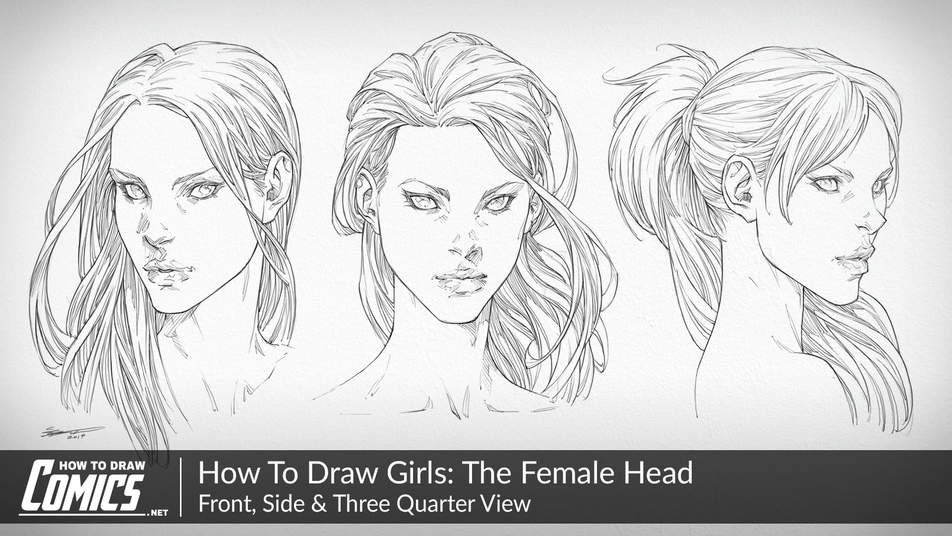
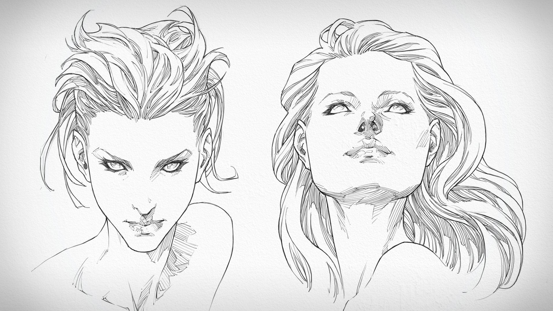
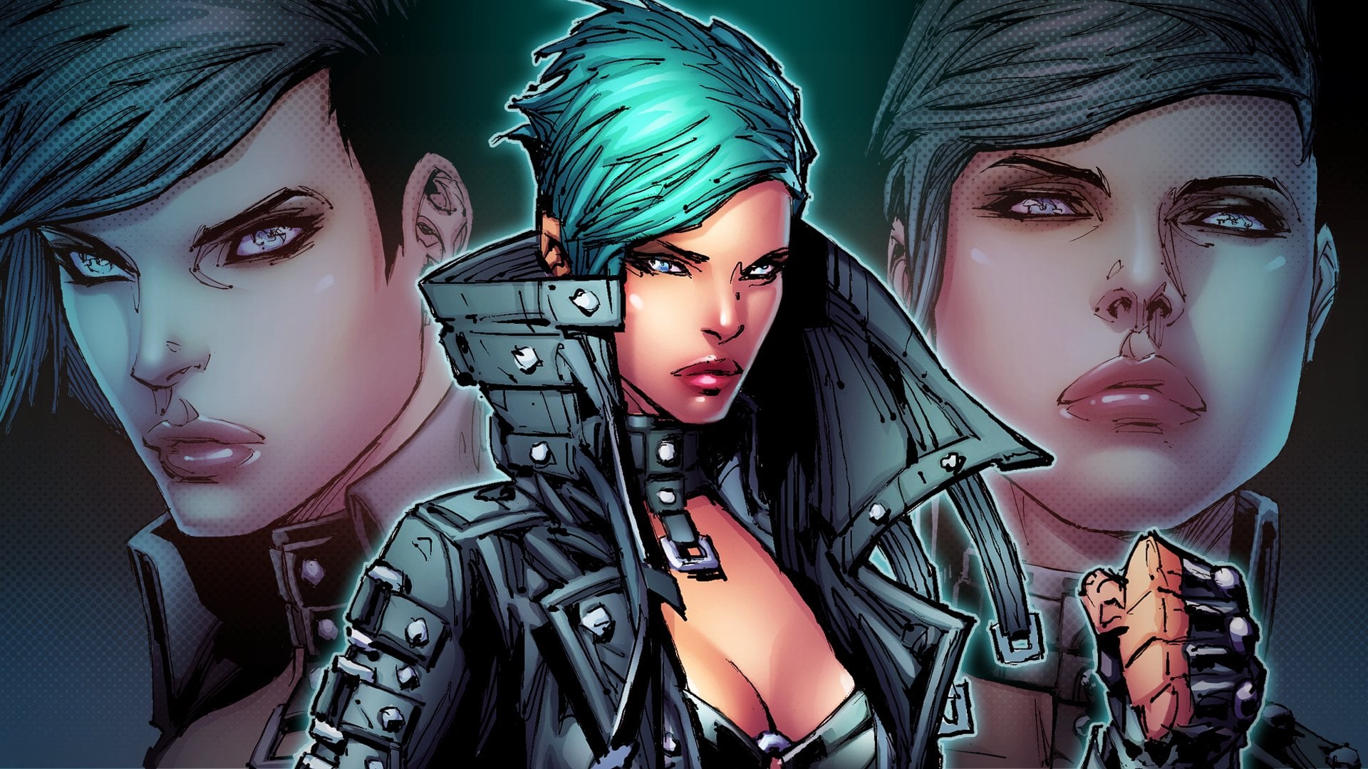
2. How To Draw Female Heads: Front, Side, Three Quarter Angle: comes to drawing anything, no matter what it is, it could be ahead. It could be a body. It could be the arms and legs. I always start out with a foundation that I can lay down onto the page in order to figure out how big my character is going to be, how they going to be posed in positioned. But most importantly, the basic structure, the foundation that I laid down before I begin jumping into the details or even the anatomy stage, is that this helps me to establish the proportions and for the head specifically, what this entails the foundations is a very basic structures. So this basic structure is made up of a sphere, which you can see me laying down now for the cranium, and I chop the sides of that sphere off to create the temporal areas of the head. And then I drove down a line straight through the middle of the face, all the way down to the chin where I place in the jaw and ultimately established the overall length off the face. And this is the same way I approach male heads and female heads, is not really a difference at this stage, besides the basic shape, which is also somewhat established here in the foundational stage. But once the foundations are placed down onto the page, the next step is to begin drawing right over the top and placing in the facial features and ultimately, the hairstyle as well, which will get to in just a little bit. But first off, I always like to begin with the eyes. The eyes are probably one of the most prominent part of the face overall, because that's where our attention locks on to first. Why does it do this well, when it comes to our ability to be able to emotionally connect with and relate with a character, it's the eyes that we're going to try to attempt to do this first and foremost because they're the most expressive facial feature next to the the mouth. And that's about it. I mean, the mouth and the highs of pretty much the most expressive parts of the face Overall. Then, of course, you got the sub expressions that conveyed through the subtle movements in the muscle structure of the face and that kind of thing. But when it comes to stylized comic book type characters. You're not really going to be too concerned with that. A lot of the way in which she convey the emotion of your character. I have the feeling that personality and you know their their emotional state. It's going to be through the eyes and the mouth and have their position. How they're expressing. Um, so you know, I like to start out with a very rough sketch, okay? Something which is light for the facial features, and I'll start out with the eyes, work my way down the face down to the nose and then the lips. And as I articulate the basic vory rough outline all that particular facial features that I'm working on, I'll begin to draw on top of the refining it. But in order to be able to do that, I've got to start out light. So noticed that when I initially start placing in the facial features or the jaw line of the character on now, in this case the hair, I'll start out exceptionally light, using very faint lines to establish the overall shape off. Whatever it is, I'm drawing the size of it and ah, then once that's down. When I'm happy with it, I'll begin drawing in the details, starting out with a more solidified Maura find outline and then afterward, placing in the rendering in the most subtle of details. Now, when it comes to female head, specifically, I like to keep things subtle, especially when it comes to the face itself. And when I'm talking about the face itself, I'm really referring to the area where the facial features are going to be placed. And then, of course, the neck as well. You really don't want to put too much refinement into the neck muscles, okay, they shouldn't be too defined, because that's going to ultimately lead to a character which appease aged or overly masculine, you know, and it's okay to have a masculine looking female head, but you don't want to sacrifice the femininity that actually makes it appealing in a feminine capacity, right? So you want to be able to show that the person that you're depicting is still a woman. Because if the viewers confused as to whether or not they're looking at a female character , a male character, then there's going to be a disconnect there. They is not going to be and established reinforce understanding off the idea you're trying to represent and the idea that they're perceiving. So you want to try to make sure that the idea you have inside your mind what you intend to represent to the audience is going to be exactly what they perceive or very close to it, because that ultimately translates into effective visual communication, which, as an artist, you're trying to do all the time. So with the basic overall shape of the characters hairstyle down onto the page, what I'm now doing is I'm working over the top of that, that vory basic structure that have established and I'm playing. I'm doing three things here. I'm placing in the main key outline, but I'm also rendering in the texture for the hair at the same time. And the reason that I do these at the same time is because, you know, I'm kind of letting myself creatively loose here, so to speak. You know, I'm not thinking about it too much. I'm really letting my hand just have free rein and and begin placing in the details without thinking about the overall method that I like to approach. Usually too much, Um, and the method that I would usually take on here if I was being careful because this is kind of risky business is I do the overall outline before placing in the rendering. But as I said, I'm kind of doing boys here. And the reason as to why I'm doing usually doing it one way or the other is because men are me my creative space. When I'm really feeling the the artistic muse shine through and I'm just, you know, I'm having a great time on the drawing board. I'm not thinking too much. I'm not over analysing the situation. I like to. I like to just take things as they come. So in this particular case, I am placing in the outline and I'm establishing the main contours within the hair, but almost like kind of breaking it up as I go and placing in that rendering. As I said before. Now, the way in which I like to place in the rendering is I'll consider where the key light source within the scene is going to be placed, and in this case it's going to be place from the top left of this particular characters head and as it shines down onto their head, what we're going to see is that on the dark side of the head, do so to speak. We're going to see more rendering and as that light full off turns from a light Grady and into a dark one as it travels down the length of the head, we're also going to see that same level of detail occur. It's going to start out light ish at the top with a minimal amount of rendering. And then as it descends down into the bottom part of the hairdo, we're going to see more. Rendering occur more cross hatches, while not really cross hatches, because there is no cross hatches technically here. But it just hatches right And those hatches are going to be placed finer and closer together, more compact, in order to create darker tones in order to increase the density off. That the tone that we're trying to establish here for the hair throughout the different areas in order to try to convey that let light for from the main light source. And not only that, but also the tone of the hair okay, and that tone can come from the color as well. So, for example, a character who has blond hair is going to have a lighter amount of rendering placed over the top of it, which means we're going to want to be very conservative as to how much rendering will be into place over the top off her hair style. And it could be very easy to over render hair. And it's something that I run into ah lot and probably will run into with these examples. Um, but that's why it's really important to make sure that you develop your ability to be able to balance the amount of detail you place into your characters at with the way in which they coming across visually. Because sometimes you know that that readability should be placed at the top of your list of priorities before any amount of detail. Any amount of rendering that's ultimately what makes a readable image, and the reason as to why you want to make it readable is your idea. Your illustration will be able to come across as clearly as it possibly can to the audience , because the more clearly that they can, I see it the more they're going to be able to understand it and connect with it. And that's really what I'm always constantly trying to do here, when it comes to you know, anything that I draw but more specifically here with the female character portrait's that you'll see me do up right now. And really, what I'm trying to get to come across to the audience is this sense of solidity within the hairstyle itself. This, ah, the sense of mass and volume, although that is described through the rendering of the texture that I'm suggesting within it with that rendering. So now that everything's basically established, you know, essentially all the rendering is done. The main outlines of placed in I'm going back over the top of the drawing, and I'm starting to docking up the lines where I think that there needs to be a little bit more emphasis place, and this is really a line waiting process. Essentially, where I'm getting, for example, you can see that I've darkened up the outline around the inside of the eyes there so that I can get them to stand out more so that their shape is most solidified. But now that this this first heads done. What I'm going to do is I'm graded and move on to our next one. And what you'll notice is that the process is very similar. I'm starting out with the eyes. You can see that I'm starting out very lightly here, placing in the overall shape for the I and the city and then the eyelashes and then the pupil and the iris. And above that, the eyebrows which kind of rendering quite lightly as well. And a placing in a few details there, justice, adjust the form around the eye socket itself. And then we moved down to the noise and then ultimately the lips. So again, no matter what head I'm drawing, no matter what angle we're viewing it at, I start out it with the same in the same order I s that begin with the eyes. And then I moved down to the Nori's, and then I ultimately moved on to the mouth and the lips. Now, when it comes to women specifically because we are kind of drawing up some female heads here, it's important to understand what actually makes them look like a female head, as opposed to a male head because there are certain characteristics that we kind of have to keep in mind, and those characteristics come down to the structure and this shape of the head. Most importantly, now let's talk about the jawline more specifically here because that's kind of what I'm placing in here on this one. It's important to make sure that the transition from the corners of the joy into the bottom of the chin when it comes to drawing a wimp woman is soft. Okay, you want nice around and edges and corners because this is something which is strongly associated to the feminine characteristics that have bean idealized and stylized. It incorporated into a lot of illustrations and, ah, most specifically comic book and kind of cartoon type stuff, which is again, it shows these idealized interpretations of the female head and the female figure overall as well when it comes to drawing the full body of a woman. But the reason as to why they've been an idealized is because, you know, ultimately everything is taken from reality, and it just so happens that in real life, what you're going to find is that women do appear tohave, a less chiseled aesthetic to their face. Just because they have a little bit more body fat, just a little bit. Not too much, but just a little bit. And this softens out. You know that they're cheekbones and the corners of their joy, as I was saying, and so you want to try to translate this over to your most stylized illustrations? Or even if you're drawing realistic portrait, it's important to still keep these things in mind. These these specific attributes that make your head's look feminine because at the end of the day, that's the cues that normally you're going to use to present them as being female heads. But also your audience is going to use to understand them as such. If you know the jawline of your female characters and on soft, if they chiseled in their jagged and their sharp well, you're just going to notice as a result that your characters, your female characters, begin to look more masculine, and that's kind of the effect I think of these as dials, right? These attributes this certain attributes that you can add to the shape off the face of your female characters that are going to make them look more masculine or feminine, and you can dial them in either direction. He can make them super dramatic, or you can make them subtle. It's ultimately up to you. You can't have masculine looking female characters. That's 100% fine. But just make sure that it's carefully balanced so that again the audience understands what it is they're saying. So now you'll see me placing in a bit more rendering around the face of the character. And just as I was saying before, we don't want to overdo this. It can be very, very easy to overdo it just because you are dealing with a female head and it doesn't actually take that much detail to suggest the various forms throughout their face because they're subtle forms and you want to try to keep them subtle. Now I'm a bit of a perfectionist, so I just erased the jawline that I'd place in previously for this female character, and I decided to redraw it back in because I felt like it was it was coming across as just a bit too masculine. And maybe you didn't even notice that to be honest, um, But you know it is. It is something that you have to be constantly monitoring within your work. You know? How does the character actually look? How are they coming across? Kind of taking a that zoomed out perspective every now and then and really considering not only how the drawing is coming together and whether or not it's it's structurally sand, but what the viewer is going to see when they look at it, whether or not it's going to be coming across in the way that you intended to. So just as before, we're moving on to the hair here for this portrait, and I'm a tackling that in the same way, I'm outlining the key contours within the hair as I render in the texture and break it up. And it really is the the act of breaking it up and in placing in those very thin, very subtle render lines that I do placing quite fast, you know, I try to get some energy in them as I as I drool them in that gives the hair this this textual feel, as if you know it's not just it's not just a solid helmet atop the character's head, but that it's actually made up of these strands now, one of the things that most people do from mistaking a little amateur artists will do not through any fault of their own. It's just that the way have this tendency to articulate every street single strand in the hair before we know how to draw hair. And it's because we know that it's made up of individual strands. But we don't understand necessarily that we don't see those individual strands from a distant. It's only if we were very, very close up to someone's head that we can actually make hat and and that the individual strands within their hair that makes it up. That's the only time at which will be able to see them as being visually, visually distinct from one another. But beyond that, when you're looking at it from any kind of distance, you'll see that those strands actually kind of blurred together into an indistinguishable form. Um, overall well, they become individually indistinguishable within that form, and that's what ultimately creates the shape for the characters hairstyle or, you know, the person's hair star that you are illustrating. And so you know it's important to put that first, you want to put the shape and the style of the characters, hair first and then place over the top of that. The textual details that actually make it look like it's made of strands or more suggest that it's made of individual strands. And you do that by simply breaking it up based on the overall structure. Again, you're breaking up that overall structure once it's established, which is really what that first stage was about when I was drawing that the overall hairstyle in very, very lightly before tackling the details. And so this is the key to maintaining integrity within the head, you know, because otherwise that shape can very quickly get lost. I have seen some artists actually tackle that tackle that the smallest sub clumps of hair before establishing that overall hairstyle, and that can lead to a bit of a mess later on down the track. So just as before and placing it a bit of a drop shadow underneath the jaw there to get the head to stand out against the next someone just to give it some height again. These cash, it does tend to add a a little bit more three dimensionality to the illustration, and then I'm playing. I'm going back over the top of those contours, and I'm starting to give them a slightly darker outlined by adjusting their weight to a heavy of variation and the areas in which I like Teoh kind of place. Thes Thika lines is around the hair as it kind of lays against the head. You know, just the outside of the overall hairstyle just to make it stand out and again to give it some lift. I'll do the same thing underneath the jaw line, as well as placing in that drop shadow. Just because the great thing about line weight variation is that it can add so much a depth to your artwork with that, the whole of the detail. It's really just the main contours that you're emphasizing and those main contours I go, usually going to be encompassing the key primary elements that make up the illustration overall. So with them emphasize, you get a better read on the artwork, and it's something that can make a huge impact within your art and really up it to that next level of professionalism. I noticed that when I first began using line weight variation within my art, that's when I really saw a jump within my quality of my work, the quality of the work, that I was able to produce it the time anyway. And then, you know, you learn how to use this stuff, you give it a try, and ultimately it reinforces itself within your your regular approach and you develop it from that point on to to ever greater heights. So this this particular characters hair the reason that I stayed so long on it, you know, tweaking the line weights and really trying to get the main clumps of hair to stand out a little bit more is because I did feel, is there. I over detailed it to an extent, and I wasn't too happy about that. Um, that was something that I felt I needed to do my best to address. Of course, at the time, I didn't realize that it was kind of OK, it kind of wasn't that bad. In hindsight, just because you know, now that it's ah, it's all done, you don't realize that when you're in the moment when you're there with it when you know you're completely submerged within the work itself and you don't have that that break from it to give your eyes a rest and to disconnect from it for a little while. You realize that, Hey, you know what? It wasn't that bad, but at the time, you kind of freaking yourself out. It's like, Oh, man, I need to fix this up I need to fix that up. But in order to really get a good idea as to how it's looking, it's important to give yourself a break so that you can get that fresh perspective when you come back to it later on. But I do feel a so her hair came out pretty well in the end, and all it took was just tweaking that the balancing of that rendering and that the hatches and making sure that I'm getting the correct read that I'm looking for on the hair as it's pulled and and ah, you know, overlaps against itself in different ways. In orderto create that overall formation that the the overall hairstyle ultimately becomes . So yeah, these at the with East to female portrait's done, it's time to move on to the last one, and you'll notice that here I've tried to show you an example off how a female head is presented from the front, how it's presented from the 3/4 angle or close to the specific review points. And now what we're looking at is the female head as it looks from the side, or at least close to the side. I don't like toe draw, you know, super diagram, attic looking illustrations that are exactly the female head. Just because I can kind of tend to look a little bit stagnant, it takes the illustrative aspect out of the examples that I'm showing you, and it just causes the outweigh toe look static. So I wanted to add a little bit more character into these particular examples, just to show you that you know a lot of the time when it comes to presenting the characters that you may create female or male, whether it be for comics, whether it be for video games or or movies, or you know any other form of illustration where you might be required to draw your female characters at, there's going to be very few occasions where you're looking at them straight on from the side or straight on from the front, because these are very, you know, I guess. Would you call them or the graphic views? You know, they're very technical views where it's it's not really natural to see somebody within that particular context. And so you want to kind of try to introduce a bit more of a natural have been more of a natural look to your illustrations that that make them Seymour riel. And I know that when it comes to learning how toe droll the female head and had a structure that can be good to learn first, how to structure it from the front and from the side directly. And, you know, even for the back in the back 3/4 and the direct 3/4. But, you know, ultimately, I think that you can get the same the same idea across through, you know, Nia side examples profile and portrait views of the head. Rather than having tea go for the you know, the very technical diagram attic viewpoint. I don't think that teaches you as much because it takes the life out of the character, and it takes the personality out of them, and I personally just do not like drawing the female head within that particular context again. One of the beautiful things about drawing is the fact that you were able to breathe you a little bit of yourself into the character. You're able to give them a life of their own just through your own expression. I mean, that's what art is at the end of the day. It's a form of your own expression. And when that can come through within the characters and the artwork that that you're presenting to the rest of the world, that's when you really start toe. See your see realist rations is having someone of a soul. Um, so again, with this particular example, the last example that we're going to do here of these somewhat standard views you can see that I took the same approach, started out with the eyes, went down to the nose and then moved on to the mouth, laid in the outline for the face itself, the neck, the shoulder and then established the overall hairstyle for the character, which I'm now beginning to refine, and the way in which I'm refining it at this point in time is a little bit more how I would recommend refunding, especially if it kind of new to this stuff where you're essentially just running a heavy, a contour over the top or the rough basic foundations that you laid in for the shape of the characters hairstyle overall and then over the top of that placing in the rendering. I'm not quite doing that exactly. You know, I'm taking an approach where it's kind of Ah, little bit more of both again. And that's just because I've been drawing for a while now. And I do tend to take a less structured approach, especially to organic materials such as hair. And you know, this would really be a hair tutorial when you think about it. Because hair, if you haven't noticed, already, takes the most amount of time out of everything else on the female head to draw. When it comes to you know, drawing a female portrait eso, you're going to find that a lot of your time is sucked up by it, especially if you like these characters here that you're looking at. They have somewhat extravagant hair styles that require a lot of time in a lot of effort to really articulate the way in which that hair is being pulled and stretched and and directed by the style that you've established for it, and to really indicate that that level of texture and, you know that's really what we're trying to do when it comes to the amount of time that we're putting into the rendering here. And everybody has their own method for presenting hair and style izing it, especially when it comes to this more comic book e type format. But ultimately, that's something that you've just got to develop for yourself and it comes down to a time thing. You know, I've gotten faster and faster at being able to whip up the hair for my characters in this, but using this particular approach, and I can tell you that it didn't take ah such a short amount of time. In the beginning, it was very took a lot of time to get all that detail place in there. But, you know, I'm of the a school of thought that the more you practice something, regardless of how complex it is, the fast you're going to get at it so you can get really faster doing the detailed stuff if you just practice it. But, yeah, you know, a game that doesn't change the fact that a lot of your time is going to be taken up with just placing in the details to this hand. I think that it really does. When you can take the time to do that. It creates a beautiful contrast with the characters face, which is relatively bear, an absent of detail and then the hair, which is pretty much the opposite. You know, it's got the most amount of detail out of the entire portrait. And so you know, it's It's really something that I think can add a lot of appeal visually to your finished artwork. And, you know, people just love contrast. They love contrasts in terms of the amount of detail that's incorporated into your art. They love contrast in terms of the different values that are at play as faras the levels of tone that you might incorporate within the character, whether it be through their costume or, you know, just through the head between the head and the hair like we've done here. People love that contrast because it helps to break up the illustration. It helps them to visually digest what it is they're looking at. But here's also really fun as well, because it is organic in its nature. It doesn't have to look a particular way, Aziz, Long as you're keeping in mind that the basic rules that make it work when you're detail ing it, you know, again, keeping in mind the light source. You know, in this case, and Cain were shining the light down of the character from the top left. And ah, you know, you want to make sure that in order, Teoh, tie that together Tiu make Europe work and grew in with the light source that you've established the character under. You've got to make sure that your shading it accordingly. So again, you're going to see more details added into the bottom part of the hair. Ah which is facing away from the light source or falling away from the light source. And ah and yeah, you just want to you want to try to make sure as best you can that everything is consistent , that the what you're trying to represent, you know, the light source and that the character that you're placing it under the forms that you're dealing with, the textures and the materials that have been incorporated, the colors, um, you know, and I know that we're not dealing with color here because these air in black and white but you know, color still has a particular value. For example, red hair is going to have a darker value, then yellow or white hair. So that needs to be taken into account as well. Because, you know, in that particular case, red hair is going to have more rendering incorporated into it than the lighter colored hair will or black hair. Of course, we'll have a ton of shadow and probably even more rendering than that. I don't like to necessarily waiver too much will make too much variation between the hair color of my characters to that extent. However, just because I know later on that when I do color it, I'll be able to color whatever color I want. So this is really just something that you'd want to take on board if you were purely just working in black and white pencil or ink for your come people characters or just, you know, your pencil illustrations that you want to do up over your female characters. But that pretty much does it as faras. How I like to go about structuring the female head from these basic points of view. And the main things to keep in mind is just to start out with that solid foundation the beginning, because that's really what's going to determine the success all of your female portrait's. And then what you want to do is build on top of that. You know, lay out the basic proportions, make sure that shape is looking good and then above that foundation, placing the facial features, starting with the eyes that noise the mouth and then moving on to the hair. You don't have to take it in that order, but I like to just, you know, out of habit. And that's the best way in which I've found works for me because, you know, I think the eyes tend to establish, you know the size of the eyes tend to establish this size and the proportions and the oh, and the placement sometimes off the other facial features, because you kind of drawing the other facial features in relation to them. And then, of course, you get the size of the face itself, which can greatly determine the look of your character. But that just about wraps it up. I hope that you've enjoyed this. Listen, thanks so much for watching.
3. Outroduction: thanks so much for joining me in this lesson. I hope that you took away a ton of useful information. Now remember that the basic overall workflow for designing a well structured female head is toe one. Start with the foundation K with a solid foundation. This ensures that you'll be able to get you're female heads proportionally accurate and that you'll be able to place the facial features in relation to one another in an accurate way. It decides them up accordingly. And then, of course, over the top of that foundation. What was then able to do is refine that basic draft that rough sketch and clean it up so that we can ultimately end up with an accurate looking drawing that slick and polish that looks professional. So again, I heard that you took away a lot of value from this lesson. Let's jump into the project
4. Class Project: Okay, So if we a project, what I'd like you to do is review the lesson that you just watched and make sure that you take note of how the overall workflow sequence is executed. So again, we start with the foundations than we lay in the facial features over the top of those foundations. We keep it semi rough and loose. And then once we're happy with that dropped, what would do then is will begin refining what's already there on the page. By working in this way, you ensure that your artwork, your door female portrait's are going to turn out in the best possible way that they can. Because you're putting in the grand work you're you're planning out the Oldman success over that drawing. So remember foundations first and foremost, then the refinement stages. And once you reviewed the lesson and you've carefully gone back through it, what I'd like you to do is draw up your own female heads. Do you want from the front they want from the side and do one from the 3/4 angle, and be sure to submit your project to get feedback with that said good luck and keep up the good work
 Clayton Barton, Harness the Power of Dynamic Drawing