Transcripts
1. Introduction: Hey you doing? It's Clayton here from how to draw comics dot net in this. Listen, I'm going to show you how to draw up the female head from the top down and the bottom up perspectives in the front of you were going to start off by laying in the initial foundations for each of these points of view. And then I'm going to show you how to refine them, laying in the facial features, making sure that we're able to come up with a slick, cool look and head do for the characters. And then what we'll do is we'll take that initial dropped and then we'll outline it with some carefully placed line weights and strategically place rendering to make the entire illustration pope with form and dimension. I heard that you get a ton of value out of this lesson. Let's jump into it
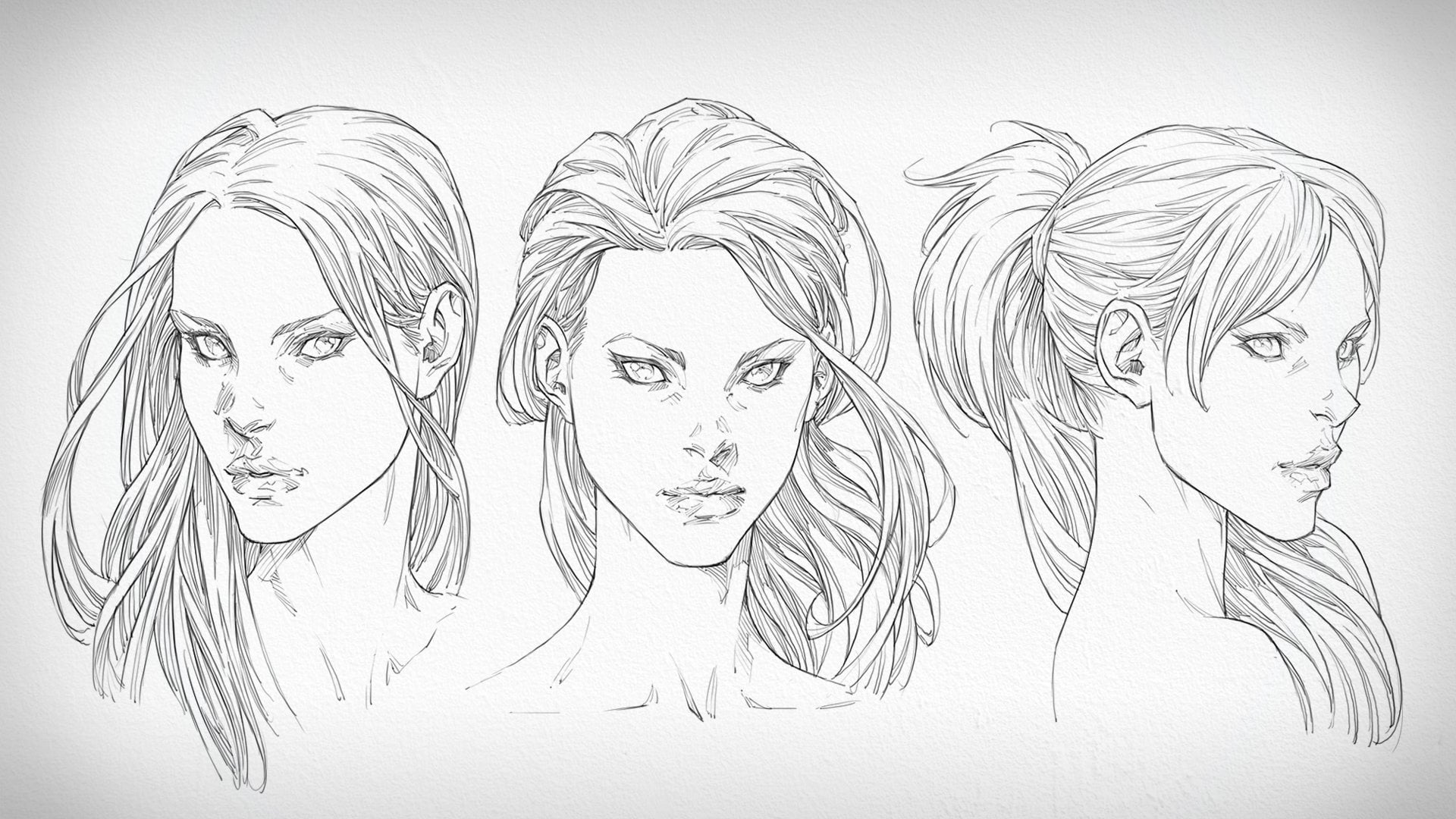
2. Downward Angle - Front View: Now we're going to jump into some tricky of use for this demonstration, and with these more dynamic angles, a solid foundation becomes even more important. So we're still using the same fundamental building blocks to construct a basic head. We've got a sphere for the cranium used to get the scale end, positioning of the head sorted to begin with. Then we had the face which is built off of that. And of course, from there we put out where the facial features are going to G o, except this time looking at the female head from the top down and bottom up, the proportions of the face are going to become foreshortened. As a result, we see some pretty significant changes, not only with where the features are going to be placed, but how they'll be shaped along with the shape of the head itself. Because as the head turns downward away from us or upward, everything becomes skewed by the perspective. Luckily, in these examples, we're looking at the up and down tilt from the front, so we're really, really seeing the effects of that four shortening along the vertical axes. Even so, it's a tricky situation to navigate around, but we'll do our best here. With the foundations down, we're ready to draw in the facial features, starting with the eyes. I always start with the eyes because I think they're important, especially for women. A woman's eyes, a mesmerizing. They draw you in and hold your gaze. That's likely due to the thick eyelashes and mascara we give them for emphasis, but most importantly, feminine allure. Let us help. Now that we're looking at this lady's head from above, the shape of the eye has changed. It kind of straightens out along the top. It's not as curved, but then with the bottom eyelid. We see how that curve is steep and as it wraps around the eyeball, the eyebrow is also sitting much closer to the I now. So why is that? Well, it's because of how the head is structured and the relationship between the brow line and eyes. The brow acts as a roof that hangs forward over the eyes to shield them from rain, sweat, dust, snow son and anything else that could potentially irritate or damage our eyes. The I sit back inside the skull, and so looking at our lady head from above, the distance between the brow line and island becomes narrow. Uh, in fact, the high we get, the short of that distance is going to become. If we get high enough, the brow roof could potentially obscure the Aysel together. This goes for anything that protrudes or recedes on the head of this angle. Anything protruding such as the brow and tip of the noise, is going to sit lower. Anything receding will be pushed higher. It's an optical effect, but on a basic level, that's what's happening. Here's some other interesting things you'll notice whatever sitting further back on the head, such as the years or the corners of the jaw, thou be raised along with the impressed facial features like the eyes and opening of the mouth that sit back inside the skull. Anything sitting forward like the front of the face as a whole, for example, will be lowered. Essentially, we're distorting the heads geometry in perspective here, and I know it sounds really complicated, but actually it's not when you begin thinking back to that basic foundation. We started off with its those basic forms that were working off here, and that's really what we're attempting to put into perspective. As long as you keep the basic rules in mind for the top down view, you're going to be fine. So let's go over a few of them before I start talking about the hair because we'll have heaps of air time for that. Since Hair takes a fair wild Orender, let's focus on the face itself for a moment and have a top down perspective modifies its shape. Looking at the jawline, we can see that from this point of view, the corners of the draw sit much higher than they would if we were observing the head at eye level. The corners of the jaw sit further back. So in this particular instance, they'll appear raised as the head turns downward, the chance It's Ford. So what are we going to see? As a result, the opposite effect. It's going to drop, elongating the distance between it and the corners of the jaw. As for the facial features, the underside of the nose is completely hidden in this viewpoint, so we only see the top bridge inside planes again. It'll drop down further toward the mouth like the brow. If we were to rotate it in an even more dramatic downward direction. The nose might very well completely overlap the mouth all together, never mouth in itself is interesting because it's in the upward and downward angles that we're able to get a better look at the cylindrical curve it follows. It doesn't travel across the face in a straight line. Instead, it bends around it. If you look in the mirror, open your mouth and tilt your head back or forth. You'll see that your teeth following arch and so does the opening of the mouth. The more we tilt the head away from us, the more significant that Arch is gonna get. In this example. We're looking at a beautiful lady head from above, so the mouths curve will follow a downward arch like a shell au. So that's the opening of the mouth. But how are the lips drawn from this point of view? Well, we're going to see the same thing happen with the top lip that we saw with the underside roof of the brow. It'll become narrow. Uh, it's more hidden as the head tilts downward. The bottom lip, however, is more exposed. We see more of it were able to see more or less of the planes that make up these features, depending on their angle, a point of view and the perspective. We're looking at the men, all right, so we've talked about the features and the way they're affected when drawing the female head in the top down perspective. But what about their placement? How are the proportions of the head and the proportional relationships between the features affected? When we start applying perspective to it, we actually start to see some pretty significant changes there. And one might argue that everything we know about the proportions of the head becomes a useless at this point. Because of that, that's not true. The proportions of the head is still well and truly intact there just foreshortened. In other words, as the head tilts away from us, the placement of the features begin to recede relative to their proportions. What does that mean? Well, it means that the face can still be broken up into thirds with the brow line on the 1st 3rd nose on the second and chin on the third, the bottom half of the face below the noises still split into thirds to find a placement All the mouth to accept. These measurements are all scaled according to the perspective, as the head angles away from us. The distance between the features contract. As it angles toward us, they expand. How does that apply to this lovely lady head in particular? Well, the top of the head will be bigger, with a greater distance between the facial features well toward the bottom. The face will become narrow, and the distance between the features will get shorter. Look, we're getting all technical here, but don't overthink it. What we're seeing happen is essentially, what would happen if he took a basic Cuban tilted it on a downward angle. He is the basic head model to plot out the structure and proportions as best she can. Then give it your best shot. What you'll find is that your natural intuition is going to kick in and you'll be ableto wing it while keeping what I have said here in the back of your mind. If you start to get too calculated and precious about nailing the exact proportions of the head according to the perspective, you're drawing it in. You're out is just going to look to manufactured used this stuff as a guide to help you when you need it. Use it to cross check your work so that you can figure out where things might be going wrong. Then address them at the end of the day. You're an artist, not a mathematician, So give you so some creative liberty here. At this point, this girl's hair is essentially blocked out and rendered to a fairly high degree of details , so we'll save that explanation for the next example will go over here in a minute with the drawing basically done, though, it's time to go back over what we've done and add the garnish I'm talking about. Those slick looking line waits in the subtle rendering that's really going to make this head pop off of the page. This is the easy part and the fun part where we get to refine the drawing and give it that final polish. Okay, so specifically, how do we go about that? We're going to go over the top of the major outlines and darkened them up the surrounding contours of the face, ears, eyes, base of the nose and mouth. I want to emphasize the lines to get these areas of the drawing to stand out look one way too great for a lot of things, indicating light direction, adding variation to the thickness of your lines for visual interest in aesthetics. But by far the best thing they bring to the table is a sense of depth at this stage. That's the number one thing at the top of a list of priorities. Introducing as much death to the drawing as possible. Cash out is a great for this to the only Carney's. They're a pain to render number that how many times I've gone through this, I still have trouble composing the hatches inside my car shadows. The reason for that, at least for me, is because, unlike regular rendering, were no really trying to describe form here. As much as we're trying to indicate the shade of time, because literally we're rendering the shade of one object being cast over another. In this case, that would be the cash shadow of this girl's head over the top of her neck. Now, that's not to say we don't want to indicate some sense of form at the same time. It's kind of a mix of boats, but you really want to give the impression that this is a projected shadow that's being cast by another form, not the shadow of the form it's being cast upon. So I try to angle the hatching in a somewhat randomized direction within the car shadow that still indicates whatever form it's blanket it over. It's a bit of a balance, and Anil honesty. It comes down to aesthetics. If it looks right, it probably is right. But until that point comes just a race and rework it as much as you need to a case. It went back onto the hand now, and I'm pretty much doing with it what I've already done to the face. I'm emphasizing the major forms within the hair with some well placed line weights. And make no mistake, Hess certainly does take on and follow a form of its own. That's essentially what shapes its style, and we've got to describe it as visually as possible, a middle that detail because without that emphasis, it can easily fall apart. The form hair takes on should be what the eyes sees first, the texture, tone and shading created within it there as a complementary addition to help describe its shape. In fact, I think of all rendering besides car shadows in the same way I think about most other surface details. Every hatch needs to fall is a form to help describe its surface texture or material. If it doesn't, then the integrity of that form will be tarnished. It won't appear to be the shape it was intended to be, and it's so easy for hair to fall into the trap of becoming an unreadable mess due to an abundance of detail. Copious amounts of rendering is fine, but it's got to be balanced within the context of the major form. It's being drawn within. For example, you can clearly see how this character's hair is shaped, how it flows and how it's laid. Three. The carefully contrast of light and dark times created by the rendering at the top, where the light is brightest, there's a minimal amount of rendering, whereas the underlying of layers that are evil acts by the looks above have an increased level of rendering to darken their time. Combined with the line weights I'm using to emphasize the separation within the hair. This makes it much more readable. It makes sense visually. What you're looking at is easily understood. All the while, I'm pushing the depth of the Hera's well. It's got a real textual feel to it now. Truth be told, I went a little crazy on the hairdo for this one. Not sure what kind of vibe I was going for. Maybe a wild punk chick that had a bit of an attitude. I got no idea you could have a lot of fun styling the hair of your characters, that's for sure. Sometimes I don't really know what I'll come up with until I start blocking out a basic shape for a style I think might look cool after you start breaking it up in defining the layering. Even the most out their hair stars usually come together pretty well. So you've got quite a bit of freedom, which is why I try to complement the overall aesthetics. Old the character with the hairstyle I choose for her. It's an extension to their design
3. Upward Angle - Front View: So for the most part, the top down view of the female head is done and dusted. Now it's time to move on to the view that many of us find to be the most difficult to draw the bottom up. View the view of the head where your below and you're looking up at it. We've already got the foundations down, so we'll talk about how the base model of the head is affected by this angle in a moment. For now, you can see me jumping straight into the facial features, starting with the eyes as always and moving my way down to the nose, mouth and out of the ears. The way I'm drawing the facial features here directly opposes the way I drew them in the first example. It's a complete contradiction to what I just told you, because now the brow line is raised whether eyes alot it, creating a significantly greater amount of distance between them. We get a good look at the underside ridge of the brow as it extends over the top of the eyes. Usually you'll find a little bit of shadow gathering in this area, too, so I've added a hint of rendering to indicate those darker tones in the bottom up view of the head, the bottom plane of the noises also revealed. As a result, we're able to see right up the nostrils of this lovely lady. We've got to be real careful with the size and shape of the base of her nose, however, because if we're not that pretty schnoz might end up looking like a shorty snout. And that's definitely not something we want. This was a problem I used to constantly run into, and the way I avoid it now is by drawing ah light outline for the underside plane first, just to capture the right shape and to make sure it's sized up correctly before I start adding in the nostrils. Also, you've probably noticed by now that in the bottom up perspective, instead of pulling away from the eye line the tip of the noises a raised up toward the eyes , and if we were to tilt the head back even further, we'd see it extend above them. The mouth curves upward now, too, and we Seymour the top lip than the bottom lip. In this instance, everything is reversed, which in a way makes it easier to remember if you've already learned how to draw the downward view of the head from above. You just take the opposite approach for the upward view from below. Instead of sitting higher, the east sit lower. The top of the E is still aligned with the brow, and the bottom still lines up with the noise. It's just that this alignment within their proportions is bent by the new perspective. We're viewing the head on to find this curve that, simply fully the bend of the guidelines that wrap around the vertical and horizontal axes of the spherical form I used to establish the cranium during the foundation stage. The construction process is still the same is drawing the head from any other viewpoint. We start with the bowl of the cranium, divided into quarters slice of the sides and extend the face off the front of it. Except the divisions. And the measurements used to find the length of the face have now been skewed by the four shorting applied to it. In this perspective, they're still there, and we can still use them. It's just that they distorted, squashed and stretched in different ways now. What makes this view so difficult to draw is that the jawline is basically inverted. The point at which the chin aligns or even sits higher than the corners of the George depends on our vantage point and how far back the head is tilted. But in this circumstance, the angle is dramatic enough for us to see the underside of the jaw. This isn't something we're used to seeing, so it looks weird, even if you've managed to draw accurately when the face becomes this foreshortened. As a result, the length and width of it are hard to determine, which is why a lot of a racing and tweaking is involved to get it looking correct. All right, that's the head sorted. For now, let's talk about hair. You can see that I've gone for somewhat of a majestic looking hairstyle here. As usual, I started off by blocking in the basic shape with light, wispy lines that captured the movement, gesture and liveliness I wanted the herto have. He needs to look alive. It's dynamic and most of the time, in constant motion with the characters movements. This is one example where we can really see how the hair complements the characters, mood and vibe. We get the impression that this woman might be a princess, queen or even a warrior, but certainly someone with power and a certain amount of majesty To them, hair styles can completely influence the way we relate to and feel about a character. It's a significant part of their design and one that requires careful thought while I'm drawing in the hair, I keep my arm and hand loose and relaxed if my grip is rigid that that'll show through in the lines and stiffen up the drawing. This is especially true with hair, where you want that natural flow to come through. Once the overall hairstyle is blocked in breaking up and adding texture to it is easy that basic blocking in states really determines the direction we end up taking with all the refinement and details that follow. So it needs to be there. Otherwise, there's a very good chance will lose our way. Working from simple to complex is the number one surefire approach toe winding out with a successful drawing as I start rendering the hair, splitting it up and giving it depths with those darker tones. I'm considering a couple key things. I'm asking myself from which direction is the light source projecting onto my character? And how is the hair layered? Those two things give me an indication as to where the hatches need to be placed, and if I'm able to place them in the right spot, the hes going to pop convincingly with a greater amount of depth. Regardless of the characters hairstyle, I tend to take the same approach to hair every time. When I don't I end up getting lost in the process. This approach took some time to develop it to the point where I was able to repeat it each time and get a consistent result. I looked at loads of examples from various other. Rod is observing how they went about drawing hair. The biggest discovery I made through doing so. Was there knack for simplification, and my greatest obstacle was making the hair I drew for my characters too detailed, and it still is pretty detailed. But the main problem was my approach was overly complex and unorganized. It just wasn't straightforward enough, and when I looked at the way, these other artists drew hair it hoped to me realize that I didn't have to make it so complicated for myself. You could still illustrate beautiful, lustrous hair with very few lines, as long as you were able to capture and maintain the overall style and flows throughout the process. And that didn't just mean its outline, but also how the foreman volume old the characters hair was described through the rendering . We tend to really overcomplicate things for ourselves when it comes to drawing most of the time. This is because in the back of our minds we think it has to be complicated because it just couldn't be that simple. But that's where real must re is born in your ability to simplify the process by taking the complexity out of it and streamlining your workflow, you might always feel challenged by Iraq. You want to hope that's the case, because that will keep you hooked on it, keeping striving to move forward and do better. But drawing an illustration shouldn't feel like an ordeal, even after you've learned in practice the skills required to execute it. Hair can feel like that sometimes for sure, because it can be very detailed. But if you optimize your approach, it will be an aspect of drawing women that you're able to navigate with these. I've gone around the face placing in some subtle rendering, and now I'm trying to compose the hatching inside the drop shadow beneath her head. From this angle, it's difficult, because I've got to somewhat describe the structure off her Jor and neck the throat area. In general, there's no one rule you can follow that's going to work each and every time. For something like this, every drawing is a unique case. What you can get good at is how you handle the approach. And for me, that includes being aware of the lights set up and the forms I'm dealing with by form. I mean, the simplified mass is that the anatomy and structure within any given area of the head is composed off. Doing this at least gives me a clue as to where I might start. And then it's just a matter of being brave and taking the plunge and having a go. Sometimes the first thing you'll try will work out just fine. Often times it won't. So you've just got to a race and redo the parts that don't work out. This is certainly the case for me when it comes to rendering and car shadows, especially in this context. Truth be told, I'm still not entirely happy with it and will go back to change it later on. For now, though, I'm going back over the main contours, all the drawing to define them with heavier line weights so that they stand out more and in turn, give this lovely lady head a better visual read line. Waits solidified, drawing and when it comes to areas within it that a pact with details such as the hair they needed more than ever to clear up any visual congestion, they somewhat shopping the drawing with greater clarity, which ultimately leads to the alluring aesthetic you might see in a pro piece of comic book art. You'll get what I mean as soon as you start adding them to your work line. Weights have an immediate impact on the perceived quality of your comic art, I say, perceived because land weights can even make a mediocre drawing look way better. There's a simple addition that makes a huge difference while I lie in wait, the hair I'm also laying in some more rendering to further break it up and increase the level of depth. This is all done through a greater amount of hatching, which varies in terms of sickness and density, depending on how light or duck I want the tone being composed to turn out. I've also dropped in some car shadows within the hair itself, just to give it an extra boost of three dimensionality. This additional pass of rendering really helps to give the hair form and emphasizes the layering all those luscious locks with further separation between the values. Rendering is tricky at first, and it takes a wild so literally develop a rhythm within your wrist that will allow you to lay those hatches in with a very natural intuition toward their composition. The biggest hurdle with rendering is comfortable ITI and confidence. That's when you'll find that you are able to pull up the best rendering when you're anxious and nervous about it. It's easy to overthink the whole process, but you'll get used to have these hunches function over time through practice and lots of it. You'll grew familiar with the different tonal ranges that can be created As you experiment with the spacing thickness shape n trajectories of the hatches, you'll figure out the best approaches for creating the Grady INTs, describing form, texture, materials. Most of this is just the process of getting to know yourself as an artist and the way you uniquely like toe work. Not everyone constructs a drawing in the same way, nor do they shade or render it, and that difference manifests as their style. You've just got to give yourself the room to explore your own process and develop it from there. So now I'm revisiting the underside of her jaw where we see it connect to the neck. I'm not happy with how the shading looks in this area. It's not really describing the shape of the forms with dealing with accurately. And the darkness of the tones don't quite work, either. Which means I've got to do a little experimenting here, and the first thing I'm trying to do is emphasized the Jolan itself with a darker shade. I want to separate it from the underside plain of the Jordan to describe the anatomy around this area more accurately, because the jawline is usually more distinct, appearing as a thick delineation around the bottom of the face, and although I've managed to get it standing out a bid more, the base of the George still just looks way too flat. So what I'm going to do instead is erased the entire drop shadow completely and have another go at rendering it back in this time, I've started out by establishing the Jolan first with a series of hatches to define its edge and lifted it up higher. Then I shade the bottom of the door neck. To do this, I'll outline the area or a one Orender first, then lay in the hatching. This is pretty much the same approach. I'd take two delineating the shape of a shadow that would be completely filled in with black. It's just that with dealing with a lot of turn shadow here, so I'm filling it in with hatches instead. This area is looking much better than it Waas again, the way drop shadows full, and then how the hatches a composed within them to convey a particular tone and shape at the same time is difficult. So it usually takes a multiple attempts, at least for me to get right in general, the viewpoint of the female head that we're looking at here is difficult to draw for multiple reasons. But this part in particular is really where I still get stuck, and the more I try to fix it, the more I tend to overthink it, which certainly doesn't help. The reason this happens is because there's no one way of doing it. I could shade this area anyway. I like, as long as it doesn't look incorrect. And from this angle know, many people know what incorrect looks like, let alone whether or not the drop shadow is crosshatched accurately. No one really knows how it should look, so they wouldn't know any different. So in this instance, it's less about striving to get the bottom of the jaw and drop shadow toe look right and more about making sure it doesn't look wrong. There is a space in between right or wrong, where as long as it looks okay, you'll find what I'm saying is that you've got some room for error in a situation like this , at least to an extent, so I just keep on a racing and experimenting until I find a good compromise I know it won't be perfect, but I also know that it will be possible. It's good to think of drawing in general as less of a literal replication of reality and more as the suggestion over an idea. That's all the audience needs most of the time, and they'll be more than satisfied with it. And that wraps up at demonstration for the up and down angles of the front of the female head. These two viewpoints are probably the most difficult for me personally, but if you're able to master them, they can be used to convey your female characters with an incredible amount of intensity and drama. Remember, it'll begins with the foundations. If you can nail them first, it will set the stage for your success when drawing the female head from these angles.
4. Outroduction: thanks for watching this list, and I hope that you learned a ton off valuable information from going through this demonstration. We went over how to draw up the top down view of the female, had had a drawer from the bottom up and along with that, covered a whole bunch of different techniques for line waiting the drawing and rendering it out it to create a finished professional looking illustration that presented the female head from these dynamic angles that are quite difficult to draw. So let's jump into the first assignment here and get started.
5. Project: all right. So for this assignment, whatever like you to do is go back through the lesson that you've just watched review on an extremely, very careful and an unethical level exactly what the processes that we went through. Remember how he laid in the initial foundations? That was the most important part. But it's Herman ing the success of our drawing for giving us the best chance off over drawing that was going to look accurate, which is going to stand up on its own, which was going to give us the best possible outcome that we could ask for. And then what we did was relating the facial features based upon that initial foundation. And, ah, ideally got them in the correct perspective within the correct proportions and the correct spacing between one another, so that we were able to present the head, end its features within these angles in a convincing away, and then ultimately refine that draft made sure that we articulated the main outline with some carefully place line weights and then the rendering, where we detailed out the hair and gave it a little bit of texture and volume, and articulated some of the subtler forms within the anatomy of the face itself. What I'd like you do to do after you've gone through the lesson again is I'd like you to get out your sketchbook after your reviewed it, and then sketch up your own female heads from these perspectives and see how you go. And if you run into any trouble if you free to go back streets, a lesson that's the beauty of the being of video is that you can rewind it and review what we've gone through thus far to refresh your memory to make sure that you're able to break through those obstacles that you'll inevitably come up against and so just guide you along the way. That's where you're going to get the most value out of these videos when you start putting pencil to paper, putting everything you've learned into action and actually executing some of the techniques and lessons that we've gone over in this video. So good luck. Thanks so much for watching and, uh, just do your best until next time. Keep on practicing, keep on creating, and I'll see in the next lesson
 Clayton Barton, Harness the Power of Dynamic Drawing