Transcripts
1. Introduction: Hello and welcome to my series; colored pencils, the
beginner's class three, luminance sketching dynamic textures with
colored pencils. Have you always wanted
to know how to use colored pencils to produce
gorgeous textures and effects? Want to learn some new
techniques, tips, and tricks? If the answer to any of
these questions is yes, then this class is
perfect for you. My name is Imran. I'm a graphic designer and
illustrator and I'm totally obsessed with colored pencils and art materials in general. I've been using colored
pencils for many years now, many different brands and
types of colored pencils to do sketches with in my sketch
book on a daily basis, on scraps of paper, on larger surfaces
that I do complete illustrations with that are
ready to frame and print. This is the third
class in my series, colored pencils for beginners, which will build upon
the techniques and the knowledge that we learned
in class one and class two. In this class, we will look at a three awesome techniques to build some fabulous effects and textures and we will
demonstrate this by using the illustrious pencil known as the Caran d'Ache
luminance pencils. We will look at the basic supplies that are
required for the class, then we will delve in to the
exciting world of creating color textures that are easy to produce and look
absolutely fantastic. We will move on to
designing highlights with some amazing tools
that you may or may not have seen
before, and finally, we will apply
different mediums to create interesting shadows and dark tones that can be fully embedded into our
lovely illustrations. We will then bring
all the techniques together in a beautiful, easy to follow
step-by-step full sketch. On completing the exercises within the lessons
and the full sketch, you will then be ready to delve into the
wonderful world of magical colored
pencils and produce your own beautiful sketch
in your class project. What are you waiting for? Grab yourself a nice drink, get yourself some nice treats, get them pencils sharpened, and let's get ready
to start the class.
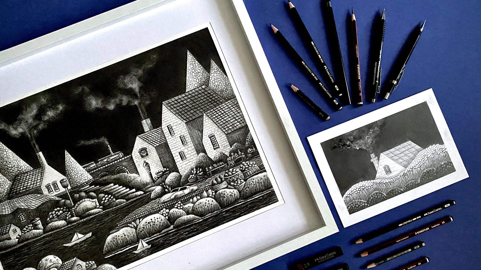
2. Luminance Pencils: Okey-dokey. Let's now talk about the main supply for this class
that you'll need and yes, you guessed right, that
is the colored pencil. Now you can see here, I've got some nice
colored pencils here. The ones that I'm going to
demonstrate in this class are the Caran d'Ache,
lovely luminance pencils. I'll just show you
the little leaflet that you get within this. This is the luminance 6901 by Caran d'Ache and these
pencils are absolutely great. Now, remember, you
do not need to use this particular
pencil for this class. This is just the third type of colored pencils that I'm demonstrating in this series. If you remember, we went through the Prismacolor colored
pencils in class one, then we went through
Polychromos color pencils in class two and in class three, I'm demonstrating with this
gorgeous luminance pencil. Now, this is a soft core pencil. This is very similar
to the Prismacolor. The biggest difference in this
is that it is light fast. Lightfastness, if you
don't already know, is all to do with the ability of a color to stay
permanent over time, so it won't fade out. Again, we covered this in
class one in a lot of detail. So do check that out if you
want a quick little recap. But again, it's absolutely not necessary for you
to go ahead and buy these particular pencils for this class because these
are very expensive. The actual set, the Apgar
is the 76 sets over here. I'll just bring that
onto the screen and that contains a whole raft of different
colors and sizes. Absolutely gorgeous. It comes in really nice box. But again, you do not need
to buy this for this class. If you happen to
have these pencils, then absolutely go ahead and grab hold of them and
get them sharpened, so we can get ready and
enjoy this journey. But if you haven't got these, then it's absolutely fine. However, if you
really want them, if you have this huge
burning desire to buy these gorgeous pencils that come with this
fantastic lead, then absolutely go ahead
and get them if you want. I'm going to leave some recommendations
on the sizes of the sets that these come in, in the resource packs. Do have a lookup that if you want to really get
yourself some of these. I would never recommend buying a huge set like this when you're starting off in colored
pencils or even if you want to try
out a new medium, I would always start off
with a smallest set. Now, the smallest sets can be a little bit more affordable. The great advantage of
this pencil is that you can buy them in singles, whereas with the Prismacolors for people in the UK
like me or in Europe, we can't buy those particular
pencils in single. Once they've run
out in your set, then you're going to end
up having to buy more. That's why I always
prefer to use this pencil when I'm
doing continuous artwork. I'll just quickly move
this to the side aside, and let's just focus on
the ones that we have. To quickly go through this leaflet and talk a
little bit about this. You've got this beautiful,
gorgeous leaflet here. Let's see if we can get
a zoomy zoom on this, and then it basically
just goes through what the characteristics
are of these pencils. In summary, these are just
intense, bright colors. They have high pigment
concentration. The smoothness and superior
covering power in them really surpasses a lot of other brands of
colored pencil, and they are lightfast in compliance with the highest
international standards, which is according
to this ASTM D 6901. Haven't got clear
what that means but that must mean
something special, but basically, these
are very lightfast. Once you create your
artwork with these, they will not fade over time, and again, it's just a
personal preference. However, if I had the choice of using these and using
my Prismacolor, I would probably because
of the experience, just stick to the
Prismacolors because the buttery consistency
of Prismacolor, I don't even think these
Caran d'Ache luminance can even come close to. These are really nice and smooth and the lay
down is great. Even with the Derwent Colorsoft, you get really nice
smooth lay down. But I just find that
because I've used colored pencil dip various
brands over the years. I just can't find the
color pencil that gives me that gorgeous consistency bottle like velvety, smooth lay down of color
that the Prismacolor do, which we went through
in class one. Again, if you ask me what my favorite
color pencil to use for experience and just
for a nice enjoyment, I would say that it would
be the Prismacolor for actual light fastness and
longevity of my artwork, I would use either these ones, these current national
luminance pencils, or I'd use the
Polychromos pencils that we went through in class 2. That was just a quick
little discussion of the pencils, the
colored pencils. Again, grab holder
whichever colored pencils that you have in this class. If you have the
softcore ones like the prismacolors or
the Derwent Colorsoft, then that will probably be better when you're
following the class because it will be able to
imitate the softcore lay down that we do in the
lessons in this class. Now, let's move on to the other materials and tools that you will
need for this class. Let's look at that next.
3. Class Supplies: Welcome back. Let's
now talk about some of the additional supplies that you will need for this class. Now do remember, it's
not necessary that you have every one of these items that I have got on
the screen here. If you have these at hand, then that's absolutely great. If you haven't got them, then don't go ahead
and start buying these individual supplies
just to complete the class. It's just something
for you to see when I demonstrate using
different techniques. But if you want to go
ahead and get them, then absolutely do this. All of the reviews and links of these particular
supplies that I'm demonstrating will be in
the class resource pack. So do check that out. Let's quickly go through the supplies and
let's start off with the one that you're most
likely going to have and that is the Humboldt pencil. Just get yourself any pencil
that you have lying around, a HB will be absolutely fine, and this is what we're going
to use when we come to doing the lessons that are towards the middle part of this class. Secondly, make sure that
you have a sharpener. Now, this is an absolutely must, especially when using
colored pencils, not only to sharpen your pencil, but to sharpen your
colored pencils as well. Ensure that you have
a decent brand or a decent type of
sharpener that will sharpen your pencils
without breaking them. I went through
different sharpeners in class 1 of this series, so do check that one out. I'm using this
standard 1 that I've got here that works
absolutely fine. Again, try avoid using the cheaper
sharpener because they tend to just break the cores of the leads
in your pencils, so that's something
to look out for. These are the two
items that you're most likely going to
have lying around, so grab hold of these
and get yourself ready. Now, let's move on to these next sets of items
that we have here, and we're starting
off with the blender. Now, this is the dry blender
for colored pencils, and the one that I'm
using is the one that I used in the previous classes, and This one is by Derwent. It's just a standard blender. Now, if you haven't
got a blender, then don't worry about
this because there is other ways of blending colored
pencils that we will do, and I'll demonstrate
that when we come to that part of the lesson. If you have a
colorless blender like this with your colored pencils or if you have one on the side, then grab hold of that. That's going to come very handy. We are going to be using that throughout the lessons
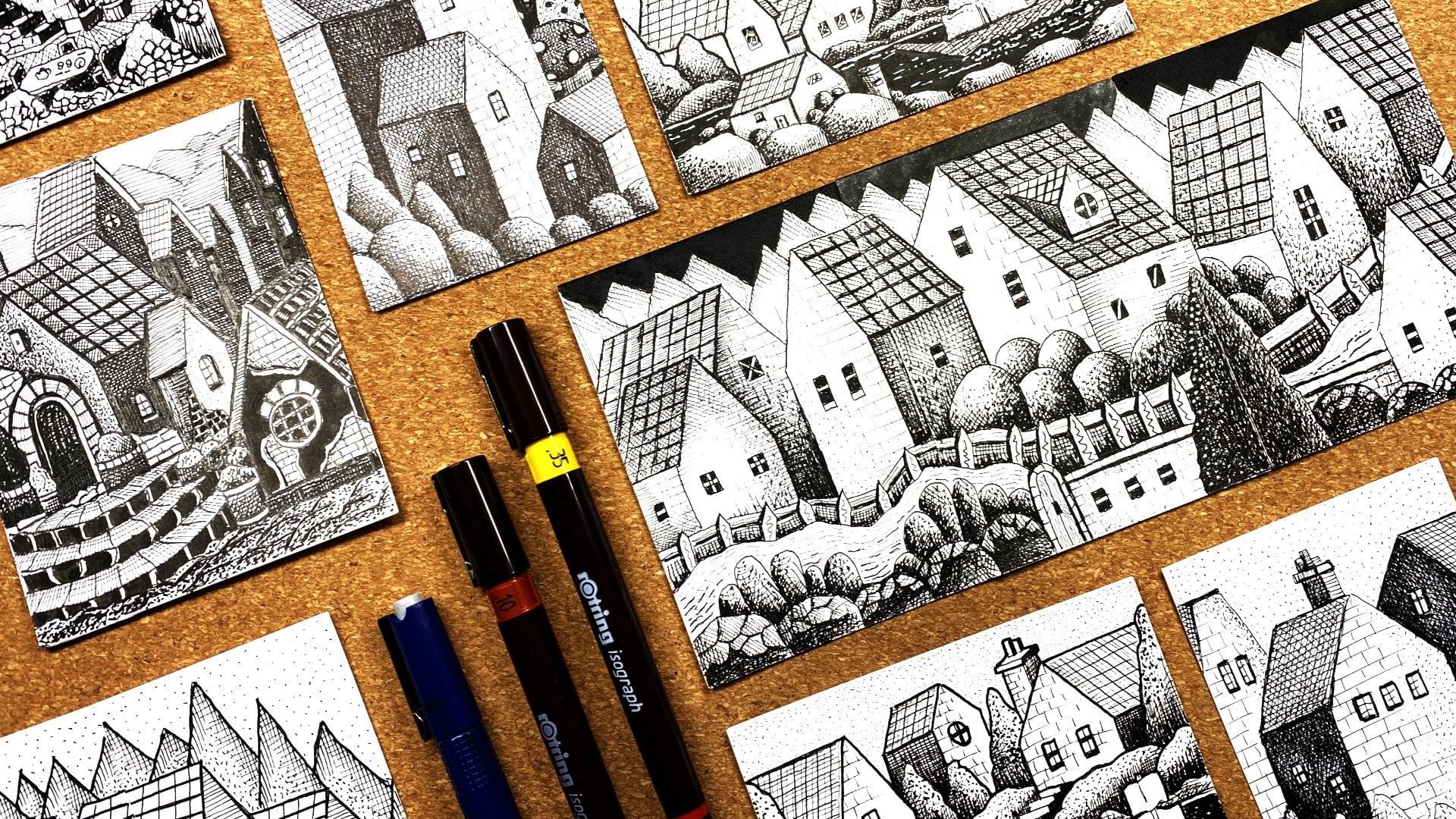
in this class. Moving on to fine
liners over here. I've just got these
basic fine liners. But I would say for fine liners, if you do have a variance
in the tip sizes, then go for the ones that have a nice broad tip like this. This one over here,
you can see I've got a nice heavyweight
thick tip on that one, and that's going to be
very handy on this. What you want to avoid
for this class with fine liners is to have
the very fine tip, so a nice heavy, thick tip will work great in
the lessons in this class. Now moving on to this
unique little utensil, and I promise you
this is not something to take the fillings
out from your teeth. This is an embossing tool. Now, you're most
likely not going to have this type of thing lying around in your
house or in your drawers, but if you do, if you're
into your arts and crafts, you're most likely going to
have something like this. Now, this is a very
interesting tool and we're going to do some super-duper
techniques with this. If you have one of
these lying around, then grab yourself that now and get it ready for the lessons. Let's move on to this one now, and this is something
that you've seen me feature in a lot of my classes, and this is just a
general paint marker. If you have a white
paint marker, that will work great. If you don't and you
have gouache instead, then grab hold of
your white gouache, that's going to
work excellent for the highlight section
of the class. Moving on to the
final two items here, I've got some brush pens here. Now you may have these
lying around, you may not. These are very useful, not just for using
with colored pencil, but just generally using
in arts and lessons. If you have a couple of these and different tones of gray, then grab hold them and get
them ready for the class. If you haven't, don't
worry about it. Most likely you're not
going to really have this, so let's just move
this to the side. But they are great
and they do add great feature when it comes
to using colored pencils. These are just
standard brush pens. You might not have the
similar ones like I've got, you may have them in
a set of fine liners. Whichever type of brush
pen that you have, if you have some nice
gray tones in them, just get them ready
for the class. Finally, here I've just got some standard Crayola
felt tip markers, and these are just
water-based markers, and you most likely
going to be able to get these because
these are really cheap to buy from any type of art store or even
the pound store. So if you can get hold
of some of these, these are great when it comes to creating textures
and adding depth, and I've got a couple
of gray tones here, so that will work very nicely. That's about it for the actual
supplies on themselves. Let's move on now to the different surfaces that
I recommend for this class.
4. Surfaces: Let's just quickly go through the different surfaces that I recommend to use in this class. We went through
surfaces in a lot of detail like we did with the
colored pencils in Class 1. If you want to recap on that, do check that out. The ones that I recommend for
this are going to be based in the ones that we went
through in Class 1 and Class 2. Over here I've just got three
different surfaces here. I'm starting off with
this little sketchbook that I do a lot of my
colored pencil work in, and this is just a
cheap sketchbook that contains cartridge paper. Cartridge paper is fine, as long as it has a decent
amount of tooth on it. But overall, it has
a smooth surface. I would recommend going for a smooth surface cartridge
paper that's good quality, that colored pencils
can adhere to. You can see here I've got some nice little illustrations
with colored pencils, and it works really well. I'll just show you the
texture of this paper, and I'll see if we can
get a zoom in on this. You can see that we have a nice, very smooth surface on this
cartridge paper sketchbook. This is something
that I recommend. Let's move this one to the side. Over here, again, I've just got a pad
of cartridge paper. This is the heavyweight
cartridge paper, acid-free, and it works great. Suitable for pen, pencil, charcoal, and many
different materials. I'll just show you
this one as well. You can see over here, not sure if you can see this
on the camera very well, but it's very nice and smooth, good quality, has a
nice thickness to it, and it will work great
for colored pencils. Finally, over here I've got
my Bristol board paper. This is probably
my go-to paper for colored pencils if I'm
doing a big piece. I highly recommend this. If you have this type of paper, just quickly open this up. This has a super-smooth surface, and colored pencils
work great in this. There is a vellum version of this particular paper which has a slight more texture on it, you can use that if you want, it's entirely up to you. Just avoid using
cheap printer paper, or cheap paper that you
buy from the pound store, because you're just not
going to be able to produce those textures and effects that we're going to go through. That's pretty much it
for the actual surfaces. Get yourself some
decent cartridge paper, or some Bristol board paper, and you'll be ready to go.
5. Colour Textures: Welcome back. Let's now start
with the exciting part of the class and go through some of the awesome techniques
that I'm going to discuss. Firstly, get your pencils
ready if you want to follow me step-by-step
in this, in the lessons, then get maybe a couple
of colors that are ready sharpened at hand so
you can easily do this. Alternatively, if you just want to watch the lessons
and then follow along afterwards when you recap over them, that's
absolutely fine. We're going to start off by
doing technique number 1, and that is creating color textures using
our colored pencils. Now, remember, you
don't need to use the same pencils as me
or even the same colors, just get a similar color
that I'm demonstrating with whichever colored
pencil brand that you have, and let's get started
with the excitement. [LAUGHTER] Firstly, what I'm
going to do is I'm going to use this lovely orange
color that I've got here. Just for reference, if you are using the Caran
d'Ache Luminance, this one is number 850, and this one is called Cornelia. If you want to use the same
color and pencil as may, that's the reference
to this one. What I mean by color texture
is using line weights, crosshatching, stippling, and different techniques
that we've also covered in the pen
and ink class. If you've watched that from
the series that I've done, we're going to apply all
those texture techniques using colored pencils. The interesting thing with colored pencils
compared to ink is that you can add
more and more layers in different methods. Let's go ahead and do this. With your colored pencil, what I want you to do is I
want you to start off by doing a swatch of color by
using the side of the pencil. Notice I'm holding
the pencil like this with my index finger on top and I'm just using
my thumb to just rotate it and just
hold it lightly. I'm not holding it at the end. Remember if you went
through Class 1, we went through all the
different holding positions. We want to hold
it on the side to create a really nice
swatch of color. Just lay down that
first layer of color. I'm using my heavyweight
cartridge paper. This first layer may
look a little bit different for you depending on the paper that you're using. It's basically bringing
out the surface of that texture of the
paper and that's all it is. Just a very light
swatch of color, and that's about it. It's just a nice little
rectangle of color. Once you've done this, then I want you to switch
to your holding position and hold it like you would
hold a normal pencil. Just like that, and using the sharpest part of
your tip of your pencil. I want you to start drawing in some lines that go
from top to bottom, keeping them as
close as you can, but keeping them consistent. Just like that, you can see I'm drawing over that swatch
with the same color. This is what I mean
by color textures. We're effectively doing
these hatching lines over a base color. You can see just by doing
this quick little technique, it's brought out
a textured look, which is very different, just a flat color lay down. What I'm going to do
now is I'm going to go across the other way. Just like this, using
that same position, use those lines to go
all the way across. I'm not pressing down too hard. It's just with medium
pressure and just to fill in those lines
where we have them vertical hatching
lines to complete this grid crosshatch
lovely texture. That's it. That's what I mean by using color textures
and crosshatching. That was the first
part of the technique. What we can do now is
we can actually go ahead and add another
layer on top of this. Using the same color, if I just hold this from the side like I did
with the first layer, I'm just going to go
in and I'm going to add another layer of
color just like that, applying medium pressure just
on this edge and then just building that color into the actual crosshatching
lines that we've gotten. You can see it's merging the crosshatching lines,
softening them up. I'm just adding a
bit more depth. This is a great technique to use when you're sketching
quickly with colored pencils where you
don't want to be pressing down too hard or filling up
the area of your paper. You can see all I'm doing
is I'm just using it in this little area here on
the left-hand side and then just bringing that layer
along the bottom line there just to give it that
variance and interest. You can see adding more and more we'll just darken this
bottom left-hand corner. That's great for when you want to add a difference in value. For example, if
you're drawing a ball or a piece of fruit or a
furniture or whatever it is, you've got these
different contours and you've got darks and lights. You can easily do that
with this technique. Just like that here, we've got a nice bit of dark
on this side and then we've got lights on this side that's blending into this
beautiful texture. Try this out with the
colors that you have. This will work best with
medium-tone colors. If you have maybe
lighter shades, you might not be able
to get the full effect. I advise you to
use medium colors. But just as an exercise, try this particular
swatch out with as many colors as you can
to fit on your page and that'll give you
a nice indication of what your colors
can produce and what textures that
you can make when it comes to doing
your class projects. Let's now look at the second method of
creating color textures. Again, what I'm going to do
is I'm just going to work underneath this first swatch
of texture that I created. I'm going to stick
to the same color and I'm going to go
ahead and just lay down another nice little
swatchy swatch of first layer of this
beautiful orange color, gorgeous color that is one of my favorite
colors, orange. Absolutely beautiful. [LAUGHTER] I'm just
going to throw that in, get that laid down very nice
and it's looking great. First swatch of color as that base color
going in very good. Now what we're going to do
is we're just going to add in some little doty dots here. If you can see, I'm just
lightly adding again, some dots in that bottom
corner over here, just like we did with the lines, but we're sticking to this
bottom left-hand side, concentrating on adding
this nice stippled look and that's pretty much it. What you can do is
you can vary this. You can have a bit
of crosshatching and some staples in your
sketches to really bring out a range of textures to make your artwork
look very interesting. I'll show you some of
these examples of using these techniques in the artworks
that have also produced. Just like that, I'm just
adding these lovely doty dots, beautiful staples
into the bottom left-hand side of
this rectangle. You can see how quickly we've added this really
unique texture. This can be used to add
texture to the heads of maybe plan areas
or even on food, or just to vary it on any type of illustration
that you're doing. It just works so well
and it's so easy to do. That was the second
method using stippling. I'm using dots over
the first layer. What you can do is
you can even add in that second layer as we
did with the first one. But with this, what
you're going to do is if you add in too much
of a second layer, it's going to mute out and
blend away those staples, so be very gentle when you're adding a second layer if
that's what you want to do. Otherwise, you just
going to erase away that beautiful stippling
work that you've done. This is a very nice light look compared to the texture look that we got from
the crosshatching, which is very dark and vibrant and it stands out
a lot more with contrast. You've got two
different looks there that produce two very
different results.
6. Combined Look: Let's move on to
the third one now. For this one, what
I'm going to do is, I'm going to add
another swatchy swatch as a first layer
across the page here. I'm going to make this into
a slightly bigger swatch, so we have a double area
size on this side over here. You've got to remember that this order that I'm doing
where I'm laying a base color down and then adding those texture
lines with hatching, stippling, crosshatching, you don't have to do it
in this particular order. You can actually go ahead and do the hatching lines first or the stippling lines and then go over with a light
swatch of color. The results will
be very similar. It's entirely up to you
how you want to do it. I always like to add
in my base color first and then do some hatching
lines and texture lines. But it all depends
on the type of illustration or the
drawing that I'm doing. Sometimes I might just feel like throwing in them
hatching lines first, just to give me a bit of an indication where those
textures are going to be and then just go over with two or three layers on top
to just merge it all up. You can see here now, I've got this really
nice base layer that laid down with
this gorgeous orange. We'll leave it at that for
this next method to move on. What I'm going to do
now is I'm going to use my beautiful blender tool. If you remember from
Class 1 and Class 2, we used this dry color blender. As I mentioned before, I'm using the Derwent one, whichever one you have, if you have it, then
grab hold of it and start using it as
I'm doing right now. What I'm doing here
is I'm just going to go in and I'm
just going to blend out this bottom left-hand side. You can see with that
blender all it's doing is, it's pushing in that
beautiful pigment, that gorgeous, orangy
orange pigment into the grooves of
that paper surface and it's just spreading
out that orange. You'll notice that the color looks different once
you've blended it, especially with this orange. That's usually the
case when you're using these colorless blenders. It just makes a
fantastic and smooth. But again, if you don't
have one of these blenders, that's no problem, just leave
that base layer as it is. I'm only showing you
this so that you have different options
that you can work with when you're practicing and enjoying this gorgeous
[LAUGHTER] medium. Just like that, that
bottom left-hand corner, I've just gone ahead and
added a nice layer of blender on top so we have a variance from this
side going onto this, nice and drive that, nice and blended over here. Okey dokey. Now
what I want you to do is I want you to go in and just throw in some
lines like this. They don't need to be straight, they just needs to go
up in one direction, roughly the same distance apart, and maybe go halfway
across the actual swatch. Just like that you
can see I've created this really nice
texture over here. What we're going to do now
is we're going to go in and we're going to do a
diagonal line like this. Just like that over
those vertical lines, I'm just going to use a diagonal line to
create this crisscross, beautiful texture on top of
that blended area of pigment. You can see how quickly
we've just created this lovely dimension over here by just using
the same color. I mean, I love producing
artwork in a singular color, or if you like in
a monotone effect. It just looks so good
and it really helps with your understanding of using
color in art in general. What I'm going to do now
is I'm going to add in those steeply steeply
dots that we did here. But I'm going to put them
in at the top over here where we have that dry
lay down or color. You can see what that
does is it starts adding that additional
layer of interests. Look at that. Look how easy
that's easy to create. Now you can do this as a foreground or a background
for your artwork or you could just base your entire
artwork by starting off using this base layer and just building this texture to
produce your picture. Whatever you like, practice this
experiment with this, have a lot of fun, and I assure you
you're going to really enjoy this journey
once you get started. Like I said, you
don't need to be using the same color as myself, do this a couple of times
with some different colors. Just get practicing
with it and you're going to have a lot of
funs. Just like that. I'm throwing in
them little dots, not pressing down too hard, just using that
beautiful pigment and letting it flow and
adhere to that paper. That's it for that one. What we can do now
is maybe just add in a few more details
at the bottom. What I'm going to do is
I'm just going to use the side of my pencil again, hold it like this, and I'm just going to go
in and I'm going to add in another layer at
the bottom there, and I'm going to press
with a bit more pressure so that we have a more
heavier lay-down of color just like that so
that this looks like we have a bed of maybe
straw or a bed of like fibers that are just
being raised up from some imaginary [LAUGHTER] world and then we have these little dots on top that represents the
heads of those straws. They can be whatever you want. I'm just trying to make up a nice [LAUGHTER] little scene. You can do whatever you want. You can make these
into lollipops. If you want to
[LAUGHTER] make them into some whimsical elements, you can go ahead and do
that. Just like that. I've added in that base layer to really bring out that
difference in tonal value. Yes, we did the whole thing with just one gorgeous orange color. Give this a go, try it
out with a few colors. That's about it for
this first technique. I'm going to just
quickly show you some of the artwork that I've produced
using this technique. If I just get a zoomy zoom
back on this one over here. You can see on this little
scene that I've done, I've got some textured
work using that one color, I've got this crosshatching on these peaky peak
elements at the back. A lot of it is really
nice and dark. Then again, I've got it on
these elements at the front. You can see that I've got this dark area on the left and then it becomes
lighter on top. That's where you have this huge advantage of building again those
crosshatching lines, and then going over them
in a nice layer of color. It's just a case
of just building this into your
actual image itself. Now what you don't want
to be doing is you don't want to be using
this technique on every element of your
image or on your picture. Otherwise, it can't
get a bit too much and you may lose track of where you've actually got the elements and you don't want everything looking the same. Just to add visual interest, it's always nice to have a little bit of texture
here and there, just to give it some contrast, not just in tonal value, but also in overall texture. That was one example. We have more examples here. On this one, I've got a lot
more of a lighter feel, so you can see that that
texture work on the peaks here. I've done them very dark
on the left-hand side, few steeply stippled dots over here on the
end and then I've left the edge on the right-hand sides of
these completely blank. What that adds is it adds
that dimension of light coming in and hitting
this overall scene. It just gives it a
really nice light, airy feels that you have
so much texture within the entire image that
it really makes it pop out and it's so
interesting to just view. I think it looks fantastic. Again, textures there. Again, I've got
some more textures in this area down
here on the peaks. Notice again, I'm
not using textures on every elements of these
images that I've drawn, it just adds visual interest. Just give that a go. Have a go at doing the swatches like we did in the exercise. I'll just get a zoomy,
zoom back in on there. This will really help
you to visualize the different tones and areas that you can fill in
with your colored pencils, especially if you only
have a single color. If you don't have
Caran D'ache Luminance and you really want
to try them out, then I would probably say, maybe just buy two or three
different colors that you really like and then
test them out by using these different
techniques that I'm showing you in this
class and then you can actually go
ahead and just do a nice monotone
single color drawing, like I've done over
here in my sketchbook. Again, let's just get
a zoomy zoom back on there, just like that. I mean, most of these
are all single tones. Anyways, you can see over here, I've just got one
color sketch here. They look fantastic when
they're complete and again, another single color on this
spread, single color again, that I've just shown you before, and again single
color and then I've got some that are
multiple colors, but not too many colors. Just like that, you can really create some gorgeous artwork. Give that one a go. Let's then move on
to the next one.
7. Embossing: That was a nice coffee. That wasn't it? Yes, it was. [LAUGHTER] Welcome back. Let's now have a look at technique Number 2 in
the class and it's using this wonderful
peculiar-looking tool called the embossing tool. Now you can see on the screen, I've got three of these, and they vary in the tips that are at the end of
the sharpy sharp point. I'll just bring them
on the screen here. You can see on this one we
have this really huge tip. It's like a round sweet, chisel tip at the end, and then we've got these
two that vary in length, but the tip is pretty similar. Now you can get these
in packs of threes, sometimes in packs of fours, or you can buy them in singles. They are very inexpensive. Now I'll leave the links to where you can
get these from in the resource pack but
you can get these from any arts and crafts store. Again, they're not very expensive in the grand
scheme of things. I would say it's very
useful to have this tool, especially if you're
working in colored pencils, but they can be useful
if you're doing arts and crafts and card making
and things like that. How are we going
to use these with our lovely luminance pencils? Now again, you can use this technique on
any colored pencil. It will work but what you
do need to bear in mind is that you're
using a sharp tool so do be careful with it. Don't go and injure yourself. Use this very
carefully and gently. I've got to say that because I don't want you to
start saying, Oh, because of that
same Ronnie's gone and made me get this tool. It looks like something that's going to take my feelings
out of my teeth and I've gone on hurt myself because we're
not here about hurting, we're here about relaxing. Do be careful with
sharp tools like this. Now I'm going to
demonstrate this quickly on the screen
before we go ahead and use this with the
luminance pencils because it's always nice to know what
I'm talking about before I go ahead and do it. I've got myself a piece of
card that's colored hair. This is just the backing
board of my little book. It's difficult to see
this on white paper, which is why I'm
going to quickly demonstrate this on this card. All we've got to do with this
is just go ahead and just press down and create
these little grooves. You can see on the
screen you barely be able to see them
even on this card. I'll bring this up
on the camera and get the other
zoomy-zoom in on this. If you just bear with me if
I show you this at an angle, you can see that we're getting these nice little
groove lines over here. Get a bit more of a zoom. Nicely to groove lines over
here. That's all it is. We're just creating these little embossed
lines which are just scraping the surface of
that card or that paper. We're just using this to
effectively create a pattern, or draw, or come up with some nice texture work but then how are we going to use a colored
pencil as well? That's what we're going
to come on to next. I'm just going to leave
the cardboard example as it is nice and row. You can see that on the screen. I hope you can see this clearly that you
can see we've got these nice grooves
going into that card. Now let's actually demonstrate this with the colored pencils. It's going to flip the
book over to the page, and I'm actually going to use the last page of my book
to demonstrate this. The reason for that is, is that when you're using this, the pressure is going to
make it go through to the other page and it will
affect the page underneath. Do bear in mind if you are using this technique on
maybe a sketchbook, it would be a good idea
to insert maybe a card or another couple of sheets
of paper underneath so it doesn't get affected
when you're using this. Let's now get to
the exciting stuff. I'm going to use this
one that I've got here. This one with this medium point, and then on the end I've got an even find point at the end. Let's grab hold of
some colored pencils. I'm going to use my
lovely orange color that I used in the last lesson. I'm also going to use
this beautiful dark red. These are also in crimson. The number of that one is 589 if you want to
follow exactly with me. Just make sure we've
got a nice zoomy-zoom so that you can see
beautifully clearly. I think I need a bit
more coffee right now. That hit the spot that did that Americano,
absolutely gorgeous. Let's get back to it.
We're going to go through a similar sequence of
creating color swatches. The first method is
to use a color and what we're going to do is
use a dark red for this one. Grab holding your dark color, whichever color you have, get your embossing tool, and use the point that I would say a medium point
and on your page, just come up with
a couple of lines that are coming downwards
from nice vertical lines. Not sure if you can
see that on the paper, but I can see that
with my naked eye. I'm just creating
these vertical lines pressing with medium pressure. You don't want to be
pressing too hard on paper, because you just going
to end up tearing the paper. Just like that. I'm just creating vertical
lines evenly spaced out, just like I did in
the first technique, up to about there. Then I'm going to go across, and I'm going to create
that beautiful crisscross, crosshatched texture
that goes across. This will become
more prominent when we start using the
colored pencil. I'm not sure if you
can see the grooves. I can just about see them
on my camera screen. I'm sure you'll be
able to see them. Look, what we've done
is we've created these grooves with
our embossing tool. Now, all I'm going to do is
I'm going to grab hold of my pencil and I'm just going
to lightly press down. You can see the
magic is happening. Isn't it [LAUGHTER]
We've got that, gorgeous. That isn't it? We are unveiling that embossed
texture that we just did. I'm just using light pressure with that dark color on top. You can see we've got this beautiful crisscross
white pattern, which is bringing out
that color of the paper. Now, this is a huge advantage when you
want to create highlights, when you want to
create details that you just can't get
with a white pencil, then this is brilliant. Just like that, with a
little bit of color on top, you've just got yourself a gorgeous little swatch of crissycross, crosshatch,
beautiful lines. You wouldn't even be
able to tell that you did this with an embossing
tool. Now, would you? No, you wouldn't. Now what
I'm going to do is I'm going to go in with
another darker layer. You can see we went over with a lighter layer and
you might be thinking, if you go into dark, are you going to end up
covering up those lines? Well, the answer to that is no because they've been embossed and really dug into that surface
and tooth of that paper. You can go as hard as you want
with your colored pencil, especially if you're using a soft core colored pencil
like the luminance, or the Prismacolor, it will
not go into that groove. You can see I'm using
medium pressure again but I'm just doing more of a
heavier lay-down of color. It's looking fantastic. Just look at that. It's like magic, isn't it? It is. All we've used is
a cheap embossing tool. Well, that's going to
be our little secret. You don't need to tell
anyone that when you're showing off your gorgeous
artwork and say, "Look at all these
gorgeous techniques, look how beautiful
my artwork is, I'm just a magician". [LAUGHTER] that's
what you can say. [LAUGHTER] Let's just
finish that one off, and that's the first method. Fantastic.
8. Two Colour Effect: The second method of
using this technique is to start off by
using a color swatch. I'm going to use that
beautiful orange that I used in the previous class. I'm just going to go in and
I'm going to go in and create a nice little switchy
swatch of color underneath, like I did before. Just lay down that color. For this first color
in this second method, try using a color that's a lot brighter than the color that
you've got on top here. That will make more sense
when we come to doing it. Just like that, a nice
even layer of color. You don't have to
keep it too light, you can go in a little
bit darker than me, so I might end up adding
another layer on top. This is going to
be important when we use this second method. Just like that, a decent amount of color on that
color swatch there. Superb. Now, what we're going to do
is we're going to go in and get our lovely embossing tool. Again, I'm going to
use the same one, and I'm just going to
go in over that color. Now, you might be
thinking, why is he going over that color for? You can't even see it. But this shall be revealed. The magic trick will be shown. [LAUGHTER] If you just
keep coming down, follow the same pattern
that you created on top. Just for this example, you can go absolutely wild
with this and come up with gorgeous patterns and
designs and textures. You can even do a complete
drawing or a sketch with this and reveal it
[LAUGHTER] later on. Just like that, just
keep going across, create that nice texture. Again, you won't be able to see this properly on the screen, but you'll be able to follow
it with the naked eye. Now, what I'm going
to do is I'm going to go in with that red again, so that red that I used on top. Then I'm going to go in
over what I just did. Use that read or that
darker color to go over. You can see what's
happening here, it's a beautiful orange
embossed line that you've got. What this is effectively
doing is bringing out that initial color that you've embossed into and it's
bringing it underneath. It's a great way of creating this visual effect and adding some variance
into your artwork. Look at that, that looks
absolutely gorgeous. Doesn't it? We've got this
beautiful crisscross or waffle effect underneath
that red and it's orange. It's not even the
color of that paper. I'm going to go in now and go in a little bit
heavier with the red. What that'll do is
it'll get rid of the white bumps
that you have with colored pencils when
you're going over a surface and it will
smoothen it out. Now, you can even use your blender tool to go over this to smooth
it out completely. I'll let you experiment with
that. Well, look at that. Fantastic. If you
compare the two, we've got a complete
different result, but we're using a
very similar method, two steps in that one, and then three
steps in this one. Look at that. I bet
you didn't think it was going to be that easy. No, I'm sure you
[LAUGHTER] didn't. This wonderful tool can
produce some gorgeous results. Now, let's do a
combination on this side.
9. Combined Effect: For this one, let's go ahead and start off with our
embossing tool on the top. I'm going to do
some lines coming in vertically from
the top and again, you don't need to press
too hard on this. If you want a very
scattered raw look, then use it really
quickly like this and do these straight quick
swipes coming down. You don't need to follow the exact pattern
that I'm doing here, just give it a test. That's what it's all about. It's just about experimenting. Then I'm going to
go ahead and do that crisscross at an
angle from this side, and again, I'm not sure if you can see this
on the camera, so I'll just quickly get this done and just throw
in a few more lines. Then at the bottom here, I may go ahead and add a first layer of color
like we did in this one and go in to give a bit of a variance on this
entire swatch, keep it nice and big. A nice swatch of
orange going in first, so we did a bit of texture
work on the top part, and now we're going in
with the orange and I might end up doing
a thicker layer of orange so that we get a nice color coming through
in that embossed line. Just like that, I'm not
going to burnish it, I'm just going to go in
with a couple of layers. If you remember in Class 1, we went through the layering
process and burnishing. If you want to recap on that, do check that out. I'm going to be using those techniques
throughout this class. Just like that, we've got a
nice swatch of that orange. Then I'm going to go in, and I'm going to start doing some doodling
within that orange. I've just got a bit of an idea of what I'm going to do here. Just random, it doesn't
have to make any sense. Just to demonstrate
that you can easily sketch with this tool at your advantage and create some very funky
interesting results. Just like that, I'm creating
these little elements here. I know it's difficult to follow when you can't see
what I'm doing, but you just bear
with me and you will see that it really is fantastic. Just like that, I'm going to
do a few dots over there. Now what I'm going to do is, I'm going to use that
red to start layering over with a light
layer and you can see that magic happening, that wonderful crisscross coming out and I'm going to
go all the way across, to wherever I laid down those embossed lines
with that tool, I'm going to cover it up with a very light swatch of color. You can see what I've done. It's just random lines. Just have a bit of fun, go wild, throw in them random
lines and then see what you get [LAUGHTER]
it's so much fun. Now what I'm going to do
is I'm going to go over the orange now with a bit more pressure to reveal some of them lines that
I've got there. I can see I've got
a couple of them elements coming out in the orange emboss and then
its located [inaudible] you can create some gorgeous
abstract pieces with this. Try that out, try out some abstract work with
this tool if you have it, and it's looking great. What I'm going to do now
is I'm just going to go in on the top, go in a little bit heavy so that we have nice contrast with our beautiful embossed
lines just like that. That's a bit of
contrast there and remember you don't have to
just stop at one stage. You can keep working on this. You can go over the
color again with the embossing tool and then
bring out a darker color. You can literally
keep working on it. But when you're using this
in your class project, if you do have this, try not to overpower
your sketches using this tool because sometimes you can get
a bit excited like me. You just want to start creating loads and
loads of these lines, then your actual design goes a bit too wild and
then you think, what have I done here? But then again, that's
what art is all about. Experimenting and
seeing what creations you can come up with. Just like that, I've
gone ahead and created this little scene with these little bumpy
bumps at the front. We can also demonstrate the actual blender and see
how it looks with a blender? I've just got a
blender the hair now, so just going over this area
with a blender and you can see that it enhances the look of the actual
embossed lines. You can see over here
it's bringing it out slightly more smoothening the rough surface of that textured pigment
that's on there and just like that,
it's looking fantastic. I'm just going to go over all of this very quickly and lightly, not pressing down too
hard and look at that. That looks gorgeous, now just going to give that
little wipe with my hand. Try not to wipe
it with your hand because it will
smear everywhere, but I don't want to blow into it because that will make all
sorts of funny noises. [LAUGHTER] That's just our work. You can see we created three lovely swatches
with our embossing tool, and this is
absolutely fantastic. Now I can show you some of
the artwork that I've done, that I've incorporated
embossing tool in, let's just bring them
onto the screen. As you can see on this one here, this is a little sketch that
I did obviously of a house. You know what I'm like,
I just love making houses and drawing houses
and these whimsical wells. [LAUGHTER] I'll get
to zoom in on that. You can see over here at
the front on these peaks, I've got really
nice embossed lines going up into random
little strips. That's it, I've only used
the embossed line on here, and I've used it on the
roof area over here. I've used it very sparingly,
but what it does is, it adds a nice effect to the overall texture
of the drawing. That's one example, I've got another
example over here with a bit more detail so let's
just get back, zoom on that. You can see, we'll
just move that out of the way so you
can see this a bit more clearer and I've
dropped everything on the floor, just carry on. Over here, we've got some nice embossed texture
work down here again, all I've done is I've just
done the straight lines. I've not done any cross
hatching or any stippling. These are just
straight lines with the embossing tools
in this area. Again, straight lines
going down there, and then just on the
roofs of these houses, I've got these horizontal
lines going there. Then I've got the
crisscross waffle lines going over there for the tiles. You can see it adds a
nice balance and achieves a nice overall look and
it doesn't look like you've gone absolutely wild
with the embossing tool. Give that exercise and go, and then maybe try out
doing a couple of sketches with the embossing tool and
with a couple of colors. That's about it for
this second technique, let's now move on
to the next one.
10. Paint Marker: Okeydokey, welcome back. I hope you had a
nice little break. I certainly did. That little chicken
sandwich was gorgeous. [LAUGHTER] Let's get on with
the next part of the class. This one is now all about using these gorgeous
white paint markers. Now I've got a couple
of sizes here. I've got a really fine
tip one down here, and I've got a broader
tip over here. These are great to use, to add highlights
into your artwork, regardless of which
materials you're using they're quite versatile. But however, with colored
pencils specifically, they were great because
they literally just adhere to the surface on
top of the actual pigment. Let's do a few examples of this. Let's just get a nice blue
color and maybe a darker blue. I'll look at which ones
we're looking at over here. I've got number 660 for
the lighter blue shade, and then I've gotten number 159 for the darker blue shade. If you want to follow, check those colors out
and let's get started. I'm going to use the
lighter shade now to just do another swatch of color, just like we did before. Just a nice light swatch of color in the top
left-hand side over here, as we've been doing in the previous examples demonstrating
the other techniques. This is just a
great way to really visualize and practice
these techniques before you start your class
project and before we move on to the biggest sketch that we're going to be doing. Just give this a go, swatch a little bit of
blue and that's all it is. I'm just going to do
a light swatch there. Then at the bottom, I'm going to do another swatch so that we can demonstrate to different looks with
the paint markers. With this one, I'm
going to go in with a white swatch
like I did above. Then I'm going to go
in with my darker blue and then I'm just going
to blend this into that lighter blue
to come up with this nice variance
in tonal values, from dark to light. I'm just using this technique
that we covered in class 1 where we're doing this
light layering technique. Then I'm just going to go
in with a lighter blue. I'm going to go in
with the second layer, press down a little bit harder, and then overlap that over the dark so that we have a
nice blend of color. Then to top this off, what I might do is
I might just go ahead and burnish this, so grab hold of my burnisher, where's my burnisher gone? It's got to be
somewhere down here. It might be going
for a nap somewhere, so we've got to find it and
wake it up, there it is. [LAUGHTER] Here's my burnisher and it's depleted quite a bit. I think we'll have to do a
quick little sharpening, sharpen on that one. Again, the burnishers and the blender sticks
that we have here. You can easily sharpen these. It's absolutely the same
as using a colored pencil. Just going to do a quick sharpen on that in my sharpener, and we're ready to go. There we go. We don't have
to have a super sharp point. You can have a nice
flatty flat point. We can just go in and burnish
this out to really get a beautiful smooth color layer that we can start experimenting on with our paint markers. Now, as I mentioned earlier
on in the earlier lessons, where we were looking at
the materials and tools, if you don't have paint
markers and you may have some white designers
gouache then use that, use a paint brush for it. If you've got one, it will
give a very similar effect. But even if you don't
have this and you have maybe a white gel pen, you could even try that. Let's now start off by using the white points of this marker. Give it a little shaky shake
[NOISE] and pop it open. Move that to the side and
on that lighter shade, let's just draw in a couple of lines and you can see how easily that paint marker
draws and glides over that beautiful pigment
of the colored pencils. Again, because it's
a very light color, it's a very subtle effect and you can use that
at your advantage. Now let's move on to the
nice dark blended area that we've done over here
and do exactly the same. You can see that huge contrast. The paint marker works
great on blended swatches, on completely burnished swatches and on dry light
swatches as well. Just like that, just
a couple of dots, you can draw whatever you like. It's such a huge advantage
to use one of these pens. I actually prefer using
these pens to using gouache purely because you have more control and it's
just a lot easier. You just pop it open, give it a little closely close, and you're done, and
with this you can get different pen
variations in sizes. Give that shaky shake. I've got a nice thin
tip on this one. Again, just go in to
vary those dotty dots, and just do some crissy
crosses if we want to. Now it all depends on the
angle that you hold it and how much paint you've
actually got in this one because this
one's pretty dry it out. As you can see those paint
lines are quite faint. But the technique with
these are just to give them a little pressy press and it should release
that white paint. It's just absolutely fantastic. You can create some
gorgeous effects with this and you're ready to go.
11. Small Details: Let's quickly
demonstrate this on a little mini type
of sketch so that you can visualize this and prepare for your
own class project. I'm just going to go in and do a nice light swatch for
maybe a background. Keeping it very light
with that light blue that I used in
this swatch here. Just go in very light indeed, don't need to press down at all. Just remember I'm using that
heavyweight cartridge paper, I'm going to be using that
paper throughout this class. It's just one of my
preferred papers. Can get them in small packs, in big large sheets. I just like to use this paper
mainly because it's really affordable and you don't have to waste too much of it when
I'm doing these exercises. Just like that, a nice
little swatch there, and then with the same color, I'm going to go
in and maybe draw in a couple of shapes like this, just going to a roundy
shape going on top, and there may be one
going down here. This again is another
technique that is similar to what we did in the first technique
lesson where we're doing crosshatching
using the same color, and all I'm doing here
is I'm just going to use some diagonal lines to create some hatching inside
those shapes. You can see how easy
it is if you just come up with an interesting
little subject shape, where we've got these
little three peaks that can be anything
you want them to be. They could be cactus
plants or they could be sweets or jellies
or whatever you want, whatever you want them to
be in your wonderful world. Just like that,
I'm just going in. Then what I'm going to do
is I'm going to go in with a little bit more pressure
and start going in and lightly adding that layer to really bring out a bit of
contrast to what we have. Just like that, you
can see we're just blending away way
crosshatching lines, they're showing
enough to see that we have some texture
going on there. Again, just like that, adding in that another layer of color over that
crosshatchy hatch area, and that's looking good. Then what I'm going to do is
I'm just going to fill in this area with these
round circular motions, and that's looking great. With the darker color now, I'm going to come
in with that dark blue that I used over here, and I'm just going to go
in and start creating some sharp areas at the basis of these little
design things that I've done to add that
visual interest and give it a bit more of an impact look whereas before
it was quite flat. You can do this so easily
when you just have two different shades of color
a dark blue and light blue. I mean, you might not have
the same colors as me. Just try it out with two
colors that are similar, but one dark and one light. Just like that go in, got a nice bit of texture there. It's looking fantastic. Let's carry on, keep filling it in, get it really nice, and I think we'll leave
it at that okey-doke. Now let's get the white
paint marker out, give it a shaky shake
and open it up. But you'd have to be
careful with these when you do give them a shake
and you open them, they can splatter everywhere. Do make sure when you take the cap off after you've
given them a shake, that you do it slowly, you don't want to make a
mess all over the place. No, we don't. Just put that marker
now what I'm going to do is I'm just
going to go in from the bottom and do this little flicky
flick motion going up. You can see we've added these beautiful
tapered style lines on the basis of these little
elements that we've got. It just adds that
visual interest. Now that would be
really difficult to do with another colored pencil, for example, a white or
a really pale color. That's where these markers
are just absolutely supreme, and what I'm going to
do here now is I'm just going to go in
and I'm just going to go in with these nice
dotty dots to really bring out this shape and
add that visual interest, add a bit more texture to these little shapes and
designs, beautiful. Now what we can also do is
we can just highlight and just outline the edges of
these now with that white pen, you can see what that does is it separates them shake so easily. Just add a couple of dots to
the top. There you have it. You've got a beautiful little
scene of three things, just relaxing and chilling out, and we did that so
quickly by just using our white paint marker and a
couple of colored pencils. Try this one out. There's a lot of fun to
do this type of exercise, do it with some
different colors, come up with some
different shapes, get your marker or your gouache, or even your white gel pen, and come up with some of these nice funky
little details that you can add in to your overall
sketch and illustrations. What I'll show you now is
I'll show you where I've used these on my
sketches before. If you just move
this out of the way, and it's on the same sketches
I showed you before, but we've got variations in them of all the techniques
that we're doing. You can see over here we've
got these lovely dots down here on these beautiful
triangular peaky designs that we
have at the back, and again here, lovely, nice and subtle, and then on this next one, we've got something similar. Just get our zoomy back so
you can see the whole thing. So you can see here we've got beautiful little stippled dots. Now I've done this with
the thick version and the really fine point
as well to just create a bit of a
variance in that texture, and then I've got the same here where we've got
this lighter color. It just looks fantastic. I mean, you can go in and
start drawing things on top. It doesn't have to
just be texture. It can be drawn on. I throw over here, I've just
added some lines to create a type of a reflective look of the bulk to add
that water area is. I'll show you on another
piece where I've actually created some
texture lines and patterns. If we just get zoomy-zoom
back on this one. This one's a nice
big piece of this, which just gets a zoom back. You can see this
one a bit better. You can see here this is a nice monotone
single-color sketch that I've done with
the luminance pencil. It's a beautiful, gorgeous,
viridian green color. If you notice over
here where we've got this marbled look. I'll just zoom in on that as you can see that a bit better. Just over here, we've got this
really nice marbled look. I've just drawn that in with my white paint
marker. Look at that. It's just so good, so
versatile and easy to do, and then what that does is, that just adds that
variation in texture, and it just gives it
that third dimension. Instead of having
everything look the same, you've got little bits
and elements that really bring your attention to them and it doesn't
all look flat. Try that out, try out in the
technique and give it a go and do some sketching with it and see how you go with that. Once you've done that
and enjoyed yourself, have a little break, get yourself a nice warm drink, maybe a little slice of cake or a treat,
but not too much. Then we're ready to move
on to the next one.
12. Dark Tones: Okay, welcome back. Let's now look at our third and final
technique in the class and this technique is
all about adding darker shades to your
colored pencil work. Now, if you've watched
Class 2 of this series, we went through
different mediums interacting with
colored pencils. We went through graphite, ink. We went through even
watercolor and in this class, we're going to be
doing something a little bit different
where we're going to be using different mediums to just darken certain areas of
our colored pencil work. So let's start off by doing
a few swatches so that we can work on top of and I've decided to use this
gorgeous pink color here. Let's just see what
this one is called, it's called uncinate queen, whatever it's called
something [LAUGHTER]. It's got this huge name and
it's called that and pink, and the number for
reference is 571. So if you are following with the caran d'ache
luminance pencils, it's Number 571 and I'm
just going to call it pink, it's a gorgeous color. So let's start off by
doing some swatches, I've just got to make sure
that I've got that zoom on here so that you
don't miss anything. You don't want to be
missing no detail. It's all about those
lovely details, I think that's nice and sharp and I'm just going to follow suit on what I've been doing
in the previous lesson. So let's just do a nice
little swatch of color. I'm just going to go
across like this and lay down a nice layer of color, not going to do any blending, just going to keep
it nice and basic. And I'm going to
repeat this about five or six times
depending on how much space I have on my page and if you're going to follow
along step-by-step, then just go ahead and
do what I'm doing and then I'll speak to you
once this is done. [MUSIC] Okay, I've got six
lovely little swatches here of this beautiful pink. I've kept them the
same consistency and tried keeping
the layer similar, so just do this on your piece of paper with
whichever color you have. If you have a pinkish shade, then go ahead and do that. If not, then just use
whichever color you fancy. Let's start off on the
first swatch by using our crayola water-based
super tip fiber marker. So these are great
to use to darken areas over colored
pencils as you will see. We just get a bit of a zoom in on the focus, and
that's looking good. So I'm going to start
off by using my gray. Now, if you don't have
a crayola gray marker, then just use whichever
marker you have. I've got six swatches here, so I intend to do
six different things and use six different supplies. Let's start off by just adding some lines
here at the end, and you can see that
that water-based marker, the ink, just flows on
there really easily. And this is a huge advantage
when you want to just darken certain areas of
your colored pencils. You can see, I'm just doing
a bit of a crosshatch there and then maybe a few
stippled dots down here, just to darken this
end of that swatch. And it works really nice. If I had an even lighter gray, it would look even better. So that's the gray
crayola swatch being used on top of the
lovely luminance pencil. Looks fantastic, that does. Now, let's move on to the
next one, and in fact, the next one is another
crayola and this one is more of a similar shade of pink
as the luminance pencil. This is another good way of darkening your areas of
your colored pencil work. If you don't have
a particular range of colored pencils
to darken with. So if you have a cheap pack of these crayola
watercolor markers, then you'll always
find a color that's similar or maybe a
little bit lighter or darker than the
ones that you have in your current dash pencils or in any other
brand of pencils, just experiment with
this just like this. So I'm going to do
this on the swatch underneath and you can see
how beautiful that looks. It's really subtle and it's just darkening those areas
with that crosshatch. Just look at that. It just looks amazing that, doesn't it? With a cheap marker, you can achieve awesome
results like this. We can even go in and
actually darken completely. So you can just go
in and just add a layer over here so I'll just put a sample
layer down here, I'll maybe do this with
the gray as well on top. So if we just layer
it on top completely, you can see and compare what the results are
going to be like so just like a swatchy overlay
over here and then maybe just a crisscross
crosshatch on the other side, that way we can have
a bit of a variance. And you can see it
just looks fantastic, so I'm sure if you have
children in the house, you've probably already got loads of these lying around like me [LAUGHTER] so just grab hold of the ones that
you can get hold of. They don't have to
be the crayola ones. It can be any kind of felt-tip markers that
are water-based. Avoid using the
alcohol-based ones because they're just going to seep right through to the
other side of the paper. Just give that a go, and see what results you get. So moving on now to the
next actual item itself, and that one is this
specialty pen here, this is the brush pen. Now, this one is quite
an expensive brush pen. It comes in a pack. You can also buy
them in singles. It's a dual tip brush pen. On one side, you've got the lovely brushy
brush tip over here, the fiber brushy brush tip, and then on the
other side you have a nice bullet point felt-tip
style thing over there. We're going to concentrate
on the brush tip over here. Now, the ink inside this is a water-based and
that's what we want. We don't want to use
alcohol markers. We went through alcohol
markers in Class too so just to get
that difference, we're going to be
concentrating on water-based. Now again, this is
a nice shade of gray and you can see because
this gray is so light, the effect is very subtle and this is
huge when you want to just add those delicate touches to your beautiful
colored pencil work. You can see it looks
absolutely gorgeous. Look at that texture, it's just bringing it out
so nicely and softly. It just looks fantastic. So again, with that brush pen, going on the side there. Lovely jobly! Look at that beautiful,
nice and subtle. We've got a sharp contrast on
that top one then we've got this nice merging
of the colors in the middle and then we've
got this beautiful, subtle, lovely shade going and mixing in with that
beautiful pigment. Fantastic. Whichever brand of brush
pen you have lying around, if you have them,
definitely give that a go. Try getting the lightest
shade of gray you have, or even get a similar lighter shade of the
color that you're using and just give it a go and see what
results you can get. It's so much fun, right? We've done the first three, let's now move on to these ones. And for this next one,
I'm actually going in with another
luminance pencil so just grab hold of a similar but darker shade of the color that
you've got down. I've just using this red caran
d'ache luminance crimson, that I already had out cause it's from a similar
family like the pink. I'm just going to go in and do that little crosshatching
on the top of that pencil and this
is effectively like the first technique that
we did where we were doing the crosshatching
using the same colors. I'm just going to use
this darker shade to do the crosshatch, and that effectively darkens
that area that you've got. And again, with your colored pencils because
it's the same brand, it will work really nice. You could try it with
other brands if you want. If you have maybe a
crayola colored pencil, try out with that. If you don't have a
particular darker shade of what you're using, just vary it, try it out and see how it works. And then on the other side, just lightly add a little
layer over the top, and you can see we've got this really nice dark and
then mid-tone in the middle. So using the colored pencil, a darker shade will work great, so do try that one out.
13. Contrast Look: Now let's move on to
this one over here. This one, what I'm
going to do is, we're going to go
for the fine liners. Now, fine liners come in many different shapes and sizes. You can even use brush fine liners or chisel
tip fine liners, and in fact, I'm
going to actually use a chisel tip fine liner. This one is a chisel tip one. It's from my sets of fine
liners that I've got. Now you don't need to worry
if you don't have this, just use the thickest
point or the thickest tip of the fine liners set that you have and just go
ahead and do this. This is going to be
a very dark contrast sketchy look now. Because we're using
black ink over. You can see all I'm doing is creating these nice light dots, breaking them up, little lines, hatching lines and then just do a bit of the crosshatch across. That doesn't necessarily
darken the area, it's just adding a bit
of a sketch on top. But that's fine if you're just using this to maybe just add a couple of dots where you want a little bit of dark to show
or even a bit of texture, you can go ahead and do that. Now if we just go in hard on this side just
with the plane, you're going to see,
you're just going to get a nice strip of black ink. You can easily get nice contrast with a marker or water-based
marker like this, and your colored pencils. Just give it a go, try it out and see
what results you get. That was the fine liner that
I used in the chisel form, use whichever ones you have. Finally, we're
going to go through the last swatch and just
test out our fountain pen. Now, my fountain pen here
has a double broad nib. You can see this on the screen, I'll try bringing it
a little bit closer. If you can see that, that's quite a thick. It points at the
end there isn't it? Yes, it is. This is
going to produce similar results like the
chisel tip, fine liner. They're just thoughts. I'll
just do this over here. The thing is with a fountain
pen that has a broad nib, you can vary the line rates. You can see I'm going
in a bit heavy here and then I'm just going
in really nice and thin. That's the advantage you have
with a fountain pen tip, especially a broad one. I would avoid using very fine tips because
sometimes they might not even glide on top of your colored pencil work depending on the surface
that you're using. A nice heavyweight or abroad
or even a medium might work, but a broad or a double
broad nib will be fantastic. Just here, I'm just
going to maybe just fill that area up with a few scribbles and just get that filled in
for consistency. You can see we have six
very different results. We'll just put the pen away and we can analyze the
results that we have. Just looking back at this, we can see that we've
got quite a lot of contrast where we're
using the darker colors, we have more subtle look where we've got a very
nice light gray, especially using that brush pen. Brush tips are
great when you just want subtle details going in, in the darker areas, and if you have a
standard, cheap, normal felt-tip pen like a Crayola and you
can color match, you can get even nicer results. Give this a go, try out with as many
different types of mediums as you want. As a final tip at the end, what you can also do is, you can use your original
color that you use the pink and then
just go over it. Effectively, what we're
doing here is we're burnishing and pressing down with firm amount of pressure to just burnish a layer
of color over it, if you want it to blend
in a little bit more. What that'll do is over those water color ink lines
that we have over here, it'll just add another hint of that pink and it will make
it a bit less contrasty, a bit less sharp if that's
all that you're after. On this pink over here, if we go over it like this, you can see it's
melting away into the original color and
that's looking really nice. Again, with this gray, it's very subtle
as it is anyway, but if we go over it like this, it's going to make
it even more soft. You get this really
nice soft look where you have a
little bit of dark, great for adding shadows. I usually use this
quite a lot to add shadows to my
colored pencil work, and if we just for completeness, do this over here. Again, we're just basically merging these two colors
together, aren't we? That's looking quite nice. Then on the black ink you
can see that the black ink can smear when you are pushing over it with
the colored pencil. Sometimes that can
look quite nice, but sometimes it might
just look like a mess. I thought I'll just
demonstrate this to you so you can see what
effects you can get. This ink is quite
wet at the moment. If we go over this, we might get a bit of smudging, and you can see
there we're getting quite a bit of smudging there. But it can add to the effect. If you don't want
the lines to be too sharp then just go over them
with your colored pencil. What that'll
effectively do is blend it into that base layer
like we've done there. Again, if we can bring the pencil over that
ink area there, it's dragging some of
that ink across and just merging it into
that bottom layer and making it all come together. That's looking pretty nice. As I said before, give this a go with
as many mediums as you have available. Try it out with
different colors. That's about it for
this technique. But what I do want
to show you is some examples of
where I've used this. Let's have a look at them. On this spread that I've got down here in my sketch book, I've used my fine liner and my fountain pen to add these
little dots in the sky area, also used them to highlight
the edges of the house and the edges of these
little peaks in the midground and the door. They just work really well
when you want to just add in some nice bits of dark to just bring out some
of the details. If you look at the next page. This one is quite
a symmetrical type of sketch, but again, I've used a heavy thick line on the outside part
of these buildings just to make them stand out, and then some texture work over here at the front on
these peaky areas, and then a little bit
on the car itself. It just brings a nice
little dimension to the overall look
of your drawing. Moving on, over here, we've got quite a lot
of heavy work using the fine ink liners and a
mixture of using the brush pen. You can see over here right
underneath the car I've got a little bit of brush pen work that I've done just to
add a bit of shadow, a little bit on the wheels and again on the inner
part of the roof here, just a little bit of
shadow with a brush pen. It's very subtle. It just adds that
extra layer of depth. Moving on to this final
sketch here that I've got. On this one it's a very crosshatchy background
that I've got here, a little bit abstract, but I've used the fine
liner to highlight the areas on one side so you have light coming
in from the other. It's just all about mixing the mediums to get the result and the look
that you're after. If we have a look at
the other images here, where we have a bit more
detail and we have a bit more of a composed
look and feel. You can see if you bring
your attention down here, I've used the brush marker
just to add a little bit of a shadow area down here and
on the peaks themselves, this brush marker work just to blend and merge some
of the colors again. It's actually the same color that I've got here,
this brush pen. Then underneath the boat, before I put the
white highlights on, I added a nice shade over here
just to give that shadow. That's all it is. It's just adding these
small little elements to your overall colored pencil
picture just to give it that enhancement and to make
it look really interesting. That's about it for
the techniques. We're now ready to move on to the exciting part and start
constructing our full sketch by incorporating all the
three main techniques that we've gone on through
in the lessons before. Grab yourself a nice drink, get yourself a couple of
treats, have a few sips, relax, take a deep breath
[LAUGHTER] and let's get started with
the full sketch.
14. Full Sketch: Welcome back. Now I'm sure you've had
a nice little break. Enjoy your tea,
coffee, hot chocolate, or whatever you like to drink, and now we're ready
for the full sketch. Before we start the full sketch, I'm going to say it's
always a good idea to do a color swatch of all
the colors that you have. Now, unless you've already
done this, give this a go, just get a nice piece of paper out that you're going to be
doing you're drawing on. I've got this
cartridge paper here, and I've done this pretty
much when I got my pencils, which was a long time ago. I basically stapled
two pieces of paper together and then
just went through the entire collection
that I had in my set, and did a small swatch and put a reference number next to it so I know which color
represents what. I just grouped them
into warm colors and the colors that were inside
the actual box itself, and also moved onto earth
tones in the middle. Then I moved onto the cool colors and
then the greeny colors. This is a great reference to have before you
start your sketch, really so that you
are prepared and you don't waste too much time thinking about which
colors to use. You can go ahead and scribble
a little bit of color before you place it onto your
drawing or illustration. Let's move our lovely
color swatch to the side, we don't need that right now, and let's get these
lovely lights on. Nice and bright, just
the way we like it. Let's get a bit of
a zoom in on this. What I'm going to do is
I'm going to work on the same paper that I've
been doing throughout the lessons in this class on this nice A5 sheet
of cartridge paper. But before I start, I always like to do a
nice border that I can contain within the page for
the artwork that I produce. I'm going to quickly
get my pencil, just got my standard
pencil here, and I'm just going to draw
in a nice border that's around about one centimeter
from each corner. Let's go ahead and do that now. [MUSIC] Now I've got myself a nice one centimeter
border around the page. I've just zoomed in on there and you can
see it as a back, now it's lovely round border. We can contain all
our sketch and illustration in the
center of that area. If you don't need to do this, if you don't want to do this, I just have a habit of doing this. I think it always adds a nice white border when
your artwork is finished. If you want to do that, go ahead and do it. If you don't, then
just sit back and relax and watch the
adventure commence. Let's just go in now
and with my pencil, what I'm going to do
is I'm going to come up with a nice little scene, whimsical style, housey
scene, of course, they shouldn't be any
other type of scene that I want to be doing [LAUGHTER]. If you want to follow this
step-by-step, go ahead. I'm just going to come up
with some elements over here. Maybe we start off by doing
the foreground elements, so I just makes sure
that you can see the whole thing on the screen and it doesn't wibble-wobble
off the screen anywhere. Just like this, I'm
just going to do a couple of elements
at the front, keeping things very simple. We don't want to
over-complicate things, so just like that. I've these little peaky elements I like to usually have in a lot of my drawings and illustrations
just like that there. Then maybe we have some more elements
over here that pop up, so maybe some of these more
bumpy bumps going up here. Just to add a nice
bit of pattern, lay down of area. Just like that. We've
got this front row, then we've got these
bumpy bumps down here. Then maybe we have a lovely
housey house, of course. Let's place our housey house
round about this area. Now again, if you're
trying to follow step-by-step, don't worry. If you're bumpy bumps or the foundations of your house are slightly
different from mine, it doesn't make a difference. Or I want you to do for
this step-by-step sketch, is to just go ahead, lay down some shapes and create some of these
scene type thing, and then we can start concentrating on
the colored pencil. Just like that, I'm
just going to bring in some of these straight
lines that go across, and let's just continue
with that one. It's quite a steep roof on that. That's how it is, isn't it? We need to come up
with these ideas, you don't know what
you're going to get. That's the excitement of
it to us. Just like that. I've got my steep
roof over there. Then what I might do
is I might add in a few more elements to break
this area up down here. A couple of triangular
peaky things coming up, and then we can vary this
with a little bit of color. Again, just like that, I think that looks quite nice. Shall we throw in a
little chimney? Why not. Let's just throw in a nice little chimney
thing down here. It doesn't have to be accurate, you don't need to worry about perspective or
anything like that. Just lay something down on your gorgeous page to
color in effectively. Over here, I think I might
do a nice little boaty boat. You know I love my
boats and my houses, so just a little wobbly
line there straightening. Keep it nice and simple,
nothing too complicated. A shallow point for
that part of the boat, and then we may have
some sails coming here. Just a couple of sails, just the rectangular shapes down here and maybe another
one over here, just gives it that
visual interest. Then just a squiggly
wiggly line at the bottom. That's about it. Let's now
look at that mid ground. For the midground,
I might just do a horizon line across
here like that, that'll separate the mid from the front and from
the background. Then for the background, I think I'm just going to go ahead and just double
up on this line, and just create this
as a midpoint area. Just like that, we may end up having
some nice peaks in the distance over
here, like this. Fantastic. Let's just do maybe a couple
more down here that are coming down at that angle
then just one going up there, and then we can do some
fantastic things with that. For the background, the background that's
farthest apart, let's go ahead and just do maybe triangular pointy
things down here. We've got these triangular
pointy things up and down, and then maybe one
more over here. Then we might end
up putting one down here like this and then finish it off by
doing a little baby one in the center
there. That's it. I think that's good enough for the basic structure
of the sketch. Then maybe add in a couple
of details for the windows. Let's just have
standard windows here. We don't want to do
anything complicated. One window there and maybe
just another window over here. That's going to look great. Just like that, two windows. What I'm going to do
is I'm going to leave them empty on the inside, and we can create a nice little design once we come to using our
colored pencils. Maybe we could throw
in a door here. Why not say, let's just do a curvy curve on the
top part of the door, and then maybe just
throw in a little bit over inner indents in the middle and then just have the
line for the door and maybe a door handle
there and that's it. Keeping it nice and simple so that we can
concentrate on the color. Just going to get a bit
of a zoom back on this, so that it fits a bit better on the page and that's
looking great. Now, what I'm going to
do now is I'm going to do this step-by-step. We're going to work
on a few little areas first and then
we're going to move on to the other areas, but we're going to incorporate the three techniques that we learned in the previous lessons. But before we do any of that, let's start off with the
embossing technique.
15. Emboss Details: Grab hold of your embossing
tool if you have it. If you don't have an
embossing tool, not to worry, just skip this step and just
watch the magic happen. With my embossing tool now
I can plan where I want to have these embossing lines to bring that beautiful effect. I want to have it
over here where I've got these peaks at the front. Just with that medium point
of my embossing tool, I'm just going to go ahead
and I'm going to throw in some random lines from
the bottom of that peak, go into the top for just about maybe three-quarters
the way up. Again, you won't be
able to see this. You might be able
to see this if I turn one of the lights down. Let's just turn the lights
down just for the purpose of this embossing so that you can see this a little bit better. Is that better? Maybe turn
that light back on again. I think that's better
because you have a bit of a shadow and you can see it. Let's dim the light for
this particular technique. I'm just going to carry on
and I'm going to do the same going up in that motion
that I did before, keeping it nice and organic. I don't want everything
to be perfectly straight. I'm just going to
swivel this a little bit as I do this so that I
get some nice random lines, continue that on this one
down here just like that. Varying the lengths of
them that just adds to the interest and makes it look a little bit more funky, really. [LAUGHTER] Just carry on. Then I'm going to
add another one down here, just like that. Then I'm going to move
on to these next ones. This is where it looks
really good where you have these lovely white
embossed lines that bring out the
white of the paper. Then you've got a
nice bit of color. Where you're going to end
up having color here, going straight to the emboss, it adds that beautiful
layer of depth and it looks like things are
really overlapping nicely. Just like this,
you're going to carry on doing that from
that one over there. This one and that's about it. Next, what I'm going to do
is I'm going to focus on the roof like I always do
in all my illustrations. Just with the roof,
I'm just going to grab hold of the tool and just create some vertical
and horizontal lines. Starts off with these
horizontal lines going across, trying to keep them similar, but it doesn't matter
if one is above the other and you have
a bigger distance, it's no problem at all. I'm just going to do a crissy
crosshatch coming down. Don't need to worry
too much about those details and
that's looking great. Now, we've got nice bits of
embossing going on there. I'm going to leave this area so we can just have
a blend of color. Leave the rest of the house
just for pure blending. The boat area. What we could do with the
boat area is we could maybe where the sails
are we could just maybe emboss the edges of
those sails just to add a nice highlight line and then
maybe a little bit on top. Just on the left and on
the top of those sails, that will give you
a nice little pop. Let's just get the light
back on. Fantastic.
16. Colouring: Okey-dokey. Now, I'm
going to go ahead now and start coloring these
elements that I've done. I want to go in with a
beautiful green tones. With the colors that you have, make sure that they're
nice and sharp so that you don't have to waste
time sharpening them while you're doing this. I'm going to grab hold of a three greens that I've got
ready on the side over here. It's always good idea to group your pencils into the colors
that you want to use. I want these lovely
three colors down here, just grab hold of any
greens that you have. If you have a mid tone and a dark or a light
and a mid-tone, just grab hold of them, is just to create that variance. I've got a light green there, I've got a mid tone green, slightly turquoise
color and then I've got a really dark green over here. If you want to know what
the numbers are for, if you are following with
the luminance pencils, the light one is 220, the mid green is 729, and the dark green is 739. Let's make sure that our
focus doesn't go out. I don't want you to miss
a single second of this. No, otherwise you're
going to be disappointed. That's looking nice and sharp. What we're going to do now
is we're going to go in with the lightest green first. With the lightest green, let me get a zoomy
zoom in on here. Try getting this as close
to the screen as I can. I'm going to go in and I'm
going to just lay down a nice circular motion
shade of color like this, and you can see those beautiful, lovely embossed lines
coming out at the bottom. Then I'm going to leave a little bit of a gap
on this top area. I don't want to go all
the way to the top, I want to leave a bit
of white on there. Because when we go
to blend this out, the color can push into
that area and it can effectively add a nice shine of highlights on it naturally. Just like that, just
add a light layer with the circular motion,
but that's to the side. Let's move on to the mid tones. With the mid tone green, I'm going in again, starting off from the bottom. You can see it's building
that color, that tonal value. We've got that gorgeous
difference going on there. Just bringing it up like this, and that's looking great. Then finally I'm going to
use that lovely dark green, gorgeous dark green, and I'm going to add in some circular motions with a base of that little thing is. Whatever we're going
to call it a peak. A little pile of green jelly
sweets, whatever you want. [LAUGHTER] Just like that
is going in at the bottom, not going into much with the dark because
we don't want it to get overpowered when
we blend it like that. I going to strip the strip
of dark going there, maybe a little bit more on this side because we want the
light coming in this way. We get to keep it to this format from the left-hand
side going up, and that's looking superb. Now I've got my blender pencil, and you got to make sure that your blender pencil is being cleaned from the tip
because I probably use this on another
sketch so good at it. I just have some scrap paper
and give it a clean [NOISE]. You can see I've got a few
marks coming off there. What you don't
want is, you don't want that previous
color that you blend it to murky of
what you're doing. You want to keep
it nice and clean. Like this, what I'm going
to do is I'm going to start off with a light color
is and blend downwards. If we start from the dark color, it's going to blend more
dark into the light. It's always good idea to
start where the light is. Like that. Slow circles, color motions going
on over here. Like that where that light green is pressing medium pressure, not too much pressure, we want this to be nice
and smooth like that. Building it to that
mid tone green, you can see how
beautiful that looks. Gorgeous, that isn't it. Then going straight
onto the dark. As we did before in the exercises when we went
through the embossing. Even using a blender over
those embossed lines will not affect the
highlights of the embossed. Look at that, it looks absolutely gorgeous
that doesn't so? What I'm going to do now is, I'm going to lightly
move up that green from the middle into that white
area that we left over here, and then I'm just going to leave that white area as an edge. We still have a little
bit of white there, and that'll pop out nicely when we color in
this water pass. That's what I'm going to do now for all of these
elements over here. If I just bring this across, you can see that I've got
all of these elements, same ones down here. I'm going to follow
the same technique. Is going to go in
with the light first, then the mid tone,
then the dark, then I'm going to blend
it out with this. Once I've done that, I'll speak to you and have a look and see what
we need to do next. [MUSIC] Okey-dokey, I can see that I've got that same technique can call a style going across all of these peaks
that are in the front.
17. Brighter Peaks: Now, the next step I'm going to do is I'm
going to repeat this for these bigger peaks
that we have over here, but we're going to
slightly change the color and maybe add in a little bit of
yellow to brighten it up just to create
that visual variance. Let's go ahead and do
that for the first one, maybe grab hold of a
nice yellow like this. This particularly
yellow that I've got, the number is 820 on this one. What I'm going to do
is I'm going to start by adding this from the top, like we did with the
lighter green color. Just like that, mixing it
in and bringing it down, I can see that when you use lighter colors on the embossing, it's going to be a
lot less prominent, but you can still see it. We're just going to
bring this down all the way here and effectively just add this as another
color on top of the greens. I'm going to repeat this
all the way across. Let's now do the lighter
green that we had before. Again, I'm just
going to go in over this and what this has
done now is this is effectively brightened
up that row of those bumpy things
that we've got up here and that just creates
that visual interests. You don't want to have
everything look the same or use the same color, otherwise it just gets boring. Otherwise, just use one color to create your [LAUGHTER]
entire drawing. I mean, it's fine to do that. I love doing that
about monotone look. But for this sketch, let's concentrate on
these beautiful colors and try coming up with
something really nice. Just like that, I'm just
going to add in that lighter green and you can see already without even
doing any blending, we've got a nice bit of golden yellow at the
end of that one. Then going in with a darker tone down
here and then we can basically just build this color and really add a bit
of visual interests, just a little bit of that
midtone that we had before. Then I'm going to go in
with the darkest right at this bottom area here so that we have the highest amount
of contrast here. Then just across that
top part of the peak, you see where it separates that bottom from the top let's have a nice bit of dark so that
it creates a nice division. Then it'll really make
this one on top pop out just like that,
but rarely subtle, we don't want to overpower
with the dark and now we're ready to go in
with our lovely blender. I'm just going to give
that blender a quick, little swipe so that green
is often the previous. Don't want to contaminate
that yellow now. Do we know? We don't. [LAUGHTER]
we're going to start off where the yellow is. Let's just go in with a yellow, so I'm just going to blend
this yellow before I touch it with green because then
the green is going to start mixing in with it. We've got that nice blend of
that yellow going on there, just give it a bit of a wipe and then I'm going to bring it down into this green area where we've got a bit of light
yellow mixture coming in. You can see that's creating a
really nice blend of color. Then I'm just going
to bring you up here to finish it off so that we have a little bit of
that green coming in on the top over this. Just like that circular motions, keeping it nice and light, not pressing down too hard, and then eventually we're in
this mid green value here. Then finally we get to go into that lovely super
dark forest type green color which
I absolutely love. Just like that,
blending over it to make sure everything
looks nice and smooth. We don't want to have
bumpy bumps on this, we want everything to gel
together just like a cake. Let's just carry on
with this one here. I think that's looking great. There we have it, so
you can see now we've got this yellow highlight. Now you can go back in
with the yellow once you've finished
doing your blending. What that will do
is that we'll just pick up areas where you might think you
need a little bit more of this lighter color. That just really enhances
the overall look and that's the huge advantage
of using these pencils. They can layer on top
of another layer, even when you've burnished off, you can still get
elements of this on. But do remember that this
is a soft core pencils, the more you use it, the more it's going to
get run down quickly. If you're running out of
pencil core color code, then just use it a bit sparingly if you only
have a few pencils. That's why it's always a
good idea to just have an idea of what you're drawing before you
go ahead and do it. That's what those
exercises are for, just to give you a
bit of a technique. That's what we're doing here, just adding a bit more of that yellow and effectively
burnishing now, doing this final burnishing
with that yellow, and it's looking fantastic. There we go. We've got a really nice color gradation
going on over there. I'm going to go ahead and I'm going to repeat this now for these three peaks that are
similar within this range. Let's go ahead and do that now. [MUSIC] We've now finished
the peaky peaks that we've got at the front. I'll just bring this on
the screen so it fits. We've got this nice
little yellow hue on top of these little bumpy
bumps in the middle area. It adds a nice glow over here and you can see that
I just went over the whole thing with the yellow to just give it that
final burnish to add that little highlight and glow of yellow on the
top right-hand side. What you can do is, you can
actually do is go ahead and add the yellow to
these peaks up the front, but I'm going to leave
them as they are. I want there to be a
little bit of separation. Let's now move on to the next bit of area that
we're going to concentrate on. I'm going to do these little pointy peaks that
I've got down here, 1,2,3,4,5 of them and before
I go ahead and do that, I'm just going to get my eraser and I'm just going
to erase out some of those pencil lines because
we don't need them to interfere with
the colored pencil, get rid of them and then
we've got a nice clean piece of paper to work our lovely
colored pencil magic gone. So let's just concentrate
on this area now.
18. Orange Details: Let's just grab some orange. I've got two beautiful
shades of orangey orangey. I've also got a nice lighter
shade of orange as well. I'll show you each
shades on the screen. Let's just have a look
at these quickly. The lightest one that
I've got is a 041, then it's 030 for
that mid value. Then for the darker,
reddish, orange color, we've got 850 if these are the ones that you
want to follow with. I'm going to do the
same technique now, but we've got no embossed
lines on these areas. We've just got pure paper. What we're going to do is
we're just going to lay down our first layer of
color, just like that. A gorgeous orange.
That isn't it, what a beautiful
color orange are. With all colors, you
know what I'm like. But there's just some colors
that just made me say, "Wow, that is gorgeous." An orange is one of them. Love that orange.
Let's just calm down. Just like this, I'm going
to go in and I'm going to do all of these because this
is going to be fairly quick. Nothing too complicated here. I'm just going in
and you can see I'm leaving this little
area here white, because I want that to
be part of the highlight that pops against the shadow, or the color hue of the house, and just leaving
that area white. I'm just filling in that
left-hand side of that shape, just like that with that
light color just going in. Nice single layer of color. Using these pencils is great because their lay down is just super smooth and it really
quick lay-down of color. Sometimes we'd pull it pencils, you may have to work
in a little bit more depending on the
brand that you're using. That's why I always
say avoid using those cheap brands of colored
pencils that you get from the pound store because
you're just going to end up overworking them and they don't contain any real
pigment in them. Anyway. It's always better to have a few good pencils than to have a huge set of cheap pencils that
just don't work properly. That's just what I would advise. I wish I had advised
that to myself years ago when I started
colored pencils, but hey hindsight
is a great thing. I've just laid down that
little shade of orange. Now, I'm just going
to build on top of this with the mid tones. You can see with the mid tone, it doesn't really make
a huge difference. It's just very subtle, but it's these
subtle details that when you look at
an image overall, once you've done it, it just really makes it look
that much more better. Just like that, this mid-tone
orange in that area, approximately halfway
on these shapes. Just like so, just using standard pressure and not
pressing down too hard, keeping it really
nice and light. Just filling in those
gaps with that mid tone, leaving that top
right-hand side white. That's looking fantastic. Just like that, little
bit more there. Now we can move in with
the beautiful dark orange. With the dark, let's just use our circular motions
and just add in a little bit a
dark at the bottom. Then again over here, on the left-hand side, just bring it up a little bit, not pressing too hard because
it is a very strong color. You don't want to lose all that beautiful blending
work that we've done. Carrying on on this
one, just like this. Then on this second to
last one over here, maybe add a little bit
more on this one because we have more surface
area to cover. Then finally, just add it
onto the left-hand side here. Bring it onto the right, fill that area up and
we're looking great. What I'm going to do now is, I'm going to go ahead and yes, you guessed it, I'm going
to get my blender stick. Lets use another blender
stick that I've got. Let's just go ahead and lightly blend this
whole thing together. You can see when I'm
blending that orange, it's creating this really light orangey yellow
shade on the top. That's why I left
that area white. It effectively adds it as
a nice highlight area. It looks gorgeous,
that doesn't say. Again over here, just going in a circular motion, just filling that area, going into that white area, just dragging that orange up, circular motions,
and it fills it in with a beautiful white shade. Beautiful stuff. Look at
that smooth and buttery. Not as buttery as
the Prisma colors, but it's still buttery enough. If you like your butter, then you're going to
love these pencils. Just don't go ahead
and eat them. Don't say that,
these are butter, I'm going to try these
what they taste like. Do not do that.
Please don't do that. Let just carry on with this. Talking about butter actually, it's made me a bit peckish. The time here. What time is it? We're looking at
early morning now. I think I quite fancy a nice
slice of cake right now. I bet you're thinking
that's all there ever is, cakes and drinks,
coffee all day. You'd be right, I'm thinking so, because cake and coffee, they just go so well. Then you've got
colored pencil work, life can't get any better. [LAUGHTER] Let just concentrate. I'm just doing the same thing over here in circular motions. I'm going to give
it a little blow. [NOISE] Looking great. Let's just get a zoom back on this and see how the
overall picture is looking. Look at that. Look
how nice that looks. Gorgeous bit of
color on the page. We've got these
beautiful greens, gorgeous hues of greens. Then we've got that lovely
complimentary orange. It looks fantastic. Let's now go for a break. I think I need to get
myself a warm drink, sit back and get yourself
a drink or a snack, and then we can move on to
this lovely housey house.
19. The House: Welcome back. That was a
nice refreshing drink, but I actually ran
out of coffee. Can you believe that
run out of coffee and it's a bit too early to go to the shop to get some coffee, so I just had to
make myself a nice little alternative drink,
and it was very nice. Let's just get on with
this lovely sketch. Now, I'm going to concentrate
on the house area now. I've got myself two
beautiful colors, absolutely gorgeous
these colors. The numbers on these
colors are A36, and then I've got my standard
Alizarin Crimson 589. Now this color that I've
got here, this 836, this is actually called
Brown Ocher 50%. What a great color
that brown ocher. If you have this in your set, then absolutely use
it. Please use it. It's just such a great color. If you haven't, don't
worry about it, just use any color
that you have. With this one now what I'm going to do is I'm just going to use the color itself
as the base layer. I'm just going to go
in and start coloring in this house element
here from the front. I'm going to keep it very light. I don't want it
to be burnishing. I don't want to press
hard on this because we're going to do something
slightly different here, whereas previously
what we did was we used the embossing tool to
bring out some details. Then we just did some
really heavy color blending in these orange areas. Now what we're going to do
to vary it a little bit is just use the pure color
itself to bring out some of that texture of the paper and that
will look really nice against the smooth color
that we have around here. Sometimes using the grain of the paper that
you have is just great to bring out that natural texture and
that's all I'm doing here. Again, I'm just going to go in with another
directional movements. I'm going in diagonal here, just going across and
you can see you've got this grain coming
through from the paper. That's exactly what I want. I want that effect of that paper to separate
it from everything being super smooth
and that just adds that additional
layer of interests. Now look at that color,
that's just a gorgeous color , isn't it? You can do that with
light colors like this. Again, just moving across
on this side and just going in vertical movement, just keeping it nice and smooth using the
side of the point, not pressing down hard at all. Just like that and it's
looking really nice. I don't want to go into
the roof area because remember we have
those embossed lines that are there already. We'll deal with them
and we add the red. Now, let's do the
chimney part down here. Again, with the chimney
part just going in there and then
little things that come out from the chimney. These little cutesy things
where the smoke comes out of just a little bit
of color on that. Now what I want to do is, I want to go in and I
want to start adding in maybe some details where the door is and where
the windows are. With the same color now, I'm going to add in a
little bit more pressure. You can see, by just adding
a little bit more pressure, it's created a complete
different look, hasn't it? So adding a little
bit more pressure gives us a nice, dark, smooth, flat color, whereas
just using the side it gives us more of a
textured light color. Just like that, I've
done that there. Then maybe with the
window area here, I might just do a little bit
of darky dark down there. Press hard on the
pencil to achieve that. Then maybe where the
chimney area is, I may just do dark on the
chimney area over here. You can see we've
just used one color to produce two very
different tonal effects. Again, if you've got
a limited palette, you use this technique
of using light and then going in with a bit
of pressure to vary. Just here, I'm just going
to go in and press down. It's looking fantastic. Now what I'm going to
do is I'm going to put this colored pencil to the side so I don't
forget which one it is. Put that to the side because we're going
to come back to it. Let's now move on to
the roofing roof. We're going to use that gorgeous
alizarin crimson color. Just like that, we're
going to go in, lay down that first layer. You can see that magic
happening, can't you? That beautiful embossing line, that crisscross waffle
line is coming out. It looks fantastic. Now for the roof, I'm not going to go
in completely lie, I'm just putting in this base
color so that I know where those crisscross
embossing lines are. Now I'm going to go in, I'm going to press
with medium pressure to get a nice lay
down of that color. That's just in gray, isn't it? I mean, look at that beautiful. We've not used any paint on top to bring these
white lines out, we've just embossed with
that embossing tool. It's all dry techniques this. We're not using
any wet mediums at this point and you can get
some gorgeous results. Just look at that
beautiful, isn't it? But if you didn't know about
the embossing tool before, you're thinking, "This tool
is just amazing, isn't it?" "It from heaven,
this tool, isn't it? [LAUGHTER] Let's carry on. I mean, when I first
found out about this, which was quite a while back and I was just
completely amazed, I thought, "Do you know what? I can't wait to start
using this tool for my work in colored pencil." It really is a game
changer when you want to add in some
details like this. Just like that, you can see. Let's just make this line a little darker and a
bit more prominent. It's looking superb. I'm just going to add another line down
here of the red that represents this side of the roof so it just creates
a complete picture. It looks a bit more realistic. That's it for the house. Now, I'm going to go back to that original color that I had, that beautiful
brown ocher color. I'm going to use this now
to add in a few details. I'm going to create these
little horizontal lines here. We're going to
effectively just add in a very subtle brick line, it goes in, that just enhances
the look of this house. Now you don't have to do
this if you don't want to, but I just wanted to show
you that you can really get varied results when you're
using a colored pencils. It's not always just a case
of using them to color in. Generally, the color
pencil are used just coloring
pictures, aren't they? But you can sketch with them and that's what
it's all about and really use this beautiful tool to its complete
potential and come up with gorgeous artwork and sketches that you can color
in and vary with texture, or if you're just in the mood
of doing some coloring in, then you can just use
them to color in. Absolutely, you can do that. I mean, I do quite a
lot of coloring in my mindful coloring sessions
that I do at work and that really helps with relaxing and I'm going to be
releasing a series on mindful coloring so do
keep an eye out for that. We will be using colored
pencils in that. That's definitely something to think about when you're
using colored pencils. If you don't like to sketch, then absolutely use them for
coloring in and relaxing. Well, let us now concentrate on this sketch. Look at that. How quickly did I just quickly
scribble away a couple of lines and we've got this
beautiful detail bricks. Let's get a zoom back on that so that we can have a look
at the whole picture. Like to look at
the whole picture and then think about
things, don't we? Yes, we do. Here we go. We've just quickly added in them beautiful details on that house. We can finish off by maybe adding in some
window lines here. One, two and then maybe a nice one
in the middle, three. Look at that gorgeous, isn't it? You just repeat the
same on the other one. Fantastical. There we go. Now for the door, I might
just leave that to the end. I'll decide what color I
want to use. That's it. We've used a three different
methods of applying our color and coming up with different textures
and variations. Do give that a go. We can now concentrate on
maybe this area here where we've got our beautiful
boat and that water apart. Let's do that next.
20. Water and Boat: Let's now add in some beautiful
blue in this water area. I've got myself a
few blues over here, I'll just bring them
onto the screen. You can use whichever
blues you want, if you want to use blue, if you want to use a different
color, go ahead and do it. Absolutely. Then usually
in a set you get some nice blues depending
on the size of your set. I think for this one I'm
going to probably use a nice light shade
of blue and then go over it with some mid-tone and then with a bit of dark. We'll move these turquoise
ones out of the way, and just for reference, if you want to
follow the same one, the lightest blue is number 661, the mid-tone blue is 660 and that beautiful dark blue is 159, which we used in one of
the previous lessons. Let's go in and start
layering this beautiful blue. I'll just get that
in the middle, see if we can get a bit
closer to that. Yes, we can. Fantastic. With the
lightest color, I'm just going to go in and use my pencil to lay down that
initial layer of color, very nice and light. Sometimes when you're using these colors or using any
color is really in art, you can always have an idea
of what color you want. But when you start
laying it down, it gives you another idea or something might pop in
your mind thinking, that might it work
better and it's just really coming up and
improvising as you go along. Sometime you get them happy mistakes and they
work out really well. But sometimes they don't
work out that good. You might end up using the
color and you might think, I shouldn't have bothered,
that looks not very good. [LAUGHTER] That's the enjoyment of the experience that
journey of artisans it. Then the more you get familiar with your
colors that you have, then the more you'll be able to make those decisions quickly. Then you won't have
too many mistakes. Well, they're not really
mistakes out there, they just learning experiences. That's the whole point
of just practicing. Just keep practicing with your colors sketch
every day with them. Don't just do one
type of sketch, do all different
types of sketch, do some abstract work, do some fine detail work, just do some coloring gain. The more you use them, the more you're going to end up enjoying yourself and coming up with some awesome results. That's the first layer down. Now, with the mid-tone layer, I'm going to go in, I'm going to use this movement like this. I'm just holding the pencil
from the side like that, and I'm just doing that
flick motion just to come up with these broken lines that create a bit of a
pattern and give an element of movement
where this water area is. Just like that, fill
those areas or do that little flick motion just to add a bit
of that texture, and that just gives it that nice visual look so
it doesn't look too flat. Just like that, I'm dropping in them lines and then
I'm just going to overlap randomly in
different areas. I'm going to darken up
a little bit more under the boat so it effectively
looks like a shadow, and that's about
it for that one. Let's just go back in now
with our light blue color and just go in and just
do a light second layer, not going to burnish completely. If you remember the different
stages of burnishing, we go in light and you go in
again with the second layer, the third layer until you're
happy with the color. Then once you're happy, you go in with a heavy
pressure to burnish and lock it all together to get
that final smooth effect. Starting we went
through in class 1 and we covered a little
bit of that in class 2. Just using all those
techniques to add a little bit of interest to this
textured class that we're doing right now. It's so much fun, isn't it? I bet you thought all
you could do with colored pencils
is just coloring. Just fill in those gaps,
and just coloring. But now, you know better. You can create textures, you can sketch with them, you can do all sorts. Just go ahead and do it. Don't wait, just do it now. Sometimes you end up
buying pencils or you buy our supplies and you think,
they were so expensive. I don't want to
waste them. But it's never really a waste, is it? Because every time you use it, it becomes that experience
of the journey. I wouldn't say just
use current definitely scribble all over
a page with them because that probably
would be a waste. However, you might end up with a gorgeous piece
of abstract work, but generally just go ahead and just practice
as much as you can. What we're going to do
here is we're going to use that horizon line just
to fill this area, just that it looks complete. We've got that water area
coming in from there. We don't want it to look odd. We just wanted to complete it over here where
we've got these peaks, see if that's on the camera. Just going to add in
a bit of that blue. That will just give
us an indication that we've got that
waterline going all the way across the
back so it doesn't look too odd. That's about it. For the watery-water
part with light colors, let's now go in with our dark. With the dark, I'm going to
go in and I'm going to add in some nice sharp contour lines
under the boaty-boat area. Then I'm just going to
follow some of those lines. I dropped in with
the medium one where we did that flicky-flick motion. I'm just going to create
this little wavy wave line, just to add that final bit of texture and detail just to
make it look interesting. Just like this, keeping
it nice and random. You don't have to do
this if you don't want. I just like to add as much detail as I can in
these small little part, so just like that. Don't need to do it all
the way to the back, just having it out in the
front because usually you get the detail and
focus on the front. Then the further back you go, the more blurry out
naturally it becomes. Just like this, I might
overlap some of them, do a bit of a
crissy-cross like that, and it's looking fantastic. Look at that, gorgeous that
doesn't say just like that. Then on the back just do
some loose one's a bit more widely spaced out just to
give it a complete look. I think I'm going to
leave it at that. That's the water part done. We can now do a little bit of detail work on the
actual boat itself. Let's do that next. Okey-dockey. Let's now
have a look at the boat. I'm just going to grab hold of these two
colors over here. I've got this gorgeous raw
burnt ocher color, 077. Then I've got that
beautiful burnt sienna, 069 for the numbers. I'm just going to use these
really quickly on the boat. Just add in that lighter shade first where the base
of that boat sails. Again, just going in really nice with a light shade
very quick and easy. Don't need to worry too much
about details on this one. Then maybe where the sails are held up by those posts
just a little bit over there. I'm going to leave the sails
and the white of the paper because I want that to have a nice contrast with
the background. Then with that darker color, I'm just going to go in and
I'm just going to add in some lines just to add
a little bit of detail. We don't need to go
overboard with the detail on the boat because it is
still in the mid ground. Just like that, a
couple of lines there. Then maybe at the front and
then maybe at the back. If your pencil's sharp enough, maybe just drop in another
line just to show that these are planks of wood going across
beautiful plates of wood. Then maybe just a little bit on the edge of that. That's it. I'm not going to add any
more detail on the boat. The boaty-boat for now is done.
21. Background Elements: Welcome back. Let's now look at the background area over here. For this I've selected some lovely gray tones
that I've gotten my set. If you want to follow the
numbers for the lightest gray, I've got 002, then I've got 004, then I've got 507. Lovely, okey-doke. What we're going do is
we're going to go in. Let's just get a zoom me zoom in as much as we can and
we're going to basically cover this entire
area where we've got this horizon background area
with the lightest gray. Just select whichever color you have and just give it a nice, little covering with
that light color. I love this gray color, it looks absolutely brilliant. Sometimes if you have too many saturated colors
in your drawing, then it looks a
little bit too noisy, and to overcome that, always use some
nice neutral grays to really balance
out your image, and blues and grays always
work really well together so it's always handy to have some gray tones in your sets. Sometimes if you don't have
gray tones in your sets, it's just worth maybe
buying a couple, maybe buying three
gray tones or light, medium and a dark, and that way you
can really enhance your overall effects of your
illustration or your sketch. Just like that, I'm
just filling in that area with my lightest
gray that I've got, and it's looking really nice. Again, lay down
is a really good, really quick and smooth. Fantastic. Now I'm going to go to
the mid tone gray value, and I'm just going to
basically go in and darken the baseline of each
one of these elements. You can see we've
got one element part there, the horizon part, we're just going to go
in and just darken that. Then I'm going to just
darken this area over here so that we have that
difference in tone. It goes from dark to light, and it just adds that
additional layer of interest. Again, over here, got another one down here. We don't need to go in with super detail for the
background, otherwise, I will just focus on the background and
the foreground and the midground all at the same time and you may end up losing focus so as what
we don't want to do. Just continuing there, just using that mid tone, I'm just layering it over that horizon part
first and then going onto these little peaky peaks at the back just to add
that second dimension. Again over here, just going in and
it looks great, that doesn't mean just a
few little layers of color and it completely changes
the overall look. Let's carry on with these
ones at the end over here, I've got this second to
last peak down here, so just a little bit of dark on there and then finally
on the last one, just to separate those
items and make them look a little bit more
better just like that, and I think that's about enough. Now I have my darkest gray
and with the darkest gray, all I'm going to do is
I'm just going to add in some sharper lines
at the base there. Again, another sharper line at that horizon where it meets the water level and then
maybe a little one down here. Then I'm going to do the same for the ones on top but instead, I'm going to do that
technique that we did in the first technique part of
the lesson where we just did a few little
crosshatching lines just to add a bit more
texture and separation. Look at that, I'm just
adding these hatching lines. Now I'm going to
do crosshatching, just going to keep it simple
hatching lines with that darker gray and
that just adds that beautiful element
of distance and a little bit of detail just popping out so it
doesn't look boring. We don't want it to look
boring, no we don't. Just like that, a couple
of the lines with a darker pencil going
across and this is why it's just so good to have maybe three tones of gray
in your set all the time. You can just really mute out the lovely textures and colors and saturation of
your overall image, and that's about
it for that one. I'm not going to add
in any more detail. Let's now move on to
these beautiful peaks, these pyramid peaks that
we have at the back.
22. Pyramids: After this one, I've got
eight awesome color. For this one, I'm going to use this super-duper blue color
over here that I've got. This one is called gray-blue. That's what it's called.
It's called gray-blue. It's number 755
and for the dark, I'm just going to
use my standard 159 that I've used throughout
the lessons in this class. For this, I'm going to go in and do a little bit
of crosshatching. So I'm going to get that
color and my pencil is quite blunt but
that's actually advantageous for me because
I don't want it to be super sharp and all I'm going to do here is I'm just
going to start there. I'm going to start adding in those lines, those
hatching lines, and just following the shape and the direction of the
lines that I've got down here and that's
all I'm going to do. Just like that, go in, follow them up in
this initial stage, you can see that the line
width changes because I've got a blunt pencil and
that's great for just adding that varied line widths. You can see I've got heavy lines there going across brilliant. That's exactly what I'm after. I don't want it to be
super sharp at this point so just very soft and subtle, but it needs to be apparent
and it needs to be seen so just carry on like this, very loose and gorgeous. Now, I'm going to need to
maybe sharpen my pencil a little bit because
it's wearing down again with the
soft core pencils, they do wear down
really quickly. I'll just do a quick
sharpening sharpen on this one and it's looking
nice and sharp now. Let's just go in again and what I'm going to
do is I'm going to go back to this first one
here and I'll see you. I'll try not to cover
it up with my hand. I'm going to go in the other
direction so just like that, I'm going to go in
the other direction and create this
crosshatching effect. I'm leaving the edge
white I'm not going to go all the way to the end
and you'll see why. Let's just carry on
and just fill this in. Very nice. Look at that, it just brings out
such a nice texture. Again, if you have
only a few colors, don't worry about it, just
use the colors that you have. I appreciate that the
colors that I've used on here they are quite intensive because I've
got such a big set. Even when I first started using
Cohen's.luminance pencils, I didn't really buy a set I
bought individual colors, and then slowly I just
built a collection and then I just gave up because
I thought, you know what? Let's just buy the entire set. I know I've already got a few, but I just want to have as many colors as I
can at my disposal. Again, that just comes with a bit of experience
and learning. I do advise just
get a small set. You don't need to get a big
one if you really want to get these pencils because
they can be very pricey, but sometimes you get
the special offers on and it works really nice. Just like this, you
can see I'm creating this crisscross texture across all those big peaks and now
what I'm going to do is, I'm going to use that same
color and I'm going to start doing a little bit of shading over here on the left-hand side. Just on the left-hand side, I'm going in and just doing a light layer over that
crisscross and if you remember, that's what we did in the first technique in
the lessons in the class. Just applying that
same principle, keeping it very light and
airy all the way down here, not pressing down too hard. I want to have a subtle texture in the background of these. I don't want them to pop
too much, just like that, dragging the pencil lines
all the way to the end and then just continuing
again on that next one, keeping it very soft, not pressing down
hard at all using circular motions just to
cover up those spaces in-between those
crosshatching lines and then just bringing it up over here not all the way to the edge just as
close as we can, but we want to maintain a
nice white edge on the end. Then again, over here, I'm going to do the same, just going to fill
that area up really nice with this beautiful
blue-gray color. What a gorgeous color
that is, isn't it? It is like a denim-type color. What a gorgeous
color. Calm down. [LAUGHTER] Just carrying
on with this and then just going in circular
motion well relax, we don't want to overpower anything and that's
looking great. So again, doing the
same on this one, very light, very quickly. Take your time with it. Obviously, I'm
recording this lesson, so I've got a bit of
a time limit with my camera and all the
technology that I'm using. But I want you to really take
your time with this medium. It is a slow medium anyway, purely because of the nature
of colored pencils being slow so just enjoy the
process. Don't rush. Just take every step as it is. I'm going to do this in a
couple of hours, this sketch, but you can spend maybe
a couple of days on it, just do a little bit at a time and that way
you'll enjoy it. You won't get tired
and it's all good. That's it for that part now. Now what I'm going to do
is I'm going to switch over to my dark color and this is where we bring out the beautiful dark
contrast lines. Again, I'm just going to go in, I'm going to throw
in a couple of those hatching lines just
to overlap it like this, so that you can see that we have a nice little contrast between that light
blue and the dark. You can see just by adding
a few of those dark lines we've already created
so much depth in there. Now it's got created
that separation between these gray elements and then we just have
this nice layer, I'm texture that just makes your image looks so much better. So again I'm just going to do the hatching lines
across and you can do this by just establishing
how much you need. You don't need to
do hatching lines on every single element. It's just really
to make it pop out and make it stand on its own. I'm going to let you do
that however you want. Add in as many or as few
as you think you need. You're not going to be
able to add exactly the same angled lines that I'm doing here, because that's just
going to become very laborious and I don't
want you to get bored. I want you to just
enjoy that process. Just follow along the best
you can and come up with your own line spacing and
line weights and patterns. That's absolutely fine. Just like that now, I've just gone in with that dark everything's
is nice and subtle. It's not overpowered
the overall picture itself and we're going
to leave it at that. But what you can do
is if you want to need to know these areas, you can just use that dark to just use the
circular motions, and as you can see we've
got this nice edge where it meets the
whites of that page. You can do that all the way across just to get a
nice blend going on over there and just to
separate it so it doesn't all look too soft on the edge. Just like that with
circular motion, we're just going round which
is filling in the areas don't go in too hard and
go up and down like this. Because what that'll do is
it'll just make it look unnatural and we don't want
things to just stand out. We want everything
to gel together. That's what it's about,
making it all come together. Again, just with the round tip of that
pencil colored pigment, just go in round
circular motions where it meets the other elements
and just finish it off like that and that way you have a nice complete full
area that you've just filled in and again on this chimney because the
chimney is so whites as it is, you can just go ahead and
use that circular motion. So just create a bit of dark, not too much saturation, just nice and the light, and then just fill in the areas around it so it
doesn't look like it's just on its own and then
maybe just fill that area. Then when we come to
doing the outlining part, that's when everything
will start looking so much better so lets
get zooming back on this. We can see the whole
thing and you can see now the overall picture is coming
together quite nicely. You've got some nice bit of colors upfront and
then in the middle, you've got these
nice Earthy tones, warmer tones and then
finally at the back, we've got these nice
bluish, grayish tones. Now, what we need to do is
just fill in the sky area.
23. Sky Area: I've got two beautiful
shades of pinky and orangey. For the pink, I've got the 571. It was that one that
I used in one of the examples in the
previous lesson. For the orange, this one is
actually just called orange. [LAUGHTER] It's 030 if you
want to know the numbers. With this, all I'm
going to do is I'm going to use the pink first, use the side of the pencil, and I'm just going to go in and layer that color
as a base layer. We don't need to do
anything fancy here. We're just going to
fill in this space, so we just coloring in.
That's what we're doing. We're just coloring in
this whitespace that we have for the sky
area of this image. Don't need to be super neat. Even if your lines go over
the element, that's fine. Don't worry about it. There's no point
being worried about your colors going into another, just enjoy the process. You're not going to get tested. It's not a test.
It's not an exam. You're not going to get a
grade at the end of it. This is just an experience
for you to relax. That's what art is all about. Relax, express yourself. Let it all out on
that paper with your median and you'll feel so much better
once it's all done. Sometimes making
them little errors, they can just release that bit of stress
that's in your life. Sometimes those stresses, they get to us all, don't they? That's just the way life is. They should be something
that you can do, that's nice and proactive, that you can just get
away from the hustle and bustle of daily life
and you can just enjoy a bit of me time if you like with some colored pencils or whatever medium you like. But do keep in tuned with the classes that I
produce because I am going to be doing a series on well-being art with
colored pencils very soon. We're going to be doing a lot of these techniques that we're
learning in this series, in this class that we do in
this texture work, blending. We're going to
apply a lot of that in the upcoming classes. Let's just carry on and do that. You can see we've got a
nice base layer over there. Now what we're going to do
is just going to add in that lovely orange
color from the top. Not going to go in
from the bottom. I'm going to go in from
the top, just like that. Go in. Sometimes the sounds that the actual pencil
makes against the paper, it's so relaxing just to
listen to that sound. I'll just be quiet for a few seconds and let you
listen to that sound. [NOISE] It's great. That doesn't say it makes
you want to fall asleep, but don't be falling asleep. You want to watch my class. [LAUGHTER] Just
enjoy the process, the sounds, the texture, the feel of these beautiful
pencils and mediums. Let's just go over with a
final layer of the pink now. I'm going to press a
little bit hard now. I don't want to go in and do a super flat burnish on this. I just want to go in with a little bit more
pressure just to bring out some saturation
of that background, just like that very
light but firm. It's looking great as gorgeous
color that, isn't it? Like a pink, orange
sky that, isn't it? Fantastic. Look at what
you can achieve with these little mediums,
these little pencils. They usually have them locked up in a tin and never use them. No. You need to get that out and you're going to get the
paper out and start getting all that beautiful
pigment on paper and create something fantastic
and enjoy the journey. That's what you're going to
do. You enjoy the journey and not forget to have a nice cup of coffee once it's all done. Actually, that's just
reminded me I'm thirsty now. I have to get myself
another cup of coffee. But yes, if you remember I've
run out of coffee today, so it's just going
to have to be water. That's all good and that's
about it now for the sky area. I'm just going to
leave it as it is. I'm not going to go in with
my blender pencil yet. Once we've added
all the details and finalized everything
on this sketch, then I'm going to go
in with a final blend. Now the only thing
that remains is this little door over here. Let's see what beautiful
colors we have. We might do this nice
turquoise color. Got this really nice
turquoise color here. I think I'll just do it
this turquoise color. I'm just going to go in and
I'm just going to go in with a hard color pressure
just like that, just to fill in that lovely door that we've got down here. That's looking fantastic,
gorgeous color by by way, and see that turquoise. Absolutely beautiful. Just color the door in
whichever color you like. That's about it. I
think we'll leave the dry color part as it's, and then maybe we may
end up topping it up once we've gone in with
the other mediums. Let's now move on to
the other mediums.
24. Shadow Details: Welcome back. Let's now start adding some nice little detail work with the other
tools that we have. I'm going to start off by
using the lovely brush pen. Now, this is the same
one that I've been demonstrating
throughout the class. So let's get started with this. I'm going to use the
brush tip because it just makes it easier to apply, and let's get a bit of a
zoomy zoom in on the picture, so you can see a
bit more clearer. That's looking good. I'm going to start off with
the boat area because that's the one that's popping
out to me for a shadow. I'm going to just lay down In one gentle stroke with this
brush pen going across, just to add that
little shadow element. You can see it
enhanced it so much just by adding a
few little lines, not pressing hard, and it looks great. Now, we can also add
some shadow element onto the actual boat
itself just over here, just on the edge of where
that darker line comes. Again, it's so subtle, and it works really well. Now you've got to
remember if you're using a brush pen like me, it's always a good idea
to have a little bit of scrap paper to hand just to make sure that
every time you use it, you just give it a little
clean like this because it does pick up some of the pigment that
you've used it on. That's enough for
the boaty boat. What we could actually do
is we could just go in, and on the sails where
we did this embossing, you could just add in
a nice gray edge line, just to give that a
little bit of shadow. You can see that
works really well. Now, this is quite a dark color, and I think I've gone and
picked up the wrong one. This isn't the one that
I really wanted to use. The one that I want
to use is this one. This nice little light shades, so if we just open this one, let's just test it out before we go ahead
and put it down. There we go. That's the
one that we wanted to see. There we go. Let's put the right pen in the screen
and get rid of the wrong one. But it's fine to use over
the darker shades there. Now I've got the light pen here. I'm just going to go
in just like that. Look at that
fantastic light gray. Now again, if you
don't have these, don't worry about it. Just carry on with your
normal colored pencil work, and if you have the
Crayola markers, just use that to add in some of these nice little shadow areas. I'm just going to go
in with that light one alongside the post areas, just drop it in, and then just up the
bottom bring it across. Now, that's looking great. Just with a few little
strokey strokes of the gray, we can add in so much more
depth and make it pop. I'm going to now concentrate on these front elements
that we've got. These are actually looking
quite good as they are, but I'm just going to add in
just a little gentle touch with my marker just to give it that completeness
and just like this, a gentle touch going across. This may go over
the embossed lines, but that's fine
because I'm just doing it on the left-hand side, and that is because the
brush pen can actually get through to the groove
that we created. If you have these embossed
lines and the very sharp, and you want to mute them out, then it's a good idea to use your brush pen to go ahead and just call them up
and get a bit of that gray ink in-between there. It's hard to get colored
pencil in-between there, purely because it's
a dry pigment. Wet pigments like this
can work really well. Although this really
isn't pigment, this is more dye-based
because it's watercolor, so we can carry on. Again, just over here, I'm just going to go ahead, and just add in just
a little bit of that shadow color and
just mute out these lines slightly purely because we
don't want them to be too harsh where the dark is and that will just enhance it
that little touch, you can see by just adding this little marker lines
across the dark area, and a little bit
over the top and over those hard embossed lines. We've just softened
it up a little bit, haven't we? It looks great. Just like that, I'm just
going to carry on over here very lightly with
a very light touch. Just remember, you don't want
to be pressing hard with these markers on top of your
beautifully blended work, because sometimes what
can happen is they can just go ahead
and ruin it all. You don't want to ruin all
that effort that you put in. No, you don't indeed so. Just like that, going in
with that lovely light gray, just to merge and blend
and give this tone a slight increase in intensity,
it's looking fantastic. Just carrying it
on with this side, and then quickly use
these round motions and then just dab it on
where the white is, and just in that dark
area, it looks great. Again, just going to
repeat that across it, and I'm going to do this quickly because we don't
want to overwork it. Sometimes you end up overworking things because you just
enjoy yourself so much, and you forget that you
only need to do a touch. It's just a little touch,
that's all you need. Just carrying on over here, and that is looking pretty nice. I'm going to leave
it at that and I'm going to clean
my brushy brush. So give it a little wipe, there wasn't much
on there anyway, but always nice to make sure that your
brush pen is clean. Now I'm going to go in, into these areas where
we've got lovely orange, and it'll be a bit
more prominent in here when we're adding this because you can see the
orange is a lighter color, and it darkens it
up really quickly. I just want to add this at
the base and at the edge. I don't want overpowering
gray going into this. Just a little touch
and look at that, it enhanced it that
slight little bit. Just going across
here on all of these, just adding in that
shadow effectively, to just give it that
extra touch and just to increase it up a
level on the detail, and it's looking fantastic. Look at that, look how
easy that is to do it. I bet you never thought that
you're going to be using brush pens with your
colored pencils. Well, there you go
then, isn't it? You learn something
new every single day. Now, I only recently started
using brush pens with my colored pencils
because previously when I first started
using colored pencils, I would have just used
colored pencils as they are. But then you experiment, and you figure things out, and you realize
that you don't need to just use a medium
in isolation. It's great to use with
other mediums, really, to get the effect
that you're after. I've done that area now, just going to move on to housy house and
with housy house, all I'm going to do
is, is use that gray. Just do a nice little strip
coming down over here. Nice and gentle, and then just with
the tip of the brush, just adding a couple of dots. That's enough for that side. Then we'll just have an under
shadow on this area here, just a light on the
shadow going there, and that's about enough. Then for the window, just a little one
underneath there, and another one over here. Then on the edge here, just a really light one and then a shadow going on the under part of that roof area that will look really nice and subtle. That's about it for that. We could add a little bit where this door element is here, just to darken it slightly. That's looking good, and then finally on the chimney area, let's just bring
that up a bit down. You can add in some nice
bit of shadow over here. So just under there and then just across the little
shoots that come out, and that's about it. That's the house done. The front element is done, just get to zoom back, and get the whole
thing on the screen. Good. Yeah, so house done, fronts elements done,
the orange bits done, and then we've got
the boat done.
25. Background Shadows: Now, for the background where we have our
lovely great peaks, I'm just going to put a nurse. They'll strip down here, where it meets the water area. Very subtle, doesn't
need to be too dark, just go across there like that and then across this area, and then just for the grays
on the peaky peaks over here, I'm just going to go in, and just dab it a little bit, just to give it a little bit of an enhancement is going to hardly show up or it
will make a difference. Now again, if you're using these brush pens like I am or whichever brand you're using. Be very gentle with this, don't overwork it, just go in and give it
a slightly old tap, but if you don't want to do this and you're worried
that you might mess up all your
lovely blending, then just leave this step out. I actually liked doing this so I'm going to
continue, and now, we're just going to add in a little bit of a
freak motion here, where we've got the darks, just to give them a slight
enhancement, just like that. Nice bits of gray on there
using the side of the brush, just flicking it up. Just like that, and you can see that adding a nice kind of shadow effect going across there on the second
to last one or pair, just like that, very loose, and finally, the one over here, we can just add a
nice little blend, and this edge that
will meet the roof, we can just put a little line to cover it so to make
it or gel together. That's about it. That's enough for the brush pen, and you're going to give
it a quick little clean, very good, put it away, we don't want that to dry out. No, we don't. Otherwise, we're going to be in trouble, so just having a look at this, that's just a brush
pen work done. Now, we can go in, and start touching up with assumed darks and
highlights with our pen. So let's do that next.
26. Outlining: Okey-dokey, Let's now use our fine liners and
fountain pen broad tips to come up with some
nice outline work. I'm going to start off with
my chiselly-chisel tip, use whichever tip you have, and let's get started. I'm going to start off by going over the
edge of the house, just like this, the
very thin line using the edge of that chisel tip
just to create some outline. Then I'm going to do the same
for the window area here, just on that side and
then across the top. Then again, repeat
the same on this, all that does is, it just fine tunes what we have. Then the chimney area you
can just outline this because it gets blurred up in
all that mixture of color. And I'm just going to go
ahead and actually outline the shoots completely and then across the top
and bring it down. Then maybe just a line
there and a line there and maybe just bring a line
across over here. Very good. I am going to actually
put a line on the windows here
because I just want them to have a
nice difference in separation with the rest of the house and
that's looking great. Let's now move on and let's
just put a line across here. Again, I'm just using the
edge of my chisel tip, I'm not pressing on the
complete flat part. I'm just getting a
very nice thin line and that's the advantage
when you have a chisel tip, we can go in really thin or we can go in really
thick and heavy. On this side what I'm going
to do is where the door is, I'm just going to follow that across and then bring it down. And then inside
where the door is, let's just add a bit of detail. That's about it for that one, where the door line is, let's just put a little
line there. Very good. Let's move on to the orangy
orange part, so very thin. I'm just going to add a
broken line on this side. I'm not going to
do the same there. I'm just going to
add a broken line on this edge and then follow that pattern
with a broken line. You don't have to
outline completely, it's just about adding
a few little touches of that black ink to just make it pop out and give it
another dimension. That's fine on that one. Now I'm thinking let's do a little bit on
these peaky peaks, so with the chisel let's
just go in here and just add that broken line halfway
across that circle part. Then I'm just going to
repeat that over here. Don't want to make it too
much of a solid line. Don't want to lose
all the impacts of that beautiful
blending and color. Again, over here, just to enhance and
just to make this stand out a little bit more on the edge and then
on the edge here, just to add this
beautiful broken line, kind of need to neat up effectively because we don't
want it all to look messy. We want to have some
nice sharp edges, just a very look and feel of
these beautiful elements. There you go, broken line there, and then broken line
on this one as well, a couple of dotty dots. Then we do the same for
this one, going across. Lovely, and then again on this one just going across
not into the white area. Then on this one going
across halfway through. Then finally on this one, take it up from the bottom
and just about there, that's enough for the
dotty dots on that. Now, let's have a
look at the boats. We can actually go ahead and do a little bit of dark where the water-line meets the boat on this curvy, curvy part there. Then maybe throw in
a couple of lines going across like that
just at the front, just to sharpen it
up a little bit. Then maybe we could just add in a black line that's broken like we did on the
front elements just across there and that's
about it for the boat. Now we can also add some black dotted lines for
the waves in that water area. What this will do
is effectively add a kind of double shadow
effect on those blue lines. But do this very sparingly, don't overdo this if you decide to go ahead and
do this because you just don't want loads and loads
of these black ink lines overpowering that lovely
texture that we created, just a little bit like that
will work wonders, right? Let's now move on
to that mid-ground. Again, for the
mid-ground, we don't need to do too much
with the black, just may be a broken
line going across that horizon area that meets the water and
the mid-ground. Just a broken line there and lightly there and
just a bit over there. Then maybe just to separate these little thing
images that we've got, just a little dotty
dot line there, another dotty dot
line over there. Maybe one here for completeness, don't need to do
any of that one. Then maybe just on
the edge over here, just a dotty dots and I think
that looks rather nice. We can also maybe just add another broken
line dot over here. Then across, over here, just to see how it
goes on your drawing. You may find that you
don't need to put these in or you may need
to put more in, in a certain area
as you go along, just add in whatever you need. With the pyramids, we've got
nice bit of dark over here. So I'm just going to add
in that broken line on the edge and again over here and add in the
broken line on the edge. Don't worry if you
go in a bit too hard or you add a line
in and you think, oh, I didn't want
that line there. Just practice, that's what this is all about
like I said before, it's not about making
the perfect drawing or creating the perfect
picture or artwork. It's just a journey and
this is how you learn. That's about it
for the darks now. I don't think I'm
going to go in with my fountain pen yet, We'll do that once we've
added the highlights. Let's now move on
to the highlights.
27. Highlights: Time to have some fun now with our lovely white paint marker. Give that a shaky shake [NOISE]. Open it away from the
artwork because we don't want it just splash
everywhere if it's leaking. Fantastic. Now with this, what I'm going to do
is I'm going to start off on the bottom
left-hand side here, so I'll just bring
that up a little bit and this is where
the fun begins. I'm going to start dropping in these lovely white dots where we've got that
lighter area and this will just add that
extra dimension to our drawing and just
make it look awesome. You can see just by
adding those dots, it looks like we've got these
beautiful bundle of suites. These gorgeous white
suites that are laying on this bed
of green suites. This is how it
just makes it pop. What I'm going to do is
I'm going to repeat that. I absolutely love this effect. I think just by adding this, it totally enhances the drawing by 1,000 times and it makes
it look so much better. Just again, on those
white ones at the front, just keep going over as much
or as less as you like. It's entirely up to you how
many of these dots you want, there's no right way or
wrong way of doing this. You just go ahead, design it how you like. The journey should be enjoyable, and the results should be
how you want them to be. That's what it's all about. their own rules in art, like I always say,
there's no rules, express yourself
however you want with some awesome mediums.
Just like that. Look how gorgeous that looks, knowing nothing I'm
going to get a bit over-excited once I saw. Let's just carry on and add
in those beautiful dots. Now, you can also use the colored versions of
these paint markers. If you have maybe a
yellow or an orange, go ahead and use that to
add some of these dots, that will just add another
color dimension to it. I'm only using my white
one because I just want to keep it simple
for the class but I could use the
other ones to add maybe yellow and orange
onto these peaks, but let's just keep it white
as it is and just like that, adding them gorgeous dots of paint that you could
never achieve by the white colored pencil because the white
colored pencil will just lighten up the color and you hardly be
able to see it. Look at that,
gorgeous, isn't it? Look at that white onto that yellow blend,
beautiful stuff. Let's just carry on. Again, just randomly
putting these on, clustering them up into the top right-hand corner
and it looks fantastic. Again, on this one, it's just so enjoyable. This is probably one
of the best parts of putting a colored
pencil sketch together. As far as I'm concerned, I really enjoy adding these dots and it's
effectively just adding little jewels and diamonds on top of your
beautiful artwork. Very good stuff. Just like that, going across there with
my nice heavyweight tip. Give that a close
before we smudge it everywhere and put it to the side, and let's have a look. Let's get the drawing
on the screen properly. Wow, look at that, that
looks amazing, doesn't it? Now I'm going to use my
thin one that I have the thin tip to do some detailed dots on
these orange ones. I don't want to keep
them thick because as we go further back
in the distance, the details will get
smaller and smaller. Let's go ahead and do this,
give this one a bit of a shaky shake [NOISE]. Keep that an old pen
away from the artwork, and let's start adding our
detailed dots on this. Now, what I'm going
to do on this one is I'm going to actually drop in a line of white
on the edges first. Now if you remember, my marker was
actually running out, so probably I got a
paint left him this. I hope this actually works
all the way to the end. It is seems to be
working right now. I want to quickly get
that lovely paints out, and what that's done
is it's just added that nice little glow on the edge where the
light is hitting in. Let's just start throwing
in a few of these dots. Very small and nice and fine. Look at that, gorgeous
that, isn't it? You can see that there's
a contrast between the thick ones and
the thin ones. Again, not going to overdo it. We just want a few of them on this right-hand side of the shape of this
triangular pointy shape, and it's looking great, so just find that I'm
dropping them in. Now you may have an entire set of these markers
that you can use. As I said before, try all the other colors
if you've gotten them. It's just nice to experiment
and see what you've got. If you've only got white, then that's absolutely fine. White will work
great on all colors. That's it about it for that. Look at that gorgeous
stuff, isn't it? It looks really nice. Now we're going to move our
focus onto the boaty area, and using the same marker, I'm just going to go
in and start adding in some white
highlights very thin. But then we'll go in and start adding in some heavier
ones, I think. Let's go and get the
big pen [NOISE]. Now with the big pen, I'm just going to add
in a nice cluster of these dots onto that edge, and then maybe throw
in a couple of that heavier lines
at the frontier, just to give it an
indication that we have movement in this water area. That's about it. Just nice
and light, very light touch. Now where these sails, you can also just
maybe add a line of white hair just
to clean it up. If you've accidentally put
some color over the white, that's a great way to
just do some correction. It's like using some of that
correction fluid, isn't it? Just to go over and whiten up those areas that you
might need to add onto. That's about it for that, let's now look at
the housey house and see if we can add
any white on there. I'm going to leave
the housey house as it is because I don't
want to overdo it. We already got that
nice embossed roof and let's keep it nice
and flat on that one. Then on the elements
at the back, maybe I might just add in
a couple of lines coming in like this on them peaks
just to break it up, so you can see what
I'm doing there. I'm just adding in
some white lines coming down and what
that's doing is it's just slightly breaking up that edge that we've got
going into the blue, and then on this one maybe
just add in a couple of dots, very light, just to
lighten up that area. Then here again, just going
in with little freaky motion, just bringing in
the white lines. Then finally finishing this off, maybe just bring in some
white lines to cover up a bit of that pink that went across. Don't have to do this. I'm just doing this for
correction purposes, so just to correct that area, and just add that down,
that's looking great. We are nearly done with
all the white highlights. Maybe just add in some very light ones
here where we've got the horizon line and
what that'll do is it'll just make it pop over
that shadow area. I think we'll leave it at that. Let's just give our pen
at close and take a look, and it's looking
fantastic, isn't it? Let's just have a look and
see what else we need to do.
28. Final Touches: We can probably add a couple of darks on
this as well now. I'm going to use my fountain pen where I've got the broad nib. With the broad nib now,
all I'm going to do is, I'm going to just add in some really light dots where
we've got this area here. Very lightly just add in some dots where we've got this darker area on the pyramid, just lightly to enhance
them a little bit. Again over here with
the fountain pen, just some really light
lines on the side there. You can see what that does is, it just gives it a little
bit more interest in texture just by dropping in wet inclines and I'm
just going to go across, it looks like it's a
bit of a cross hatch. Just coming up with
these random lines so that it looks like it's
all merging together. Again over here, just a
little bit of black lines. Very nice and random, dots and lines, just in all directions. Just maybe a little one
here with a few coming out. Yes, I think that's
looking quite nice now. I may add a few more into the water area here just
underneath the white. Where I've got the whites there, I'm just going to add
in a line underneath them to make them
effectively pop out. What that does is, it just really adds a nice bit of contrast within
that texture area. That's about it for that. Now the final thing
that I'm going to do is I'm just going to go ahead and blend that sky area
with my blender pencil. Let's go ahead and do this now. This is just so that the whole thing looks
nice and smooth. I'm just going to use the
edge of my blender and just go in and start
bringing this down. I had to leave this
right at the end so that I know that my actual
drawing is finished. A lot of the times when you have a larger area and you've
just covered it with pencil, sometimes an idea might just pop in your head
and you might think, I could add this
element to this, or that element to this. It's always a good idea to leave your final blending area of the bigger areas
towards the end, because then you still have the flexibility to go ahead and make changes
if you need to. I'm happy with this now, I've added enough details
into this overall image. All I'm doing now is
I'm just going to go in and blend nicely, not too hard, just keep it nice and light, and it will add another
dimension to the actual drawing. Let's just carry on with this. [MUSIC] Now I've done a nice blend over there using
my blender pencil, blend it out completely
and it looks fantastic. Then I finally finalized
with just doing a nice black border
using my crayola marker, just a complete neat
image. There we have it. We've done our full sketch. Hopefully you would
have given this a go. If you haven't had
followed me up to now, then just give this a go. Have a look at the lesson again and work on
these techniques. You don't need to do exactly the same as I've done in
this full sketch, but give it a nice overall
complete go from start to finish and see what results you get and that will be great. Now let's move on to the exciting part of
your class project.
29. Class Project: Okie dokie, welcome back. Let's now talk about your
exciting class projects. Hopefully, you would have
watched the lessons up to now and you may have
followed step by step, which would have probably
completed most of your class project because
your class project is to go through the three-technique
exercises that we went through in the
lessons, follow along. We started off with the
beautiful technique Number 1, where we did the crosshatching as we did on the screen here. I'll just get to zoom on this and we had a
great time doing this so just practice
technique number 1 with as many
colors as you like. Try doing these designs
that I've come up with. Start off with the
crosshatch there, then do the stippling, then maybe do a mixture of both. Then once you've
done that practice with a couple of colors, maybe do all of these with two colors
or even three colors, and see what results you get so that was the first technique. Then after that, we went through the lovely embossing
tool and created these gorgeous highlights
using our colored pencils. Now if you don't have an embossing tool,
that's absolutely fine. You can skip this step
and not to worry, you'll still would
have completed your class project even
if you haven't got this tool but if you have this tool or if you really
want to get this tool, then you can get them from
the local pound stores or craft art stores,
then very inexpensive. All of the links where I've got all these materials
that I've shown in this class is going to be in the class resource sheets
so do check that out. Give this one a go as well. Try out the different
stages that we used when we embossed first went
over with color, and then we colored first
with one lighter tone. Then we embossed over, then went over a dark
color to bring out this beautiful colored
embossing line. Then do a bit of a
practice sketch with the embossing tool to come
up with a nice pattern and design just to get
yourself used to using this tool to create lovely
designs and highlights. Once you've done that, practice, maybe with a couple
more colors just so that you get comfortable
using this tool. Do remember, when you
press down with this tool, it will go through to the
other page so don't keep anything nice underneath
that sheets of paper, just maybe add in a scrap few sheets of paper so
that they don't get scored or your table doesn't get ruined so do be
careful put something underneath your sheet
of artwork before you go ahead and emboss
using this tool. Then that was
technique number 2. Then we did paint markers, adding in highlights with
our beautiful paint markers. Now again, if you
don't have these, you may have some
gouache or a gel pen, just use whichever
ones of them you have, just to get an idea of
how to use this paint or liquid material on top of your dry pencil to get
gorgeous results like this. Give that a go, try it out with a few colors and if you have a few other colors
of your markers and try it out with
that absolutely. That was the second
part of technique 2. Then technique 3 was
where we were adding some lovely darker tones
onto our colored pencil. Now again, use whichever
materials that you have, whichever tools or fine liners or ink pens to just come up with these swatches and
practice and implement these into the color swatches and see what results you get. That will give you a practice
and an understanding of how to darken areas when you can't do it with your
own colored pencil, so if you have brush markers, you use brush markers. If you don't have
them, not to worry, don't need to go out
and buy any of these, these can be quite expensive, but if you have
them lying around, then absolutely use
them and it'll be a huge advantage if
you've gotten gray tones. But generally, you're
most likely to have Crayolas lying around somewhere. If you've got them and you've
got some nice gray tones or even some nice colors and
use them like we did in the lesson to come up with
some gorgeous results and practice how to
add darker shades. That was technique number 3. Then we went and did our
lovely job full sketch. Let's just get a
zoom back on that. Then with our lovely sketch, we created a nice
little scene step by step by using all of the techniques that we
went through in the class, all three of them. Try that out, follow this step by step if you haven't
already done so. Then once you've done all this, then you're ready to do your own drawing so come up
with a gorgeous sketch using colored pencils and adding as many techniques
as you can that you've learned
within the lessons in the class and doing
the full sketch. You can go ahead and
do an abstract piece. Go ahead and work from reality, do a still life, or come up with a beautiful
whimsical seen or even another house scene
like this, absolutely fine. You have the license to
do whatever you like. I hope you enjoyed the
process and remember, give yourself a rest in between the exercises because
this medium can be quite laborious when it comes to blending and really coloring in. It can get your hand tired. My hands are absolutely
knackered out right now. Let's just carry
on and hopefully, you would have come up with
some gorgeous results. I've enjoyed this process and I'm sure you're
going to enjoy this process and I can't wait
to see what you produce. Let's now move on to some other final thoughts
and wrap up this class.
30. Final Thoughts: Welcome back. Let's [BACKGROUND]
now just go through some final thoughts
and wrap up the class. Hopefully you would
have worked your way through the three techniques
that we went through in creating color textures with using the sides of the
pencil and adding in details with a sharper
part to create some beautiful hatching lines
and depth with same color. Then hopefully you
would have gone in and tested out other
colors to come up with a range to get that
lovely experience and understanding of how those
textures can be applied. Then we moved on to the second technique
where we went through different highlights by using those beautiful
and special tools, like the embossing tool and the paint marker to come
up with some real fancy, beautiful designs that bring
out those gorgeous whites of the paper and add that extra layer of magic
onto your illustrations. Then finally in technique three, we went through the
dark tones and adding shadows with using
water-based markers, brush pens, and ink. Hopefully you would have gone
through a couple of them depending on what supplies
you had available. Then this would have given
you a nice little practice so that you could follow the
full sketch step-by-step. This would have enhanced your overall
experience of how to create textures and beautiful effect using
colored pencils. I hope you've tried
all the exercises out as best as you can and
gone through the full sketch. Now you're ready to do
your class project, so please give the
class project a go, and come up with a gorgeous
sketch of your own and try using as many of the techniques that we
went through in the class. Don't forget to take pictures of all the beautiful artwork
that you've produced, whether it be the exercises
or the full sketch, and also include
the class project that you do of your own sketch. Upload all of it on the project gallery for all
of us to have a look at your wonderful creations
so that we can learn from each other and so that
we can motivate each other. This was the third
class of my series, Colored Pencils for Beginners. As I mentioned earlier
on at the beginning, if you haven't gone through
class one and class two, then there's definitely things in there that you can pick up. Even if you're already used
to using colored pencils, it will give you a nice
overall experience from the basics building onto
mixing with other mediums. And then finally
with this class, creating textures and effects. This will give you a nice rounded experience
and first-hand look at how to really delve into this magical world
of colored pencils. Do check out my other classes on Skillshare and follow me on social media so that we can stay in touch and
learn from each other. I personally advocate
sketching and drawing every single day regardless
of what medium you use. If you're in the mood of
using colored pencils, start sketching with
colored pencils every day. Keep them nice and
small and compact. Don't go ahead and do
complicated designs. It's just to get yourself
into that habit of sketching. If you haven't
already checked out my daily sketching habit class, then do check that out. That goes through
some different types of sketching methods
to really inspire you to start sketching on a daily basis with
various mediums. Once you've uploaded
all your wonderful work on the project gallery, please leave a
review on the class and share your
experience with everyone on the platform so that
other people can find the classes and go through
the same journey as you, and we can share this wonderful
medium with everyone. Thank you so much for your time. Thank you for taking the class. Take care of yourself. Carry on sketching and
don't forget to take breaks in-between your artwork and get yourself a
nice drink and a cake. I'll see you on the next one. Take care of yourself. Peace.
 Imran Mughal, Graphic Designer & Illustrator