Transcripts
1. Introduction: Hello and welcome to my class, sketching with markers. My name is Ryan. I'm a graphic designer and illustrator. In this class, we're going to be learning about the wonderful world of markers. We will start off this class by going through some of the different types and grades of markers that you can get, ranging from water-based markers, to alcohol-based markers, pro markers, brush markers, and also pigment markers. We will then look at some of the different surfaces that you can use markers on, different grades of surfaces and paper and we'll demonstrate which ones will be able to take markers and give you the best results. We will then be moving on to the exciting subject of layering colors using your markers going through how to build values using similar colors and also using opposing colors. Also, looking at how gray tones can be used to add shadow and depth to your beautiful illustrations. Then we're going to be moving on to the more exciting subject of blending your colors. We're going to look at how to blend your colors using alcohol markers. Specifically, how to blend similar colors from the same hue family. How to blend different colors and gel them together. We will also look at the interesting subjects of how to use a colorless blender in alcohol markers. This will all be done comparing and contrasting two different grades of papers to show how paper surface can facilitates the entire blending process. Then we will move on to how other mediums interact with markers where you can use them to produce very interesting results. We will look at how graphite can be used. We will look at how colored pencils can be used. Finally, we'll also look at how ink fine liners can be used to produce interesting, gorgeous effects in your sketches. Then we will be moving on to the step-by-step quick sketch for you to follow and practice all the techniques and implement the information that you've learned in the lessons. On completing the lessons and exercises and going through the quick sketch step-by-step, you will have all the tools and ideas to come up with your own beautiful class projects where you can use the techniques that you've learned to really get well immersed into this wonderful medium of markers. This class will equip you with the information, understanding of basic principles of how to use markers so that you're well set off on your journey in this wonderful world of markers and beautiful colors. What are you waiting for? Get yourself a gorgeous drink, get yourself a nice treat. Sit back, relax, and let's get started with this class.
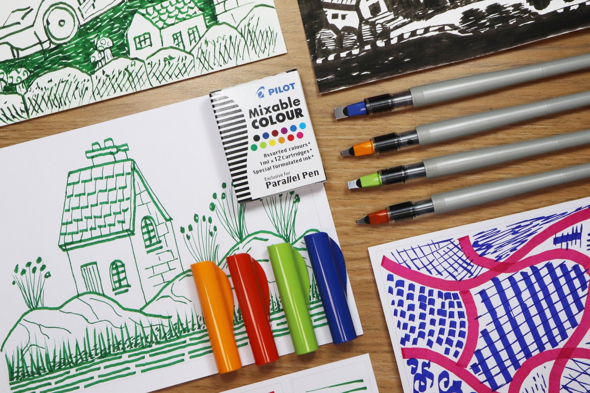
2. Types of Markers: Let's now start off the class by talking about some of the different types of markers that you can get. I've summarized the markers into three types. The first is water-based markers, second is alcohol-based markers, and the third, I've labeled as paint markers. Now, you can get other types of markers as well, but I've decided to narrow it down just to these three for this beginner's class in markers. Let's now talk about the first type of marker, the water-based marker. Now, these markers are usually very cheap to buy, they're the cheapest option out of the three that I mentioned. They tend to be acid-free and odorless, which means that they're very good for children and adults alike, and you don't need to work with these in a well ventilated area. Water-based markers are good for calligraphy and line arts, especially if you're trying to do quick little doodles and sketches. In comparison to the alcohol markers, water-based markers can be a little bit difficult to blend and lay a color width depending on the surface that you use. You will find most often than not, especially if you're using just normal thin paper, you will get a lot of bleed through, and it will eventually tear the paper if you keep layering with water-based markers. The majority of water-based markers are generally not available to buy as single markers. If you run out of a color, you will most likely have to buy a full pack again. Generally, water-based markers are very good markers to use if you want to use a cheap marker that's easily accessible, and that you can use quickly, and use it as maybe a throwaway marker once it runs out. You can produce fairly decent results with these markers, but where it comes to using these markers for full illustrated artwork, I would tend to go for the next option, and that is the alcohol-based markers. Now, alcohol-based markers are naturally going to be more expensive than the water-based markers because of the solvent that they're made up of. There are many brands and ranges for alcohol-based markers. You can get cheap markers, and it can go all the way up to very expensive markers. Alcohol-based markers are usually quick drying and they have good permanence levels. A lot of brands that produce alcohol-based markers use double-sided nibs, which gives you a nice options to create line width and variation. They can also be waterproof once they've completely dried out on your surface. One of the huge advantages of using alcohol-based markers is that you can blend colors together and layer them very easily to produce absolutely gorgeous results. Some brands produce alcohol markers in both dye-based ink and also pigment-based ink. Pigment-based ink is very good for lightfastness. If you decide to draw beautiful artwork in your alcohol markers using pigment ink, they will last a lot longer, and you can even put them on the wall and they will not fade over time with the interaction of light. Pigment-based markers are also available. One negative thing about alcohol markers is that they can be irritable to the eyes and lungs because they have strong smells that usually come out from them from the alcohol, the solvent mixture that is used to produce the liquid part of the marker. This means that you will need to use these markers in a well ventilated area, so they're not suitable for children. I would not recommend your children getting hold of these markers. Many alcohol marker brands produce singles in those ranges that they produce, which is a huge advantage because when you run out of a color, you can just go ahead and replace that color without having to spend so much money on the set. Generally, alcohol markers work absolutely brilliant. They come at different price points and ranges, and they come in a huge array of colors and sets. You can buy these in individuals, small packs, medium packs, or you can buy them in huge box sets. The price will depend on the brand that you go for, and we will look at this more in the next lesson. The final markers that I want to quickly talk about is the paint markers. Now, these may be labeled as actual solvent markers or even alcohol markers in some cases. However, they differ with the content of the solution that's contained within the actual marker. Now, these markers contain either actual paint in the form of oil paints or acrylic paints, or they can contain a mixture of ink and paint in different proportions. The huge advantage of this type of marker is that it produces opaque and bright colors, which means that you can produce gorgeous highlights over any other type of marker work. So if you're using an alcohol-based marker and you can't get really thick opaque lines, you can easily achieve that with these paint-based markers. They often come in white colors and really nice ranges of metallic colors, so you can produce some gorgeous special effects. Another advantage of these markers is that you can use them on multiple surfaces, so they don't just have to be used on paper, they can be used on leather, on plastic, they can even be used on some metals. These markers are very versatile, and you can really produce some very nice, abstract, and funky looking artwork with them. These markers excel in their special effect colors, especially in the metallic colors, and you can get the actual metallic shine once they completely dry. Whereas with other markers that are more alcohol based, the metallic colors tend not to have as much shine as these paint-based markers. These markers also tend to be light fast and waterproof once they've completely dried. They're great to use on outdoor materials such as on bags or on your trainers or even on your wallets. They will last, and they'll be able to take water, and they should know fade over time very quickly. These markers are activated by shaking them, and there's usually a little roller ball inside the actual marker that starts moving the paint that's already within the tube to ensure that it doesn't clog up. Every time you use these markers, you have to activate them, whereas with the alcohol and water-based markers, you're ready to use them as soon as you take the cap off. Paint-based markers have very strong scents, especially the oil-based markers. The solvent that's inside them is very strong and has a very, very strong odor, so you've got to ensure that you use these in an extremely well-ventilated area. These markers should never be used near children at all. That was just a quick little overview of three generic types of markers. Let's now move on to the main type of marker that we're going to use in this class, and that is the alcohol based marker.
3. Alcohol Based Markers: Welcome back. Let's now talk about the alcohol-based markers that we spoke about before. As mentioned before, alcohol markers come in a variety of brands, shapes, and sizes. Therefore, the price points differ vary dramatically from brand to brand. Let's start off by looking at a very popular brand of alcohol marker that is the good old Sharpie markers. These markers are usually the cheapest alcohol markers that you can buy. They're readily available and they come in a very good color range. You can also get these in metallic colors and some special effect colors as well. They come in big packs, small packs. Some colors you can actually get in single such as the blacks, grays, and maybe blues and reds, or you can get small packs with maybe three colors in them or four, but generally, the color ranges for the variety of colors usually come in the bigger packs. You can blend and layer with these markers. They're very good to coloring in coloring books. However, the surface must be thick enough to be able to take the marker because you do get a lot of bleed. Sharpie markers usually come in single-size tips. However, you can get different types of tips as well. You can get a fine tip, a broad tip, a big chisel tip marker. However, they usually don't come as double-sided tips. Well, I've never seen one in double-sided tips. Sharpie markers are not refillable. Once they've run out, you've got to buy them again. One of the biggest disadvantages of Sharpie colors is that they're not color-coded or they don't have color names written on the actual marker. In the sets that you buy, they generally tend to have a range of colors. If want to replace that color, it's very difficult to find that particular color because the color of the caps don't tend to usually match the actual real color that comes out of the marker. There's no real color-coding and you will usually have to guess what colors you need to buy again and most likely they're going to come in a full set rather than in a smaller set or singles. As mentioned before, the singles usually come in the black, the grays, maybe the blues and reds only. You're not really going to get your purples, your oranges, or your secondary and tertiary colors as single. Moving on to the second midpoint marker that's by Winsor & Newton. This is the main markers that I use on a daily basis and I will base the rest of this class using these types of markers. The Winsor & Newton range are alcohol-based markers, and they're reasonably priced in the grander scheme of things. They have excellent color ranges, they have pastel colors, bright colors, more specific ranges for specific types of jobs. You can get them in big box sets that work absolutely brilliant. I personally use the box sets myself because the box actually serve as storage. These types of markers, you must keep them flat so that the ink doesn't collect up on one side. The reason for that is that they usually have a double-sided tip. They're very good for blending colors, similar colors blending into each other, opposite colors blending into each other and the layering process is very good indeed and we will come onto the subject in the coming lessons. As mentioned, these double-sided tips, so you can either have a bullet tip or a chisel tip in the pro marker, or you have a brush tip and a chisel tip in the brush marker. These tips usually cover most of the line variations that you need to produce, so they work absolutely brilliantly. Winsor & Newton also produce a different set of alcohol markers containing pigment inks and these are called pigment markers. These markers are very light-fast and the fading over time, they're going to be very minimal compared to the non-pigment-based alcohol markers. The shape and size of the actual marker is quite different from the pro markers and the brush markers. The quality is very, very good. The color codes and numbers are usually printed on the markers. Whereas, with the pro markers and the brush markers, it's usually a sticker that's just added onto the marker. The feel and look of the pigment-based markers from Winsor & Newton is a lot more premium. They also come in the double-sided tip. However, they don't come in the brush tip, they usually come in the bullet tip and the chisel tip. The huge advantage with Winsor & Newton range is that they are fully color-coded and they have the names written on them and you can also buy the singles. Whenever you run out of a particular color of that marker, you can easily go ahead and replenish it and replace it and put it back into your set so it works absolutely brilliantly. These markers, however, are not refillable and as mentioned before, they have a slightly cheaper look and feel because of the writing and the color codes actually being stickers that are attached onto the marker themselves, and sometimes over time they can wear away or they can actually start coming off at the edge. The feel and the look generally isn't as premium as some of the more expensive markers. Let's move on to the final marker and this is the Copic marker. Now, this marker has the highest quality and performance in terms of physical quality and actual quality of blending and layering colors. I personally think these markers are the best markers you can buy. Huge color range is available in them, and they are fully color-coded with their names and code numbers, which makes the singles available. Which, again means that you can buy the ones that run out and buy them in singles in various colors and ranges. A huge advantage of the Copic markers is that they're refillable so you don't need to go out and buy the marker again. You can just buy the refillable cartridges that come with it and that way you save money over time. However, the biggest and probably the only disadvantage of this marker is that they are very expensive. In comparison to the Winsor & Newton, I would say they're probably 3 1/2 or four times as expensive per marker, which is a huge amount, especially if you're buying a pack of maybe 24 or 48 markers. You're going to be spending a lot of money on Copic markers. I generally do not recommend buying Copic markers for anyone who's a beginner in the world of alcohol markers or generally in markers at all. Because I just don't think that the price justifies what you're getting for it, especially at this early stage. If you really want to have that experience of Copic, maybe just buy yourself a small pack, but you'll notice that even with a small pack of maybe five or 10 markers, you're going to be spending as much as you would normally spend on Winsor & Newton in buying a 24 or even a 30 pack of markers. The price difference is very big indeed. However, the Copic markers are generally the best markers that you can get. Now, I use the Winsor & Newton more than any other marker. I tend not to really use the Copic markers. I have used Copic markers in the past, and I maybe use Copic markers more on the gray tones because I think that the gray tone colors are a little bit more superior than the Winsor & Newton. The Winsor & Newton tend to be warmer than the Copic markers. The Copic markers tend to be a little bit cooler and a bit more truer to the gray tone values that you generally get. Other Copic markers also come in a range of prices within the markers. You get the cheaper Copic Ciao markers like I've got here and you get the full and Copic markers and there's also Copic sketch markers and Copic illustrator markers. There's a different range of Copic markers, but however, like for like with the Winsor & Newton, they are a lot more expensive. If you compare them to the Sharpie markers, they're probably about 20 times as more expensive as the Sharpie markers. I would recommend that you maybe go for that midpoint at Winsor & Newton or whichever brand of alcohol marker that is available to you because Winsor & Newton is a UK-based brand. Therefore, in all the art stores in the UK, it's the main brand that's readily available. Wherever you are in the world, whichever country you're living in, go for the midpoint marker that you can get there. There's so many superior markers that are in different brands. It's not just only Winsor & Newton and Sharpie, you can get Arteza, Faber-Castell, Prismacolor, Touch markers. There's just so many ranges of markers and they work brilliantly. All the techniques that we're going to be going through in this class can be applied to any alcohol marker. Just get the markers that easily and readily available for yourself. Avoid using cheap markers because, with cheap markers, the blending and layering is going to be a little bit difficult. However, even if you have Sharpie markers, you can still complete this class with Sharpie markers. Let's now move on to the next one.
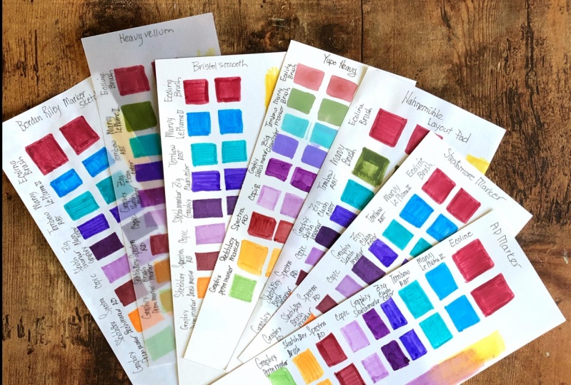
4. Surfaces: Welcome back. Let's now start by looking at some of the surfaces that I would recommend that you use your markers with. Now, markers can generally be used on quite a wide range of surfaces. The surfaces to avoid using are the printer papers or the really thin cheap papers that you can get, because the markers are just going to literally bleed and tear right the way through them. If you've used markers in the past on cheap paper, you know exactly what I'm talking about. On the screen here, I've got four different samples of paper. Starting on the left, we have marker paper which is specifically produced for markers, alcohol based markers, and this one is by Winsor & Newton. It's a very thin paper, so there's not much weight to it at all. It's only 75 GSM. But it's got a special coating on it that allows the actual ink and alcohol and the actual solution of the marker to stay on the paper for as long as possible. Great paper to use and we're going to demonstrate each one of these. The next one that I've got here is just general cartridge paper, 200 GSM, heavyweight cartridge paper. Again, you can use this for markers, it works really nice. Third one over here, and this is probably my most favorite and most used paper. This is the Bristol board, and it's a 270 GSM. This paper works great with markers. Again, one of the most important aspects of using markers, and surfaces, and paper is bleed through, and the ability for the paper to withstand that marker and ink, and not allow it to seep all the way through the paper and tear the paper. This paper for me is one of the best papers that you can get. The final one here is the Multimedia Artboard. This is a very thick artboard, 1.4 millimeters thick, and this is one that works really good with markers. However, an important aspect to note is that the thicker the paper, the more porous the surface, the more your marker will be used, and it will be very marker hungry. The papers are going to really absorb that marker very quickly, and you may find that with a thicker and more absorbent papers, your markers tend to run out quite quickly. This is a good paper to use, however if you're doing a big piece of artwork, I probably wouldn't recommend it because your markers will run out fairly quickly. Let's do a quick little test of a couple of different markers on each one of these papers. Firstly, what I'm going to do is I'm going to look at the standard Crayola water based marker. This is the cheap marker that we went through in the earlier lesson. Absolutely brilliant marker to use, it's not alcohol based, it's water based, but again, these cheap markers, they can produce some really nice results, but it all depends on the surface that you use them on. Let's start off with the marker paper by Winsor & Newton. All I'm going to do is I'm just going to do a little swatch on each of these to just show you how it works. You can see it releases the ink very nicely. I'm just going in this back and forward motion, and you've got this really nice, vibrant swatch of color, works really well, and with this marker proof paper, this Winsor & Newton marker paper, you can see that the ink stays on to the actual paper. Now this paper isn't really made for water based markers, it's made mainly for alcohol markers, but you can see that the results are quite nice. Let's move on now to the second paper, the cartridge paper, using the same ink and the same color. You can see that when I'm releasing that ink, it's actually absorbing a lot more of that ink solution, and because it contains water in it, the water element is absorbing into the actual paper. You can see the more you go over with a water based marker on a porous surface, the more it's going to absorb into the fibers, and you will eventually get a lot of tearing up of that surface. If I keep going over and over again, it's going to eventually start tearing into the paper. That's the disadvantage of using water based markers because they do tend to go through paper very quickly. Just looking at the actual contrast of the color, you can see the color showing up a bit more lighter on the marker paper, whereas with the cartridge paper, you've got much more saturation, and it's showing a slighter darker value. The actual look and feel of the marker will depend on the surface that you use. Let's now move on to the next paper and we're looking at the Bristol board. This is my favorite paper and you can see the results are very similar to the actual marker paper. Bristol board paper is absolutely brilliant. The surface is nice and smooth, it can be a little bit expensive, however, I would highly recommend getting this paper, especially if you're using markers quite heavily, and you rely a lot on actually layering and blending with markers which we're going to come on to in the next lessons. There's a swatch with the Bristol board. Let's now move on to the final paper, the mixed media multimedia paper. You can see that the release of ink on this one is a little bit slower, and that's because there's more surface for it to cover and the paper is a lot thicker. This is really thick board and you can see that it actually takes the marker really well. If we just carry on, just create a nice little swatch, just going back and forward, not pressing down too hard. That's one thing to notice. You shouldn't really be pressing too hard with your markers, otherwise you will damage the tip of them, and you will damage the paper. There we have it. Let's just get a zoom back on this. We've got four swatches using the Crayola marker, the water based color marker, and you can see that the results are quite different for each paper. Personally, I always like using the Winsor & Newton marker pad paper if I'm using water based markers, but I generally tend to use the alcohol based ones, which we're going to move on to the next. The Bristol board for me is always the one that produces the best results. Let's now move on to our next marker.
5. Promarkers: Let's now move on to our alcohol-based marker and we're going to be looking at the Promarker by Winsor & Newton. These ones, as I mentioned before, these are doubled tipped. We have the bullet tip on one end and then we have the chisel tip on the other end. They work really nice. This is my go-to marker, and I absolutely love this. Let's get the zoom back on this. Let's just create a nice little swatch with the bullet tip on the Winsor & Newton. This is absolutely brilliant. This paper was actually designed for the Winsor & Newton range and it just works absolutely brilliant. I mean, look at that beautiful saturated color just coming out of that marker. What I'll do is I'll actually use the other side of this as well. Let's use the chisel side just to give you a demonstration of how the paper can take it. You can see you've got more broader strokes with the chisel side. If you go backward and forward, you're releasing a lot more ink, and the paper can take it very well. It's like the actual ink and solution of the alcohol, the solvent stays on top of the paper to get maximum coverage, and you get this beautiful saturated look. Let's now move on to the actual cartridge paper now. Again, let's use the bullet point. You can see straight away it's a lot more darker because that solution of ink and solvent, the alcohol, is going into the actual fibers of that paper immediately, but it produces quite a nice swatch. You can see it's quite darker than the first one. Again, the surface that you use will depend on the results that you get. Just doing the same now with the chisel side, and you can see that beautiful ink coming out of that marker, just going backward and forward. Fantastic. Let's now move on to the third paper. Here we have it on the Bristol board now. The Bristol board, it just feels so smooth when you're just applying the actual marker to it. It's just got this really nice surface. You can see that the marker goes on really nice and smoothly. I'll turn it around and go to the chisel tip. Beautiful. I mean, just look at that, look at how nice that is. Absolutely love using this paper. This is the paper that I'm going to actually use for most of the classes. Let's now move on to the final one. We've got our Mixed Media art board, and you can feel the difference straight away. I can feel that the ink is literally pouring out of the market and getting absorbed immediately into the fibers of this thick art board. But the results, again, are very nice. Let's look at the chisel side, very good. Like I mentioned before, that this paper, this art board will use your ink very quickly purely because of the thickness of the board and it's very porous from the surface. Let's just get our zoom back. There you have it. We've got a nice range of colors produced on different surfaces. Again, the actual color values, the shades of that color, it's using the same ink, but we're getting different results on different papers. Whatever your preference is, I would say go for that type of paper. If you like darker tones, then maybe go for the cartridge paper or the Bristol board or even the mixed media art board. If you prefer lighter tones and you like to maneuver that ink, then maybe go for the marker paper. But the most important aspect of this is that how much of the ink bleeds through. Once we've done all this, I'll show you the back end of the actual paper, the other side, and you'll be able to see which paper withstands that ink the most. Let's move on to the next marker.
6. Brush Markers: The next marker that I'm going to use is the BrushMarker, and this is exactly the same as the ProMarker, with the only difference being that one end of it is a brushed tip, and the marker for the ProMarker tip was a bullet tip. Let's have a look at this. We've got this lovely brush, flexible brush tip, which I absolutely love using, and it's great for blending when we come to blending. On the other side, again, we've just got the standard chisel tip, we'll do exactly the same as we did before. Let's get a zoom in. Using the BrushMarker on that Winsor & Newton, absolutely gorgeous. Look at that. Look how nice that ink looks on that paper, very nice indeed. You can keep going on this again and again and again, and it won't rip the paper, or tear the paper. It's just absolutely beautiful paper to use the chisel tip, you can see that ink is coming out really, really nice, nice turquoise color there. You've got a nice bright turquoise color. Moving on to the cartridge paper. You can see that as soon as that ink hits that paper surface, it starts getting absorbed into it straight away and it's a lot darker. I'm using the same pressure with the brush. The advantage of the brush is that you can maneuver the brush around to really fill in the areas. If you've got some really small areas you want to cover, you can use the tip. Great advantage of using the BrushMarker. Then let's move on to the chisel tip. Just going in and do exactly the same. It's taken up a lot more of that ink compared to the first paper, the Winsor & Newton marker paper but the results are absolutely gorgeous. Let's have a look at the next one. Again, with the Bristol board, the ink's coming out really nice and smooth. All I'm doing is using this backward and forward motion with the brush tip and squaring it off with the pointy part of the tip. You've got yourself a nice swatch of color. That's the BrushMarker. Now for the chisel, let's go in with the chisel and do exactly the same like we've been doing. That looking lovely. You've got yourself a nice swatch of color. Final one, the mixed media art board, let's go on to that and you've got this nice resistance with the brush and the actual surface, it's producing a more dried effect. The ink is coming out more dried out in terms of the actual releasing of ink from that brush. Yo u can actually see that in the texture of the paper as well. The actual board you can see over here, you may have to work it a little bit more when you're using this thick mixed media art board. This art board is quite expensive, so I wouldn't go ahead and just go and buy a big part of this art board. If you've already got art board, it doesn't have to be the same on the I'm using just give it a go, and it's a nice little exercise that you can do. Let's just get a zoom back on that. Now, you can see that the results are very different, especially when comparing to the marker paper. You can see how light and pastel like the color results are there, compared to the other three, which are much darker. The cartridge paper giving the most darkest results, the Bristol board, being the in-between, and the mixed media, a little darker. For me, it's always going to be the Bristol board, that's the effect I like, but again, whichever effect you like I'd go for that particular paper. Let's move on to the final marker.
7. Pigment Markers: For the final marker, I'm going to be looking at the pigment marker from Winsor and Newton. As mentioned before these markers have pigment ink in them and these are great for lightfast purposes. These won't fade over time. However, they can be a little bit more expensive and I would probably not really recommend getting these markers, but if you have a couple of these or if you just want to try a few out, maybe just a couple of colors in them, they do work very nice. The actual look and feel of the marker is very different from the actual Winsor and Newton pro markers and the brush markers, the actual sizing, and the look and design is completely different. However, you still have two tips on it. We have the standard bullet tip on one end and then we've got the chisel tip on the other end. Very nice design. Let's see how it works on the paper. Let's start off by using the market paper and you can see that the release of this ink, it's actually even better than the pro marker and the brush marker. The reason for that is that this particular paper, this Winsor and Newton marker paper, it's actually called Winsor and Newton pro marker papers. It's actually specifically designed for these pigment markers but you can use other markers on them to get very nice results, but they really work best with these pigment markers and you can see how nice and saturated that color is. Let's just go into the chisel tip. Adding in that chisel tip, you can see that the colors coming out a little bit lighter. The reason for that probably is that there's more ink on one end where the bullet tip is rather than the chisel tip, so always store these markers flat rather than having them stick up. I probably had this marker in part somewhere, that's why ink release is a little bit different from one end to the other, but it does give you that nice variation. You can see you've got nice bit of ink going on over there. Let's move on to the cartridge paper now. You can see that is really dark from the bullet tip. That's again because it's very porous surface, whereas with the marker paper, it's actually stopping the ink from going into the actual fibers of the paper. As you can see, it's very nice and dark that color, gorgeous color that purple. Let's go in with the chisel tip and you can see I'm going in and it's very dry. The actual application is very dry and because my marker here probably needs to be reset and left for a while, you can see that the difference in the actual texture is quite varied, but I guess that's a good way to demonstrate how to use markers and get different types of textures within. Let's move on to the next tip. Now moving on to the bristol board. Look at that, look how nice that is. Absolutely gorgeous. I love this paper. I think it's probably one of the best papers that you can get. There are other papers that you can get to use for markers. There's a marker pad, marker card you can get, but it does cost a lot of money. I wouldn't really recommend spending lots of money, especially if you're a beginner in the world of markers, I'd go for a mid-price paper like this bristol board or the marker pad just to get used to the world of markers. Now you can see my marker is running out on this side, it's very dry, but it does give you a nice result. This marker here you can see that the release of ink is a lot slower, you can see the tip itself is drying out. That's another thing to be worried about with markers. Don't leave them open for too long. Don't leave them upside down or at one end in a part or in a pen part, just keep them flat and keep them nice and clean, otherwise, they will dry out. Going onto the final paper now the mixed media artboard. You can see, as expected, it's going to be a lot darker because the surface is a lot more porous. It's going straight into the fibers of that mixed media artboard, but it still looks very nice. Let's go on to the chisel tip and there's probably not much we're going to get out this end. So you can see we're getting a very nice dry look, but sometimes this dry look can work fairly well, especially if you're producing some textured work in your art or you're just creating some abstract designs, but it is very dry and that's because the actual chisel tip is a bit dry, but the paper is very thick and porous and it's actually taking that ink very quickly. Let's just zoom back. We've got a nice variation, four different papers over here. Winsor and Newton producing very nice light swatches of color with water-based markers, alcohol-based markers with pigment ink as well. Then we've got the cartridge paper here, and then we've got the bristol Board we produce very similar results. The cartridge paper will actually be slightly darker depending on how quickly the ink is released whereas the bristol board gives a nice mid color, which I always prefer in my artwork. Then finally, we've got the very thick mixed media artboard, which will really drain out your ink from your markers. I would probably avoid using this. Just give it a go if you're interested in testing it out, if you have, maybe some artboard lying around, but that's the general overall view of the surfaces. There is a another paper that I would recommend, but this is a very expensive paper and that is.
8. Sketchbooks For Markers: That paper is actually by a company called Crescent and it's called render. Now, this paper is absolutely brilliant if you're wanting to do work in a sketchbook. This is my sketchbook here, and I'll show you this. I'll just have a zoom in, so you can see we've got a beautiful sketchbook here. They come in different sizes, the sketchbooks, you can even get this paper as single sheets. I tend to only buy this for the sketchbooks because I like to come up with little sketches. You can see that the actual marker doesn't bleed through at all. This is probably the only paper I've ever used where markers don't go through at all. If you're after a sketchbook or you just can't stand marker bleed through, then this is probably the paper that I would recommend. It's got a good thickness to it, a good weight to it. I use this to do daily sketches on with markers. I like to just keep a nice little sketchbook. You can see I'm using a lot of heavy marker work and most of this is just Winsor & Newton brush markers. You can see you've got no bleed through whatsoever. I'll show you the last page, just to show you that there's literally no bleed through. Little illustration here. Lots of deeds or work, lots of heavy marker work. You can see on that next page, there is absolutely nothing. It's like magic. This is a paper that I would recommend if you just can't stand bleed through. Let's look at the actual papers that we've tested. This first one here we've got the Winsor & Newton. That's the Winsor & Newton here. You can see that you are getting a little bit of shadowing, a bit of bleed through with the watercolor marker, with the Crayola, but with the other markers, the brush markers and the pigment markers, you're not getting any bleed through and that's great. You do however get some shadowing. I wouldn't say that it's completely bleed proof but it is a good paper to use especially if you don't want your papers leaving a bleed through mark onto the surface or onto the sheets underneath. That's the Winsor & Newton. Then if we look at the actual cartridge paper. You can see here with the cartridge paper that the Crayola, the water-based marker, didn't get much bleed through at all actually. But with the alcohol-based markers, the pro marker, and the brush marker, they completely bled through. With the pigment marker there's not as much bleed through, but you are getting shadow and if you keep working it through, it's eventually going to go through. If you're looking for paper that doesn't bleed at all, then this is not the one for you. Let's look at the Bristol board. If we just flip this over. With the Bristol board, you can see the results and very similar to the cartridge but they withstand the marker a lot more. That's because it's thicker in weight. With the actual water markers, so the water-based mark, the Crayola you've got no bleed through at all, which is quite good. Then we've got much more shadowing for the alcohol-based markers. Then with the pigment marker, there is not much shadowing just a little bit. That's one of the reasons I like using this paper because a bleed through isn't as much as with the other papers. If we look finally at the board. I'll just till this over. With the board as expected because it's so thick you literally got no bleed through or shadowing at all. I guess if you want to use a sheet of paper that you want no bleed through on, then go for the mixed media board or go for the render paper, but these are going to be expensive options. Let's just turn these back around. That's it for the surfaces although I'll just demonstrate a few different papers for you to give you a bit of an idea of which papers you should use. Avoid using cheap printer paper and don't use your markers in a normal sketchbook, even in a Moleskine sketchbook or a decent brand sketchbook because the markers will bleed through. If you really want to use a sketchbook, then go for the render by Crescents. I'm going to leave all the details of these products in the resource sheets, so do check it out. That's a pretty much it for this. Let's now move on to the next one.
9. Layering: Welcome back. Let's now talk about the subject of a layering with your markers. Now for this demonstration, I'm going to be using my brush markers, so the Winsor and Newton brush markers, to demonstrate how to layer using similar colors and using gray tone color. Let's start off by getting a zoom in on this. Now a huge advantage of using alcohol markers is that you can layer to add in more vibrance and more darker tones, build some depth into your illustrations and you can do this very easily. I'm going to demonstrate this firstly by using this brush marker here, and the color is China blue from my 48 essential set. If you want to follow using the same colors, go ahead but if you haven't got the same color you you do this exercise with any color. I'm going to use a chisel tip now to actually add in some color. All I'm doing here is I'm just adding this first layer of color and the paper that I'm using for all these exercises now is the Bristol board paper. You can see I've got a nice layer of color, just swatching that out, beautiful. That's my first layer of color. Now the intensity of your layering will depend on the time that you spend between each layer, and what I mean by that is I've just added this first layer, if I wait a couple of seconds, maybe 10, 15 seconds and allow this layer to dry then add in my next layer, I will get different results. Whereas if I immediately go in and add in more layers immediately before it dries, then I'm not really going to get that gradual change in tone and value. We've given this a couple of seconds now, let's go in with our second layer. That's the first layer and again, all I'm going to do is I'm just going to use the same technique backwards and forwards and I'm just going to stop it round about halfway point. Now you can see that the tone has become a lot darker. We've got a darker value on the left and a lighter value on the right, and that's just produced by layering with the second layer of the same color. Now again, all I'm going to do is I'm just going to wait for this to dry, maybe give it about five or six seconds just to make sure that it's completely dried out before we add our third layer. That's about now. Let's add in our third layer, starting again from the left just going in with that chisel tip, and I'm going to go in halfway on the second layer. I'm just going to go in backwards and forwards, and you can see that it's intensified and darkened this third layer. Basically, we've got dark going all the way to light and we produce that very easily just with one color. Now, the intensity of this dark to light will depend on the actual color that you use. We can demonstrate this again and we can actually go ahead and use a different color to demonstrate this. Let's choose another color. I've got another color here this is a slightly mid-color it's called cinnamon, so it's like a brownish color. Let's do exactly the same as we did before and see what results we get. Again, going in with the first layer and I'm just going to go in with this light layer like this. I'm only going to go over it once, take it away all the way to the end, give it a couple of seconds and now let's go in with the second one. You can see immediately we're getting a difference and because this is a lighter color than the blue, we're getting a much darker tone on the second layer. If we just bring that down, you can see with the blue because we went in with a more darker tone from the start, we're not getting much of a contrast with the second layer it's effectively just adding a hint of color on top of the first layer. But this one, with a second layer, it's become really apparent and the contrast is quite sharp. By now the second layer would have been dried, let's just go over with the third one. You can see and you can see how nice and beautifully saturated that color is. Gorgeous color that one, by the way, it's cinnamon. Absolutely love with this color. There you go. We've got the third one there, and you can see we've produced a nice range of color with just one hue of actual color. You can see how easy that was to produce darker tones and the sequence of this is always going to be that you start off with your first layer and keep it nice and light, nice and thin, and then you gradually build by adding darker tones. Now let's demonstrate this in a quick little sketch. Let's just do a quick sketch over here. We could actually use the same color. I might just do a rough little sketch here. Maybe do a couple of objects, this lead be effectively be a bottle. All I'm doing is drawing in, blocking in the color with my marker, the chisel side and just designing a rough little bottle. You can see the nice and easy. Effectively we've just got a couple of layers there, it's nice and mixed. What we can do is we can actually go in with our blue again and maybe draw in something else. Let's use the brush tip, and how about another bottle here. Let's just keep it nice and rough. It's not about doing perfect drawings at this stage, all I'm doing here is demonstrating the layering technique to produce a nice range of colors very easily. There you go. We've got another bottle there and maybe let's add in maybe a third bottle. I've got this nice orange color here, or we could just start a box, let's just draw in a little boxes. We've got a little box here, and all I'm doing is adding in that color with the brush tip, and at the moment, these are just the first layer. We've got one layer there, let's go back in now and start adding in some darker tones. I'm going to you use the brown, the cinnamon color and I'm going to use the brush tip now to start darkening these areas. Now you can see as I add that second layer, you've got a gorgeous darker tone that's already started bringing a bit more depth into this very rough illustrations. You can see I'm just going in very lightly, just adding in a couple of darker tones and maybe just a couple of lines, couple of dots here, just to add a bit more depth. Let's do the same with the blue. Go into the blue, let's darken that area a bit more so you can see with the darker colors, the blue is slightly darker than that brownish cinnamon color. You can add details of very quickly by just layering your colors. We're doing no blending here, all we're doing is layering the same color to produce different values, darker values from just a couple of layers and how easy is that. Don't need to be neat. I'd suggest that you try this out. Just draw a couple of objects, a couple of shapes, and just go in and start layering that color and see what results you get and you'll be surprised that with markers you can produce things so quickly compared to other mediums like colored pencil or water colors or anything else. Whereas other mediums you've got to spend quite a lot of time to build colors up with markers. You can do this so quickly, and so easily can add details in by just layering that same color. I mean look at that, it looks gorgeous, doesn't it? It's not a great illustration, but it's just a good illustration of the layering effect. I'm going to add in that third and final layer just to really intensify the dark and you can see we're getting a nice variants of color, nice better detail, darker shade on the left, and maybe dropping a couple of details, go over it couple of times. Again, you can keep going over it again and again. There will be a threshold for the actual color itself. There'll be a point where you won't be able to add in anymore because it's already reached that threshold. But that's fine, usually three layers is quite enough. Let's go in with the blue. Again, the darker color on the blue all I'm doing is just intensifying some of those edges just to give this a bit more form, make it look a little bit more interesting rather than just having a flat drawing. You can see you can start adding details in so easily and it's very effective, so look at that. Let's just finally do the last one with the orange and I think we're doing on this one. You can see with the orange, this amber color, we've pretty much reached the threshold of the dark, we're not going to get any more darker than that, and that's something to just understand. Maybe add a couple more details here on this box, couple of dots here, couple of lines here, and we're looking good. You can see just quickly do a little scribble by changing the variance of the tones of that same color to produce a nice little sketch.
10. Grey Tones: Let's now look at how to utilize great tones to produce these dark areas. Let's just move this over here. What we'll do is we'll produce the same swatches with the same colors so that we can contrast and look at how they differ. Many use that same blue, that China blue, just to add in a nice layer of color going all the way across. I'm just going to keep it as light as I can with a chisel side of the tip just to make it nice and even. There we go. What we'll do is we'll do exactly the same with the brown one so we don't have to do that again, so we're just going to add the first layer of the brown, drag it across couple of times. Try keeping it nice and light. There we go. What we're going to do now differently is we're going to look at some gray. Depending on the colors that you have, you may not have that many grays. If you've got the same set that I have, I've actually got most of the grays. Grays usually come in cool grays or warm grays. Let's try them both. I've got a cool gray here and this one's called cool gray one. I'm just going to use the brush side of the tip. Let's start adding in a layer over that blue. Now, you can see that this cool gray one is adding a really nice tone onto that blues. It started slightly darkening that blue areas. If we do the same for the brown, you've got them very nice, subtle shade going over the brown, that cinnamon color and it looks really nice. If we use a darker gray now, so if we go in and we'll look at the cool gray three. That first one was cool gray one. You go in with cold gray three and maybe add in a couple of layers going in from the edge. I you can see this one is a lot darker. You can see we've got a lot more darkness coming out of the color. Again, let's add it onto the brown. We've got much more darkness coming into the brown. Now, if you like to get things really dark, and then you're thinking "hang on a minute, I don't want it to be that obvious you can see that there's this separation line between that dark gray area and the pure brown area. All you need to do is go over it with the brown again. If we go over this with the brown, what that will do is it will effectively blend that darker area into the light. If we just keep continuing with this, what it does is, it darkens the gray area without creating a separation line. You can see what we're doing is going over it again. We've got a nice darker tone and you can keep repeating this so you can go in with the gray very lightly and just keep it nice and subtle. Then go in with a brown again. Just to intensify the color and you can see how quickly we can get results from dark to light by using gray tones. Absolutely brilliant. If we look at maybe a warm gray, so we've got a warm gray here. This one is warm gray three, the other two, if you remember, we're cool grays. Let's just look at this side, if we add the warm gray onto the brown here. You can say, looking really good. Now if you take the gray over to the white area, you'll be able to see the actual color or dark gray compared to the brown. If you can see over here, you've got this nice pure warm gray color and that's how it reacts with the brown. Just layering, it across and if you do the same for the blue. If you just add the warm gray on the outside and then go over it on the blue then you can really appreciate how that warm gray changes the value or the tone of that blue. You can use this to your advantage of darkening colors or lightning colors. It works really well. That's the actual layering. If we see side-by-side, we were doing darker tone going to light with the same color. Then over here we using grays to produce a darker tone of that same color. You can see that the results are quite different, but they are quite nice and saturated. Let's just do a quick little sketch over here using the same principles. Again, all I'm going to do is I'm just going to maybe draw a couple of bottles again, nice simple objects just like this. What we'll do is we'll do exactly what we did before. Have the same colors as we did in the previous sketch. We've got nice, so bottle shape over here and maybe do something similar over here, or maybe just have a tea pot or something. Let's just draw in a little teapot. Let's have it next to the bottle, so it looks a little bit more interesting. Maybe we've got this teapot shape here, or actually, let's just make this a little. Yeah, why not? Let's do a teapot. A little teapot, I think it's coming out. There you go. Simple little teapot shape there. Then let's use that orange that we had before to maybe draw a cup. Let's just have a little cup here. Nice and rough and easy again, try this out, just follow what I'm doing here you don't have to do the same shapes, that am doing, these are just little over rough examples just to show you how to use this layering effect. Let's bring in our grays. I'm going to use the cool gray three that we used earlier on, and let's start darkening some of these areas. Now you can see that with the gray you get much more of a contrast. In certain parts of your illustration, you may want a nice dark contrast. I mean, like in this illustration here it works fairly well. You can really start making out these values and objects and really get a very nice effect, you can see all I'm doing is just adding in detail work by going in dark, again on the bottle couple of layers, you don't just have to add one layer, you can go over again. The principle is exactly the same. Start off by just doing one light layer, go in with another and gradually build up those values. You can see the gray is quite dark and contrasting hare. If we use the color again over it to just mute it out, you will get a nice subtle tone. The reason I'm showing you this is because you may not have all the different gray values. If you've just got a darker gray, just go over it with that same color layer over it, just to give it a subtle touch and you can see it creates a nice look. I'm going to go in now with an even dark gray. This is a warm gray four this will be slightly darker. Well, it'll be much darker, so we are producing much more of an intense shadow. Look, here on the left-hand side. You can really have a nice play around with darks and lights. That's what it's all about. It's just having a go, have a bit of fun. Designing some shapes, come up with some ideas. Just do some block objects. It's going to look really nice. What I'm going to do is finally just going to go in with a brown, so soften up this area and then just layer over the gray to add in some saturated, darker tone. We've got some more saturated areas here. We can maybe leave some lighter areas to show, highlight work and just add in a little bit more design. Again, with the blue, let's go in a little bit darker with that blue, to color those areas so they don't look too contrasty and maybe just add in a couple more lines. It's looking really nice. I'm going to leave it at that. Let's just get a zoom back. You can see we created a nice little swatch of color going from dark to light or light to dark, whichever way you want to call it. We produced some nice shades using the gray tones that we had, the warm grays, and the cool grays just to quickly come up with some values and some shadow work to produce something interesting and that's how easy it is. Try this out. Try your entire color range to produce darks and lights and see what results you come up with is just practice so that you can get ready for your class project where you'll be producing a nice sketch by using all these different techniques and exercises. Let's now move on to the next one.
11. Blending: Welcome back. Let's now talk about the wonderful subject of blending. Now, the huge advantage of alcohol markers or any type of markers really is the ability to blend one color to another. Let's demonstrate this and see how easily this can be done. I'm going to be using, again, the brush markers from my Winsor and Newton set. Over here on the screen, I've got two different papers to demonstrate this because the actual ability of the blending will depend on the surface that you're using. The surface does play a part in how quickly or how well you can blend two colors with each other using markers. On the left-hand side here, I've got my favorite Bristol board paper, and then on the right-hand side, I've got the Winsor and Newton marker paper. Let's have a look at three colors, we will attempt to blend three colors and we're going to use the same hue family for this, and we're going to use the blues. I've got a nice light blue here, so we'll start off with a light blue on the left. Then I've got a mid-tone blue on the middle part, and then for the darker blue, I've got a nice vibrant blue to go on the right. What I'll do is I'll attempt to blend all of these colors into a nice strip. Let's start off with the Bristol board side here and get to zoom in. Starting off with the lightest shade of blue, this one is called sky blue from the brush marker set. All I'm going to do is I'm just going to use the brush marker tip and start laying down some color from left to right, just like we did in the layering lesson. Just a nice light strip of color, maybe up to halfway. If you've watched any of my previous classes on colored pencils or any other mediums, I'll go through blending in a three-step process. I'm going to do pretty much the same for this. However, blending with markers compared to other materials is a lot quicker and easier. We've laid down our lightest blue first, just a nice layer of light blue. Then we're going to go in with the mid-tone blue. This one is the China blue, so just with this mid-tone blue what I'm going to do is I'm going to start in the white area here. I'm just going to start adding in some color on that white area. Then I'm going to slowly bring it over to the lighter area, and you can see that it started jellying in to that color. It's quite distinct, you might think that, yeah, that's just overpowered that blue. Well, the next step will be to start muting this out. I'm just adding that layer. Then I'm going to quickly go in with the marker for the light color again. Then starting from the left here, just going on, adding another layer, and now you'll be able to see that this joint hair from the dark to the light is nicely melting away. I'm just using the circular motions with the brush tip. The brush tip is great to do blending. I actually prefer blending with the brush tip compared to the actual bullet tip because a bullet tip tends to leave a streaky effect. Whereas with a brush tip, you can actually use a very light pressure to get some nice blending going on. You can see we've got this beautiful blend going from the light blue all the way into that mid-tone blue area. We've got this beautiful melting of colors that looks really nice. Let's put that blue away, and let's open up our dark blue. For the dark blue, I've got royal blue from my set. We're going to do exactly the same. We're going to start adding in the royal blue from here. Just adding in a nice layer, just in circular motions, and then going slightly over that mid-tone blue. Then, again, I'm going to continue this all the way to the end of this little paper strip that I've got. It's looking really good. It's always better to start off with the lighter colors first depending on the hue of color that you're using for this blue. I started off with a light and then gradually build up to the dark. What I'm doing now is I'm going to use that mid-tone. With the mid-tone, I'm going to just continue from here. Then just melt it onto that joint area where both the colors meet. You can see how easy and seamless it is to just blend these colors together. It looks absolutely brilliant. I probably won't be using any more of the dark, I'll just blend out this area with the mid-tone. The mid-tone's always a nice color to use to blend out your color. You can see over here now, we've got a nice dark, deep blue on the right, going into a middle, grayish blue in the middle, and then ending up with a lighter blue. If you want this little joint area from the light blue to the mid blue to get even more seamless, then just go over it with a light blue, start from the edge of where the light color starts and just build your way in until you're happy with the actual color merging into the other here. That's looking pretty nice and good. I'm happy about that. What I'm going to do now is I'm going to do exactly the same now using the other paper, so the pro marker pad paper. You'll be able to see that there's going to be a huge difference in this. Because with the previous paper, the Bristol board, as we mentioned in the earlier lessons, this is a surface which has a slight texture to it, and it absorbs the ink as it comes out. You're not going to have much time to maneuver that color. Blending, you've got to do it fairly quickly before the actual color dries out completely. You can salvage some of the blending even if it dries out. But then you're going to spend a lot longer working the color over and in another to get the result that you're after. You'll see now that when I do this on this marker pad paper, the results are going to be a lot quicker. Let's start off with a light blue again. Let's go in with a light blue. You can see that the color comes out so much more fluid and stays on to that actual paper longer. Just with a light blue there, going in with the mid-tone now as we did before. Look at the blending, the blending happens immediately. As soon as that one color touches the other, it starts blending and melting away, mixing effectively one color to another. Just like that, I've just added in that mid-tone blue, and then I'm just going to go back with the lighter one, start from this joint area and just mix it out to give myself a nice blend of light to mid-tone value. We've got that light to mid-tone there, let's add in the darker blue right at the end. Let's add in a little bit more on this right side, and then just lightly with a light touch, let it overlap, and it's looking good, gorgeous that is. Look at that beautiful, vibrant array of blue. With the mid-tone again, starting where the mid-tone is, and just lightly overlapping this, blending it out very lightly. You don't need to press hard because the harder you press, the more you're going to move away that ink from another, and maybe just add in a couple of dabs with that brush. You've got yourself a beautiful, beautiful array of color. Let's just have a look at this and zoom back. You can see that using different papers produces slightly different results, but the application can be very different. On this, on the right-hand side, the marker paper, I was able to get blending done very quickly, I didn't have to work in too much. Whereas with the Bristol board paper, I had to work in a couple of layers, mix them around to get the desired effect. You can see that generally it's very easy to blend from one color to another. Let's try this out now using maybe a couple of opposite colors, not from the same family, and let's demonstrate this again.
12. Different Colours: Let's now blend two different colors. I've got a nice red color here. This one is called berry red, and then I've got an orangey shade which is called amber. Let's attempt to blend these. What I'm going to do is I'm going to start off with a lighter color, I'm going to use the amber, and I'm going to actually use the chisel tip of this just to demonstrate this slightly differently. With this, I'm just going to lay out that amber color onto my paper strip here. I'm going to take it halfway. I'm just going to take it halfway all the way up to that point, give it a good layer of color, couple of layers of color. That's looking good. Now let's add in some of that red. With the red, I'm going to go in with the brush tip because the red is slightly darker, and I'm just going to start adding in that red color onto this white area first just to get that pure color onto the paper so we can make the distinction. Beautiful red, that berry red. Now I'm just going to bring this across very gently onto the amber, and you can see it started mixing immediately. You might not be able to see this on the camera, but I can see that it's lightening that shade of orange. I'm going to go back now with the amber, I'm going to get the brush tip out, and then I'm going to just go in where I've just got the pure amber and slowly mix this in. You can see, all I'm doing is I'm overlapping that area where the red meets the amber. I'm just going in in circular motions, back and forth. What that does is, it slowly melts away that harsh differentiation line that we have between the two colors. What it's doing, it's blending the two here in the middle. That looks gorgeous, doesn't it? Effectively, this is a gradient blend. We're blending this out into a lovely gradient, from one color to another. You'll notice that when you're blending colors, if you've got a lighter color, the darker color that you're blending into will actually start adding onto the tip of your brush. The way to get rid of that, all you need is just get an extra strip of paper and just clean your brush off to make sure that you've got no bits of the other color left onto that brush, and then all you need to do is go back in again. If you want to get a better blend, go in into the lighter color, add another layer, and then bring it across over to that darker color, and you can see we've got a gorgeous, seamless blend going on there, looking absolutely brilliant. Let's do the same now. Let's just clean our brush to make sure we've got no residue of red on there. That's looking good. Just give it a little dab on some extra paper, move that to the side and then what we can do is go straight into the ProMarker Pad Paper and do the same. Let's just go in with the amber color. I'm just going to use the brush side, I won't use the chisel. I'm working quite fast here. You do have to make sure that with markers, if you want to achieve blending or decent layering, you do have to work quite fast, depending on the paper that you're using. Then, again, with the red, I'm just going to go in and I'm just going to lightly blend that color. You can see that the blend on the Marker paper is a lot more quicker. You can get results a lot more quicker on the Marker Pad. On the Marker Pad, what you'll notice is that the color stays wet a lot longer, and that's a huge advantage if you're after blending colors and getting really nice gradients and hues. Again, just going in with the amber, I'm just going in in circular motions, very lightly, not pressing down too hard. What that's doing is it's taking off that red and slowly melting it away into the orange shade. You can see, a lot of that red now is on the tip, so I'm just going to clean that off. You can see, that's actually becoming a red orange color there, so what you want to do is you want to maintain the saturation of the hue on your markers so that they don't get ruined, and I would highly recommend that you clean your markers like this, just keep dabbing them until the color comes back to its normal color shade. That's looking good. Then you can go in again, starting from the left, where we've got the orange, go in and let's start melting this beautiful gradient out. I'm happy with that. That's looking really nice. Let's get a zoom back to compare them. There you have it. We've got the two different colors blending into each other by doing the layering and circular technique, by just overlapping one color over another and repeating it until we're happy with the melting away of one color into another. On the top one, we did three different colors from the same hue family; lighter shade, mid-tone, too dark, and you can see that the results can be quite striking. Let's now move on to the beautiful colorless blender.
13. Colourless Blender: Let's now talk about the ProMarker colorless blender. Now, you can get this colorless blender in the ProMarker range. You can also get the colorless blender in the actual BrushMarker range. What I'm going to do is I'm going to demonstrate this on how to use this colorless blender because sometimes you may think that a colorless blender, all that it does is blend two colors once they're on the paper. That's actually not going to work so I'm going to demonstrate this. The correct way to use a colorless blender is to actually apply the colorless blender first onto your paper or surface. You've got to make sure that you generally work quite fast with this because if the colorless blender dries out, then you're not going to be able to do the next step. The first step is to apply a good amount of colorless blender, as I'm doing here, I'm just using the chisel tip because the chisel tip usually releases a lot more of the actual alcohol that's inside this marker pen. We want to get a good coating of that, a really nice good coating onto our paper. Not sure if you can see that on the camera. There it is quite a lot there on the sheet. What I'm going to do now is I'm going to choose two more colors. Let's start off with our lighter shade. Here I've got a wild orchid color, so with my brush marker, all I'm going to do is I'm going to start adding in that wild orchid color onto that colorless blender that I have just put down, and what you'll be able to see is you'll see that it's coming out really well because we've already got a layer of that alcohol on there, and that's all it does. It basically encourages the flow of the ink. I'm adding this darker purple color here. This color is actually called purple or violet. I'm just adding this from the right-hand side, making sure that it's on the colorless blender layer. All I'm going to do is I'm just going to overlap this as I did with the previous ones, and you can see we're getting a really nice quick blend. This is quite a darker purple compared to this other shade that we have on the left. What we're going to do is we're going to go in and repeat this until we get a nice blend of color. Now the temptation you may have is once you have your colors on here, you may think that I'm going to use the colorless blender on top of this. But that's not actually going to do anything for your blending because what that's going to do is just going to move the color away and just add more alcohol and maybe just leave a white patch of alcohol there, so don't put the colorless blender on top of any color. Always apply it before you apply the color, just to encourage that blending. You can see there I've got a really nice blend of colors. Let's try this out again on the marker pad. Again, with my colorless blender, just going to go in and you can see on the marker pad you can see the colorless blender, we have just the pure alcohol really solution that's inside here. It comes out a lot quicker and it's going to stay wet a lot longer as well. Let's go in again with the lighter shade first. What I'm going to do is we're just going to use a chisel end for the lighter shade. I'm just going to bring that over here. You'll notice that with the colorless blender, when you pull a layer of colorless blender on top, it does tend to slightly mute out or give your color a washy look. Now that's going to be natural because you're going to have more of the alcohol in. If we just go in over here and just go in and just overlap as we did before and see it's looking really good. Now I can show you the actual color by itself over here next to the colorless blender when we don't have any of that colorless blender and you can see that it's a little bit more vibrant and saturated compared to the color that we have where we have just the blender underneath. If you'd like to have your colors slightly muted and you want the blending to happen a bit quicker, then use the colorless blender method first. Then all I'm going to do is I'm just going to stop melting away with the lighter shade here and using the brush tip. You can see you're getting this really nice, lovely two-tone color strip. It's so easy. It's just literally taken a few minutes to achieve that, doesn't it? Now, if you were to do this with a dry medium such as colored pencils, it could take a lot of working into, it might not even work but with markers is just so nice and easily achievable that you can get these results really, really well. Now you may find that sometimes your colors are not blending because they're just too high in contrast with each other. That's just unfortunately the way it is. Just try blending colors in an exercise like this as much as you can just to get a feel of how your markers work together. What I'm going to do now is I'm going to go in and get a zoom out. You can see that we've got some nice results there. What I'll do here just to keep this complete, I'll just add in the dark from where we didn't have any colorless blender so that it all looks very nice and similar. It's looking really good. Beautiful bit of color blending there. For the final one, the final script that I've got here. What I'm going to demonstrate to you is more of an abstract way of blending, and it's really using the similar technique that we've been using in the ones before. But we're going to use another tool that you'll definitely have at your disposal and that's going to be your fingers. Let's move on to that next.
14. Abstract Blending: Let's demonstrate this nice, fun way of blending markers. What I'm going to do is add in a nice shade of yellow. This particular color is called canary. You can use the chisel tip to just add in a good bit of this canary color. You've got to work fast if you're going to try this method out because we don't want the marker or the alcohol solution to dry out. So what I'm going to do is just add this in good amount of solution, and I'm going to quickly move on to my next color which is bright green, and then I'm just going to bring this across just to start this lovely blend going on. Then what I'm going to do is I'm going to use my finger to slowly maneuver that color into another. Now you'll see you can't really get much of an effect with this, but it is coming off on your finger. If it's dried out really quickly, then what I suggest you do is just add in your colorless blender. What we're going to do is we're just going to add in some of this colorless blender on top. Now remember like I said before, if you want to just blend, this is not how you blend because the colorless blender is just adding a layer of pure alcohol on top of it. It's not actually doing anything to the color underneath. I've just added in some of this, and then I'm just going to go in with my finger and start layering in a bit more of that yellow, and you can see that with my finger, I can slightly move this across. However, because of the paper that we're using, we're not getting much of a movement by using our finger. You can see there, I can slightly rub this in to get a little bit of a blend, and it's coming off on my finger very, very slightly. But the next step is just to keep building that coloring, mixing it up with your finger a little bit, and seeing how it works. It's a nice idea to try out, a little bit of fun, but you do need to use a lot of your alcohol markers to make sure they stay wet so that your fingers can start maneuvering that color, one into another and give it a little blend. Now you might think, "This doesn't work very well. It's not really a great idea. I can hardly see any blending going on," and you'd be right to think that. But when we move on to this next paper, the marker pad paper, it's a completely different ball game. Let's try this out again. We've got the yellow. We've got that beautiful yellow there, gorgeous canary yellow color. Now I'm adding in quite a lot of this with my chisel tip, and then I'm just going to go in and add in that green. You can see now that I've got a lot more of this alcohol solution and this color solution on my actual paper because of this market pad. With this, it's so easy to blend this out. Now look at that. A lot more of that is coming out. If we just keep adding this to the actual color, you've got that wet alcohol solution and you can just maneuver it out. It's so easy to do. If we add in a little bit more of this yellow with our brush, use your finger to spread out that color, so it works really well. I wouldn't say do this in a actual piece of your illustration or your artwork, it's just a fun little option to try out if it's something that you want to do. You can see I'm just maneuvering that alcohol. Spreading it out, that solution, and it's making my fingers all yellowy, but it's all good. Now if you add another color to this, so for example, I've got this darker, turquoise green color. If we add this to the next over here, you can see we're adding even more. Now you can see that depending on the color that you're using, you're going to get different results. Just like that, I'm just going to spread it out with my finger. You've got a smoother look. Wherever you've got this liquid alcohol color, you can just smoothen it out with your finger, but you do have to work quite quick in order to do this. You can even layer on top with the colorless blender. If we layer on top of the colorless blender and start adding a little bit more of the solutions to the mix. We just go on with the colorless blender and just remember, the colorless blender is going to pick up all that color. To make sure you maintain your colorless blender marker, you do need to clean it off. It's the same way of cleaning, just get an extra bit of paper and just rub it off until you have no color left. We'll do that once we've done this demonstration, so just go in with your colorless blender while the alcohol is still wet, the solution is still wet. You can maneuver it around. Then we want to add in maybe a little bit more green here. It's nice and wet, and there you go. With your finger, you'll be able to feel that solution. You can just spread out that lovely alcohol solution color. That's just an additional technique to use if you're struggling or if you're using colors that are not blending together very well. Just work very fast, and just lightly dab with your finger to soften up that blend. Let's just get a zoom back on that. Okay, fantastic. We've got four different ways of blending colors using alcohol markers. A great little exercise to do, so try it out with the colors that you have. Do similar colors, light tones, and dark tones of the similar hues that you have. Do opposite colors. Do colors from the same color family, and do some complete abstract colors from complete dark to light. Try using a colorless blender if you have one. Layer it down first, then adding your colors on top. If you really want to do some abstract magical work, then maybe try out using your finger on the color. Add some colorless blender on top of the color, more color on top, just to come up with some nice unique little color mixes. That's about it for the blending. Let's now move on to the next one.
15. Mixing Outside: Welcome back. Here's just a quick little tip on how to color mix some of your marker colors outside of your surface. What I mean by this is that if you only have a limited color palette or you've only got a limited amount of markers and you want to produce maybe a third or fourth color just to get some interest into your artwork, you can actually do this outside of your paper. Over here, I've just got a plastic sheet, this is just from a old frame that I had. The surface that you use has to be a shiny plastic surface that's not going to absorb the actual color markers. Over here, I've got a couple of colors, so we've got some blue and yellow. Say for example, you only have maybe one blue and one yellow, and you want a green that you don't have in your set. What you can do is you can just go in and go into this little plastic area and just literally empty out some of that color. I don't know if you can see this on the screen very well, so what I'll do is I'll just bring this over here with the white underneath. You can see that the alcohol ink is coming out really nicely, and it's very wet. It's going to stay wet for quite a while, whereas if you had done this on a piece of paper, then it's going to dry up very quickly. All I'm doing is just taking out that ink, and then I'm going to take out the ink of the yellow right next to it over here. What we can do is we can directly start mixing these two colors on the actual plastic material, so you can see here, I'm just mixing up the colors. What happens is it starts color mixing before we even apply it onto the paper. I'm just going to get rid of that, and then what I'm going to do is I'm going to go in with my colorless blender really to add in a little bit more of that solution. You can see we've got this lovely green, whereas before we just have that blue and yellow, we've got a nice shade of gray. Now, you can add to this as much as you want, so maybe you have another blue, you just want to add a little bit more blue hair to come up with a varied color palette. It's effectively like using watercolors in a palette just to mix your colors before you apply them. You can easily do this, it works really well, mix them up. You can even use your finger to mix these colors up. But I want to keep my fingers clean for my illustration, but I'm just using this colorless blender really to bring out a nice varied green color. If you haven't got green at all, you will have green in a set, but if there's a certain type of green shape that you're after, you can actually go ahead and create that with the colors that you have. You can see here I've got a nice bit of color. Just make sure that you wipe away your colorless blender before you put it away so it doesn't get ruined. Then what you can do is actually just use your colorless blender, if you have a fine tip or a brush tip just to pick up some of this color or you can even use a brush or even use your finger. Then what we can do is we can just go in into the paper, and you can see, we've got our self a gorgeous green that you wouldn't have had. Let's get a zoom in on that, so there you have it. You've got this really nice green color that we're just lifting off from our palettes over here our little sheets of acetate or plastic. It looks really nice. If you don't want to have yellow and blue on your sheet, and you just want that green, you've got a beautiful way of doing this. Again, you're going to have that color on that palette for quite a while because it's not going to dry up immediately. It's going to stay nice and wet, and you've just created yourself a lovely green. If we just put that color to the side and look at the colors that we made this up from, so we've made this up from this yellow here. We made it up from this blue, and we've got our self that third green. You can go in onto your piece of paper yourself and actually mix that color yourself. If we just quickly demonstrate that, a little bit of yellow there, blend a little bit of blue on top of it. You can see you've already got a nice green. But if you don't want the edges to show off the two colors that you're using. You've got a blue on the edge, and you're going to have to go in with the yellow to stop that edge. Then you've got that mix and match color. We've got dark areas on one side and lighter areas on the other. Then the best way to do that is mix away from your paper, on a plastic sheet or on a porcelain plate, where you don't have any issues with the actual drying up of the markers. Just take it off and put it directly onto your paper and it works beautifully. That is a nice little tip and technique that you can try out, and if you like, just make sure that you clean your markers, so you see over here I've got my blue ones or the yellow here. I'm just going to clean that marker off to make sure that I don't have any contamination of colors. When I want to use this yellow, I get a beautiful yellow. You can say just dominate if you've got the brush, and we've got beautiful pure yellow left on the brush. That was a nice little tip for you to try out, so do try that out. Let's now move on to the next one.
16. Graphite & Markers: Welcome back. Let's now start by looking at some different mediums that we can use to interact with our alcohol markers. Firstly, let's look at the wonderful medium of graphite. I've got two different grades of graphite. I've got a standard HB graphite and I've got 4B graphite. Let's start with the HB first. All I'm going to do is do a little swatch over here of graphite, just layer it down. This particular pencil that I'm using, if you're wondering, what is he using, what type of pencil is this? This is a woodless pencil, so it's just made out of pure graphite so that you don't have to shave off the wood and waste the natural resource of wood. Works great just to do quick little sketches with. I've got a nice little swatch of HB graphite. Let's just put down HB over here so we know what we're looking at. Then again, what I'm going to do is I'm going to get the 4B. This is just using my mechanical pencil. I'm going to layer that graphite down just as I did with the HB. What we are going to do is you're going to see how these different mediums react with the alcohol markers that we have. That's nice bit of graphite there. We've got 4B there just for reference. Now what we can do is we can go in now and start looking at the alcohol marker. I've got a nice little color here. I've got that berry red color. All I'm going to do is I'm just going to open this up, use the chisel side of the marker. I'm just going to layer some alcohol marker ink over that graphite. Graphite works really well with markers. Let's do the same with the 4B. Doing exactly the same, just bringing a little strip of ink across that. If you can see on the camera, you'll notice that with the 4B, we're getting a bit of a murky moodiness, where the graphite is, and that's because of the softness of that particular graphite. The softer the graphite, the more moodiness you're going to get when you're using alcohol markers over it. I would generally recommend using a HB pencil when you're doing some sketching with graphite or when you're trying to work out how to interact your markers with graphite in your illustrations. But if you like to do abstract work where you've got a bit of mixing of mediums going on, then go ahead and use the 4B or the softer pencils that you can get. That was the alcohol marker over the graphite. What we're going to do here on this side is we're going to just do a swatch of the marker on top and then another one over here, and we're going to reverse the order of what we just did. Before we went graphite first, then marker on top, we're going to do marker and then graphite on top. This works really nice as well. With my HB pencil, all I'm going to do is, do a bit of shading over this very lightly. You can see we're darkening that red berry color. It works really nice to add in some shadows. Sometimes I do this in my illustrations. What I do is I just add in as much marker in my illustration from the start, and then to darken areas, all I do is I just use my pencil very lightly like this going in this backward-forward motion, just to darken up the value to give it a bit more of interest. Let's do the same with the darker, softer graphite lead. You can see with a softer lead we're getting a much more contrasty look. We're getting a sharp color going on top of there. You might think that "Oh, I don't like the way this is looking. I want it to be a bit more subtle, but I want to be using the darker shade of graphite." To eliminate the harshness or that separation, all we need to do is just go over it again with our ink marker. What that will do is, that will give it that subtle movement from dark to light. All I'm doing is I'm just layering on top. You can see it's actually bringing across some of that graphite because it's so soft. We can do the same here with the HB. We just layer on top of the graphite just to keep it nice and subtle and you're getting that little bit of a mix going on of graphite and alcohol ink. This is a great medium to use and interact with your alcohol markers. Let's now move on to the next one.
17. Coloured Pencils & Markers: Let's now move on to the second medium that we're going to use to interact with our alcohol markers. Yes, it is a wonderful colored pencil. Now, the one that I'm going to demonstrate here is one of my favorite brands of colored pencils that is the Faber Castile polychromous. I've got a couple of colors here. I've got this nice deep yellow color and I've got a red. I'll give you the color names if these are the ones that you have in your sets and you want to follow along. The yellow color is called dark cadmium yellow and the red is a dark red. If you want to follow, then you can use the same colors or use similar colors. What I'm going to do as I did with the graphite example here is I'm going to lay it down a couple of swatches of the colored pencil first. Then I'm going to reverse it and do the same as we did before. Let's just layer in some of this lovely deep yellow shade, this cadmium yellow color. All I'm doing is I'm just giving it a medium pressure, I'm going to go backward and forward a little bit just to make sure that we've got a nice coverage of color in this little swatch. Then I'm going to do the same with the red for the second swatch. Lovely, look at gorgeous color. I love my colors as you well and truly know. But I'll stop enjoying just looking at the colors for now. Let's just get on with the lesson. There's a nice bit of red. Fantastic. What I'm going do now is, I'm going to go in again with that red berry color of my pro-marker using the chiseled tip. I'm just going to glide it across. Let's see if we can get a bit more of a zoom in, so you can see this a bit better. We don't want to lose focus. That's okay. I'm just going to glide this over that yellow and you can see that you're effectively getting a color blend really by layering one medium over another. It just works fantastically. If we do the same for the red, we're just going to end up getting a darker or more vibrant and richer tone of red. Colored pencils work great. Now on this side, what I'm going to do is I'm going to do what I did before. Let's just drop in a couple of layers of the red marker. Then we can start working our colored pencils on top. We've done that. Let's just get our yellow and start adding in some of that yellow over the actual marker. You can see it's very subtle, but it works great, especially if you want to add in a little glow into your illustration, or if you just want to darken a certain area up just very slightly, it works great. It gives this really nice feel and look. Because these polychromous pencils are really good quality, absolutely brilliant pencils. You're not going to get any smudging or breakages of the actual color lead that's in them. It works fantastically well. I don't know if you can see this properly on the camera, but I'm getting a gorgeous yellowish hue going over this and it's very nice and subtle. If we do the same with the red pencil, now this red pencil again is darker than the actual marker. Let's just start layering this on very lightly. I'm not pressing down at all, just using the circular motions. If you haven't watched my colored pencil class with about polychromous and even Prismacolor. Then do check that out. I go through all these different layering techniques and we're basically applying them to this. You can see now I'm darkening that color with the red. It's very nice and subtle. We're using the same color hue, just to darker value of it to add in a bit of darkness. You could use this if you don't have a darker red or if you don't have a gray marker and you just want to add in a little bit too dark, adding some dark red colored pencil on top, and look at that. That just looks gorgeous. What we can also do is go over some of that red with a bit of the yellow. Again, what you're doing here is you're effectively doing some color mixing, and blending with pencils over the alcohol marker ink. Look how gorgeous that looks. It's a huge advantage to use, maybe use your alcohol markers to cover up a wide area and then go over with your colored pencils. Then if you want to add a few more details on top, then just go over with your alcohol marker and you can see, look at that. It looks absolutely gorgeous, vibrant swatch of beautiful colors. Let's now move on to the next one.
18. Fineliners & Markers: Now the final medium that I'm going to talk about is the good old ink liners, the fine liners that you can get to outline your illustration. Now I use these, probably, more than any of the medium with alcohol markers. However, you do need to note the sequence or the order of how you use them, and what I'll do is I'll demonstrate this next. Over here, I've got a couple of markers that are different points. We have a 0.05 marker, a very fine nib. What I'll do is I'll just give a little cross-hatching line here to just create a bit of a square or rectangle, just add a bit of separation between the lines. Then I've got a nice 0.8 thick tip with the Micron pen. I'll do exactly the same here, so we're using the same principle. We're just adding our medium first. Then what we're going to do is we're going to go over this with markers. Now, because these inks are archival and waterproof only, what tends to happen is, once they're completely dry, and when you start going over them with your alcohol marker, the marker tends to start murking and moving the ink around. To overcome that, there is a another fine liner that you can use and that is the Multiliner by Copic. If you can see on the screen, it says here, water and Copic-proof pigment ink. That Copic-proof is basically alcohol-proof. Now these can be a little bit hit and miss, so they don't always work. So I would probably suggest that you don't ink your illustration first. Rather, start off by using your pencil, go over with marker, and then go over with ink, like we're going to demonstrate here. What I will do is I'll leave this till later so we can come back to this and see how it will work. The ink is now dry on both of these little criss-cross swatches. What we'll do now is we'll just add in our ink from our marker, and you'll be able to see that just adding a very light layer does work quite nicely. It doesn't murky up the ink too much. However, with this thicker point, we may end up getting a bit more smudginess. If I'm just doing exactly the same pressure, you can see that it is slightly a bit more smudgy down. If you can see that on the camera, so I'll bring that a little bit closer up to you, so we do have a little bit of smudginess on that ink with the thicker point, but with the finer point, it works okay. But what you don't want to be doing is you don't want to be going over it really hard, adding loads and loads of layers, because that's going to, without a shadow of a doubt, completely wipe away that ink because it isn't alcohol proof. What I'll do now is I'll go in with my swatch, and let's go over with our fine liners. This is where the fine liners really, really have a huge advantage because what you can do is you can just go in, do a rough little sketch with pencil, go in with the alcohol markers, and then clean it all up with your fine liners to produce something really nice. With the thicker marker first, let's just go over, and you can see the marker layers over this perfectly. You get no issue of murkiness or the blotchiness of the ink interacting with the marker. It just works great, and it gives it that crisp, clean look. So we'll do the same with a really thin point here, the 0.05, and you can see it works great. You've got that beautiful stark contrast, whereas when you put the ink down first and then put the marker over it, it fades the ink a little bit. Then we've always got the issue of that ink wiping away and muddying the color if we overwork it. Let's now look at that Copic Multiliner that I was talking about before. Let's just move the sheet slightly up. Again, these pens are specifically made for the Copic liners, but you can use them with other alcohol markers. I've actually got a couple of different points in these. I've got a 0.1 and a 0.7, so a thin point and a thick point. So let's just layer a couple of these down. These pens are rather expensive, initially, to buy, but what you do is you can get refillable ink cartridges for them, which works great. I like to use these inks just in case I do a quick little sketch, and then maybe after a day or two, I decide that I want to just add in some marker work. It works really well with that. But the paper that you use also plays a vital part in it. The paper that I'm doing this on right now is the Bristol board, which I've been using so far. However, sometimes it can be a bit temperamental, and it may or may not work depending on the surface that you're using. I've got my two little swatches here. Let's go in with a Copic marker. I've got a nice Copic marker here. This one is a cool, great number 2. Let's just use the brush side of this. We still got to wait for the ink to completely dry. If you start writing with these and then going over straight away with your marker, then it's going to completely muddy it. I'll just give this a little tap. We're not getting any marker. They do generally dry out pretty quickly. I would probably give it maybe about 4-5 minutes, at least, for it to completely dry. Let's wait until it completely dries out. Hopefully these are nicely dried out now. They may still be a little bit wet, but we can go ahead and demonstrate this. Using my Copic marker with a cool gray, I'm just going to lightly go over them lines, and you can see we're getting no muddiness at all. The ink stays exactly where it is, and it works wonderfully. Now it might not be the case with the thicker one because it might not have dried out totally yet. But we'll go ahead and try it out. So let's try this out. You can see yes, it's working great. I wouldn't do this with the non-Copic-proof fine liners, like we did up here. I would make sure that you always use the Copic-proof resistant ink in these lines that we've just got hair. Let's test this out now with the Promarkers and see if we get any different results. I'm just going to do exactly the same. Just do the 0.7, a couple of random lines here, one, two, three, four, five, six, whatever. I just do this, and let's do the ones that we did on top with a thin lines, and we'll wait until this dries out. Then we'll go over with our Winsor & Newton BrushMarkers or Promarkers. Now we've got some nice dry ink on there. It's not smudging or anything like that. So we can test our BrushMarkers. This color that I've got here is the cool, gray, too. So if I'll use the same color that we had with the Copic, the color itself will be quite different because they all depends on the brand that you're using. Let's go with the actual brush end of the marker. Again, very lightly, let's just go over, and you can see that the cool gray from the Copic compared to the BrushMarker is quite different. The Copic seems to be quite more blueish and cool, and the BrushMarker seems a lot more warmer. That's just how the manufacturers produce their colors. So you can see, with the BrushMarker, it's worked really well. We've got no smudging of the ink. Again, with the thicker one, we may get some smudging on this one, depending on how dry our ink has become. But no, I'm generally not getting any smudging with that, so it's working really nice. So if you do want to try out doing your ink work first and then going over it with markers, then I would recommend getting one of these or maybe a couple of these. As I said before, they are quite expensive to buy, but you can buy these cartridges that just go in at the back here. It just pulls out there. You've got yourself this nice squeegee ink system that they've got in here, and it just clips right back in. So this, and then overall, if it's something that you're going to use quite a lot, then it may be worth investing in one of this. So do check that out. Again, all the descriptions of the products are going to be in the resource sheets. That's about it for the interaction with other mediums. We went through graphite first. We put the graphite down first, and then we overlaid it with the marker, and we did it the other way round, and it worked really nice to produce some dark shades over our alcohol marker. Then we looked up colored pencils using the Faber Castell Polychromos. You can use any colored pencil for this experiment here or doing this exercise. It will give different results. But I really recommend that you try this out just to get familiar with your markers and to see what you can produce with them. Then, finally, we looked at just standard fine liners with normal archival ink, and then we looked at the Copic proof. The alcohol marker proof ink with the Multiliners by Copic, and they work really good if you want to go over your line work with your alcohol markers. Try as many of these out as you can. Give it a go. practice with different color combinations, and what that will do is give you a nice bit of experience that will develop your technique and first-hand experience of using markers and playing around with different mediums. Let's now move on to the next one.
19. Quick Sketch: Okay. Let's just do a quick little sketch using some of the techniques that we've learned in the previous lessons. It would be a good idea if you follow this sketch step-by-step as I'm completing it, so you can get a bit of practice and some ideas just before you start off your class project. But if you don't want to copy what I'm doing, then go ahead and do your own little sketch. Absolutely no problem at all. Let's make a start. For this one, what I'm going to do is I'm going to just be using my HB pencil just to come up with a quick little sketch. Let's do that first. Okay. What I've done here is I've just done a very quick little doodle style sketch of just a little house with some elements at the front and at the back. The next step now is to select some colors from my alcohol marker set. I'm going to be using my brush marker set, so I'll just quickly show you this. This is a set that I'm going to be using. This one is the 48 essential collection, gives a nice variation of colors, so you've got some good warm colors, cool colors and a couple of variations of each. What I'm going to do is I'm going to select out some of these colors to do in this illustration. Okay. Now I've selected a range of colors to plan my illustration with, but again, I may come in and out of different colors as I go along, but this is a great little startup selection to start off. What I've got here is I've got a couple of greens. If you want to use the same colors, that I've got, if you have the same set, I'll just mention what colors I have here. I've got the forest green and bright green for my greens, put them on the side there. Then I've selected some grays. I think I've gone through the cool grays here. I've got a cool gray 4, and I've got a cool gray 2, then I've also got a warm gray 4. There are my three grays that I've got, put them to the side. For my brown, earthy tones, I've got a nice cinnamon, which is one of my favorite colors. Then I've got a burnt sienna, which is a slightly dark shade, and for the orange and warmer colors, I've got my fire brick red, gorgeous color that one, and then I've got amber. Finally, for my lighter tones, I've got these beautiful dusty pink color, and then I've got a standard pale pink. Let's move them to the side. Then I've just got a mid-blue, which is a china blue, but I may add some more to that blue shade. Let's first start off by using some of the lighter shades to do this house. What I'm going to do is I'm going to use the dusky pink color. I'm just going to use a chisel tip side. I'm just going to layer down some color in the front of this house illustration. I'm not going to really bother too much about how neat I'm being at this stage. I'm just really layering down that first layer of color. You can see the first layer is nice and pale. I'm just following these lines. If you don't have these colors, then by all means, use whichever color you like. Just get yourself a nice selection of color so that you can start experimenting in this small little illustration. I've now switched to my brush tip, and what I'm going to do is I'm going to use the brush tip to slowly and gently add the color around that window frame that I've got, then I'm going to go in with my 2nd layer. The 1st layer is down and you can see it's quite blotchy. You've got lighter areas here, you have darker areas here. To smooth it out, all I'm going to use the brush tip and I'm lightly, very gently pressing down to release that color in that alcohol solution. We've got a nice smooth effect over here. This color is great to do on houses, especially where you have brickwork. It's a nice base color to start off on. It's a very sandy stony type color, and I absolutely love this one, dusky pink. I'm happy with that, and I'm not going to be too bothered about keeping within the lines because the final step will be to use the fine liner. We've done this side, let's do the same on this side here. Again, this illustration is very, very simple. I've not put too many details on it. It's really to highlight techniques and bring them together in a quick little drawing or a little doodle, if you like. All I'm doing is again, just adding again that color in the 1st layer, and I'm just layering it down very gently with the brush tip. If you don't have the brush markers and you just have the pro markers, then just use the point tip for this stage just to clean off these edges. I'm just bringing this across. Tilt your paper to the side if it helps you with the angles. I've got this gelled onto the table for the purpose of recording this video, so what I would normally do is I'd normally tilt my page just to get the lines a little bit more neater, but I'm not really that bothered for this quick illustration, it's just about getting that base color down. Now I'm happy with that, I'm going to leave that 1st layer as it is. Let's now start adding in some color on this border area of the roof. For that one, I'm going to be using my nice brown shade, this gorgeous cinnamon. I'm just going to use the brush marker, and you can see that you've got this really nice, lovely, earthy, brownish color. It's not too overpowering or dark, and all I'm doing is I'm just pressing down that brush tip to really get that color out. You've got to remember with your markers, once the colors run out, they're going to dry out, so you can easily replace them, especially if you've got these Winsor and Newton brush markers or pro markers. You can just get the same color again, and it works great. Sometimes when you run out of your favorite colors, you're thinking, what color should I use instead? There's no point of using another color, just get that same color, it's so easy to get hold of. Again, all the links will be in the resource sheet where you can get this from. I'm happy with that first little layer. Let's just continue this across here. Very loose, not really bothered about too much detail at this stage. You can leave the detail for your class project. Just don't worry about making this a perfect sketch. Just pull something together like I have. What I'm going to do here is the little chimney area here, you've got this little mid part of the border. Let's just do that similar color. Looking good. Now what I'm going to do is I'm going to use that dusky pink again. Coloring that main parts of the chimney, the holding part of the chimney, and these little sheet things that come out where the smoke comes out. Let's just add a little bit of color there. Looking very nice. Now, you can see how quickly we added color to a quick little pencil sketch. Now let's go back in again with the cinnamon color and let's start adding in some detail work to this window, so just the inner edge of this window. How about just adding a little bit of color there and then using the same color just for the window sill that's coming out to the edge of the window. Then just to finish it off, maybe just add a couple of lines coming down like this on the actual window frame itself. But I'm leaving this edge blank so that it looks a little bit more soft.
20. Layering Details: Let's put that color on the side. Let's think about what we're going to do for the roof. For the roof, I always like to use a nice dark color, but what I'm going to do is I'm going to go in with my amber. With this amber, I'm just going to go in with the chisel tip straight in and I'm just going to drag it down. It adds nice wines of color. You'll see that sometimes when you're using a chisel tip because it's quite firm, when you're going over and over again, you get these streaky lines of overlap. To get rid of the lines, all you need to do is just add in another layer on top of that, and what that does is it'll intensify the color and it'll gel your color together. Let's just do a line going across the top of that. Let's just do another line to close this off. Looking great. Let's look at the brush tip now to really start adding in some details. What I'm doing here is I'm just following these lines that I've got for the tiles with the marker itself. You can remember from the layering lesson, to layer the color, all we're doing is just adding another layer but we can use that to our advantage by just bringing out some details. It doesn't have to be fully coverage on this area by just intensifying the color. You can use that intensified color to add that next step of detail. That's what I love about markers and I suggest you try this out. Try this out on this little doodle that you're doing in here with me if you're following me step-by-step. But try it try out on a couple of other doodles, just with practice and it works really nice. I'm going to leave that as it is. Let it dry. Let's move on to some of these areas here and I think for some of these areas what I'm going to do is let's do a little bit of blending. So far all we've done is just add some simple color, block out areas, and we've done a little bit of layering. Let's now do some blending. I've got my two greens here. I've got my forest green and my light green, so effectively, a light shade and a darker shade. Let's go first with the light shade. With light shade, I'm just going to block in these areas that I did at the back, they can just represent small little bushes or whatever, whatever they want. They could be little rocks of candy. At the end of the day, it's your little illustration. You can make it whatever you want. I like to draw little candies in these funny little walls that I create, so that's just me. I've got a bit of sweet tooth as well, so let's just carry on with this. I'm just lightly just adding in that green and that's looking really nice. Beautiful, vibrant, bright green there. Now what I'm going to do is let's just close our marker. Don't forget to close your markers, don't leave them open, otherwise, you're going to come back to not a very nice marker because it'll be all dried out. Let's just add in some of these dark green now. All I'm doing is just adding in a couple of dots if you can see over here. Just adding in a couple of dots to the basis of this little shape that I have, just continuing that there. Then what I'm going to do is I'm going to quickly go in again with my lighter green and then I'm just going to overlay that to blend it out. Again, just using circular motions over that dark green area to just blend and melt that color out and you can see how easy that is, just to blend. I mean, the paper, again, I'm using is the Bristol board because I love how the Bristol board can easily blend the colors and it can hold the color really well, especially with these markers. You can see how quickly we were able to go from dark to light green, create a lovely gradient blend, and that's how easy it is. So again just doing that there, going to follow the same process on these next ones, so I'm just going to go in with the dark first. I don't want it to completely dry out, so just a couple of dots there, adding a couple of dots. Then on that last bit over here, a couple of dots and go in with that lighter color to blend this out, so circular motions with that brush tip. Beautiful. Look at that, look how easy that is, then you try doing this with a colored pencil, it'll take absolutely ages. You can achieve great results with colored pencils, don't get me wrong. I love colored pencils, as you will eventually know, but if you want to just achieve a quick result, then I would say that markers are the best way to go, especially if you just want to do some quick doodly. You can see that gorgeous little blending, gorgeous gradient. We can go in again now with the darker marker, so the forest green and let's just add in maybe some lines underneath really to intensify some of that shadow area. Again we're not creating realism or we're not creating a complete sketch here that we're going to hang up on the wall, well, you can hang it up on the wall. That's entirely up to you. Why not? Hey, look at your beautiful art that you're creating. All I'm doing there is just adding in the dots and I think I'm going to leave it at that. Let's now move in to our gray tone areas. For the gray tones, what I'm going to do is I'm going to go in with my lightest gray. I've got the cool gray Number 2 hair and I'm just going to do this for these stony little details here. Again, just using that brush, and what I'm doing here is I'm just flicking the brush up. So I'm just tapping and flicking up, tap it and flick it up so that we don't have too much color going on. You can see what that does is it produces an effective gradient really within one stroke. So you've got a darker area at the bottom and when you are releasing and lifting that brush up when you're going to the top it becomes slightly lighter. What that does is it helps and aids that blending process. I'm just giving these little upward movements to add in those little brushstrokes and that's where the brush marker works great. I've just added in that first layer there, I just wanted to color to be on the base. Let's just give it a couple of seconds and then what we're going to do is we're going to add in another layer and take it up to the one on top. So we'll effectively have darker going to lighter using the same color and doing the layering process. Let's do that now. So just lightly, bring that to the top. You can see we've got darker at the bottom and we've got lighter on the top. I'm just going to leave a little bit of a gap for the white so that it looks like a highlight. That's looking really nice. Again, take it higher up than the first stroke to the next level and we've got ourselves, a beautiful little gradient shift from one end to another. Let's leave that for that one and let's go in with the darker color now. Let's go in with a cool gray, for now. This is quite a darker shade. If you'll see here, soon as I add it on, I am just going to use that dot technique to add in these little dots of that cool gray just at the base of it. Then we'll be able to melt it upwards when we blend with our lighter color again. Again, just very gently, very lightly, I just want you to just add a darker shade at the bottom. That's about enough. Going back to the lighter, cool gray too, let's start melting this upwards now. As you can see, look at that, look how gorgeous that looks. So easy to blend, so easy to produce, great, easy results, and gorgeously told doodly doodles. I'm just doing the same thing, just dragging it up like that to create a lovely little effect. Super. What I'm going to do now is let's move the gray to the side. Let's now add maybe some darker areas over here where we've got the orange. I'm going to use the fire brick red for this. one I'm going to do with this is I'm going to actually go in and just effectively just add a little borderline on the edge to separate some of the details. Just very, very lightly like this. Try this out, just slightly, just add these little rendering lines, these detail lines, so that it looks like we've got some details on these tile areas. Just effectively a dotted line, isn't it? It's just going up. No overdoing it, maybe leaving it at that and that just gives it a little bit more interest. What we'll do is we'll leave that red now, to the side.
21. Grey Tone Details: Let's just add in maybe a little bit of color here. We had a warm gray, I believe. Yes, it was a warm gray 4. Let's just, using the actual chisel tip, maybe just come up with a couple of streaks here. You can see that warm gray is absolutely beautiful. Just a couple of streaks here with that warm gray, very nice and loose, just to give it a little bit of a pavement look. Then what we can do is we can go in with our cool gray and just slowly add in some circular motions here just give it a bit of interest. Just again, all the way to the top layer it on, create a bit of texture, that's all we're doing here. Just backward and forward, little bits of texture, add the points up to create some detail work. It looks like some stony points coming up. Looks quite nice. Just finish it off over here. See on the screen. Around the edge of my screen there, so I have a complete drawing. Let's just finish the bottom part. That's looking rather nice. What we can do now is we can just wait for this to dry and maybe add in a couple of streaks of color for the back. I think I'll use my pink for this. It's always a good idea to have a piece of paper to hand, just to test out your marker before you use it. Just in case you select a color and then once you start using it, you think, "Oh no, I don't like that color," then you won't be disappointed. I've just got a little bit of strip of paper here. Again, I like that pink, I think it looks quite nice. I'm going to use this pink. But what I'm going to do is I'm going to use the brush tip, and all I'm going to do is I'm just going to brush up a couple of lines on the back just to add a little bit of visual interest. You can see there a couple of lines just for the background. I'm not going to do a detailed background, just to add a bit of interest. Then maybe, right at the bottom here, we can just use the brush tip to just indicate that there's something in the background. Just like the little shape like this going up and down, it is enough to represent anything. It's just adding a little bit more depth to your drawing. You can see that this pink is just a gorgeous color. What was the name of this? It was called pale pink. Absolute beautiful color. It's good for skin tones and things like that. But I personally don't do portraits or anything like that. I stick to my landscape and my whimsical drawings, but I really like using this. We've got lines going upwards and then we've got this nice little shape. Then we can add more depth by adding another layer and just going in. You can see how easy it is to create that visual texture and that difference in shade and tone. Look at that. Look at how easy that is to create so quickly and easily, it's a very loose work, it's effectively like you're painting with markers. You can even call it a painting. Again, very lightly now, just with my brush pen, just going up just like so, very loose, to keep it really nice and interesting. You don't need to color the entire background. You don't have to do that. I'm not going to do that. I'm just going to leave it as it is. Fantastic. Let's now have a look at our fine liners. The next step that I'm going to do is I'm going to actually start doing some detail work with fine liners. But before I do that, let's add in maybe some shadowy areas on the house with our gray marker. Again, going in with the cool gray, let's just add in maybe a line here. If you remember, in the earlier exercises, we looked at how we used grays to actually layer color, to darken areas. You can see, it's looking rather nice with the cool gray there. Maybe just adding a little shadow line here, maybe have some shadow areas over here, just drop them in, give it some visual interest. Again, if there's any elements that are sticking out that you think that could be darkened up, maybe just add in a couple of dots with your gray. Gray is a great color just to add in quick little dots. You can see on the green here, I'm just darkening it slightly with that gray to add a bit more contrast and a bit more saturation to that shadow. Again, you can pick out details so easily by just dabbing your brush marker. Because it's so flexible, it can come up with really nice shapes just to complete off this illustration. Then maybe, let's go in with the darker gray just to highlight these shadows a bit more underneath the stony areas and maybe underneath these hills of green that we have over here. Just maybe a couple more streaks going across that just to give some visual interest. I think that's enough for the marker part for now. Let's now move on to the inking.
22. Inking Outlines: For the inking, I'm going to be using my Micron note point 08 pen, I'm not going to use the Copic markers because I want you to follow this. Most likely you're going to have a fineliner lying around that's going to be similar to what I've got here, so let's just use this technique of going over with the details. I'm just going to start off just like this, go over then details. The advantage of using a fineliner over your marker work is you can actually neaten up that marker work. Because sometimes with markers you may have details, you might not be within the lines of your drawing, well, you can easily hide that with the marker. All I'm doing here is just going up and down, vertical, horizontal lines, nice and easy. Don't worry too much about adding detail, you're just practicing and getting familiar with this brilliant medium. Again, just doing my vertical, horizontal lines, I'm going now to the diagonal lines, and it's always difficult to draw in one position so I'm going to move my arm just like that. Again, you won't have your picture or your piece of paper taped onto the table because you'll be able to move it around. I suggest that you do that, just rotate it so it's nice and comfortable for you to draw. With the window, let's just go in and start drawing in the lines of the windows. We've got the frame there, we've got the little extended part of the window that goes there. For the inside frames, I'm just going to draw in a couple of lines like so just to give it a nice illustrated look. Then for the tiles, what I'm going to do is I'm just going to draw light lines going across very lightly, very jagged-edged, so they're not going to be straight. I'd rather have them nice and wobbly because that just represents that they're made out of a material that's a bit flexible. Let's just stay the same coming down in between those red lines, and I think that looks rather nice. What I'm going to do now is, you don't have to outline any of the details there if you don't want, I'm just going to do that because that's the effect that I like. I'm going to just lightly outline these areas here, I'm just going to outline those shapes so that we have a bit more form to what we're doing. You can spend as much or as little time as you want with the marker work and then just touch up or go in with a lot of detail with your fineliners, but that's entirely up to you, whatever your style is. You don't even have to use the fineliner for details, you can just go in with the markers and really build in the details with the marker work and you don't even need to bother with any cross-hatching or any further detail work afterwards if that's what you want. By all means, do whatever makes you happy. Let's just carry on with that. You can see it's bringing out that form and texture, giving it that illustrated look. I'm just going to add in a couple of brick lines here, so just a couple of lines coming across very loose, and over here just across the side a couple there. I'll just finish them off by doing a brick layering pattern, make it a little bit more interesting. Again over here, a couple here, just up and down randomly, you don't have to be exact. Then maybe on this area here we could just add in a couple of rounded shapes to represent concrete or some gravel, so let's just add a couple of dots here. Then maybe just for these little sweet areas that I said, just a couple of lines going up and then maybe a couple of dots on the top parts of them, and I think that's looking quite nice. There we have it, we've got a nice little illustration that took us hardly any time to complete. You can see we've done some blending, we've done some layering, we've done the marker first and then we're going over with a black fineliner. You can see that it produces some great quick results, and you'll be able to do as many sketches as you like once you've got the hang of this. Hopefully, give this a go and try out a couple of more sketches. Draw something completely different, draw some block objects or do more houses or do a really detailed sketch. But once you start getting used to and familiar with the techniques, and the blending, and the layering, and the sequence of how you're going to use your materials, then I would say you're ready for your class projects. Let's now move on to that.
23. Class Project: Welcome back. Now it's time for us to do our class project. Hopefully, you would have done some of the exercises in the earlier lessons on layering with markers using different colors, using similar colors, and also looking at the lesson on blending, trying out different blending colors on different papers if you have them available, and also if you have the colorless blender available, doing a little test with the blender with color on top and then maybe more blender on top, really to get yourself well-immersed in this wonderful medium of markers. Then hopefully, you would have followed my step-by-step sketch in the quick sketch of that small little house that we did. Even if you don't have the markers that I've got, you can use similar colors from any type of marker as long as it's alcohol-based markers and that it's a decent brand. This would have given you a nice overall introduction to how to use markers and to get a little bit creative with them. Then hopefully now, you're at a stage where you can give your class project a go. Before you start your class project, just make sure that you've given the lessons beforehand enough time to practice with your markers. It's always a good idea to do a color swatch on the paper that you're actually using. That way, you won't waste too much time thinking about the colors. You'll have the swatch of colors ready for you to select from and you're ready to go. In my class project, I'm doing my sketch starting off without using any graphite at all, going in with my alcohol-proof marker, and then just allowing the sketch to dry for about 5-10 minutes so it's completely dry to the touch. Then I'm just working in all the techniques and layering techniques and a little bit of blending with the colored markers that I've swatched out. Again, really important to swatch out your colors on a separate piece of paper so that you can select which colors you want to work with. Then all I'm doing is adding in some detail with some colored pencils, which is a great medium to use alongside markers. Whichever colored pencils you have available, if you have them, give them a go in your class project and see what results you can get. Then at the end, all I do is add in some highlights with my paint marker, the pastel white paint marker, just to really bring out some of those white areas and give the overall sketch a decent look. Now if you want to actually go ahead and use this sketch that I am doing, I'm going to make this sketch available in the line drawing and in the full-colored drawing that I've completed in the resource sheets. So do check that out if you can't think of coming up with a sketch quickly or if you just want some inspiration, absolutely fine to do this, just have a look at the resource sheet. I really hope you give this a go and enjoy this process. Don't just stop at the class project. Keep continuing with your sketches with markers and then hopefully, this will open up a complete new world into the amazing world of colorful markers.
24. Final Thoughts: Okay, just a couple of final thoughts now, to wrap up this class. Hopefully, you would have gone through the exercises and practiced a little bit of color blending, layering with colors, interacting with different mediums on different surfaces that you may have and this would have given you a good understanding of the basics of how to use markers in first-hand, and then you would have completed the step-by-step sketch, which would have given you a nice rounded view of how all these techniques can be used to produce a quick little drawing, and hopefully, this would have helped you in your class project to produce a beautiful piece of artwork using markers. So I hope you've enjoyed this class and I hope you've really will and truly immersed yourself in this amazing world of markers and colors. Continue doing sketches with your markers on your paper, and if you decided to go for a sketchbook, try doing a sketch every day or every couple of days. Use fine liners, use graphite, use different types of tips on your markets to come up with varied lines and interesting artwork, and do post the artwork that you produce so that we can all have a look and enjoy this wonderful medium together. Follow me on Skillshare for all my latest classes and updates, and follow me on social media so that we can stay in touch and we can learn from each other, and enjoy this wonderful world of art. So thank you so much for your time. Take care of yourselves and peace.
 Imran Mughal, Graphic Designer & Illustrator