Transcripts
1. Introduction: Having a basic understanding of color theory is important
to motion graphics. In this class, I'll give
you an introduction to the color wheel
and color psychology, show you the easiest way to
generate a color palette, and together we'll animate
a gradient background. Can't wait to see
what you create.
2. Getting Started: For this class, you'll
need Adobe After Effects, Adobe Media Encoder to export. I'll include a
completed gradient file in the project and
resources page. Class project is to
create a color palette, and together we'll create
a gradient background. I feel free to post your
project to the project gallery. I love seeing the
stuff that you create.
3. Colour Wheel & Colour Harmonies: Here we are on the
Adobe color wheel. But really, you can
use any color wheel that you find on the Internet. For the purposes of
keeping this class short, we're only going to focus on the three most used color
harmonies in motion graphics. Remember that these are not
the only color harmonies, but they are the most used. The first color
harmony we're going to look at is analogous. Analogous is when you use colors that are right beside each
other on the color wheel. For example, green always
looks good with yellow, red always looks
good with orange. Purple always looks
good with blue. I've gone ahead and created
a Pintrs board with samples of color harmonies that we go through
in this class. I really suggest
looking through it for some inspiration for
your color palettes. You can find the link on the
project and resources page. Here's some examples of the
analogous color harmony. The next color
harmony we'll look at is called monochromatic. Monochromatic is when you use different shades
of the same color. This one is pretty
straightforward. Here's some examples of
the monochromatic harmony. The third color harmony we're going to look at
is complimentary. Complimentary is when you use colors on the opposite
side of the color wheel. For example, orange always
looks good with blue, green always looks good
with red and so on. Here's some examples of
the complimentary harmony. A
4. Neutral Colours: Black and white,
as well as brown, are all neutral,
which means that they can look good in
almost any composition. Here's some examples of neutral colors being
used in compositions.
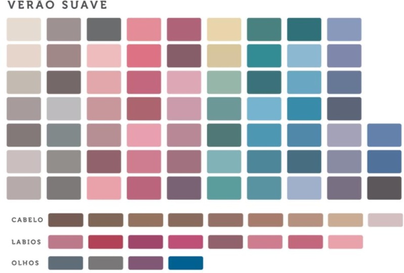
5. Colour Psychology: Okay. Another thing you might want
to consider when choosing your color palettes
is color psychology, which is the different
meanings and feelings that different
colors can convey. For example, red can convey
strength, excitement, love, pink can convey sincerity, compassion,
and sophistication. Purple conveys luxury,
royalty, spirituality. Orange conveys success,
confidence, bravery. Yellow can convey happiness,
creativity, and warmth. Green can convey
healing, nature, freshness, and blue can convey
peace, trust, and loyalty.
6. Easiest Way to Generate a Colour Palette: In this lesson, I'm
going to show you the easiest way to
generate a color palette. It's so easy that it almost makes the rest of
this class irrelevant, but I still think
it's important to understand why it chooses
the colors that it does. We're going to use a
website called Coolers. Once you're on the
Coolers website, you can click the Start
the Generator button. Once we're inside the generator, press the space bar, and it does all the work for you and chooses color palettes
that look good together. If you like a color,
you can press this lock button to
keep that color. I like this purple color, so I'm going to keep
that, and then you can continue to
press the space bar. Once you have a color
palette that you like, you can go up to Export and
you can save it as an image.
7. Another Way to Generate a Palette: Okay, so let's say
you don't feel like creating a color palette
using the other methods. So how else can we go about
creating a color palette? Well, here I am back on
the Adobe color wheel, and I'm going to
show you another method that's super easy. If you go up here, you can
find the extract theme tab. We can click to
select a File button. Here's a very blurry photo
of a sunset that I took. And as you can
see, Adobe creates a color palette using the
colors from the photo. We can go over to the
color wheel and we can see exactly where on the
color wheel the colors are. If you want, you can move these around to choose different
colors from the photo. There's also the
extract gradient tab, which essentially does
the exact same thing except it creates a
gradient for you. And to save it, we
can go up here and click to download
as a JPEG button.
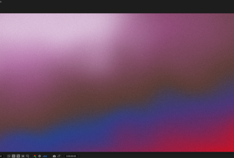
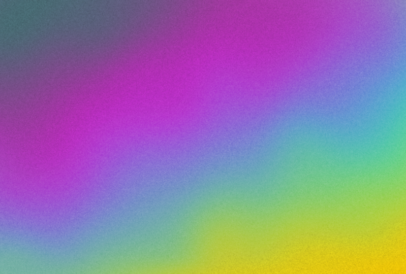
8. Animated Gradient Background: Okay. So now let's create
our gradient background. First thing we're going to do is import our color palette. We can place our color
palette in our timeline. Press S to bring up the scale. We'll scale it down and
put it in the corner. Now we'll create a new solid. Using the color picker, we'll choose our solid color to move our solid to the
bottom of the timeline. We can duplicate the
layer with Control D, search for the fill
effect in effects and presets and add it to
our new solid layer. Use the color picker again
to choose our next color. Again, we'll
duplicate our layer. Use the color picker. It's up to you how
many layers you want to have and how many
colors you want to use. Now that we have all
our solid layers, we're going to draw some
masks using the Pen tool. Now we're going to draw a mask over each of our solid layers. Okay. Now that we've drawn
masks over our layers, let's add a little
bit of animation. Search for the turbulent
displace effect. Place it onto one of
your solid layers. Press Alt and click the
Evolution stopwatch. We're going to use an
expression time times 50. As you can see, it
adds a little bit of animation to our solid layer. And what we're going to
do is we're going to copy and paste it onto
our other layers. Control C to copy, control V to paste. Now select all the
solid layers and press F to bring up
the mask feather, and we're going to turn these numbers up to something really high until you get
a nice gradient. And that's essentially
it. You can always adjust your masks and your mask feathers to get
a look that you like. And you can always go back
and change your colors. Here's a couple other
examples that I created by changing the masks
and changing the colors. To give it a more grainy look, we're going to use
an adjustment layer. Got a layer, new
adjustment layer. With the adjustment
layer selected, search for the effect
noise HLS auto, change the type to grain, and we can turn the lightness
up to something like eight. You could also
change the speed of the animation by changing this
number in the expression. I look forward to seeing what you guys are able
to come up with.
9. Export: Here's a quick lesson on how
to export your animation. First, you're going to want
to trim your work area. This is how long your animation is going to be when you export. I'm going to make mine 5 seconds by pressing N on the keyboard or dragging the end
of the work area. Now we can go to File, Export, add to Adobe Media
Encoder queue. Once Media Encoder is open, we can click here to
bring up our properties. F format, I'm going
to choose H 0.264. And beside preset, you can see a whole list of presets that
Adobe has created for you. For this one, I'm going to
choose YouTube ten ADP. Here we can name our animation and choose where we're
going to export it. And because we chose a preset, we don't really need to worry about any of the other settings. We can go down, click Okay, and then click the
Green Arrow to Export.
10. Outro: Congratulations, and thank
you for taking this class. Now you can share
your project in the project gallery so everyone can see the color
palettes you created.
11. Bonus Lesson - The Other Colour Harmonies: So now let's take
a look at some of these other color harmonies that we didn't look at earlier. Let's toggle down our
color harmony tab. Split complimentary. Instead of having one
complimentary color, it takes the complimentary
color and splits it into two colors that are right beside each other on the color wheel. Here's some examples I found of the split complimentary harmony. Okay, let's keep
going down the list. Next, we have square,
which seems to be the most simple taking one color from each side of
the color wheel. Here's some examples
of the square harmony. Let's check out triad. So triad can be thought
of like a triangle. It's similar to square except we're only using three
points on the color wheel. Here's some triad examples. Let's keep going. Let's
check out compound. Compound seems to be a
little bit interesting. Compound seems to be a mixture of complimentary and analogous. It has a complimentary color, and both complimentary colors have an analogous color as well. Here's some examples of the compound harmony that
I was able to find. Shade is almost exactly
the same as monochromatic. Both monochromatic and shades both use different shades
of the same color.
 Tyler Bennett, Motion Graphics Designer & Photographer