Transcripts
1. About the workshop: Hi, my name is Anna, and today I propose you to pay him to green with greens in watercolour is
thought to be one of the most difficult Color Groups and color schemes
because it's very difficult to find
the right way to mix greens and to paint
greenery in general. I hope in this
workshop you will get a better understanding
of how to mix green, how to paint green. This workshop consists
of three parts. The first is about Color
Mixing, Color Theory, how to mix greens, how to use ready
greens, and so on. The second part is about
form of the trees and how to make it I felt BAD is
practical painting. And we will together
paint these plots and we will learn this
principle in action. I hope you'll love this class. Let's begin
2. Base colour concepts: Before starting about
how to mix colors, you first have to deal
with the basic concept of colour is the warmth,
the color, temperature. Why it's necessary? Because the key theory, mixing greens is
based precisely on the correct combination
of warm and cool shades. And we cannot understand
how to mix greens right? Before. First we need to understand what is warm and what
is cool colours. If we're beginning to
talk about theoretical, it's imperative to know about base colour concepts of that is widely spread
among the artists. It's the color wheel. It was first formulated
by a hardness eaten. You have probably seen
these color wheel in some training
courses, so materials. And basically there
are three colors. Cold, primary colors. It's the colors that
you can have mix. It's yellow, red, and blue. These colors mixed
together form a net. Neutral gray exists
secondary colors that are mixed from
the primary colors. And in this case, yellow and red gives us orange. Blue and red gives us purple. And the combination
of where that we need is yellow and blue, that gives us green. The second basic
concept of colour, also tied to the color wheel, is worth what's warm? So what colour can we
call warm or cool? It's that temperature
of the color. The main concept is that warm colors termed tablet Orange and cool colors
tend toward blue. It's very difficult concepts and these concepts is based
on many manufacturers. And even yellow can be
warm and it can be cool. And even blue, it can
be cool and KI is could be really warm and it's
hard to understand, but I'll try to explain you how the colors of
the color wheel are warm and how are called
salt and basically gear. In this case, we can see
that these health is cold. So I have formulated
to solve such rule. That color that looks
like it's lead by the sun is warm and the
color that lead by the moon. It's cool. And also for you to understand. I have swatch thumb covers from the one Color Group that
are either cool or a warm. Here in these Ber, these yellow is cool and
these yellow is warm. And you can see in that
concerning these colour, it's more visibly
seen that this is cooler because this looks more like late by
the moon than this. And again, with
that blue colors, these blue is colder than this. Now, after these basic knowledge about color temperature
and about the color wheel, we will move to the theory of
Mixing exactly green shades
3. Mixing green: There are basically
two main ways to mix green in watercolor. We are either mixing
yellow with the blue. We are taking ready color and making it more warm or cold depending on
the garlic itself. So these are two base concepts. And we will talk about mixing yellows with real in order for forbear resulting color
to be natural and beautiful. It's important to
understand that what categorize and what
shades of blue and yellow we are mixing precisely within these warm,
cool framework. So now I will show you based
on two categories of yellow. Here is called yellow, this is warm yellow, this is called blue. This is warm blue. And we begin. If you mix a Goldblum, I have dark blue. We've so it's called boom. And if you are mixing it with a warm yellow, Yellow opera, you get rather bright and
rather vibrant green. If he use some warm
versions of blue. Here is a couple of Blue. And you mix it again
with warm yellow. You will have more muted colors than you, than the colours. So you get when you
make so called blue. So general rule is when you're
applying a colder shade so you get more vibrant and
bright tones of green. And now, what is, what or what is
happening when we are changing the warm yellow
to the cold yellow. I'm taking this or
this is Aureolin. And if we are mixing
the Aureolin way, the warm blue, you
get more natural. Let's say Color. It's more bright, small, Sunny, and so on. So it's like bright. But it seems true
core rather natural. And what happens when we combine these cold balloon
with cold yellow. I will show you now about, I can tell you without showing
that we will receive very, very bright and the
unnatural color. So here, this example, you can send more
comfortable recommendations to walk width. And more comfortable colours
is when you mix some warm blue with some warm yellow, they unmuted and
they are natural. And if you have some cold
yellow or cold blue, you will receive for rather bright colors and they
often look not so natural. So you need to think in advance, water color you will
need to use and why. But again, I want to
repeat the base concepts. If you mix a cool blue
with warm yellow, you get bright, vibrant green. If you use warmer versions of
blue in mixes will yellow, the colors will be muted. And if you combine cool
blue with a cold yellow, you get very bright and almost
always unnatural colors Than just experiment
with your paints. So look what yellow, so what blues do have and combine them and mix
them and swatch them. And I will guarantee
that you will get some new mixes that
you will laugh lot. So it's about that Mixing yellows and blues in
order to receive some green. And now let's talk about, right, the green colours. I will remove the schedule
because my swatch isn't. So here you can see the swatches from my base palette that are used in practically
all my paintings. And I have made these colors
are super essential for me. And any of them definitely. These are colors that
are widely used, but they are not necessary. And you can see that here. I have for ready green colours. It's phtalo green. It's cobbled green. It's Berlin green. And I don't have the tube, but it's forest green
functioning can also. You can see that here I have
like these phtalo green, very bright, very
unnatural color. And I have these in the category of really
needed to call us. Why? Because it's very,
very easy to mix greens based exactly
on this color green. So this is phtalo
green in pure form. So it's really bright. And I want use these bright
green in my paintings. It's unnatural. You cannot see these
green in greens. Almost nowhere. But what happens when I
mix these phtalo green? For example, we brown. Now I'm mixing it with
Transparent Brown. You can also use burnt sienna
or Emily, any brownish, orange ecology half and receive the color that looks really
more natural and more muted. If I makes his exactly
these phtalo green, we've Karla, cold Sepia, so it's dark, dark brown. I get very natural, very dark and very
beautiful green color that is ideal for painting
the dark areas in the green. So this is among of my
most Zoloft to mixes. It's tell green blues, Sepia. I can mix of phtalo
green with orange. In this case, I will
receive some warmer green. And again, it's natural. So basically we're on color
mixed with some orange, brownish with the
Sepia, with Orange, it gives us very, very good mixes and they
low, currently harmonious. So that's why these color, I think, is very important. It's also no, not unless phtalo green but as viridian and so on. So you need basically
any bright called green than the other already
colours that I have. Paralleling green. I will swatch it for you. But it's already
ready, darker green. And these mixes, so separate with flour green
and perylene green. They are really common. So I'm just using it because it's quicker to
use The radicals. And if base concepts is that I'm constantly adding some yellows or some blues to the ready. Green colours to receive four different shades
and different tones. That color that I use
often is Cobalt green. It's very beautiful in shade, and also it relates heavily. And I love it. Again, the principle is a bad. I'm adding some, some colors, mostly yellow to the
right techniques to receive kinds of other sheets. That perfect list you'd money. And generally, while painting, I'm using both methods
for creating green. So I'm using radicals. And mixing yellows
are Blue said, or I'm mad directly. Mixing yellows and greens. Here is my coloring, and here are the lists of My
mostly used green colours. It will be in the
appendix to the lesson, the scan of these, these swatches and I think 95 brush sides of my paintings are made
exactly using these, these, my favourite mixes. So when I'm mixing black, Phtalo blue, Phtalo Green
with them separate, I get some dark colors. I'm missing coddled
blue with yellow offer and receive very natural
and muted green colour. When I'm mixing Grady, Cobalt, green with again, yellow are received very natural and bright,
sunny worrying. So just take whatever paints you have and try to mix them using the theory that I
have told you before. And I think you will
discover hungry to mix us and hope you
will block the result
4. Form of the trees: Now it's that second
theoretical part needed to be in greens, and it will be shorter than the first
one about the color. The main thing you need to
know about painting greens. In general, it's understanding that shapes the
shapes of the trees. When you know exactly about
your shape of your three, it will be immediately
clear what kinds of three you wanted to beat when you looked
at your painting. And the most important
thing is true. Remember the basic shape? Trees that have leaves, they aren't more, most
often round or oval. A cyprus is spindle, has like large crowds and very thing trunk and
fear trace our cones. They are thin on top and thick underneath the most common trees or some kind of theater trees. So that's always put the needle and some kind of leaf trees. And given these features of shape and glide shade
distribution of them, you will no doubt
have credible trees. What's distribution
of light and shade? Look, here is the simple shape. It's the ball. And here, what about light and dark spots? And again, you can see on
the trees that here are the most lying down and
here is more dark zone. The same striation of the
cone and the ease fir tree. So we have light zone here, we have dogs on here and
have the shapes of the coal. It's about shapes that are critically important
for the painting trees. And now, I think you have the questions what to do
with the shrubs and with the grass to make sure
that they don't merge into one mass of incomprehensible
green. In grass. It's important to consider that arrangement of these
particular grasses. They grow upwards rather
than flowing on the ground. And it's also very
convenient and practical to use different textures that are very Isabel crazy
to in watercolor. And also don't be afraid to put some dark places to
show the volume. And when you have dark places, when you have
different textures. So here I have granulation
here I can flex crouching, and I have the form of a grass and it looks neutral
while the colour, by the way, it was painted
so we cobbled green, dark and my Aureolin Hue. So here is more yellow, here is more green. And some more examples. Here is the pure tree. It's cold, so it's like my big thing upwards and
it must be thick downward. Here or the Barnes sold berms. They have like around
the Baptist churches, Leaves and these thin trunk. Again feel trees. Again here or thin or thick. And again, these
cone, again form. And the color, the
colors are used, dog green, and they
look rather natural. Here again, these few tree, and I'm telling it
like fifth time, but it's very important when you're beating
feel trees that you have thin upwards and downwards. And if you have the form
of the three cold spiral, all well and you distribution
of light and shade, you will get a perfect result. And hopefully now you have
a better understanding how to paint greenery in terms of color
and into the forum. And now we're going to practice. We will paint such plots. And I will explain
these principle here. So how make the
green look natural? How to create affects
how to create grass, how to create trees,
have two branches. So let's begin our Painting
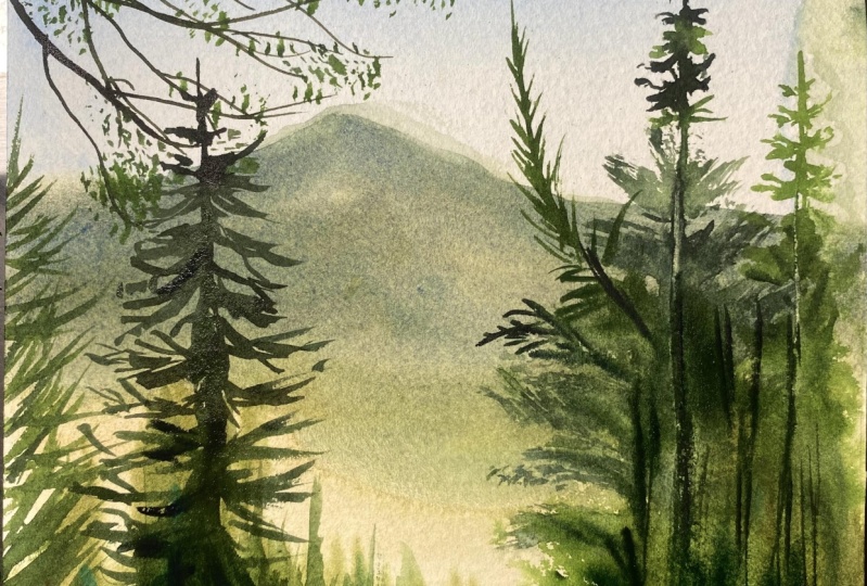
5. Pencil sketch: Okay, so now we know all
theoretical knowledge. And let's make the practice part and let's paint these bloat. Why did I choose the floor? Because it's very convenient because it's showing the
different types of green. Greens on the background,
green cell foreground. It also shows the form of the trees here and
different branches. So It's a good subject for a training that green
colour and trees form. And we'll begin with
a simple sketch. So that back ground, he'll will be something
like somewhere here. On my reference photo. It's strictly on that Santa. But because of the
composition rules, we are making eight a
little meat more upper, because it will look
more harmonious than here we have the trees. And most of the
times, by the way, I don't draw trees with the pencil because I
simply find no need. I just solve the
central part and then I will paint it
only using the brush. And so I'm marking the
direction of the leaves. And so on. Some way here, I will
have these, My Earth. And here it will
be like the trees. The trees, again the
trees and the choice. So I think the salt. And now we will
start by creating a toll for the sky and
for these background
6. First watercolour wash: I'm beginning with
applying clean water. It's really totally
clean because it has green aspect, but no worries. I'm simply applying
clean water on all my sheet because I want to create the lower layer of paint. So yeah. And, uh, we are beginning with
the applying the sky. I'm taking some cold blue
color because I want also to have my painting to have cold contrasts
by colour. Now. So the sky is simply blue. And I'm applying just
blue paint here. While it's approaching
the lower part, the my pin to become
less saturated. So I'm digging go mixing
water in my paint to create the effect that I have
like dark sky here in the, on the top and not so
bright sky on the bottom. Then I will mix some some
yellow ocher in my Blue. And I receive these
beautiful green color. It's just the green color. Then I will wait a few minutes till my paper a
little bit dries. So I will apply green paint, bluish green paint here
where I have held. Now, I'm simply creating these first layer and
creating the toll. So I need some Brown
I'm taking number. So I have these here. I have like a brownish tone. Maybe here, a little
bit of orange to create more contrast than I want to create some
kind of contrast. So I'm applying for you. But here I apply
separate brown and then I'm mixing a
Indathrone Blue. It's very dark blue with
again my yellow opera. And I receive for like green
tone, darker green tone. And I'm applying these
darker green tone, creating my road. Maybe applying some
dark blazes, some here. So in this painting, we will use the layers. So now we are creating
these I first layer. And it hasn't be concrete. Applying these paint. And now seems that here my
paint has dried a little, but not well dried. And I want to make the hills because
they are far from us. They receive a clear
blue undertone. So I'm mixing ultramarine,
Indathrone, yellow ocher, and also Mixing Cobalt here, Cobalt blue to create
these bluish color. And I'm applying these
bluish color on my heel. My paint is more than, um, than I applied previously. So and it The edges are blurry, but we can clearly see
this alert of the hill. And it's good. Also here, I want to
create extra texture. And in this lecture
I will use salt, a little bit of salt. And then while my my
sheet is still wet, I'm applying like more
dark green color. So I'm using now basically
the one mix of yellow, ocher and Indathrone Blue. And previously for creating
kind of green, green, green, I used these, Hello,
cerulean, blue. So again, my yellow ocher. So basically it's
one yellow color. And I'm applying
different kinds of blues to create different greens. We can even click on the brush
to create extra texture. It will not so well because
key and I want to show you one more way to create texture in the the greens you have
applied to your paint, the paint or thick, and it takes some time for the paint to dry. I see salt here and I
don't want salt here, so I'm removing it. So I begin to create texture
with my palette knife. So here I'm moving
the paint with my and also saw my grading
the feeling of some grass. Again with palette knife. And I can see, I can see that my road is a little bit with too much green and I have
lack of perspective. So I'm applying more paint here. Some dots. Again to create a texture. Because when you're
painting grass or trees, it's very important that
you have not even paint. So when you have
different colors, when you have different
tones, different sectors. So the more different C have
in these kind of washes, the more interesting
cloak, that final picture. So now I'm applying these
cold blue in some places, again to create the Internet. When I'm scratching
with a palette knife. It depends on time and the
how dried my paper is, because now it's not so dry. So I want to receive the
efforts of white grass. And now you can see
that I'm scratching and my paint gets inside. So here in these places now. And also some darker. Let's here. Maybe few dots here. And I think these
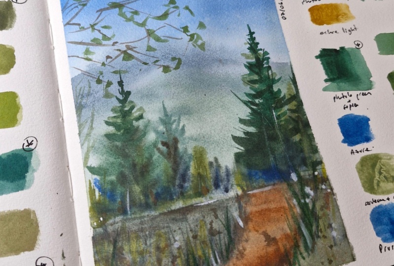
first wash is done. And now I will dry my sheet. And then I will begin to
form the silhouettes of the trees and the dry the paper. One
7. Painting trees and adding details: Sheet has dried Luka, how gorgeous the salt are
erected within the paint. So it's like, I love this
ethics where image and it's very suitable for painting grass and
creating structure. And now I have changed
the water in my account. So it's like clean. And now we are beginning to
paint these these trees, these trees because
now it's like blurry and I want some more
focus, focal points. And I'm mixing the
color for the form Y. My trees. I'm taking phtalo green. I love this mixture. I'm taking phtalo green
and mix it with Sepia. In fact, you can use for this mixture pure colour
named perylene green. It's really dark, dark green. But if you want your
green to be dark and you have no option, you can easily mix phtalo
green with some dark brown. I have here Sepia. Okay. I have mixed it and now I
begin to paint the trees. I will. Okay, the reference will
be somewhere like here. And remember what I have
told you about the form. And I'm beginning to create the form using like
these dark color. I'm trying it to be different. So these branches, they are like a diagonal sound
where I place dots. And for some places I want to have greener
and more bright color. So I'm taking the
other brush and I'm mixing yellow ocher. We the of Tala. Hello, cerulean. So
it's Phtalo Blue to receive kinds of bright green. And I'm basically applying
the paint with two brushes. And these two colors will grade the effect of different
branches of our tree. And the first half of my tree is like mate
with a precise strokes. And the second I will
do with another brush. For this purpose, I can use rather these gold brush or these fan brush or calligraphic
brush. It doesn't matter. It just matters
that you have like different the stroke
is not equal. And with these movements and also Mixing here,
the other color. I'm creating, the feeling of
lower branches of my tree. I will also show you the sterols that are
made with the fan brush. The color is, again repeat, it's phtalo green with sepia. And I'm applying these paint and creating these
different kinds of strokes that are perfectly
is suitable for painting. Like trees. So somewhere like are the Color Somewhere it's more greenish. Somewhere. It's more yellowish. So I'm just trying to create the different strokes
with different color. So I have here now like
five green colours now. And all they are mixed from Phtalo Blue of phtalo
green, Sepia, yellow, okra. So I'm wearing my
green to look it. Salt, it will look more natural. In some places, are
applied really dark layer. And I can also use here spray and 1 mol, three here. So in most cases
for painting green, I use that different brushes. In one brush, I have like more light color and in the other a little
more dark color. It's just like more convenient
to have these two brushes and these diagonal. Just remember the
information about the form that was in the theory
section of this workshop. And you will get great result. Now, I think that my these three is a little bit more diagonal
that I want it to be. And simply, it's, it's about the grading
of the texture. And we are using
different brushes to create the effector that we have like
many greens here. And now I see that
these here I have very equal wash
with equal paint. So I'm scratching. You can also splashes paint. Splashing. You need to cover
the area that you want. Don't want to be
covered with the paint. I'm using gleich,
these paper towel, placing it, and
thinking on my brush So in some places, I spray, in some places
I splashed the paint. So basically, one
thing about painting the greens is that you
make it look different. Because when you have the
equal strokes with equal kawa, equal color, it
really looks very, very dull and boring. So I'm creating here kind of darker paint and also carrying some grass with these darker paint. And I don't like what I have
here because it's very dull. Wash here. So I'm taking brush and lifting off some
paint that I have here. Maybe applying some other
with a different color. Mixing some more yellowy green to create the contrast by color, and also applying some
few splashes, few dots. I will make these you broke so to create the efforts of the
branches of the tree. So I'm making it by standing. So I'm now I'm not
sitting. I'm standing. And it's important because it gives your hand
the right movement. So if you are sitting
that now, stand up, I'm holding my brush here near the end
because it gives you these needed movement of the brush and it gives
you the freedom. So and I began to first-time just some way, in some places, I'm making the paint
and also tough. And now applying here are some greenish paint to create the feeling
of some leaves here Remember that? Told that if you have like very equal strokes
and equal paint, it will look like not so good. So I'm mixing now Cobalt
blue with yellow, offer to receive that
different kinds of green. And with this kind of messy strokes, I create this feeling. And also I would love to
the splash, the paint. And I can feel that here. Now I have not enough paint. And here these plays so low glycol boring as
so I have decided that I want to have here
another, another tree. And the principle is the same. I'm applying the lower parts of my tree more freely and paint glass attention
to all the details. And I'm, the upper body uses more
concrete and with more details. And again, we can use
these palette knife to create these kinds of strokes. Some final touches. I will love to mark the area where a ends and
where my trees start to grow. Here. And with light green, I want to mark this period here. Final details. Detail. I'm careful
looking water, in what places I miss that
dark spots and adding them. Paint here is most
dark paint I have. It's mix of Indathrone,
Serbia and Phtalo. And now I'm trying to think
not as the concrete strokes, but I'm just trying to
think in a spot way. So what I have not so
not so many spots, dark spots, and where
I don't have it, I simply place it. So now I think this
image is ready. And I hope that
after this class, you will understand
how to paint greens so that they look like realistic, but they are made
in an artistic way. And I hope that it's
more clear for you now about the colors and
how to choose them, and how to avoid these super
unnatural greens that are very common in the extra
watercolor paintings of the people that
start to paint. And I hope that you love to
and had pond in this class. And thank you for
painting with me.
 Anna Zadorozhnaya, Watercolour artist