Transcripts
1. Class Intro: Colored pencil artwork can be considered a painting technique. Because of the blends of color that artists can achieve. Colored pencils are used in layers and I mean lots of layers to create transparent blends that are flattering and unique to this medium. In today's class. Colored pencil lemons. We'll take a closer look at painting with colored pencils. Hello, I'm Daniela Mellen and author and artist. Today's class is for artists who are interested in using colored pencils as a drawing medium. It's designed for beginner colored pencil artists, As each chapter demonstrates the step-by-step method used to achieve the illustration and to show how colored pencils add a unique touched to artwork. This class is the second of three classes that use the same lemon template to create a finished piece. Class includes a template to help you make your initial sketch. From there, we'll build up layers on each element of the image, from the lemons to the leaves and the branch. There are 11 drawing chapters. for painting this vivid art piece with additional chapters included, such as class supplies, additional supplies, using and modifying the template, and a chapter on illustration variations. This is the second class that uses that lemon template. The first class was a beginner watercolor class. And the final class will be using acrylic paints and will be released in the upcoming weeks. But for today, take out your colored pencils and let's get started.
2. Class Supplies: So these are the class supplies today that we're going to use for our colored pencil lemons. This is the second class in the three-part series, with each part using a different medium. So these are the supplies for today's class. I have a piece of sandpaper here and I'm going to use that for texture. And any size will do as long as it's big enough to cover the lemons. I have my watercolor lemons template, which is from the first-class, the watercolor lemons. But we're going to use the same template to create our image today. I'm using a piece of card stock. You can use many varieties of different paper and we'll talk about those in another chapter. But for today, I'm just using a piece of white card stock. I have a pad here. It doesn't really matter what it is. I'm using it so that when I lean on it and create my drawings, I have a little give and a smooth surface. So that's the only reason I'm using this pad and I'll probably just flip it over and use the backend of it. My goal here is to make sure it's big enough that my paper can fit on it comfortably. I have a light source here that I'll use to trace my template. I have a piece of scrap paper and this is just a light piece of paper that's very big that I can fold it. And the purpose of this is to rest my hand on it so that I'm not smudging my work. I have a pencil sharpener geared towards colored pencils, which happens to be the same brand of the pencils I use. That's not a requirement, but it is a sharpener that works very well for these pencils. I also have a little brush here that I can use to brush away any remnants of the colored pencil that are created while I'm making my drawing. I have it just a little white eraser. And then these are just some little cotton swabs that I might use on my work. It's completely optional. And then this is just a little piece I have here, a piece of fabric so that my pencils won't roll around because I like to use my pencils and have them all out in front of me. In the next chapter, we'll go over options and different pieces you can use for supplies, as opposed to the ones I'm going to use in class today.
3. Variations on the Class Supplies: Now for some supplies that you might be interested in using that we're not going to specifically use in class today, but are perfectly acceptable variations of the ones I am using in class. We'll start with the colored pencils. I use Prismacolor, colored pencils. They're a nice pencil that's both soft, waxy, but not too soft, not too hard and not too waxy. I feel like they blend nicely and it took me a while to get the hang of using them so that I wasn't pressing too hard. But that's something that comes with experience and practice and lots of that. So any set of colored pencils you want to use as is wonderful and can be useful. And I'm sure you might have some that are more favorite than others and some are more affordable than others. The key to remember when making a really effective colored pencil painting is to have lots of colors to blend. And you can also blend your own colors. And that really varies on the softness of the pencil. But to get a nice range of colors and shadows and highlights that look very natural when you choose a color to use. For example, the yellow for the lemon, I choose three or four. So I have everything from a very light yellow down to a deep orange. And so here I happen to have five colors that I'll use, my lemons so that the lemon isn't just a simple color of yellow, canary yellow or something. I do the same thing with my greens. I have three or four greens varying from light to dark. And then I like to do under paintings on some of the leaves. So I'll use different colors and I'll go with browns and oranges. So there'll be some overlap. I'll tell you the specific colors I use as I use them. But it isn't so important to use a specific ones I use as it is to use a blend of them. Now in class I had a pad of paper that I used to press down on my work to put it under my work while I'm actually making my colored pencil drawing. You can also use a clipboard when I'm traveling or when I'm doing art on the go or even on my porch, I like to use a clipboard. This is just a cardboard clipboard, but there are many that you can use, wooden masonite, et cetera. Now in class we're gonna do our drawing. We're using card stock, but that's not the only paper that you can use and use effectively. You can use copy paper, which I use frequently. It's not the best thing to use as it's not necessarily acid free, but I do like using it. It's convenient, it's available. And I think it looks great since I scan my artwork, I'm not worried about it. Lasting generations. You can also find some drawing paper. And the key for this is just fine one that is not only the color that you like, but the texture. Some has more tooth than others. Some is smoother. So that's another option. As I mentioned, we'll be using card stock in class today. I'm just going to use a white one in class. The card stock, as we all know, comes in lots of colors. And if you get a nice muted color, you can get a very effective and result with your colored pencils. And the last thing that I love to use colored pencils on is a piece of paper that I gel printed on. And here I gel printed on it. And I have a number of classes that also reflect gel printing techniques, but I just used acrylic paint, a matte acrylic paint. So when I create my colored pencil image over this gel printed paper, I get a very interesting result where you can see the texture and the colors and patterns behind it. And lastly, I talked about using sandpaper in class today, and we're going to use this underneath our lemons to give us a little texture. But if you don't have sandpaper or you don't want the look of sandpaper. There are plenty of other things you can use to essentially make a rubbing on your paper. Stencils will work depending on the stencil. And then these are some of my most used things and these are just placemats. They're either plastic or vinyl. I find these very inexpensively with some very interesting patterns. I'll pick them up and use them underneath my work to give some very interesting textures. So that's another option. In the next chapter, we'll go over using the template.
4. Using the Template: Now to use my template, I just take it in a printed onto a standard piece of paper. And this will give me a nice size for an 8.5 by 11 piece of card stock, the same size as the copy paper prints out on. I put my template onto my light source. And this could be even a window. You can make a stack where you have a glass plate on top with a light underneath, and therefore you have your own light pad. By this little light pad here, I put my template on it, I illuminate it, and then I put my paper down. And wherever I want my template to go, I can just make a tracing note to make the template personal unique. I like to do different things with it. So I might flip it over and hold it at an angle. I'm, I put my paper down on my template. I get a very interesting result, a little different than the standard one that gets printed out. So once I have it down here, I take, this is a French gray. This is just happens to be my favorite one to use. And I just gently pencil in what I see here as the template. You can use a standard pencil as well and an eraser. But I don't mind either. Smudge lines are going over them again. I traced them very lightly, so it doesn't matter to me. So after I make my initial sketch and I have that down, I can take parts of the template, particularly this part down here that looks a little strange. And I can use those leaves and add them to my existing drawing, my existing sketch. And so I just find out exactly where I want to put it on my piece. And then I'll just add that sketch right in. Again, I do this with a very light hand. And for me that was the hardest part of using colored pencils, was getting familiar with that very light touch. I'm not using it as a pencil like I would in grade school writing, penmanship. I'm trying to sketch with it, so I'd have to think of it a little differently. There's any thing you wanna do to modify your template further. Now's the time to do that. So I might just enlarge some of these lemons at a little point to some of these leaves, and this is your chance to really make it personal. In the next chapter, we'll start coloring and are lemons.
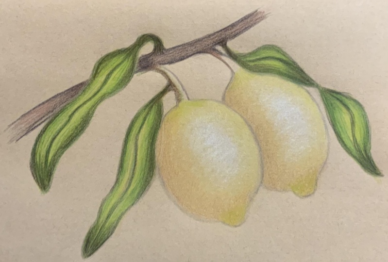
5. Coloring the Lemons: Dark Colors: So now to start my drawing, I have my sandpaper for my texture. I'm just going to set that aside. And I have my scrap paper here that I'll use as needed as a hand rest. So I have my drawing here, my template which has been sketched out with a light hand and colored pencil. I have my pad of paper just to lean on. You can use a magazine or a stack of papers as well. And now I'm going to start, I'm gonna start by coloring some of these lemons. And we're gonna go and light layers and we're going to use lots of colors, lots of strokes. So the first thing I wanna do is add some depth. I'm going to add darkness over here to the side of a lemon. And I'm going to repeat this on this side of the lemon. Now because lemons are rounded, the part that's closest to me is really the center. So my highlights will have to graduate from the center to the top of the lemon. I'll start with my darkest color here, and I'm just using this as a mineral, orange. And with a very light hand, I'm reaching up at the top of the pencil. I'm just sketching a very light touch. Some areas of darkness. Going right here on the bottom, leaving a little gap between the edge of the lemon and the base. And I'm just going back and forth strokes. So that's one method. You can use strokes all the same direction. It's a second method. You could just make little circles here over and over again. And the key is just use lots of light layers. You don't want to press hard and scratch the paper. You want to just go lightly and add your colors. And I like to start with the darkest color and a very light hand. And this is just giving me a little depth to my image. Now the reason I chose this color orange is it's almost a brownish. Orange, has a little gray in it as well. And it gives a little depth to my yellow, the typical color of the lemon. So I'll come in here and I'll do the same thing. Again. I'm just going back and forth with a very light edge, gently holding the pencil, not even too tightly. And I'm gonna come over here. And I'm mocking the shape of the lemon, leaving just a little barrier to the edge and coming around here. And this is the first of many layers that we'll do on this lemon. Again, you can barely see it. And it's just a hint of a shadow. That looks pretty good. My edges blend out. There's no clear beginning. It kinda blends right from that paper. I'm going to set this aside, go to my next deepest color. And this is Spanish orange. I'm going to go over that first color and just extend it just a little past where I did that first color. Both on the top and the bottom of that first color of shading. Again, I do a very light hand going back and forth, just barely rounding the edges. And I'll do that on the top women as well. And take your time and do this because your goal is to get just a little hint of pigment on your paper with a very smooth edge and a smooth gradient. If you press too hard, you'll get actual strokes and we're not really looking for that. The last thing we're gonna do before we take a quick little break is switched to our next color, our next darkest color. And this one is a canary yellow. So it's not my lightest yellow that I have. It's my third lightest yellow. And I'm just again extending over the area. I already put down. Coming around here. Going over those oranges that we put down, and just extending a little further past. So as you can see, there's quite a blend, quite a buildup starting here. I'll go over this as many times as I want. I want to make this a nice blend of colors, essentially a gradient. And this is where you get the impression of a painting rather than a drawing. I'm going to stop right there. Just take a break. My risk, it's a little tired. Then we'll come back and start adding more layers to our lemon.
6. Coloring Lemons: Light Colors: Now to continue with my lemons, I'm going to take that canary yellow. And at the very tippy top, I'm just going to gently add a little shading just before the original pencil mark. And I'll just delicately bring that ever so gently closer to that pencil mark and then blend it out. So now we have a nice big egg-shaped highlight. I'll do the same thing on this one. Now because it's a lemon. And then we have to look at the actual image that we're trying to color. For reference, lemons have a little tinge of green to them. So I'm going to come in here with a very lemony yellow, green here, this chartreuse. And I'm going to take my pencil and at the very edge I'm going to start at the bottom and just push color up. I'm going to go all the way around the bottom, pushing color up towards the center. Just to give a little hint of green. And I'll do the same thing over here. I'm pushing just a little darker than I did for those first layers, but only slightly if little bit of green here coming in. And now we're making a nice little basis for our color. I'm gonna do the same thing up top. And I'm just going to go even a little lighter than I did at the base, but I still want that color to come around and just shoot out from the top of that lemon. Will work further on the branches in a little bit. But for now I just want to give a little hint of green. Going to switch colors here to this lemon yellow. And now I'm going to start by taking my sandpaper. I'm going to slide it underneath my piece so that it covers both areas underneath a lemon. And would that lemon yellow, I'm just gonna make circles very gently and go over the entire image that lemon that I already colored in. I'm not gonna touch that white part just yet. And I'm just going to add a little bit of color, a little depth here of color. Come around. And I'll do the same thing up top here, pulling that color down a little further. And I'll gently bring that color very lightly to the edge of the initial sketch. Once I have that section of the lemon colored in, and I'm happy with it. And I could spend more time on here if I wanted. I'm going to jump to the next one. I'm going to bring that pigment very gently down to that first lemon. And then I'm going to color everywhere. We already added pigment, just slightly overlapping, a little bit further. Going round and round and continuing to do this. I don't want harsh lines for the edges, want them to gradually fade out. And as you can see, I have a nice highlight right there. I'm going to switch back to my canary yellow, which is a little deeper shade and go over everything we just went over. And this is how you build up really beautiful, in-depth, vibrant color. So I'll go around this some more. And I'll show you just on this one, lemon. And the other one, I'll do offscreen. It's the same exact technique. We're going to go around the area we already colored in very gently. Once that's all colored in, will go around it again with just a teeny bit more pressure. I'm overlapping my lines, continuing, going round and round, and I get a very nice color. I'm gonna take my scrap paper now and set it down on my paper so that when my hand rests and not in danger of affecting the areas I've already colored. I'm going to come here and I'm going to take this cream color. And I now am going to extend the pigment we added. I want to leave a little bit of a smaller elliptical of white of the paper. But I'm making it smaller. Each time I go and add another layer. Now I'm going to go round and round again over all the areas we colored in. And I have just a little bit of a highlight remaining. I'm going to take my white and I'm going to just go over that highlight. Doing this mainly so that I have layers of wax and pigment over the entire image here that I'm coloring right now. I don't want there to be that even it's miniscule. I don't want there to be that depth of the bear paper. And now I'll just continue to color all over that lemon. And by using this white and going lately, I'm actually burnishing it. I'm going to stop there off screen. I'll do the same thing to this lemon, and we'll come back and start our leaves.
7. Coloring the Leaves: Shading: So now here I'm starting with a light umber, and I want to take it on my leaves here. I want to add some of the darkest spots. So I'm going to start and I have my scrap paper here, going to start with this leaf here. I know my darkest spot is going to be the shadow that this lemon casts. So I'm very gently holding the top of the pencil, going to go back and forth, creating just a little bit of a shadow. And again, I want that color to blend out nicely. I don't want there to be a harsh line and certainly not a straight line. So I'm just going back and forth, depositing chest a little bit of pigment down where the shadow would be that that lemon would cast. I'm leaving a little space between the actual lemon itself in the leaf. And then I can go back in there and just gently add that. Again. I'd want lots of little layers, not one dark layer. And this creates the beautiful blends that we have with our pigments. After I have that, I'm going to start at the very tip here of this leaf. I'm just going to gently stroke color upward. Again, this is my underlayer under painting. So whatever colors we put on top, we'll give a different effect than when there is none of this pencil. I also like to go up top here close to the branch. And again, I just stroke that color down. I'll do this with the remaining leaves, adding shadow at the tip and towards the branch, speed this along. And then we'll come back and take a look at what we're gonna do with some more underpainting. Now I just go back and forth adding a little pigment here in there until I get a nice little shadow. And I have the underpainting shadows done, the basic spots. I can go back and really specifically look at each leaf and decide where I want to add a little more shadow. So I want a vine down the center of each leaf. So I'm just going to go over and create that little vine. Some areas on that little line will be darker than others. And that nice dark area I like to make in the bend. Do the same thing over here. So I create that line following that shape of the leaf. And then right in here is where I'll make it just a little darker. Blending it out. Again, I follow the shape, create the darker spot here. And now for this leaf heroes is the most dynamic. I want to add a lot of shadow back here. So I'm going to just pull it out. This is where the leaf looks like it's twisting. So I'm just going to pull a little more shadow that way. Again, I'll create that line down the center, that vein. There we have our first layer of our leaves.
8. Coloring the Leaves: Light Colors: So now to add another color to these leaves, I want to go in there with my yellow and I'm going to take my lemon yellow here. I'm going to take this pigment. And I'm just going to make long brush strokes. And once again, I'll show you on one leaf and then we'll off camera. I'll color and all the leaves to this stage. So I'm just going in there and creating that yellow background on the leaves. This isn't going to be my final color, but this is a very nice basis for building up the colors I do want. I'm going to go over all areas on that leaf, including the darker areas we've already painted. And this is going to be my absolute lightest color that we see from this leaf. Unlike the lemons, I don't want the highlight to be white, want it to be this yellowish color. So I'll off-camera continue that, doing all the leaves to get them to this point. So now all my leaves and all my stems have that lemon yellow color or the underpainting and the lemon yellow color, I'm going to now switch to my lightest green. In my case, it's a chartreuse. And I'm going to come in and just draw lines from the top of the leaf following the vein shape. And I'm not coloring in the entire area. I am trying to add just a little bit of depth, a gaur around the exterior, leaving the center the lightest of the colors. Once I have that with the chartreuse off camera, I'll do the remaining just like that. Okay, so now I've done the chartreuse on all the leaves. And for this leaf, the one that's most complicated, I treated each section as two separate leaves. So I pulled color from the center fold here, down as well as up. But it take a quick break here, and then we'll come back and continue adding color to our leaves.
9. Coloring the Leaves: Greens: So now before I get started, I'm just going to take my brush and just wipe away any loose bits of pigment that either broke off the pencil or formed from the friction that I created by adding color to my paper. I'm going to come in here now and I'm going to take my apple green. This is kind of a medium to light green. And I want to start again at this one leaf right at the top. And I'm going to pull strokes down towards that vein and towards the outside of that leaf. I'll do this a couple of times because I'm not going to get the color darker, just more vibrant by repeating it over and over. And then I want to start following that vein down, would just long strokes right to the base. And then I'm going to pull strokes up. Again, starting to turn that leaf a little green. Going to come around the edges as well, making nice long strokes. And these emphasize the length and the shape of the leaf going to come right underneath that lemon. And paid a little special attention because it has that shadow. And as you can see here, I'm starting to get a little more of the pigments breaking off my pencil and onto my paper. Which is another reason I want to make sure I use the scrap paper. Now off-camera. After I clean up here, I'll do the remaining leaves. We'll come back to at our next layer. So now I added all my apple green to the leaves here, paying more attention to the areas where there's a natural shadow from our previous layers. Again, I treated each section separately, so I have more green coming from the top and more green from the middle up to the top. And as you can see with each layer of the green, I'm going over that edge, that one, the outline that we created with a new shade of green. So there'll be lots of layers and the actual pencil of the gray will seem to disappear. When we're done, we'll take a quick break. We'll come back and darken our leaves.
10. Coloring the Leaves: Dark Colors: So to darken our leaves, I'm going to come in here with a peacock green. And again, just going to gently pull very lightly, very lightly this time because this pigment is so much darker. I'm going to pull down my green, the length of the leaf. I'll go in the center here, making very light strokes on the vein and then pull up from the bottom. This changes the tone of the leaf very nicely. Going to come around here around the edge. Continuing my long strokes right around the perimeter of the leaf. I'll gently work my way in towards the center, but being fairly loose. So you get to see the different colors that we've already put down. And then on this area will be added the shading right underneath that lemma and where we want to darkest, just going to gently go in there, add more pigment so it's nice and dark. And then pull that color away from it. I'll take my brush and just sweep it across. And then I'm going to reach back and get that apple green, that green we used in the previous step. And blended right on top of that area. To help it blend out naturally and seamlessly. I'll just do a little bit on the other side with a very light hand. Then I'll come back with my peacock green to make sure that I have that just a little bit darker, causing a little bit of contrast, pulling it out ever so slightly. I'll come back in with that apple green and blend it. I'll do this with the remaining leaves, really emphasizing the dark area. And then we'll come back in the next chapter and look at what we have left to do.
11. Adding Contrast to the Leaves: So now I've added that additional layer of green to my leaves and I want to go into a little more work on the leaves. But, uh, take my darkest color, the dark green, and I'm going to start at the top and just gently pull down the color very lightly. Get a nice crisp edge from the top. And I just wanna go over that vein to really emphasize it. From the base, I'll pull up. And this is just mimicking the procedure we did with that previous color. I'll pay attention to the shadow area. And then I'm going to take a light color and help it blend out. Can be any color of the greens that I want. It could even be a yellow, but instead of using the apple green this time I'm going to go back to the chartreuse. And I'm just going to pull that color right on top of a color I just added to create a nice blend and the nice little cohesion. And as you notice, I didn't color in my leaves all one color. I can go back in with this dark color and add still yet more pigment. And I like to start from the top and pull it down with little strokes. And then I like to come up from the bottom and do the same thing. So now I have a lot of contrast. I'll come in here, right, this little shadow area. Pull some of that out. And then just to balance it out, I'm gonna make another area of darkness on the other side. Once again, I'll come in with that chartreuse just to add a nice little blend to what we have. And I'll do this with the remaining leaves. But before I do that, I want to take a look at this leaf here that's twisted. It looks a little strange because I don't have the shadow, right. So I want to make sure that I have enough shadow. I'm showing that this lemon is in front of this leaf and this leaf is actually behind it. So I'm going to create more shadow with my dark green. Pull that color up. And then just emphasize the shadow right on the leaf. Just like we did if there are areas where you see that you don't have the right shadow or it looks to light. The beauty of using light layers is you can go back in and add more pigment. I did that with the dark green. And then I'll come in with the chartreuse and blend that out. And then off screen, I'll go and finish up the remaining leaves. So now that all the leaves are done and have a beautiful blend of green and yellow. I want to start adding a little more realistic edge to it. So I'm coming in here with my burnt umber and I'm going to just gently go down that vine. And again, some areas I'm going to make a little darker. And other areas I'm going to skip all together so that I get a little variation here of natural brown in my leaves are going to come around to the edge. And on one section of the edge, I'm just going to add a little bit of brown. And then of course, I'm going to go right to that shadow and add even more brown. You can pick and choose. If you want to add a little to the stem, maybe a little spot here and there. I'll do this with the remaining leaves and we'll come back and take a look at our piece.
12. Coloring the Branch: So the leaves are almost complete and I'm very pleased with the way they're coming out. I want to add just a few little touches here and there again to make them look a little more natural. So I'm coming here with my dark umber, going to go to the top of the leaves and just pull on one side, just to really emphasize one area of darkness. And we'll do the same thing at the bottom just for a little section, blending it out. And then I like to add just a few little dots here and there on the leaf, little specks. I'll do this with the remaining leaves and we'll come back and start our branch. So there I have my leaves. I can continue going with different layers, adding more colors if I wanted. And I'm quite pleased with these results. Now I want to start work on the branch, and this is where everything starts to come together. For the branch, However, I'm gonna start with my darkest color, my dark umber, and here's where I want to very light hand. I'm going to start with all the dark shadows. So underneath any area where there's a leaf, I'm going to gently put some pigment, leaving a little gap between where I'm putting the pigment and the actual leaf itself. And then I'm just going to emphasize that shadow. And I like the bottom of the branch to have a little longer, darker shadow than the top. So as you can see here, my bottom shadow really extends out. And I'll go and do this a few layers just to get a dark color. And this is the underpainting that we're doing. Once I'm happy with the shape that I have, I can go back in and fill in the gap, closing it closer to that leaf. I'll go on the other side of the leaf, gently and lightly pulling color out from that leaf. And again, I want to pull color out from the everywhere that there'll be a little natural shadow can go back in. Don't be tempted to make too dark color the first go around. Continue with your light layers. You can always go back and add more and you'll have so much more control this way. Again, I want that nice gradient blend. So I have that down. I'm gonna come over here underneath these little leaves. Just want to have a little bit of a shadow. Can even pull that shadow up right from each of those leaves. And I'll do the same thing over here. I'm going to pull this one out and pull this one in. And this is my darkest color. I'm not going to use too much of this. But once I have all those areas, I'm going to go and just really emphasize that border. Just on those areas where we added that deep shadow. Do that up top here and maybe just one or two spots here. Just to blend that out. I'm going to switch now to a lighter color here, my light number. And again, holding the top of that pencil, I'm going to blend over the image, over the color we created and blend out further. Not coloring the entire branch, but just sections extending what we've already colored. I like the way this is looking. Since those sections on the bottom are closer together, I'll start connecting them and just branching out slightly from where we had them. Can go over it with a light edge. And then I'm going to switch here to my lighter color. This is peach beige. Going to take this color and just brush over the areas that we haven't colored on that branch. And this creates a beautiful gradient, blending out the browns. Now what I'd like to do with this color at the top and the bottom edge of the branch is go to that edge maybe a half inch down where I've already added color. And just swipe color out so it fades away. Can be as long as you'd like or as short. And that way I don't have to make a hard edge to finish that branch. I'll come around adding that color on the top and bottom. And then we'll take a quick little break. Once I have pigment everywhere in a nice wax coating over all this brown and that layer of beige on top of it. It makes a nice cohesive unit. We'll stop there and take a quick little break and I'll brush off all our little pigments.
13. Coloring the Branch: Dark Colors: I brushed on my pigments off anything that broke off the pencil or rubbed off as we were making our sketch. Now I'm gonna come in here with a Sienna brown, which is a red or brown. It a warm up our piece. And I'm just going to gently, very gently go over the bottom half of this branch. It'll warm it up, read and end up. And just add a different layer of coloring. Do this very lightly when I get to the edge here and just brush that off just like we did with the peach beige. And then I'm gonna come in here, and this is a dark gray, 75 percent warm gray. I'm going to come in here and very lightly with a thin hand outline that lower edge of that branch. This makes it a little more cohesive. And when I get to the edge, I'm just going to gently stroke it off. Do the same thing on the bottom here with a very light stroke, outlining that top branch following that stroke off. And then I like to take little areas and I make almost little triangles. I can overlap the area that we already had a little bit of natural shadow. And I just do this up a few places and I can do it from the top as well. Top to the bottom. Just a little discoloration on that branch. And then I like to add a few little specs here and there. On a branch. They can be anything from bugs to discolorations, but it gives a very realistic goal. Ok, we'll take a quick little break and then we'll come back and add our final touches to our lemons are leaves in our branch.
14. Adding Details: So now to add the final touches, I like to make this a cohesive unit. So I'm going to take my Sienna brown and I'm just going to stroke some of the leaves here, just the little edges, pulling it down right from the top. And this takes a little of the sienna brown that was on the branch and now it introduces it to the leaves. I'm also going to take this and introduce it to the bottom of these two stems of the lemons. So with a very light hand, create that stem. Gently blend it out. Just like this. And this is kind of an underpainting. Going to come in with an apple green to continue to work on that stem and gently go over that layer we just added. I want to bring that color right to the top by the branch. And I'm just going to gently add pigment to pull that out. Same thing here. Going over the color we already added in a very light layer and coming back and adding another layer on both. Lastly, I'm going to reach in for my dark green and add a final layer on this little stem of a lemon. He added that layer on the bottom following that shape of that lemon up here. Nice little light layers. And then I'm going to take my French gray here and go over that entire image very lightly. It'll keep it green and yet tone it down ever so slightly. And now to really emphasize the lemons, I'm going to take my sandpaper for texture again and put it underneath the lemons. Because I have a coating of wax over all the lemons entirely. I'm not going to really be changing the color too much. Going on there with a lemon yellow. And now I'm going to add just a little more pressure just to brighten it up. And I like to start on the areas that are darkest, first of a lemon. And I'll go around and not do this about two or three times. Not only does this add a little more vibrancy to the lemons, but it also has texture from underneath is starting to show through and it's very subtle. In this case, it's subtleties. I use sandpaper, but if I used a larger stencil or one of those textured placemats and get even more texture. Now I'm going to switch from the bright color here using the same pencil with very light pressure. And I'm just going to go back and forth over that highlight. I want that highlight to remain, but to have a little tone of yellow, uh, come on this one, go over the entire area that we already added, the color. Really emphasizing that couple of times. And then very gently going over that highlight. To really finish it off. I want to come in here with this light umber and gently create a shadow between the two lemons. So we're ever, There's overlap between these two lemons. Just going to add a little shadow. I'll go around a couple of times, extending my little circles over and over so they gradually fade out. Come right back to that area where I want it to be most dark. Go over that a couple more times, making sure this blends out nicely. And with a very gentle hand, I'll blend it out further. I'll switch to my lemon yellow again. And just at the top, blended out. Keeping my sandpaper in place underneath the lemons. I'm going to come in here with this apple green and gently stroke up on the bottom of the lemon. And I'll do the same thing on this one. Blending it out with just a hint of that yellow and green together. It looks very nice. At this point, I'm gonna take a step back, come back, and then we'll do just a little shadow that I like to do around my entire piece.
15. Adding a Shadow: So now I've had a moment to just let the pieces settle. And in my mind, more importantly, let the piece settle. And I'm really pleased with the way it looks. It captured the brilliance of the yellow and green. And my colored pencil art. I like to do a little like a little vibration around it of a shadow. And for that I'm going to need my scrap paper and my colored pencils here. I'm going to start with this very light gray. It's 10 percent cold gray. And I'll start in the center of my piece, covering up the area where I already put the colored pencil. And I'm just gonna go over it, making a little bit of an edge with this light gray. It's very subtle and I'll go around the length of the branch and I'll speed this up along so that you can see what I'm doing. Then once I have it done around the branch, I'll continue it around the leaves, both over and underside. This creates a little shadow around the leaves. And I think it makes everything stand out when it's all done. Now, this gray that we're using is only 10 percent gray, so it doesn't really stand out, but it does create a little shadow. I think it makes the piece coordinate and it separates it from whatever's in the background. And I like that look, it's subtle but effective. A goal around all the leaves, all the lemons, and the branch. Once I have that done, I can stop right there. If you want to take it a step further, I will go in with a darker gray and this is my French gray. And I'll just create a little line on top of that light gray butt up against the actual image. This creates a sharper outline. Will show you the effect that this will give as well. It makes that gray vibration that we made really stand out and it sharpens the edges. It's an optional step you can take or you can not. It's up to you. I like the way this looks. I think it's a very effective way to go. Once we have that done, you can take a further step. And again, this is just the same procedure, adding more layers. So here I have 70 percent gray and I'm just gonna go over the edges one more time. I go over the mark we just made with that French gray. But you can see how each time I do it and I do it with a light hand, it just sharpen that edge up that much more. You could also take this color, emphasize any of the areas that have the shadow on them already. By giving them another layer and that will surely emphasize it and create more contrast. And the last thing I like to do is I'd like to take that French gray and make some imperfections in the lemon. I'll just do some stippling, making little groups of this leaf spots just in a few sections on the lemon. I don't tend to do it in the highlights, tend to overlap more so in the shadows and just some of the other areas. And there we have our completed colored pencil, lemon.
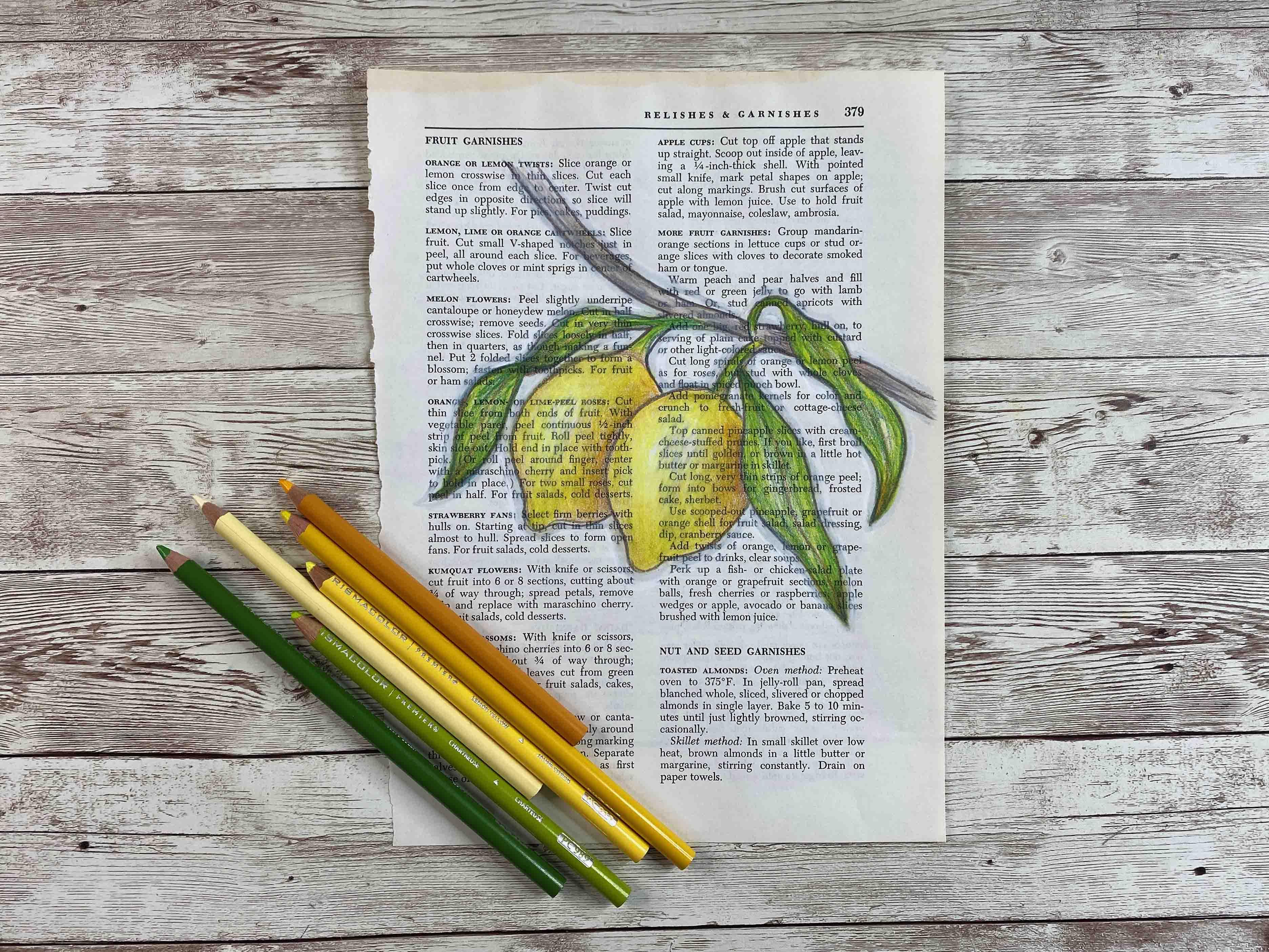
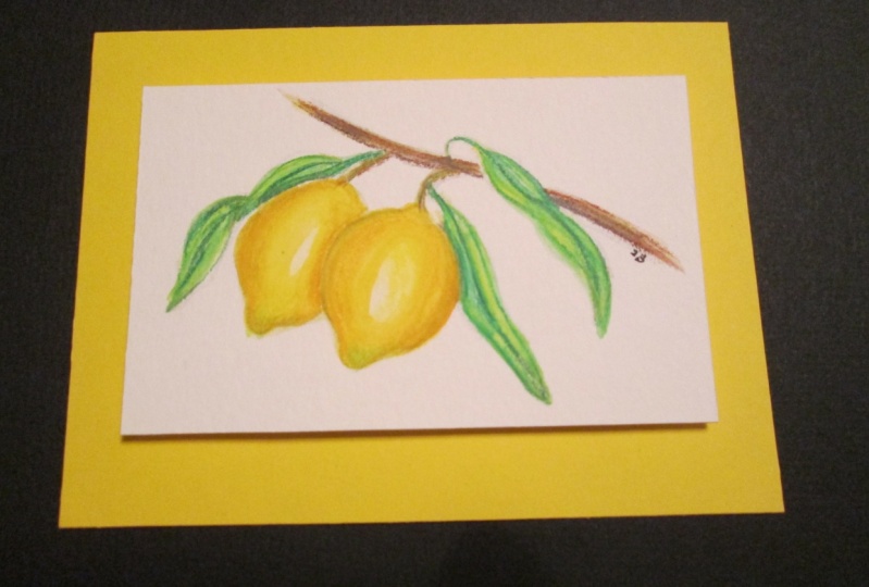
16. Class Wrap Up: So here's our completed colored pencil drawing from class today, we started out with a template. We created the image that we wanted. Adding additional leaves are moving objects, or adding additional images to our initial sketch. From there, we started adding colored pencil layers and lots of them. We created blends and gradients, shading and highlights, and we created a colored pencil painting. Now, I wanted to show you some variations using that same template and colored pencils, and just changing your paper. Now here's that same sketch, but it's done on a gel printed page. And all that is, is acrylic paint with the background that was painted onto the page to give some interest and texture. And as you can see, there's a little transparency to the colored pencil drawing. So you do see the pattern from the background, but it's not dominant. It just adds a level of interest as does the entire scene. I have some gel printing classes that you can refer to if you'd like to use that technique. And here's a colored pencil drawing just on a book page. This was an old book that I salvaged. It was a cookbook and this page had a lot of citrus and lemon recipes and I thought this would make a nice background. My illustration, I use the same template, put that in there, change the leaves slightly and I have a different look. Now using that template, the first class was on watercolor. So you can see how watercolor colored lemon give you completely different painted images. And the upcoming class is going to be using that same template and acrylic paints. And that way you'll get a whole slew of ways to use different medium with the same image. So back to our colored pencil image in addition to the template that you can download to help you create your sketch, I've also included a sheet with just some bonus tips on using colored pencils. You might know some of these things, but some of them might be helpful to you. And having them altogether in one cohesive unit is sometimes an easy way to refer back to them. I hope you'll try your hand at a colored pencil, lemon illustration. Choose your colors, choose your sketch. Make your template. As you see fit. Snap a photo of your work and post it in the project section. Please be sure to follow me here on Skillshare to get notified a future classes, and please consider leaving a review. Thanks for joining me today.
 Daniela Mellen, Artist & Author