Transcripts
1. 00 Intro: Hi, If he wished to color your character says martyrs but have difficulty when it comes to using them. Then this course is for you. My name is ago guys keep from studio Olga. I have published manga professional and I have been in love with markers for many years. In this course, I'm going to teach you mine techniques. This is part one of my four-part series of using or who, who markers each part of the series. We'll address a different technique. I will provide materials with us course that you can use, but you are very welcome to use your own. And since it was requested in another course, I'm going to keep the coloration process in real time so that you can better follow along. So let's begin.
2. The Materials: Let's talk about the materials first, the paper. In this course, I'm going to use the who, who marker pads for the strength of 200 grams per square meter. I found it quite comfortable to use. And one thing that I really liked is this protective sheet, which prevents the ink from seeping through the paper and staining the paper below your drawing. Here is a trick that I would recommend for you to do with any type of paper that you're going to use. This to sacrifice at least one sheet of paper for test strips. These can be used to test out different colors and different materials so that you can avoid making mistakes on your actual drawing. So basically you can test out which colors work well with each other so that you don't have to redo the whole drawing because the colors that you chose did not work out well. And this is what I did. I basically cut out one sheet of paper and made these papers trips. I will also be using the who, who fine liners. They are available in different strength which go from 0.052 brush. And of course, I'm going to use the or who, who markers, at least in this case, they come with a black storage bag that has four compartments and also has another spare plastic sheet similar to the one in the marker pet. It also has marker color swatches. This set has 120 marker. I really recommend to fill out this color swatches because one thing that is not so good about these markers is that the color of the pen that is displayed on the pen does not really correspond with the color that is on the paper, which is why it is good to use these color swatches and to use the papers trips that I have already talked about. A few words about the UFO markers. I have been using Copic markers for almost exactly two decades now. So when I tried these markers, I was pleasantly surprised that in terms of ink quality, they were quite similar. They blend really well. They also are a lot cheaper than the Copic markers. But at least for now, you only can buy them in a set. So you cannot purchase certain color that has gone empty. And unfortunately, they are at least now no refills available for them. Also, they can be refilled if you have Copic marker refill ink bottle that corresponds to the color of the marker. I tried that and it did work. So just in case I hope that one day there will come out with a refills. Also, it takes a while. I felt in the color swatches. And you know that feeling when you're starting to color something with the marker, it's always this hesitation of putting ink to paper, especially when you haven't used certain material, you don't know how it will react even though I have been using markers for 20 years now, I still hesitate. So maybe it's a relief for some of you to know that even though I loved them, it's still a bit intimidating. It is said that there are two types of artists. Some that sort their supplies and some that don't. In my case, as you can see, I prefer to sort the flies by color. Basically, I use the color swatches to sort the markers by colored types. So basically the Yellowstone's are in the first compartment. The red tones are in the second compartment. The greenish tones are in the fourth compartment, and the gray tones are in the force compartment. Additional materials used in this course are a white water color by color x to create the highlights and panned pastels to add a bit more blending to the skin into a bit of blush to the cheeks. I use thin watercolor brush for the highlights with which I apply the white color x. And that's basically it. So let's go to the first, uh, who, who mock our course.
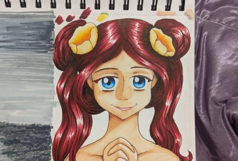
3. Coloration with Ohuhu - Middle Tones - Skin: So let's begin a few words for the beginning. I'm going to provide the line art in their attachments. So if you want, you can use it to follow along with the coloration process. I also will highlight the colors that I'm using at any given moment. When I'm not talking, I will be using music, so I hope you can enjoy it. So let's begin. For the line art. I have used. Who, who lined robbing pen with the strength of 0.05. Just a few words about the technique that I will be using in this course. There are many different approaches to how to color it was markers. So I will be using different techniques for different courses. So in this course, I will be using three types of colors. It's the base color, the middle tone, and the shadows. In this case, I'm starting with the middle tones, and I will start with the shadows. I will start with the eyes, and I will be using the PB 7 pastel blue. I will color the shadows of the eyes. And as you can see, I'm always a bit hesitating before starting good color to the drawing. And I don't think that I will ever stop doing that. Because traditional materials are intimidating because the way you can correct mistakes are limited. As long as the ink has not dried, I go over the same spots with the same color. If you layer the color on top of each other, that way, you can create colored transitions that correspond with each other. Basically you, you use the theme color and if you go over certain spot twice or three times, it becomes a bit darker bar in the same shade. I'm using this technique a lot. Next I will be using the air 19th, barley beige color for the skin. I like to start with the shadow of the nose. It may be that you have other preferences. I tried to color this stage relatively quickly so that the ink does not dry too much and I can blend the transitions. And again, if you go over the same spot twice, you will get a slightly darker shade of the same color. And don't forget. Then the ink dries, it will become lighter. So don't worry if you're in the first moment you think, oh my God, it's too dark. It will get a bit lighter. So right now I'm basically drawing the shadows that are cast by the hair. Next comes the lips, and after that comes to the neck, then I start coloring the shadows of the hands. I'm still using the same color for the skin of the hands as I'm using for the face. You might see that I'm using different coloring. Then filling in certain areas, some areas that are not as dark, I remove the marker rather quickly so that there is this light transmission which can be created when you are using a brush marker. But when I'm filling in other spots that are more in the shadow, I'm basically filling them in. So I apply also bit more pressure. This parts are also will be colored darker later in the coloration process. And then I again go over some spots, but the same color twice or three times to create this darker shadow. The same technique is applied to the skin of the neck and body. Let's go. Hello. Hi. Hello. Okay.
4. Middle Tones - Hair Part 1: Then I'm switching to another color. It's the BB 11, marine blue. I'm using it to fill in the base shadows of the hair. It is at this stage is that they determined how the highlights of the hair look like by using the shadows to work them out. This technique will later allow me to blend the colors quite nicely. I tried to use more defined highlights and shadows on the parts of the drawing that are in the front. And less defined highlights and shadows into parts that are more in the back. And it basically repeated for all of the hair. Hello, right? All right. Hello, hello, and so forth. Hello. Hello. Hello. Okay. Yes. Okay.
5. Middle Tones - Hair Part 2: After I have done it for the right side, I'm doing it on the left side as well. And as you can see, the light is coming from the left or for us at the right side, for the character to the left side. Okay. Hi. Hello. Hello. I'm using the same colors. Eyelashes and eyebrows. Hello. Okay. Hello.
6. Middle Tones - Hair Part 3: Hello, hello, hello. Hello, hello, hello. Hello.
7. Middle Tones - Hair Part 4: Hi. Right. Hello. Hello. Okay. Okay. Hello. After the left and right side, does Dan I'm using the same color to color the shadows on top of the head. And it's again the same technique with going over the same spot, Tobias with the same color. And don't worry too much if the color does not blend completely at this point, since we'll be going with other colors over it, it will blend more later on. All right. Hello. Thank you for calling. Okay. In this country. Hello. Hi. So hi. So this hello.
8. Middle Tones - Clothing: Let's talk a bit about the colorless blender. It is not really meant to blend the colors as the name would suggest. Or at least not in the way that you would think. But it is great for fixing mistakes. So basically the ink in the colorless blender pushes the color of the ink of the normal markers out. So if you go over a certain spot or over certain line, but the Schumacher can fix this mistake by using a colorless blender. So you go to the spot and you push the color back over the line. You have to be careful though, not to push it too far. So I did a small mistake when coloring the biloba eyelashes, and I now pushed the darker color back to the eyelashes from the eye. It works in the cases when they are, the spot that you try to push the color away from is not colored by other colors. Which means as long as you did not color that spot, you can push the color away from that spot. But if there's another color, I would suggest using that color to push the other color away because otherwise, if you go over that spot with the blender, you might muddles the colors and create a mess. Next, I will be using the y two sunflower. I will use it to color the shadows of the earrings. And I decided to use same color for parts of the flower ornaments on the head. The same goes for parts of the clothing. When you are coloring, it's good to repeat certain colors that way. The colors in the illustration harmonize with each other and don't stand out too much. By the way, before I started the illustration, I decided on a certain type of colors that I'm going to use so that I wouldn't be struggling with trying to decide to which of the 120 colors in this set I'm going to use for this particular piece. So while I'm coloring it, so in that way, it is easier for me to work with a limited amount of colors that they have chosen for this particular illustration. Let's go. Hi. Hello. Hello. Next I'm going to use the uranium for the clothing. As you can see, the actual color is darker than the marker itself, which is why it is important to create these color swatches. Hello. Hello. As you can see, I'm not leaving parts of the closing of white, at least where I'm using red color. And it's because the clothing itself, It's fabric, does not reflect light, has so much. So basically, if you leave too many white spots it with suggests that it is more of a silky or leathery fabric. You always have to think about the texture of the thing that you are trying to portray. So in this case, whether it reflects a lot of light, then I'm going to use the W G 001 warm gray one. I preferred to use warm grays or by using called grace because it works more with the color palette that they normally use. My color choice is usually more warm and colorful. I'm using it to create the shadows on the marker that she's holding. And then also going up the same spots twice in order to create a darker shadow. And I'm using the same color on the color of headdress or at least on the parts that are in the shadow. Hi. Then I'm using the same color that I used for the hair in order to call the bow on her dress.
9. Middle Tones - Lips: I'm using the color are 21, fruit, pink for the lips. I started the part where the lips are pressed together because it is usually the darker part that gets more shadow. And then I define the form of the lip. I usually don't use that much handouts on the upper lip and instead let the highlights appear on the lower lip because light is usually from above, the upper lip is more in the shadow. In the lower lip sticks out a bit more, so it gets a bit of light and reflects a bit of light suggesting that she's wearing lipstick or lip gloss. So basically I leave the part that has a highlight of free of color and then define the form of the lip by adding additional shadows with the same color. Okay?
10. Middle Tones - Flowers: Next, I'm again using the colorless blender in order to slightly, slightly blend the color transitions on the lips. Then I'm using are 21 foot pink, the color of the flowers on the hair ornament. As you can see, I'm leaving the edges white for now because I want to have the flower ornamental, slightly lighter edges. Again, this is a base color for the middle tones. It's like the shadow of the flower. And repeating the same thing on the left side. Hello, hello. Hi. And since I like color repetition, I'm using the same color on the marker that she's holding.
11. Shadows - Hair 1: After I'm done for the middle tones, I start adding the shadows with darker colors and then go over it again with the middle tones, blending the colors together. First, I'm using the BB8 cerulean blue. I start again with the eyes. As you can see, the actual color of the marker is darker than the cap of the marker would suggest, which is why I'm using the color swatches. I'm drawing first the outline of the eye and the texture in the eye. And after that, I'm adding the shadows to the eye. Then I'm using the BGI 09 blue great tool. It is even darker than the PBA. With the same color. I'm now applying the dark shadows to the hair. I especially take care to apply the shadows where the different hair strands intersect. That gives a more plasticity to the hair. Sorry. Hi. Hello. Hello. So for fall. Okay. Hello. So hello. Hello. Okay. Hello. Let's continue. Hello. Next. Slide. Okay. Hi. Hi. Okay. Okay.
12. Shadows - Hair 2: And then I'm using again the middle tones, the PB 11, marine blue on the hair and blend the colors together, but they take care not to fill in the highlights of the hair. In this technique, I'm mixing the colors on the paper. Hello. Hello. Se can see by not filling in the highlights and not going to the edges of the highlights, it creates a bit of a darker highlight around it. I blend the shadows for the rest of the hair as well. And as you can see, I'm using the protective sheet in order to avoid the coloration. To go through to the other drawing below. Hello. Wow. Okay. Hello. I'm using the 20 powder pink. I use it to its darkest shadows to the skin. I tried to use it Radha sparingly and only to the darkest parts. That way I convert all the shadows of the skin. Okay. And so forth. Hello, hello, hello, hello. In this lesson. Next I'm using again the BG nine, blue-gray to nine, and add the darker shadows to the clothing. It is the same colors that they used for the shadows of the hair, but it looks different and way darker. When I added to the red dress, I usually avoid using black colors when coloring with markers except for the outline. Instead, I usually use dark blue, like in this case. Hello. Hi. Then I'm using the geranium, the color of the dress, mid tones to blend the colors together. Hello, hello.
13. Shadows - General: This is a color that I quite like to use for darker shadows of light objects. It's our 11 malware shadow. It works well for dark skin, at least the darker parts, but also for other things. I use it for the parts of the skin that are in dark shadows. I find that light violet works well for shadows of light skin. I use the same color for the finger nails also floods a dress. The same colors used to add a bit of texture to the flowers in the hair. And you can see the color looks different in combination with different colors. Hi. Hello. It's just interesting to see how it looks on the color of the dress, which is wide. By using warm colors to these types of shadows, make the coloration look more harmonious. Hi. Okay. Today. Hi. I think so too. Hello. The same color can be used also on the lips and also on the hair. So basically I blend or the shadows together by using this one color and by going up to the highlights of the hair with this color. Similarly, a lag on the color of the dress. It creates an interesting color effect for the hair and adds a bit of violet to the blue. The same color is used to add shadows to the marker that she's holding? Yes. In this system? I think. So. Too. Hello. Hello. Hello. Hello. Hi. Thank you. Hello. Okay.
14. Base Colors - General: Next, I'm using, these are 22 borne fruit, pink. I use it again to blend the colors together on the lips and on the flowers into here. Okay? Hello. Hello. By going over the flower ornaments on the parts of that texture with the mouse shadow, the coloration looks softer. So basically if you draw lines with a marker and then go over it with another marker, that the slider then it blends the colors together and make the lines luke softer, more washed out like with watercolors. And then after I'm done adding the shadows with the darker colors, I'm using the lightest based colors to achieve a soft coloration, blending the colors together and the really strong highlights are left free. So in this case, I'm using are 18 pastel peach. I'm using it as a base color for the flowers and the skin. This is the part that this a bit intimidating because now I'm going to color the big areas of the skin. And this is when I will have to work fast because in order to blend it really well, I have to be careful not to let the ink dry out when I layer it. That way, I can have this almost digital like smooths coloration, which can be made really well with markers. Hello. Hi. Okay. Hi. All right. Hello. I live less highlights on the hands compared to the sales because then defaced attracts more attention. Then they add some more blending to the face and then use the same color on the flowers. Then I take the R9 barley Bache and add some more shadows to the flowers. Since I'm repeating the colors in the middle color for the skin, the colors work well together, but since I used a different color for the flower, it's the color of the lips and the marker. This color looks differently in combination with it. I'm also adding it a bit to the shadows of the color of the dress. And it gives a bit of warmth to the lightly violet color of the dress. At the same time, it led this violet highlights of the hair stand out more, which look a bit more cool than the shadows of the dress. But if you want to blend them in and to give the hair a bit more warmth, you can add a bit of this color to the parts of the hair that are closest to the face. This is a technique that is used in digital coloration. Actually used more nowadays than in the past, which means that you add a bit of skin color to your hair. At least on the parts that are closest to the skin. I'm using pastel blue for the eyes. Next time, the BG for Mint blue also, it doesn't look that way from the cap of the marker. It is the lightest blue in this case, and it blends the color of the eyes more. I use the same color for the highlights of the hair. Parts of the highlights, a leaf white. I will add a bit more of the white to the hair by using a white paint. Hello. Okay. Hello. Okay. Okay.
15. Base Colors - General Part 1: Next I'm using the GY six and nice color, which is slightly greenish yellow and I'm using it and the lighter parts of the flowers smell us on the earrings. Uh, kinda less. Splenda is used to blend the light parts of the flowers. It's only vertex well, was rather light colors. Then I'm using again the art 21 fruit pink and add a bit more shadow to the lips. I'm using the same color on the nails and demat car.
16. Base Colors - General Part 2: You might have noticed a bit of the blush on the cheeks and a bit more blending on the color of the skin. I actually wanted to record this part, but forgot to turn on the camera. I used to Penn pastel colors to achieve this effect. Here's an explanation how it works. Basically, you use the marker to create the base color and the shadows, and then blend the colors more by using the pond pastel. It, the slightly opaque, the end, It's blends and lightens the color, gives it a bit of a color. I like to use it on the skin and also to add a bit of blush. I know blend the colors together by using our 19. Then I'm using y are certainly three, Mellon yellow. It's actually a bit of an orange colored that they can use to add a bit more texture to the earrings. It's going to give it a bit more of this metal login highlights in the workout highlights a bit more. I also use it on a few parts on the flour ornament. And then add our 21 and color into stamps on the flowers.
17. Effects - Highlights: And now comes the highlights. In this case, I'm using a wide DIYbio colorectal fluids, water color and draw highlights. I use a thin watercolor brush to do that. I strengthen the highlights on the eyes at a bit more highlights on the earrings and the lips, as well as highlights on the fingernails, the marker, and of course, the hair. I find the color Rex white, a lot more softer and more yellowish compared to other white inks or white watercolors. So I think it works more for warm sort of coloration. Hello. Yeah. Okay. Wow. Hello. Hello. Okay. Hello. Hi. So basically we are done.
18. Conclusion: I hope you have enjoyed this course. For me, it is really fun to color with markers, and I hope you can learn to love them as much as I do. I find that mockers worked particularly well with character coloration. So I usually prefer to use marker, spend them colouring characters. If you have any questions, feel free to ask. And if you have any finished pieces, whether it is the outlines that I have provided with this course or if it's your own, please share them in the project session. Good luck. I will see you in the next course.
 Olga Rogalski, Professional Mangaka and Illustrator