Transcripts
1. Introduction: [MUSIC] Do you use color in your work? Do you want to express
yourself with it, create beautiful
color compositions which tell your story,
share your feelings? If so then welcome to
my color theory lesson. My name is Kate Keytofreedom
and I'm an illustrator. I worked both in digital and
with traditional materials. I work as a freelancer and do different
kinds of commissions, illustrates stories, and
make my own projects. I studied design
at University for four years and since
then I've been improving my skills
with the help of illustration courses both in Moscow and British
School of Art and Design and in London at UAL, and also with the help
of a lot of practice. When I was just starting to
learn to draw and paint, I was often intimidated
by color as it felt so unpredictable and
hard to understand for me. I even thought of myself as
more of a graphics person, but now I really
do enjoy working with color and people
who see my work, especially, emphasize they'd
liked the colors of it. This is a powerful instrument
which can help you say so much and create the impression you aiming for in your work. In this class, I'm
going to tell you about color wheel and how we can use it to create harmonious
color palettes. Also, I'll show you a couple of other ways to find a
good color combination. In the end, we will
make a series of abstract geometrical
composition in a restricted color palette, which you will choose with
the help of color wheel. This is a great
exercise to practice, and also the results of it can become a stylish
wall decoration, or a draft for posters, postcards, stickers, and
so many other things. This class will be most
helpful for beginners, but even if you already
have experience, you can still explore
color even more and take your relationship with it to a new level by
doing the project. I will be happy to
help and give you feedback on the results
of your exercise. Please, share your
work and let's fill this world with color and become more and more
confident using it. Let's get started. [MUSIC]
2. About the project: [MUSIC] As a project
for this class, we're going to make a series of geometrical compositions in their restricted
color palette, which we will choose with help of the color wheel and one of the schemes I will tell you about in the next
part of the class. It helps a lot to learn
to apply theory to your own practice and to fully experience
how colors work, how they mix with each other, how they interact with each
other on canvas or paper? This can help you
understand color better and this knowledge will be
actually useful in your work, even in digital as similar
principles apply there. Also, I hope you'll get a lot of fun and pleasure from
this playful project. A scholar should be fine. I myself really enjoy doing this thing every now and then. It gives them practice
and it feels like a meditation when you
work with real paint. In different stages
of our project, we will choose two simple
geometrical shapes as the main characters
of our series, make sketches of
geometrical compositions and choose six that
we liked the most. Prepare sheets of paper for the series and transfer
the sketches to them. Choose our color palette and apply chosen colors
to the compositions. Add accents and
make corrections. Take photos of our pieces. While doing this project, don't be afraid to
make a mistake. Remember that we are
experimenting and learning here. There are actually
no mistakes in art. Please share a photo
of your series of six geometrical compositions
in the project gallery. Let's create this new
colorful world together. Also you can share an image
of any stage of your project. If you have any questions about them or you have
any difficulties, I will be happy to help. In the next short video, I'm going to tell you
about the materials that you'll need
for the project.
3. Materials: [MUSIC] In order to
start with the project, please listen to the color
theory part of this class, and prepare some tools and
materials that you'll need. You'll need acrylic
paint or gouache; red, blue, yellow, black, and white colors, flat brushes, pencil and eraser, scissors, ruler, masking tape, any paper or sketchbook
for your sketches, and thick paper for painting. Let's get to the theory. [MUSIC]
4. Colour Wheel: This is a theoretical part
of our class which will be useful not only in the project
we will make together, but in your future art practice. [MUSIC] I want to tell you a little
bit about color wheel. There are different
versions of it suggested by different people, like Gotar, Isaac
Newton, Johannes Itten. There are a little
bit different, but all have the same purpose to help us navigate through
the world of color. Today, I will show you the
wheel by Johannes Itten. He was a Swiss painter, writer, designer, and teacher
at Bauhaus School. He's color wheel,
looks like this. It includes all colors
of the spectrum from blue to red plus violet,
which connects them. In the base of the circle, there are three primary colors, red, yellow, and blue. By mixing them with each other, we can get all the other colors. They themselves
cannot be obtained by mixing any colors together. That's why they're
called primary. When we mix two primary colors, we get secondary colors, which are orange,
green, and violet. It goes like this. Blue plus red is violet, blue plus yellow is green, and red plus yellow is orange. If we mix one primary
and one secondary color, we will get tertiary colors, which are the rest that
you see on the wheel. Of course, there can be
many more different hues. But for this scheme,
which color wheel is, 12 colors is quite enough. Color perception
is very imprecise. But the more we will
work with color, the more different hues you
will see and differentiate. Now that I walked you through the components
of the wheel, let's talk about why we need
it and how we can use it. As I've already said, this is a scheme that can help you create harmonious
color combinations. Let me show you a few variance
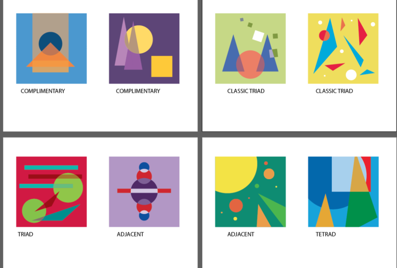
of how you can do it. Complimentary
colors are the ones that are on the opposite
side of the wheel. For example, yellow and violet, green and red, blue-green
and red-orange. Such combinations create the biggest contrast
between them. They create a strong impression, draw attention to them. This can look really beautiful, but you should also know where this contrast is
needed and we're not. For example, red letters on green background would
be really hard to read, they clash too match. I like using
complimentary colors in my work and building my
color scheme around them. I really enjoy restricted
color palette. They can look so establish. Second scheme is triangle
or triad, three colors. This scheme can
make the contrast of the previous ones soft. We can take yellow and instead of its
complimentary color, violet, use the neighboring a red-violet and a blue-violet. It is still quite a
beautiful contrast, but not as bold as a
complimentary pair would be. This triangle can be
also rotated in any way, creating many different
combinations. Classic triangle
or classic triad is an equal-sided triangle, which can also be
rotated in any way, and one of these examples is a combination of
three primary colors. Another example can be
green, orange, and violet. We also can take 2-5 colors that are situated next to
each other on the wheel. They are less contrasting. It is a software combination and it can look
very interesting. We can get tetrad by building a rectangle
on the color wheel. We will get four colors. With this and the
previous scheme, it starts to get a bit
more complicated as we have now more
colors in our set. It is important to look also
the quantity of each color, do not make it look clowny. A useful tip might be to set one or two colors
as the main ones, meaning they will have the
most amount of space and to use other colors
as smaller accents. Square is one of the
examples of tetrads. Before we get to practice, I'd like to show you one more
thing about color wheel. Different versions of it can
have a few wheels in them. On this one, we can see that the middle circle is similar to the one we were
just looking at. But it also has inner
circles in which more and more white color
is added to the same hues. There are also outer circles where more and more
black is added. This makes colors lighter or darker and also less saturated. Adding black, white, or
sometimes even both of them can make colors more complex and sophisticated, more toned down. In our project, we will also use black and white paint to
get different lightness. In this lesson, we learned
about what color wheel is and what schemes we can use to create color
palettes for our work. No matter what it is, an illustration, a painting, a design for
something an outfit, or even an interior design. In the next short lesson, I'll show you a couple of other ways to get
color combinations. See you there. [MUSIC]
5. References and other resources: [MUSIC]. In this lesson, I just want to give you
a few more ideas of where to look for color
inspiration and help. You can do especially
websites which you can easily Google and find the ones that
fit best for your purpose. For example, I like the site coolors.com where you can either get inspired by trending
color palettes, create your own one, or even upload a picture and
see what colors are in it. There are many good
resources for that. Just find the one that
suits you best and use it. Also, it's really
not a bad idea, especially if you're only
starting to work with color, to take inspiration from
the images you like. Take an illustration in
which you really loved the colors and try
to analyze it. You can use one of the sides like the one
I showed you before, or open the image
in any program, you can draw in and use eyedropper tool
to pick the colors. But I would actually
recommend to try and analyze an image
with your eyes first. What are the main colors
for this picture? Which color takes
the most space? Which one adds tasty accent? There can be millions
of colors on a picture, especially in a photo. But what you need
is the main idea. What makes these colors work? What combines them
best together? Also use the knowledge of
color wheel you already got. You can also search my beloved
Pinterest and find images there with already picked
palettes. That's an easy one. The final, but in my opinion, the most useful advice is to
experiment yourself a lot. Don't try to get everything
from the first time. If you're drawing with
traditional materials, you can make a few
color sketches before you apply
color to your work. These sketches should be small, quick, and not detailed at all. You just apply the main
colors you want in the same places and
proportions you want to use them
on a final piece. Make a few variants, and choose whichever
you like the most. In digital art,
it's even easier. You can choose different
colors and save different variance of your work and then compare which
one works better. Does not forget to
do everything on different layers as it will be much easier to change
colors that way. From this lesson, we
learned that we have many different places to
take inspiration from. These are special websites, images that we like. Palettes from Pinterest. The last but not least, experimenting and
making color sketches. Now, we're ready to move
on to the project by default class the most fun part. See you there. [MUSIC].
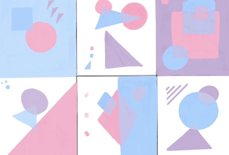
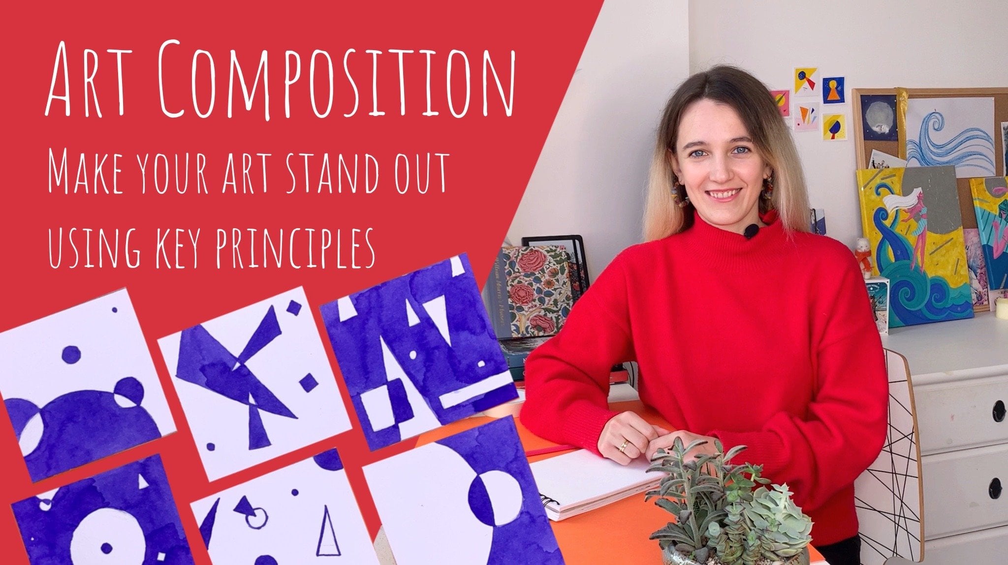
6. Making the compositions: Now that we know a little bit more about the theory of color, let us get to practice. I'll remind you that we
will be doing a series of dramatical compositions in
a restricted color palette. At first, let's make
the compositions. [MUSIC] We will make some sketches to find
the best compositions. I suggest we take square sheets, although you can take
any ratio you want. Just remember that in sketches, the proportions should be the same as in your final pieces. Take your sketchbook or
any blank sheet of paper. Now choose two
geometrical figures which will be the main
characters of your series. You can choose any shapes, just don't take the
complicated ones. It's best that you
take the shapes that you can draw
easily and quickly. For example, I chose a
triangle and a circle. Now let's start sketching. Make compositions
by positioning two, three shapes on the sheet. Try to make them
intersect as it makes compositions look more
interesting and dynamic. Also it will make it more exciting on the stage
of adding color. Don't spend too much
time on sketches. Do them quicker,
but more of them. Try to do at least 20 so that you have something
to choose from. Now look at all the
sketches you've got and choose six of them
that you like the most. Put small marks
under them not to forget and let's move
to the next part. [MUSIC]
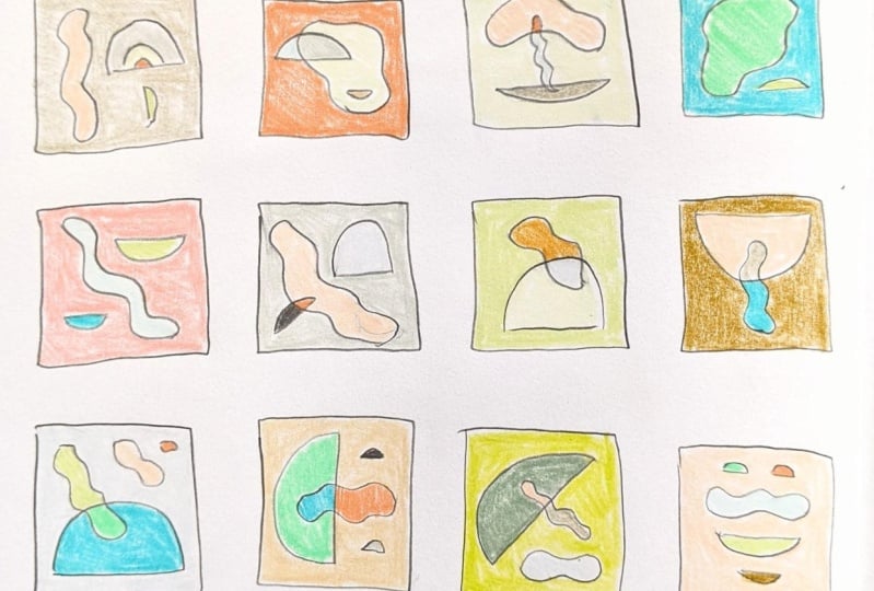
7. Preparing the sheets: [MUSIC] Now, let's prepare
everything for color. First, you need to cut
out six pieces of paper. Don't make them too big. Mine are about seven
centimeters on both sides. Then we'll tape them
carefully to your tablet, or to the back of a sketchbook. [MUSIC] Finally, transfer
the compositions you chose from your sketches, to the sheets of paper we
prepared with a pencil. Try not to push the
pencil too hard, and erase all unnecessary
lines in the end. [MUSIC] The project
is ready for colors. [MUSIC]
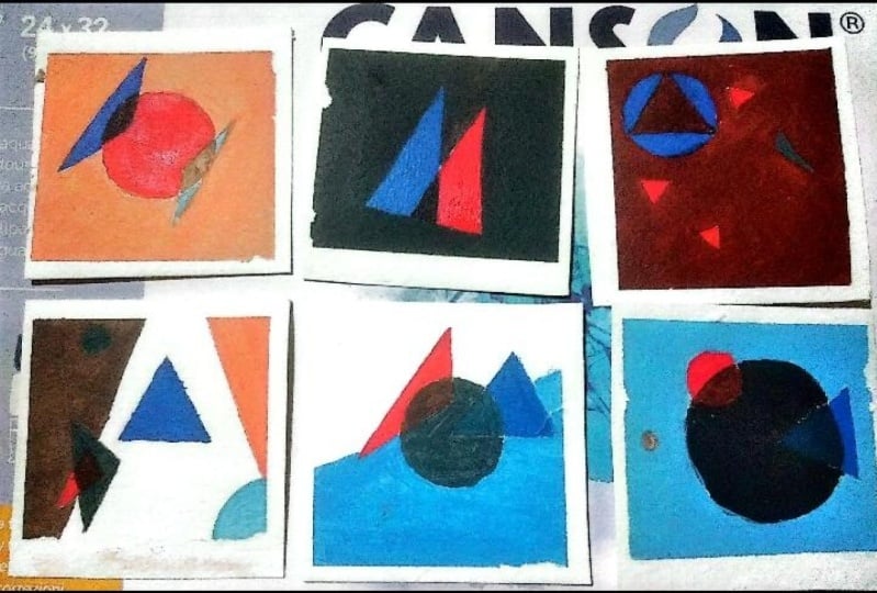
8. Applying colour: [MUSIC] Now we've finally got to the part
with all the color. But first, let us create
our own color palette. It will be a restricted palette which will only have
two main colors, these are going to be
complimentary colors. This is the first
scheme I was telling you about in the lesson
about the color wheel. Let's remind ourselves
that complimentary colors are any two colors on the opposite sides
of the color wheel. Choose the pair that
you like the most. For example, it can
be yellow and violet, blue and orange, red, and green. You can also use pairs
with tertiary colors, but it will be a
bit easier to use primary and secondary
ones for now, as they will be easier
to get and mix. I'm going to choose a yellow and violet for my compositions. Also, we will use colors that we'll get from
mixing those two that we chose as main with each other and
with white paint. We can try our palette on a separate sheet of paper
to see how it looks. Take your acrylic paints and your brushes and let's do it. For example, in my palette
there will be yellow, violet, a mix of them and lighter tints of
all these colors. If at this point you don't like something
about your palette, you can easily change it. Just try another combination
on your palette sheet. Now that we have our palette, let's start coloring
the compositions. An interesting twist
here is that we're going to be coloring
the intersections of our shapes with a
color that we'll get from mixing the colors
of the shapes together. For example, if my circle is yellow and my
triangle is violet, on their intersection
I'll get brown. This way we are creating
an illusion as if one of the shapes is transparent so we can see another
shape through it. When you choose which color to make each element or background, try to keep in mind
how this is going to look not only on
a separate sheet, but also with all six
of them together as our six compositions is also
one whole piece [MUSIC] As a final little thing, you can add small elements
like dots and thin lines to your compositions
using the same colors from the palette [MUSIC] When you have finished,
let the paint dry up and unstick the tape [MUSIC] See if you like
the way the pieces are positioned near each other. You can change their order and composition and see
what works best. You could take pictures
of different variants to compare and understand which
of them you like more. Congratulations to you,
your project is ready. Please share the final photo of your compositions in
the Project Gallery, where you can also ask any questions about
any stage of it. I'll be glad to help. I hope this exercise helped you to understand
color a little better to get some practice
in mixing and combining it. Also know you have a nice
set of abstract compositions which you can develop even further as your
personal project. You can leave it as a nice
decoration for your room, or you can scan them
and make stickers, posters, or postcards with them. Also, you could choose a
composition you like the most and create a bigger
piece of it on Canvas. Of course, if you
like the palette that you created
for this exercise, you can use it in your
other work too [MUSIC]
9. Summary: [MUSIC] You have finished your project and learned a bit more
about color theory, and also applied your new
knowledge in practice. You can use the schemes
that I told you about as long as they help you. At some point, you'll start to choose colors intuitively. But still, sometimes you need to consciously think through
the colors for some project. The schemes, color wheel, special websites, inspiration boards will
help you with this. In this class, we've
learned to use color wheel to find
good combinations, to take colors
from other images, websites, or from
your own experiments. We chose a combination in
their restricted palette and made an abstract
art project in it. We had some fun. I'm really happy to be teaching this class and sharing
my knowledge with you. There are more lessons to come. If you want to ask any questions about the class or the project, you can do it in the
comments under this video. If you have any other questions for me or just want to chat, you can find me on
my Instagram page, Keytofreedom, or my
website, Kayway.me. You've done a great job
and finished the class. I really hope you enjoyed it and also I want to see the
compositions that you made, so please share them in the project section
under this video. I'll see you in my next classes. Goodbye. [MUSIC]
 Kate Grishina, Illustrator, artist