Transcripts
1. Introduction: Composition, what is it? Why is it so important? And what is wrong
with this video? Hi everyone and welcome to
my class on compensation. My name is Katie to freedom. I'm an artist and
illustrator and an abdomen. I have application in design, illustration and psychology. And I haven't learning and practicing odd for
more than ten years. And now I'm happily sharing my knowledge and experience
with my students. Composition is a keto. Good artwork and
composition is good. You might not think about it. But when it's bad, you will definitely notice
that something's wrong. As you have probably noticed in the first shots
of this video. That's why it is so important to understand how
composition works. In this class, I'm
going to tell you about some rules and principles
of composition. So you can use them and break
them to achieve your goals. You will find out how
composition can help you to get the impression you want and to express your ideas
clearly and vividly. In the end, you will do
a couple of exercise which will help you put your
new knowledge into practice. We will do a series of abstract
geometrical compositions, which can become self-sufficient
art pieces themselves. They can become sketches for bigger paintings or
illustrations for posters, postcards, stickers,
and so much more. As a result of the class, will get more
understanding and control over creating compositions
in your art practice. No matter what medium you use or what style you create
in this class, is good for beginners. In all articles as composition lies in the core of any artist. But this class can also
give some insights and new thoughts to
more advanced artists. I will be happy to
see you in my class. So let's get to this
journey together. See you there.
2. About the Project: The project for this class
will consist of two parts. It will make two series of abstract compositions using
simple geometrical shapes. First series will be done as an applicant who will
create compositions out of cut-out geometrical shapes using different rules
and principles, which I will tell you about in the theory part of the class. Using cut-out paper
actually helps to feel it with your
hands how all this works. But you can also do this part in digital
form if you like. As for second series, we will draw it by hand and
maybe even add color or ink. In this syllabus, you'll explore your abstract thinking
as you will create compositions in association with props I will give to you. E.g. you will explore how
you can express the feeling of an early morning or a windy day in an
abstract piece of art. Interesting task, isn't it? It is fun, quick,
and easy to work with simple geometrical shapes. And yet it will help you, even with more
complicated objects as even complex multifaceted
compositions can be decomposed to combinations
of simpler shapes. As a result, you will
have two series of geometrical
compositions which can become self-sufficient
art pieces. You can find even more
inspiration if you look at some abstract
works of great artists. And along the way, you will
gain more understanding and courage to experiment with composition and make
it work for you. Practice makes perfect. But let's get to
the theory part.
3. Three Important Principles of Composition: So what is composition
and why is it important? Competition isn't
artistic arrangement of the parts of a picture, uniting them into whole. Don't worry, I
will explain that. Basically it is how you
position the elements of your art piece on your sheet or canvas or in the frame of
your camera and so on. Composition is the
base of any art piece, and not only visual one, it is in the core of a song and dance sculpture
picture and so on. Composition can be put to the
second place after an idea. Idea goes first, then compositions built in
accordance with it, and then goes color, shape, details, and all other things. If composition is
made poorly than even a very skillful work with color will not
save the piece. With the help of composition, we can direct the glands of how viewer to an important
part of our work. For this, we create compositional
center in the piece. It is the point which we
want the main focus on. Each can coincide with geometrical centre of the
sheet, but not necessarily. Compositional center can
be on the background. It can be moved to
the site and so on. So from this, we can name the first main principle
of a good composition. It always has hierarchy in it. The dependence of the secondary
elements on the main. If in the chat, everyone talks simultaneously and
with the same volume, we can hardly hear anything. The same is with pictures
and all other art pieces. If all the elements
are equally important, nothing is highlighted
more than the others, then it becomes a part. And really we cannot figure out what is the main point here, who is the main character? So there has to be
the main element which we focus our
viewers attention on. All the other elements can
support and highlighted. The second principle for good
composition is homeless. It is hard to measure, but it can be felt intuitively when you
look at the picture and you see that nothing can
be added or taken away here. Nothing more, nothing less. In other words, in
a good composition, you cannot take away
an element or add something without
ruining the balance. You can experiment by taking a famous painting and
trying to cover part of it, or add something on top, most likely you will immediately feel that something's wrong. The third principle of a good
composition is balanced. Feeling of balance can be
practiced and developed. It cannot be measured or
calculated by formula, but you can definitely feel it. When you look at the picture, you sometimes can feel that
one part of it is overloaded. It seems to be fall
into one side. This overload can
happen because of two uneven positioning of
the elements on the sheet. E.g. on one side there
are too many elements. Are there very big, and on the other
side, it is empty. Also, it can happen
because of the colors. One part of the
image is too bright, dark, contrasting in
comparison to another. Actually, the image of scales is rather useful
in the beginning. This way you can
easily understand what you need to do
to achieve balance. In this part of the class, we've learned three main
principles of composition. In the next part,
I will tell you about morals and principles, which you can build
your composition on, the features that you can
give to your composition. So let's move on.
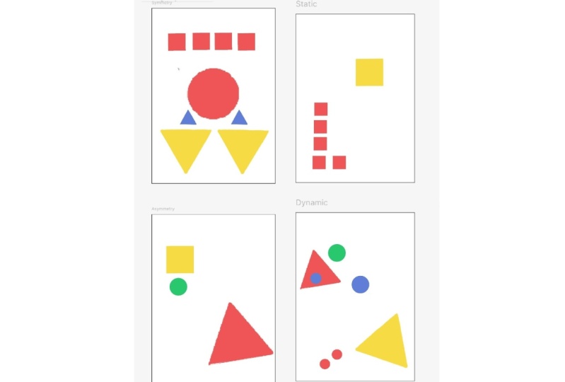
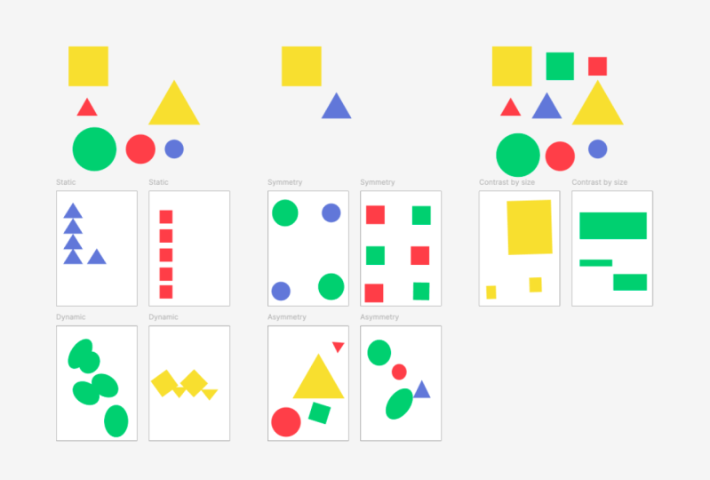
4. Ways of Creating a Composition: In this part of the class, I will tell you about a few more variants of
creating your compositions, a few more rules
that you can use. Overall, there is
infinite amount of composition building skills. Every artists could probably
think of a few of their own. That's why it doesn't
make much sense to try and learn
everything at once. It is really hard to remember and hard to navigate through. We will move slowly
step-by-step. And I will tell you about a few more helpful schemes which you can use to
create your compositions. And also we'll talk about
some things to avoid. The worst thing you can take
into consideration is that composition can be
symmetrical or asymmetrical. Symmetrical means
that the elements of the picture are
positioned well, symmetrically towards the
center of the picture. Some artists make this type of composition a part
of their style, their trademark by using
this feature often, e.g. Wes Anderson is famous by his beautiful shots
and his movies, which are often
created symmetrical. Symmetry can also
look rather boring. Sometimes it can seem
motionless and predictable. To add diversity and
movement to your picture, use S symmetrical composition. Here are some examples of it. Also, composition can
be static or dynamic. A composition can be
achieved by using right angles and parallel lines. Also by showing
objects which are positioned straight and
steady on the plane. When there is no feeling that
if you unfreeze the shot, something you will
immediately happen. Dynamic is when we feel that the objects and the
picture are in movement. That this composition is just a shot which
depicts it just one stage of the actual caught the moment dynamic can be achieved
with the use of diagonals. They can express the
feeling of speed. Also dynamic is
achieved by using the acute angles and steady
positions of the elements. By showing the characters
and movements, by using the unexpected
points of view, by playing with perspective
and not using parallels. Also, rhythm of the elements can help with creating a
feeling of dynamic. The third thing is that in composition you
can use contrast. This contrast can be by
shape, size, and color. We can highlight
important elements which we want our
viewers attention on. By making the beak
especially bright, light or dark in comparison
with other elements. We can also play with
contrast by shape, e.g. we can show our character
as sharp and angular. And the world he'd got
himself in as soft and round. This way we can articulate
the thought that's our character doesn't
really fit in, in this world because he is already visually in
contradiction with it. Or to the contrary, we can show our character as
soft and tender and round shaped and the
surrounding world and other characters as
harsh and prickly. And it shows us that this world is dangerous and
hostile to our character, or at least it looks that way. The next tool I want to talk
about is the golden ratio, or in simplified version, the rule of thirds. If you divide your sheet in three parts horizontally
and vertically, the intersections of
these lines would be the points where human
eye tends to focus on. These areas would be great for positioning important elements
of the picture there. Also, it is best not
to make the line of the horizon right in the center. This way your illustration
splits in two parts. According to the rule of thirds. It's better to put it somewhere
along one of the thirds, either higher or lower
than the middle. The rule of thirds is also
applicable to colors. One color can take more
space than another, e.g. two-thirds of the pictures and cold colors and
one-third in warm ones. In this part of the class, I told you about four
things you can take into account when creating
your compositions. Symmetry, asymmetry,
static, dynamic, contrast by size, shape, color, the rule of thirds. It can seem a lot to take in
at once, but don't worry, we will repeat and try out these principles
in our exercise. But before we get to it, I also want to talk to you about some don'ts of
composition making. This would be the things not to do except when you
have a reason for it. Let's talk about it.
5. DON'Ts of Composition Making + Exceptions: So let's talk about
some things to avoid or take into account when
creating your composition. First, I will tell you the rule, but then it will also tell
you in which cases you can break it down so
the composition, the first one is positioning
exactly in the center. You better avoided if there is no special purpose
for it and it's not your special style. Otherwise, send their
positioning can be a bit boring. You can move the main element a little bit to the
side from the center. And this can already make the composition more interesting
and create more dynamic. But if you have an
idea to show how perfectly balanced your
illustration characteristics, how he's meditating in the center of his perfectly
symmetrical room. And even cats line
geometrically perfect places. And this is about a defining
trait of his character, then yes, this will
definitely express your idea. Without words, two elements touching
the edge of the shape. It is better not to position an element's side-to-side
with the edge, but rather to leave
some space between them or moving object further behind the edge so that
we could guess that it continues there outside
of the picture frame. But if e.g. we want to convey the
feeling of tightness to show that the world of how character became
too small for him. Or if he is kept in
a cramped dungeon, then we can use this as I
did in my illustration. Touching the edges creates tension which we normally don't want to distract the viewer
from the main elements. But in this picture, and in such cases, tension is kind of
the main element. It is part of the main
idea of the picture. We can use it three, the same as with the
edge of the sheet, can be said about elements
touching each other's edges. It's better to
intersect objects, move one behind another, or to move them apart and
leave some space between them. But same thing here as
with the previous one. If awkward tension is what you actually want to show a
new picture, then use it. E.g. if you want to
show two kids that will ask to stand together by their
moms to take their photo, but they don't want to be
so close to each other. They are not friends
or they have some issues with each
other at the moment. You can show them just slightly touching
with the shoulders. And we will all feel how awkward and uncomfortable
situation is for them, along with their facial
expressions, of course, for this rule is often used in photography and imported art. Is the person on the
picture looks to the side. It's better to leave a bit
more space for his sight in front of his face and less
space behind his head. Otherwise, there can
appear an impression that the character stumbles into the edge of the picture,
like interior wall. But if that's what you want
to tell about your character, that they're stuck
in a dead end. Then moving their
face even closer to the H will be one of the ways to visually
express this message. Five, framing of human body. It's better to avoid
cutting humans figure in the places of joints,
ankles, knees, wrists. Better cut the frame somewhere
in the middle of ties, or fit the whole figure
into the picture and leave some space between lower edge of the sheet and humans feet. Also in accordance
with the rule to, you'd better not put the
feet exactly on the edge. It's useful for the
children's drawings, but it's better to avoid. Also, it's good to live a little bit more space above the head then
under the feet. I would actually not recommend
to break the rule about cutting on the joints because this creates
kind of spooky sites. But here it is. If you are after spooky, creepy feeling from the picture, then go ahead, do it. What about more
space above the hat? You can break this rule, e.g. if you want to show that
your character is very high, so high that he hardly fits into the frame
position and under the character too close to the upper edge of the
sheet, create discomfort. And you can even catch yourself on almost
physical desire. Band a little bit as if to avoid hitting
something with your hats. That's creates this
physical discomfort. But if that is
something you want, it can express
your idea clearly. A very important thing
about working with composition and learning
about the tools is that this rules just
help us to orientate ourselves to understand
how this works. When we finally get
the hang of it, we can break these
rules and change them. The main thing here is to understand why we're doing this. What purpose we have. Composition should serve
an ideal for nappies. It helps us to express
our thoughts better, brighter, and more clear. All in all, you can see
that the composition is a very useful and
important thing. It can help you express
your thoughts so well, but also it can create an unnecessary feeling of
discomfort for the viewer. If composition is done poorly, the viewer might actually not understand what is the problem, but they will definitely
feel that something's off. It will be harder to
look at the picture, to connect with it, to focus in it, and even to understand it. On the contrary, a good
composition will make your art piece easier to focus on and more
interesting to watch. Okay, now that you have a lot
of theoretical information, let's finally try and use it. The next part of the class, I will walk you through the materials and tools
that you'll need to do the exercises so we can
finally get to practice. Yea, I excited. I am.
6. The Materials for the Exercises: So for the first
exercise where we will go through the rules
we've just learned. You will need ten A4 paper
sheets, scissors, and glue. And you'll need to print out the files attached to the class. And Scott our geometrical
shapes from that. Or if you decided to make
the exercise digitally, then open the Figma file
I prepared for you. Click the link and make a
copy of the file for itself. While the second exercise, you'll need a sketch book, a couple of sheets
of thick paper, pencil and eraser, a ruler, and optionally some color in materials like acrylic
paint or color pencils, one color of ink. This is up to you. Your compositions can
look differently. Choose whatever you
like to try the most, or try them all if you like. And finally, let's move
on to the exercises.
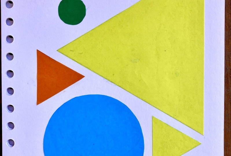
7. Composition Exercise - Applique: So in this exercise, we will live wires the principles
and rules who have just learned and apply them
to our compositions. As you already know, even sophisticated
compositions with men elements can be broken down into simpler
geometrical shapes. Let's find it useful
and easier for understanding to start
practicing with simple shapes, a circle, a triangle,
and a square. It is quick and fun and will
still help you to apply your new knowledge to more complicated objects
and compositions. So for the first exercise, we take the cut-out shapes and
A4 sheet of printer paper. Or if you're doing it digitally, just open the Figma file. The Canvas isn't shapes
are already there for you. The task is to use
three to five shapes for every sheet and make
compositions out of them. Make two compositions for
each point of the list. Symmetrical, asymmetrical, static, dynamic with
contrast by size. At first choose your 35
shapes and experiment with positioning them on the sheet in accordance with the
principle you're working on. When you found the variance, you like blue the shapes to
the sheet and write down which principle you
use there so you don't get lost in your
compositions later. In digital form, you can move the objects by dragging them, copy them by holding Alt
on PC or Option on Mac. And dragging the
shape to the Canvas. Rotate them by
selecting and finding semicircular arrow
in the corner. And scale them by dragging the diagonal arrow in the corner and holding Shift at the same time not to
change the proportions. Here I've chosen the
positioning for my elements. I'm happy with my symmetrical
composition and I'm gonna glue down and right here
in the corner, symmetry. In similar way I
would do it in Figma. The canvases already
have the name, so the principles were using proceed this way with all
the other compositions. In the end, you will have ten
fun geometrical art pieces. And while you're doing them, try to keep in mind our
three main principles. Hierarchy of the elements. Some elements are main, others supporting
wholeness of composition. No more, no less. Balance. Composition should feel like it's balanced on the scale. You can take a screenshot of this short version to help you. I know it can be hard to keep all this in mind
at the same time. But that's why we're practicing. I believe that you'll
manage to do everything and be able to actually
have fun with this. As we are already making art. Even an exercise is
an art projects. After all, in the end we'll get a series of abstract art pieces. When you're done, take a picture of all the
compositions with their names and the blood is pleased to the
project section. In digital form, we can make a screenshot of
all the campuses. I will be happy to see
your works and give you feedback or answer any
questions that you have. You can actually
ask your questions in the discussion section
under this video, and I will be happy to help. And now that we are more
experienced composers, let's move on to the next even
more imaginative exercise. See you there.
8. Imaginative Compositions Exercise: In this exercise, we will
include our associations. This is XSS is not
only about techniques, but about creativity
and imagination. First, take your
sketchbook and the pencil. We will make sketches of
our composition's first. Just draw the frame
of your sheet. You can choose any shape. I chose square one. But when he chose
it, try to make them all the same
size and proportions. We will be using three to
five geometrical shapes. The same ones as before, circles, squares and triangles. But now you have more
control over their size. And the triangles can be with
the right or acute angles. And the task here would be
to create compositions. Two probes, they'll tell you. They are tender morning, bright day, mystical evening, starry nights, strong wind, stillness, fight, hog, joy. At first, make
smallest sketches, but try to catch the mood. Try not to create some actual
objects out of the shapes. Keep your pieces
abstract and tried to convey your
association through the composition and the
principles that we've learned right down the props and the rich sketch so that you
don't forget which is which. When you're done with that, choose six compositions
you like the most. We will draw them in bigger size and maybe even color
them if you like. So we'll need to
draw the French for our compositions proportional
to those you chose before. Now translate
compositions you've chosen to this bigger
sheets with the pencil. Next, you have a few options. If you want to add
color to your pieces, you can watch my class on
color here, on Skillshare. There I explain how you can
choose the pellet and how to color your compositions
with acrylic paints. Also, you can use color pencils. If you want to make it black and white or any color and white, you can take ink and
carefully colors some parts of your compositions while leaving others whites. Try to think and planet
first, which would be, which use the intersections
between shapes to. This would make it
more interesting. Or you can make linear
composition and color just lines with fine liner and markers. It would be also interesting to experiment with line thickness. You can make some contrast
thicker, some thinner. This can also create
beautiful effects. When you're finished, cut
the compositions out. In the end, you will
have six finished abstract geometrical
compositions with titles. Take a picture with series
taken into consideration. That composition is also how you arrange the pieces
among each other to find the positioning
of the sheets that you like the most and
take a photo of them. Please share your photo
in the project section. As usual, I will
be happy to help answer your questions
and give feedback. Congratulations, you have
finished the project. And now you know that these
were not just exercises. You actually have two series of abstract art pieces
on your hands. And there are so many things
you can do with them. Stickers, posters, and postcards
are just some of them. So let's get to the concluding
part of our class now.
9. Conclusion: Now you have learned
quite a bit about composition and its
rules and types. And you know what great
power competition has to create great art works to
express the right feeling, to make an impression you need. Tried to use the
principles we've learned. This will help you to understand the mechanics of how
composition works. And then you will get more
and more confident with it. And we'll be able to
experiment on your own. Break the rules, knowing
why you're doing it. The best way to achieve this confidence is of
course, to practice. You can do the exercises, but also try to
keep composition in mind while working on
your other projects too. You've done a great job. And I will be very happy if
you share your projects in the project gallery
and write me a review. Feedback is very
important for me to create better classes
for you in the future. And I will gladly answer any questions you have and give feedback to your
projects as well. Also, you can continue to
work on these projects by checking out my other class on Skillshare about
color theory. The exercise there is similar, but it adds color
to the picture. I was happy to teach this class. Check out my social media is I'm always open to
chats about art and creativity and allowed
to get to know my students by and see you.
 Kate Grishina, Illustrator, artist