Transcripts
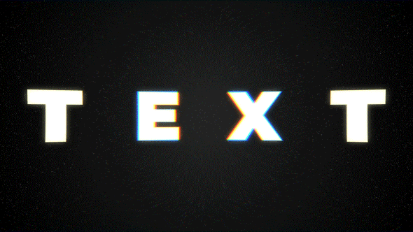
1. Introduction: This effect we will create
right now in this class, I'll show you how you
can create a goal texts transformation effect
using built-in tools of Adobe After Effects. I'll share with you
all my personal tips and tricks which you
need to know to create seamless transformation
of text font and various adjustments to get
unique and fast results. Also, I'll show you
how you can colorize your effect and create a cool, animated and textured
background with seamless loop. The best thing about
this effect is that you don't need to buy
any external plugins. You don't even need to have any knowledge of
Adobe After Effects. You can just download
a free trial version of Adobe After Effects. And we will start
from basics and gradually we'll get to
more complex stuff. I think it's the
best way to learn the software while greeted
interesting effects for fun. And to complete this class, our goal is to create this seamless texts
transformation effect. I'll be happy to see you
in my class has also your result after
following all the steps. So let's get started.
2. Creating Text Refrence: Okay, so I'm using Adobe
After Effects 2021, but you can use pretty
much any version. It will do fine. You can even download a free trial version of
Adobe After Effects. And it will work rate
because we are going to use simple built-in tools
of Adobe After Effects. Also, I'm going to
use standard layout, so you can click here. So your panels should
be similar to mine. If you cannot see some
of the panels which you can see on my screen,
for example, paragraph. You can go to Window
and enable it from here, paragraph, Paragraph. First of all, we can go
to Project panel here. Click on this icon or click here to create
new composition. Let's left mouse
click on this icon, and let's call it text effect. Let's set 1920 by 1080, which is full HD resolution. You can uncheck this button. So you could manually write
these numbers, 1920 by 1080. Also make sure that
your frame rate is 30 frames per second. And our effect will take up to four seconds,
maybe even three. But let's say duration
to four seconds. And we will able to cut
it out later if we need. So here are our frames, seconds, minutes and hours, and click Okay, so to
create this effect, we need some kind of reference. First of all, we need to
create a simple text. Then we are going to apply the animation using
built-in tools. So let's create our
tests reference. First of all, we need to
go to this text tool here. Leftmost click on it, and
then just create a box just by left mouse clicking and dragging like this,
hold and drag. So you've created
this text box and here we can just type text. We can select this
text and go to paragraph and click here. It will be in the cellar and we can make it
bigger by clicking here. Also, you can set all caps, so all letters will
be capitalised. And at this point you can
use pretty much any font. My case, I've used
font which has less of these kinds of edges. In my case, it's Montserrat. It's a free font and you can
download it from the web or just simply use
any font you like. Also this font, I'll provide an resource step to this class, publishers link in description. So let's set Montserrat black. Maybe let's make it bigger like 350 and select the Align panel, which you can also
enable it from here. Window, align with this panel. We can just click here, align horizontally
and vertically, which will make it appear directly in the
center of our screen. Nice thing we can do is just to spread out these letters a bit. In our case, we want just to create this kind
of animation where it's transforming from this
bold text to this text. Then this stretch
one stretched bolt, and then back to beginning. So for our reference, we can just spread out in
these letters like this. Or as much as you
want to make sure this fits in the center of
our screen by three here. So our next step will
be right mouse click on this text layer
and go to Create, create Shapes from
text regulated. So as you can see, we've disabled automatically
this text layer, and now we have only
this shape layer. And what is cool about
this shape layer that we can manipulate
each point of this text. So for example, if I'm going to select this pen tool here, I can just click on this edge. You can swim with
wheel on the mouse. And you can just
simply select one of the points in a
manipulated this, how we can just
animate our points. The next video, I'm
going to show you how we can animate our points
using keyframes. See you in the next video.
3. Text Morph Animation: So now we have this
first type of the text. The next step is to
create this kind of transformation into this
more lighter kind of text. As you can see, it's bolt and then kinda thin kind of text. So first of all, we need
to have another reference. So let's disable this one. We can enable this
text which we already have and can just duplicate. Just select it and
press Control D to duplicate, disabled this one. And we will work only on
this one which is on top. Now let's change to light. As you can see now we
have this lighter kind of texts and we can just simply squish it together by using
this tracking tool. Now we can change to any kind of value which works
best on your font. So something like this,
I think works great. And we can do the same which
we did in previous video. We can right mouse click
on this text and go to create shapes from texts. Now we create another
text, outlines. At this point, it's good
idea to save your project because After Effects can
crash from time-to-time. So let's go to File Save. And you can pretty much save it wherever you want
and click save. So now we have these both texts, but they are not transforming
into each other. It's pretty easy to do if
you are using the same font. Because the trick here
is that your font should have the same amount of
points for each letter. So for example, you
can see this letter T, and it has 12345678 points. And exactly the same number
of points you need to have on this other one which
we just created. So let's disable this one. And you can also see that
this has 12345678 points. And in this case,
it will work just great because we can just open this first texts
conversation texts layer and click here to scroll
it down and contents, you can see each
of these letters. What is cool about
this that we can also open here and see also this. Each of these letters, and each of the letters
have their own path. So we can simply just
select it and copy. Before we want to
create a keyframe, we want to save this path by
clicking on this stopwatch, on this layer on top, which is main one, which
is this one, Baldwin. So let's click on it. And so basically we've
created our first keyframe. And what is key-frame? Key-frame is basically
point in time, which remember, is the
value of southern property. In our case, this keyframe. Remember this point in time, which is 0 seconds. At the beginning. It remembers the value of path, which basically this shape. And we can simply just scroll through and then change a bit. And by the way, the change in the position by clicking on one of the points also
creates new keyframe. But you can click on
this selection tool. Then somewhere inside. And only then you can choose pen tool and select
one of the points. So basically by changing
or moving these lines, you created new keyframe. This how animation works. As you can see, it
tries to go from this state of this
shape to this date. You can also move around, also move it a bit like this. By the way, you can use
the mouse to scroll in and also hold space bar
to move around. As you can see, my cursor
turns to this hand tool, which allows me leftmost
click and drag our window, which is really handy to
move around in your image. And once again, we need to
select the selection tool, click inside of
this mask and then this pen tool to be able
to create new shape. As you can see, it also
created new keyframe. Now it's just simply jumps
between these keyframes. So it goes to this first
position and second position. In our case, we don't want
to have these ugly shapes. So we can just select these
keyframes and delete them. Just simply select them and
press Delete on keyboard. And then later,
like on 20th frame, we can create another keyframe. But this time we can
just simply select this path from this
text to outline, which is this one
with thin font. We can basically
select this path from letter T and press
control C to copy. And then just select this path and press
Control V to paste. And now as you can
see, it transforms to this letter, which
is pretty cool. Exactly what we want, exactly the same we want
to do with this letter e. So let's copy this
letter, this path. Press control C to copy. Then go to this letter
e. Create a keyframe, then jumped to 20th frame. Make sure that you've selected
the path of letter E. And make sure that you've copied this letter e path by selecting it and
press Control C to copy. And then go to letter
E here on top, and press Control V to paste. Now we already have
these two letters which transforms
exactly what we want. In case if your pond, it has different
kinds of points. You can always just simply go to this 20th brain and manually
with this pen tool, adjust the position
of these points. You can also move
around these dots to create another shape to
match your second pond. But it's much easier
to use the same font with same amount of data. As you can see,
it's a lot easier and it works really
great and really fast. Let's do the same
with the x and t. So let's open this x and t
of this text outline, which is on top,
which is this one. Let's also create a keyframe for x and create a keyframe for t. Now let's go to this
layer below here. Let's copy this x. Press control C to copy. Then go to 20th frame. And let's find of
this texts outlines, which is both one,
this letter X. Select the path and
press Control V. Also, let's copy the t path Control C. Go to this t path, select it and press Control V. This how we can create this kind of animation,
which is really cool. Let's also disable this one because we don't
need this anymore. And now we have this kind
of first kind of animation. In the next video, I'm going
to show you how you can stretch your texts like this. And it will still have this
feel like its own fund. Because if you will, just try to press S on
keyboard and stretch on scale, you can see that this doesn't
look like a text font, is too stretched and
doesn't really look nice, as opposed to this one which
is really stretches nice. And next video, I'm going
to show you how you can stretch it in right way.
See you in the next video.
4. Complete Animation: So now let's stretch our
texts and right way. What would be really handy in this situation is
to have a ruler. So we can just press Control
R. So we will be able to read a line by moving our cursor to
this part of the screen. And just let me just
click and drag it down. So now we can just
create our outlines. So we would know
how much should we want to stretch vertically. So something like this
should work fine. You can also use this
tidal action safe. And you would know that it's
exactly the same position. So it will look nicer and we can disable here tidal action save. And now we can just
simply stretch our texts. And to stretch our texts, we can open once
again our contents. We can even select this layer
and press U on keyboard. It only will show us our paths. In this way. It doesn't show us each letter, but we know that it is t, e, x and t. So let's give
another 20 frames, which will be 1
second 10 frames. So this time we want
to select our text. We can select the path, just simply select
only this top points. And this way we can just simply drag it by
one of the points. Left mouse click and drag up. You can hold shift on keyboard. It will allow us only
drag up vertically, and as you can see it now, it's snaps to our roller. You can also go to
View and make sure that you enabled
your Show Rulers, Show Guides and snap to guides. In this case, it will
snap to our guidelines. So let's do the same
with these points below, just like them with
simple selection tool. Leftmost click and drag and then hold Shift and drag it down. So it will snap also
to this guideline. Now as you can see,
it looks a lot better than just using scale. So let's see how it looks. It looks pretty good to me. And our next step is
to create this kind of really bold text on entire screen and
then back to normal. So let's do exactly this. By the way, you can
just simply go to back to this text from here. You could just simply select these keyframes and press
Control C and Control V. And it will just undo
this kind of motion. But in my case, I want these
letters to be all over the screen so we can still
copy these first keyframes, which is for this text bold, and then just go to this
two seconds and paste. Now what we can do is to select this path one and then
press Shift on keyboard, and then press the right
arrow on keyboard, which will move to
the right like this. You can do the same
with this path to and with this third path, we can just squish it
together like this. So this test would look at IRR. So just by using the arrow keys and selecting these paths, you want to make sure that your text is in the
center of our screen. So let's move it a bit
to the left like this, and this looks pretty good. The next step, which we
can do is to select all of these paths and double-click
on one of the points. Just select the
selection tool and left mouse double-click
on one of the points. It will allow us
to scale our text. So we can just click on this corner and drag
it to the right. If you hold Control, it will scale up
from the center. And if you hold Shift Also, it will scale up uniformly. We can also drag it to the
left to make sure that it's still in center of our screen and we can still
move one letter at a time. Let's make sure that
it's still transforms. Okay, great. Finally, we can
just select one of the points and then
select these top ones. More up like this by holding
shift as we did before. And also with these points here, you can also hold Shift
to add some of the points for removes some of the
points to your selection. And then let's move
down like this. And let's just create
a nice letter x. And at this point
you can be creative and adjust your
font as you like. So for example, if
you want to have this letter e more stretched, now we can just select this letter and stretch it a
bit so it would look nicer. The same thing you can
do with this letter T and adjust as you like. But for this class, I don't
want to waste any time. And it looks fine
to me like this, as you can see now we have
this kind of animation. And finally, we can skip another 20 frames and
select these keyframes, which is here at the beginning, and press Control C and
Control V to paste. And if we will cut
this work area to this moment and
press 0 numbered, we can see that we already
have this kind of animation. Now let's also save our project. Press Control S or
go to File Save. In the next video, I'm
going to show you how you can create this animation so it, each of the letters will go one after another.
See you next video.
5. Complex Animation: First of all, what we can do is to select these key-frames. Can press F9. So if I'm
going to press 0 map, but you can see that
the motion starts a bit slower than fester
and then slower. To each of these moments. What we can also do is
to go to graph editor. Here, select all
these keyframes. Just left mouse click
and drag it to select all of them is important
to click here. Choose graph type and options and set to
Edit Speed Graph. This case, you'll
see the same graph as I'm seeing on my screen. So now when we've selected
our points like this, we can simply just
leftmost slick on this handle hold and
drag it to the left. A bit like this, maybe like 90 per cent. Now let's press 0 number
to see what we've got. Now as you can see,
this motion starts faster and slower at the end, which looks a lot
more interesting, and drag it to the right
if you want this animation to look a bit
different and smaller. So it's up to you
to play around with these handles to get the
different kind of look. Next thing which we
want to do is to go out from Graph Editor. We want to exit graph editor
and cascade these keyframes. Basically we can just select
all of these keyframes, decide on the top ones. And then click here two times on this next
frame, button 12. And then just move these
keyframes to second frame, which basically means that the first letter T
will start sooner. And then other ones. Same thing, we want to
do it with each letter. So let's press one to select these letters
and move it later. And then this letter
t, which is less one. We can also press 12
and move it like this. So now what we have, we can also manipulate this work area so it will take up
all of our animation. Now let's press 0 number
to see what we have. We have a little cascade. So this animation happens
on the letters one by one. So it would look even more
interesting at this point. We don't want to see
all of these layers and we will work
only with this one. So let's select these layers. You can just select the top one, hold Shift and select
this bottom one. Then go to toggle switches and click here to hide
these letters. And also we're here
to hide them as well. So in the next video,
I'm going to show you how you can add this kind of stylization to our text
has also the background. You see in the next video.
6. Textured Background: So the easiest thing to
do is to add background. So let's start with
the background. Now we don't want
these rollers anymore, so we can just click
on them and drag it to the top and this
one to the bottom, so it will disappear. You can also press Control R. So we would not
see our rulers. And also we can disable
this title action safe. So now we have only
this onscreen. Now let's create our background. To create our background, we can go to layer new solid. Let's call it BG for background. Then click Okay. So now we want to apply an
effect called Gradient Ramp. So go to effects and presets. If you cannot see
this panel here, you can go to Window and enable it from here,
Effects and Presets. It will load up and then just type gradient to
see this gradient ramp. So let's let mouse click and
drag on this layer here. And now we can manipulate
with this effect. First of all, what
we can do is to swap the colors and then change this linear ramp to radial ramp because we want to have
this kind of center, which would be lighter. And then we want some kind
of vignette on the edges. If you want to have
the same kind of gradient as I have here, just copy these values
you can see on my screen. So you'll get the exactly
the same gradient also by wanted to change this
color to a darker one. So once again, if you want
to have the gray color, which perhaps here, you can
just type here twenty eight, twenty eight, twenty eight. And click Okay. Also, if I'm going to zoom in, you can see these kind of circles which we can
reduce by holding Alt on keyboard and go into this project panel and
then just let mostly here. So go to at least 16
bits per channel, which will reduce a
bit these circles. But also we can go to effects, controls and change
this ramp scatter. Let's set to 500. And as you can see, we
removed most of them. Also, we can create this
gradient even tighter. We can use curves effect
for this and drag it here. Let's add a bit of
contrast just by clicking and dragging
this curve here. Let's drag it to the right. So that's how you can manipulate
this kind of gradient. Also, we can duplicate this
background, select it, and press Control D to duplicate and delete all of these effects. So select all of them
and press Delete. At this point, I want to
add a bit more lecture. So let's type here fractal noise because
this effect we will use and drag it on
this BG on top. Here we can change
the practical type. And Mike is dynamic, works best. But you play around with
these fractal types. If you want to have kind
of different kind of loop, then I've used black. You can also change to any
other to see what you prefer. But in my case, I wanted to have real small spectacles
are my background. So let's increase our contrast
to about two hundred, five hundred degrees, the
brightness to minus 105. So now as you can see, we
have this kind of texture. And I also want to
go to transform and change the scale to
real small lake three. And if I'm going to zoom in, you can see that we have this really nice
dots on our screen. You can change to a bit
bigger to see it better. I'm going to set to seven, so it will be easier after compression of
this class video, it should be more visible than
if I'm going to use three. I'm going to use seven, but you play around
with the smaller value. And finally, I want to
animate this kind of background so it will
not be just static. You can go to evolution options and change this random seed. We can hold alt key on keyboard
and left mouse click on this stopwatch next to the random seed that
most ligand it. And let's type time, multiply seven, and
click anywhere here. So in this case, it will
change to random seed, which basically means
two random pattern. This kind of spectacles,
each seven frames. So as you can see, each
seven frames, it changes. And if I'm going to
press 0 numbered, it looks more interesting. Okay, so we've created our cool texture
of the background. We can also click on Toggle Switches and change this layer on top of the screen. So it will be on top
of our gradient. Once again, I recommend
you to use smaller value, so it will be less noticeable. In the next video,
I'm going to show you how you can apply this kind of pattern of fire
to our effect. See you next video.
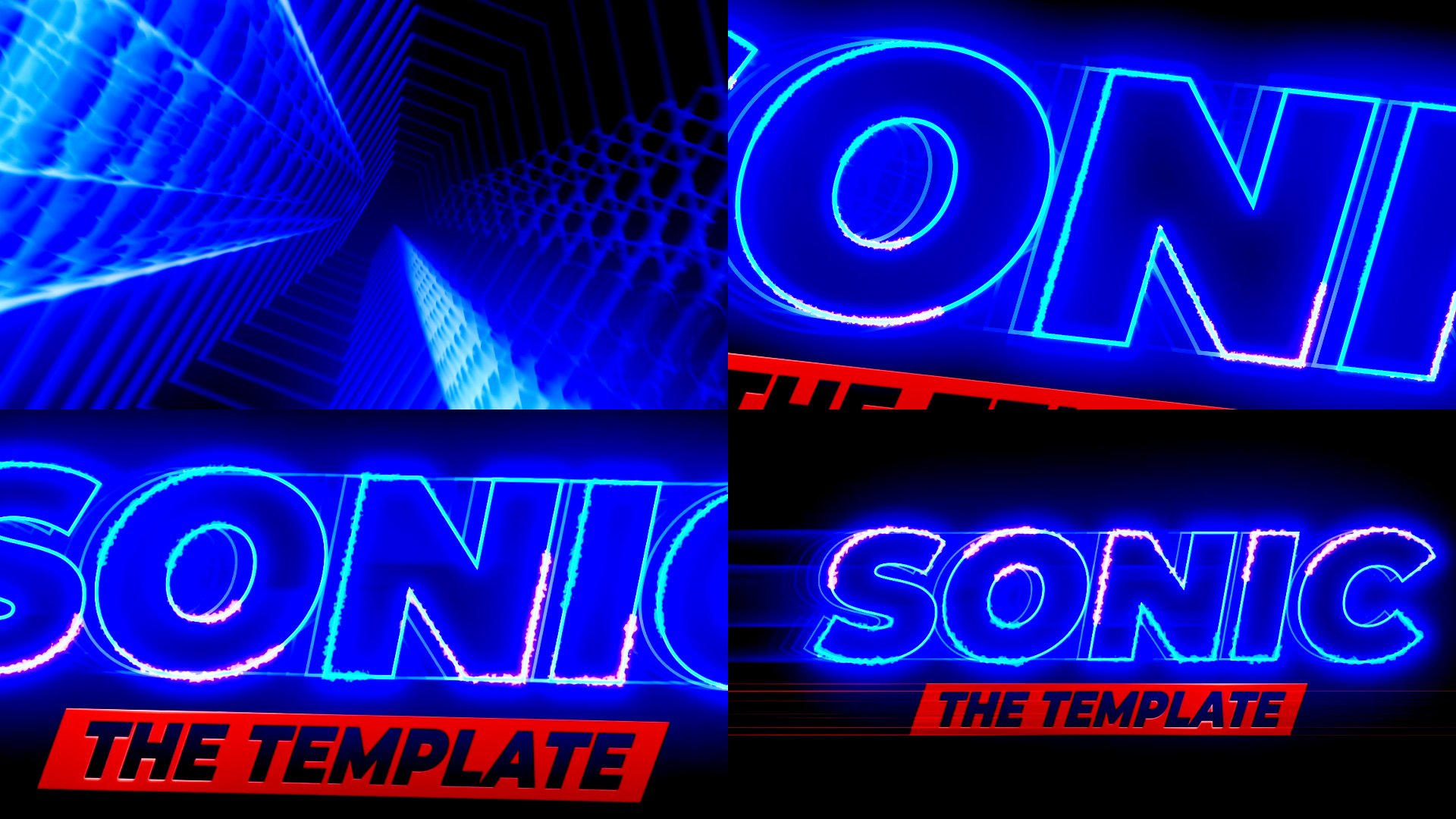
7. Finalizing with Textures and Effects: So now we have this
really nice background, and now let's create
some fairly animation. First thing I want to do
is to change this color. I want to have it as a yellow. Light yellow pretty much
will be same as white. But I want to have this
kind of hint of the yellow. And let's click Okay. So here infile, we can change
the color of the text. So next effect, which
we are going to apply is wrapped and edges. Basically this effect drives this kind of fire a little look, you need to change
this edge type to spikier edge sharpness
we can increase. So it would be not that
Laurie at the edges like now. We can set it to war. You can see now it's
not that blurry. And also we want to
animate our evolution. Hold Alt key on keyboard is
you can see I'm holding Alt, leftmost click on
this evolution. And let's type time. Multiply 250, which
basically will add more animation to our edges. As you can see, now these
edges kind of live a bit. They are changing even if
our texts doesn't change. Which looks more interesting. Next thing which I want to do
is to set this play head to the beginning and we want
to animate this border. So it will get really crazy like this at some points and
then back to normal. So at the beginning, I
want to set it to 0. So it will be just
nice and clean text. Now let's create a keyframe. Then later in the video about
these key frames like this, we want to create
another keyframe. So as you can see, we have
already this border keyframe. You can press U
on keyboard and U one more time to see
all the keyframes. And about here, we can
increase the amount of border. Basically, our idea
is when these texts, letters animate, it will
distort a bit about here. Let's set it to value like 36. And as you can see, we've added this animation about here. We want to set this value
to the normal as well. So let's set it to 0. So now we have this
kind of cool animation. Same thing we want to do
here when it's changing. So we can also select this first keyframe and this
last keyframe and press F9, which basically means
that this distortion will start slow than fester, and then slow again, which corresponds
to our animation. And it looks more natural. Then let's keep a few frames late to this kind of timeframe. Let's copy this keyframe, press Control C and
Control V to paste. And once again, about here
at the end of the animation, we can copy this key
frame control C, control V, so it will
get back to normal. And let's keep your frames here. Copy this keyframe
Control C, Control V. And go here, and let's
copy this keyframe here. As you can see, this
text is really big, so it's a good idea to skip your frames and set
it to 15, an alkene. We don't want to distort
this layer on top, which will be this kind of white layer because we
still need to see our text. So what we can do is
just simply a slate, this keyframe control
C, control V here. And basically it
means that it will stay the same like this. And by the end, we
can also set it to 0. So let's press 0 number
to see what we got. Now as you can see, we
have this nice animation, but it's still pretty clean because we need
to see our texts. It's all times. What we can do is to close it here and duplicate
this text layer. Let's rename it. You can just press Enter on keyboard and let's
call it text yellow. And maybe let's add some glow. So let's type here
Effects and Presets, low, scrolling down and
under Stylize, lets slow and drop it here. Now as you can see,
it's turned white, but we still have
this hint of yellow, which works perfect for us, but we can just add a
bit of glow radius. Let's set it to 32, so it would be much
easier to see. Now let's lower the
intensity like 2.6. Sonatas can see we have this
really hot glow inside. And then these edges, which is kinda goes
to yellow color, which is exactly what we want. It will blend with other
colors even better. Okay, Now we can just
duplicate this text, the yellow and press Control D. And let's rename it text white. So this text white, we
will leave as it is, because it's still
white and this yellow. Let's change the color. This time. I want to have this yellow
really, really noticeable. Also, I want to delete this low because we don't
want it anymore. And to see this
yellow layer better, we can just simply skip
two frames forward. So let's click 12 and move
it forward like this. And now as you can see, we have this kind of yellow color. But if you zoom in, you can see that it still
has some kind of shadow. And to avoid this kind of hero, we can change this mode
of this text white. The screen. Now we
have this kind of nice blend which
we want to have. You can play around with
the color of this yellow. It's up to you which kind
of color you want to have. But what we really
want to do is to press U on keyboard and
to see our border. And now I want to change
this transformation here. Because here we can
add some kind of stylized look to this effect. We can create
another keyframe for scale of our roughen
edges effect. So let's click on this scale and press U on the keyboard
and U one more time. So we will see this
keyframe as well. And then skip to this
keyframe which is here. If you hold Shift, it will
snap to this key-frame. And let's change the scale to
really big value like 250. And as you can see,
we have this kind of different kind of
look to our edge, which gives more
complexity to our effect. And it looks even
more interesting. Here at this keyframe, we can set back to 100. Here. We can just
copy this 100 again, Control C, Control
V, N about here. We can also change it to 250. So it wouldn't be
a more noticeable. We can change the
border as well. So let's increases to 50. And as you can see, we have this nice wisps of our border. Let's also go to
this keyframe here. And let's set it to 50. You can play around with
these values as you like. And here at the end,
we can set back to 50. So this is basically
how you can add this really cool effect
with the yellow color. The red color will be
much easier to add. As you can guess, we
can just simply close this layer and press
Control D to duplicate. Move it down. And let's call it red one, just pressing Enter on
keyboard and type red, and simply just change to
kind of orangeish red color. We can also skip two frames, 12 by clicking here. So this is basically how you can add these kinds of colors. And it looks pretty cool. You can also press U
on keyboard and change these key frames in between two different
kind of values, like 150. So it will still
get more kinds of different edges if you want
to add even more complexity. So here we can also
change the scale to 150 and you'll add even more
complexity to your effect. It looks pretty
cool, but we have really big problem here. I'm going to click here to
deselect all of the layers. You can see that we still
cutting our layers like this and we are not getting
this effect on the edges. If you like, as it looks, you can leave it as is. But I want to also
show you how you can avoid this problem.
If you don't like it. You can just simply type
here Motion Tile and simply just drag here before
wrapping edges effect. And you can see it adds
this kind of page back in. Same thing we want to do
with this yellow one. So you can see it's cut off. Let's drag it in before and
it's appears the edges. And also on this white one, just drag it before
wrapping edges. Let's press 0 number
to see what we got. We have already
pretty cool effect. But I've also thought
that it would be nicer to add a little something. So this effect would
look even more complex. This little thing will
be even easier to do. You just basically
select this text white, press Control D to duplicate, and let's call it outline. Now we can just
simply select all of these effects and press
Delete to delete them. And we can just simply
click on this fill. By clicking here on none. We can disable it
and click Okay. And also we want to
add some stroke. We can add yellow stroke,
something like this. And click Okay. And to see the stroke
on this outline texts, we want to skip from this
last layer or frames 1234, and then just drag
it to the right. And if I'm going to click here, you can see that
we've added this and other texts with the stroke. Let's select it and maybe
change the stroke to five. So it will be a
lot easier to see. But you can also
play around with these values to get the
look which you like. And if I'm going
to let mostly on this page and drag it to the
beginning as well as here. And here. It will still be onscreen
because it's cut up. It will appear randomly, which is not what you want. Let's expand it and let's
see what it looks like. N final thing, which you can
add is a bit like a shadow. I can just select
this text outline and press Control D to duplicate and place
it here below. And let's call it shadow. Just press Enter
and call it shadow. And to add this shadow
so it would be visible. We can set it even later, like to 13 frames. So let's set this to 13 frame. As you can see, it
starts a bit about here. So we need to move it to five frames to the
right and expanded. As you can see, this
layer starts here. Finally, you just simply
click on the Stroke. Click on man, and click on this field and set it
to black and click. Okay? And in this case, we've
paid in our shadow. But before we will need to
change this shadow to normal. Now, we can see that
we've added our shadow. If you cannot see your
shadow pretty well, you just simply can go
to this VG and make your background a bit brighter to see your shadow
as you can see here. Better. My case, I'm going
to leave as it is. And let's press 0 numbered. And let's see what we've got. And finally, what
we can do is to add some little adjustment
layer. Let's click here. Adjustment layer. Drag it on top. Once again, you need
to go to layer, new adjustment layer to
add this adjustment layer. And we can add some effects
like Optics Compensation, like most leak and drop
it on adjustment layer. And let's change this value. So this optics
compensation effect, you can get this kind of strange look or you can
go other way around. You can just disable
it and apply some bulge effect
and drop it here. Makes sure to
increase your effect. So it will be a lot bigger like this and here and
a bulge height, you can decrease this amount. So it will bulge out
exactly as you want. You can also add chromatic
aberration effect. You just type here we are
this chromatic aberrations. And as you can see,
we can just simply set these values to
a bit smaller value, like minus 55 to add these kind of different variation
in color if you want. Once again, we can press 0
number to see how it looks. More, variation in color, which looks pretty nice. And you can just switch
back to any other kind of effect which you want to apply and see what works
best for your work. As you can guess, you can go
with other kinds of colors. For example, you can set
this to 0 and this to five, and you'll get
variation in color, or this two minus five. And you'll get different
kinds of colors and play around to get the
exact look we should like. Feel free to follow me
here on Skillshare. I have a lot of places fun VFX
using Adobe After Effects, because I think it's pretty
fun to create something interesting and meanwhile,
learn the software. Also I have another texts
animation effect has also called Freeze
affects texts animation. Other kinds of animation
complexity effects, even logo animation and even
Da Vinci Resolve animation. I also recommend you to check
this color texture texts animation in Adobe After Effects because
it's much cleaner, but also pretty fun. Or just check this really
fast 12 minutes class on VFX. And you'll see that
you are able to create a really fun VFS inside
of Adobe After Effects. So feel free to
follow me here on Skillshare classes every week. Thank you for watching.
 M Jake, Lets Create VFX & Cool Stuff Together