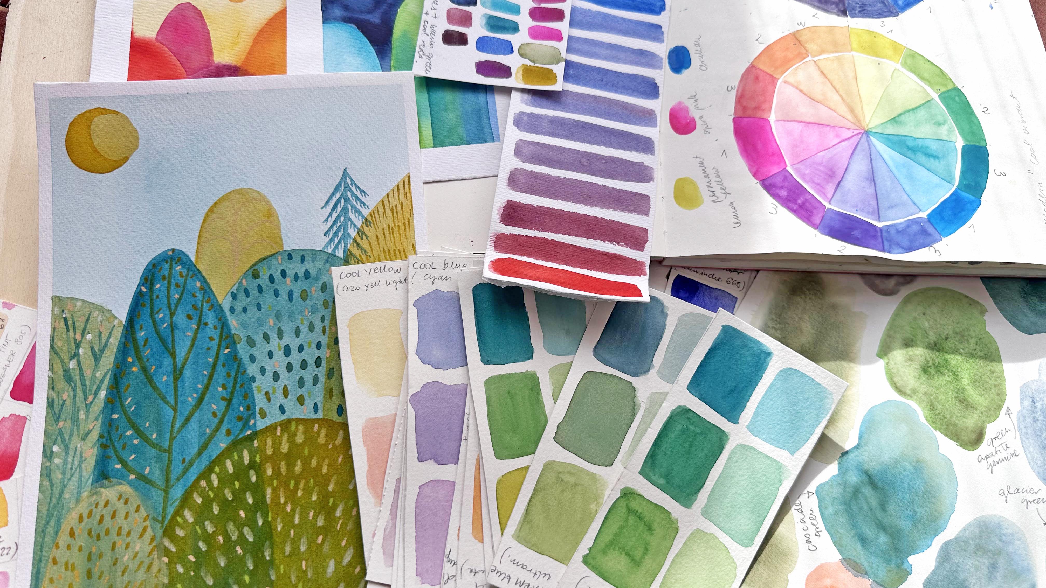
Transcripts
1. Intro: Are you confused
about color theory, how to apply colors in your art? If yes, then don't worry. It's the same for me. That's
why I created this class. Because I believe there are two rules when it's up to
learning new art skills. The first is to take baby steps, and the second one is to
learn by playing and trying. You will learn basic
definition about color. And you won't feel overwhelmed because we will take baby steps. You will do a lot of fun
exercises in which you will immediately apply all
the color definitions. Hi, my name is Ana. I'm an illustrator. I illustrate books and
sell my art online. I also teach here on Skillshare. I invite you to make friendship with color within this class, where we will take really bite sized lesson with basic
knowledge about the color. But there will be
not only theory. You will paint your own
color wheels and you will explore color properties
within exercises. And then we will apply
all the knowledge to paint final project, a watercolor forest scene during the process leading
into painting. The final illustration,
I will share with you some of my
personal experience. Share some advice and tips that I use for
my own illustration. This class is for everybody, both for beginners and
advanced illustrators. Maybe you're like me, that
you have too many colors in your color palette and
too many color charts, but you don't actually use them. That's why I think
it's useful to have a basic knowledge of
mixing colors in your art. We will use water
colors for this class, but you should know
that this class is good also for other
water mediums like, for example, wash or
acrylics as well. I hope you will join me in this class and in
the next lesson, I will explain you what will
be the classes project.
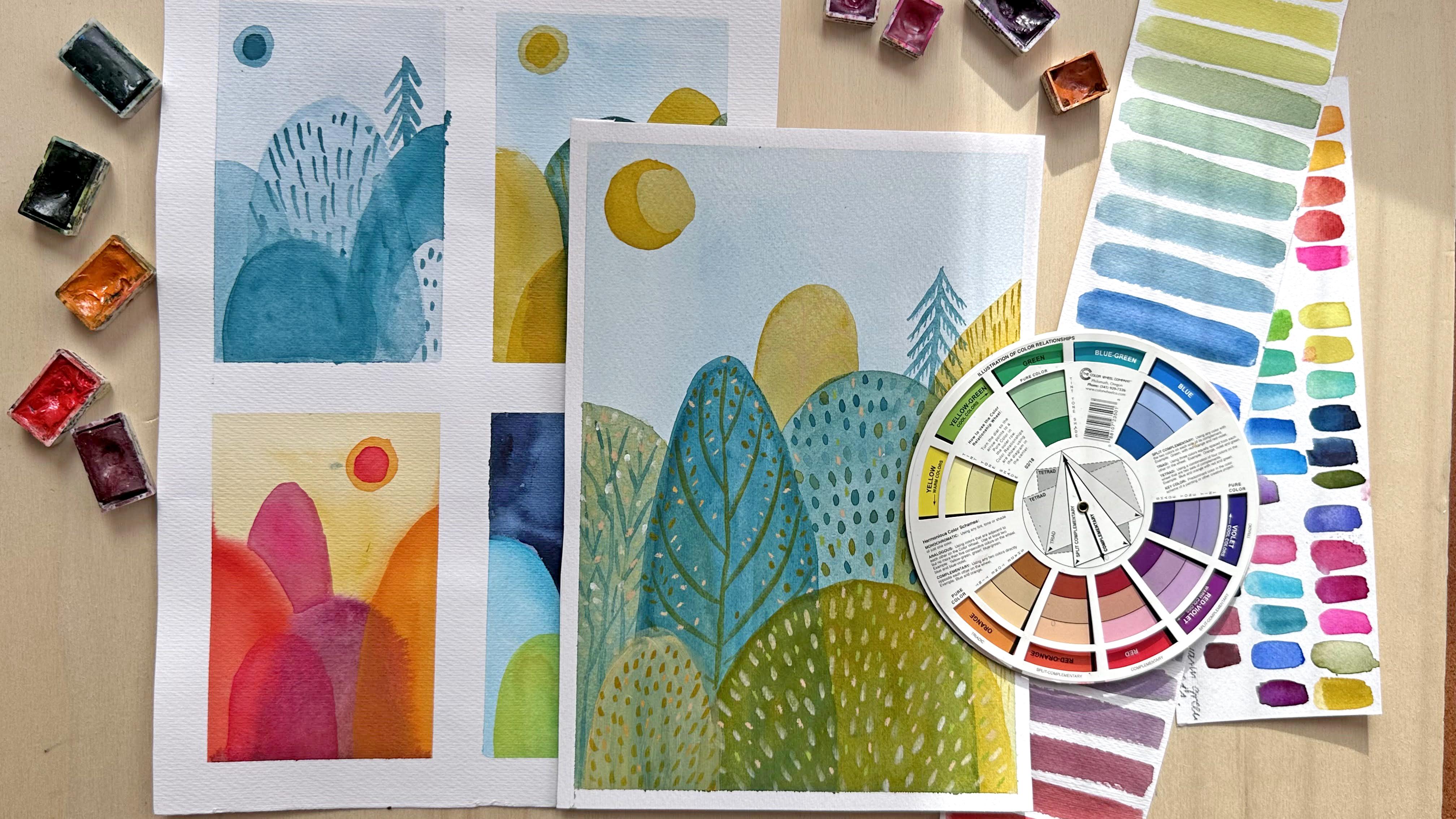
2. Class Project: Let's see what we will do
for the classes project. For the final project, we will paint watercolor
illustration. It can be watercolor
but also wash or other water medium illustration based on one color definition, one property of color, one step at a time. Let's start from the beginning. First, you will see all the
things about the colors, starting from creating
colors from scratch, using your primary colors. You will see different
ways of achieving different colors from
different primary colors. Then you will explore different definitions
related to color, like value, temperature,
saturation. You will do small charts in
order to fix those terms. And of those definitions
in your mind, then we will try them
up first with easy, really easy warming
up exercises. Then for the final project, you will draw four drafts based on four color definitions. You will choose one of them
in order to develop it into the final watercolor
illustrations. Illustration, it can be
whatever topic you choose. I will paint a forest scene. Important is to choose one of the color theories to
develop your final project. As you can see, the class
is structured from A to Z. You will take all the steps in the path into creating
your final project. In this path, you will learn all the basic color definitions, Prepare your art supplies. In the next lesson,
I will explain to you what exactly you will need.
3. Art Supplies: First we will create
the paper wheel model. For this, you will
need to compass or another round shape
that you can draw from, for example plate or
your masking tape. Also something to cut
from like scissors or cutting blade of pencil. For all the other lessons
where we will use colors, there is the list of supplies. I will use color wheel as a reference. But
you don't need it. You can use it for the paper. I will use partially sketchbook. I will use watercolor
paper. It's up to you. You can use sketchbook
for all your project or just a paper
also watercolors. I use watercolors
in pens you can use if you want water medium, you can use colored
pencils for the details. Of course, watercolor brushes, I use synthetic
brushes if you want. Also a depend for details
for the final project, but it's not necessary. Most important are
brushes of course. And something to mix your
colors color palette. I use this from ceramics or
you can use some other like this plastic packaging part. In the next lesson, we will start to create the color wheel.
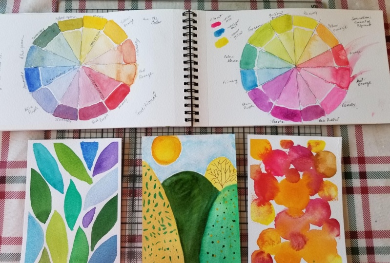
4. Make Your Color Wheel. Part 1: In this lesson, I
will show you how to create your own color wheels. I think it's a useful exercise. I already did it several
times because I always think it's good to refresh your
color mixing skills. We will create two color wheels. I will show you how to achieve different color mixing based on different types of
primary colors. Let's start with sketching. Cutting out a paper circle. I will show you how to create a circle and
divide it into 12 pieces. And have a model
that you can re, use it as many
times as you want. It's very simple,
let's check it out. First step, take a sketch paper. You can use a compass or a
round shape like a plate, to sketch your circle. I will sketch a small circle. If you want to have a bigger
circle, it's up to you. I prefer to have more
comfortable and small shape. Then obviously cut it out. Fold your circle into two halfs. First like this, then
in the second half, when you have your quarter, then divide this quarter
into three parts. It doesn't have to be equal, it can be Just do
it by here it is. In this way, you can have a circle with 12
equally divided parts. Now you can use it as
a guide and sign where you will draw your lines that
will divide your circle. I will develop all the
exercises in one sketchbook. I thought it's a
cool idea to have one place where you
explore the color theory. There will be other exercises, other classes and lessons. I think it's good to have
all in one place so you can have it whenever you search
for it just in one place. Let's start from painting
the first wheel. For the primary colors. Here we will use classical
yellow, red, and blue. If you even have just
a basic watercolor set of 12 or even less colors, you will have those
three Basically, when you use those colors, the mixes are more muted, more muddy, secondary
and tertiary colors. That's because those
are warm colors. I won't get into the theory now. I think for now it's enough that you know that if you
mix warmer colors, then you will
achieve the mixes of more muddy and
more muted colors. Whilst if you use
other three colors, which are pink and san
instead of blue and red, then your colors will be
more vibrant and color. Let's start from painting the classical, the
first version. Let's start with
creating primary, our red, blue and yellow. I will number the colors. Number one will be primary, number two, Secondary,
number three, tertiary. I will sign on the color wheel. You should know that between primary colors there
are other three colors. That's quite easy to count. Let's introduce a new definition of color. This is the value. The value basically is how light the color is to
exercise yourself. You can already try
to use two values. I will do that for
my color wheel. The first one is saturated color
and the other one will be more diluted color. If you use water colors, just use more water
to dilute your color. If you will use guash, then you will have to add
white in order to have a lighter value of your color. It's up to you. You can also use just one value and paint
it all with yellow. I will paint two values
for all my color wheel. Once you painted
your primary colors, you can mix your
secondary colors. Secondary colors are mixes
of two primary colors. You mix yellow with blue
and you will achieve green. And then you will mix yellow and red and you will
achieve orange. And then red with blue
will give you violet. And those are three
secondary colors. This exercise is also
good to understand the quantity of color
that you need to add. If you're not sure you can
swatch the color before, it's okay not to get the perfect green in the
first mix. Just try it out. It's a good exercise to
understand the quantity. For example, violet
for me, is difficult. I swatch it out. This one seems a little bit, maybe warm, so I will add
a little bit of blue. Finally, orange, basically, secondary colors
should be a mix of 55, 50% of one color and
50% of second color. But it's obviously not so easy
when you try to paint it. When you finish, your
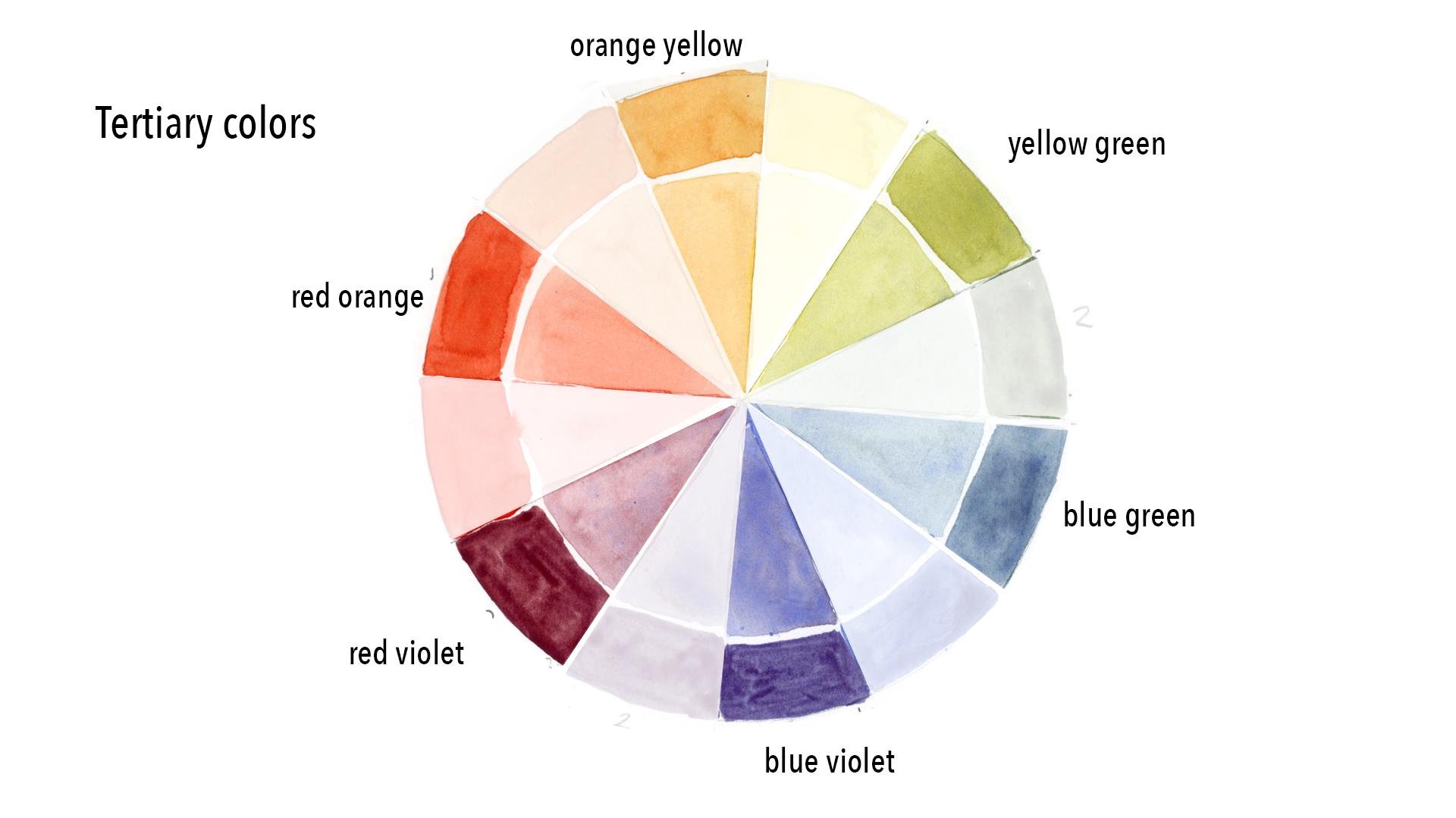
secondary colors, skip to the tertiary colors. The tertiary colors are mixes of the colors
that are nearby. If you mix yellow with green, you will get yellow, green, blue with violet, you get blue violet, et cetera. The best solution would be to
keep your secondary colors. For example, here I use half of my green and add more yellow. Second half I will
add more blue. I will have green,
yellow, and blue green. If you don't have your
secondary colors, it's not just add more
yellow, for example, to your green if you're
creating yellow green. Another advice, just
keep swatching. If you're not sure if
your color is right, keep trying and
swatching until you see the difference between
the two colors. Great, we've completed
the first circle. I will call it
traditional colors. You used for this circle colors. It means that your blue
is more warm color, even if it's cool color. The same is for red. Red is a warm color. In the next lesson, we will paint more modern
colors, more vibrant colors. When you will use color tones for your
swatches, see you there.
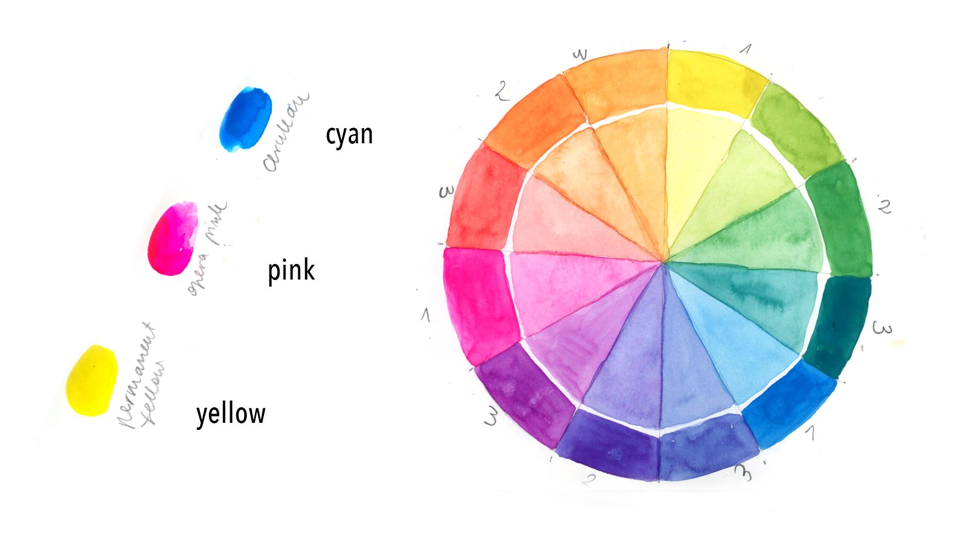
5. Make Your Color Wheel. Part 2: Welcome to the second part
of the color wheel lesson. As I already told you, we will paint second
version of Color wheel. If you're curious how
to get more vibrant, not too muddy colors. If you're searching for more, maybe modern, more neon, or more vibrant
palette in your work, then you should
definitely try it out. Three primary colors. Search for a pink color. It could be magenta. I will use Opera Rose, which is at the end,
almost neon color. It's really strong
and vibrant color. You can use something
not so bold. It could be, as I said, magenta
or pink version of red, red that is more pinky. I will explain the temperature of colors in the other lesson, but maybe your intuition
can tell you what are more cool versions of your red, of your blue, and
of your yellow. For example, here
I will use yellow, which is brighter than the yellow that I use
in the first wheel. It's not too warm, I lan blue. If you have cyan blue or another brighter
version of blue, I will switch two yellows
that I used before. And right now you can
see the difference. The first one is a little bit
warmer and I think darker, and the other one is brighter. Here you can see
the difference or other of other two
primary colors. My Serilian blue, which
as you can see above, very different from other
blue that I used before. And here is Opera Rose, which is very strong
and vibrant pink. I struggled a little
bit to create a green. Remember, it's always good to swatch your color beforehand. First, it was to turquoise, I added a yellow. It is really cool
exercise to warm up your color mixing skills, if you can say like this, but I think it's a useful thing if you
work with water colors. Also, if you're using gash, it's good to experiment. And yeah, just keep mixing and try to figure
out the quantity of color that you use and also the colors that you have from mixing,
Just two colors. Look at this violet. I really love how it came out. Now I'm skipping
into orange color. Right now, I'm creating
the secondary colors. The last step is to
create tertiary colors. Again, I left my secondary
swatches and I'm adding yellow to
create yellow green. Then I will add blue
to create blue cream. Since the blue is really bright, you cannot achieve a
very dark, um, blue. It also behaves in
a different way. At the end, the color
will be saturated. And you cannot know
it will be saturated earlier than if you would
have the dark blue. But look how gorgeous
turquoise it created right now. Violet blue. And the other swatches, probably you have spotted a fly even if it's
a very high speed. I had a guest, a friend that came to visit me during
filming on this class. She just kept me company. From time to time,
you will see a fly. Maybe she was attracted
to the vibrant colors. Okay, finished. So look at the difference
between two color wheels. I think it depends on what
colors do you prefer. It's a good exercise also to understand the differences
between primary colors, how colors can mix differently. I also would advise you to write the colors that
you use in the future. You know how to
recreate the mixes. It's a good habit
to name colors that you for your future projects. Let me know, how was
this exercise for you? Did you learn something new? And if you have any questions about color mixing and
your primary colors, then leave it in the
discussion panel. In the next lesson, we will
see basic color definitions.
6. Color Hue: What is hue? Basically, hue is what we
mean when we say color. When you're identifying a color, you have to ask yourself,
what hue is it? Meaning, where does it
sit on the color wheel? For example, here
we can say it's a type of yellow orange. Therefore, we have
identified the hue. We can vary by adding
another primary color, as we did in the lesson before when we
created color wheel. In this example, I
extended it a little bit. I painted three primary
colors and added blue into the yellow to create more hues in between
those two primary colors. And then added gradually
red from blue to red, and created more versions of red violet and blue violet hues. This is what we will
do in this lesson. I want you to extend a little bit hues
in the color wheel. You had only three
colors between two primaries and right now we can see how many of
colors we can create. Obviously, there's a limit
and I don't agree with a theory that it's enough to have four or five basic colors, and you can create any
colors you wish myself. I have too many watercolor
hues in my palette. As obviously, there are some
colors you cannot reproduce. There are, for example, neon colors, very vivid colors. But with this exercise, we will see that with
only two colors, you can create really
big variety of hues. I split the primary
colors into 3 bars. I already did red
to yellow hues, and right now I will be
painting blue to yellow. We will create
variety of yellow, green, and green hues. I encourage you to do this exercise as I
already told you, I think it's useful to
know that maybe it's not necessary to buy ten
different kinds of greens. Maybe you can create it
from your basic colors. Maybe it's more useful to buy more yellows and more blues. For example, you can
mix them in between in order to create
different hues of green. This is a very quick exercise. You don't have to spend
a lot of time on it. Just create simple swatches
of color and have fun. Obviously, there
are much more hues. You can also mix in
between green and violets. Violets and orange. But those are color
theories and those are not the subject
of this class. However, I will prepare another class about color
theories right now. Just concentrate on the
basic colors definitions. And right now we've
explored hues. Be sure to up your exploring of the hues
between the primary colors. If you want, please upload
it to your project. I'm very curious what colors, what hues of primary hues did use and share with
us your discoveries. In the next lesson, we will talk about value. See you there.
7. Color Value: What is value? Value is the relative
lightness of a color. This is also known as tone. In this example, I have
gradually added small amounts of water to blue pigment
to make it more dilute. Therefore, lighter,
I also swatched. But one step at a time, I will show you
everything in the lesson. Okay, so in this exercise, I will swatch both watercolor and wash. What's the difference? If you're new to watercolor, then you should know
that usually you don't use white with
watercolor because white is an opaque color and
the nature of watercolor is translucent, translucency
and transparency. In order to create
lighter values, lighter versions of hue, you just gradually add water. It's quite popular
exercise in watercolor. In this way, you
exercise yourself in creating different
density of water color. More diluted the color is, the more translucent it is. Therefore you have
a lighter value. It's a good exercise to understand the quantity
of water and pigment. If you use a lot of water color, then probably you're
already familiar with it. If you're new to watercolor, I advise you to do this
exercise because it's really useful and you get more
familiar with this medium. And you have to start from
some point to understand how, how to mix the pigment with
water and see its opacity. Opacity of water color. In the second example, we will add white in order
to lighten the watercolor. Basically, if you're
purist water colorist, you don't never use white. White color is basically Gah. It will transform
your watercolor into Ga. That's because
white is opaque color. Even if you have white color in your palette,
it means that it, if you add it to watercolor, it will transform it
into G. Because Ga is an opaque version of watercolor, basically, it's up to you. I mean, there are
no specific rules. I love to mix media. I use both watercolor and gas to you if you want
to give it a try. And also you can discover how to transform the
watercolor into gas. Also, you will see how
the opacity of watercolor will change by gradually
adding white color. Okay, we learned new
color definition. One baby step at a time, if it's useful for you, do this exercise and
you can upload it to your project gallery as well. In the next lesson, we will see what is the
color temperature.
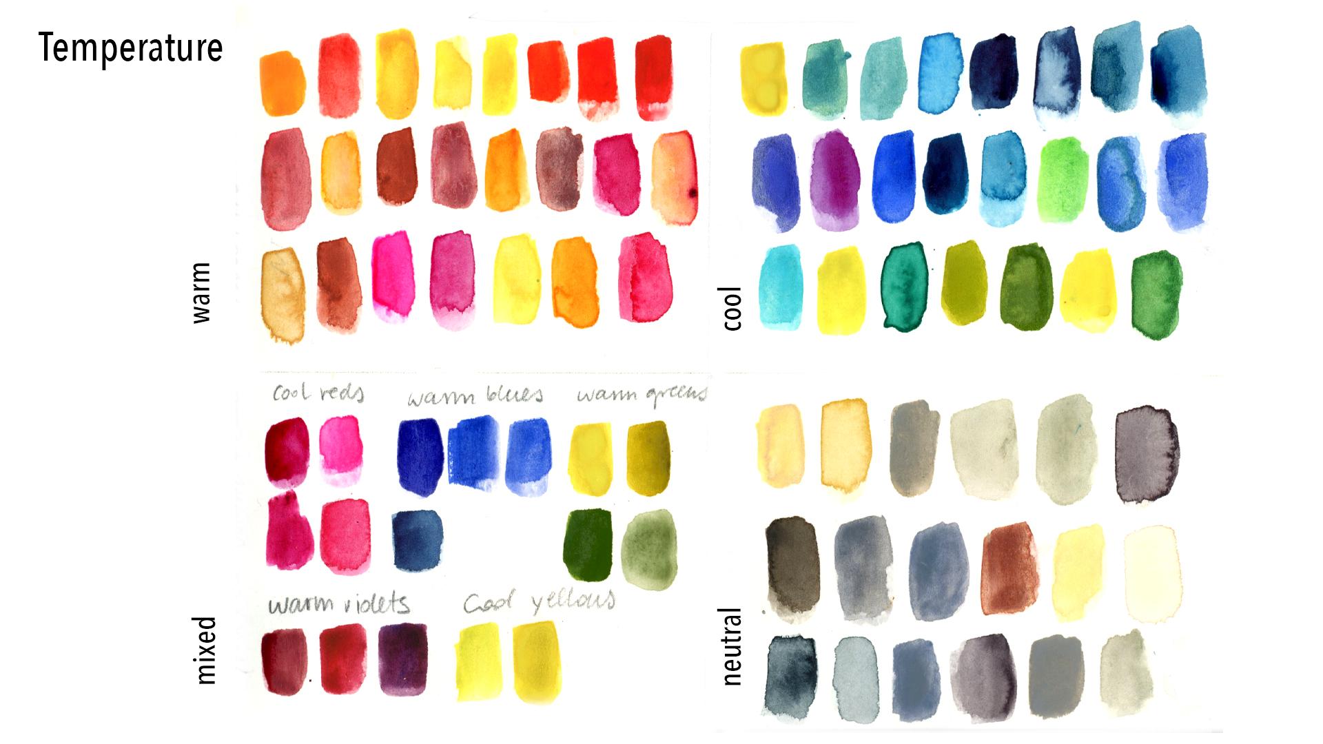
8. Color Temperature: Welcome In this class, the second baby step
that we will take, just a bite of knowledge, what are cool colors, what is the
temperature of colors. I will also share with you
some knowledge about that. Some of cool colors can
be warm and some of warm colors can have
also cool bias. Let's start, Okay, so probably you intuitively know what are warm and cool colors. This is a very
intuitive knowledge. Warm basically are
on the side of will and are from yellows to reds. But also there are border
colors that can be more warm. Like for example, red violet, which tends towards
orange and towards red. The colors that tends towards
orange and thread will be warm or will have warm bias. While the color is directed
more towards blue, they will be cool. For example, this is a
range of cool colors. Usually it's defined from
green to blue and violet also. But violet can be
warmer or cooler. Yellow, more green. If it has more blue in it, it will tend to more cool color. The same for green. If green has more blue into it, it will be cooler. It has more yellow to
be towards orange, it will be warm. This is more or less the theory I prepared my palettes of warm, cool and also neutral colors. Neutral colors are
the colors that are also here,
intuitively like grass. Some browns I have for example, or I will put it
probably over there. The Okra is maybe too warm. It could be both
warm and neutral. Because also neutrals,
you will have cool and more warm bias. Let's start to
swatch our palettes. If you have less warm colors, then don't worry the
ones that you have. Don't worry right now
about the bias which colors can be warmer and cooler. Just use your intuition and use the colors that
you have in your palette. If you have a color wheel also, you can watch and see which one can be
defined warm or cool. Good habit is to spray
your watercolor. I always do that because later on it's easier
to apply water color. I don't have to
insist with brush and water to activate the pigment. I'm watching right now the colors that I prepare
that I consider warm. For example, this yellow is probably because
it's not so greeny. I also included different
variations of red. I will also have
magenta, purple, snow, but kind of purply
reds and pinks. Okay, now I'm switching
into the cool colors. As you can see, I have different variations
of green, for example. This could be considered
warmer green, but right now I won't think
about it because it's still considered to be a cool color in the
range of the palette. If you have greens,
purples, violets, I mean, and blues, the. Swatch them. As you can see, I also a
yellow because I find it, the yellow to be really cool. It's almost greeny, so I
added it to my cool palette. Okay, so right now
let's think about those colors that are in
between cool and warm colors. So let's try to figure
out which worms are cool and which
cool tones are warmer. In my, on the color wheel, as I already told you, those are the border colors. For example, purple violet, which is considered cool color
when you add ready to it, it, it will have warm bias. The same for greens as I
already explained to you. For example, I will
look at my warm palette and think which of those colors
can be considered cooler. There will be still warm colors, but which will have cool bias. For example, which
I have more orange, red, which is definitely
warm for example, which has more blue into it. It tends towards,
to be blue magenta. It's more cool. This one is
definitely more cool. Already goes towards purple, it's a cool tone. Do the same for
your cool palette. Pick the warmer tones that
you consider more warm, those colors which
tends toward red. For example, this would
be a cooler green, but there will be other
greens that will tend towards orange and red.
The same for blue. If you have a blue that
tend to go towards red, then consider it warmer blue. So this is a very
useful exercise. Look at your palettes and
pick the colors that are border colors and paint them into your mixed
warm and cool palette. I picked my colors and I will, I will divide them into
cool reds, warm blues, warm greens, warm violets,
and cool yellows. If you want, you can
divide it as well or you can swatch
them as you go. The last palette
are neutral colors. See if you have any neutral
colors in your palette. For example, I use
Naples yellow, which I think is quite neutral. You can maybe have
row Siena or amber. But even if it's burnt
sienna or amber, there will be warmer. But still can be neutral. Maybe maybe you have sepia in your palette. I swatch different kind
of gray. I love grace. I often buy them. I have both warmer
and cooler grays. Try to see in your palette if
you have some earthy tones, like terra tones, or if not, then you can just
skip this past. I forgot to add cool yellows
into my mixed palette. So I will do it in
this last step. Let's recap some of
definitions that we saw during this lesson. We have two families of
warm and cool colors. The colors have warm and cool. Warm colors can have cool bias, meaning they will tend toward
blue on the color wind. Cool colors can
have warmer bias, which will tend into
your color wheel. I hope this lesson
was useful for you. If you want, please share in your project your explanation of temperature in your
watercolor or wash ballet. I will be very
curious to see it. In the next lesson, we will see the last color definition
which is saturation.
9. Color Saturation: Let's jump into the last
characteristics of color. The last definition
which is saturation. Saturation is also
known as intensity. How clean or dirty
a color feels, how vibrant or neutral,
bright or dull. It can be a example. We see blue, which gradually
becomes more saturated, more dull. How to do it? In this lesson, I will
show you a simple rule. And we will do an exercise
when you will discover how to saturate color without using black or gray,
nothing like that. It's an artistic basic
rule that maybe few know and it's really important to know it without
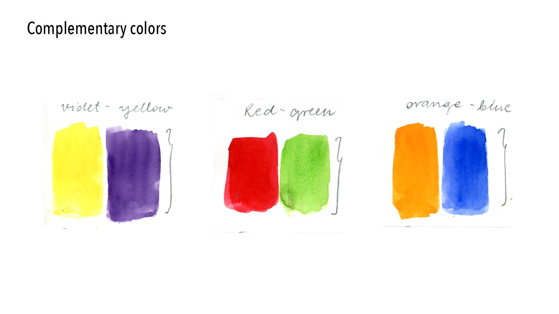
further talking. Let's see what rule is it? I'm talking about the rule
of complementary colors. If you have color wheel, then grab it and you probably
will have those indicators. Complementary colors are in the front of each other
on the color wheel. For example, for blue
it will be orange. For this blue violet, it will be yellow,
orange, et cetera. They're in the opposite
positions on the color wheel. This is a rule of colors. It's not the topic
of this class, but it's also useful to
know that it's one of the color rules the same as
split complementary colors. But let's leave it for now. The first complementary
rule says that the colors that are complementary
when they are nearby, they create a high contrast
as you can see here. For example, three
primary colors with their complementary couple color creates really high contrast. Instead, you will add a mix of the complementary
color into another that will create this may color, they will desaturate
like in this example. If you will add green, which is a complementary
color to red, and you will add green to red, then you will desaturate it. It's quite easy to remember
when they're separated, but nearby they create contrast when you
mix them together, when they're together,
the contrast disappears. It desaturates the color. Let's start from the
example of the slide. Let's try with the
first couple of colors, which is red and green. As you can see, I prepare different couples
of reds and greens. Because obviously
you can remember that you can vary the colors. If you use red, you can also use a cooler red or something like
magenta or maybe like in this case is quite the saturated brownie red with another type of green. Also, you can experiment with different hues of red and green. Choose one of them,
pick one of them. And try to see how they behave when you
mix them together. I picked the first couple
of swatches right now. I will add gradually
green into my red color. Something like the
same exercise, like where you mixed
two hues together, two colors, just add
gradually green. First little amount of green, then bigger amount of green, et cetera, until the color
will saturate completely. As I said, this is
a very useful rule. You can use it for different things because
let's be honest. Maybe the colors that you will
create won't be brilliant. Won't be too nice. They will be dull, muddy. But you use this
rule basically to tone down your color,
to create shades. For example, if you
want to make a shadow, I don't know, for example, create dimension to your object. Or you simply want
to create a darker, more or the saturated
version of your color. You don't have to search for another color
in your palette. You don't have to
use browns or grays. You can use it also to keep
your palette harmonized. Because when you
mix your base color that you already used in your illustration and you will add just another
color into it, it will be more harmonious
if you, for example, used. Gray or black. Instead. Also, adding
black is not so popular. If I can say in
using water colors, basically, you don't use black. This is a very basic rule that I think each
artist should know. Also, for other colors that
remain primary colors, I will watch different types of couple different types
of variations of colors, of oranges and blues. I will pick just one of
them and do the swatching. But if you want,
you can also try to swatch all of the couples
and see what will happen, what kind of colors
you will create. Let's make a quick
exercise in order to fix the rule that I talked
to you previously about, the one that you use
complimentary colors to create shadows and shades
of the basic color. It's really fundamental
and basic rule for artists, it's
good to know it. I created this rounded
shape with orange color. Try to guess what
color should I use? Create a shadow. You're right, it's blue. It's complimentary color. You already know it really well. I will just add a
little bit of blue. Doesn't have to be
a lot of color. You can dilute it.
As you can see, it creates lovely shade. It didn't add brown, I didn't add black. Just the complimentary color. I'll make another
quick exercise for the saturating the color that you can use in
your art when you, for example, have one
dominant color and you want to just use another
shade of this color. For example, if
you paint autumn, you have different
colors of autumn leaves. For example, vibrant
colorful leaves can be yellow, orange, red. But also there are
leaves that are already brown and old, maybe. And in the late autumn,
the color changes. It can be useful for
your illustration. For example, instead of searching for browns
or other colors, you can just simply use the same color you
used for your leaves. Your basic color,
for example, orange. And then with
complimentary color, you can saturate it. The illustration will
be more harmonious. The color will be
more harmonious. Give it a try as a final touch. I use the lifting
technique to create the veins on the leaf while
the color is still wet. I use wet brush and just lift the color with a
clean but wet rush. That was our first exercise. Now I invite you to the exciting lesson where you
will try all the theories. First, we will
warm up just to do the simple exercises for all the color definitions
that we knew, and we will try to make simple illustrations.
So see you there.
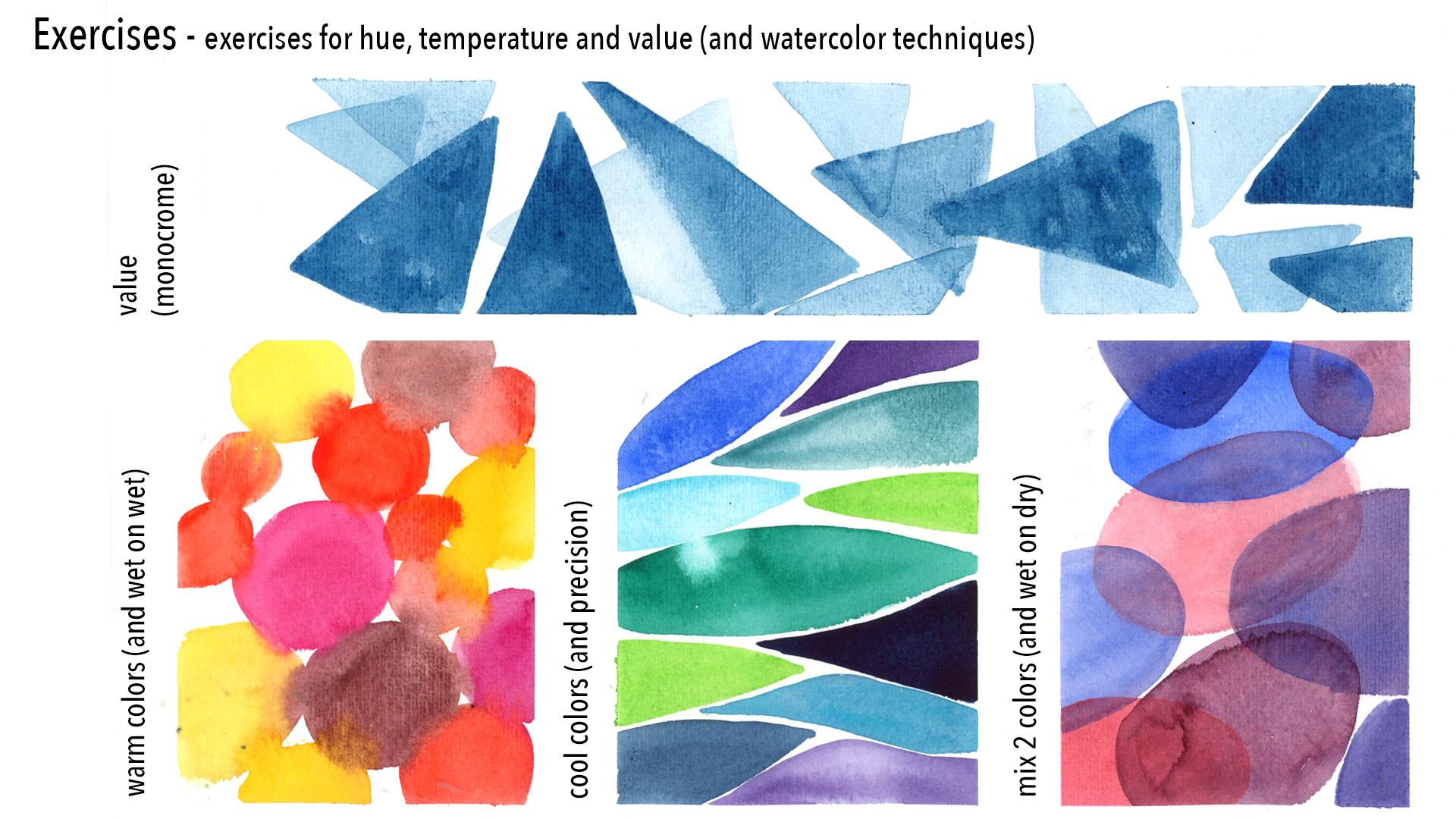
10. Warm-Up Exercises: Welcome to the lesson
where we will take one step further and do
some warm up exercises. Before we will start
our final project. We will do some exercises
where we will join all the theory about color definitions that
we learned before. And we will join it with some basic watercolor
techniques. Let's jump into the lesson where I will show
you everything. In the first exercise, we will try the value,
in other words, monochrome exercise, because
at the end we will use the same color and we will just use different amount
of water and pigment. It's a great watercolor
exercise when you play with the skill of diluting your color and
trying out the pigment, you play with water as well. I think it's great to start as I will paint
in this exercise, only geometrical
shapes because I think it's also
okay to start easy. You can also start with
geometrical shapes. This way you won't be
thinking about what to paint. We should I paint you
just starting out easily and start to warm up. Uh, your hand with
simple shapes. I'm starting with triangles. But you can paint whatever
shape or object you want to. In this exercise, I thought I want try out only the
transparencies of water color, but also the layering. So it means I will paint
over layers beneath. I will overlap the shapes. It's also a good thing to try. Obviously, water
color is pigment that will move when
you paint over it. It's also a good thing to
exercise that you have to be relatively quick in order to
move the color underneath. You can try to do it as well. You can try layering, or you can paint shapes
that won't overlap. It's up to you. Let's do some exercises with
color temperature. I will start with
warm color palette, so grab your warm colors. Again, I will paint simple geometrical shapes and
I will paint them nearby, attached one to another, while the paint is still wet. In this way, the color will
blend into each other. This is wet technique. Wet on wet techniques
is also when you wet the background
beforehand and you paint directly on the a
wet background. In this case, my
background is dry. But what I meant by wet, by wet is exactly the
fact that I'm learning to paint quickly and in order to see how the colors blend into each other while
they are still wet. It's also useful exercise. We will use it as well
in our final project. Give it a try. Let's jump
into the cool color palette. Again, I will paint shapes and right now I want you to exercise
the precision painting, meaning that we will
paint instead of letting, blending the colors
into each other. As for the warm palette, I want you to avoid it. Paint the shape as near as
possible to the other shape. And try not to touch the colors. Try not to touch the borders. This exercise is always useful, not only for water colors. It helps your hand to warm up. I must say I'm not a precise
person in the painting. I'm also not a precise person. But this exercise
is very useful even if you don't usually are
precise in your out, maybe you more expressive
person but it's always useful to warm
up your muscles. As you can see here, I failed to exercise
my shapes blended. Yeah. It only means that I'm not a very precise artist
in my way of painting. I don't do this
exercise a lately, but it doesn't mean
that it isn't useful. If you like to paint
in a controlled way, then you definitely will have
to do this exercise a lot. So the last exercise is about
mixing two colors to hues. For right now, we will skip complementary colors and
saturation exercise because we already did exercise with
leaves and with a shade. Pick other colors which
are not complimentary. You can use two primary colors. You can use whatever
hues you want from your other
exercise with hues. When you created different steps between two primary colors, pick whatever colors you wish. I will use blue and red. I will play with creating
purples and violets. I will try to create
different hues with those two colors. The exercise will be about
wet on dry technique. And again, layering, I will do the same thing as
for the value exercise. But this time I will try to
do it a little bit better. Because in monochrome
and value exercise, I had a little bit hurry. You can see that the
colors are blending. Now I'll try to do it
a little bit better. I will let my color
dry before I will layer another color on it. Again, testing wet on dry
and layering technique. And also testing mixing to hues. You can also use this
exercise to test the values. As you can see, sometimes I put more opaque color
and sometimes I will use more translucent
value of blue or purples. Well, the last thing you can
see that I did my exercises on separate sheet
in my sketchbook. But it's up to you. If you want, you can proceed with your
exercise in your sketchbook. I did it in the separate paper and probably I will glue it, tape it down into
my sketch book. Here we are. We finished our
exercises that helped us to warm up our hands but also
our creative muscles, before we will do our
final illustration. First we will prepare drafts. See you in the next lesson, where we will prepare drafts
for our final projects.
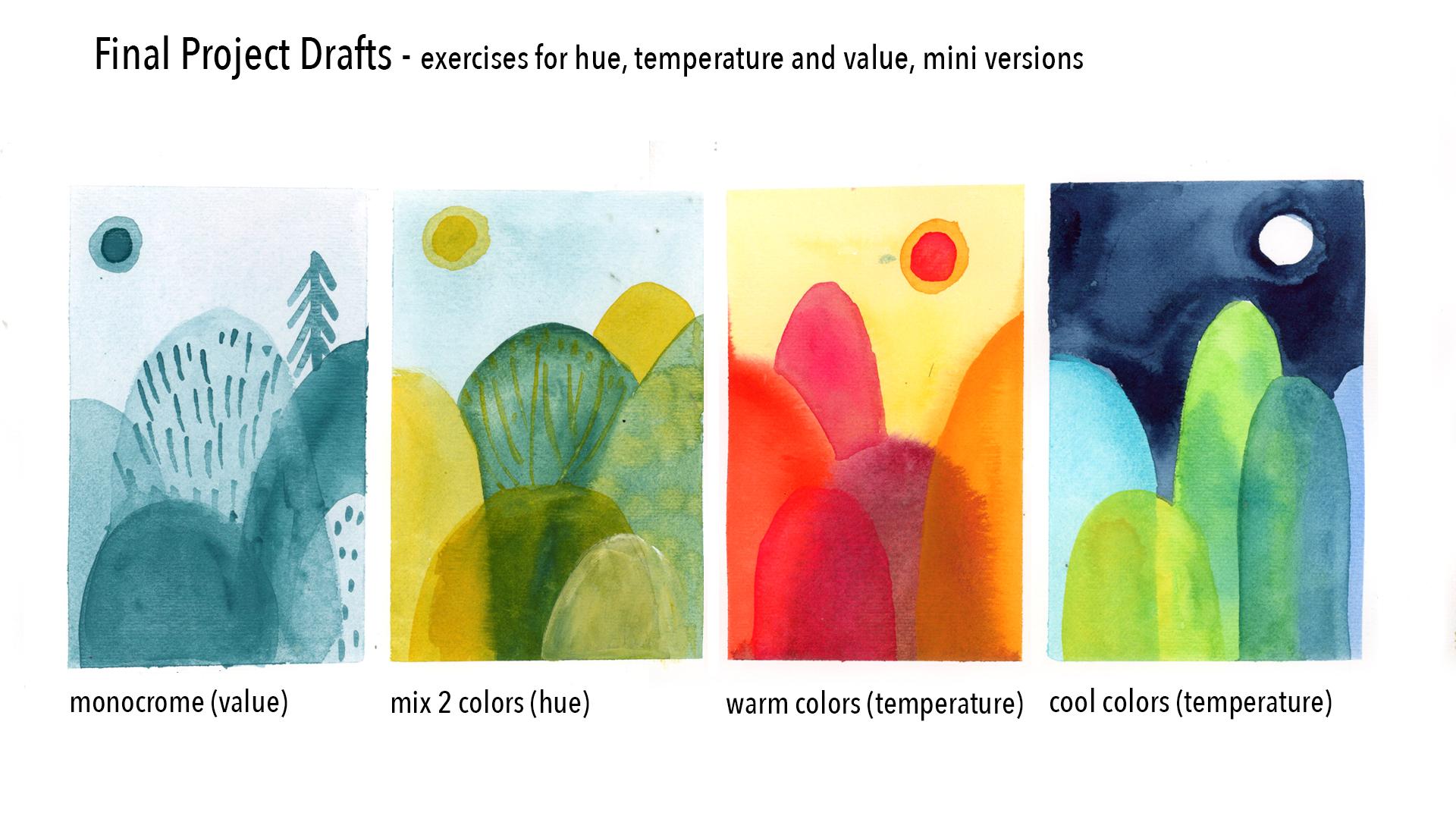
11. Drafts For The Final Project : Welcome. In the lesson where
we will prepare drafts for our final project. Basically, we will apply all the things that we learned before and that we
applied for the exercises, but this time we will
apply it for the drafts. Why is it useful? Because you will continue
to warm up and also you will just drafts without any pressure of doing
final illustration. And then you will pick up your favorite version and
then you will develop it. Let me leave you some of
advice before we will start. First of all, choose the subject that you would love to paint. It doesn't have to
be forest or trees. Maybe there's
something else that is easier for you or
excites you more. Don't focus on the
details in that phase. You don't want to
waste time right now. You can use also a small format and it doesn't have to be large. You can divide your sheet
into more smaller squares. Then try to use all the different
techniques that we already tried for each project. Not only color theory,
but remember, don't, it's just draft phase, it's a playful time. Don't overthink it and let the creativity and playful
mindset guide you. Let's get started. I will paint on the other side
of my previous exercises. I created those four squares with masking tape if you want. You can use even smaller
or bigger if you want. But I advise you to work right
now on the smaller area. You will be quick and you will also help you not to be too stressed about how
to fill the blank page. Yeah, just a draft
mode at the moment. Let's start with
the value draft. For the value draft, I will use the Tise,
blue green color. I'm painting the
background so I will very light color to paint the sky. Later on, I can build up darker colors above to
create my painting. You can also skip this face and use white
background if you want. And use lighter values of
your color for some details, maybe other objects.
It's up to you. I decided to paint background since this color
will serve for me. Also for the second exercise, mixing to hues, I will
use the turquoise yellow. That's why I decided to
paint the same background, the same color for the sky. I could have used
yellow as well, but I will paint it in
this t quise color. Let's keep at the
moment also for the second exercise,
mixing to hues. I will explain you better. The colors that I
chose, the yellow, I chose the colors from this swatching yellow
to blue chart. Instead of using blue, I decided to one step before, instead of blue, I will
use this green blue. Which is basically, if I would mix blue with yellow,
it's up to you. You can use two primary
colors or you can use whatever hues you want
for the second exercise, but we will paint it later. But since I have to wait that my back for the first
exercise will dry, then I will in the meantime, the background also for the second exercise where I will use also
the yellow color. Okay, I dried my backgrounds
with hair dryers, otherwise it would
be too long and I am back to my value draft. I will use darker values
to build up my image. Right now I'm painting
shapes of the trees. Sometimes as you see, I will use darker values, sometimes
lighter values. I don't plant anything
as I already told you. And what I advise to do as
well, just play around. Don't see what your brush
will bring to you right now. I do painting some
details but later on I will stop because I think it's not
the face to do that. Just did some details
more or less. Let's skip into
the second draft. The background is already dry
and I will use the colors that I explained to you
earlier, yellow and turquoise. I will mix different greens. Again, I don't plant
anything right now. I'm painting with a pure yellow. And I will play with yellows greens with
different values as well. Sometimes the value will
be more dark, more opaque, and sometimes it
will be lighter. So here I will try some
precision exercise. Instead of layering the color, I will try to fit my tree
beneath those two front trees. Also, you can see that I will
use wet on wet technique. I will mix in some darker
values into basic color green. Again, I'm just playing
a route without thinking really which
tree should be dark, which one should be lighter. Right now, I'm focusing on
playing with mixing colors and trying different ways
to apply the water color. Let's try out warm colors. I will use the same
colors that I used for the previous exercise
for the background, this time I will use yellow and then I will use a wet
on wet techniques. While the background
is still wet, I will paint the trees and see how if I like this solution. Again, just play around for the first trees, I used wet on wet technique, but now they are dry. So I will try some different
solutions as well. So I'm painting another tree with the background
that is already dry. And then later on I will
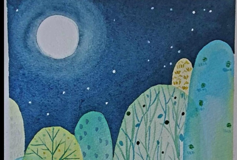
do some layering as well. For the last draft, we will use cool colors. This time I won't use
the background because I want to paint skies
around the trees. I will use dark night skies. In this case, since the water color won't
cover the dark skies, first I will have to paint the trees and then sky
the dark sky around it. Again, playing with cool colors. No planning here. The only thing I
know is that I want to paint the night
sky around the trees. To paint the trees, I will play a little bit of wet
on wet technique. And I will blend colors
together and then also try some layering and playing also with transparency
of the colors. But I will mix only
the cool colors. Once the trees are dry, I start to paint the night sky. And here, the precision
exercise was useful, because I will have to paint
the sky around the trees. Right now I am shaping the moon. I will just leave the blank page a moon shape
as a white moonlight. And then paint all this indigo, dark blue around the trees
to create the night sky. I hope you had fun
with this one. That was the aim
of this exercise. To have fun, to continue
to warm up, to lose, and to build your color
and watercolor skills, but with a playful spirit. Those are four drafts
that I created. I would love to see your drafts. You came up with what subject, with what color combinations. And in the next lesson, we will pick one of
them and make of it, of the chosen draft, a final, bigger illustration. So I can't wait for it. See you in the next lesson.
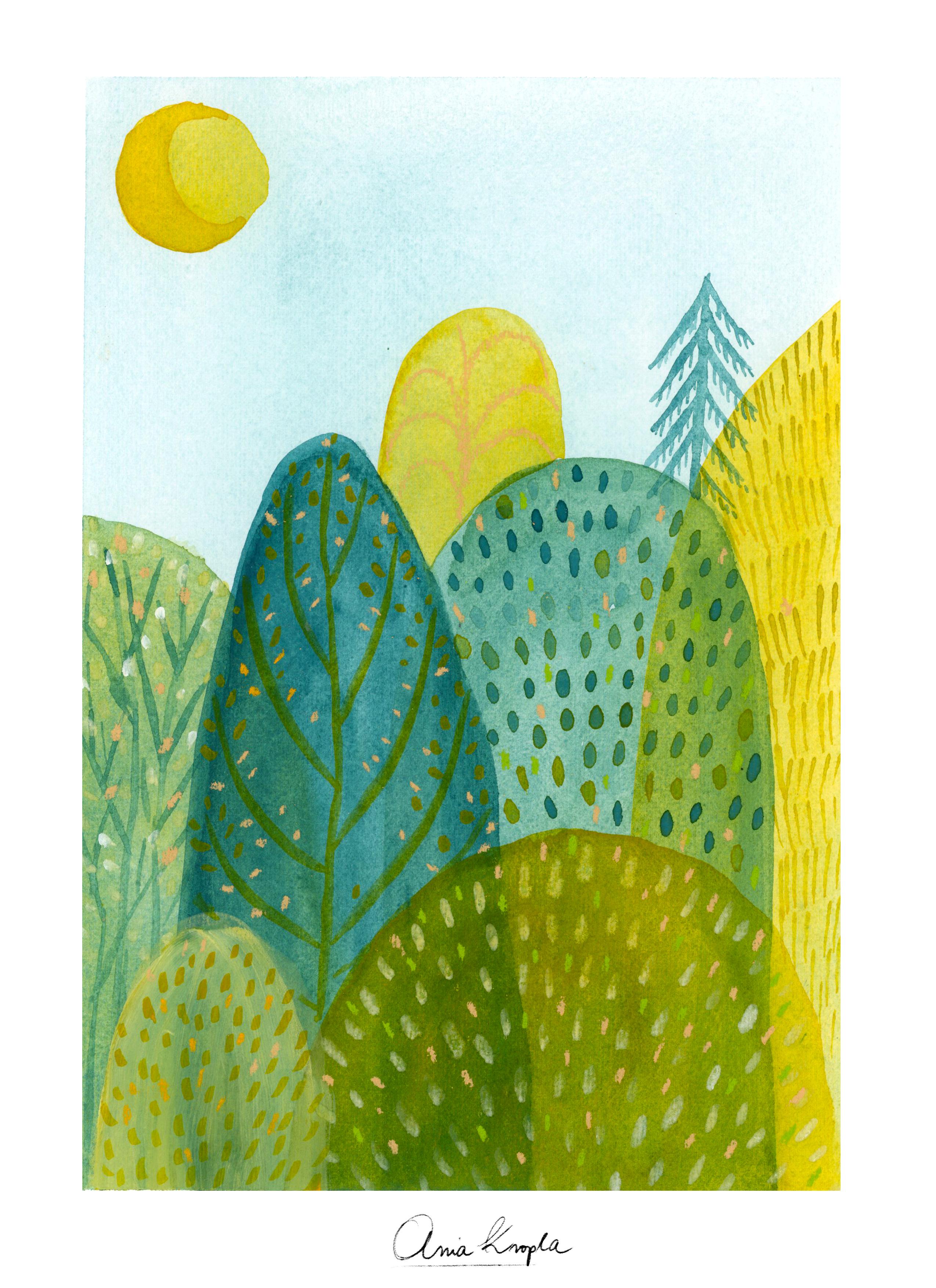
12. Final Project Part 1: Welcome to the part of our final project where
we will pick one of the four drafts
that we drew before and make of it a bigger
final illustration. Those are my four drafts. Take that you created. Pick the one that
you enjoyed the most and that you
would like to paint. Before we will start, I want you to consider this should be still
a playful exercise. I'm always saying that
the creativity and playful spirit should
always be on your side. Because otherwise,
you'll be maybe too stressed and the best results are where we are having fun. Don't stress out,
but try to be more accurate than in
the draft phase. Already, you should
be warmed up. We've already made
previous exercises. In this phase, you can repeat the exact steps that you did
in the previous lessons, but right now we are painting
the bigger illustrations, but I'm sure you will feel
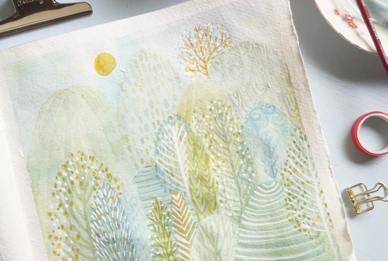
more ready and warmed up. This is the illustration
that I picked up. I decided to recreate
the two colors draft. I really enjoyed the mixing of the greens. They're
really lovely. Look how beautiful textures, those pigments mixed
together that they created. I really enjoyed it, so I would like to explore
it a little bit more, but obviously you can
choose another draft. If you want to make
monochrome do it as well. If you want to make temperature
exercise, it's up to you. Depends what really
excited you the most. As the outcome, I will repeat
exactly the same steps, but I'm not planning it. Maybe the layout of the
trees will be different, maybe the colors that I
will mix will be different. It's still about exploration. I want plan, but I want to be, I want this exercise
to be a little bit more accurate without stressing, without planning,
but with thinking more about things that I do. For example, in the draft phase, I didn't worry about the
fact that the colors were still wet when I was
painting new layers. So maybe they blended. I was painting in a little
bit of Hurry, hurry. I just wanted to
make a quick sketch. Maybe the details are not
so accurate in this phase, I want to be it more accurate. For example, I will wait
between the layers to dry. If you're layering and you don't want the
colors to bleed. Also think of this, that each of the layers
should be really dry before you will paint over it. You already made
the decision which color definition you
want to develop. But if in the draft space, it wasn't so deliberate, maybe right now you could think of values that you
want to build up, the colors that you want to mix. You can swatch the colors. I repeat, don't stress out, but try to be more
intentional about the things. Think also what did you like in your draft
and how to achieve it? If you liked more
blending colors, wet on wet technique, or you prefer to be more precise and paint in more
control way, maybe on dry. Think of these little steps to incorporate them in
your final project. In my case, I really
liked the layering, the transparency, the
translucent layers. I will try to achieve that by using a lighter
values of color. I really enjoyed,
as I already say, the pigmentation of
two mixed pigments. I will also want to do it to have it in my
final illustration. As I already told you, I'm painting on a
really dry background. I don't want, in this case, to have the wet and wet
techniques on my trees. Want blur, I want
the colors to blend. But I don't want the shapes, I want the shapes
to be sharp and translucent rather than blurred. Like for example in my
warm palette draft here, I'm being quite flu
in mixing colors. As I told you, I
will try to wet on wet color blending
and try to achieve the same effect of
the pigment that will separate in
my illustration. Here I'm painting another tree. I want to paint
really light value, translucent value of
this blue green color. I'm playing intentionally
with values. I'm still using just two colors. I'm not really
worried of colors, should I use, I'm playing with them directly
on my color palette, on my color mixing palette, and exploring the
colors that are mixed during the painting. The final touches
and details will be in the part two
of this lesson.
13. Final Project Part 2: I thought that there's
too little yellow. I would like to warm
a little bit more the illustration at a little bit of contrast of bright color. I'm painting the moon or sun. I'm sure probably it will be something because
this illustration is quite paint the yellow
dot over there. And also I thought to
paint yellow trees here and there just to add a little bit of vibrant
and more bright elements. I'm painting this tree
also in the front, even if I know that I won't
get the yellow color. Because as you know, the watercolors are translucent. They won't, especially if you're working with more
translucent pigments. Because some of the pigments are more opaque and some
more translucent. In your color palette, you can always check it before the yellow is a really
translucent pigment. It won't cover green color, even if I would like
to have a bright yellow in the front.
But it doesn't matter. I also enjoy this
layering effect, this translucent effect. I'm trying here to cover
it as much as possible, but as you can see,
it won't cover. I won't be able to
achieve yellow, the bright yellow
as I would like to. But I also can brighten
up a little bit, create more bright
contrast with the details, which I will do later on. I think I'm done
with the colors. With the shapes, as you can see, it's really very simple. I decided to work again with geometrical shapes and to make really simplified trees shapes. If you already know me,
you know that I really love to create small details to create textures above the
illustration and objects. Right now I will
just have fun with painting leaves and
branches still. I will use the same colors, but in addition to water colors, I will consider if to use may be colored
pencils or pastels. I don't know. We
will see right now. I'm playing with colors that I have in dispositions
and the mixes, again, green, blue,
greens and yellows. But this time I'm trying
to add a darker value. Because the water color, when it will dry, it will be more translucent,
obviously, more light. The color will be
lighter when it's dry. I'm trying to use the color as opaque as
possible for details. If you want, you can use
water color as well. Or you can use maybe pencils and whatever
art supplies and tools you usually use to paint over the water color if
you use mixed media. In my other class about
magical watercolor world, I explain a little bit better. What kind of brushes
and tools do I use? I really love to play with
different shapes of brushes. For example, the
stagger brush or sword brush to create grass textures or
branches, for example. But if you don't
have this brush, you can just use small
brush with sharpened tip. And explore the shapes you can create with the
brushes you have at home. I thought I will add
gah to my illustration. Because I can see that the yellow won't be
bright enough to create. To add a little bit of details
that will pop up that will add brightness and contrast
into my illustration. Because white is still the color that can be
added into my mic. It's not the different color, especially if you will use, you already have a little bit of white in the
mixes of your color. Very opaque right now. I'm just adding,
painting a negative, maybe I could say I'm
just adding white, which is okay if
you mix two colors. I think you can also add, we also in other drafts, if you use monochrome, if you use cool or warm colors, it's still okay to add white
because it's not a color. Since at the end, I love
to mix different media. I never use only one art medium. Why not to use gas
if you want to. If you feel like
adding, feel confident, then do it or even also other medium into
your illustration. Again, I added white to my color to create
this brighter yellow. I think it's a bit
better now because I thought that this illustration was still a little bit too dark and the tones were too similar. And monotonedIk', a little
bit better right now. Again, defining my last details. Branches, leaves. I will use water
color to it slowly. I will finish the other trees we finished. I hope you finished
your final project too. This is the outcome of the
final illustration that I did. I added some tiny details, leaves with soft pastels
and color pencils. But the battery went down, so I wasn't able to film it. But as you can see, they're still in
the same colors. I'm really happy
about the outcome, about all the greens and yellows that I created
with only two colors, a yellow, green and okay, the last three also with
a little bit of white. But still, I think
it's great to know how many colors and layers and how rich illustration we can
make with only two colors. In the last lesson, we will do the sum
up of all the class. Be sure to meet me there by.
14. Final Thoughts: If you're here, you
probably did all the class. All the lessons.
Congratulations, you made it. I wanted to thank you really very much for taking my class. I hope you enjoyed it and
that you achieved new skills. Let's recap briefly all
the steps that we took. I showed you all art supplies, then we created the color wheel and we learned all
the color properties. We did some warm
up exercises and we apply them into the drafts
for the final project. And we developed one of the draft into the
final illustration. I'm very curious about, what did you paint? What color palette did you use? I would like you to share it with us and share what you did. Was it a forest scene as well, or was it another topic? What colors did you use? Did you have any surprises, any exploration? Aha moments? Or are you satisfied
outcome? Did you have fun? Because that's the
most important thing. Please share your
project with us, a plot within the
project gallery. And also remember
that I prepared for you resources that you can
download to your computer. I hope that by taking
this class you got more confident with
color by that. Also more confident
with your art that you're ready to explore
more colors in your art. Last but not least, I would like you to ask you to leave a review
for this class. It will be very helpful for
me to know if you liked it, what can I improve. And also it will be helpful to other students to find this class on the
skill short platform. Please leave your review
and thank you in advance. Follow me here on Skill Short for more lessons
that are coming up. Also, you can follow me on social media on my
Instagram and Youtube. I hope to see you
in my channel by.
 Ania Kropla Malinowska, Award-winning illustrator