Transcripts
1. Introduction: Hello. Hi, my name is Ania. I'm an illustrator and graphic designer, and I'm really happy to have you in my second Skillshare class. My background is in graphic design, but for the last years I mainly work as an illustrator, and lately, I also study to become a professional illustrator for children's books. To see my illustrations, you can follow me on my Instagram and YouTube accounts. But because watercolors are the basic medium that I use in my illustrations, I would like to share with you all the knowledge and the skills that they've achieved throughout the years of my artistic research and studies. I will show you the basic watercolor techniques through the simple and quick exercises. I'll walk you step-by-step through the single techniques. I'll show you the wet on wet techniques, wet on dry technique, then with three really useful exercises. I'll explain to you how watercolor transparencies work. Then I'll show you how to paint really nice homogeneous washes of watercolors and then I'll show you two ways to paint watercolor gradients. At the end, we will use all the exercises and techniques that we learned to paint a watercolor bouquet of flowers. This class is for everybody. If you're a beginner then you will learn basic watercolor techniques. That's perfect. If you already paint with watercolors, then these exercises can be useful to improve your skills. At the end of this class, you will know the basic watercolor techniques. You'll feel more secure to start to paint your own illustrations or you will know other ways and techniques that maybe you didn't. I'm really glad to share all my tips and tricks with you. Also, you will paint your own beautiful watercolor flower bouquet. I hope to have you in this class and in the next lesson, I'll explain to you the class's project. See you there.
2. Class Project: Let's see what is this class's project. During all the class, we will see the single watercolor techniques and we will do exercises. As a final project, we will use all the techniques that we've learned during the lessons to paint watercolor, flowers bouquet. We will paint a single elements of flowers with different techniques. For some of flowers we will use wet on wet techniques. Then we will see how to paint a larger area to paint a uniform wash and also we will see how to apply gradients to paint leaves and other elements. Also, I'll show you how to paint details. As a bonus, we will use metallic gold watercolors to apply additional elements that will make your illustration really spark and pop up. As a final project, I would like you to share with us and upload your watercolor illustration of flower bouquet. But if you'd like to, then I encourage you to upload also the outcomes of the single exercises of watercolor techniques. Also remember, those are exercises to improve your skills or to learn watercolors. But above all, I would like you to enjoy the exercises, to play with them. Nothing has to be perfect. I would really prefer you to try and not to be worried if you're not happy with the outcome of your exercises. That's because it takes a lot of time to learn watercolors and usually it's not always perfect at the beginning, but that's not important. The most important is to try and to play and to enjoy your art. See you in the next lesson where I will explain you that art supplies that we will use for this class.
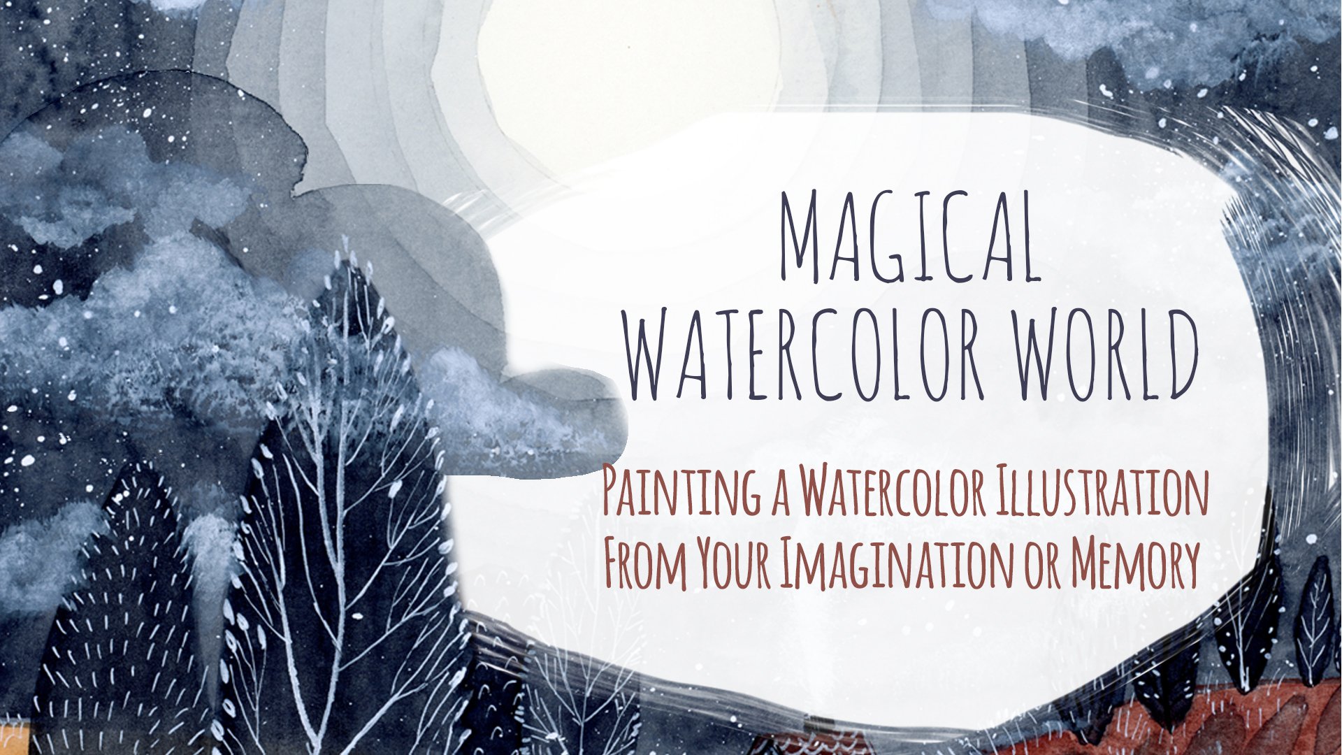
3. Art Supplies: Let's see the art supplies that you will need for this class. I'll walk you through the art supplies in a really quick way. If you would like to see a more detailed watercolor art supplies lesson, then I invite you to see the art supplies lesson from my Magical Watercolor World class, where I explain a little bit more, the watercolors that I use. Right now I'll show you just the basic supplies. Let's start with watercolors. I will use my set with mixed brands and paints. You can use your brand, your watercolors, it's not important. For the final project, I will use those two colors, which are the Cotman watercolor of Winsor & Newton Color Mauve, and Van Gogh watercolor, which is burnt sienna. For the details, I will use Dr. Ph Martin's Pen White ink. Once again, you can go back and see my Magical Watercolor World class where I explained all the differences between white colors. I will also use the set of gold watercolors for the bonus class, and those are Gansai Tambi Starry colors. Also, the brushes, I will use round synthetic brushes from large to thin for details. Also, water, pencil, and eraser. As for the paper, for the exercises, I will use this Arteza paper which is lower quality and cheaper and Arches Cold Press, which is really high-quality for the final project. I will also use a book for the support to have the supports that will allow me to do the inclination. You will see it during that washes and gradients exercises. I will leave also the list of the supplies that I use with names and the brands in the classes resources, so check it out. I also wanted to let you know that if you don't have the same paints or paper, it's not important. Obviously, there is a huge range of materials available, so grab whatever you have at home and in the next lesson we will start our first exercises, and I'll show you two basic techniques that you use to paint with watercolors. See you there.
4. Basic Painting Techniques: Welcome to the first exercise lesson. I would like us to start with two basic techniques, two basic ways that you use to paint with watercolors. Those are wet-on-dry and wet-on-wet technique. When you learn to manage those two techniques, basically, you will be able to apply it in almost all of the watercolor illustrations. For example, wet-on-wet technique is often used to paint really blurry elements like clouds, skies or other elements, for example, some animals. That's why it's really useful to know all those. Let's start with wet-on-dry and see what does it mean. Basically, it means you use wet paints with wet brush, which is dipped in the color on the dry paper. The tip here is to have a lot of color that you will prepare into your color palette, and to have a lot of color also on your brush. When you dip the brush in the color, try to take as much as possible with your brush. In this way, when you will apply it on your paper, you will create [inaudible] and you will push drops of color on your paper. You can try as many times as you want. Here, for example, I play with color and I push it around in different directions, you can try it as well. Just experiment, play with your color, prepare your palette before, and see how it behaves on your paper. My tip for you is to use a pipette to dilute your color. When you're about to finish it, just take water, preferably it should be clean water. Right Right it's a little bit red, but for the red color, it's fine. This way, you can squeeze clean water into your palette and then add the pigment, also you will have a clean water that you can add in any moment to your watercolor. Here I prepared maybe too much water, lots of colors, so I should also add lots of watercolor if I don't want it to be too translucent. Let's jump into the second technique which is wet-on-wet. What does it mean? It means that your paper must be wet before you apply watercolor on it. To do it, you have to apply a clean water on your paper. Here, my water is slightly colored with red, but it's okay because it's still translucent. I will show you the quantity of water here, maybe you will see it. Here Here is. It shouldn't be too much, it shouldn't be too wet, and it also shouldn't be too dry. Important that it should be homogeneous and shouldn't be a puddle of water. In this way, the color will apply in a more homogeneous way. Once you apply it to your water on your paper, pick your color and apply it on your wet surface. Here you can see how color spreads, it's different than the previous technique, you don't have control here, you cannot decide where the color goes within the water, of course. Here, I will try this technique the second time, you can also try to see what happens when you apply more water, and what happens when you apply less water. In this way, you can see what it changes, and how watercolor spreads differently. You can also play around and add other colors, and see what happens if you add one one two or more colors into your wet surface. We've finished this lesson, where you saw two ways you can paint with watercolors. Here is the exercise, and you can also find it in this class' resources. I hope it wasn't too difficult, and the next lesson, we will see what does it mean to work with watercolor transparencies. See you there.
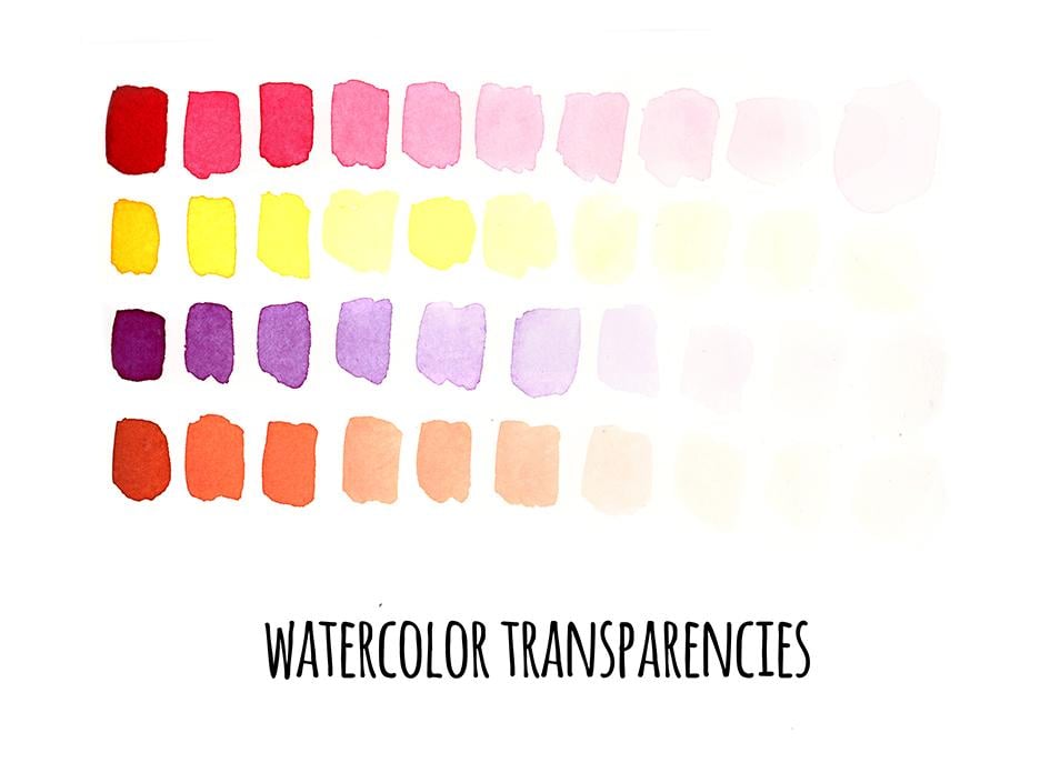
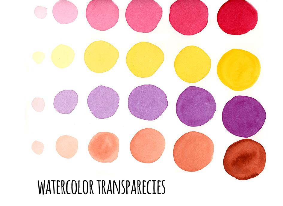
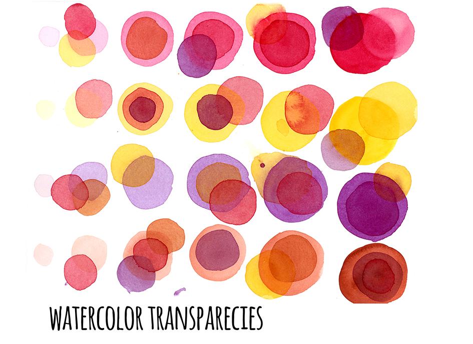
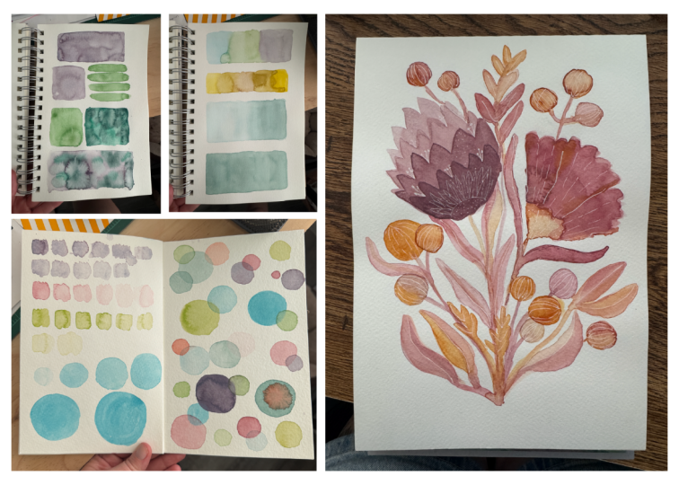
5. Watercolor Transparencies: Welcome to our next lesson, where I will show you three simple exercises for watercolor transparencies. This is very useful exercise to help you understand the quantity of color that you have to use and the relation between the quantity of water and the quantity of pigment that you need to use. by this exercise and playing, you will also see how to overlap colors, you'll be able to understand quantity of color that you have to use and how single pigment paints behave. The last exercise will be just playing with the different layers and overlapping, the colors and transparencies. Let's start with the first exercise from dark to light. It means that we will paint with dense color and then we will dilute it to make it more translucent. You can spray your colors with water before painting, so you will activate pigments. We will try to swatch the same color from more dense and opaque to more translucent. For the first swatch, don't add too much water, just wet your brush and add just really 2, 3 drops of water to have your color wet. But basically it must be dense. Then every time I'll add just a little bit of water, a few drops to diluted, and then swatch it and proceed this way. In this way, you will have your color every time more translucent. This exercise is also useful to understand the fact that in watercolors, you never use white color. If you notice, basically, usually in watercolor sets, there is no white. Sometimes they add it. But the fact is that the traditional watercolorists never use white. That's because watercolors works with transparencies. Once you add white to your color, it will lose it. It won't be transparent anymore. To achieve more bright and lighter color, you just simply dilute it. In this way, this brighter and lighter tone is achieved by the white of the paper because more translucent your color is, the more bright it appears with the white of a paper that is underneath. Just start with more thick, dense color, and it is more covering and more you dilute it, more bright and lighter it appears. Try this exercise, add always a little bit of water to your initial wash, and try to achieve tonalities from the most opaque covering tone to the most translucent and bright color. Let's switch to from light to dark exercise, which is basically the same, but just another way around. You will start with more diluted color, and then by adding the color into your watercolor, you will achieve a more dense and opaque color. This time I will try to paint circles. Try to do this exercise as well just to get familiar with watercolors and try to understand how much color you have to add and hues when you want to have more translucent color, and how much pigment you have to add to have more opaque and vibrant color. Also, if you will paint circles, here I also paint from the smallest to the biggest circle, you will also exercise how to paint uniform washes of color. When you add color for the next circle add both color and a little bit of water each time just to have enough color for the next circles. Remember to paint with lots of color, not to dry and to push your puddle of color around. This way, it will be more easy to achieve this very uniform swatch of color. Paint as many circles as you want until you're satisfied. You can follow me and paint the whole paper because in the last step of this exercise, we will use all the circles that we've painted to see other aspects of watercolor transparencies. Let's switch to the last part of this exercise. We will try to overlap different colors into each other and so I will use the same colors as before, and I I experiment to see how each color behaves when it's overlapped on another color. For example, how red behaves on the red color, on yellow, violet, brown, etc. Then I will play with yellow and violet and brown. Experiment with different colors, also with different intensity of colors. Sometimes you can use more translucent color. Another time, pick more color, make it more dense to see if it covers more. You will discover that some colors are more opaque than the other ones. For example, yellow will be more translucent than the red so it won't cover the red or the violet once it's overlapped. It depends what colors you will use. The best way to discover it is just to experiment and play. The strength of transparencies of different colors is always signed on its packaging. You can overlap 1, 2 or more colors. Just play around, experiment and see how different colors have different hues and transparencies. Don't worry if you do some mess. I did and it's okay. This exercise doesn't have to be perfect, it's just for fun. It's for you to discover, for you to paint and play around and see how watercolor behaves. Have fun. The other thing that you should keep in mind is that your circles or the shapes that you painted before should be dry once you paint over them. Otherwise, the colors will blend into each other. Unless you want them to blend, just keep in mind to have your washes dry. Let's recap our exercises. The first step was to paint from the darkest, from the most dense color to them most translucent, most light color then vice versa, from the most light and diluted color to the most opaque and also from the smallest to the largest. Then we've mixed all together to see how transparencies behaves when we paint with different colors one over another. I hope this exercise was useful for you. You can paint all the papers or a lot of sheets of paper. It's up to you. I encourage you to use as many colors as possible so you will also be able to see how different colors paint in different ways. Yes, so play with that. If you want to do, then upload your outcome of exercise in the classes project. In the next lesson, I will show you how to paint watercolor washes.
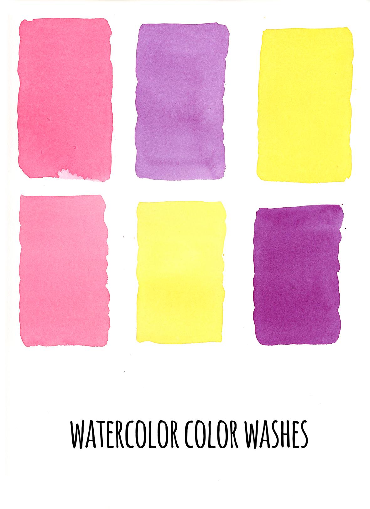
6. Watercolor Washes: In this lesson, I'll show you useful exercise to paint color washes and to paint larger areas of watercolors without any marks and blobs, just in a really nice uniform way. This is really useful skill when you want to paint larger areas like backgrounds, or sky, for example, or just bigger element of your illustration and you want to have this really nice and homogeneous surface. Before you start to paint, prepare something to put under your watercolor pad. It can be box of your colors or a book. I will use a book later because it's a little bit higher and larger, and then more comfortable. Once you have your watercolor pad inclined, prepare your color. You want to have, as usual, a lot of color. Start to paint line, a stroke, from the left to the right. Try to leave a little bit of drop under your stroke. What it means is that you have to have your wash quite moistured. It can't be too dry. That's why the inclination is for. You just want your drop to go down. Then with the brush, you want to pick this drop and paint with it. Paint it as long as there's the drop left. Once it's dry, you can dip your brush again and restart painting or you can just leave it. Do the washes as long as you want to. You can make them shorter, you can make them longer, it depends on you. If you want to, you can make them really long. Create this little drop. If you have too little paint, then pick it once more time. For example, here I prepared two little colors so I don't have enough paint. Repeat the exercise as many times as you want. I will use the same three colors and I will just paint more washes with those three. Here I'm taking the book because it's more comfortable. It creates a bigger inclination. This way, the drop of color will flow down more easily. This technique allows you to create those plane and homogeneous washes of color. Let's repeat. We pick the color, we draw the first line from left to the right, and then we always paint from left to the right with the drop that remains underneath. Once the drop of color is dry, then you can pick your color one more time and continue to paint in the same way. You can finish your wash, for example, and there will be still a drop left. You will have to collect it. Just dry your brush in the tissue and then collect this drop with a dry brush. In this way, you want to create a darker color. I hope you liked this exercise. Remember, it doesn't have to be perfect. It's really useful exercise, but it's not so simple at the beginning. At the beginning, maybe it will be difficult to paint these ideal watercolor washes, but I encourage you to try it more and more times. After one time or just one single exercise, it's difficult. At the beginning, I painted sheets and sheets of papers, so it's perfectly normal not to be able to paint it at the first try. But don't worry. Play, exercise, and if you're not able to paint it in the first time, then just don't worry. Also remember, it's not about being perfect, but it's about trying and playing with your art. Enjoy, and I hope it will be useful for your illustrations. If you like to, then upload also this exercise to your class's project. In the next lesson, we will see two ways to paint watercolor gradients.
7. Watercolor Gradients: Welcome to the next lesson. I'll show you two ways to paint water color gradients. The first one will be the same as the watercolor washes, but we will use more colors. It is very useful to paint gradient by grounds and surfaces, and the second way to paint gradients, which is more common. Let's jump into our exercises. Let's start with the first way of painting gradient washes. The procedure is the same as for painting washes. Just, we will add a second color. We will paint with two common colors. Remember to have your paper inclined, tilted, the gravity will do the work and the last line must be very humid and this little paddle must be created. Once you're ready, add the second color and with the help of the brush, try to unite them. Create this in-between color by mixing your first color with the second one, and then pick the second color and continue. In this way, you will create in-between color. You'll have yellow then this orange color and then you proceed with red. This exercise can be quite tricky. If you're not satisfied with your gradients at the beginning, don't worry, probably it takes time to create those nice and smooth gradients. This gradients can be used to paint backgrounds, for example, you can use it on the whole sheet and create a beautiful background sky, for example, and then paint over it. I started the second gradient, I used purple. For the last line, I add a little bit of color. If you see that's if it's too dry, the last line then add just a little bit of color. Once it's ready, I will paint the second color just underneath. I will leave a tiny white space that I will join afterwards. Then create the mix of two colors. Once when it's ready, proceed with pure secondary color. This example, it's yellow. You can also add more colors. I'll just do two, but if you want, you can make them three or more. If you feel ready, then go for it. Try, you can also make them larger, also the whole page if you want. Obviously you would have to use a larger brush. But for the purpose of exercise, if you don't know this technique then I would suggest you to do just two colors on the smaller area. Let's start with the second exercise. We will paint regular normal gradients. You don't have to have your paper inclined. It can be just flat as you would usually paint. I will paint lines of multiple colors that will blend into each other as a gradients. Pick up your first color and just paint the area that you want. For this exercise, it won't be too large, just a simple line of color, rectangle of color. Remember to have your color abundant, not too dry. Then paint the second color and join them with your brush. I add some more color just because when there is too little color the blending won't work very well. The best way is to have a lot of color. Here Here the puddle of the third color. Proceed with this exercise. Try to figure out how much color do you need. It shouldn't be too little. We said that already, but it also shouldn't be too much. This exercise is helpful to figure it out. Use your colors and just proceed as long as you want. This is the outcome of our exercise. You will find it also on this classes resources. I hope you've enjoyed those exercises and that they will be useful for you, for your illustrations. If you want, then upload to the outcomes in the class's project. Also remember, it's not about being perfect, It's about exercising, it's about trying and it doesn't have to be perfect right away. Those were all the exercises that I wanted to share with you. We will use all the techniques that we've learned and paint the final project. See you in the next lesson.
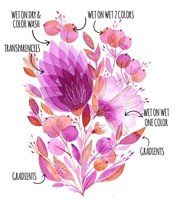
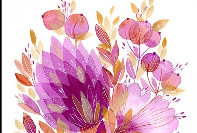
8. Final Project: Let's start our final project, and it will be a flower bouquet. Since I really love painting flowers and nature, I thought it will be a really good way to experiment on the techniques that we've used before. We will paint this watercolor illustration. In my art, I paint flowers and botanical elements really often, so I think it is the best way to try all the techniques that we've learned before. I will use only two colors, but feel free to paint with more colors that you will choose, and also feel free to paint your own flowers, your own shapes. I paint from imagination, so if you prefer, you can paint also the real flowers. I will also upload the sketch and final illustration in the classes resources. If you want to, then you can also use my sketch as reference for your own illustration. Here's the outcome of the illustration. I also describe the techniques that I used to paint the single flowers. You will find it in this class resources. Let's jump into our final project. As I told you in the art supplies for the final project, I will use Arches watercolor paper, cold pressed, and also two colors, mauve and burnt sienna. Because I'm about to finish the mauve color, I will squeeze a little bit of fresh color into the pan. First prepare the sketch, I've sketched it with a pencil. I prefer to have a sketch before I paint, but if you feel like it, then you can just start to paint directly without sketching. I also prepared my first color and we will start with first wash for the biggest flower, and then I will overlap the layers, as you can see, they are petals that are overlapping so I will start just with the first layer, with the first wash. As you can see, I don't use the same direction of brush strokes that I use to paint the washes in our washes lesson. It's not so important the direction of the strokes because it depends on the shape you are painting as the fact to help your edges of paint always wet. Don't let them dry in this way when you paint and also paint quickly. The paint will land altogether in a smooth and uniform way. I use the hairdryer to dry the first layer, so I can show you how I paint the second layer above the first one. I use the same color, a little bit more saturated. It means that I've added a color to my watercolor wash, and I'm painting in the same way as the first one, it's just a smaller one. This time I will let it dry in natural way. Let's start the wet on wet technique for this flower. I will use just one color. It means that I will paint the first layer with one color and then add the same color, but it will be more dense. The first wash, is very diluted and light as a color. While it's still wet, I'm adding the same color but more saturated, more dense, and just to tap the brush into the first layer. The first layers shouldn't be too wet because the color will blend more and it is possible that two colors eventually will join and blend altogether. We will see if it will happen in this case. I let it dry in the natural way, and now I'm trying to do wet on wet technique with two colors. So as always, I paint the first layer and while it's still wet, I'm adding the second color. My color blended too match, so I'm helping myself with a tissue. I just tap the color that blended to match, but to do that, the color must be still wet. Here I proceed with a wet on wet technique and now we are switching to the regular gradients. We will use the wet on dry technique. I'm painting the first color, then I'm picking the second one, and I will try to blend them together to create this gradient of two colors. While the paint is still wet, I can still add another color for example, I want this flower to be darker on its bottom side and that's the good thing about the quality watercolor papers that they absorb water slowly. The better watercolor paper is, the slower is the process of absorbing of the water, and that basically what you want in the watercolor techniques because if this flower was dry, then it couldn't be possible to add another color in this wet on wet technique. I also add stocks while the paint is too wet in this way, the colors blend nicely into each other and now I switch to paint leaves with gradients. The process is that the first part of leaf I paint with one color, for the second part of the leaf, I use another color. While the first color is still wet, I join the two parts so they blend very nicely together and it creates this beautiful gradient. Another way to paint gradient leaves is the same as I used for the round shapes. First, I paint one color on the top, and then the second color in the bottom and I join them together. I will proceed with my painting, I will use the same techniques, I will mix them and repeat them to create the final bouquet. You can join me by watching the whole process. I will paint the final stalks for the missing parts of the flowers and leaves. At the end, I will add details, I will use the same two colors as for the flowers, but it will be more dense and saturated to cover the color underneath. I really love tiny strokes and lines, I love to create this delicate details, it makes the painting more delicate and soft in my opinion. I just proceed in this spontaneous way. I don't plan it, I just paint wherever I feel to and now I proceed with two colors. For the details, you can use the smallest brush you have, but also, bigger brushes often are good, it depends on the tip. It should be really well sharpened. Here I used the white ink for the details on the flowers. I really like to use white color. I think that it brightens a lot the illustration. This particular one is opaque and it's water-soluble, and it also covers really well your color underneath. Here once again, you can see the outcome of the final illustration with all the techniques that we've used, and you will find it in the classes resources. I hope you've enjoyed this final project. I can't wait to see what you've created. The next lesson is the bonus lesson where I will show you how I paint gold metallic watercolors. See you there.
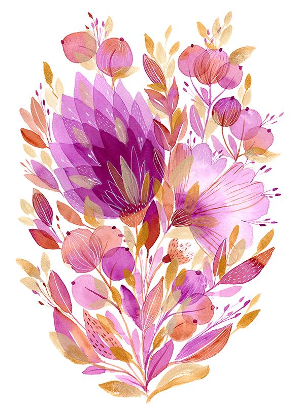
9. Bonus Lesson : Welcome to our final bonus lesson, where I'll show you how I paint with gold metallic watercolors. I think metallic watercolors can make your illustration pop-up and sparkle even more. I will use this brand of watercolors, Gansai Tambi starry colors. It has a selection of six gold colors. I really love this champagne gold, so I will start with this one. They are quite dense, but yeah, you can see that also when I paint above another element, the color is quite translucent. I will usually paint with wet on dry technique and sometimes I will use two golds to create gold gradients. Now I proceed with leaves and wet on dry technique. I will add the second gold. This one is red gold. It is warmer gold, quite orangey. I will paint leaves with just this gold, and then I will also try to paint gradients with it. Here I paint gradient with wet on wet technique, so first I paint the lighter gold, and then I add the warm red gold on it while the light gold is still wet. As you can see, the blending isn't so strong as with the regular watercolors. Here I paint regular gradient, the first part of the leaf with one type of gold and the second one with the other, just as we did when we painted the leaves with watercolors. Also here, we will repeat the techniques and mix them. For example, here I overlap a gold watercolor of the petals. I think the effect is really nice. I repeat gradient leaf again, and sometimes I overlap the leaves over the flowers and petals. Here is the final illustration. I really love the outcome. The gold with this violet looks really good. But since gold is quite universal color, I think it will work good also with other colors. If you have other metallic watercolors, them go for it. I also have other tones of metallic watercolors, but I love to use gold, but feel free to use whatever colors you have at home. I hope you've enjoyed this bonus lesson. If you have metallic watercolors, then feel free to use them. Feel free to experiment to use more metallic colors; it's up to you. See you in the next lesson where we will share some final thoughts.
10. Final Thoughts: Congratulations, you've made it. Thank you for watching all the lessons and all the classes. We covered everything from art supplies, to exercises of the watercolor basic techniques, to the final project illustration where we've applied all those techniques to paint watercolor bouquet. If there's one thing that I hope you take away from this class, it's the knowledge of the basic techniques. I hope you will feel more secure now, and you will understand a little bit more of watercolor, and you will start to apply all those techniques for your own illustrations, for your art, and I really hope it was useful for you and that it clarified the doubts that you had, and it encouraged you to paint with watercolors. Upload your project to the project gallery, upload your bouquet, your flowers. I can't wait to see what you've created, what flowers you painted or the techniques that you used, and also do it to inspire other persons. I think it's really important to inspire one another, to exchange your experience, your doubts, your questions, and also to just to inspire with your art one another. If you like, then also upload your single exercises outcomes, and also if you have any questions, please come back to me in the discussions. I will be very happy to come back to you and to have with any questions. If you like this class, please leave a review. It will be very helpful for me. Also, share the class with all your friends if you like to, and also follow my profile because I will come back soon with other classes. Thanks again one more time for joining me, and see you next time. Bye.
 Ania Kropla Malinowska, Award-winning illustrator