Transcripts
1. Welcome to Class!: The holiday season is upon us and there's no better way to get in the spirit of making
yourself a cup of hot cocoa, decorating your tree, turning on your favorite
Christmas album, and of course, painting some festive holiday
illustrations in watercolor. My name is Priya from Petals
by Priya Watercolor Designs and I'm a full-time artist
based in Honolulu, Hawaii. Well, my background
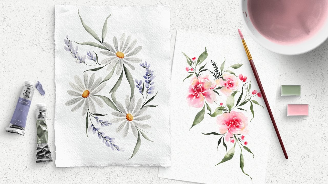
is primarily in loose floral and
botanical paintings. I also enjoy creating more
detailed illustrations, especially when it comes
to holiday-themed artwork. That's what we'll be
doing together today. In this class, you'll learn how to paint realistic-style
mistletoe and candy cane
illustrations using a variety of
watercolor techniques. I'll be breaking down
everything you need to know. No matter what level or how much watercolor
experience you have, you'll be able to
follow along easily. Before each project, we'll start by completing a
few practice exercises to get the hang of some of the more intermediate and
advanced techniques, such as blending, shading, and utilizing color values to add depth and interest
to our paintings. That way, we can
learn about each of the techniques and
start building up our muscle memory before
diving into the projects. Also included in this class
is a lesson dedicated to teaching you my
illustration process from start to finish, including conducting
and spell research, creating digital
sketches on the iPad, transferring our
final outlines to watercolor paper
using a light board, and finally, completing
the illustration. Now, if you prefer to paint freely without any sketching, you can absolutely do that and still participate in this class. But for those of you who
want to dig a little deeper into the
illustrative process, that lesson will be for you. I've also included free
downloadable sketches of each of the projects for class today that you
can download and reference in the
resource section below. By the time you're
finished with this class, not only will you have two
beautiful holiday paintings, you'll also come away with invaluable watercolor and
illustrative techniques that you can take with
you as you continue on in your journey
with watercolors. Before we jump into the class, if you want to learn more or connect with me on social media, you can find me on
Instagram @petals.by.priya, on my website,
petalsbypriya.com, or on YouTube
@petalsbyPriyaWatercolor. Now, if you're ready
to get started, grab your hot cocoa, your watercolor supplies,
and let's get to it.
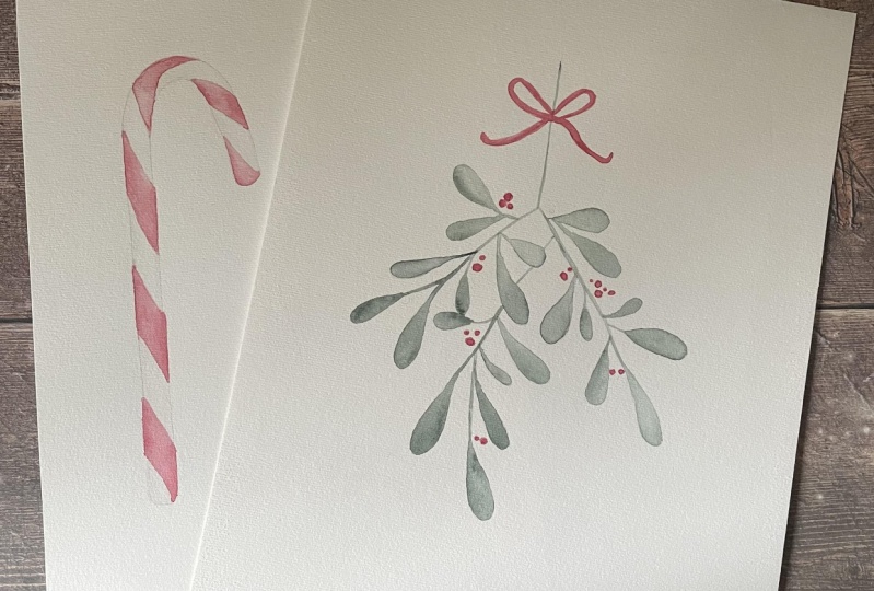
2. Class Projects: We'll be completing two kinds of three projects in class today, the mistletoe and two
different candy canes. As I mentioned before, we'll start each project with
a few practice exercises. I know it can be
tempting to jump right into painting
the main pieces, but I want to encourage
you to participate in the short practice sessions so you can truly get the
hang of each technique, not only for the
projects in this class, but also so that you can
confidently apply them to any future paintings
you work on down the road. At the end of class,
please remember to upload your final projects to the projects and
resources tab below. It's a great way to receive
feedback on your work and connect with other students. You can do this by navigating to the projects and resources tab, clicking on the green
button that says Create Project and
uploading a title, photos and brief description
or comment if you'd like. I know firsthand, how scary and intimidating it can feel
to put your work out there. But Skillshare has
a very supportive and encouraging
community of creatives. There's no need to be shy. I went ahead and
uploaded my project first and I hope to
see yours there soon. Finally, if you
have any questions or you run into any
challenges along the way, you can also post those in
the discussion section. I'll be checking
that frequently to answer any questions
or comments.
3. Supplies: Let's talk about the supplies
you'll need for this class. Starting with watercolor paper, I'll be using Legion Stonehenge, 100 percent cotton paper. For brushes, I'll be using Princeton
velvet touch round brushes, ranging from Size 2-8. But any round brushes
that you have at home, will do it just fine. For watercolor paints, I'm going to be
using pretty much the same color palette
of red and green for each of the projects, because I want my
final pieces to be coordinated and cohesive. But you're welcome to
use any colors you have available that you
like working with. If you'd rather paint
bright neon candy canes, you can absolutely do that. The most important
part of this class is learning the painting and
illustrated techniques. I don't want you
to worry too much about choosing the
perfect colors. Other watercolors supplies we'll need include a jar
or bowl of clean water, mixing palette and a paper towel for dabbing excess
water off your brush. If you choose to follow along with the illustration lesson, I'll also be using
the Procreate app on my iPad for creating
digital sketches. But you can also just
use a pencil and paper if you don't have
a drawing tablet, my printer for printing
out the final sketch. You don't have to have
a special art printer or anything for this step, we'll just be printing out a simple black and
white sketch to trace onto our watercolor paper. Any basic printer
will do just fine. I'll also be using an
LED light board for tracing the sketch onto
my watercolor paper. If you do not have a
light board, don't worry. I'll tell you another
workaround for this in the illustration lesson. I'll also use masking tape
to hold my paper in place while I transfer my sketches, and of course, a pencil
and kneaded eraser. Once you've gathered
all your supplies, I'll see you in the next
video for the sketching and illustration process.
4. Illustration Process: In this lesson, I'll
walk you through my illustration process
from start to finish. Now I will say I
used to never be one to sketch anything out
prior to painting. But as I've learned new
skills and techniques, I find myself gravitating
more and more to it as I have a much higher
chance of falling in love with my final painting when
I put in a little extra time and effort into the prep work. One more thing I
want to mention, there's definitely a
time and place for utilizing this
illustration process. For example when I'm
painting loose florals, which is my primary subject, I almost never sketch
anything out beforehand. I much prefer to just
go with the flow and trust my artistic intuition. But when my end goal is to
paint a specific object, like a candy cane, mistletoe, or a more detailed
botanical illustration, that's when I'll use this method and put more time into
the prep work upfront. Let's get started. For this demonstration, I'm going to use this
mistletoe sketch as an example as we go through the
four main steps. Step number 1 is taking a
look at inspiration photos to help get the idea of
what my subject looks like before I start sketching. Keep in mind we're simply gathering inspiration
from these photos and starting to identify the key characteristics
of the mistletoe. What we're not doing is copying or tracing any of these photos. We want our creations to
be 100 percent our own. At this point we're simply
pointing out things that we want to keep
in mind as we sketch. One of my favorite sites to gather inspiration
is unsplash.com, which has thousands of
royalty-free photos you can use. But I also like to
browse Pinterest for additional inspiration
and color palettes. As I browse these photos, I'm just taking note
of what features I'll include in my
mistletoe sketch, like the rounded
nature of the leaves and the general
shape of the stem. Step number 2 is creating the digital sketch on my
iPad using Procreate. Like I mentioned earlier, if you don't have an iPad or you don't have Procreate,
that's totally fine. You can just use a pen and
paper to create your sketch. I just prefer to use Procreate because it allows
me to make mistakes and rework my drawing without having to erase
and damage my paper. When I'm done sketching, I export it as a PNG and send it to my laptop and
via Google Drive or email. Step number 3 is
printing out my sketch and transferring the outline
to my watercolor paper. First, I print out my
finalized sketch onto just regular 8.5 by 11
inch printer paper. To do this, I'll create
a Photoshop file that's 8.5 by 11 inches. I import my sketch
and resize it to whatever size you want
your final painting to be, and then print. Once it's printed, I transfer it onto my watercolor paper using this LED tracing board that plugs directly
into my laptop. I'll show you how
to do this first and then I'll tell you about another method that works if you don't have a light board. First, I take masking tape and tape my sketch
onto the board. Then I turn on the LED lights
to the maximum setting and I take my watercolor paper and tape it down on
top of the sketch. I always make sure to
tape everything down firmly so nothing
moves while you're tracing because
that can be really frustrating when that happens
and you have to start over. Finally, I use a
sketching pencil to trace the outline onto my paper. Make sure you're
drawing very lightly so the pencil marks and
indents aren't too harsh. Once it's done, I
carefully remove the masking tape and move
on to the next step. As I mentioned before, if you don't have
a tracing board, you can still do this process. You'll just need to use the natural light coming in
through your window instead. Just make sure you have enough natural light to shine through
your thick watercolor paper and be sure to use
gentle masking tape or washy tape on your window. You can also use tracing
paper if you'd like, instead of these two methods. I haven't personally done that, but I know a lot of other
illustrators who do. That's another option as well. Step number 4 is lightening your sketch using
a kneaded eraser. The reason you want to
lighten your sketch is because as soon as you
lay any paint on top you won't be able to go back and erase those pencil marks. I like to do this
first to make sure the pencil lines don't interfere
with my final painting. I generally recommend using a kneaded eraser
for this process because all you have to do is gently roll it
over your paper and it lightens the
pencil marks really well. If you have to use a
regular eraser, you can, but just be very
careful not to tear or disrupt the surface of
your watercolor paper. Of course, Step number 5 is completing the actual
painting process, but we'll go through that stuff together in the next section. There you have it. Those are the four main steps to my illustration process. Then the next few videos, we'll start painting
each of the projects.
5. Watercolor Mistletoe Part I: First up, we'll learn
how to paint this mistletoe illustration. You're welcome to
create your own sketch or as a reminder, you can download mine in
the resource section. In the previous lesson, you saw my process for getting this final sketch transferred
onto my watercolor paper and I lightened it using
my kneaded eraser. If you haven't done
that step yet, I highly encourage
you to do that now because once you
start layering water and paint over the top of it, you won't be able to go back and erase any of those lines. Before we start on
the actual painting, I want to practice a few
of the key techniques we'll be using for
this painting. Go ahead and grab a
piece of scratch paper and let's practice together. The first technique I want
you to practice is blending, because we'll be using
that technique on each of the mistletoe
leaves to get those nice soft blends
between color values. Go ahead and load up some extra dark pigment onto your brush. It doesn't matter
what color you use because we're just
practicing right now. I'm just going to mix up a color using my sap green
and Payne's gray. I'm loading up my brush and I want you to
start practicing just on scratch
paper by painting just a dark rectangle
just like that. Now before that dries, I want you to rinse off the rest of that pigment off your brush, dab off any excess water and just try to blend
it out so you get a nice smooth gradient
from dark to light. I'm rinsing off
that excess color, dabbing off the excess water, and then gently blending
out that color. The goal here is to have
a nice smooth blend from dark to light. So let's try that one more time. I'm loading up my brush
with my dark green value. Just painting a
little shape here, rinsing off the excess
color on my brush and before this part dries, I'm just gently blending it out. Just like that. It's a nice gradual change
from dark to light. We don't want to
see any harsh lines where you can obviously
tell the difference. Let's practice that
again because again, we're training our
muscle memory here. The more you practice, the more natural it
will come to you. But this time I'm
going to do it in a little bit more
of a leaf shape. Instead of drawing a rectangle, I'm just going to apply
some pressure onto my brush and just do
a basic leaf shape. Again, we're just
practicing here, so I don't want you to feel any pressure to make
things look perfect. Rinsing off the excess
water on my brush and just gently
smoothing that out. Now you can start to see a really nice smooth bleed
and blend on that leaf. I'm going to go ahead and
do that one more time. I'm getting that dark
green value on my brush. Gently pressing
down onto my paper, rinsing off, dabbing
it on my paper towel, and then gently blending it out. If you have too much
water like I do there, just rinse off your brush again, dab off all the excess water and just let your bristles
soak up some of that excess. That's also a great
lesson on water control. If you've taken any
of my other classes, you probably are
already familiar with these but it's
always good to practice. Just gently work on it
until it's nice and smooth. Again, that's the
technique we'll be using on each of the mistletoe leaves, which helps just give it
a little more depth and realism rather than just
having it be one flat color. Now the next concept
I want to demonstrate is using color values to create even more depth and
interest in your painting. The value of a color is its relative lightness
or darkness. A darker value means you have
more pigment on your brush and a lighter value as you have a higher concentration of water, gets lighter and lighter. Let me walk you through a little demonstration
of what I mean. Here you can see my palette. I'm loading up my brush
with mostly pigment, so there's hardly
any water in here. That's going to give
us the darkest value. I'll show you what that
looks like on paper. I'm going to paint a
little value scale here. That is very dark, almost black because it's
just mostly that dark color. But as I gently rinse off
additional color off my brush, you'll start to see
that value lighten up. I want you to do
this along with me and just practice slowly
rinsing off some of that color so that you have a
higher concentration of water in your mixture. Just keep working
up your value scale until it's as light
as you can go. That's the cool thing
about color values and watercolor is this
is all just one color but they look so different
depending on how much water versus pigment
you have in your mixture. I can probably do
it one more time before it gets
pretty much clear. There you go. Not only are we
using variation of values in each of the
leaves like we did here also with blending
but color values will also help us
create interest when we add the berries
into the mistletoe. I'll show you what
that will look like. Not only are there
different sizes of berries, so you have some small,
you have some bigger, but also different values. There's some darker
berries here, there's some lighter ones. Then also within each berry, you can also vary the value. That's a mouthful. But then each berry, you can vary the value. That gives it a really
nice 3D-rounded effect. You can see here
there's a lighter value and then those darker
values to add shadow and make it look more round. Let's practice a value
scale one more time. Load up your brush with the
highest concentration of just straight-up pigment and then just gently rinse
off some of that color and work your way
towards a lighter value. It's all the same color, but they look
different depending on how much water you
have in your mixture. It's one of my favorite
parts about watercolor. So many different
ways that the water affects how your painting looks and how your colors look. One more very light value. It's pretty much just
clear water by that point. There you have it. Feel free to keep
practicing your blending and your value scales. When you're ready, we'll get started on the
actual mistletoe painting.
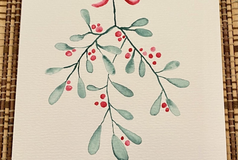
6. Watercolor Mistletoe Part II: I'm going to be working on the painting in three steps. First, I'm going to paint each
of the leaves and the stems using those blending
techniques we just practiced. Then I'll add the berries, making sure to vary the size and the values of each of them to give it a little
bit more interest. Then finally, I'll add
the red ribbon on top, also adding shadows and
blending where needed. Let's start with the
leaves and the stems. Again, the color I'm
going to be using is a mixture of sap green, Payne's gray, and a
touch of indigo to give it a little
bit of a blue hue. I'm going to do a
couple of these in real-time so we can go
through them together, and then I'll speed it up as
I continue to fill it out. Starting opposite of what we just did in the value skills. When you're working on
watercolor illustrations, it's always best to
work from light to dark because you can always add darker values on top of lights, but it's not so easy to
go back and remove color. I'm going to start with
a really light value, which, again, means lots
of water in my mixture. I'm just going to go ahead and paint a light first layer
on this leaf petal. As you can see, it's a very light color
because I have a lot of water in my brush and just
a touch of color. I'm just going to
gently fill it in. It's nice when you already have your sketch done
because at this point, it's just pretty much like a coloring page that
you're filling in. So you don't have to
worry about the shape or the lines because they're
already there for you. Now, I'm loading up a darker
value of that same color. This is where we can
practice our blending. I'm just gently
going over the stem, touching in some color there using the wet-on-wet technique, rinsing off my brush, and gently smoothing it out. This is the process we'll be doing on
each of the leaves. The constant back
and forth between blending and layering
in some darker colors. That's looking pretty
good for the first one. Let's do a couple more
together in real-time. Starting with a
really light value, a lot of water in your brush
and just a touch of color. I'm just going to go ahead and gently fill in
the base layer. Once that base layer
is nice and filled in, I'm loading up just a medium
value of the same color, and while this base
layer is still wet, I'm just gently tapping in
some of that darker value. You're just slowly building
up a nice gentle blend. Rinsing off my brush, dabbing off the excess water, and smoothing it out a bit, just like we did in
the practice lesson. One more thing I
want to note here is because I'm right-handed, I'm working from left to
right on the illustration so I don't have to worry
about my hand touching any of the wet paint or
damaging any of those lines. Obviously, if
you're left-handed, you'll do the opposite. I'll do one more layer here, tapping in an even darker value. Just slowly building
up that depth, rinsing off my brush,
and smoothing it out. Again, if you get too
much water on your petal, no worries, just
rinse off your brush, make sure you get all
the excess water off, and then let your bristles soak up some of
that excess water. I'll do one more in real-time, and then I'll start
to speed it up. This process does definitely
take more time than just filling in each leaf the
same exact value of green, but it gives our illustration
a lot more depth. You can see here on
our final painting, each of the petals really has that shadow and the highlight, and it just look a
little more realistic. Very light value on my brush, filling in that base layer, and then slowly working my
way to a darker value using the wet-on-wet technique. So that first layer is still
a little bit wet as I add it, and then gently blending it out. You're always working
from light to dark. You'll probably notice
that your water bowl starts to get pretty muddied up from all this
blending and rinsing off color. So just make sure to change
that out periodically because you always want nice clean water when
you're blending. If you want to make it
even more dramatic, you can go in with a
really dark value at the end and just tap in some
final color along the edges. Rinse off your brush and just smooth out those
lines a little bit. It's fun to do that
every so often, just so that all of your leaves don't look the exact same. Hopefully, you're
feeling comfortable with that process by now. I'll speed up the
rest of this and then we'll move on
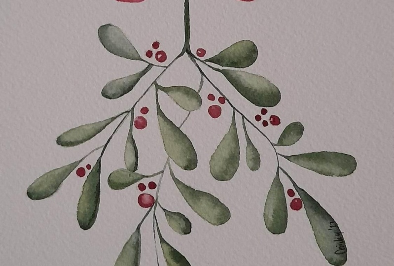
to the berries. Now all of our
leaves are filled in and we can get started
on the berries. Just like we talked about
in our practice sessions, we're going to make sure we vary the value and also
the size and shape. Getting started left to right, you're just going
to start adding in your berries using a
variety of values. So have some of them be lighter, have some be darker, and then also don't be afraid
to tap in some shadows. I'll show you an
example on this one. I'm putting down a nice
very light base layer. Let me make it just a little bit darker so it's
easier for you to see. Then once I have that
base layer down, I'm going to tap in
some extra shadows. I'm getting a dark value of
my same red berry color. I'm just going to gently
tap in some color around the edges to make the illusion
that it's rounded and 3D, and then gently blending it out. You don't have to do that
on every single berry, but it does help to make some of them look a little
bit more realistic. The one right next to it,
I'm just going to make very dark and filled in. Then I'm just going
to continue adding in these barriers as I go. On the bigger ones, I'll tap
in the shadows because it's a little bit easier to
do on a larger scale. Again, tapping those in right there and then gently
blending it out. It's the same process
we used for the blending of all of the leaves, but it's just on the
barriers instead. Again, not doing it on
every single berry. Just here and there. Also, if you're not
happy with where the berries were in your sketch or if you use my sketch, feel free to just add them
wherever you see fit. If you see an area
that's maybe lacking, go ahead and add
some more there. Or if it's a little too
full in some areas, you don't have to
add in anymore. I'm just going to make my way
through the illustration, adding in these berries and making sure to
switch up the value. Now our berries are done, our leaves are done,
everything is looking great, so we can go ahead
and do the last step, which is adding in the
red ribbon on top. We're going to use
a lot of the same techniques that we did, varying the value and blending, and we're just going to
be adding a little bit of shadow along where
the ribbon is tied. Let's go ahead and get started. I'm using the same red color
that I used for my berries. I'm just going to be following
the lines from my sketch. I'm just prepping my paint here. I'm going to start with
a really light value. I'm just going to gently outline where this
bow is going to go. Again, you don't have to add a bow if you don't want to, or you can do a different
style bow if you'd like. Or if you downloaded my sketch, you can do the exact
same one that I'm doing. I just added in a
very light layer, making it thicker in some
parts, thinner in others. I'm just going to gently tap in using the wet-on-wet technique, tap in some darker value
where those shadows would be. So right there on
the intersection. Don't worry, we're going
to be blending these out along the top there, and then on either
side coming down. It looks messy now,
but we're going to use the skills that
we just learned. Using a clean damp brush, I'm just going to
start blending out those shadows so it's
a little cleaner. I'm making sure to work
quickly because I want this layer to stay wet as
I tap in these shadows. Again, that's called the
wet-on-wet technique. Your first layer is still wet while you go in and
add a second layer. That's my favorite
part about watercolor. It feels very
organically simplistic. It doesn't have to look perfect. That's the best part
about this style is it's a blend between
realistic and loose. I would still characterize this as a loose-style watercolor, but it does have
some definition with the sketches and the
realism in the leaves. There you have it. Not only did you create this beautiful
mistletoe painting, but even more importantly, you learned some of my favorite intermediate and advanced
watercolor techniques that you can implement into all your future
projects as well, like blending and
understanding color values. I hope you enjoyed this
one, I definitely did. In the next lesson, we'll be painting beautiful
candy canes and implementing a lot of these
same techniques to help give them depth
and look more 3D.
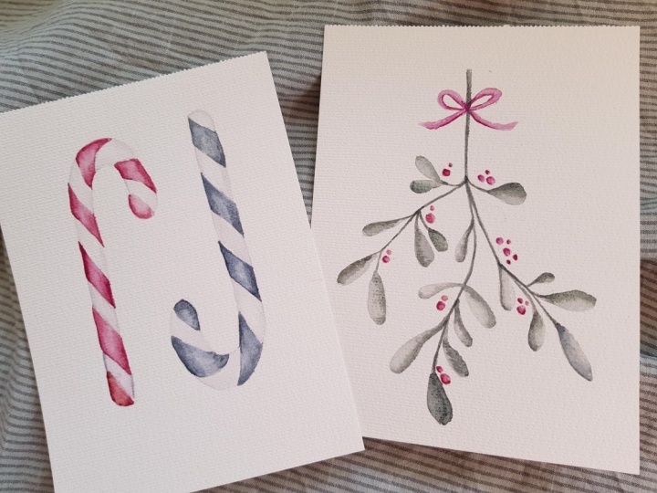
7. Watercolor Candy Canes Part I: In this lesson,
we'll be painting these two different candy canes. One red and one green. Of course, you're always welcome to use any other colors you'd like to work with
if you want to give your candy canes and
more creative flare. I've already
transferred my sketch onto my watercolor paper using the process we went
through earlier in class. I lightened the pencil marks
using my kneaded eraser. If you haven't done so already, you can go ahead and do that. Just a reminder again, you want to make sure your
pencil marks are nice and light before you start
layering on your paint. Now, just like we did
in the previous lesson, I want to start with a couple of practice exercises to warm up. You can grab your
piece of scratch paper that we used in the last lesson. Let's get started. You can see in these candy
canes that they look realistic and rounded because we have
these shadows on either side. It really makes it
look like it's 3D and that you could just pick
it up right off the page. I know we practiced blending in the last lesson
for the mistletoe, but this time we're going to
be using it on both sides. We're going to be blending from the left to the right with a nice highlight in the middle to give it that rounded effect. You're familiar with blending, but this time it will just be
a little bit more advanced. Let's practice. I'm going to start just by
penciling in little rectangle. You don't have to do this part, but it's just going to help
guide me a little bit. Once that rectangle is in there I'm going to load
up my brush again, we're just practicing here,
so don't worry too much about what color you are using. I'm just going to add a bit
of color here on this side, and also on the opposite side. Then we're going to blend them together so they
meet in the middle with a nice light highlight. You want to cover quickly
because you don't want either of those sides to dry. Rinse off your brush, dab it on the paper towel, and just start working
out that color. It blends nicely. We want the middle part
to be really light, so don't be afraid to rinse
off your brush again. You don't want it to be
too saturated with color. I'm just gently blending it out. This is the process
we'll be using on each section of the candy cane. I want you to get really
comfortable with it. You can go back in with a
second layer, dark value and we'll just get
comfortable adding in color using the wet-on-wet technique
and then blending it up. The other thing is
my second layer, rinsed off my brush. I'm gently smoothing
it out again. There you have it. It takes a little
bit of work to get the balance of colors right because you want to have it nice and dark enough on the side so that it really
looks like a shadow but you want to keep the
middle nice and light so it looks like a
rounded highlight. Let's do that one more time. I'm going to make
it a little bigger so it's easier to demonstrate. I'm just going to add
in some of that color on the top and on the bottom. Again, you don't have to worry
about this being perfect. Don't worry about the colors. Don't worry about making
the edges perfectly smooth. We're just practicing
blending here. You'll have to work quickly. You really don't want
either of the sides to dry before you
start blending. The rise, that's
where you start to get harsh drying lines. In between each
of these strokes, I'm just rinsing off
the color of my brush so that's nice and clean
so I can blend it well. If you struggle with
this, don't worry. It's more of an
advanced technique, so it's going to take a
little bit more practice. If you don't get it
on the first try, you can always tap in more
color like I'm doing here, and then blend it out again. That's another nice
part about watercolors. You can always layer
one more and try again. Those are looking pretty good. Just a reminder, this is how each of those
sections are going to look on the page once we start
painting the candy canes. You can see just like
we did in the practice, we have darker on
either side and then a nice highlight
in the middle to give it that rounded effect. Another thing I want
to mention here is these white sections of the candy cane are
not actually white. I used a very light
value of gray because I still wanted to
get those shadows on there to make it look rounded. If I just didn't add anything
in the white sections and just left it as white
paper it would look flat and unrealistic and a
little bit more cartoony but because these sections have nice blending and shading, you're going to have to use
just a very light value of gray to indicate
those shadows. Yes, they are white, but really when
we're painting them, they're going to be a
very light value of gray. I actually am going to be
using a premixed light gray. I'll show you what
that looks like here. That is going to
be way too dark, even though it looks like
it's going to be too dark, or the white sections
of the candy cane. Just like we did in our
values lesson earlier, I'm adding a lot of weight to that mixture to make
it really light. It's just going to be
barely noticeable. There are a few different
ways to mix up a gray if you don't already
have a premixed one. One of my favorites is
just to use mostly water but just a touch
of Payne's gray. Just like what we did
on the other side where we practiced blending
in these rectangles I'm going to do
that one more time using the light gray
that I just mixed. I'm going to pencil
in a rectangle. Doesn't have to be perfect. I'm going to go ahead and
mix up my gray color, making sure I'm using just barely a touch of
color, mostly just water. I'm going to do
the same exercise. I'm adding in the gray. Again, you hardly want to
notice that it's even gray. For the most part, you
want it to look white. I'm adding that in
on either side, rinsing off the pigment, and just gently blending it out. You can barely tell
there's even color there, but you do still get those
shadows on either side. Once you're comfortable with all of those practice exercises, we can get started on
the actual candy canes. I'm going to start by
doing the light gray section of the red
candy cane first and then I'll go in
with the red color.
8. Watercolor Candy Canes Part II: This might start to feel a bit tedious because we're going to be doing the same thing on every section of the candy cane, but I'm going to
get started with the light gray sections. Starting here at
the very corner, I'm taking my darker
value of gray which again is not
actually dark, but it's the darkest value. I'm just tapping in the
shadows on the either side, before rinsing off my brush
and gently blending it. This is a little harder to demonstrate because
you don't want your gray to even
be that noticeable. You just want the
shadows to be there. Middle part should
be a nice highlight, and then slightly, slightly
darker on either side. Again, I'll show you
what that would look like on the finished painting. You can see here
very slight shadows that you can't tell that
this is majorly gray. Just shadows on the outside
and highlight on the inside, and that's what we'll be doing on each and every section. There are couple
more in real time, and then I'll speed
up the process while you work on yours. Tapping in very slight
shadows on either side. I want it to be
barely noticeable, then rinse off your brush and
blend it into the middle. One more time here. Slight shadows on the side. Rinsing off your brush and
blending into the middle. I went ahead and started
a brand new bowl of clean water just for
the gray because I was starting to have
a little hint of green and red for my
berries and my leaves, and I wanted this to just
be purely light gray. You might want to do that, too. I'm going to speed up the
rest of this process, but I'll just be doing the
gray part and then we'll move on to adding in
the red after this. Now all of our gray
parts are filled in for the red candy cane so we can get started adding in the red. I'm actually using
the same red mixture that I used for the
berries on the mistletoe, and we'll do the same
exact process we just did, except using the red. I'm starting by loading
up my brush with a fairly dark value of the red. I'm just going to
carefully add in my shadows among the edge. Rinse off my brush so
it's nice and clean, and then gently blend
those together. I also want to note, you want to make
sure that all of your gray sections are dry
before you start adding in the second because we want to
have nice clean lines. If the gray was still wet and
I started adding in the red, then they would bleed together
and just create a mess. Make sure your grays are all nice and dry before
adding in the red. We'll just do this
section by section, just like we did with the gray. I'll do one more in real time, and then speed up the process
so you can work on yours. It's a little too light so
I'm going to go back in with a darker value. There we go. I'm using darker shadows on
either side before it dries. I'm rinsing off my brush. It's nice and clean. Then blending into the middle
to make the highlight. You can always go back in with a second layer if you want it to be a little bit more dramatic, have a little bit more contrast. You can just go ahead and tap in a darker value
shadow on the edges, and then soften it out a bit. I'm going to go ahead and
finish out the rest of this, but take your time
and just remember, you can always add
more layers and just blend, blend, blend
until you're happy with how it looks. I'm actually going in and adding a darker value just at the very tip because I really just want these
shadows to be bold. I'm just going back in, which is the nice part. You can do this, too. You can always go
back in and add more. That's why I generally
like to start lighter because it's harder to take it away if
you go too hard, but you can always add more. I'm going to do that
to these first two, and then we'll continue on. I'm just filling in the last little section of red. The nice part about
projects like this, the mistletoe and
this candy cane, is you're learning
new techniques, but then you get tons of chances
to really refine, practice, and hone them in. We learned how to blend, we learned how to
create highlights and really change our value, and then we're getting
tons of practice. So each section, you're getting
better and better, which is just something
I really love about this project and why I
chose these projects is because it's a
lot of repetition and building in
your muscle memory, which is a huge part in improving
your watercolor skills. You're getting water control
practice, muscle memory, blending practice, understanding how your
paint works on the paper. Just great practice. I'm just finishing up this
very last section here, and you can see that I'm lifting some
color off the page right there so it's a
little bit too dark. You can rinse off all
the pigment and water off your brush and just gently lift some color right off the page to create a
highlight if it's too dark. That's another technique
that's called lifting, and there you have it. Now we'll do that
same exact process. Get even more practice on your second candy cane, and I'm going to be using the exact same green
mixture that I used in the mistletoe leaf petals. Once again, I'm going
to start with the light gray and we'll do the
same exact process. I'm just going to do a couple in real time and then
I'll speed up the rest so you can work on yours. Starting with the gray, using clean water to make
sure my brush is very clean. Don't want anything
to get muddied up, and just gently tapping in
those shadows on this side. Tapping them in and
then blending it out. I'll continue doing that
throughout the rest of this candy cane,
and then we'll meet back up to start
adding in the green. As I was adding in
my gray shadows, you can see I had a
little accident here, which is where I accidentally
got a little bit of red from the last candy cane
into this gray section. It's not perfect, but I took
a little bit of paper towel, got it wet, and just
tried to soak up some other excess
color on there. It doesn't look perfect. But once we start adding
in the green color, it won't be as noticeable. I'm just going to
go ahead and finish adding in these shadows here, and then we can start
adding in the green color. Now all of the light
gray sections are included and we can get
started adding in the green. But of course, you don't
have to be using green. If you want to use a
different color, go for it. We'll do the same exact process. Again, lots of practice
with blending, lots of practice
with highlighting, lots of practice using
our color values. I'll do a couple in real time, and then I'll fast-forward. This section here is very small, so I'm just going to use the
very tip of my brush here. Adding the shadows
on either side. Make sure your brush
is thoroughly rinsed up and then start
blending it up. I go back in and tap in just a little more
of that shadow. The very end section is a
little different than the rest. That's mostly shadow here. Just like that, and then you can move on to the next sections. Just like with the last one, you do want to make
sure that all of your gray sections are dry before you start
adding the green because you don't want
those to blend together. Each section you want to look
nice and clean and crisp. Then you're just
blending it out. Again, if you need to create
a stronger highlight, just rinse off
your brush and let your bristles just lift
some of that color right off the page, and that creates a nice
strong highlight there. Now you're familiar with
what we will doing next, so I'll speed up
the rest of mine. You can work on yours and
then we'll meet back up. We're all set. So feel free to keep
practicing these. Try painting them in
different colors and you can vary them by making the candy
cane's stripes thinner, thicker, or by painting additional lines in-between
the main stripes. Feel free to get creative
and just have fun painting these festive
holiday candy canes. In the next and final lesson, I'll talk through
some creative ways to use your paintings. I'll share some additional
learning resources and we will wrap up the class.
9. Resources & Final Thoughts: Congratulations, you made
it to the end of the class. I'm so grateful you
decided to join me today and I hope you enjoy
the painting process and learn some new
helpful techniques. Now whether you
completed one or both of the projects in
class today there are a lot of fun ways to
incorporate your work into other holiday crafts
and decor this season. Here are a few creative ideas. You can frame your paintings and hang them up by your
Christmas tree. You can gift your paintings to your friend or family member. I personally love
to give and receive handmade gifts I
think they're just so special and meaningful. You can use your skills to
create holiday greeting cards. If you want to do this I have another class you can check out called how to create and print Greeting cards
using your artwork. You can paint gift tags to spruce up the presence
underneath your tree. Again, if you want
to learn how to do this I also teach you
how to make gift tags and greeting cards
in another class called easy watercolor
Christmas cards and gift tags. You can check that one out
as well if you'd like. No matter what you decide I hope you enjoyed painting
alongside me today and I just want to
thank you again for choosing to join
me in this class. Happy holidays and happy
painting from me to you.
 Petals by Priya Watercolor, Watercolor Artist & Teacher