Transcripts
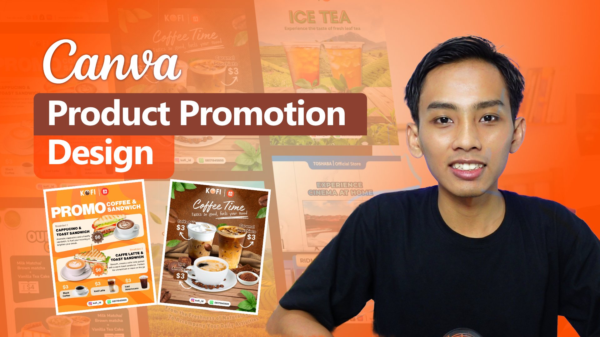
1. Introduction: Canva in recent years has become a highly versatile
alternative for anyone working on projects or tasks that involves
visual elements. Canva is a very appealing
option because it offers a user interface that easy
for beginners to use. Canva also providing
a wide range of tools that help make our projects
look professional. What I find most
impressive is that Canva already includes a photo
library and video library, and it becomes even
more powerful with AI integration, with
AI implementation. Along with various
other libraries such as templates, clip arts, shapes, and many more features that are rarely found
in combating software. In this class, we will
learn how to create design to promote
Product using Canva, especially for those of
you who want to promote product on social media
and online marketplace. It's also for anyone who
wants to learn how to design Canva so that the
results look professional. Canva offers a wide
range of features. It all depends on
how we use them. What do you learn in this class? We will study the
characteristic of design for product
promotion so we can determine the right
materials and content to include
in our design. We also explore Canva
features which are comparable to those found
in other editing software, as well as the asset Canva provides to make the
design process easier. We will learn about the
composition and layout. Composition is essential for arranging objects and images, so they appear proportional. In addition,
composition and layout help make the editing
process more efficient. We will also practice
creating design. Practice sessions are very important because
they allow us to explore Canvas features and sharpen our instinct in design. This class is suitable for those working in digital
marketing, graphic design, content creation,
content planning, or anyone involved
in visual work. It's also suitable
for beginners, as well as those who
already understand design, but want to create more
professional looking result. For those who are just
starting out, Don't worry, this class is structured
systematically, and I hope it will be easy
for everyone to follow. The focus of this
class is how to create attractive design in a
simple way using Canva. My name is Ashari Ashari and
see you in the next session.
2. Why Product Promotion Design Needs Strong Character: Hello, everyone. Thank you for
joining this class. In this session,
allow me to share some material first because I believe it's important
for us to have a shared perspective on the
design we're working on, including how to make use of the features
available in Canva. That's why, when we start
designing letter, everything I explained will
be easier to understand since we have already covered it in this material session. Let's begin by
briefly understanding the user interface and the main features we'll
often use when designing. This is the visualy out of
Canva as you can see here. On the left side, you can
access on the left side, you can access several
types or icon in Canva such as design
element, text, gallery, brand, upload project,
and also apps that provided a lot
of AI for users. Since we'll be creating design that include graphics
and photos elements, the tab we'll use most often
is the element tab here. In the element tab, there are a wide variety of assets that
already provided by Canva. When we search this element
are group several categories, such as shapes, graphics, sticker, photo, videos, frames, chart tables, audio,
even more cups. The next features we'll
frequently use is a text here. These features allow us to create or add text
to our design. Often, we will be writing copy, description, headlines,
titles, and so on. Canva also provide very
templates here. But in practice,
we will mostly use textboxes to manually
write our description. Next, we will use to pen here. These include features
like pen to draw and also shape that contain a lot of shapes such as rectangle, circle, triangle, pentagon,
hexagon, star, and others. There's also the line features. Which connect to
point to form a line. Additionally, there
are title and type features that can be used. One of the things
that makes Canva appealing is its
extensive asset library. When we open the apps types, there are many applications
to choose from such as voice, magic media, chart, photos, audio, video, even, and Mockups. And all of these
features is really important for our design. The Photo apps here is
one we will use often. When we click it, the Photo
will appear on the left side. Here. Just below the apps icon. On the Magic Media icon, Apps icon, Magic Media and Photo. We can explore all
the Photo asset that Canva offers for
our design needs. As long as we subscribe to Canva, we can use all available assets, very helpful, especially for those are still
learning design or have difficulty finding assets. Canva provides asset across a wide range of
themes and topics, and we can also use
keyboard to find photos that match
our design needs. And the most interesting thing from the Canva is on the apps tab. You can see here. Canva also
provide AI generation. As you can see here,
there is many apps, AI apps that
integrated with CANVA. Some of them you
can use for free. As long as you
subscribe Canva pro, you can use these apps, but not all of apps you can use, but mostly this app available
free when you subscribe the Canva and you can use to enhance your
design more better. You can see here a lot
of AI apps integration. And this is the why
the Canva becomes, you know, so many
users they using Canva because the Canva, they brave to integrated
AI application into this project or into this
feature into these tools. With all the asset and
application it offers, Canva is a solid platform that makes things
easier for users. Many users, especially those working in a creative field
like digital marketing, graphic design or anyone
who needs visual content, don't always require perfect
or highly technical designs. And what they need are
designs that look good, appear professional, are quick to produce,
and easy to create. And that's why so many
people use Canva. The focus of this class
is to create design in a simple way while still producing visually
appealing results.
3. How Composition Shapes Visual Impact: I Hello, everyone.
In this session, we will take a brief look
at the composition and the materials needed to create
a post design in Canva. Composition is very
important because it helps us to understand
each design element, making the design process
easier and more effective. So the composition
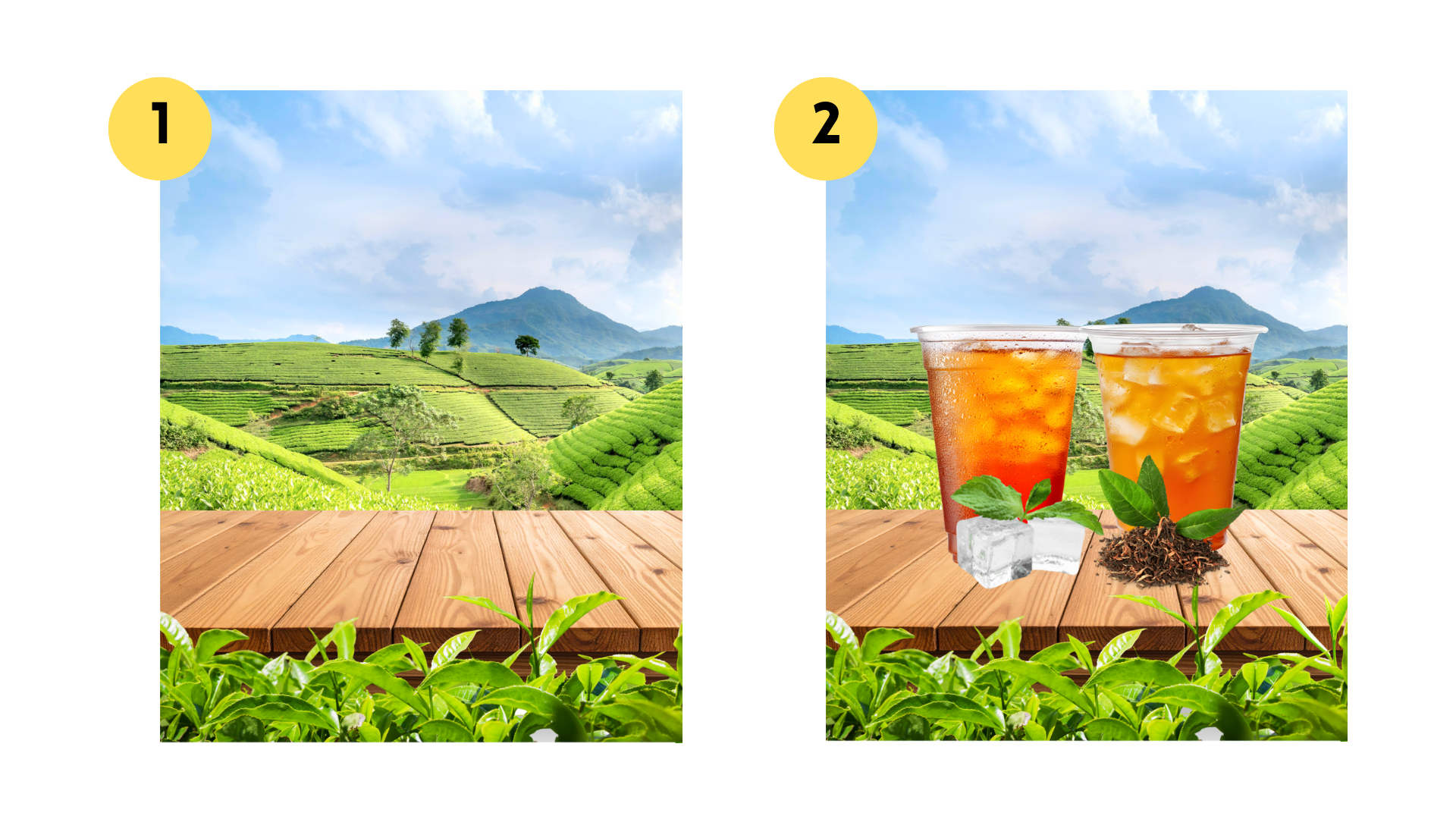
number one is a background. The first composition
element we will use in design is preparing the background. As shown in the example design, the background features
a scenic image of a tea plantation or a mountain
planted with a tea plant. This background was chosen
because it matches. Click here, click position to
see in the background here. This background was chosen because it matches the product being promoted in the design. In fact, we can
create background using various styles
such as gradients, solid colors or patterns. However, in this example, we use a photo of a tea plantation combined
with the tabletop texture. As you can see, there
is a wooden table in the bottom and selected
tea leaves placed on it. Background are very important
because choosing the red ones making the
visual more appealing. Ideally, the background should be relevant to the
product being offered. To find stock photos or
image libraries for background, you don't need to worry. Canva provides a very
comprehensive resource library. There are plenty of photos
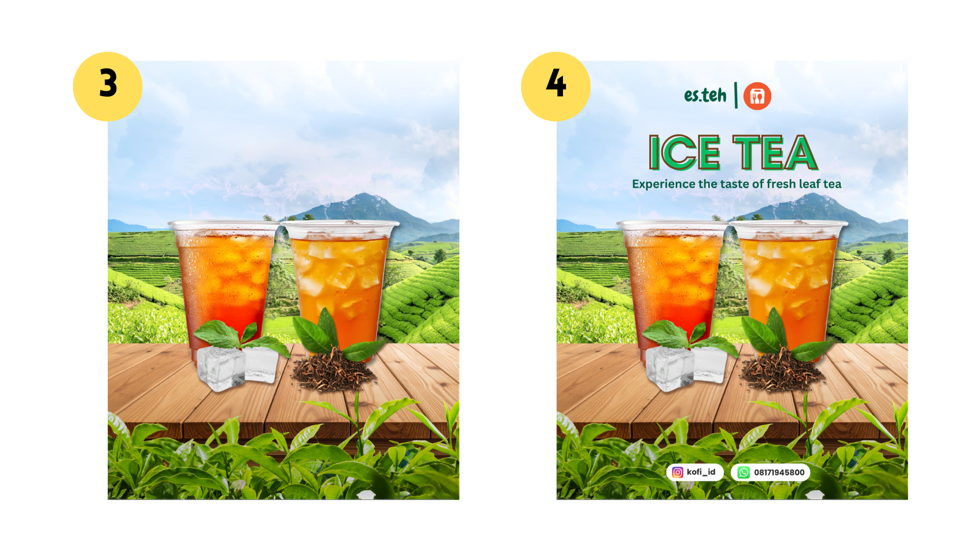
available for use as a background. Next composition is the object, which refers to the main visual element in
the product design. Objects are divided
into two types, the main object and the
supporting or secondary objects. The main object is, of
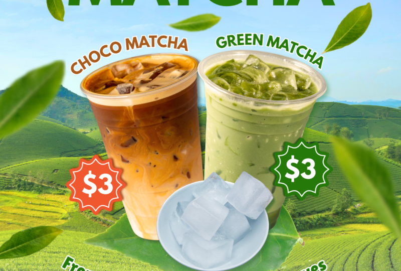
course, the product itself. In the example image,
the protect show is iced tea served
in a plastic cup. This product stand
out because it's larger than the other
elements around it. The visual focus in clearly directed toward the ice tea
as the main object. Supporting objects
serve to enhance and reinforce the main object. They can also add
variation or act as a complementary elements to make the main object more
visually appealing. In this design, the
supporting objects include grenty lips and front lips. This visual support
the main product are relevant to
the design theme. So in our design, we
don't just include the main object this one. And we also add supporting elements to strengthen the beautify the
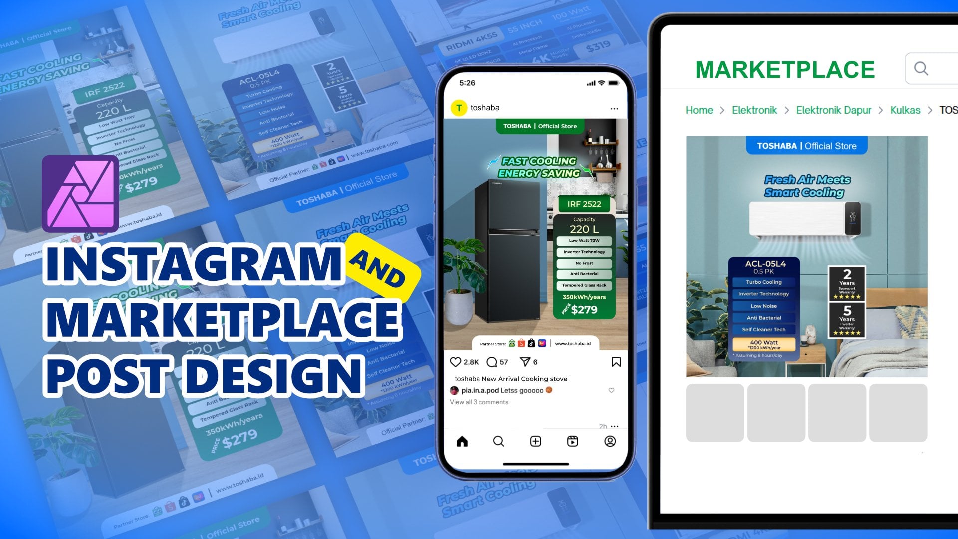
product presentation. Number three, from
the composition is copywriting and
descriptive text. To fully convey the
message of the design, we need copywriting
and descriptive text. If you look at the example, the design, you will
see the word ice tea. And the copy line reads Experience the taste
of fresh leaf tea. Copywriting is meant to spark the audience imagination
about what it would be like to drink the tea fresh green
and high quality. As a result, the
audience will visualize the iced teas being
made from fresh leafs, and they will be
encouraged to try it. Descriptive text can also
include price information, menu items, or other messages. The designer wants to
communicate to the audience. However, it's important to
note that we shouldn't include a lot of detailed information
like ingredients, nutrition content or a
technical specification. Copywriting should
only hightlight the key points the
audience need to know. So here's what we need to
remember when designing prepare a background which
can be solid color, Gratian, color combination,
photo or a mix of photos. Identifying the product to be promoted as the main object, add supporting objects to enhance the product
visual appeal. And the next is include
copywriting and descriptive text that
conveys important messages. These three core
composition elements must be understood and prepared
during the design process. Next, we will learn
about the layout, how to arrange the objects
sizes, placements, and visual positioning so that the design
looks proportional, visually pleasing
and well organized. So see you in the next session.
4. The Power of Layout in Organizing Design: I Hello, everyone.
In this session, we will briefly
discuss about layout. I believe this is
important to help us work more smoothly when we move into the practical session. Previously, we have
learned about composition, which include a
background objects and copywriting or text. Now, in a layout, we will learn how to place
those elements properly, how to organize the background, the objects, and the text. So the design looks clean, proportional, and
not overlapping. The layout that we
want to discuss number one is a header. When we look at the design, the top section is the header. The header, we can include elements that
represent the identity of the owner or company, such as a logo or a visual
accent that reflects the brand. The function of the header is to validate the design comes from an official
account so that in the information presented
can be trusted. The second section
is the headline. The headline is usually the largest or most
visually striking text, and it becomes the main point of attention when someone
first sees the design. The headline is usually the largest or most
visually striking text, and it becomes the main point of attention when someone
first sees the design. The audience focus aside
from the object is also drawn on the headline because of its size
and readibility. The example design, the
headline is the ice tea, followed by the
copywriting underneath. This texts, the most
prominent element is supported by
additional messaging, and copywriting serves to invite the audience
to imagine something. For example, the line experience the taste
of fresh leaf tea. It helps the audience
visualize that the ice tea comes from
fresh ingredients, high quality tea
leaves, and, you know, like fresh because it's
cold with ice cube, and it will adding
value to the product. The next slide number
three is content or image. The content section is the
main area where we design, where we place elements
such as images, photos, the main object
and supporting object. The most important part
is the main object, which is the protact
image we want to promote. The image can come from
the actual product Photo, or for our practice session, we will use photo
from Canva Library. In addition to the image, we can also add such as pricing menu information
or the other key points. If the product being promoted is electronic items or
electronic stuff, we can include the
specification or, you know, the full
detail from the product. Just highlight the
key points that are relevant and easy for the
audience to understand. It's important to note
that the Audiens only has a short time to view
and process the design. Therefore, the size of images and texts must
be proportional, easy to read and not confusing. In just a few seconds,
the audience should be able to grasp the main
message of the design. The last layout is the footer located on the bottom
of the design. In this example, it includes a logo social
media usernames social media like Instagram and also contact
person like Whatsapp. And we can also add
such as a website, a website address or
business location. The footer function is
similarly to the header. It provides additional
information and validates that the design
comes from an official source. These are the key part of the design that we
need to understand so we can properly place
element like headlines, main object, supporting object, copywriting and description. And don't forget to
adjust the size of images so that the design looks
neat and well organized. Next, we will briefly
learn about the guideline. Guideline will help us to place object more easily
within the design. In the example, you will see the guidelines that divided
the workspace into eight box. Each box acts as a reference
for placing design element. The top box is usually
for the header one and the bottom
box for the footer. And the remaining box
are the area we can work combining copywriting,
images, and headlines. In the practical session, we
will place the copywriting and headline just below
the header in here. And follow the main image
and supporting visual, and finally, the
footer at the bottom. This guideline help us to set clear boundaries so that the
object placement doesn't interfere with the other
elements when making the design and making the
design more organized. Next, we will move on
the practice session. The first design that we
will create is to promote Macha drink product. So in the next demo session, we will begin designing
the Matcha product. See you in the next session,
the design session.
5. Practice 1 - Create Background and Put the Product: A Hello, everyone.
So in this session, we're going to create the
social media design with Canva And the design that we want to create is to promoting a Macha. Have you ever tried a Macha? So macha is combination
from green tea with milk, sugar, and sometimes
also add some cream. The taste is so good. Fresh, sweet. But
unfortunately, today, we're not going to make macha, but we're going to
make the design for promoting macha using Canva. So let's move to the canva. So I want to make disclaimer. The Canfa that I want to use
in this class is Canva apps. If you're using the
Windows or PC or Desktop, you can download the
Canva in Microsoft Store. You can find the Canva and
you can download the Canva. And if you're using tab such
as Android tab or iPad, you can download on the Google
Play Store or Appstore. If you want to use Canva
in browser such as Google Chrome, it's
also possible. There is no difference between
using Canva in browser like Google Chrome or
Canva in this app. So there's many
way to open Canva. I want to make
disclaimer. There is no difference feature
between Canva open in Browser or
Canva open with apps. There's just slightly difference between the Canva on the
browser and Canva on the apps. It's just on the user interface. In the Canva, Desktop. In this interface, we can click New Document
with this type. And we can click New
Document in here. But when we open the
Canva with Browser, there is no new document. If we're using the multi
document on the Canva, we're using a new
tab on this browser. So the difference just
on the tab interface. If we're using Canva, there is a and there's
a tab feature in here. But when we open the
Canva with Browser, we have to using this new tab
to open the new document. You can using Canva
with Browser or download apps Canva on
the Microsoft Store. But for this class, I want to use this
Canva for Dekstop. So let's continue
to create design. The first step, we have
to set up the workspace. We have to set up the document. So because we want to create the design for promoting
Product on social media, especially for maybe, we upload it on Instagram and
on the Facebook. So my humble opinion, we can go with four
by five aspect ratio. So we can click Create and click social media and there
is a Instagram story, Instagram post, Facebook
post, Instagram reals. So we just click
the Instagram post, 4:5 aspect ratio with
1080:1350 pixel. So like this. So maybe you wonder
why the interface on this canva is different
on your interface. This is using the dark theme we can change the theme become a light theme with click here Option menu and
click the profile, and we can change the theme
from the tag into the light. We this. So it depends
on your preference. If you like a theme in the dark, you can change the
theme to dark. If you prefer the
interface in a light, you can try the light theme. And there is two option
mode for the workspace. We can click in this high high page tunel
mode or scroll mode. If we click the scroll mode, when we add page, there is a page one and page
two, just scrolling down. And if we add page three,
just scrolling down. And if we choose
the hide thumbnail, click here, in a different mode, there is a page one, page
two, and page three. So it depends on your
preference, too, but I prefer this
page, this mode. Ideally, we working
with this workspace. Like the previous material
we have learned before that the importance
from the design is one of the important
of the design, and we have to set up first is a background and main object. So we are going to create the
background first and also find the main object. Oh, yeah. Friends, I also uploaded the link contain of the material that we needed
to create the design. So you can open the
link that I provided into the project
section into the, the project session,
you can open. And in the link, included all
of the material in design. So don't worry if
you hard to find the real object or hard to find the object on this
library because there's all of the
object that we needed. You just copy and paste
copy from the page, the link that I provided
into the your project. But in this course, I will show you how to find the material from
the background, from the main object, and
we will edit one by one. So let's continue. I think this is too. I will find the several
image before I will review which one most the
most, you know, better. So I think I will
go with this one. I just scale up like this. And maybe I will find the right like this. Right. The next I will try to
find the main object. The main object is Macha, and we will find the Macha
protac on the library. Honestly, you can also
use your own product, but you have to provide
your own image. You have to take the
photoshoot from the product. But as a practice, I want to find the
product from the library. For the Macha, I
think I would type Macha Macha in plastic cup. So there's a lot
of maja in here. Maybe this is cool. I will find one
more Macha product. Oh, I have the idea. Because this is in
the green matcha, I want to find the brown macha. I will brown macha latte. I plastic cup. Oh, yeah. That's awesome. It's cool. Because the Macha, this
object has a background. We have to remove the background. To remove the background
is a simple way. We click this object
and click background remover. Unfortunately, if we're using
the free version of Canva, there is the feature is locked. And every feature that
has this crown icon, it will be locked. But after we subscribing, this crown become this gray crown and the feature
will be unlocked. So click the object and
click the Background remover. Next, we will also
remove this background, just click background remover,
and then like this. So after we remove the
background maybe I will using I will
adjust position for this drink like this. Maybe it's too much. Yeah, like this. Little bit center. Like this. So I want to add some object in this
area in here this area. I want to add with maybe with leaf because this is
product from green leaf. This is macha, green
macha and brown macha. So I want to add with tea leaf. Tea leaf. But using this also this. Oh, I want to go with this leaf. Again, because this leaf
has a white background, we have to remove white background
first with background remover, and in second, the
background is removed. We adjust the position, we move to under the
cup of drink like this. So the next, I want to add
some variation of leaf. In a upload tab, I have uploaded the material. This is the insolation of leaf. And I also included
this material on the link that I provided. So you just open and this
leaf is available in there. So I think I will add some
leaf into this design. I would go with this maybe in here and which one? Which one? This here. Maybe it will be awesome
if I click this. And also this I will also add with which one? This one? Right. So it makes the leaf is a fly. The leaf is flying
spread in right and left the product like this. And I think one more. This one. All right. This is the sum variation that I think it will
be awesome if we make one of these or two of
these leaves is make it blur. Make it blur between that, to make this leaf blur, we can use this feature. So we just click the
leaf like this and click the edit and click Blur. And if we just blur using
this feature at blur, so the area that we block, the array that we
select, it will blur. But we're not using
this feature. We're using this whole image. The intensity, we slide to
the left, and on the right. I think it's around 60, 61, 60, 60, yep. And the leaf has a blur effect. They also make this leaf blurre the same
method using blur whole image, and slide to
the right to 62, like this. And this one, I also make it blur Just click lure
and click whole image, slide to 60 or maybe more. 75. Yeah. So more or less, we have a background,
main object. Like this and variation. But I think in this area
still missing piece. I don't know, but
I think because this product contains of ice, so I want to add this ice
cube to find the ice cube in this photo material we type
ice cube like this. I think it's not thin synchronize
because the texture of the ice and this ice is different
and this color is so strong, maybe we can find
another ice cube. Maybe I will go with
ice cube in bowl. Mm N. Nice, nice, nice. I delete this eyes
and eyes Kelton. Because this picture
still has a background, we have to remove the background. Just click this picture
and click background remover. And then So the next is we will add some effect and doing
some color grading. And also, we will, you know, like synchronize from the color, nuance and also the shadow. So see you in the next session.
6. Using Effects and Colors to Set the Mood: Hello, everyone. So
back to the design, we have created the background. We have created the
object, the main object, the product Matcha, and
also cube ice and leaf. In this session,
we're going to make the effect like shadow,
color adjustment. And also, we will reorganize the layout of
the object using guideline. In this background, I want to make this background more warmer, more saturated, especially
in the sky area. So click the Background
click edit and the filter see all, you can choose in the filter or in the adjust in
the color adjustment, we are in the color adjustment. In the color edit, there is
a two color green and blue. Green will represent
in this area, green and blue will
represent in the sky area. I want to make the
sky more bluish. So I will click
this blue, right? And a little bit
increasing the saturation. And also a little
bit slightly bluish. Like this. And for the green, I want to make a
little bit darker, reducing the brightness like this. Okay, I think it's enough
for the background, I want to move to the matcha In this macha because the source of light is from here, right? It's from the left side. And this cup in this area is darker and
this array is brighter. This cup in the
green cup is also in this area is darker and
this array is brighter, I want to flip I want
to flip this cup, just click flip and click
horizontally, right? So because the source
light is from the right. So automatically, this
area will be darker. And this area will be
dark will be brighter. It's not in this area. So I will flip this
more or less like this. So I think I will
adjust a little bit. We can also manage the
all of this layer using position and click
layer position and click click
position and layer. And I think we can change the direction and we can
change the position. And we can change
the position like in this brown cup will be on
the back from the green. Okay. I will make a little bit
warmer or cup this green cup, a little bit warmer, click
edit and click adjust. In the temperature, we
gradually slide to the right. Little bit warmer
like this, right? And in this ice, because the ice is not warm, still it's like cold. We will make this more
warmer with temperature. This. Yeah, I think it's enough. Okay, the next, we will add some shadow right shadow in this area, like a shado in this area,
shadow in this area. So I want to use drop shadow
feature on the canva. to doing that, maybe I will bring to the
left for a while. I click this a brown matcha. Click Edit, click Shadow
and choose drop like this. So we will experiment
in this lighter. We can change the
distance, for example, and we change the angle
like this, right? Yes. Indeed, to make the
drop shadow like this is really hard in canva because it's
different when we create the Shadow on a photoshop
or an affinity photo, it's more easy, but in Canva, it's, like, a little bit effort. Like this, the drop shadow. And it will apply on
the green matcha. A click drop shadow. We can slider the
angle like this and the distance plus two
this one and blur amount, and blue amount will be
increased like this. It's not too strong for
the drop shadow, but yeah, I think compared to
without drop shadow is, I think it's more or
less like these guys. Indeed, the drop shadow
is not really strong or almost almost there's
no difference between adding some
drop shadow or not. But, yeah, I think,
like, this is enough. So we back the ice cube in here. And from the ice cube, we also apply the drop shadow but this one is I think it's
good. The angle is right. We just add the blur amount, blur amount and
distance like this. So I will change this color, the dropshadow color
from the black to the green dark darker
green like this. I will also apply on
these two from black to green Maybe there is
such a little different, but yeah, I think we need
to change the color. And then, I will also edit
some shadow in this area. We click the element. We click the white shadow
this and in this graphics, see all well, which one? Yes. And we will use this
from shadow I rotate to I rotate to
hundred degree. 180 degree. I mean, and move to the bottom
like this and like this. And for the position, this shadow I will
bring to above, yeah, above of this leaf. And I think I will
stretch a little bit down or bring to top
and stretch down. Or if it's too much, we will stretch again, stretch down little bit down. And if this too
strong or too much, we can reduce the
transparency to 70. Okay, guys, we have
created the background. We have created the main object, create Matcha and brown Matcha, and also ice cube, and the shadow drop shadow and
the shadow for this bottom. So the next we will put the copywriting, price
additional information, and also like header
and footer as a validation for this design
or for this post. So see you in the next session.
7. Organize Object with Guideline: I so the next step, we want to put all of this copywriting from the
hidden footer copywriting, additional information
for price and many more. So the next I want to put
the headline in here. I will use the text
at TextFox like this. I'll bring to the top here, and I will type Matcha, and I will change the color
and the size the phone size to 100 108 this. And then I will change
the pond to league spartan. And I will change
the color to green. Click document color, click Plus, add new color and then this. We were working
on the guideline. We will use the guideline
to rearrange the layout, the object placement to
create the guideline. I think we need
to add page here. Here, this is page
one and page two. We want to create
the guideline first. To create guideline, I will
use the element shape. We'll click here Rectangle,
tangle, like this. I will put on the top, like this and stretch
down to this, you know, this rectangle. And I change the stroke
to one like this. The stroke is black, yeah, like this. So I wanted to duplicate
this rectangle. Copy paste like this, and I wanted to duplicate again. So I have four rectangle and I block copy paste again. And now the box
content is eight box. So I will stretch the box
until the bottom like this. So here is eight box, one, two, three, four, five,
six, seven, eight. So from this box, I will remove the color, and the rest of it
just. Oh. Yeah, we need to make it join. Perfect. Like this. Here, after we have eight box, we block all of them and
click CTRL+G to group. Now in the position,
we have the guideline. And this cutline will copy and paste into page
one, like this. As you can see here, there is a box from the top
to the bottom. I will divide it some
area into eight area. Of the position, I will bring this guideline to
under the background. So we will have a guideline
to rearrange the object. So I want to put the maca in here in this platform,
the Macha, right? And I will move to the position, you know, the screen and
this leaf a little bit here. A little bit here,
like this here. And I want to make
this, you know, this cup a little bit
smaller or make it smaller. Yes, a little bit smaller. Like this and using this leaf. Oh, this shadow is also we fix the shadow
first, right after that. This leaf also make it smaller. Like this. Maybe a little bit smaller this and
the leaf like this. Because in this
area is for footer. In this area for
header, of course, this area is for headline, and this area is for footer. And yeah we'll edit. So the guideline is very, very crucial for us to help
us to arrange the object. And if we satisfy
with the result, we can hide this guideline just bring under the
background like this. I will type the
name of the menu. I will using at textbox and type top for example, choco matcha. This increase this to 26 27, using the effet curve. Like this. And change the font
to league spartan. Like this. I changed the
color to cream to brown because the cup the
tring is a brown color. We also using fun
in a brown color. Like this. Choco matcha and make it. I want to add also outline. We click this we click
the effect and click outline and change
the color from black to white like this and
increase the thickness to, I think I don't
know, 100 100 Yep. Choco Macha. And I copy and
paste the choco Macha to green color like this. So Choco Matcha, I
will type here with green matcha like this. Choco Matcha and Green Matcha will rotate a little bit, like this. Macha Choco Macha
and green Macha. And I also edit
copywriting in this area, right? Copywriting in this area. Click add text here, this
copywriting will you know, like provoke the Audiens when the Audience read this
design and it's like, Oh, this is true,
this looks awesome. And it makes the
Audience provoke to try the matcha buy or it's
like to make it wishlist, maybe, or make it
plan to buying matcha. So the copywrting to
provoke Audience is, I want to increase
the size first. Because this matcha
using natural leaves, natural leaves, original leaves. And fresh from the, you know, from the color
is a green fresh. I will type from the freshness. Yeah, right from the freshness freshness of natural leaves. Accompany. So I will use another phone. I will use Lilita one. You just type Lilita on in here. Yeah. I use this one and
choose the color green. The same color as a
matcha this green. And I also add some effect
add outline white outline. I will choose white and make the outline more
thicker, I think 100. Yeah, 100. From the freshness
of natural leaves, I also add effect curve
effect in this curve. We can, you know, like, make it curve like this And for the phone, I think it's too small, right? Too small, I will increase
the font to maybe 34 35. Yeah, 35 is enough, I think. Yes, 35 from the freshness
of natural leaves, and I will copy in
the second line. In the second line,
I will type to acompany acompany your activities. Like this. From the freshness of natural leaves to accompany
your daily activities. Is to height, I will make
it a little bit to the top. Like this, Macha,
took Macha and cream Macha from the freshness of natural leaves to accompany
your daily activities. So the cooperating will provoke
the audience is like, Oh, I think maybe I will try this matcha I will buy this
matcha provoke the audience. It's a freshness.
Of natural leaves to accompany daily activities. So we will again, look review the position of
object using the guideline We will bring back
the guideline. So the copyrighting is a little bit across the line, but
I think it's normal. I think it's not problem though. But make it perfect. Not perfect because
we're using guideline, maybe I will bring a
little bit higher, the matcha and also Choco matcha,
green macha, the cup. I also bring little bit higher this or even I will
make it a little bit bigger for the
product, right? A little bit bigger. Like this. Maybe a little bit
bigger, right? This little bit top on the top, this leaf big leaf. Yes. From the freshness of natural leaves, accompany
daily activities. Yep. Alright, guys. I think this whole also make
it a little bit bigger. More or less like this. So we'll hide the
guideline again. Okay. So the next we
will make the price. I think I will use this element. I will type price. Price tag, maybe. Like this, will go
with which one? Price. Just price. With this. I make it a little bit
smaller and put here. And I change the color to brown. Like this. And copy and paste to
this and change the color to pin or green or too much. Green Yeah. Text at Textbook We'll increase the size
of the font size. And change the brown with the font to league
spartan like this. And change the color to white. Like this. I think it's too big to
bit make it smaller. And this brown is too strong. I think make it more softer. Oops. Which one? Yep. And I copy paste to here and click three dollar like this. And for this price, I
will add some shadow too. Click Edit. So next click Shadow I will
use drop Shadow like this. Angle. Distance. Intensity. Color. Intensity will increase the
intensity, like this. And color is to this. Here, also using
the drop shadow. Shadow using the drop shadow, change the color to brown, dark brown here and angle. Oh, it's not dark brown guys, but green dark green, like this. Right. All right.
8. Crafting Effective Headers and Footers: So the next we will put the header and header in this top area and footer
in this bottom area. Footer and header as
a validated design, the design is come from the official information
or comes from the owner. So we have to put the design in top design
and bottom design. Again, we will use because we live in Asian
countries. I'm in Indonesia. And Indonesia, one of the
biggest marketplace that provide delivery food
is shopee food. So we will find the
shopping food logo in here. Just for demo. It's not for promotion, guys. Like this. Shopee food. Make it smaller and put in here. And again, we also this is logo for shopee food and we also logo for the owner matcha. Logo. I will using font just font. The The name of company is Esteh. Esteh here means ice tea. Like this. And I will change the phone or I will increase
the phone first. I will increase the
font into chewy You can type in in this box with chewy.
You will find the font. Stat and then I change
the colour to green. And I increase the
size to 40, 42 42. And I will put on the left side of
Shopee food logo. And then I will
add separate line. You can click line. You add a line shape here, here, here. And I will change the color too. Green and increase the stroke seven. All right. es.teh And last but not least, we also create the footer. The footer I will, you know, like maybe a social
media account. So I will utilize the rectangle. I typed the rectangle, rectangle at a shape,
rectangle here. I will make this like
thinner, the long rectangle. And I put in the bottom, change the color to
white, like this. Put in here. And now we'll find the
social media logo, especially instagram logo. Right? This I will use this logo and transform into smaller. esteh.id This is just username. It's for demonstration. This is a fictive account, right? This, and I will make a little bit rounder
round it in the corner. It's not a little bit do. It's rounded like this. I will change the phone
using a spartan league. So in order to, you know, like synchron with
this es.teh.id So I will copy this box, this rectangle around
it, copy and paste. So in this box, I will fill with
the whatsapp logo. Oh, no, no. Click element and
then click Whatsapp. Click. Click see all and click this this Whatsapp logo and put
in here and it more smaller. And then I think I will
type 081 7199 and 45. 80. If you know you know. So yeah, this is the number. Contact person for this
pay for this company. Okay, so this is the design. More or less, the
first design for this class is more
or less like this. We might be I just
want to a little bit make it brightness increase. Okay, more or lesses like this. This is the first
design for this class. And in the second design, we also create a design
to promoting Matcha. But we're using different
style and different approach. So my purpose is the more
we practice making design, the more the more we
can, you know, like, make some improvisation
or sharpen our instinct about maybe create design in different situation,
different purpose. So you've been following
step by step that I have give it before, and don't forget to upload your project into
the project section. And don't forget, please
left a review for this class before we move
to the project number two. So see you in the
project number two.
9. Practice 2 - Setup Background and Product: Hello, everyone. So
in this session, we're going to create the
project design number two. In this design, we're
still promoting Matcha, but we will make design
with different approach, different purpose,
and different style. So let's move to the canva. So in this Canva, before we still
promoting the same but we were using a different purpose and
still for social media. So I would recommend it if we
choose the Instagram post. Still using the Instagram
post aspect ratio. So we go to Create,
click Create, and then click Social Media and click Instagram post
4:5 aspect ratio. 1080:1350 pixel. After we set up the workspace, the importance of the design is a background and main object. So we have to set the
background first and then find the right object to
become the main object. So in this design, design is like the
point of view from top. So I will use the photo, the surface of table. So from the background,
I will type surface of light wood Maybe we can use
this picture, right? Or we'll find the
another alternative. This one. Yeah. It's depend
on your preference, but I think I will use this one. I will delete one of them. I will use this picture
as a background, right? Rotate to 90 degree, and then i will up until it
fills the empty space. Oh, yeah. So the next, I will
put some shape, some shape as, you know, as a background for the object. It's not background for the design, but background for the object. We will utilize this to shape. This shape provide a lot of shape from rectangle
or file around it, trapezium, triangle and more. We will use a combination
of shape to create a certain shape that maybe
isn't available in here. So I will use the what it
called trapez Trapezum. We will use trapezoid shape using combination of
rectangle, this one, I will change the
color maybe to green this The combination of rectangle and this. The combination of
rectangle and trapezoid. I will rotate to 90, right? I put in here and
I strech like this. So if the trapezoid
is like this, I will combine become like this. So this shape is a combination between trapezoid and rectangle. Than that, maybe I will
make a little bit, you know, a little bit longer. And the rectangle also doing
the same in rectangle one. Like this, the
length is the same, and I will combine with this. Then I will make it center. More or less like this. I will make the edge or
the corner is around it. The corner, this one, this one, and this one is rounded.
Doing that is easy. I click here and click
Corner rounding to, 30, 30, 30 point. And I will click position, click layer and
click the rectangle. I also add the corner round to 30. Like this. So we'll have the
trapezoid trapezoid but in the corners around it. So the next I will using the same trapezoid,
but I will flip. I will flip this trapezoid. Unfortunately,
confat doesn't has ability or feature to flip this shape, so I will make it
from scratch again. I will use the rectangle
tool and the rectangle, yes. Combination from
rectangle and trapezoid. If in the earlier, I use this trapezoid
and right now, I will use this one trapezoid
and rotate 90 degrees this -90 degrees and the length, the same and combined
into one length. And the same, we will add the corner rounder
rounding to 30 like this. And for the rectangle one, also add the corner
to 30 like this. So if we pay attention the rectangle is to I
think I will add more hay. So we have the two background
for the main object. I will make a little
bit higher. Lines. All right. The next, we will find the object because the product
is the same, right? Because the product
is the same, we're still using the
same material as before. In the earlier project, right, we will open the project
that we create before. This one. Yeah. I will copy this one. I will copy and bring this workspace
and paste in here. And canva automatically
will copy and permit to copy and paste in a different document
in different design. As long as this document
open in the same account, I will reset the rotation
to zero degrees. And make it smaller like this. And then for this area, I will also add a macha product
but in a different menu. Friends, I also upload
all the material that we need to make the design. I also upload on the material. From the previous the project
and also on this project, I upload all the material. So if you hard to find the
right object in this library, you copy and paste, there is no problem,
no big problem. So don't worry if
there is hard to find the right object in
the photo library, right? So in this area, I also add some objects. I click the photo
and recently used. I will use this one. Okay. I will use this
one and this one. So different menu guys. Again, because this
object has the background, we need to remove the
Background with background remover. Doing the same, click
Background remover. Make it in the size is quite similar and
reducing the size. You and put here. More or less. And the next, I will
using a combination menu. It's like, this is the
special offer, combo package. There is a macha and a
sandwich, matcha and sandwich. And right now, I will use find the sandwich to accompany
the matcha menu. The first sandwich I will
maybe I will find matcha cake. Like this. I will use this. After this, I will put this cake under this
menu or I will, you know, put this cake and put this glass
little bit center. Oh like this. I will switch this
one and this one. Switch also position. Okay, next, I also put
the cake in here, too. So I want to find the
another menu cake. For example, like caramel cake. And then I will use
this one, right? Scale down and put in
here and click position, put the cake under the menu. And we, you know, like, switch this position. Doing this one little bit
smaller, little bit scale down. And this is also a little bit smaller. Lines. So this is the main
object, the menu. And I think I will make it a
little bit darker green one. A little bit darker, little
bit darker. Just little bit. It is. And this one also follow
the color, the new color. All the shape. So this one, all the shape right now. The next, I will
add some object in here as if this table is from top layer from top point of view in the background
not the object, but the background as long as this, you know, the point
of view from the top. As if this is the
table surface and some object on the top of table. So the first object
I will put is a matcha powder I will type with leave. This one. I will use this one. Just click background remover because this matcha has background put in here. Right. Or before we put in here, I think we can a little bit just the size and put in here. Or we can rotate the position. And because we don't
need this leaf, we can brush to remove all
of this unwanted object. Just click slider this
brass to make the brush wider and just remove the
leaf that we not need it. And done. The next object
that I want to put in this area is chocolate. Chocolate. Cube. Like this. We'll find the
right chocolate egg from top of point of view. Okay. The another
one, maybe like this. Yep. Depends on
your preferences. You can use this one and
you can use this one. But I will use this one. Click background remover and then put the chocolate in here. A little bit, make it smaller. The next object that I
want to put in here is a honey honey bee. This, we will find the honey
from top point of view, right? Like this, maybe. Right? Maybe we'll
find another option. Yeah, I think we'll
use this one and click Background remover and make
it smaller and put in here. Okay. This. And the last
in this corner, I will put brown sugar
is like, you know, the ingredient, the main
ingredient of the matcha is for produce the brown
color is using brown sugar. We will use I think this one. Click background removal and rotate
the brown sugar here. little bit here. Like this. All right. We will a little bit adjustment, doing some adjustment to make
the size looks properly. Make the layout also looks properly. I will make it some you know, adjustment again in a layout bring to bottom like this one. No. This one, too, I will put a little
bit to the top. Okay, guys, this
is more or less. We have the background. We have the main object. The main object is this menu, and also secondary object
is some, you know, like ingredients in the corner in each corner, the ingredients. And the next session, we will create the effects
such as drop shadow and also adjustment in
color in order to balance from each object. And then after that, we also put the copywriting,
the description, the title, and the last, we'll create the footer and
the header and the footer, see you in the next session.
10. Why Guidelines Matter in Design Structure: Hello, everyone. So
in this session, we're going to continue to design designing Matcha
social media promotion. Like I mentioned before,
in this session, we're going to
make some effects, drop shadow and some effects
and color adjustment. So I will start with this one and the corner object, this one. I will add drop shadow
you add drop shadow, which is we just click Edit and go to Shadow and click drop. It's very easy guys. We reduce the distance. We rotate the angle angle. We also reduce again
the distance like this. And then in this color, we change to, you know, like, similar to similar
to background color. Like this. Next, this one, I will
also click drop shadow click shadow, click drop. And then distance click shadow and the working on the shadow and change this color and change this color similar
to the background color. It's not similar though, but tends to follow little bit following
the background color. Maybe we'll increase
the intensity, maybe. This little bit like
this or this one. Add the intensity and increase
the little bit distance. I will also edit this
honey honey object like a shadow, drop, distance, angle. Okay. Change the
color to this one. Maybe change the angle and
also the distance too. And also the last
object in the corner, add a shadow drop change the angle like this change the color. Yep, like this. Okay, more or less like this. And next we will also make the drop shadow for
this main menu. I will start with
here, click Edit. Click shadow, also
click drop and shadow and click distance,
increasing the distance. This change the color, similar to the background
color. Like this. Also doing the same method
doing this one drop shadow. Like this will change the
color to similar like this. Or if we want to
change, you know, like the shadow like this
one, distance. Intensity. But it's not suitable, we back to the drop
shadow like this, but we have to change
the angle like this and more or
less is like this. We also doing the same
for this one object. We change a little bit in the angle and increase
the distance. And change the color. Following make it a little bit
similar in the background. It's more brighter, I mean, we increase the increase
the distance like this. But like this. Next, we will add the
drop shadow for this cake, which is the same method, and increasing the distance, change this angle one, this one. And this one. In the bottle, too,
click drop shadow, pick the angle, distance, this one, and change the color. We also doing the
same for this glass. click edit click shadow, click drop and shadow Like this, this change the
color and this one. Maybe because we add it some effect and the
size of the glass is a become smaller, we will make a bigger, a little bit bigger,
and also a little bit bigger, too, like this. So, more or less the object after we add the shadow
will be like this. The next I will
use the guideline. The guideline that the
previous project we use, we will also use in this design. To make a guideline
is the simple way, we will utilize the tools
like shape like this. You also find the shape in this element in
this element too, but you can also use tools and this shape like
this. Is the same. So it depends on
your references. So we put this rectangle
on the most top. Change this stroke
to one like this. And the color come no
color, not using color. We come like this, this one, and we'll copy and
paste this rectangle, we block both of them. Copy and paste. We have four rectangle
and we block all of them. We copy and paste in the bottom. We block the total of
eight rectangle and stretch them until the bottom. One, two, three, four, five, six, seven, eight. So the eight rectangle will
be from the guideline, and we move to the page one
because we using new page. We move to the page one
and paste in here. We click position, and
this is the guideline. And this is in the guideline.
We move the guideline. We move the guideline, guideline, and drop in the top of background above
layer of background here. So we have the guideline in the back or in
front of Background. So with this guideline
we will rearrange, again, rearrange the object. I will little bit make it to the bottom like this
because in this area, it's for header and then yeah. And then this area
is for footer. So we'll make it a bit bigger in here in order to make more, you know, synchronize in
size and more proper. And then for this one, I will put little
bit down like this. Or maybe we can still add the size like this can still
at the size like this. We can still at the size to make the object more proper
compared to the space area, a space empty space like this. So in the guideline, I will hide the guideline to
hide the guideline is simply just drag and drop in under
the background like this. Okay, next, we will
put the copywriting and also put the
header and footer. So here in the next session when we put the copywriting,
heater and footer.
11. Writing Headlines, Copy, and Descriptions That Work: In this session, we're going
to put the copywriting, the copywriting description,
price, header and footer. So we start with title in here. For the title, I will use
this at textbox here, and I will put in here. I
will increase the size. I think I will increase
the size up to Mm I will type our special. I will use lilita one, lilita one. I will choose this Lilita one. And then I will change
this color to white. Right too wide, and click
effets and click outline and increase the
thickness to 100 and click here, click green. And I will copy and paste
duplicate this and I will put here, change two Combo. In this combo, I will
change the color to orange or maybe I just find
the right color with new document color. I will click add a new color. Yeah, I think it's like this. Or maybe a little bit brighter. Our special combo like this. I think the thickness, I will increase the thickness. I'll be maybe 120 120. And then I think I will make this part more comes a
little bit done like this. Okay, guys, the next step, we will input the text
description and price, and also we will make the
footer and header letter. So let's a text box here,
and I will put here, and I will add milk Matcha and then brown matcha. Brown Macha like this and
change the font to 25. Oh, all of them changed to 25. And change the color
to white like this. And I will change the font
type to lilita one or Nunito. Yeah. I will use Nunito and change the type
font to bold like this. Milk Matcha or brow Matcha. And I reduce length spacing
to 1.2, 1.2, like this. And I will add textbook here, and I will retire change
on to 25 and change and change font to Nunito bold plus and I will type Vanilla Tea Cake. Right. Like this. And then in the element
in the element, I will type price to
add price for the menu. We can choose one of them, one of the Label, and I will choose
which one? This one? So I will choose
this rice label. I will change the
color this pink colored to green color. And then I will
add textbox here. Okay. And then for the rest, I will write $4 Again, change the font, change
the font to 25, change the font type, bold, and change
the color to green. And I will have only I reduce the size like this. And next, I will copy
this one. Like this. I will copy and paste
and bring to this area. Maybe I will a little bit make it moving a little bit
to the left, right? And I will change the
description to milk Matcha or brown Matcha.
I will change this. I will change this menu to
green matcha or chocolate Choco matcha plus caramel cake. And in this description, I will make the right align. Using this? like this, and I'll bring this price tag
align right line like this. Right, green matcha choco matcha. The caramel cake
only four dollar. And the next, I will
bring back the guideline. The guideline, with
this guideline, we will make some
adjustment, right? So adjustment. Yeah,
I think it's okay. After we satisfy the layout, the rest of it, we will create the heater. And the footer. I will open the I will open the project
previously we create. This is the design we
have created before, and I will use the same heater
and also the same footer. Social media account and
contact person like this. So this is more or
less the result class. This is more or less
the design number two or the second project
to promote Matcha. So the difference between this design if this
design is to promoting a certain product
and headline about the product and make the
product more outstanding. And then focus on the product, Macha, cream matcha
and prawn matcha. But when we look at this design, it's like this is post for
promoting a package package, special package, special combo, matcha and cake, a cream cake, and matcha and caramel
cake, something like that. So it depends on your purpose and depends
on the use case. If to promote a certain product that making the product
is outstanding. Yeah, this design
is more suitable. So whether this design
and this design is very, very beneficial if you
want to promote your own product or if you want to promote a certain product with a different style and
different purpose. So the next I will
recap our class in conclusion and then see
you in conclusion session.
12. Conclusion: Hello, everyone. We
have now reached the conclusion of what we have learned
throughout this class. In this session, I want to recap the important point from the beginning until
the practice. So when designing with Canva, the first thing we need to do is prepare the
necessary materials. The most important one is the product image because it will be the main
object in our design. Turn that in workspace, the first step we can take
is to create a background. The background is
important because it sets the vibe and
tone of the design. It also serves as the base
for placing the main object. So the background and the object in the
design must be aligned. There are plenty of resource
available such as photos, graphics, and other elements. These images are very easy to find and we just need to
type in the right keywords. In a promotional design, the product is presented
as the main object. However, we don't just
show the product alone. We can also add supporting
elements to make the main object standout more. For example, using secondary
objects like ice cubes or tea powder can
make the design look more varied and
visual appealing. And next, another
important element is the copywriting and headline. This play a role in
persuading the audience or stimulating them
to imagine the product. For instance, if the product being promoted is a beverage, we can invite the
audience to image the tastes they will
experience when consuming it, or the benefits they will get when using
a digital product. For descriptive texts or additional information such
as specification, price, ingredients, and
nutritional content, it's best to write them in a short sentence
or the key points. This means we only present relevant information that
the audience needs to know. Not every detail
has to be included. After creating the
background, adding objects, and writing the
descriptive text, the next step is
arranging the layout so that all elements
appear proportional. Previously, we learn about dividing the space
into eight sections. Each section has
its own function such as a place to
insert content. With a good layout, we can create clear
boundaries between objects, so they don't appear
too large or too small. The next is adding effects
to the object we use. So the colors and
appearance between objects look consistent and harmonious with the background. There are many features and effects that canva
provide for our design, and all of them can
be used as needed. I think those are the key points I can share from this class. Everyone, please don't forget to leave a rating
for this class. It really helps me to evaluate and improve
future classes. Also, don't forget to upload your practice design in the project section so I can
give feedback on your work. I'm confident that your
design will be even better than the examples
I make in practice. I Fathoni Ashari, thank you and
see you in the next class.
 Fathoni Ashari, Design and Content