Transcripts
1. Introduction: We often encounter
product advertisement on social media that instantly
catch our attention. This is usually
because the product is presented with
attractive visuals. Similarly, when we browsing
online on the marketplace, we tend to trust a
product simply because its promotional design is appealing and supported
by informative content. This is the power
of visual design. It draws attention
and builds trust. People are naturally
interested in products that are presented in a
visual appealing way. In promotional post,
strong design or communicate the
message and product features clearly
and effectively. In this class, we
will learn how to design product posts that are both visualy compling and optimized for
multiple platforms, especially in Instagram
and online marketplaces. If you are promoting a product on social media and marketplace, this class will
help you to create attractive design
for your product and brand. So what we learn? First, we will study
the characteristic of Instagram post design
and marketplace design. Understanding this
characteristic is important, so we can determine
the materials and content included
in the design. Second, we will prepare
the necessary materials. We will set up the workspace in affinity photo and use stock
materials to create our design. Third, we will learn about the composition
and layout rules. Composition and layout are very important for
placing backgrounds, product image,
text, copywriting, in a proportional way. The layout and
composition also help make the editing
process more efficient. Four, we will directly practice creating design using
Affinity Photo. We will design to product for cross platform use and apply everything we have
studied step by step. This class is ideal
for digital marketers, graphic designers, and
marketplace sellers who want to make their
product stand out visually. There's plenty of
practical insight and creative
inspiration to gain. The lesson are structured
in a clear systematic way, so you can easily
follow along and build your skills
with confidence. The main focus of
this class is simple, how to create attractive, effective design that are
easy to learn and apply. Whether you are promoting a new product or refreshing
your brain visuals, this class will give
you the right insight. If you like to stay
update on future class, feel free to follow
my Skillshare account. I'm excited to keep
learning together and share more inspiring
lesson with you. My name is Fathoni
Ashari and I will be happy to guide you through each session and helping you to take your product visual
design to the next level.
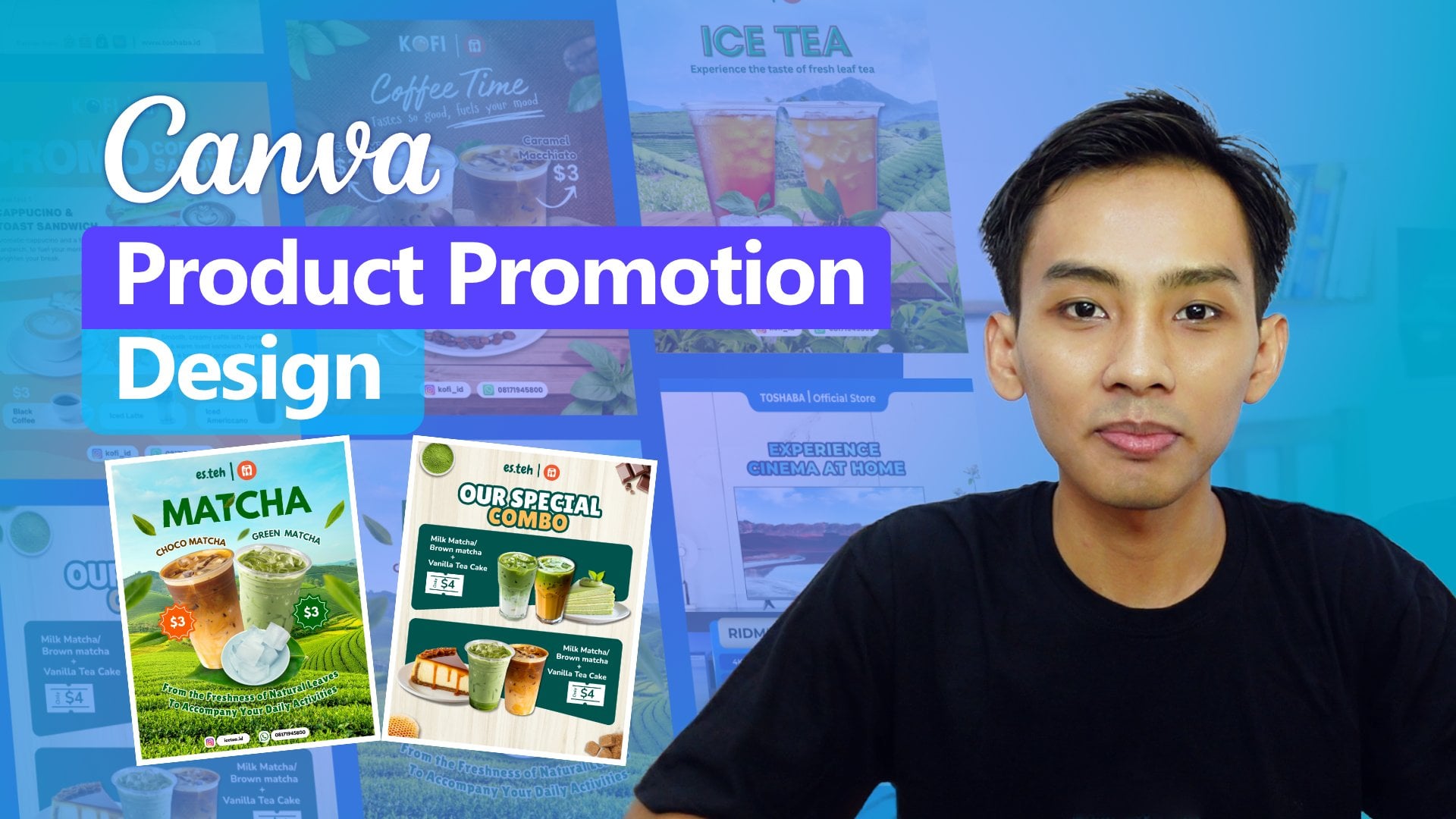
2. Learn Instagram and Marketplace Design Characteristics: Hello, everyone. Thank you so much for enrolling
in this course. I'm really glad
to see you again. Before we design
Instagram post and marketplace design
in this session, we will understand
the characteristic of Instagram post and
marketplace design. As we have learned before, brands often use consistent design when
promoting products, meaning the design used
for social media is also applied to marketplace
design or Thumbnails. In reality, promotional design for Instagram and
marketplace are not exactly the same as both platforms have
different characteristic. However, we can still
use the same design across platform with
just a few adjustments. Before we start designing, let's discuss the
design characteristics of Instagram and marketplace. One key difference
between Instagram and marketplace design
is the aspect ratio. Instagram now uses a default
aspec ratio of 4:5. Well, most marketplace still use a square ratio
of 1:1. The 1:1 ratio more limit the space
available for placing design elements compared
four by five aspec ratio. Social media design tend to present the most important
information in single visual, although carousel
features can be used for put more information, but it's better if the
most important information is conveyed in one slide. This is because social
media content is meant to trigger the
audience, to take action, whether that's
visiting a website for more details or going to the marketplace to
make a purchase. The main characteristic of Instagram product
promotion design is the emphasis on
the product photos. The product photos is
the central object that must be seen
in the audience. It becomes the main
attraction in the design, encouraging viewers
to learn more about the product through its
specification or description. To make a product
look appealing, we need supporting
visuals such as a background and
supporting object. That enhance the
Product appearance. For example, this design, the main object is the TV, supported by a blue
background that complements the image
shown on the screen. Since the Prodicct television, we could also use a beautiful
scenery that aligns with the TV feature of displaying beautiful,
high quality images. Visual can also
include mockups or representation of the
product place in a room. For instance, showing the TV on the table or in a
living room setup. This kind of placement
showing viewers how the product is used and
also give us visual ideas. Besides product image, it is
also important to highlight the product's specification
so the audience can imagine the advantages of
the product being promoted. We don't need a
list every detail, but we should select key points that serve as hightlight
or selling features. This specification points can be presented in
attractive visual format. For example, in this
TV post design, we might highlight that the
TV has 4K resolution, a QLED panel type, and 120 herz refresh rate. That's the important features that define the panel's quality. Other point include
the operating system like using Google TV, Ram and storage capacity, processor type, and
other highlight such as power
consumption and price, which are important
considerations for customer. So we also need to understand what customers are looking for. What features are
point making them interested in the product
we are promoting. Here in the background, play
is a very important role. It sets the mood, supports the main object or product and can validate the
product features, like a scenic
background that matches the TV's ability to
display beautiful images. However, it's important
to remember that the design should not
be crowded or busy. It should still
headlight the points, maintain proportional sizing
and avoid looking cluttered. The audience should be
able to clearly see the product and easily read the description
or specification.
3. How Layout Helps Us Position Objects Effectively: Hello, everyone. This time we're going to
learn about layout. Learning layout
is very important to help place various
elements in a design, and layout can help us
determine the visual direction. Now, let's break down
the parts of the layout, especially those related to the Instagram design
and marketplace. On the right side of
the presentation slide, you can see an example of
design and on the left is a diagram dividing the
design based on a taline. But we will discuss
the layout part first. Part of design. Heather. The heater
can be an accent, frame or any design element that represent a
print or company. Shown in the sample design, the top part of the header includes the placement
of a brand logo, which confirms or validates that the design comes from
an official account. This means that the information
inside can be accounted for and the information presented in the
design is official. In the headline section, it is usually the
largest text and become the main focus when someone
first sees the design. So our main focus
as the audience is on the headline or copywriting that
explain the design. The headline has
several functions. The first is to
provoke the audience. Besides provoking, the
headline can also give the audience an imagination
of the product. The sample design, the
television product uses the copywriting
experience cinema at home, which provokes the
audience to imagine that watching through this TV feels like having
a cinema at home. So copywriting function
to give the audience an imagination of the experience
of using the product. Copywrting in headline
doesn't usually include direct call to action like
buy now or limited stock, or you will look cooler
if you buy this TV. Is that it encourages the audience to
imagine the product, how it will be if they used it. It's convenience,
advantages, and features, allowing the audience to imagine through provocation
of the copywriting, to make the headline more
than just a short sentence. To create the headline
often consider several things such
as Word choice, efficiency, and
sometimes rhythm. Although it doesn't
have to rhyme, the most important thing
is that it can provoke the audience to imaging the
product being promoted. Most importantly, the headline
should be interesting, easy to understand, and
efficient, not too long. The content section is
the main part where we can design or place
design elements. The content can include
images, supporting images, copyrighting and
detailed information, such as specification or
important information. Most important thing is the image of the product
we want to promote. Without a product image, we cannot create a design
because the image plays an important role in shaping
the audience's perception. So the product image should be the main object
in the design. As shown in the sample design, the main image is television, supported by a secondary
or supporting object. Remote control. So not
only the main object, but sometimes we need a
secondary or supporting object to strengthen the main object. Besides images, the
content section can also include text. This text is
important because it explains in more detail
to the audience, helping them assess whether
the product is worth owning or not by reading the
specification or key points. For example, in
the sample design, we can see the
specification clearly, and the audience can
read them and then consider whether the product
is suitable to buy or not. However, the
information included in the content must be
carefully selected. The text is usually short, summarize or presented as a key point so that the design doesn't look too crowded
with many texts. This also makes it easier
for audience to read. So the message the company wants to convey can be
delivered effectively. Not all information is included, only key points that headlight the products
advantages and features. It's important to emphasize
that the audience only has very short time to view
and ditches in the design. Therefore, the size of the image and text must be proportional, easy to read and not confusing, so the audience can quickly absorb the necessary
information. The last part is in the footer or in the bottom
section of the design. In the sample
design, you can see several marketplace logos
and website address. So the footer serves the
same purpose as the header, as a place for
additional information such as store location,
service center, contact person, or
the marketplace where a product
can be purchased. The footer and header both serve as identity elements
in a design to validate that the
design is official and the information inside is accurate and comes from
an official source. However, in marketplace design, the header and footer
are not always present. For example, a
Marketplace thumbnail may only include a heater without
a footer or vice versa. This is because
Marketplace design uses one by one aspect ratio, which limit the amount of
material that can be included. So headers and footers in marketplace more
flexible and optional. So how to organize the
header content and footer. After learning about
the parts of design such as the header headline
content and Footer, now we will discuss a
bit about the guideline. The guideline here function is align to help us place
and design elements, so they appear proportional. You can see in the example, there is horizontal guideline from the header to the footer. Based on the guideline,
we can see that the design is divided into three sections, the
heater and the top, the footer and the bottom, and the rest is
the workspace area where we can design freely. In this area, we can place the main object copywriting and also information such as specification and
additional detail. Since the main object of
this design is television, the TV is made to being the largest among all other objects. Next to the television, you can see the
specification or key points the audience or customer
needs from the product. So these two elements, the television and the
specification point become the vocal
point of the design. Meanwhile, the
copywrting provoked the audience to imagine
the advanced features, and they would experience
if they use the TV. Actually, a design layout
doesn't have to be like this. There are many decent
variation up there, but more or less the design will practice later uses this
concept and layout. The header at the very top, follow up and the copywriting, then the main object
and list specification, and finally, the
footer at the bottom. And if you pay attention, the guideline divided
the workspace into seven section
or seven boxes. Each box serves to place a
specific part of the design. For example, the top box
used to place the header. So the header should not be larger than box that
has been outlined. The same cost for the footer, it should not be larger
than the button box. So what if the guideline is used with a square 1:1 aspect ratio? The answer is we will
use the same guideline. That means for the one
by one aspec ratio, we will also use guideline
divided into seven section, which we will apply in
a practical session.
4. A Deep Dive into Composition for Visual Arrangement: Hello, everyone.
In this session, we're going to learn
about the composition for Instagram post design
and Marketplace design. Composition is very
important because it helps us understand
how to arrange text, images, and other
design elements. When we design without knowing
about the composition, we end up placing
objects randomly or in a way that
doesn't look neat. So the function
of composition is to make our design look clean, pleasant to view,
and proportional. By learning and
understanding composition, we at least develop a sense
or instinct when designing, like adjusting for size, image size or size
of other objects. For example, the point is, our design becomes more organized when we
understand composition. Now, what are the
compostion element used in Instagram post
and Marketplace design? The first one is Background. The background is in the
bottom layer of the design. Usually, it's the lowest layer. The example image, the Background is a gradient from dark
blue to light blue. This backgron will later be layered with the design
elements like copywriting, specification, and
additional information. The background is
important because it can set the theme of the design. It's usually adjusted to match the product
being promoted, especially in terms
of color and mood. So the product looks in
sync and visually pleasing. To create a background, we
can use various methods. One way is to combine
several images. And for example, in this design, the background combines
a kitchen scene and tablet top surface. Then a model is
edited to take it look like she's standing
in the kitchen. So the background acts
as a space for placing the main object
and making it look like it's occupying
a real environment. In another example, we use
a photo as the background. The main object is television and the background is
a room interior. The TV looks like it's
a place on the table, even though we are just using
a room photo as a background. We can also use color
gradients as a background, like in the design example
that uses a gradatian. With gradients, we can adjust
the colors as we like. It's easier than searching
for stock photos online or doing a photoshot
which takes more time. So there are many alternatives
for creating backgrounds. The easiest is finding
stock photos online, combining or editing
them or using the interior design
images and placing the products as if it's
part of the space. The simplest method is using
a colored gradient background. The next composition
element for Instagram and Marketplace protact
design is the object. Objects are divided
into two types, main objects and
secondary objects. The main objects is in
the product itself. In the example image, the
product is a television. You can see the TV is standout. It's the largest and most prominent element
in the design. So here, the main object is the TV and the secondary
object is the TV remote. Besides product objects, we can also use models like a doctor, engineer, technician,
homemaker, or anyone who relates to
the protac or use it. For example, in the design shown, there's a model of mother
and child cooking. The main product is a stove, and the model choice is relevant because they are using
the stove being promoted. As mentioned earlier,
the main object should be the most
dominant in size. It should be the largest or relatively larger
than other objects. The main objects becomes
a focal point of design, helping viewers focus
on the product and supporting objects like food
are used as complements. In this example,
the main object is a TV and the supporting
object is remote control. It's important to choose object that relate
to each other. The main prodact and
supporting object should be connect and don't include
object that confuse the audience
and secondary objects because the secondary object helps strengthen
the main object. Even if they are removed, the secondary object is removed, the design can still
be understood, but it might be less appealing. So the function of
secondary object is to enhance the main object and
improve the overall design. Secondary objects can take
many forms like symbol, icons, logo, or other objects like
remote or food shown earlier. Next is copywriting
and specification. When promoting a product
or explaining it to consumer what they want most is to know the
product specification. For example, if we're
promoting a TV, it's important to include
its key specification. If we break down the
specification in detail, we might end up with too much information that
won't fit in the design. So we need to headlight
the most important points. That's why we must understand the Product specification and its advantages compared
to competitors. So we need to headlight
the most important points. That's why we must understand the Product specification and its advantages compared
to the competitors. Unique features or benefit will be strong
selling point, too. From all the specification, we can create the key points. For example, the Protex
is a Ridmi 4k TV, and we can mention that
it's 55 inch diagonal. Has 4K resolution
and QLED panel for the display and
120 herz refrigerate. Runs on Google
operating system has 4 gigabytes of RAM and 60
40 gigabytes of storage, uses an AI processor
and has metal body and consume 100 watt of power. These are the points we should include when
promoting a product. Additional info like price, warranty and special
features can also be added. For instance, the
100 watt power usage is highlighted in a
different color to show it's a unique
advantage special for a 55 inch TV that this TV is low electricity consumption. Instead of writing
everything in detail, which may take several slides, we can just list the key point so customers understand
the product at a glance. Next is copywriting.
This isn't just about asking people to buy
or promoting discount. The copywriting here invites
the audience to imagine. For example, in the design that says experiencing them at home, it will give the audience
imagination that they are watching a movie on this TV as if they
are in the cinema. Another example says
cooking made easy and fun, which makes people
imagine that cooking becomes enjoyable and
simple within the stove. So the copywriting
here aims to provoke imagination and connect
emotionally with the audience. So we've learning about
the characteristic of Instagram and
Marketplace design, as well as layout
and composition. And the next step is to practice
creating a design using Affinity software to implement
what we have learned. So see you in the next session.
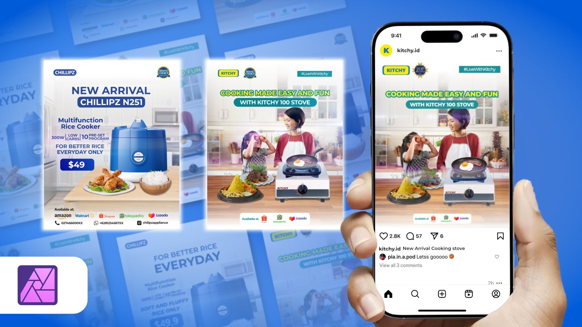
5. Design for Promoting Refrigerator Product: Hello, everyone. So this
is the practice session. In this session,
we're going to create two design, two project. The project number
one, we want to create the design for
promoting appliances. The appliances is refrigerator. So we're going to create
the Instagram posison for promoting refrigerator and also Marketplace Marketplace cover for refrigerator Protag. The protect number
two, we're going to create TSN for promote
electronic stock. The electronic is
air conditioner. The same we create, and we're going to create for Instagram and
also for Marketplace. So let's move to the
project number one, that is to create the design for promoting appliances
refrigerator. So let's move to
the Affinity Photo. We move to the Affinity Photo. The first thing we have to
set up the workspace for Instagram format for 4:5
aspect ratio to doing that, which is click File, click New. And in this page in
this width and height, we change to 1080p
right and 1350 pixel. And we changed the Dept to 300 and make sure in
the document unit, we choose the pixel
and click Create. So we have done to create the box space for
Instagram format. Next, I want to put the object
to create the background. So the first we
want to make it a background because the background
is a fundamental thing, like we have previously
learned about the material that the
background is really important. So the background is the thing that we want
to create first. So, guys, you can download the file that I've uploaded into
the project section after you download it and you
will get the file needed in for this practice or the step by step that I want to show in
this lesson, right? The first thing, I want to
use this bqckground this image, and I will combine with
this image with this image. So I just track
and drop in here. This is the background
of kitchen because the size is big we
need to resize. The doing that is a simple way. You will see the blue line. You can click CTRL + zero to bring back the default Zoom. You can adjust the size
like this. More or less this. So I want to combine with floor title. Just drag and drop. Again, because the
floor is too big, I want to I think just
make it a little big. Just reduce the, I want to
change this floor, right? I want to change this
floor with this floor. Because this floor, it doesn't
cover until the bottom. The floor doesn't cover
in this space area, so I want to change this floor. This floor within this one. To doing that, I want to
doing some selection first. Maybe I will unhide this. And click I'll be using
the Pentool selection. Just click here and
then click here. Because the line is too thick, we can change the
size of the line. Maybe I will go with 0.20
comma two, like this. And I think it's more easy to
us and it's not too thick. Click here. And click here. So I want to select the background without
the floor, right? This is the white color because this color is the
background set to white. If we set tune the other colors also
using the other color. But I'm going to change the color because I want to
make selection to doing that. This is a feature to
make a selection. Click selection like this
and click Mask Layer. You can click CTRL+D to remove
the Outline like this. So, we have the background
without a fLoor. We unhide the flour
and then bring back to below the kitchen
and start to adjust. I want to find the right
I think I want to change a little bit the
perspective because this floor is not
really correctly. I think, in my opinion, this floor is not perfect
in a perspective. Just little bit adjustment in a perspective to doing that. I want to convert this layer to resterize layer to the pixel and using this perspective tool and a little bit
adjustment like this. And this is also a little
bit adjustment like this. Just click Apply and doing
some adjustment like this. The next step, I want to put a wall in front
of this kitchen. Doing that, I will
use this picture. Because this is too
big, we can reduce. We can reduce the
wall like this. I want to use pen tool and select on this table
without a floor. Just on this table
without a floor. Doing that, just click here. Now, here. Click here
and just click here. And click selection. I'm
not using this mask layer. I want to take the sample
into the new layer. So I want to use
CRL + G and then appear the new layer with
the sample that we select, click unhide the source, the pixel, this and then click CTRL+D to
remove the selection. So we need to reduce
the size like this. And I want to bring down this area and maybe just stretch this wall
to until top like this. Because this wall is a white color and then the cabinet of the
kitchen is a blue colour. I want to change
this wall color like this blue in the
cabinet in the kitchen. To do that, we will
utilize the adjustment. So in the adjustment, there
is a feature to recolor. We click the recolor and
on the recolor adjustment, click right click and
then click mask to below. So here means that this
recolor adjustment os only affect on the
pixel layer like this. It's not affect
on another layer. And click and the
recolor adjustment. And in the hue, we slide
this color carefully, maybe just like this. And we reduce the
saturation like this, and we reduce the lightness. So the color from this wall and this cappinat is a similar right or maybe just a little bit simillar. Right? Similar. And make
click I think it's enough, the color is similar. So the background that
we have to create is more orlass like these
guys. More or less like this. But if we pay attention
closely in this area, right, is not less it's not naturally placed because the floor that we put in here
doesn't has the shadow. And this one also doesn't the shadow and this floor
also doesn't have the shadow. So the feel that this part
doesn't places properly. So we will make the shadow for
this floor and this wall. Doing that. Is a simple way. Before doing that, I want to, you know, like
organizing this pixel. I want to change the
name to wall I think Wall and this layer to
the kitchen background. And this is for this layer, I want to change to floor. And I will remove the
pixel I will remove. So next, we will
create the shadow. If we pay attention,
there is some area that the source of the light comes reach in this area and the
shado reach in this area. So with our imagination, this is just imagination. The shadow will cover
in this area, right? The shado will cover
this area and in this area and also some area, you know, like little darker in this area will cover
the shadow too. to doing that, let's draw the shadow using the
pentool click here. I think the shadow will
reach in this area. Like this, just little bent
up to cover in this area. Just click in this area. So I want to change this
white color to the black. It's very easy click fill. Just change the color like this. There is a stroke in
the black color too. We don't need the stroke, so we remove the stroke. So this curve and this curve, we bring back down to under the kitchen like this and
change the blending mode to multiply blending
mode to multiply and reduce the opacity
to I think 20%. Yeah, 20%. And add it some effect like Gaussian blur to make the edge of this part maybe a
little bit blur like in the above like this. Right? So we also have the
shadow in this area, too. We also draw the shadow maybe
in this area in this part. I think it will cover
like this. No, Yeah. We're doing the same, change the plane let to multiply
and reduce the opacity to 20% and add it
some gaussian blur. I think five. And if we pay attention closely, in this area, it's
also darker, right? Or maybe we will reduce the opacity to just
a little bit, maybe 10%. And in this area, we will draw just little just a little We changed the blending mode, multiply and reduce the
opacity, maybe 50%, right? And add some gaussian blur add some gaussian blur I think just
little pixel one pixel, 1.1. Or maybe it's too thick, we'll reduce it to 20. Yep. All right. So we unhide the wall. And the wall also
doesn't has the shadow. We make the shadow for the wall. I will utilize the
rectangle tool. Just create the rectangle. Just create a rectangle
like this and bring rectangle to the
below on the wall. Change the blending
mode to multiply. Again, reduce the opacity. We're doing the same
method like before. And then edit some gaussian blur. Like this. gaussian blur. No, I think 30%. Right. More or less, the background we will want to create
is like this. And the next step, we put in the main object,
secondary object, and then edit some effect
like shadow like before. So see you next session.
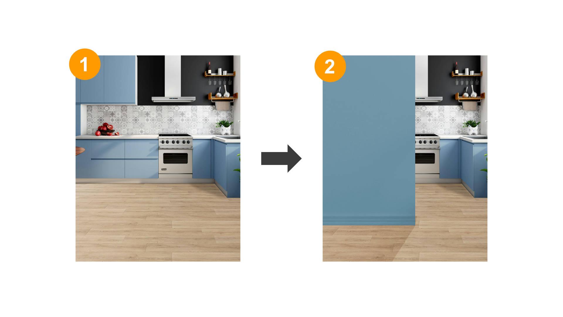
6. How to Place and Enhance Objects with Visual Effects: Everyone in the preview session, we have created the background. We have combined several
images into a new background. In this session,
we're going to put the main object and
the secondary object, and also we're working on the shadow and effect.
So let's start it. Because the main object
is a refrigerator, I will put the refrigerator as a main object and also plant. Thise is the two plant up to
you which one you choose. The main object is refrigerator, the second object is plant. So we put the main object first. Because the size is too big, we reduce the size and
put the gator in here. I like this and
also put this plan. Because this plant has this
plant picture has background. We need to remove
the background. We will doing some selection on this pixel on this
plan to doing that. I'm not just drag
and drop in here, but I just open this
pure like this. Just bring this area. And automatically,
the affinitive photo will open in a
different document. It's not the same document
on the workspace, but open in a new
document like this. In the background we unlock. And we will doing the selection. In Affinitive photo, there is a two way when we want
to doing selection. The number one, we're using the selection brush
tool like this, right? And we select it carefully. The second one using the
object selection tool. And this picture, this is just exclusive with the new
version of Affinity Photo. I really doubt that in the
previous version, in this, like, the software that I use in this tutorial is using
the software 2.6 0.3. I doubt that the version of the version affinity
photo before this, maybe version 2.5 or 2.4, there is no available
in there is no feature like Object
Selection tool. So the Object Selection tool just appear on the
newest version with the Object Selection tool, which is click in here, and the software will analyze the sofa will analyze the object
on affinitive photo. Affinitive photo will
analyze the object and automatically
making the selection. Just like this, right? When we move the
cursor a little bit, the silver automatically
making the selection. When I click here in 1 second, and then this we're doing section, automatically
doing selection. And we can edit some
section in the pot, also in the soil. Like this. If there is some part that
or not selection yet, we will tie it up with
selection plus tool like this. We change the
substract to the add. When we click the ad, it will add in the
selection, right? When we click the subtract, it will reduce the
area like this. So we add some area that not
selection yet, like this. After we satisfy the result, we will tidy up the selection
in the refine section. Click refine, maybe make
it a little bigger on the brush which is brush
carefully in the white area. And yeah, the software doing some selection and
remove the white area. That Like this guise, until the white area
is gone, right? Until this as until
the white area is gone. After we satisfied
about the result, we click Apply, or maybe just
a little bit reduce the ramp. I think I will go with 10%. Minutes 10% and click Apply
and click Musk layer. And then automatically if some part may be unselected yet, not perfect in the selection, which is click brush using brush tool and change
the foreground and background. And maybe we reduce
the size like this. Just a little bit, only a little bit
in the selection. Just, you know,
just some part that maybe is not selected properly. I like this and also like this. Sometimes the most hard is
doing selection, right? If we done with the plan, which is click here
and click Copy and click Paste in this page, right? Because the size is too big, we need to reduce the size. We put the plan besides on
the refrigerator, right? Oh, this is some residue
when we doing selection, and the reciue is just one line. And we can remove this
with click the plan, click on the mask
layer on the plant, and edit, we change the size of brush and make sure that
this is on the black. To doing that
in a simple way. Just click here and remove just like this. Make sure that this is the
set for a crone to plug and then reduce the recidu. Okay, like I mention before that
we have learned before, we will use guideline. The guideline will help us
to plasma the object, right? The headline will give
us some insight to, you know, to arrange the object like the main object and
the secondary object. The guideline will help us to arrange the object or
to organize the object. So how to use the guideline
Look at this guideline. In the top area,
this is placed for the header and then
the bottom area. This is placed for the footer. So in this area is
placed for the content. I want to maybe a
little bit changes between the background and then main object and the
secondary object because, you know, I want to make
a little bit adjustment. For example, I will
bring the guideline into the below
refrigerator model. I will make the
refrigerator a little bit. Down. And this is also following
the refrigerator. But I think I want to
make it little in here. And I think the
refrigerator also, I will a little bit
decide like this. I want to a little bit stretch
the wall just like this. More or less the object
like this guys. I want to hide the guideline. So the next Oh,
this is the area. This area maybe I want a little bit stretched too for the shadow. Next, because this refrigerator and plant doesn't has a shadow, so we want to create
the shadow for the refrigerator and then
the plant in order to get more naturally placed on
the room on the interior. So to doing that, because the source of light
is from here, so I think I will create the shadow behind this
refrigerator in this area. To doing that, I will drow
the shadow using the pen tool. Let's get Let's
throw the shadow. Click here. Maybe click here. Click here. Click here. Click here, here, here. And I want to change the color to the
black, right in this. And I want to remove the stroke. I want to remove the stroke, and I will change
the blending mode to multiply and reduce
the capacity to 20% like this and place the
the below refrigerator model, and also give the
Gaussian blur and little bit. You know, slide the slider
into 1.5 pixel like this. I think 1.5 is enough. Or if you want to more blur, I think two pixel also good 2.1. Okay, the next step, I want to make the
wall gradation in color because the more lower of
this wall, the more darker. I want to make it like that. And I will utilize
the rectangle tool. I will cover up this wall with
rectangle tool like this. Again, I will bring it to above
the wall, this rectangle. And I will change
the blending to multiply and slide the
opacity to 20%, I think. Yeah, more or less like this. And in this layer in
this rectangle shadow, this is the well shado. I will use the gradient tool and I will draw from the
top to the right. There is no effect at all. We can change this
color, left and right. We will try to change
the color one of them to white like this. So after we change the
color to white and then using the multiplied
blending mode, so we just slide
the slider that we want until the result we
want, like this, right? So after the shadow
of this wall, I will also edit the shadow again. The shadow will be like this. I want to make this result because the source of light from this, maybe I can put the shadow from and to here to here and here, here. So we're using the solid color, bring to the white and reduce the strokes remove
the stroke, right? We delete the stroke. Say, we change the planting
mode to the screen. Right? We change mode on the screen and bring back this curve to, above the wall, like this. Just reduce the
opacity to maybe 10%, I think. Yeah. 10%. And edit some gaussian
blur like this. We can re edit the
shape like this. Right? Okay, more or less like this. And the next we will
create the shadow for the refrigerator
and then the plant. Like I said before,
we will draw the shadow for the refrigerator, just like this. We draw draw oh like this and we change the color from
white to black and again, remove the stroke and move this to the bottom
of refrigerator. Chang blending mode to the multiply and reduce the opacity.
Just like this. I think it will be perfect
if I bring to 50% and added some gaussian blur I
think 1.7 is enough. 1.7. I think more
higher more higher. No, 2.1. And then the opacity,
more higher. I think, 60%? Yeah, 60% would be perfect. And also about this plant. This is also as, you know, we need to draw the the shadow like this and bring to
under the plant like this. No, no, no, no. This is the
plan, the layer of the plant, this is curve above this change the blending
mode into screen. And then change blending mode to multiply and reduce
the opacity to, I think, how much 20%. Yep, 20% or maybe bigger. 30%. So if the shadow is not too I think like
this will be like this. And Absolutely, we will utilize the gaussian blur the gaussian blur
right maybe a little bit. Gaussian Blur. The next is utilize the
Gradient tool in this shadow. I want to make it more a gradient from here is more
transparent in here. Using that, we click the
Gradient and from here, we drag and drop to here. Or maybe like Oh, the same. So which is need to
click in this dot. I will utilize the gradient tool. And click this curve and then
drag from here like this. Click this dot, click click
this color. Click the gradient. And in here, this dot or this dot, we try which one that
affected like this, we remove the we reduce
opacity to zero, and we gradually slide
this Ah, like this. Or maybe because
this is multiple, we can change this color. It's not a black, but white? It's the same. We can still use gradient more
longer like this. Yep. The more Shadow to adjust the more lighter the
Shadow is like these guys. So we have created
the background. We have created the
main object and secondary object and
also it some Shadow. Now it looks natural. It looks natural. So
in the next step, we will put all of
this content like footer, header, copywriting and
also specification, and all of this material. So see you in the next session.
7. Designing Headers and Footers for Validated Posts: Hello, everyone. So we've
been creating the cron and also put the main object
and the secondary object. So the next is
we're going to put the material from a header, copywriting,
specification, and footer. So before I'm doing that, I want some adjustment in this layer because
this layer is crowded, I want to make a you know like
group, each part. So in other than that, the layer is more organized.
So let's do it. This is the for plant. And this is shadow
for the plant. So I want to group and
I'm group plant object. This is the refrigerator model. Yeah, I want to just keep it
like this and this world. Because this word
has some shadow. I want to combine the
shadow into one group. This shadow, this shadow, and this shadow, right? Right? And this world,
I want to make it. Group, like this. So this is One. This. This is the Oh, this is the shadow
for the refrigerator. So I want to make group
for refrigerator. Next, this is include the wall. So I just drag and
drop put here. This is the kitchen background. And this is these are the shadow for the
kitchen background. I want to group and
make the name as a background. I think our layer is
more organized, right? The next step, I want to
put from header to footer. I want to make the heater
first. Let's do it. I want to make simple shape
using this rectangle tool. And in the color, I will choose the
color, solid color. And I think I will choose this
color because we need to, you know, this is
the blue color, and this is also blue. But this is the cream leaf
green. This is also green. So maybe I want to use the
green color or maybe tend to green like this
round it like this. Or maybe like align center. We use the guidline I think, or the spece to big,
but it's not problem. I will hide. So the next, I want to put the official logo. This is the logo. The logo the brand is toshaba, yeah, you know, imitation
from a certain brand. Make you know, separation line. I want to use I want to type maybe official star. Like this. Toshaba official star. Or I think I'll just make it
little bigger or the header. Just like this. Right?
Maybe a little bit closer. These two. Like this. So the next I want to make the
footer is also simple way. I will use the rectangle
can like before. Like this. I want to
click alignment and then it make it on the center and use the corner
feature, corner around it. Maybe like this. We're using the white
color and start to put the marketplace logo. Like this. Um, I want to type Official partner. Like this. And I want to change the font to monstterat semi bold and
reduce the size. Like this. Official partner, maybe a little bit longer. Like this. Like this. And I want to create
separation line And I copy this title
and put in here, and I will tap www.toshaba.com. This is it's like the website. So the header is more we
need more longer header. To like this and the website of official partner. More or less is like this. So we have created the header. We have created the footer. I think this phone is too big. I want to reduce to ten Yep. Yep. And then the next, we need to write the specification
in this area, right? Between that, I will
utilize the rectangle tool. This is because this is the area when we
put the specification. Before I'm doing that, I want to make some margin
using the ruler tools. The margin will help us because
Instagram and some media, even though they using
4:5 aspect ratio, but Instagram will crop
a little bit again when the design appear
on the homepage. So I think it will be better if we edit some margin
left and right. I will put around
50 pixel, 50 pixel, 515047, 41 50 pixel, 52. 49 doesn't matter. So in here, because we're using 1080, minus -50 is around 1030, is not problem. So we'll use this area to
write the specification. I want to change the color. We also can change the
color using the sample. For example, because this
header is a green color. I want to use this color
in here to doing that, just click this rectangle. We press the I key and then, you know, find the
sample color like this. So we start to
writing one by one, the specification, right? I think it will be I
will do some experiment. Before we using the, you know, the brown color, brown floor. I will also using some
accent for brown colour. But we will cover with
green colour letter. I will make the corner
rounded like this, but I will reduce the
percentage of rounded. Like this, and then I will copy. I will duplicate the
rectangle and make it more stretch down like this. And then using this I will utilize the
Gradient effect like this. But in the Gradient effect, I will use we can take the color sample like this because I want to
take the color sample, a color code from this green. I will copy here, and I will paste in here, right? And now I will edit
with this color. I will make it darker, darker. Like this. Yeah. Now I click the
gradient tool, right? And I will move this
gradient to this craton. Or I think it will be perfect if I'm doing some experiment. Yeah. And then I will also using the
rectangle tool for here. This is just variation. in order we can create the specification more
interesting, right? When we just listing the specification on
the the design is not maybe a little bit boring without any
additional design, right? I will use this and
doing some improvement with I will copy this code. And if we added additional node in here
in the center like this, and we can slider
right and left. And we can change
this color too. I want use I want to
paste the color code. Like this. But I will also take this color code can
and copy paste in here. So the result will be like this. Maybe I will do it some experiment in this
Gradient tool like this. Yeah. I think much better. And in this rectangle, I will reduce the percentage
of rounded to 20%. A little bit longer like this. And I will a little bit closer. And also, I will make it
duplicate in this layer. And in the bottom, around it, I will make it a little
longer like this. But the color, I
will slide in here. In the little bit center. And in this layer, I will bring down to cream. Yes, yes, the cream
rectangle like this. So as if this rounded rectangle as a behind of this
more like this. Yeah, more or less. No, no, yeah. Maybe
just a little bit here. And again, I will reducing this rectangular
presentation around de percentage, little bit. And then this is two. Like this. So this is the place when
we put the specification. The rest is we just
create the background and the rectangle again for
placement of specification. For the gradient, we
choose the gradient. We reset the gradient. green. Yep. green.
Little bit green. I think it's more
lighter like this. In this rectangle, we also
utilize the round edge. I think I will bring down
to the 15% like this. Maybe a little bit room. Okay. So we can type in this area for the
model of refrigerator. Maybe I just type random code. No, no, no. I just use the
artistic text tool, click. Maybe refrigerator RF
referring refrigerator. I think mostly appliances on the name of the model
also they explain about the specification like capacity or like some important
specification. Dimension, I think, or the
year of the product launch. So I want to put maybe the capacity of the
refrigeratores around, let's say 245 or 242 and four, they're referring the capacity, that the capacity is 240 liter, for example, and
two and five, 25, they're referring the year that this refrigerator is built. This is for just example in not referring the real product. But yeah, I think maybe some
friend also doing the same. They will the number is
also meaning something. So I think it will be great
if we change the color too. White. gold, right? Yeah, I think it will be
awesome because this is just placing the number layer, so we not need a lot of space. And maybe we can
stretch a little bit. To the top. When customers sees the product, maybe the most important thing from the refrigerator
is a capacity. I think from the capacity, the people maybe
they're looking for the small refrigerator
or mediums refrigerator on the pick refrigerator. So the capacity is important. The number one we put
here is a capacity. Like the model, the capacity, this refrigerator has
capacity, 240 liter. So the 240 litter is a main main specification or maybe which is
240 liter like this. And I will duplicate this
240 litter bring to the top. I will change the type to I
will type capacity, right? And reduce the size. Seven, I think medium. And it will be more bigger, I think, 240 liter. Maybe it's too big. We
can reduce the size. I think the most
important after knowing the capacity will
make a little bit. Short. The most important after the capacity is
the power consumption. People they considering and they want to choose
they want to, you know, like, choose the most
power saving refrigerator. It's not the most, but at least they have more lower
power consumption. I think for this capacity, I would type lower watt 75 or 70. Right? And I here, reduce the size to seven. I will change the semi bold
like this, lower what. And the rest of it, I just copy and paste
bring down like this, just copy and paste. I can bring So after knowing the specification
about the voltage, I think people knowing about the refrigerator
is the mechanism, the engine or
mechanism, the cooling. There is a conventional
technology and also the newer technology in a refrigerator conventional
and inverter. So this you say inverter technology. Technology. So the inverter technology means the refrigerator offer
more power, safer. I think six. You were reducing the
power, the font. Next, after knowing the
mechanism of machine, people tend to considering that the refrigerator is no frost. No frost here means that the refrigerator
doesn't has snow. You know, like the
snow particle. No frost. And we want to copy and put in
here like this. Yeah. We'll make some
gimmick description like antibacterial
bacterial bacterial. I've been searching
for specification and people more loved about tamper tamperglass For example, high material quality. Just for gimmick, another
gimmick like this. So after knowing about the
material, the specification, consumer they tends to exactly
precise about the power use. Like how much the cost this refrigerator they take
for a month or a year. Maybe some institution or some organization they put
Label and then, you know, like the measure of the
amount of electricity, this refrigerator used
for a year, for example. So we will put that
specification. And put in here. Let's say we take 350 or maybe 370 kilowatt hour we have kilowatt hour per year, each year. Like this. Here means that in one year, normally, this refrigerator,
they take 370 kilowatt hour. So the consumer will be knowing the consumer
will be, you know, like, have calculation on their
calculation that, Oh, okay, maybe the bill is not really
high for if I biy this, and then maybe the consumer also doing some comparison with another product with
this result, right? So I want to use this font with the color with this font. A little bit bigger. Yeah. And the last
we put the price. Okay, from the price is
sensitive information, right? Normally, 250 $200 250 $200. Yeah, let's say we
put $250, right? This is the normal
price or no, no, 299. It's too much. 279. Yeah. So maybe different
region different price, but this is the price. $200. $279. I will make this
price more little bigger. I think it's most the bigger. Yeah. If you pick, reduce the, like this. So this is the capacity. We have created the capacity for this refrigerator
and we'll put here.
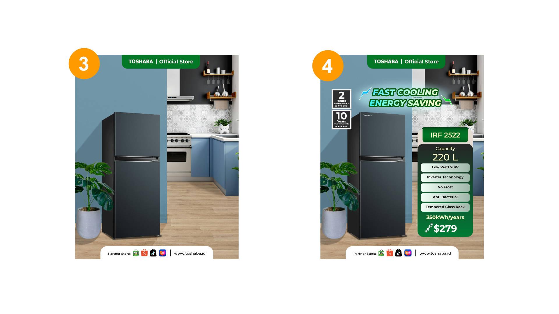
8. The Importance of Specification and Copywriting: The next is we will create
the copywriting in here. The copywriting they
will usually consist of a short sentence that representation of all
of this specification. And the copywriting
should attract the audience or copywriting
will provoke the audience, and copywriting will give
the imagination for audience. What if they use this product? I will type the copywriting. Fast fast cooling This is a representation
of the the machine. The refrigerator is itself. Fast cooling. And then I will change the color to white
first fast cooling. Power saving. Power saving. If not power
saving maybe energy saving. Yeah, I think more awesome. fass cooling, energy saving. Like this. To make this, copywriting
is outstanding. Maybe I will add with stroke. To create stroke, we
will using this set forground to color that we
want to make it stroke. Maybe I want to use
this green color. And to make the
stroke is a thicker, we can click this copywriting, right, and click character. Here, the outline style, we can slide to
value that we want. But next, this is the
important step, the order. This, you can see that draw struck behind versus
draw struck in front. Oh, we just draw struck
behind like this. And if we think that
the green is too dark, we may be a little bit Yep, it'll bit brighter in this. Or the fun is to
extra bold we need I think it will be
awesome if the extra bold here is also
extra bold, but italic. Yeah. Plus cooling
energy saving. This is also apply on this
copywriting at the same way. We click this forground
and choose the color. And in here, because
we're using 2.5 in here also using 2.5, 2.52 0.5. And we choose draw
stroke behind like this. Make it more outstanding. We can change the
color. From the white, solid white color, maybe we
need to using the gradient. Maybe I will choose the
color yellow like this, two green or green to yellow. Green To yellow. Yellowish. Like this. The cream is not
the cream need more stronger. Mm. Yep. And the yellow more
yellowish, like this. We also do the same method. We can copy and pass
paste using gradient we paste in here, paste. And also we copy the
color of yellow, this and also apply
on this Color. Yeah. We also added some effect
like a shadow white shadow. Maybe I'll using
the eclipse tool. Not eclipse. opo sih?.
Ellipse. Yeah, Ellipse tool. Eclipse is different
thing, right? And I will choose
the white color. Oh no. This is a
Background or white color. fast cooling energ saving. I will make this as a shadow
and using the gaussian blur. The gaussian blur the
favorite thing in this tutorial like this, right? And maybe just a little
opacity. Oh, no, no, no. Here, the overall layer, bring the opacity down. I think this is the green is not maybe how about the Blue? Oh, that was cool. Yeah, this is awesome. I will copy and apply on
this. No, no, no, no. No, no, no. Apply on this. What? What? No. Oh, this side. Yeah. That was awesome. fast cooling energy saving. This is from the copywriting. And maybe because
this is too much. I think if you think this
copywriting is too big, we can reduce one level
from the 15 to 14. Right? To 14. fast cooling, energy saving,
like this. And the opacity for
the Shadow maybe reduce a little bit to 60 like this. And maybe we need
to a little bit added a little bit distance to 14%
increase the distance. Yeah. Fast cooling,
energy saving. And the next we
want to edit some, you know, additional information like warranty or discount. But I think we need to make this validated for the refrigerators
with current warranty. Yeah, warranty. How long the company and they want to offer warranty
for this product? I think for creating
the warranty, we want to create in
the simple way in a simple way using
the rectangle tool. Yeah, I think we're
using the white color. And I will copy the
rectangle tool. Or even though it's not copy, I will edit some stroke
to white, black or white. Stroke is white, and
the color is black. This, and I will added stroke. Oh,
because this is the shape. We add it stroke
in here like this. And I will change using the
align and using this method. Maybe it's not full of black but a little bit
gray, like this. Just type or maybe it's
too too thick, the border. Maybe, yeah, 1.9 is enough. Just type the warranty. For example, like,
three years warranty. Is it enough? Yeah, three
years warranty is a normal. I will remove I will
not use this color. I will just use a
white color like this. Uh, just three years warranty. I can using Yours. Yours. Three years. Service. Just service. Service. Part. Yeah. It's a more shorten
service part May Yep. More or less like this. Three years service part. Maybe the number three
years is need too big. I three year service part. And to make it
more, I don't know, is usually the label, they put some attribute like star like this. I want to make five
star one, two, three, four, the last is five. Yeah. And convert this to, no, no, change the color. Change the color to yellow. Like this. Wow, it's so cool. Three service part. And I copy all of this label element and put behind it Yeah. And maybe I will type
ten years ten years for Inverter inverter warranty. Oh, I think we need to
make it more space for inverter and warranty Warranty. So the customer, they
need to be safe about the inverter because
the inverter technology maybe someday they will, you know, like facing the
problem or something like that. But it's also three years
service part warranty. Three. Three. Yep. Three years service part and ten years inverter
warranty. I think the font is too big. Maybe I will just
make it a little. More. Maybe three. 3.5. Yes, 3.5. It
will be awesome. 3.5. And we're doing the same in this size, 3.5. Like this. I will put the
warranty. A little bit smaller. I think it's okay.
3.2. Okay. No problem. Yeah. And here. Okay, the rest of it, maybe we'll using organize this layer because this
layer is too crowded, you know, too much of layer. We need to make it more simple. We will group this object and we name it three years warranty. Next, we'll make it group
ten years warranty. And I will group
this specification. Right? It's too
much layer, right? Group. I will rename spec. Next, I want to
make a little bit, you know, accent in here. Add it some accent
like this, like this. Like this. To making correction. Like this. All right. Oh, I think it would be
perfect if like this. It's just representation
of energy, right? I will reduce the size or no. Reduse the size, and I fill with the yellow color the Background with yellow color
or green color. Which one the better or blue, even sift like this. Blue. I think it will be perfect. And this is for the
outline is a yellowish. And I will choose the
draw stroke behind. Yep. We choose the round join or
meter join as you like. And we align to the
stroke to the center or align strop to the
outside or center. Yep. And draw stroke behind like
this and I will copy paste, and I put here, maybe I will mirror this or flip flip to
horizontal like this. And I put in here and change the
color to yellow. Yellow or cream. green. Yep. Yes, like this. So this is
just representation of energy. We need to expand the shadow. Yep. But the shadow it will
be perfect if we change the color blend to screen. Oh, I think there is no
big difference. All right. The rest it, I want to put this Toshaba here. Little touch. Yep.
Toshaba Alright. I think
it's enough, guys, for the result, more or less says the result
will be like this. And the next is, this is the format
for Instagram, but we want to create this
not just for Instagram, but also for Marketplace. So what if we convert this, you know, this design to
1:1 aspect ratio.
9. Converting Design from 4:5 to 1:1 Aspect Ratio: Unfortunately, the
Affinity doesn't has picture to convert
the aspect ratio, so we need to moving one by one the object
from the background, from the min object, from
the title, from everything. We have to re adjust
and reorganize the object that maybe can fit in a one by
one aspect ratio. Doing that. So bee doing that, we need to, you know, like, organize the layer. To organize the layer
is really important. We need I changed the
name to copywriting. And this, this Yep. If our layer is more organized, it will be easy for us to arrange. So we will create the new document New document and typing 1080
by 1080. But we need to change this 1350 make sure that
document unit on the pixel. Click create. Oh, this is
the layer for the plan. And yeah, I need to close. This is the utilize a new layer. First thing first, I want to
copy the guideline, right? I want to copy in the guideline. I want to copy in
here. As you can see, the guideline is too big. So we stretch the
guide line until it perfect to aspect
ratio 1:1. So in the guideline, this is the guideline for
one by one aspect ratio. The rest of it, we
just copy one by one, like the background for example, we copy the background here, we're copy the background. And then we copy in the floor. Here, we copy in the
floor under the background. So I think because the Background and the floor is too big
for this aspect ratio, I need to resize, right? Click ship, hold ship, and gradually, we
need to scale down. I think it's enough
in this size. A little bit. And then
we copy the wall. The wall is also not proper in this layer
in this aspect ratio. But because the
wall has, you know, some shadow, so we need to synchronize
with the refrigerator. We copy the refrigerator here. So between the refrigerator
and the wall, we have to select
at the same time and hold sift and
reduce the space until it's we were
using the guideline, put the guideline in above, and activate the guideline. Unfortunately, the space
is too tight, right? The space is too tight. And it's really hard to
put this on this level. I think I will reduce the
size from the background and the wall from the
kitchen and the floor. Doing that, click background
and hold sieve hold CTRL, click floor and hold shift Next, hold shift and then
reduce the size. I will bring a little bit to
top like this. Top layer. Yes. And in this world, I will stretch to a
little bit like this. The refrigerator too. Next, I will copy the
plant object. I will copy, I will
paste in here. So basically doing
from the beginning, the copy is above the plan is above the
refrigerator right. A little bit, maybe a little
bit smaller like this. And then I will copy the specification paste in here. Oh, the specification and the main object
doesn't suit well. So I think the refrigerator
may be a little bit biger. So that the
specification doesn't uh and then I will reduce
the size the specification. I hold the ctrl and
reduce the specification. I just copy the waranty layer, warranty label,
reduce the size too. Everything reduced
the size because we using architec text tool. So if we reduce
this in this layer, the font will automatically
adjust the size too. So it's a very beneficial. The rest of it just
maybe I don't know, little bigger Copy the header Copying
header pasted here. Oh, the official star. Also, the rectangle. So we'll make the
group for this. header. This is also need to group. Header. So because the
space is too tight, I think we don't
need included in the footer because this is for thumbnail for cover of
product on Marketplace, maybe it's not necessary to
put a footer in this design. So I will have some
advantages. The object. I will maybe take it
a little too low, like this bring and
the refrigerator, also, I want to make a
little bit smaller too. Like this. It's fine. And we can put the copywriting. Yeah. We can put the copywriting
and paste here. We will reduce this copywriting. Click CTRL and reduce
the size like this. Oh, toss up There is a
little Toshaba logo. Toshaba a logo is included
in the copywriting group. We will just delete right, and reduce the size and
put in above in this area. Don't forget, toshaba logo. In here, or in here. To Yep. More or less the thumbnail
will be like this. If we feel in the copyright
is not bigger enough, which is click hold CTRL and increase
the size like this. So this is the thumbnail
for Marketplace. Oh, I think for the
shadow, like this. There is some shadow that
doesn't look perfect. We need to revisit revise, revise and put back the
gurantee we can just like this. We have been create for Instagram design or upoading on the Instagram account,
official account. And then we also create for Marketplace thumbnail
using one by one aspect ratio. And this is what I mean, we using the same design, same resource, but for
different use case. Even though we need to adjust a or rearrange or
reorganize the object, but it doesn't take really long, which is copy paste,
which is copy pase. The object that we have done create in this design
for Instagram, and we move one by one, the object and rearrange
into this aspect ratio. So I think for project
number one is finished, and we're going to next to
the project number two. So I hope your result
better than this. I hope your result is absolutely way, way
better than this. And if you don't mind, please give the review
of this course. Please give review
about this course. In other I can make it
improvement in the next class. But I will really recommend
it if you take rest a while while before we continue to
the practice number two. Don't forget to upload
your project and left the review for this class. We move to the
project number two. So you. See you in
the next session.
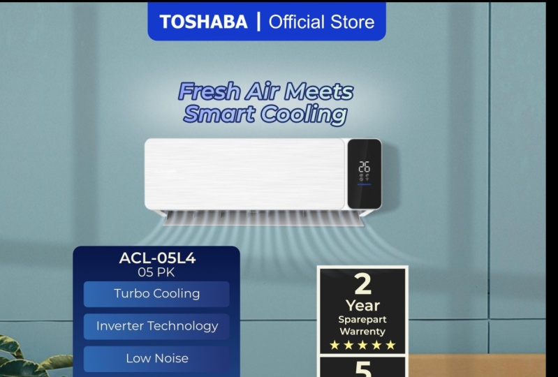
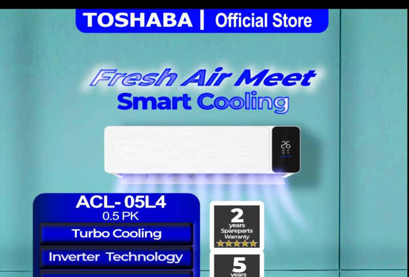
10. Second Design for Air Conditioner Promotion: And the project number
two, we're going to create design for promote
electronic stuff. The electronic is
air conditioner. We're going to create for Instagram and also
for Marketplace. So the first thing first, we have to set up the document. Like the tutorial
prefacely the first step, we need to set up the
document. Click New. We click File, click
New Document New. And this is we have to change the resolution
because the Instagram using 4:5 aspect ratio, we're using 1080 pixel
and 1350 pixel and change the DPI to 300 and and make sure the document unit on
the pixel and then click create. Again, after we created
the document setup, the next step is to
started to design, especially the first step is creating the background because
the Pagron is fundamental. So like the previously project, I have alojet the material
that needed in the tutorial. You can download it and then
you will get all of the file that requirement
for the tutorial. Because we want to promoting
the air conditioner, we have the air
conditioner model, we have the background, we have the loco and
some other material, and we will combine it. Again, because we want to
create the pgroun first, so I will use this image, this picture as a background
and we will use it as background and we will
edit this picture. Just drag and drop
into the document. The next step, I want to put the so I just drag drop the background
to the document. Because the background is too big, we need to scale down, right need to scaledown
and I will adjust the background little bit bigger. Yeah, more or less like this. And then I will put the air
conditional model, right? So this is the air conditioner
that we want to promote. I will just adjust the size
like this for a while. Now, because the
air conditioner is the product that is related to cooling the air
to cooling the room. So in a cooling vibe, maybe it's more suitable if
we color change to Blue. Change to blue because, yeah, blue is more cool bring cool vibe. So I want to change the
background color a little bit blue because this
is the green, right? And to doing that, I will use the adjustment
feature that is the HSL. I will use HSL. Here, I will use the green layer or
maybe this color, and I will click picker. And I just click
sample image random as long as in this area in this
area in this background area. So after we pick
the color sample, slowly with careful,
we slide the hue shift to left a little
bit blue like this. And we also increase
the saturation. Or maybe we using this feature, we will bring this
a little bit blue. These two. Like this. I think it's enough,
guys. So this is the blue after we change the color. This is the preface, and this is after we change
using HSL sift adjustment. So I want to make this air
conditioner little smaller. So in the next, I will use the guideline. This
is the guideline. Just Drag and drop it will help us to manage to organize the object. Right? I will bring the
guideline under the background. And remember, this is
in the area for footer, this is area for header. And probably the copywriting
is also in here. So I want to put the
air conditioners maybe a little bit here. I want to add some shadow, some shadow from maybe from
window or window reflection. So maybe usually in
this air conditioner, they put on the wall, and usually some
shadow from window, they will also
reflect on the wall. So I want to add a shadow
from window reflection. Doing that I just maybe creating the using the
rectangle tool, right? Using the rectangle tool, I will change the width. So yeah, let's say, 60 or 70, 65 L in this. I will duplicate
CTRL+J ring here. We can duplicate with
CTRL+G or citr CTRL+C and paste. This is the same. I want to rotate to this layer. Yes, a little bit here. Maybe a little bit here
and a little bit here. I want to change this
color from white. I block three of them
and I change using the set background to black here. And I will group
three of them, right? And because we group this layer, the blending mode become
passthrough, we change to normal. And then we reduce
the opacity to 30, 25, 22, 20 to 20% and we edit
in the Gaussian blur. Gaussian blur. Add
it to gaussian blur, two or pixel like this. Or maybe we reduce the opacity to 15 or ten, 10%. Yeah, like this. This is the shadow, the reflection of window, right. Special for this rectangle. We can you know, even though in
this is the group, we can edit each rectangle. I want to use this using
the Gradient too and I start draw this here. And in here, I click
here, click the gradient. So I think I will change
this color in here, change this color
to white, right. And I move in this rectangle. I try to rotate right to rotate. Like this and slide in this
sign to a little bit here. The shadow is more
smoother in this area. The shadow I think is enough. The next, I will add a shadow
for this air conditioner. We can imagine that the
light here from this side. So because the
light is from this, I want to use I want
to draw the shadow with this, air conditioner. The shadow would
be in this area. So I'll just draw on the
shadow like this. Like this. We use a little bit smoother
in the corner like this. Like this. A little bit
smoother around it. I mean, Like this. You can follow this
to draw drawing. We can correct the shadow the shape using
seeing node tool. Maybe a little bit
here or like this. So we bring the color
in the background, bring the color to black. And here from the foreground, we set fill to none. We bring the curve to below in the air
conditioner like this. Then, in this case, we change the blending
mode to multiply and reduce the opacity to 20, right and edit, the gaussian blur. gaussian blur. 25 pixel,
three, three pixel. Three pixel. 2.9. Yep. If the shadow doesn't look
natural or I think this is look more rounded,
we can revisie We can revise with
not just like this. drawing with carefully like this drawing like this. I think a little bit closer
using this node tool, we also be able to block
just affected in this node. We block the node that we
really need to change and a little bit closer like this. So so we have created
the background. We have created the main object. The next step, we want to put the material such as header, footer, and also
copywriting. The next step. So before we go
into the next step, I want to, you know, like, reorganize this layer in
order to be more easy to, you know, recognize
in the future, because when the
layer is crowded, yeah, we hard to edit. HSL shift adjustment, this is
belong to the background. So bring down and click
right and mask to below. So the HSL shift adjustment just
affected in the background. And then the air
conditioner on the shadow, I will name it the wall shadow. And then for the
air conditioner, I also become air conditioner. Including the Shadow. So okay, friends, we have
created the background. We also created the main object. The main objeck is
air conditioner. And the next step, we
want to put the header, footer and the content. The content consists
of copywriting and also specification and also also some
effect and shadow. So see you in the next session.
11. Using Headers and Footers to Establish Brand and Company Identity: Everyone. So in this session, we're going to continue
the progress of creating design for promoting
air conditioner. So in the previous season, we have created a background
and also main object. And the next we put the
material like footer, header, and also in the content. So let's start it. We start from the footer. We will create the footer. As a previously example, I will use the rectangle
tool in this rectangle. I just using this and I will edit around it
in this rectangle tool. Like this, maybe a little
bit bigger and center. I will change this
color to blue. This foreground set to none, and this background set to blue. Like this. Maybe a
little bit bigger. All right. I will use
the guideline like this. Remember, this area
is for footer, so I will use half is a half
of this area four footer. We still have this area
for copywriting a letter. But this area is for
footer in the footer, like the previous example before, this area will fill with the Brand name like this. I will put like this. And also, I will edit
the separated line. The color is also white, maybe a little bit smaller
like this, like this. And I will write this official official official store and I will type official store. Like this, I will bring
the color to white. Maybe reduce the size of color like this and
bring to the center. Like this. I think from the footer is enough, more or
less is like this. And then we continue
to the header. For header. This is heater and
we continue to the footer. Is this the same like
previouse before? I also using the rectangle tool. In a simple way, this
is the rectangle tool. I will put in the center. Here and click corner and I will edit round it in
the rectangle like this. And I also put the
Marketplace logo here. I will bring back the loco above round above the
rectangle like this. I will type I will change. We need to change the
color first from what to to black official partner. So the consumen will they can purchase the product on
this Marketplace platform. So we make it smaller. Official partner. Like this. And I want to add separation. With black totally on my
too thick. Like this. And I will type this is
for the website address, www.toshaba.com Reduce the size.
This is for 6pt, six, and this is
also six, like this. So maybe it's too wide. And I will make it
center like this. Okay. It's not I think it's
too small for footer. Maybe I will increase the
size to seven, right? This is also 27,
and I'll bring two. Left. This is to right
and increase the size of Marcetplace logo I can still be able to scale up. Yeah, more or less like this. It will be more proper. And I will reduce the percentage
of edge to 15, I think. Yeah. Okay. That was awesome. So we have created the footer. We have created the header. The rest of it, we need to put the material in the content. We'll put the copywriting. Oh, no, no, I think
I want to create this specification
first, right?
12. How to Write Specifications and Copywriting Content: Specification first. To
put the specification, I will use the same
method like this. So I will utilize
the rectangle and I will change the color
using the gradient, right? I will click here and using it and change the color to Blue. This one is become like this, and this one is become
blue, dark, dark blue. Like this a little bit darker. And this is little bit I think blue more purple Yep, like this. Next, I will rotate the
gradation like this. And I want to add it
with this rectangle, I want to add the corner
round it like this, but in the percentage, I will reduce to 8% like this. This is the place we will put in the specification, right? Maybe we need to revise like this and a little bit
to like this. All right. Remember, we're
using the guideline. This is the area for guideline. Maybe just a little bit surpass
this line is not problem, even though just a little
bit is not problem. Yeah, we can surpass this. The next, we will fill the space area with
specification, right? Doing that, we create
another rectangle here We changed the color. We change the We can
change the color. I think more blue like this. All right. We're using
the gradient tool, and we rotate the Gradien tool. Maybe a little bit
like this, like this. And here, I think it will
be a little bit brighter. And here is also a
little bit brighter. Yeah. More or less is like this. And forget to add around it because the main
area is rounded. So the point
specification, also, it will be awesome if also
using the rounded maybe 15. Right? Yeah, 15. And then for this area, we will type we will type the model of this refrigerator
this air conditioner. So I will use type artistic
text tool in here, maybe a little bit zoom. And I will type maybe ACL
because the font is black, I will change the phone
color to white like this. ACL here means that air conditioner air
conditioner. L is random. Letter, ACL this air conditioner
has capacity of 0.5, it's not capacity, but the
engine power is 0.50 0.5. Is 05. So I will type
005L4, just random. 05 here means for engine power and L4 maybe some good to differentiate from
another product. I will increase the letter, ACL 05L4, like this. And I will copy
paste this letter, and I will change the type to 0.5 a and make it a little
bit smaller like this. So we need to readjust
this point like this. I will change the color to
little bit yellowish Okay. Yeah, like this. And maybe Oh, we use
the Arial font. Maybe I will change
to Montserrat. So in or to synchronize with previously project I will use semi pod for this name
model and 0.5 pcs like this. It's not the change.
So we will use the point, point number one. We have to knowing the
specification of the product, we want to create the design. For air conditioner, I think people will
considering some aspect. The number one, maybe
we can see from the capacity or the power of engine because we knowing
the engine is 0.5 pK. So the next is maybe
we'll type this is using machine like I will
type turbo cooling. I will reduce the size, maybe 29, eight, seven, yep seven. Turbo cooling. I will use the
white color for this point. Turbo cooling little bit thinner. Turbo cooling maybe. Next, we just is copy and
paste bring down this copy. And the next aspect
people want to know this is because this air conditioner is a modern air conditioner. So mostly in the air conditioner using inverter controller. So I will type
inverter technology. The font is too big. I think I will change
the font size to six and also to
two Turbo cooling. Next aspect, people want to
know we copy and put in here. People more complain about, you know, like AC is so noisy. They hate a noise of
air conditioner, so this feature bring noise silent noise or low noise. Next, we copy and paste, low noise. Another feature, anti bacteria. So this air conditioner just is not only reducing
the temperature, but also filtering
the bad bacteria, the bateria that may be
contained in the air. Like this, next,
we copy and paste. The air conditioner also has
feature self clean cleaner. because mostly the air conditioner, they gradually because
the air conditioner maybe gradually or
six month, once, once in six months
or twice in a year, usually calling the
serviceman to, you know, like fix the air conditioner, Tu tune they full of dirty of, you know, of dust or
something like that. Okay, the next when people
buying a air conditioner, they often considering about the power consumption, right? So we'll use the
power consumption. We will give the
power consumption. So I will create
the rectangle tool. This is the special
feature, right? And I will fill with
Gradient like this. I will fill the first
color is a orange. And I will use this color
code to fill in the side. Also using the orange
and the middle, I will fill with a little
bit brighter like this, right? And click the gradient tool. And I will rotate the
gradient like this. And I just slide. Because this is the main
feature, the important feature. Added the corner feature, bring to maybe 15. Yeah, like this. And then. And then I will type this air conditioner
using 400 watt. Maybe using blue color. Blue, dark blue. Yep, dark blue. 100 watt, I will increase
the size. 100 watt. Seven, right? And I will copy again and paste. I will type 1,200 kWh kilowatt kilowatt hour
kilowatt hour per year. So this is like the
calculation, the consumption, this air conditioner
annually, right? Like this. I will
edit some space more. Maybe for 1,200 kilowatt hour, I will give the disclaimer
like this and I will type prime textol in here and I will add
this disclaimer. Assuming 8 hours per day. So this is for explanation. Why this air conditioner consume 1,200 kilowatt per year
kilowatt hour per year. This will be reach up to
1,200 kilowatt hour if assuming the consumen using the air conditioner
8 hours a day. So it will probably true
or close to the 1,200. I changed the font like this. Okay, Cas, we have
created the spec, but I want to make it
more changes in the spec. You know, like if
we pay attention, the speck is too much
too much take the space. So I want to use little bit make it a little
bit smaller like this. And if we potential, this is t 49.8, so we need to change to 50
in order to easy to type. We change to 50 again
to reduce the space, we need to 50, change to 50 and this two. So I want to use,
you know, like, so we need to Save the space. I know. So the gap between one point, another point is a ten pixel. Right. Like this. And we have more
space in here like this. And then to make it
synchronize with this color, I want to also change the
color this from white to little bit yellow
or to maybe gold. Like this and I will
try to experiment. This is just experiment, guys. I want to also change
this color to maybe zero Like this and become a dark darker,
darker, like this. It's more cool, right? It's more cool.
So what gonna do? What we are going to do
to change all of this. The one the first option is just change one by one, right? Change one by one with this. So to change all of this color, what we're going to do is just copy change one by
one manually like this. Right. Delete it copy paste, places like this and delete. Again, paste, put in here, and this round it with the
leg and last paste in here, right, copy paste
and put in here. Here. It's a cool, right? So we have created
the specification. Next, we created the warranty. Like in the preface before, we have created warranty Libel using the rectangle
tool like this. And change the
color to black and peel the set foreground to white. So we can change the outline thick using this stroke. And change this join run join
to miter join and align. Oh, no, no, no
to. Yeah, like this. It's a to thick I think, I
will reduce this to 1.9. So before we doing that,
I want to organize this layer because this
layer is crowded, right? And I will make
this specification. Group, right. And I will bring the name back. It's also happened
on the header. I will group and bring
the name to header Also, the footer, I will group, and I will bring
them the footer. So it will more organized, more easy to add it. Back to the rectangle, I
will change the color. Maybe it's not too black, talk like this and bring
the rectangle to above. And so we can write
the warranty label. So as previous project after
we creating this square, which is type which is typed
using artistic text tool, right? Type in here, start with
I think type two. And then using another
artistic tool. Yes. Two years. Reduce the size. Six, two years. Spare part, warranty like this. Spare part. Warranty. Spare part I copy paste and type Warranty two years sparepart warranty. And we added some
icon like star icon. Here we edit the stroke. So we not use the
stroke, I think, this using Without stroke, and just use color
two yellow like this. Two years warranty spare
part using five star. Four, five. Little bit bigger, 15, and we just copy we paste, we bring to the
bottom and change the number five years inverter because maybe consumers more safe when they has and they have gurantee
inverter for five years. Like this. I think this is too
big, I think, 3.5. Right? This is 3.5. 3.5 like this. Change to bold. Maybe a little bit to the center for
specification, right. And the next is we are going
to create the copywriting. We can brainstorming from the specification to
create the copywriting. So I will type fresh air meets. Smart cooling. I will type fresh air meet,
fresh air merts smart cooling. I will use extra bold and I will add the stroke
for this copywriting. I will add with blue colour. Right and we will adjust the stroke using
this feature using the character to
pop up this tools. The character you
just simply to click this character and all of these character
edit it will appear. We can edit, like fonts or
sentence or word with more easily. Then we increase the width of the outline and don't
forget in the order, we click draaw struck behind. And we can increase I think 2.9, 2.7, 2.4. Yes, 2.4. We're doing the same 2.4 and don't forget to order
throw stroke behind like this. For the color, I will
use the Gradient tool. I will use blue color. In here, blue. And in this side, I will use green like this. we doing the same with the second with the
second sentence, I will copy in this
color code and click in here also
using the Gradient tool, which is the Gradient
and paste in here. And back to this color, we want to take the blue sample, blue color code and back to this sentence in this color and paste the color
code in here. All right. fresh air meets
smart cooling. I think it's too small. I will increase the
size, maybe 13. And yes, I think I will add
a little bit shadow in here. I will added shadow. I will use the Ellipse stool,
just like this. Change the color to
white and bring to above the sentence and just click gaussian blur
and slide like this. Or maybe we can
reduce the opacity. Oh okay. We repeat the process. Okay. And after that, we reduce the opacity. Like this. We reduce the
opacity more to 25.
13. Enhancing Product Impact with Visual Effects: In this part, I will give
some effect, you know, like air flow from the from the air conditioner flow
out and fill the room. To doing that, we
will using tool. We will draw the flow
of the air one by one. How to doing that sometimes it's really we need to really careful to doing
that, just like this. We will draw the air. First, we need to reduce the
thick of stroke to 0.2 like this in order to take the easy of flow
to create the flow. We will create we will drawing the air flow
one by one, basically. We will fill the
shape with white. We will draw one by
one like this, right? And we duplicate this curve
and ring to the side, and we change the trajectory, the focus a little bit to
the center, like this. So we will adjust this
note like this, right? And also, we copy and paste and we bring to the side like this. And we will also
change the little bit so this is as a
practice how to adjust the node because we working on node often when
designing something. Again, next, we copy paste more until it fully full
from this area to this area. We change the side, again this node little
bit more center. Right. Like this. Copy and paste again and decide bring a little
bit more center. It's too much. Again copy and paste. We will draw the
flow of the air first before we apply some effect. We need to draw
this first later after we create this flow, it will be easy to us
to apply the effect. Next, copy and paste again. Bring to little center. Like this. Next, copy and paste. Little bit more
center, like this. This note, little bit Center is more little bit
Center, right? And this this time is I
want to make it center. Yeah, right. So the rest of it, I just copy this, I want to just copy,
copy and paste, right? So I have a duplicate
all of them. So what I'm going to do
I just flip transform, flip horizontal like this
and just put in here. The last, I will copy this time, this tape and flip transform
to horizontal like this. A little bit close to the top. Like this, like this. After we have created
this airflow, the next is, I want
to group all of this. This group, right? After we created the flow of the air before we apply
some effect in this part, but I want to organize this layer first
because this layer is trip started to
crowded it, right? I want to group this
lapel warranty label. Now we'll give
name warranty one. And here is a group
warranty two, and it's more organized, right? And here in a copywriting, I will group for copywriting, we're working on this Airflow. I will also click Group. I will give it name airflow. So what going to do
with this airflow, I want to add some effect. The effect is a
filter, actually. I will use filter. Motion Blur. Right. We will experiment. We'll add motion blur first. Try to slider like this. I think yeah. 11.4. I think it's 11 11 pixel. Like this. And I want to change the color. This, change the color. Become a little bit blue. Yeah. And maybe
reduce the opacity. And I will added it the blue the blue, like this. If the flow is too much, we reduce like this. I will copy this one, I will copy with ctrl+j So the vibe is more stronger, but I will make a little bit I will stretch a little
bit shorter like this, and I will reduce
the opacity to 70. Like this. So it is the effect of air flow. So I will reduce this from 75 to 50 maybe? Yeah, like this. And this 75 too. 70, yeah. Maybe I will also
apply some gaussian blur maybe one pixel here, top and the bottom also
one pixel, one pixel. Or more. 3.1. 1.97 0.3. This two. Okay, like this. Overall, the opacity
is too strong. We need to reduce to 50
like this. All right. This is what I mean
the flow of air. Because the spec is
some part is, you know, like reach this area, I will move this spec to the
top layer like this, right? And I think for this color, it would be awesome
if this white color. Right like this. So the result will be like this,
more or less, guys. We have created
the Instagram post to promoting air
conditioner product. More or less, the result
will be like this. This is the background. This is for air conditioner, Min object and has some airflow effect and this
copywriting this is header, footer specification
and label This is for Instagram promotion.
14. Convert the Aspect Ratio from Instagram Post to Marketplace Cover: And now we change the
aspect ratio one by one and then for marketplace cover or marketplace
thumbnail for product. It's a simple like
the previous project. We change the we move one
by one into new document, and we will set
the Document 1080 and we change to 300 DPI
and the document unit. Make sure the document
unit is a pixel. And then we create. And then we'll use guideine. We'll use guideline.
This guideline is too big because
the resolution, the height is more shorter than than the previous
aspect ratio. So we just stretch stretch until suit to the document. Next, we just move one by one. We start from background. This is a background. I think like this. And then from the main object, the air conditioner and
also the the airflow. I will make it closer
to each other. That is the air
conditioner airflow. I will copy and paste here. Right? The guideline
should be on the top, here. The air conditioner. It should be placed on here and little bit
smaller, absolutely. You can, you know, reduce the size or scale
down the size with Hold shift and reduce
the size like this. Next, we'll also copy in the Shadow this window
Shadow wall Shadow, just click Copy and paste. Here, maybe a
little bit bigger. We need to rearrange or just
like this, doesn't matter. And then we copy spec
specification for the product based in here. We can reduce the size with
hold sift and gradually, oh hold CTRL gradually we make
it smaller right here. And because this sentence, assuming 8 hours a day is using, you know, is using frame, so it doesn't automatically
adjust in size, so we need to manually
reduce the size, maybe 4.5, we need to
log 4.5 yes like this. To be safe, I think it
will be proper if this, you know, a little bit
more higher like this. Then we copy in the label, warranty one and warranty two. Copy and paste here. And then we go in the header. This is the header
pasted in here, scale down a little
little bit like this. And the rest of it is
copywriting. This copywriting. So copywriting is also
need to scale down. I think I just need to reduce
the size 13-11, right? A little bit rich
in these areas. I think for the air conditioner
is a little bit down. These two. And now, the guideline will hide, and the result more
or less is like this. Okay, this is the
version of Instagram post, and this is the version
of marketplace design. Marketplace thumbnail,
marketplace cover. I hope that the result of your design is more
better than this. And I'm sure that the result will be more better than this. And if you don't mind, please consider to
give the review, left the review for this class. It will help as a teacher. The other student will also sees that this course maybe
is beneficial for you, and it also really help for you. So I think the practice we have practice in a project
number one and number two, and I hope you will
get all of this insight and see you
in the conclusion. I will recap the most important
thing for this lesson. See you.
15. Conclusion: Hello, everyone. We have
reached the conclusion session. In this session, I'll
try to summarize the important points we need to understand and remember
from this class. First, we learn
that we can create design to promote Product
across multiple platforms. So we only need to
create one design that can be used for social media
such as Instagram, Facebook, as well as for Marketplace,
for thumbnails, cover Design for
social media and marketplaces tend to feature the product as the main focus. Rather than simply
displaying the product, we can present it as if
it occupies a real space, commonly referred to a
product mockup to capture the audience's
attention and help consumers visualize how the
product might look when used. We also need to understand the product specification
or advantages, especially the most
important ones so that consumer can compare it with
the competitor's product. That's why the
specification shown in the design should be
simple, not too crowded. Only a few key points
should be included. Focusing on what consumers
really need to know. Next, we move to the
technical side of design. To make the design
process easier, we need to understand the
layout and composition. Layout helps us
organize the object, so the design looks structured
and visualy pleasing. In layout, we have to
learn about the headers, poters, objects,
and copywriting. These elements help us arrange the placement and
sizing properly, so the design is
easy to look at. There are many layout
composition available out there. You can try different layout, but the principle
remains the same. For social media and
Marketplace design, we need a main object,
supporting object, copywriting and header also footer to validate
the post is official. In terms of composition, we also learn about the
background and background we can create from various sources such as gradient or interior spaces. background are important for
placing the main object, and we also learn
about the content, what kind of object
we can choose, including mind and
supporting object. Both of which are important
and complement each other. We also studied copywriting, which should be
persuasive and not just random words or sentences. The rest depends on intuition, such as when adding
effects like shadow, lighting, and similar elements. Lastly, we learn how to use
guideline and aspect ratio. This help us adjust our
design slightly to fit different aspect ratio and we use guideline to make layout
and composition easier. This way, cross platform
design becomes achievable and allows us to create design that can be used across
different platforms. Those are the key points
I want to highlight. And next, please don't forget to give rating
for this class. It's very helpful for me as a teacher and for other people who want
learning design. Also, don't forget to
upload to your project. Through the project session. And I believe your results are even better than
the example I provided. I'm Fathoni Ahsari, thank you and
see you in the next class.
 Fathoni Ashari, Design and Content