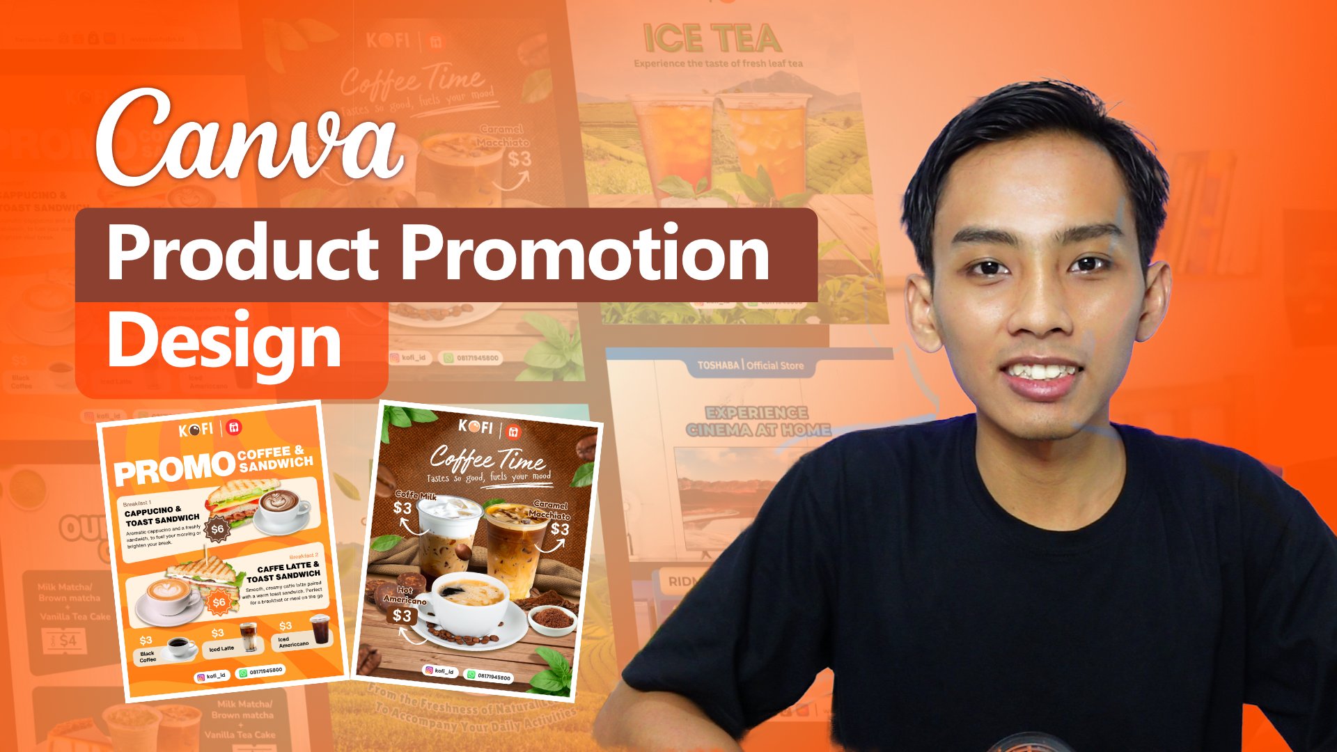
Transcripts
1. Introduction: Hello friends, at
the end of 2025, we have received a big news. Affinity has officially joined Canva and it doesn't stop there. Affinity also released
Affinity version three, which unifies its
three previous apps, Affinity Designer,
Affinity photo and Affinity Publisher into
one Integrated software. The most surprisingly part all of these features
are now free. We just need to log in through Canva and automatically gain access to everything from Version 2 plus major
improvement in version three. With stronger capabilities
compared to earlier version, Affinity version three has become a good software for all kinds of visual needs from graphic design and illustration to
other creative work. That's why it's so
exciting to learn affinity and apply
it to our projects. In this class, we'll learn graphic design using
affinity software. We'll explore key features
that make designing easier, and we'll also practice creating product promotion
design with affinity, sharpening our skills and
instinct in using the software. And what we will learn
in this class. We will take a look
at essential tools that simplify the
design process. We also learn how to set up the software for
the first time from basic settings to installing extension for smoother
editing experience. Next, we will dive into
practical session, creating a product
promotion design. We'll study the characteristic
of promotional design, practice breaking
down layouts and composition to make
our workflow more effective and efficient and learn how to edit combining
multiple objects, elements, effects, and texts
into acompaling design. This class is perfect
for anyone who wants to learn affinity version
three and to learn the creating product
promotion design or work professionally in
visual design fields such as digital marketing. Content creation or
social media agencies. Together, we will explore alternative fashion three
features and practice designing and producing high quality work
with simple way. My name is Fathoni Ashari and
see you in the next session.
2. What's New in Affinity 3: What's new in Affinity? When you compare affinity
version three with version two, there are several improvements. The first change in
the user interface, which now features new icon, although the overall
layout remains quite similar to the
previous version. And the most significant update is the major leap in
Affinity version three. It unifies the three
main application, affinity designer for
vector based design, affinity photo for
pixel base editing, and affinity publisher for
layout works such as magazine, books or newspaper into one
in the credit application. With this integration, Affinity claims that users can switch between modes simply by clicking the bar and the top vector, pixel, and layout, and
the transition happens seamlessly without damaging or altering the project
in the progress. These features is considered a revolutionary breakthrough in the world of graphic
design software, since it's not yet available in other competitor programs. In addition, Affinity
version three is now integrated with
Canva for premium users, a variety of AI Power
features are available, such as generative field, generative resolution,
edit portrat blur tool, color, rise and
super resolution. These tools are
designed to simplify the design process and
deliver more polish results, similar to the
generative capabilities offered by competing software. It's important to
note that the access to Canva AI is limited to
Canva premium subscribers. But you don't need to worry
because for this class, we were using the affinity
for free version, and it's not required the
Canva premium account, and Canva is only used
as the log in gateway, so you can still use a free
Canva account to access Affinity version three and
enjoy all its features for Affinity except
the affinity AI that utilize Canva
premium account.
3. Setup Affinty Setting: Hello friends, previously, we have learned about
the material that we needed to create design
infinity version three. And in this session,
we're going to practice to create design to sharpening our skill and then implementing the material that we have learned previously. So there's two design that
we're going to create. Both of them is to
promoting a product but in different style
and different purpose. So move on the
design number one, and now move on the
affinity software. So the first step, we have
to set up the workspace because we're going
to create design for social media purpose, especially especially, for example, Instagram
and Facebook. So we have to create the resolution and aspect
ratio for Instagram. So we can click File, click New, and we can scroll down and
find social media potrait post. Here, because we want to create the Instagram
aspect ratio, we choose the social media
social media potrait post because this has 1080p
1350p, click here. And here, as you can see, this is 1080 by 1350. And don't forget to
turn on the artboard. Turn on the artboard. Because it is very important. Let I explain if we turn off the artboard and
just create document, There is just one page. When we create the object in
the inside, this is visible. If we move to the outside, the object will be not visible and not convenient when editing. Or when we create the object, just partly on this inside, and mostly in the outside. So in the outside part
is also not visible. So it's not convenient
sometimes when we're working on the
different design, but we want to create
in the same document. So my highly recommended I
closed this document first. Click now, I click Fill New and click Social Media
post here tune on the artboard and click
Create document. Right now, there is
the ier artboard one. And if we create the rectangle, for example, and this rectangle is I moved on the outside, the rectangle still
visible, right? The rectangle still visible, and I moved on the
inside is also the same. This is very beneficial if we want to eliminate temporarily, maybe remove temporarily
in the object or we move to the outside here for
temporary is very useful. And if we want to create working on different design,
put in the same document. For example, like this,
this is the artboard one, and I can create the
another Airport. To create the another arboard, just simply click alt and this click Artboard and I move here. So right now, I'm working on different artboard,
right? Different Arboard. But still on the same document. So we just turn on the artboard, there is so many beneficial
that we can get. So my highly recommendation
in this practice, we will using the
artboard like this. So I'll remove I repeat
from the beginning, click New here
because we want to create the design promotion
to submit your post here, 1080 active 1350. Or we can also create manually. Like this document unit, we move to the pixel here and
for page with with type 1080. Yes, and then page
height to 1350, maybe we can change
the DPI to 300, right? And don't forget to turn on the artboard and create
the document here. Right now, we have
created the workspace. We have created the document, and let's we started
designing the first design.
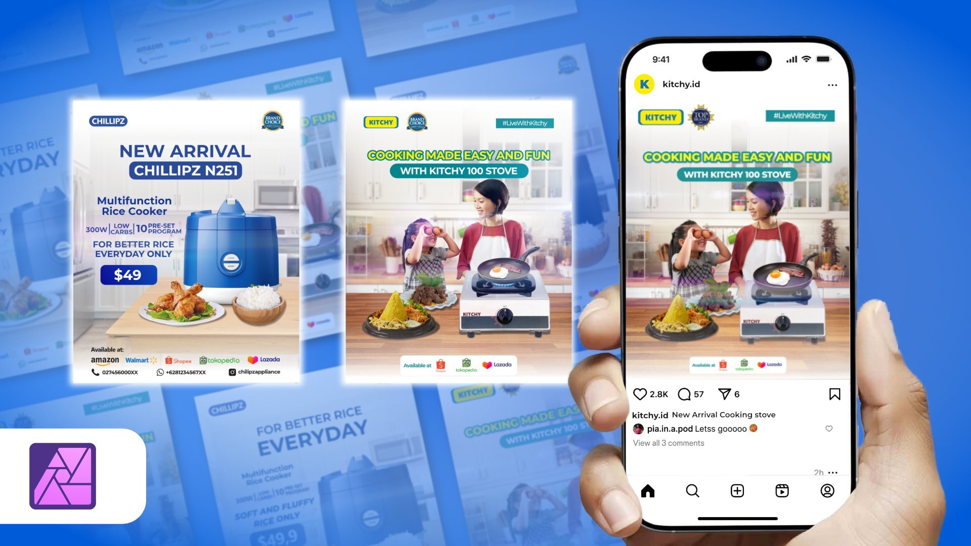
4. Deep Dive Layout and Composition: Hello friends, before we move on to the
practical session, in this session, we will learn
about the composition and layout for creating
promotional design. First, this is important, so we share the same perspective about design we're
going to make. Second, it helps us arrange text images and other design
elements more easily. By understanding the
composition and layout, we will develop
instinct in design, for example, adjusting for size, scaling images, or placing
objects correctly. Often, in the design process, there may be too
much empty space or certain areas that
feel overcrowded. In short, understanding
composition makes our design more organized. The first composition
that we have to pay attention is a background. The background serves as the
foundation for placing design elements while also
bringing the design to life. In front of the kitchen, there
are three models father, mother and child while cooking. Without the kitchen background, the photo of the model
and the object on the table would look
plain and less engaging. Without the background, the
model and the table object filled empty and
lack storytelling. But with the kitchen
background the design becomes more lively and conveys
the message that family is cooking with
promoted a prduct. Of course, background don't
always have to be photos. You can also use color gradient or pattern depending on the
design you're working on. There are many alternatives, but the most important thing is that the background should bring the design to life and
help it tell a story. The next aspect of
composition is the object. Objects are divided
into two categories, main objects and
supporting objects. Taking this design example. The main objects are
the stuff product and the family model behind it. Without this, the design
wouldn't tell a story. It would just be a background filled in the supporting
elements like food, food, header information,
or copywriting text. People might be confused about what the design
is actually about. But when the stove and family models cooking are included, the design clearly
communicates that the family is cooking
with the stove. That stove. That's why the
stove and family models are considered the
most important and the substantial and
outstanding object, they must be present in a
product promotion design. In another example,
The main object are the stove and pan being used with a blue flames
visible under the pan. These are shown as the largest image because
they are the focus. In front of them are supporting objects like fried chicken, fried rice, and other diseases. If the stove image were missing, the design would feel
unclear and lifeless. But if the supporting
food object were removed, the stove and bod would
look plain and empty. And leaving unused
space and adding food in front of the stove make the design more
lively and engaging. And supporting object
can also include like Brownies noodles or
chocolate drinks, and these elements
enhance the design, making it more attractive, busier and more relevant
in the theme or story. And the main object
doesn't stand alone, it needs supporting
object to feel complete. That's when the main
and supporting object must be relevant to each other. It would feel odd to
promote a stove but use supporting objects
that have nothing to do with cooking or food. The next element of
conversation is text. Text function as it conveys the ideas and information the designer want to
communicate to the audience. With text, we can express our goals and details
such as a promotion, discounts, specification,
prices or campaign messages. Text is highly effective
because audience can read it easily and quickly
absorb the information. For this session, text is divided
into three main parts. Number one is headline. The headlines role is to
grab the Atens attention. Alongside the main object, the headline helped throw focus. Headlines are usually
larger than other texts. And for example, in
the design shown the headline happy
holiday and cooking time. For example, in
the decent shows, the headline reads
happy holiday. From this headline,
we immediately understand that the
design aims to promote a product through the theme
of holidays and cooking. Number two is copywriting. Copywriting consists
of sentences that spark imagination or
provoked thought. After reading the headline, the audience moves
to the copywriting. For instance, this design turned cooking time
into family time. This phrase suggests
that the cooking can be a funny family activity. With this product,
cooking becomes exciting, especially when shared
with loved one. Another example, cooking
made easy with Yuantum. This line conveys that
the product makes cooking simpler and
more enjoyable. And copywriting works
subsconsciously, shaping perception and building a positive image of the product. Number three is
descriptive text. The descriptive text provide essential information the
audience need to know. For example, in one design, side the left side list
product advantages. The Yusaku stove is
safe from as leaks, made with standard
approved materials, comes with one year warranty and the product is
produced by a local company. These points explain
the product, but only selected
headlights are included. So the audience can absorb
the information quickly. In our affinity
practice project, we will focus on three
key elements Backgorund, object, and text. Background
is fundamental. It sets the stage for objects and must align with
the promoted product. And objects are the main focus, they must stand out
and capture attention, and supporting objects should also be relevant to the product. And text delivered the message, headline that fit the theme, copywriting that
sparks the emotion and imagination and descriptive text that conveys key
product details. And you may notice the gating
line across the design. These are helper lines to separate elements and make the
placement visual blessing. At the top the heater, there is a yusaku logo and
the tag line stay with you. This area is reserved for campaign logos or
brand identity. Below that, the second
row is for the headline. The next row is for copywriting, and the remaining
space is for objects, where the bottom row
serves as footer. This guideline helps us decided font size for headlines
and copywriting, as well as spacing
between elements. For example, we don't place objects in the footer or
headlines in the header. Each element has its own area. Headlines also guide us in determining the
object placement and scale ensuring
proper adjustment. There is no strict rule about dividing the workspace
into eight rows. However, since the 4:5 aspect
ratio is commonly used for social media platforms
like Instagram and Facebook, dividing the workspace into eight section is a
practical approach. This way, we have clear
areas for hader, headline, copywriting,
objects, and footer. All friends, that's
enough introduction before we move into practice. Now we share the
same perspective on creating content for
our practical session. Next, we will continue
with hands on design in affinity and explore its
features one by one. So see you in the next session.
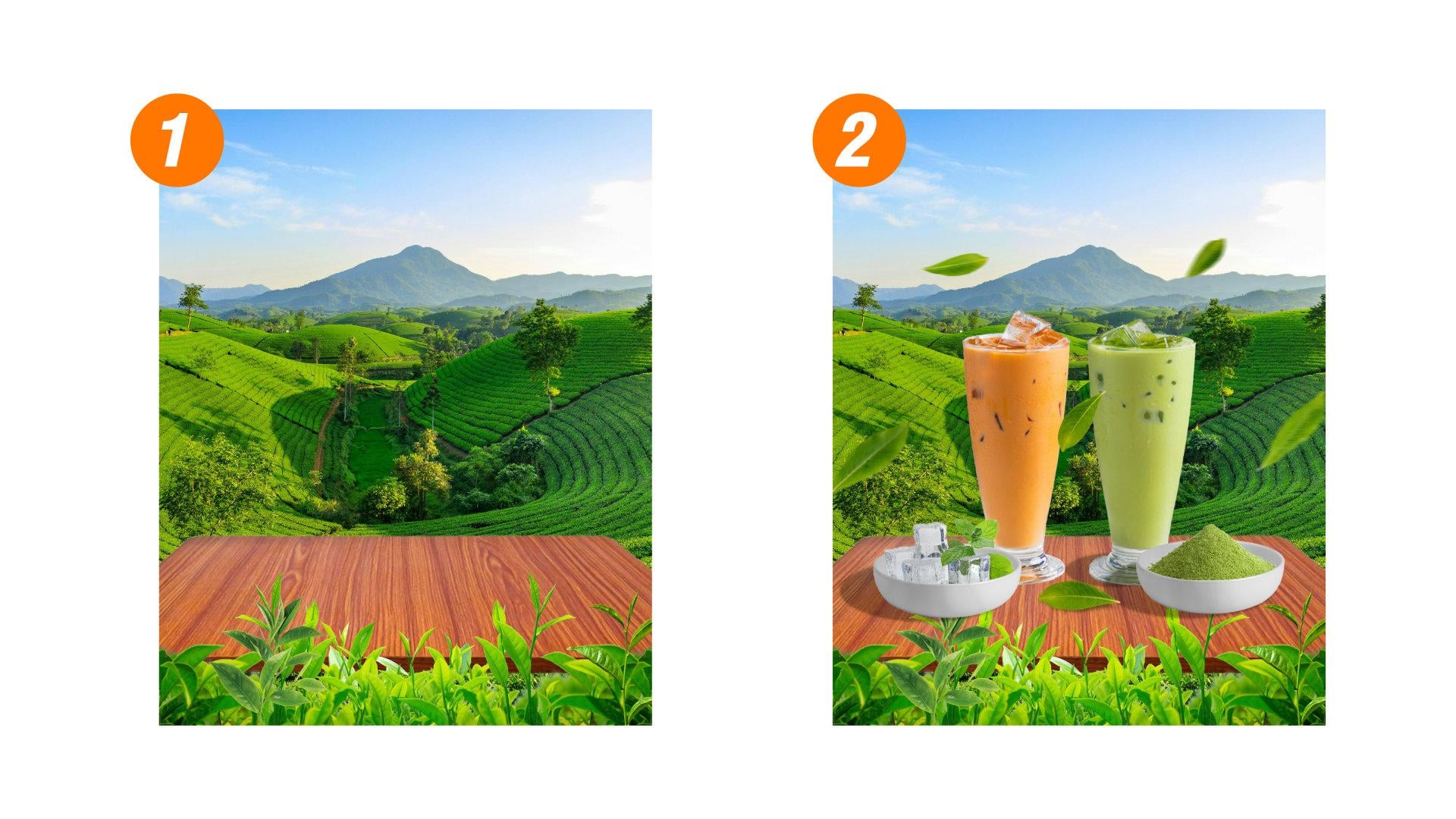
5. Practice Design 1 - Setup the Background: So the first composition that very important in
design is a background. So the first step, we have
to set a background first, and then later after the
background have done, we put the object. So the first step, we
will create the background. Friends, I have provided
the material that needed for this practice.
So don't worry. You just download on
the project section. You got all of this file, and this file you just import on drag and drop well
the editing process. So the first step, I want to
use this picture to import, you just simply drag and
drop here like this. And this picture
import into workspace. As you can see, the
image resolution is bigger than the workspace. So we can scale down here, like this and ctrl+0 to bring back the
zoom in the default zoom. And we can little bit move to find the right position
on the background. Next, I will combine
with the object. This one, wooden
wooden table here. And I scale down
and put in here. Unfortunately, the table has
white background, right? The table has white background
and we have to remove the white background before we put this into this area later. So to remove the
white Background, we will use the object
section tool that we have setting the
segmentation before. So we click object selection
tool and affinity will analyze the picture
we just wait. And if Affinity successfully
analyze the object, we click left click. So for all of your friends, if the object selection
tool doesn't work, maybe you still not
activated this feature. In the machine learning,
this segmentation, you have to activate it
in this segmentation setting to make this
feature available. Okay, move to the selection. After we satisfy about the
result in this selection, which is click the Muscle layer like this and white backgorund will
automatically gone. CTRL+D to deselect, and then the wooden table
doesn't has a background. And the rest of it,
we maybe just click, I think we can
resterize this layer, resterize this layer. So after resterize this
layer, we can scale up. Scale up like this.
And put in here. But if we pay attention closely, this table doesn't suit well. The perspective is
not suitable yet. So I will use this perspective tool to
make it a little bit lower. So what I mean is like this, I click Perspective tool here, and I think I will
little bit make it lower here. Like this. I think it's enough, and click Apply and make it a little bit bigger like this. All right. Next, I will rename this Background, which I will name the
Backgroun tea field. And this is the wooden table. Next, the object I want
to put is the tea leaf. This is the isolated tea
leaf. So don't worry. This doesn't has a white Background, so we just use it directly without need to
remove the background. I will put this
tea leaf in here, and I will duplicate
this tea leaf. Maybe I will rename first Rename tea leaf 1 I will duplicate. We
can duplicate with Ctrl+C and Ctrl+V, copy paste here or simply click ALT and
drag this object. And there's a tea leaf layer. Maybe I will rename
this two tea leaf two. And I will flip this
tea leaf horizontal. And here, I will put
in this right side. So between left and right, there is a full of tea leaf. It doesn't stop there. I
will add another leaf. This one, leaf three. This one. I scale down and I put here. In the middle. Like this, right? I will rename with tea leaf middle. And I also still had
tea leaf this leaf one. I think it will be
awesome put here. So I will little bit
make difference between this one in the left side and the right side is
not really identical. And to camouflage that this
leaf is just, you know, like flip side like this
and one more, this one. I will also put
in here. In here. to camouflage that this
picture is just flip. Okay, the tea leaf. tea leaf two, tea leaf three, tea leaf middle. I just name it
with tea leaf three. And this is tea leaf four. Tea leaf four, just like this. Okay. Now we have the background. Background is a tea leaf
tea filled scenery. This is a wooden table, and this is full of tea leaves. Maybe I will make a little bit lower in the wooden table, a little bit lower like this. So we have created
the background. The background consists
of tea plantation, right? And also wooden table
and tea leaves. Here, next we'll put
the main object, and then the secondary object. Main object and
secondary object as if standing on the table. So the next session, we put the object and see
you in the next session.
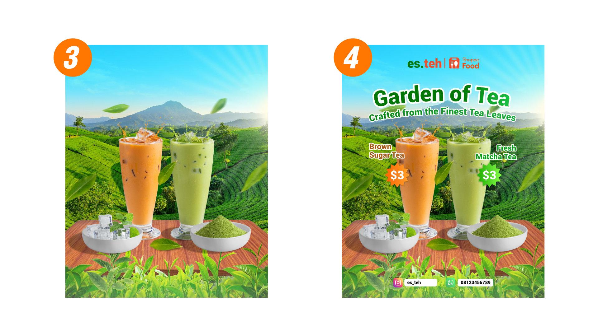
6. Insert Main Object into Design: Hello, everyone. In
the preface session, we have created background. The background consists
of tea plantation, wooden table, and also tea leaves with in front
of the table. So the next, we want
to put the object, main object and
secondary object. And let's start with
the main object. The main object we want
to create is this one. The brown matcha and
also green matcha. So because I want to make
this selection is perfect, I'm not using the method to drag and drop in this
area in this space, but I want to drag and drop into this part and open the
picture in the new tab. I will bit drag and
put in here like this. So we have a new
document open this glass, and if you pay attention, this is a bigger resolution
than our workspace here. Because the principle
of selection, the biggest resolution
of the object, the more easy we
select the area. If we just have the
small resolution object, it's hard to affinity to analyze the picture or
analyze the object. But if the object as
resolution is more easy, the selection tool between
objects selection tool or selection brush tool to
try to analyze the pixel. So to make this selection tool, let's using the object
selection tool first. And this way, affinity
will analyze the object. And that's the object
and after that, here, the glass
automatically selected. And just click, right click
and Object section is done. But there is some part
that doesn't select properly like this in this area in this area
and also in this area. I will use the selection
brush tool to tidy up this unproper selection
like this example. The straw, I'm not including
the straw. All right? And just click here. Don't forget to
click to hold ILT. Well, we move to the Cursor. Don't forget to click Hold Alt to remove the
selection like this. Without hold Alt, we
will add selection. With hold Alt, we reduce
selection, right? So in this area, for
example, in this area, there is some area that
doesn't selection properly, we can add selection like this. Add selection like this,
add selection like this. Add selection like this. And selection like this. Some area that doesn't
select properly. The Alt and here. After we satisfy the result, we just click Mask Layer. Or there is a refine here. But after that, you
can use this refine. This is the refine tool with a lot of figuration with
a lot of configuration here. But for this selection,
I'm not using this tool. Maybe we will using letter
in different object. I just click mask layer here. And Ctrl+D to deselect to have perfectly selected
glass green mancha. Before we move this
object to the workspace, don't forget to size, rasterize the object like this. So if you wonder why this rasterize cover in
this space area. So the simple answer because in this area before there is a straw until the top. So don't worry about
this anti area that cover with this blue
line because before, this is the area for straw. Maybe still residue in here. Doing that, maybe I
will utilize this eraser, erase like this
will increase the size. And remove in this area,
remove in this area. And now let's the
resteration more lower. Yeah, maybe we still utilize this remove in
this area, maybe here. And right now, the resteration close to exactly in the
area that cover the glass. Okay. Next, we just copy and
paste to the box space here. Because the resolution
is too big, we can scale down here until suitable on the table is maybe a little bit
bigger like this. Okay. The first main
object has done. Next, we're doing the same
method with this brown Macha, just drag and drop and put in this area to make a new document to open
new document here. Here, like previous method, we're using the object
selection tool. And let's affinity, we
analyze the object. And after the sign appear, just click left
click and affinity will automatically doing
the job like this. So the rest of it, we just need to tidy up
with selection brush tool. Don't forget to remove the selection or
hold Alt to add selection. Like this, for example, We tidy up the some area and not selection
properly like this. Like this. Like this. Like this. Yep. After satisfied about the result. Which is click mask layer. Ctrl+D to deselect, and then forget to
rasterized the objeck. Here, as you can see, this also apply some area
that steel cover will selection Maybe this is still on
residu to remove that using the eraser brush tool and with
carefully, delete this area. Residue in this area,
just like this. And then still be able to. So in this top area maybe
right now this area still. Right now, yeah, I
think it's enough. Just copy and paste into
workspace like this. Again, the size is
too big, scale down. And put beside the green Macha. Because the glass looks thin, I will, you know, make it more wider. Just click shift and click Just hold shift just click shift and ctrl to
make wider like this. I think it's too much.
Just little bit. Thinner. Yeah, like this. And also happen with
this brown matcha, click Shift+Ctrl and stretch to the side on the left or right. Like this. I think between the green
and brown is the same size. Just make it in the
center, like this. Maybe it's too big, I will
reduce the size, both of them. Okay, guys, if we pay
attention, you know, if we pay attention, the
lighting is from here, right? The lighting is from here. So it means that the sun is
the left in the right side, the sun is from here
and hit this area. And the shadow in here
because the sun doesn't reach this area full of shadow because this
is a curve area. So here means because this glass have light color
and shadow color. This is shadow,
this is headlight, and this is a headlight
This is shadow. Well the sun, the lighting
comes from right side. So we have to you know, switch switch between the class. Click Transform and
flip to horizontal, click Transform and click
to horizontal like this. And I think I will switch
this glass because I think this is more
suitable, right, like this. We have put the main object. The main object is a glass from selection from
this material. We choose previously and like this. This is the main object. And later next, we will put the secondary object and see you in the next session
to put secondary object.
7. The Role of Secondary Object: Hello, everyone. In the previous session, we
have put the main object. And right now, we also
put the secondary object. The first secondary
object I want to put is the matcha powder. This one. This matcha powder
and combination with bowl. So the Matcha powder on the bowl. How to do that, first, we put the bowl the
bowl white bowl. Unfortunately, this bowl doesn't
has a background, right? And I put in here
temporarily temporarily. And I also put this
matcha powder. And unfortunately, this matcha powder has a
background white background. So we have to remove first.
Again, the principle of selection is the
bigger solution, the more easy the software
will analyze the pixel. So I will utilize this
bigger as the page can, but don't until the cross the document still in the inside document
like this, right? Still on the inside document, completely in the
inside document. And I will use the
object selection tool. And let's the affinity doing
the job and like this here. So affinity will
select the object. And if we, let's say satisfied with the result and
just click Musk layer. So we have a bowl picture
and organic matcha powder. So I want to make this matcha inside of the background
inside of the bowl. part of them is
inside of the bowl. How to make those? So I want to make this powder
inside of the bowl. Like a part of this Matcha is inside
of the bowl like this, how to do how to make that. So I want to make the
matcha powder first. And we're working on the and
we're working on the bowl. In this bowl, as you can see, I want to make selection in this part of in
this part of bowl. I want to make selection
in this part of bowl. Between that in this bowl layer, I want to use pen tool here and we learn the
pen tool. I will start here with here, and gradually,
this is first dot. The second dot, I
will start with here. If your dot has a
background white, color white and outline black, we can set up in here, we can remove the
white with here, none. And to set up the Outline from 0.2pt 0.1pt like this and
continue the selection. If we just continue
to the third, you know, third selection, third point, the result
will be like this. And it's hard to manage the
precise selection, right? So my humble opinion, we just click here. Before we create the third dot, we click here to
make this curve, you know, it's not continuation, but to create a new path for
the cursor for the curve. Just click here first, and then click the third point. Doing the same here first, click the third point. Same. Click the next point. We're doing the same,
click the next point. I think this is the
last dot in the inside of it's not precise
like this, maybe. The rest of it just
create dot the outside of bowl in this area carefully. So we have created
the front of bowl that this should be covered
the some part of powder. Next, we click selection
to make a selection area. Still on the bowl, we click Ctrl+G on the player, Ctrl+D. So we have
the selection of bowl. If we hide the player
in the button player, we will have part of bowl and we bring
back it's like this. So we click stick to
deselect and right now, bring back the Matcha power and bring Matcha powder
under the bowl here. And the some area, the some bowl is cover. So right now, if we
pay attention closely, if I hide the bowl like
this, both of them. So next working on
the matcha powder. We pay attention
there's some area that still have white area
like this like this, and how we do fix that. But if we pay attention
closely, you know, if I hide the bowl temporarily, if we pay attention, if you wonder where to
remove this area, the white area, the white area, how to remove the white area. All right. So I want to repeat the
selection doing selection. This is the green Matcha. I drag and drop here. And I repeat
selection like this. If you wonder how to remove
the whie area like this, and I create the
object session tool. Let's the affinity will analyze the picture
and click here. Here. And before I click Musk
layer, I will click Refine. And that's we're
working on the object. Here, this is there's option matte, foreground
background and feather. If we click matte, right,
click and we block in here, in this area that
contain the white area, and automatically white
area is gone. This is also happen too. And if we click foregorund, it will bring back the
white area like this. Wow. And if we click a background, it will reduce the
object like this. Whoa. The object, this is unselected. And click feather. This is really suitable
if we're working on the feather like hair
or something like that. But we just click click matte and remove the white
area that we unwanted. Like this, this one, this one. Okay. After we satisfy
the result and just click Apply and click the mask layer. Well, this is the
perfect selection without white residue, right? And I think this is the
better matcha about right? So in this layer, I
will delete just delete it and bring this layer
to here and bring back the bowl and reduce the size and
put in here like this. If you wonder how to
delete the white area. Next, between this bowl here. I think I will rename first. Top bowl. behind bowl. Oh, this is the plus. Main object one. Main object, two. So next, the top bowl the Matcha
powder matcha powder bowl matcha powder,
and behind bowl. I select all of them
and reduce the size, click shift and reduce
the size that we want. And bring here here. Here like this. So this leaf it should on the
top of this bowl. So I move this leaf, right, in the top
of layer like this. So we working on top bowl, Matcha and behind
bowl and like this. So the next secondary object, I will put the ice still on
the bowl the ice ice cube. Still on the bowl. To doing that, just click bowl, drag and drop or we just copy and paste,
bowl on this bowl. above and behind bowl, I copy and paste
right and bring to this to this area like this and bring the
ice png, please. Oh, even though the name
is png, but unfortunately, this eye has a white
background. Let's do the same. Let's select with the
object section tool. And let's affinity
analyze the object. So the affinity doesn't capable of doing all
selection object. So we have to select partly this leaf
first and this first, a, this second as, like I, this two, these two. And we take it up
with selection brush toll this like this area
with this area. Right? And if we satisfy, just click mask layer and
ctrl+c to select and reduce the size and bring to top
to top of bowl bring to, you know, close to
the inside of bowl and bring in the
pitching top bowl to behind bowl like this. And the ice as if in
the inside of bowl. So I will make I will
group this object. Between that just simply, we select this area. So this is the setting that we have mentioned in
the earlier class, the mark selection to behaviour
like this, just like this. We select the bowl
with ice, just group. And we also select this area bowl with
matcha powder and group. So we have to group, this
ice group and matcha powder group. If we feel that this
bowl is too big, maybe we can reduce a
little bit, both of them. A little bit. Put in here, this here and put in here. Next, if we pay
attention closely, I think the wooden table is I think I will make
it a little bit bigger. like this is a
little bit bigger. All right. Hello friends, we have created the background. We have created the main object
and the secondary object. To make it more crowded, I want to add little
additional secondary object. It's just attribute,
some attribute. I want to make the flying leaves, for example, like this. The flying leaves, maybe
I will put here, drag and drop a little
bit bigger like this. And I will put
another leaf here. Another leaf here. Flying leaf. Or maybe I don't
know, it's right. Next. Which one? This one? And the last I think this one. Oh, I just the same
the same leaf. I think which one? Which better? This one? Yep. So, I think it's I will use, this one. The last leaf. So here, the leaf is a flying
to make it a little more, you know, like a wind effect
or something like that. To make it more
little bit dramatic, I will add filter, and I will choose motion
blur click one of the leaf. I think I will click this leaf and I will little bit
make it dramatic. Here with filter, gaussian blur. This one, like this and
this one too. Like this. I will add the filter gaussian blur or if not gaussian blur, I will change this
one with motion blur. Yep. No, no. This one. Yeah, I think better
motion flu, right. So this one also motion
blur. Motion blur. This one, too, with motion flu. Just let this without
any effect like this. And I will copy
maybe this one like this close to fill empty space. So here, the so we have
created the background, right? We have created the main object. This is the main object,
green Matcha and brown Matcha. This is the secondary object, Ice cube on the bowl and also the powder matcha
on the bow little bit, you know, adding
flying leaf, right. Maybe if you feel
this is too big, you can reduce the
size like this. So the next I want to edit
some effect like a shadow, lighting, and also a little
bit color adjustment in between each object is
synchronouse in color. So see you in the next session.
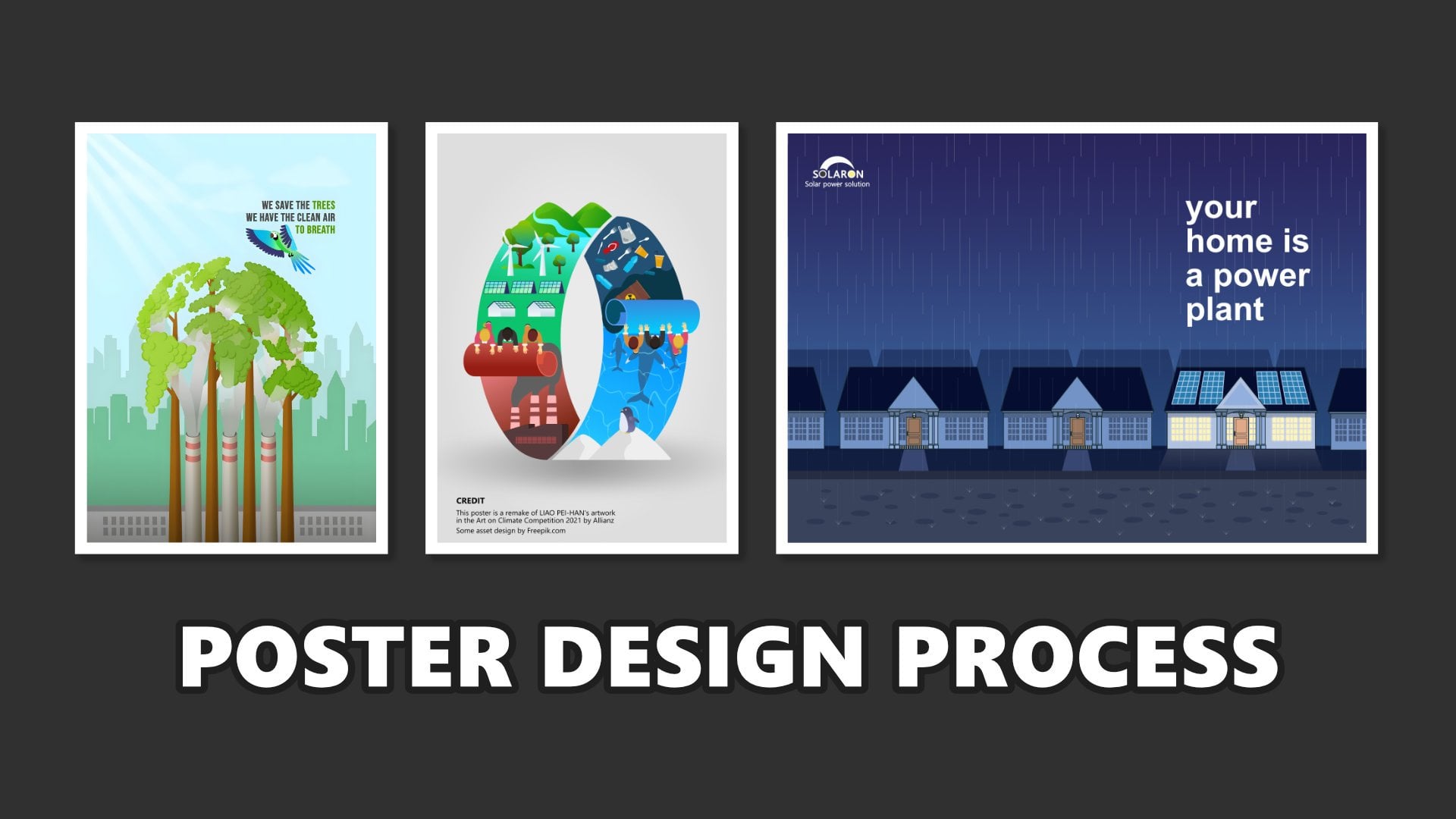
8. Stunning Up With Applied Effect and Color: Hello, everyone. So
in this session, we're going to apply some effect like a shadow
and color adjustment. So in other in each object, they have a same vibe, same synchronize in color, and also it's more
pleasing to the eye. So move on to practice. So if we pay attention, the
light is from here, right? I will hit the object here. So this is the more brighter, but the bowl doesn't have a significant difference
between light and bright. And I think I think this ball should be
flipped too because this is the more
brighter than this area. So we will working on this ball adding a shadow
and also this object too. I will little bit tidy up the layer because the layer
is started to crowd it, especially about this leaf. This one, you know, I will make it group for
this leaf, and I will hide. Yeah. And also, this one, too. Start to crowd it, and I will group. Like this and I will hide. So this is just for help to make our easy in working
on this object. So the first thing, I will re size this bowl because I think it's bigger
than I thought. I think it yeah,
more or lesses like this guys and put in here, and this one also put in here. Because this area is
darker than this area, I will flip this transform, flip horizontal
like this, right? Because the light is from
here and we'll hit in here. And this one, too, I will
transform to flip horizontal. This more brighter than this area. So the next, I will add a
shadow for each object. This one, this one,
this one, and this one. So to make the shadow, I think the simple way I
will use the ellipse tool, right, because the
sun is from here. So the shadow should
be in here like this. And if your offile has outline, you can remove
this outline here, remove this outline
and choose the color to close to the dark that you can reduce the opacity to 50 and change the opacity
to multiply here and move this ellipse layer under the bowl ice like this and just little
bit like this. And in this layer, we add gaussian blur like this. Maybe 1.6 like this. So this is the simple way
we create the shadow. The Shadow is just
simply copy and paste because this also
apply in here too. Just copy and paste and
bring the under this one, the group and just like this. Right, just like this. And this oval also
apply in here. This object, just simply
getting a ellipse tool here. Getting oval, giving
the color to black. Right and the
opacity move to 50, change to 50 click multiply, and put
in under the main object and click gaussian blur
give the radius to gaussian blur to 1.6 maybe. Yeah. Like this. Maybe I will reduce
the opacity to 40 to 40. And I want to add a
shadow in the bowl. So not only add shadow here because the sun
will hit this area. So this area should
be darker, right? This bowl area should be
darker to doing that. This is just a
little simple trick. I will add using the
adjustment tool here, the group, click adjustment
and I will click curves. Here and we're
working with curves. So before we working
on this graph. So before we working on
the curves graphics, in this curve adjustment layer, put in the group here. So the curve adjustment
layer just only apply on the ice with bowl, not apply in whole
document, right? So I will give the difference. If the curve adjustment in here, when we working on the graphics, it will influence
all of the document. But when the curve adjustment
in the inside of the group, so this only influence
in this object, right? So we will make it
darker like this. Just darker like this. And after that, this
curve adjustment that inside in the
group, this one, the curve adjustment,
we will invert with Ctrl+G, right? It's becoming a black. But actually, it just invert. When we invert back,
it will black. When we invert black,
it will to previously. So in this mode, in this invert, we
click the mask layer. We will make it darker. So the bowl ice bowl will
look darker like this. And after that, we will invert. In the curve adjustment layer, click Ctrl+I here. And using this paint
brush tool still on the curve adjustment pain
brush tool we reduce the opacity, maybe to 20, and also
reduce the hardness, maybe to 20 and also this flow, maybe to 30 and little bit
draw in this area. Oh, don't forget to
set foreground to white right to white. And the gradually draw
this bowl like this. So just not only the bowl
not only has a shadow, but also this area is also a
little bit dark like this. So it will also
apply in this bowl. Repeat the process, right? Click this bowl and add the color adjustment curve. Before we working
on the graphics, we move curve the inside of
group like this, right? And then we make this
bowl darker here darker. After that, we
invert Ctrl+I and using the paint brush tool
with this configuration
and start to draw. Here slowly but
surely we draw this Like this, right? It's not only at shadow but also a little bit
shadow in this bowl. This brighter, darker, I will also
apply for this class too. This glass main object to click the adjustment and
also the Curve. Yep. Before we working
on the graphics, we move curves to
main object too, because we want to
influence the min object, bring to bottom here,
and this one, two, this 0.2 like this
and invert Ctrl+I. And using the pen brush
tool to draw this area. This area, this darker area. Like this, right? Yeah. More or less will be. This is the shadow. So the next I will bring
back the leaves here. So I want to make this sky a little bit,
a little bit blue. Me. It's like the sky is
saturated or maybe or blue. Doing that, I will add I will add a shadow
with rectangle tooth. Uh like this, I will
change the color. So I will remove the outline
first, remove the outline. Here, this is the outline
and remove the outline. And this rectangle
just only has black color. But I will change the
color with gradient In this, this is the white white
color in the white color, I will change the
opacity to zero. And this black, we this black, I'm going to change
the to blue like this. And after that, click
this rectangle, click this fill tool, and we move the direction
of gradient become like this. And maybe some
adjustments using this. You know, I don't know
what they call it, but change the slider. Yeah, we call it
slider like this. And in this point in this
point in this color, maybe it's too much. I will add the opacity. This is maybe I will change to 60 like this and
change the color. To a little bit
bluish or cyan. Yeah. Like this. This is the easy way and simple way
to change the sky color. And I want to also add the lighting because
the sun is from here, right? The sun is from here. So I want to add I want to using double start double star
tool and draw on the double start. Here, maybe the first
will change the color to white and increase
point to 20, I think, and in juice, red juice to 10 I think and scale up scale
up much scale up. Like this, I want
to put in here. It's too big, right. reduce. I want to put a little bit
here and change the color, little bit to yellow. Just little bit,
little bit yellow. And I will add the
live filters filters and choose gaussian blur one. Like this if it's too much, I will increase the
gaussian blur to and 12. Yep. Like this. Okay. So as you can see here, we have created
the background of course. Okay, next on the Background
tea field, I want to add a little
bit adjustment in this. The adjustment because this area is too bright, you
know, it's too bright. And I want to change
adjustment little bit. To make it adjustment, I will using the HSL here
because basically, even though this color is green, but I think it's color more yellow. So we choose yellow and move. The slider just little to more cooler and reduce the luminosity. So this is the this is
before and this is after. If too much, we back
to minus three, and this is just minus eight. This is before,
and this is after. So it's more, more
green and cold. Next, I also want to put the little bit shadow
in here in the bottom. Still using the rectangle. Here, the rectangle.
The rectangle. Using white shadow,
as you can see here, with shadow and using
the gradient in this one, I will reduce the opacity. And with this tool will change the direction
of gradient to like this. And reduce the
opacity for this one, for this one point because this is too
much in a white color, we can reduce to maybe 30. So this is the before.
This is the after. And this rectangle, this is
before and this is after. And this rectangle here. So I want to tidy up the layer. This is the star. Sunlight, I will name sunlight. The rectangle is bottom
shadow this one, I will type top
shadow, sky shadow. This is leaf. Group or
leaf, group, and object. This adjustment for
Background tea field. I want to bring this inside
of background tea field like this. Is like this, the instead of
Background tea field, right, guys. So we are creating the
Background main object, secondary object, and adding
some effect lighting. And the next we'll
put the text from the headline copywriting,
also additional information. And the last is footer
and header and footer. So see you in the next session.
9. The Important of Text in Design Promotion: Hello, everyone. So
in the previous session, we have created the background
and the main object and also some effects,
lighting and shadow. In this session, we're
going to add text, copywriting and also
additional information. And let's move to the
practice session. So before we add the text, I want to use the guideline
to reorganize the object. And this guideline
will help us to like monitoring and also
reorganize the object placement. To create the headline, we can utilize the
rectangle here. And we set the color to
fill non color like this. And the left and the left is
a outline and the outline, I will set to 0.2. Yes, 0.2, 0.2pt. And then this
rectangle, I will copy. I will copy and paste here, and I will put
underneath like this. Right now, I have to rectangle
this area and this area. I will copy them. And right now, I have
four rectangle one, two, three, four, and next, I will also copy again. all of them for rectangle and
I put underneath this one. Yeah. And right now, I have eight rectangle here. And eight of them, I will stretch to the bottom like this. So right now, we have eight rectangle and each
rows and each rectangle, they will divide the area
into the certain area, this one, this one in the
top of rectangle here, this one is the placement of
header and this underneath, the second rectangle is
placed for the headline. For example, actually, rectangle this rectangle is placed to headline
and copywriting, right? Headline and copywriting. And most bottom, the
area is for footer. So because we're going
to create the text, the headline and copywriting. So the copywriting should
on here because this is the best area that not fill with the object
and this area too. So this is the guideline, and we will use it later. So before put the text, I will make this guideline
into a group, a block of them, select all of them, a rectangle and Ctrl+G to make it a group. And I will name it at guideline. Yeah. And I just
hide the guideline. Next, I will type the headline using artistic text
tool like this. I will type Garden of Tea. This is when we using
the architec text tool. So what if you want to
create the curve writing? This is just straight line
horizontally writing, but we want to create
the curve, right? To create that, I will utilize
the Ellipse tool and make the line using this line to placement of text
to placement of text. And after that, we choose
artistic text tool, and here, click this area, this line until so we offer the cursor until the
T and wave appear and click here and left
click and start to typing Garden of Tea, like this. To make it a center,
just simply, this is the green triangle, and we just slide
a little bit like this and the writing
into the center. And we also applied here to make the writer more to left
and here more to center. If the font is too big, we can reduce the phone size
to reduce the phone size, it is simple and select all of them and just click
reduce phone like this. Maybe reduce again. And just bring the
green triangle to make it a little bit center. Next, I will change the font. For this tutorial, I will
use I'm going to use maybe roboto yeah, roboto like this. Make it center, little
bit center, like this. garden of tea. Yeah, I think till, the one size is too big. I will reduce to 28 maybe. Yeah, to 28 is perfect, I think. Garden of tea, we
change the font to roboto and change the
color from black to, I think, because
the theme is green, I'm going to change the phone
to green like this, right? And to make it more firm in the age of writing, I will add the outline. To add the outline is a
simple we can use this tool. This tool is character. We click here, and this
is the place we can edit the outline and also
the some effect. So this character, it will
help us to edit the outline, to edit the phone
and to, you know, like, make it more shorter or
longer space in each phone. So many editing, so many tools that related to font in
here in the character. So to ed the outline here, we can just here this one
until open tab this window. And in the width, we
slide maybe 1pt. 2pt, 2.9pt. Let's say 2pt and we click this line to line
stroke to outside here. And because the stroke is black, we change to white like this. If you feel that the
outline is too thick, we can block them and
change the outline, maybe reduce to 1pt, 1.5, for example,
1.5 or just 2pt. I will using the guideline here because this headline is
in the second rectangle, maybe I will little bit in
this area in this area, right? Like this Garden of tea
we hide the guideline. And this is the place
for the copywriting. For copywriting, I will
type I will copy this one. I will copy and paste. So we have two, the
garden of tea. but actually, this is for copywriting, because the copywriting also
using curve style, and we just copy this one
and change the font size, for example, I
will use maybe 14. 14 and reduce the stroke
to one like this, and type crafted from the finest leaves. tea leaves. Like this. I will make it center, and I think it's too big. I will reduce a little bit, maybe to 12pt and get center. Yeah, more or less like this. The rest of it, I will bring close
to the headline. Garden of tea crafted
from the finest tea leaves. So to make it more, little bit related to this lighting because
this lighting is from the right side. So I want to make this color, garden of the Tea and
this copywriting, little bit apply some gradient. To doing that, block all of them and click font color,
click gradient. So here. So in this gradien this
point from white, we change to maybe green Green. Yes, like this. I
think it's enough. And the rest of it
just using the click this one and the oval and click the fill tool and
then fill tool, we change the gradien
direction like this. Or if we want to switch to flip from brigther
color to the tag color, which is using this
one reverse gradient reverse like this and automatically
we'll flip like this. The current of the tea and
this one also apply too. Click font color, click gradient, click this one and bring using the green like
this and just reverse. Garden of the tea crafted from the finest tea leaves like this. This is for the header, and this is copywriting. Next, I will add the menu name for this brown Matcha
and Green Matcha. To create the menu, I will also using the artistic texto
and just type here. I will type Brown Matcha, Brown sugar tea will type Brown sugar tea like this. And I also copy this one. And I will type Well fresh green matcha fresh matcha, fresh tea, ike this. I think I will change the align
to align right like this. fresh, fresh matcha tea And I reduce the font
from 12 to maybe ten. Yeah, ten is enough. brown sugar t and fresh Macha tea. Here, I think I will reduce the, you know,
leading overide of to 11. This one too, to 11. fresh matcha so to edit the color to edit
in the font color, we can use this tool font color. But the font color also available in this character
window, font color. So yes, depend on
your preferences. Just click here, click here
or click here. It's the same. I will change this
color to brown. Yep, brown. In this point, I will change
to a little bit orange. Like this Brawn sugar tea. If the prawn is too much, we can Yep make it
brighter and this one. Yep. Brown sugar tea, and this one
because this one is green. So I'm not really I'm going to change the color or maybe
I will chose a little bit, make it more brighter like this. Yeah, like Brown sugar tea
and fresh matcha. Next, I think a little bit here. Yep. Next, I will put in the price. For the price, I'm going to use start tool here
and put in here. This start, I add the
curve edge point maybe to, I don't know, 12. Yep. And change the
color to maybe brown. Yep. Like this, and
remove the outline. This one, remove the outline. And then I add the outer
circle, no, no, no. The inert juice, increase
the interred use maybe 75%. Yep, 75% and change
the color again to, I think it's darker
brighter like this. Maybe is too big. I will add the gradient here. This one. This one should be darker. This one, like this. Mm. Okay. And for the price, I will utilize
Artistic text too. So I will type
Artistic text tool. No, no, no, no. Which one? Oh, This is the cover
type in here first. Artistic text tool, we type. three dollar like this and bring this three dollar to this one. And this layer three dollar
bring to the top of star. Again, We remove the
outline here, the outline, click no line style and
increase the font and change the color from green to this color,
just white, like this. Three dollar and just copy
and paste bring here. Here and change the color
from orange to green. Like this, and this one
also change to green. Yeah, more or less like this. So I will put a little bit
higher close to the menu, little bit higher, close
to the menu, like this. So brown sugar tea for $3 and fresh matcha
tea for also $3. I will add some effects. I will add a shadow in here. Just click the rectangle
and click Layer effects. We utilize the outer shadow
here and increase the radius, offset and increase
the intensity. Like this, I think the opacity
will reduce the opacity. Yeah, just like this. Or the radius. I also increase the juice. This one, and also this one, too, click the
outer shadow here, click radius offsite this one intensity And the color, we can
change the color, actually. Maybe it's more green, dark green like this. If not visible, we just increase the opacity and
increase the ret use. Yeah. We just
adjust as you like. So next if you feel
that the phone for the press is like maybe if you prefer
to more bigger font, we can increase to 15. Yep. This one you
to increase to 15. So, guys, so we have created the headline and copywriting
and also menu and the price. And the next I will put
the copy header and the footer. So see you in the next session when we
put the heater and footer.
10. Header and Footer as Validation Design: Hello, everyone.
So this session, we're going to put the header
and footer for this design. And then let's do it. Here, I want to bring back the headline to review about everything that
we have created. This area is empty space header, and this area is also
empty space for footer. Let's fill this area first. I want to fill this area
with this one shopee food. Logo. This logo, I
will put them here. This is the yeah, Shoppee food is one
of the marketplace online and provide
the delivery food. I will put in here. And let's say the restaurant or the cafe, the name of the coffee is let's say the name is I will using
the artistic text tool. And then I will type in here. I will type es.teh here. es.teh here means ice tea. So change the color. We're using the
color picker here. Like at, IT, click Color Picker, and track to find
the color sample. I will make it.
Make the same color as the shopee food
color just like this. Yeah. Es.teh Maybe I will
change this color to white. Like this or this one. No. Yeah, I think it's a better. It's better. And I will add the separate the separate shape
using rectangle tool here, separate shape and
change the color to this one Color picker. es.teh the maybe it's more thinner es.teh and shoppe food and make it cente
es.teh and Shoppe food. So for the logo, because
this is the white, I think it's not looks cool, so I will change the
green and I will take the sample from this
color like this. es.teh. Yeah. This is
for the footer. And here for the header, I will using the I will add
the social media account like this. From Instagram
logo, put in here. And also this also, whatsapp logo. Instagram logo, and Whatsapp logo. And then for this
Instagram account, we add the rectangle
shape like this, change the color to white, and add the corner
to rounded and bring close to the
Instagram logo, like this. And I will types too big. reduce the font. To 8pt, es.teh like this. Change color to black and
reduce to maybe 6pt. Next, I will copy in this es.teh
and the rectangle copy and paste and bring to
here close to whatsapp account. And I will type the number. Let's say one, two, three, four, five, six, seven, eight, nine. Yep. Is random number
phone, please call. Don't call it this number. Like this, and the rest of
it just bring the center. Here, if we hide the guideline
the guideline, the result will be
more or less like this. This is, you know, the promoting of matcha, the promoting of Matcha and this is for the headline
and the copyrighting, menu, price, and
also for the header. And for this leaf, the shadow, I will add the shadow
for this leaf, right? So we into the group. This one, or this one. So to create this shadow
do for this leaf, there is a new trick. The trick is, we can copy
this leaf Ctrl+J. You can using Ctrl+J
to copy in this leaf. And this bottom from leaf two, I changed to make it darker
using curve adjustment, and this curve
adjustment bring to leaf two in the bottom here, right? And I will make if you
want to get the result, maybe you have to hide the leaf. This leaf will
head first, right? And this left the inside has the curve adjustment in the inside leaf number
two in the bottom, and we edit the curve layer, and the result will be dark. Dark right? Dark. And this will reduce
the opacity to 50%. Oh, no no, we change
the multiply, right? And leave this leaf, we reduce the opacity to 50. So we reduce the opacity to 50 in the leaf two
layer, this one. Not in the curve adjustment, no, but in this layer. So this layer, leaf two, this layer, and we bring
back the leaf two here. And which is crashed down in the leaf two in the
darken left two, which is pick shift. hold sift to stretch down, Shift. shift like this. And after that, we
add the gaussian blur. Yep. 2.5. Like this.
Alright, guys. So the first, I think the header need to
bring back little bit down. For the final touch, you know, for the final touch, I will bring back the orange
juice splash here. This is splash, water
splash actually. We can put in here. Like this is splash from The glass comes splash from the glass like this and
we can change the color. This one. We're using the HSL color. Maybe we try recolor first. Oh, don't forget to
bring the recolor into inside of orange
splash like this and just by gradually. Okay. Like this and reduce the No, no, yeah, I think like this. Right? And we copy and paste
this place and put it here. And also, this one, this layer one and
this layer place in front of the green glass, we change to green color. Too much, I think. Yeah.
I think I will reduce the opacity and reduce the lightness or
increase the lightness. Yeah, like this, more or less. So this is the Oh, I think for make difference yet, I will flip.Okay guys. So this is the first
design that we have created to promote
matcha product. More or less, the result
will be like this. So the next we will move
to the second design, build to promoting a product but in different style
and different design. Friends, if this
class is helpful, please don't forget to leave
a review for this class on the review page on the Skillshare review because the review is really important
for us as a teacher. And also, don't forget to upload the project your project. So maybe I can give
some feedback. About your project.
And I'm sure that your project is more better than what I show
in the tutorial. So yes, I'm very exciting to see all of your
work in the project section. And also, don't forget to follow my skillshare account to get the latest class notification, and maybe we can learn
together in another class. Next, we move to the
Design number two. So see you in design number two.
11. Practice Design 2 - Background from Several Image: Hello, everyone. So
in this session, we're going to make
the design number two. previously we create
design a number one. And right now, we're going
to create Netis number two, still to promoting a product. And the product that we want to promote still is similar to the refuse product is
the drink matcha drink, but in a plastic cup, right? But we want to create
this design in different style and
different purpose. Let's move to the
Affinity software here. First, we create
the new document, click New, click
file and click New. And right now, we want to
create the custom setting page. Even though we're still using the aspect ratio for
social media bus, but we set up the
document setting. First, in the document unit, we change to pixel. Here DPI we change to
300 and page width, we put 1080p
width and height. We choose 1350. 1080x1350 pixel. And don't forget to
turn on the artboard. If you curious about
the different artboard, turn off or turn on, you can watch the
preview session in the design number one. I have explained about
the different artboard when turn on and turn off. So for this project, let's turn on the artboard
and create Document. So we have to create
the document. This is the document for
creating the second project. And the next one of the most
important and first step in the previous design is to set the background to setup the background. So we set up the background. For the background, I want to use this one, this picture, right? This picture has a
big resolution. It's two big resolution, you know, like this. And I want to scale
down until here. So I want to utilize this
background part of background, part of picture like
this, maybe like this. So we're still on
the pixel tab here. When we moved on the vector, some icon is different. And because we're working
on a different image, maybe it's more convenient
maybe using the pixel. Right? So I think for
the convenient in it, I want to crop this image. There is two ways
to crop this image. The first way we can use the rectangle we can
create the rectangle here. We can create di rectangle
here, the rectangle size, precise exactly like the document setting and
document resolution like this, full of the document,
and this rectangle, we click the create
clipping mask here. And the picture of tea
field automatically crop. We also be able to
crop with this way. Maybe we undo, undo and we're
not using the rectangle, but we're using the vector
Affinity vector mode. We switch to vector
here, and the vector, there's a crop tool here, the vector crop
tool, and we click. Simply we can crop to
here and here. Like this. And here, the layer is also the same because the layer
also have clipping mask. So it's basically the same
as the previous method. But yeah, it depends. You can use first method
and second method. But yeah, I will use this
one to crop this tea field. And I will add the
name for the background. Tea leaf. The next I will put the
chocolate this one. This is chocolates splash. Chocolate's splash here. I will scale down like this. I will put in here first.
And also this white splash. This is I think this
is like milk, right? Milk. The chocolate
doesn't has a background. So this is just a
PNG file doesn't has background. But unfortunately, the
white splash milk has a blue background. We have to remove the blue background
first before we add it the chocolate and the white. We have to remove the background
the blue background first. Remember, make this white
splash as big as possible, but doesn't surpass this page, just like what I do still left little bit space
around this picture. And we using the object selection in the object
selection tool here. And let the Affinity
analyze the picture. And find the right position or the right object like this, for example, here and click. Right click. They automatically
automatically selection. But if we pay attention, this selection still
contains in a blue color. So a blue not cuff maybe the
result will be like this. If I just click layer
mask mask layer. As you can see here, there is some blue color still
left in the selection. And I'm not a using this selection because
still be able to some blue color left. So we undo back to the
selection like this. And in this position, I will use this picture
and these tools, go to the pixel selection, and click grow or shrink. And let's so I will
type minus one pixel. So this selection will
go more inside and reduce the residue
of blue blue color. Maybe some areas still
left blue colored. Maybe we will fix with this
one, selection brush tool We will reduce the
width to one, I think. Don't forget if we want to add the selection, we hold Alt. No, no, no, just ALT. Wait, wait. Just
ALT and like this, maybe in this one too, hold ALT and push the selection. Maybe this one too,
and push the selection. So this is the method to create the clean
selection, right? After we satisfy the
result, just click. Just click mask layer. Here and Ctrl+D
to diselect. I think the result is more
clean than before, right? So we have the clean white
splash and chocolate splash. Next, I want to use this place as if this
place will crossing this field and divide this field divided
becomes two area. So we put aside the what
flash first. Oh, no. In this chocolate splash, we hold shift or maybe
like this splash. We hold shift like this and
stretch down stretch to up like this to stretch this and
hold shift again make it more narrow and also still as if the chocolate
is crossing the The field this. Next, I will also
make this the milk, also crossing the field. Here, I will click shift
and stretch to like this and rotate here and put this white splash
under the chocolate. Again, like this. This one. Maybe stretch more, shift
to stretch more further. Again, to make it more narrow. Like this. Yes, I think I will make a
little bit bigger for this. Yeah, like this.
Okay. More bigger. Yeah. More or less I think Yep. bigger or stretch again. Okay, like this. And for
the white I will apply some tools and I call
the tools liquify here. Because the shape of
white splash is to curve. We will make this white
splash is more straight. Between that, we will utilize
the liquify tool temporarily, we hide the chocolate splash. So I will rename chocolate chocolate
splash and milk splash. Like this. We will hide
the chocolate splash temporally and we're working
on with this milk splash. We will using the liquify. So the luqify so this luquify will force the
form of object as we like. Maybe we will push the object, we will push the
object gradually. For example, like
this, this one, we will stretch or
force the object. To make it more straight. But sometimes the
result is not good. So we will increase the brush, increasing the brush like this, again 800 around 800, and gradually we will make
this splash more straight, reducing the curve
gradually slowly, but surely, and this one, too. This one, two, this one, two, slowly but surely,
we make this place. Maybe we're increasing
the size, the curve. And after we satisfy, we can click Apply. Bring back the chocolate. And right now in
the milk splash, we can position like this. Maybe it will be rotation. Like this. Stretch again
or make it bigger. Yeah. All right. So more or less, this place will
be like this guys, and we want to tidy up because sometimes when
we look at the closely, some area like this,
some area like this, we don't and not need it. And we want to remove this area in this
area and this area. To remove that, click
Chocolates splash, click mask layer here
in the mask layer. In the chocolate in this
one. Chocolate splash. And we click paint
brush tool like this. In this setting, we have
to set thing first. We set the opacity to 100. We set the flow to 100 and the hardness to
maybe 50 or 100 too. Yeah. 50, 80. And we set the background to black the background to black, and we remove here and start to remove
like this. We remove. By gradually and carefully. And maybe we can increase
the brush size to make it. I think the hardness to 100. So gradually, let's
remove the unwanted part. Like this. All right. Maybe in this area white splash still visible,
we can remove. We can little bit go to inside. Go to left, right? Rotate. All right. This area still visible
too, this area also. This area to green part. Maybe we'll set things up in the Liquify Just turn like
this and pull in like this. Yeah, more or less like this, just click Apply. All right. Maybe we're working on
again with this area. Utilize this brush tool
in this area too. This area too, this
area too, this one. Yeah, I think for this
one, too, we remove. Yep, more or less like this. It's more it's more tidy, right? When we compared to before, when we compare to before,
is now more tidier. This one still left the
residue here. All right. And I will put the
next image I will put this one milk tea
texture. All right. So this milky texture,
I want to put in here. Maybe I'll scale down a little. I want to put here
milk tea texture. And I will bring the Milk tea
texture under the milk splash. Here. It will divide
it into two parts. This is the green area, and this is for the
brown area, right? Divide it on the field, we'll divide it into two parts. Oh this is still able in the
green area just like this. Yeah, ply. Divide
it into two parts. Maybe just a little bit go down. Just a little bit
making smaller. Right. Next, I also put the
ice texture in here. This is actually it's
water, actually. But it's similar to
ice texture, right? And I put it here.
And I put here. So, I will apply
the gradient tool. Apply the gradient tool,
it's like transparency. I want to apply transparency
for this ice texture. Doing that, we're
using the fill tool. I want to use a fill tool here, this fill tool, so
I want to apply some transparency
transparency between this area to this area. Using the fill tool. Between that, click
the layer Pixel bens and using this fill tool, click the fill tool and draw
the Gradient tool to here. So in the picture like converting into black
and white because this Gradient tool has color have color
white and gray color. So it will convert
to black and white. To convert that, it's a simple
we can change the color to green like this
or yellow like this. And we change this color, this opacity to zero like this. Simple, make the gradient. In this point, we put
the color we want. Maybe we want the color
with blue, for example. Maybe we can choose a blue
color like this, blue. And this one, maybe
you can also click white and reduce the
opacity to zero, like this. So it's like the matcha
texture, matcha texture, combined with ice combined
with ice ice particle, right? Just the rest of it, just adjust the opacity. Maybe if the blue is too much, we can reduce the
blue the opacity. 75, for example. Yeah, 75. So here. So it's like this milk tea texture is contain ice particle, right? So this is the background
that we want to create. We combining several
images into one background. Next, we will put
the main object and also the secondary object. So see you in the next session.
12. Placing Main Object and Secondary Object: Okay, everyone, let's continue to practice in the
this number two. In this session, we're going
to put the main object, the main object and
the secondary object. And the first object
that we want to put this is this product. Green Matcha and ron Matcha, still. And which is drag and drop
and put in here. So, unfortunately,
this green matcha still has a background
with a backgorund. So we have to remove
first, remove the background like usually, like we're using the
object session tool and with the affinity,
analyze the object. This and let's review. I think the selection is good. This part also this part two. Maybe some area. We tidy up with selection brush tool we
increase the width to ten, I think, like this. and also this part. If we satisfy about result, just click Mask layer here. So this is the first
selection of the product. Don't forget to click
Rasterize like this. And the next I will scale down. Like this. And the
second object, the second object
we want to put is this one brown matcha. drag and drop. Here and using the same method,
Object Selection tool. And we wait, waiting until the affinity
selection during selection. And here, I think the selection
is complete, complete. We're using the sesion
Brass tool to tidy up up, increase the width. Like, this one, too. This one, this one.
And if we satisfy, just click the mask layer. CTRL+D to deselect
and don't forget to rasterize and scale down
scale down like this. Compare make it the comparison. Yep Mm. Okay. We layout We put this brown matcha in here. Yeah, I think it is here and this green matcha the green matcha, we put the top of
brown Matcha like this. Maybe more bigger. This one make a bigger. Next, we're going to put
the secondary object. The secondary
object for this design, I want to put the secondary
object I want to use. I want to use this chocolate, this chocolate for the secondary
object, drag and drop. But I'm not drag and
drop in this workspace, but I want to put in here in this opening your tab like this. And let's click
Object selection tool, and the affinity will
analyze the object. This one. And then it be satisfied, just click mask layer. Ctrl+D to deselect and don't forget
to rasterize this one. We copy and put here, this project number one
here and paste in here. Just scale down and bring
the name chocolate. Here, put here and bring to under the brown
matcha like this. Maybe a little bit. Yeah, for this matcha like this. This chocolate, also. Okay. Next, the
secondary object I want to put this brown sugar, right like same previously,
this chocolate. I just drag and drop in this
area to open a new tab here. And we want to select this sample to put
in the document. Doing that, just click
Object Selection and tool. And let's go start with
analyze like this. If we want to choose this
one and just click here. And it will automatically
select this brown sugar. Just Ctrl+G to copy
into new layer. And right now we have a
cube of brown sugar. Next, Ctrl+D to select and next, we will also make
selection for this one. And after that, Ctrl+J
So we want to selection one by one, right? Ctrl+J, next, we want to select this one again Ctrl+J and
packed in the background. Ctrl+D first and
click the background, next, we want to
tag this one maybe. This ga pizza. Which one? This one? This one. Yeah. Just click Background. So we have four cube brown sugar. And all of them I
just click Copy, bring to the workspace
and base here. Scale down. And I will put the brown sugar to
here, for example. This one here. This one. Here, I think here.
This one here. So I want to make a little bit smaller this
this chocolate too. Like this brown sugar, this brown sugar too. You can hear this one and
this one little bit bigger. Next, I want to make this
one of the brown sugar. One of the brown sugar as a
blue effect like this one. I will put filter, no, no, no. Yes, filter, gaussian blur. I want to a bit blur. Like this blur. And this one, I think I will put here. So more or less is like this. So we have created
the background and put the main object
and secondary object. Next, we will add the shadow effect and color adjustment in order to each object is more
pleasing to the eye. So we'll see you in
the next session.
13. Effect and Color to Make Design Stunning: Okay, guys, next, I will add
the next secondary object. The next secondary object is
I want to put leaf,tea leaves. Here in the bottom. And I just click
Object selection tool like previously always here, and I just click mask layer Ctrl+D and click reduce the
size and put in here. Just a little bit, maybe. Because in this area, there is some additional
file like this one, this one, this one. So I want to also put the secondary up
check in this one in this area, green area. Next, this leaf. Because this doesn't
has white background, just scale down and put in here. Like this. Bring back to under
the green bottle, green matcha scale down,
just like this. Maybe and scale down. Like this. I think a little bit bring to close to the on glass and this
one also close to it. So in other that there is a space adding a
space like this. All right. So I want to also add
the flying leaf here. For example like this in here. So let's add some shadow and color adjustment to make the object look
pleasing in the eye. The first shadow I want to
put is in this green Matcha. In this here should be a
shadow should be a shadow. To create the shadow
a simple way. I'm using the simple
easy easy way using ellipse tool,
just like this. Draw the shadow like this, change the color to like this. And the opacity. Yeah, opacity, I will set to 100 first, right? This is black. It's
not black actually, but close to black
dark color like this. Black oval, I will change the blending mode from normal to multiply and
reduce the opacity to 50. And let's adjust
little bit like this. And bring the ellipse under
the image, the class image. Next, I will add the I will add the gaussian blur
filter gaussian blur. And 2px like this. So I think the Oh, no, no, no, I think the shadow because the light is
from here, right? So this is the dark side. So so the shadow should
be on this side. Yeah, yeah, yeah.
I'm sorry, guys. Yeah. This one. So before I continue to
adding the shadow or effects, I want to tidy up the layer because the layer
started to crowd it, right? So in this background and this foreground this I will
name with brown sugar. Brown sugar one. This is brown sugar two. This one is brown sugar. Let's say brown sugar three. This one brown sugar four. This one. tea leave. One. And this is tea leave two. This green matcha cup
Green Matcha cup. This one. Green
brown matcha cup. All right. And I will
group this brown sugar. Or let's like this. I will group letter maybe. And this ice texture. Milk tea texture, okay? Yep. I think. Okay, it's perfect. Next, I want to make a shadow for this place, right? For this place. I'm going to use the Pen tool
which one? This one? Pen tool. I want to
draw the shadow from here, maybe from here. So the Pen tool here because the pen tool has
appeared in the color, maybe we will set the
color to none first and this outline to like this and continue here to make a shadow here. Here and bring the white
or black the black color. And this outline
and this outline, we remove this outline,
we remove here. We change from normal to multiply and reduce the
opacity to 50, right? We using node tool to setting up this this shadow and the rest of it. We add the gaussian blur gaussian blur for this
shadow. All right. Next, the shadow that we want to make is shadow
for this glass cup. Using pen tool we draw
the shadow from here. Here is draw this
not really precise, but let's say we shape
a draw like this first. We set the color. We set the color to dark close to Black and
remove the outline, remove the outline and change the blending mode
to multiply and reduce the opacity of 50 and bring this curve to
under the brown matcha. This one. And let's we setting up a little bit like this. This. Right. And click gaussian blur click radius Click to 1px, 1.42pixel. Yep. Next, if we pay attention, some color is not
set up properly. For example, this field is like to the green contains
a little bit yellow. And this one, this leaf also
contains yellowish yellow. And from this leaf and this leaf has different
color as different vibe. So we have to make it more synchronized and make
it easy to the eye. First, we start with the Background. In this background I want
to add the HSL, and this HSL, I will bring the inside of the
background like this. And this HSL adjustment just apply on the
background field. And I will reduce the yellow, click this yellow
background and reduce the opacity like this, right? Or this, you know, the green little bit change
to maybe this is too blue. It's too much. Maybe -5.4 -5.4. This is before. This is after. This is before. This is after. Yeah, I think the yellow and the green is more
natural like this, right? This is before,
and this is after. Before, before, after. Okay. Next, this leaf also
apply in the same method. I want to add the HSL again. And this one, this
yellow, I will move. Okay, before we apply the HSL. Remember that the
HSL adjustment bring this layer to the
inside of this layer. So this only effect
of this t leaf one and not effect of
whole the document. And click the yellow
because in the yellow, we want to reduce the
yellow red yellow like this and increase in the green, little bit move to maybe this is more yellow. Yeah, a little bit
to blue like this. Our next yellow, we also move
a little bit to maybe -14. Okay, like this. I think
it's more suitable, right? This is before and
this is after. This is before,
and this is after. If the saturation is
not quite enough, we can increase the saturation, like this in the yellow and also in the green,
increase the saturation. Increase saturation. This is before and after
before and after. And I think the color is not
really for the contrast, I think for the contrast is
I need to strong contrast. To make it that, I will
add the adjustment for tea leaf with curves to
increase the contrast, remember, curve adjustment, bring to the leaf
one, the inside. Just bring down to increase
the contrast like this. This is before and after. If too much, maybe
we can reduce. Okay. This one. Before and after, right? So we'll apply this tea
and this tea leaf also. Tea leaf one, tea leaf two. Let's say we give the name
the tea leaf three. Then we will use the
HSL, HSL adjustment. The yellow, we bring the
tea leaf the inside. Yes. Like this. It and maybe a little bit brighter like this
is more suitable, right? So for this tea
leaf, I think, yeah, I will choose delete
and copy from this one. So in order to have
the same colour, the same vibe this one, and I will make it blur here, click gaussian blur
and blur leave. Okay. So if we pay attention
the tea leaf, I think I will revise the
adjustment for tea leaf. I think the green is
need more little bit unsaturated like this. Unsaturated. Okay. Done this before and after. Yep. Okay. Next, we move to
the tea texture. I want to add the tea texture. I want to add some
contrast using curve, the milk tea texture using curve, increasing the contrast or
decreasing the contrast. Don't forget the
curve adjustment, bring the inside to
the milk texture. Here, Yeah, reducing
the contrast and also move like this. So it's more vibrant because
we increasing the contrast. Next, we will also apply the
same method with this one. This one, first green matcha, I will add the
curves adjustment, bring to the inside of
green matcha and applying the curve adjustment like at the contrast this Here, this. Again, if too much. Yep. This before and
after before and after. Next, we also apply with
these two at the contrast. Curves Just a little bit done. Don't forget to curve adjustment,
bring the brown matcha, bring the inside and little bit making more contrast like this. So after before before, after just slightly
little bit better. I think this milk de is more
need more vibrant, right? Like this. All right. In the brown sugar, I think it needs to adjustment
to the brown sugar. Simply just using
the curves level, bring the brown
sugar increase. Like this. Brown sugar one and
now brown sugar two two doing the same click curves. brown sugar two and Set curve like this is more brighter
and more contrast. Next, Brown sugar three, add curves, bring to the inside
Brown sugar three, and increase the curve
like this and like this. The last brown sugar four at
the curves, and here. Bring the inside and
also make more brighter. All right, guys, this
before and after, I think it's more brighter. Okay, don't forget to bring
the name documentaries. I will type design number two. Design two. That is. In this document, this document still the name still untitled. Yeah, this first
document still untitled. Yeah, we'll name it later. We have created the background. We have created the
main object and secondary object and
apply some effect, shadow and adjustment
and color adjustment. And next, we'll
put the text from headline copywriting and also
some additional information and the last header and footer. So see you in the next session.
14. Text to Convey the Message: Hello, everyone. So
in design number two, we have created the background the object and the
secondary object, right now, and let's put
the text from the headline, copywriting description,
and also later, we're working on the
footer and header. So moved to the
Affinity software. Here, like the previous session, before we put in the text, I want to use the guideline. And to make a guideline, right? To make a guideline, I will use this rectangle and I will divide the workspace
into eight area, eight, you know, yes, eight area with
this rectangle tool. Like this and remove
the color here, but add the outline to white, for example, and the size
is 0.2pt like this. And put this rectangle in the top the top
of space like this. And let's copy copy
paste this rectangle, and I put the inside under
the first rectangle. So we're doing that, select both of them the rectangle
and copy and paste and bring to the
under the rectangle. Now we have four rectangle. Just select all of this
and copy and paste. Which one? Like this. And now we
have eight rectangle, and the rest of it just
stretch to the bottom here. So we have divided the
workspace into eight part. Maybe I will group this
one for the guideline. And right now, the eight of
rectangle into one group, and I will rename
this group into guideline. Here and this is the area for header and this
is a for copywriting. But I want to use this space for copywriting and later this header and this area
is for copywriting. But because this object
is cross the line, right? Cross the line, I want to set up again this object,
a little bit smaller, just a little bit
smaller or from here, just a little bit
smaller like this and put in this a brown
sugar, little bit down. Like this, this one, too. It's a little bit close
to the chocolate. Temporally, it's like this. And I want to type. I want to hide in the guideline, and I will use letter. I want to type the
artistic text. I want to type here
on the headline. I'm going to type simple, simple sentence
like fresh coffee. Milk and tea. Here, I will change
the font to simple robot, maybe, and reduce the size. Like this. And I
think it's too small. I will increase a
little bit, like this. And because the space
is so limit limited, I want to make this milk splash, a little bit good to the left. Yes, little bit to right or maybe I will just
using liquify here. A little bit, I will
push the white splash to close to the here to add the space
for copywriting, right? Just like this. And this texture just
a little bit like this to fill the blak
space here, green. Right now, back to the
copywriter copywriting. I will add the outline
to add the outline, we utilize this character here. And then in this
non outline stroke, we click we add the stroke. Maybe I will add one, 50, just like this, and I will change the color
from black to white here, and for this color, click in still this
window in the align, we use aligned stroke
to outside here. So we have the headline
fresh copee, milk, and tea. And because this writing
has like a fill, I want to change to Brown. Yeah, fresh coffee,
milk, and tea. And I will use the guideline. Okay, this is still on the area, but the area for the
headline is limited. As you can see here, the space for the headline is limited. So I want to lock
all of this object, you know, all of this object, and a little bit push to
the bottom like this. Bring the space to
bring the space for the headline and
copywriting, copywriting. And I will copy this writing
I put into the bottom. And I will reduce
the font maybe to nine or eight like this. And I type the place where your ideas ignite. Here. And maybe I will
using the pt 0,7, maybe. Yep. The place where
your ideas ignite. And then I also
write the address. Maybe I will this is
the random adress. Don't find this address because this is a
random address. fresh coffee, fresh
coffee, milk, and tea, the place where
your ideas ignite. From pemuda street
number 12 Klaten. So this is just
random street on the nearby in close to
my location. I will maybe 7.5 or no, maybe same with the
fresh coffee milk and tea in the place where
your ideas ignite. Okay? Maybe I will little
bit in the bottom. And I will type the menu. Here, I will hide the
headline for temporarily, and I will type the menu. the menu, I will using the
artistic text tool here. I type Choco Choco Matcha Coco Matcha here, maybe increasing the
size to nine, right? But reducing the what do you call it leading
overide, using this one. Choco Matcha and change
maybe change the font, to Sitka and remove the outline. Remove the outline here, remove the outline like this. This text, I'm going
to pick text bold, text bold, banner bold, text bold. Yep. Choco matcha. I just go in this one
and paste in here, and I will type green. Ma Matcha. But because this is using
on the green background, I want to change this to white. Right now, this is choco
matcha and I will increase. I'm going to increase
the size to 10. And this one also just type 10. Choco matcha and
this type 10 also. Choco matcha, maybe I will add this also to 10 and
this one also to 10. Choco matcha green matcha. Close to here. Mm. So I think this one, you know, this chocolate splash is
make the matcha matcha writing camouflaze
maybe the colour is is not suitable for the menu. I think I will delete. I will remove this chocolate. Doing that, we go to the chocolate place here still
be able on the mask layer. Still, this chocolate splash has mask layer here and
using the brush tool. Make sure the opacity to 100, the flow to 100 too, and this hardness also 100. But gradually we
remove this one. Maybe we'll have it. I
will zoom a little bit. This This one Choco Matcha and green Matcha. I think it's better. Okay. Okay, next, I will put
the price for this menu. For the price, like, well, I will use
the star tool here. Start tool, bring the color
to white for temporarily or just yeah orange like this
at the curve edge point, maybe 12 and increase the
inner radius like this to 75%. And just make a little scale down
here, put in here. And I will add this one
artistic text tool. Just type three, no, no, $3. No. Which $ sign? this one. $3. This one, reduce the size. Yep. Three toler. It's a simple price tag, right? Just copy and paste
and bring here. And also three dollar,
but I want to change the color to green, right? Dark green maybe. Mm Yep, like this. Yeah, like this. Press coffee milk and tea, the place where
your ideas ignite. Ta strip. Yeah, this is
the address. All right. Next, let's put the
header and footer. I think the space I will
use this guideline, which one the guideline because this area for the
footer is too empty, and this area still be able
to bring little bit down. I want to bring the
object, like all of them, except this one, except header the headline
content and copywriting. I want to bring little bit down. Next, and hide the guideline. And next, we will put
the header and footer. So see you in the next session.
15. Place the Header and Footer: Hello everyone. So let's continue. We put the header and footer. That's from the header,
I will using this logo. I will putting the header here. Scale down the header. Put in here. Let's say the restaurant
name is cafe point. Reduce the space,
reduce the, what it call it? leading overide. Again,
that is the size. And I want to make the color
like this on the logo. I will use the color picker, drag and take the sample
here. Cafe point. I think I will change the
one maybe to roboto bold, semi bold, Yeah. Cafe point. I think a little bit reduce the size 8pt. So for the header, I will put the
coffee point here. I want to make a little
effect from this logo, I will add the layer effect. Here, I will add
I'm going to add the outer glow here and add some glow effect
in the logo area. Maybe increase the radius
but lower the intensity radius increase the radius use lower the
intensity, like this. Cafe point. I think I'm going to
use the guideline. I show up in the guideline
maybe in the logo size. I will increase in the logo size here like this. All right. For this area, I will put the social media like previous
project social media here, reduce the size this
reduce the size. Maybe more smaller like this. And then I will utilize
the rectangle tool to type this rectangle tool to make the place to write the Instagram username and
also the contact person. In the Instagram
in this rectangle, we can change the color to white and also add the rounded
corner round it. Yeah, like this. Next, we
click this rectangle and click the Artistic
Text tool type in here, let's say type Cafe point. Like this using roboto I think regular Cafe point. Okay, roboto regular, cafe point. And I just copy this rounded rectangle and
also cafe point, this one. Just copy and paste in here. And I will type in the
contact person 08123456789, Just for sample. like this. So coffee point and
on that person. And the last, I will also put
the barcode of location. So maybe if you hard to
find this location, maybe you just scan the barcode. Or you also be able to put
the barcode for promotion, co promotion or
something like that. So many purpose. But in the barcode, I
will put this I will make this rectangle in the
under barcode like this here. And I will type this one. Just copy from here, copy paste, bring here. This one, put in
the top, and we can change this rotation. Reducing the space. This one. Maybe I will put a
little bit here. Location. It's too big, I think. I make smaller. This one. And also on this one, I will
bring a little bit to left. This one location. Yep. All right, so I'm going to
hide the guideline and here. I think if we pay
attention this one, I want to change
to bold, I think. Which one? bold, yes.
And this one, too. Bold, think when we change to bold type
one is more form and more proper
like this, right? Cafe point, fresh,
coffee, milk, and tea, the place when where
your ideas ignite here. Okay, everyone, so this is the
result of is a number two. I think, yeah, I think maybe you can using this material for
practice in this class. So again, don't forget
to upload your project. And also, don't forget to
write a review to leave review for this class because the
review is important for me to evaluate this class to
make the better class letter. And also, don't forget to follow my Skillshare account
to get the latest class. And also, don't forget to upload your
project, your workload. I hope your result much much better than what
I show in this class. And the next session, I
will recap this class. I will recap the key points
from the beginning this class until
this part in order to get the clear
inside of this class. So see you in the conclusion.
16. Conclusion: Hello, friends. We have now reached the
conclusion session. This time, I will
try to summarize the key points that we have learned from the
beginning to the end. Affinity version three is a very good alternative
for those of you who need a graphic design
editing software that complete in terms
of features and tools, but without subscription fees. In addition, the development
of affinity is still ongoing because it has already been integrated
with Canva. So in the future, the
software will continue to be developed with
the addition of new features or
tools that will make it even easier for us to
create the design we want. Second, regarding the designing
in affinity version three, we have learned to create two design through
this practice, we indirectly started to
get acquainted and become familiar and recognize one by one the tools that
available in infinity. The first step we took in the design process was
creating the background. We create the two design
and also two backgrounds. And why is the
background important? Because the background
is the place to put the objects and making the
object we promote look alive. And without the
background, the objects placed in the design will look
planned and unattractive. And therefore, it is better
to carefully think about the backgrounds on the
object a could be standout. The background makes the object look outstanding
compared to others, but not to overshadow
the objects, but to make them more appealing. In the practice we
did, we could use a combination of several images to create of background example. In the first practice,
we use a background we use the background of tea plantation
combined with a typo. And as if the table were placed in the
middle of the tea field, and then we placed the
product we were promoting, namely green Matcha
and brown macha. And this can be interpreted as showing that the products
come from fresh, natural ingredients
and close to nature. Background selection also
appeared in the second design, where we combine a tea plantation
divided into two areas, one for green tea, and separated by chocolate splash
and milk splash. And on the brown side, we edit a background
with matcha drink texture. By learning to create
these two design, we also learned how to imagine combine several images into
one cohesive background. Next, we need the main object
and supporting objects. The main object can be obtained from product images that
we want to promote. We can do a photoshoot to get a photo material
with a good quality. And during the photoshoot, you can take pictures of the product from various
direction and angles, then choose the most
suitable angle perspective to place in the background
you have created. If you only have one
photo product then the background must be adjusted to match the angle and
perspective of the product. Other than that,
secondary objects or supporting objects are also very important because they
make the design more varied. And secondary objects
can also help the Audience understand the
product being promoted. For example, in
the first design, we use secondary objects
such as matcha powder to illustrate that the product is made from selected ingredients, plus ice cubes to show that the drinks is
cold and refreshing. And in the second design, we use element like
chocolate, brown sugar, and some leaves to show that the drinks uses
quality ingredients. This secondary object can
increase Audience trust and validate that the product truly comes from good
quality materials. After that, we work on the
text elements in the design. The text was divided
into several parts, headline, copywriting and description or
additional information. And the headline
is the main focus when the Audience sees
the design, and headline must
be short because audience only glance at them. If the headline is
not attractive, the audience might not be
interested in reading footer. So the object and headline are the keys to grab attention. Then copywriting is used to keep imagination
about the product, and for clear information, we add decorative texts
such as specification, advantages or other
important details. We also place header and footer as additional
information, and as fabrication, then the
information is official. This way, the audience feel the information they receive
is valid accountable. The content of headers
and footers depend on it. They can include company logos, partner logos, unique accent, address, contacts, social media, website, phone number,
barcode, and more. Essentially, headers
and footers contain additional information placed
on the top on the bottom, so to not interfere
with the main visuals. This allows us to
include a lot of information without
disrupting the main visuals, which are in the background main product secondary object and texts. That's all the key
points in this class. I hope this class help you practice designing with
affinity version three. And actually, it's not
limited to version three. You can also apply this in affinity version
two or version one. So it's not restricted
only in version three, and even the future version, I think the interface
will not change much, and there may be
additional features, but in terms of interface, there will not be
significant changes. Thank you, friends,
for following this class until the end. Don't forget to follow and
leave review for this class. See you in my next class. My name is Fathoni Ashari.
See you again.
 Fathoni Ashari, Design and Content